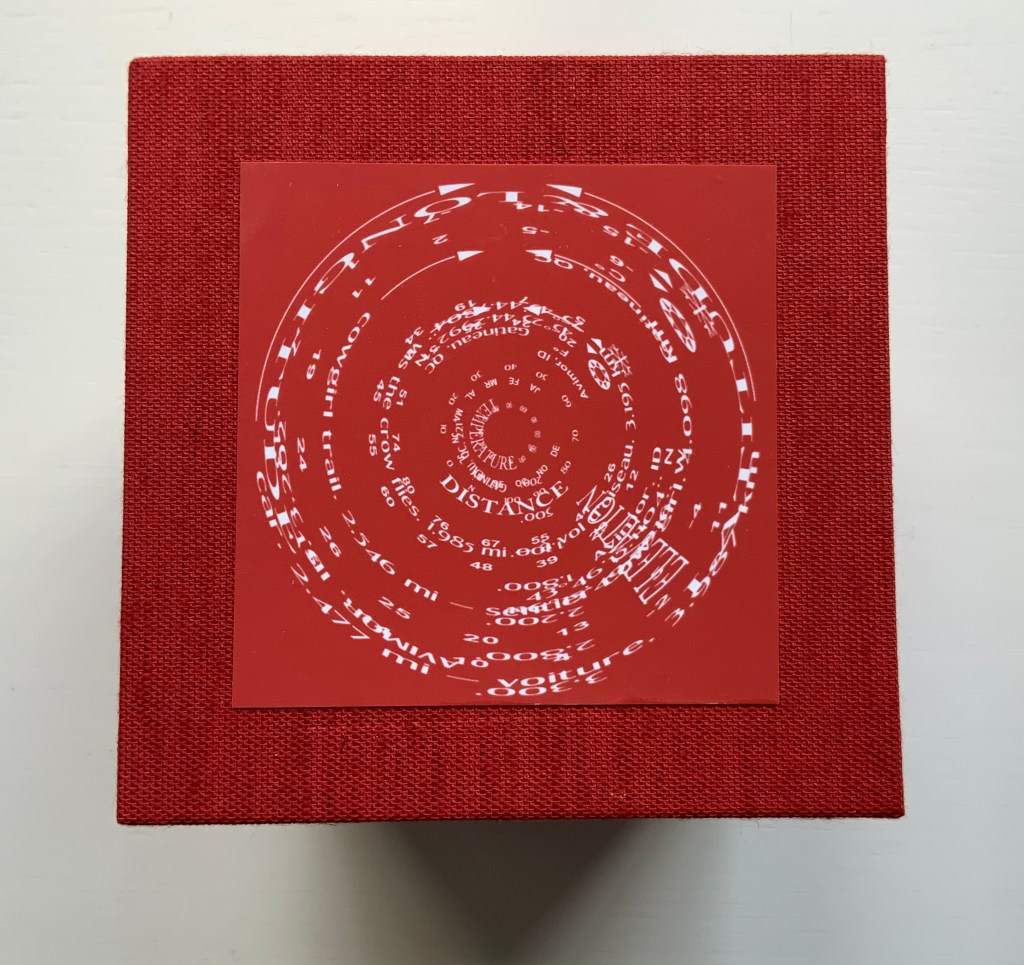
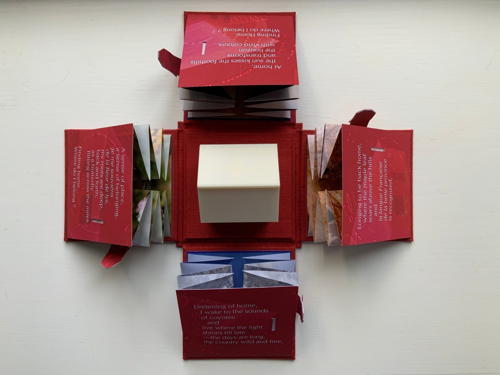
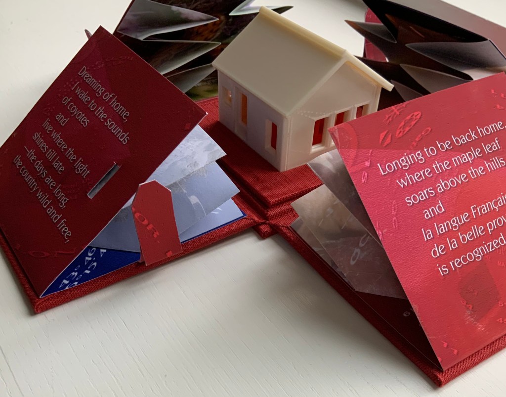
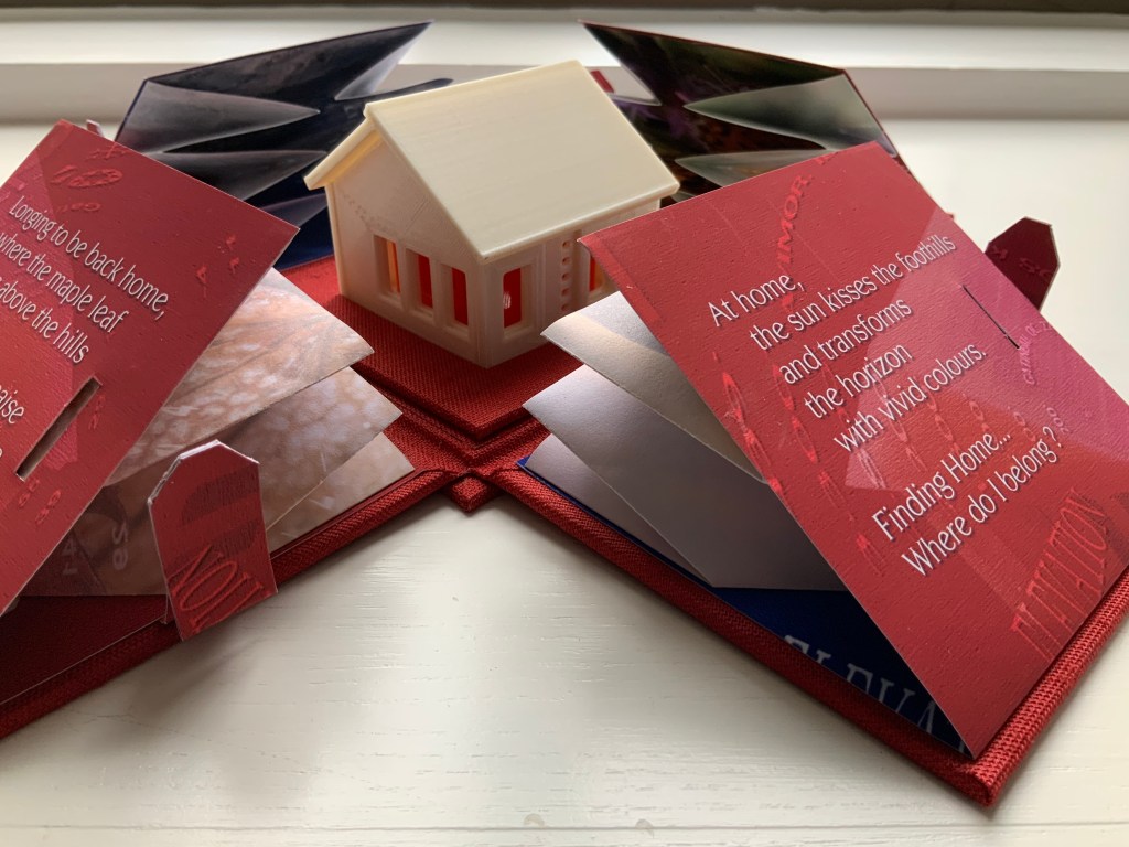
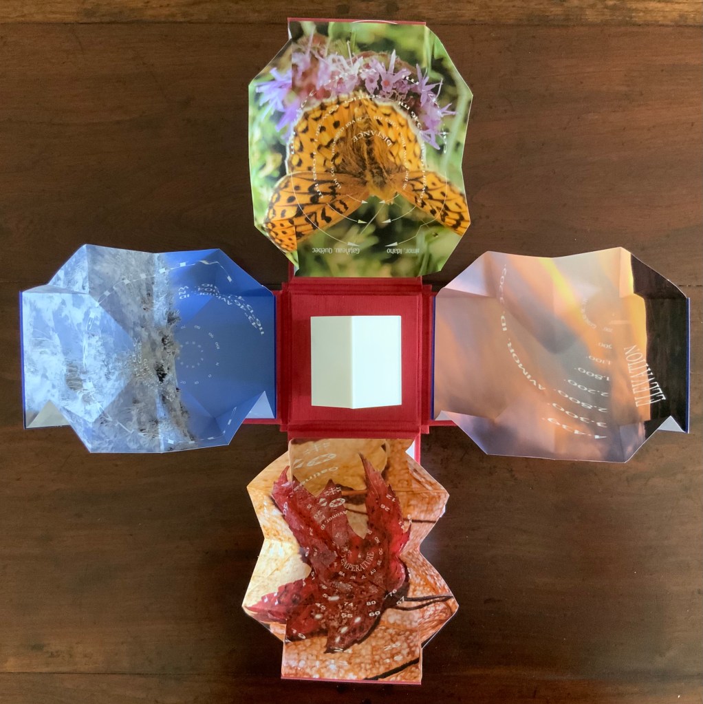
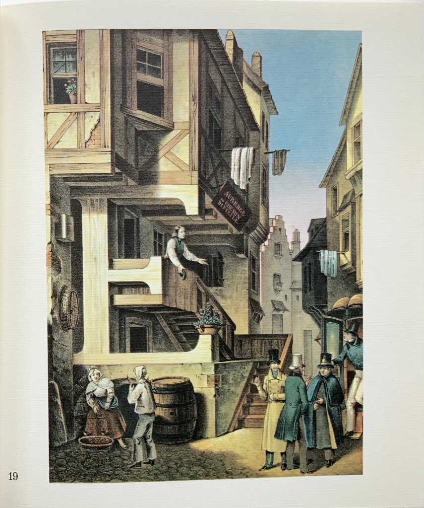
Finding Home (2019) Louise Levergneux Explosion box with cloth over board binding with inkjet printed images (H114 x W115 x D115 mm, closed); 4 Turkish map fold booklets (H95 x W95 mm, closed) inkjet-printed on Lasal paper, each attached to the interior of a box flap; 3D printed house. Third edition of 3 copies, of which this is #2. Acquired from the artist, 5 February 2021. Photos of the work: Books On Books Collection.
An explosion box, Turkish map fold, and small 3D-printed plastic house — the inventive combination reflects the many-featured domain of book art. That alone would warrant adding this work to the collection, but its union of material with content clinched the decision.
The work’s nomadic theme may have its roots in Levergneux’s various places of residence over time, but it also echoes her blog, entitled 1/2 Measure Studio, which began at the end of 2015 with her moving from a 20×12-foot studio into one measuring 10×10. The blog records indefatigable travels and visits with fellow book artists at all points of the compass to which Finding Home‘s four flaps might also allude — just as the small model might also allude to the half-measure studio.
Among the Turkish fold maps, the small house also conveys centrality and both a point of departure and one of arrival. The spirals and concentric circles within the open maps emphasize further the theme of seeking a center. But the work is not only about place. With all the maps open, we have a house surrounded by four blooms of color, which implies a still point in time among the shifting seasonal imagery.
There’s much about this work that recalls Gaston Bachelard’s The Poetics of Space (1969). There is, of course, the miniature house itself, for which Bachelard has entire chapters, but also in the maps, there is the butterfly recalling the chrysalis (pp. 85-86); the sun-kissed foothills, the recurrent theme of the horizon, distance and immensity (passim); the red maple leaf, the autumnal recollections (p. 179); and the prairie snowscape, the paean to snow (p.61); and the longitudinal and latitudinal references, recalling this passage:
Each one of us, then, should speak of his roads, his crossroads, his roadside benches; each one of us should make a surveyor’s map of his lost fields and meadows. Thoreau said that he had the map of his fields engraved in his soul. And Jean Wahl once wrote:
Le moutonnement des haies C’est en moi que je l’ai. Poème, p. 46(The frothing of the hedges I keep deep inside me.)
Thus we cover the universe with drawings we have lived (p. 33).
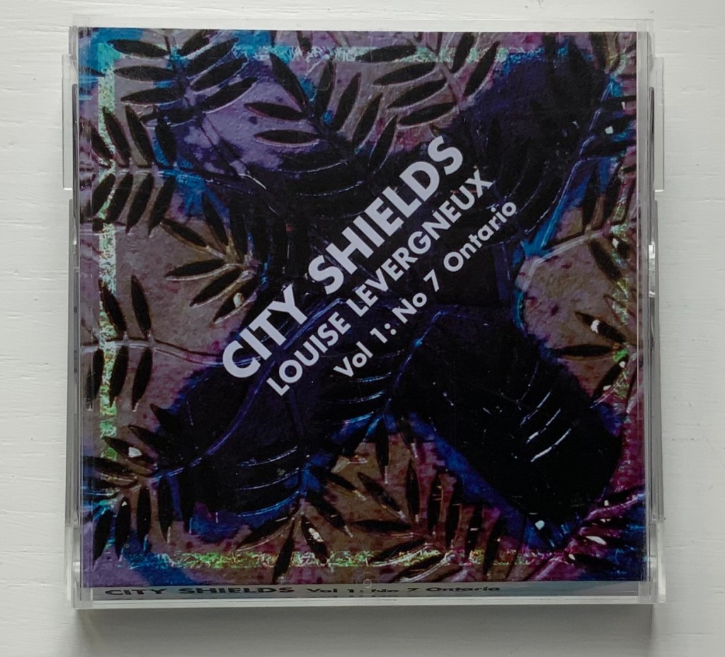
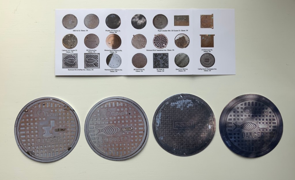
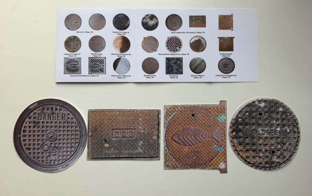
City Shields, Vol 1: No 7 Ontario (2017)
City Shields, Vol 1: No 7 Ontario (2017) Louise Levergneux Jewel case cover (H103 x W105 mm) with insert printed on Inkpress Matte paper holding 21 die-cut photos of manhole covers printed on Generations G-Chrome Lustre paper. Edition of 25 copies. Acquired from the artist, 5 February 2021. Photos of the work: Books On Books Collection.
Like Finding Home, this work is autobiographical, documenting Levergneux’s travels from 1999 to 2020, from Scotland, Canada and the US. As summarized on the insert for this one issue, the shapes and design of the actual manhole covers vary — as do their die-cut photos — some round, some square, rectangular, flanged. Small as they are, their colors and shadows nevertheless entice thoughts of miniature tunnels and drains lying beneath them and winding their way under whatever surface on which the manhole covers rest. City Shields‘ evocation of hidden space and their reminder to look down as well as up at city architecture create a strange and welcome fit with the architectural theme in the Books On Books Collection.
Levergneux celebrated the close of the City Shields project with a 20th Anniversary Edition, described here.
Further Reading
“Architecture“, Books On Books Collection, 12 November 2018.
“Guy Bigland“. 31 August 2023. Books On Books Collection. (See his Square Photographs of White Circle Paintings (2022) for comparison).
Bachelard, Gaston, Maria Jolas, Mark Z. Danielewski, and Richard Kearney. 2014 (1964). The Poetics of Space. New York: Penguin Books.
Chen, Julie. 2013. 500 Handmade Books. Volume 2. New York: Lark. P. 20 (see Will Karp’s 49 Masterpieces of Art (2011) for comparison).
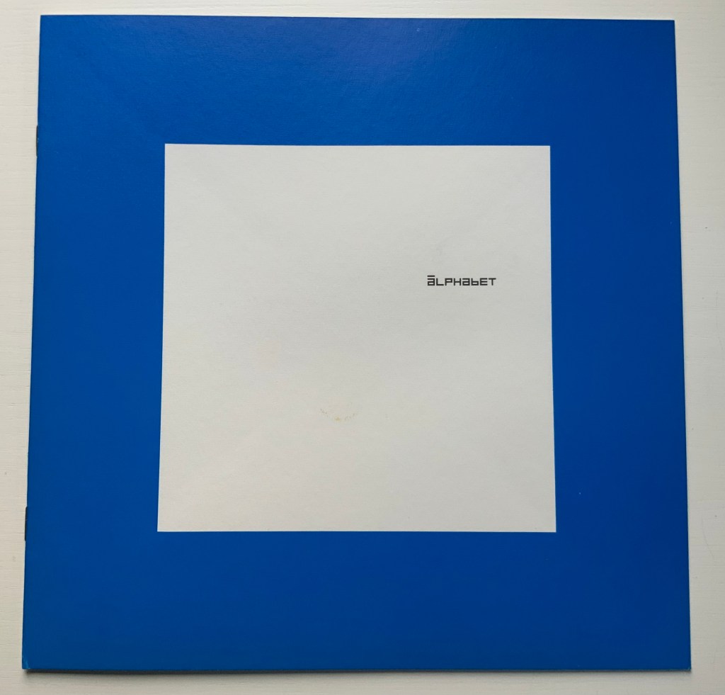
Alphabet (1970) Timothy Epps and Christopher Evans Booklet. 250 x 250 mm, 16 pages. Acquired from Antiquariaat Frans Melk, 23 November 2020. Photos: Books On Books Collection.
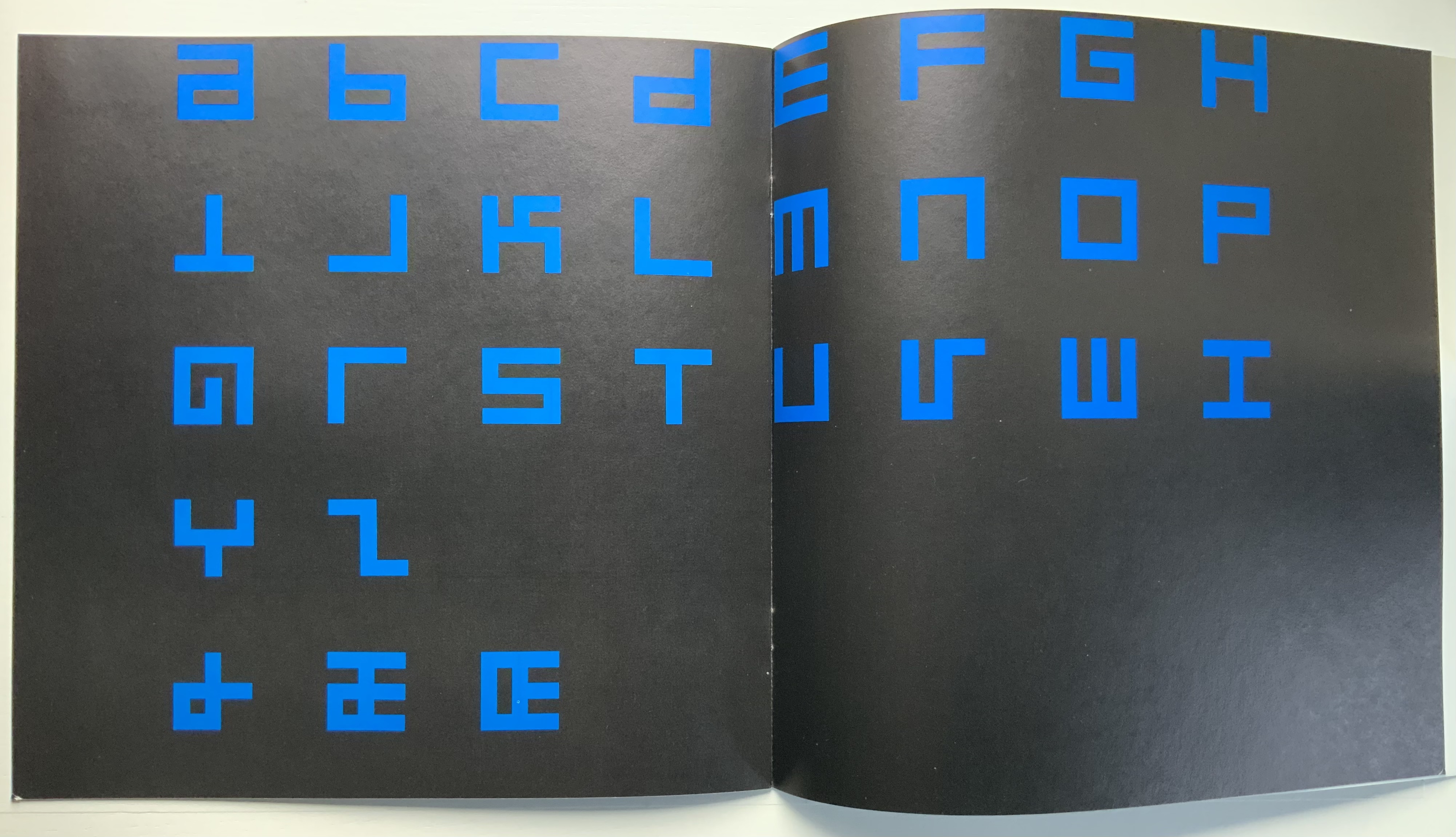
This is the alphabet that inspired Raffaella della Olga’s LINE UP (2020), also in this collection. At the UK’s National Physical Laboratory, Epps and Evans created their alphabet in 1969 in response to the challenge to overcome machine-readable typefaces’ human-unreadability. Perhaps because it was the second of three responses to Wim Crouwel‘s New Alphabet (1967), published in the Kwadraatblad/Quadrat-prints series, the Dutch graphic designer and series editor, Pieter Brattinga, snatched it up for publication in his series of experiments in printing ranging over the fields of graphic design, the plastic arts, literature, architecture and music. This particular issue was designed by John Stegmeijer at Total Design.
While the bright blue (above left) stands out strikingly against the black background, the booklet appropriately makes the human eye strain to see the letters darkly printed against the black. Would a scanner pick them up? Does the similar elusive effect created by debossed printing in della Olga’s collaboration with Three Star Press allude to this as well? What would that ingenuity create if applied to Crouwel’s New Alphabet or to Gerard Unger‘s A Counter-Proposal (the first response to Crouwel’s booklet) or Anthon Beeke‘s Alphabet (the third and strangest response — letters composed of naked women)?
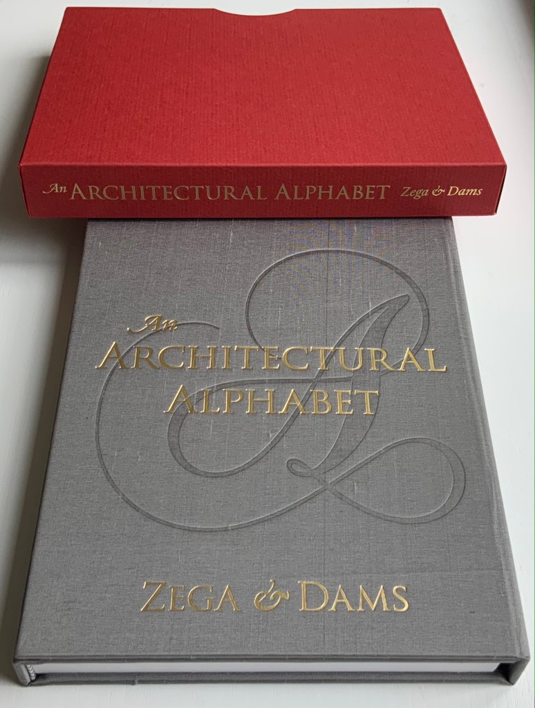
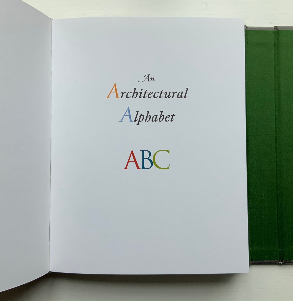
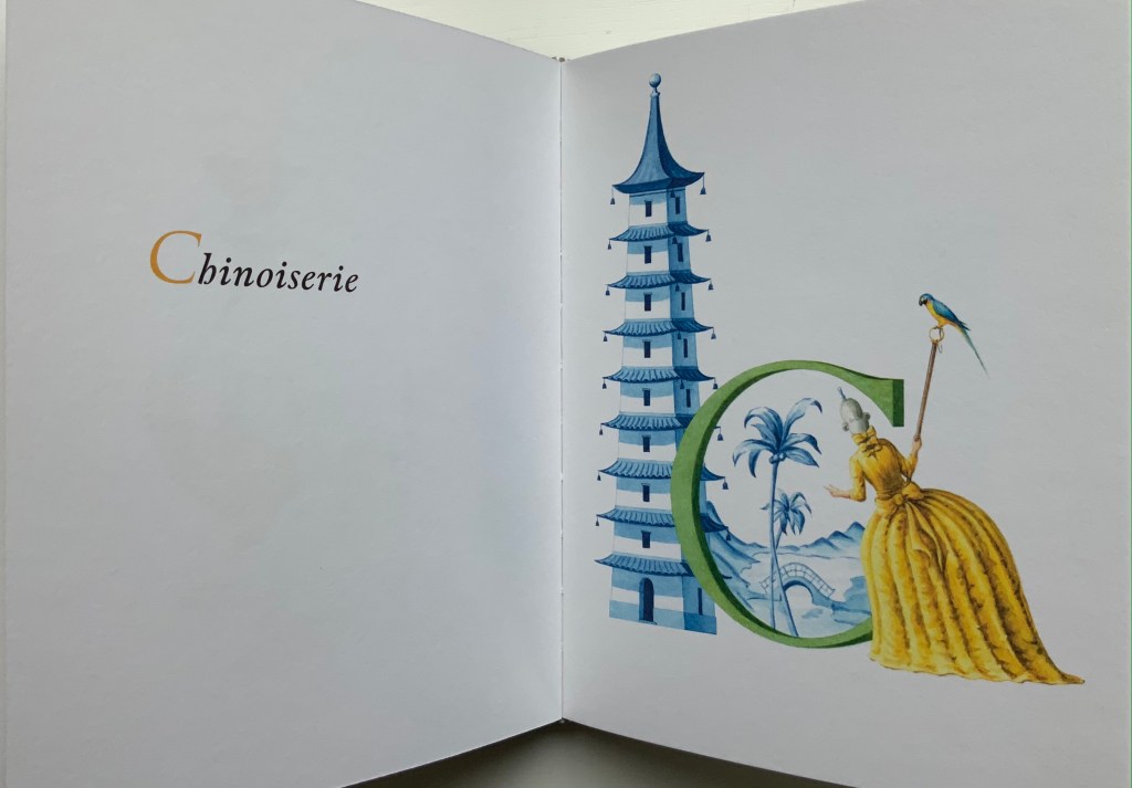
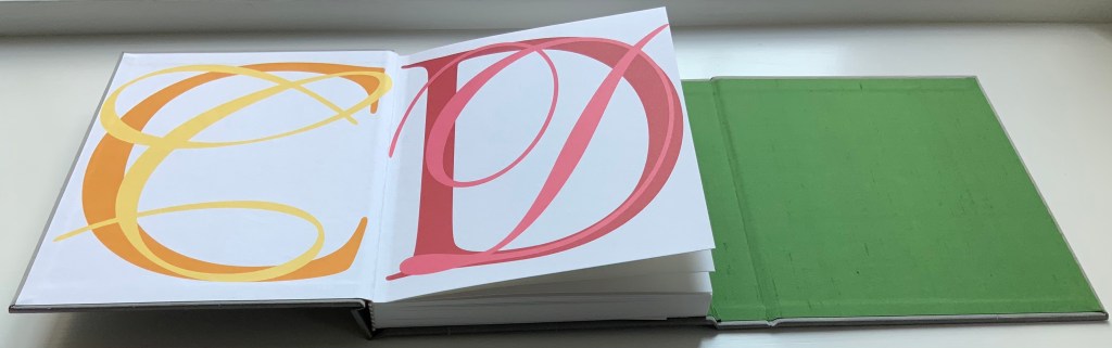
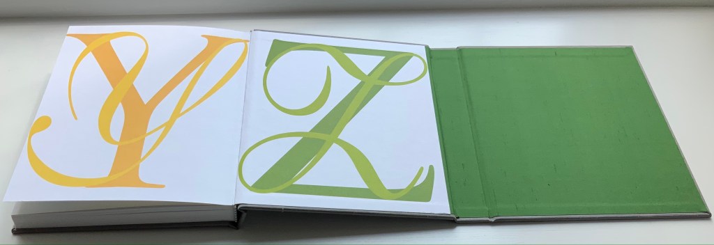
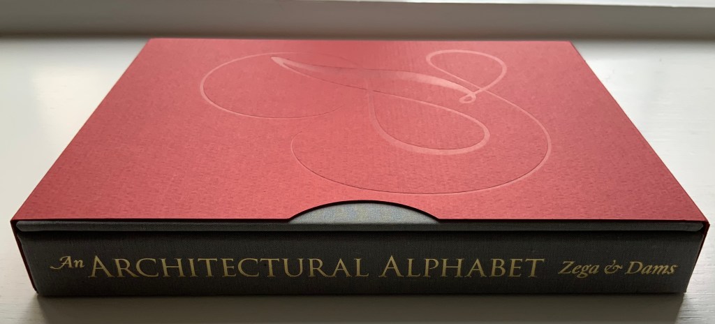
An Architectural Alphabet : ABC(2008) Edward Andrew Zega & Bernd H. Dams Slipcase, casebound in a variation of the Chinese fashion. H210 x W178 x D25 mm, 96 pages. Edition of 400, of which this is #21. Acquired from Architectural Watercolors, 8 April 2021. Photos: Books On Books Collection, displayed with permission of the artists.
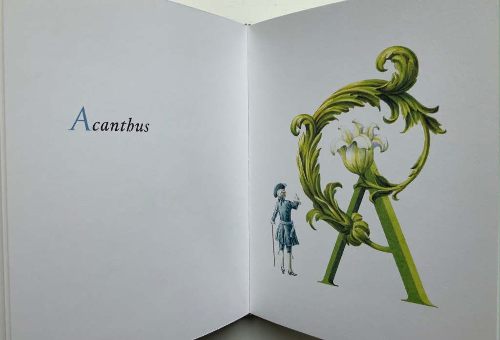
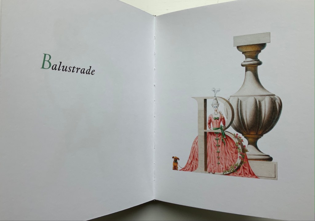
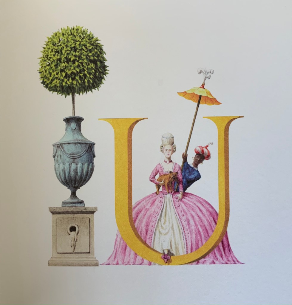
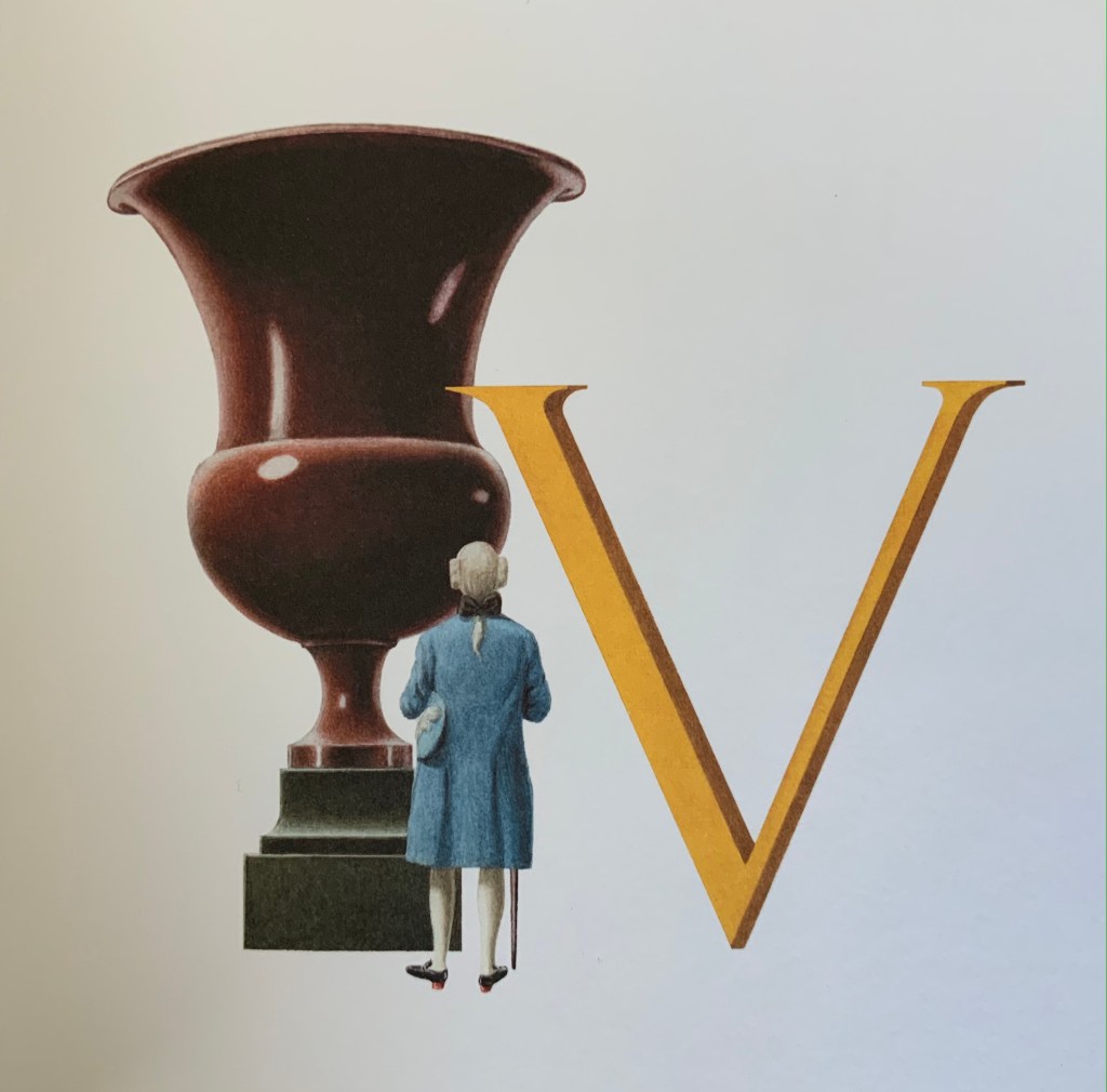
Since 1995, Zega & Dams have published several volumes of their architectural watercolors, almost all focused on the Ancien Régime but with some diversions to New York’s Central Park and Russia’s Tatarstan. An Architectural Alphabet is, however, not quite a diversion and certainly more than a divertissement. Two elegant essays — “Letter Pictures” and “Artists’ Alphabets” — bracket the elevational drawings of A to Z with their accompanying illustrations. The essays weave together reference points from the history of the Latin alphabet, architectural history, histories of architectural and natural science illustration and those of typography and graphic design. They do this lightly and knowingly just as the letters and images do, which play simultaneously with typographic and calligraphic traditions and the vocabulary of the architecture and decorative arts of the Ancien Régime and the Grand Tour.
The acanthus leaf commonly used to decorate a column’s capital, hence the gentleman’s upward gaze.
Balustrade: a rail supported by balusters (vase-shaped columns), used for balconies from which a lady might like to peer.
The authors/artists’ choice and use of fonts offer other examples of their subtle erudition. The body text is set in Capsa italic, a rather allusive and self-allusive choice. Dino dos Santos, its designer, was inspired by fonts created by the 18th-century type-founder Claude Lamesle. One of those Ancien Régime fonts is Gros Romain Ordinaire, whose name draws further attention to Zega & Dams’ decision to use italic in place of the usual Roman for the body text. With its “Romain” roots, Capsa italic performs as the perfect foil to the choice of display font, which also serves as the template for the “letter pictures”: Carol Twombly’s Trajan. The name and design are based on the Roman capitals entwining Trajan’s Column in Rome. The fact that the ancient Roman capitals had no letter U, only the letter V to stand in for both, provides the artists with the opening for the following visual joke.
Urn versusVase
The authors take the stylistic development of chinoiserie during the Ancien Régime for two rides in the work: one for vocabulary with the letter C and another for structural allusion with the binding.
The binding is a variation on Chinese casebinding. Here the sewn book block has been placed on the middle board of three hinged boards and is attached to the left-hand and middle boards by the endpapers (CD and YZ, respectively). The right-hand board is hinged to fold on top of the left-hand board. The Curtis by Curtis 1.5 paper (a 200 gms vellum stock) is stiff, and the sewing is so tight that the book does not easily open or lie flat. The casing, however, allows extensive pressure without the hazard of breaking the spine’s covering. In two finishing Oriental touches, the artists called for grey silk for the board coverings and green for the inside of the right-hand board and hinge.
With its architectural and alphabetic themes, An Architectural Alphabet makes a fitting addition to the Books On Books Collection, and its essays serve as welcome reminders of the more discursive volumes by Laurence de Looze, Marian Macken, Hugh McEwen and Chrysostomos Tsimourdagkas (see Further Reading).
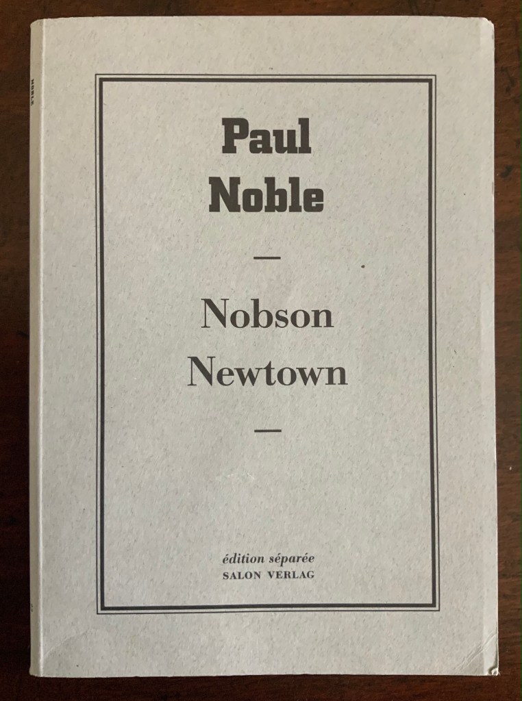
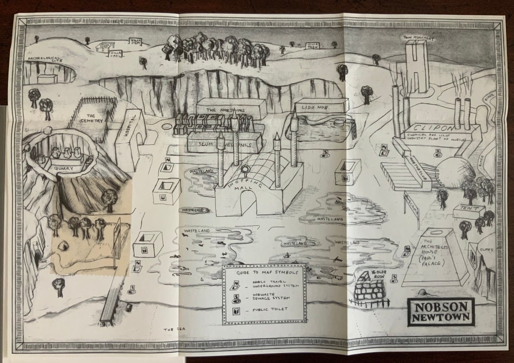
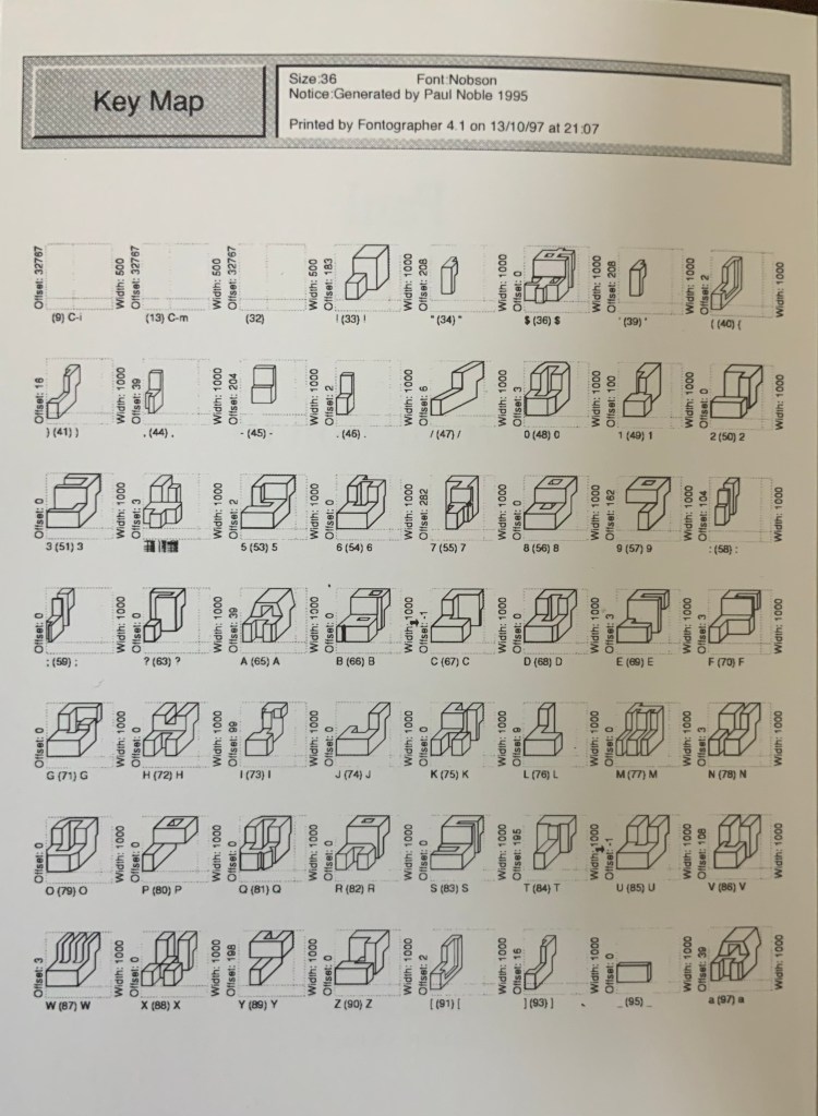
Nobson Newtown (1998) Paul Noble Paperback, H17 x W120 mm, 32 pages with foldout map. Acquired from Marcus Campbell Art Books, 13 March 2021. Photos: Books On Books Collection.
With Nobson Newtown, Paul Noble extends the tradition of alphabetical architecture to full-scale city planning and landscape architecture. Some of Antonio Basoli’s 19th-century designs — for example, the letter A — display a letter-shaped built environment, as does Steven Holl’s The Alphabetical City (1980), but in seaside Nobson Newtown, the buildings spell out words, and the mapped habitation (although without any depiction of inhabitants) rests on a founding myth as bizarre and misanthropic as its current civic arrangements.
In addition to a map of the town and the environs, Nobson Newtown includes a key to its alphabetical and typographic building blocks, which are, of course, rendered in Nobfont. Easy legibility is not a characteristic.
The Museum Boijmans Van Beuningen commissioned a film from Noble exploring Nobson Newtown, insightfully characterized as “an ever-incomplete inner landscape of the person building the town”.
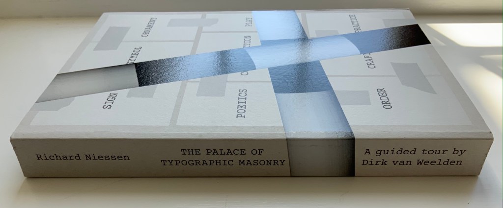
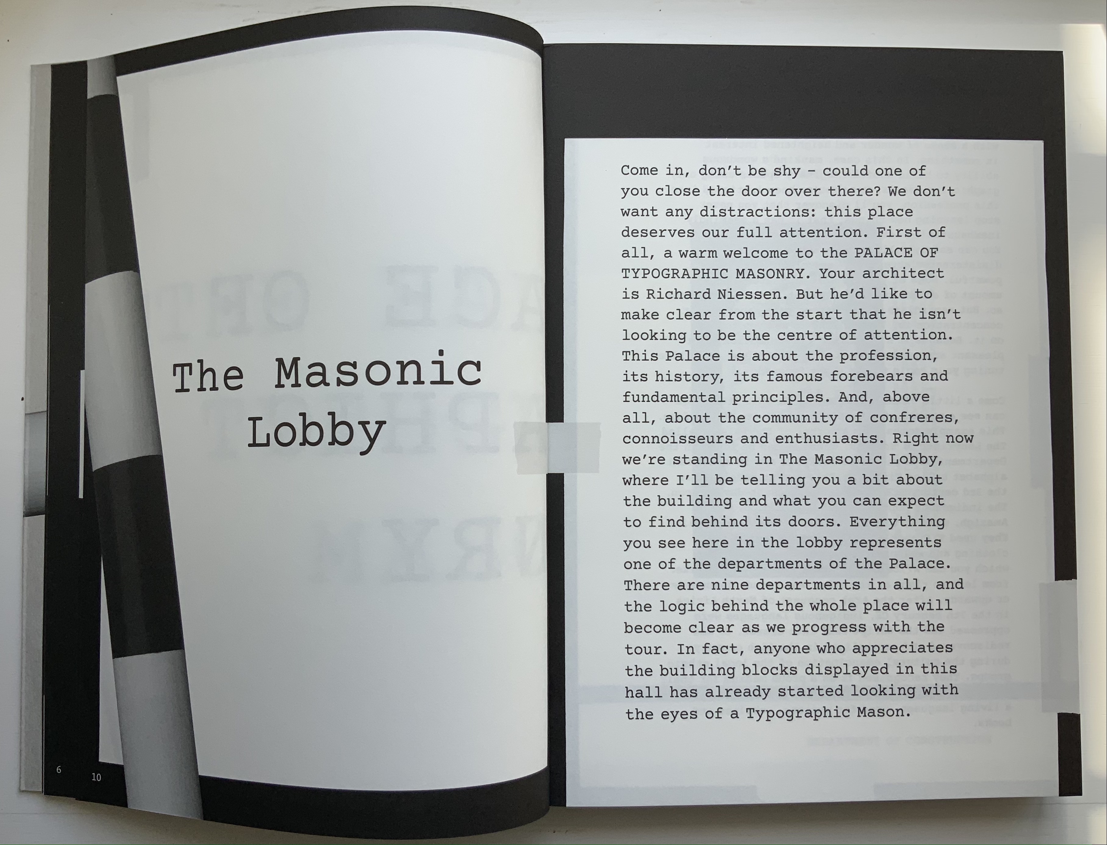
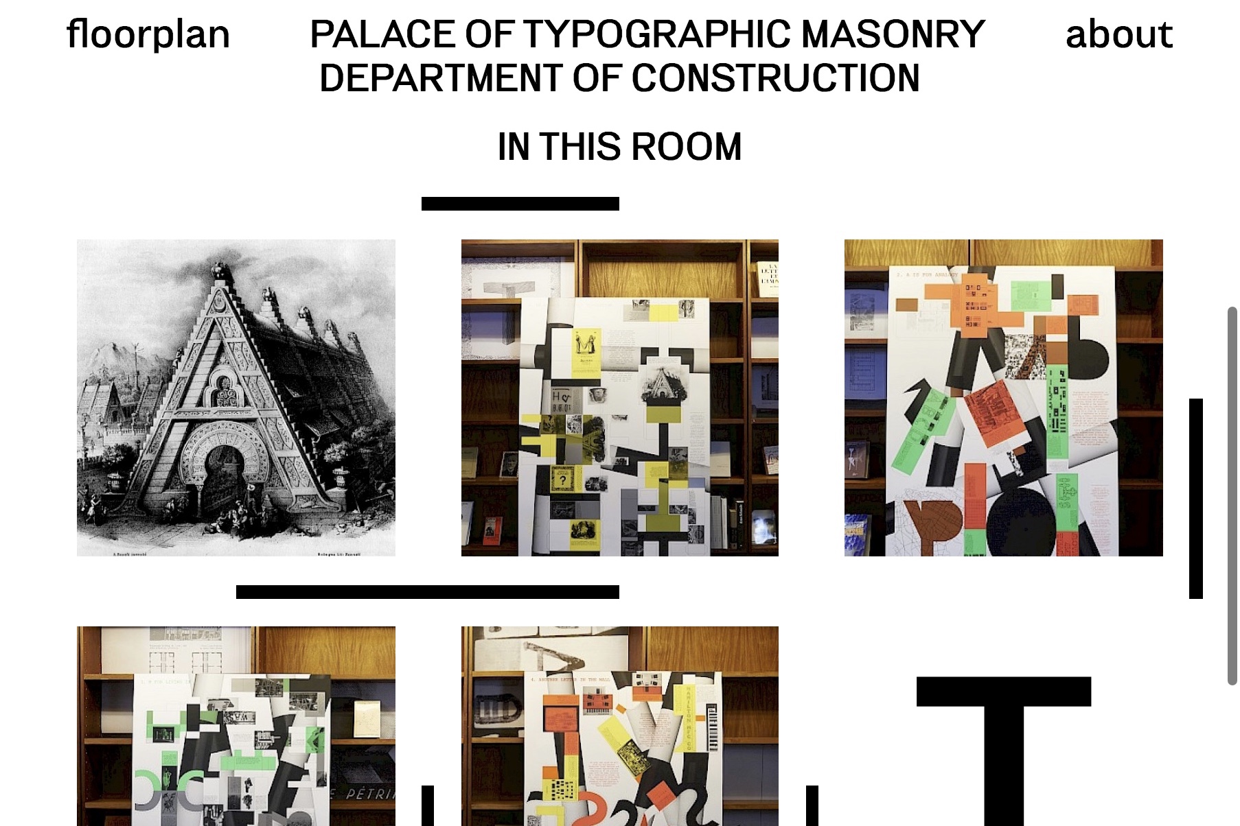
The Palace of Typographic Masonry (2018) Richard Niessen Paperback, perfect bound. H300 x W215 mm, 348 pages. Acquired from Wordery, 29 March 2021. Photos of the work: Books On Books Collection. Displayed with permission of Richard Niessen.
Website, perforated poster, exhibition and paperback, The Palace of Typographic Masonry occupies its place in the Books On Books Collection unlike any other work. The book itself is a shape shifter. Its size competes with those of museum catalogues. In fact, the Palace of Typographic Masonry is like a museum, so much so that it requires a tour guide, which is one shape the book takes. With its nine departments (Sign, Symbol, Ornament, Construction, Poetics, Play, Order, Craft and Practice), it is like a working museum of graphic design, and Dirk van Weelden, our tour guide, often hands us off to departmental “staff” for a lecture or overheard interview.
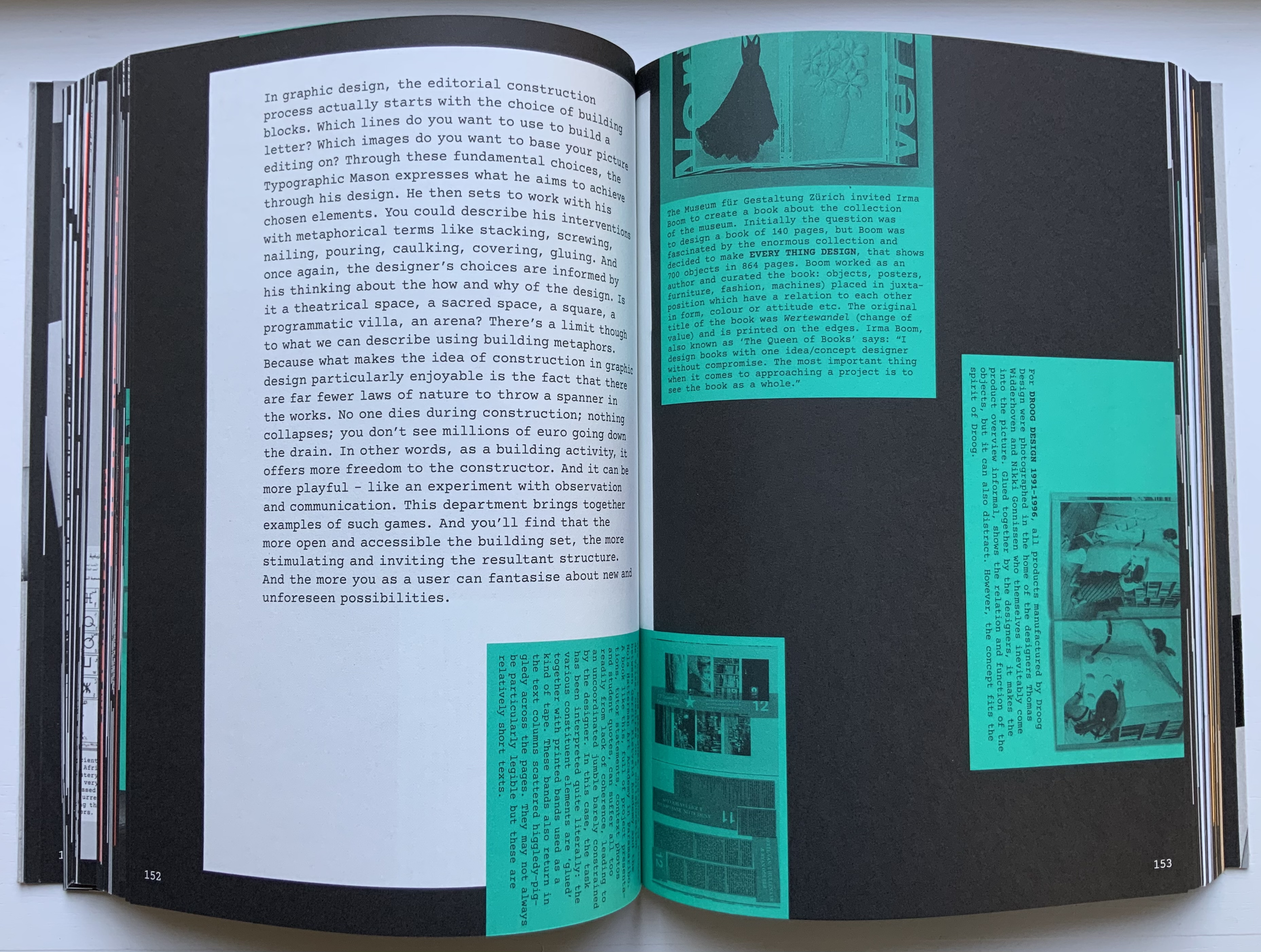
Given the guided-tour premise, the page layouts strangely, or perhaps appropriately, disorient. On almost every page, at almost every turn, we are rubbernecking and twisting to follow text that appears in a typewriter font on sheets and cards that seemingly have been stuck to a black surface with masking tape, photographed and then printed. Some of the text-bearing cards wrap from the recto page to the verso, leading the reader to think that perhaps the pages are on Chinese fold sheets. A card or sheet may be displayed complete on a page, but the next page may show its edge as if an overlapping photo had been taken. On some pages, the items overlap like a collage. At times, the effect is one of moving down a corridor of blackboards that are covered with notices and captioned photos on white, green and fluorescent orange paper. At other times, the page contains multiple cards as if lying on a flat surface — much the same as objects might be arranged in gallery glass cases — and in different orientations so that the book has to be turned clockwise or anti-clockwise to read each item — much the same as having to walk around a glass case to look at each object in it.
Interspersed glossy sections showcase projects illustrating or responding to the text or the department. For example, Slovenian graphic designer Nejc Prah delivers variations on Masonic tools for Symbols; Paris-based Fanette Mellier, on grid-based design for Poetics; and the Amsterdam-based studio Moniker, “board game cut-ups” for Play. While these sections fit their context in the book, their content and “slippery floor” substrate ratchet up the sense of disorientation. Museum visitors easily tire, and they can be bored in some departments.
Nejc Prah‘s variations on Masonic tools and symbols. Photo: Books On Books Collection. Displayed with artist’s permission.
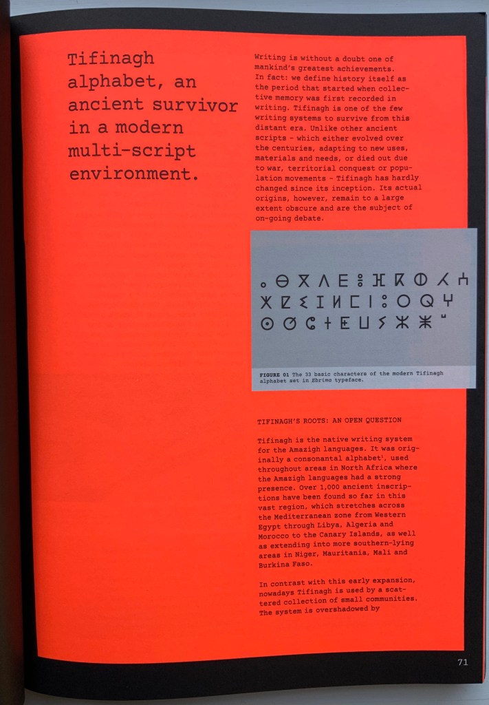
For example, the palace’s labyrinth of scripts — also reproduced separately on the perforated poster — is followed by a discussion of the revival of Tifinagh, the nearly extinct written language of the Tuareg in the Maghreb. The labyrinth presents thirty-six scripts in those varying orientations mentioned above and is wonderful in its breadth but also tiring — especially from the effort required by the font size and orientations. The story of Tifinagh’s revival and integration through typeface design is inspiring, usefully makes the point about the cultural conventionality of alphabets and more, but also makes for a long trek before our guide moves us along into the next department.
With the website for The Palace of Typographic Masonry, Richard Niessen aims for both a collective (imagined) building and an encyclopedic (digital) space, organized into those nine departments or frames. Contributors can add to the source collections or, within the departments and their subdivisions, create new rooms based on the source collections. One contribution particularly appropriate for the Books On Books Collection comes from Tony Côme: “The Typotectural Suites“. Here in one location, the visitor can find those “language towers, typographic islands, cities to decipher, plans in the shape of letters, encrypted walls, speaking bricks, habitable capitals” created by Johann David Steingruber, Antonio Basoli, Antonio and Giovanni Battista de Pian, Paul Noble and others.
The Departments of Sign, Symbol or Order could give more prominence to the role of numbers in the world of typographic masonry. Numerals do appear in the tables for Morse Code and International Maritime Signal Flags, but the visitor would not know that counting and numbers preceded writing and letters. Perhaps the curator could persuade the art historian and archaeologist Denise Schmandt-Besserat to contribute images of those clay tokens to which
The Mesopotamian cuneiform script can be traced furthest back into prehistory to an eighth millennium BC counting system using clay tokens of multiple shapes. The development from tokens to script reveals that writing emerged from counting and accounting. (Schmandt-Besserat, 2015)
Or perhaps the curator could persuade William Joyce to donate some clips from The Numberlys (2012) to the Palace source collection, even preferably some snippets of interactive code with which the visitor can help the five animated characters transform numbers into letters.
Universal languages are highlighted in an Annex, which has been compiled by Edgar Walthert. An update soon to come includes excerpts from Book from the Ground by Xu Bing. A link to Xu’s film The Character of Characters would make a useful addition. It will be interesting to see whether the Annex’s accompanying lecture covers the stir over a “post-text future” and whether typographic masons are returning full circle to pictographic language.
Further Reading
“Architecture“. 12 November 2018. Books on Books Collection
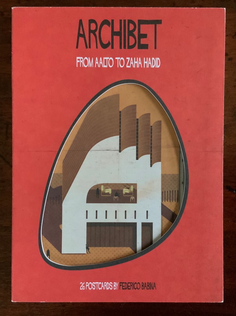
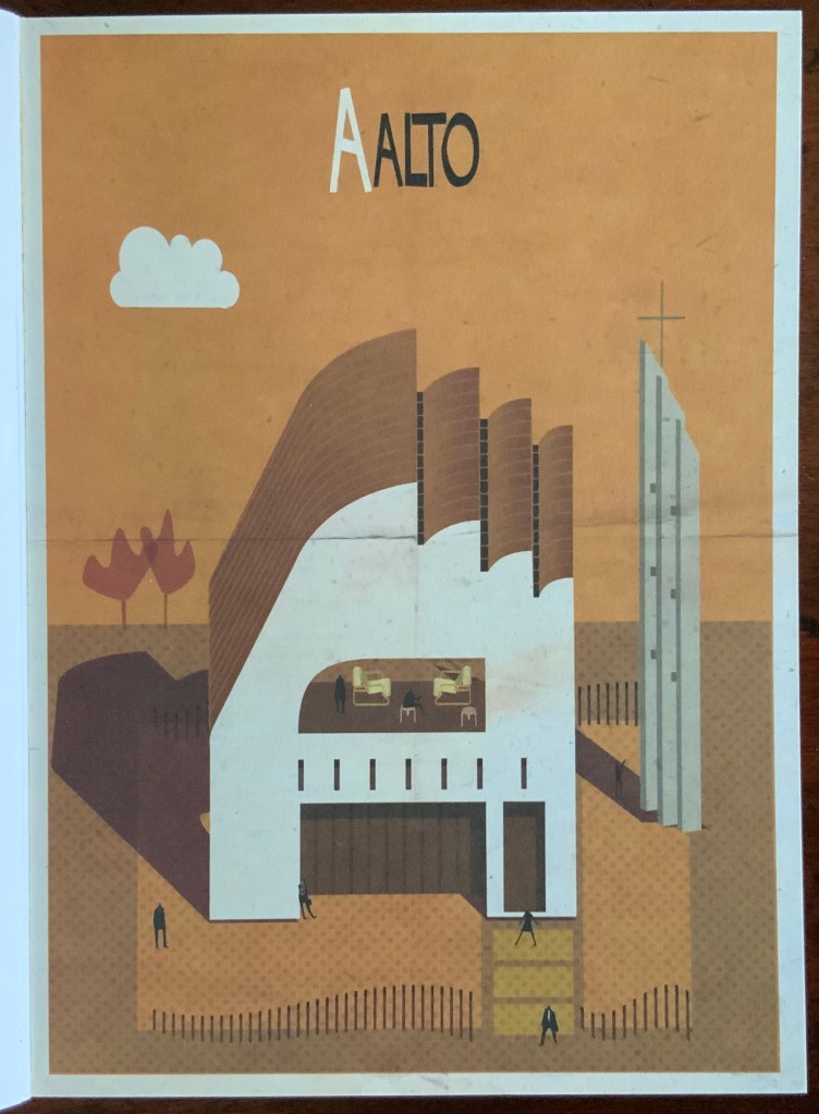
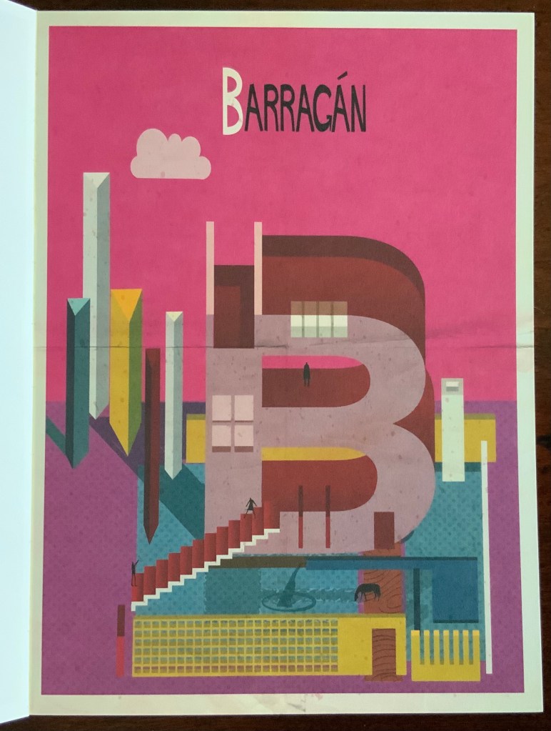
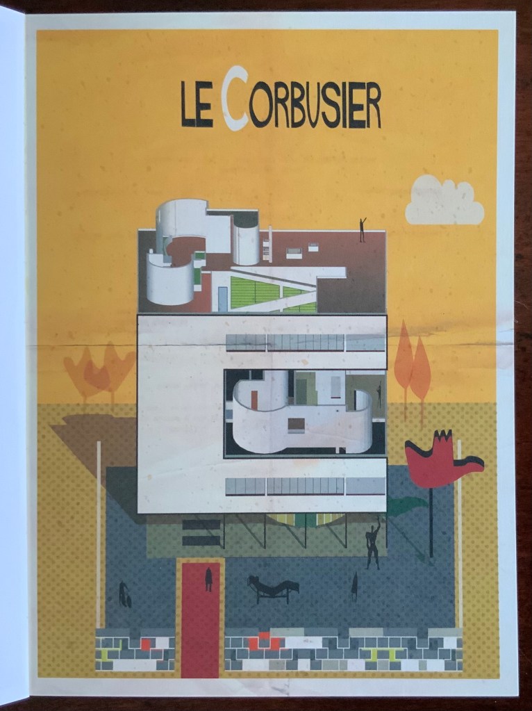
Archibet(2015) Federico Babina Perfect bound card. H165 x W120 mm, 26 cards. Acquired from Laurence King Publishing, 12 March 2021.
Mostly modern architects, the letters of their first or last names integrated with a surreal building reminiscent of their styles, but the handling of colors and flattening of perspective, which signal Babina’s style, dominate as can be seen below with Aalto, Barragán and Le Corbusier.
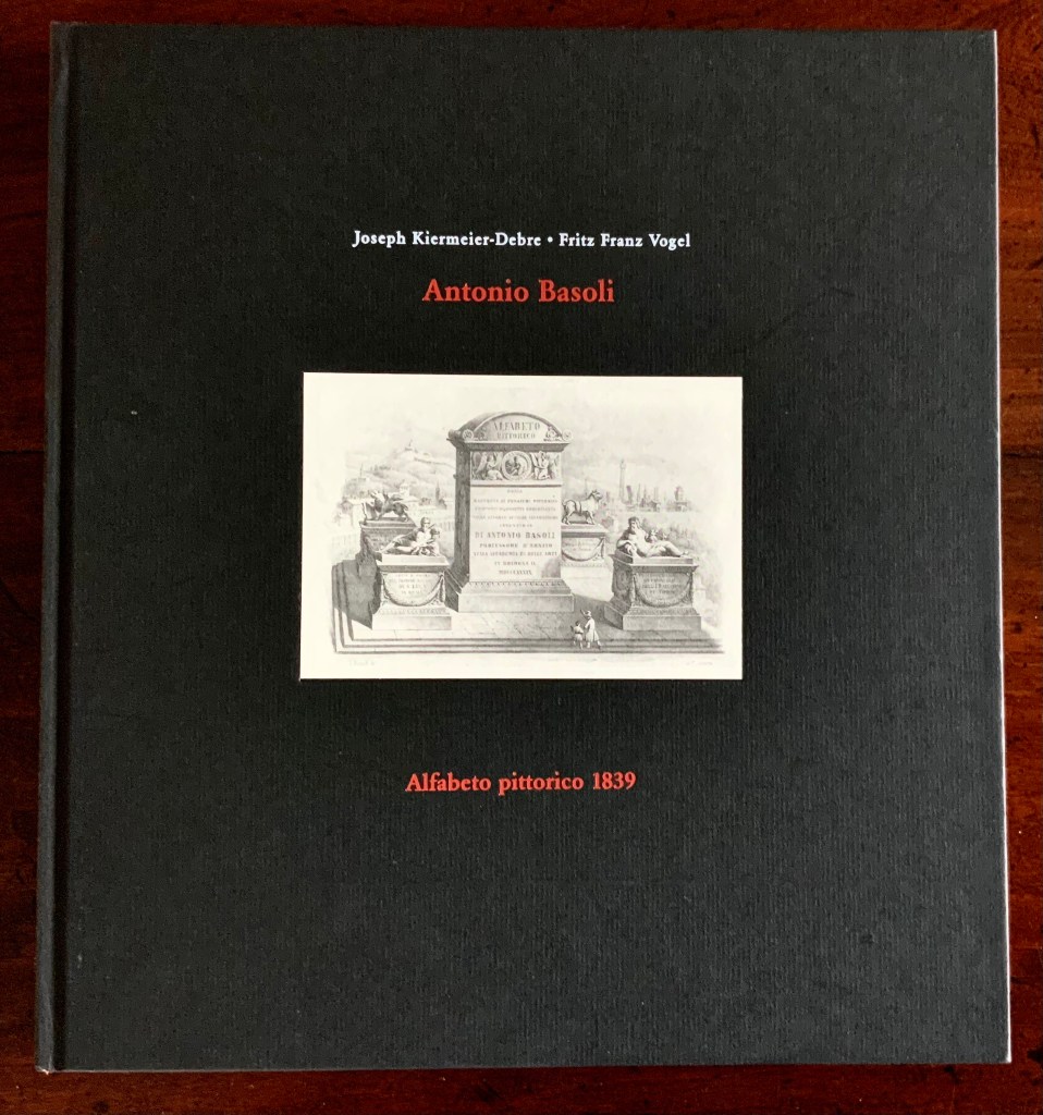
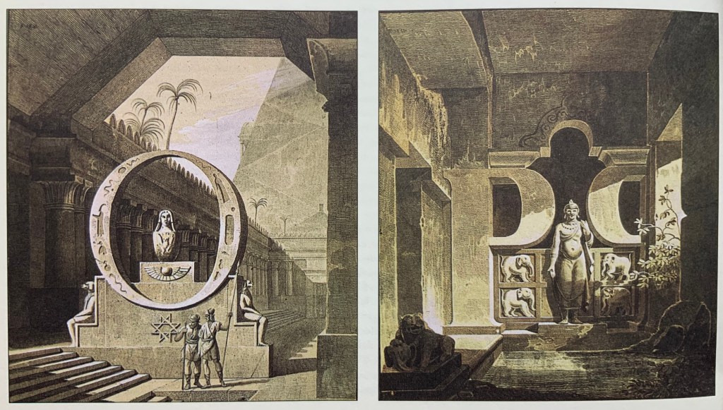
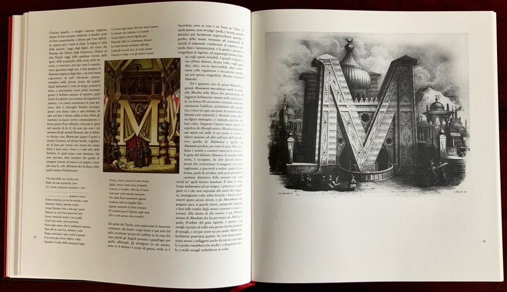
Alfabeto Pittorico, ossia raccolta di pensieri pittorici composti di oggetti comincianti dalle singole lettere alfabetiche (“Pictorial Alphabet, a collection of pictorial thoughts composed of objects beginning with the individual letters of the alphabet”) (1839/1998) Antonio Basoli Facsimile edition created by Joseph Kiermeier-Debre and Fritz Franz Vogel (1998) as part of the boxed set Alphabets Buchstaben Calligraphy, published by Ravensburger Buchverlag. H275 x W255 mm, 144 pages. Acquired from Antiquariat Terrahe & Oswald, 14 March 2021. Photos: Books On Books Collection.
The Ravensburger Alfabeto pittorico is like a “Black Forest Cake” — a lot of ingredients. The recipe starts with Antonio Basoli’s design of monuments based on letters of the alphabet and his original Italian and French descriptions. To this, the chefs Joseph Kiermeier-Debre and Fritz Franz Vogel add German and English translations. Then, alongside Basoli’s inventions, they place reduced versions of Antonio and Giovanni Battista de Pian’s contemporaneous alphabetical/architectural fantasies. And sprinkled throughout, providing comparative context to Basoli’s career in Bologna as a professionally and academically recognized scenographer, there are dozens of reduced versions of lithographs of opera settings by the more renowned scenographers associated with Vienna, Milan, Venice, Naples and Munich. It is entirely a pudding in the spirit of Basoli.
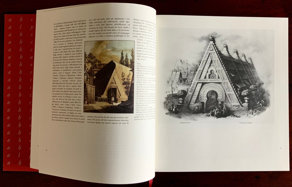
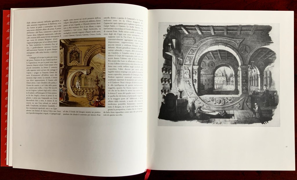
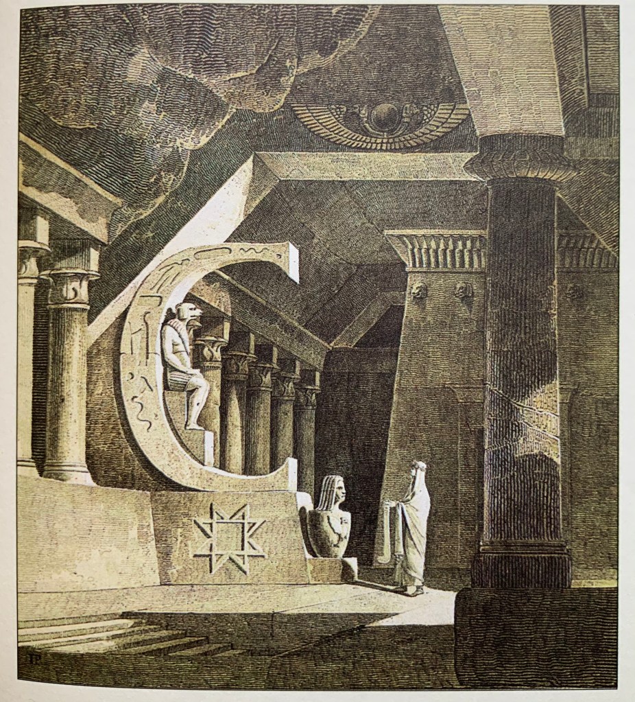
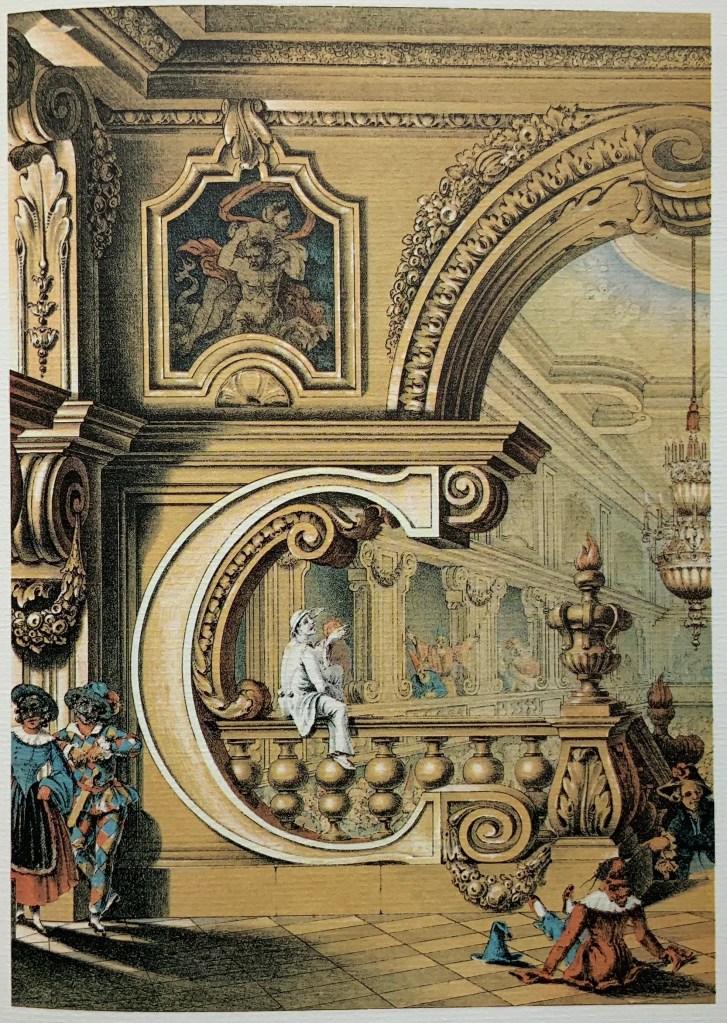
Basoli creates densely illustrated scenes based on each letter of the alphabet. For each view, his goal is to incorporate the letter structurally or ornamentally in a central building, which in the most successful attempts would begin with the letter. For instance, the large A-shaped building is an orangerie (as in arancia for oranges). B hints at the Tower of Babel and the destruction of the Babylonian empire. C stands for catafalque (or “crypt”) and the Capuchin monks attending to a burial.
Setting a further standard of success, the artist populates each scene with people, activities, objects and symbols that begin with the designated letter. Around the orangerie, agricultural attrezzi (“implements”) are strewn, stone aquile (“eagles”) perch on the building, alms are being distributed by a man in Arab dress, trees beginning with the letter A forest the background and pop up from pots, and the whole setting evokes Arabia according to the 19th-century perception of the region encompassing “Persia, Syria, Egypt and Ethiopia”.
As Kiermeier-Debre and Vogel point out in the preface and afterword, this scene and many others reflect the time’s preoccupation with the Orient and antiquity from the not-too-distant Napoleonic campaign in Egypt (1798-1801) that spawned the archaeological industry of Egyptology. They also reflect the scenography arising from a half century’s operas such as The Escape from the Seraglio(1782), The Caliph of Baghdad (1800), Abu Hassan (1811), Ciro in Babilonia (1812), L’Italiana in Algeri (1813), Il Turco in Italia (1814), Semiramis (1818), Maometto (1820) and Belsazar (1836). Drawing attention to the alphabetical scenes’ evidence of the wide range of Basoli’s cultural, historical, mythological and religious insights, Kiermeier-Debre and Vogel rightly conclude that the work is as much an encyclopedic pictorial dictionary as abecedary.
The author who provided the original commentary on Basoli’s scenes was G.C. Lossada, an art historian. He, too, notes Basoli’s erudition, but on the artistic success of each scene, he swings between acclamation and deprecation. Here is his concluding paragraph on the letter C:
Despite the fact that the shape of the letter C, the theme of this picture, does not lend itself to the main object that is depicted, and the larger part of the building actually lies outside of the initial, such that the whole design could well exist without it, despite all this the perspectives and proportions are so well thought out that this picture can be acclaimed as one of the best in the collection. P. 110.
Equally balanced in their appraisal of Basoli, Kiermeier-Debre and Vogel rank him behind his contemporary scenographers such as Karl Friedrich Schinkel but rate his alphabetical architecture over that of Giovanni Battista de Pian. The latter may be a matter of color and taste. Even reduced, Pian’s scenes draw the eye over Basoli’s, and if the criteria for ranking include a consistency in integrating concept, subject, technique and material, Pian’s letters strain less in their achievement. The letter C certainly takes the cake for Pian.
Basoli does, however, gain a point over Pian with his concluding ampersand. As Lossada remarks, in recapitulating the alphabet and images emblematic of each letter, Basoli’s “&” is entirely a scenic etcetera. The ampersand can be viewed online with the complete alphabet, thanks to the Civic Museum of the Risorgimento in Bologna and also RMR Productions (video, 7 June 2014; accessed 5 April 2021). Neither replicates the clarity of the Ravensburger reproductions.
Top row: A, C and E from Alphabetto Latino Schizzato a Bena da Antonio de Pian, reproduced in Antonio Basoli:Alfabeto Pittorico 1839, edited by Joseph Kiermeier-Debre and Fritz Franz Vogel, published as part of the boxed set Alphabets Buchstaben Calligraphy by Ravensburger Buchverlag (1998). Hardback, sewn. H275 x W255 mm, 144 pages. Acquired from Antiquariat Terrahe & Oswald, 14 March 2021. Bottom row: A, C and E from Alphabetto Pittoresque (1842) by Giovanni Battista de Pian, reproduced in Ein Schmuckalphabet aus Wien“Alphabet Jewelry from Vienna” by Anton Durstmüller, published by Fachhochschule f. Druck (1973). Perfect bound with pages in Chinese fold. H245 x W220 mm, 72 pages. Acquired from Versandantiquariat K. Stellrecht, 22 March 2021. Photos: Books On Books Collection.
Father and son, Antonio de Pian (1784-1851) and Giovanni Battista de Pian (1813-57)) worked in Vienna during the 18th and 19th centuries. Born in Venice, Antonio came with his father to Vienna, where he became a court-appointed set designer and scene painter and was inducted by the Academy of Fine Arts in 1843. Giovanni Battista (or Jean Baptiste) was not as professionally or academically successful as his father, but his Alphabetto Pittoresqueportfolio outshines his father’s Alphabetto Latino Schizzato a Bena and rivals the earlier Alfabeto Pittorico by Antonio Basoli, the elder Pian’s Bolognese contemporary, who was also an accomplished scenographer as well as an internationally honored academic. All three artists’ portfolios are scarce, and as they represent the next link in the chain of complete architectural alphabets that began with Johann David Steingruber’s Architectonisches Alphabeth in 1773, it is fortunate that the facsimile works produced by Durstmüller and Kiermeier-Debre/Vogel are available and accessible.
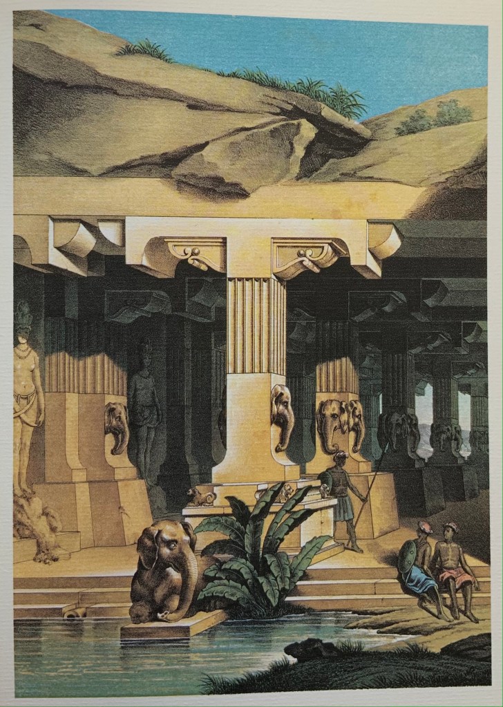
Antonio de Pian’s architectural alphabet portfolio is the rarest of the four. With its frontispiece/title page and twenty-two letters (B, D, J and W are missing), the only copy resides somewhere in Vienna. Fortunately, all of the twenty-two appear in the Basoli facsimile produced by Kiermeier-Debre/Vogel in 1998. The brown-tinted lithographs of the elder Pian’s portfolio echo not only the Basoli portfolio’s monochromatic character but also its emphases on Near or Middle Eastern or Oriental settings and on antiquity. As Kiermeier-Debre/Vogel point out, the dual emphasis was ushered in by Napoleon’s Egyptian campaign (1798-1801) and also showed itself in opera’s subject matter during Basoli’s and the Pians’ lifetimes. Twelve of Antonio’s scenes have settings in antiquity or the distant past, and seven in the Near or Middle East. Fifteen are based in Europe.
Letters M, N, O and P by Antonio de Pian
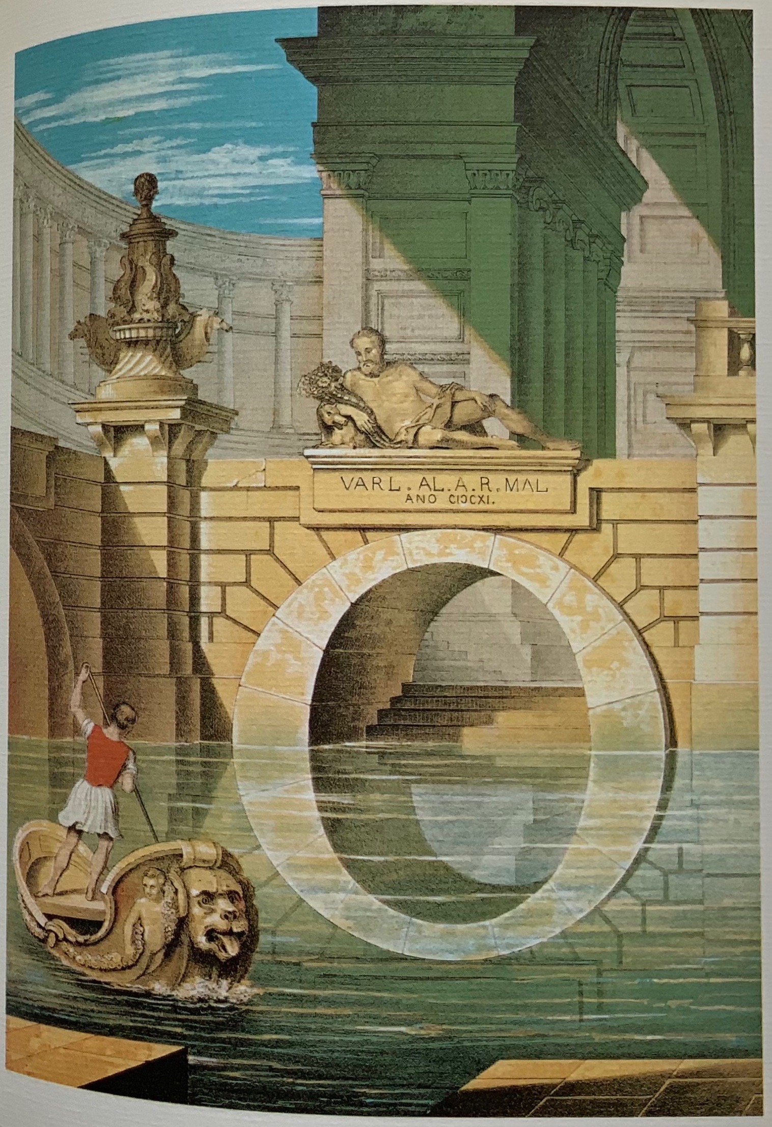
The original of Giovanni Battista’s portfolio is less rare, coming up for auction at five figures occasionally in the last few decades. It, too, appears in the Kiermeier-Dobre/Vogel’s Basoli volume but more prominently than his father’s. Anton Durstmüller’s earlier Ein Schmuckalphabet aus Wien/“Alphabet Jewelry from Vienna”(1973) showcases Giovanni’s portfolio. With its Chinese-fold leaves and laid paper, Durstmüller’s book matches and enhances the warmth and color of Giovanni’s invention and the chromolithographs by the Viennese lithographers Leopold Müller, Johann Höfelich, and M.R. Toma. Giovanni’s use of the arch’s reflection in the water to form the letter O, Pian places himself firmly in his father’s and Basoli’s company regardless of any lack of appointment or honors.
The Chinese fold of pages in the Durstmüller volume; the letter O by Giovanni Battista de Pian.
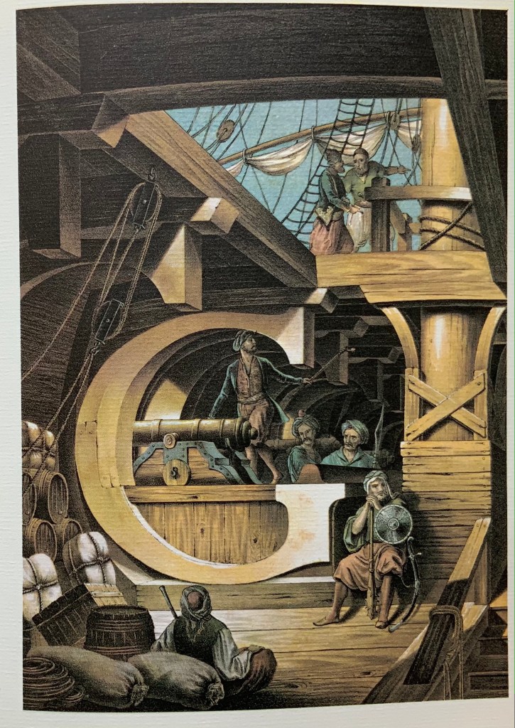
Sixteen of Giovanni’s scenes have European settings; eleven are Middle Eastern (he has an extra S). Of these, at least nine represent antiquity. From Basoli to the elder Pian and to the younger, there is the subtle shift in their scenes from the Classical to NeoClassical to Romantic styles, reflected in the diminishing emphasis on antiquity and growing emphasis on rustic European scenes. Typographically (or really calligraphically), the shift is less subtle. With almost every letter, Basoli used or tended toward a slab serif letter shape with blunt tips and sloping brackets. The Pians, however, leaned toward block serifs and sharply curving brackets, as seen in the letters A, C and E, above, and the letter M, below.
Kiermeier-Debre/Vogel’s side-by-side presentation of the letter M by Giovanni Battista de Pian and Antonio Basoli, respectively. Photo: Books On Books Collection.
Basoli’s serifs do not vary with the scene’s region, which might have created anomalies but somehow that does not happen. Only with certain letters do the Pians vary their letters with the region. At the top here, the serifs in the elder Pian’s letters C and E reflect their different regional settings. Below, his two S’s, however, fail on this score. The block serif S belongs more with the antique Roman scene; the nearly sans serif S belongs more with the antique Egyptian scene. The more exotic the setting from a Western perspective, the more the block serifs present difficulties — as in Giovanni’s letter G (the Turkish pirates below decks appear fed up with it) and letter T (the Africans depicted are certainly looking askance at the architecture) below.
Basoli’s and the Pians’ use of slab serif letter shapes reflects both their theatrical profession and the period’s infatuation with the shape in advertising in newspapers and on posters. Slab serifs were called Egyptian serifs, not that those letter shapes appear anywhere in Egyptian antiquity, but neither do the Keith Haring-like figures on the flanking columns in Giovanni’s L scene. See Further Reading for the story of slab serifs and their moniker.
For more on the operatic and theatrical context in which Basoli and the Pians worked, see the entry for Antonio Basoli in the Books On Books Collection.
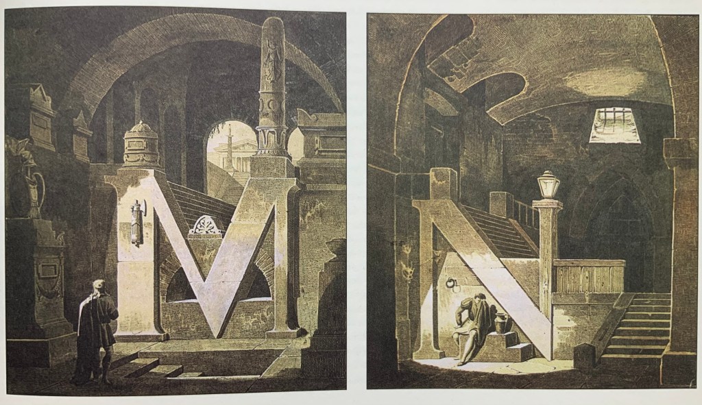
Architectural alphabet (1773/1972) Johann David Steingruber Casebound, sewn, headbands. H356 x W260 mm, 112 pages, including 33 facsimile prints. Published by Merrion Press, London. Edition of 425, of which this is #9. Acquired from Chevin Books, 24 July 2020. Photos: Books On Books Collection.
Several professional and academic architects and designers as well as academics from other disciplines have delved into the intersection of the alphabet and architecture. A few of them have also noted the intersection’s expansion to include artist books and fine press works. Since Johann David Steingruber’s effort in the 18th century, it has become quite a busy intersection.
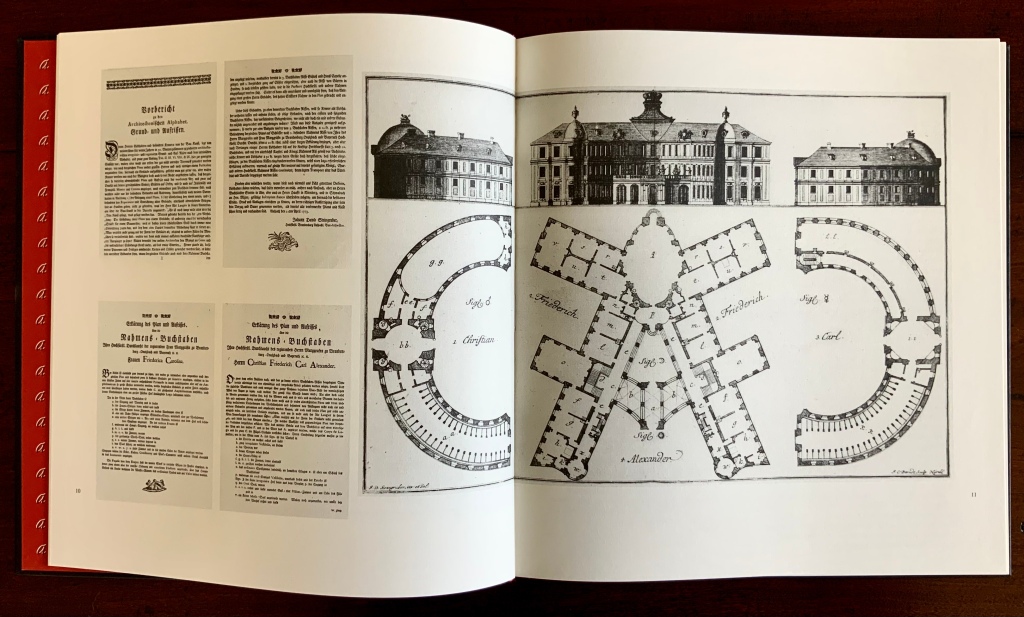
Originally published in installments at Steingruber’s own expense, the volume opens with its gloriously long title in an “arch of contents”, the columns inscribed with thumbnail images of the letter buildings to come. Although the title page lists 1773 as the publication date, the last installment came in March 1774. In his lifetime, Steingruber published three other works, illustrated and described toward the end of this facsimile, but Architectonisches Alphabeth became his most famous — “postcard” famous.
Architectonisches Alphabeth: bestehend aus dreyßig Rissen wovon Jeder Buchstab nach seiner kenntlichen Anlage auf eine ansehnliche und geräumige Fürstliche Wohnung, dann auf alle Religionen, Schloß-Capellen und ein Buchstab gänzlich zu einen Closter, übrigens aber der mehreste Theil nach teutscher Landes-Art mit Einheiz-Stätte auf Oefen und nur theils mit Camins eingerichtet, wobey auch Nach den mehrest irregulairen Grund-Anlagen vielerley Arten der Haupt- und Neben-Stiegen vorgefallen, dergleichen sonsten in Architectonischen Rissen nicht gefunden werden, zu welchen auch Die Façaden mit merklich abwechslender Architectur aufgezogen sind.
Steingruber dedicated his Architectural Alphabet to Christian Friedrich Carl Alexander, Margrave of Brandenburg-Ansbach, and his first wife Frederica Carolina, not to be confused with the paying dedicatee of Bach’s Brandenburg Concertos, the Margrave of Brandenburg-Schwedt. By a baroque coincidence, however, the first Brandenburg concertos, the ones composed by Giuseppe Torelli but not really influencing Bach, were dedicated to the Margrave of Brandenburg-Ansbach, then George Friedrich II, Alexander’s great-uncle who employed Torelli as court composer. Like Torelli, Steingruber too had to be satisfied with his payment as an appointee — court and public surveyor, and later principal architect of the board of works — even though he went to the trouble of making sure that his employers’ monograms and their associated buildings appeared in the span above the roman arch.
Steingruber seemed unaware of other building designs from alphabetical foundations. This facsimile’s editor gently and genially fills in the missing context. John Thorpe (1565–1655?), an English architect, drew up a property based on his initials. Thomas Gobert (1625-90), a French architect, produced Traitté d’Architecture dedié à Louis XIV, a manuscript whose building plans spelled out “LOVIS LE GRAND”. Anton Glonner (1723–1801) designed a Jesuit church and college around the monogram “IHS”.
There was not much chance of these letter-shaped edifices’ being built. Nevertheless, Steingruber adds matter-of-fact descriptions to his elevations and plans, calling out heating, kitchen, toilet and servants’ arrangements as if conferring with a prospective client ready to commission one of these typographic palaces. Who would not want a serif with a view? Or conduct guests on a tour of the bowl, capline, crossbar, stem, stroke and tail of the property?
The main text appears to be set in Van Dijck (before Robin Nicholas’ revision between 1982 and 1989) and printed on a cream laid paper. The special earmarks of Van Dijck — the sloped apex of the A, the stepped center strokes of the W, the non-lining numerals and especially the downward stroke at the top of the 5 , the tilted lower bowl of the g, etc., identifiable in Morison’s A Tally of Types and Rookledge’s Classic International Type Finder — all seem to be present.
The laid paper is not only tactilely pleasant, it visually supports the clarity of the facsimile prints. Their sharpness outdoes what is achieved even with the zoom function applied to the freely available digital version, which can be seen in the interactive comparison below.
Kiermeier-Debre and Vogel edition (1995)
Architectonisches Alphabeth (1773/1995) Johann David Steingruber Facsimile edition prepared by Joseph Kiermeier-Debre and Fritz Franz Vogel. H356 x W260 mm, 80 pages. Acquired from Antiquariat Terrahe & Oswald, 14 March 2021.
In smaller dimensions, this edition does not present the prints in their full size. Partially making up for the deficit is the Munken Pure paper’s brightness, against which the Garamond Berthold typeface and photolithography work well. Also, the book includes French, German and English text as well as illustrations that broaden the context to the present. Alongside Steingruber’s elevations and plans, Kiermeier-Debre and Vogel have included several birds-eye views of inventive roofing of 20th-century architectural models inspired by Steingruber’s plans.
Christian Friedrich Carl Alexander’s monogram buildings reduced alongside reductions of Steingruber’s original foreword and explanations of Federica Carolina’s and Alexander’s buildings.
Not satisfied with some of his efforts, Steingruber offered second options; here, for the letter A, and later, for the letters M, Q, R and X.
Verso: Paula Barreiro’s roofing design for Steingruber’s letter B.
Verso: Helge Huber’s and Alexandra Krull’s roofing designs for Steingruber’s letter C.
In another instance of positioning Steingruber’s book in the history of alphabetic architecture (or architectural alphabets), the editors include a complete set of small reproductions of Thomas Gobert’s designs and elevations spelling out “LOVIS LE GRAND” from his manuscript mentioned above. Although created a century before, his drawings do not seem as stylistically distant from Steingruber’s as those of the 20th-century rooftop drafts do. Driving home their point that “the design of alphabetical buildings must not be based slavishly on a Baroque roman type or a classicist roman version”, the editors conclude by drawing attention to Takenobu Igarashi‘s 20th-century sculptural celebrations of the alphabet in aluminum, concrete, wood, chrome and gold.
Photo: Mike Sullivan, “Igarashi Alphabets“, Typetoken, 25 November 2013. Accessed 26 March 2021. Displayed with permission of the reviewer.
In print and online as well, new original and secondary works have continued to busy the intersection of the alphabet, architecture and artist books. Richard Niessen’s The Palace of Typographic Masonry (2018) and Sergio Polano’s “Architectural Abecedari” (2019) are two recent examples. And, as if to confirm the busying of the intersection, we have Takenobu Igarashi: A to Z (2020) in print and making up for the scarcity of Igarashi Alphabets (1987).
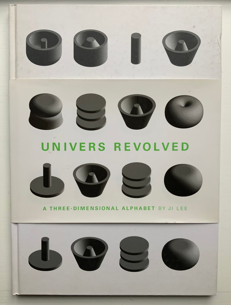
Univers Revolved: A Three-Dimensional Alphabet (2004)
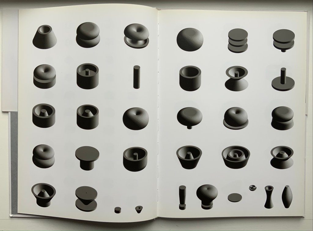
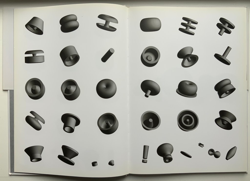
Univers Revolved: A Three-Dimensional Alphabet (2004) Ji Lee Sewn paper on board hardback. H338 x W238 mm, 64 unnumbered pages. Acquired from Unoriginal Sins, 12 December 2020. Photos: Books On Books Collection.
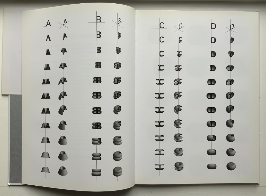
In his extended essay on Stéphane Mallarmé’s Un Coup de Dés Jamais N’Abolira le Hasard, Eric Zboya celebrates Ji Lee’s 3D typeface by rendering the entire poem in that face. The discovery of that essay led to the acquisition of Zboya’s artist book, which led to the acquisition of Ji Lee’s scarce volume Univers Revolved: A Three-Dimensional Alphabet (2004). Lee’s book resonates with several other works in the Books On Books Collection. Compare it, for example, with Johann David Steingruber’s alphabet book Architectonisches Alphabeth (1773/1973), Paul Noble’s alphabet book Nobson Newtown (1998) and Sammy Engramer’s three-dimensional rendition of Mallarmé’s poem.
This double-page spread displays the manipulation of the alphabet’s first four letters around their axes at two different angles to render their 3D shapes.
These two double-page spreads show the complete alphabet and punctuation marks at two different angles, which provide a key with which to begin reading text spelled out in the book.
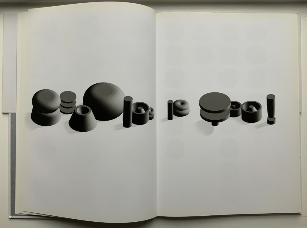
Lee teases his reader by composing sentences with different sized letters. “Reading is Fun!” is one of the easier to decipher.