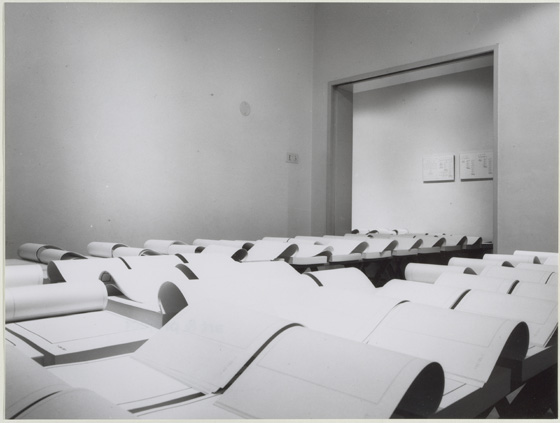
Printmaker, photographer and book artist, Frances Kiernan is based in Richmond, UK. I first saw her work in The Riverside Gallery exhibition (29 November 2014 – 14 February 2015).
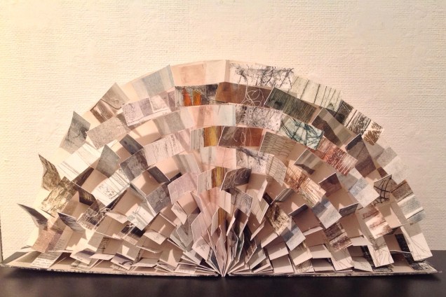
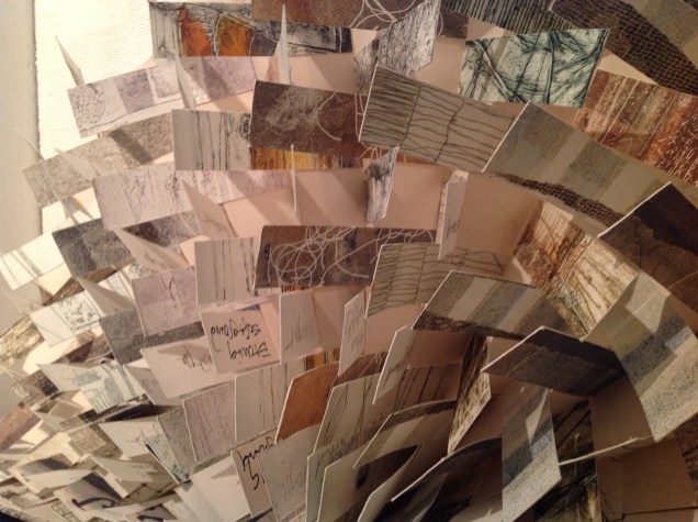
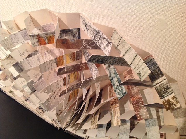
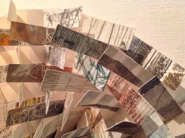
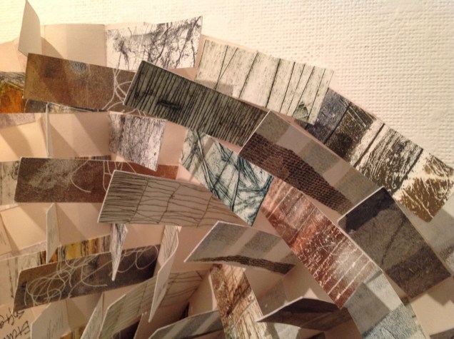
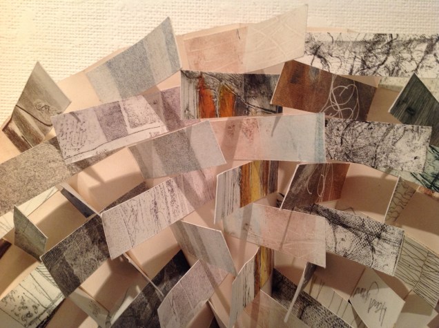
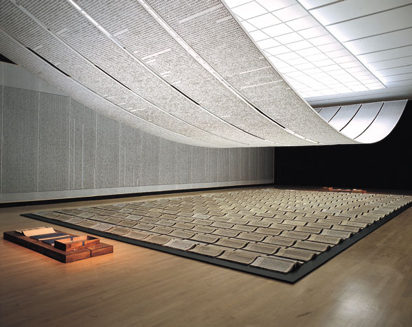
… made from the discarded prints during 2010. Rather than destroy them I liked the idea of creating a new piece of work out of damaged and unwanted prints.
The book also serves as a reference to the different processes in printmaking. (Kiernan)
All the Prints I Have Made, 2010 From “Artists’ Books” exhibition at The Riverside Gallery, Richmond, UK 29 November 2014 – 14 February 2015All the Prints I Have Made, 2010 From “Artists’ Books” exhibition at The Riverside Gallery, Richmond, UK 29 November 2014 – 14 February 2015All the Prints I Have Made, 2010 From “Artists’ Books” exhibition at The Riverside Gallery, Richmond, UK 29 November 2014 – 14 February 2015
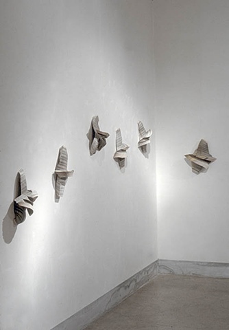
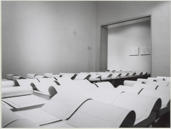
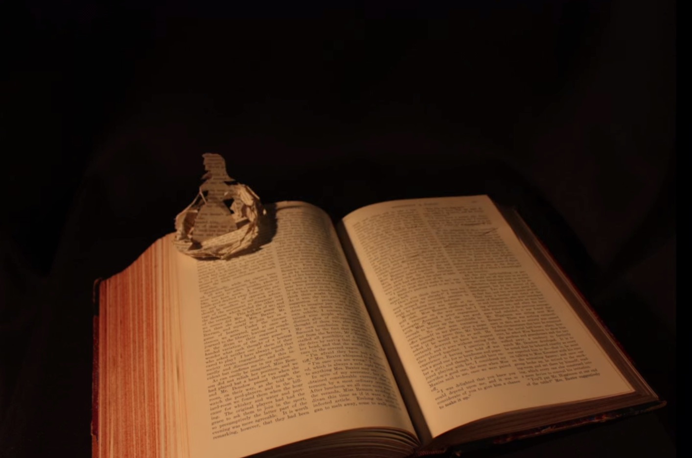
Like this flag book shown, her “Princess Caroline” series vaults over mere craftwork into indelible book art. Her work can be found in collections at the V&A, Kensington and Kew Palaces and the Sanskriti Foundation in New Delhi.
Beyond the Window windows filled with pencilled dreams Princess Caroline was a forward thinking woman with interests in politics, the arts and science. This book represents Caroline’s longing to go out into the world. We imagine her dreaming of a world beyond the window looking out to reach the marvels of the universe. The book was placed in a compartment in the Cabinet of Curiosities. The compartment was lined with mirrors so that the windows appear to be never ending and to help convey how her dreams could never be attained. She contented herself with collecting curiosities that the men brought back from their travels. The windows of this concertina book are handcut. The window panes are covered with Matsuo kozo paper that have been screenprinted from pencil drawings to reflect her dreams. The ‘Maru-chitsu’ wraparound case is screen printed onto bookcloth and can be closed with a Japanese bone clasp. Book commission for the Enchanted Palace Exhibition at Kensington Palace 2010/11.
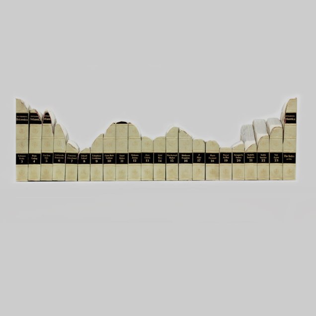
Australian artist Mary Ann Santin studied at the Adelaide Central School of Art and has exhibited at the State Library of South Australia, the Miele Gallery and Loreto Spring Art Show. Her techniques and themes echo those of Jessica Drenk, Guy Laramee and Georgia Russell.
A5 green, 2012 found encyclopaedia, paraffin wax, dye 21cm x 15cm x 5cm“1962”, 2012 Sanded work Found encyclopaedia 28cm x 92cm x 13cmSpring two, 2012 Books in rubber and glass
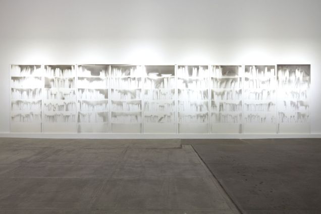
Material investigations were also an important process in the search for the most relevant means to suspend, submerge, and cover-up objects and paintings. Books treated as if they were blocks of wood, paper erasures buried under paint, and print techniques on glass allowed the metamorphosis of forms or objects to embody these ideas of absence denoting presence.
I see my body of work as a positive process of repurposing objects and old paintings that no longer fear the loss of remembrance. That holding pattern between grief and loss remains suspended within memory and our day- to- day acknowledgement of their existence. This sense of quiet melancholy finally gives way to acceptance and permission to start anew.
At 6 minutes in, there is a wonderful riff on the book as elemental cultural artifact, being able to stand for each of the four elements. Here are links to the images to which Spector refers – so much more enjoyable to see as well as hear!
There is a related brief note about Spector’s “The Rise and Fall of Books” here. Spector’s works — especially his collages with found poems drawn from book jackets — strike deeply. With them, book art goes beyond the read artifact into the relationship of writing and reading.
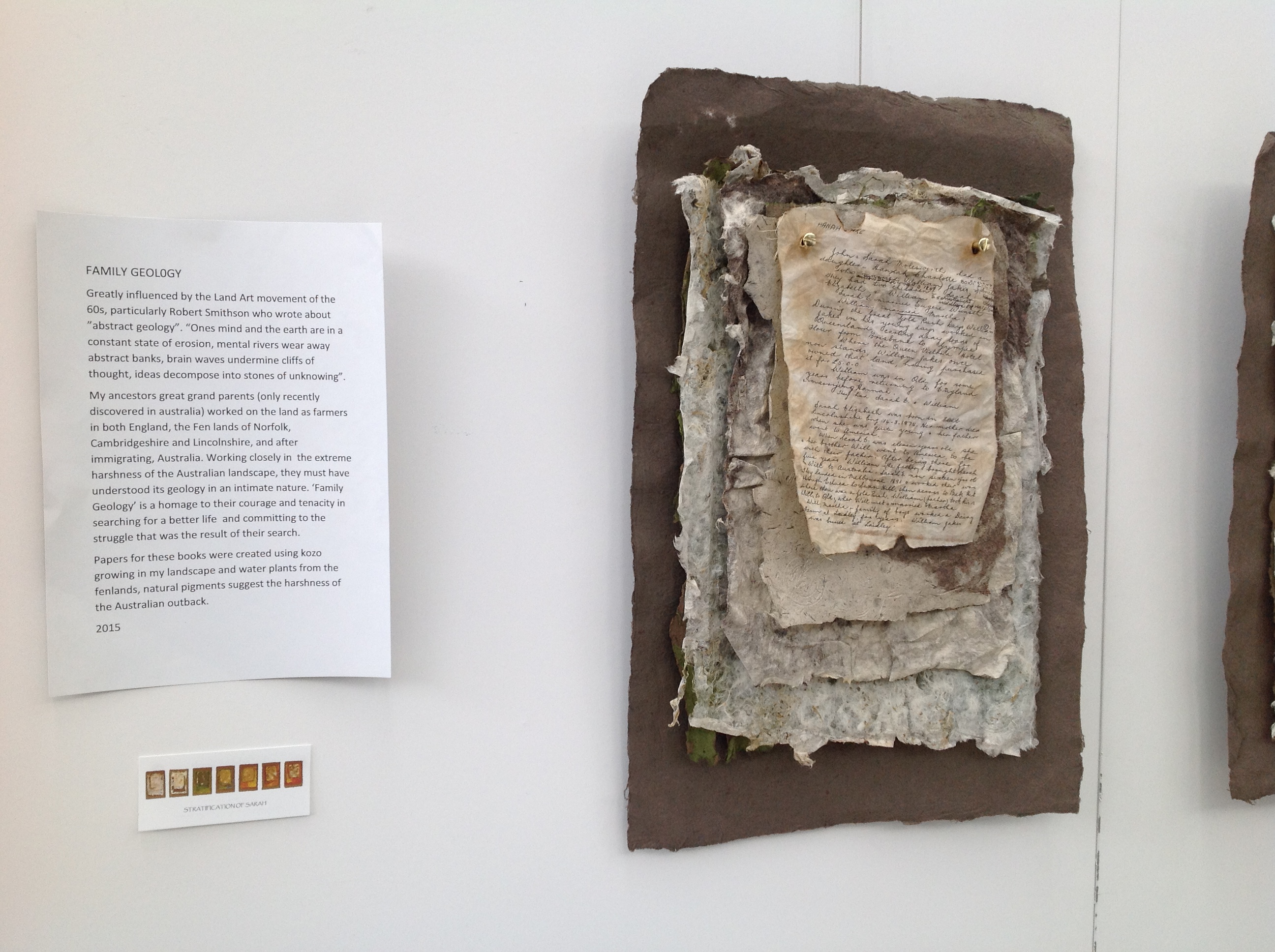
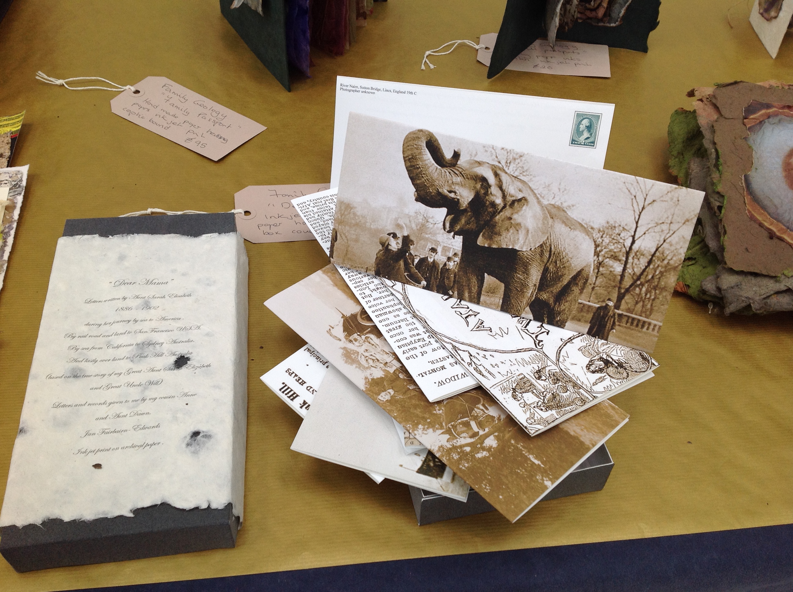
Family Geology by Jan Fairbairn-Edwards consists of multiple related works to create the visual narrative of her Victorian era family’s emigration from the Norfolk fens to Australia. One of the central characters is her great aunt Sarah, who is the focus of the work Stratification of Sarah shown below.
Stratification of Sarah, 2015 Jan Fairbairn-EdwardsStratification of Sarah, 2015 Jan Fairbairn-Edwards
Symbolically, the six hanging “chapters” of Sarah’s journey move from the dun colors of the English fens to the hotter colors of Australia. The artist uses sheets of paper handmade from plants native to the Norfolk fens as well as traditional clothing fabric. The “geological” layers of the journey’s story are reflected in the stratified sheets that diminish in size from back to front. The weathered documents appearing in each hanging are copies of found items from the family’s possessions or allusive artifacts, such as the article about Alice, “Jumbo’s widow“.
Alice was the African elephant being shipped aboard the HMSS Egyptian Monarch to join P.T. Barnum’s Jumbo in the US. Also on board the Monarch was Sarah, 10 years old when she embarked for the first sea leg of the journey to Australia. In another work in Family Geology called “Dear Mama”, the artist has invented a series of letters from Sarah, several of which tell of Sarah’s searching the ship for Alice.
“Dear Mama”, 2015 Jan Fairbairn-Edwards
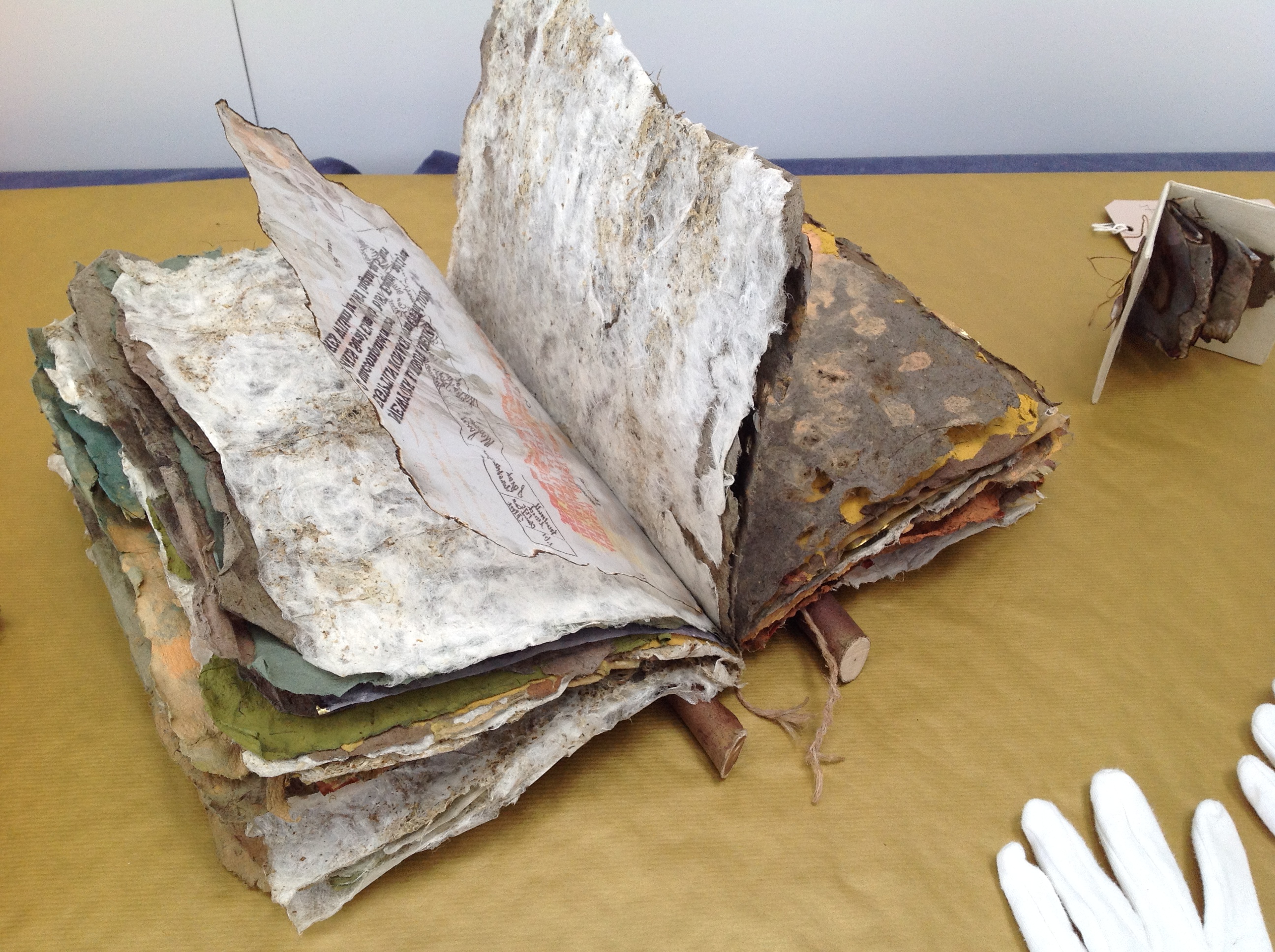
The other related works feature only fens-originated material, with the exception of a few pieces whose spines are branches of eucalyptus trees. Those spines and the hot Australian colors are the main physical manifestation of the Australian destination. As seen below, the stamps from the officialdom of the empire on which the sun never set provide another of the numerous unifying threads in the narrative.
William’s Story, 2015 Jan Fairbairn-Edwards Handmade papers with kozo and fenland plants, natural pigments, ink jet print (archival quality) on tracing paper, inks, string and eucalyptus wood binding
The artist suggested that I call this an installation. It is, but with the difference that there is this multi-threaded, narrative unity across and among the individual works that I have not noticed before in other installations. That unity makes me stumble a bit over the fact that the constituent works are purchasable individually, which casts the “installation” in something of a contrasting light. The work as a whole is one of remembrance and restoration. Doesn’t the removal of pieces of Family Geology undermine that?
Remember the 2014 installation Blood Swept Lands and Seas of Red created by artists Paul Cummins and Tom Piper at the Tower of London: 888,246 ceramic poppies progressively filling the Tower’s famous moat between 17 July and 11 November? Each red bloom represented a British military fatality in the First World War. The installation as installation resides only in the memories of its viewers and can be experienced only partially in photos, video clips or the website. The poppies sold individually over the web (I am one of the lucky owners of one of them). When I look at this single ceramic poppy, sometimes there is a failure of metonymic power – the ability of the part to stand for the whole. Other times, it starts the image of a cascade of blood from a stone window into a moat of red. And so, what of a single work plucked from Family Geology?
The full impact of the installation– a family speaking to one another in and across time, from across seas and continents – something on which the viewer eavesdrops – rises like the musk from the back of an inherited chest’s bottom drawer full of old letters, curled newspaper clippings, fading photographs, pressed leaves and flowers. At first, you think it is the volume of this manufactured memorabilia and their semi-invented, semi-found connectedness that is the source of that impact. But then you pick up William’s Story. The texture of its papers, the rough, dry sound of the leaves turning and the ash that flakes to the table from their edges take you deep into that musk through the one work.
You can sift through the several pieces of Fairbairn-Edwards’ Family Geology, and some will take you to the same place on their own, others lean much more on the presence of the installation. The thought of taking away from the whole one of its stronger parts leaves me hoping for an institutional white knight to purchase the “installation”. Yet the scent of William’s Story on some visitor’s fingers is probably making him or her reach for a checkbook or credit card right now.
See also Turn the Page 2015, where Family Geology had its debut and was one of the eight finalists.
Family Geology will next be on show at Art & Papiers, Vézénobres (Gard), France, this month (June 2015).
John Cheever’s short story “The Swimmer” is an all-time favorite. After seeing the short film of it with Burt Lancaster, I can’t imagine Ned Merrill’s appearance any other way. Even in Michelle Ku’s animated book art version, I see Burt Lancaster’s big grin and its sorrow.
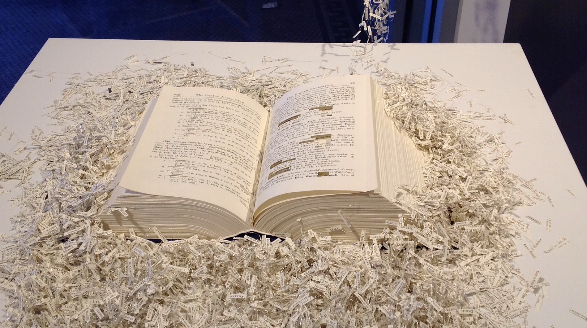
Before seeing Ku’s work, which has planted the urge to seek even more examples of animated book art, I had enjoyed Regan Avery’s The Groton Avery Clan at the CT(un)Bound exhibition in New Haven, Connecticut. The work consists of a handmade book, metallic thread, motor and an Arduino microcontroller. The Avery clan has inhabited the state since the 1600s. Regan Avery’s handmade book is a copy of the family history published over 100 years ago. From it, the name of each descendant of Christopher Avery, the original immigrant, has been excised and the ten thousand names handwritten on miniscule scraps of yellowed paper that emerge from the book along interconnected threads put into motion by the motor and microcontroller.
Regan Avery, The Groton Avery Clan, 2015
When the motor engages, the name slips become “a teeming mass of humanity”.
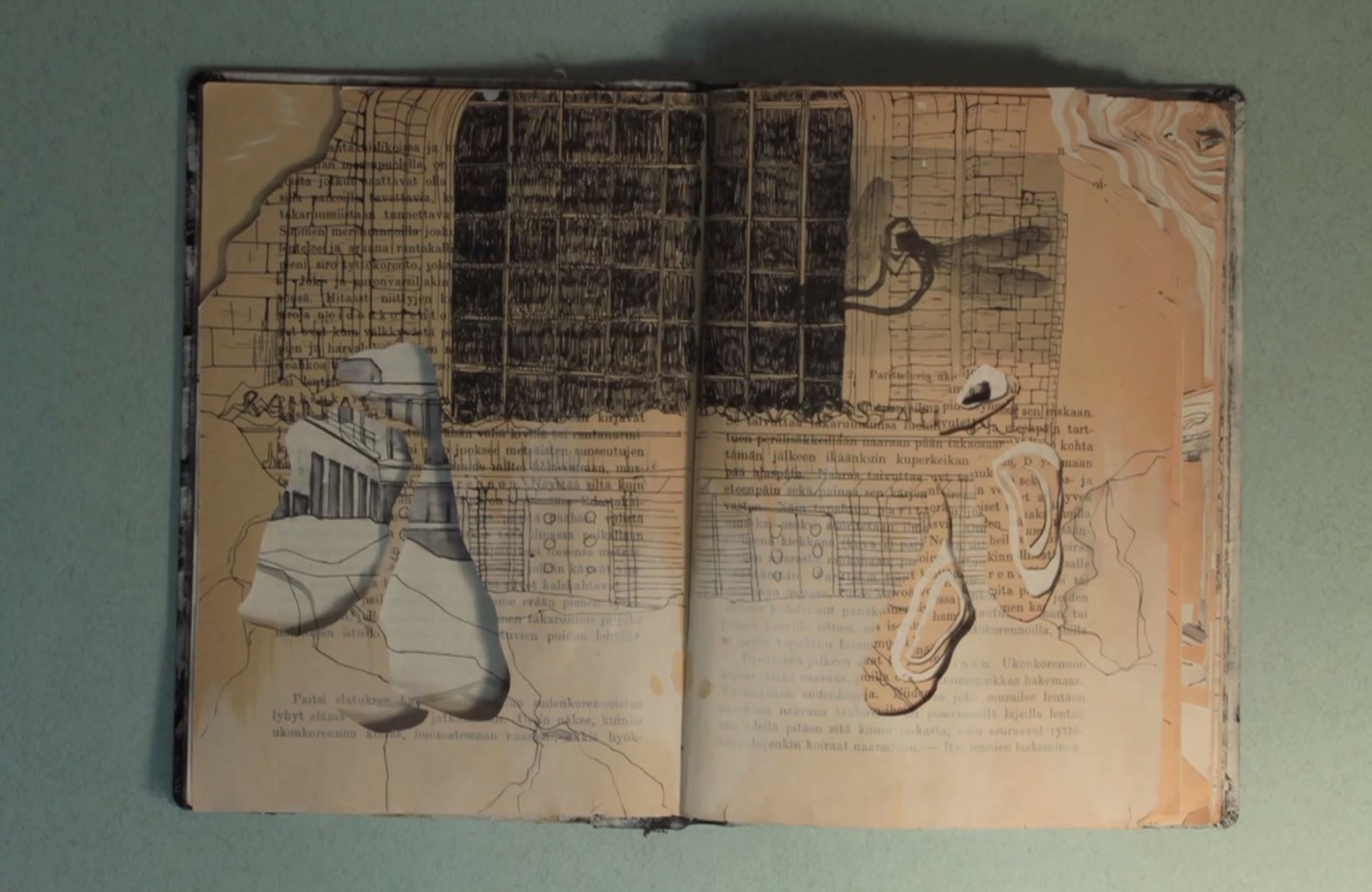
In 2011, Saara Tuulia posted City and Snow Book on YouTube, which is a simple stop motion animation comparable to Ku’s more complex The Swimmer.
Saara Tuulia, City and Snow Book, 2011
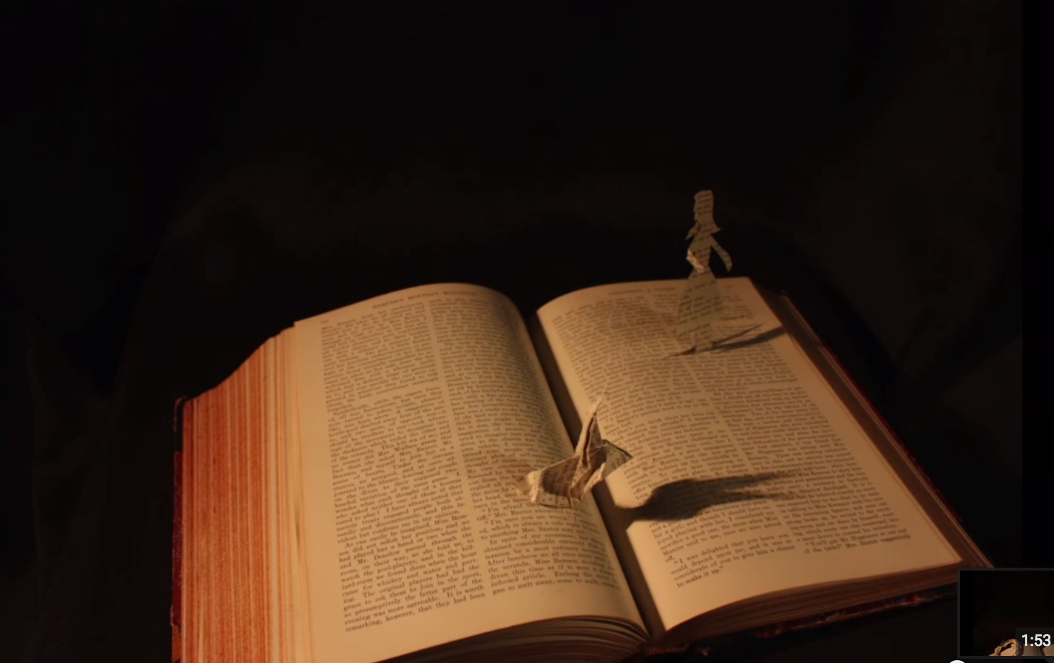
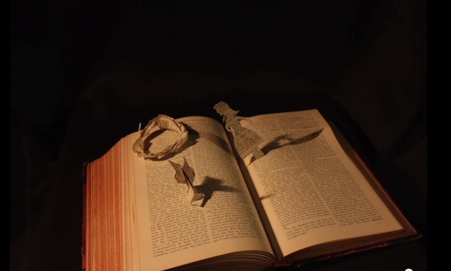
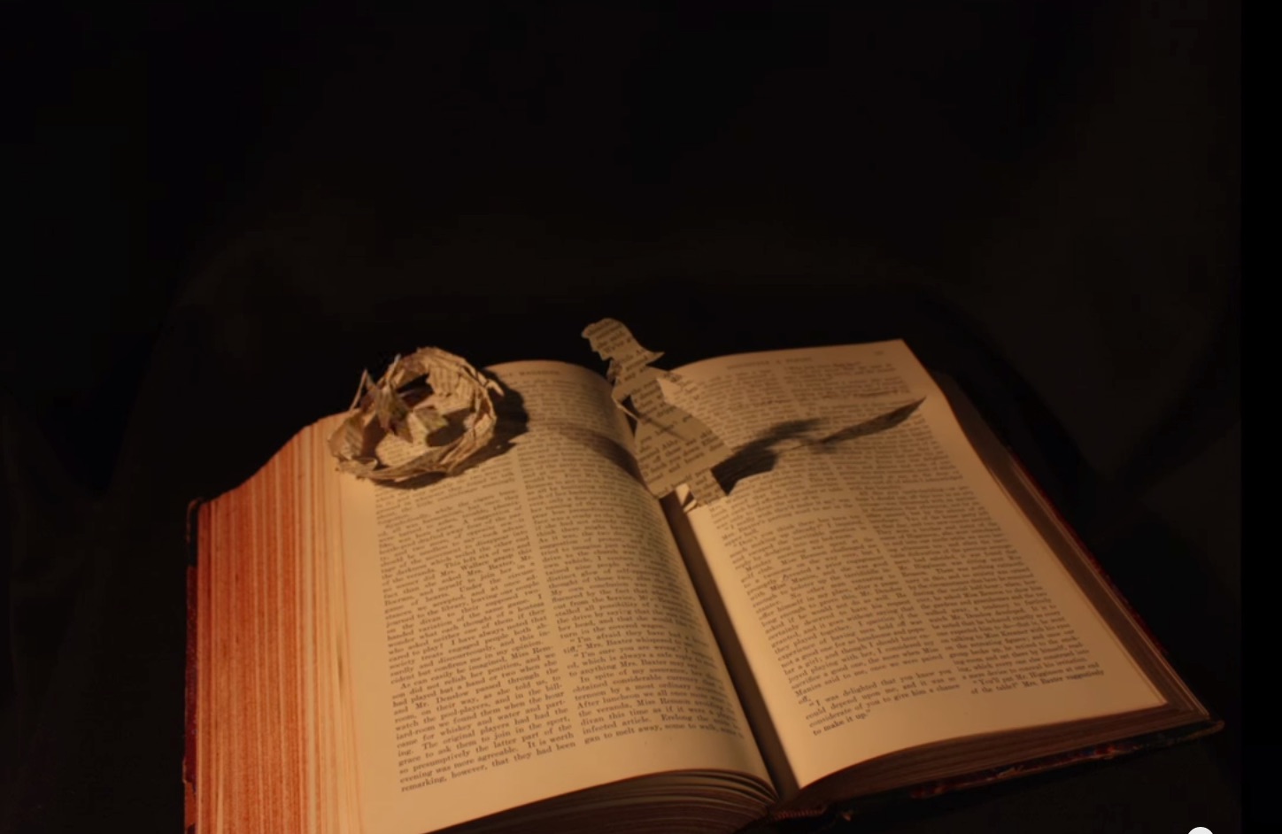
In 2013, Danielle Lathrop posted Book Art, whose stop motion animation highlighted the figurative and origami-based vein of the art form and its practitioners’ obsession with Alice in Wonderland.
Danielle Lathrop, Book Art, 2013 The White Rabbit and Alice sequenceDanielle Lathrop, Book Art, 2013 The White Rabbit and Alice sequenceDanielle Lathrop, Book Art, 2013 The White Rabbit and Alice sequenceDanielle Lathrop, Book Art, 2013 The White Rabbit and Alice sequence
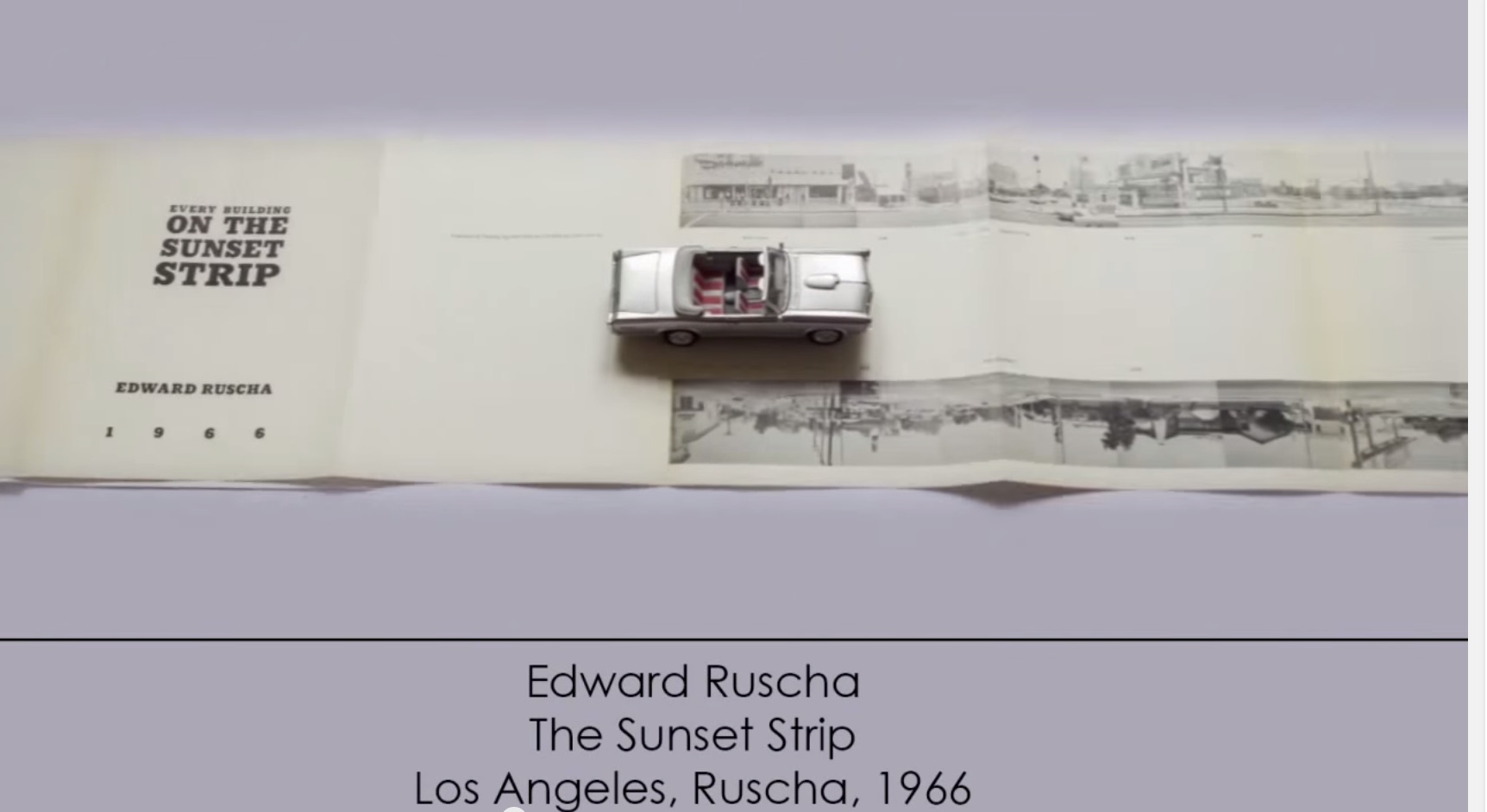
More recently, and posted here, another example of animated book art – Giulio Maffei’s series Le Vite dei Libri (The Lives of Books) – demonstrates the increasing engagement and sophistication in this variant form of book art.
Giulio Maffei, Edward Ruscha’s The Sunset Strip, 1966, 2015
For 2014-15, the New England Guild of Book Workers have organized a traveling exhibition: Geographies: New England Book Work, its itinerary covering each of the 6 New England states. Last year, the Rhode Island School of Design (RISD), the Wishcamper Center at the University of Southern Maine and the Bailey Howe Library at the University of Vermont hosted it. This year, the show has appeared at Williams College Library and is scheduled for Dartmouth College Library and the Creative Arts Workshop in New Haven, CT. Criss-crossing geographical boundaries as well as those of book art and the book arts, Geographies calls to mind the last line of Elizabeth Bishop’s “The Map“:
More delicate than the historians’ are the map-makers’ colors.
Or, in this case:
More delicate than the historians’ are the [book-artists’] colors.
Although born in Nova Scotia, Elizabeth Bishop grew up as a New Englander in Massachusetts with her paternal grandparents. As a far-traveller and visual artist as well as poet, she would have enjoyed this exhibition and found it fitting if it had included a broadside of “The Map”.
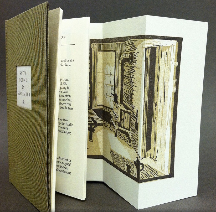
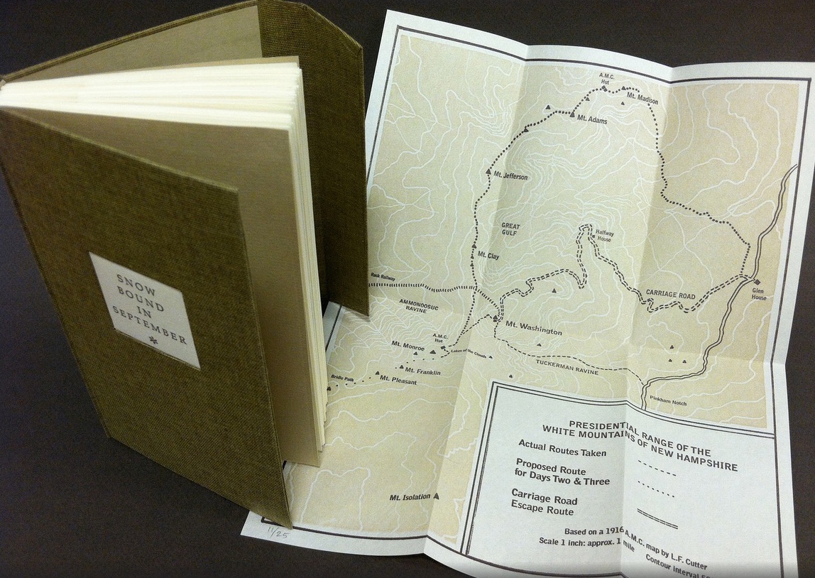
Nevertheless, what a range of “colors” from all the New England states and beyond – from historic to modern, from fine and design bindings to traditional and creative bookbinding, from artist books to calligraphic manuscripts, from masters to apprentices and from object to narrative. The latter finds a wintry exemplar in Snow Bound in September: A Re-Imagining by Laurie Whitehill Chong, retired Special Collections librarian and curator of Artists’ Books at RISD.
The artist made this book the same size as her grandfather’s Appalachian Mountain Club hiking guide. Snow Bound is an invented ancestral narrative, in which the artist uses a surviving photograph and her grandfather’s notes about being stranded with his wife for five days on Mount Washington by a hurricane-driven snowstorm in September 1915 to re-imagine the ordeal from her grandmother’s perspective. Note the slotted front cover into which the flap extending from the back cover fits to keep the book closed, snug against the elements.
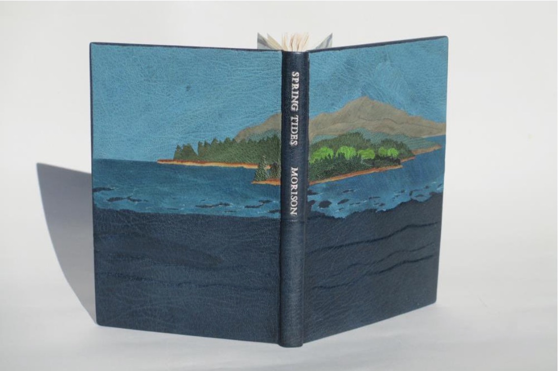
Julie B. Stackpole’s creative re-binding of Samuel Eliot Morison’s Spring Tides takes us from the New England mountains to the shore as can be seen from the layered binding.
Spring Tides by Samuel Eliot Morison Boston: Houghton-Mifflin Co., 1965. Julia B. Stackpole, Design binding 21.8 x1 5.0 x 1.6 cm January 2014
In Stackpole’s words:
The traditional tight-joint binding is covered in navy blue Niger goatskin with waves in the lower parts created by paring before covering. Cut-outs in the onlays of the lighter blue leather of the water help it transition from the dark of the navy to the sky’s azure. Onlays of other leathers create the forested landscape of the shoreline and hills. These blues were chosen because the only blue leather in a large enough piece to cover the whole binding was the dark navy, while I only had scraps of the water and sky’s blue. The endpapers are a Cockerell marbled paper over-painted with blue, with leather hinges.
Pictures of the works in the catalog (and others not) can also be found at the Williams College Flickr site (for now). I say “for now” because they will be pushed downstream inevitably in the way of today’s digital flow. They may even disappear; although as Matthew Kirschenbaum has explained in Mechanisms, something digitally forensic will remain. That boundary of the tangible and the digital, the haptic and the virtual, is only lightly but evocatively touched in this collection.
When Julia Stackpole writes in the online catalog about that Cockerell marbled paper that it “felt to me like the waves and the shoals and ledges of Maine waters”, you long to lay hands on the Spring Tide. Anne McClain’s Place includes photographs taken digitally of places on Maine’s midcoast that have been special to her her “entire life and will continue to be a constant as other things change and move on”. What is captured digitally is reproduced physically to fix those places that will “continue to be a constant”. But places do change.
Anne McClain, Place Drum Leaf Binding 19 x 15 x 1.8 cm February 2014
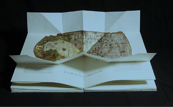
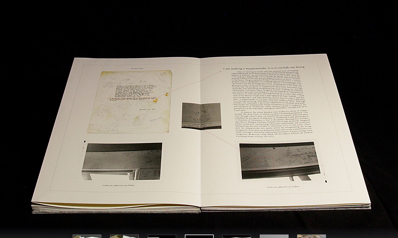
Rutherford Witthus’ contribution touches the boundary between the digital and physical most directly. His artist’s book is entitled 28 Fort Square: What Charles Olson wrote on the window casings of his apartment in Gloucester, Massachusetts, of which there are eleven copies.
Rutherford Witthus, 28 Fort Square: What Charles Olson wrote on the window casings of his apartment in Gloucester, Massachusetts, 2014
In these 11 copies, Witthus digitally reconstructs the windows of Charles Olson’s apartment at 28 Fort Square where he wrote his main work, The Maximus Poems, and covered the window casings with meteorological data. The artist book “presents for the first time all of the images of the window casings”.
Rutherford Witthus 28 Fort Square: What Charles Olson wrote on the window casings of his apartment in Gloucester, Massachusetts Artist book 42 x 28 x 2.5 cm 2014 Edition of 11
Athena Moore, chapter secretary of The New England Guild of Bookworkers, produced the catalog for this itinerant exhibition organized by Stephanie Wolff, Exhibitions Coordinator and Todd Pattison, Chapter Chair. If you have the chance to see the exhibition in its next venue, take it.
Just as Elizabeth Bishop questioned the depiction of the boundary between land and water on her map – “Shadows or are they shallows at its edges …”, you will find the juxtaposition of these works reminds you that the boundary between book art and the book arts can be shadowy or shallow indeed.
The Paul D. Fleck Library & Archives at The Banff Centre has over 4,000 artists’ books and multiples. Inspired by Ed Ruscha’s seminalbook “Every Building on the Sunset Strip”, we will display every item in the collection in a case in the library, rotating through 15 items weekly. Here you will find a photo log documenting the items, chosen randomly for display. Click through on any photo for title and creator caption.
For more information and full catalogue records for the items pictured, visit banffcentre.ca/library/.
Kudos to book artist Jaye Fishel for setting up Every Item in the Artists’ Books Collection and to Silvio Lorusso for the interview with Fishel.
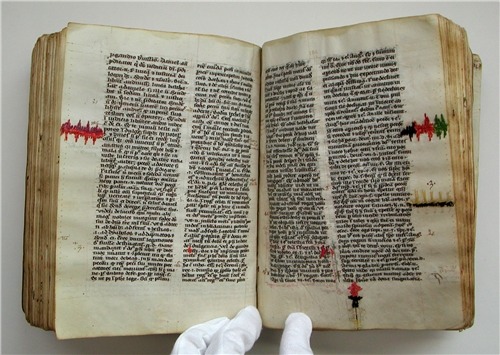
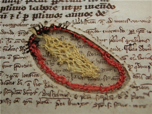
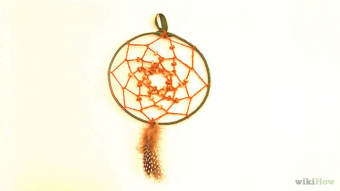
William Dean Minter, Senior Book Conservator in the Digitization and Preservation Department at Pennsylvania State University drew my attention to these images. At first, they reminded me of passages in Annie Tremmel Wilcox’s A Degree of Mastery, in which she describes mending rare books with kozo paper under the hawkeye of the late Bill Anthony. Then, dreamcatchers sprang to mind. What were the images, sounds and thoughts caught in words now missing on these pages, words slipped from the dreamcatching pages? But book artist Esther Kibby, who teaches photography, graphic design and web design at the Art Institute of Dallas in Texas, came up with the most telling association: kintsugi.
Kintsugi (or kintsukuroi) is a Japanese method for repairing broken ceramics with a special lacquer mixed with gold, silver, or platinum. The philosophy behind the technique is to recognize the history of the object and to visibly incorporate the repair into the new piece instead of disguising it. The mastery of the book restorer is to invisibly repair the book. Our “dreamcatcher” restorer seems to have in mind the kintsugi philosophy and lets the repair draw attention to itself and creates “a new piece”.
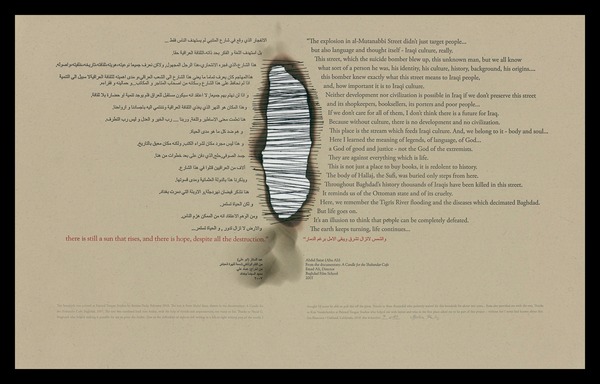
In the hands of a book artist, such a technique could generate ironic expressions of biblioclasm: the restored book that is no longer a book? Or echoes of Walter Benjamin’s presumption of and preoccupation with the modern world’s fragmentary nature? Or the pain and sorrow of Al-Mutanabbi Street?
Bettina Pauly, The Sun that Rises, 2013. Made for An Inventory of Al-Mutanabbi Street.
Or a tongue-in-cheek answer to those horrified by the destruction of “the book”?
When the Japanese mend broken objects, they aggrandize the damage by filling the cracks with gold. They believe that when something’s suffered damage and has a history it becomes more beautiful. —Barbara Bloom
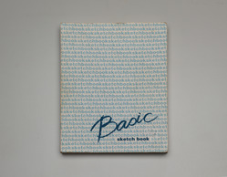
I first came across Noriko Ambe’s book art in 2013 through her site and MoMA’s Inside/Out. Two years later and preparing to attend the closing of Yale University Art Gallery’s special exhibition of Allan Chasanoff’s collection of book art, I spotted her Basic Sketch Book. The latter provided me with a way of making sense of what seemed like a slight contradiction of assertions in her artist’s statement and the MoMA interview.
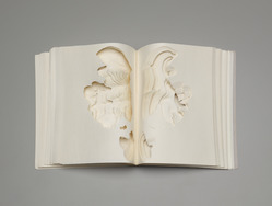
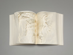
Noriko Ambe, Work of Linear – Actions, Found sketchbook (2000) 27.9 x 21.6 cm (11 x 8 1/2 in.) The Allan Chasanoff, B.A. 1961, Book Art Collection, curated with Doug Beube- See more here.
Referring to the series Work of Linear – Actions, Ambe writes, “It looks like annual rings of a tree or topographical map or wave, but it isn’t. It is absolutely the traces of actions of a person, which is me.” So here is book art as abstract self-portraiture.
Noriko Ambe, Work of Linear – Actions (2000)
Noriko Ambe, Work of Linear – Actions, 2000
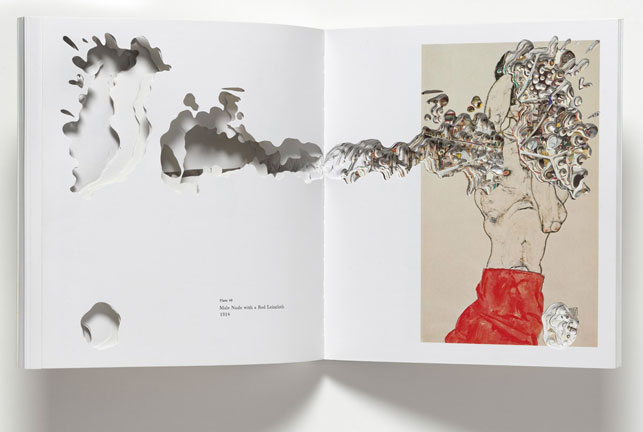
But in her interview with Hanna Exel and referring to the seriesキル –Artist Books Project, Ambe comments, “I am not trying to express myself or insert myself into the other artist’s work by cutting their catalogue …”. In that series, Ambe selected 24 artists’ books and catalogues, and, studying each carefully , excavated or rather drew by excision. Aren’t these “absolutely the traces of actions of a person” — Noriko Ambe?
His heart, his life: Andy Warhol Collected Beauties: Damien Hirst Art Victims: Damien Hirst Prologue: Sugimoto + Foer Sculpture: Richard Serra Spiritual America: Richard Prince Crash!: Takashi Murakami Kiru- Cut : Egon Schiele In the Studio: Arberto Giacometti Current – War Cut: Gerhard Richter Current – A Private Atlas: Gerhard Richter In the bathtub?!: Jeff Koons Diamond Dust Shoes: Andy Warhol Warning!: Richard Pettibone Sailing to…: Cy Twombly Anatomy of Love: John Currin Listning to Tom Freidman: Tom Freidman Thoughts on Tom Freidman: Tom Freidman Beautiful Inside of My Head Forever: Damien Hirst Dots on Dots and Leyers: Roy Lichtenstein To Perfect Lovers: Felix Gonzalez-Torres A Study of Robert Therrein: Robert Therrien Double sides: Gilbert & George Artists, Believe in Yourself.: Piotr Uklanski
In her series statement, Ambe elaborates:
The process of creation was divided into roughly three stages. First, I earnestly established a deep respect for the artists and verified what they expressed through their art. After assimilating that information I decided on the theme (title) that needed to be expressed. Through a filter, the filter being me, the work was made while cutting as though I was having a dialogue with each single page.
When cutting something from the back I didn’t know what kind of image would appear next. Each time I decided to cut away or to leave behind and the process continued to a point where the book was on the verge of destruction, and then following my theme I re-constructed. Finally, while I clearly remained in the work as a filter, the essence of the artist was emphasized. It became a collaboration for the first time when these two things were balanced.
She calls the results dialogues and collaborations. I see unique works of art. Literally taking tradition as her material, Ambe delivers book art with its own unmistakeable, individual style. Each interpretation through her eyes, hands and scalpel is a unique, new work and a self-portrait in an abstract sense.
Werner Pfeiffer, Zig Zag, 2010 Laid into drop spine case: One folded sheet (20 x 20 cm.) which unfolds into a paper structure with various panels containing text printed in red and black, including instructions for use of the work. “The structure used in this book is a combination of two accordion folds. Both are first creased, then each segment is cut halfway through at the center and finally the two strips are merged together where the cuts have been made.” Limited edition of 60 copies.
“The book is one of the most powerful weapons ever invented.” — Werner Pfeiffer, Book-Objects & Artist Books, online exhibition, Cornell University Library’s Division of Rare and Manuscript Collections.
Anselm Kiefer, Der Rhein, 1982-2013 Collages of woodcuts on canvas with acrylic and shellac in a leporello structure.
“The book, the idea of a book or the image of a book, is a symbol of learning, of transmitting knowledge … I make my own books to find my way through the old stories.” — Anselm Kiefer, publication entry for Brünhilde schläft, in Toledo Museum of Art Masterworks (Toledo, 2009).
Like Anselm Kiefer, though eight years older, Werner Pfeiffer grew up in the shadow of Nazi Germany. The works of both artists are rooted in the book and its peculiar place in that culture. Pfeiffer’s book-objects consist of deconstructed, dismantled library discards that are reassembled with glue and coated in gesso. “Gagged and tormented” (with nails, screws, rope and various physical distortions), the works are “symbols of pain, of torture, of suppression which are inevitably brought on by the censor’s act”, the real remnants of which Pfeiffer recalls from his earliest childhood.
Pfeiffer’s artist books on the other hand run the gamut of foldouts, scrolls, flexagons, walk-in environments and rely on traditional bookmaking craft: handset type, letterpress printing, sophisticated binding as well as original print techniques such as wood cuts or linoleum blocks and etchings on archival papers. The emotional range of Pfeiffer’s art is also wide — humorous, playful, piquant, simultaneously angry and sorrowful, concerned. The overriding concerns are straightforwardly explained in the text to the online Cornell University exhibition.
The first schoolbooks I can remember, leftovers from the previous regime, were heavily “edited.” They were books with words and sentences blackened out. Chapters were deleted; entire pages were missing. This was information declared unsuitable for a post-war generation, a generation who six months earlier had been practically obliterated by the events now deemed unfit to be read about. Part of what they had lived through, their own history, had been blocked out, hidden behind those black marks.
Measured by the perceived fears an innocently bound codex seems capable of instilling, the book is one of the most powerful weapons ever invented. And yet we find ourselves at a threshold where its power and influence seem to be waning.
… As in the past, we find at the core of our current socio-political realignment the process of communication…. The new cultural footprint is a set of digits and their application, made possible by the microchip and the speed of electricity….
My book-objects have their origin partly in this ambiguous realm, a period of change as radical as it is dramatic. Superimposed over this perceived uncertainty is my personal concern about censorship. By making books which are deliberately mute I try to raise questions. Words are lost; they are no longer important. The books take on new forms; they become provocative statements. No longer instruments for reading they become sculptures, they become Book-Objects.
As with all superior sculpture, Pfeiffer’s works make the hands twitch to touch and manipulate them. In a few exhibitions, that interaction has even been encouraged. There is something inherently haptic about his book art (for example, Zig Zag and Abracadabra) and his book-objects (for example, Drawing Blood), which can be enjoyed vicariously in these videos: Youtube 1, Youtube 2, Youtube 3 and Youtube 4.
Kiefer’s materials are more varied, more monumental than Pfeiffer’s, and his concerns are decidedly not straightforward. Considering his sprawling studio complex at Barjac, in southeastern France, and its towers and installations, to say that Kiefer’s oeuvre extends beyond book art is an understatement. But for Books on Books, his most moving works — even those in which the book’s material presence is greatly subordinate — remain tethered to book art. The ache to touch Kiefer’s art, however, is different from what you feel with Pfeiffer’s. What little playfulness there may be in some of Kiefer’s earliest pieces is overshadowed by monumental works evoking an urge and dread at the same time.
You feel it walking up the stairs in the Royal Academy, looking up and seeing the sculpture Für Fulcanelli – die Sprache der Vögel, its great wings of beaten lead spread and rising above you. Between the wings, the body is made of a stack of elephant and double elephant folio books lying flat (or rather gathered folios made of lead like the wings). Interleaved with the closed and open books are rusted metal folding chairs with wooden seats and backs, the kind found in city parks. Thick metal wedges that appear to be wood are inserted at various points to balance out the angular, tilting pile. Separate and lying before this huge bird is a carved wooden snake, elongated and heading right to left as you view the work. The pages of the books curl and fold and roll up as if sodden or aflame. Some are rusted. The bottom-most book has lead binder boards, water stained and looking like marbled paper. Not all of them have binding boards, but all are spineless. You want to touch but know that if you do, your fingers will come away with some alchemical residue of history that will not come off and may burn the skin.
Pfeiffer’s works from a major exhibition in 2011 at Cornell remain on view online. Another major exhibition followed in 2012 at Vassar College. A new exhibition is scheduled for February 2015 in Toledo, Ohio. More about it in The Blade.
A major retrospective of Kiefer’s art at the Royal Academy of Art concluded in December 2014, coinciding with an hour-long BBC program. An interview with the artist and several podcasts are available on the RA’s site, and the rich and extensive exhibition catalogue provides articles exploring the complex themes of Kiefer’s art.