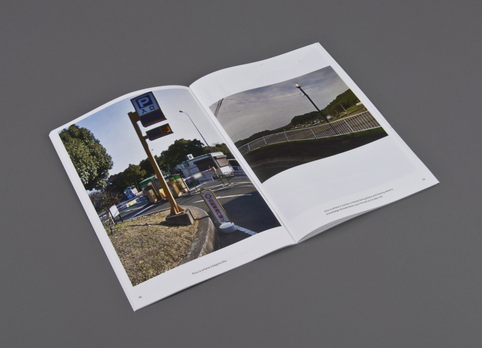
This is where (2014) Print on demand, three booklets Erin Zwaska
An ongoing chance-based publication project in the spirit of Ed Ruscha. Images are randomly-selected Google streetviews (which are often captured at noon to avoid shadowing) of cities like Paris, Tokyo, etc. The copy is compiled from all tweets containing the phrase “this is where” between noon and 12:15pm local time for each city. Consequently the text and imagery for each 15-minute issue originates from the same, albeit ambiguous, time and place. And though text and image are randomly paired, surprising narratives often emerge. Included in the collection of the Library of the Printed Web.
This is where is where the tradition of Ed Ruscha meets the Web. Go there and see for yourself.
A search of Lafayette College’s Artists’ Books Collection on the genre yields 1284 entries, including works by Alicia Bailey, Julie Chen, Maureen Cummins, Steven Daiber, Karen Hanmer, Margaret Kaufman, Clifton Meador, Lois Morrison, Werner Pfeiffer, Gerhard Richter, Maryann Riker, Edward Ruscha, Buzz Spector, Barbara Tetenbaum, Erica Van Horn and Sam Winston.
Check out the archives for the Werner Pfeiffer exhibition.
Worth a visit to the Skillman Library if you’re in Easton, PA.
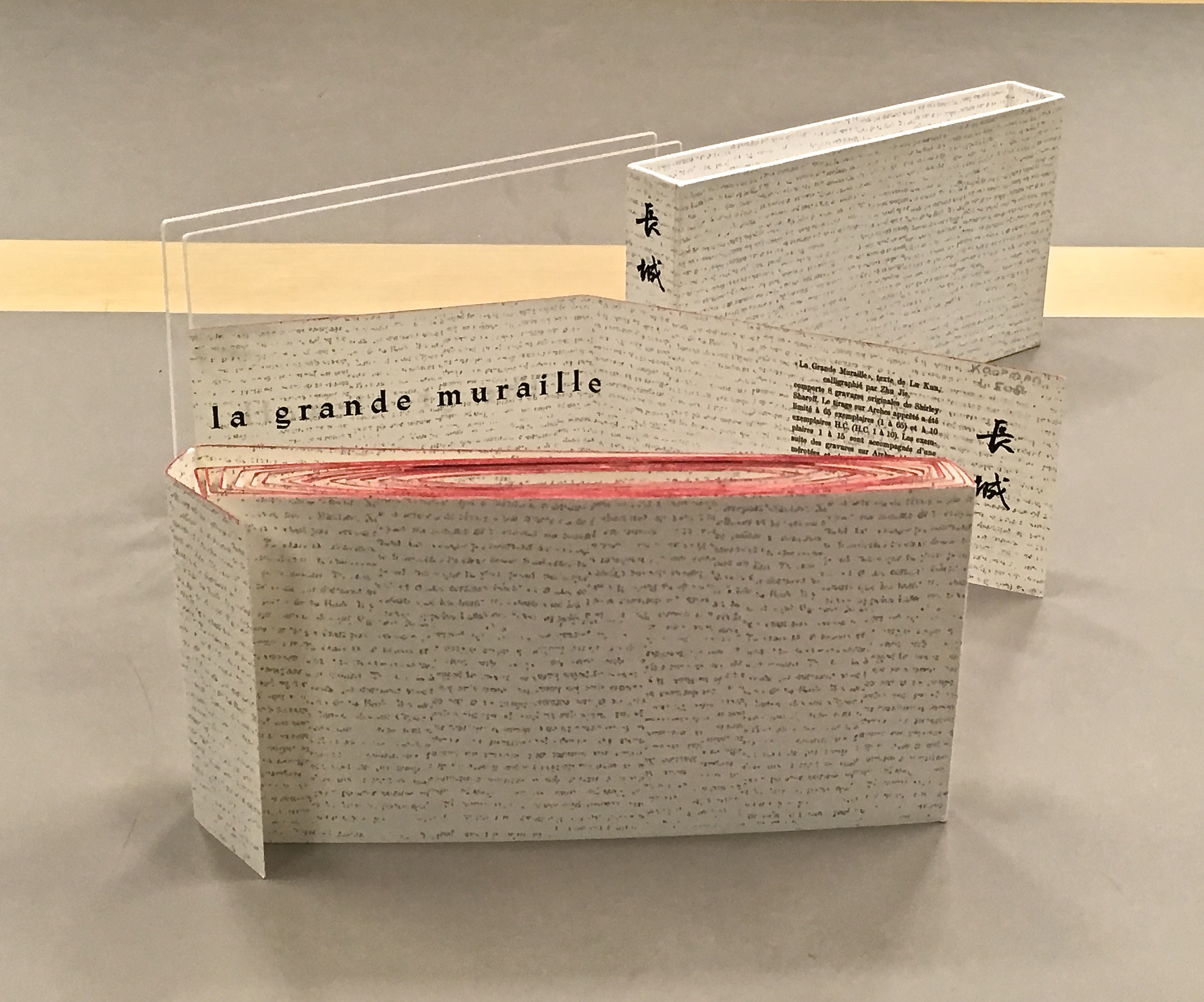
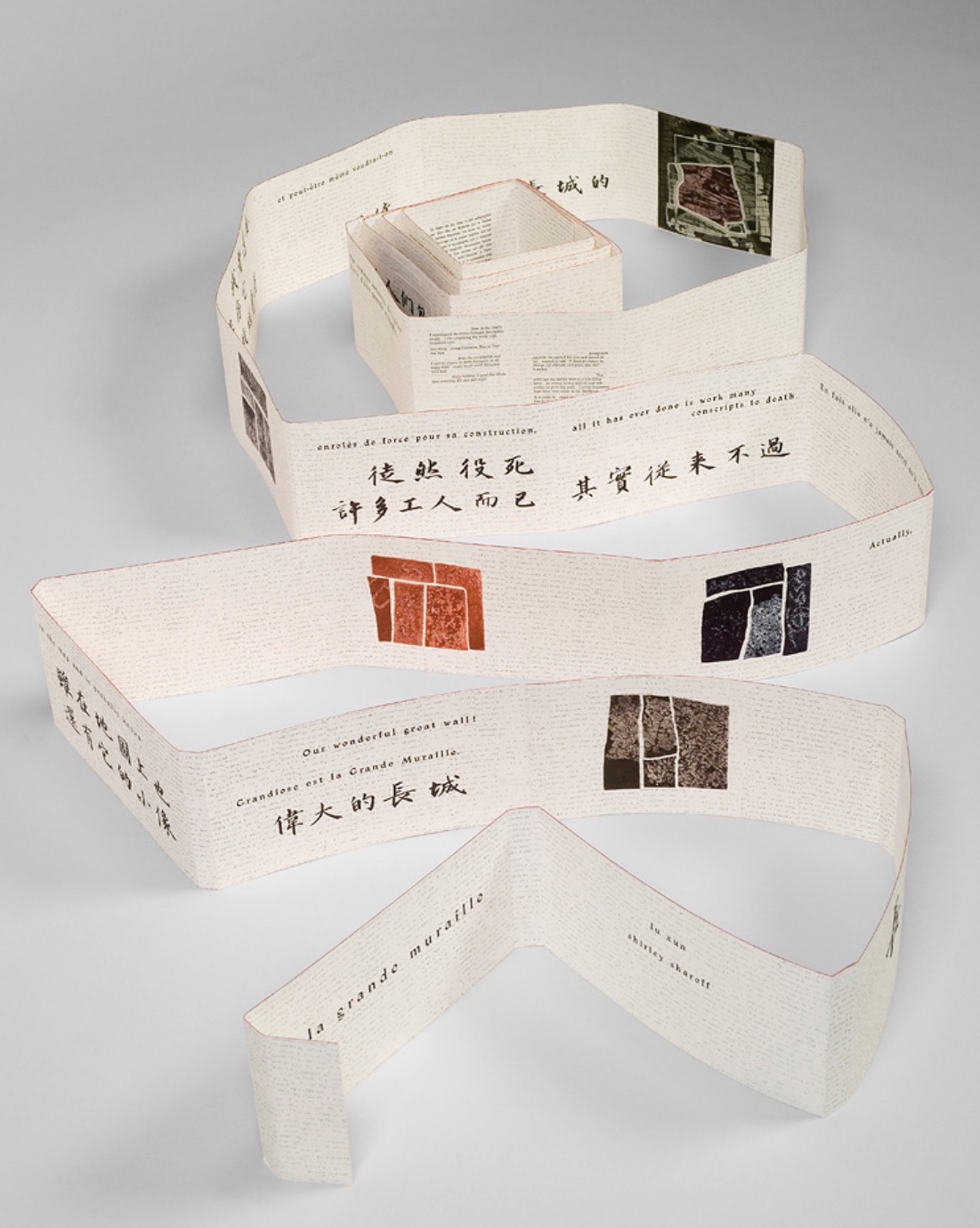
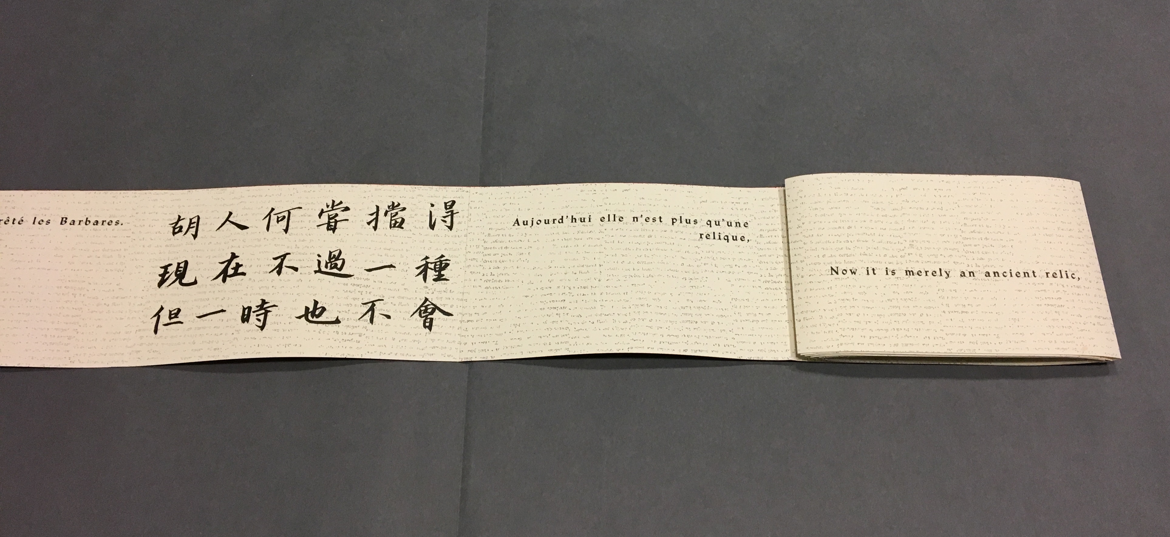
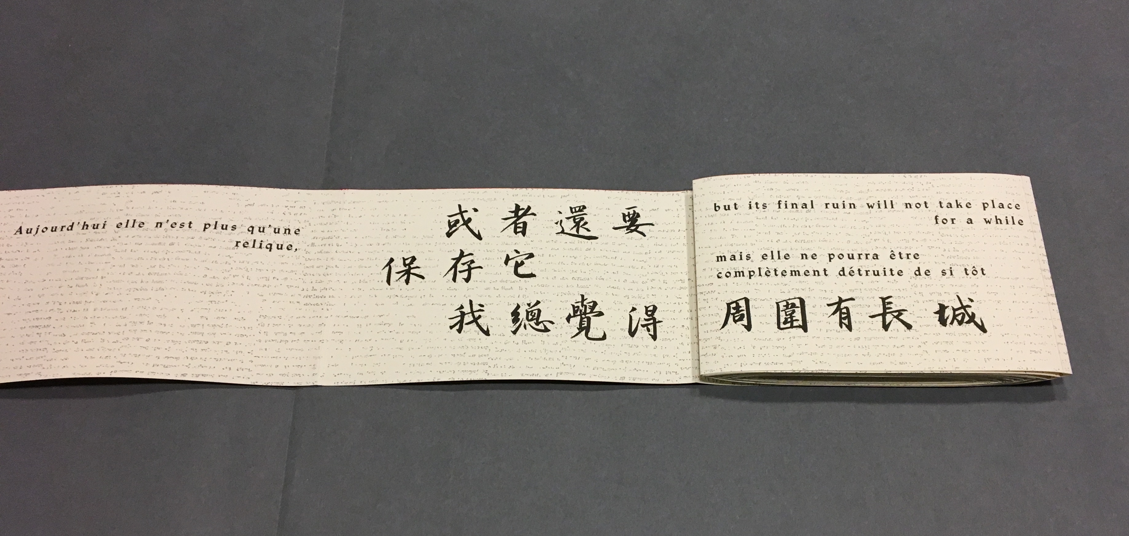
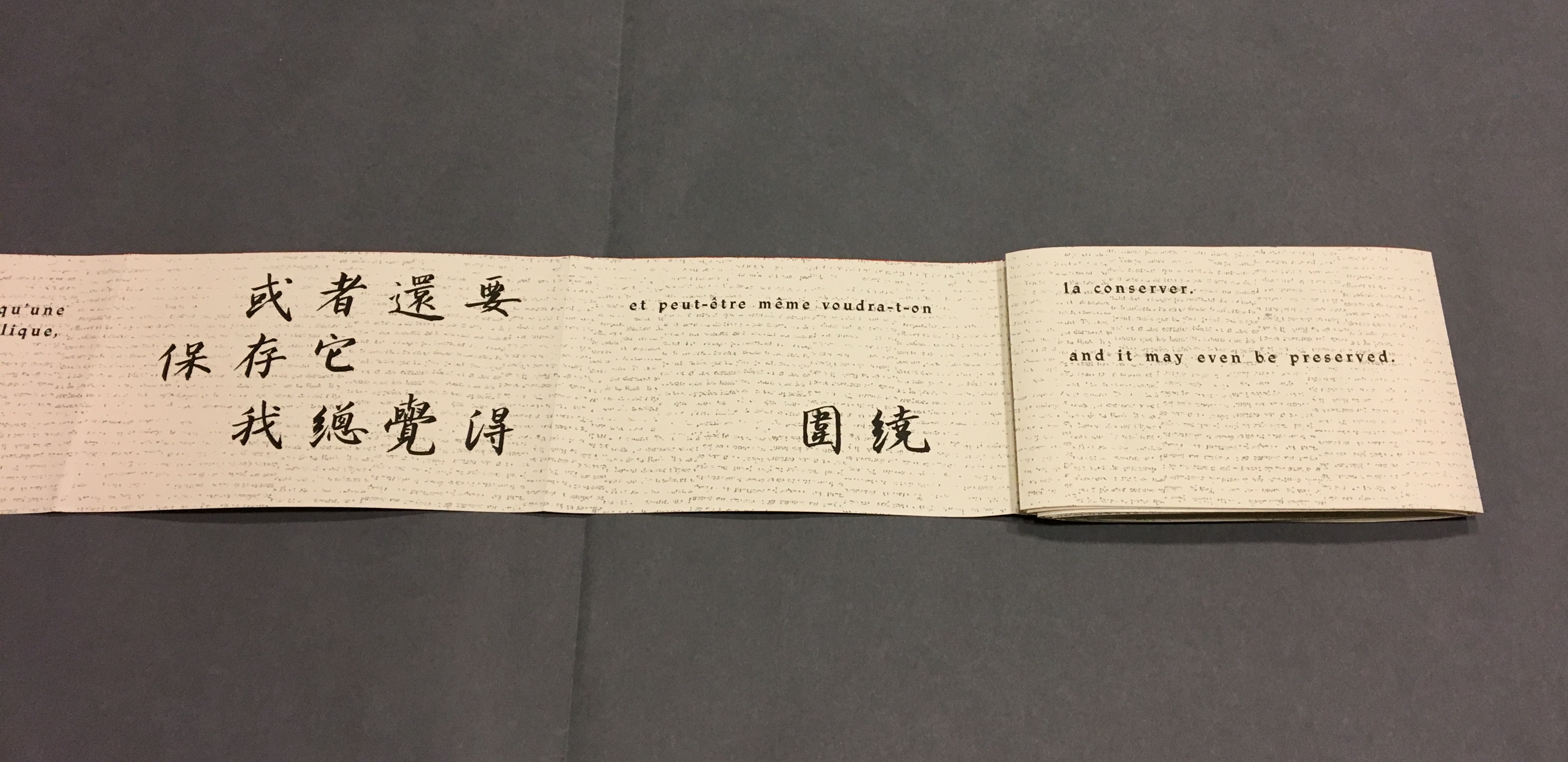
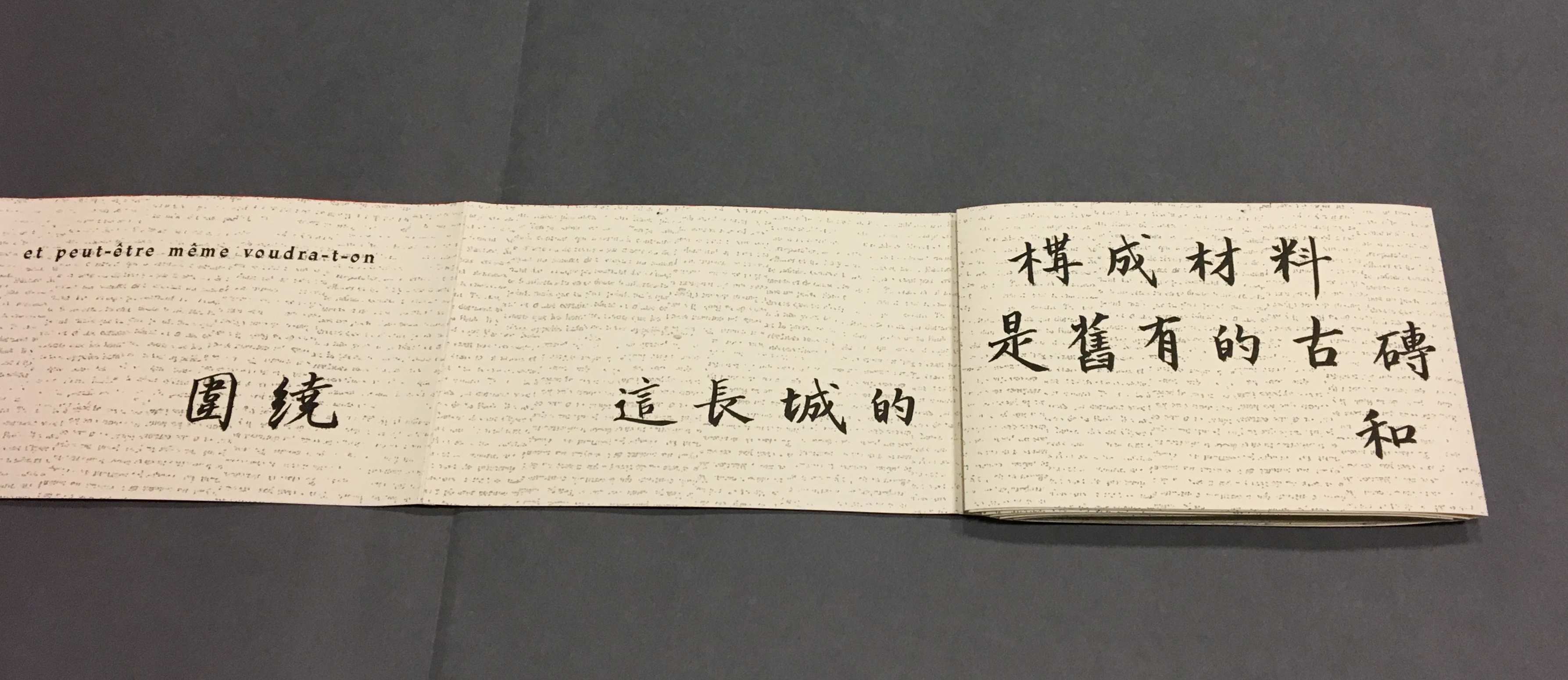
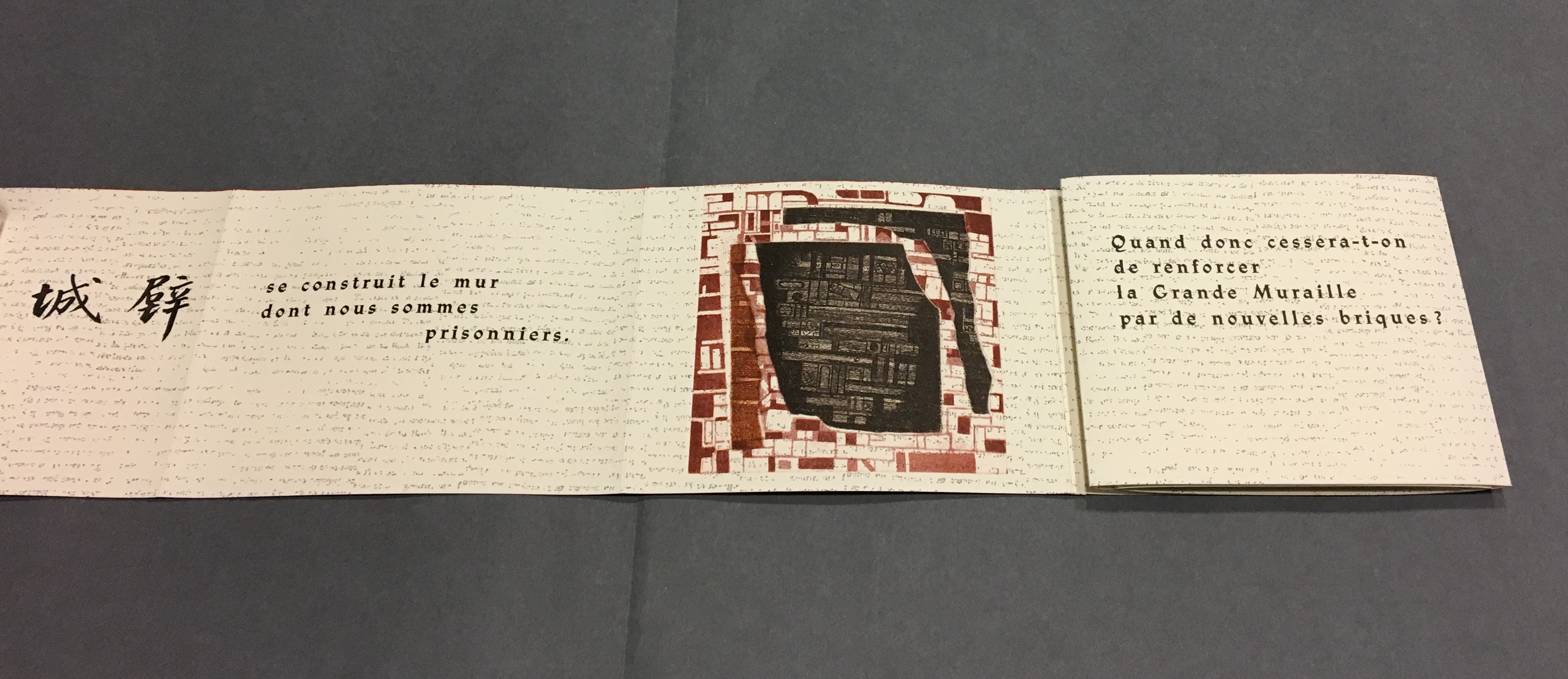
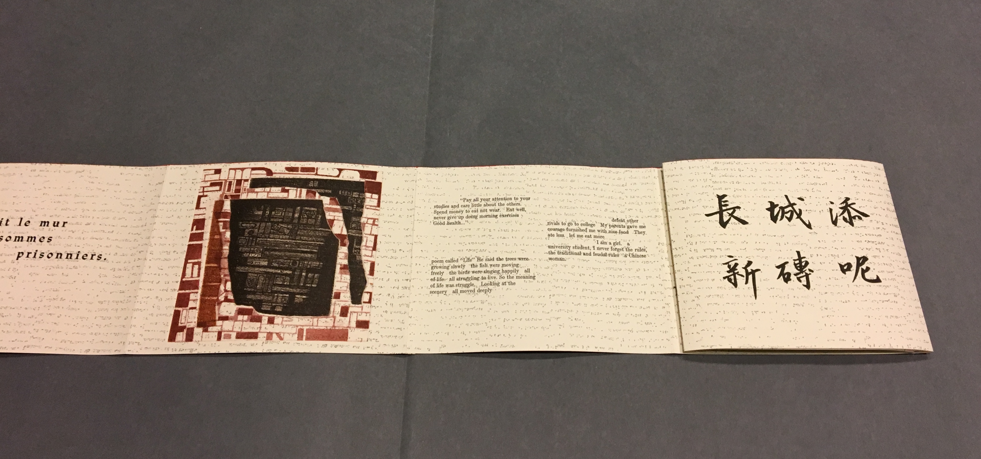
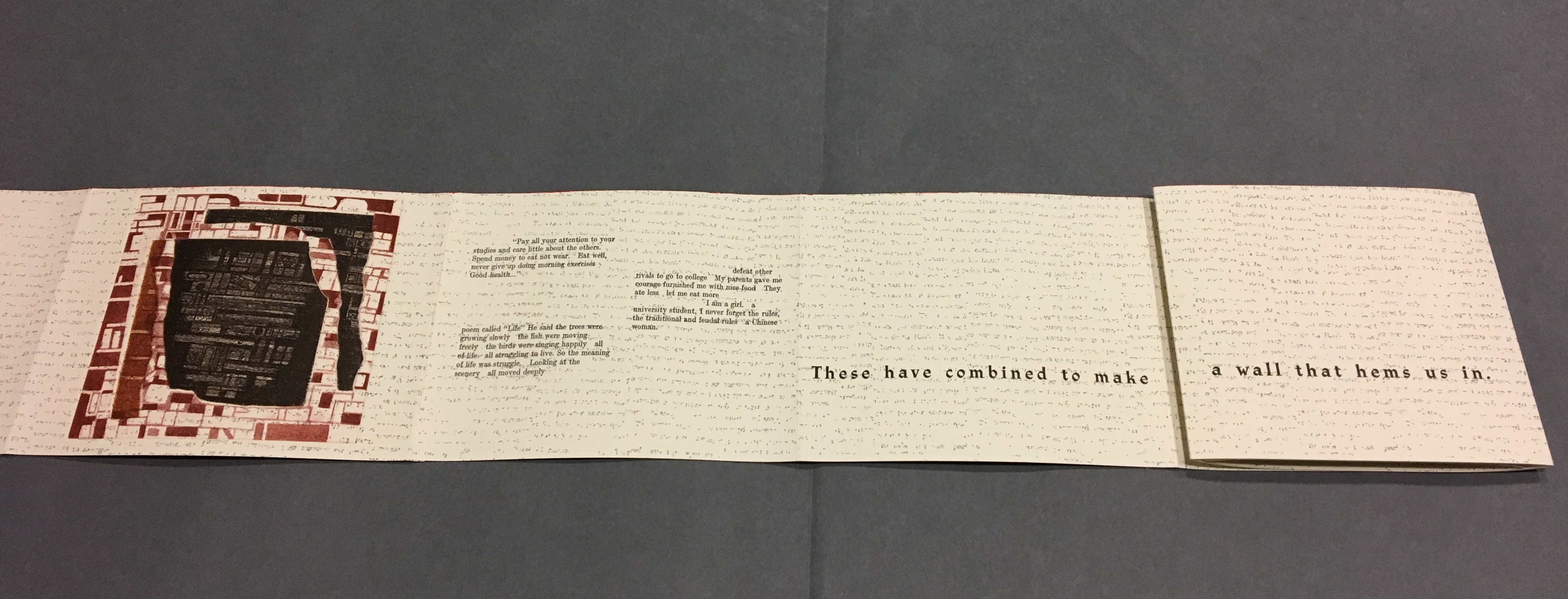
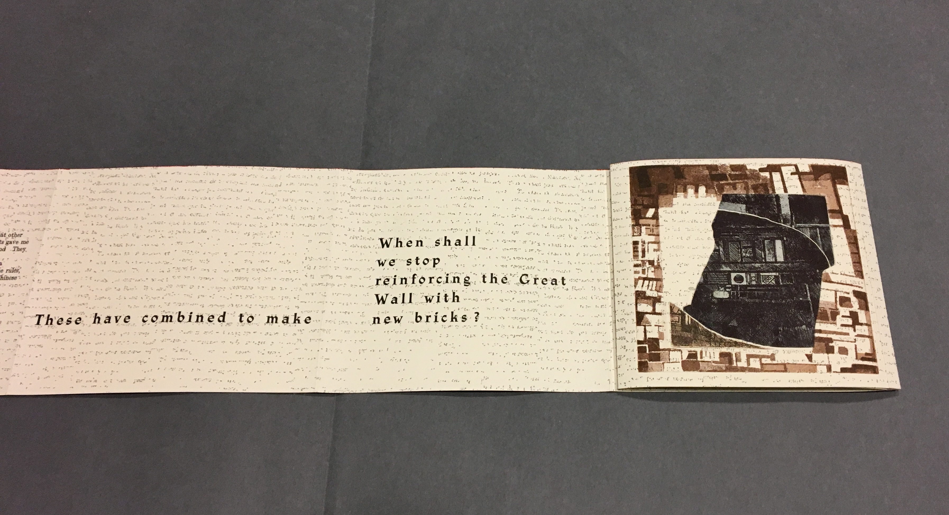
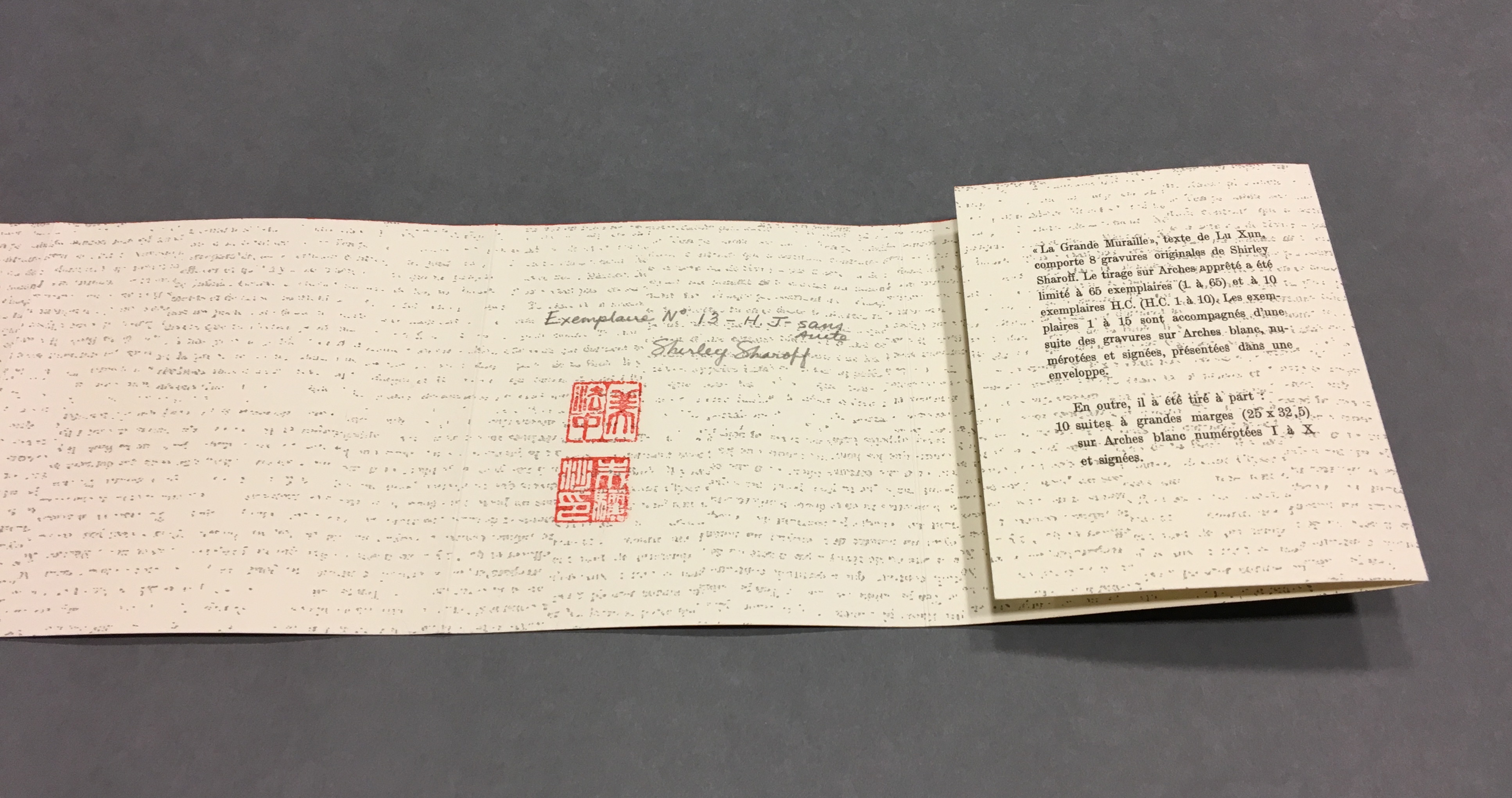
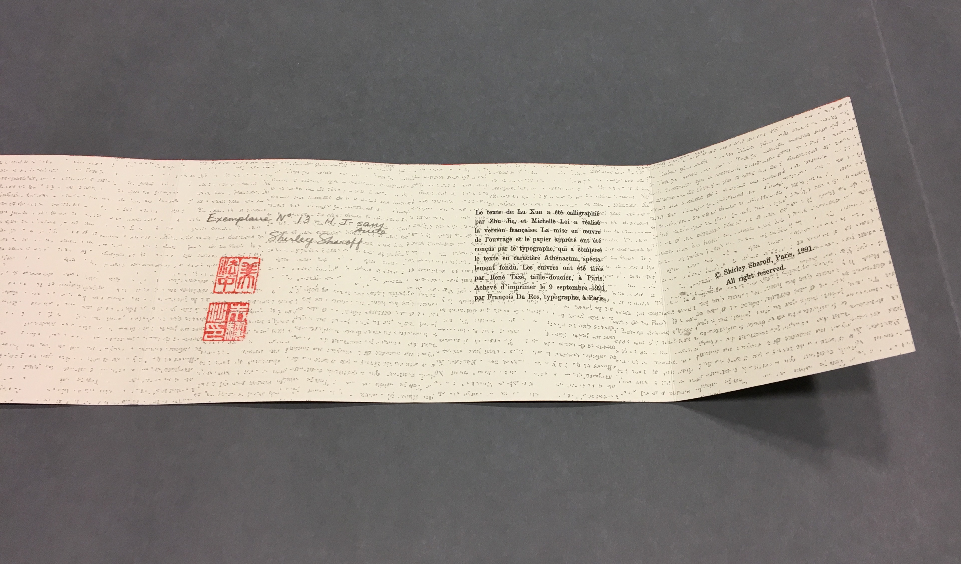
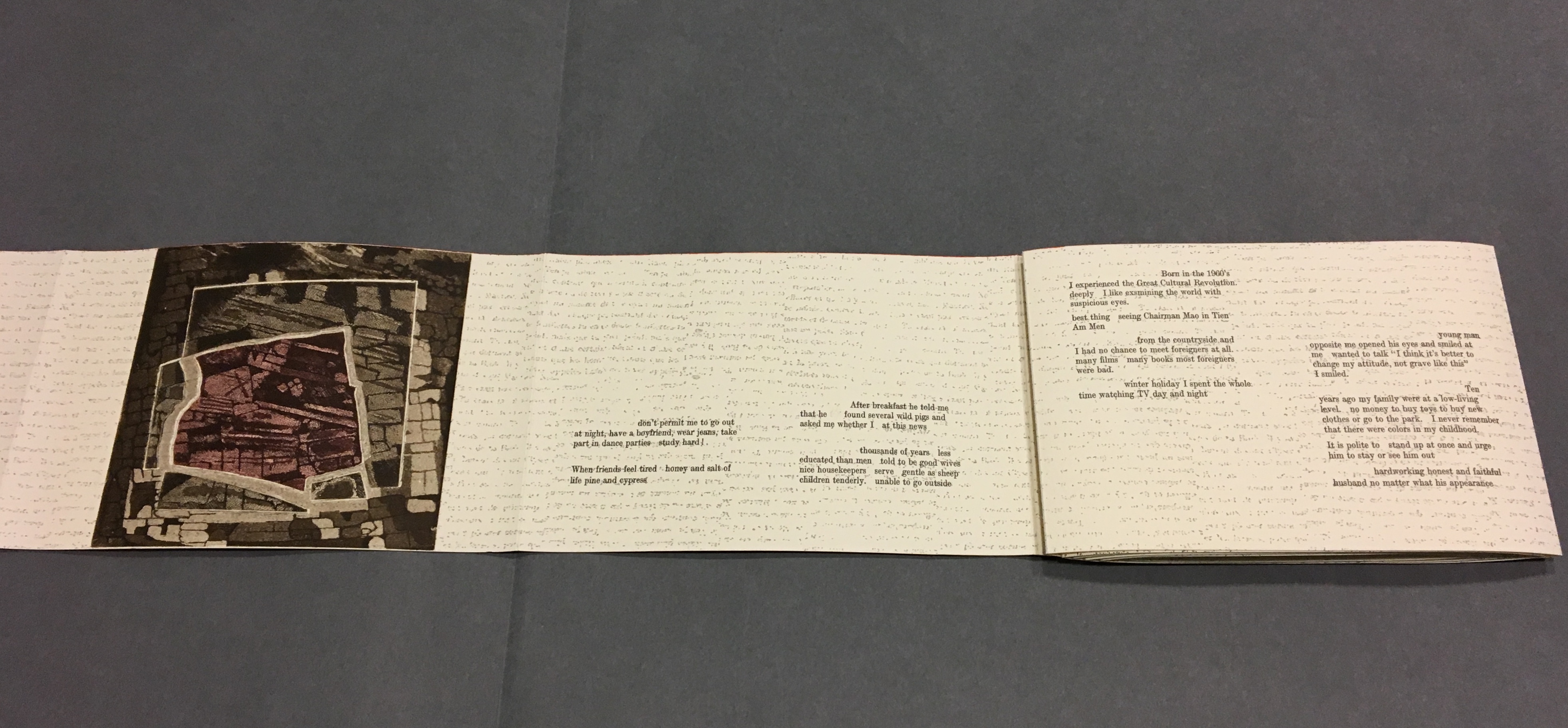
La grande muraille/The Great Wall (1991), Shirley Sharoff All Books On Books photos are reproduced here with permission of the artist.
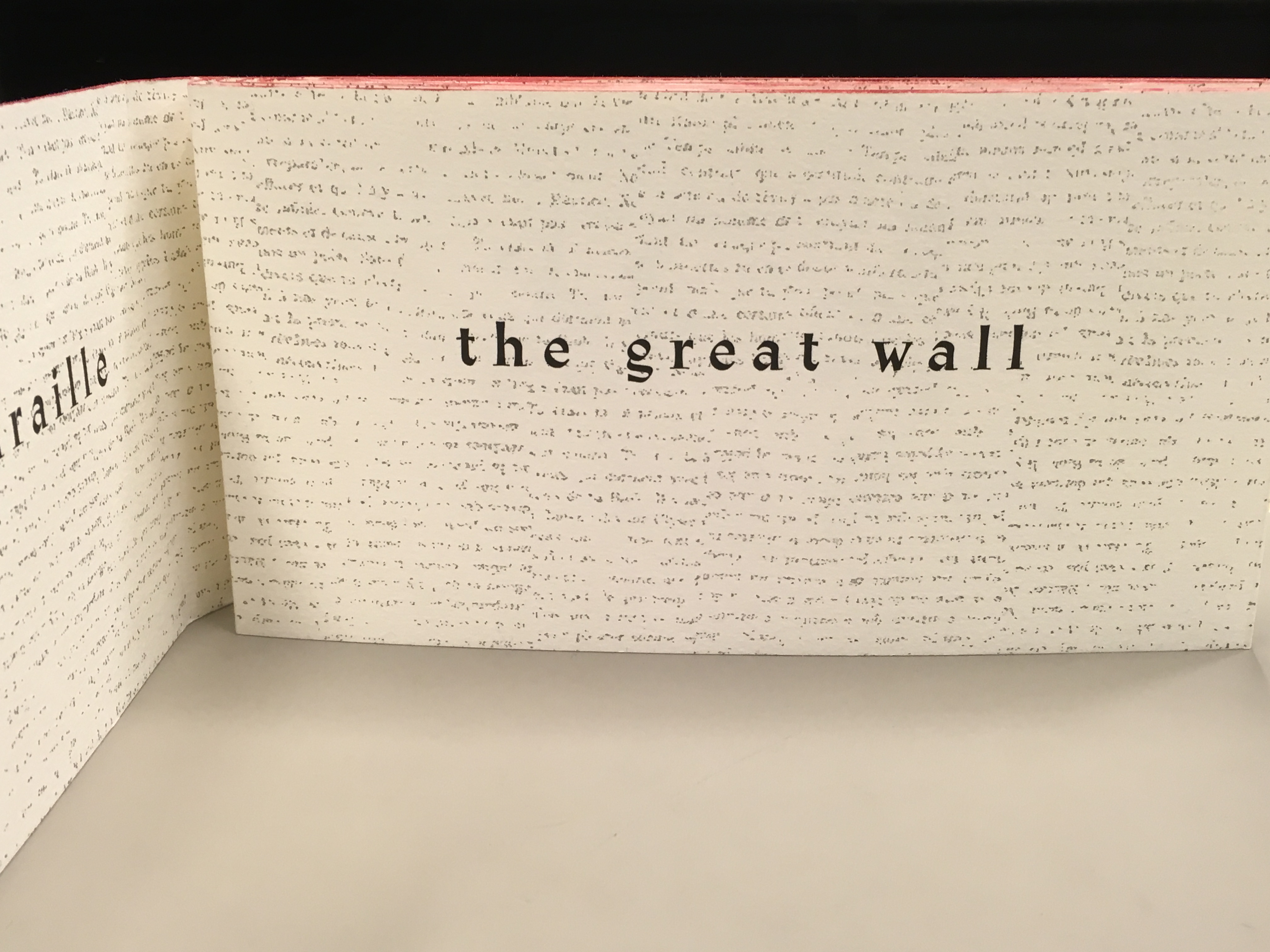
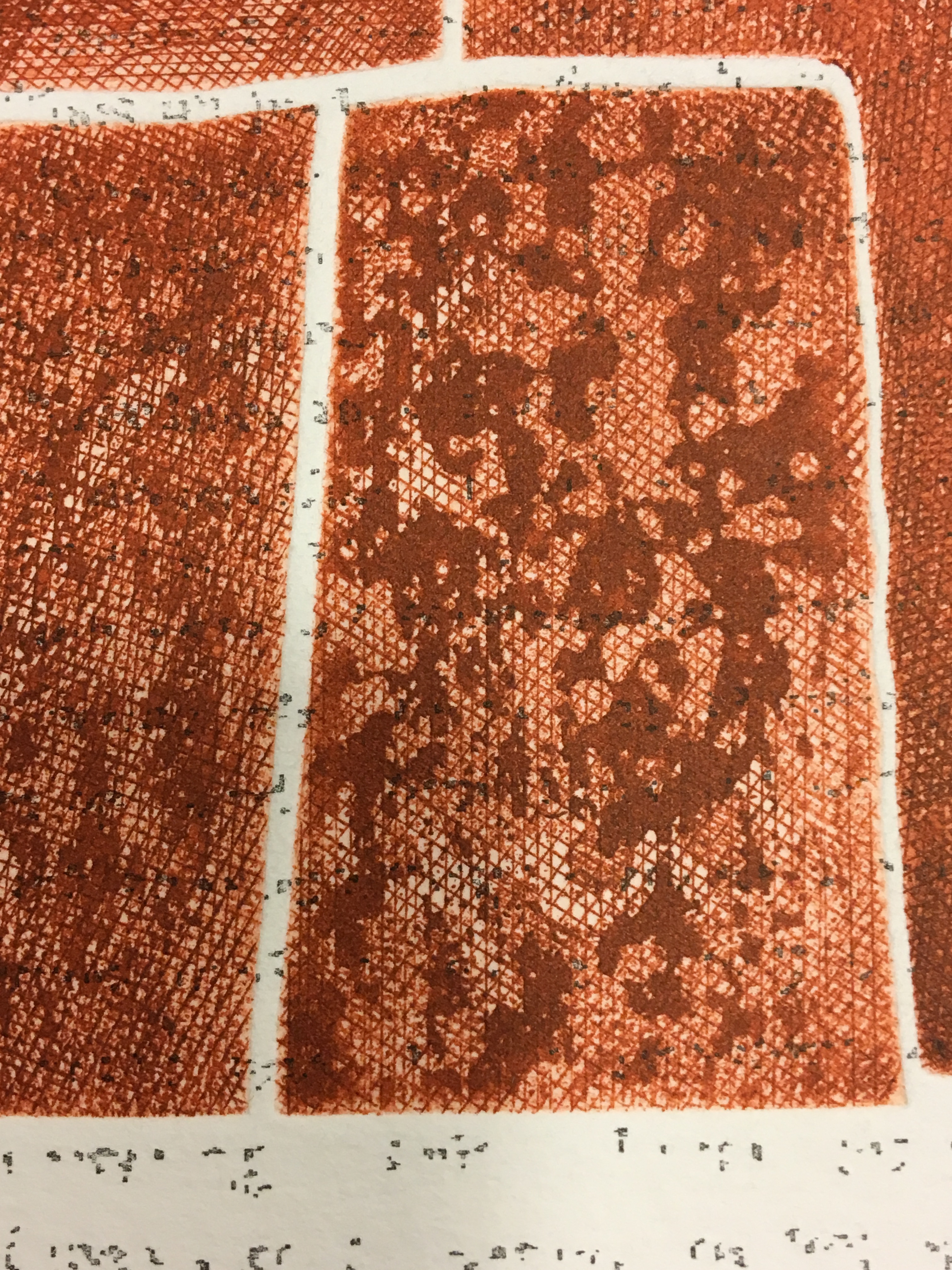
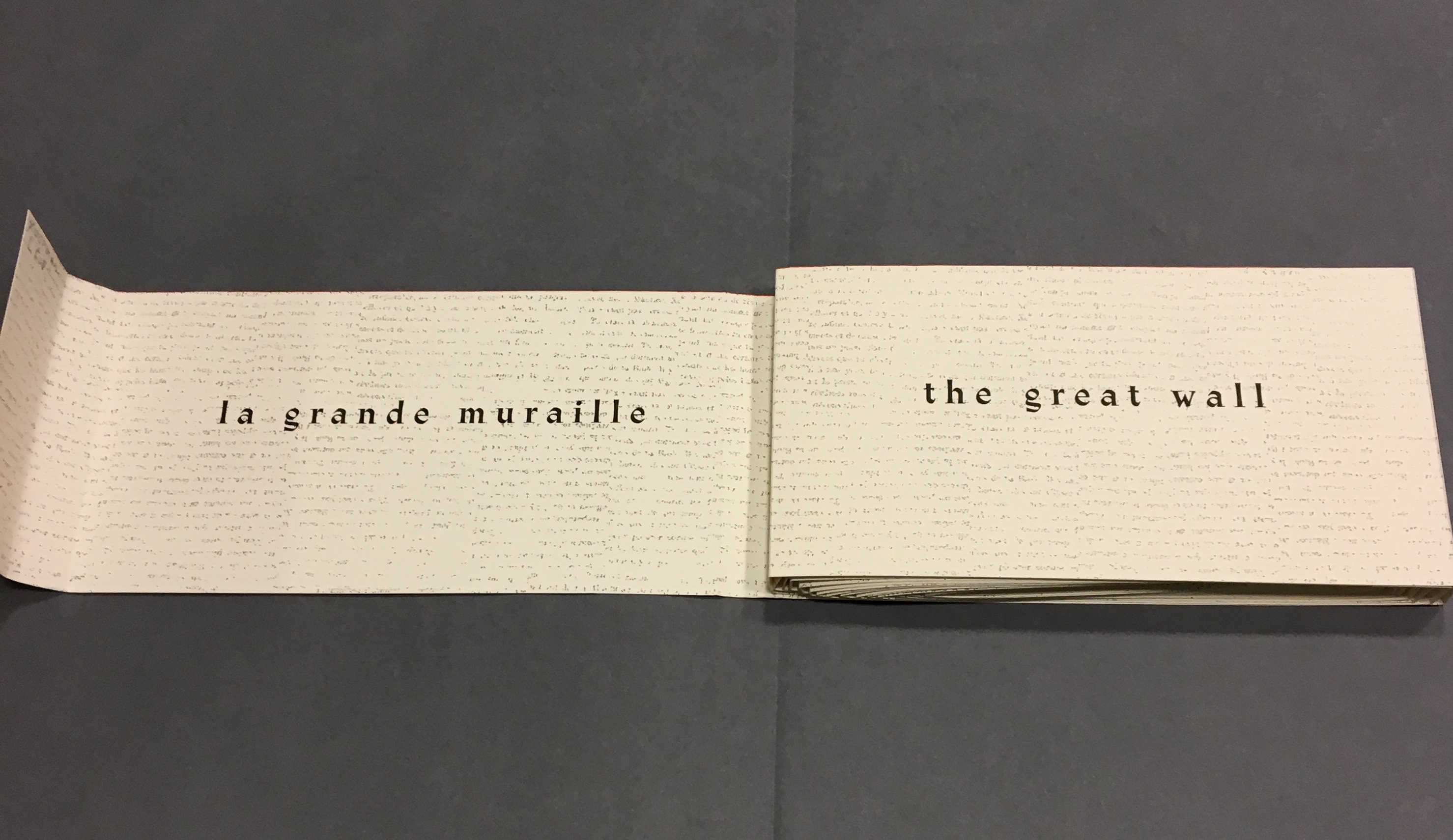
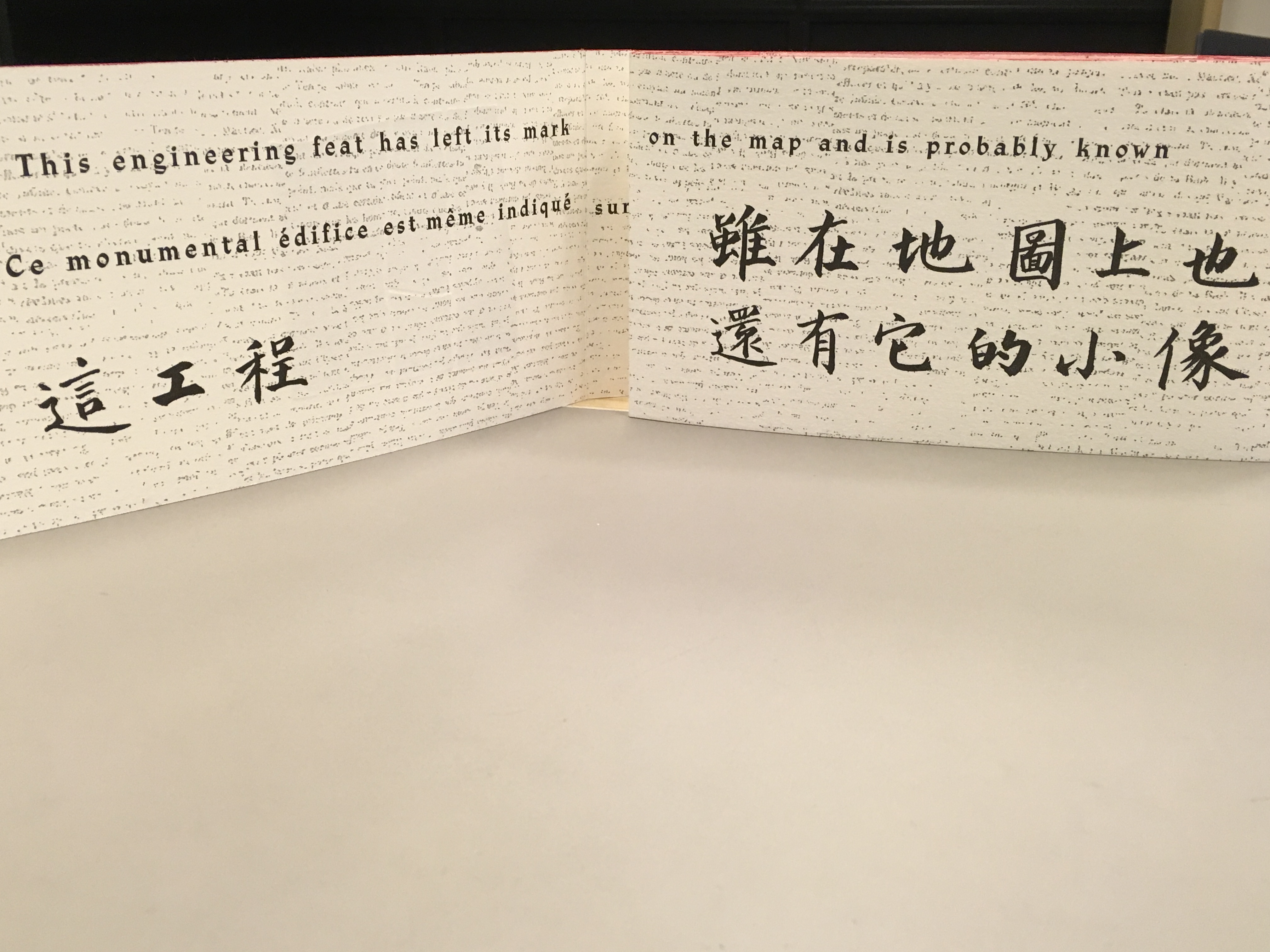
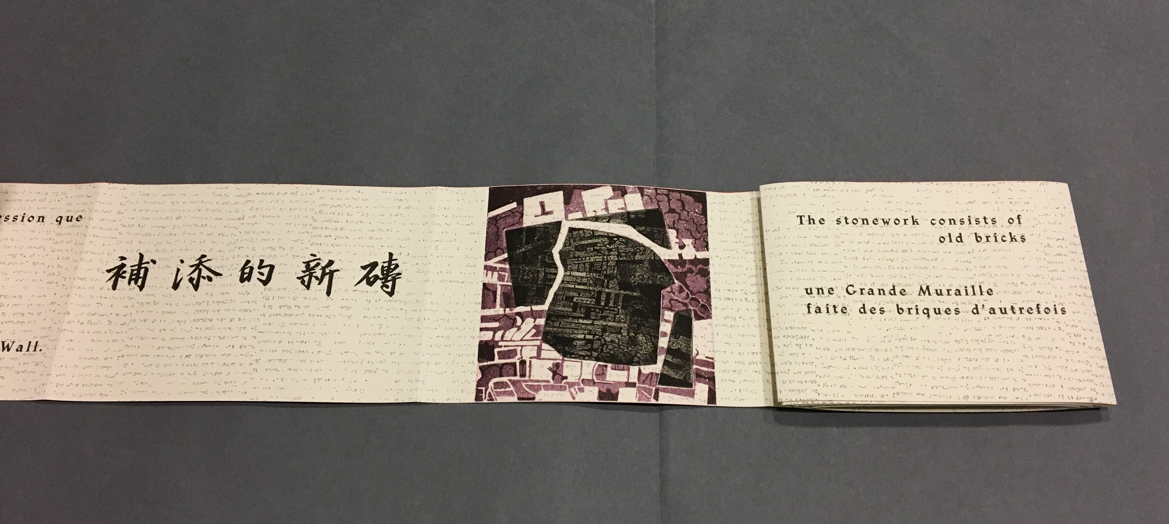
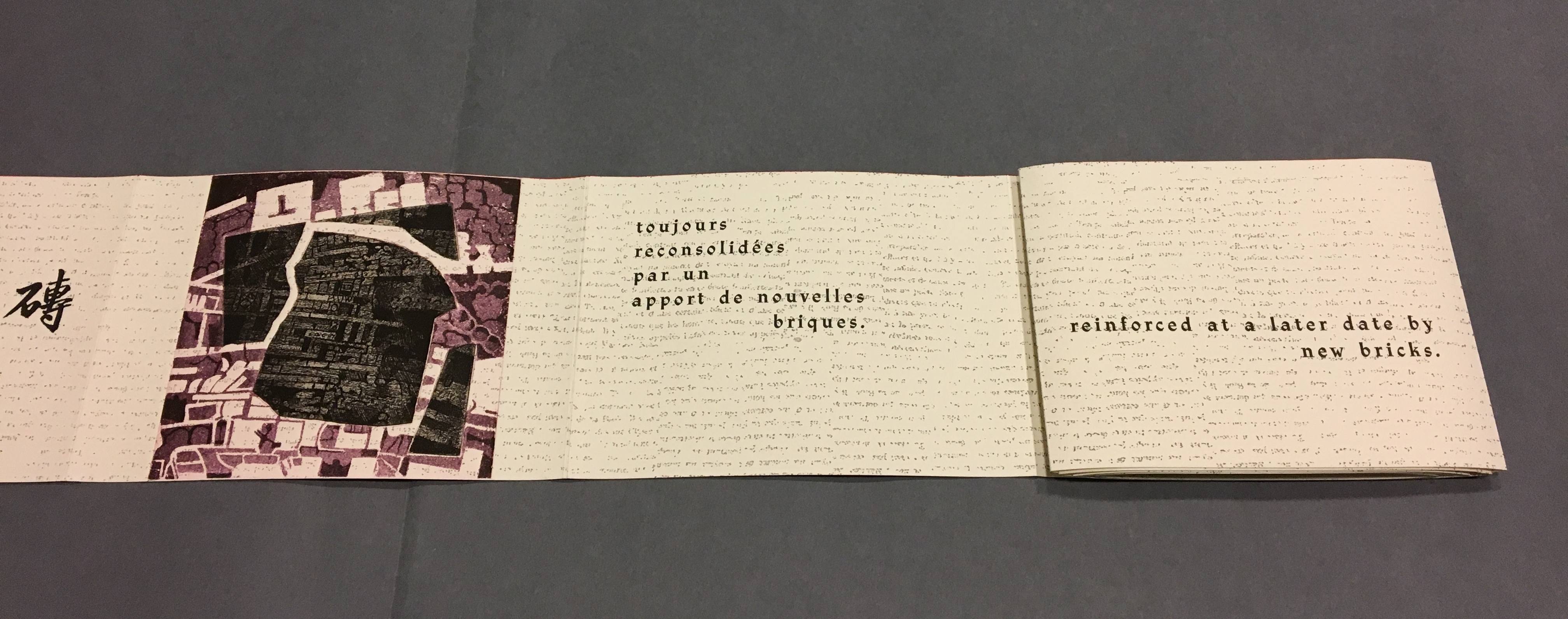
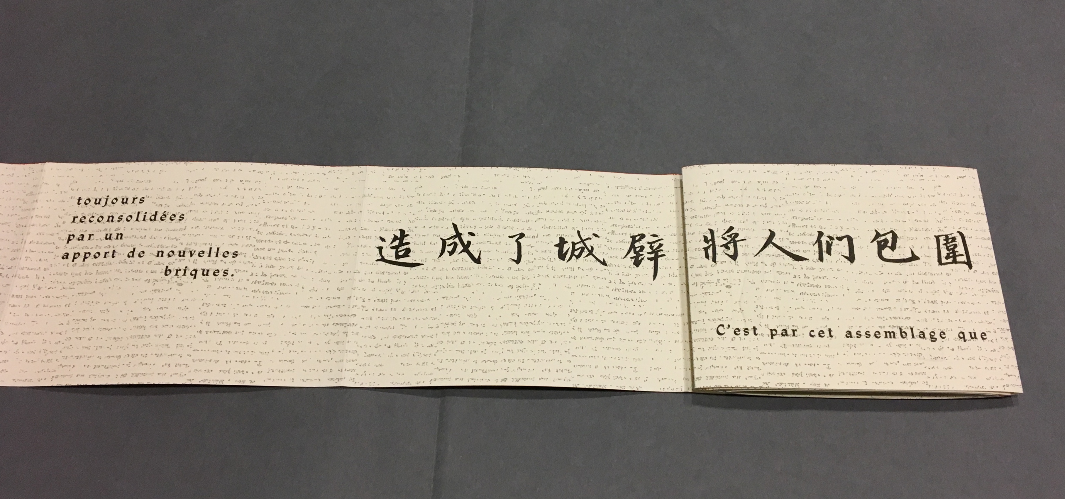
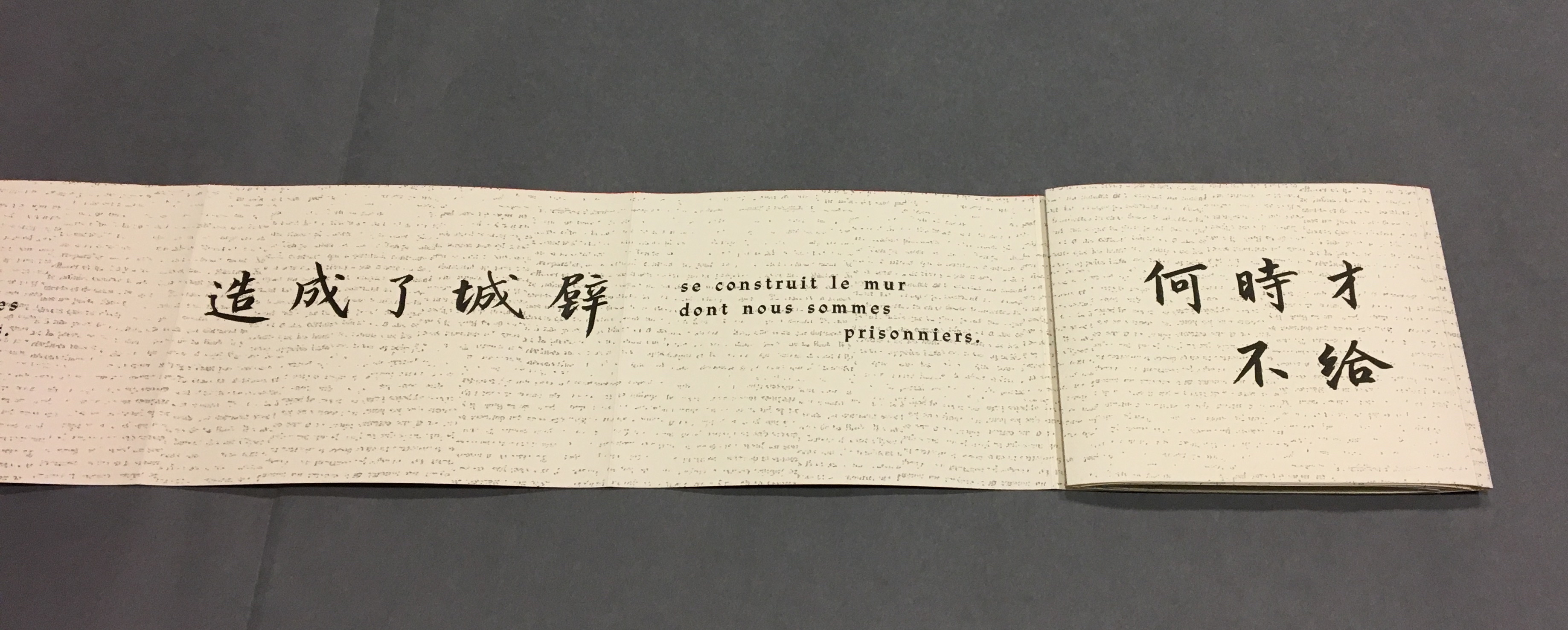
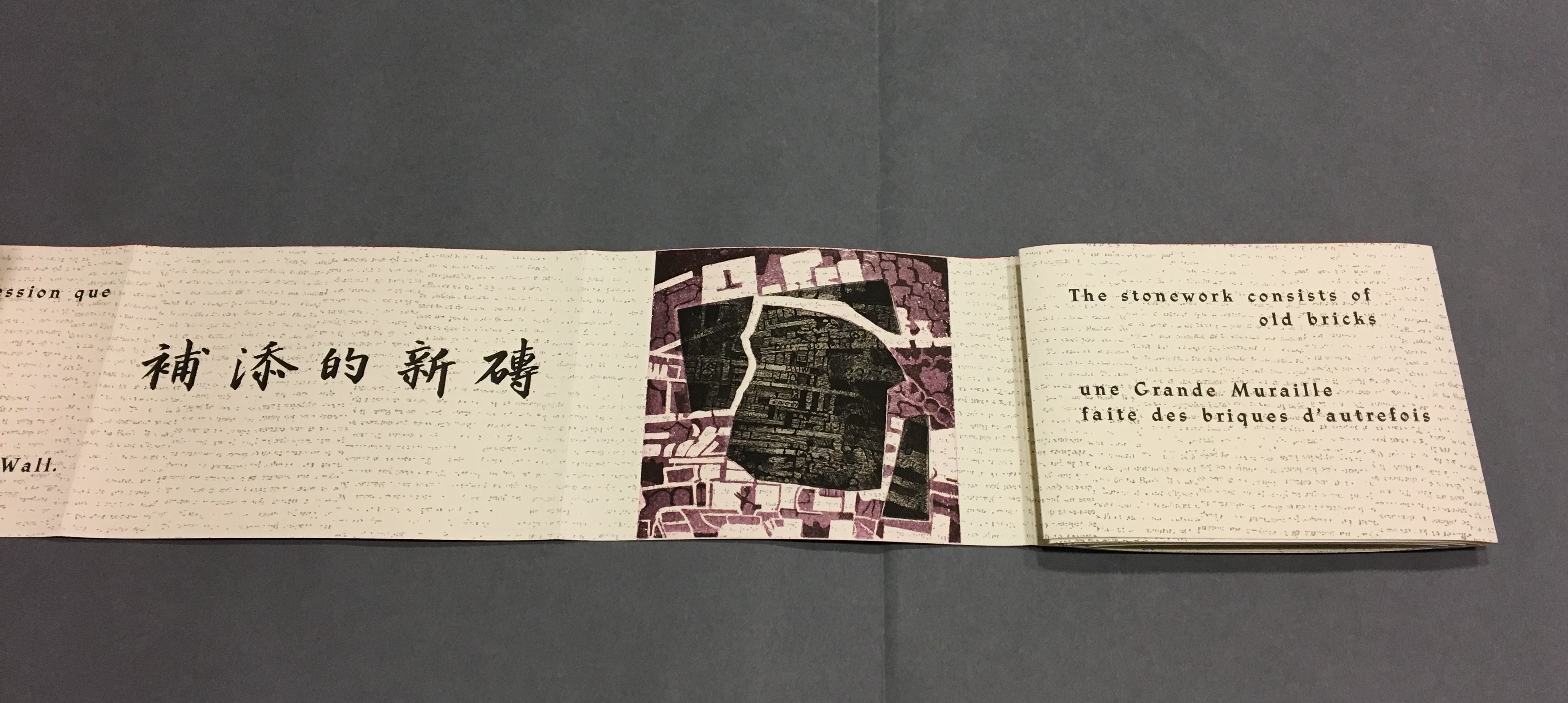
Detail, La grande muraille/The Great Wall (1991) Typeface: Athenaeum, designed by Alessandro Butti and Aldo Novarese in 1945
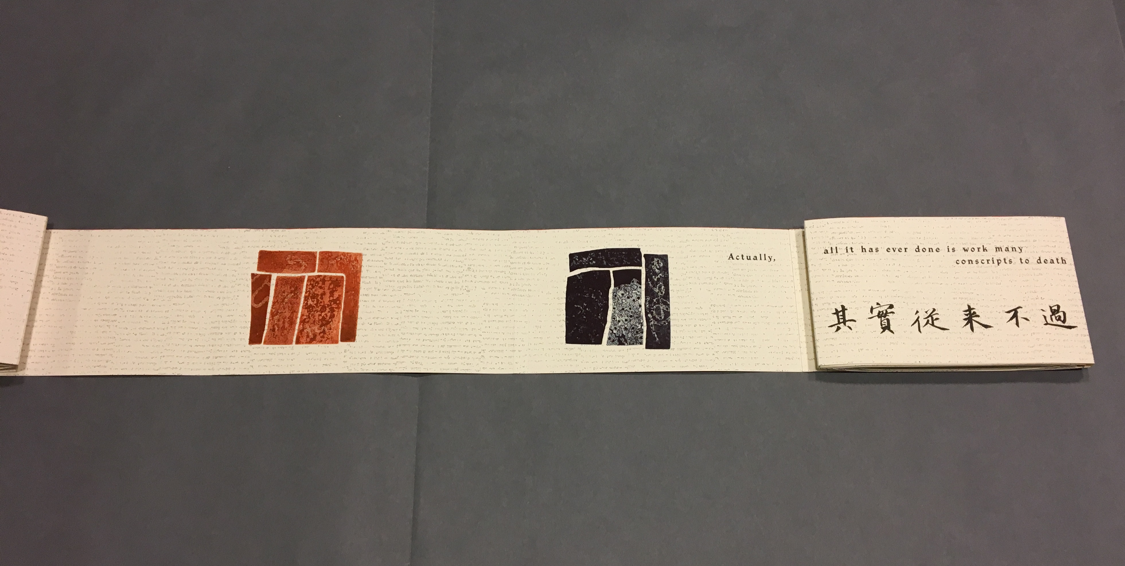
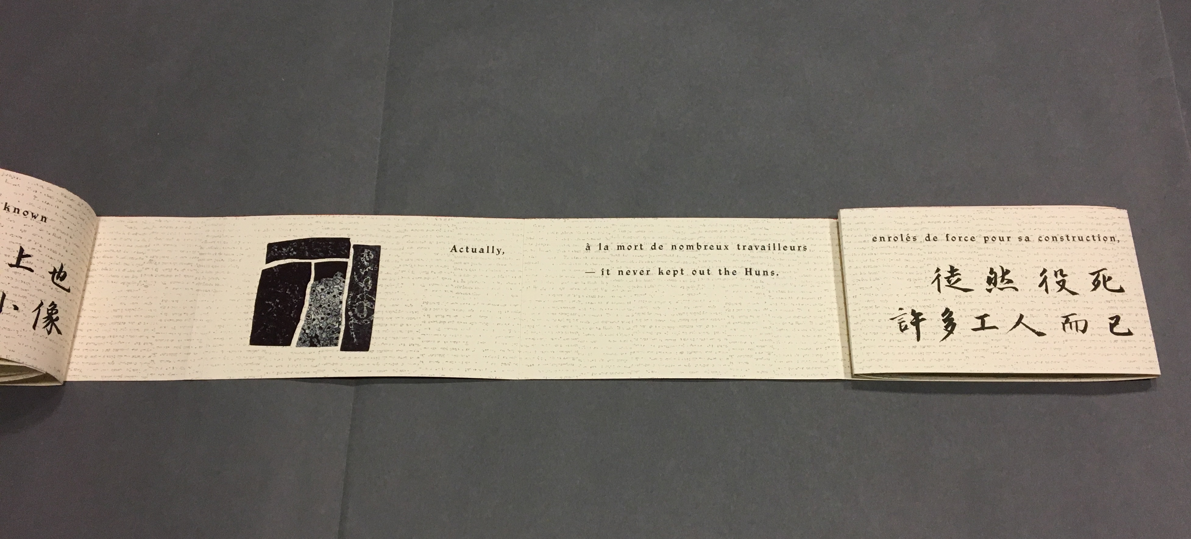
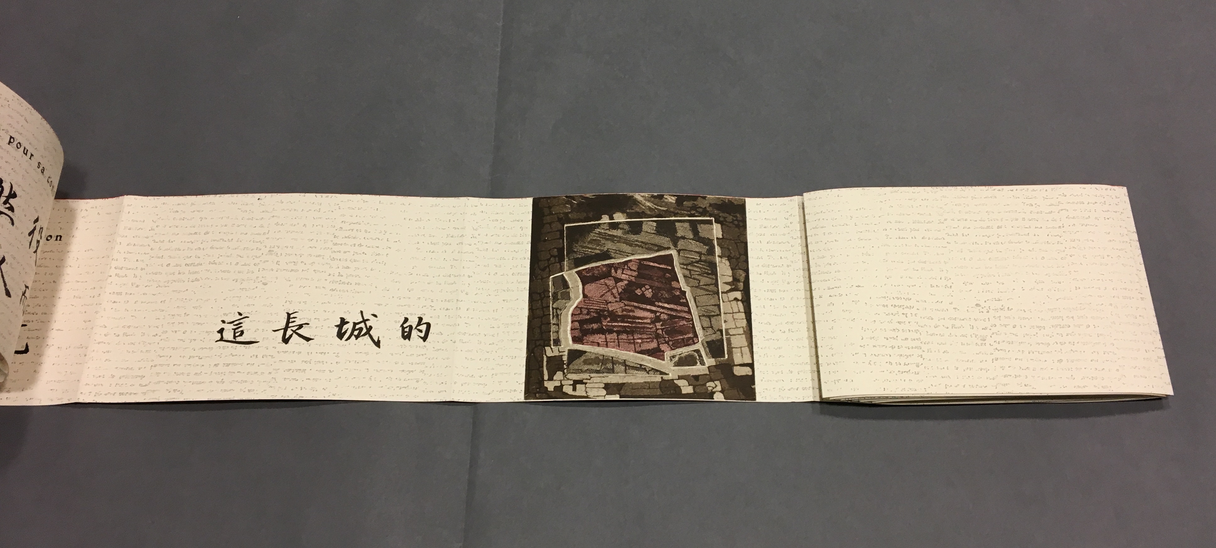
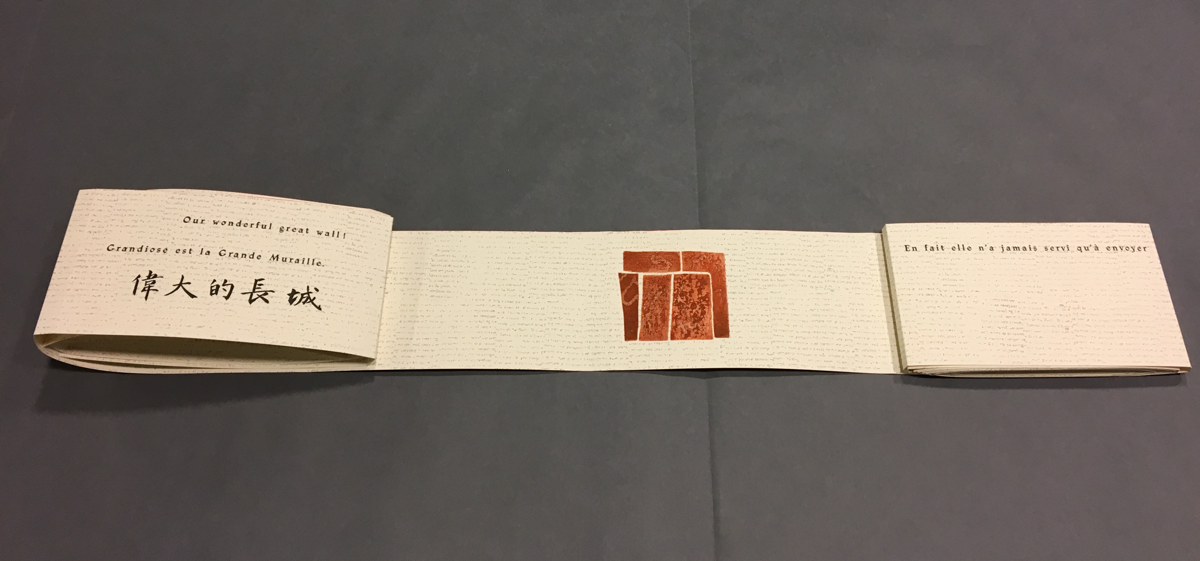
The National Library of the Netherlands advises, “for [Shirley Sharoff’s La grande muraille/The Great Wall (1991)] to be read, the book first must be rolled out”. And that is what I did, using the large table in the Special Collection’s seminar room.
Enjoyable as that was, enjoying it again with the video afterward, something seemed awry. As the Chinese poem by Lu Xun, its French and English translations and text from Sharoff’s language students unrolled, interpersed with her prints, the text seemed to have gaps, or so I thought. So I returned a second time. Perhaps if I re-shot the video. Perhaps if I took more stills and close-ups. Perhaps if I shot the rolling up as well as the unrolling.
No doubt, the second effort added to the pleasure. Looking at the videos and stills, I can again feel between my fingers the Arches paper and engravings’ impressions on it. But still I detected gaps, seeming mismatches between the French and English. I wondered to what degree they
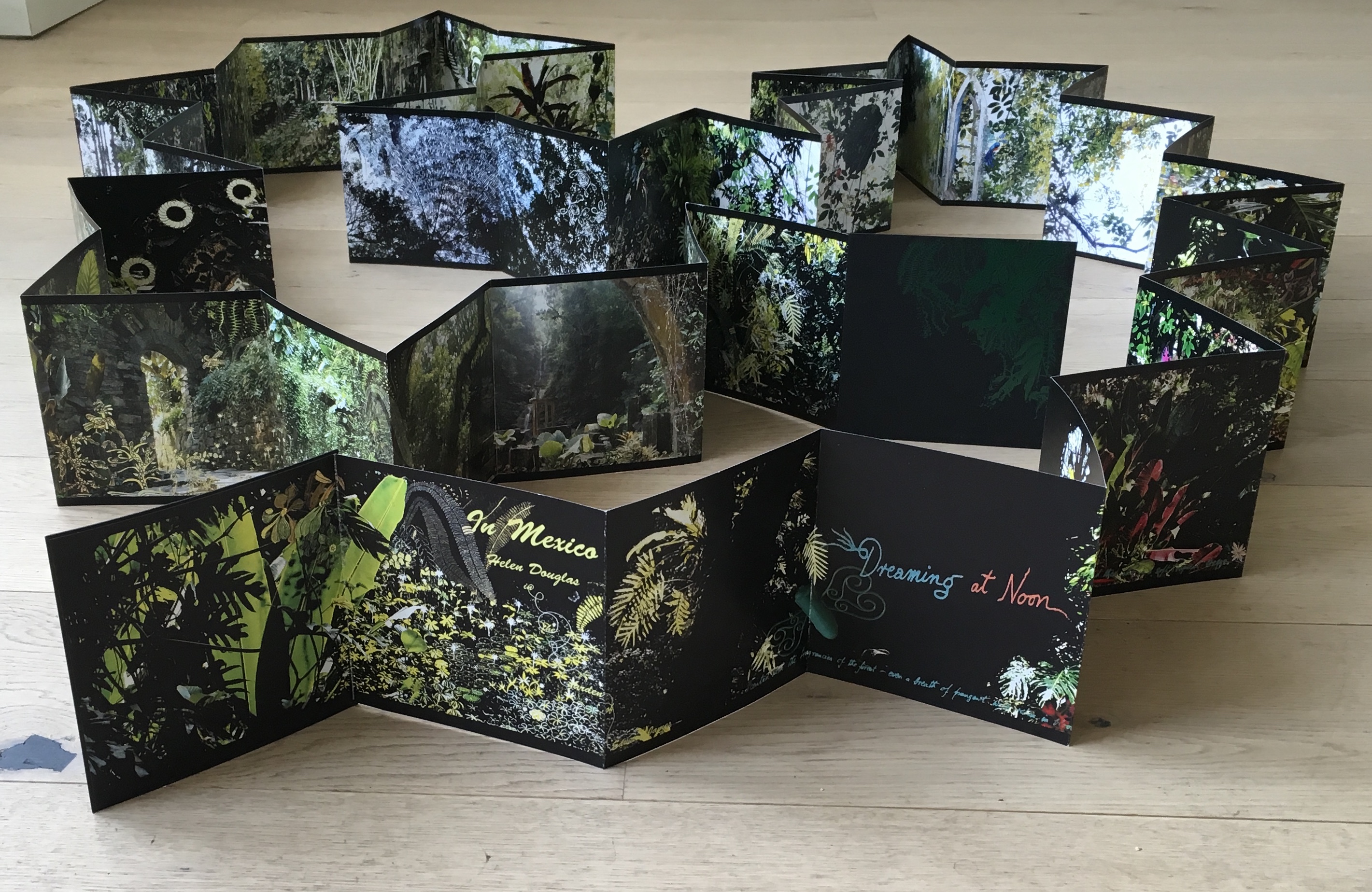
followed the Chinese text or whether some of Lu’s text had been omitted. So, I returned a third time, and then came my “ah hah” moment. Unrolled, La grande muraille looks like a double-sided leporello or accordion book like this one: In Mexico by Helen Douglas.
In Mexico: in the garden of Edward James (2014) Helen Douglas
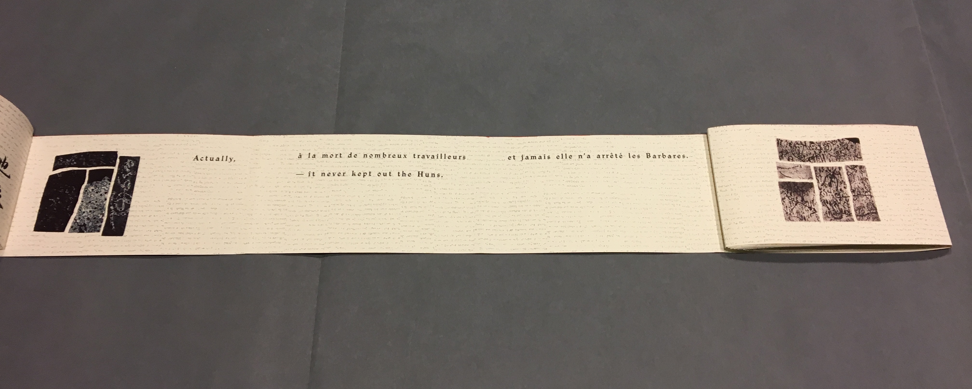
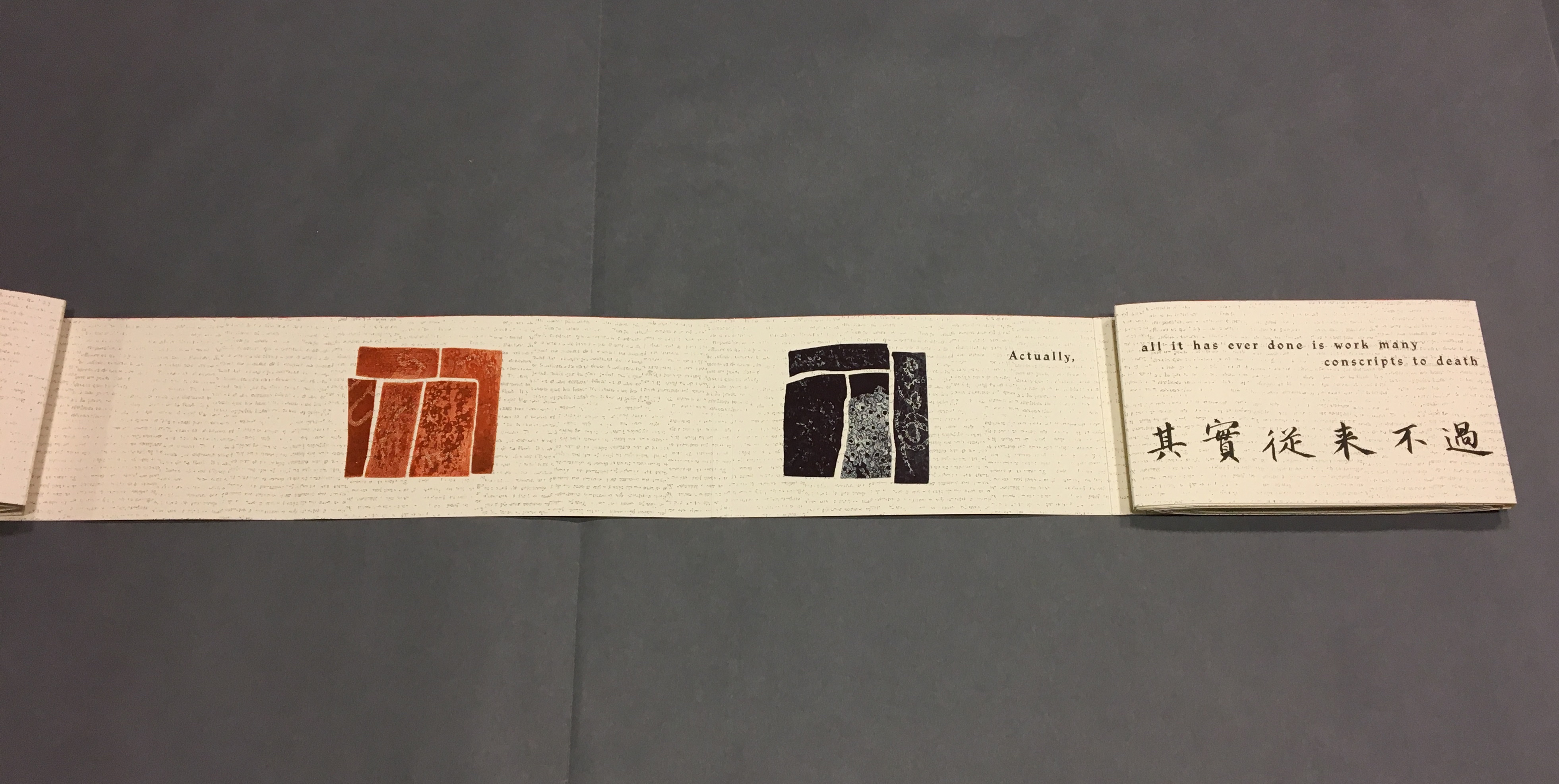
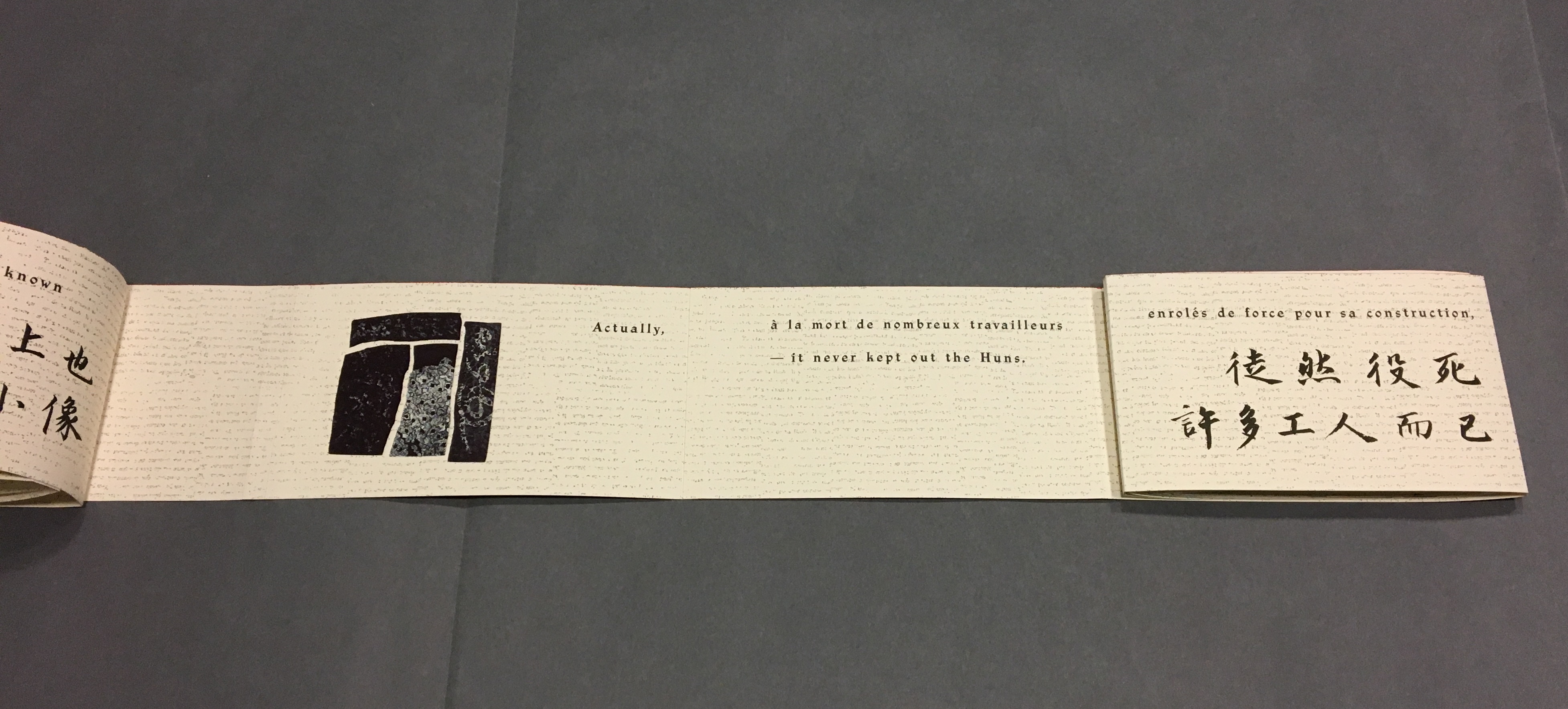
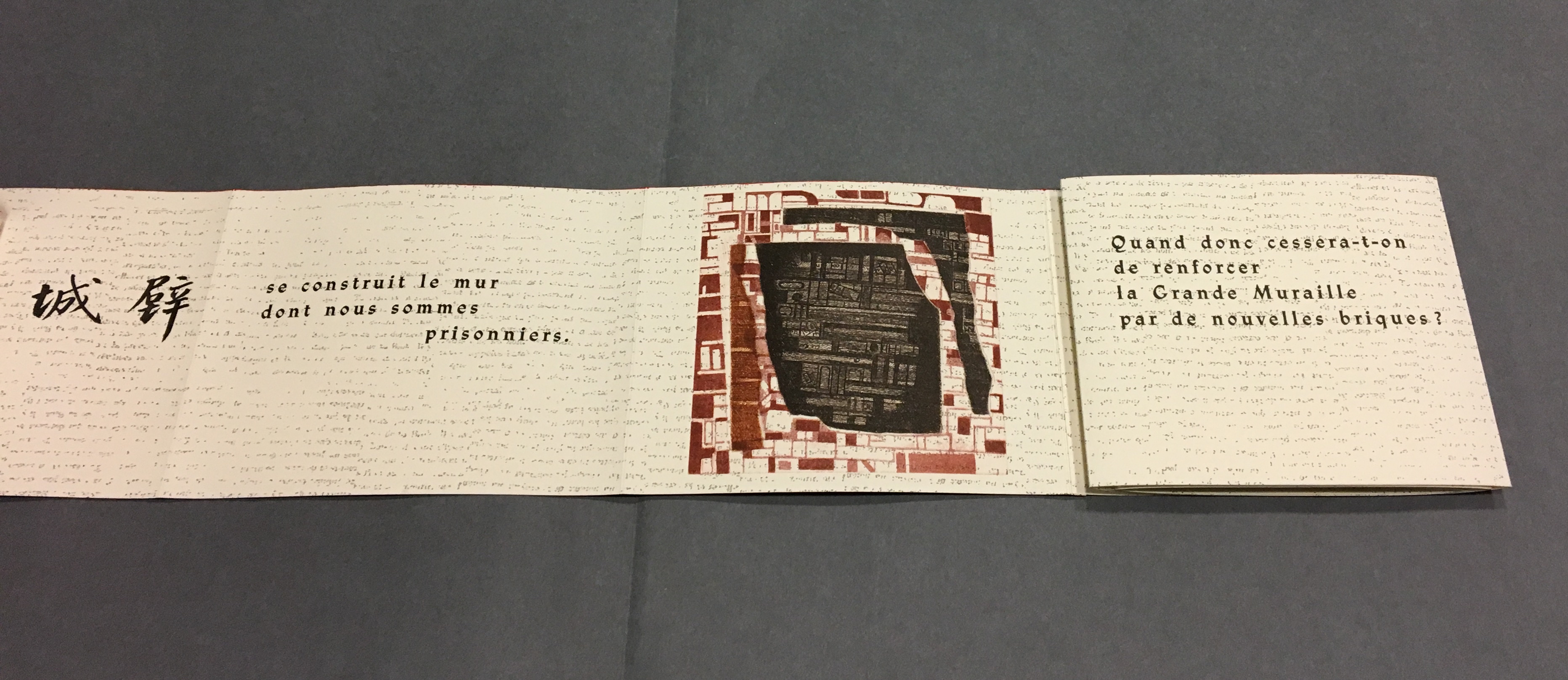
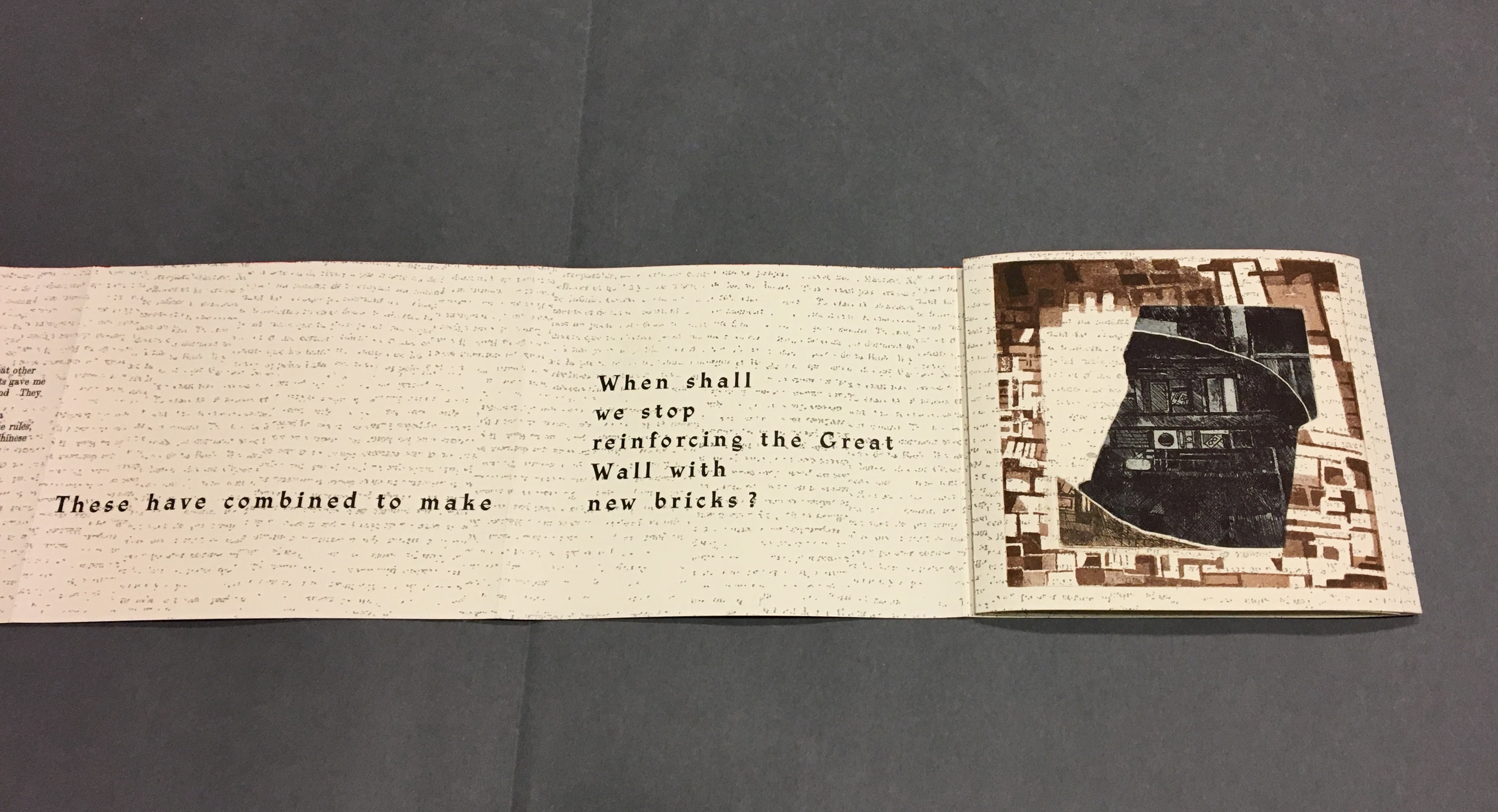
To read La grande muraille as the double-sided leporello it appears to be, however, is to overlook the multi-page spreads that Sharoff conceived with François Da Ros (her typography and print collaborator) in putting together this forme en escargot (snail-shell form as she calls it). The snail-shell form, its multi-page spreads and the text demand that you read La grande muraille as you unroll it, or rather, as you unfold it.
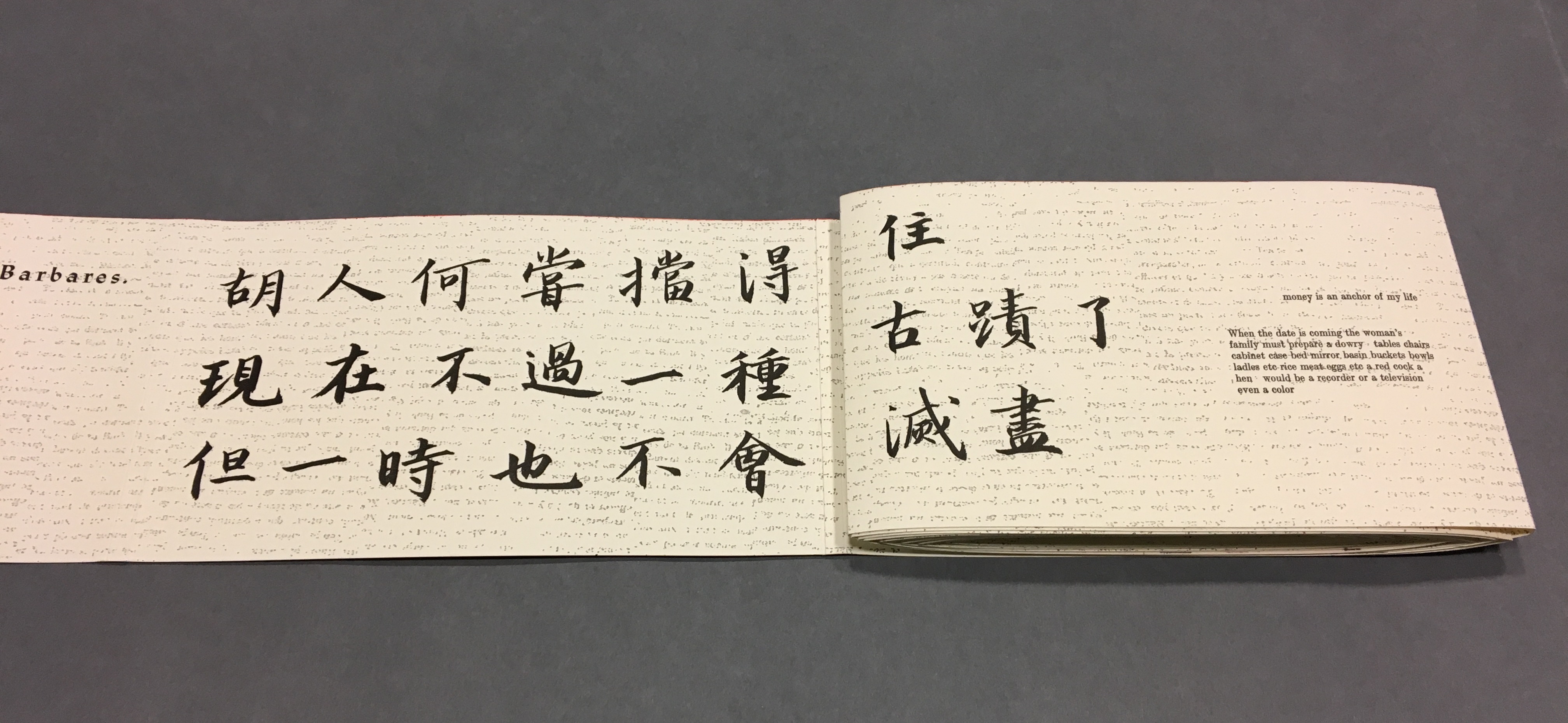
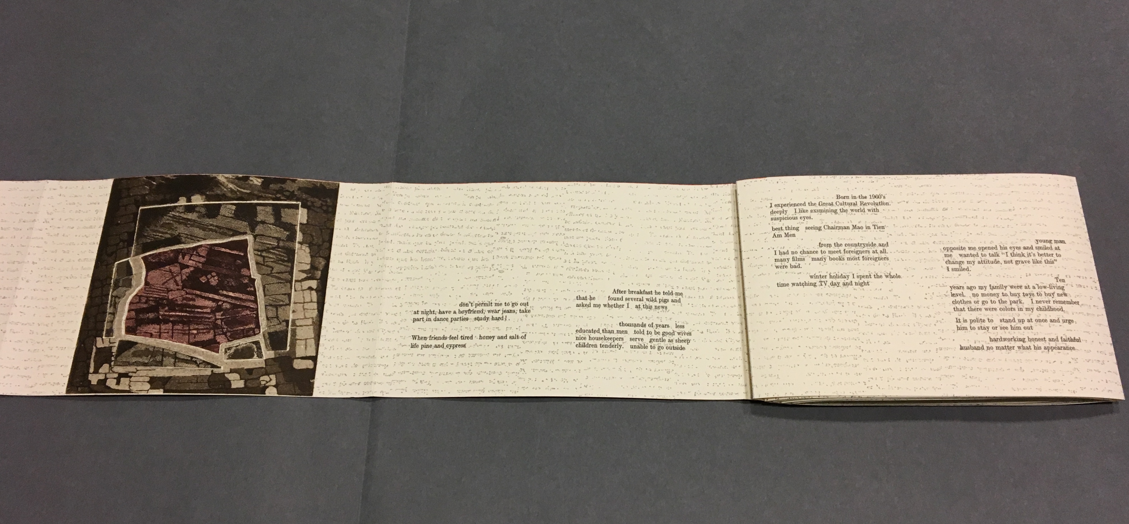
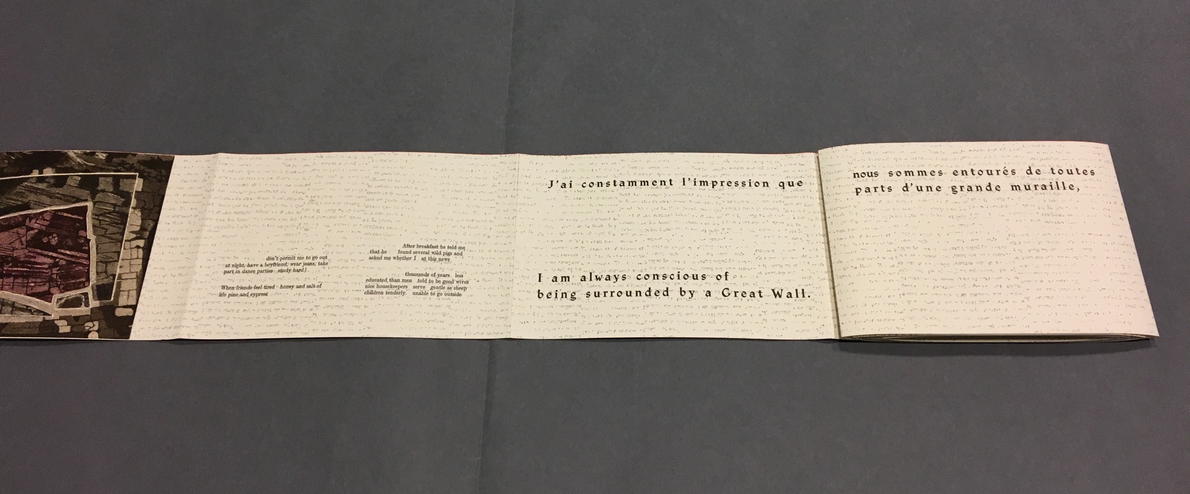
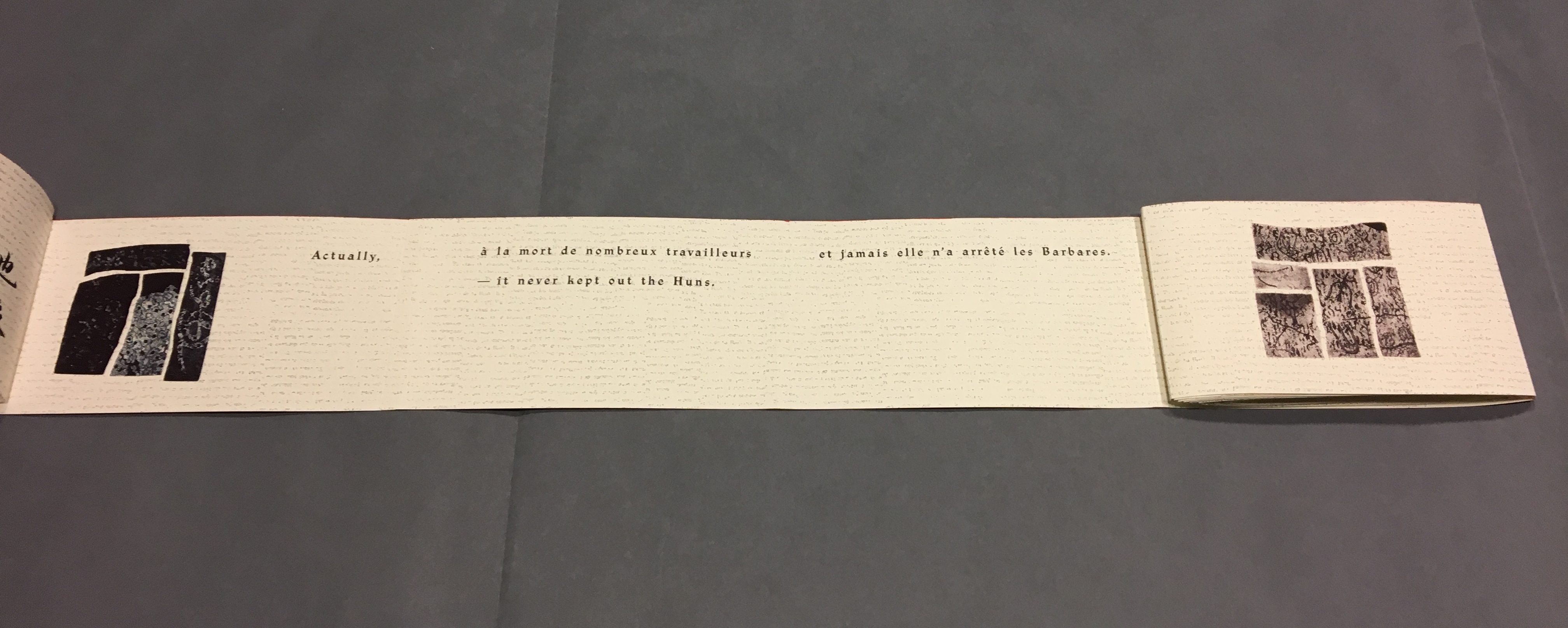
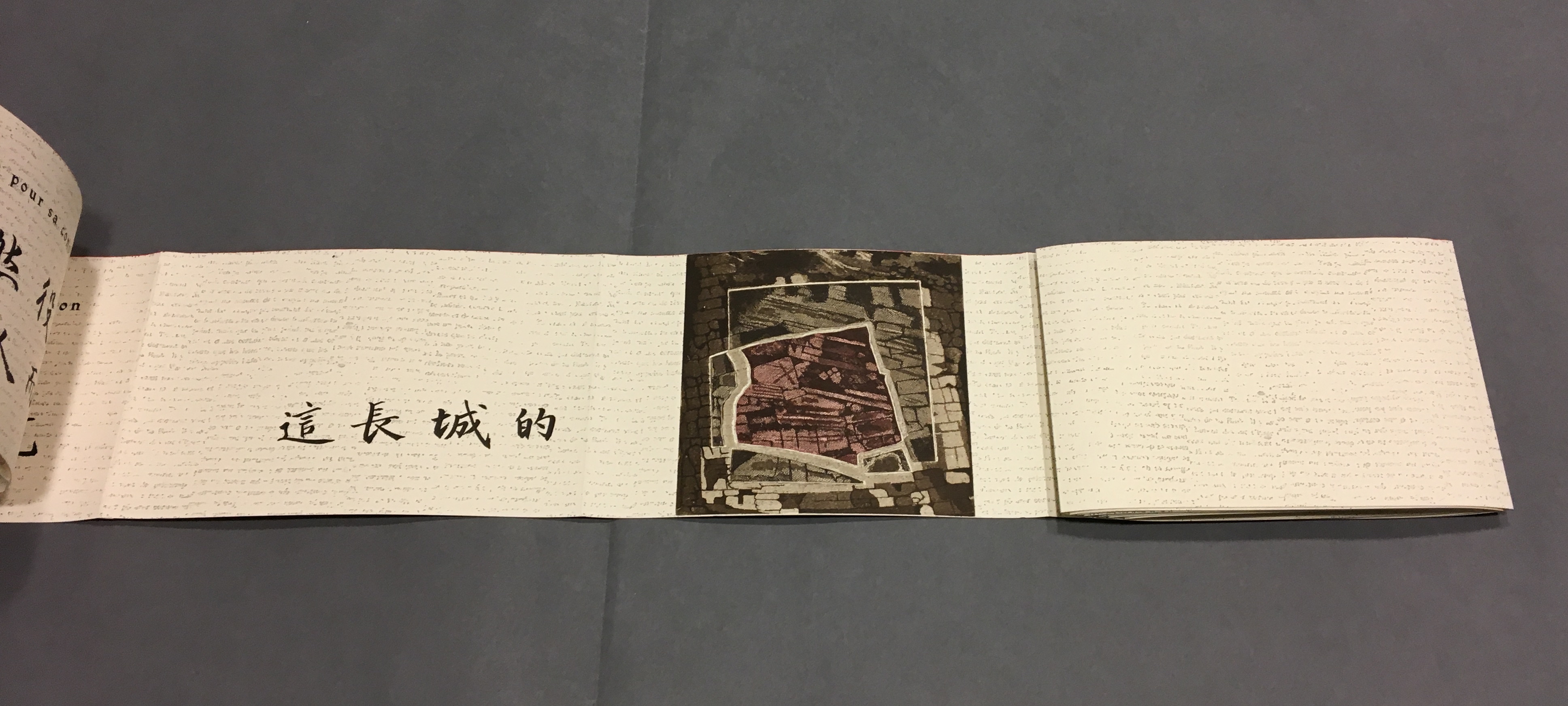
With the book laid flat, the “page spreads” are easier to recognize, the text is easier to read, and the forethought needed for the “imposition” of text and images to deliver the sequential text, easier to marvel at. As each recto page is turned to the right, two new pages appear to the right. This unfolding approach to reading the book offers several intriguing “double- and multi-page spreads” and an experience of the texts and eight prints in the sequence driven by the text. When you have finished reading in this sequence, you will have read both sides of the scroll.
Reading the text
Front cover La grande muraille/The Great Wall (1991), Shirley Sharoff
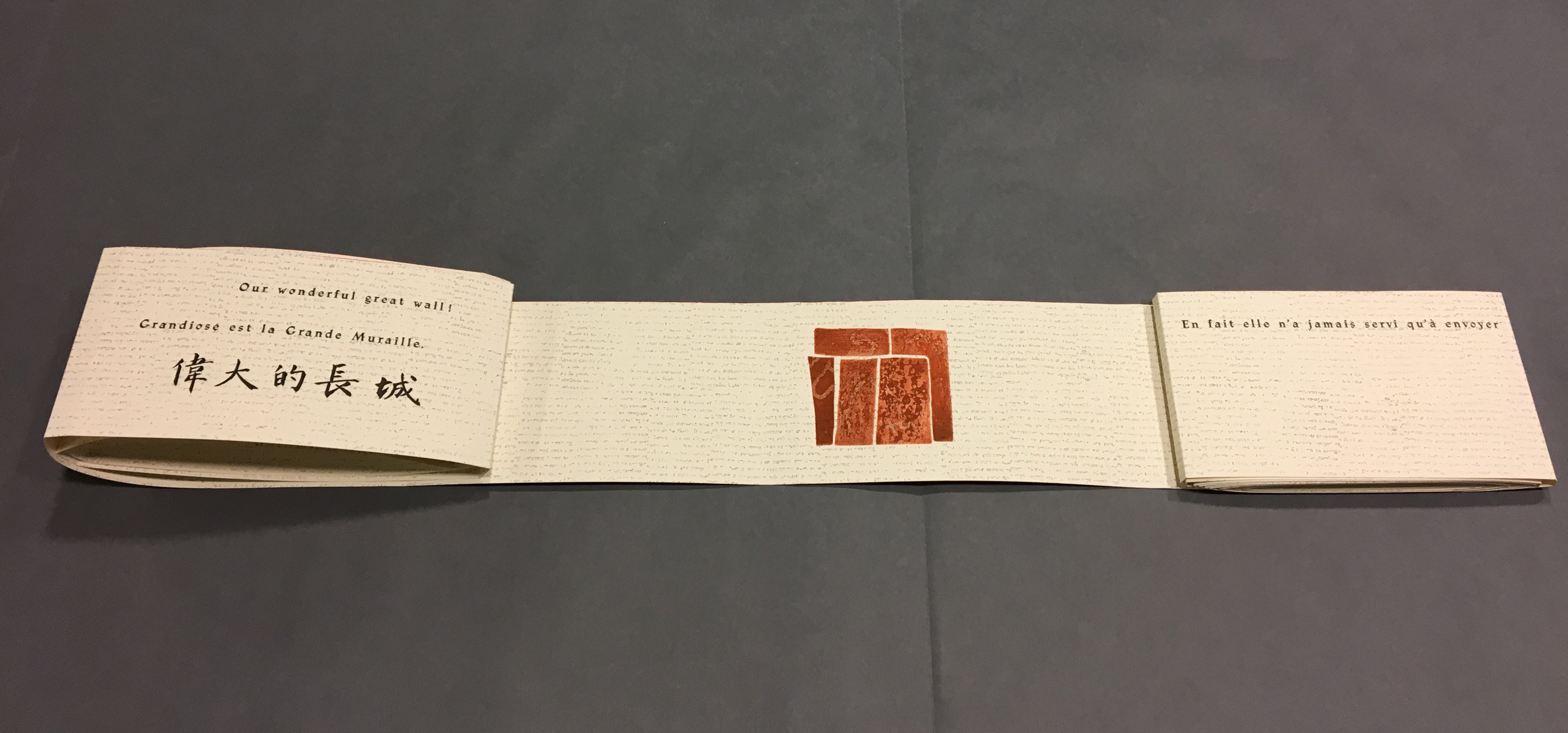
“Pages 1 and 2” As “page 2” is turned to the right and the English title of the work disappears, “pages 3 and 4” come into view.
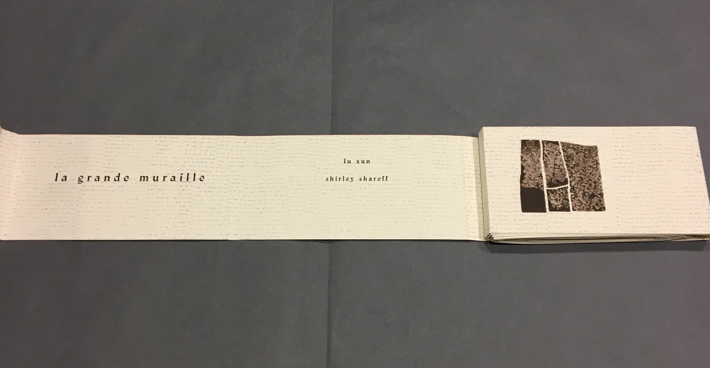
“Pages 1, 3 and 4” “Page 3” displays the authors names, and “page 4” displays the first of eight prints in the book. As “page 4” is turned to the right and disappears, “pages 5 and 6” appear.
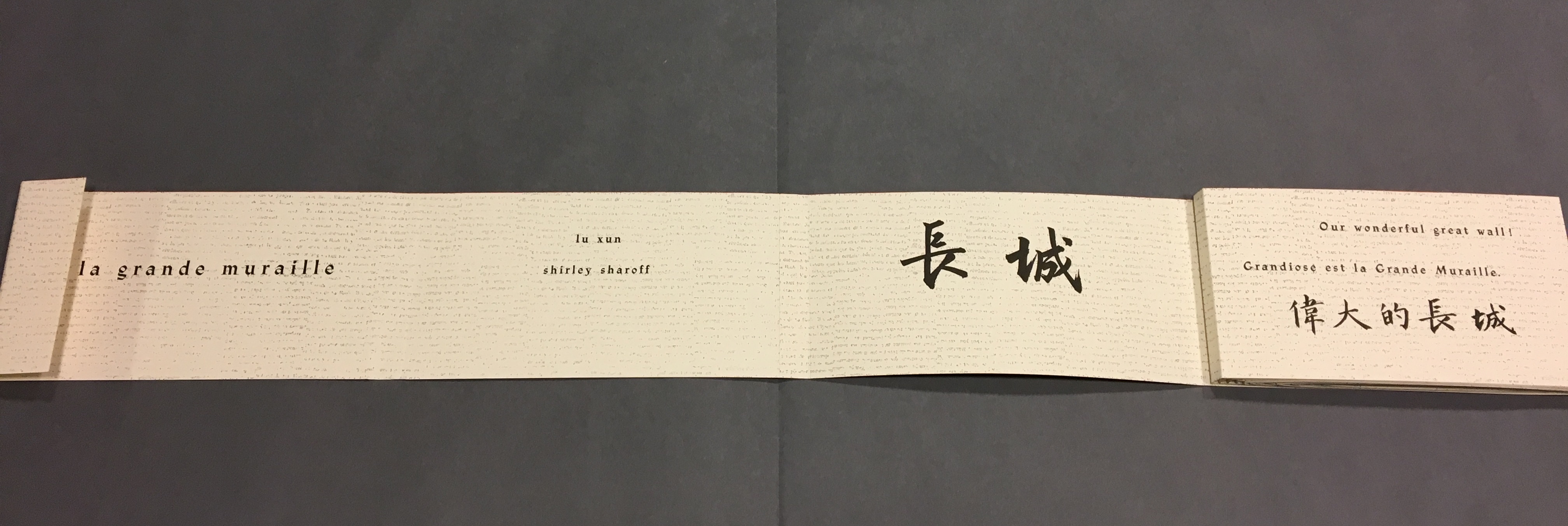
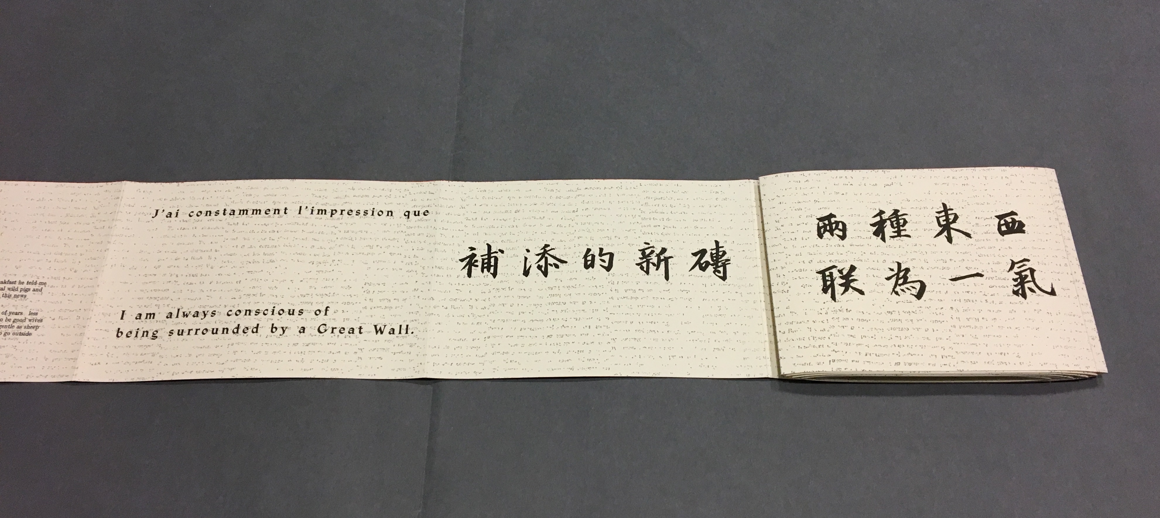
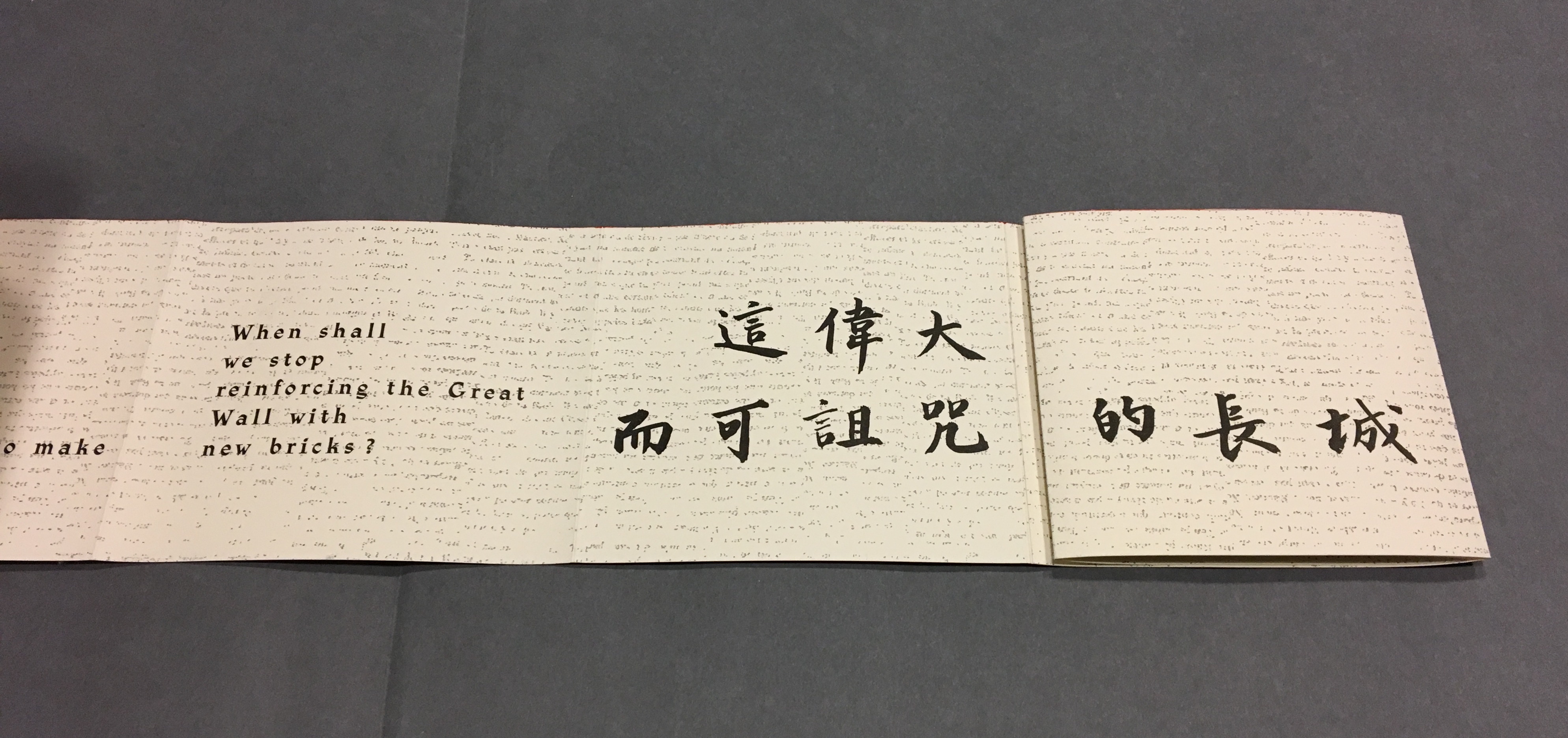
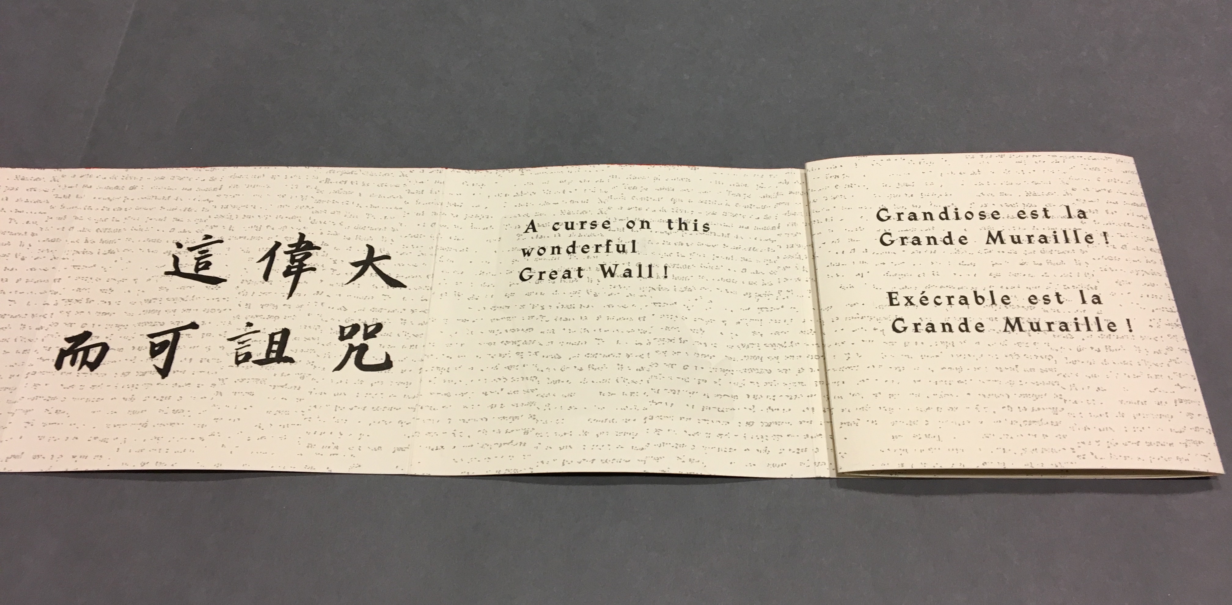
“Pages 1, 3, 5 and 6” “Page 5” gives the title of the book in Chinese calligraphy. On “page 6”, the opening line of Lu Xun’s text appears in English, French and Chinese. Turning “page 1” to the right will cover the authors’ names on “page 3”, and turning “page 6” to the right will yield the next four-page view.
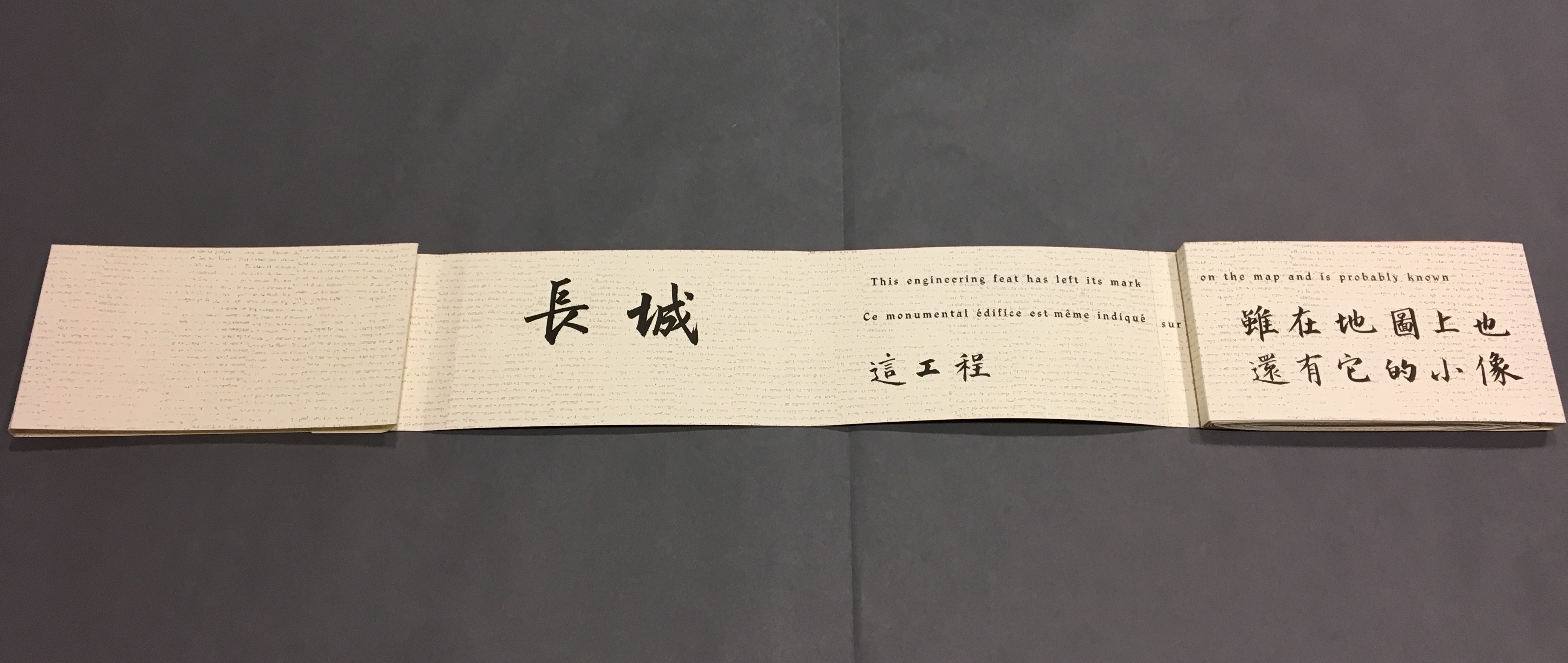
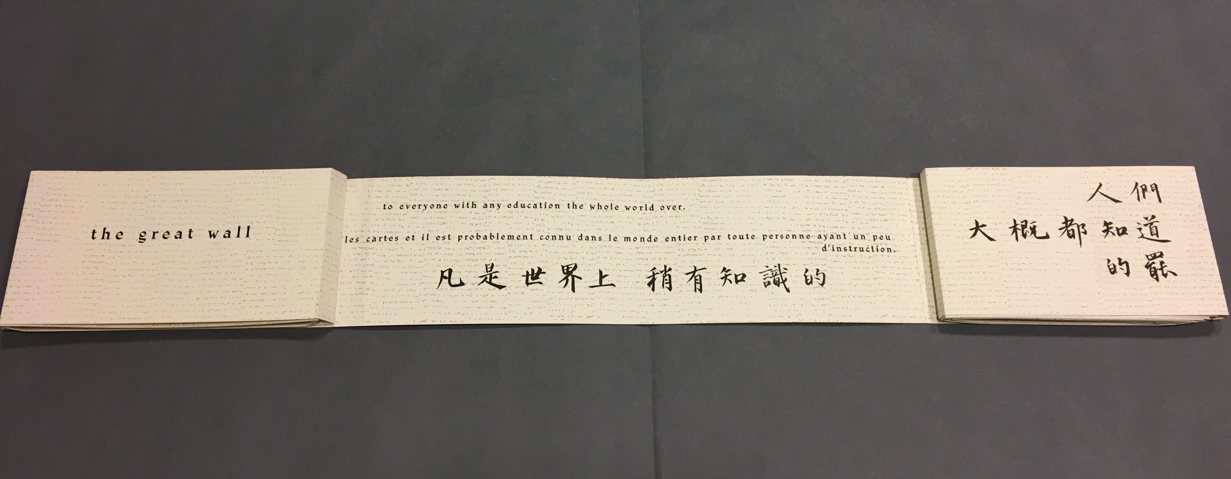
“Back cover, pages 5, 7 -8” The next lines of Lu Xun’s disquisition run in English, French and Chinese across “pages 7-8”.
Detail, “Pages 7 and 8”. Notice how the English text on “page 7” runs across to “page 8”, but the French text disappears under “page 8”, effectively running on to what will be revealed as “page 9” in the next view.
“Pages 2, 9-11” This view results from two page turns inward on the left and two outward on the right. “Page 2” has come back into view on the left. The English text on pages 9-10 completes the sentence interrupted on “page 8”. The French text on “pages 9 and 10” completes the sentence that began on “page 7” and ran behind “page 8”.
Pages 9-10, 12-13
Pages 6, 12, 14-15
Pages 12, 14, 16-17
Pages 16, 18-19
Pages 16, 18, 20-21
Pages 20, 22-23
Pages 20, 22, 24-25
Pages 24, 26-27
Pages 24, 26, 28-29
Pages 28, 30-31
Pages 30, 32-33
Pages 32, 34-35
Pages 32, 34, 36-37
Pages 34, 38-39
Pages 38, 40-41
Pages 40, 42-43
Pages 42, 44-45
Pages 44, 46-47
Pages 44, 46, 48-49
Pages 46, 48, 50-51
Pages 48, 50, 52-53
Pages 50, 54-55
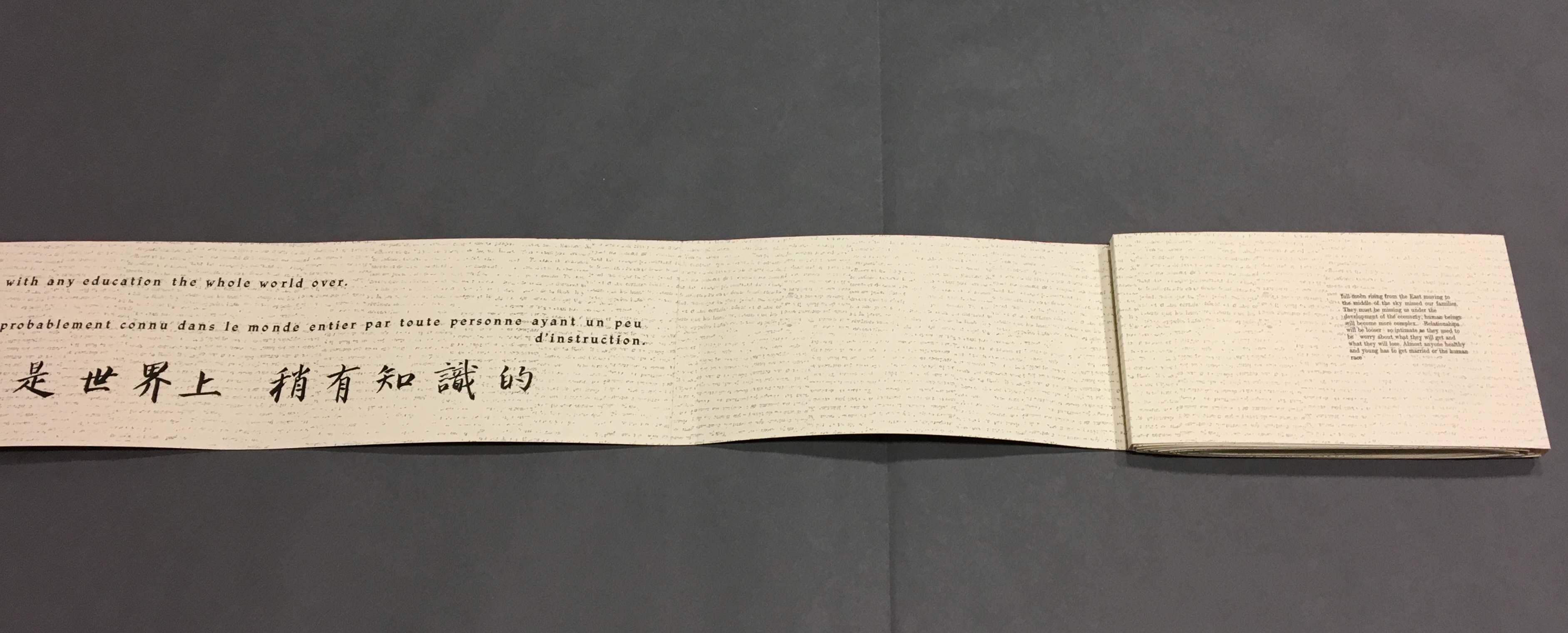
Pages 54, 56-57, the latter displaying the last ten characters of Lu Xun’s text.
這偉大而可詛咒的長城)
Pages 56, 58-59
Pages 58, 60-61
Pages 60, 62-63
Pages 62, 64-65
pages 64, 66-67
Now that the so-called gaps in the English and French texts were resolved, I wanted to understand how the English and French matched up to the Chinese text. For that, I asked help from two acquaintances in The Hague: Bee Leng Bee and Yingxian Song. They obtained a copy of Lu Xun’s text, traced it through the photos I had taken and found that the three languages run almost in parallel as the work unfolds.
“Almost” because the order of the languages is not alway the same. On pages one and two, we see the French and English titles but must wait until page five before the Chinese title appears. Then, on page six the order changes: English first, then French, then the corresponding ten Chinese characters. On pages seven and eight, this order is maintained. Later, with the turning of page fifteen, the French comes before the English and Chinese; the first Chinese character aligning to the French and English (其) appears on page seventeen. Then, as page seventeen is turned to the right, the order changes back to French then English on page eighteen, but on page nineteen, it moves to French first then Chinese. The book’s textual conclusion on pages fifty-six through fifty-nine runs Chinese, English, then French.
The juxtaposition and weaving of the three languages often seems painterly as if intended to evoke the layering of the bricks and the intertwining vines and foliage along stretches of The Great Wall. Here is the uninterrupted Chinese text:
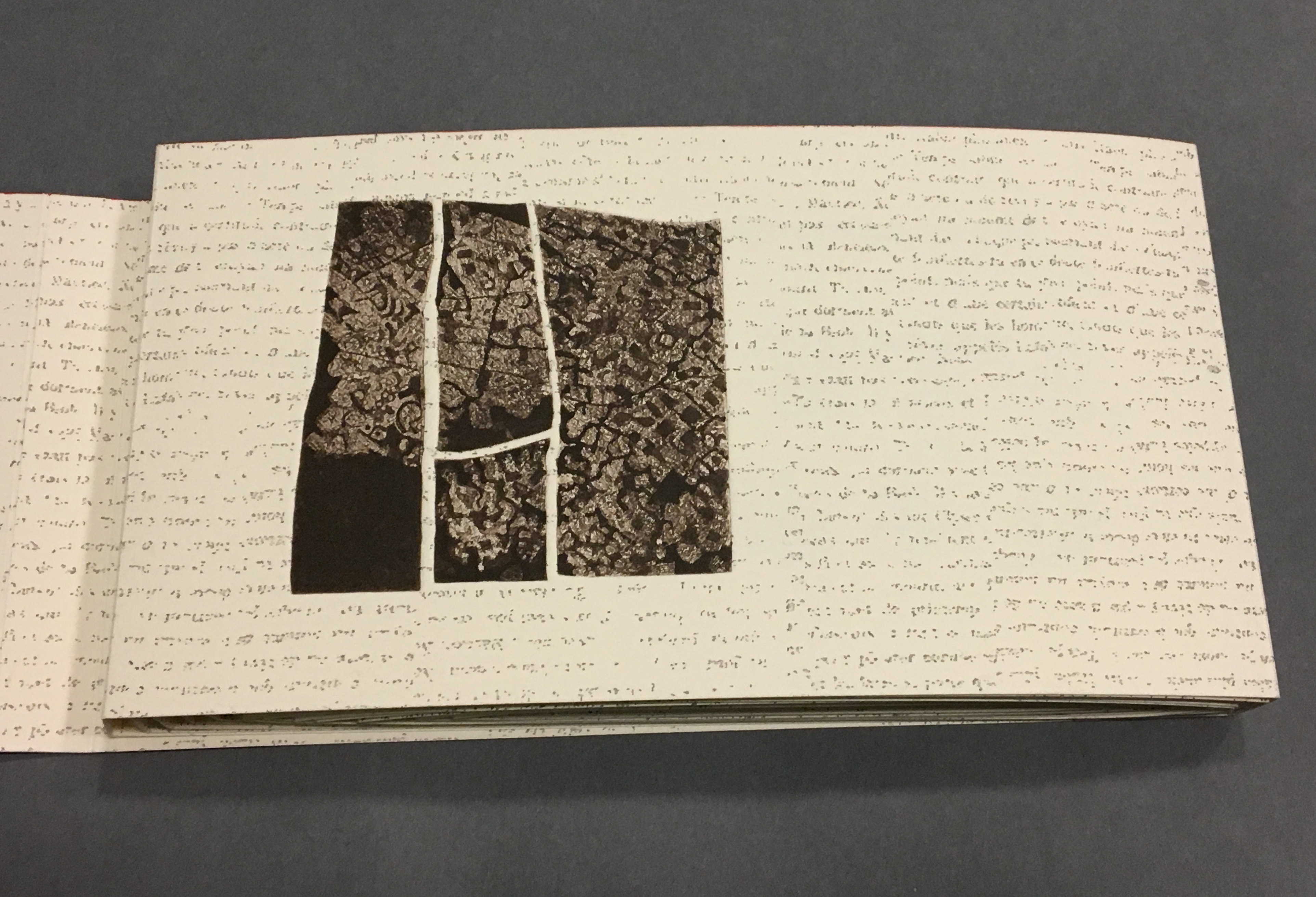
Even though following the forme en escargot results in having reading both sides of the scroll in the end, Sharoff also uses it to play with the notion of intended sequence. Completely unrolled and standing on its edge, the work echoes the Great Wall. The tint of red along the top edge recalls the blood spilled in the Great Wall’s construction. The prints echo the Great Wall’s bricks, the vegetation in its crumbling gaps, even the gates. The completely unrolled work is an intended sequence, also — an invitation to walk the wall. Coming upon each of the eight copperplate engravings in the unfolding sequence is a different experience than walking up and down the “outer wall” and then the “inner wall” to see them. Five are on the outer wall, three on the inner.
The print first to be seen as the book unfolds, but one of the three on the “inner wall” with the book unrolled.
The second print comes into view on “page 14”, the second of Lu Xun’s statements begins in French on “page 15”, and with the rolling up on the left, “page 4” has reappeared.
With the turning of “page 15”, the third print comes into view on “page 16”, and the sentence begun with “Actually” on “page 16” continues on “page 17” above the Chinese.
“Pages 16, 18-19” The French at the top of “pages 18-19” is continuing the sentence from “page 15”, and the English beneath on “page 18” is continuing the sentence from “page 17”.
With this spread — “pages 16, 18, 20-21” — the fourth print comes into view on the right, and the French and English sentences conclude together in the middle.
“Pages 30, 32-33” and the fifth print comes into view.
“Pages 38, 40-41” and the sixth print comes into view.
“Pages 44, 46, 48-49” and the seventh print comes into view.
Pages 50, 54-55 and the eighth and final print comes into view.
Reading the form “in time”
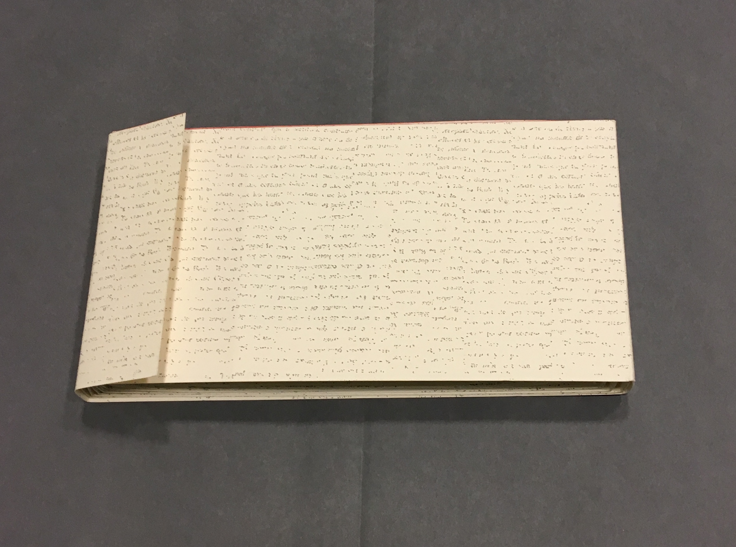
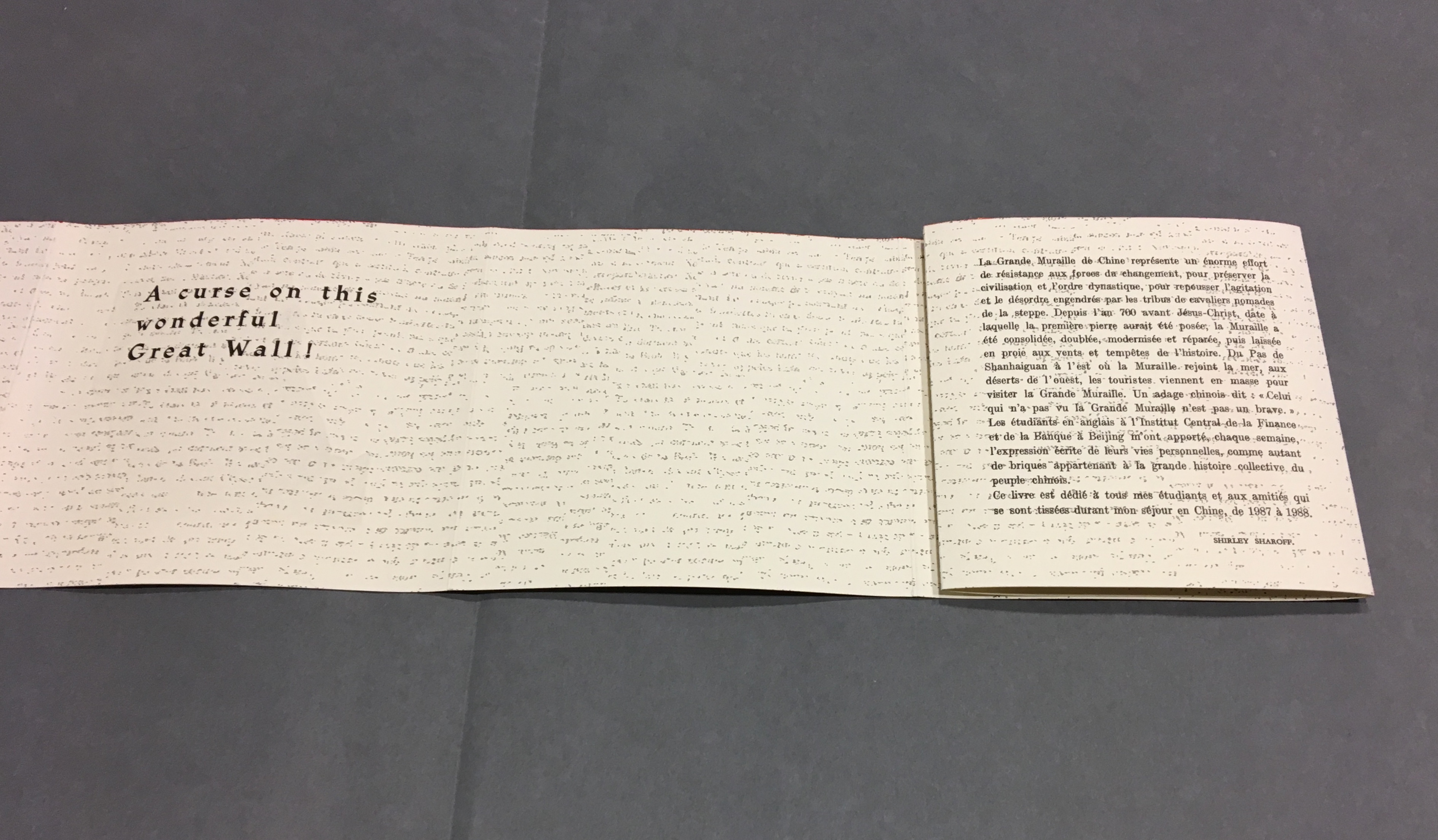
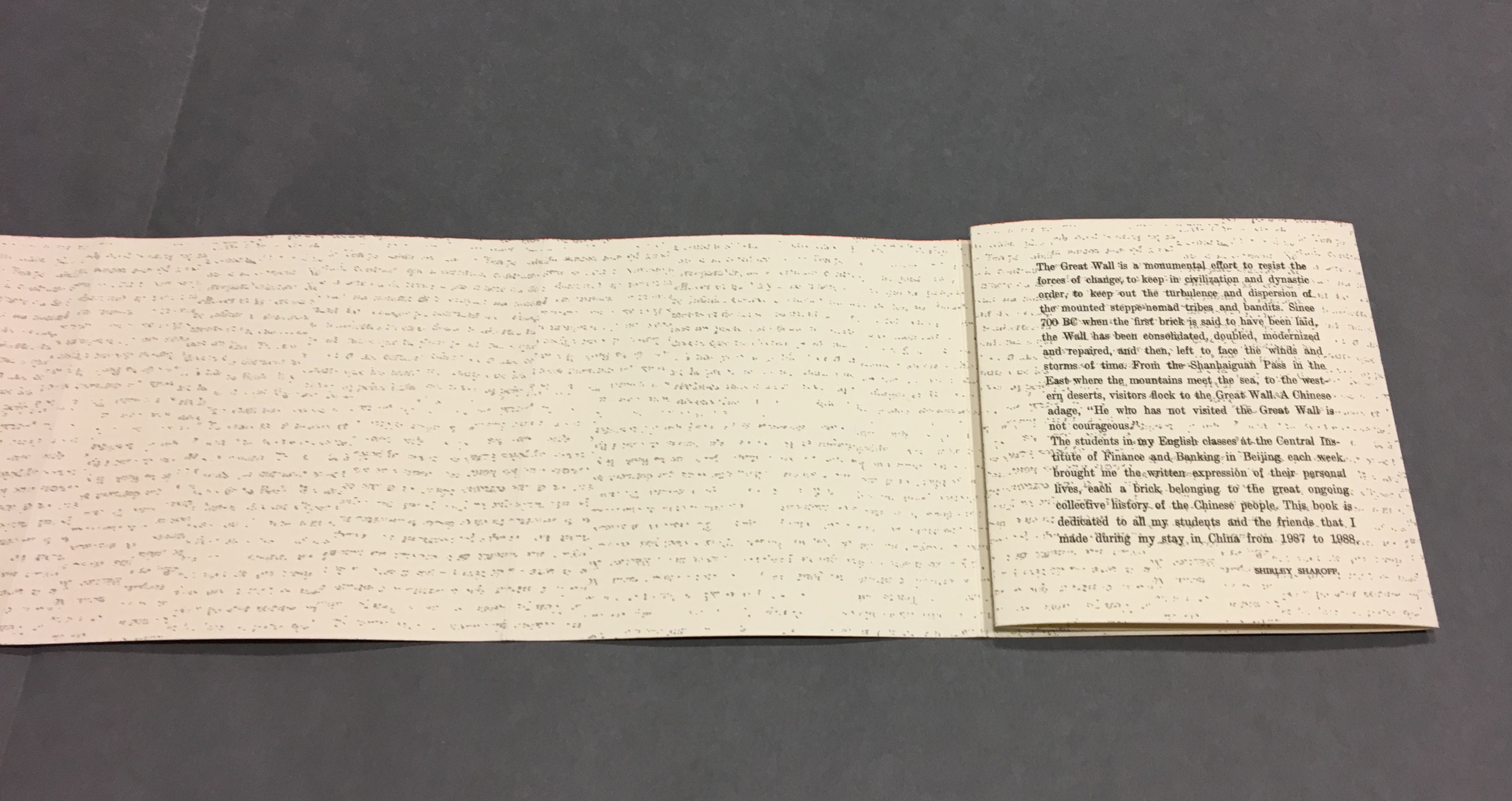
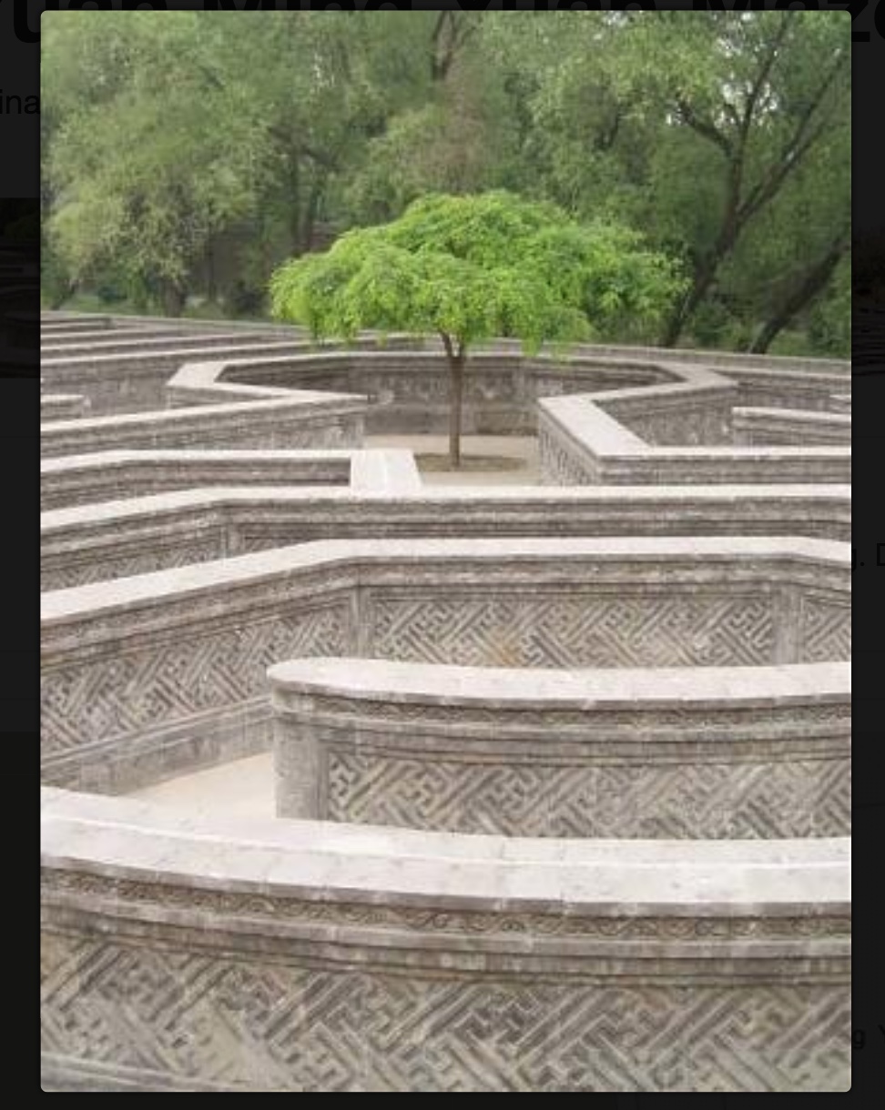
As the force of the snail-shell binding resists the unscrolling and pulls the standing pages inward, the work has another echo: the eroding maze in the Ancient Summer Palace (Yuan Ming Yuan) outside Beijing. The faint markings on the paper, created by printing the results of repeated photocopies of a manuscript, amplify the echo.
Arches paper printed with the results of multiple photocopies of a manuscript.
Although Lu’s text does not mention the maze, Sharoff introduces contemporary text that, alongside the interweaving Chinese, English and French of Lu’s text, evokes a maze-like, time-travelling effect. The autobiographical texts from the English-language students she taught at the Central Institute of Finance and Banking (1987-88) reflect on their childhood and adolescence in the Maoist era and their recollection of representations of foreigners in books and television. These “new bricks” in their modernness and fracturedness interrupt the flow of Lu’s prose praising and cursing the Great Wall. Yet, in their segmentation and placement, they also physically echo the prints and reinforce Lu’s expression of the paradox in the construction, fragmentation, reconstruction and erosion of the real Wall.
“Pages 32, 34-35”
Sharoff’s La grande muraille is a treasure that rewards repeated visits and contemplation: not only for itself but also as a parallel or forerunner.
La grande muraille’s physical impetus (The Great Wall), the seemingly decipherable/indecipherable characters on the Arches paper, the wry paradox of Lu Xun’s observations, the socio-political-cultural implications of the “new bricks”, the work’s innovative form and the pulling of past and present together parallels the work of Xu Bing and his play with language across East and West. His Book from the Sky first appeared in 1988.
Sharoff’s use of Lu’s contemplation on The Great Wall also foreshadows Jorge Méndez Blake‘s Capítulo XXXVIII: Un mensaje del emperador / A Message from the Emperor (2017?). The title refers to an anecdote in the story “The Great Wall of China” by Franz Kafka, a contemporary of Lu Xun. The narrator tells the reader how the emperor has dispatched from his deathbed a message to the reader, entrusted to a herald who, struggling as he might, cannot escape from the confines of the palace to deliver the message — yet which we the reader await hopelessly and with hope.
What more should we expect from art?
____________________________
*For help and permissions, thanks to Paul van Capelleveen and the staff at Koninklijke Bibliotheek, Den Haag, and Shirley Sharoff, Paris. For help with the Chinese and calligraphy, thanks to Bee Leng Bee and Yingxian Song.
Hubert, Renée Riese, and Judd David Hubert. 1999. The Cutting Edge of Reading : Artists’ Books. New York City: Granary Books. See pp. 24-27 for the Huberts’ reading La grande muraille.
“UCCA announces Xu Bing’s most comprehensive institutional exhibition opening July 21 in Beijing” by Sue Wang on May 18, 2018 • 7:06 pm from CAFA ART INFO.
Rotch Library offers a small but growing collection of contemporary artists’ books. The collection focuses on artists’ books published from the 20th century to the present and explores a range of techniques and technologies employed by the books’ creators.
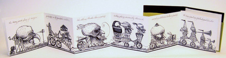
Yellow Submarine? Monty Python? Heath Robinson? Rube Goldberg? Hieronymus Bosch? Albrecht Durer? Quentin Massys? Whatever the influence, David M. Moyer has created choice work under The Red Howler Press. MIT has chosen well.
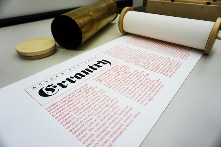
Errantry (2008) Werner Pfeiffer
Errantry, a 27-foot scroll housed in a howitzer shell casing, is inspired by Der Triumphzug Kaiser Maximilians or The Triumphal Procession of the Emperor Maximilian (1515), a series of 130 woodcuts by Hans Burgkmair the Elder (1473-1531) and others, about which Pfeiffer comments: “One of the dominant features in this document is the militant nature of many of the characters depicted, as well as their posture in parading their arms on horse, by carriage or on foot.” The text in Errantry draws from a poem of the same name in J.R.R. Tolkien’s Middle Earth mythology. The source poem, composed by Bilbo Baggins, describes one of his quest adventures in the usual self-aggrandizing yet self-pitying tone. As a model for Pfeiffer’s text, it makes the digitally printed images of war all the more horrible.
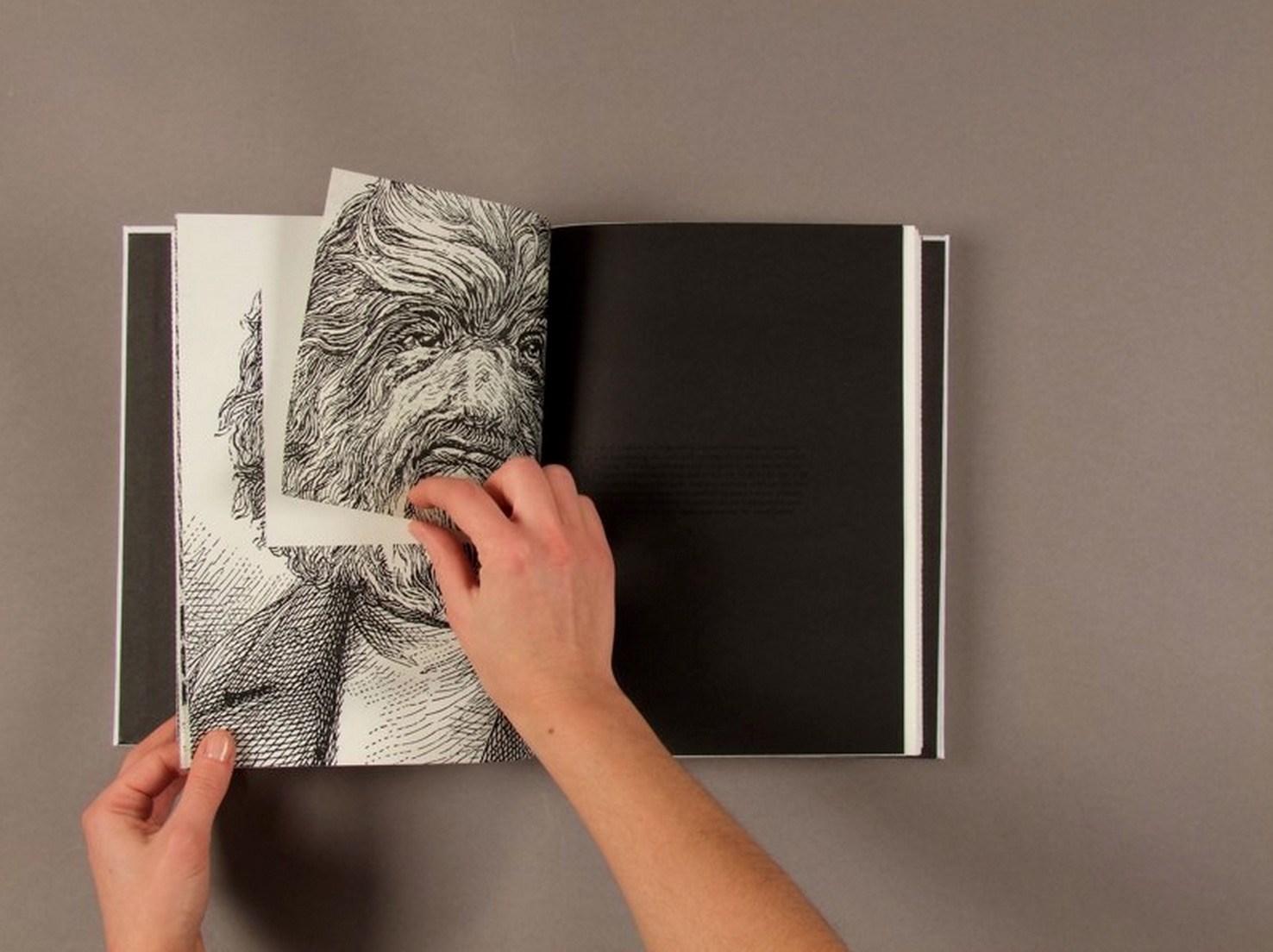
The picture above comes from Linda Toigo‘s interactive edition of Robert Louis Stevenson’s The Strange Case of Dr. Jekyll and Mr. Hyde. The interactive elements consist of opening envelopes, ripping pages, constructing illustrations from jigsaw pieces, turning and returning pages facing reflective surfaces, but just as engaging — perhaps more so — is the unified way in which layout, texture, page size, illustration and half-tones achieve a gothic atmosphere. Experience it here online.
Going to and fro between her blog, website portfolio and Vimeo site is like viewing a solo exhibition in the artist’s company. When you have finished viewing this two-minute video, treat yourself to Toigo’s book art animation. I especially enjoyed the “hide and seek” effect of the three-level accordion and tunnel book work Annar and the Moose. But what is worth repeated viewing is Medieval and Modern History (Suggestions for Further Study for Jack Hroswith) (2013), in which the artist uses lit matches, a glass surface and her fingers to burn, excavate and sculpt the pages of a used history textbook. Jack Hroswith is the owner’s name inscribed on the opening endpaper, which is a haunting piece of random history reflected in the artist’s creative process:
… I gave chance a prominent role: with the same morbid fascination that inspired the fire officer in Fahrenheit 451, I let fire burn its way on the pages, and I observed the devastation of words, maps and illustrations. At the same time, however, I kept a certain level of control on the destructive process developing a quick reaction to avoid the complete dissolution of the book: for every page I waited for the fire to reach a chosen sentence or a specific image before pushing the paper down onto a glass surface with my fingertips.
In her blog, Toigo notes the influence of Gustav Metzger’s Autodestructive Art manifesto from the 60s, John Latham’s burning Skoob Tower and sequences from Truffaut’s Fahrenheit 451. Toigo seems to have no “anxiety of influence”. While her works echo those of contemporaries and twentieth century book artists, they do so in her own voice.
Further Reading
“Islam Aly“. 13 January 2020. Books On Books Collection.
“Doug Beube“. 21 April 2020. Books On Books Collection.
“Jessica Drenk“. 29 August 2024. Books On Books Collection.
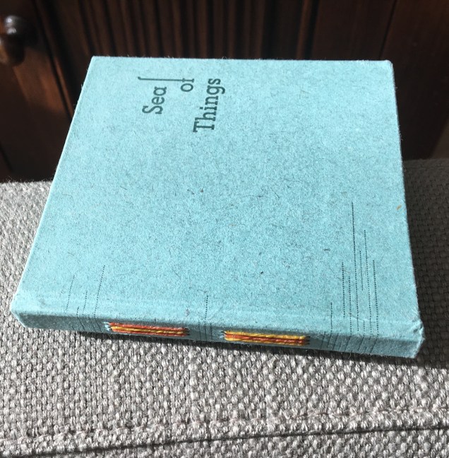
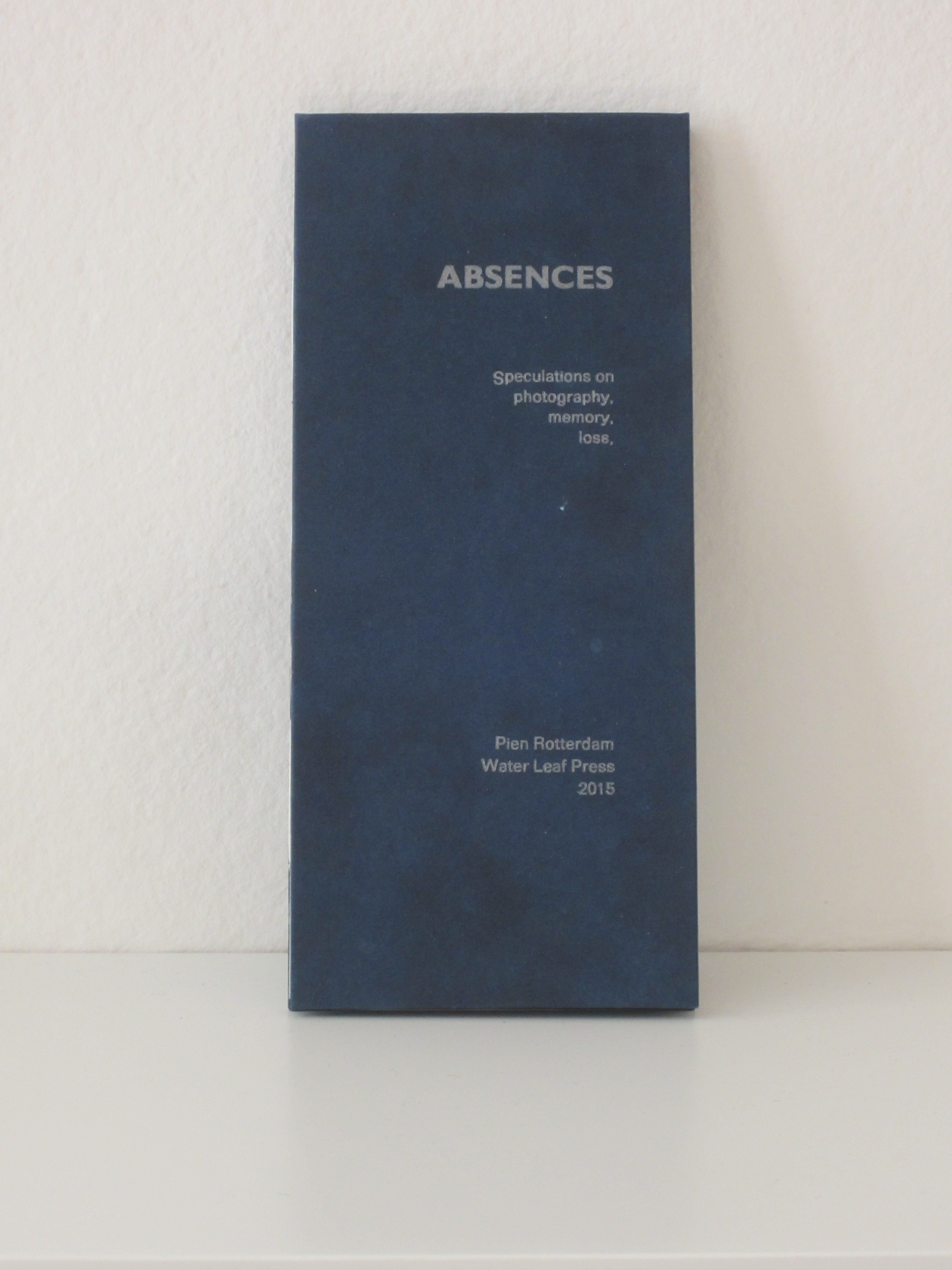
Again and again, Pien Rotterdam’s works — Sea of Things (2014) and Absences (2015) — reward reading and contemplation.
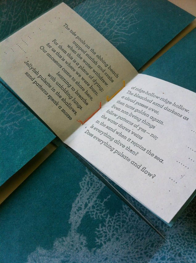
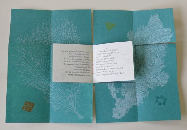
Sea of Things (2014) Pien Rotterdam Border book structure; 11 x 10.5 x 1.3 cm closed; 20 by 30 cm folded out Image printed into kozo/cotton paper with very fine paper pulp; text and cell-like patterns printed letterpress on kozo/cotton/abaca paper. Set in Atlas and Atlas Light. Acquired from the artist, 17 July 2017.
Sea of Things (2014) Pien Rotterdam
Sea of Things (2014) Pien Rotterdam
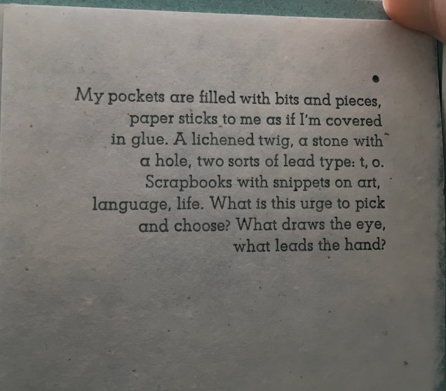
The images of the coral, square, circle and triangle are “pulp printed”, a hybrid silkscreen/papermaking technique, which Rotterdam learned from Tim Mosely. The images themselves are made of fine pulp paper, transferred to, pressed and dried together with the receiving kozo/cotton paper. Message (or image) and medium are one, a sea around the letterpress text, whose words and acts described harmonize with technique, material, color and shape. Here are “pages” 1 to 5 as a sample.
Sea of Things (2014) Set in Atlas and Atlas Light on kozo/cotton/abaca paper.
Sea of Things (2014) Pien Rotterdam
Sea of Things (2014) Pien Rotterdam
Sea of Things (2014) Pien Rotterdam
Sea of Things (2014) Pien Rotterdam
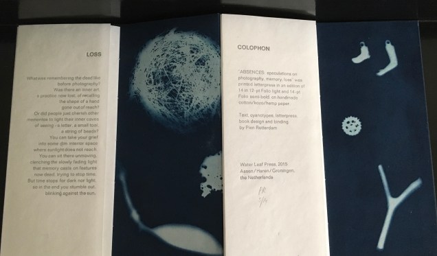
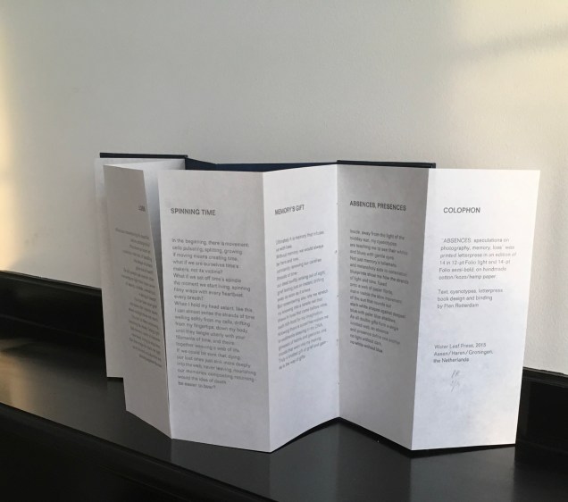
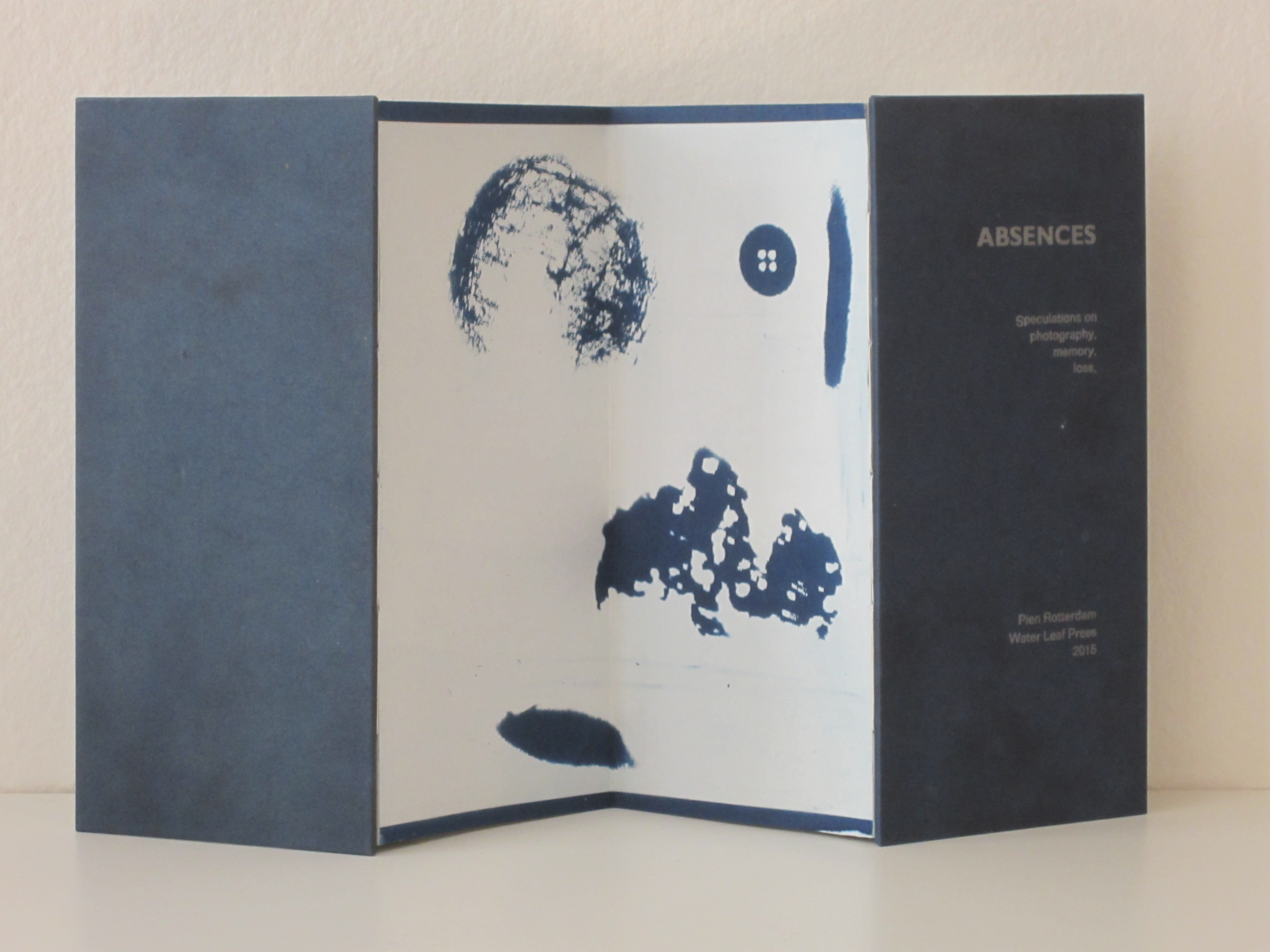
As with Sea of Things, Rotterdam achieves another singular union of technique and meaning in Absences. Where Sea of Things addresses selecting and collecting, Absences addresses loss, memory and the experience of time.
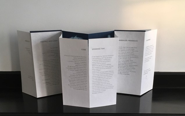
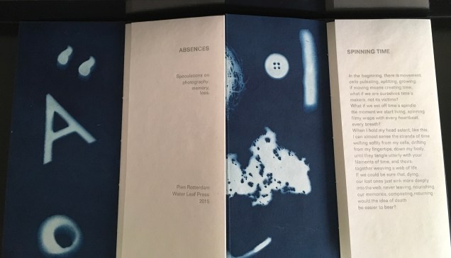
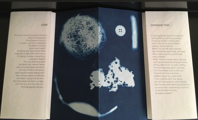
Absences (2015) Pien Rotterdam Concertina structure. Cyanotype on photogram and text paper handmade from kozo/cotton/hemp in different weights, apart from the cyanotype on the back, which is made from Japanese paper. Letterpress in Folio light (lead type) with silver-grey ink. 10.5 x 23 cm when closed, 42 x 23 cm open. Acquired from the artist, 17 July 2017.
Absences (2015) Pien Rotterdam
Absences (2015) Pien Rotterdam
Absences (2015) Pien Rotterdam
Absences (2015) Pien Rotterdam
Absences (2015) Pien Rotterdam
Rotterdam’s explanation of the connection between technique, material and meaning can hardly be bettered:
When I made my first cyanotype photogram ten years ago, I was immediately struck by the way in which light shapes against a deep-blue ground show, simultaneously and paradoxically, what was there when the paper was exposed but what is now no longer there: the photogram makes absences visible. This realisation has led to an exploration of the metaphorical properties of the cyanotype process and to speculation on the relationship between photography, mementos, and memory, between memory and loss, and on the nature of time, in six brief reflective texts.
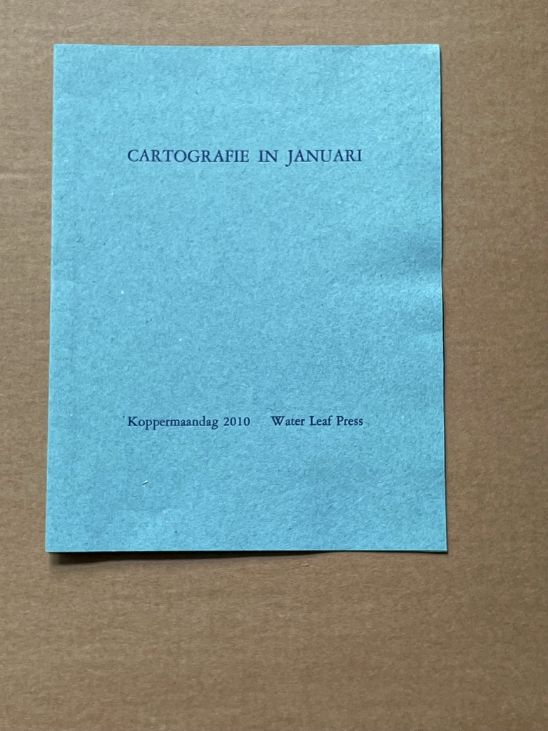
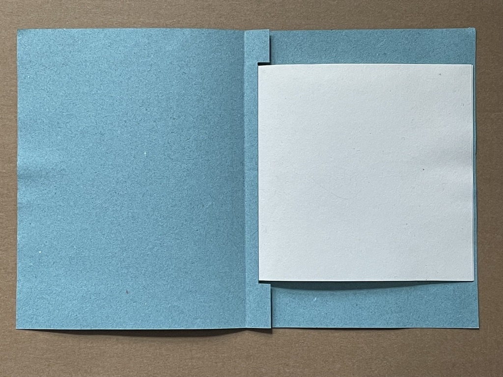
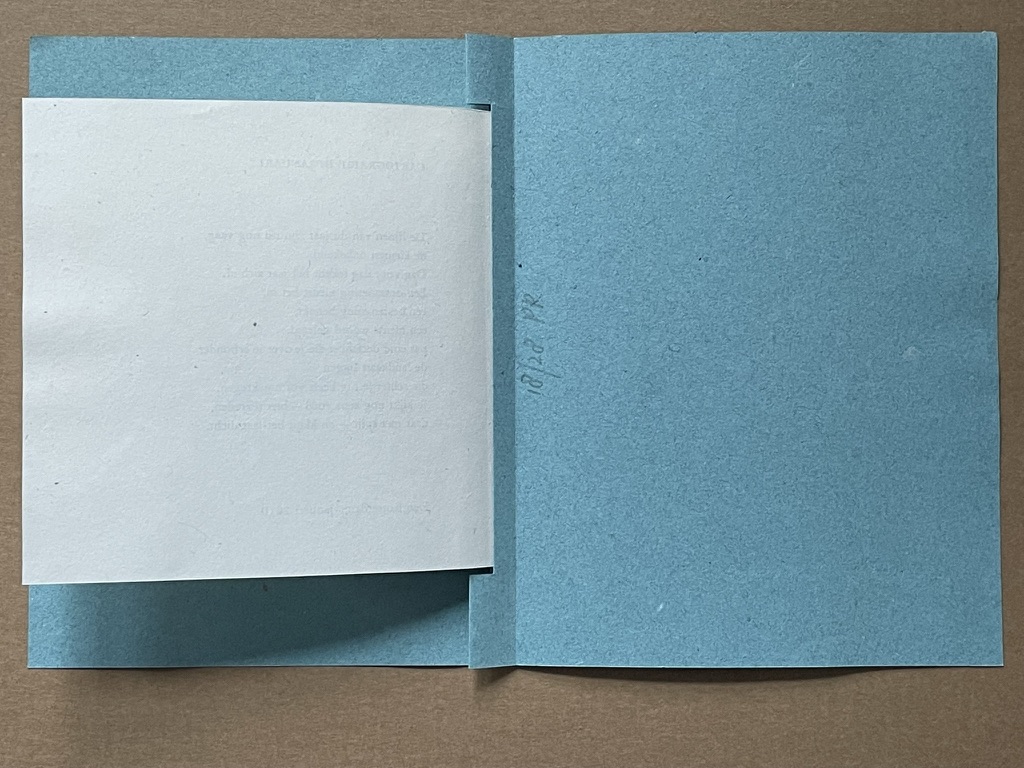
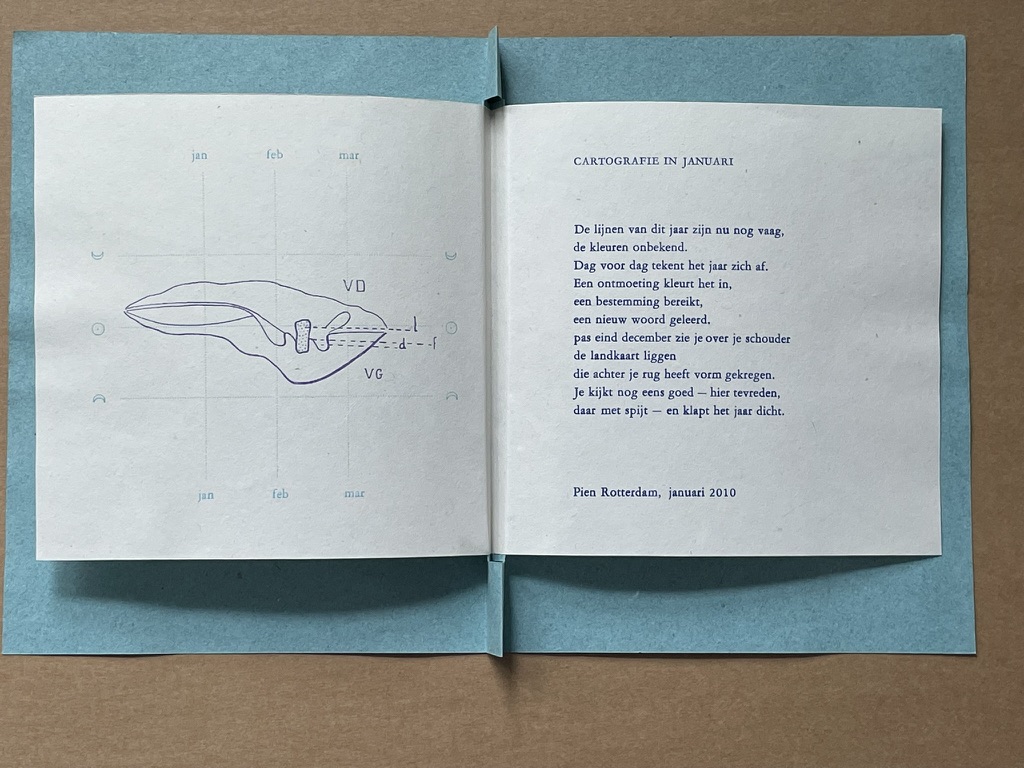
Cartographie in Januari (2010)
Cartographie in Januari (2010) Pien Rotterdam Pamphlet, modified stub binding, sewn. H160 x W130 mm. 1 folio, 2 panels. Edition of 28, of which this is #18. Acquired from the artist. Photos: Books On Books Collection.
This year’s lines are still vague, the colors unknown. Day by day, the year takes shape. An encounter colors it in, a destination reached, a new word learned. Only at the end of December do you see the map lying over your shoulder, which has taken shape behind your back. You take another good look—here with satisfaction, there with regret—and close the year.
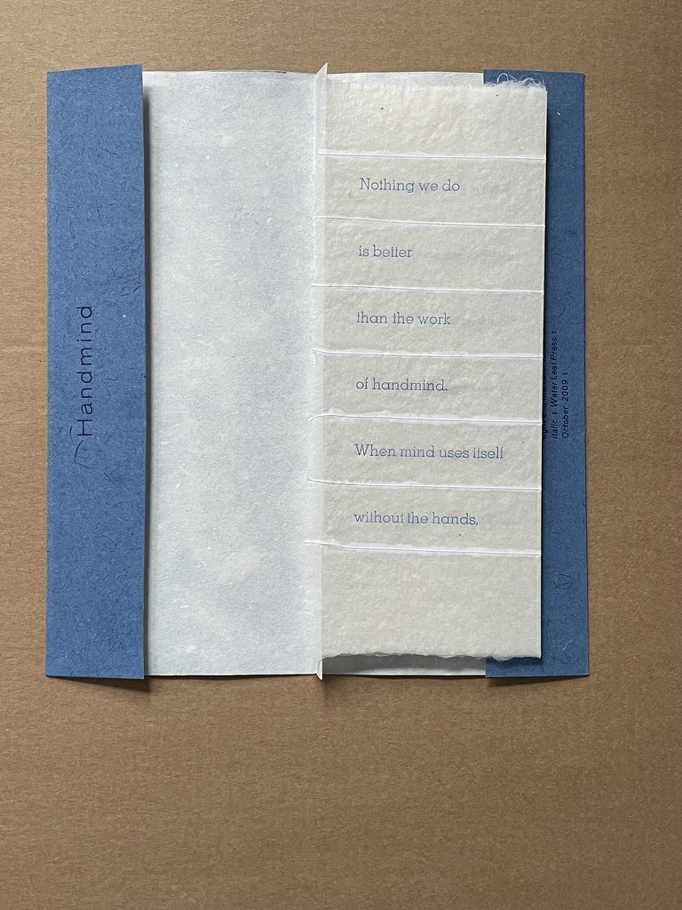
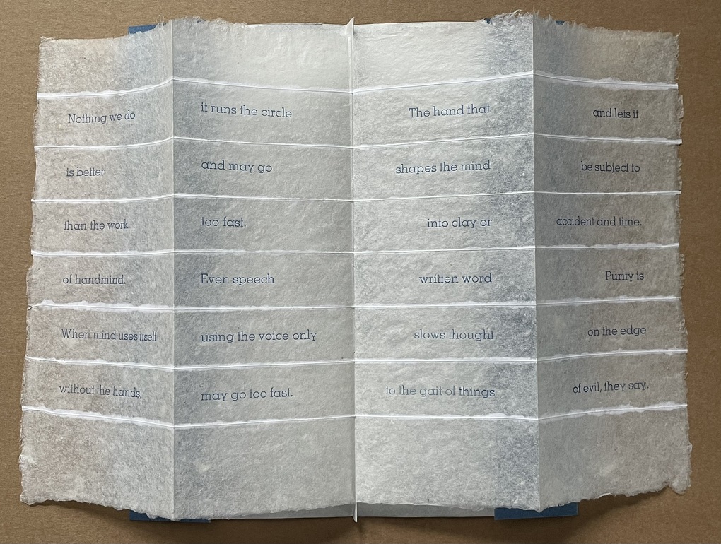
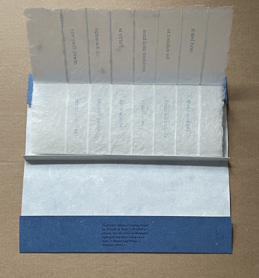
Handmind (2009)
Handmind (2009) Pien Rotterdam Pamphlet, stub binding, sewn, printed on abaca, flax & cotton. H202 x W90 mm 2 folios, 4 panels. Text from Ursula K. LeGuin “Always Coming Home”. Limited edition (unknown qty). Acquired from the artist. Photos: Books On Books Collection.
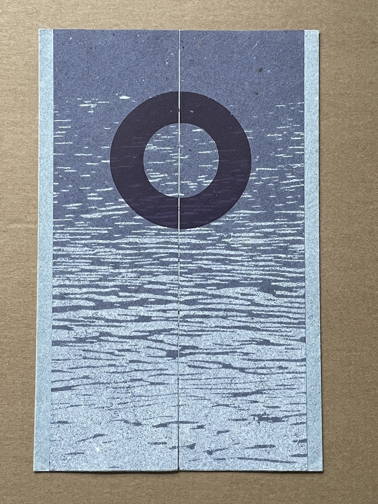
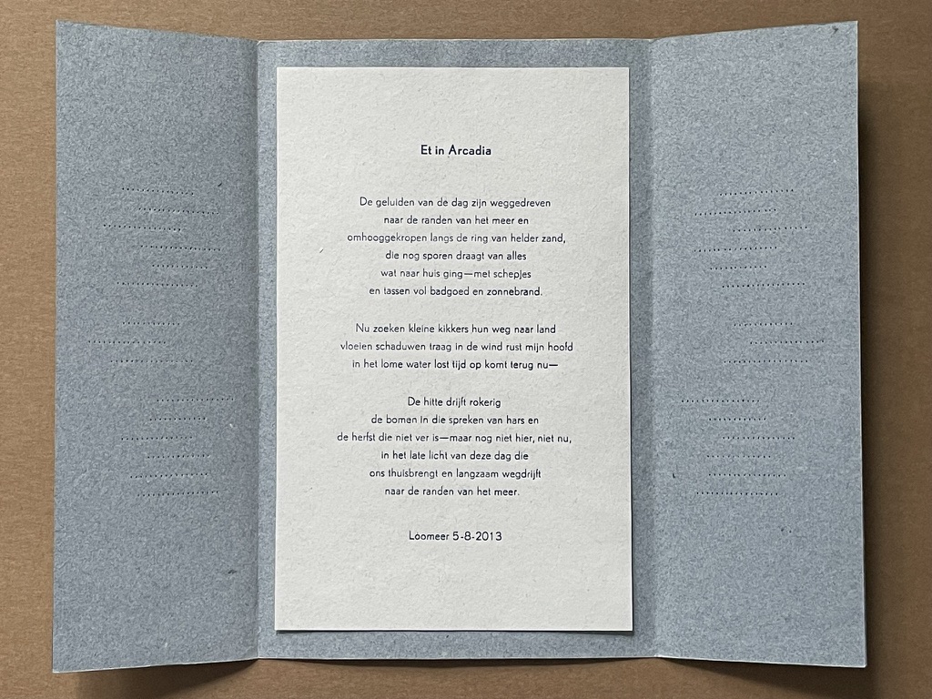
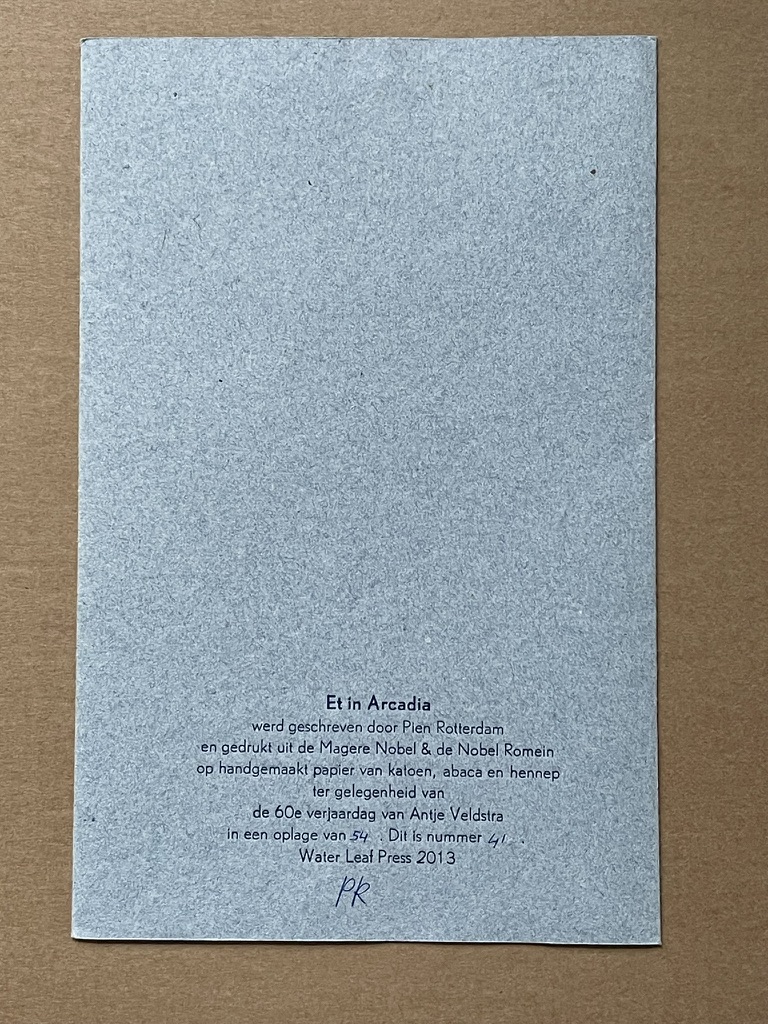
Et in Arcadia (2013)
Et in Arcadia (2013) Pien Rotterdam Pamphlet, French fold. H210 x W135 mm. 1 page. Edition of 54, of which this is #41. Acquired from the artist. Photos: Books On Books Collection.
The chatter of the day has drifted to the edges of the lake and crept up along the ring of bright sand, which still bears traces of everything that went home—with shovels and bags full of bathing gear and sunscreen. Now little frogs find their way to land, shadows flow slowly in the wind, my head rests in the languid water, time dissolves, returns now— The heat drifts smoky into the trees that speak of resin and autumn that is not far off—but not yet here, not now, in the late light of this day that brings us home and slowly drifts away to the edges of the lake.
Rotterdam’s site rewards repeated visits. It traces her development as a book artist since 2003 and demonstrates mastery and strength at each stage. Her work can be acquired through the site. Rotterdam lives and works in Groningen, The Netherlands, home to the Book Arts Network, Grid Grafisch Museum and De Ploeg, an artists collective started in the early 20th century.
Further Reading
Hirschey, Paige. 7 December 2023. “Rhapsodies in Blue: Anna Atkins’ Cyanotypes“. The Public Domain Review. Using the cyanotype process, Anna Atkins produced the world’s first photograph album.
In the hands and mind of Anouk Kruithof, book art is made to sound intimate notes (Automagic, 2016) and grand notes (Enclosed Content Chatting Away in the Colour Invisibility, 2009 ongoing). She has packed so much art, enterprise and life into her life that it is hard to find sufficient time and resource to keep up with her activity. In 2017 and at the turn of 2018, a flurry of commentary arrived to mark her show ¡Aguas! at Foam Fotografiemuseum in Amsterdam. A fortunate effect of social media and the Web is that current news seems to pull retrospective links in its wake.
For Max Van Steen’s perceptive review of AUTOMAGIC (pictured above), click here.
Here are some of the videos and sites featuring Kruithof, her activities and art:
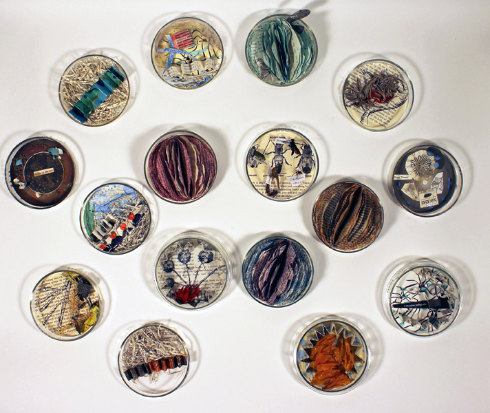
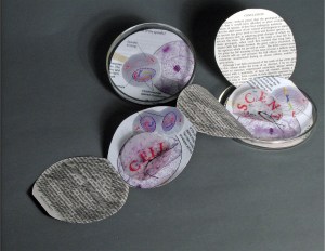
Cell Compendium (2008-2016) Diane Stemper The work began with a gallery installation of Cell: Descent and 25 petri dishes filled by gallery visitors with science facts, liquid and solid matter. The installation in 2016 included 75 dishes filled with small altered found text books, drawings, and specimen objects housed in petri dishes.
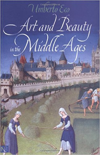
In the middle of a shelf in Diane Stemper’s Ohio home, Umberto Eco’s Art and Beauty in the Middle Ages sits bookended, on the left, by two books about Francis Bacon and, on the right, by a small monograph on Pierre Bonnard and another book Art and Culture of Japan. The books are not organized alphabetically or chronologically. When she pulls the book out, it feels perfect, not too thin or thick, its dimensions and weight ideal for carrying in a shoulder bag. It has a feeling of secrets and importance.
Since discovering Stemper’s work at the Center for Book Arts (New York, 2014), I have wanted to talk to her about the themes and material that drive that work. Art and science, paper and glass, the universal and the particular, ink and watercolor, the physical and the spiritual. We finally arranged it in medias res, and she agreed to this oblique approach to her mind and art.
BoB: As you open Art and Beauty to its mid-point, what do you hear, smell or see about it or around it?
DS: Well, not sure if you mean inside of the room I am in or the memory it conjures, so I will go with memory. The words “cathedral”, “Chartres”, “vestibule”, “allegory” take me from the immediate space of my front room to the interior of a European cathedral or even perhaps as a child to the pews of St. Paul Cathedral in Minnesota during midnight mass. There is the fragrance of incense, the dark light of an imposing building, chanting and mystery. There are also the many hands of craftsmen chipping away at stone, painting glass and the laborers who put it all together and probably were not treated all that well.
Then there is that word “parabolic” and Eco’s explanation of Aquinas’ description of the arts as being literal, that the poetic image and its meaning were in the mind of the “reader” and that this association was a “matter of habit” – this reminds me that I and my viewers have different habits of mind, from the museum visitors I once toured who loved Impressionism and were hostile to Rothko, to the viewers responding to my specimen series – “why are they dead, did you kill them, that’s icky”. Surface literalism can be a matter of what one is familiar with and fearful of what one does not understand, but it can also be a “way into a piece” if the viewer is willing.
BoB: At the end of his book, Eco sums up his explanation of how the medievals looked at art with this startling statement, “They saw the world with the eyes of God”. What of today’s viewers of art and, in particular, those who look at your art?
DS: When originally picking the book from the middle of the middle shelf and then opening it to the middle, that sentence you mentioned — “The association of an image with a certain meaning is a matter of habit” — leapt out. Eco was referring to the ability of people of the Medieval period to read an image as if it were a literary text, for example, knowing instantly which animals or colors represent which biblical figure or story. However, I am reading Eco’s words from my 21st century vantage point, where there isn’t necessarily a concrete set of universal meanings assigned to objects or colors that every person understands and knows.
He also writes that the medieval mind loved a puzzle, that it was part of public discourse to figure out symbols and the inherent meaning within images. That there was adventure in the act of discovery. And another phrase that struck me: “Grasping reality through sense knowledge.”
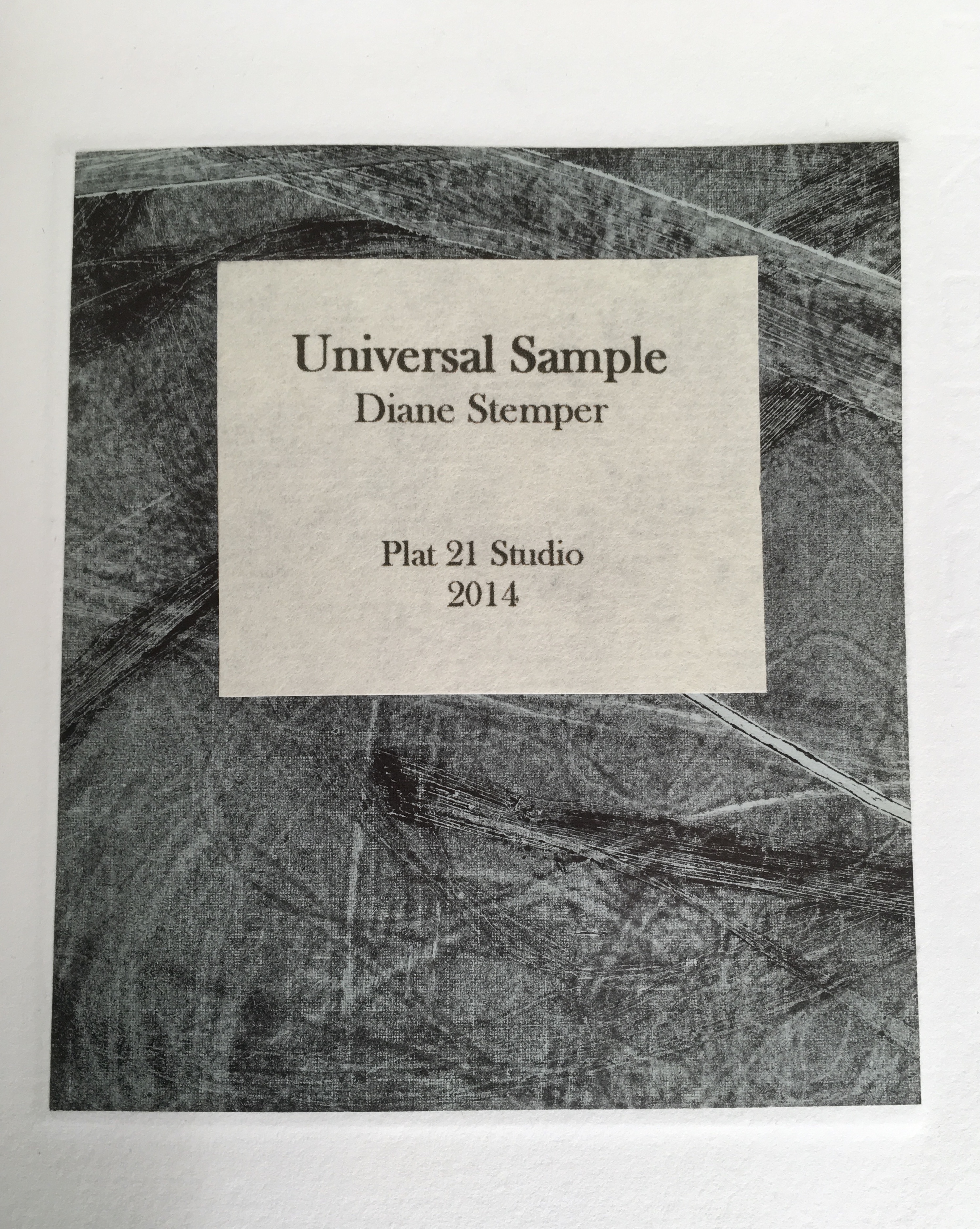
Universal Sample (2014) Diane Stemper Edition of 4, Intaglio and letterpress on Arches
Today’s “matter of habit” is problematic when viewing art. For some of my pieces, in particular Universal Sample and my drawings and prints of specimens, the viewing can be rather cursory, a knowing, habitual glance that says, “oh I see what that is”. The glance sums up the object in very simplistic terms. In this case, for the viewer, the specimen represents death or some distasteful high school experience of dissecting a small creature, and nothing more. It is possible to look at visual art not just with visual sense but in partnership with other physical sensations conjured by the image. Looking at the work as if there is more than meets the eye, that there is an underlaying sensibility to the image that references another experience or feeling or bit of knowledge, a smell, a sound…or that of the animal or that of the instance in which the animal finds itself, or the moment that a curious person finds such an animal. Imagining that moment — “What was it like?”
So, I hope that people will approach my artwork with imagination and not as a matter of habit — to look at my work as if it is a bit of a puzzle, not a straightforward statement or concept but more of a string of thoughts, feelings and visual and sensate information to be arranged and rearranged to come to some sort of conclusion or idea about the meaning, however uncertain that may be.
BoB: Do you recall the circumstances of the book’s purchase? What were you doing when you decided to buy it?
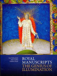
DS: I absolutely remember. I was living in London with my spouse and family as part of a study abroad program my spouse was leading. Each day, after all were at school or otherwise occupied, I would head out in pursuit of art, medical museums, natural history oddities or any number of things and on one day I went to the British Library to see an exhibition, Royal Manuscripts: The Genius of Illumination. This was an exhibition of the several collections representing centuries of books commissioned by kings and queens and to my delight there were books on medicine, science and nature. After spending a very long time in the exhibition, I went to the gift shop where I found the Eco book. The extraordinary detail of the manuscripts I had just seen and the enormity of the exhibition itself put me in the mood to purchase the book.
BoB: As an artist whose work has an intimate relationship to “the book,” could you describe the effect this has on you when you are reading books in general or when revisiting the Eco book in particular?
DS: In general, when I am reading a book versus the screen of a device, I enjoy the structure of the book and understanding the manner in which it is assembled. The type of binding, the quality of paper, the action of the pages, do they lay flat or do they fight. I find the term “perfect binding” ironic as I am reading a book where the pages are falling out. I typically notice the condition of a book, faded covers, mildew or wear on the edges. Books with these qualities I feel a bit sorry for as I wonder where their next home will be, probably not my local library or the used book store, since here in Ohio, we haven’t many of those. Maybe they will live a short while at the Goodwill Thrift Store and from there, the recycle bin. Books are a bit like an endangered species and I am at times concerned that the youth (I have one at home) are only relating to books as they are required to do so at school and not as a place of refuge, ideas and travel. It is hard for books to compete with the ever-present screen and digital speed of information and interaction.
The Eco book in particular is a pathway back to London, to other centuries, to a time when art was the screen of the day and to the Royal manuscript exhibition. The books in the exhibition survived over centuries; the hours and hours of skill, artistry and dedication it took to not only create the books but to also preserve them gives me pause. The Eco book itself is not a great work of craftsmanship as an object, it is, after all, bound as a “perfect binding”. Still, it has not fallen apart yet, so the binders must have used a better-quality glue. Instead, the Eco book is a vessel of ideas and murmurs of what it meant to have art and beauty in one’s life hundreds of years ago. What are my intentions when opening a book? To be lifted away from the present, to enter another time period or another person’s circumstance or to be visually transported.
BoB: Turning the question on its head, when the act of creating a work rather than the act of reading is in flight, how do books feed your working process?
DS: For my series on Darwin, all seemed to fall into a flawless moment. I happened upon dozens of petri dishes and had already been thinking about Darwin’s 200th birthday. It is an instance of form and content playing together without much conflict or negotiation. From that came many books that really seemed to define themselves both in structure and content.
Cell Book #37 (2014) Diane Stemper
My books built into petri dishes are a different viewing experience for people because the dish itself is so familiar and suddenly the viewer finds the dish in an unusual circumstance, that of being a book. People pause, take notice and naturally ask questions, they seem unleashed from any customary reaction or habit and are open to an idea. The dish is an entry to figuring out a puzzle and not a barrier, such as an image of a dead bird or a dissected lizard might be.
The first books (Cell: Compendium) were in direct response to various nearby communities that were pushing for “creationism” to be taught in the public schools. The petri dish is a universal item repositioned and viewers find it humorous, unique or “creative” and while some stop there, most people are prompted to go further. The recognition of the petri dish spurs and opens the door to more meaningful connections and interpretations.
Compendium of Fact #1 (2009) Diane Stemper
Mostly however, when making my art work, initially the book structure is secondary, a simple vehicle for the content. Imagery, content, text and the oblique narrative story are primary and the development of the images and content are the key portions of my studio work. I use other books in my work, discarded textbooks and spines, for instance, that I take apart and rework. I also use books as reference, looking for a word or phrase, a bit of information to jumpstart a narrative about a topic I am interested in. I borrow science imagery to create and integrate with my own images. I am an observational artist and that includes observing via books as well as nature.
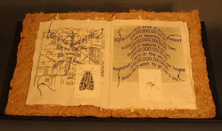
Discovery Plat 21 – Numbers (2001) Diane Stemper A unique artist book. One of four unique books exploring the life of insects as observed on, in, around an Ohio porch. Book 2 (Migration), Book 3 (Pause) & Book 4 (Flight) in the special collections of the Cincinnati Public Library, Hamilton County, Ohio.
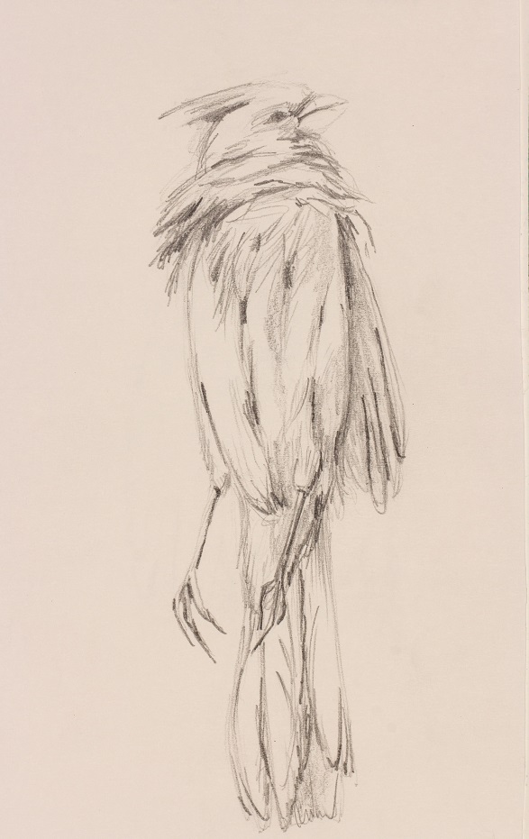
Ohio Specimen Cardinal (2016) Diane Stemper
Once the content and images are in motion, the book structure comes into play and that is when the many possibilities of the structure interact with the content and it is really the most significant challenge of creating an artist book. I do not like to use book forms for the simple novelty of the structure or for the entertainment factor (for instance a pop-up or tunnel book) unless of course it really fits the topic. I want viewers to focus on the images and feeling or message of the work, so the book structure becomes, is, or should be a thoughtful object that houses an idea or an experience, it is in service to the artist, to the viewer, it invites the viewer in and then steps aside.
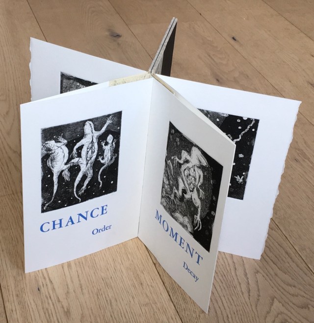
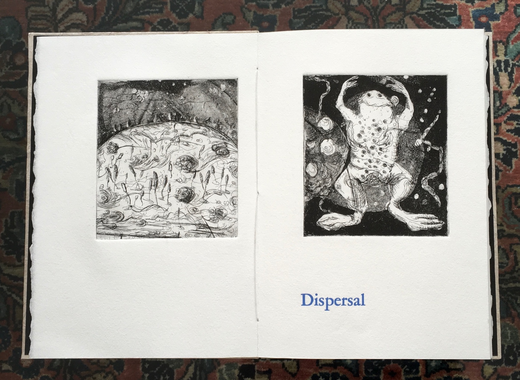
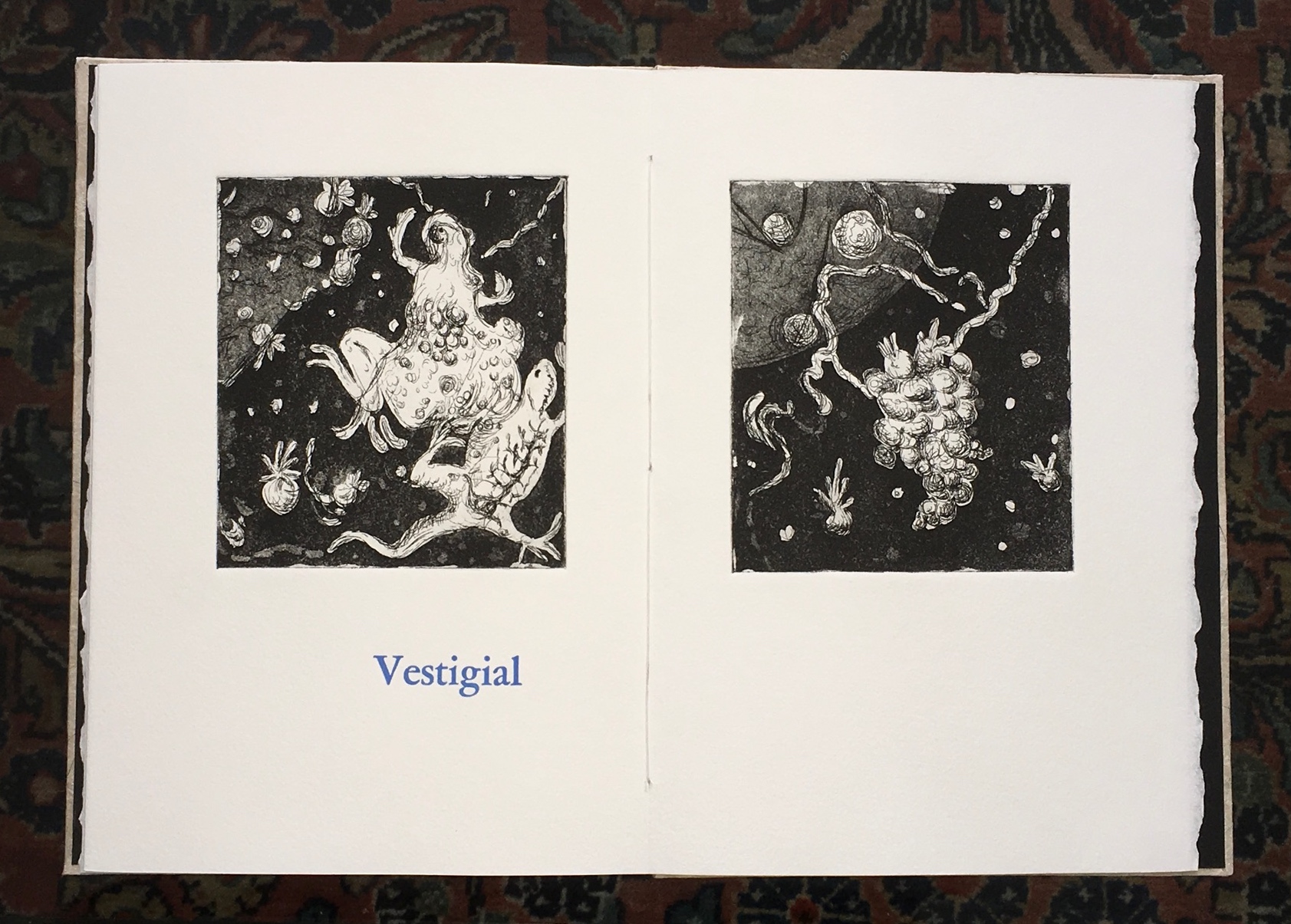
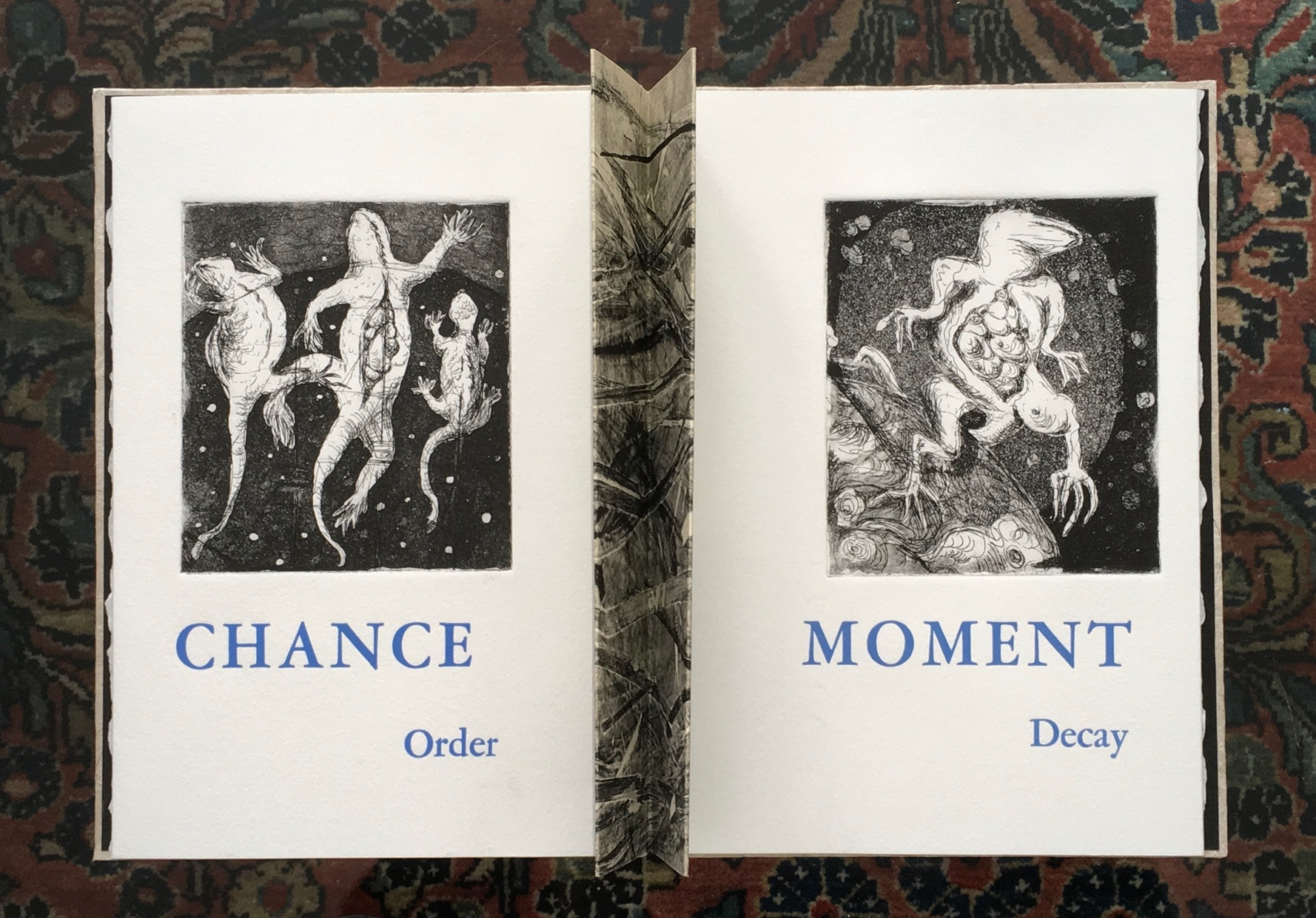
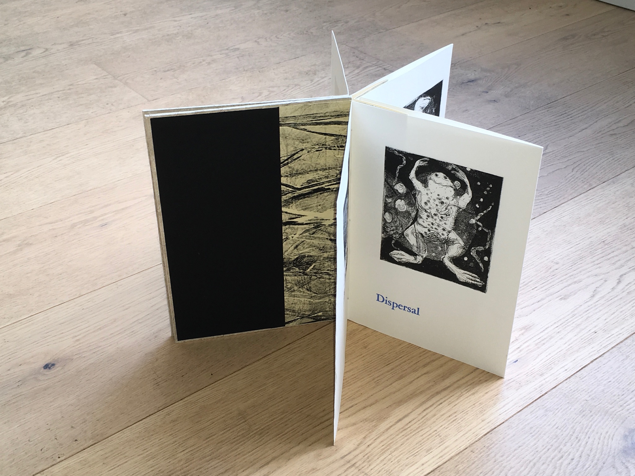
BoB: Let’s turn to Universal Sample in some more detail. I’d like to ask you to comment on the intersection between the words in Universal Sample (“universal” and “sample”, “chance” and “order”, “moment” and “decay”) as well as the intersection of the words with the prints, their color, the paper you used, and the star structure.
Universal Sample (2014) Diane Stemper Edition of 4, Intaglio and letterpress on Arches
DS: First, let me say the entire book, the six images and the text, is meant to present obliquely a life cycle of early life forms. The images are inspired by my own source material comprised of many drawings of specimens that I did at the Hunterian Museum at the Royal College of Surgeons in London.
The title, Universal Sample, is singular and expansive. A sample is one bit of something larger that is collected and taken from a whole and isolated, universal represents a larger inclusive whole. In this case “Sample” is not numbered or identified. It is in relationship to all else, is composed of and is evidence for all else.
Dispersal – Begins the book and alludes to creation.
Universal Sample (2014) Diane Stemper Edition of 4, Intaglio and letterpress on Arches
Vestigial – Ends it and alludes to remains.
Universal Sample (2014) Diane Stemper Edition of 4, Intaglio and letterpress on Arches
Chance – In part I feel the world is a chaotic place where the intentional can be overcome by chance and luck, circumstance and happenstance.
Order – This is about human systems (religious, scientific) within a chaotic world and about the molecular combining and recombining relative to evolution over millions of years which bring about reasonable order within an ever-changing environment.
Universal Sample (2014) Diane Stemper Edition of 4, Intaglio and letterpress on Arches
When I place the words “chance” and “order” together, I am referencing religion as a human system attempting to bring order to chaos, to explain the inexplicable. The images progress from an unidentified plasma or bubbly life form to a life form that appears to be lizard like, one of the early animal forms on earth. One print shows three lizards, a trinity of sorts, impaled perhaps, especially as specimens might be. Floating, they represent the substance, atom, molecules, electrons, neutrons that I know exist versus the Trinity as espoused by Christianity that I am not so certain about. In this way, I am harking back to the root of an entire body of work that I have made that draws upon Darwin’s On the Origin of Species.
Moment and Decay are read together with the image of a frog, a frog that is decomposing, reordering and redistributing its cells. I want the text to key viewers into the idea of a space, gap, a line or moment when decay begins. The last print is of an imaginary cellular structure of a life form as it is releasing and redistributing entirely into another space whether that is air, dirt or water or the space beyond our stratosphere.
The book structure, font and print size and paper choices are all subject to various constraints, such as paper and press bed size, size of copper, or availability of type face at the printmakers cooperative where I do my printing. For this book, I worked the structure of the book, image and text placement and layout simultaneously with content development and made at least a few small mock-ups to help me see the possibilities, resolve problems and keep me on track. I like book structures that are straightforward and that are an entry to the images and content. Sometimes, as with the Cell books, the structure is integral to the content of the work. For Universal Sample, what was going to be a simple accordion changed as I saw that the images and text could offer different ways in which to view and read the book. The star structure which consists of a series of three-page short accordions sewn into a concertina spine is elegant, seems like a standard book, a good frame for the images and when opened it can go beyond being a standard book and be manipulated and reconsidered.
Universal Sample (2014) Diane Stemper Edition of 4, Intaglio and letterpress on Arches
BoB: Where next with your art?
DS: I like anything that can be described as a collection, the more personal and odd, the better, and I find opportunities to visit natural history or medical museums when I can. Currently, I am finishing a book object that incorporates several of my drawings of backyard specimen finds. This work includes test tubes and refers to the challenge of birds to avoid hazards and remain undetected. I am also thinking about a series of artist books that somehow reveal the dozens, hundreds, thousands of birds that are housed in the drawers of collecting institutions.
BoB: With thanks to Diane Stemper for her time and reflection. To enjoy more of her work, see her site and also:
Diane Stemper received her B.F.A. in printmaking from the San Francisco Art Institute and a M.A. in Interdisciplinary Arts from San Francisco State University. Her work is included in the Artists’ Book Collections of: DAAP Library, University of Cincinnati, Ohio; Main Public Library of Cincinnati and Hamilton County, Cincinnati, Ohio; Special Collections, Miami University, Oxford, Ohio; and the Lucille Little Fine Arts Library, University of Kentucky.
Ruston’s art celebrates the natural world and human spirit, inviting viewers “to follow, to unravel secrets, and to pay close attention to the world around them”.
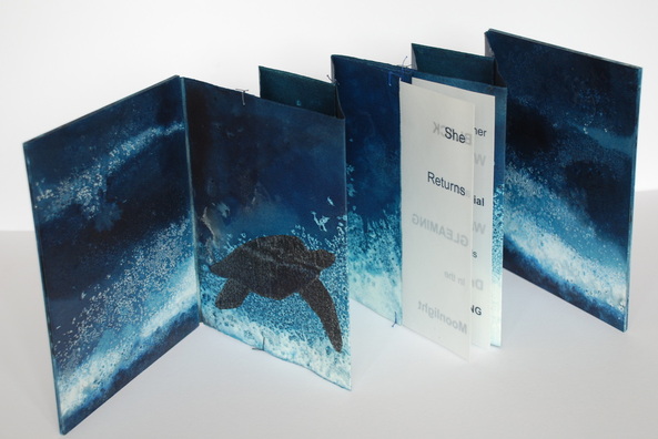
Chris Ruston She Returns (2011) 23.5cm x 18.5cm, Edition of 2
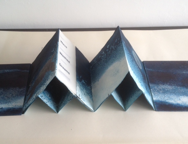
Part of a series called Ocean Blue, the book She Returns uses a double concertina fold and ink on Fabriano watercolor paper to invite us to follow the image of a leatherback turtle making its way through the deep, which fluctuates between the depth of blue-black and the shallows of blue-white. The text reads
SheReturns BLACK and GLEAMING
in the Moonlight
her Primordial needs Roaming WaveWashedDreams.
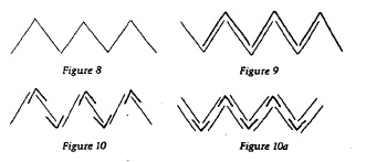
Originating from the Tang dynasty (A.D. 618-908) in China as the Orihon, the concertina fold is also called the accordion fold and sometimes the leporello*. For “She Returns”, Ruston employs a variant of the binding approach in Figure 9. It is
from Hedi Kyle, “Orihon’s Triumph: Origin and Adaptations of the Concertina Fold”, The Ampersand, Vol. 3, No. 2, December 1982.
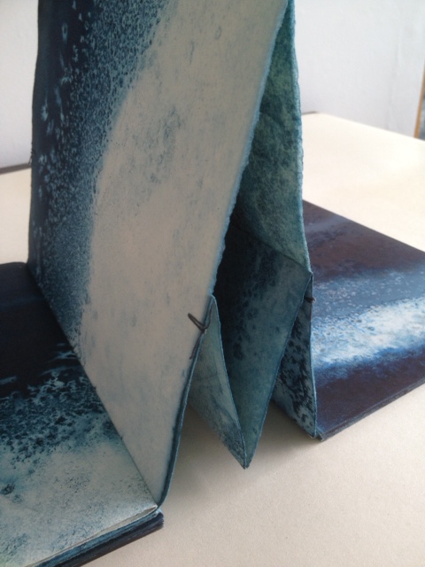
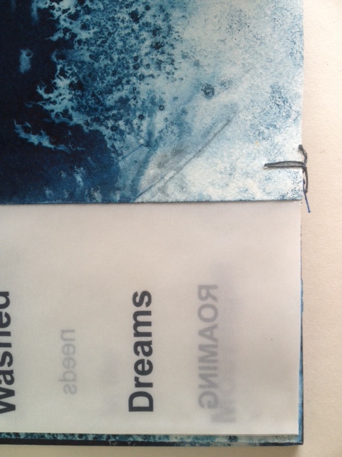
essentially two pages folded together into a concertina fold, but in origami terms, the “mountain” fold of one page is inverted to a “valley” fold, which creates “small boxes” between the pages when the concertina is opened as seen below. The single signature of transparent paper with text is sewn into the centre page. It is bound by a simple stitch top and bottom of each fold.
Painted board covers were then attached.”The stitches at the top and bottom of the page work well as it allows some small movement of the two concertina folds. As I saturate it with water and ink it needs to be a bit more robust but this means it can be bulky when put together.”
Binding detail of She Returns
Binding detail of She Returns
Binding detail of She Returns
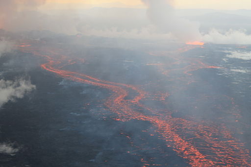
The Holuhraun lava field, on 4 September 2014, during the 2014 eruption
The Bárðarbunga volcano in Holuhraun, Iceland, is active. From August 2014 to February 2015, it erupted for 181 days.
Lava fountains of the fissure eruption in Holuhraun on 13th September 2014 around 21:20.
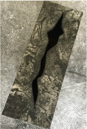
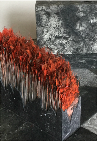
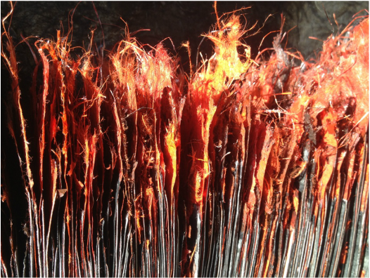
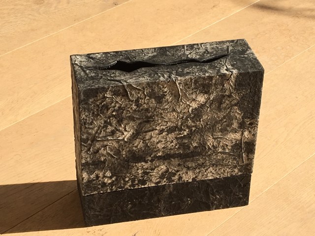
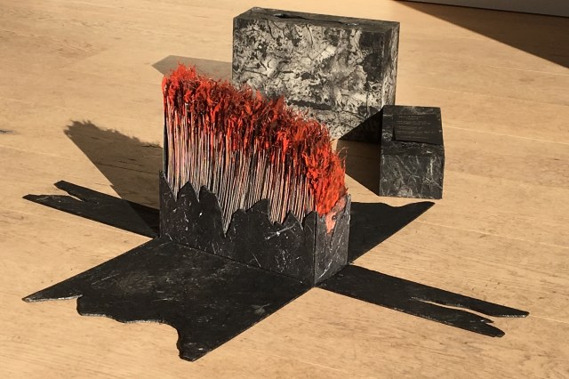
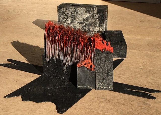
Ruston responded to that natural event with the work Holuhraun, 2014-2015.
Ruston’s Holuhraun reflects that duality of nature’s destructive creation and creative destruction. The sides of the box falling away mimic the volcano’s production of new land. But the work is more subtle than that; it implicates the viewers in that duality. In taking apart the closed object, we “create” or, at least, reveal another object of art.
Ice is the countervailing passion in Ruston’s art.
What a sight to wake up to on a cold winter’s morning – a blanket of thick frost over everything. Armed with camera, and a thick warm coat, I couldn’t resist taking a detour on my way to the studio. The air was still, the grasses and branches coated with ice crystals, all bathed in a soft gentle light. I spent a pleasant hour surrounded by the gentle rustle of ice crystals softly falling to the ground. (12/12/2012)
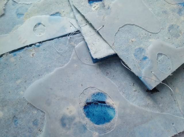
In response to her natural surroundings, as well as powerful films such as James Balog’s Chasing Ice (PBS, Nova, 2102) and installations like Olafur Eliasson’s Your Waste of Time (MoMA, New York, 2013), Ruston created Are We Listening?, a work of small pieces of handmade paper into which random text is incorporated and overlaid with transparent paper. Human time and earth time, destruction and creation, recurrently emerge as central themes in Ruston’s art whether touched by fire or ice.
Chris Ruston Are We Listening? (2013) Handmade paper, ink, transparent paper 15cm x 10cm
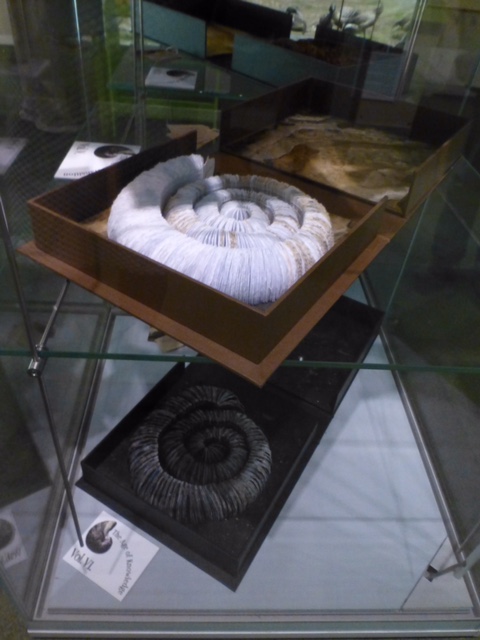
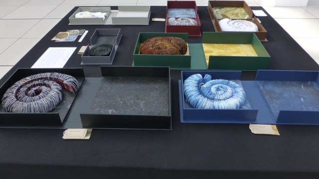
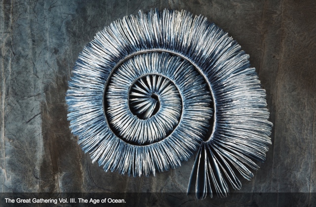
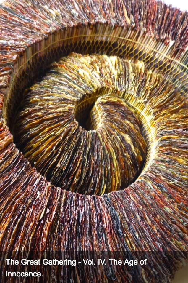
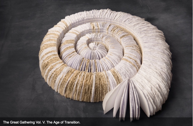
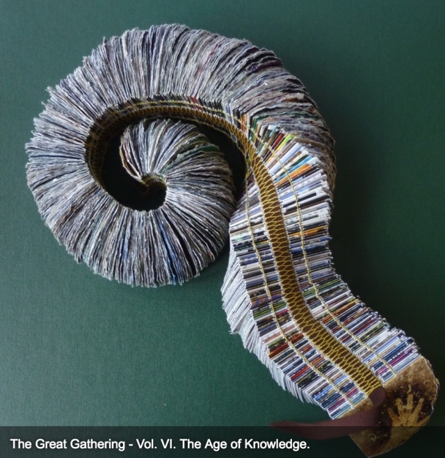
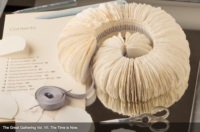
In capturing these themes, The Great Gathering (2015) may be Ruston’s masterpiece — so far — in making visible how the world touches us, and how we touch the world. In this work, she has drawn her inspiration from ammonite fossils on display in the Sedgwick Museum of Earth Sciences, Cambridge, and the Colchester Natural History Museum. The Great Gathering first appeared as an installation at the Colchester Natural History Museum, which is housed fittingly — especially for this work — in a deconsecrated church.
The Great Gathering, Seven books, seven moments in time (2015) Natural History Museum, Colchester, Essex, England Photo credit: Chris Ruston
Chris Ruston The Great Gathering, Seven books, seven moments in time (2015) On display at Turn the Page, Norwich, England, May 2016 Photo credit: Chris Ruston
Ruston writes:
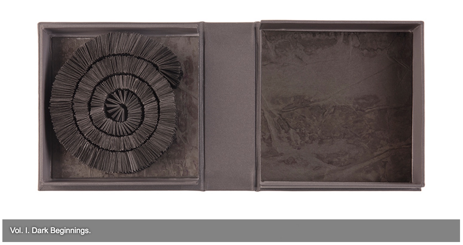
Using the ammonites spiral shape as a starting point, these books represent the unfolding story of evolution. The humble ammonite is an abundant index fossil, easily recognised, and a regular feature in museum collections. Often associated with journeys, symbolically these particular fossils are believed to have absorbed the knowledge of the Universe from across the centuries.
Science and art are the presiding geniuses over many works of book art.
In The sciences of the artificial (1969), Herbert Simon emphasized: “The natural sciences are concerned with the way things are” and engineering, with the way things ought to be to attain goals. Like the scientist, the artist, too, is concerned with the way things are. They are the raw material with which the artist works or to which he or she responds. But like the engineer or the designer, the artist is concerned with the way things ought to be to make visible “the way things are”:
The Great Gathering (2016) Chris Ruston Photo credit: Chris Matthews
how a solander box ought to be constructed to operate with the work and, in enclosing it, be “the work”;
The Great Gathering (2016) Chris Ruston Photo credit: Chris Matthews
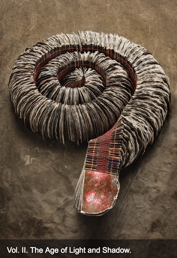
what materials (photos from the Hubble telescope) ought to be used to reflect a moment in time;
The Great Gathering (2016) Chris Ruston Photo credit: Chris Matthews
how thread, tape and stitch ought to be to hold together a spine that will flex and spiral into the shape of a fossil;
The Great Gathering (2016) Chris Ruston Photo credit: Chris Matthews
how the color of the material ought to be juxtaposed with the material’s altered shape to carry meaning;
The Great Gathering (2016) Chris Ruston Photo credit: Chris Matthews
how the shift from content to blankness ought to be juxtaposed with the material’s altered shape to carry meaning;
The Great Gathering (2016) Chris Ruston Photo credit: Chris Matthews
how the selection and alteration of text ought to be made to show the fixity and flux of knowledge and ourselves;
The Great Gathering (2016) Chris Ruston Photo credit: Chris Matthews
and how our reflection in the mirror in Volume VII under the maker’s tools and the made thing ought to implicate us — a theme echoed above by Holuhraun, 2014-2015 — in an ongoing process of making and remaking.
For her next invitation to the viewer to follow, unravel secrets and attend closely, Ruston is returning to the ocean.
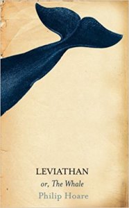
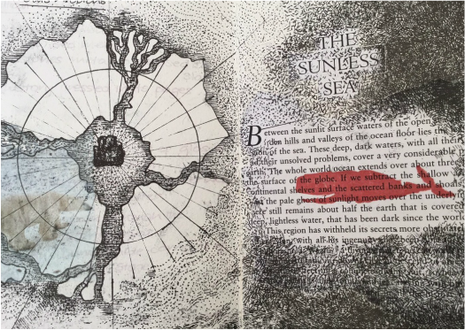
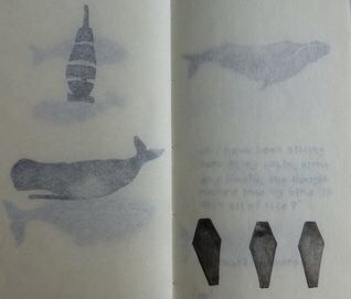
Inspired by Philip Hoare’s Leviathan and his fascination with Melville’s Moby Dick, Ruston recently began research into whales and whaling logs for her next work. Like evolution, here is a subject of grandeur, expanse and time, even fire and ice. The sketchbook pages below tantalize. How will the artist, this time, make visible how the world touches us?
*In Mozart’s opera Don Giovanni, the main character’s manservant is Leporello, who, when singing the Catalogue Aria, produces a book that endlessly unfolds the list of Don Giovanni’s conquests.

 DS: I absolutely remember. I was living in London with my spouse and family as part of a study abroad program my spouse was leading. Each day, after all were at school or otherwise occupied, I would head out in pursuit of art, medical museums, natural history oddities or any number of things and on one day I went to the British Library to see an exhibition,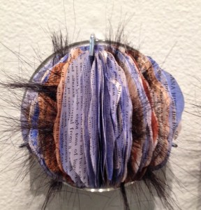
 She Returns