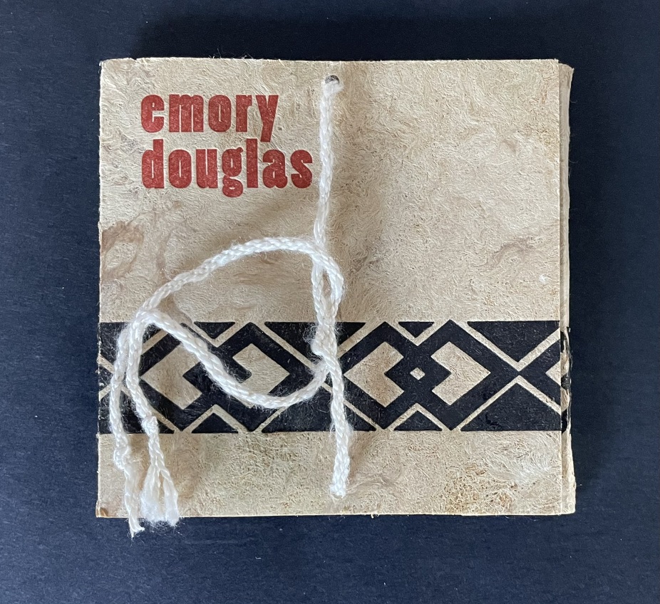
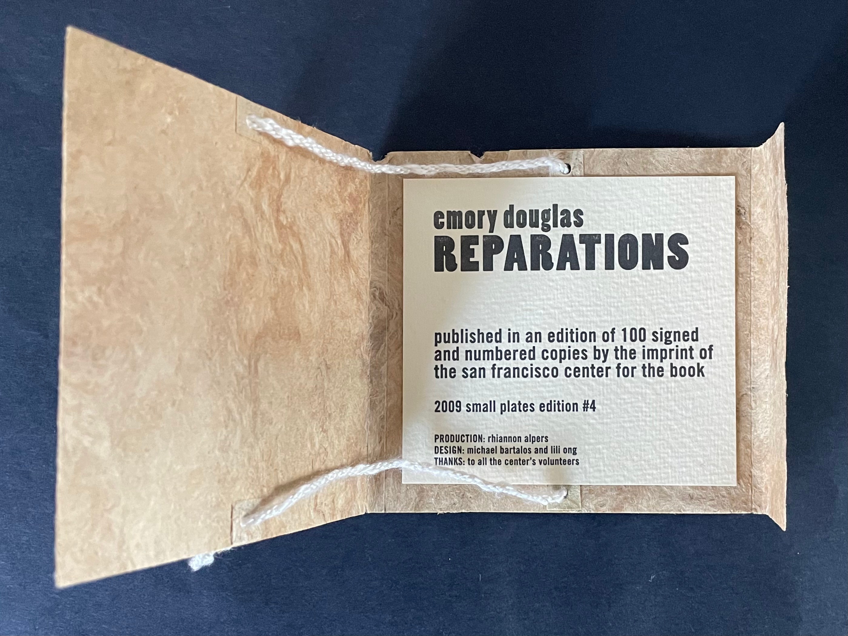
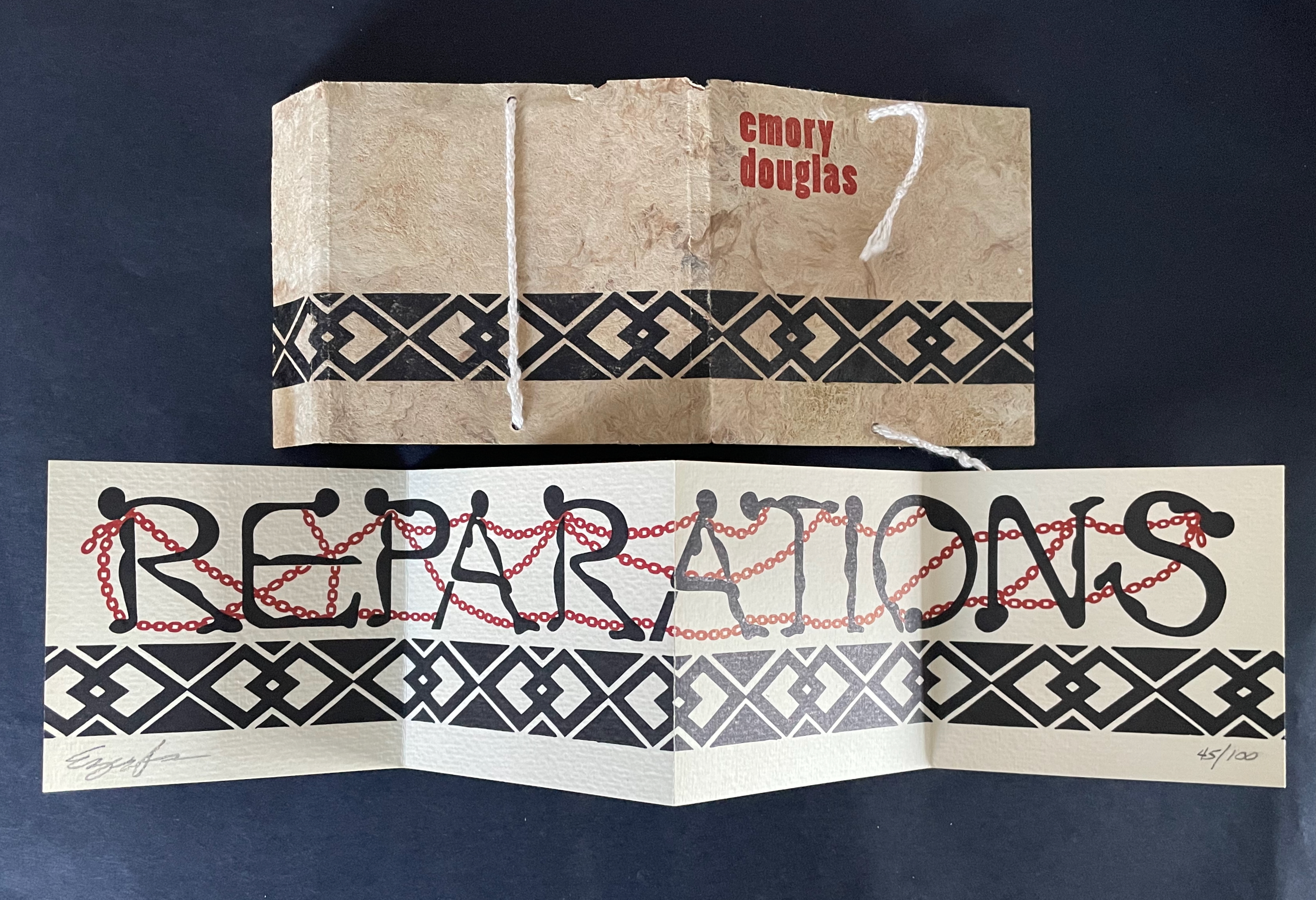
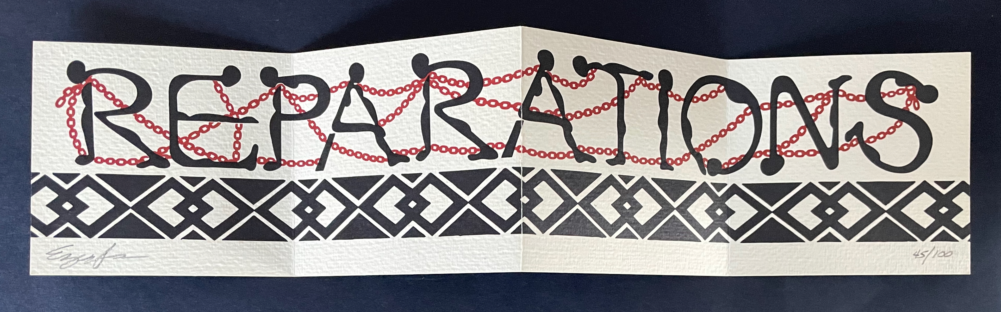
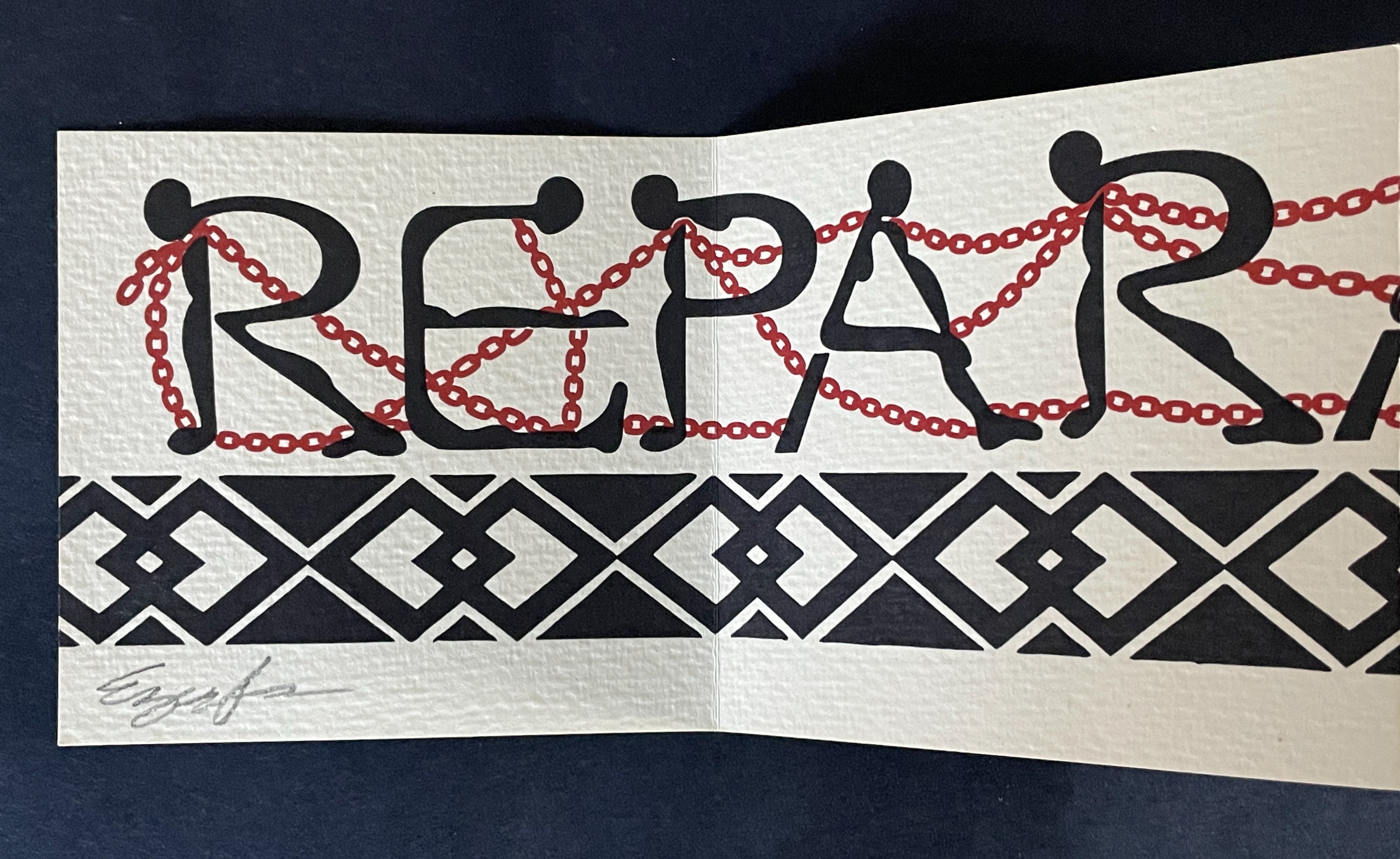
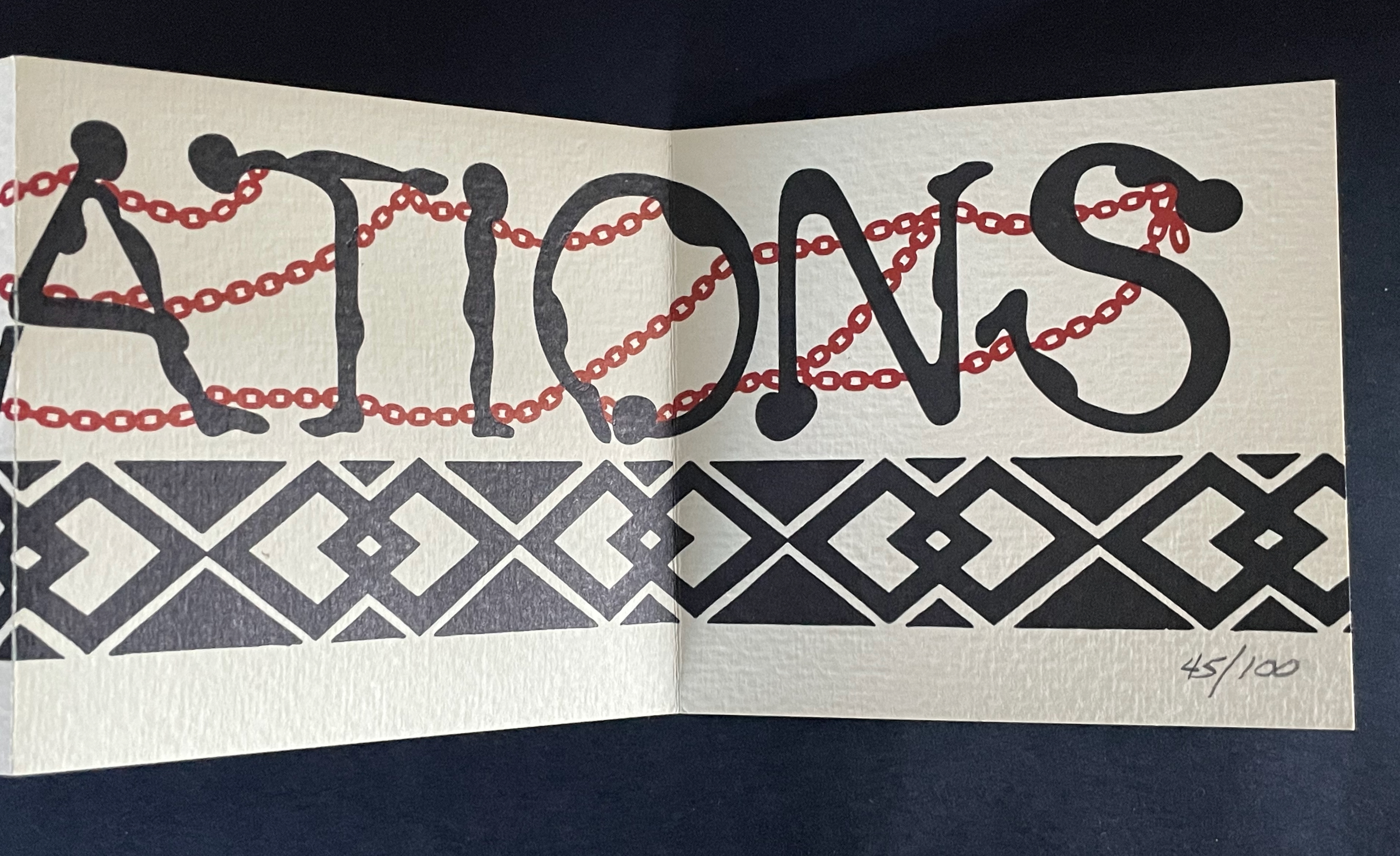
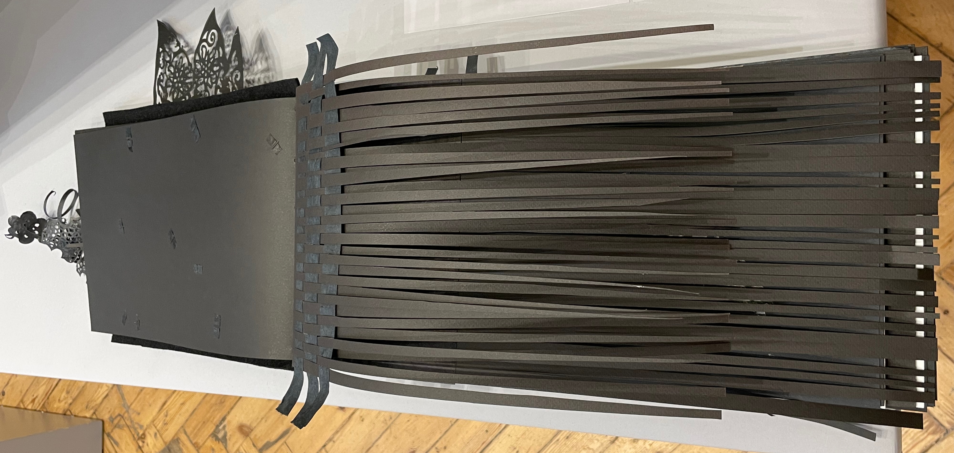
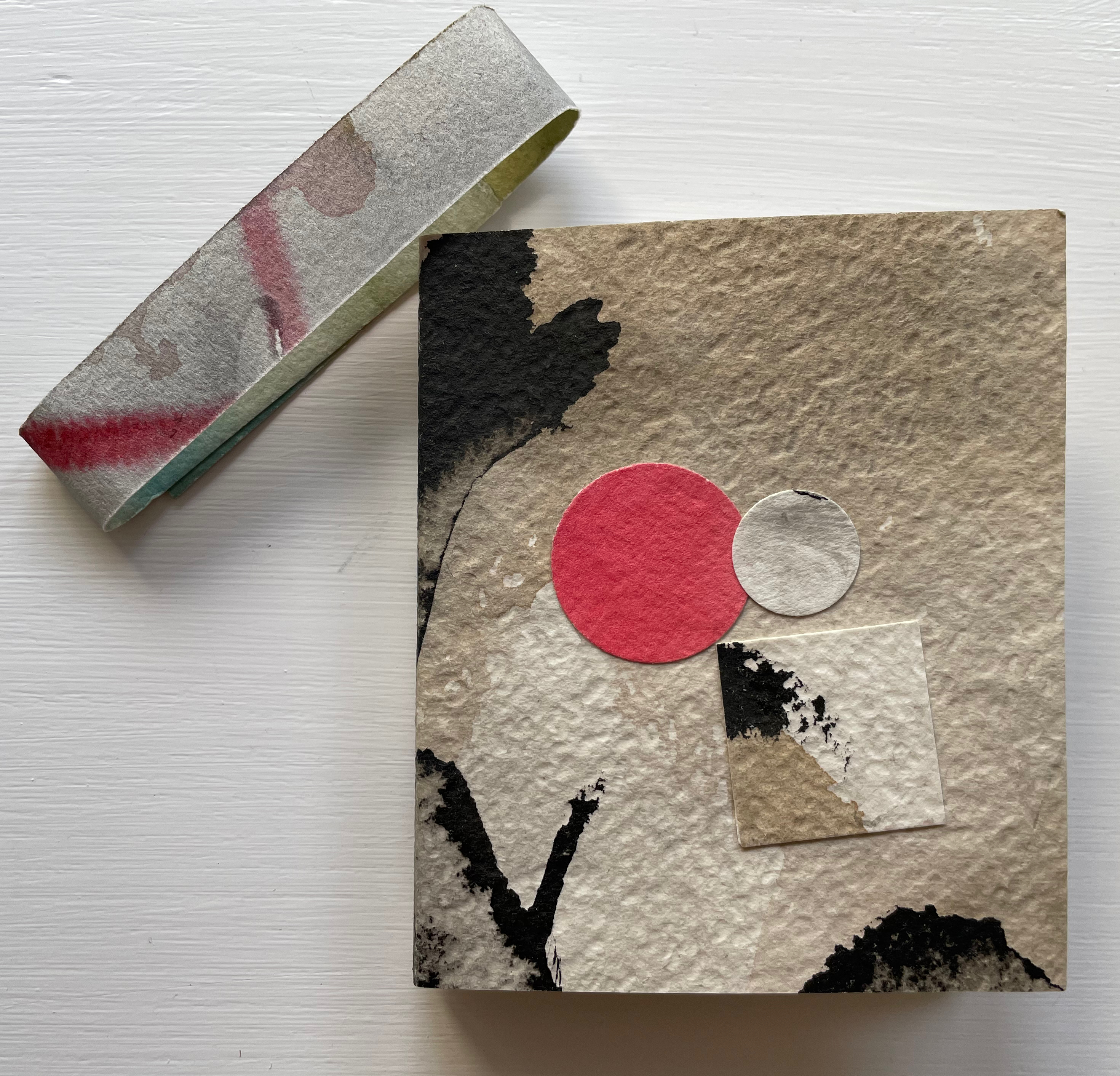
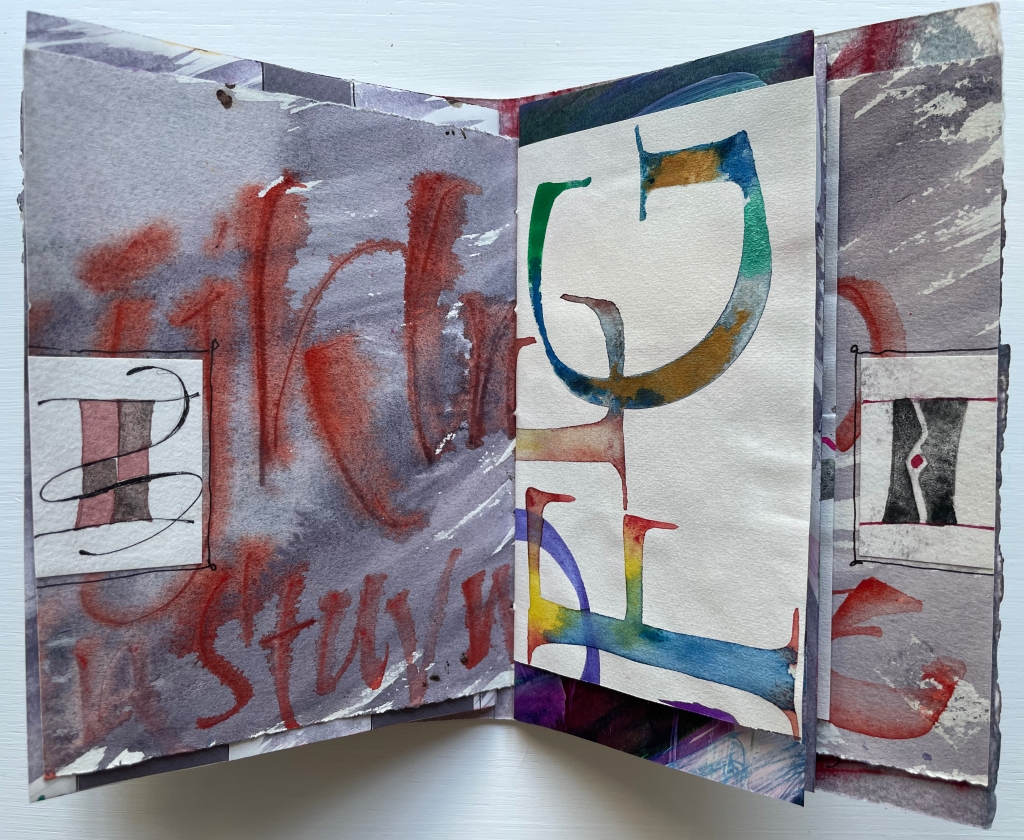
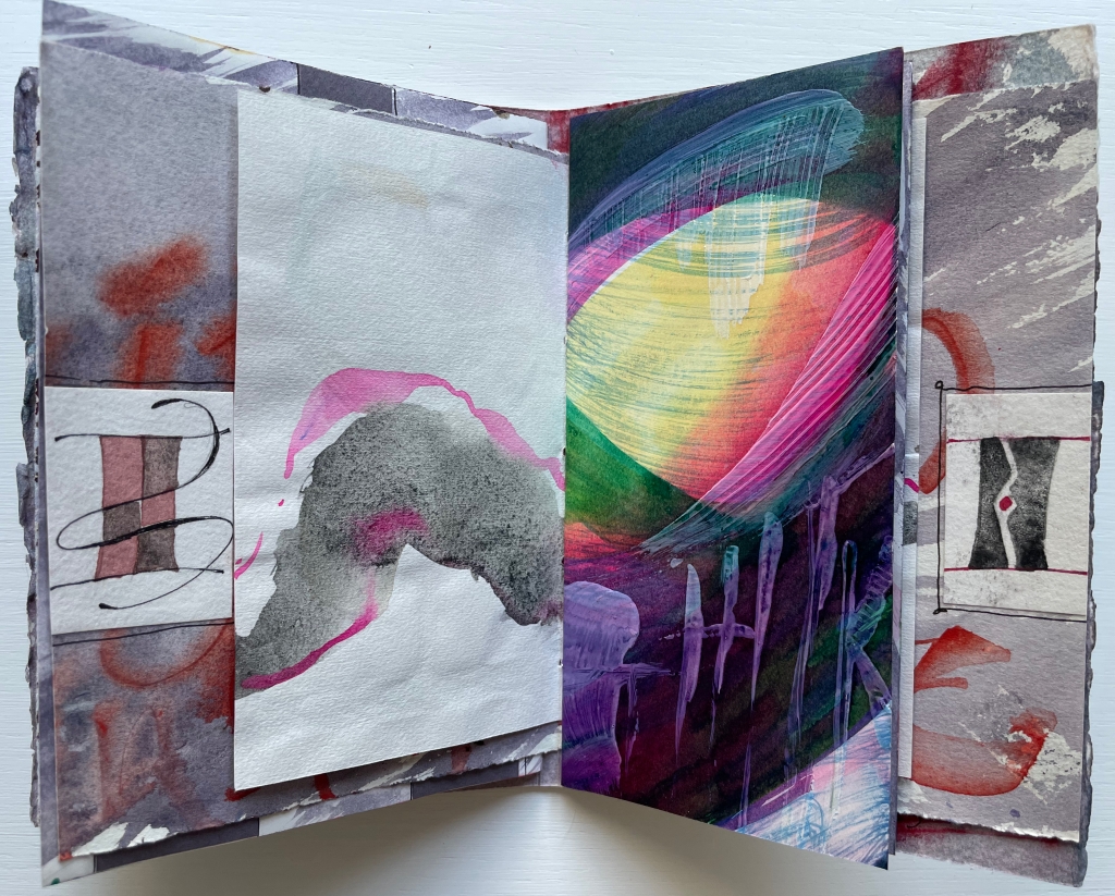
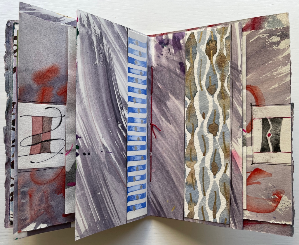
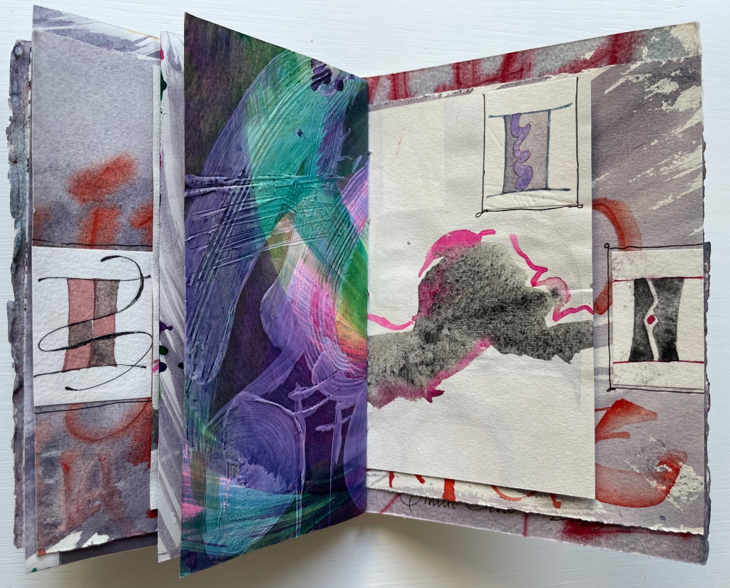
Reparations (2010) Emory Douglas Cover enclosing leporello. Cover: H102 x W105 mm. Leporello: H89 x W95 mm (closed); W380 mm (open). [4] panels.Edition of 100, of which this is #45. Acquired from the San Francisco Center for the Book, 30 June 2025. Photos: Books On Books Collection. Displayed with permission of the publisher.
“Emory Douglas is renowned for his iconic representations of the Black Panther Party through his work as the Party’s Minister of Culture. For decades, he communicated the power and charisma of the movement through his compelling straightforward graphic style. … The imagery for this edition was initially a painting by Mr. Douglas’ which was then translated into a 2 color, letterpress graphic. The pages of the book are a one-sided, accordion fold piece. The folded cover is made of Amate bark with hand-spun hemp and silk thread and letterpress printed in 2 colors with interior colophon page attached””–San Francisco Center for the Book
The chains fastened at the neck, wrist, and ankle of each letter and linking each human figure to the next propose a new orthography. What was spilled spells out the case. In the original mural on which this quietly loud artist’s book is based, the chains were colored red, white, and blue.
Happy 250th Anniversary, fellow citizens.
Further Reading
“Tia Blassingame“. 17 August 2020. Books On Books Collection.
Gabor, Nora. 18 February 2021. “Black History and Experiences through Book Arts“. The Full Text: News about library resources and services. Chicago, IL: DePaul University. Accessed 22 January 2024.
Gleek, Charlie. “Centuries of Black Artists’ Books“, presented at “Black Bibliographia: Print/Culture/Art” conference at the Center for Material Culture Studies, University of Delaware, 27 April 2019, pp. 7-8. Accessed 20 July 2020.
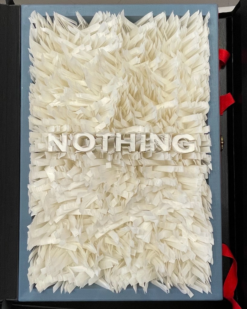
Bookmorph n. (bōk+μoρφ): a portmanteau word referring to casebound books which have been modified; an emergent branch of sculpture in which textual content is often downgraded; treatments include chewing, cutting, drilling, entombing, pulping, ripping, shooting (with a firearm), siliconising, etc; any codex fundamentally altered or warped by an artist; a site of entropic processes designed to return pages to cellulose fibre, and/or the creation of a fungal landscape; a bibliographic montrosity.Michael Hampton, arts writer, May 2025
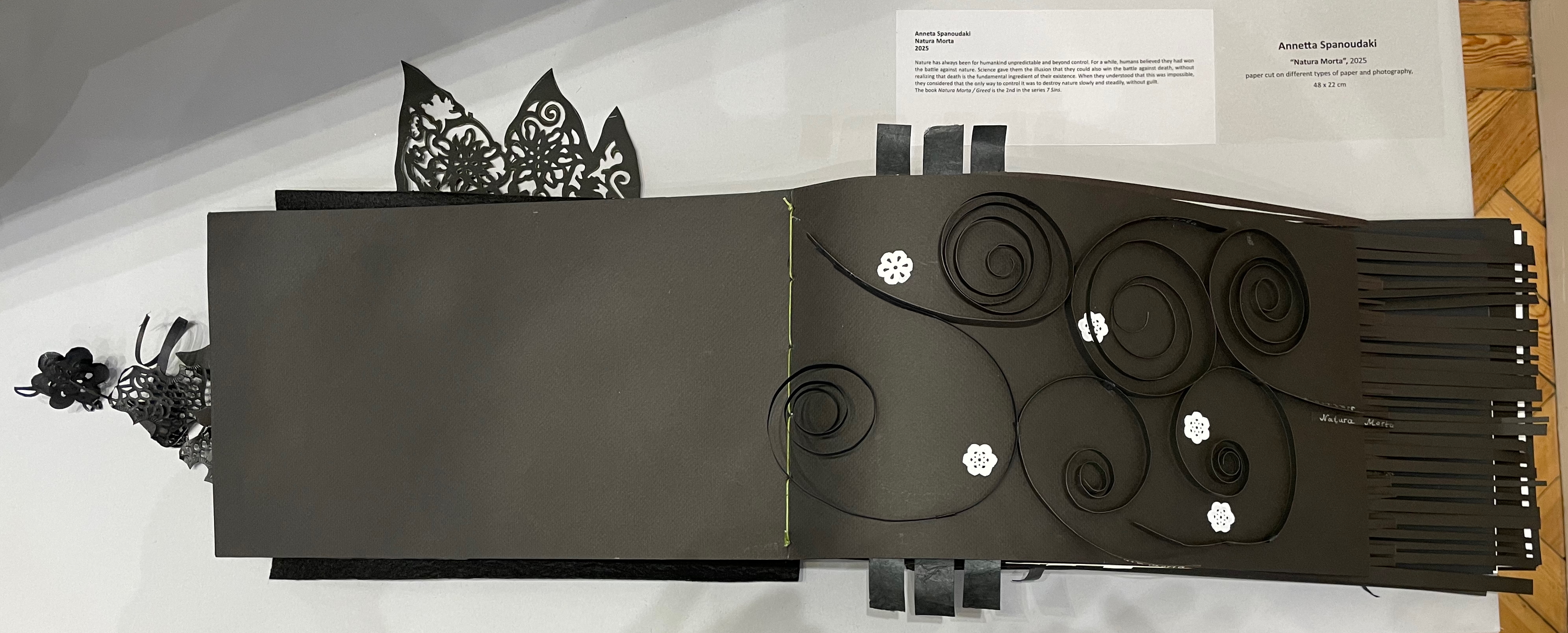
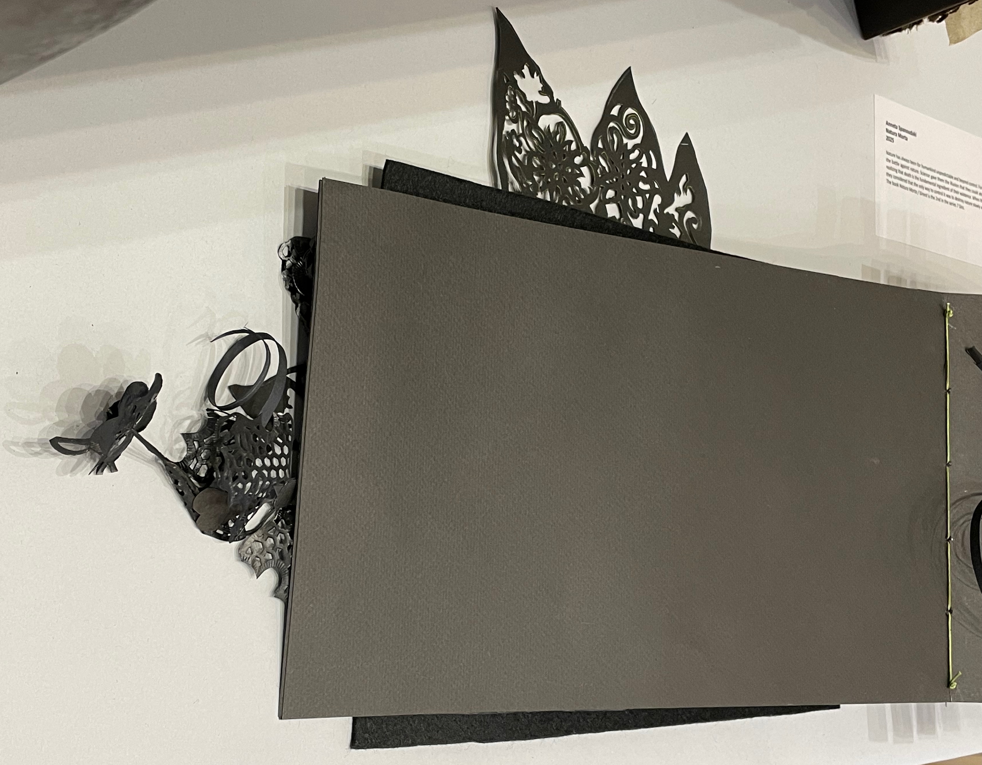
The curators’ choice of title and epigram for this exhibition is somewhat daring. Although they have included plenty of bibliographical montrosities that fit Hampton’s definition, there are plenty of bibliographical beauties, too — even among the “monstrosities”. A strong attraction of this exhibition is that it presents so many recent works from Greek book artists. Even more attractive is its hands-on display of most of the works.
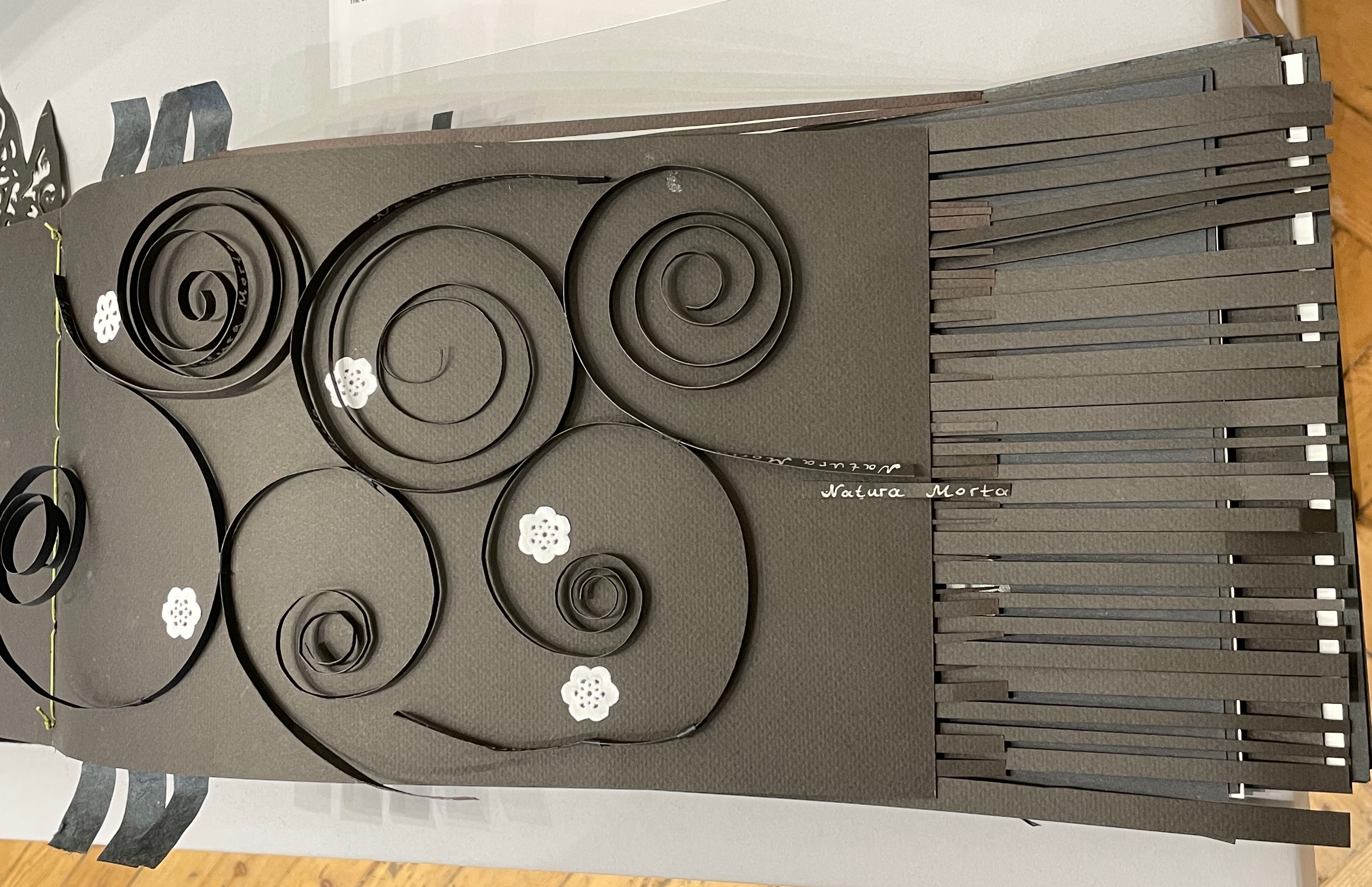
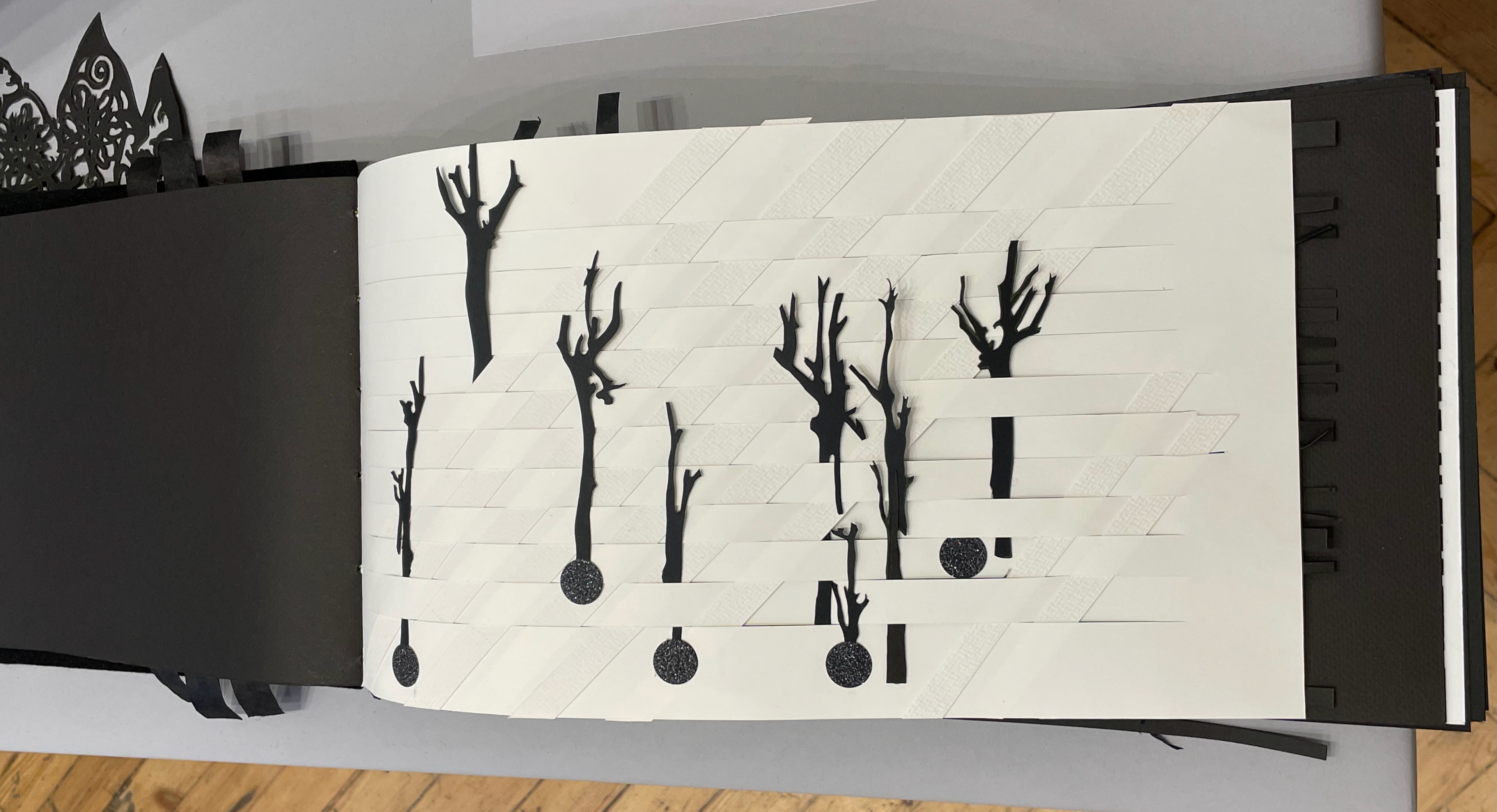
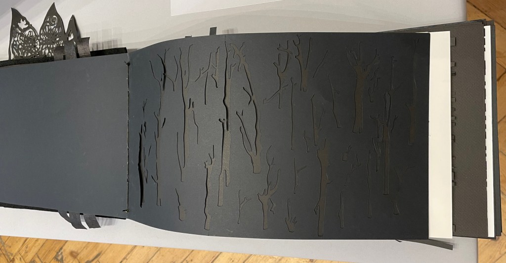
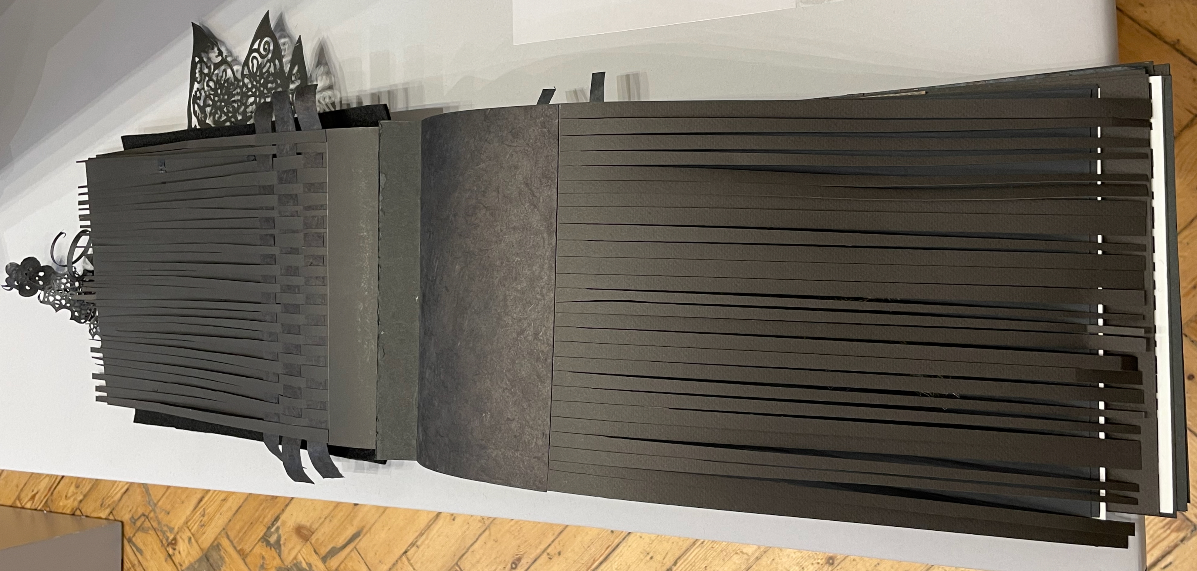
Anneta Spanoudaki’s Natura Morta (2025) is a striking case in point:
Natura Morta (2025) Anneta Spanoudaki Paper cut on different types of paper and photography. 480 × 220 mm. Photos: Books On Books.
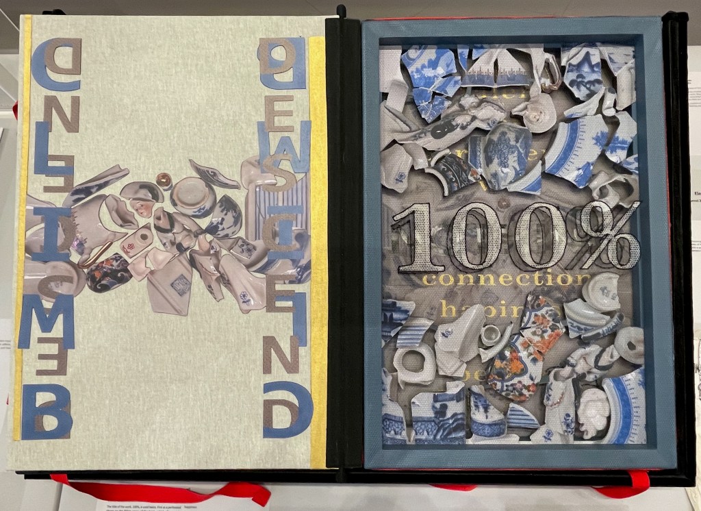
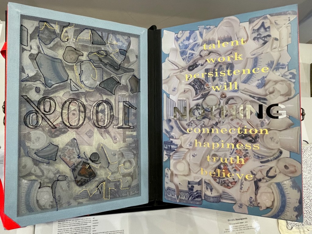
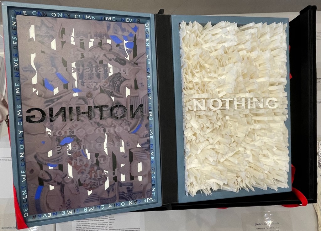
Another case in point is Dimitris Skourogiannis’ 100% An Artist’s Bible (2025). To be turned, its large “leaves” require metal rings on the fore-edge.
100% An Artist’s Bible (2025) Dimitris Skourogiannis Japanese paper, cardboard, wood, fragments of porcelain objects, print, metal rings, acrylic pains, fabris, tulle, and metallic threads. 500 x 350 x 140 mm. Photos: Books On Books.
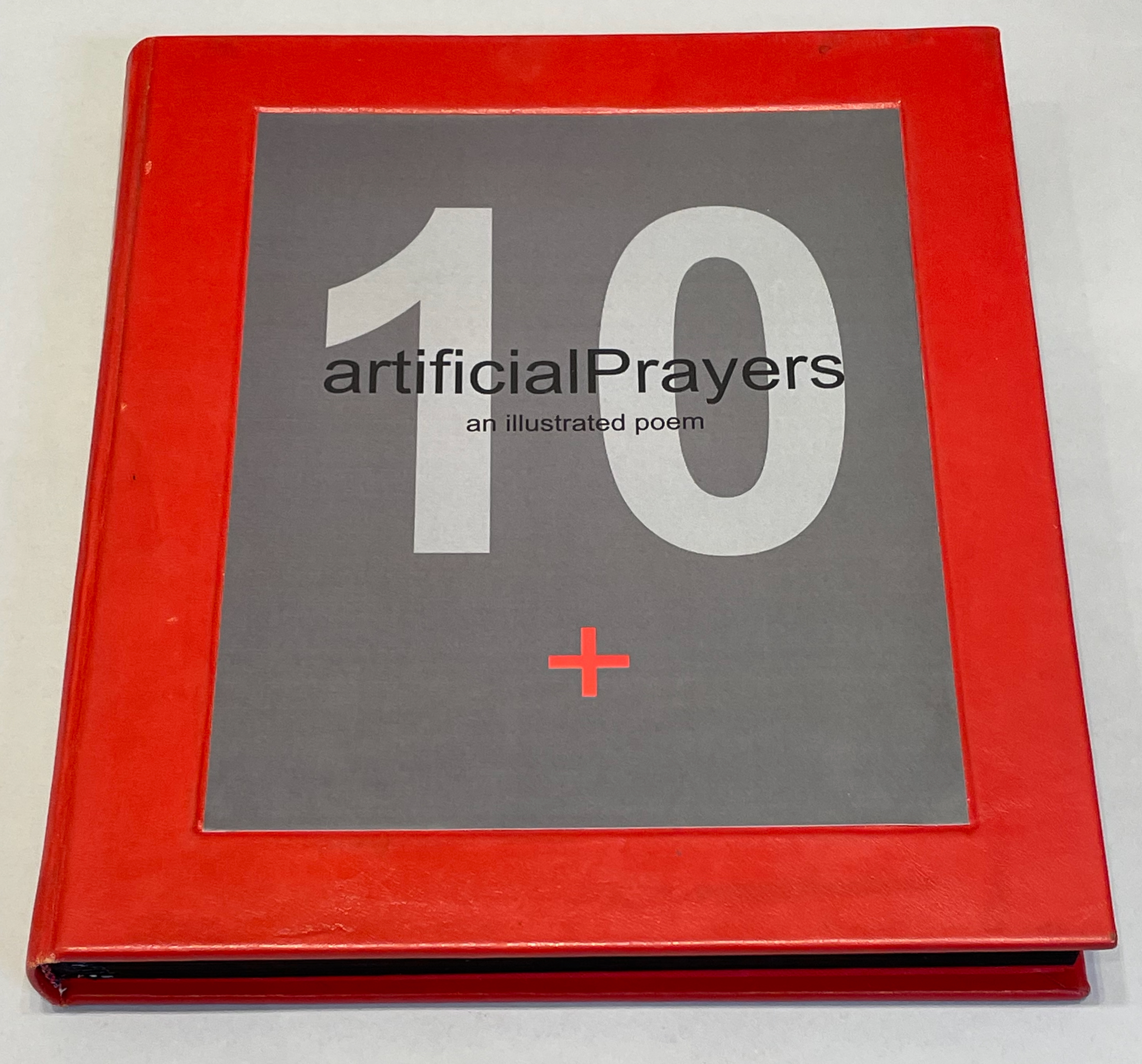
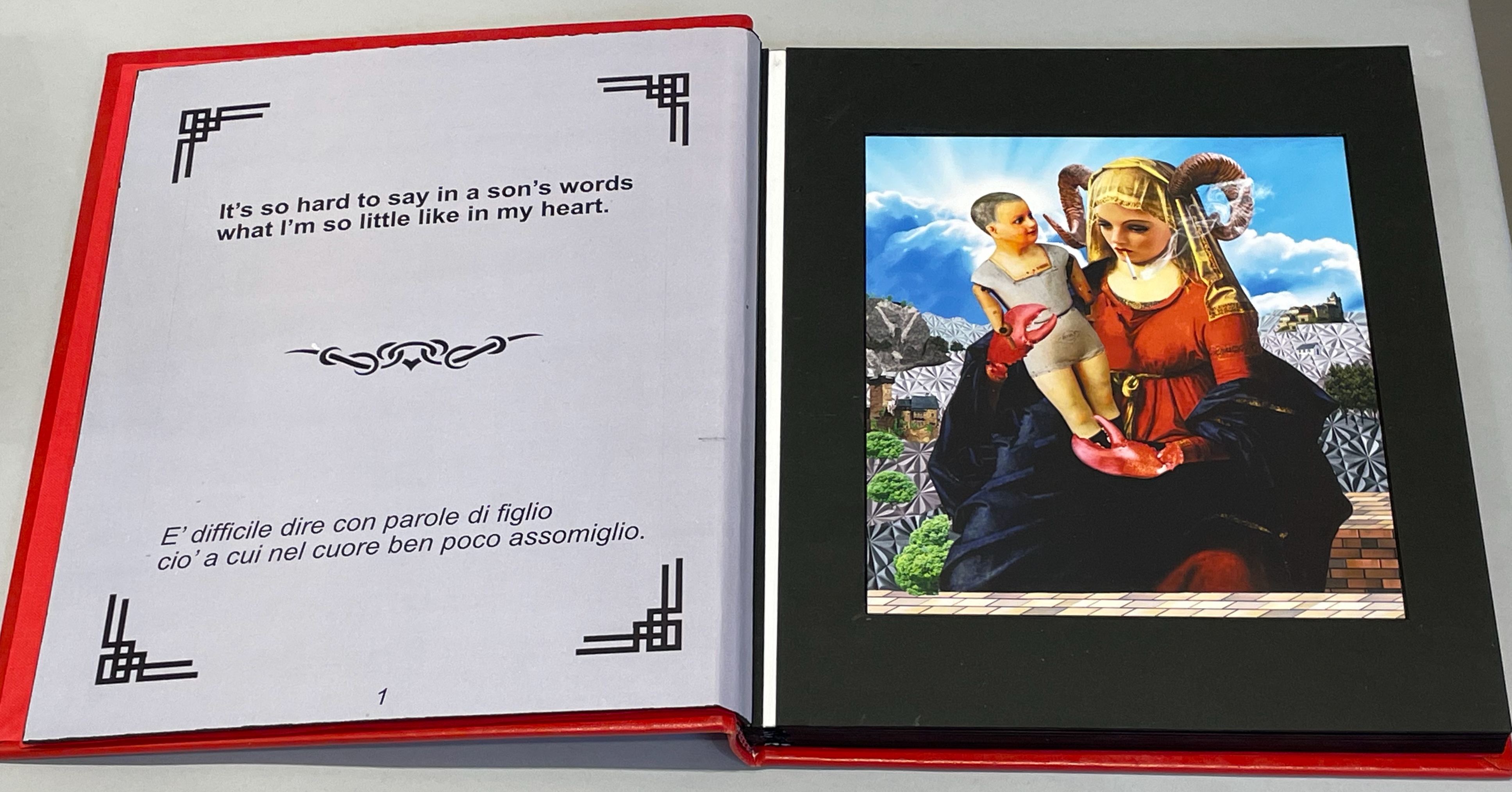
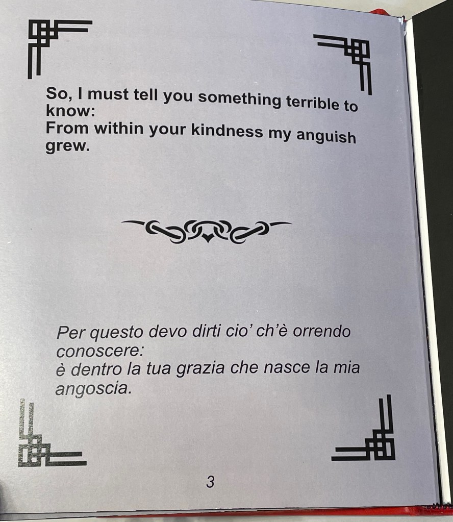
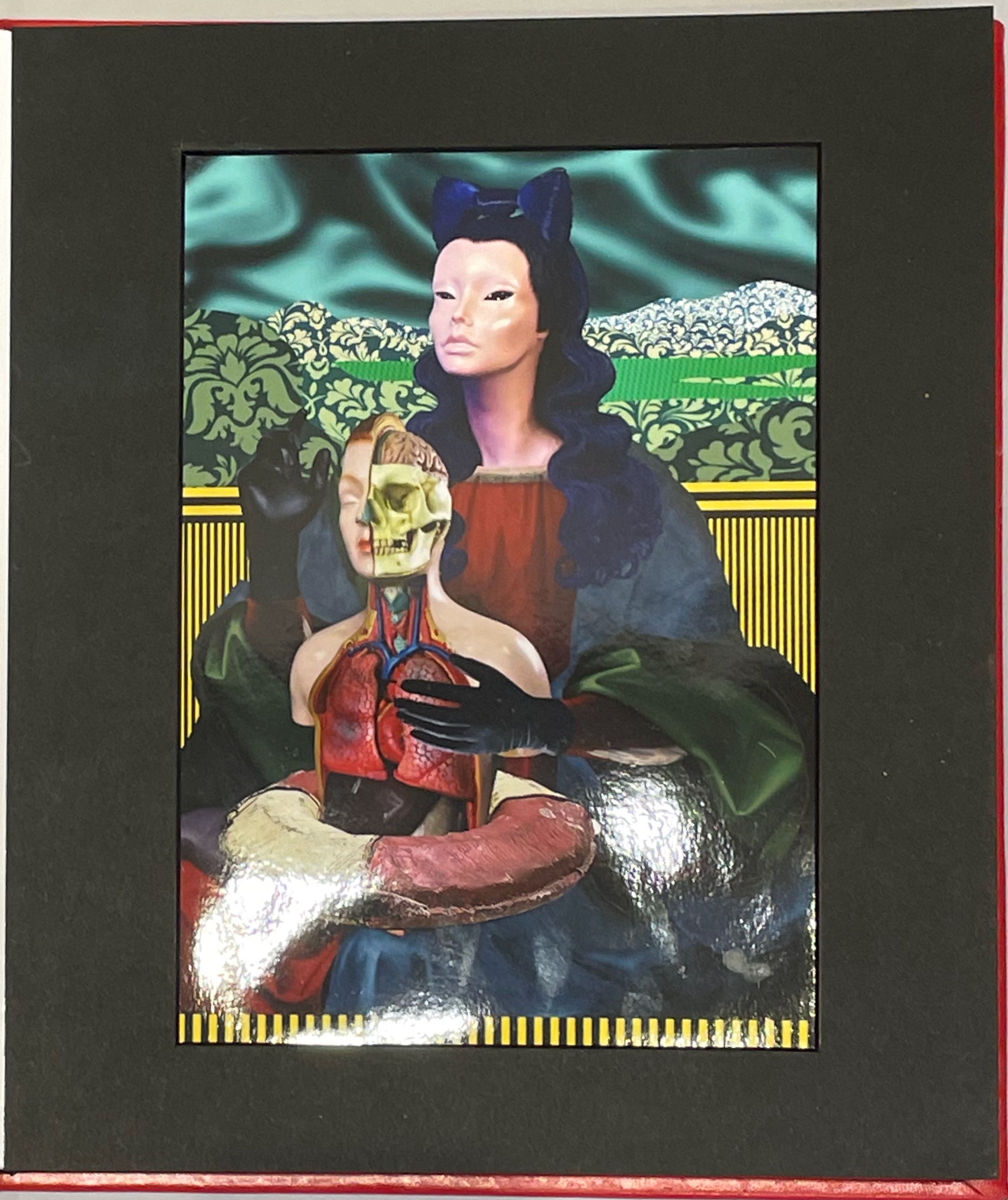
Thick leaves seemed to be the order of the day. On heavy black card, Thodoros Brouskomatis’ 10 Artificial Prayers (2025) presents surreal collages challenging the theme of “Madonna and Child” and couplets from Pier Paolo Pasolini’s “supplica a mia madre”.
10 Artificial Prayers(2025) Thodoros Brouskomatis Printed digital artworks on photographic paper, cardboard, and leather. 300 x 250 mm. Photos: Books On Books.
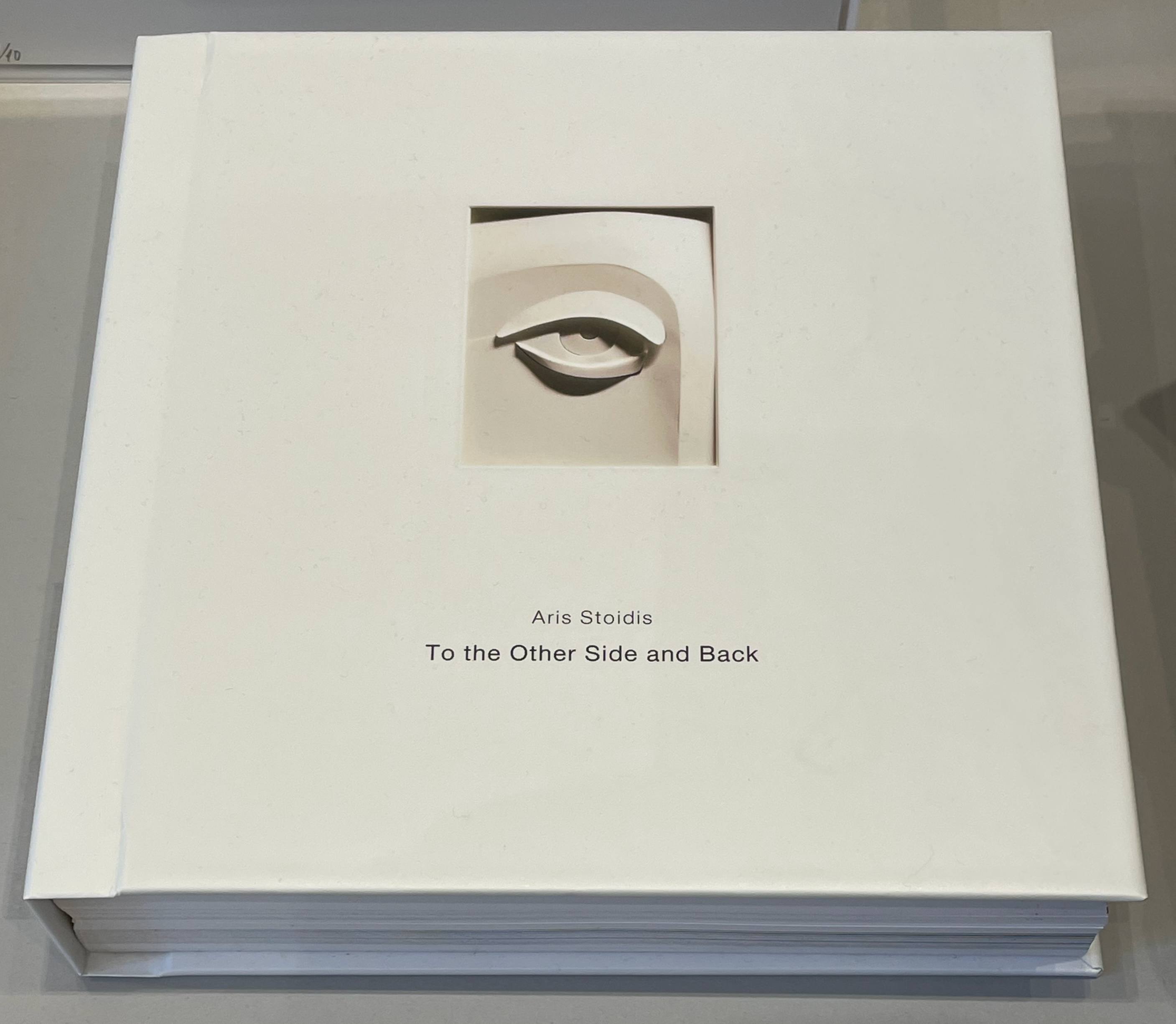
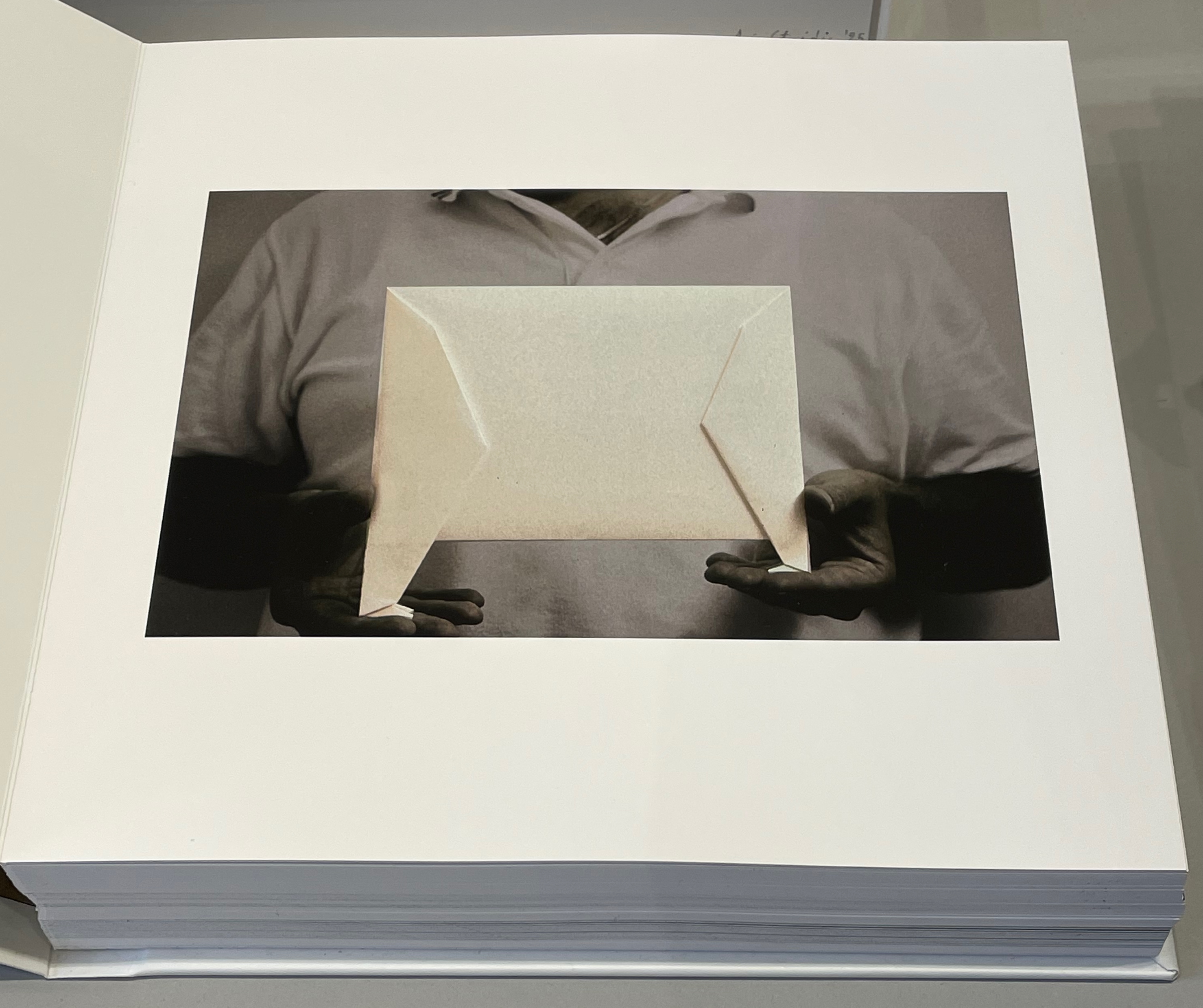
On slightly thinner card, Aris Stoidis’ To the other side and back (2025) carries a sculptural image on every page. The work straddles the borders of sculpture, photobook, and artist’s book. Stoidis writes, “Ever since my first pieces, I have been “receiving” images that I’ve materialized without really comprehending them myself. They simply exerted an inexplicable power on me.” The book comes in a plexiglas box with a papercut sculpture (not pictured here).
To the other side and back (2025) Aris Stoidis Photographic prints on card. 270 x 270 x 20 mm. Photos: Books On Books.
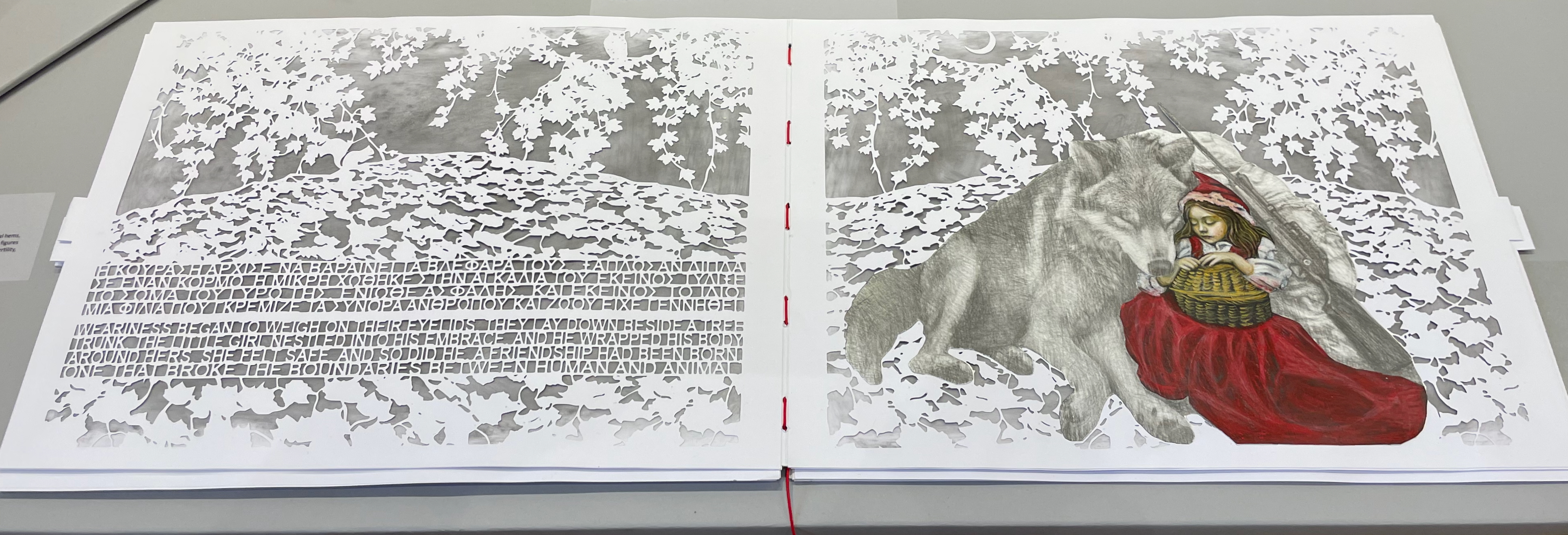
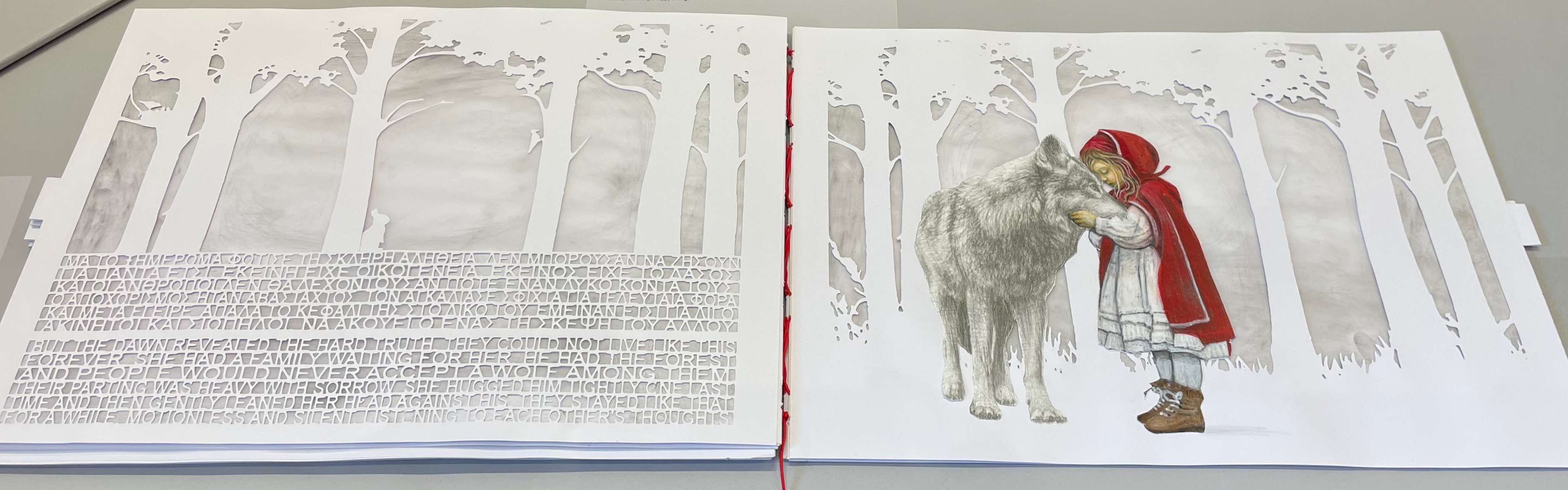
On still thinner leaves, Ismini Bonatsou’s Little Red Riding Hood (2025) nevertheless projects striking depth with its montage of papercut pages, acrylics, and pencil. Just as striking is the contemporary reversioning of the fairy tale.
Little Red Riding Hood (2025) Ismini Bonatsou Acrylics, pencil, and papercuts. 450 x 300 mm. Photos: Books On Books.
Given that the portmanteau term “bookmorph” comes from Michael Hampton, it seems appropriate that he has two works on display. Although one of them is under glass, 12 Chairs (bookmorph) (2012), the other is not. RAGE PEN by Hampton and David Blackmore is the UK contingent’s only work produced in 2025. Others from the UK contingent include Sarah Bodman, BOOKEND, Jonathan Callan, Joe Devlin, Stephen Emmerson, SJ Fowler, Rowena Hughes, and the Inscription Journal editors (Gill Partington, Simon Morris, Adam Smyth). RAGE PEN is also particularly appropriate because it requires a ruler to separate its perforated fore-edges. The exhibition provides one along with multiple pairs of white gloves. Really hands-on.
The participating Greek artists also include Eleni Angelou, Nikos Arvanitis, Rania Bellou, Maria Bourbou, Natassa Chelioti-Naga, Ioanna Delfino, Anna Dimitriou, Antonia Iroidou, Eleni Kastrinogianni, Peggy Kliafa, Alexia Kokkinou, Georgia Kotretsos, Nikos Kryonidis, Vasiliki Lefkaditi, Eleni Maragaki, Kyriaki Mavrogeorgi, Despina Meimaroglou, Christina Mitrentse, Fiona Mouzakitis, Kiki Perivolari, Stamatis Schizakis, Ifigeneia Sdoukou, Christina Sgouromiti, Danai Simou, Nectarios Stamatopoulos, Despina Stavrou, Evangelos Tasios, Yannis Tzortzis, and Leonie Yagdjoglou.
Congratulations and thanks to the curators — Christina Mitrentse, Fiona Mouzakitis, and Despina Stavrou — for bringing together this selection of outstanding works.
The Hellenic Centre opens at 11:00 and closes at 17:00, Tueday through Friday, so the chances to visit by the 28th of November are limited. The brief catalogue that documents the exhibition and these few photos cannot substitute for tactile engagement with the works on display. An hour and a half passed in a flicker.
First, the back-dating. This comes from the delightfully annoying or annoyingly delightful belated discovery of Erik Kwakkel’s 2015 entry on the history of the horn-book “Book on a Stick” in Medievalbooks. Delightful and annoying to find the truly earliest appearance of a horn-book right under my nose in the Bodleian Libraries but too late to include it in the Alphabets Alive! exhibition at the Bodleian in 2023.
Andrew White Tuer’s History of the Horn-Book (1897) came close with its dating of the horn-book’s first appearance as 1450, but as Kwakkel writes:
The image shows Christ being brought to school by his mother. He is bringing his “textbook” to class: a hornbook, which dangles from his wrist by a string, just like many of the later specimens did … Quite intriguingly, we are shown a real medieval snapshot of how children carried their hornbook to and at school. More importantly, it shows that the hornbook was indeed a medieval invention….While no actual hornbooks appear to survive from the medieval period, these visual representations show that educating young children was also the driving force behind the production of hornbooks in the age before print.
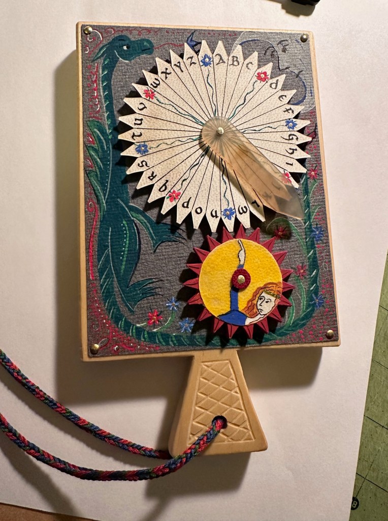
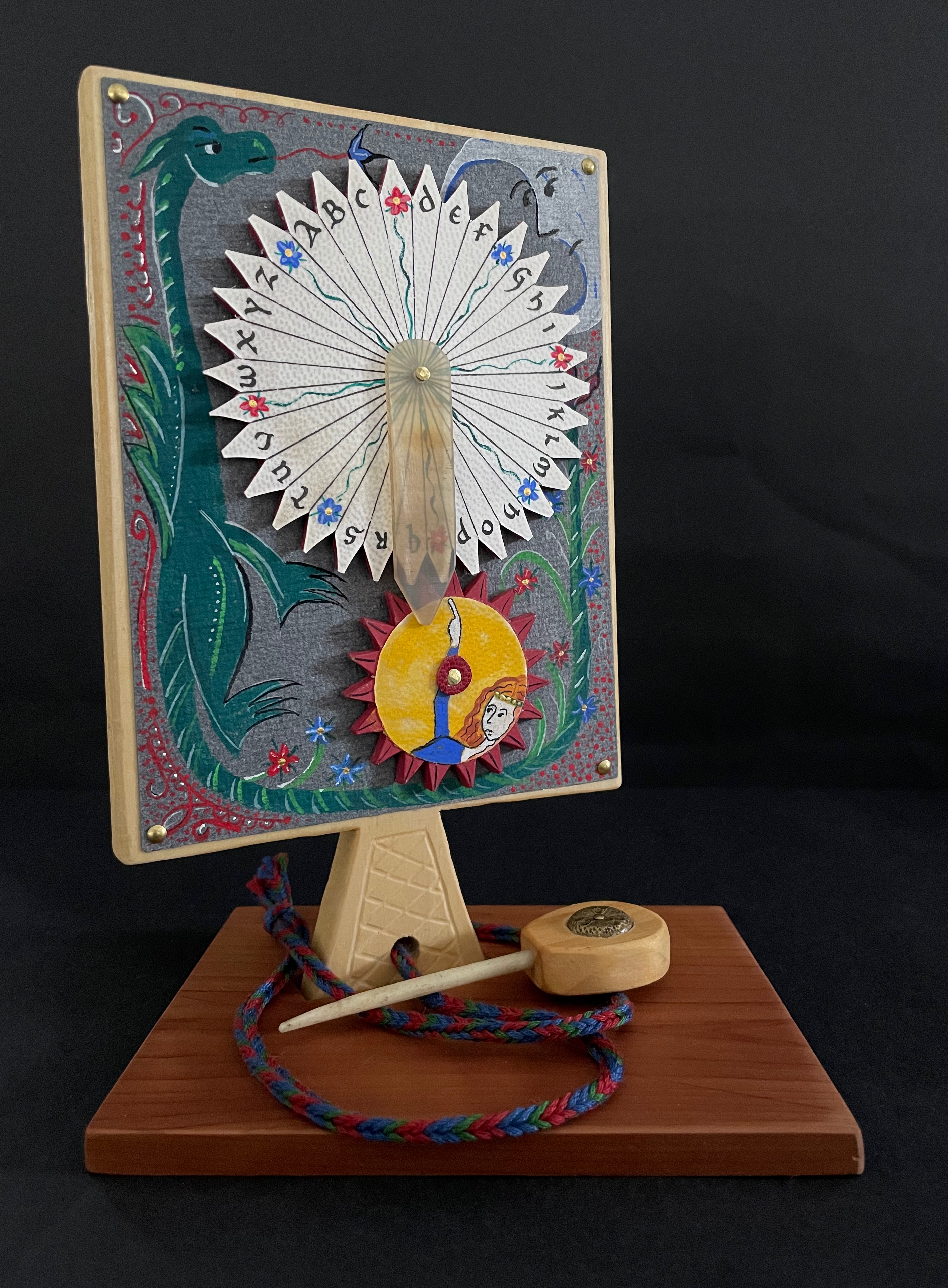
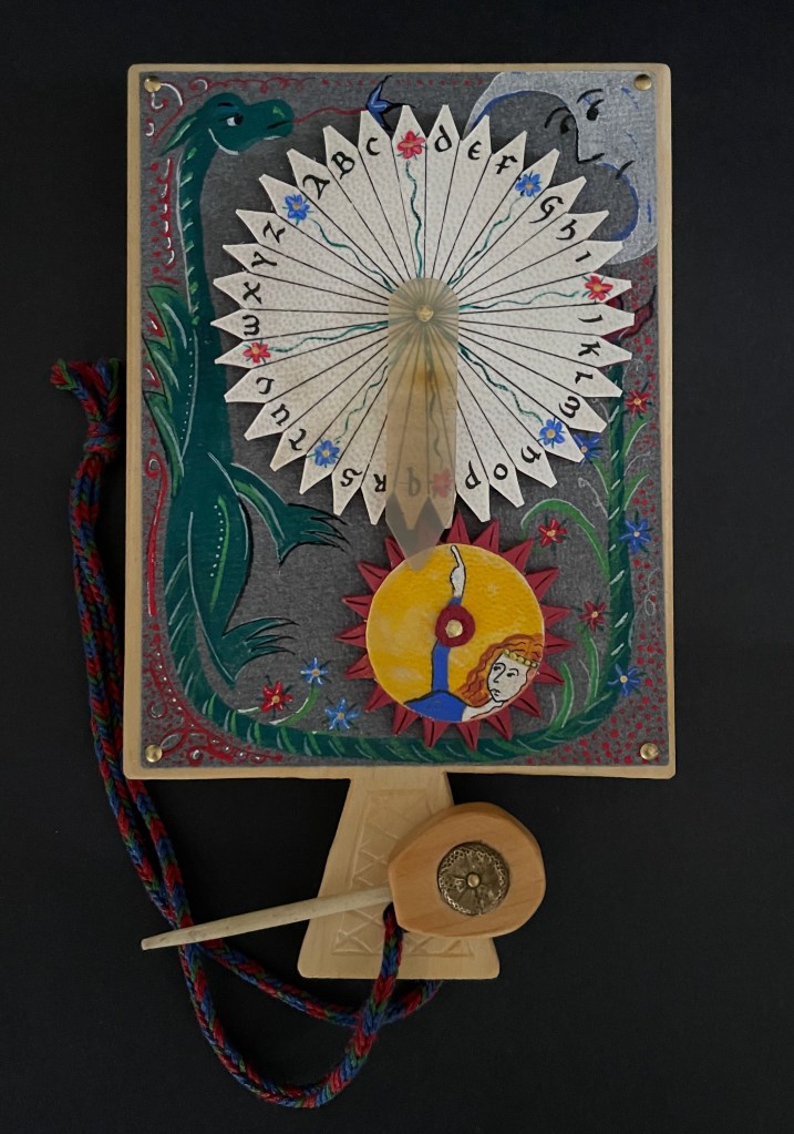
And for the updating, here is Ashley Thayer’s Mechanical Horn-book (2025) just arrived in the Books On Books Collection.
Mechanical Horn-book (2025) Ashley Rose Thayer Horn-book. On stand: H192 x W160 mm. Off stand: H192 x W115 mm. Unique. Acquired from the artist, 17 October 2025. Photos: Courtesy of the artist. Books On Books Collection.
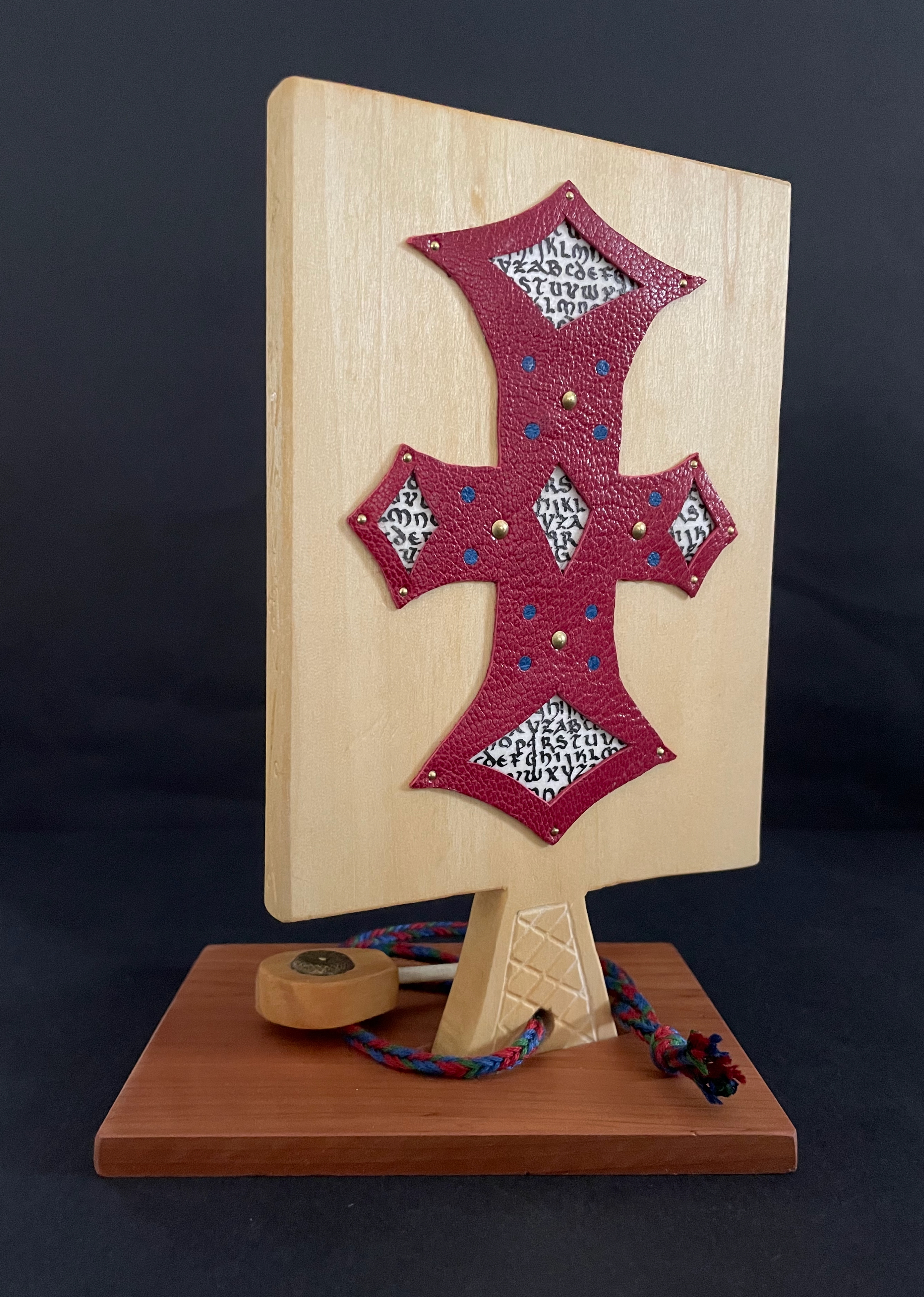
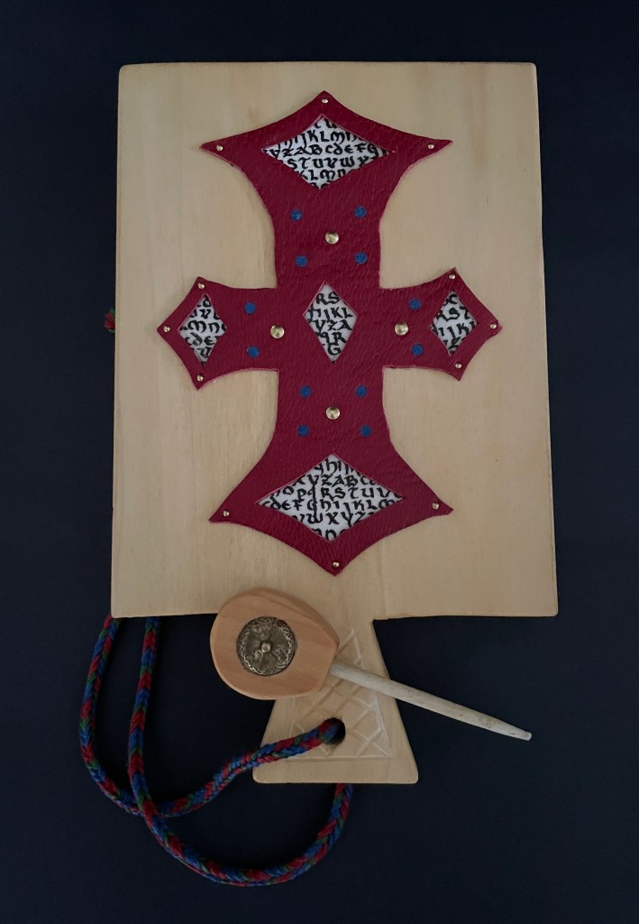
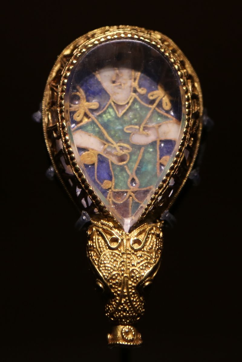
The paddle is made of pine wood, the gears of vellum-covered bookboard, the spinning “arm” of authentic cow horn, and the wrist loop of embroidery thread by a medieval finger loop braiding technique. On dark grey-blue Khadi paper, Thayer has painted a border of the moon, a berried floral garland, and a wyvern, the heraldic emblem associated with Wessex, the Anglo-Saxon kingdom from which Alfred the Great emerged in the 9th century. On the reverse, a cross of cut red leather with five inserts of calligraphed vellum alluding to Christ’s five wounds reflects the horn-book tradition of combining religion with learning the alphabet. It also makes this horn-book reflective of Alfred’s Anglo-Saxon and Christian background.
The pointer, called an aestel in Old English, is made from poplar wood, an antique button, and antique bone. Its inclusion isn’t simply functional. Appearing alongside the Wessex wyvern, it points to that famous aestel on display at the Ashmolean in Oxford: the Alfred Jewel.
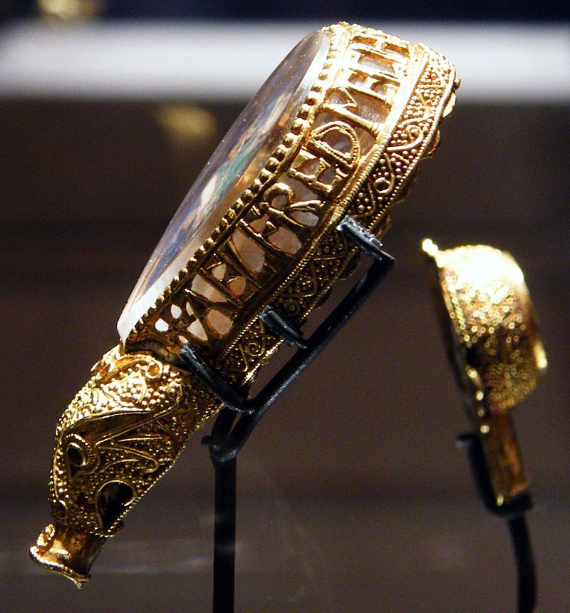
The Alfred Jewel, Ashmolean Museum, Oxford. Photo taken from the front by Geni CC BY-SA 4.0. Photo taken from the side by Richard M Buck CC BY SA 3.0.
If there’s ever an Alphabets Alive! redivivus, Erik Kwakkel and Ashley Thayer have provided the pointers to the other treasures in Oxford that should be included.
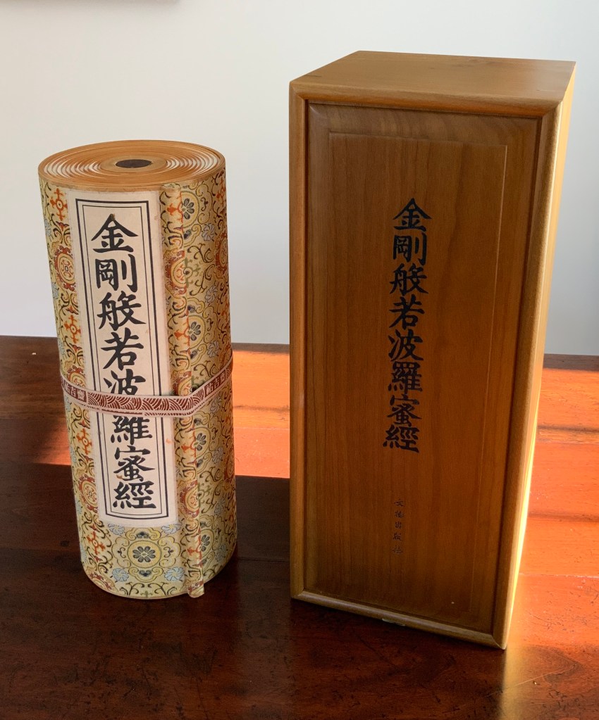
Diamond Sutra in 32 zhuan (seal) fonts (2017) Zhang Xiaodong Scroll in dragon scale binding. 152 x 382 x 160 mm. Edition of 300, of which this #197. Acquired from Sin Sin Fine Arts (Hong Kong), 31 October 2019. Photos: Books On Books Collection.
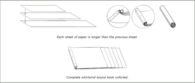
In 1900, in China’s Dunhuang province, the Diamond Sutra (868 CE), the world’s earliest complete and dated printed book, was discovered in a cave along with 40,000 scrolls. One of those other scrolls — Or.8210/S.6349 — was possibly just as important for the book arts as the Diamond Sutra was for the history of printing. Like the Diamond Sutra, Or.8210/S.6349 resides in the British Library and is “the only known example of whirlwind binding in the Stein collection of the British Library” (Chinnery). The structure is also known as dragon scale binding, although distinctions between the two have been debated (Song). It came into use in the late Tang dynasty (618-907 CE) then fell away in the face of the easier to handle butterfly and wrapped-back bindings. Besides Or.8210/S.6349, there are few surviving examples of original whirlwind or dragon scale bindings.
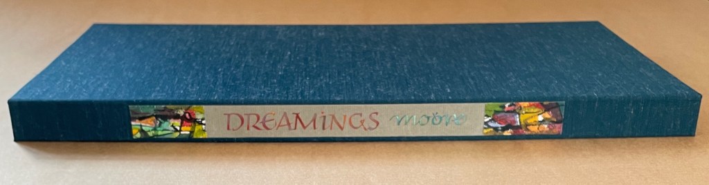
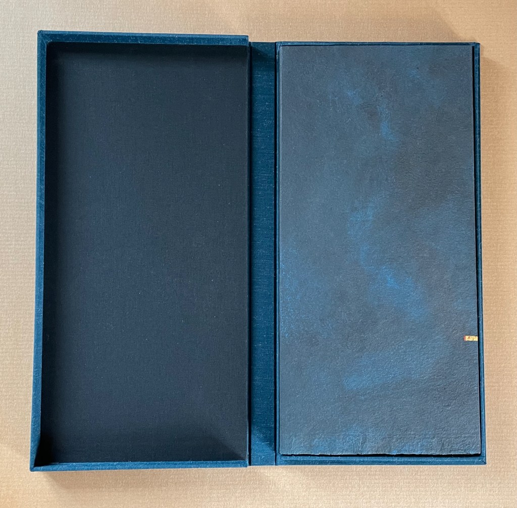
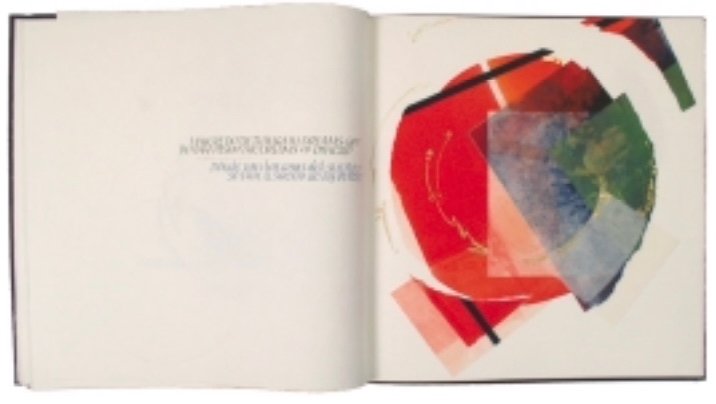
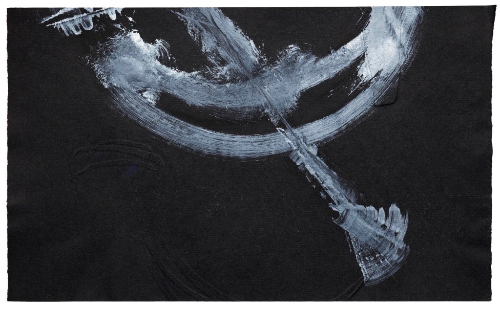
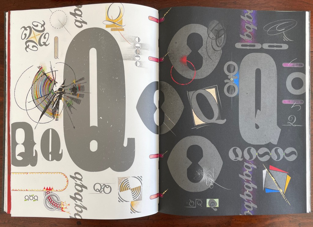
Dreamings (2023) Suzanne Moore Artist’s manuscript. Softcover, handsewn. Cloth-covered box with handwritten and painted title pastedown on the spine. H368 x W178 mm. 17 pages. A unique edition. Acquired from the artist, 15 April 2024. Photos: Books On Books Collection and artist.
Dreamings (2023) follows the artist’s Question Series, begun in 2008 considering questions of life and art while exploring the letter Q – “that quirky letter of distinct design” as Moore calls it. Other works in the series include:
Thirteen Questions (2008), drawn from Pablo Neruda’s The Book of Questions (1991) [Libro de las preguntas (1974)], unknown location.*
Amorous Embrace (2023) Suzanne Moore and Titus Lucretius Carus (trans. A.E. Stallings) Artist’s manuscript, stub bound to stone cover, tinted thread, gold leaf, kozo, paste paper. H220 x W148 mm. 12 pages. Unique. Acquired from the artist, 5 February 2024. Photos: Books On Books Collection.
Sometime in the first century BCE, the Roman poet Lucretius wrote the didactic epic De rerum natura (The Nature of Things). It celebrates the atomistic physics and philosophy that Epicurus and his followers recorded two hundred plus years before in thirty-seven volumes. Imagine the determination to press that Greek vision of the world from atoms to the cosmos into six volumes of Latin poetry. We’ll have to await further papyrology applied to the cinders of the Herculaneum library of scrolls and hope that it reveals more scraps of the Greek’s Περὶ φύσεως (On Nature). Only then will we know whether Lucretius based his poem directly on them.
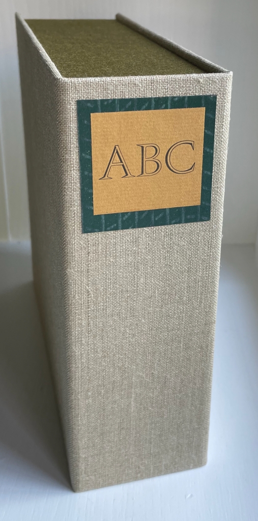
ABC of Bugs and Plants in a Northern Garden (2012)
ABC of Bugs and Plants in a Northern Garden(2012) Judy Fairclough Sgantas and Claire Van Vliet Clamshell box, softcover, open spine, paper-tab-sewn binding. Box: H188 x W192 x D65 mm. Book: H167 x W171 x D35 mm. 27 f&gs, 1 folded pastedown at end. Edition of 120, of which this is #45. Acquired from Vamp & Tramp, 15 September 2023. Photos: Books On Books Collection. Displayed with artists’ permission.
Handscapes (2016) Margaret (Molly) Coy & Claire Bolton Casebound, hand sewn and bound with doublures and two ribbon bookmarks. H260 x W310 x D30. 80 folios. Edition of 12, of which this is #9. Acquired from the artists, 19 October 2023. Photos: Books On Books Collection. Displayed with artists’ permission.
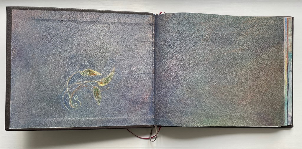
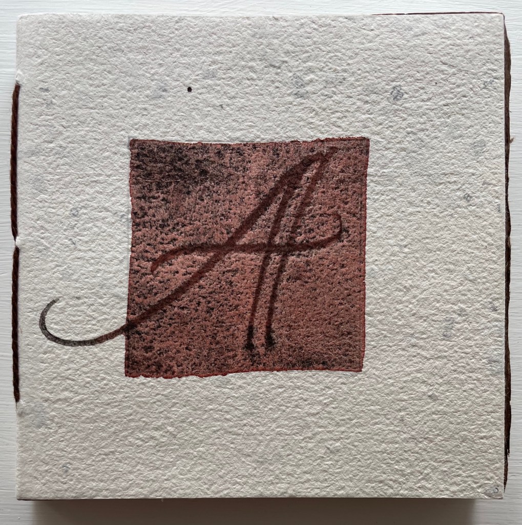
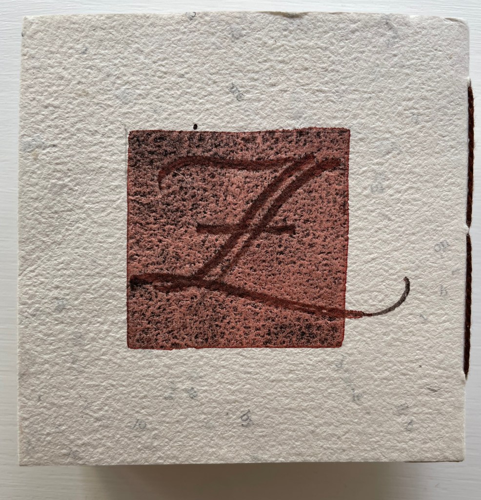
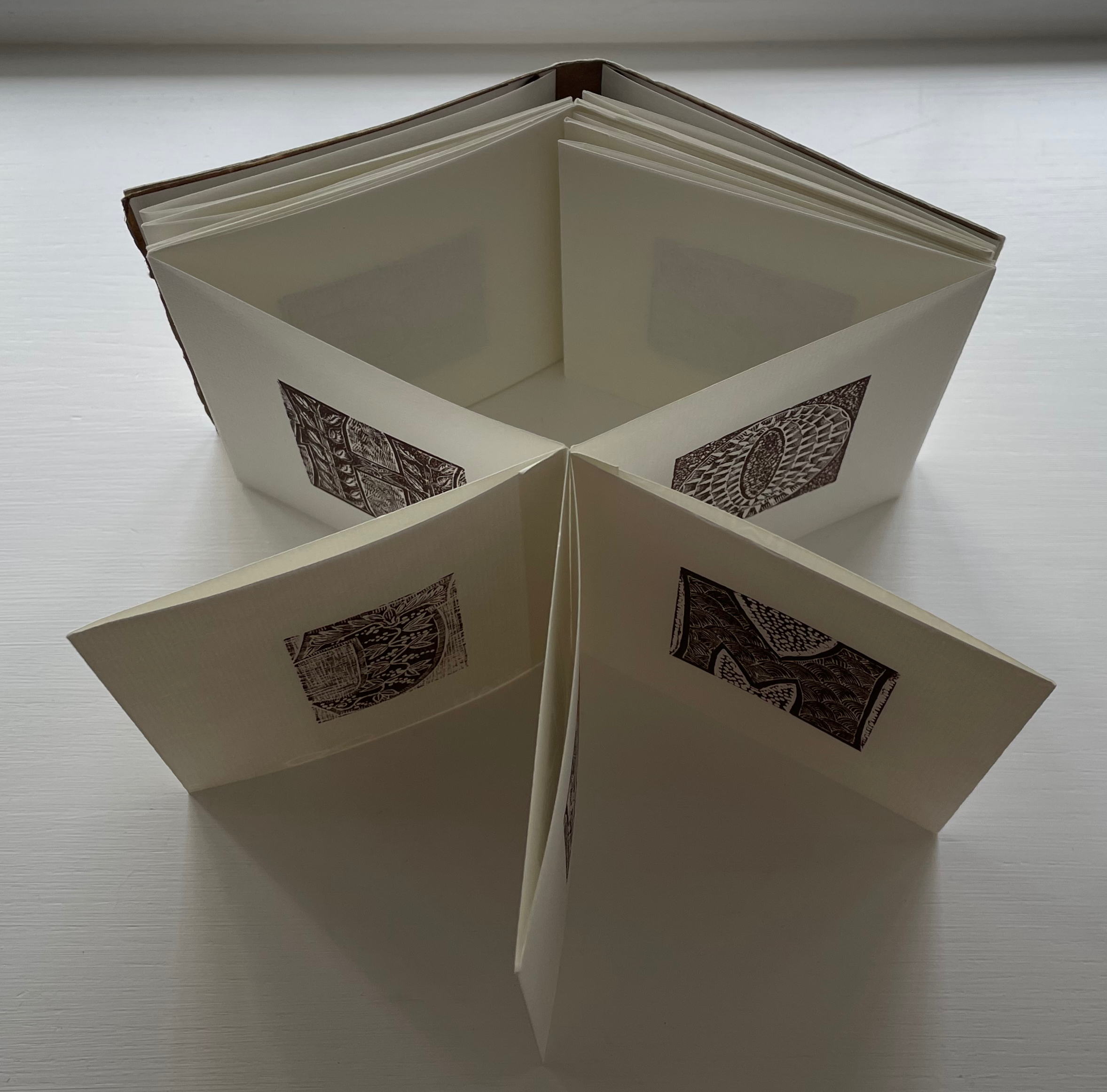
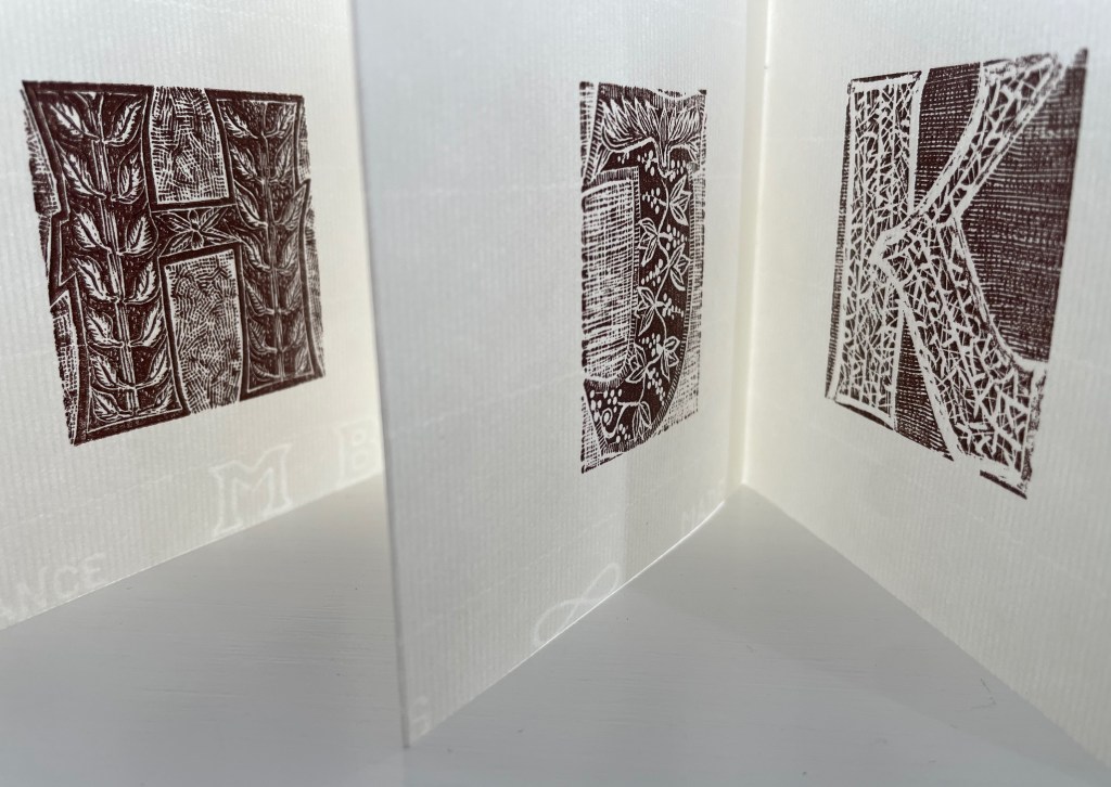
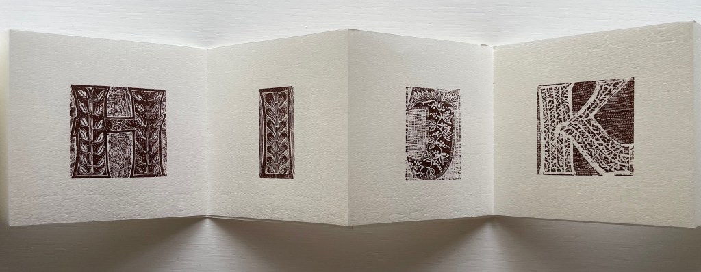
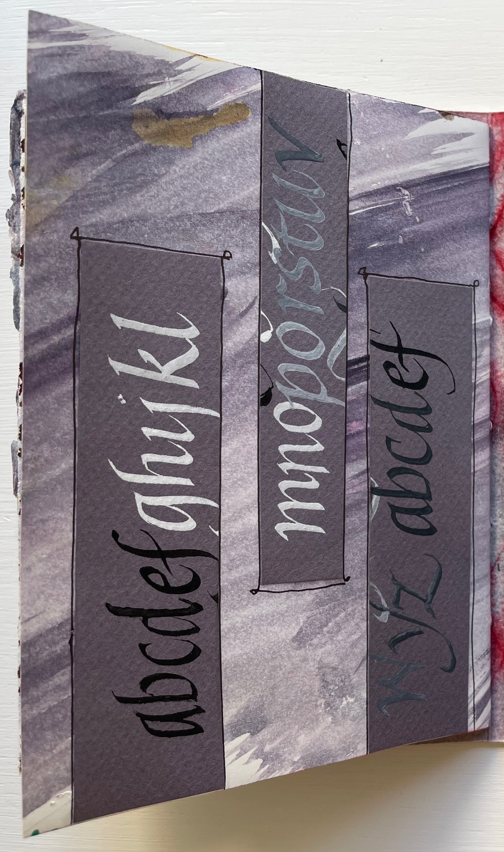
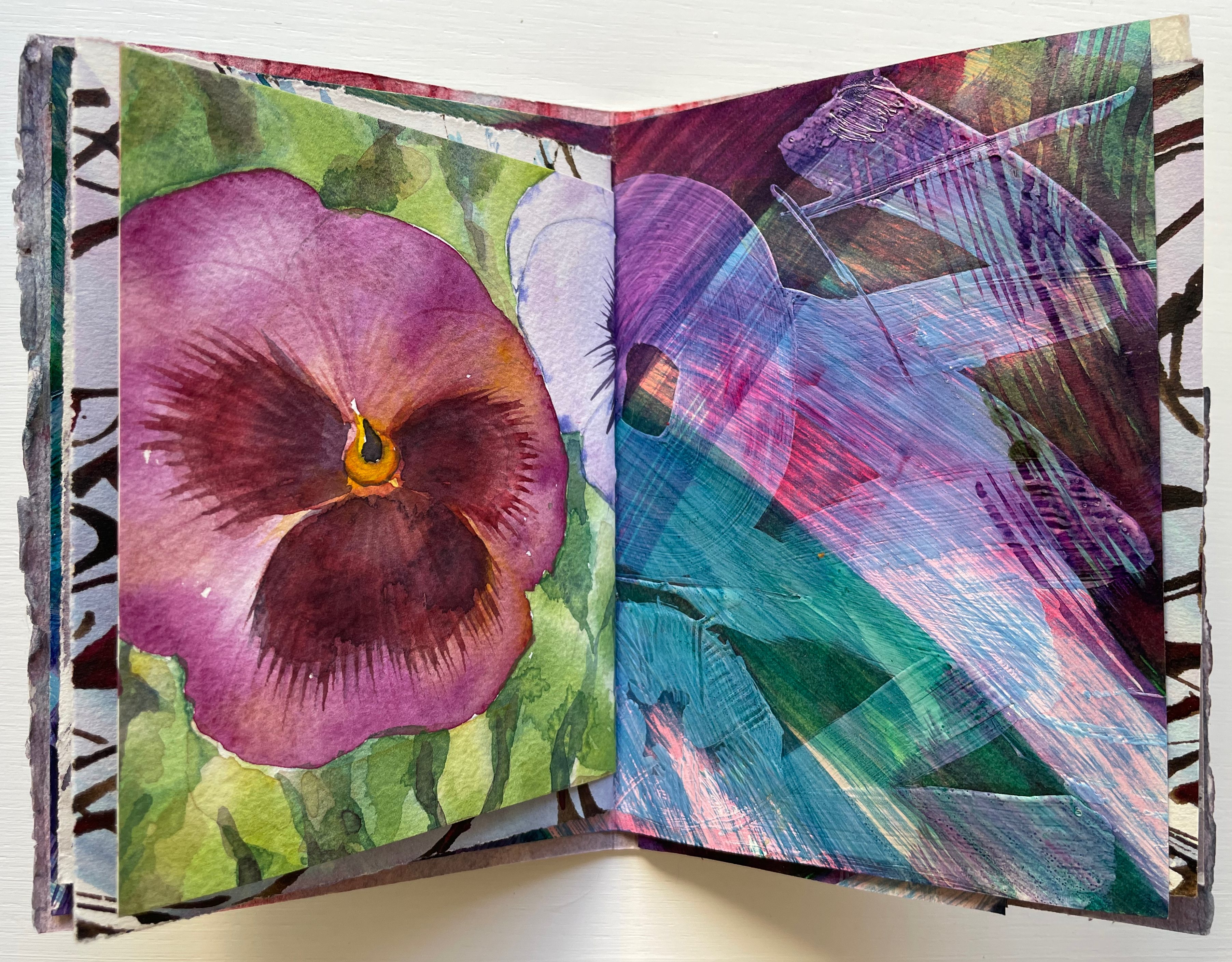
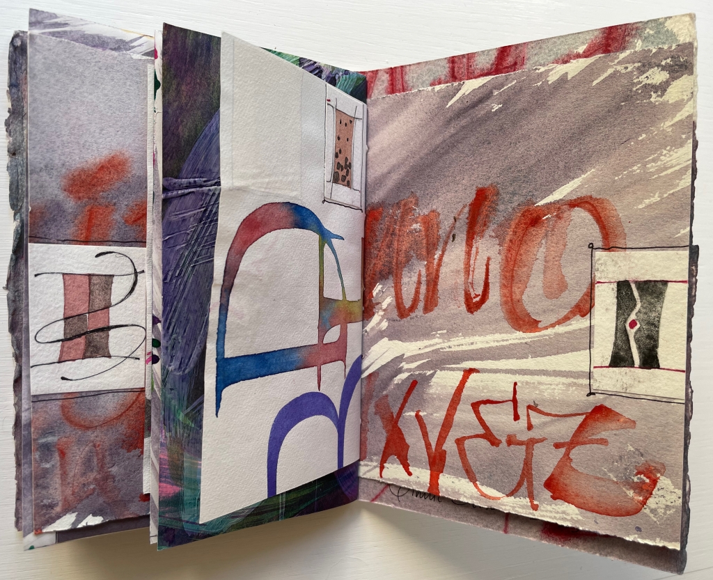
Patterned Alphabet (2013) Annie Cicale Sewn, casebound leporello. H104 x W104 mm. 34 panels. Edition of 41, of which this 26. Artist 4 July 2023. Photos: Books On Books Collection.
Patterned Alphabet could well have been entitled Textured Alphabet. The number of different textures almost equals that of the patterns. It is the textures’ interaction with each other as well as with the patterns that particularly appeals. The cover, appropriately made of Cave Paper’s Alphabet Heavyweight, initiates the interplay. While the calligraphic style and patterned background of the copperplate engravings of A and Z do not vary, the textures around and beneath them multiply, mirror and contrast. The surface of the Cave Alphabet paper echoes that of the copperplate’s stippled background. The softness of the thick cotton string, binding the cover, contrasts with the roughness of the paper.
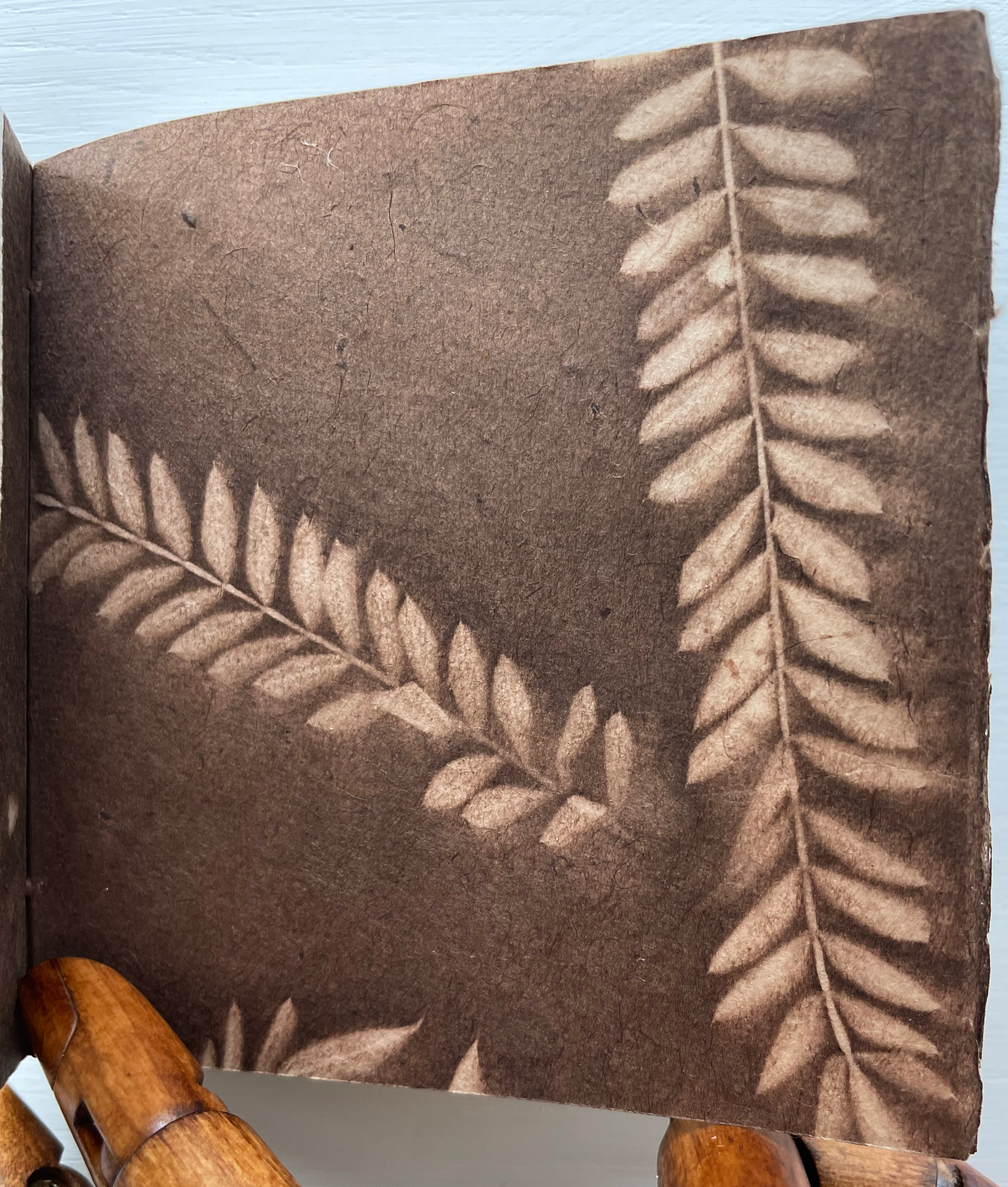
Before coming to the leporello, hand and eye are slowed by another texture. Like the self-referential Cave Alphabet paper cover, the flyleaf refers to itself with a leaf print. It contrasts with the cover, however, in its lightness, surface and color. While that dance of contrasting textures goes on, the flyleaf’s embedded image strikes up its own contrast with the relief technique and letters on the covers.
When the leporello comes on stage, the print pattern and paper texture exchange the roles they played at the beginning. Before, the print pattern held the stillpoint around which the cover, binding string, flyleaf and copperplate danced. Now, the smoother laid texture of the Ingres d’Arches paper becomes the stillpoint. Its weight, surface and color — very different from those of the cover and flyleaf — serve that constancy well. For each letterform (including the ampersand), different patterns make up the anatomy and background, which adds quite a number of dancers around the stillpoint.
The printing technique for all those dancers — Resingrave engraving — contributes to their variety of pattern. Invented by Richard Woodman, Resingrave is a synthetic substitute for boxwood. It consists of a thin layer of resin atop a block of MDF wood and, since the ’90s, was famously used by Barry Moser (e.g., the Pennyroyal Caxton Bible). More than lino or blocks for woodcuts, it allows for the thin lines necessary for close and fine patterns. Standing the leporello against the light offers a chance to enjoy the interaction of the “texture” of those patterns with the texture of the paper.
Like Moser, Cicale has engaged with watercolors as well as prints and embraced the abstract as well as the figurative, as can be seen in the next work.
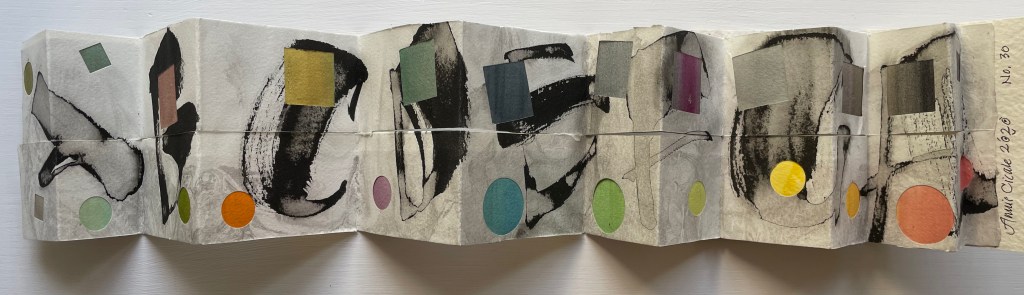
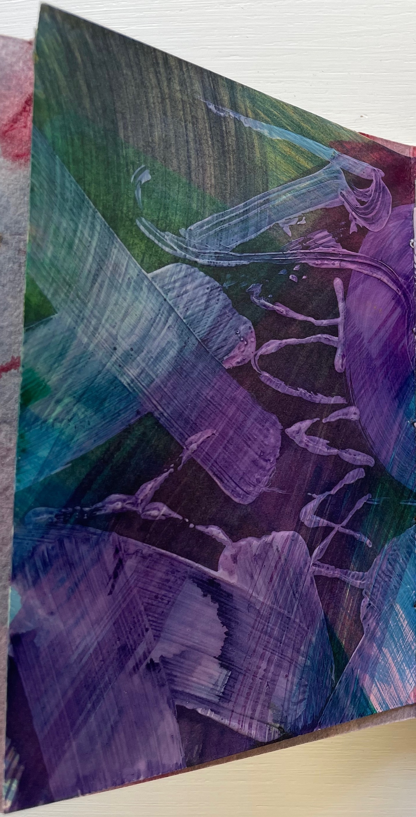
Detritus No. 30 (2020)
Detritus No. 30: Floppy Alphabet, Brush Alphabet (2020) Annie Cicale Modified leporello, pasted to paper cover, bellyband closure. Closed: H95 x W80; Open: W750. 12 panels. Acquired from the artist, 4 July 2023. Photos: Books On Books Collection.
Here, Cicale has compiled and collaged cast off letters, ornaments and marks from completed works to create a modified double-sided leporello bound in painted and inked watercolor paper, held together with a belly band. The leporello’s two modifications are its variation in panel size and the cut across the mountain folds. Except for a reversal on the first panel, the upper row’s panels bear square cutouts, and the lower row’s bear circular ones. Although constant in shape and distribution, the recurrent squares and circles vary in their color and size, highlighting the variation in size of panels. With their constant black and gray, the ink-brushed letters A-H contrast with the variance of color and size of the circles and squares.
On the reverse side of the leporello, the circles and squares exchange position. They are, in fact, circular and square patches, black and white on this side of the leporello and colored on the other, supplying the color to the other side’s square and circular cutouts. The circular patches are generally consistent in size, as are the square patches, which contrasts with the varied sizes of the cutouts on the other side. The reverse side of the leporello is more muted, and with its black and white patches, it seems more abstract, but is it? Letters themselves are abstract, which may the tongue-in-cheek point of the underlying patches.
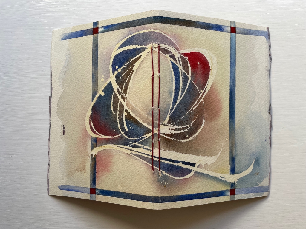
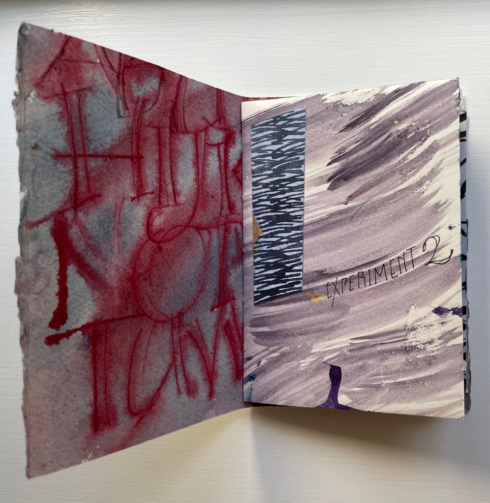
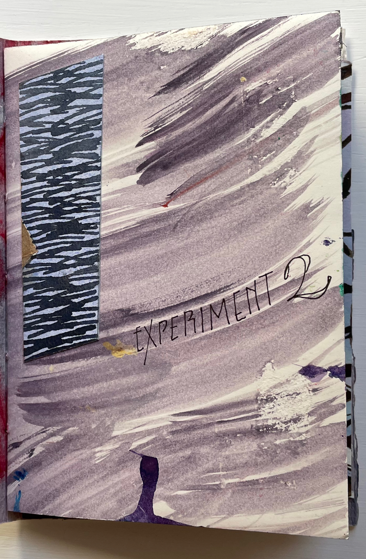
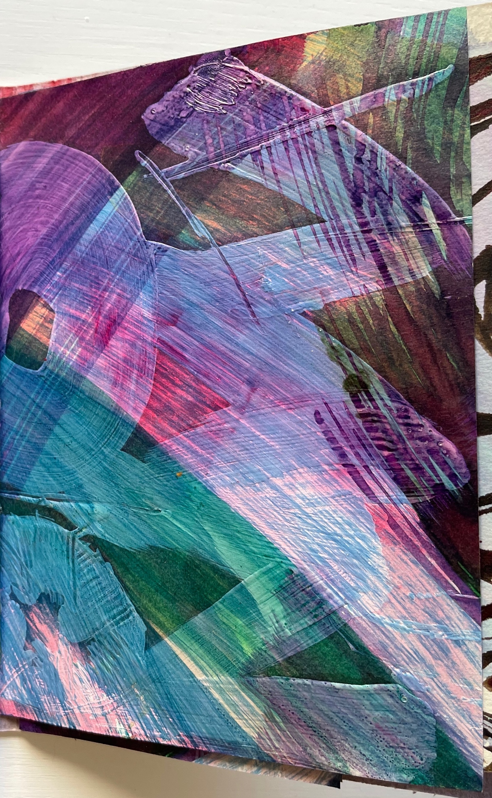
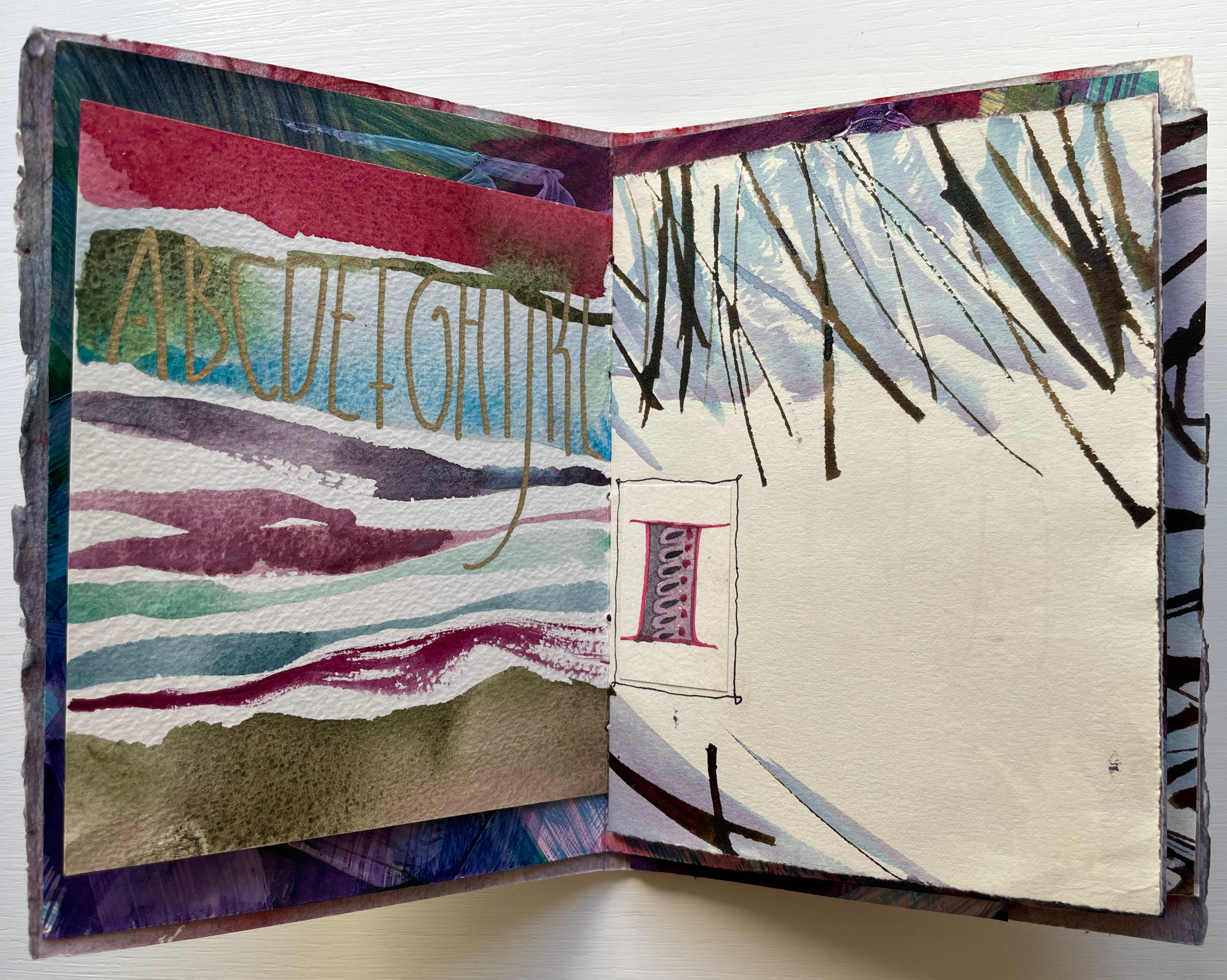
Experiment No. 2 (2023)
Experiment No. 2: Step by Step (2023) Annie Cicale Pamphlet stitch book. H185 x W 130 mm. Seven folios of varying trim size and papers, one set of four folios gathered and sewn to upper fold of spine, one set of three folios gathered and sewn to lower fold of spine. Acquired from the artist, 4 July 2023. Photos: Books On Books Collection. Displayed with permission.
Cicale continues her dance of contrasts and similarities with Experiment No. 2 (2023). Here are some of her comments on process and material:
Teaching watercolor for many years has allowed me to try many exuberant techniques, using good rag paper and a wide gamut of colors, shapes and techniques.… An alphabet written on another sheet of paper has been collaged on these pages. I’ve used walnut ink, watercolor and iridescent pigments, which create an interesting series of contrasts as you move through the book.
Another experimental aspect of this pamphlet stitch book is the gathering of the folios into two separate gathers and the variation in size of the folios. The exterior image of the spine above and its interior below show the attachment of the gatherings to the right and left folds of the spine. Two pamphlets in one.
The first gathering’s title-bearing folio measures H176 x W246 mm when spread out fully. On its title-bearing page, there is one of the collage elements that Cicale mentions; three others appear on the other half, which is the final page of the first gathering.
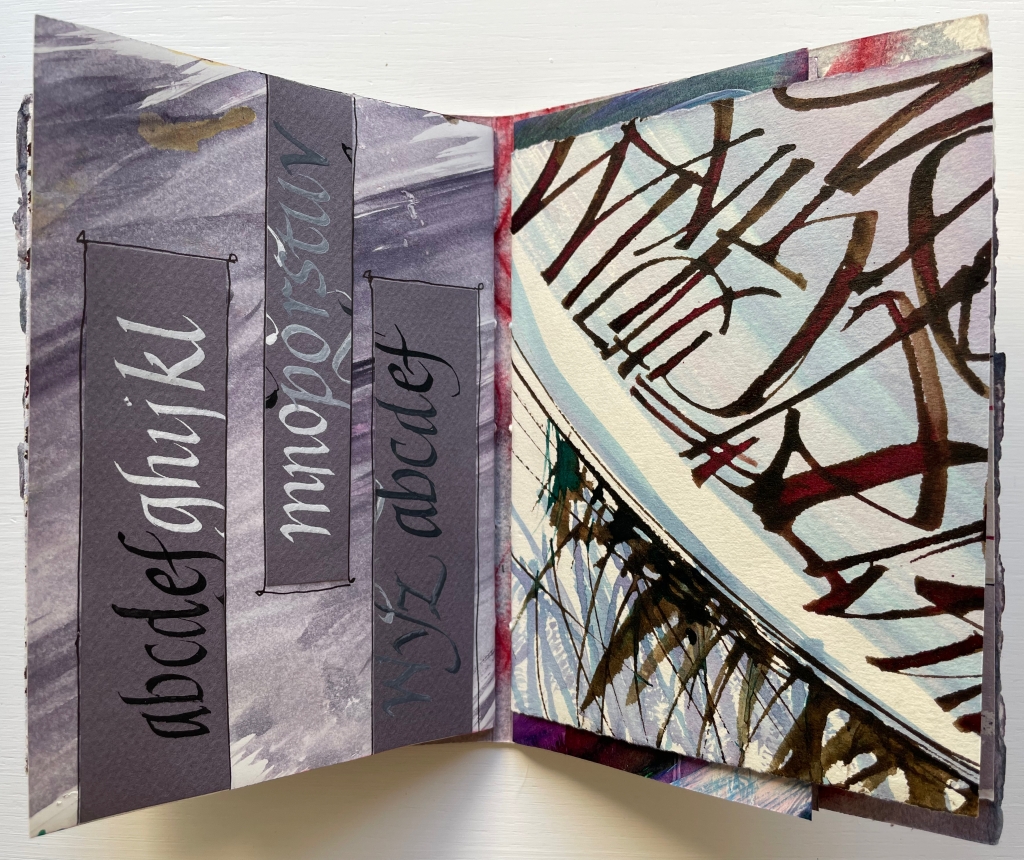
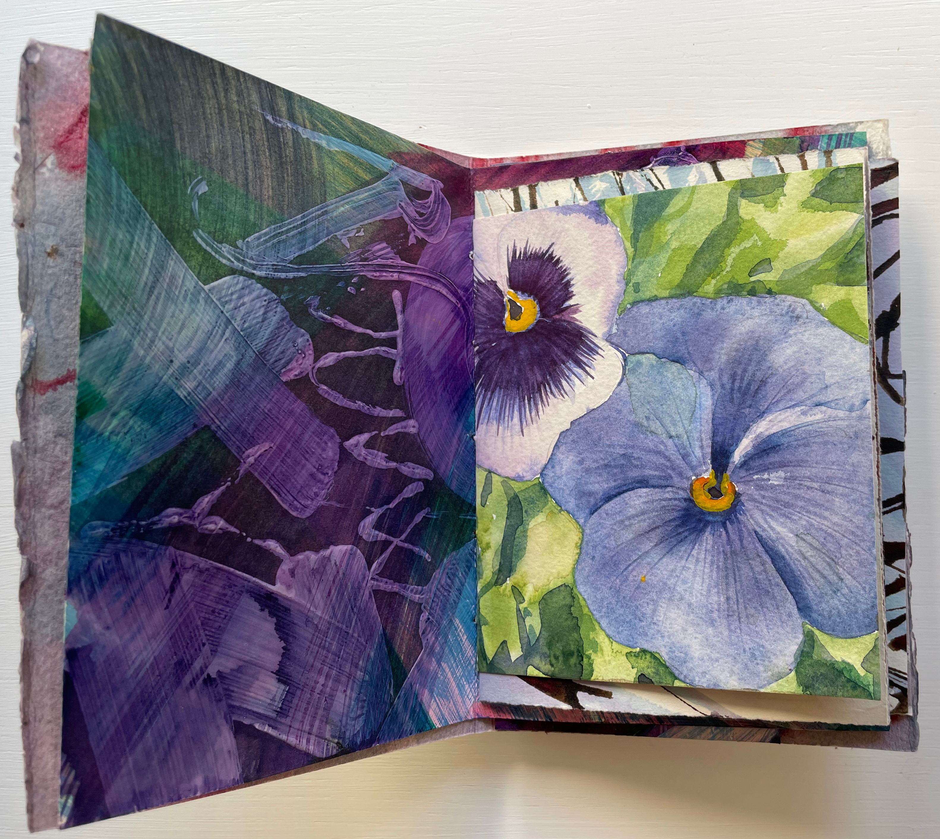
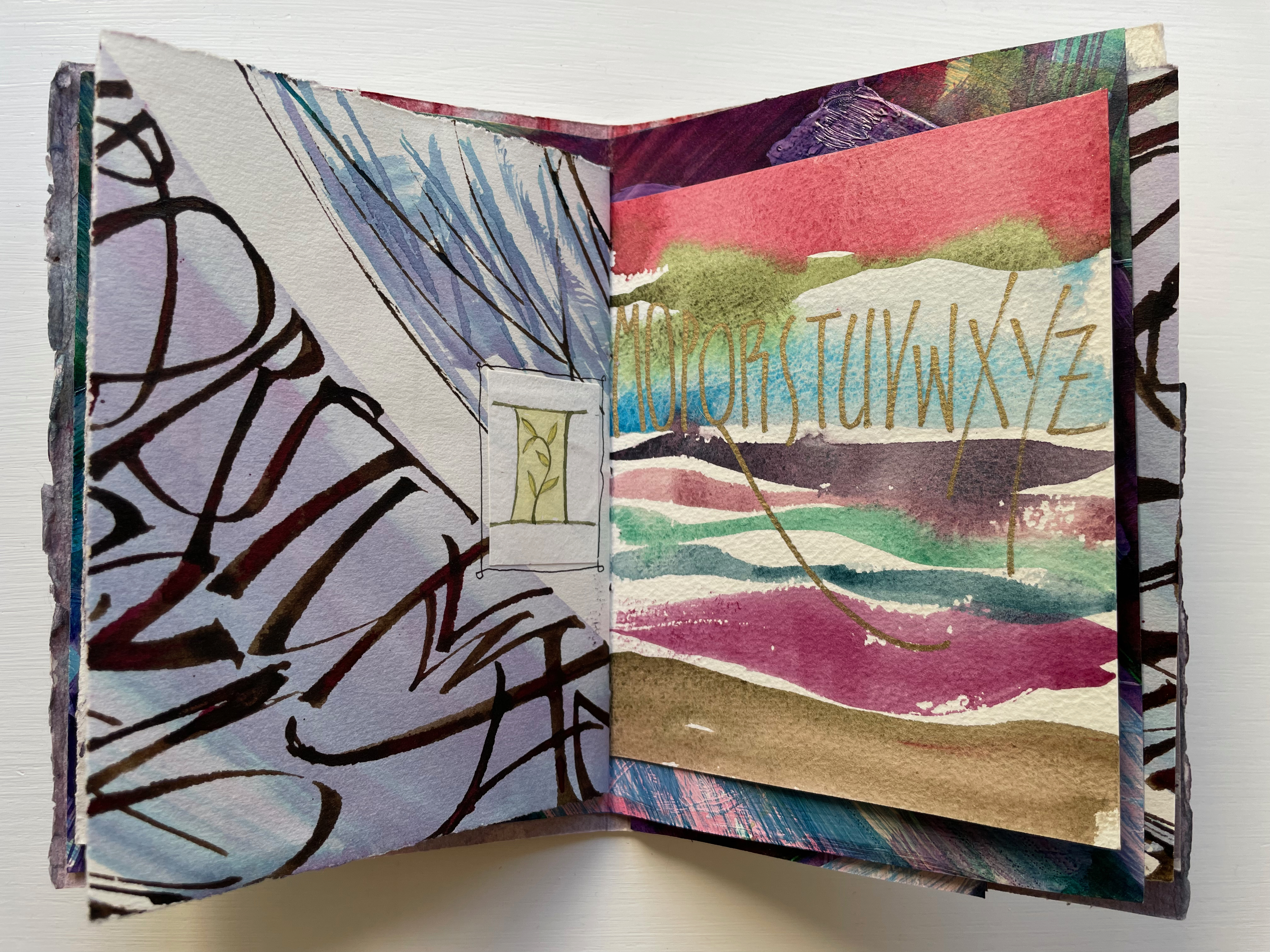
Of course, the full images on either side of the title-bearing folio cannot be seen all at once because of the intervening, contrasting and differently sized folded folios. It’s those different sizes and contrasts that somehow urge the reader/viewer to jump forward then back not only to see those full images for every folio but also to enjoy the magic of the contrasts and similarities. Two of the more effective spreads prompting this jumping forward and backward are these below. On the reverse side of the title-bearing folio is a colorful impasto painting of letters, some in sequence, some overlapping.
Perhaps it’s the impasto of the verso page that prompts the jump forward to find its recto mate, but once there, the mirrored colors of the pansy and letters surely prompt a jump back to enjoy again the different colors mirrored before.
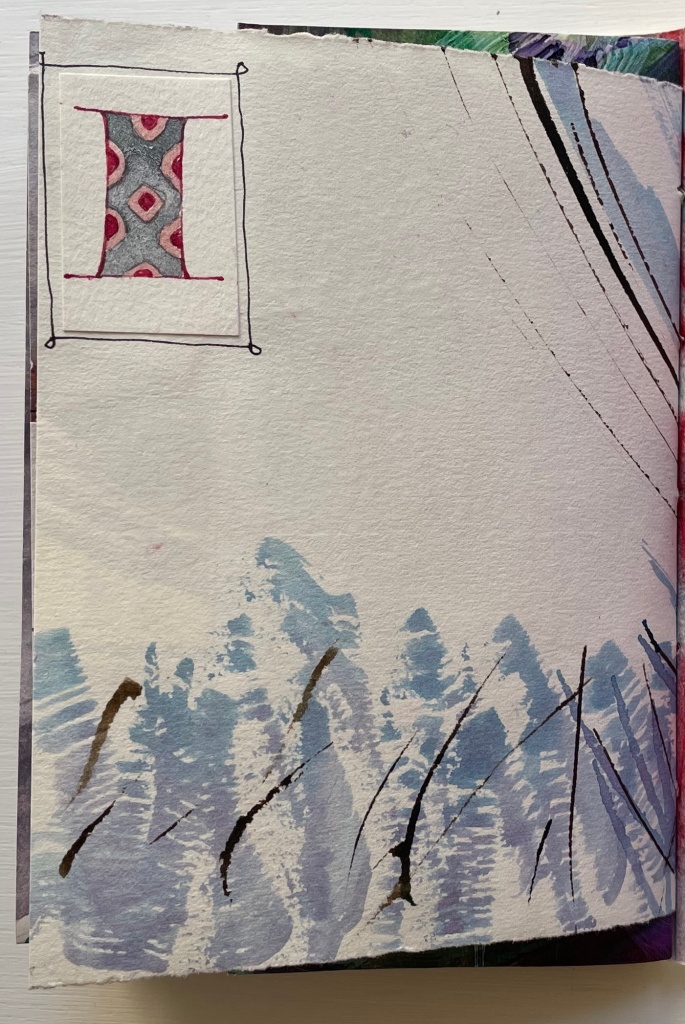
Below, the truncated alphabet prompts the leap forward to find its other half, and the contrasting wintry calligraphy facing M through Z sends us back to its other half to puzzle over those collaged thumbnail letter I’s.
Mind that all of this has occurred in just the first gathering.
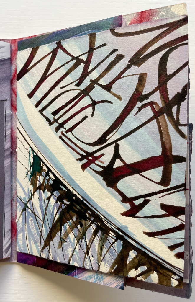
The second gathering has fewer folios and perhaps fewer prompts to jump forward and back, but there is at least one prompt to jump back to the first gathering. The first page of the second gathering recalls from the first gathering the folio of wintry calligraphy — the one above with the two puzzling thumbnail letter I’s.
Curiously, the second gathering has several more of those thumbnail letter I’s than the first gathering has. In fact, due to the narrowness of the inner folios, the collaged thumbnails are also more constantly present to the eye. In general, the thumbnails and narrow inner folios make the second gathering more about the collage effect and strong contrasts across the differently sized pages and less about jumping forward and back.
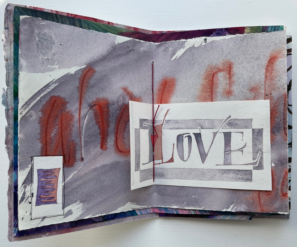
When we reach the final page of the second gathering, there sits the thumbnail, almost as if it were the illuminated initial of “Incipit” — except, of course, this is the end.
Tantalizing and enchanting as those thumbnail letter I’s are, they also draw attention to the experiment’s one jarring folio. It appears in the center of the first gathering and is quirkily the only off-center folio in the whole book. It is also the folio that, with an explicit message, forecloses the surrounding incipience. With that twee red heart beneath the red thread, out the window goes the structural and material subtlety so enjoyable in the rest of the book.
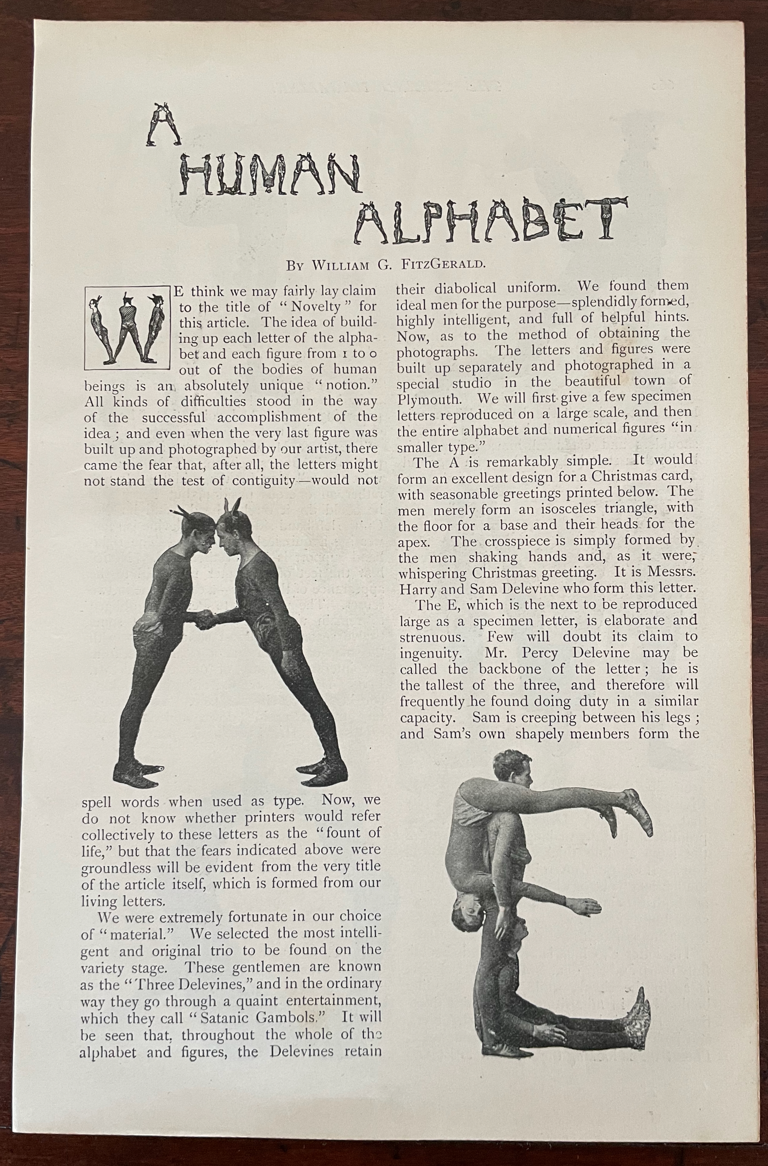
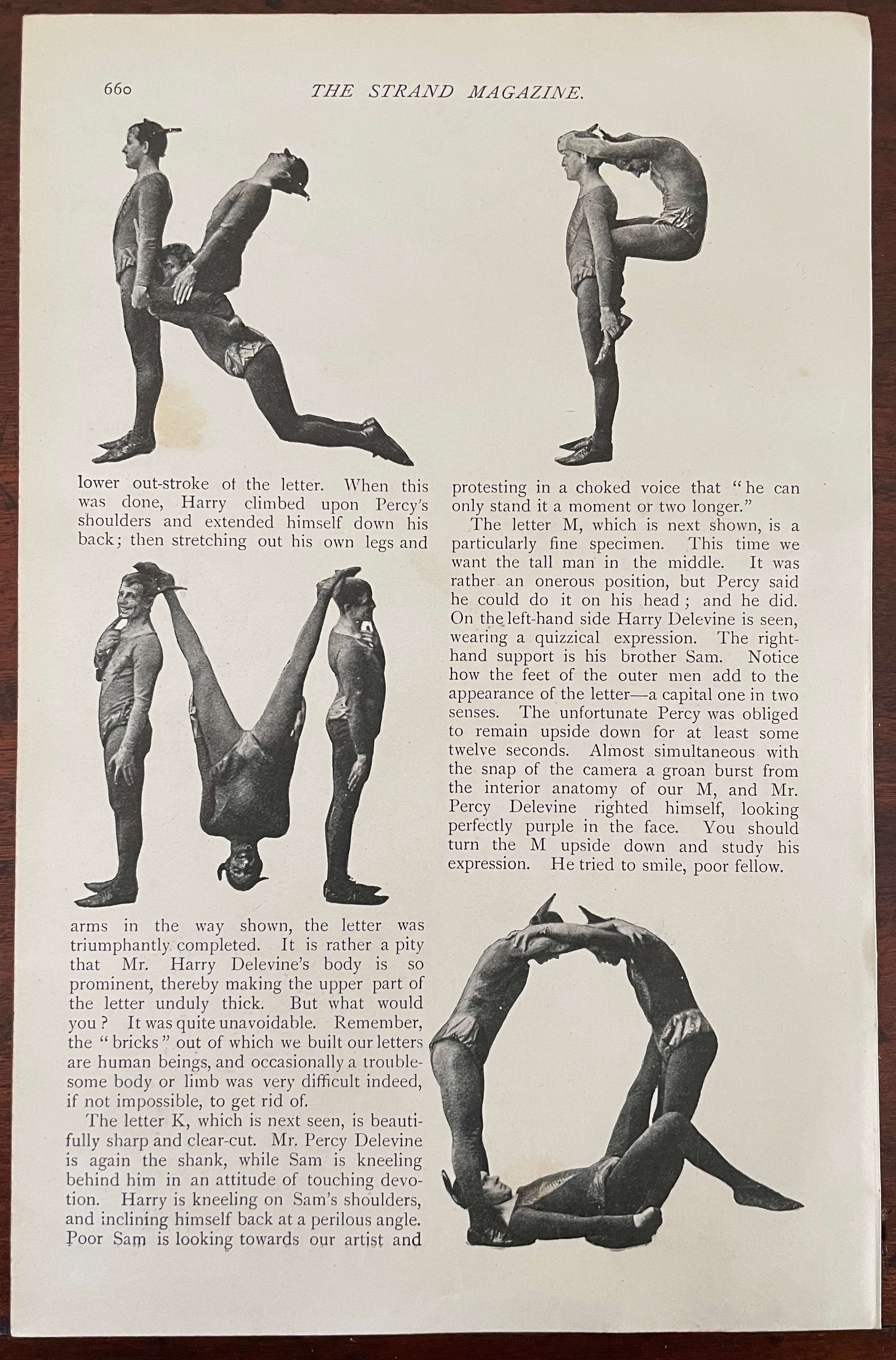
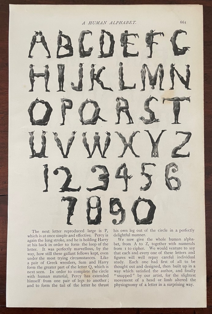
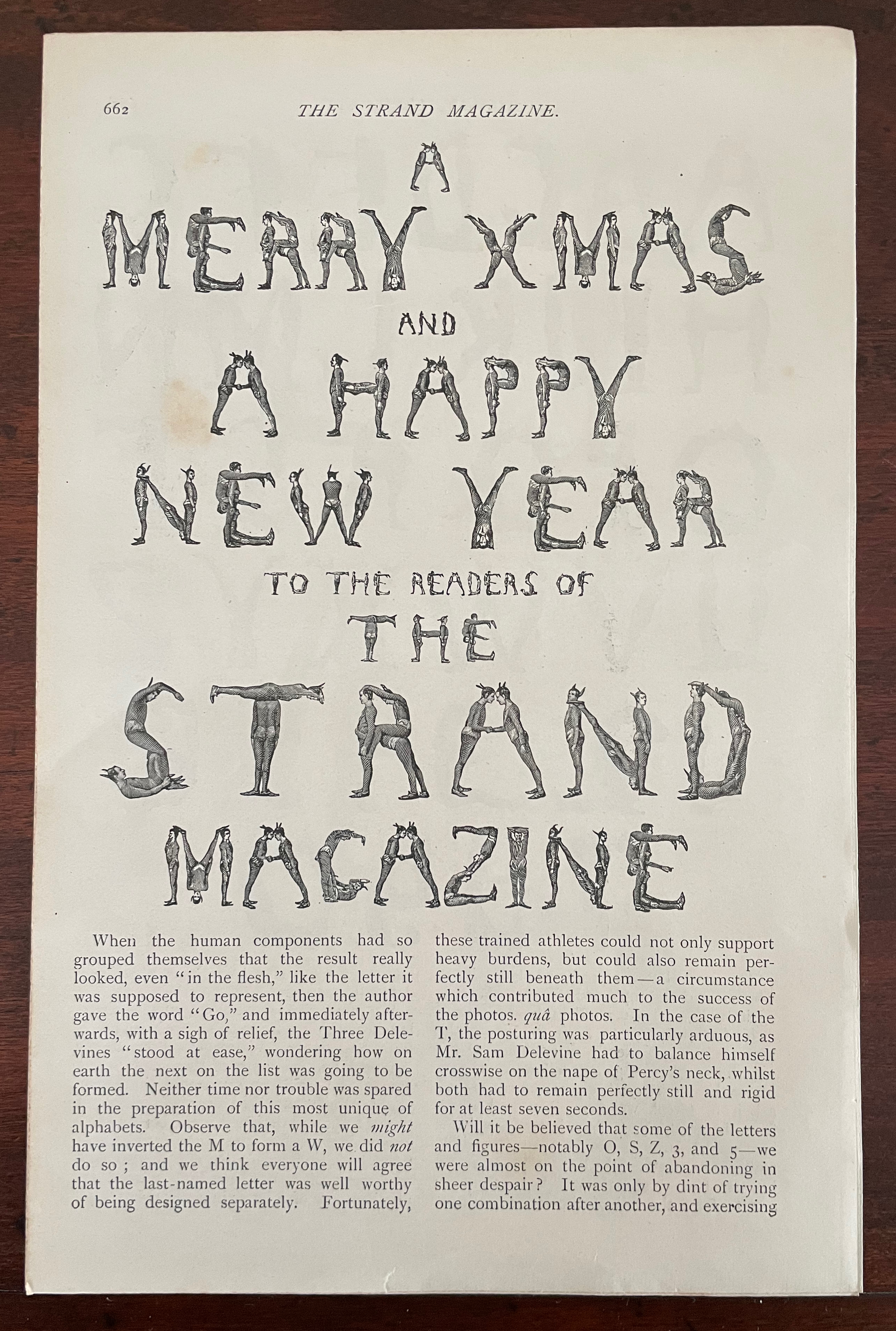
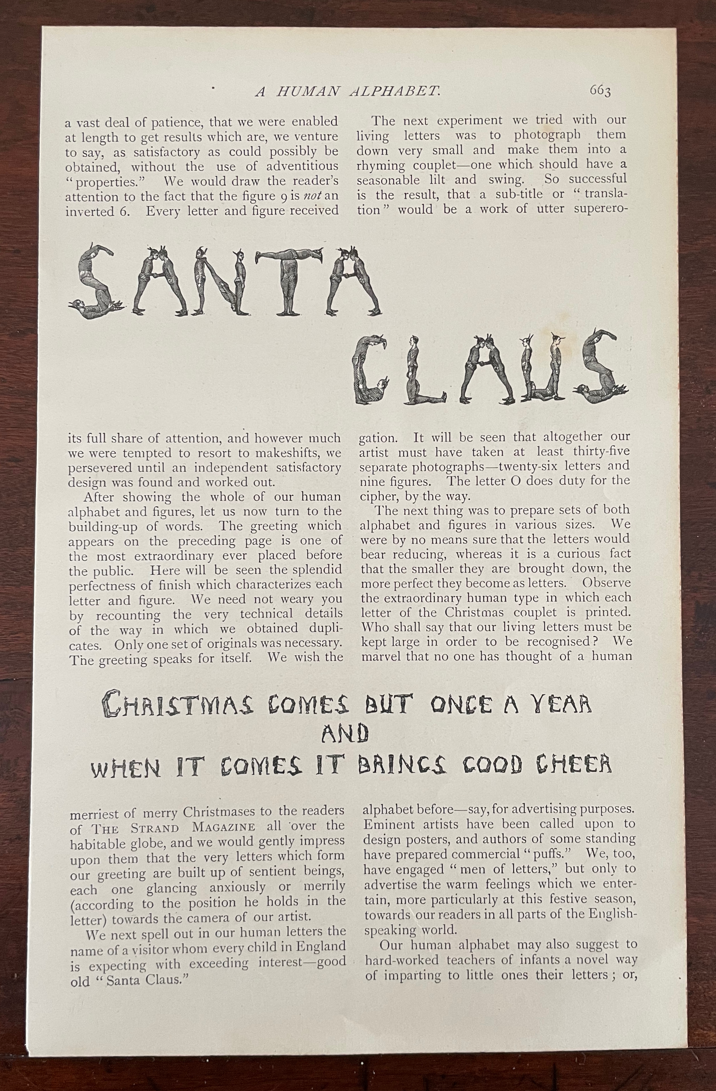
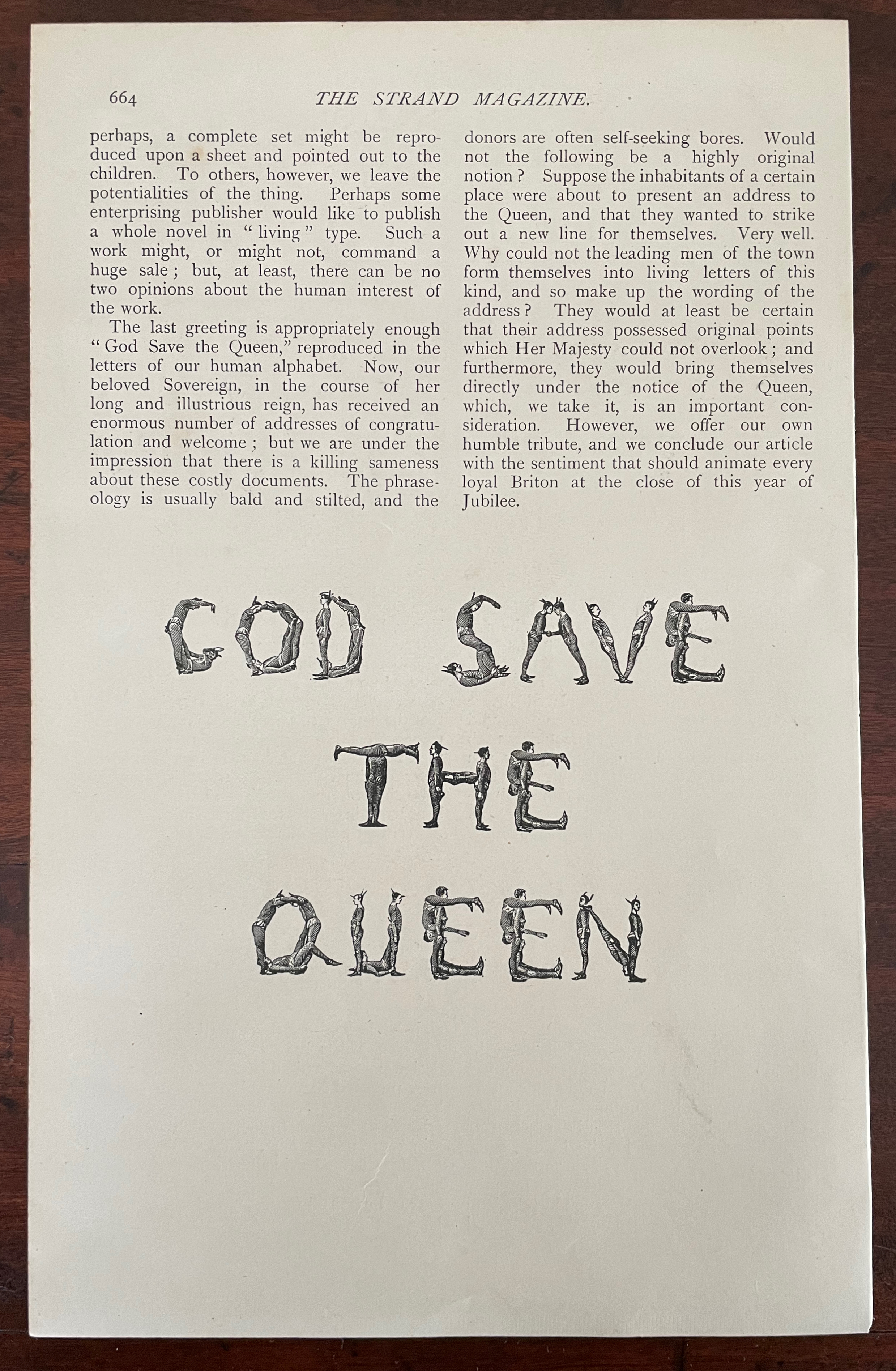
A Human Alphabet (1897) The Three Delevines Loose folios, William G. Shepherd’s article in The Strand Magazine, Vol. XIV, December, pages 660-64.H230 x W160 mm. Acquired from Cosmo Books, 26 August 2023. Photos: Books On Books Collection.
Only remembered after the Alphabets Alive! exhibition opened at the Bodleian in July 2023, The Three Delevines and W.G. Shepherd (their impresario on the occasion in 1897) have nevertheless demanded an appearance online among the other embodied alphabets (or lettered bodies) included in the “B for Bodies” display.
Shepherd is not merely the author of the Strand article but asserts his authorship of the alphabet performed by The Three Delevines. Although generous in his praise of the Australian brothers Sam, Harry and Percy for holding each of their poses for at least seven seconds and, in some uppercases, for twelve, Shepherd does not identify the Strand’s photographer by name or acknowledge his skill beyond “snapping”. At least, he refers to him as “our artist”.
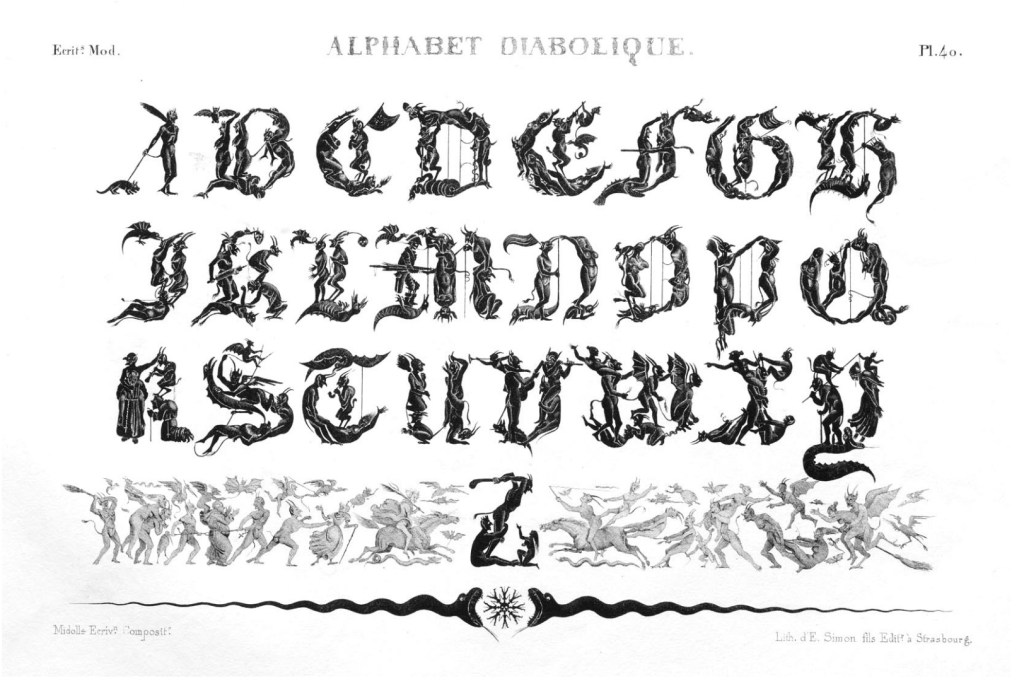
So much of his effort went into discovering the music hall troupe and its performance called the “Satanic gambols”, and congratulating himself on his sculptural instruction, and then describing superfluously what his “artist” and the Delevines rendered, Shepherd neglected to do the research at the British Museum (before the Library was hived off) to realize that his claim to “Novelty” had been superseded several times over. Even right back to the diabolical calligraphy of the — oh the shame of it — French graphic artist Jean Midolle (b. 1794). Blame the oversight on the combination of Christmas and the Jubilee.
Devroye, Luc. 2022. “Jean Midolle“. On Snots and Fonts. McGill University, Montreal. Accessed 6 September 2023.
Dukes, Hunter. 27 April 2023. “Punctuation Personified (1824)“. The Public Domain Review. Not only could letters be formed with the human body, so could quotation marks and square brackets.
FitzGerald, William G. December 1897. “A Human Alphabet”. The Strand Magazine. Vol. XIV. London.
Goetz, Sair. 11 June 2020. “Letterforms / Humanforms“. Letterform Archive News. Accessed 30 January 2022.