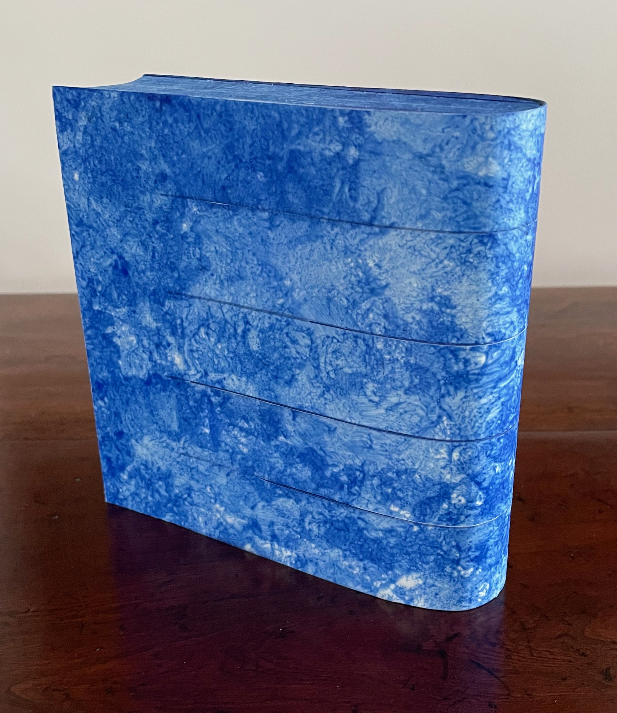
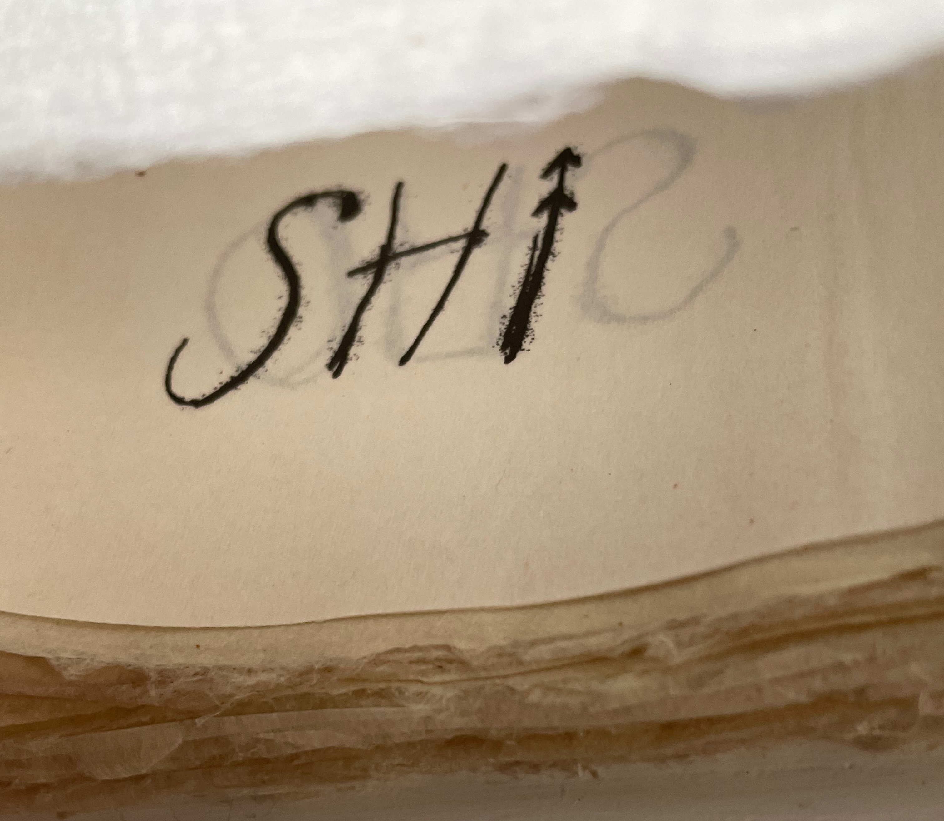
Breaking Waves (2023) Emmy van Eijk Sculptural book. 140 x 140 x 40 mm (closed). Unique work. Acquired from Papertrail Handmade Books, 22 January 2024. Photos: Books On Books Collection.
Breaking Waves spills over at least three categories of bookmaking: the bound blank book, designer bookbinding and sculpture. It would take a bold owner, however, to use the work in its first category. Fortunately that invitation quickly yields to another.
Handscapes (2016) Margaret (Molly) Coy & Claire Bolton Casebound, hand sewn and bound with doublures and two ribbon bookmarks. H260 x W310 x D30. 80 folios. Edition of 12, of which this is #9. Acquired from the artists, 19 October 2023. Photos: Books On Books Collection. Displayed with artists’ permission.
Co-founder of The Alembic Press with David Bolton, Claire Bolton is an independent historian of printing and type as well as an aficionado of handmade paper. She recently donated works in shifu (a spun and woven paper textile) to the Bodleian. Although she disclaims classification as a book artist, her works in the Books On Books Collection — especially her collaboration with Molly Coy called Handscapes (2016) — argue with her persuasively.
A Little Black Book (1995)
A Little Black Book(1995) Claire Bolton Miniature, exposed-spine, stab-bound with red cotton thread to hard boards. H73 x W60 mm. 64 pages. Edition of 100, of which this is #4. Acquired from Oak Knoll Books, 11 October 2023. Photos: Books On Books Collection. Displayed with artist’s permission.
Out of Breath (2019) Jacobus Oudyn Hardboard slipcase covered in textured paper, housing stab-bound book with waxed paper cover, attached page lifter. Slipcase: Box: H345 x W232 x D50 mm. Book: H300 x W202 mm. 34 pages. Unique. Also acquired, Artist’s Proof: H205 x W165 mm. Both from the artist, 1 June 2023. Photos: Books On Books Collection. Displayed with permission of the artist.
In turning the thirty-four pages of this artist’s book, your fingers, eyes and ears pick up a rhythm: a labored inward and crackling outward breath, a catching and losing grasp of air, an alternating wet, dry, wet wheezing. The effects come from the material (sounds and touch that the slippery, thin and delicate rice paper gives against the wrinkled carbon paper that continues to shed its carbon), from the technique of alternating positive and negative prints, and from the ticklish action of picking up the pages with the card lifter. It takes a long time to turn these pages.
The artist’s note accompanying the work describes it as being “for all our friends and relations who have been victims of Mesothelioma and other ‘industrial’ lung disorders like Black Lung”. Indeed, the double-page spreads’ bilateral symmetry and their blackness, grayness and whiteness recall chest X-rays. The process by which Oudyn achieves this is worth remarking.
In correspondence with Books On Books, the artist notes that the process emerged from much chance and circumstance. It began with rubbings made against charred trees after a bush fire near Tewantin in 2018. Those results prompted childhood memories of the kind of carbon paper he knew as a child. Wanting to explore its use, he found that it was no longer stocked by stationers in the region, no doubt because computers, printers and photocopiers had made it superfluous. An online search yielded some boxes of very fine thin A4 sheets of bluish black and purer black carbon paper from China. Around the same time, he had been experimenting with momigami using various papers, mainly rice paper and mulberry but also cartridge and craft paper. While making books with the carbon paper and momigami results, he had reason to iron some sheets flatter, which yielded a variety of carbon prints on the rice paper. Different temperatures, durations and pressures as well as other papers yielded a range of prints on paper but also beautiful positives on the fine carbon paper itself. Experimenting with different orders in the steps, rewrinkling before or after ironing, and further grading and sorting the papers, Oudyn gained some control over the finished result. Then came the ideas that led to Out of Breath and the following works.
Opening Dark Windows (2020)
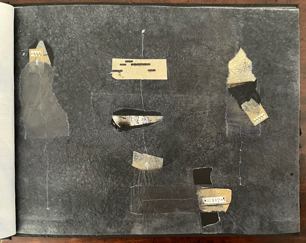
Opening Dark Windows (2020) Jacobus Oudyn Slipcase. Japanese stab binding, endpapers and a small card page lifter attached by thread. H220 x W300 mm. 20 folios. Unique. Acquired from the artist, 1 June 2023. Photos: Books On Books Collection. Displayed with permission of the artist.
Opening Dark Windows has a variety of tactile sensations similar to those in Out of Breath. Both have covers generating an unusual sensation — a waxen flexible texture in Out of Breath, a dry rough stiff texture in Opening Dark Windows. Both alternate different weights of papers. Of the 20 folios in Opening Dark Windows, 10 are carbon tissue paper, 10 are cotton Ingres (108 gsm), and all show the experimentation described above. This work, however, also displays Oudyn’s characteristic use of multiple media and collage — black acrylic paint, white wax crayon, pva glue, graphite, inks and found text. Oudyn also adds further tactility with torn and cut flaps with their pull tabs. All of this is in service to an idea: an exploration of fading memory and the retrieval of material long thought forgotten, both of which are made interactive by the flaps (the physical “dark windows”) in the carbon tissue that reveal the collaged text, signs, fractions and drawings sometimes glued to or made on the underside of the tissue, sometimes on the underlying sheet of Ingres.
Texture and weight alternating from one layer to the next, textures juxtaposed as flaps peel away, truncated text expanding and changing as the page turns — this is mindscape as surreal scrapbook.
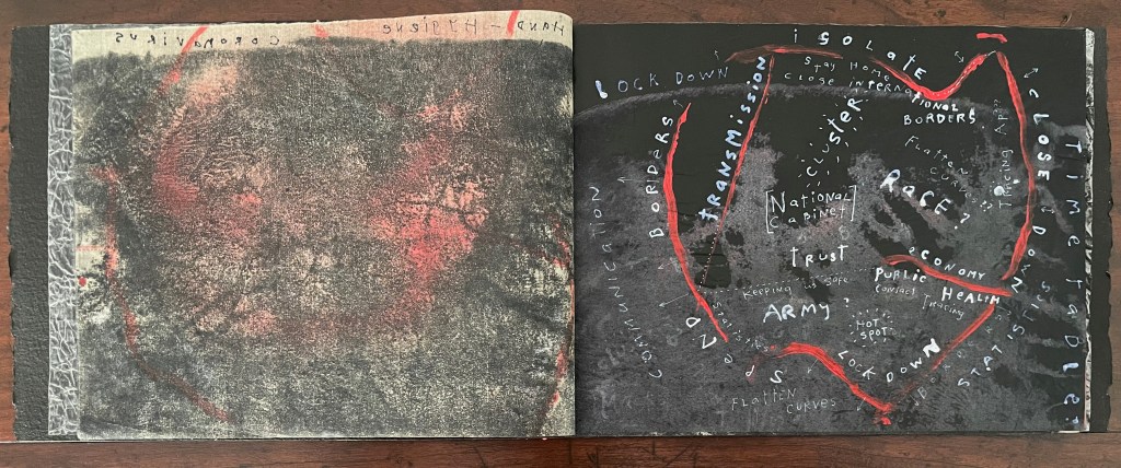
Flattening the Curve (2021)
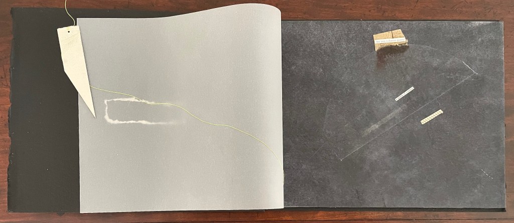
Flattening the Curve (2021) Jacobus Oudyn Slipcase. Japanese stab binding.H210 x W300 mm. 24 folios. Unique. Acquired from the artist, 1 June 2023. Photos: Books On Books Collection. Displayed with permission of the artist.
Like Out of Breath and Opening Dark Windows, Flattening the Curve (2021) uses the “swag” of black papers Oudyn had created. Although it is also a work of multiple media — the papers themselves, graphite and inks — the focus of Flattening the Curve rests more on a sort of narrative or documentary line showing how language changed as the Covid 19 pandemic progressed. A specific Covid language evolved as daily progress reports from political leaders and medical experts and interviews in the media became the focus of everyday life for two years. As the words on the page change reflecting their use for the purpose of authority and confidence, the seemingly fixed geographical boundaries in red break and shift. Even the height and width of the leaves shift.
M.L.A. (2021)
M.L.A.(2021) Jacobus Oudyn Softcover pamphlet-stitched, textured flyleaves. 18 sheets Chinese carbon paper, 18 sheets Chinese rice paper. Found text. H125 x W110 mm. 36 pages. Unique. Acquired from the artist, 1 June 2023. Photos: Books On Books Collection. Displayed with permission of the artist.
Obviously from the works above, Oudyn deploys his set of tools, techniques and material imaginatively, but for this satiric portrait of a flip-flopping Member of the Legislative Assembly in Australia, the subject himself seems to have selected unwittingly the overprinting from carbon paper onto rice paper. Every turn presents a reversal.
Even beneath the reversals, his previous faces to the world accumulate and peek out slightly askew from “today’s” view until at the end you can hardly tell what view would be next. To which the M.L.A would reply, does reply, “Yes, why not?”
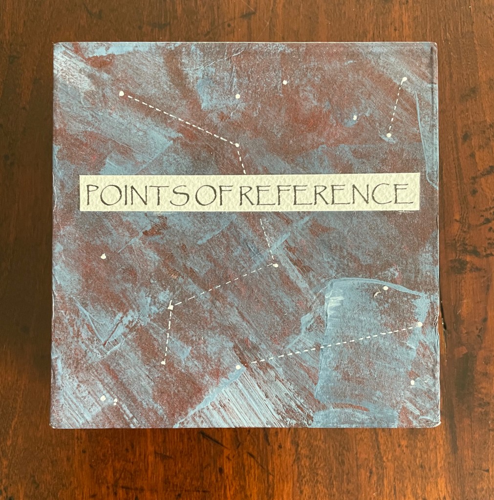
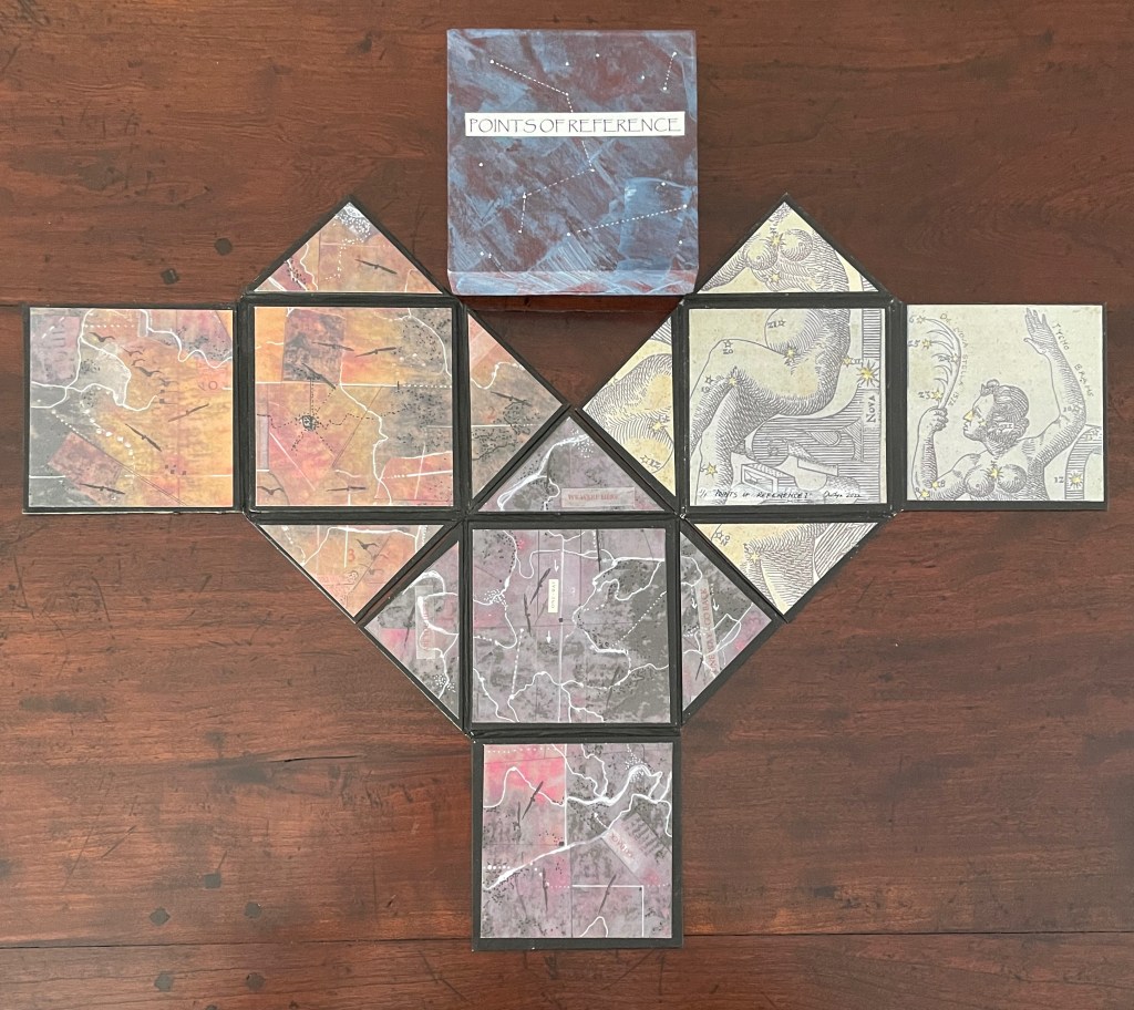
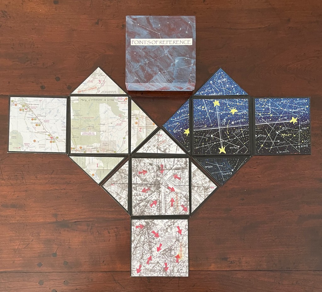
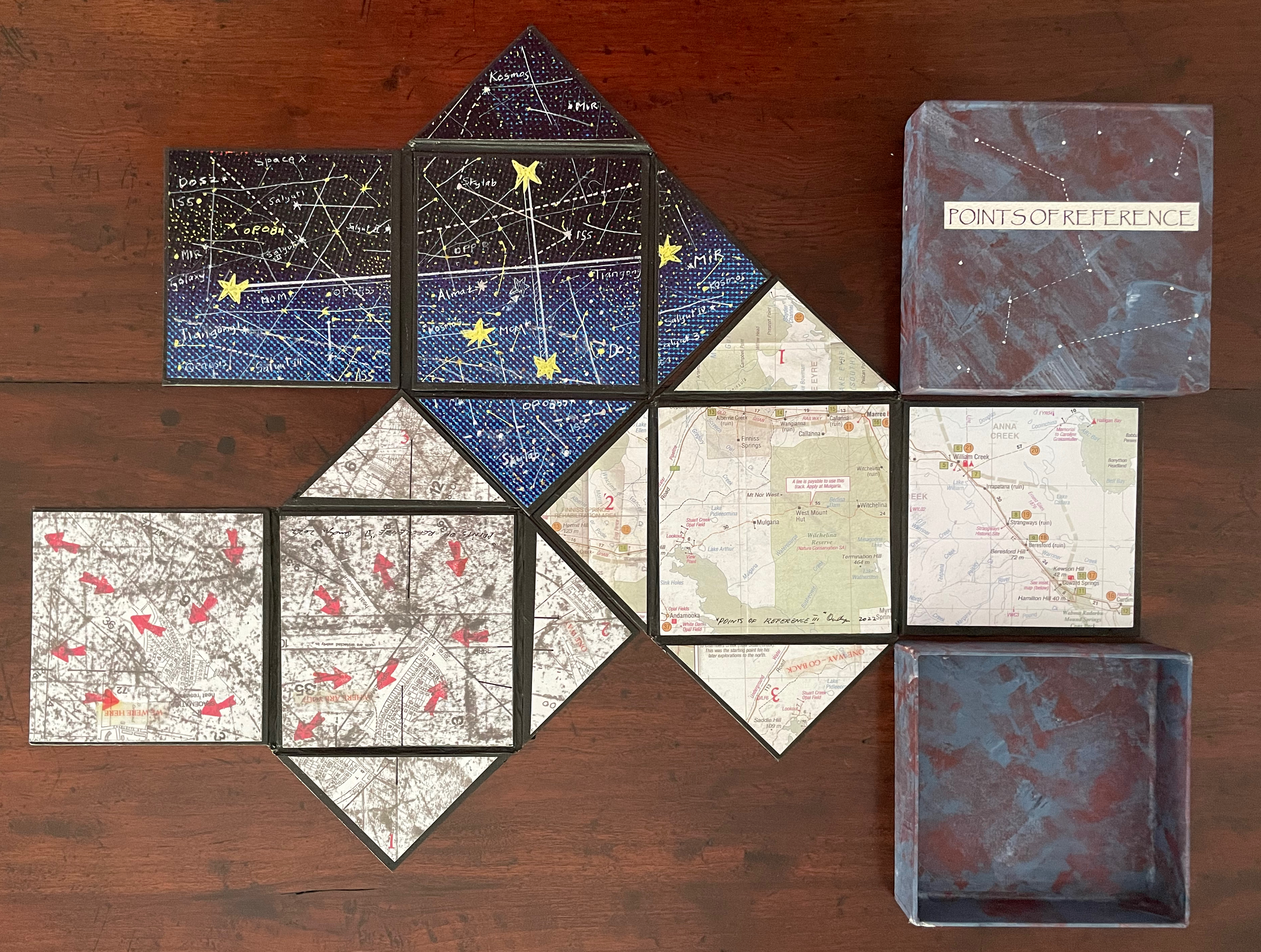
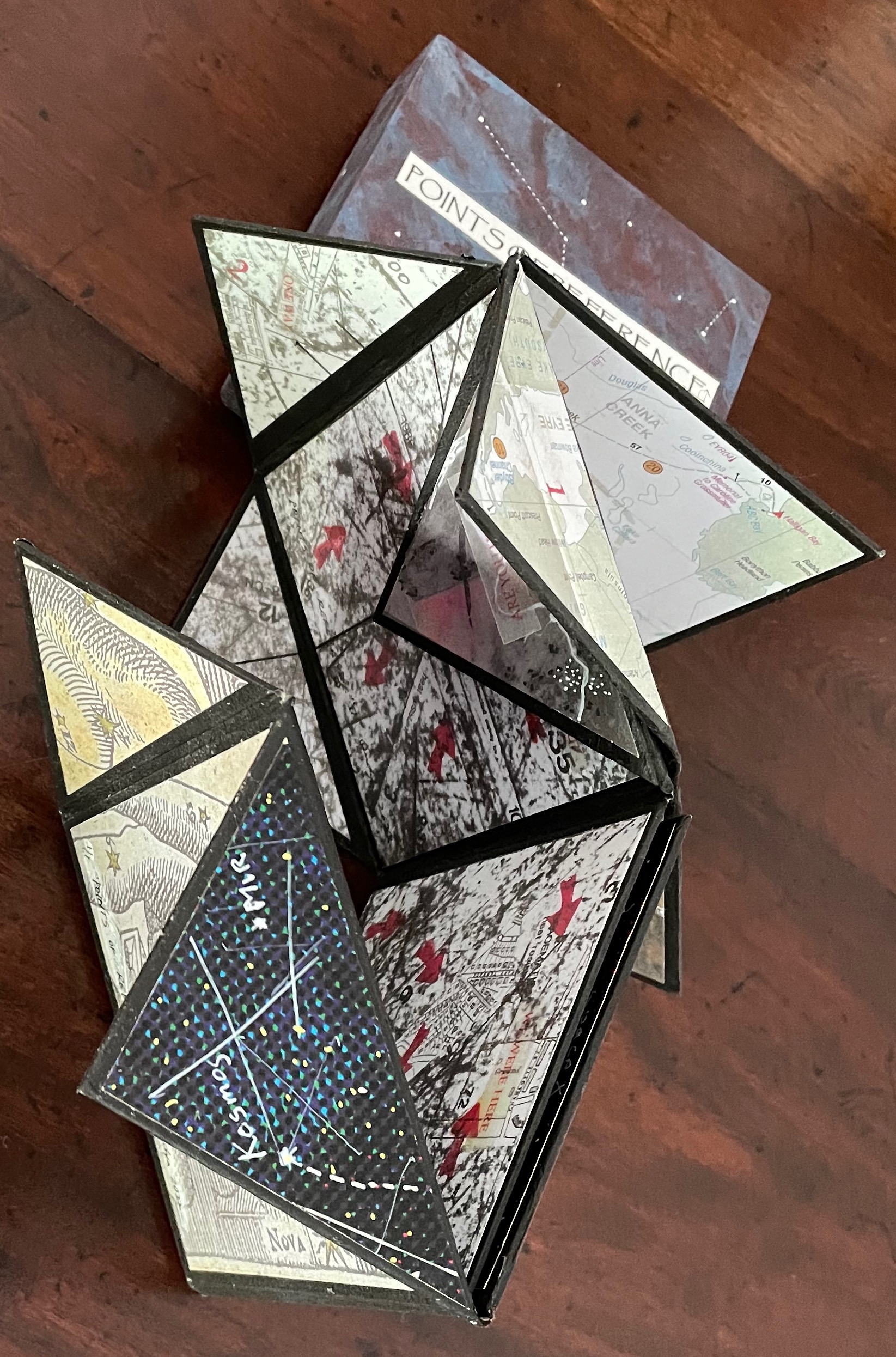
Points of Reference (2022)
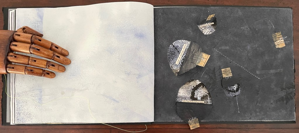
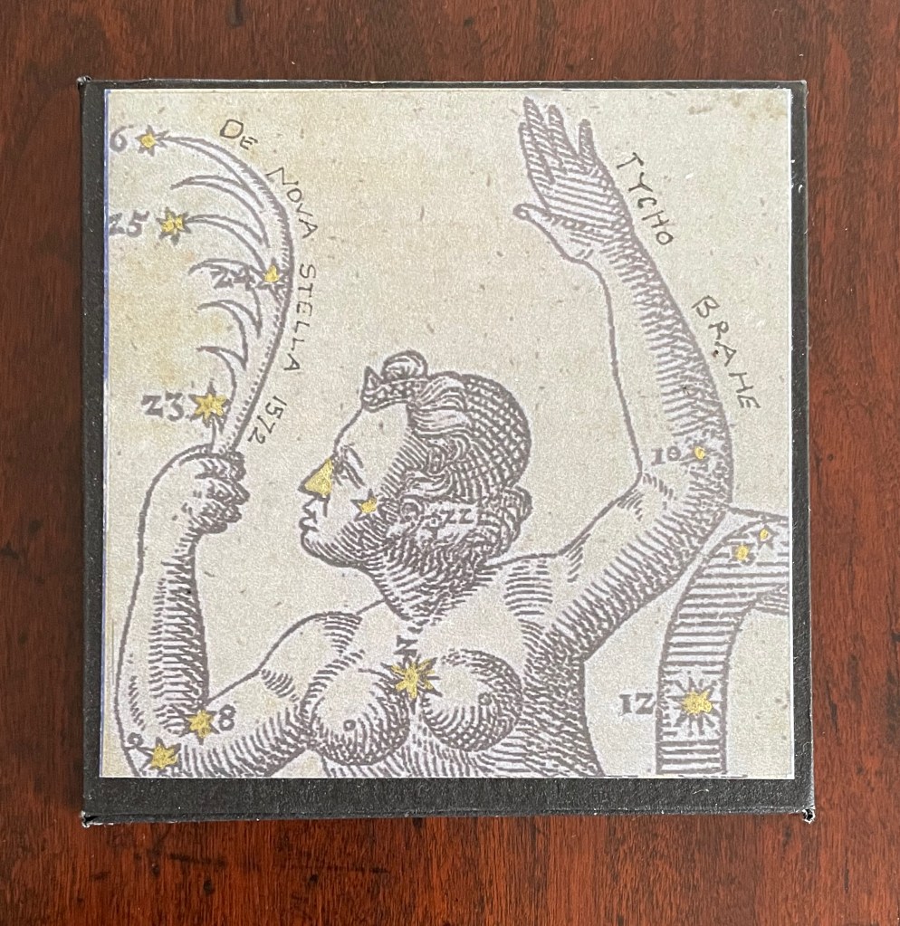
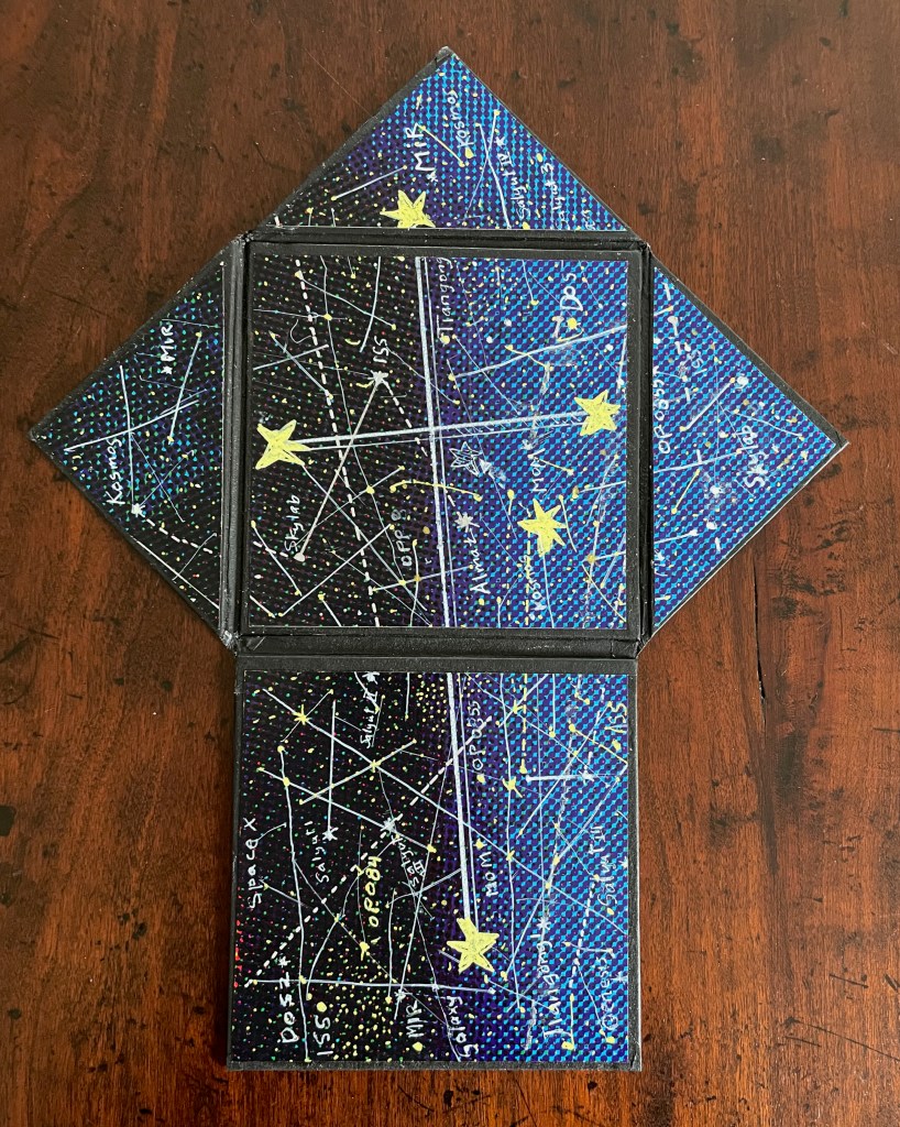
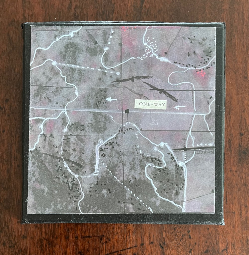
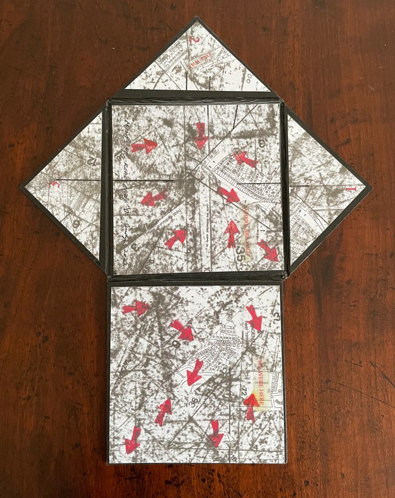
Points of Reference (2022) Jacobus Oudyn Box covered in illustrated paper. Three small books, each with five double-sided panels. Box: 115 x115 mm. Each book, closed: 103 x 103 mm; open: H260 x W 210 mm. 10 panels each book. Unique. Acquired from the artist, 1 June 2023. Photos: Books On Books Collection. Displayed with artist’s permission.
Points of Reference recalls Oudyn’s earlier ‘16 Century Map‘ (2012) where the artist juxtaposed an old European map (showing Mesopotamia and the Euphrates, the Northern hemisphere’s cradle of civilization) with an Australian map of the Kakadu National Park, which covers ancient locations that evoke the concept of Tjukurpa, by which Australia’s Anangu refer to the creation period. The later work raises the earlier one’s implicit critique of European colonialism — “if we map it, we own it” — to a more all-embracing level.
A paper-covered box holds three small identically shaped, double-sided folding panel books. Each has two square panels and three triangular panels. When fully opened, each book takes the shape of a directional arrow.
One book has an image from Tycho Brahe’s Stella Nova 1572 on one side and, on the other side, an imaginary space map of commercial and abandoned space junk around the Southern Cross.
The second book has a planimetric map on one side and, on the other, a map of the same area entirely painted over predominantly in a muted orange and yellow, with some brown and gray, and black-ink silhouettes of birds in flight and native Australian markings in white and black.
Similar to the second, the third book has a partially obscured cadastral map with plots of property on one side and, on the other side, a map of the same area entirely painted over in gray, with some rose accents and, again, black-ink silhouettes of birds in flight and native Australian markings in white and black.
The triangular panels in the second and third books are numbered 1 to 3 on both sides, signifying that the same areas are mapped on both sides. Also, both of these books have faint collagraphed snippets of found text on the overpainted sides. Uniquely, the third book has gameboard-like text on both sides. On one side, the text reads,”ONE WAY”, “WHERE ARE YOU?” and “WE WERE HERE”; on the other, it reads “ONE-WAY”, “ARE YOU HERE?”, “WE WERE HERE”, “ONE WAY – GO BACK” and “- GO BACK”.
Along with their punning on the work’s title, the pointer-shaped open books’ re-arrangeability and their gameboard text suggest a playful invitation to consider how we imagine, mythologize, redefine and map what seems to us to be empty space challenging our place in it.
Facing Again (2023)
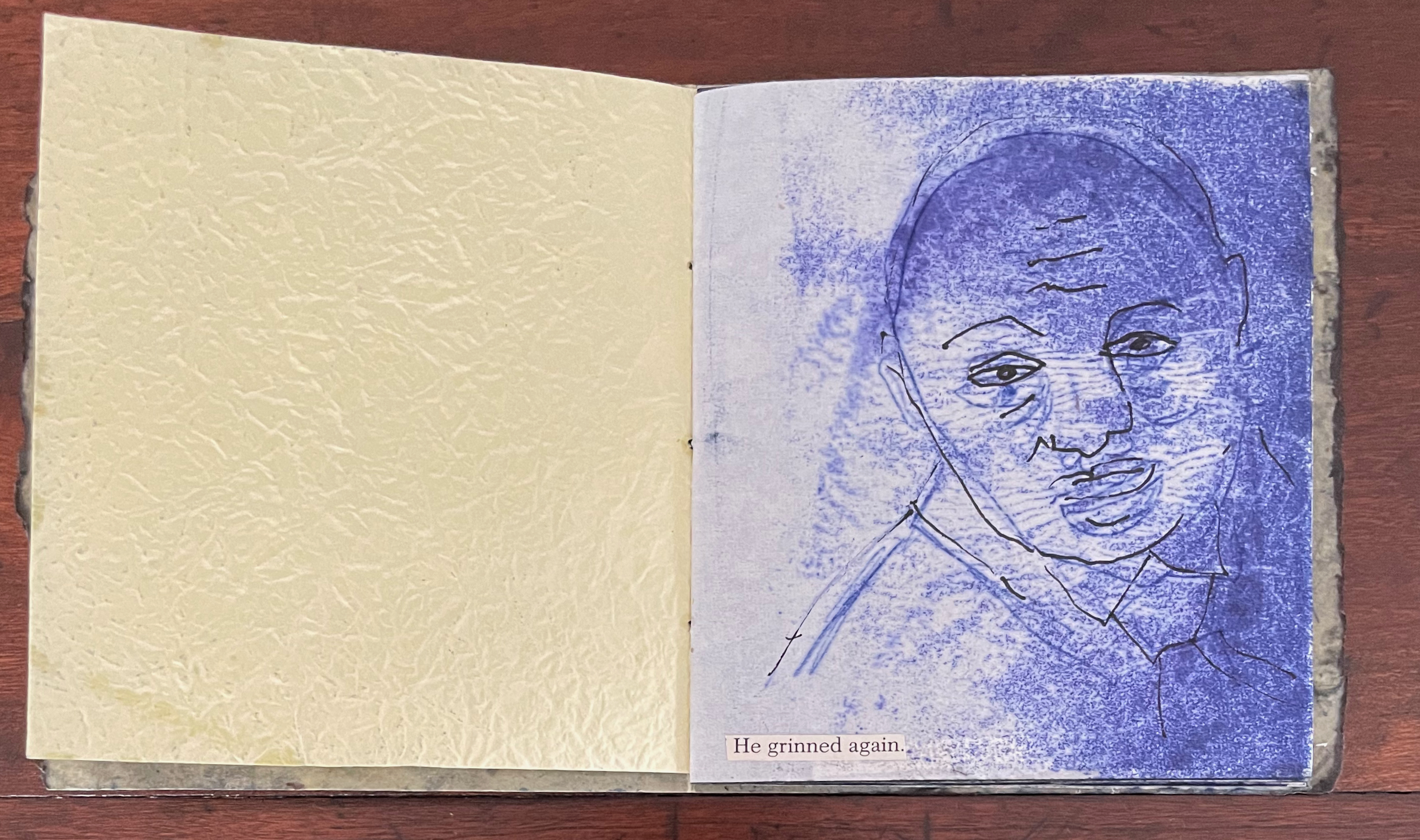
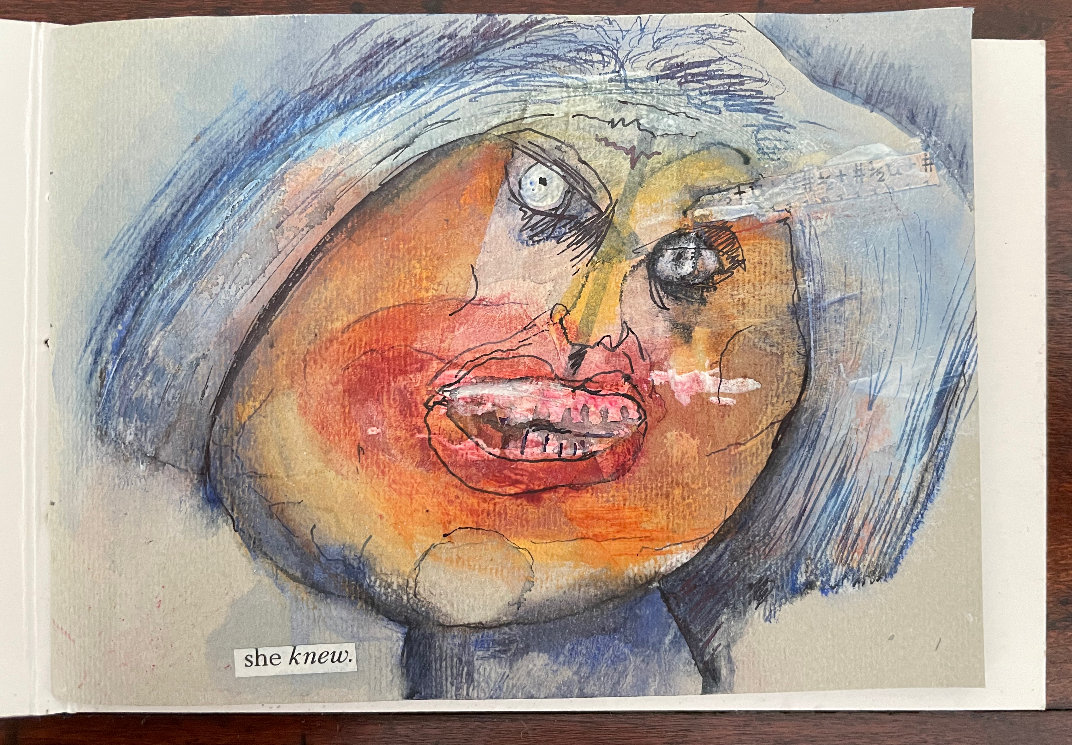
Facing Again (2023) Jacobus Oudyn Card cover, found-text title pasted on front cover. Pamphlet stitched, 10 portraits made of found text, collage and mixed media. H102 x W147 mm. Unique. Acquired from the artist, 1 June 2023. Photos: Books On Books Collection. Displayed with permission of the artist.
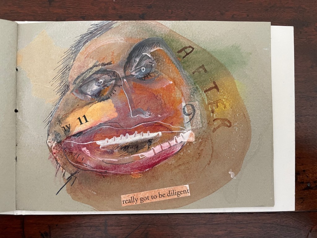
Something of a cross between the satire of R. Crumb and Spitting Image and the rawness of Lucien Freud and Francis Bacon, each of these ten portraits fills its half of an 80 gsm gray pastel paper folio. So, naturally, they loom larger than life in the near-miniature trim size. While the portrait in M.L.A. has a real-life subject of its satire, these faces in Facing Again are fictional, more general and reflective of “mental” issues afflicting 21st century first world societies. Common to most of the portraits, fractions appear as content in the mouths or in the minds of the portrayed — or almost as if they are brushstrokes conveying a characteristic. They imply a sense of psychological, social and political fractionation and division that have featured increasingly in the first three decades of the 21st century.
In the first portrait, above, a set of fractions seems to issue from the character’s forehead like a thought bubble, but this bubble is shard-shaped and could just as well be impaling the character’s forehead with fractions. In either case, they have to do with what “she knew” — the “what she knows” that inflames her face and contorts her nose and mouth into a snarl.
Although not a fraction, the eighth portrait’s reference below to the 9/11 event of 2001 and the text — “really got to be diligent” — evoke an identifiable instance of fractionation and division. This character is more physically distorted than the first. Its jaw dislocated, its teeth inverted, its eyes askew, the face looks submerged in a brown pool of 9/11 aftermath. Divisions on a global scale begat violence, which reinforced fear and division, which begat more violence and fear. If it were only that simple.
These portraits are images of confusion and uncertainty until the last, who seems able to weep only with one eye for “something else”.
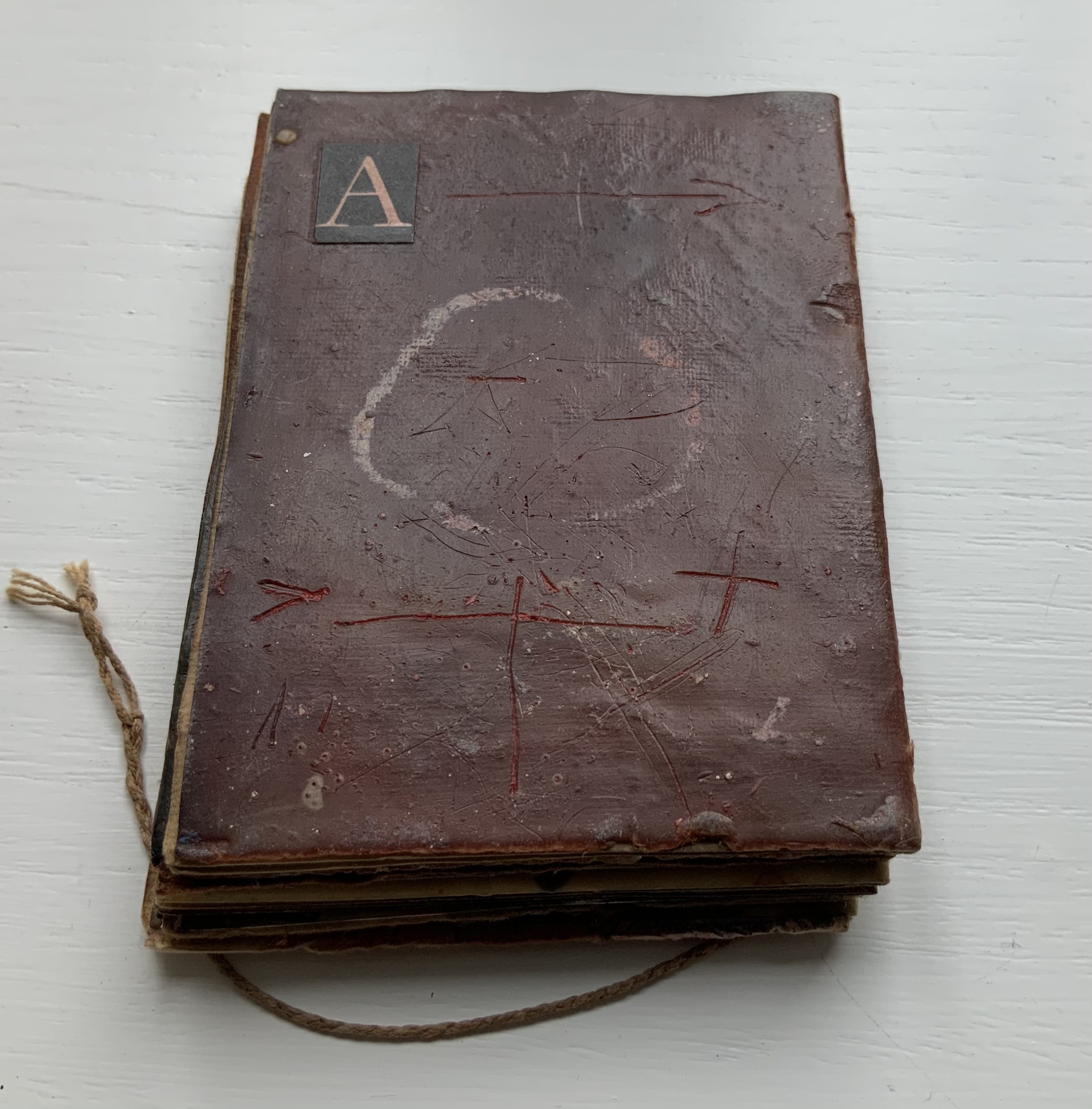
Alphabet People (1989) Peter and Donna Thomas Miniature codex with illustrated paper over boards, endband, sewn. H60.5 x W47.5 mm. 64 pages. Edition of 200, of which this is an artist’s proof. Acquired from Bromer’s Books, 16 February 2023. Photos: Books On Books Collection.
Peter and Donna Thomas have made several alphabet artists’ books. One made in the shape of an Apple MAC, one in the shape of mushrooms, one celebrating views of Yosemite, one for musical instruments (accordion to zither, of course), one for spring wildflowers and one, of course, just for the letters themselves.
This one may be their earliest. Handset in Greeting Monotone and letterpress printed by Peter Thomas on peach-colored handmade paper. The same paper is used for covering the boards. As with all the initials in the book, the alphabet on the cover and pastedown title card is inked in red. The illustrations are reproductions of twenty-seven line drawings by their daughter Tanya Thomas.
Seen end-on, the book shows some of its fine press features, especially the two-color sewn endbands and tight turn-ends of the cover paper. Handmade paper characterizes much of the Thomases’ output, and their interest in papermaking has extended as far as Africa, the Philippines and Totnes, Devon, England.
From the publisher’s description of the second edition:
A self-taught hand papermaker, Peter Thomas became interested in knowing how apprentice-trained hand papermakers working in production hand papermills made paper. He especially wanted to learn the “vatman’s shake,” the series of motions that papermakers used to form their sheets of paper. This desire circuitously led him and Donna to Tuckenhay, near Totnes, Devon, in England, where beginning in 1988, they recorded several hand papermakers, returning to make others in 1990 and 1994. The book begins with a short history of Tuckenhay Mill and the story about meeting the papermakers and recording their interviews. This is followed by eight interviews of men and women, some of whom worked in the Mill from between the World Wars until it closed in 1970. All of the papermakers are now deceased, but the stories – in their own words – remain an extraordinary, entertaining, and timeless record of their lives and work. In the 1830s, Richard Turner started manufacturing paper by hand in the Tuckenhay Mill, and paper was continuously made by hand there until 1962. From then until 1970, the Mill produced pulp (half-stuff) until the business went bankrupt….
The Thomases’ works are well represented at in University of Wisconsin-Madison’s Special Collections. Some of the several particularly related to papermaking — as well as other paper-related ones from the Books On Books Collection — are listed below. Any study of the intersection of book art and paper could not help but include Peter and Donna Thomas.
The Neolithic Adventures of Taffi-Mai Metallu-Mai (1997)
The Neolithic Adventures of Taffi-Mai Metallu-Mai(1997) Gerald Lange and Rudyard Kipling H216 x W260 mm. 55 pages with 17 additional illustrated page inserts. Edition of 150, of which this is #149. Acquired from the artist, 11 Febuary 2023. Photos: Books On Books Collection. Displayed with the artist’s permission.
Gerald Lange’s choice of “How the First Letter Was Written” and “How the Alphabet Was Made” from Rudyard Kipling’s Just So Stories (1902) for this elaborate, delicate but robust edition was fitting. By 1997, he had founded the Bieler Press (1975), co-founded the Alliance for Contemporary Book Arts (1987) and edited its journal AbraCadaBrA for seven years, had been the Master Printer at USC Fine Arts Press and selected as the first recipient of the prestigious Carl Hertzog Award for Excellence in Book Design (1991) and was about to publish the first edition of his Printing Digital Type on the Hand-Operated Flatbed Cylinder Press (now in its fifth edition, 2018). In keeping with his interests leading up to this work, Lange letterpress-printed it from handset Monotype Pastonchi and a digitally altered version of Berthold Post Antiqua. More to the point, as he noted on the Bieler Press site, he chose the stories for “their affinity with subjects related to the lettering arts”. If that affinity is not clear enough from the text, Lange’s treatment underscores it in subtly ingenious ways.
Kipling attributes the drawings throughout to his heroine, Taffi and her father. Where others like Macmillan Children’s Books have rendered them boldly, Lange prints the primitive petroglyph-like images on separate Gampi sheets inserted between the folded Kitakata text leaves of the tortoise shell edge-sewn binding. Those text leaves are individually water colored on their reverse sides (urazaiki manner based on nihonga painting) so that the pictographs beneath reveal themselves through a striated layer. The color and striations are reminiscent of cave paintings. Additional Asian papers (Kasuiri and Chirizome for end sheets, Cogan Grass for covers) increase the work’s tactility — simultaneously soft and rough, flimsy and tough — and contribute a grassy smell redolent of the stories’ physical setting.
The quality and rightness of choices in structure, material and process have placed several of Lange’s works in The British Library, University of California (various), Columbia University, Harvard University, University of Minnesota, New York Public Library, Princeton University, Stanford University, Victoria and Albert Museum, Yale University and others. The initial reason bringing this particular work into the Books On Books collection was its representation of book art inspired by the alphabet. That Robin Price, several of whose works are also in the Books On Books collection, assisted with the design came as a bonus. That this is one of the last bound copies of The Neolithic Adventures of Taffi-Mai Metallu-Mai makes it a treasure.
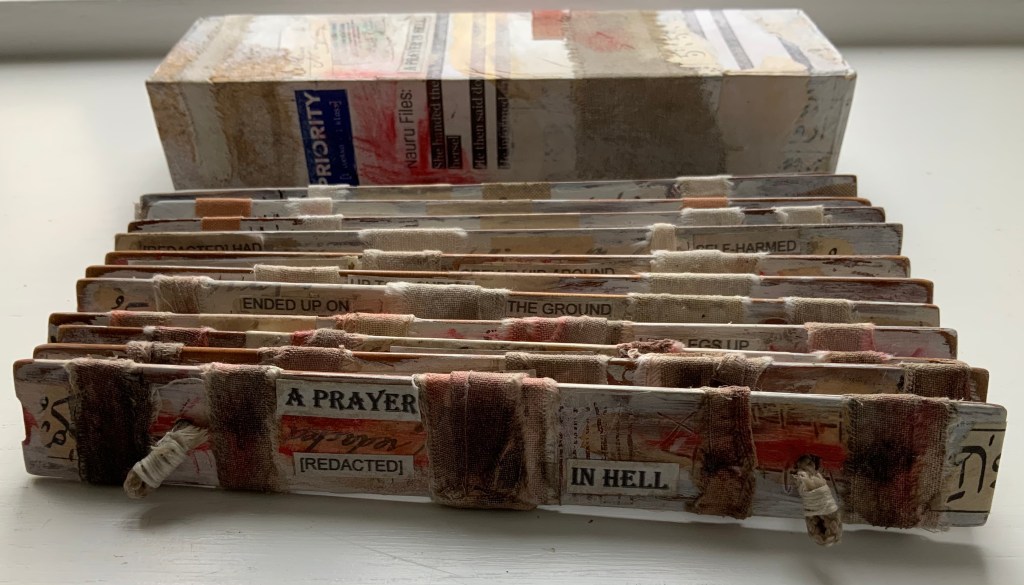
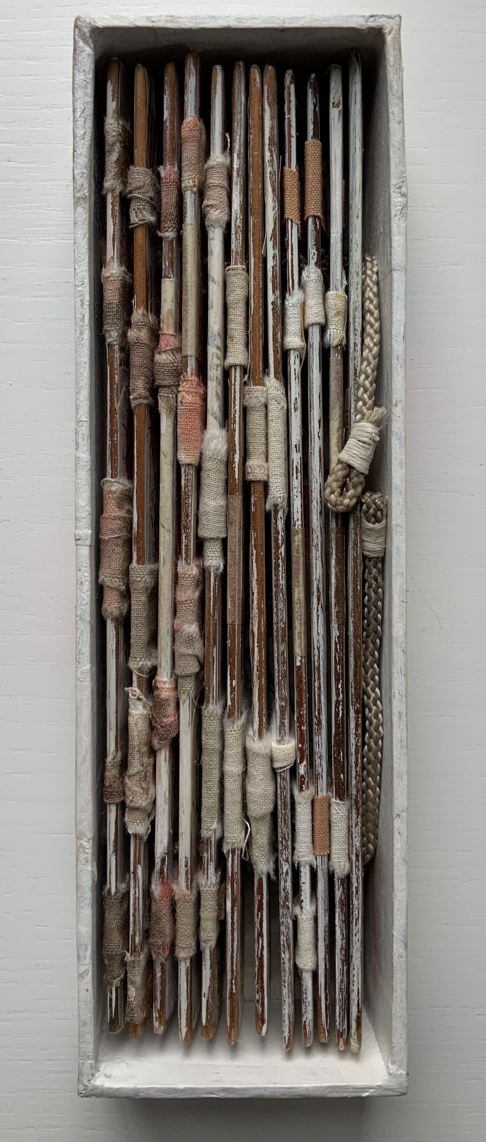
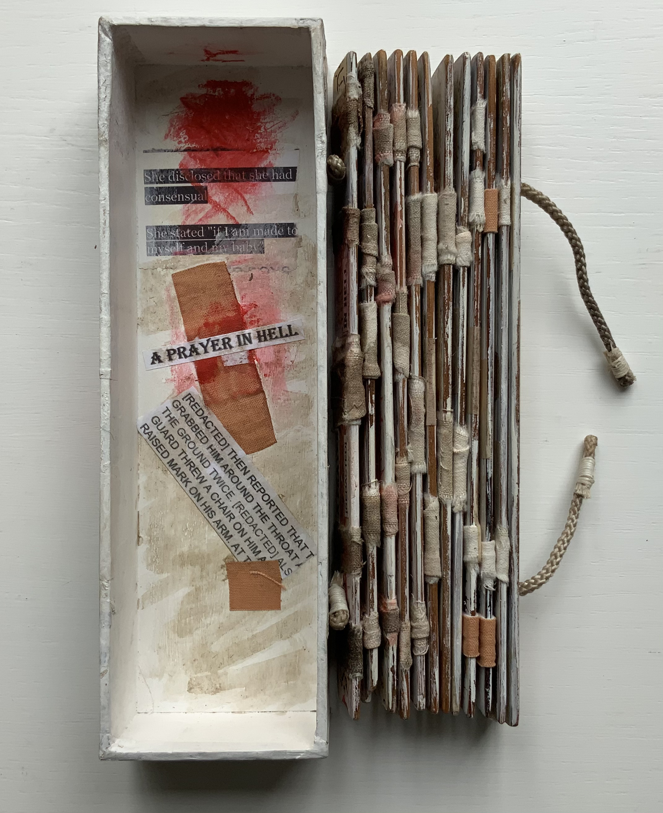
A Prayer in Hell (2018) Jacobus Oudyn Palm leaf prayer book format of 12 timber slats with double-sided collages materials and images made with pomegranate ink on antique paper, water soluble crayon calico, wound dressings and PVA adhesive. Text from Nauru Files — Guardian Newspaper and Islamic prayer book. Open: H195 x W130 mm. Closed: H195 x W 55 x D35 mm. Slip case: 2 mm card with collage, H202 x W60 x D38 mm, to be displayed with the book. Unique. Acquired from the artist, 4 January 2020. Photos: Books On Books Collection, displayed with permission of the artist.
A Prayer in Hell is one of Jack Oudyn’s larger works. works refer to the Australian experience of the world’s refugee crisis (perhaps the largest diaspora in history), A Prayer in Hell is the most scorching of them all.
Materially, the work embodies the refugees and their experience in many ways — its palm-leaf prayer book pages even consist of “stressed and recycled timber slats”. The binding cords penetrate drawings of eyes on each slat, creating the effect of the faceless staring through bars. Although the work’s title alludes to the English expression “not a hope in hell”, the work itself nods toward hope appears in how the wound dressings, wound round the slat pages, gradually become cleaner. Under and over the dressings, strips of English and Arabic text are collaged alongside handwritten extracts from Islamic prayer books and reports of events and conditions in Australian detention centers. Complete with redactions, the English text refers to the scandals associated with the centers at Nauru, Papua New Guinea, Christmas and Manu islands.
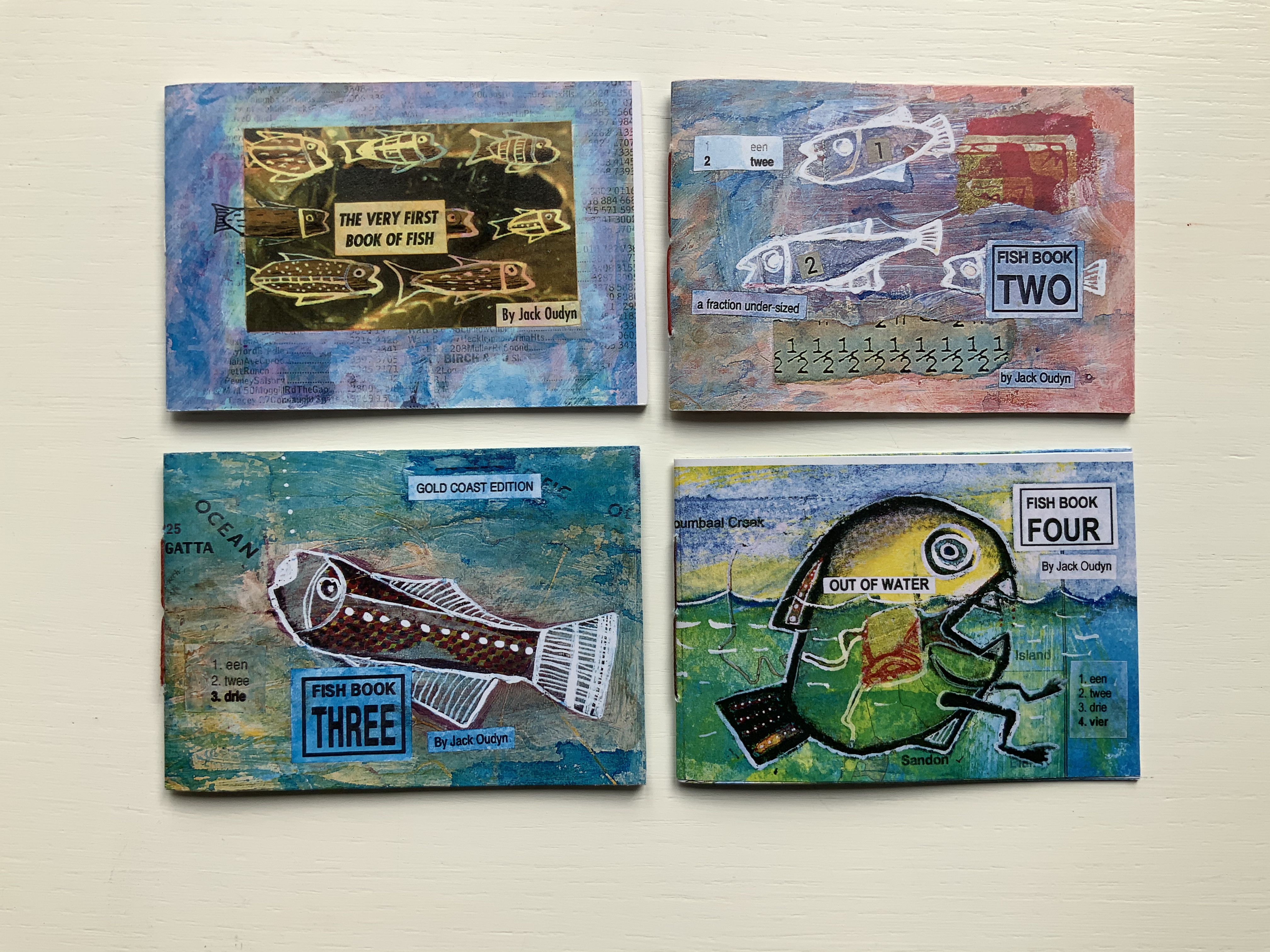
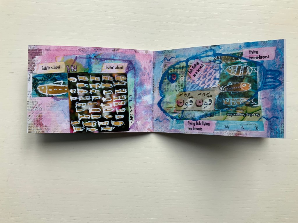
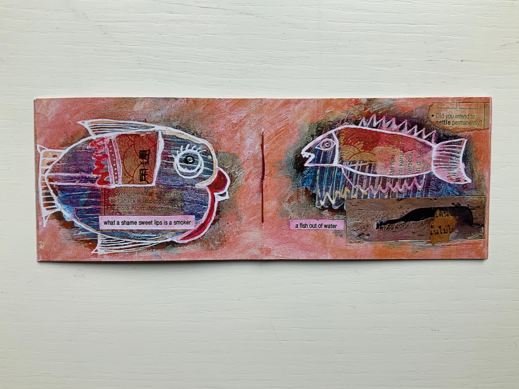
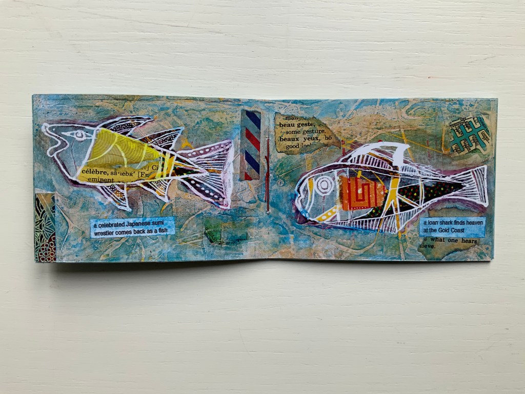
Fish Books One, Two, Threeand Four (1999 – 2001)
All acquired from the artist, 4 January 2020. Photos: Books On Books Collection, displayed with permission of the artist.
This complete set of his fish books represents Oudyn’s Micro Press imprint well. Many of the small works are playful with language, form, and material and, often, socially satirical or critical. More hook-in-mouth than tongue-in-cheek, the fish books have provided the artist with ground for playing with collage and printing techniques. In imagery, they are reminiscent of Ric Haynes, Breughel and Bosch. In text, they encapsulate the punsterdom of book art (albeit without the usual book-related self-referencing, though “fish wrapper” would have been good for their covers); reveal the artist’s Dutch heritage in their numbering; and revel in Australia’s odd common fishnames (dart, flattie, stargazer, sweetlips, etc.). By Fish Book Four (2001), however, a socially sharper tone emerges. The dates of publication, which vary from those in the WorldCat links for each title, are taken from the artist’s website.
The Very First Book of Fish (1999) Jack Oudyn Booklet made of 200 gsm digital paper, sewn with single white waxed thread, 16 pages. Color laser print of mixed media drawings; ink, paint, collage on pages from telephone directory. H70 x W105 mm, 16 pages. Edition of 50, of which this is #27. Photos: Books On Books Collection, displayed with permission of the artist.
Fish Book Two(1999) Same format as first, except sewn with single red waxed thread; #49 of 50.
Fish Book Three (2000) Same format as the second; #25 of 50.
Fish Book Four(2001) Same format as third, except sewn with single dark gray waxed thread: #13 of 50.
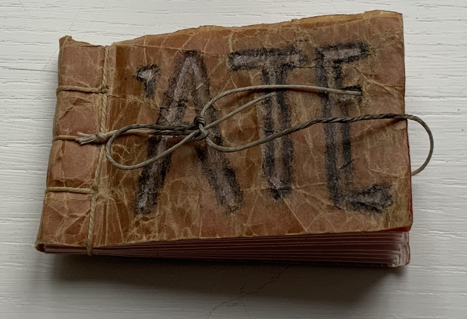
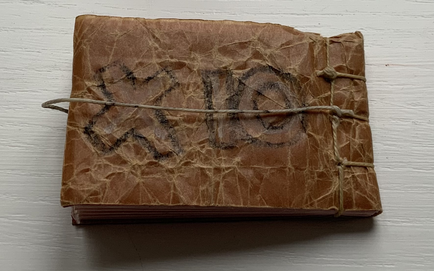
‘ATE (2011)
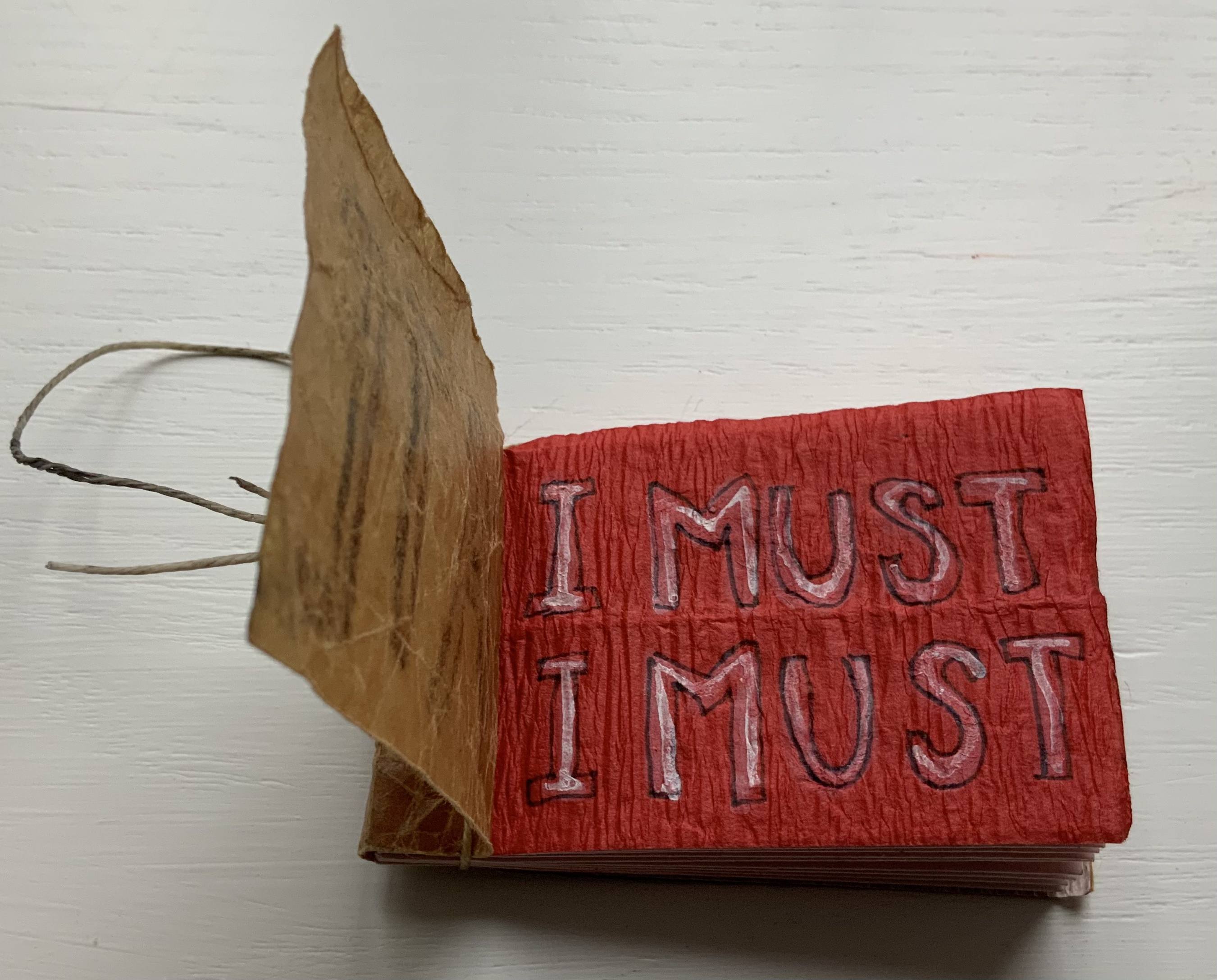
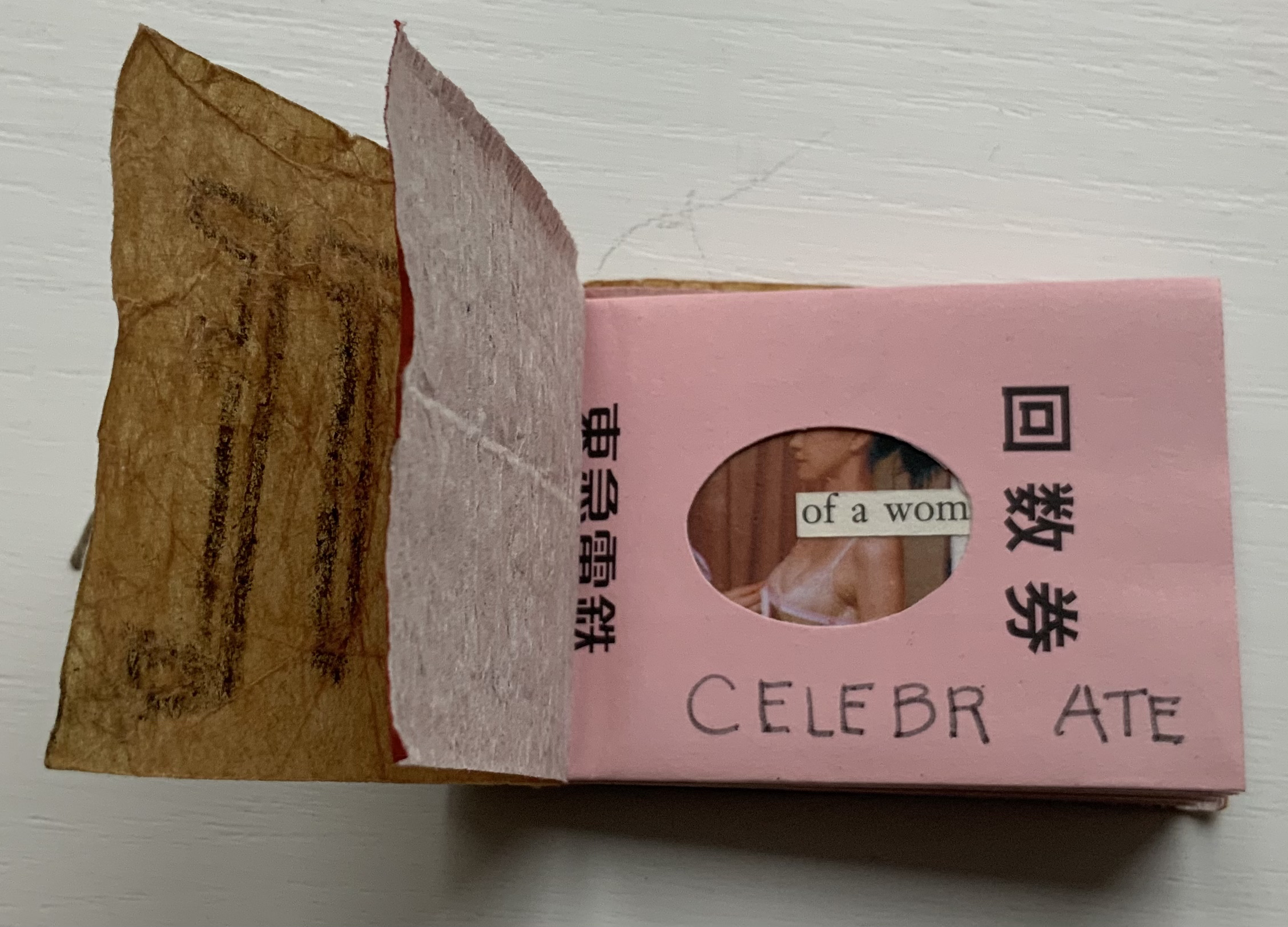
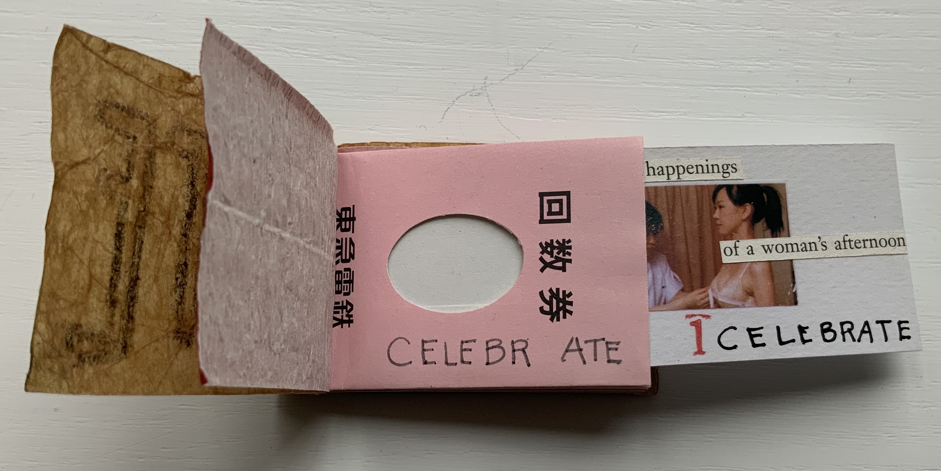
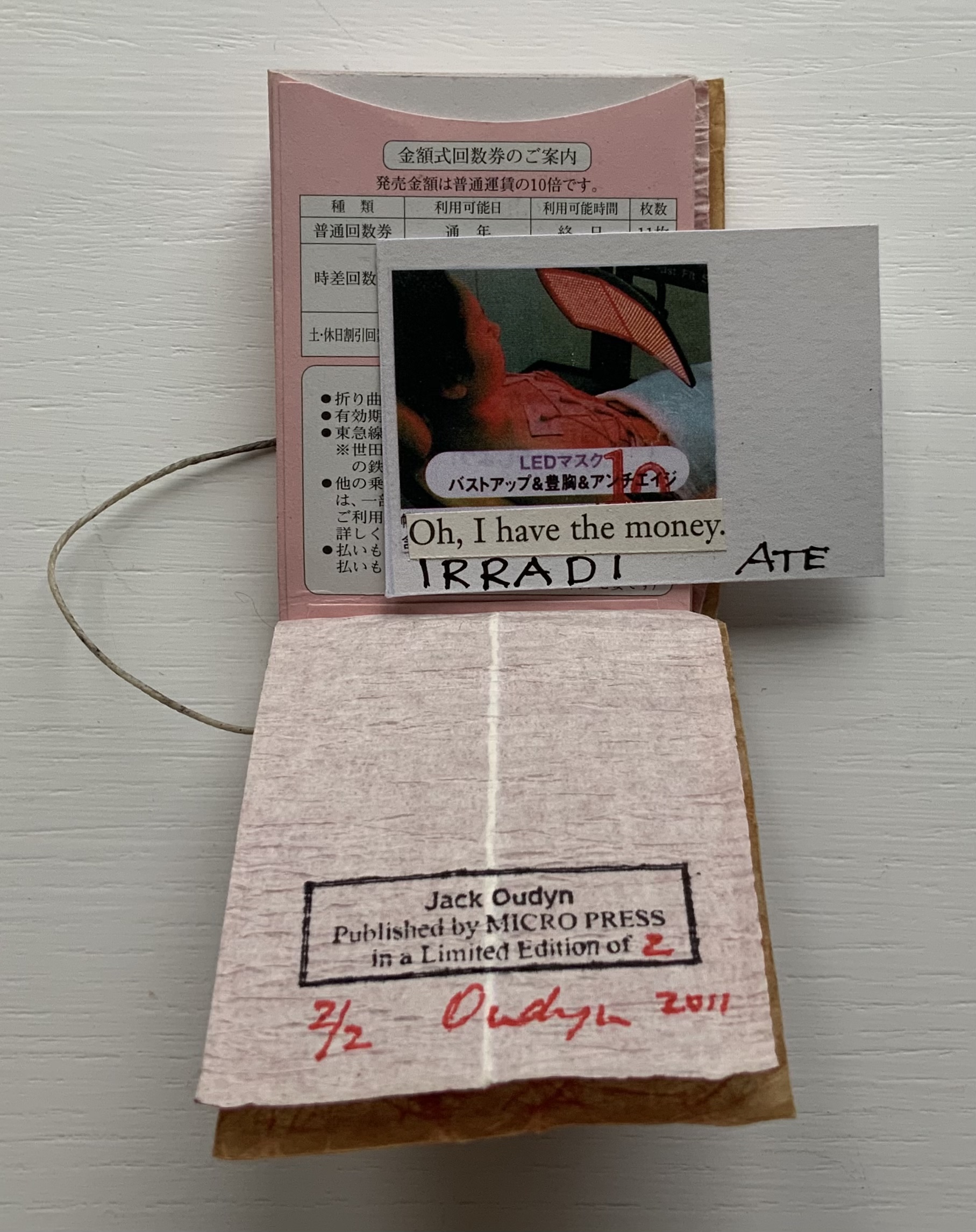
‘ATE X 10 (2011) Jack Oudyn Japanese stab-bound booklet, with wax paper cover and Momigami fly leaves. H54 x W74 mm, 10 train ticket sleeves holding 10 small numbered cards collaged with advertising brochure photos. Edition of 2, of which this is #2. Photos: Books On Books Collection, displayed with permission of the artist.
‘ATE X 10 demonstrates Oudyn’s wont to play language, form and material off image and vice versa. Bound in a Japanese stab binding by waxed thread and wax paper from the fish markets at Tsukiji in Tokyo, the book begins with a front fly leaf page bearing a tag line from the breast exercise mantra; on the same Momigami paper, the end fly leaf bears the colophon. The pages are made of Japanese train ticket sleeves containing numbered cards collaged with small photos from advertising brochures found near railway stations. As the fly leaf hints, the modest photos come from ads for breast enhancement services, an 8 x 10 promise relative to the images presented.
The works in the Micro Press imprint also reflect Oudyn’s interest (and presence) in mail art. He has been a member of the International Union of Mail Artists, and a section on his site is devoted to mail art.
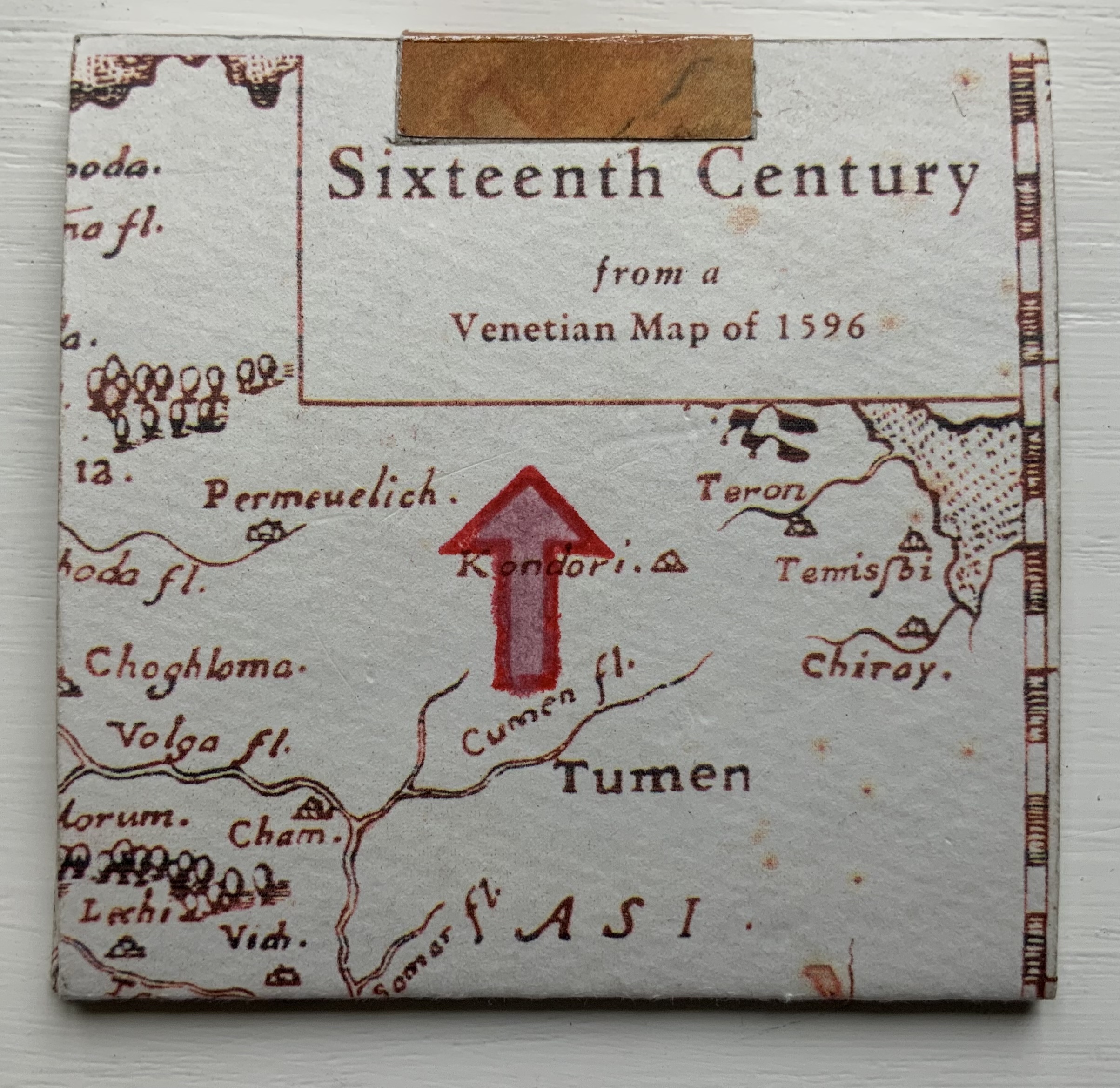
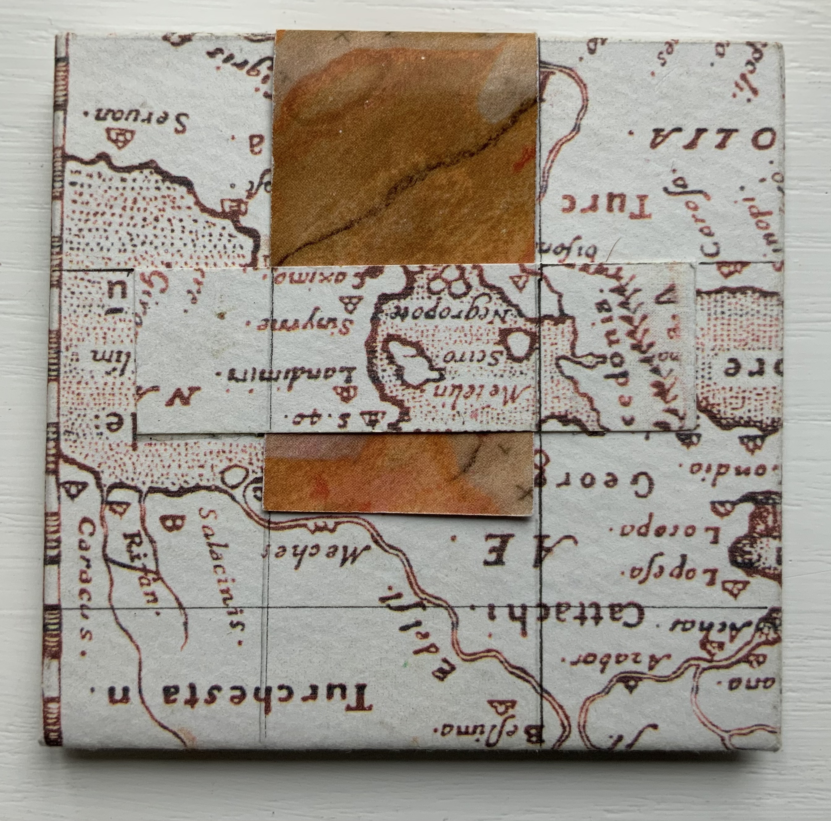
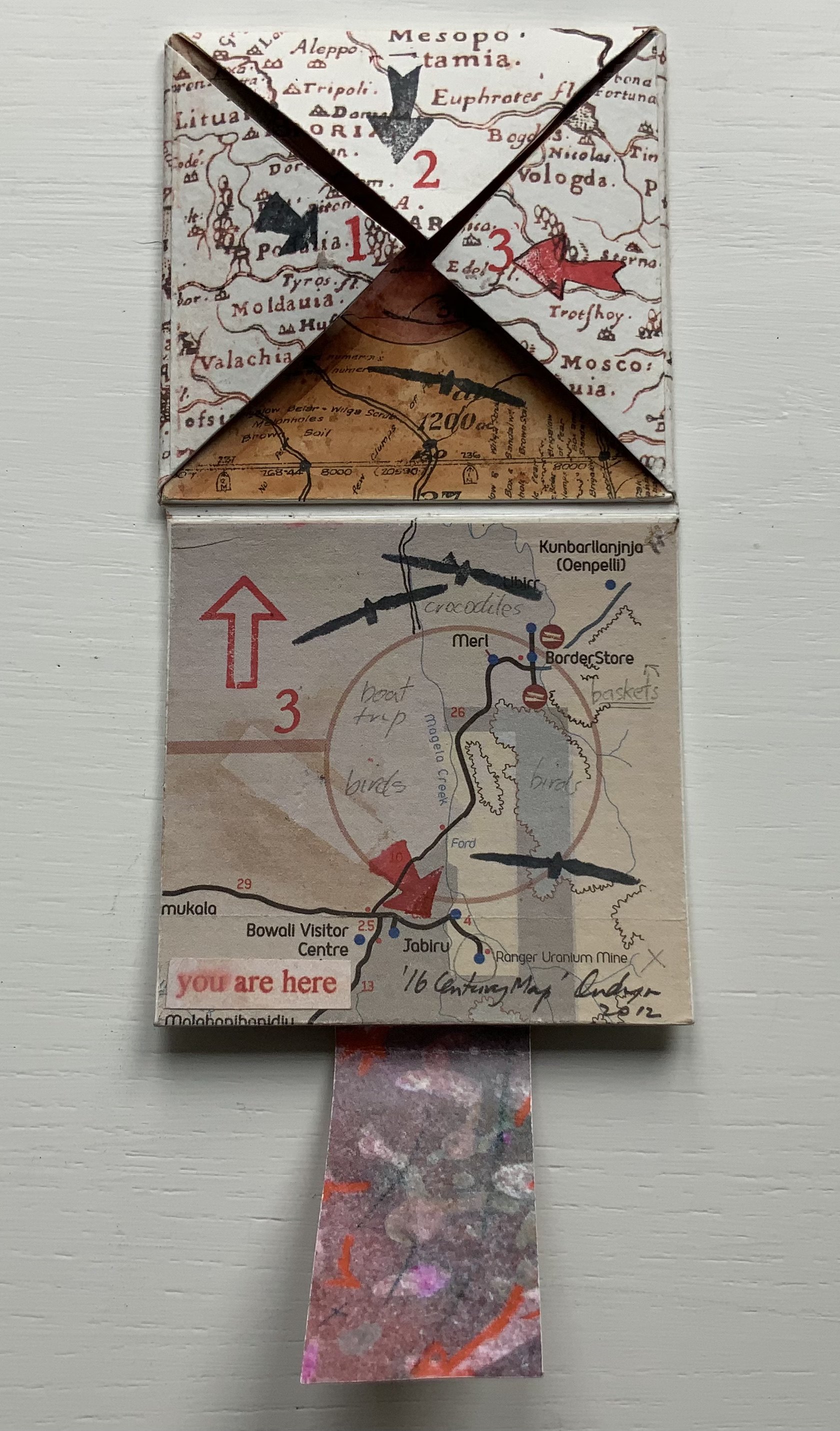
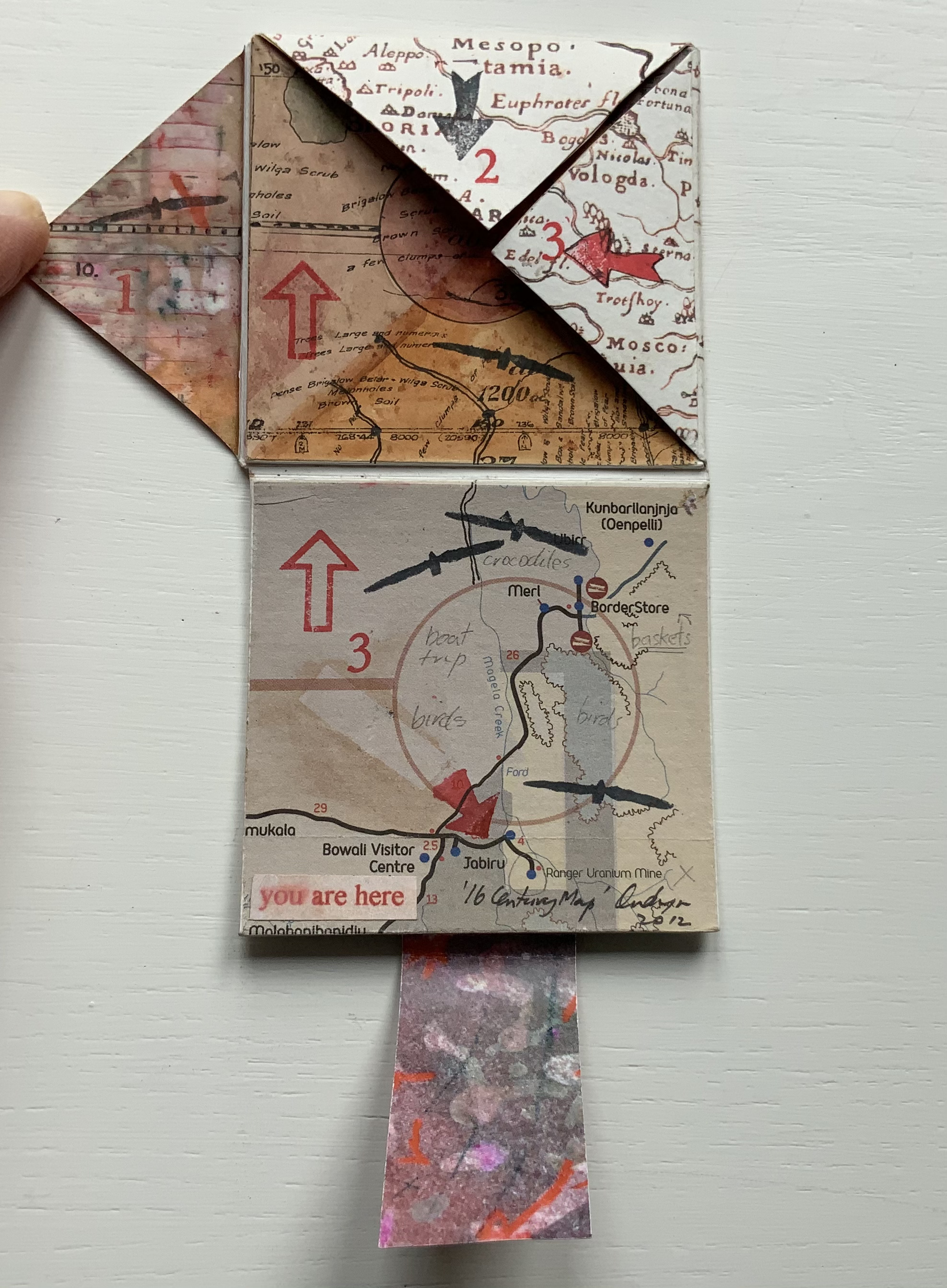
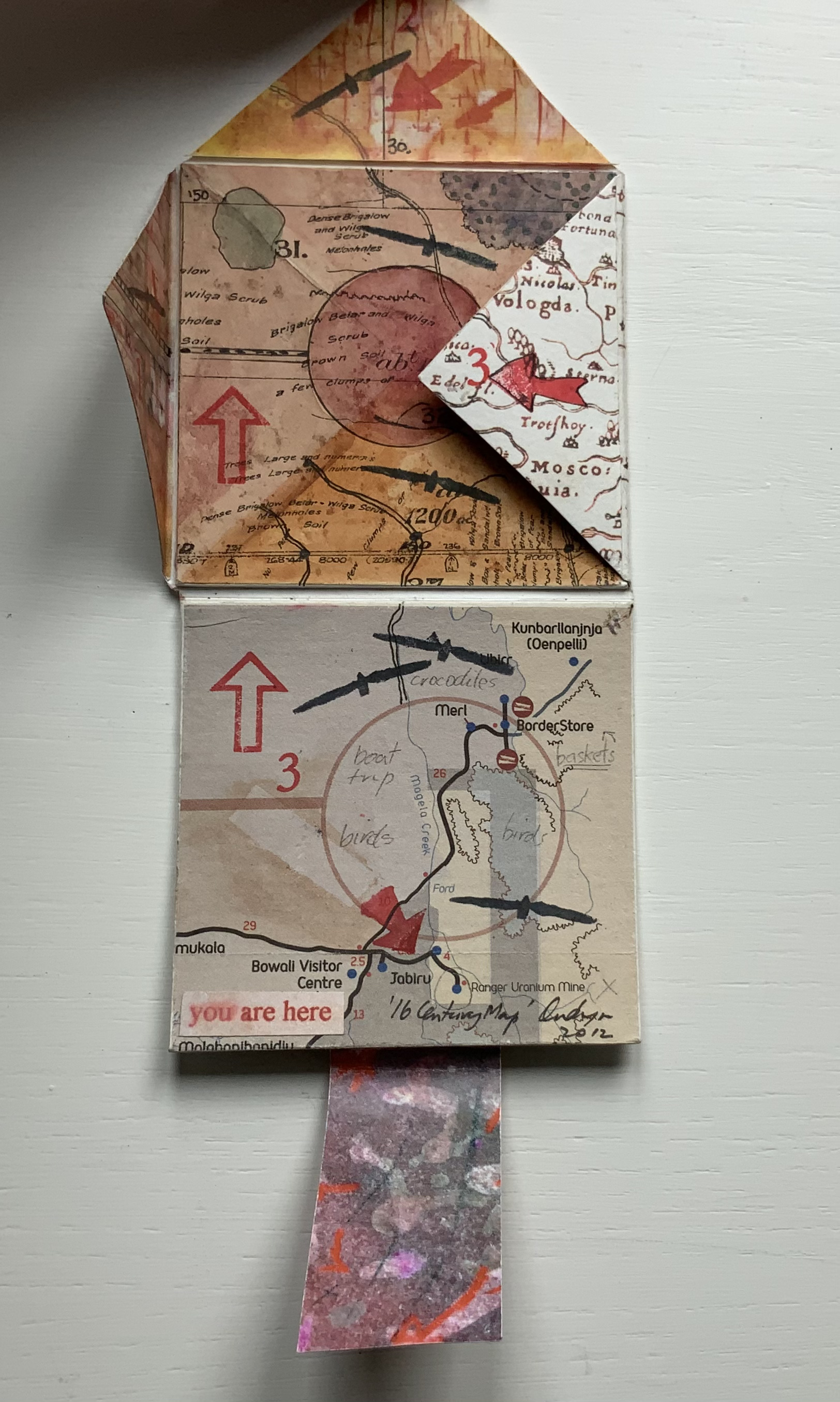
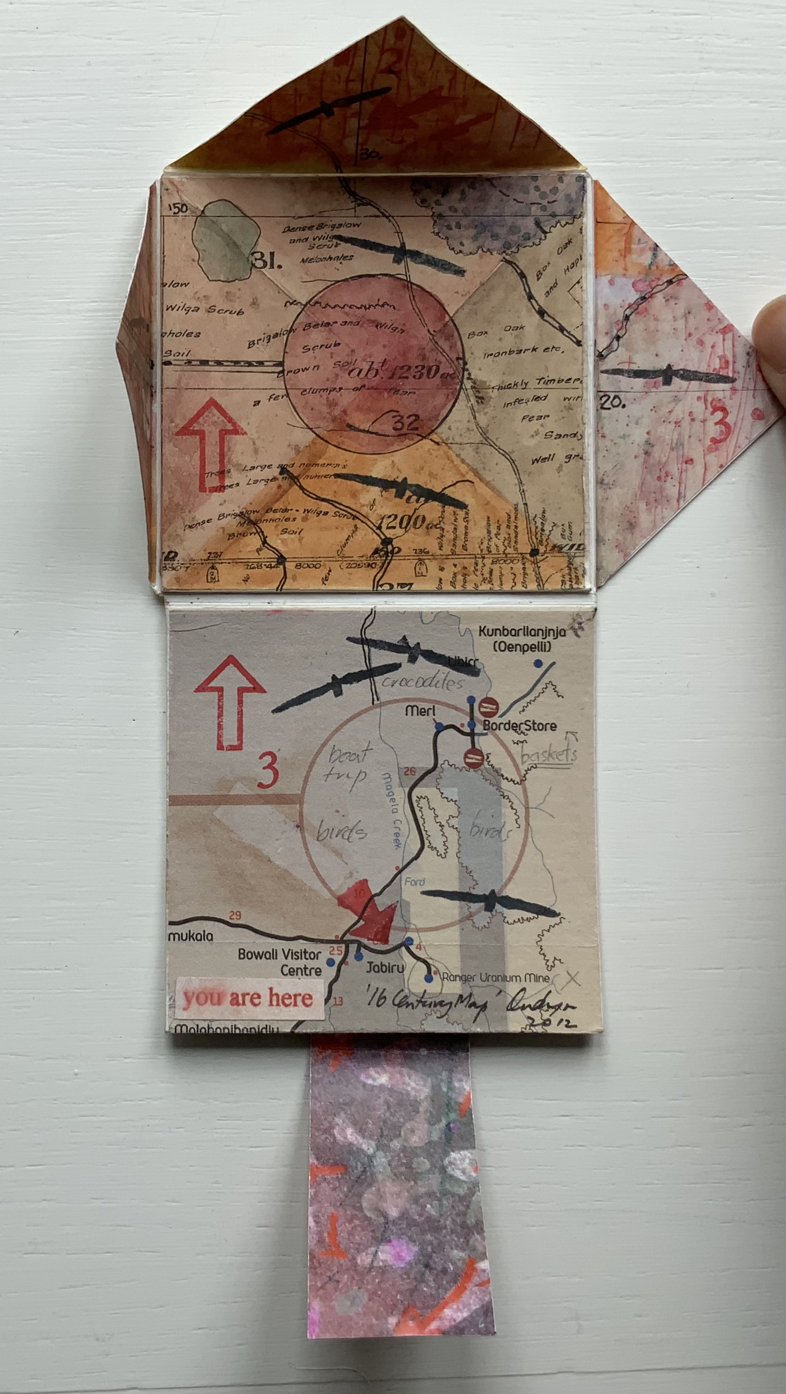
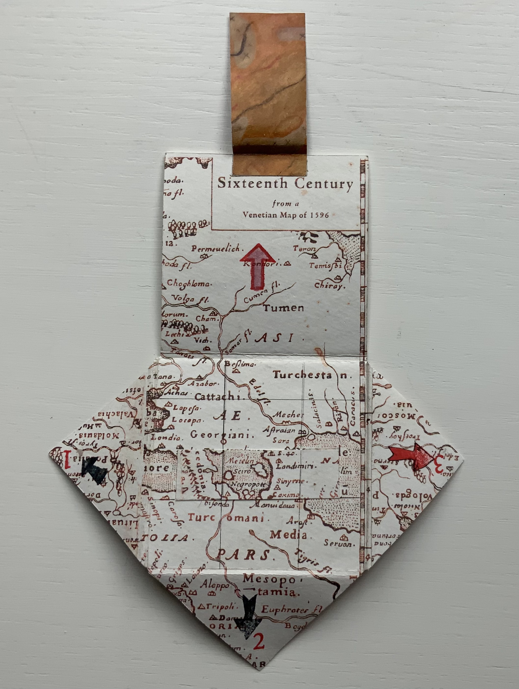
’16 Century Map’ (2012)
’16 Century Map’ (2012) Jack Oudyn Tab/slot-bound, single-fold, map paper on board, covering three outward-opening triangular cut tabs over center map paper on board; ink-stamped and drawn, with “you are here” sticker in lower left corner. H70 x W72 mm (closed). Unique. Acquired from the artist, 4 January 2020. Photos: Books On Books Collection, displayed with permission of the artist.
This small unique work — and those that follow — lie outside the Micro Press imprint. As the artist writes on his blog, this is a trial attempt at juxtaposing the exterior old European map (showing Mesopotamia and the Euphrates, the Northern hemisphere’s cradle of civilization) with the interior Australian map of the Kakadu National Park to get at the concept of Tjukurpa, by which Australia’s Anangu refer to the creation period.
It is not strictly a Turkish-fold map, but the way the tab with indigenous colors snugly closes ’16 Century Map’ is just as mechanically satisfying.
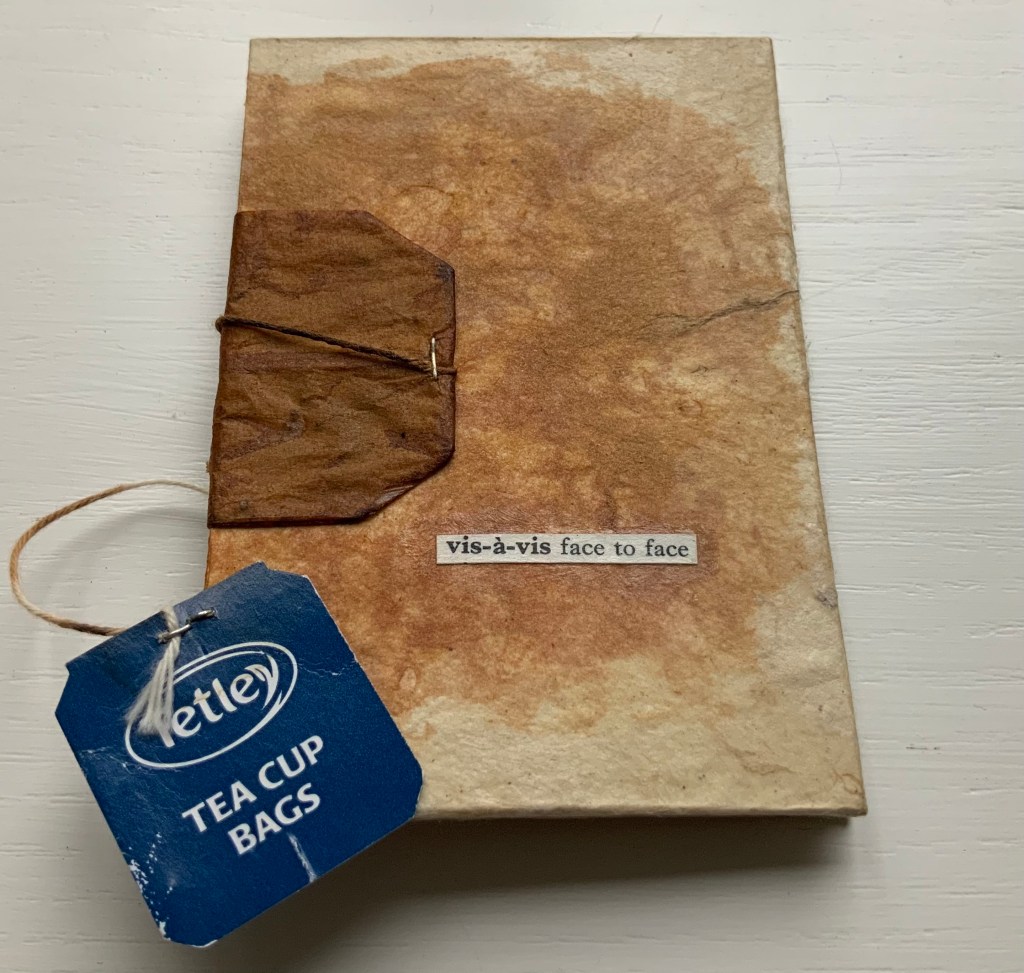
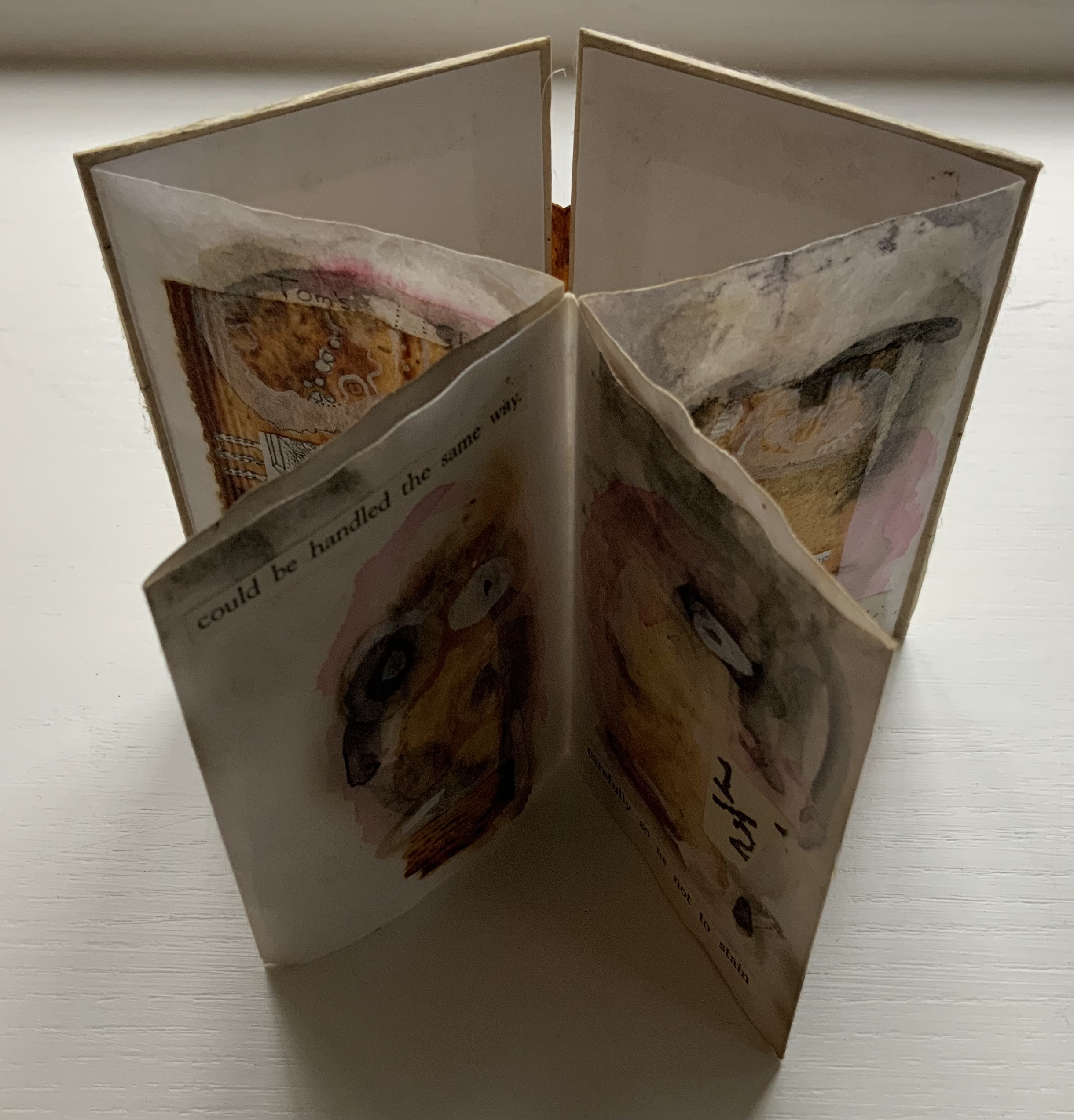
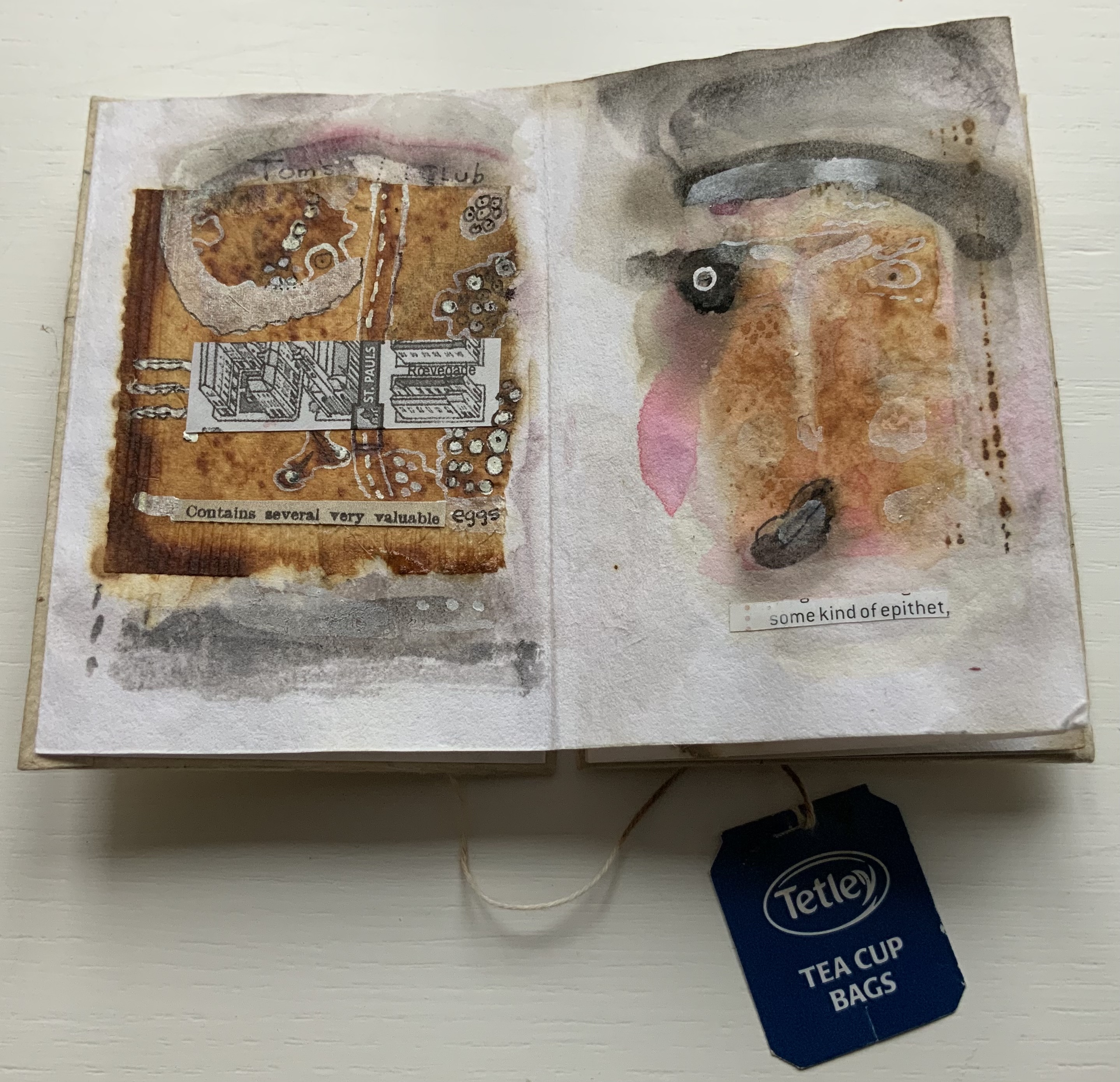
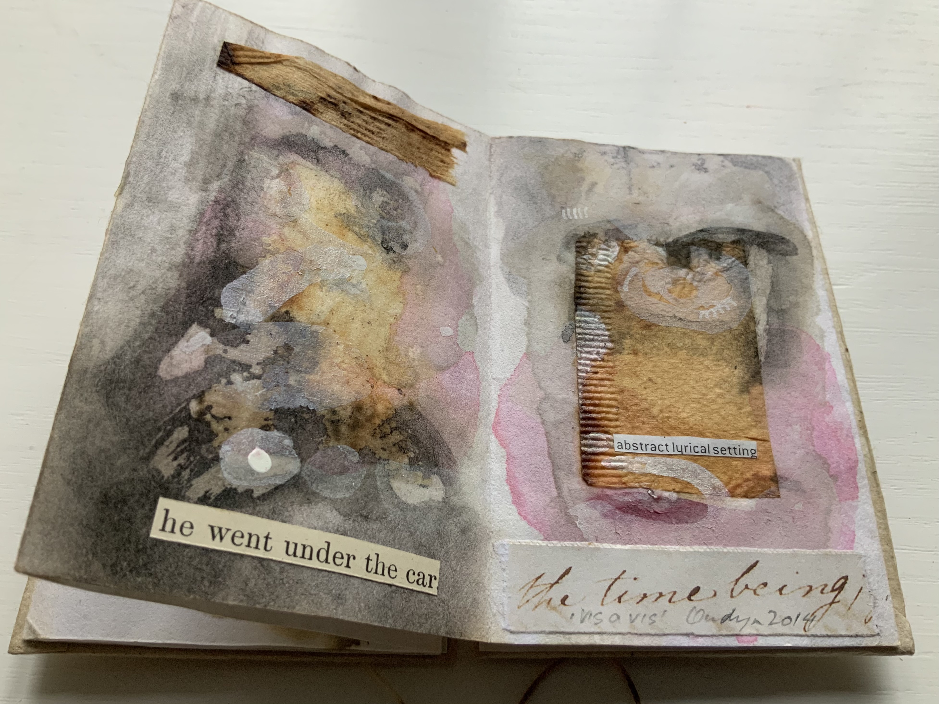
vis-à-vis | face to face (2014)
vis-à-vis | face to face (2014) Jack Oudyn Blizzard-fold booklet, mixed media and collage with tea bag paper. H100 x W70 mm, six panels. Unique. Acquired from the artist, 4 January 2020. Photos: Books On Books Collection, displayed with permission of the artist.
A heavily stained, empty teabag glued across the two boards, whose opening is closed with the teabag string wrapped around a wooden button, serves for this booklet’s binding. A conversation between two people struggling for words, hence the near random use of found text, occupies the six panels. The abstract faces profiles are characteristic of Oudyn’s work, as is the use of acrylic medium as a block out or resist. Or perhaps it is egg yolk, which would be in keeping with the reference to eggs and, with the tea stains, in keeping with a breakfast-table conversation.
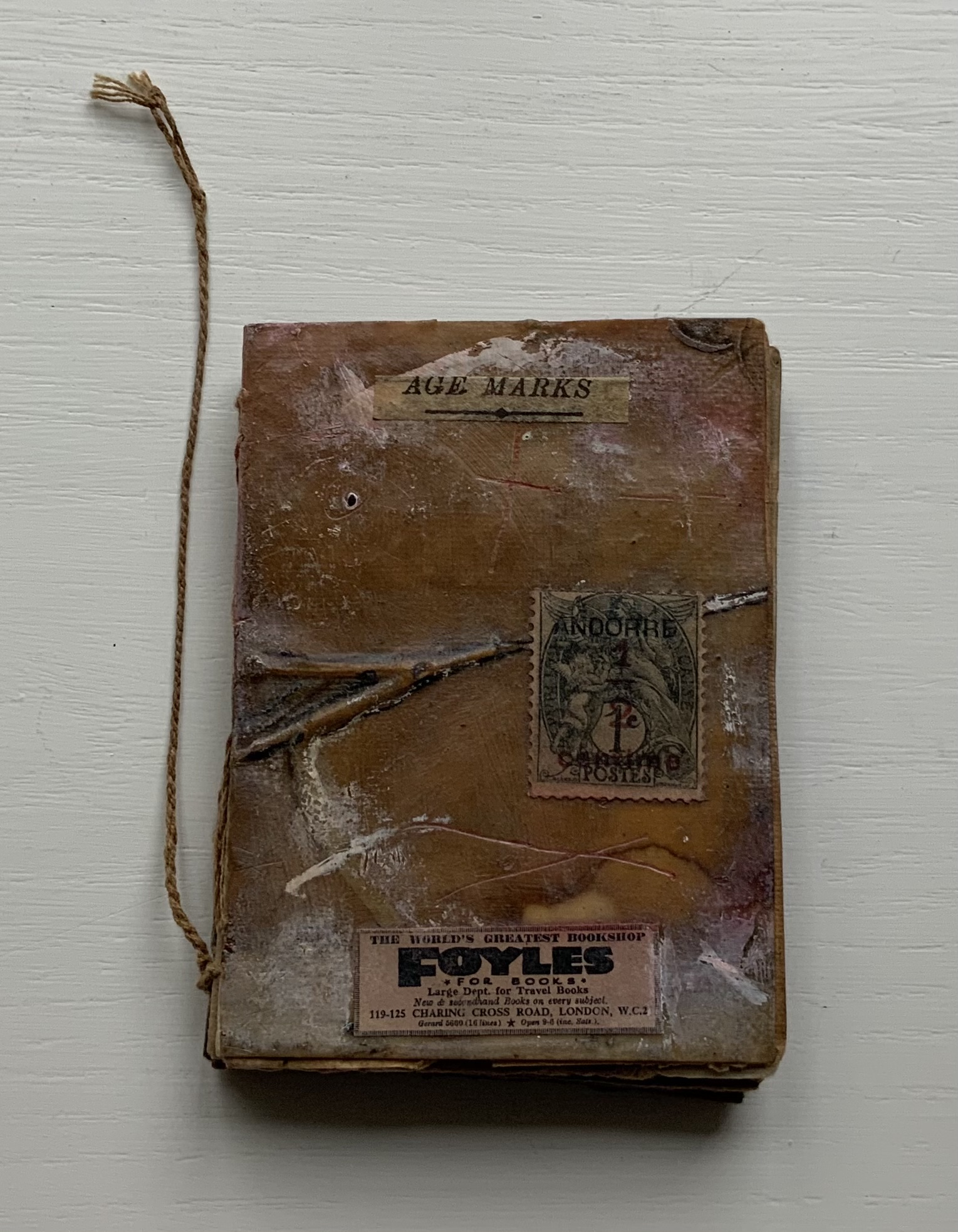
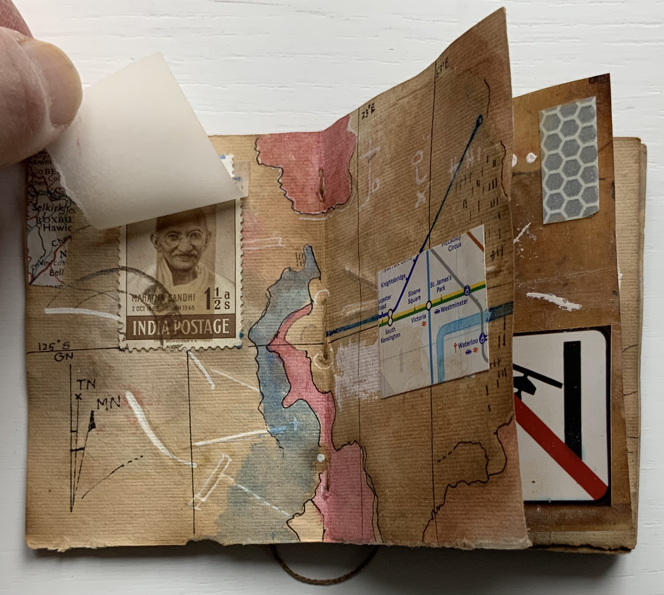
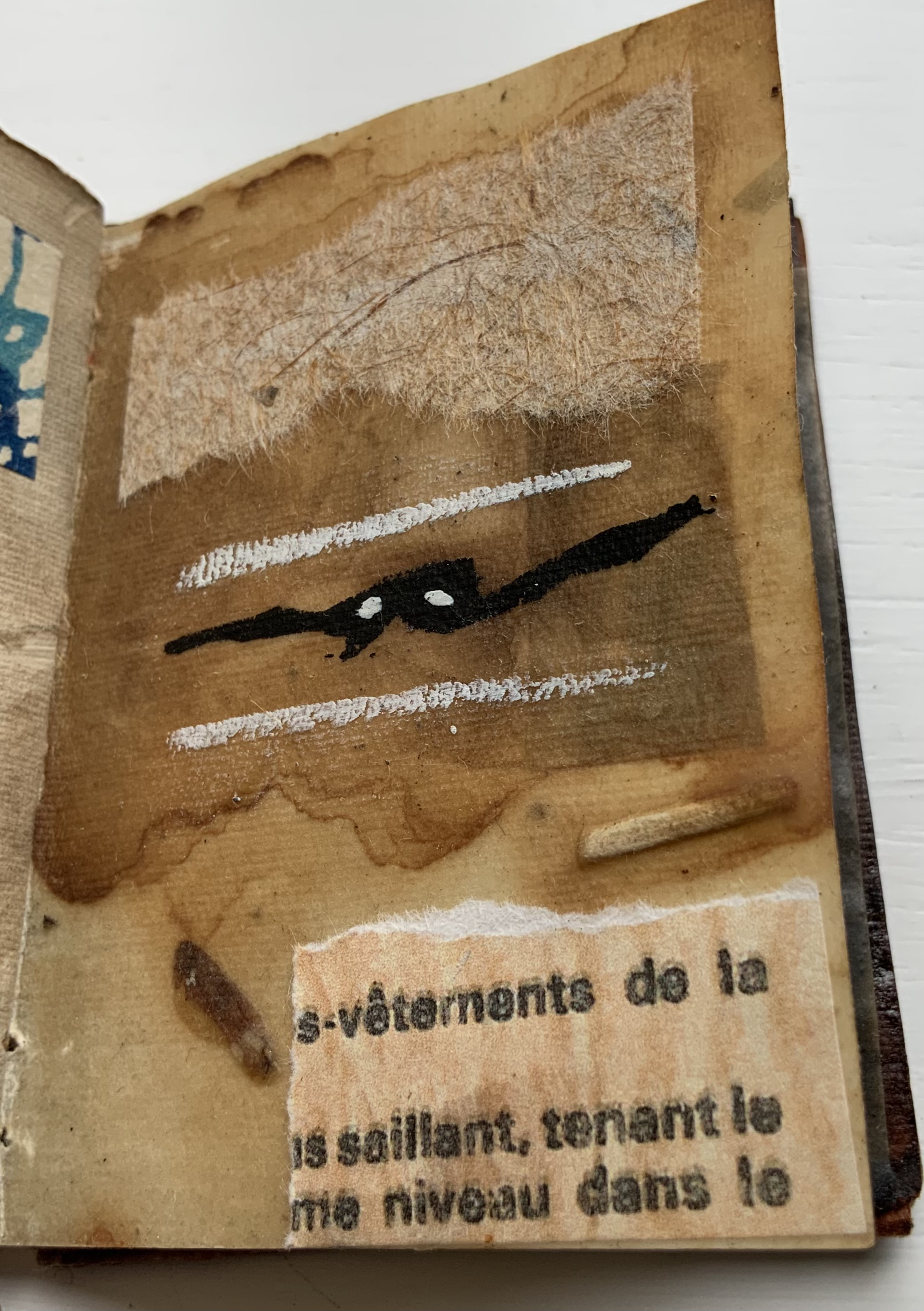
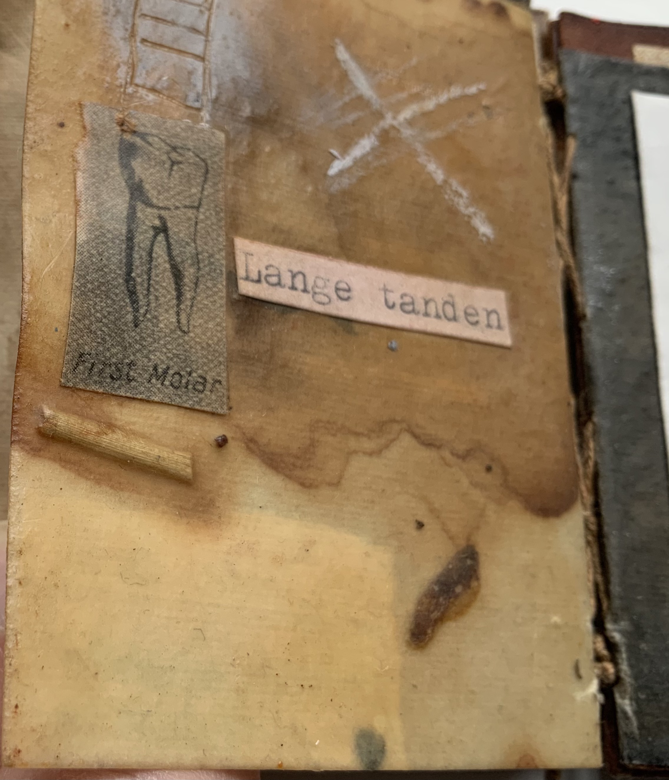
Age Marks (2014)
Age Marks (2014) Jack Oudyn Handmade waxed and stained paper book by Trace Willans. Mixed media and collage on paper. H85 x W65 x D10 mm, 44 pages. Unique. Acquired from the artist, 4 January 2020. Photos: Books On Books Collection, displayed with permission of the artist.
Trace Willans makes blank books from organic, sustainable media. Age Marks began as one of these blanks, its pages consisting of lightly textured machine-made lightweight paper (ca. 100 gsm), some stained and waxed. The result is not exactly an inscribed blank notebook, not exactly an altered book. Oudyn’s use of mixed media of different hand-made papers, tracing paper, found text, wax, reflective road tape, postage stamps, white acrylic ink, gouache and pigment creates a unique record of the aging process of mark making. Marks made by conversation, observation, inscription, printing, writing, drawing, collation, lifts and reveals, cutting, tearing, pasting, weaving, binding — all filtered through aging.
Small as it is, Age Marks is one of the most varied haptic experiences in the collection.
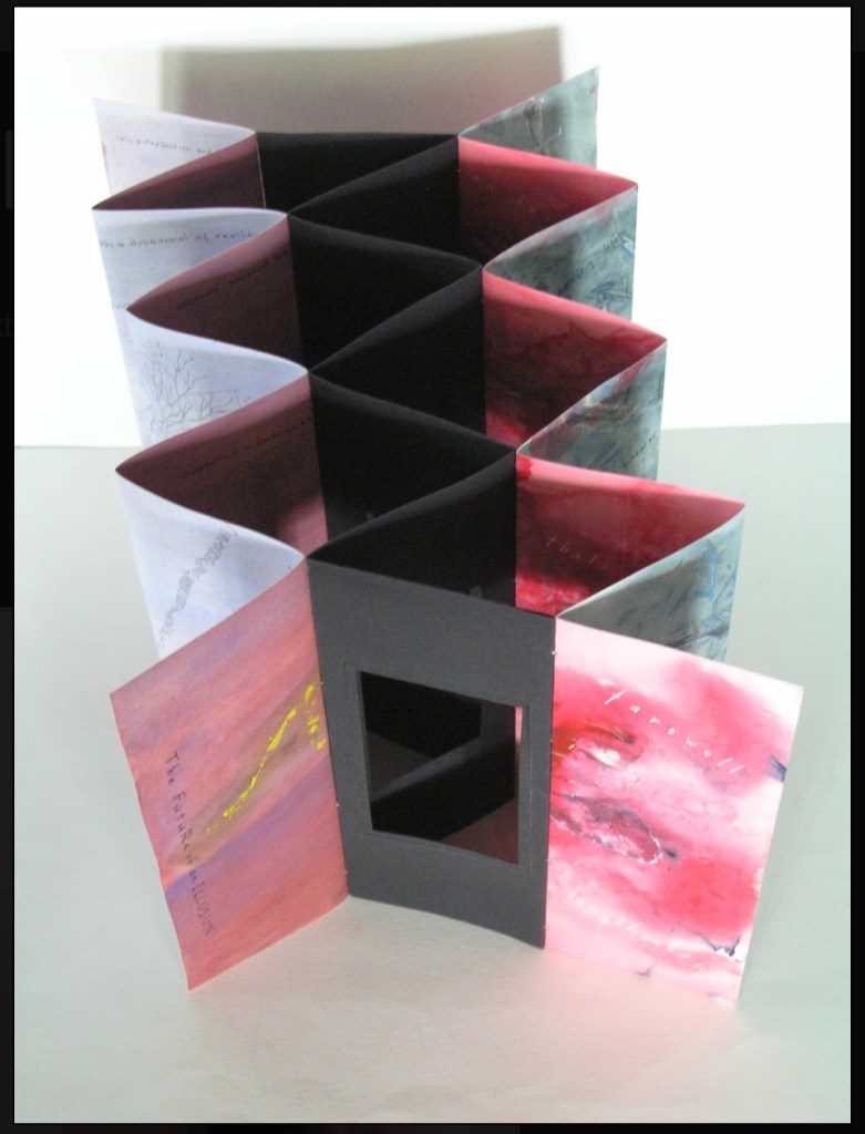
The Future of an Illusion (2017)
The Future of an Illusion (2017) Helen Malone and Jack Oudyn Sculptural tunnel book structure (three joined four-fold leporellos) enclosed in a folder and protective boxin a box,. Box made with Lamali handmade paper, suede paper (lining) and Somerset Black 280 gsm; Folder: Canson black 200gsm, skull button and waxed thread; Leporellos: center leporello made of Canson black 200 gsm, linen thread adjoining two leporellos made of Arches watercolour paper 185 gsm with acrylic, soluble carbon, gouache and transfer ink jet images. Box: H275 x W313 x D34 mm; Folder: H258 x W295 x D21 mm; Book: H250 x W290 x D16 mm closed, D410 mm open. One of an unnumbered, signed edition of 4. Acquired from Helen Malone, 12 September 2017.
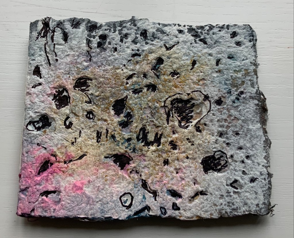
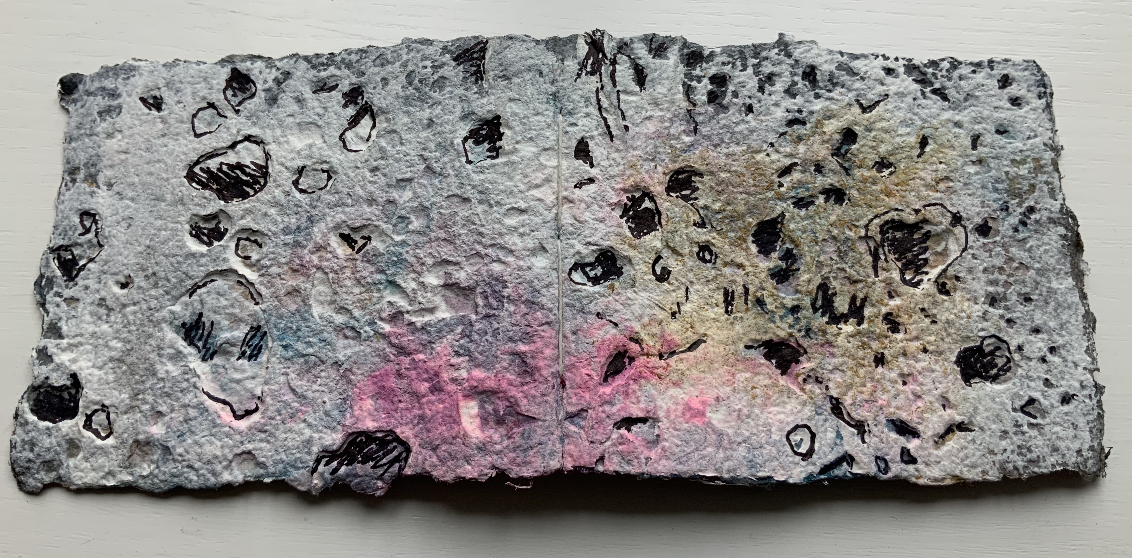
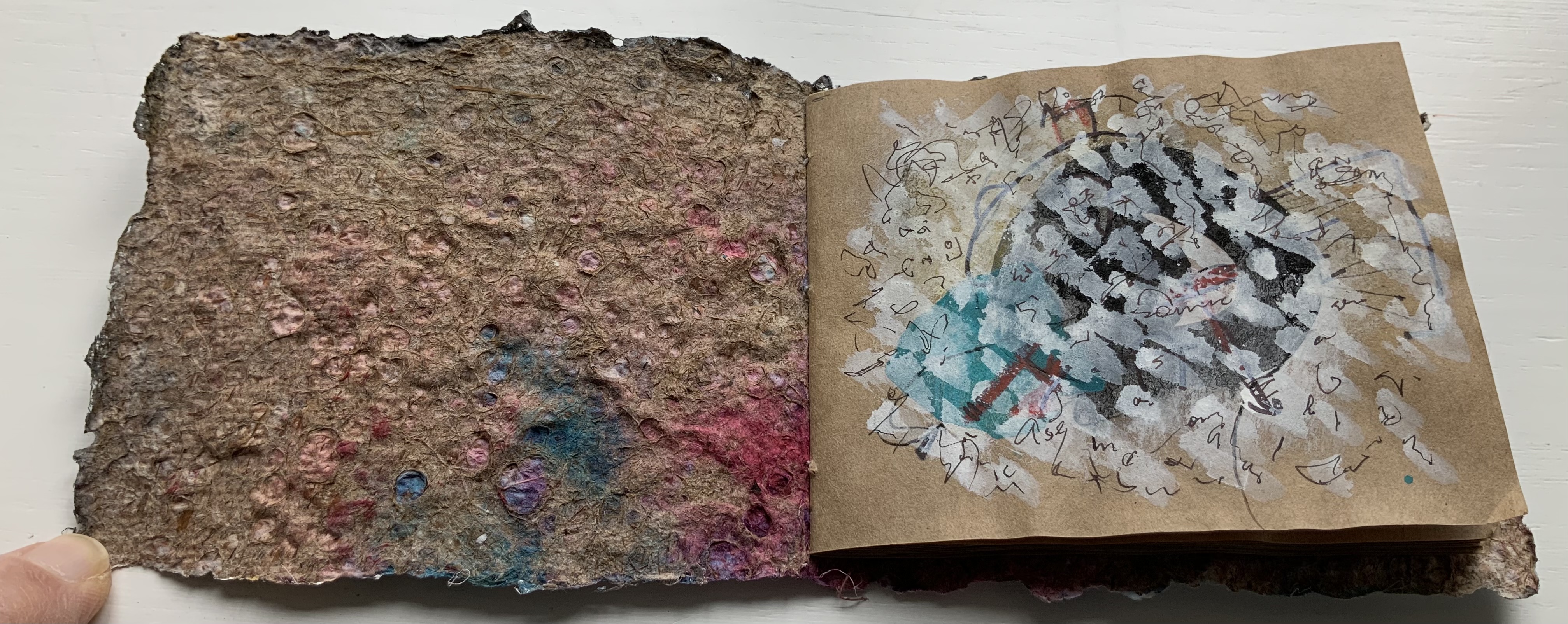
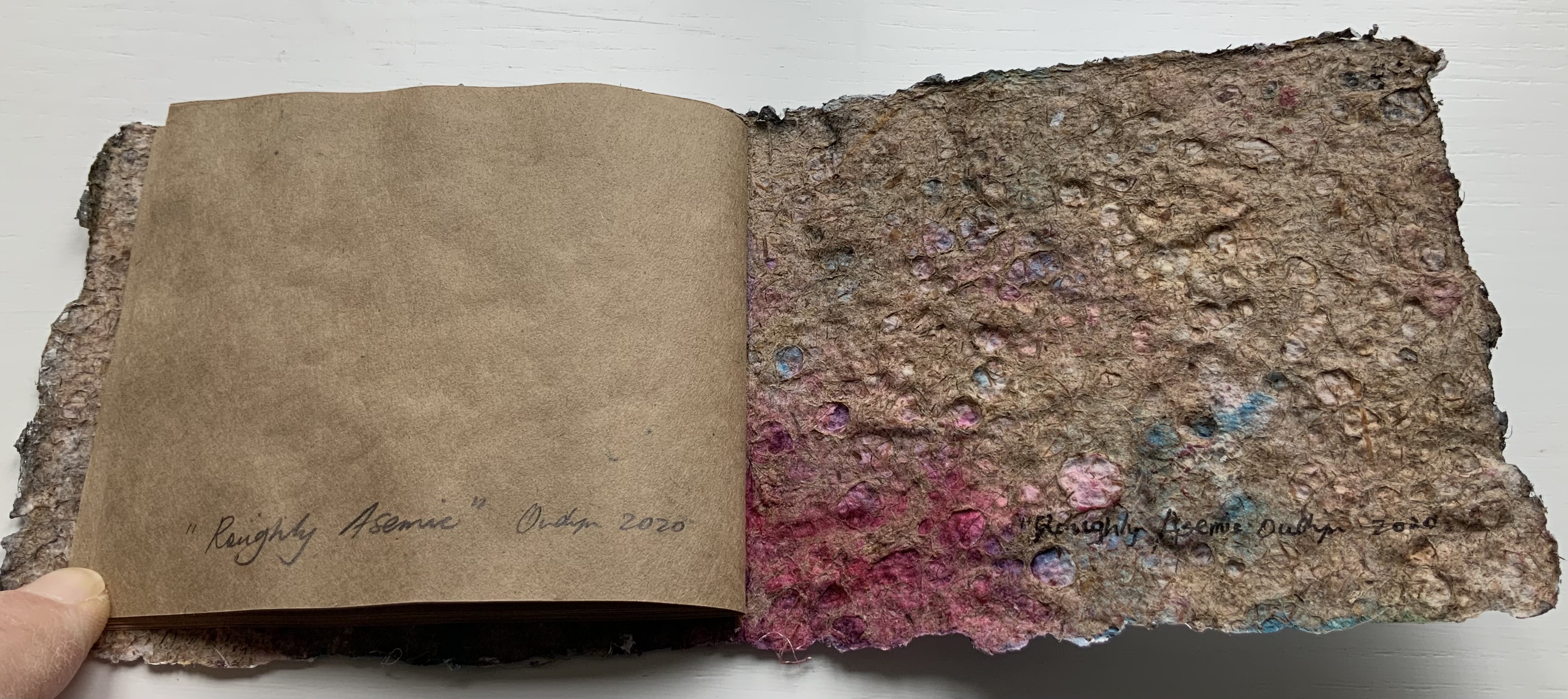
Roughly Asemic (2020) Jack Oudyn Booklet, single-thread stitched, handmade paper cover, painted and inked, over brown Kraft paper folios illustrated with drawings and markings in paint and ink. H105 X W123 mm, 7 leaves, folded in half making 28 unnumbered pages, 14 of which bear drawings and markings, 13 of which are left blank, and the last page bears the title, signature and year. Unique. Acquired from the artist, 4 January 2020. Photos: Books On Books Collection, displayed with permission of the artist.
This work’s title could not be more apropos. It is a scratchy thing to hold, its pages stiff and crackling as they turn. Patterns, images and letters struggle to emerge, only to be submerged by each other on the same or next page, which goes to show how difficult it must be to achieve entirely asemic markings. “Roughly asemic” might be the best hoped for.
Foster, Robin. “Feature Artist – Jack Oudyn“, Personal Histories, International Artist Book Exhibition, Redland Museum, UNSW, Canberra. 11 March 2014. Accessed 19 October 2020.
Theme and Permutation (2012) Marlene MacCallum Hand sewn pamphlet, images custom-printed in offset lithography on Mohawk Superfine, text printed in inkjet, covers inkjet printed on translucent Glama. H235 × W216 mm Edition of 100, of which this is #54. Acquired 5 October 2018.
Photos: Books On Books Collection.
Theme and Permutationis one of a series of artist’s books inspired by the experience of living in Corner Brook’s Townsite area on the west coast of the island of Newfoundland. Between 1924-34 the pulp mill built 150 homes to house the mill management and skilled labourers. Over a period of 10 years, I have photographed in several homes, all the same type-4 model as the one I live in. These homes vary in condition from close to original in design and décor to highly renovated. This project gave me the rare opportunity to record the evolution of interior aspects of these homes. It has been the context to explore the paradoxical phenomena of conformity and individualization that occurs in a company town. Having grown up in a suburban housing development, my earliest memories of home is that of living in a space that is reminiscent of my neighbors’. Each artist’s book explores a distinct facet of image memory, multiplicity, sequence and offers the viewer a visual equivalence of the uncanny. Theme and Permutation is a response to the permutations and variations of the type-4 Townsite House. Digital tools were used to translate the original film source of eight different window images from five houses. The sixteen offset lithographic plates were custom printed in twenty-nine separate press runs. Each image is the result of a different combination of plates. The structure is a sewn pamphlet with translucent covers. The viewer enters the body of the book with a tritone image of a single Townsite window. As one moves into the piece, new window images appear and layer over each other. The images become darker and more heavily layered towards the mid-point. The center spread has an inkjet layer of two text blocks printed over the offset litho images. The text speaks of the history of the homes, the architectural permutations and economic shifts within the Townsite area. The ensuing pages continue to provide new combinations of window layers, gradually lightening in tonality and allowing the individual windows to become more distinct. A third text block provides a personal narrative. The piece concludes with a tritone image of one of the Townsite windows in original condition.(From artist’s website. Accessed 1 September 2019.)
*From the artist’s description of Wall Stories (2014).
Chicago Octet (2014)
Chicago Octet (2014) Marlene MacCallum Hand bound artist’s book with folded paper structure, letterpress and inkjet printing, H166 × W78 mm closed, H443 x W293 mm open Unique. Acquired 5 October 2018.
Photos: Books On Books Collection
Chicago Octet is a work of visual poetry by eight masters of book art. If they were performing music (and you can almost hear the music of Michigan Avenue), MacCallum would be their performing conductor.
The piece I created, Chicago Octet, had several collaborative components. The letterpress printing consisted of a word selected by each participant printed on one of Scott [McCarney]’s folded structures. The images were a digital layering of every cityscape photograph that I made and then inkjet printed on top of the letterpress. The final folded structure was designed by Mary Clare Butler. The case was designed and built by Scott McCarney, the front cover embossment was by David Morrish and Clifton Meador. (From artist’s website. Accessed 31 August 2017.)
Update: With funding from the Canada Council for the Arts Digital Originals Grant and assistance of Matthew Hollett and David Morrish during the Covid pandemic, the artist created Shadows Cast and Present, a digital re-imagining of her three most recent book works. The three cantos into which the work is divided also enrich one’s appreciation of Theme and Permutation and Chicago Octet. MacCallum orchestrates the various media — text; sound from music, voice and the noise of city and nature; video — with a touch as light as paper and light.
Further Reading
Books On Books. “Architecture”. Books On Books, 12 November 2018.
MacCallum, Marlene. 2014. Wall Stories. Website. For the text cited in the epigraph for this entry, go to the last linked image in the series of thumbnails displayed.
Otis Artist Book Collection. “Conrad Gleber ‘Chicago Sky Line’”, 27 January 2014. Gleber’s work is an interesting one to compare with Chicago Octet. Chicago Sky Line (1977) is a fan book of photographs secured at a single point by the binding and, when spread clockwise, reveals the sky above Chicago and, when spread counterclockwise, shows the Chicago “skyline” below clouds and sky.
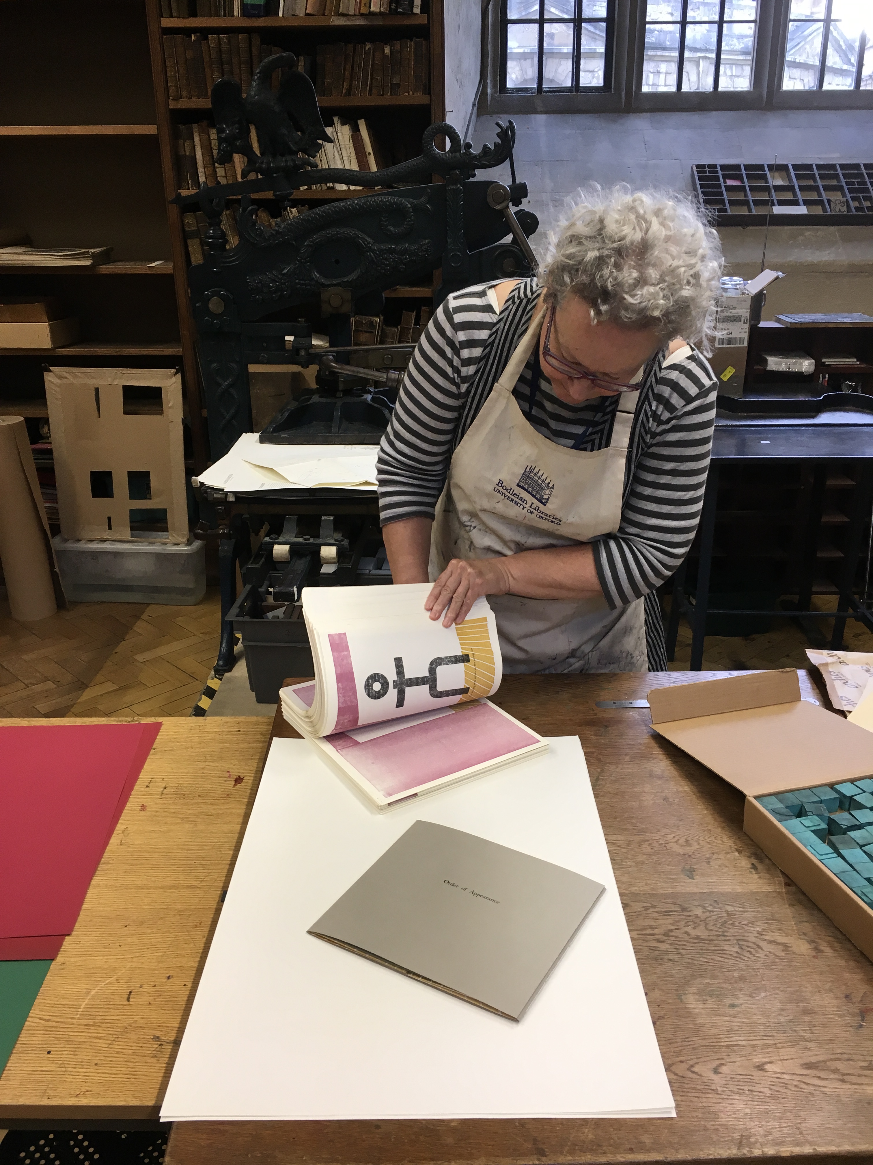
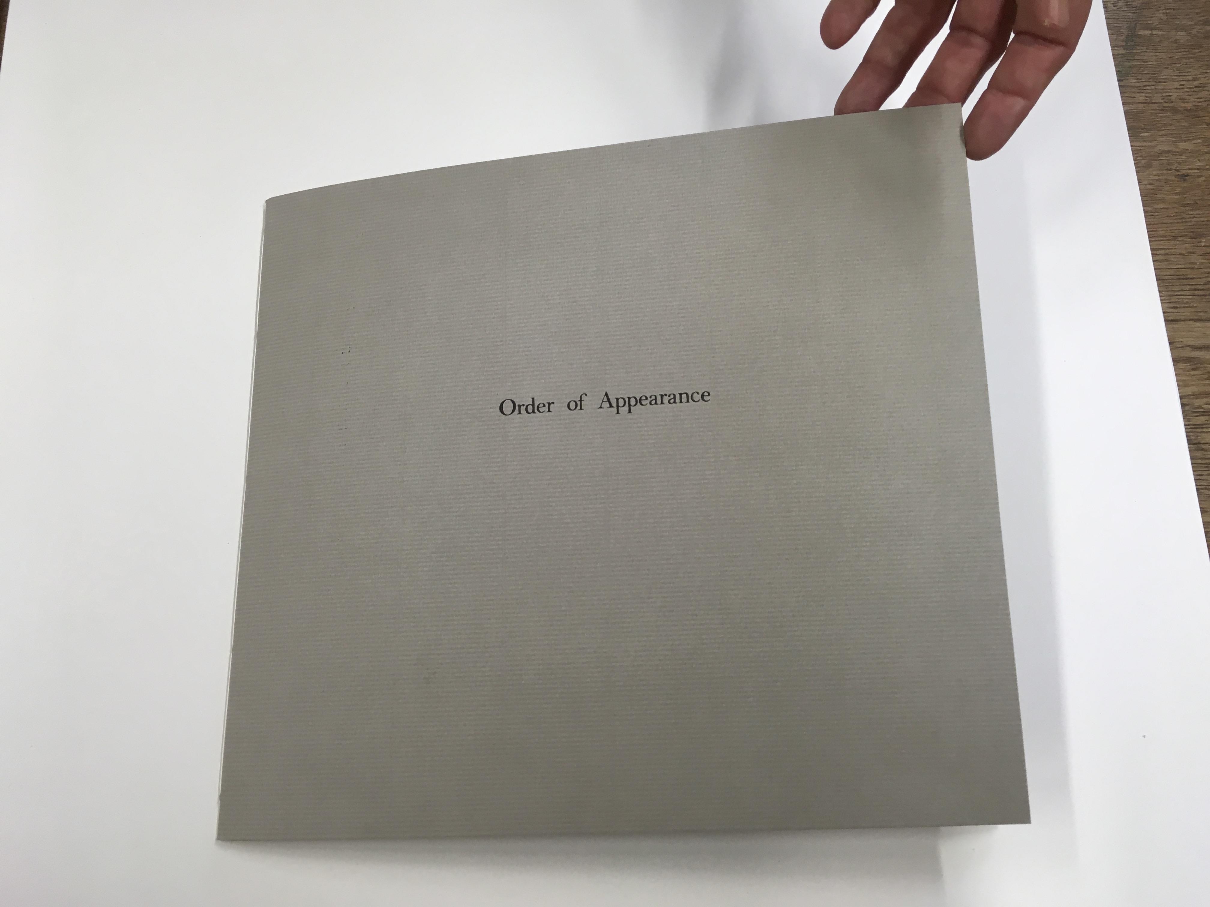
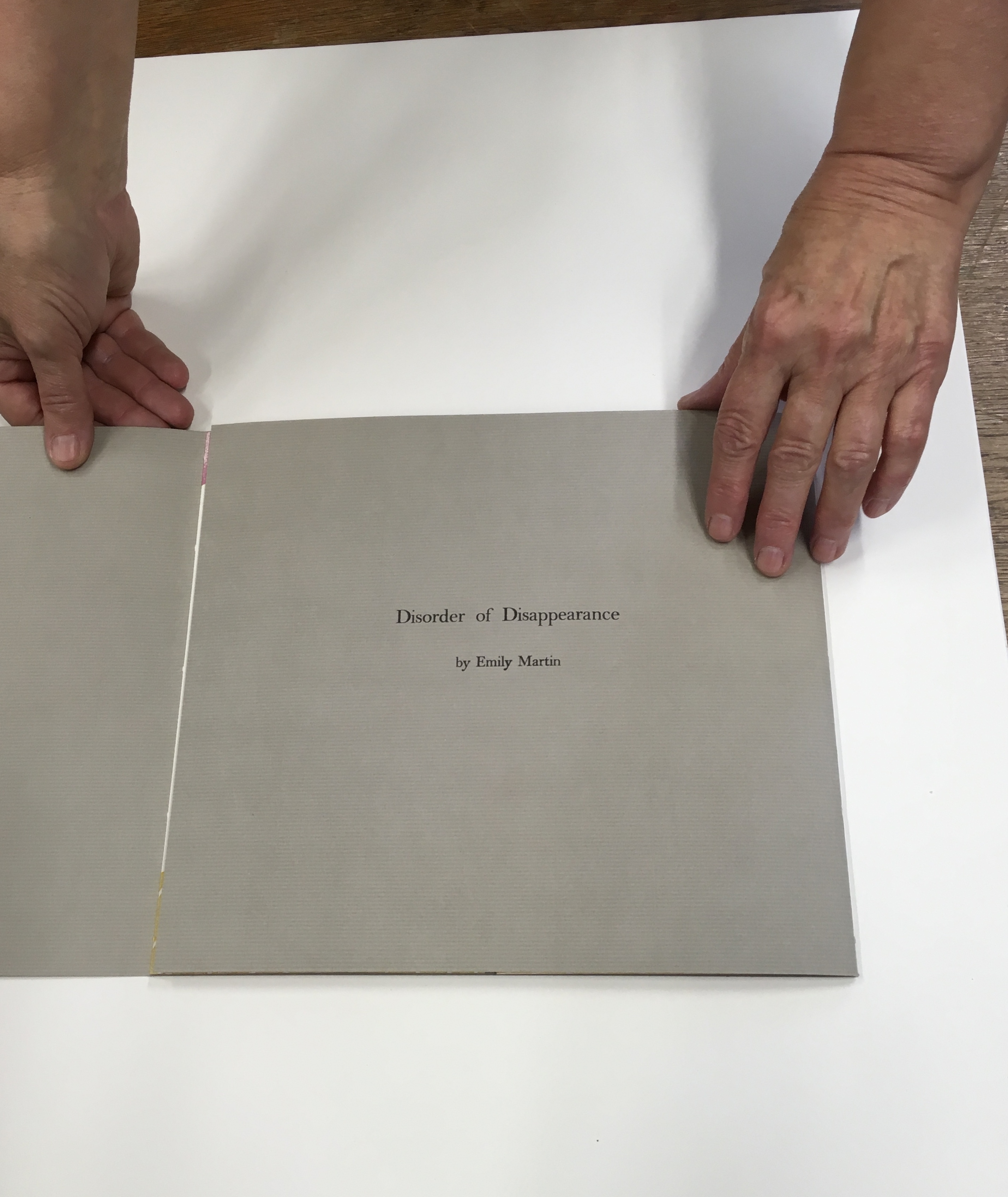
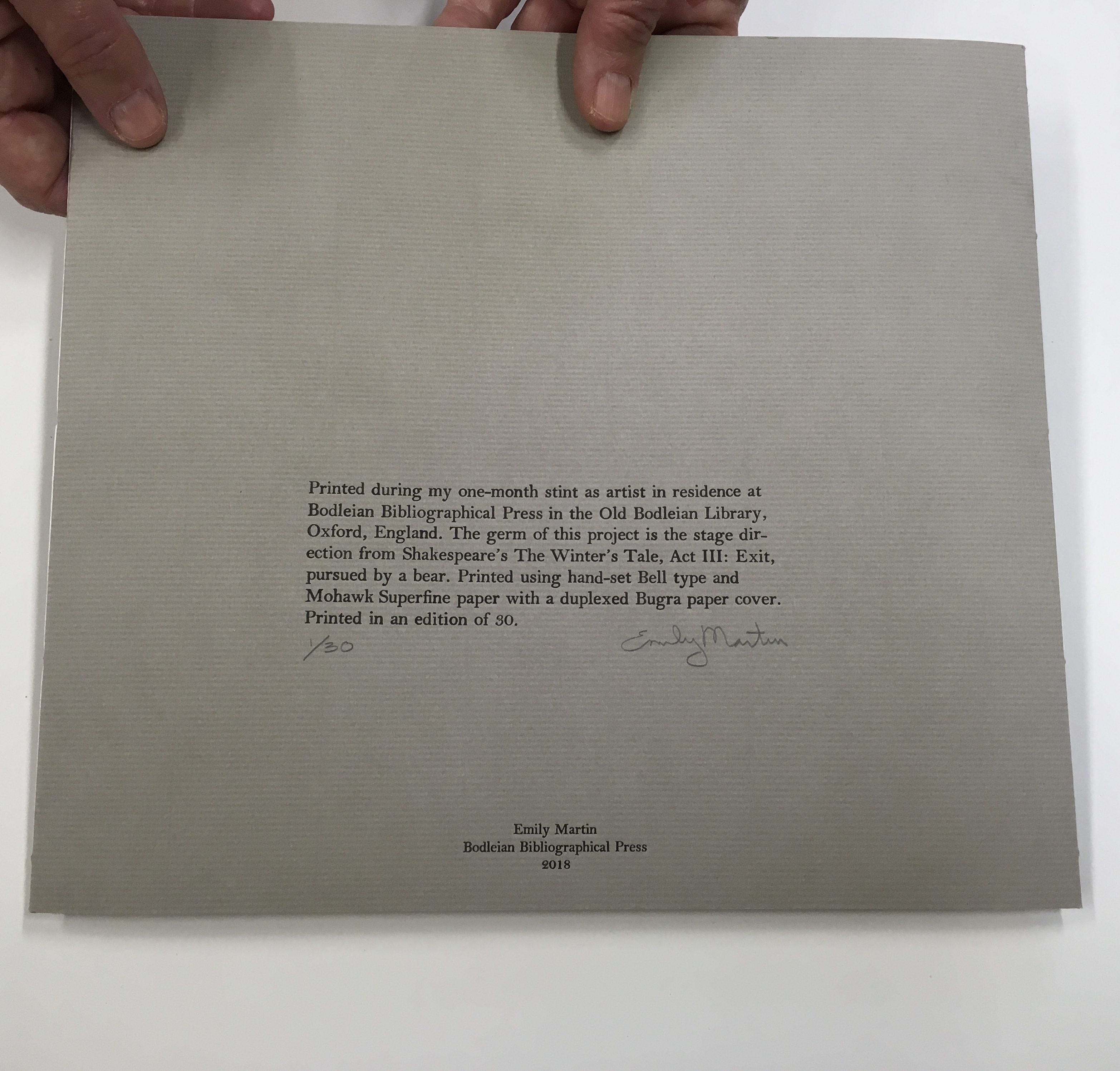
Emily Martin likes to leave the order of reading or viewing her new book up to chance and the reader. She sees it as part of her creative process. Call it “designing chance”. Order of Appearance: Disorder of Disappearance, the book at the culmination of her talk and time as the 2018 Printer-in-Residence at the Bodleian, illustrates the paradox perfectly. This work is one of several springing from Shakespeare’s plays — in this case, the springboard being the famous stage direction “Exit, pursued by a bear.”
Emily Martin wrapping up her stay as Printer-in-Residence at the Bodleian Library
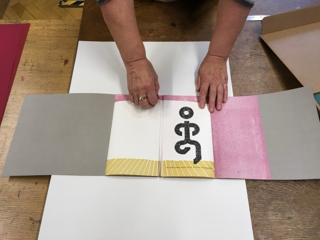
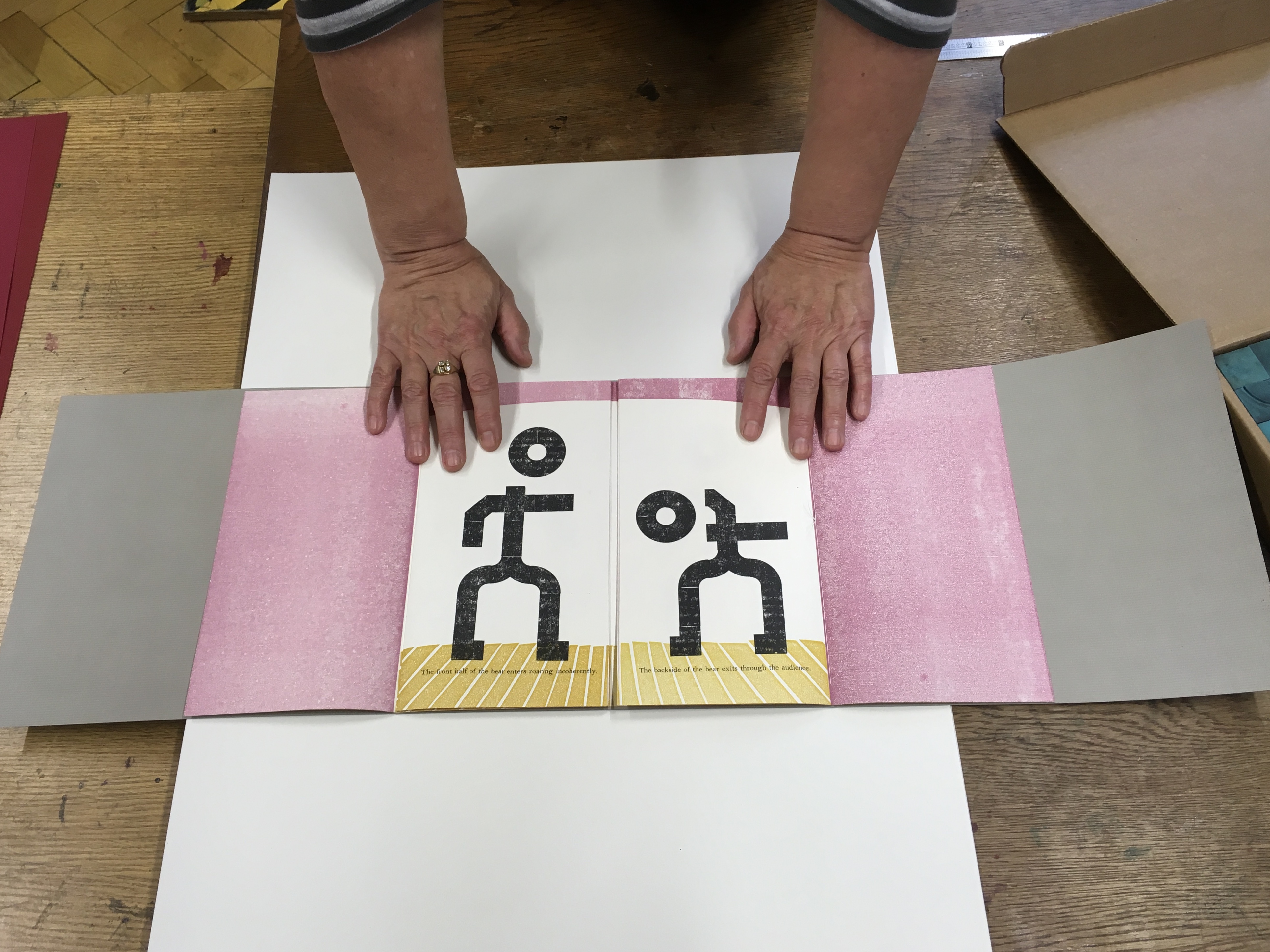
The gatefold cover opens left then right to reveal a set of signatures (folded and gathered pages) sewn to the lefthand crease and a set sewn to the righthand crease. The lefthand signature presents an empty stage; the righthand signature, a stylized stick figure of the leading lady, who is exiting to wild applause. Other characters in Martin’s Order/Disorder or Appearance/Disappearance include the leading man, the clown, a mime, an improv artist, a ballet dancer and, of course, the bear. They can enter and exit one by one or in pairs and in any order and sequence the reader chooses.
“The ballet dancer enters furious with the choreographer.”
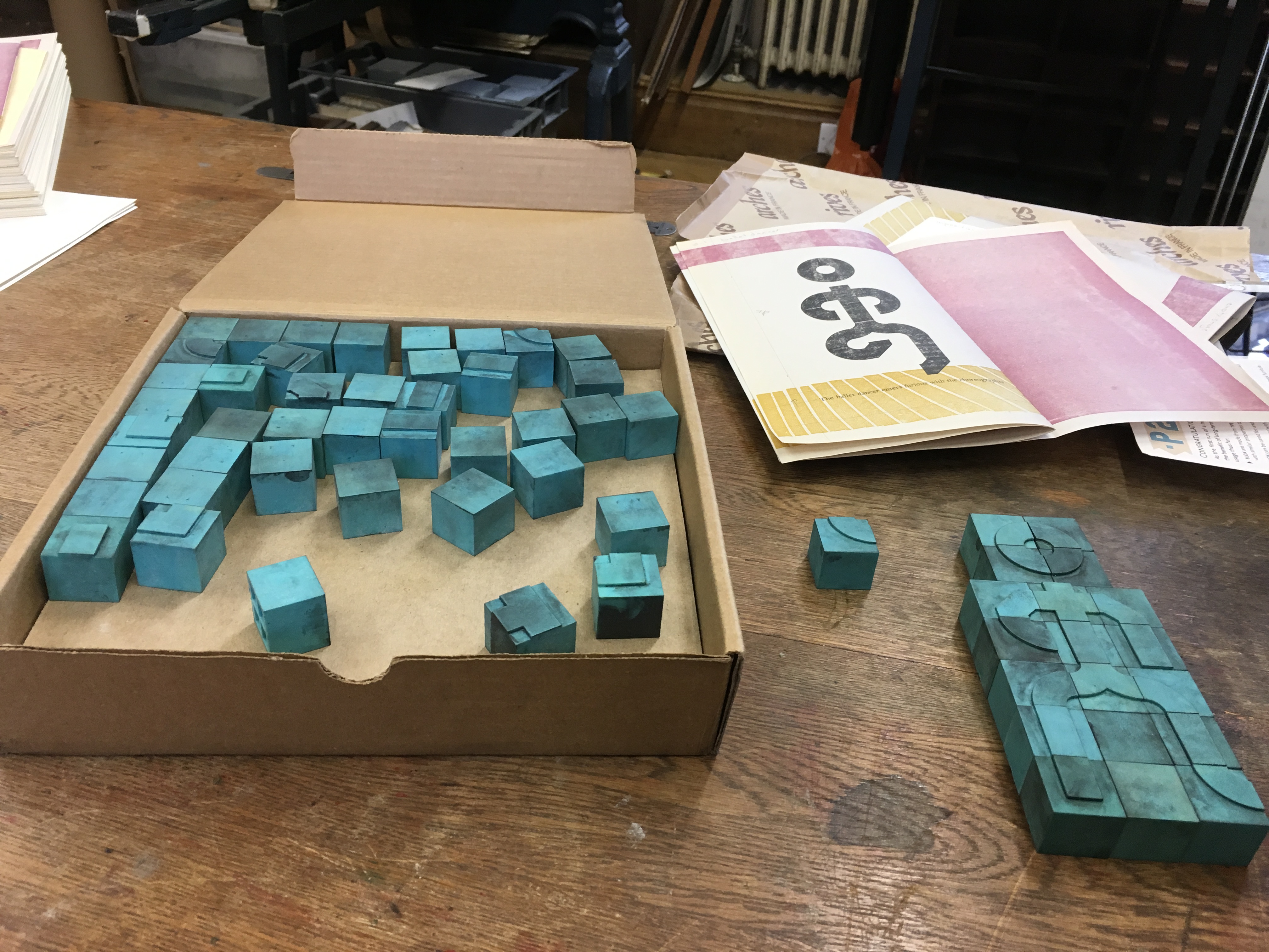
Martin forms the characters’ figures from P22 Blox, a set of modular shapes that she uses to great effect conveying expression and attitude with changes in posture and gesture. The characters are not without their subtleties. The clown’s feet are larger than any other figure’s. The close observer will note that, side by side, the leading lady is slightly shorter than the leading man and has one other subtle biologically distinguishing feature.
The P22 Blox and member of the “repertory group”The bear’s entrance and exit
The bear’s scene above — like any scene or sequence of ordered/disordered entrances/exits — however chosen or varied by the reader — is very short. On the left, “The front half of the bear enters roaring incoherently”; on the right, “The backside of the bear exits through the audience”.
Slapstick and whimsy play an important part in Martin’s books, not without bite. By “designing chance” into her works, she implicates us the readers and viewers in the biting. The “P22 Blox repertory performers” made an earlier appearance in Martin’s Funny Ha Ha Funny Peculiar or Funny Peculiar Funny Ha Ha(2017), which has plenty of bite. Funny Ha Ha is a dos-à-dos book (two books sharing the same back cover) — what else could it be for her conflicted response to Shakespeare’s comedies, individually enjoyable yet easily mixed up in her head due to a certain sameness of plot and
… So much mistaken identity, gender confusion and various other contrivances while romping their way to a fifth act wedding or two. Even more problematic are the decidedly unfunny themes that are common in many of these same comedies such as hypocrisy, sexual harassment, intolerance, sexism, misogyny, and anti-Semitism.
Funny Ha Ha also uses the slice book technique, which, as with the flexible order/disorder of Order of Appearance, inveigles the reader — enjoyably and uncomfortably, back to back in the former’s case — in creating new readings and meanings as the top and bottom halves of the pages turn independently of one another.
Martin’s earlier forays with Shakespeare left less to chance for the reader/viewer. For Desdemona, In her Own Words (2016), we have Martin’s collection and reordering of the few words given to the character in a strongly affecting stop motion animation, which appeared in 2015 as a boxed book. Martin’s The Tragedy of Romeo & Juliet (2012), awarded a silver medal at the Designer Bookbinders’ International Competition in 2013, is her book art’s earliest engagement with Shakespeare. There she uses the carousel book structure to set several scenes in the round, each with a repetition of the play’s Prologue chorus slightly adjusted with the insertion of modern equivalents for the setting of Verona. Think Rwanda or Serbia, and why not? All the world’s a globe, as the carousel implies. Forthcoming in the Shakespearean suite may be the best yet — which is a high bar — a spiralling interpretation of King Lear’s descent into madness.
Martin’s talk is entitled “Visual Metre and Rhythm: the Function of Movable Devices”. The illustration of volvelles, lift flaps, harlequinades, tunnel books, rivet-and-tab movables and pop-ups ranged beyond the Bodleian’s sources; it was obvious that Martin had made good use of the time allocated for research during her residency. Presumably as with the talk by Russell Maret, the 2017 Printer-in-Residence, Martin’s talk will be posted on the Bodleian site. In the meantime, a visit to her site will not only provide an impressive range of movables and pop-ups but also demonstrate their function as serious artist books.
For those wanting a closer look or hands-on experience, Order of Appearance can be seen in motion here and will be available for purchase at CODEX 2019 in Richmond, CA and from her site.