Books On Books Collection – Peter & Donna Thomas (I)

Alphabet People (1989)

Alphabet People (1989)
Peter and Donna Thomas
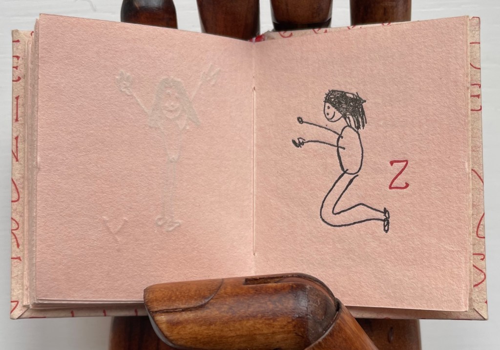
Miniature codex with illustrated paper over boards, endband, sewn. H60.5 x W47.5 mm. 64 pages. Edition of 200, of which this is an artist’s proof. Acquired from Bromer’s Books, 16 February 2023.
Photos: Books On Books Collection.

Peter and Donna Thomas have made several alphabet artists’ books. One made in the shape of an Apple MAC, one in the shape of mushrooms, one celebrating views of Yosemite, one for musical instruments (accordion to zither, of course), one for spring wildflowers and one, of course, just for the letters themselves.

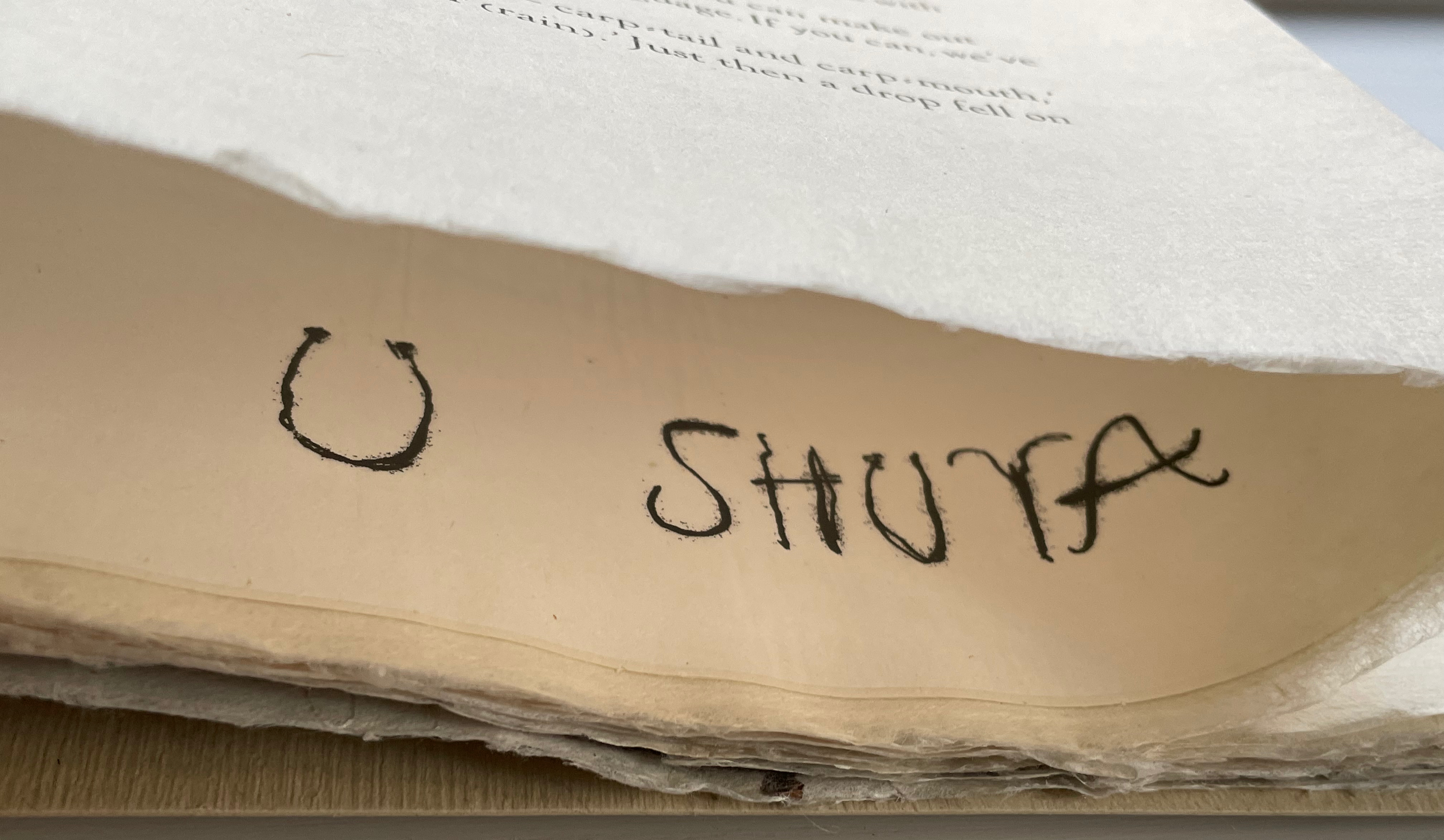
This one may be their earliest. Handset in Greeting Monotone and letterpress printed by Peter Thomas on peach-colored handmade paper. The same paper is used for covering the boards. As with all the initials in the book, the alphabet on the cover and pastedown title card is inked in red. The illustrations are reproductions of twenty-seven line drawings by their daughter Tanya Thomas.

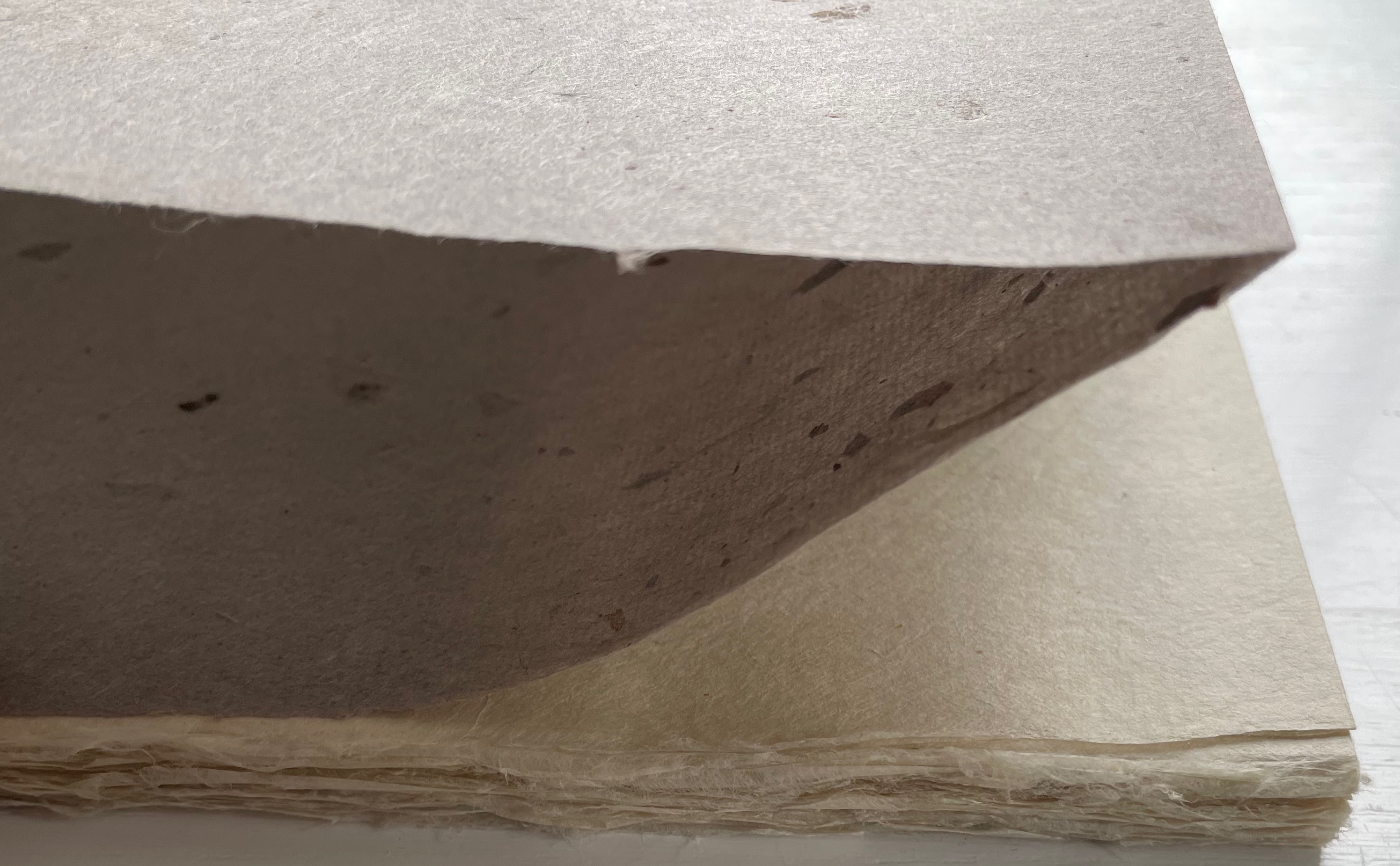
Seen end-on, the book shows some of its fine press features, especially the two-color sewn endbands and tight turn-ends of the cover paper. Handmade paper characterizes much of the Thomases’ output, and their interest in papermaking has extended as far as Africa, the Philippines and Totnes, Devon, England.

They Made the Paper at Tuckenhay Mill (2016)

They Made the Paper at Tuckenhay Mill (2016)
Peter and Donna Thomas, ed.
Paperback, perfect bound. H280 x W220 mm. 120 pages. Acquired from the artists, 22 June 2022.
Photo of cover: Books On Books Collection.

From the publisher’s description of the second edition:

A self-taught hand papermaker, Peter Thomas became interested in knowing how apprentice-trained hand papermakers working in production hand papermills made paper. He especially wanted to learn the “vatman’s shake,” the series of motions that papermakers used to form their sheets of paper. This desire circuitously led him and Donna to Tuckenhay, near Totnes, Devon, in England, where beginning in 1988, they recorded several hand papermakers, returning to make others in 1990 and 1994. The book begins with a short history of Tuckenhay Mill and the story about meeting the papermakers and recording their interviews. This is followed by eight interviews of men and women, some of whom worked in the Mill from between the World Wars until it closed in 1970. All of the papermakers are now deceased, but the stories – in their own words – remain an extraordinary, entertaining, and timeless record of their lives and work. In the 1830s, Richard Turner started manufacturing paper by hand in the Tuckenhay Mill, and paper was continuously made by hand there until 1962. From then until 1970, the Mill produced pulp (half-stuff) until the business went bankrupt….

The Thomases’ works are well represented at in University of Wisconsin-Madison’s Special Collections. Some of the several particularly related to papermaking — as well as other paper-related ones from the Books On Books Collection — are listed below. Any study of the intersection of book art and paper could not help but include Peter and Donna Thomas.

Further Reading

Abecedaries I (in progress)“, Books On Books Collection, 31 March 2020.

The First Seven Years of the Rijswijk Paper Biennial“. 10 October 2019. Books On Books Collection.

Looking Back and Forward from the Paper Biennial 2018“. 24 June 2018. Books On Books Collection.

Helen Hiebert“. 18 June 2021. Books On Books Collection.

Maureen Richardson“. 28 September 2019. Books On Books Collection.

Fred Siegenthaler“. 10 January 2021. Books On Books Collection.

Hunter, Dard. 1978. Papermaking: The History and Technique of an Ancient Craft, 2nd ed. New York: Dover. Republication of the second, revised and enlarged 1947 edition.

Hiebert, Helen. 2000. The papermaker’s companion: the ultimate guide to making and using handmade paper. North Adams, MA: Storey Pub.

Hiebert, Helen. “Strange Papers“, Helen Hiebert Studio, 12 August 2014. Accessed 3 November 2020.

Hiebert, Helen, and Melissa Potter. 2016. The secret life of paper: 25 years of works in paper. Kalamazoo, MI: Kalamazoo Book Arts Center.

Kurlansky, Mark. 2017. Paper: Paging through History. New York, NY: W.W. Norton.

Müller, Lothar. 2016. White Magic: The Age of Paper. Cambridge, UK: Polity Press.

Sansom, Ian. 2012. Paper: an elegy. New York, NY: Wm. Morrow.

Thomas, Donna. 2001. A Mushroom ABC. Santa Cruz, CA: Peter & Donna Thomas.

Thomas, Peter. 1988. Shakespeare on Papermills. Santa Cruz, CA: The Good Book Press.

Thomas, Peter. 1990. Papermaking in Seventeenth Century England. Santa Cruz, CA: Peter & Donna Thomas.

Thomas, Peter and Donna, eds. 1994. A Collection of Paper Samples from Hand Paper Mills in the United States of America. Santa Cruz, CA: Peter & Donna Thomas.

Thomas, Peter and Donna. 1996. MAC’s ABCs. Santa Cruz, CA: Peter & Donna Thomas.

Thomas, Peter and Donna, compilers. 1999. Paper From Plants. Santa Cruz, CA: Peter & Donna Thomas.

Thomas, Peter and Donna. 2001. Yosemite ABC. Santa Cruz, CA: Peter & Donna Thomas.

Thomas, Peter and Donna. 2002. Accordion to Zither. Santa Cruz, CA: Peter & Donna Thomas.

Thomas, Peter and Donna. 2006. Spring Wildflower ABC. Santa Cruz, CA: Peter & Donna Thomas.

Thomas, Peter and Donna. 2015. Letters. Santa Cruz, CA: Peter & Donna Thomas.

Vincent, Jessica. Indigenous Women Are Publishing the First Maya Works in Over 400 Years, Atlas Obscura, 08 August 2019. Accessed 27 October 2020.

Weber, Therese. 2008. The language of paper: a history of 2000 years. Bangkok, Thailand: Orchid Press.

Books On Books Collection – Gerald Lange

The Neolithic Adventures of Taffi-Mai Metallu-Mai (1997)

The Neolithic Adventures of Taffi-Mai Metallu-Mai (1997)
Gerald Lange and Rudyard Kipling
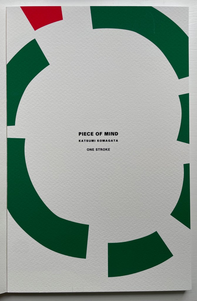
H216 x W260 mm. 55 pages with 17 additional illustrated page inserts. Edition of 150, of which this is #149. Acquired from the artist, 11 Febuary 2023.
Photos: Books On Books Collection. Displayed with the artist’s permission.

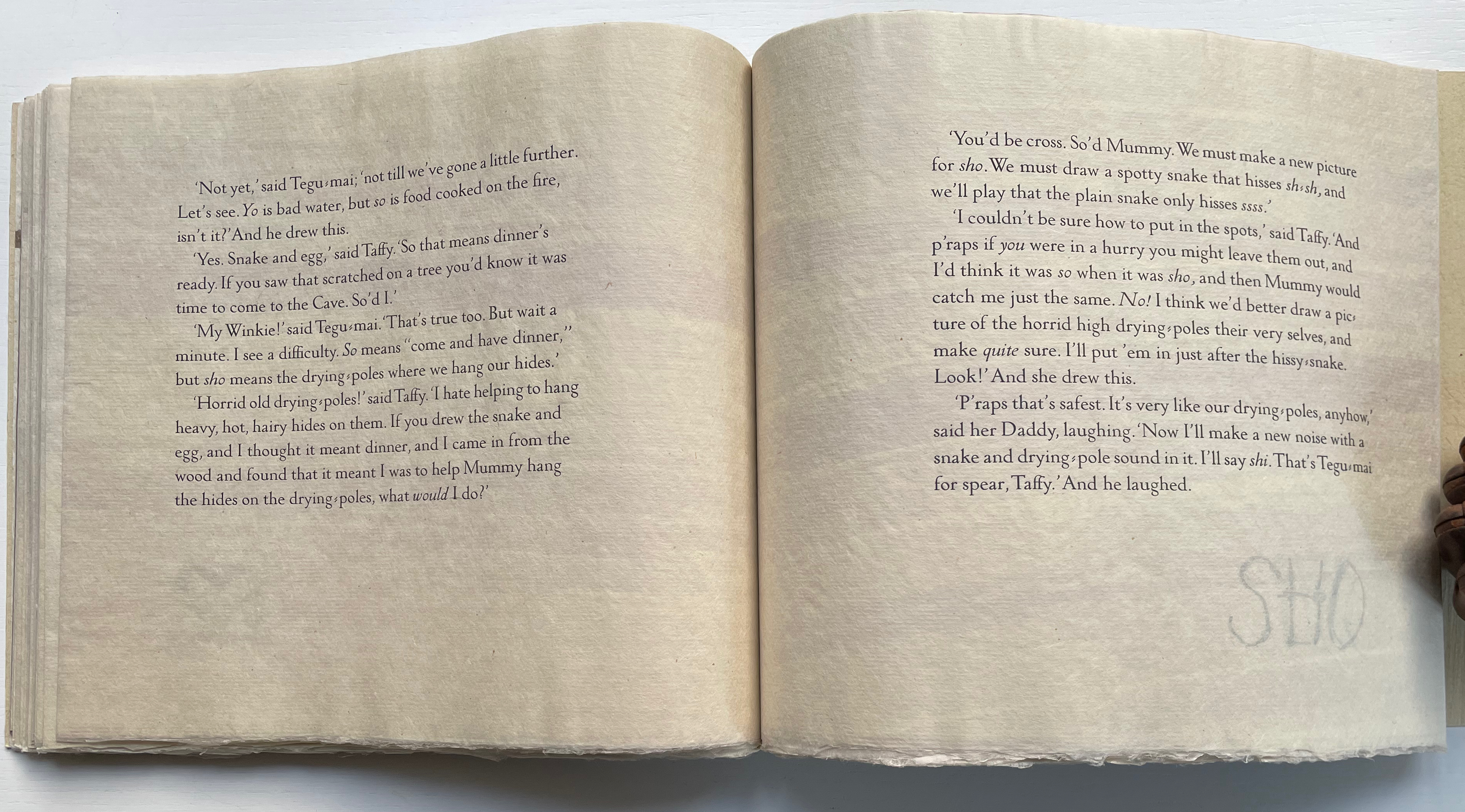
Gerald Lange’s choice of “How the First Letter Was Written” and “How the Alphabet Was Made” from Rudyard Kipling’s Just So Stories (1902) for this elaborate, delicate but robust edition was fitting. By 1997, he had founded the Bieler Press (1975), co-founded the Alliance for Contemporary Book Arts (1987) and edited its journal AbraCadaBrA for seven years, had been the Master Printer at USC Fine Arts Press and selected as the first recipient of the prestigious Carl Hertzog Award for Excellence in Book Design (1991) and was about to publish the first edition of his Printing Digital Type on the Hand-Operated Flatbed Cylinder Press (now in its fifth edition, 2018). In keeping with his interests leading up to this work, Lange letterpress-printed it from handset Monotype Pastonchi and a digitally altered version of Berthold Post Antiqua. More to the point, as he noted on the Bieler Press site, he chose the stories for “their affinity with subjects related to the lettering arts”. If that affinity is not clear enough from the text, Lange’s treatment underscores it in subtly ingenious ways.

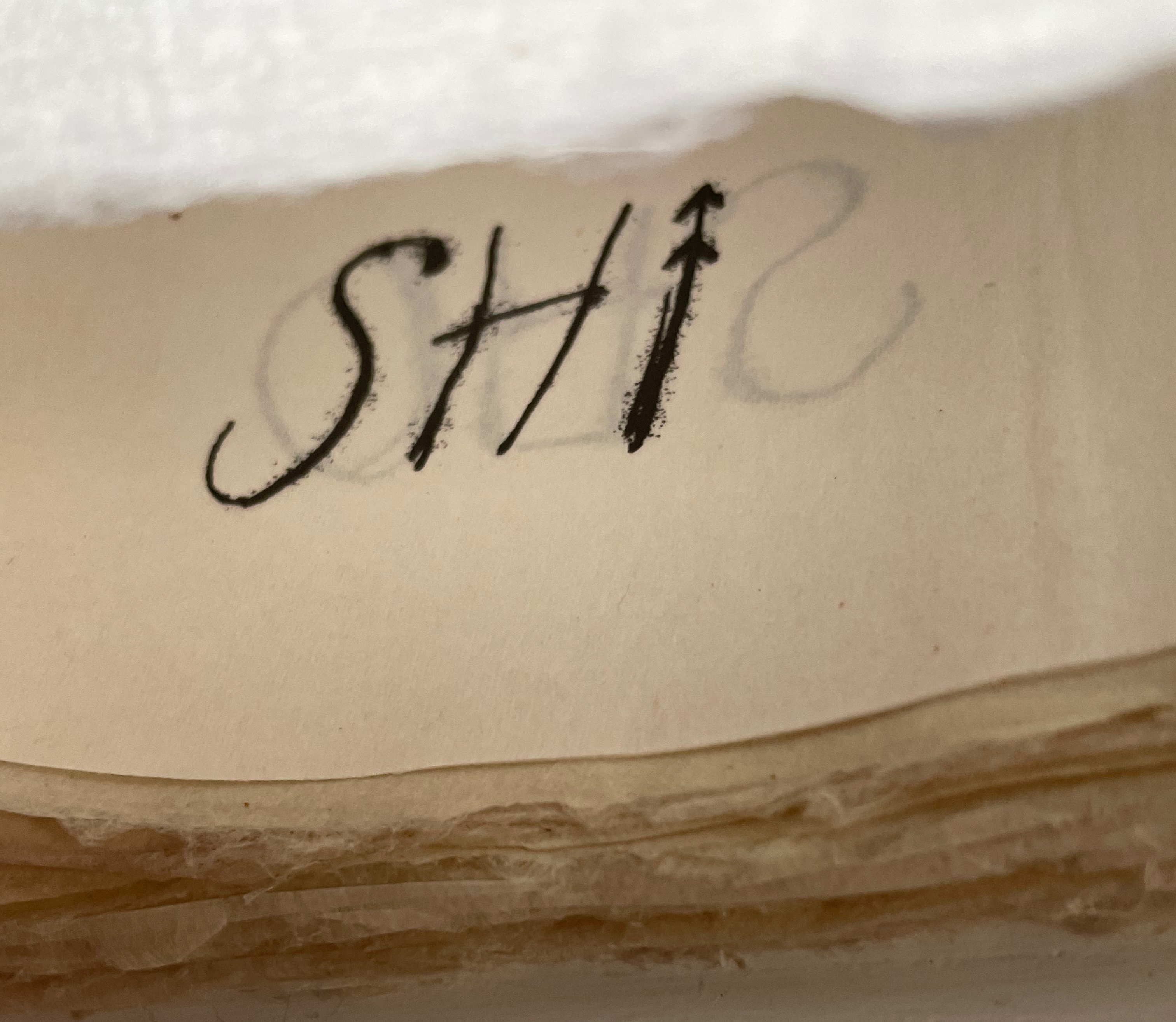
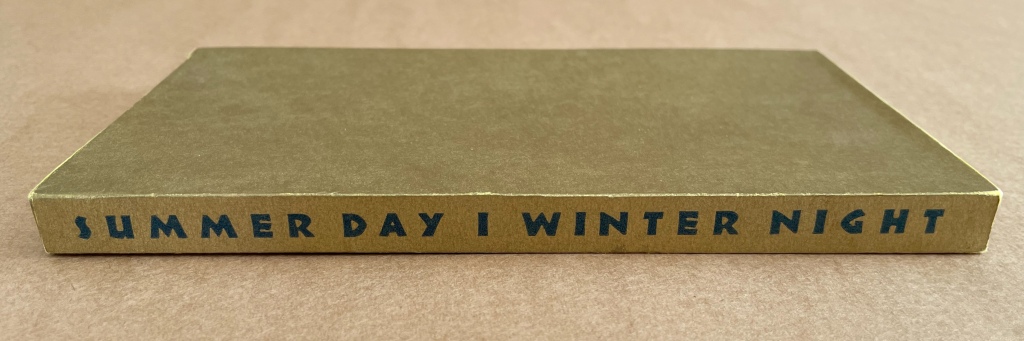
Kipling attributes the drawings throughout to his heroine, Taffi and her father. Where others like Macmillan Children’s Books have rendered them boldly, Lange prints the primitive petroglyph-like images on separate Gampi sheets inserted between the folded Kitakata text leaves of the tortoise shell edge-sewn binding. Those text leaves are individually water colored on their reverse sides (urazaiki manner based on nihonga painting) so that the pictographs beneath reveal themselves through a striated layer. The color and striations are reminiscent of cave paintings. Additional Asian papers (Kasuiri and Chirizome for end sheets, Cogan Grass for covers) increase the work’s tactility — simultaneously soft and rough, flimsy and tough — and contribute a grassy smell redolent of the stories’ physical setting.

The quality and rightness of choices in structure, material and process have placed several of Lange’s works in The British Library, University of California (various), Columbia University, Harvard University, University of Minnesota, New York Public Library, Princeton University, Stanford University, Victoria and Albert Museum, Yale University and others. The initial reason bringing this particular work into the Books On Books collection was its representation of book art inspired by the alphabet. That Robin Price, several of whose works are also in the Books On Books collection, assisted with the design came as a bonus. That this is one of the last bound copies of The Neolithic Adventures of Taffi-Mai Metallu-Mai makes it a treasure.
Further Reading

Abecedaries I (in progress)“. Books On Books Collection.

Lyn Davies“. 7 August 2022. Books On Books Collection. Reference and fine print.

Timothy Donaldson“. 1 February 2023. Books On Books Collection. Reference.

Cari Ferraro“. Books On Books Collection. Artist’s book.

David J. Goldman“. Books On Books Collection. Reference.

Rudyard Kipling and Chloë Cheese“. 15 February 2023. Books On Books Collection. Illustrated children’s book.

James Rumford. 21 November 2022. Books On Books Collection. Illustrated children’s books.

Tommy Thompson“. 21 August 2022. Books On Books Collection. Reference.

Drucker, Johanna. 1999. The alphabetic labyrinth: the letters in history and imagination. New York, N.Y.: Thames and Hudson. Reference.

Ege, Otto. 1921/1998. The Story of the Alphabet, Its Evolution and Development… Embellished Typographically with Printer’s Flowers Arranged by Richard J. Hoffman. Van Nuys, CA: Richard J. Hoffman. A miniature. The type ornaments chosen by Hoffman are arranged chronologically by designer (Garamond, Granjon, Rogers) and printed in color.

Firmage, Richard A. 2001. The alphabet. London: Bloomsbury. Reference.

Fischer, Steven Roger. 2008. A history of writing. London: Reaktion Books. Reference.

Jackson, Donald. 1997. The story of writing. Monmouth, England: Calligraphy Centre. Reference.

Lange Gerald. 2018. Printing Digital Type on the Hand-Operated Flatbed Cylinder Press. Fifth edition, revised, updated & expanded ed. Seattle: Chatwin Books.

Robb, Don, and Anne Smith. 2010. Ox, house, stick: the history of our alphabet. Watertown, MA: Charlesbridge. Children’s book.

Robinson, Andrew. 1995. The story of writing. London: Thames and Hudson. Reference.

Rosen, Michael. 2014. Alphabetical: how every letter tells a story. London: John Murray. Reference.

Sacks, David. 2003. Language visible unraveling the mystery of the alphabet from A to Z. New York: Broadway Books. Reference.

Samoyault, Tiphaine. 1996, 1998 trans. Alphabetical order: how the alphabet began. New York: Viking. Reference and illustrated children’s book.

Books On Books Collection – Jacobus Oudyn (I)

A Prayer in Hell (2018)

A Prayer in Hell (2018)
Jacobus Oudyn
Palm leaf prayer book format of 12 timber slats with double-sided collages materials and images made with pomegranate ink on antique paper, water soluble crayon calico, wound dressings and PVA adhesive. Text from Nauru Files — Guardian Newspaper and Islamic prayer book. Open: H195 x W130 mm. Closed: H195 x W 55 x D35 mm. Slip case: 2 mm card with collage, H202 x W60 x D38 mm, to be displayed with the book. Unique. Acquired from the artist, 4 January 2020. Photos: Books On Books Collection, displayed with permission of the artist.

A Prayer in Hell is one of Jack Oudyn’s larger works. works refer to the Australian experience of the world’s refugee crisis (perhaps the largest diaspora in history), A Prayer in Hell is the most scorching of them all.

Materially, the work embodies the refugees and their experience in many ways — its palm-leaf prayer book pages even consist of “stressed and recycled timber slats”. The binding cords penetrate drawings of eyes on each slat, creating the effect of the faceless staring through bars. Although the work’s title alludes to the English expression “not a hope in hell”, the work itself nods toward hope appears in how the wound dressings, wound round the slat pages, gradually become cleaner. Under and over the dressings, strips of English and Arabic text are collaged alongside handwritten extracts from Islamic prayer books and reports of events and conditions in Australian detention centers. Complete with redactions, the English text refers to the scandals associated with the centers at Nauru, Papua New Guinea, Christmas and Manu islands.

Fish Books One, Two, Three and Four (1999 – 2001)

All acquired from the artist, 4 January 2020. Photos: Books On Books Collection, displayed with permission of the artist.

This complete set of his fish books represents Oudyn’s Micro Press imprint well. Many of the small works are playful with language, form, and material and, often, socially satirical or critical. More hook-in-mouth than tongue-in-cheek, the fish books have provided the artist with ground for playing with collage and printing techniques. In imagery, they are reminiscent of Ric Haynes, Breughel and Bosch. In text, they encapsulate the punsterdom of book art (albeit without the usual book-related self-referencing, though “fish wrapper” would have been good for their covers); reveal the artist’s Dutch heritage in their numbering; and revel in Australia’s odd common fishnames (dart, flattie, stargazer, sweetlips, etc.). By Fish Book Four (2001), however, a socially sharper tone emerges. The dates of publication, which vary from those in the WorldCat links for each title, are taken from the artist’s website.

The Very First Book of Fish (1999)
Jack Oudyn
Booklet made of 200 gsm digital paper, sewn with single white waxed thread, 16 pages. Color laser print of mixed media drawings; ink, paint, collage on pages from telephone directory. H70 x W105 mm, 16 pages. Edition of 50, of which this is #27. Photos: Books On Books Collection, displayed with permission of the artist.

Fish Book Two (1999)
Same format as first, except sewn with single red waxed thread; #49 of 50.

Fish Book Three (2000)
Same format as the second; #25 of 50.

Fish Book Four (2001)
Same format as third, except sewn with single dark gray waxed thread: #13 of 50.

‘ATE (2011)

‘ATE X 10 (2011)
Jack Oudyn
Japanese stab-bound booklet, with wax paper cover and Momigami fly leaves. H54 x W74 mm, 10 train ticket sleeves holding 10 small numbered cards collaged with advertising brochure photos. Edition of 2, of which this is #2. Photos: Books On Books Collection, displayed with permission of the artist.

ATE X 10 demonstrates Oudyn’s wont to play language, form and material off image and vice versa. Bound in a Japanese stab binding by waxed thread and wax paper from the fish markets at Tsukiji in Tokyo, the book begins with a front fly leaf page bearing a tag line from the breast exercise mantra; on the same Momigami paper, the end fly leaf bears the colophon. The pages are made of Japanese train ticket sleeves containing numbered cards collaged with small photos from advertising brochures found near railway stations. As the fly leaf hints, the modest photos come from ads for breast enhancement services, an 8 x 10 promise relative to the images presented.

The works in the Micro Press imprint also reflect Oudyn’s interest (and presence) in mail art. He has been a member of the International Union of Mail Artists, and a section on his site is devoted to mail art.

’16 Century Map’ (2012)

’16 Century Map’ (2012) Jack Oudyn
Tab/slot-bound, single-fold, map paper on board, covering three outward-opening triangular cut tabs over center map paper on board; ink-stamped and drawn, with “you are here” sticker in lower left corner. H70 x W72 mm (closed). Unique. Acquired from the artist, 4 January 2020. Photos: Books On Books Collection, displayed with permission of the artist.

This small unique work — and those that follow — lie outside the Micro Press imprint. As the artist writes on his blog, this is a trial attempt at juxtaposing the exterior old European map (showing Mesopotamia and the Euphrates, the Northern hemisphere’s cradle of civilization) with the interior Australian map of the Kakadu National Park to get at the concept of Tjukurpa, by which Australia’s Anangu refer to the creation period.

It is not strictly a Turkish-fold map, but the way the tab with indigenous colors snugly closes ’16 Century Map’ is just as mechanically satisfying.

vis-à-vis | face to face (2014)

vis-à-vis | face to face (2014) Jack Oudyn
Blizzard-fold booklet, mixed media and collage with tea bag paper. H100 x W70 mm, six panels. Unique. Acquired from the artist, 4 January 2020. Photos: Books On Books Collection, displayed with permission of the artist.

A heavily stained, empty teabag glued across the two boards, whose opening is closed with the teabag string wrapped around a wooden button, serves for this booklet’s binding. A conversation between two people struggling for words, hence the near random use of found text, occupies the six panels. The abstract faces profiles are characteristic of Oudyn’s work, as is the use of acrylic medium as a block out or resist. Or perhaps it is egg yolk, which would be in keeping with the reference to eggs and, with the tea stains, in keeping with a breakfast-table conversation.

Age Marks (2014)

Age Marks (2014)
Jack Oudyn
Handmade waxed and stained paper book by Trace Willans. Mixed media and collage on paper. H85 x W65 x D10 mm, 44 pages. Unique. Acquired from the artist, 4 January 2020. Photos: Books On Books Collection, displayed with permission of the artist.

Trace Willans makes blank books from organic, sustainable media. Age Marks began as one of these blanks, its pages consisting of lightly textured machine-made lightweight paper (ca. 100 gsm), some stained and waxed. The result is not exactly an inscribed blank notebook, not exactly an altered book. Oudyn’s use of mixed media of different hand-made papers, tracing paper, found text, wax, reflective road tape, postage stamps, white acrylic ink, gouache and pigment creates a unique record of the aging process of mark making. Marks made by conversation, observation, inscription, printing, writing, drawing, collation, lifts and reveals, cutting, tearing, pasting, weaving, binding — all filtered through aging.

Small as it is, Age Marks is one of the most varied haptic experiences in the collection.

The Future of an Illusion (2017)

The Future of an Illusion (2017)
Helen Malone and Jack Oudyn
Sculptural tunnel book structure (three joined four-fold leporellos) enclosed in a folder and protective boxin a box,. Box made with Lamali handmade paper, suede paper (lining) and Somerset Black 280 gsm; Folder: Canson black 200gsm, skull button and waxed thread; Leporellos: center leporello made of Canson black 200 gsm, linen thread adjoining two leporellos made of Arches watercolour paper 185 gsm with acrylic, soluble carbon, gouache and transfer ink jet images. Box: H275 x W313 x D34 mm; Folder: H258 x W295 x D21 mm; Book: H250 x W290 x D16 mm closed, D410 mm open. One of an unnumbered, signed edition of 4. Acquired from Helen Malone, 12 September 2017.

Click here for additional images and comments.

Roughly Asemic (2020)

Roughly Asemic (2020)
Jack Oudyn
Booklet, single-thread stitched, handmade paper cover, painted and inked, over brown Kraft paper folios illustrated with drawings and markings in paint and ink. H105 X W123 mm, 7 leaves, folded in half making 28 unnumbered pages, 14 of which bear drawings and markings, 13 of which are left blank, and the last page bears the title, signature and year. Unique. Acquired from the artist, 4 January 2020. Photos: Books On Books Collection, displayed with permission of the artist.

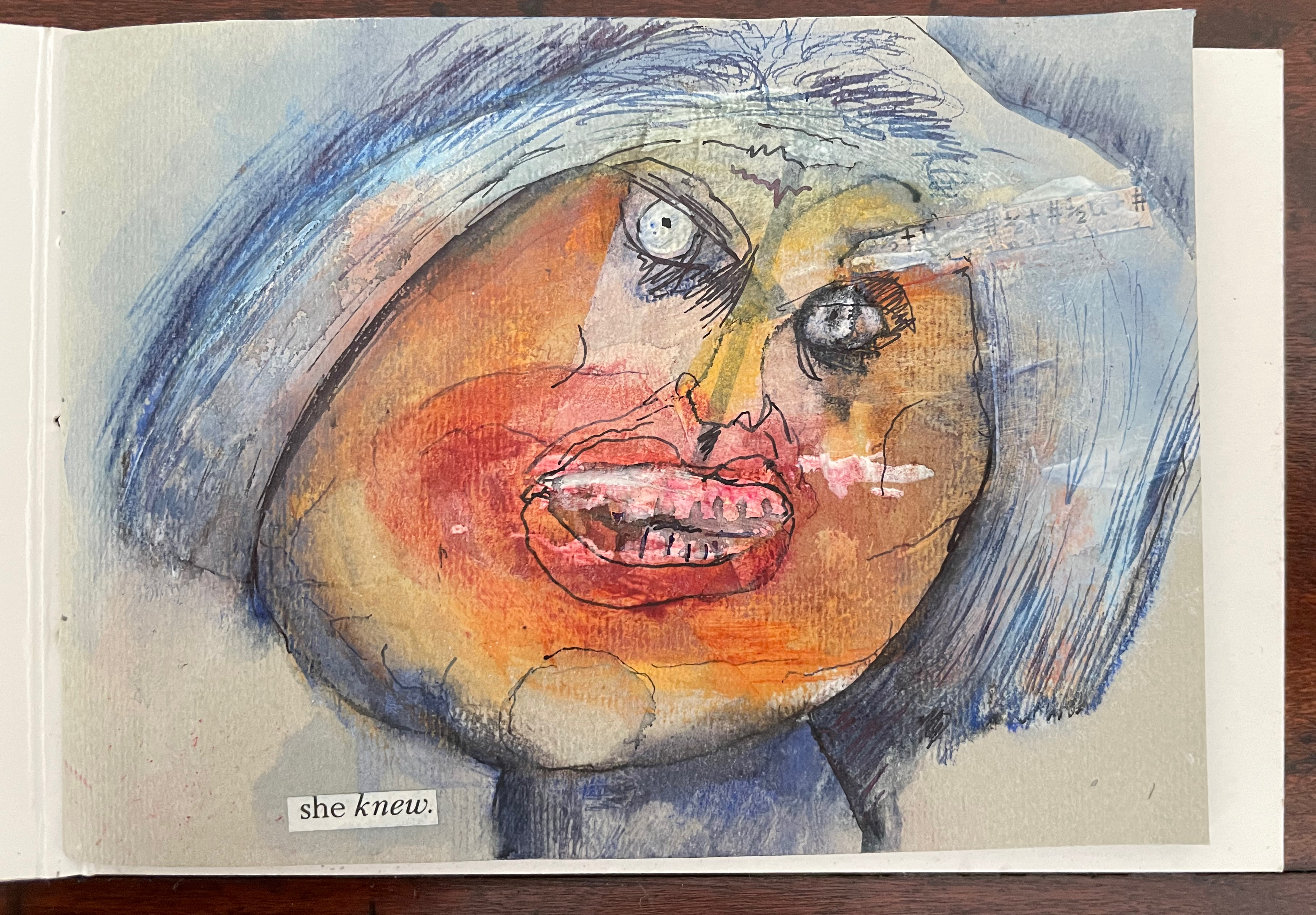
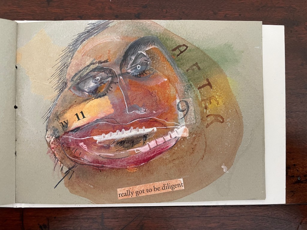
This work’s title could not be more apropos. It is a scratchy thing to hold, its pages stiff and crackling as they turn. Patterns, images and letters struggle to emerge, only to be submerged by each other on the same or next page, which goes to show how difficult it must be to achieve entirely asemic markings. “Roughly asemic” might be the best hoped for.

Further Reading

Jacobus Oudyn (II)“. 3 November 2023. Books On Books Collection.

Jacobus Oudyn (III)“. 10 August 2024. Books On Books Collection.

Cooper, Victoria. 2017. “Liminal Moments At The Edges: Reading Montage Narratives in Artists’ Books“. In Bodman, Sarah (ed.). 2017. Artist’s Book Yearbook 2018-2019. Bristol: Impact Press, UWE.

Foster, Robin. “Feature Artist – Jack Oudyn“, Personal Histories, International Artist Book Exhibition, Redland Museum, UNSW, Canberra. 11 March 2014. Accessed 19 October 2020.

Oudyn, Jacobus (Jack). Blog entry, 4 February 2013. Accessed 19 October 2020.

Oudyn, Jacobus (Jack). Micro Press. Artist’s site. Accessed variously from 1 September 2017 to 16 January 2021.

Helen Malone and Jack Oudyn“, Books On Books Collection. 5 December 2017.

Books On Books Collection – Marlene MacCallum (I)

“examination of everyday spaces … a celebration of interior life with special attention to the collection of objects and the adornment of surface” * —Marlene MacCallum

Theme and Permutation (2012)

Theme and Permutation (2012)
Marlene MacCallum
Hand sewn pamphlet, images custom-printed in offset lithography on Mohawk Superfine, text printed in inkjet, covers inkjet printed on translucent Glama.
H235 × W216 mm
Edition of 100, of which this is #54. Acquired 5 October 2018.

Photos: Books On Books Collection.

Theme and Permutation is one of a series of artist’s books inspired by the experience of living in Corner Brook’s Townsite area on the west coast of the island of Newfoundland. Between 1924-34 the pulp mill built 150 homes to house the mill management and skilled labourers. Over a period of 10 years, I have photographed in several homes, all the same type-4 model as the one I live in. These homes vary in condition from close to original in design and décor to highly renovated. This project gave me the rare opportunity to record the evolution of interior aspects of these homes. It has been the context to explore the paradoxical phenomena of conformity and individualization that occurs in a company town. Having grown up in a suburban housing development, my earliest memories of home is that of living in a space that is reminiscent of my neighbors’. Each artist’s book explores a distinct facet of image memory, multiplicity, sequence and offers the viewer a visual equivalence of the uncanny.
Theme and Permutation is a response to the permutations and variations of the type-4 Townsite House. Digital tools were used to translate the original film source of eight different window images from five houses. The sixteen offset lithographic plates were custom printed in twenty-nine separate press runs. Each image is the result of a different combination of plates. The structure is a sewn pamphlet with translucent covers. The viewer enters the body of the book with a tritone image of a single Townsite window. As one moves into the piece, new window images appear and layer over each other. The images become darker and more heavily layered towards the mid-point. The center spread has an inkjet layer of two text blocks printed over the offset litho images. The text speaks of the history of the homes, the architectural permutations and economic shifts within the Townsite area. The ensuing pages continue to provide new combinations of window layers, gradually lightening in tonality and allowing the individual windows to become more distinct. A third text block provides a personal narrative. The piece concludes with a tritone image of one of the Townsite windows in original condition.
(From artist’s website. Accessed 1 September 2019.)

*From the artist’s description of Wall Stories (2014).

Chicago Octet (2014)

Chicago Octet (2014)
Marlene MacCallum
Hand bound artist’s book with folded paper structure, letterpress and inkjet printing,
H166 × W78 mm closed, H443 x W293 mm open
Unique. Acquired 5 October 2018.

Photos: Books On Books Collection

Chicago Octet is a work of visual poetry by eight masters of book art. If they were performing music (and you can almost hear the music of Michigan Avenue), MacCallum would be their performing conductor.

The piece I created, Chicago Octet, had several collaborative components. The letterpress printing consisted of a word selected by each participant printed on one of Scott [McCarney]’s folded structures. The images were a digital layering of every cityscape photograph that I made and then inkjet printed on top of the letterpress. The final folded structure was designed by Mary Clare Butler. The case was designed and built by Scott McCarney, the front cover embossment was by David Morrish and Clifton Meador. (From artist’s website. Accessed 31 August 2017.)

Update: With funding from the Canada Council for the Arts Digital Originals Grant and assistance of Matthew Hollett and David Morrish during the Covid pandemic, the artist created Shadows Cast and Present, a digital re-imagining of her three most recent book works. The three cantos into which the work is divided also enrich one’s appreciation of Theme and Permutation and Chicago Octet. MacCallum orchestrates the various media — text; sound from music, voice and the noise of city and nature; video — with a touch as light as paper and light.

Further Reading

Books On Books. “Architecture”. Books On Books, 12 November 2018.

Books On Books. “The Colophon and the Leftover “i”. Books On Books, 23 April 2019.

MacCallum, Marlene. 2014. Wall Stories. Website. For the text cited in the epigraph for this entry, go to the last linked image in the series of thumbnails displayed.

MacCallum, M. “Creating the Visual Book through the Divergent Technologies of Photogravure and Digital Processes”. Presentation at fourth annual Grenfell Campus Research Showcase, Memorial University, Corner Brook, NL. 29 March 2011.

MacCallum, M. and David Morrish, D. “The Discrete Potential of Four-Colour Photogravure in Contemporary Art Production”, Rapport, Volume 2, Norske Grafikeres, 2010.

Otis Artist Book Collection. “Conrad Gleber ‘Chicago Sky Line’”, 27 January 2014. Gleber’s work is an interesting one to compare with Chicago Octet. Chicago Sky Line (1977) is a fan book of photographs secured at a single point by the binding and, when spread clockwise, reveals the sky above Chicago and, when spread counterclockwise, shows the Chicago “skyline” below clouds and sky.

Robertson, L. and Tuttle, G. Marlene MacCallum: the architectural uncanny (Corner Brook, NL: Sir Wilfred Grenfell College Art Gallery, 2007).

Bookmarking Book Art – Emily Martin

Emily Martin likes to leave the order of reading or viewing her new book up to chance and the reader. She sees it as part of her creative process. Call it “designing chance”. Order of Appearance: Disorder of Disappearance, the book at the culmination of her talk and time as the 2018 Printer-in-Residence at the Bodleian, illustrates the paradox perfectly. This work is one of several springing from Shakespeare’s plays — in this case, the springboard being the famous stage direction “Exit, pursued by a bear.”

030A3B5D-777F-4356-BE9D-0485B1B36D8B
Emily Martin wrapping up her stay as Printer-in-Residence at the Bodleian Library
0DBE3AA4-9AD2-44F1-A2D8-A17BBDAD3A83

The gatefold cover opens left then right to reveal a set of signatures (folded and gathered pages) sewn to the lefthand crease and a set sewn to the righthand crease. The lefthand signature presents an empty stage; the righthand signature, a stylized stick figure of the leading lady, who is exiting to wild applause. Other characters in Martin’s Order/Disorder or Appearance/Disappearance include the leading man, the clown, a mime, an improv artist, a ballet dancer and, of course, the bear. They can enter and exit one by one or in pairs and in any order and sequence the reader chooses.          

“The ballet dancer enters furious with the choreographer.”

Martin forms the characters’ figures from P22 Blox, a set of modular shapes that she uses to great effect conveying expression and attitude with changes in posture and gesture. The characters are not without their subtleties. The clown’s feet are larger than any other figure’s. The close observer will note that, side by side, the leading lady is slightly shorter than the leading man and has one other subtle biologically distinguishing feature. 

The P22 Blox and member of the “repertory group”
The bear’s entrance and exit

The bear’s scene above — like any scene or sequence of ordered/disordered entrances/exits — however chosen or varied by the reader — is very short. On the left, “The front half of the bear enters roaring incoherently”; on the right, “The backside of the bear exits through the audience”.  

Slapstick and whimsy play an important part in Martin’s books, not without bite. By “designing chance” into her works, she implicates us the readers and viewers in the biting. The “P22 Blox repertory performers” made an earlier appearance in Martin’s  Funny Ha Ha Funny Peculiar or Funny Peculiar Funny Ha Ha (2017), which has plenty of bite.  Funny Ha Ha is a dos-à-dos book (two books sharing the same back cover) — what else could it be for her conflicted response to Shakespeare’s comedies, individually enjoyable yet easily mixed up in her head due to a certain sameness of plot and

… So much mistaken identity, gender confusion and various other contrivances while romping their way to a fifth act wedding or two. Even more problematic are the decidedly unfunny themes that are common in many of these same comedies such as hypocrisy, sexual harassment, intolerance, sexism, misogyny, and anti-Semitism.

Funny Ha Ha also uses the slice book technique, which, as with the flexible order/disorder of Order of Appearance, inveigles the reader — enjoyably and uncomfortably, back to back in the former’s case — in creating new readings and meanings as the top and bottom halves of the pages turn independently of one another.

Martin’s earlier forays with Shakespeare left less to chance for the reader/viewer. For Desdemona, In her Own Words (2016), we have Martin’s collection and reordering of the few words given to the character in a strongly affecting stop motion animation, which appeared in 2015 as a boxed book. Martin’s The Tragedy of Romeo & Juliet (2012), awarded a silver medal at the Designer Bookbinders’ International Competition in 2013, is her book art’s earliest engagement with Shakespeare. There she uses the carousel book structure to set several scenes in the round, each with a repetition of the play’s Prologue chorus slightly adjusted with the insertion of modern equivalents for the setting of Verona. Think Rwanda or Serbia, and why not? All the world’s a globe, as the carousel implies.  Forthcoming in the Shakespearean suite may be the best yet — which is a high bar — a spiralling interpretation of King Lear’s descent into madness.

Martin’s talk is entitled “Visual Metre and Rhythm: the Function of Movable Devices”. The illustration of volvelles, lift flaps, harlequinades, tunnel books, rivet-and-tab movables and pop-ups ranged beyond the Bodleian’s sources; it was obvious that Martin had made good use of the time allocated for research during her residency. Presumably as with the talk by Russell Maret, the 2017 Printer-in-Residence, Martin’s talk will be posted on the Bodleian site. In the meantime, a visit to her site will not only provide an impressive range of movables and pop-ups but also demonstrate their function as serious artist books.

For those wanting a closer look or hands-on experience, Order of Appearance can be seen in motion here and will be available for purchase at CODEX 2019 in Richmond, CA and from her site.

Bookmarking Book Art – Hedi Kyle’s The Art of the Fold: How to Make Innovative Books and Paper Structures (2018)

The [artists’ book] movement had its beginnings with a few individuals (conceptual artists Dieter Roth, Hansjörg Mayer, and Ed Ruscha immediately come to mind), but in the area of structural experiment and invention only one person seems to have been markedly influential (albeit seriously ignored): Hedi Kyle.

Alastair Johnston, “Visible Shivers Running Down My Spine”, Parenthesis, Fall 2013, Number 25.

While Alastair Johnston’s 2013 interview with Hedi Kyle is a rich one and welcome, it is inaccurate to say Hedi Kyle has been seriously ignored.  After all, in 2005, the Guild of Book Workers awarded her an honorary membership, and Syracuse University’s Library invited her to deliver that year’s Brodsky Series lecture. In 2008, the Philadelphia Senior Artists Initiative recorded her oral history and posted her artist’s statement along with an extensive list of prior exhibitions, honors, professional roles and board memberships stretching back to 1965.

If, however, Johnston’s assessment is accurate, subsequent events have rectified the situation. In 2015, Kyle delivered the keynote address “Four Decades under the Spell of the Book” for the Focus on Book Arts annual conference. In the same year, the 23 Sandy Gallery held a successful international juried exhibition entitled “Hello Hedi“, an echo of the 1993 exhibition organized by the New York Center for Book Arts entitled Hedi Kyle and Her Influence, 1973-1993. In 2016, the San Francisco Center for the Book held a solo exhibition for Kyle: “The World of Hedi Kyle: Codex Curios and Bibli’objets“.

And now, in 2018, Laurence King Publishers has brought out the eagerly awaited The Art of the Fold by Kyle and daughter Ulla Warchol, which is the immediate impetus for this essay. The authors aim their book at artists and craftworkers, but there is a secondary audience: anyone interested in book art or artists’ books or origami — and learning how better to appreciate them.

On picking up the book, the first thing its primary and secondary audiences should notice is the folded “dust jacket”. Why the quotation marks?  Just look:

“Dust jacket” unfolded, side 1

“Dust jacket” unfolded, side 2

This innovative, subject-appropriate cut, fold and print can set the reader on a hunt for precursors such as Peter and Pat Gentenaar-Torley’s Paper Takes Flight/Papier op de Vlucht, designed by Loes Schepens, where the multilayered dust jacket has small envelopes attached to hold paper samples from the contributing artists, or Doug Beube’s Breaking the Codex, designed by Linda Florio, where the dust jacket includes a perforated bookmark, whose removal implicates the reader in a bit of biblioclasm and challenges Western parochialism.

Paper Takes Flight/Papier op de Vlucht (2006) Peter and Pat Gentenaar-Torley Note how the book’s title is revealed on the second dust jacket from the bottom.

The five opened dust jackets displayed beneath the title page

Bottom-most dust jacket folded from the backboard to the right revealing the airmail envelope, which contains a blank sheet of airmail stationery

The Art of the Fold‘s clean, balanced design (Alexandre Coco) and excellent diagrams (authors) mesh well with the text. While this integrated clarity in the introductory section on Tools, Materials, Terminology, Symbols and Techniques will be appreciated most by artists and paper engineers, the secondary audience of library/gallery curators, aficionados and collectors will benefit from the description and comments in particular on materials, terminology and techniques. Knowing these points about an object of book art enhances appreciation of it and improves its handling, presentation and preservation.

Following this introduction, Kyle and Warchol provide 36 sets of detailed instructions across 5 sections:

  • The Accordion
  • Blizzards
  • One-Sheet Books
  • Albums
  • Enclosures

This double-page spread introducing the accordion structure shows off the the diagrams’ clarity, a feature throughout the book. Also in this spread are two important statements in the verso page’s final paragraph:

The accordion fold as an independent component is our focus point in this book…. Let us start with a brief visual display of a variety of folding styles. Hopefully they will inspire you to grab some paper and start folding. (p .28)

The focus on structure “as an independent component” is a strength and weakness. The strength is self-evident in the thoroughness and attention to detail. The weakness? More than occasionally, the authors make asides about the meaningful interaction of structure with content and, occasionally, with other components (type, color, printing technique, etc.). Some exemplars selected by the authors would have been welcome. The artist’s and reader’s challenge is to provide their own examples of how the structural component might work with different types of content, mixed media and other components that combine to deliver the artistic object.

The second statement — the exhortation “to grab some paper and start folding” —  illustrates an unalloyed strength of this book. As towering an authority and figure in the book arts and book art as Hedi Kyle is, she and her co-author go out of their way again and again to keep readers open to playing with the techniques and structures and finding their own  inventiveness and creativity. For those content to collect or curate, both statements push them to look for or revisit outstanding examples and inventive variants of the structures elucidated. After this section, a browse of Stephen Perkins’ accordion publications, a site running since 2010, would be a good start.

This double-page spread introducing the section on Blizzard structures delivers that blend of the anecdotal with essential engineering-like detail that is characteristic of the authors’ style throughout. Having explained how this family of folded structures that bind themselves got its name (a fold discovered in a daylong fold-a-thon due to a blizzard’s shutting everything down), the authors dive into the proportionality so key to getting them right. Perhaps because of its non-adhesive, origami-centric nature, the blizzard book structure generates more than its fair share of kitsch exemplars. When blizzard books do come along that rise to the level of art — integrating structure, content, printing, typography, color and other components of bookmaking in an artistically meaningful way — they stand out all the more. One such work took first place in the 23 Sandy Gallery’s juried exhibition in 2015, “Hello Hedi”:

Blizzard Book (2015)
Virginia Phelps

Next to The Accordion section, the One-Sheet Books section has the most models. It is also the section that most addresses that challenge mentioned above:

A book folded from a single sheet of paper, including covers, offers a unique opportunity to consider the content and cover as one comprehensive design exercise. We explore the coming together of printing, layout and folding. (P. 94)

Given this opportunity, some treatment of imposition would have been useful, especially for the Franklin Fold and the Booklet Fold Variations. For the Booklet Fold Variations, one could lightly pencil into the book’s clear diagrams the usual markings and enumerations as below.

Again, a few selected photographs of examples of One-Sheet Books that achieve the coming together of content, design, printing, layout and folding would have been welcome.

The double-page spread above with which the Albums section begins exemplifies the book’s quality of photography (by Paul Warchol, Ulla’s husband). Like the “dust jacket”, the crisply photographed Panorama Book structure (upper right) and the pages that explain it will send readers on a quest to make their own or hunt for outstanding examples such as these by Cathryn Miller and Cor Aerssens, a long-time friend and correspondent with Kyle.


Westron Wynde (2016)
Cathryn Miller
Author’s statement: “This book presents the poem ‘Westron Wynde’ in a purely visual form. Letters become colours, and are used as graphic elements. The book manifests the essence, if not the sense, of the poem.”
Westron wynde when wyll thou blow,
The smalle rayne down can rayne – 
Cryst, yf my love wer in my armys
And I yn my bed agayne!

Memories (2012)
Cor Aerssens

Memories (2012)
Cor Aerssens

Memories (2012)
Cor Aerssens

A cautionary, or perhaps encouraging, note though: the fact that some structures can enfold others will frustrate readers with strict classificatory minds and exhilarate the more freewheeling. The Phelps’ Blizzard Book highlighted above includes in its sections items exemplifying the Flag Book and Fishbone structures. Aerssens’ Memories is even more so an integrated variant of the Panorama Book structure, featuring as it does panels within panels, two 8-leaf booklets bound into front and back with paper hinges, and mylar folders holding pressed flora from Aerssen’s northern Dutch environs.

The Enclosures section presents fascinating structures, not all of which are suited “to fit many of the projects in the previous chapters”. For example, the second-most fascinating form — the Telescoping Ziggurat, shown in the lower left corner of the recto page above — looks incapable of enclosing any of the other 35 structures. The authors acknowledge it is “less of a book and more of a toy — a stimulating and curious object whose inherent mathematical quality mesmerizes as it spirals inward and outward”. The most fascinating form, however, is as much a book as stimulating and curious object: the Sling Fold structure.

This structure looks suited to enclosing scrolls or narrow, collapsed accordion books of diminishing height, and its mechanics invite playful integration with content and variations of color, typography or calligraphy, printing method and materials.

It would not do to conclude a review of this book without touching on the Flag Book structure, for which Kyle is so well-known. It is found in The Accordion section. The outstanding works implementing this structure are legion. Here it is below in all its glory, which is exceeded only by the Two-Sided Flag book in the pages following it. 

The Art of the Fold should become an instant classic. If readers are tempted to “grangerize” their copies with photos and clippings of favorite examples and variants, they would do well instead to create one of the authors’ album structures in which to keep them. There could be many editions of this classic to come.

Update: for more on Kyle and Warchol, see their interview with Helen Hiebert in her series Paper Talk.

Bookmarking Book Art – Looking Back and Forward from the Paper Biennial 2018

Stimulating offers of paper art and book art abound in The Hague in June and July 2018.

Museum Rijswijk celebrates its twelfth Paper Biennial (12 June – 7 October). The Pulchri Studio hosts a major exhibition (1-22 July) for the founders of the Paper Biennial — Peter and Pat Gentenaar-Torley. In advance of the latter exhibition, I visited the Biennial and then the Gentenaar-Torleys in their studio as they were preparing for the show and, as it turned out, rushing to fill last-minute orders from the Middle East.

The Twelfth Paper Biennial

As you enter the Museum Rijswijk, the large paper chess set in the courtyard elicits a smile and, with the overcast, a cocked eyebrow — a good combination for this exhibition and museum. The building neatly combines contemporary and 18th century Dutch interior features that deceive the visitor into thinking it small then being surprised by the number of rooms. Cheerful (or somber) deception combined with delightful (or startled) surprise are a common thread in book art and paper art. So is looking back and forward. The 12th Paper Biennial is no exception in its fitting environment.

Eighteen artists are each represented by multiple works, enough in most cases to appreciate style and technique and to compare and contrast within each display as well as across the artists’ displays. While many items in the Paper Biennial 2018 are of the “stop you in your tracks” variety, perhaps my planned visit to the Gentenaar-Torley studio or the museum shop’s selection of the Genetenaar-Torley books from the first seven biennials had primed my eyes for the particular works below.  Large but airy paper fabrications floating from the ceiling or wall. Abstraction melded with the figurative. Vegetal and handmade paper. Saturation of colors. Innovativeness. Although, missing was an example of Pat Gentenaar-Torley’s hallmark technique of painting with thin layers of colored pulp.

Double-page spread illustrating Pat Gentenaar-Torley’s technique, from Puur Papier/Pure Paper (2008) for the seventh Paper Biennial

On entering the most spacious room, my eye was caught by Mathilde van Wijnen’s Ruimte. In English, “ruimte” translates variously as space, room, area, place, capacity, location, aerospace, range, wideness, spot, compass and largeness. Under Van Wijnen’s hand and tools, it also translates into rhythms of light and shadow, evoking an expanse of dunes.

Ruimte (2017)
315 gsm, acid-free drawing paper
Mathilde van Wijnen
from the twelfth Paper Biennial
Detail of Ruimte (2017)

Another of Van Wijnen’s work in the same room plays with light in a different way: Helios.

Helios (2014)
Paper, pastel and graphite
Mathilde van Wijnen

The shifting metallic sheen and trompe l’oeil effect of Mathilde van Wijnen’s Helios (2014) and, in different rooms, of Lei (2016) and Bouten (2016) are mesmerizing and made me retrace my steps more than twice.

I like it that the technique is not very obvious and it remains mysterious. I also like to hear about my black works that people think it is made of a different material than paper, sometimes leather or fabric. (Correspondence from Mathilde van Wijnen, 20 June 2018)

Another artist in the show capable of making the abstract tangible is Annita Smit. Her piece called Frivool is a good example. In English, “frivool” means frivolous, light-hearted, flighty, shallow and flippant. In Smit’s hands, calque or tracing paper becomes all of that and more — a feathery embodiment of those Dutch winds that swirl every which way.

Frivool (2017)
Calque paper
Annita Smit
from the twelfth Paper Biennial
Detail of upper right of Frivool
Middernacht (2016)
Bible paper, ink
Annita Smit
from the twelfth Paper Biennial
Like the colors in Van Gogh’s Starry Night, those in Middernacht shift with texture and perspective, but the shaping and folding substitute for the palette knife and brush handle.
Detail upper right of Middernacht

Smit’s material and colorful works reminded me of Beate Hoffmeister’s similar use of telephone directories (featured in the second Paper Biennial book put together by the Gentenaar-Torleys) and the textural effects achieved by Pavlos (featured in the sixth Paper Biennial book).

Beate Hoffmeister‘s paper sample covering the book-in-a-book from Papier en Vuur/Fire and Paper (1998) for the second Paper Biennial
Champs (“Field”) (1989)
200 x 300 cm, snippets of paper
Pavlos (Dionyssopoulos)
from Papier op de Vlucht/Paper Takes Flight (2006) for the sixth Paper Biennial

Comparing/contrasting this earlier work with that of Smit is like comparing the techniques and palettes of the Impressionists with that of Hundertwasser.

Andy Singleton sticks to white for all of his pieces in the show.

Silk (falling) (2018)
190 gsm Watercolour paper (100% cotton rag)
Andy Singleton
from the twelfth Paper Biennial
Detail upwards of Silk (falling)

What is special about this paper is its ability to absorb water without damaging the paper. … The process I use to create the forms is called wet folding. I cut each piece of paper to the shape I want, this spray the paper with water to dampen the material. This allows me to manipulate the paper in ways that would be difficult when dry without damaging it. I then dry the paper rapidly with a heater (hair dryer or electric fan heater) to hold it on position. The paper is now set in its new form. (Correspondence from Andy Singleton, 22 June 2018)

As with many of the artists’ works in the show, Andy Singleton’s are clustered in different rooms. While this curatorial approach might irritate some, I found that it worked to lead me back and forth to spend more time with the individual works. The smaller wraith-like productions by Singleton on the floor above sent me back downstairs for another look at the large Silk series, where I was reminded of Katrin Zutter’s Tranquillity from the third Paper Biennial book (2000).

Tranquillity (1996)
55 x 55 x 40 cm, Nepalese paper
Katrin Zutter
from Papier en Water/Paper and Water (2000) for the third Paper Biennial
Sample Nepalese paper
Katrin Zutter
from Papier en Water/Paper and Water (2000) for the third Paper Biennial, which elicited paper samples as well as artwork and essays

Throughout the exhibition, works draw attention to their material in differing degrees and with differing intentions. Angelique van der Valk’s is one of the more organic, almost raw in degree, and takes us back to the origin of paper and, by extension, culture:  vegetable papyrus.

Groente Abstract, serie 7 #3
Paper from peeled asparagus, rhubarb
Angelique van der Valk
from the twelfth Paper Biennial
Photo credit: courtesy of the artist

The Groente Abstract (Vegetable and Abstract) series are a result of many experiments. Every kind of vegetable has its own intrinsic qualities and the way of treating each material differs….The tension between abstraction on one side and the organic forms of this material on the other hand, is what I find most interesting. It reflects, to my mind, the way we live: culture on the one hand, nature on the other. I strive for harmony between these two, or to make their tension and friction visible. (Correspondence from Angelique van der Valk, 21 June 2018)

Fittingly entitled Tijdloos Papier/Timeless Paper, the fourth Paper Biennial book (2002) carried a guide to making vegetable papyrus. Gentenaar’s inclusion of such an article follows naturally from his own early sculptures’ borrowing from plant shapes.

Double-page spread from Maureen Richardson‘s ” Vegetable Papyrus” in Tijdloos Papier/Timeless Paper (2002) for the fourth Paper Biennial

Gentenaar’s artist’s statement “The Memory of Paper” begins

My inspiration is a plant bud, which, in spring, unfolds into a leaf. A compact folded form feeds itself with water and turns into a great spacious form. In autumn, this leaf falls off of the tree, the water evaporates and a small web of fibers curling around the spine is the new form.

Peter’s leanings toward nature/abstraction and Pat’s, as seen in the 2017 Suzhou exhibition, would certainly lead them to cheer on Jocelyn Châteauvert’s process and her contributions to the Paper Biennial 2018.

Flamingo (2015)
Handmade abaca paper, pigment
Jocelyn Châteauvert
from the twelfth Paper Biennial
Photo credit: courtesy of the artist

As to the process, understand that I am the papermaker and thus determine a number of aspects such as fiber, sheet thickness, translucency and color. I also  have to anticipate shrinkage. As the paper for this had fiber beaten for 4 hours, there is at least 30% shrinkage. I use this aspect to create structural integrity in the piece without having to introduce other materials for support. So all the necks of the birds actually hold the piece up. (Correspondence from Jocelyn Châteauvert, 21 June 2018)

Update: See Châteauvert’s interview with Helen Hiebert on Paper Talk, 30 May 2019.

Double-page spread of Nepalese lokta paper made at the Manohar Upreti mill, from Geist van Papier/Spirit of Paper (2004) produced for the fifth Paper Biennial

Only on exiting through the museum’s shop did I notice how the early Paper Biennials’ books explicitly and ingeniously showcased paper samples such as Nepalese lokta paper (as above), handmade abaca, Japanese washi paper and many other varieties of handcrafted paper. Later on, I learned that from the start in 1996 with Voelbaar Papier/Tactile Paper (1996), all  seven books included “papier monsters” (paper samples).

Paper sample from Loes Schepens, included in Voelbaar Papier/Tactile Paper (1996)

Perhaps the Gentenaar-Torleys’ books made it possible for the twelfth Paper Biennial to assume its viewers would appreciate implicitly or simply take in stride the variety of paper types used by the exhibition’s eighteen artists. But for this viewer, that assumption just gives reason for another revisit, and the Paper Biennial 2018 does reward a lingering visit.

In my case, however, the lingering made me late for my visit to the Gentenaar-Torley studio.

A Visit with the Founders

Bicycle path to the Gentenaar-Torley Studios
Footbridge to the studio
The “front house” and a welcome from Pat Gentenaar-Torley

Despite the size of The Netherlands, each locale seems more spacious than possible. Like the country and Museum Rijswijk, the Gentenaar-Torley studio seems to hold more space than it should contain. From the quiet of the “front house”, as Pat calls it, she led me to noise of saws, drills and industrial-size fans whirring. Shaking her head at the noise and activity, she explained that the Address Downtown Hotel, Dubai, which reopened in early June, had placed a rush order for 10 sculptures, reduced it to 5, then ordered 12 more, and just as those had been dispatched, a Qatari order delayed a year due to the blockade was reactivated — all in the midst of preparing for the Pulchri Studio exhibition. A workman with saw and drill was preparing the crates for the shipment to Doha. Peter drying a piece for the retrospective was the source of the whirring fan’s noise. Suspended by twine, the piece could have been a cloud or massive version of Pat’s koi caught in a net over the large custom-built vacuum table.

Crates readied to leave the studio for Doha, Qatar (June 2018)
Photo credit: courtesy of the artists
Peter and Pat Gentenaar-Torley in the studio
Rijswik (June 2018)
Backwall of the studio (June 2018)
The appeal of Gentenaar’s work to the Middle East is clear in this three-dimensional swirling, calligraphic effect.
As Water (2013)
61 x 92 cm, in studio
Patricia Gentenaar-Torley

This is the constant state of affairs at the Gentenaar-Torley studio. Consider these events from May 2017 through June 2018:

The Pulchri Studio exhibition — “Is beauty only skin deep” (July 2018) — will include older and newer works. That title is equally appropriate to each artist although in different ways. Starting with layers of dyed paper pulp clinging to large frameworks of bamboo or raffia palm, Peter coaxes a two-dimensional sheet into a three-dimensional object.

From the Suzhou Exhibition Book
Photo credit: courtesy of the artist
From the Suzhou Exhibition Book
Photo credit: courtesy of the artist
From the Gentenaar-Torley studio (June 2018)

Pat, on the other hand, coaxes a sense of three dimensionality from layers of dyed pulp, applying them wet on wet and, literally, working backwards, up from what will be the top layer of the painting to the next layer, then the next without disturbing the fibers that she has nudged into the shapes she wants in each layer. Think of it as the reversal of the steps in oils or frescoes in which first comes the background, then layering upwards and ending at the top.

Working on pulp painting from the front to the back
Photo credit: courtesy of the artist
Smiling Down on Me (2008)
65x 43 cm
Patricia Gentenaar-Torley
Photo credit: courtesy of the artist
Fair Chance (1988)
Patricia Gentenaar-Torley
Detail of Fair Chance showing use of kozo fibers and gilt-infused pulp

In those different ways, surface breeds depth from within which beauty rises.

I made my second visit to the studio on the day Peter, Trude (daughter) and Pim (son-in-law) were loading a truck with the works for the Pulchri Studio. Pat had the task of preparing the price list but took a break to allow for photos of the “well-ordered chaos” of the works remaining for transport.

Pulp paintings waiting for the truck (June 2018)
An unusual combination of textures in this piece for the Pulchri Studio show
Two more for the Pulchri Studio
Photo credit: courtesy of the artists
Koi and still life lined up and ready to go

Among the items readied for the Pulchri Studio were other items destined for different locations. This one scheduled for installation in one of the Holland America Line cruise ships reminded me how lucky one might have to be to see the works from the Gentenaar-Torley studio. Other installations have been commissioned by the TUI cruise line, the top-floor restaurant in Disney World’s Hotel Four Seasons and Yas Mall in Abu Dhabi. If you live in Atlanta, Georgia, you can see Ruby Takes Flight at 1355 Peachtree Street, NE.

A second commission from the Holland America Line (June 2018)
Ruby Takes Flight (2018)
Peter Gentenaar
Photo credit: courtesy of the artist

Better luck still if you are within striking distance of The Hague. Along the linden-lined Lange Voorhout, the Pulchri Studio stands at number 15, and in its large Mesdagzaal, the exhibition runs from 1 July through 22 July.  Art sometimes requires that you make your own luck.

Installation day in the Mesdagzaal at Pulchri Studio
Photo credit: courtesy of the artists
Installation day in the Mesdagzaal at Pulchri Studio
Photo credit: courtesy of the artists

For short video interviews, click here and here.

Bookmarking Book Art – Learning to read Shirley Sharoff’s “La grande muraille”

La grande muraille/The Great Wall (1991), Shirley Sharoff
All Books On Books photos are reproduced here with permission of the artist.
Detail, La grande muraille/The Great Wall (1991)
Typeface: Athenaeum, designed by Alessandro Butti and Aldo Novarese in 1945

The National Library of the Netherlands advises, “for [Shirley Sharoff’s La grande muraille/The Great Wall (1991)] to be read, the book first must be rolled out”.  And that is what I did, using the large table in the Special Collection’s seminar room. 

Enjoyable as that was, enjoying it again with the video afterward, something seemed awry. As the Chinese poem by Lu Xun, its French and English translations and text from Sharoff’s language students unrolled, interpersed with her prints, the text seemed to have gaps, or so I thought. So I returned a second time. Perhaps if I re-shot the video. Perhaps if I took more stills and close-ups. Perhaps if I shot the rolling up as well as the unrolling.

No doubt, the second effort added to the pleasure. Looking at the videos and stills, I can again feel between my fingers the Arches paper and engravings’ impressions on it. But still I detected gaps, seeming mismatches between the French and English. I wondered to what degree they

followed the Chinese text or whether some of Lu’s text had been omitted.  So, I returned a third time, and then came my “ah hah” moment. Unrolled, La grande muraille looks like a double-sided leporello or accordion book like this one: In Mexico by Helen Douglas.

In Mexico: in the garden of Edward James (2014)
Helen Douglas
La grande muraille/The Great Wall (1991)
Shirley Sharoff
Photo credit: © Koopman Collection. National Library of the Netherlands/Jos Uljee

To read La grande muraille as the double-sided leporello it appears to be, however, is to overlook the multi-page spreads that Sharoff conceived with François Da Ros (her typography and print collaborator) in putting together this forme en escargot (snail-shell form as she calls it). The snail-shell form, its multi-page spreads and the text demand that you read La grande muraille as you unroll it, or rather, as you unfold it.

With the book laid flat, the “page spreads” are easier to recognize, the text is easier to read, and the forethought needed for the “imposition” of text and images to deliver the sequential text, easier to marvel at. As each recto page is turned to the right, two new pages appear to the right. This unfolding approach to reading the book offers several intriguing “double- and multi-page spreads” and an experience of the texts and eight prints in the sequence driven by the text. When you have finished reading in this sequence, you will have read both sides of the scroll. 

Reading the text

Front cover
La grande muraille/The Great Wall (1991), Shirley Sharoff
“Pages 1 and 2”
As “page 2” is turned to the right and the English title of the work disappears, “pages 3 and 4” come into view.
“Pages 1, 3 and 4”
“Page 3” displays the authors names, and “page 4” displays the first of eight prints in the book. As “page 4” is turned to the right and disappears, “pages 5 and 6” appear.
“Pages 1, 3, 5 and 6”
“Page 5” gives the title of the book in Chinese calligraphy. On “page 6”,  the opening line of Lu Xun’s text appears in English, French and Chinese.
Turning “page 1” to the right will cover the authors’ names on “page 3”, and turning “page 6” to the right will yield the next four-page view.
“Back cover, pages 5, 7 -8”
The next lines of Lu Xun’s disquisition run in English, French and Chinese across “pages 7-8”.
Detail, “Pages 7 and 8”.
Notice how the English text on “page 7” runs across to “page 8”, but the French text disappears under “page 8”, effectively running on to what will be revealed as “page 9” in the next view.
“Pages 2, 9-11”
This view results from two page turns inward on the left and two outward on the right. “Page 2” has come back into view on the left.  The English text on pages 9-10 completes the sentence interrupted on “page 8”. The French text on “pages 9 and 10” completes the sentence that began on “page 7” and ran behind “page 8”.
Pages 9-10, 12-13
Pages 6, 12, 14-15
Pages 12, 14, 16-17
Pages 16, 18-19
Pages 16, 18, 20-21
Pages 20, 22-23
Pages 20, 22, 24-25
Pages 24, 26-27
Pages 24, 26, 28-29
Pages 28, 30-31
Pages 30, 32-33
Pages 32, 34-35
Pages 32, 34, 36-37
Pages 34, 38-39
Pages 38, 40-41
Pages 40, 42-43
Pages 42, 44-45
Pages 44, 46-47
Pages 44, 46, 48-49
Pages 46, 48, 50-51
Pages 48, 50, 52-53
Pages 50, 54-55
Pages 54, 56-57, the latter displaying the last ten characters of Lu Xun’s text.

這偉大而可詛咒的長城)

Pages 56, 58-59
Pages 58, 60-61
Pages 60, 62-63
Pages 62, 64-65
pages 64, 66-67

Now that the so-called gaps in the English and French texts were resolved, I wanted to understand how the English and French matched up to the Chinese text. For that, I asked help from two acquaintances in The Hague: Bee Leng Bee and Yingxian Song.  They obtained a copy of Lu Xun’s text, traced it through the photos I had taken and found that the three languages run almost in parallel as the work unfolds.

“Almost” because the order of the languages is not alway the same. On pages one and two, we see the French and English titles but must wait until page five before the Chinese title appears. Then, on page six the order changes: English first, then French, then the corresponding ten Chinese characters. On pages seven and eight, this order is maintained. Later, with the turning of page fifteen, the French comes before the English and Chinese; the first Chinese character aligning to the French and English (其) appears on page seventeen. Then, as page seventeen is turned to the right, the order changes back to French then English on page eighteen, but on page nineteen, it moves to French first then Chinese. The book’s textual conclusion on pages fifty-six through fifty-nine runs Chinese, English, then French. 

The juxtaposition and weaving of the three languages often seems painterly as if intended to evoke the layering of the bricks and the intertwining vines and foliage along stretches of The Great Wall. Here is the uninterrupted Chinese text:

偉大的長城!

這工程,雖在地圖上也還有它的小像,凡是世界上稍有知識的人們,大概都知道的罷。

其實,從來不過徒然役死許多工人而已,胡人何嘗擋得住。現在不過一種古跡了,但一時也不會滅盡,或者還要保存它。

我總覺得周圍有長城圍繞。這長城的構成材料,是舊有的古磚和補添的新磚。兩種東西聯為一氣造成了城壁,將人們包圍。

何時才不給長城添新磚呢?

這偉大而可詛咒的長城!

Reading the images

Even though following the forme en escargot results in having reading both sides of the scroll in the end, Sharoff also uses it to play with the notion of intended sequence. Completely unrolled and standing on its edge, the work echoes the Great Wall.  The tint of red along the top edge recalls the blood spilled in the Great Wall’s construction. The prints echo the Great Wall’s bricks, the vegetation in its crumbling gaps, even the gates. The completely unrolled work is an intended sequence, also — an invitation to walk the wall. Coming upon each of the eight copperplate engravings in the unfolding sequence is a different experience than walking up and down the “outer wall” and then the “inner wall” to see them. Five are on the outer wall, three on the inner.

The print first to be seen as the book unfolds, but one of the three on the “inner wall” with the book unrolled.

The second print comes into view on “page 14”, the second of Lu Xun’s statements begins in French on “page 15”,
and with the rolling up on the left, “page 4” has reappeared.
With the turning of “page 15”, the third print comes into view on “page 16”, and the sentence begun with “Actually” on “page 16” continues on “page 17” above the Chinese.
“Pages 16, 18-19”
The French at the top of “pages 18-19” is continuing the sentence from “page 15”, and the English beneath on “page 18” is continuing the sentence from “page 17”.
With this spread — “pages 16, 18, 20-21” — the fourth print comes into view on the right, and the French and English sentences conclude together in the middle.
“Pages 30, 32-33” and the fifth print comes into view.
“Pages 38, 40-41” and the sixth print comes into view.
“Pages 44, 46, 48-49” and the seventh print comes into view.
Pages 50, 54-55 and the eighth and final print comes into view.

Reading the form “in time”

As the force of the snail-shell binding resists the unscrolling and pulls the standing pages inward, the work has another echo: the eroding maze in the Ancient Summer Palace (Yuan Ming Yuan) outside Beijing. The faint markings on the paper, created by printing the results of repeated photocopies of a manuscript, amplify the echo.

La grande muraille/The Great Wall (1991)
Shirley Sharoff
Photo credit: © Koopman Collection. National Library of the Netherlands/Jos Uljee
Arches paper printed with the results of multiple photocopies of a manuscript.

Although Lu’s text does not mention the maze, Sharoff introduces contemporary text that, alongside the interweaving Chinese, English and French of Lu’s text, evokes a maze-like, time-travelling effect. The autobiographical texts from the English-language students she taught at the Central Institute of Finance and Banking (1987-88) reflect on their childhood and adolescence in the Maoist era and their recollection of representations of  foreigners in books and television. These “new bricks” in their modernness and fracturedness interrupt the flow of Lu’s prose praising and cursing the Great Wall.  Yet, in their segmentation and placement, they also physically echo the prints and reinforce Lu’s expression of the paradox in the construction, fragmentation, reconstruction and erosion of the real Wall.

“Pages 32, 34-35”

Sharoff’s La grande muraille is a treasure that rewards repeated visits and contemplation: not only for itself but also as a parallel or forerunner.

La grande muraille’s physical impetus (The Great Wall), the seemingly decipherable/indecipherable characters on the Arches paper, the wry paradox of Lu Xun’s observations, the socio-political-cultural implications of the “new bricks”, the work’s innovative form and the pulling of past and present together parallels the work of Xu Bing and his play with language across East and West. His Book from the Sky first appeared in 1988.

Sharoff’s use of Lu’s contemplation on The Great Wall also foreshadows Jorge Méndez Blake‘s Capítulo XXXVIII: Un mensaje del emperador / A Message from the Emperor (2017?). The title refers to an anecdote in the story “The Great Wall of China” by Franz Kafka, a contemporary of Lu Xun.  The narrator tells the reader how the emperor has dispatched from his deathbed a message to the reader, entrusted to a herald who, struggling as he might, cannot escape from the confines of the palace to deliver the message — yet which we the reader await hopelessly and with hope.

What more should we expect from art?

____________________________

*For help and permissions, thanks to Paul van Capelleveen and the staff at Koninklijke Bibliotheek, Den Haag, and Shirley Sharoff, Paris. For help with the Chinese and calligraphy, thanks to Bee Leng Bee and Yingxian Song.

Further Reading

Shirley Sharoff (1). Books On Books Collection.

Shirley Sharoff (2) “. 1 August 2020. Books On Books Collection.

Hubert, Renée Riese, and Judd David Hubert. 1999. The Cutting Edge of Reading : Artists’ Books. New York City: Granary Books. See pp. 24-27 for the Huberts’ reading La grande muraille.

Bookmarking Book Art – “Bhutan: A Visual Odyssey Across the Last Himalayan Kingdom”

Standing open at 7 foot by 5 foot, is it the world’s largest bound book? The result of Michael Hawley‘s research and field expeditions out of the Media Lab at the Massachusetts Institute of Technology, it is certainly the iMax of books.

Bhutan book presentation
Book Arts Collection, University of Washington Libraries

News coverage:

Compare and contrast:

  • Yale’s Beinecke Library’s double elephant folio of Audubon’s Birds of America.
  • The Marble Books at Kuthodaw and Sandamuni, Mandalay, Myanmar.
Dhammapada Page 1/4, Kuthodaw (1868)
Photographs by Anandajoti Bhikkhu
  • Other forms of large-scale book art can be found here.

Bookmarking Book Art – Ioana Stoian

It took a long look at the development of Ioana Stoian’s work to show me the relationship of trompe l’oeil to book art — and to appreciate how an artist can invent herself.

Stoian’s apprenticeship as an artist began with the decorative arts in 2004 in Lower Normandy, France, and has taken her to New York (MoMA), Cologne, Vienna, Salzburg, Minneapolis, Ostende (Belgium), Kadoide (Japan), Amsterdam (the Stedlijk) and, as of 2015, back to Minneapolis, where she is a Jerome Foundation fellow at the Minnesota Center for the Book Arts.

Stoian’s time as an assistant artist with the Scottish painter Lucy McKenzie, starting in 2008, honed her skills in deceiving the eye with faux woodgrain and faux marbling. For example, see McKenzie’s 2008 installation at MoMA, 2009 installation at the Ludwig (Cologne), 2011 installation at the Galerie Buchholz and 2013 installation at the Stedelijk. One may wonder whether Daniel Buchholz’s roots in antiquarian books or the Stedelijk’s in artists’ books prepared the ground for Stoian’s artistic direction toward book art and paper art, but book art and trompe l’oeil joined spectacularly in 2014 when Stoian had the chance to work with Tauba Auerbach in 2014 on the completion of Auerbach’s Wood and Bent Onyx. Stoian handpainted the fore, top and bottom edges of the book blocks in watercolor pencil and paints to match the color and grain of the prints of wood and marble digitally offset on pages of Mohawk superfine paper. As a technique, fore edge painting dates to the 16th century, and the “vanishing” variety, where the painting appears only when the pages are pressed and fanned out, dates to the 17th century. Over time, a standard type of press developed to hold the “canvas” of page edges evenly fanned to accept the painting.

Wood (2011)
Tauba Auerbach
Digital offset printing, Mohawk superfine paper, 55 pages,
hand painted edges 
closed: 43.2 x 24.1 x 5.1 cm
© Tauba Auerbach. Courtesy Paula Cooper Gallery, New York.
Photo: Steve Probert
Bent Onyx (2012)
Tauba Auerbach
Digital offset printing, Mohawk superfine paper, Japanese tissue,
hand painted edges
closed: 43.2 x 16.5 x 16.5 cm
© Tauba Auerbach. Courtesy Paula Cooper Gallery, New York.
Photo: Steven Probert.
Still from “Fantastically Fast Fore-edge Painting by Stephen Bowers
Friends of the State Library of Australia
18 February 2013
Stephen Bowers’ fore-edge painting on a copy of A Narrative of a Survey of the Inter-tropical and Western Coasts of Australia by Phillip Parker King, son of the third governor of New South Wales
Still from “Fantastically Fast Fore-edge Painting by Stephen Bowers
Friends of the State Library of Australia, 18 February 2013

Despite this established history of fore-edge painting, Stoian had to fall back on a mastery and technique that come from her apprenticeship work, inventiveness and meticulousness. These books were very heavy and the pages were very thick …. There was absolutely no way to fan the pages.  I went through the book, page by page, and made marks of where the wood/ marble veins were located.

Before Stoian started work on Wood

Then I clamped the book so that water wouldn’t seep in and using my ‘map’, I recreated the wood/ marble. As you can imagine, it was challenging to match the inside spreads. I had to constantly unclamp, verify that I was matching the spreads, re-clamp, paint, wait…

I used both watercolour pencils and paints. Needless to say, it’s very hard to erase watercolour without using lots of water and saturating the page. I had to be careful with every single brush stroke I made.  

Finished

There is something Zen-like about trompe l’oeil in the attentiveness to detail, to material, to execution.  But there is more. To mangle a Zen saying:  Trompe l’oeil is more than a pointing at the moon; those who gaze only at the pointing will never see beyond — never see the beauty of the moon, never see the beauty of the pointing. With the best of trompe l’oeil, that moment in which the eye is fooled recurs again and again for the attentive viewer. In its recurrence, the work of art alternates between the self-referential (the mind drawn to the pointing) and the mimetic (the mind drawn to the pointed at).

Moon of Enlightenment (2010)
David Bull
From a design by Tsukioka Yoshitoshi (1839-92) in his series “One Hundred Aspects of the Moon”.
The Zen saying is “All instruction is but a finger pointing to the moon; and those whose gaze is fixed upon the pointer will never see beyond. Even let him catch sight of the moon, and still he cannot see its beauty.”

So it is not surprising that Stoian has “always been interested in Japanese art and culture”. As early as 2008, origami appears in her commercial decorative work. She is the author of two books: Origami for All with her partner Eric Gjerde (2013) and The Origami Garden (2016). In reviewing both books for The Fold , Jane Rosemarin commented:

… as I paged through her first book, “Origami for All,” I eventually began to understand that Stoian is an artist who has chosen origami as her medium. Her work is not hard to fold, but it has a consistency of style and a real beauty.

Recognized not only for their origami, Stoian and Gjerde were invited in 2013 to exhibit their paper art at the prestigious Salon des Artisans et Métiers d’Art, held at La Propriété Caillebotte in the village of Yerres outside Paris. While Gjerde’s folds explicitly explore the mathematical (for example, Voronoi tessellations and hyperbolic paraboloids), Stoian’s explore shapes more suggestive of the oriental: cranes and flowers as in Strelizia (2010).

Strelizia (2010)
Ioana Stoian
Pigment on handmade flax and abaca paper
165cm x 59cm
Strelizia (Strelitzia reginae) is a South African plant, known as the “bird of paradise” or “crane” flower.

Where Gjerde’s interest in his material has led him to bio-art (paper grown from bacterial cellulose), Stoian’s has hewed to traditional papermaking, which figures consistently in her work: for example, Hidden Within (2010). In 2012, that interest in traditional

Hidden Within (2010)
Ioana Stoian
Hand-made flax and abaca paper
1.3m x 1.3m

western papermaking had turned eastward:

After discovering western papermaking, I became fascinated with thin, strong sheets, which obviously led me to washi – the Japanese paper made from mulberry. I naturally had the desire to go to Japan and see how this paper was made.

It so happens that a friend of mine, Tomoko Fuse (a very talented and well-known female origami artist and perhaps the most published origami author in the world), was at a paper folding event in France. I casually mentioned that I wanted to go to Japan to learn papermaking. Next thing I know, she had very kindly organised for me to spend a month with Yasuo Kobayashi, master paper maker and owner of Kadoide Washi – an offer I could not refuse.

I spent a magical month in the mountains, during the Kozo harvest (December) and had an amazing time learning from a great master.

Yasuo Kobayashi is a fifth-generation papermaker but also a writer and philosopher, whose unique views on papermaking warranted his inclusion in the American Folklore Society’s sponsored report on apprenticeship and papermaking. Yasuo Kobayashi told the report’s author, Aimee Lee: “I wanted the kozo to tell me what kind of paper it wants to become, not to force it to be what I want. This is not typical for papermakers. I want kozo to be my teacher.” When asked to elaborate,

… Kobayashi compared bunka (culture) and bunmei (civilization). “Bunka is what you think from your heart.” In contrast, bunmei’s goal is to develop constantly, exemplified by the western desire for progress: people do not want today and tomorrow to be the same—they want things to be less difficult and more convenient. This mindset cannot translate to making real paper. His grandfather’s and father’s lives were not very different. His father’s and his lives were a little different. But his son’s and his lives are so different that it is hard to relate across that rift. He sees two roots for the future of paper: growers and makers. Real kozo goes with the heart but is inconvenient and does not follow progress. Kigami [paper] comes from the root “to be born,” and this word also relates to breathing. When born, paper is like a child: weak, but growing stronger over time until it dies. He knows that his point of view is rare, but also said people must balance bunka and bunmei, rather than to go absolutely one way or another. Today, the balance is too heavy on the professional side, so he tries to balance this by leaning towards the growing side.

Stoian’s jump at the chance to learn from him is consonant with her “journeyman’s” approach to her artistic development. Note that the visit to Kadoide Washi precedes the work on Wood and Bent Onyx for Tauba Auerbach in 2014. The methodical diligence required in making washi and the resulting appreciation of the properties of paper re-present themselves in Stoian’s mapping of the grain and perceiving what the works and the paper “wanted”. The impressive fore-edge work with Wood and Bent Onyx now seems inevitable, rising from a combination of technique and deep appreciation of color, material, form and structure in the service of illusion. In her own work, Stoian strives toward bunka, which is evident in works like Strelizia and Hidden Within, where the form and color her handmade paper takes combine to convey feeling — or “heart” as Kobayashi might put it. Her aim has become even clearer during the Jerome Foundation stage of her “journeyman’s” journey.

Stoian received the Jerome Foundation Mentorship grant for 2014/15 at the Minnesota Center for Book Arts to create an artist book — an extraordinary artist book. The mentorship program  offers emerging artists the resources to create a book, fusing together newly acquired skills with aspects of their own artistic practice. The grant provided one year of 24-hour access to the Center’s facilities, a mentor, and a series of introductory workshops on paper making, letterpress printing, and book binding.

Responding to her new wintry environment, Stoian embarked on l’hiver (2014), a new work consisting of 80+ individually hand-made and dyed pieces of paper. L’hiver is reminiscent of Hidden Within (2010) in its pursuit of a harmony of color, structure, and form. The former is perhaps more open than the latter and lets each part’s snowflake-like uniqueness assert itself.

l’hiver (2104)
Ioana Stoian
Hand dyed, handmade flax and abaca paper
3m x 1m

The congruence and continuity of those two works do nothing to prepare the viewer for Nous Sommes (2015), the artist’s book that follows them. While Nous Sommes continues Stoian’s aim of harmony among color, structure and form, while its intensity of colors harks back to the stencil work for Lucy McKenzie’s Stedelijk exhibition in 2013, the structure and form Stoian chose marks a bold departure.

The cover and binding of Nous Sommes has the feel of a Solander box.  The book opens in a particular order of lifting the triangular flaps, one of which displays the “Table of Contents” and another the colophon. 

Nous Sommes (2015)
Ioana Stoian

Nous Sommes has nine “chapters” or differently sized, shaped and colored slipcases whose material matches that of the cover and binding. The chapters fit precisely together (tangram-like), but the order of their reading lies with the reader’s choice of color, shape or size. The video provided by Stoian and Gjerde offers one of many readings of the work.
Nous Sommes (2015)
Ioana Stoian
Empty “chapters”
Nous Sommes (2015)
Ioana Stoian

Within each chapter is a precisely fitted paper structure to be “read” by unfolding, positioning, displaying, contemplating and, in conclusion, returning it to its chapter/slipcase.

“Contents” of nine chapters/slipcases
Nous Sommes (2015)
Ioana Stoian 

Commenting on Strelizia, shown earlier, Stoian writes,

I am interested in intuitive color experiments; this work represents the flow from mood to colour, with the final form of the paper manifesting itself from these captured emotions.

In Kandinsky’s footsteps, perhaps, this artist finds and aims to offer the spiritual in art. The title Nous Sommes suggests so. Whether the expression “we are” applies to the art object (self-referentially) or to its audience (individually or collectively), form, structure and colors assert community, inclusion and a fitting together. 

We can look forward to Stoian’s next chapter as she has received a follow-on appointment from the Minnesota Center for the Book Arts: the 2017/18 Jerome Foundation Fellowship.