Books On Books Collection – Robin Price

as you continue (2012)
as you continue (2012)

Robin Price

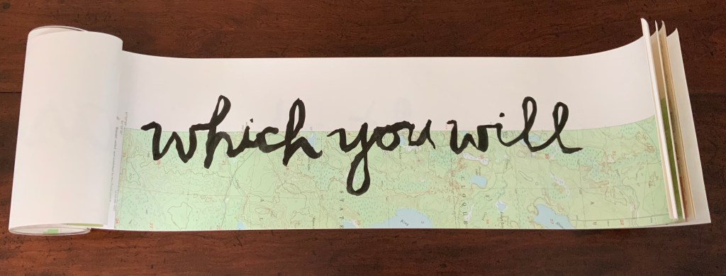
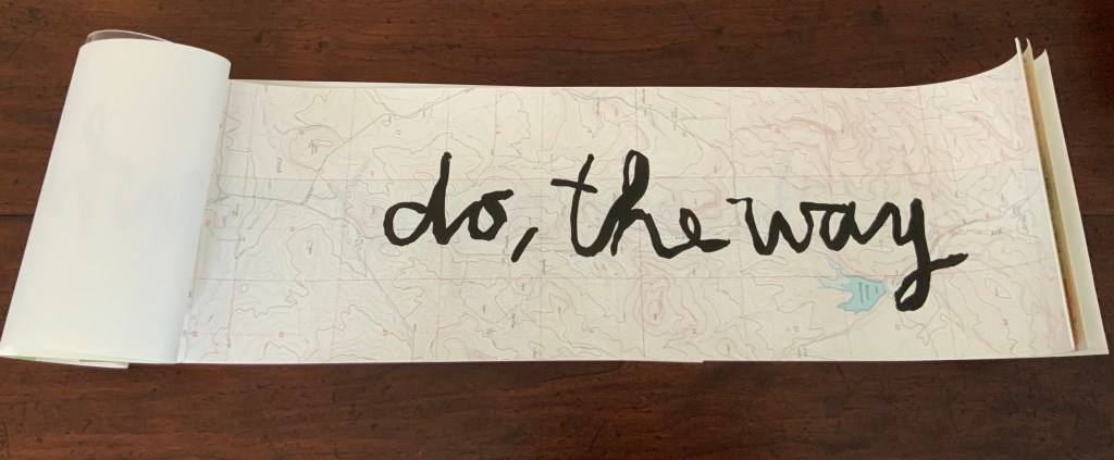
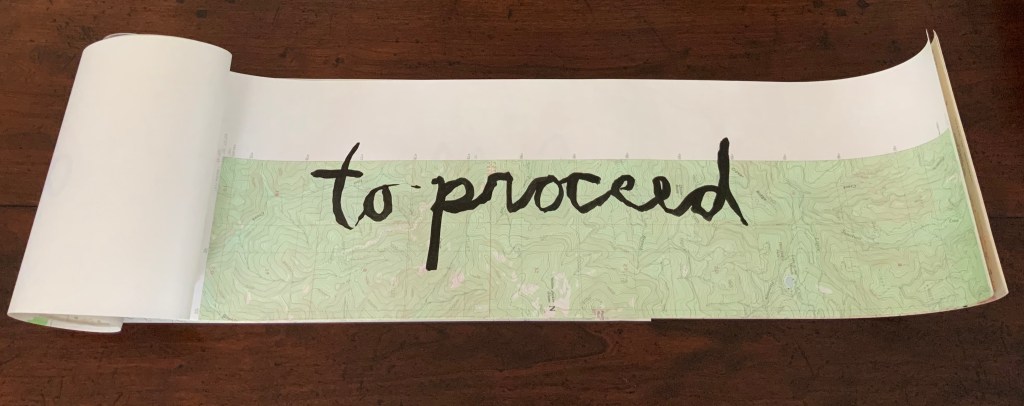
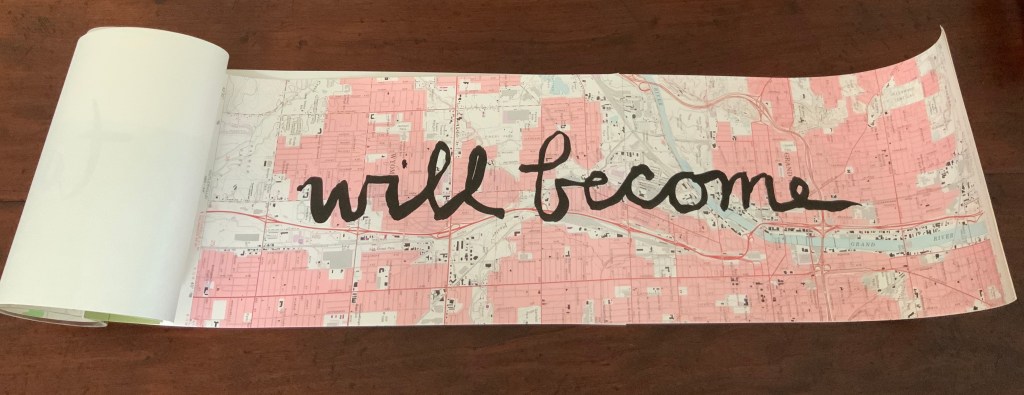
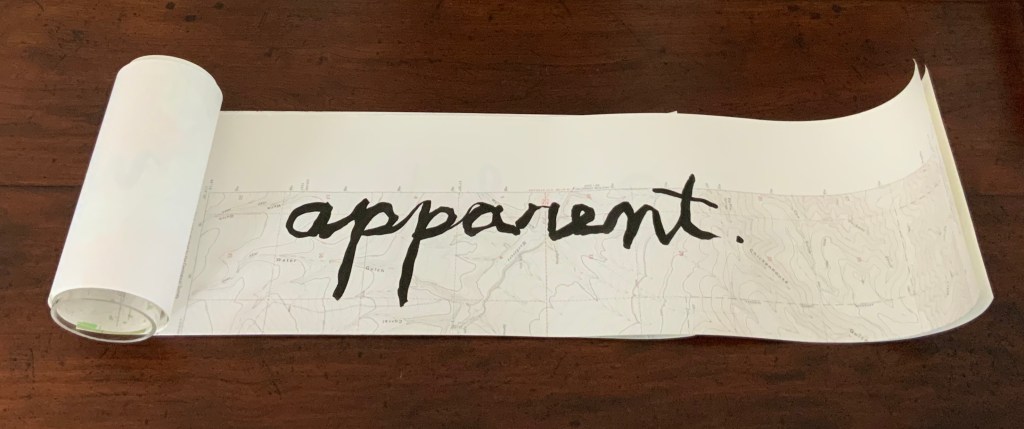
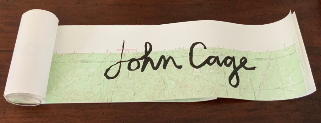
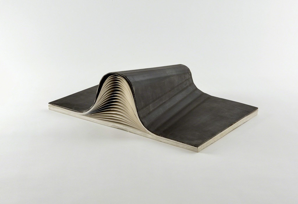
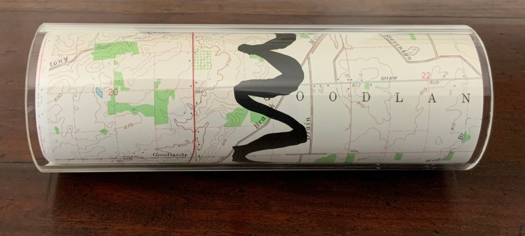
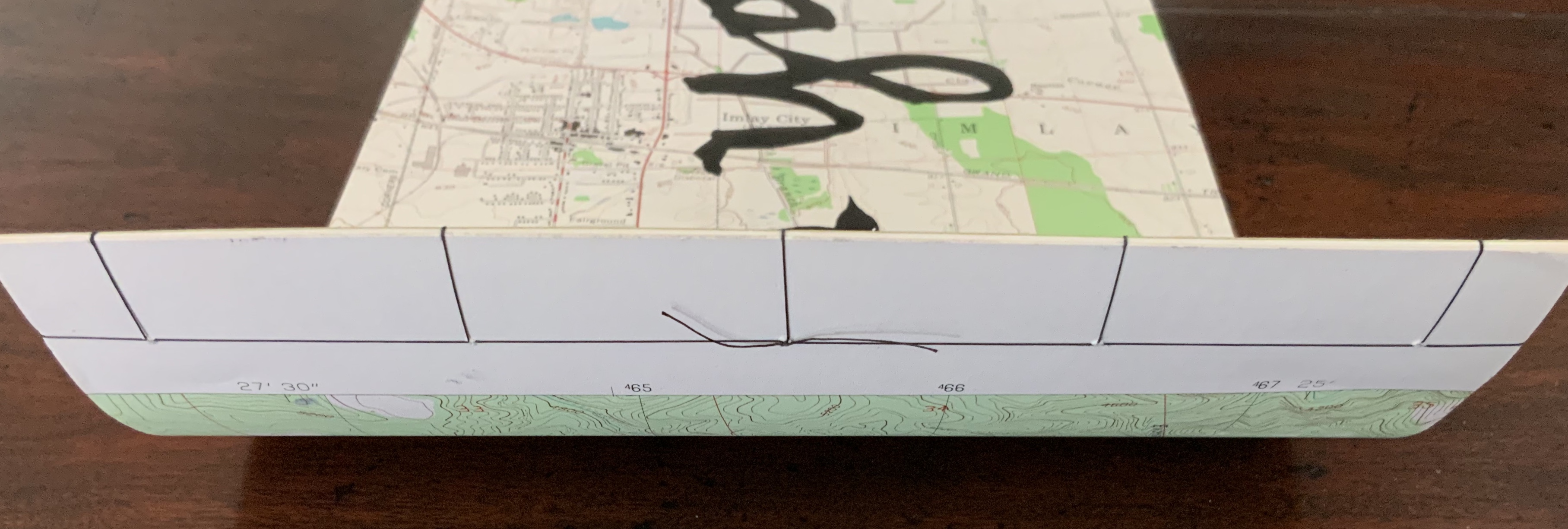
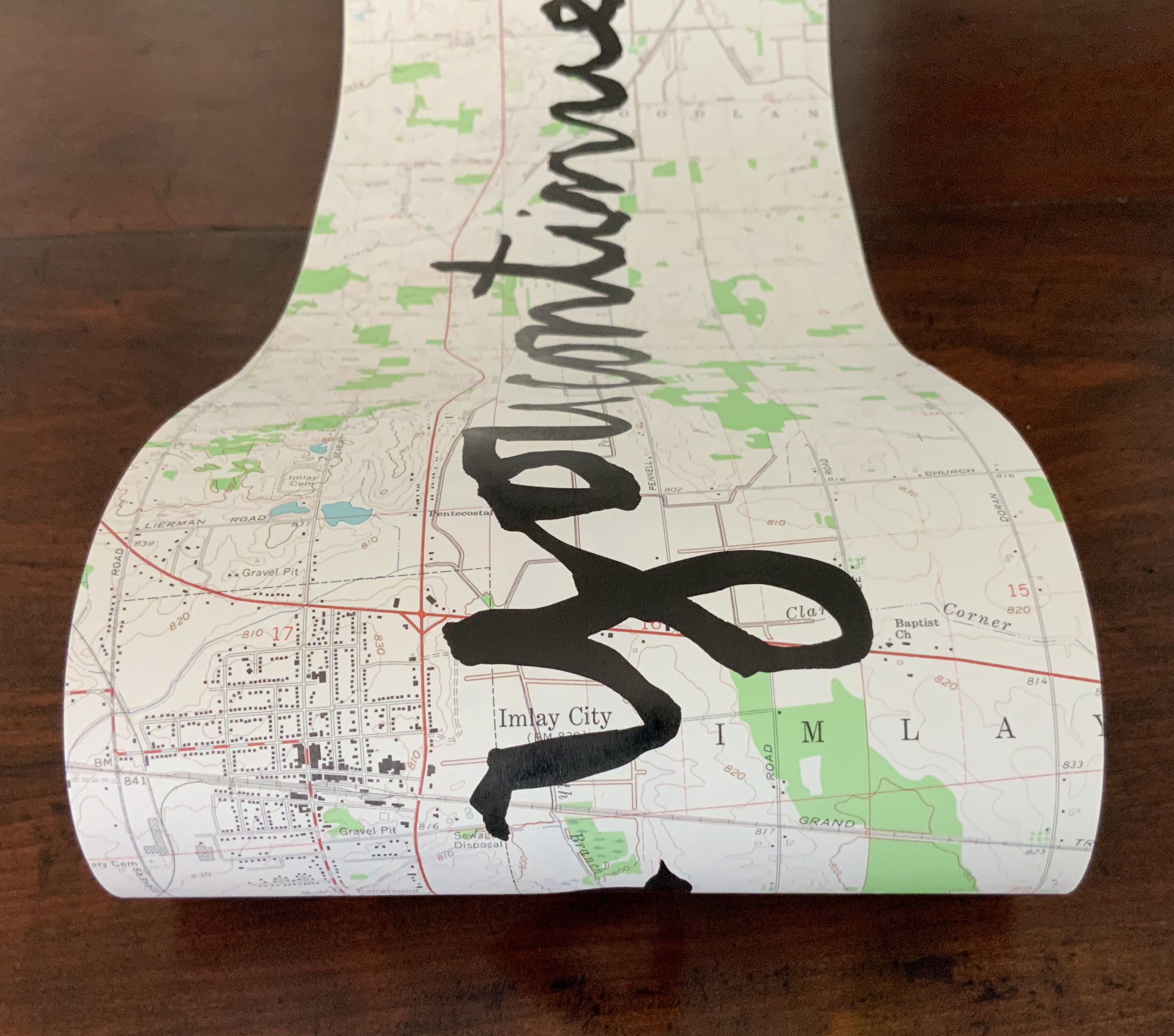
Housed in acrylic tube, eight pages including letterpress printed colophon page, seven pages of USGS topographic maps inscribed with sumi ink by hand, bound with a small piece of Fabriano Tiziano green in Japanese side-stitch. H184 x W679.5 mm unfurled. Edition of approximately 65, of which this one is dated and initialed on 7 November 2012. Acquired from the artist, 25 March 2015. Photos: Books On Books Collection.
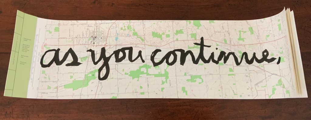
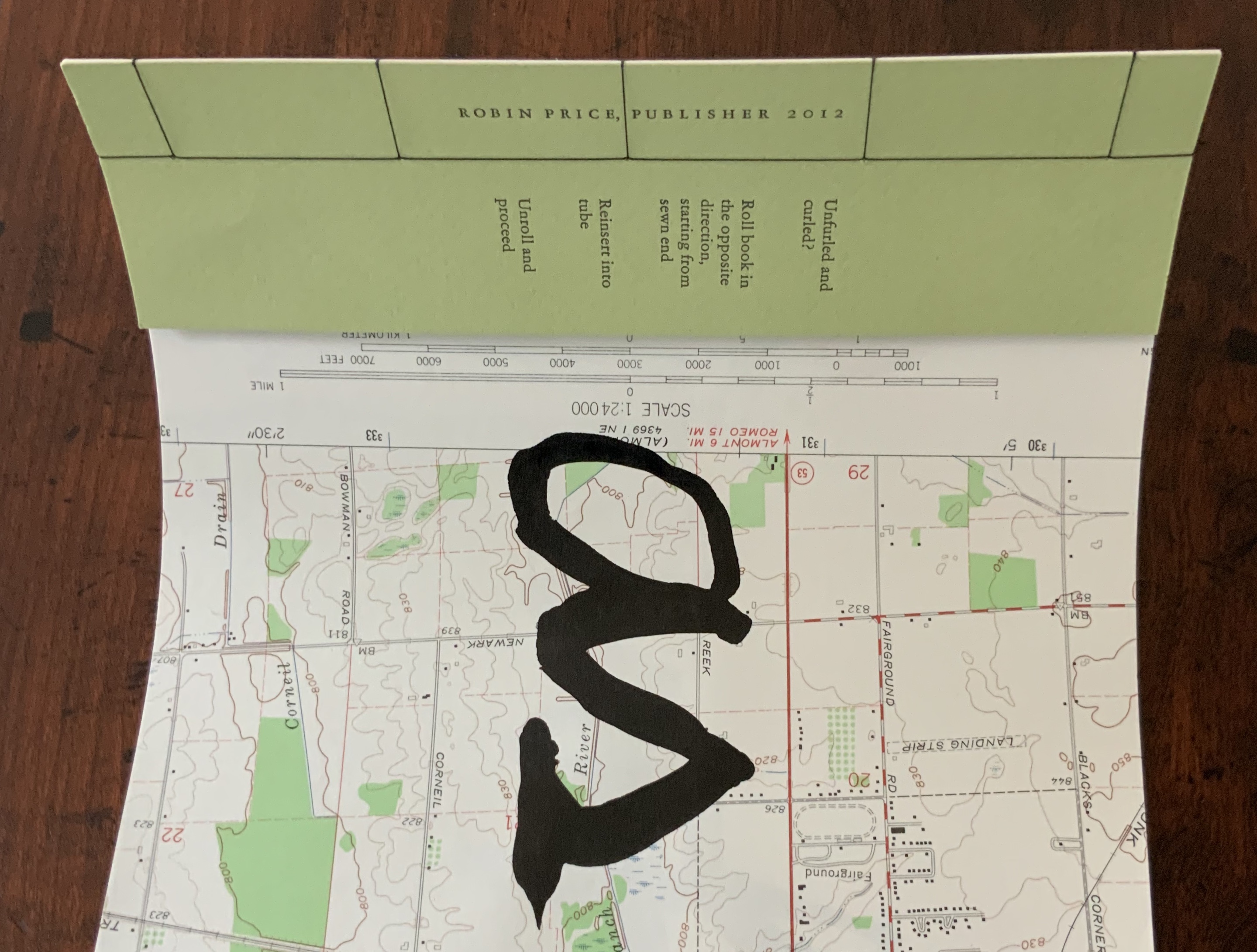
When as you continue first appeared, Jen Larson wrote of it in Multiple, Limited, Unique: Selections from the Permanent Collection of the Center for Book Arts (2011):

… this work serves as an elegant meditation and metaphor on the subject of life journeys — and orienting oneself in the midst of landscape or circumstance that can only be apprehended by survey and the will to move forward.

The year 2012 marked the centennial of composer and artist John Cage’s birth. An aficionado of “chance”, Robin Price revisited this work that had begun in December 2010 when she discovered on the Crown Point Press’ Magical-Secrets website the quotation by Cage. Cage had made this remark to Kathan Brown in 1989 after the Crown Point Press’ building was condemned following an earthquake. By chance, it now seemed fitting as a centenary birthday wish to this artistic master of “the purposeful use of chance and randomness”. Also by purposeful chance, Price turned to a technique that seemed entirely fitting for the work, its history and her personal perspective. Price writes:

… I took up the project anew and practiced writing on several different occasions, feeling dissatisfied with various trials. Eventually I found my way to writing with my left (non-dominant) hand as the most authentic expression I could bring to the content, as visualization of struggle, fear, and acceptance of imperfection.

Counting on Chance (2010)

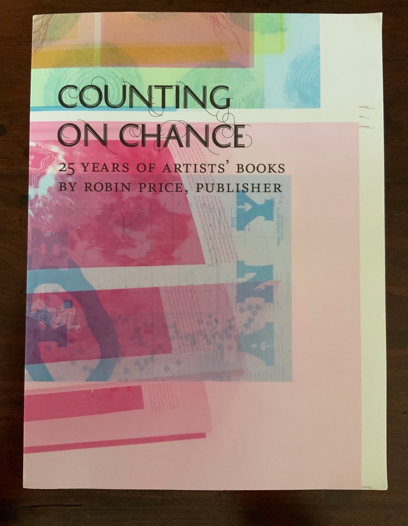
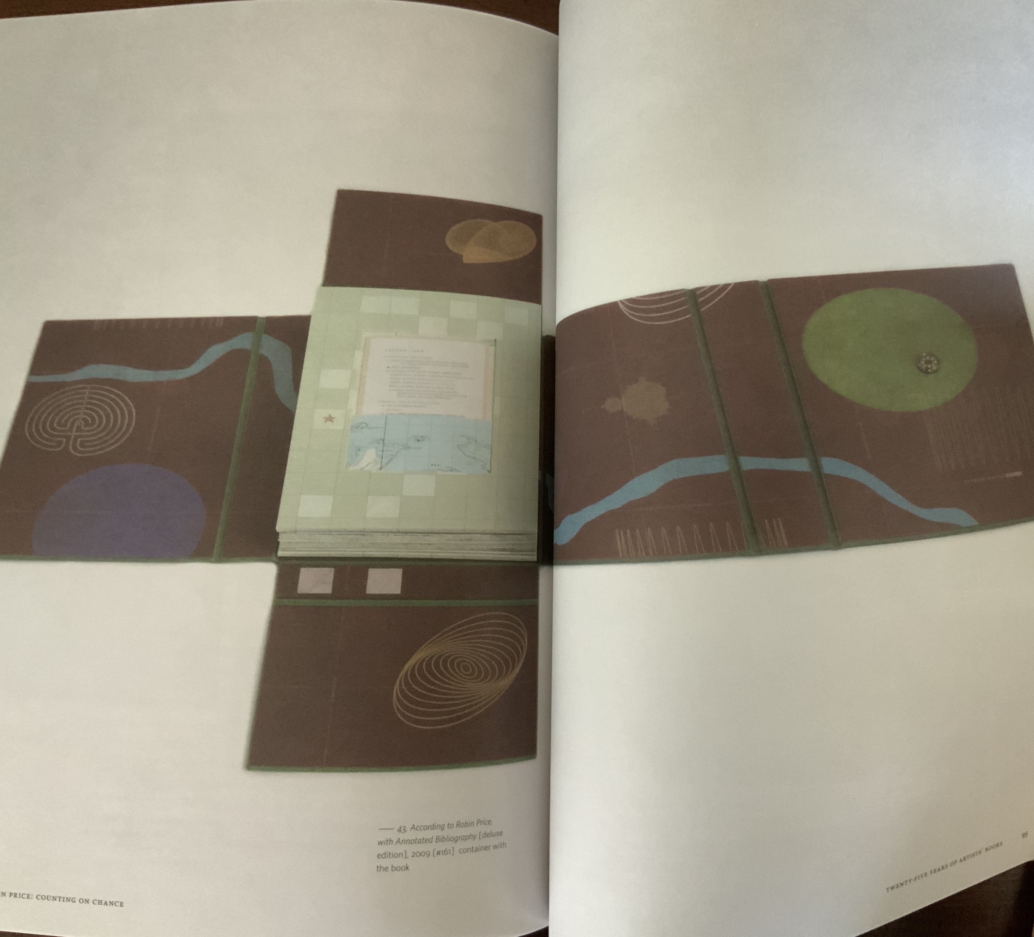
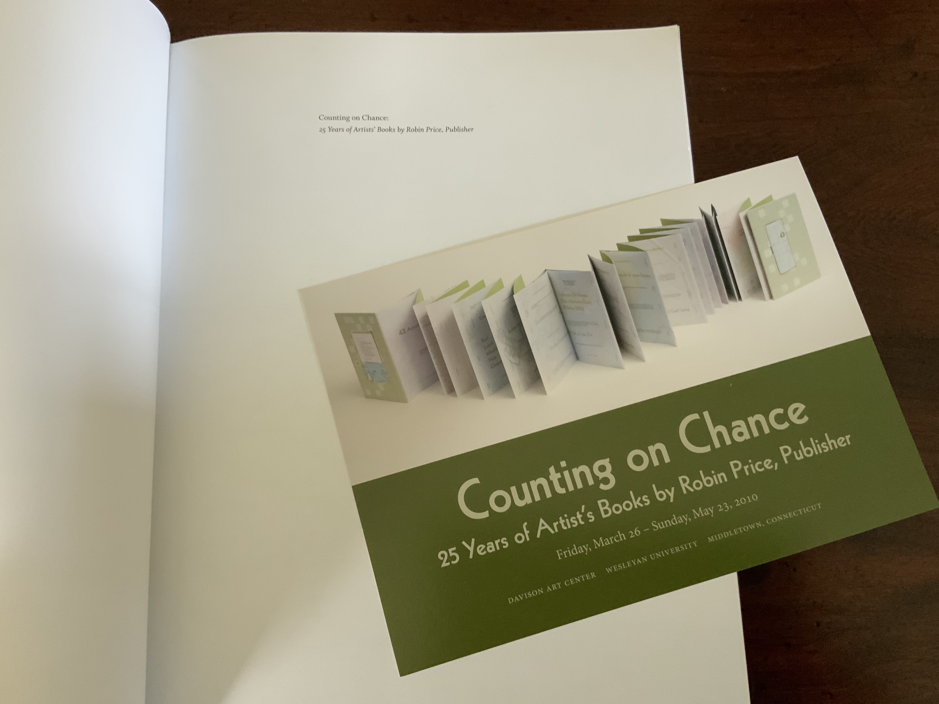
Counting on Chance: 25 Years of Artists’ Books by Robin Price, Publisher,(2010)

Robin Price

Perfect bound. H305 x W229 mm. Acquired from the artist, 25 March 2015. Photos: Books On Books Collection.
The very covers of the book were created by chance operations. Generated solely on press using three of the four process color printing plates from the book’s interior via “make-ready”, areas of image were built up on the paper by repeatedly passing the sheets through the press, and consistently rotating the sheets prior to their feeding through ensured variation among the covers within the edition.

In addition to the theme core to Price’s art, Counting on Chance embodies another aspect key to her work: choice and collaboration. Published in conjunction with the exhibition held at Wesleyan University’s Davison Art Center, the volume includes a brilliant essay by Betty Bright, interview by Suzy Taraba and a catalogue raisonné prepared by Rutherford Witthus. Like choosing the right colors, the right combination of fonts, the right layout, the right weight and opacity of paper, and the right structure, Price’s choice of collaborators (or their choice of her) in her work and publishing is an artistic practice itself.

The Anatomy Lesson (2004)

The Anatomy Lesson: Unveiling the Fasciculus Medicinae (2004)

Joyce Cutler-Shaw

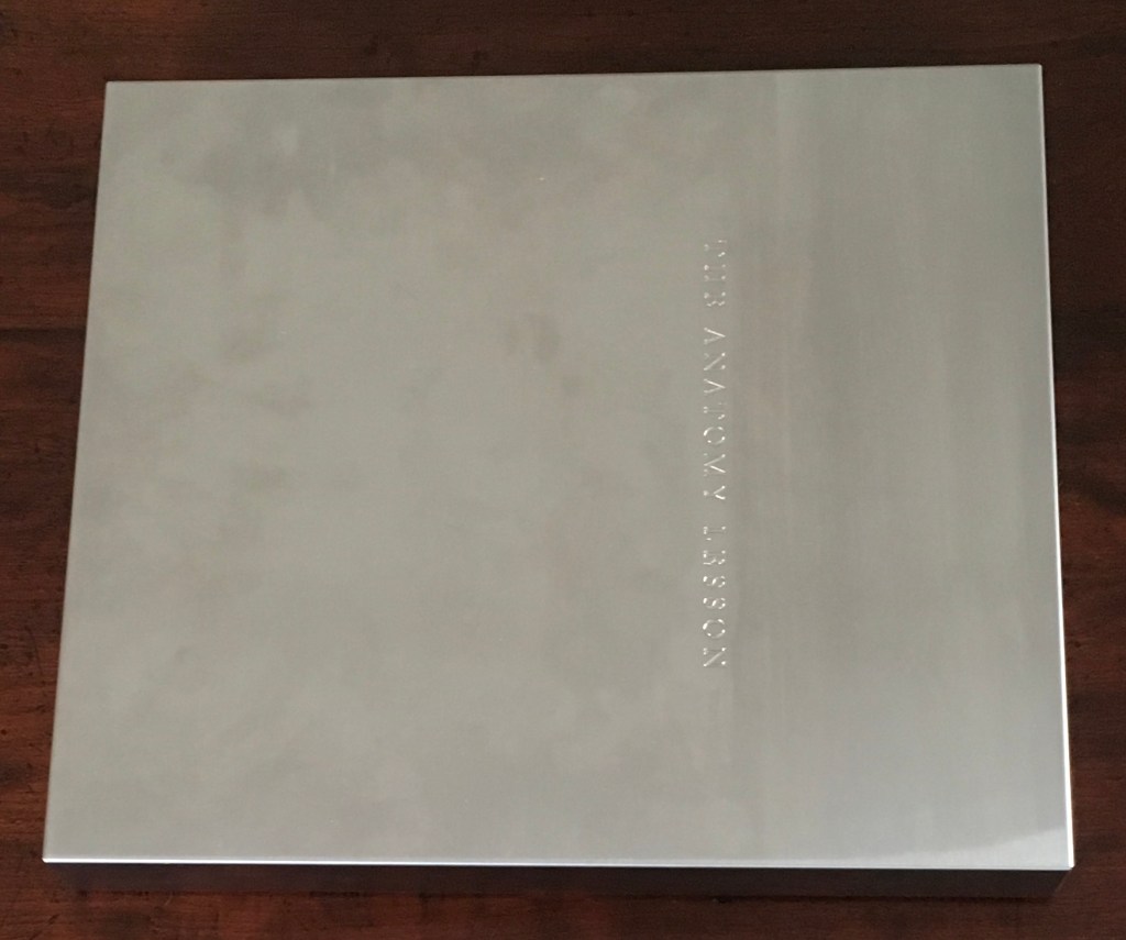
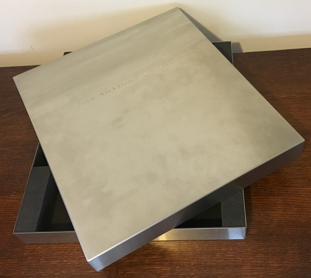
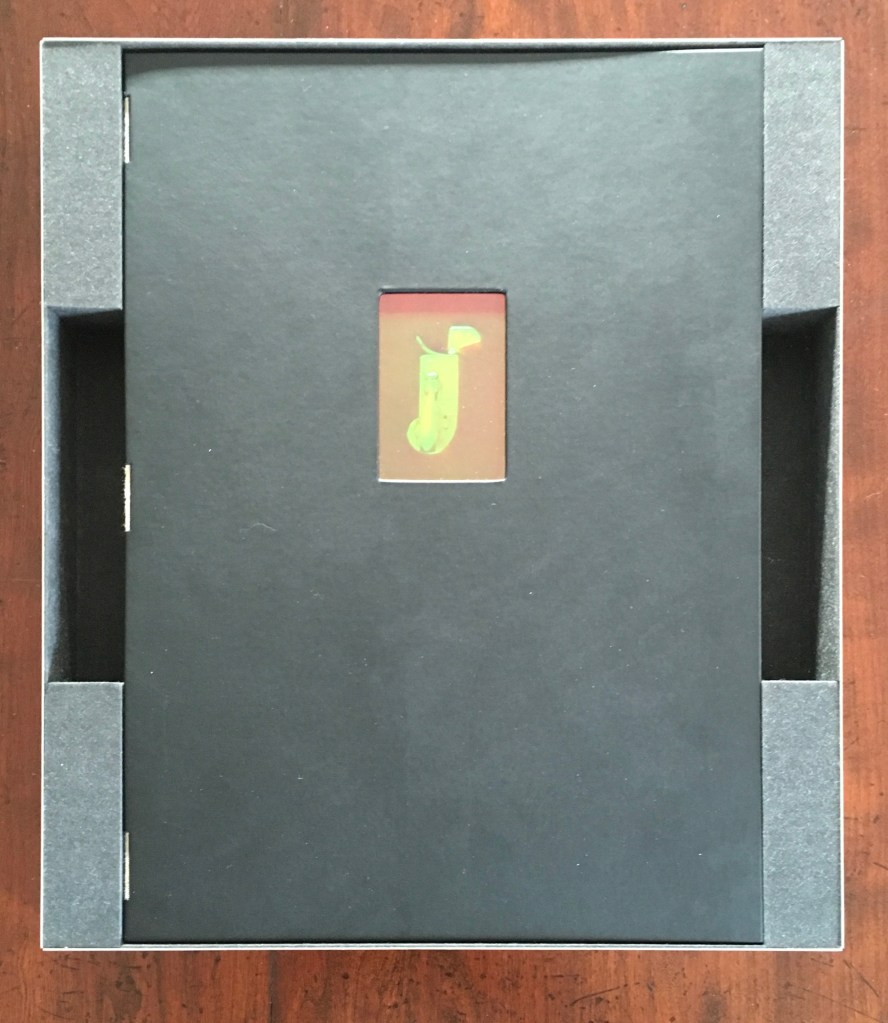
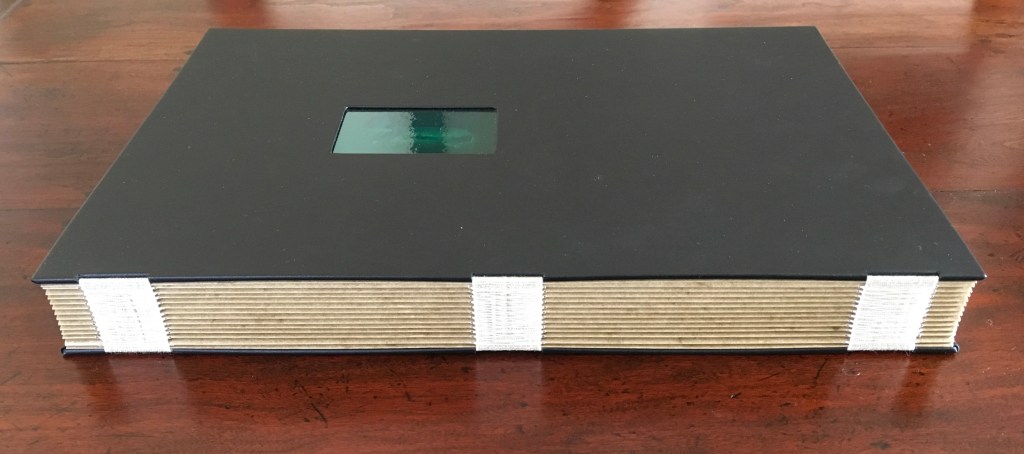
Housed in a custom-made, engraved stainless steel box (H370 x W326 x D44 mm), concertina binding co-designed with Daniel E. Kelm and Joyce Cutler-Shaw, produced at The Wide Awake Garage; twelve signatures of handmade cotton text paper, the central ten signatures each made up of one sheet H356 x W514 mm and one sheet H356 x W500 mm glued to the 14 mm margin of the first sheet, for a total of 96 pages, each measuring H356 x W253 mm.
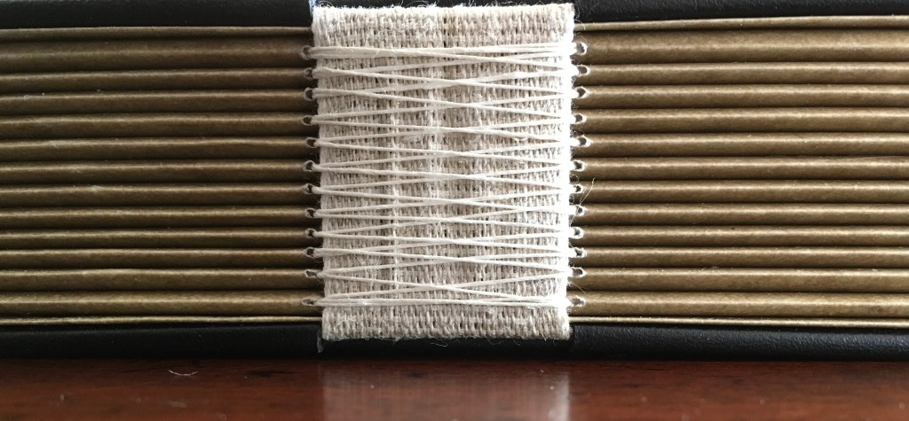
Binding of leather covered boards (a hologram embedded in front cover) with an open spine, taped and sewn into a reinforcing concertina structure: H361 X W259 mm.
The hologram, produced by DuPont Authentication Systems, features an early eighteenth-century brass lancet. Edition of 50, of which this is a binder’s copy. Acquired from the binder, Daniel E. Kelm, 15 October 2018.

Generating two double-page spreads, one for the Fasciculus Medicinae on the left and Cutler-Shaw on the right, the foldout pages extend to 1016 mm.

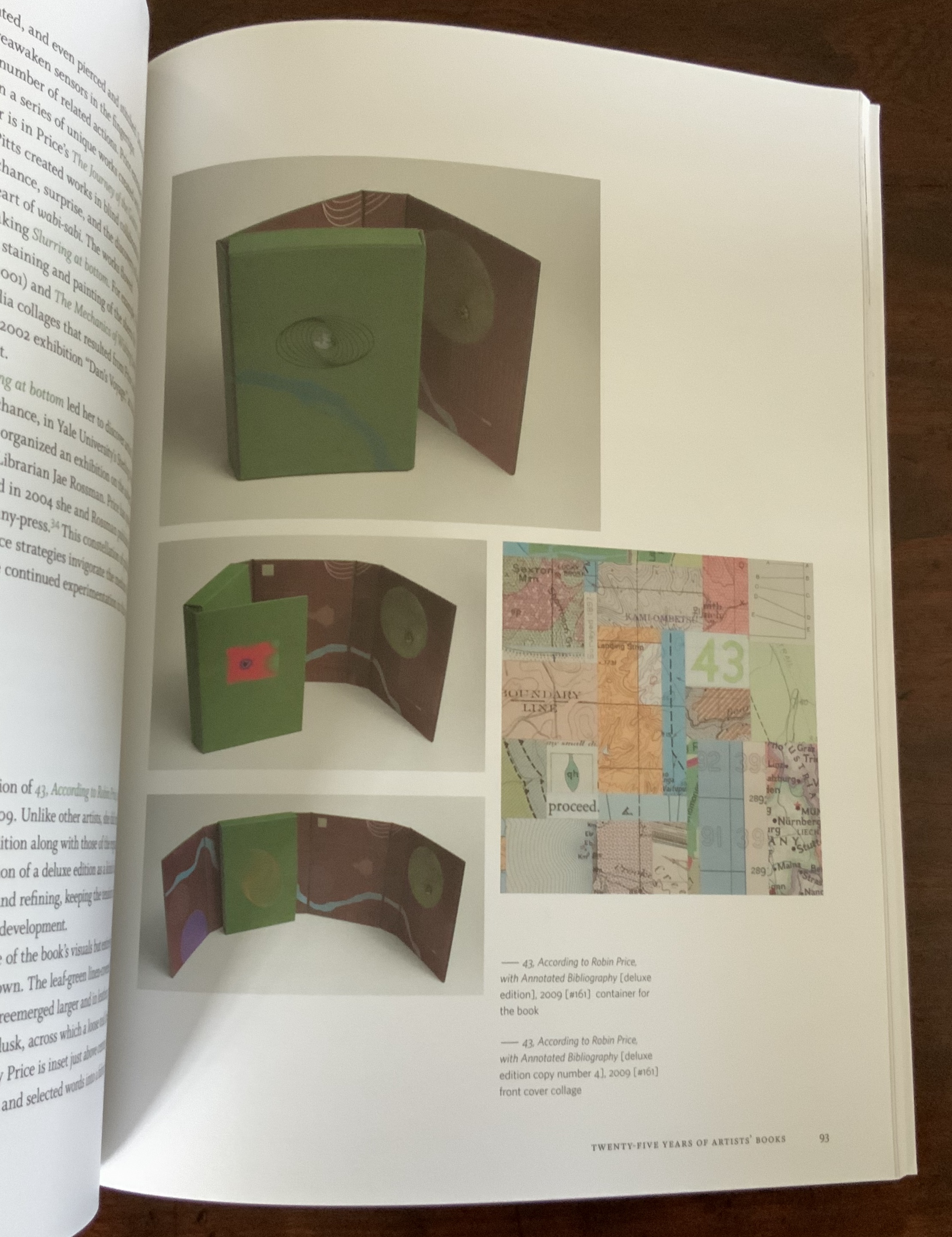
Responding to the 1993 Smithsonian challenge to book artists to create a work in response to a scientific or technical work in the Dibner Library, Joyce Cutler-Shaw approached Price for assistance in creating a unique book based on Shaw’s response to the Fasciculus Medicinae (1495), the first printed book with anatomical illustrations. A decade later, Price was convinced to issue this 50-copy edition. In Counting On Chance, Betty Bright recounts the story behind this brilliant collaboration. Detail and additional images about the work can be found here.

Further Reading

Counting on Chance: 25 Years of Artists’ Books by Robin Price, Publisher, exhibition catalog / catalogue raisonné. Wesleyan University Davison Art Center, 2010

Bright, Betty. No Longer Innocent: Book Art in America 1960-1980 (New York: Granary Books, 2005), pp. 249-50.

Bright, Betty. “Handwork and Hybrids: Contemporary Book Art,” in Extra/ordinary: Craft and Contemporary Art, edited by Maria Elena Buczek (Durham, NC: Duke University Press, 2010). Essay highlighting the work of Robin Price and Ken Campbell.

Bookmarking Book Art – Alicia Bailey and the Artists’ Book Cornucopia

For a decade, Alicia Bailey has played the role of Ceres to book artists and collectors, bringing them the Artists’ Book Cornucopia. And this has been in addition to creating her own bookworks, organizing other exhibitions and running Abecedarian Gallery and Raven Press. Artists’ Book Cornucopia X marks the tenth and last cornucopia but not the end of their impact.

Cornucopia implies abundance and variety, and Alicia Bailey has delivered both. A glance at the ten catalogues finds a consistently high level of participation — always at least thirty artists — and every catalogue has shown a “variety of varieties”. Consider these varieties:

Variety of structures: accordions, boxes, flag books, girdle books, pop-ups, miniatures, portfolios, scrolls, sculpted shapes, wallets, etc. The variations within each type would require a hunt through The Art of the Fold (Kyle and Warchol), Structure of the Visual Book (Smith) and Book Dynamics! (Hutchins) to identify them properly. In ABC X, all of the structures mentioned above are represented. Over the decade, the Artists’ Book Cornucopia have spilled out structural innovations such as Merike van Zanten’s A Soldier of the Second World War (ABC I), Pamela Paulsrud’s Touchstones (ABC II), Cathryn Miller’s Universe: Foundation Trilogy (ABC III), Louisa Boyd’s miniature Stardust (ABC IV), Susan Kapuscinski Gaylord’s Spirit Book #67 (ABC V), Candace Hicks’s Trees of a Feather (ABC VI), Karen Hardy’s Vellicate (ABC VII), Bryan Kring’s Shared Illusion (ABC VIII) and Josh Hockensmith’s After (ABC IX). The abundance of innovations makes a visit to the Abecedarian Gallery site for numerous second-guessings worthwhile.

The variety of material used by the artists overwhelms: beads and buttons (Ednie), cactus needles and jute (Reka), cement and glass (Bryant), ceramic and cardstock (Wolken), copper and redwood (Anstruther/Grasso), fishing line and wire (Johnston), fish-skin and mull (Klass), leather and “metal findings” (Melis), magnet and museum board (Burton), palladium and aluminum leaf (Bailey), ribbon and slide viewers (Grimm), silk and sinew (Alpers), thread and tyvek (Asato), window screen and wood (Fleming), zippers and fabric (Melhorn-Boe) and, of course, upcycled books (Anastasiou). Any appreciation of the ingenuity of materials selection and manipulation across the Artists’ Book Cornucopia requires a rewarding read of the descriptions provided in each of the catalogues.

Then there is the variety of techniques: blind deboss (Lawrence), calligraphy (Towers), chromogenic prints (Grimm), collograph (Dokudowicz), cyanotype (Biza), gelatine monoprinting (Powers-Torrey), intaglio (Larson), letterpress (Nakata), linocut (Knudson), photopolymer (Larson), risography (Powers-Torrey), silkscreen (Anastasiou) and woodcut (Lucas). Like the materials used, the techniques employed are almost too many to name, and of course, those named are used by more than the one artist mentioned.

And, of course, a riot of papers: abaca (Welch), Alabama kozo (Sico), Awagami Shin Inbe (Gorham), cotton-abaca (Lucas), Domestic Etch/Lana Laid/Masa/Niddegen (Powers-Torrey), Hahnemühle Ingres mouldmade pastel paper (Ednie), indigo flax (Johnston), Somerset (Moyer) and Thai Momi marbled paper (Towers), which of the varieties used are far too few to mention.

And varied carriers of colour: acrylic (Johnston), crayon and botanically dyed ink (Ednie), digital ink (Reka), gouache (Thrams), milk paint (Anstruther/Grasso), pencil (Fleming), pulp painting (Welch), Sumi and walnut inks (Towers), textile ink (Melhorn-Boe) and watercolour (Ednie,Thrams and Towers), again far more could be mentioned.

Likewise, the variety of shapes and direction is kaleidoscopic: zigzag, circular, globular, vertical, horizontal, square, cuboid and boustrophedon (left to right to left to right, etc.). And that is before any listing of the Platonic shapes in Sarah Bryant’s The Radiant Republic.

The wide variety of themes in ABC X echoes the same breadth across the previous nine catalogues. Here we have architecture (Bryant), botany and discovery (Gower), chronic illness (Wolken), the city (Dokudowicz), environment (Lowdermilk), industrial landscape (Burton), the literary (Bailey), pain (Reka), sexuality (Grimm), travel (Melis), wildlife (Thrams) and #MeToo (Ellis). The named representative artist is just a starting point for each theme, and the themes mentioned are only alphabetical, not exhaustive.

Perhaps the one varietal shortcoming of ABC I-X is that most of the artists participating hail from the US. When another nationality appears in one of the catalogues, it surprises. Over time, “vintners“ from the following countries have shown up: Argentina, Australia, Austria, Brazil, Canada, China, Egypt, France, Greece, Korea, Netherlands, Poland, UK and Venezuela.

The abundance and variety of Alicia Bailey’s Artists’ Book Cornucopia prove one premise and question another from Johanna Drucker’s The Century of Artists’ Books:

If all the elements or activities which contribute to artists’ books as a field are described what emerges is a space made by their intersection, one which is a zone of activity … There are many of these activities: fine printing, independent publishing, the craft tradition of book arts, conceptual art, painting and other traditional arts, politically motivated art activity and activist production, performance of both traditional and experimental varieties, concrete poetry, experimental music, computer and electronic arts, and last but not least, the tradition of the illustrated book, the livre d’artiste. The Century of the Artists’ Books (New York: Granary Books, 2004, new edition), p. 2.

ABC X and its nine sisters shout a resounding “Amen”, but the rich quality and originality of the works displayed whisper “‘the’ century?” At the close of the 21st century’s second decade, Ceres is smiling.

Further Reading, Listening and Viewing

Bailey, Alicia. “‘Narrative Threads’ uses book art to explore stories”, PostIndependent, 3 May 2018. Accessed 2 December 2019.

Bowen, Sara. “Artists, Books and Interviews #2: Alicia Bailey”, Book-Art-Object, 20 November 2011. Accessed 7 November 2019.

Dillard, Julia “Curator Alicia Bailey on the Intimacy of Artists’ Books and Everything You Didn’t Know about Book Arts”, Art Gym Denver, 23 October 2017. Accessed 7 November 2019.

Froyd, Susan. “#45: Alicia Bailey”, Westwood, 19 September 2013. Accessed 7 November 2019.

Isaacs, J. Susan. The Book: A Contemporary View (Wilmington, DE: Delaware Center for the Contemporary Arts, 2011), p. 15.

Leutz, Pamela. “This Time Is: Alicia Bailey”, The Guild of Bookworkers, 25 April 2018. Accessed 7 November 2018.

Wolfson, Zach. “Beyond the Gallery with Alicia Bailey”, Infusion5, 17 April 2014. Accessed 7 November 2019.

Bookmarking Book Art – Jukhee Kwon

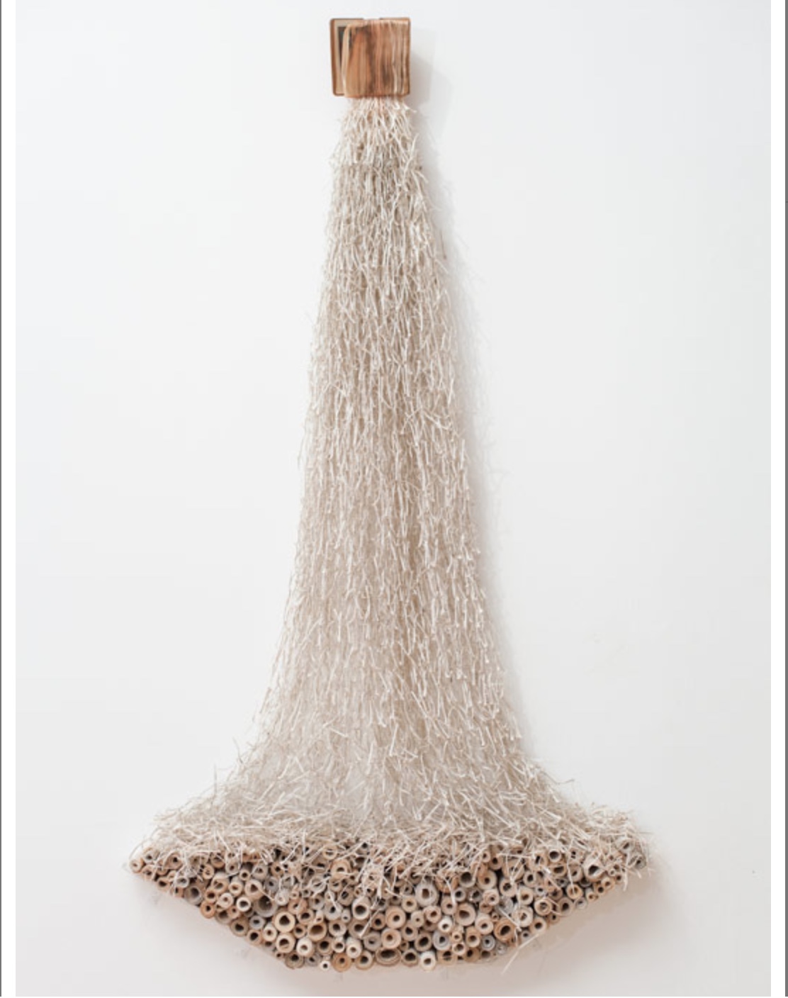
The 20th century poet Ezra Pound espoused the view that the best way to understand and critique literature was by juxtaposition of works from different periods. Here is an attempt at that approach applied to the art of Jukhee Kwon and John Latham, but the critic might have better selected Kwon’s Libro Libero (2013) to make the point about “releasing … energy and celebrating freedom”. Kwon’s own thoughts about Libro Libero lead in a different direction though.

Libro Libero (2013)
Jukhee Kwon
Photo: Jonathan Greet

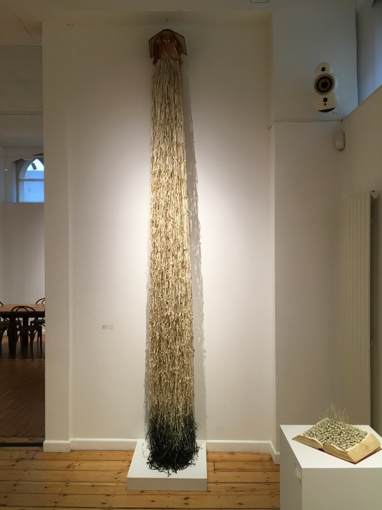
The work of Libro Libero was done with a Christian nun’s book. I am not so religious a person, but I understand that religion is about life. How we come and how we live and how we die. And every belief has a strong link with something invisible and oneself visible … (we live in the body) … you can say the connection between the soul and body. 

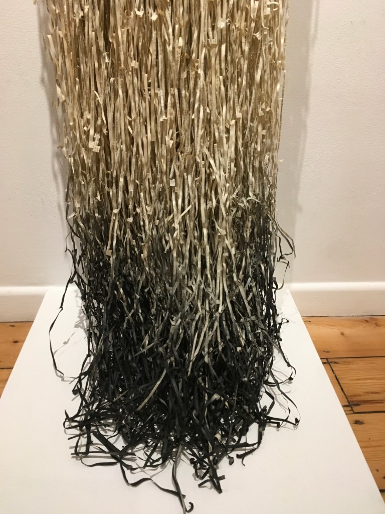
So I made the bookwork to be producer and receiver. Pages are coming out (producer) and the scrolled papers are below them (receiver). 
The shredded paper is falling and settling on the scrolled paper boat (it looks like a boat or if you will a bowl). The falling paper is fragile but in the boat or bowl it becomes solid and safe. 

Email to author, 26 September 2018, edited for brevity.

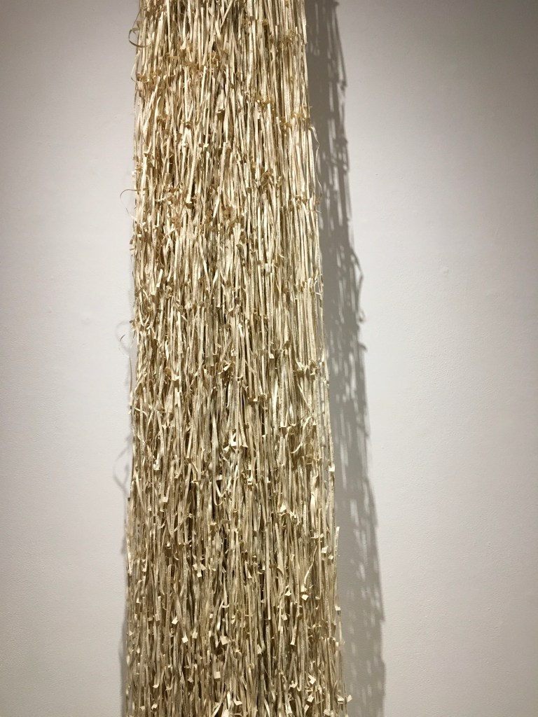
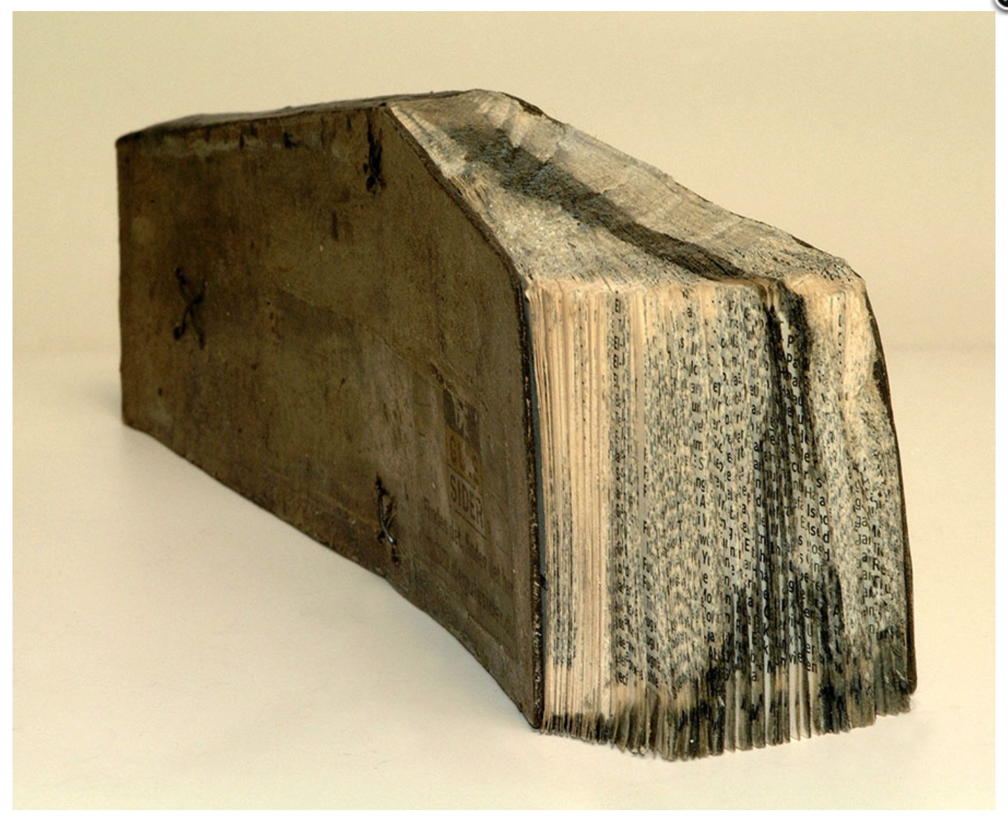
At the October Gallery in London in January 2019, I had the chance to see a similar bookwork. The difference drives home the use of the book as material — like clay or stone for sculpture, oils or watercolour for painting. But it is freighted, manifold material.

Dipping into Darkness (2013)
Jukhee Kwon
Photos: Books On Books

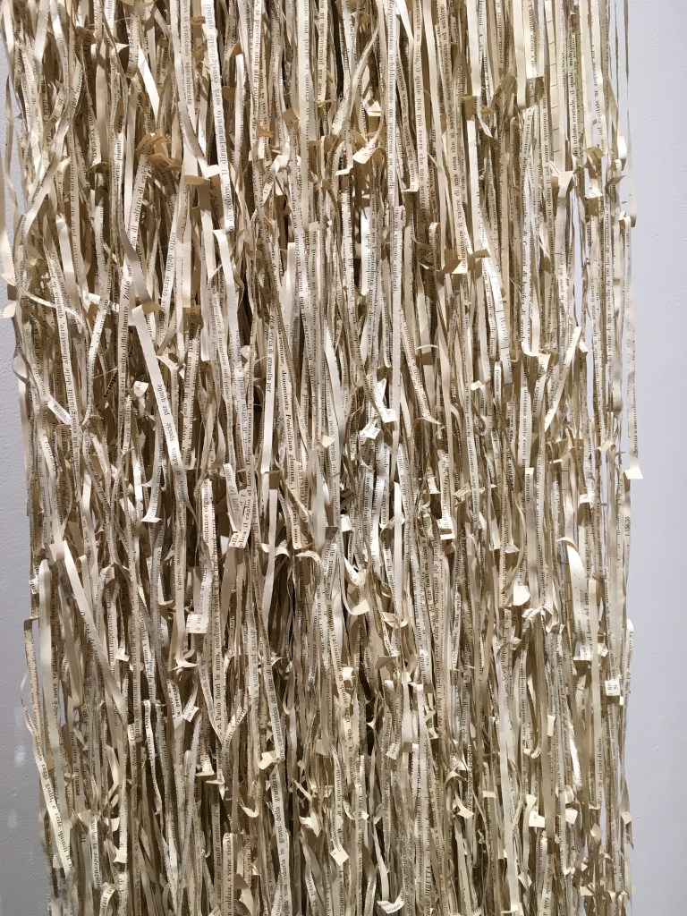
It brings paper, cloth or leather, and ink; it brings content. As in Libro Libero, Kwon turns another book into an active composite — the covers opened to spill out pages, cut and braided into ribbons, the last of which have been dipped into ink. Or, per the title, is it the covers opening, the pages unravelling and braiding, the ink of the words draining into a pool of darkness into which the ribbons are dipping? Rather than the lighter spiritual association suggested by the former’s title, shape and action, Dipping into Darkness implies a blacker interpretation. Or perhaps that is too Western a perspective. Is the breviary at the pinnacle of the work the result of the brush-like shape’s dipping into the ink of contemplation?

If the chance to view and contemplate Kwon’s art arises, take it.

Further Reading

Culture 24

October Gallery

Houghton, Gerald, and Jukhee Kwon. 2023. Jukhee Kwon Liberated. London: October Gallery.

Bookmarking Book Art – The Colophon and the Left-over “i”

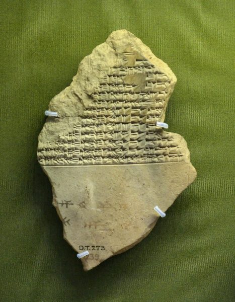
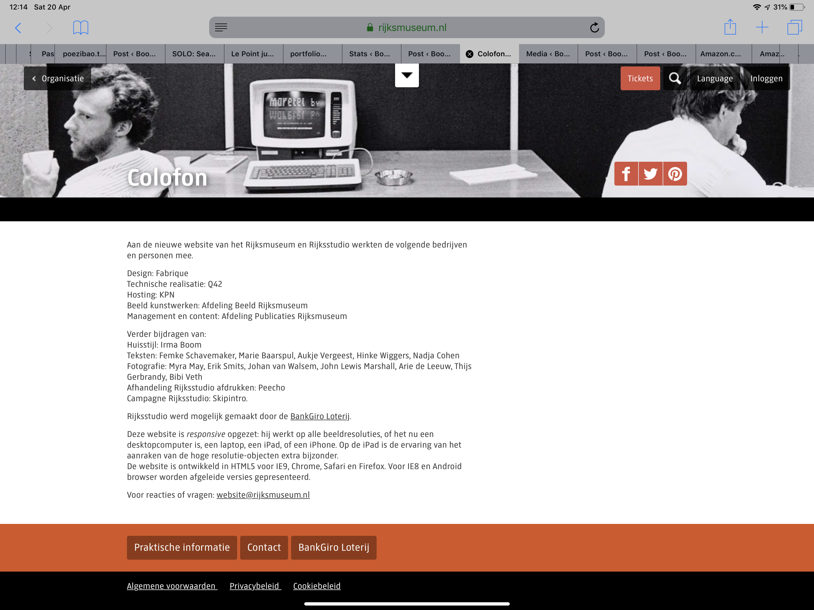
This tale comes from J. S. Kennard’s short 1901 tome on the colophon — that last page at the end of a manuscript or book. The colophon has served many purposes: giving the title of the work, identifying the scribe or printer, naming the place and date of completion or imprint, thanking and praising the patron, bragging, blaming, apologizing, entreating, praying and much more. Examples can be traced back to clay tablets and forward to websites.

Cuneiform tablet from the Library of Ashurbanipal, British Museum. Interesting that the colophon was added in ink after the clay had dried.
Colofon page of Rijksmuseum website

Its presence on websites may be one of those decried skeuomorphic hangovers from book publishing, but perhaps the colophon has an underlying value or purpose to serve in both the analogue and digital worlds. The late Bill Hill, who wrote the 1999 Microsoft white paper “The Magic of Reading” and was an early contributor to online typography, suggested making colophons a compulsory standard for website design and asked:

Why not introduce the venerable concept of the colophon to the Web? Could it be used to drive a new business model for fonts which would benefit the font industry, web developers and designers – and the people who visit their sites? [Sadly this page at the Bill Hill’s site is no longer available.]

Fanciful? Perhaps, but not much more fanciful than Erasmus’ proffered explanation of the word “colophon”. His expanded edition of Adagia printed by Manutius in 1508 includes this adage:

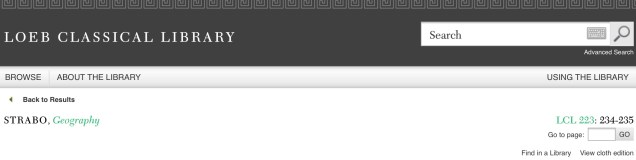
Colophonem addidit He added the colophon. This came to be used when the finishing touch is added to something, or when some addition is made without which a piece of business cannot be concluded. The origin of the adage is pointed out by Strabo in … his Geography, …

And here is Strabo from the Loeb Classical Library online; scroll down to paragraph 28:

As venerable a publishing custom as the colophon may be, it is more honoured in the breach than the observance. Book artists tend to be more observant, but not religiously so, and of course some works of book art might be disfigured by a colophon. Still, there are sound reasons why book artists should bother themselves with a colophon — even if it stands apart from the work. In her review of Book Artists and Artists Who Make Books (2017), India Johnson gives one of those sound reasons:

It’s probably impossible to include every detail of production in a colophon—but some give it their best stab, exhaustively listing everyone that took part in a project. More concise colophons recap only the most relevant details of making—perhaps those the primary creator feels will factor saliently into making meaning of the book.

The convention of the colophon in our field exposes an assumption that the meaning of an artwork is informed not only by the finished product, but by the specifics of artistic labor. “Book Artists and Artists Who Make Books“, CBAA, 1 October 2018. Accessed 3 October 2018.

If craft does figure in a work’s meaning, then the more we can see how it figures, the greater our ability to appreciate and understand the work. For conveying insight — what materials and from what sources, what processes, what tools, who contributed, where and when the work occurred — the colophon stands ready. But where does it stand?

A contemporary of Kennard, A.W. Pollard declared that, to be a proper colophon, it had to appear at the conclusion or summit of the work. Artful as are some of the manuscripts and books that Kennard and Pollard cite, none push the envelope in the manner that works of contemporary book art do. Which brings us to another reason for book artists to consider the colophon: inspiration from history or tradition.

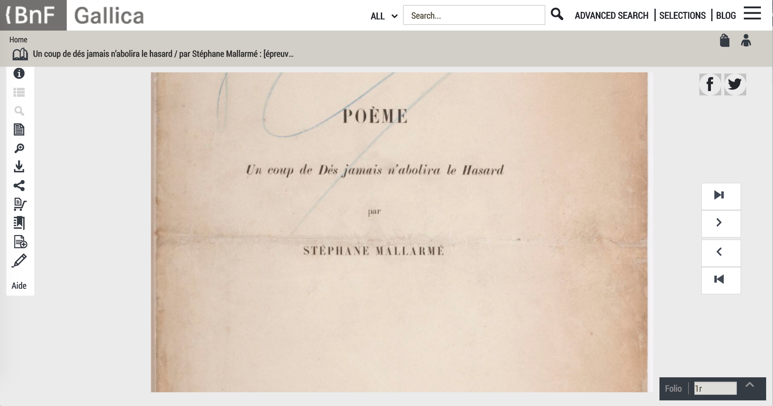
The last page of the codex may be a rightful spot for placing the codex, but what if the bookwork’s shape is challenging or musing about the shape of the book? Finishing touches might go anywhere. Think of Van Eyck’s self-portrait hidden in a reflection in The Arnolfini Portrait, or that of Vélazquez in Las Meninas.

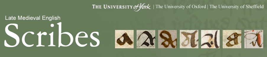
Historians’ diligent cataloging of the “hands” of the scribes has enriched the self-identifications in colophons and connected those craftspersons with additional manuscripts. Book artists who use calligraphy or involve calligraphers should ponder the implications of this tool historians use to identify scribes by the style of their “hands”.

Late Medieval English Scribes (2011)
The Centre for Medieval Studies at the University of York

What potential, meaningful “tells” in a work’s colophon might the book artist or calligrapher leave to enrich the work — and provide insights for historians and connoisseurs poring over the finishing touch?

The colophon’s underlying value or purpose warrants book artists’ thinking about recording it offline and online, though this might be stretching the definition of the colophon. Our enjoyment of Kitty Maryatt’s 2018 reconstruction of La prose du Transsibérien et de la Petite Jehanne de France (1913) by Blaise Cendrars and Sonia Delaunay is certainly enhanced by the “colophonic” booklet she included with the work and the “About” page online.

Perhaps the story of the little “i” left over – the colophon – will prod the future historians of book art to examine bookworks and their artists’ websites for those finishing touches and stir artists to bestow that last finishing touch for the sake of the work’s soul if not their own.

A Prospect of Colophons

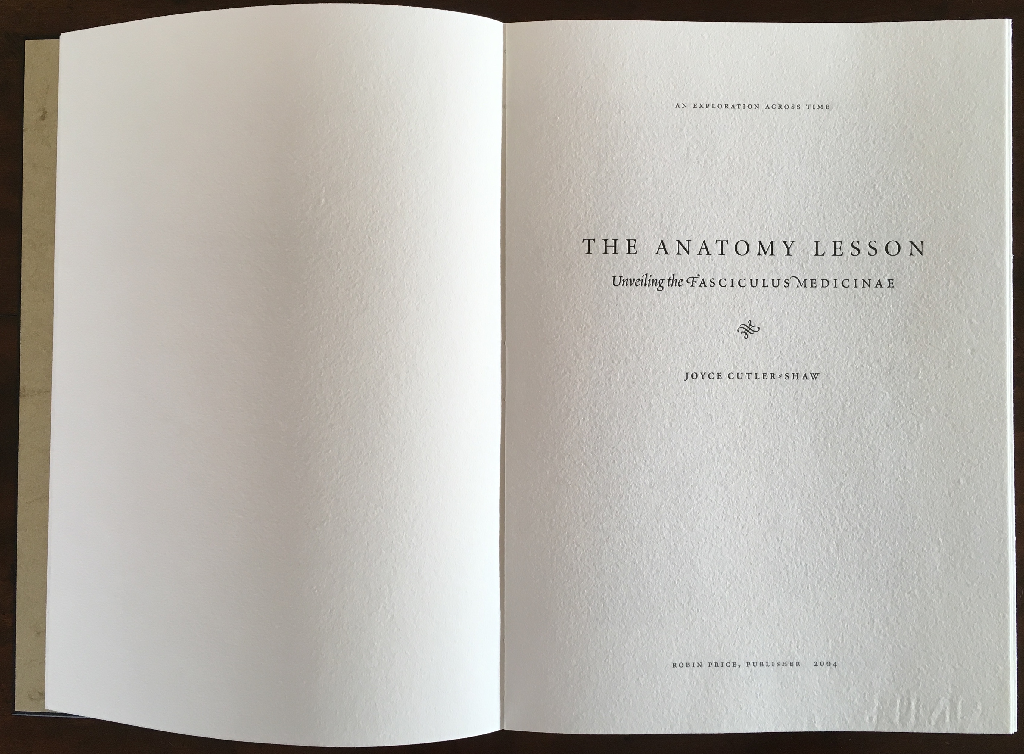
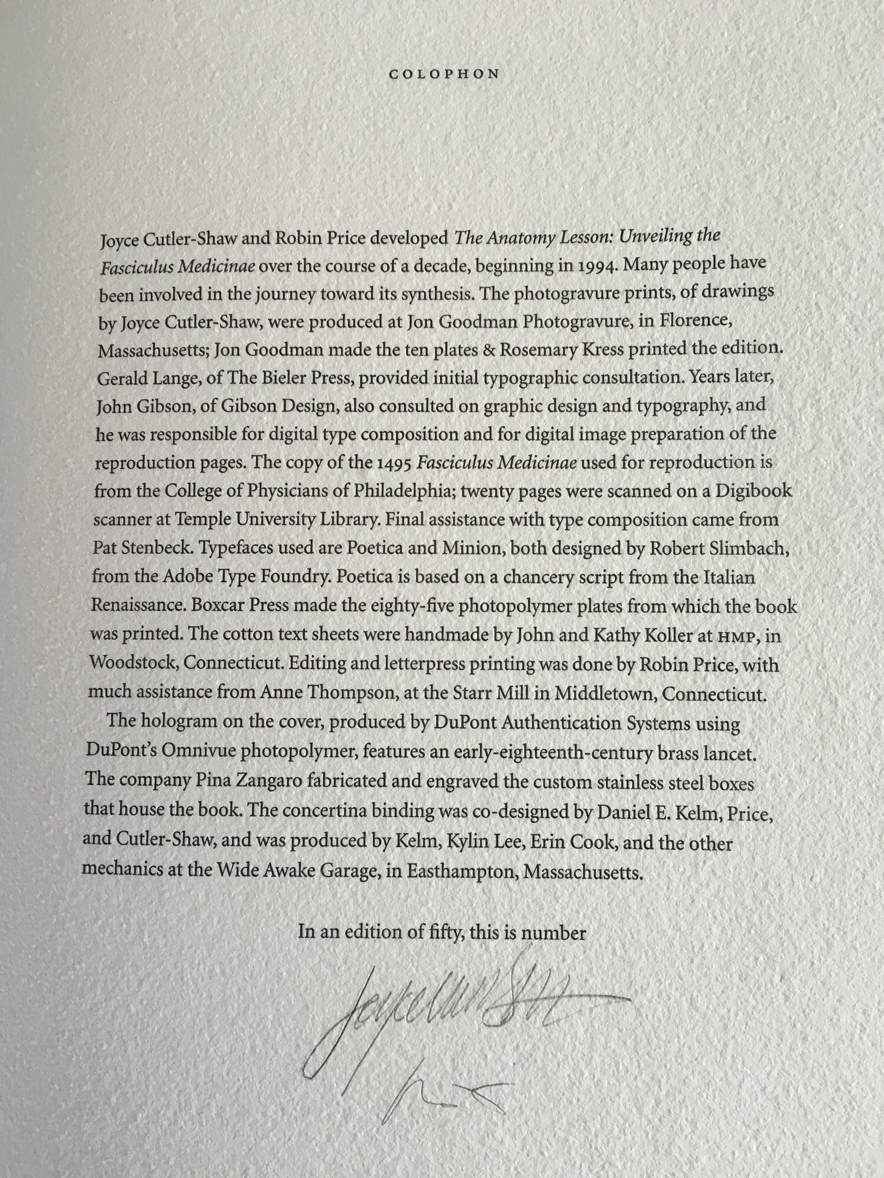
The Anatomy Lesson: Unveiling the Fasciculus Medicinae (2004)
Joyce Cutler-Shaw
The careful reader will notice that the edition number is missing. This instance of the work is one of the binder’s signed but unnumbered copies, having been acquired directly from Daniel E. Kelm.
Lyn Dillin, The Ballad of the Self Same Thing (2019)
Can this be the first rhyming colophon?


Finding Home (2016)
Louise Levergneux
This may not be the first bilingual colophon I have seen, but its being inside the top of the box enclosing the work makes it the first to occupy the physical summit a work.
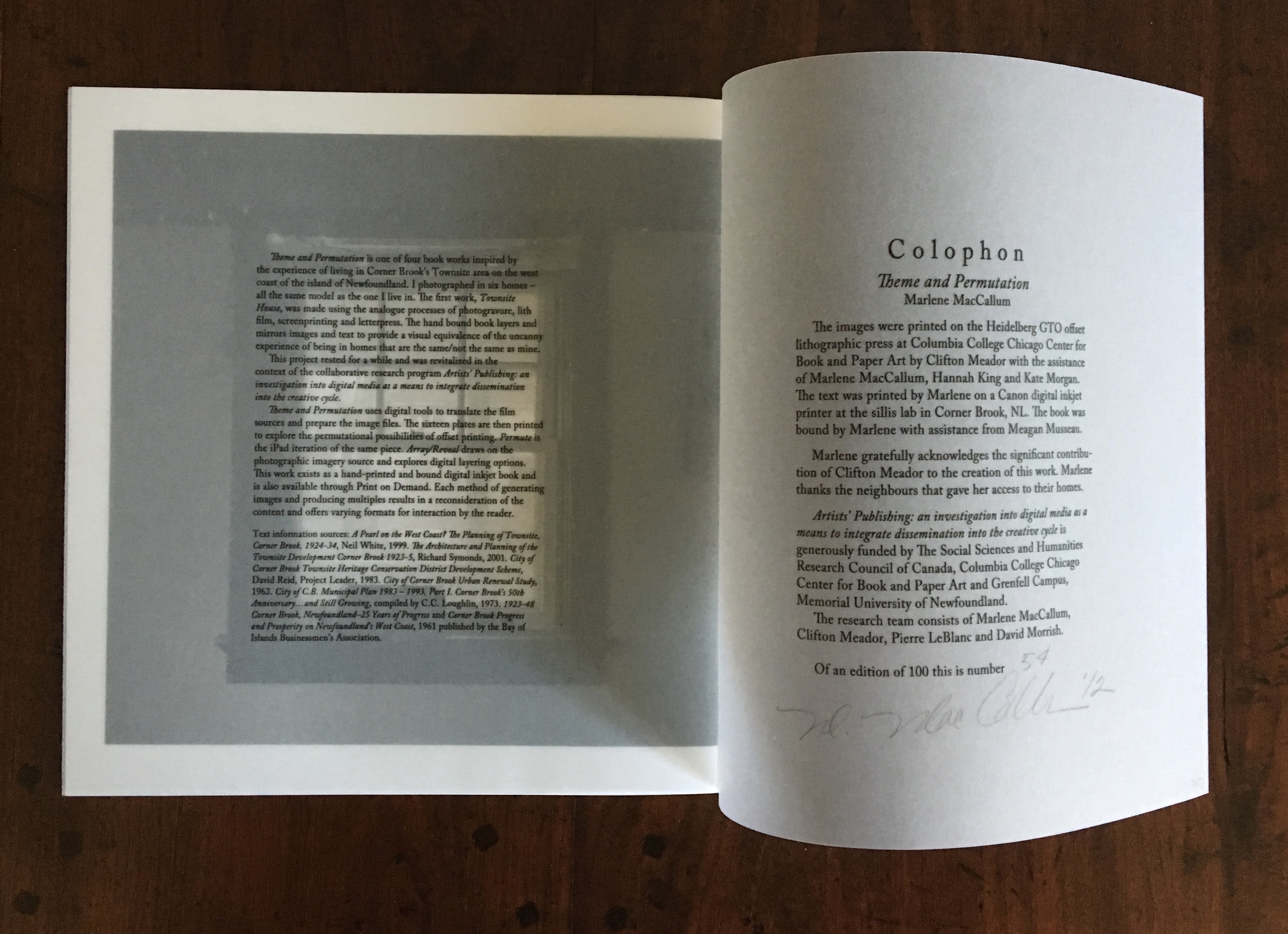
Theme and Permutation (2012)
Marlene MacCallum
This double-page spread reveals process information about the work that adds to the reader/viewer’s appreciation of the themes and permutations occurring in the pages.
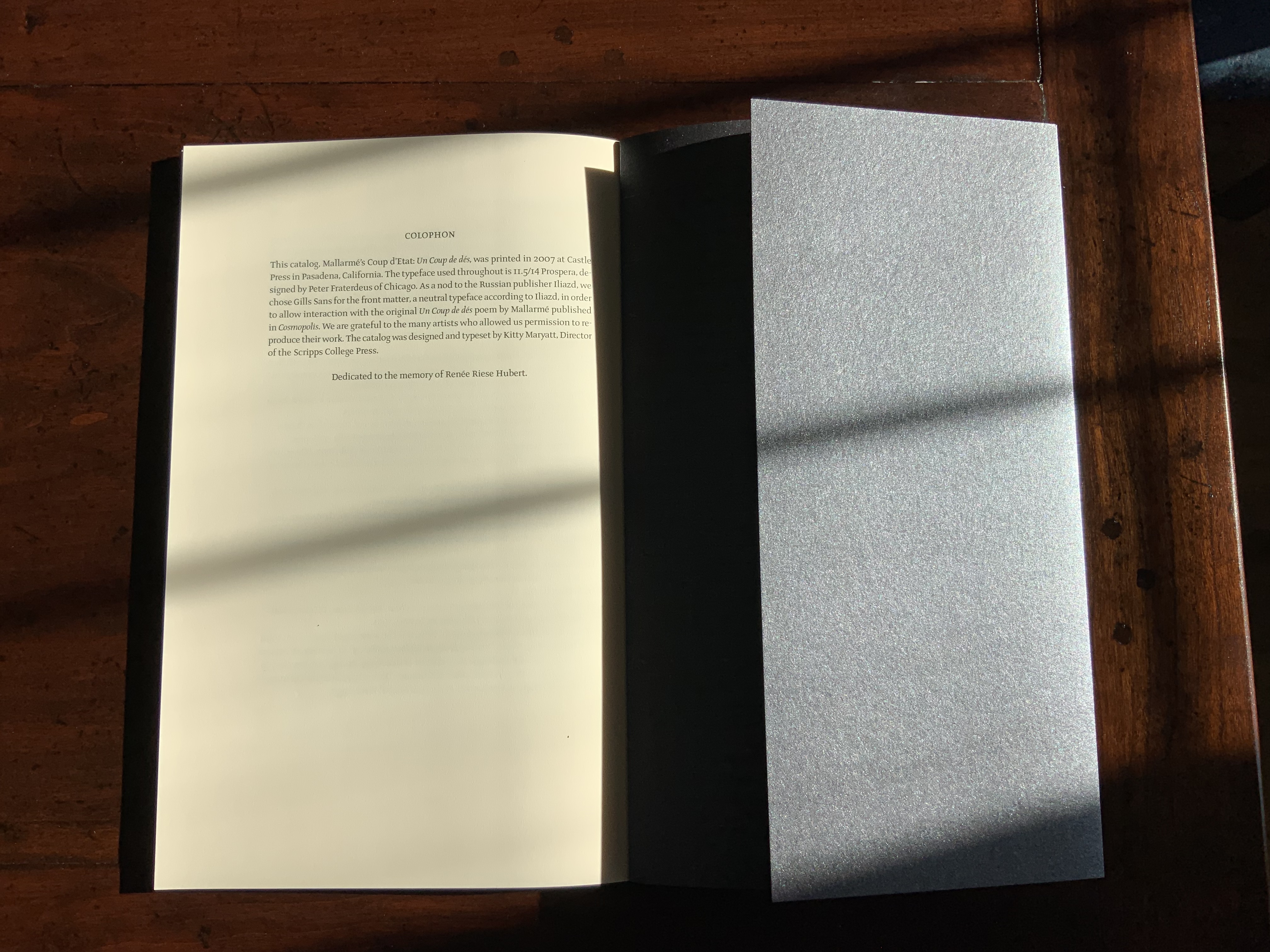
Mallarmé’s Coup d’État (2007)
Kitty Maryatt
The colophon’s nod to Iliazd sends the reader/viewer back to the start of this catalogue that is a bookwork in its own right.
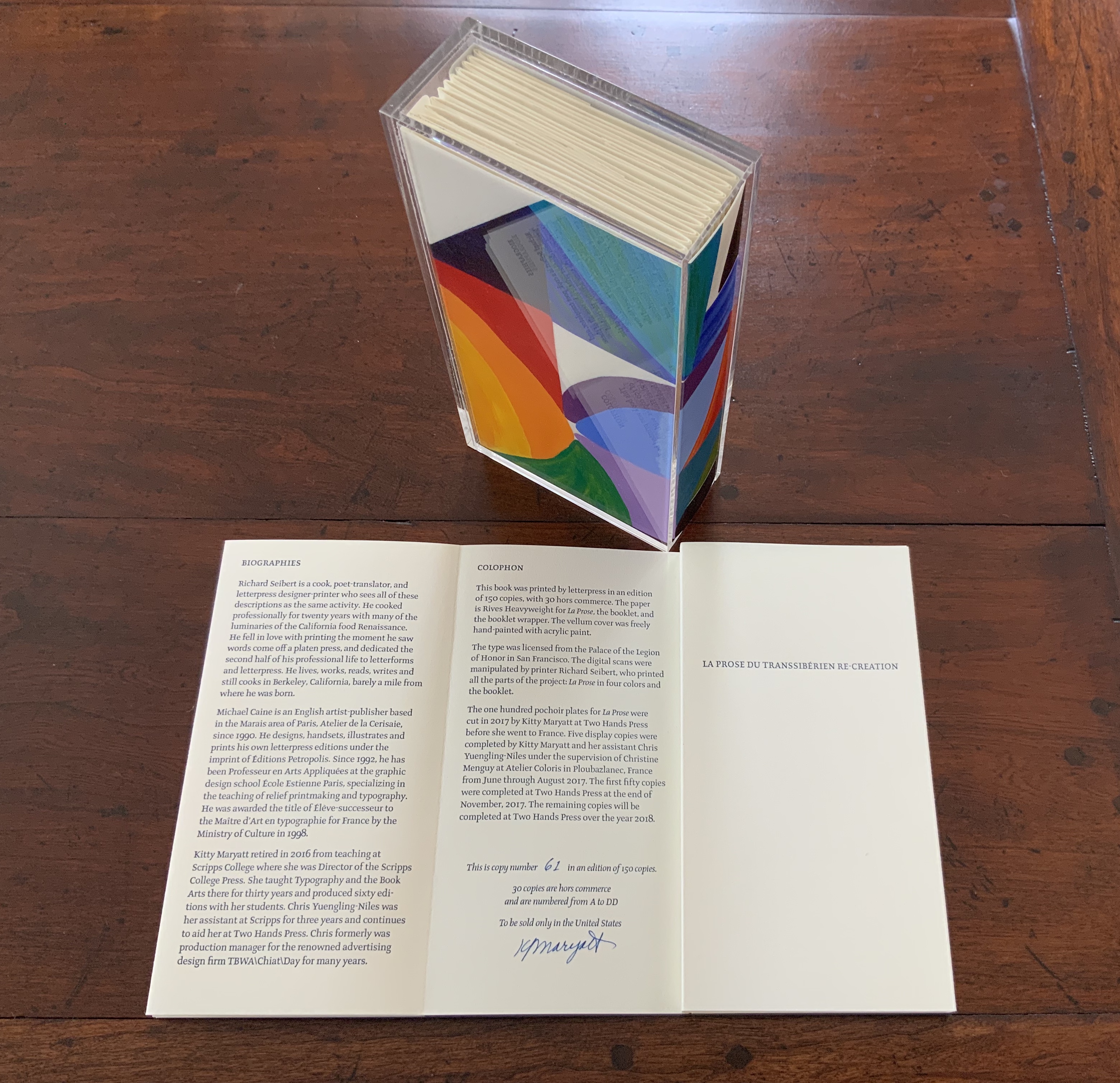
La prose du Transsibérien Re-Creation (2019)
Kitty Maryatt
A “colophon within a colophon”. The booklet providing details about the original work and Maryatt’s re-creation has an accordion structure and collapses into its own tri-fold wallet, which fits within the cover of the main work, seen here in its acetate holder.
L is for Lettering (2011)
Cathryn Miller
This hilarious and touching abecedary parades as a marked work handed in for a course, a portrait of the artist within a contemplation of the past and future of typography and letterpress. This colophon embodies the finishing touch.
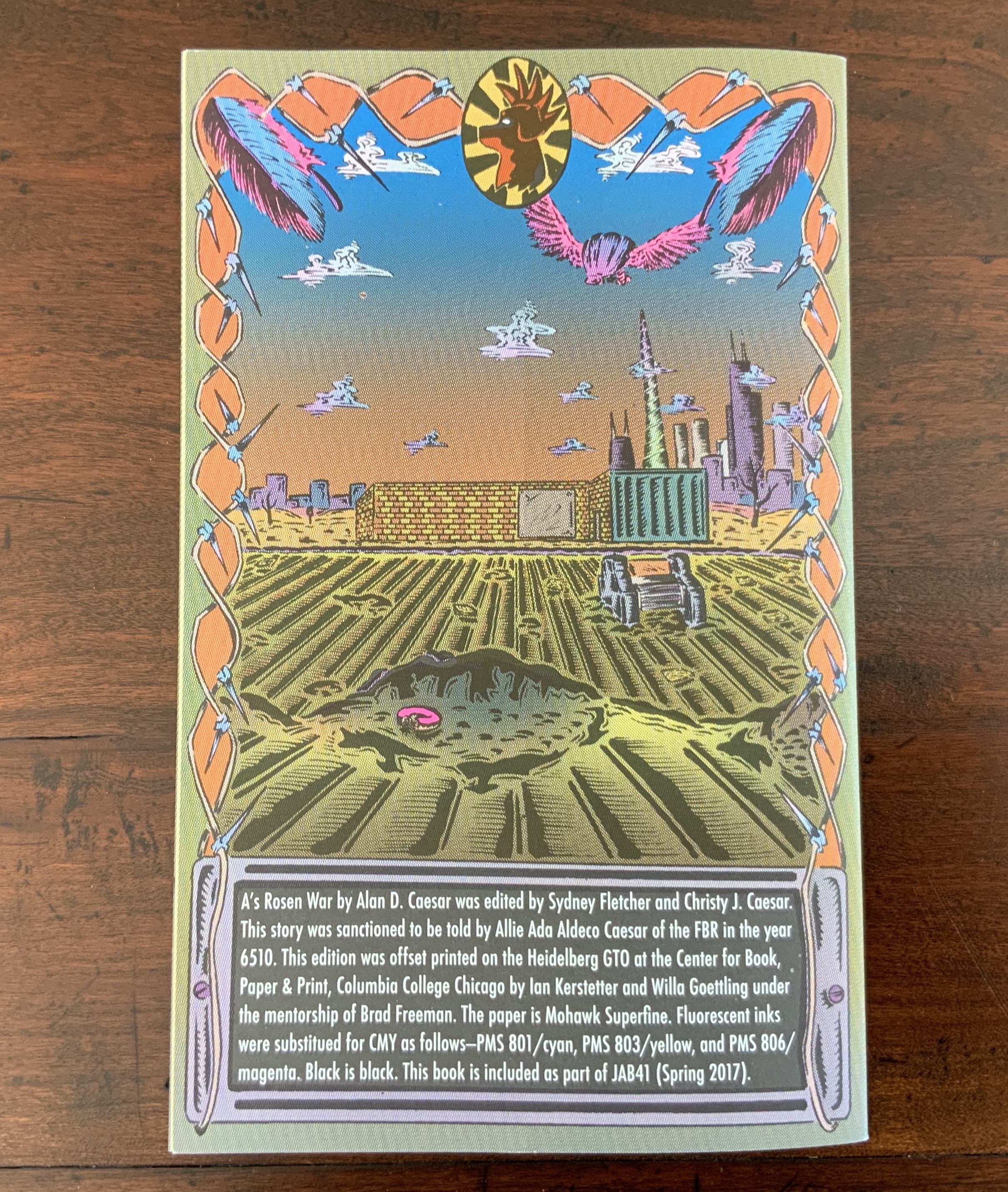
A’s Rosen War (2017)
Alan Caesar
This colophon continues the premised date with which this work of science fiction book art begins.

Further Reading

Bennett, Paul A. Books and Printing : A Treasury for Typophiles. Rev. ed. Forum Books. World Pub. Co., 1963.

CREWS Project, “Learning about Cuneiform Tablets Behind the Scenes at the British Museum”, 14 June 2017, accessed 20 April 201. (See for an example of scribes’ skill in ink on clay.)

Richard Gameson. The Scribe Speaks? Colophons in Early English Manuscripts. Cambridge: Cambridge University Press, 2001. (See for the human interest: “I, Aelfric, wrote this book in the monastery of Bath”; “Pray for Wigbald”; “Just as the port is welcome to sailors, so is the final verse to scribes”.)

Bill Hill, “The Magic of Reading”, accessed 20 April 2019.

Hurtig, Alain. “Les colophons“. L’outil typographique. Accessed 26 January 2022. (Seventeen brilliantly designed and shaped colophons.)

Joseph Spencer Kennard. Some early printers and their colophons. Philadelphia : G.W. Jacobs and Co., 1902. (Less academic but just as interesting and typographically more fun than Gameson.)

Alfred W. Pollard. An essay on colophons, with specimens and translations. Chicago: Caxton Club, 1905.

Alfred W. Pollard. Last words on the history of the title-page, with notes on some colophons and twenty-seven facsimiles of title-pages. London: J.C. Nimmo, 1891.

Ming-Sun Poon, “The Printer’s Colophon in Sung China, 960-1279”, The Library Quarterly,43:1 (January 1973). (See for the 34 calligraphic inscriptions and the colophon to the Diamond Sutra: “On the 15th of the 4th moon of the 9th year of Hsien-t’ung [May 11, 868], Wang Chiek on behalf of his two parents reverently made this for universal free distribution.”)

Christine Proust, “Reading Colophons from Mesopotamian Clay-Tablets Dealing with Mathematics”, NTM Zeitschrift für Geschichte der Wissenschaften, Technik und Medizin, 20:3 (September 2012). (Helpfully diagrammed black and white views of the difficult-to-see incisions in clay.)

Ding Wang, “A Buddhist Colophon from the 4th Century: Its Reading and Meaning”, Manuscript Cultures, 3 (2010). (Beautiful photos of the scroll scribed by Baoxian.)

David C. Weber, “Colophon: An Essay on its Derivation,” Book Collector 46 (Autumn 1997).

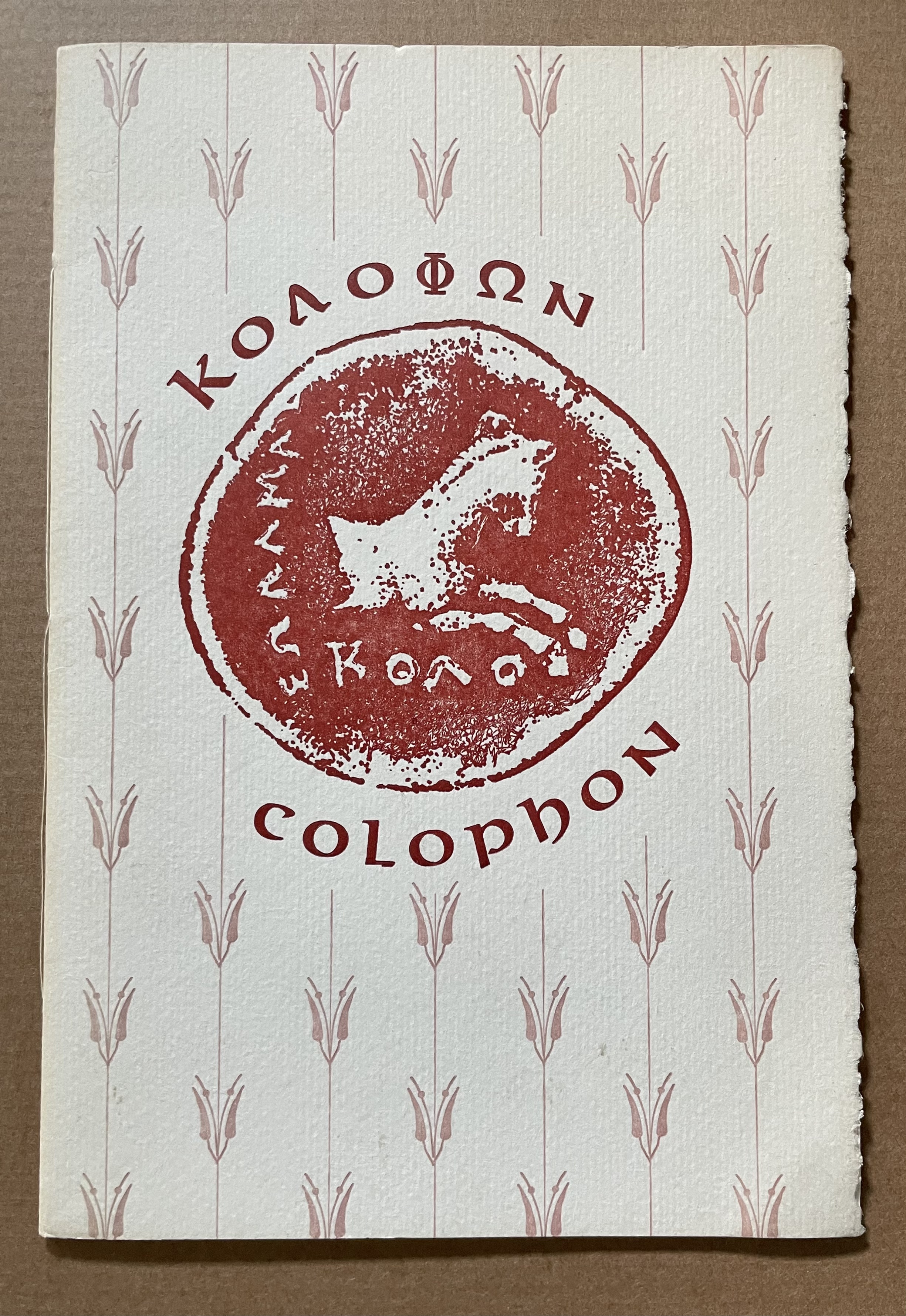
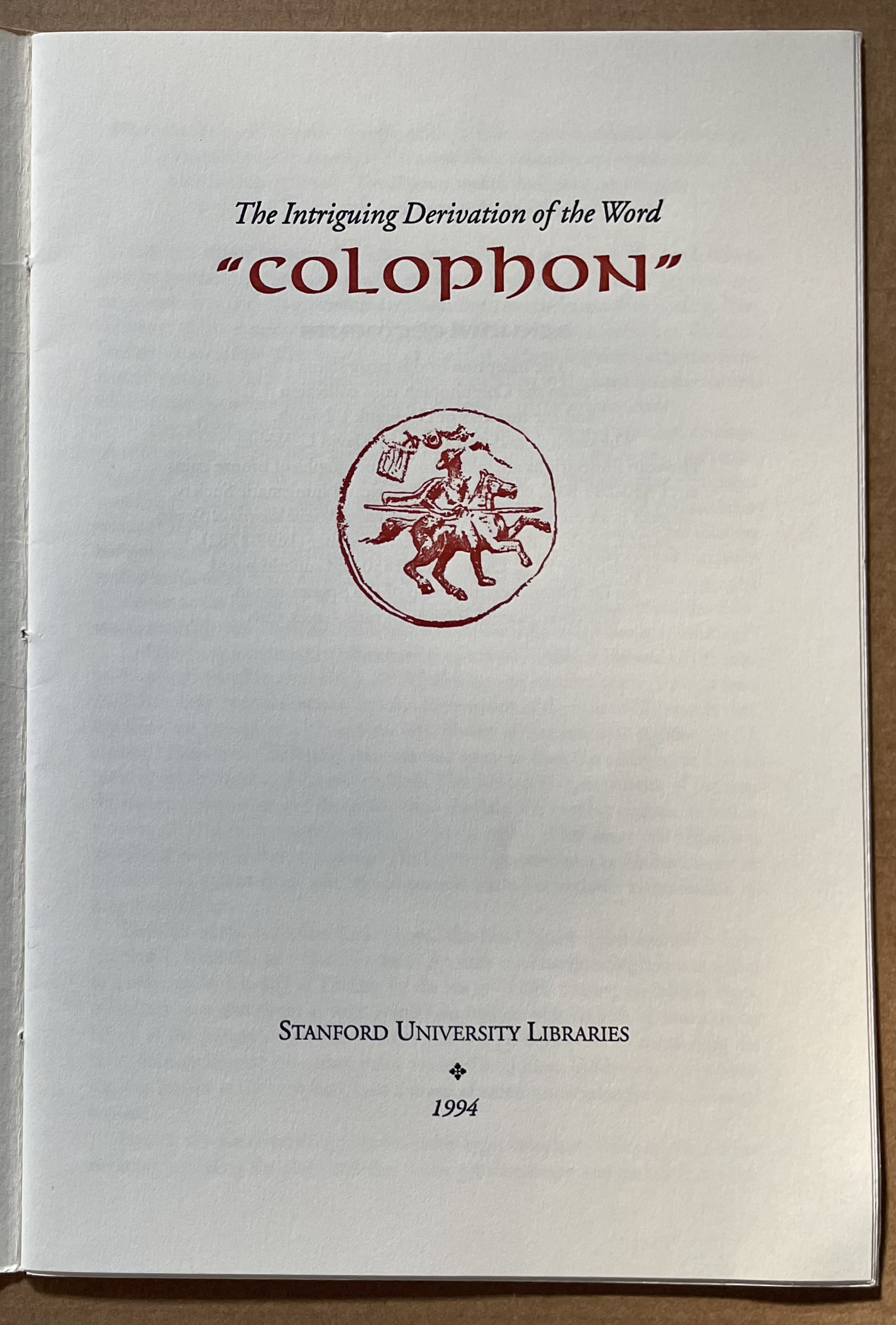
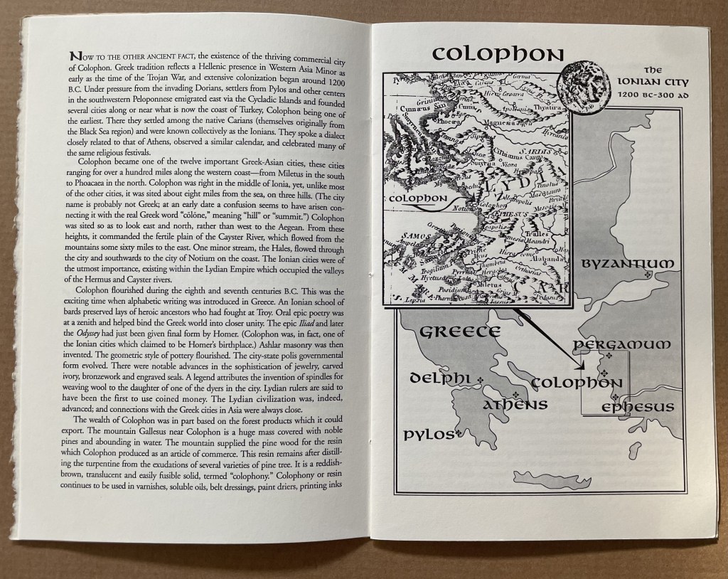
The intriguing derivation of the word “Colophon” (1994)
David C. Weber
Sewn booklet. H230 x W155 mm. [16] pages. Acquired from Cotswold Internet Books, 7 May 2023.
Photos: Books On Books Collection.

Pollard, Alfred W. Last Words on the History of the Title-Page, with Notes on Some Colophons and Twenty-Seven Fac-Similes of Title-Pages. Burt
Franklin Research & Source Works Series, 668. B. Franklin, 1971.
Pollard, Alfred W. 1859-1944. Last Words on the History of the Title-Page, with Notes on Some Colophons and Twenty-Seven Fac-Similes of Title-Pages, by Alfred W. Pollard. J.C. Nimmo, 1891.
Pollard, Alfred W. 1859-1944. An Essay on Colophons, with Specimens and Translations, by Alfred W. Pollard, and an Introduction by Richard Garnett.
The Caxton Club, 1905.
Pollard, Alfred W., and Richard Garnett. An Essay on Colophons : With Specimens and Translations. Burt Franklin Bibliography and Reference
Series ; #142. Burt Franklin, 1968.
Van Elverdinghe, Emmanuel. “Modèles et Copies : Étude d’une Formule Des
Colophons de Manuscrits Arméniens (VIIIe – XVIIIe Siècles).” Dissertation,
2017.

Bookmarking Book Art – Update: the John Jarrold Printing Museum Saved!

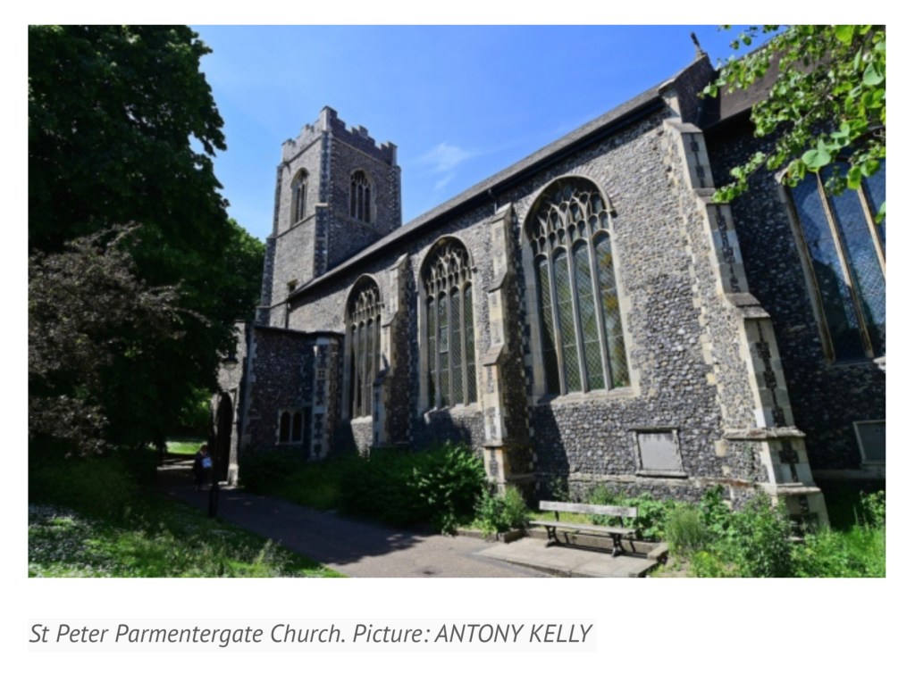
Last November, the post below appeared under the title “Saving the John Jarrold Printing Museum”. News has arrived that the museum will be renamed the “Norwich Printing Museum” and moved to St. Peter Parmentergate in King Street, Norwich. The Norwich Printing Museum’s volunteer supporters aim to open it in the summer 2020.

How fitting it would be if the organisers of the Leiden Book Arts Fair, held in St Pieterskirche, Leiden, every November, were to celebrate the event next year. The connections between The Netherlands and Norwich/Norfolk run deep. And, given that the great-great-grandson of John Folger who came to America from Norwich in 1635 and settled in Watertown, MA, was Benjamin Franklin, arguably America’s “uncle of printing”, how fitting it would be if the members of the New England chapter of the American Printing History Association played printer’s devil to the affair.

Congratulations to Jules Allen and the NPM volunteers and thanks to Caroline Jarrold for this outcome.

Posting from 8 November 2018:

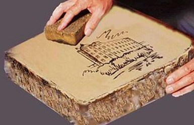
Litho stone featuring the St James Mill building in Norwich. Image: JJPM
From Print Week, 26 September 2018

The John Jarrold Printing Museum in Norwich, England, is one of the few working print museums in the world. Here’s a selection of ten from among its hundreds of holdings: 

  • Star wheel etching press. Wood & Company, West Smithfield, London. 1858. No.1250. Donated by Midlands Art Centre, Birmingham, June 2010. 
  • Albion. Hopkinson & Cope, Finsbury. 1845. No. 1900. From Mr Gott of Watts & Rowe, King’s Lynn.
  • Albion. Hopkinson. Jonathan & Jeremiah Barrett, executors of R. W. Cope, Finswbury, London. 1840. No. 1273. From William Booth, Woodbridge.
  • Columbian. Probably George Clymer. c.1845. Was purchased new by Jarrold & Sons Ltd, and was their longest serving machine. (Lent to the Norwich School of Art for the Caxton Quincentenary).
  • Stanhope. 1825. Donated by Cambridge University Press. 
  • Side-lever lithographic hand press. Hughes & Kimber. ex Norwich College of Art & Design.
  • Top lever lithographic hand press. D. & J. Greig, Lothian Road, Edinburgh. c.1840. 24 x 17 in. Presented to John Jarrold Printing Museum, May 1999 by Geoffrey Dunn, 22 Henry Drive, Leigh on Sea, Essex, SS9 3QQ.
  • Ratcliff direct lithographic press. John Ratcliff & Sons Ltd, Wortley & Leeds. 1927. Double demy. Donated by Curwen Studios, London. Thought to be the only surviving example.
  • Furnival stop-cylinder. 1984. Double demy. Donated by H. Hawes, Elmswell.
  • Heidelberg one-revolution cylinder press, c.1950. Donated by Jarrold & Sons Ltd. Heidelberg. Schnellpressenfabrik A.G. Heidelberg, Germany.
The developers aiming to tear down the building that houses the John Jarrold Printing Museum have mooted keeping some of the older printing presses now there and using them as mood or accent pieces for the café to be built as part of their residential development plans. 

Anyone caring to comment can do so on the Norwich City Council planning site.

Bookmarking Book Art – Hanne Stochholm Exe

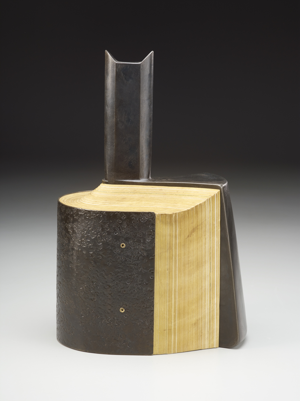
Danish artist Hanne Stochholm Exe‘s “assemblages”, which garnered first prize in the 7th International Artist’s Book Triennial Vilnius 2015, have cousins far afield — geographically and chronologically.

Remake (2015) 
Hanne Stochholm Exe
Reproduced with permission of the artist
Talks (2005) 
Hanne Stochholm Exe
Reproduced with permission of the artist
Small Talk (2005)
Hanne Stochholm Exe
Reproduced with permission of the artist

Geographically, this merging of book and metal finds common cause in the US (see Andrew Hayes’ works) and Israel (see the work of Neil Nenner and Avihai Mizrahi, represented — as is Hayes — by the Seager/Gray Gallery).

Offset (2013)
Andrew Hayes
Cover Story #4 (2017)
Neil Nenner and Avihai Mizrahi

Chronologically, the hold that books and metal have had on one another reaches far past the moveable type of Gutenberg’s Bible and Master Baegun‘s earlier Jikji.

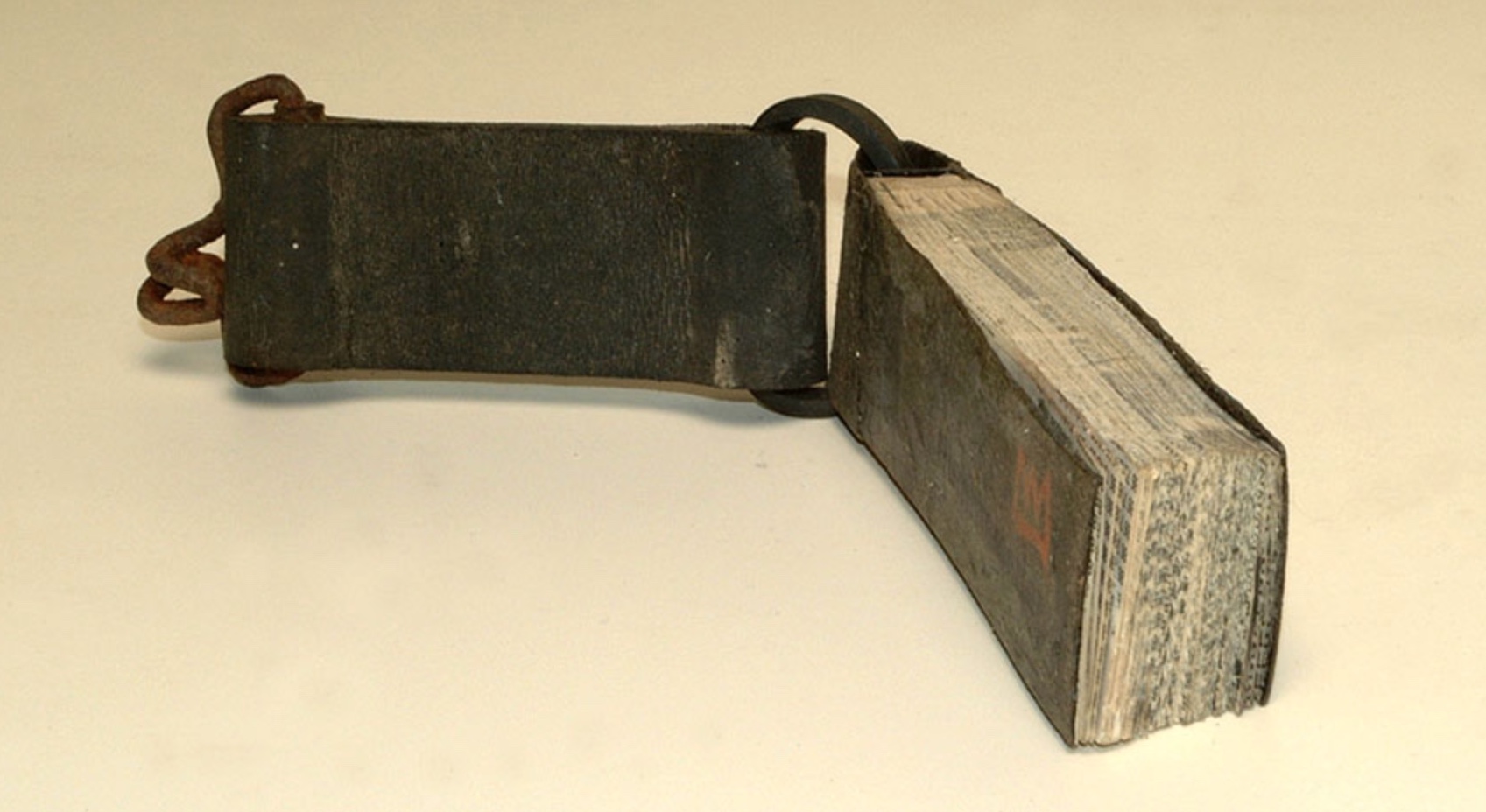
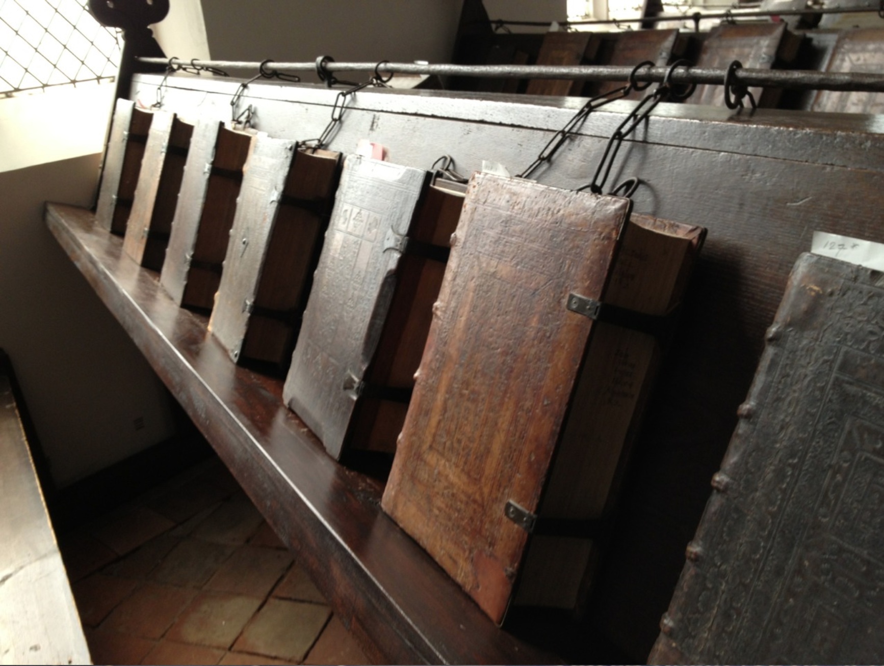
Those metal “feet” embedded in the front and back covers kept the bottom edges of upright books chained in lectern libraries from wearing out.

Of course, those 11th century metal fittings probably passed unnoticed by studious readers. Not so with these studious artists in the 21st century whose imaginations have seized on the contrast of materials to recast the book object as an art object.

Bookmarking Book Art – Irma Boom on the future of the book

Fore-edge of Shelia Hicks: Weaving as Metaphor  by Nina Stritzler–levin and Arthur C. Danto
(Yale University Press, 2006)
Designed by Irma Boom

“AM: How would you sketch the future of the book?

IB: The book has a great future. In the statement in my little red book [Irma Boom: The Architecture of the Book] I talk about the renaissance of the book. It is already happening now. … 

At a recent event, Massimo Vignelli claimed ‘The book is dead’. …

I was shocked when Massimo repeated that sentence, I read it everywhere. But the printed book does not need any defender. It has survived 600 years or so. The way information spreads depends on the inventions of that time; paintings have survived, photos, and the book is another form.

Anne Miltenburg, “Reputations: Irma Boom“, Eye Magazine (Summer 2014). From 

Bookmark – “The Chapter: A History”

The Venerable Bede working on his translation

Nicholas Dames’s readable New Yorker piece presents telling episodes in the history of authors’ use of the chapter in non-fictional and fictional works — from Cato the Elder, Pliny, the Venerable Bede, Caxton, Fielding, Gissing and others.

Latin capitulum, Spanish capítulo, French chapitre, Czech kapitola, German Kapitel, Romanian capitol, Italian capitolo, English chapter: is it anything different in the digital age? The page can “disappear”, scrolling down a window, replaced by a percentage of book completed. What about the chapter?

The following paragraph from Dames is telling when juxtaposed with the final chapters of Amaranth Borsuk’s The Book (MIT Press, 2018), which brings to bear on the history of the book and its elements the perspective of an artist; reviewed here.

Like the momentary lifting of a pianist’s fingers while a chord still resonates, the classic novelistic chapter evokes time by dwelling in a pause rather than a strong ending. We feel time in the novel by marking it out into bits, but only bits that have no strong shape, that fade or blur into one another in the recollection. The greatest practitioners of the chapter have preferred to cast their divisions as fleeting caesuras with lingering aftereffects, scarcely memorable in their specifics but tenacious in the feeling they evoke. (italics added) Situations yielding silently to new configurations, feelings fading imperceptibly or stealing upon us, shifts in the atmosphere around us: time in the novel is made up of these chromatic transitions, and the usual name for them in the history of the form is the chapter. 

Nicholas Dames, “The Chapter: A History“, The New Yorker, 29 October 2014

Bookmarking Book Art – International Image Interoperability Framework

From Sexy Codicology (well, they must have thought the name would increase traffic).  Accessed May 1, 2017 11:17 PM.

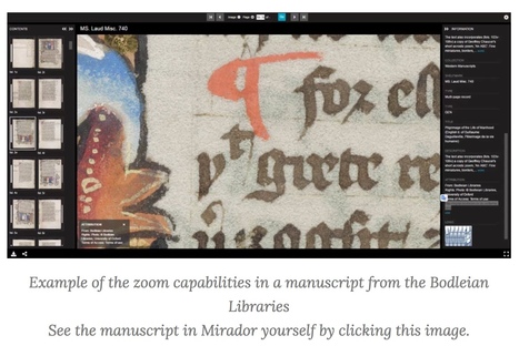
Scholars and programmers from all over the world are working together on providing a technology that give researchers, and heritage enthusiasts, a rich and uniform experience when viewing digitized heritage. Most of all, they want to make it possible that as many digital collections as possible all work in the same way, so that any image from any museum or library can be seen in any viewer online, together with any other manuscript or artwork that is IIIF compliant! Side-by-side!

Click here

The International Image Interoperability Framework (“triple I eff“) began its efforts in 2011. As of September 2018, over 100 universities, libraries, cultural heritage institutions and open source software companies are participating. space

Click here

Some of those organizations hold book art collections. Imagine being able to examine an artist’s book “in the round”, to zoom in, to compare one artist’s flag book with another’s side by side. A query about whether any of those organizations plan to apply the technology to those collections has been sent.  

Bookmarking Book Art – Erin Zwaska

This is where (2014)
Print on demand, three booklets
Erin Zwaska

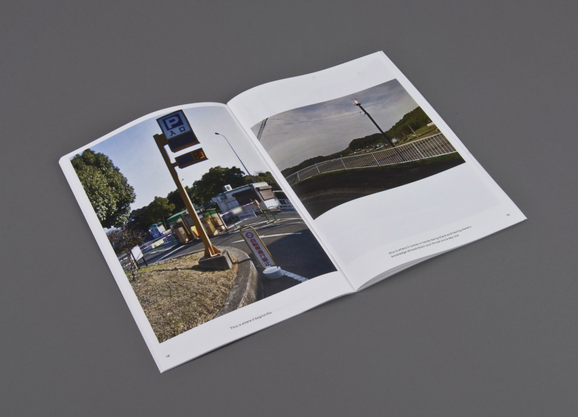
An ongoing chance-based publication project in the spirit of Ed Ruscha. Images are randomly-selected Google streetviews (which are often captured at noon to avoid shadowing) of cities like Paris, Tokyo, etc. The copy is compiled from all tweets containing the phrase “this is where” between noon and 12:15pm local time for each city. Consequently the text and imagery for each 15-minute issue originates from the same, albeit ambiguous, time and place. And though text and image are randomly paired, surprising narratives often emerge. Included in the collection of the Library of the Printed Web.

This is where is where the tradition of Ed Ruscha meets the Web. Go there and see for yourself.