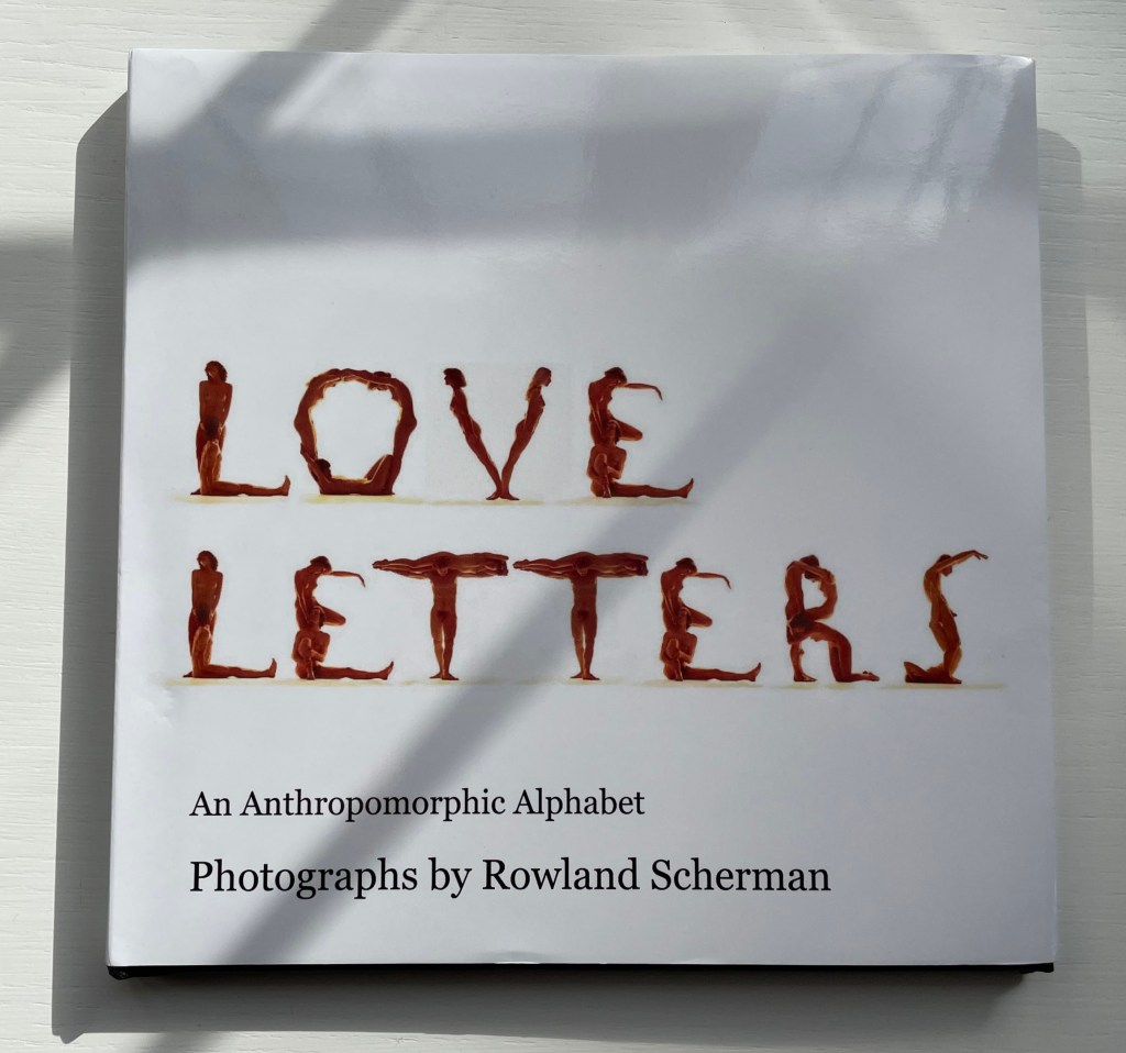
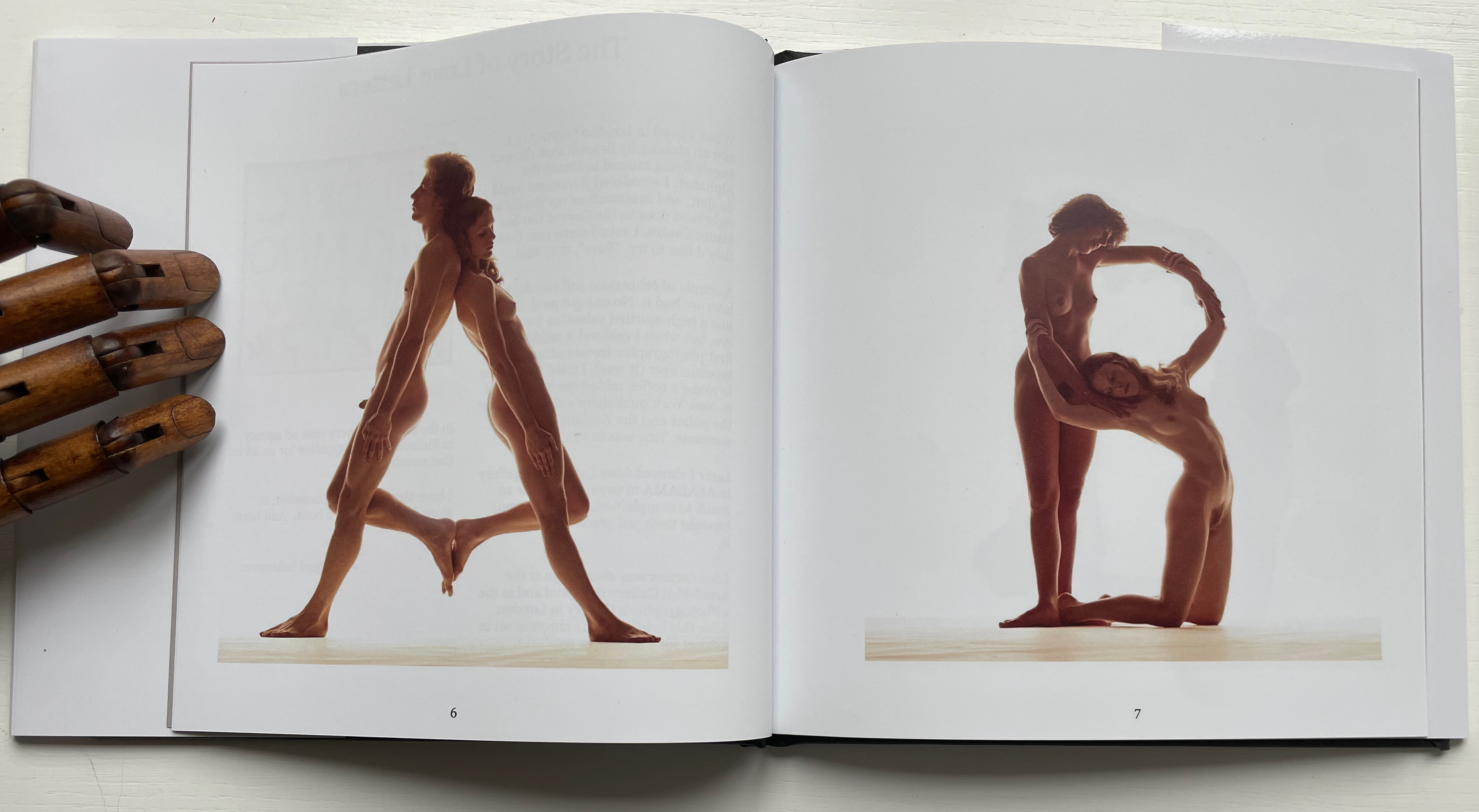
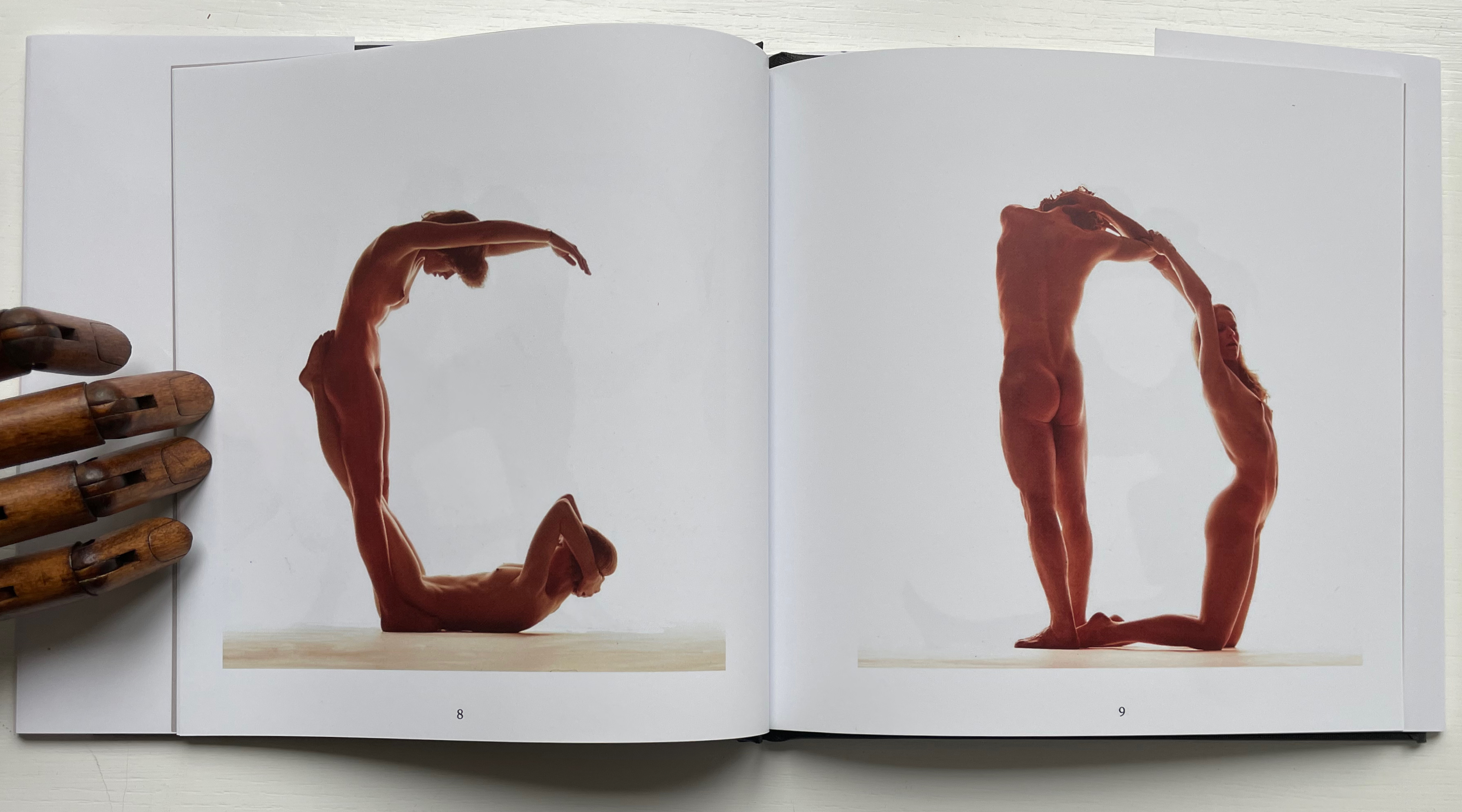
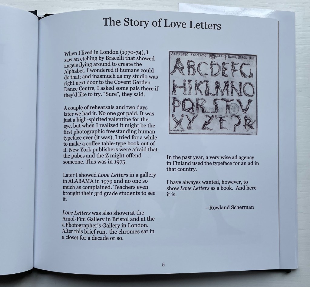
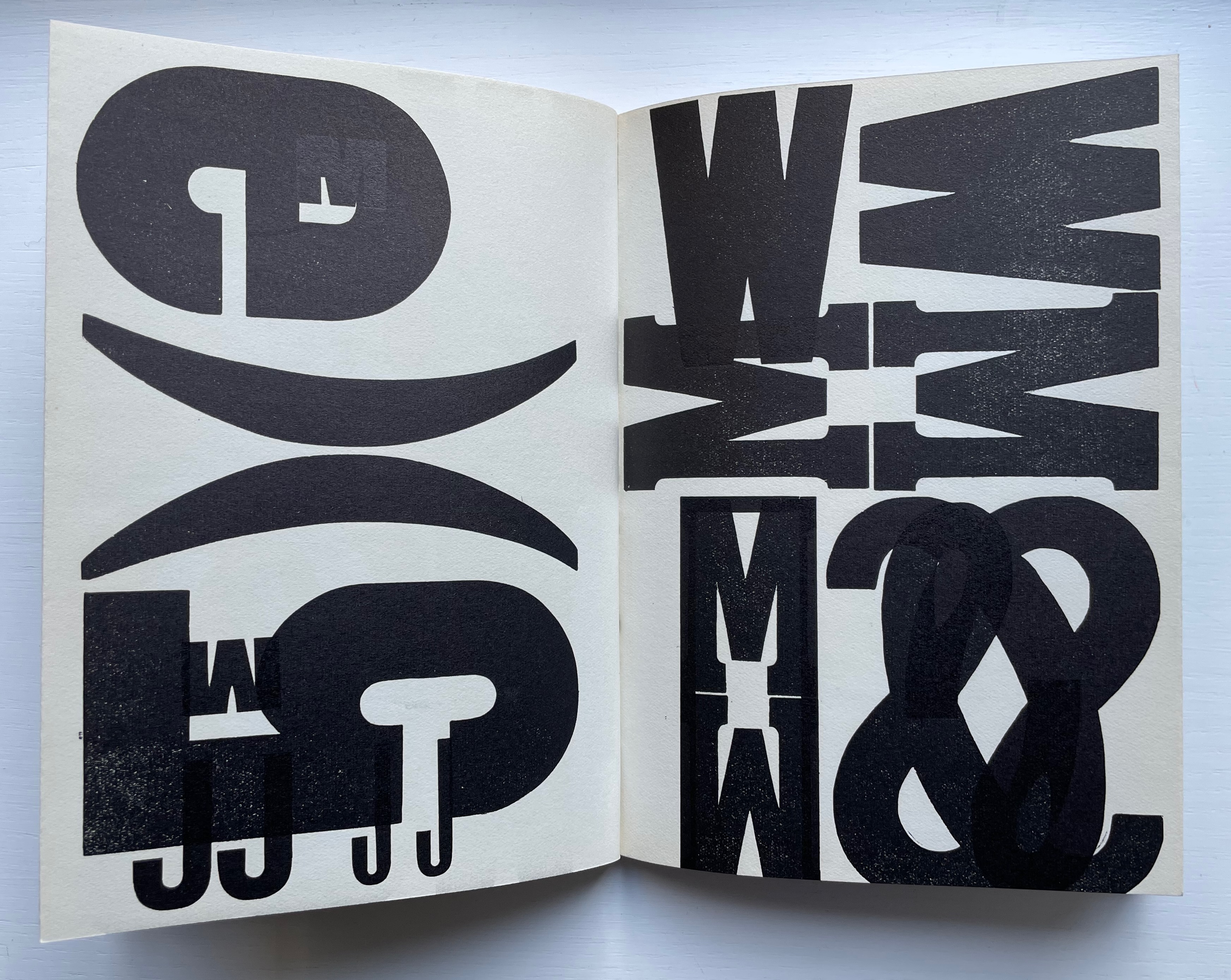
Love Letters: An Anthropomorphic Alphabet (2008) Rowland Scherman Casebound, doublures, perfect bound. H178 x W180 mm. 34 pages. Acquired from Rowland Scherman, 3 March 2023. Photos of the book: Books On Books Collection. Displayed with permission of Rowland Scherman.
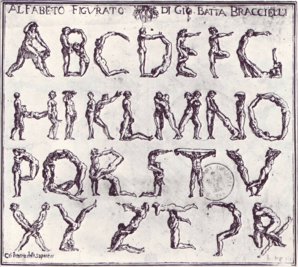
Giovanni Battista Bracelli’s “Alfabeto Figurato”, a single-sheet etching, occurred well after Carravagio’s presence there earlier in the century but well within the sphere of his ongoing influence. The print’s contortions of human bodies to display that most human of inventions — the alphabet — would probably have pulled a sneer of admiration from him. Maybe Bracelli had heard of the 5th-century comic playwright Kallias, who had his chorus dance (no doubt “cheek to cheek”) the shapes of the Ionian contenders for letterforms. In 1969, Anthon Beeke and Ed van der Elsken had their naked models arrange themselves into the alphabet on the studio floor and took photos from above. When Rowland Scherman saw Bracelli’s print on a London bus 340 years later, he wondered if human bodies could actually hold those poses or ones like them.
In the third decade of the 21st century, when book bannings and body shaming have reached new heights (or depths), Scherman’s “Story of Love Letters” might leave the reader wondering if we are now running headlong past Kallias and the 5th century into the pre-alphabetic world.
Dukes, Hunter. 27 April 2023. “Punctuation Personified (1824)“. The Public Domain Review. Not only could letters be formed with the human body, so could quotation marks and square brackets.
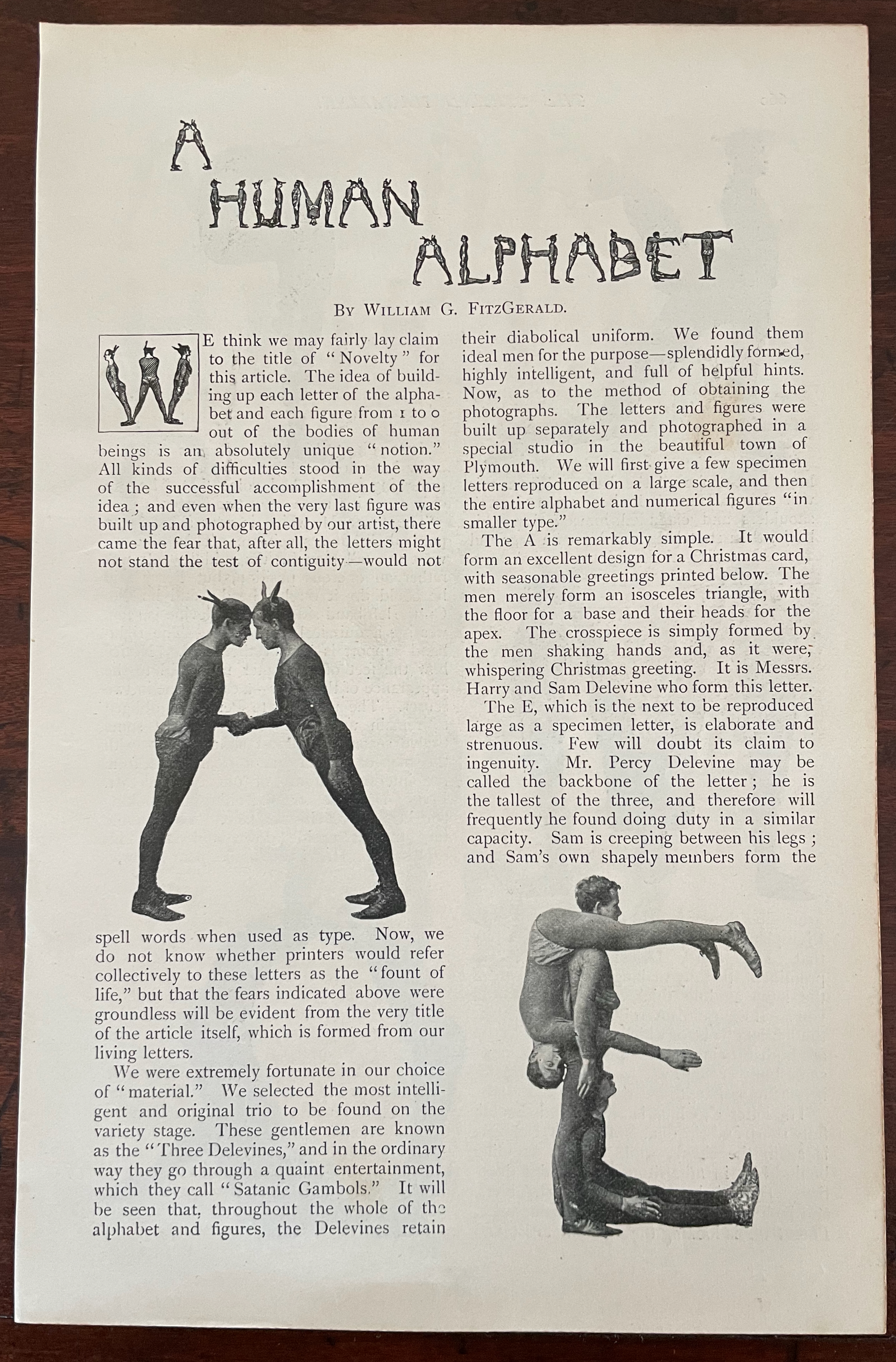
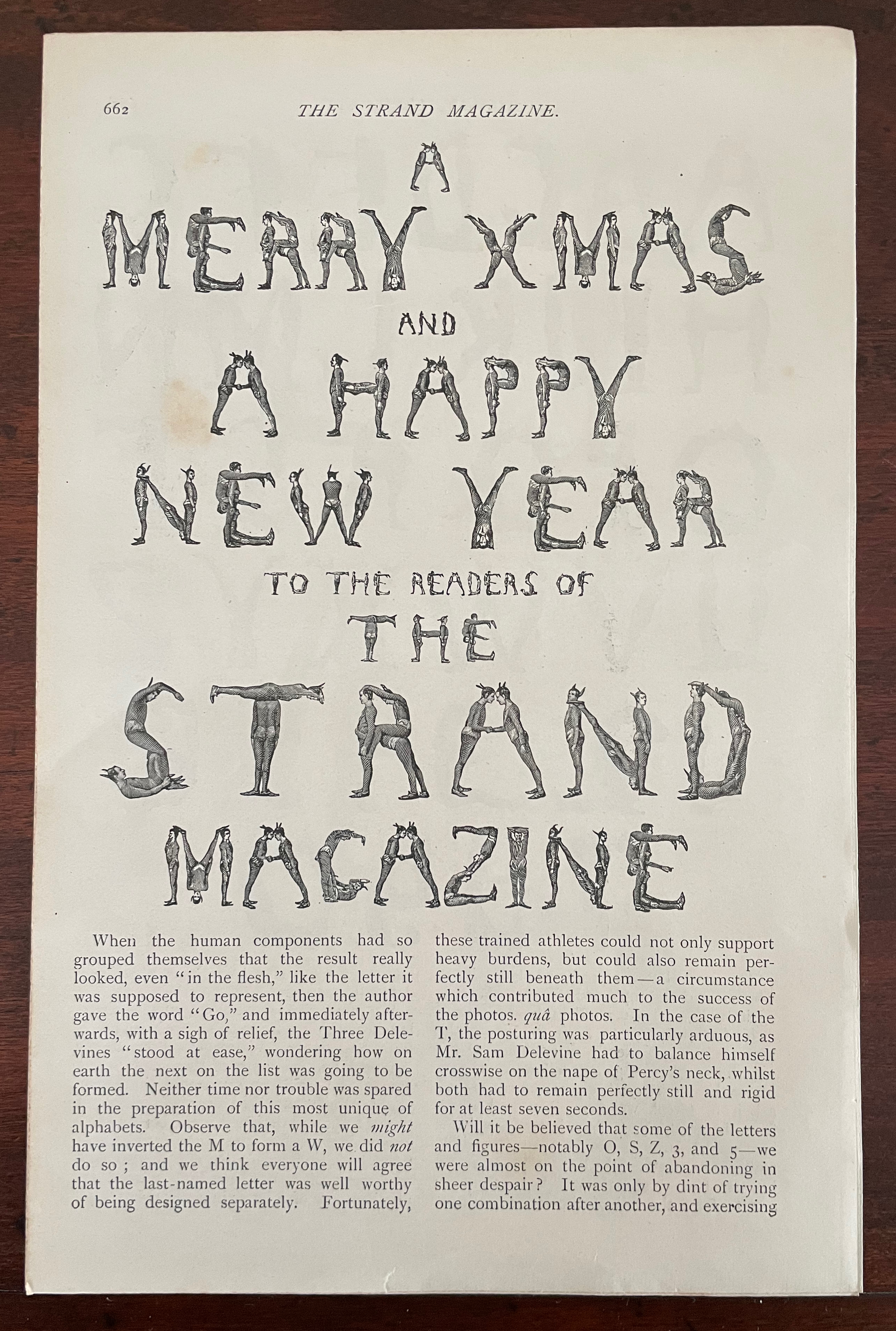
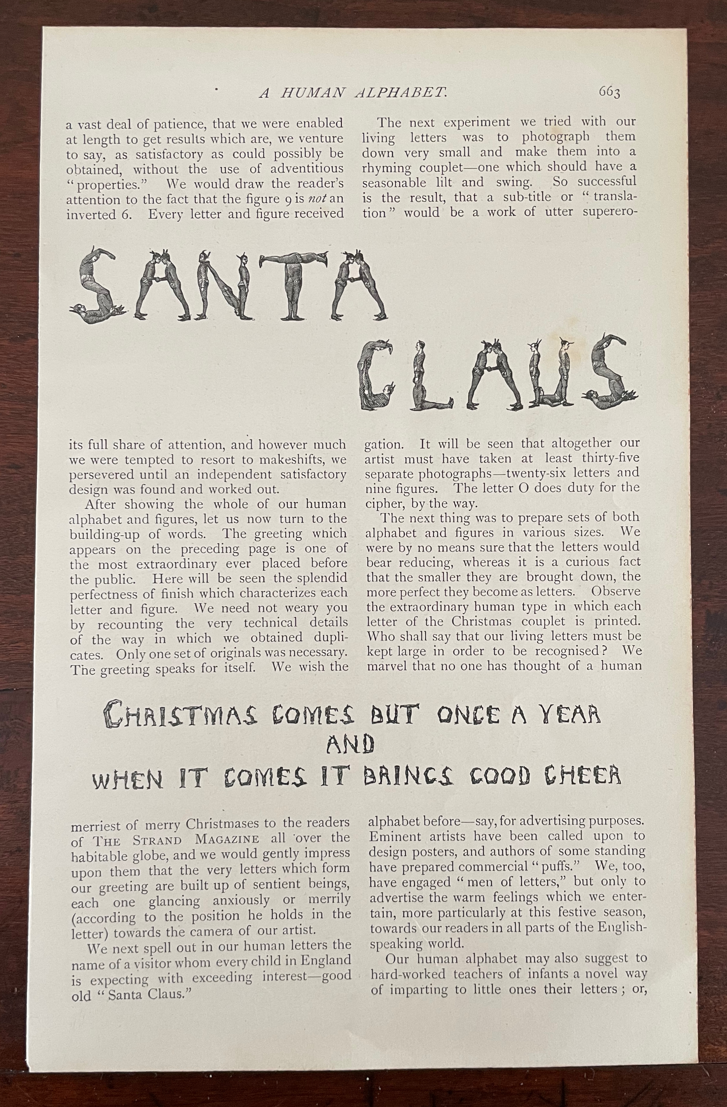
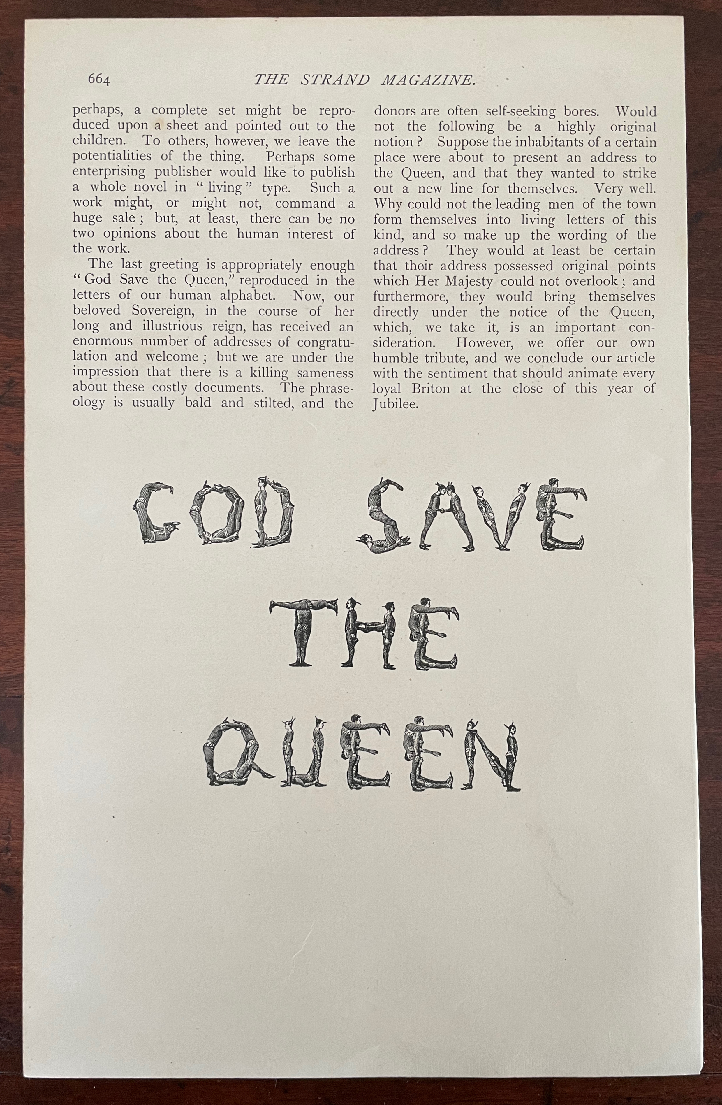
A Human Alphabet (1897) The Three Delevines Loose folios, William G. Shepherd’s article in The Strand Magazine, Vol. XIV, December, pages 660-64.H230 x W160 mm. Acquired from Cosmo Books, 26 August 2023. Photos: Books On Books Collection.
Only remembered after the Alphabets Alive! exhibition opened at the Bodleian in July 2023, The Three Delevines and W.G. Shepherd (their impresario on the occasion in 1897) have nevertheless demanded an appearance online among the other embodied alphabets (or lettered bodies) included in the “B for Bodies” display.
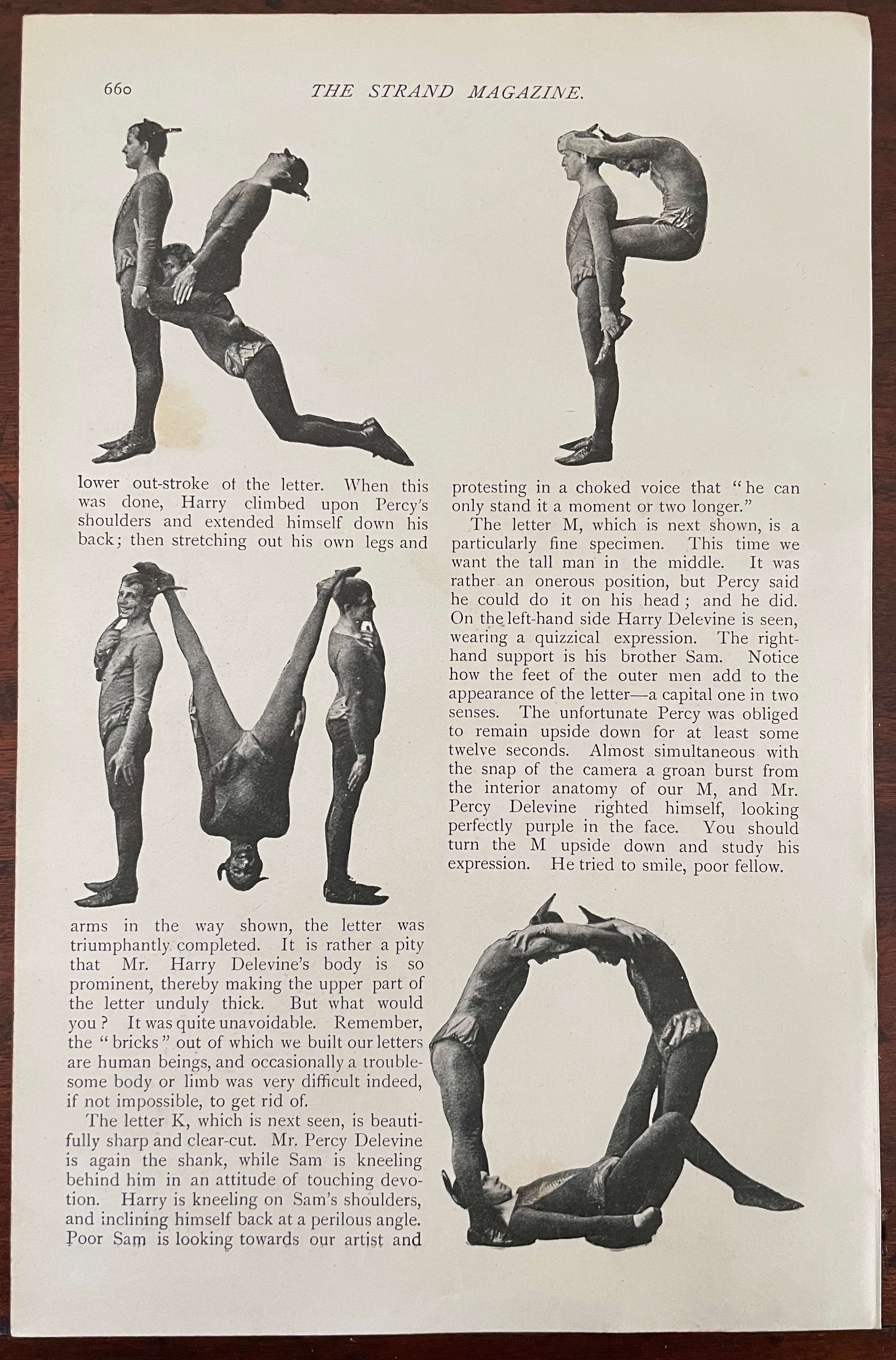
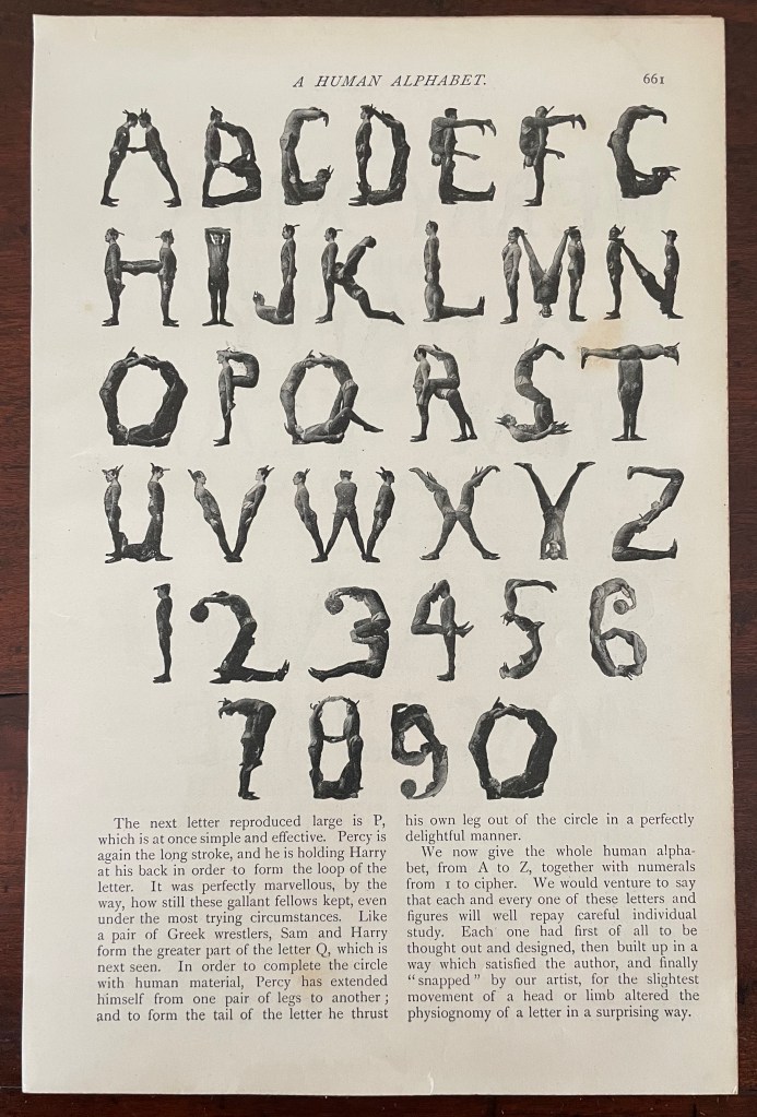
Shepherd is not merely the author of the Strand article but asserts his authorship of the alphabet performed by The Three Delevines. Although generous in his praise of the Australian brothers Sam, Harry and Percy for holding each of their poses for at least seven seconds and, in some uppercases, for twelve, Shepherd does not identify the Strand’s photographer by name or acknowledge his skill beyond “snapping”. At least, he refers to him as “our artist”.
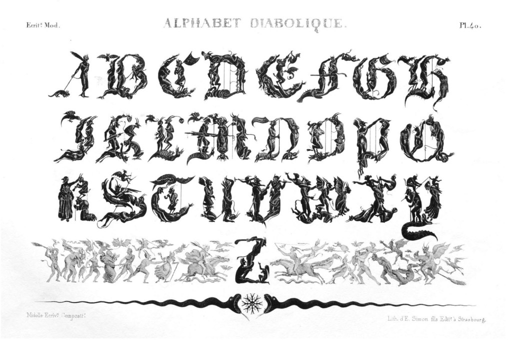
So much of his effort went into discovering the music hall troupe and its performance called the “Satanic gambols”, and congratulating himself on his sculptural instruction, and then describing superfluously what his “artist” and the Delevines rendered, Shepherd neglected to do the research at the British Museum (before the Library was hived off) to realize that his claim to “Novelty” had been superseded several times over. Even right back to the diabolical calligraphy of the — oh the shame of it — French graphic artist Jean Midolle (b. 1794). Blame the oversight on the combination of Christmas and the Jubilee.
Devroye, Luc. 2022. “Jean Midolle“. On Snots and Fonts. McGill University, Montreal. Accessed 6 September 2023.
Dukes, Hunter. 27 April 2023. “Punctuation Personified (1824)“. The Public Domain Review. Not only could letters be formed with the human body, so could quotation marks and square brackets.
FitzGerald, William G. December 1897. “A Human Alphabet”. The Strand Magazine. Vol. XIV. London.
Goetz, Sair. 11 June 2020. “Letterforms / Humanforms“. Letterform Archive News. Accessed 30 January 2022.
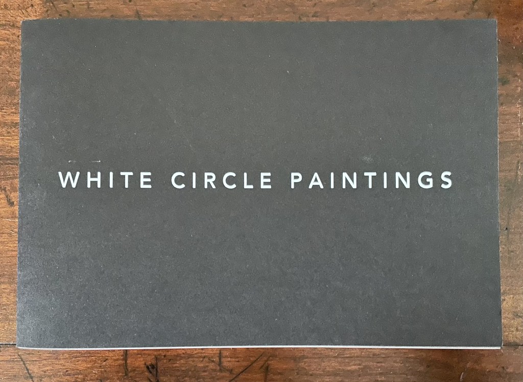
Square Photographs of White Circle Paintings (2022)
Square Photographs of White Circle Paintings (2022) Guy Bigland Saddle stitched soft cover. H150 x W220 mm. [40] pages. Edition of 100. Acquired from the artist, 12 October 2023. Photos of the work: Books On Books Collection.
The cover and title of this artist’s book create an odd road sign to appreciating the work. White on heavy black stock (320 gsm), only the second half of the title appears on the front cover. Opening the book to its bright white sturdy 148 gsm interior, we find photographs of the promised “white circle paintings” framed in dark gray to black squares. So far, so expected. But on closer inspection, the dark squares emerge as road surface. At the end of the book, almost all is revealed by a short text on the rules and history of the mini-roundabout.
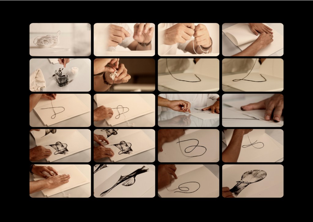
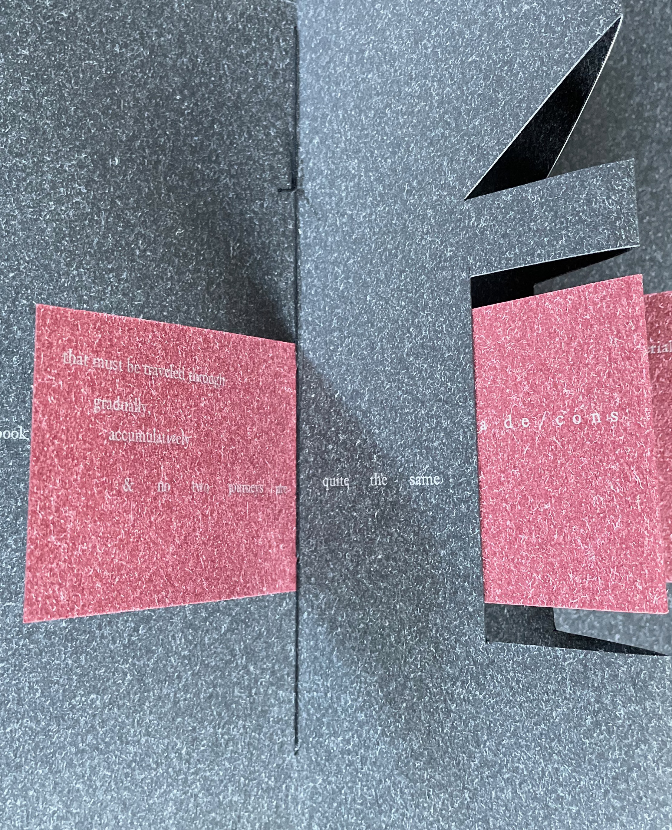
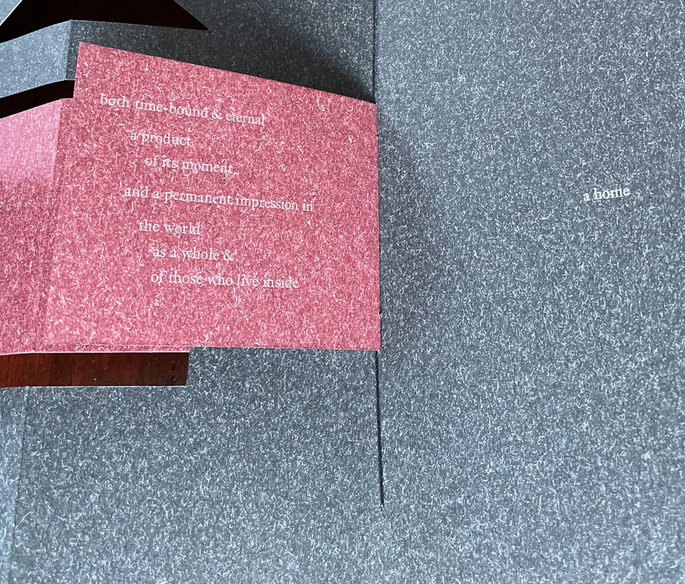
The Voice of the Yarn (2022) Pramod Chavan Casebound, glued, illustrated paper over boards, plain doublures. H325 x W235 mm. 66 pages. Acquired from the Artist, 20 May 2023. Photos: Courtesy of the artist.
The technique of painting or printing by pulling a soaked string from a folded sheet of paper will be familiar to Western kindergarten and elementary school teachers. In India, the technique has been raised to an art form. The tradition of painting with rope, string or thread had its champion in the late B.K.S. Varma. Joining that tradition to the tradition of alphabet-inspired art is a new champion: Pramod Chavan.
Chavan calls his art “thread typography”. These process photos showing his manipulation of inked thread between folds of paper suggest that “thread calligraphy” might be just as apt. Whichever term, the results achieved — without direct sight of ink, tool and surface — are astonishing. It evokes the Punch cartoon of the kingfisher sitting on a branch and calculating in its speech bubble Snell’s law for entering the water to catch the fish swimming below the surface. Pramod Chavan must have a similar speech bubble filled with calculations for Bézier curves.
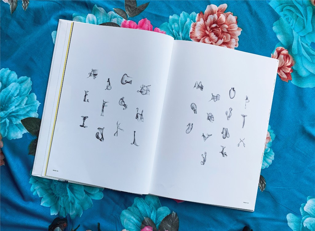
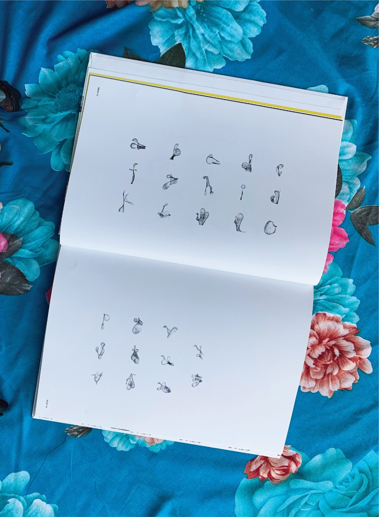
Between A and Z, The Voice of the Yarn lays out both the upper- and lower-case letters individually and the alphabet entire on double-page spreads like that above and below. The role of the fold in this technique is echoed in similar but very different ways by Jim Clinefelter’s A Rohrshach Alphabet (1999) and Étienne Pressager’s Mis-en-pli (2016).
The choice of background for photographing the double-page spreads makes a nod and smile to the usual floral images that arise when the technique is introduced for school — or after-school — art projects. Chavan’s thread typography springs from simple elements and opens into complex images — very much in the spirit of the alphabet itself.
“Carol DuBosch“. 25 February 2023. Books On Books Collection. If DuBosch recapitulates her Alphabet of Calligraphic Tricks (2014), perhaps she can persuade Chavan to contribute an ampersand!
ABC of Typography (2019) David Rault Casebound, sewn, illustrated paper-over-boards cover, endbands, sewn, red doublures. H265 x W195 mm. 128 pages. London: Self Made Hero [Translated from French (Gallimard, 2018)]. Acquired from The Saint Bookstore, 29 June 2023. Photos: Books On Books Collection.
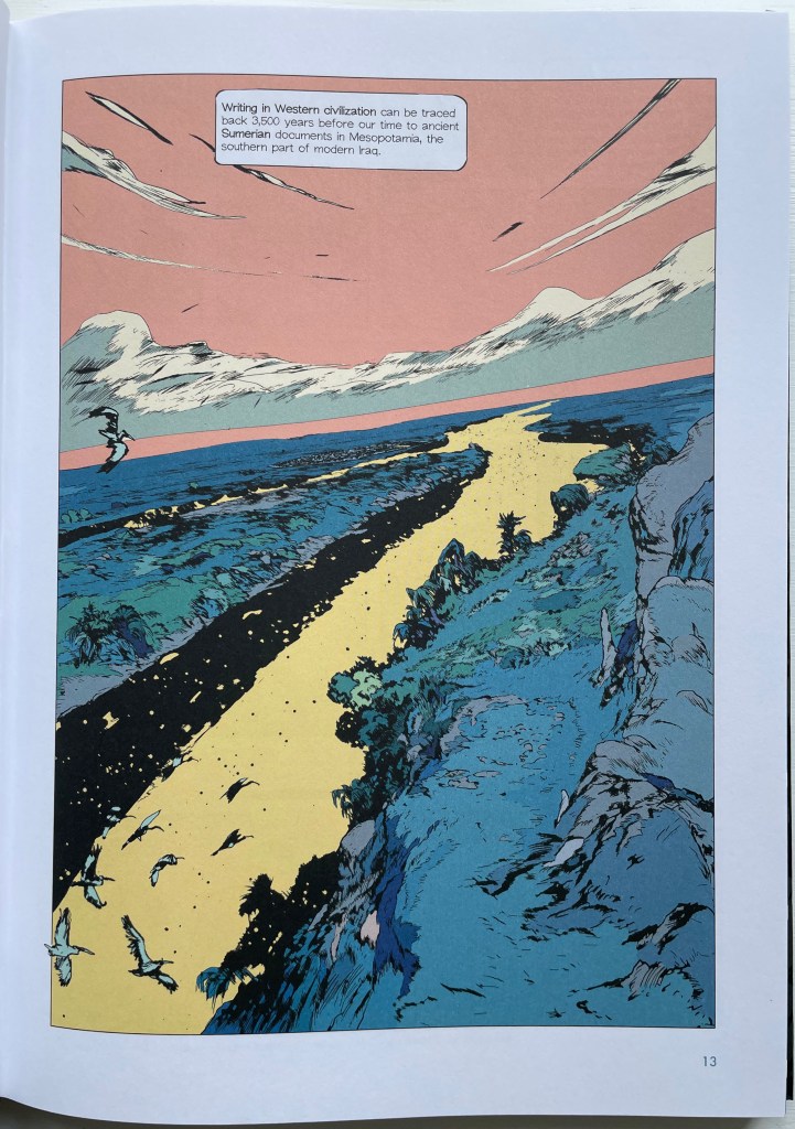
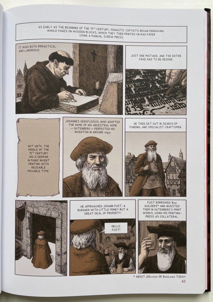
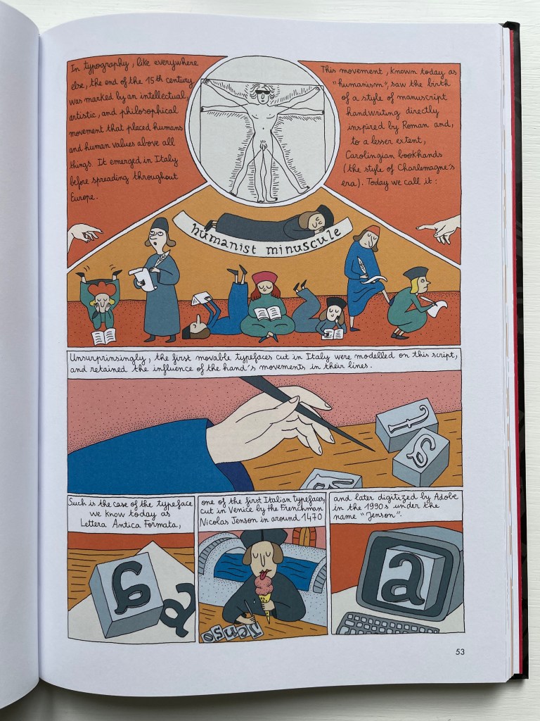
David Rault’s ABC of Typography traces 3,500 years of letters and type from pictographs and cuneiform through Roman lettering and Gutenberg to the Bauhaus and beyond. For the Books On Books Collection, it enriches the focus on the alphabet, typography and artists’ books — in particular, that subset of illustrated histories of the alphabet and type. These include Tommy Thompson’s The ABC of Our Alphabet (1952), William Dugan’s How Our Alphabet Grew (1972), Tiphaine Samoyault’s Alphabetical Order (1998), James Rumford’s There’s a Monster in the Alphabet (2002), Ada Yardeni’s A-dventure-Z’ (2003), Don Robb and Ann Smith’s Ox, House, Stick (2007) and Renzo Rossi’s The Revolution of the Alphabet (2009).
While enhancing that subset of illustrated reference works, ABC of Typography also highlights a gap in the collection. Rault and his team of invited artists hail from the Franco-Belgian tradition of lesbandes dessinées (BDs), which the French and Belgians call laNeuvième Art (“the Ninth Art”). English-language readers will likely be familiar with BDs from seeing Hergé’s Tintin or René Goscinny’s Asterix. Other than Chiavelli’s Arthur R./Un Coup de DÉS Jamais N’Abolira le HASARD (1988) and its two companion volumes, the collection has no BDs. The Rault volume does, however, deliver a mini-survey of styles among contemporary bandes dessinateurs with its assignment of chapters to eleven different artists.
The book’s overall design by Jean-Christophe Menu simultaneously embraces and sets off the individual styles of drawing and lettering. Menu’s consistent use of a slab serif font (Lubalin Graph Std?) for chapter titles alongside oversized chapter numbers that bleed off the facing page signals his intent and success.
The variety of “strip” layouts pushes the boundaries of unity. Some, like Libon’s and Clérisse’s, float on the page. Others, like Singeon’s and Simon’s, are ruled off. Within the strip layouts, panels vary in shape, and the images within them tilt at different angles, all creating as much of a sense of movement as any action comic. Even where a strip is ruled off, sketches sometimes encroach across panels as well as the book’s margins or gutter to give depth and perspective as well as movement. as happens with the gulls in flight below from Aseyn’s chapter.
Note how the gulls in flight in Aseyn’s chapter appear within panels but also cross them and the gutter.
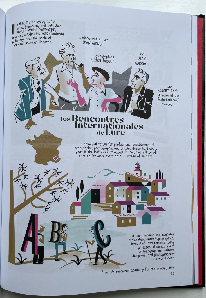
Evident from Clérisse’s recounting of “Les Rencontres internationale de Lure” (an influential annual forum in Provence), Simon’s homage to the typologist Maximilien Vox (one of the forum’s founders) and Ayroles’ positioning of the typeface DIN, the volume’s European roots are never far from the surface, which also makes ABC of Typography a useful and necessary addition to this collection or any shelf of Anglo-centric works about the alphabet, type or design. It’s interesting that, while the French have categorized BDs as the ninth among the ten officially designated arts, typography and design do not yet rate a category. Neither does the livre d’artiste for that matter, which raises a question:
Between the traditional BD and livres d’artistes by graphic artists, is there fertile ground for artists’ books that blend subject, material, form and metaphor into innovative works of book art? The above-mentioned BD by Chiavelli, paying homage to Mallarmé’s Un Coup de Dés, represents one end of that spectrum. Hervé di Rosa, part of the Figuration libre movement, associated with Keith Haring and graffiti artists, can provide the other end of the spectrum with his Un Coup de Dés jamais n’abolira le Hasard (2021), published by Virgile Legrand. For the work of book art between them, Nanette Wylde’s Babar Redacted: ABC Free (2020) might be a case in point. Likewise, Catherine Labio’s curated exhibition in 2013 — “From Bande Dessinée to Artist’s Book” — finds earlier exemplars in the works of Lars Arrhenius, Felicia Rice, Omar Olivera and Mamiko Ikeda.
Babar Redacted: ABC Free (2020) Nanette Wylde Based on an altered copy of the board book B is for Babar: An alphabet book by Laurent de Brunhoff. French link exposed spine on tapes. 9″ x 9″ x .5″ closed. Edition of 3. Photos: Courtesy of the artist.
“Richard Niessen“. 23 April 2021. Books On Books Collection.
Library of Congress. “Bande Dessinée: Comics & Graphic Novels“, in “Reading in French: A Student’s Guide to Francophone Literature & Language Learning”. Library of Congress Research Guides. Accessed 11 August 2023.
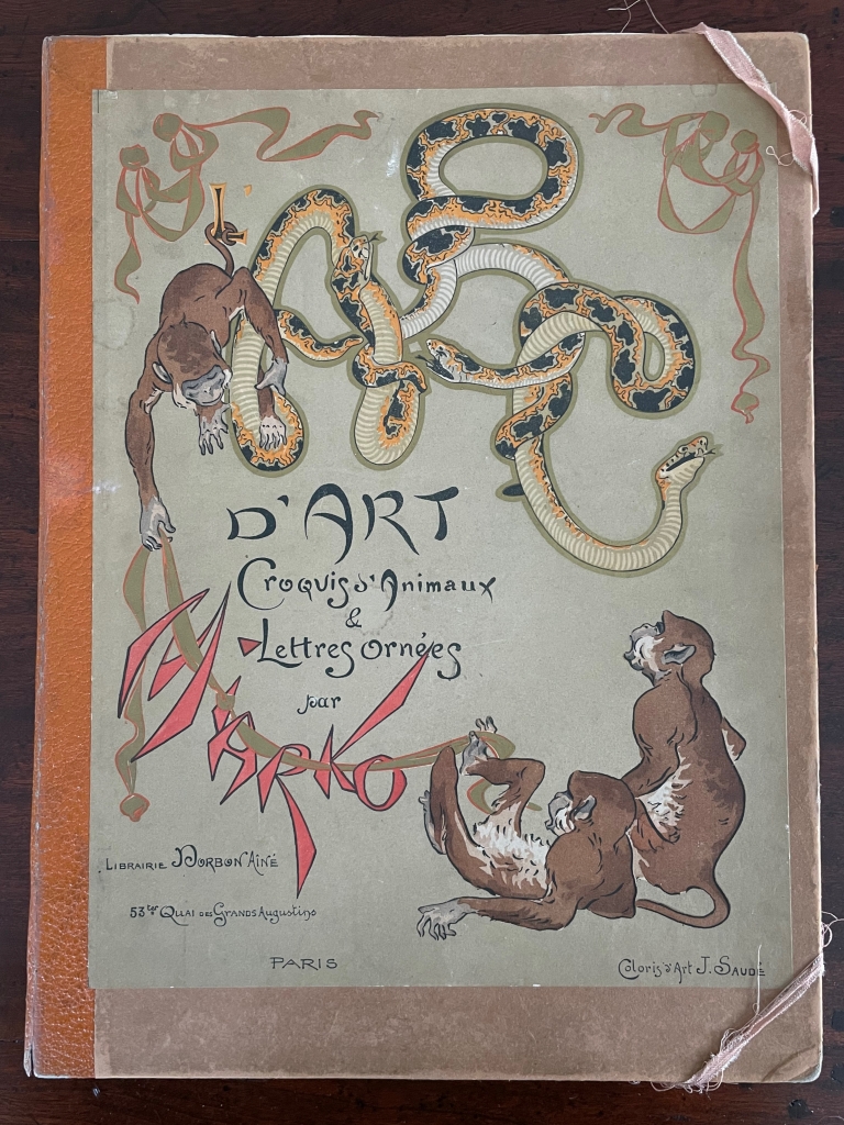
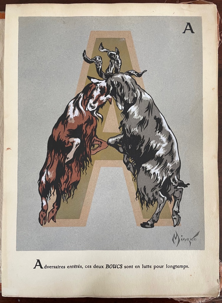
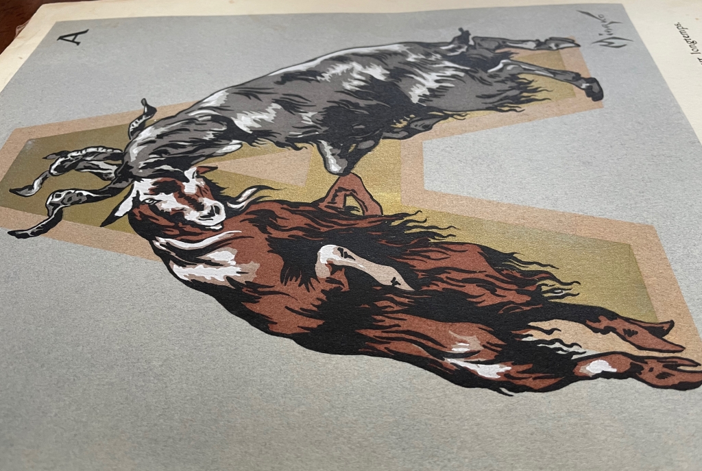
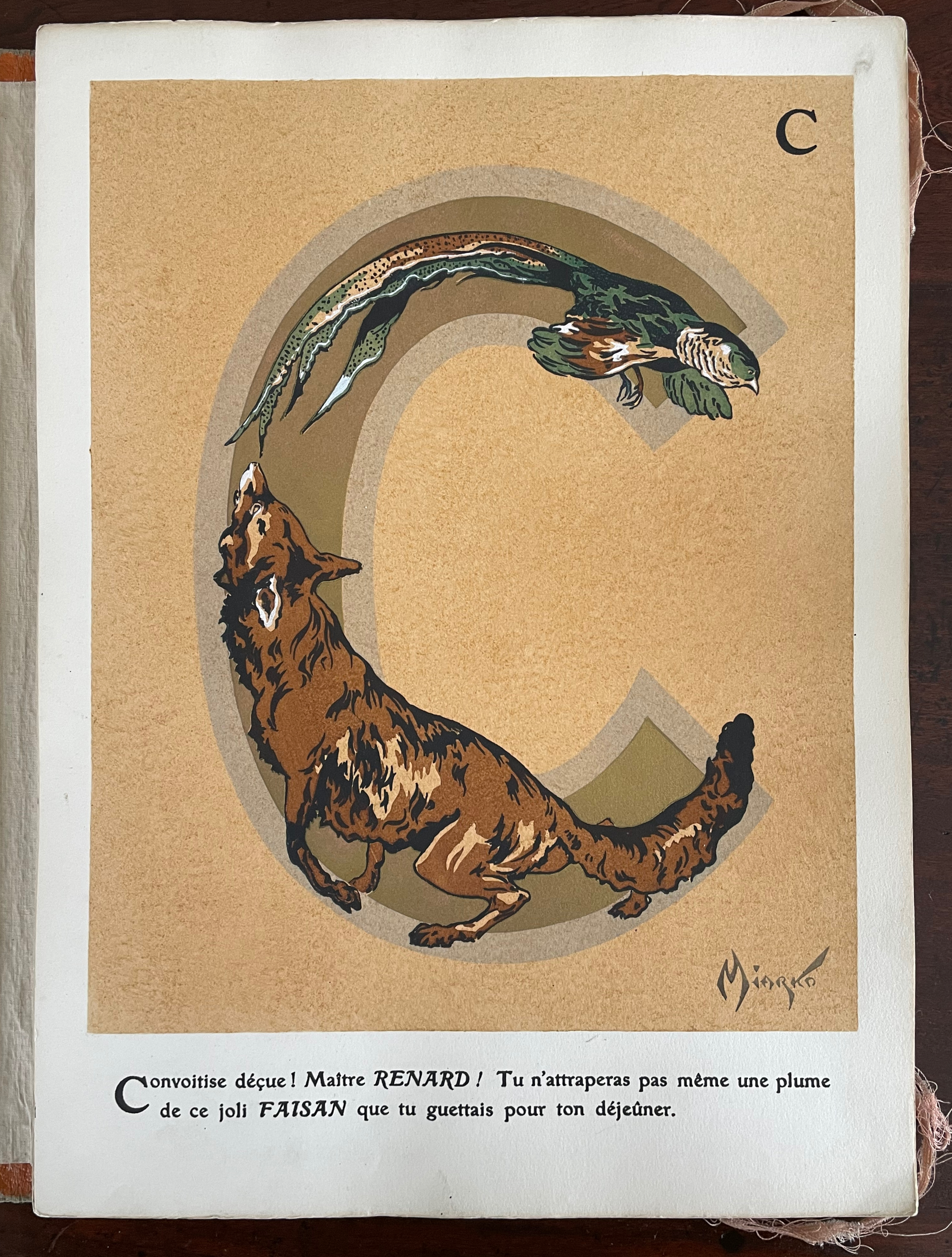
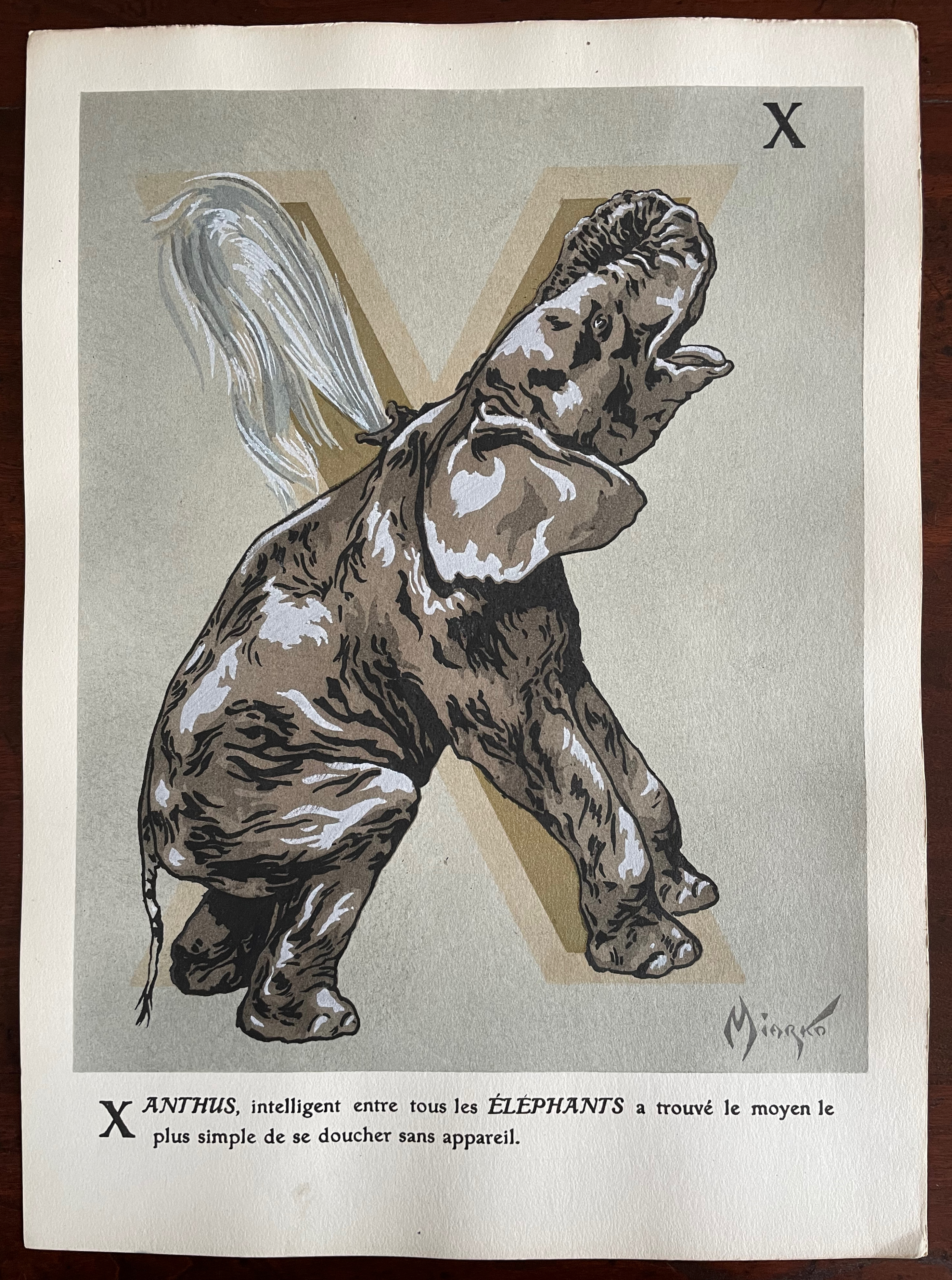
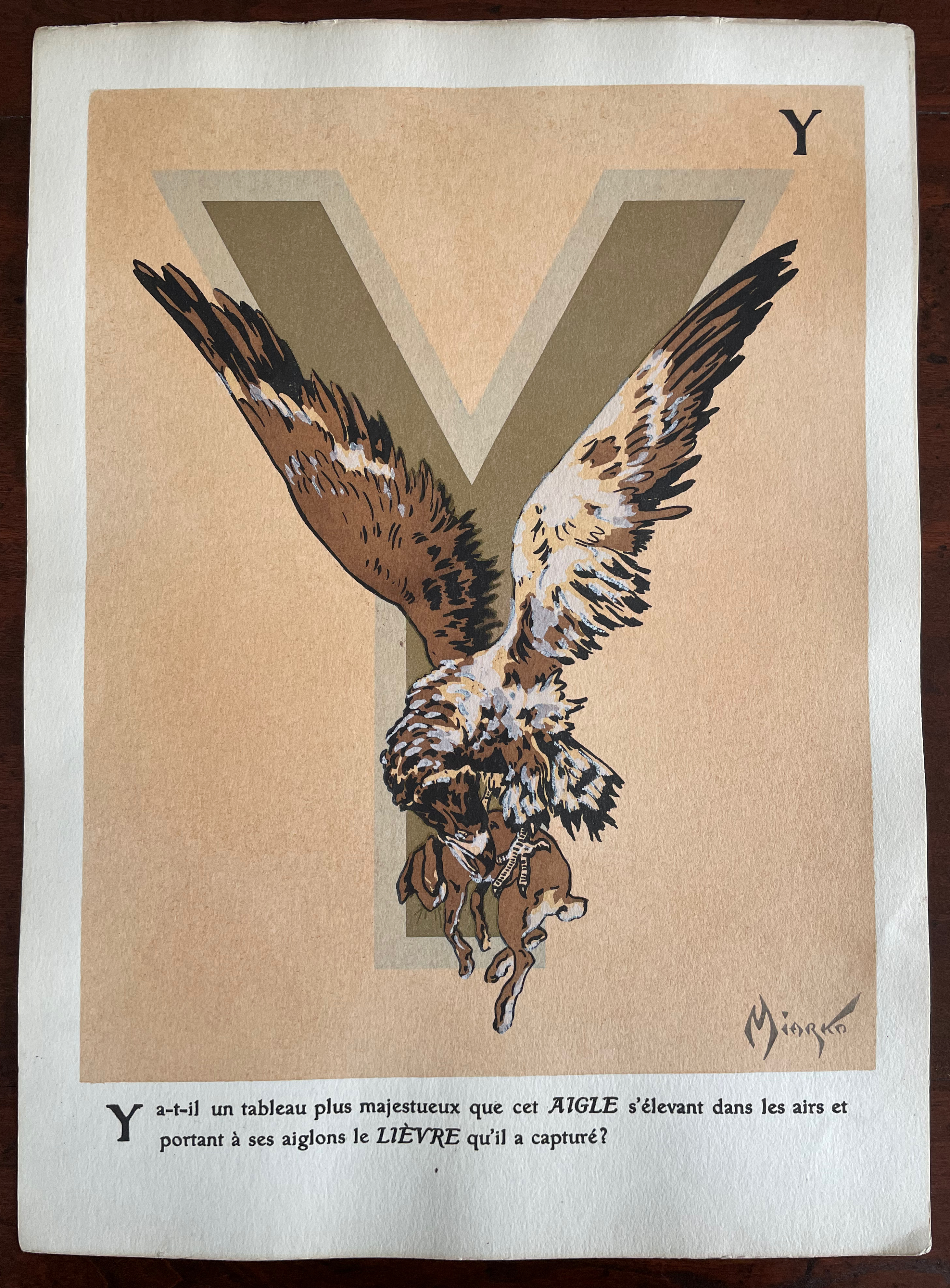
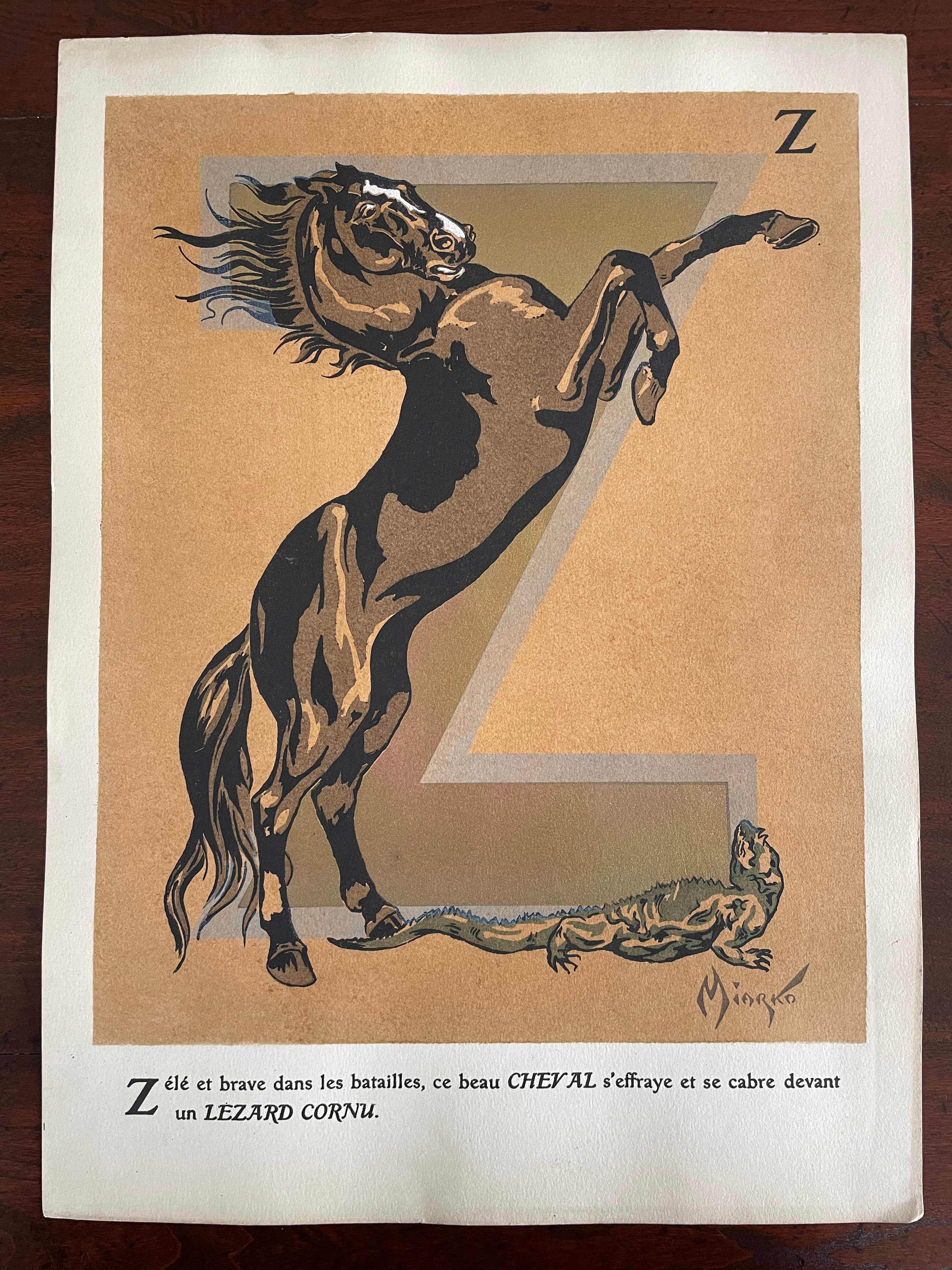
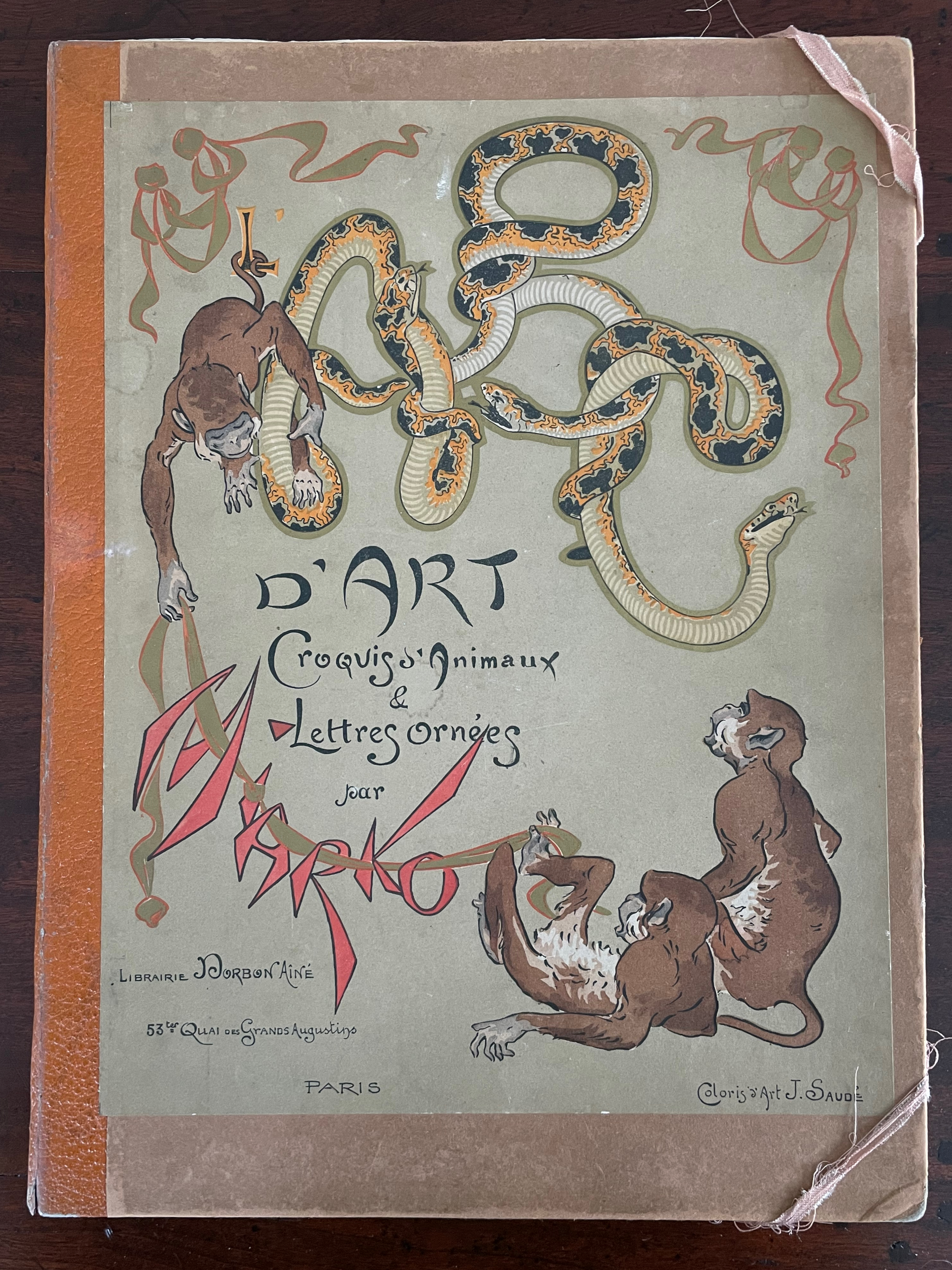
ABC d’Art: Croquis d’animaux & Lettres ornées [ABC of Art: Animal Sketches & Decorated Letters] (c. 1920) Miarko (Edmond Bouchard), Colored by Jean Saudé Portfolio, corner closures with ribbon, Portfolio: H385 x W285 mm. Prints: H380 x W280 mm. 27 folios. Acquired from ADER Nordmann & Dominique, 16 March 2023. Photos: Books On Books Collection.
Miarko (born Edmond Bouchard, 1889, Kyiv) was an illustrator, caricaturist, painter and expatriate in Paris when he died in 1924. His work followed in the Art Nouveau tradition and appeared in magazines likeThe Magpie.
Of his limited output, ABC d’Art is probably the best known. Produced by Jean Saudé, it provides a representative link in a chain of alphabet works with which to explore distinctions and affinities among different periods of art. Although Saudé was known for his pochoir work, the varying background colors of ochre, golden yellow, blue gray, mauve, etc., and use of gold paint in Miarko’s plates speak an entirely different language from that of fellow-expatriate Sonia Delaunay’s intense pochoir colors in Alphabet(1972) or even her work in the 1920s. Although some affinity with the woodcut of the horse in C. B. Falls’ ABC Book Boo(1923) can be seen, the handling of color, again, leads in different directions. Add Jasper Johns’ painting Alphabet (1959) to this chain, and marvel at the stylistic differences that arise from the artists’ blending of stencil work and brush work.
Miarko’s portfolio is a cardboard folder with an orange morocco paper spine. Its covers have lithographed illustrations in colors applied. The letters ABC formed by boas on the front cover are almost easily missed for the gamboling chimpanzees. There are twenty-seven lithographed plates in colors and gold. Each letter of the alphabet is rendered as a large initial in gold paint and outlined in another color. The twenty-seventh plate is devoted to the numerals 0-9.
Unlike most animal alphabet books, the animals do not always correspond to the initial they decorate. Rather, each initial corresponds to the first letter of the text beneath. More to the point of its difference from most animal alphabets, this one’s images and text seem to revel in nature’s tooth and claw.
“Alphabets Alive! – Animals“. 19 July 2023. Books On Books. An online version of the exhibition at the Bodleian Libraries, 19 July 2023 – 24 January 2024.
“Sonia Delaunay“. 17 July 2023. Books On Books Collection.
“C. B. Falls“.14 December 2022. Books On Books Collection.
ADER Nordmann et Dominique. 16 March 2023. Abécédaires, Etc.: Collection Bernard Farkas. Accessed 16 March 2023. Cf. Le Bestiaire by Albert Gérard and Robert Hanesse (c. 1960), p. 78.
Art Institute Chicago. Alphabet (1959). Jasper Johns. Ref. 2015.121.
Affen und Alphabete [“Apes and Alphabets“] (1962) Helmut Andreas Paul (HAP) Grieshaber Slipcased, self-covered leporello with eighteen original woodcuts of stylized apes and sixteen typographical experiments. H450 x W335 mm. 36 unnumbered sheets. Edition of 300, of which this is #68. Acquired from Winterberg-Kunst, 22 October 2022. Photos: Books On Books Collection.
HAP Grieshaber was one of the foremost German woodcut artists of the post-WWII era. His devotion to the woodcut technique was almost matched by that to the medium of the book, which he used in several formats and sizes for series works. Apes and Alphabets is one of the larger of those series and representative of his undeviating Expressionist style and blurring of borders between letter and image, the civilized and uncivilized, the artificial and the natural. This slipcased accordion book comprises 18 original woodcuts, two of which appear on the cover (one again on the wooden slipcase).
A full page of ranks of blackletter characters echoes a full page of columns and rows of apes with musical instruments. In visual cacophony, the letters make wordless strings just as the apes make soundless music.
Only one of the book’s panels has a touch of color, but the garish orange of the slipcase and book cover shows Grieshaber’s characteristic handling of this element — printing over an undercoat that serves as background. Even when working with a single color in these prints, Grieshaber earns his description as Der Holzschneider als Maler (“the woodcutter as a painter”), to which could be added “collagist”. Although influenced by Paul Klee and Lyonel Feininger, the physical intensity of the prints, this book and the others below sets Grieshaber apart.
His use of heavy wove paper in this work and other monumental ones like Die Rauhe Alb (1968) is equally of a part with a drive toward the tactile and a reaction to the alleviation of wartime paper shortages, which comes up later in Herzauge (1969) below.
Poesia Typographica (1962)
Poesia Typographica (1962) Helmut Andreas Paul (HAP) Grieshaber Paperback, perfect bound Chinese-fold folios, black endpapers. H215 x W155 mm. 28 unnumbered pages. Edition of 1000. Acquired from Print Arkive, 22 October 2022. Photos: Books On Books Collection. Displayed with permission of the publisher Galerie der Spiegel.
The alphabet theme of Affen und Alphabete carries over in the hornbook images on the front and back covers of Poesia Typographica. More than most typographic or concrete poetry, Poesia Typographica addresses the materiality of letters, images, ink, paper and printing — even going so far as to exalt it over the alphabet.
This is particularly clear in Grieshaber’s use of white ink on a transparent sheet to record the tale of missionary Baedeker and his Analphabeten Bibel (“Illiterates’ Bible”). To the Russian peasantry to whom Baedeker distributed thousands of the booklet, he claimed that its eight pages contained “the whole Bible, the pure teaching of our Jesus Christ”. The typeset transparent sheet sits between what would otherwise be a double-page spread of solid black. That spread is followed by one of red, one of white and then one of gold.
The transparent page explains :
the peasants saw in the black of the first page the darkness of their sinful hearts, their great guilt.
in the red of the next page, they united with the divine blood of christ. they walked out the suffering steps of our lord. washed clean in the blood of his love, they won innocence:
the pasture linen of the third page, that is the purity that must be in the heart.
ready to enter into the mystery, to look into the sunshine of God’s face. to fall down in prayer, the sound of the golden trumpets of heavenly bliss in their ears.
A literate reader may smile at the missionary’s metaphorical hoodwinking of the serfs, but the longer the reader moves the transparent page back and forth, registers its interloping nature, and recognizes that “analphabet” doesn’t just mean “an illiterate” but also one who does not know letters at all, the more the materiality of the stiff black, red, white and gold pages makes itself felt and the more the viewer realizes that Grieshaber is laying down a challenge to look beyond the alphabet to the ink, paper and the printing.
Just as in Affen und Alphabete, the reader/viewer must look at letters beyond “shapes for sounds”. Letters may have their roots in the pictorial, but Grieshaber isn’t taking their “shapeness” back to pre-Gutenberg or pre-alphabet pictoriality. He takes it into an expressive post-Gutenberg, post-alphabet visual and material art.
Herzauge (1969)
Herzauge (1969) Helmut Andreas Paul (HAP) Grieshaber Board book casebound in bookcloth, with illustrated dustjacket. H294 x W240 mm. 16 unnumbered pages with 9 color plates. Edition of 800? Acquired from K.G. Kuhn Antiquariat, 14 July 2023. Photos: Books On Books Collection. Displayed with permission of artist’s family.
Hat das Herz noch ein Auge? (“Can the heart still see?”), Grieshaber asks on the last page of this artist’s book for children published by Parabel Verlag in Munich. It’s a disturbing afterword. It changes what you think these Expressionist woodcuts and the words beside them express. Grieshaber explains that, by 1937, paper for printing was scarce. From a generous doctor, he obtained filtration paper on which to print his landscape woodcuts Die Rauhe Alb, his visual ode to the Swabian Alps. Children brought him the sheets of glossy paper on which the original 20 copies of Herzauge were printed and over-drawn with a dry brush. No one wanted Die Rauhe Alb at the time, and all but one copy of Herzauge were lost. His summary phrase — Märchen in dunkler Zeit (“Fairy tales in dark times”) — offers a way into the board book and perhaps an answer to the question “Can the heart still see?”
Second double-page spread. “Ach Alm, a knight once moaned. Achalm, I live in your lap.”
Achalm is a mountain in Reutlingen, Germany. On its top are the ruins of Achalm Castle, ancestral seat of the counts of Achalm, a 13th-century Swabian noble family. The legend is that the name comes from Count Egino’s dying words to his brother. He meant to say “Ach Allmächtiger!” ( “O Almighty!”) but only uttered “Ach Allm…“, and to honor Egino, the brother named the mountain and castle Achalm. It’s a clever poem and clever woodcut. The last word Schoß — meaning bosom, arms, heart or lap — is close to the word Schloß — meaning castle. Turning the castle into a fairy tale crown, the woodcut also gives the mountain a feminine visage, a sweep of white that looks like an embracing arm and a village nestled in its lap.
This spread comes after the first in which a black woebegone bird in a brush-streaked patch of snow occupies the foreground alongside the lines “Winter is a hard man. The tree freezes.” And it precedes the third in which the viewer’s perspective must be that of standing on a dock and looking out on a harbor alongside text that reads, “Do you hear the horn hooting in the harbor? We are leaving.” Achalm is the fairy tale bookended by dark cold before and forlorness after.
The fourth spread’s text — Wer streicht am Abend allein über de Berge? Die Katze weißes.(“Who is painting alone in the mountains in the evening? The cat knows.”) — is a fairy-tale blend of gloomy forest and mysterious animal humor matched by the dark purple undercoat and background of the woodcut.
A fifth spread with colors of dark blue, burnt umber and green against a turquoise undercoat and background shows a distressed Hansel-and-Gretel-like pair on the turquoise path between blue and umber trees and beneath a large blue, umber and turquoise owl that cries “Home, home!” as Der Nacht krab kommt (“The night call comes”)
The sixth and seventh spreads introduce a different air of childhood innocence, one of lessening threat. In the sixth, a child figure with upraised arms (throwing an orange ball up in the air?) wanders down a meadow valley bordered by a knoll of trees leaning over the otherwise sunny scene with black and purple foliage that suggest the faces and hair buns of stern school mistresses. The last line of text — Ich mußzur Schule (“I must go to school”) — evokes a nursery-rhyme dawdling ten o’clock scholar to English ears. In the seventh, Wir haben Ferien (“We have holidays”) sounds like the concluding sentence in a final school assignment and is matched by the child-like drawing of swans, roses, a green lake and a motherly figure. But mother is faceless, preparing us for the afterword’s hopeful but worried question “Can the heart still see?”
It’s good to see a renewed interest in Grieshaber — not only for his own artistry but also his medium. Another of his major works — The Easter Ride, a series of 27 colored woodcuts based on a journey through the Swabian Alb — was exhibited at the Elztalmuseum Waldkirch in early 2023.
Helmut Andreas Paul Grieshaber, better known as HAP Grieshaber, is one of the most important artists of the 20th century in the field of woodcuts. He created numerous large-format, abstract works on socio-political and religious themes. He was considered down-to-earth and idiosyncratic. His art was intended to be visible and accessible to all. … The exhibition invites visitors to engage with Grieshaber’s idiosyncratic, unmistakable visual language and to become acquainted with the technique of the woodcut.
“The Easter Ride” – HAP Grieshaber In this special exhibition, the Elztalmuseum is showing one of the artist’s major works: “The Easter Ride”. 10 March 202307 May 2023, Elztalmuseum Waldkirch
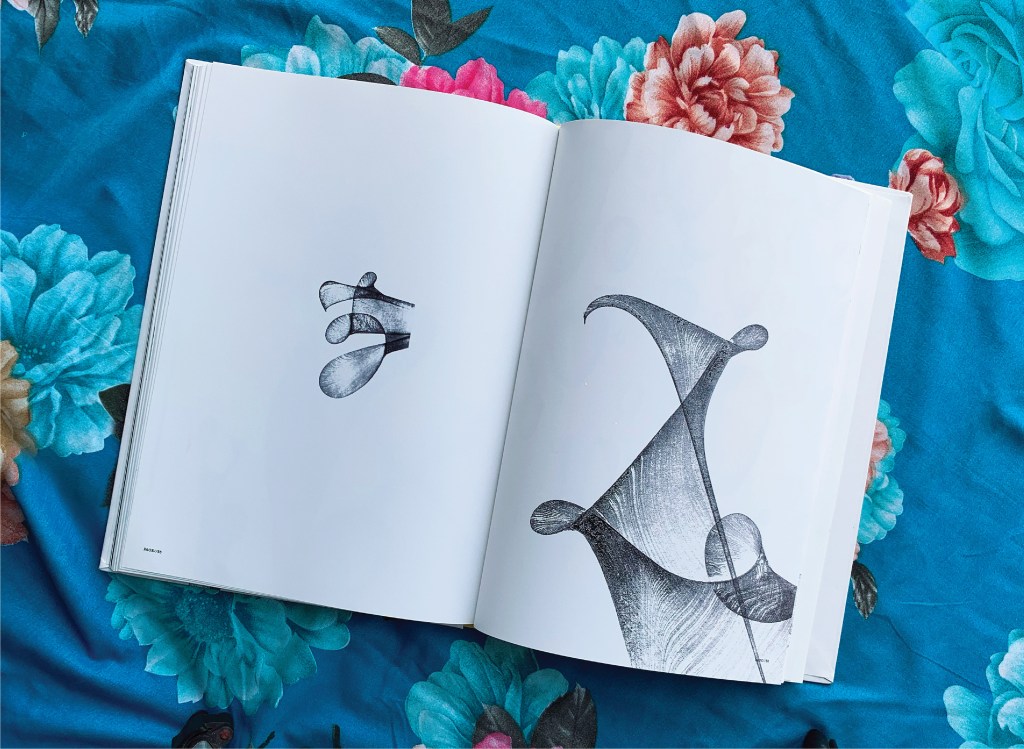
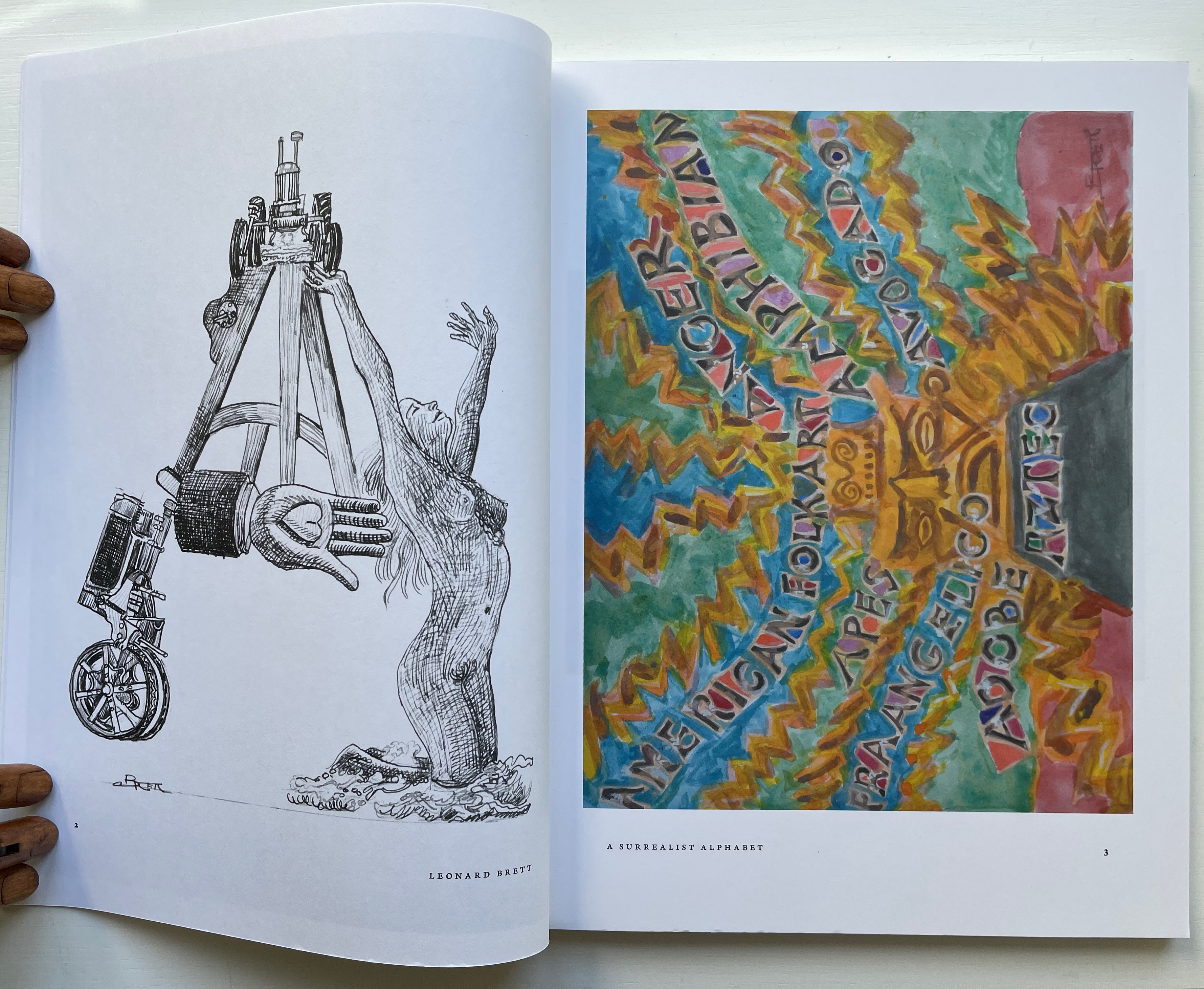
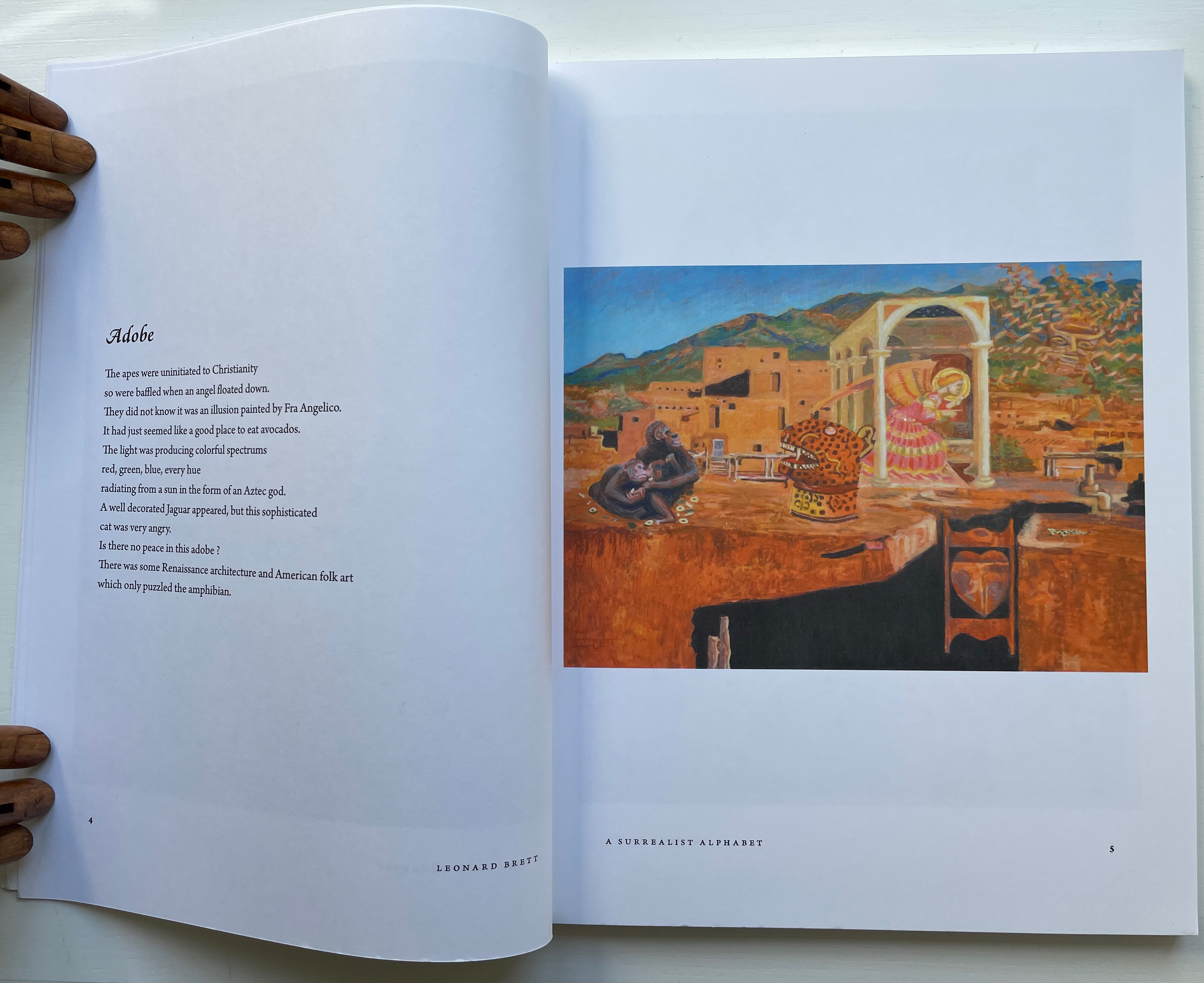
A Surrealist Alphabet (2014) Leonard Brett Perfect bound paperback. 216 x 280 mm. 120 pages. Acquired from Amazon.fr, 10 February 2023. Photos: Books On Books Collection. Displayed with permission of the artist.
Per the artist’s statement, an interest in the aesthetics of script as visual symbol led him to the Louvre and British Museum for studies of ancient scripts — Sumerian, Egyptian, and Chinese — and to Bali, Egypt and Istanbul for inspection of contemporary scripts and sources of inspiration. Juxtaposition of that with images and text alluding to baseball teams (the Blue Jays and Orioles ), celebrities (Elvis and Marilyn Monroe), Renaissance painters (Raphael and Pisanello among others), movies and TV shows (Casablanca and X-Men) and much more leads to one of the densest and most frenetic of alphabet artists’ books in the Books On Books Collection.
Each letter receives two double-page spreads. The first is a diptych, consisting of a black-and-white etching forming a composite letter across from a color image that may come from a watercolor or a host of other media; the second, a poem and another color image (again varying as to media) playing off the poem. The etchings and original color artwork were in an exhibition sponsored by the Sunshine Coast Arts Council in Sechelt BC, Canada,1-26 March 2017. According to the exhibition’s description, “The drawings in the book were used as a reference to produce the engravings shown in this exhibition. The engravings are done in the traditional manner using a burin to cut the plate, there is no acid used. They are inked and printed the same way as an etching on damp rag paper.”
The color treatments of A and Z suffice to show how the artworks in exhibition complemented and differed from the book. Just these letters’ two double-page spreads, however, come nowhere near the effect of unrelenting variety and creativity delivered by the volume as a whole.
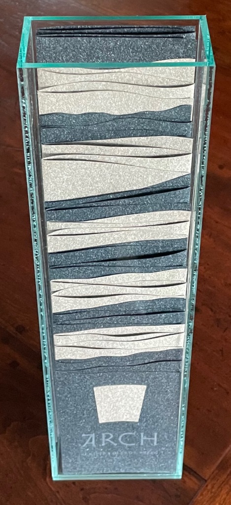
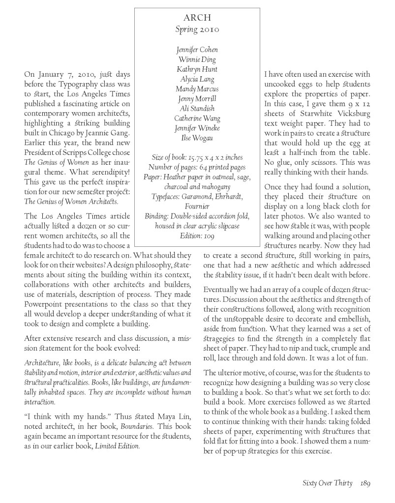
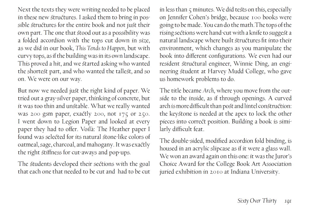
Arch (2010) Kitty Maryatt, Jenny Karin Morrill, Ali Standish, Alycia Lang, Jennifer Wineke, Mandesha Marcus, Catherine Wang, Kathryn Hunt, Ilse Wogau, Jennifer Cohen and Winnie Ding Acrylic slipcase, leporello formed of self-covering booklets sewn together. Slipcase: H410 x W110 x D50. Leporello: H400 x W 90 mm (closed). 64 pages. Unnumbered copy from edition of 109. Acquired from Bromer Booksellers, 7 December 2022. Photos: Books On Books Collection
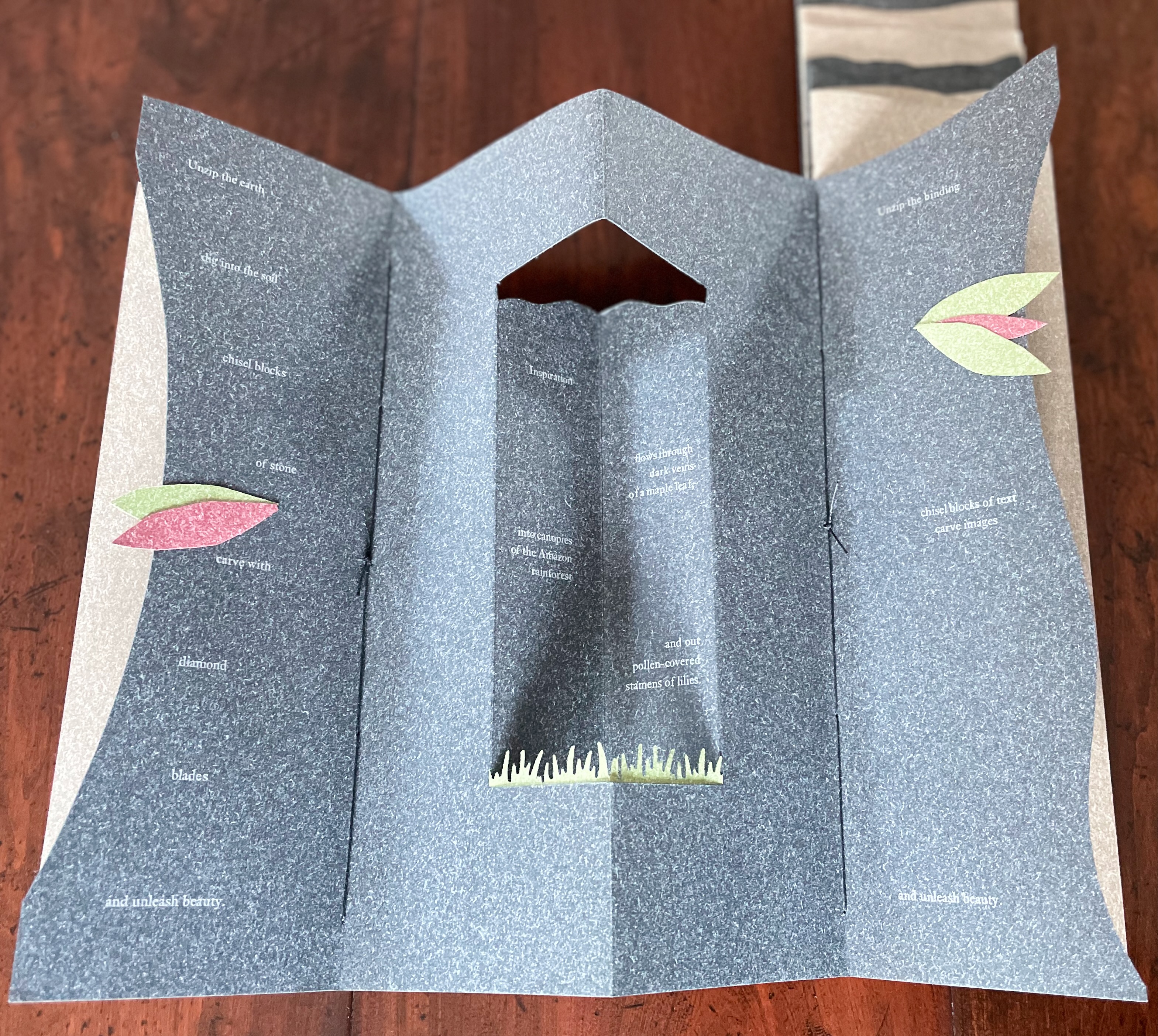
Nôtre-Dame de Paris (1831), Archdeacon Claude Frollo points to the book in his hand and then to the cathedral and says, “This will kill that”. It is ironic that Hugo’s book (popularly known now by its English title The Hunchback of Nôtre-Dame) was written in large part to save the then-decaying cathedral (post-Revolution, it served as a warehouse), and it succeeded. It is also ironic that, while the fictional character’s metaphor has a point about the book’s permanence of replicability outlasting the building’s permanence of stone, it misses the collaborative foundations of both.
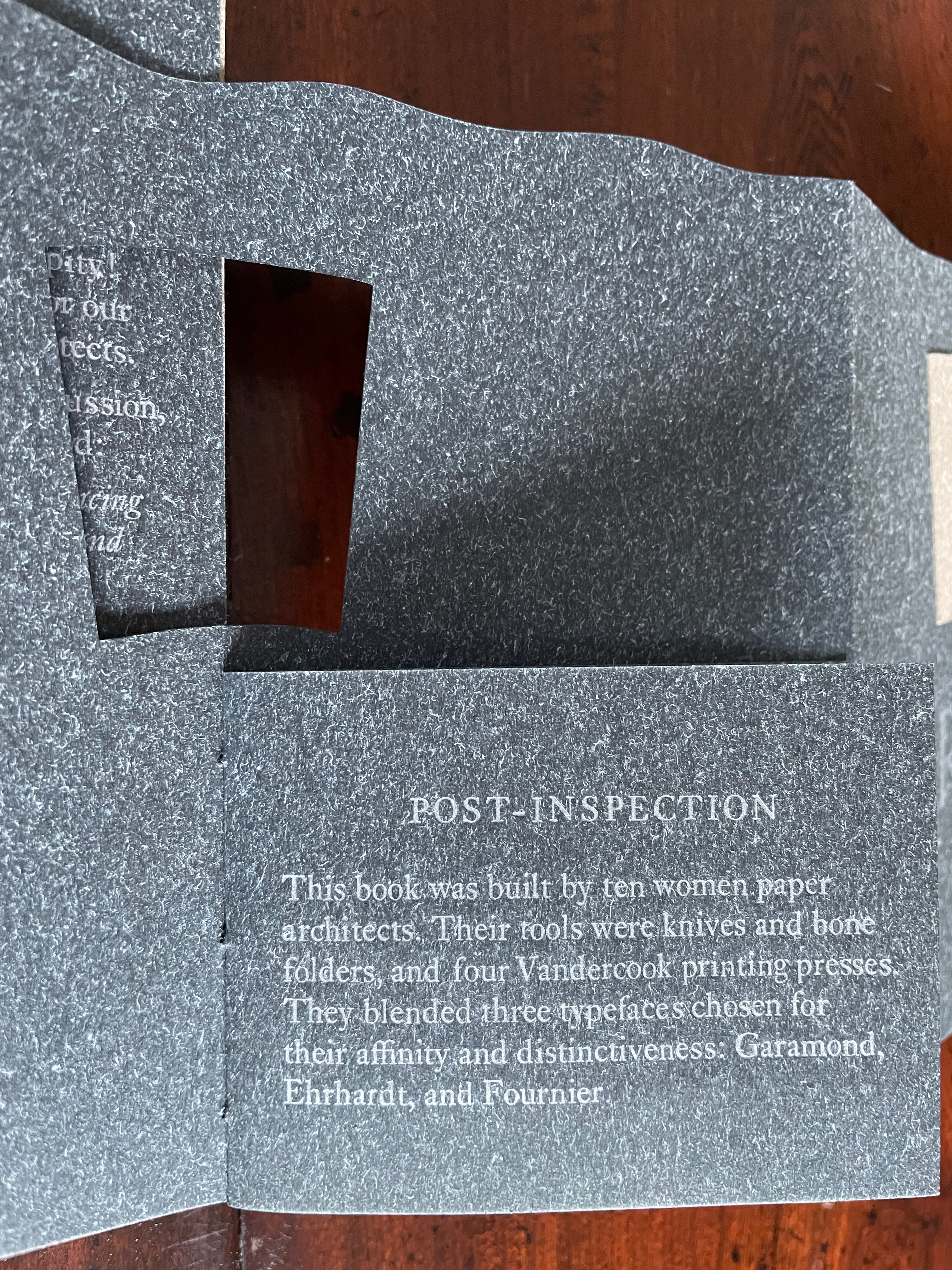
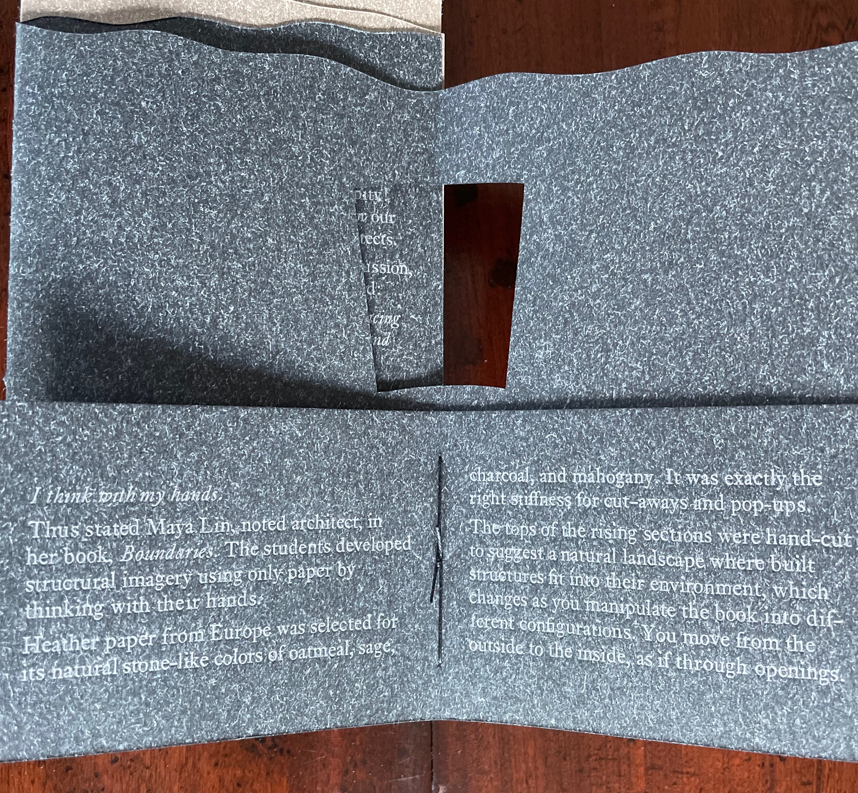
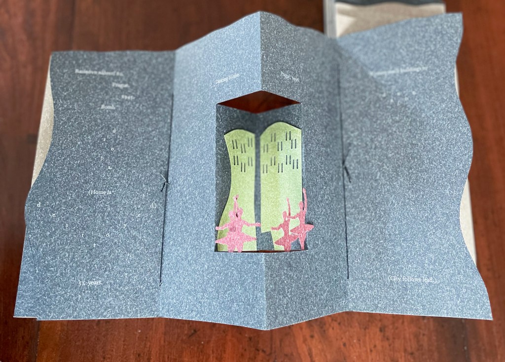
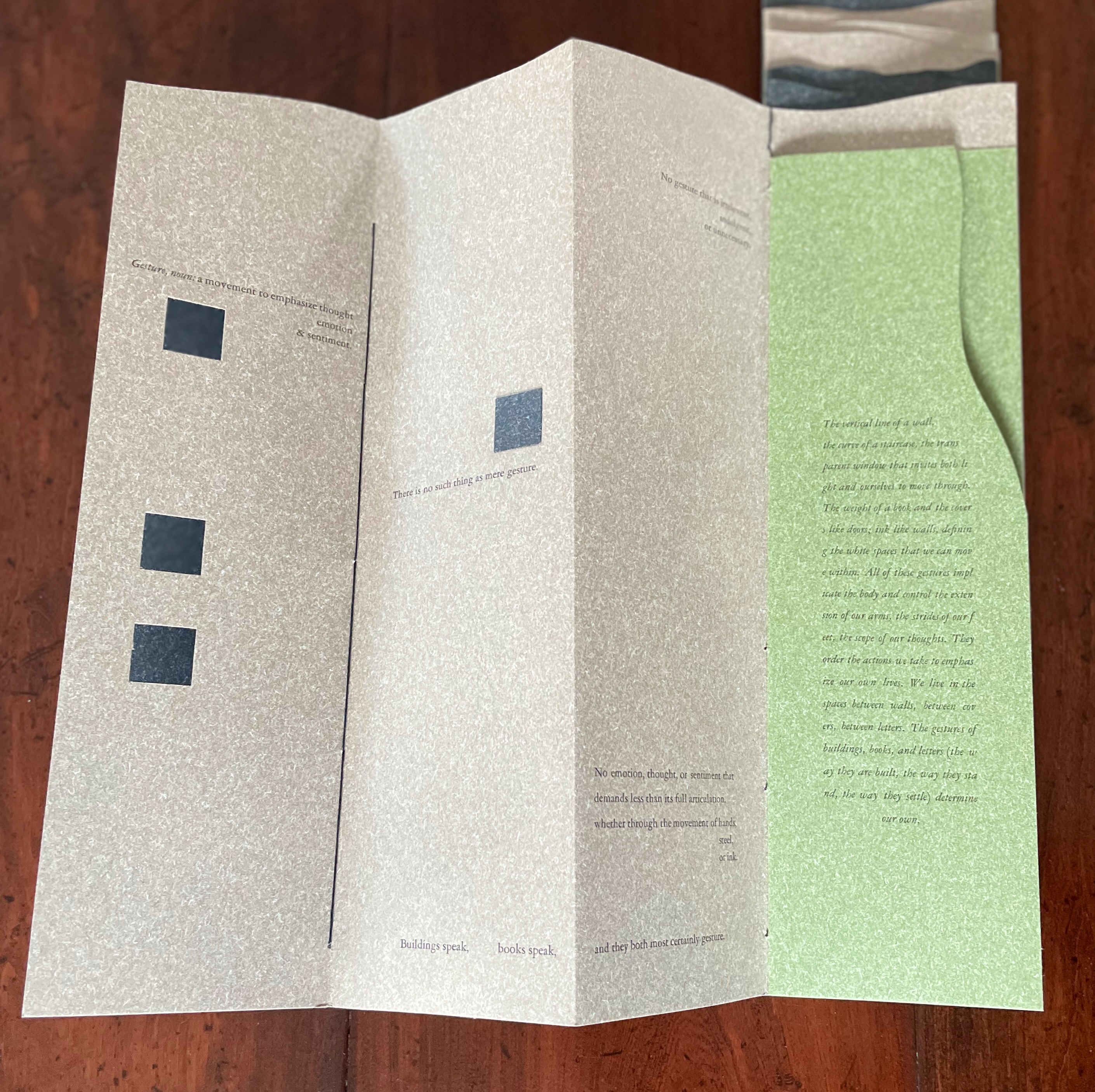
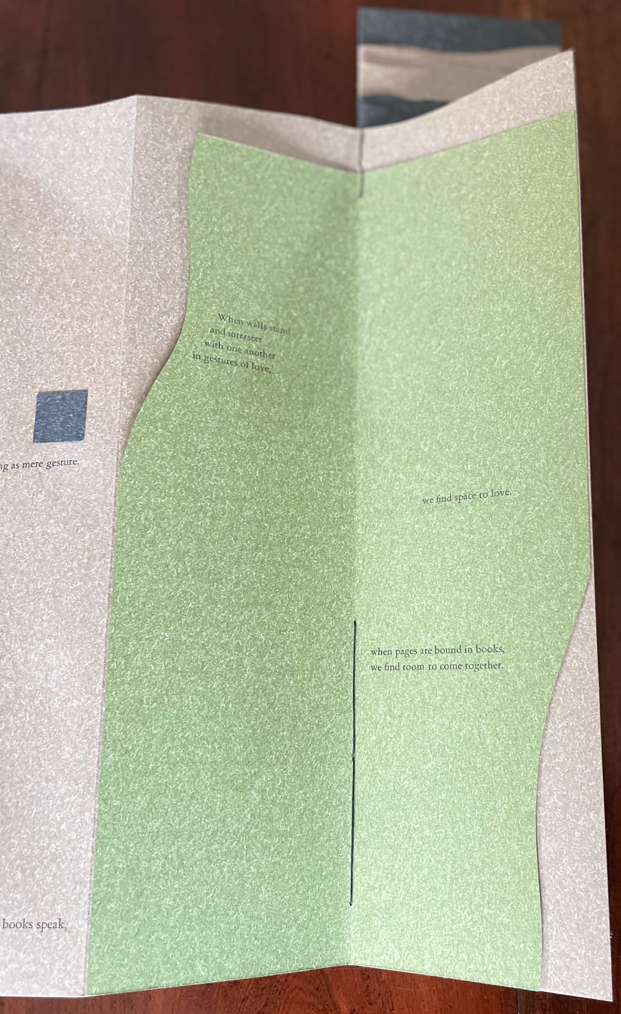
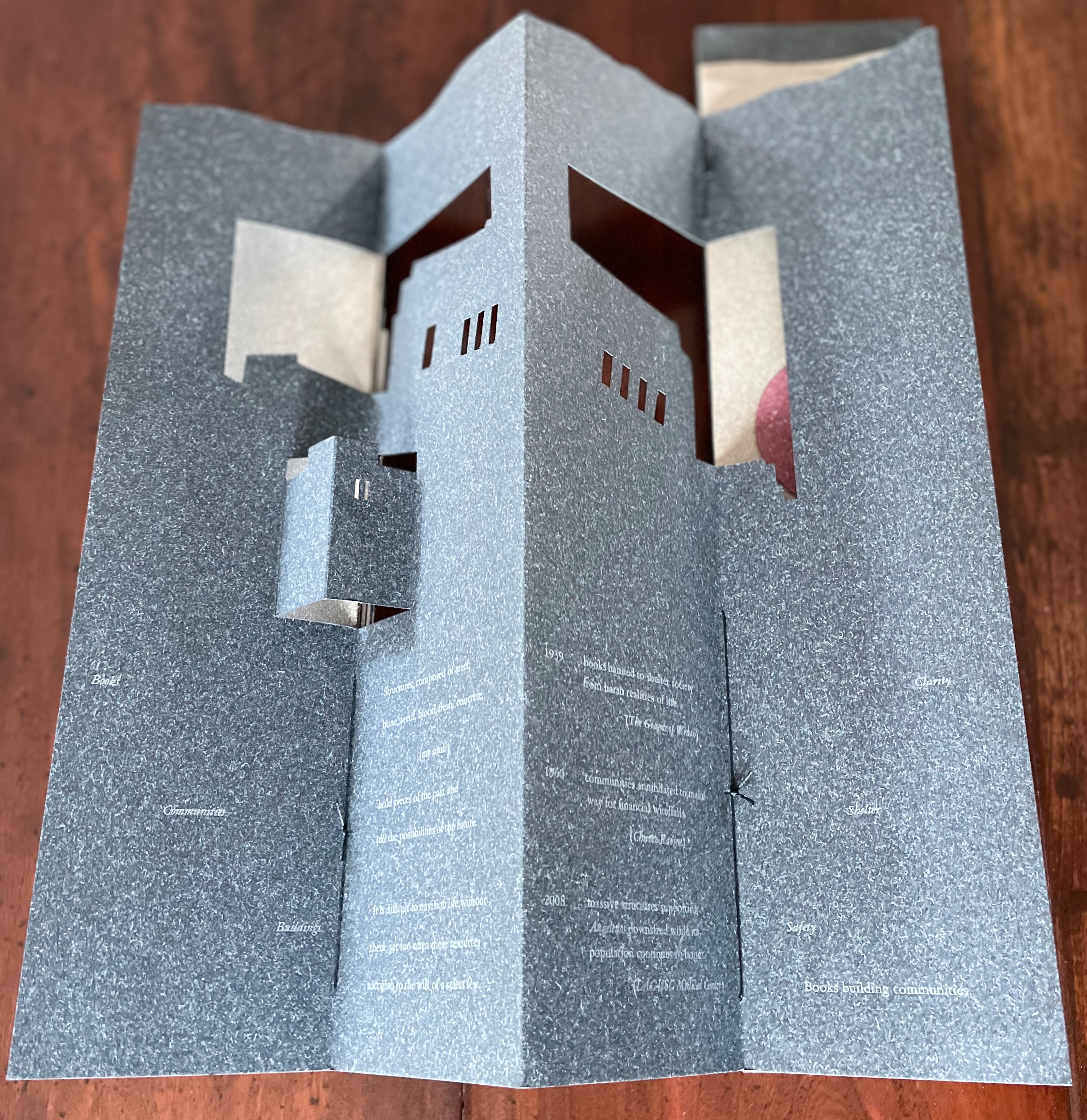
Arch (2010), created by ten students at Scripps College under the direction of Kitty Maryatt, reminds us that the creation of a book — even a work of book art — is a collaborative effort. All the students involved in the design, planning and production were women, a happenstance serendipitously blessed ahead of time by a Los Angeles Times article celebrating women architects. Drawing on that article and Maya Lin’s Boundaries (2000) as well as other research, the students agreed on a mission statement for the work: “Architecture, like books, is a deliberate balancing act between stability and motion, interior and exterior, aesthetic values and practicalities. Books, like buildings, are fundamentally inhabited spaces. They are incomplete without human interaction.”
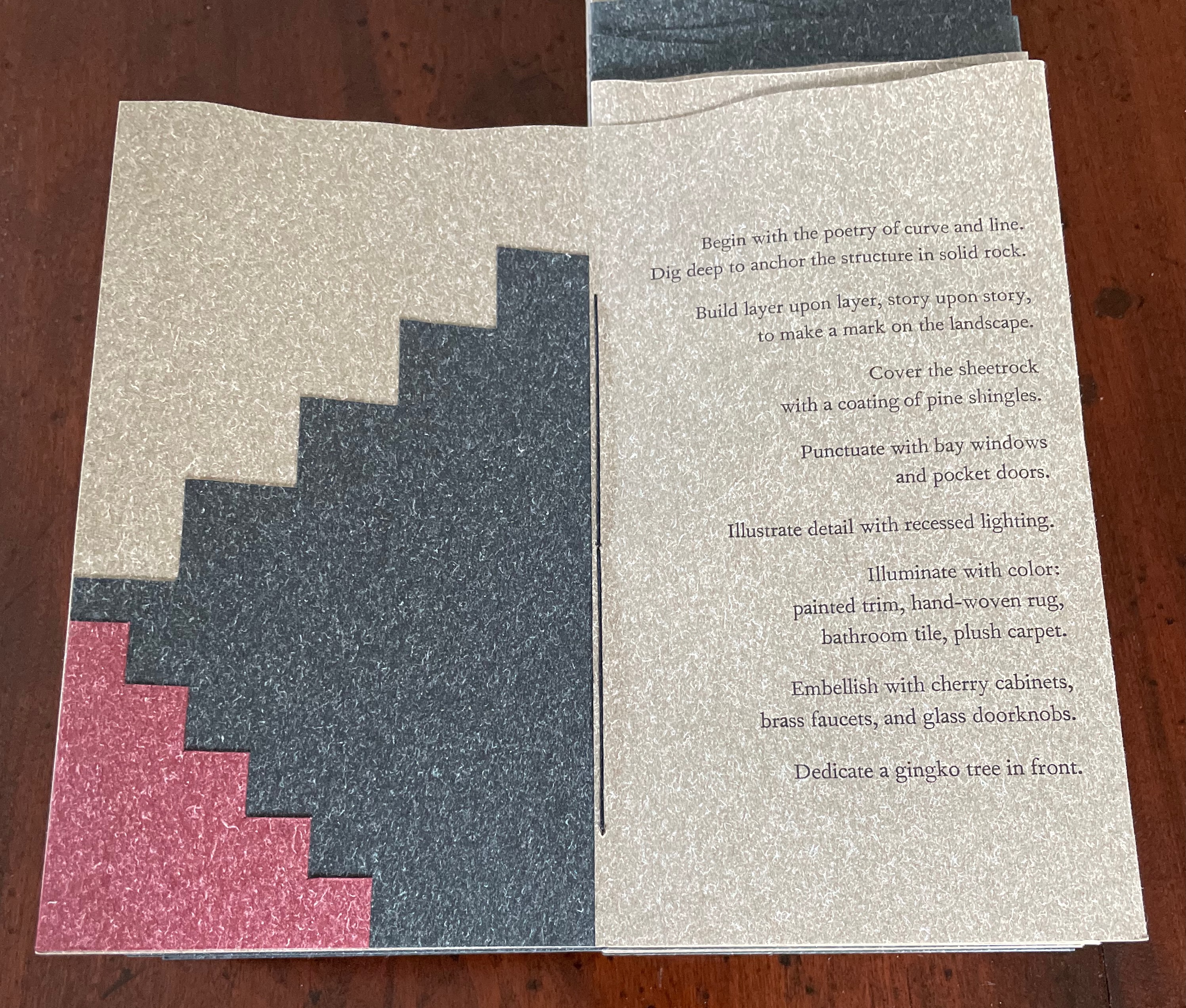
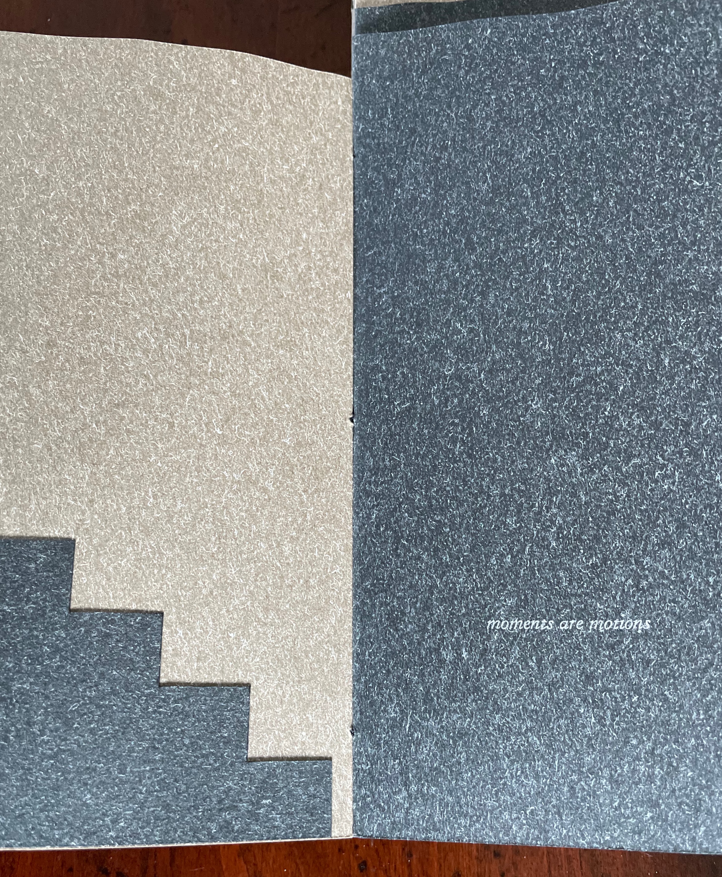
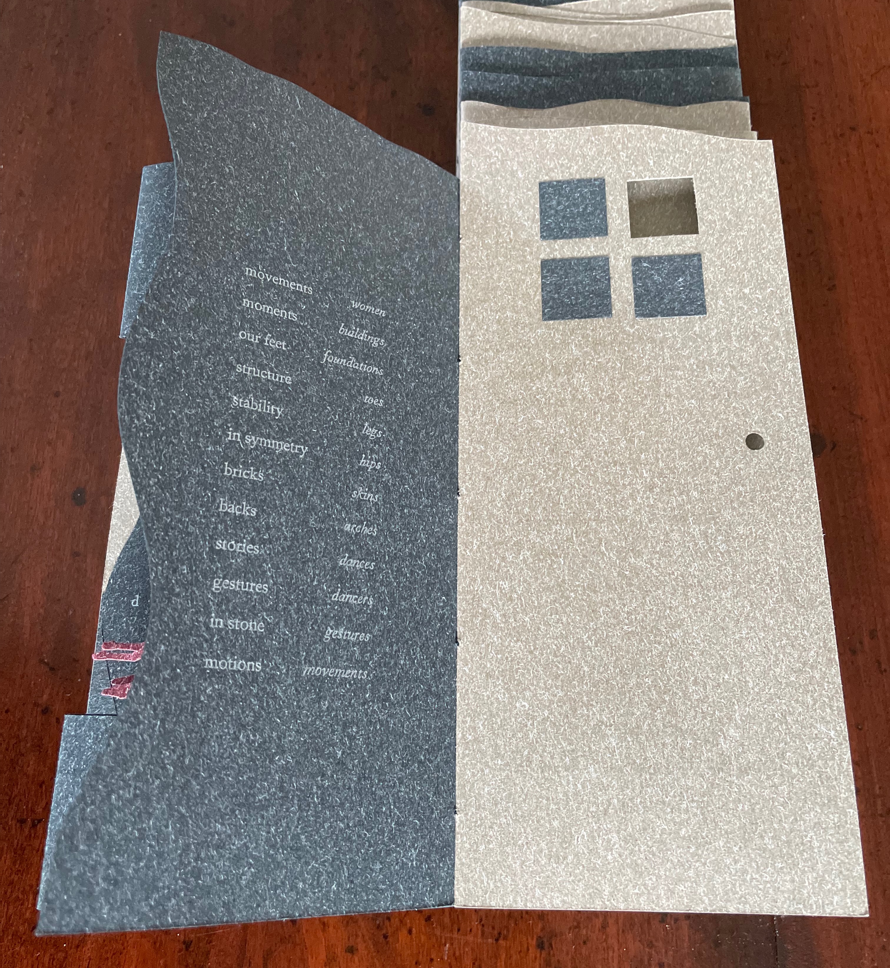
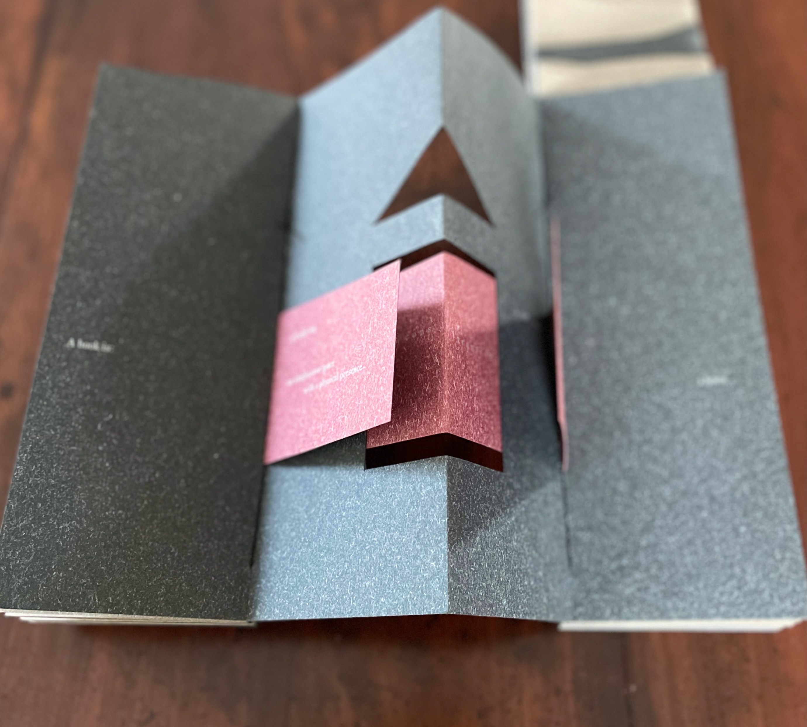
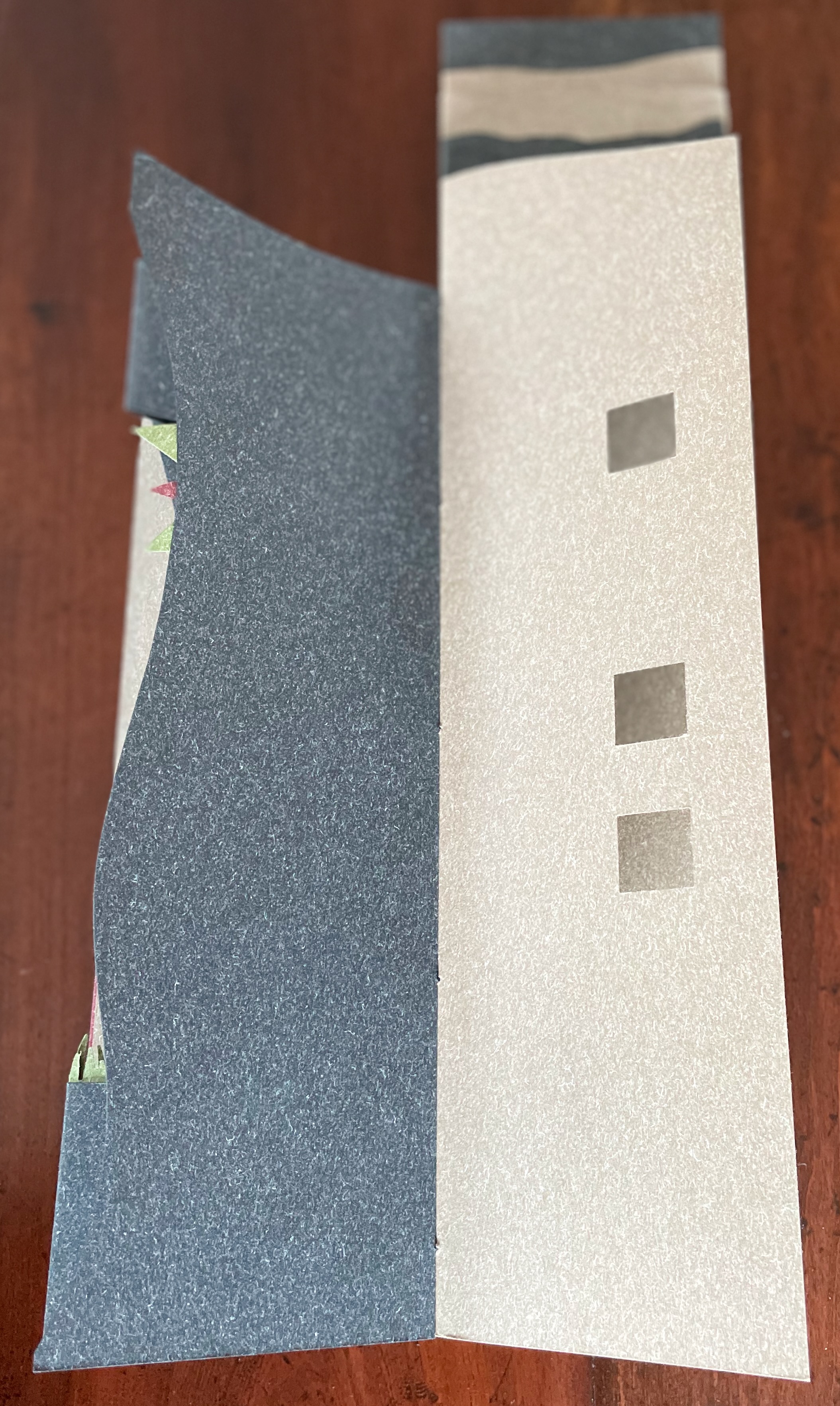
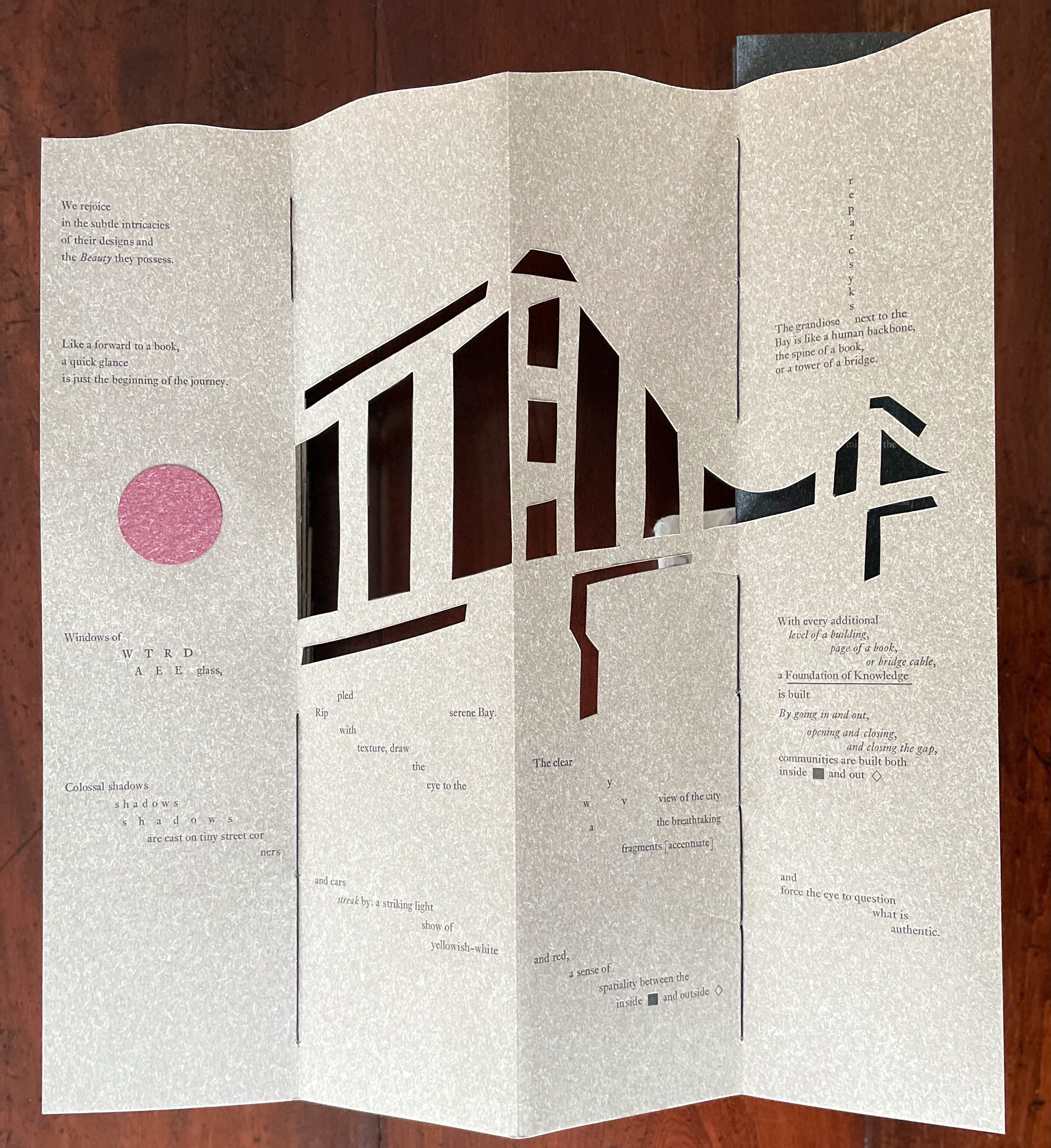
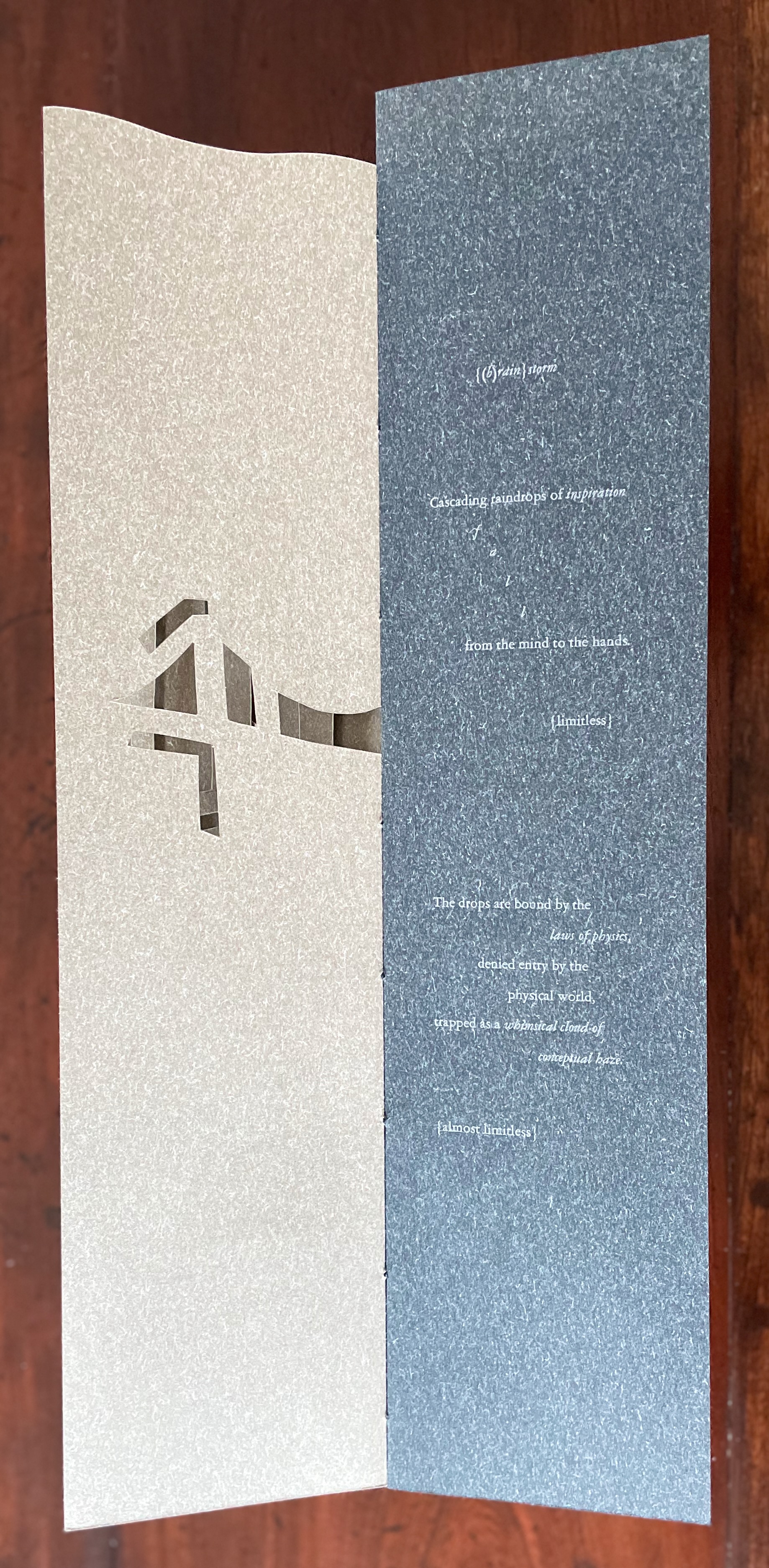
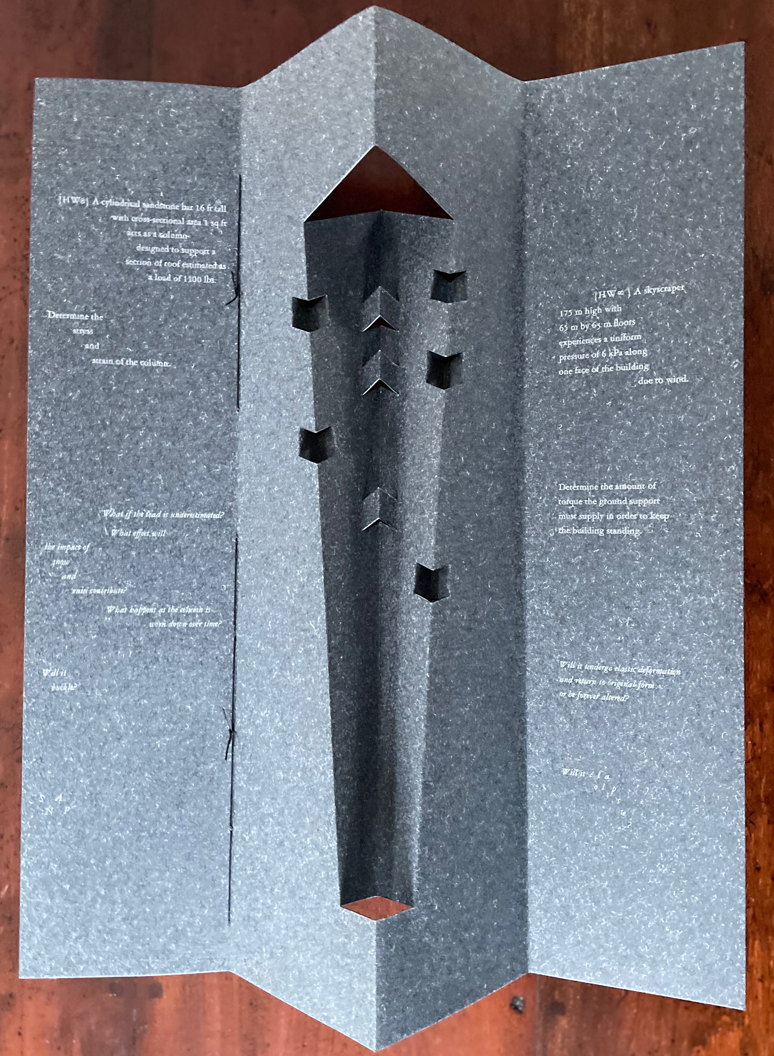
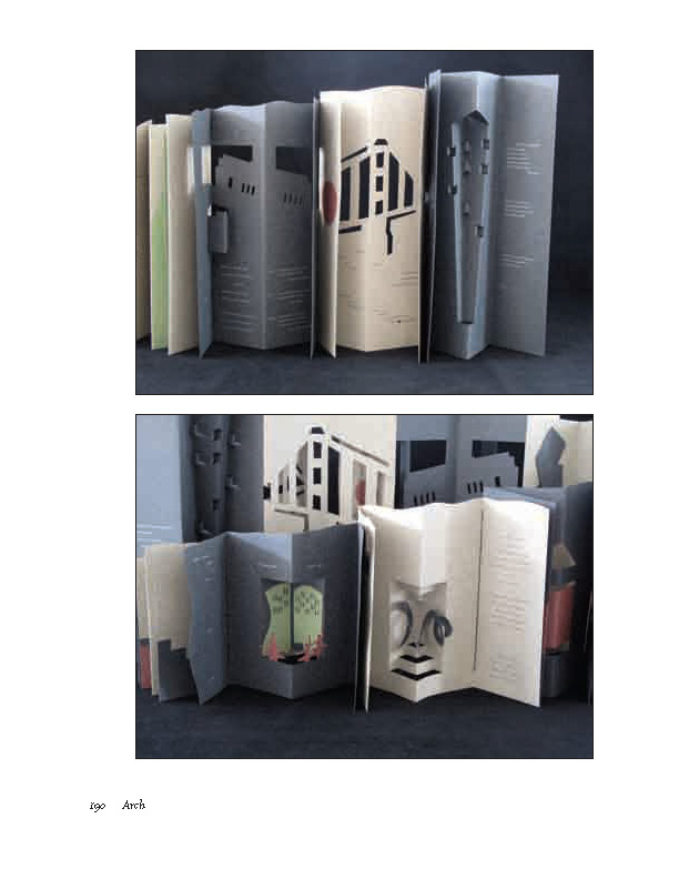
Clever structural use of paper with a stone-like appearance, paired with apt choices of text matched with equally judicious choices in typography, evoke the similarities between books and buildings. Each architect/bookmaker’s contribution is a self-covering booklet in leporello format. Of different heights, the booklets are sewn together to create a tiered tower to be housed in an acrylic slipcase.
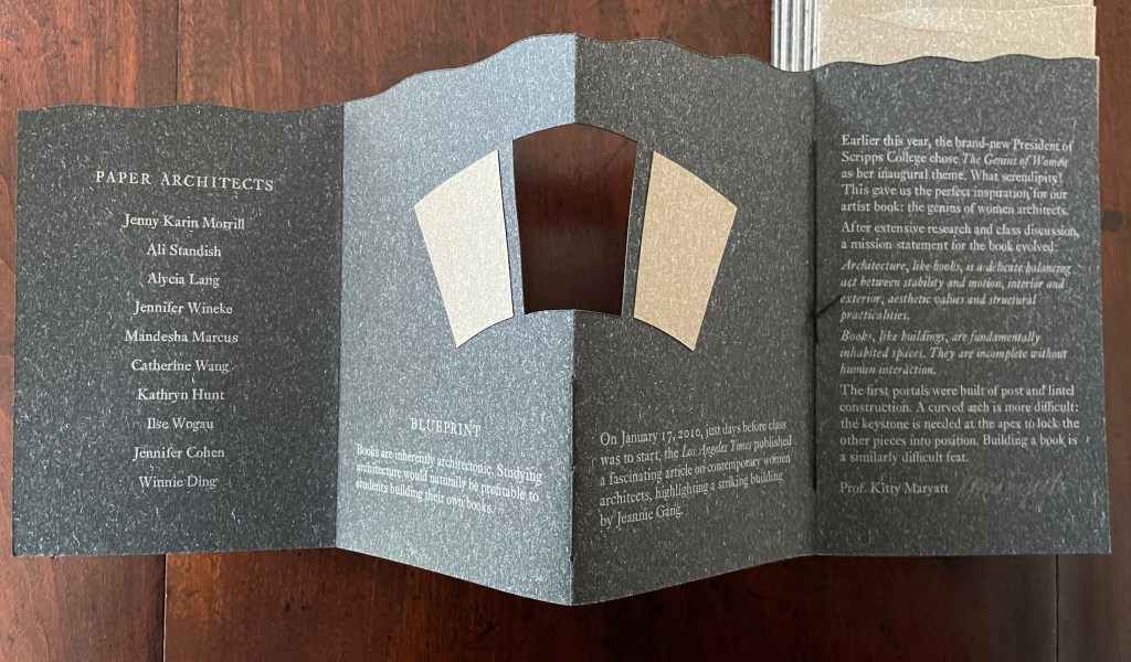
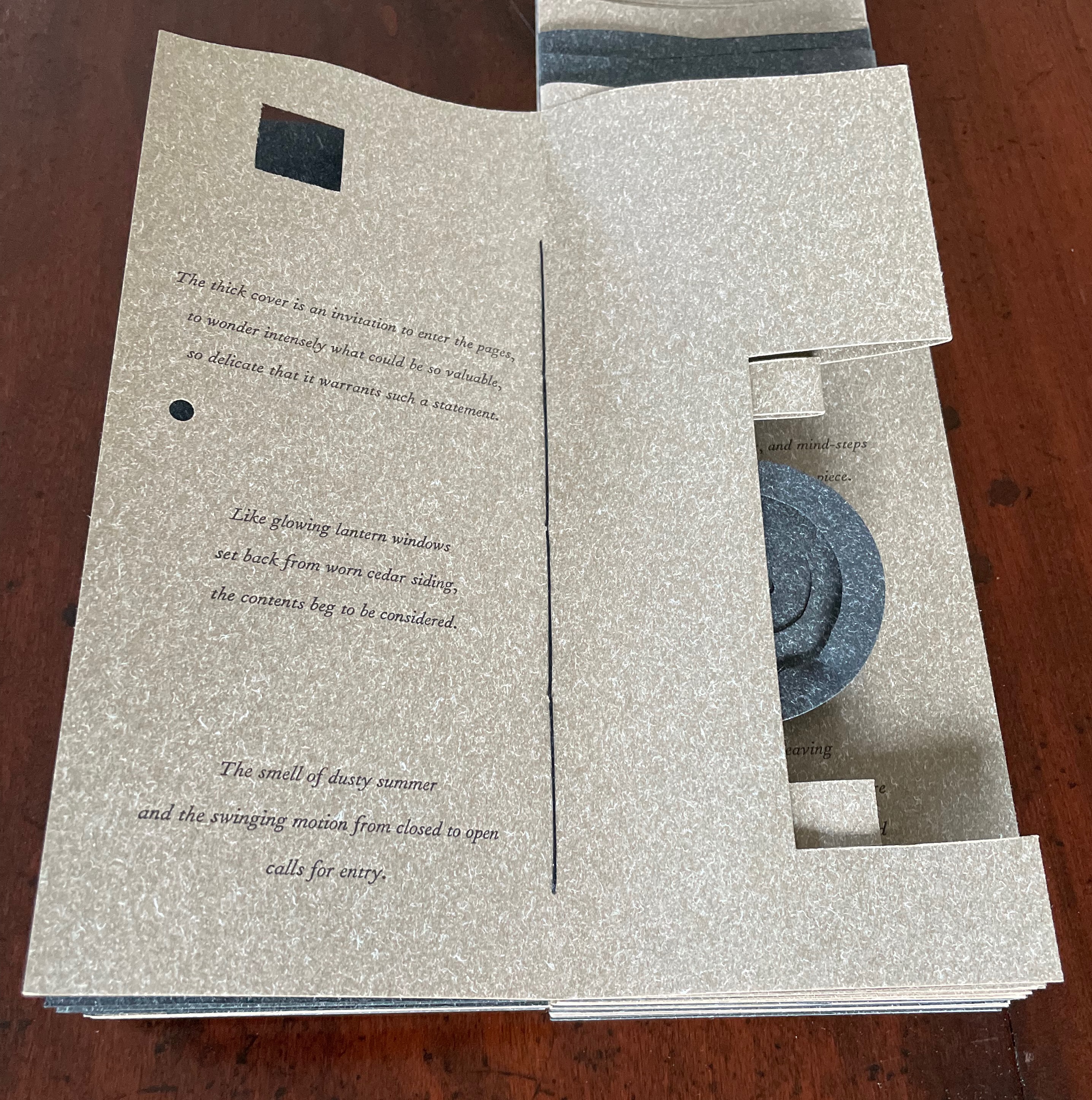
The first booklet, open below, incorporates Maryatt’s introduction, entitled “Blueprint”, all of which appears in the work’s entry in the publication Sixty over Thirty: Bibliography of Books Printed Since 1986 at the Scripps College Press (2016). The entry is reproduced in full further below.
The next booklet lists the sources of architectural inspiration, and as the lattice door on the list’s facing page turns, two sets of stairs, cutouts in contrasting colors, ascend on the verso page to the text that begins at the top of the recto page and ends at the foot of descending stairs on the next double-panel spread. Like Maya Lin, Maryatt’s students built their works by learning to think with their hands. The reader, too, has to think with the hands to experience fully this booklet and those that follow. The whole work conjures up the titles of Juhani Pallasmaa’s books — The Thinking Hand and The Embodied Image. Readers of this online entry will have to expand the images below, enjoy the words and imagine their way through with the title of another of his books — The Eyes of the Skin.
Lynn, Greg. 2004. Folding in Architecture Rev. ed. Chichester, West Sussex: Wiley-Academy. See for references to Mario Carpo, Gilles Deleuze and Peter Eisenman.
Macken, Marian. Binding Space: The Book as Spatial Practice (London: Taylor and Francis, 2018). A trained architect and book artist, Macken articulates and illustrates the how and why of the overlap between architecture and book art.
Williams, Elizabeth. 1989. “Architects Books: An Investigation in Binding and Building”, The Guild of Book Workers Journal. 27, 2: 21-31. This essay not only pursues the topic of architecture-inspired book art but turns it on its head. An adjunct professor at the time, Williams set her students the task of reading Ulises Carrión’s The New Art of Making Books (Nicosia: Aegean Editions, 2001) then, after touring a bindery, “to design the studio and dwelling spaces for a hand bookbinder on an urban site in Ann Arbor, Michigan”. But before producing the design, the students were asked “to assemble the pages [of the design brief and project statement] in a way that explored or challenged the concept of binding”. In other words, they had to create bookworks and then, inspired by that, create their building designs. Williams illustrates the essay with photos of the students’ bookworks. [Special thanks to Peter Verheyen for this reference.]
Erwin Huebner is a professor at the University of Manitoba engaged in research and teaching cell and developmental biology. He is also a book artist and miniaturist. Following his work, the Books On Books Collection has started small and hopes to grow into his larger works. At both ends of the spectrum, Huebner’s themes resonate with the integration of art and science, a recurrent focus of the collection (see Further Reading below).
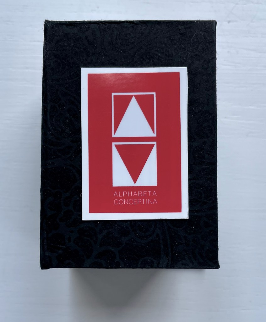
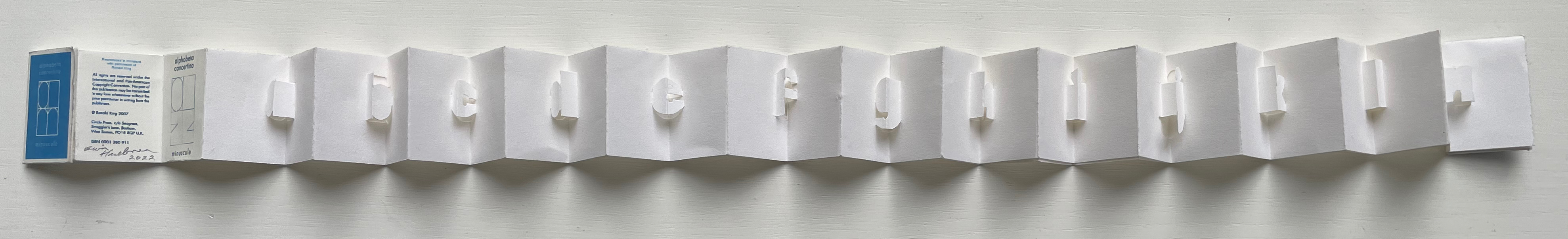
Alphabeta Concertina Majuscule (2015)
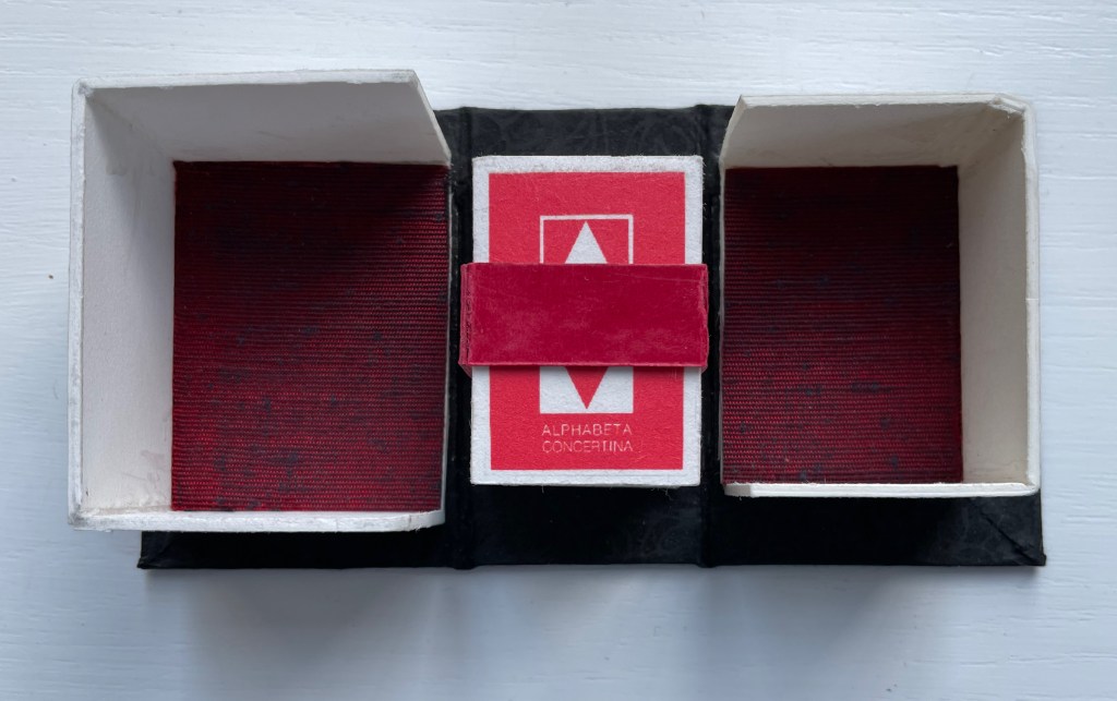
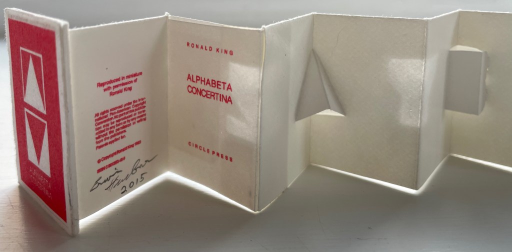
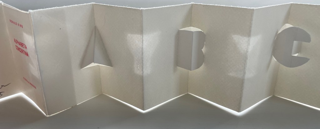
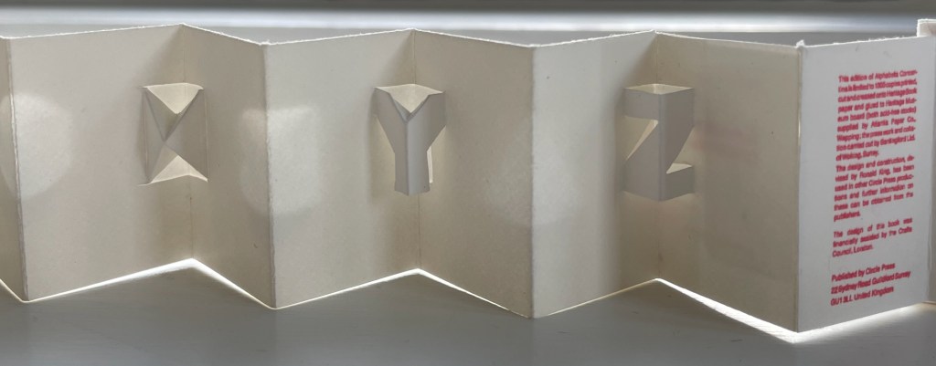
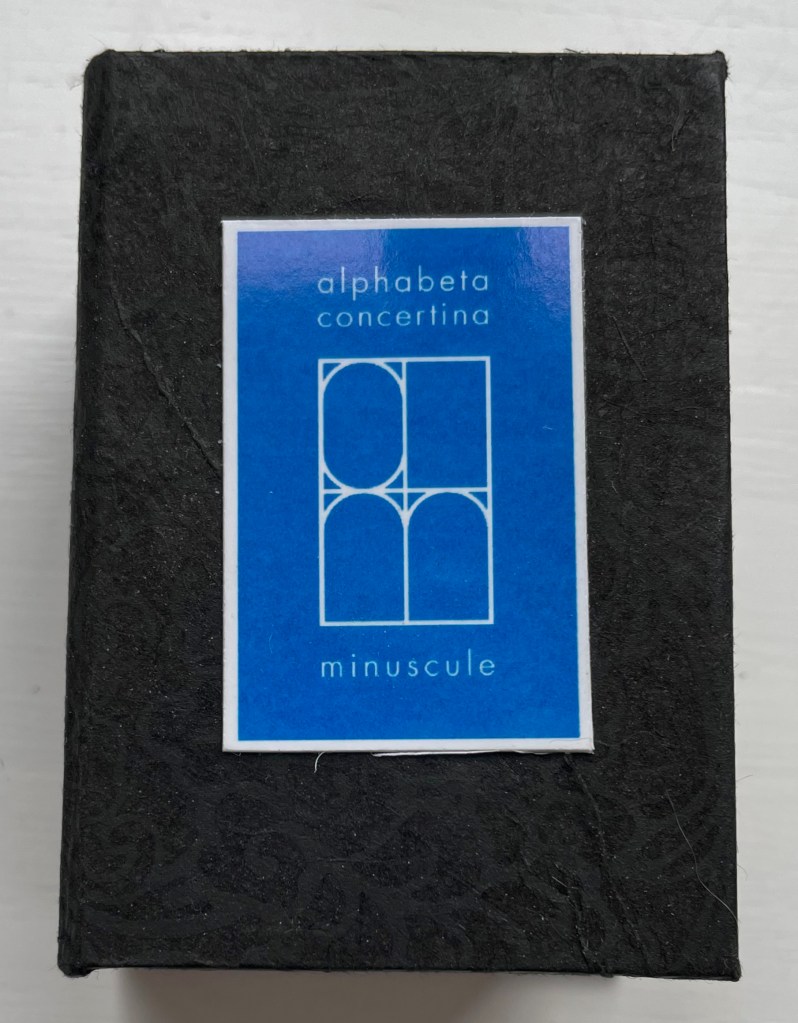
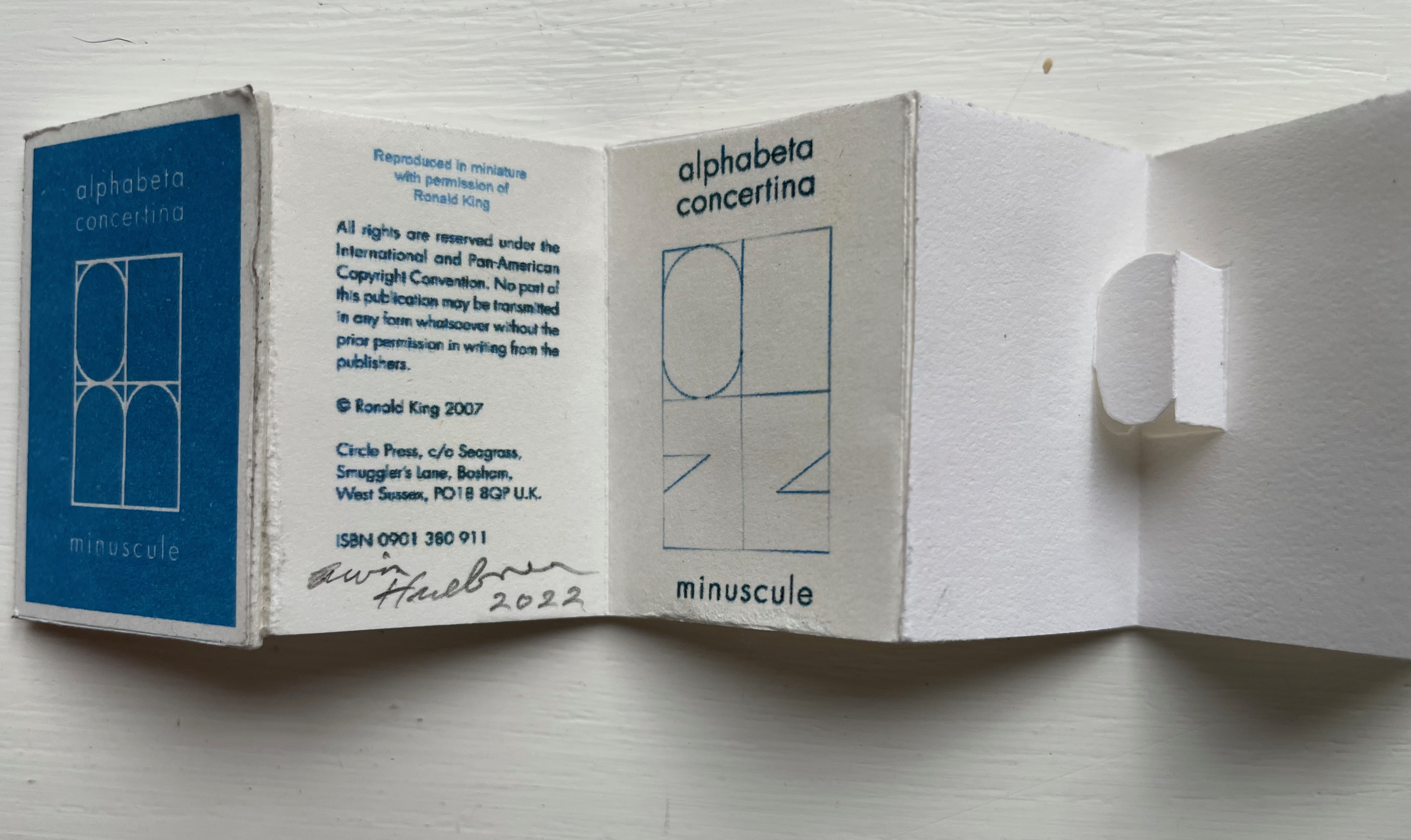
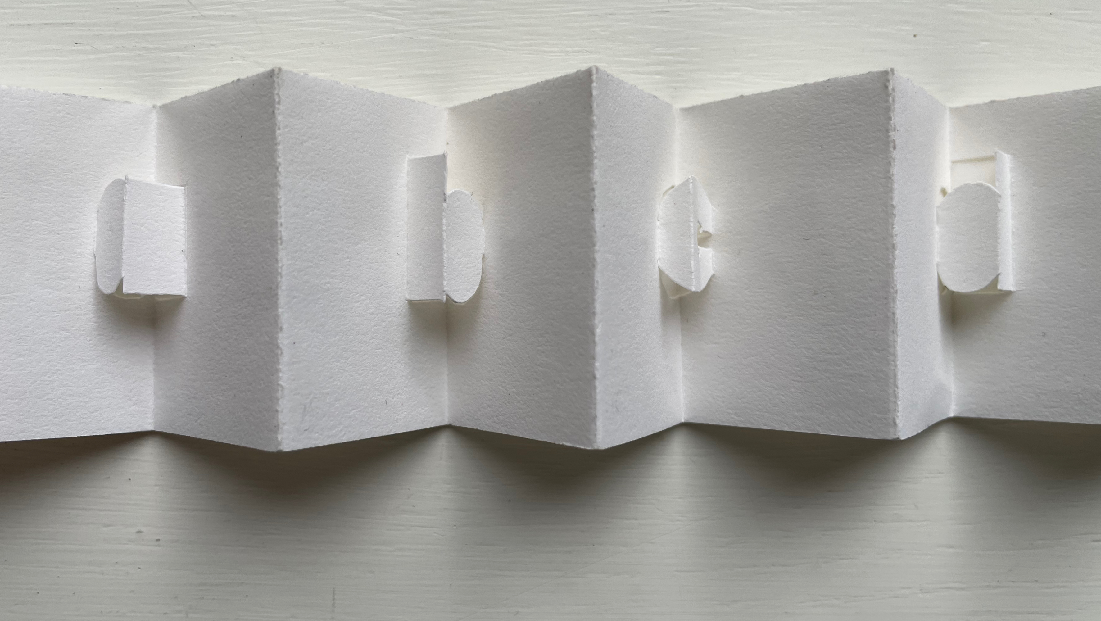
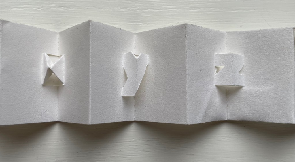
Alphabeta Concertina (2015) Erwin Huebner (with permission of Ron King) Miniature double-sided leporello. H 1.5 x W 1.0 x D 0.75 in. Edition of 4. Acquired from Erwin Huebner, 20 January 2023. Photos: Books On Books Collection.
The geometry and invention of Ron King’s work must have appealed to a kindred spirit in Erwin Huebner. The classificatory nature of the alphabet must also have spoken to Huebner’s inner Linnaeus. As 2023 is the 270th anniversary of Linnaeus’ Species Plantarum, which introduced his classification system, it is an auspicious moment for Huebner’s miniature versions of King’s alphabet concertinas to join the Books On Books Collection and be included works in the Bodleian exhibition “Alphabets Alive!” (19 July 2023 to 24 January 2024, Weston Library, Oxford).
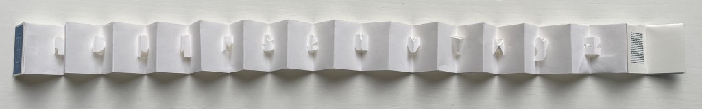
alphabet concertina miniscule (2022)
alphabet concertina miniscule (2022) Erwin Huebner (with permission of Ron King) Miniature double-sided leporello. H 1.5 x W 1.0 x D 0.75 in. Acquired from Erwin Huebner, 20 January 2023. Photos: Books On Books Collection.
Both the majuscule and miniscule concertinas are double-sided with half the alphabet on one side and half on the other just as King designed from the first with The White Alphabet and the majuscule concertina in 1984 and subsequently 2007 with the miniscule.
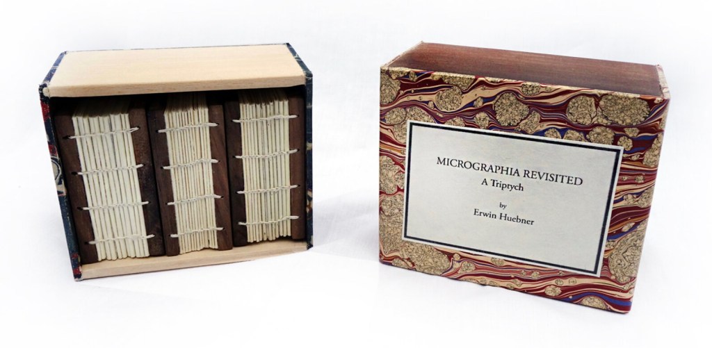
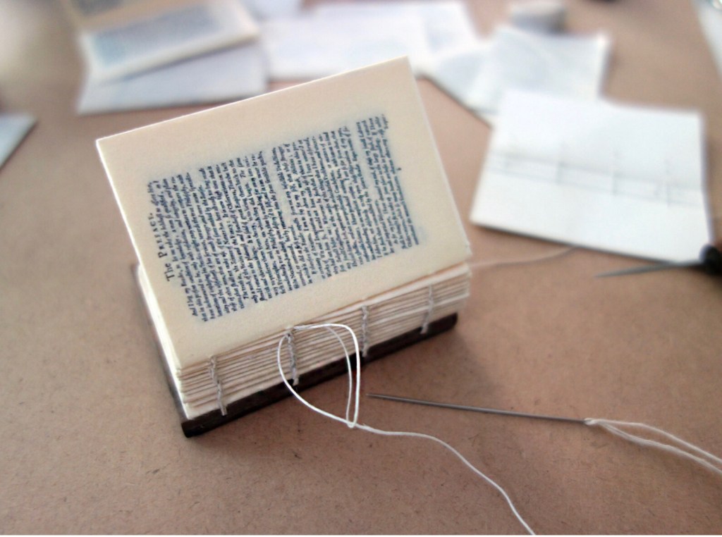
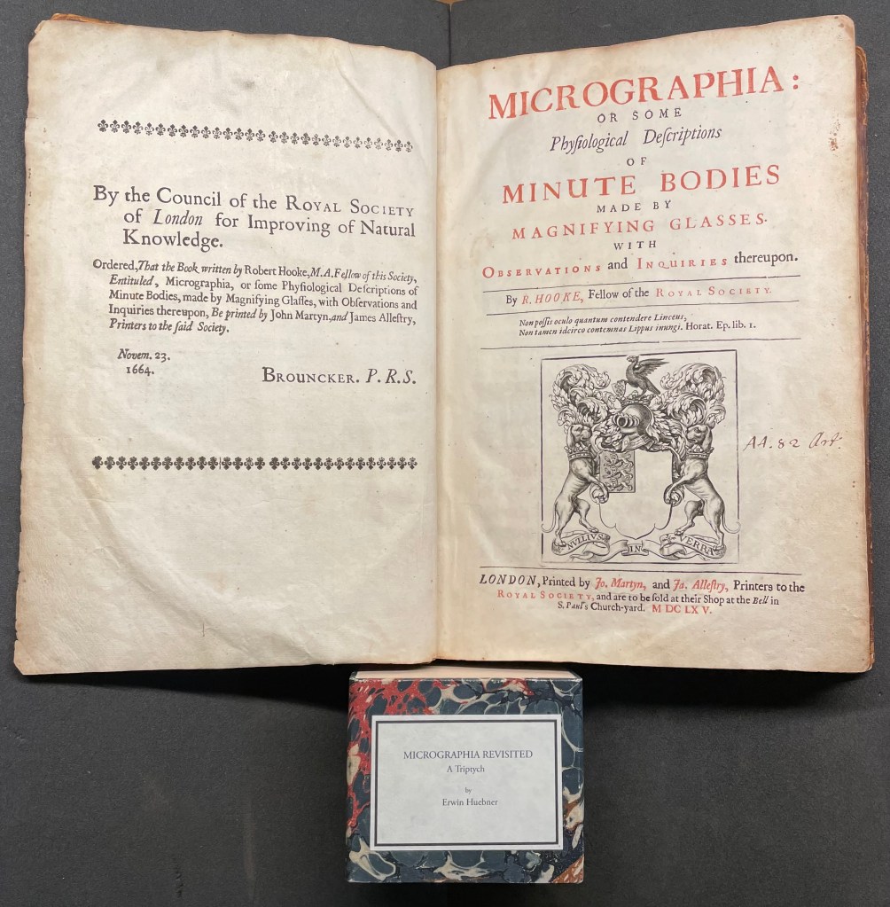
Micrographia Revisited (2017)
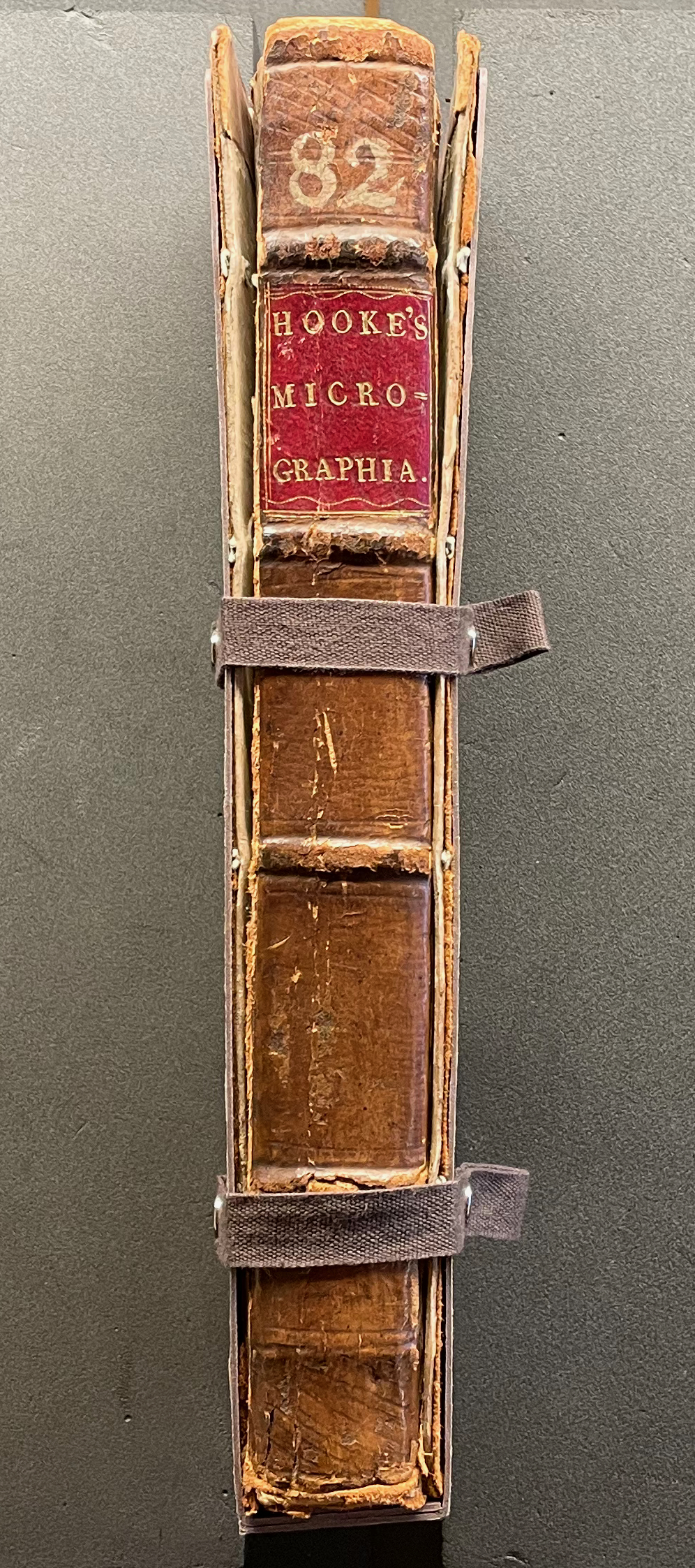
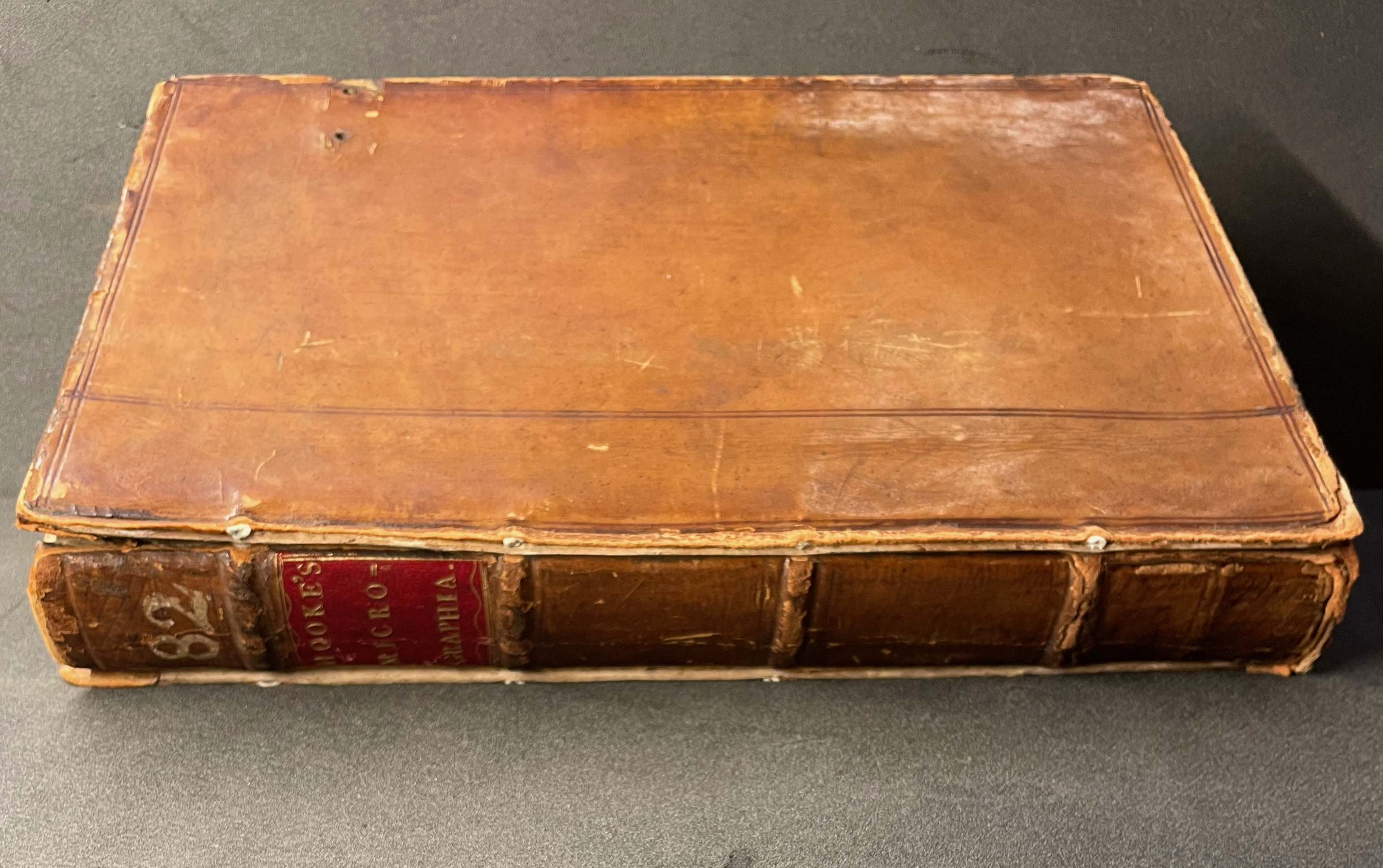
Micrographia Revisited: A Triptych (2017) Erwin Huebner Box with 3 Coptic-bound volumes, each H 2.625 x W 1.875 x variable depth. Edition of 3. Acquired from Erwin Huebner, 20 January 2023. Photos: Courtesy of the artist.
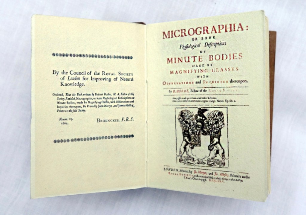
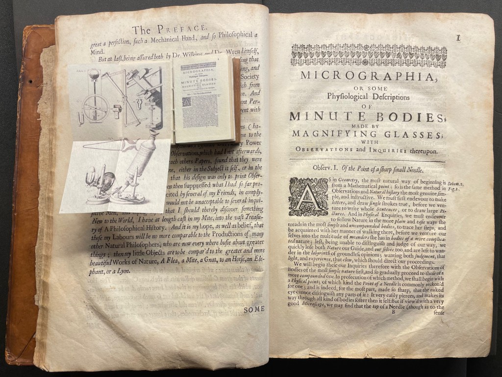
Despite Francesco Stelluti’s Melissographia (1625), Robert Hooke’s Micrographia: Or Some Physiological Descriptions of Minute Bodies Made by Magnifying Glasses with Observations and Inquiries Thereupon (1665) was long thought to be the first publication with illustrations drawn from observation with a microscope. Given Huebner’s scientific and artistic careers, it would seem impossible for him to resist paying homage to this work. Indeed, in his larger artist’s books, he has incorporated entire microscopes, but here, he exploits the technological advances of photography and electron microscopy and joins them with the craft of bookbinding to produce just as wondrous a work. Using Scanning Electron Microscopy (SEM), Huebner has created images of the same or similar objects to those Robert Hooke observed in the 1600’s. One of the volumes in the triptych presents these photographic results, and the other two present a reprint of Micrographia.
The coptic binding to black walnut covers, the wooden case covered in marbled paper and the subtitle create a suitable medieval/Renaissance air for this homage.
Living in a village near Oxford and having access to the Bodleian Libraries, I took Micrographia Revisited on a pilgrimage to compare it with a copy of the original not far from Hooke’s alma mater Wadham College.
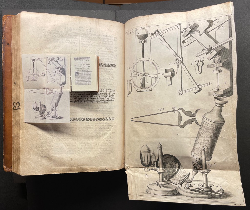
Among the many outstanding features of Huebner’s homage is his use and placement of fold-outs to capture the larger plates in Hooke’s original, all of which were placed in an appendix and some of which were also printed as fold-outs. In the juxtapositions below, note how Huebner has placed Hooke’s illustration of his equipment at the end of the Preface.
Sitting atop the double-page spread showing the end of the Preface and page 1 of Hooke’s original is Micrographia Revisited, open to Huebner’s fold-out of Hooke’s illustration of his equipment. Hooke’s same fold-out illustration from the appendix is juxtaposed below with Huebner’s.
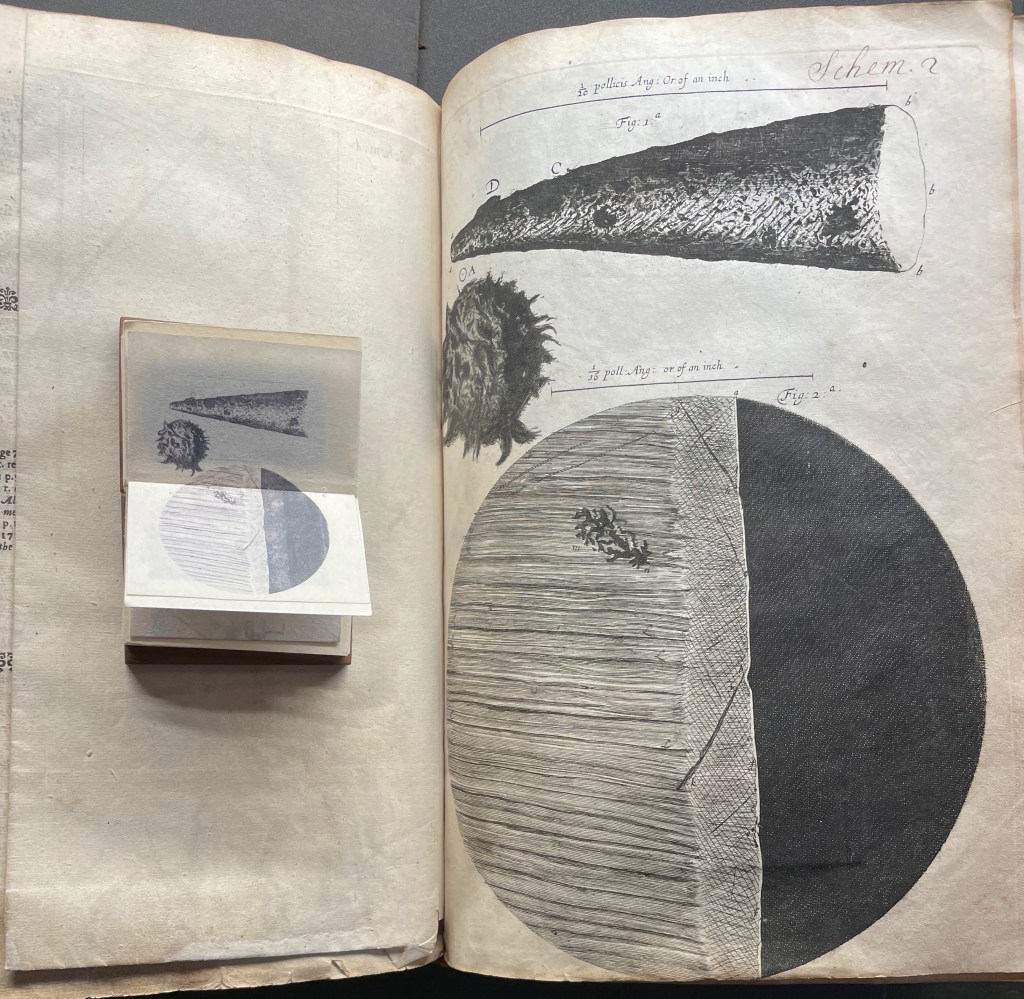
Hooke’s first two objects under the microscope Hooke are the point of a needle (described on pages 1-3) and the edge of a razor (described on pages 4-5). Huebner transforms Hooke’s single-page plate illustrating what he describes into a double-page spread between pages 2 and 3 of Micrographia Revisited.
Juxtaposing Huebner’s double-page presentation of Hooke’s drawings of a needle point and edge a razor with Hooke’s single-page presentation.
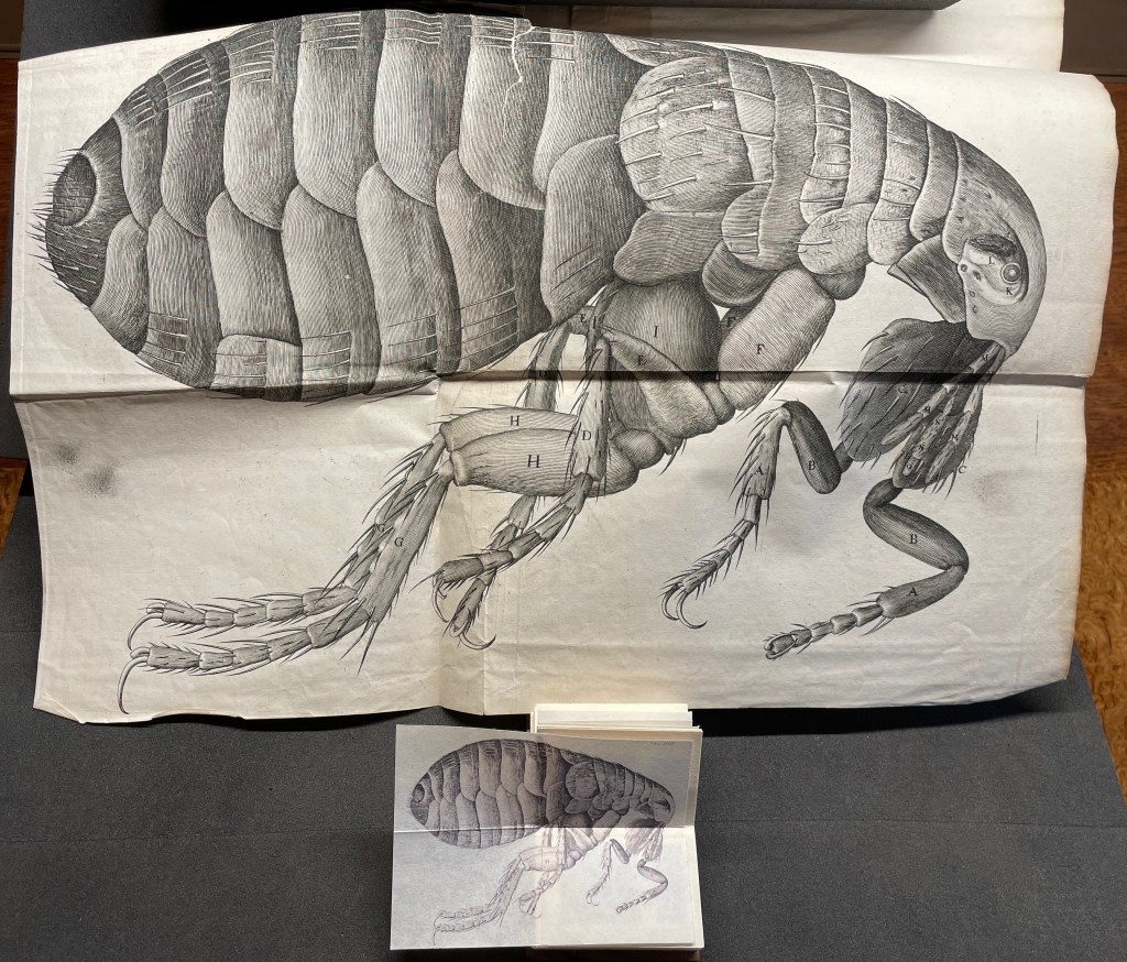
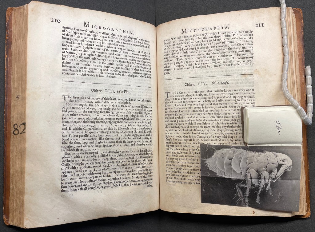
Hooke’s large fold-out of his flea may display the most impressive drawing in the book. The description appears on page 210, and the fold-out is in the appendix. Huebner’s double-fold fold-out of the illustration falls between pages 210 and 211.
The flea from Micrographia juxtaposed with that from Micrographia Revisited.
But most impressive of all is Huebner’s SEM image of a flea and its testament to Hooke’s powers of observation and skills as a draughtsman.
In the spirit of “standing on the shouders of giants”.