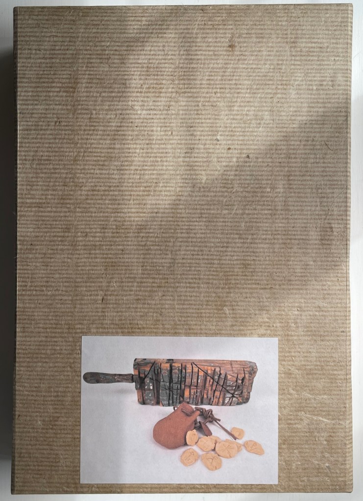
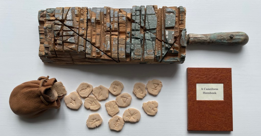
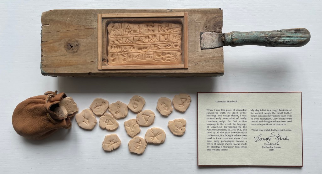
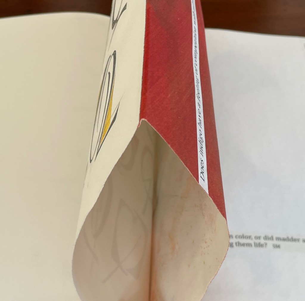
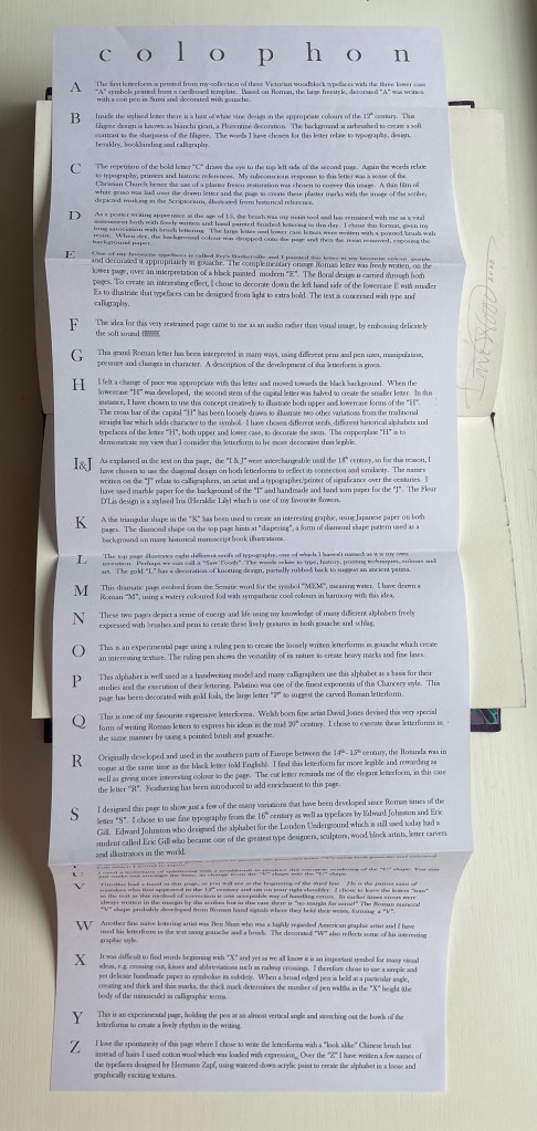
A Cuneiform Hornbook (2023) Connie Stricks Box: H340 x W233 x D57 mm. Horn-book: H333 x W85 x D40 mm. Leather pouch: H77 x W60 x D25 mm. Tokens: Variable 20 x 25 mm. Colophon folio: H101 x W71 mm. Unique edition. Acquired from the artist, 26 June 2023. Photos: Books On Books Collection. Displayed with the artist’s permission.
Connie Stricks has re-imagined the horn-book with found objects, leather craft, clay inscription and sculpture. Prompted by a workshop challenge, the artist found an echo of the earliest writing system — cuneiform — in the scars and cuts of a discarded saw horse.
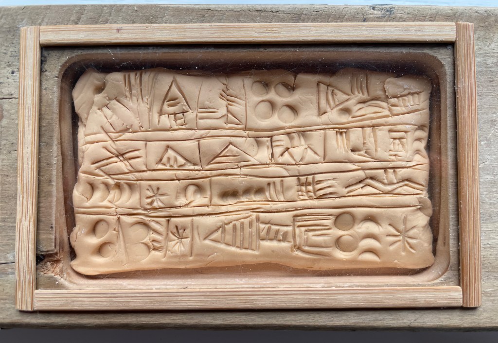
On the smooth side of the block of saw horse wood, she has carved out a shallow rectangle large enough to hold a small clay tablet she has inscribed with cuneiform marks. Like the traditional horn-book with its pared sheet of cow horn tacked down over the ABCs to protect the letters from wear and tear, the Cuneiform Hornbook has a sheet of clear plastic over the tablet. Stricks may also be having a bit of fun, hinting at the usual under-glass view we have of ancient artifacts.
The small bag of tokens nods toward the predominant assumption that cuneiform marks were developed to meet the accounting and administrative needs of Mesopotamian civilizations building on the underpinnings of agrarian and trade societies. The irregularly shaped tokens have marks on both sides. As trade grew, so grew the need for trust, and tokens indicating an exchange would be sealed in a clay purse (bullae) bearing a cuneiform-inscribed description of the contents.
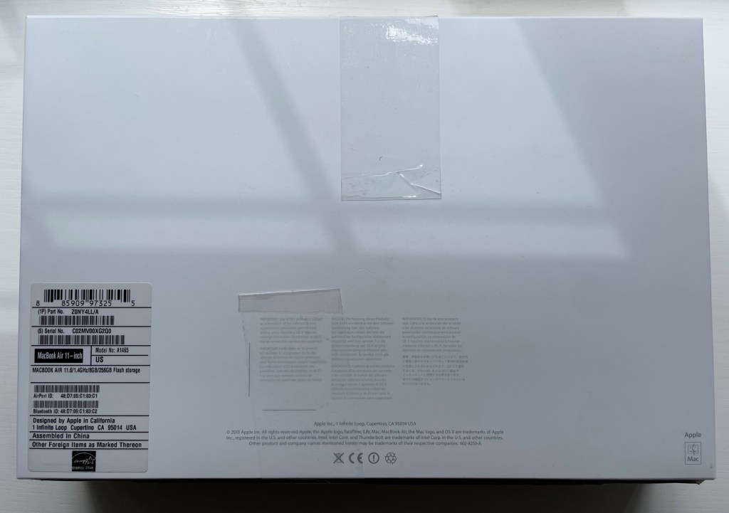
An amusing “found-object” feature of A Cuneiform Hornbook lies in its packaging and storage. The snug, almost vacuum-like fit will be familiar to some. Confirmation for them and revelation for everyone else appear on the outside of the base.
Like a MacBook Air, the multiple parts nestle among styrofoam blocks, and the leather pouch of tokens and small folio bearing the colophon are enclosed in the usual clear self-sealing cellophane envelopes. And now that MIT scientists have developed an AI transliterator and translator for Akkadian, the CuneiformHornbook’s reader need not worry about technological obsolescence.
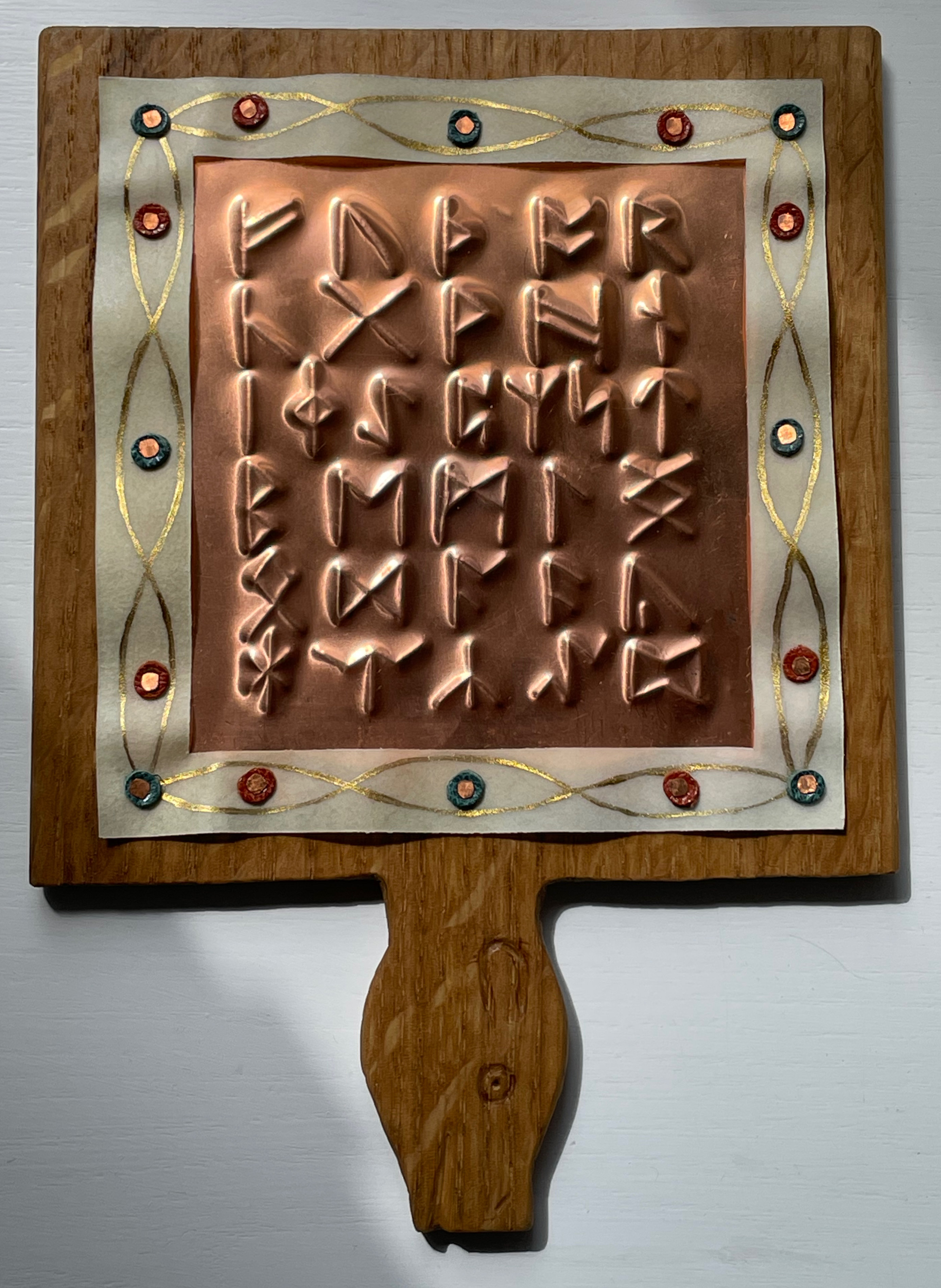
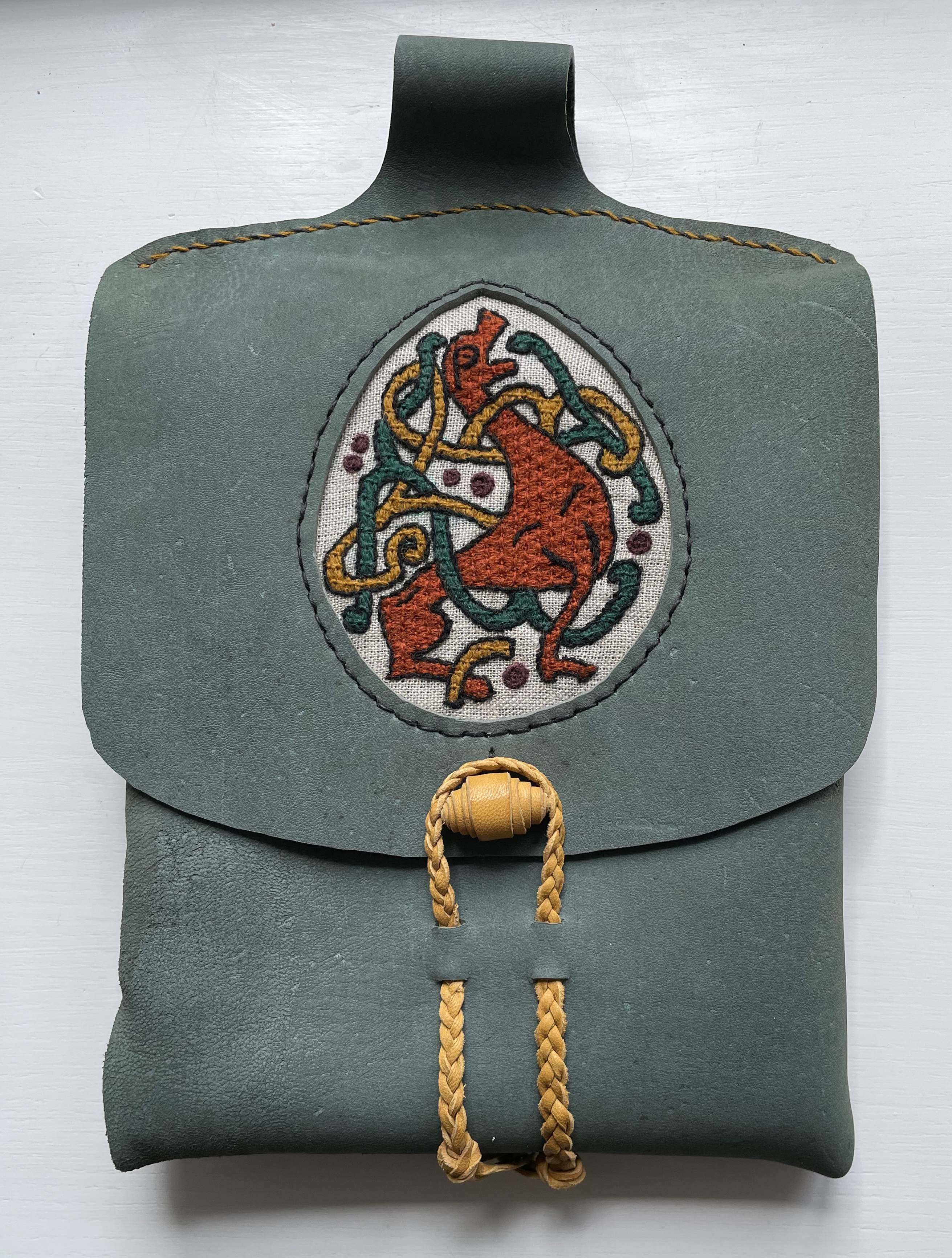
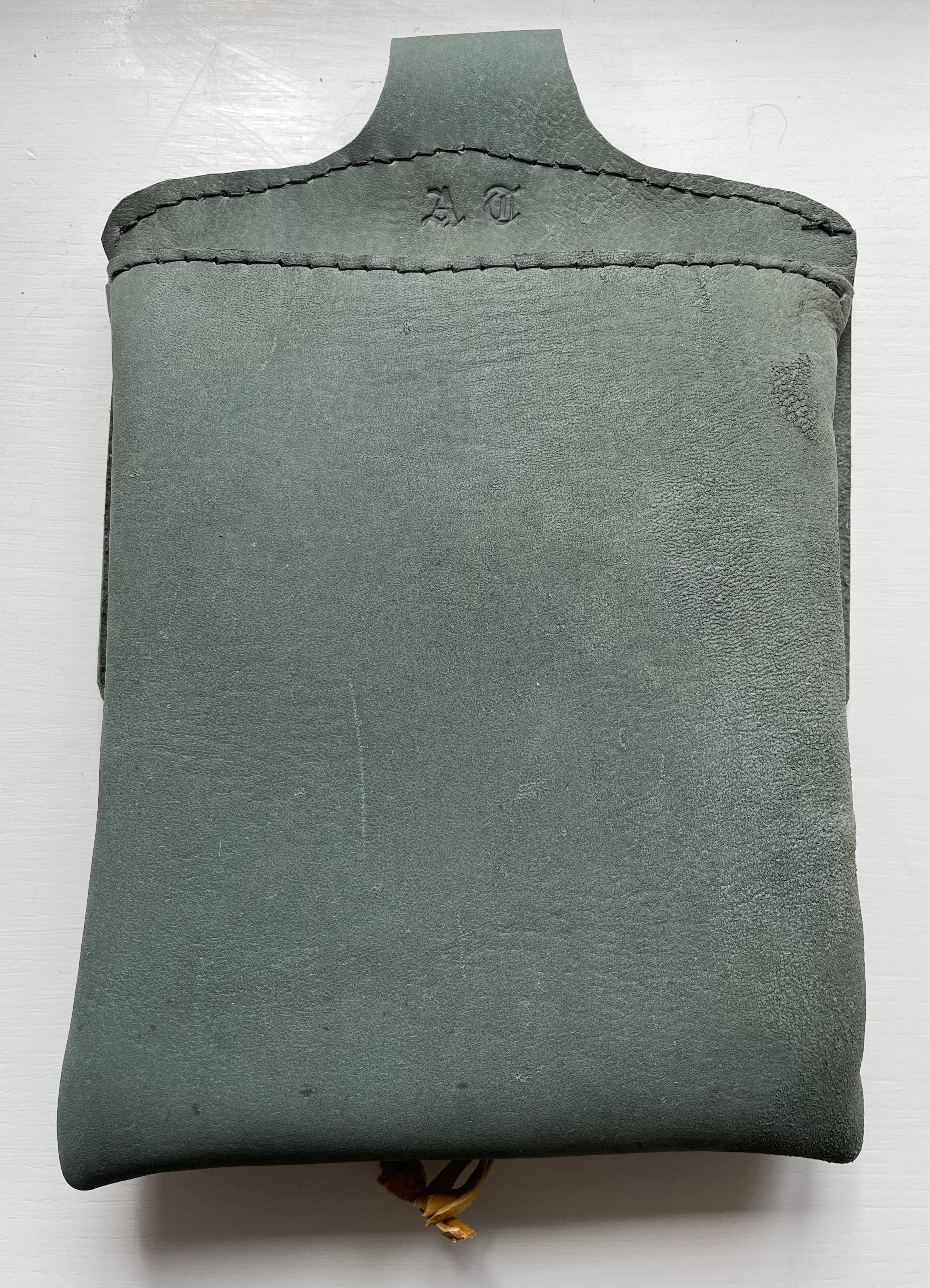
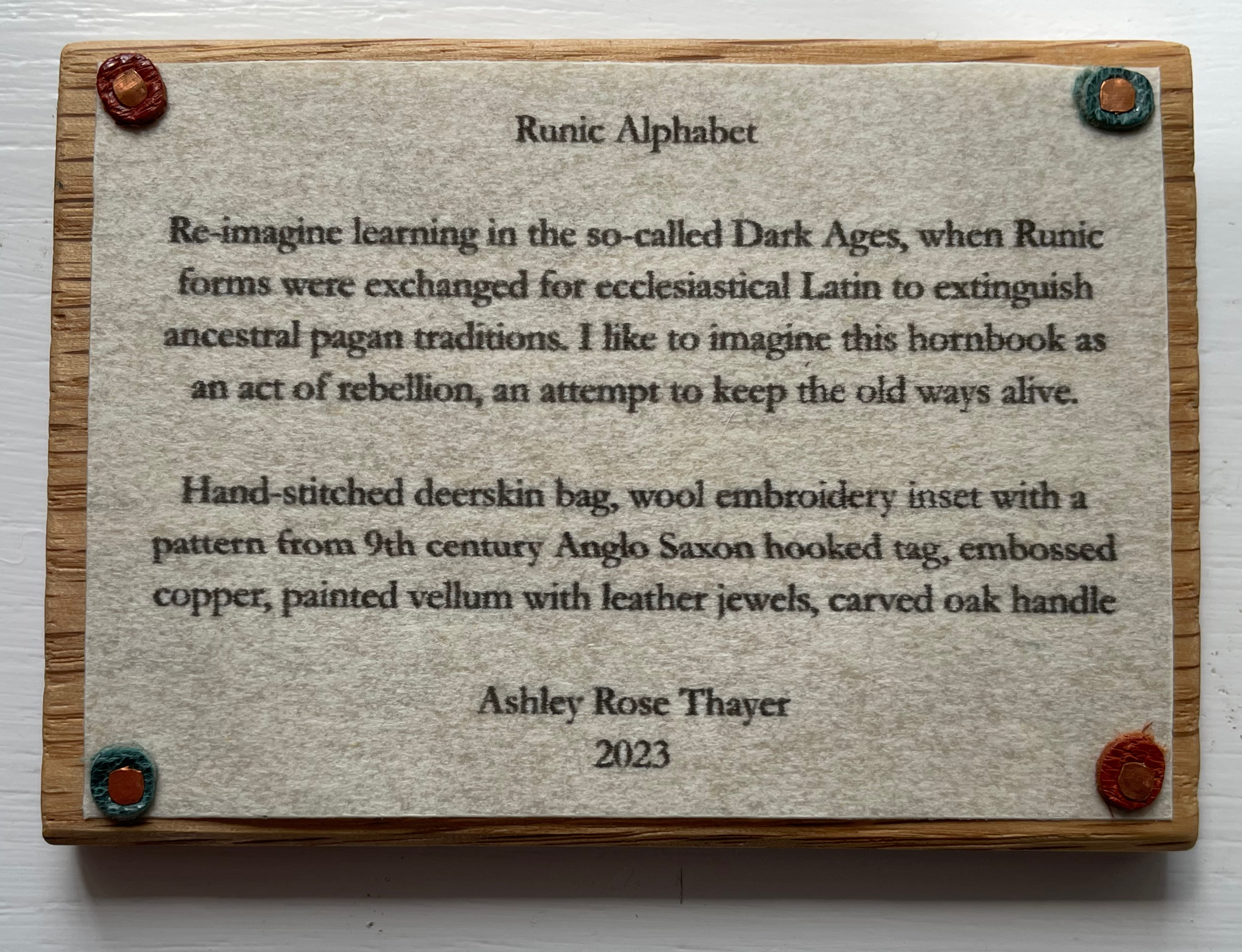
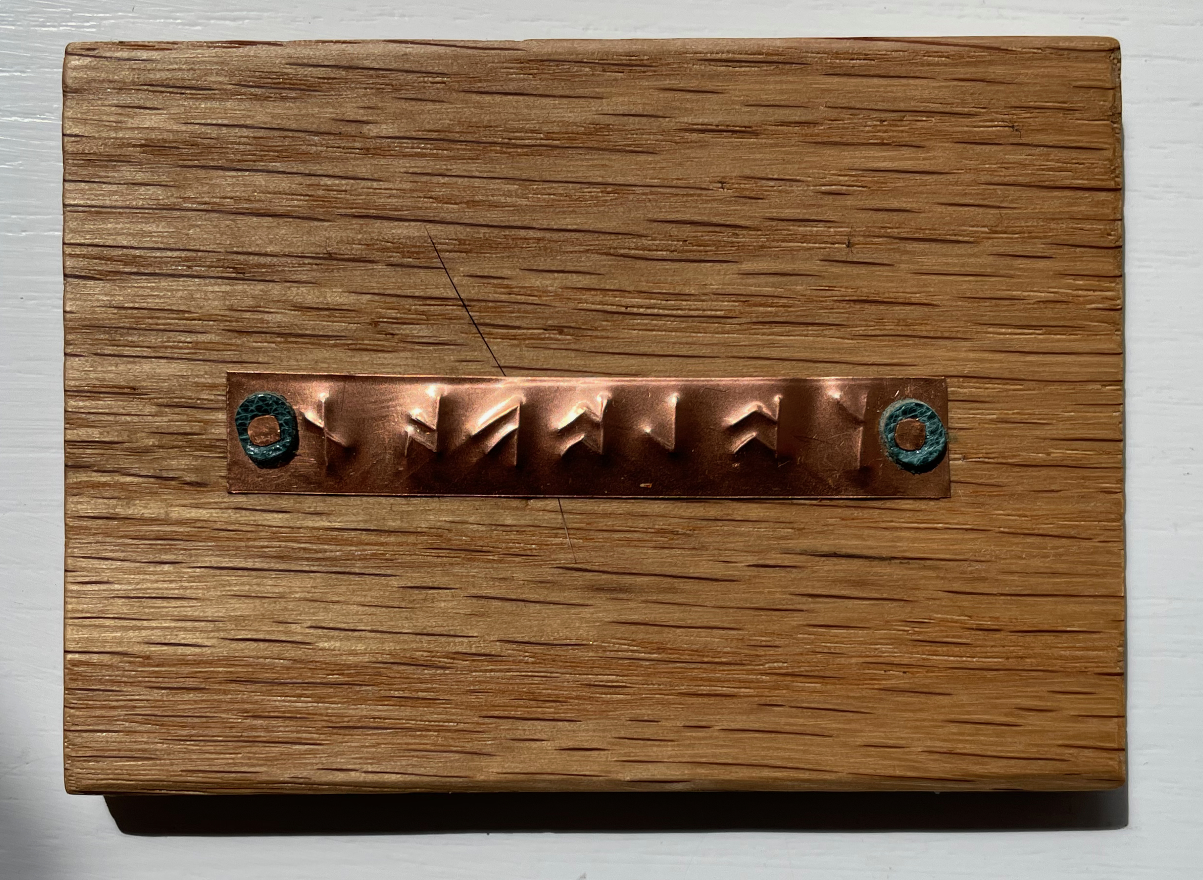
Runic Alphabet(2023) Ashley Rose Thayer Bag (H290 x W195 x D30 mm) enclosing horn-book (H177 x W167 mm) and colophon plaque (H63 x W88 mm). Unique edition. Acquired from the artist, 26 June 2023. Photos: Books On Books Collection. Displayed with artist’s permission.
Through her affiliation with the Northwoods Book Arts Guild, Ashley Thayer organized a challenge to reinterpret the horn-book. Several spectacular and inventive works emerged, and at this writing, an exhibition is being organized. The Bodleian “Alphabets Alive!” exhibition (19 July 2023 – 13 January 2024) was lucky enough to acquire one of Thayer’s own efforts: Runic Alphabet. With this work, Thayer re-imagines the learning tool for the so-called Dark Ages. Runes eventually succumbed to the Roman alphabet as military and religious conquest extinguished pagan traditions. So, this horn-book is, in Thayer’s words, “an act of rebellion, an attempt to keep the old ways alive”.
A hand-stitched deerskin bag with a wool embroidery inset of 9th century Anglo-Saxon pattern encloses the oak horn-book with a carved handle and faced with embossed copper and painted vellum with leather jewels. Also enclosed is a small oak plaque bearing the colophon.
The reverse side of the colophon bears the word “colophon” transliterated into embossed runes
Following the Northwoods Book Arts Guild project, Thayer progressed to another age with this next work.
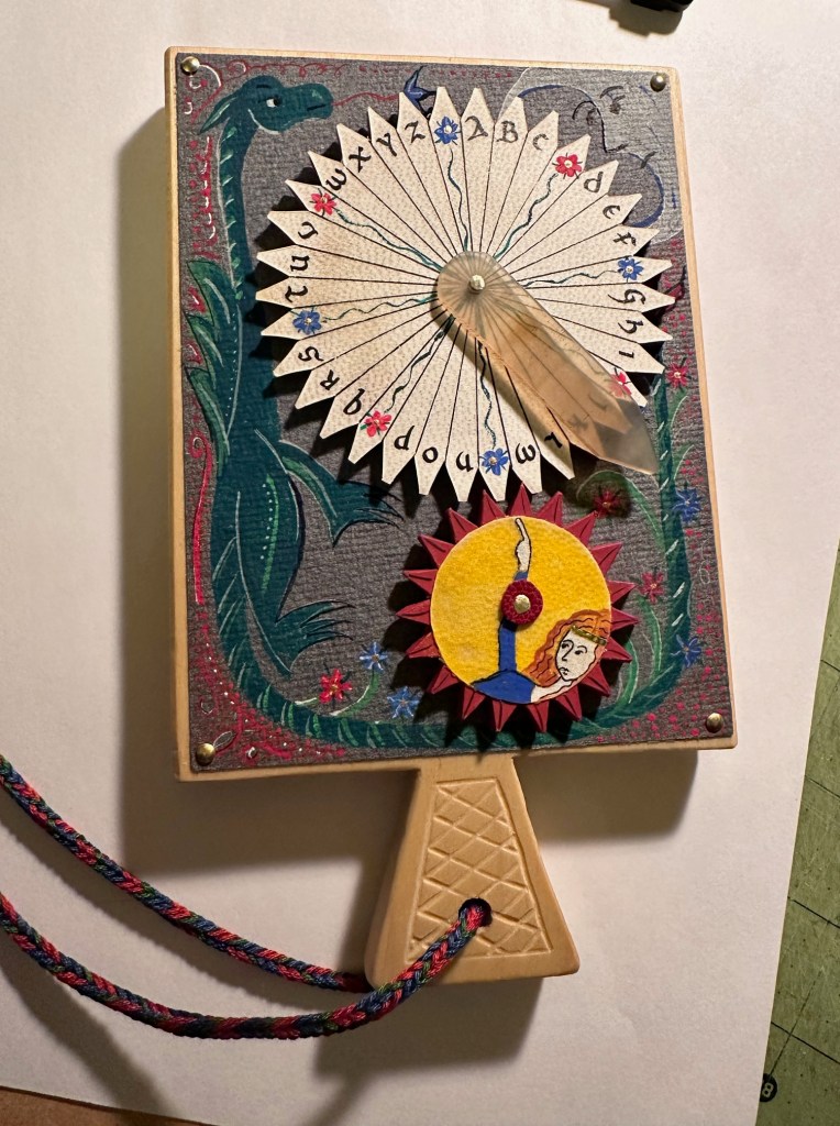
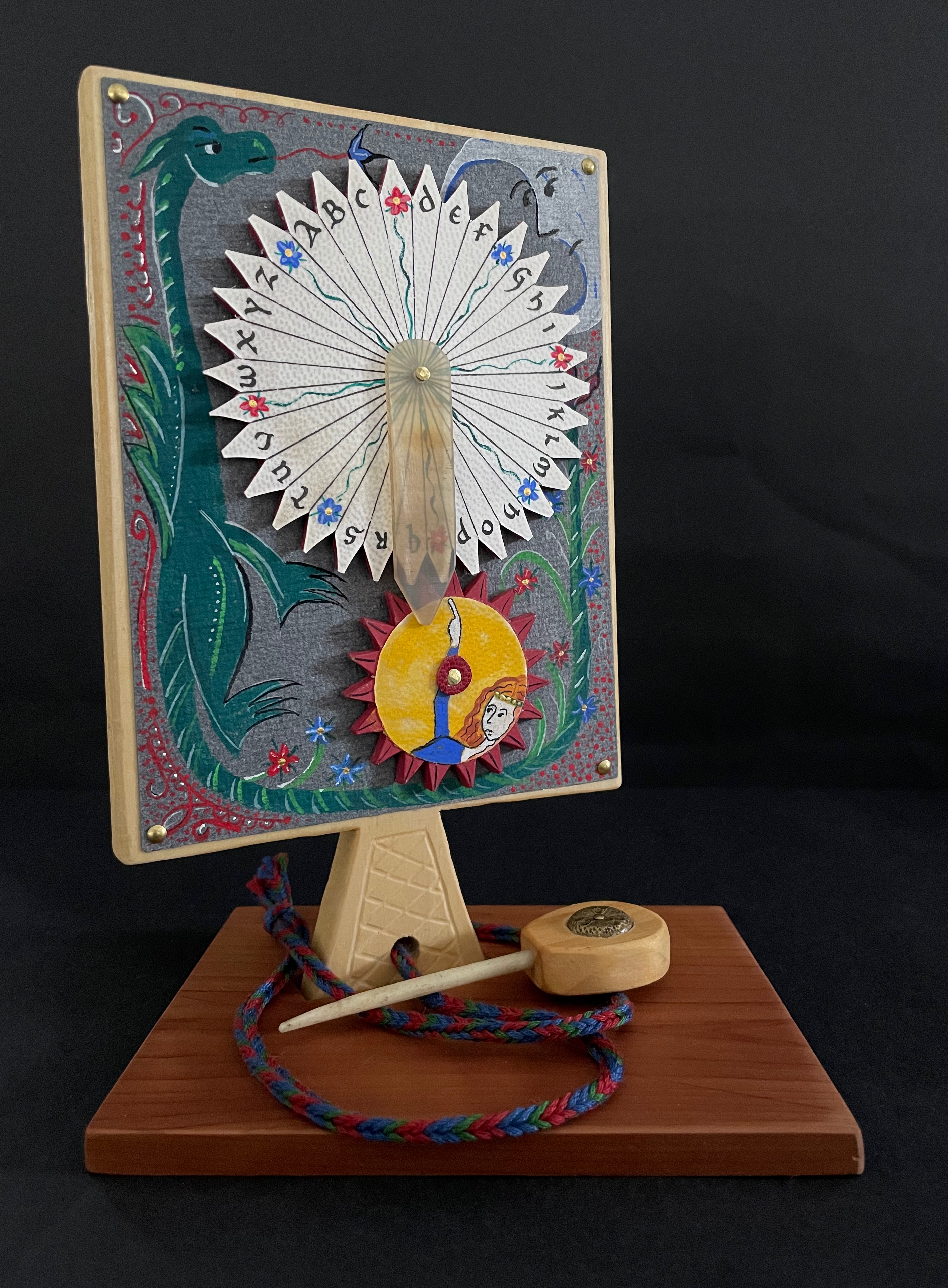
Mechanical Horn-book (2025)
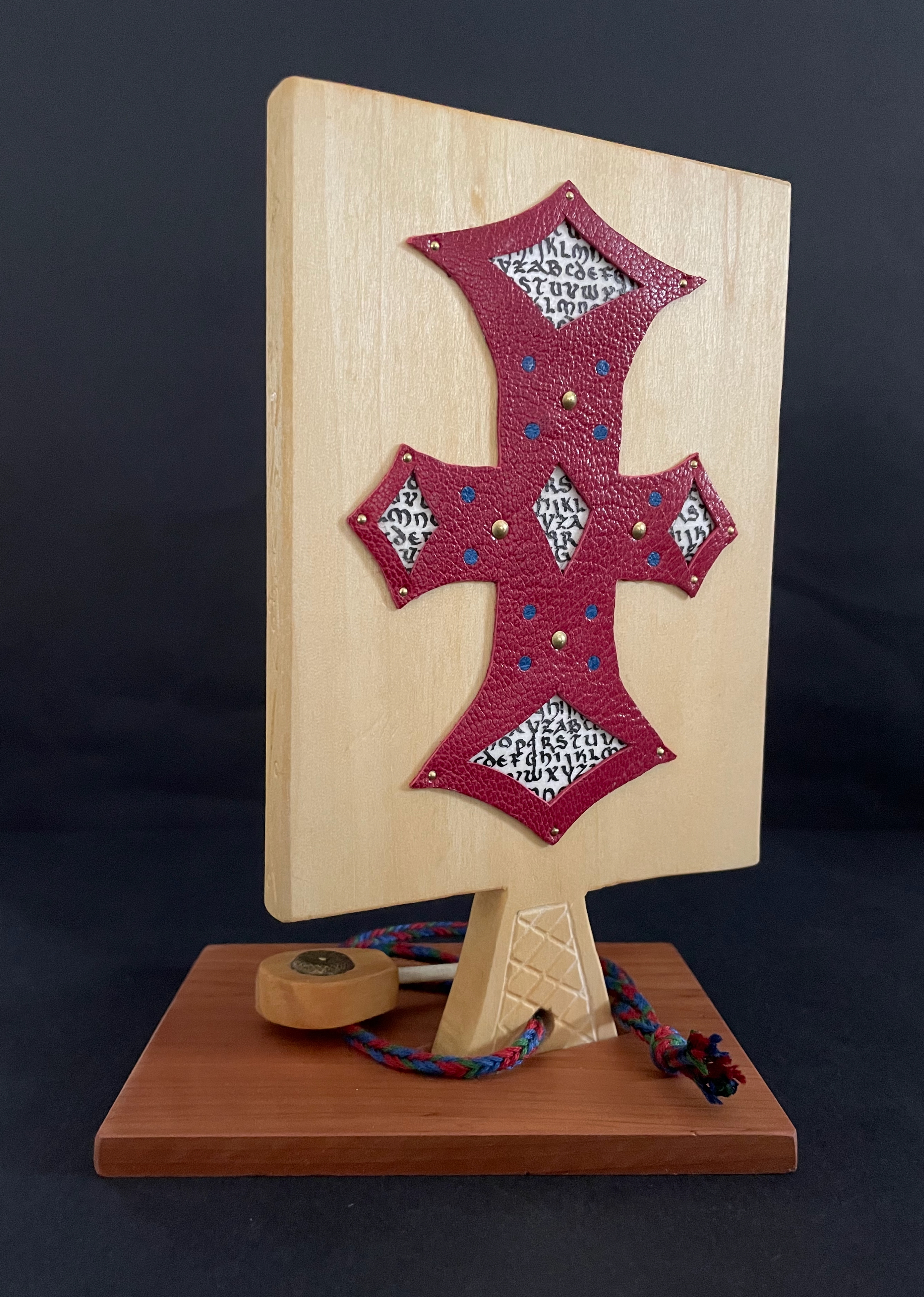
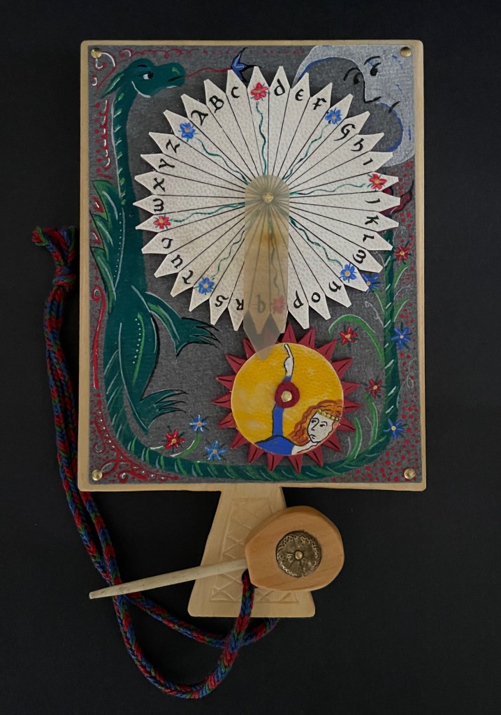
Mechanical Horn-book (2025) Ashley Rose Thayer Horn-book. On stand: H192 x W160 mm. Off stand: H192 x W115 mm. Unique. Acquired from the artist, 17 October 2025. Photos: Courtesy of the artist. Books On Books Collection.
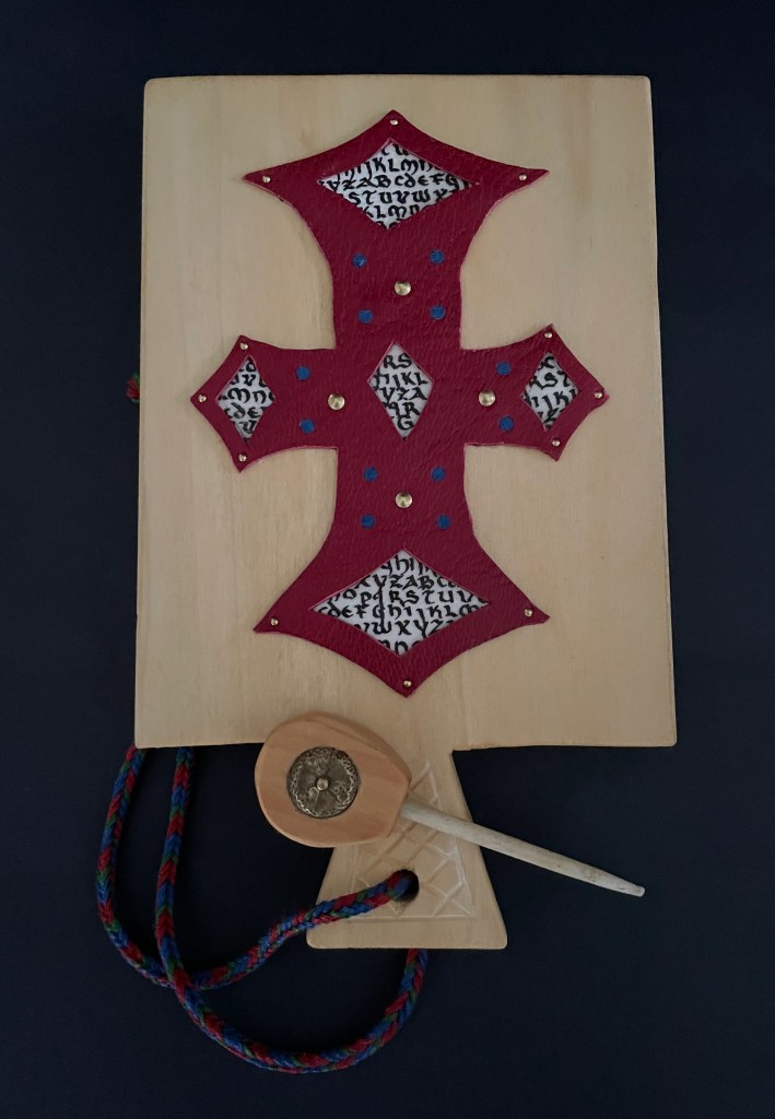
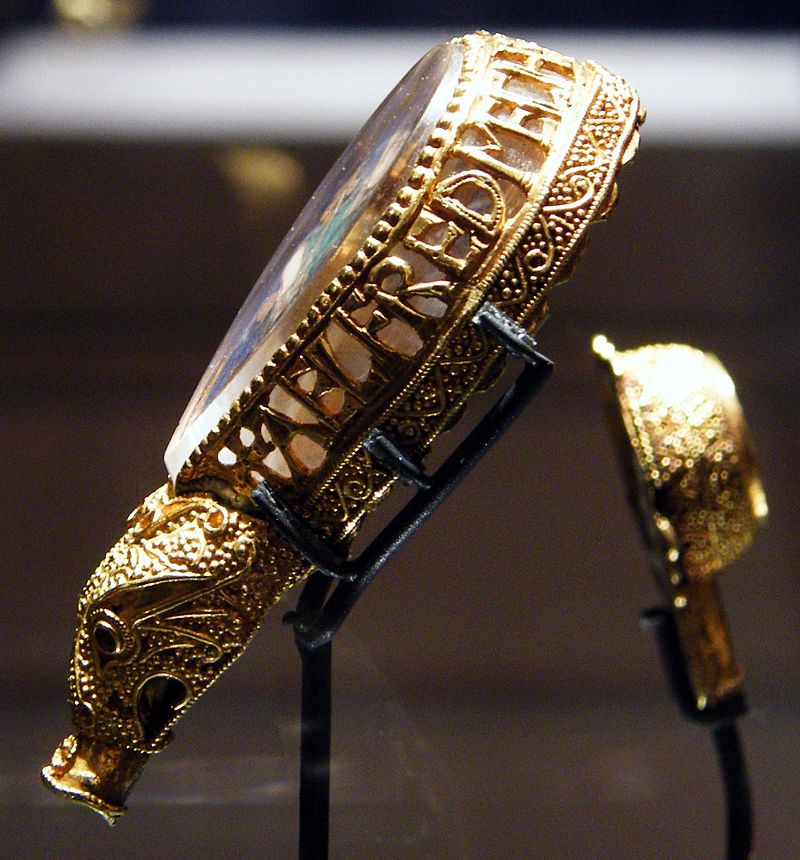
Mechanical Horn-book is an homage to the Anglo-Saxons of Old England. The paddle is made of pine wood, the gears of vellum-covered bookboard, the spinning “arm” of authentic cow horn, and the wrist loop of embroidery thread by a medieval finger loop braiding technique. On dark grey-blue Khadi paper, Thayer has painted a border of the moon, a berried floral garland, and a wyvern, the heraldic emblem associated with Wessex, the Anglo-Saxon kingdom from which Alfred the Great emerged in the 9th century. On the reverse, a cross of cut red leather with five inserts of calligraphed vellum alluding to Christ’s five wounds reflects the horn-book tradition of combining religion with learning the alphabet. It also makes this horn-book reflective of Alfred’s Anglo-Saxon and Christian background.
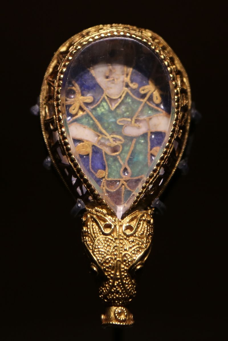
The pointer, called an aestel in Old English, is made from poplar wood, an antique button, and antique bone. Its inclusion isn’t simply functional. Appearing alongside the Wessex wyvern, it points to that famous aestel on display at the Ashmolean in Oxford: the Alfred Jewel.
The Alfred Jewel, Ashmolean Museum, Oxford. Photo taken from the front by Geni CC BY-SA 4.0. Photo taken from the side by Richard M Buck CC BY SA 3.0.
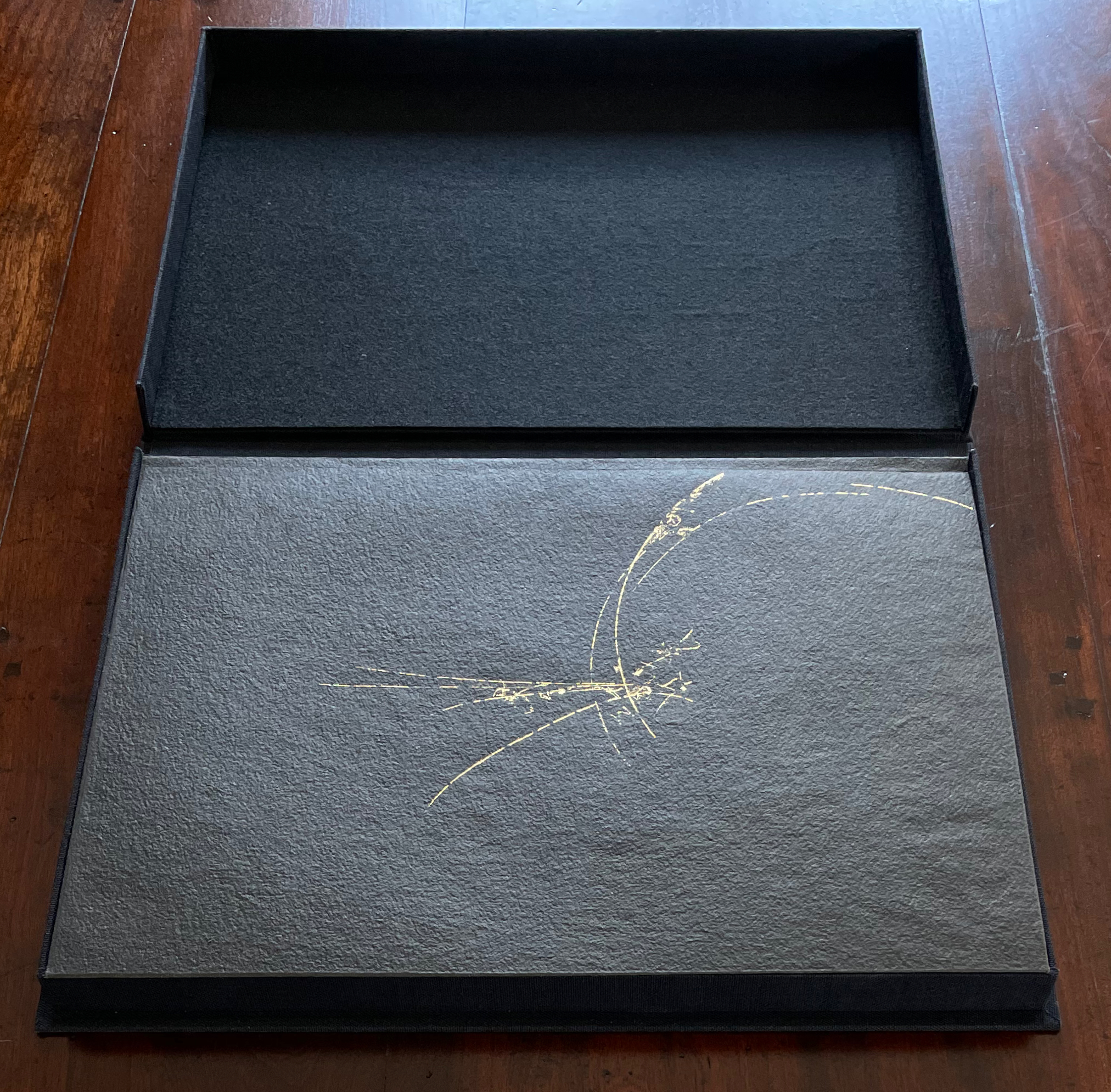
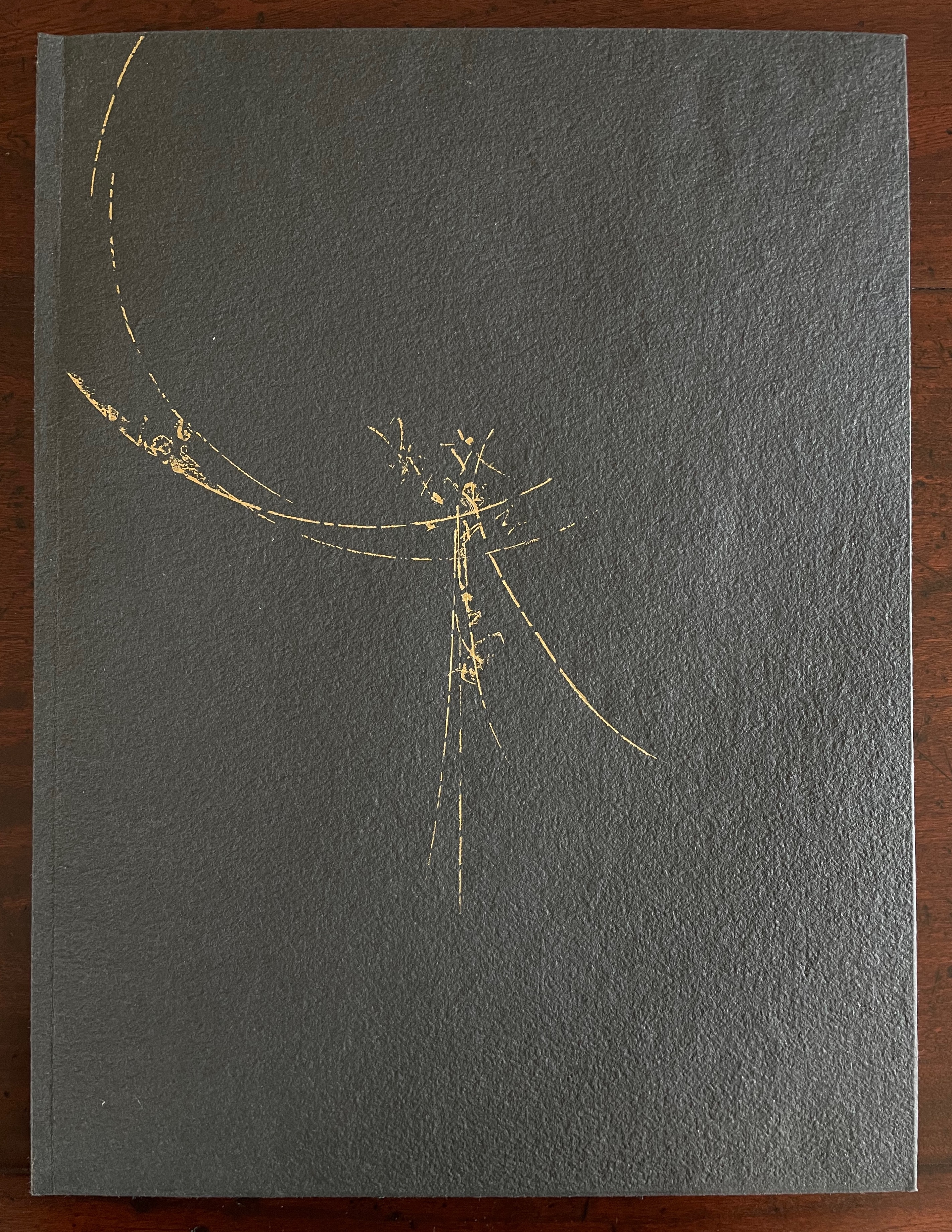
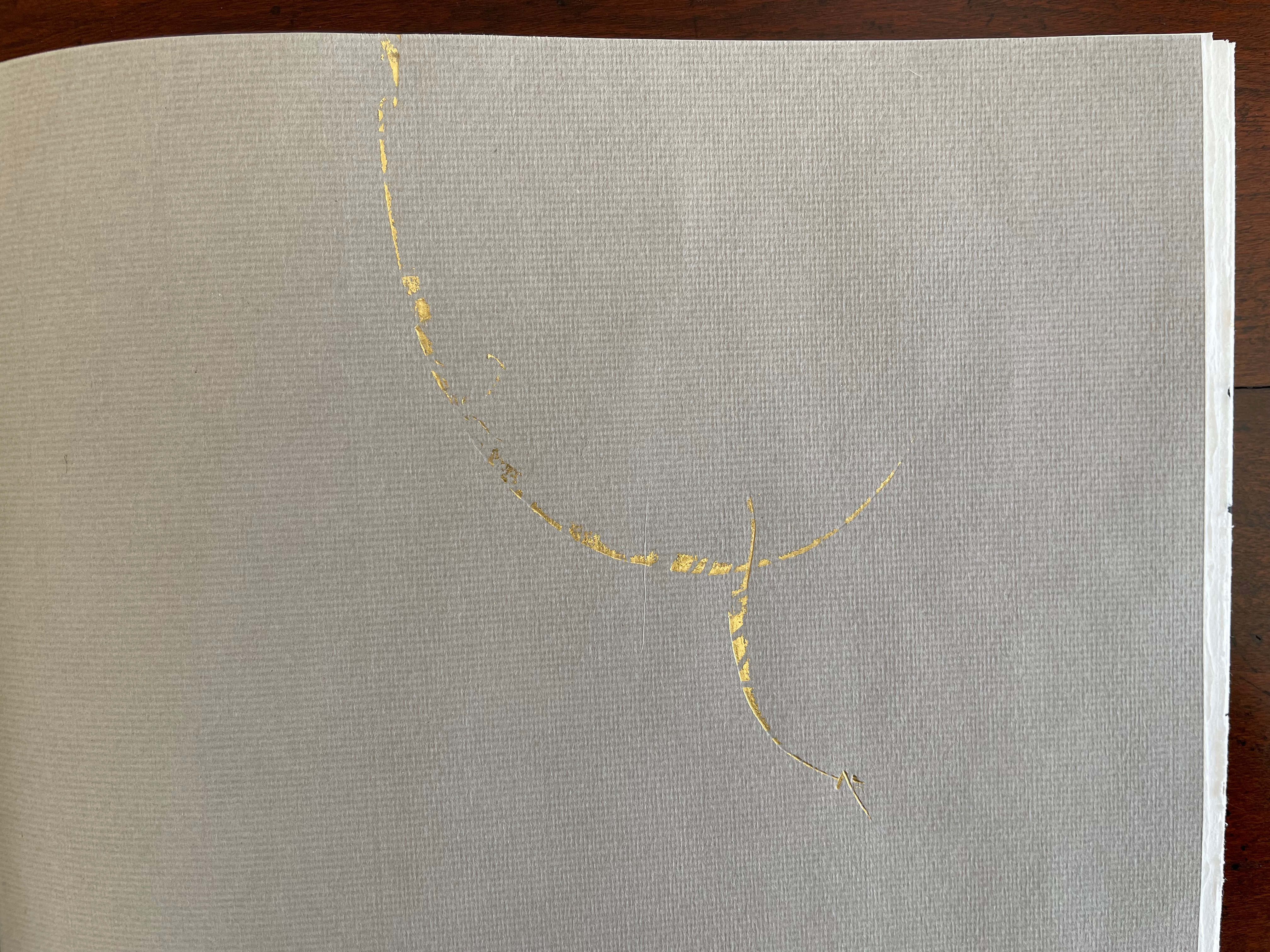
Battledore(2019) Bård Ionson Digital photo of oscilloscope art on walnut, with leather straps & tacks. H229 x W127 mm. Animation of oscilloscope art with Artivive. Resolution: 3840 × 2160 px. File format: mp4. Duration: 1’0″ sec. File Size: 74.1 MB. Acquired from the artist, 1 March 2019. Photos: Books On Books Collection. Displayed with permission of the artist.
The artifact displayed here is a vehicle for a digital artwork in which oscilloscope drawings are animated in augmented reality and which exists as an NFT (Non-Fungible Token). To view the digital artwork, open the camera on a smartphone, point it at the QR code below, and download the Artivive app. Open the Artivive app and position the phone’s camera over the artifact or even its image above.
Each of the alphabet characters transforms into a logo (or image of a product associated with the company behind the logo). The letters represent Apple, Boeing, Comcast, Disney, Exxon, Ford, Google, HBSC, ING, JP Morgan Chase, Koch, Lockheed Martin, Microsoft, Nestle, Orbital, Phiser, QinetiQ, Raytheon, SkullCandy, TiVO, Unilever, Volume Integration, Winchester, Xerox, Yandex and Zinga.
Now that A is for Apple Inc. rather than the fruit, Ionson wonders, “What are our children learning as they navigate digital devices vs. when children used wooden tablets with narrow ideas presented with pictograms.” He goes on about the entities behind Battledore‘s letters, “Many of these are companies that manufacture weapons of war or are players in an information war. Many countries and organizations are using the information space of social media and news in a disinformation war. It is a digital battle now.”
To drive this home with several layers of irony, Battledore is offered as the learning tool needed to
Train your children for the battles of the 21st Century. Where brands, countries and organized crime compete for your allegiance. Using art, history, finance, education, news, war, social media and religion they fight to keep a hold on your mind. Learn to fight back by subverting the tools they wield.
At one layer of irony, the physical artifact shown above lies dormant just as it did until the teacher “activated” it with classroom recitation of the letters. But now, in augmented reality, the letters seem to come to life revealing hidden entities associated with them. Now, the reader/viewer has to engage in a digital transaction, point a digital handheld device at the letters, and peer to see and learn, letter by letter, what the letters “really” stand for — all while a looping track of electronic battle-game sounds plays on. Viewed on a laptop or desktop, these video clips at Elementum, Patreon and ARTificial show the transformations without the need of a smartphone. Caveat: whether phone or laptop, lower the speakers’ volume before activating!
While the word “battledore” serves the artist’s metaphoric purpose, it introduces another layer of irony (unintentional according to the artist) in that the physical artifact is a horn-book, not a battledore, which was the later paper version of the horn-book. An additional unintentional irony is that, as illustrated by Andrew White Tuer, the “dean” of horn-book history, the old artifact itself was often wielded as a weapon.
Some transformations are easy to follow and connect with a corporate entity. Others — such as the Q becoming a missile launcher because Q is for QinetiQ — require a bit of digging (online, of course). The original teaching device was not without its “corporate” — or rather religious, economic and patriotic — associations, but they were more obvious in the text, emblem and images on both front and back of the artifact.
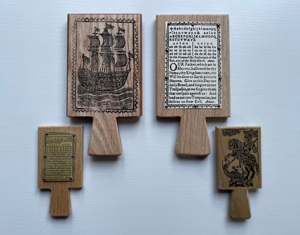
Facsimile horn-books. Real cow horn is used for the cover of the horn-book at the lower left. Gene Wilson
The NFT element of this work is yet another level of irony. It begins with a paradox and a pair of causes. The paradox is ownership in the digital age. Most digital objects — downloadable music or book files — are not owned securely. Whether subject to the supplier’s whims or errors (like Amazon’s now infamous overnight removal of Orwell’s 1984 from its customers’ Kindles) or to obsolescence (by operating system upgrades or by outright abandonment of file formats such as Adobe Flash), we do not so much own digital assets as lease them with fingers crossed for luck while the vendors’ fingers are crossed behind their backs.
The irony raised by Battledore‘s NFT status is the underpinning technology’s claim of redefining and securing unique ownership in a digital work of art. A long explanatory article in The Verge provides an amusing and clear explanation of non-fungible tokens and blockchain technology. Although a digital artwork can be copied many times by many viewers even if it’s included with an NFT,
… NFTs are designed to give you something that can’t be copied: ownership of the work (though the artist can still retain the copyright and reproduction rights, just like with physical artwork). To put it in terms of physical art collecting: anyone can buy a Monet print. But only one person can own the original.
A metaphysical or aesthetic precursor to all this can be found in Walter Benjamin’s seminal essay “The Work of Art in the Age of Mechanical Reproduction”. He writes,
The presence of the original is the prerequisite to the concept of authenticity. And
that which withers in the age of mechanical reproduction is the aura of the work of art.
So in Benjamin’s terms, the Monet original has authenticity, it has aura. NFTs and blockchain technology aim/claim to replace the “presence of the original”, its “unique presence”, its “aura” with “ownership of the work” as the “prerequisite to authenticity”. By associating a piece of wood, leather, metal tacks and inscribed plastic with the digital asset, Ionson physically and ironically underscores the paradox of digital ownership.
The NFT feature of Battledore also carries with it a pair of causes. The first cause has an analogue in the late 20th-century theories about book art: that this new form of art arose as a means of bypassing art galleries and gatekeeping authorities of art. Likewise, NFTs and blockchain technology have their roots in peer-to-peer (P2P) networks in which data resides in whole or distributed state across a network of distributed servers. The purpose of P2P is to protect data from the threat and vulnerabilities of centralized control. Battledore leverages its digital format and that anti-authoritarian tradition of NFTs to subvert the corporate enemy on the digital battlefield.
The second cause, related to the first, is economic and financial and linked to copyright. In the physical world, authors’ and artists’ ability to be remunerated from the sale and re-sale of copies or original works is attenuated. They might receive royalties from copies sold by the intermediary publisher or a percentage from an original sold by the gallery or to a collector, but there is no economic framework for remuneration from subsequent transactions. NFTs and blockchain technology provide the digital artist an option for ongoing remuneration. Whenever the NFT is exchanged, a new block in the chain arises, and the whole chain is aware of it. So the digital artist can set financial terms not only for the initial financial transaction but also for subsequent ones.
When the Books On Books Collection is donated to the Bodleian Libraries, the chain of digital ownership will extend by one more block. The wallet in which the Battledore NFT and financial terms, if any, reside will transfer to the Bodleian with a digitally secure chain of custody and provenance. Of course, with the accompanying transfer of the physical artifact associated with the NFT, the artist and collector will be giving an ironic wink of the eye to the amusement and relief of the Keeper of Rare Books at the Bodleian.
Benjamin, Walter. 1969. “The Work of Art in the Age of Mechanical Reproduction“. Illuminations, edited by Hannah Arendt, translated by Harry Zohn, from the 1935 essay. New York: Schocken Books. Accessed 7 July 2023.
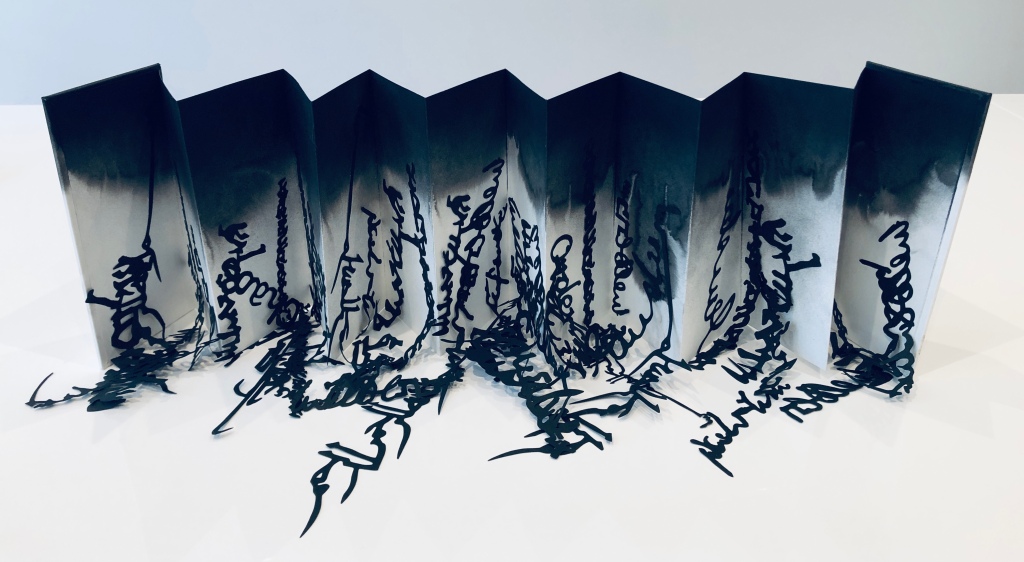
Babel(2019) Lizzie Brewer Box: H278 x W158 mm. Leporello: Closed H195 x W97 mm. Open 825 mm. 14 panels. Unique edition. Acquired from the artist, 14 February 2023. Photos: Books On Books Collection and courtesy of the artist.
Inspired by a 2019 exhibition at the Scuola Internazionale di Grafica in Venice, Lizzie Brewer created this work that sculpturally explores the border between image and letters. The laser-cut letters and words in black calligraphy from various languages (Farsi, Chinese, Kufic, Arabic, English, Greek, Japanese, etc.) seem to pour off the pages of a white leporello. Recalling the tower with which the Babylonians dared to reach heaven (Genesis 11:9), the multiple languages and randomness of the script accentuate the disorder visited on humankind when God decided they were being blasphemous.
Whatever Ur language preceded those languages is lost in the blackness of the cloud of ink from which the texts seem to rain. And perhaps the blackness also implies the punitive nature of the Old Testament deity. The leporello and calligraphy should certainly remind us of the pre-codex and pre-typesetting time of the story.
Some of the letters and words, all made from 150gms black Canford paper, are attached to the white 220gms cartridge panels, some are left free to be leaned against the panels or puddled in front, adding to the watery effect of the thinning black India ink in the background.
Library of Babel (2019)
Library of Babel (2019) Lizzie Brewer Leaflet. H210 x W105 mm. Acquired from the artist, 14 February 2023. Photos: Books On Books Collection. Displayed with artist’s permission.
With its hand-printed title, gold leaf mark and insert, this folded leaflet of hand-made paper made its appearance in an exhibition at the Westminster Reference Library in 2019. The quotation in the insert comes from the “The Library of Babel” by Jorge Luis Borges, and the phrase “[t]his set of works” refers to several of Brewer’s striking sculptures in homage to the story. These works are not in the Books On Books Collection (yet?), but these images (courtesy of the artist) are too complementary to the works above to be overlooked.
Hexagon (2019) “The Universe (which others call the library) is composed of an indefinite, perhaps infinite number of hexagonal galleries” — Borges “The Library of Babel”
410 pages (2019) and detail “Each book contains four hundred and ten pages.” — Borges, “The Library of Babel”
Lead Page (2019)
Untitled [Labyrinth] (2019)
Further Reading
“Sean Kernan“. 23 February 2013. Books On Books Collection. For another homage to Borges.
“Ines von Ketelhodt“. 1 February 2021. Books On Books Collection. For another homage to Borges.
“Peter Malutzki“. Books On Books Collection. For another homage to Borges.
“Aurélie Noury“. 9 November 2020. Books On Books Collection. For another homage to Borges.
“Hanna Piotrowska (Dyrcz)“. 13 December 2019. Books On Books Collection. For another homage to Borges.
“Benjamin Shaykin“. 3 December 2022. Books On Books Collection. For another homage to Borges.
“Rachel Smith“. In progress. Books On Books Collection. For another homage to Borges.
“Sam Winston“. 18 May 2023. Books On Books Collection. For another related alphabet work.
Frate, Kathryn Shank. 2019. “Tower of Babel Exhibit“. Scuola Internazionale di Grafica, Venice. Accessed 28 June 2023.
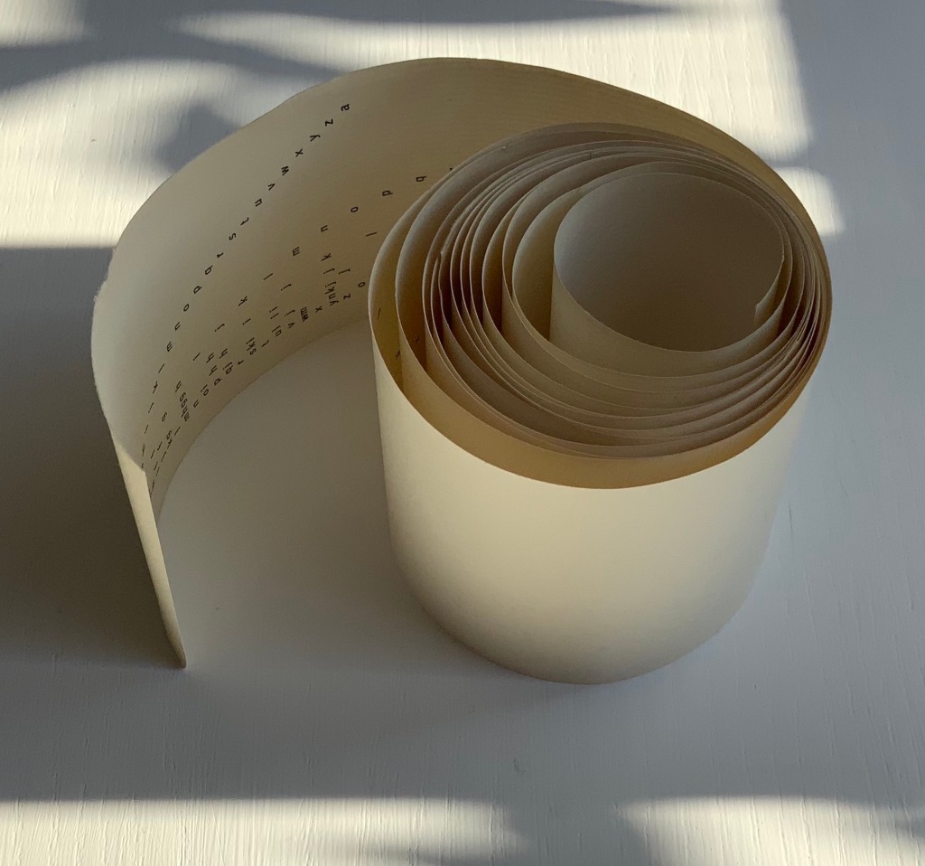
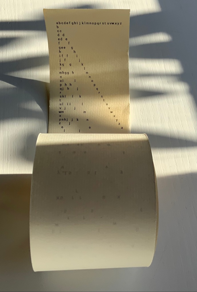
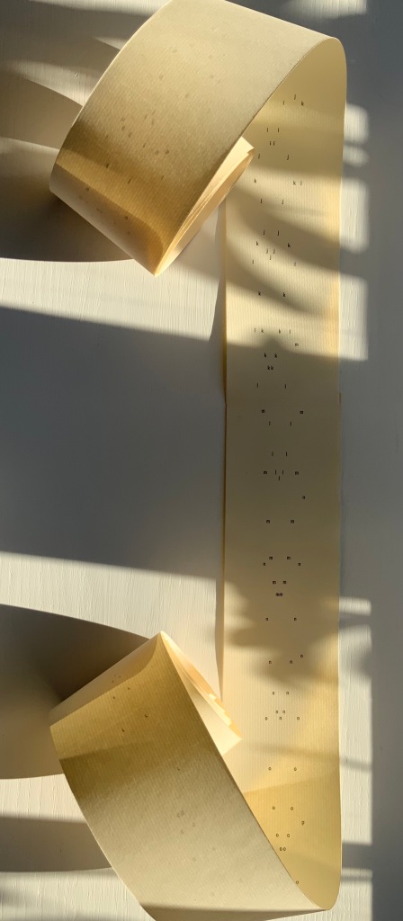
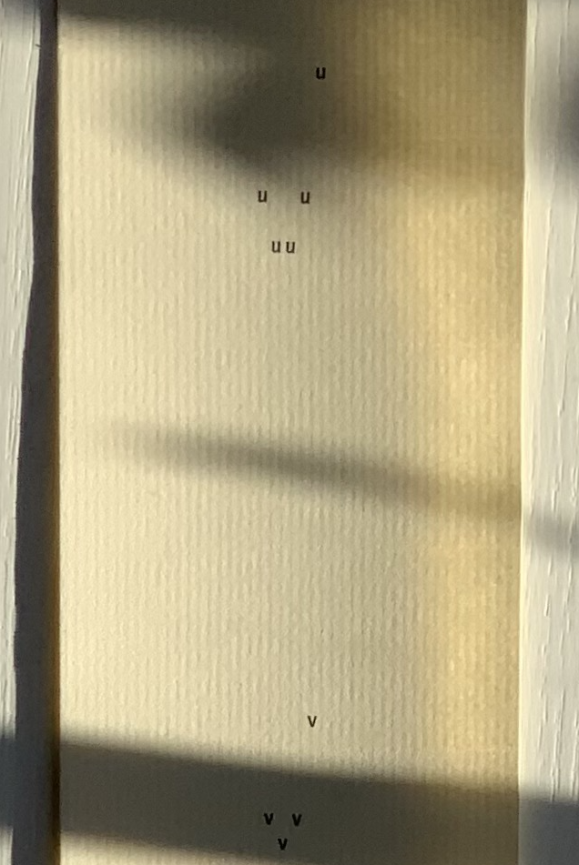
abcdefghijklmnopqrstuvwxyz(“Alphabet Poem”) (1963) Emmett Williams Scroll in three parts printed offset on laid paper. H2228 x W60 mm. Acquired from Ozanne Rare Books, 29 September 2021. Photos: Books On Books Collection. Permission to display from Ann Noël Williams.
More than seven feet in length, this alphabet scroll was originally published around 1961 by Verlag Kalender, the same publisher that published the Kalender Rolle, whose form influenced this work. Intended for performance, the scroll is gradually unfurled and read aloud. The “Alphabet Poem” was sold on its own and as a part of George Maciunas’ Fluxus 1. Other views online can be found in the Galerie Krinzinger archive, New York’s MoMA and Swarthmore College.
Exactly how the “Alphabet Poem” would be performed is unclear. Presumably read left to right line by line? How are the gaps to be handled? Should the reader pause for each letter missing in the gaps? Performance aside, the form and structure entice more of a visual engagement in the way that concrete and conceptual art and poetry most often do. The letters fall according to rule and constraints. The rule is to maintain the alphabetic sequence vertically, horizontally and in a zigzag diagonal. The constraints are the width of the paper roll, the spacing between letters in the top row and the spacing between lines. The visual patterns that result pull the eye away from the alphabetic/spatial rules, and it searches for entirely other pareidolic patterns — faces, constellations, etc. Just the way the eye discovers letters and shapes in everyday surroundings, the clouds, etc. All of which bumfuzzles our hemispherical brains — no doubt the concrete/conceptual intent?
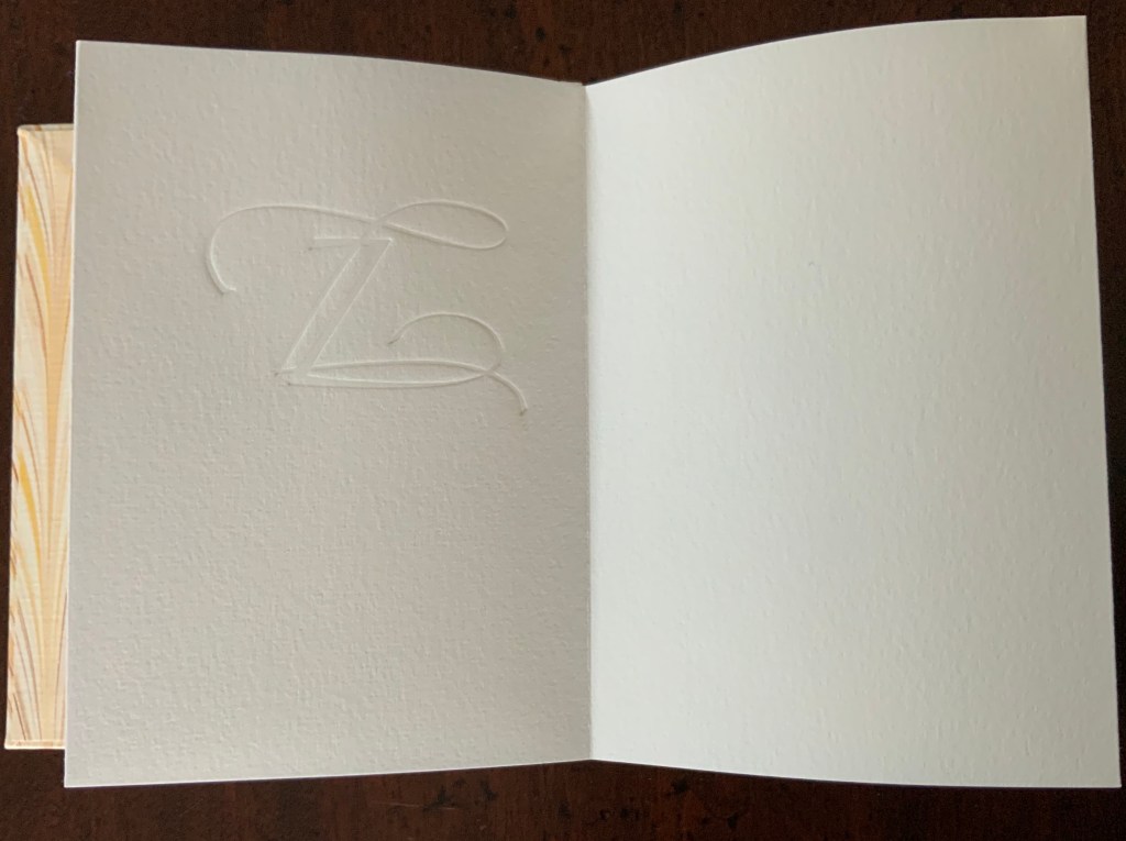
There is no letter z!
Under Further Reading, other artists associated with Fluxus and visual (or concrete) poetry can be found in the Books On Books Collection. Beyond the collection, Hansjörg Mayer’s alphabetenquadrate (1966), in particular, should be compared and contrasted with Williams’ scroll. Like Williams’ scroll, Mayer’s leporello reads left to right and vertically. But where Williams’ alphabet seems to flutter away algorithmically and languidly into blank space at the end of the scroll, Mayer’s alphabet takes on a curving pattern that fills in a grid of 26 x 26 character spaces and finally overprints the completed grid to the point of illegibility.
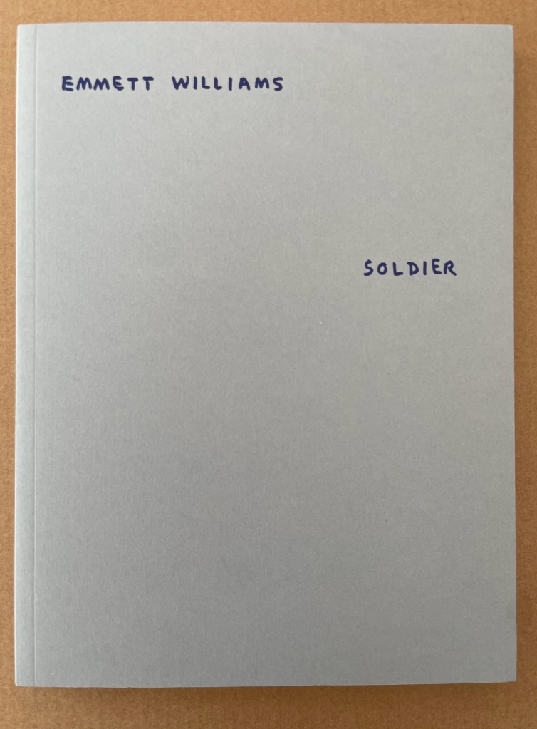
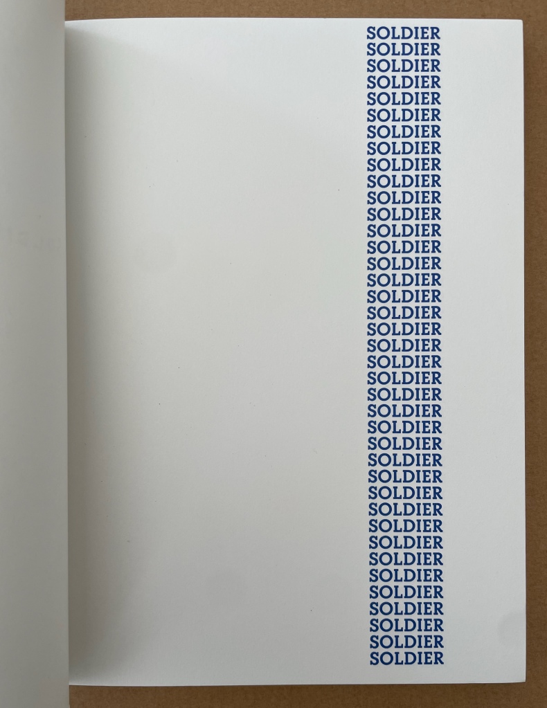
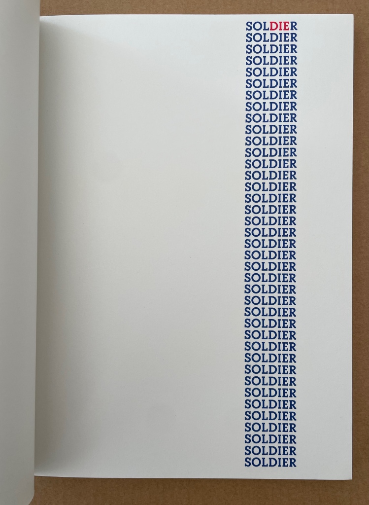
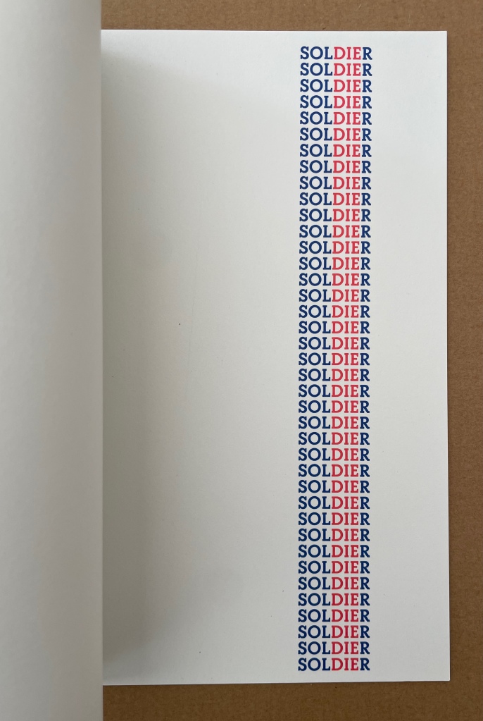
As if there weren’t enough for which to thank Clive Philpott and Moeglin-Delcroix, we have their efforts through Zédélé Editions to reprint early classics of book art, including SOLDIER by Williams, Jan Dibbetts Robin Redbreast ‘s Territory (1969) and hermann de vries’ White (1960/80) among others.
Between 1966 and 1970, Emmett Williams (1925-2007) was the editor, with Dick Higgins, of Something Else Press, which published a large number of books by artists linked with the Fluxus movement. A pioneer from the Fifties of a new form of poetry called “Concrete Poetry”, in reference to Concrete Art, in 1967 Emmett Williams assembled the first collection of works by international poets and artists, An Anthology of Concrete Poetry, simultaneously published by Hansjörg Mayer in Europe and Dick Higgins in the United States. He defined it in his introduction as “direct” poetry, “using the semantic, visual and phonetic elements of language as raw materials”. In contrast with the subjective expression of traditional poetry, this approach sought to use a minimum of resources, focusing on systematic composition processes based on repetition, permutation and mechanical development, governed by a pre-established protocol.
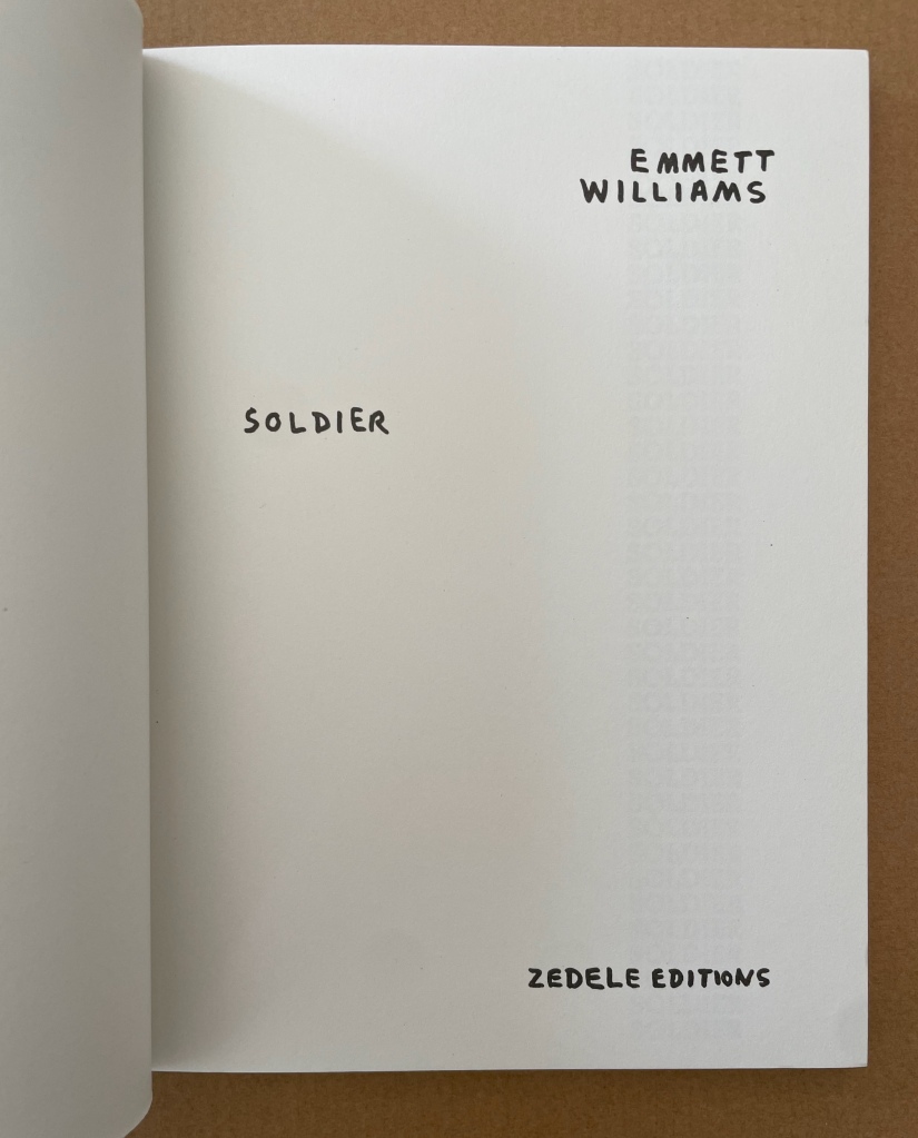
In 1973, again with Hansjörg Mayer and Something Else Press, Emmett Williams published four long autonomous poems, including SOLDIER, composed the previous year at the California Institute of the Arts, and collected in a single volume entitled A Valentine for Noël. The book was dedicated to his young pregnant wife, Ann Noël, whom he had met in 1968 when she was working for a year as Dick Higgins’ assistant, and who, as director of the graphics workshops at CalArts, helped the artist overcome the technical difficulties of changing over from manuscript to printed poems.
Later, Emmett Williams said: “My first ‘dying’ soldiers poem dates from 1970 during the war in Vietnam.” This first version of SOLDIER is a silkscreen print in red and blue. It is obvious that the later version — a sequence of 40 pages during which the reader sees the three red letters, DIE, gaining one line on each sheet — is visually more striking and politically more effective: by the simplest of means, it makes the inevitable advance of death in the column of soldiers typographically visible. For this re-edition, it also seemed obvious that the publication of the poem in a separate volume restored its implicit function as a flip book. The “playful” aspect present in all Emmett Williams’ works seems to have taken refuge here in the childlike form of these animated books, designed to give the impression of continuous motion. Far from undermining the tragic nature of the subject, the flip book form accentuates the protest against war as a killing machine. A flip book for adults, which remains highly topical. — Publisher’s insert.
Noël Williams, Ann. 2020. Spirale. Berlin: Argobooks. “The design for the artist’s book SPIRALE was developed to accompany the performance of the same name, performed by Ann Noël and Emmett Williams at the Sprachen der Künste festival at the Akademie der Künste on 4 February 1984. The alphabet with names of artists, Berlin squares, song fragments, streets and restaurants was created through Emmett Williams’ and Ann Noël’s habit of making alphabet lists to fall asleep at night. The artist couple prepared their word and name lists for the performance independently of each other and then challenged each other on stage.” — publisher’s description.
John Crombie formed Kickshaws in 1979 in Paris. Joined by Sheila Bourne, they published over 150 works. Apparent as the esoteric influence of visual poetry and the Oulipo movement may be, their works have the combined smell of the printer and typesetter’s workshop and artist’s studio that distinguish them from that crowd.
ABC in a maze (1987)
ABC in a maze (1987) John Crombie Spiral bound on four sides, double gate fold. H95 xW95 mm, 17 leaves. Edition of 300 (150 in English, 150 in French), of which this is Letter of 26 numbered A-Z. Acquired from Librairie Jean-Étienne Huret, 17 March 2022. Photos: Books On Books Collection.
The cover of this work hides its title, just as the proper order of the pages hides in the reiterations of the alphabet across 17 leaves of this double gatefold puzzle and book.
The French title ABC Dédale carries more freight than the English. Not only does it convey the idea of the maze by reference to its inventor Daedulus, it refers to Cadmus, the Phoenician prince who brought the alphabet to Greece while on his quest to find his sister Europa, mother by Zeus to the Minotaur — the “monster in the alphabet”. If that seems a far-fetched allusion, then consider the additional hint in the name of the chosen typeface: Hélios, the Greek god and personification of the sun, to which Daedulus’ son Icarus flew too close in their escape from Crete.
Portrait évolutif du typographe “Evolving portrait of the typographer” (1988)
If a selection of works from the Books On Books Collection were made based on the theme of “artists’ books and color”, this small work would have to make the cut. Moving from five small splashes of color in the first pass, subsequent passes build up a multi-colored cartoon image of the typographer in a head-on eyeless gaze. At the seventh pass, however, the colors begin to fade; in the ninth, the features of the portrait begin to erode, and by the twelfth, only streaks of gray and the faintest impression of the outline remain.
A close look at the title reveals that same faint impression of the portrait’s outline. Were it not for its reference to the three primary colors, the title would have to be amended to a baker’s dozen of passes in collaboration with the press.
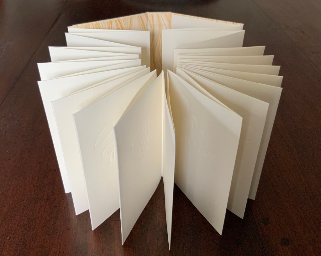
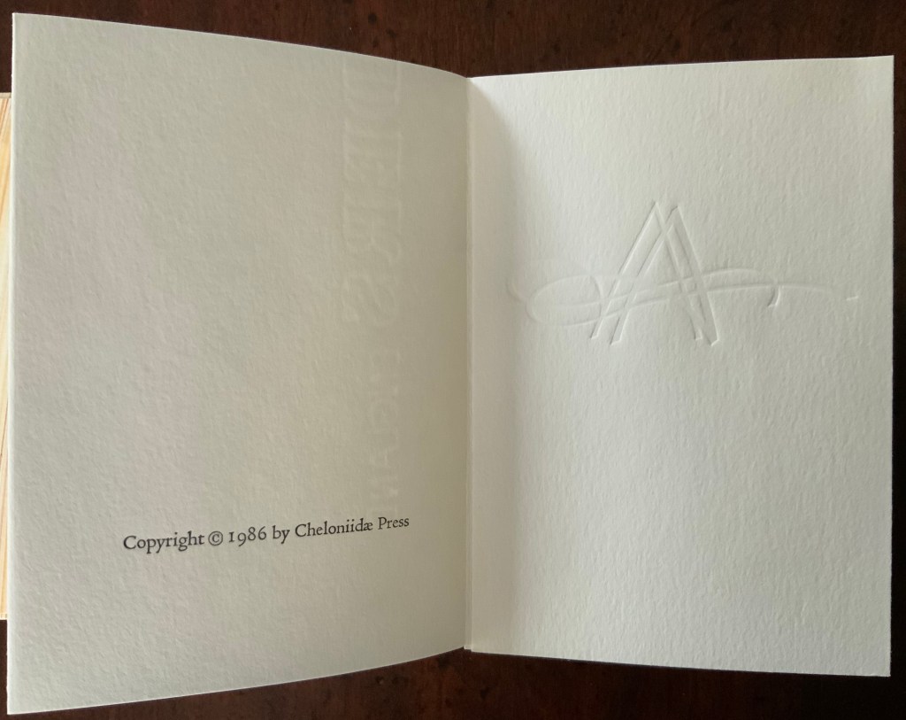
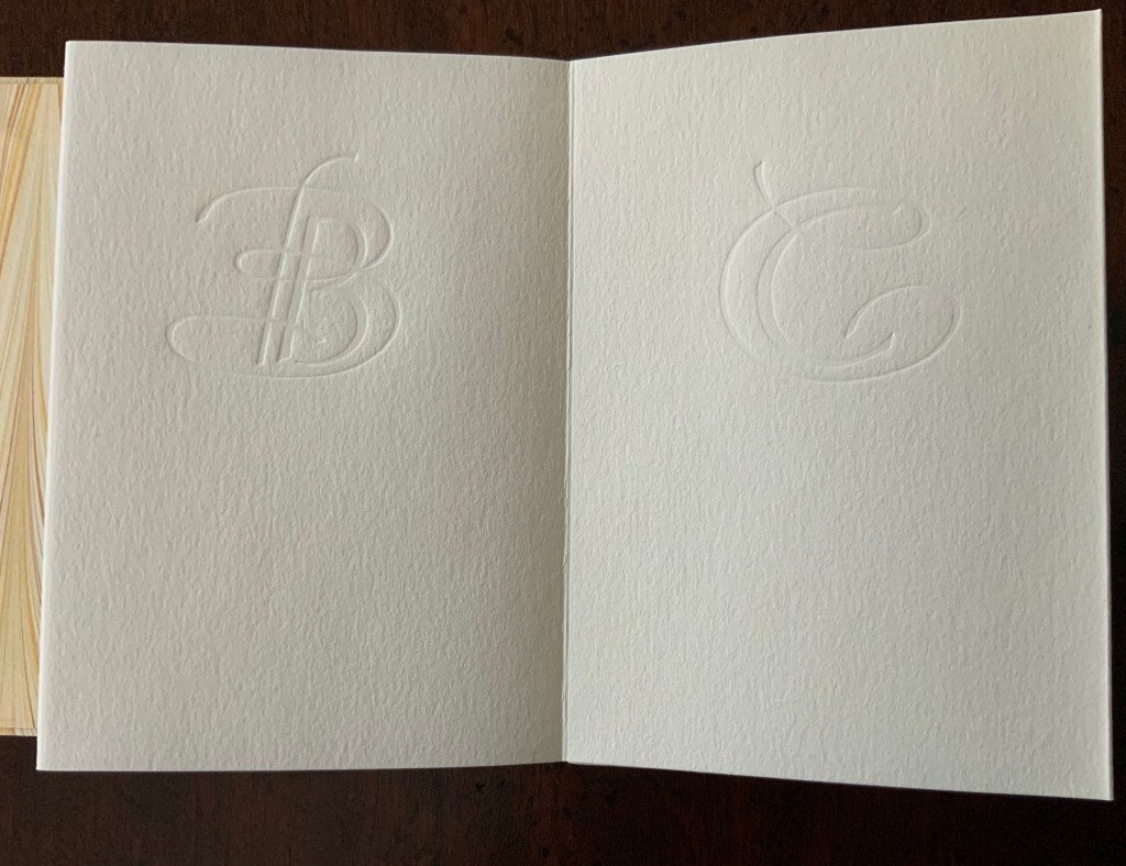
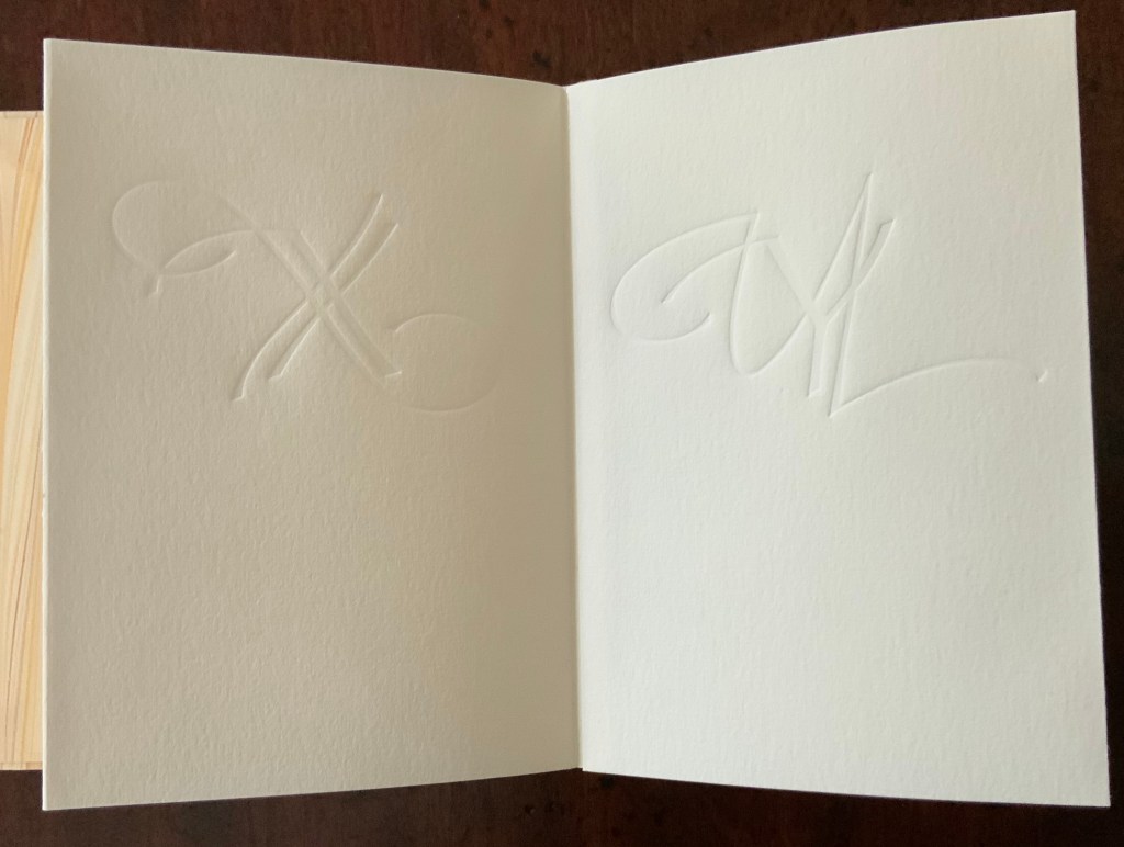
A Fowl Alphabet (1986) Alan James Robinson (etchings), Suzanne Moore (calligraphy) Casebound. Marbled paper over boards. Doublures and flyleaves. H218 x W145 mm. 26 Folios untrimmed at head. Four-page prospectus loose. Acquired from Bromers Bookseller, 16 August 2022. Photos: Books On Books Collection. Displayed with permission of the artists.
Under his Cheloniidae Press imprint, Alan James Robinson created three artist’s alphabets: A Fowl Alphabet with Suzanne Moore; An Odd Bestiary (1982) and The Birds and Beasts of Shakespeare (1990), arranged as a double abecedary, first the birds and then the beasts. Although this copy of A Fowl Alphabet comes from the regular edition and does not have the color of the deluxe editions of all three abecedaries, it does demonstrate the extraordinary fineness of Robinson’s wood engraving as well as his compositional talent, which also informs the book’s design. The positioning of the birds’ heads in their printed black frames conveys a sense of movement and three dimensionality on the individual page, but notice how Robinson varies the positioning from page to page and across double-page spreads to enhance the sense of movement.
With its core thick strokes shadowed and entwined with thinner flourishes, Suzanne Moore’s calligraphy creatively complements the way that the heft of Robinson’s engraved heads plays against those compositional features.
“Cheloniidae” is the scientific term for the family of sea turtles, and much of Robinson’s art is marine related. But the dominant and consistent impression conveyed by the ouput of Cheloniidae Press is that of Robinson’s artistic skill as an impresario and conductor of artistic talents. Added to the background of his duet with Moore are Master Printer Harold Patrick McGrath, Faith Harrison and her hand marbled paper, Arthur Larson and his hand typesetting and the binding skills of Claudia Cohen.
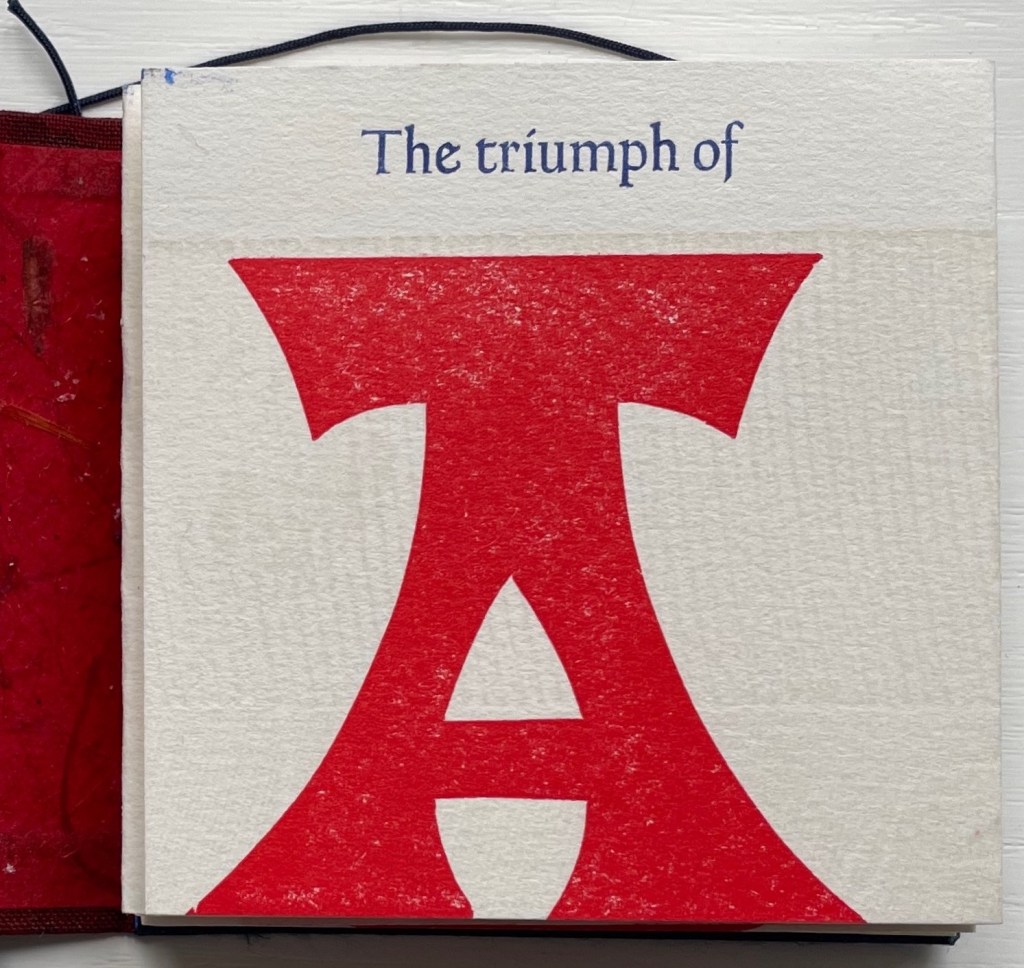
The Triumph of the Alphabet(2017) William Rueter Accordion fold extending from the back page. Bound in paper-covered boards with printed paper title on spine. Twine tie closure. 82.6 x 82.6 mm. 27 panels. Acquired from Vamp&Tramp Booksellers, 7 October 2022. Photos: Books On Books Collection.
From the colophon: “This nameless wood type alphabet was made c. 1900 by the Hamilton Mfg. Co. Here at The Aliquando Press it is affectionately called ‘Ali-oops!'”
The full quotation from Audin is “The triumph of the alphabet gave true impetus to our Western civilization … The alphabet made it possible to transmit all-embracing concepts and truths to humanity”. There was more than one Audin interested in letters. Marius was father to Maurice and Amable, and the three of them produced a multi-volume history of printing called Somme Typographique. Amable contributed the section on the birth of the alphabet, and Maurice wrote the section on the discovery of typography. A scan of this volume does not yield the pronouncement in the Aliquando Press miniature. Luc Devroye‘s entry on Marius Audin cites him as a major influence on the French typographical world, and his number of books exceeds those by his sons combined. Given his livelier style, it seems more likely that the quotation in The Triumph of the Alphabet belongs to Marius. If so, “Ali-oops” might deserve an erratum slip. Slip or no, the panels with their tripartite texture and dual contrast of colors and font make The Triumph of the Alphabet a triumph of printing pleasure.
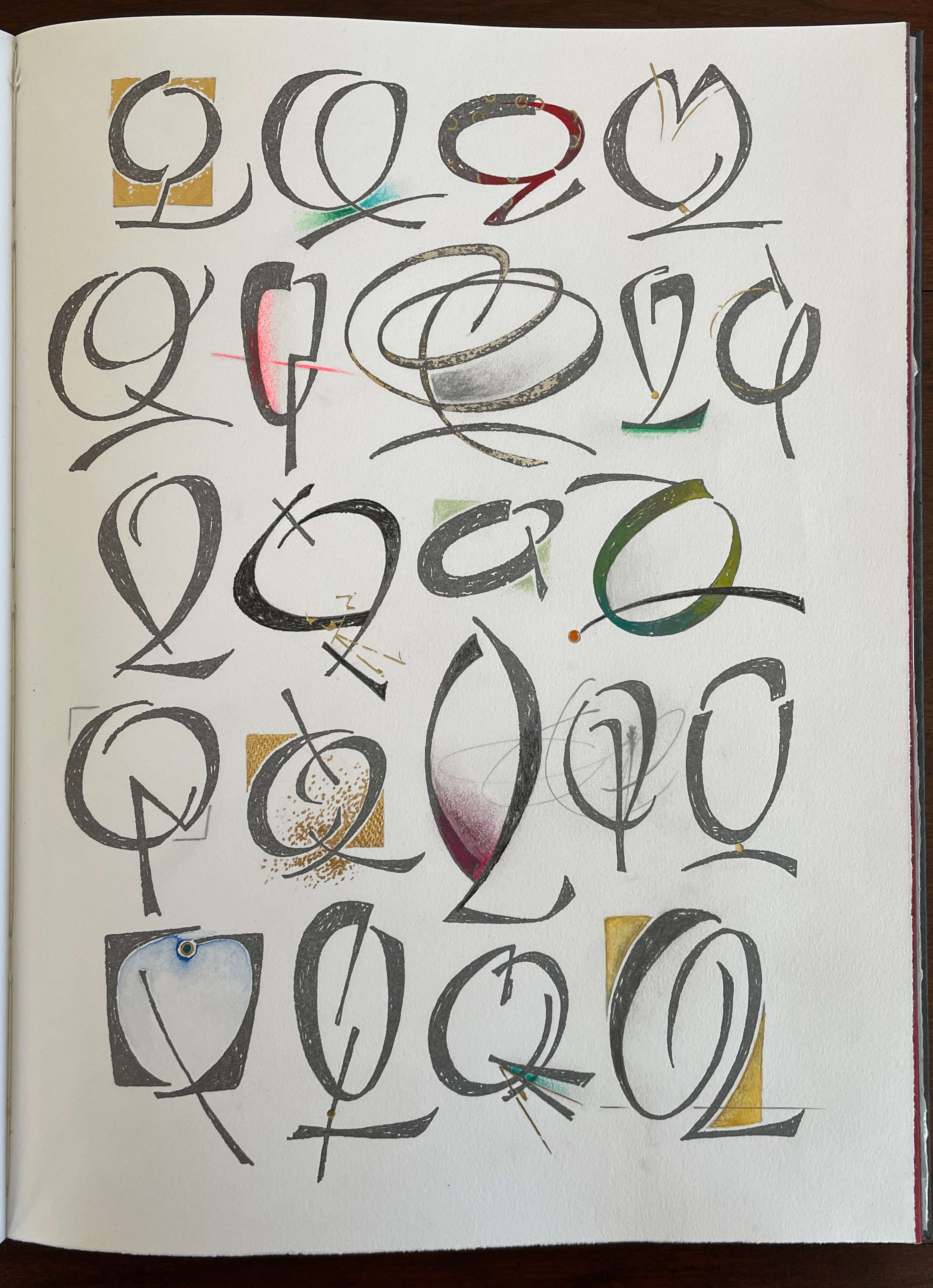
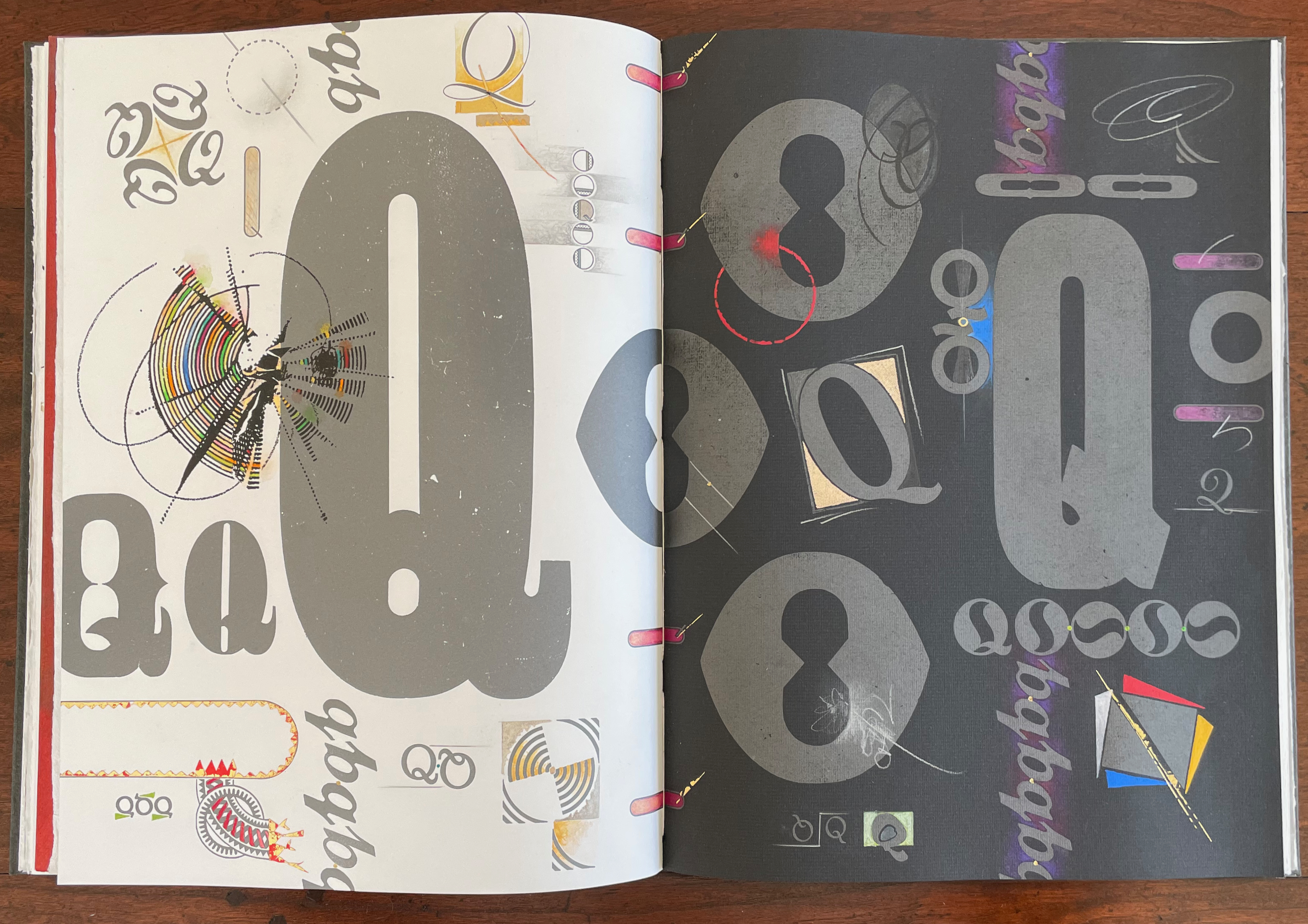
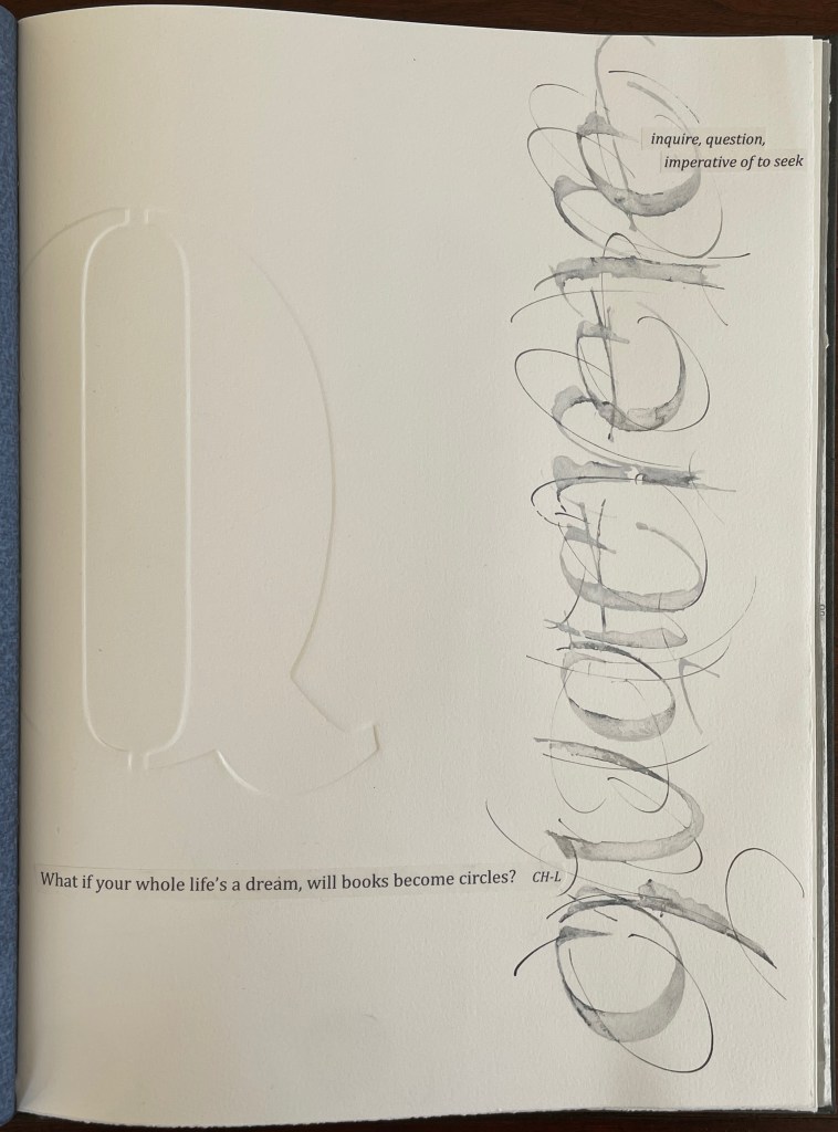
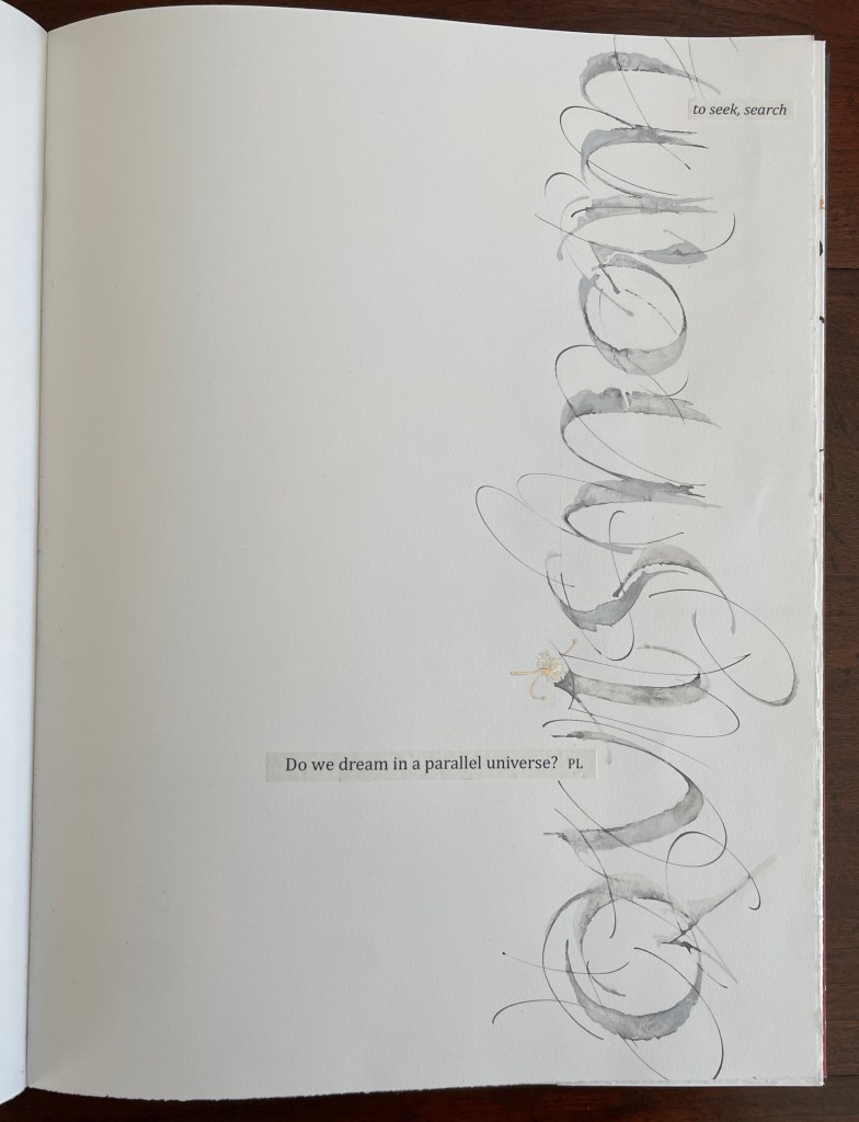
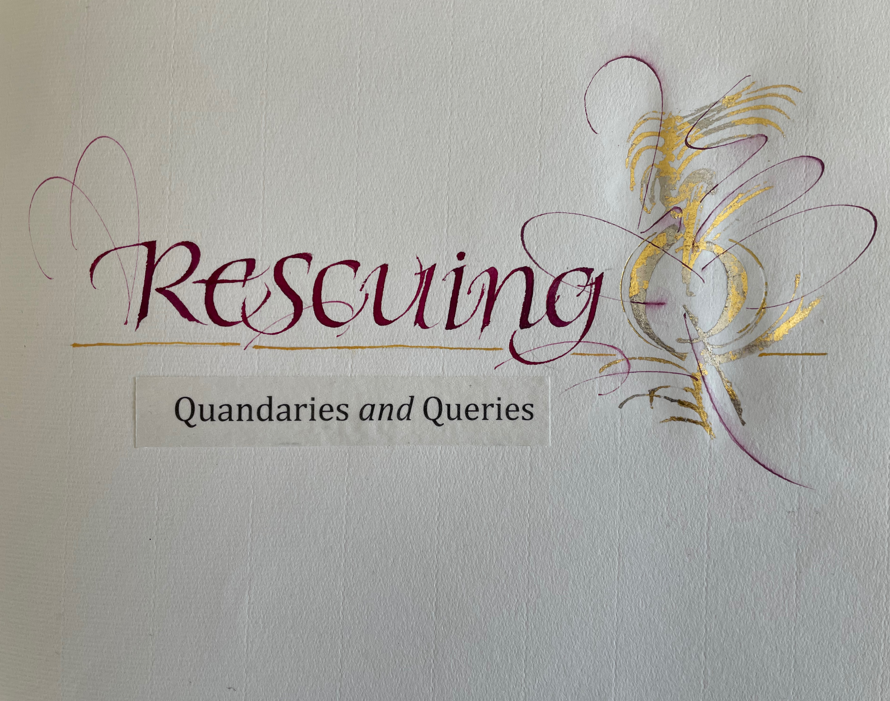
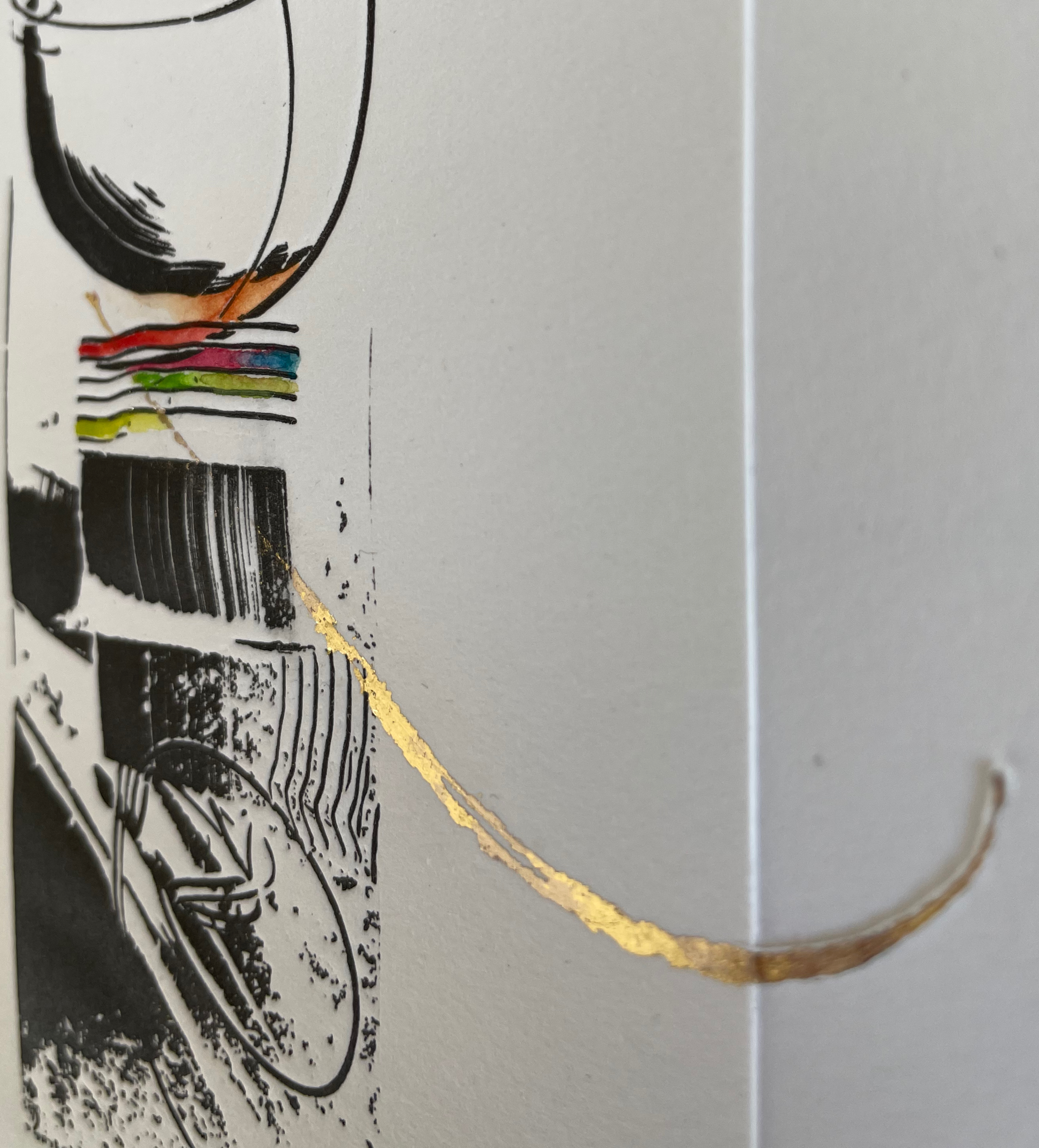
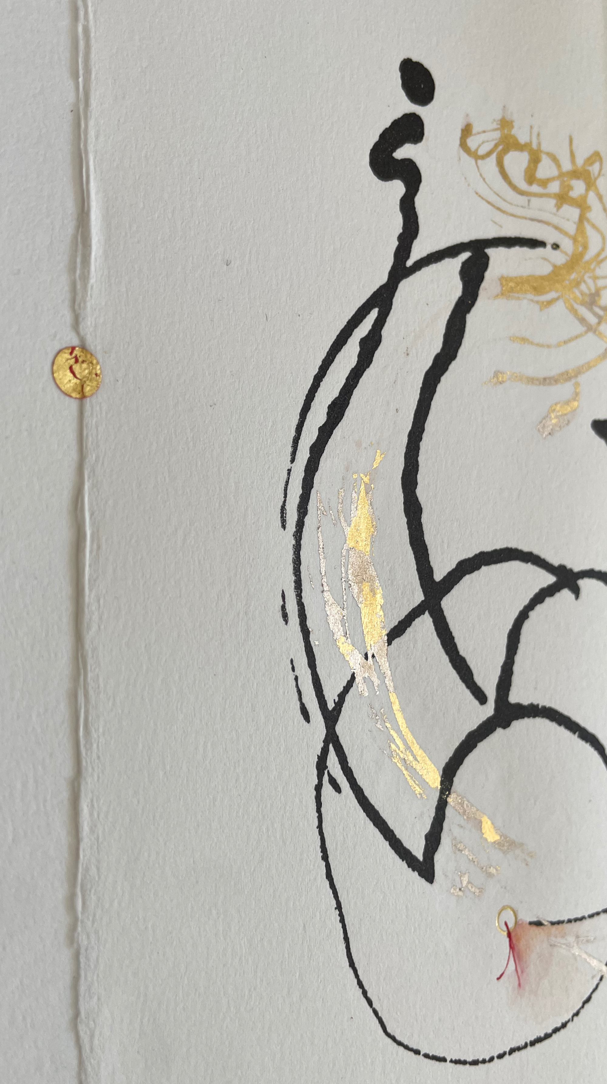
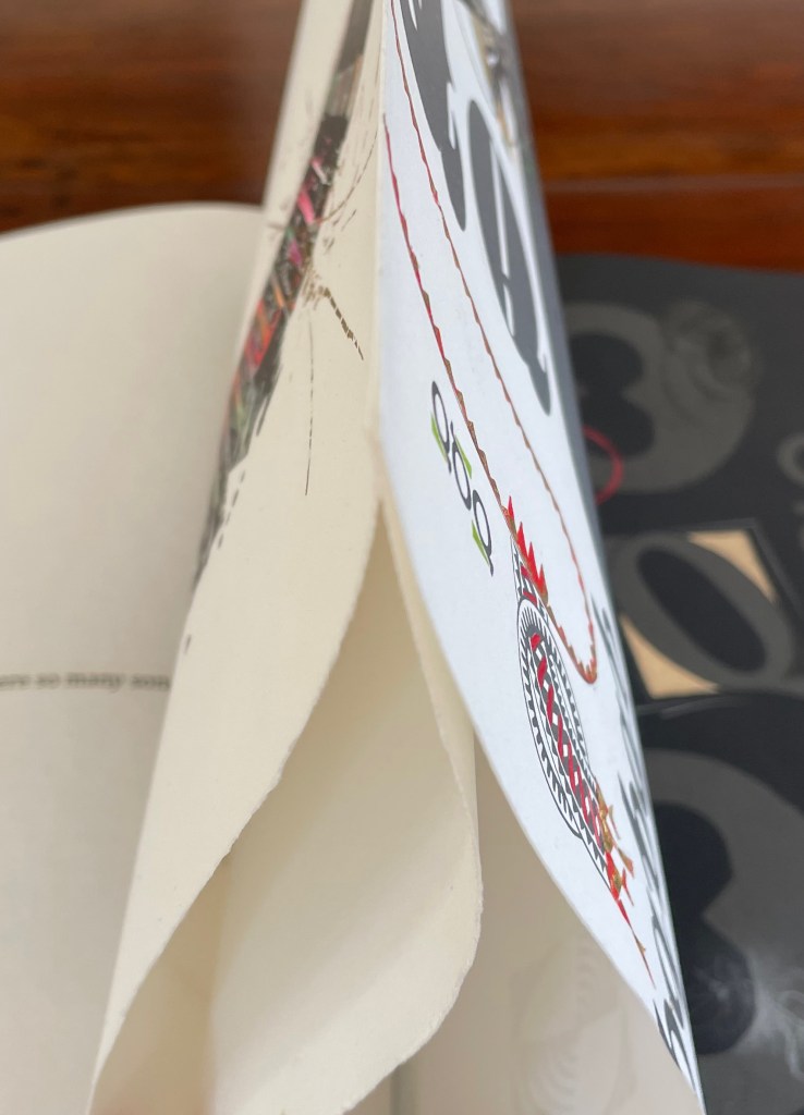
Rescuing Q (2023) Suzanne Moore Box enclosing softcover book. Box: H400 x W300 x D30 mm. Book: H380 x W285 mm. 32 pages. Printing by Sandy Tilcock (and Phoebe) at Lone Goose Press and Jessica Spring, Springtide Press. Unique edition. Acquired from the artist, 25 April 2023. Photos: Books On Books Collection. Displayed with permission of the artist.
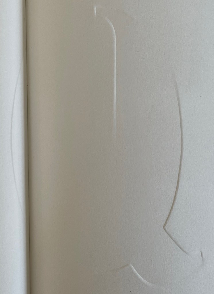
Rescuing Q is a manuscript book, consisting of original paintings, monoprints, collage, pigmented prints, embossing, debossing, gilding and handwork complementing the letterpress printing. It is one of several such works designed and created by Suzanne Moore after more than 20 years of experimentation.
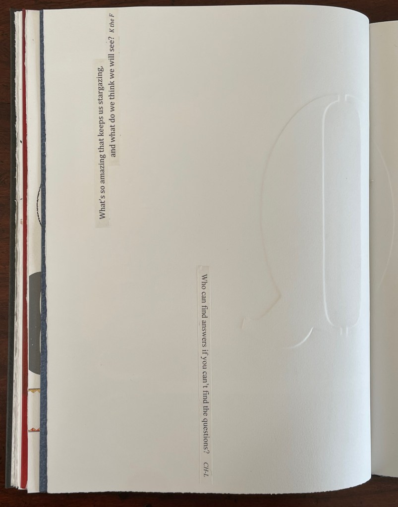
Q is not normal. Q is quirky. Q floats away. Q comes in too many shapes and sizes and colors. So attractive, Q was bound to be hijacked by Q-Anon, political operatives and social anarchists.
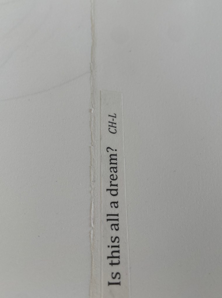
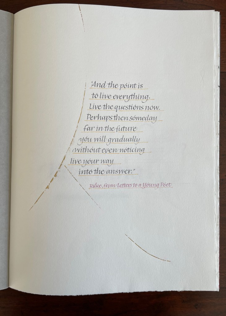
But Q will not remain captive for long because it is always asking questions. And, if we want answers, then as Rilke says, we must “live the questions now”.
For most readers though, the question that will be uppermost is “How did she do that?” Moore is quick in her generosity and would insist on amending that question to “How did they do that?” Consider the selection of paper. More than Arches (a laid paper with visible mesh and watermark) had to be considered for these interactions of ink, gouache, gold leaf, palladium, debossing/embossing by etching press and hand, cuts and overlays.
What notes, movements and rhythms were playing when these colors and the sequences were chosen?
How do they think of paper and ink in three dimensions?
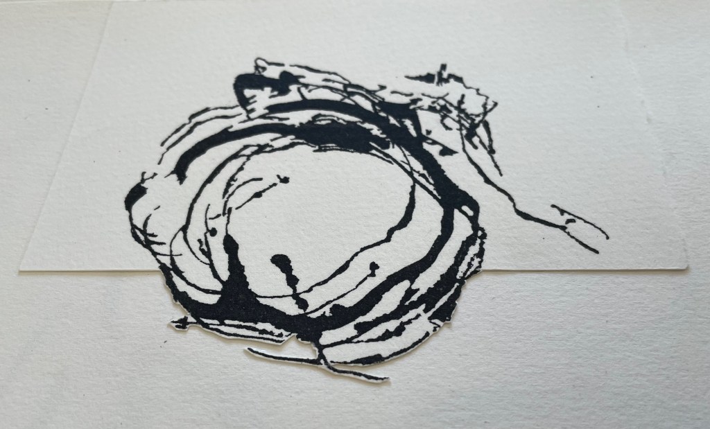
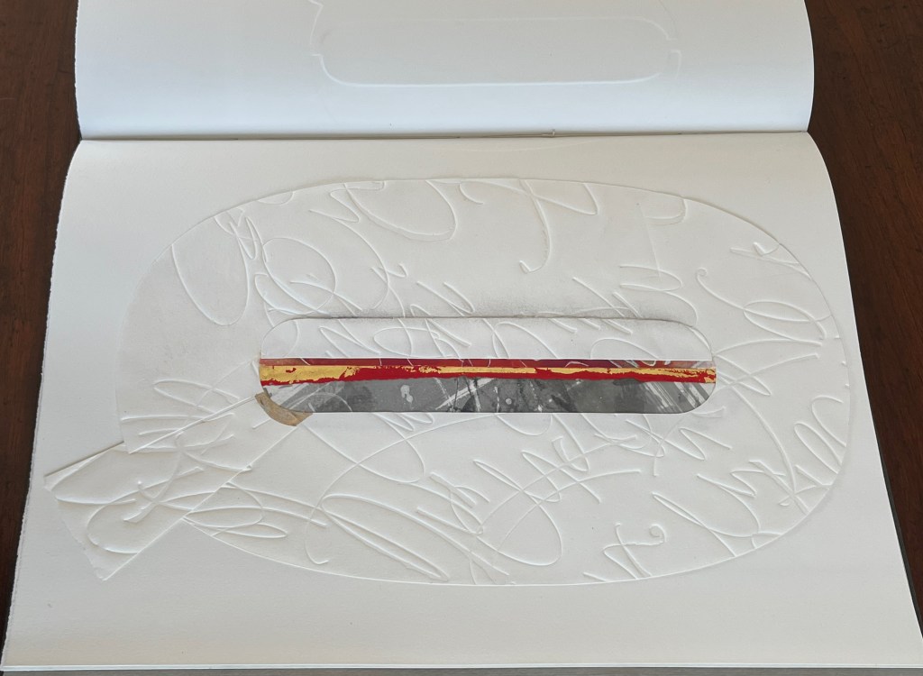
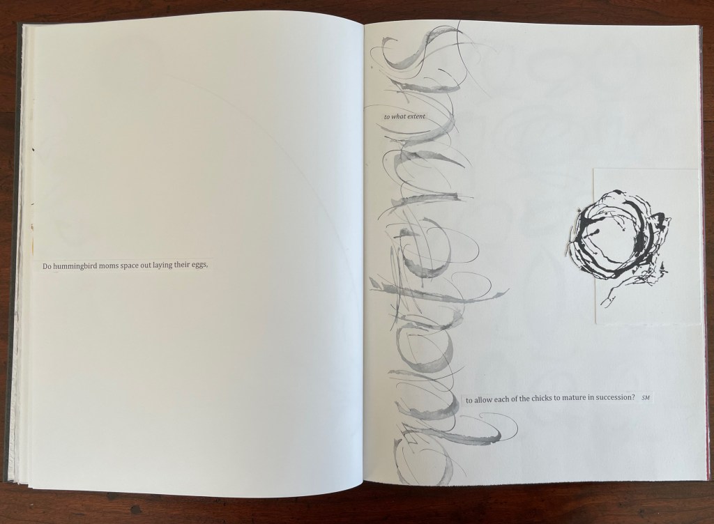
Who saw Q and questions in a bird’s nest?
And someone’s memory called up Cave Alphabet paper for the endpapers.
The fact that Moore and her colleagues can do all that (and more) and the fact that their gentle and pointed questions fuse with the art ensure that Rescuing Q does and will succeed.
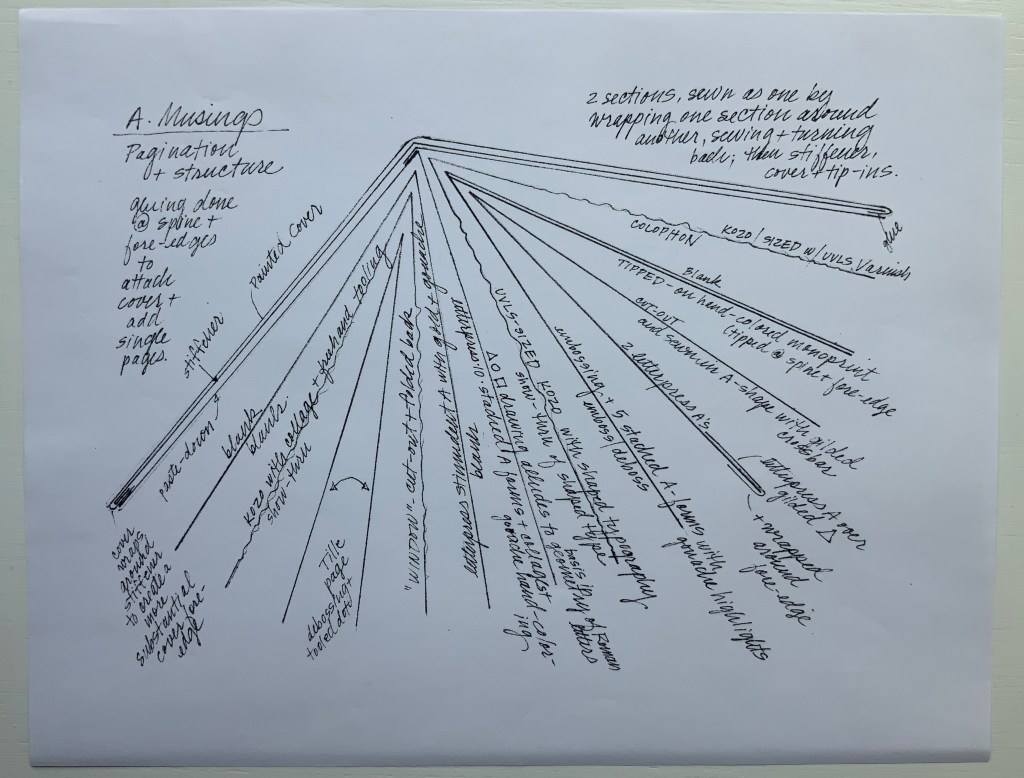
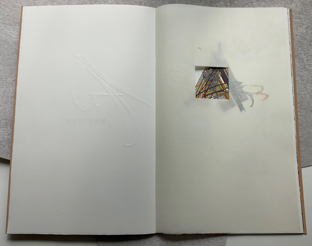
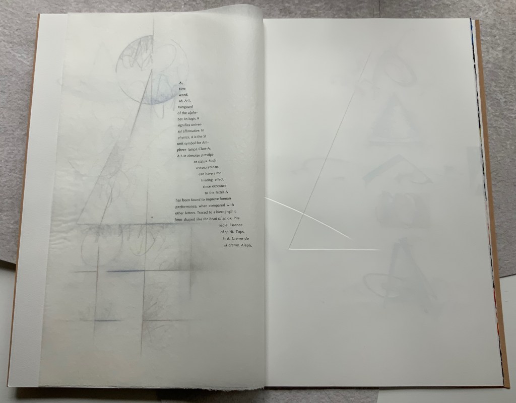
A Musings (2015)
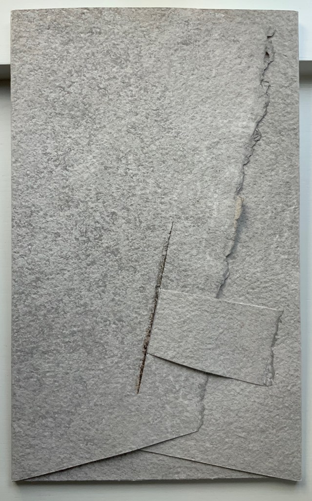
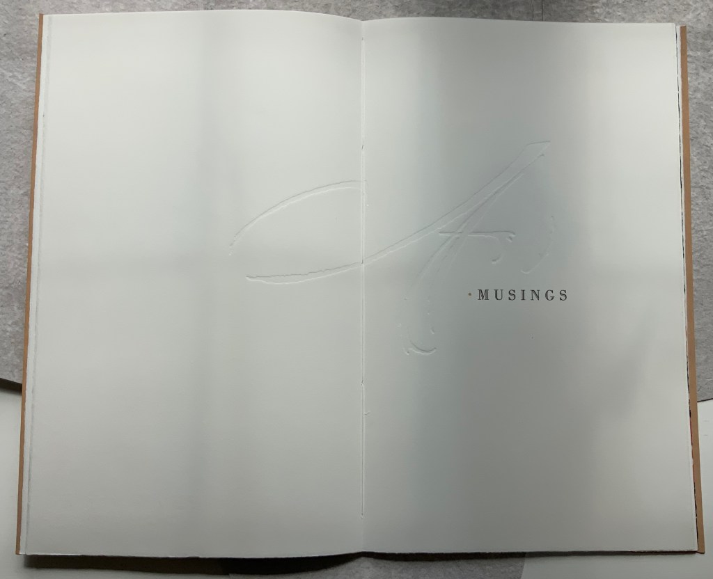
A Musings (2015) Suzanne Moore Tab-insert portfolio around softcover book. H370 x W230 mm, 24 pages. Edition of 26 variants, of which this is N. Acquired from Abecedarian Gallery, 13 February 2022. Photos: Books On Books Collection. Displayed with permission of Suzanne Moore.
Title page
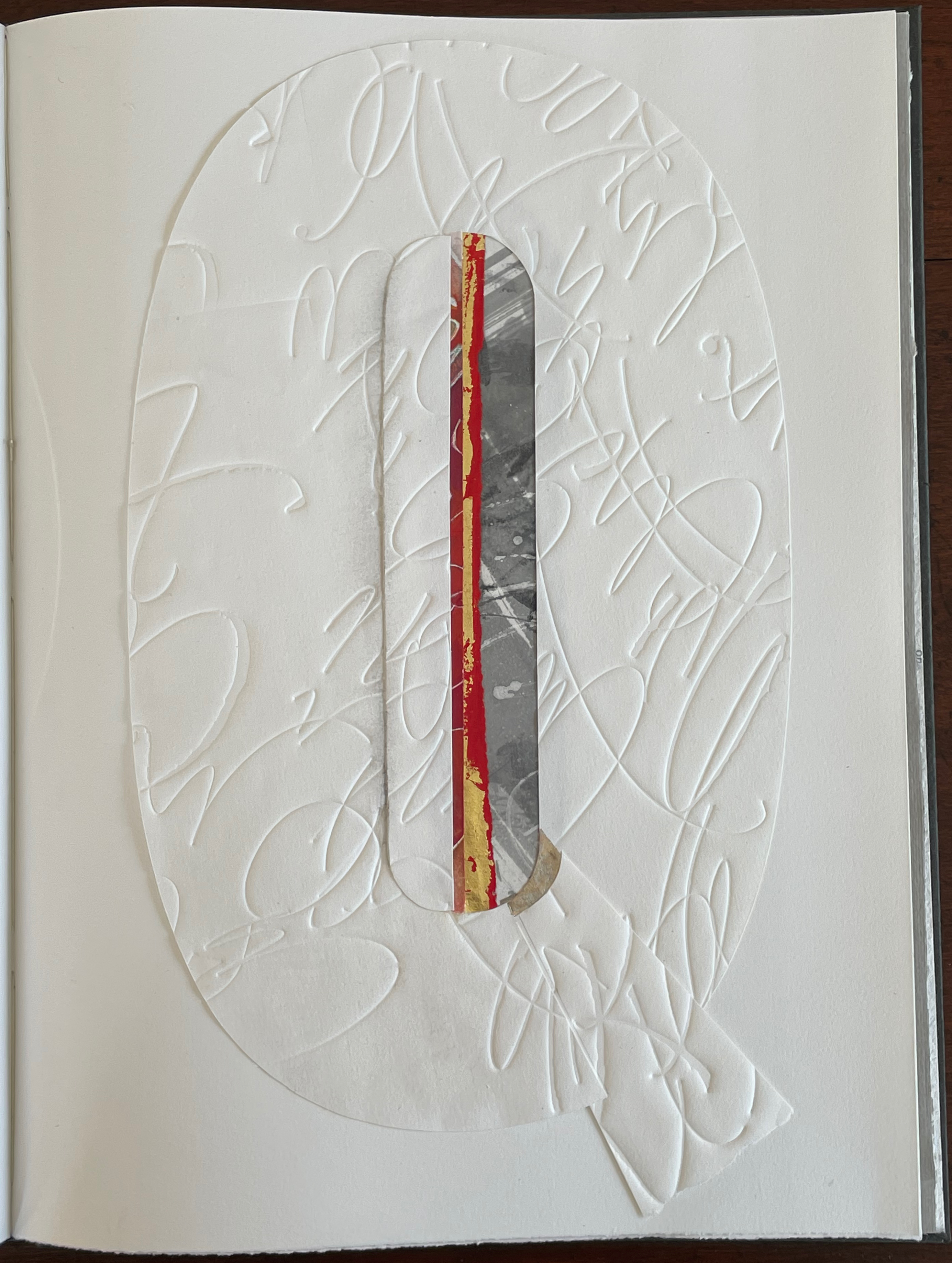
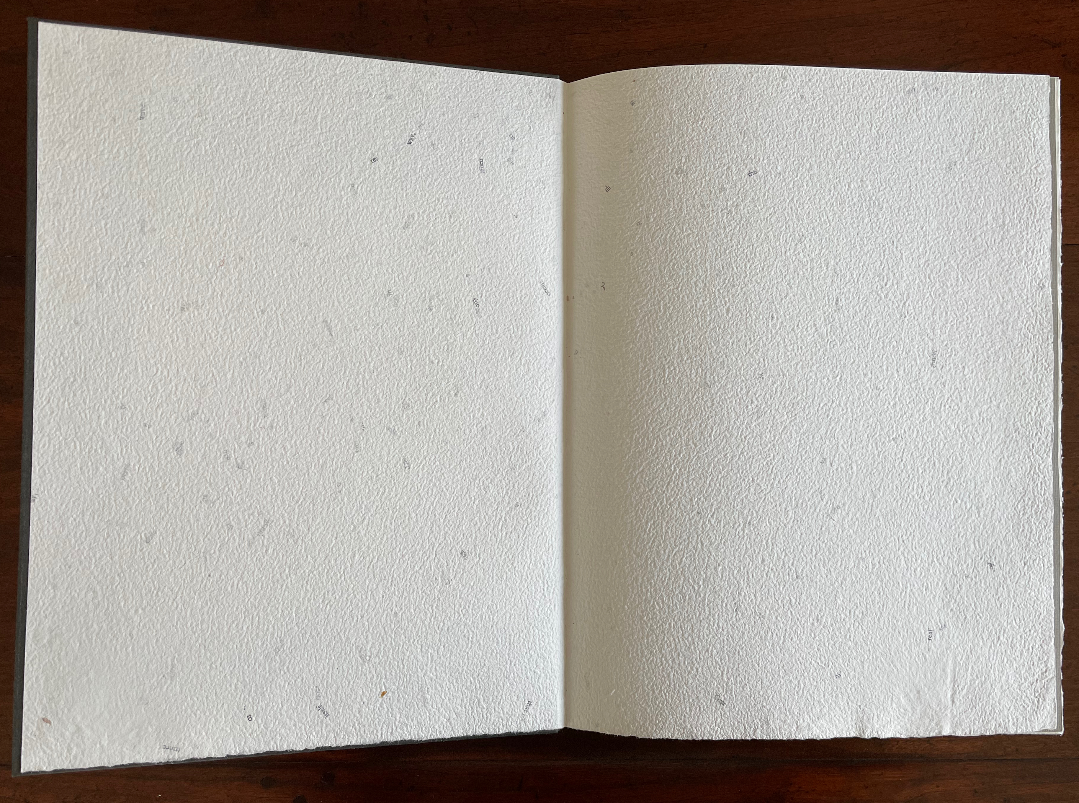
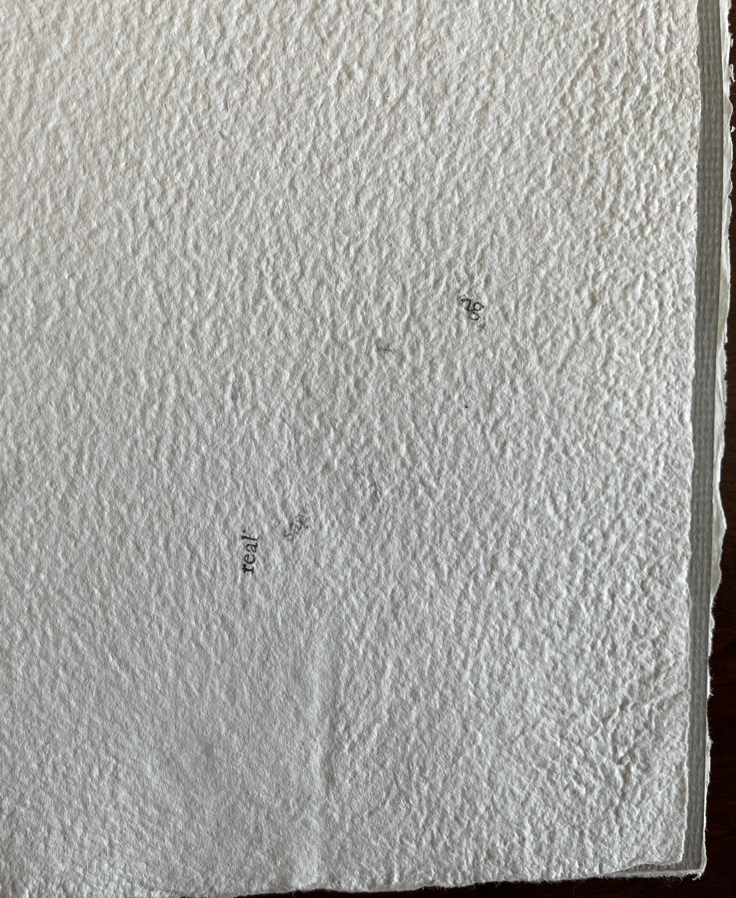
Another manuscript book, A Musings is an encounter between Suzanne Moore and the letter A, one of her 26 muses. As with any artist and muse, this naturally leads to portrayals of A in such varied positions, with such varied tools and techniques and such varied materials that the boxed and bound portfolio must take the amusing title A Musings. The muse finds itself posed across Magnani Aquaforte, Arches Text Wove, transparent kozo and other handmade papers enveloped by a stiffened, painted handmade paper. Moore’s musings fall on the historical, symbolic and spiritual aspects of the letter A with acrylic paint, pencil, freehand foil tooling, gold and palladium leaf, collage, debossing and embossing, sumi ink and gouache, sizing and varnish, monoprint, letterpress, folds and cutouts.
A separately provided copy of the artist’s plan for the pagination, structure and treatment per page offers a useful insight into the questions of how such a work is thought through and made. Page layout and the type of paper, in particular, play together sometimes like a clockwork mechanism and sometimes organically.
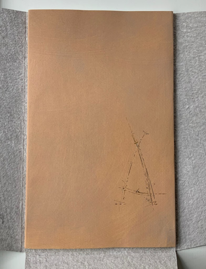
Painted cover
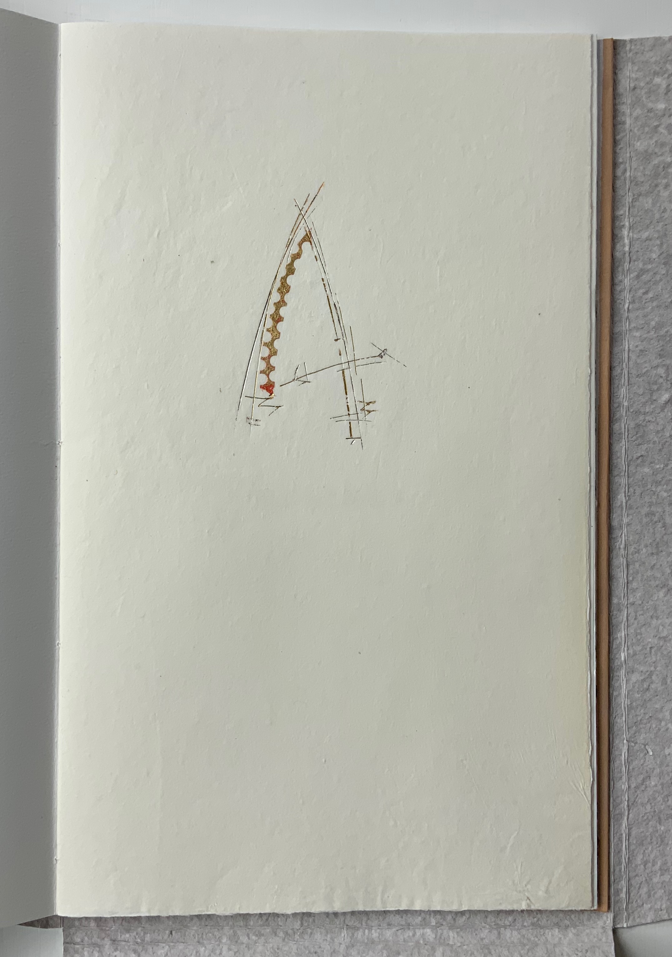
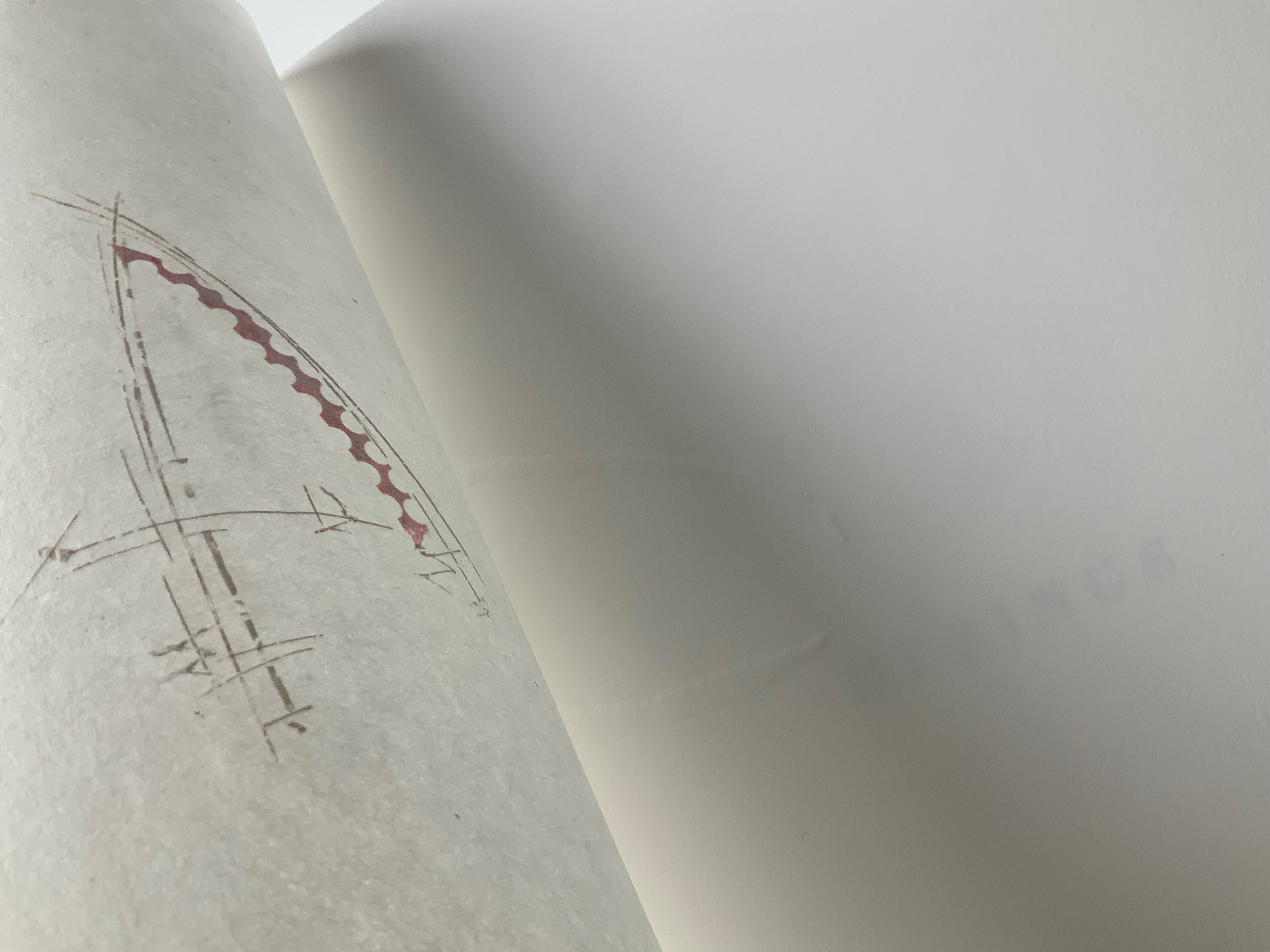
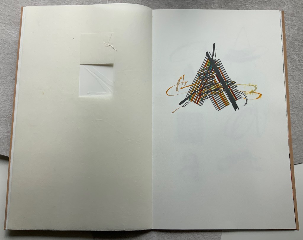
Left: Half-title. Right: Half-title turned to show translucency of kozo; note on the facing recto how the stroke from the debossed A on the title peeks through.
After the title page (see further above), the next double-page spread shows the title page’s debossed A in reverse on the verso page. Facing it is a square cutout through which multicolored lines forming overlapping As appear. Because the cutout page is translucent paper, we can see that the multicolored lines extend into a larger A on the next recto page. Turning the cutout page reveals that the cutout is actually a flap folded up and secured with white thread sewn in the shape of an A. This three-dimensionality of the flap is echoed by the way the crossbar swashes of the facing A seem to swirl around its two legs implying a spinning A.
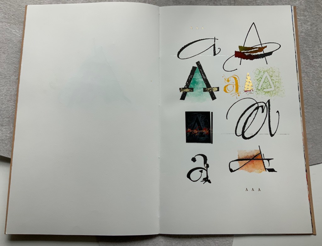
From the single A interacting with a cutout, we move to a dozen evocations of the historic forms that the lowercase and uppercase A have taken. The lowercase “closed a” from the semi-uncial hand starting in the 5th century appears second down in the lefthand column, and the “perfected” Roman uppercase A appears at the bottom of the right column. Amusingly, some evocations blend periods of history. In the lower left, the drawing of a lowercase “open a”, which comes from the 8th century Carolingian miniscule hand, takes on the stylization of the 15th century’s bianchi girari (white-vine stem decoration). Just across from it, the stylized version of the Proto-Sinaitic (1700 BCE) form of aleph, meaning “ox”, has a burnt umber background that suggests markings in early cave dwellings.
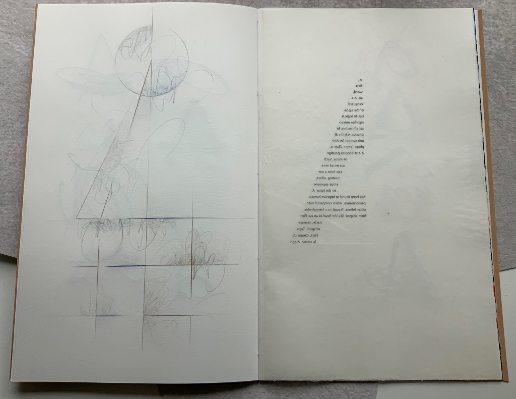
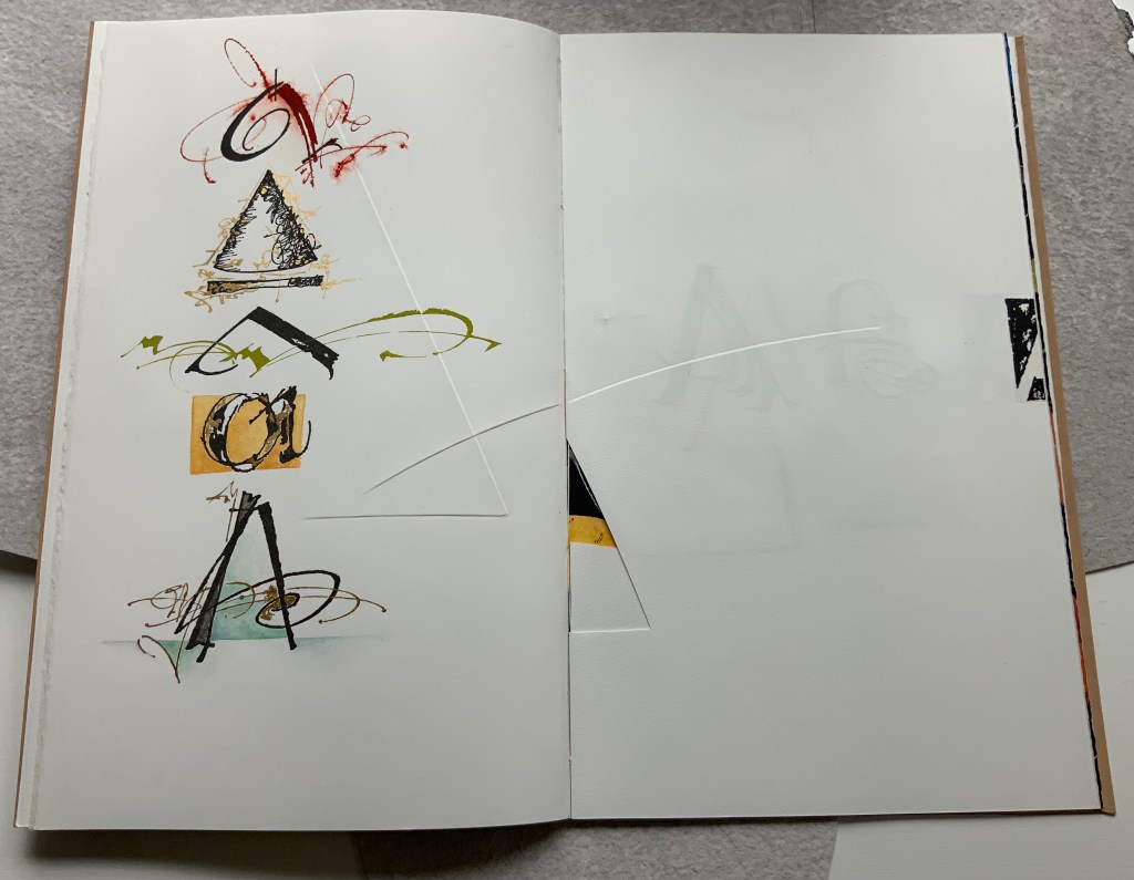
Using a translucent leaf with set type shaping half an A, the next two double-page spreads play (or muse) on uppercase A’s bilateral symmetry poised between geometric and freehand approaches to lettering, between typography and calligraphy and between inking and debossing.
When the recto page above with its debossed line and angle is turned, another extraordinary integration of composition, paper, printing (inking, debossing and “embossing”) and, now, cutting occurs. Notice how the ink of the first and third As overlaps the now “embossed” angle, how the now “embossed” line becomes debossed as it crosses the gutter, how the previous double-page spread’s themes of geometry/freehand, printing/drawing and lowercase/uppercase likewise cross over, and how the cutout triangle uses the yellow ink showing through to form the crossbar of an A and the gutter to form the A’s lefthand stem.
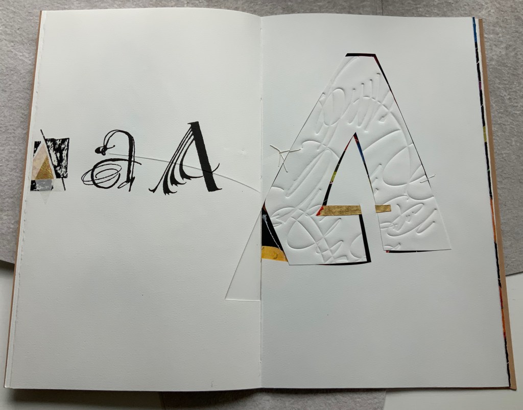
There is much else to muse upon in the spreads above, but it’s in the last two spreads where Moore builds and unfolds a fantasia of calligraphy, color, debossing, cutting, gilding and painting. Notice how the gilt crossbar slots through the page and helps secure the debossed piece behind the cutout to the page.
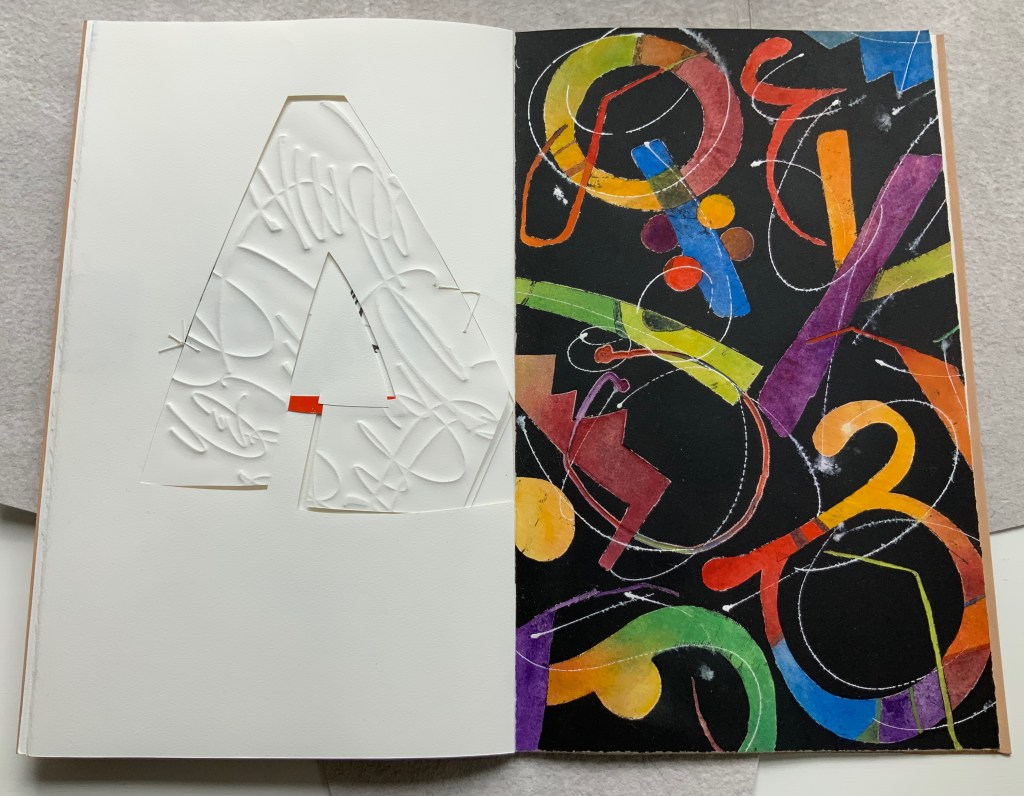
And when the page turns, notice how its gilt crossbar reveals its red paper beneath and becomes the spot of red completing the crossbar for the cutout A. The red spot against white seems to set off the explosion of color and calligraphy on the black final page, printed by Jessica Spring from polymer. The different shapes for A here come from African alphabets. The images are unique monoprints, done on an etching press. With the letters placed to block out the black and overlap one another, a sense of depth and texture arises. Contributing to that sense of texture, the white letters are hand-painted in gouache — sometimes layered, sometimes blended.
Books are inherently collaborative affairs, and for artists’ books, collaboration can become almost another tool for the artist. Jessica Spring, mentioned above, also debossed the opening A, hand-set the half-A composition and contributed to Rescuing Q. Now a fine binder in her own right, Gabby Cooksey, a studio assistant to Moore and Don Glaister, was essential to A Musing‘s hand work, binding and wrapper. Part of Moore’s creative progression from contributing to overseeing to orchestrating can be traced from here across three other works in the Books On Books Collection.
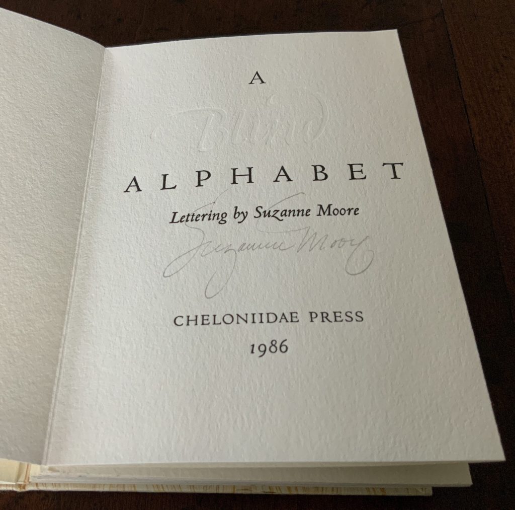
A Blind Alphabet (1986)
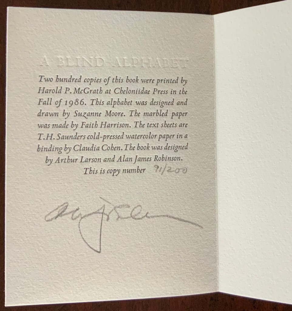
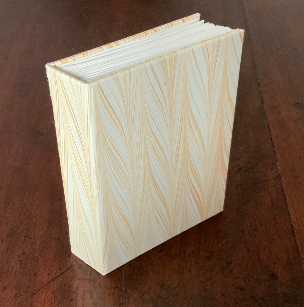
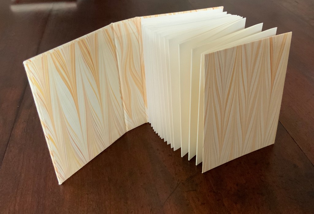
A Blind Alphabet (1986) Suzanne Moore Accordion-fold. Closed H128 x W93 D28 (spine) D22 (fore-edge) mm; open 3200 mm. 34 pages. Edition of 200 of which this is #91. Calligraphic letters designed and drawn by Suzanne Moore, printed by Harold McGrath on T.H. Saunders cold-pressed watercolour paper, bound by Claudia Cohen in marbled paper by Faith Harrison. Acquired from Veatchs, 1 May 2018.
Here, as noted in the colophon to A Blind Alphabet, Moore has the creative role of originating artist, designing and drawing the alphabet — soloist, as it were, in the Cheloniidae Press reportory orchestrated by Alan James Robinson.
In Robinson’s wood engravings of birds, Moore plays a creative contributing role with much the same repertory company.
A Fowl Alphabet (1986)
A Fowl Alphabet(1986) Alan James Robinson (etchings), Suzanne Moore(calligraphy) Casebound. Marbled paper over boards. Doublures and flyleaves. H218 x W145 mm. 26 Folios untrimmed at head. Four-page prospectus loose. Acquired from Bromers Bookseller, 16 August 2022. Photos: Books On Books Collection. Displayed with Suzanne Moore’s permission.
Again, Cheloniidae Press’ master printer Harold Patrick McGrath and “usual suspects” Arthur Larson (hand typesetting), Faith Harrison (hand marbling) and Claudia Cohen (binding) played their roles in this book. Here, Moore has the creative contributing role of designing the alphabet and, for the deluxe and full vellum editions (not shown), hand lettering.
In book art, an artist’s progression from contributor to orchestrator is not necessarily linear as can be seen in this subsequent work.
Bartleby, The Scrivener: A Story of Wall Street (1995)
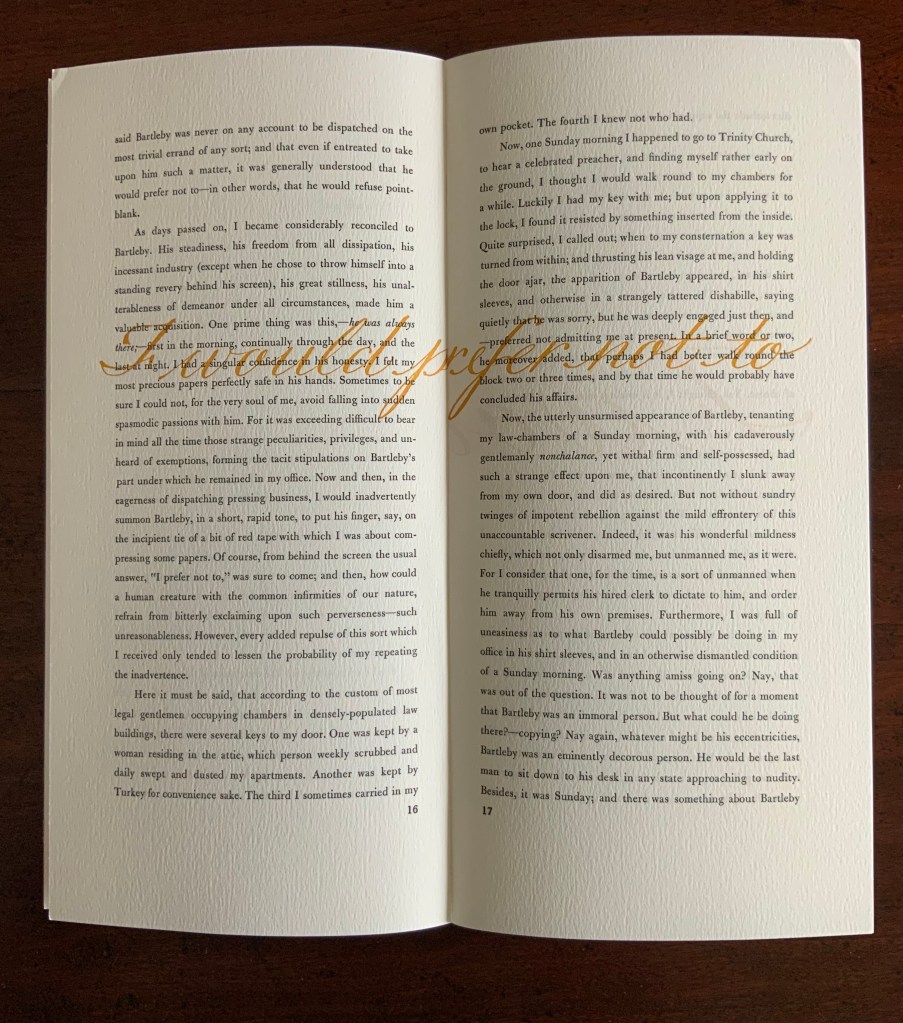
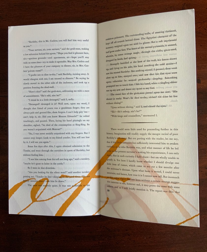
Herman Melville, Bartleby the Scrivener: A Tale of Wall Street, 1853. Indulgence Press, 1995. Typeetting, printing and binding by Wilber Schilling; Calligraphy by Suzanne Moore. Text paper by Janus Press. Endpapers by MacGregor & Vinzani. Edition of 100 of which this is #71. H320 x W158 x D14 mm. Acquired from Indulgence Press, 17 December 2015. Photos: Books On Books Collection. Displayed with permission of the publisher.
Wilber Schilling (Indulgence Press) orchestrated this edition of Herman Melville’s well-known story. Part of Schilling’s genius was to invite Moore to provide the calligraphy for Bartleby’s hallmark (his only) words “I prefer not to”. Another part was to print Moore’s calligraphy in ever-increasing size in ghostly ochre and in descending position across the pages of the book.
For more of Suzanne Moore’s works and artistic roles as well as others’ insight into them, see below.
Moore, Suzanne. 2016. Studies in Love the Question. Handlettered pages in book bound by the artist. 34 images available at Letterform Archives. ______________. 2014. Zero – Cypher of Infinity. 24-page handlettered pages in book bound by the artist. Letterpress pages by Jessica Spring. 20 images available at Letterform Archives.
______________. 2014. Origins and Spectrum. Process portfolio for Zero — Cypher of Infinity. Includes notes from the artist. 28 images available at Letterform Archives.
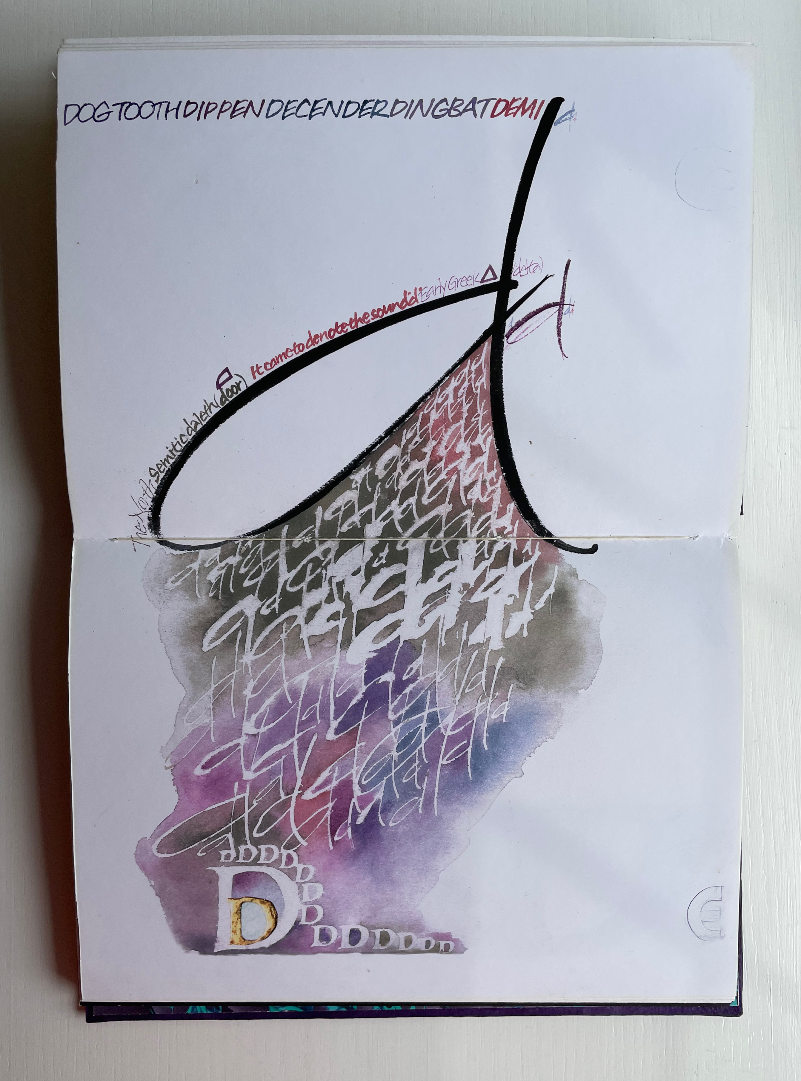
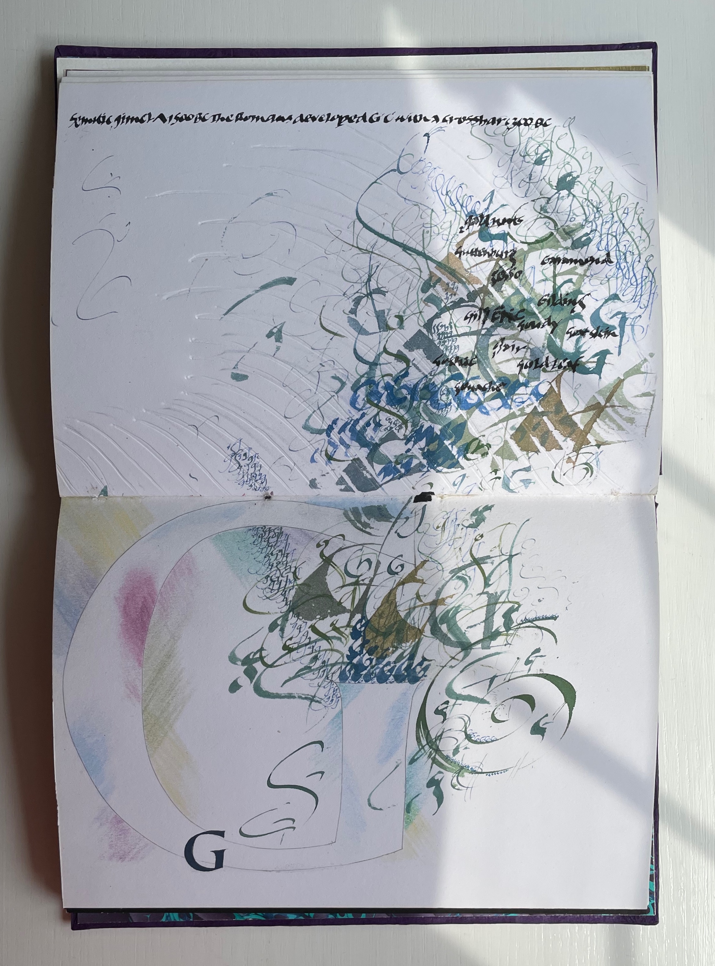
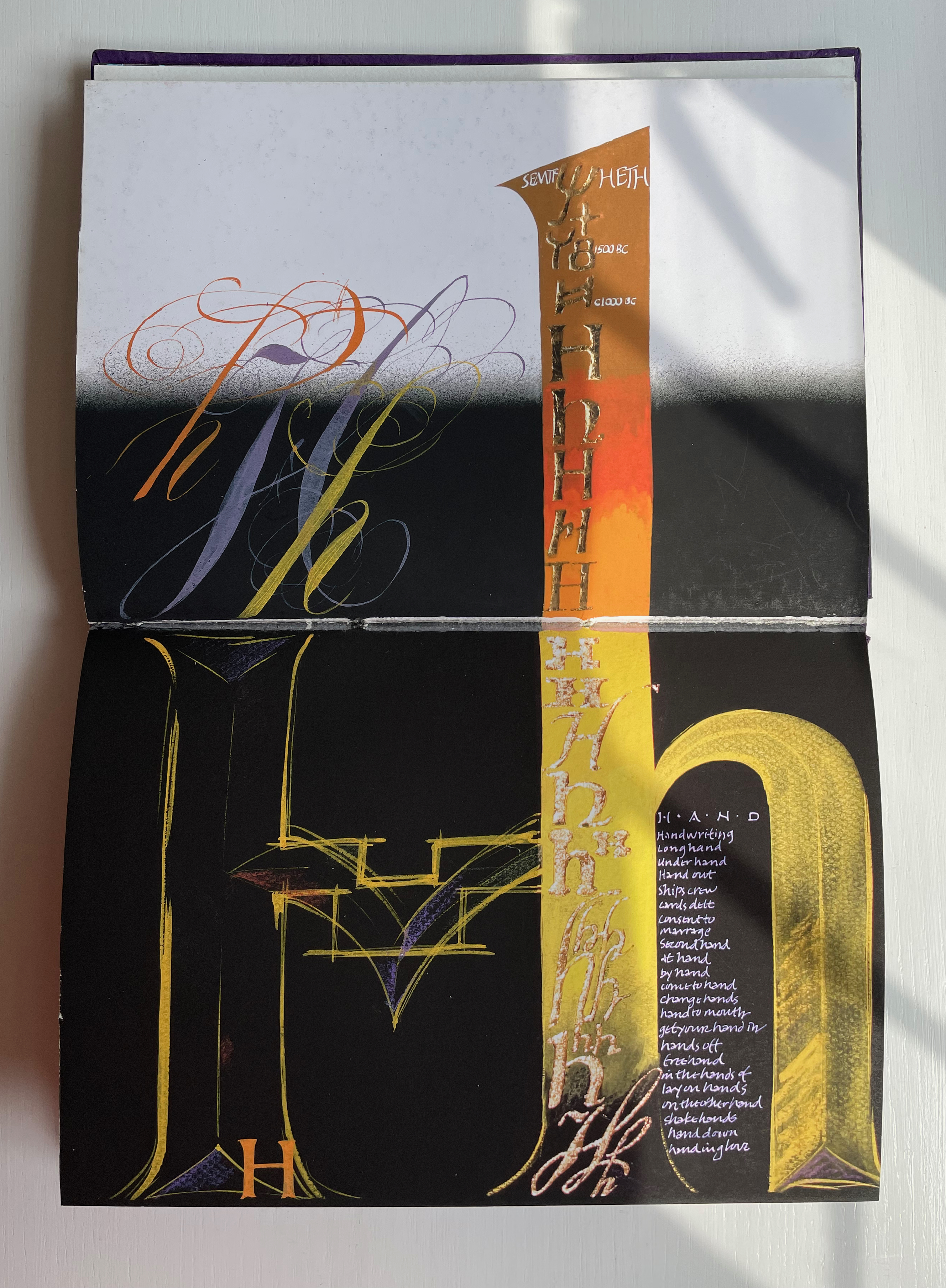
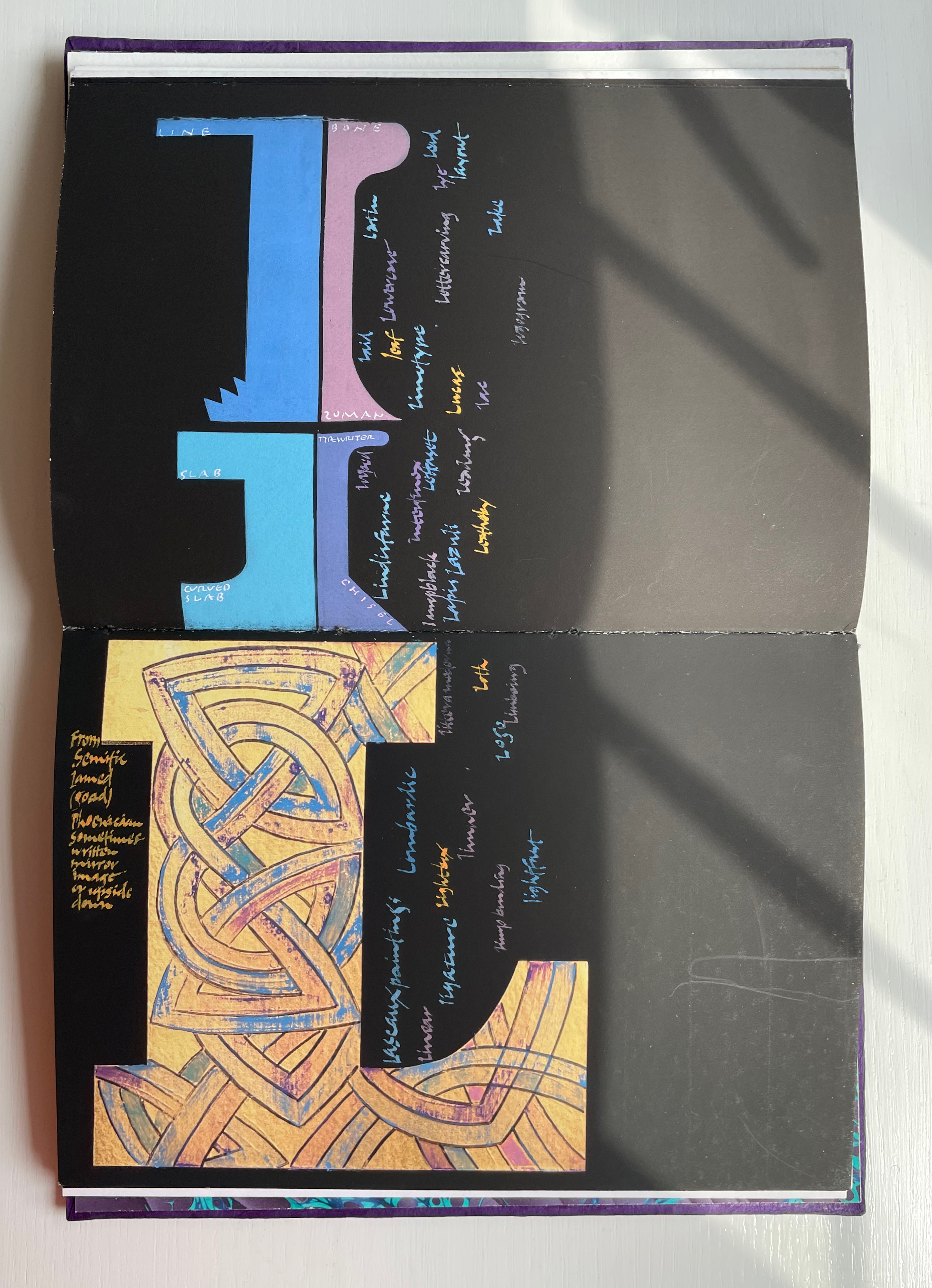
Alphabetica (2002) Dave Wood Bound in vellum; open-spine binding sewn on vellum strips. H210 x W290 x D30 mm. 54 pages. Loosely inserted colophon. Edition of 26. Acquired from the artist, 27 July 2022. Photos: Books On Books Collection. Displayed with permission of the artist.
From Alphabetica‘s description as an exploration of the alphabet’s “diverse development from historic shapes to the infinite variations we see today in typefaces and calligraphic forms of the Western alphabet”, the reader might expect an academic work. The deeply embossed and debossed royal purple cover presenting the title in landscape format suggests otherwise as do the marbled endpapers and embossed gold foil title page. The cover is built up with a very strong paper made in Nepal, painted with acrylic then sprayed with semi-matte varnish. Inside, the reader finds a portfolio of twenty-five distinct “canvases” in which Wood demonstrates both historical sensitivity and artistic inspiration.
Across the twenty-six spreads, Dave Wood has captured each letter’s distinct story with multiple styles of calligraphy in Sumi ink and gouache paints as well as varying textures and techniques (Canson and Arches paper, glassine, foil, embossing, stamping, feathering and cutting), colors and layouts.
The letters’ developing shapes and periods are labeled. Starting with the letter B, Wood adds names of typefaces, structural terms for type, palaeographical terms and terms from the crafts of calligraphy, typesetting and printing — all beginning with /b/. Similar labeling occurs for the letter C but with a different layout. Across the twenty-five canvases, Wood excels at this balancing of difference and similarity. Notice, for example, how letters B and C incorporate the Renaissance style of illumination called bianchi girari (white vine stem decoration).
The ways in which uppercase-to-lowercase movements interact with the layout’s variations make for a dynamic experience. Sometime it’s subtle, sometimes vigorous. Note, for example, how the letter D de-emphasizes the gutter whereas the letter E emphasizes it.
With letters H through Q, a shift from Arches white to Canson black paper and back adds to the overall dynamic movement. Yet Wood is attentive to elements of unity; for example, his playful handling of the gutter in the transition from letter H to letters I/J echoes that from letters D to E.
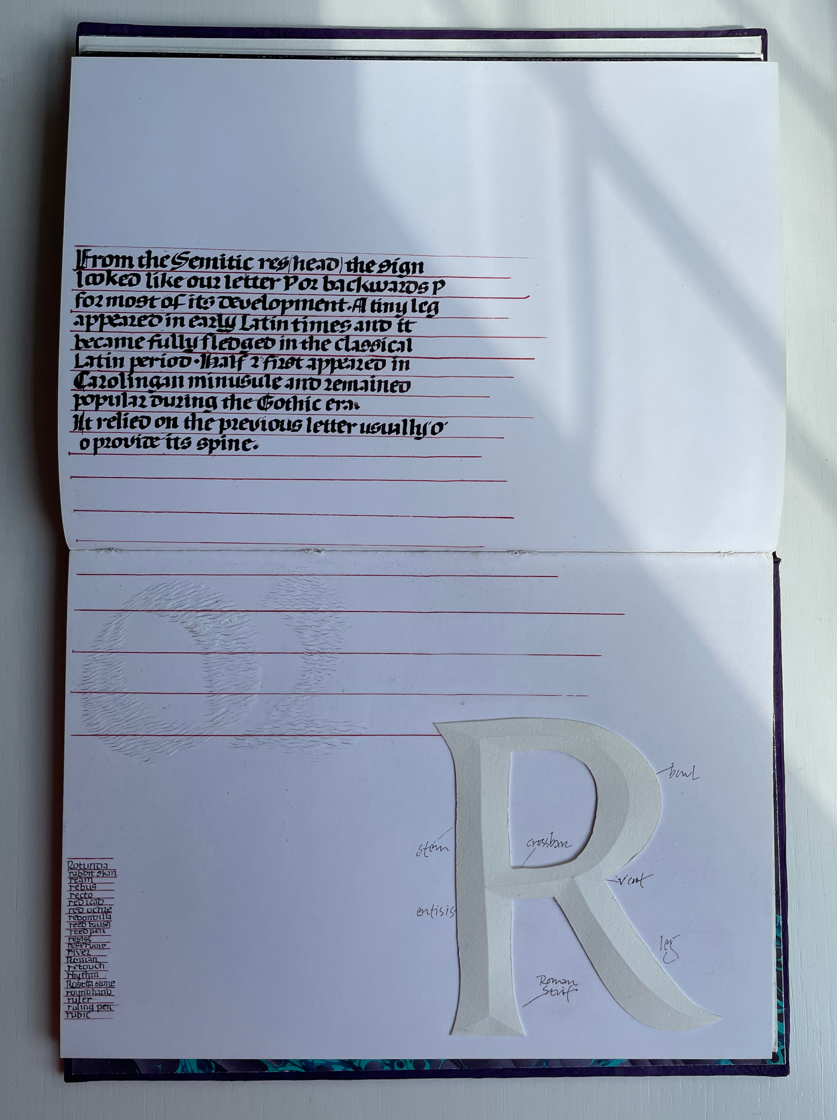
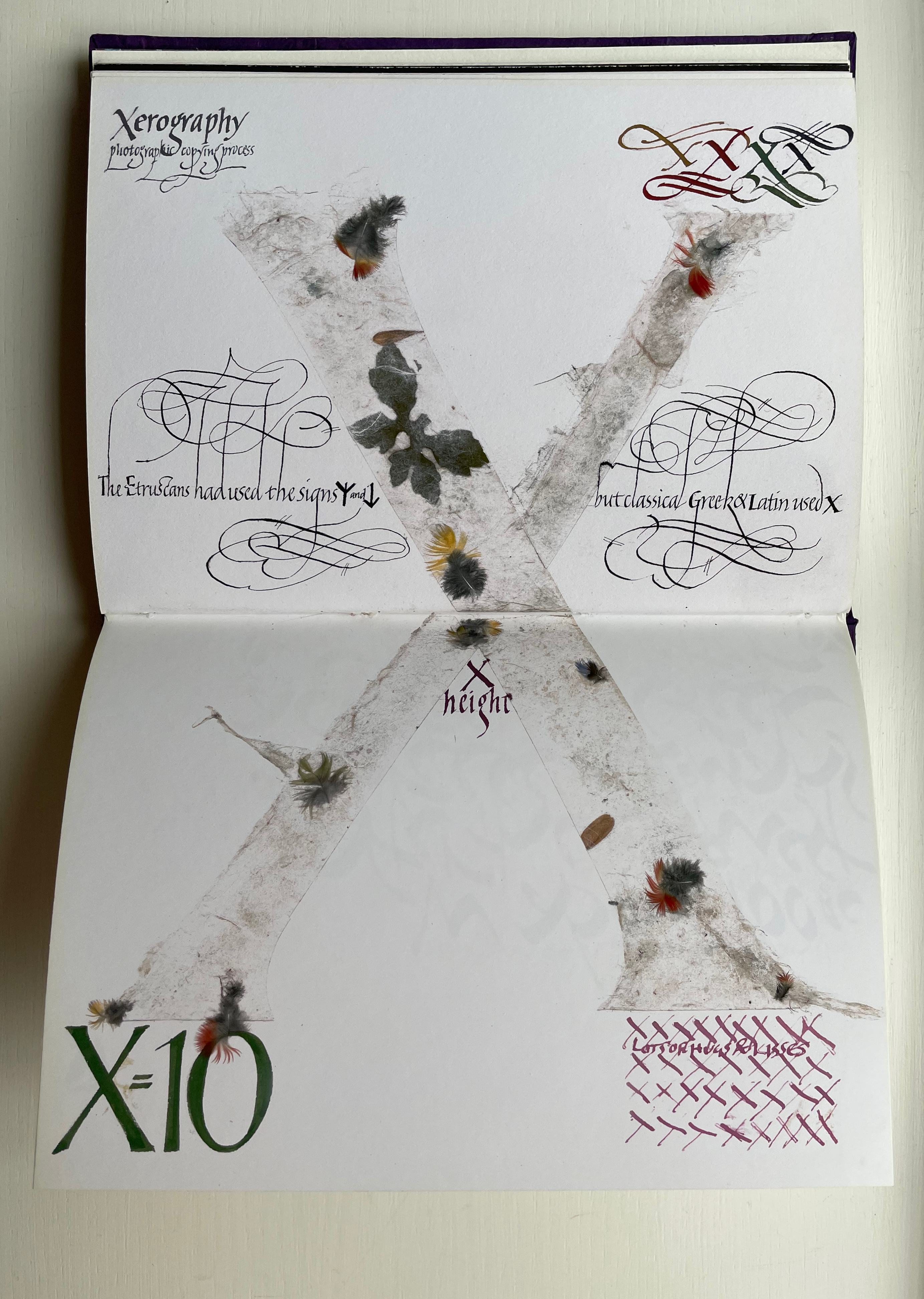
Only six letters perform the trick of extending across the gutter — lowercase H and uppercase K, M, O, U and X. While O, U and X take the similar approach of almost evenly straddling the gutter, each of the other three succeed differently. M is perhaps the most striking and interesting of them all. M derives from the Semitic word for “water” mem. As Wood points out in the loose insert colophon, the watery blue that fills the letter is intentional — as must be the precise alignment of the inner peaks of the letter with the gutter. Such attention to detail in the midst of so much activity on the page demands a similar attentiveness from the reader.
For example, the long tail of the Q does not show up until the bottom of the spread. And the reader may need to pick out the the word “or” in the text to spot the lowercase r in the textured, oversized written word “or” directly below the text.
Visual puns abound. Celtic knots in a capital L (for the Lindisfarne gospels). An S formed of stones. Leaves falling from a lowercase t (for tree or tea, of course). A U growing underground.
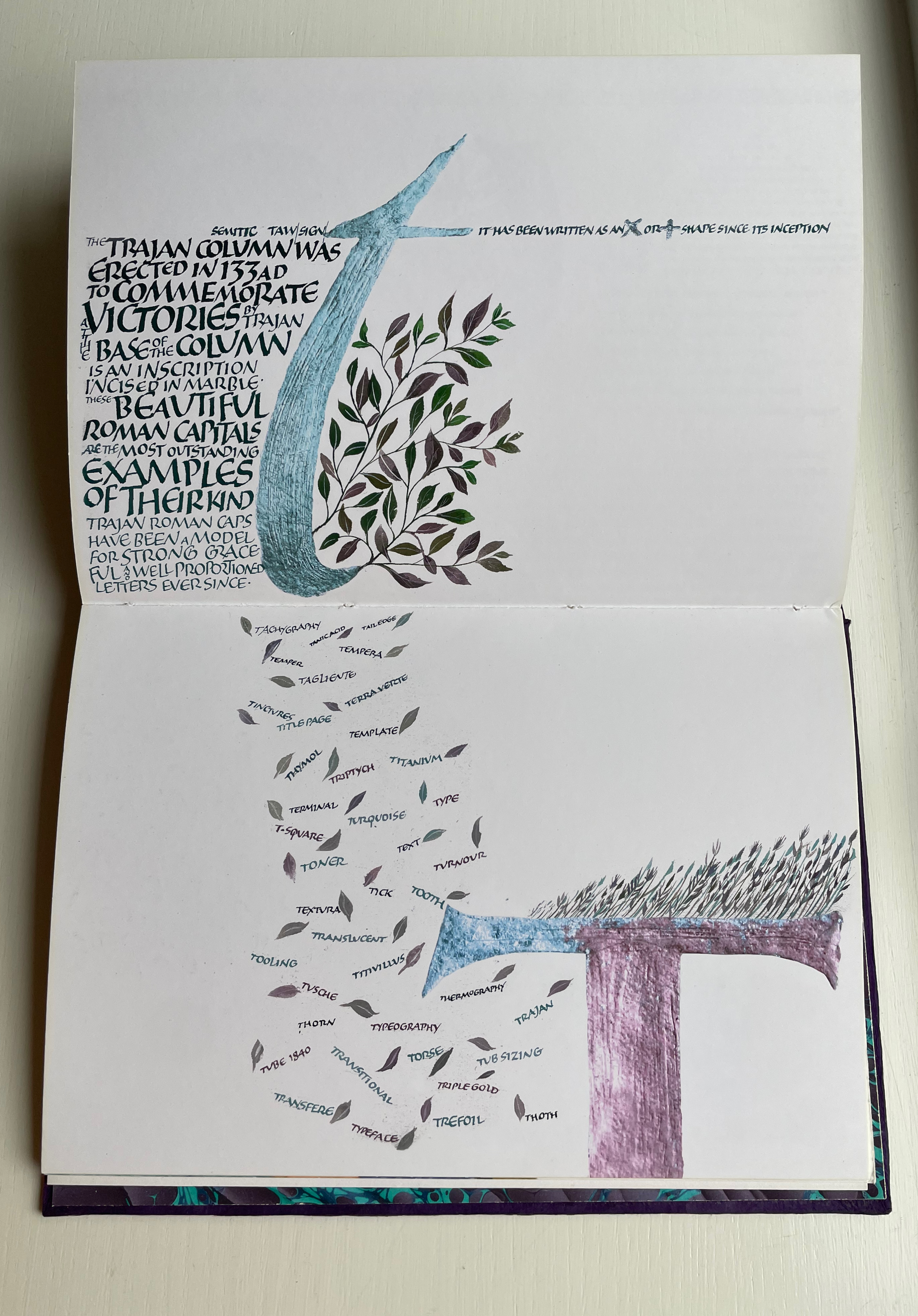
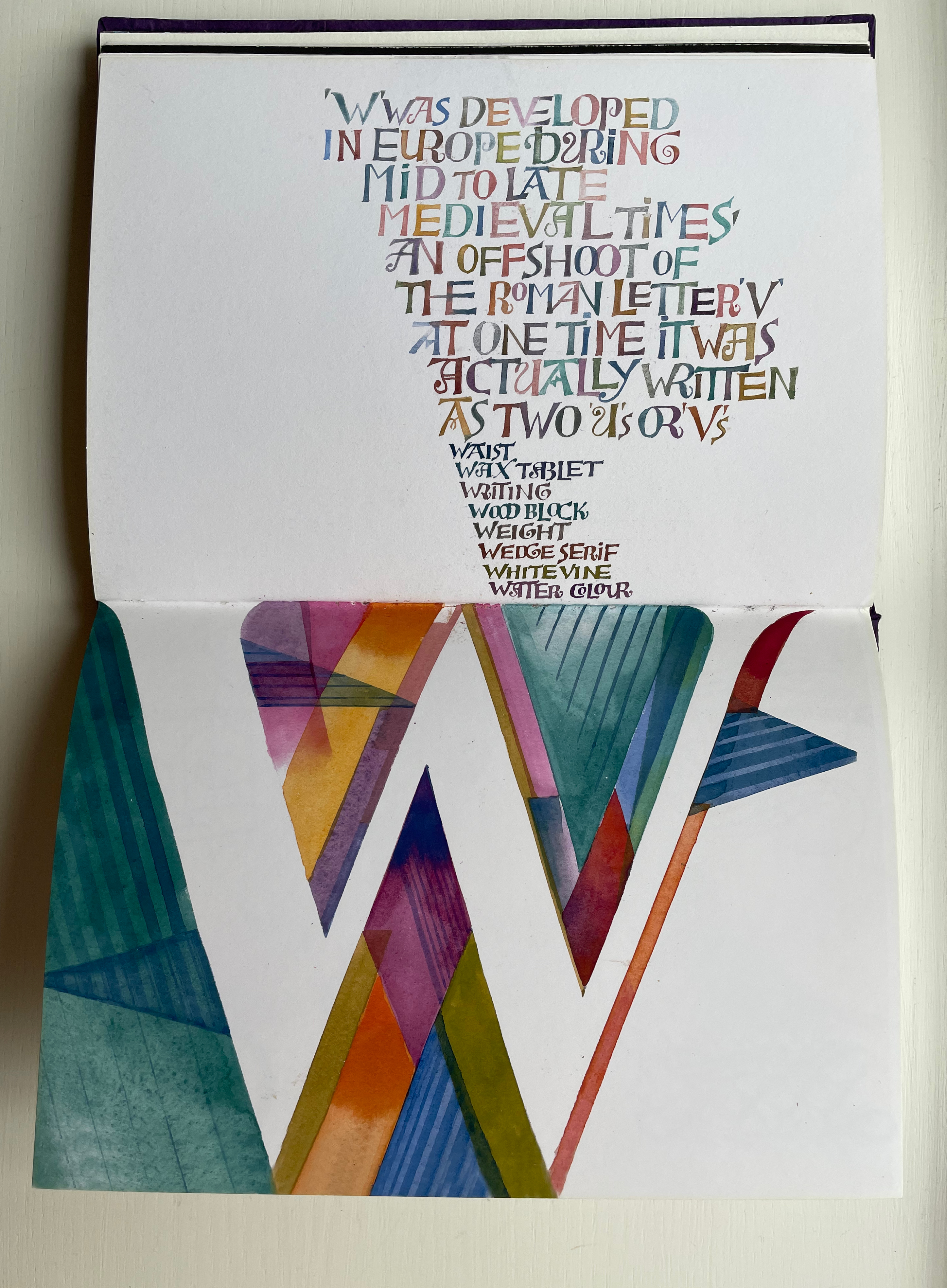
Fortunately, the accordion-fold colophon loosely inserted in the book offers pointers to some (not all) allusions. For example, the beginning of the third line for the letter V pays homage to Titivillus, the 13th-century patron demon of scribes’ mistakes. The illustrated W is an homage to Ben Shahn’s letter design. The highly contrasting thicks and thins in the letter X allude, in calligraphic terms, to the thick mark’s determining the number of pen widths making up the x height (the body of the miniscule).
And while the colophon may be necessary to know that the typefaces written in color below were created by Hermann Zapf, any viewer can enjoy Wood’s incorporating the entire alphabet in the Sumi ink design culminating in the letter Z as a fitting self-referential conclusion to Alphabetica.