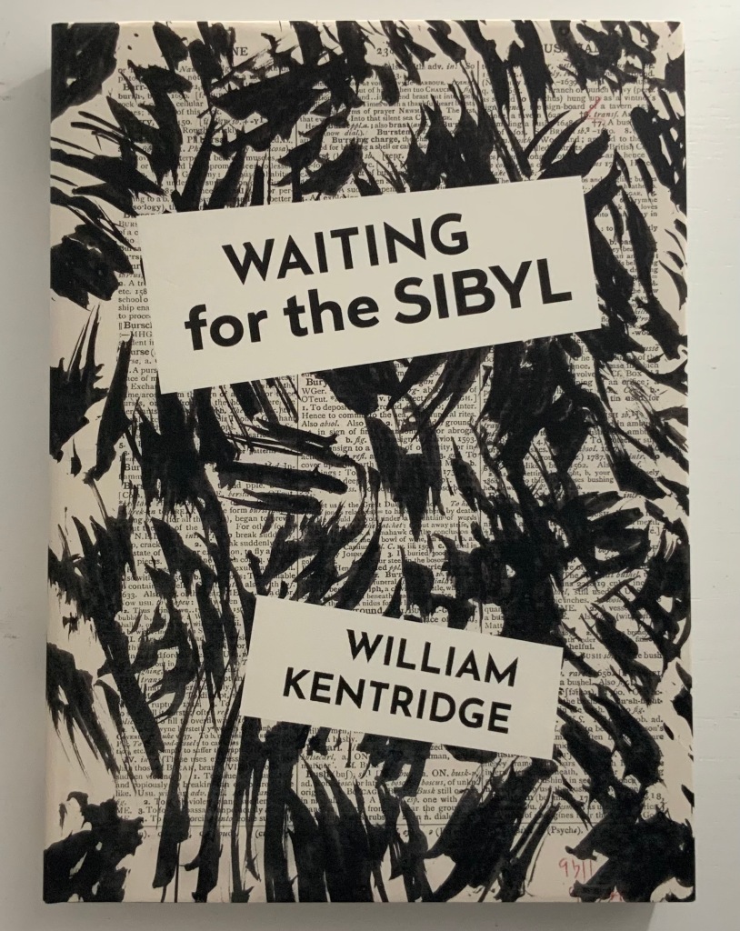
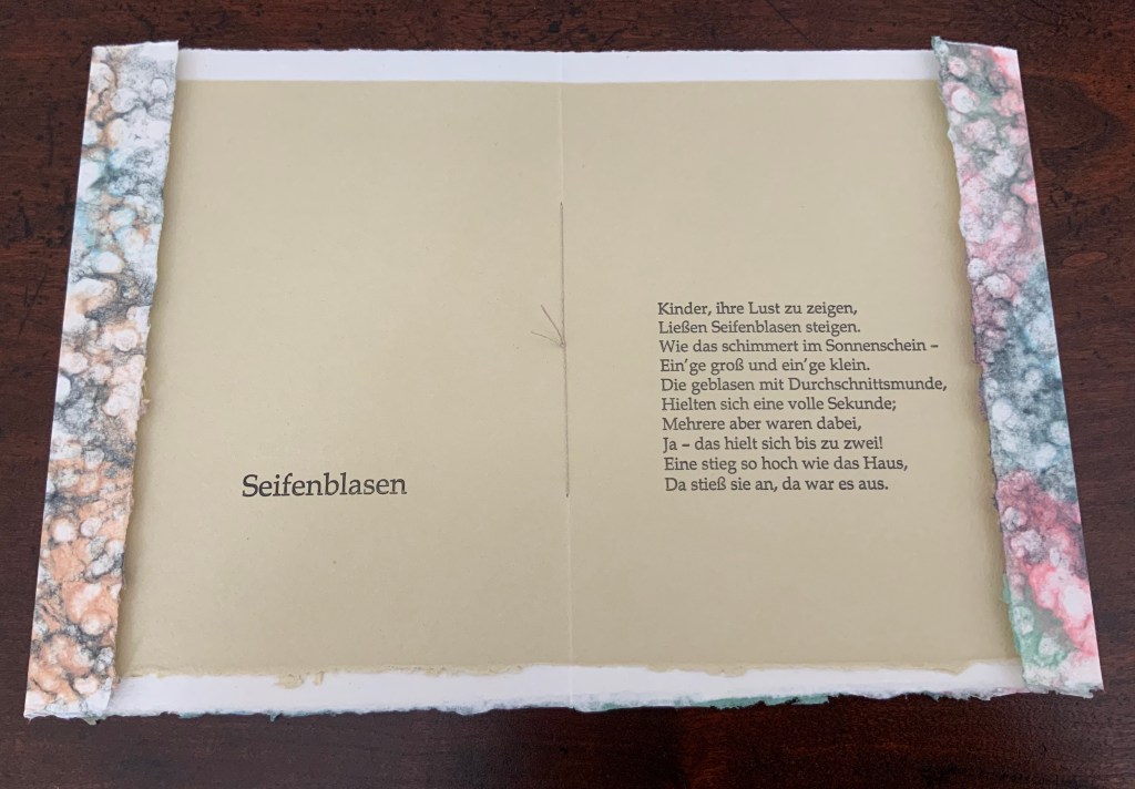
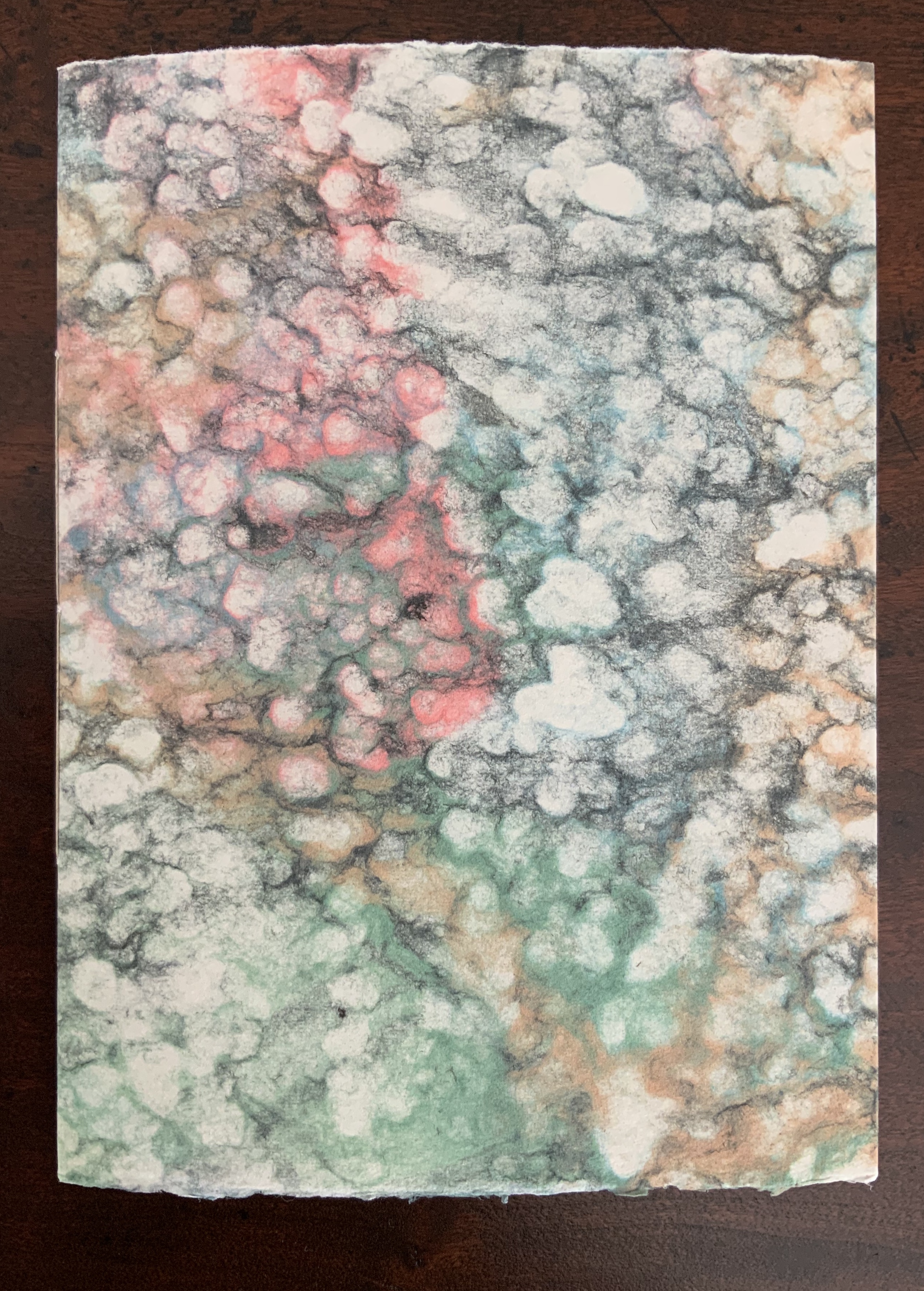
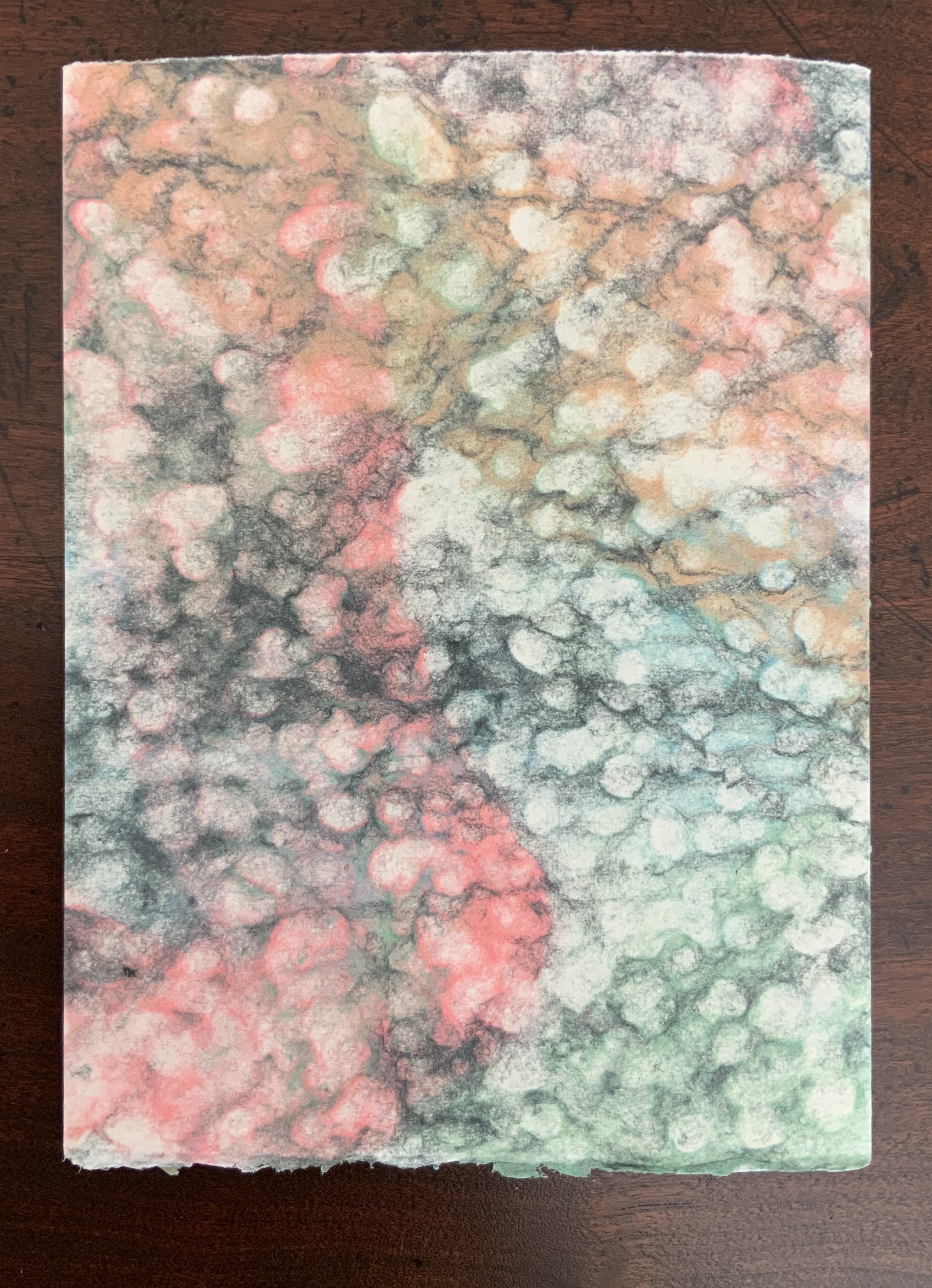
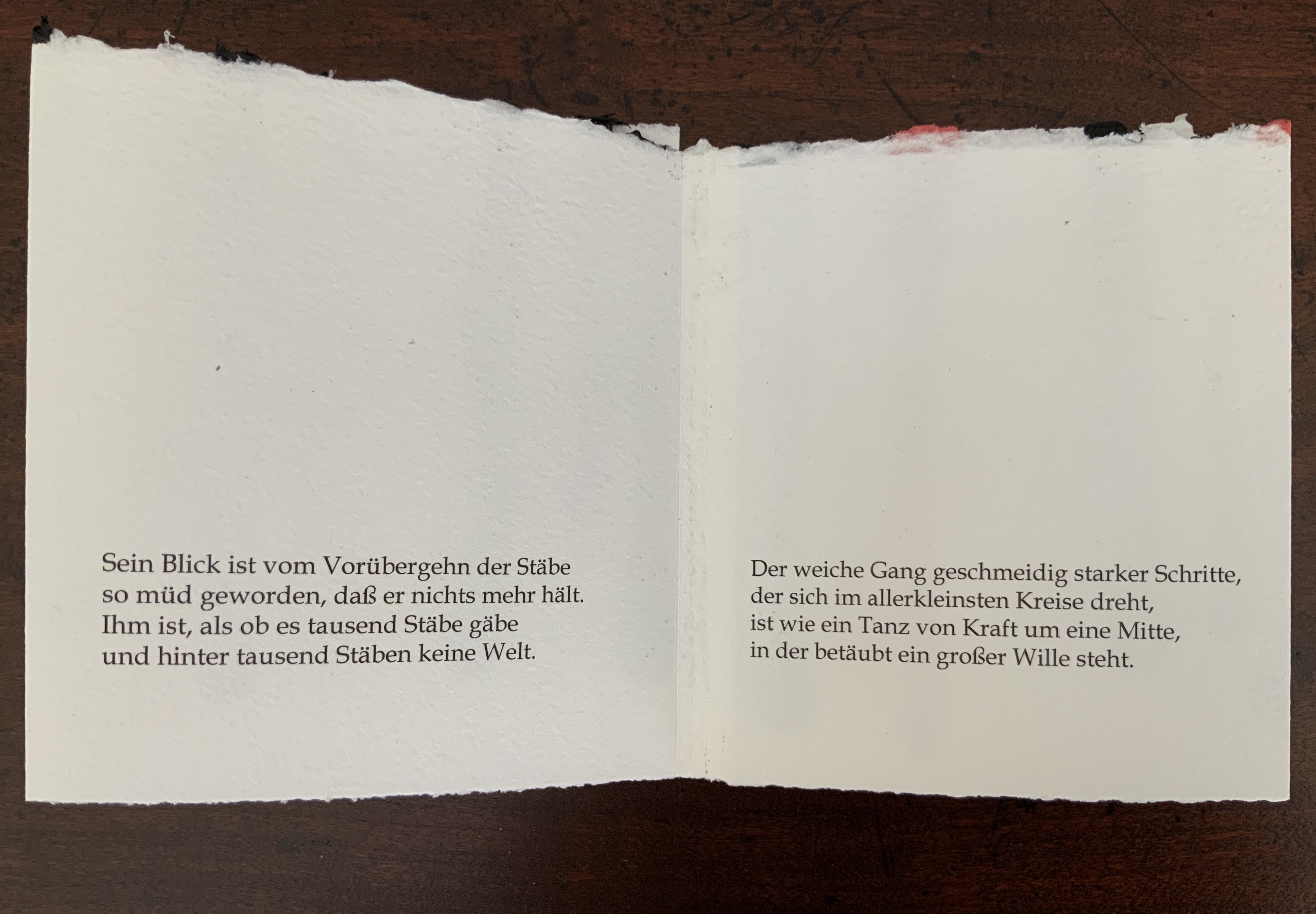
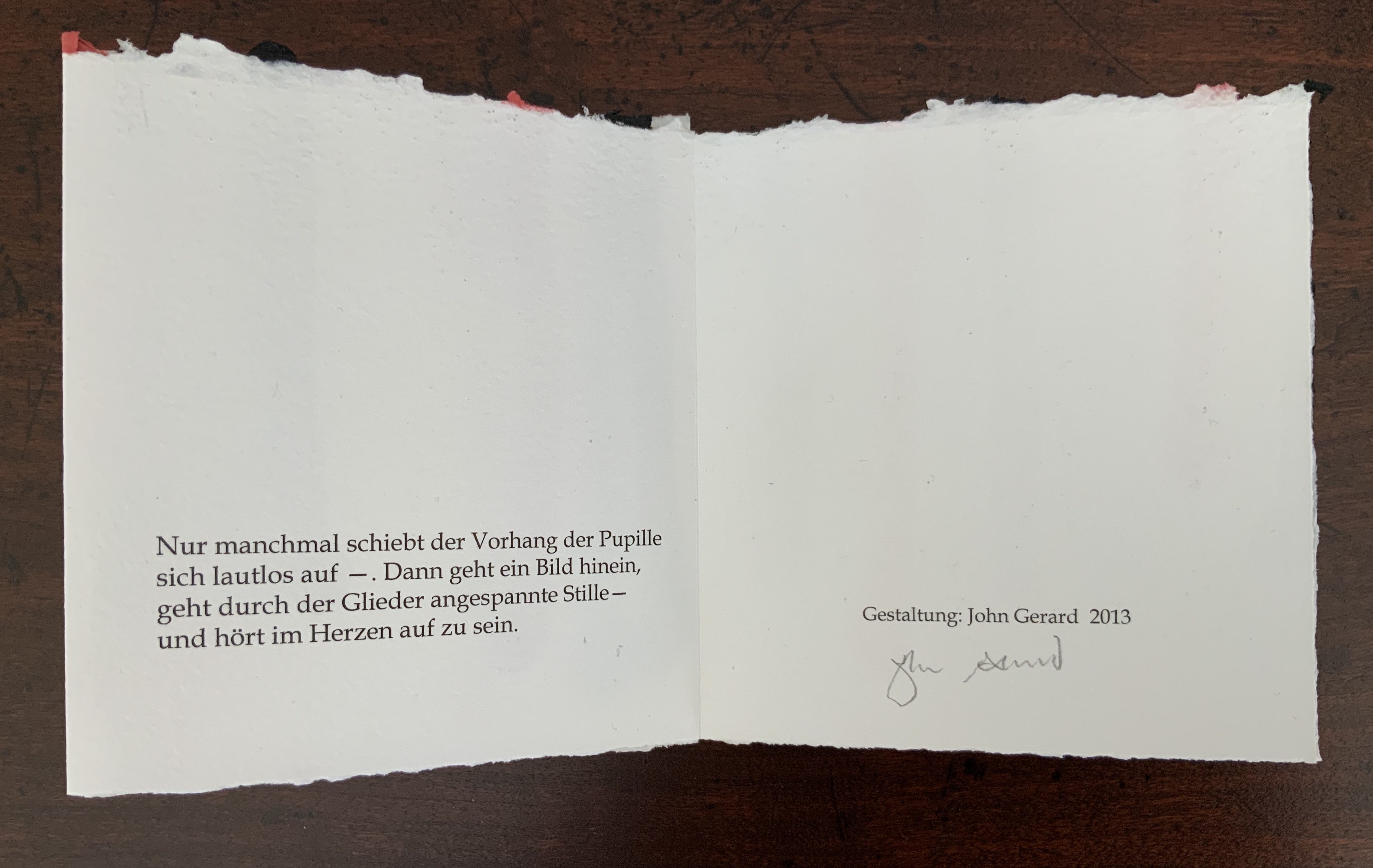
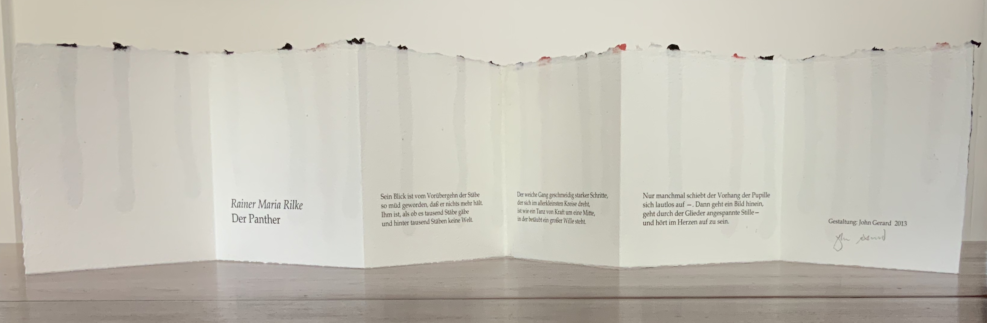
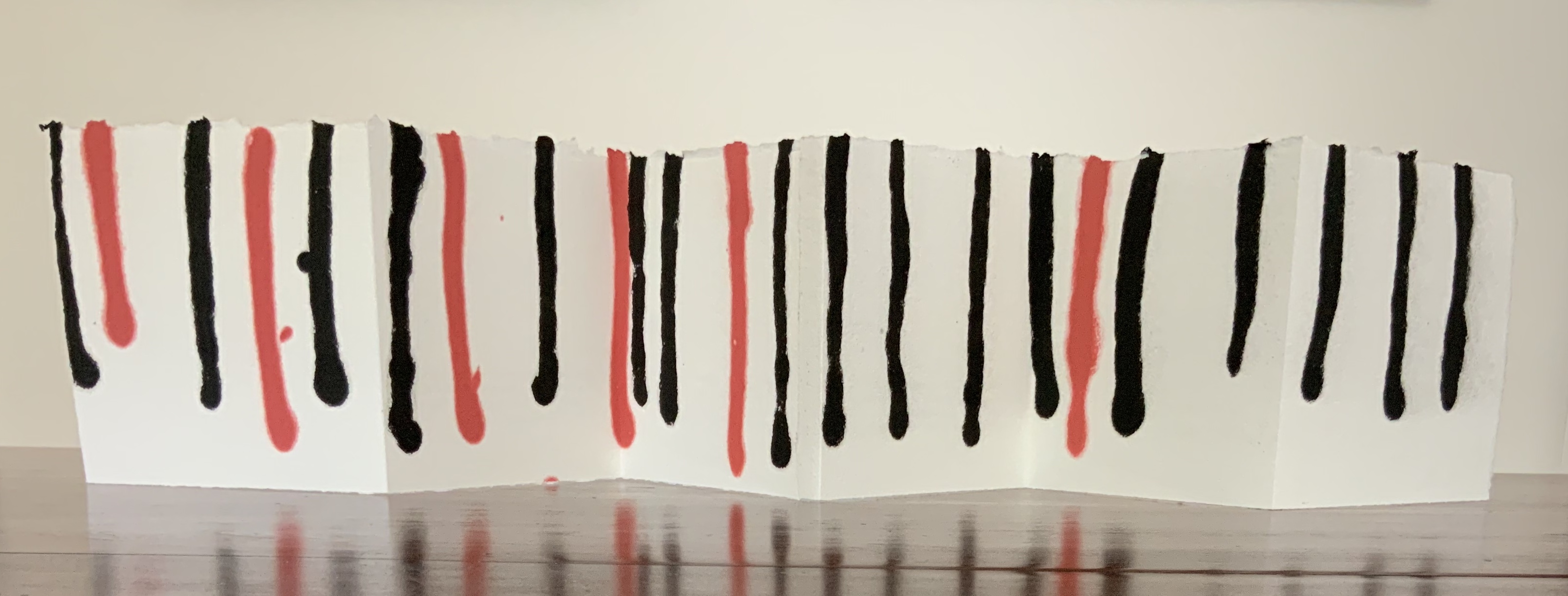
Rescuing Q (2023)
Rescuing Q (2023)
Suzanne Moore
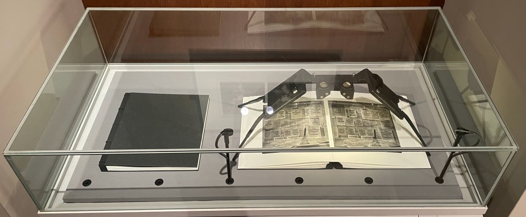
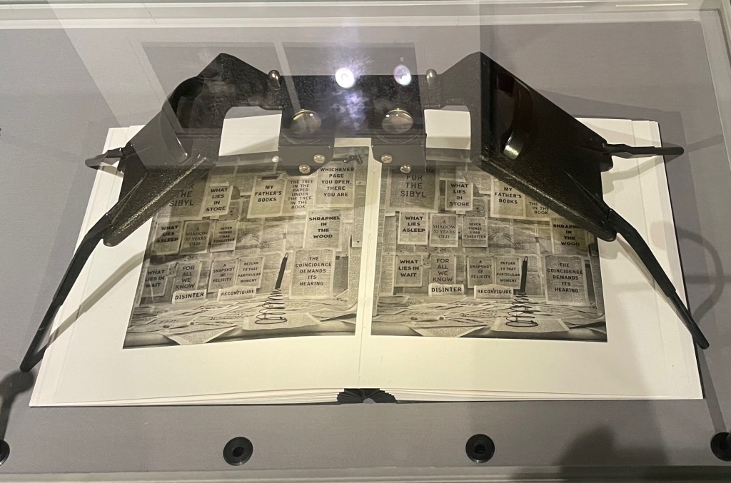
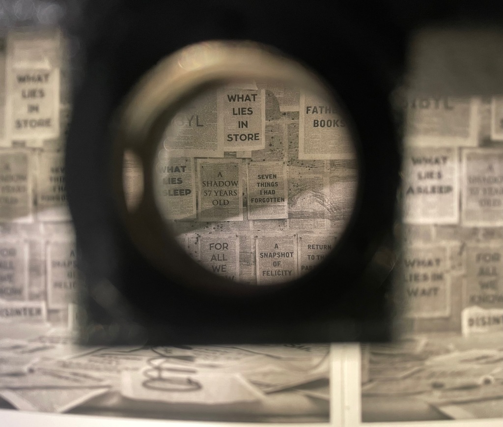
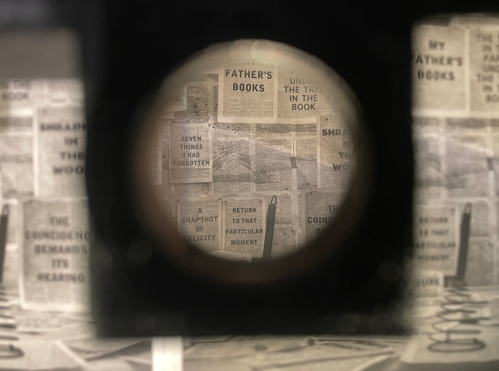
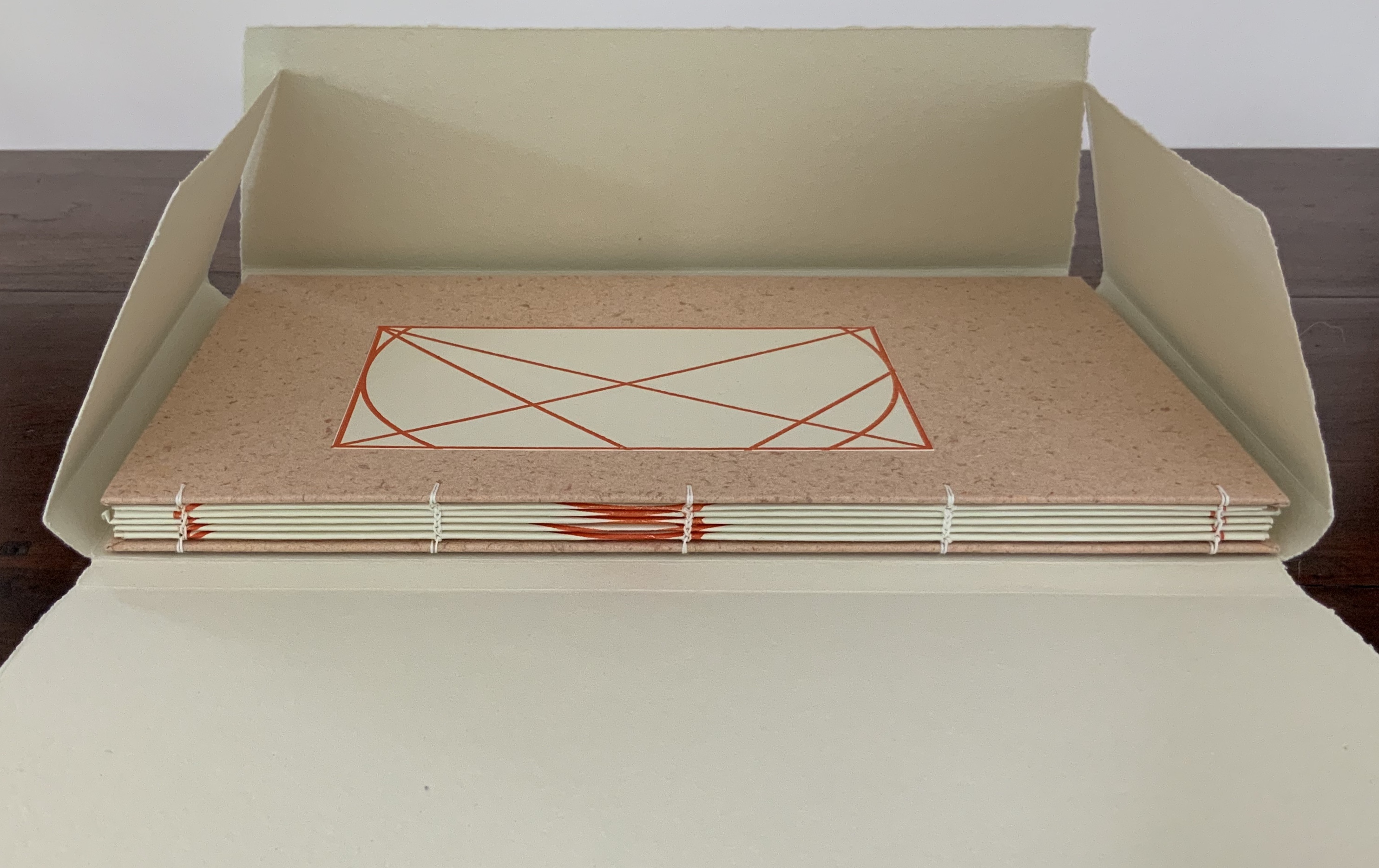
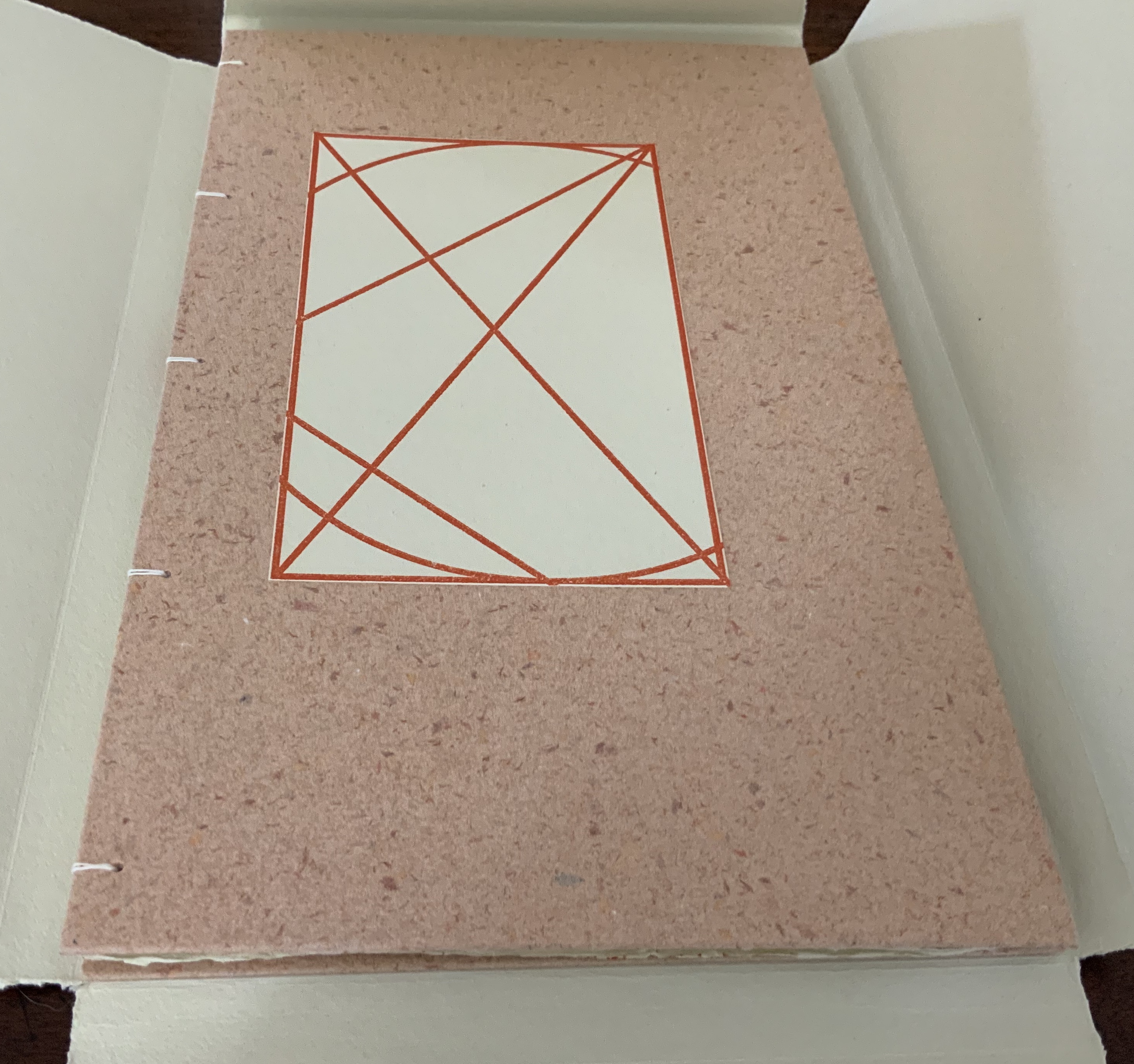
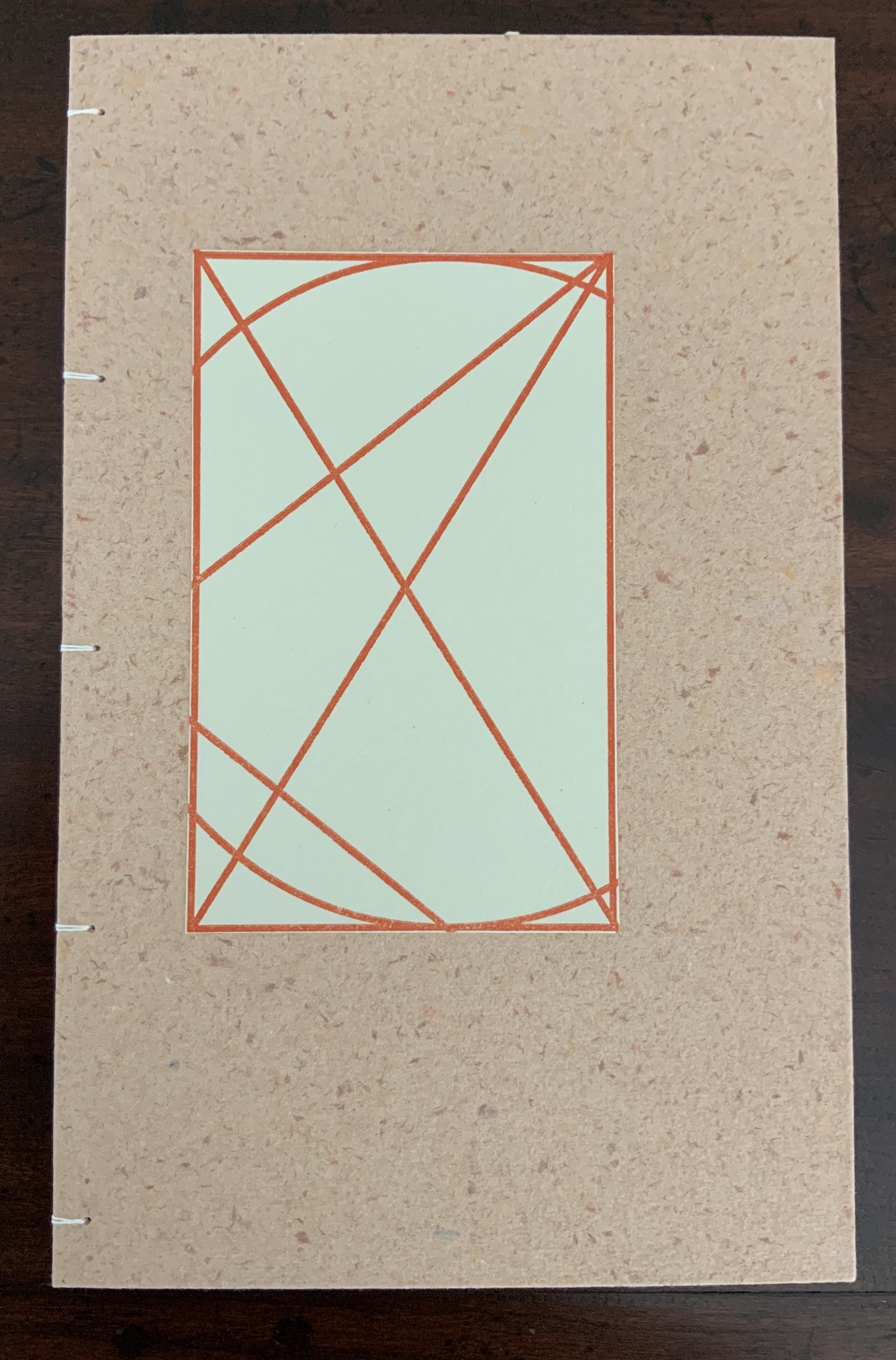
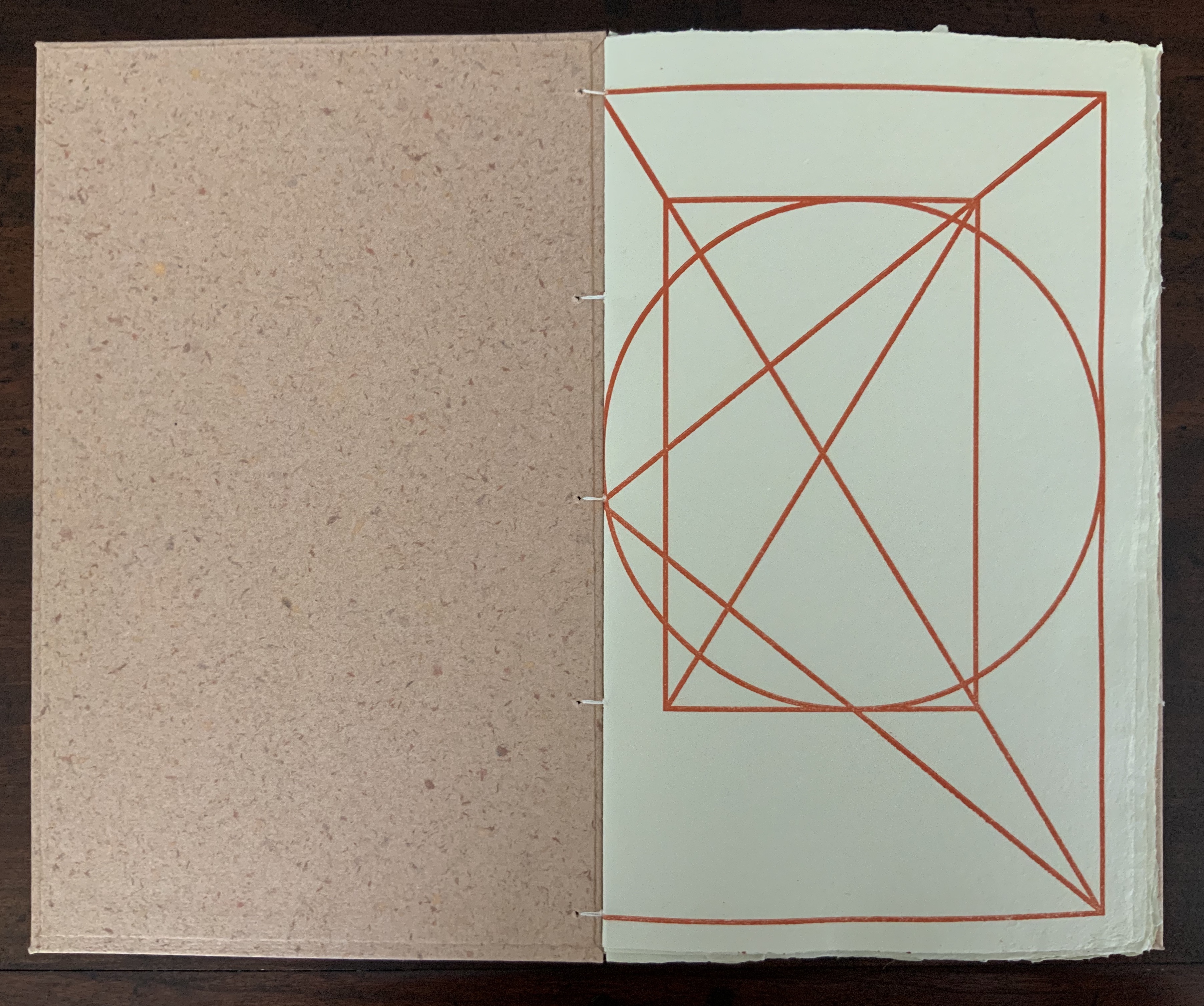
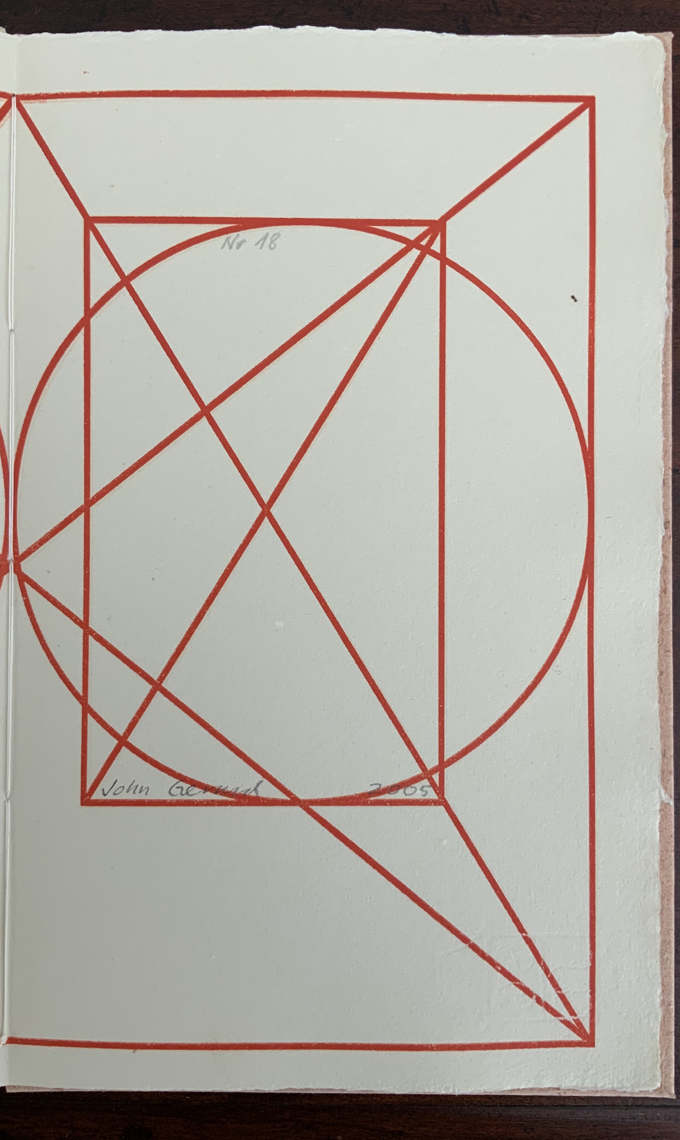
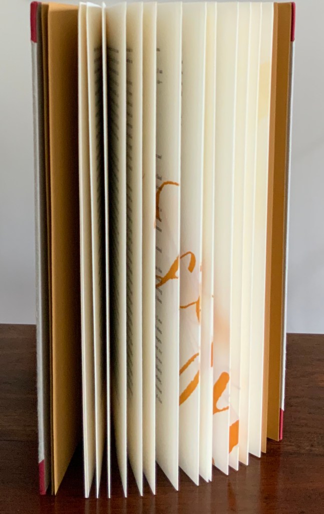
Box enclosing softcover book. Box: H400 x W300 x D30 mm. Book: H380 x W285 mm. 32 pages. Printing by Sandy Tilcock (and Phoebe) at Lone Goose Press and Jessica Spring, Springtide Press. Unique edition. Acquired from the artist, 25 April 2023.
Photos: Books On Books Collection. Displayed with permission of the artist.
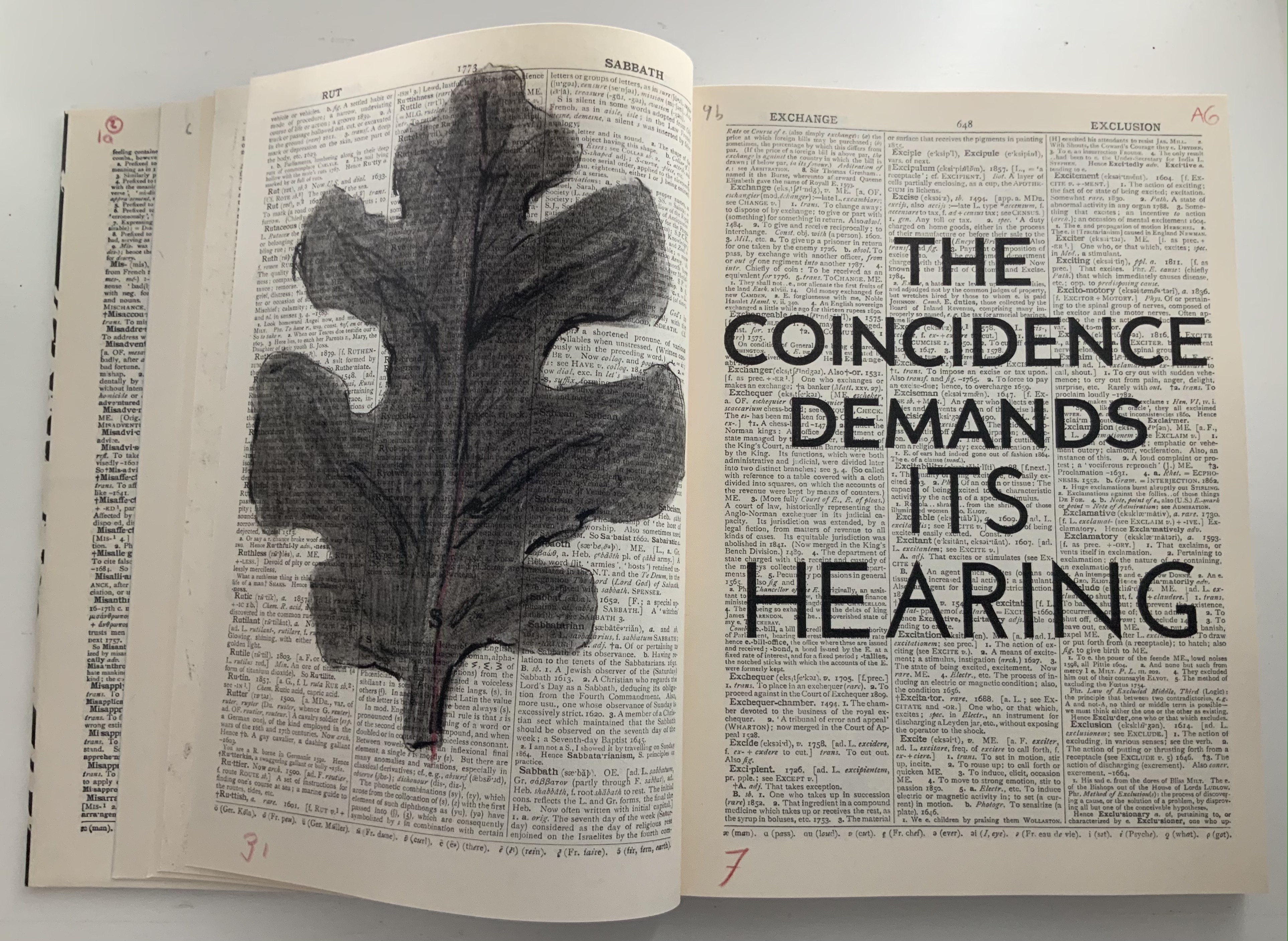
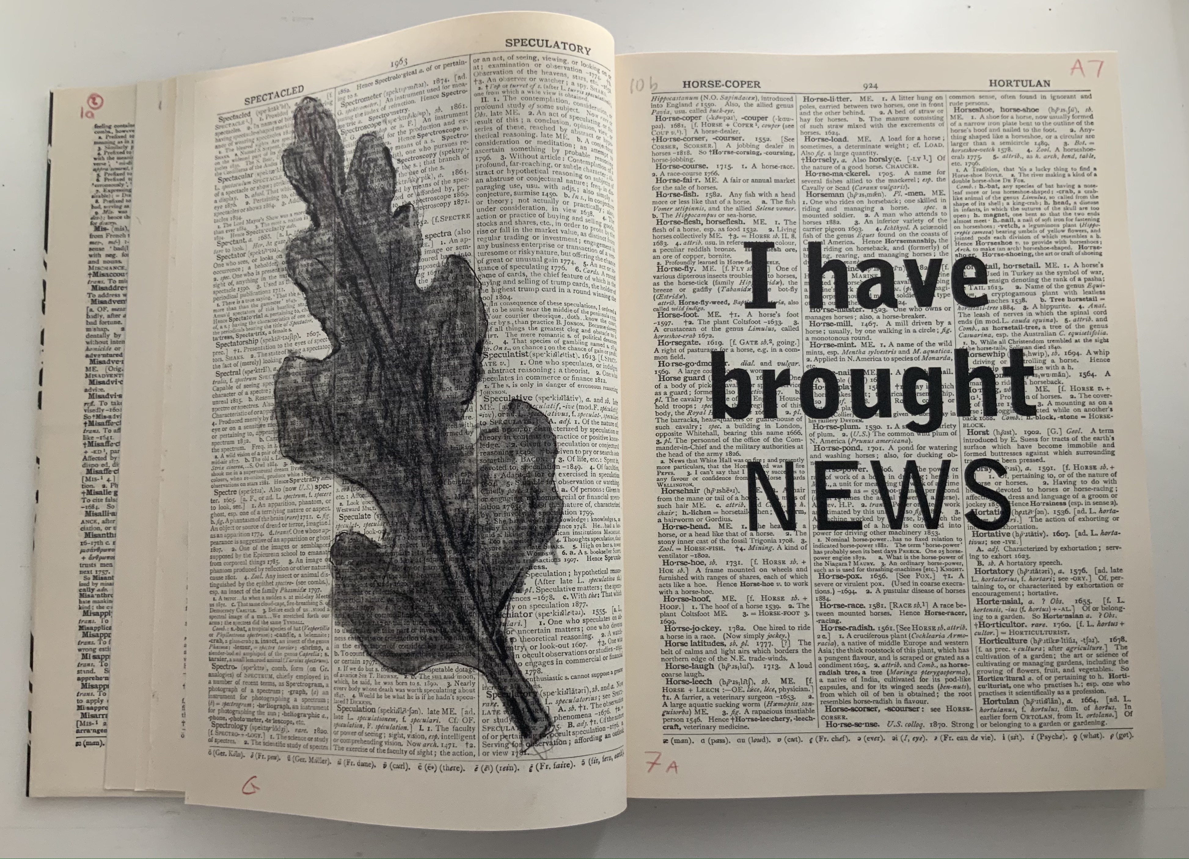
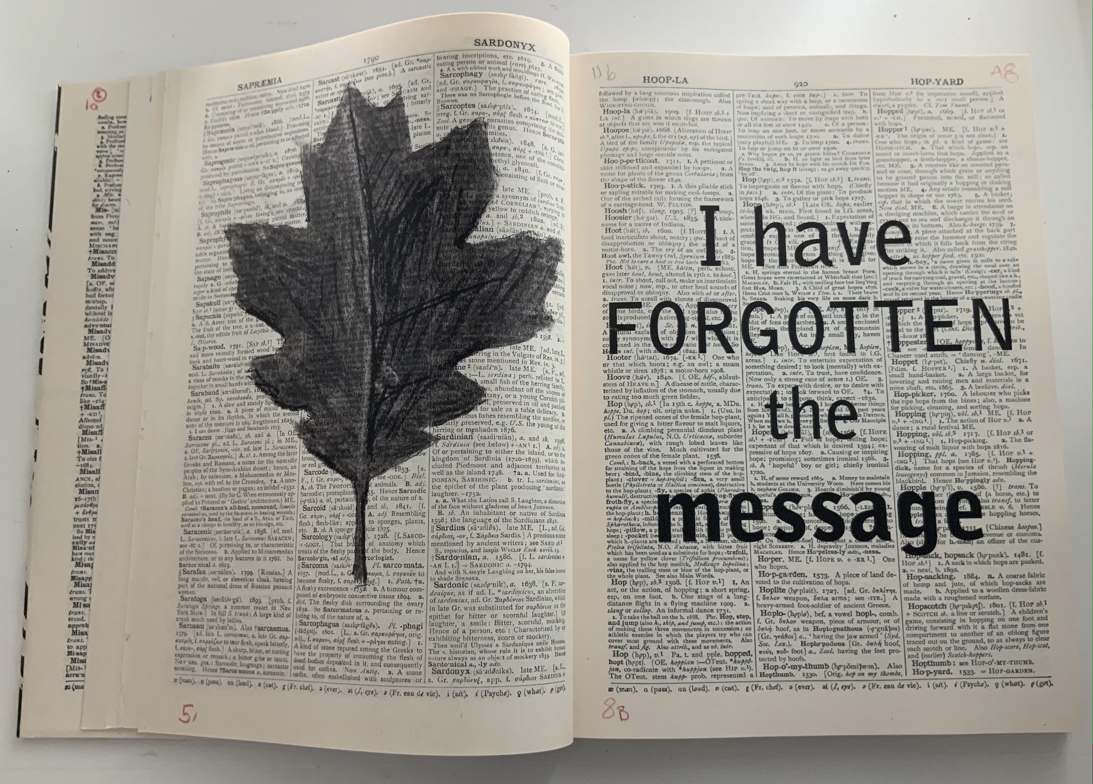
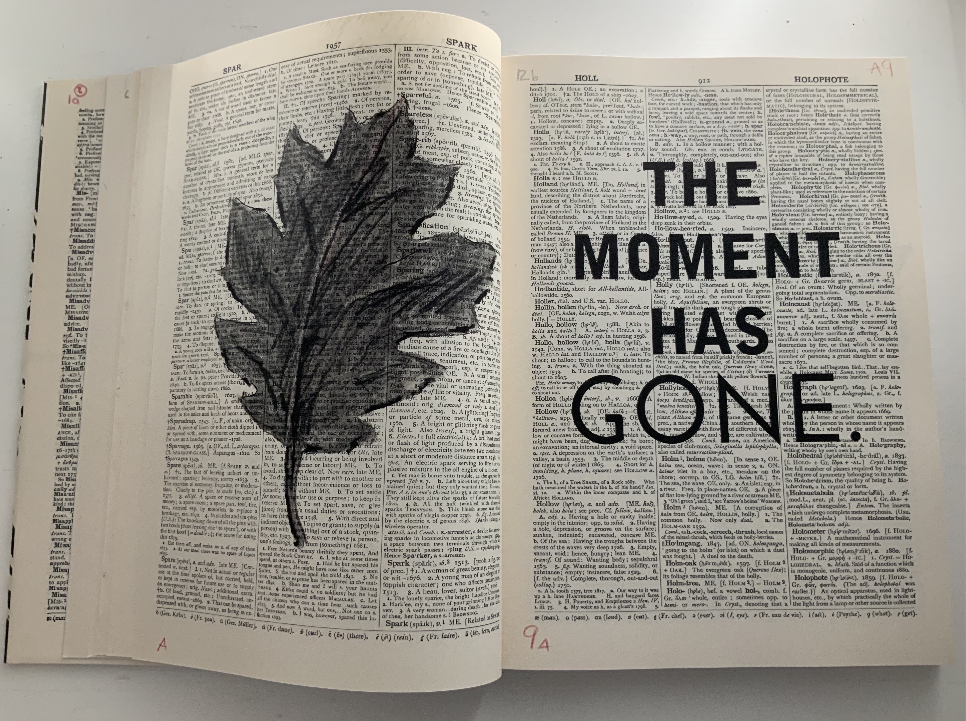
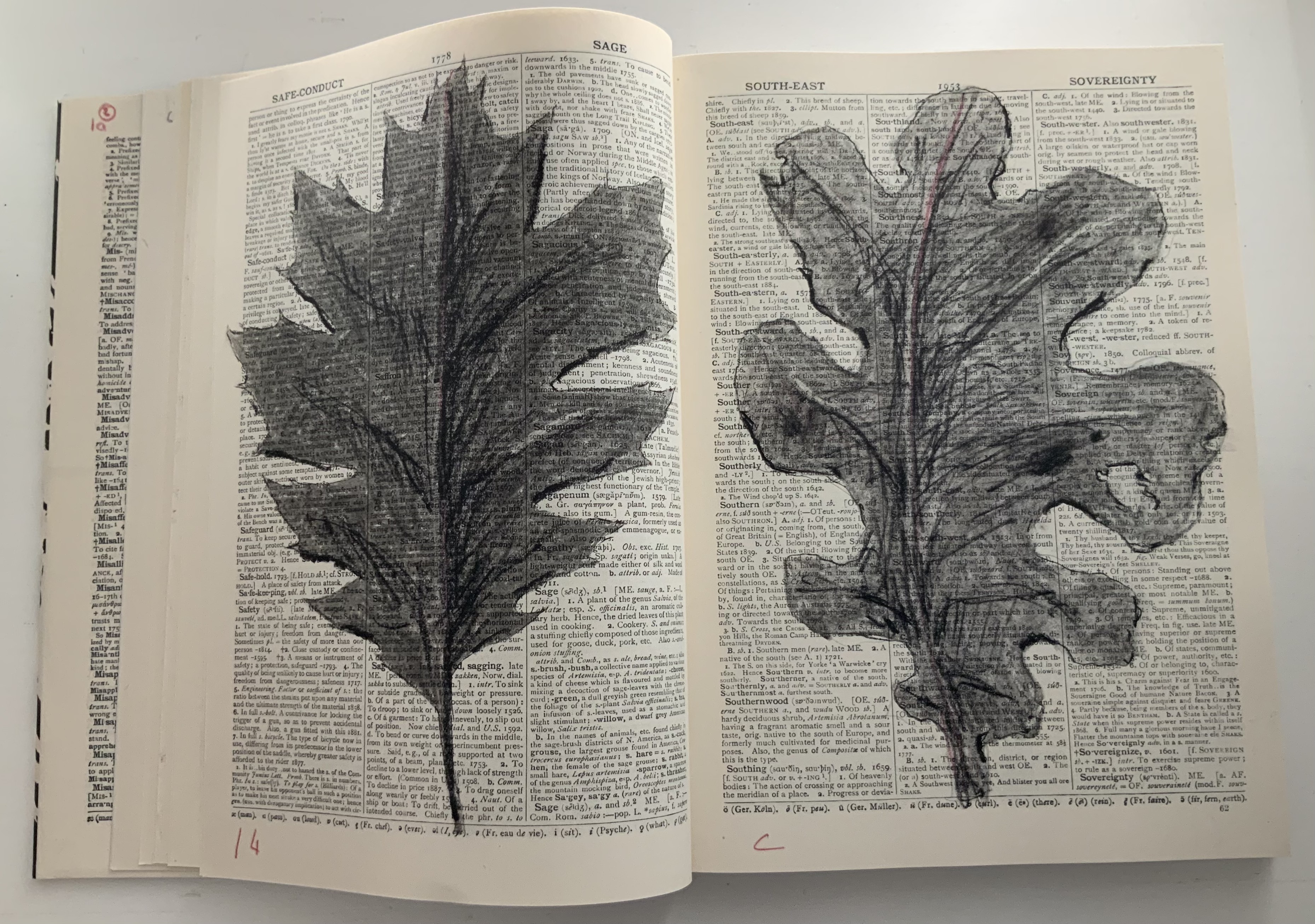
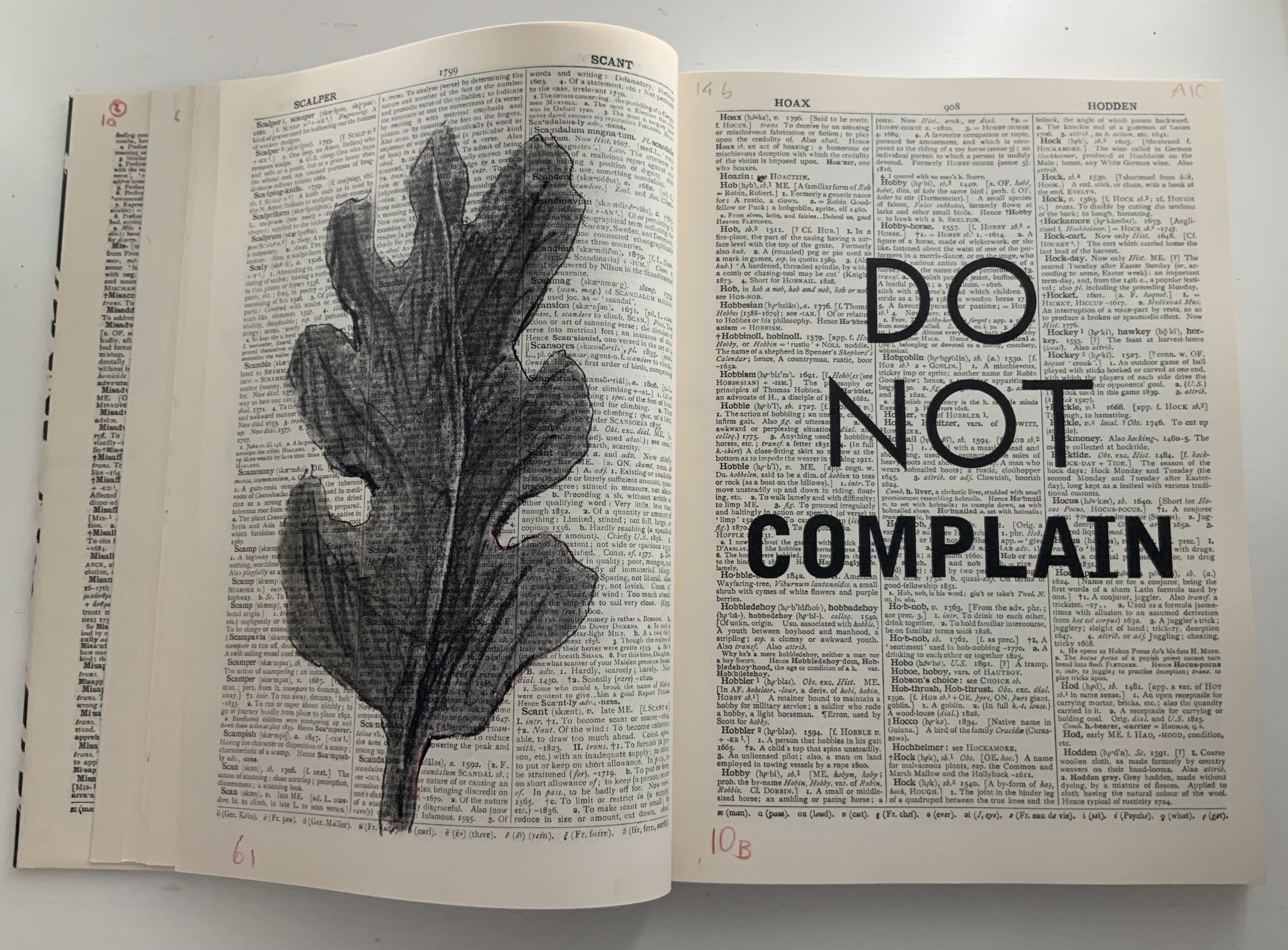
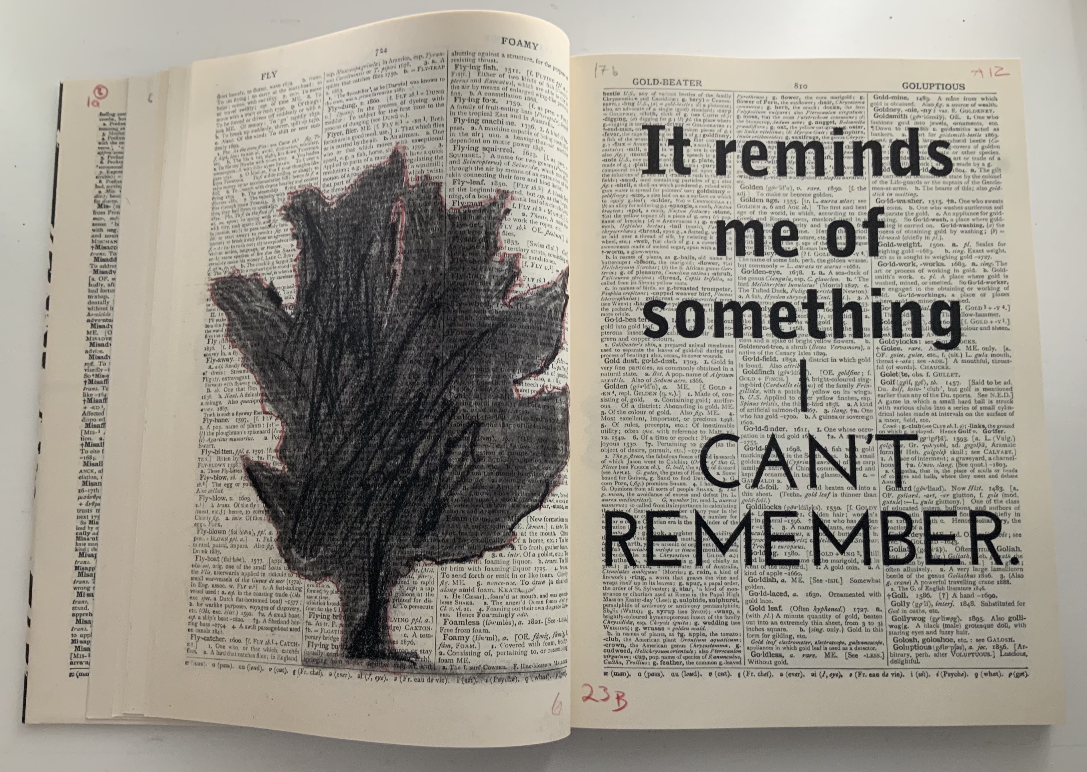
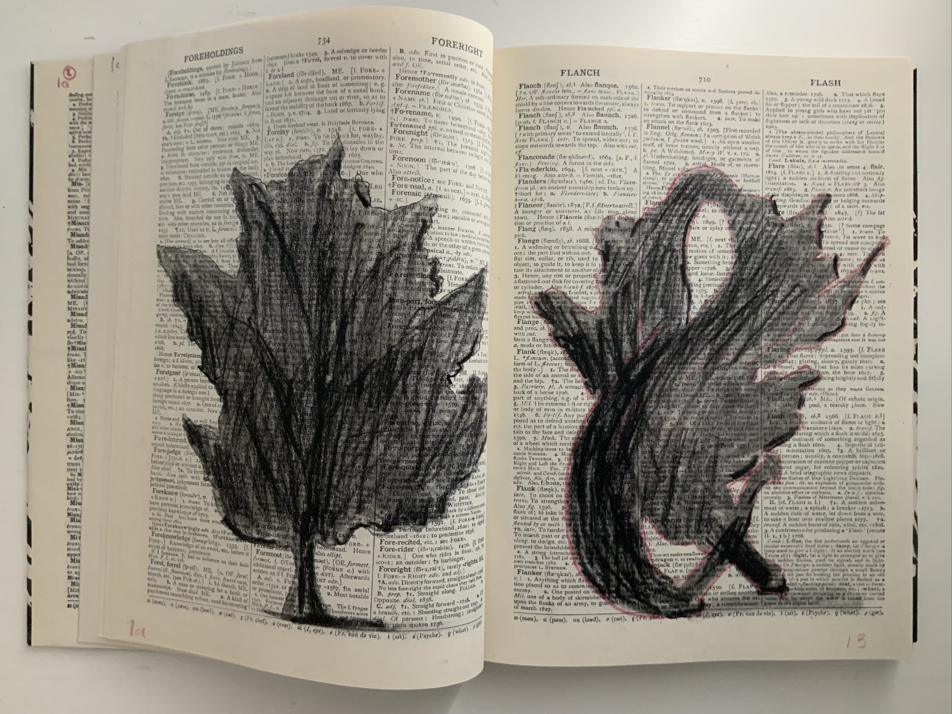
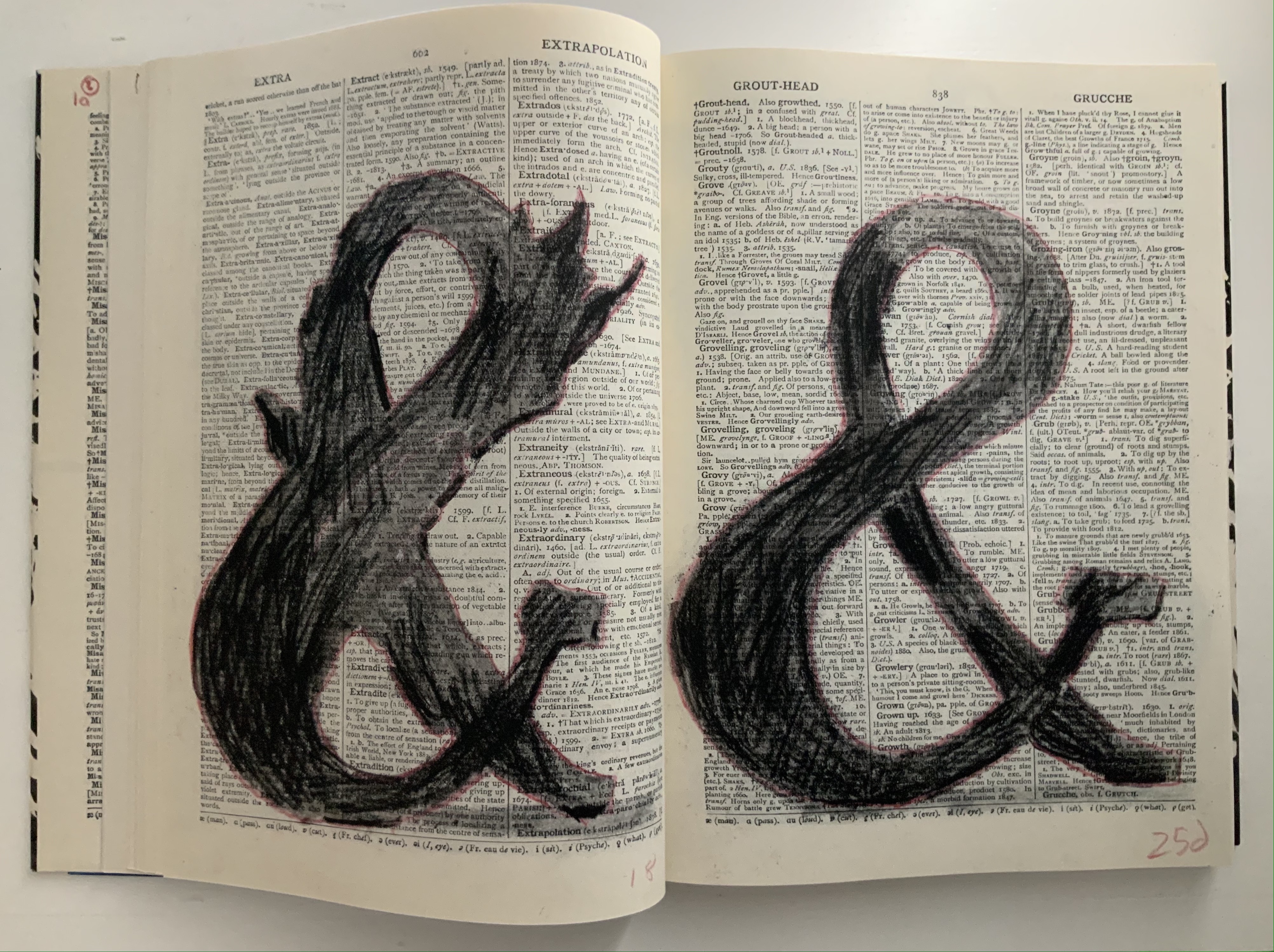
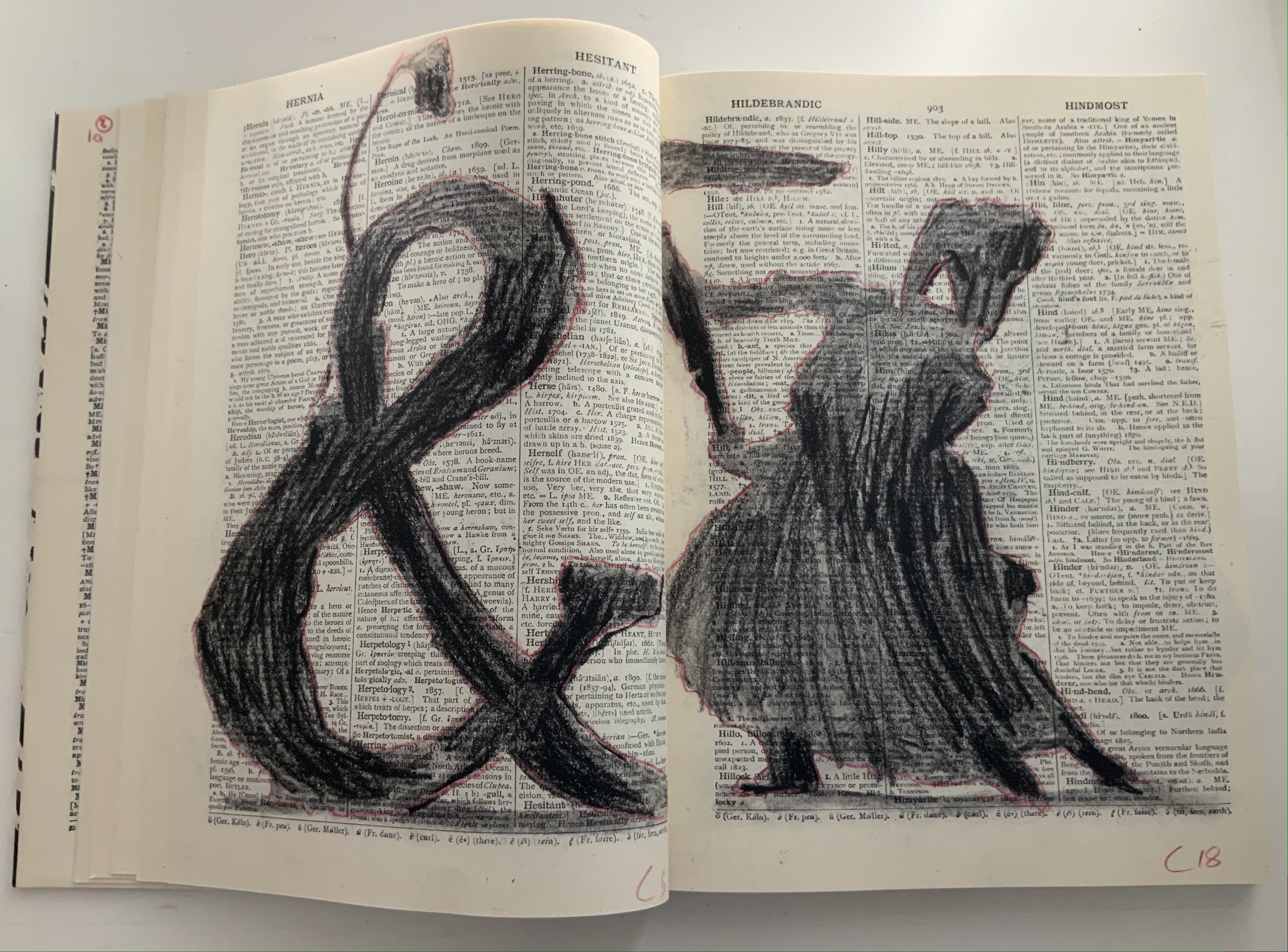
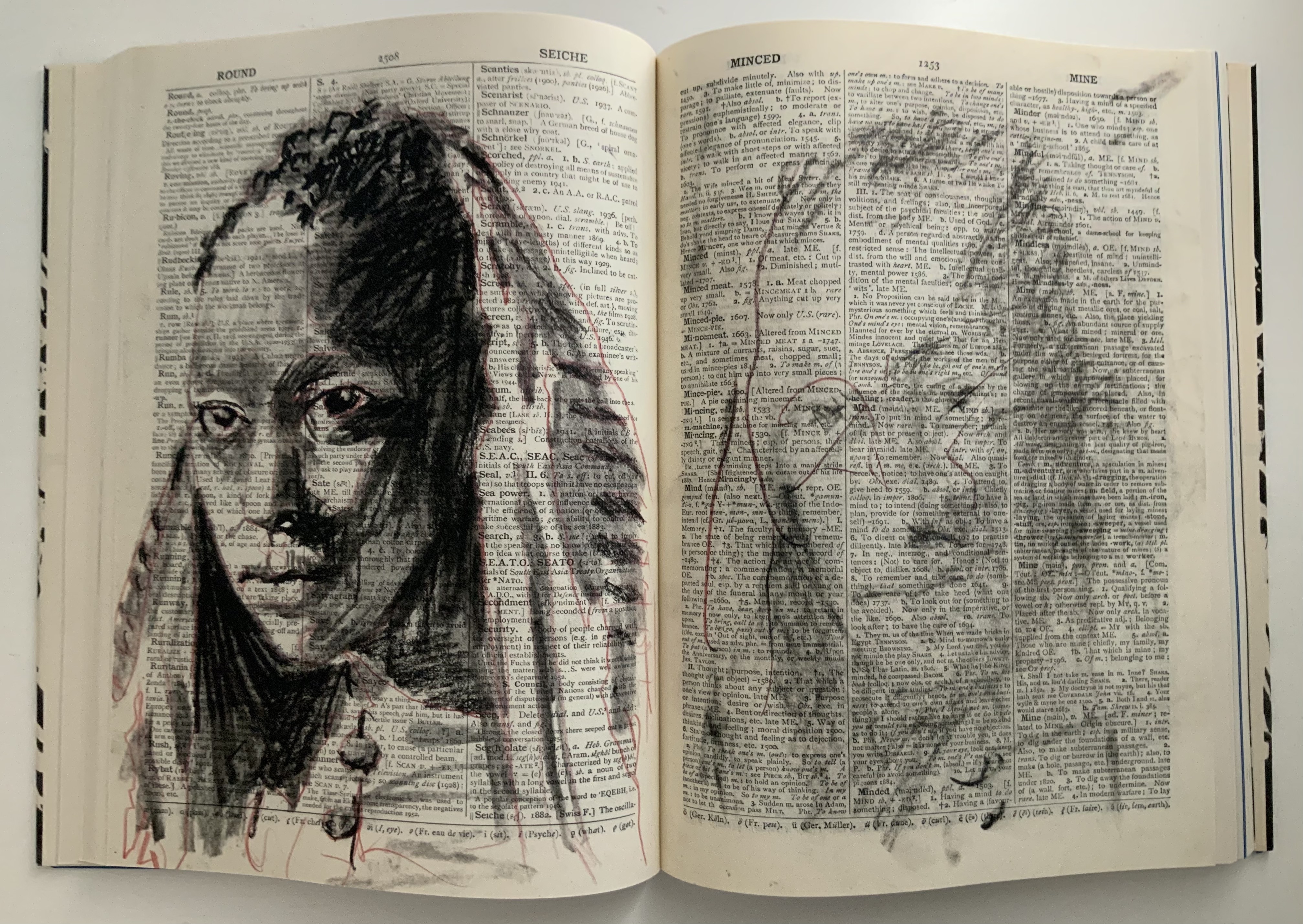
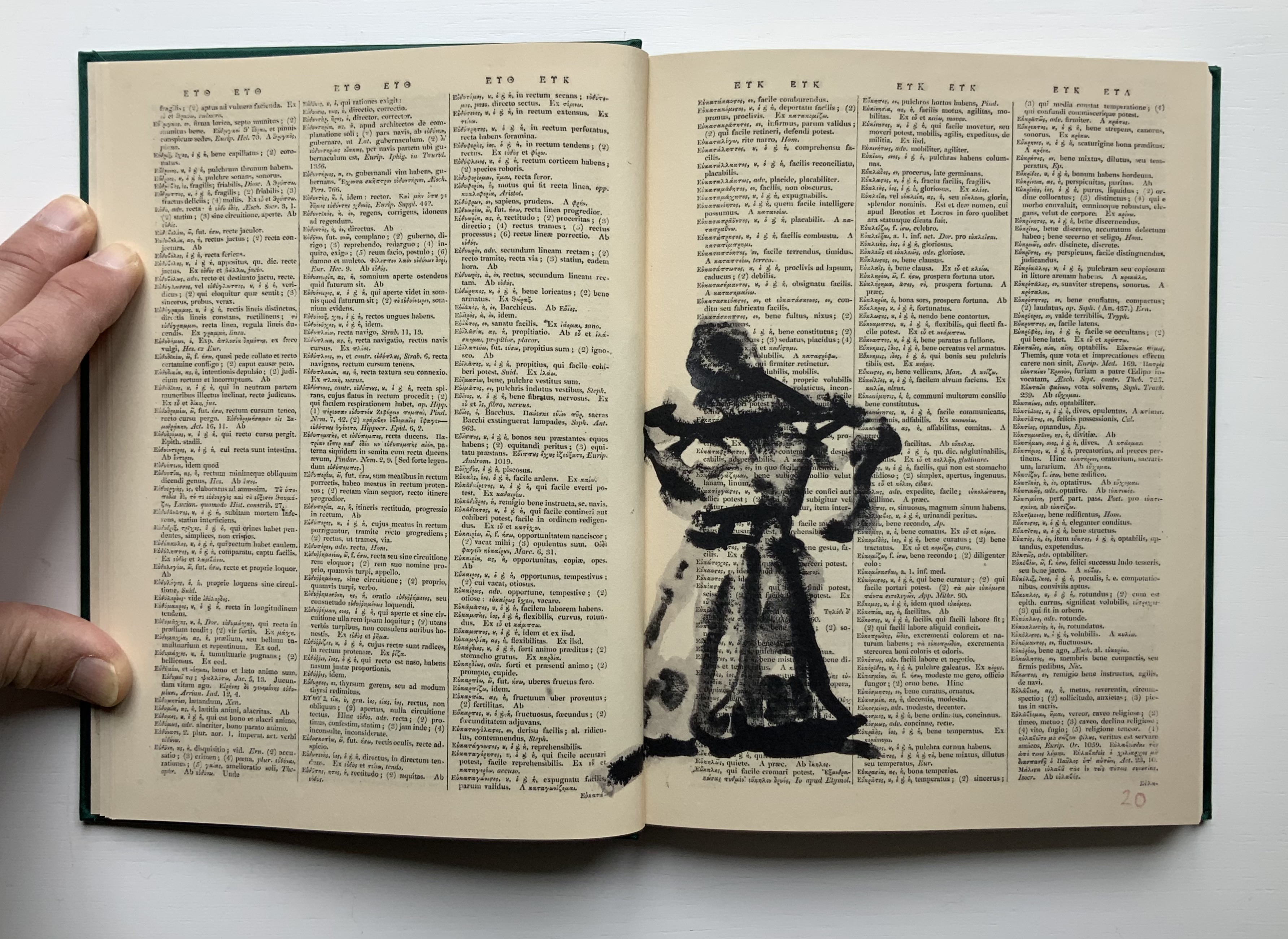
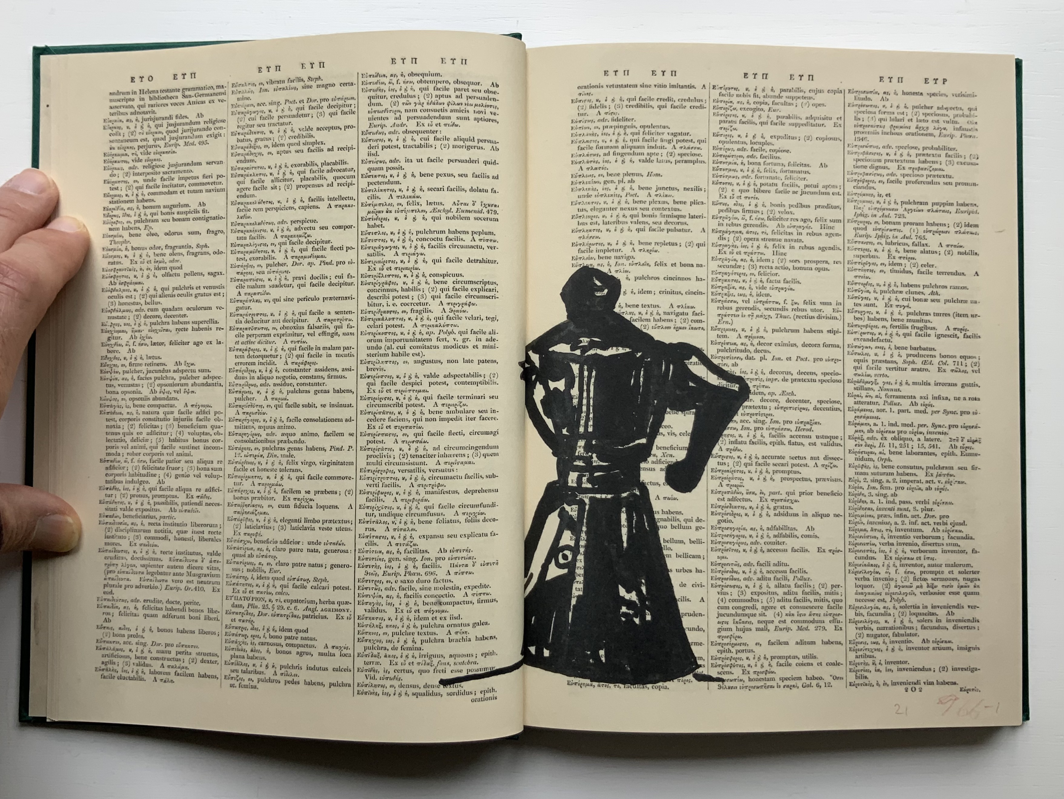
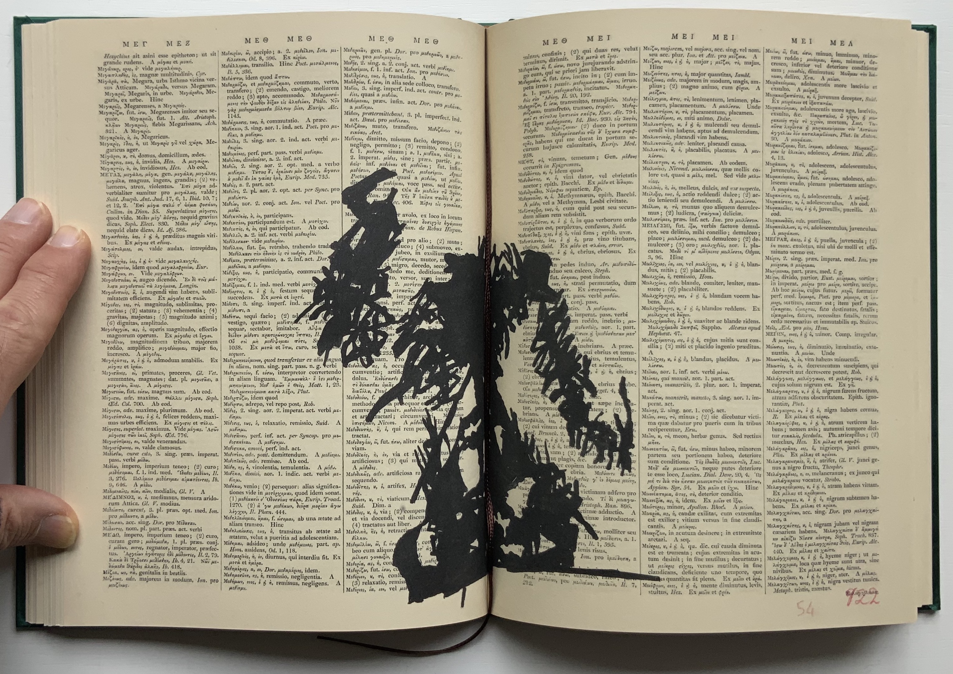
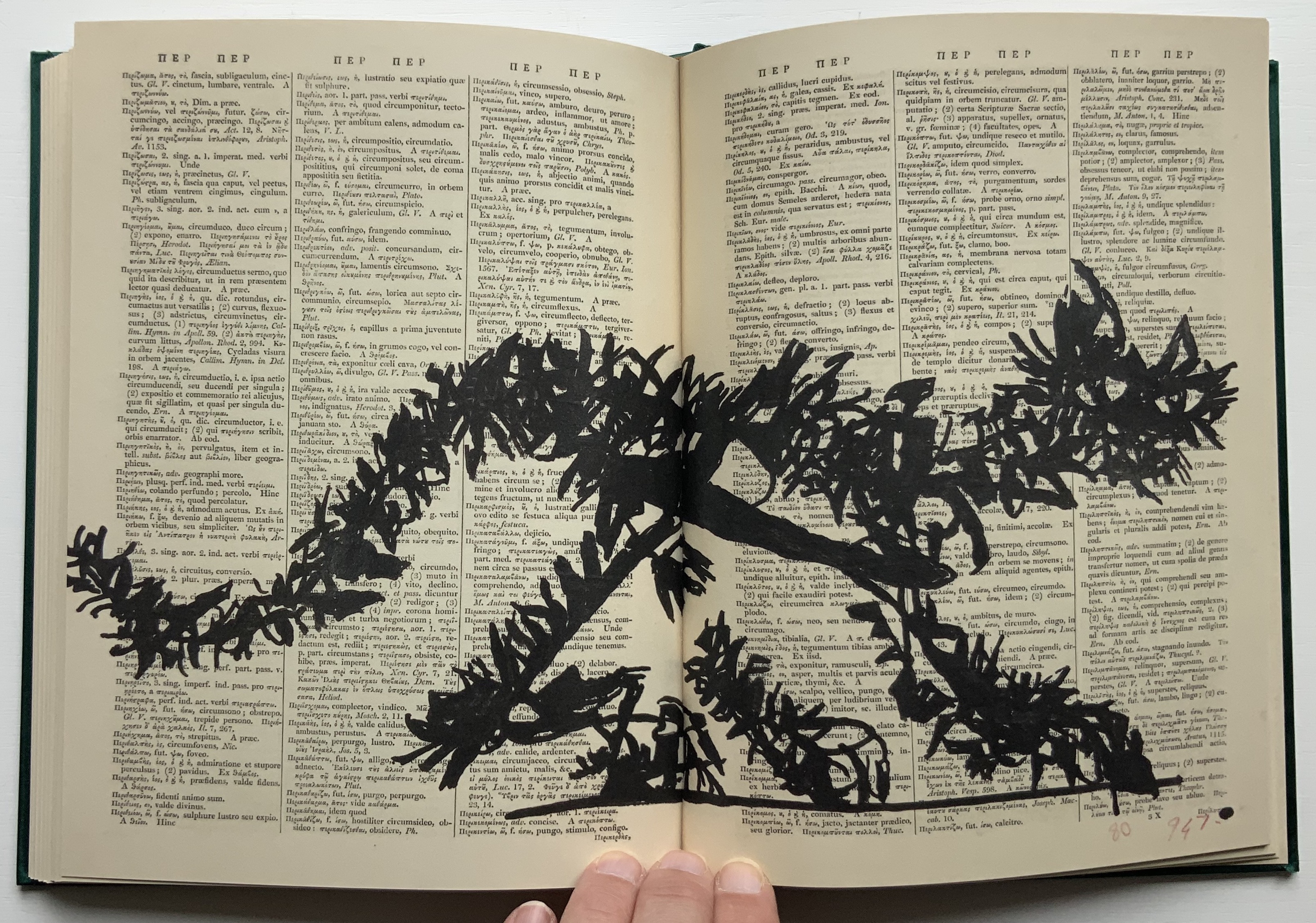
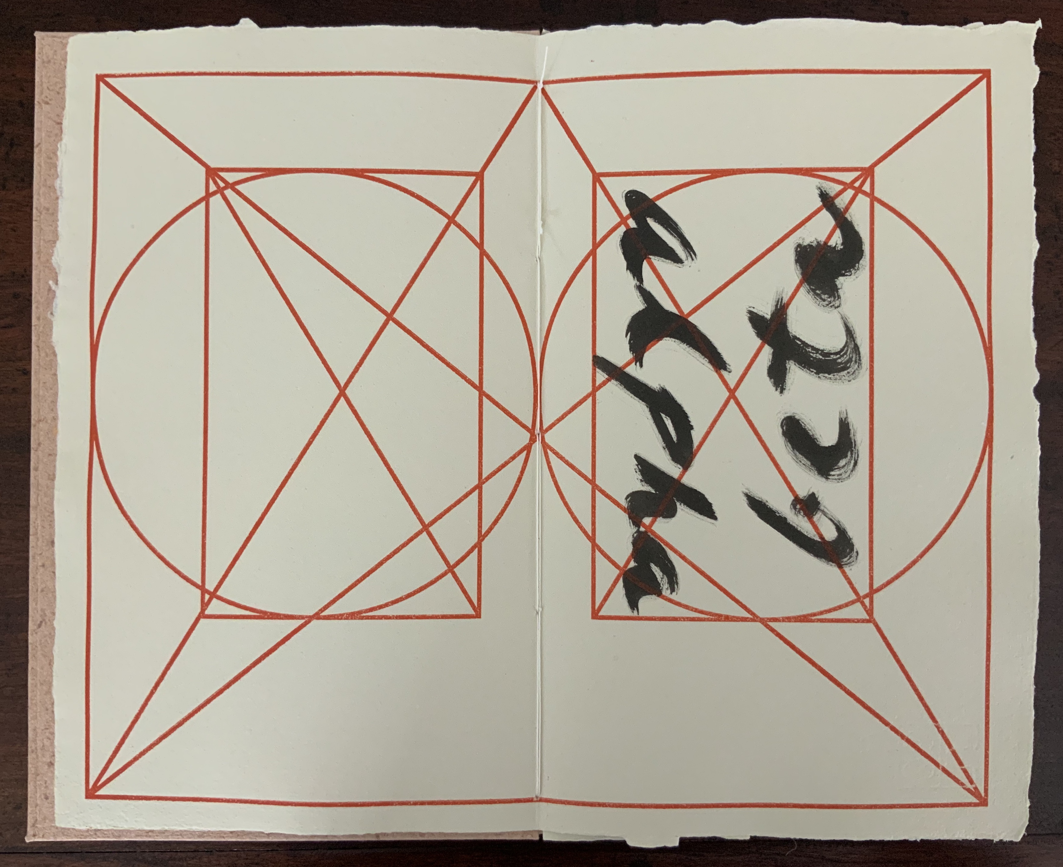
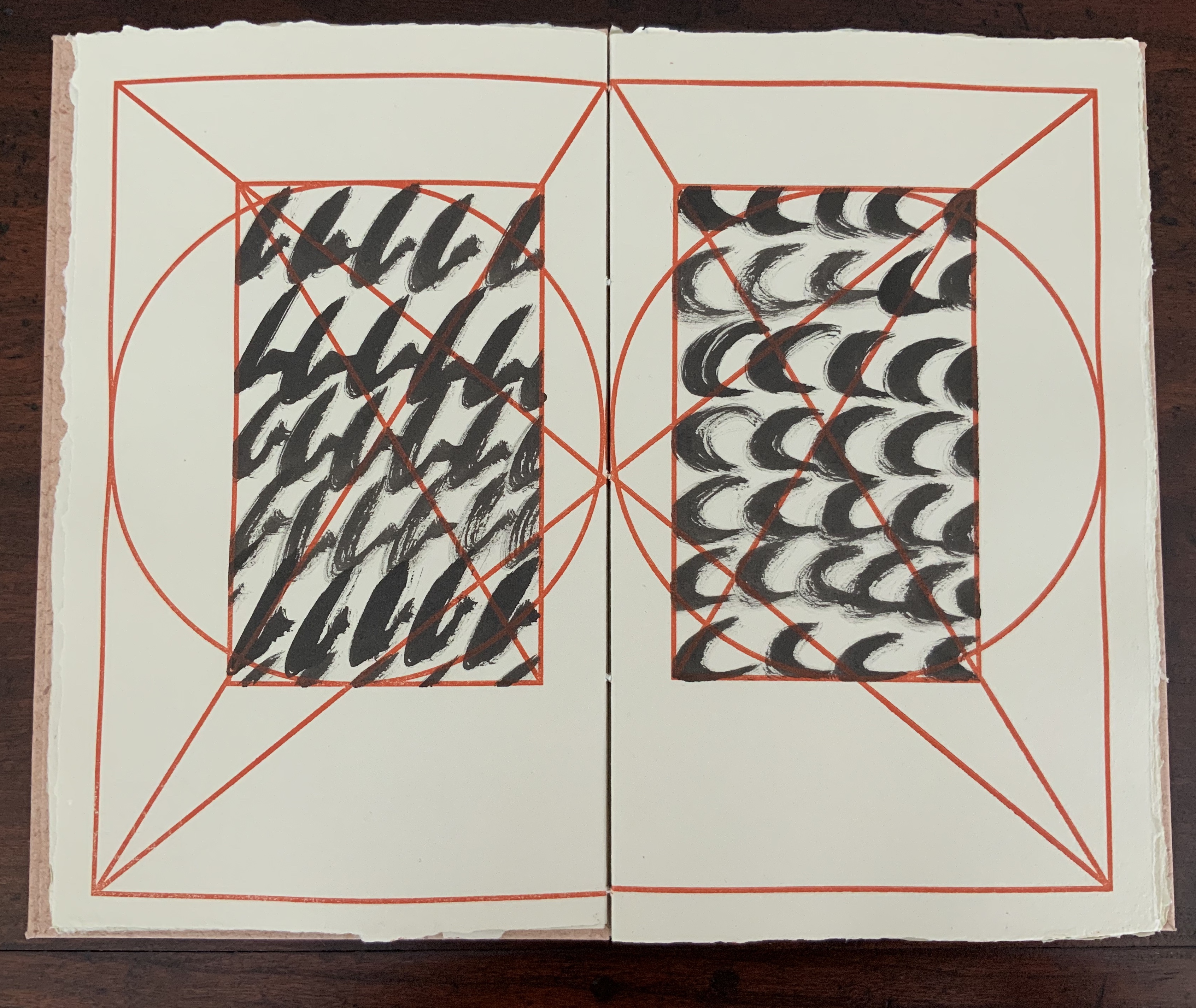
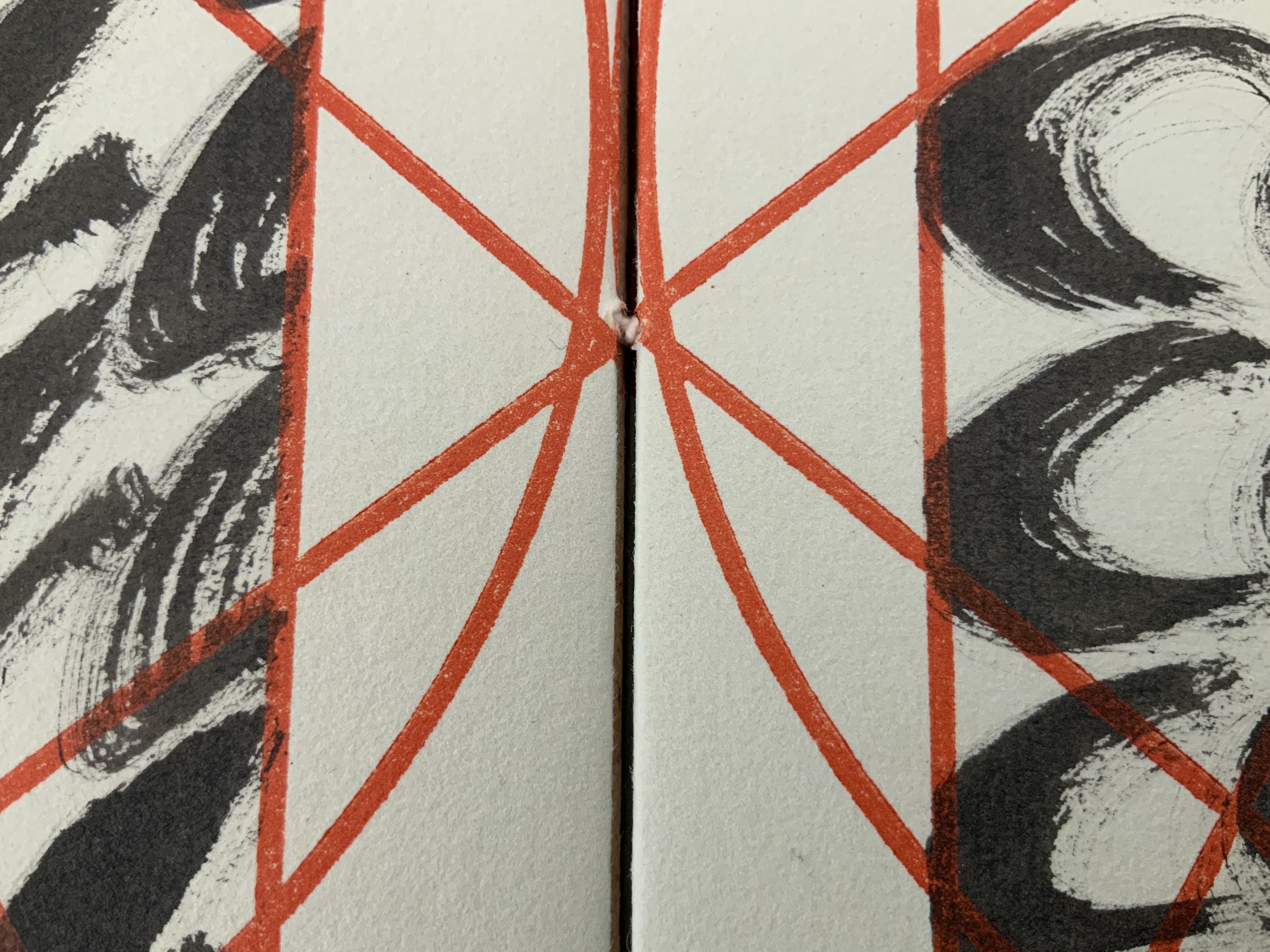
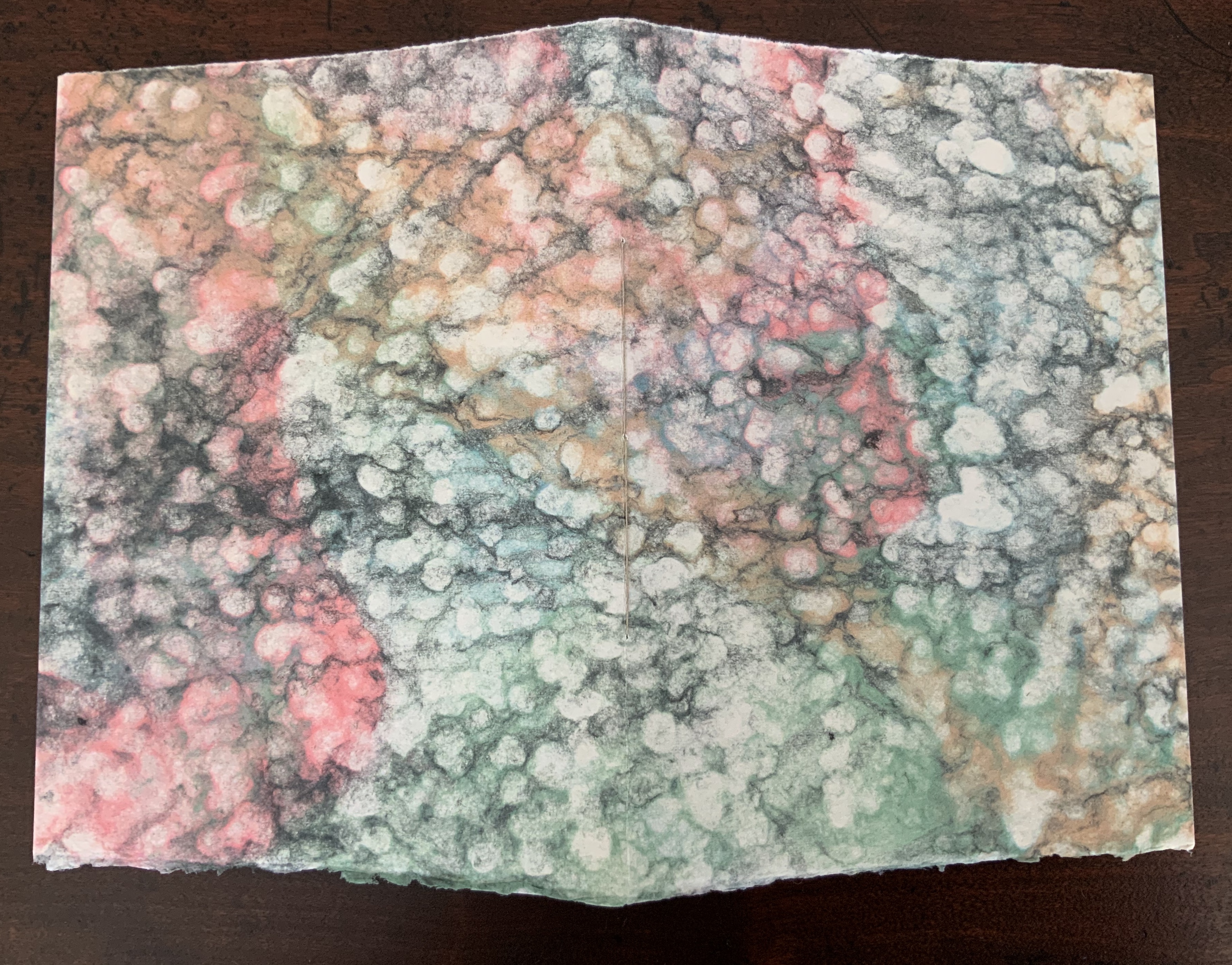
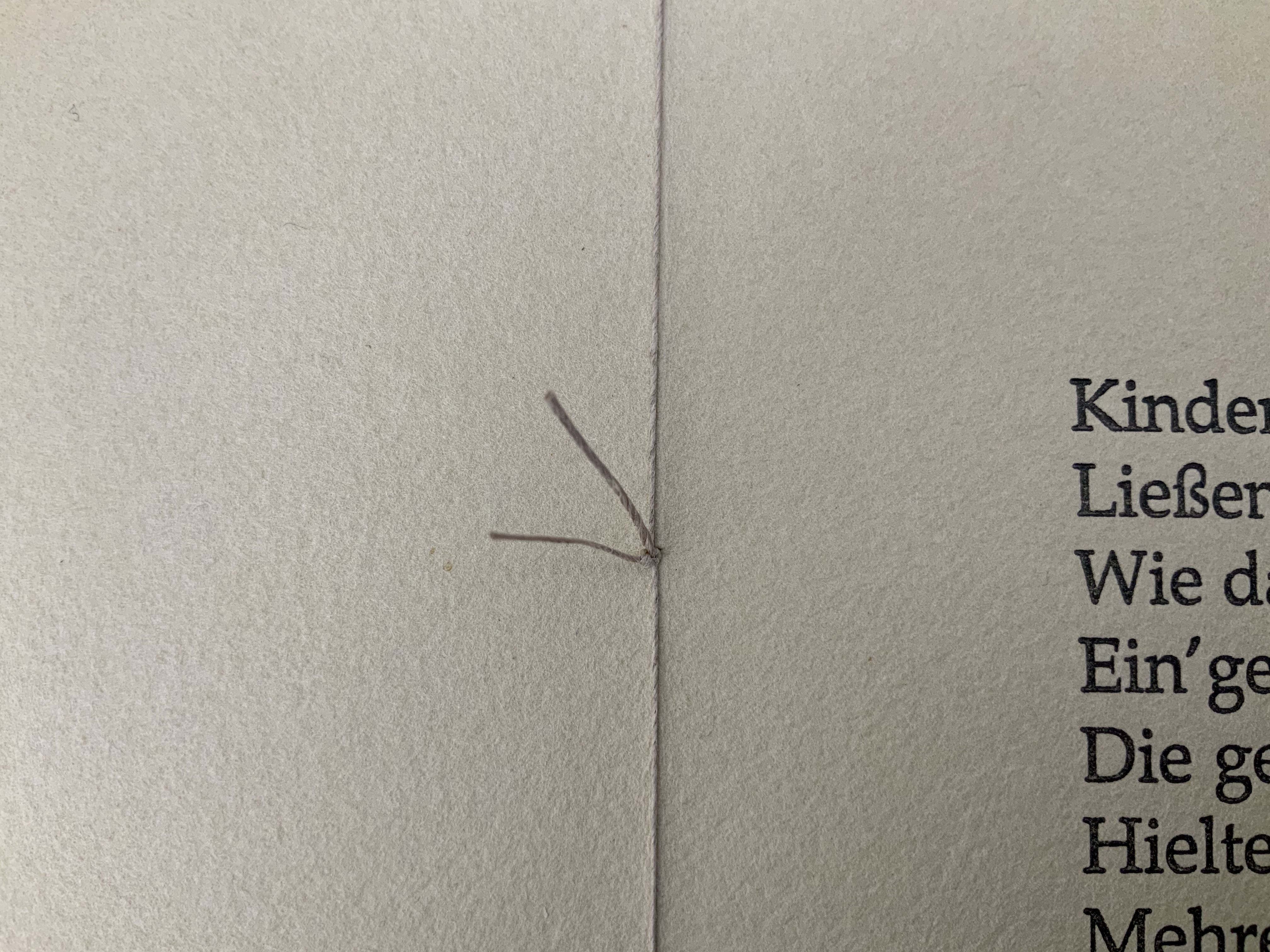
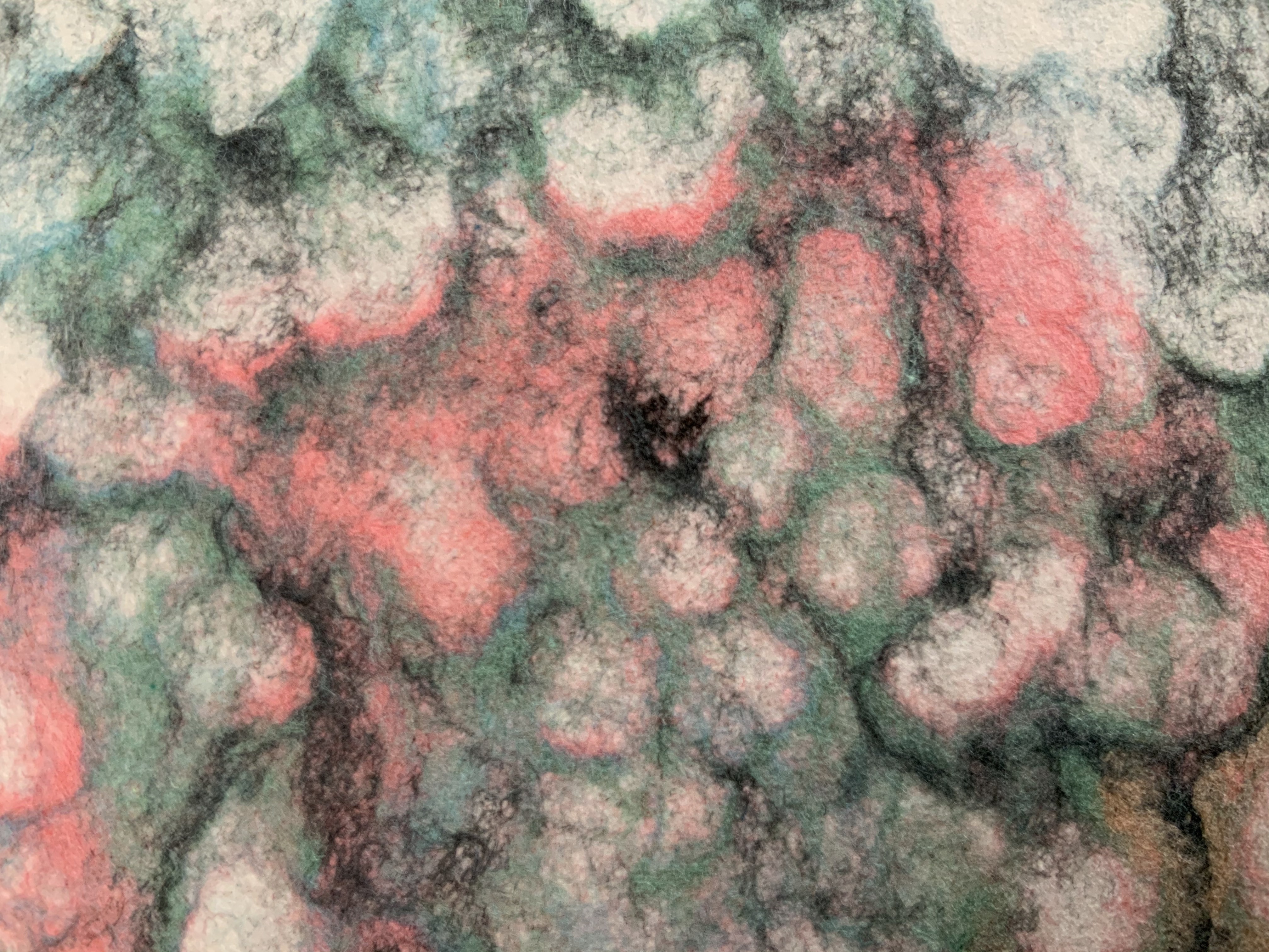
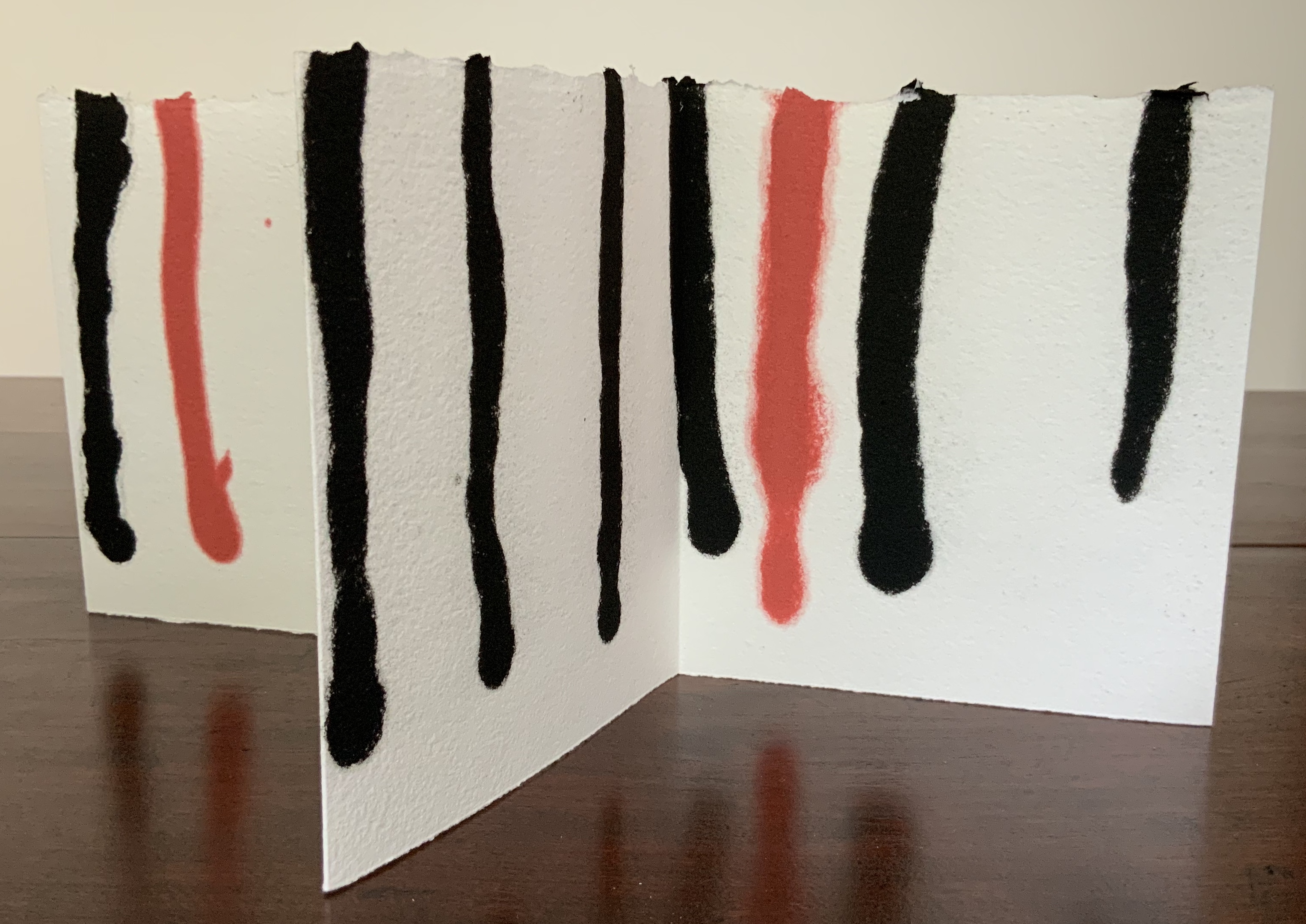
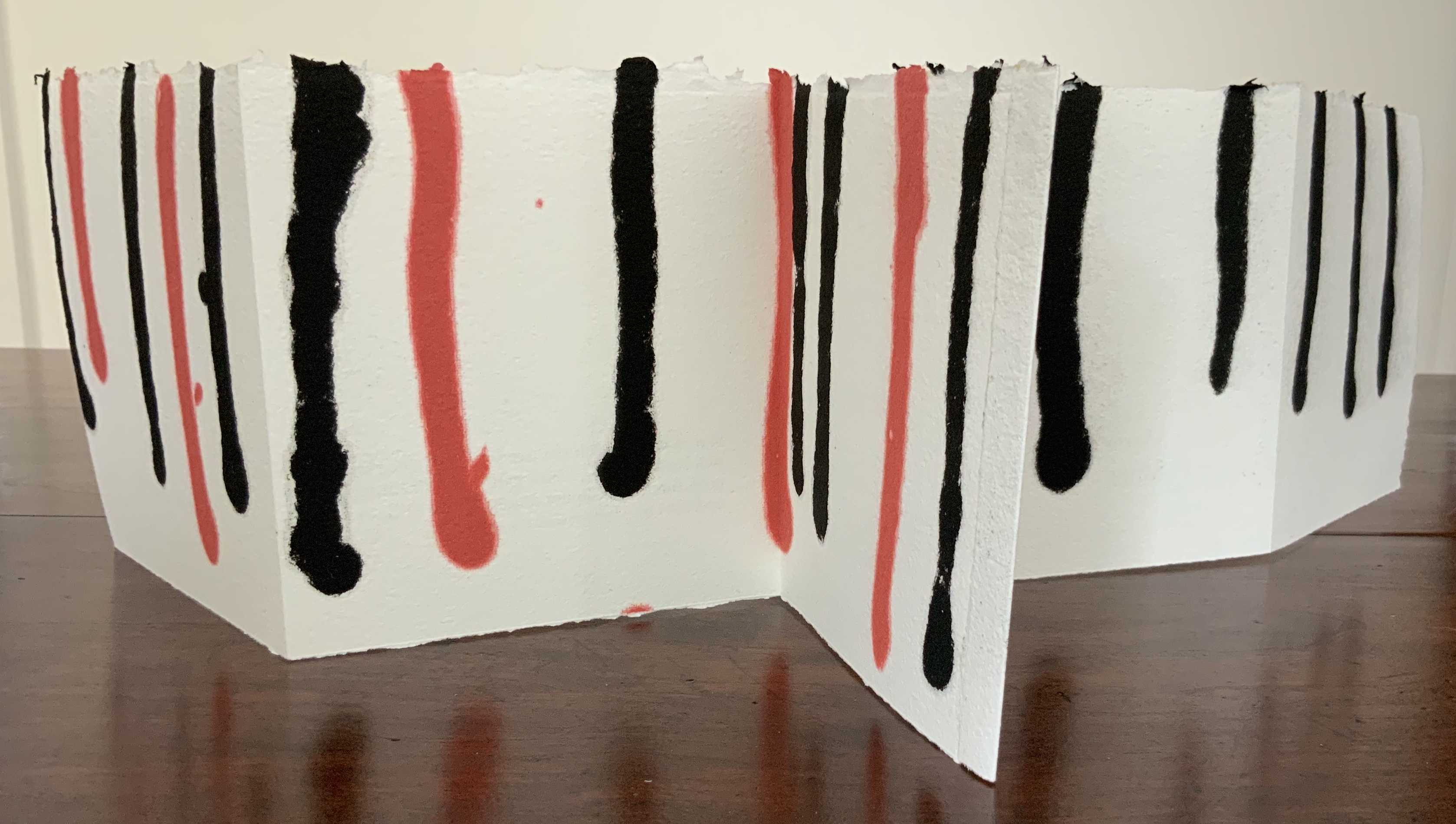
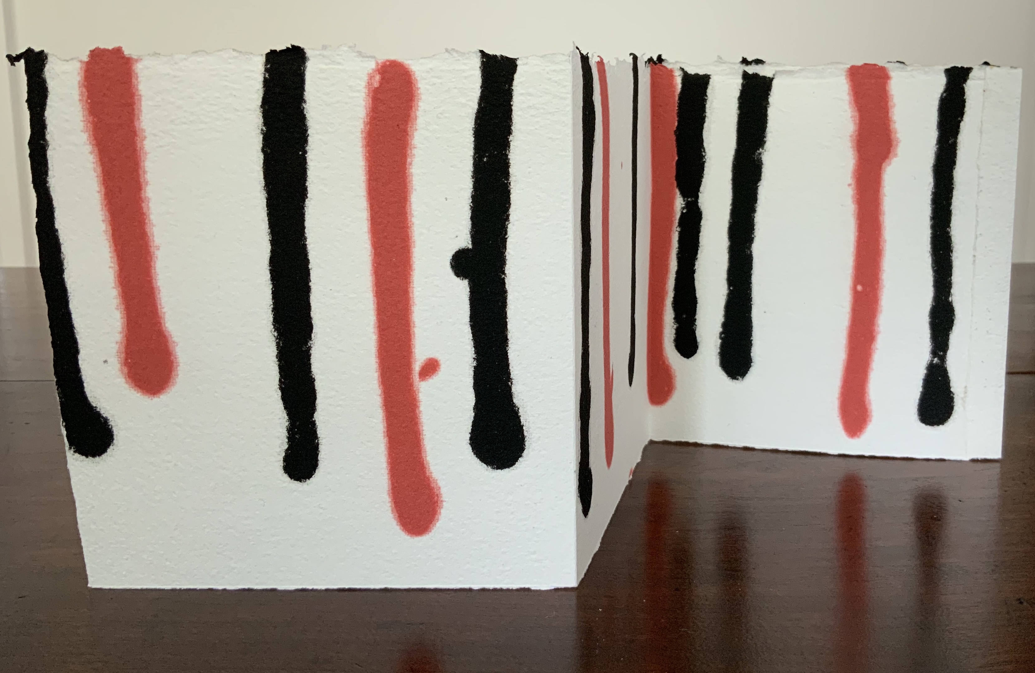
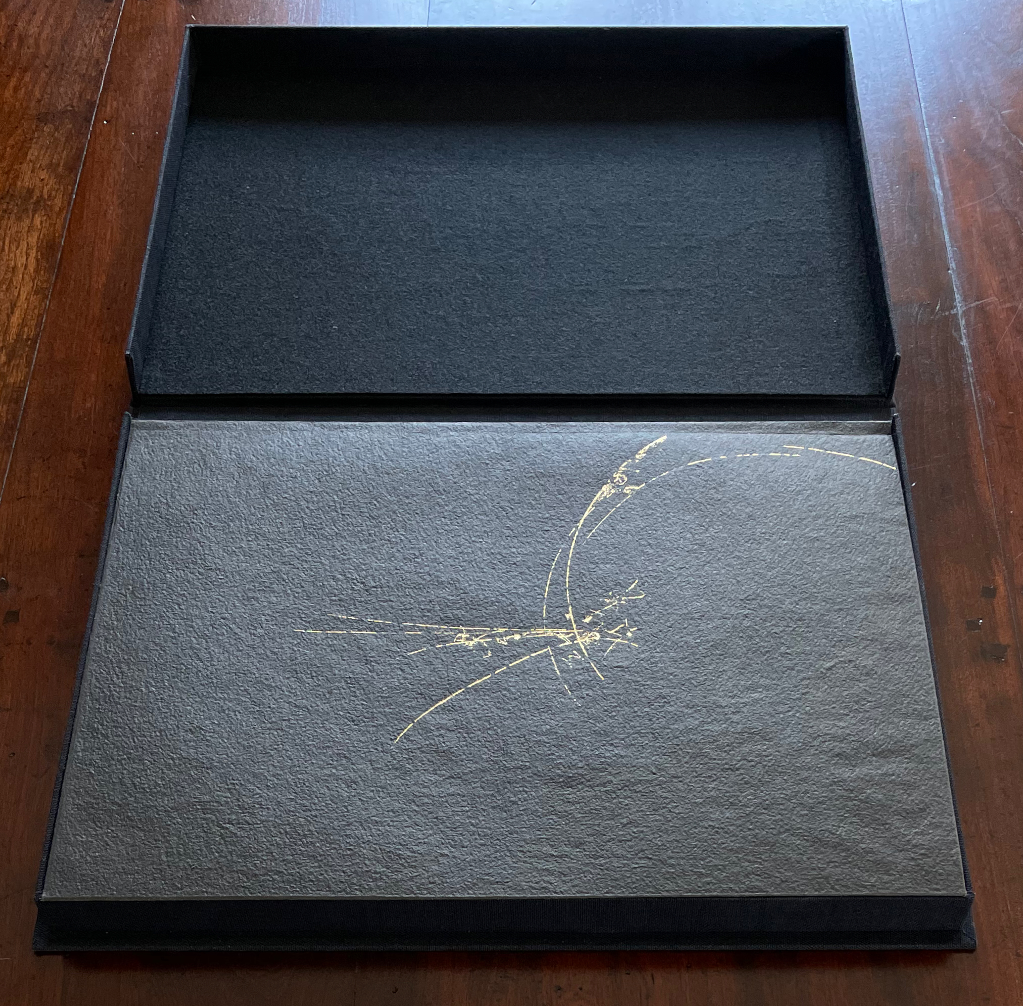
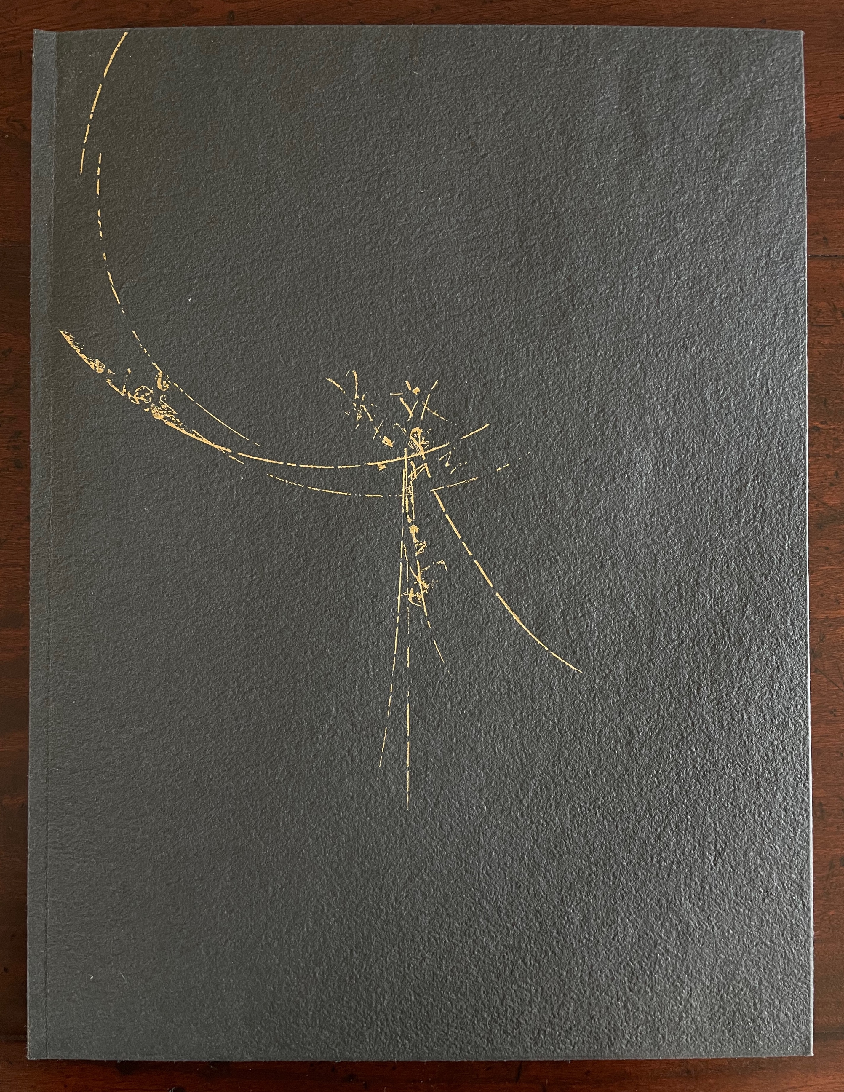
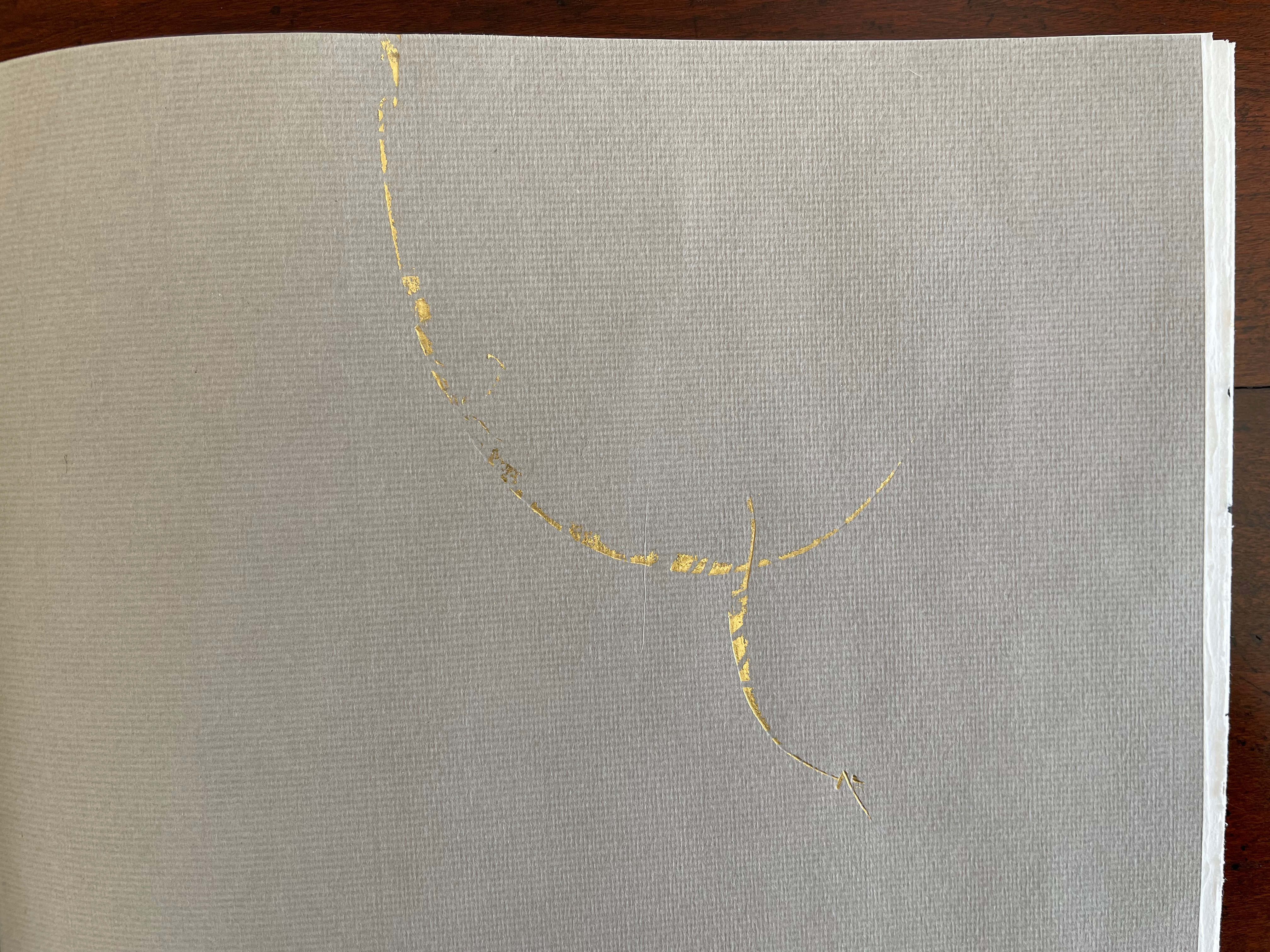
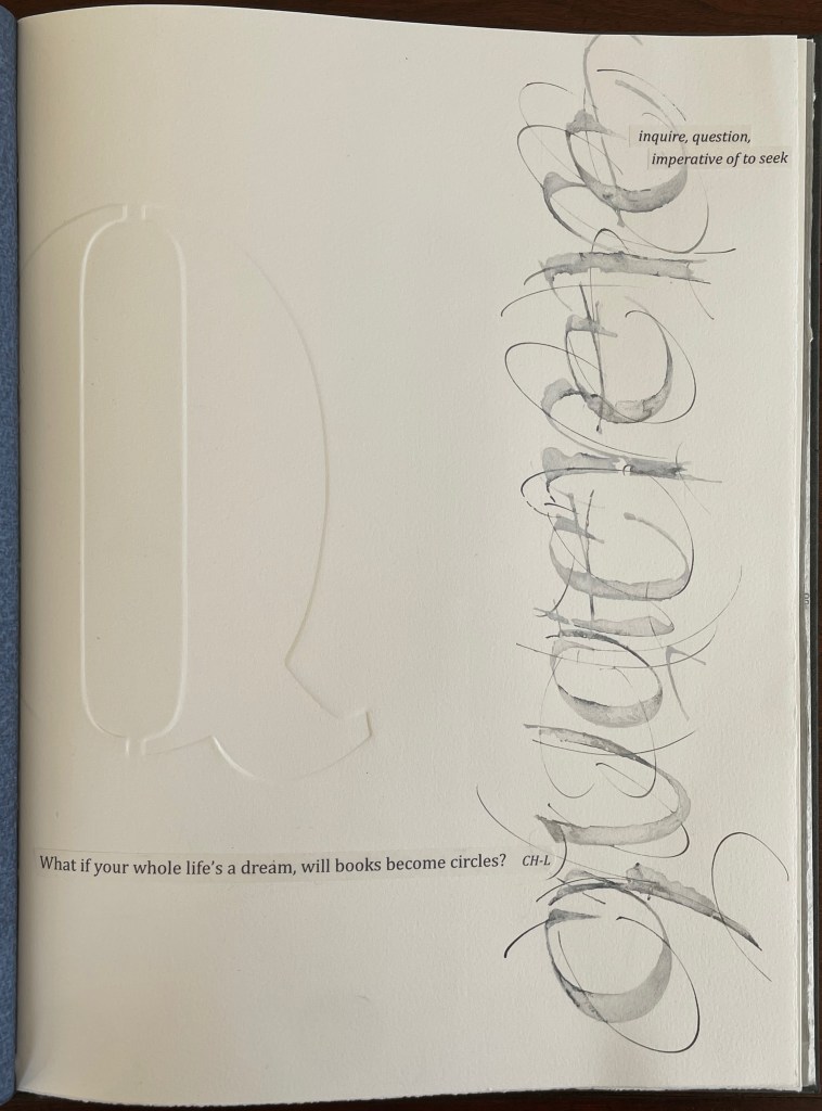
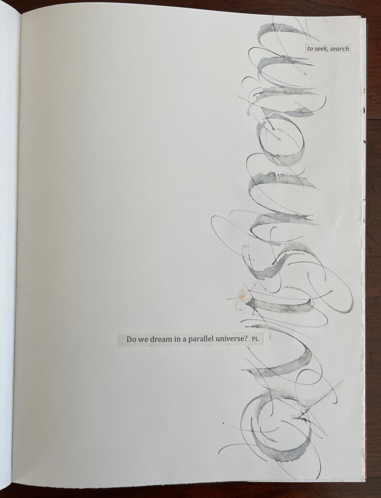
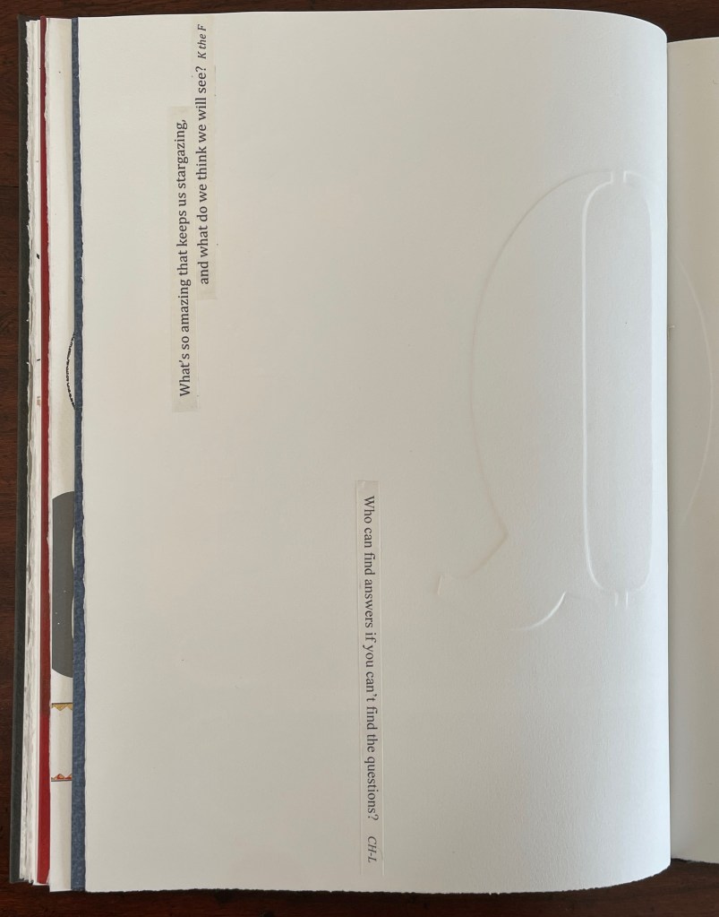
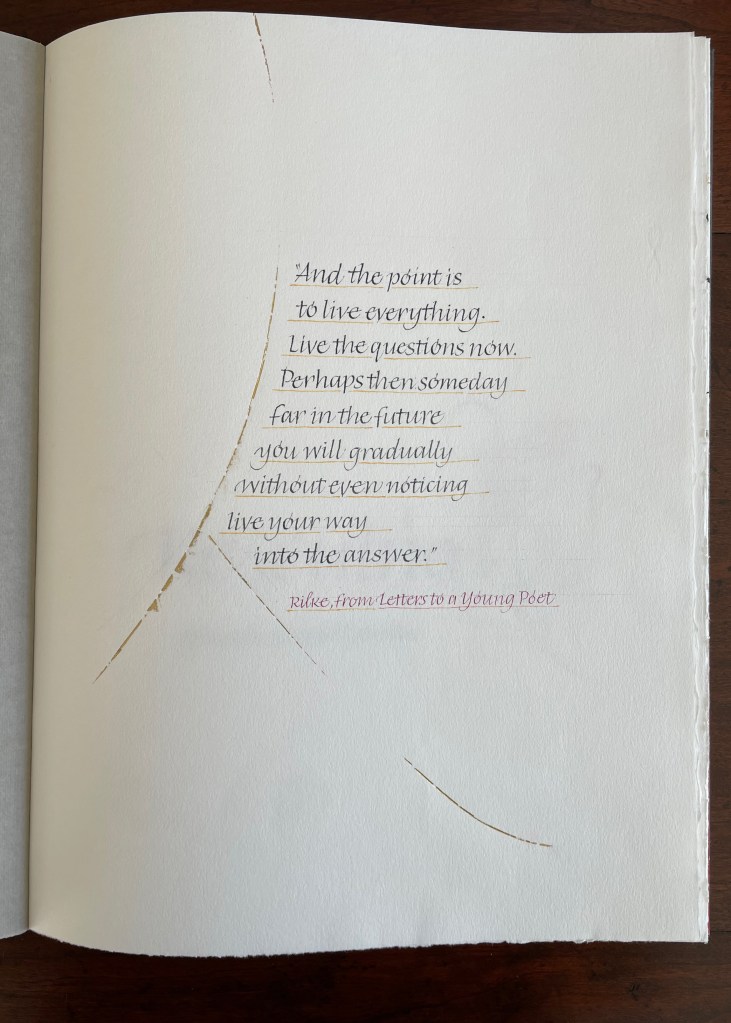
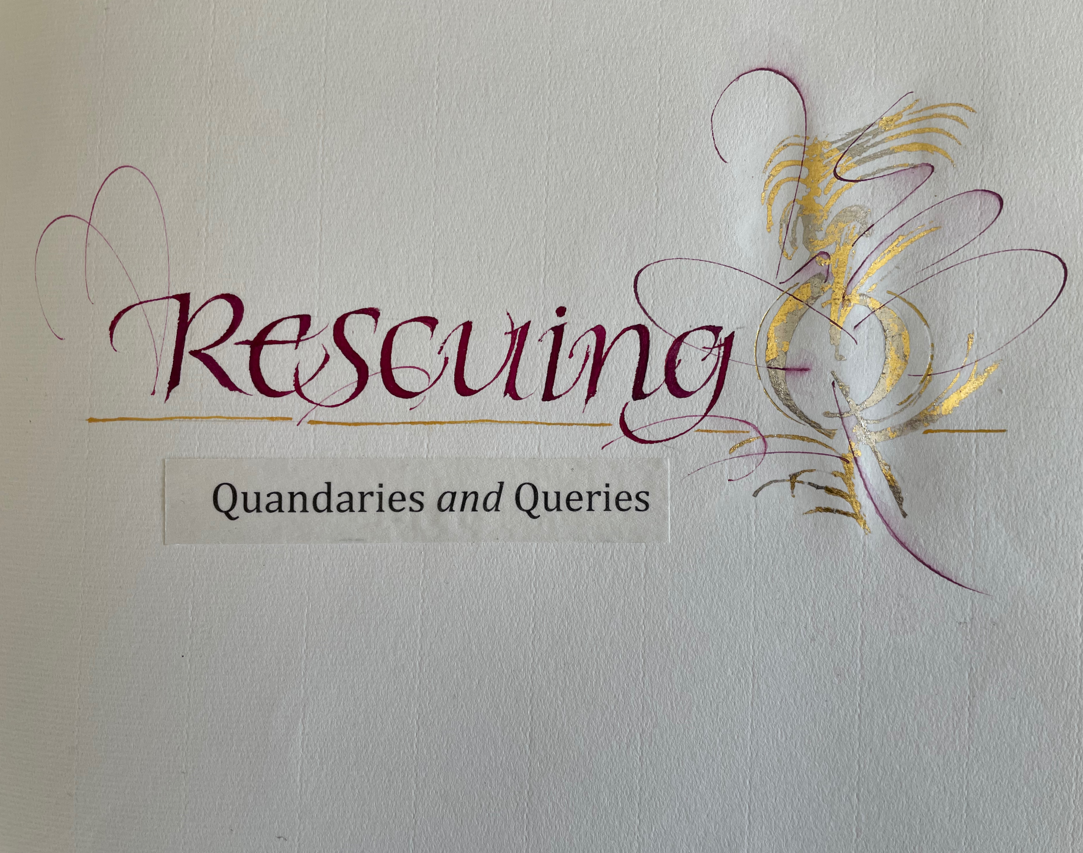
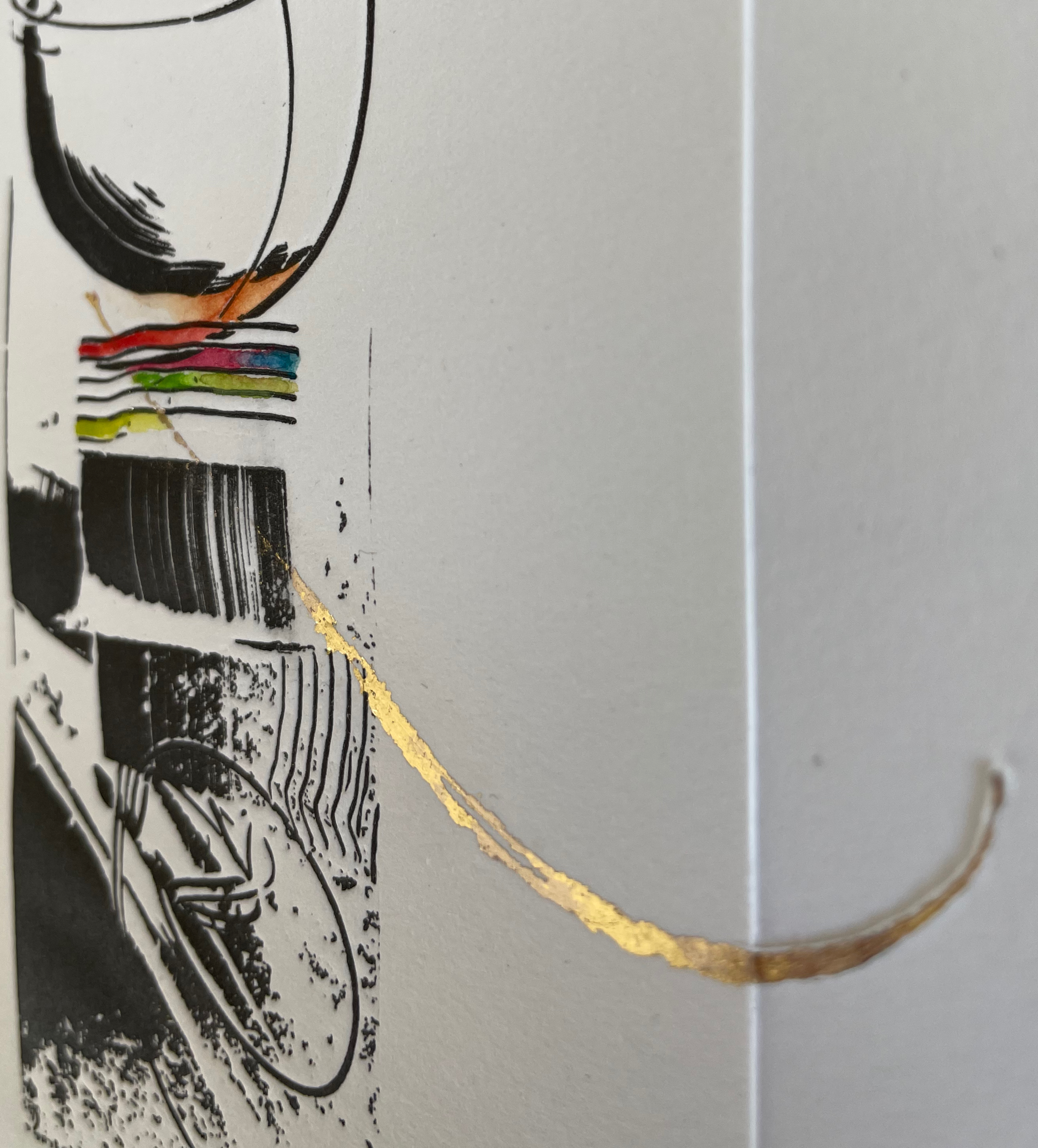
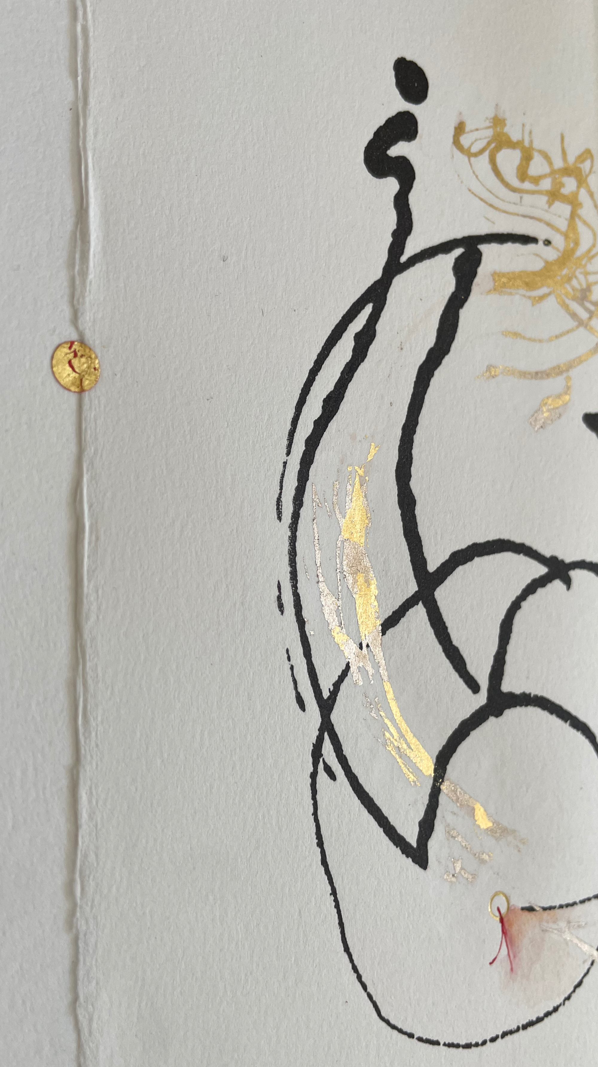
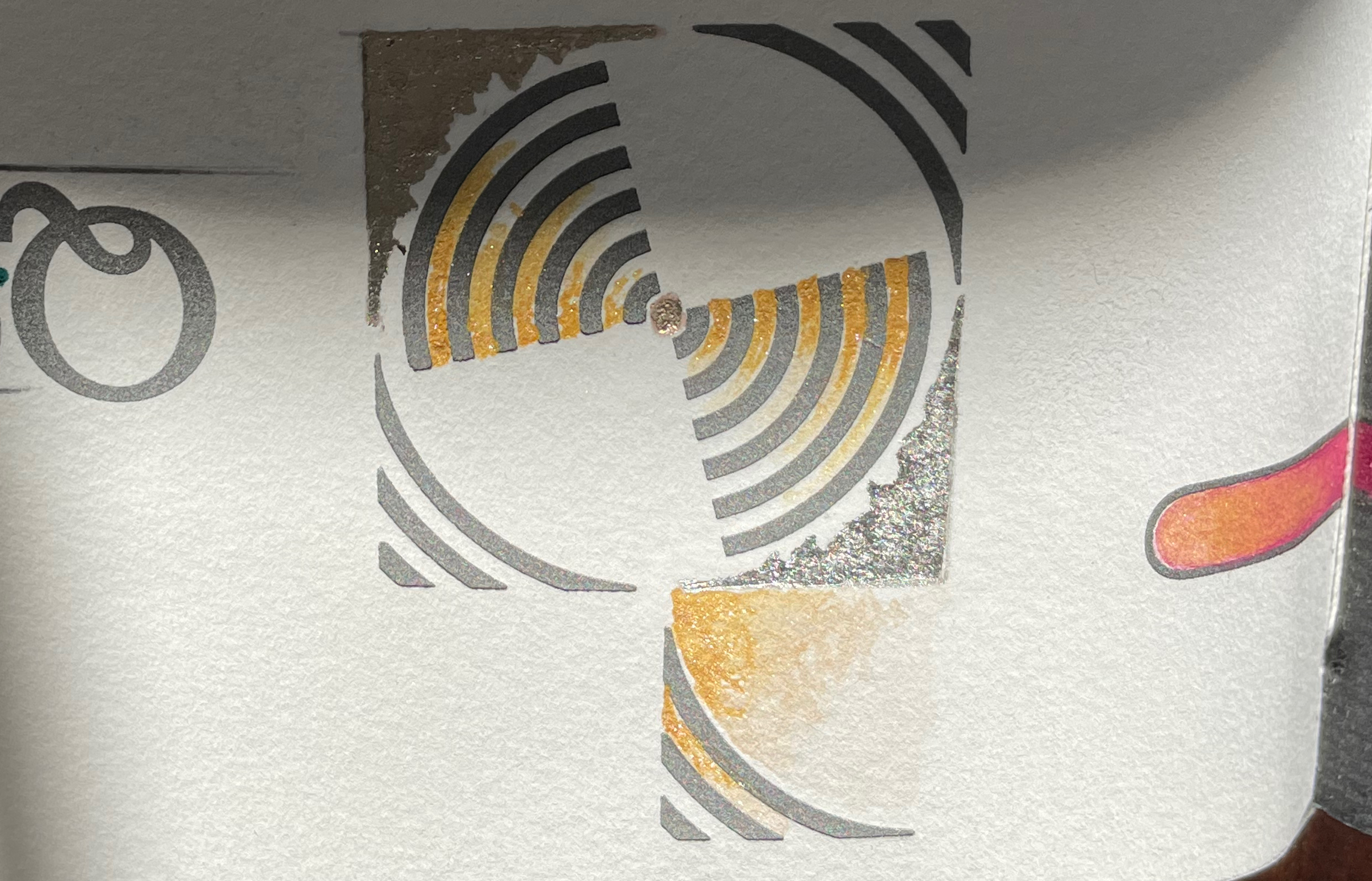
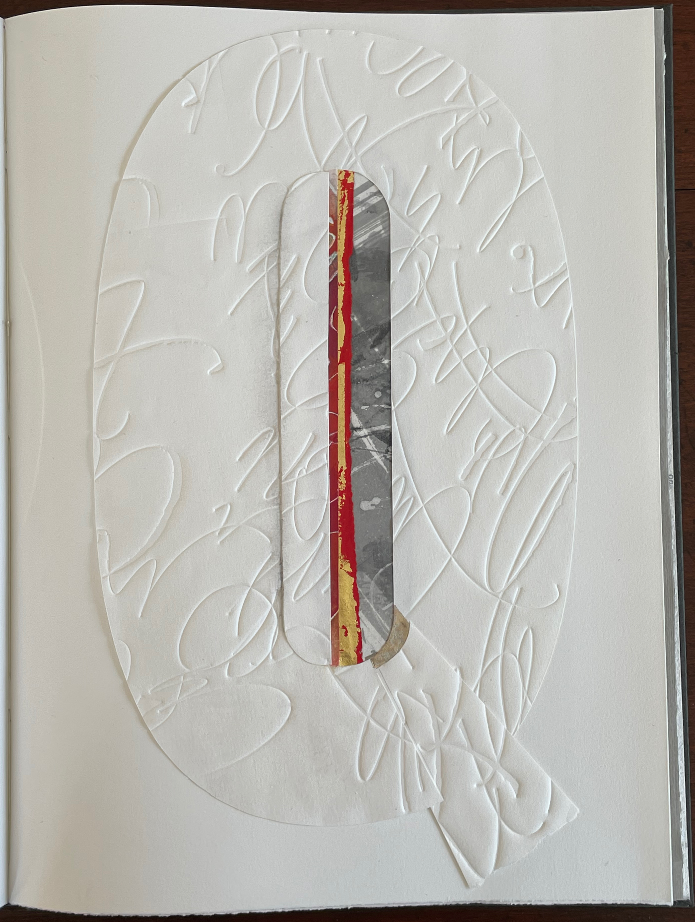
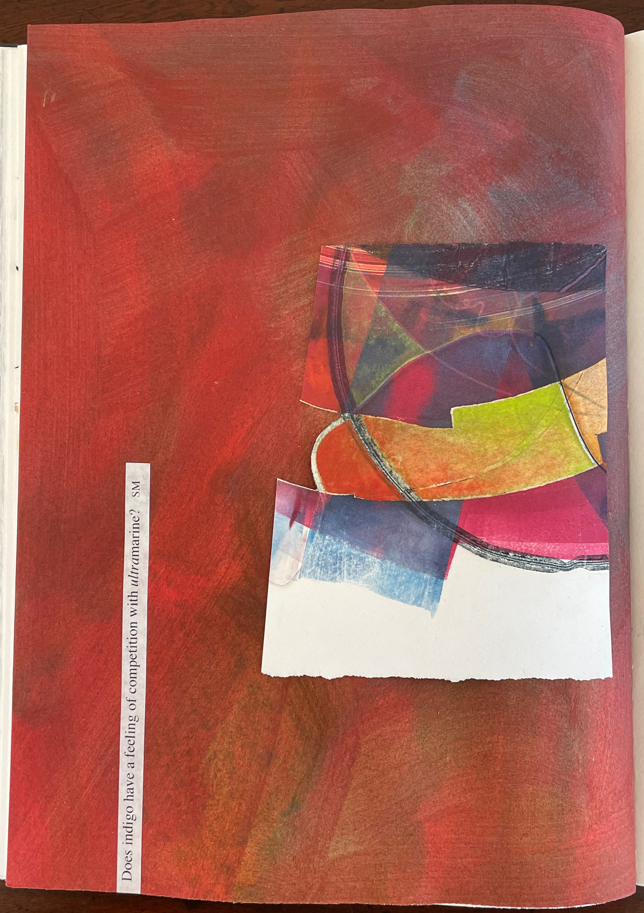
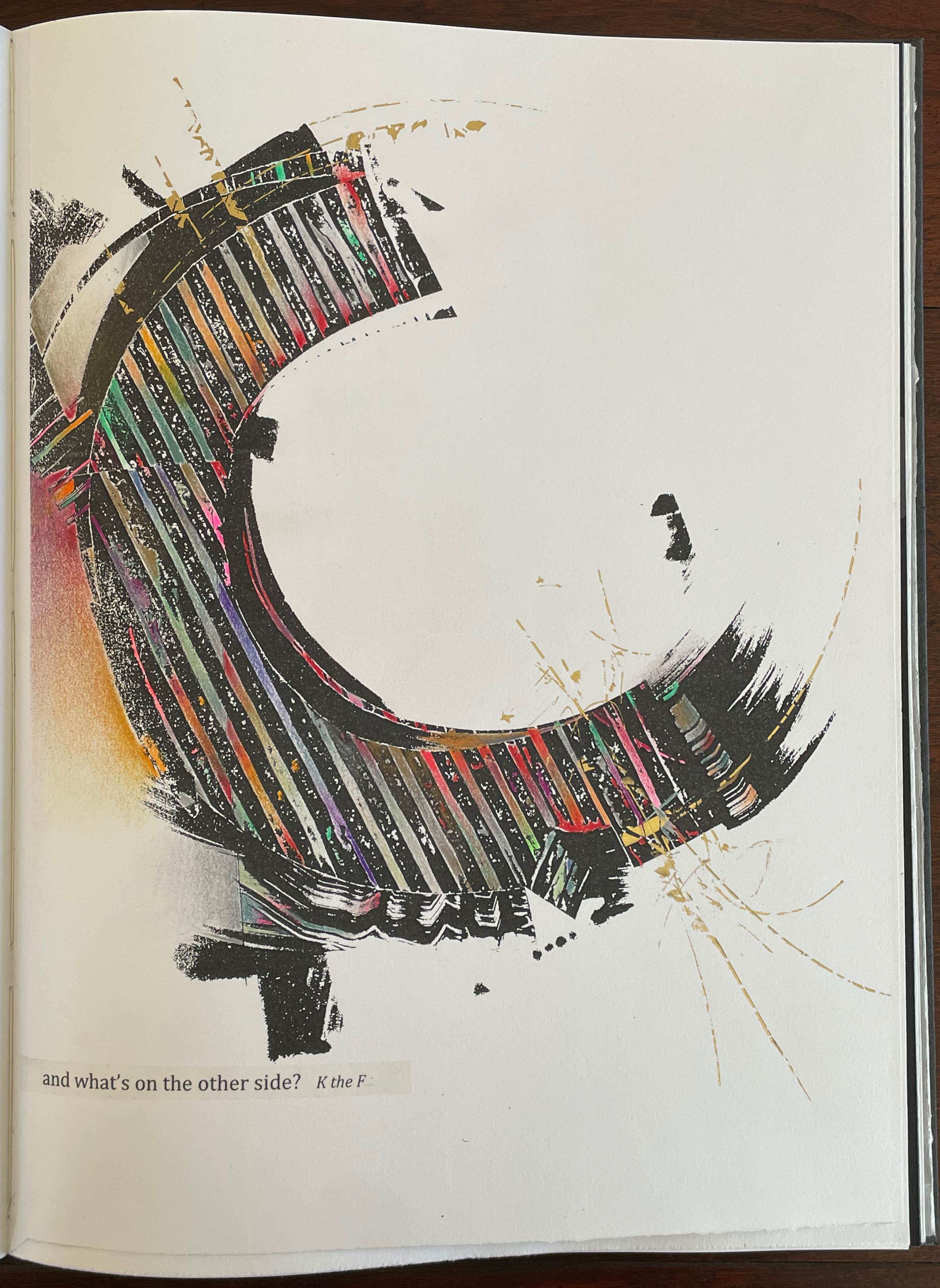
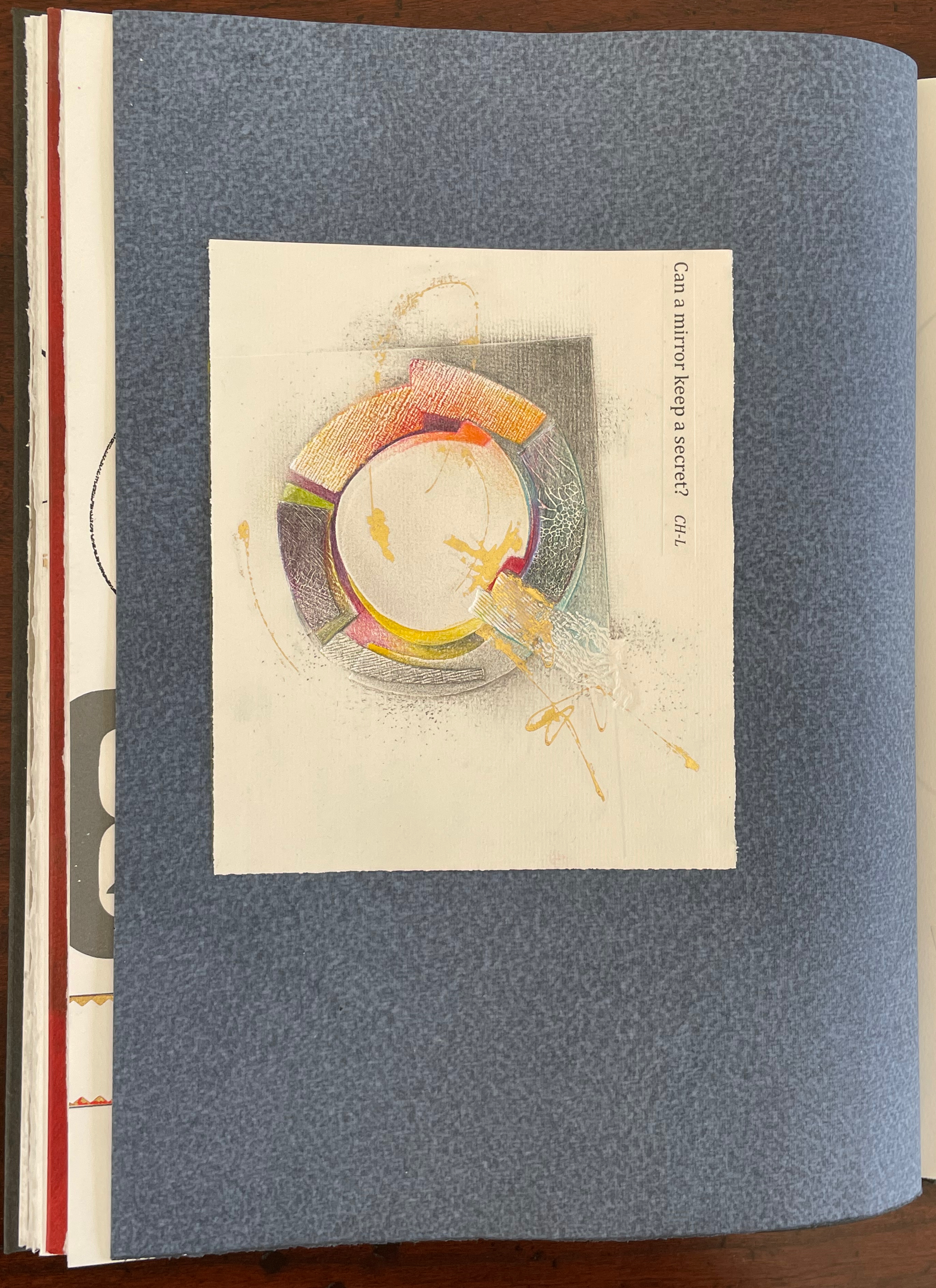
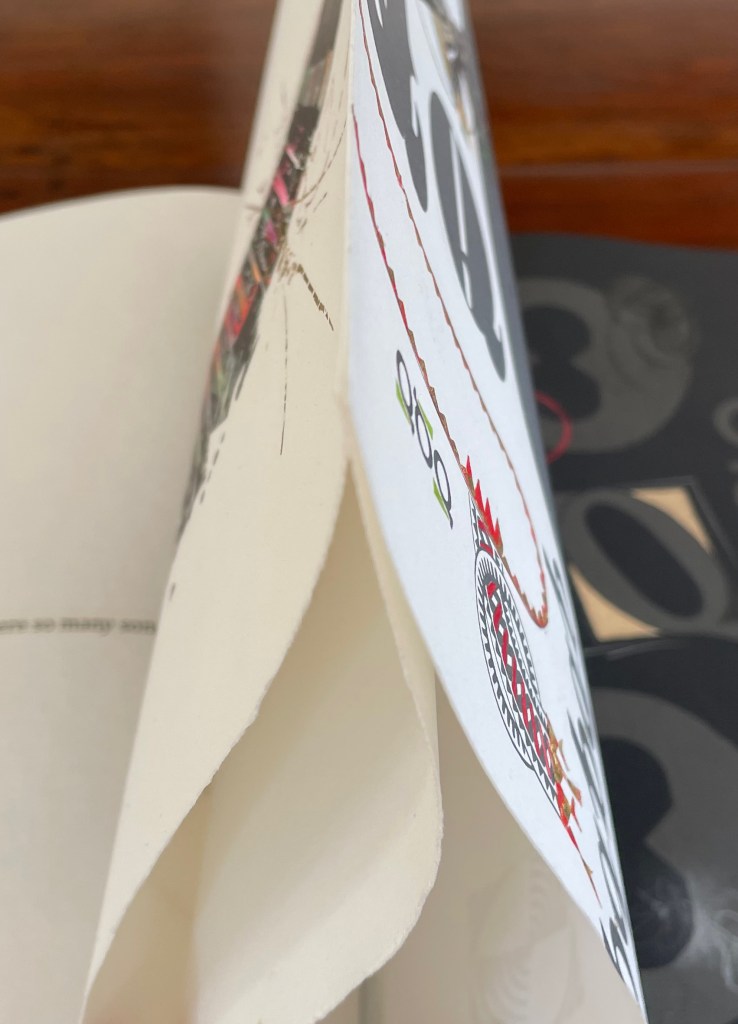
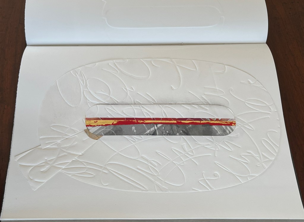
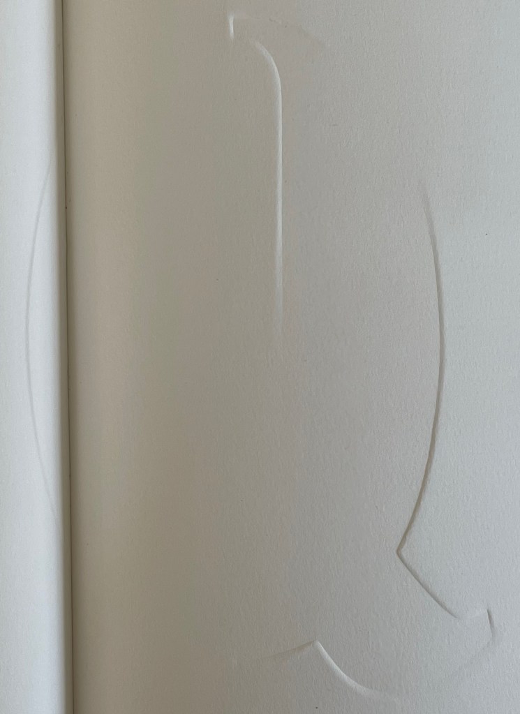
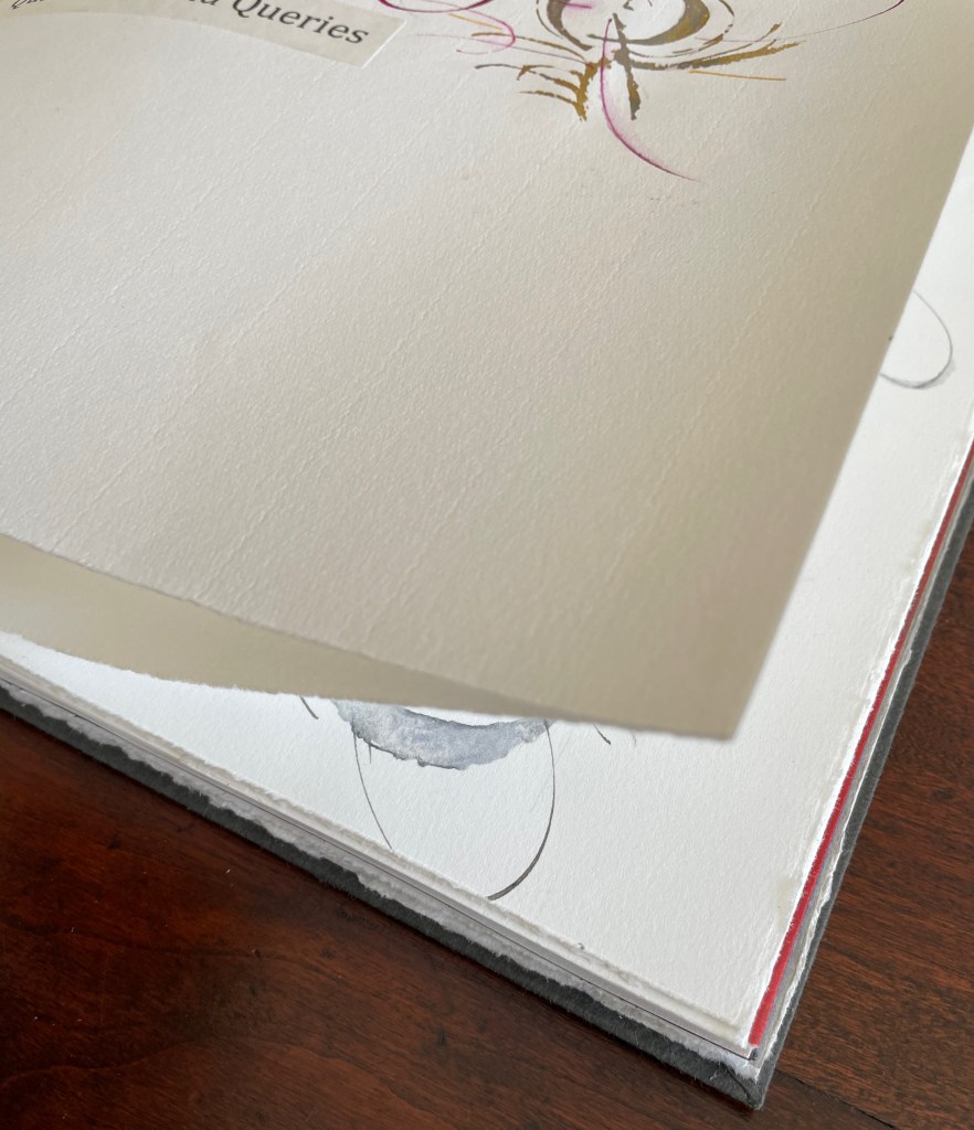
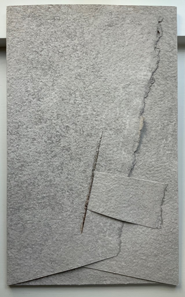
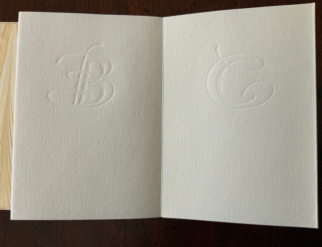
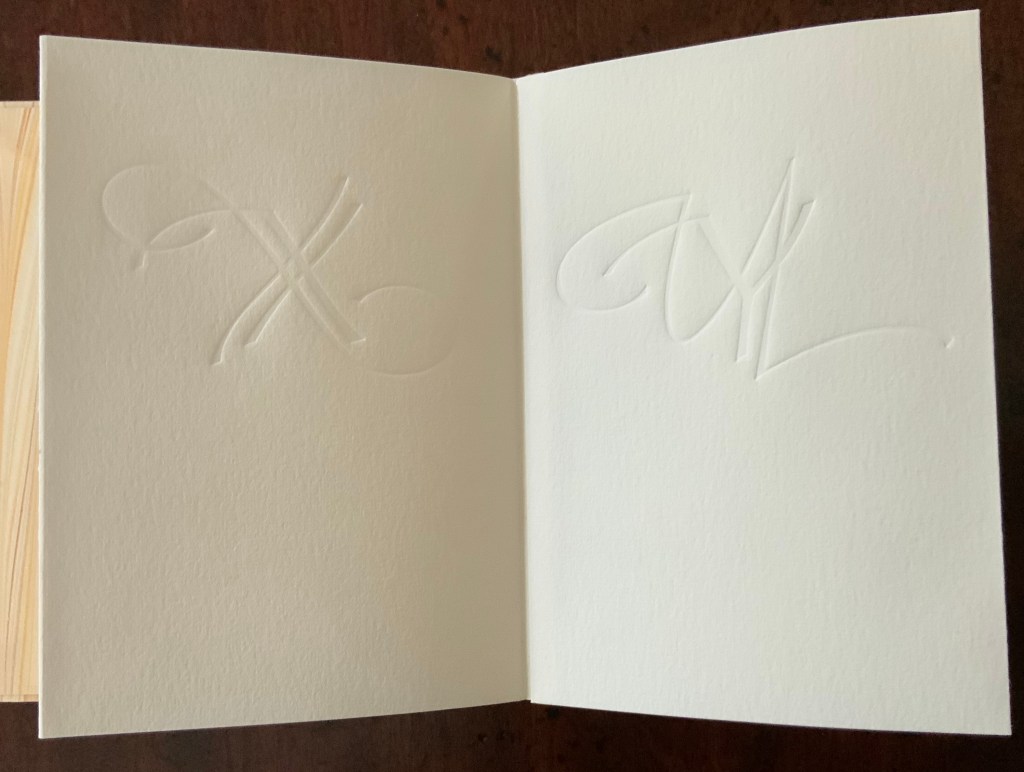
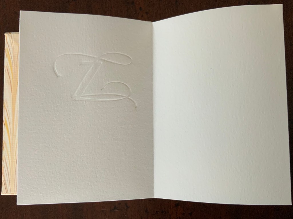
Rescuing Q is a manuscript book, consisting of original paintings, monoprints, collage, pigmented prints, embossing, debossing, gilding and handwork complementing the letterpress printing. It is one of several such works designed and created by Suzanne Moore after more than 20 years of experimentation.
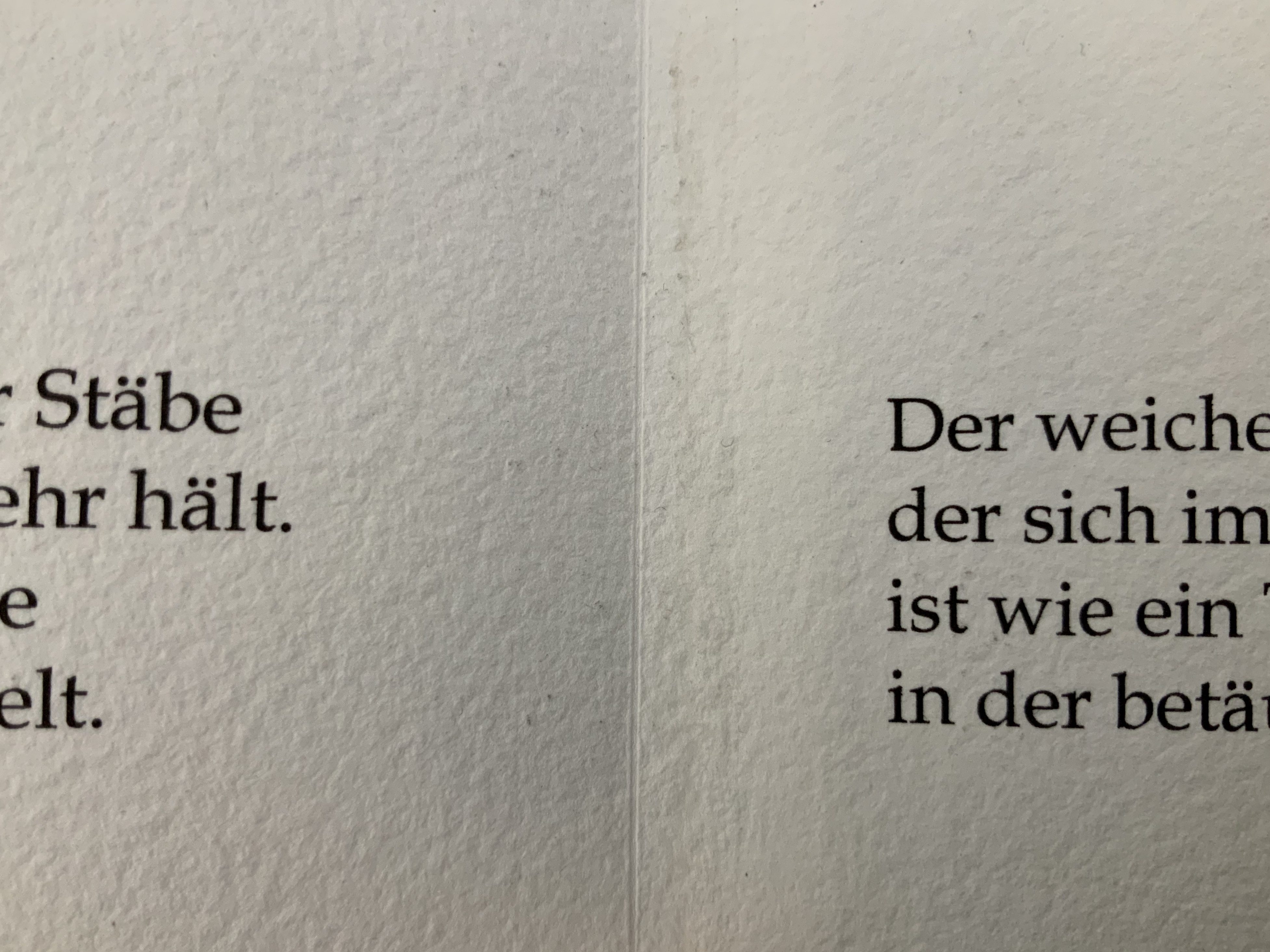
Q is not normal. Q is quirky. Q floats away. Q comes in too many shapes and sizes and colors. So attractive, Q was bound to be hijacked by Q-Anon, political operatives and social anarchists.
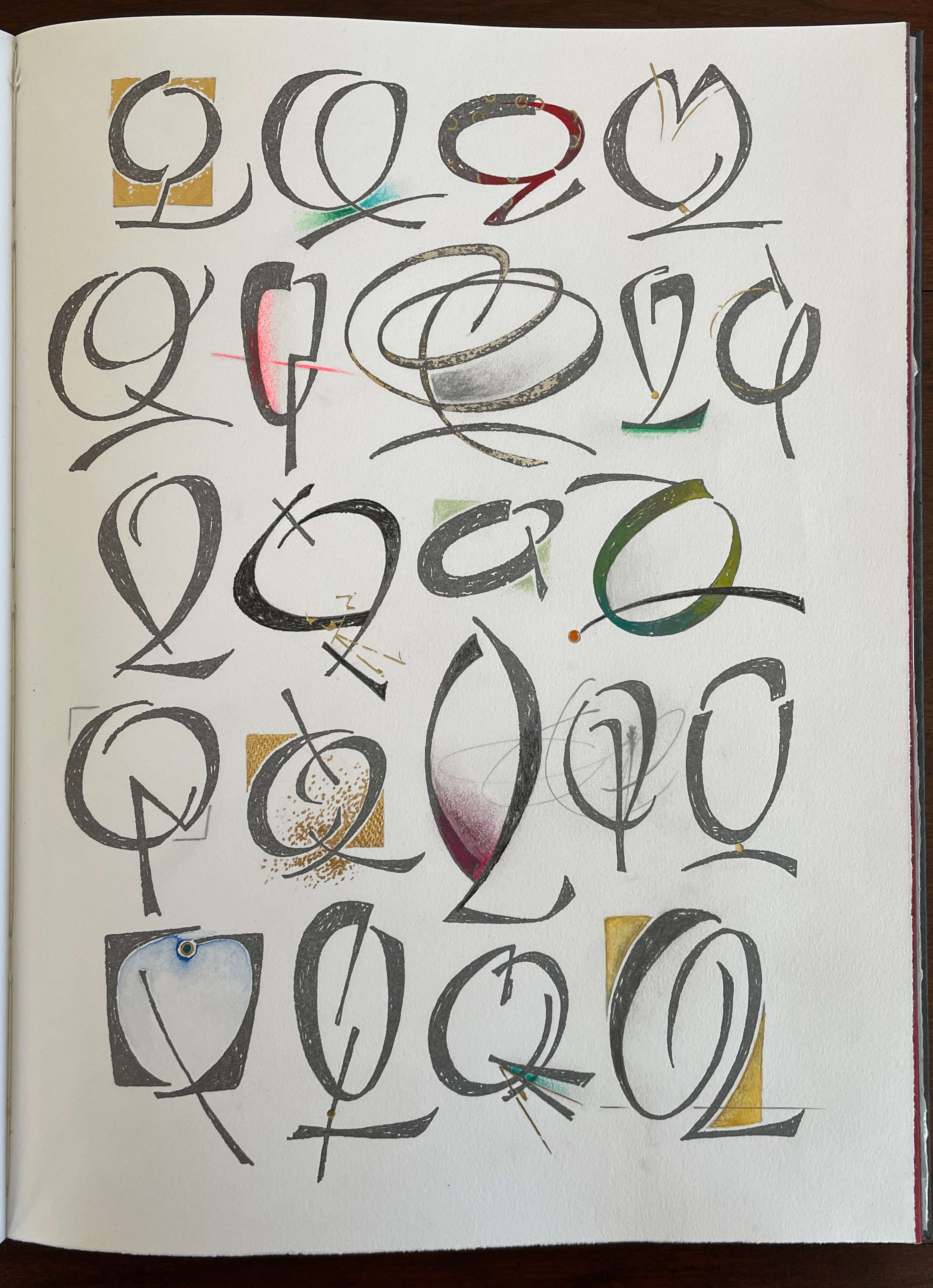
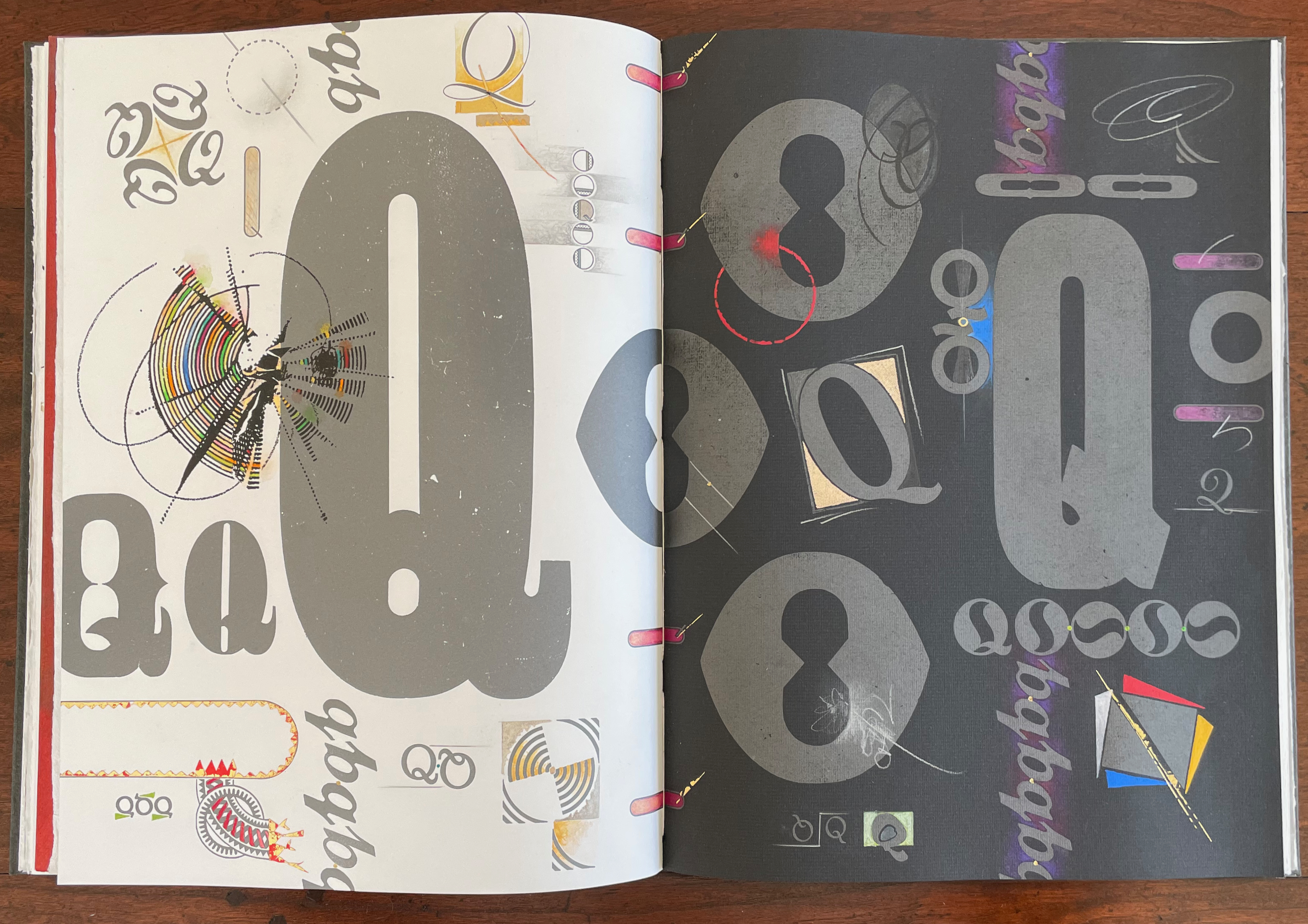
But Q will not remain captive for long because it is always asking questions. And, if we want answers, then as Rilke says, we must “live the questions now”.
For most readers though, the question that will be uppermost is “How did she do that?” Moore is quick in her generosity and would insist on amending that question to “How did they do that?” Consider the selection of paper. More than Arches (a laid paper with visible mesh and watermark) had to be considered for these interactions of ink, gouache, gold leaf, palladium, debossing/embossing by etching press and hand, cuts and overlays.
What notes, movements and rhythms were playing when these colors and the sequences were chosen?
How do they think of paper and ink in three dimensions?
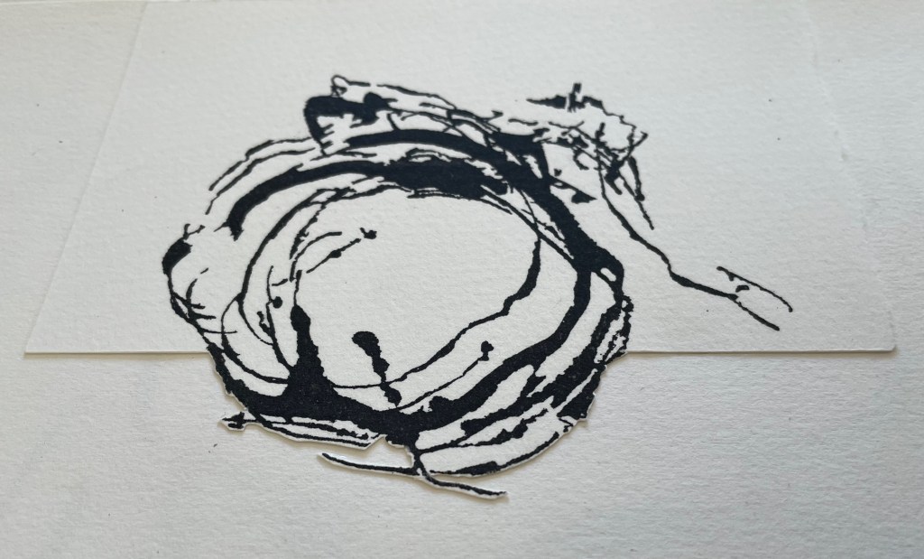
Who saw Q and questions in a bird’s nest?
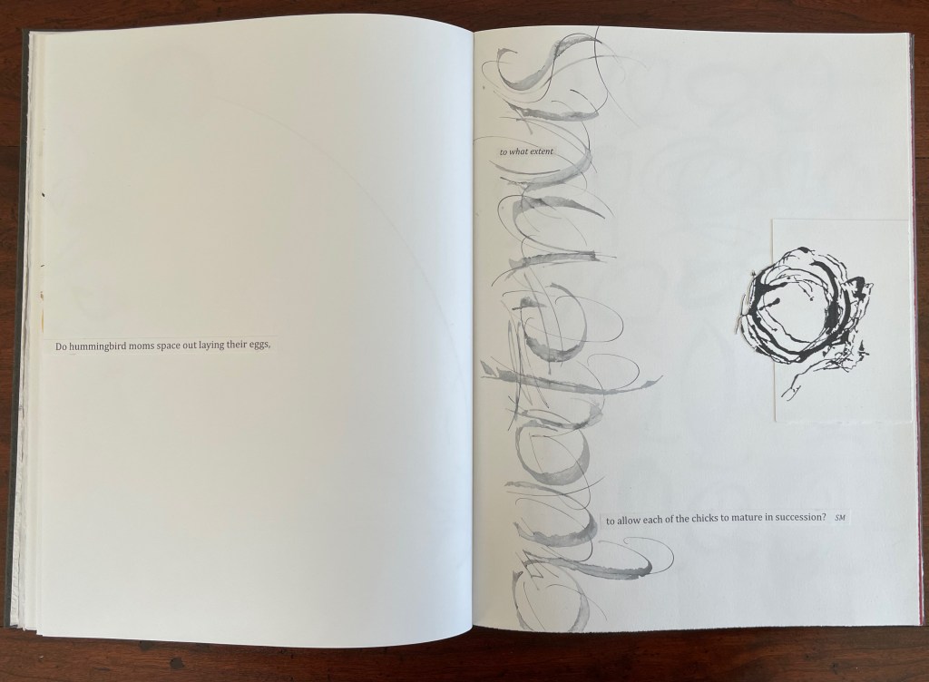
And someone’s memory called up Cave Alphabet paper for the endpapers.
The fact that Moore and her colleagues can do all that (and more) and the fact that their gentle and pointed questions fuse with the art ensure that Rescuing Q does and will succeed.
A Musings (2015)
A Musings (2015)
Suzanne Moore
Tab-insert portfolio around softcover book. H370 x W230 mm, 24 pages. Edition of 26 variants, of which this is N. Acquired from Abecedarian Gallery, 13 February 2022.
Photos: Books On Books Collection. Displayed with permission of Suzanne Moore.
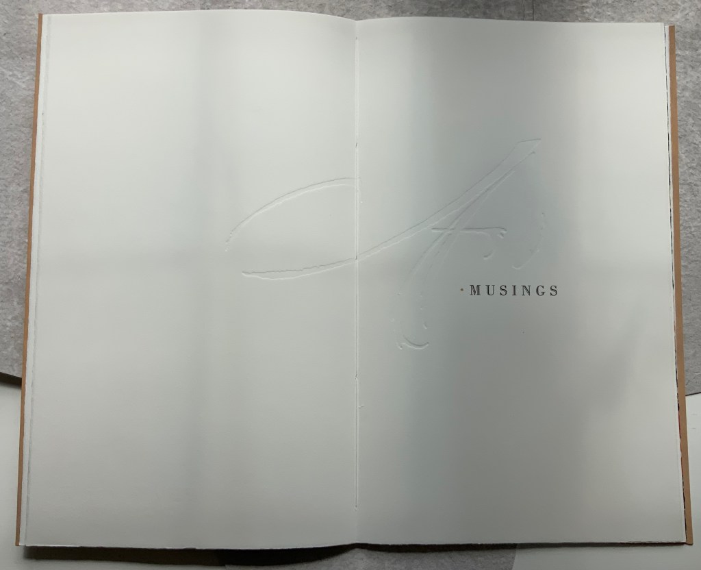
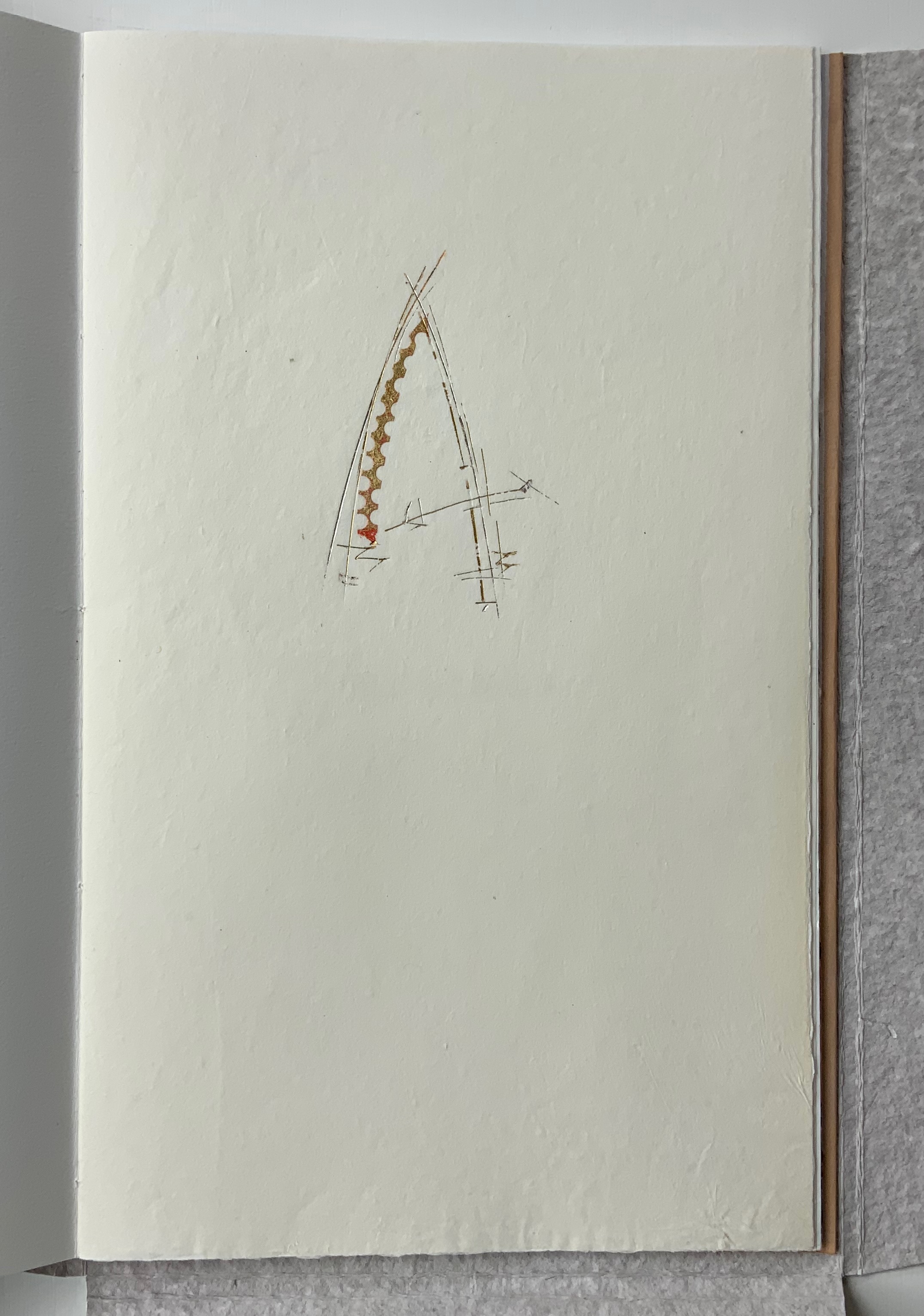
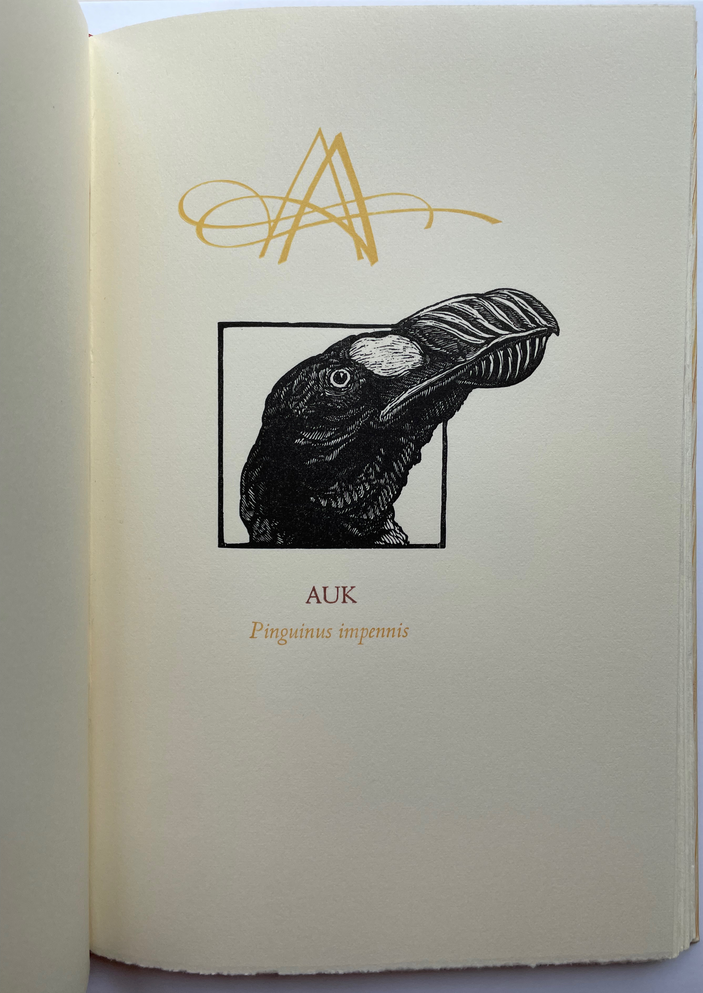
Title page
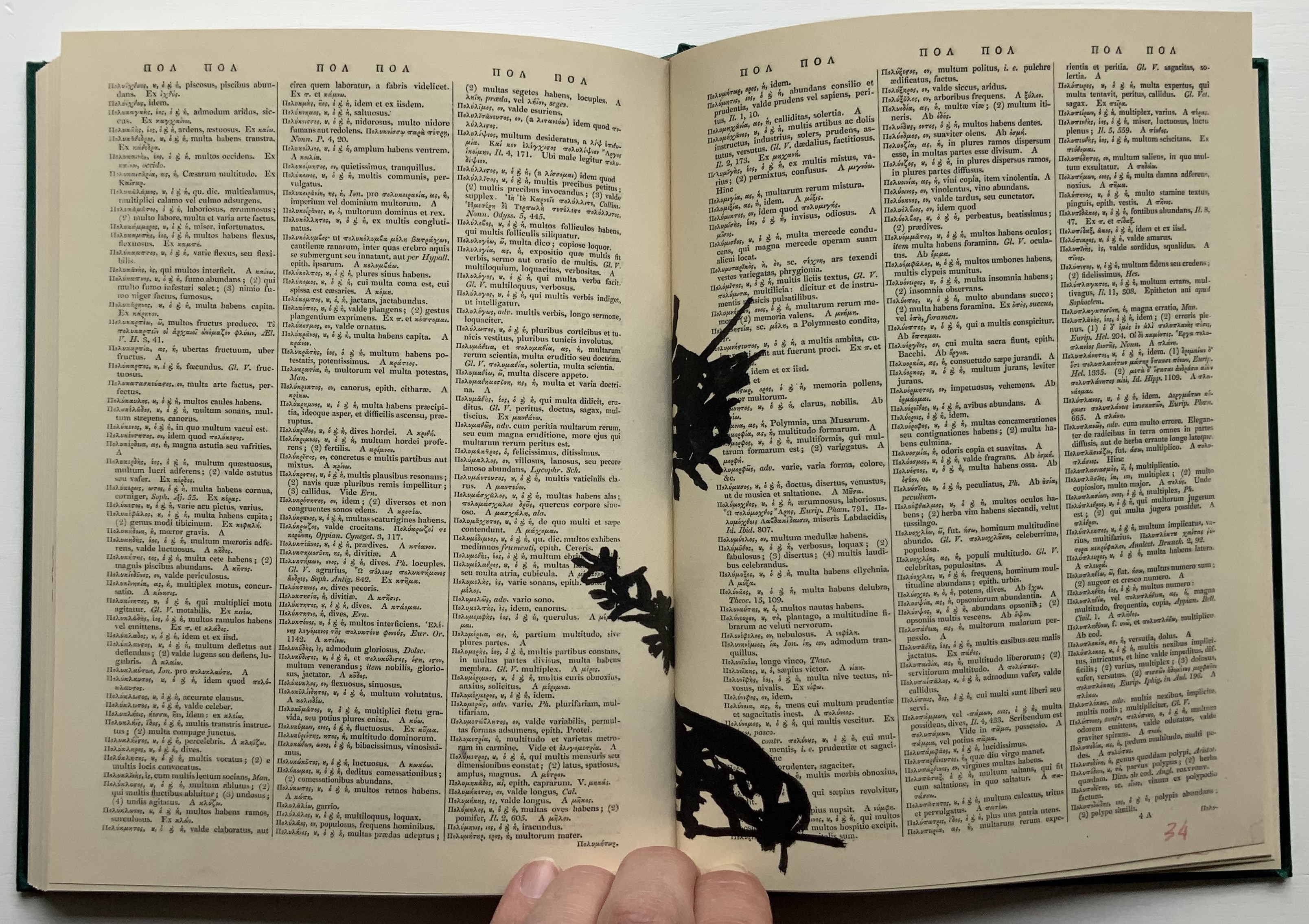
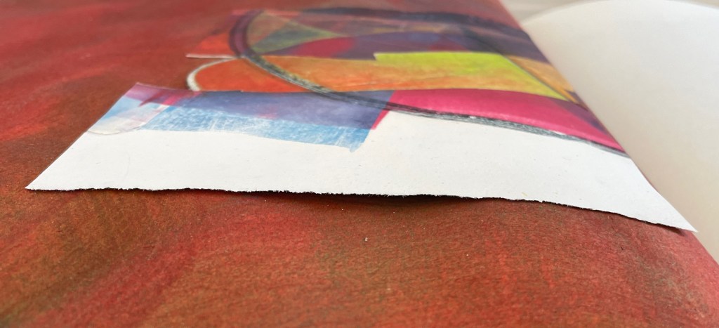
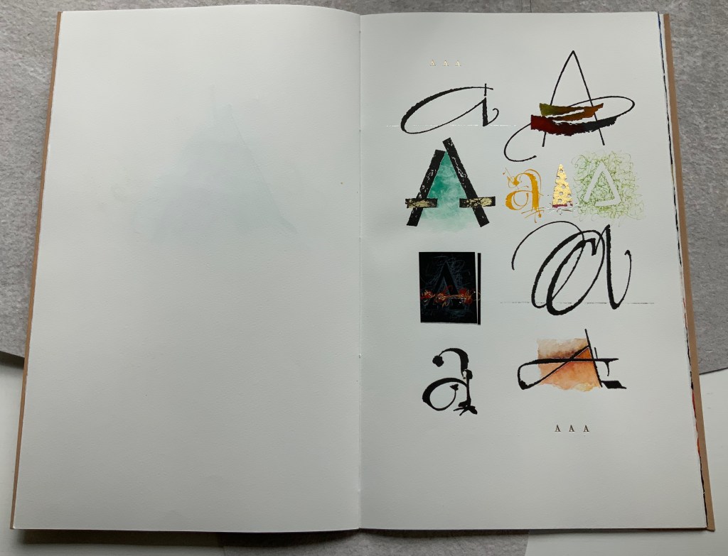
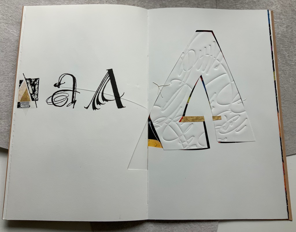
Another manuscript book, A Musings is an encounter between Suzanne Moore and the letter A, one of her 26 muses. As with any artist and muse, this naturally leads to portrayals of A in such varied positions, with such varied tools and techniques and such varied materials that the boxed and bound portfolio must take the amusing title A Musings. The muse finds itself posed across Magnani Aquaforte, Arches Text Wove, transparent kozo and other handmade papers enveloped by a stiffened, painted handmade paper. Moore’s musings fall on the historical, symbolic and spiritual aspects of the letter A with acrylic paint, pencil, freehand foil tooling, gold and palladium leaf, collage, debossing and embossing, sumi ink and gouache, sizing and varnish, monoprint, letterpress, folds and cutouts.
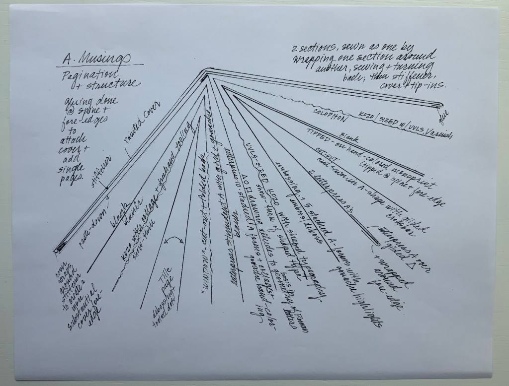
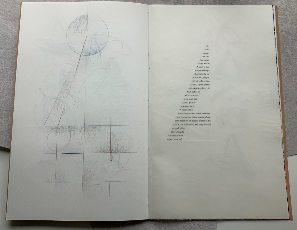
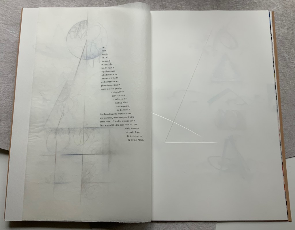
A separately provided copy of the artist’s plan for the pagination, structure and treatment per page offers a useful insight into the questions of how such a work is thought through and made. Page layout and the type of paper, in particular, play together sometimes like a clockwork mechanism and sometimes organically.
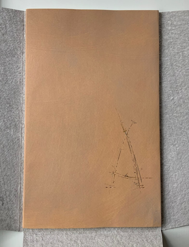
Painted cover
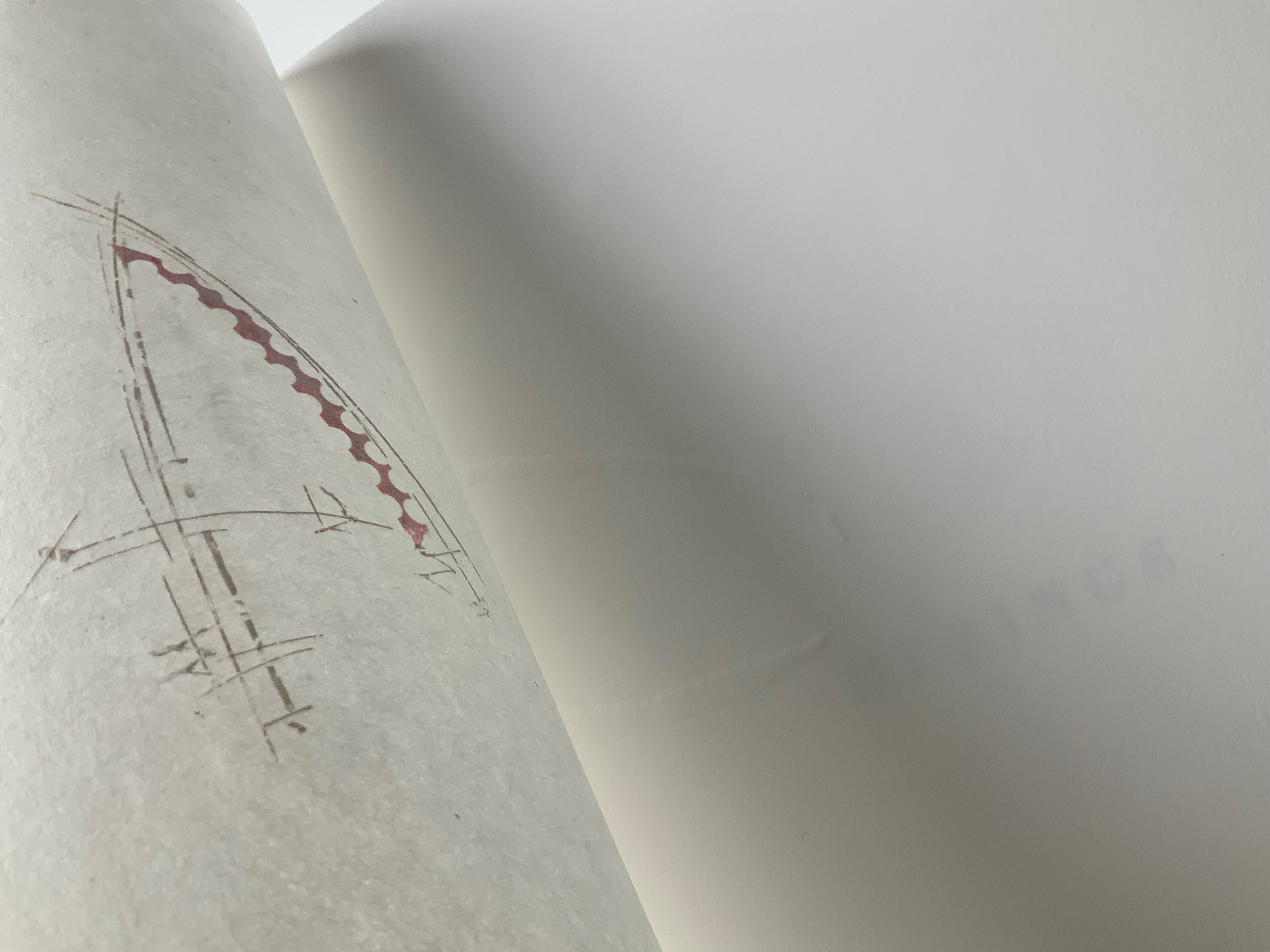
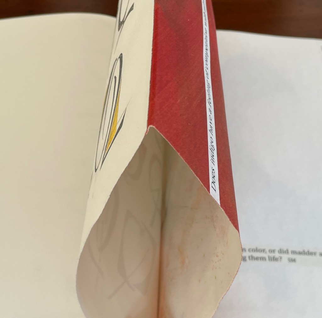
Left: Half-title. Right: Half-title turned to show translucency of kozo; note on the facing recto how the stroke from the debossed A on the title peeks through.
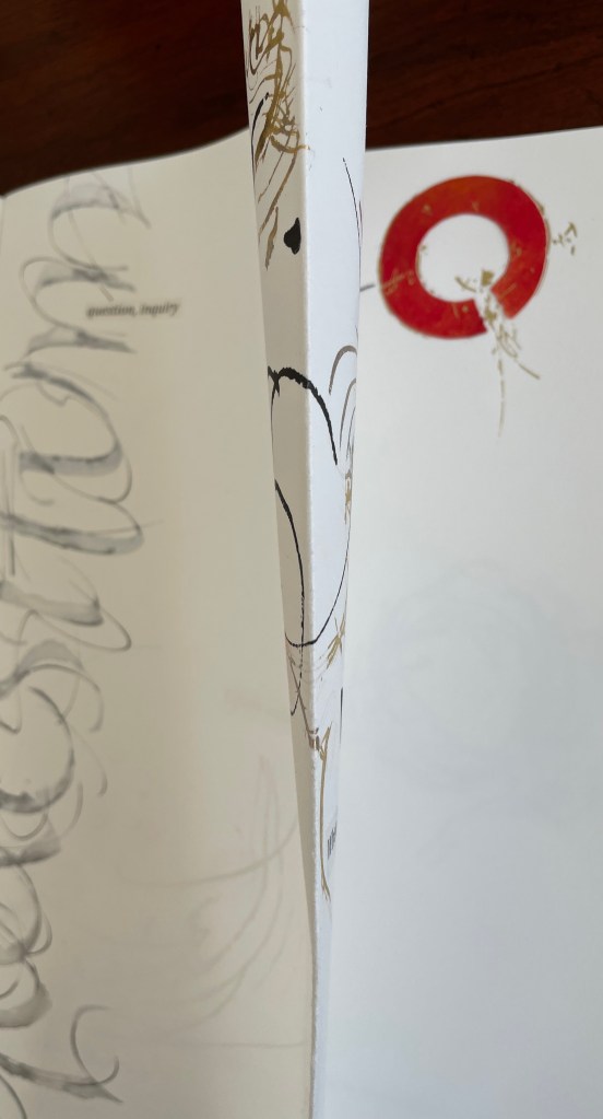
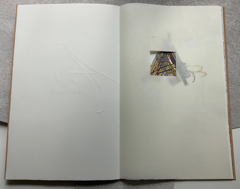
After the title page (see further above), the next double-page spread shows the title page’s debossed A in reverse on the verso page. Facing it is a square cutout through which multicolored lines forming overlapping As appear. Because the cutout page is translucent paper, we can see that the multicolored lines extend into a larger A on the next recto page. Turning the cutout page reveals that the cutout is actually a flap folded up and secured with white thread sewn in the shape of an A. This three-dimensionality of the flap is echoed by the way the crossbar swashes of the facing A seem to swirl around its two legs implying a spinning A.
From the single A interacting with a cutout, we move to a dozen evocations of the historic forms that the lowercase and uppercase A have taken. The lowercase “closed a” from the semi-uncial hand starting in the 5th century appears second down in the lefthand column, and the “perfected” Roman uppercase A appears at the bottom of the right column. Amusingly, some evocations blend periods of history. In the lower left, the drawing of a lowercase “open a”, which comes from the 8th century Carolingian miniscule hand, takes on the stylization of the 15th century’s bianchi girari (white-vine stem decoration). Just across from it, the stylized version of the Proto-Sinaitic (1700 BCE) form of aleph, meaning “ox”, has a burnt umber background that suggests markings in early cave dwellings.
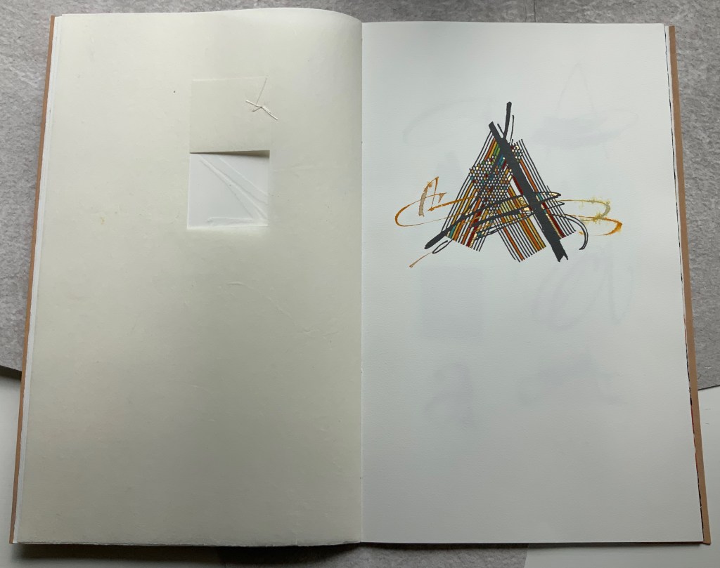
Using a translucent leaf with set type shaping half an A, the next two double-page spreads play (or muse) on uppercase A’s bilateral symmetry poised between geometric and freehand approaches to lettering, between typography and calligraphy and between inking and debossing.
When the recto page above with its debossed line and angle is turned, another extraordinary integration of composition, paper, printing (inking, debossing and “embossing”) and, now, cutting occurs. Notice how the ink of the first and third As overlaps the now “embossed” angle, how the now “embossed” line becomes debossed as it crosses the gutter, how the previous double-page spread’s themes of geometry/freehand, printing/drawing and lowercase/uppercase likewise cross over, and how the cutout triangle uses the yellow ink showing through to form the crossbar of an A and the gutter to form the A’s lefthand stem.
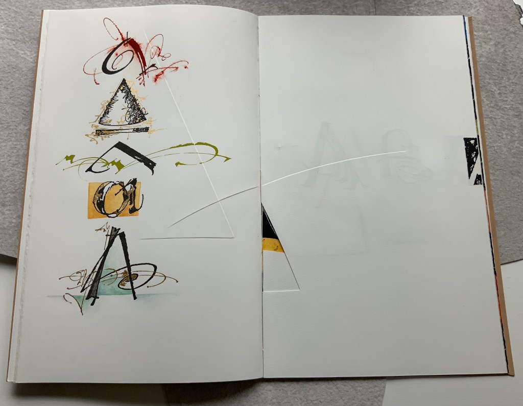
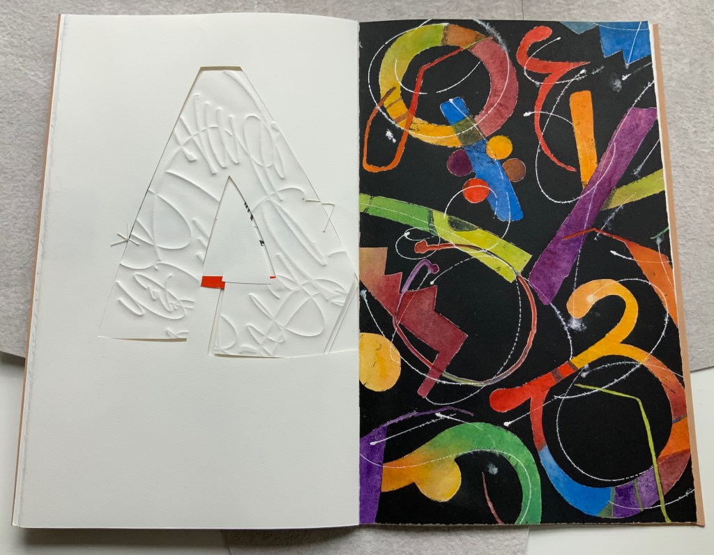
There is much else to muse upon in the spreads above, but it’s in the last two spreads where Moore builds and unfolds a fantasia of calligraphy, color, debossing, cutting, gilding and painting. Notice how the gilt crossbar slots through the page and helps secure the debossed piece behind the cutout to the page.
And when the page turns, notice how its gilt crossbar reveals its red paper beneath and becomes the spot of red completing the crossbar for the cutout A. The red spot against white seems to set off the explosion of color and calligraphy on the black final page, printed by Jessica Spring from polymer. The different shapes for A here come from African alphabets. The images are unique monoprints, done on an etching press. With the letters placed to block out the black and overlap one another, a sense of depth and texture arises. Contributing to that sense of texture, the white letters are hand-painted in gouache — sometimes layered, sometimes blended.
Books are inherently collaborative affairs, and for artists’ books, collaboration can become almost another tool for the artist. Jessica Spring, mentioned above, also debossed the opening A, hand-set the half-A composition and contributed to Rescuing Q. Now a fine binder in her own right, Gabby Cooksey, a studio assistant to Moore and Don Glaister, was essential to A Musing‘s hand work, binding and wrapper. Part of Moore’s creative progression from contributing to overseeing to orchestrating can be traced from here across three other works in the Books On Books Collection.
A Blind Alphabet (1986)
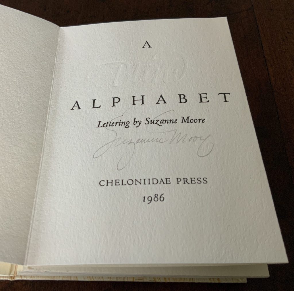
A Blind Alphabet (1986)
Suzanne Moore
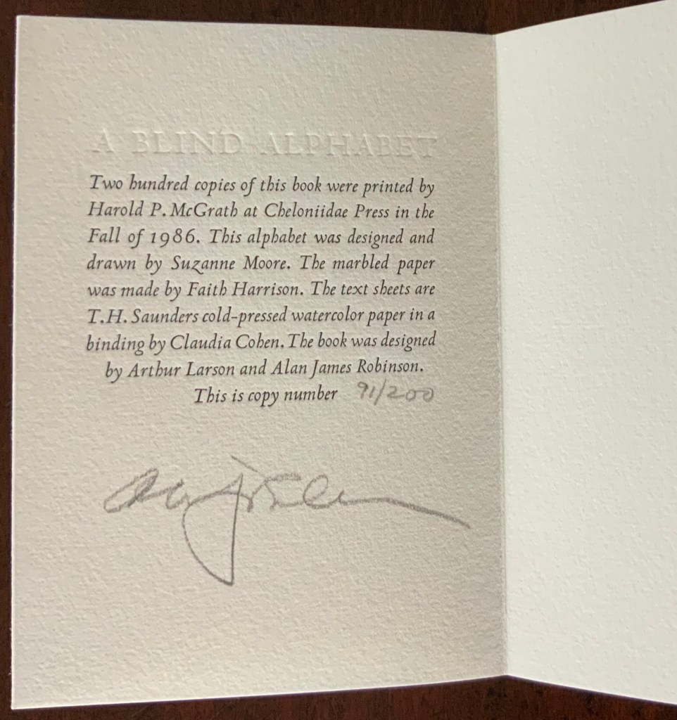
Accordion-fold. Closed H128 x W93 D28 (spine) D22 (fore-edge) mm; open 3200 mm. 34 pages. Edition of 200 of which this is #91.
Calligraphic letters designed and drawn by Suzanne Moore, printed by Harold McGrath on T.H. Saunders cold-pressed watercolour paper, bound by Claudia Cohen in marbled paper by Faith Harrison.
Acquired from Veatchs, 1 May 2018.
Here, as noted in the colophon to A Blind Alphabet, Moore has the creative role of originating artist, designing and drawing the alphabet — soloist, as it were, in the Cheloniidae Press reportory orchestrated by Alan James Robinson.
In Robinson’s wood engravings of birds, Moore plays a creative contributing role with much the same repertory company.
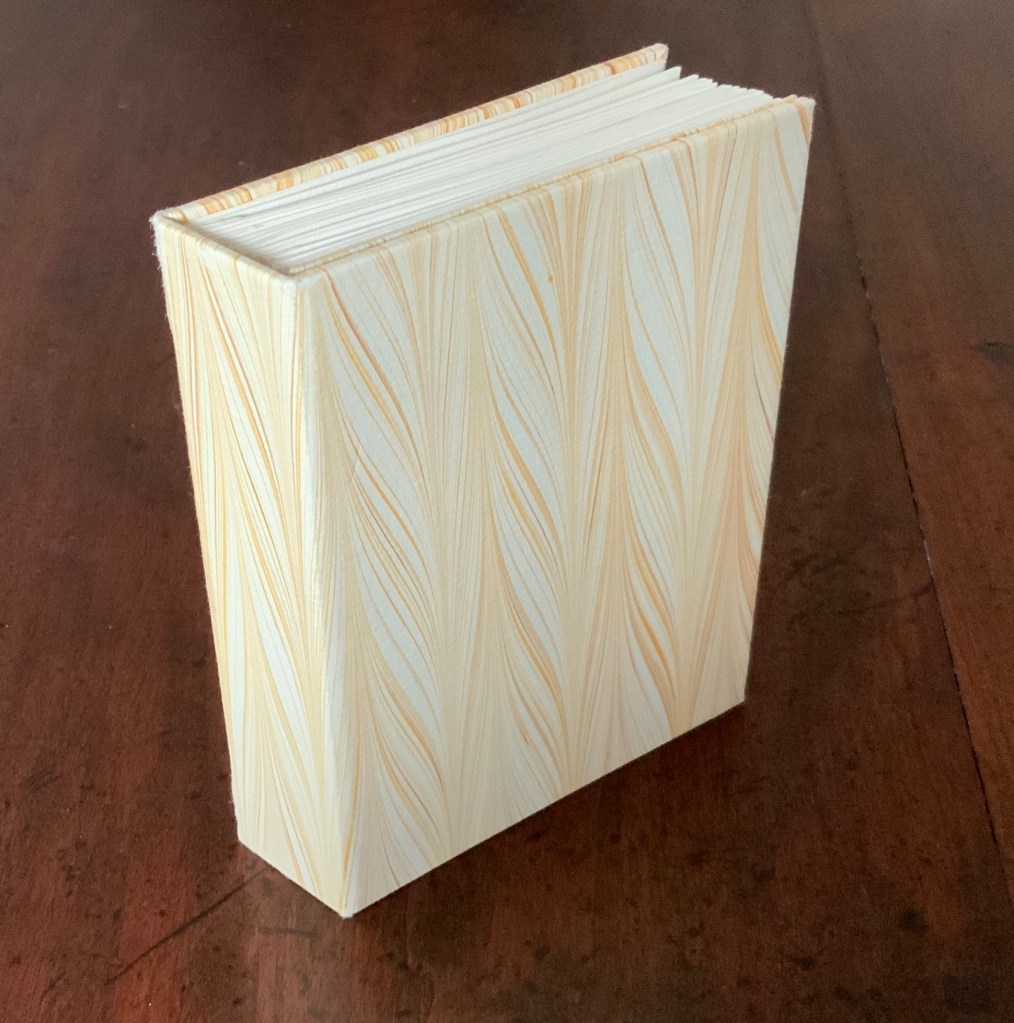
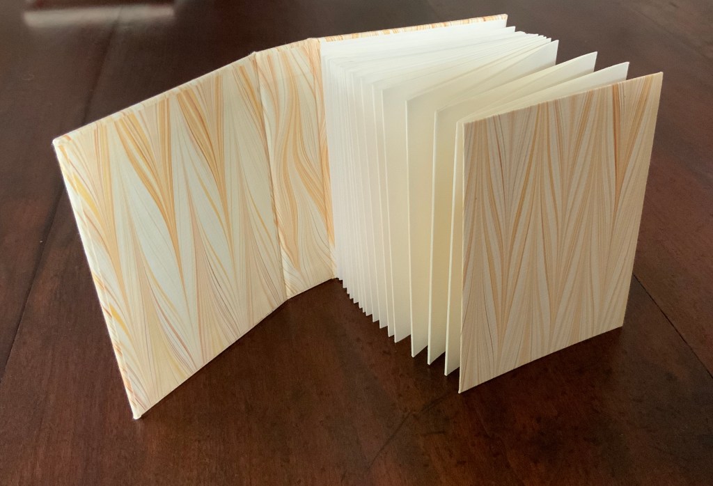
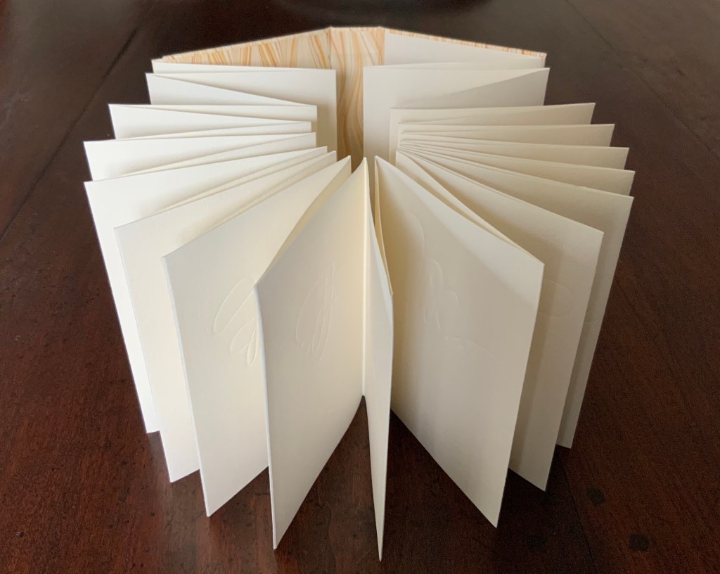
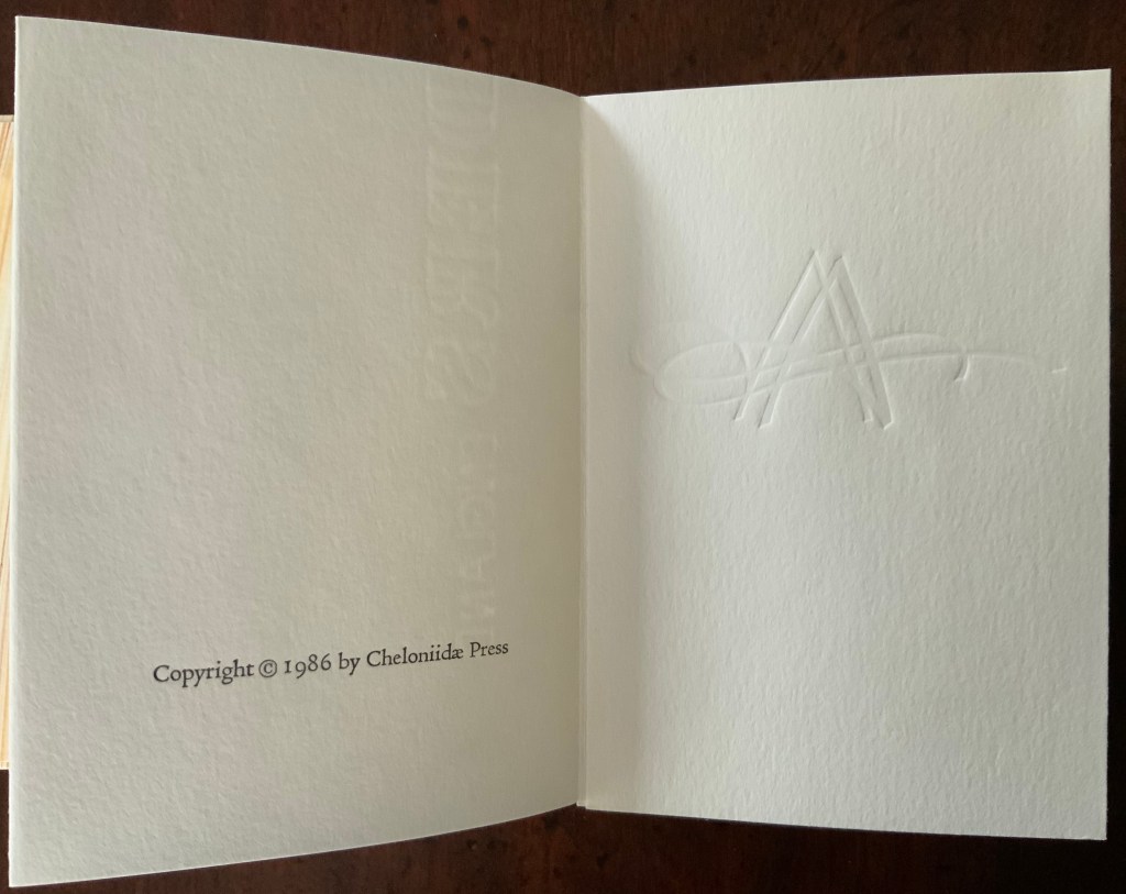
A Fowl Alphabet (1986)
A Fowl Alphabet (1986)
Alan James Robinson (etchings), Suzanne Moore(calligraphy)
Casebound. Marbled paper over boards. Doublures and flyleaves. H218 x W145 mm. 26 Folios untrimmed at head. Four-page prospectus loose. Acquired from Bromers Bookseller, 16 August 2022.
Photos: Books On Books Collection. Displayed with Suzanne Moore’s permission.
Again, Cheloniidae Press’ master printer Harold Patrick McGrath and “usual suspects” Arthur Larson (hand typesetting), Faith Harrison (hand marbling) and Claudia Cohen (binding) played their roles in this book. Here, Moore has the creative contributing role of designing the alphabet and, for the deluxe and full vellum editions (not shown), hand lettering.
In book art, an artist’s progression from contributor to orchestrator is not necessarily linear as can be seen in this subsequent work.
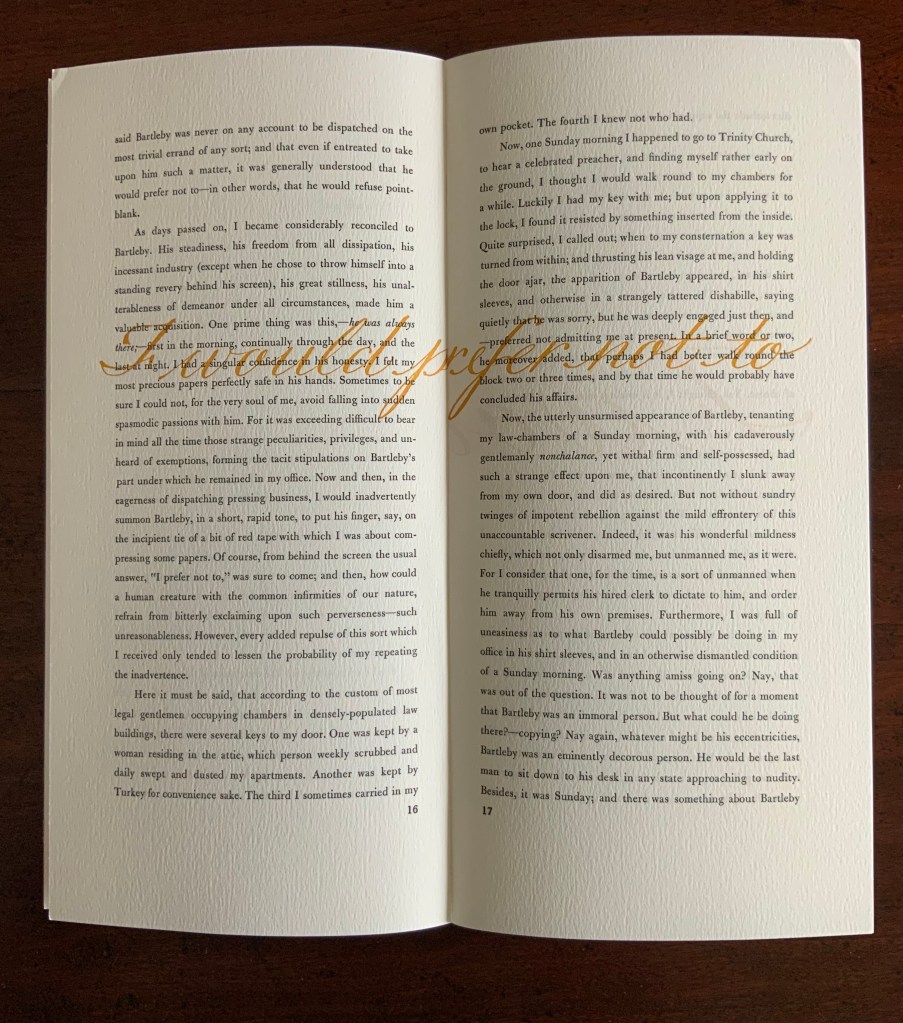
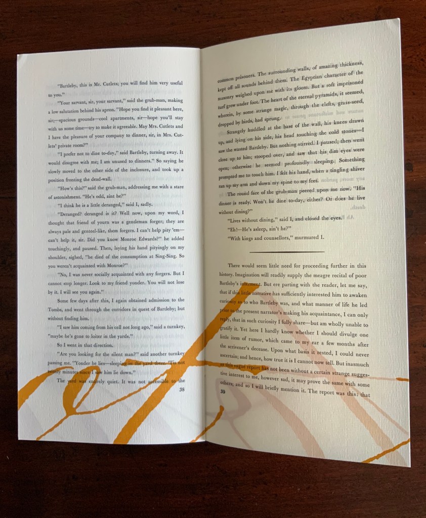
Bartleby, The Scrivener: A Story of Wall Street (1995)
Herman Melville, Bartleby the Scrivener: A Tale of Wall Street, 1853. Indulgence Press, 1995.
Typeetting, printing and binding by Wilber Schilling; Calligraphy by Suzanne Moore. Text paper by Janus Press. Endpapers by MacGregor & Vinzani.
Edition of 100 of which this is #71. H320 x W158 x D14 mm. Acquired from Indulgence Press, 17 December 2015.
Photos: Books On Books Collection. Displayed with permission of the publisher.
Wilber Schilling (Indulgence Press) orchestrated this edition of Herman Melville’s well-known story. Part of Schilling’s genius was to invite Moore to provide the calligraphy for Bartleby’s hallmark (his only) words “I prefer not to”. Another part was to print Moore’s calligraphy in ever-increasing size in ghostly ochre and in descending position across the pages of the book.
For more of Suzanne Moore’s works and artistic roles as well as others’ insight into them, see below.
Further Reading and Viewing
“ABCs“. 29 November 2015. Bookmarking Book Art.
“Abecedaries I (in progress)“. Books On Books Collection.
“Alan James Robinson“. Books On Books Collection. In progress.
“Wilber Schilling“. 23 November 2015. Books On Books Collection.
Gwinn, Mary Ann. “Vashon artist among those who worked on handmade St. John’s Bible”. Seattle Times, 24 December 2014. Accessed 13 January 2020.
Hayden, Danielle. “Meet the Vashon Island Artist Keeping Lettering Alive”. Seattle Magazine, July 2018. Accessed 13 January 2020.
Moore, Suzanne. 2016. Studies in Love the Question. Handlettered pages in book bound by the artist. 34 images available at Letterform Archives.
______________. 2014. Zero – Cypher of Infinity. 24-page handlettered pages in book bound by the artist. Letterpress pages by Jessica Spring. 20 images available at Letterform Archives.
______________. 2014. Origins and Spectrum. Process portfolio for Zero — Cypher of Infinity. Includes notes from the artist. 28 images available at Letterform Archives.
Yin, Joyce. “From the Collection: Thomas Ingmire, Susan Skarsgard, Suzanne Moore“. Letterforms Archive, 29 March 2018. Accessed 13 January 2020.