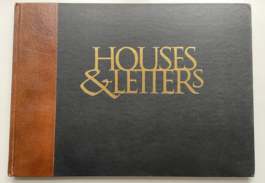
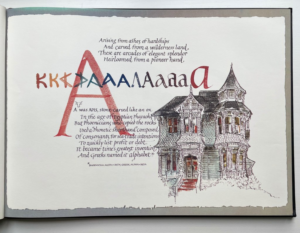
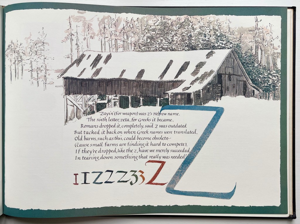
Architecture-inspired artists’ books and artists’ books inspired by alphabets make up two separate strands of the Books On Books Collection. Along with Sacred Space by Jeffrey Morin and Steven Ferlauto, Lanore Cady’s Houses & Letters is one of the rare works that weave them together, joining the beauty of form in architecture with the beauty of letterforms. With her calligraphy, verse and watercolors of Victorian structures of Humboldt County, California, Cady presents her audience with a history of the alphabet from the proto-Sinaitic to the Roman/Carolingian that ultimately argues for the historical preservation of the buildings depicted.
The house depicted with letter A is the “Graham House”. In notes at the end of the book, Cady provides this brief note about it:
Frank Graham came to Humboldt from the southeastern provinces of Canada and the Maine woods to become a giant in lumbering and other local industries. He was married to Martha Montgomery, direct descendant of the Lees of Virginia. Built at the end of Ninth Street in Arcata, California, in 1885, their house is one of the few landmarks that has remained unaltered since its construction. It boasts five different shingle shapes, hand-carved arches, embellished redwood burl and curly redwood.
The structure accompanying the letter Z is “Robert’s Barn”:
This “Humboldt-type barn,” over 100 years old, is typical of the barns on fine ranches in this dairying-ranching country. It is on the Mel-May Ranch (so named for Melvin and May Roberts), Bayside Road, Arcata. Years ago it was “moved back” 125 feet away from the road.
Further Reading
“Lanore C. Cady“. 9 February 2011. Times-Standard. Humboldt County, California. Accessed 1 August 2022.
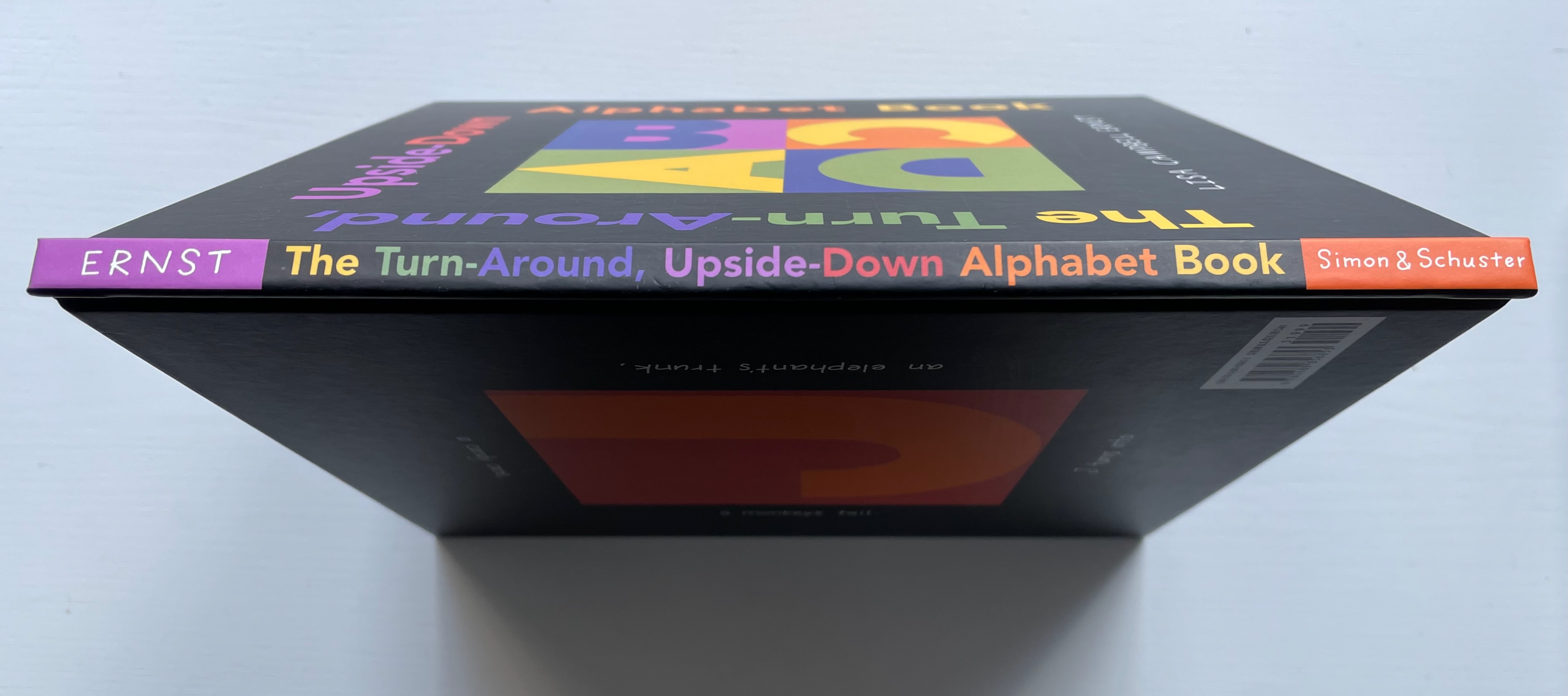
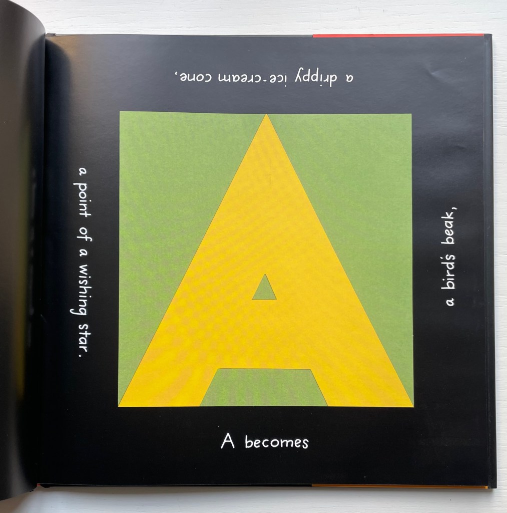
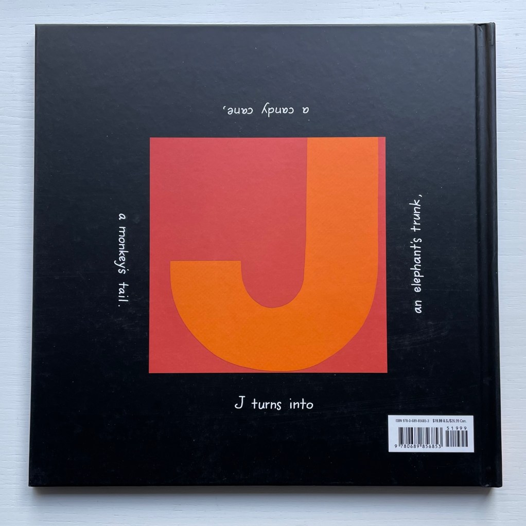
From children’s picture book to artist’s book and back, certain techniques and tropes with the alphabet recur. Finding an image in a letter or making an image from a letter may be the oldest, not surprising given the pictorial origins of almost all writing systems. Lisa Campbell Ernst freshened this approach with a structural twist that does not rely on pop-ups, flaps, pull-tabs, a volvelle, accordion tunnel or any of the other moving part standbys of children’s books. Rather the whole book moves — as its title suggests.
Two non-alphabetic predecessors to this book are Katsumi Komagata’s Walk & Look and Go Around (1992). Ernst’s inventiveness with foreground, background and negative space holds its own in the illustrious company of illustrators, designers and artists below under Further Reading.
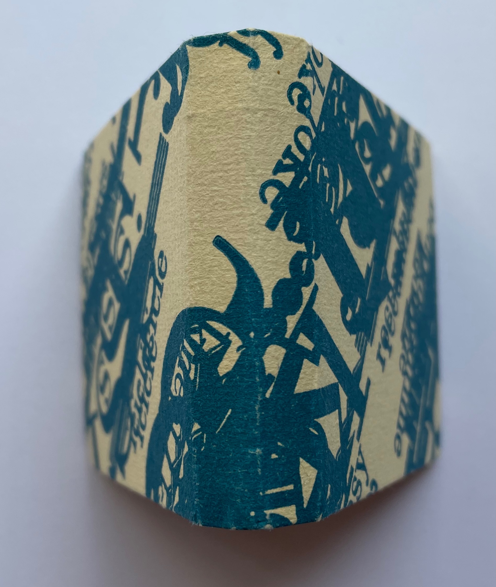
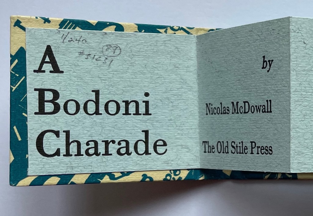
A Bodoni Charade (1995) Nicolas McDowall Miniature accordion attached to paper over boards. H59 x W67 mm. 32 panels. Edition of 240, of which this is #1. Acquired from Bromers Bookseller, 16 August 2022. Photos: Books On Books Collection.
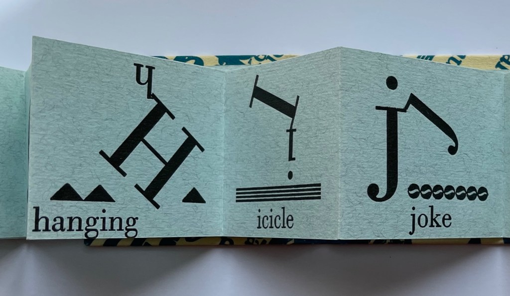
A Bodoni Charade expresses a rare wit with 26 imaginative and original unions of letters, decorative type, text and images. The accordion joined to the front and back covers discourages stretching it out for reading and encourages turning the pages codex style. Just as well — the jokes should be savored no more than two at a time, and enjoying the execution of letterpress skill demands it. Notice how the letter g’s descenders kiss the bottom edge of the page as if they are about to fall into space. Glance — or look hard — at the icicle, and you will swear that the lowercase i’s dot is actually dripping. And enjoy how the lowercase j demotes the judgmental uppercase letter J by sharing its jester’s cap bobble.
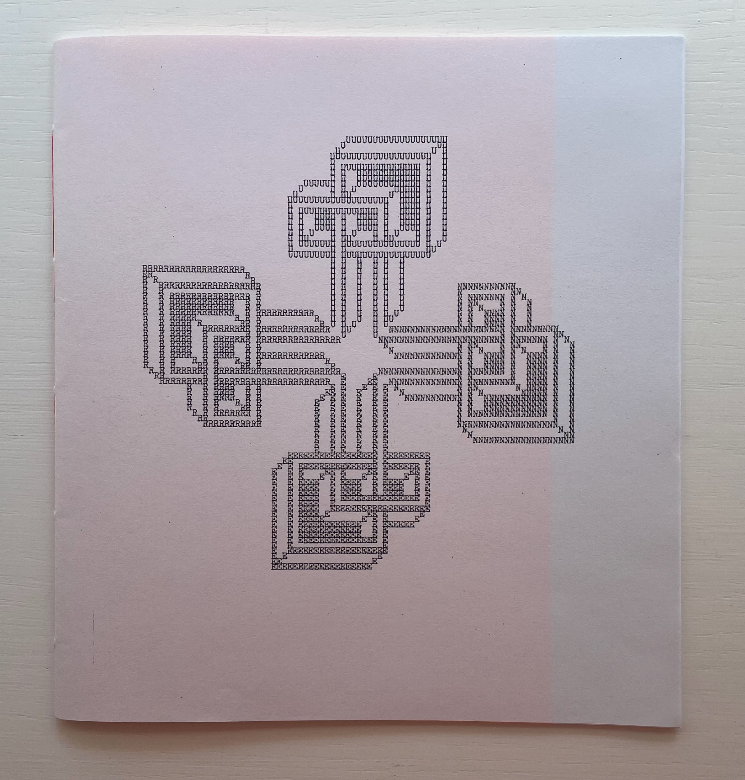
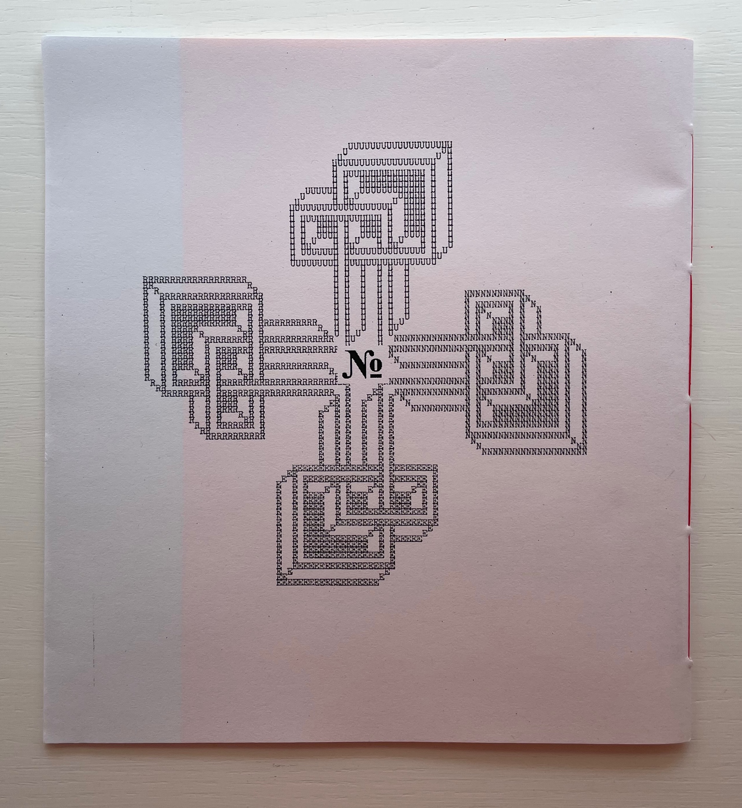
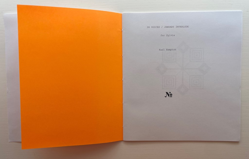
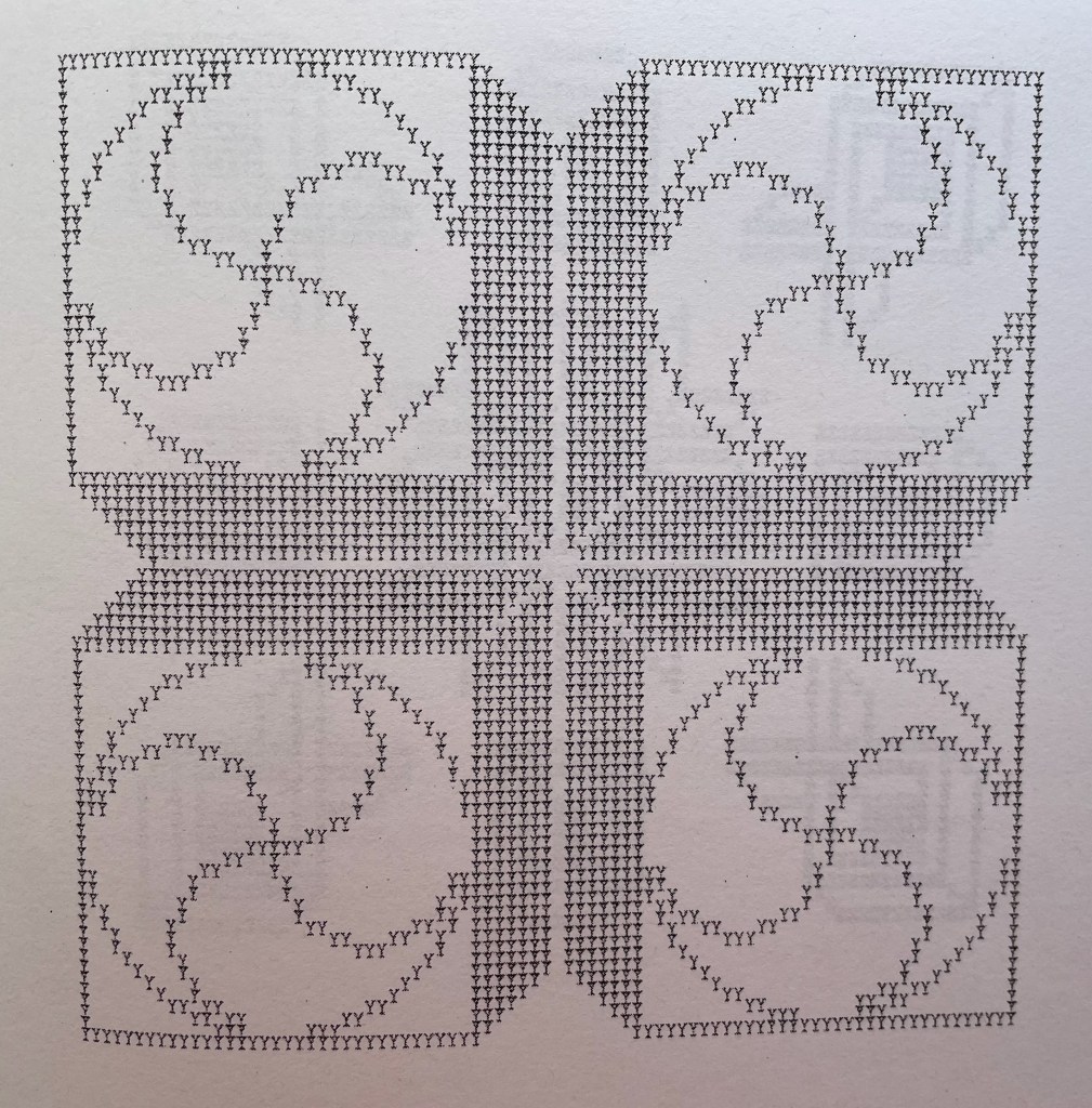
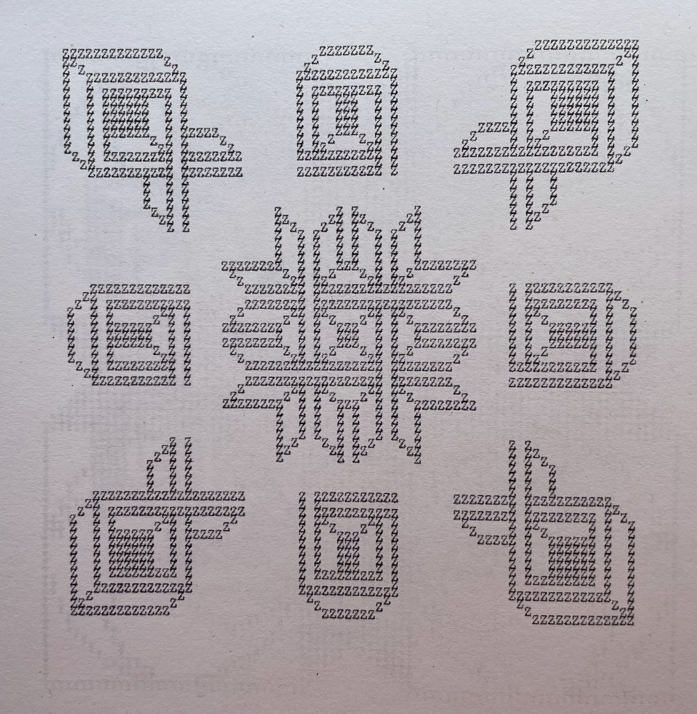
26 Voices / January Interlude (2020) Karl Kempton Sewn booklet. H190 x W177 mm. 28 pages. Edition of 60 unnumbered. Acquired from Derek Beaulieu, 4 January 2021. Photos of the work: Books On Books Collection. Displayed with permission of the artist.
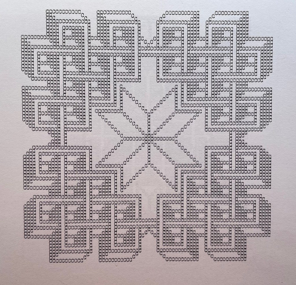
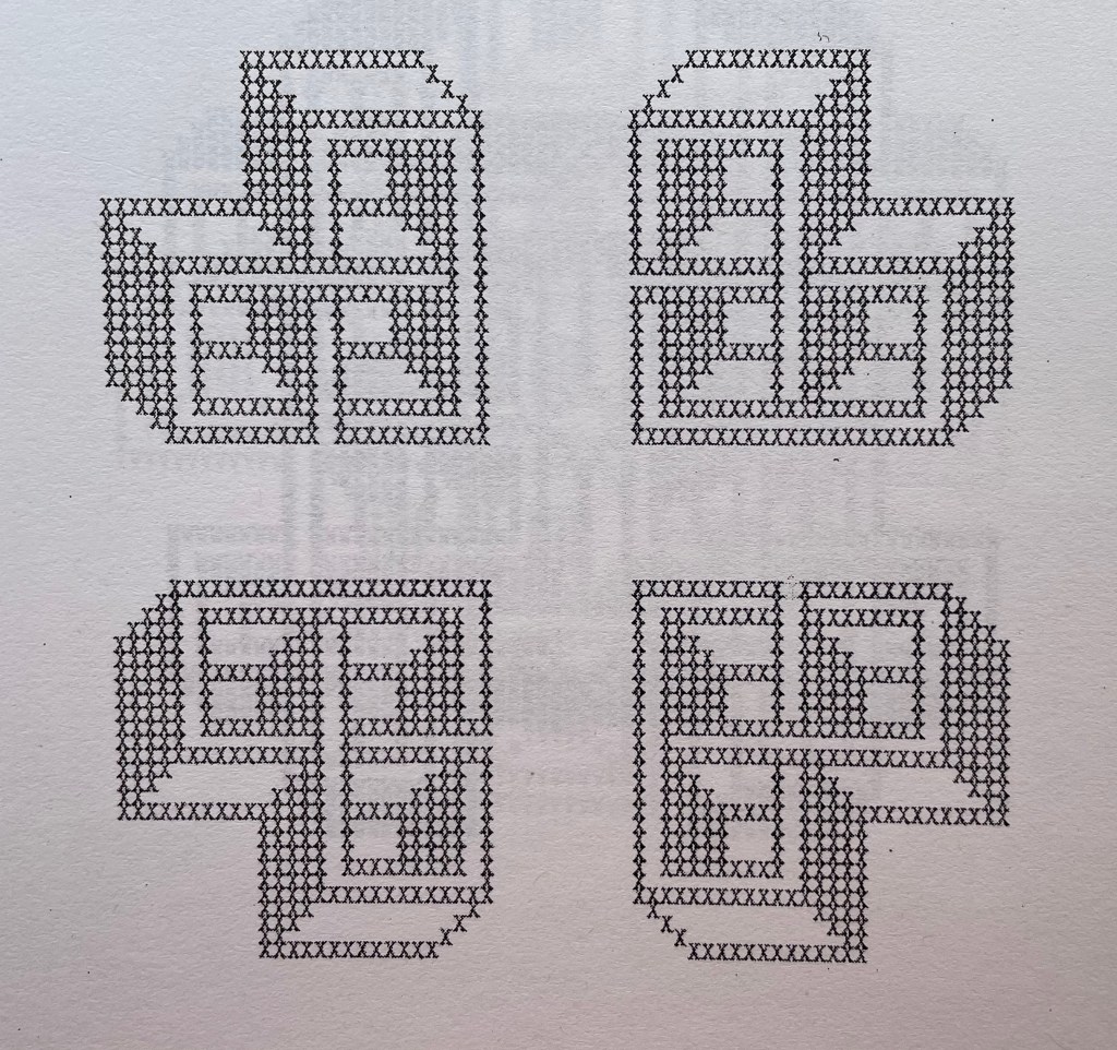
Derek Beaulieu deserves a vote of thanks for bringing this work back into print, even if for a limited edition. 26 Voices / January Interlude first appeared under the title Rune 2: 26 voices/ january interlude as number 10 in Robert Caldwell’s Typewriter series, published by Bird in the Bush Press (1980). In the Acknowledgements, Kempton writes that the series “was composed in January, 1978 in 28 days. After the letter K the flow stopped until a dream of L’s form arrived unblocking the flow”.
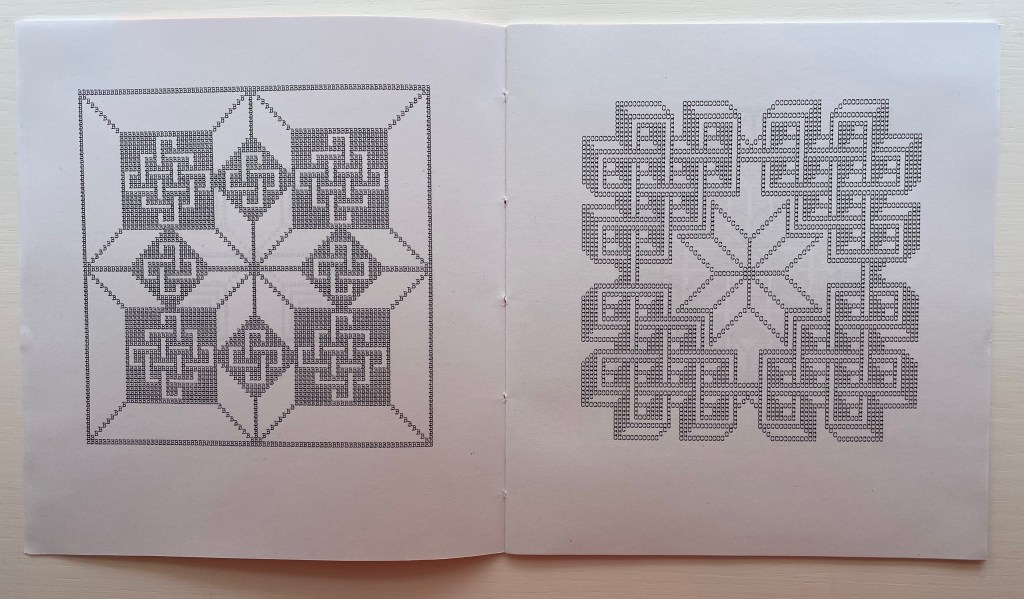
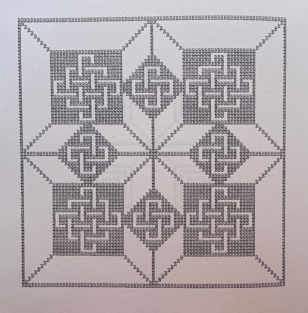
The series of patterns, each made from an upper case letter of the alphabet typed over and over, range in appearance — some like Amish quilts, some like Byzantine rugs, some like Celtic knots, but like snowflakes, no two alike. Given how some pairs of letters are mirror images of each other (bd, pq) or inverse (bp, dq), you would expect some close affinity in their two patterns, but no. No pairs of those patterns look at all alike. You would also be mistaken to expect a pattern to reflect the letter that constitutes it. Instead, you find one pattern resembling the letter X, but it is made of letter U’s. There are naturally some similarities between patterns at the broadest level — E and N, L and M or R and S — but these have little to do with the letters themselves, and the similarity recedes as details come to the fore or falls into the background with illusory three dimensionality. The shapes are not rune like, but individually and sequentially, they have the associative dream-like qualities of runes.
A close up
Double-page spread B&C
B close up
C close up
Center double-page spread N&O
Double-page spread X&Y
X close up
Y close up
Z close up
Actual runes appear in the following work, similarly in black and white and with similarly illusory three dimensionality. Not technically in the Books On Books Collection, playground (2013-14) can be found online. Surprisingly, it has not been in print.
playground (2013-14)
playground (2013-14) karl kempton Online, 78 pages (screens). Accessed 7 August 2022. Screenshots reproduced with permission.
What an opportunity for collaborators to join with Kempton to produce playground in different editions varying in color (black and white, red and white, green and white, blue and white, etc.), in paper (handmade, watercolor, washi, high gloss, matte, etc.) and in binding (accordion, stab binding, case bound, scroll, etc.). Perhaps such an extravaganza is not in keeping with Kempton’s style and approach over the years, but this playground is such an invitation to play.
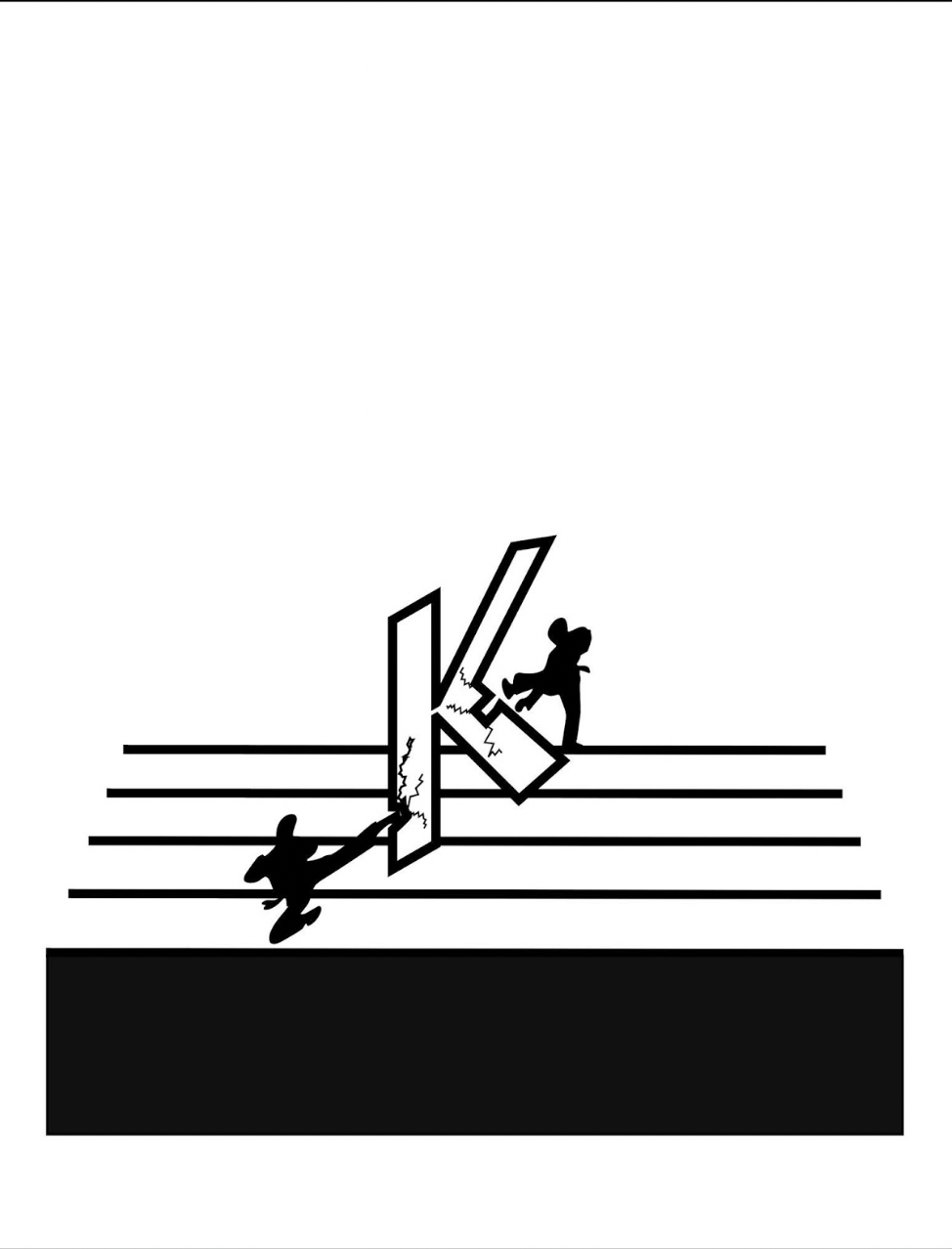
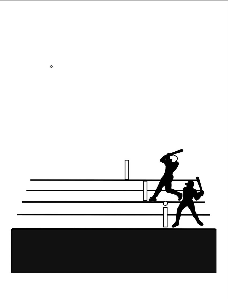
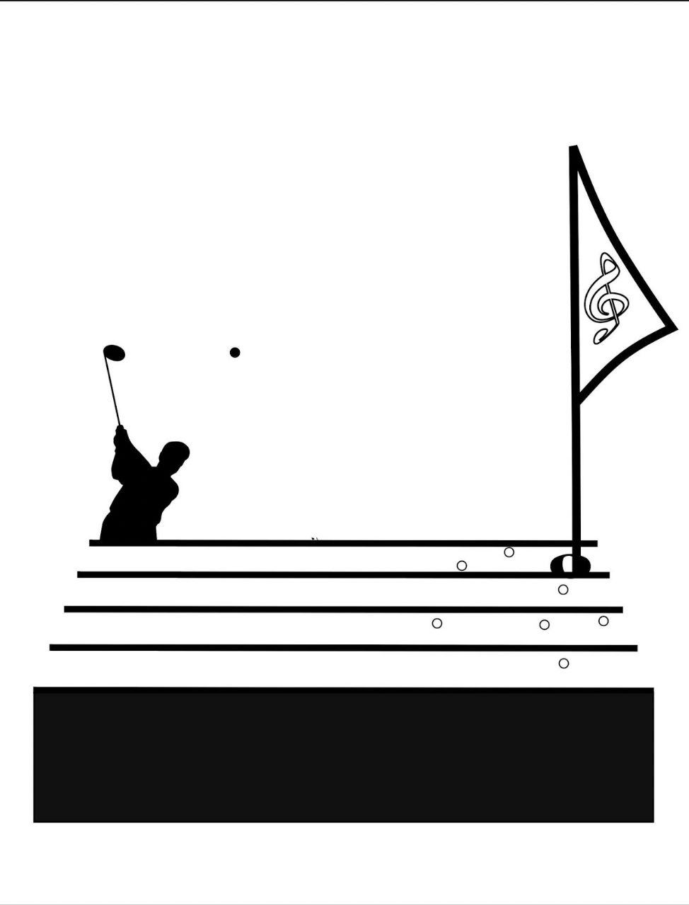
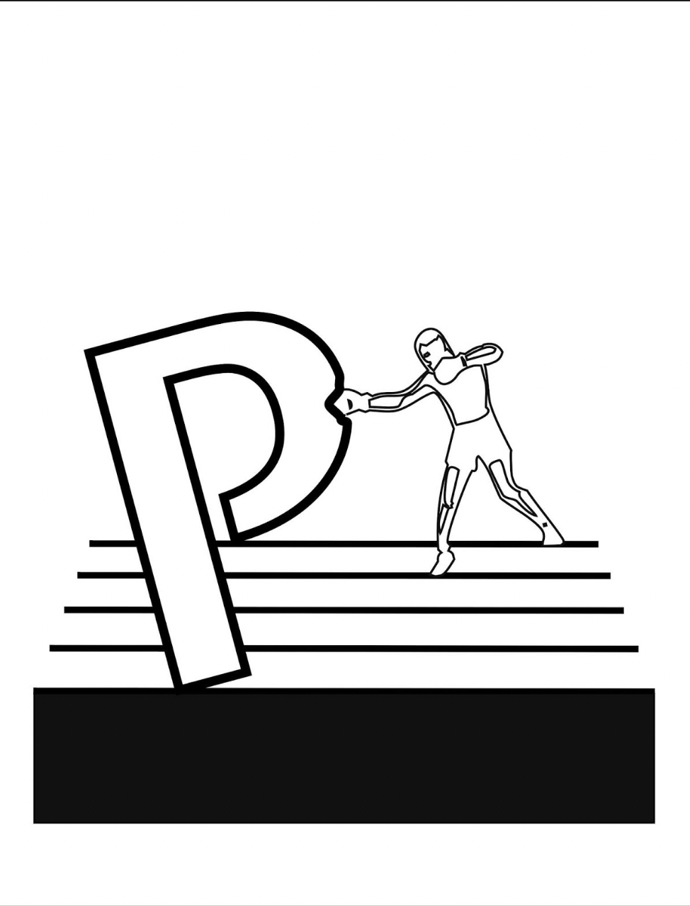
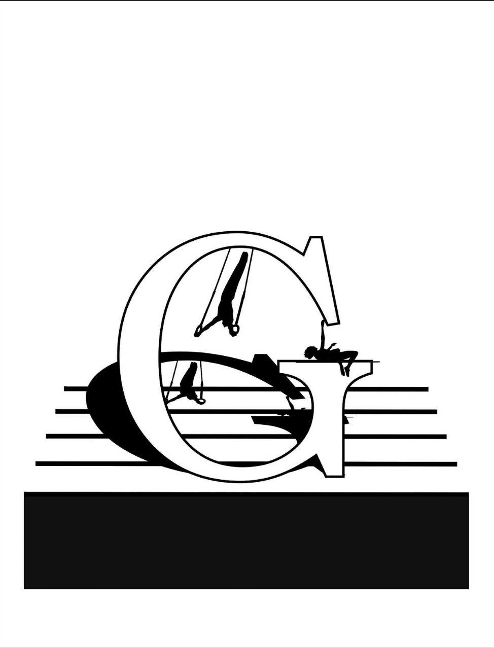
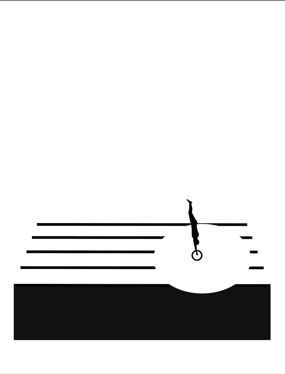
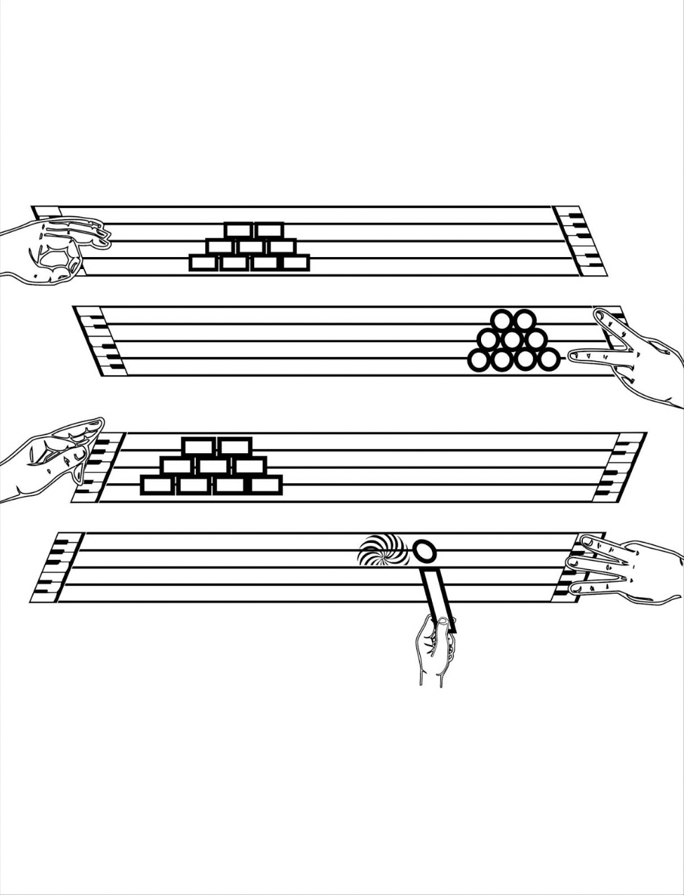
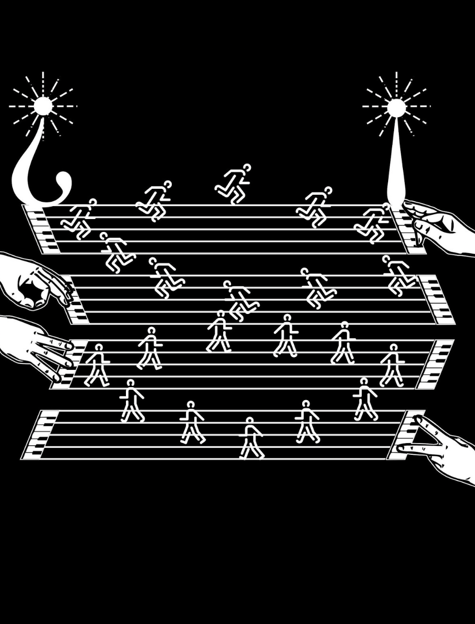
Games and sports are depicted together with letters and punctuation marks on platforms made of the musical staff or stave, all of which offer Kempton multiple means of metaphor. FIrst, inked martial arts figures break a K of karate boards. Then, a baseball player bats the dot of a lowercase i into the air. A basketball player jumps and aims at a basket formed of a half note. A golfer chips toward a half-note hole flagged with a pennant bearing the treble clef G. A boxer punches the bowl of a large P.
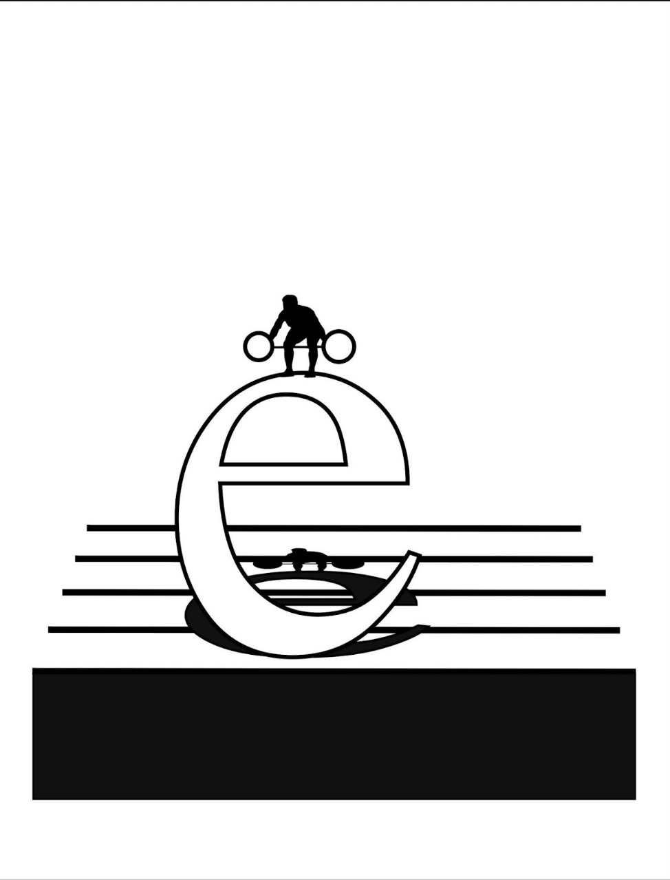
The images become more worked as the book proceeds. A weightlifter atop a lowercase e lifts a set of weights composed of the umlaut above the e, and the shadow of the image is cast across the stave lines behind the letter. Shadows of gymnasts appear behind an uppercase G, lowercase o and lowercase i.
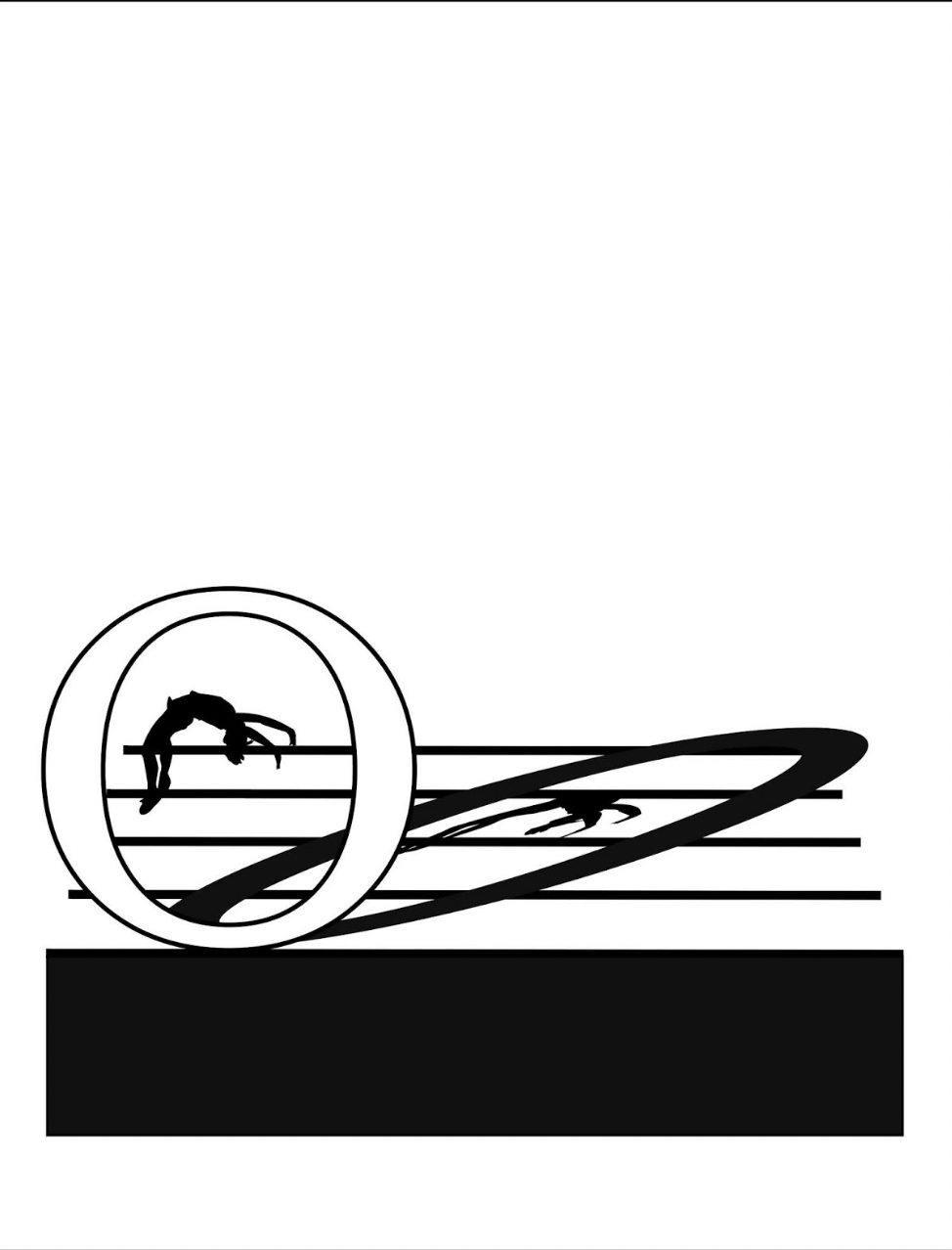
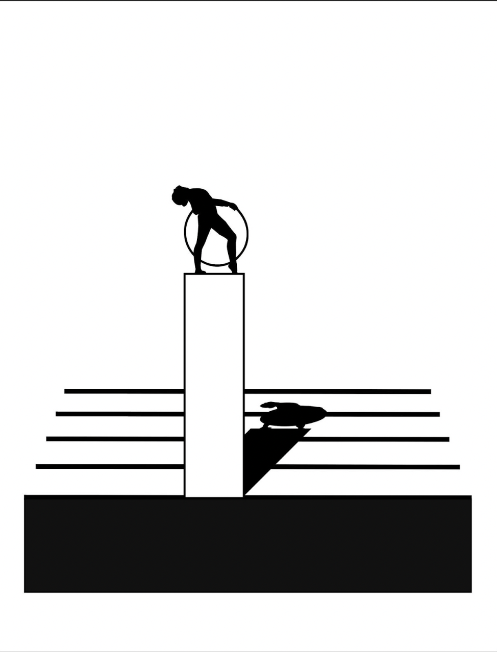
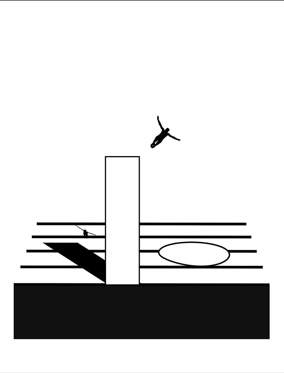
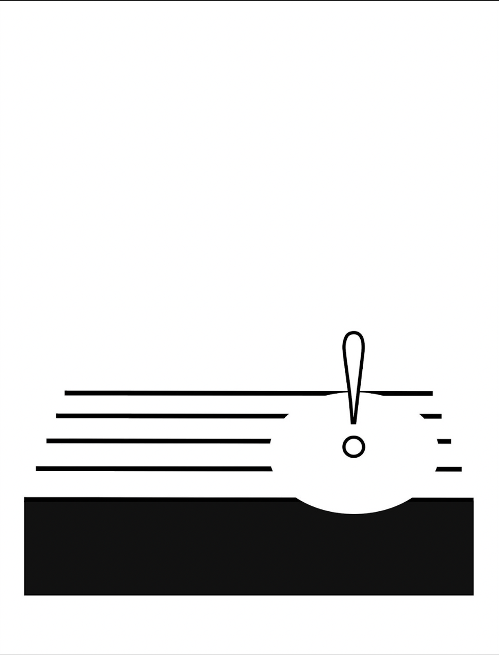
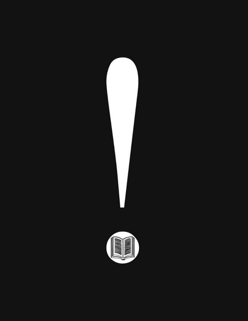
Animation sequences occur, such as the platform diver leaping from the body of a lowercase i and creating an exclamation-point splash in a pool formed by a circle that widens across the stave as the diver submerges.
Around the same time of playground‘s inception, this combination of letters and musical notation found expression among other artists: for example, Jim Avignon & Anja Lutz in Neoangin: Das musikalische ABC (2014) and Bernard Heidsieck in Abécédaire n° 6 clef de sol : été 2007 (2015). Metaphorically linking textual expression, if not individual letters of the alphabet, with musical scores goes back at least as far as Stéphane Mallarmé’s Un Coup de Dés Jamais N’Abolira le Hasard (1897) and carries forward into explicit linkage by Michalis Pichler (2009) and Rainier Lericolais (2009) in their works of homage to Un Coup de Dés.
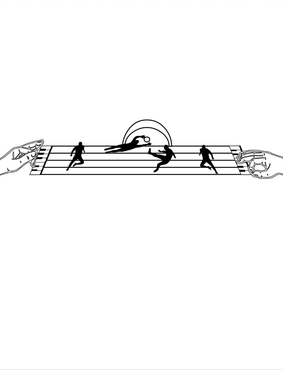
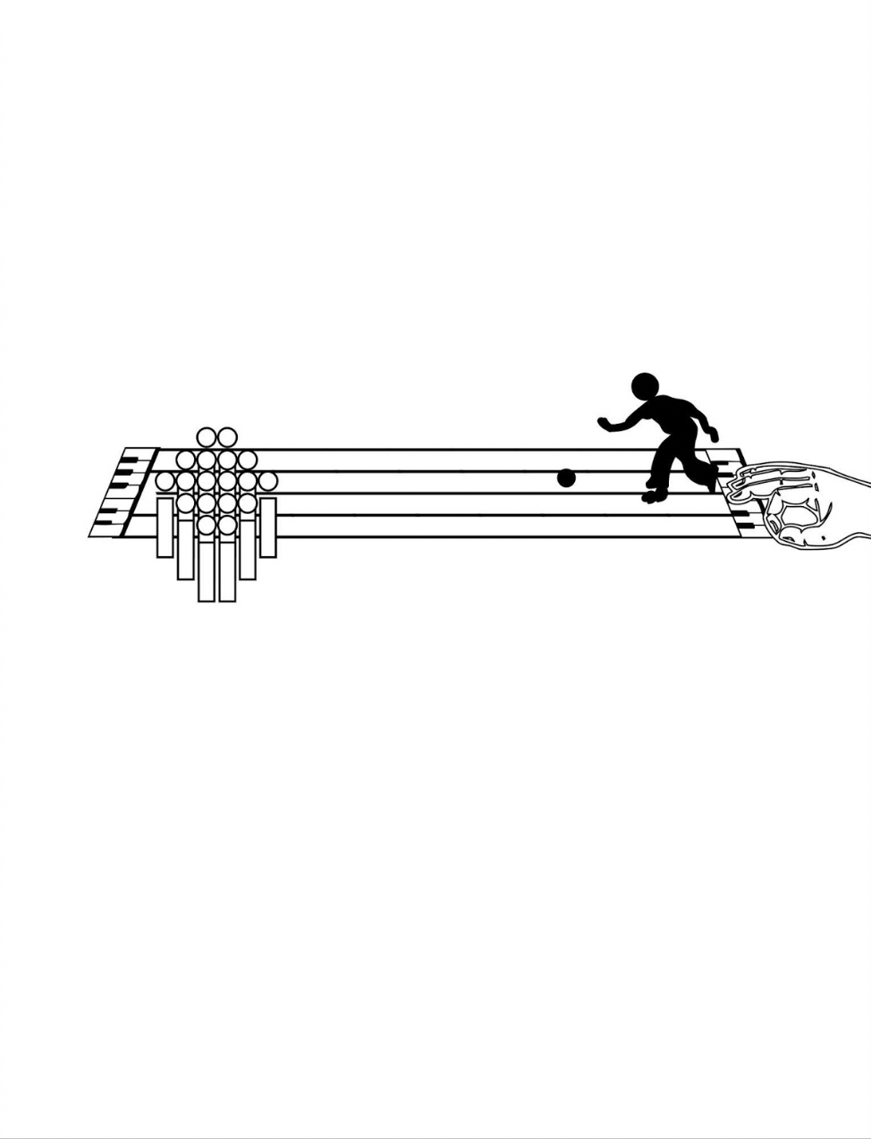
To return to Kempton’s playground, an interlude occurs to associate the alphabet with magnetism, then breaks off to return to the games motif, this time in the form of winter sports. The musical notation motif is still there, but Kempton modifies it with a piano keyboard at both ends of the stave and with manicules fingering the keyboards at both ends while articulating a variation on sign language. Musically and metaphorically, matters become more complex with the introduction of two pairs of staves, pyramids of squares and circles and one manicule using the lowercase i to bring back the magnetism interlude.
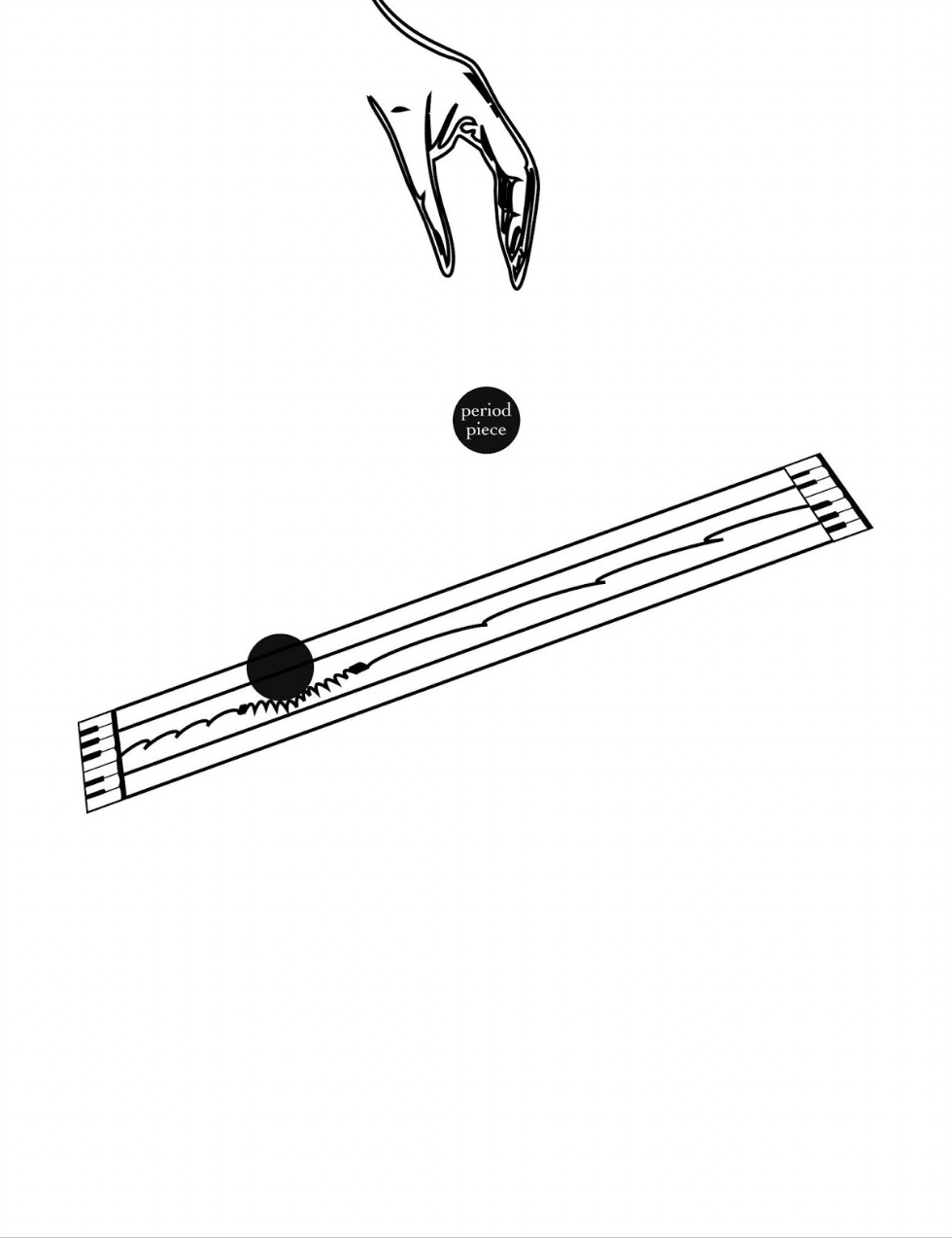
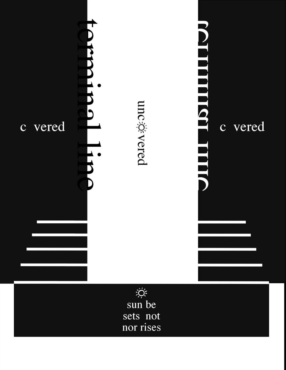
From here on, additional motifs are developed, and words and phrases appear: a physics experiment punningly labeled “period piece”, a night game lit by inverted question and exclamation marks, and juxtaposed opposites (“covered/uncovered” and “sunrise/sunset”).
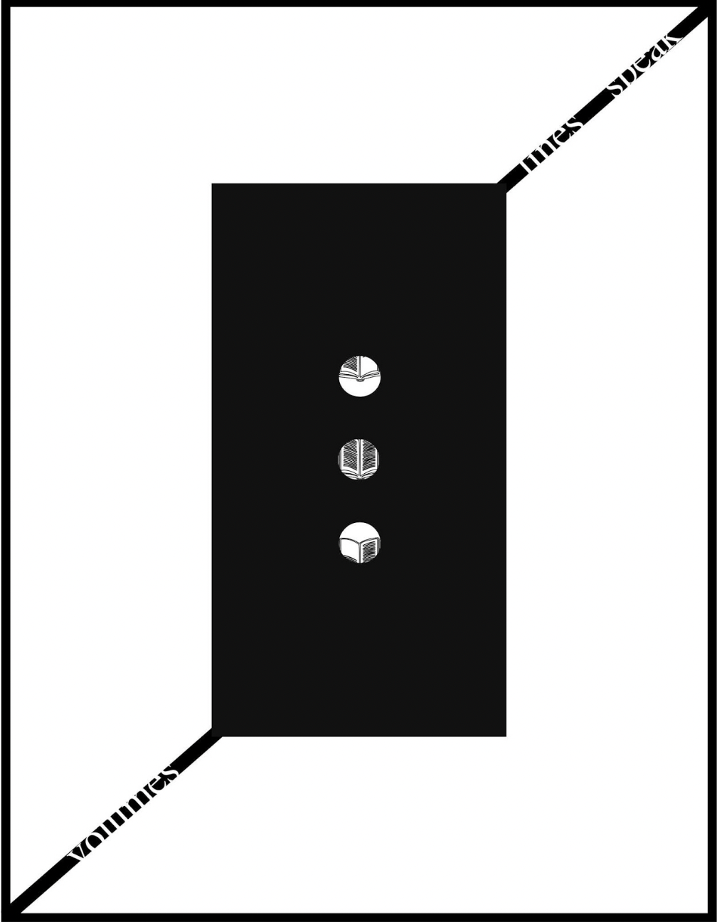
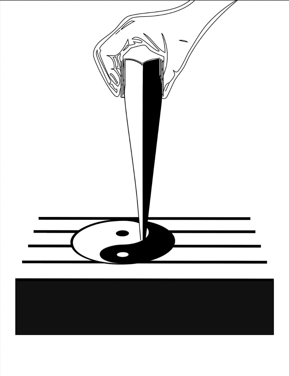
All these motifs, textual and visual puns, and images seem concerned with the development of symbols for interpreting the world and communicating that interpretation. With the appearance on black background of an exclamation mark with an open book inside its point, then a pair of rectangles each suspended by the sentence “volumes lines speak / lines speak volumes”, an animated sequence begins an extended narrative drawing everything together.
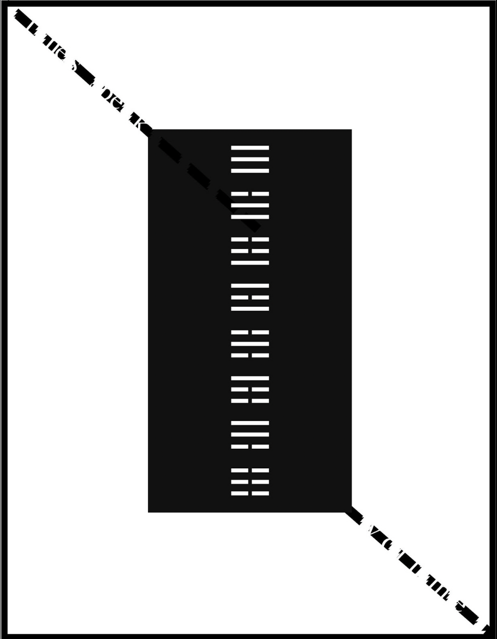
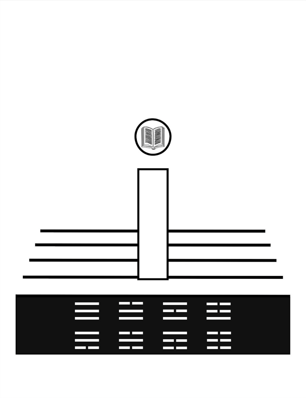
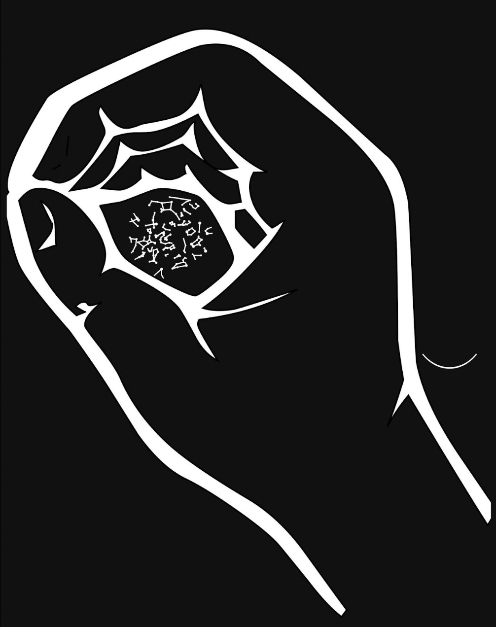
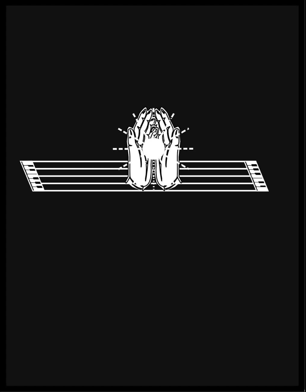
After the descending hand squeezes out the yin yang symbol onto the stave from the image of an open book, Kempton joins this theme of interconnected opposite forces with the development of language, which is where the runes come in, held in an unclosed fist. Eventually the book concludes with an open pair of hands, centered on reversed-out stave/keyboards and holding a point of light radiant against the blackness.
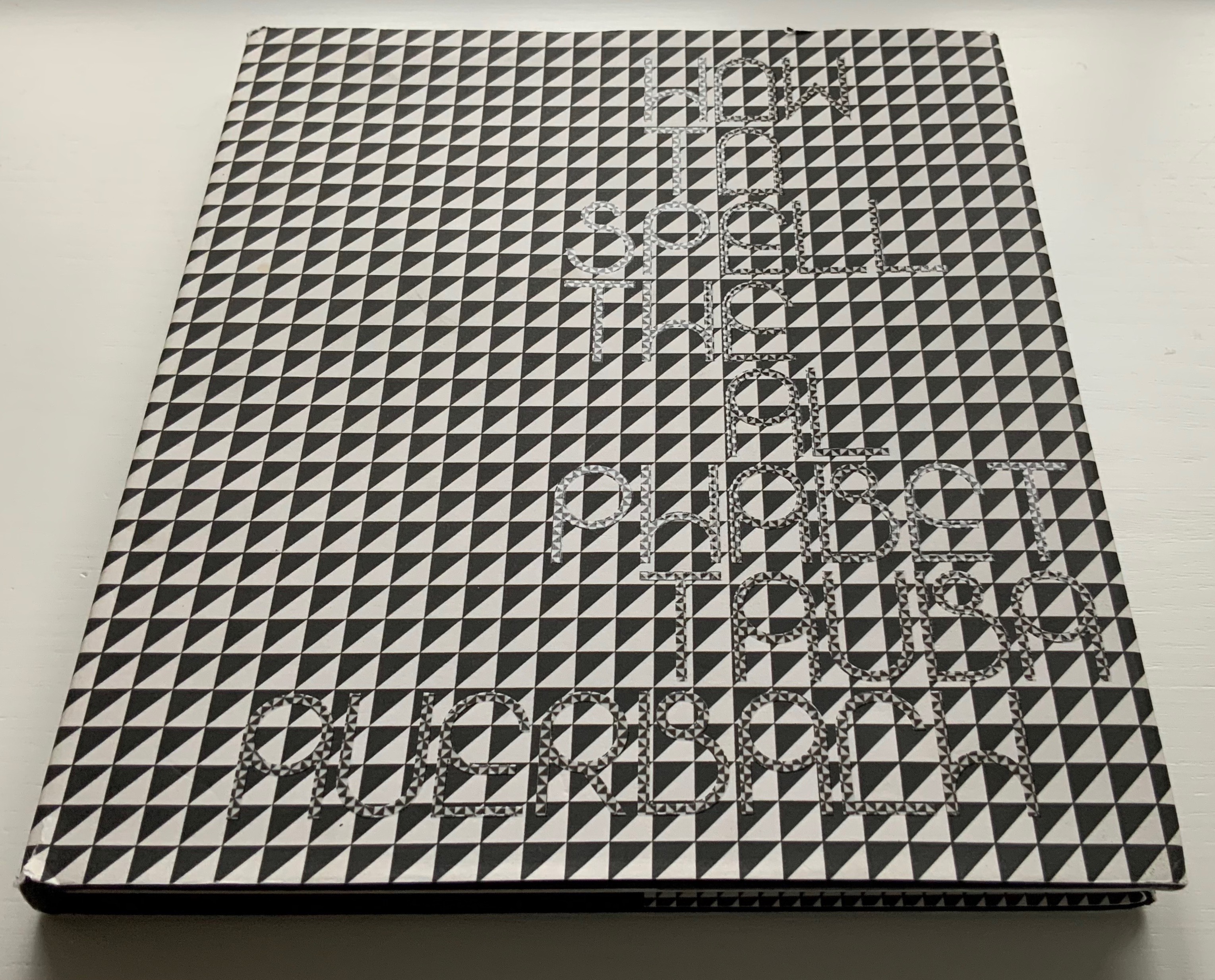
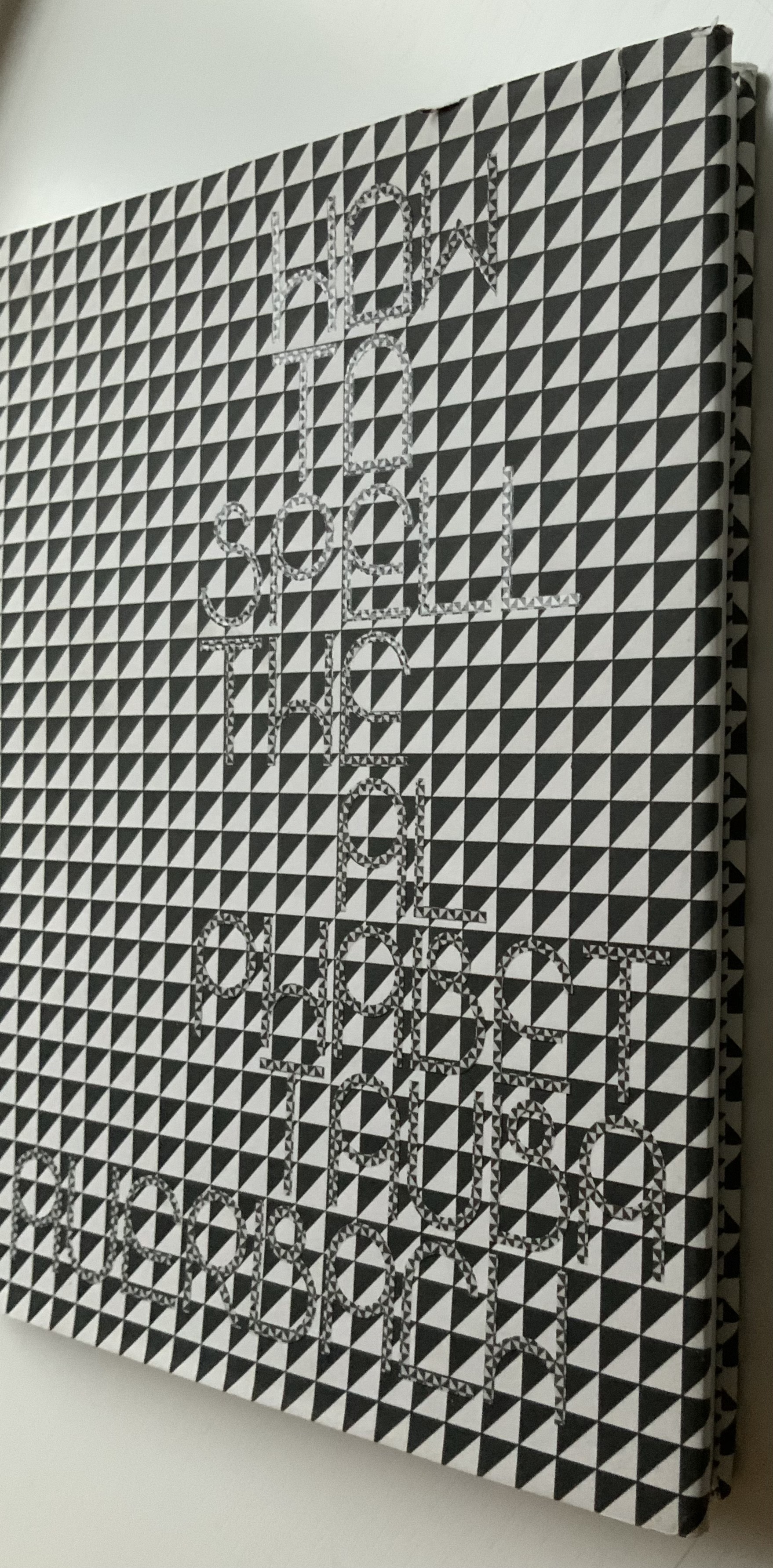
How to Spell the Alphabet (2007) Tauba Auerbach H255 x W220 mm, 112 pages. Acquired from Zubal Books, 26 October 2021. Photos: Books On Books Collection. Displayed with artist’s permission.
Auerbach writes in her preface:
The intention of this work is to take an inquisitive look at language, and to apply the unique properties of the system to the system itself.Subjecting language to its own idiosyncrasies and inconsistencies in iteration after iteration in turn brings about major changes and remarkable patterns. … My focus on the flaws or glitches of language is not in the spirit of criticism, but in the interest of cultivating a new idea of possibility or perfection.
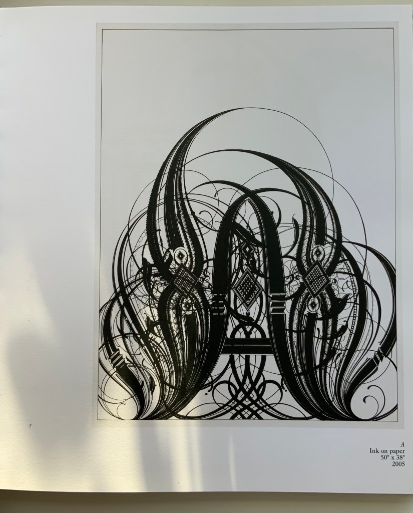
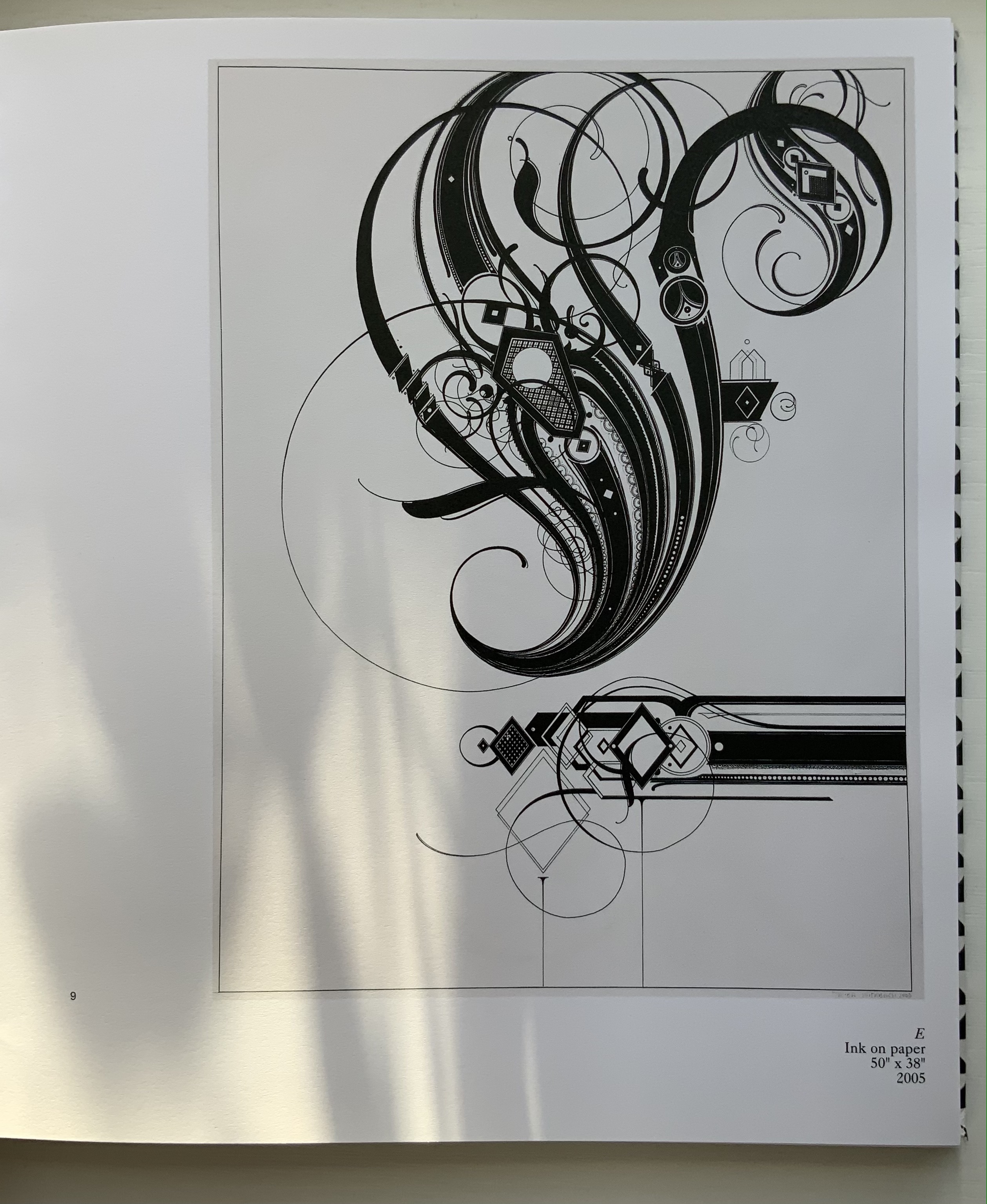
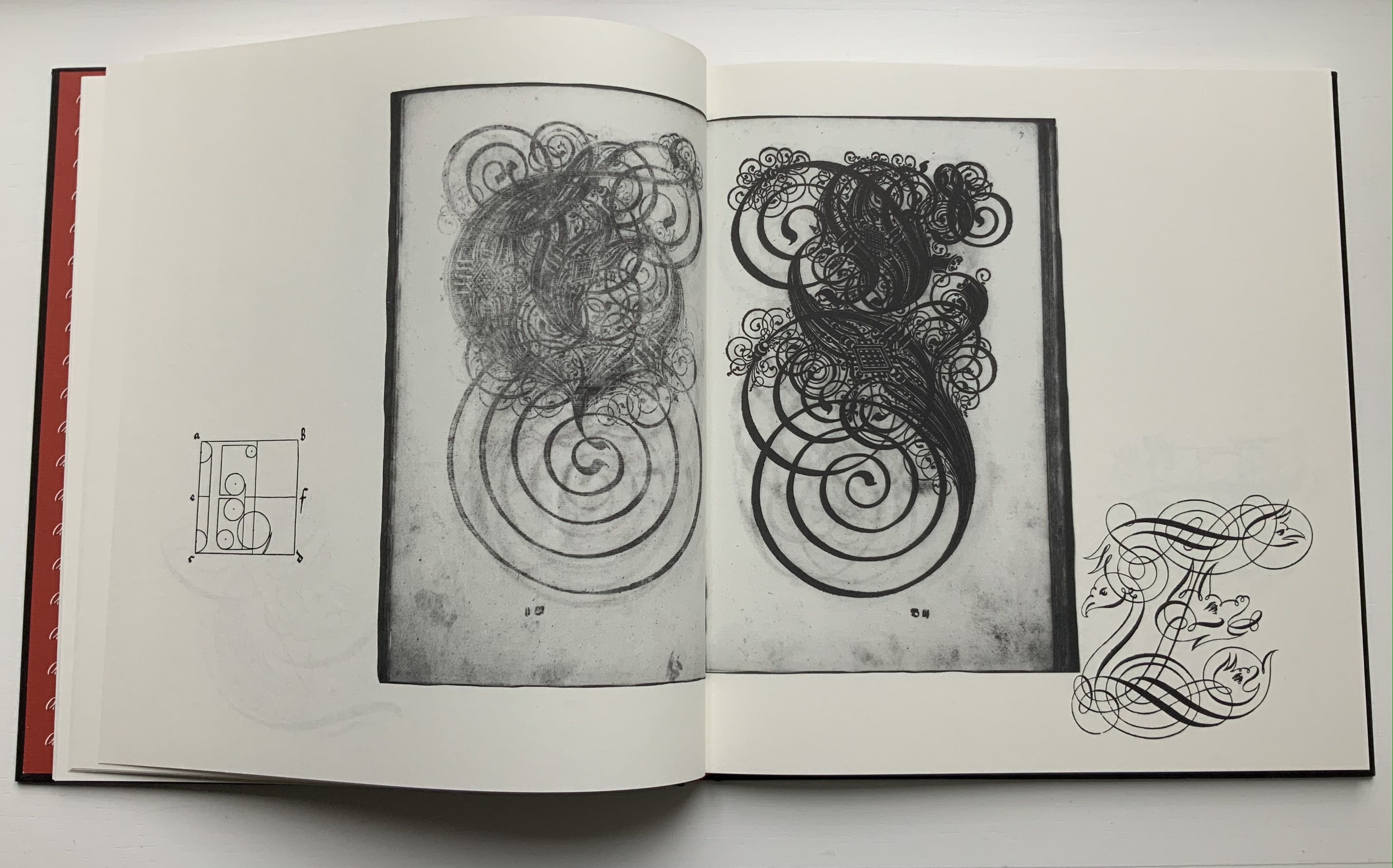
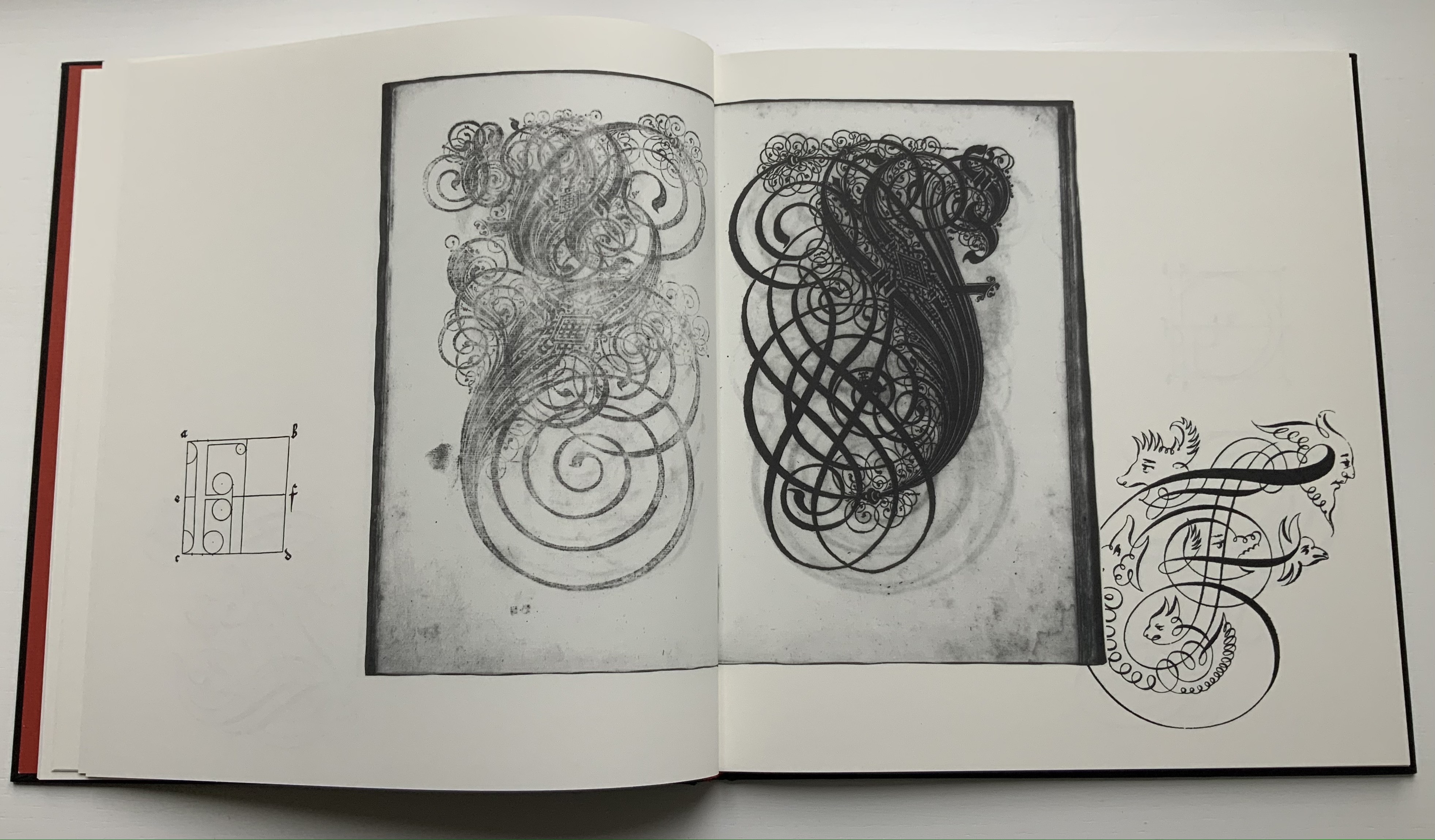
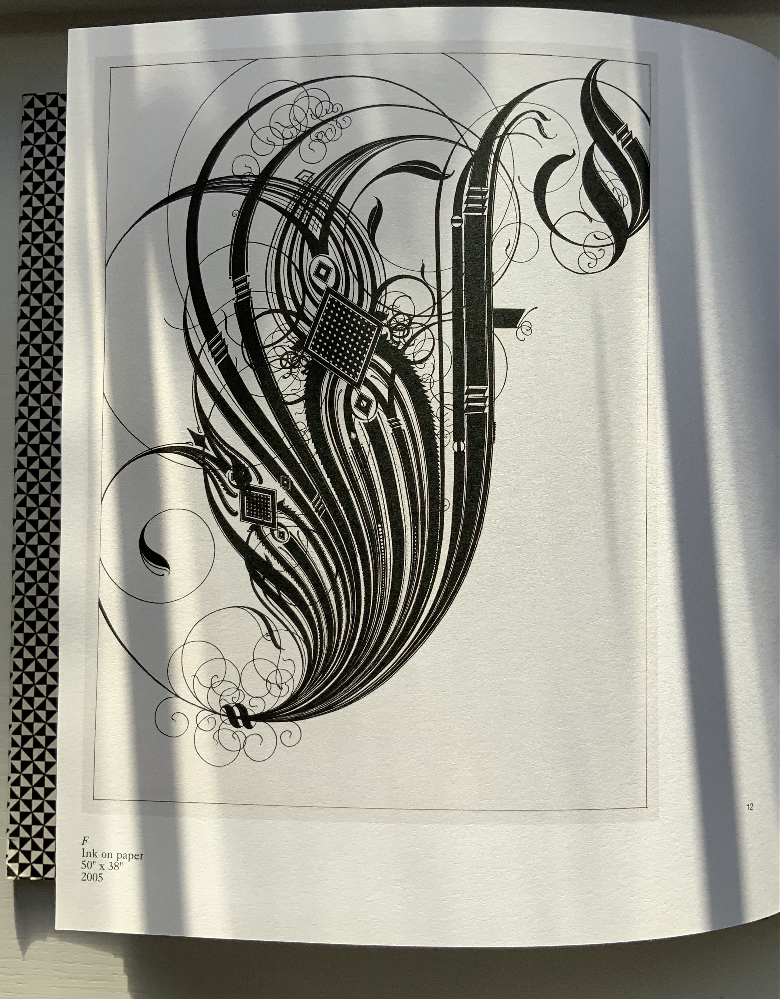
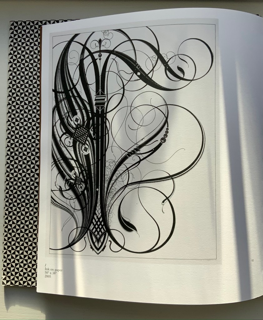
It is also in the spirit of artistic playfulness. “How to Spell the Alphabet” is the title of one of Auerbach’s best-known works. A work of ink and pencil on paper (2005), it begins “EY BEE CEE DEE” and was featured in MoMA’s “Ecstatic Alphabet” exhibition (6 May – 27 August 2012). That shows just one way in which How to Spell the Alphabet‘s artistic playfulness makes the letters of the alphabet ecstatic (“to stand outside themselves”). In keeping with the book’s cover and the name of Auerbach’s publishing operation established in 2013 (Diagonal Press), each of those ways adds another angle, another way into, another perspective on her work. This entry, however, deals with only one of them: what Auerbach calls “letter worship”. Expanding on that, she writes:
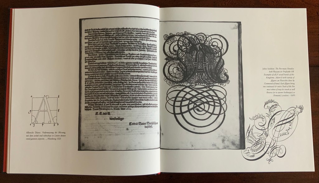
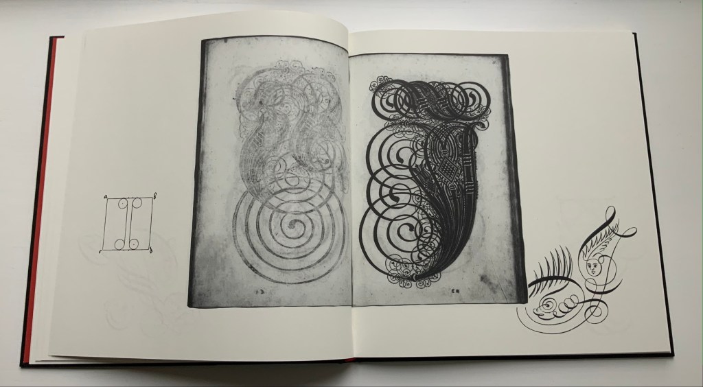
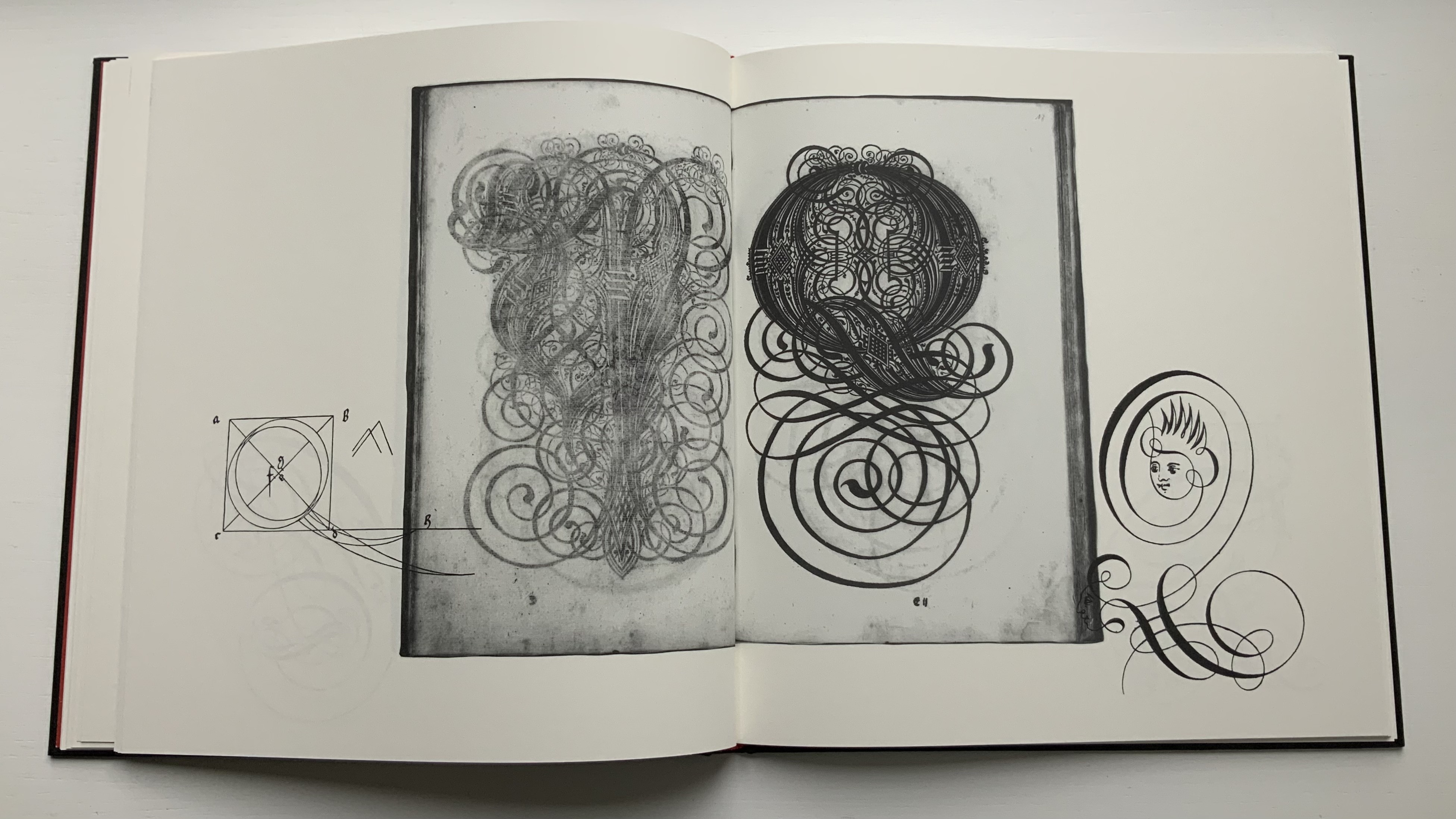
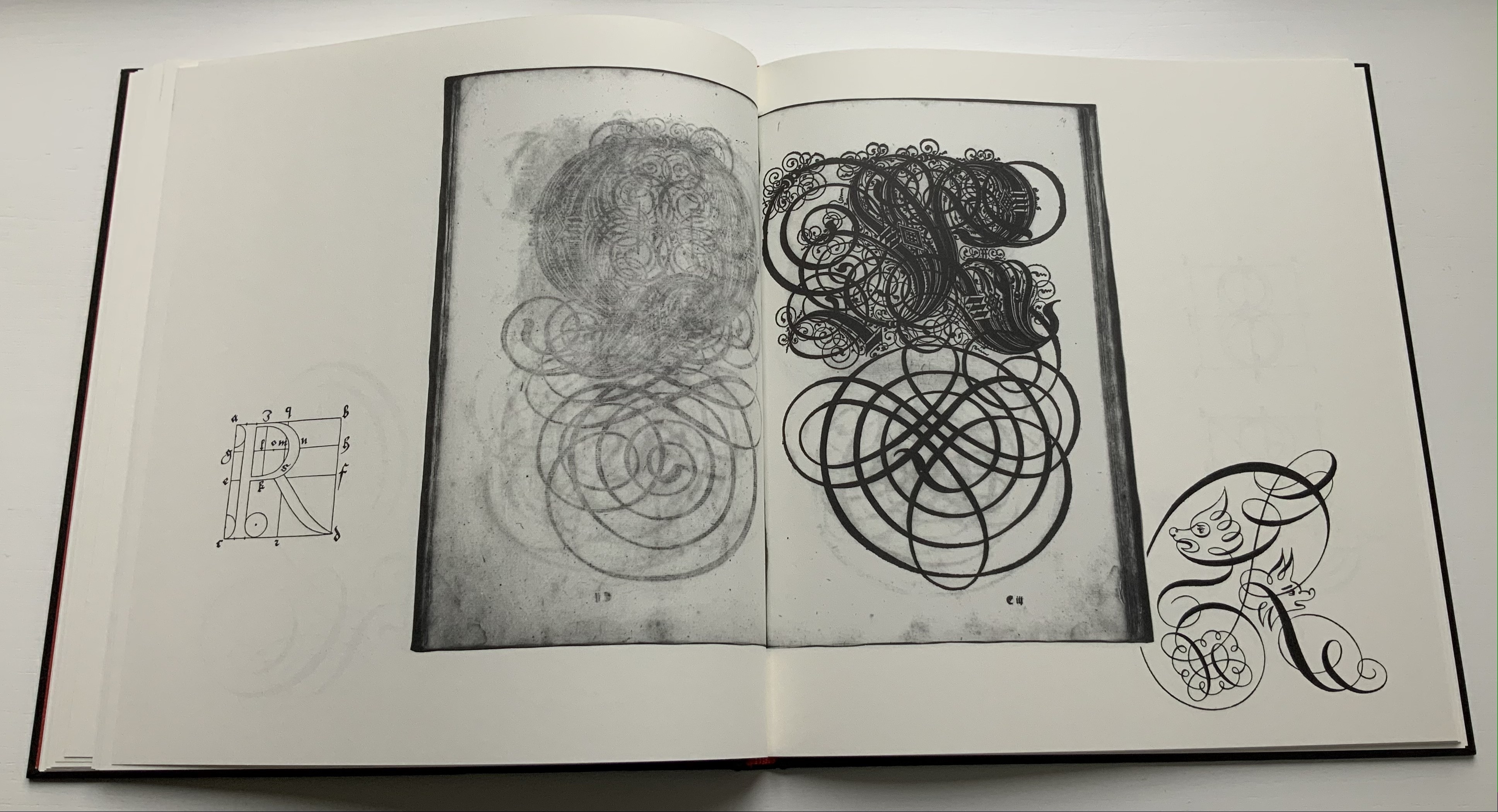
These pieces are an exaggeration of the slowness of hand-drawing letters. Taking several weeks to draw, each one is a meditation on the form of a single letter on its own, isolated from meaning or context. … These specific letters are inspired by a German alphabet designed by Paulus Franck in 1601. In the tradition of illuminated manuscripts, such an ornamental font treats each letter both as an object of worship and as a means of expressing worship towards what is written. But … they are also an expression of the idea that celebration — in this case, through embellishment — can lead to obliteration. They are meant to teeter on the edge of decipherability, oscillating between legibility and abstraction.
“A” by Tauba Auerbach (left) and Paulus Franck (right). Photos: Books On Books Collection.
“E” by Auerbach (left); “E” and “F” by Franck (center); “F” by Auerbach (right).
“I” by Auerbach (left) and by Franck (right).
“Q” by Auerbach (left); “Q” and “R” by Franck (center); “R” by Auerbach.
That reference to oscillation between legibility and abstraction also draws attention to Auerbach’s fascination with helix-like and chiral (handedness) images and phenomena, which lies at the heart of her major 2021-22 exhibition and even finds expression in its title SvZ. Auerbach’s work oscillates between the world of the alphabet and the world of science and math, just as the letter and the world oscillate when we grasp at the meaning of their relationship.
Mis en pli(2016) Étienne Pressager Monotype, inked, folded in half lengthwise and unfolded. H840 xW570. Edition of 16, of which this is #12. Acquired from the artist, 22 April 2022. Photos: Books On Books Collection, and courtesy of the artist. Displayed with permission of the artist.
The alphabet loves a mirror, and like many artists’ books that comment on themselves or the Book, Étienne Pressager’s monotype is self-regarding — in its process, its result and its title. A large sheet is folded lengthwise and unfolded. Ink is arranged just so in the center and to the right. The sheet is folded, pressed and unfolded to reveal the mirrored alphabet. Voilá, a single-fold book. Mis en pli or “Set in fold”.
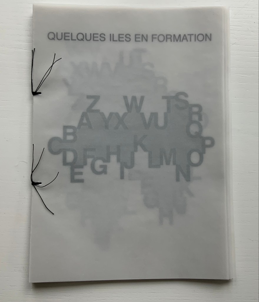
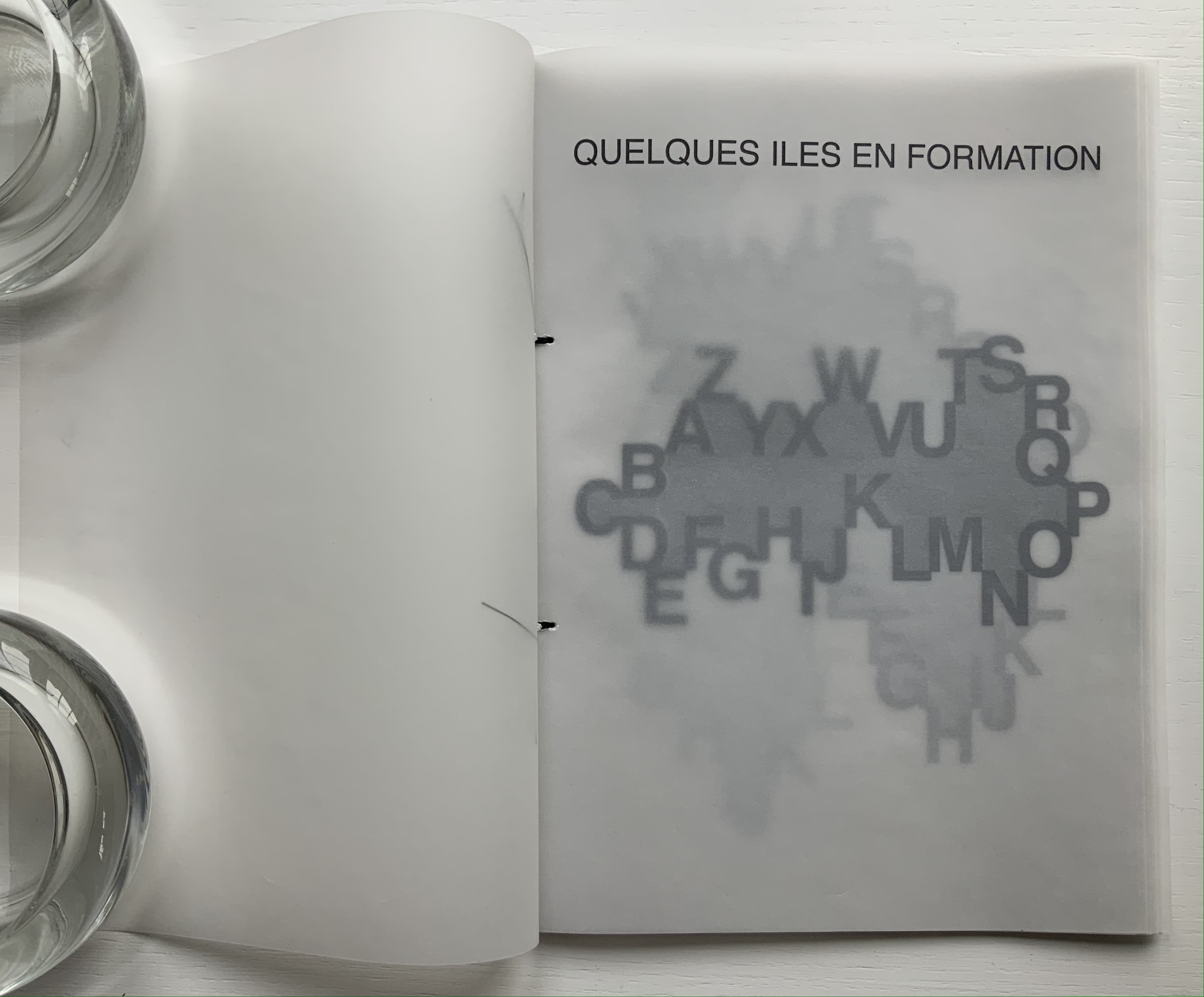
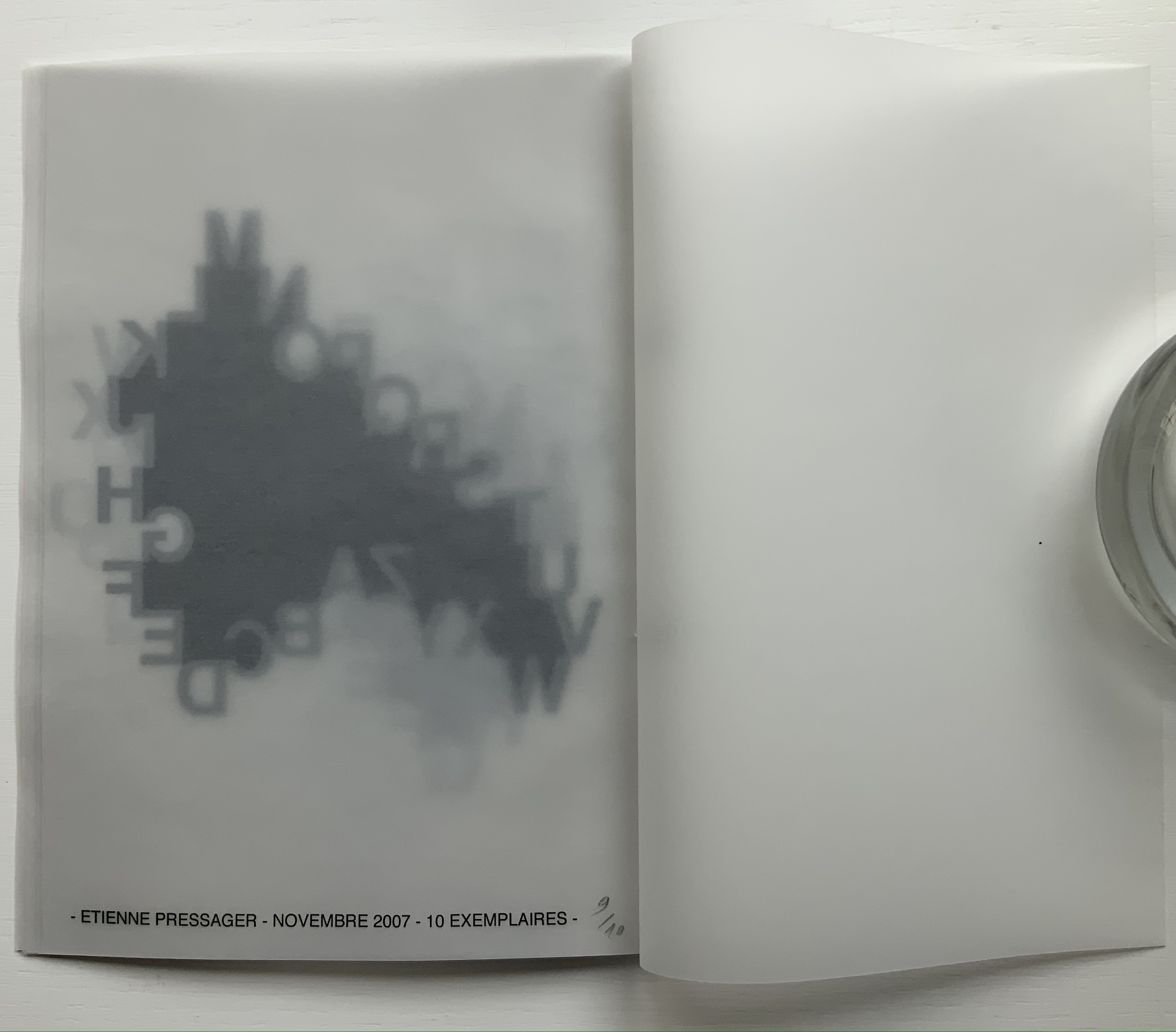
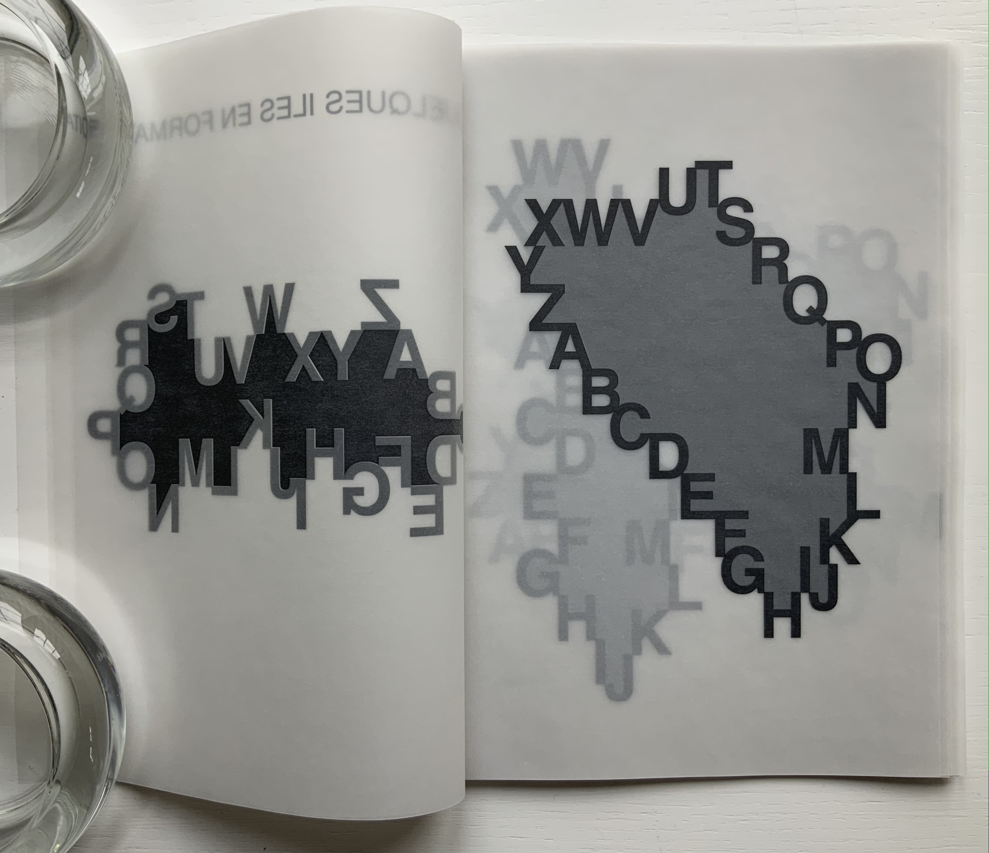
Quelques îles en formation (2007)
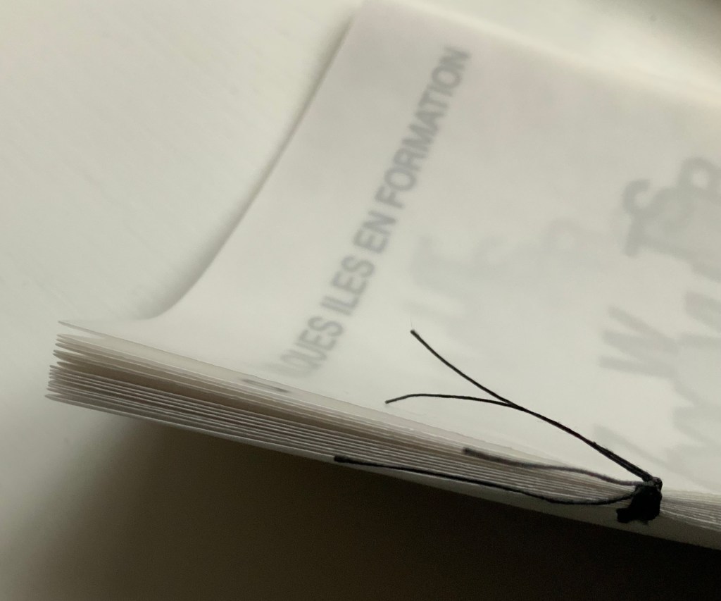
Quelques îles en formation (2007) Étienne Pressager Handsewn booklet. H210 x W170 mm, 30 pages. Edition of 10, of which this is #9. Acquired from the artist, 8 March 2022. Photos: Books On Books Collection.
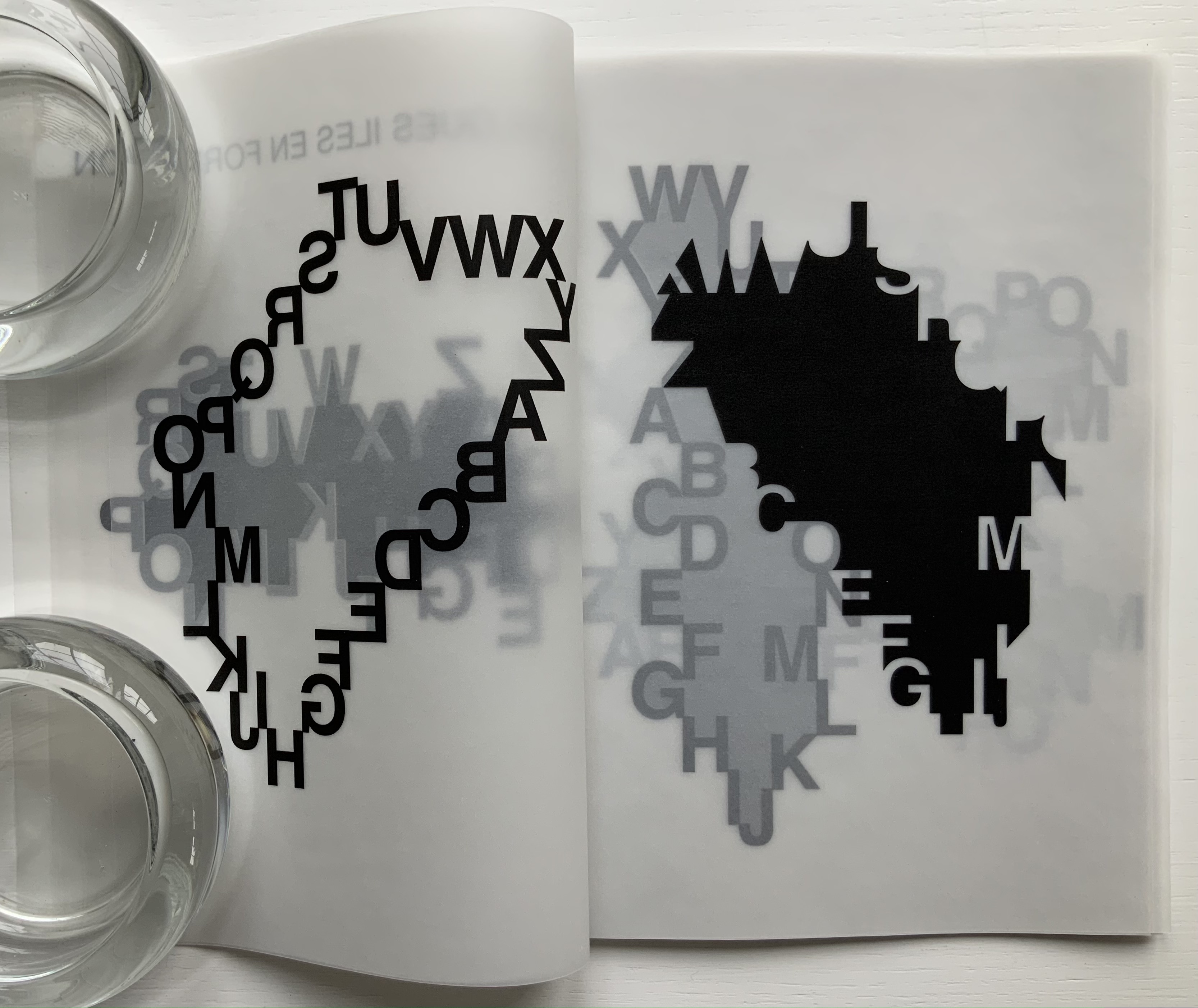
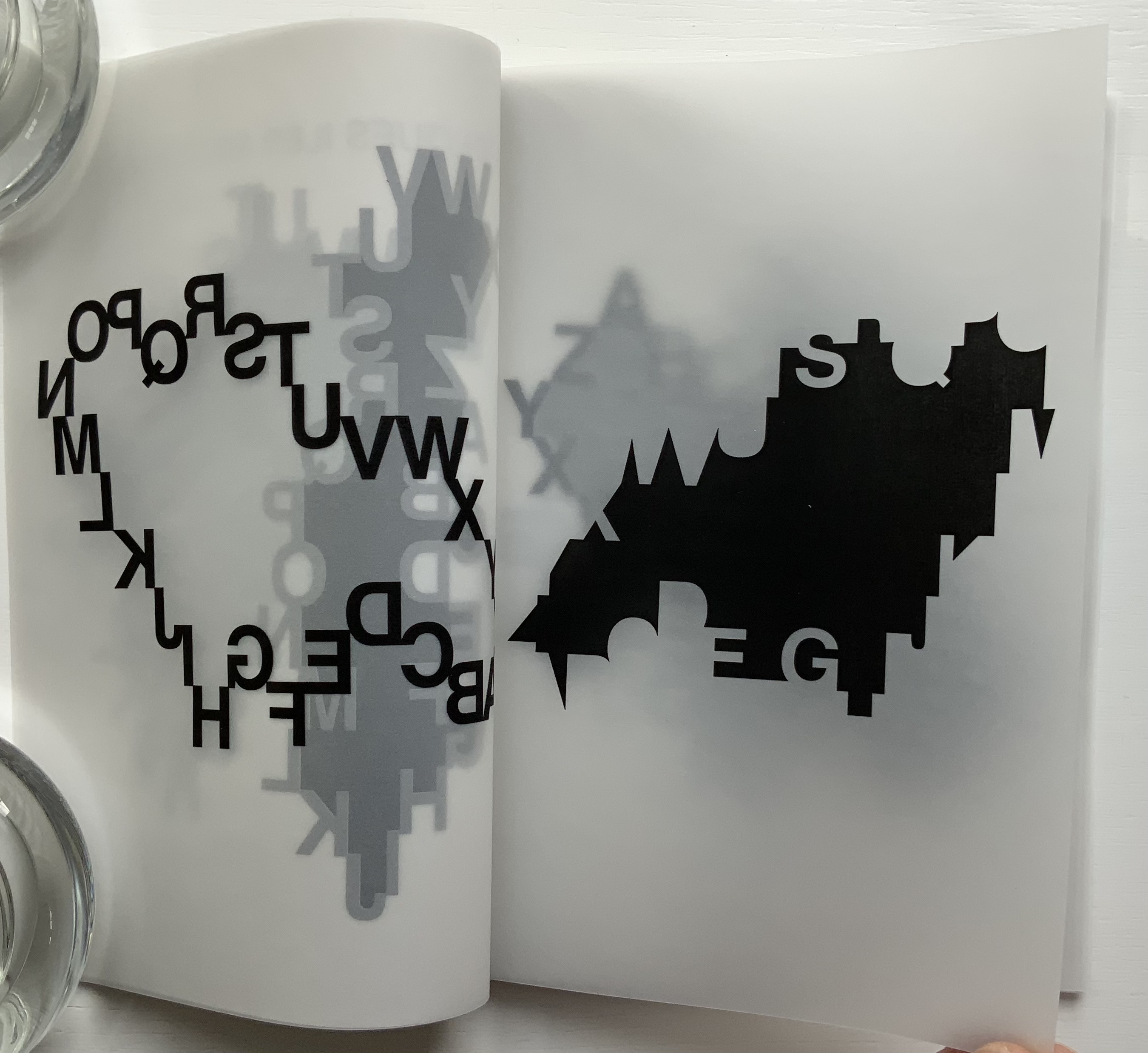
Quelques îles en formation consists of fifteen single-fold folios handsewn with black thread. The first and last folios serve for the front cover/title page and colophon/back cover, respectively. The thirteen folios between them constitute the îles/”islands” being formed by the encircling letters of the alphabet and the encircled masses laser-printed on the translucent paper. But why “some islands”/quelques îles and not just thirteen? As the reader/viewer moves through this work, it dawns that there are far more than thirteen ways of looking at these blackbirds.
Spine, showing the single-fold folios.
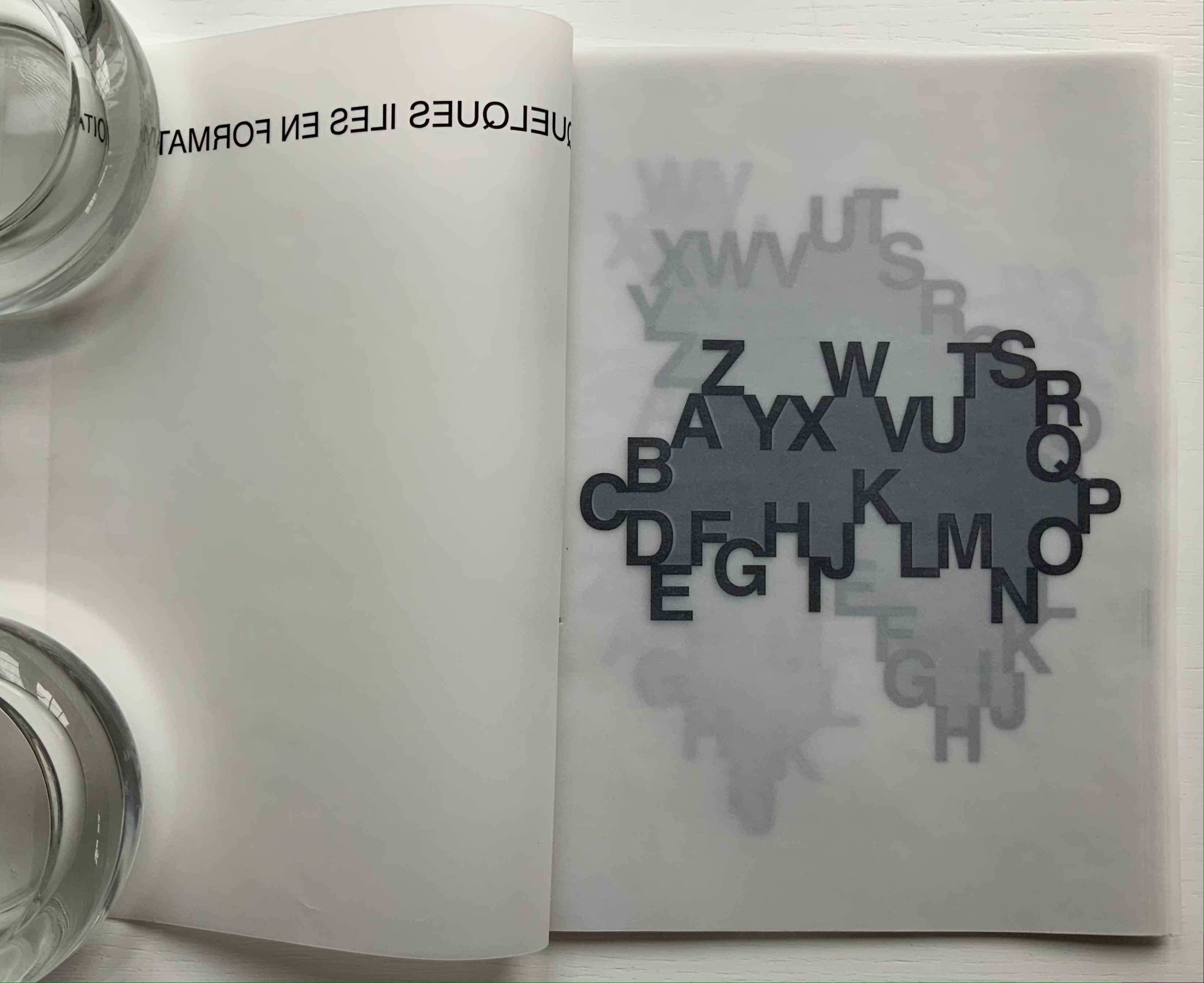
To talk about the folios (and since the pages are unnumbered), let’s name them “Island AB”, “Island CD” and so on. So the work’s second folio would be Island AB (below). If we go round the island clockwise from Z, we are reading the alphabet in reverse. This doesn’t seem right (although we are reading à droite/”to the right”). But to follow the Latin alphabet aright, we are forced into reading right to left. Once we reach letter C, the Western norm of left-to-right reading asserts itself — even if bumpily so — but with letter P, we are back to the Middle/Far East direction of reading. At least, in either direction, the dark gray body of land is clear enough. Or is it?
Folio “Island AB”: first, second and third pages displayed. The fourth page appears below.
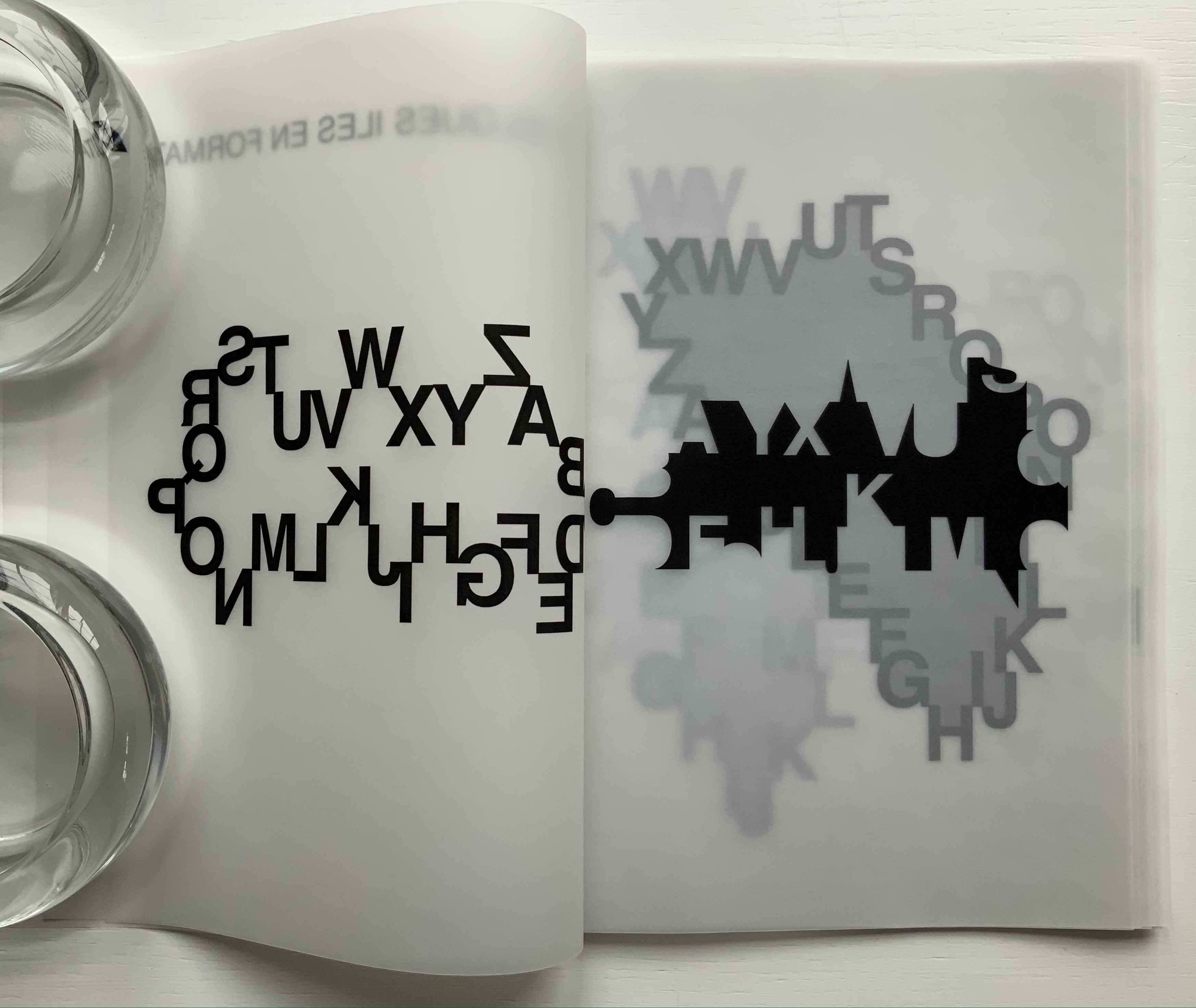
When Island AB’s first page turns, the black letters separate from the body they define. They float in reverse on the second page (above) even more black. The dark gray body now becomes a separated mass of black on the third page (above). It looks like an abstract image or a skyline, but here and there, the island’s contour shows just enough parts of the absent island-forming letters to make out the Y, X, F, K and M. When the third page turns, Island AB’s “underside” appears on the fourth page of the folio (below). The reversed black letters on the second page lighten to gray as the translucent paper falls over them, but the black abstract or skyline or island printed on the third page shows through just as black as before.
Island AB’s fourth page; Island CD’s first, second and third pages.
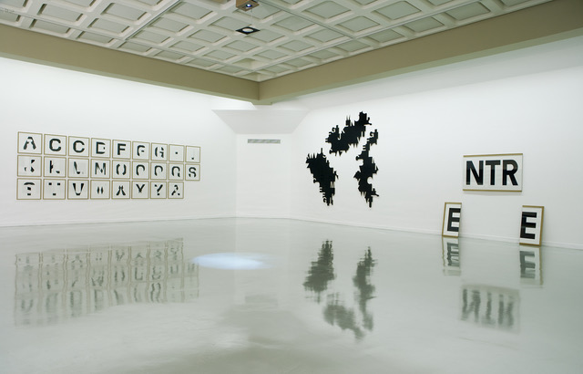
In an installation setting, three of these bodies of black become the work Îles capitales, a standalone large-scale hanging made from industrial plywood covered with thin black melamine. In contrast, the book form layers the islands, adding yet another layer in the process of îles en formation. The islands beneath cast shadowy outcroppings upwards around the island covering them. Indeed, as pages turn, outcroppings disappear, replaced by others from islands further underneath. Look again at Islands AB and CD above.
Gallery view of Îles capitales (center) in “Bertrand Gadenne/Étienne Pressager: A,B,C,D, Etcaetera”, a joint exhibition at Lieu d’Art et Action Contemporaine (LAAC), Musée de France, Musée de la Ville de Dunkerque, 2007. Photo: Courtesy of Étienne Pressager.
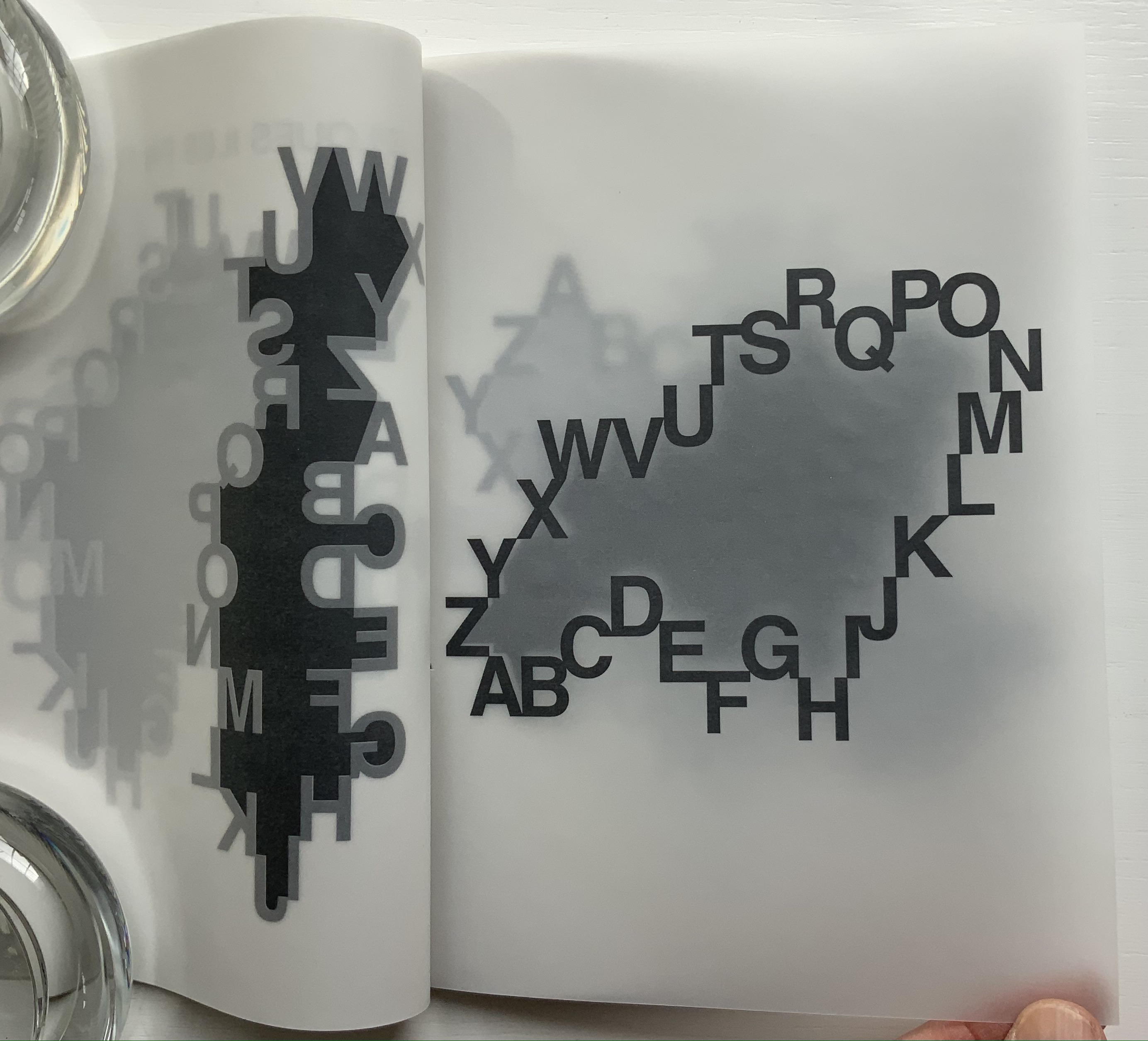
Another element of the layering comes into play as pages turn. It comes just as a page is lifted. Below, on the left, the letters around Island GH lift away leaving a blurred outline of the island beneath; on the right, the island becomes more sharply defined as the page begins to turn. Calling further attention to the layering, each folio is folded offset, the first and second pages always being wider than the third and fourth, which facilitates turning the slippery translucent pages but highlights the work’s in-betweenness, its gradations of gray, black and white.
Island GH: with its first and third pages being turned.
Each island is shaped by the same 26 letters, but the contours of each island differ. An infinite number of varied archipelagoes could be derived from Pressager’s ourobouros-like alphabet, just as an infinite number of words can be generated from the alphabet, which in turn can be used to define, delineate and bridge domains or islands limited only by our imaginations. Confronted by such infinities, what can a finite human do but offer up quelques îles en formation?
Abstract Alphabet: A Book of Animals(2001) Paul Cox Casebound, sewn to doublures. H288 xW238 mm, 52 pages with single foldout. Acquired from Amazon, 1 July 2021. Photos of the work: Books On Books Collection. Displayed with permission of Chronicle Books.
Not that the alphabet and writing happened chronologically step by step or in one place, but the theory is that they started with pictograms (one sign, one object), ideograms (one sign, one idea), logograms (one sign, one word); added the rebus principle and phonograms (one sign, an object or its sound as in bee the object or the sound of “bee” for use in a word with that sound); added marks for pronunciation or contextualization to distinguish one homonymic phonogram from another; and finally arrived at syllabaries and the even more efficient alphabets (one sign, one sound). Alphabetic letters acquired their non-pictorial shapes as all these signs became more simple and abstract through the tools used to inscribe them (a wedge-shaped stick, a reed, a brush, etc.).
The tools used to make signs in Abstract Alphabet are stencils and ink, or rather a knife and paper or die and metal to cut the stencils to be used with ink. The result is certainly abstract albeit less simple and yet perhaps more artful — and not simply because of its inspiration from the works of Jean Arp. In its artful way, Abstract Alphabet challenges us to think about the alphabet, how it works and how we learn to work it.
Cox’s alphabet skips the pictogram and goes straight to these Arp-ian abstract shapes. His abecedary (“a book of animals”) even skips the images of the animals whose names his signs “spell out”. His signs turn every which way, shrink or expand to fill the double-page spread, which makes the codex also a tool playing into how the signs look and how we read the words they make. The foldout key and the animal name’s initial letter are essential to identifying these animals. But what if there were no foldout key (another element of the Swiss-Army-knife codex’s performing its tool function)?
What if the initial Latin letter of the animal name did not appear in the upper left corner of each double-page spread? What if the animal name ran over to a third or fourth page? What if the Abstract Alphabet were delivered on a scroll? Or a set of 26 clay containers, each inscribed with the signs composing an animal’s name and inside each container a number of tokens each marked with the signs making up the animal’s name? Would the relative frequency of signs in just 26 words make deciphering possible? It would be what archaeologists and paleographers have faced and still face in figuring out where the alphabet came from.
In its visual abstraction, Cox’s alphabet also prompts puzzling over how reading is learned. Without figurative images of the animals to associate with the sets of shapes, how would the brain proceed? What ape looks like a combination of an orange dumbbell, gray egg and green chocolate drop?
Enciphering the alphabet with shapes reverses the alphabet’s historical movement away from the pictorial to the symbolic — but only partly, the shapes are abstract after all. Also the foldout key supplies alphabetic readers with their childhood phonemic clues. But if there were no foldout key, we would have to backtrack and learn what sounds a yellow half-circle, a set of red stairs and so on make. Could we have learned to associate sounds with these abstract shapes instead? Non-alphabetic written languages such as Kanji and Chinese have semantic and phonetic clues embedded in their characters. Cox’s Arp-ian shapes would have to evolve such clues. If it were not for color-blindness, the different colors might be useful in such an evolution; beyond some assistance in distinguishing D from U and F from V, they are not over-labored.
Still this is book art that makes us think. If only the animal below, which was pictographically the source of the first letter in the Greek and Latin alphabets, were the last association of sign and animal in Abstract Alphabet, the book would end on a deserved note of genius.
“Paul Cox, AGI Open, Seoul 2016“. 9 February 2017. Alliance Graphique Internationale. Accessed 7 August 2021. Cox describes Abstract Alphabet at the 17’02” mark in the video.
Augustin. 25 January 2015. “Paul Cox“. Index Grafik. Accessed 7 August 2021.
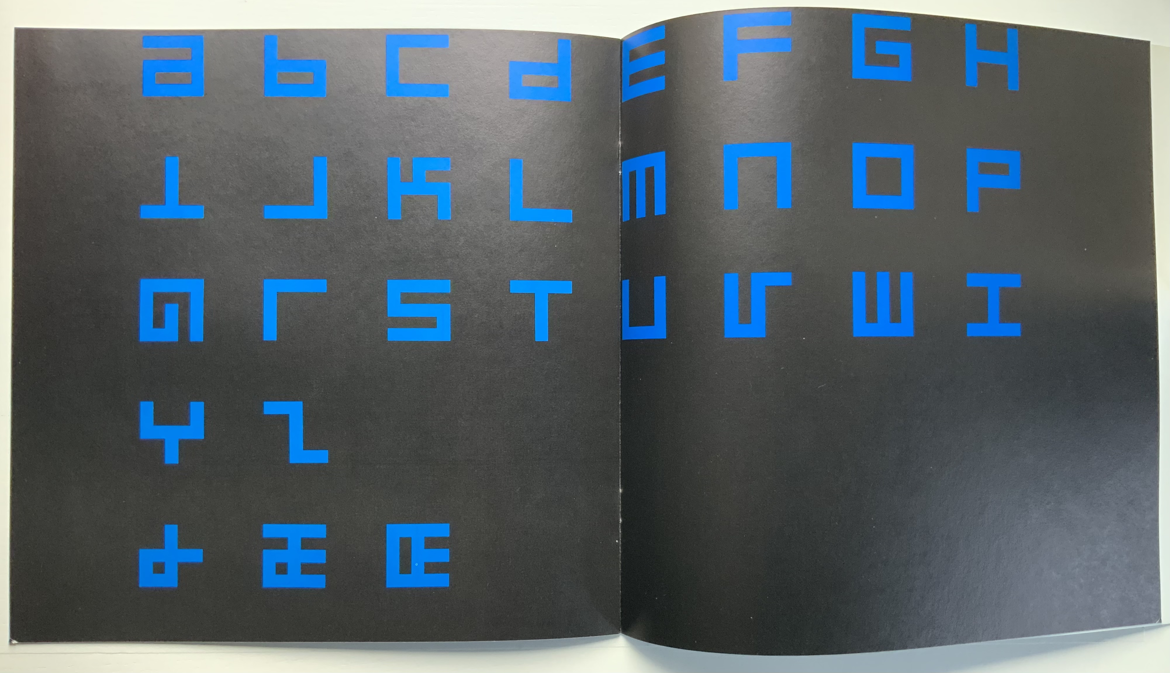
Alphabet (1970) Timothy Epps and Christopher Evans Booklet. 250 x 250 mm, 16 pages. Acquired from Antiquariaat Frans Melk, 23 November 2020. Photos: Books On Books Collection.
This is the alphabet that inspired Raffaella della Olga’s LINE UP (2020), also in this collection. At the UK’s National Physical Laboratory, Epps and Evans created their alphabet in 1969 in response to the challenge to overcome machine-readable typefaces’ human-unreadability. Perhaps because it was the second of three responses to Wim Crouwel‘s New Alphabet (1967), published in the Kwadraatblad/Quadrat-prints series, the Dutch graphic designer and series editor, Pieter Brattinga, snatched it up for publication in his series of experiments in printing ranging over the fields of graphic design, the plastic arts, literature, architecture and music. This particular issue was designed by John Stegmeijer at Total Design.
While the bright blue (above left) stands out strikingly against the black background, the booklet appropriately makes the human eye strain to see the letters darkly printed against the black. Would a scanner pick them up? Does the similar elusive effect created by debossed printing in della Olga’s collaboration with Three Star Press allude to this as well? What would that ingenuity create if applied to Crouwel’s New Alphabet or to Gerard Unger‘s A Counter-Proposal (the first response to Crouwel’s booklet) or Anthon Beeke‘s Alphabet (the third and strangest response — letters composed of naked women)?
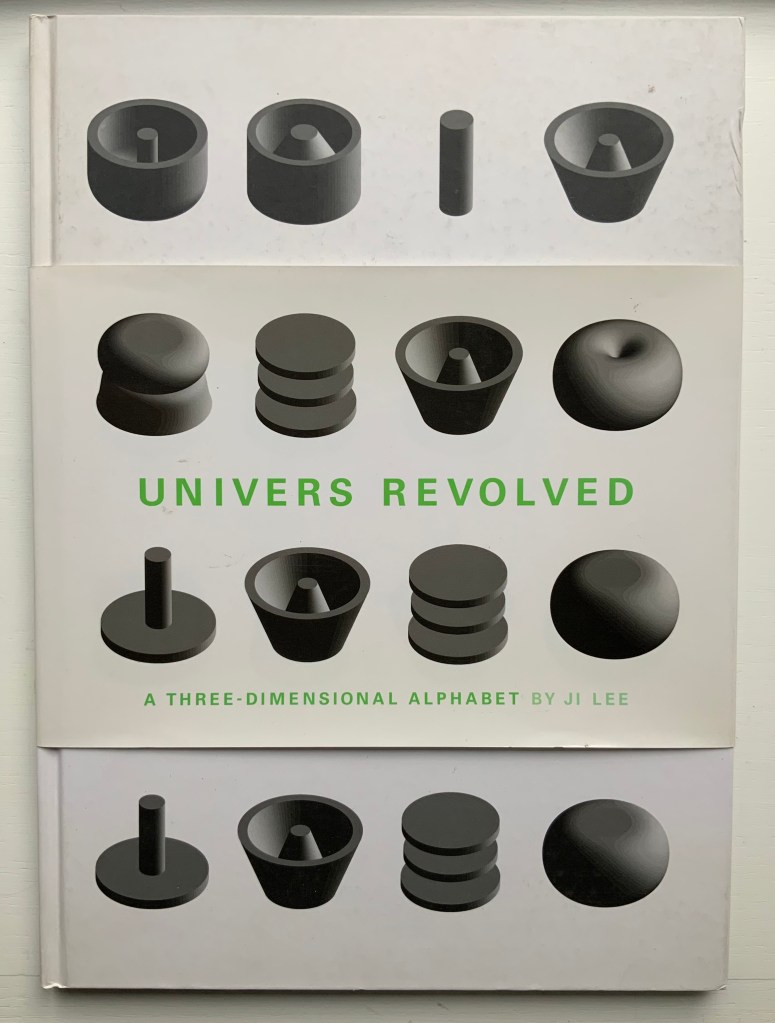
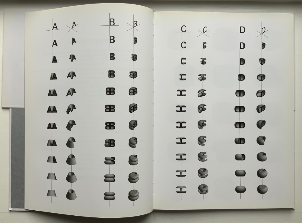
Univers Revolved: A Three-Dimensional Alphabet (2004)
Univers Revolved: A Three-Dimensional Alphabet (2004) Ji Lee Sewn paper on board hardback. H338 x W238 mm, 64 unnumbered pages. Acquired from Unoriginal Sins, 12 December 2020. Photos: Books On Books Collection.
In his extended essay on Stéphane Mallarmé’s Un Coup de Dés Jamais N’Abolira le Hasard, Eric Zboya celebrates Ji Lee’s 3D typeface by rendering the entire poem in that face. The discovery of that essay led to the acquisition of Zboya’s artist book, which led to the acquisition of Ji Lee’s scarce volume Univers Revolved: A Three-Dimensional Alphabet (2004). Lee’s book resonates with several other works in the Books On Books Collection. Compare it, for example, with Johann David Steingruber’s alphabet book Architectonisches Alphabeth (1773/1973), Paul Noble’s alphabet book Nobson Newtown (1998) and Sammy Engramer’s three-dimensional rendition of Mallarmé’s poem.
This double-page spread displays the manipulation of the alphabet’s first four letters around their axes at two different angles to render their 3D shapes.
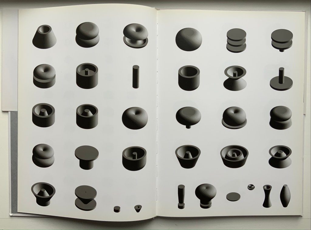
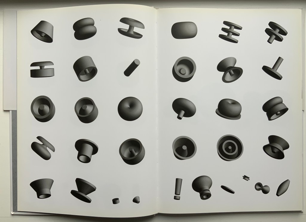
These two double-page spreads show the complete alphabet and punctuation marks at two different angles, which provide a key with which to begin reading text spelled out in the book.
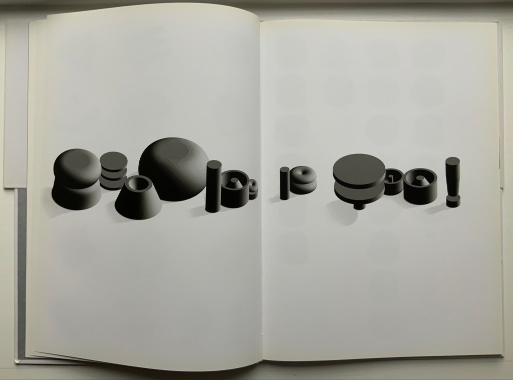
Lee teases his reader by composing sentences with different sized letters. “Reading is Fun!” is one of the easier to decipher.
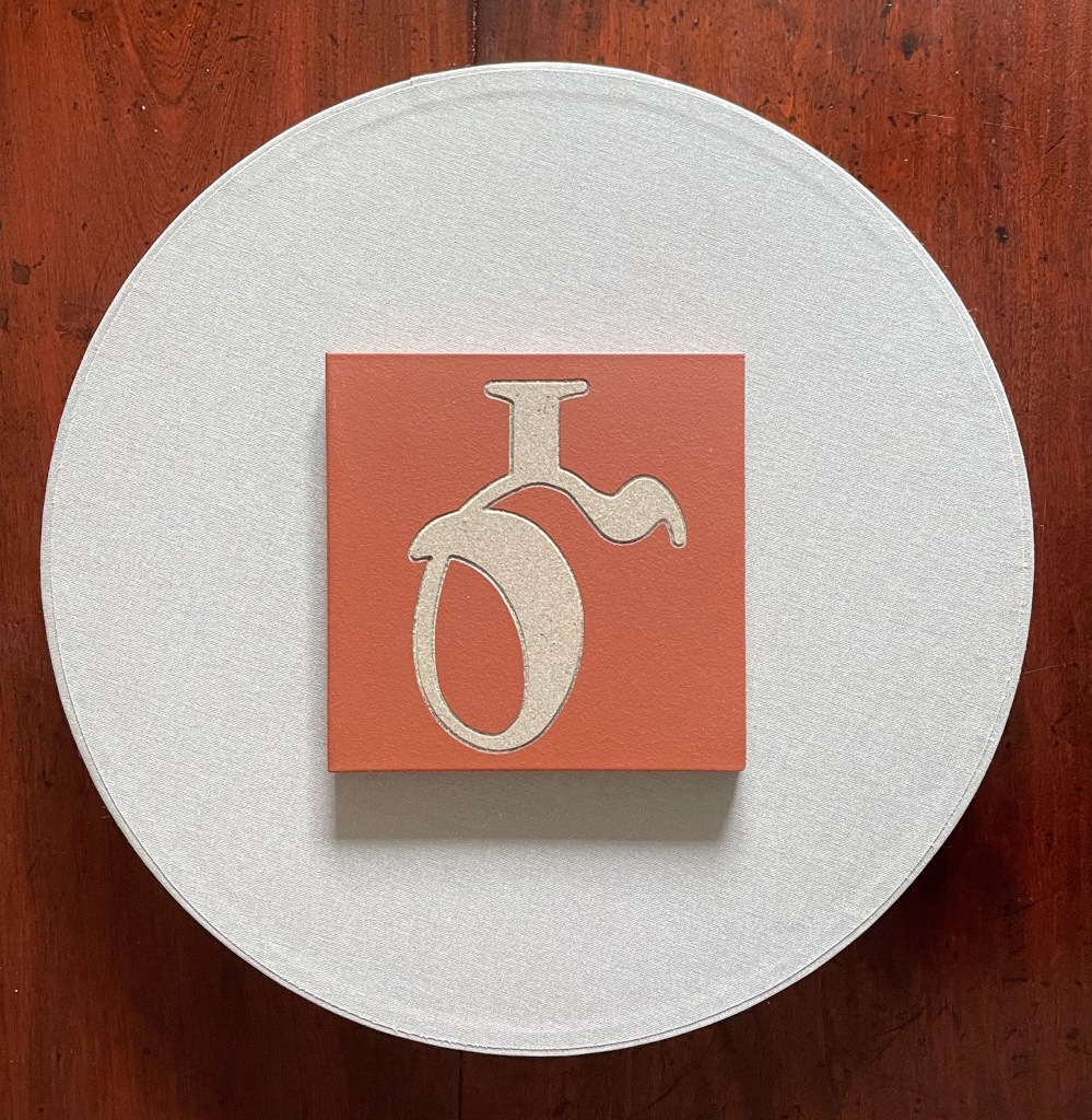
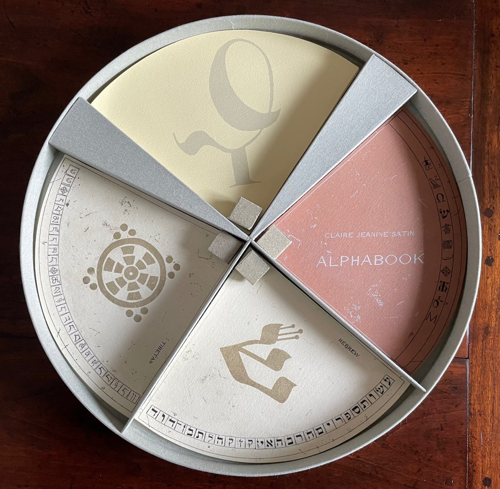
Alphabook (1998/9) Claire Jeanine Satin Circular box containing four segments of post-bound pages. Diameter 356 x D51 mm. Limited variable edition of 11, this copy with a segment on the Cherokee syllabary and a Cherokee sign tile on the cover. Acquired from the artist, 15 December 2022. Photos: Books On Books Collection. Displayed with artist’s permission.
From the artist’s description:
Alphabook is photo-etched and printed on 360 gm/m2 Fabriano Murillo with inks and metallic colors. The sets of pages are grouped in four segments. Three consist of alphabetic notations, images, phrases, and poetry. The fourth set consists of accompanying texts describing the alphabet or notations, (in this case Cherokee). The pages form circles when fully opened. A colophon page is included and signed at the end. The circular containers were constructed and bound in Italian Ciralux cloth and topped with a water-jet cut tile designed by the artist. The rim is gold stamped with the Latin phrase: VERBA VOLENT, SCRIPTA MANENT.
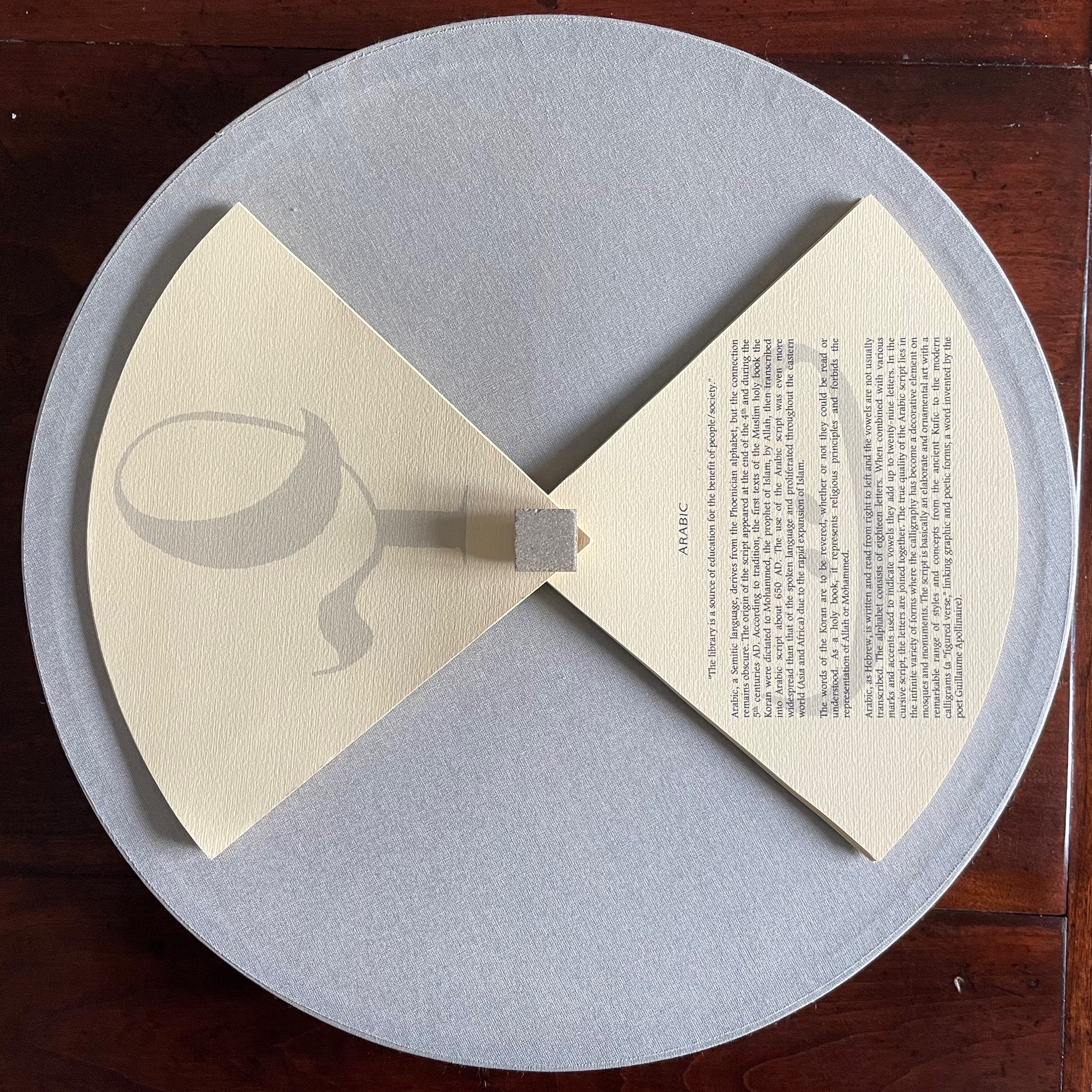
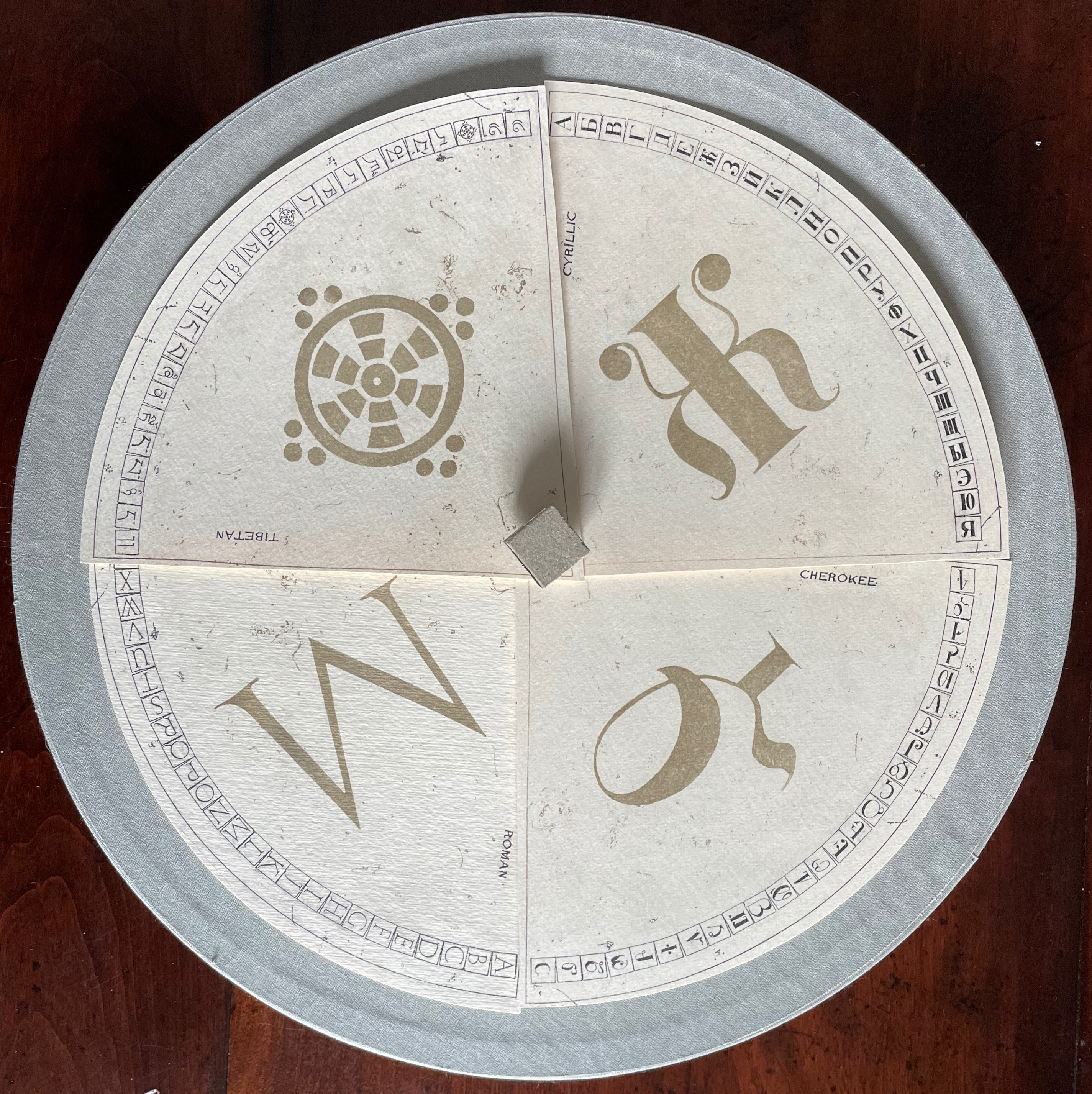
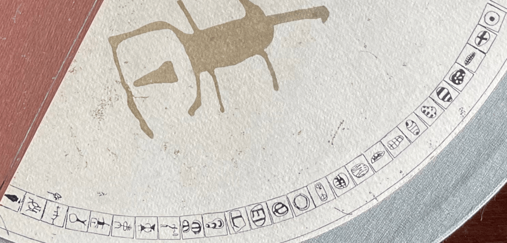
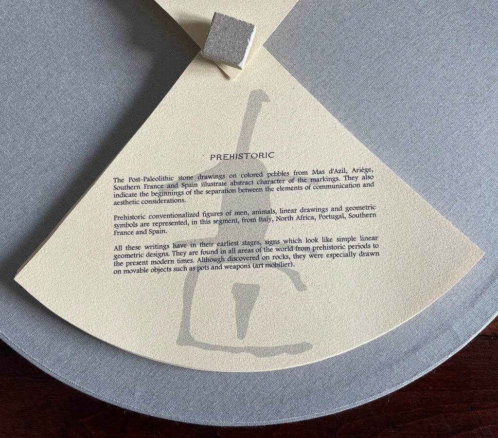
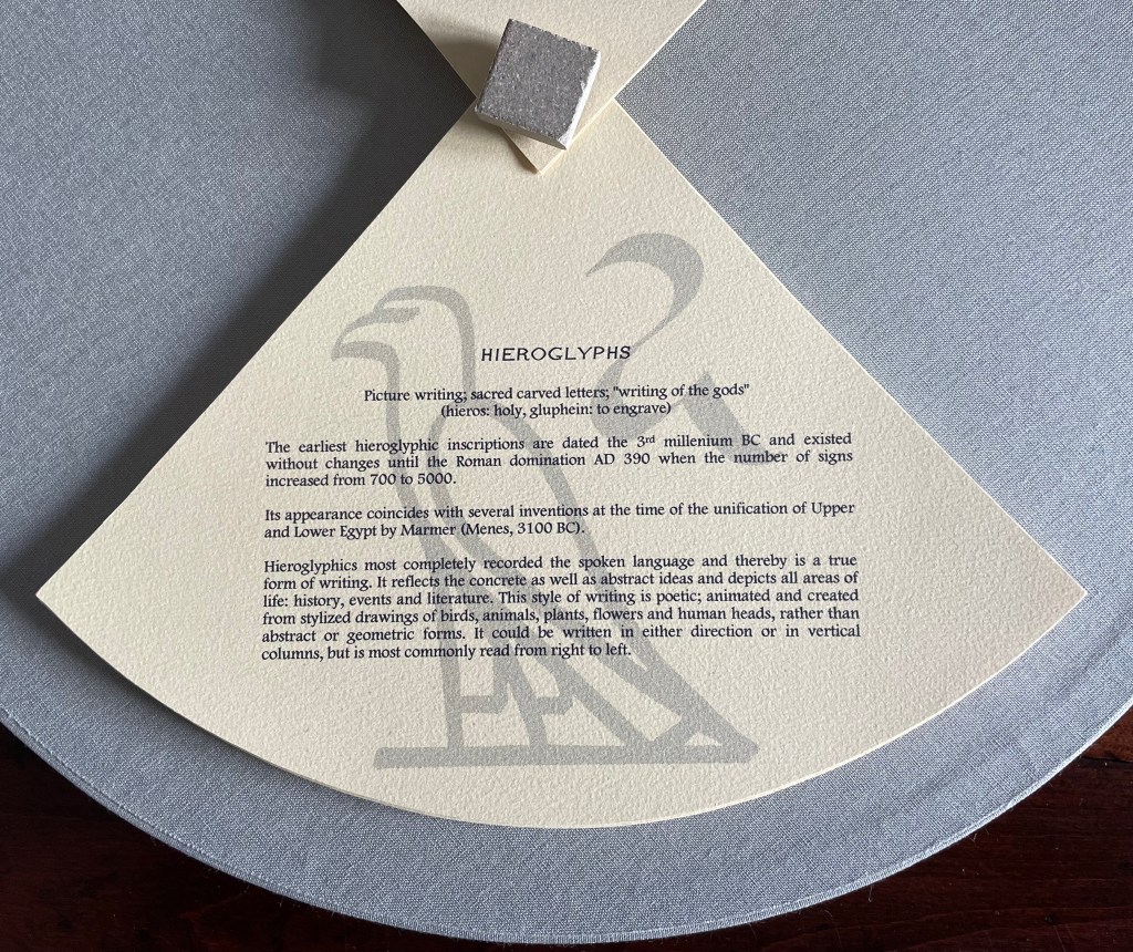
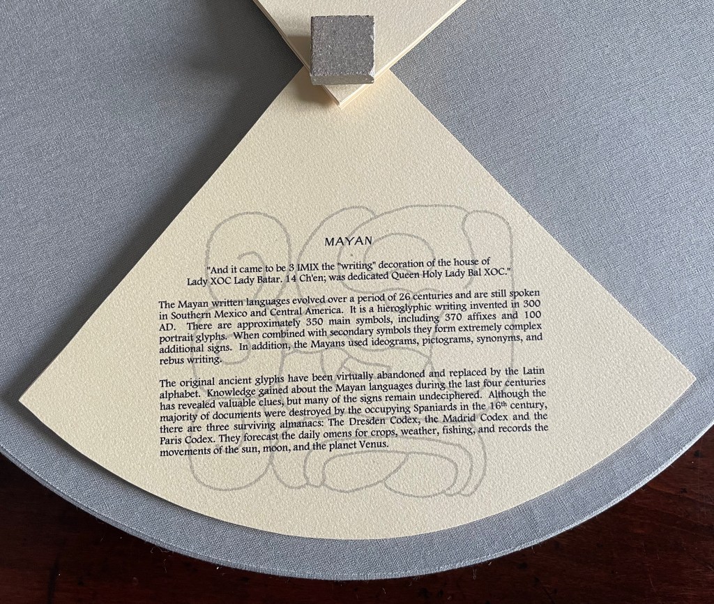
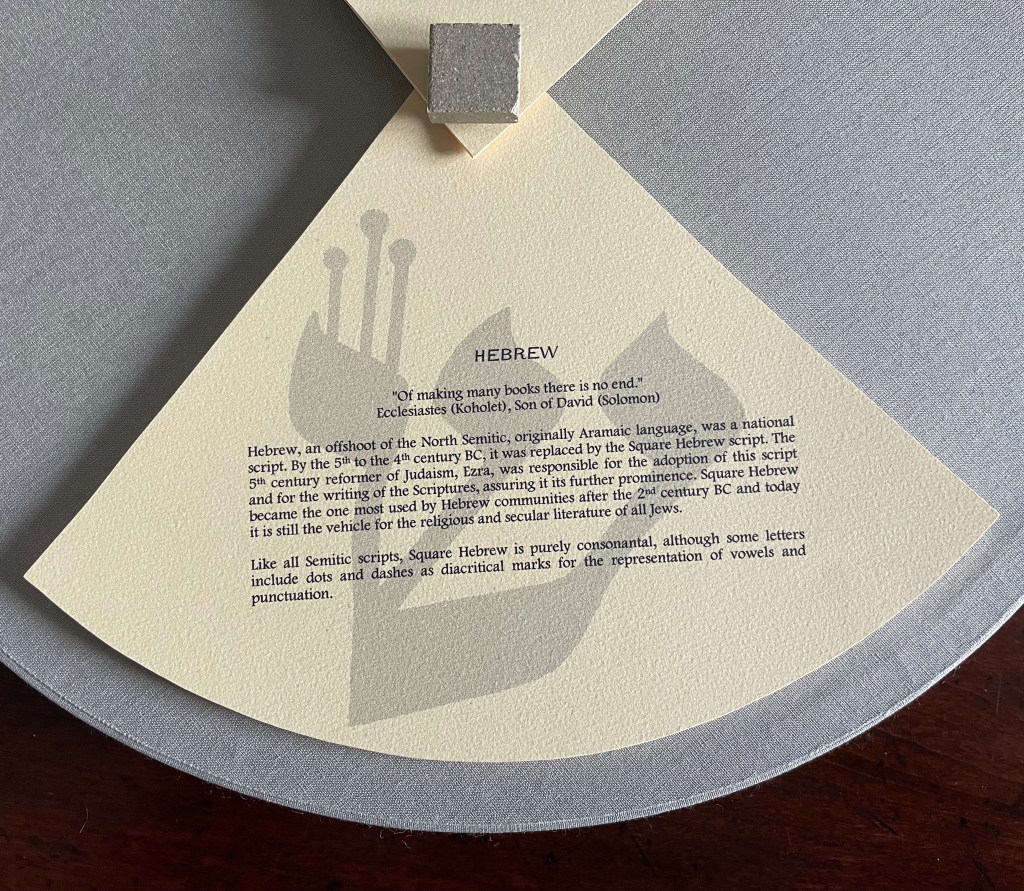
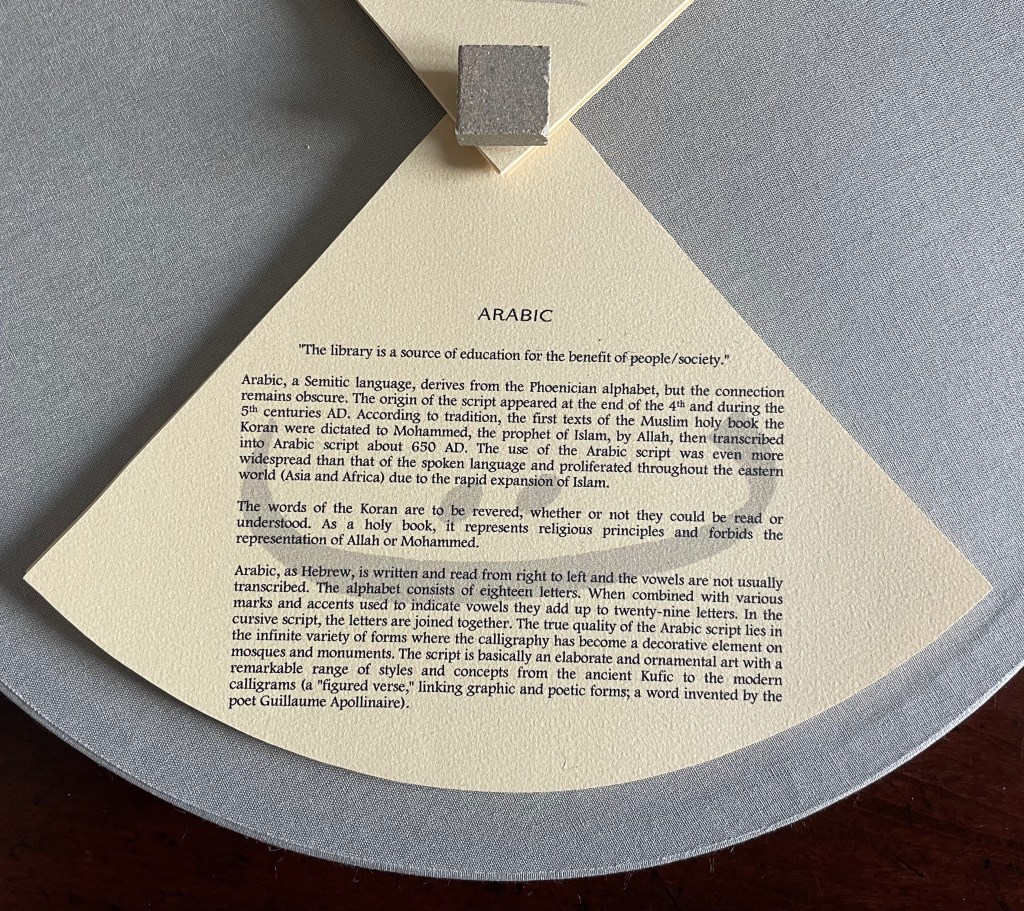
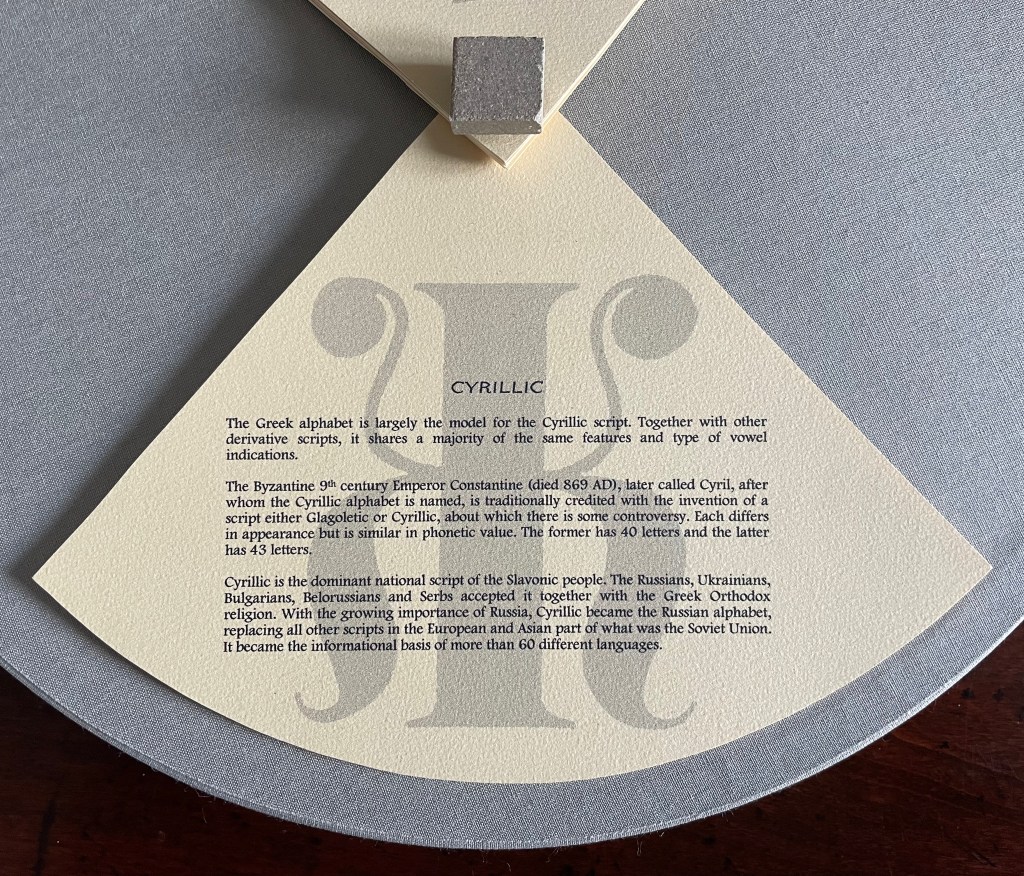
This work has no externally visible title, only the Cherokee letter Ꮉ (for the sound “ma”) on the tile and that gold-stamped Latin phrase. Traditionally the proverb runs in the indicative — Verba volant, scripta manent (“Words fly, writing remains”) — but presumably to draw yet more attention to the solidity of the written word over the iffy ephemerality of the spoken word, the subjunctive volent (“Words may fly” or “If words fly”) comes into play. As the lid lifts, the work’s title Alphabook appears, indicating that, at its heart, this work of art is a book. The container’s circular shape, its inner segmentation and the post-bound segments may challenge the traditional notion of a book, but the segments’ text just as strongly asserts a bookish purpose, highlighting eleven prewriting and writing systems: Prehistoric, Hieroglyphs, Mayan, Hebrew, Arabic, Greek, Roman, Chinese, Tibetan, Cyrillic and Cherokee.
With their pages pivoting on their central posts, the segments can sometimes display wingspans, nudging forward an interpretation of Verba volent, scripta manent that a writing system’s shapes permanently out-soar sounds on the air.
Segment open to Chinese page on the left, Arabic page on the right.
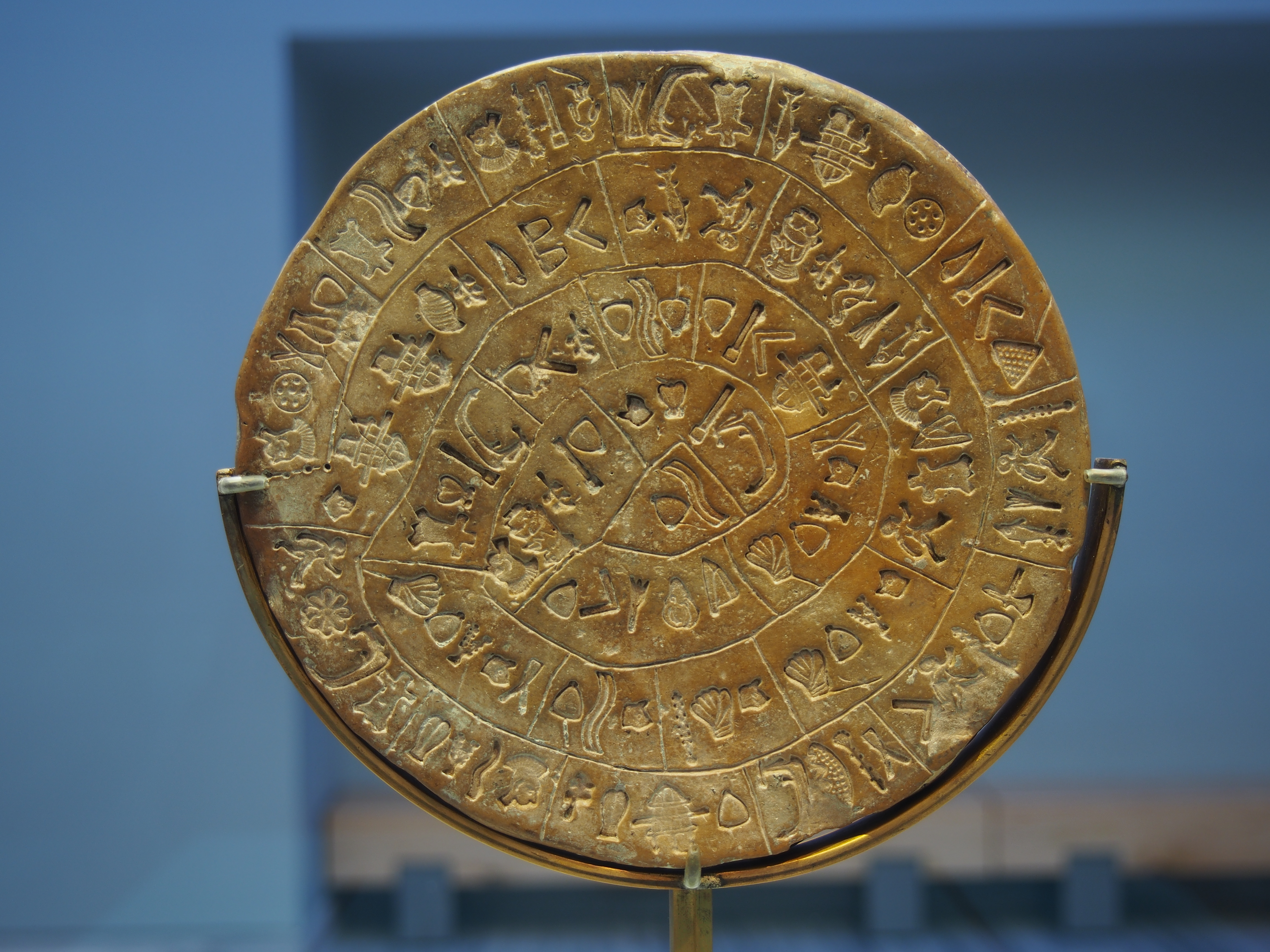
Fully opened, the segments evoke the Phaistos Disc, resident in the Archaeological Museum of Heraklion on Crete. Dating sometime between 1850 B.C. and 1600 B.C, the disc remains undeciphered, hovers indeterminately among statuses of hieroglyph, syllabary and alphabet and is still subject to speculation about its source — Linear A or Linear B.
Phaistos disc, sides A and B after the 2014 renovation. Photos by C. Messier – Own work, CC BY-SA 4.0.
Drawing on pebble and cave art images from France and Spain created as long as 36,000 years ago, Alphabook reaches back further than the Phaistos Disc. The depicted shapes along the rim of the Prehistoric segment mark the millennia-long trail to the formation of any writing system, alphabetic or non-alphabetic.
Sequoya’s Cherokee syllabary is the youngest of the eleven marking and writing systems that Alphabook covers, a distinction that made this particular version of the limited variable edition attractive. In the Books On Books Collection, works of book art such as Gerald Lange’s The Neolithic Adventures of Taffi-Mai Metallu-Mai (1997), Cari Ferraro’s The First Writing (2004) and Helen Malone’s Alphabetic Codes (2005) among others address the origin period, but besides James Rumford’s children’s book Sequoyah (2004), no others address this remarkable single-handed creation of the Cherokee script.
Opportunities for book art inspired by newly invented alphabets and syllabaries or even by endangered languages abound. There is the Odùduwà alphabet (for the Yorùbá people) and ADLaM (for the Fulani language) as well as the syllabary that “comes with” its own artist: Frederic Bruly Bouabré and his syllabary for the Bété language (Ivory Coast). The Endangered Languages Project andEndangered Alphabets Projectcan both offer inspiration. In fact, the latter sparked Sam Winston’s One and Everything (2023), now part of the collection.
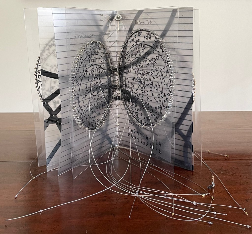
The Hebrew Alphabet Expressing the Celestial Constellations (2017)
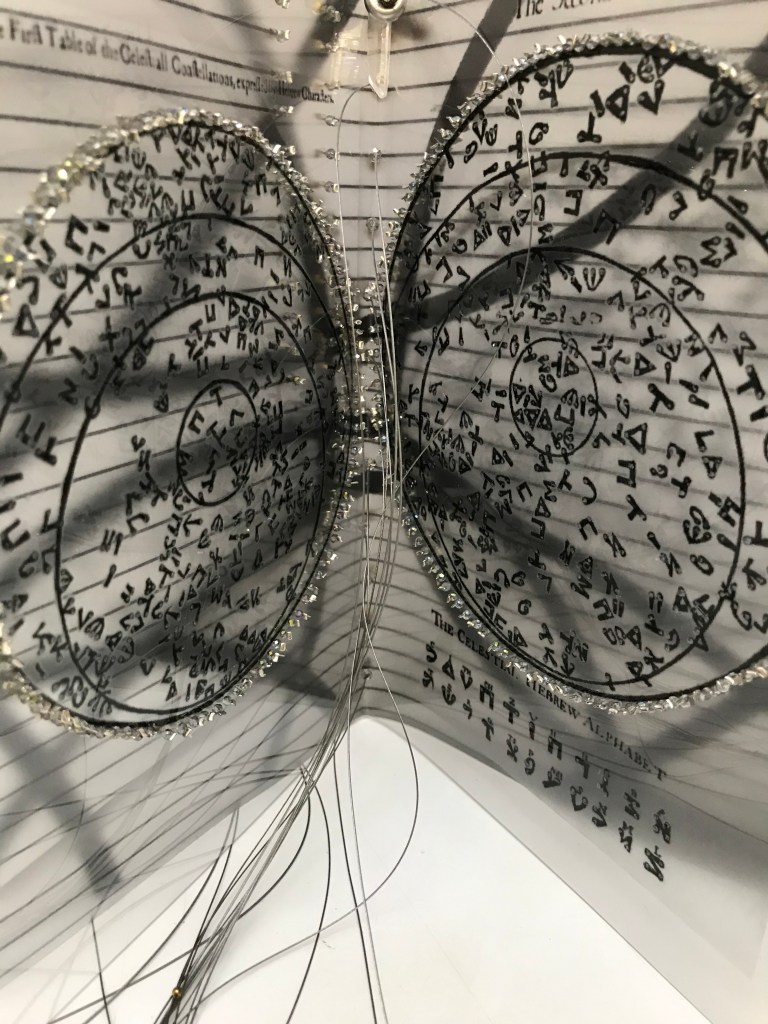
The concept of the celestial alphabet is simple: the forms of the letters are supposedly derived from observation of configurations of stars in the heavens which can be ‘read’ as a form of sacred writing. These alphabets are visually recognizable by the use of nodal points to indicate the stars at the intersection of the bars or lines in their forms, the empty spots in the ink lines signalling the bright point of light in the dark sky. — Johanna Drucker, The Alphabetic Labyrinth, p. 125.
A volume in New York’s Morgan Library by Jacques Gaffarel (1601–1681), a French scholar and astrologer, provides inspiration and material for Satin’s artist’s book The Hebrew Alphabet Expressing the Celestial Constellations (2017). More precisely, two woodcuts from the 1650 English translation of Gaffarel’s Curiositez inouyes sur la sculpture talismanique des Persans, horoscope des Patriarches et lecture des estoiles (1629) are the source.
The Hebrew Alphabet Expressing the Celestial Constellations (2017) Claire Jeanine Satin Saddle stitched with fishline. Box: H277 x W225 mm. Book: H 240 x W165 x D42 mm. 16 pages. Unique edition. Acquired from the artist, 12 April 2023. Photos: Books On Books Collection. Displayed with permission of the artist.
In addition to its astrological character, Gaffarel’s work sits in the traditions of gematria, the Kabbalah and alchemy, which Satin conjures up with gold and silver beads, and crystals. Among the earlier contributors to these traditions is Heinrich Cornelius Agrippa. Like his mentor Johannes Trithemius, Agrippa was a polymath, occultist and theologian as well as physician, legal scholar and soldier. The Latinized Hebrew letters and their corresponding characters in the celestial alphabet seen below come from Agrippa’s De occulta philosophia (1533), which is more legible than Gaffarel’s above.
But there’s a much later inspirational source of esoterica at play elsewhere in the book and in the silver letter adhering to the black box that holds the book. The letter on the box is He, the fifth letter of the Hebrew alphabet, which according to Satin was chosen at random in homage to John Cage’s theory of chance and its role in music and creativity.
The rules printed on the acetate pages suggest a school composition book, an ordered contrast to Cage’s indeterminacy. Or perhaps they are recurring lines of musical staves, and the beads clamped to the fish line are meant to suggest a chaos of errant musical notation. The alphabetic order projected on the heavens in earlier centuries is belied by the disorder of chance projected in later centuries.
With the transparency of the pages, with gold on one side of them and silver on the other, and with two distinct “projections”, Satin leaves us in suspense or a suspenseful state of simultaneity.
Alphabet Cordenons paper book (2020)
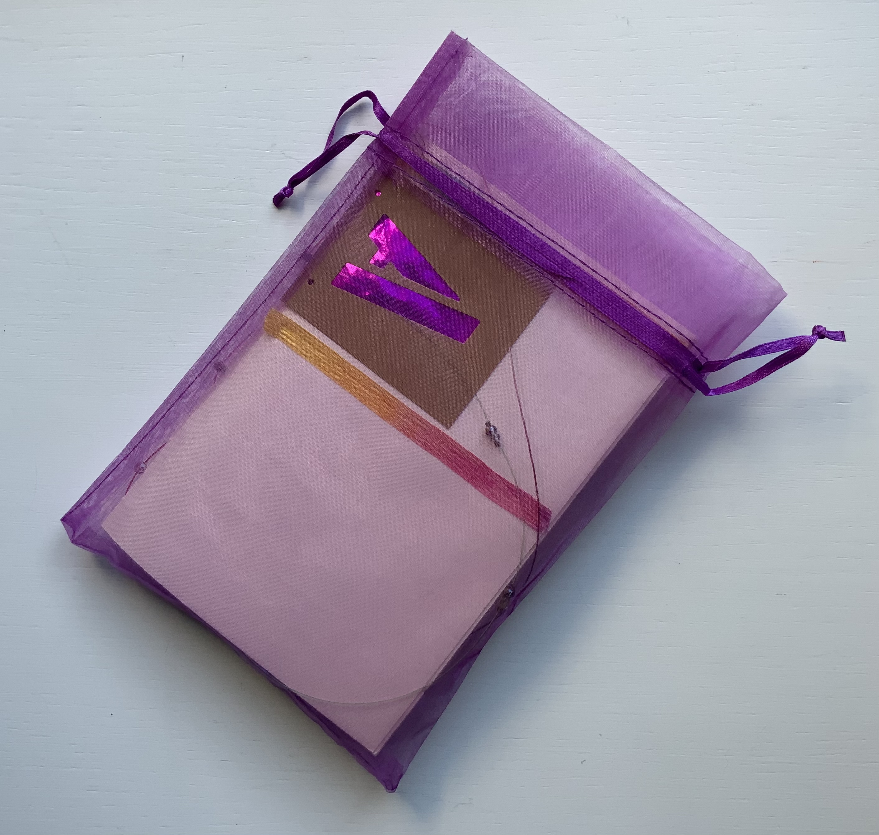
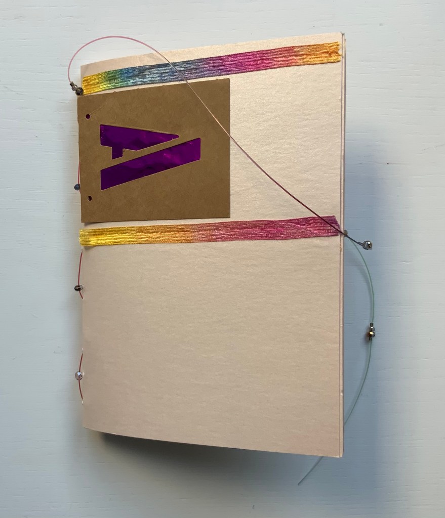
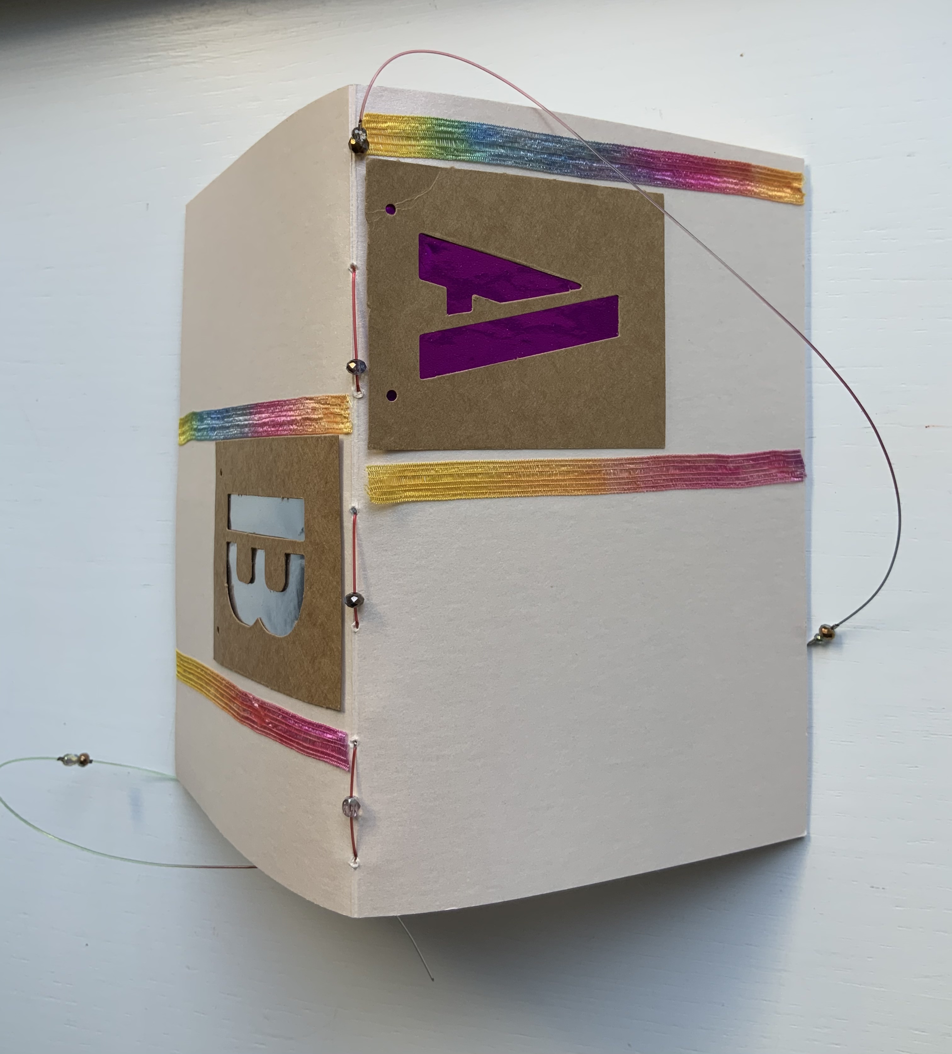
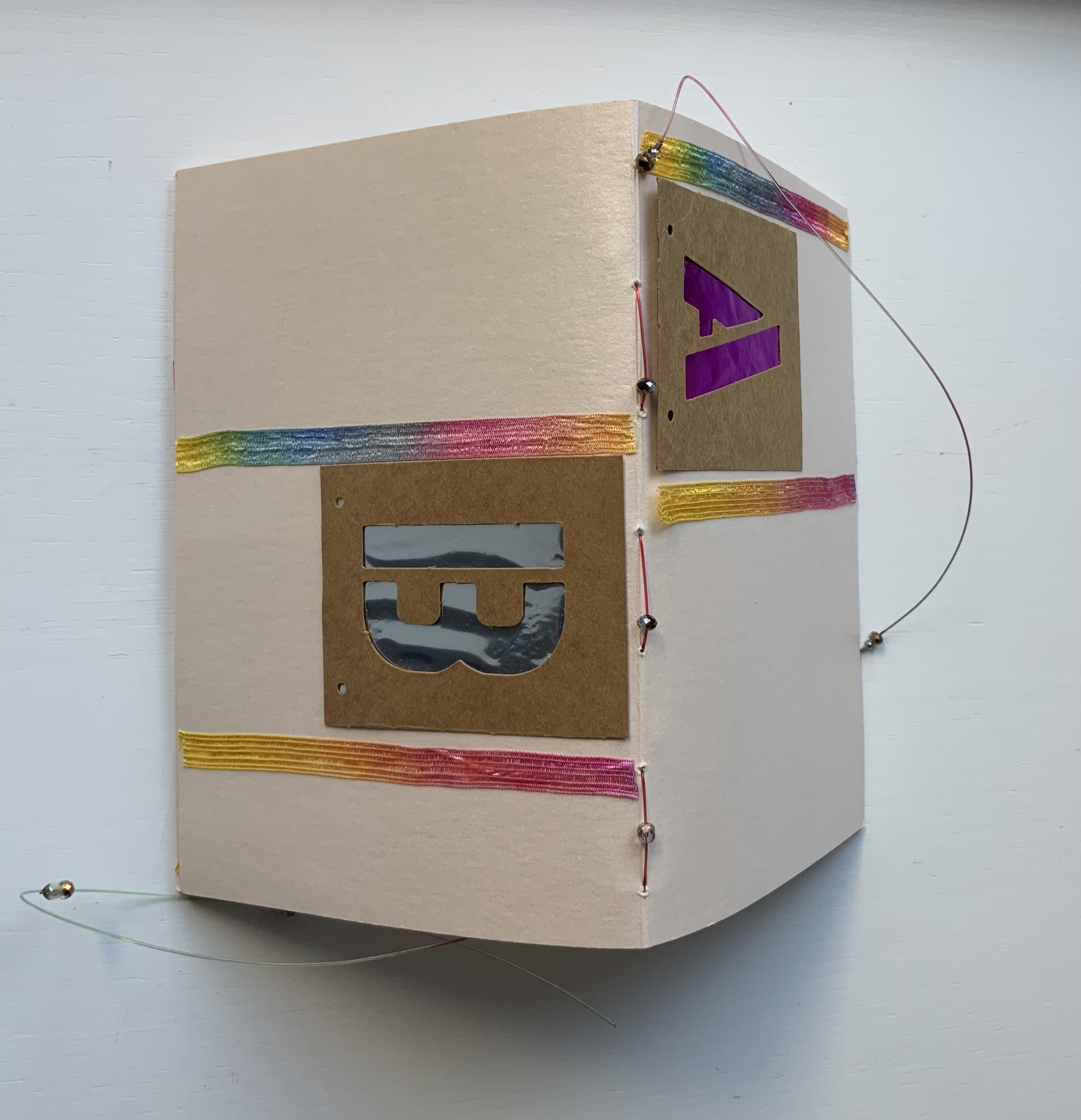
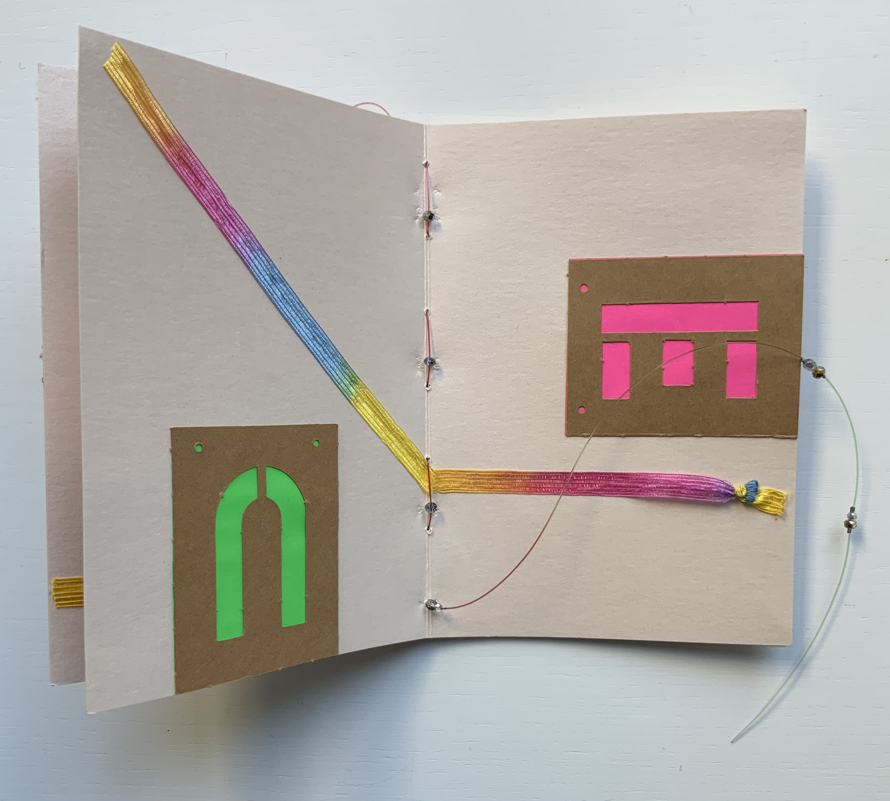
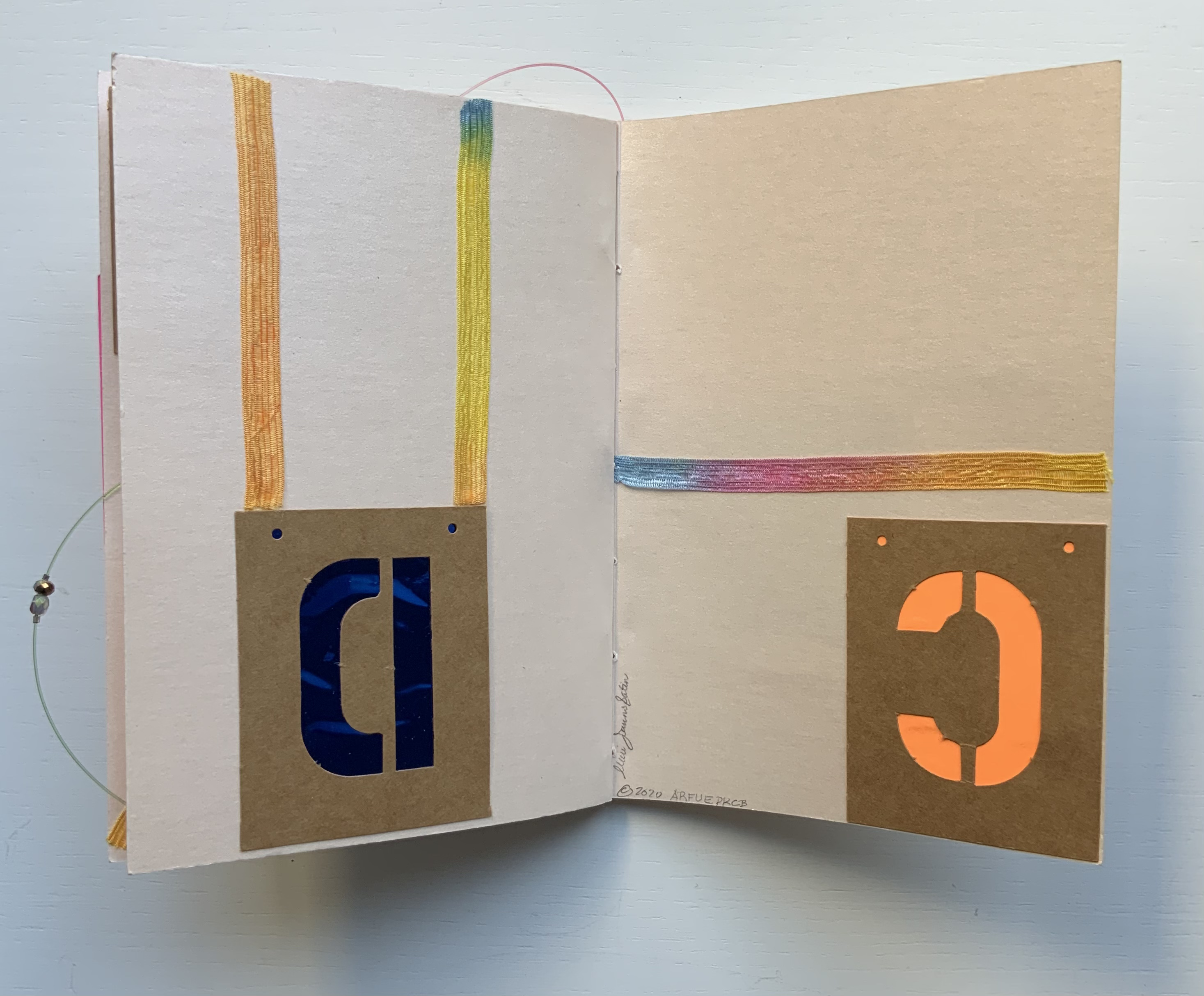
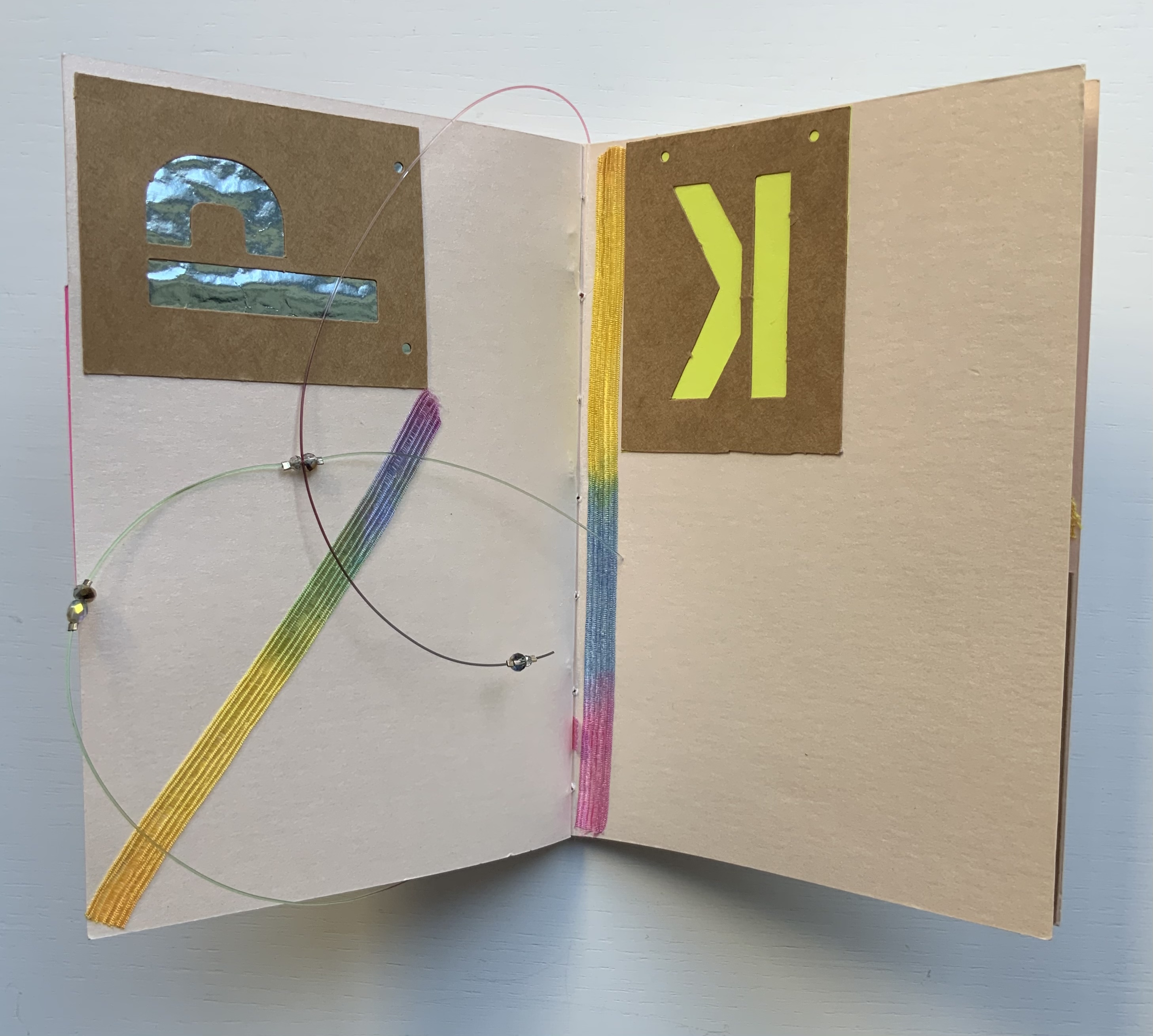
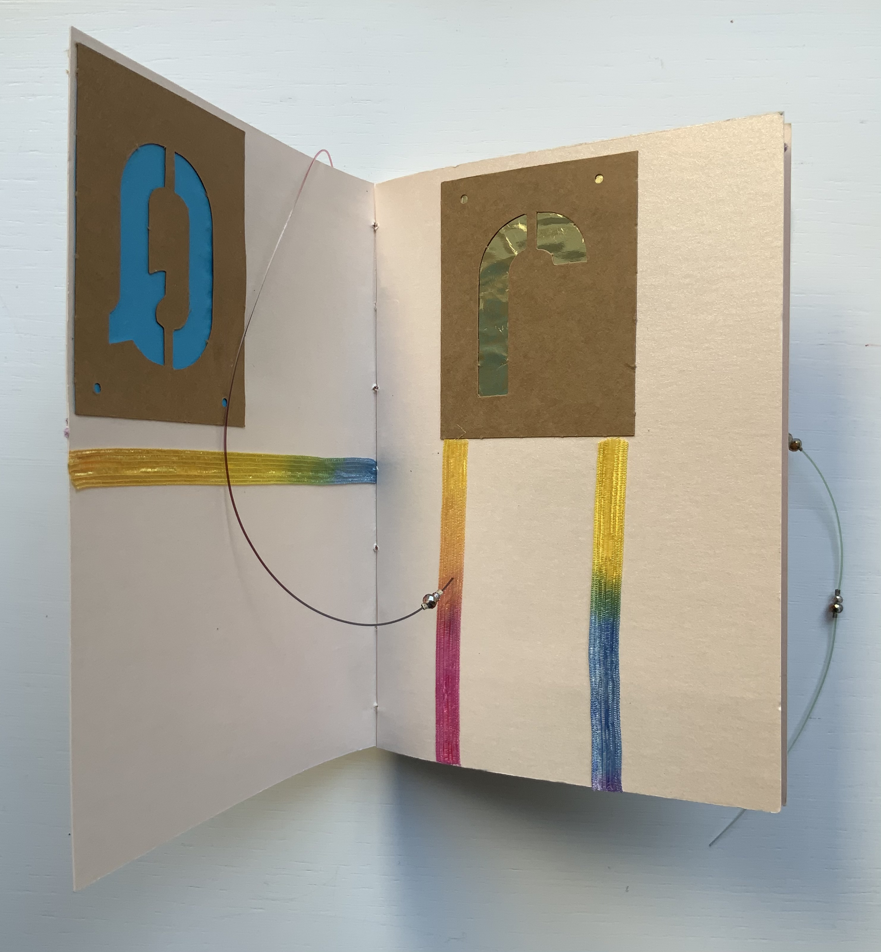
Alphabet Cordenons paper book (2020) Claire Jeanine Satin One of a series of unique works, each created with Cordenons paper, a fine paper that has been manufactured in Italy since 1630. This book uses alphabet letters, glittery strips of ribbon, sequins, crystals, and monofilament to create precise and inventive designs on the cover and each page. In a lavender cloth bag. Measures 9 x 7 inches. 10 unnumbered pages. Acquired from The Kelmscott Bookshop, 8 February 2021. Photos of the work: Books On Books Collection. Displayed with permission of the artist.
In Alphabet Cordenons, as the title suggests, the elemental meets the material. The ancient Greeks called the letters of the alphabet stoicheia (“elements”). In a sense, the elemental yields to the material. Not every letter of the alphabet appears in Alphabet Cordenons, and those that do, appear out of sequence, upside down, sideways, in varied colors and types of paper appearing through their cut stencil shapes. These aspects of materiality draw attention to the paper itself, which comes from a mill established in Corden0ns, Italy in 1630 and is still produced there.
Also drawing attention to the paper are satin ribbon with graduated shifts of color, colored foil backing that lightens and darkens, and glittering beads threaded on multi-colored fish line. Each calls attention to the encaustic-like sheen that comes from the inclusion of mica in making Cordenons Stardream (285 gms) paper.
The finish’s indeterminacy under shifting light seems to find a mirror in the random order, selection and placement of the letters as well as the changing orientation of the ribbon.
Even more indeterminate is the fish line that flips about, curls within, and slips without the turning pages. But while materiality seems to outshine the elemental at every turn, the elemental reasserts itself in the peculiar orientation of the letters and the incompleteness of the alphabet.
“Lyn Davies“. 7 August 2022. Books On Books Collection. Reference and fine print.
“Timothy Donaldson“. 1 February 2023. Books On Books Collection. Reference.
“Cari Ferraro“. 1 February 2023. Books On Books Collection. Artist’s book.
“Edmund Fry“. Books On Books Collection. (For more on the “begats” of the celestial alphabet, see this entry for the near-facsimile copy of Fry’s Pantographia.)
“David J. Goldman“. Books On Books Collection. Reference. [In progress]
Clodd, Edward. 1913. The Story of the Alphabet. London: Hodder and Stoughton. 1913. Superseded by several later works, but is freely available online with line illustrations and some black and white photos.
Diringer, David, and Reinhold Regensburger. 1968. The alphabet: a key to the history of mankind. London: Hutchinson. A standard, beginning to be challenged by late 20th and early 21st century archaeological findings and palaeographical studies.
Thompson, Tommy. 1952. The ABC of our alphabet. London: Studio Publications. Not a fine press publication, but its layout, illustrations and use of two colors bear comparison with the Davies book. It too is out of print and unfortunately more rare.