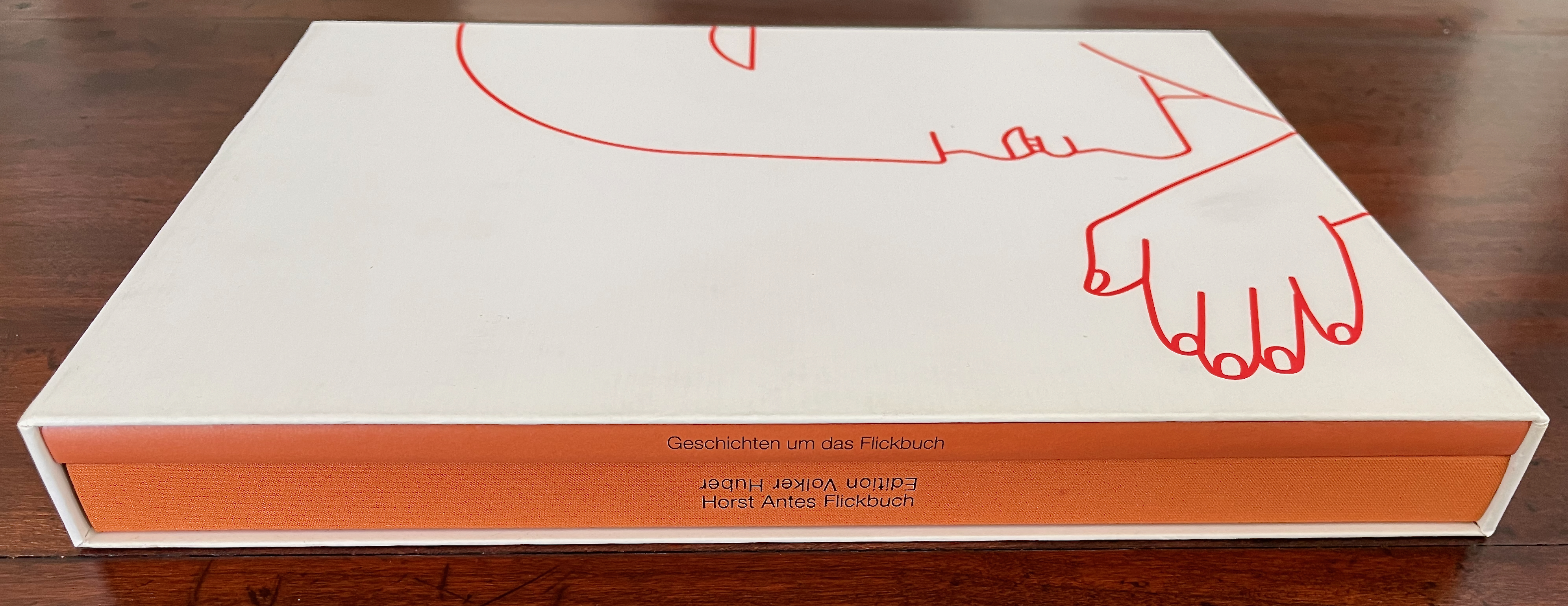
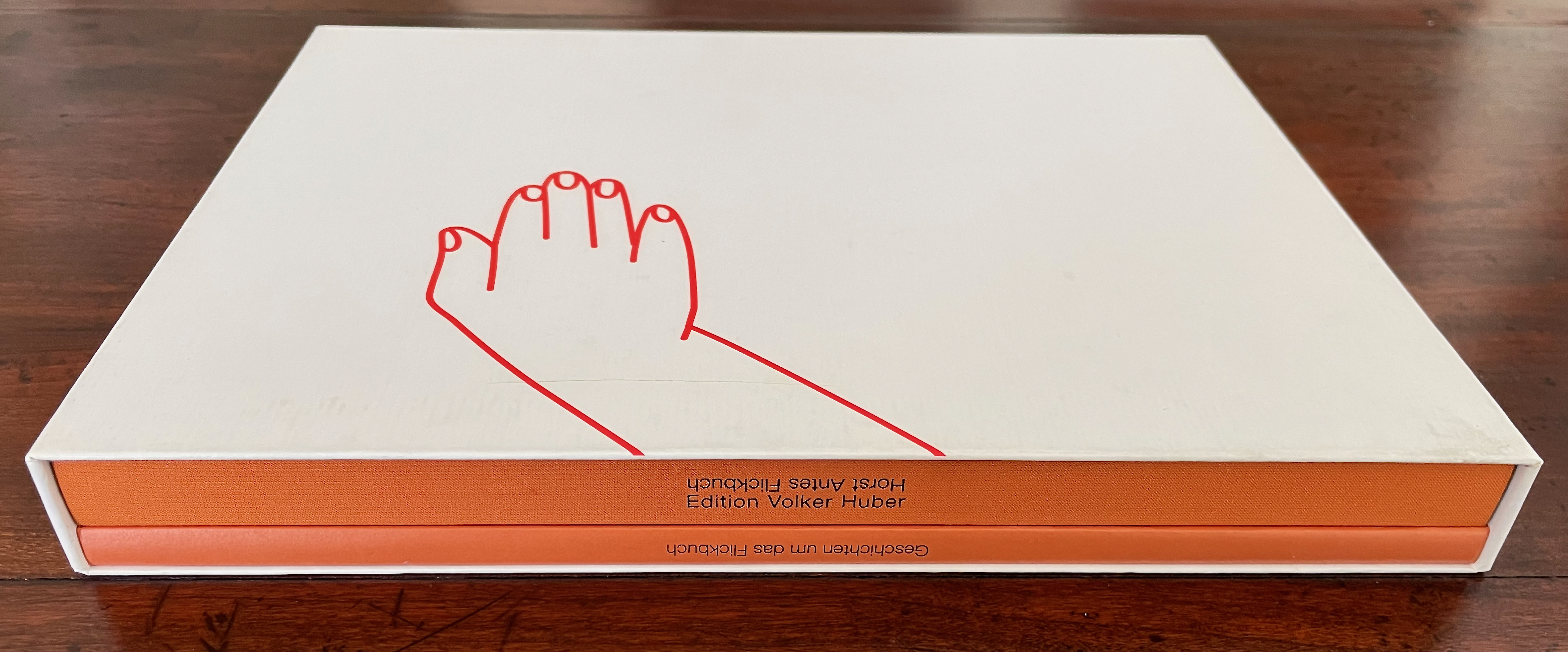
Flickbuch, Geschichten um das Flickbuch, and Fresh Breath on the Blow Book (2000, 2001, and 2003)
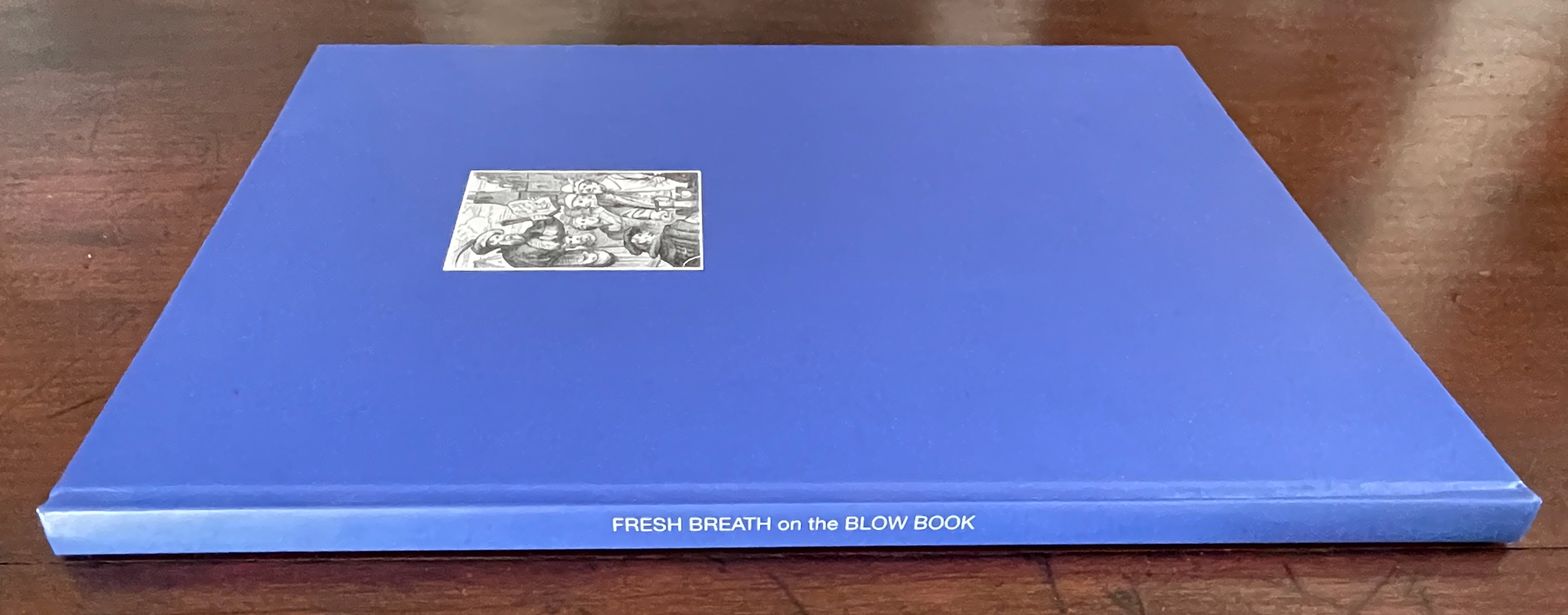
Flickbuch, Geschichten um das Flickbuch, andFresh Breath on the Blow Book [trans] (2000, 2001, and 2003) Horst Antes and Volker Huber [Translators: Ariel Frailich, Richard Hatch, and Sharon and Arno Ziesnitz] Slipcase containing two volumes in German. Single volume in English. Slipcase: H276 x W212 mm. Books: H269 x W209 mm. [164] and 32 pages. Translation volume: H268 x W209 mm. 40 pages. Slipcased edition of 1000, unnumbered copy. Acquired from Ricky Jay Estate, 17 August 2024. Photos: Books On Books Collection.
I had been looking for Ricky Jay’s The Magic Magic Book (1994) and hoped that the 2024 estate auction would yield a result. It did but an unexpected one. Like Jay, the namesake founder of Volker Huber Edition und Galerie in Offenbach was a collector of magic artifacts. He was also an honorary member of Germany’s Magic Circle, so his acquaintance with the celebrated magician and actor was no surprise. What was a surprise was that he had combined his art interests with those in magic to create a “blow book” with Horst Antes, one of the several well-known German artists he published.
The blow book is best known in its familiar incarnation as the “magic coloring book”. The performer flicks through the book of blank figures to be colored in, calls on an observer to blow on the closed book, and then reopens it to show all of the pictures colored in. Hard-to-see tabs or alternating page widths enable the performer to produce the effect. Jay’s work remains the definitive history of the blow book. It consists of two volumes, one of which is a working blow book with contemporary art by Vija Celmins, Jane Hammond, Glenn Ligon, Philip Taaffe, and William Wegman, the other being the history of the apparatus.
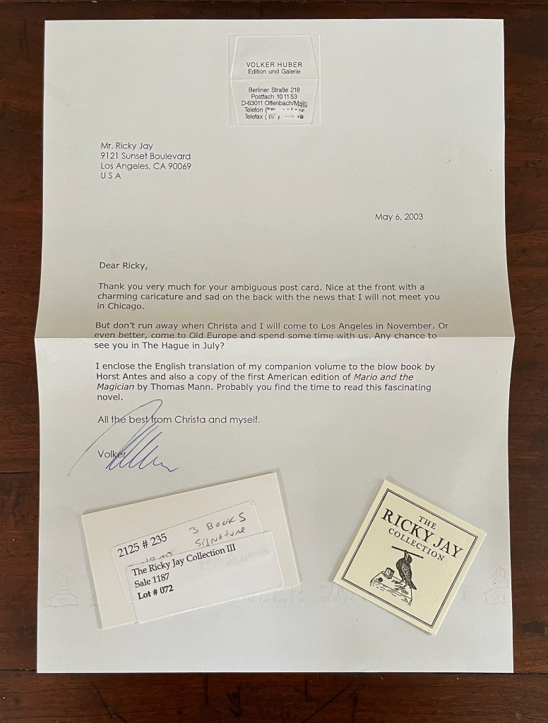
Huber leads the list of acknowledgments in Jay’s book. From that and this piece of ephemera, there is no doubt of their close acquaintance. If, however, you have read the New Yorker profile on Ricky Jay, Huber’s reference to Jay’s “ambiguous post card” will raise an eyebrow. Both Jay’s and Huber’s productions are slipcased, both are in two volumes, both have a working blow book, and both have an accompanying history. Given the New Yorker anecdote about Jay’s harsh reaction to a magician who mentioned he had incorporated Jay’s famous “The Four Queens” routine in his act, might Jay’s “ambiguous post card” have implied that Huber had reperformed Jay’s book trick?
Huber’s Geschichten um das Flickbuch [“History of the Blow Book”*] naturally cites Jay’s book. But it has many of the same illustrations. Unsurprisingly it equally highlight the same source for the first detailed description of the blow book. The main difference is that Huber argues for the existence of a missing blow book that would have accompanied the source, whereas Jay considers it unlikely. As for the working volumes, both have dos-à-dos structures. Admittedly there are differences. Jay uses tabs to facilitate the performer’s switch from sequence to sequence; Huber uses a sloping trim of width. Jay’s has twelve sequences, six to each side of the dos-à-dos; Huber and Antes have only four, two to each side. Might Jay have been a little jealous that those differences are what give Huber and Antes the room to elevate the blow book from a worked example to an artist’s book?
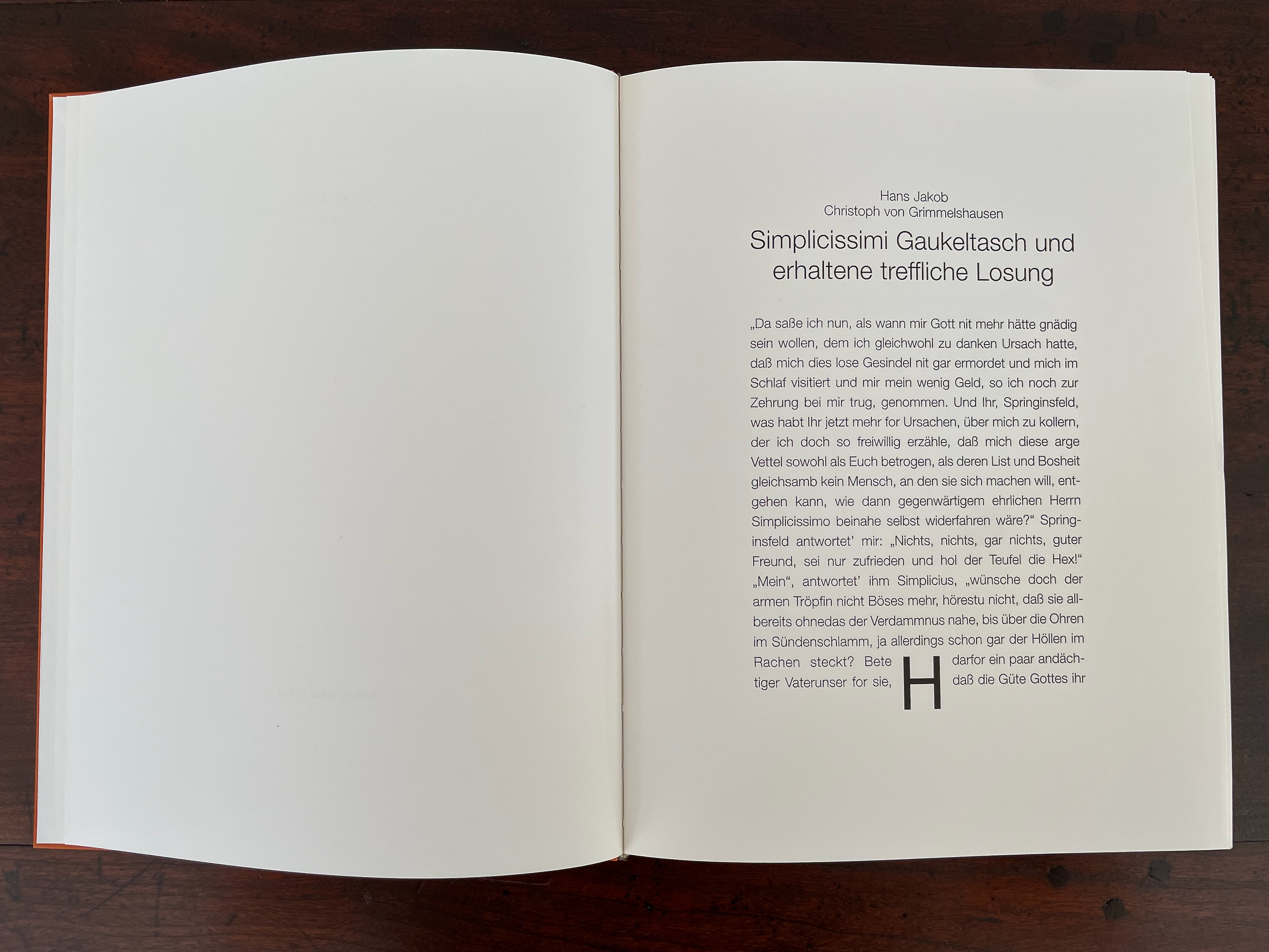
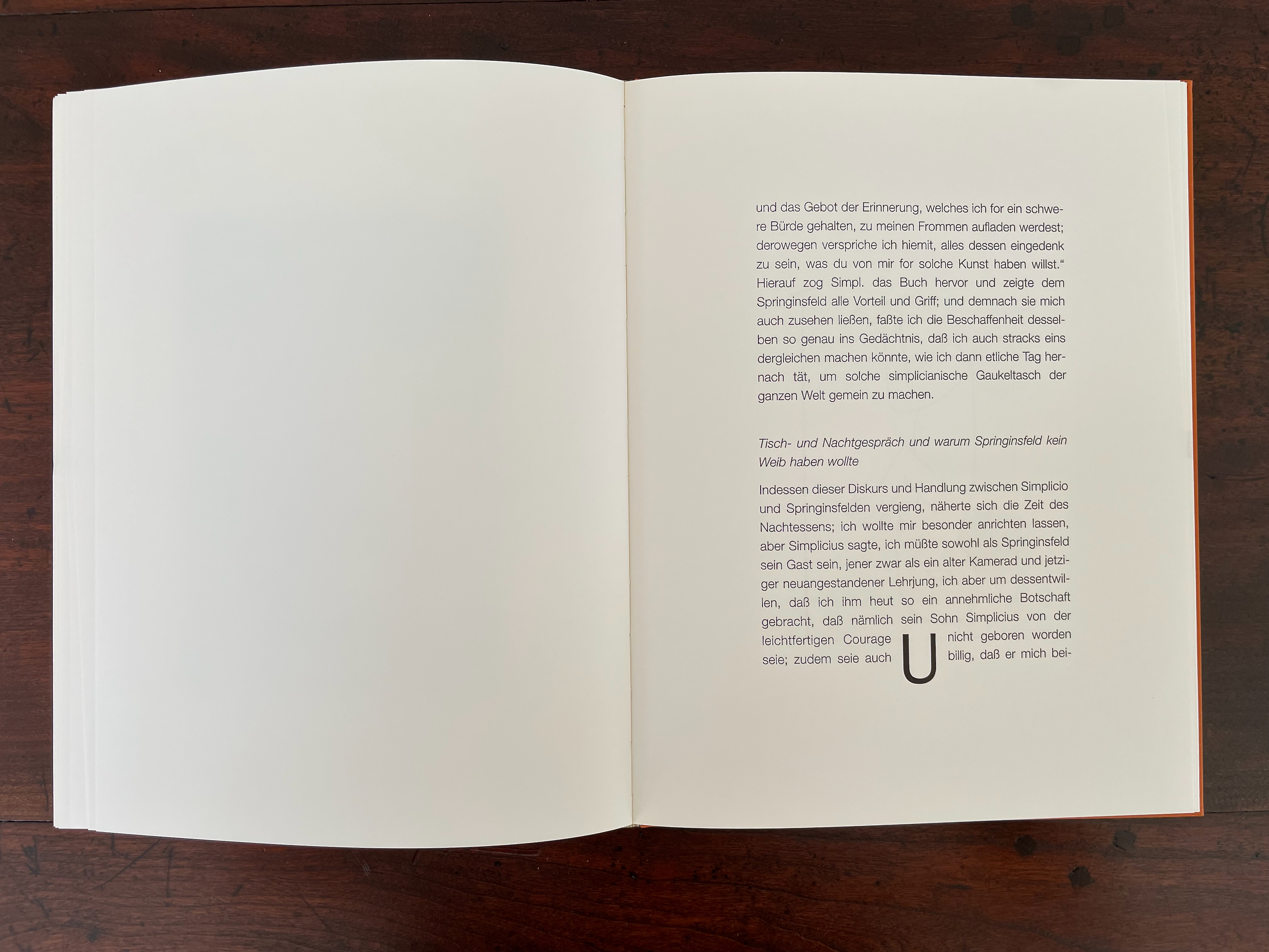
Holding the spine of Flickbuch with the left hand and placing the right thumb against the lower corner of the fore edge, the reader/performer riffles through the book. Twenty pages flip along, displaying the text of three selections from the mid-17th-century picaresque novel by Hans Jakob Christoffel von Grimmelshausen entitled “SimplicissimiGaukeltasch und erhaltene treffliche Losung” [“Simplicissimus’ Magic Book and its Excellent Profits”]. At the bottom of the text block on each page, a large display letter appears: first H, then O, gradually spelling out HORSTANTES-FLICKBUCH. It is a clever way of appropriating the Simplicissimus tale for Antes.
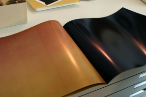
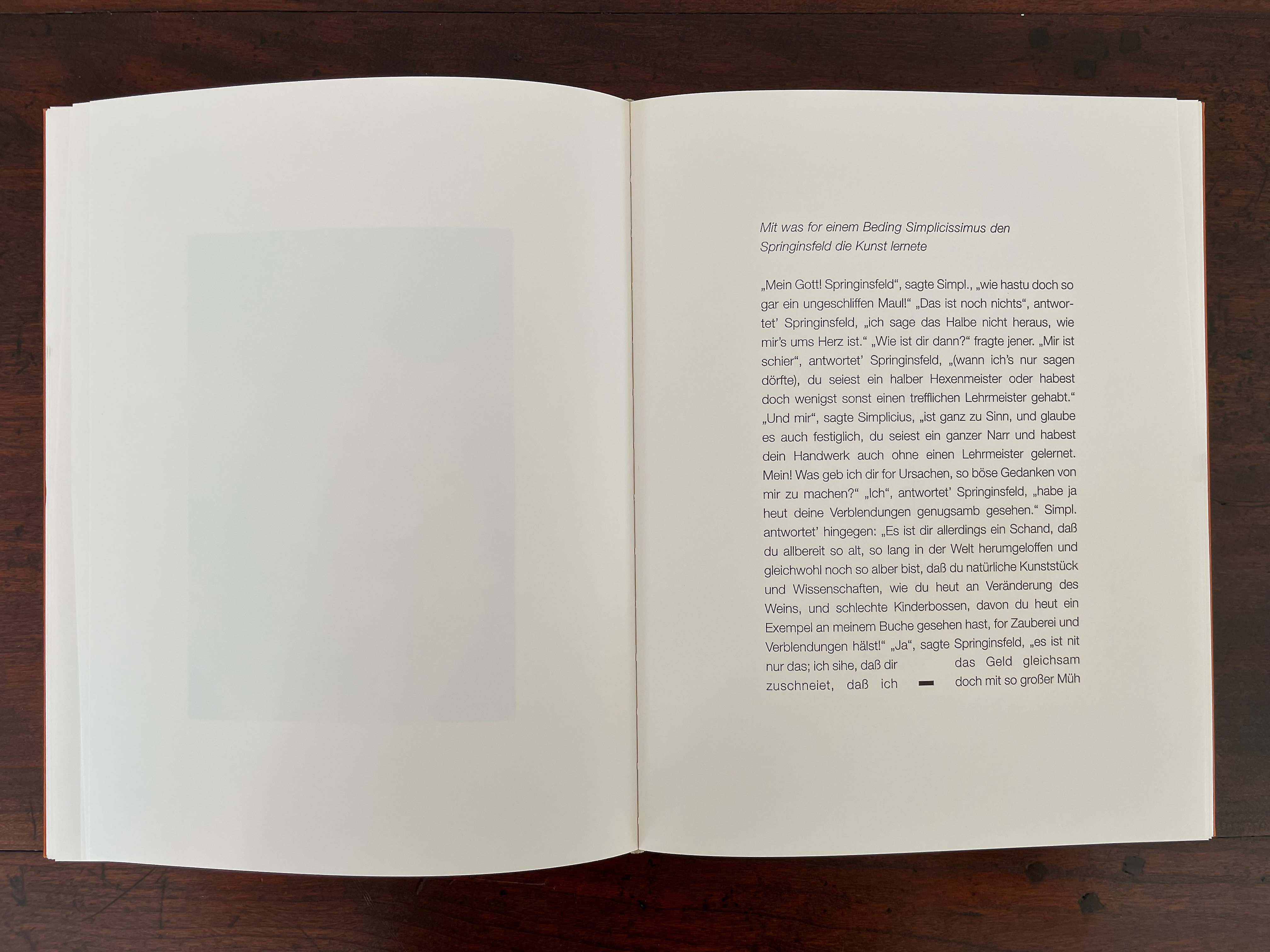
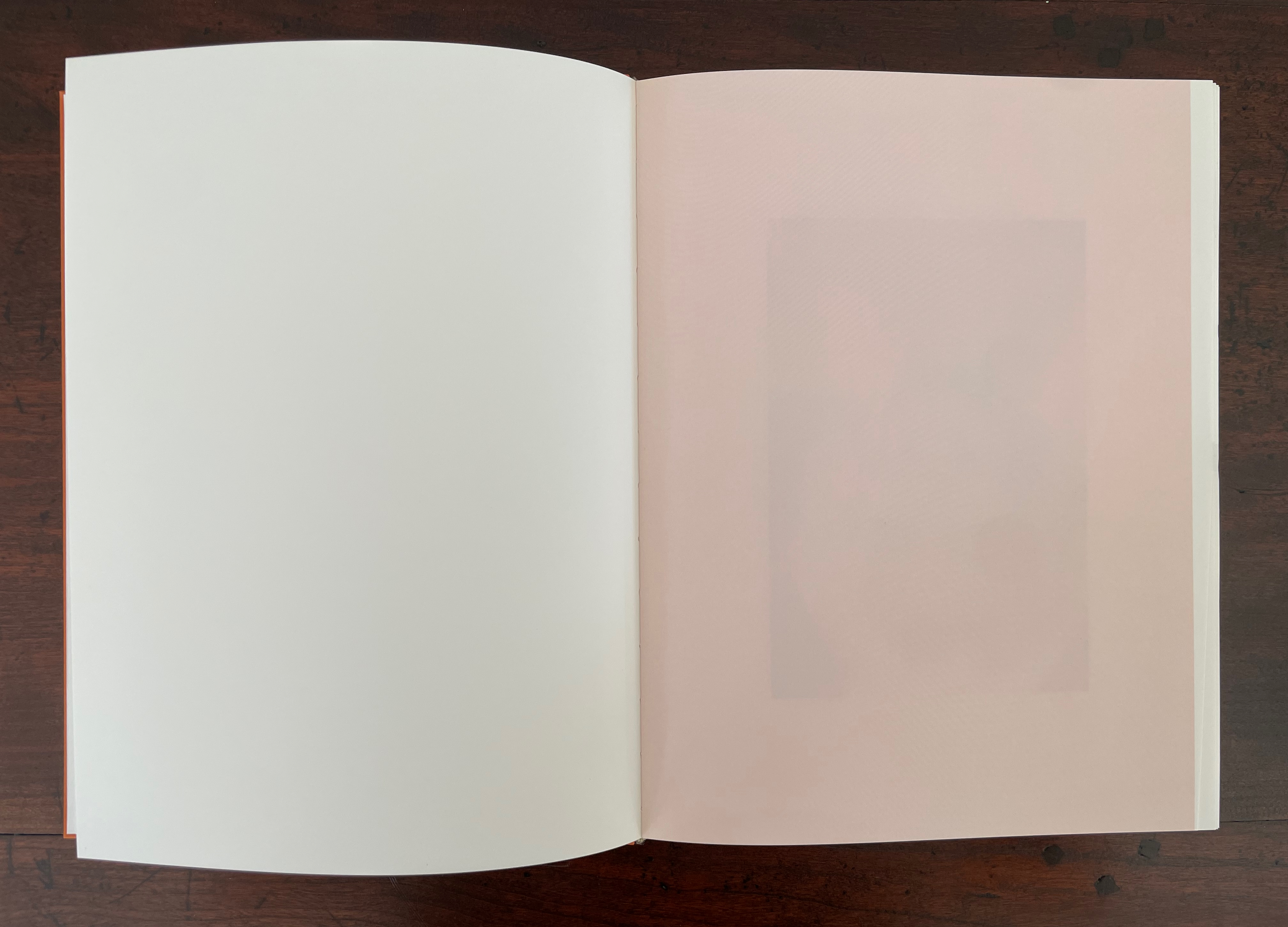
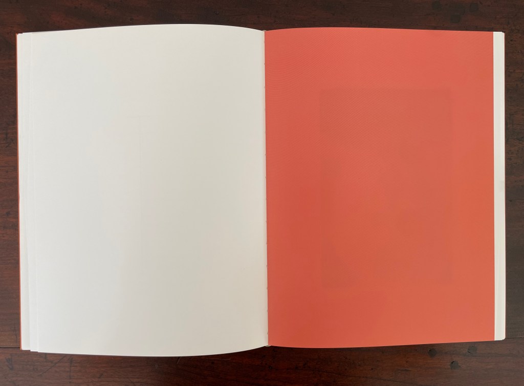
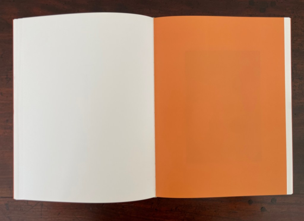
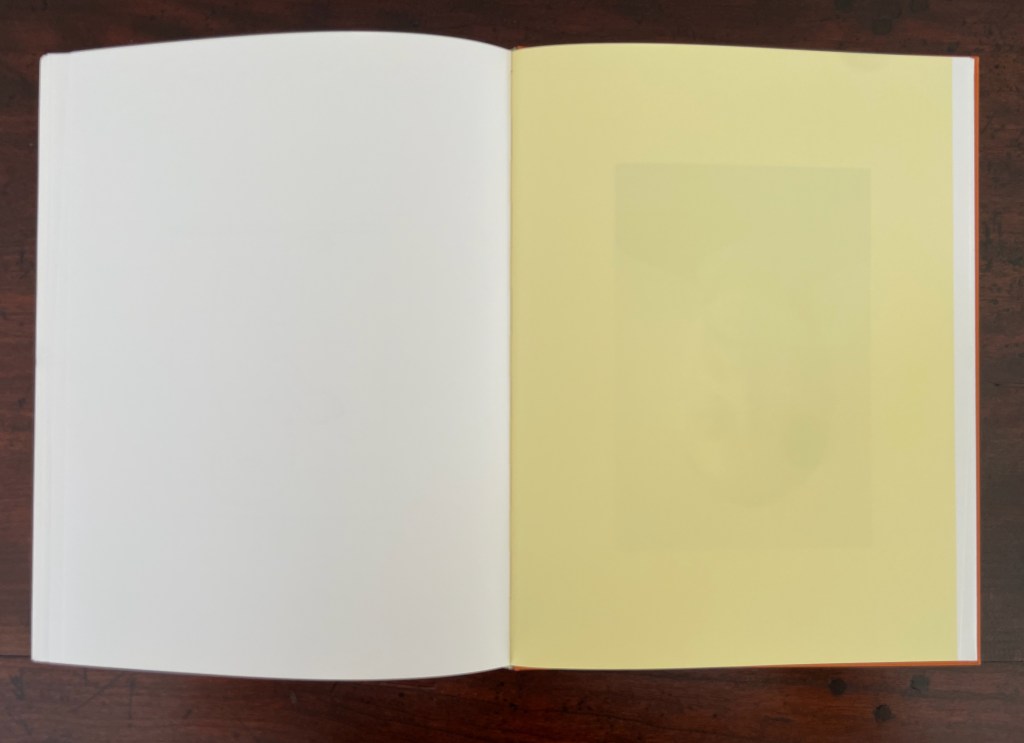
The next flick-through sequence is accessed by closing the book, shifting the right thumb to the upper corner of the fore edge, and again riffling through the book. “Magically” the text has disappeared, replaced by blank pages that change colors, gradually darkening from a light pink to coral to orange then lightening to yellow. This is another appropriation of the Simplicissimus tale. In the just-vanished text, Simplicissimus, the con artist, has arrayed six glasses of wine before the crowd of dupes gathered by his blow book patter. By adding one drop of magic elixir to the first glass, he changes the wine’s color and quality. The second glass receives two drops, the third three drops, and so on until Simplicissimus and his sidekick Hopalong are relieving their audience of their money in exchange for tins of the elixir that they believe will turn casks of plonk into the finest vintage.
The opening pages of the three Simplicissimus excerpts. Note the display characters H, -, and U, three of the twenty that spell out HORSTANTES-FLICKBUCH.
The first, ninth, eleventh, and last spreads of colored blank pages.
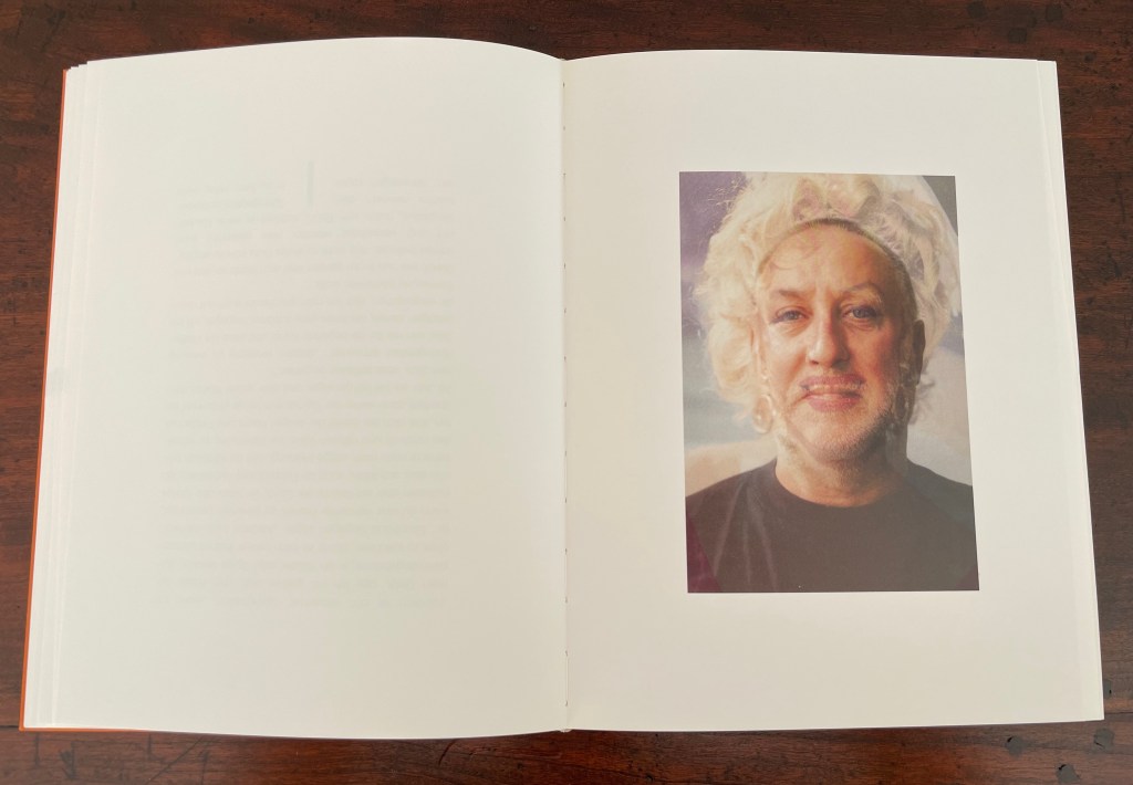
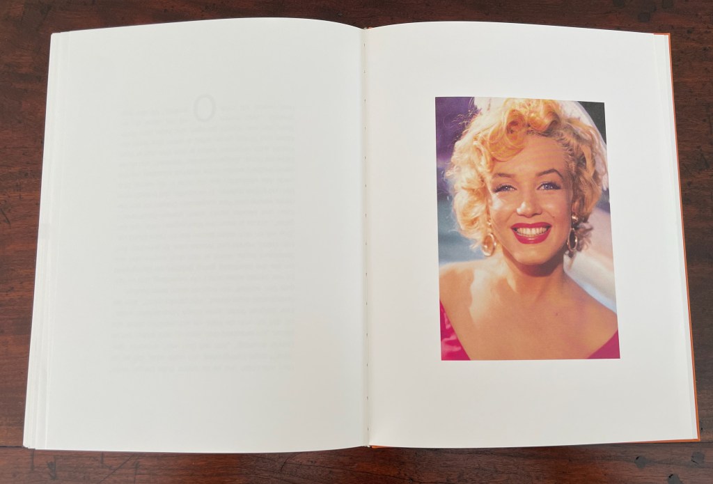
On the other side of the dos-à-dos structure, the first flick-through’s sequence of twenty images has Antes’ face morphing into Marilyn Monroe’s. It’s a curious transformation. Perhaps it’s in keeping with the carnivalesque barker Simplicissimus, and after all, the color of the paper does change from cream to white as the artist turns into the bearded lady and the latter turns into Marilyn. The sequence’s twenty-page length facilitates the gradation of the change.
The first portrait image, the mid-point image, and the final image.
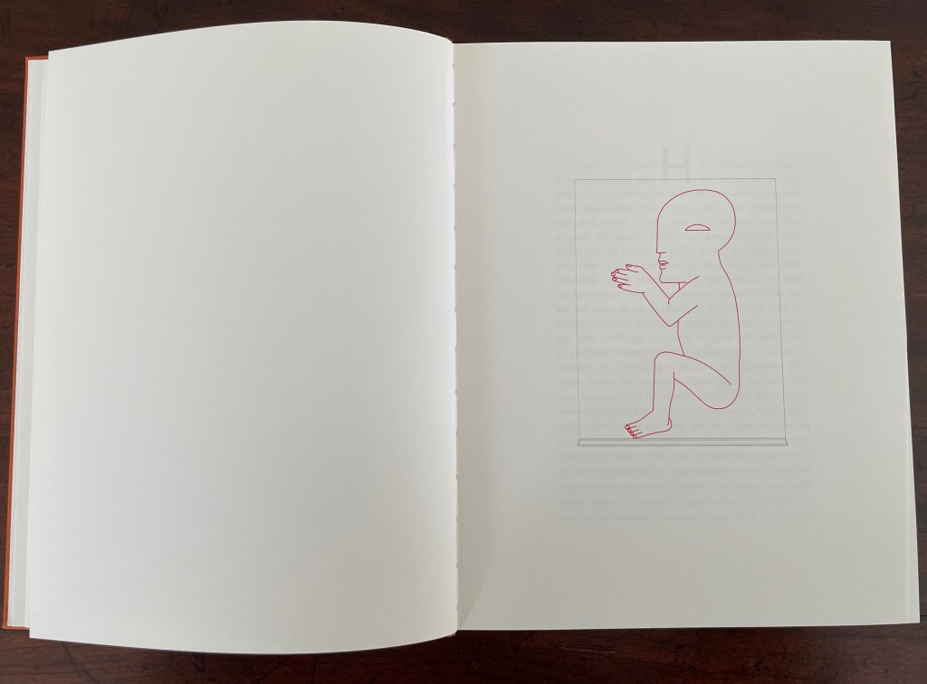
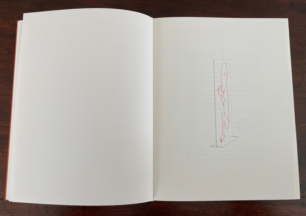
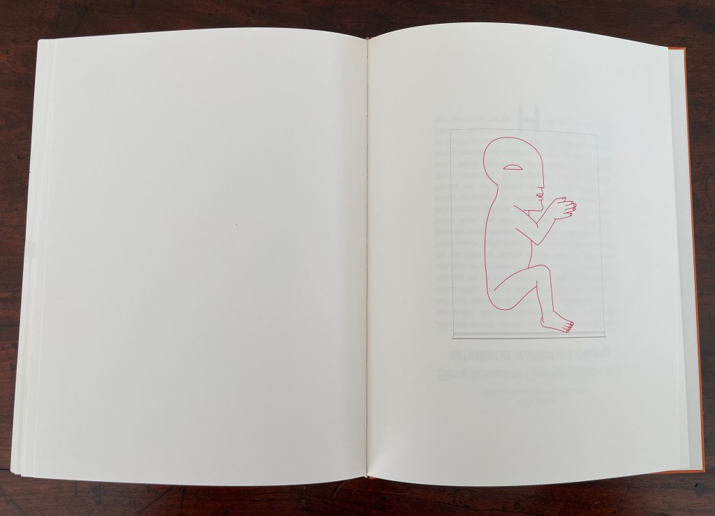
The second flick-through presents an ink drawing of one of Horst Antes’ clear acrylic sculptures called Die Figur (1995-97). A version of the sculpture rests in the rooftop foyer of Vienna’s Hofburg. Inscribed in a large plane of acrylic intersecting another plane of acrylic acting as its footing, Antes’ signature figure the Kopffüßler [“Head-Footer”] appears. In Flickbuch, the figure is drawn in red, and the plexiglas in grey ink. Across this flick-through’s twenty spreads, the drawing is animated, turning from the left, gradually showing an edge-on view, and ending up facing right. It captures Ante’s blend of the figurative and abstract for which he is known.
For some reason, Antes’ graphics often appear in German galleries alongside Andy Warhol’s images of Monroe, but here, perhaps it is a dig at Clement Greenberg. In the accompanying volume Geschichten um das Flickbuch, Huber explains how Antes’ work has been a counter-response to Greenberg’s avant gardist art theory that figurative, illusionistic painting belongs to a bygone era that has been superseded by high Abstract art that accepts and self-reflexively explores the nature of its two-dimensionality. In Huber’s view, Antes’ emphasis on two dimensions in his sculptures and paintings nevertheless restores the figurative and three-dimensionality to art, superseding Greenberg’s dicta.
Greenberg also placed photography as second fiddle to the self-reflexive and opaque surface of pure abstract painting.
The art in photography is literary art before it is anything else: its triumphs and monuments are historical, anecdotal, reportorial, observational before they are purely pictorial. Because of the transparency of the medium, the difference between the extra-artistic, real-life meaning of things and their artistic meaning is even narrower in photography than it is in prose. And as in prose, “form” in photography is reluctant to become “content,” and works best when it just barely succeeds in converting its subject into art—that is, when it calls the least attention to itself and lets the almost “practical” meaning of the subject come through. — Greenberg, 1964.
The photography in Flickbuch certainly calls attention to itself. Maybe using the flick book form to play with photos and allude to a literary text actually supports Greenberg’s formalism. Then again, the photography sequence seems to throw shade on another Greenberg polemic: his 1939 salvo for the avant-garde and against kitsch.
Kitsch, using for raw material the debased and academicized simulacra of genuine culture, welcomes and cultivates this insensibility. It is the source of its profits. Kitsch is mechanical and operates by formulas. Kitsch is vicarious experience and faked sensations. Kitsch changes according to style, but remains always the same. Kitsch is the epitome of all that is spurious in the life of our times. Kitsch pretends to demand nothing of its customers except their money—not even their time. — Greenberg, 1939.
There is something a bit tongue-in-cheek about this artist’s book and its creators. The idea of a blow book likely came from Huber to Antes. Together they must have enjoyed that spread placing the artist at one end of the spectrum and the image of Marilyn Monroe, goddess of high Pop and kitsch, at the other. Antes in particular must have enjoyed bringing the three-dimensional Kopffüßler into the two-dimensional confines of pages and, seizing on the blow book’s mechanics, creating a representational illusion of its original three-dimensional self, which of course emphasized an inherent two-dimensionality.
* The German term flichbuch translates as “flick book”. For most book historians and artists, that term and its alternates “flip book” and “flicker book” refer to the structure that creates an animation effect by gradually changing an image from one page to the next.
“HAP Grieshaber“. 27 August 2023. Books On Books Collection.
“Ricky Jay“. 2 September 2026. Books On Books Collection.
“Nicholas Phillips“. 11 August 2020. Books On Books Collection. Phillips’ Egyptian Cards demonstrate a multiple image changes in a deck of cards.
Aling, Michael. n.d. “Publishing as Architectural Practice“. University of Greenwich. Architectural book designer Michael Aling put the “blow book” principle to work in Negative Equity: House Projects by Neil Spiller & Nic Clear. By adjusting the trim, Aling makes the book display only spreads with Spiller’s work if the codex is flicked through with the right thumb and only Clear’s spreads if flicked through with the left thumb. P. 6, Fig. 2.
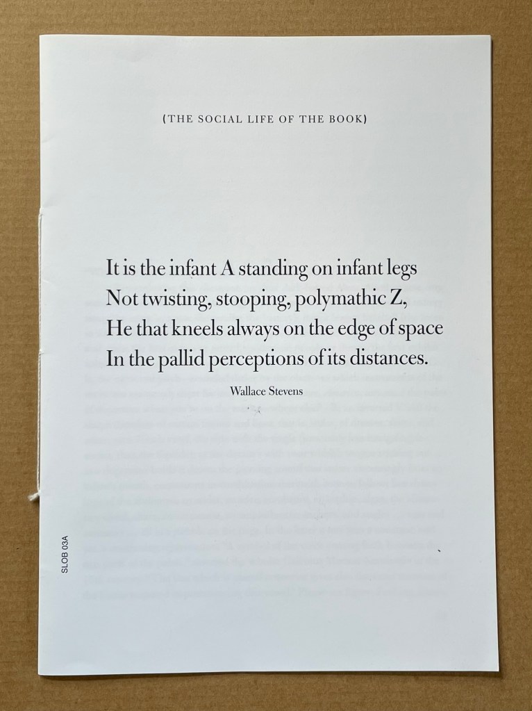
Infant A (2012) Louis Lüthi Thread-stitched signature. H225 x W160 16 pages. Edition of 1000. Acquired from Torpedo Books, 8 January 2024. Photos: Books On Books Collection
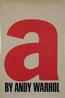
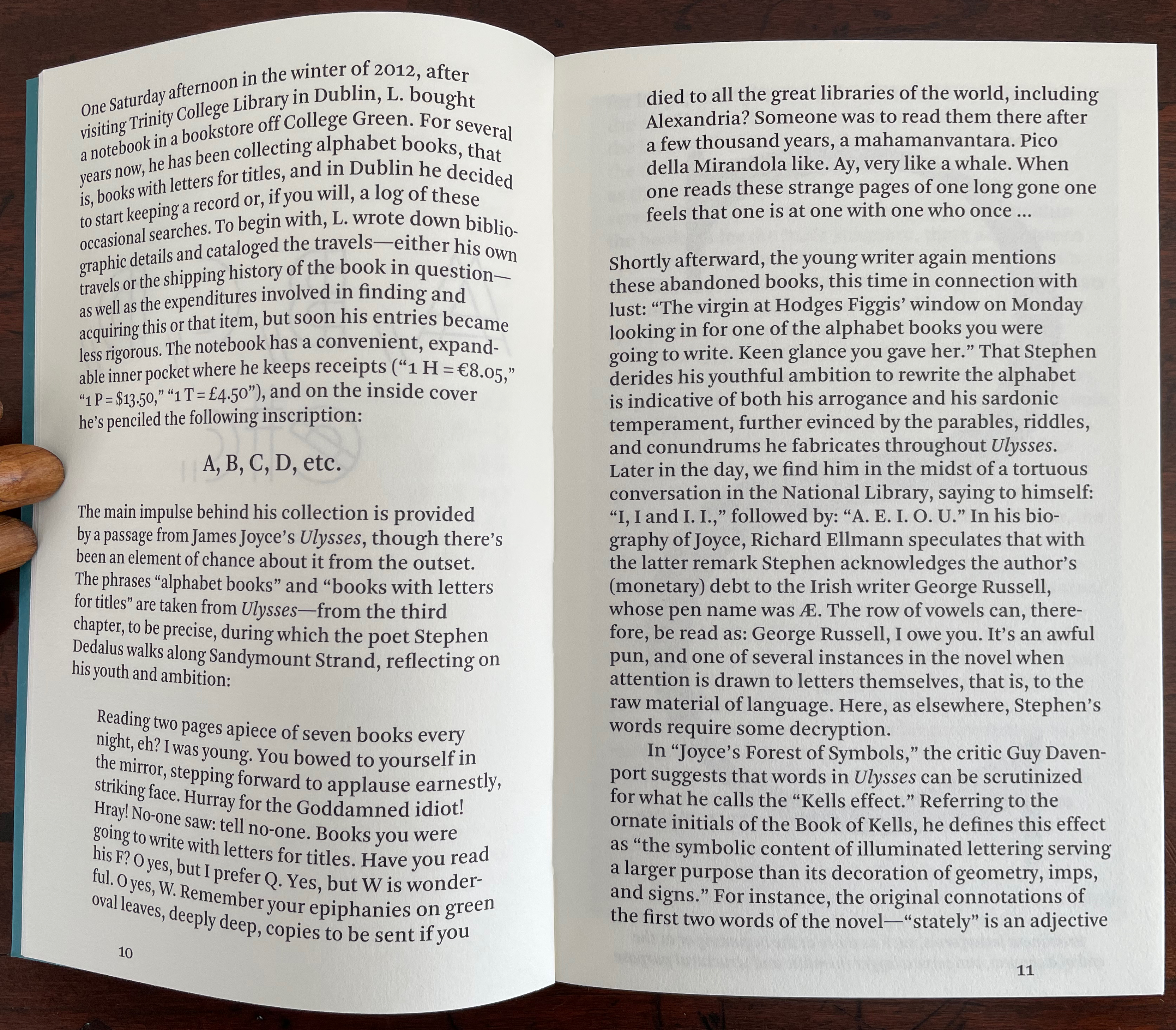
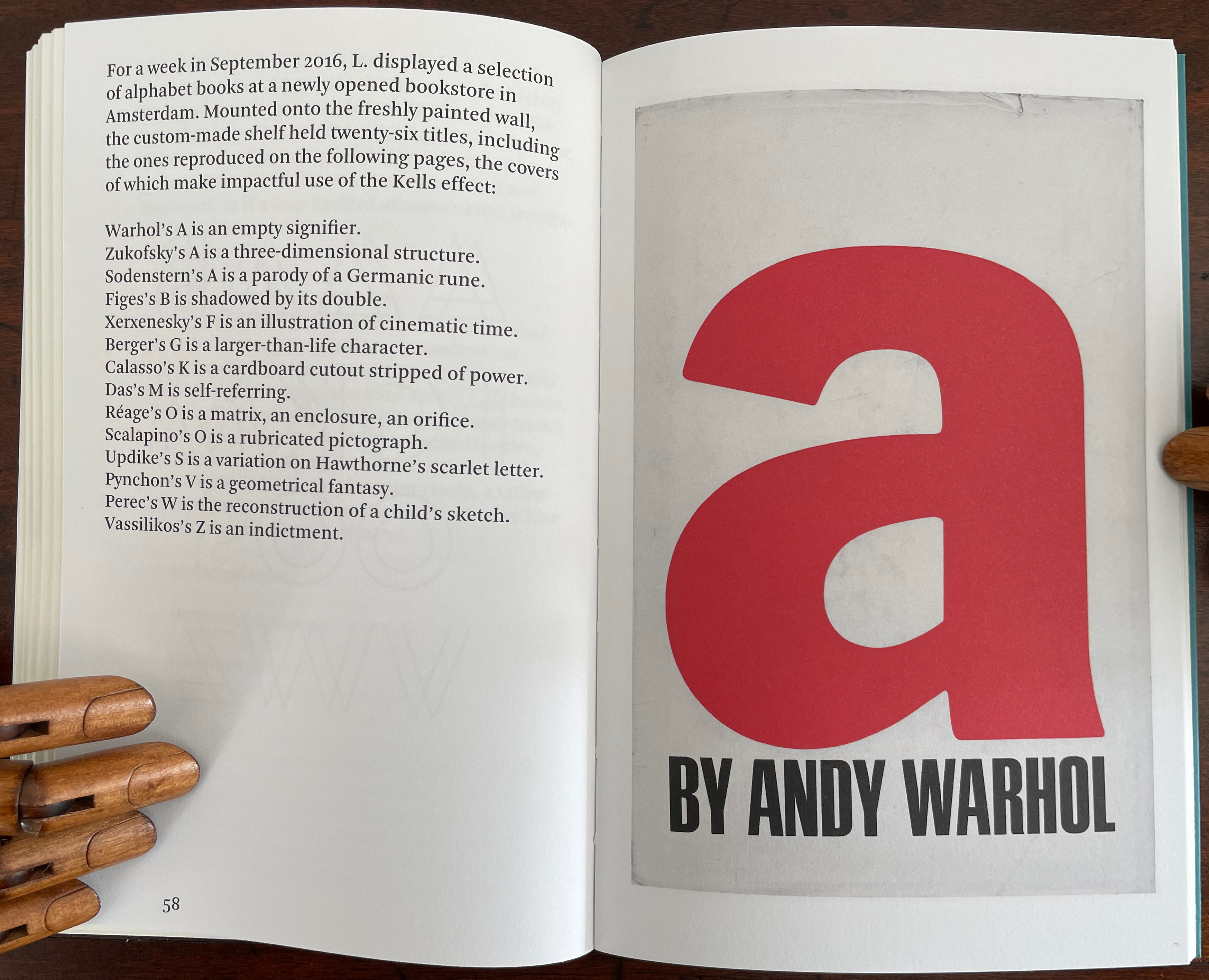
Infant A is part of a collection of essays commissioned by castillo/corrales and published by Paraguay Press under the series title The Social Life of the Book. Lüthi’s contribution fits the Books On Books Collection on several scores. First is the epigram’s invocation of the alphabet, which echoes the collection’s concentration of alphabet-related artists’ books and children’s books. See Alphabets Alive! Second is the epigram’s source: Wallace Stevens, whose poetry has inspired Ximena Pérez Grobet’s Words (2016). Would that other book artists be so inspired. Third is the narrator’s fictional conversation with Ulises Carrión in a celebration of all things A-related, in particular Andy Warhol’s novel a: a novel (1968), which finds analogues in Warren Lehrer’s A Life in Books: The Rise and Fall of Bleu Mobley (2013) and Derek Beaulieu’s a, A Novel by Andy Warhol (2017) (entry in progress). Fifth is how the dialogue reminds me of Suzanne Moore’s A Musings (2015).
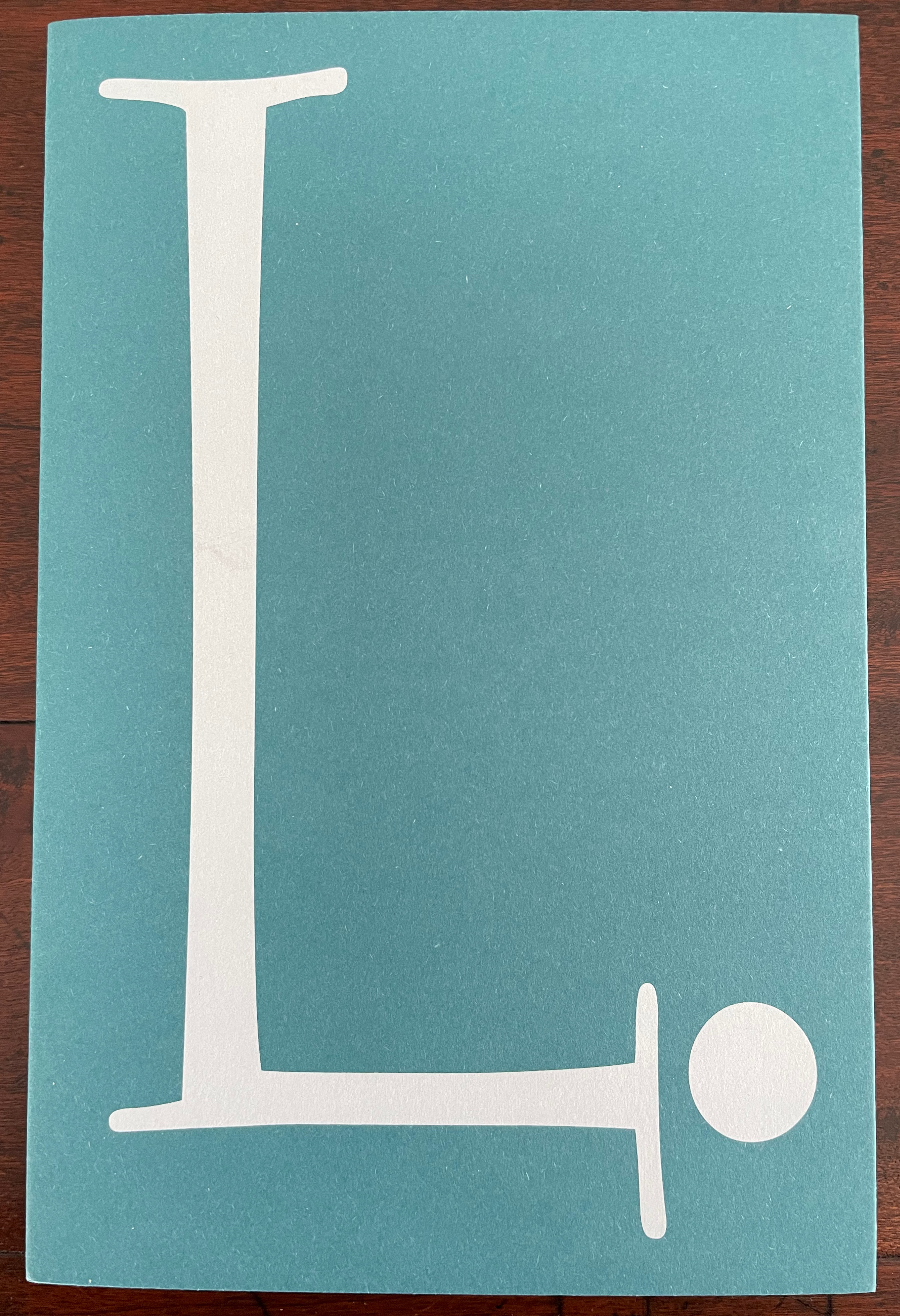
A Die With Twenty-six Faces (2019)
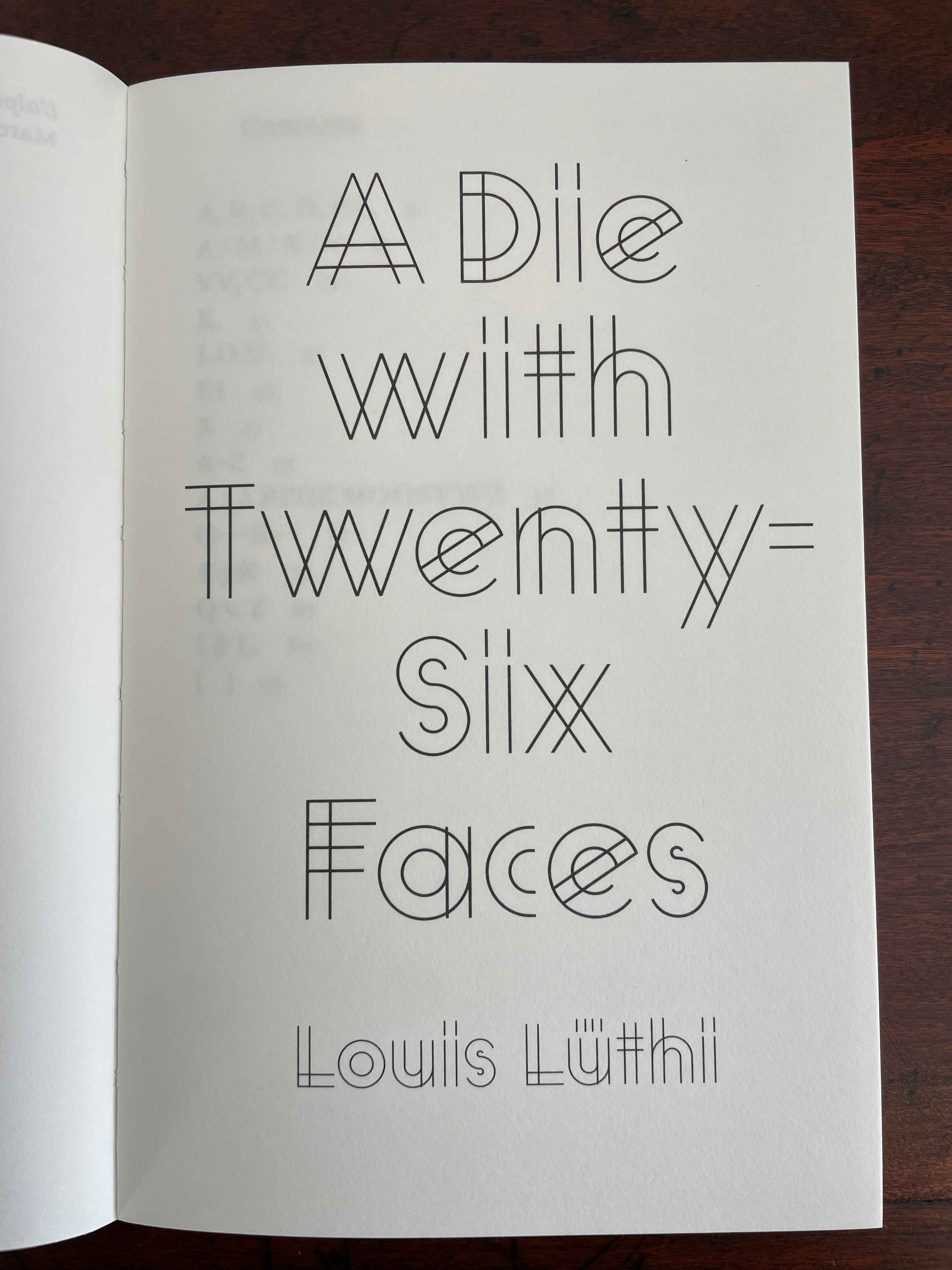
A Die With Twenty-six Faces(2019) Louis Lüthi Paperback. H200 x W130 mm. 104 pages. Acquired from Amazon, 18 September 2022. Photos: Books On Books Collection
Walter Benjamin’ unpacking of his library has a lot to answer for. Not only do we have Buzz Spector‘s take on it in 1995, but Jo Steffens’ Unpacking trilogy of photos of architects’, artists’ and writers’ bookshelves, Alberto Manguel’s elegiac Packing My Library (2018), and here is Louis Lüthi’s.
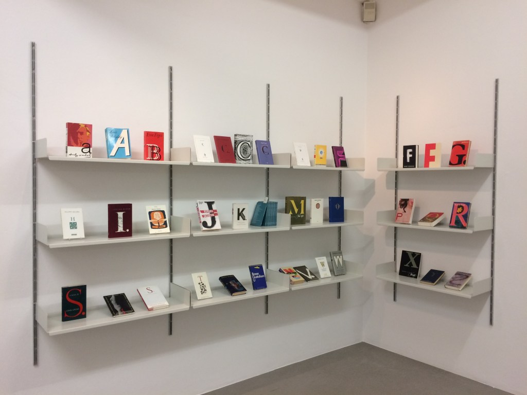
Publisher’s website: In A Die with Twenty-Six Faces, the author — let’s call him L. — guides the reader through his collection of alphabet books, that is, books with letters for titles. Some of these titles are well known: Andy Warhol’s “a,” Louis Zukofsky’s “A”, Georges Perec’s W. Others are obscure, perhaps even imaginary: Zach Sodenstern’s A, Arnold Skemer’s C and D. Tracing connections between these books, L. elaborates on what the critic Guy Davenport has called the “Kells effect”: “the symbolic content of illuminated lettering serving a larger purpose than its decoration of geometry, imps, and signs.”
The title stirs thoughts of Marcel Broodthaers’ oracular statement in 1974 “I see new horizons approaching me and the hope of another alphabet”. An alphabet that unrolls across the twenty-six faces of a die would certainly qualify as another alphabet. Broodthaers and the die also stir thoughts of Stéphane Mallarmé’s Un Coup de DésJamais N’Abolira le Hasard to which Broodthaers paid repeated homage. Throwing a twenty-six-sided die would certainly no more abolish chance than would a roll of Mallarmé’s six-sided die. Lüthi’s game, however, has little to do with chance unless we count his luck in finding the works to build his library of single-letter-entitled books. Even less to do with luck if some of the library is fictitious, a likelihood that the “publisher’s” statement suggests. Lüthi’s die is loaded!
A selection of Lüthi’s “alphabet” books on display. Courtesy of the author. Photo: Gesellschaft für Aktuelle Kunst Bremen
On the Self-Reflexive Page II (2021)
On the Self-Reflexive PageII(2021) Louis Lüthi Paperback. H200 x W130 mm. 304 pages. Acquired from Idea Books, 18 September 2022. Photos: Books On Books Collection.
This is a peculiar book in its order and nature. After two variant half-title pages, it begins with a section entitled “Black Pages”. Only on flipping through the volume can we find the remaining front matter — just after page 208. There’s another half-title and then the Table of Contents. Reproducing the marbled page from Laurence Sterne’s The Life and Opinions of Tristram Shandy, Gentleman (1759–1767), the book’s cover gives a clue to this peculiarity. Sure enough, Lüthi spells it out later in the section entitled “On Drawing Pages”.
So much in Tristram Shandy is presented out of order: a second dedication comes not after the first but on page 27, the preface is not at the beginning of the novel but in chapter 20 of volume three, and chapters 18 and 19 of volume nine come not after chapter 17 but are inserted after chapter 25. In a similar act of transposition, we find a marbled page in volume three, even though hand marbling is customarily used to decorate covers and endpapers. As Viktor Shklovsky observed, “It is precisely the unusual order of even common, traditional elements that is characteristic of Sterne.” (p. 240)
This one paragraph confers on Lüthi’s entire book the very self-reflexivity that it explores across a range of literature and artists’ books. Reflecting the custom to which it refers, On The Self-Reflexive Page II carries Sterne’s marbled pages on its front and back covers. In the text before his marbled leaf, Sterne refers to it as the “(motly emblem of my work!)“. Lüthi has taken that exclamation to heart (and cover) as if it were advice in creating this hybrid, motley work of his own: “part artist’s book and part essay, part literary excavation and part typographical miscellany” as he calls it in his middle-of-the-book Foreword.
Lüthi’s work is just one in the Books on Books collection of several inspired by Tristram Shandy. There is Erica Van Horn’s Born in Clonmel (2011), Simon Morris’ Do or DIY (2012), Abra Ancliffe’s The Secret Astronomy of Tristram Shandy (2015), and Shandy Hall‘s The Black Page Catalogue (2010), Emblem of My Work (2013), Paint Her To Your Own Mind (2018) and The Flourish of Liberty (2019). Outside the collection, there is Brian Dettmer’s Tristram Shandy (2004), commissioned by Shandy Hall’s Laurence Sterne Trust, and also Sean Silver’s Shandean online venture called The Motley Emblem (2022~) celebrating Sterne’s marbled leaf and the analytical chemistry of marbling. The latter may become a book, even an artist’s books to add to the tally. In The Century of Artists’ Books, Johanna Drucker draws attention to Sterne’s novel twice as an example of self-reflexivity or self-interrogation, but in 1994 and 2004, Sterne did not rise to the same level of precursor to book artists as William Blake or Stéphane Mallarmé in Drucker’s view. With these later works of book art inspired by Uncle Toby’s nephew in the bag, a dozen or so more might nudge Sterne up the scale.
In the meantime, anyone interested in artists’ books could fruitfully apply to the medium Sterne’s exhortation to his own readers:
Read, read, read, read, my unlearned reader! read, — or by the knowledge of the great faint Paraleipomenon — I tell you before-hand, you had better throw down the book at once; for without much reading , by which your reverence knows, I mean much knowledge, you will no more be able to penetrate the moral of the next marbled page (motly emblem of my work!) than the world with all its sagacity has been able to unraval the many opinions, transactions and truths which still lie mystically hid under the dark veil of the black one.
Artists’ books are to be read, handled and digested, not stored away in the archives.
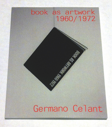
Where to go to compare and contrast the book art in Germano Celant’s pioneering “catalogue” of the Nigel Greenwood Gallery exhibition in London (1972) with that of the last half century?
Being a sort of small and portable catalogue and curator’s explanation for the gallery’s exhibition of ca. 300 works, Celant’s Book as Artwork is arranged chronologically and then alphabetically by artist. Presumably it was organized to match the exhibition’s organization (note the year 1967 in upper left of the photograph below and the distinctive Hidalgo cover, fifth from the left). With no photographs of the works, Book as Artwork gives no easily accessible visual sense of the 300 works in that exhibition. If we had that starting visual touchpoint, it would be easier to “place” the period or individual works in relation to book art from the 80’s onward.
Book as Artwork 1960 – 1972 – Exhibition Nigel Greenwood Gallery B, 1972.
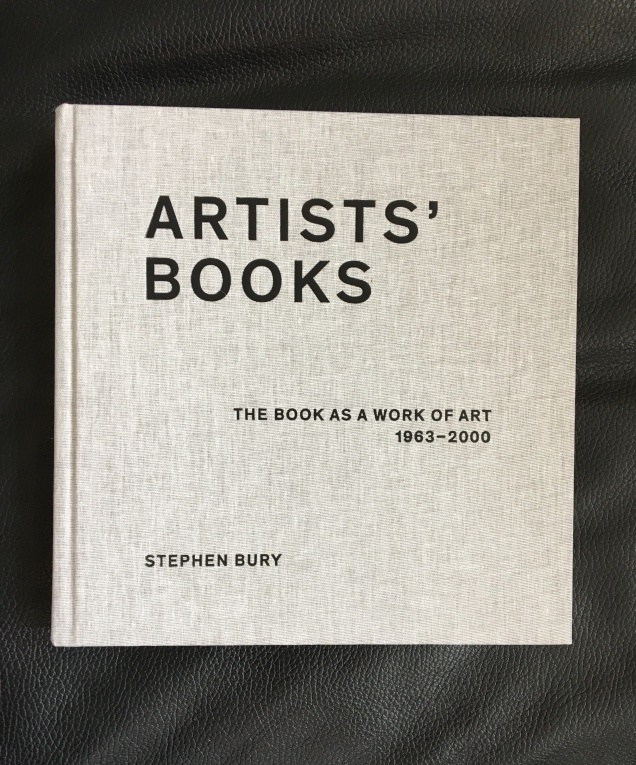
Stephen Bury’s Artists’ Books: The Book as a Work of Art, 1963 – 2000 (2015) includes, by design, only a handful of the artists and works selected for the Celano/Greenwood exhibition.
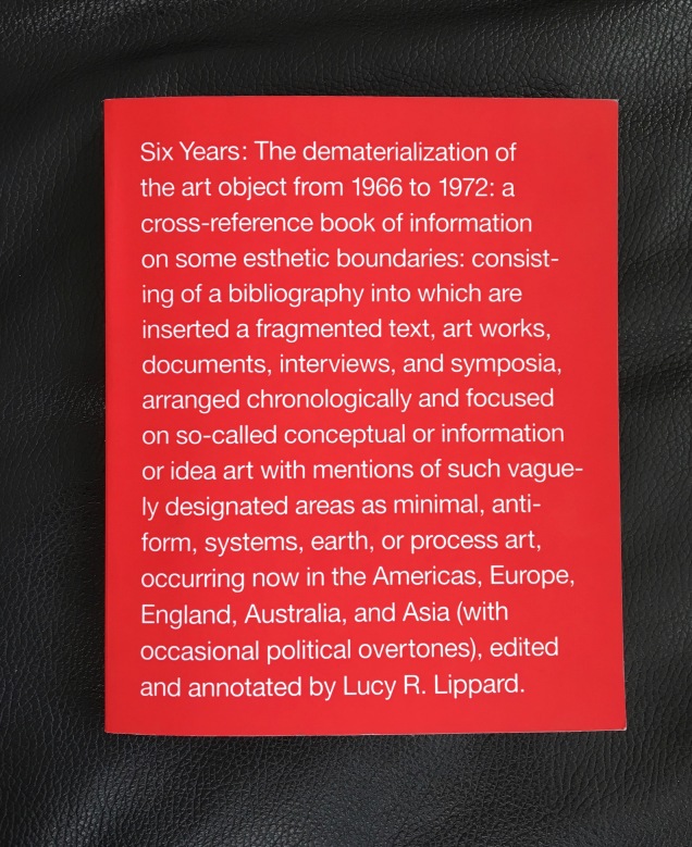
Lucy Lippard’s Six Years: The dematerialization of the art object from 1966 to 1972 (1973, 1997) — a “bibliography into which are inserted a fragmented text, art works, documents, interviews, and symposia, arranged chronologically” — comes as close as one might hope in black-and-white print for a starting visual touchpoint. Lippard’s scope, however, ranges beyond book art, so the number illustrated limits systematic visual comparison and contrast with the book art of the ensuing decades.
Phaidon’s Artists Who Make Books(2017) provides good coverage and bridges the 1960s to the 21st century. The essays and descriptions bring the book art off the page and into the mind’s hands.
Best of all is Lynda Morris’s mini-memoir of her role in organizing the Celant/Greenwood exhibition.
Germano had sent Nigel [Greenwood] a wonderful, arty handwritten letter in pink capitals … on December 22, 1970:
DEAR PUBLISHER I AM PREPARING FOR A NEW INTERNATIONAL MAGAZINE A COMPLETE ANTHOLOGY OF BOOKS MADE DIRECTLY BY ARTISTS.
…Nigel had met Germano and had his telephone number in Genoa. I was sitting beside him when he phoned and proposed Book as Artwork exhibition for September 1972. Germano immediately agreed.
For sources of book art since the close of the Celant/Greenwood exhibition, we are spoilt for choice. Print and digital, image-rich aggregations of book art abound. We can return to the Phaidon and Bury books. We can turn to the well-illustrated print and online publications from the Centre for Fine Print Research at the University of Western England, online library collections such as the MassArt Library or Chicago’s School of the Art Institute, the websites of dealers such as Zucker Art Books displaying their wares, the dozens of websites for recurring book art fairs such as International Artist’s Books Triennial Vilnius (1997 – present) and CODEX International Book Fair (2007 – present) and community sites suchas Artist Books 3.0. In the future, the Getty Research Institute‘s processing of the Steven Leiber Basement archive should also yield a rich source of images of works by the artists selected for the Celant/Greenwood exhibition.
Present-day online access challenges Mallarmé’s dictum: ”Everything in the world exists to end up in a book.” Now it seems:
Everything in the world exists to end up on the web.
As far as that premise holds, this annotation and rearrangement of Celant’s bibliography — a “webliography” — offers an online starting point for connecting the book as artwork 1960/1972 with the book as artwork since. In providing some images of the works and links to images, the webliography offers anyone interested in book art the means to gain a more colored impression of the period’s book art. That the primary impression is still black and white underscores the impact of xerographic technology on artists then as well as that of conceptualism driven by text or photograph. A webliographic approach also offers the opportunity to link the book art of the Celant exhibition with book-oriented Web-art or Net-art such as that of Amaranth Borsuk, Taeyoon Choi, Gunnar Green, Johannes Heldén, Bernhard Hopfengärtner and many others referenced below.
The reorganization here of Celant’s and Morris’s list — by artist alphabetically then chronologically — makes it easier to see the curators’ tendencies in selection as well as the influence of practical factors. The curators’ selection is obviously more Western, less Eastern European and even less Middle Eastern and Asian. Individuals’ prodigality surely played a role in whom and what was included. As Morris’s essay in the Phaidon book reveals, the geographical proximity of works available to be chosen played a role; so, too, the influence of the then-contemporary art network played a role (Atkinson, Beuys, Celant, Dwan,Greenwood, Hansjorg Mayer, Walther König, Maenz, Siegelaub, Sperone and the many other personalities of the Art-Language, Arte Povera, Conceptualist and Fluxus movements); and even the size of suitcases and availability of transport for bringing the artwork into the UK played a role.
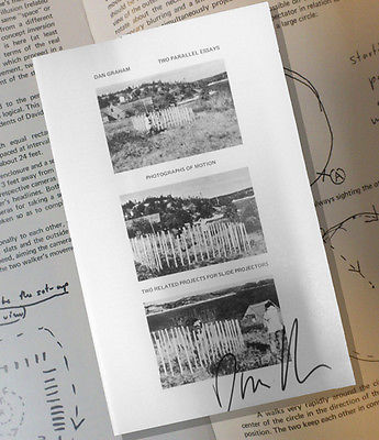
Generally the online links for the artists’/authors’ names lead to biographies, either in their official websites, Wikipedia or other news sources. Where an artist/author is listed multiple times, the links vary from instance to instance to provide a wider range of information about the individual and, in some cases (such as Dieter Rot’s), more images. The links behind the publishers’ names go to publishers’ websites or Wikipedia entries about them. The links that follow each entry resolve to images of the work, videos, audio, interviews or essays relevant to the work. For selected entries in Celant’s list, a compare/contrast takes the user to websites or works whose juxtaposition might shed light on the similarities or differences between the item in Celant’s list and book art of the subsequent decades.
The webliography also supports the haptically as well as digitally inclined. The links behind the titles of the works provide information on the nearest library location of the work (although not all titles could be located). Be sure to enter your own location and refresh the results.
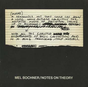
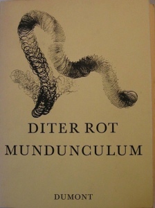
Bochner, Mel. The Singer Notes. New York: Self-published, 1968. [Images] [Compare/contrast Bochner’s notes and drawings resulting from conversations with scientists and engineers at Singer Labs in New Jersey with the Smithsonian Libraries’ online exhibition Science and the Artist’s Book, 1995]
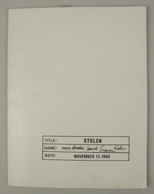
Gregory, Kathe; Landis, Marilyn; Lewis, Russell; Crane, David; Kahn, Scott. Stolen. New York: Colorcraft Lithographers/Dwan Gallery, 1970. [Images] [Compare/contrast with Andrew Savage’s Stolen White Goods, 2006, and then Cristina Garrido’s intervention White Goods, 2011]
Lole, Kevin; Smith, Paul. Handbook on Models. Coventry: Self-published, 1972. [Unable to locate a work of this title in WorldCat, but one with the title The Relativism of Emotion Handbook to the Model and same date of publication is described in Paul Robertson‘s “A Collection of Rare Art+ Language Books and Internal Documents – Many Unknown in Literature”, Gorebridge, Midlothian: Unoriginal Sins/Heart Fine Art, n.d.]
30 x 21cm, 50pp (printed recto only) plus printed card covers. Xerox inner pages as issued. The first and only edition of this theoretical work based on a physical model (electro-shock, photo beams and electronic buzzers) acting as metaphor for analogue, theoretical and representative models. Cover is very minority marked on the front and back cover has a faint diagonal crease else VG++. From the archive of David Rushton who believes only 10 or fewer of this book was published.
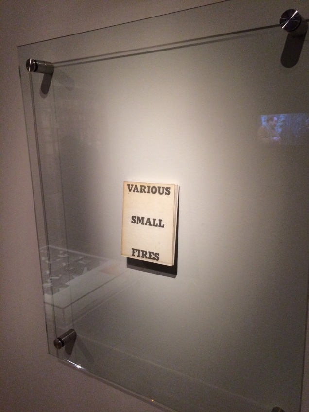
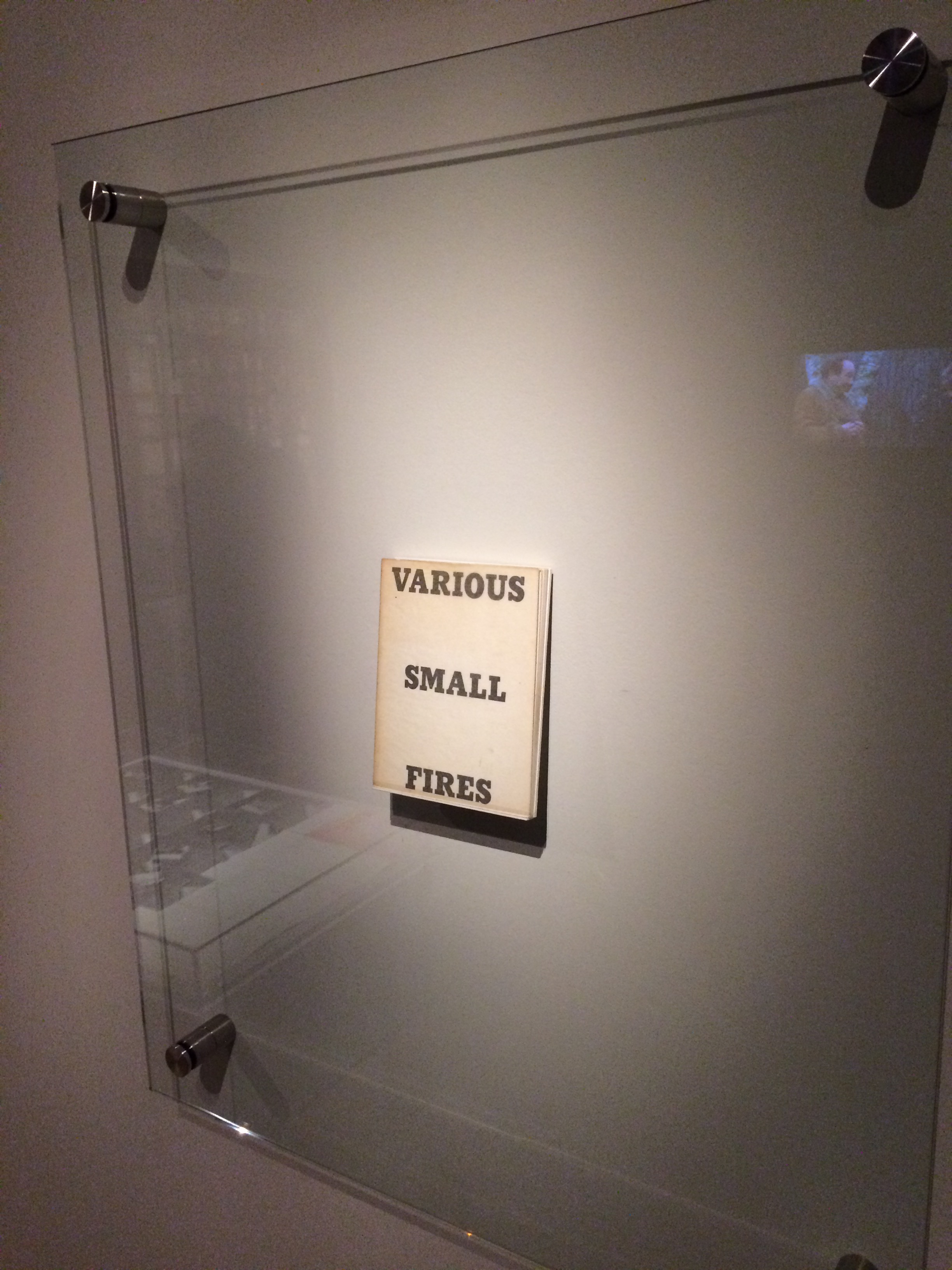
Display of Ed Ruscha’s Various Small Fires and Milk, 1964, at Pliure: La Part du Feu, 2 February – 12 April 2015, Paris. Photo by Robert Bolick. Reflected in the lower left hand corner is the display of Bruce Nauman’s Burning Small Fires; in the upper right corner, the film clip of Truffaut’s 1966 Fahrenheit 451; and in the upper left, Maria Helena Vieira da Silva’s La bibliotheque en feu, 1974.
Pilkington, Philip; Rushton, David; Lole, Kevin; Smith, Paul. Concerning the Paradigm of Art. Zurich: Editions Bischofberger, 1971. [Last author’s name corrected from “Paul” to “Peter”] [From Paul Robertson, “A Collection of Rare Art+ Language Books and Internal Documents – Many Unknown in Literature”, Gorebridge, Midlothian: Unoriginal Sins/Heart Fine Art, n.d.
“30 x 21cm, 16pp (recto only). White card covers – with offset title. A text published by Bischofberger from a theoretical document written by Kevin Lole, Philip Pilkington, David Rushton and Peter Smith (formerly Analytical Art and by this time fully regarded as members of Art & Language) which applied Thomas Kuhn’s theory of paradigm shift to art (the original theory by Kuhn being a view that revolutions in scientific thought only occurred when sufficient contrary evidence to the prevailing orthodoxy had mounted up and the original hypothesis could no longer explain the physical evidence emerging from empirical studies). It is worth noting that at this time Bischofberger bought a great deal of Art + Language material from the group and published other documents by them including some of the group’s rarest publications – storing many of the more three-dimensional works for later resale. Bischofberger did not print the books himself – rather Art and Language arranged design and publication in Coventry (for free using the University’s resources) and David Rushton drove the books over in a camper van to Switzerland (breaking down just on the edge of the city due to running out of petrol and having little money left, Rushton coasted the last mile down hill on an empty tank).
The limitations of these series of books are usually placed at c. 200 but Rushton remembers taking far fewer than that with him and this Analytical Art book was in fact only produced in 50 copies taken to Zurich plus a few retained by the artists in the UK.
That said this is one of ONLY 5 copies which were numbered in roman numerals (this one being III/V) and signed by ALL of the four writers in pencil on the first title page.”]
Pilkington, Philip; Rushton, David. Sample from a Topological Notebook. Coventry: Self-published, 1972. [Video] [From Paul Robertson, “A Collection of Rare Art+ Language Books and Internal Documents – Many Unknown in Literature”, Gorebridge, Midlothian: Unoriginal Sins/Heart Fine Art, n.d.
“30 x 21cm, 28pp carbon copy pages and printed cover. This was one of ONLY four copies made and published by the group – two copies being signed by David Rushton and Peter [sic] Pilkington and created from original typed sheets and two copies remaining unsigned and created (as here) using the carbon copies from the originals. These latter two examples were regarded by the group as artist’s proofs of the book. This is the only copy of this book available for sale anywhere as from the original four prices: one is in Paul Maenz’s archive and another two copies are in the hands of private collectors (who purchased them from ourselves). This copy is signed by David Rushton and Philip Pilkington and has been stamped on the inside front cover with the official Art & Language Stamp and also designated in blue ink “Second Copy”. Fine estate and clearly rare.”]
Magnet / Photo Series / Group 2000 / September 1968 / (4 Phase) / Continuous Photographic Photographs Continuously Photographs Up to 20,000 Shots / Run Time work / 10 years / annual series of 20,000 elements / technique / black and white photography / leafs / 3 M / K 203 3 / each 30 x 40 / constant time setting diaphragm / fixed tilt stand / 1969 / camera used maintains the original value and adds to the artistic market.
Ramsden, Mel. The Black Book. [Unable to find a work under this title in WorldCat]
Ramsden, Mel. Abstract Relations. New York: Art-Language, 1968. Edition of 5. [Unable to find a work under this title in WorldCat; the 5 images on the left in this photograph from the Philippe Méaille private collection at MACBA come closest.]
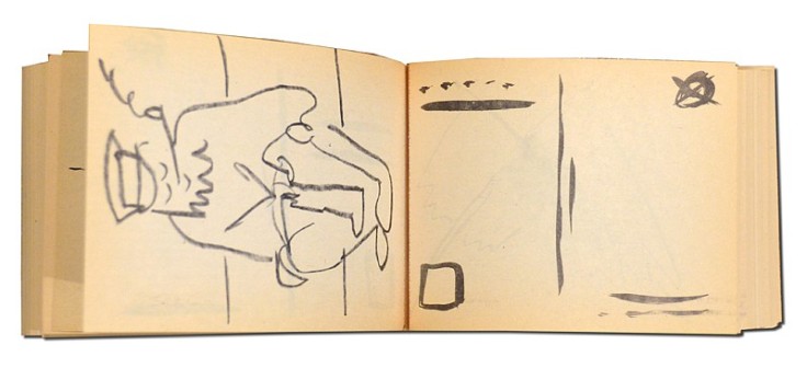
Rot, Dieter. Icelandic Leather. Reykjavik: Self-published, 1970. [Unable to locate by this title; may be referring to Volume 5, Bok 3 of the Collected Works]
Display of Ed Ruscha’s Various Small Fires and Milk, 1964, at Pliure: La Part du Feu, 2 February – 12 April 2015, Paris. Photo by Robert Bolick. Reflected in the lower left hand corner is the display of Bruce Nauman’s Burning Small Fires; in the upper right corner, the film clip of Truffaut’s 1966 Fahrenheit 451; and in the upper left, Maria Helena Vieira da Silva’s La bibliotheque en feu, 1974.
Display of Ed Ruscha’s Various Small Fires and Milk, 1964 Pliure: La Part du Feu, 2 February – 12 April 2015, Paris, Fondation Calouste-Gulbenkian. Photo by Robert Bolick, 11 April 2015. Reflected in the lower left hand corner is the display of Bruce Nauman’s Burning Small Fires, 1968; in the upper right corner, the film clip of Truffaut’s 1966 Fahrenheit 451; and in the upper left, Maria Helena Vieira da Silva’s La bibliotheque en feu, 1974.
The Studio Bibliografico Giorgio Maffei specializes in original texts and book art by twentieth century visual and literary avant-garde artists such Baldessari, Lewitt, Munari, Man Ray, Ruscha and Warhol among others. Recently the owner’s son – Giulio Maffei – “started making film as a side activity” and introduced a series of short animations “to put on the social networks and reach new potential customers”. An anonymous pair of hands displays a variety of the books and book art in stock.
But Giulio’s videos are not always the straightforward marketing effort intended. They provide an experience of book art or artists’ books that most of us will never hold or touch. And that may be Maffei’s point in his series “Le Vite dei Libri” (The Lives of Books) in which these usually glassed-off works are playfully handled, gently made fun of and still honored.
Some of the videos are derivative artworks in their own right in the same vein as Bruce Nauman’s Burning Small Fires, 1968. Nauman poked fun at Ed Ruscha’s Various Small Fires and Milk, 1964, by composing a book of photos recording the burning of a copy of Various Small Fires. Maffei’s Nauman-esque handling of Various Small Fires and Milk involves flash paper or its Photoshop equivalent. His celebration of Ruscha’s The Sunset Strip is still more endearing with its soundtrack and toy convertible. His cheeky animations of the pop-ups in Warhol’s Index (Book) and the ironically daring destruction of Papa Maffei’s copy of Some/Thing No.3 are even better. In the latter, the plastering of a Banksy-like mural with Warhol’s “Bomb Hanoi” stickers torn from the perforated cover is a sharp-edged example of the arch, reflective commentaries throughout Maffei’s videos.
Most of the films’ credits pay typographical homage to the work at hand, which is a nice self-deprecating and affectionate touch. At my last viewing, there were twenty-two works in the Lives series. They are listed below, but once you reach one on YouTube, the others follow. Giulio Maffei has also created a longer video catalogue for his father’s enterprise: Tra Libro e Oggetto (Between Book and Object). The Maffeis are a knowing team. The catalog title can be read as the beginning of a statement displayed on the cover.
BETWEEN BOOK AND OBJECT
The artists’ book, the multiple and the object
become an artwork
A statement that refers not only to the works in the catalog but to the video catalog itself and to the elder Maffei’s lifework of collecting, selling and writing about book art.









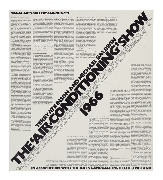
![Image result for art & language: texte zum phänomen kunst und sprache [book]](http://igem.adlibsoft.com/wwwopacx/wwwopac.ashx?command=getcontent&server=images&value=coda%5CAB00318.jpg)