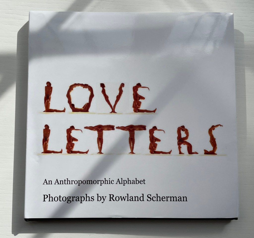
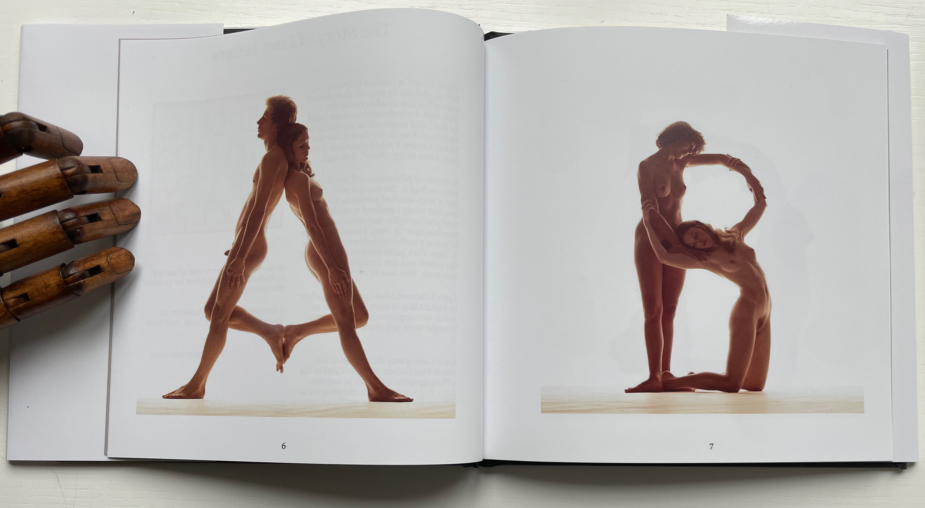
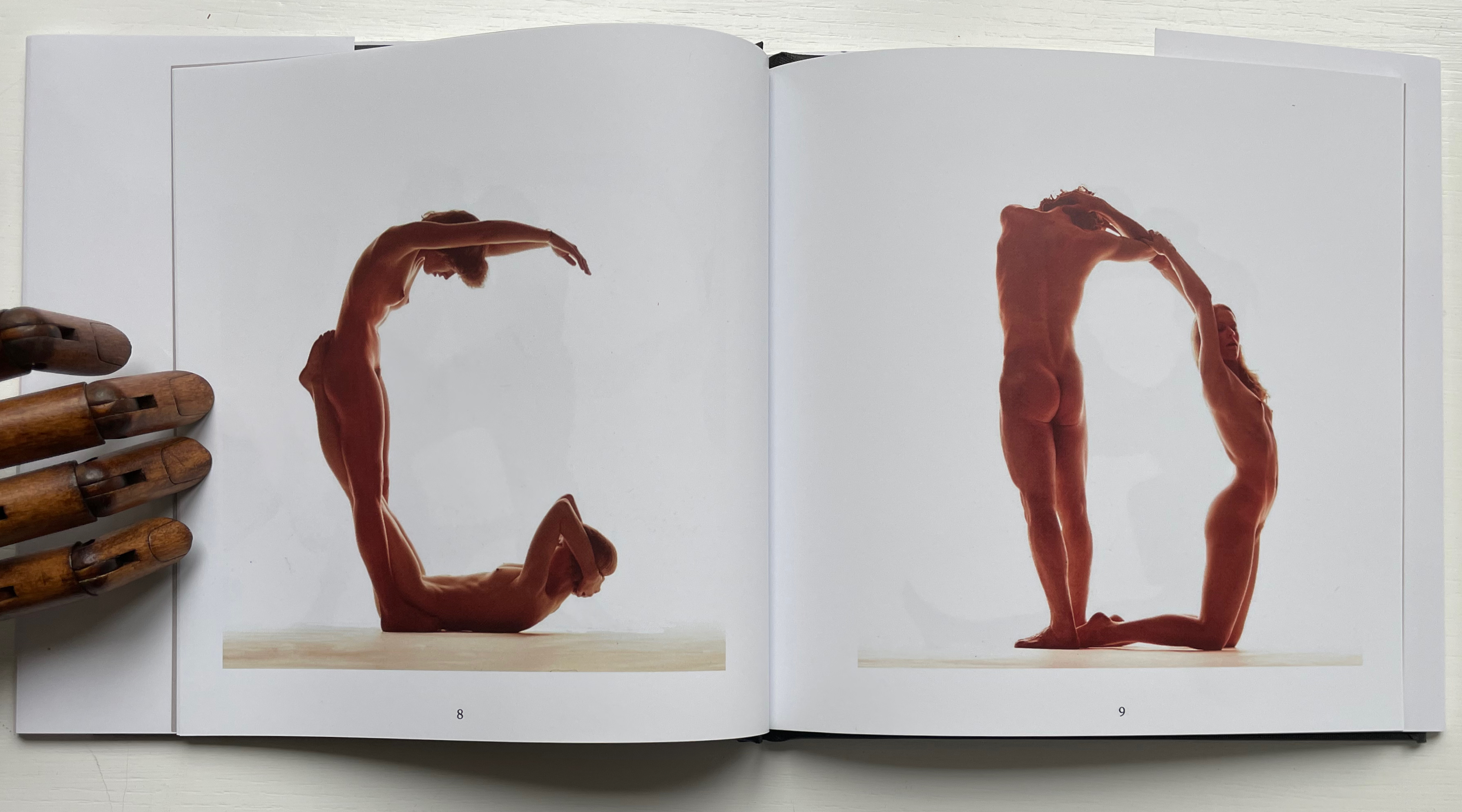
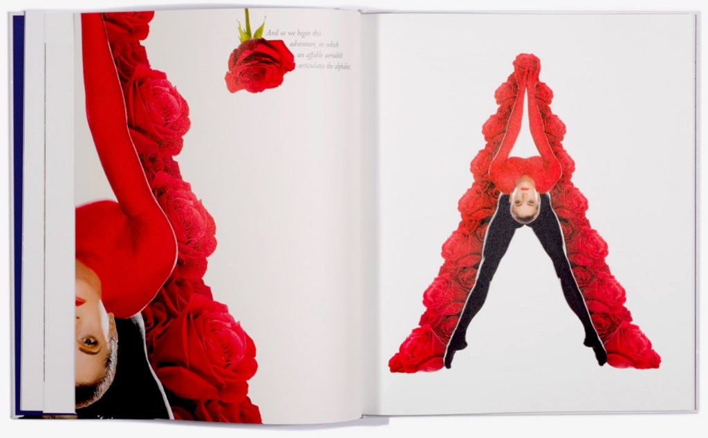
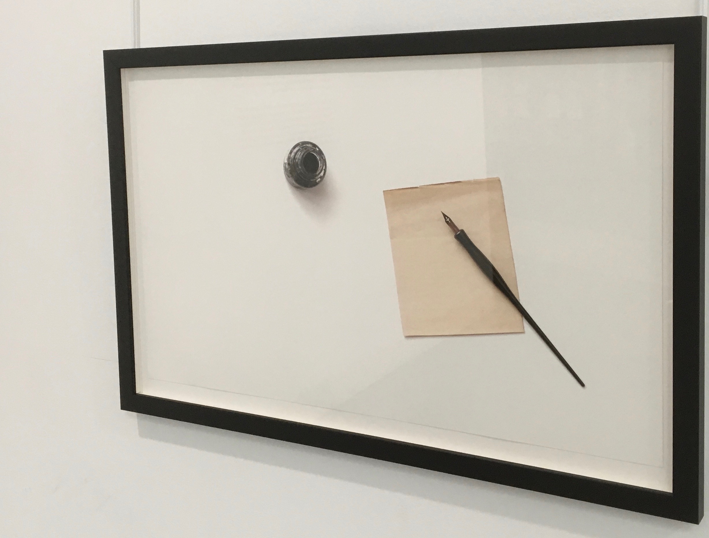
Love Letters: An Anthropomorphic Alphabet (2008) Rowland Scherman Casebound, doublures, perfect bound. H178 x W180 mm. 34 pages. Acquired from Rowland Scherman, 3 March 2023. Photos of the book: Books On Books Collection. Displayed with permission of Rowland Scherman.
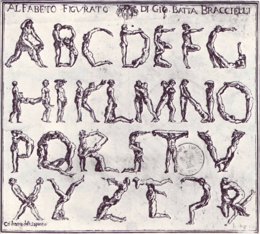
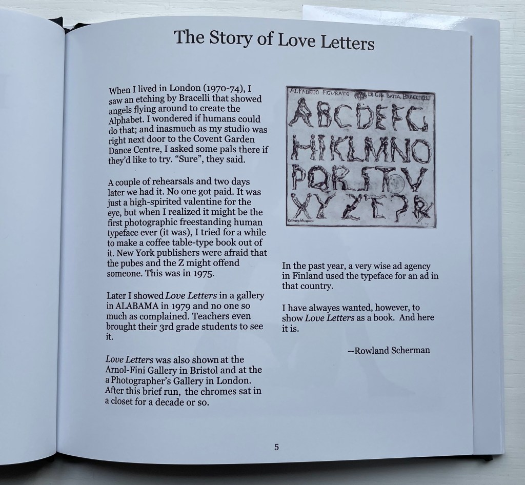
Giovanni Battista Bracelli’s “Alfabeto Figurato”, a single-sheet etching, occurred well after Carravagio’s presence there earlier in the century but well within the sphere of his ongoing influence. The print’s contortions of human bodies to display that most human of inventions — the alphabet — would probably have pulled a sneer of admiration from him. Maybe Bracelli had heard of the 5th-century comic playwright Kallias, who had his chorus dance (no doubt “cheek to cheek”) the shapes of the Ionian contenders for letterforms. In 1969, Anthon Beeke and Ed van der Elsken had their naked models arrange themselves into the alphabet on the studio floor and took photos from above. When Rowland Scherman saw Bracelli’s print on a London bus 340 years later, he wondered if human bodies could actually hold those poses or ones like them.
In the third decade of the 21st century, when book bannings and body shaming have reached new heights (or depths), Scherman’s “Story of Love Letters” might leave the reader wondering if we are now running headlong past Kallias and the 5th century into the pre-alphabetic world.
Dukes, Hunter. 27 April 2023. “Punctuation Personified (1824)“. The Public Domain Review. Not only could letters be formed with the human body, so could quotation marks and square brackets.
Erwin Huebner is a professor at the University of Manitoba engaged in research and teaching cell and developmental biology. He is also a book artist and miniaturist. Following his work, the Books On Books Collection has started small and hopes to grow into his larger works. At both ends of the spectrum, Huebner’s themes resonate with the integration of art and science, a recurrent focus of the collection (see Further Reading below).
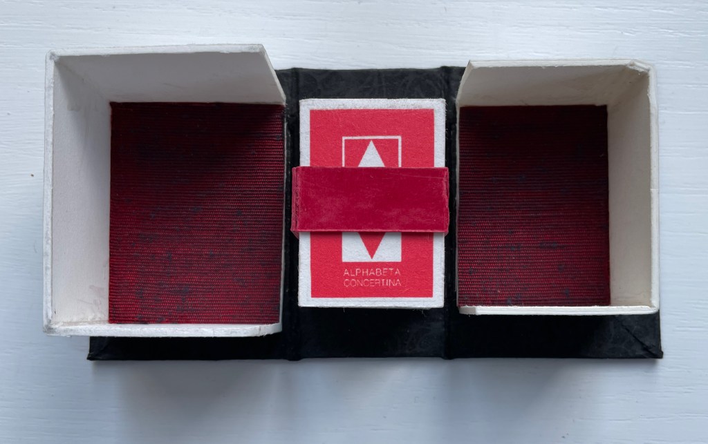
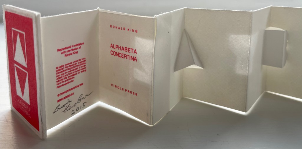
Alphabeta Concertina Majuscule (2015)
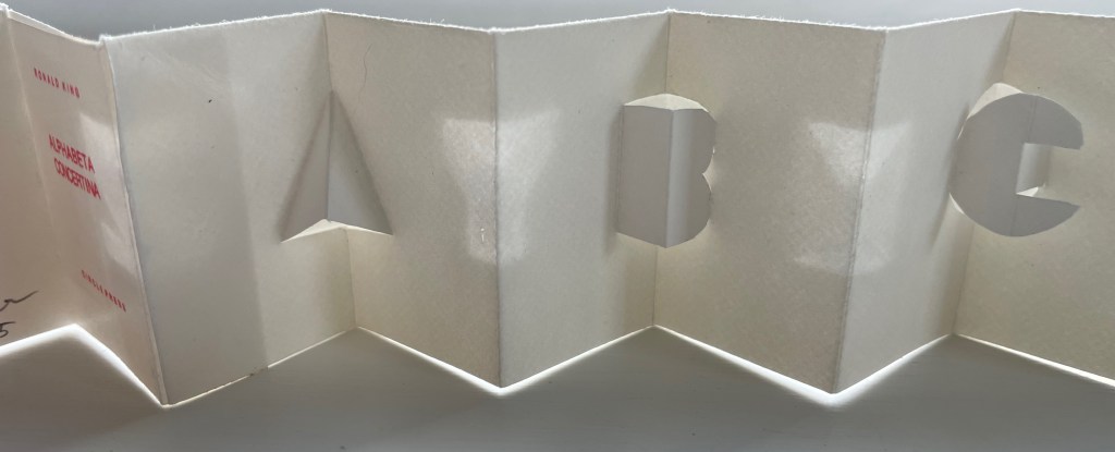
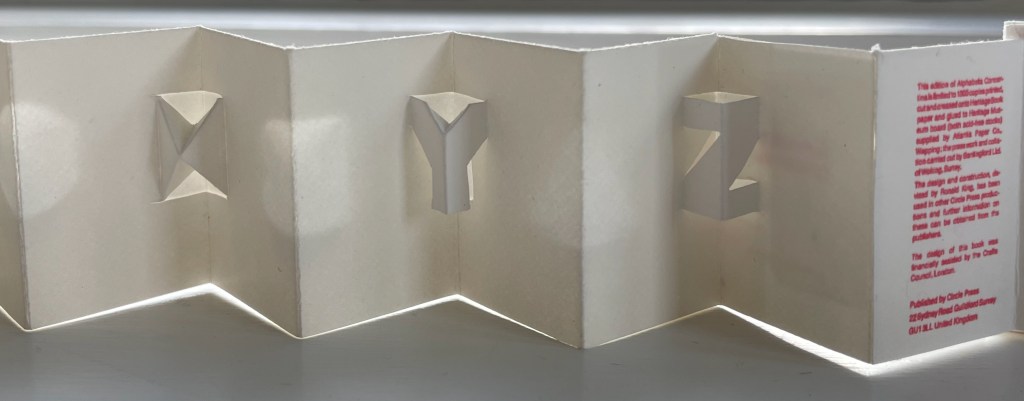
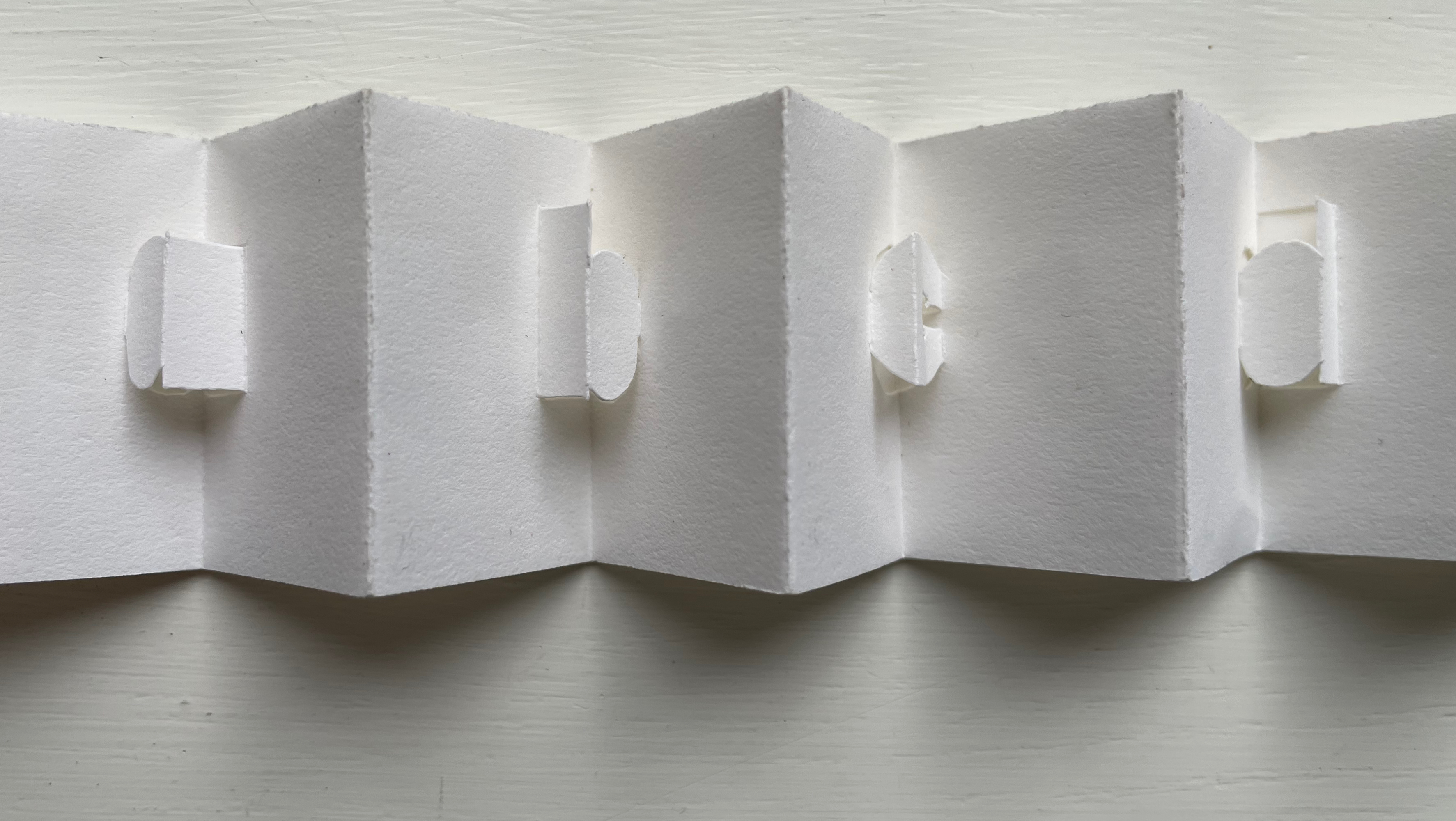
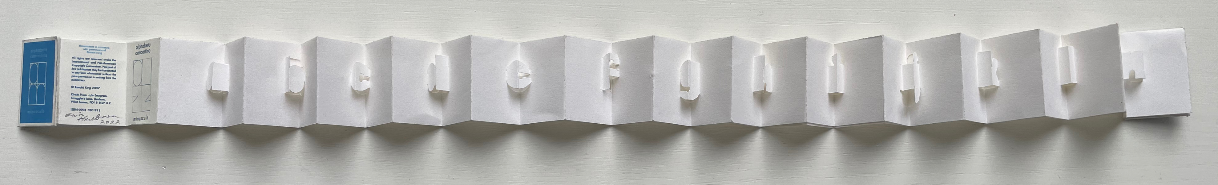
Alphabeta Concertina (2015) Erwin Huebner (with permission of Ron King) Miniature double-sided leporello. H 1.5 x W 1.0 x D 0.75 in. Edition of 4. Acquired from Erwin Huebner, 20 January 2023. Photos: Books On Books Collection.
The geometry and invention of Ron King’s work must have appealed to a kindred spirit in Erwin Huebner. The classificatory nature of the alphabet must also have spoken to Huebner’s inner Linnaeus. As 2023 is the 270th anniversary of Linnaeus’ Species Plantarum, which introduced his classification system, it is an auspicious moment for Huebner’s miniature versions of King’s alphabet concertinas to join the Books On Books Collection and be included works in the Bodleian exhibition “Alphabets Alive!” (19 July 2023 to 24 January 2024, Weston Library, Oxford).
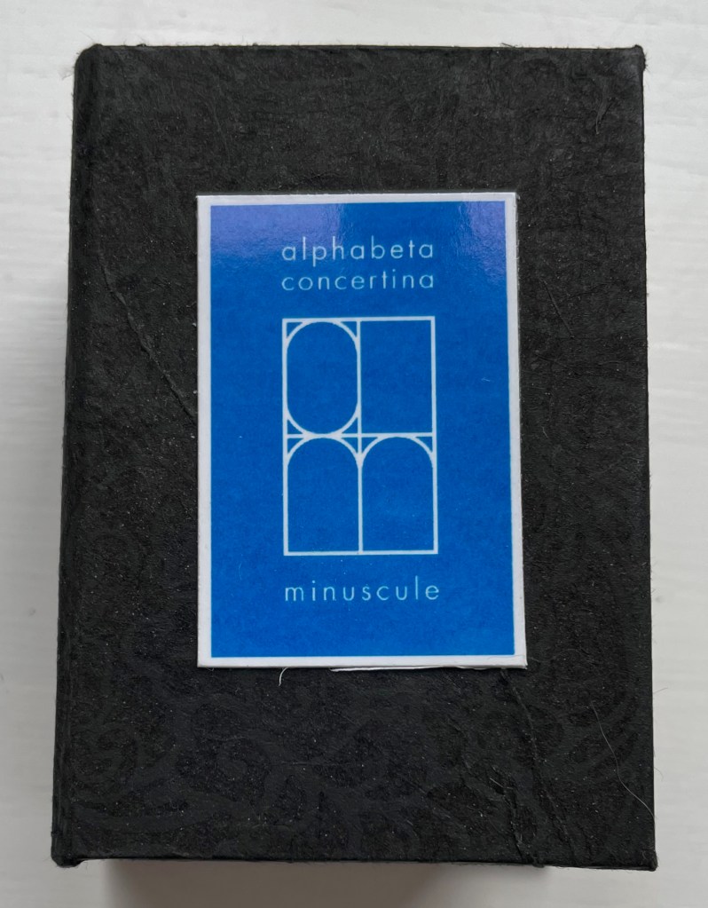
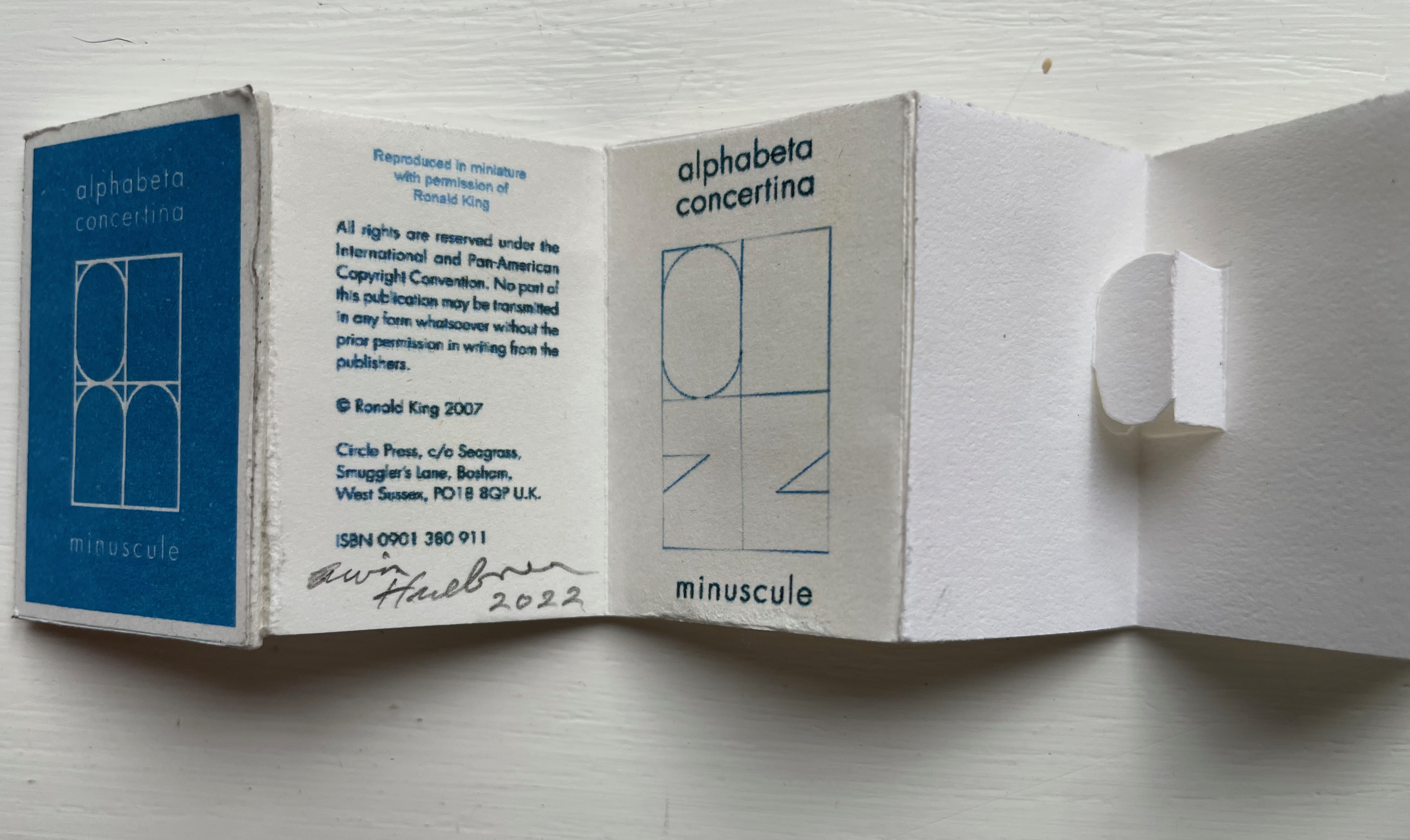
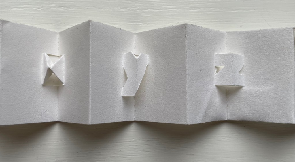
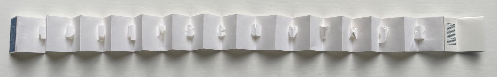
alphabet concertina miniscule (2022)
alphabet concertina miniscule (2022) Erwin Huebner (with permission of Ron King) Miniature double-sided leporello. H 1.5 x W 1.0 x D 0.75 in. Acquired from Erwin Huebner, 20 January 2023. Photos: Books On Books Collection.
Both the majuscule and miniscule concertinas are double-sided with half the alphabet on one side and half on the other just as King designed from the first with The White Alphabet and the majuscule concertina in 1984 and subsequently 2007 with the miniscule.
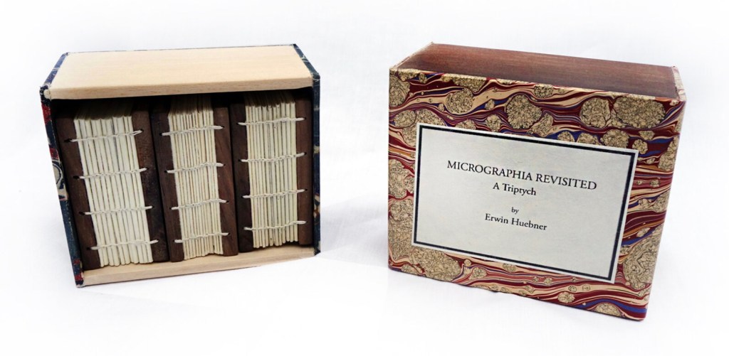
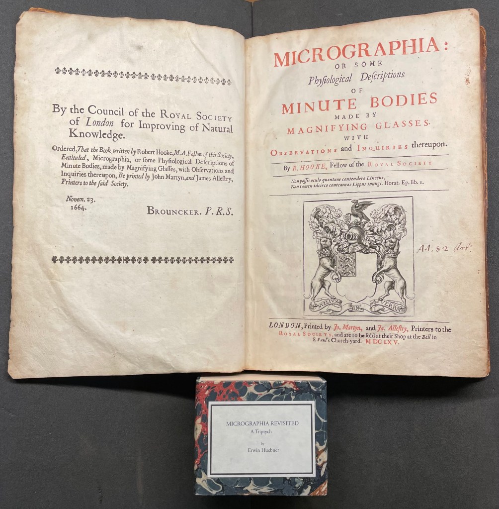
Micrographia Revisited (2017)
Micrographia Revisited: A Triptych (2017) Erwin Huebner Box with 3 Coptic-bound volumes, each H 2.625 x W 1.875 x variable depth. Edition of 3. Acquired from Erwin Huebner, 20 January 2023. Photos: Courtesy of the artist.
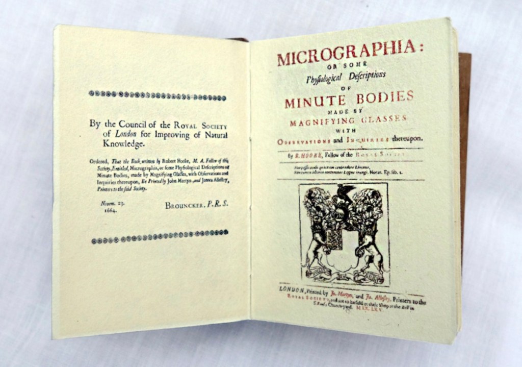
Despite Francesco Stelluti’s Melissographia (1625), Robert Hooke’s Micrographia: Or Some Physiological Descriptions of Minute Bodies Made by Magnifying Glasses with Observations and Inquiries Thereupon (1665) was long thought to be the first publication with illustrations drawn from observation with a microscope. Given Huebner’s scientific and artistic careers, it would seem impossible for him to resist paying homage to this work. Indeed, in his larger artist’s books, he has incorporated entire microscopes, but here, he exploits the technological advances of photography and electron microscopy and joins them with the craft of bookbinding to produce just as wondrous a work. Using Scanning Electron Microscopy (SEM), Huebner has created images of the same or similar objects to those Robert Hooke observed in the 1600’s. One of the volumes in the triptych presents these photographic results, and the other two present a reprint of Micrographia.
The coptic binding to black walnut covers, the wooden case covered in marbled paper and the subtitle create a suitable medieval/Renaissance air for this homage.
Living in a village near Oxford and having access to the Bodleian Libraries, I took Micrographia Revisited on a pilgrimage to compare it with a copy of the original not far from Hooke’s alma mater Wadham College.
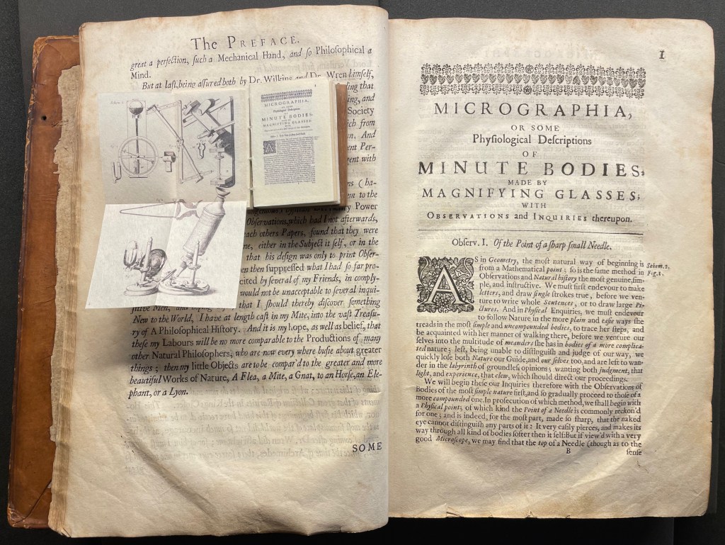
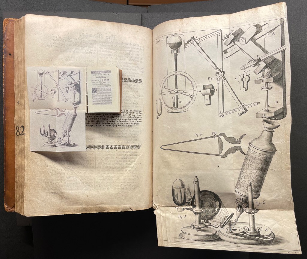
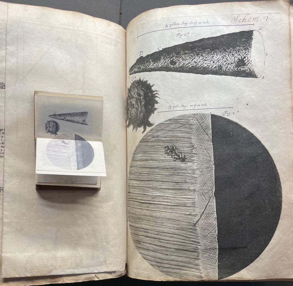
Among the many outstanding features of Huebner’s homage is his use and placement of fold-outs to capture the larger plates in Hooke’s original, all of which were placed in an appendix and some of which were also printed as fold-outs. In the juxtapositions below, note how Huebner has placed Hooke’s illustration of his equipment at the end of the Preface.
Sitting atop the double-page spread showing the end of the Preface and page 1 of Hooke’s original is Micrographia Revisited, open to Huebner’s fold-out of Hooke’s illustration of his equipment. Hooke’s same fold-out illustration from the appendix is juxtaposed below with Huebner’s.
Hooke’s first two objects under the microscope Hooke are the point of a needle (described on pages 1-3) and the edge of a razor (described on pages 4-5). Huebner transforms Hooke’s single-page plate illustrating what he describes into a double-page spread between pages 2 and 3 of Micrographia Revisited.
Juxtaposing Huebner’s double-page presentation of Hooke’s drawings of a needle point and edge a razor with Hooke’s single-page presentation.
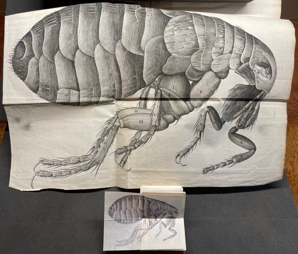
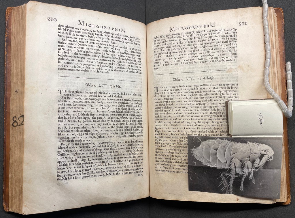
Hooke’s large fold-out of his flea may display the most impressive drawing in the book. The description appears on page 210, and the fold-out is in the appendix. Huebner’s double-fold fold-out of the illustration falls between pages 210 and 211.
The flea from Micrographia juxtaposed with that from Micrographia Revisited.
But most impressive of all is Huebner’s SEM image of a flea and its testament to Hooke’s powers of observation and skills as a draughtsman.
In the spirit of “standing on the shouders of giants”.
A Typographic Abecedarium(2015) Ornan Rotem Perfect bound in a softcover case. H174 x W176 mm. 136 pages 1 poster (64 x 48 cm, folded to 16 x 16 cm). Acquired from Devils in the Detail Ltd, 14 March 2023. Photos of the book: Books On Books Collection. Displayed with permission of the artist.
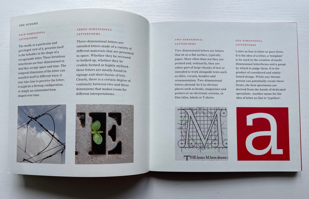
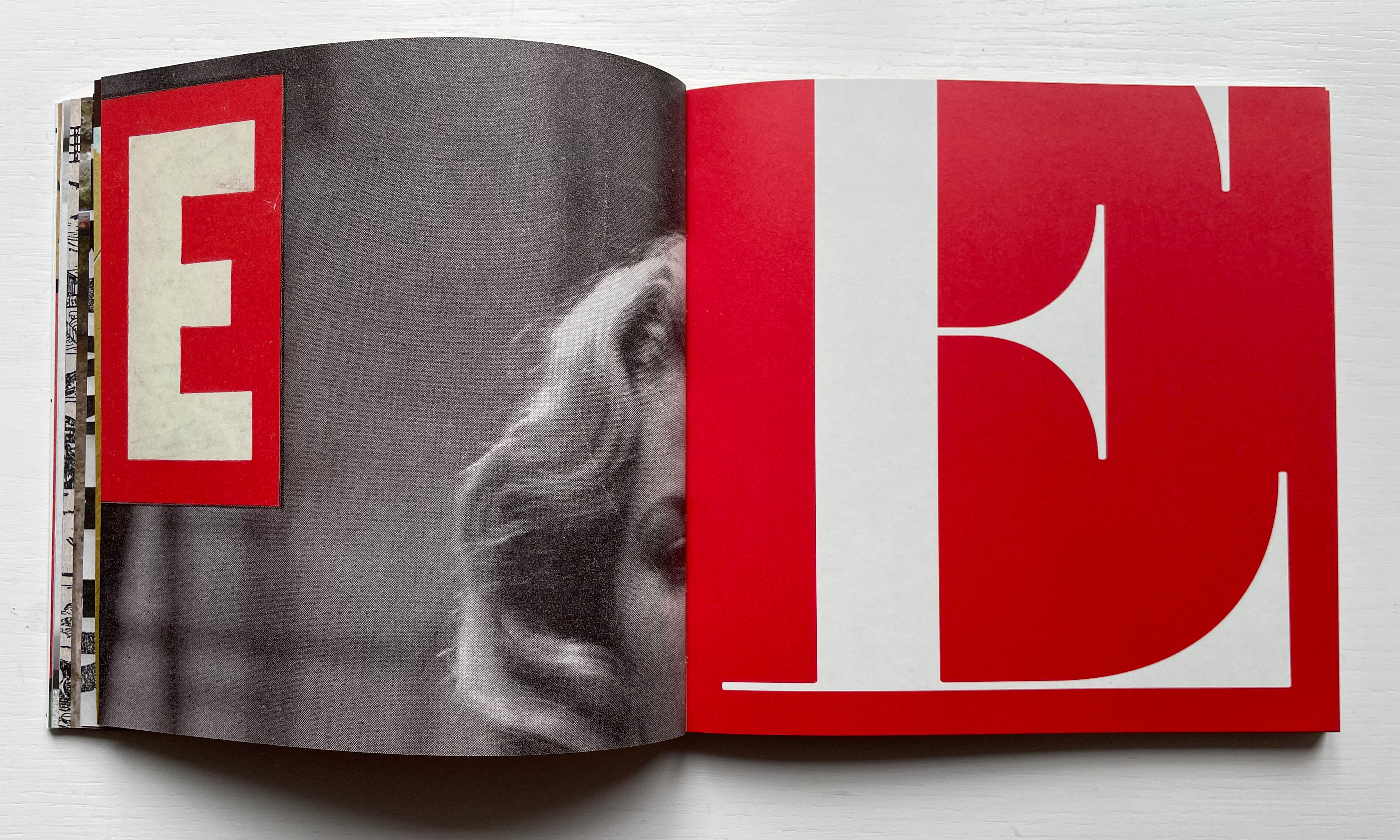
Ornan Rotem calls his book a “photo-typographic essay … a meditation … [e]xploring the relationship between typography and the visual world around us ….” As shown in the double-page spread below, his meditation is shaped across a four dimensional views of the letterform: the four-dimensional, three-dimensional, two-dimensional and the one-dimensional. At the end of the essay, there are 26 miniature essays that will send the reader back to enjoy each letter’s four dimensional entries again.
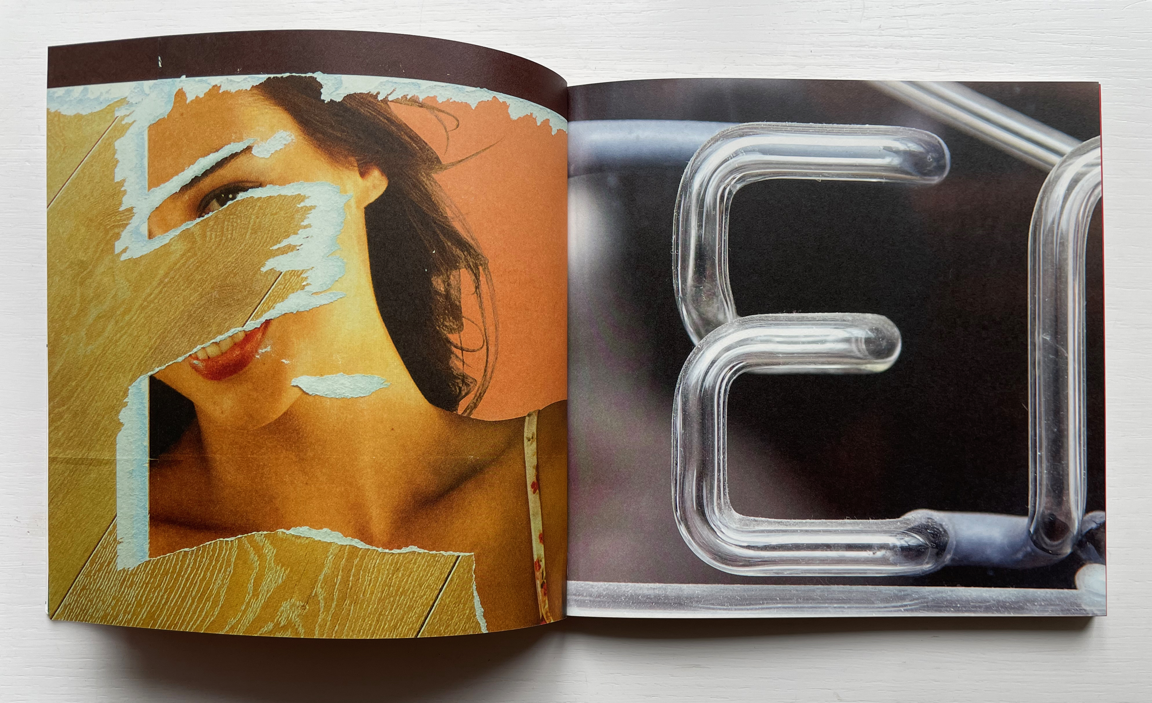
Everywhere you look you can see an E smiling at you (just saying it induces a smile). In 1969, Georges Perec, whose own name has four Es, tried exorcising the E by writing an esoteric 300-page novel, La disparition, without ever using one. I wonder how he would have felt had he come across this E — which was shot in Paris — when he was writing the novel. ¶ If you want to endow letters with character, then I suppose E would be the lively sort, hence the printed form comes from a 1948 cover of LIFE magazine.
Much is packed into these miniature essays. Naturally for an artist’s book celebrating type, there are the necessary self-referential typographic puns in the one above: character and sort. In all, there is the evidence of the long, multi-place, multi-source contemplative gestation of the work. In the example above, the allusion to Perec’s novel leads to the 1969 photo in Paris (or was it vice versa?). The typographic puns lead to a search for an E from a LIFE cover (again, or was it vice versa?). This circular connectedness over time, text and image highlights the self-referentiality of the genre of the artist’s book.
While the dense allusiveness might suggest that this is a work limited to an adult audience, A Typographic Abecedarium does find favor with a younger audience — no doubt because it speaks to the phenomenon of seeing letters everywhere and in multiple dimensions.
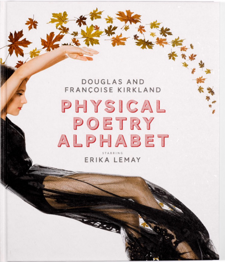
Physical Poetry Alphabet (2018) is a curious work. The Thames & Hudson-style production values combined with the knowledgeable essay in it by Ornan Rotem makes one think of Andrew Robinson’s The Story of Writing, an actual Thames & Hudson book. While the acrobatics of Erika Lemay echo the longstanding tradition of modeling the letters with the human body, followed by Erté, Vítězslav Nezval, Anthon Beeke and Rowland Scherman and so ingeniously summarized by Lisa Merkin, Lemay’s elaborate costumes and the scene design echo the traditions of Hollywood, Las Vegas and the fashion industry, which is not surprising given the involvement of Douglas Kirkland, portrait photographer to the stars. A Typographic Abecedarium strikes its singular target of “photo-typographic essay”. Having too many targets, Physical Poetry Alphabet perhaps misses its several bull’s eyes, but to follow along with its mixed metaphors, it undeniably delivers a shop full of eye candy.
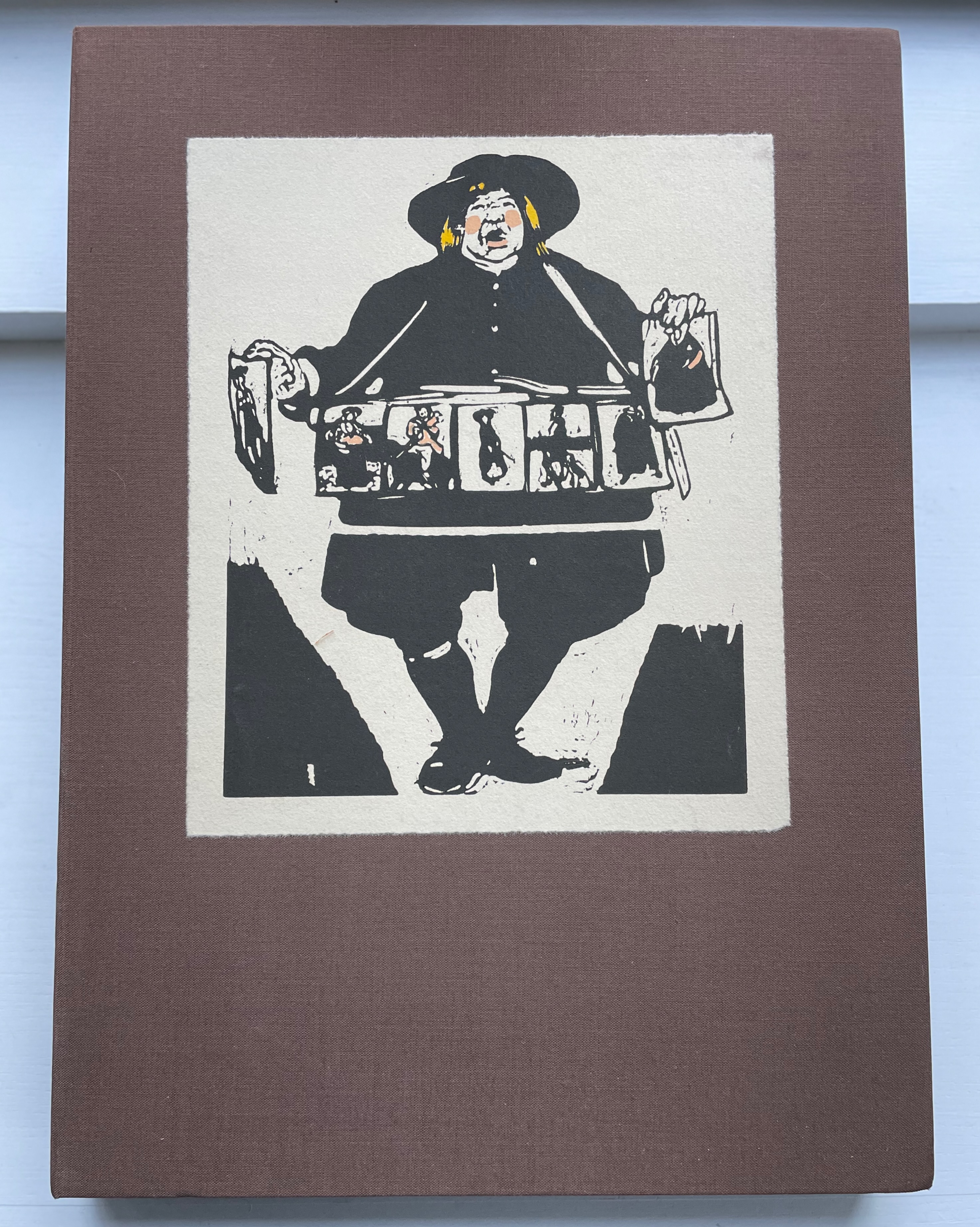
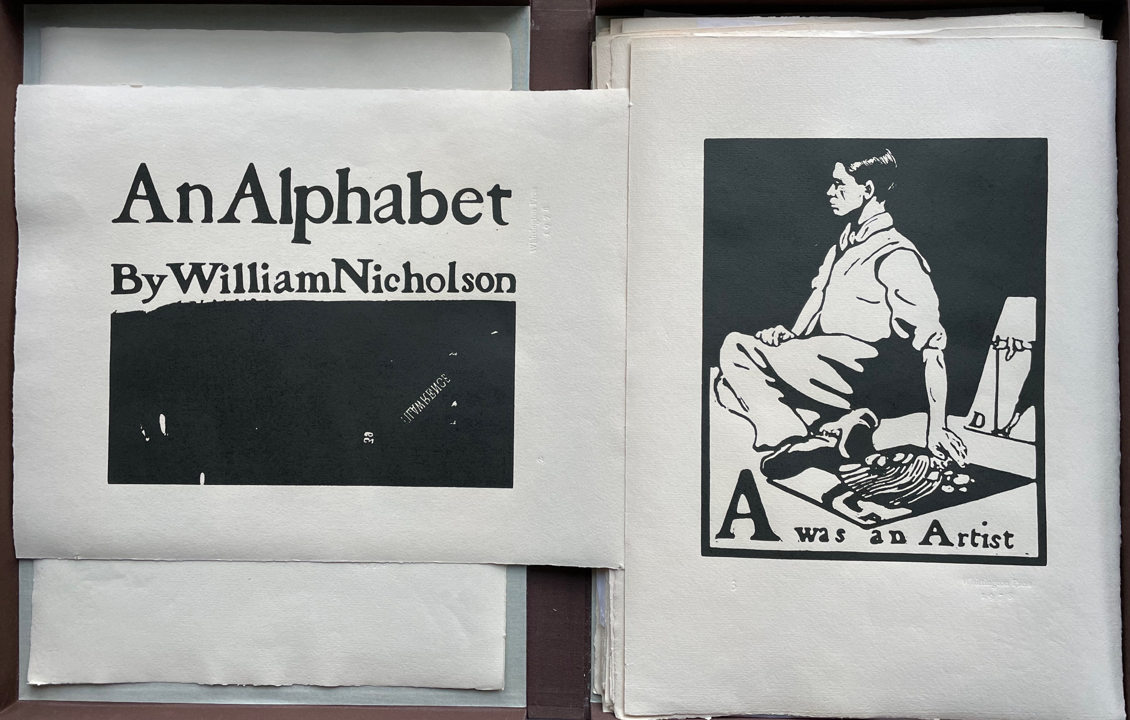
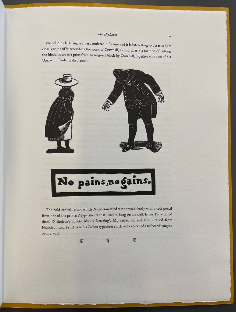
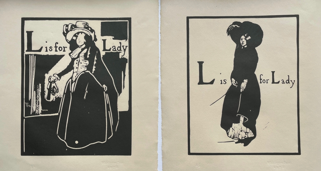
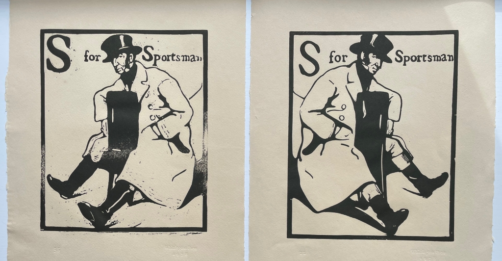
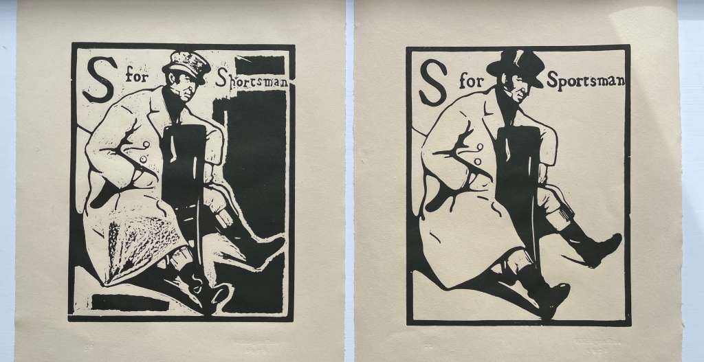
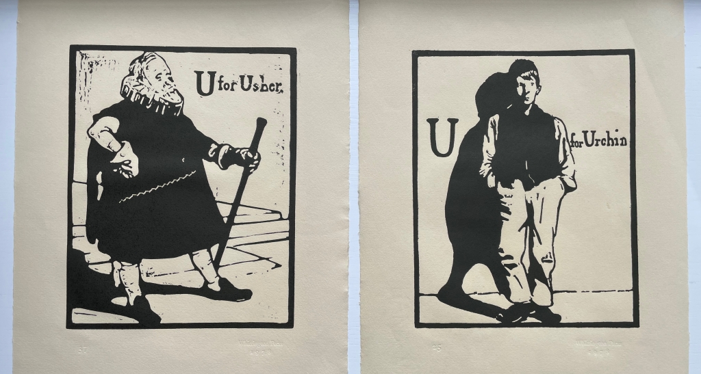
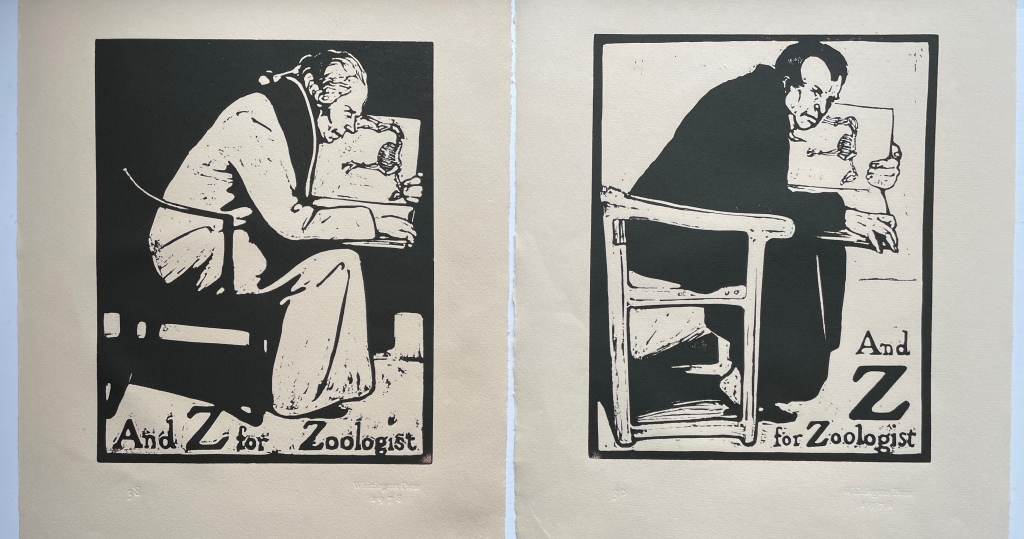
William Nicholson’s An Alphabet appeared in 1898. Eighty years later, with access to the original woodblocks (thanks to William Heinemann Ltd, which subsequently placed them with the Victoria & Albert Museum), Whittington Press and Edward Craig found themselves in a position to reproduce this famous alphabet. Craig, the son of Edward (Ted) Gordon Craig, who learned wood engraving from Nicholson, also had his father’s diaries as well as his own memories on which to draw for the booklet that accompanies the prints in this folio box. It provides a rich and diverse background that adds to their enjoyment. Craig brings to life the context and ties of friendship in which Nicholson’s art came on the scene. He even includes prints from three blocks cut by Joseph Crawhall (he of Old Aunt Elspa’s ABC fame) to show the affinities between Nicholson’s lettering and images and those of Crawhall.
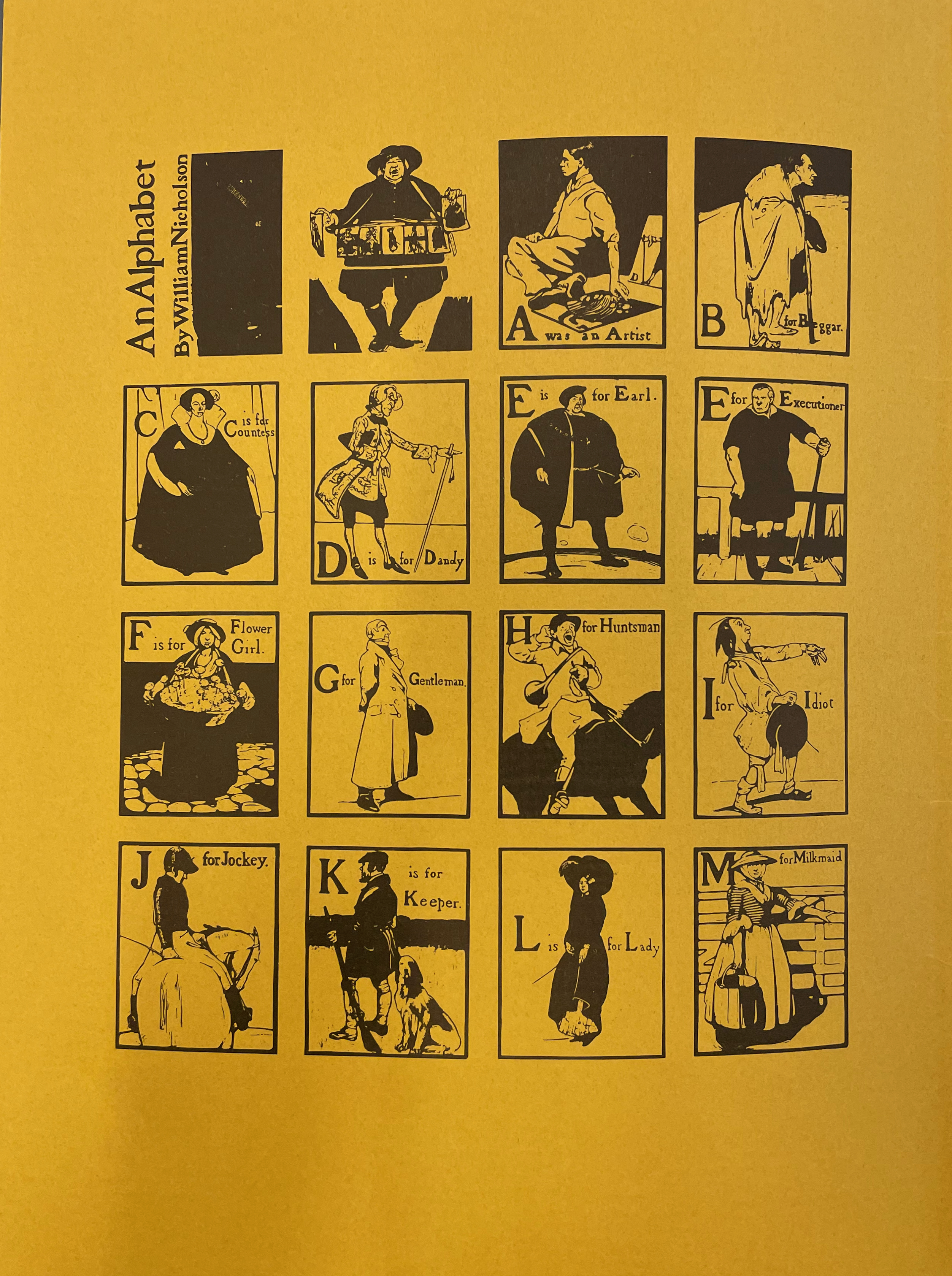
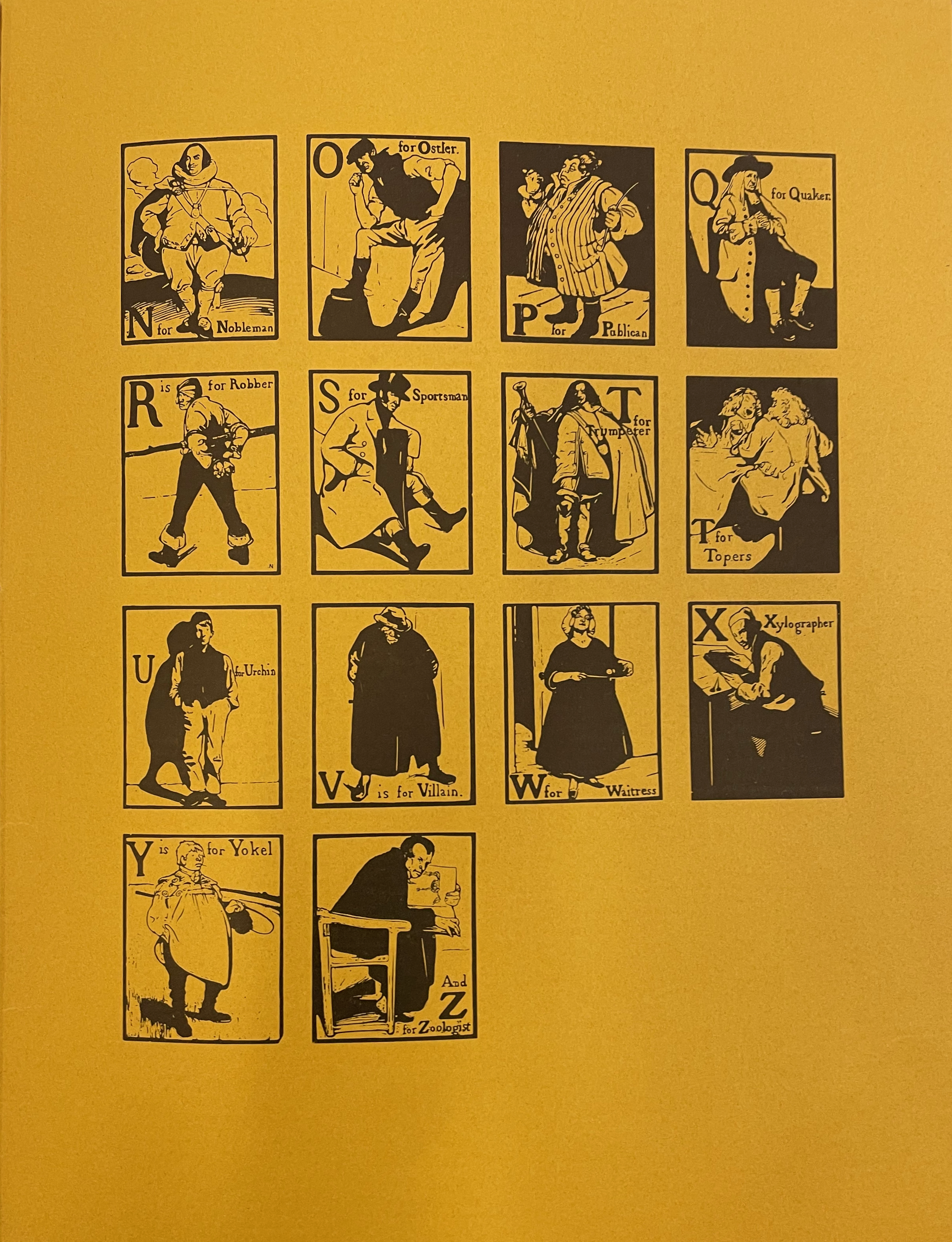
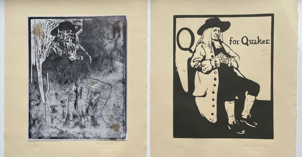
The booklet’s inclusion of 28 thumbnails of the reproduced prints is a helpful quick guide to the portfolio, but this particular edition contains 38 prints. Among them are some unused prints — a Quakeress, an Usher replaced by the Urchin, and alternative versions of the Jockey, Lady, Sportsman and Zoologist. Also included is a photo of the woodblock for the Quaker. Alongside Craig’s description of Nicholson’s two preferred courses of design and drawing, the discards and the photo offer a very real sense of Nicholson at work when placed side by side with the final designs:
After some preliminary scribbling … he would convey what he wanted from that scribble to a piece of very thin paper, or tracing paper, by inserting a black transfer paper between the two layers, then, peering into the maze of lines, he would select just those that he fancied and trace them through. …. His other method … was to draw direct onto the block with a brush heavily loaded with India ink, then, when it was dry, to refine the design by drawing over it with great care, using a softish pencil. The lead pencil shone like silver on the Indian ink and added to the excitement when the next process, that of cutting, revealed the beautiful honey-coloured boxwood below.
Discarded vs final
Discarded vs final
Discarded vs final
Discarded vs final
Discarded vs final
Discarded vs final
Photo of discarded block, final design
Craig’s booklet draws on Marguerite Steen’s 1943 biography as well as his father’s diaries, both sources rich in anecdotes and observations about Nicholson, James Pryde (his colorful partner in their J&W Beggarstaff Brothers venture), moments of time and place and the social circles in which they moved. Steen must have had access to Ted’s diaries or heard the tales directly from him. Here are Steen and Craig on a scene at the Denham “Eight Bells”, a defunct pub where William Nicholson, his wife Mabel and her brother James lived (Jimmy came to visit for two days and stayed two years):
Steen: The floor was littered with scraps of brown paper, black paper, red paper, William and Jimmy argued for hours about spacing–for which Jimmy had a great eye. Oddly enough, he was impatient and clumsy-handed when it came to execution…. With the scissors he was completely outclassed by William–who used a knife on glass, and on whom fell most of the execution of the schemes they planned together. … From all accounts, William did the lion’s share of the Beggarstaff work, so it is amusing to find in a published interview of the period Jimmy taking the lead, “telling the tale,” with only an occasional, rather lordly, reference to his partner. (p. 56)
Craig from Ted’s diary: One visit to Denham found Nicholson on the floor pinning out rolls of brown paper. With a brief ‘Hello Ted’, he carried on working at great speed with a penknife, cutting up pieces of black paper on which were scribbled a few guide lines in chalk and arranging the shapes to resemble a huge figure in a cloak. A face and hands from some buff-coloured paper were being produced by Jimmy, who was draped over a chair in the corner; these were ‘floated’ into position, then pinned. They stood on chairs to look down on their work, then added a few extra shapes in coloured paper here and there. Suddenly a figure like one of the Three Musketeers materialised. They seemed pleased enough, and Jimmy remarked that ‘it would be good for something’. (p. 3)
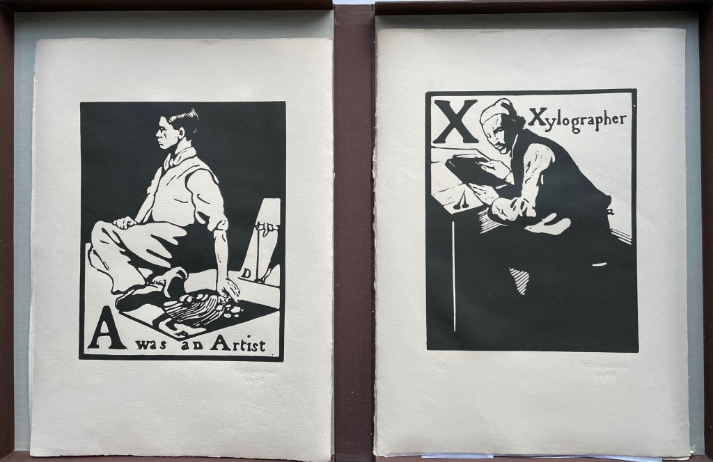
Several sources identify “A was an Artist” as Nicholson’s self-portrait, but might that three-quarters portrait of the Xylographer also be a self-portrait? Or is it his partner James Pryde in a portrait additional to the one of him in “B for Beggar”? Such is the speculation to which the warm color of Craig’s text and the vibrant reproductions created with Whittington Press would lead anyone exploring this portfolio.
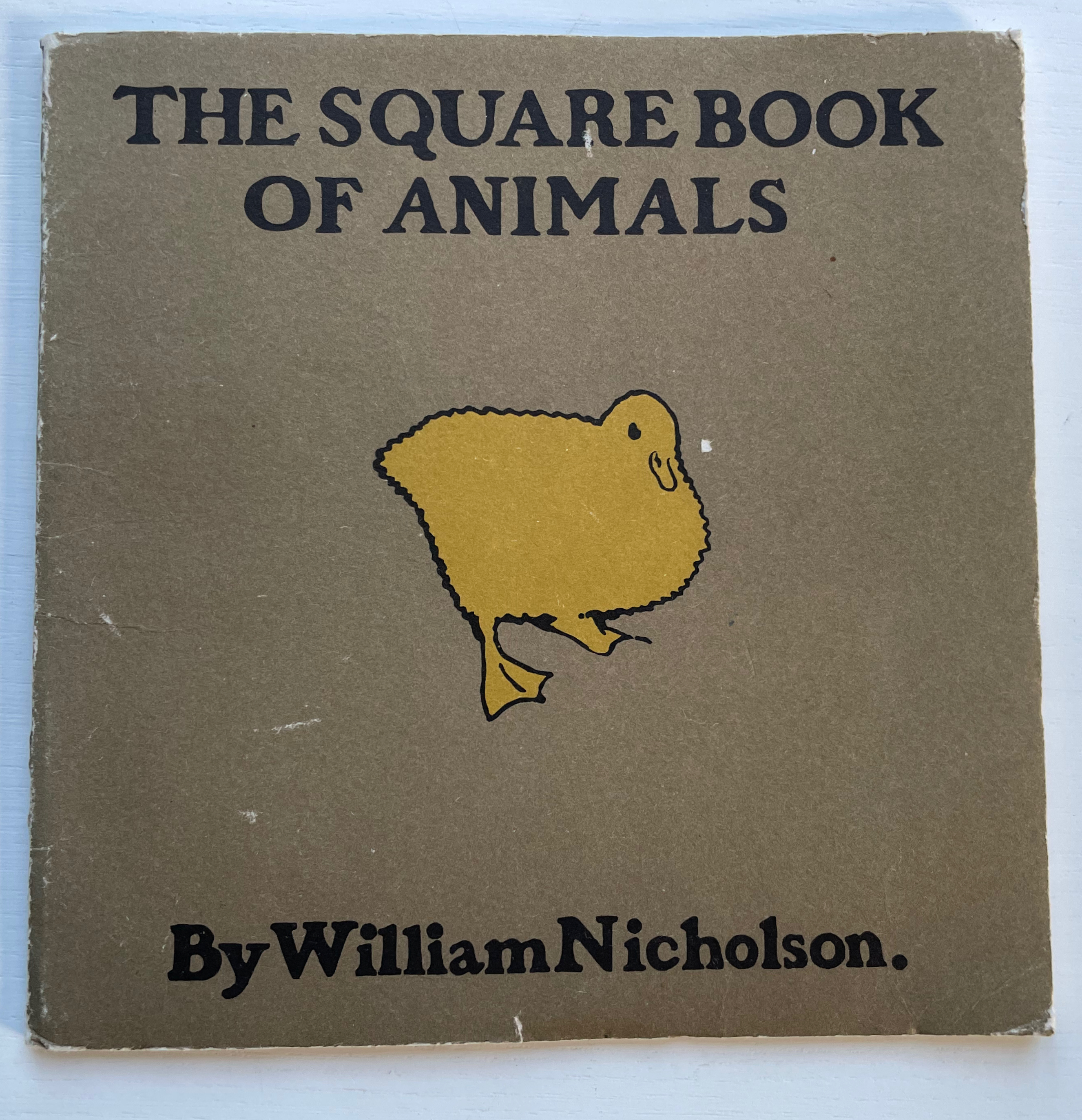
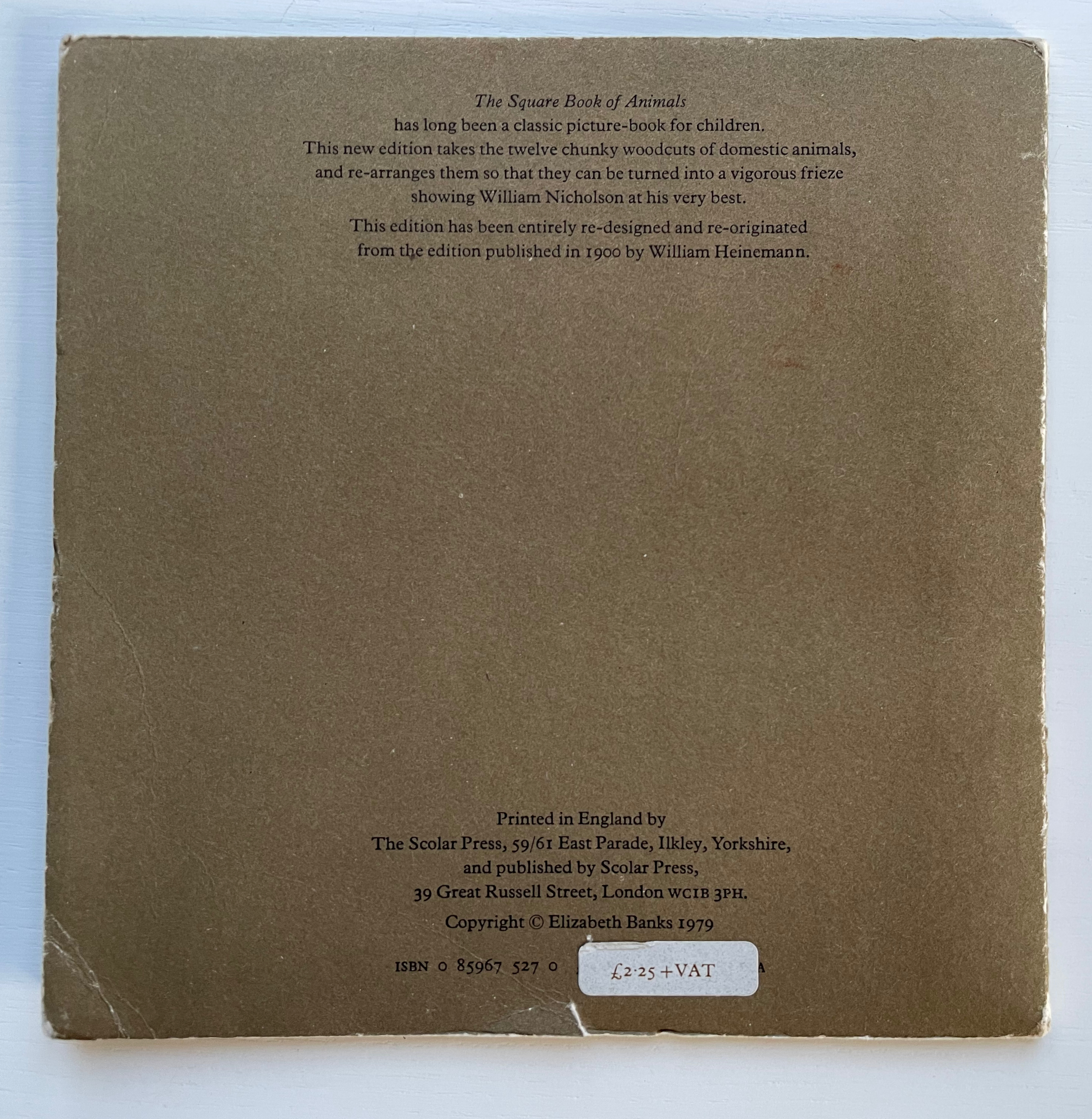
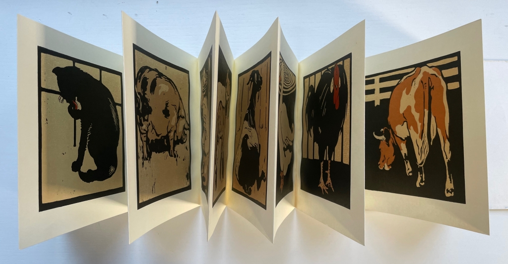
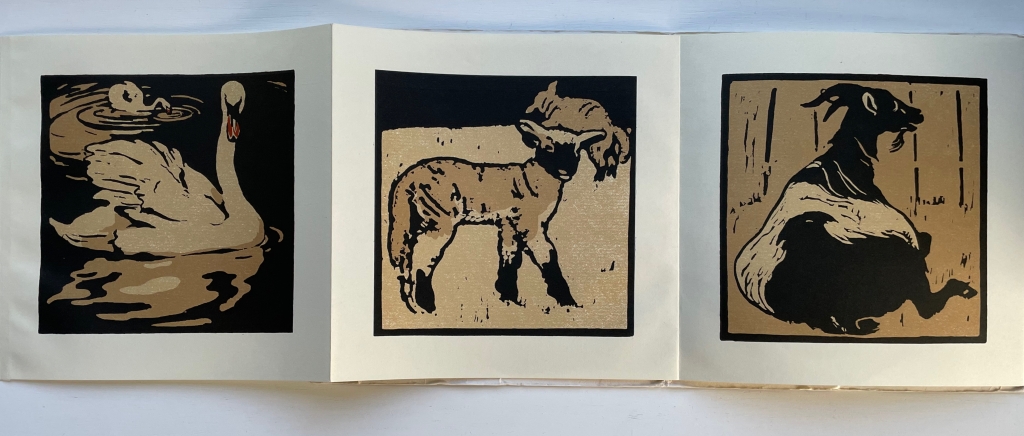
The Square Book of Animals (1900/1979)
The Square Book of Animals(1900/1979) William Nicholson Softcover, leporello. 290 x 290 mm. 12 panels. 2nd edition. Acquired from M.G. Manwaring, 2 April 2023. Photos: Books On Books Collection.
Scolar Press redesigned and re-originated the 1900 edition and brilliantly chose this leporello format, which makes one wish that Nicholson had added the book as artistic medium to his toolkit, which besides woodcuts and wood engraving included lithographs, oils, watercolors, tempera, frescos, painting on glass and photography. Given his poster work for the theater and exposure to the stage (the actor Henry Irving was a family friend and source of free tickets, and actress Ellen Terry was the mother of his friend Ted Craig) and given his facility with paper as a medium, Nicholson could have made pop-up and tunnel books of genius. But portraits, landscapes and still life beckoned as Colin Campbell tracks and explores so well in his two books (see below).
In the Books On Books collection, several works provide enjoyable comparison with Nicholson’s art: Carton Moore Park’s Alphabet of Animals (1899), C.B. Falls’ ABC Book (1923), Christopher Wormell’s An Alphabet of Animals (1990), Enid Marx’s Marco’s Animal Alphabet (2000) and Nick Wonham’s A Charm of Magpies (2018).
Campbell, Colin; James, Merlin; Reed, Patricia; and Schwarz, Sanford. 2004. The Art of William Nicholson. London; New York: Royal Academy of Arts ; Distributed in the U.S. and Canada by H.N. Abrams.
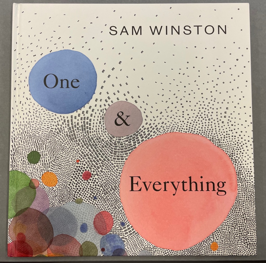
One & Everything(2022) Sam Winston Casebound with illustrated paper over boards. H265 x W255 mm. 48 unnumbered pages. Acquired 23 November 2022. Photos: Books On Books Collection. Displayed with artist’s permission.
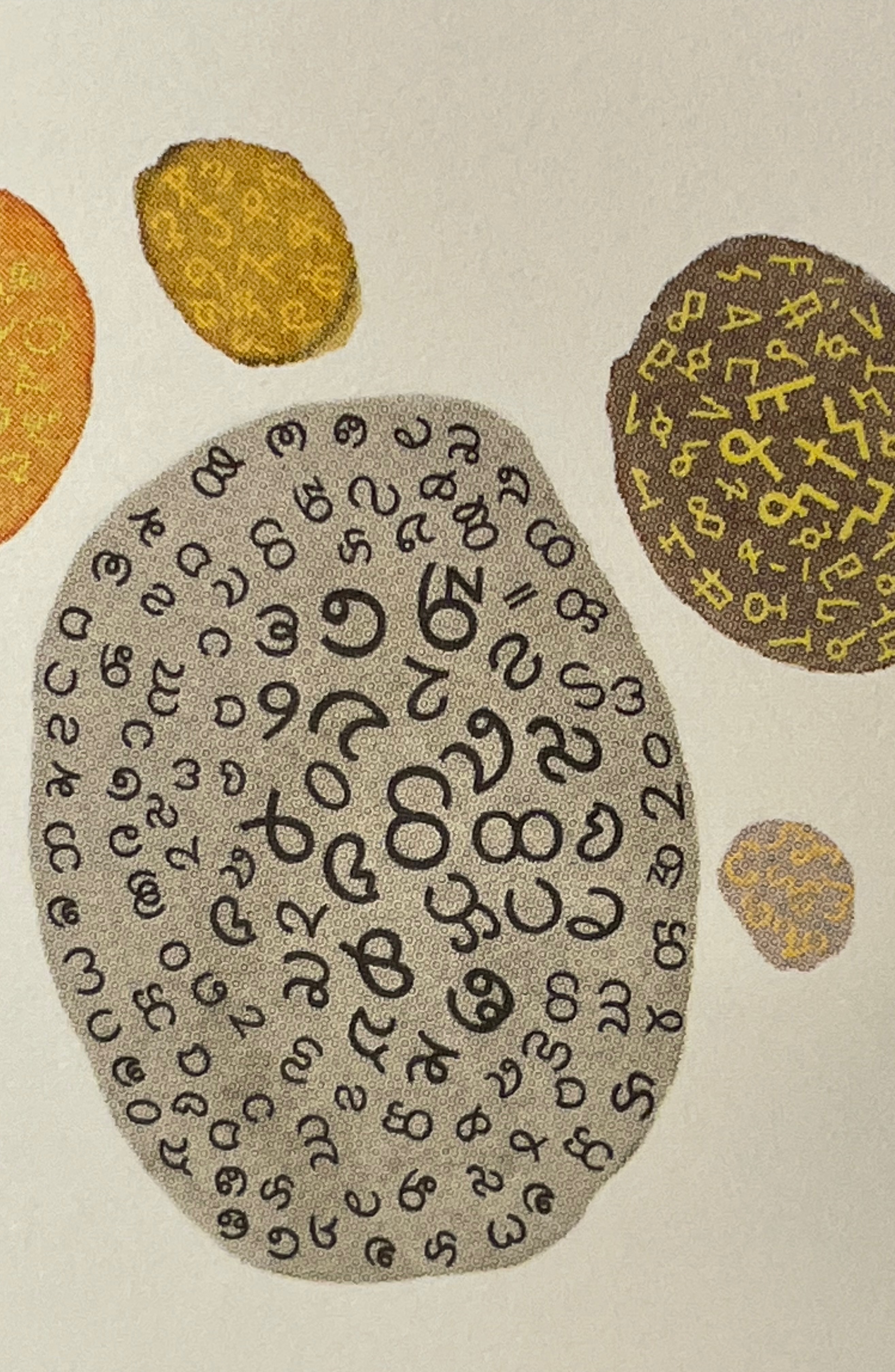
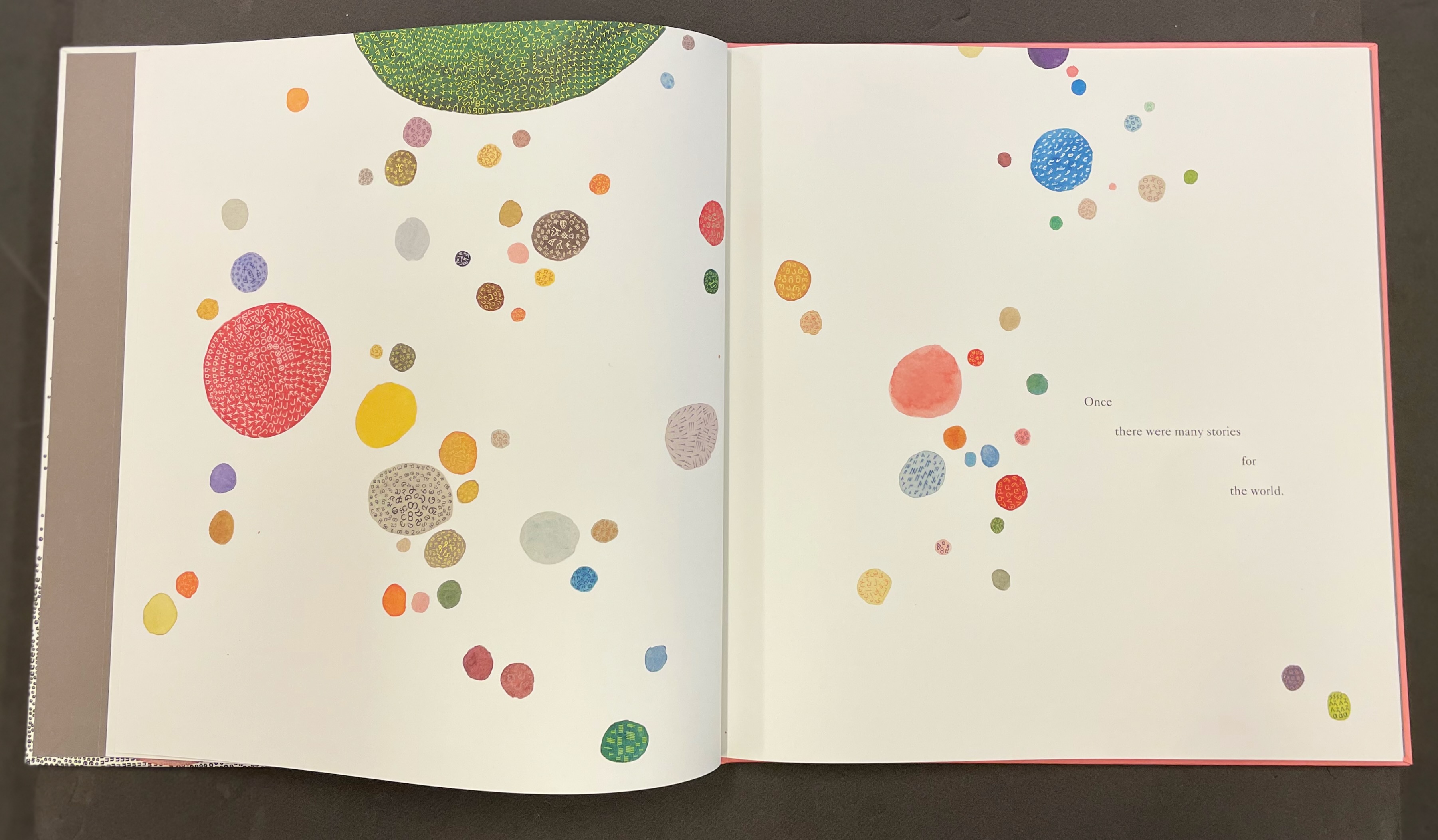
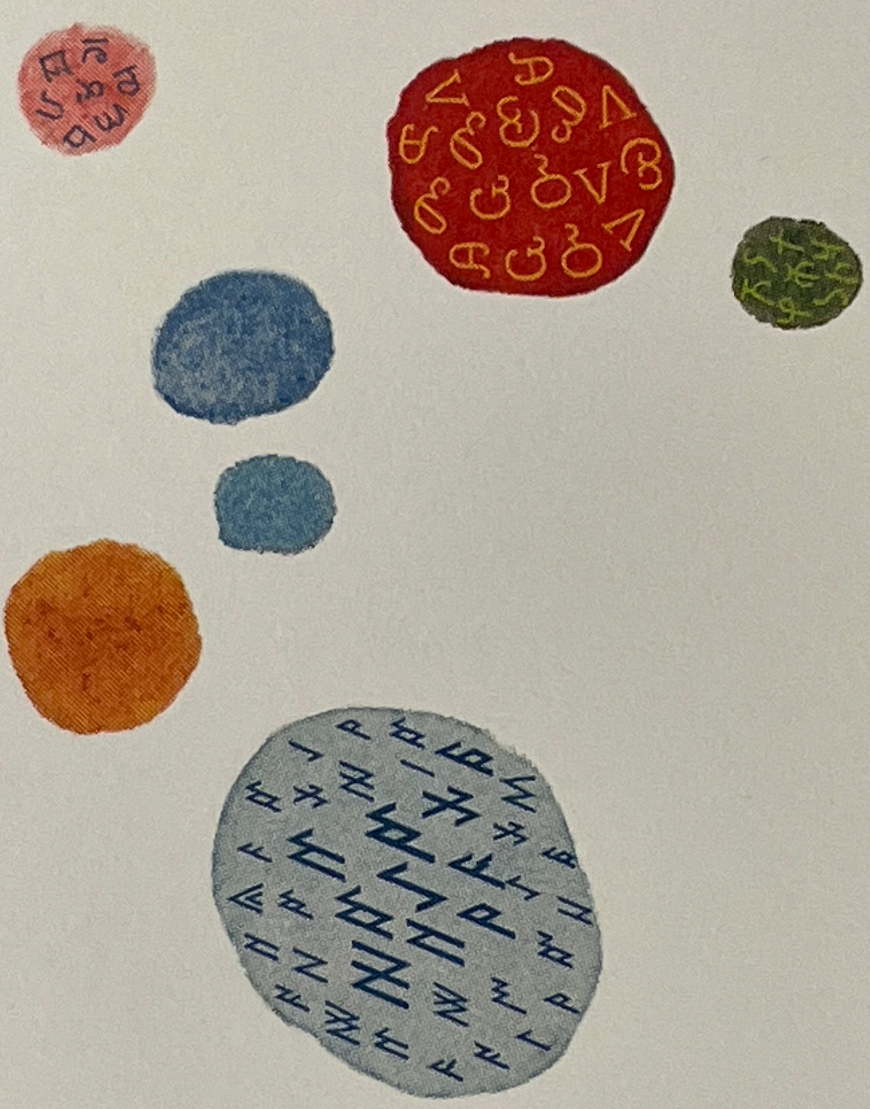
Sometimes you just know that you have read a classic. This is one of those times. Winston and Candlewick Press (Walker Books in the UK) have worked a fresh tale, tone and meaning together with image, color, design and production values to an extraordinary level. Inspired by Tim Brookes’ “Endangered Alphabets Project“, Winston uses the striking shapes of letters and scripts from the Latin, Ogham, Cherokee, Armenian, Hebrew, Tibetan and dozens more alphabets and syllabaries to create the characters in his fable about the story that decides one day that it is the One and Only story.
Shapes like single-celled creatures (each filled with a different alphabet) represent the many stories existing before “The One” arrives.
“The One” is made of the English (i.e., Latin or Roman) alphabet. Will it listen to and make sense of all these other stories?
The fable of One & Everything does more than support the notion that alphabets and languages can be endangered. Implicit in the fate of the “One & Everything” story” is the message that Babel was more of a blessing than a curse.
Readers familiar with Winston’s A Dictionary Story and his collaboration with Oliver Jeffers in A Child of Books (both below) will recognize a growing refinement and, now, breadth and depth in Winston’s storytelling. The youngest audience and beginning readers will be held by the shapes, colors and simplicity of the story. Older readers will easily grasp its underlying meanings and be intrigued by the variety of letters and scripts and the idea that languages and alphabets can die. Still older readers and teachers will appreciate the helpful resources following the story’s ending invitation. At all levels, the audience will delight in Winston’s creation of his characterful abstractions with letters from the alphabets and scripts identified in those resources. Those with an eye for such artistry will appreciate Winston’s extension of a tradition embraced by Paul Cox, Roberto de Vicq de Cumptich, Sharon Forss and Nicolas McDowall.
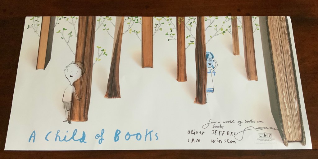
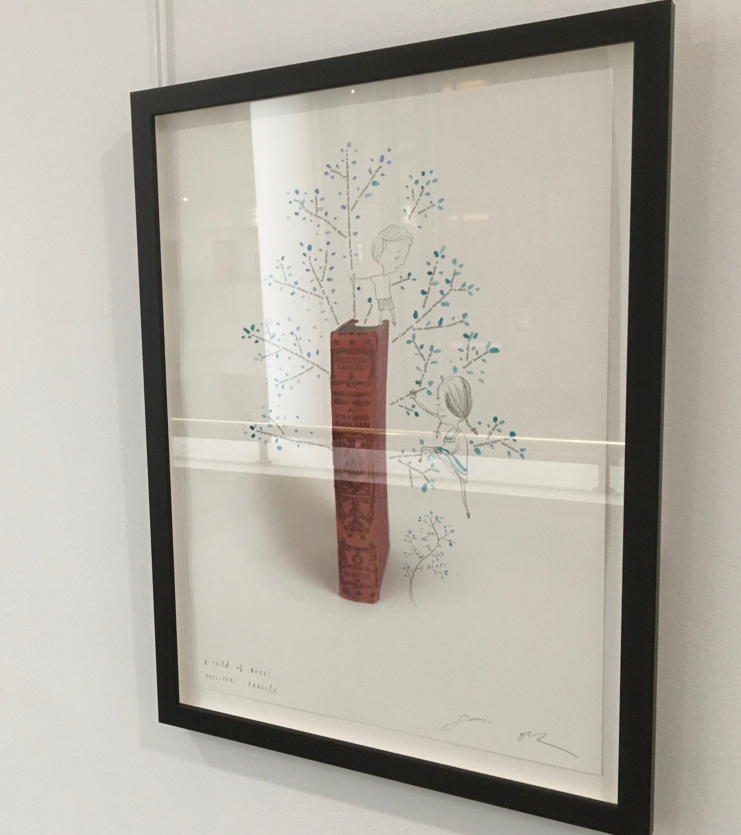
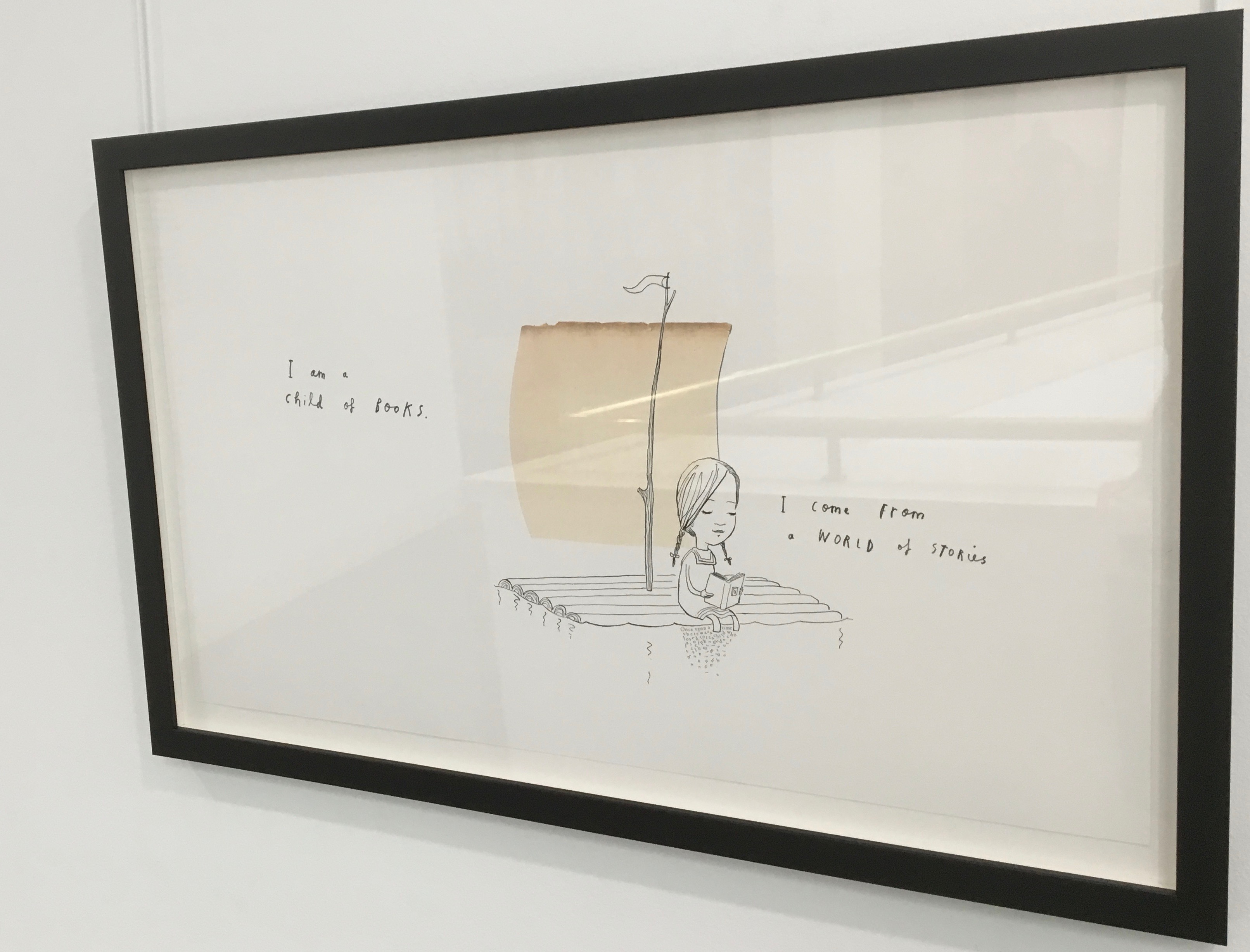
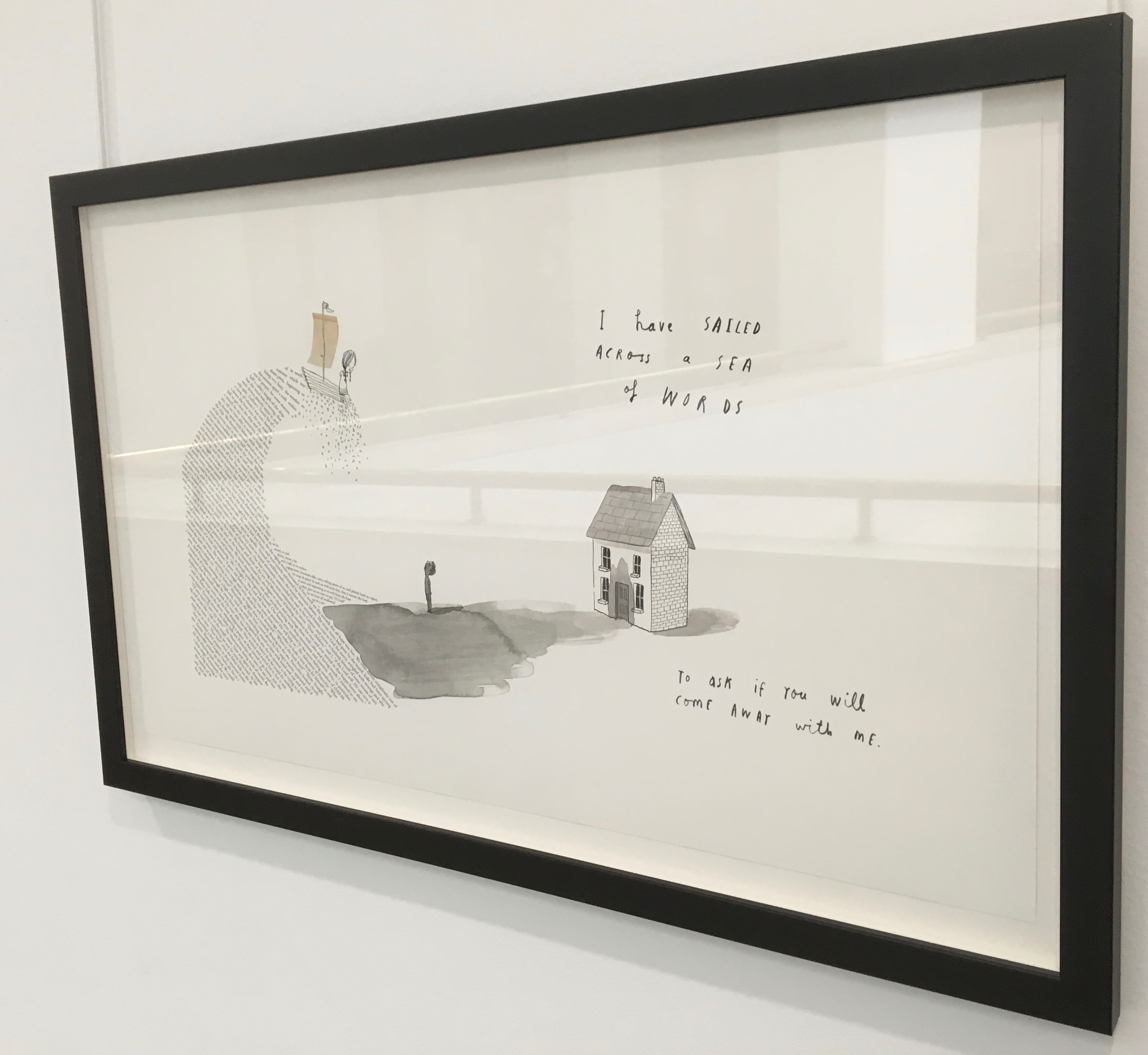
A forest made of fore-edges. A raft made of spines and its sail a book page. A wave and a path made of excerpts from books. In this fabulous world made from the features of books, the simpatico imaginations of Oliver Jeffers and Sam Winston deliver a heroine and an invitation that are hard to resist.
Promotional poster. Displayed with permission of Sam Winston.
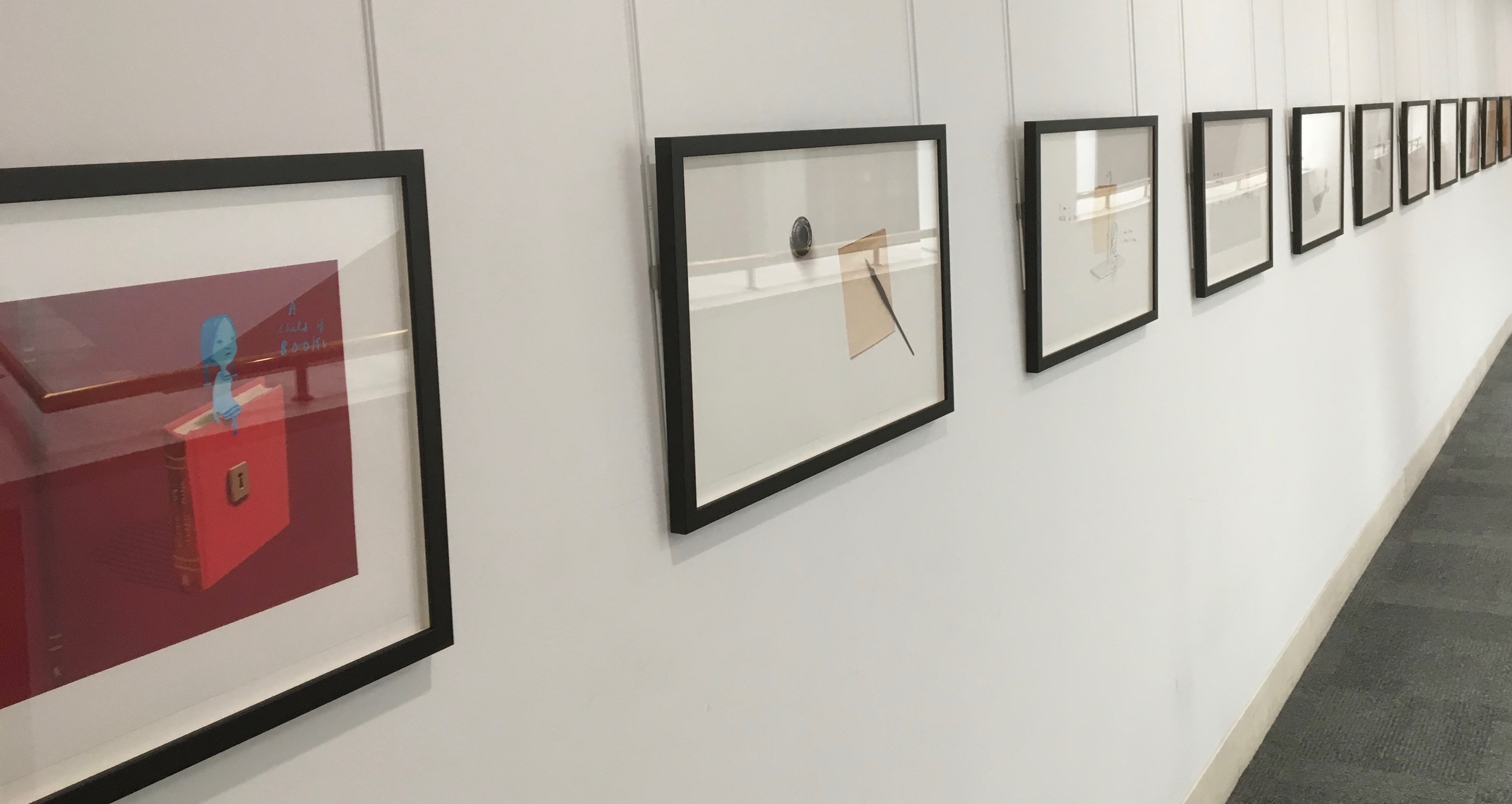
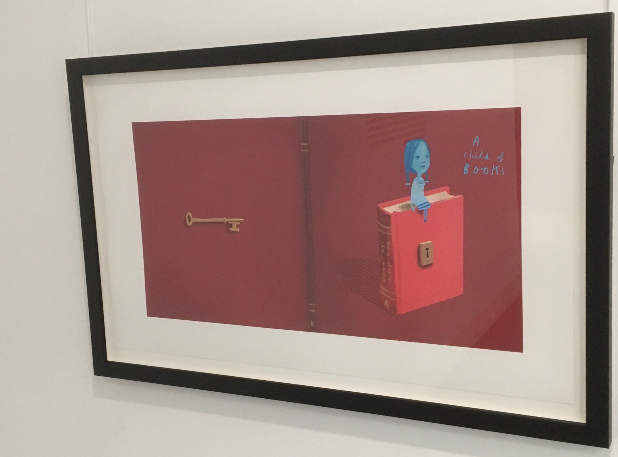
In addition to the poster above and the trade book it promotes, Winston created an artist’s book edition celebrated by this hallway gallery below mounted by the British Library shortly after its appearance.
A Child of Books prints displayed at the British Library, 9 August – 27 September 2019.
Winston’s abiding love of letters, words and stories shines through in A Child of Books. Arguably, it has its origins in an earlier work whose story is told by his invention of a very different “child of books”.
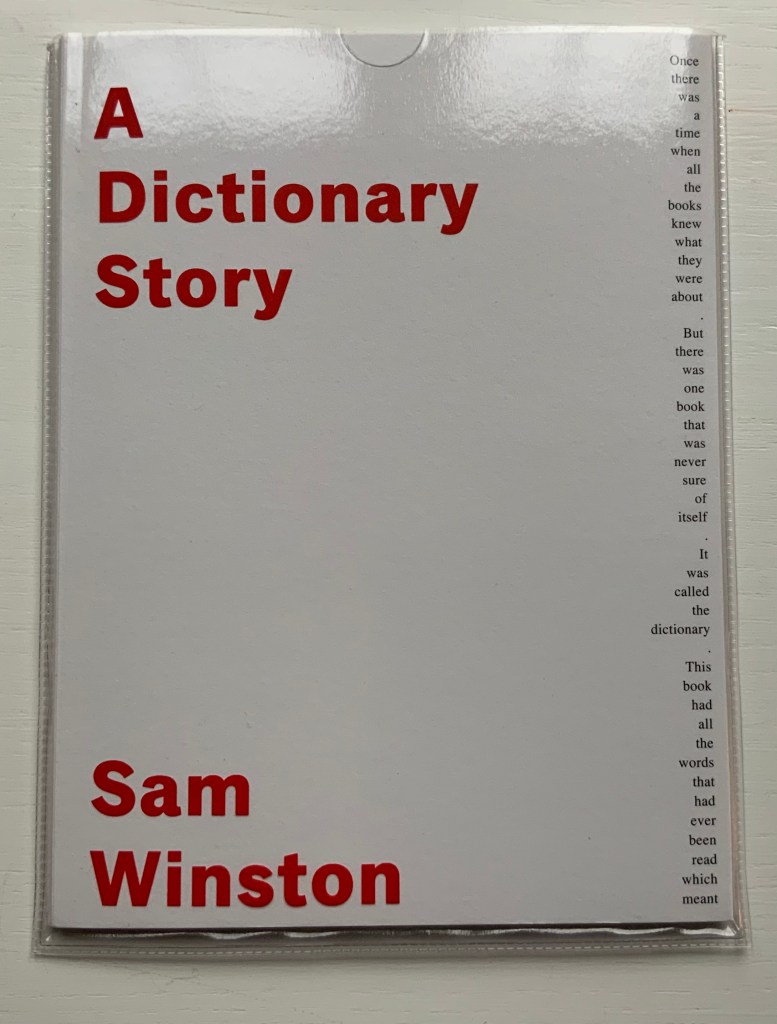
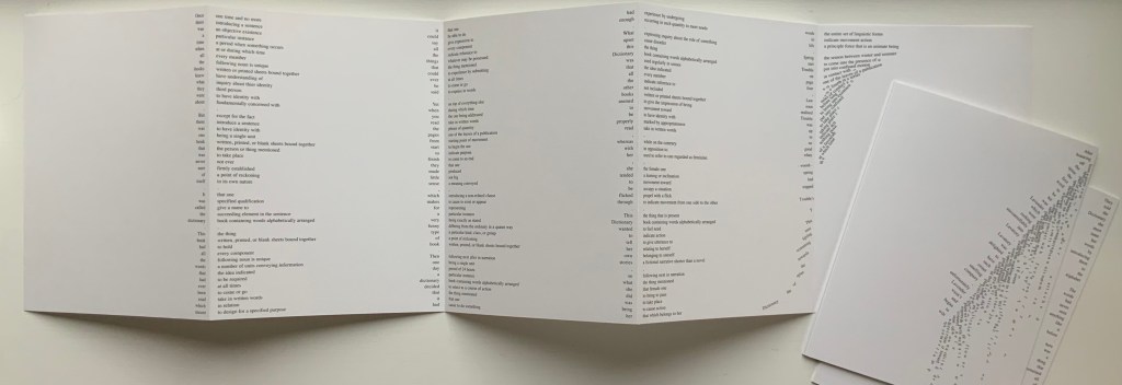
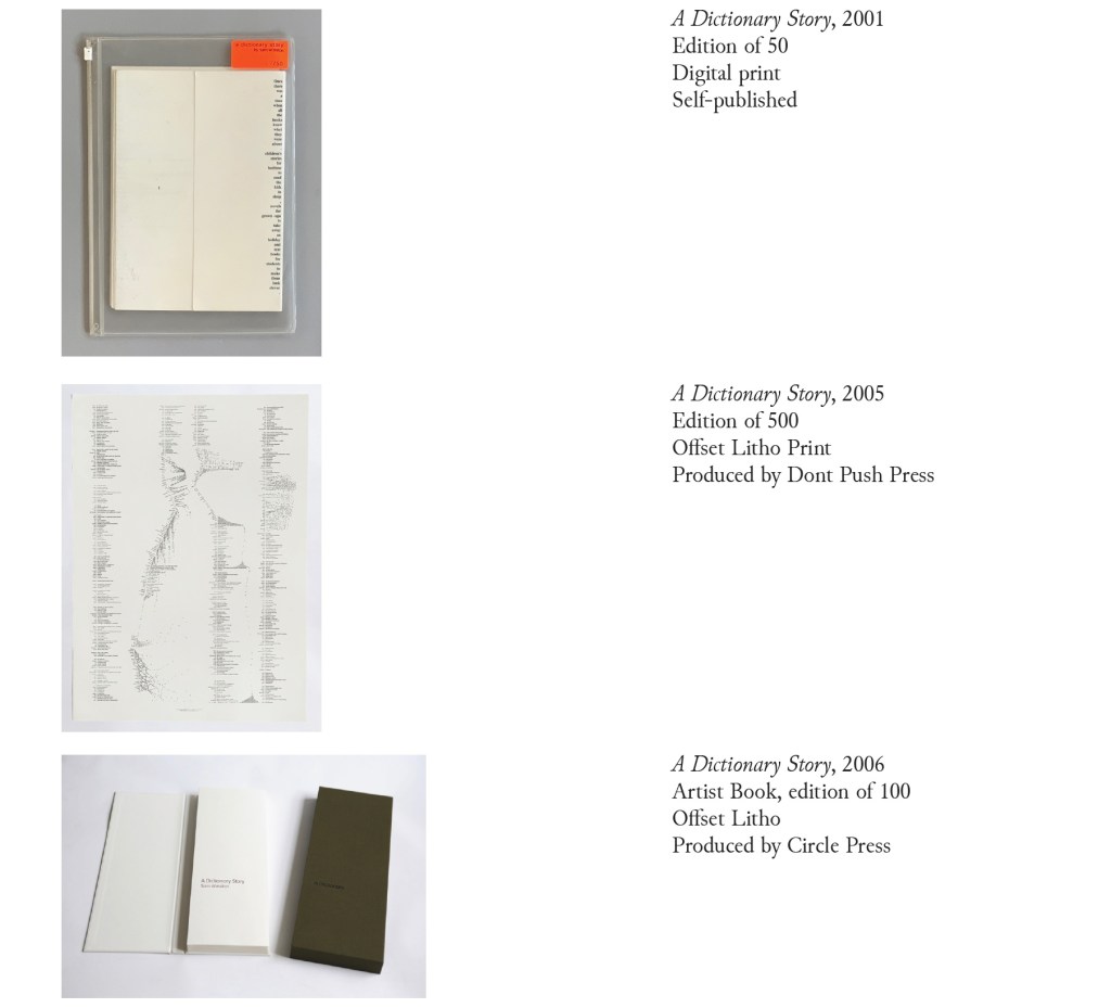
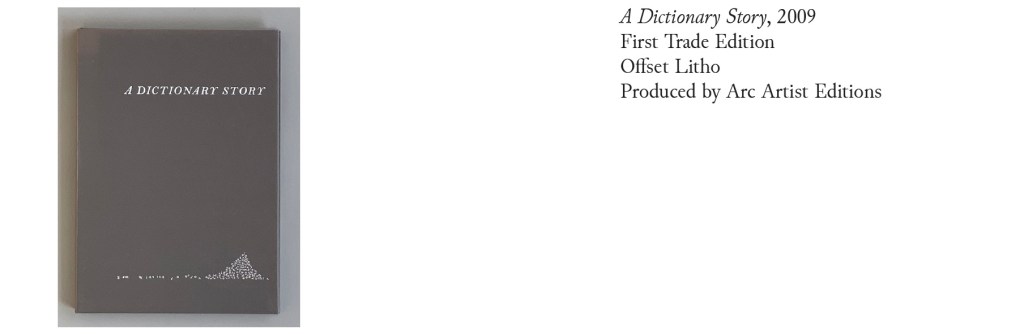
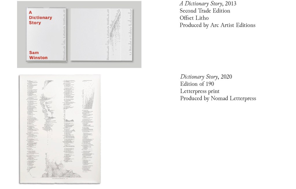
A Dictionary Story (2001 – 2020)
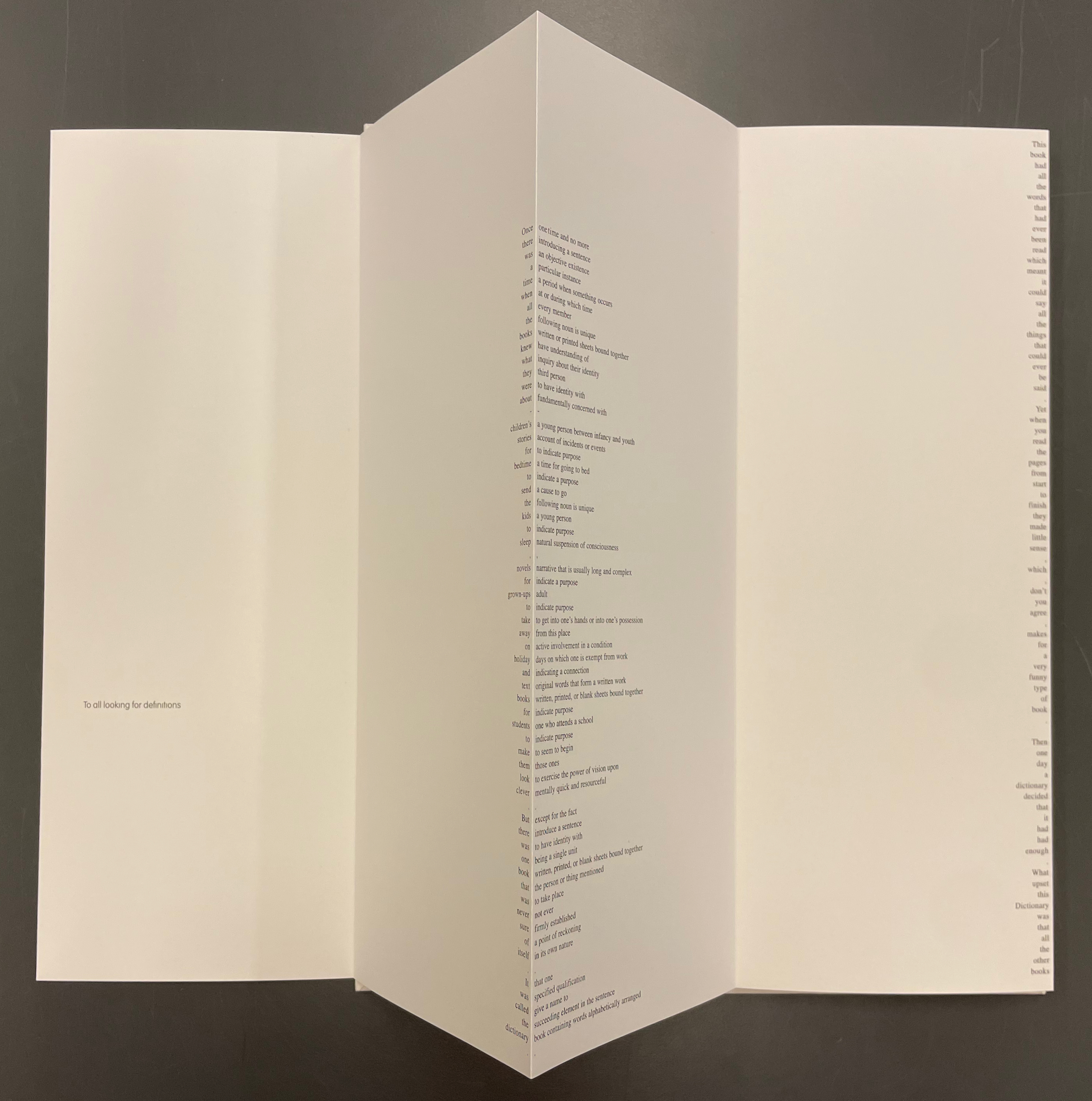
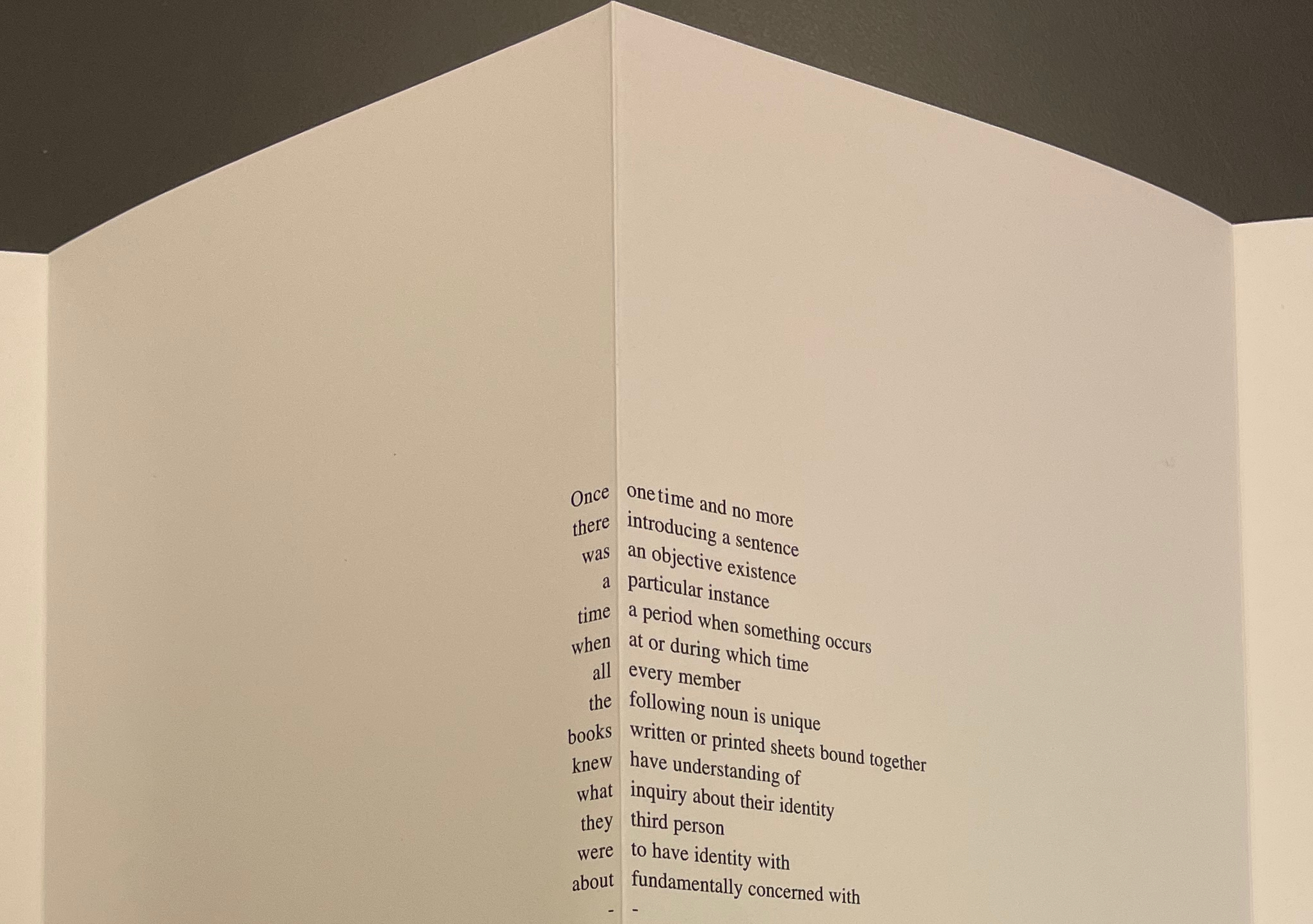
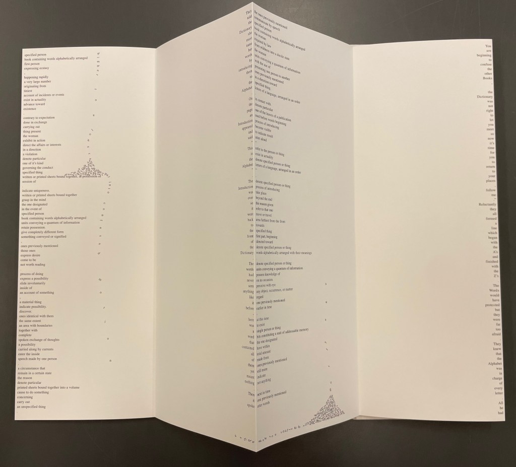
Since its origin as a student project in 2001, A Dictionary Story has appeared in an accordion book form as a fine press edition and two trade editions and as single-sheet prints. The Books On Books Collection holds the fine press edition and the second trade edition, both of which have in common a vertical flush-right single-word column that tells the story and the immediately adjacent vertical flush-left column of definitions of the words in the story. In the fine press edition, the two columns meet at each mountain peaks of the accordion fold.
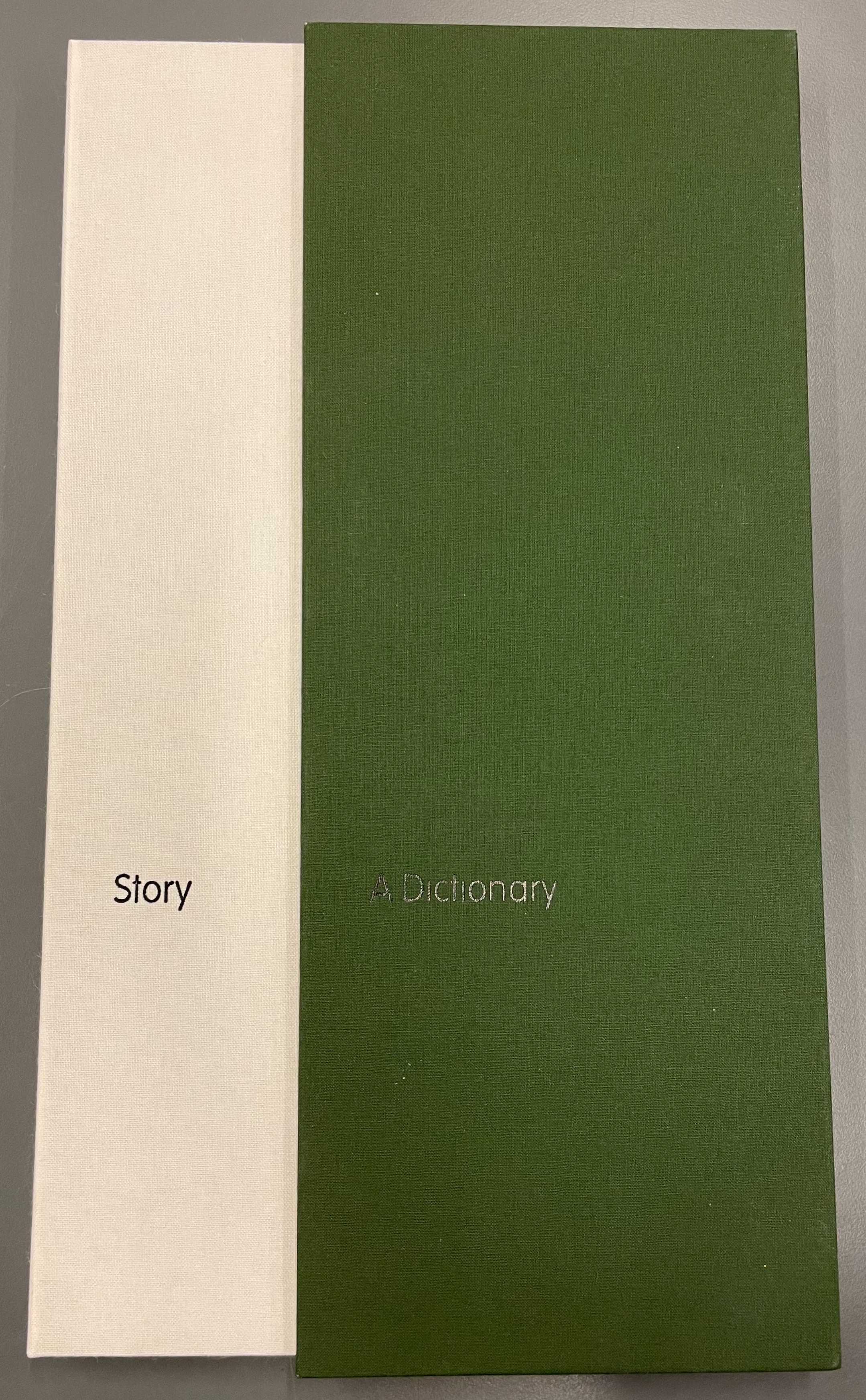
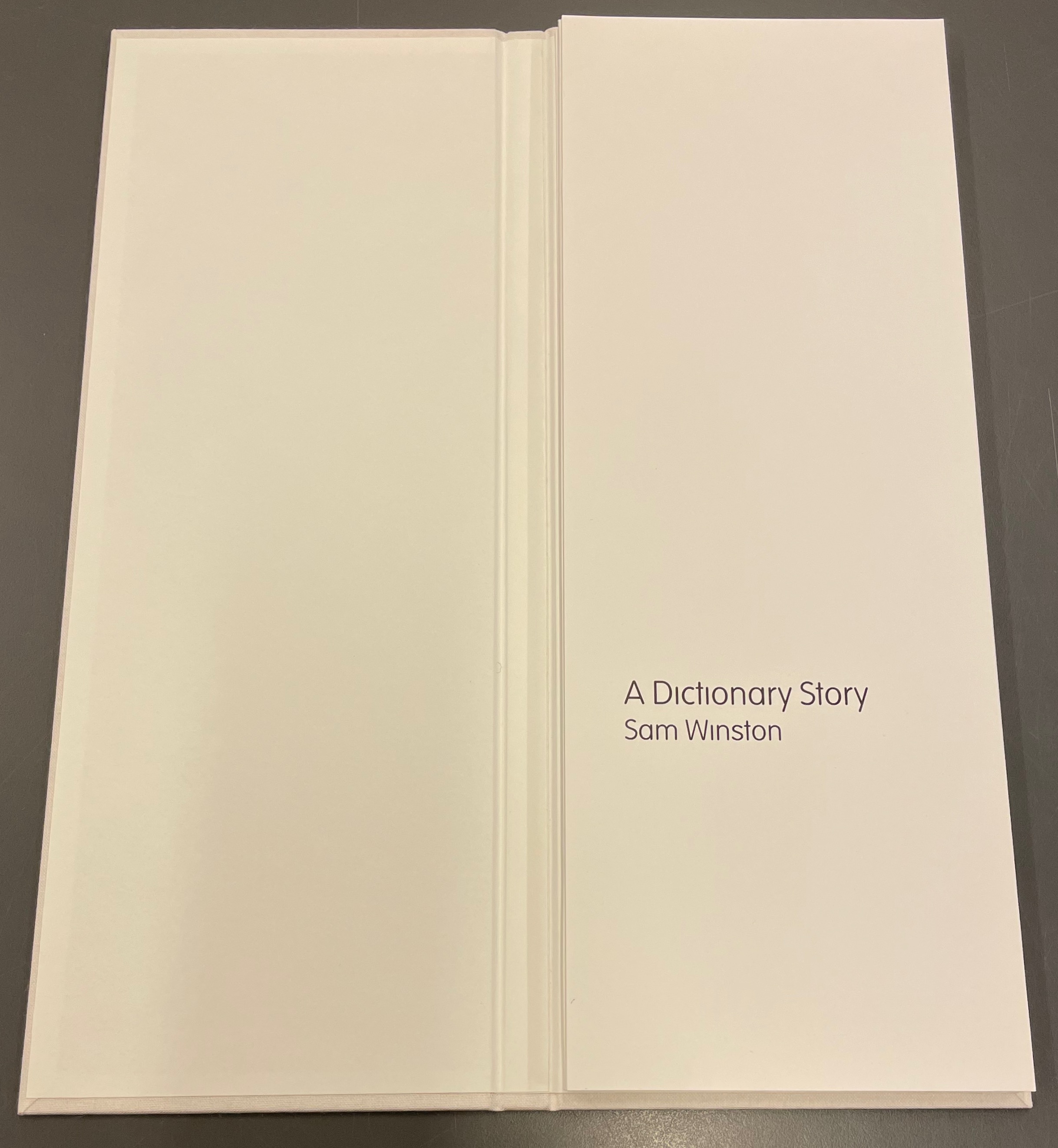
A Dictionary Story (2006) Sam Winston Slipcased leporello between cloth-covered boards.H360 x W140 mm, 25 panels. Story text set in 9 point Times Roman by Sam Winston. Book designed by Richard Bonner-Morgan and Sam Winston. Printed by David Holyday at Trichrom Limited. Bound at Quality Art Reproductions, England. Published by Circle Press. Edition of 100, of which this is #68. Acquired from the artist, 30 May 2018. Photos: Books On Books Collection. Displayed with artist’s permission.
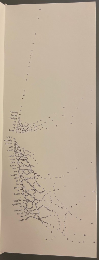
“Once there was a time when all the books knew what they were about. But there was one book that was never sure of itself.”
Panels 2-5 from the fine press edition; detail of panels 2-3.
So begins Winston’s tale about this uncertain book. The book never sure of itself is the Dictionary, which of course it must be, otherwise the tale would not be called “A Dictionary Story”. The Dictionary is jealous of all the other books because they are “properly read”, whereas she is just flicked through from time to time. A bit like the “One” in One and Everything, the Dictionary seems to think she contains all the stories imaginable, because she contain all the words — just not in the right order. So she decides to bring her words to life as characters to see what will happen. Words and letters fly about, enacting the story as if in a concrete poem. A meaningful tussle between text and image is a frequent feature for artists’ books as well as visual poetry.
Another defining aspect of book art is its self-referential nature. In an interview with Typeroom, Winston captures this in his response to the question “What is Dictionary Story all about?”:
Dictionary Story is a playful way of exploring some of our presumptions around the printed word. Or you could say that it looks towards a tool we are given at a very young age – the Dictionary – and invites us to actually think about how that works. Here’s a device that is designed to explain a word’s meaning by offering further words in its place – to me that is remarkable. This is a type of knowledge that can only explain itself through referencing itself. As a visual person the image that comes to mind is a giant, never ending, Möbius strip of language twisting back on itself.
Of course for less visual persons, the Dictionary’s whim engenders chaos, which Winston, a dyslexic, can appreciate. So he brings onstage (or “onpage”) the Books, of whom the Dictionary was jealous, to remonstrate that if words become disconnected from their definitions, how will they the Books know what they are about? Insisting that she tame her words, they have the Dictionary’s Introduction introduce her bewildered words to the character “Alphabet”.
Making the journey over the hills and valleys of A Dictionary Story is satisfying, and re-making it is even more satisfying and delightful each time. The making and re-making of A Dictionary Story must also have been satisfying and delightful for Sam Winston; he has done it so many times.
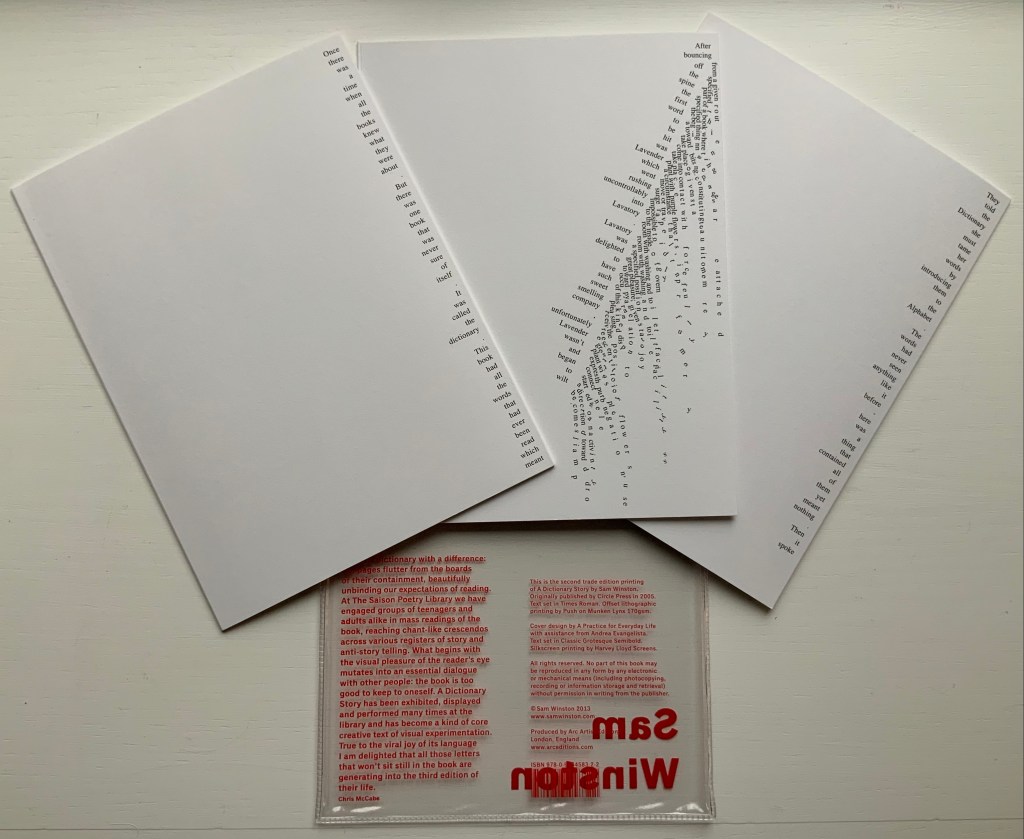
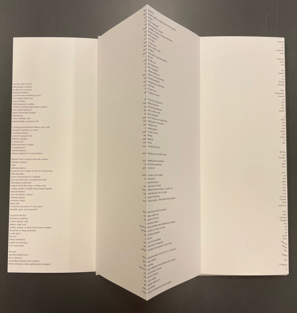
A Dictionary Story (2013) Sam Winston Three five-panel accordion folded sections in a plastic sleeve cover. Second trade edition. Sleeve: H205 x W160 mm. Sections: H200 x W150 mm, 15 panels. Acquired from the artist, 13 December 2020. Photos: Books On Books Collection.
Watching the artist adjust the typography of A Dictionary Story to changing dimensions is like watching a star tennis player who is also a star basketball player and star soccer (football) player. There’s always a ball, there’s always a net, there’s always genius.
The trade edition splits the fine press edition into three less narrow leporellos and nudges some of the two columns (story/definition) into the valley fold. Below, in the trade edition across panels 3 and 4 is where the Dictionary decides to bring her words to life, and on the right side of the fourth panel, the words begin to slip away from the fold.
The same part of the story in the fine press edition occurs on the fourth panel below, and the words tilt against the fold.
These variations create subtly different narrative paces and visual impressions in the two editions. Not one better than the other, just different. The poster variations, however, subordinate narrative pace entirely to visual impression. At present, the posters are not in the collection, but the images below help to make the point. As with movie goers, some will like the prints more than the books, others the books more than the prints, and still others will marvel at the genius in all of them.
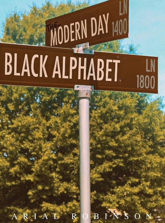
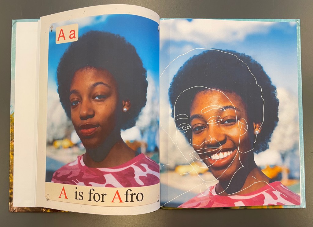
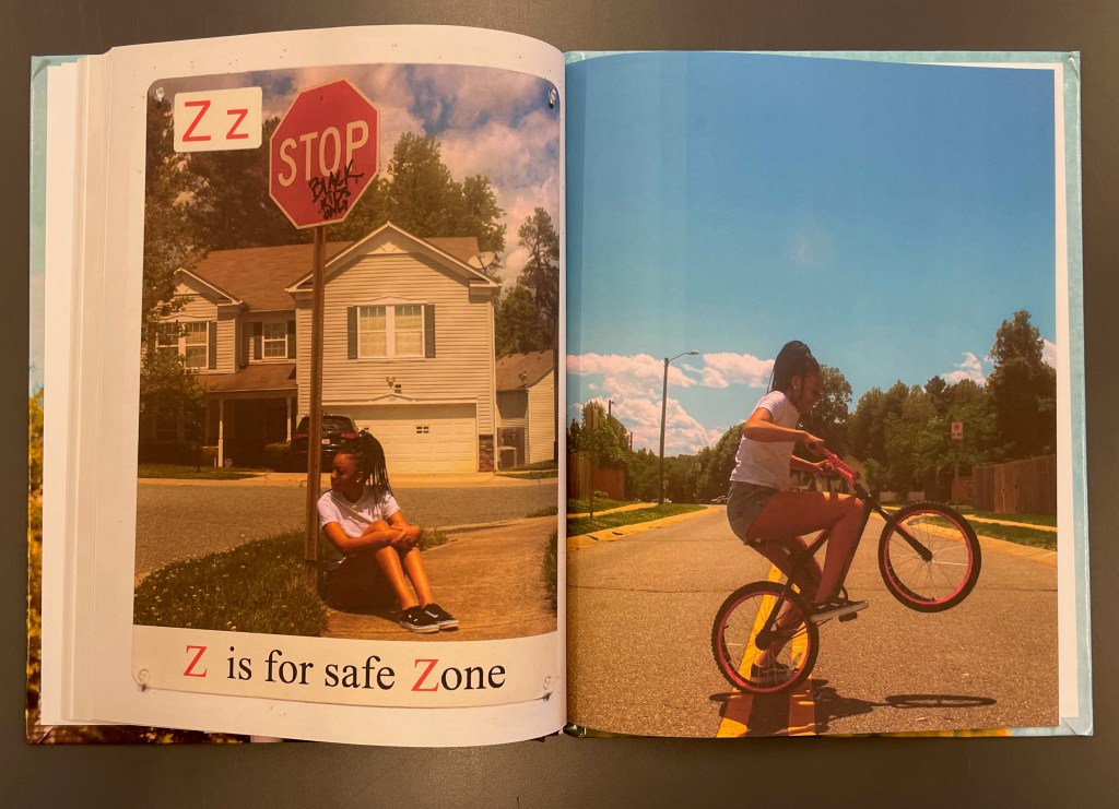
The Modern Day Black Alphabet(2020) Arial Robinson Casebound. Paper over boards. H290 x W220 mm. 64 pages. Acquired from Amazon, 24 June 2021. Photos of the book: Books On Books Collection. Displayed with artist’s permission.
Arial Robinson is a multidisciplinary artist based in North Carolina. Her photography captures the air, sky, suburban streets and heat of the state, and her book captures its Black community in a way that pushes through any “White gaze” that it encounters.
Letter A’s pair of looks — one coolly appraising its viewer and the other warmly smiling but outlined off center in white ink — begins the push with subtlety. The dual images of “Z is for safe Zone”– addressing the viewer with a Stop sign graffitied “Black Kids Only” and a young girl forming a letter Z with her bike, occupying the whole street under a Carolina blue sky — end it more directly.
Between A and Z, The Modern Day Black Alphabet primarily addresses young Black readers, celebrates them eating a popsicle, studying, cooking or drinking from a spigot and takes pride in taking care of appearances — especially hair and dress. Throughout, most of the double-page spreads have an edginess. Sometimes it’s an edgy, out-loud humor, as in “O is for Outside” with its can of “air freshener” labeled “You Smell like Outside”. Sometimes it’s the loud-quiet edginess of “X is for eXcellence” which juxtaposes a pile of certificates of accomplishment with a black-jacketed self-portrait and lapel pin that reads “We Call BS”. Always it’s the edginess of an artist in control of technique, material and vision directing her gaze on herself and her world.
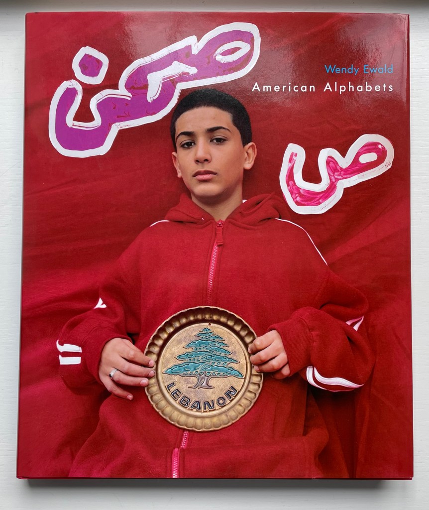
American Alphabets(2005) Wendy Ewald Casebound with white headbands and colored doublures. H305 x W260 mm. 168 pages. Acquired from Judd Books, 17 September 2022. Photos of book: Books On Books Collection. Displayed with artist’s permission.
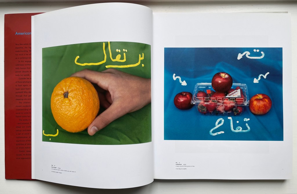
As seen throughout the Books On Books Collection, book art is more often than not a collaborative effort — even if only in the final stages of printing and binding. Ewald’s works, however, depend from the start on collaboration with her subjects — the children. Another recurrent aspect — perhaps the core aspect — in book art is the interaction of the visual and verbal. So, too, in Ewald’s art. In American Alphabets, she brings the collaborative and visual/verbal aspects of book art together at the elemental level of the alphabet. It is the children who pick the letters, words and their illustrative objects to be photographed. In the book’s “Afterword”, Ewald writes:
Like most everyone I know, I first encountered written language in children’s alphabet primers. Looking back, I now see that the words and visual examples used to represent letters reinforced the world view of the middle-class white girl I happened to be. … Putting together these various alphabets — each of them at once American and foreign — taught me a lot about written language, especially about how we have come to take this sophisticated and fundamental medium for granted. … The shape of letters mimicked the objects for which they were named. The letter R, for example, came from the Egyptian hieroglyphic for head or chief: resh. … When Woroud, one of my students from Queens, chose the word raas, or “head,” to represent the letter R, it seemed natural enough. I was startled, though, when she insisted that her head be photographed in profile, just as in the drawing of the ancient letter.
An abiding aim of Ewald’s art is to elicit or allow her collaborators’ voices and world views to create communities that overcome differences by celebrating differences. The reduced, screen-bound images here do not do justice to her four alphabets in one volume or her portraiture and photographic artistry. They may, however, convey the breadth and racial inclusivity of her vision. Arab-American, Latinx-American, White American and Black American are the American alphabets that Ewald aims to capture in this volume.
Another of Ewald’s projects ripe for an artist’s book — or rather artists’ book — is Black Self/White Self (1994-1997). Imagine the book she might create from her young collaborators’ efforts if they were brought to Penland, Women’s Studio Workshop or Art Metropole. Here is the North Carolina-based project in her own words:
When I began working in Durham’s inner city, more and more of the white population had moved to the suburbs and the public schools became segregated along city-county lines. Proposals to merge the school systems were stymied by objections from both sides.
In 1994, after the Durham school systems were finally merged, I designed a collaborative project that looked directly at the issue of race. I asked children to write about themselves, then to write another version, this time imagining themselves as members of another race.
This was greeted first with silence, then laughter, and finally with an enthusiastic barrage of questions.
Once the children had completed their written portraits, I photographed them posing as their “black” and “white” selves, using props they had brought from home. I gave them the large-format negatives to alter or write on, in keeping with ideas from their written portraits, so they could further describe the characters they had imagined themselves to be.
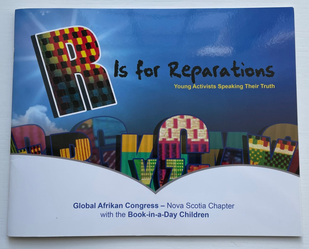
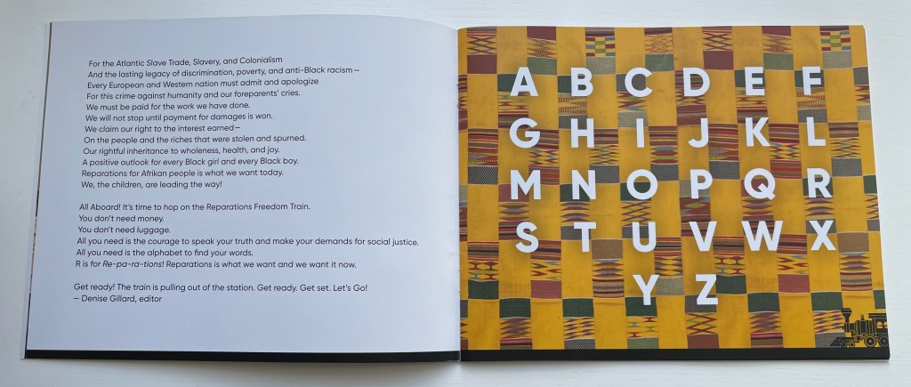
R is for Reparations (2019) Global Afrikan Congress (Nova Scotia Chapter) Denise Gillard, ed. Paperback saddlestitched with staples. H260 x W210 mm. 40 pages. Acquired from the Book Depository, 1 March 2023. Photos of the book: Books On Books Collection.
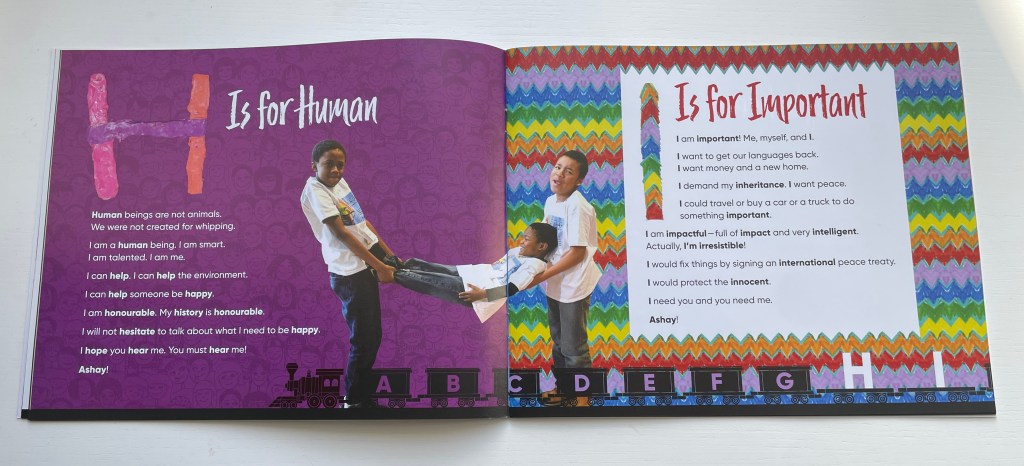
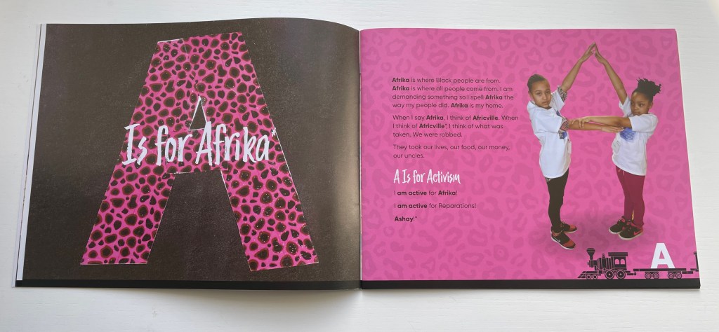
If all alphabets have a world view, can an alphabet be bent and arranged into a new world view? In 2018, the Nova Scotia Chapter of the Global Afrikan Congress facilitated a “book-in-a-day” event to help the children of Halifax create an alphabet book that answers that question. Bending and arranging the human body to make letters has a long tradition in book illustration. Drawing on that tradition, the participating children gave voice and body to create R is for Reparations, an alphabet book calling for a new world view on reparations for the damage and legacy of the Atlantic Slave Trade.
The Reparations Movement has a long history, and Halifax, Nova Scotia has played a part. In 2010, the City of Halifax issued a formal apology and $5 million in general compensation for the razing of the Black community Africville in the 1960s (see Further Reading).
Anticipating it final report in July 2023 to the state legislature, the Californian Task Force to Study and Develop Reparation Proposals for African Americans called for significant financial compensation. The governor issued a tepid if not cool response, which may be unsurprising even in the wake of his earlier signing and endorsing of legislation returning Bruce’s Beach to the Black family from whom the government appropriated it in 1924 (see Further Reading). It is an emotionally and politically complicated issue for some.
The foreword by Denise Gillard takes a less complicated view as might be expected in a children’s book, and as R is for Reparations addresses primarily Afrikans and Afrikan Descendants both on the Afrikan Continent and in the Diaspora, that view is strong and forceful. It is the sort of children’s book that would be banned in some US school libraries, but as the voices and bodies of its multi-racial cast of participants imply, it is the sort of book that those schools’ children could fearlessly manage.
Not every page is as strong as the next, but the influence of Amos Paul Kennedy Jr., Master Printer, who attended to support the children in making posters for the book launch, is evident in the colors, collage and overprinting. The book deserves comparison and contrast with the Books On Books Collection’s related holdings (see Further Reading).
Task Force to Study and Develop Reparation Proposals for African Americans. 1 June 2022. Reparations Report. State of California Department of Justice. Accessed 1 May 2023.
While working on the “Alphabets Alive!” exhibition with the Bodleian to open in July 2023, I came across this project site page by Yevhen Berdnikov, a calligrapher based in Kyiv, Ukraine.
Since “Alphabets Alive!” would primarily concern the creative relationship of artists’ books with alphabets and other writing systems, an AI-generated rendition of the alphabet (humankind’s second-greatest invention, language being the first) was a natural for inclusion. Given the short notice, the artist’s lack of bookmaking experience and — oh yes — the ongoing Russian invasion of Ukraine and attacks on Kyiv, a book was out of the question. Still, with one of the exhibition’s display cases being devoted to artists’ books driven by calligraphy and another to ones driven by color, some way of including these letter images prompted by Yevhen Berdnikov and generated by the text-to-image AI Midjourney from the company of the same name begged to be found.
Paper Cut Alphabet (2023)
Paper Cut Alphabet (2023) Yevhen Berdnikov Poster. H x W. Acquired from Yevhen Berdnikov, 8 March 2023. Images courtesy of Yevhen Berdnikov and reproduced with permission.
When the digital file for the poster first arrived, the treatment of letter Z was a surprise. Even without its current caption, the implication of the treatment was obvious to anyone who knew Berdnikov’s nationality and had seen news images of Russian tanks and military vehicles with Z painted on them. An AI-generated letter Z exists in the Paper Cut Alphabet Project’s files, but, in preparing the poster for a public exhibition, Berdnikov could not bring himself to prompt the AI to generate a symbol that had become intolerable and particularly loathsome on the anniversary of the invasion.
Chance is a well-known muse to many artists. Midjourney, the application, requires an extensive amount of “prompting” — detailed text describing the image it will create. As Berdnikov notes above, the same text can generate different results, which implies an element of randomization at work in the application. But how could a randomizing function yield a meaningful absence of image in response to prompting text? How could machine learning enable Midjourney on its own to compile this version of the alphabet without that particular and human creative intervention?
Even while acknowledging his intervention in Paper Cut Alphabet, Berdnikov insists that he is not the artist, but isn’t his use of Midjourney analogous to Vermeer’s presumed use of a camera obscura to achieve the detail and perspective we see in his paintings? If he did use that technology, does it warrant calling his paintings “device-generated”? Even so, this viewer “feels” the human artists behind View of Houses in Delft (c. 1658) and Paper Cut Alphabet (2023).
Berdnikov’s comments above and his demurrer at being named the “artist” of Paper Cut Alphabet reflect an inquisitive, open and thoughtful mind. Whatever its undetermined implications, the result of his wielding this new artist’s tool is decidedly art.
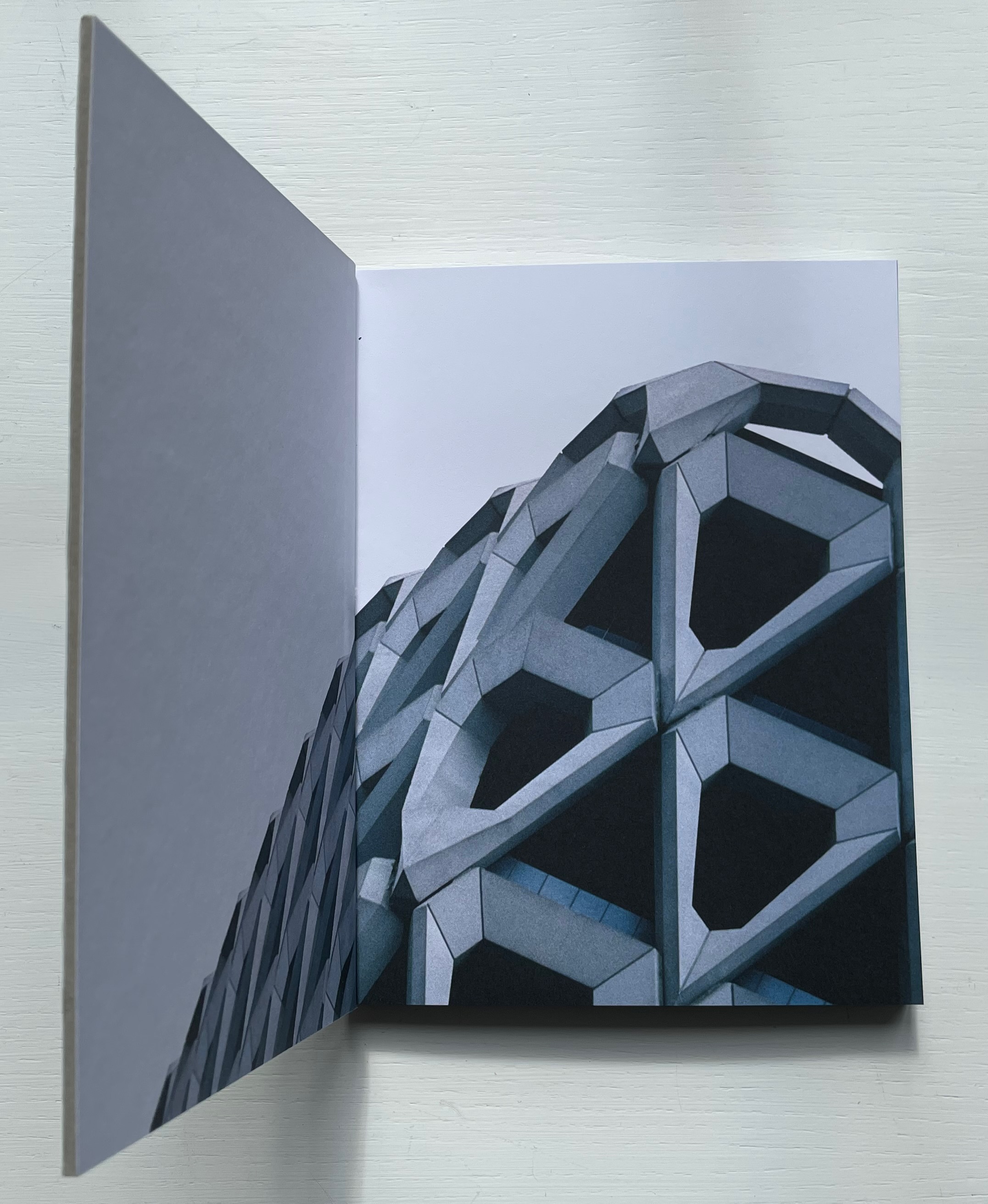
The title of designer Robert Beretta’s alphabet artist’s book is a pangram; it contains all the letters in the alphabet. His photos demonstrate that a sharp look all around will find them, too. Beretta’s selection for the letters B and C reflect recurrent themes that cross paths in the Books On Books Collection: the alphabet and architecture. Further Reading provides examples of works in those categories.
The observation of the alphabet all around us, not just in architecture, was well-captured by the novelist Victor Hugo. In a letter to his wife, he wrote, “Human society, the world, man in his entirety is in the alphabet. … The alphabet is a source” (Hardacre). Hugo saw letters everywhere, not just in what humankind creates but in nature as well. Throughout his alphabet and in particular with the letters XYZ, Beretta neatly captures that.