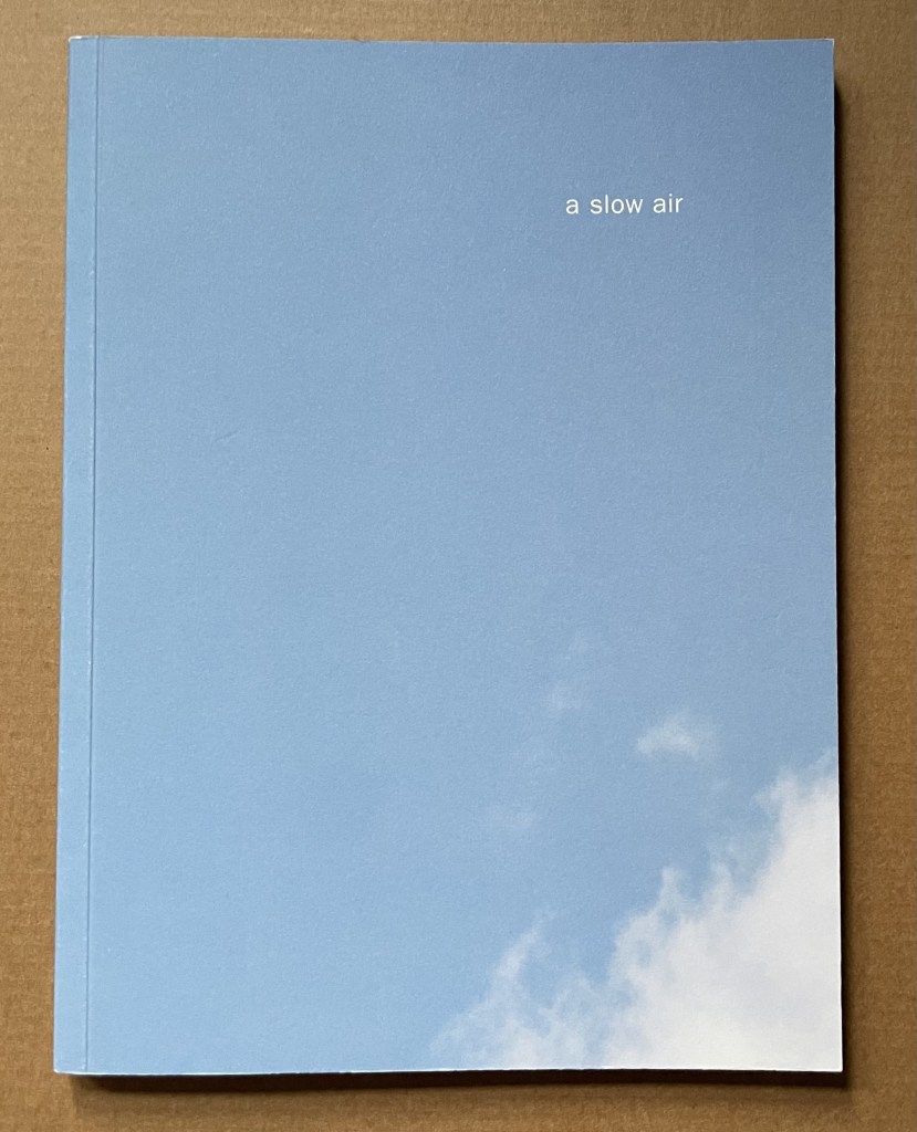
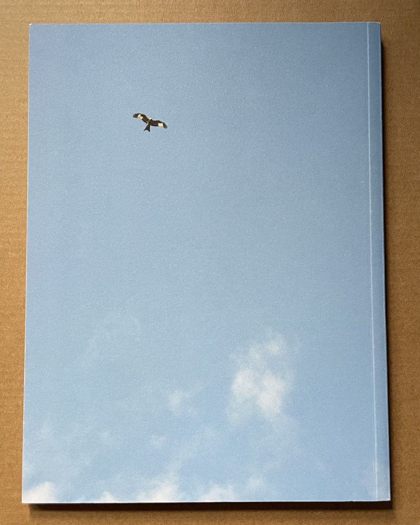
A Slow Air (2016) Thomas A. Clark and Diane Howse Perfect bound softcover. H200 x W150 mm. 64 pages. Edition of 750. Acquired at the Small Publishers Book Fair, London, in 2018. Photos of the work: Books On Books Collection.
If you live where red kites thrive, you will see them most often singly, in pairs or threes. If you are lucky, you may see as many as eight or ten at a time. Near Harewood House in West Yorkshire where red kites were reintroduced in 1999, there are hundreds. In 2016, photographer/artist Diane Howse (Countess of Harewood) and poet/artist Thomas A. Clark collaborated on an exhibition at Harewood House: the grove of delight. Using objects, words and images, the exhibition turned the house’s Terrace Gallery into a symbolic grove; also displayed was a series of 15 photographs by Howse of red kites over Harewood. For the exhibition and under the direction of Peter Foolen, the diligent Dutch publisher of herman de vries, Peter Liversidge and others, A Slow Air (the book) was produced and published by Harewood House. Foolen and the artists have assembled and manipulated the photos in a sequence of color and image that exerts a forward movement like a film or narrative. Like a real sighting of these birds circling and banking as if to a slow musical air, the book mesmerizes.
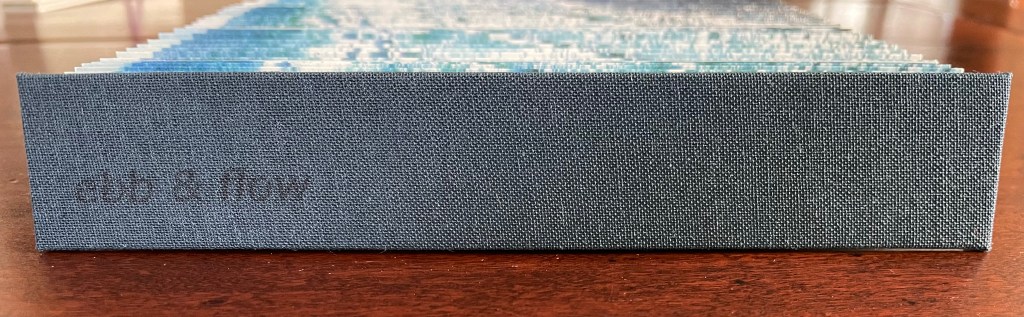
Ebb and Flow (2023) Jane Cradock-Watson Concertina book with cloth hard bound covers. H155 x W27 mm (closed), W680 mm (open). 64 panels. Edition of 20. Acquired from the artist, 21 January 2024. Photos: Books On Books Collection. Displayed with artist’s permission.
An exploration, both visually and physically, the ‘edge’ of the sea where it meets the land, with its continuous ebb and flow of the breaking waves, rhythmically rolling back and forth onto the sand. (Artist’s description)
With the binding and her photography in Ebb and Flow, Jane Cradock-Watson has sculpted and painted the sea’s edge. Four digital photographs printed on Zerkal paper have been spliced together between two cloth-covered boards. The flexibility and extent of the concertinaed paper create an undulating structure that turns seascape stills into mesmerising cinema.
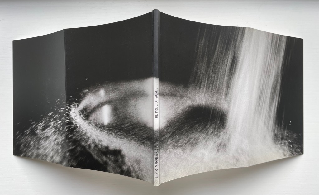
The Price of Words, Places to Remember 1−26 (1992)
The Price of Words, Places to Remember 1-26(1992) Lily Markiewicz Perfect bound paperback with deep cover flaps. H200 x W155 mm, 60 pages. Acquired from Bookworks, 11 July 2022. Photos: Books On Books Collection and Emilia Osztafi*. Displayed with artist’s permission.
Artists ‘ book s are often self-conscious about the elements of book structure. This can involve self-reflexive humor or serious philosophical interrogations of a book’s identity. Disturbing conventions of reading by calling attention to these structures is often a feature of artists ‘ books through an emphasis on the features of the page and pointing to the book as a whole. But a book can also be a self-conscious record of its own production – it can simply examine itself as a proposition – one laden with specific ideas about the ways a book can embody an idea through its material forms. There are really two subtexts here. One is the “idea of the book as Idea” – the self-reflexive creation of books · which are about being books, or what a book can be as an idea in form. The other is the “idea of the book as art idea” – which takes these investigations of the book into a dialogue with the concept of art, and shows that books are an art idea. — Drucker, 2004.
Books on Books (2011)
Books on Books (2011) Jérôme Saint-Loubert Bié, Yann Sérandour & Jonathan Monk Perfect bound paperback. H160 x W115. 260 pages. Acquired from Chapitre.com, 29 November 2023. Photos: Books On Books Collection.
The Fall(1976) Michelle Stuart Saddlestitched with staples in landscape format, glossy paper. H x W mm. 28 pages. Acquired from Specific Object, 15 March 2024. Photos of the work: Books On Books Collection.
The Fall is one of the earliest publications of Printed Matter, founded in 1976 by a group of individuals working in the arts (among them artist Sol LeWitt and critic Lucy Lippard).
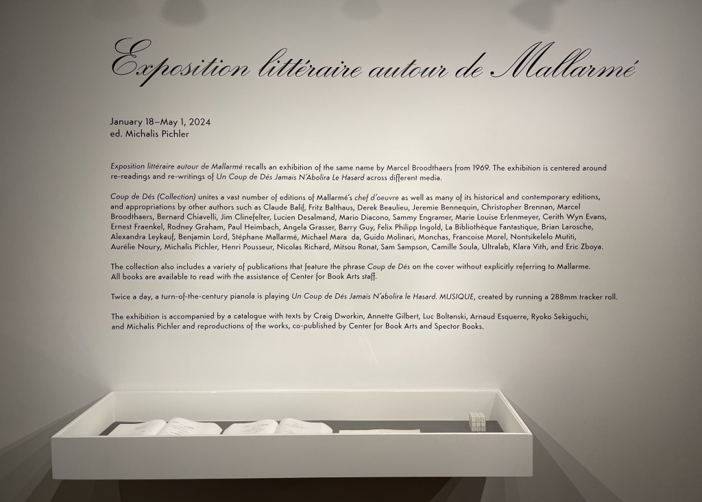
Why should an obscure poem like Stéphane Mallarmé’s groundbreaking Un Coup de Dés Jamais N’Abolira le Hasard: Poème (1897) have become the cornerstone of an art-industrial complex of literary, critical and artistic responses ranging from essays, books, edited collections, countless editions, and appropriations in the form of fine press livres d’artiste, book art and sculptures, films and theater, ballets and fado, musical compositions, digital programs and installations, and even pavement art?
Handscapes (2016) Margaret (Molly) Coy & Claire Bolton Casebound, hand sewn and bound with doublures and two ribbon bookmarks. H260 x W310 x D30. 80 folios. Edition of 12, of which this is #9. Acquired from the artists, 19 October 2023. Photos: Books On Books Collection. Displayed with artists’ permission.
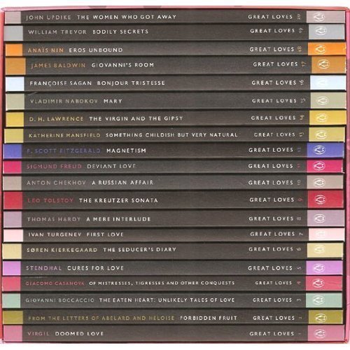
Penguin’s 2007 series “Great Loves” is a twenty-book set of short paperbacks with selections from the usual suspects (D. H. Lawrence) and the unusual (Søren Kierkegaard). The selection of eleven tales from Giovanni Boccaccio’s Decameron provides Carolyn Thompson with the opportunity to create a work of altered book art enjoyable on several levels.
The unaltered cover promises one thing. Its “under-the-cover” title page delivers another.
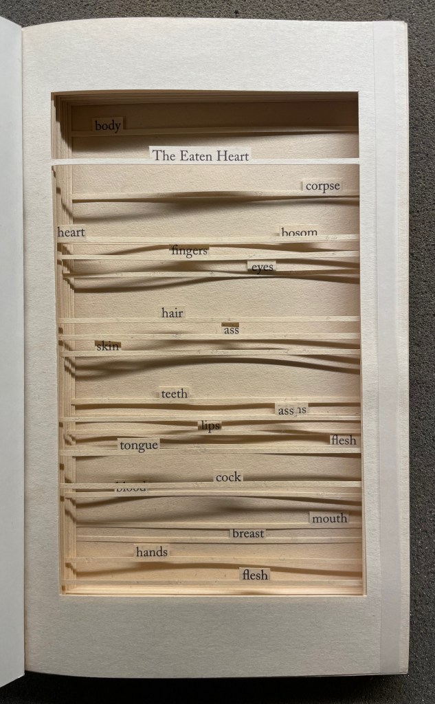
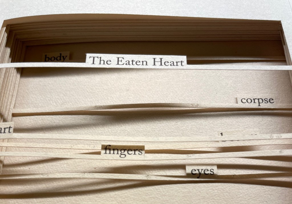
The Eaten Heart (2013)
The Eaten Heart(2013) Carolyn Thompson Altered perfect bound paperback. H180 x W111 mm. 124 pages. Edition of 3, of which this is #2. Acquired from Eagle Gallery, 7 October 2023. Photos: Books On Books Collection. Displayed with artist’s permission.
Thompson’s chosen technique of removing text with a scalpel enacts one of the paradoxical meanings of the revealed tell-tale title it presents: the scalpel has eaten away all the text on this title page except for the text chosen as the title. Boccaccio’s text is there but not there, and the “under-the-cover ” title nods toward his missing content. Leaving only words referring to the body, Thompson’s work of book art celebrates the raunchy “under the covers” innuendo in Boccaccio’s text.
The transparent tape that holds the body of cut pages together (just detectable in the image of the title page above) can be removed and the pages turned (carefully!). Below is page 11 “in motion”.
The sequence of pages 116 to 119 below shows that, while the verso pages do not play a role in the work, the movement of words on the recto side away from those that follow them, revealing the blank sheet at the end, invites musing about their possible relationship as well as marvelling at the artist’s delicate patience applied to the indelicate.
Later on, using the 50 books in the Penguin Modern Box Set (2018), Thompson created text pieces, drawings, embroideries, prints and additional altered books in the spirit of The Eaten Heart. The Laurence Sterne Trust exhibited the full set of works at Shandy Hall, York, in 2019. Eagle Gallery hosted them again in London in February 2020, and the same year, After Capote: When Truman met Marlon, her altered version of Truman Capote’s The Duke and His Domain in the series, won the Minnesota Center for Book Arts Prize People’s Book Art Award.
The more wide-ranging but more consolidating work that follows demonstrates Thompson’s indefatigable originality and insatiableness as a re-purposing artist.
The Beast in Me (2021)
The Beast in Me (2021) Carolyn Thompson Print. 130 x 130 cm. Acquired from Information as Material, October 2021. Photos: Books On Books Collection. Displayed with artist’s permission.
Although The Beast in Me has a previous iteration from 2014, this one commissioned for the second issue of Inscription: The Journal of Material Text (the “holes issue”) expands to over 500 snippets of text beginning with ‘I’ from eight different novels. Its manner of doing so makes The Beast in Me simultaneously centrifugal and centripetal in its effect — perhaps more emblematic of Inscription‘s coverage in its “holes issue” than the impressive work chosen for the covers.
Here is Thompson’s description of the commissioned work:
The statements (over five hundred of them) are presented one after another in a circular narrative with no natural beginning or ending and can therefore be read from any point. When removed from their original context, they become ham-fisted stabs at self-revelation and blurted snapshots of confession. They contradict one another, and the narrator. The piece explores the power struggle within all of us, where different aspects of our personalities vie for dominance over one another at any given moment, while others yearn for internal balance. The narrative, whilst light and frivolous in places, descends into a sinister and uncontrollable rant in others.
If we accept the print’s invitation as we would a book’s invitation to read — to engage in narrative — we find that human identity’s ever precarious balance — between inward and outward forces, its introverted and extroverted elements, the being apart and the being a part of, and integration vs disintegration — is captured sharply. A blank center, a void or hole — there but not there — defined by fragments simultaneously flying outward and pressing inward.