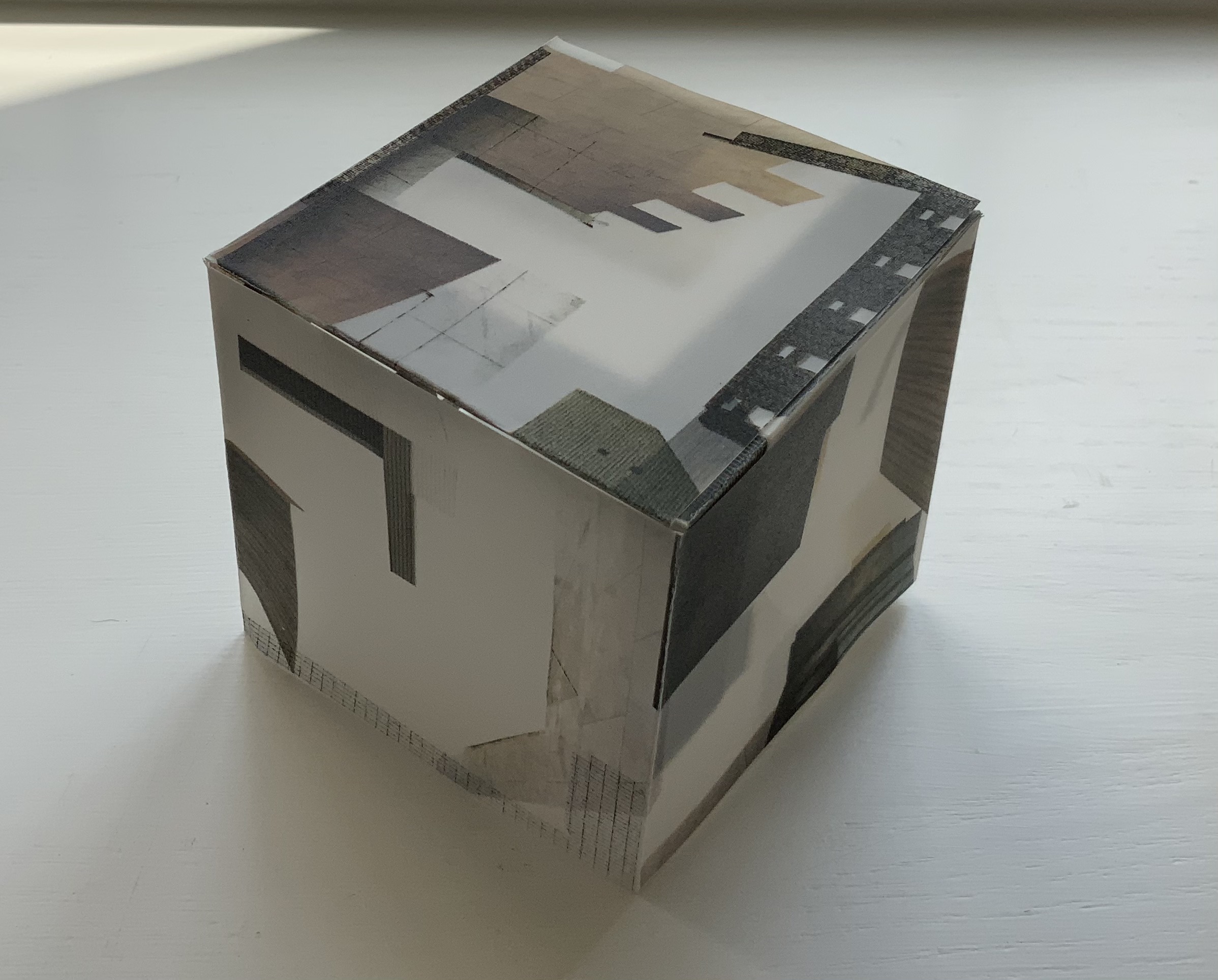
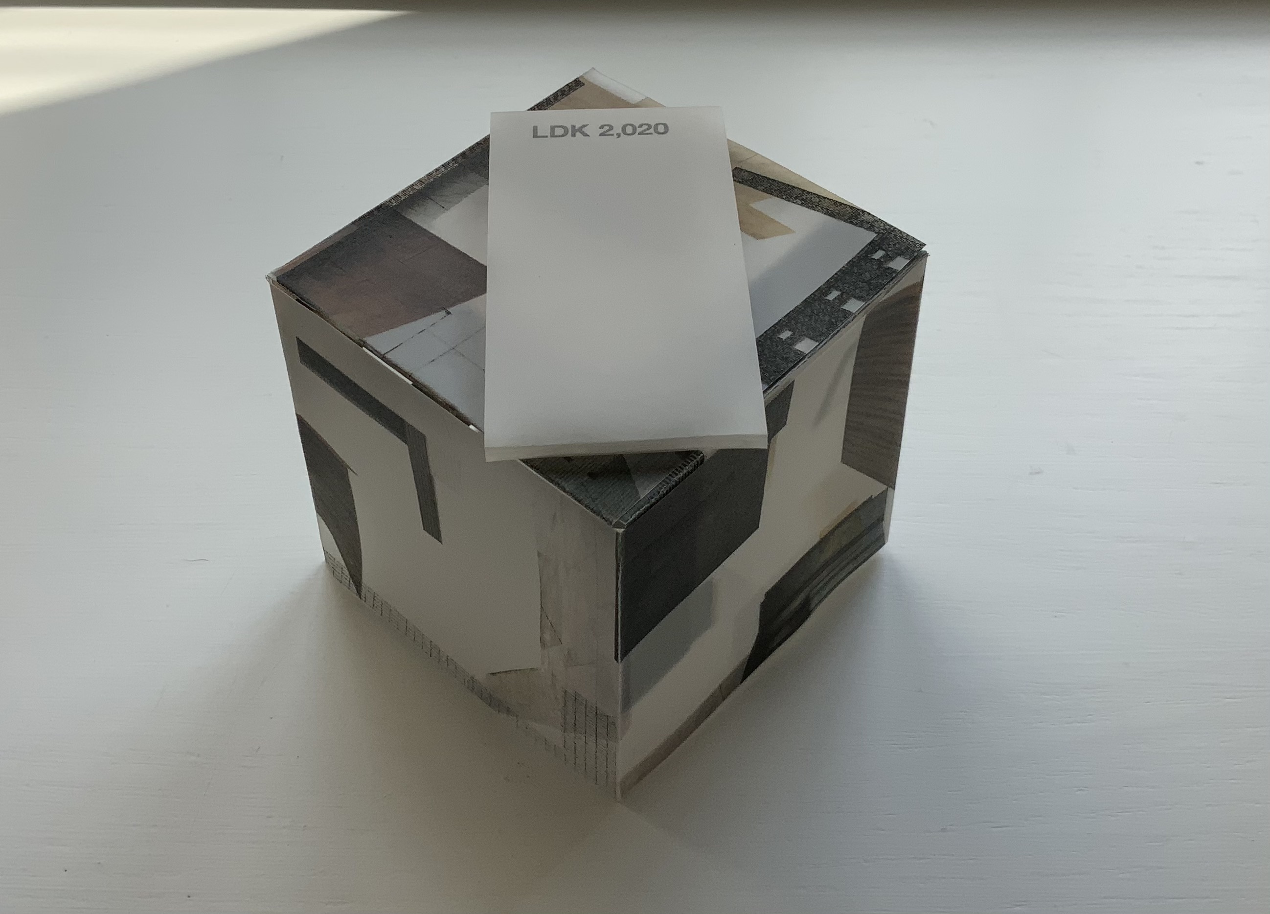
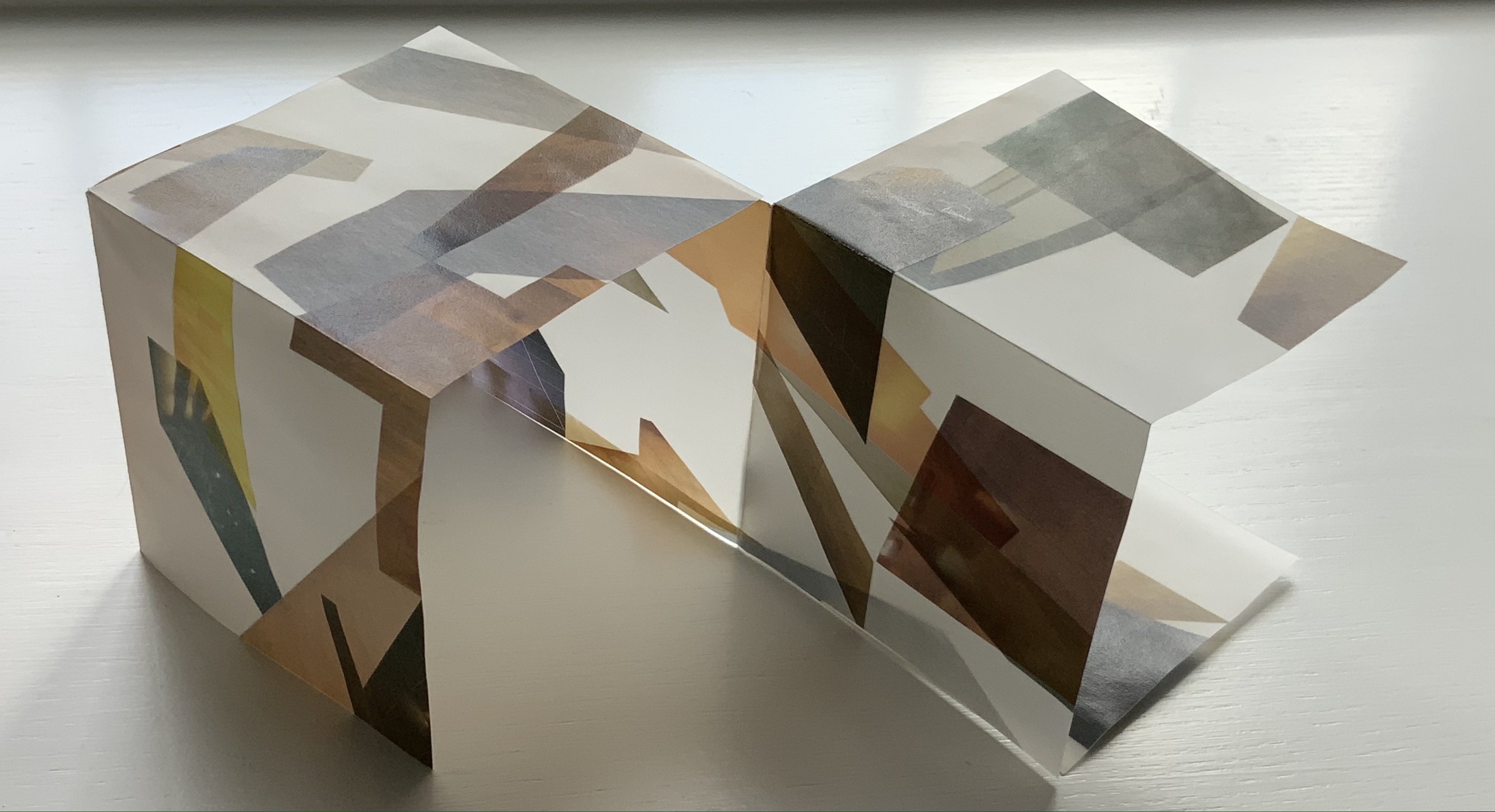
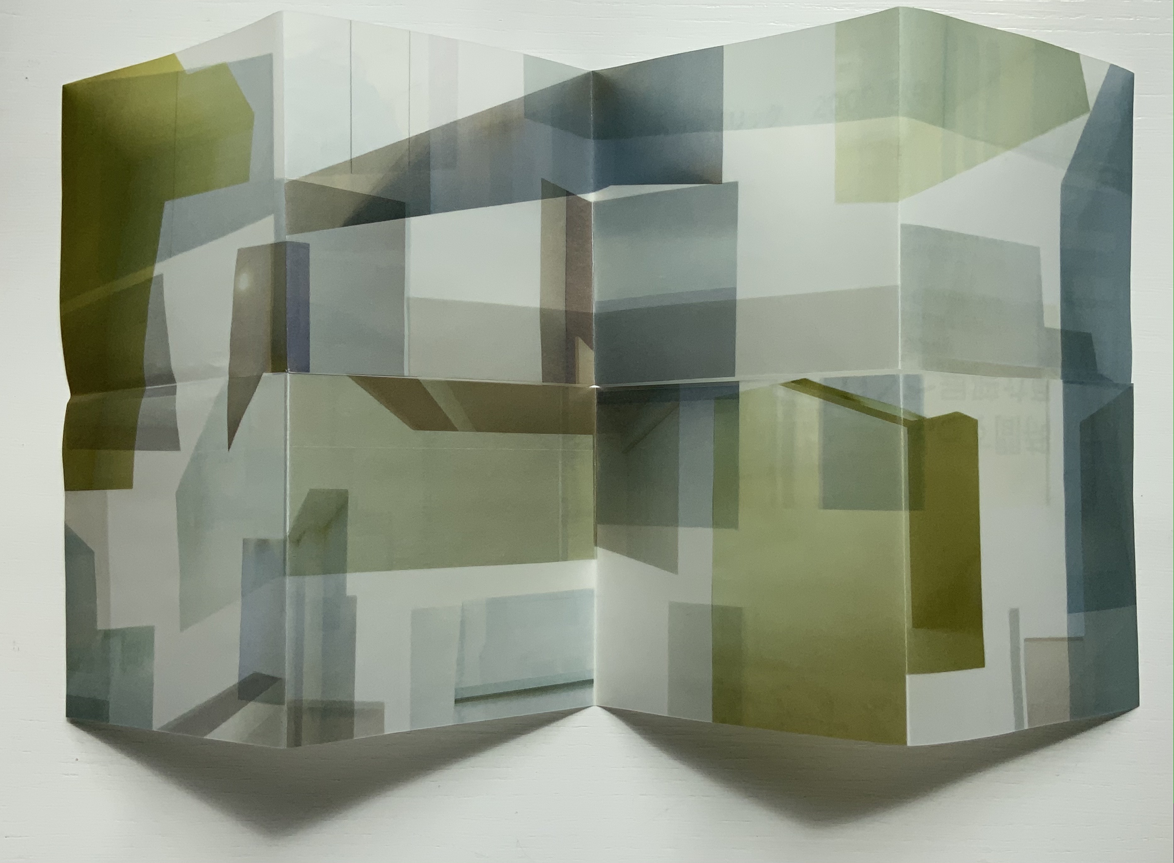
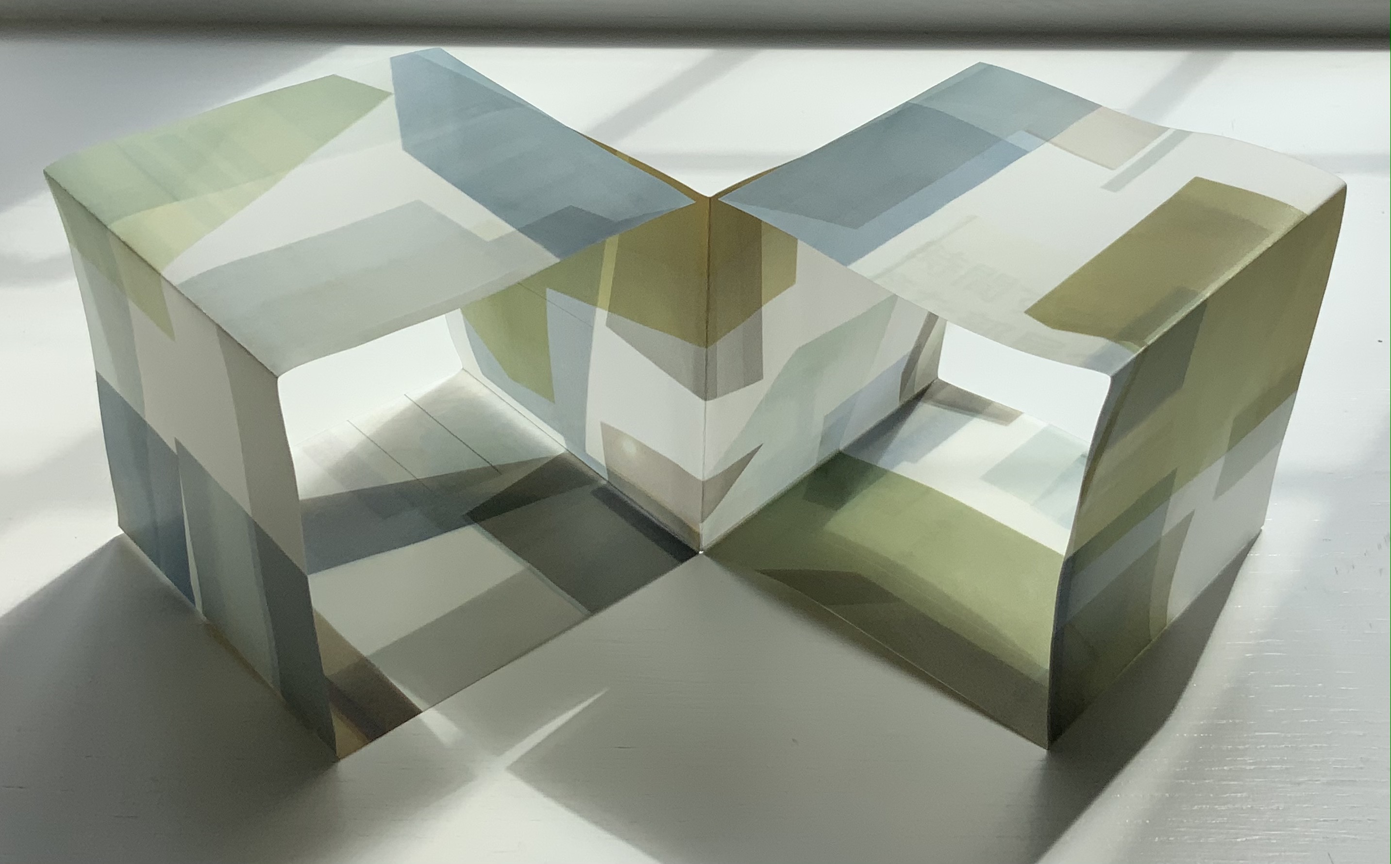
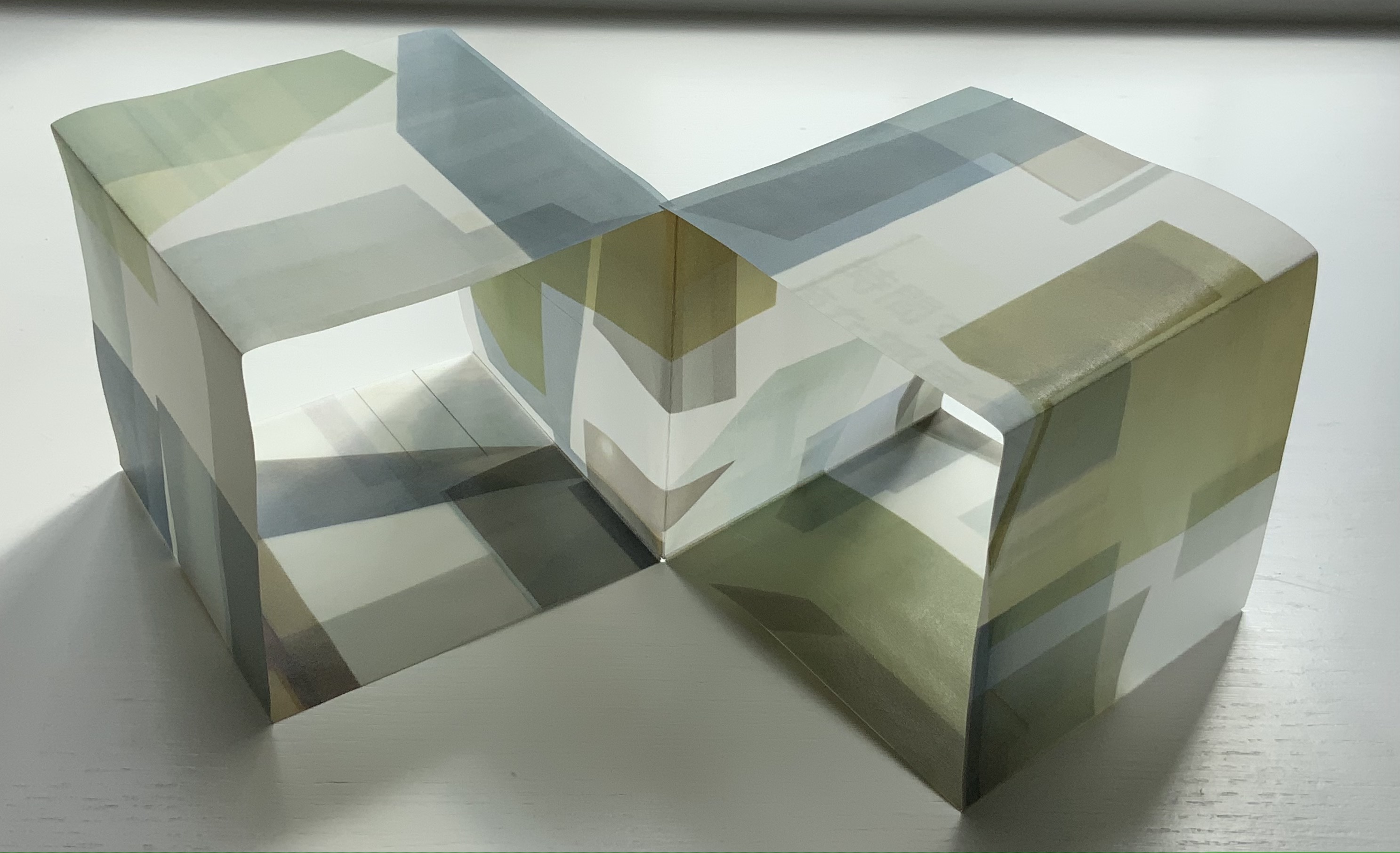
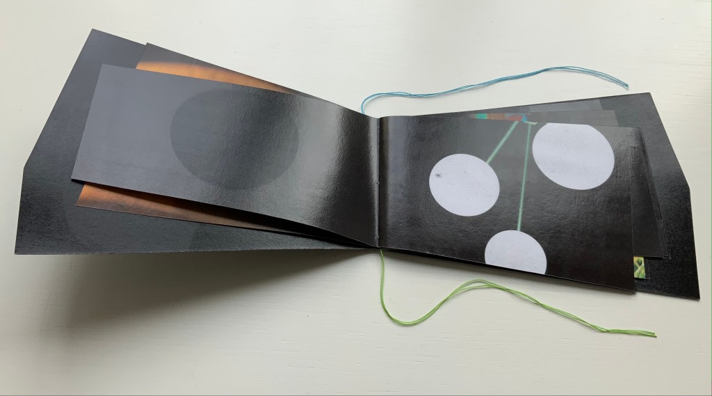
LDK 2,020 (2020)
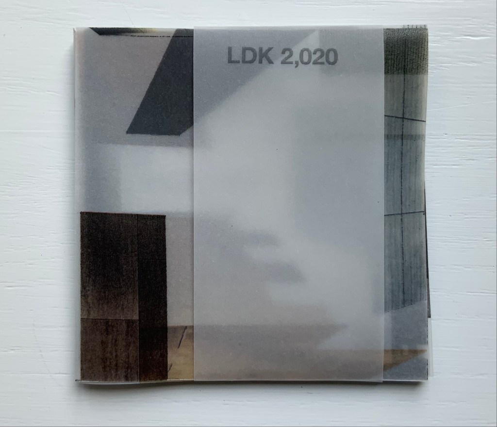
LDK 2,020 (2020)
Yasushi Cho
Banderole bound, single sheet cut and folded accordion style. 75 x 75 mm. Edition of 45, of which this is #7. Acquired from the artist 10 April 2021.
Photos: Books On Books Collection.
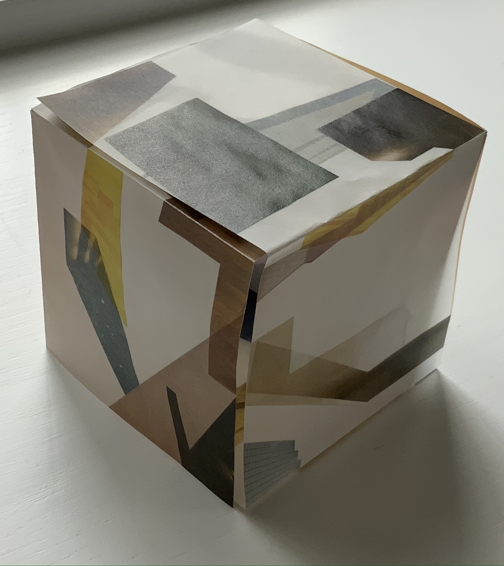
LDK 2,020, LDK FL00R and LDK 2,009 make up part of a series. Their letters L, D and K stand for Living, Dining and Kitchen and are the usual abbreviations in Japanese apartment/flat sales leaflets. Every day they arrive or can be picked up on the street, and Cho creates collages from them, digitally printing them on stiff translucent paper to be cut and creased, then folded into an accordion-style booklet. For the reader, the folds and cuts of the stiff translucent paper make a tricky “assembly and disassembly” — or reading — of the work to make it into a cube or other three-dimensional shape.
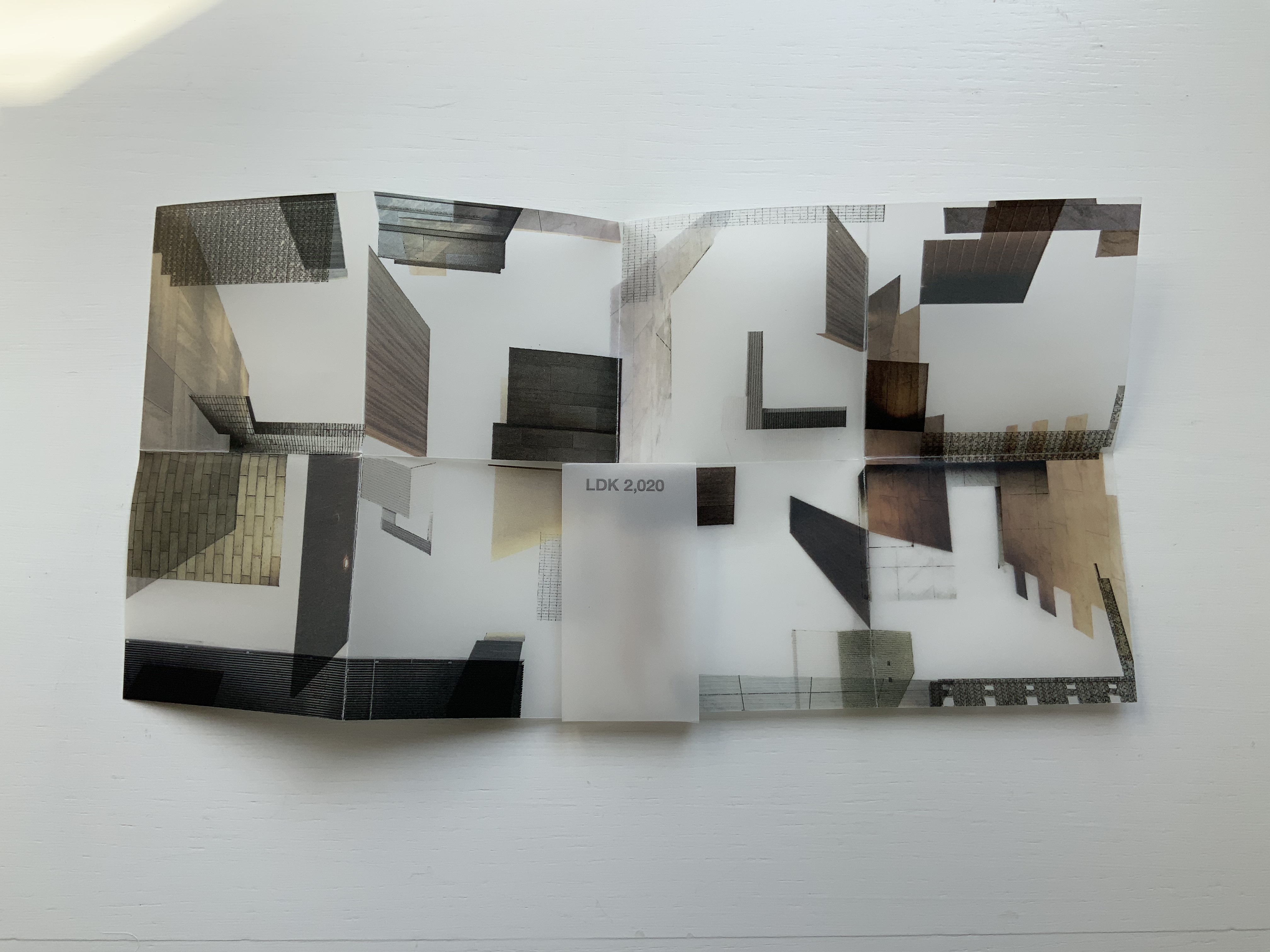
In the process of flattening the booklets into a single sheet, then folding and creasing and re-creasing, the reader wonders how the aspects of LDK may have fit together before their abstraction into the collage. Eventually though, the assembly creates objects whose interiors are their exteriors — and vice versa — and inevitably recall the shoji screens still used in traditional houses and even apartments.
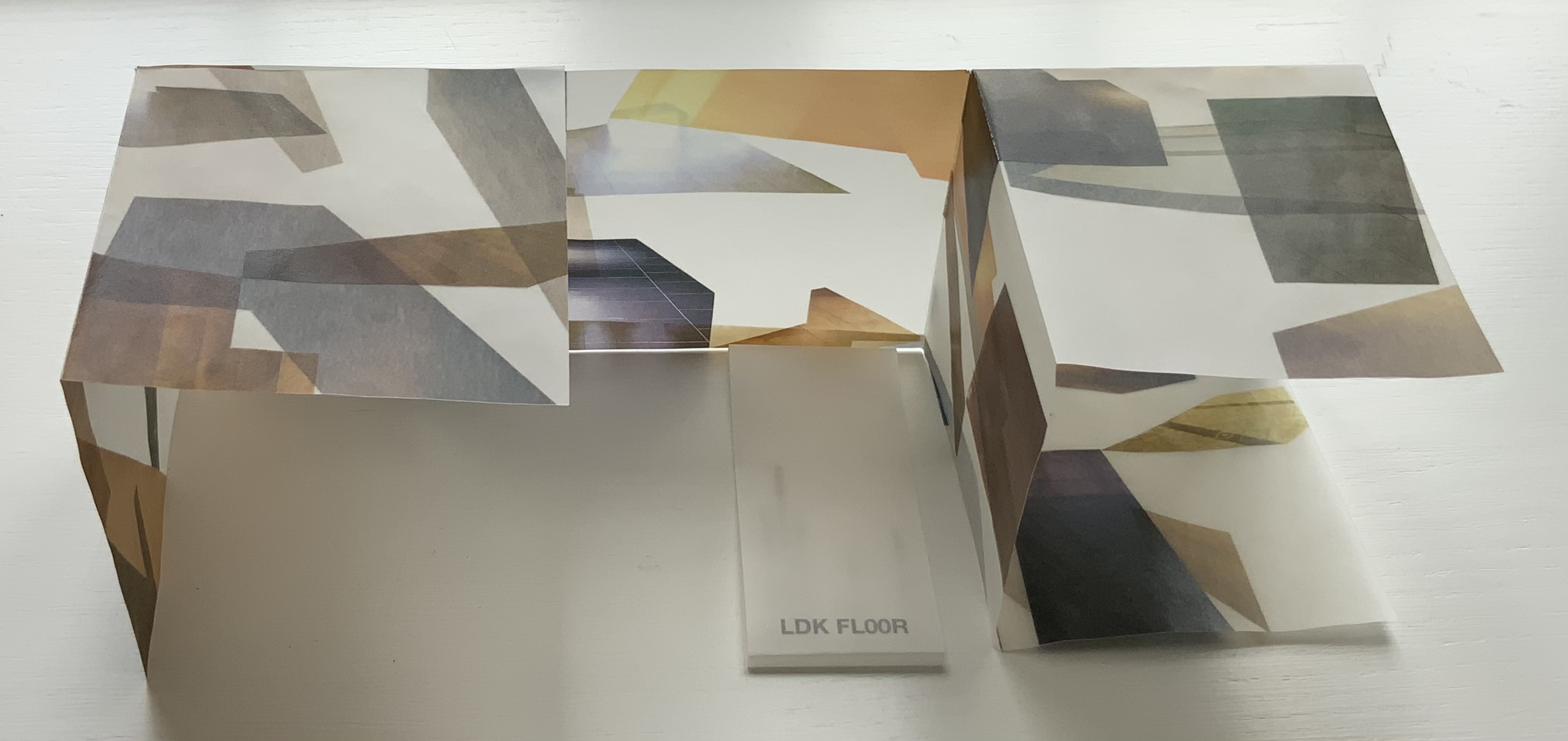
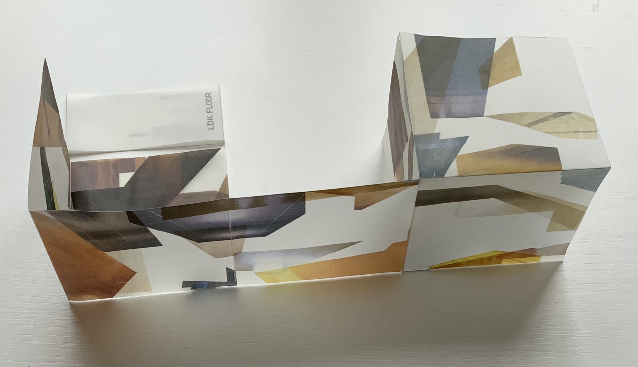
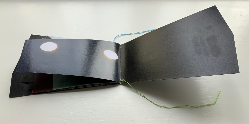
LDK FL00R (2010)
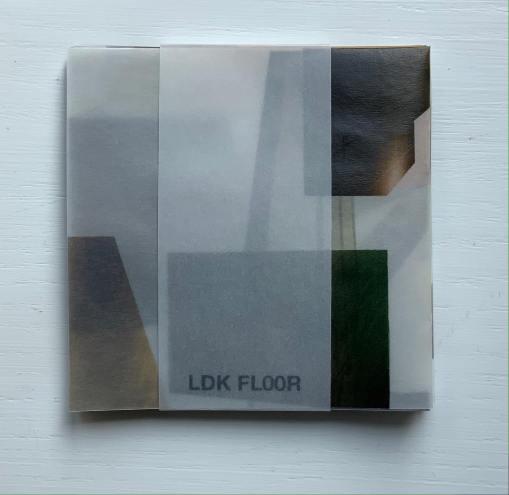
LDK FL00R (2010)
Yasushi Cho
Banderole bound, single sheet cut and folded accordion style. 85 x 85 mm. Edition of 45, of which this is #3. Acquired from the artist, 10 April 2021.
Photos: Books On Books Collection.
Like the commas in LDK 2,020 (above) and LDK 2,009 (below), the zeroes in LDK FL00R play on the apartment prices listed in the sales leaflets, but also allude to the apartments’ floor numbers. The wordplay of the titles echoes the playful multiple shapes that the sheets can take and the resulting multiple views of the collages. The collaged images in LDK FL00R, however, are of the floor surfaces only.
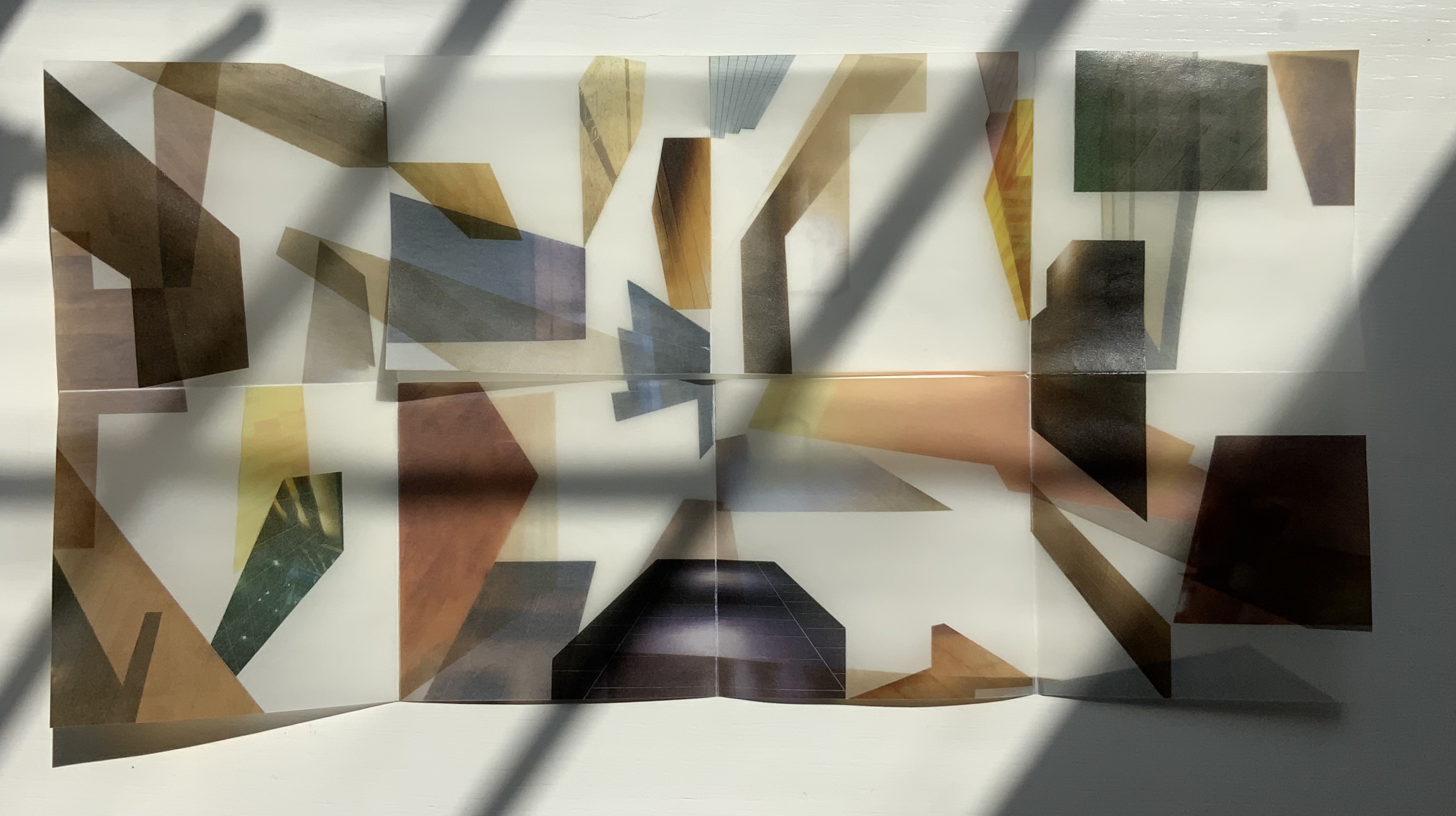
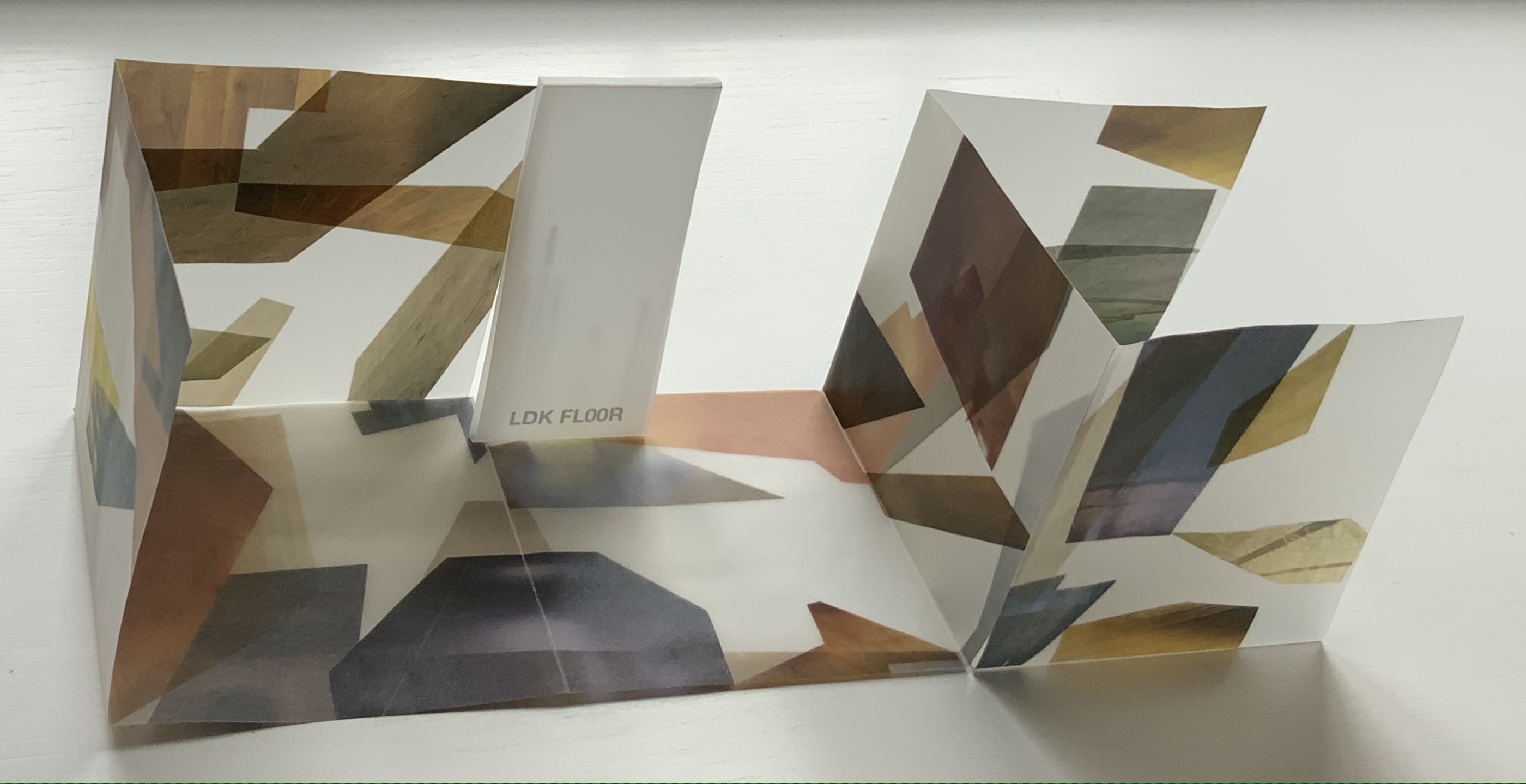
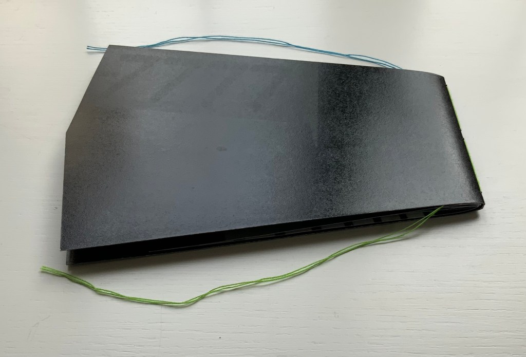
LDK 2,009 (2009)
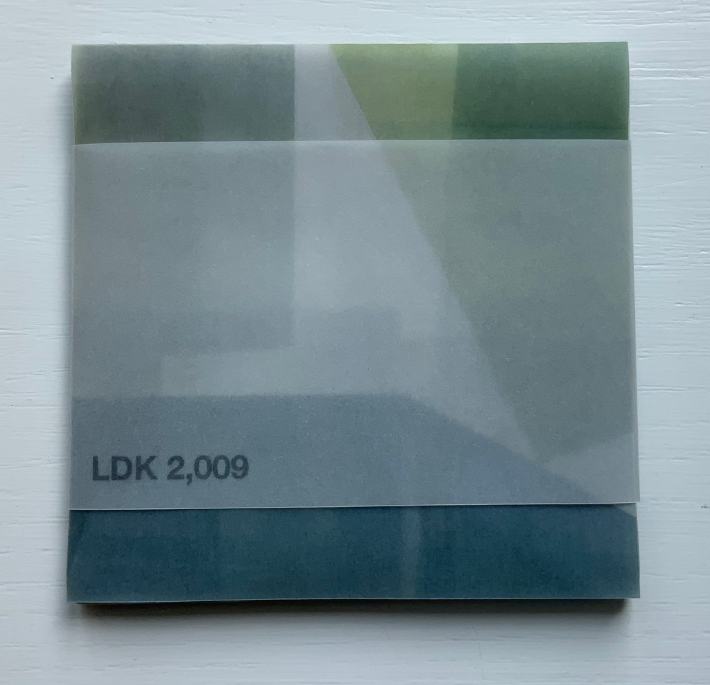
LDK 2,009 (2009)
Yasushi Cho
Banderole bound, single sheet cut and folded accordion style. 75 x 75 mm. Edition of 45, of which this is #36. Acquired from the artist, 10 April 2021.
Photos: Books On Books Collection
With smaller works of book art, size can disguise their depth and impact. In “reading” LDK 2,009 and its companions, an extraordinary depth and impact emerge. As the opened books assume their shapes and take their place in display, another element of the artful choice of material and printing technique emerges: the resulting play of light. This is a theme that Cho explores in two very different ways in the next works.
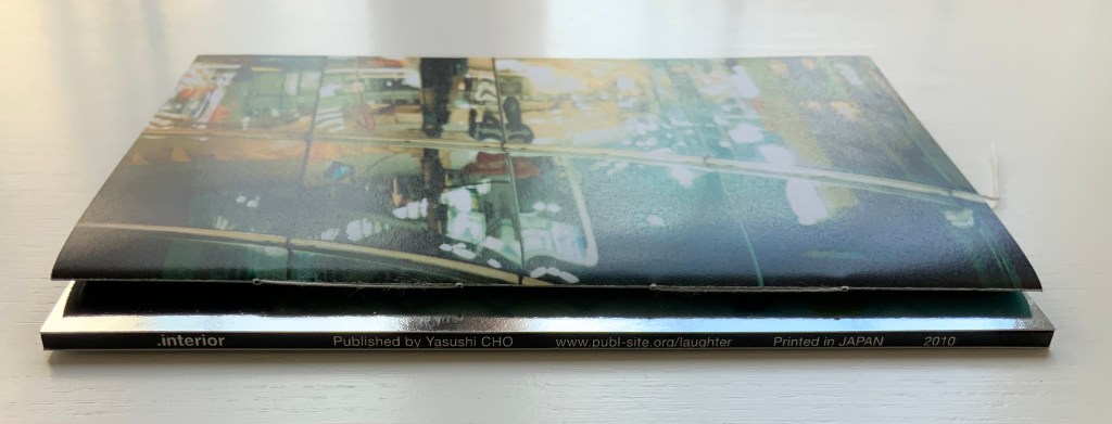
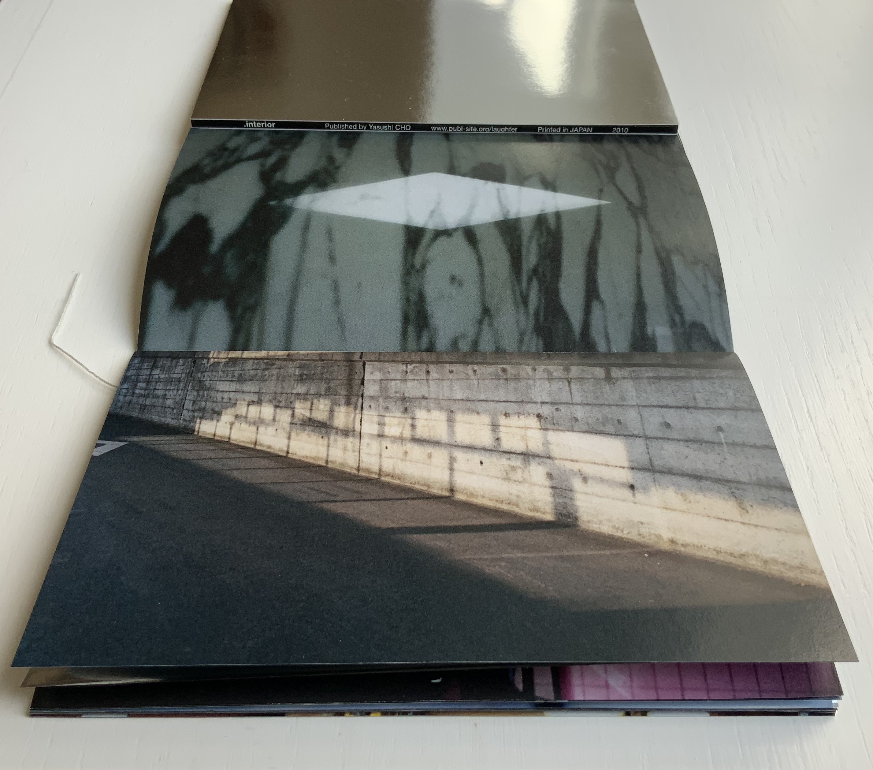
.interior (2010)
.interior (2010)
Yasushi Cho
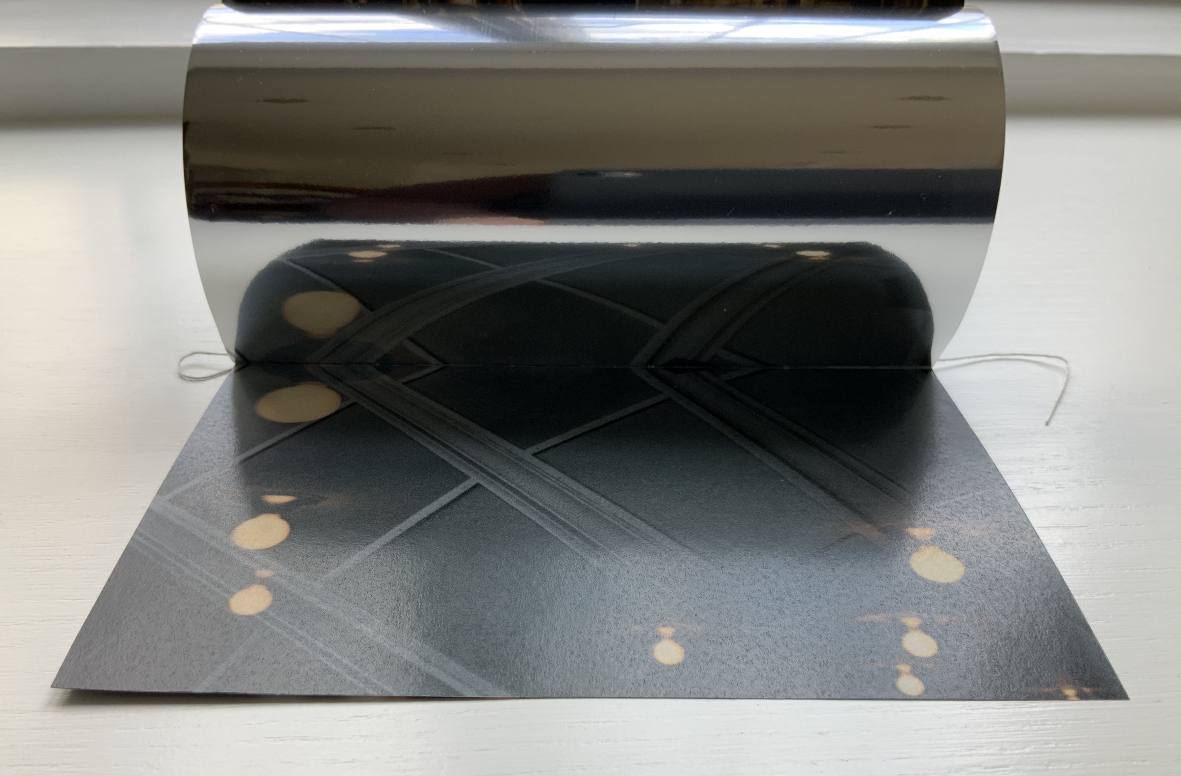
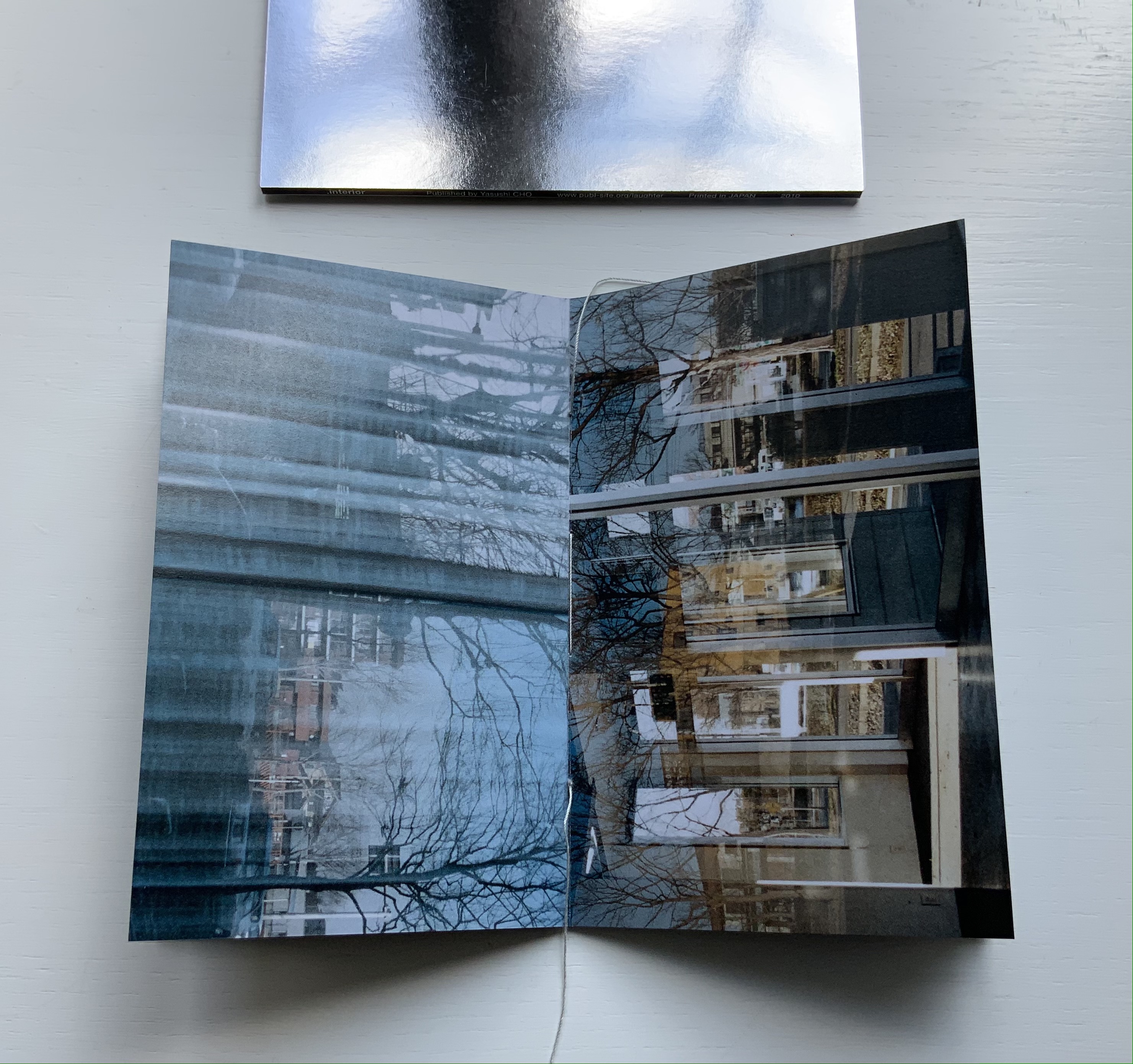
Slipcase. Booklet, sewn. H150 x W98 mm, 24 pages. Edition of 30, of which this is #4. Acquired from the artist, 10 April 2021.
Photos: Books On Books Collection.
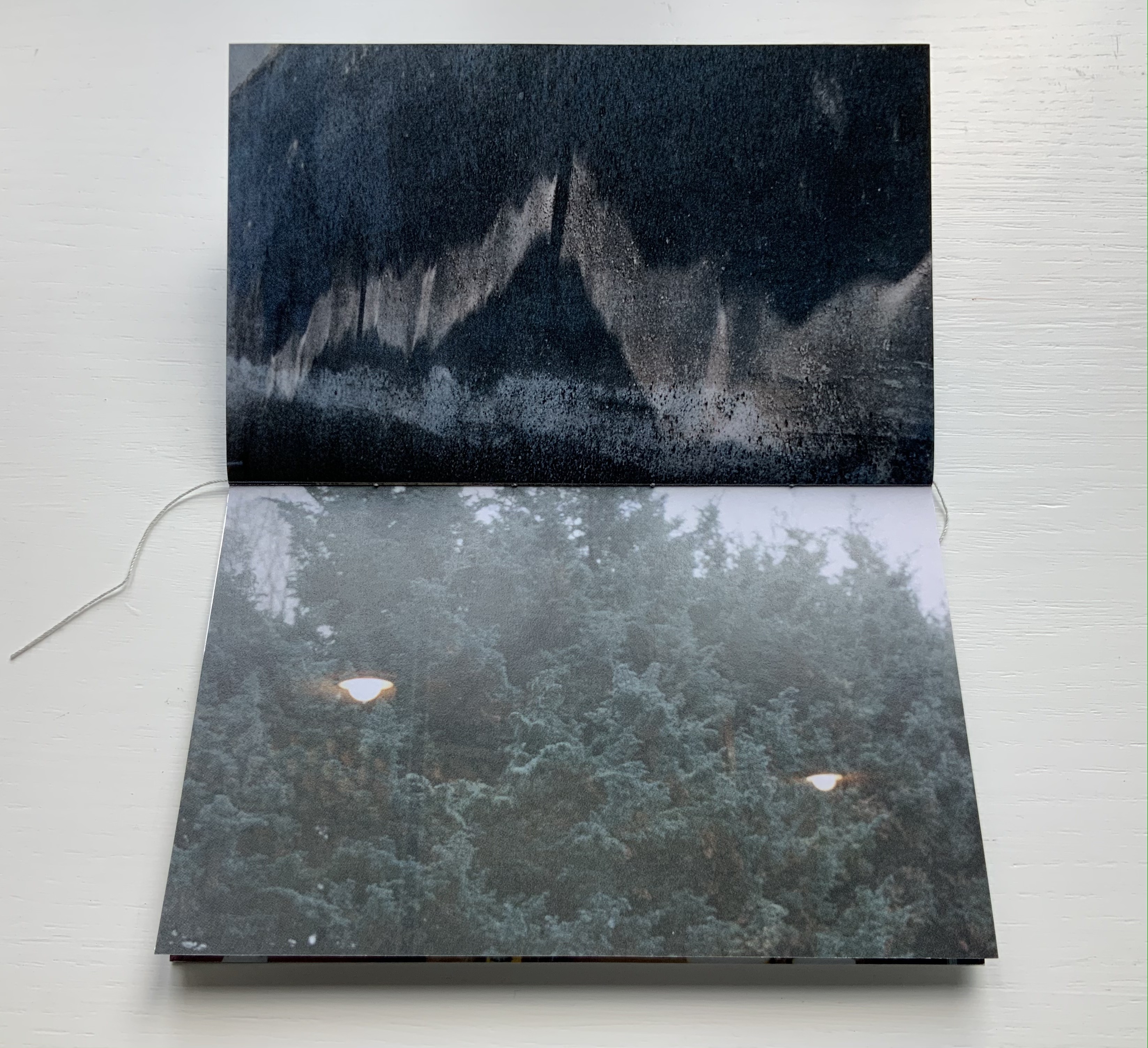
The photos in Cho’s book display views of the outside world, some of which appear to have been taken from inside an apartment whose interior is reflected in its window. Other photos display interiors — a café, an empty store — taken from an exterior vantage, resulting in reflections from the establishments’ window fronts. Some — a carpark, a walkway — seem unmediated. The playful title .interior, taken from the transposition of ・インテリア printed in the window below, and displayed on the spine of the mirrored slipcase above, confirms the artist’s theme of exploring the paradox of interior vs exterior, reflection and the mediation of vantage points.
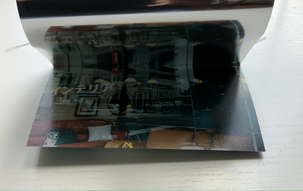
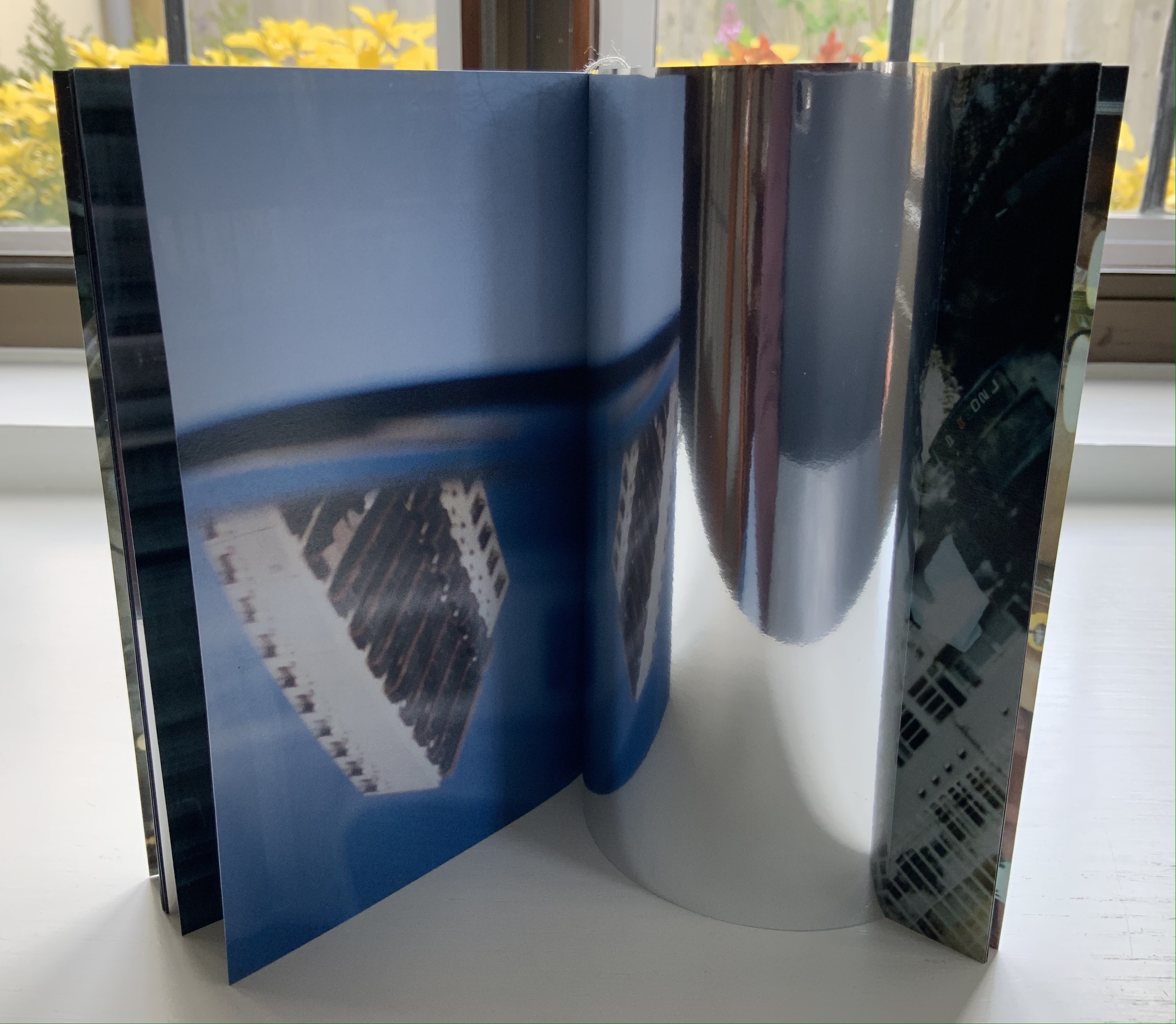
The work’s theme of reflection is also compounded by the flimsy mirrored paper interpersed between some (not all) of the recto and verso pages. Depending on the image reflected and how the mirrored paper is turned, the reader may find a simple duplicate or an extension of a pattern. Above, the shop’s interior duplicates itself upside down; below, the high rise against a blue sky duplicates itself.
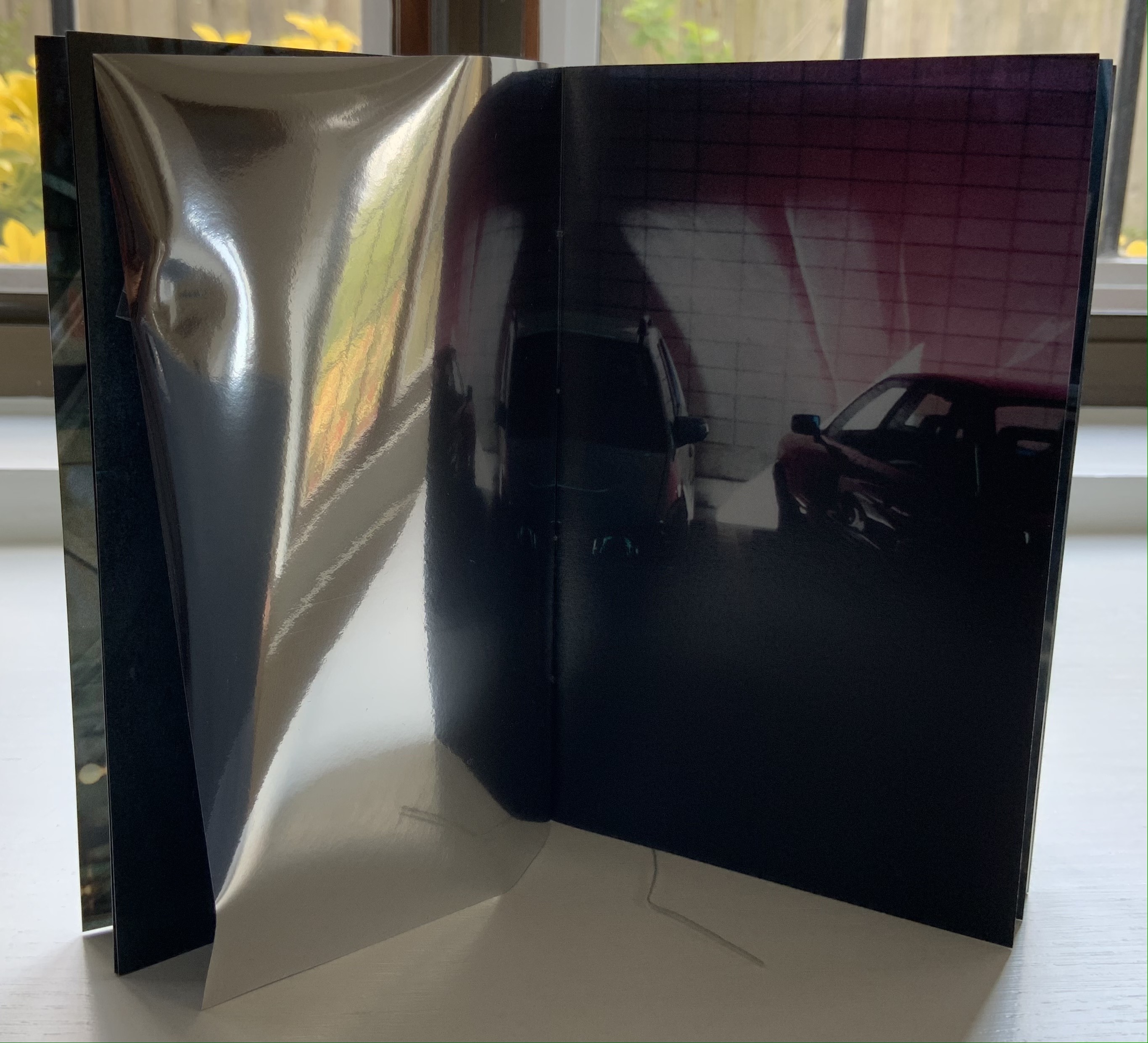
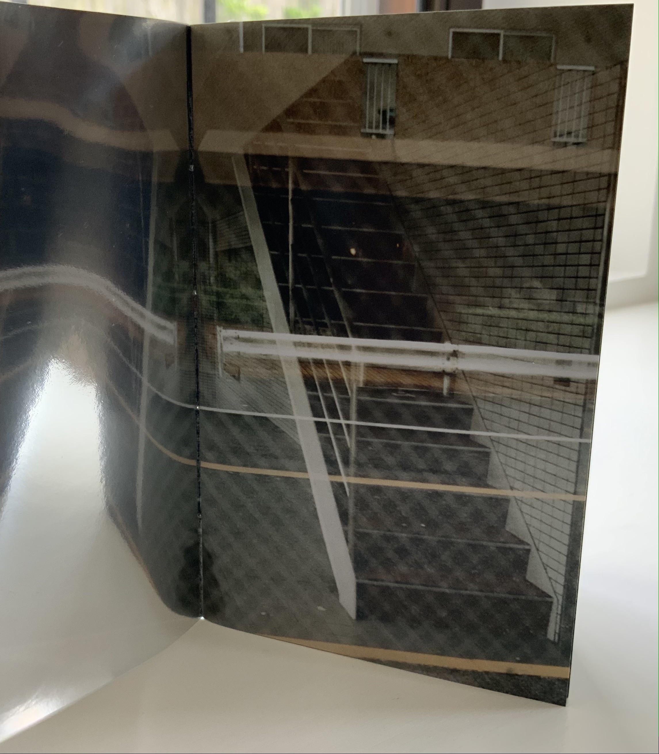
Above, the staircase seems to curve behind itself, the reflected car extends the row of parked cars, and below, the ceiling and light fixtures extend their pattern into the mirror.
Where the recto and verso are not divided by the mirrored paper, other permutations on the theme of reflection occur. Below, in the center of the book, the window in the recto page seems to reflect the vantage point from which the verso page’s photo was taken. The virtuosity in manipulating vantage points here recalls that of Michael Snow’s Cover to Cover (1975) and Marlene MacCallum’s Theme and Permutations (2012) or Shadow Cantos (2018-19).
In its composition, the photography fascinates the eye, and Cho’s use of the book and mirrored paper to present and transform the photos fascinates the mind, provoking contemplation of the paradoxes of interior, exterior and their reflections. No doubt, a gallery show could deliver similar fascination, but as a book, .interior is more than a gallery of artwork: it is a work of art.
Ld (2003)
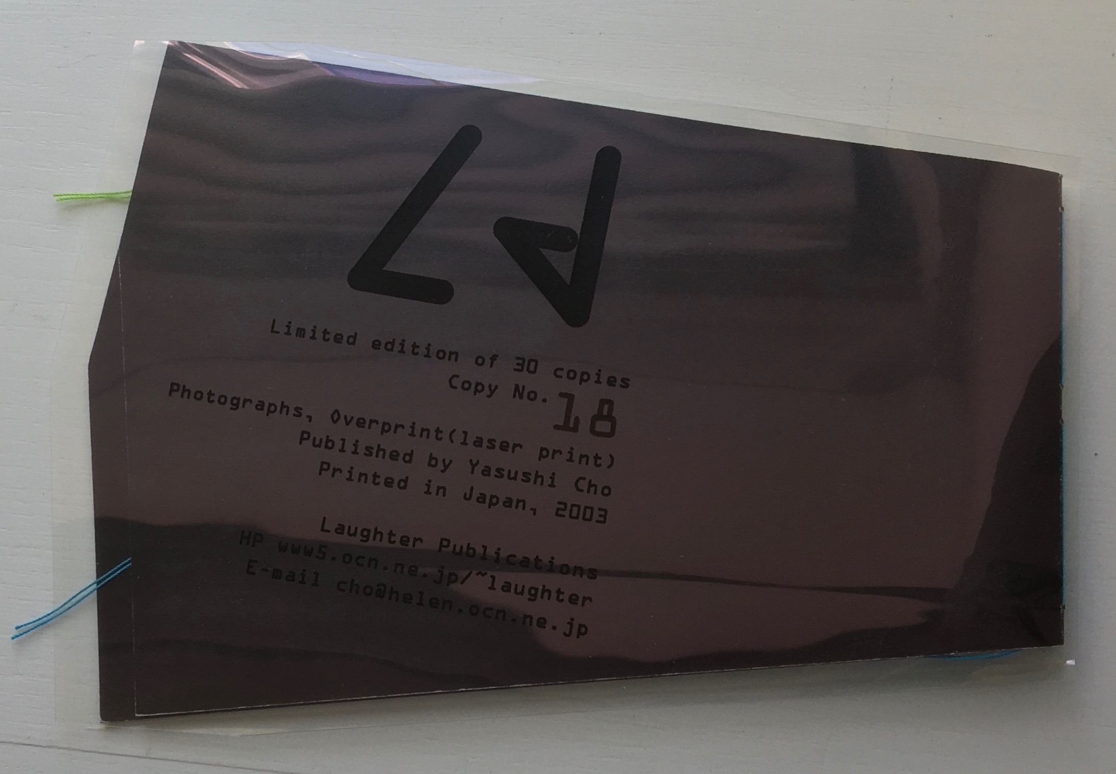
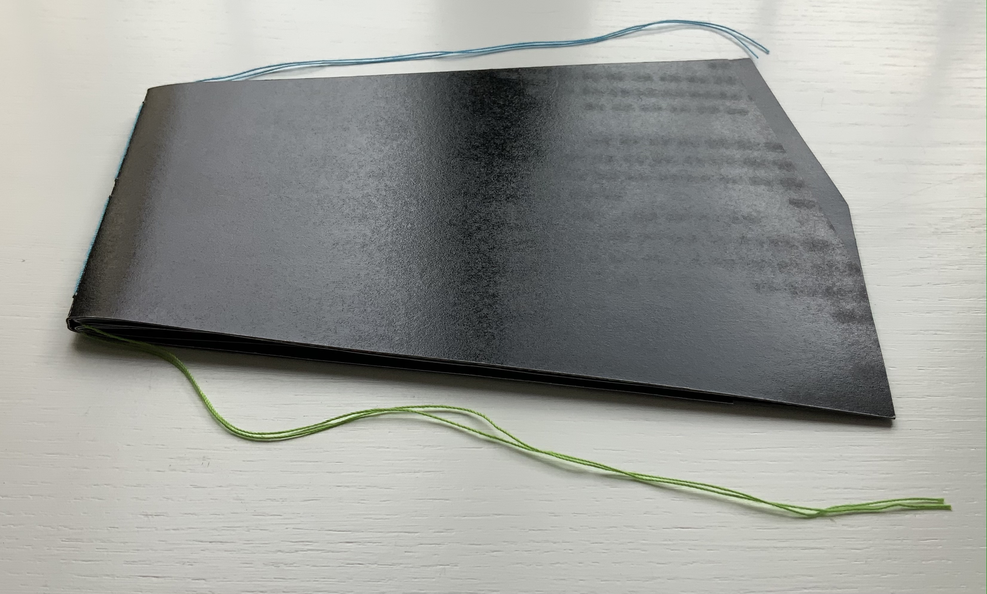
Ld (2003)
Yasushi Cho
Acetate sleeve. Booklet, handsewn. A5 nonstandard trim, 32 pages. Edition of 30, of which this is #18. Acquired from the artist, 10 April 2021.
Photos of the work: Books On Books Collection.
If the stylized letters “L” and “d” do not suffice to distinguish this work from the LDK series, its shape, content and source certainly do. The way the images, surfaces and shapes play off one another suggests that “L” stands for light, and “d” for dark. The very different source from which the work arises — a night-time walk and shoot in Tokyo — confirms it.
On the black pages, the artist has overprinted in black to give a shadowy depth to the images and surface. The images in the dark sometimes reflect the images in the light — sometimes from the facing page, other times from previous pages. Below, for instance, the film-sprocket shapes just visible on a previous verso page’s lower edge reappear faintly, enlarged and in black over the red lights. The red lights, in turn, reappear faintly, also enlarged and in black on the lower half of the narrowing recto page.
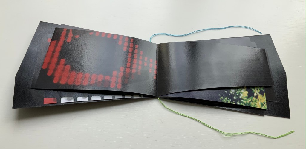
These reflections begin to suggest those retinal images that appear after a flash of light or when eyes are held too tightly closed — both of which conjure up a night-time photo shoot in an environment of contrasts between neon lights or spotlights and the shadows they cast. By staring at the bright images on one page (below), the reader may also experience additional retinal images on the facing page.
The irregularly shaped pages recall Philip Zimmermann’s High Tension (1993) or Helmut Lohr’s Visual Poetry (1995). Cho’s pages alternate at angles, narrow or widen. With the flashes between light and dark, they evoke the photographer’s searching eye, focusing lens and movement through night-time Tokyo.
Both .interior and Ld are sophisticated — materially, conceptually and in execution. With the LDK series, they make a strong addition to the Books On Books Collection.
Further Reading
“Marlene MacCallum“, Books On Books Collection, 2 September 2019.
“Marlene MacCallum and the Shadow Cantos“, Books On Books Collection, 9 February 2021.
“An Online Annotation of The Cutting Edge of Reading: Artists’ Books“, Bookmarking Book Art, 7 September 2017.
“Michael Snow“, Books On Books Collection, 3 March 2021.
“Philip Zimmermann“, Books On Books Collection, 14 January 2020.