Are we there yet? I mean the sesquicentenary of the premature announcement of the death of the book and such of its hangers-on as authors, readers and libraries. I suppose I should be satisfied to have seen its centenary. Robert Coover’s essay in the New York Times (June 1992) marked it a bit early, echoing Louis Octave Uzanne‘s tongue-in-cheek knelling in Scribner’s Magazine (August 1894), right down to the same title – “The End of Books”:
I do not believe (and the progress of electricity and modern mechanism [the phonograph] forbids me to believe) that Gutenberg’s invention can do otherwise than sooner or later fall into desuetude as a means of current interpretation of our mental products.
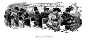
Reading on the Limited, Pullman Circulating Library.
Illustration by Albert Robida from Uzanne’s “The End of Books”, Scribner’s Magazine, August 1894.
For Coover, not so tongue in cheek, it was hypertext’s divergent, interactive and polyvocal routes as opposed to the book’s unidirectional page-turning that heralded the death of the book (and the author). D. T. Max rang out against CD-ROMs and the Internet bang on time in 1994 with “The End of the Book?” in The Atlantic when it was still called The Atlantic Monthly:
… the question may not be whether, given enough time, CD-ROMS and the Internet can replace books, but whether they should. Ours is a culture that has made a fetish of impermanence. Paperbacks disintegrate, Polaroids fade, video images wear out. Perhaps the first novel ever written specifically to be read on a computer and to take advantage of the concept of hypertext … was Rob Swigart’s Portal, published in 1986 and designed for the Apple Macintosh, among other computers of its day. … Over time people threw out their old computers (fewer and fewer new programs could be run on them), and so Portal became for the most part unreadable. A similar fate will befall literary works of the future if they are committed not to paper but to transitional technology like diskettes, CD-ROMS, and Unix tapes–candidates, with eight-track tapes, Betamax, and the Apple Macintosh, for rapid obscurity. “It’s not clear, with fifty incompatible standards around, what will survive,” says Ted Nelson, the computer pioneer, who has grown disenchanted with the forces commercializing the Internet. “The so-called information age is really the age of information lost.” … In a graphic dramatization of this mad dash to obsolescence, in 1992 the author William Gibson, who coined the term “cyberspace,” created an autobiographical story on computer disc called “Agrippa.” “Agrippa” is encoded to erase itself entirely as the purchaser plays the story. Only thirty-five copies were printed, and those who bought it left it intact. One copy was somehow pirated and sent out onto the Internet, where anyone could copy it. Many users did, but who and where is not consistently indexed, nor are the copies permanent–the Internet is anarchic. “The original disc is already almost obsolete on Macintoshes,” says Kevin Begos, the publisher of “Agrippa.” “Within four or five years it will get very hard to find a machine that will run it.” Collectors will soon find Gibson’s story gone before they can destroy it themselves.
Best not to wait for that sequicentenary then. Accommodatingly in 2012, David A. Bell and Leah Price rolled out the canon more with Google, ebooks and the Kindle tolling not merely for the print book but rather for the New York Public Library and all libraries. We even had screenings throughout 2013 and scheduled for January 2014 of the documentary Out of Print, which asks, “Is the book as we know it really dead? Is the question even important in an always-on, digital world?”
The nearer one stands, of course, the louder it is.
Sounded in the nineties but not obviously well heard, Paul Duguid, he of The Social Life of Information co-fame with John Seely Brown, advised “taking a breath”:
… it’s important to resist announcements of the death of the book or the more general insistence that the present has swept away the past or that new technologies have superseded the old. To refuse to accept such claims is not, however, to deny that we are living through important cultural or technological changes. Rather, it’s to insist that to assess the significance of these changes and to build the resources to negotiate them, we need specific analysis not sweeping dismissals.
… to offer serious alternatives to the book, we need first to understand and even to replicate aspects of its social and material complexity. Indeed, for a while yet, it will probably be much more productive to go by the book than to go on insistently but ineffectually repeating “good bye”.
So it is heartening (or depressing if you are a Jeremiah) to see 2013 rung out with an essay by Roger Schonfeld (ITHAKA S+R) that celebrates and encourages the specific analysis Duguid urged. In “Stop the Presses: Is the monograph headed for an e-only future?”, Schonfeld suggests several directions for further research and design:
- What are the perceived constraints of existing digital interfaces with respect to long-form reading of scholarly monographs? What functional requirements does print currently serve better than digital with respect to monographs, even recognizing that many of the same individuals are acquiring and using tablets and reader devices for other purposes? How can content platforms and publishers better address the needs of academic readers and other users?
- In an environment that has in many ways grown more fragmented over time, how can libraries and content platforms ensure the most efficient discovery and access experience possible for users of scholarly monographs? Is there a place for serendipity?
- How can stewards of primary source materials in tangible and digital form, such as archives, museums, and digital libraries, most effectively support the digitization of their own materials for discovery and access purposes and provide for rich linkages with the analysis of their holdings found in the scholarly monograph?
- If greater opportunities are provided over time for readers to engage with the primary sources, how might authors respond to reshape the nature of the monograph?
- Will the digital version of the scholarly monograph diverge from the print version as additional features can be added?
At the heart of what changes but remains in the shift from print to digital are Search and Usability or “ambient findability” as Peter Morville terms them. Morville’s seminal work on information architecture, search and user experience focuses on the Web but is equally applicable to the book and ebook. A superior e-monograph will enlighten its readers by the author’s choice of information architecture and its enabling them to learn and evaluate the search paths that lead to the presentation, the arguments and the primary sources. Likewise the superior print monograph achieves its goals by the judicious combination of preliminaries, Part, Chapter, endmatter and thousands of years’ development of paratextual apparatus.
Of the print apparatus for search and usability, the table of contents and other parts of the printed book’s preliminaries may not remain a useful point of entry to a scholarly ebook. In 2002, when a small team at McGraw-Hill working with Unbound Medicine decided that putting the index at the front of HarrisonsOnHand in place of the table of contents made more sense for the user of an HP iPAQ, they thought they had made a major breakthrough for mobile ebooks. Almost. What they were realizing is the centrality of those twin navigational stars, Search and Usability.
Only a little over a decade later, the insight continues to dawn, and with the intervening improvements in interfaces and devices, it may be much brighter this time.
The process of digitizing a printed book involves much more than the conversion of ink on paper to bits in a file. Functional aspects of the book must be mapped to digital equivalents. Thus we have tables of contents and indices turning into hyperlinks and spine files, page numbers that beget location anchors and progress indicators.
So wrote Eric Hellman earlier this year in “Anachronisms and Dysfunctions of eBook Front and Back Matter” and concluded that the title page in an ebook ought to be a “Start” page like the start screens in the old interactive CD ROMs or today’s DVDs of television series. Publishers such as Faber with T.S. Eliot’s The Waste Land or Moonbot Studios with The Fantastic Flying Books of Mr. Morris Lessmore have done just that.
Although the EPUB doyen and doyenne, Richard Pipe and Liz Castro, advised usability-driven rethinking of frontmatter, the practice is not widespread among purveyors of the less-than-enhanced ebook. Most editorial and design advisors such as Joel Friedlander only go so far. Their advice generally assumes the direct transfer of print frontmatter to the ebook. While allowing for the omission of spatial anachronisms like the bastard or half title, they only caution against overburdening the ebook’s frontmatter. As for the traditional index at the other end of the ebook, many publishers omit them or simply replicate the print version without links. Ebook indexes that link terms to their multiple locations in the text regardless of the flow of the text in the ereader or device are rare for obvious technical and financial reasons, and only this year was an EPUB specification for the index approved.
The two great affordances of the printed book that most challenge today’s ebooks and ereaders, however, are legibility and the page. While screen legibility may be improving at a “blinding rate”, we have today little more specific, scientific analysis of screen vs print legibility than Ellen Lupton found in 2003, although Jakob Nielsen remains indefatigable on the subject. Mechanics aside, the debate over the efficacy of reading from the page vs that from the screen should always be kept in mind. Ferris Jabr‘s April 2013 article in Scientific American and the six months of responses to it helped the topic considerably. Jabr concluded, “When it comes to intensively reading long pieces of plain text, paper and ink may still have the advantage. But text is not the only way to read.” Which harks back to the conclusion of a previous post in Books on Books and Jerome Bruner’s apt observation of Lev Vygotsky’s fondness for Sir Francis Bacon’s epigram, “Nec manus, nisi intellectus, sibi permissus, multum valent” (Neither hand nor intellect left each to itself is worth much)” (247). Perhaps for now neither print nor digital left each to itself is sufficient.
How the page matters. Enough so for Bonnie Mak to make it the subject and title of her book and to join Johanna Drucker, Peter Stoicheff, Jerome McGann and a long list of scholars conducting the analysis Duguid urged. As the August 2013 Ploughshares interview with her illustrates, Mak’s focus and interest on the material aspects of the page and book extends also to the library and performance art. Which brings us back to Drucker the book artist, who argues that instead of considering the page, table of contents, etc., as static, iconographic features of format, we should think of them as cognitive cues in an instruction set in the “program” of the codex. With reflowable text and responsive design, though, the cues can become slippery, so much so that the EPUB standard makers introduced Fixed Layout Properties with EPUB3.
This line of thinking about print space vs e-space comes sharply into focus if we consider annotatability, another of the printed book’s apparently superior affordances. While various devices and ereaders offer the ability to highlight and annotate, not all do, and the annotations are rarely accessible to others or across devices and platforms. The Web and ebook standards communities are hard at work on a specification for open annotation, which will enable the reader to share annotations of a work with other readers and enable annotations upon annotations. While we wait for the standards, though, the market spawns numerous solutions such as Readmill and SocialBook that functionally reflect “the conceptual and intellectual motivations” behind the affordance.
These experiments and successes exemplify the specifics Duguid urged. The big print-to-digital experiment of the last decade, however, that would by any measure be deemed to have exceeded expectations is the Google Book Project. Whether it was conducted in any sense “by the book” has been extensively argued in the courts and wherever else publishers, authors, technophobes and technophiles tend to gather. The year saw the dismissal of the Authors’ Guild case against Google, which left everyone just to carry on behind the scenes as they had been. So we are left with both the occasion for further bell-tolling for the book and further Duguidian exploration and experimentation as well as the avenues of research suggested by Schonfeld.
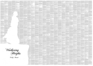
There is, however, one more change to ring at the close of 2013. The metaLABproject pulls a bit on that rope, but Kenneth Goldsmith grasps it firmly and echoes Michael Agresta‘s earlier insights into the many web-to-print phenomena that demonstrate that these two technologies may be forever intertwined. Goldsmith’s “The Artful Accidents of Google Books” highlights several individuals’ obsession with scanning errors from the Google Book Project. One of them is Paul Soulellis, the proprietor of the Library of the Printed Web, which “consists entirely of stuff pulled off the Web and bound into paper books”.
Soulellis calls the Library of the Printed Web “an accumulation of accumulations,” much of it printed on demand. In fact, he says that “I could sell the Library of the Printed Web and then order it again and have it delivered to me in a matter of days.” A few years ago, such books would never have been possible. The book is far from dead: it’s returning in forms that few could ever have imagined.
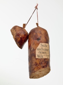
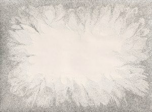
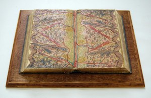
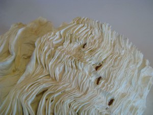
Or imagined digesting, like the series of book art by the late Dieter Roth, Literaturwurst (1969), to which Agresta gloomily alludes as “a final possible future for the paper book in the age of digital proliferation”.
I can hardly wait another thirty years!
Publications mentioned
Michael Agresta, “What Will Become of the Paper Book? How their design will evolve in the age of the Kindle,” Slate, 8 May 2012, accessed 23 December 2013: http://www.slate.com/articles/arts/design/2012/05/will_paper_books_exist_in_the_future_yes_but_they_ll_look_different_.html
Rick Anderson, “The Future(?) of the Scholarly(?) Monograph(?)”, The Scholarly Kitchen, 23 December 2013, accessed 23 December: http://scholarlykitchen.sspnet.org/2013/12/23/the-future-of-the-scholarly-monograph/
David A. Bell, “The Bookless Library”, The New Republic, 12 July 2012, accessed 23 December 2013: http://www.newrepublic.com/node/104873/print
Sven Birkerts, The Gutenberg Elegies: The Fate of Reading in an Electronic Age (New York: Faber and Faber, 1994)
Liz Castro, Comments on Richard Pipe, “ePub and Spine Order”, 31 May 2010, accessed 2 June 2013: http://infogridpacific.typepad.com/using_epub/2010/05/ebooks-and-spine-order.html
Robert Coover, “The End of Books,” New York Times on the Web, 21 June 1992, accessed 23 December 2013: http://www.nytimes.com/books/98/09/27/specials/coover-end.html
Johanna Drucker, “The Virtual Codex from Page Space to E-space”, Book Arts Web, 25 April 2003, accessed 2 June 2013: http://www.philobiblon.com/drucker/#johanna
Paul Duguid, “Material Matters: Aspects of the Past and the Futurology of the Book”, 1996, accessed 24 December 2013: http://people.ischool.berkeley.edu/~duguid/SLOFI/Material_Matters.htm
Joel Friedlander, “Self-Publishing Basics: How to Organize Your Book’s Frontmatter,” The Book Designer, 8 February 2012, accessed 2 June 2013: http://www.thebookdesigner.com/2012/02/self-publishing-basics-how-to-organize-your-books-front-matter/
Kenneth Goldsmith, “The Artful Accidents of Google Books, The New Yorker, 5 December 2013, accessed 23 December 2013: http://www.newyorker.com/online/blogs/books/2013/12/the-art-of-google-book-scan.html
Eric Hellman, “Anachronisms and Dysfunctions of eBook Front and Back Matter”, Go to Hellman, 8 February 2013, accessed 2 June 2013: http://go-to-hellman.blogspot.ca/2013/02/anachronisms-and-dysfunctions-of-ebook.html
Gretchen E. Henderson, “People of the Book: Bonnie Mak”, Ploughshares, 20 August 2013, accessed 28 December 2013: http://blog.pshares.org/index.php/people-of-the-book-bonnie-mak/
International Digital Publishing Forum, EPUB Indexes 1.0, 4 November 2013, accessed 23 December 2013: http://www.idpf.org/epub/idx/
Ferris Jabr, “The Reading Brain in the Digital Age: The Science of Paper versus Screens”, Scientific American, 11 April 2013, accessed 14 April 2013: http://www.scientificamerican.com/article.cfm?id=reading-paper-screens
Anne Kostick, “Digital Reading: UX Publishing Outsider May Lead the Way for Publishing Insiders”, Digital Book World, 14 March 2011, accessed 2 June 2013: http://www.digitalbookworld.com/2011/digital-reading-ux-publishing-outsider-may-lead-the-way-for-publishing-insiders/
Ellen Lupton, ““Cold Eye: Big Science”, Print magazine, Summer 2003, accessed 28 December 2013: http://elupton.com/2009/10/science-of-typography/#more-113
Bonnie Mak, How the Page Matters (Toronto: University of Toronto Press, 2012)
J. W. Manus, “Fun With Ebook Formatting: The Title Page and Front Matter,” Ebooks = Real Books, 23 April 2013, accessed 2 June 2013: http://jwmanus.wordpress.com/2013/04/23/fun-with-ebook-formatting-the-title-page-and-front-matter/
J. A. Marlow, “Effective Ebook Front and Back Matter,” The Worlds of J. A. Marlow, 19 April 2012, accessed 2 June 2013: http://jamarlow.com/2012/04/effective-ebook-front-and-back-matter/
D. T. Max, “The End of the Book?” Atlantic Monthly 274 (Sept. 1994): 61-71.
Jerome McGann, “Visible and Invisible Books: Hermetic Images in N-Dimensional Space”, nd, accessed 28 December 2013: http://www2.iath.virginia.edu/jjm2f/old/nlh2000web.html
Peter Morville, Semantic Studios, accessed 2 June 2013: http://semanticstudios.com/
Priscilla Coit Murphy, “Books Are Dead, Long Live Books”, Media in Transition, 19 December 1999, accessed 28 December 2013: http://web.mit.edu/m-i-t/articles/index_murphy.html
Jakob Nielsen, Nielsen Norman Group, accessed 29 December 2013: http://www.nngroup.com/
Richard Pipe, “ePub and Spine Order”, Using ePub, 30 May 2010, accessed 2 June 2013: http://infogridpacific.typepad.com/using_epub/2010/05/ebooks-and-spine-order.html
Leah Price, “Dead Again”, New York Times, 10 August 2012, accessed 23 December 2013: http://www.nytimes.com/2012/08/12/books/review/the-death-of-the-book-through-the-ages.html?pagewanted=1&_r=1&
Deena Rae, “Parts of an Ebook,” e-bookbuilders, 25 December 2012, accessed 2 June 2013: http://www.e-bookbuilders.com/2012/12/parts-of-an-ebook/
Robert Sanderson and Paolo Ciccarese, “Open Annotation: Bridging the Divide?”, Slideshare, 11 February 2013, accessed 2 June 2013: http://www.slideshare.net/azaroth42/open-annotation-bridging-the-divide
Roger Schonfeld’s “Stop the Presses: Is the monograph headed toward an e-only future?” (ITHAKA S+R, 10 December 2013, accessed 23 December 2013: http://www.sr.ithaka.org/blog-individual/stop-presses-monograph-headed-toward-e-only-future)
Peter Stoicheff (editor) and Andrew Taylor (editor), The Future of the Page (Toronto: University of Toronto Press, 2004). See also the YouTube interview of Stoicheff: http://www.youtube.com/watch?v=4XKHa7PH61c
Brad Stone, “Documentary Film Investigates the (Alleged) Death of Books”, BloombergBusinessweek, 10 May 2013, accessed 23 December 2013: http://www.businessweek.com/articles/2013-05-10/documentary-film-investigates-the-alleged-death-of-books
Louis Octave Uzanne, “The End of Books”, Scribner’s Magazine, August 1894, accessed 23 December: http://ebooks.library.cornell.edu/cgi/t/text/pageviewer-idx?c=scri;cc=scri;rgn=full%20text;idno=scri0016-2;didno=scri0016-2;view=image;seq=0229;node=scri0016-2%3A9
