Deep in the Bordeaux region, Diane de Bournazel creates livres d’artiste, sculptures and paintings and prints that will make you think of cave art, Hieronymus Bosch, Marc Chagall, Maurice Sendak, medieval tapestries, illuminated books and, finally, the distinctive art de Bournazel.
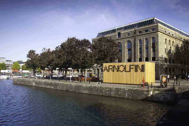
Containing over 700 items, the Arnolfini artists’ book collection is one of the largest UK collections of contemporary book art. It leans toward the 1970s and 1980s. The US-based Franklin Furnace Archive Artists Book Bibliography is representative, as are European works such as those of Vito Acconci, Marcel Broodthaers, Stanley Brouwn, Hanne Darboven, Jan Dibbetts, Helen Douglas, Dieter Roth and Telfer Stokes.
Franklin Furnace Archive Artists Book Bibliography (1977) Unbound notecards of artists’ books catalogues 3 v. ; 430 cards ; 11 x 16cm
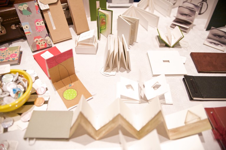
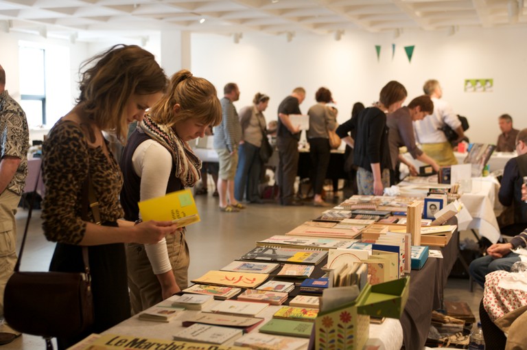
The collection is not without later representative works such as those by SooMin Leong, Jonathan Monk and Grayson Perry, but there seem to be no works after 2012. The Arnolfini, Bristol’s center for contemporary art, also hosts the biennial Bristol Artists Book Event.
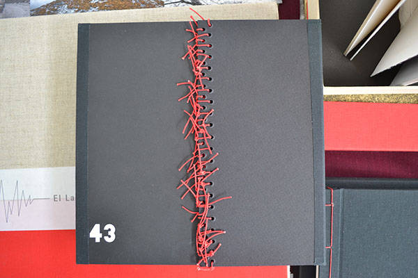
43: Cuarenta y Tres (2015) Lorena Velázquez Book 21.5 x 21.5 cm; box 30.3 X 24.2 cm; mixed technique, interventions with acrylic and serigraphy; edition: 43.
Josh Hockensmith, curator at the University of North Carolina’s Joseph C. Sloane Art Library, made it possible for me to handle this searing work memorializing the 43 students from the Raúl Isidro Burgos Rural Teachers’ School of Ayotzinapa who disappeared in September 2014 near Iguala, Mexico. The driving rain outside the windows that day compounded the work’s effect.
The hard work of describing Velázquez’s book has been done by Stephen Dingler, rare book cataloger at the University of Texas, Austin, Below is an excerpt of online comments on the 13th copy of the edition of 43.
The use of the number 43 is not restricted to the title in Ms. Velázquez’s work. Forty-three numbered copies of the book were made; the book, constructed in concertina (accordion) style, has 43 unnumbered pages; the numbers from one to 43 are printed across several pages; on one page the number 43 is produced in braille. There is little text but the book artist’s use of photographs showing demonstrations and rallies, as well as portrait photographs of the 43 missing, convey a sense of outrage and a demand for justice. The book’s pages are colored black, with most splashed or streaked with red paint, which further conveys a sense of horror and tragedy at what happened.
Stephen Dingler, “The Significance of Numbers”, The Top Shelf, 15 August 2016. Accessed 7 September 2018.
Even with more than 100 people arrested in relation to the case and a key suspect in custody in March 2018, the facts remained unknown. The 43 would have graduated in July 2018. Mexico’s new president Andrés Manuel López Obrador has committed to launching an independent commission on 1 December 2018 to to re-open the investigation in compliance with a federal court ruling.
One among the names of the 43 has been redacted because his remains have been identified. 43: Cuarenta y Tres (2015) Lorena Velázquez
The Spiral Lady (2013) Book 21.5 X 20.0 cm; box 56.5 X 21.5 cm; edition 20 + 2 a/p. Collaboration with Lola Argemí. WorldCat link.
El Vuelo/Flying (2012) Book 21.5 x 18.0 cm; box: 23.0 cm x 19.5 cm; mixed technique, fine art printing, interventions with chinese ink and acrylic; edition: 10 + 2 a/p. WorldCat link.
El Latido del Corazón/Heartbeat (2011) Book 24.5 x 35.5 cm; box 38.5 x 37 x 4.5 cm; mixed media, digital printing over plaques of collodion and several objects; edition: 4 + 2 a/p.
It can be hard to find the time to experiment with your art. Often you feel everything we create should be a finished artwork but it is extremely valuable to take the time to just play. It can feel like a waste of time but often from these opportunities the most fascinating results, techniques and […]
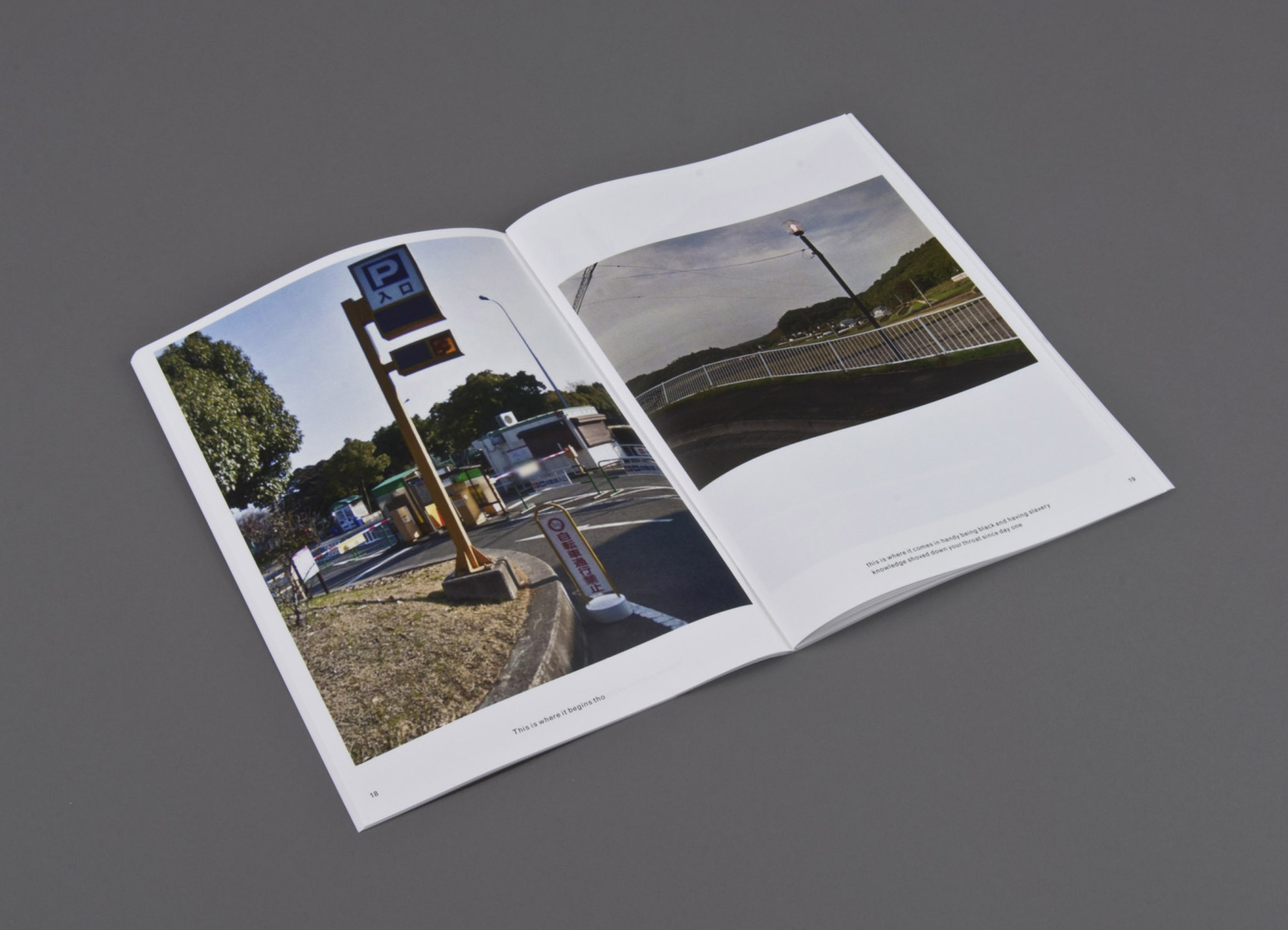
This is where (2014) Print on demand, three booklets Erin Zwaska
An ongoing chance-based publication project in the spirit of Ed Ruscha. Images are randomly-selected Google streetviews (which are often captured at noon to avoid shadowing) of cities like Paris, Tokyo, etc. The copy is compiled from all tweets containing the phrase “this is where” between noon and 12:15pm local time for each city. Consequently the text and imagery for each 15-minute issue originates from the same, albeit ambiguous, time and place. And though text and image are randomly paired, surprising narratives often emerge. Included in the collection of the Library of the Printed Web.
This is where is where the tradition of Ed Ruscha meets the Web. Go there and see for yourself.
A search of Lafayette College’s Artists’ Books Collection on the genre yields 1284 entries, including works by Alicia Bailey, Julie Chen, Maureen Cummins, Steven Daiber, Karen Hanmer, Margaret Kaufman, Clifton Meador, Lois Morrison, Werner Pfeiffer, Gerhard Richter, Maryann Riker, Edward Ruscha, Buzz Spector, Barbara Tetenbaum, Erica Van Horn and Sam Winston.
Check out the archives for the Werner Pfeiffer exhibition.
Worth a visit to the Skillman Library if you’re in Easton, PA.
Stimulating offers of paper art and book art abound in The Hague in June and July 2018.
Museum Rijswijk celebrates its twelfth Paper Biennial (12 June – 7 October). The Pulchri Studio hosts a major exhibition (1-22 July) for the founders of the Paper Biennial — Peter and Pat Gentenaar-Torley. In advance of the latter exhibition, I visited the Biennial and then the Gentenaar-Torleys in their studio as they were preparing for the show and, as it turned out, rushing to fill last-minute orders from the Middle East.
The Twelfth Paper Biennial
As you enter the Museum Rijswijk, the large paper chess set in the courtyard elicits a smile and, with the overcast, a cocked eyebrow — a good combination for this exhibition and museum. The building neatly combines contemporary and 18th century Dutch interior features that deceive the visitor into thinking it small then being surprised by the number of rooms. Cheerful (or somber) deception combined with delightful (or startled) surprise are a common thread in book art and paper art. So is looking back and forward. The 12th Paper Biennial is no exception in its fitting environment.
Eighteen artists are each represented by multiple works, enough in most cases to appreciate style and technique and to compare and contrast within each display as well as across the artists’ displays. While many items in the Paper Biennial 2018 are of the “stop you in your tracks” variety, perhaps my planned visit to the Gentenaar-Torley studio or the museum shop’s selection of the Genetenaar-Torley books from the first seven biennials had primed my eyes for the particular works below. Large but airy paper fabrications floating from the ceiling or wall. Abstraction melded with the figurative. Vegetal and handmade paper. Saturation of colors. Innovativeness. Although, missing was an example of Pat Gentenaar-Torley’s hallmark technique of painting with thin layers of colored pulp.
Double-page spread illustrating Pat Gentenaar-Torley’s technique, from Puur Papier/Pure Paper (2008) for the seventh Paper Biennial
On entering the most spacious room, my eye was caught by Mathilde van Wijnen’s Ruimte. In English, “ruimte” translates variously as space, room, area, place, capacity, location, aerospace, range, wideness, spot, compass and largeness. Under Van Wijnen’s hand and tools, it also translates into rhythms of light and shadow, evoking an expanse of dunes.
Ruimte (2017) 315 gsm, acid-free drawing paper Mathilde van Wijnen from the twelfth Paper Biennial
Detail of Ruimte (2017)
Another of Van Wijnen’s work in the same room plays with light in a different way: Helios.
Helios (2014) Paper, pastel and graphite Mathilde van Wijnen
The shifting metallic sheen and trompe l’oeil effect of Mathilde van Wijnen’s Helios (2014) and, in different rooms, of Lei (2016) and Bouten (2016) are mesmerizing and made me retrace my steps more than twice.
I like it that the technique is not very obvious and it remains mysterious. I also like to hear about my black works that people think it is made of a different material than paper, sometimes leather or fabric. (Correspondence from Mathilde van Wijnen, 20 June 2018)
Another artist in the show capable of making the abstract tangible is Annita Smit. Her piece called Frivool is a good example. In English, “frivool” means frivolous, light-hearted, flighty, shallow and flippant. In Smit’s hands, calque or tracing paper becomes all of that and more — a feathery embodiment of those Dutch winds that swirl every which way.
Frivool (2017) Calque paper Annita Smit from the twelfth Paper Biennial
Detail of upper right of Frivool
Middernacht (2016) Bible paper, ink Annita Smit from the twelfth Paper Biennial
Like the colors in Van Gogh’s Starry Night, those in Middernacht shift with texture and perspective, but the shaping and folding substitute for the palette knife and brush handle.
Detail upper right of Middernacht
Smit’s material and colorful works reminded me of Beate Hoffmeister’s similar use of telephone directories (featured in the second Paper Biennial book put together by the Gentenaar-Torleys) and the textural effects achieved by Pavlos (featured in the sixth Paper Biennial book).
Beate Hoffmeister‘s paper sample covering the book-in-a-book from Papier en Vuur/Fire and Paper (1998) for the second Paper Biennial
Champs (“Field”) (1989) 200 x 300 cm, snippets of paper Pavlos (Dionyssopoulos) from Papier op de Vlucht/Paper Takes Flight (2006) for the sixth Paper Biennial
Comparing/contrasting this earlier work with that of Smit is like comparing the techniques and palettes of the Impressionists with that of Hundertwasser.
Andy Singleton sticks to white for all of his pieces in the show.
Silk (falling) (2018) 190 gsm Watercolour paper (100% cotton rag) Andy Singleton from the twelfth Paper Biennial
Detail upwards of Silk (falling)
What is special about this paper is its ability to absorb water without damaging the paper. … The process I use to create the forms is called wet folding. I cut each piece of paper to the shape I want, this spray the paper with water to dampen the material. This allows me to manipulate the paper in ways that would be difficult when dry without damaging it. I then dry the paper rapidly with a heater (hair dryer or electric fan heater) to hold it on position. The paper is now set in its new form. (Correspondence from Andy Singleton, 22 June 2018)
As with many of the artists’ works in the show, Andy Singleton’s are clustered in different rooms. While this curatorial approach might irritate some, I found that it worked to lead me back and forth to spend more time with the individual works. The smaller wraith-like productions by Singleton on the floor above sent me back downstairs for another look at the large Silk series, where I was reminded of Katrin Zutter’s Tranquillity from the third Paper Biennial book (2000).
Tranquillity (1996) 55 x 55 x 40 cm, Nepalese paper Katrin Zutter from Papier en Water/Paper and Water (2000) for the third Paper Biennial
Sample Nepalese paper Katrin Zutter from Papier en Water/Paper and Water (2000) for the third Paper Biennial, which elicited paper samples as well as artwork and essays
Throughout the exhibition, works draw attention to their material in differing degrees and with differing intentions. Angelique van der Valk’s is one of the more organic, almost raw in degree, and takes us back to the origin of paper and, by extension, culture: vegetable papyrus.
Groente Abstract, serie 7 #3 Paper from peeled asparagus, rhubarb Angelique van der Valk from the twelfth Paper Biennial Photo credit: courtesy of the artist
The Groente Abstract (Vegetable and Abstract) series are a result of many experiments. Every kind of vegetable has its own intrinsic qualities and the way of treating each material differs….The tension between abstraction on one side and the organic forms of this material on the other hand, is what I find most interesting. It reflects, to my mind, the way we live: culture on the one hand, nature on the other. I strive for harmony between these two, or to make their tension and friction visible. (Correspondence from Angelique van der Valk, 21 June 2018)
Fittingly entitled Tijdloos Papier/Timeless Paper, the fourth Paper Biennial book (2002) carried a guide to making vegetable papyrus. Gentenaar’s inclusion of such an article follows naturally from his own early sculptures’ borrowing from plant shapes.
Double-page spread from Maureen Richardson‘s ” Vegetable Papyrus” in Tijdloos Papier/Timeless Paper (2002) for the fourth Paper Biennial
My inspiration is a plant bud, which, in spring, unfolds into a leaf. A compact folded form feeds itself with water and turns into a great spacious form. In autumn, this leaf falls off of the tree, the water evaporates and a small web of fibers curling around the spine is the new form.
Peter’s leanings toward nature/abstraction and Pat’s, as seen in the 2017 Suzhou exhibition, would certainly lead them to cheer on Jocelyn Châteauvert’s process and her contributions to the Paper Biennial 2018.
Flamingo (2015) Handmade abaca paper, pigment Jocelyn Châteauvert from the twelfth Paper Biennial Photo credit: courtesy of the artist
As to the process, understand that I am the papermaker and thus determine a number of aspects such as fiber, sheet thickness, translucency and color. I also have to anticipate shrinkage. As the paper for this had fiber beaten for 4 hours, there is at least 30% shrinkage. I use this aspect to create structural integrity in the piece without having to introduce other materials for support. So all the necks of the birds actually hold the piece up. (Correspondence from Jocelyn Châteauvert, 21 June 2018)
Update: See Châteauvert’s interview with Helen Hiebert on Paper Talk, 30 May 2019.
Double-page spread of Nepalese lokta paper made at the Manohar Upreti mill, from Geist van Papier/Spirit of Paper (2004) produced for the fifth Paper Biennial
Only on exiting through the museum’s shop did I notice how the early Paper Biennials’ books explicitly and ingeniously showcased paper samples such as Nepalese lokta paper (as above), handmade abaca, Japanese washi paper and many other varieties of handcrafted paper. Later on, I learned that from the start in 1996 with Voelbaar Papier/Tactile Paper (1996), all seven books included “papier monsters” (paper samples).
Paper sample from Loes Schepens, included in Voelbaar Papier/Tactile Paper (1996)
Perhaps the Gentenaar-Torleys’ books made it possible for the twelfth Paper Biennial to assume its viewers would appreciate implicitly or simply take in stride the variety of paper types used by the exhibition’s eighteen artists. But for this viewer, that assumption just gives reason for another revisit, and the Paper Biennial 2018 does reward a lingering visit.
In my case, however, the lingering made me late for my visit to the Gentenaar-Torley studio.
A Visit with the Founders
Bicycle path to the Gentenaar-Torley Studios
Footbridge to the studio
The “front house” and a welcome from Pat Gentenaar-Torley
Despite the size of The Netherlands, each locale seems more spacious than possible. Like the country and Museum Rijswijk, the Gentenaar-Torley studio seems to hold more space than it should contain. From the quiet of the “front house”, as Pat calls it, she led me to noise of saws, drills and industrial-size fans whirring. Shaking her head at the noise and activity, she explained that the Address Downtown Hotel, Dubai, which reopened in early June, had placed a rush order for 10 sculptures, reduced it to 5, then ordered 12 more, and just as those had been dispatched, a Qatari order delayed a year due to the blockade was reactivated — all in the midst of preparing for the Pulchri Studio exhibition. A workman with saw and drill was preparing the crates for the shipment to Doha. Peter drying a piece for the retrospective was the source of the whirring fan’s noise. Suspended by twine, the piece could have been a cloud or massive version of Pat’s koi caught in a net over the large custom-built vacuum table.
Crates readied to leave the studio for Doha, Qatar (June 2018) Photo credit: courtesy of the artists
Peter and Pat Gentenaar-Torley in the studio Rijswik (June 2018)
Backwall of the studio (June 2018) The appeal of Gentenaar’s work to the Middle East is clear in this three-dimensional swirling, calligraphic effect.
As Water (2013) 61 x 92 cm, in studio Patricia Gentenaar-Torley
This is the constant state of affairs at the Gentenaar-Torley studio. Consider these events from May 2017 through June 2018:
Exhibition at the Suzhou Jinji Lake Museum (April-June 2017)
Installation at Stefanuskerk Westerbork (May 2017)
Installation at the Galerie de Minéralogie et de Géologie, in Paris for the Iris van Herpen Couture Collection (January 2018)
Installation at 1355 Peachtree, a building with mixed businesses in Atlanta, Georgia (March 2018)
Inclusion in the Jinji Lake Biennale, Suzhou China (May-June 2018)
The Pulchri Studio exhibition — “Is beauty only skin deep” (July 2018) — will include older and newer works. That title is equally appropriate to each artist although in different ways. Starting with layers of dyed paper pulp clinging to large frameworks of bamboo or raffia palm, Peter coaxes a two-dimensional sheet into a three-dimensional object.
From the Suzhou Exhibition Book Photo credit: courtesy of the artist
From the Suzhou Exhibition Book Photo credit: courtesy of the artist
From the Gentenaar-Torley studio (June 2018)
Pat, on the other hand, coaxes a sense of three dimensionality from layers of dyed pulp, applying them wet on wet and, literally, working backwards, up from what will be the top layer of the painting to the next layer, then the next without disturbing the fibers that she has nudged into the shapes she wants in each layer. Think of it as the reversal of the steps in oils or frescoes in which first comes the background, then layering upwards and ending at the top.
Detail of Fair Chance showing use of kozo fibers and gilt-infused pulp
In those different ways, surface breeds depth from within which beauty rises.
I made my second visit to the studio on the day Peter, Trude (daughter) and Pim (son-in-law) were loading a truck with the works for the Pulchri Studio. Pat had the task of preparing the price list but took a break to allow for photos of the “well-ordered chaos” of the works remaining for transport.
Pulp paintings waiting for the truck (June 2018)
An unusual combination of textures in this piece for the Pulchri Studio show
Two more for the Pulchri Studio Photo credit: courtesy of the artists
Koi and still life lined up and ready to go
Among the items readied for the Pulchri Studio were other items destined for different locations. This one scheduled for installation in one of the Holland America Line cruise ships reminded me how lucky one might have to be to see the works from the Gentenaar-Torley studio. Other installations have been commissioned by the TUI cruise line, the top-floor restaurant in Disney World’s Hotel Four Seasons and Yas Mall in Abu Dhabi. If you live in Atlanta, Georgia, you can see Ruby Takes Flight at 1355 Peachtree Street, NE.
A second commission from the Holland America Line (June 2018)
Ruby Takes Flight (2018) Peter Gentenaar Photo credit: courtesy of the artist
Better luck still if you are within striking distance of The Hague. Along the linden-lined Lange Voorhout, the Pulchri Studio stands at number 15, and in its large Mesdagzaal, the exhibition runs from 1 July through 22 July. Art sometimes requires that you make your own luck.
Installation day in the Mesdagzaal at Pulchri Studio Photo credit: courtesy of the artists
Installation day in the Mesdagzaal at Pulchri Studio Photo credit: courtesy of the artists
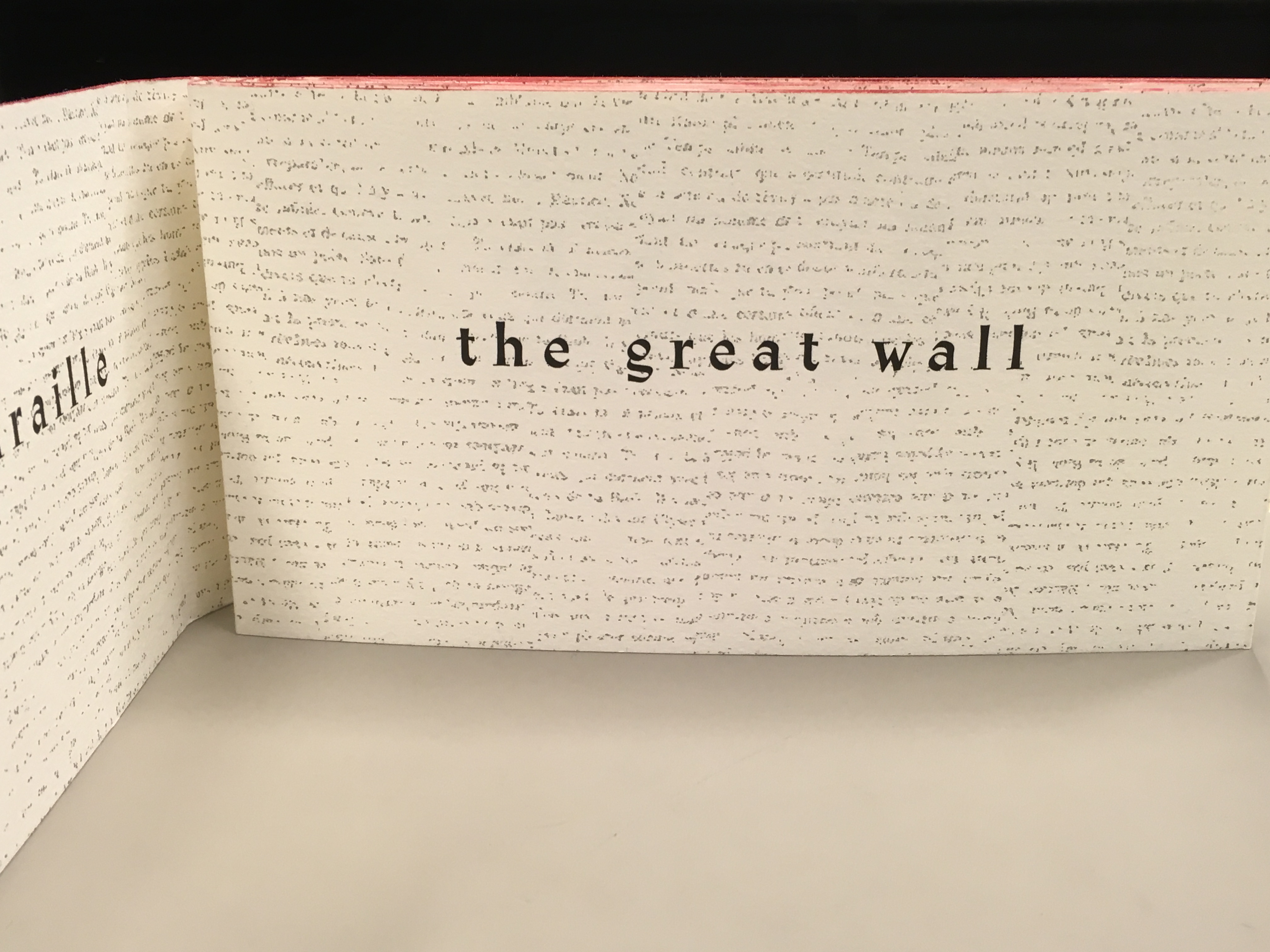
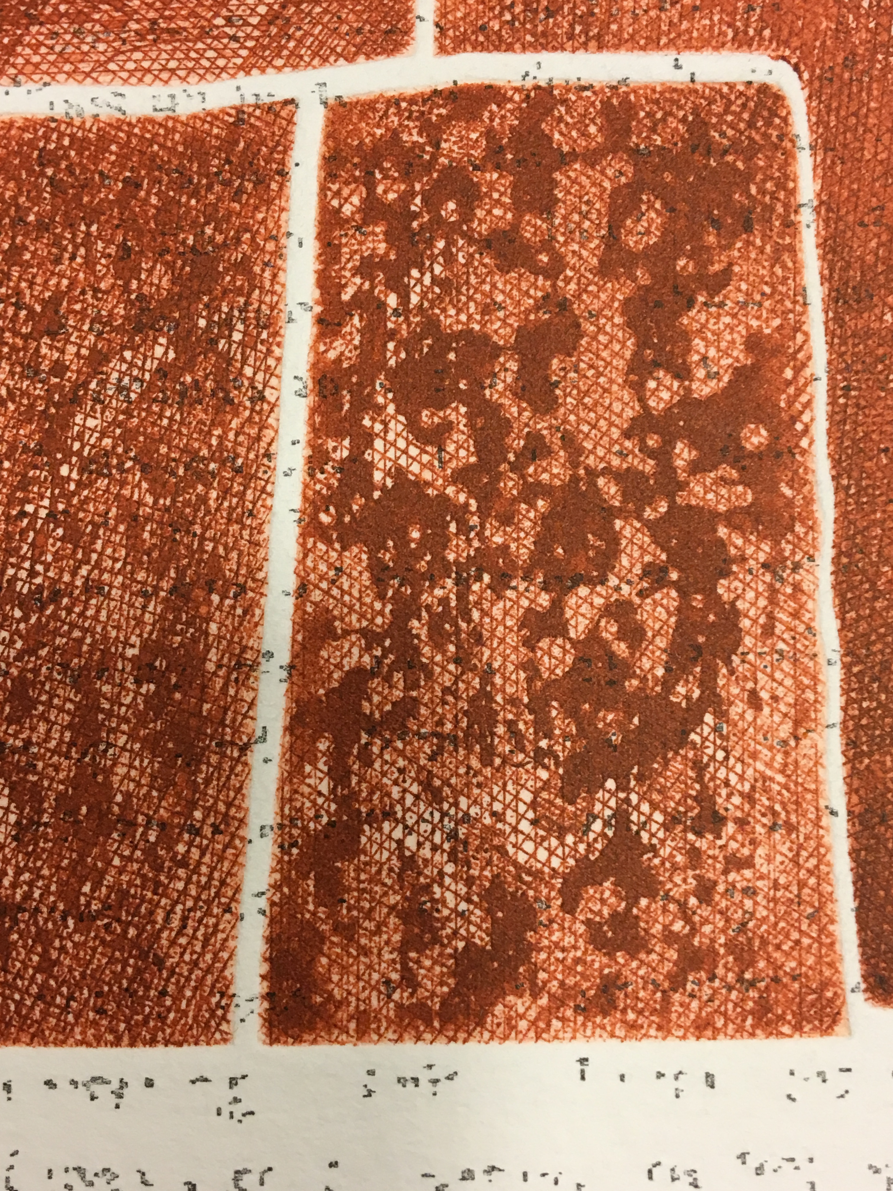
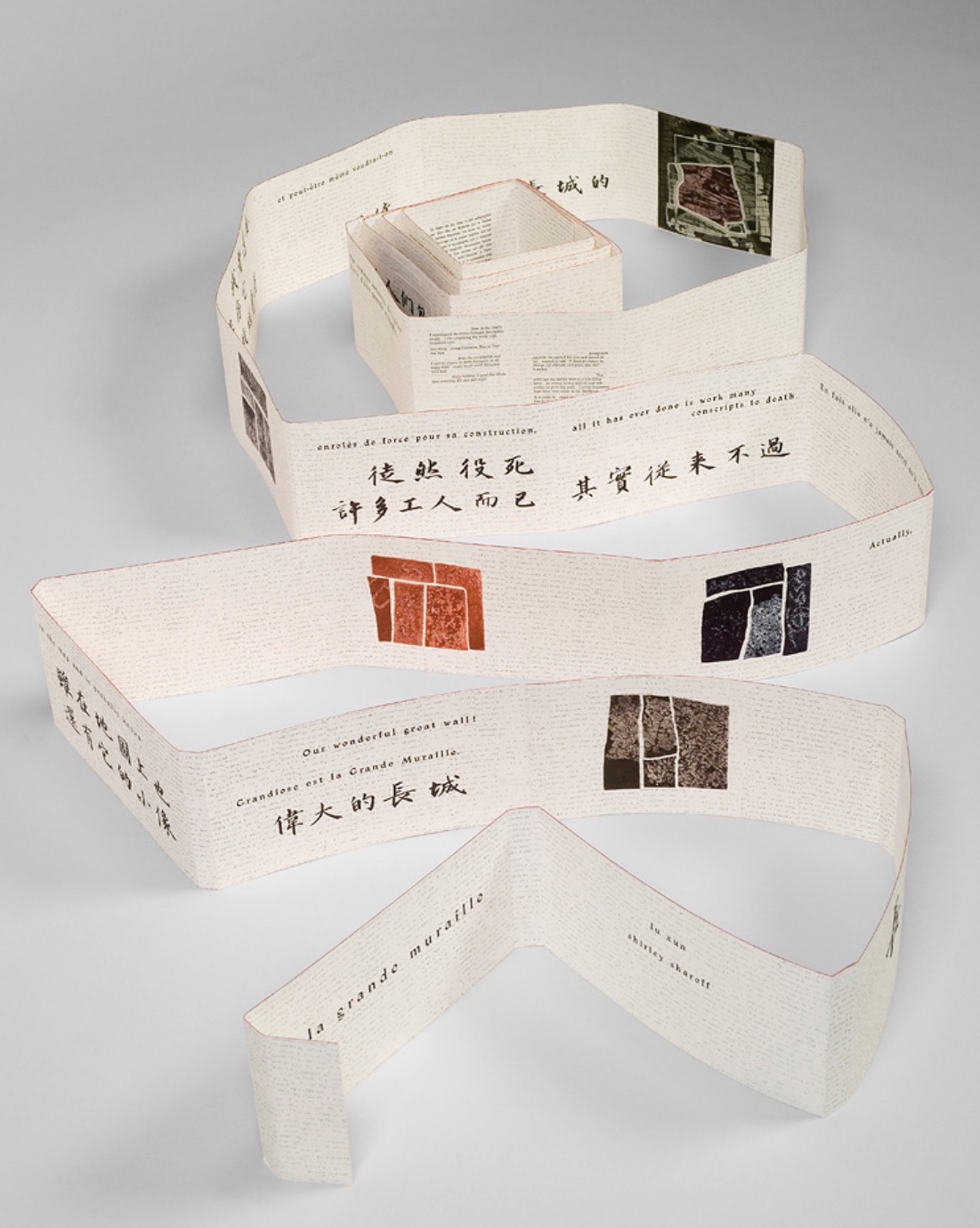
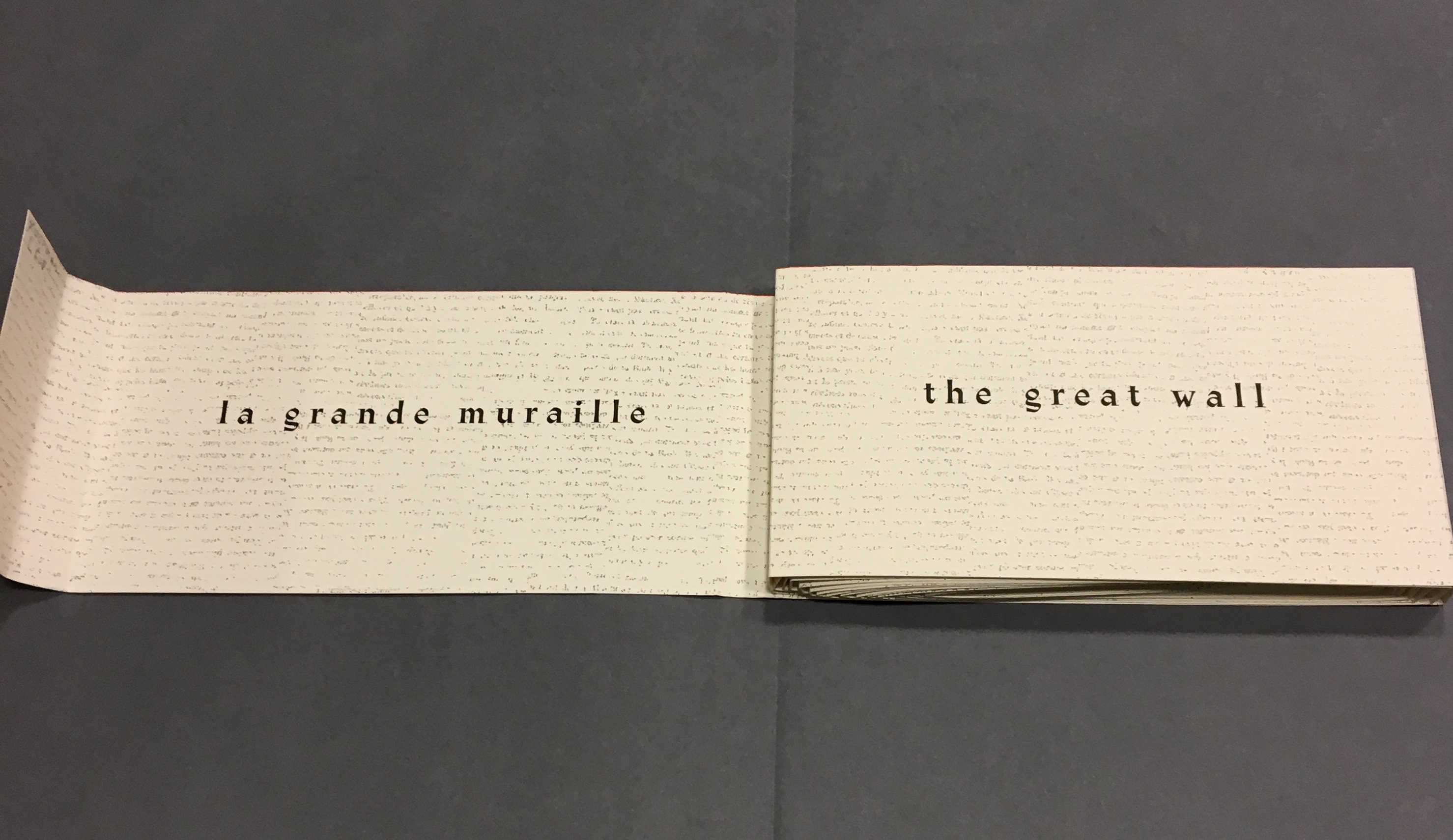
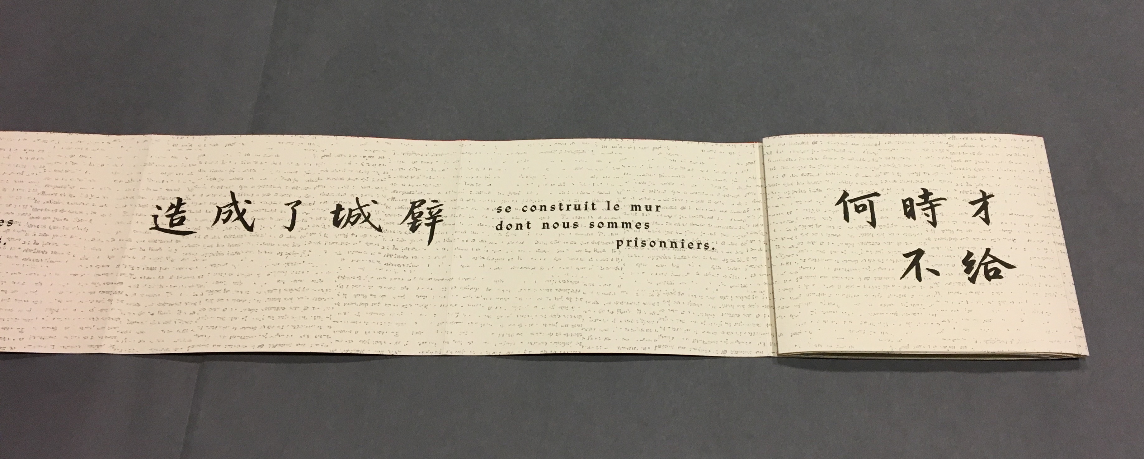
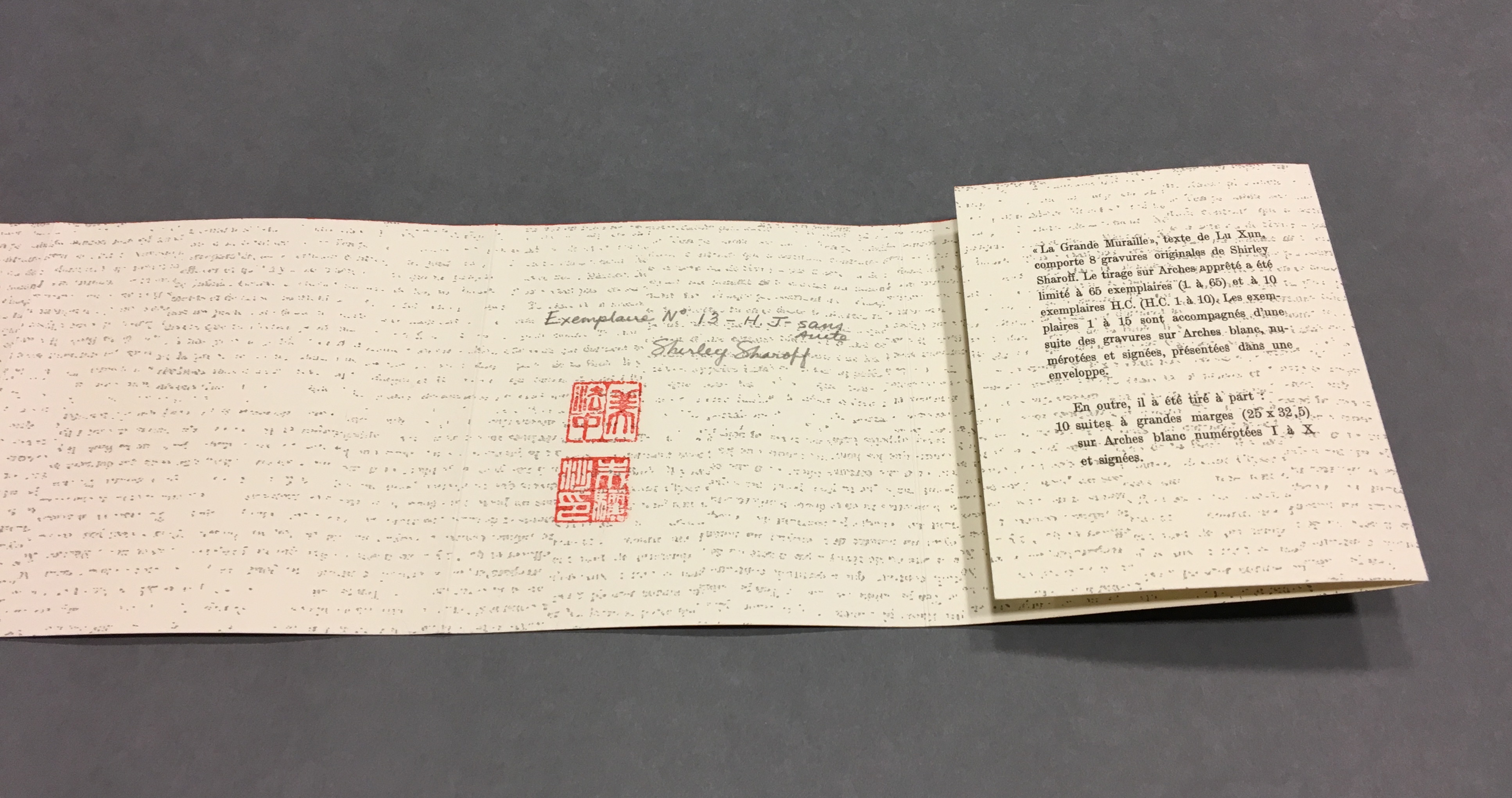
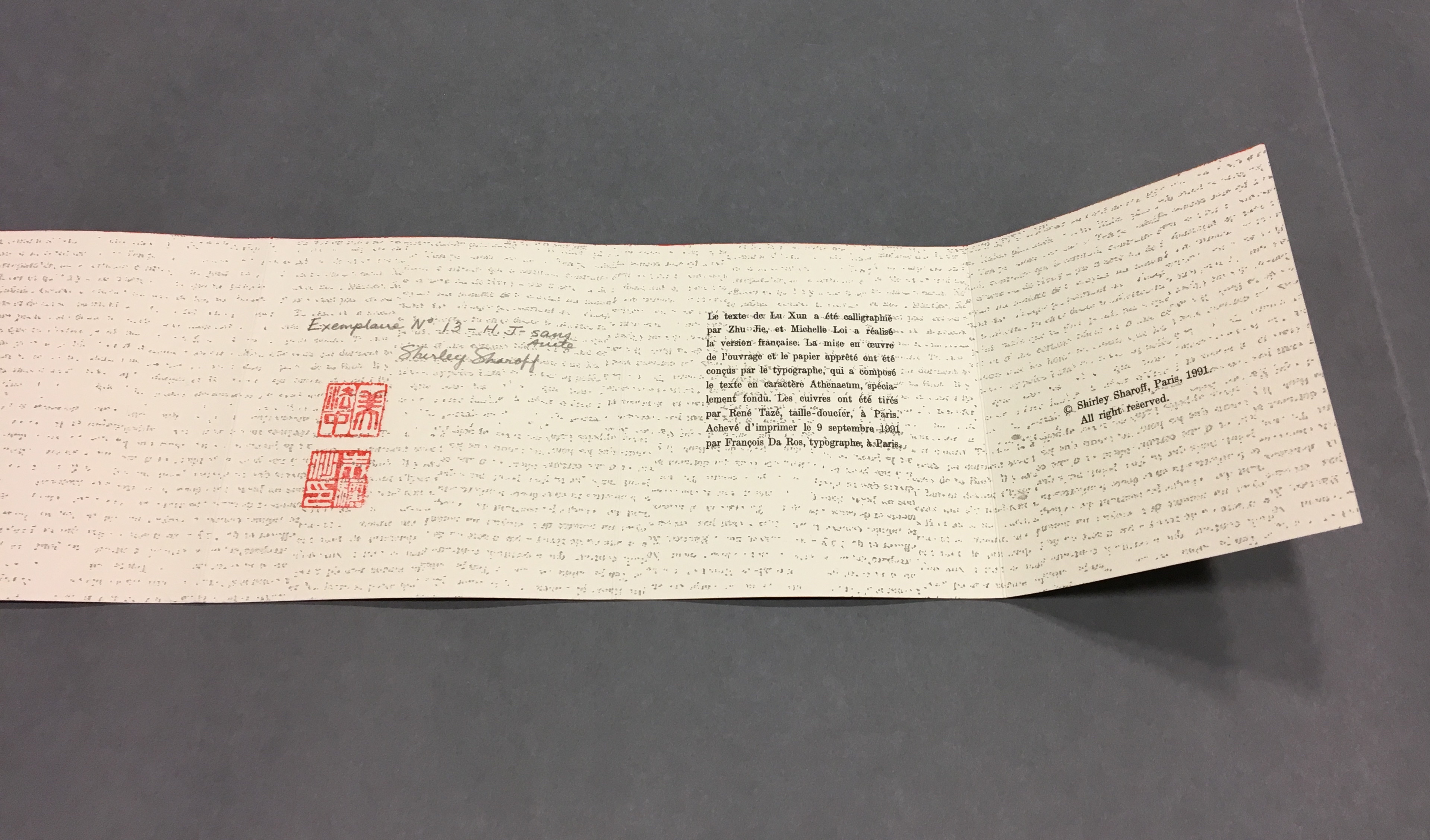
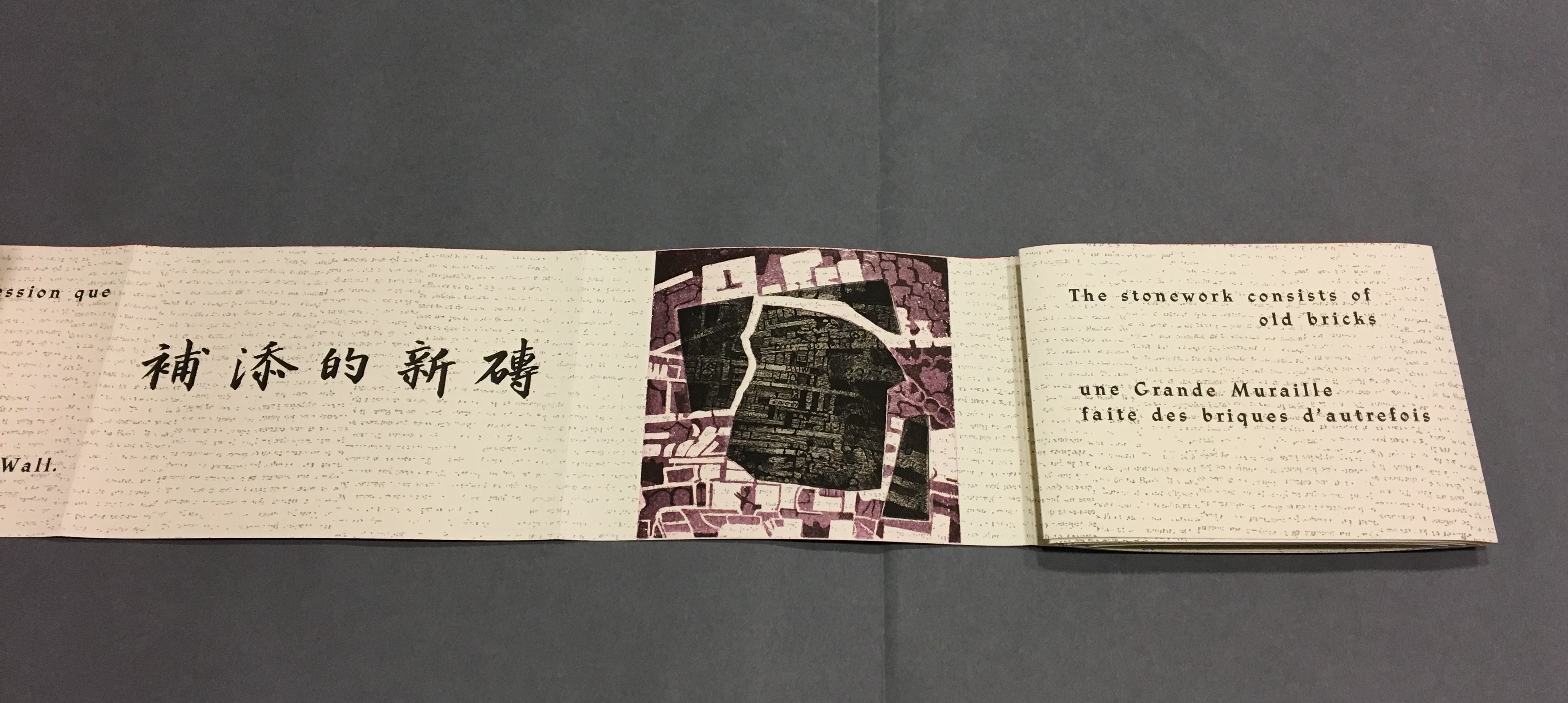
La grande muraille/The Great Wall (1991), Shirley Sharoff All Books On Books photos are reproduced here with permission of the artist.
Detail, La grande muraille/The Great Wall (1991) Typeface: Athenaeum, designed by Alessandro Butti and Aldo Novarese in 1945
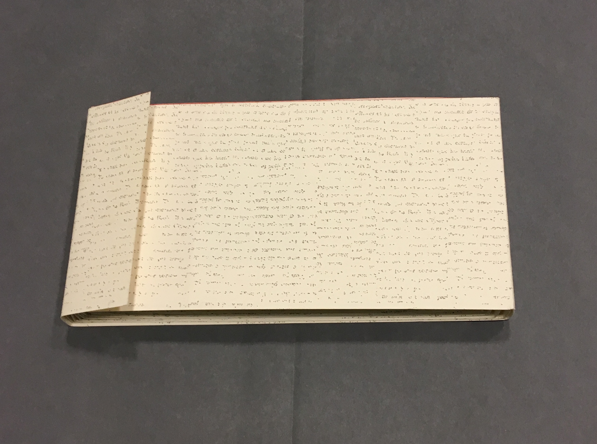
The National Library of the Netherlands advises, “for [Shirley Sharoff’s La grande muraille/The Great Wall (1991)] to be read, the book first must be rolled out”. And that is what I did, using the large table in the Special Collection’s seminar room.
Enjoyable as that was, enjoying it again with the video afterward, something seemed awry. As the Chinese poem by Lu Xun, its French and English translations and text from Sharoff’s language students unrolled, interpersed with her prints, the text seemed to have gaps, or so I thought. So I returned a second time. Perhaps if I re-shot the video. Perhaps if I took more stills and close-ups. Perhaps if I shot the rolling up as well as the unrolling.
No doubt, the second effort added to the pleasure. Looking at the videos and stills, I can again feel between my fingers the Arches paper and engravings’ impressions on it. But still I detected gaps, seeming mismatches between the French and English. I wondered to what degree they
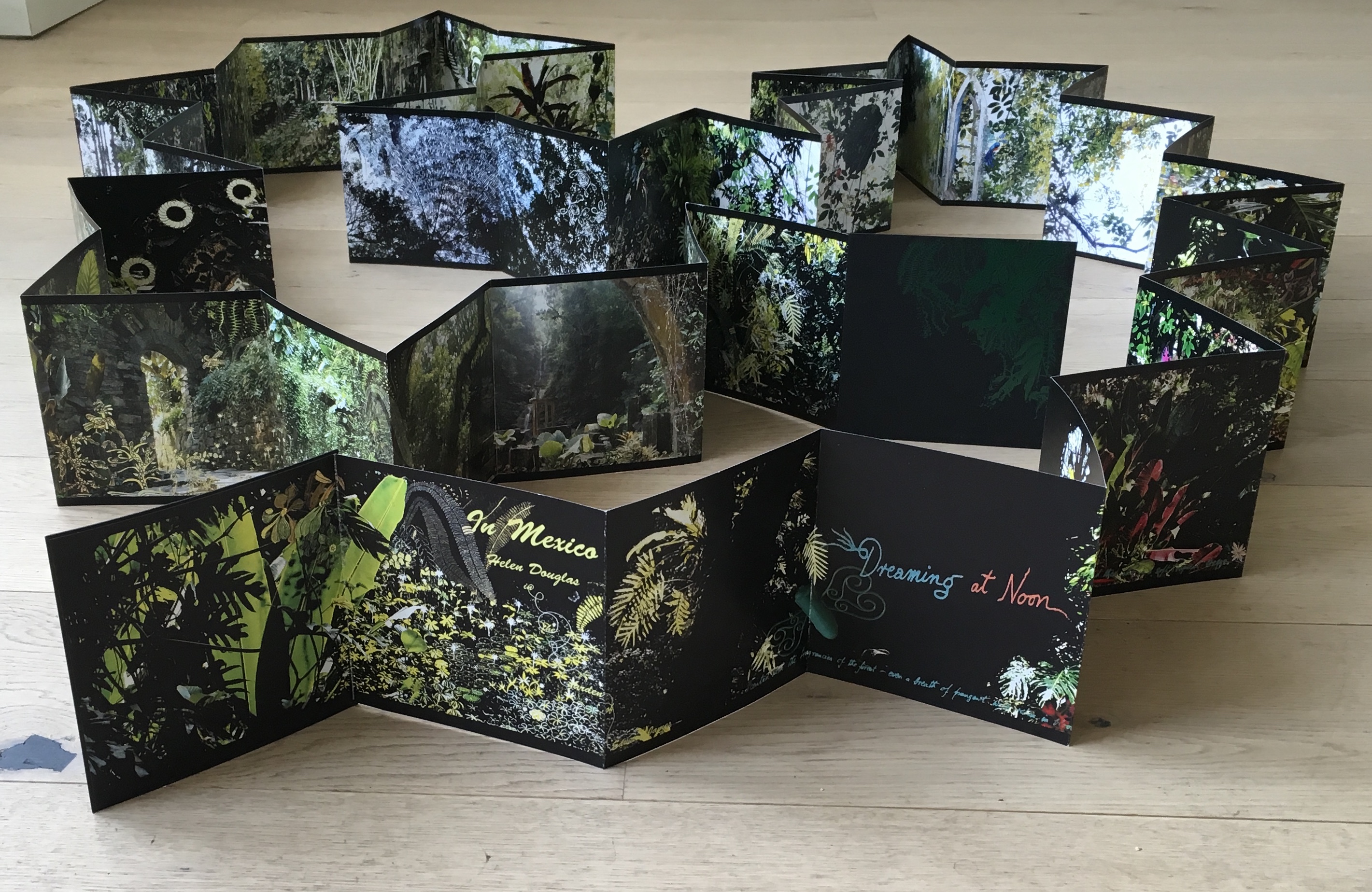
followed the Chinese text or whether some of Lu’s text had been omitted. So, I returned a third time, and then came my “ah hah” moment. Unrolled, La grande muraille looks like a double-sided leporello or accordion book like this one: In Mexico by Helen Douglas.
In Mexico: in the garden of Edward James (2014) Helen Douglas
To read La grande muraille as the double-sided leporello it appears to be, however, is to overlook the multi-page spreads that Sharoff conceived with François Da Ros (her typography and print collaborator) in putting together this forme en escargot (snail-shell form as she calls it). The snail-shell form, its multi-page spreads and the text demand that you read La grande muraille as you unroll it, or rather, as you unfold it.
With the book laid flat, the “page spreads” are easier to recognize, the text is easier to read, and the forethought needed for the “imposition” of text and images to deliver the sequential text, easier to marvel at. As each recto page is turned to the right, two new pages appear to the right. This unfolding approach to reading the book offers several intriguing “double- and multi-page spreads” and an experience of the texts and eight prints in the sequence driven by the text. When you have finished reading in this sequence, you will have read both sides of the scroll.
Reading the text
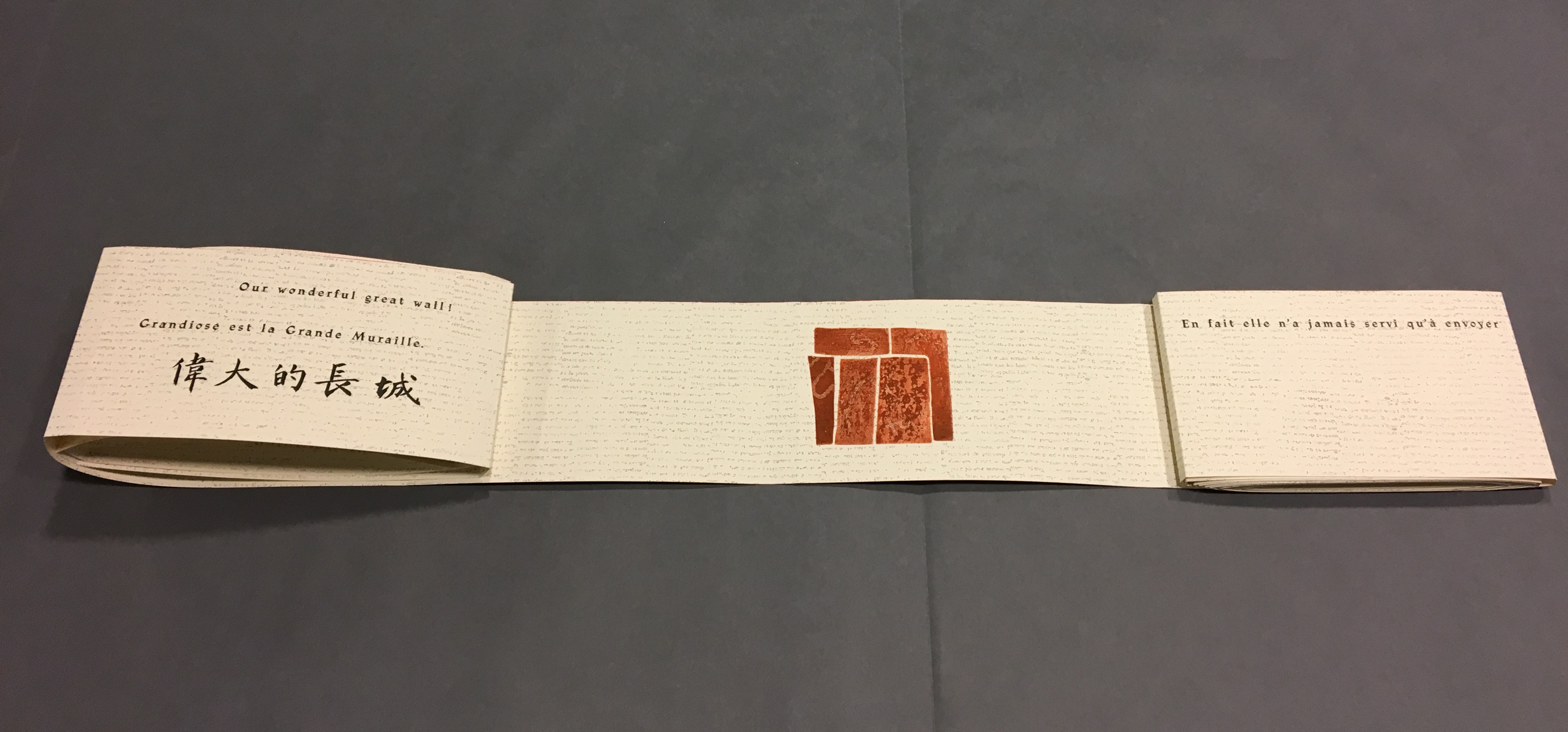
Front cover La grande muraille/The Great Wall (1991), Shirley Sharoff
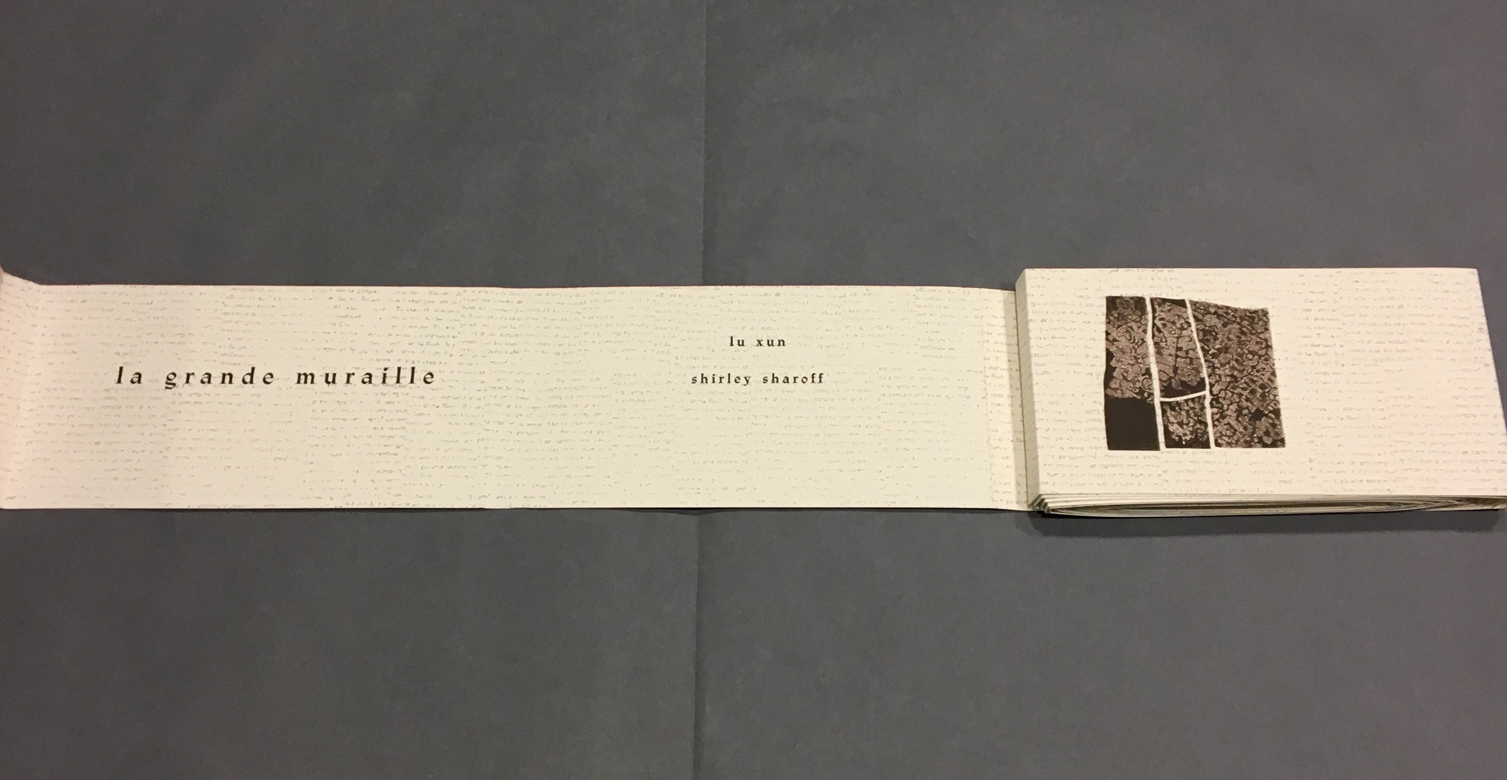
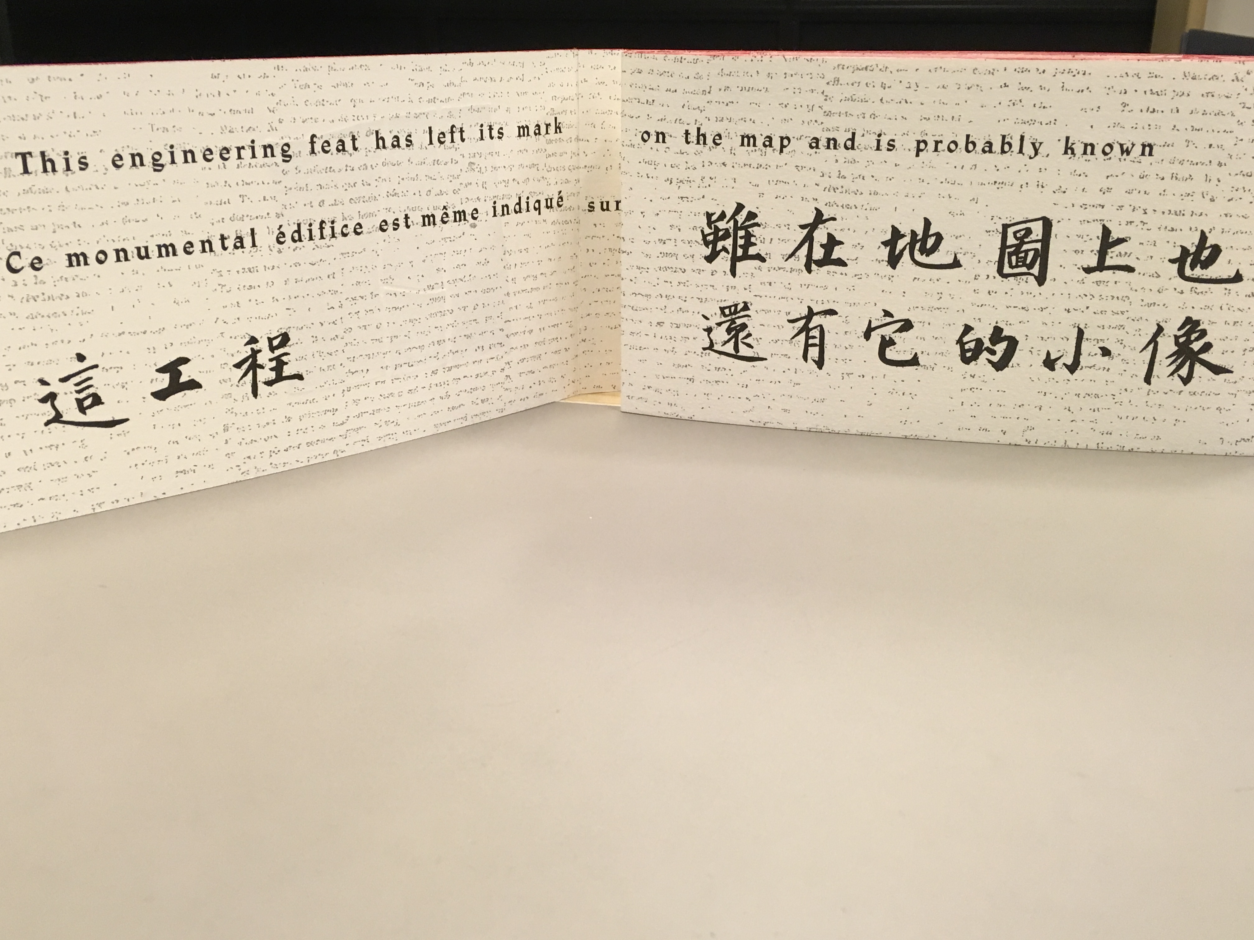
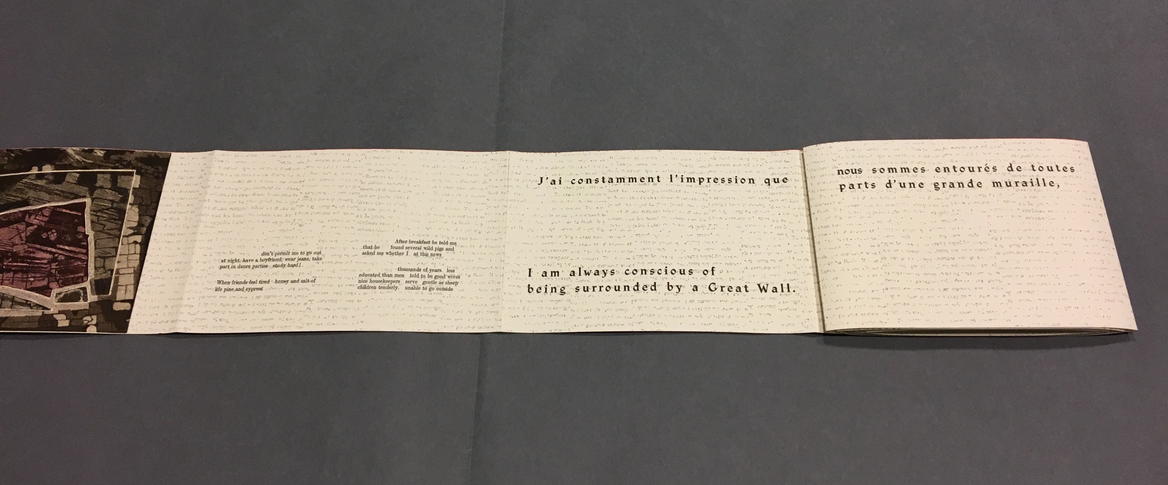
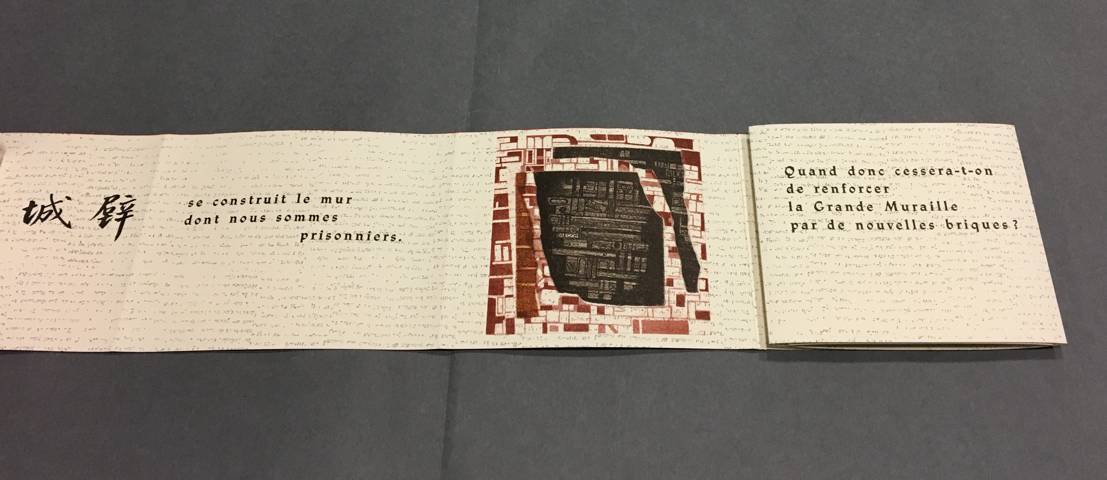
“Pages 1 and 2” As “page 2” is turned to the right and the English title of the work disappears, “pages 3 and 4” come into view.
“Pages 1, 3 and 4” “Page 3” displays the authors names, and “page 4” displays the first of eight prints in the book. As “page 4” is turned to the right and disappears, “pages 5 and 6” appear.
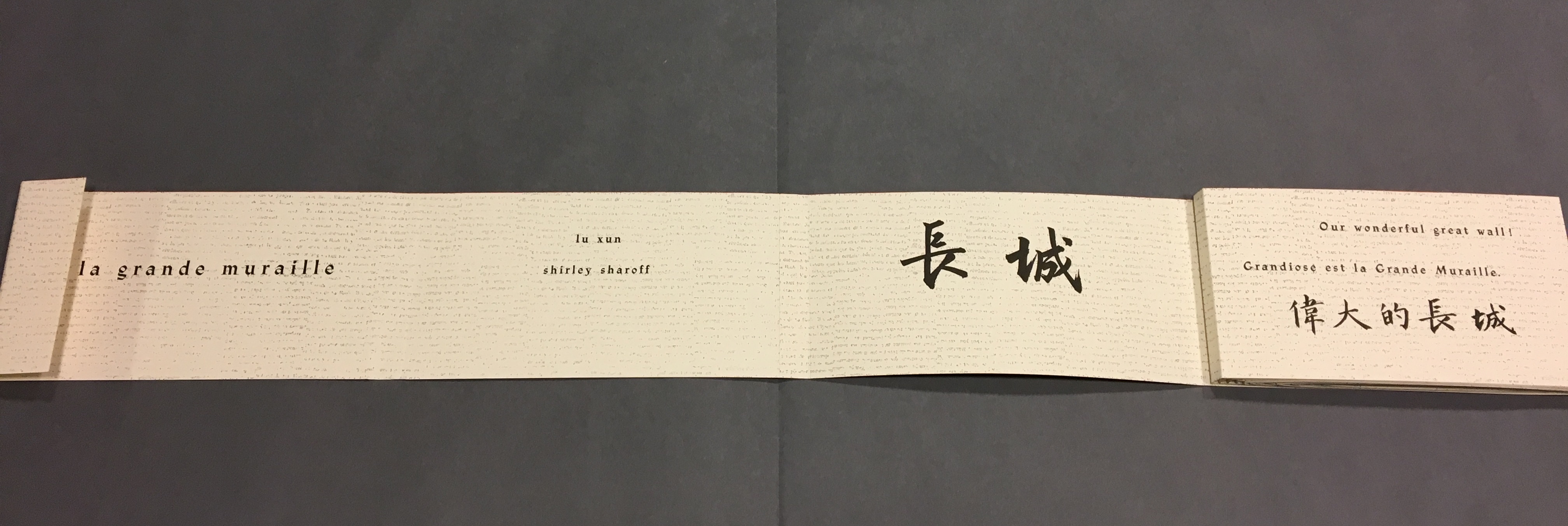
“Pages 1, 3, 5 and 6” “Page 5” gives the title of the book in Chinese calligraphy. On “page 6”, the opening line of Lu Xun’s text appears in English, French and Chinese. Turning “page 1” to the right will cover the authors’ names on “page 3”, and turning “page 6” to the right will yield the next four-page view.
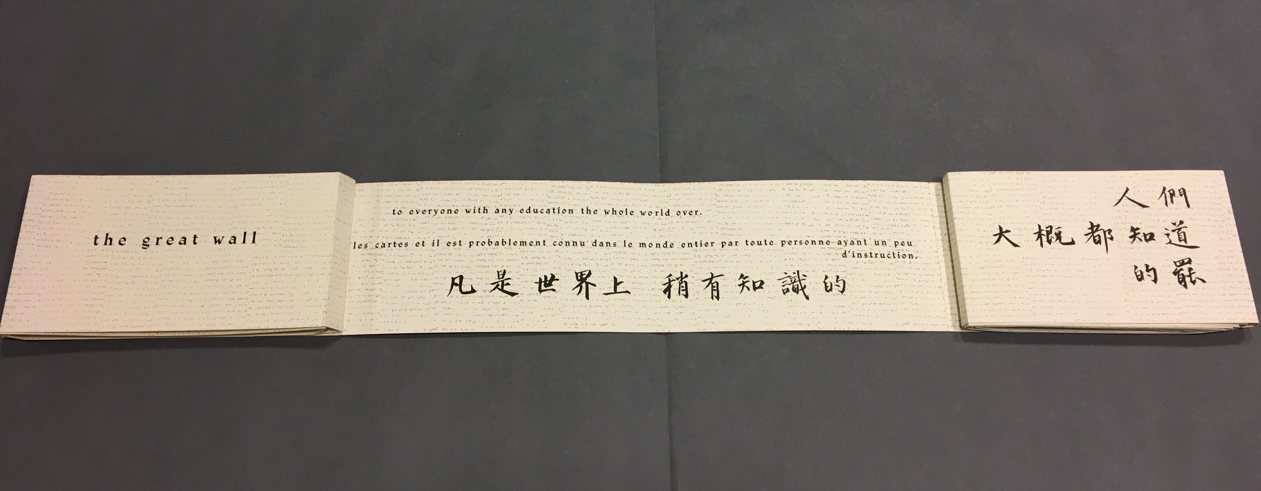
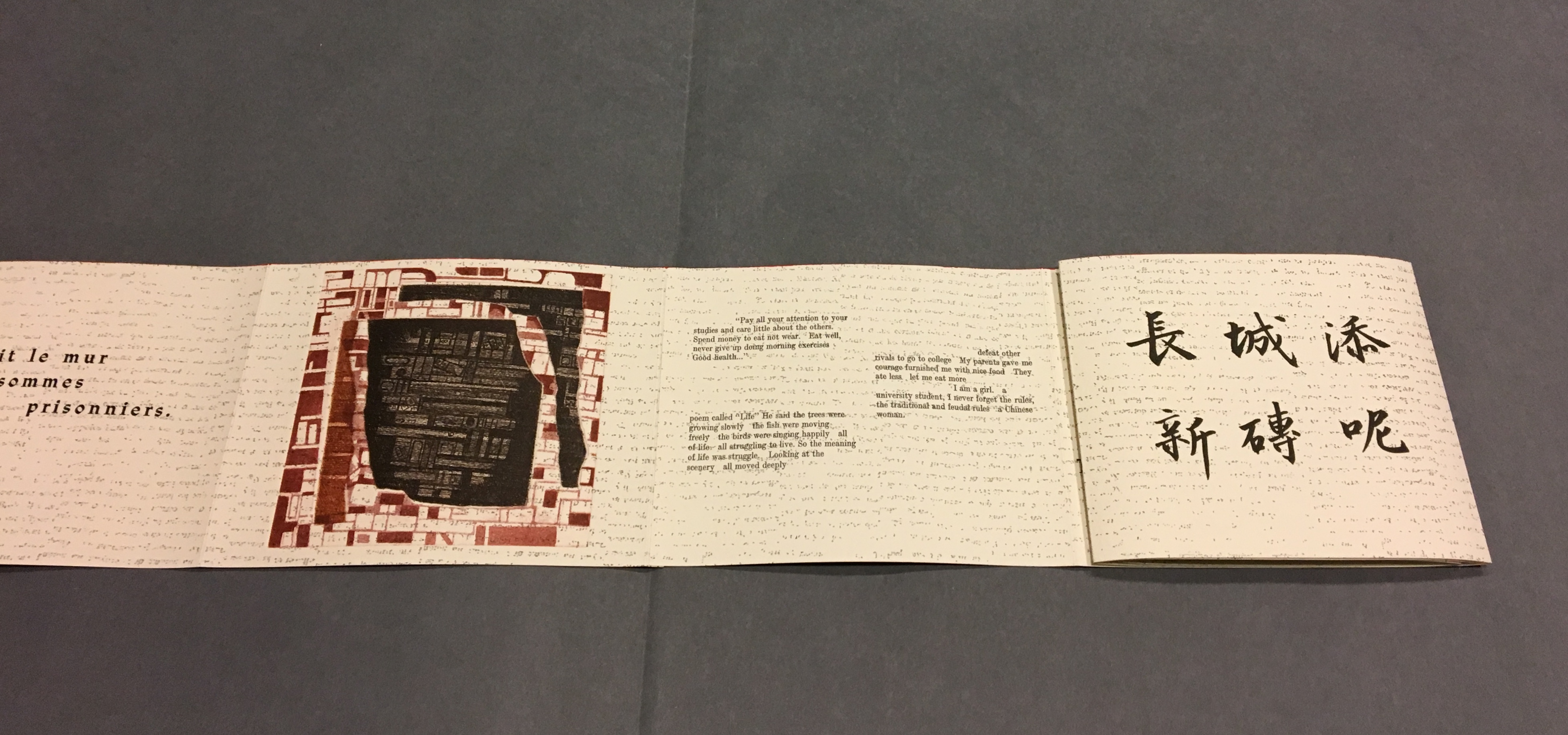
“Back cover, pages 5, 7 -8” The next lines of Lu Xun’s disquisition run in English, French and Chinese across “pages 7-8”.
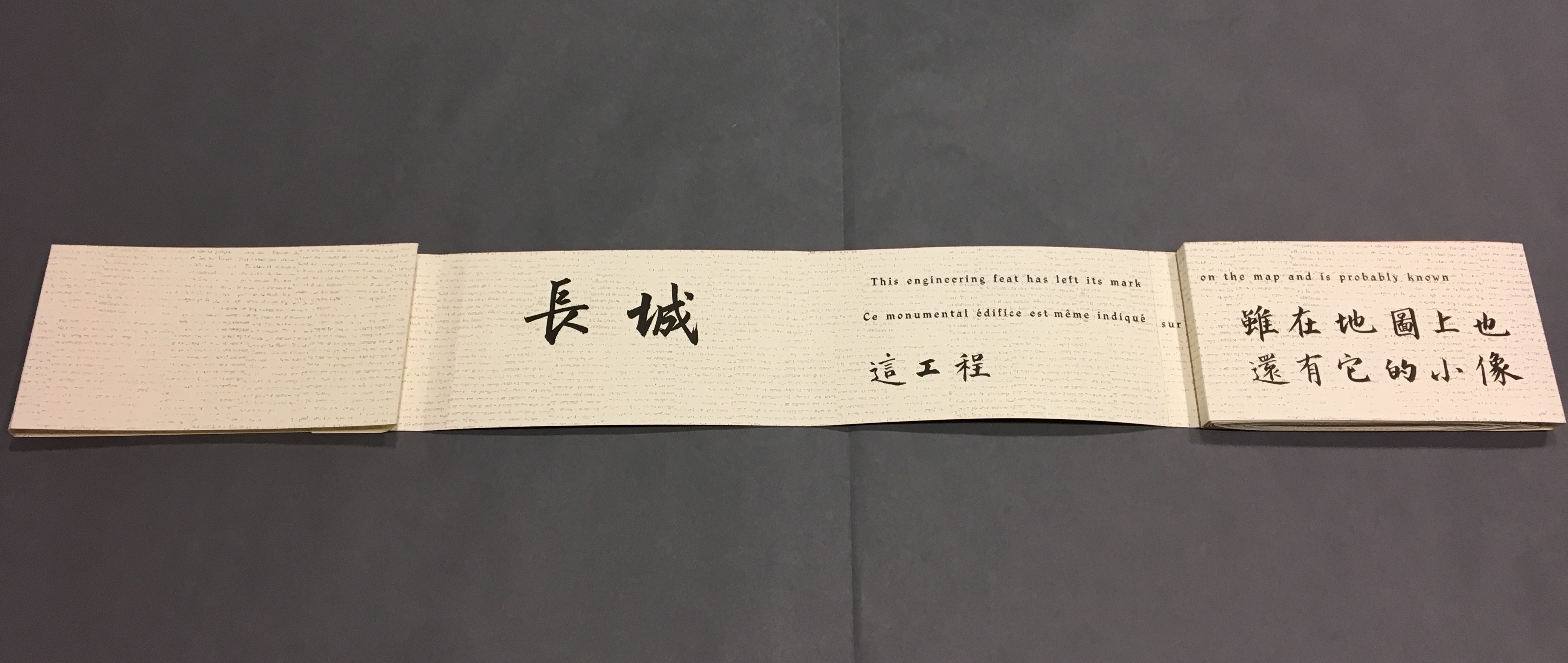
Detail, “Pages 7 and 8”. Notice how the English text on “page 7” runs across to “page 8”, but the French text disappears under “page 8”, effectively running on to what will be revealed as “page 9” in the next view.
“Pages 2, 9-11” This view results from two page turns inward on the left and two outward on the right. “Page 2” has come back into view on the left. The English text on pages 9-10 completes the sentence interrupted on “page 8”. The French text on “pages 9 and 10” completes the sentence that began on “page 7” and ran behind “page 8”.
Pages 9-10, 12-13
Pages 6, 12, 14-15
Pages 12, 14, 16-17
Pages 16, 18-19
Pages 16, 18, 20-21
Pages 20, 22-23
Pages 20, 22, 24-25
Pages 24, 26-27
Pages 24, 26, 28-29
Pages 28, 30-31
Pages 30, 32-33
Pages 32, 34-35
Pages 32, 34, 36-37
Pages 34, 38-39
Pages 38, 40-41
Pages 40, 42-43
Pages 42, 44-45
Pages 44, 46-47
Pages 44, 46, 48-49
Pages 46, 48, 50-51
Pages 48, 50, 52-53
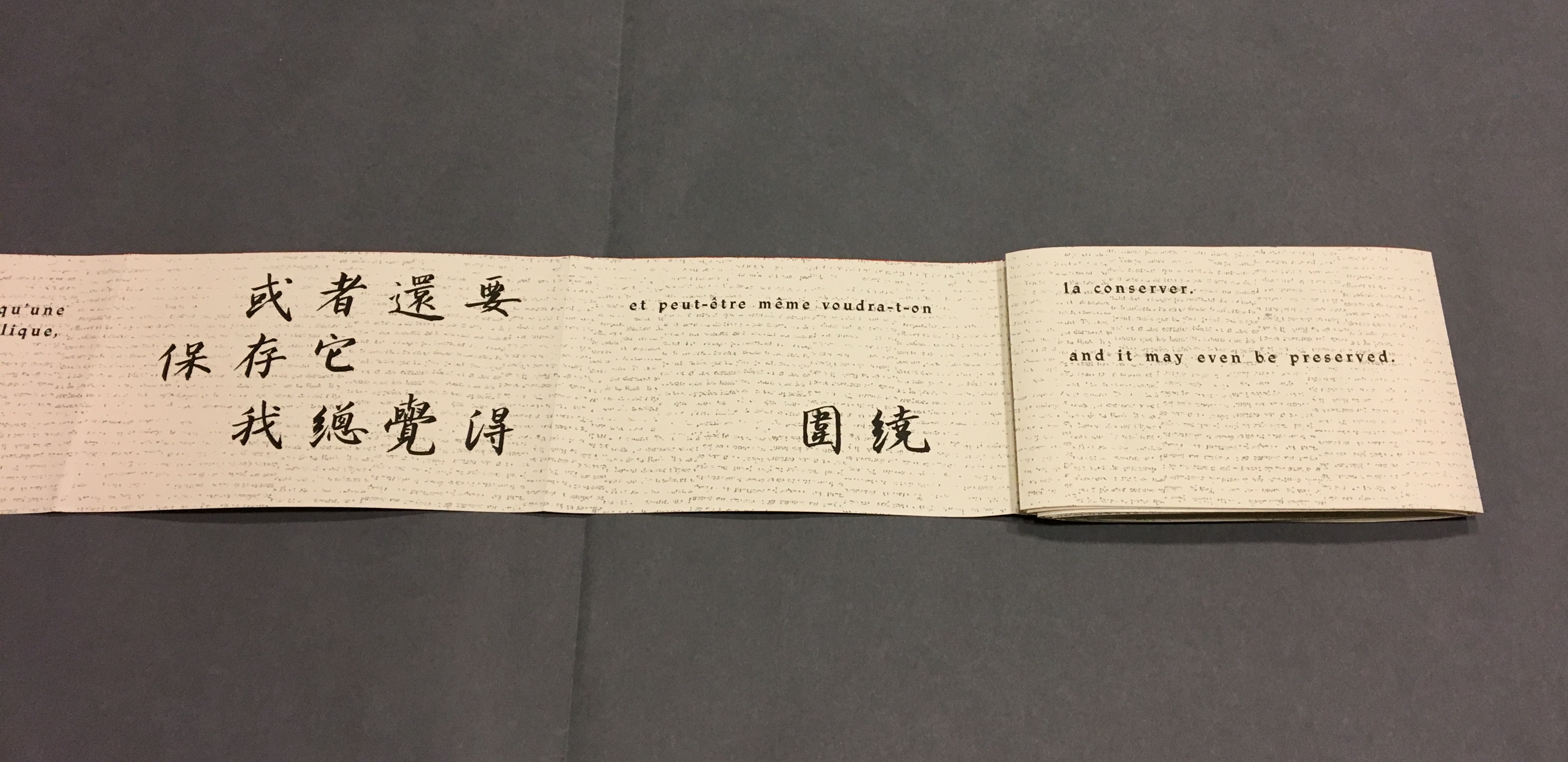
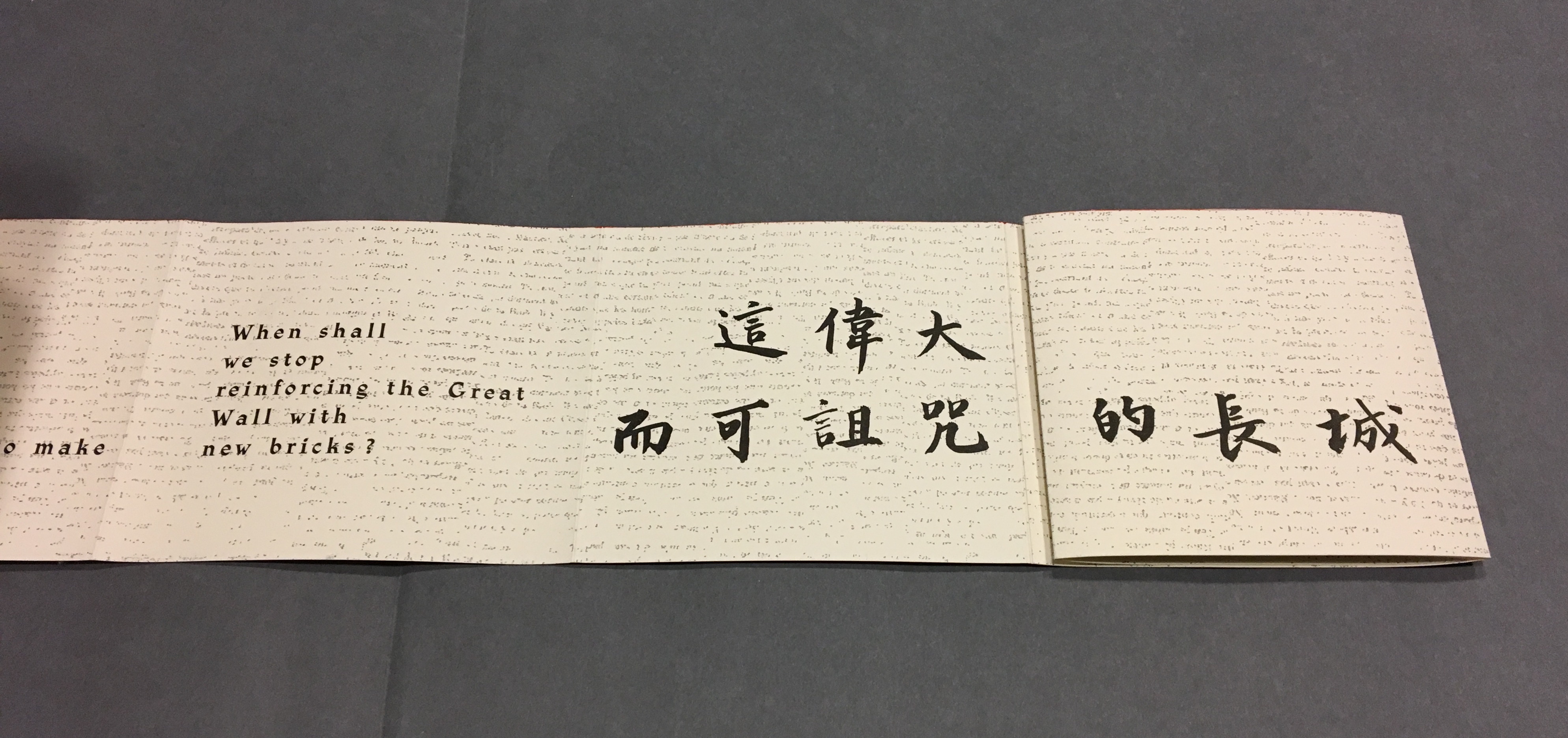
Pages 50, 54-55
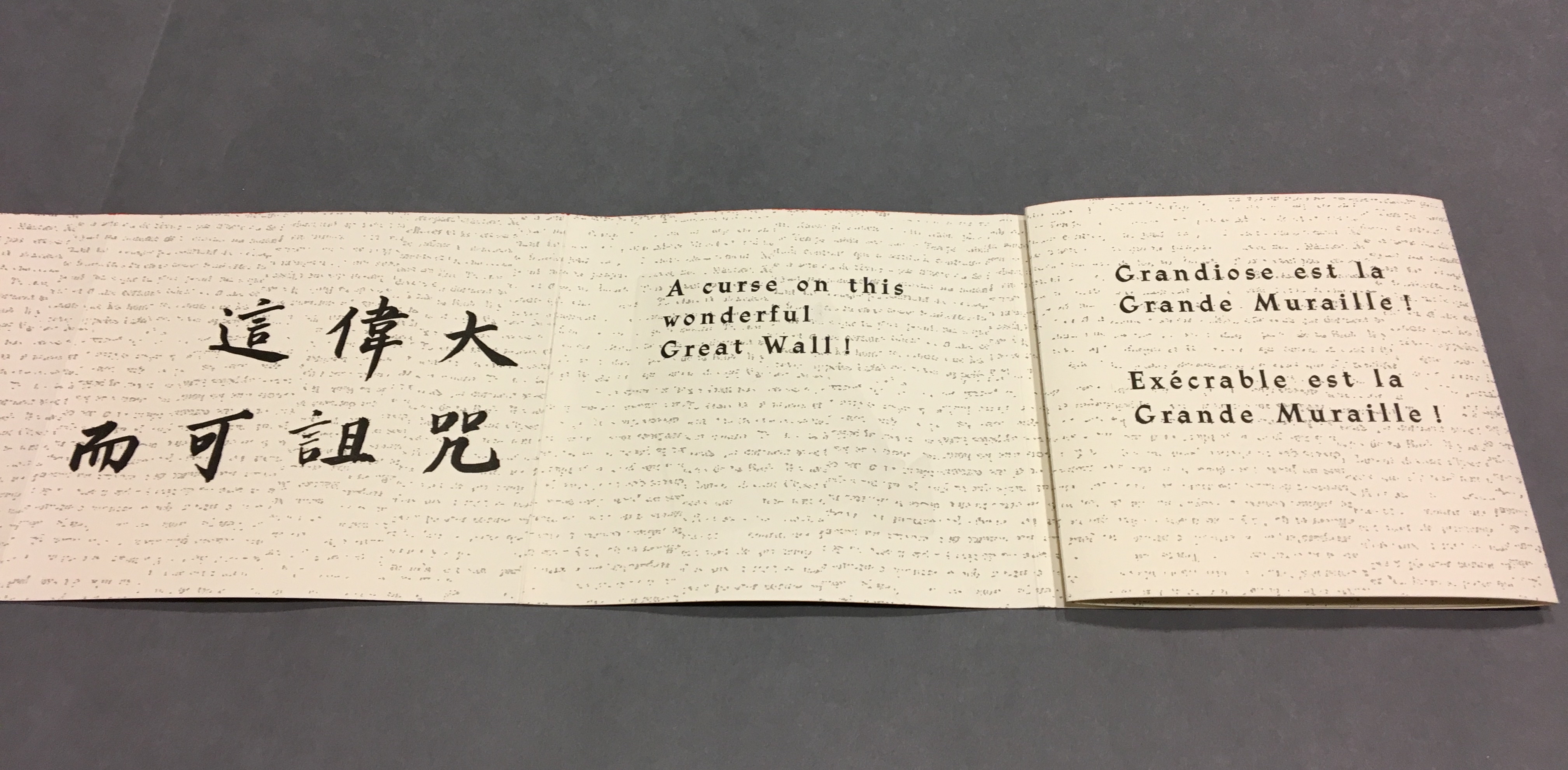
Pages 54, 56-57, the latter displaying the last ten characters of Lu Xun’s text.
這偉大而可詛咒的長城)
Pages 56, 58-59
Pages 58, 60-61
Pages 60, 62-63
Pages 62, 64-65
pages 64, 66-67
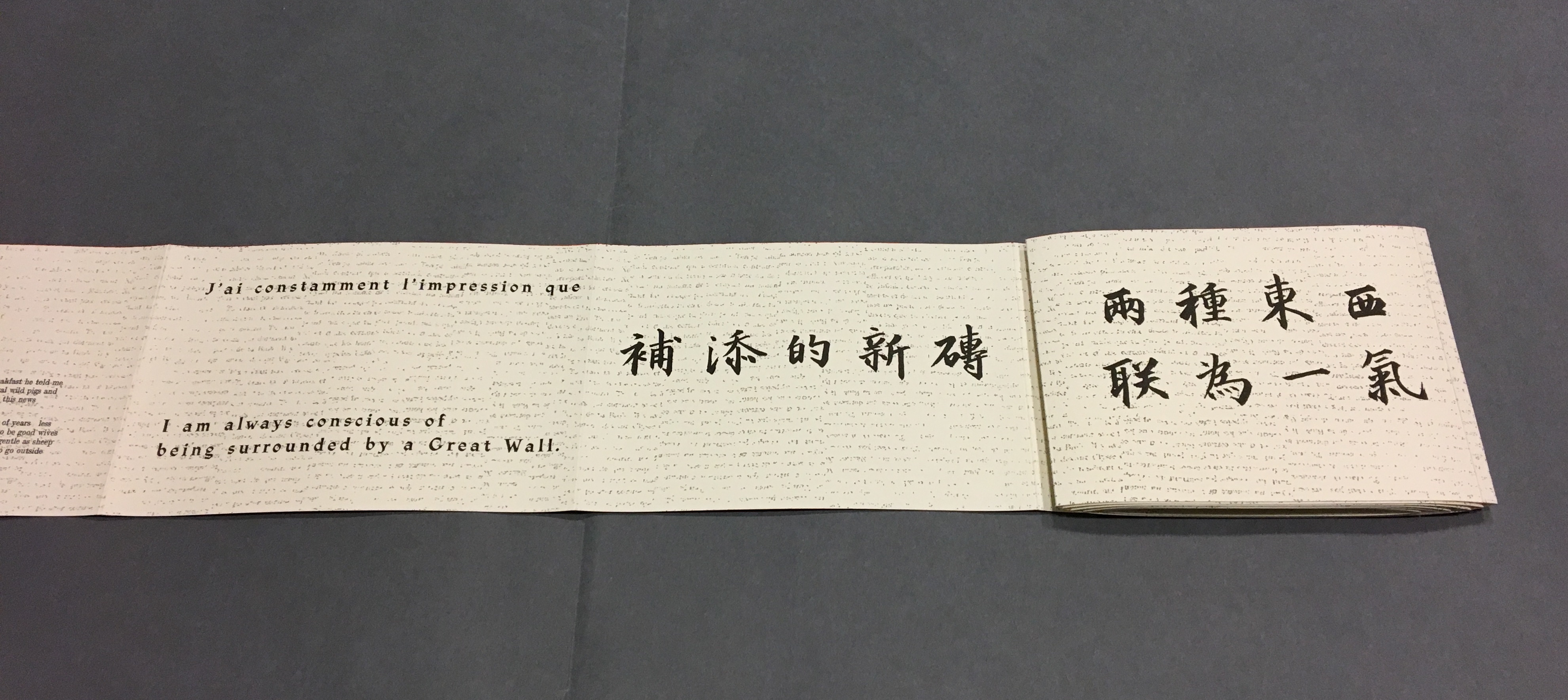
Now that the so-called gaps in the English and French texts were resolved, I wanted to understand how the English and French matched up to the Chinese text. For that, I asked help from two acquaintances in The Hague: Bee Leng Bee and Yingxian Song. They obtained a copy of Lu Xun’s text, traced it through the photos I had taken and found that the three languages run almost in parallel as the work unfolds.
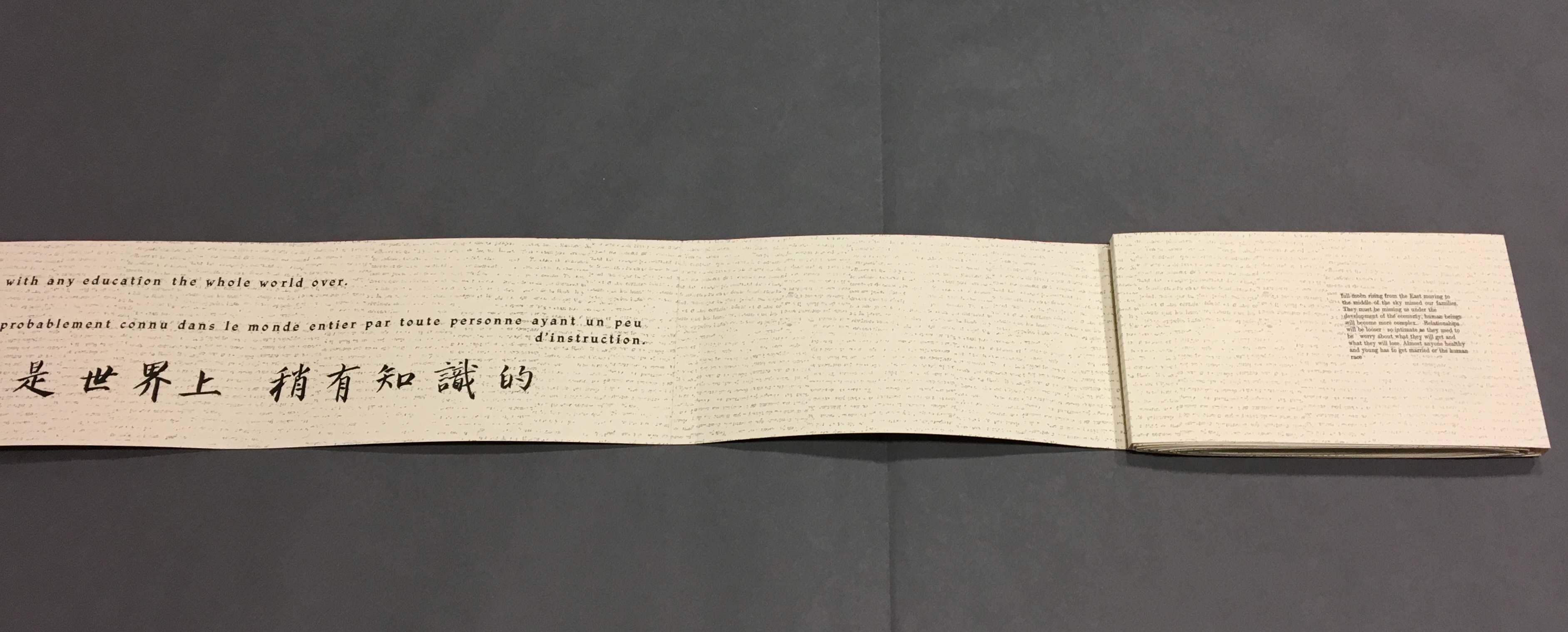
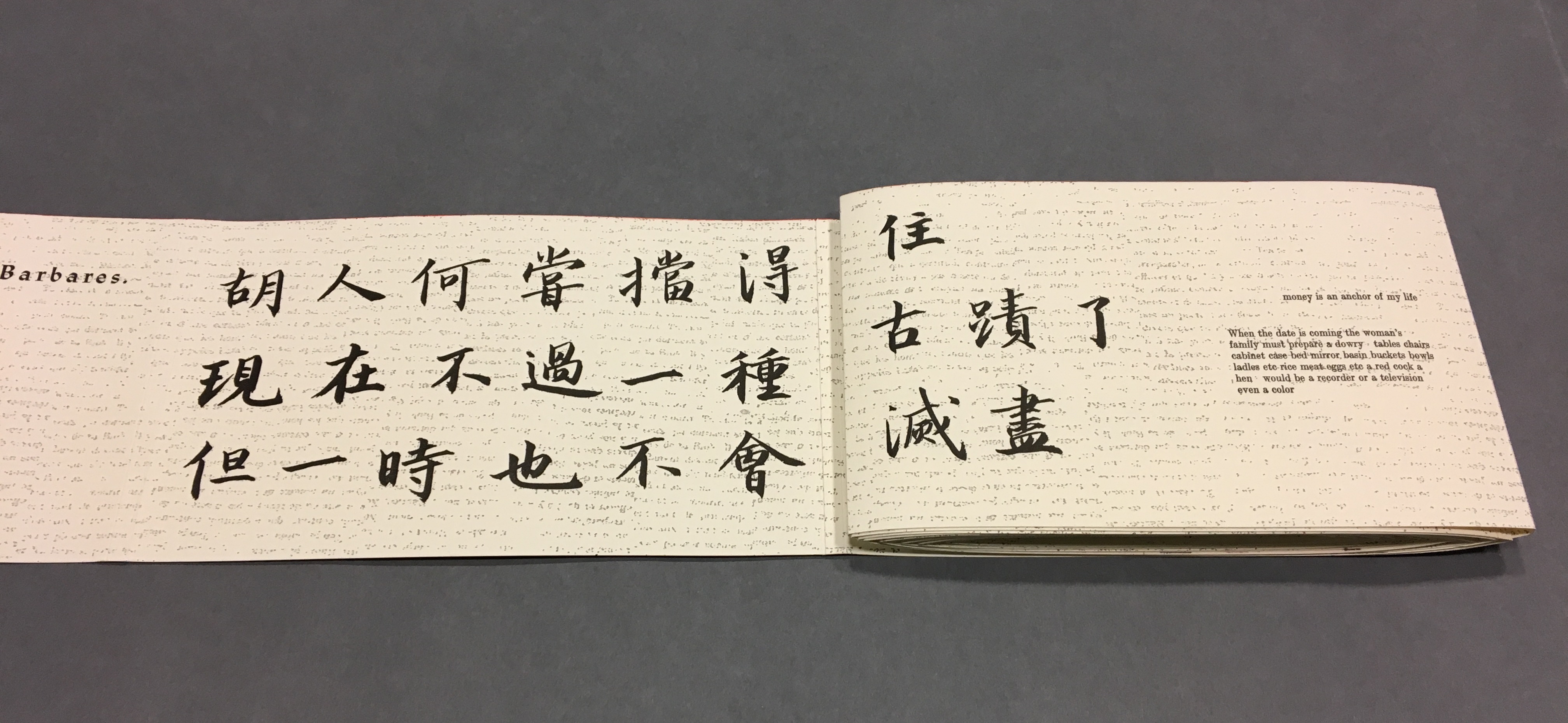
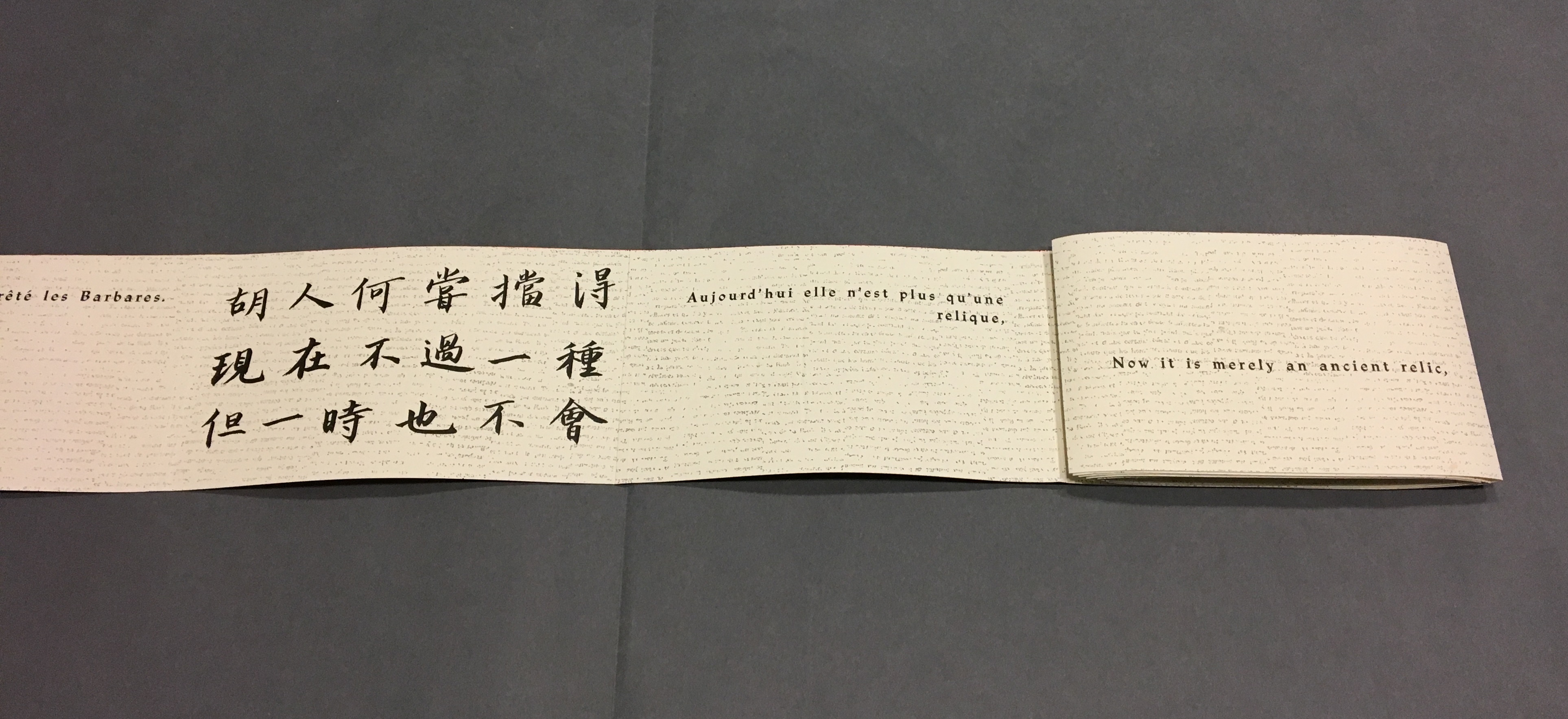
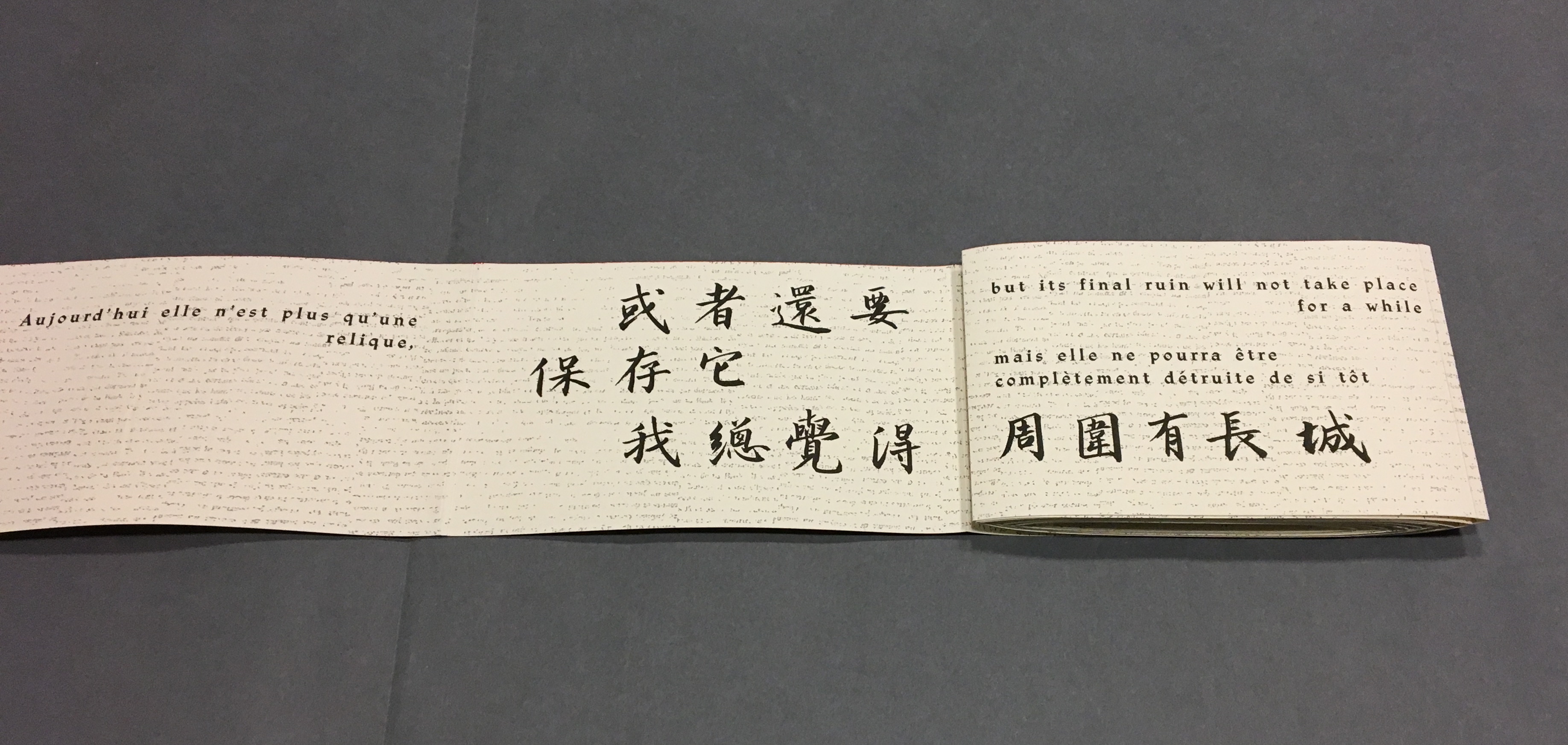
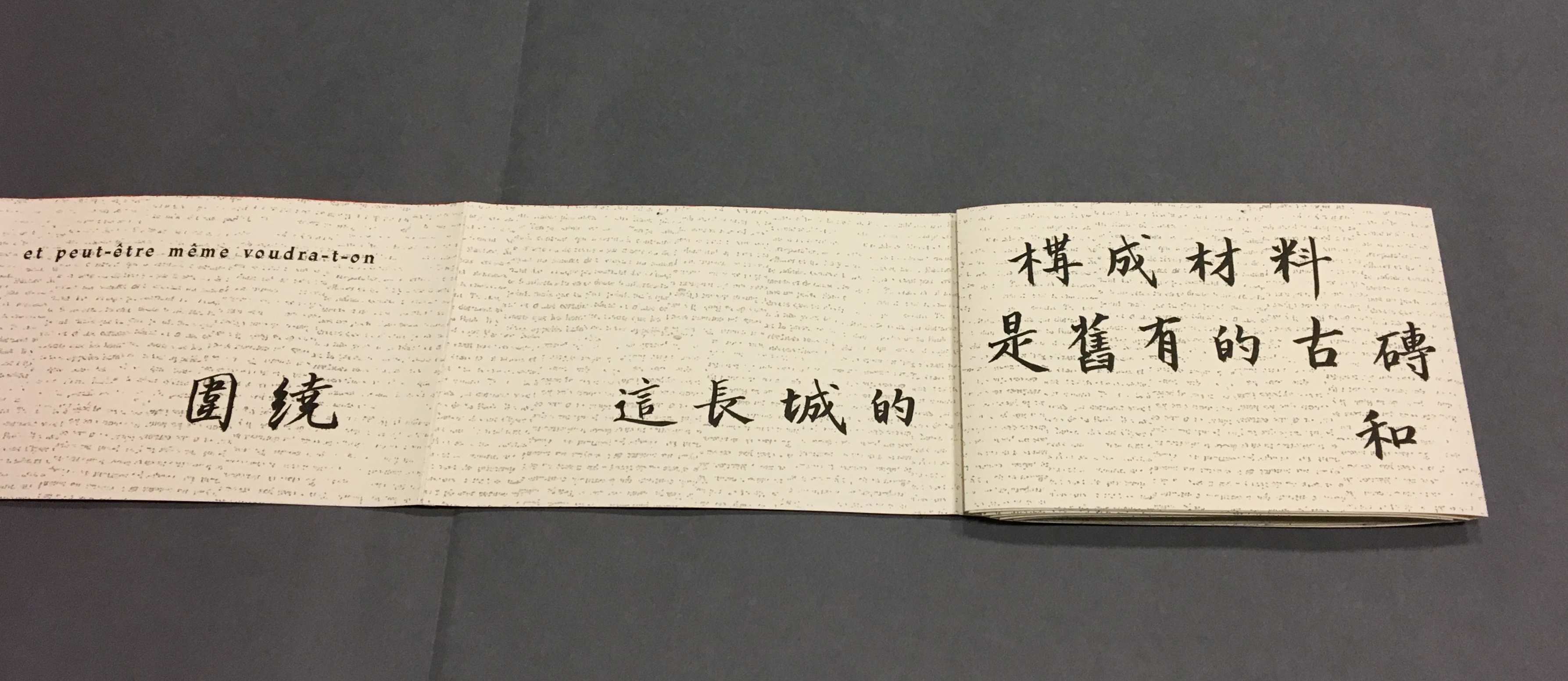
“Almost” because the order of the languages is not alway the same. On pages one and two, we see the French and English titles but must wait until page five before the Chinese title appears. Then, on page six the order changes: English first, then French, then the corresponding ten Chinese characters. On pages seven and eight, this order is maintained. Later, with the turning of page fifteen, the French comes before the English and Chinese; the first Chinese character aligning to the French and English (其) appears on page seventeen. Then, as page seventeen is turned to the right, the order changes back to French then English on page eighteen, but on page nineteen, it moves to French first then Chinese. The book’s textual conclusion on pages fifty-six through fifty-nine runs Chinese, English, then French.
The juxtaposition and weaving of the three languages often seems painterly as if intended to evoke the layering of the bricks and the intertwining vines and foliage along stretches of The Great Wall. Here is the uninterrupted Chinese text:
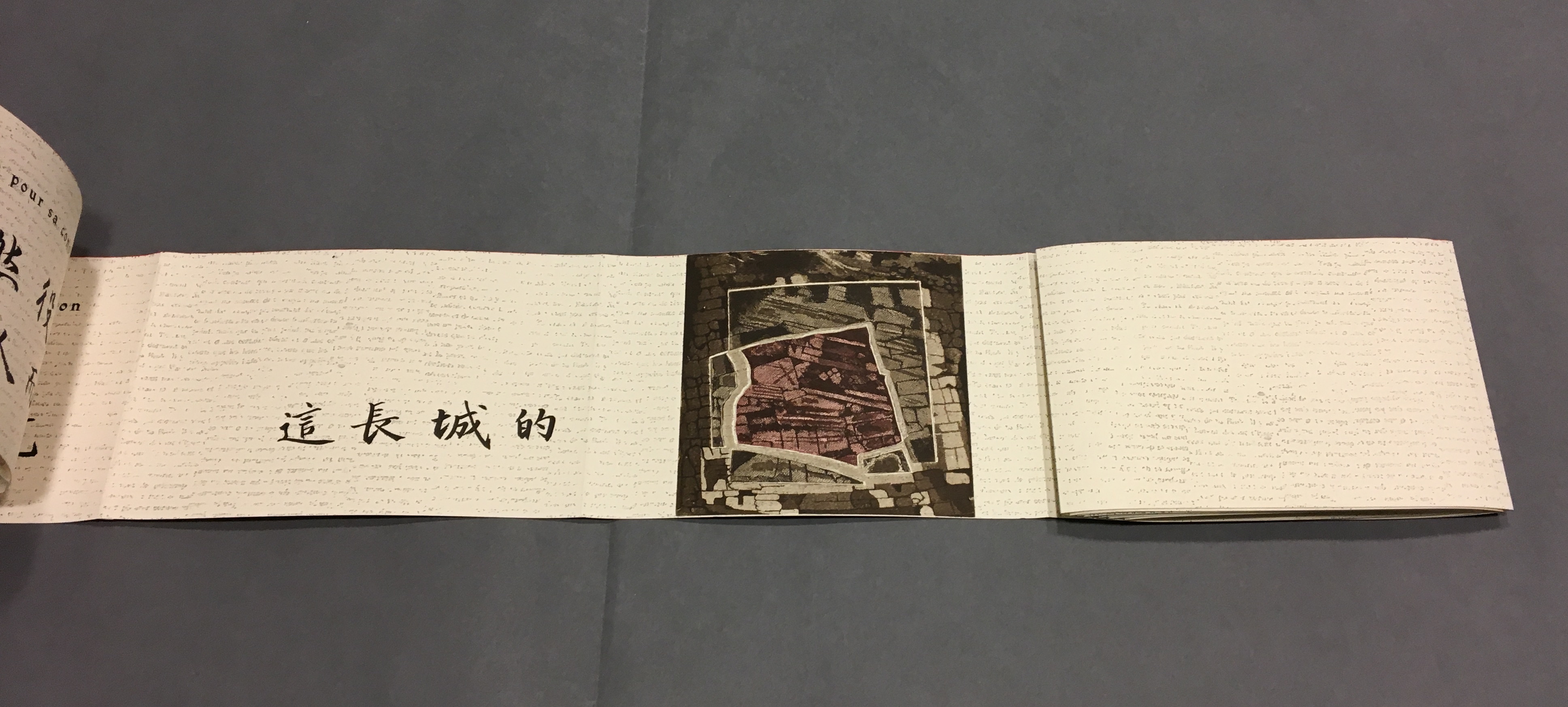
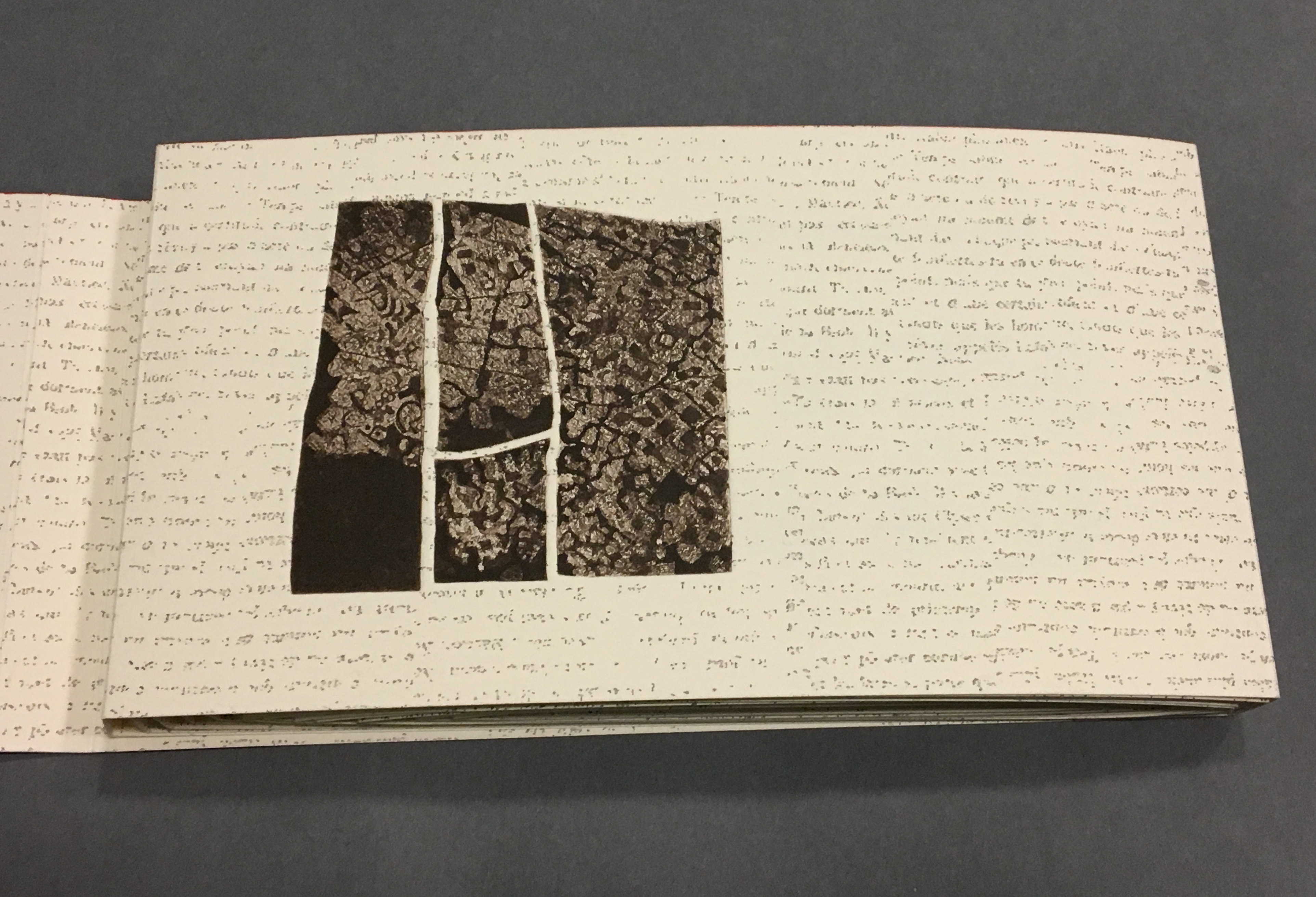
Even though following the forme en escargot results in having reading both sides of the scroll in the end, Sharoff also uses it to play with the notion of intended sequence. Completely unrolled and standing on its edge, the work echoes the Great Wall. The tint of red along the top edge recalls the blood spilled in the Great Wall’s construction. The prints echo the Great Wall’s bricks, the vegetation in its crumbling gaps, even the gates. The completely unrolled work is an intended sequence, also — an invitation to walk the wall. Coming upon each of the eight copperplate engravings in the unfolding sequence is a different experience than walking up and down the “outer wall” and then the “inner wall” to see them. Five are on the outer wall, three on the inner.
The print first to be seen as the book unfolds, but one of the three on the “inner wall” with the book unrolled.
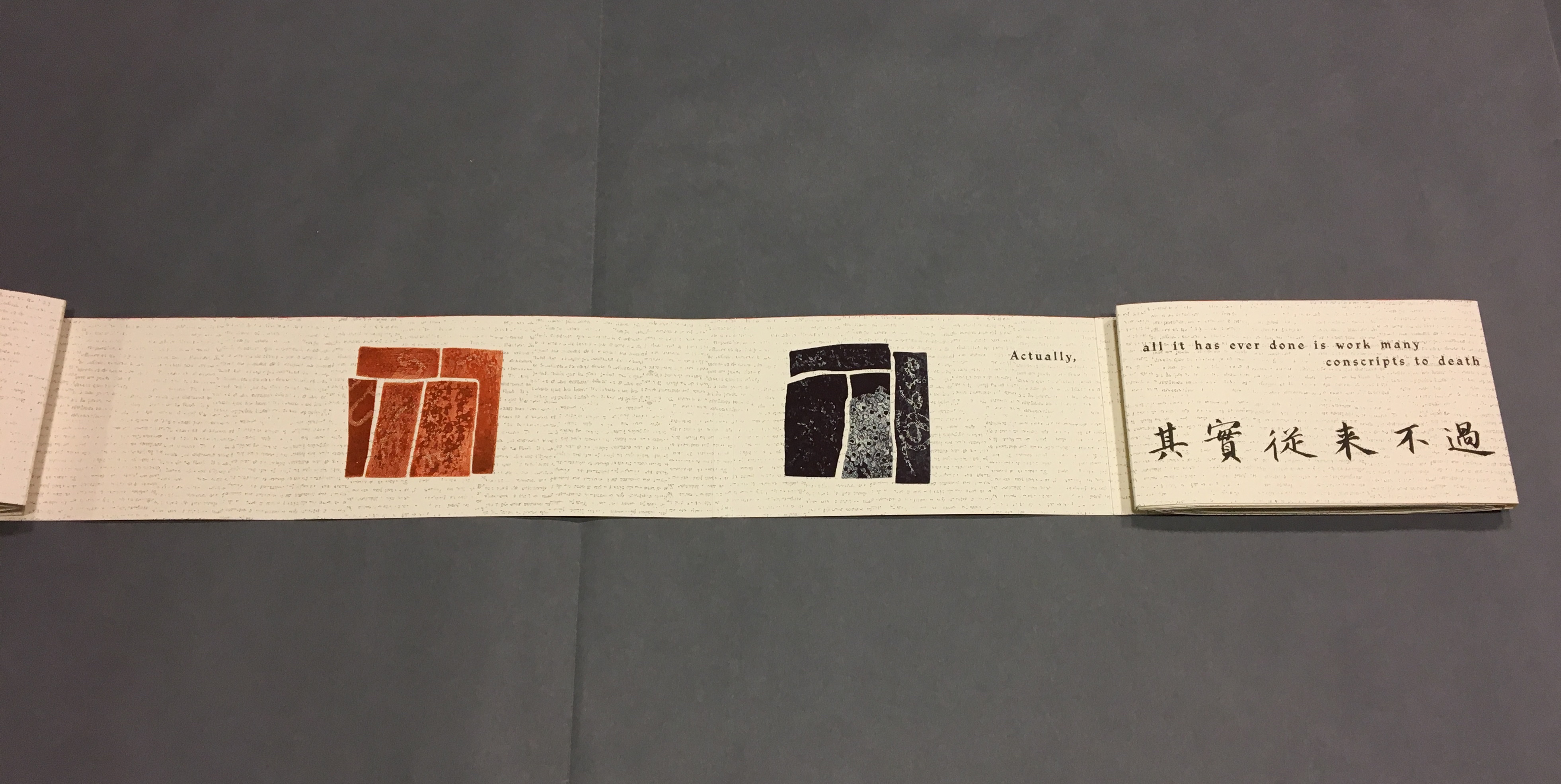
The second print comes into view on “page 14”, the second of Lu Xun’s statements begins in French on “page 15”, and with the rolling up on the left, “page 4” has reappeared.
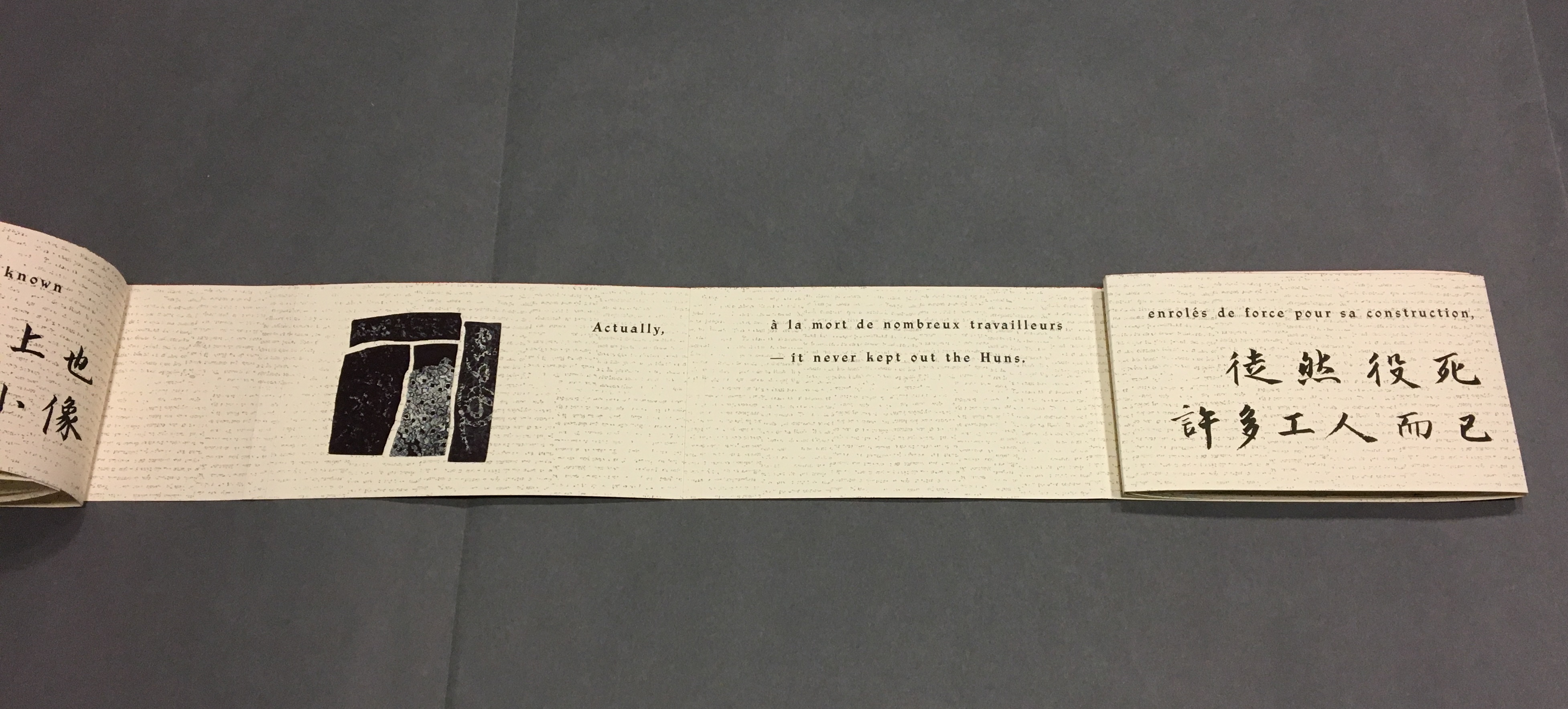
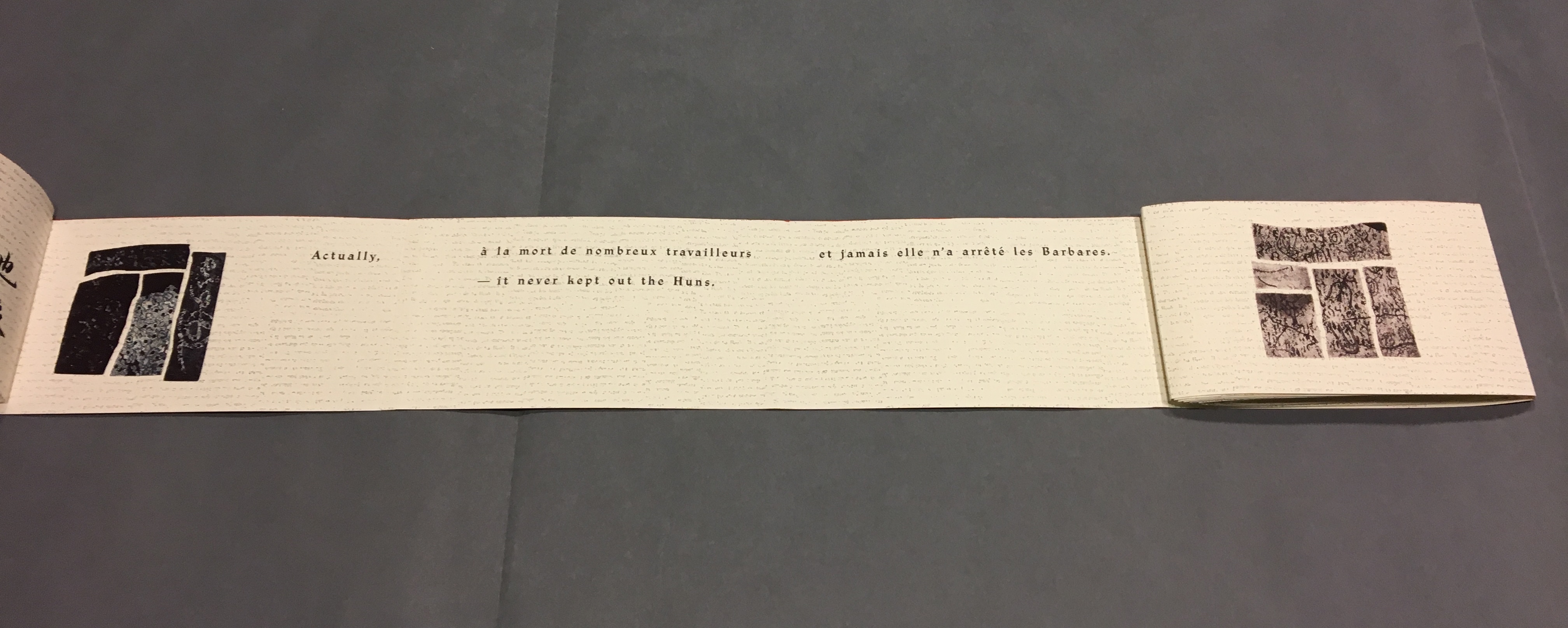
With the turning of “page 15”, the third print comes into view on “page 16”, and the sentence begun with “Actually” on “page 16” continues on “page 17” above the Chinese.
“Pages 16, 18-19” The French at the top of “pages 18-19” is continuing the sentence from “page 15”, and the English beneath on “page 18” is continuing the sentence from “page 17”.
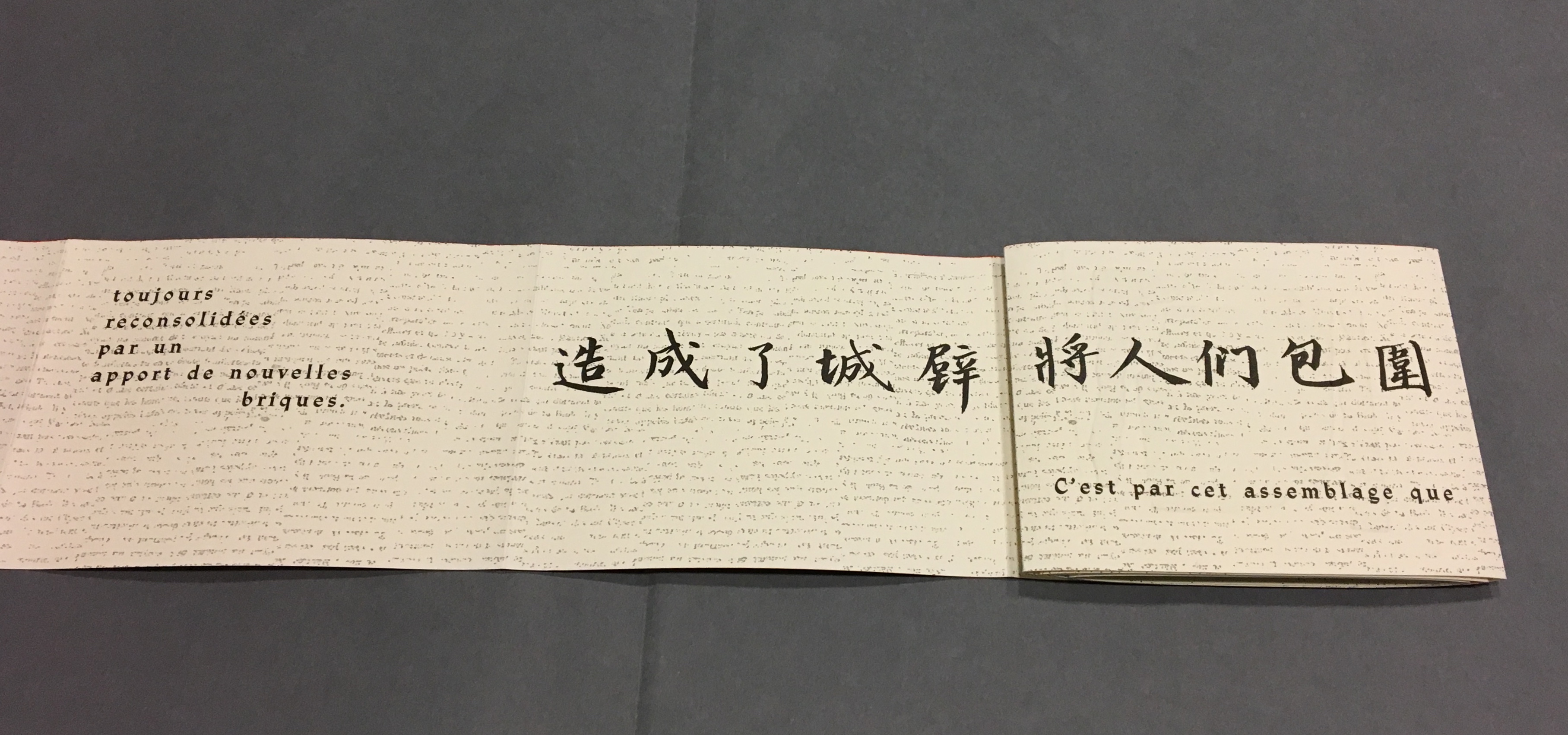
With this spread — “pages 16, 18, 20-21” — the fourth print comes into view on the right, and the French and English sentences conclude together in the middle.
“Pages 30, 32-33” and the fifth print comes into view.
“Pages 38, 40-41” and the sixth print comes into view.
“Pages 44, 46, 48-49” and the seventh print comes into view.
Pages 50, 54-55 and the eighth and final print comes into view.
Reading the form “in time”
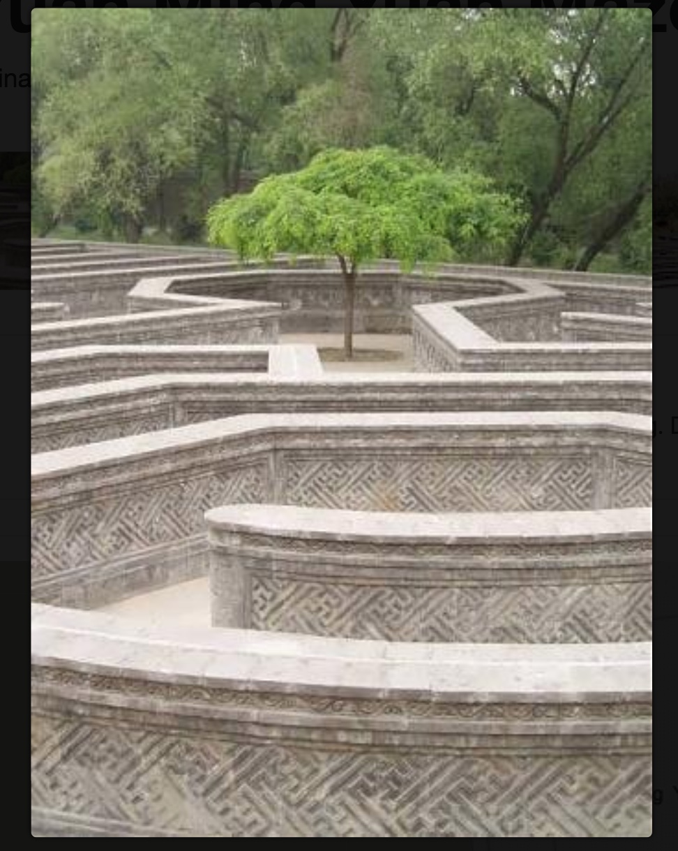
As the force of the snail-shell binding resists the unscrolling and pulls the standing pages inward, the work has another echo: the eroding maze in the Ancient Summer Palace (Yuan Ming Yuan) outside Beijing. The faint markings on the paper, created by printing the results of repeated photocopies of a manuscript, amplify the echo.
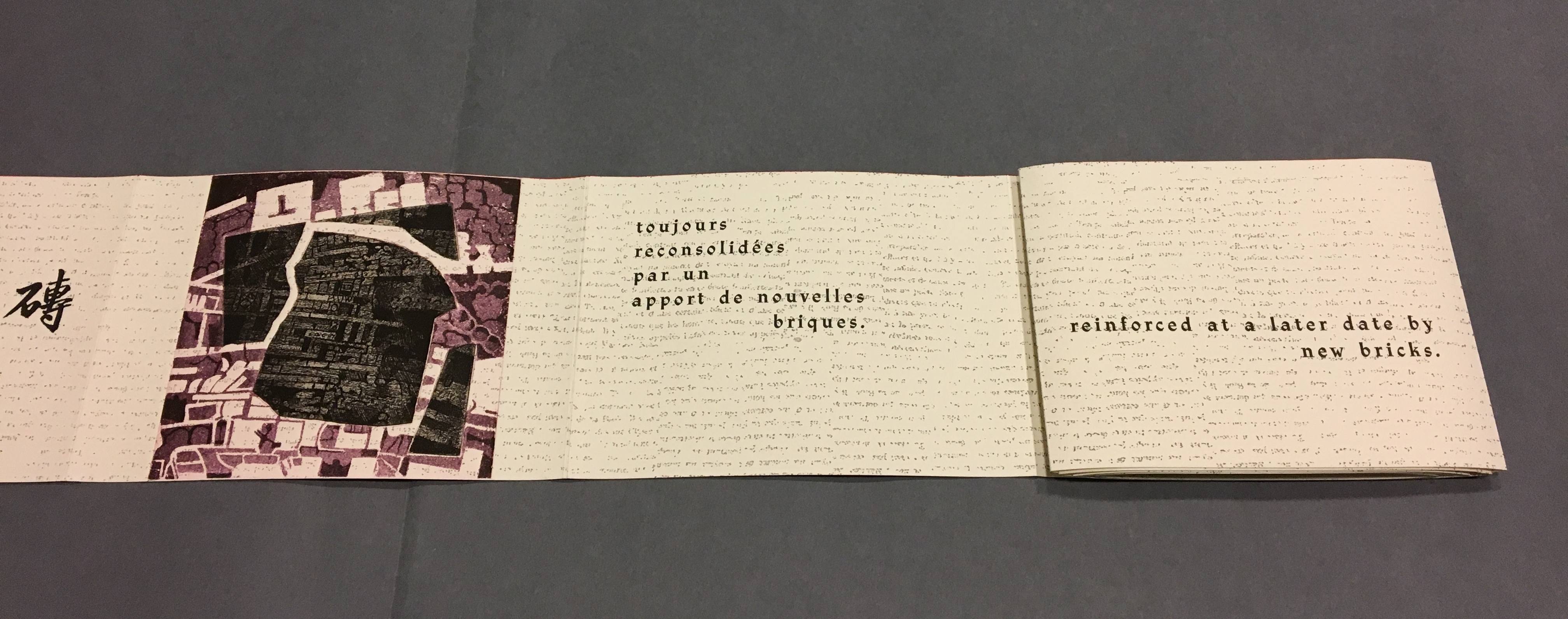
Arches paper printed with the results of multiple photocopies of a manuscript.
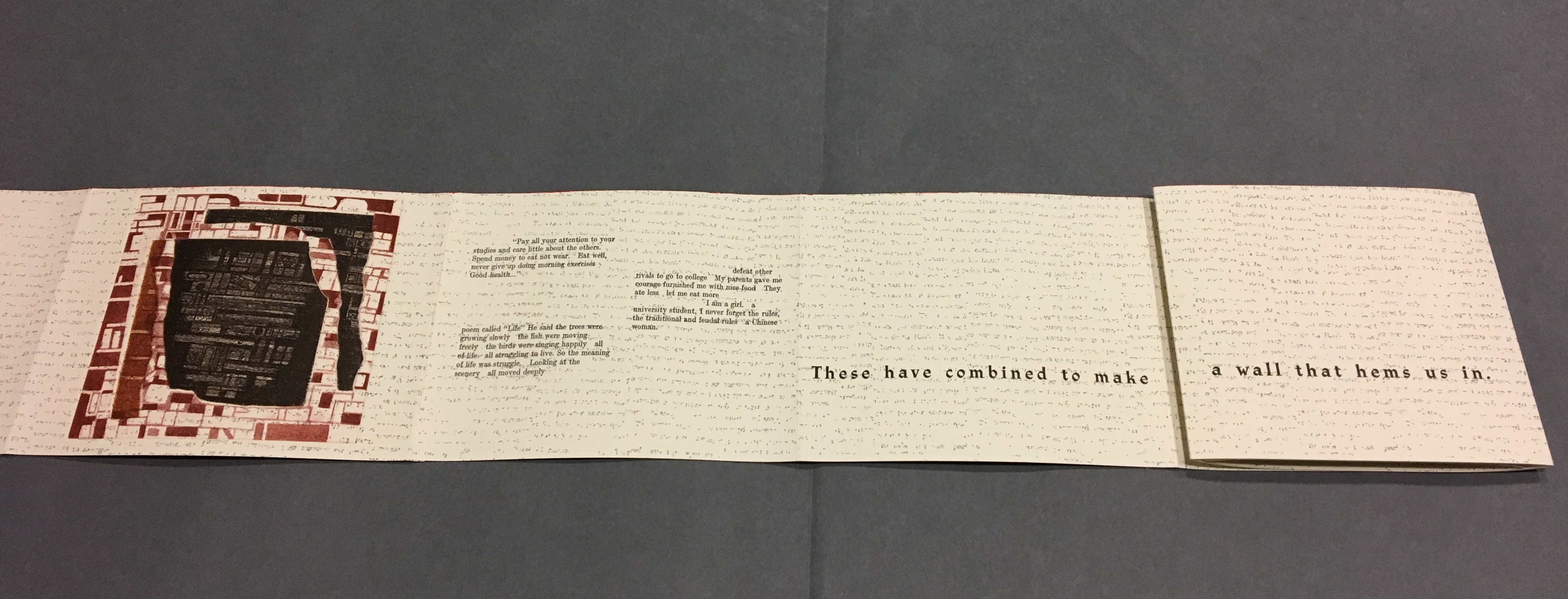
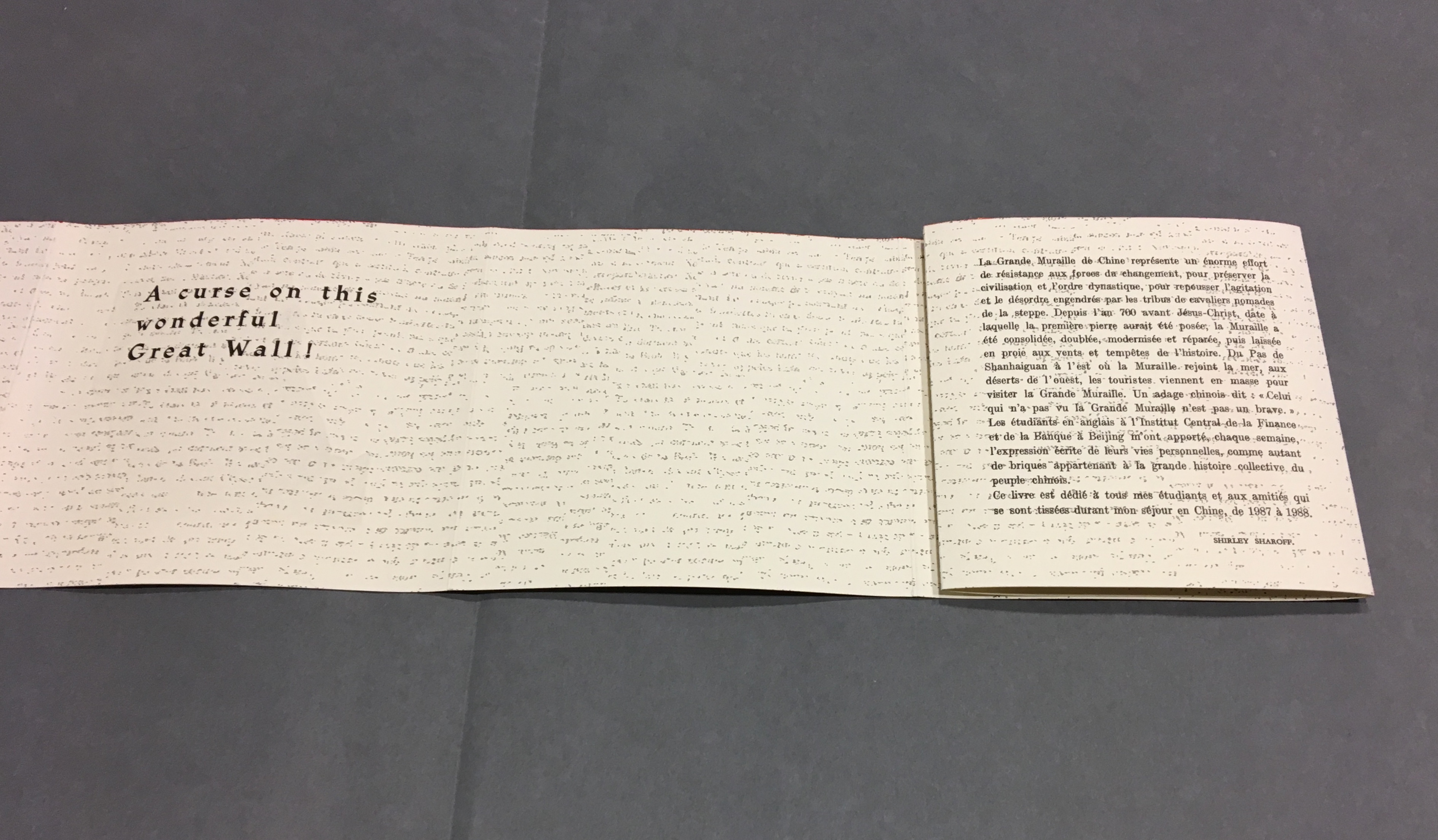
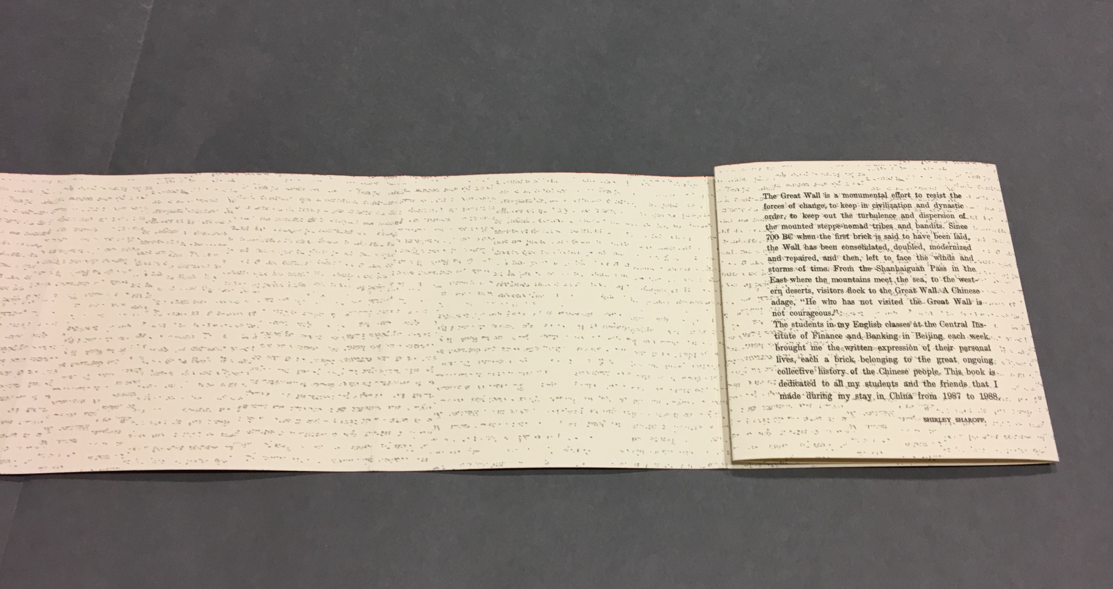
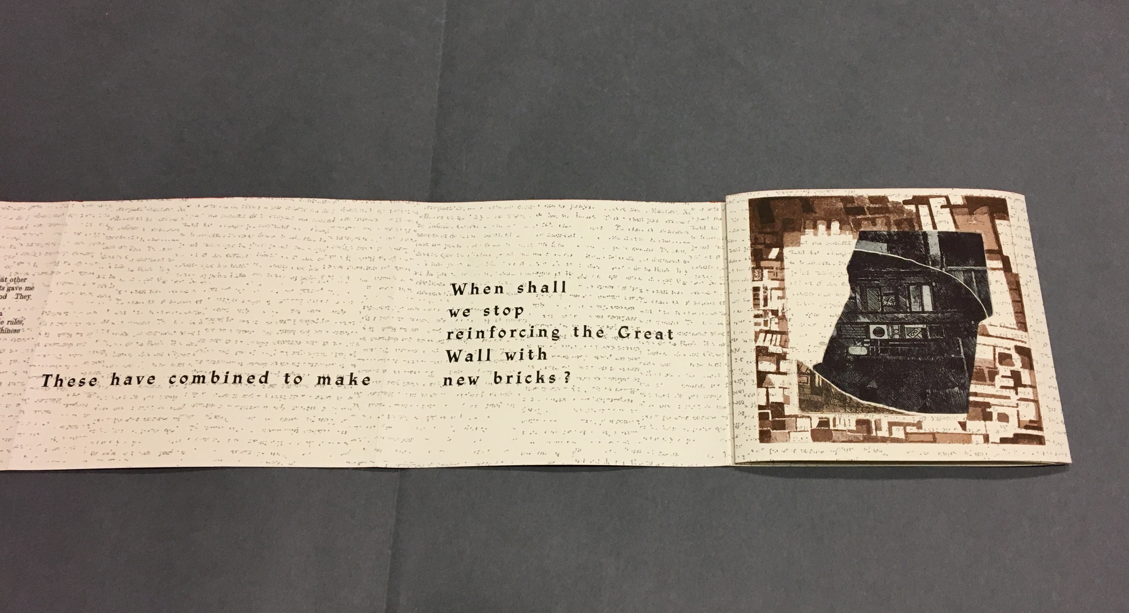
Although Lu’s text does not mention the maze, Sharoff introduces contemporary text that, alongside the interweaving Chinese, English and French of Lu’s text, evokes a maze-like, time-travelling effect. The autobiographical texts from the English-language students she taught at the Central Institute of Finance and Banking (1987-88) reflect on their childhood and adolescence in the Maoist era and their recollection of representations of foreigners in books and television. These “new bricks” in their modernness and fracturedness interrupt the flow of Lu’s prose praising and cursing the Great Wall. Yet, in their segmentation and placement, they also physically echo the prints and reinforce Lu’s expression of the paradox in the construction, fragmentation, reconstruction and erosion of the real Wall.
“Pages 32, 34-35”
Sharoff’s La grande muraille is a treasure that rewards repeated visits and contemplation: not only for itself but also as a parallel or forerunner.
La grande muraille’s physical impetus (The Great Wall), the seemingly decipherable/indecipherable characters on the Arches paper, the wry paradox of Lu Xun’s observations, the socio-political-cultural implications of the “new bricks”, the work’s innovative form and the pulling of past and present together parallels the work of Xu Bing and his play with language across East and West. His Book from the Sky first appeared in 1988.
Sharoff’s use of Lu’s contemplation on The Great Wall also foreshadows Jorge Méndez Blake‘s Capítulo XXXVIII: Un mensaje del emperador / A Message from the Emperor (2017?). The title refers to an anecdote in the story “The Great Wall of China” by Franz Kafka, a contemporary of Lu Xun. The narrator tells the reader how the emperor has dispatched from his deathbed a message to the reader, entrusted to a herald who, struggling as he might, cannot escape from the confines of the palace to deliver the message — yet which we the reader await hopelessly and with hope.
What more should we expect from art?
____________________________
*For help and permissions, thanks to Paul van Capelleveen and the staff at Koninklijke Bibliotheek, Den Haag, and Shirley Sharoff, Paris. For help with the Chinese and calligraphy, thanks to Bee Leng Bee and Yingxian Song.
Hubert, Renée Riese, and Judd David Hubert. 1999. The Cutting Edge of Reading : Artists’ Books. New York City: Granary Books. See pp. 24-27 for the Huberts’ reading La grande muraille.