Now here’s a rare thing — a journal issue that requires a video to show the reader h0w to open it.
Continue readingRaymond Queneau
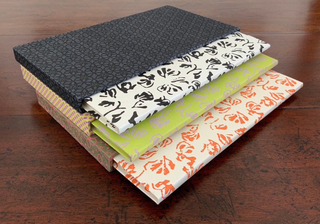
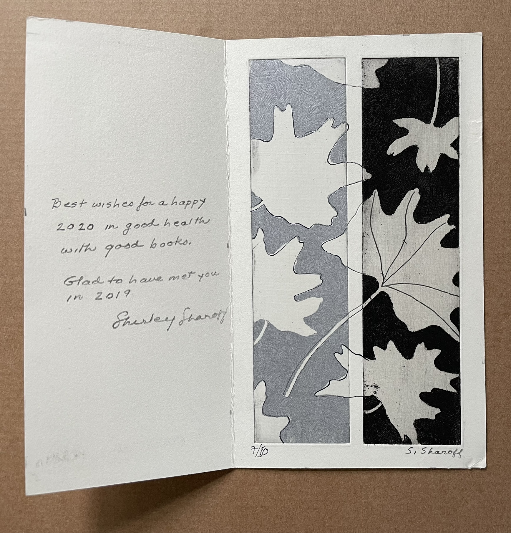
Books On Books Collection – Shirley Sharoff (2)
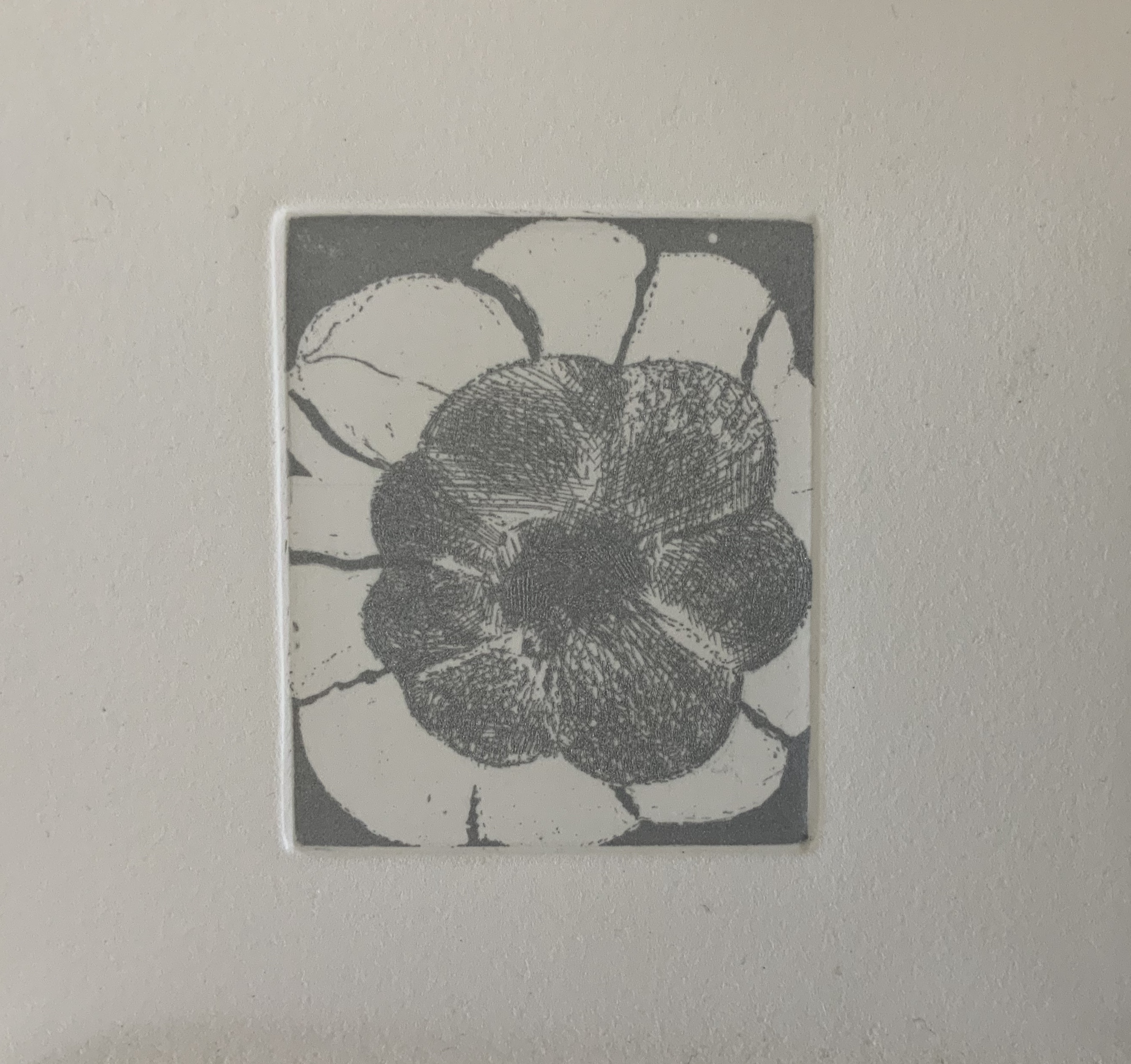
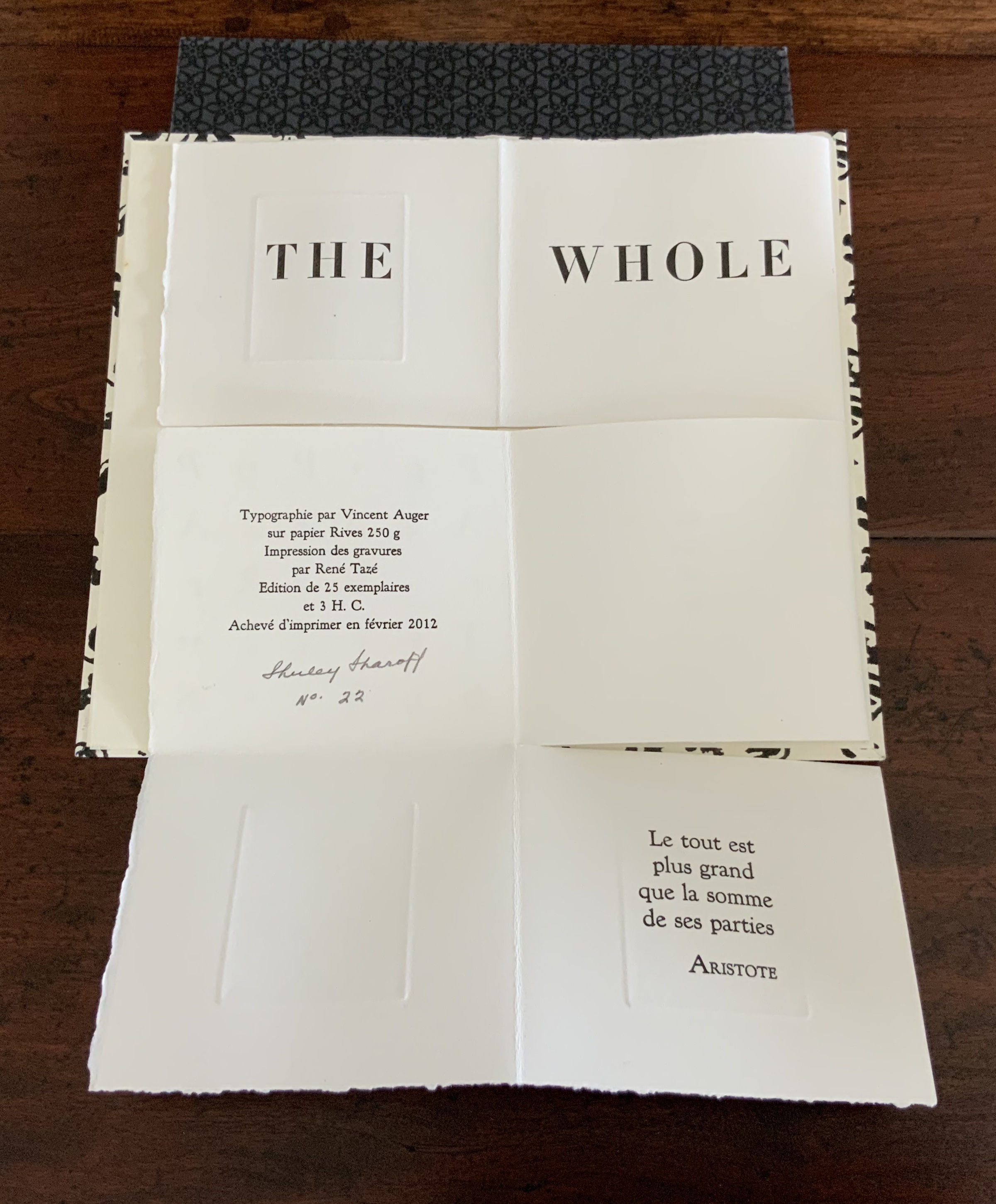
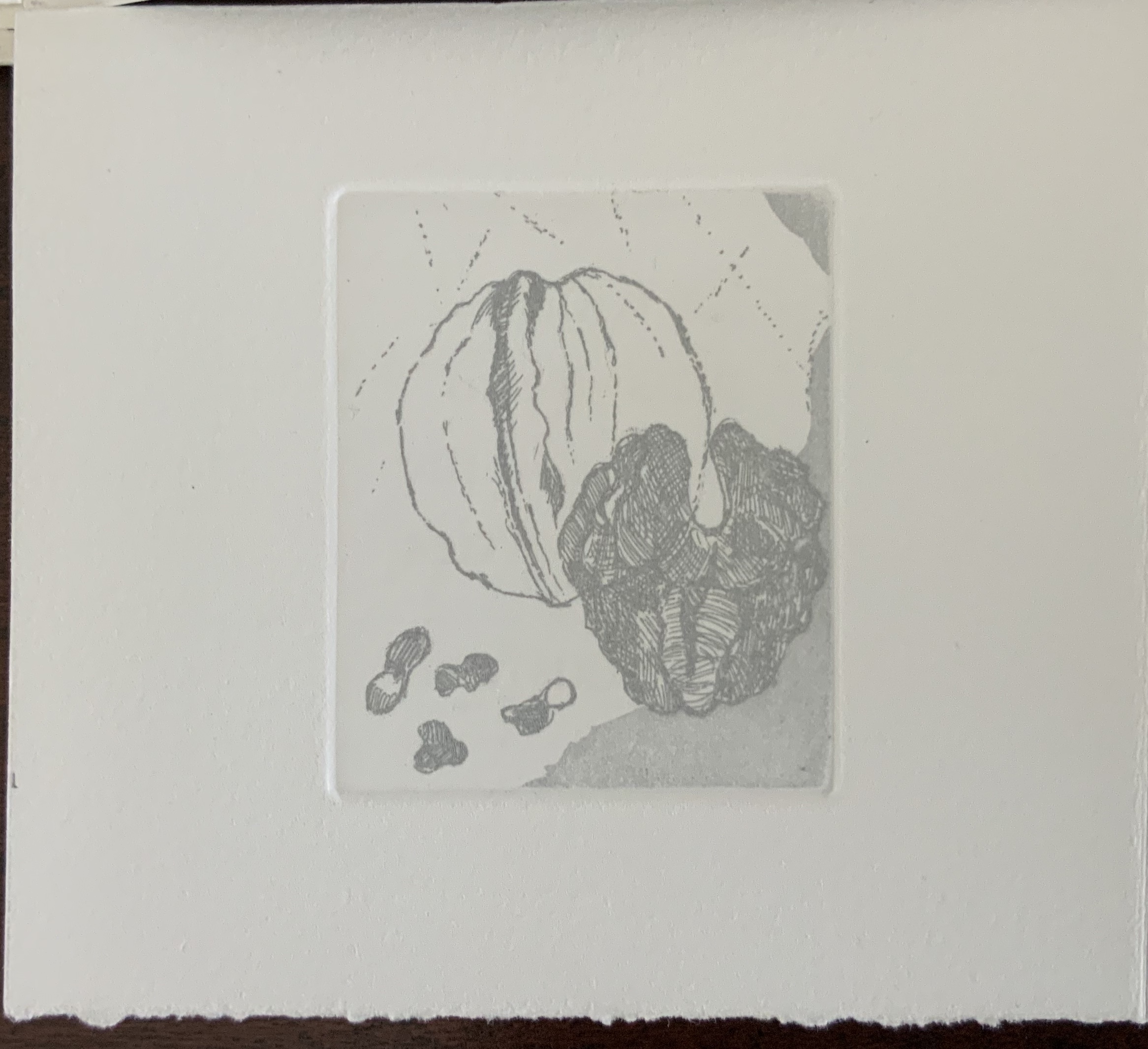
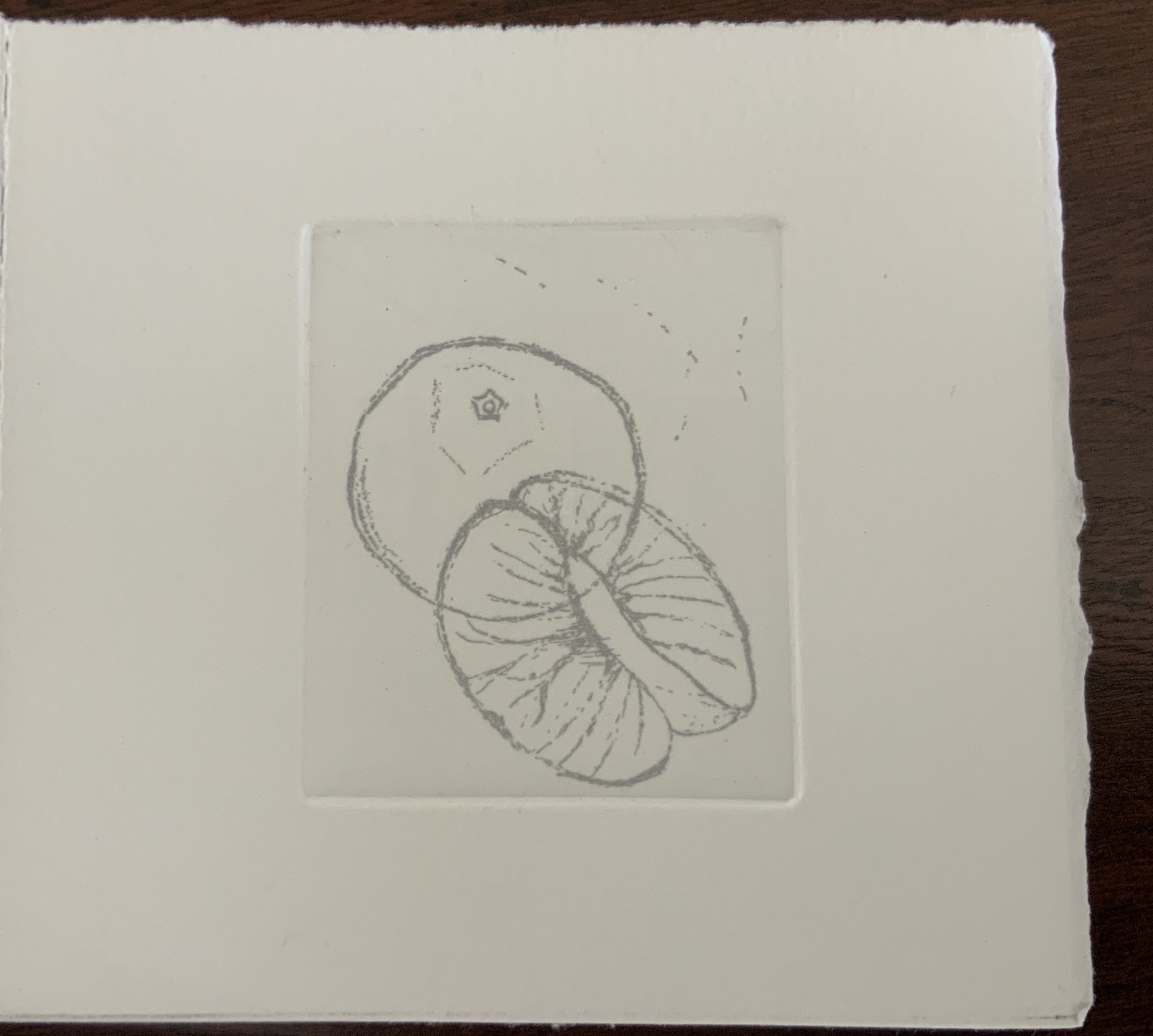
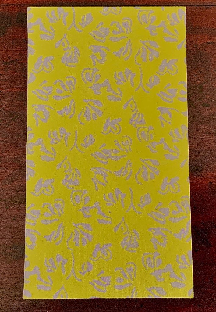
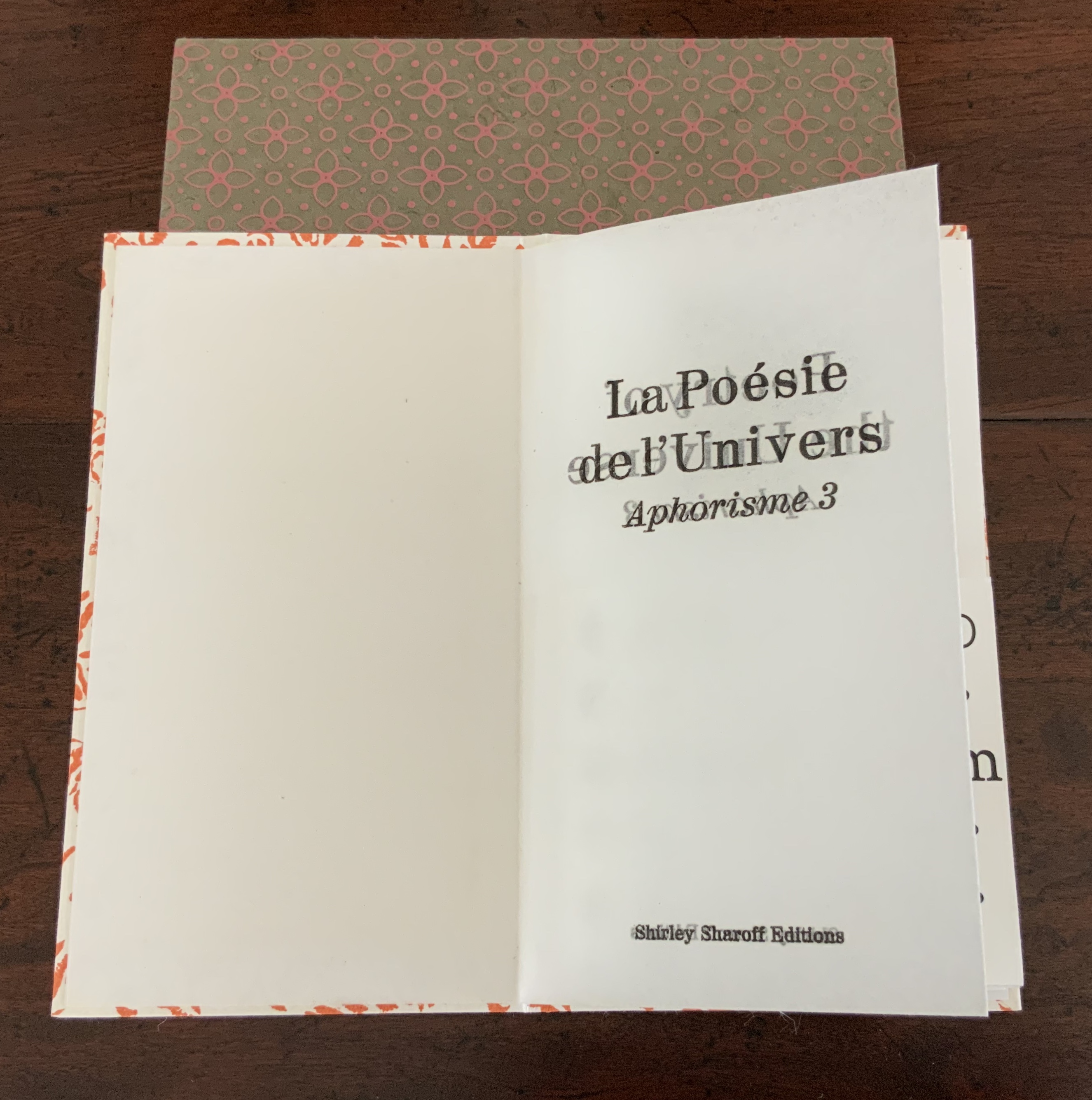
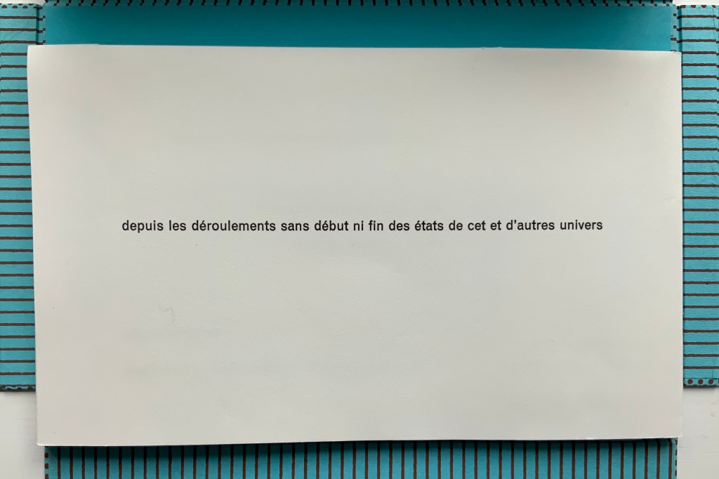
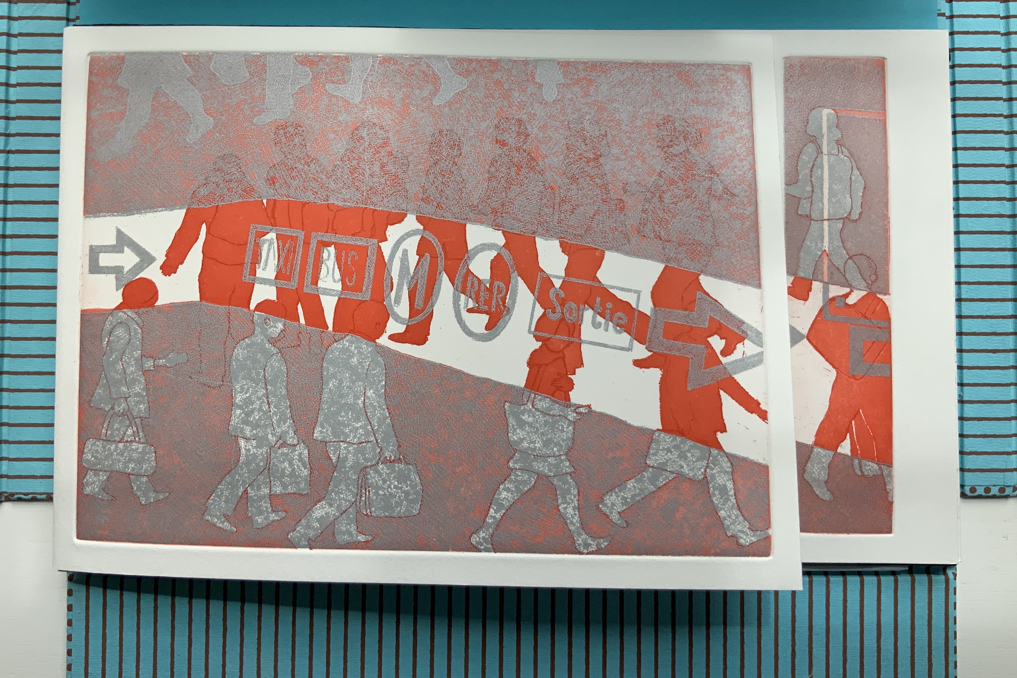
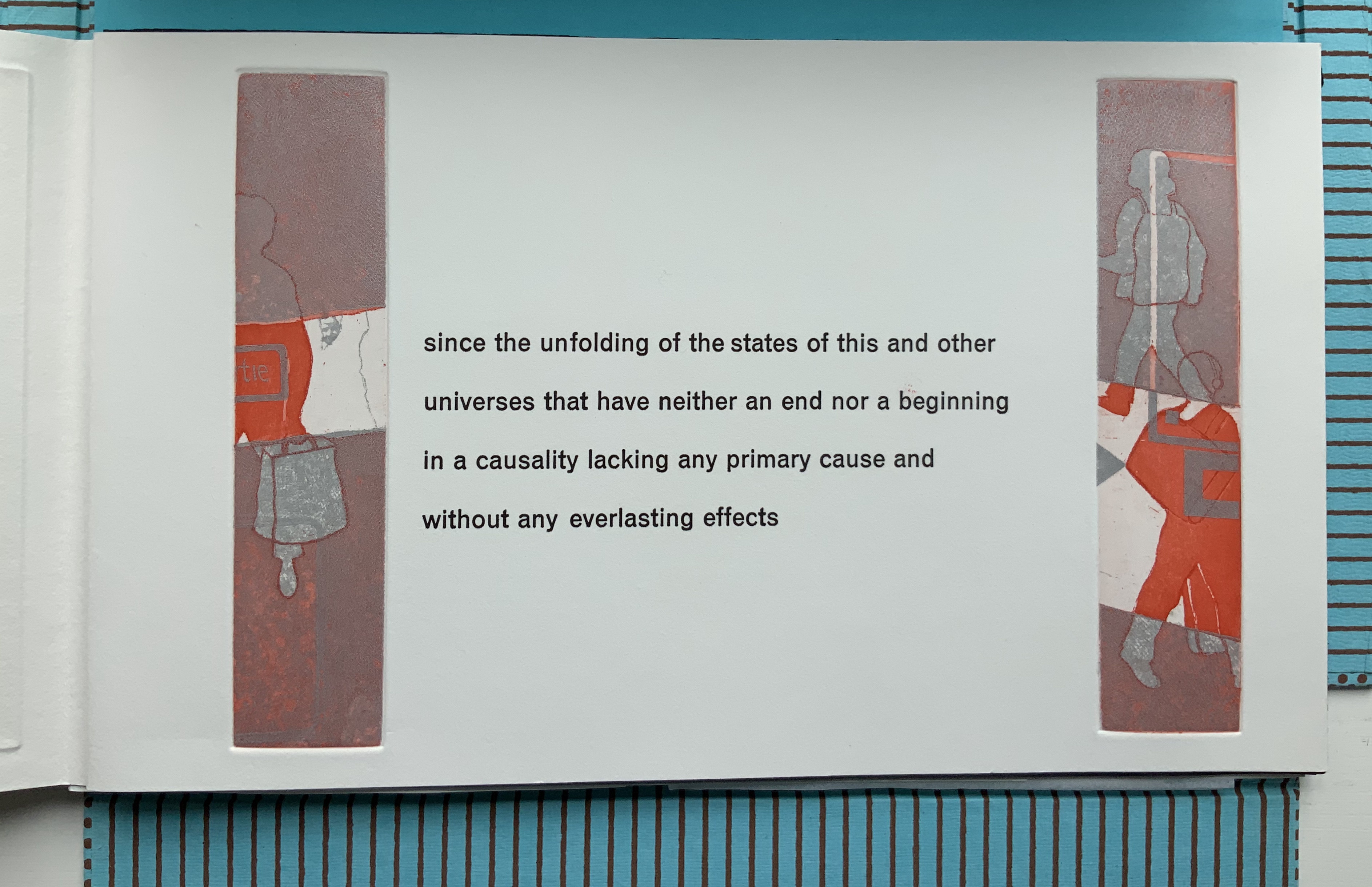
La Poésie de l’univers/Poetry of the Universe (2012)
La Poésie de l’univers/Poetry of the Universe (2012)
Shirley Sharoff
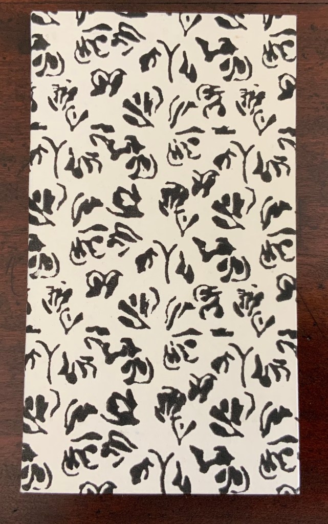
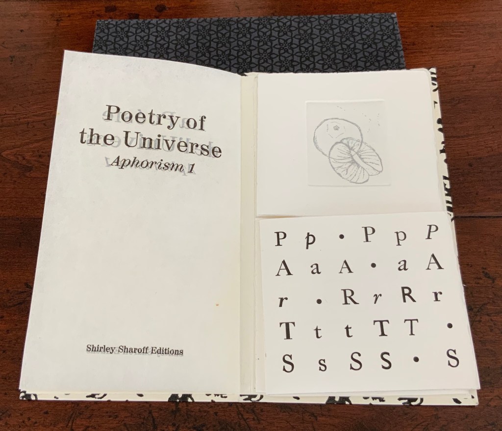
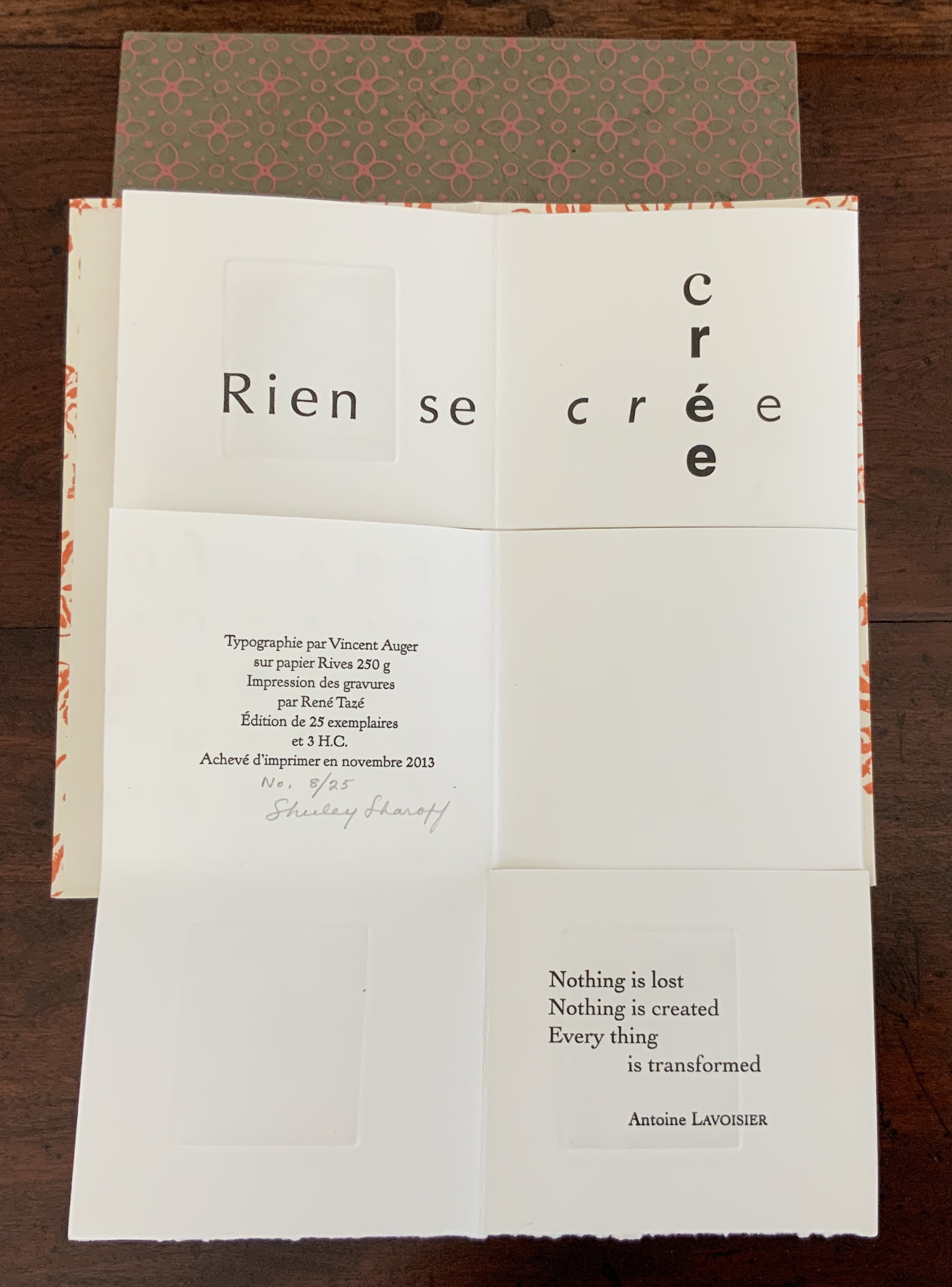
Three small volumes with aphorisms by Aristotle, Euclid, and Antoine Lavoisier (one per volume, respectively, in both English and French); each printed letterpress in various fonts and typographical arrangements along with four intaglio prints on one sheet of paper. The paper is cut along some of the folds so that folding and unfolding reveals different combinations of the text and images. Typography by Vincent Auger on Rives 250 GSM. Engravings printed by René Tazé. Edition of 25 and 3 casebound. H215 x W120 mm. Acquired from the artist, 5 February 2019. Photos: Books On Books Collection.
According to Shirley Sharoff (Books On Books interview, 5 February 2019), the fold and form of these three books were inspired by Katsumi Komagata’s work, and “Making each one was like a different game I was playing or puzzle I was solving”. Although the fold and form of each book is the same, the effect differs in each because of the placement of text and image. The result is three works of book art teasing the reader/viewer into playing with the artwork or solving the puzzle of reading/viewing it — and appreciating how the text from Aristotle, Euclid or Lavoisier fuses with the fold, form, typography and prints in each book.
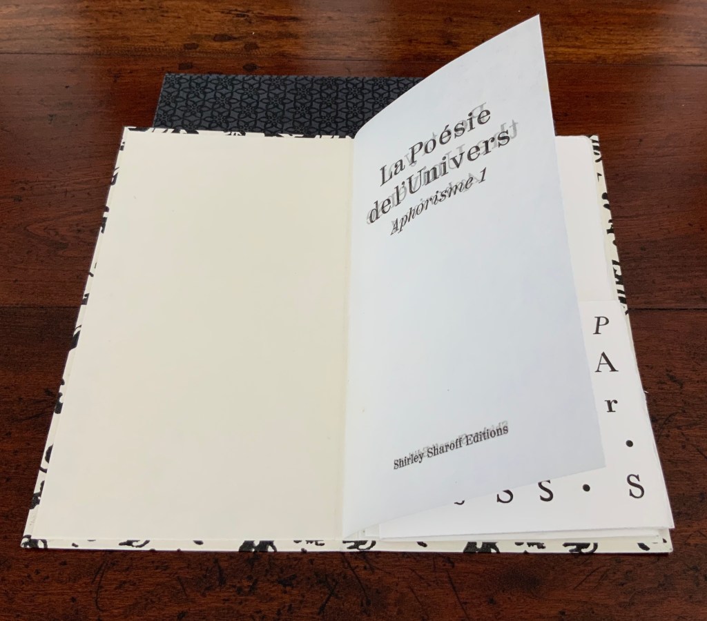
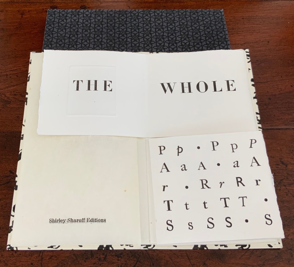
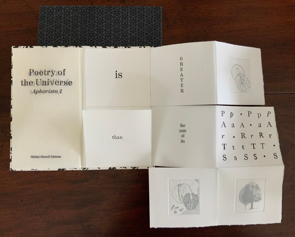
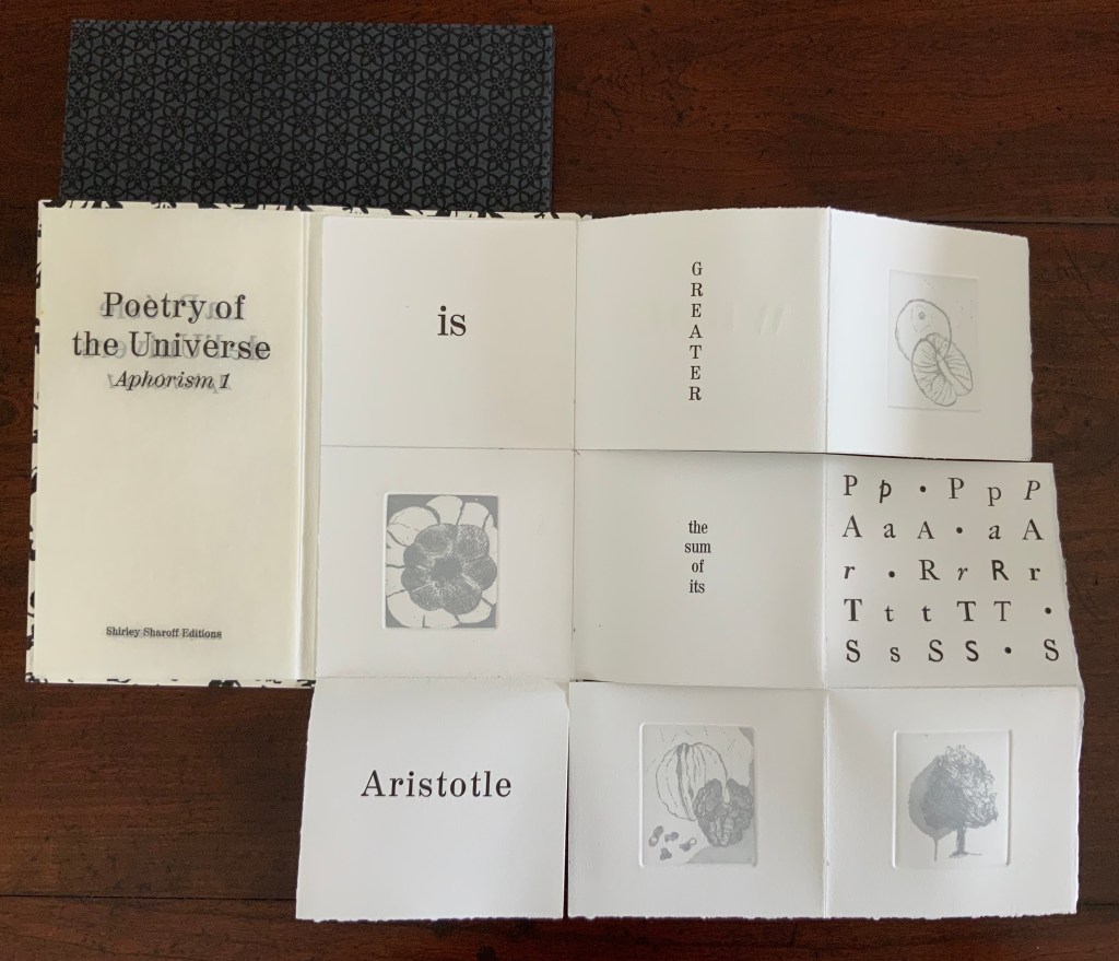
The game or puzzle of finding the order of unfolding the books has several interlocking levels. On one level, there are origami “mountain” and “valley” folds, there are kirigami cuts, and vertical and horizontal openings. As these present themselves, the process of discovering or reading the text — what it is and how its syntactic order suggests the direction and order of unfolding — emerges as another level in the game. In parallel are the dual levels of deciphering the order (if any) of the intaglio prints’ appearance and relating the images to the text. And then there is the level of the relation of French to English and vice versa.
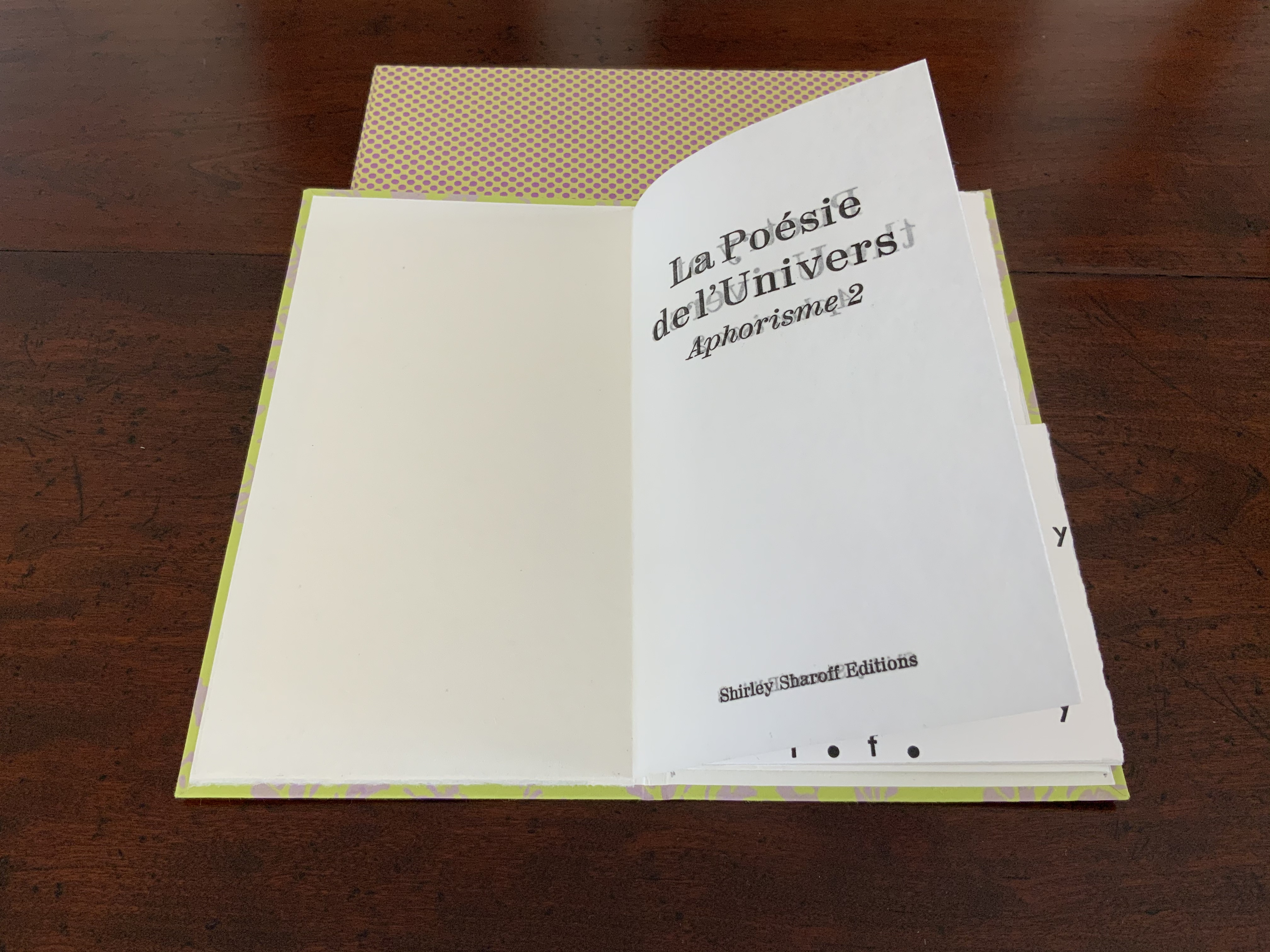
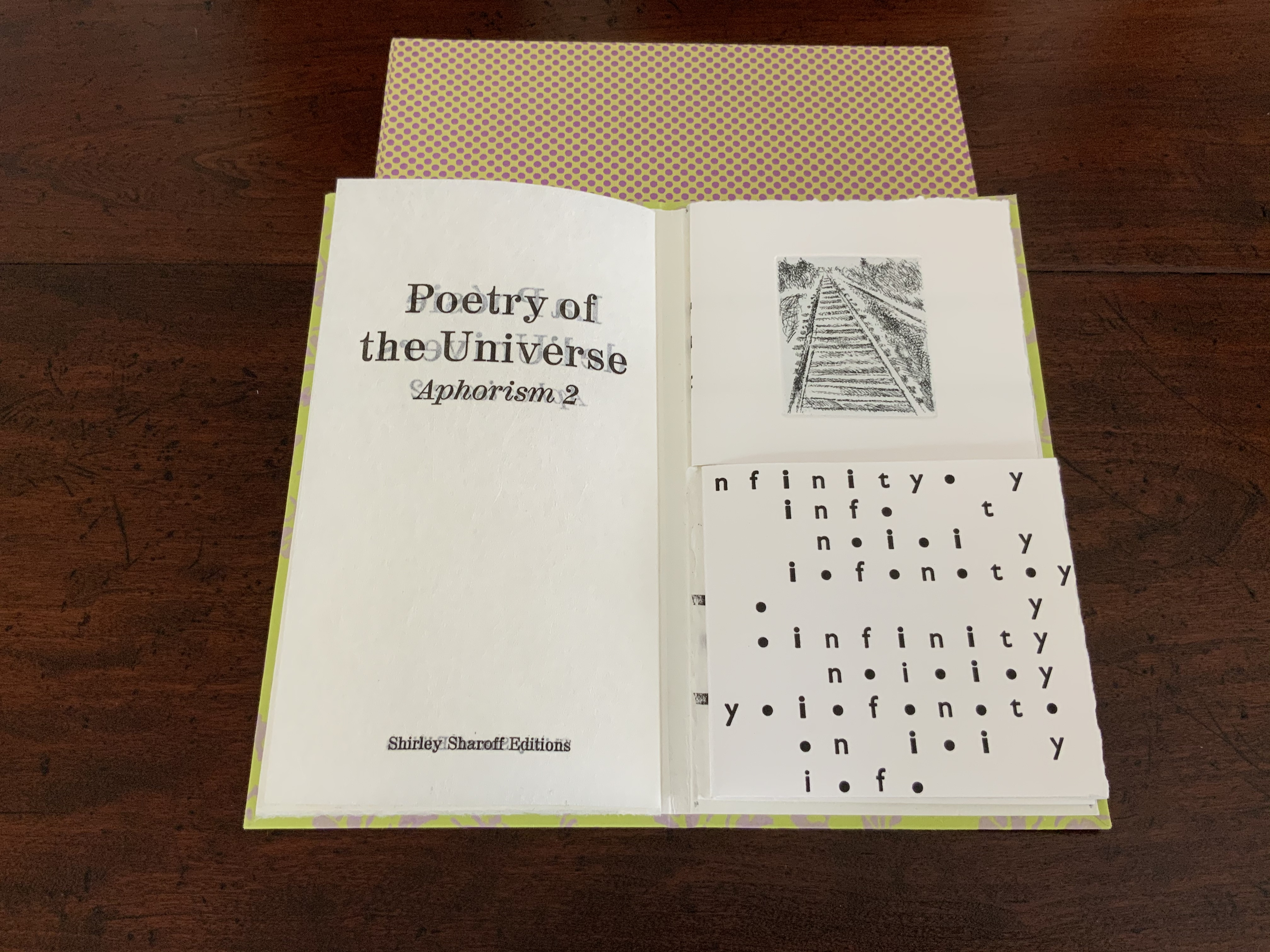
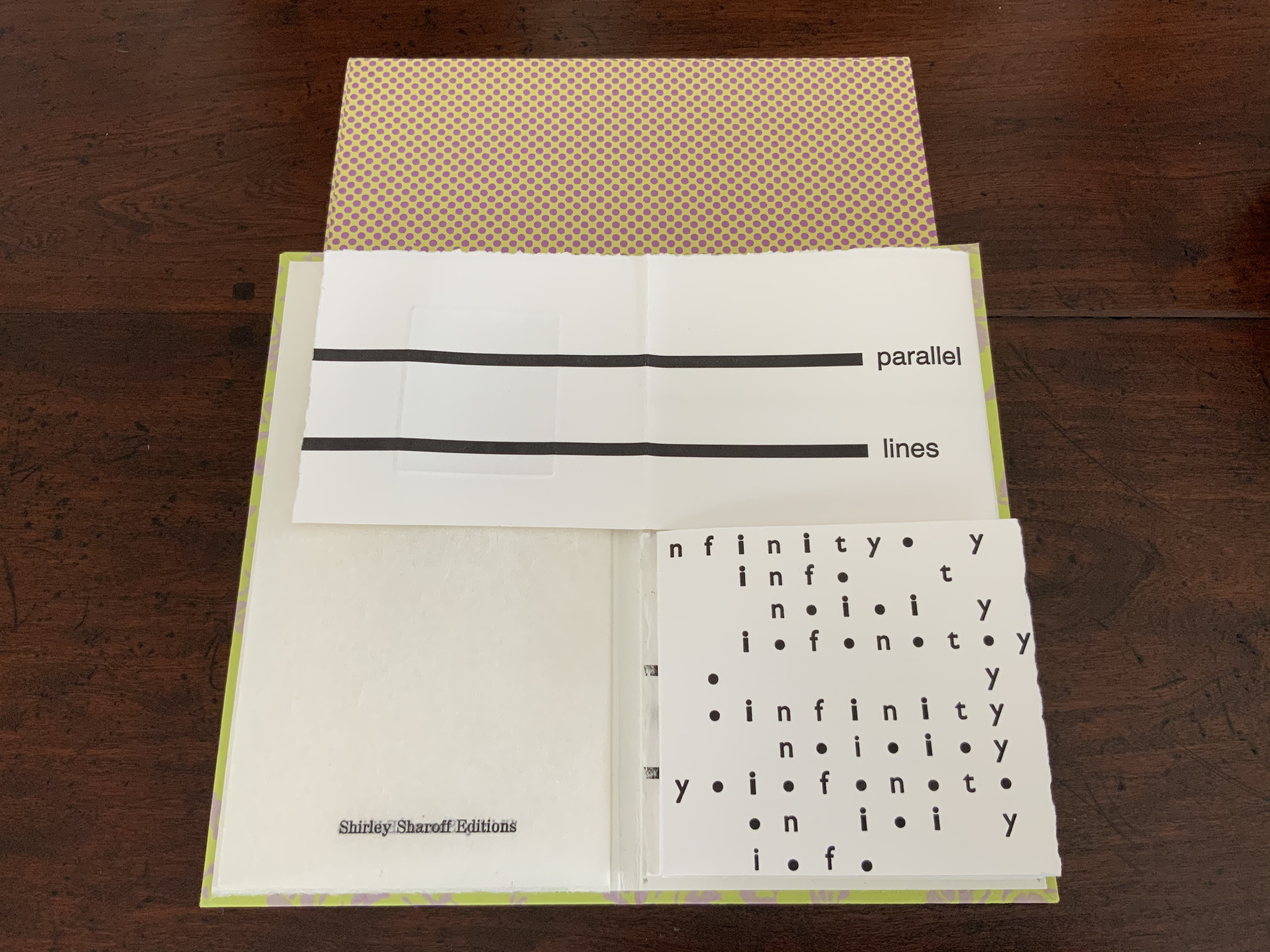
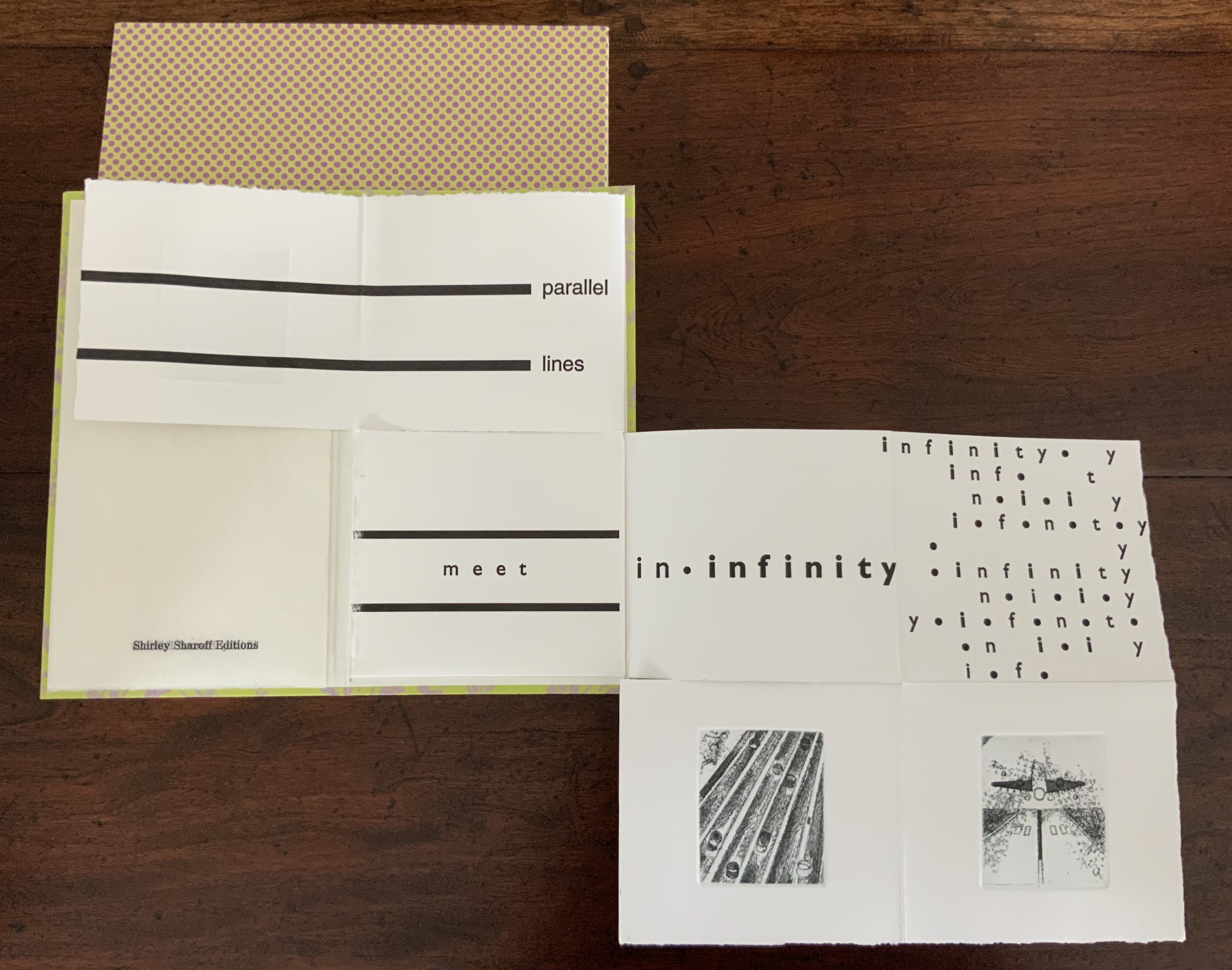
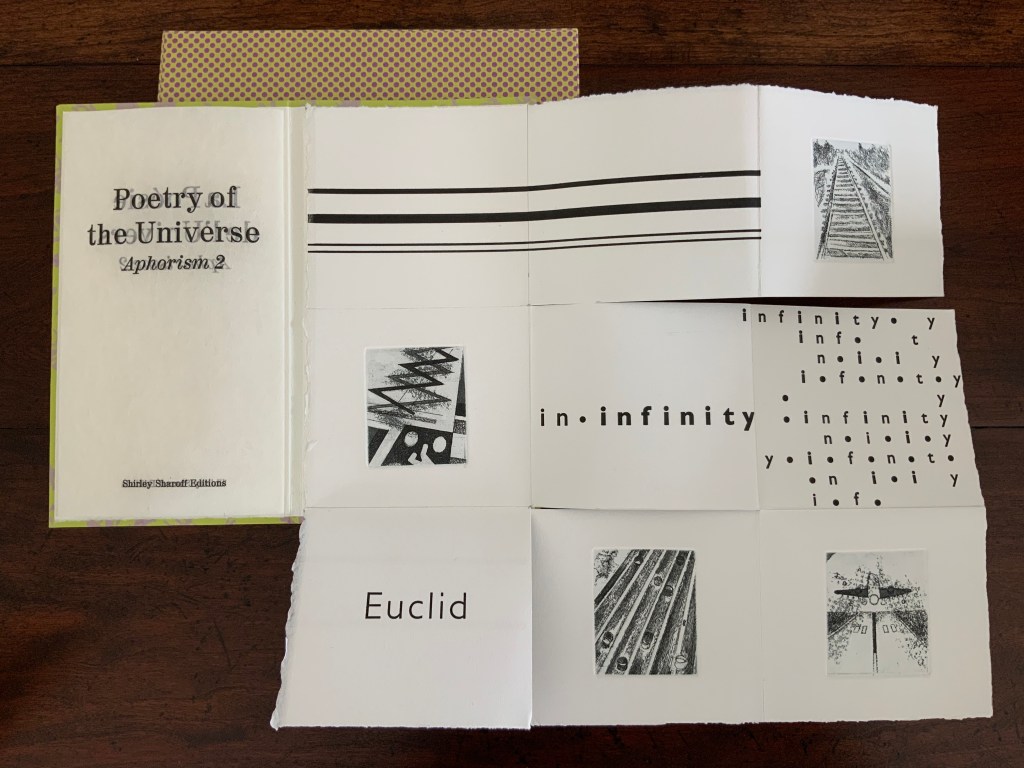
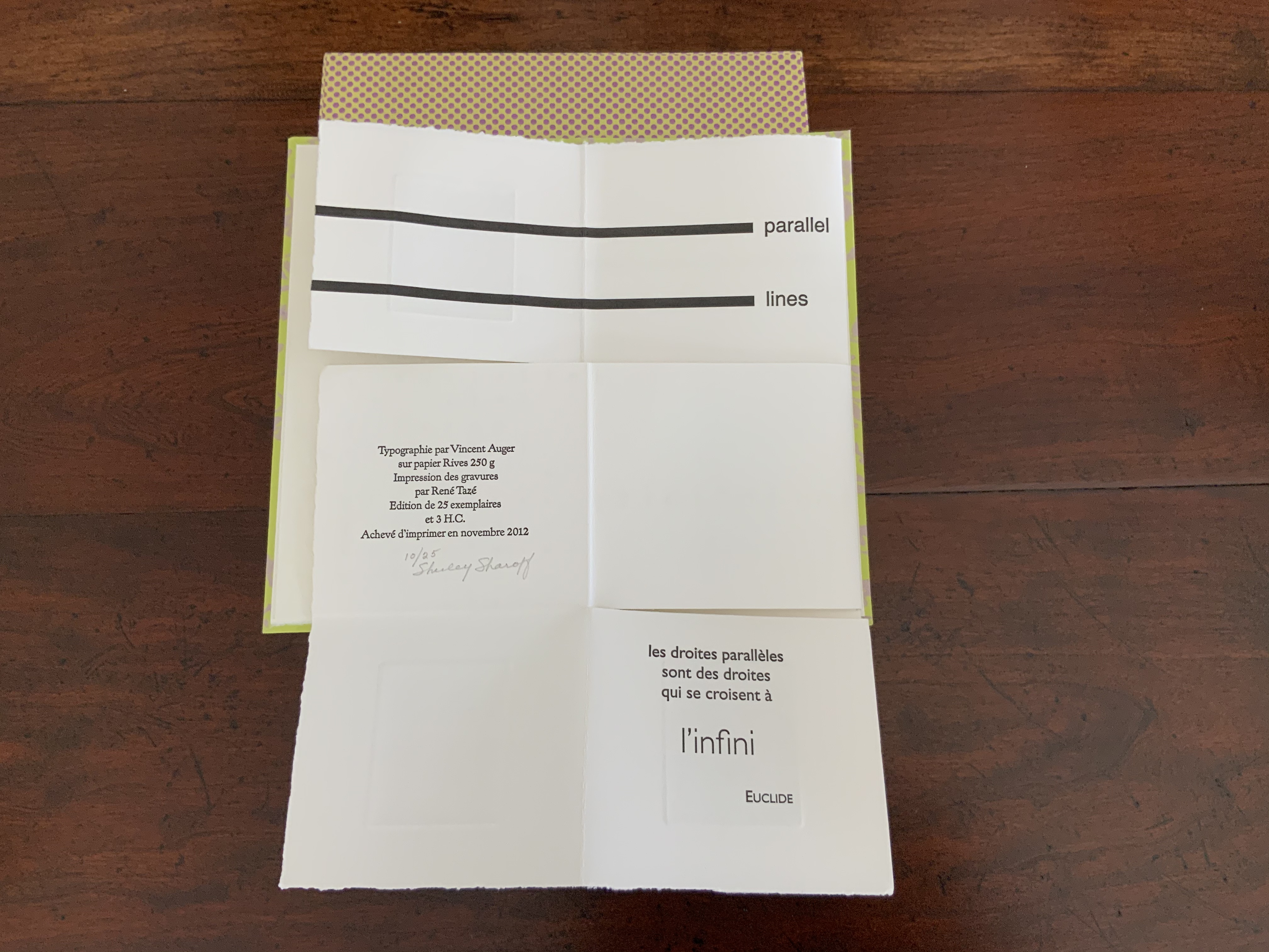
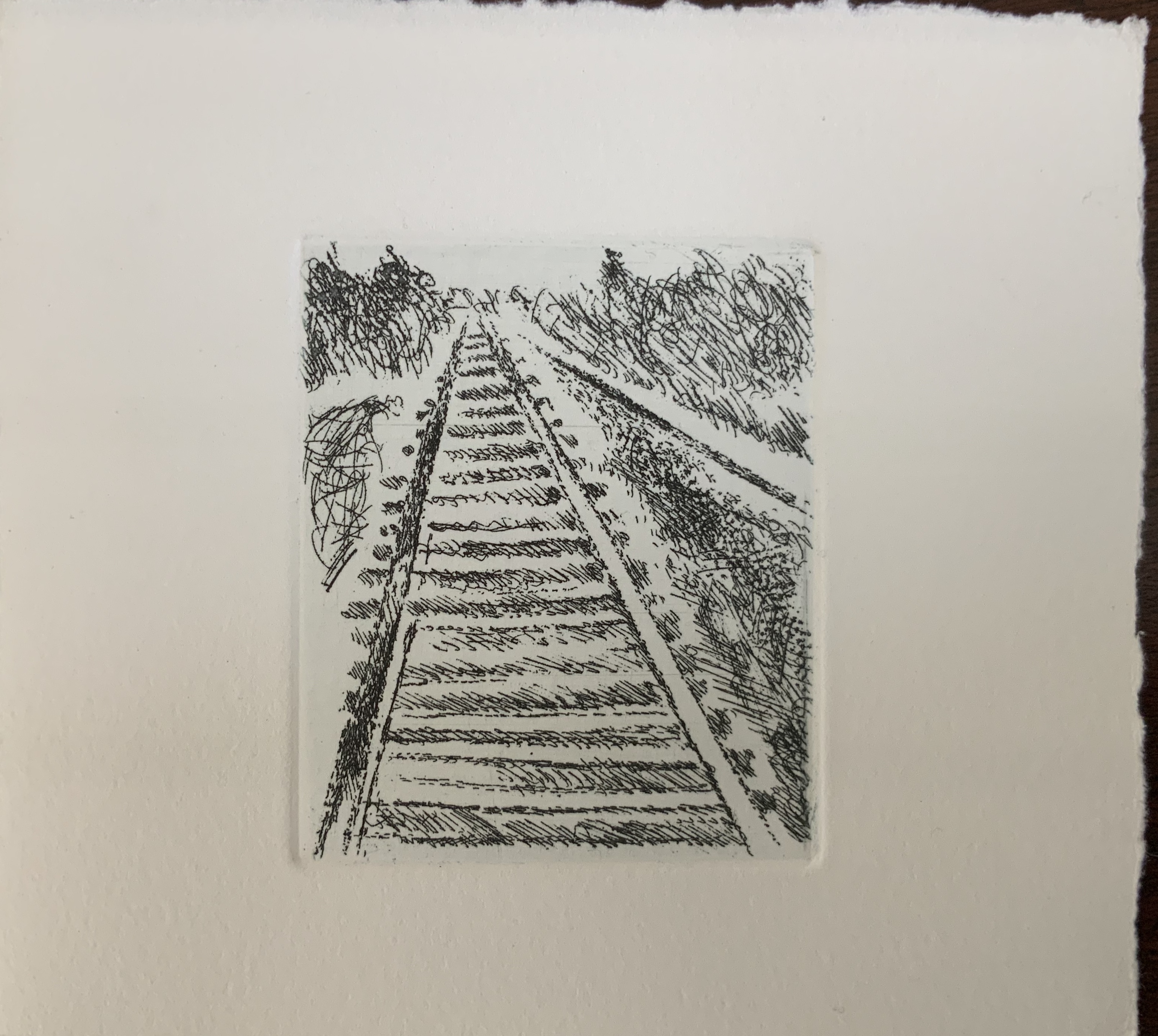
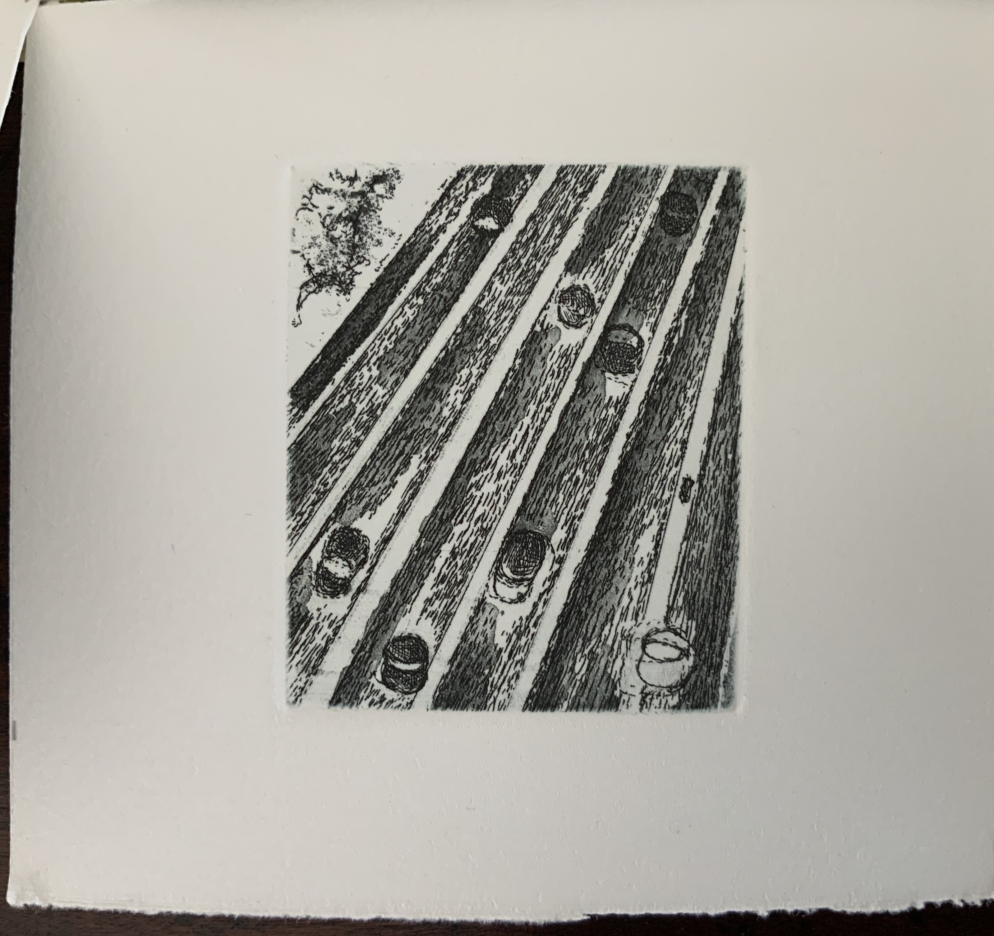
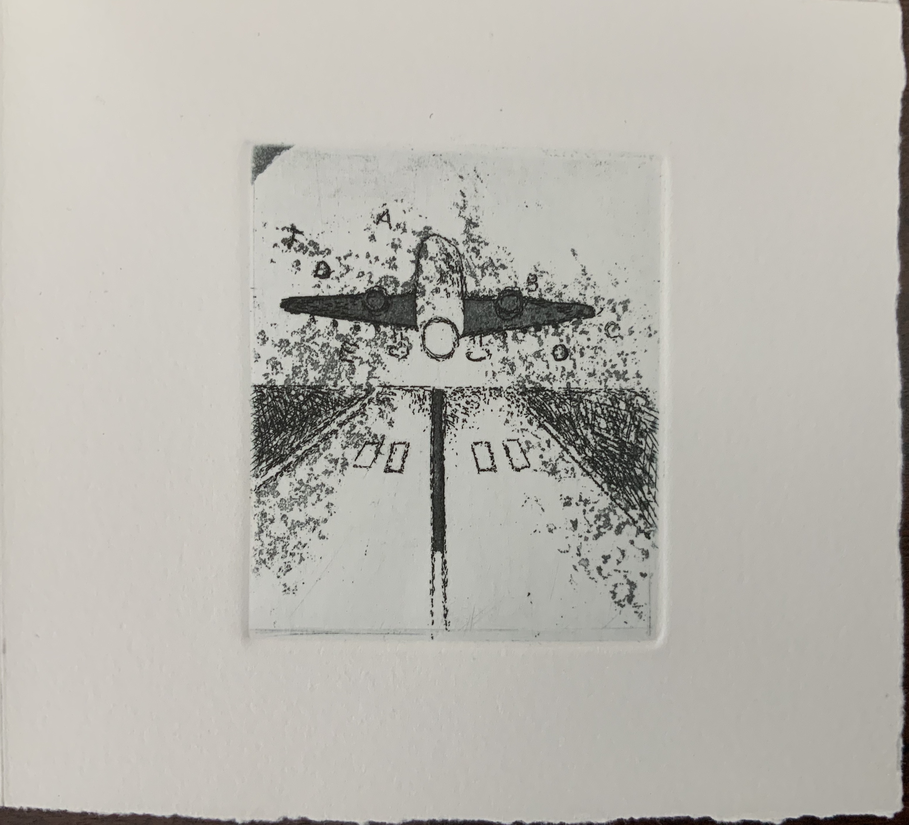
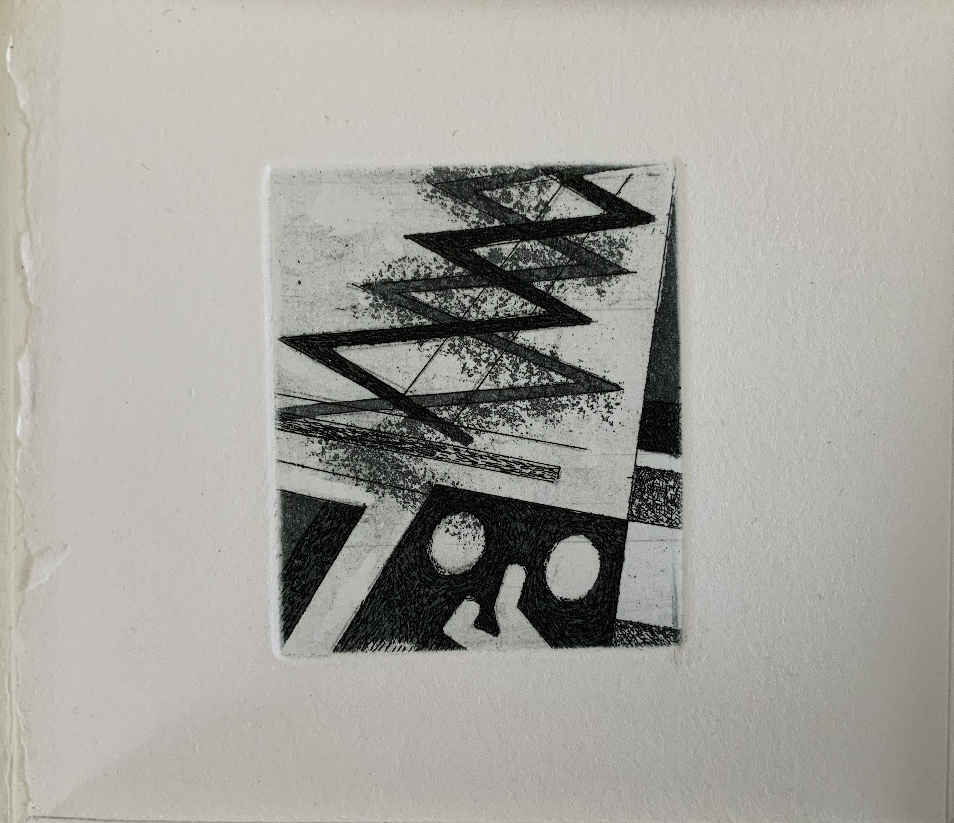
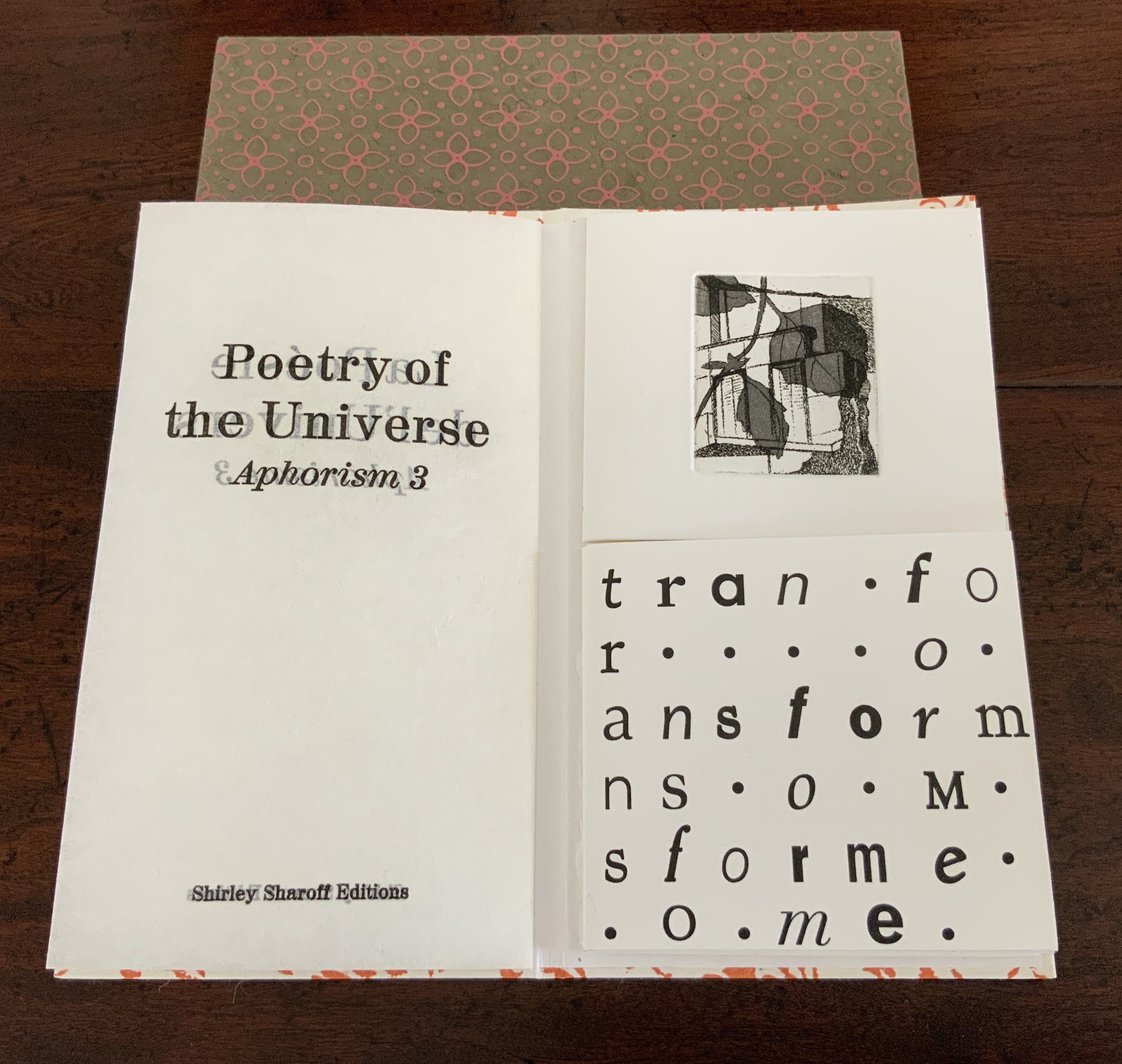
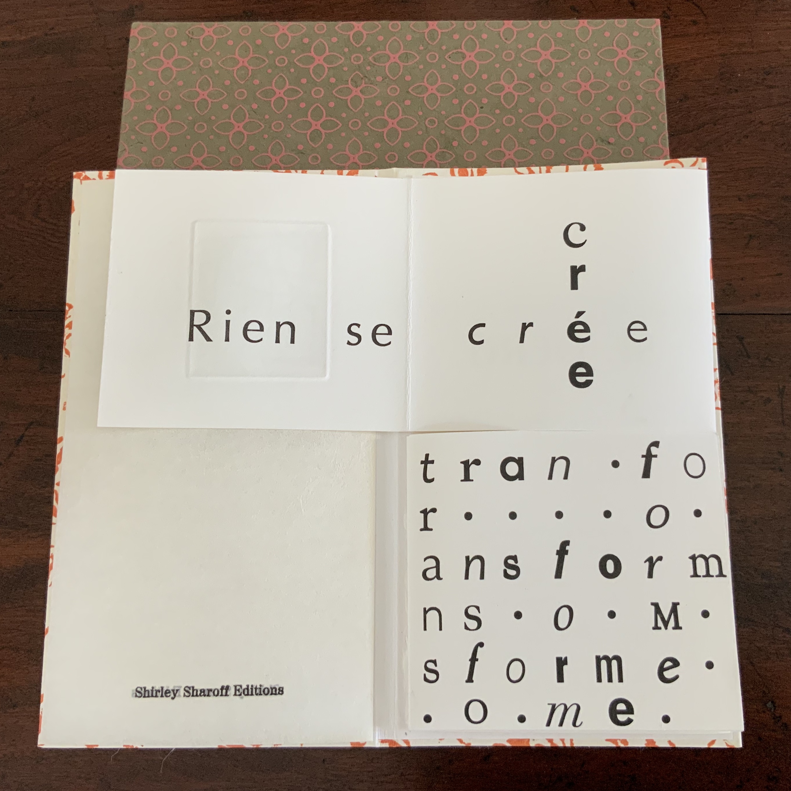
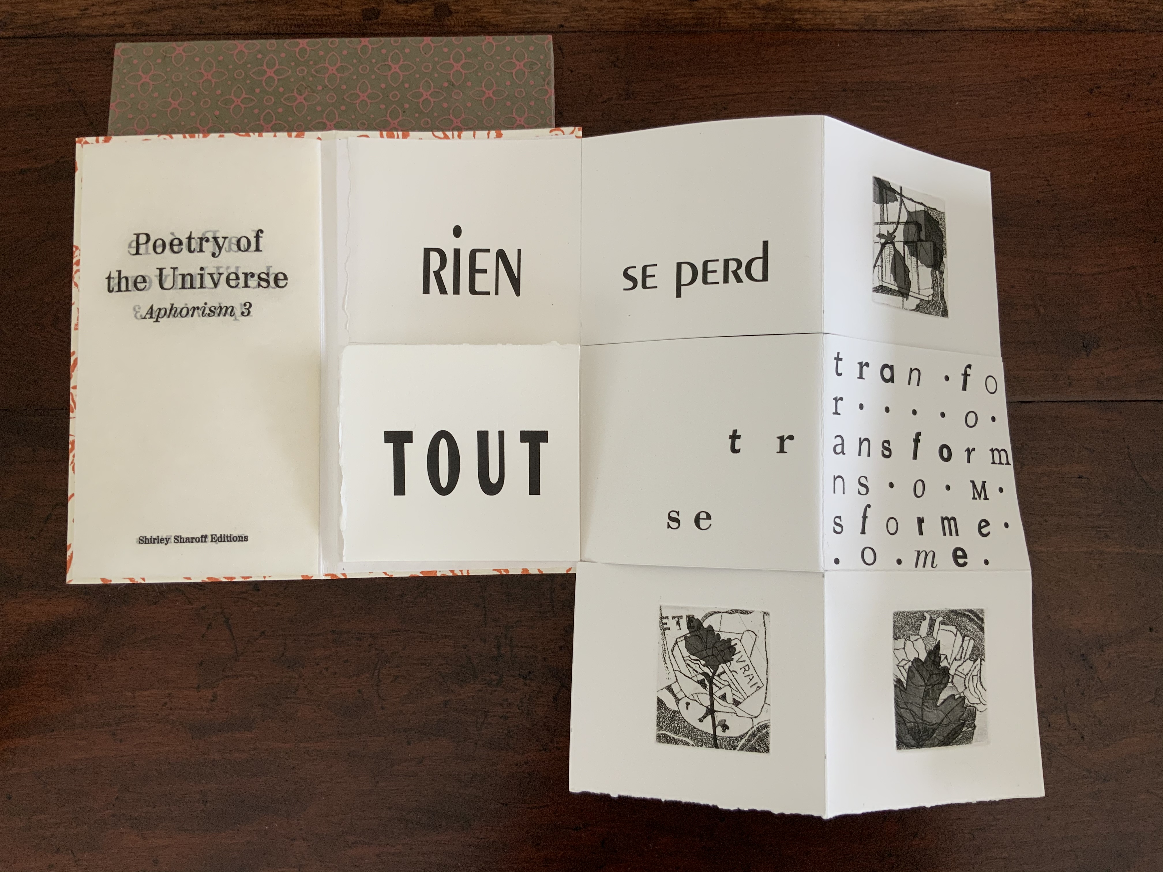
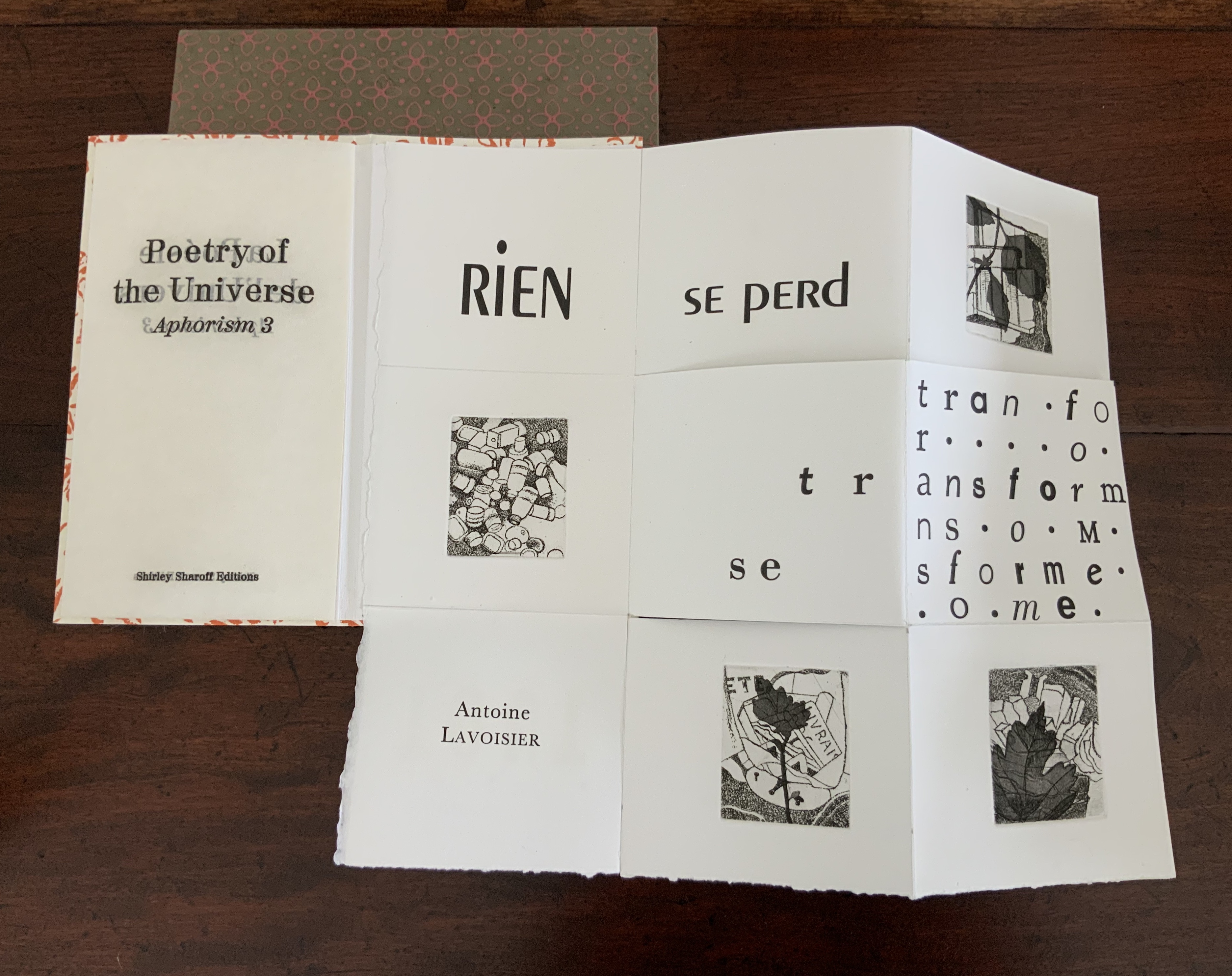
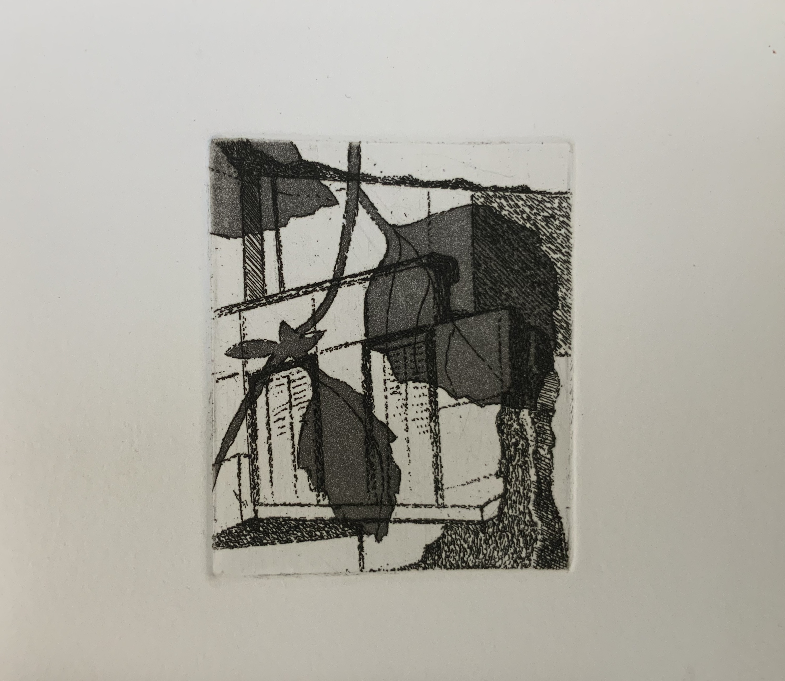
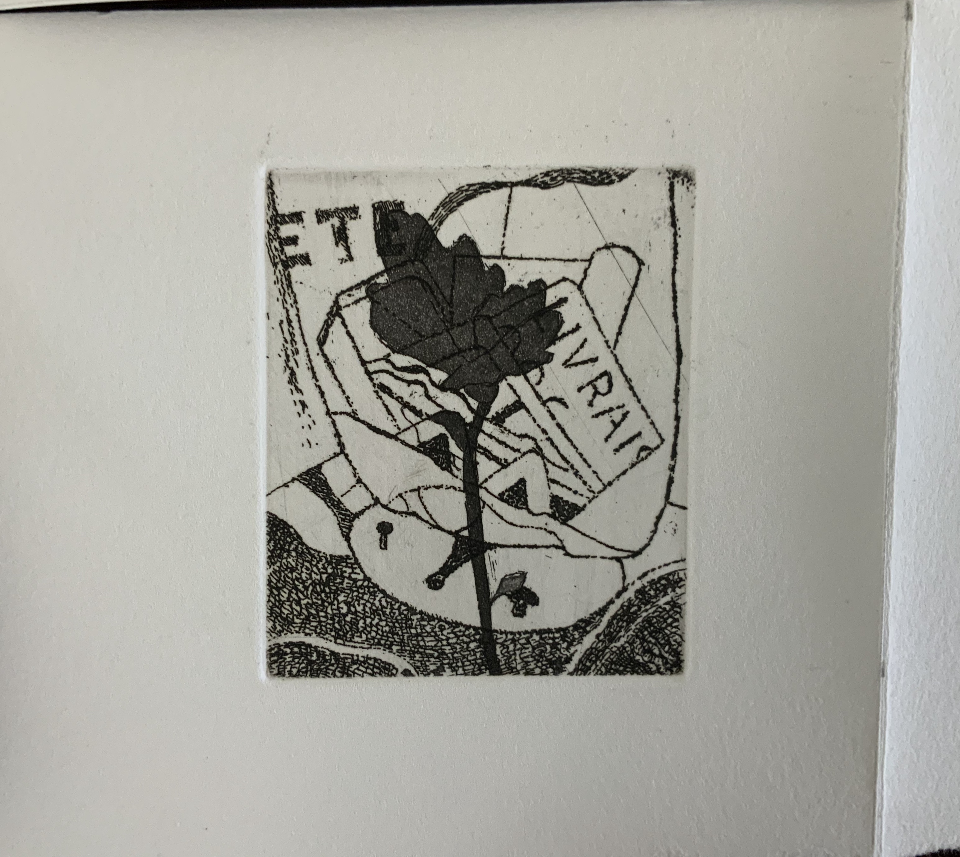
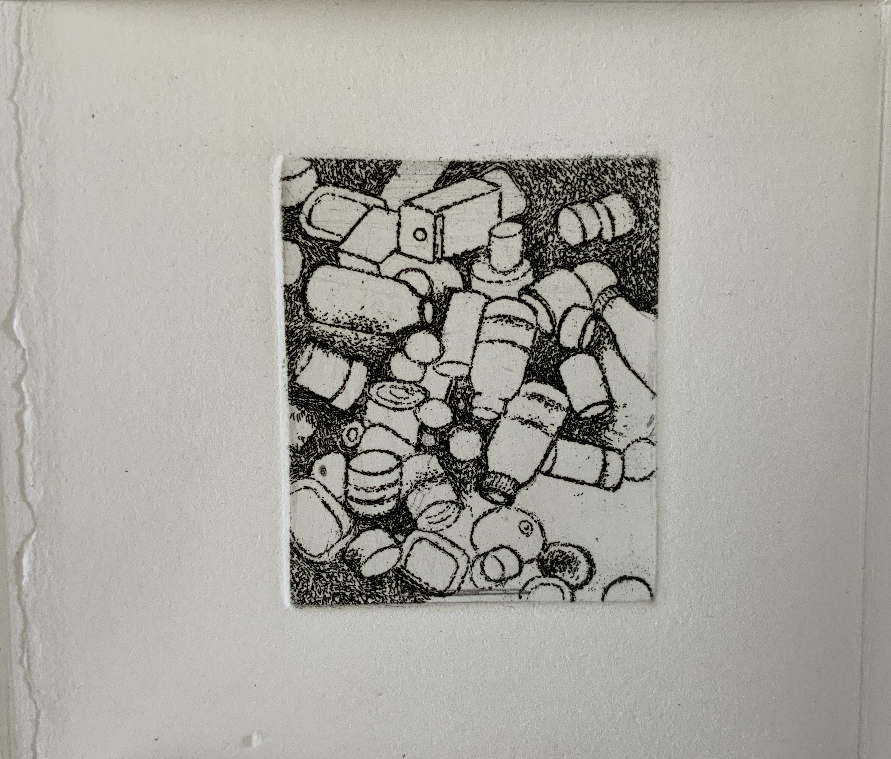
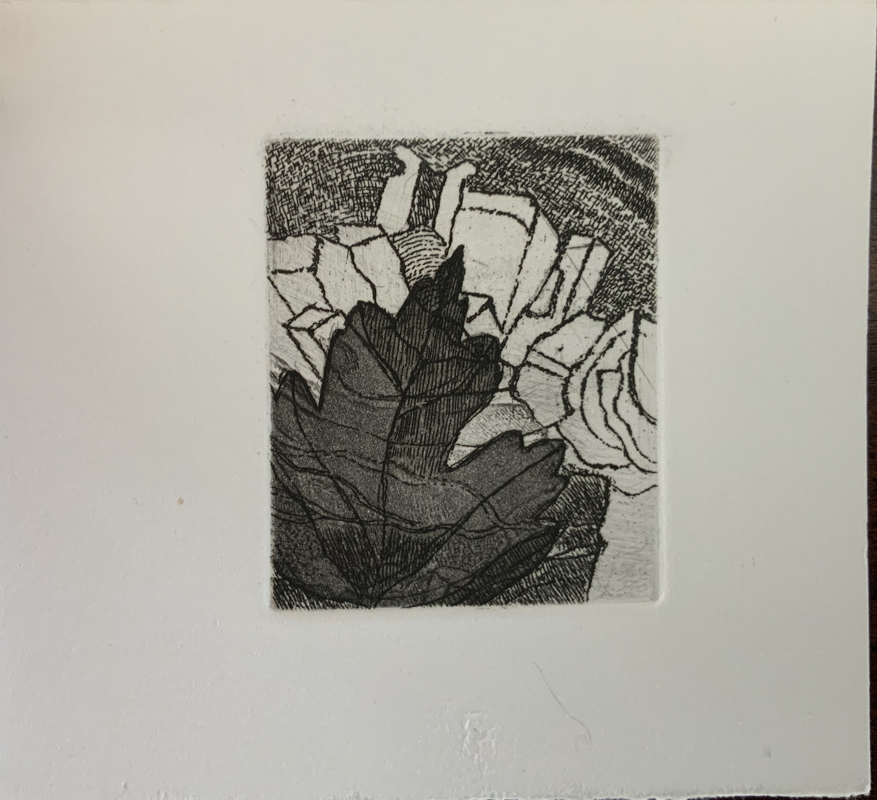
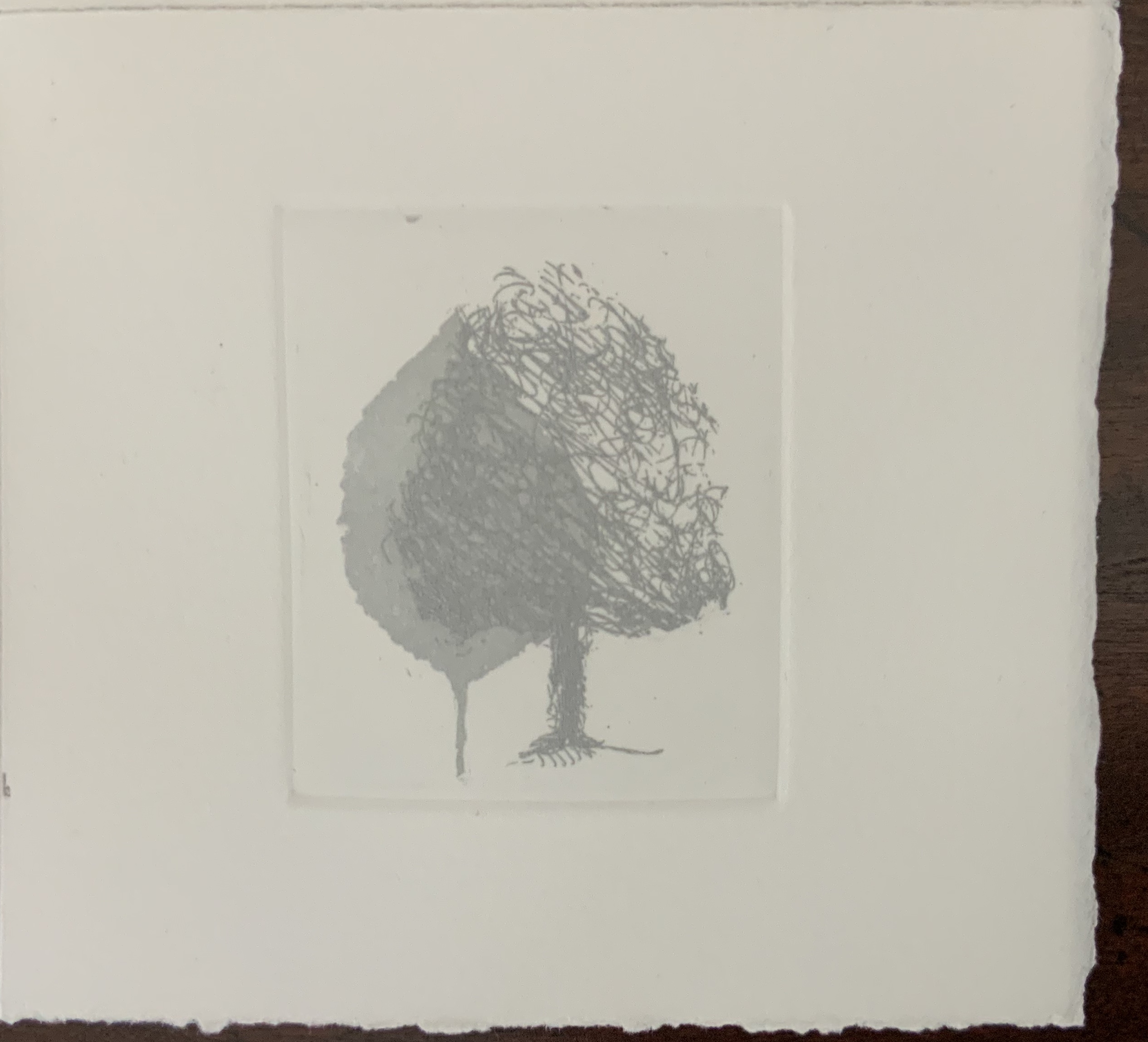
While the sets of four prints occupy the same position in each of the three single sheets, they “illustrate” their texts in different ways. In Aphorism 1, the whole tree occupies the “concluding” position of the lower right-hand corner, making a whole that is greater than the sum of the parts depicted in the other prints. In Aphorism 2, the images of transportation — train, car, plane, feet — follow from the abstract image of parallel lines. And in Aphorism 3, the two images of leaves overlapping human creations — buildings and litter — are bracketed by a central image of nothing but litter and a lower right-hand image of nature and the human-made landing atop a protruding pair of legs and feet like those of the Wicked Witch under the house in the Land of Oz.
In their variety of relationship to the structure and text, the three sets of images feel a bit secondary. Not so the presence of two languages. From the start, the French title page backed by an English title page on translucent paper suggests some sort of centrality for this bilingual feature. The only variation among the three volumes is that in Aphorism 1 and Aphorism 2, the complete French expression appears in a single panel, whereas in Aphorism 3, the English expression takes up that position. Why the bilingualism at all? The breaking up the expressions across the folds and cuts, the interspersing of images among the phrases, and the summary panels (two in English, one in French) suggest a halting, fragmented relation of each language to the other. Despite the title pages’ implication, the bilingual expressions do not exist simultaneously in parallel in any one of the single sheet books. By extension, is the relationship of language-image-thought to reality (whether metaphysical, geometrical or chemical) similarly fraught?
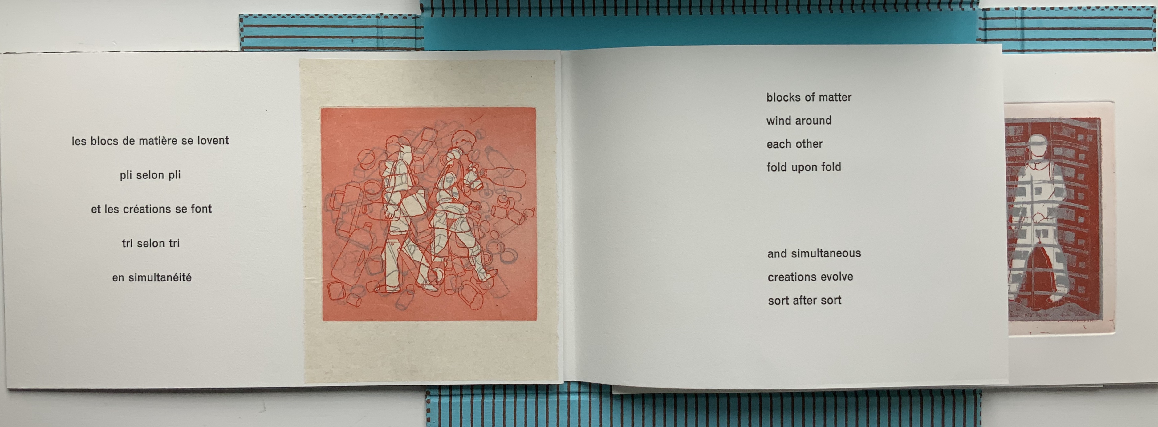
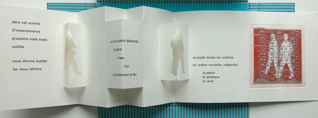
Impermanence subtile/Subtle Impermanence (2013)
Impermanence subtile/Subtle Impermanence (2013)
Shirley Sharoff
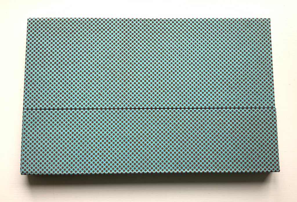
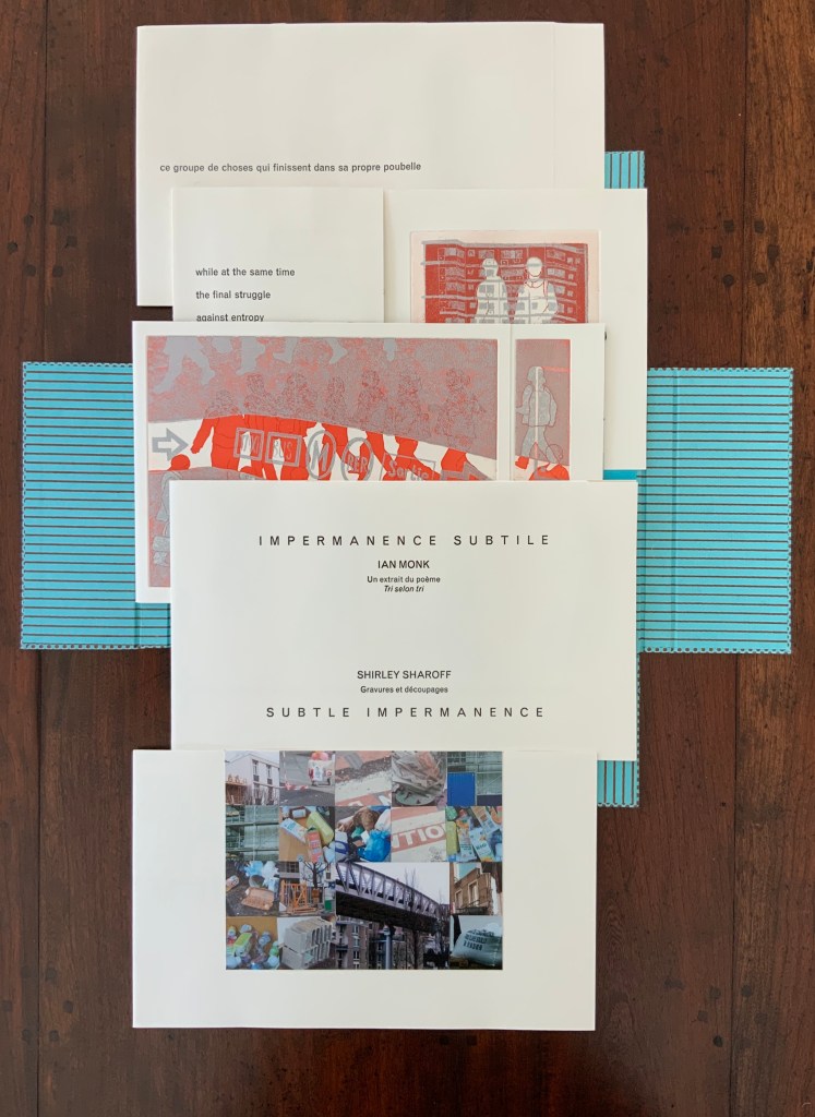
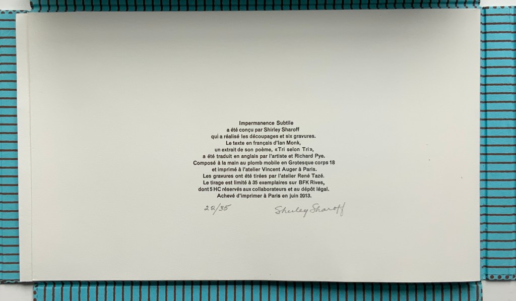
Portfolio box with four hinged flaps; five gatherings of folios bearing seven prints, collages, photos and cut paper. Text in English and French. Portfolio box: H212 x W340 x D24 mm; Folios: H200 x W330 mm, closed; variable width open, maximum W780 mm. Edition of 35, of which this is #22. Acquired from the artist, 5 February 2019. Photos: Books On Books Collection.
In Impermanence subtile/Subtle Impermanence, Sharoff’s bilingual perception of the world displays itself as more parallel, simultaneous and integrated — more subtle — than in La Poésie de l’univers/Poetry of the Universe. Where Poetry of the Universe explores this perception through dual forms (single-sheet origami/kirigami and book), Subtle Impermanence uses a multiplicity of forms (portfolio, flap book and pop-up book).

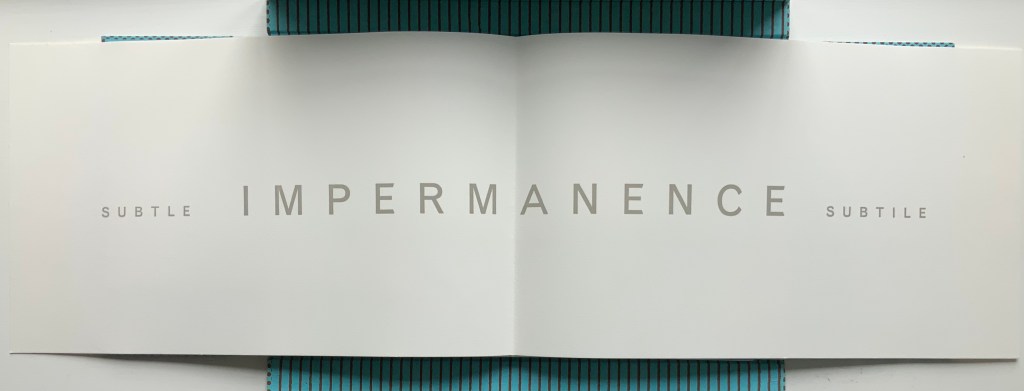
The first gathering — a single-fold folio whose first page presents the photo-collage of litter, demolition, construction and warning signs and tape — opens to a double-page spread that performs the book’s half-title function and also announces the work’s bilingual theme with the English adjective leading and the French adjective following the noun equivalent in both languages: IMPERMANENCE.
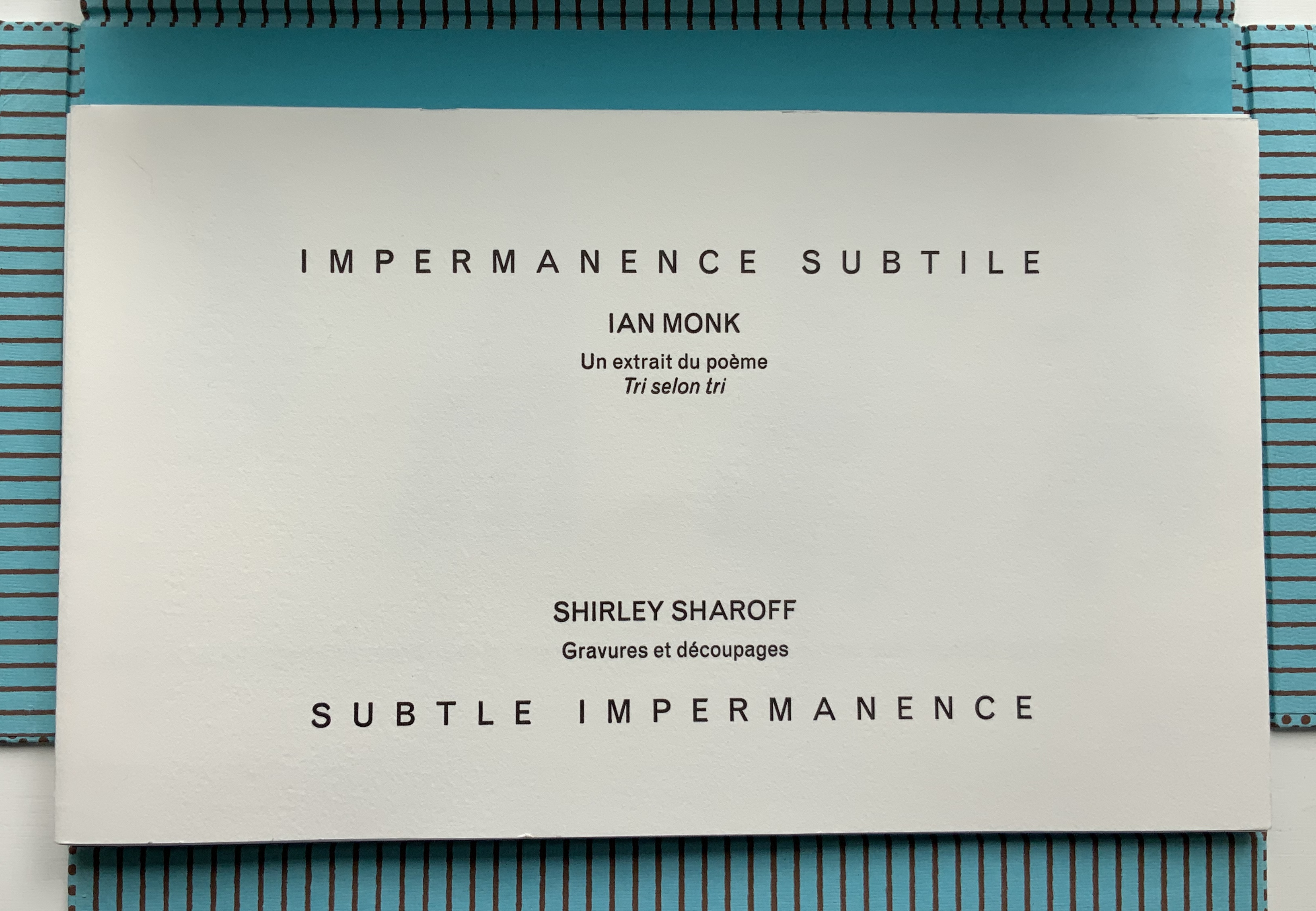
The first page of the second gathering performs the “title page” function of the book. When it opens, the first flap-book feature appears, the French text initially covering the English and, then, revealing a more parallel existence of the English and French. This is subtlety layered on subtlety. The text that appears and disappears under the flaps, and unfolds across the gathered folios, proceeds syntactically in a similar way, unrolling its qualifying dependent clauses one after another seemingly without beginning or end. As if mentally preparing a translation, the reader has to hold in mind each qualifier until what is being qualified can be reached.
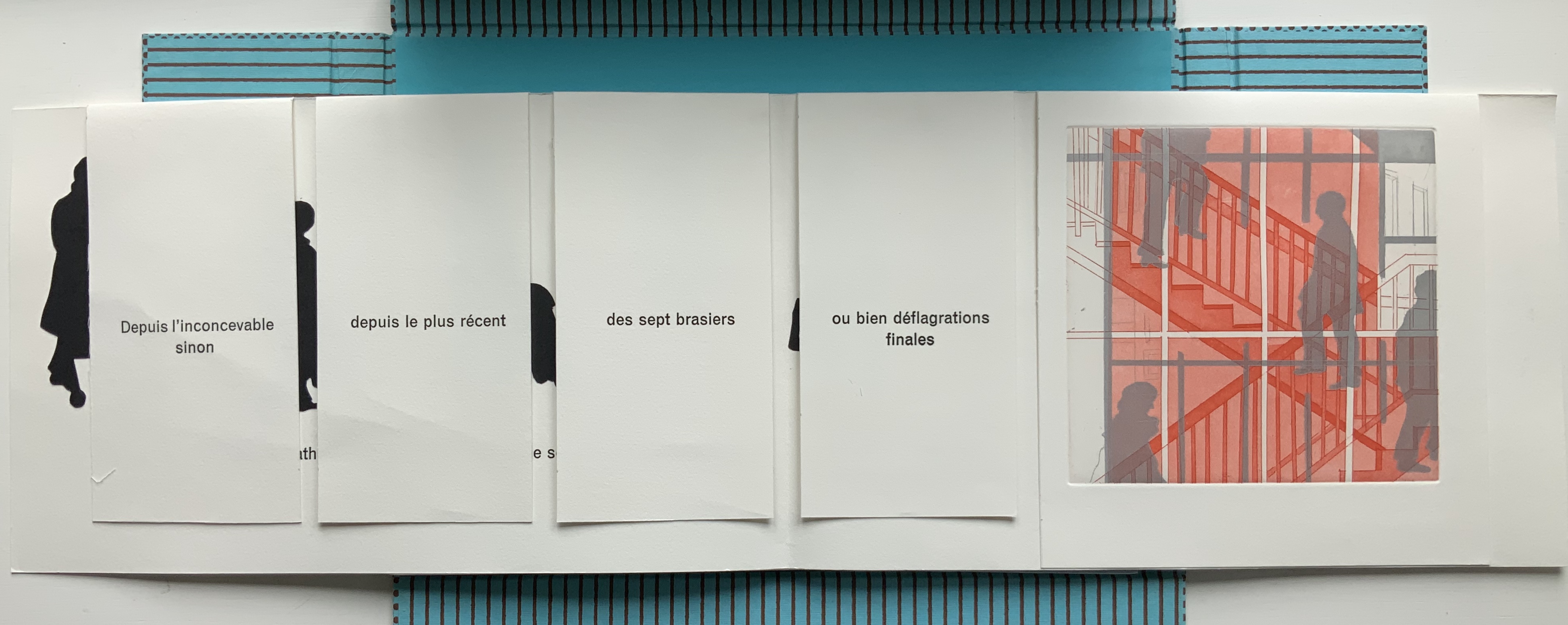
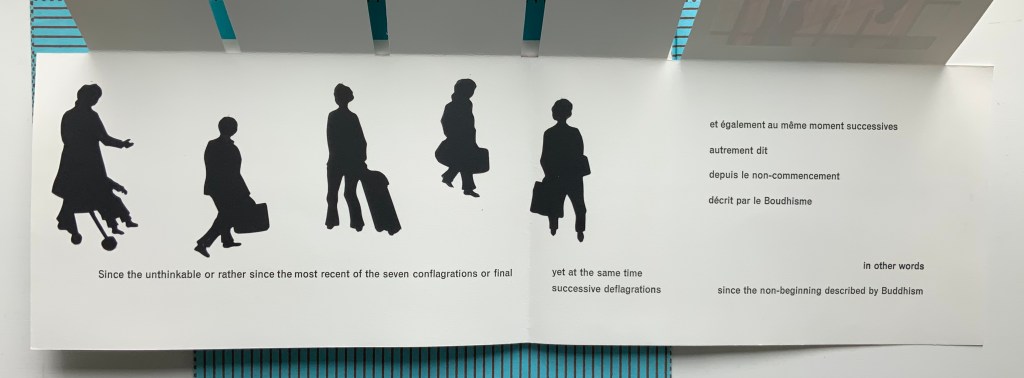
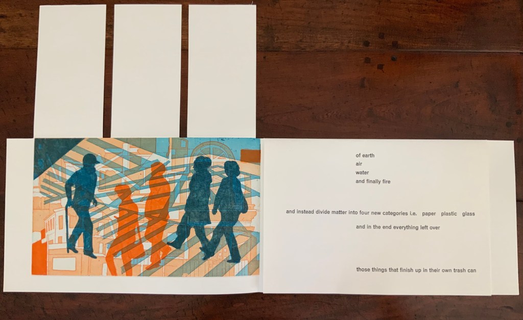
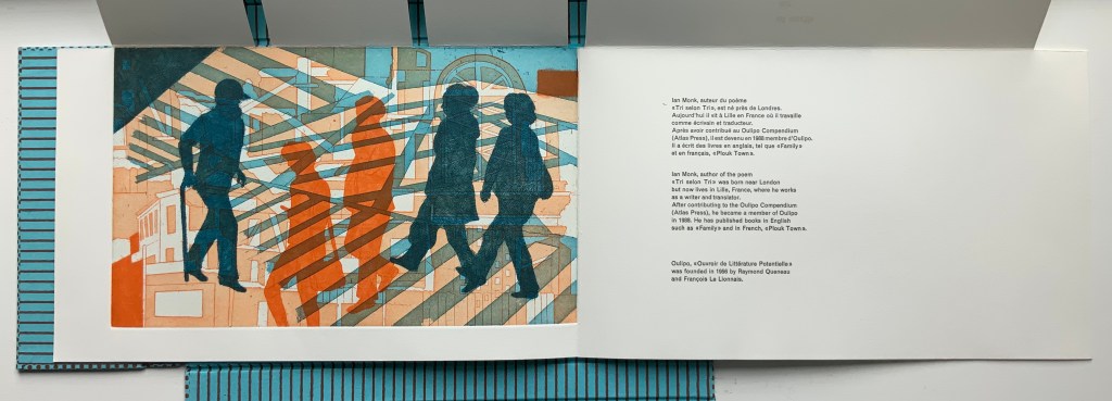
Those 5 flaps signal yet another subtlety. The text comes from the opening of Ian Monk’s Tri selon Tri (“sort by sort”), a concrete poem in the Oulipo tradition of Raymond Queneau, Italo Calvino and Georges Perec. Following this tradition means creating a literary work that adheres to some rule or constraint — like those in a game. In its original presentation, the poem works within a structural constraint consisting of 5 blocks of text, each 37 characters wide with the first and last blocks being 25 lines deep and the three middle blocks each being 22 lines deep. In self reference to its main theme that humanity is replacing the 4 elements (earth, air, fire and water) with categories of human detritus, the poem calls the first and last blocks poubelles (“trash cans”) and the three middle blocks “dumpsters” (bennes). In each middle block, a blank space — 7 characters wide by 3 lines deep — appears, mimicking the side openings of trash sorting bins. Sharoff’s subtle sculptural nod is 5 flaps (as well as 5 gatherings) for the 5 receptacles.
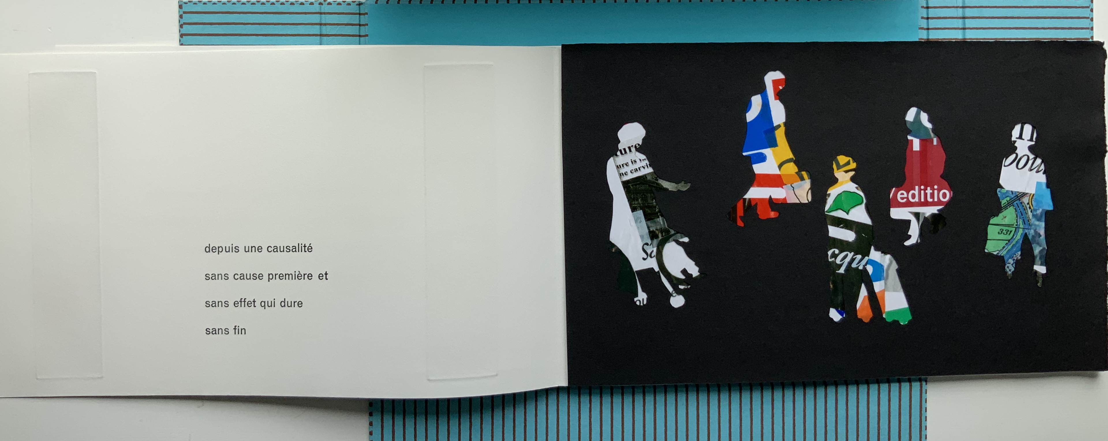
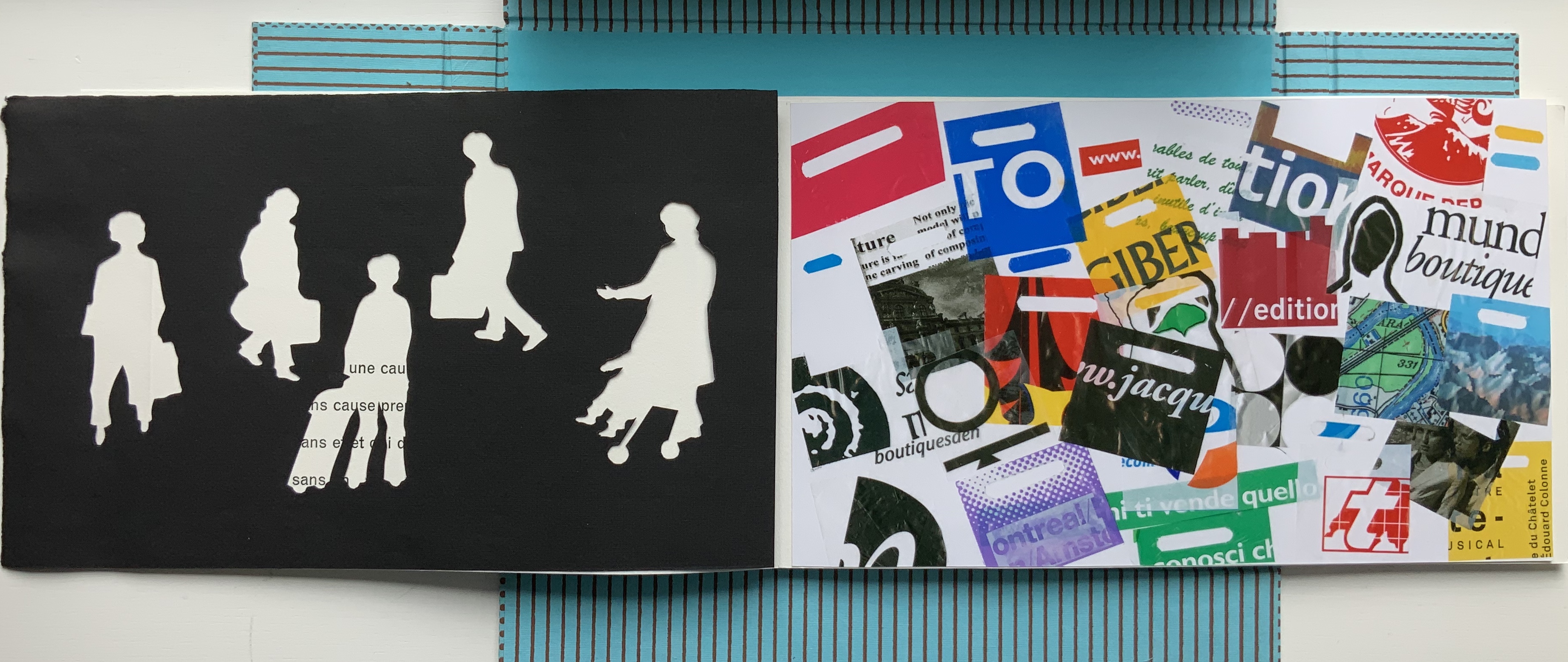
The third gathering above consists of a shortened single-fold sheet bearing the large print of commuters and shoppers and embracing a larger single-fold sheet divided by a loose black paper stencil. With its cutout human figures, the stencil overlaying another photo-collage of litter foreshadows the extract’s concluding metaphor: that, after the first three new elements of paper, plastic and glass comes the fourth new element — those things that finish up in their own trash can, i.e., humanity itself.
The fourth gathering above delivers yet another hint in the form of a pop-up feature: three receptacles, two of which have human-figure cutouts. These human figures have been appearing throughout in the intaglio prints, and in their over- (or under-?) printing of litter and construction, they too have been delivering the same hint.
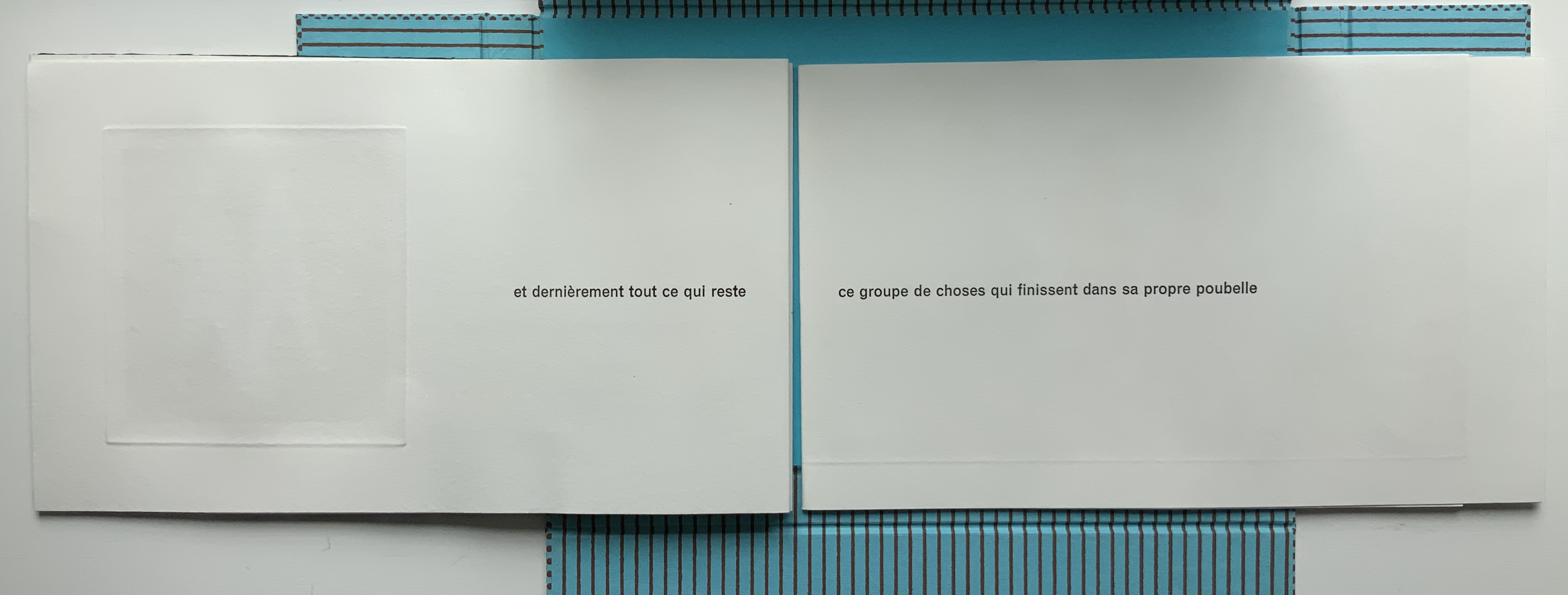
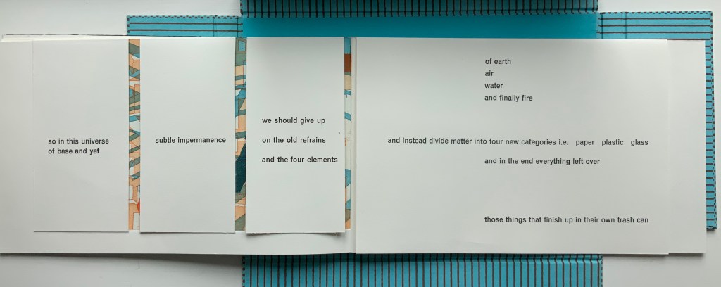
Just as the first gathering’s closed flaps display French only, the fifth and final gathering’s closed flaps display English only. The three flaps on the left rise to reveal the final print showing human figures entangled in their fully constructed world and undercut by the fourth flap’s articulation of the metaphor and implicit identification of them as “those things that finish up in their own trash can”.
Beneath that fourth flap, the artist concludes in French and English, leaving the colophon to appear on the last page — oddly — in French only.
These two works by Sharoff are perhaps bettered only by two others not in the Books On Books Collection: Ovi (1988) and La grande muraille/The Great Wall (1991). It is interesting that, while the former reflects her preoccupation with the Oulipo circle (Ovi draws on Calvino’s work), it sticks to one language (French); whereas La grande muraille engages with three languages (French, English and Chinese) yet draws on the text of a Chinese modernist (Lu Xun), not the Oulipo circle. Both, however, reflect the same ingenuity of juxtaposition and integration of language, image and forms to be found in La Poésie de l’Univers/Poetry of the Universe and Impermanence Subtile/Subtle Impermanence, which makes them defining works in the Books On Books Collection.
Further Reading
Christophe Comentale’s essay captures the delight of exploration and discovery in the encounter with Sharoff’s art.
Shirley Sharoff, entre France et Etats-Unis, présente une pluralité d’inspiration consommée entre l’estampe et le livre devenu un média, entre unique et multiple. […] Magicienne des formes et des couleurs, Shirley Sharoff ne cesse de remettre en cause, par besoin autant que par défi personnel, tout ce qui pourrait ressembler au début d’un système de lecture, de vision, figé et donc clos. L’impossibilité de savoir -qui vaut aussi pour elle- de quoi sa prochaine oeuvre-livre-manuscrit-tableau-dépliant, ou tout cela à la fois, sera fait est assez excitant. La présence de textes sentis par affinités sensorielles, personnelles, avec des écrivains non encore classiques, autant de raisons d’apprécier de pénétrer dans cet univers où le conformisme est inexistant.
Christophe Comentale, “Shirley Sharoff, des livres a tenir debout et des estampes a voir aussi”, Art & Métiers du Livre, n°231 (Aout-Septembre 2002), p.63.
Ephemera
On “The Book” (MIT Press, 2018)
With apologies to the preacher: Of making many books [on books] there is no end.
(Ecclesiastes 12:12)
With the choir of its forebearers, Amaranth Borsuk’s The Book (MIT Press, 2018) sounds an “amen” to that truth. The proliferation of degree programs in book studies covering the history of the book, the book arts and even book art ensures The Book will not be the last. What distinguishes Borsuk’s book are her perspective as an artist and the book’s breadth and depth despite its brevity.
The book has a long history of existential crises. What is a book? Is the end of the book nigh? For more than a century, those questions have returned again and again. The most recent recurrence stems from the ebook’s threat to dematerialize the book and the online world’s threat to take us into a post-text future. Even before these latest threats, book artists have long lived and worked with their own existential questions, a kind of higher existential calculus, or derivative of, the book’s crises: What is an artist’s book? What is book art? Stephen Bury, Riva Castleman, Johanna Drucker, Joan Lyons, Stefan Klima, Clive Philpott and many others in the last quarter of the 20th century dwelt on defining and categorizing book art.
Borsuk belongs to a later generation of book artists that has embraced these existential crises and recognized that the book’s existential crises are what make the book a rich medium in which and with which to create art — from bio-art miniature to the biblioclastic human-scale to large-scale installations and performances. Even to the digital.

The Origin of Species (2016)
Dr. Simon Park, Guildford, Surrey
“The small book shown here was grown from and made entirely from bacteria. Not only is the fabric of its pages (GXCELL) produced by bacteria, but the book is also printed and illustrated with naturally pigmented bacteria. ” Posted 27 March 2016. Photo credit: Dr. Simon F. Park

Silenda: Black Sea Book (2015)
Jacqueline Rush Lee
Transformed Peter Green‘s translation of Ovid’s Tristia and the Black Sea Letters
H9.5″ x W12″ x D6.5.” Manipulated Text, Ink, Graphite
Photo credit: Paul Kodama. In Private Collection, NL

Enclosed Content Chatting Away in the Colour Invisibility (2009)
Anouk Kruithof
Reproduced with permission of the artist

Field (2015)
Johannes Heldén
Produced, and premiered, at HUMlab, Umeå University
Reproduced with permission of the artist
Performance artist and academic as well, Borsuk brings that later generational and creative perspective to the existential question — What is the book? — and, with an artist’s perception of her medium of choice, displaces the old companion existential question — Is the end of the book nigh? — with an altogether more interesting one — Where next for the book?
To see where books might be going, we must think of them as objects that have experienced a long history of experimentation and play. Rather than bemoaning the death of books or creating a dichotomy between print and digital media, this guide points to continuities, positioning the book as a changing technology and highlighting the way artists in the twentieth and twenty-first centuries have pushed us to rethink and redefine the term. (pp. xiii-xiv)
In The Book, the future is not far from the physical past. Where once we had text on scrolls, now we scroll through text (albeit more vertically than horizontally). Where once human consciousness changed with the invention of the alphabet and writing, now it may be altering with our reading and writing through networked digital devices. Like the many historians before her, Borsuk starts with cuneiform (those wedge-shaped accounting marks on baked clay), hieroglyphics and the invention of the alphabet to set the scene for the advent of the book and its ongoing physicality:
- its shape (scroll, accordion, codex)
- its material (papyrus, vellum, paper, charcoal or mineral-based watercolor and ink)
- its manufacture (scribing, printing by woodblock and movable type, design and typography, illumination and illustration, folding into pages, methods of binding)
- its constituent and navigational parts (cover, book block, title page, table of contents, page numbering, index).
But Borsuk reminds us — from Sumer’s clay to Amazon’s Kindle, from Johannes Gutenberg to Project Gutenberg — the book as human artifact exists in a social, political, technological, economic and even ecological context. Who is allowed to make it, how it is transacted, how and where we use it, how we perceive and speak of it — all have affected the physicality of the book object and are reflected in it.
In the first half of The Book, Borsuk steers us through these interdependencies to a turning point. That turning point is where the pinnacle of the book arts — Beatrice Warde‘s and Jan Tschichold‘s vision of the book as a crystalline container of content — and the book’s commodification combine to cause the book’s physicality to disappear because it is so taken for granted, leaving us with “the book as idea”.
With the perception that books are ideas bestowed on readers by an authorial genius whose activity is purely intellectual, the book’s object status vanished for much of the reading public as we raised a glass to happily consume its contents…. Even though innumerable material elements come together to make the book, these features have been naturalized to such a degree that we now hardly notice them, since we have come to see content as the copyrightable, consumable, marketable aspect of the work. (pp. 106-9)
At this turning point — where “the historic relationship between materiality and text is severed” (p. 112) — the second half of The Book introduces book art. It is telling that the longest chapter in the book begins the second half, that it is called “The Book as Idea” and that it comes before any extended engagement with the digital dematerialization of the book. It is a wry pivot: the artistic genius supplants the authorial genius; what the latter takes as invisible background, the former re-makes as self-regarding foreground. As Borsuk shows and her book’s cover neatly demonstrates, works of book art are inevitably self-referential and self-aware.

As such, works of book art
have much to teach us about the changing nature of the book, in part because they highlight the “idea” by paradoxically drawing attention to the “object” we have come to take for granted. They disrupt our treatment of the book as a transparent container for literary and aesthetic “content” and engage its material form in the work’s meaning. (p. 113)
Rather than offer a chronological history of book art to explore what “artists’ books have to teach us about a path forward for the book”, Borsuk offers “flashpoints” that represent “the energies motivating artwork in book form”(p. 117). These “flashpoints” are William Blake, Stéphane Mallarmé, Ed Ruscha and Ulises Carrión. Following these flashpoints, Borsuk organizes the rest of the chapter into “key themes that recur throughout artists’ books of the twentieth century: spatiotemporal play, animation, recombinant structures, ephemerality, silence, and interactivity” (pp. 146-47).
Oddly, Blake as flashpoint does not illuminate these six particular themes. Rather Borsuk notes three other recurrent themes or “energies motivating artwork in book form” that Blake and his work represent: centering or re-centering the production processes on the author/artist; using the book as a sociopolitical and visionary platform; and redefining, developing and challenging the relationship between word and image.
Blake refers to himself as “The Author & Printer W. Blake,” making clear the union of creativity and craft in his work. (p. 121)
Blake’s engagement with the social issues of his day, and his use of book form to respond to child labor, urban squalor, and slavery, established an important trend in both artists’ books and independent publishing—the utility of the book as a means of spreading social justice. (pp. 121, 124)
Blake used his craftsmanship to develop the relationship between word and image (p. 140)
One need not look far among twentieth and twenty-first century book artists for resonance with those themes. That Blakean union of creativity and craft resurfaces in artists such as Ken Campbell (UK), Cathryn Miller (Canada), Pien Rotterdam (Netherlands), Barb Tetenbaum (US) and Xu Bing (China) — some of them even to the point of carving or setting their own type, making their own paper, pulp printing on it themselves or binding the finished work themselves. Vision and sociopolitical observation have risen up in the works of artists such as Doug Beube (Canada), Julie K. Dodd (UK), Basia Irland (US), Diane Jacobs (US), Anselm Kiefer (Germany) and Chris Ruston (UK). Blake’s redefining the relationship of word (or text) to image often reappears book artists’ abecedaries and their children’s books such as A Dictionary Story by Sam Winston (UK). As for emulators of Blake in technical innovation, consider the analogue example of Australian Tim Mosely’s works created with his patented pulp printing process, where the “ink” is actually colored pulp, or the digital example of Borsuk’s work Between Page and Screen, where the pages contain no text—only QR codes that, when scanned with a webcam, activate the text’s appearance on the reader’s browser screen.
For her second flashpoint, Borsuk selects another visionary, Stéphane Mallarmé, who like Blake was reacting to his own perceived Satanic mills draining poetry of its spirituality. Mallarmé’s Satanic mills dispensed rigid columns of newsprint to the masses and bland expanses of poetry and fiction set by Linotype machines in the neo-classical Didot font. With his famous visionary dictum — “everything in the world exists in order to end up as a book” (p. 135) — Mallarmé nudged the book toward pure concept and opened its mystical covers to the Dadaists, Surrealists, Futurists, Vorticists, Lettrists, Conceptualists and biblioclasts. With spatiotemporal play — mixing type sizes and fonts, breaking up the line and even breaking the page — Mallarmé used text to evoke image and, in his view, remake the book as a “spiritual instrument”. His post-humous book-length poem Un coup de Dés jamais n’abolira le Hasard (A Throw of the Dice Will Never Abolish Chance), published in 1897, embodies that vision and continues to cast its flashpoint light across multiple generations of book artists’ efforts. From Marcel Broodthaers in 1969, we have his homage to Un Coup de Dés. From Jérémie Bennequin in 2014, we have his serial “omage” to Broodthaers’ homage. And, most recently, we have the 2015 new bilingual edition A Roll of the Dice by Jeff Clark and Robert Bononno, for which Borsuk provides a perceptive reading.
Where Mallarmé’s flashpoint enlisted his vision alongside the cry “épater le bourgeois” from Baudelaire and other late nineteenth-century poets, Ed Ruscha’s later flashpoint illuminates a democratic counterpoint, a Zen-like vision and a very different way of changing the relationship of text to image. Ruscha’s self-published photobooks were cheap and distributed outside the gallery-controlled channels of art. As Borsuk shows — directly with Ruscha and indirectly with the many book artists influenced by him — the text is restricted to the book’s title, which interacts with a series of deadpan photos and their layout to deliver a wry, tongue-in-cheek work of book art. Ruscha’s spatiotemporal play manifests itself across the accordion book format and out-of-sequence juxtapositions. Ironically Ruscha’s works now command thousands of dollars per copy, and one has more chance of seeing them in an exhibition than in a roadside stop’s rack of newspapers, magazines and mass-market paperbacks.

Display of Ruscha’s Various Small Fires and Milk, 1964, at the Gulbenkian’s Pliure: Prologue (la Part du Feu), 2 February – 12 April 2015, Paris. Photo credit: Books On Books.
Reflected in the upper right corner, the film clip of Truffaut’s 1966 Fahrenheit 451; in the lower left hand corner, Bruce Nauman’s 1968 Burning Small Fires; and in the upper left, Maria Helena Vieira da Silva’s 1974 La bibliotheque en feu.
Mexico’s Ulises Carrión — polemicist, European bookshop owner, conceptual artist and Borsuk’s fourth choice of flashpoints — is a counter-flashpoint to Ruscha. Where Ruscha reveled in self-publishing commodification, Carrión sneered at the book in its traditional commercial form. Where Ruscha has resisted the label “conceptual artist”, Carrión played the role to the hilt. Where Ruscha’s work has elicited numerous homages (see Various Small Books from MIT Press in 2013) and achieved a high profile, Carrión’s work, much lower in profile, has provided a more compelling range of hooks or influences on which to hang many different manifestations of book art (or bookworks as Carrión preferred). In fact, Borsuk’s six stated key themes or “energies motivating artwork in book form” come from Carrión’s manifestos (pp. 146-47).
The first theme — “spatiotemporal play” — comes from Carrión’s initial definition of the book as a “sequence of spaces”, which Borsuk traces to tunnel books, pop-ups and even large-scale constructs, the latter illustrated by American Alison Knowles‘ inhabitable The Big Book (1968). One more possible future of the book implied by spatiotemporal play manifests itself in Borsuk’s own augmented-reality (AR) works, those of Caitlin Fisher (Canada) and Carla Gannis’ Selfie Drawings (2016), in which portraits on the hardcover book’s pages animate and change when viewed through smartphone or tablet.
Borsuk takes the second theme, that of “animation”, from Carrión’s dictum: “Each of these spaces is perceived at a different moment— a book is also a sequence of moments”. As her several examples illustrate, much book art is cinematic. Borsuk’s exposition of Canadian Michael Snow‘s Cover to Cover (1975) comes closest to reproducing the experience I enjoyed of “watching” that photo bookwork from cover to cover several times at the now closed Corcoran Art Gallery. Borsuk is quick and right to remind that the cinematic future of the book has been with us for a long time, even before the cinema. She bookends her exposition of Snow’s book and the text animation of American Emmett Williams‘ Sweethearts (1967) on one side with Victorian flip-books and on the other with American Bob Brown‘s 1930s The Readies (presumably pronounced “reedies” to follow Brown’s comparison of his scrolling one-line texts with the cinema’s “talkies”).
A forgotten modernist, Brown declared the obsolescence of the book, predicted a new form of reading and technology to enable it, an optical projector emitting text into the ether and directly into the eyeball. But what does this tell us about the future of the book? Borsuk notes Craig Saper‘s resurrection of Brown’s Roving Eye Press and how he even put together a website that emulates Brown’s reading machine. In her phrase describing the machine’s effect of “turning readers themselves into a kind of machine for making meaning” (p. 168), Borsuk hints at a future of digitally interactive books, which she takes up in the next section and more extensively in the next chapter. At this point, however, the reader could use a hint of practicality and skepticism. Linear-one-word-at-a-time reading, however accelerated, eliminates affordances of the page, ignores graphics and strains against the combination of peripheral vision and rapid eye movement we unconsciously (even atavistically?) deploy as we “read” whatever we see. Although in the next section Borsuk does bring on more likely examples of the book’s future exploitation of its cinematic affordances (manga, graphic novels and children’s books), this section’s treatment of animation misses the chance to cite actual recent successes like Moonbot Studios‘ The Fantastic Flying Books of Mr. Morris Lessmore (2012) and others.
Once into the third theme — “recombinant structure” — it is clear that Borsuk’s chosen Carriónesque themes overlap one another. Like the cinematic, the recombinant structure manifests itself in accordion books. It extends, however, to something more interactive: volvelles (or medieval apps as Erik Kwakkel calls them), interactive pop-ups, harlequinades (flap books) and more. Borsuk uses Raymond Queneau‘s harlequinade Cent mille milliards de poèmes ( One hundred thousand billion poems, 1961), Dieter Roth‘s slot books and works by Carolee Schneemann to illustrate book art’s celebration of the concept. The fact that Queneau’s book is still easily available on Amazon vouches for book art’s predictive qualities. The example of Marc Saporta’s Composition No.1 (Éditions du Seuil, 1962), “a box of 150 leaves printed on only one side that the reader is instructed to shuffle at the outset”, goes Queneau one better —ironically. In 2011, Visual Editions reissued Composition No. 1 in print and app forms. Alas, the former is out of print, and the latter is no longer available for download (although a video of it is available here).

Composition No. 1 (2011)
Marc Saporta
Translation by Richard Howard, Introduction by T.L. Uglow, Google Creative Lab, Diagrams by Salvador Plascencia and Designed by Universal Everything Photo credit: Books On Books
Borsuk draws her fourth theme — ephemerality — from Carrión’s dictum:
I firmly believe that every book that now exists will eventually disappear. And I see here no reason for lamentation. Like any other living organism, books will grow, multiply, change color, and, eventually, die. At the moment, bookworks represent the final phase of this irrevocable process. Libraries, museums, archives are the perfect cemeteries for books. (p. 145)
To illustrate, Borsuk begins with the physical biblioclasts — those who in Doug Beube‘s phrase are “breaking the codex“. They include Beube himself, Bruce Nauman (see above), Brian Dettmer, Cai Guo-Qiang, Marcel Duchamp, Dieter Roth and Xu Bing. While some of these artists reflect a twenty-first century surge of interest in altered books and book sculpture, “facilitated by the overarching notion that the book is an artifact not long for this world” (pp.82-84), others have taken a more generative archaeological approach — erasing or cutting away a book’s words to reveal another. Examples include Tom Phillips‘ A Humument (1966-2014) and Jonathan Safran Foer‘s Tree of Codes (2010). Phillips’ bookwork serves multiple purposes for Borsuk’s arguments. Not only does it represent the book art of “erasure”, its success across multiple editions, digital formats and presence in art galleries supports her notion of book art’s predictive qualities.
There is a variant on her theme that Borsuk does not illustrate and is worth consideration for her next edition: the self-destructing yet regenerative work of book art. Examples could include American Basia Irland‘s series ICE BOOKS: Ice receding/Books reseeding (2007-), which gives a formidably tangible and new meaning to “publishing as dissemination”; and Canadian Cathryn Miller‘s tail-chasing Recomp (2014); and Argentinian Pequeño Editor‘s Mi Papa Estuvo en la Selva (2015), which after reading can be planted to grow into a jacaranda tree.

Recomp (2014)
Cathryn Miller
Copy of Decomp, Collis and Scott (2013) nailed to a tree. Photo credit: David G. Miller

Recomp (2015)
Photo credit: David G. Miller

Recomp vandalized (2015)
Photo credit: David G. Miller
The last section in this chapter expands on the fifth theme — silence — drawn from Carrión’s statement:
The most beautiful and perfect book in the world is a book with only blank pages, in the same way that the most complete language is that which lies beyond all that the words of a man can say. Every book of the new art is searching after that book of absolute whiteness in the same way that every poem searches for silence. Ulises Carrión, Second Thoughts (1980), pp. 15-16.
Among her several examples are Pamela Paulsrud‘s Touchstones (2007-10), which look like stones but are books sanded-down into stone-like shapes, and Scott McCarney‘s 1988 Never Read (Opposed to Ever Green), a sculpture composed of stacked library discards that narrows as it ascends. Paulsrud’s, McCarney’s, Irland’s and Miller’s works are what Borsuk calls “muted objects”, but they speak and signify nevertheless:
Muted books take on a totemic [metaphoric] significance…. The language of the book as a space of fixity, certainty, and order reminds us that the book has been transmuted into an idea and ideal based on the role it plays in culture…. Defining the book involves consideration for its use as much as its form. (pp. 193-95)

Never Read (Opposed to Ever Green) (1988)
Scott McCarney
Reproduced with permission of the artist

Never Read (Opposed to Ever Green) (1988)
Scott McCarney
Reproduced with permission of the artist

Never Read (Opposed to Ever Green) (1988)
Scott McCarney
Reproduced with permission of the artist
Borsuk is a superb stylist of the sentence and expository structure. The words above, concluding chapter three, launch the reader into Borsuk’s final theme of interactivity and her unifying metaphor: “the book as interface”. Owners of Kindles, buyers from Amazon, perusers of Facebook — we may think we know what’s coming next in The Book and for the book, but Borsuk pushes the reader to contemplate the almost real-time evolutionary change we have seen with ebook devices and apps, audiobooks, the ascension of books to the cloud via Project Gutenberg, the Internet Archive and Google Books, and their descent to Brewster Kahle‘s physical back-up warehouse (to be sited in Canada in light of recent political events) and into flattening ebook sales of late. Chapter 4 is a hard-paced narrative of the book’s digital history from the Memex in Vannevar Bush‘s 1945 classic “As we may think” to T.L. Uglow‘s 100-author blockchain collaboration in 2017, A Universe Explodes from Visual Editions’ series Editions at Play.
Borsuk reminds us:
Our current moment appears to be much like the first centuries of movable type, a cusp. Just as manuscript books persisted into the Gutenberg era, books currently exist in multiple forms simultaneously: as paperbacks, audiobooks, EPUB downloads, and, in rare cases, interactive digital experiences. (p. 244)
Borsuk weaves into this moment of the book’s future a reminder that print affordances such as tactility (or the haptic) and the paratextual (those peripheral elements like page numbers, running heads, ISBNs, etc., that Gary Frost argues “make the book a book”) have been finding fresh ways into the way we read digitally. The touchscreen enables us to read between the lines literally in the novella Pry (2014) by Samantha Gorman and Danny Cannizaro (2014). Breathe (2018) by Kate Pullinger, another work in the Editions at Play series, uses GPS to detect and insert the reader’s location, the time and weather, and when the reader tilts the device or rubs the screen, hidden messages from the story’s (the reader’s?) ghosts appear.
At this point, an earlier passage from The Book should haunt the reader:
Artists’ books continually remind us of the reader’s role in the book by forcing us to reckon with its materiality and, by extension, our own embodiment. Such experiments present a path forward for digital books, which would do well to consider the affordances of their media and the importance of the reader, rather than treating the e-reader as a Warde-ian crystal goblet for the delivery of content. (p. 147)
Borsuk convinces. Art, artifact, concept — wrought by hand and mind, hands and minds — the book is our consensual tool and toy for surviving beyond our DNA. So now what? Metaphor, hints and historical flashpoints may illuminate where we have been, how it shows up in contemporary books and book art and where we may be going with it. In ten or one hundred years though, how will a book publisher become a book publisher? Given the self-publishing capability today’s technology offers, will anyone with a file on a home computer and an internet connection consider himself or herself a book publisher? Borsuk thinks not:
The act of publication — of making public — is central to our cultural definition of the book. Publication might presume some cultural capital: some editorial body has deemed this work worthy of print. It might also presume an audience: a readership clamors for this text. But on a fundamental level, publication presumes the appendage of elements outside the text that help us recognize it as a book, even when published in digital form. (pp. 239-40)
How will future book publishers learn to master the appendage of these elements outside the text (the paratext) that make a book a book “even when published in digital form”? Borsuk’s commentary on the ISBN as one of these elements sheds oblique light on that. She points to the artist Fiona Banner’s uses of the ISBN under her imprint/pseudonym Vanity Press — tattooing one on her lower back, publishing a series Book 1/1 (2009) consisting of sixty-five ISBN’d pieces of mirrored cardstock and then collecting them in a photobook entitled ISBN 978-1-907118-99-9 in order to deposit those one-offs with the British Library as required by the UK’s Legal Deposit Libraries Act. What can a future ebook publisher deduce from this?
That the use of a globally unique identifier (GUID) matters.
The backstory of the transition from ISBN10 to ISBN13 and that of ebooks, ISBNs and Digital Object Identifiers (DOIs) might provide interesting fodder. The notion that the book industry was running out of 10-digit ISBNs was a red herring used to convince industry executives to adopt the more widely used format of unique identifiers overseen by GS1. The real reason for moving to ISBN13 — reduced friction in the supply chain — was too hard to sell. About the same time, some major publishers proposed incorporating the ISBN into the DOI for an industry-standard ebook identifier. The DOI offered an existing digital, networked infrastructure already being used by most of the world’s scientific, technical and medical journals publishers. It is an offshoot of the Handle System, established by Robert Kahn. Sad to say, few book publishers adopted the DOI for their ebooks; still fewer used the DOI’s application- and network-friendliness to enable their ebooks to take advantage of the network’s digital affordances.
The DOI shares with the ISBN a feature that Borsuk points out as a limitation to more widespread use: it is not free. A significant percentage of ebooks exist without ISBNs, much less DOIs. If a digital GUID is to be used in ways that help us recognize the identified digital object as a book, future book publishers and their providers of a network ecosystem supporting ebooks, linking with the print ecosystem and reducing friction in the supply chain still have wide gaps in commerce and knowledge to close. Perhaps this particular paratextual element is unnecessary for the book’s digital future, but until those gaps are narrowed, the ecosystem for eBooks will remain balkanized by Amazon, Apple, Google, Lulu and the more digitally literate denizen of the print publishing industry. In the meantime, as Borsuk’s examples throughout her book show, there are boundless other print and digital affordances with which publishers, authors, editors, designers, typographers, developers and readers can play as they continue to shape the book.
The Book‘s publication month, June 2018, is auspicious, being the same for the Getty Center’s exhibition “Artists and Their Books/Books and Their Artists“, June 26 – October 28. The Center and MIT Press would do well to have stacks of The Book on hand. The Book will also serve as an excellent introductory textbook for courses on book art or the history of the book. And by virtue of its style and artist’s perspective, Borsuk’s book will appeal to anyone with even a passing interest in this essential technology of civilization and its growing role as a material and focus of art in the twentieth and twenty-first centuries.
