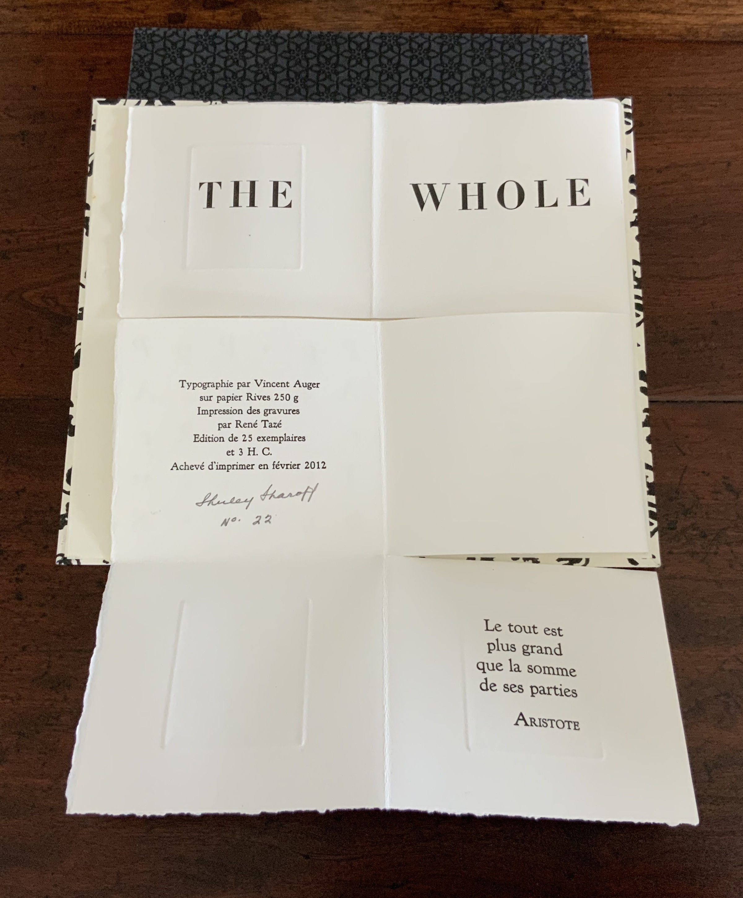
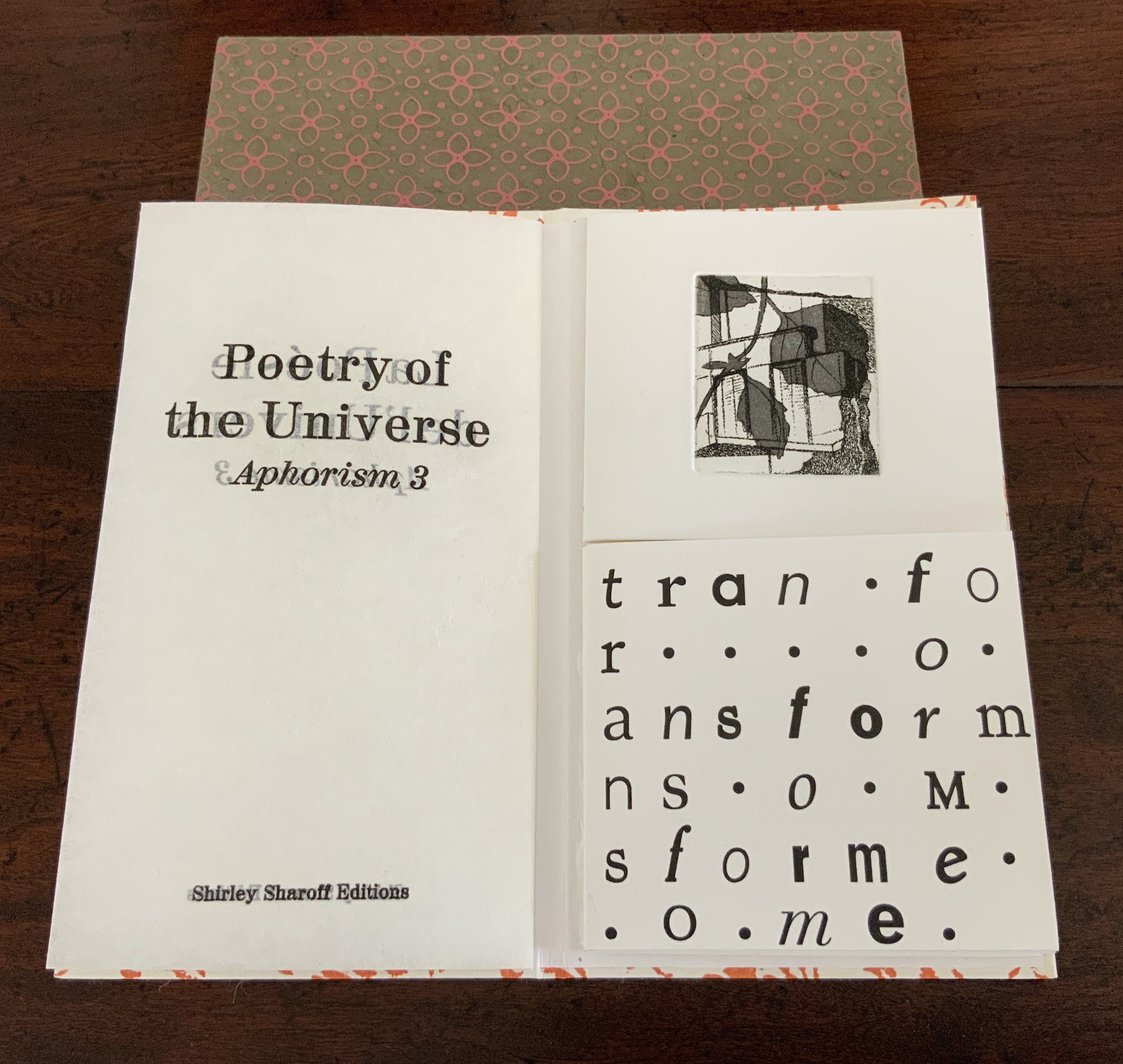
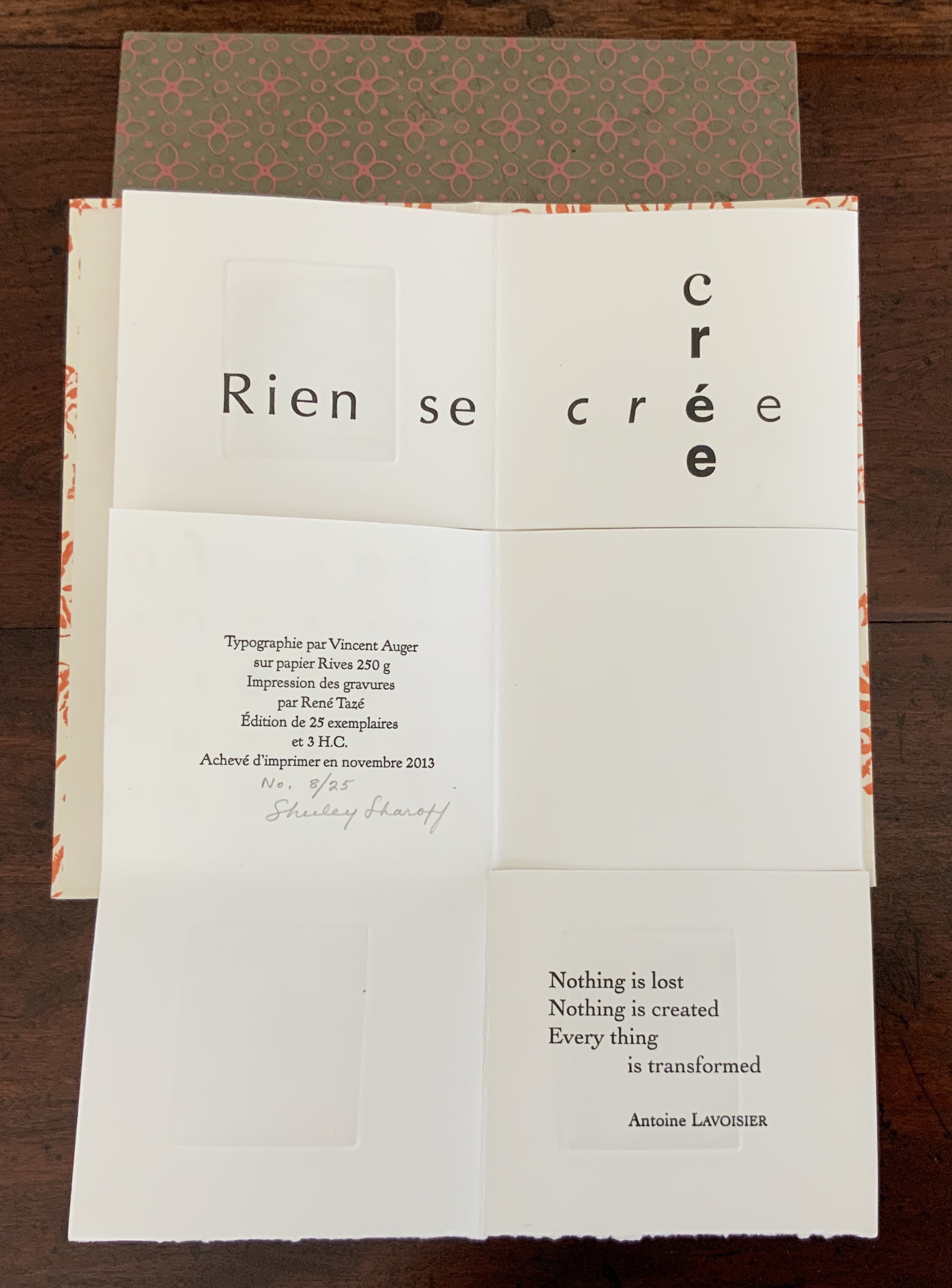
From the series entitled “Punctuation Studies“:
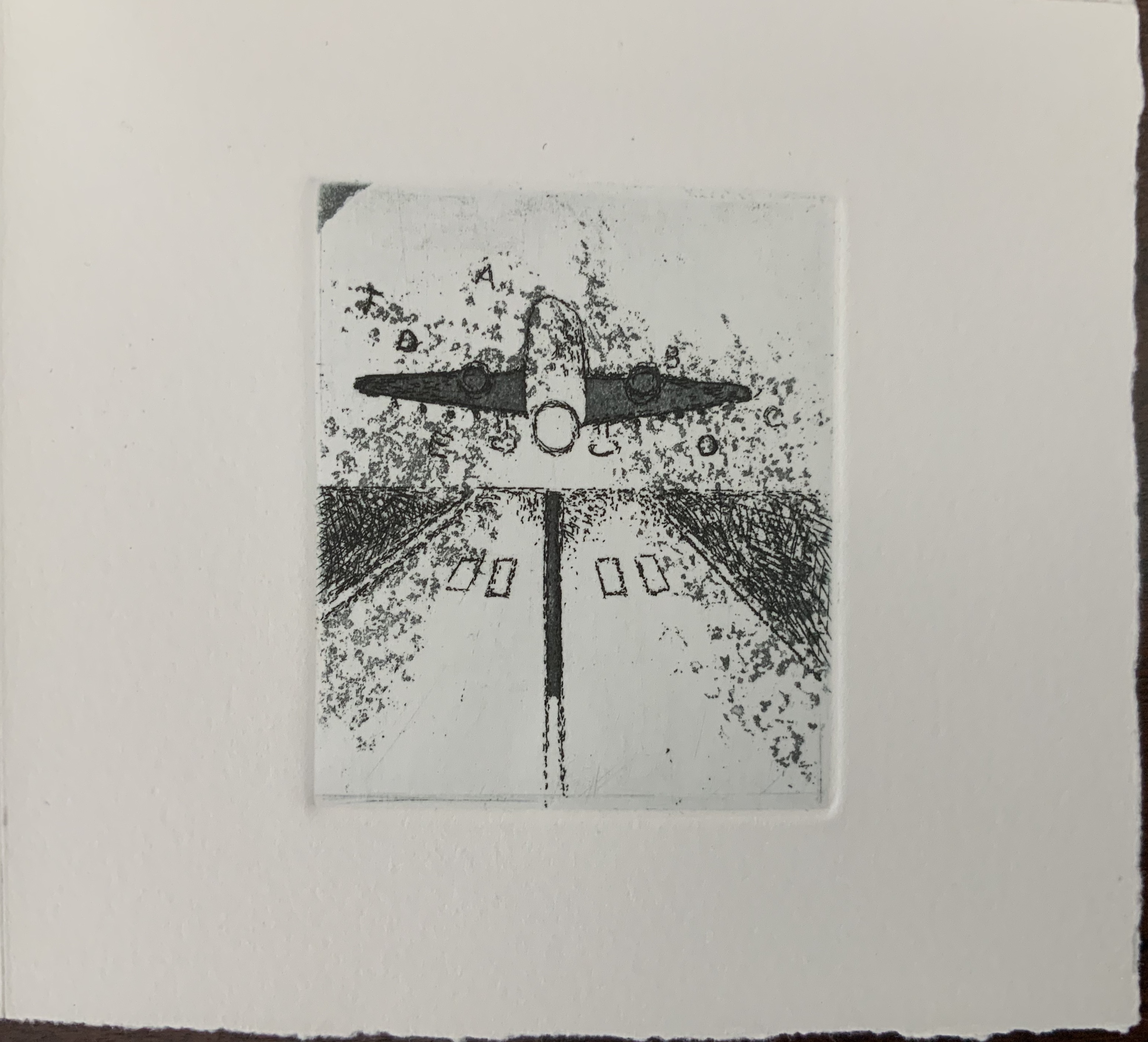
Old Man and Sea (2012)
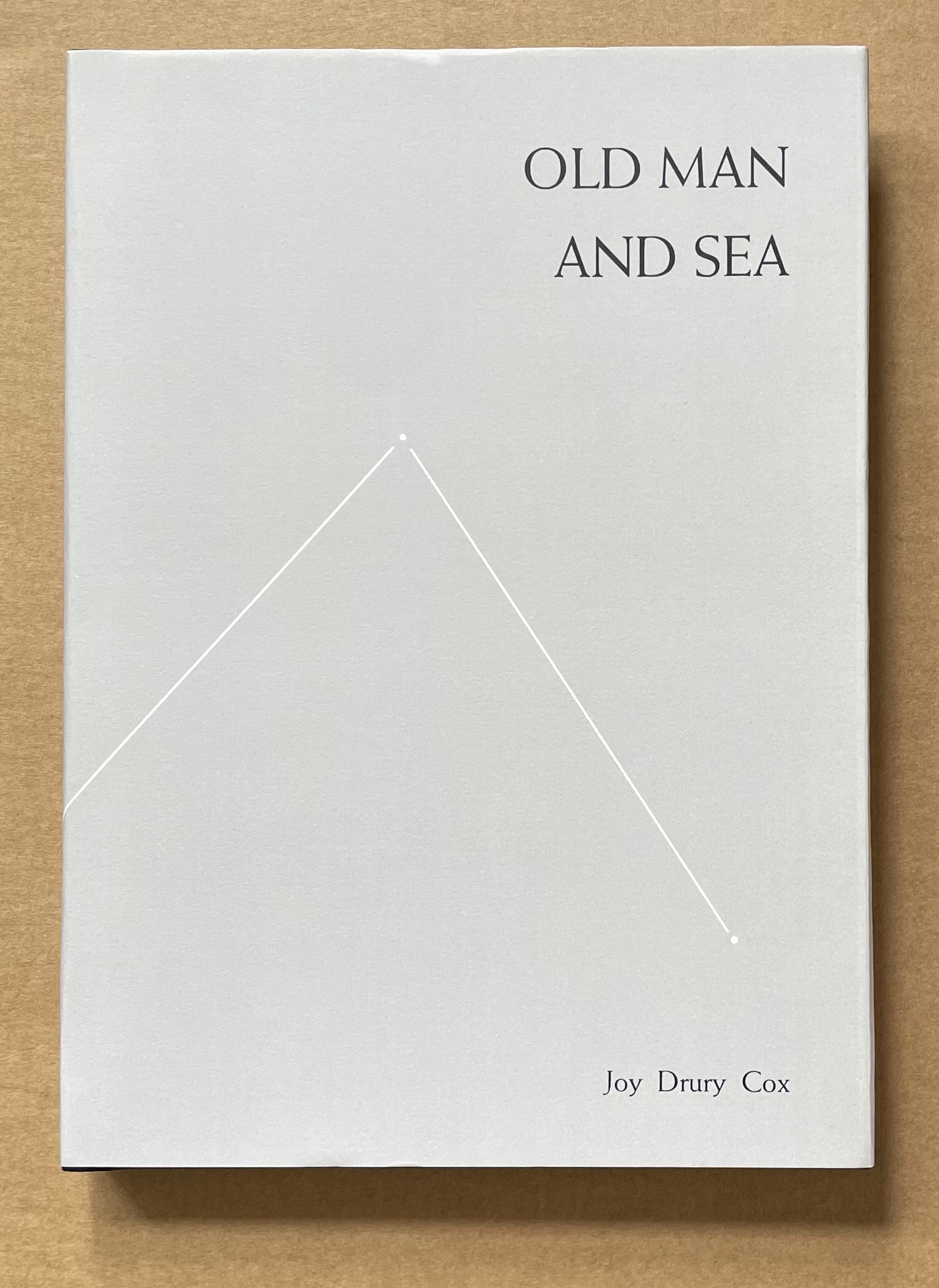
Old Man and Sea (2012)
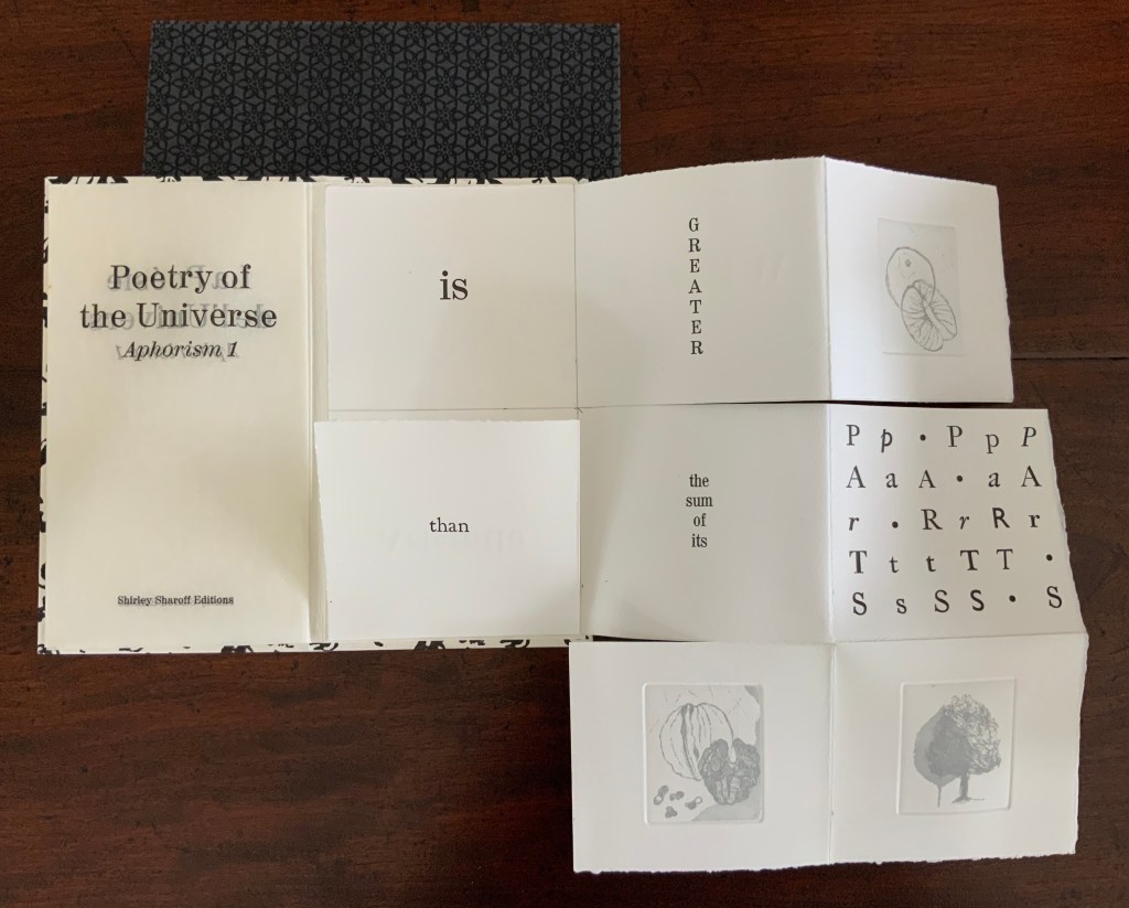
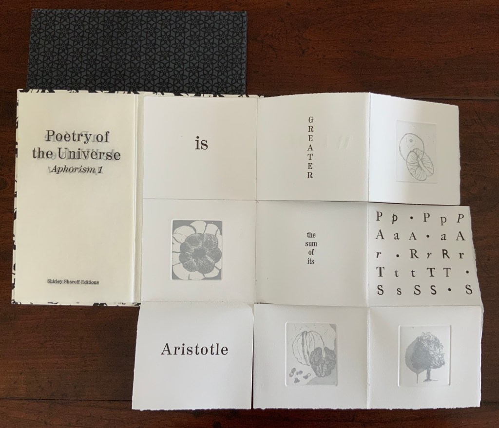
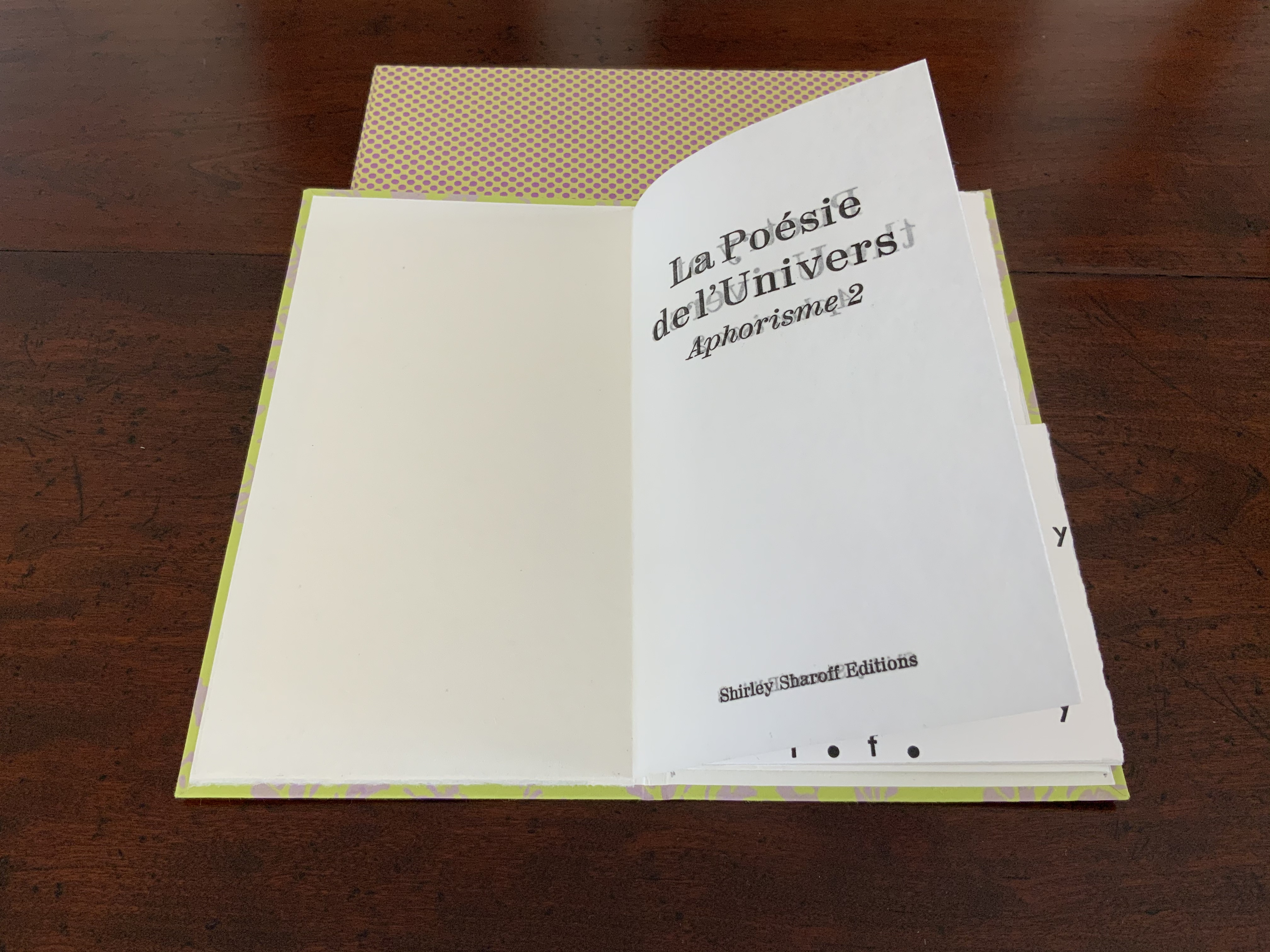
Joy Drury Cox
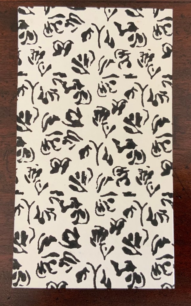
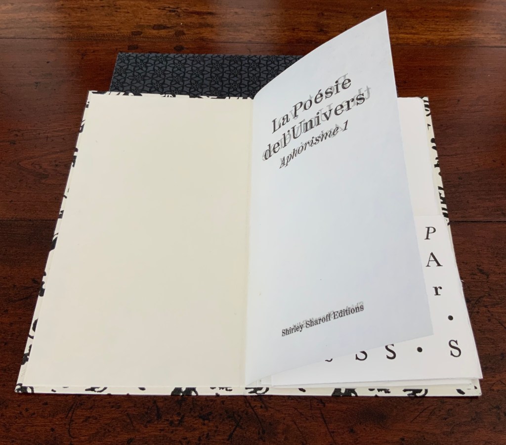
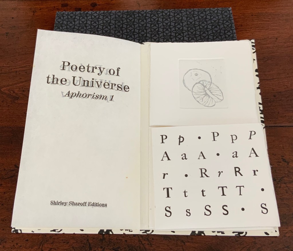
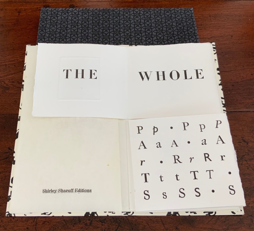
Casebound, cloth over boards, doublures. H206 x W150 mm. 128 pages. Edition of 100. Acquired from Scott Hazard, 18 June 2017.
Photos: Books On Books Collection.
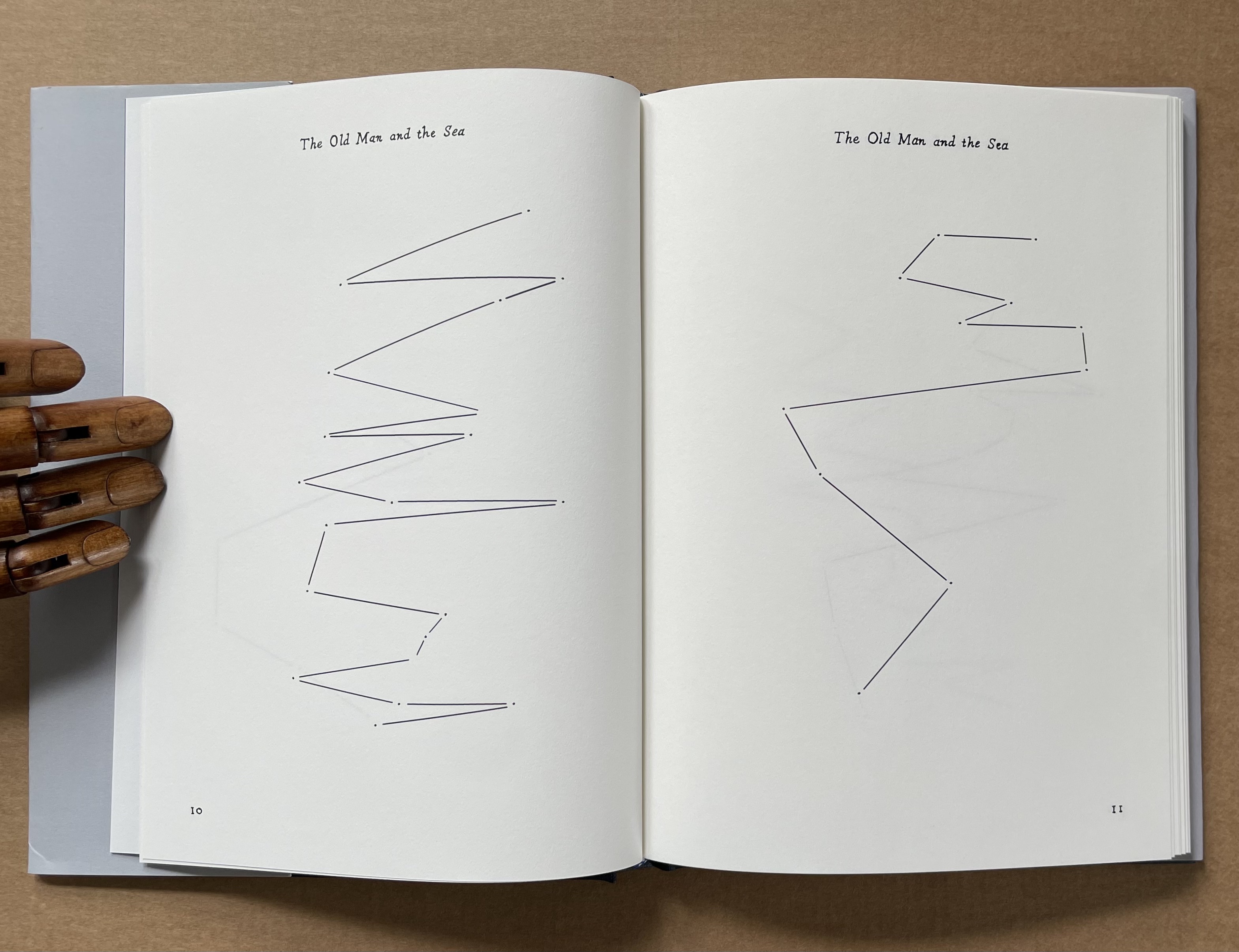
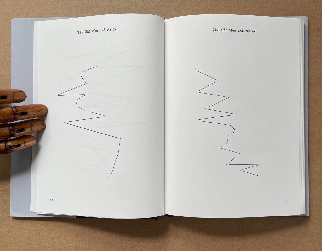
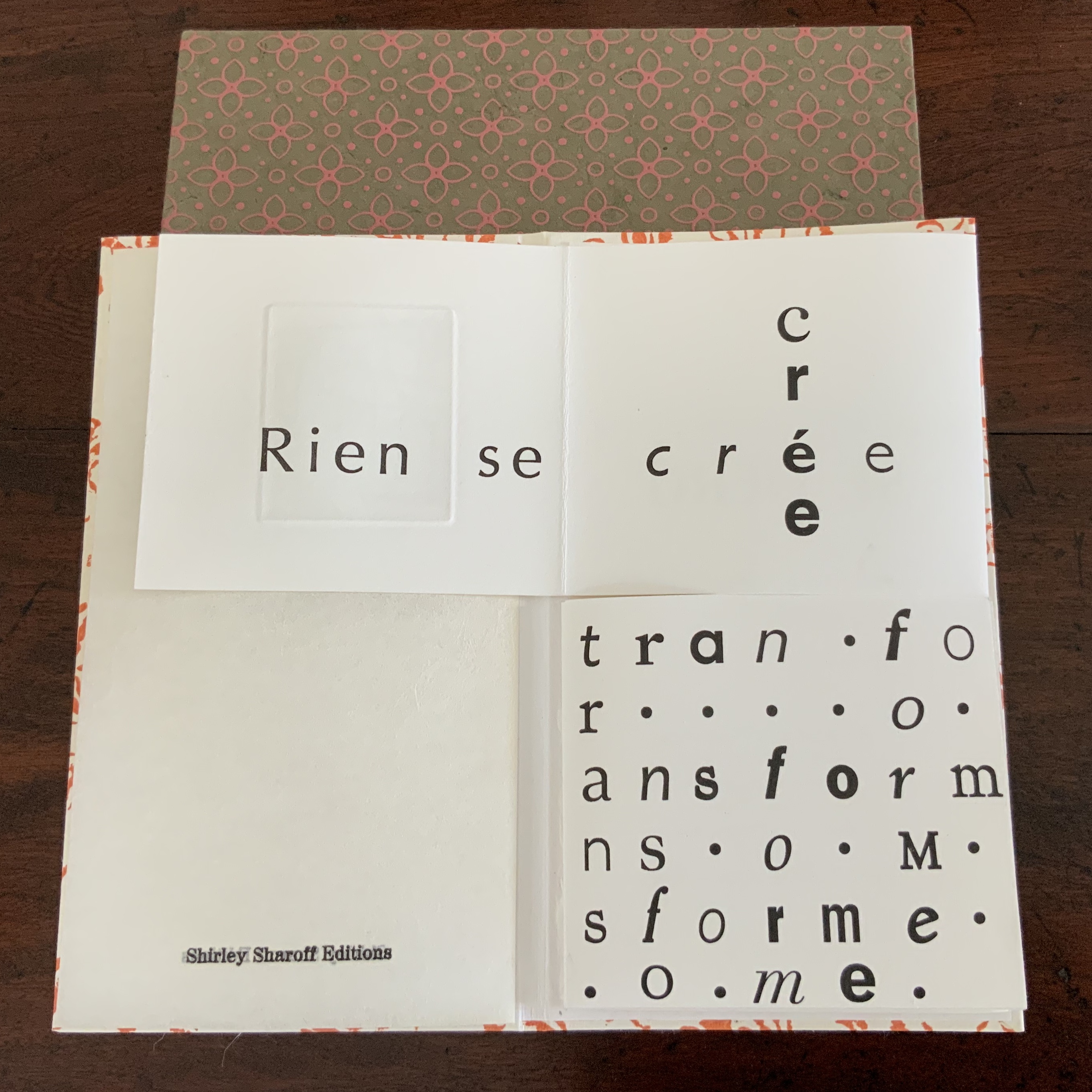
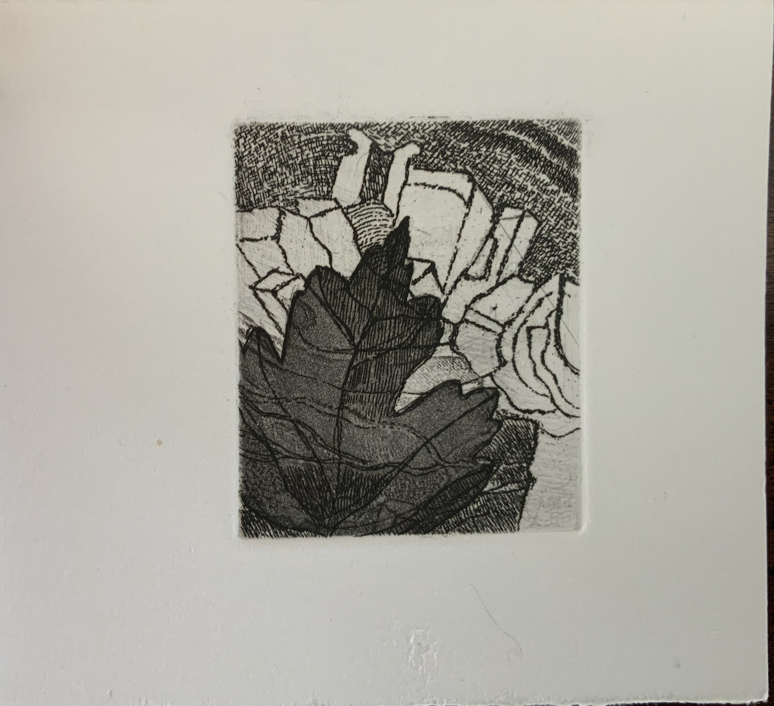
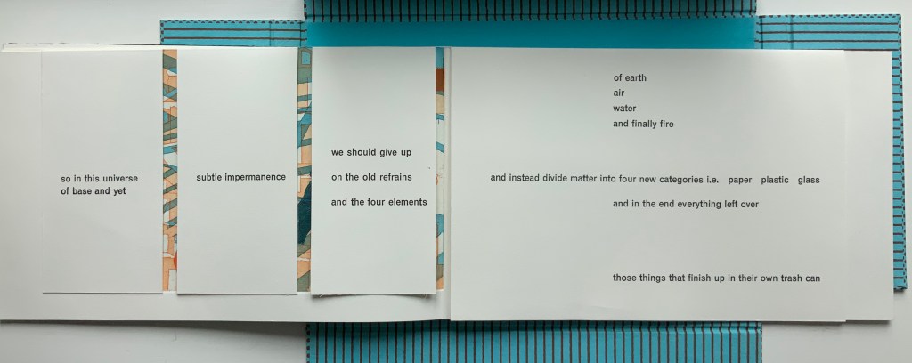
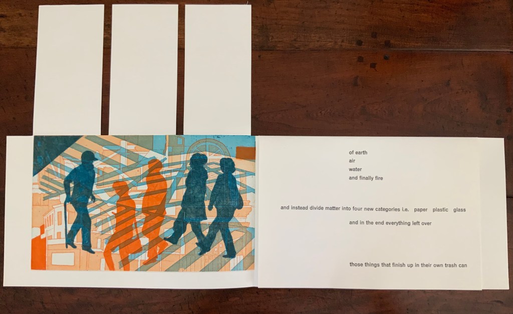
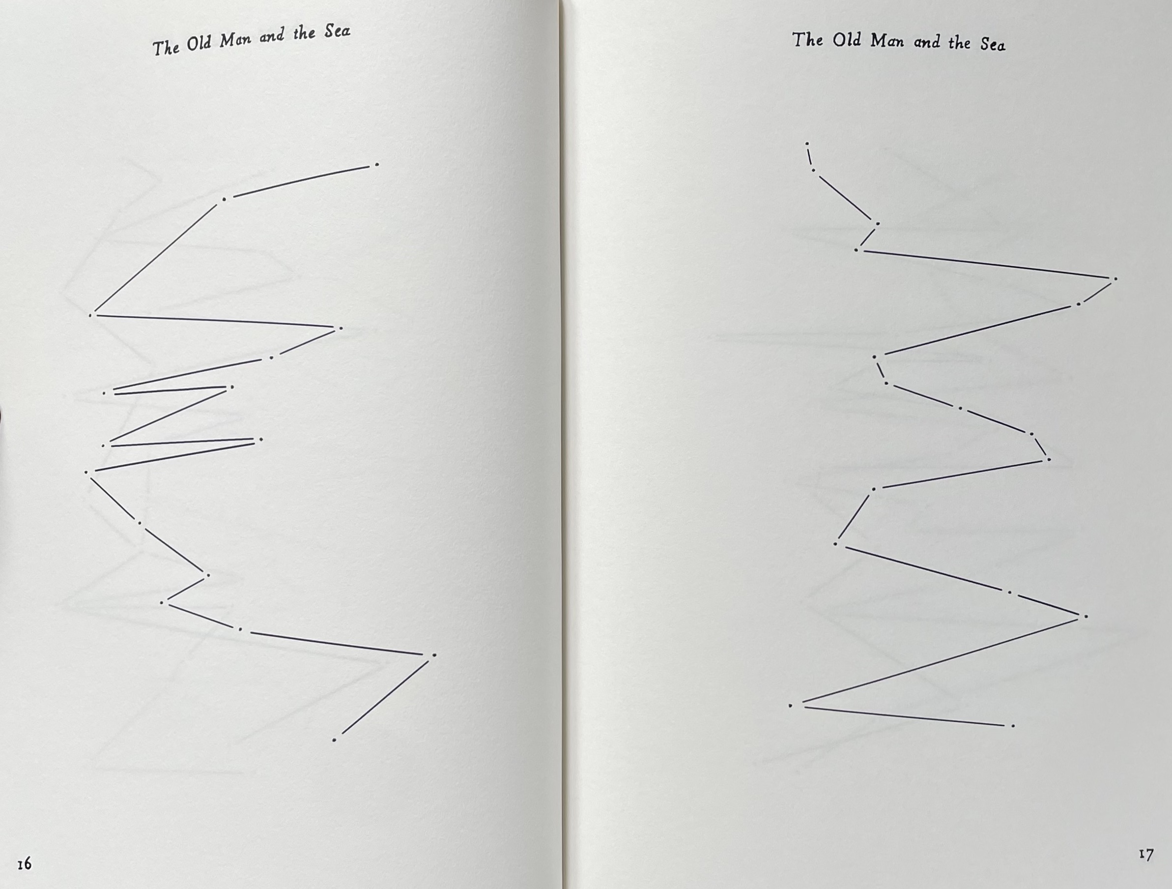
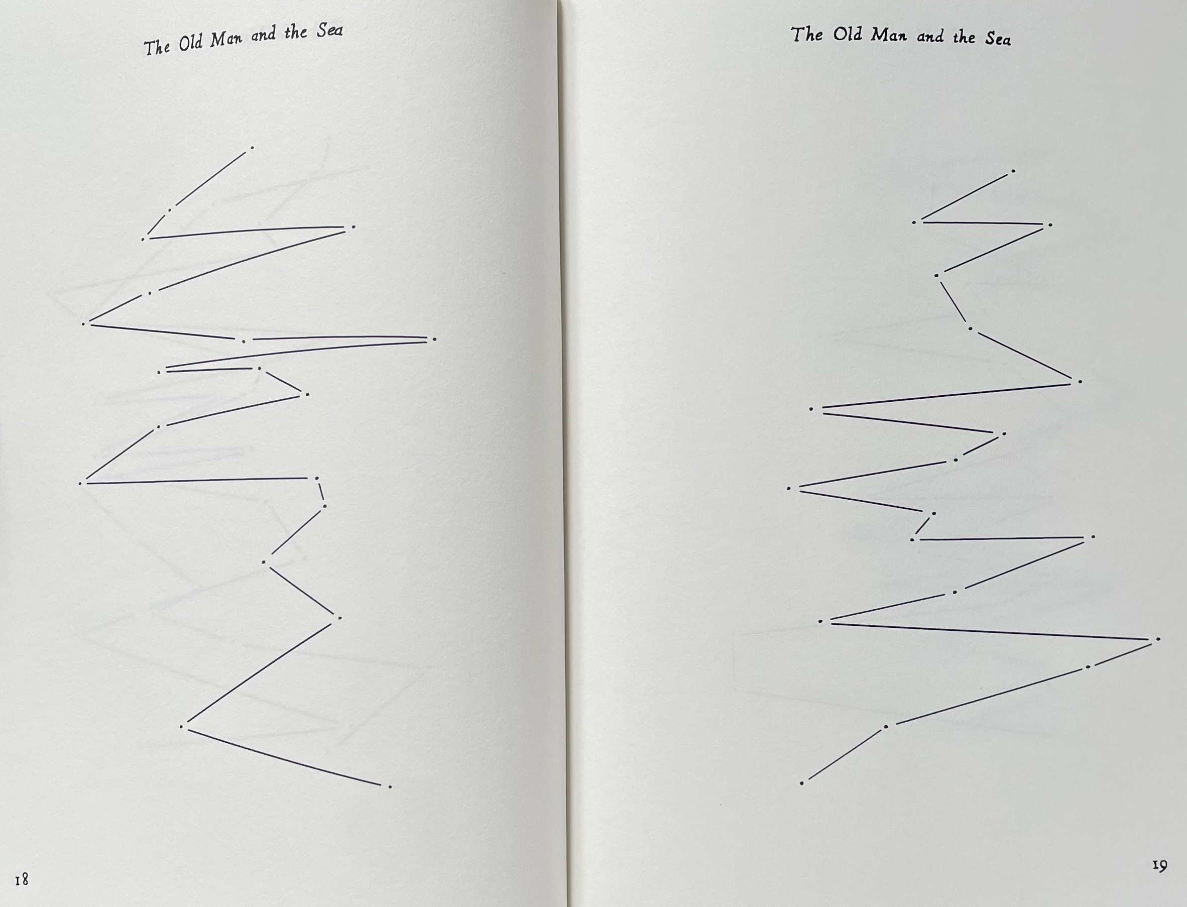
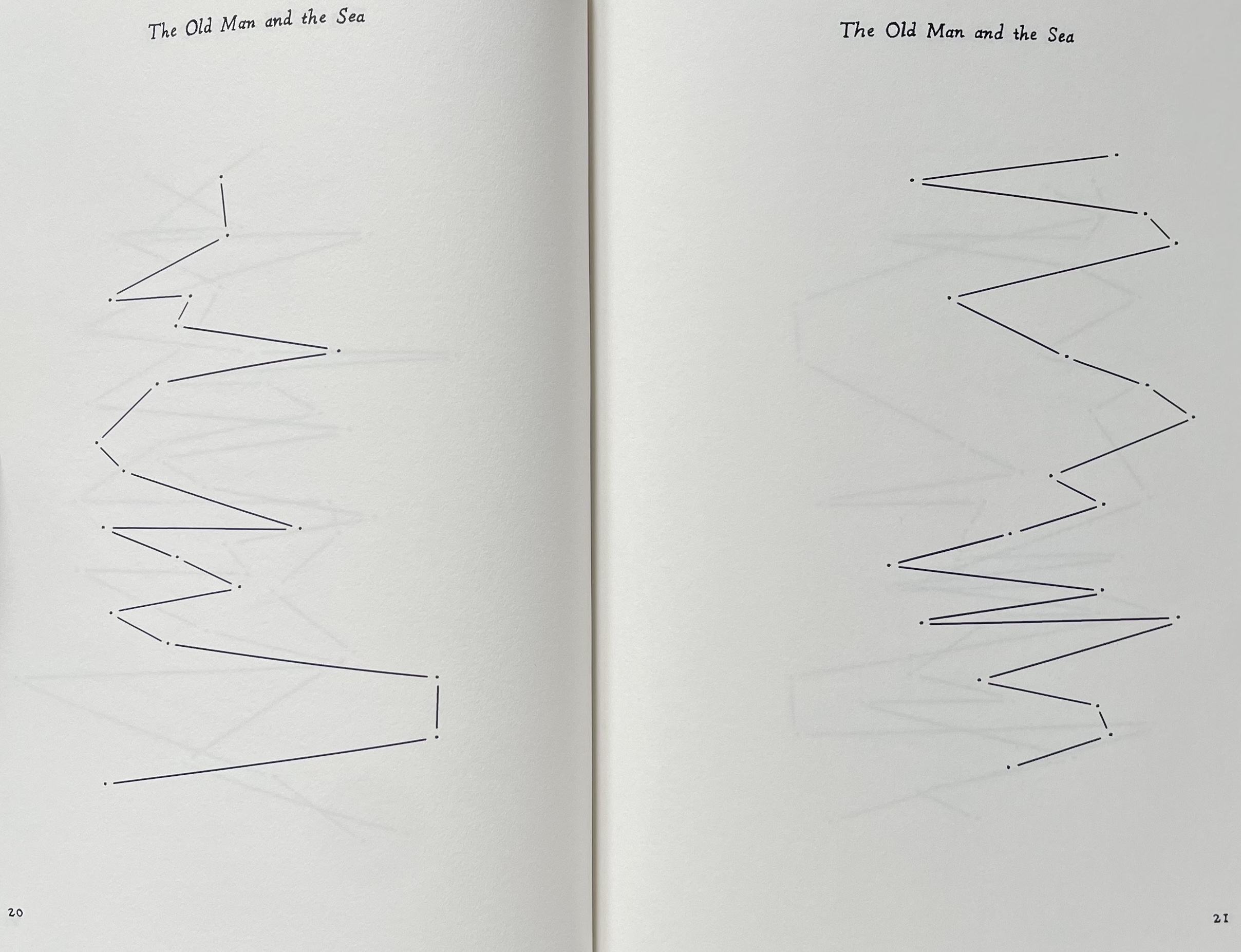
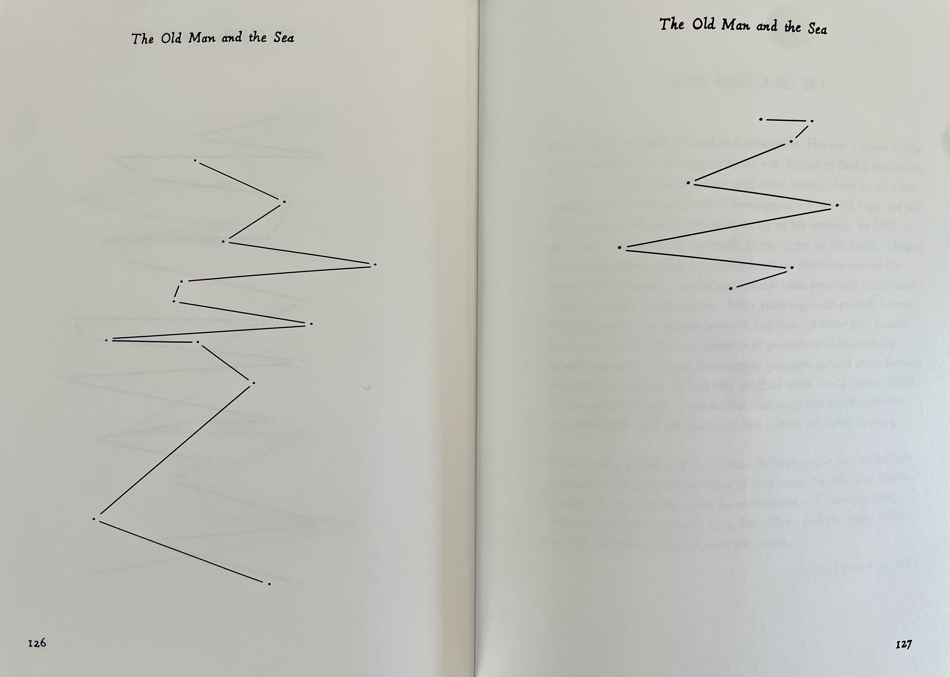
The technique of erasure, excision, redaction, extraction, etc., serves the mastery of negative space. It has attracted a large number of book artists intent on altering an extant work of text. Even webpages can be subjected to it, courtesy of “The Deletionist“, a javascript devised by book artists of course. Negative space provides the background to the marks in the foreground. Likewise, the removed text of The Old Man and the Sea is the background to the marks in Old Man and Sea as foreground, as the running head continually reminds us.
By eliminating all of the text in Ernest Hemingway’s The Old Man and the Sea except for the periods (full stops) and then connecting them with straight lines, Joy Drury Cox offers a visual reading of Hemingway’s narrative style and pace that would have made Paul Klee smile. More than a line being “a dot that went for a walk”, we have lines taken for a walk between the dots at the end of lines. And presumably OuLiPian Georges Perec would nod along in agreement with Cox’s pan-lipogrammatic approach.
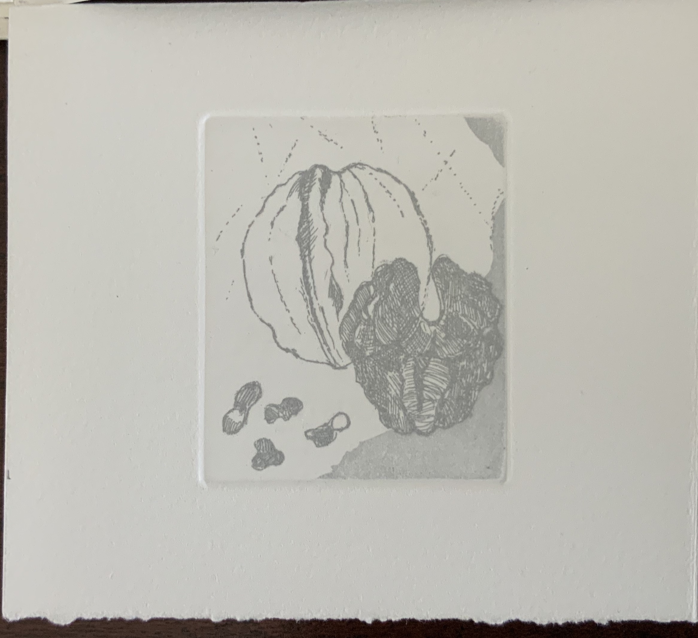
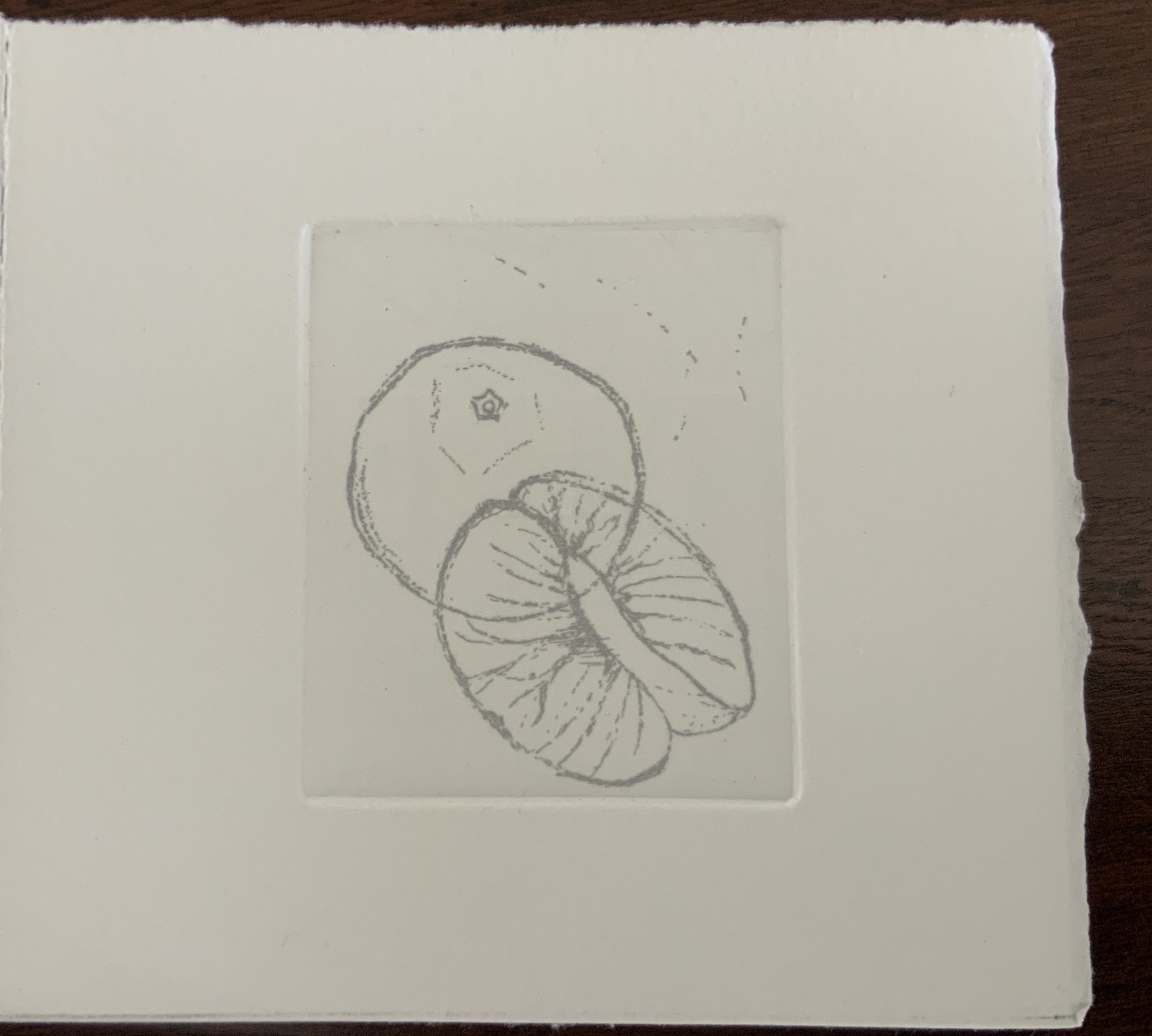
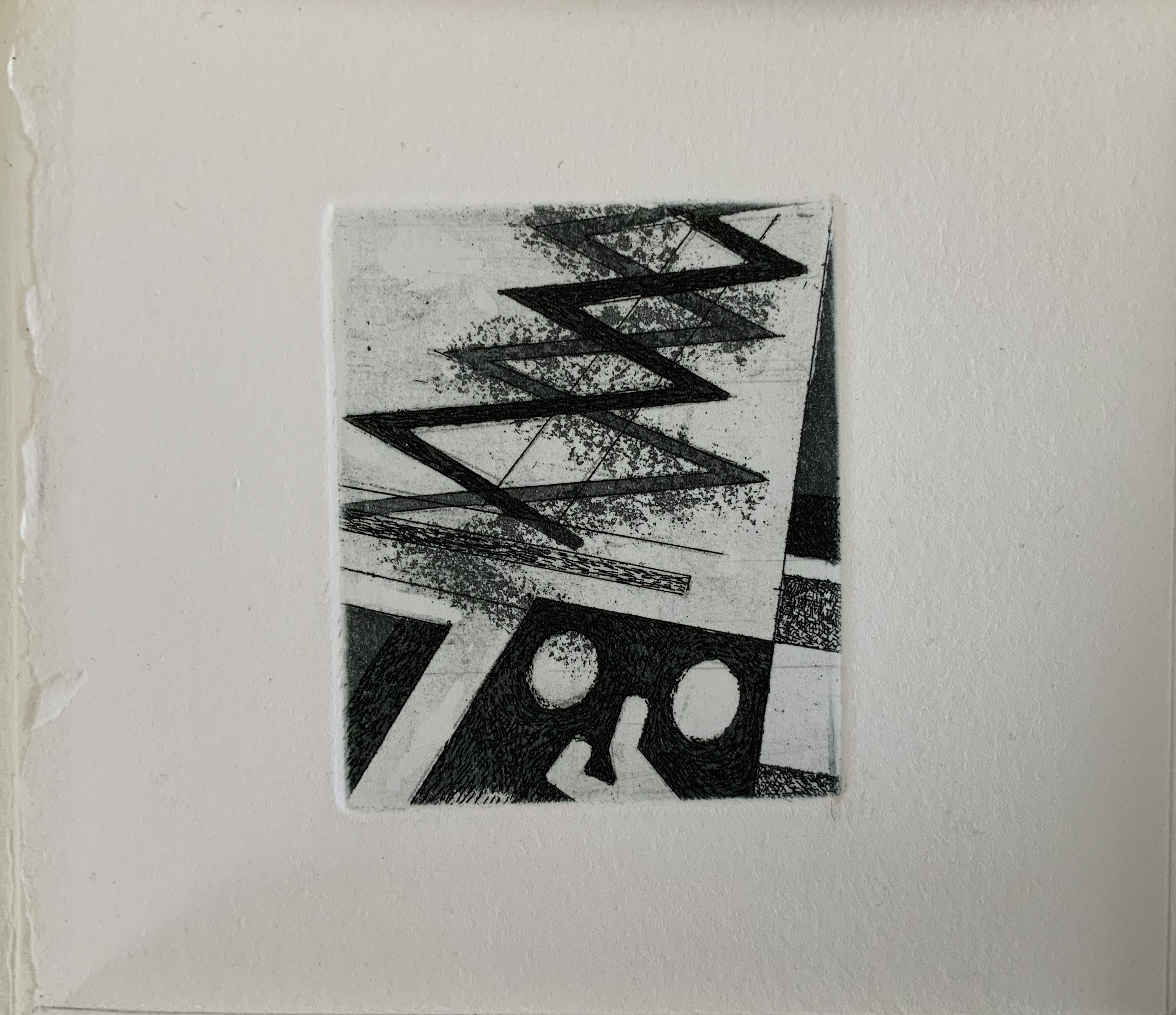
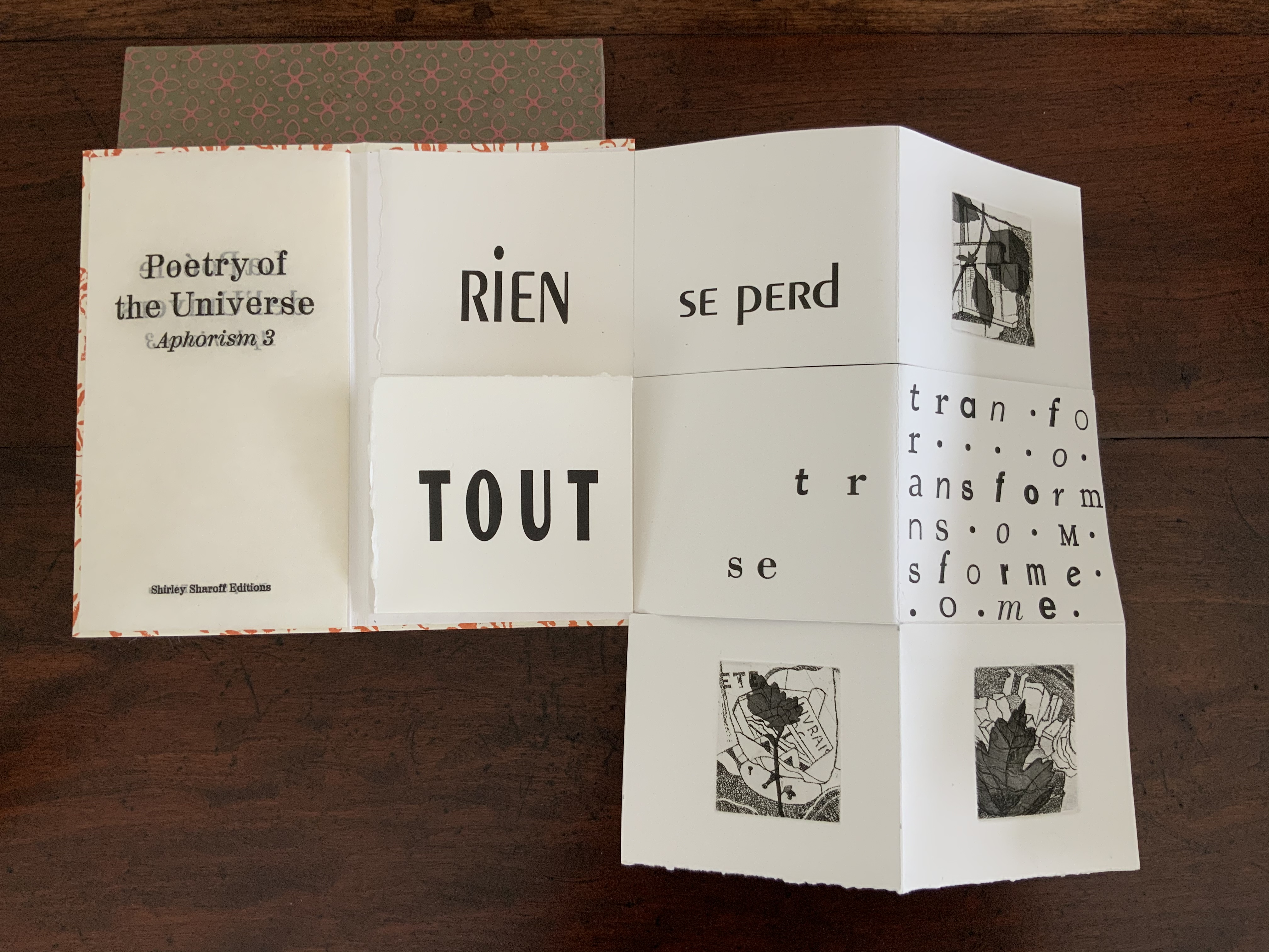
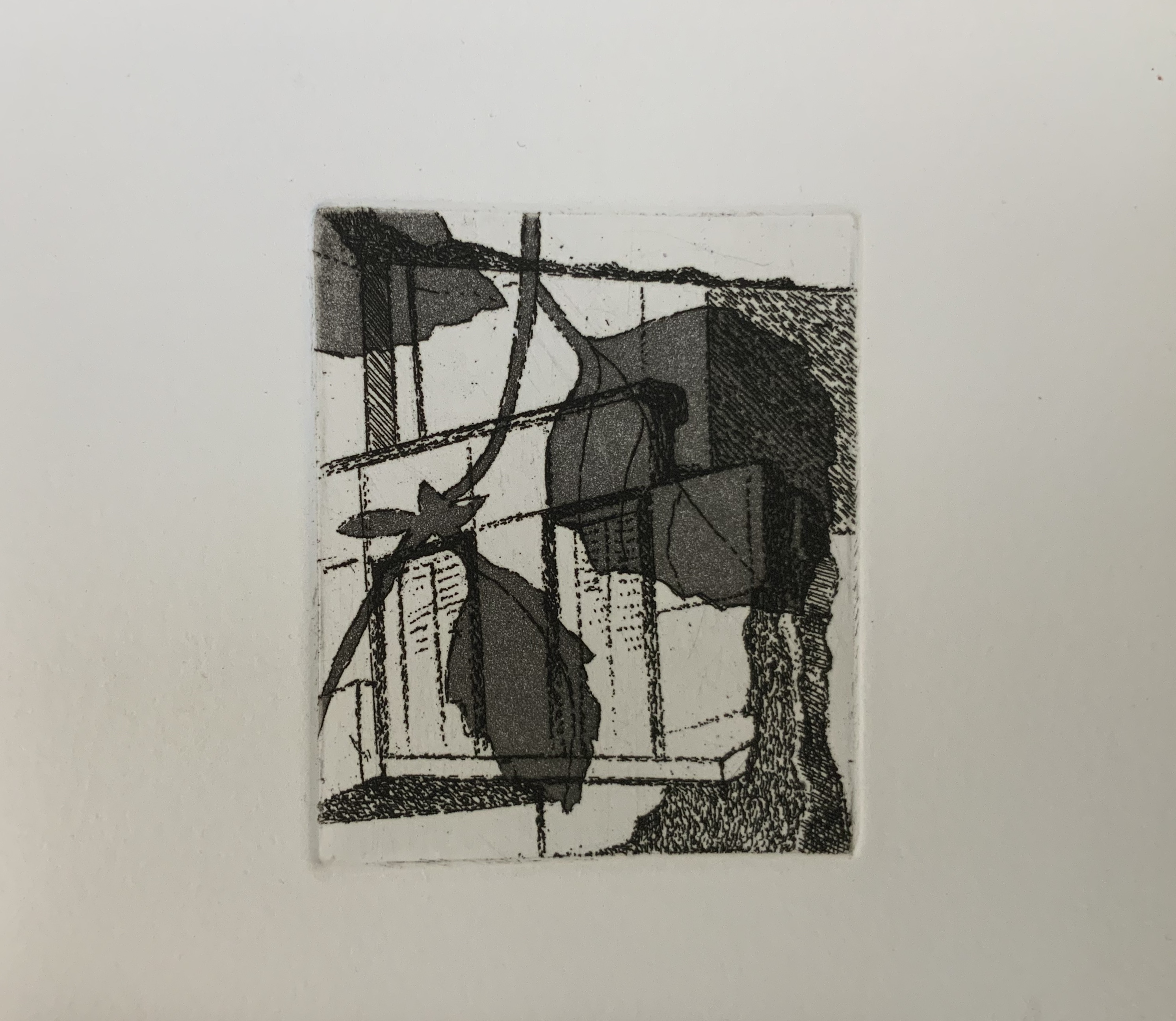
Or, Some of the Whale (2013)
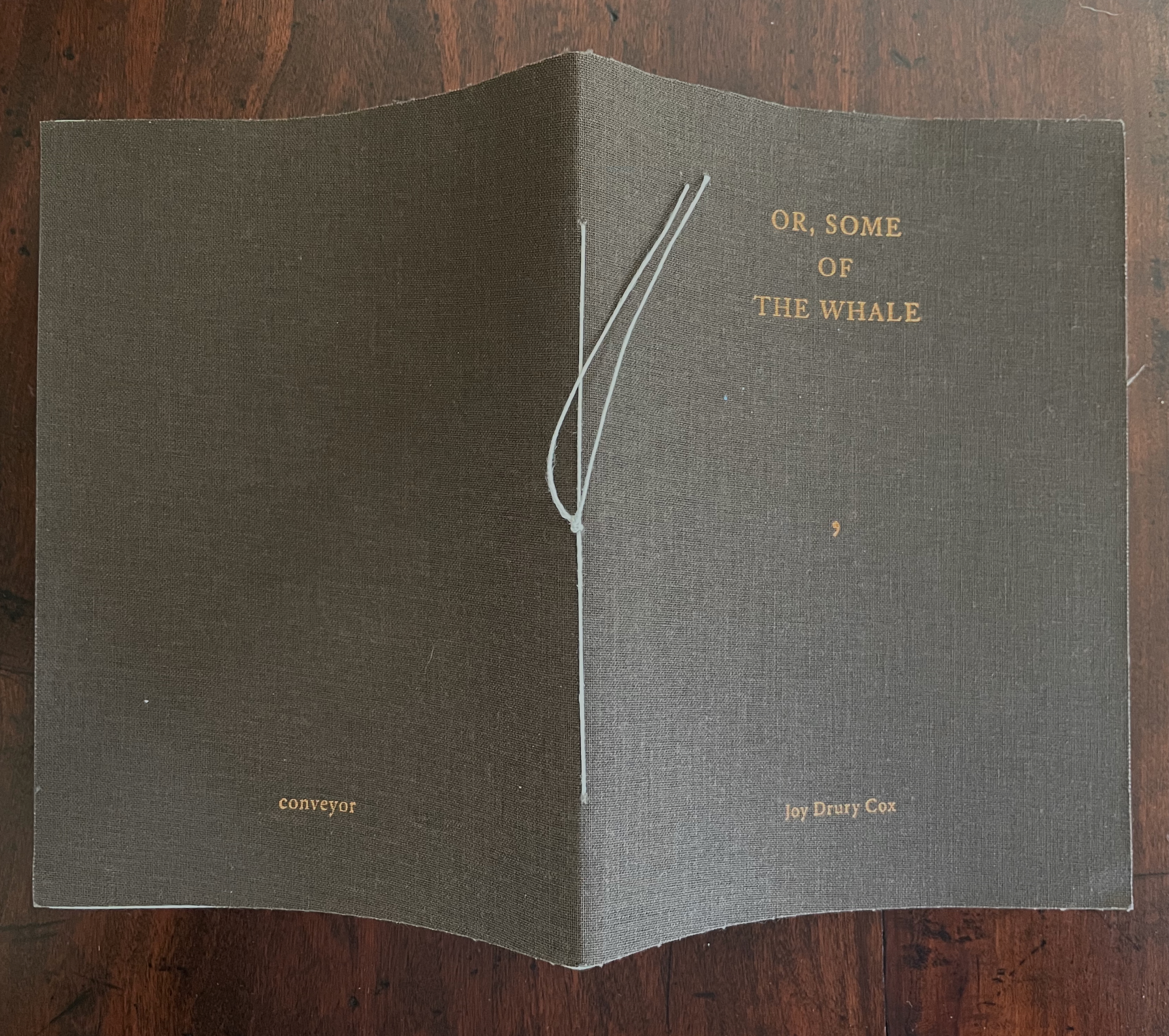
Or, Some of the Whale (2013)
Joy Drury Cox
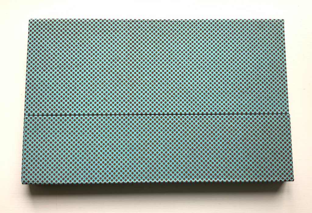
Softcover sewn booklet. H184 x W136 mm. [36] pages. Edition of 100. Acquired from Southern California Vintage & Collectible Resale, 13 July 2025.
Photos: Books On Books Collection.
As long as we know the full title of Herman Melville’s novel — Moby-Dick; or, the Whale — the title on the cover of this entry in Joy Drury Cox’s “Punctuation Studies” (and its size) tells the story plain. Almost all of “Moby-Dick;” is gone, “Or, Some of the Whale” remains. A cover like sail-cloth, pamphlet stitched over 4 chapters of a 135-chapter novel reduced to only the commas in their positions in the original text, all swimming in the blank pages like sperm or breaching from it like microscopic sperm whales.
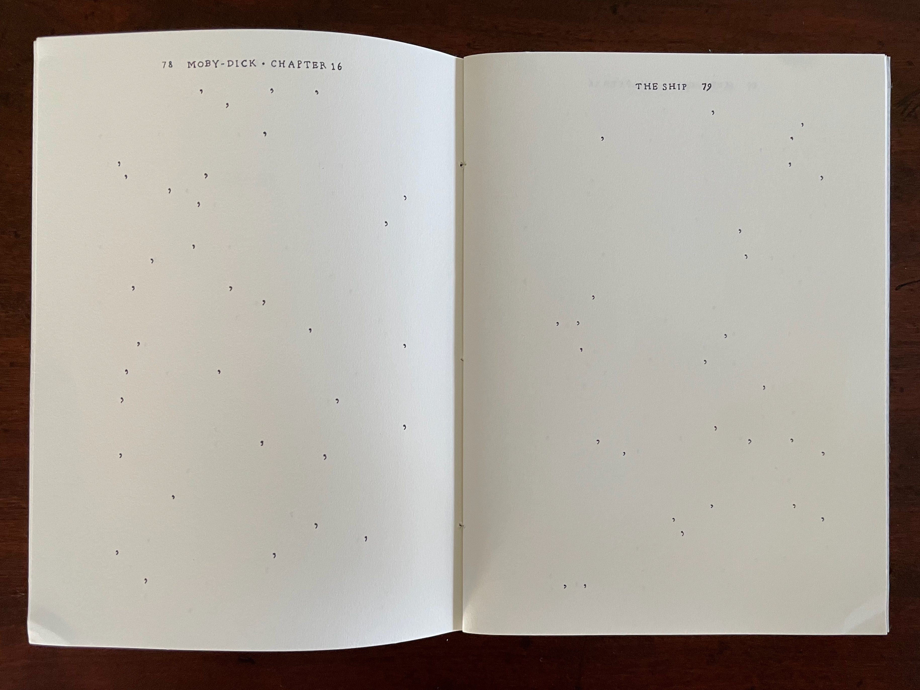
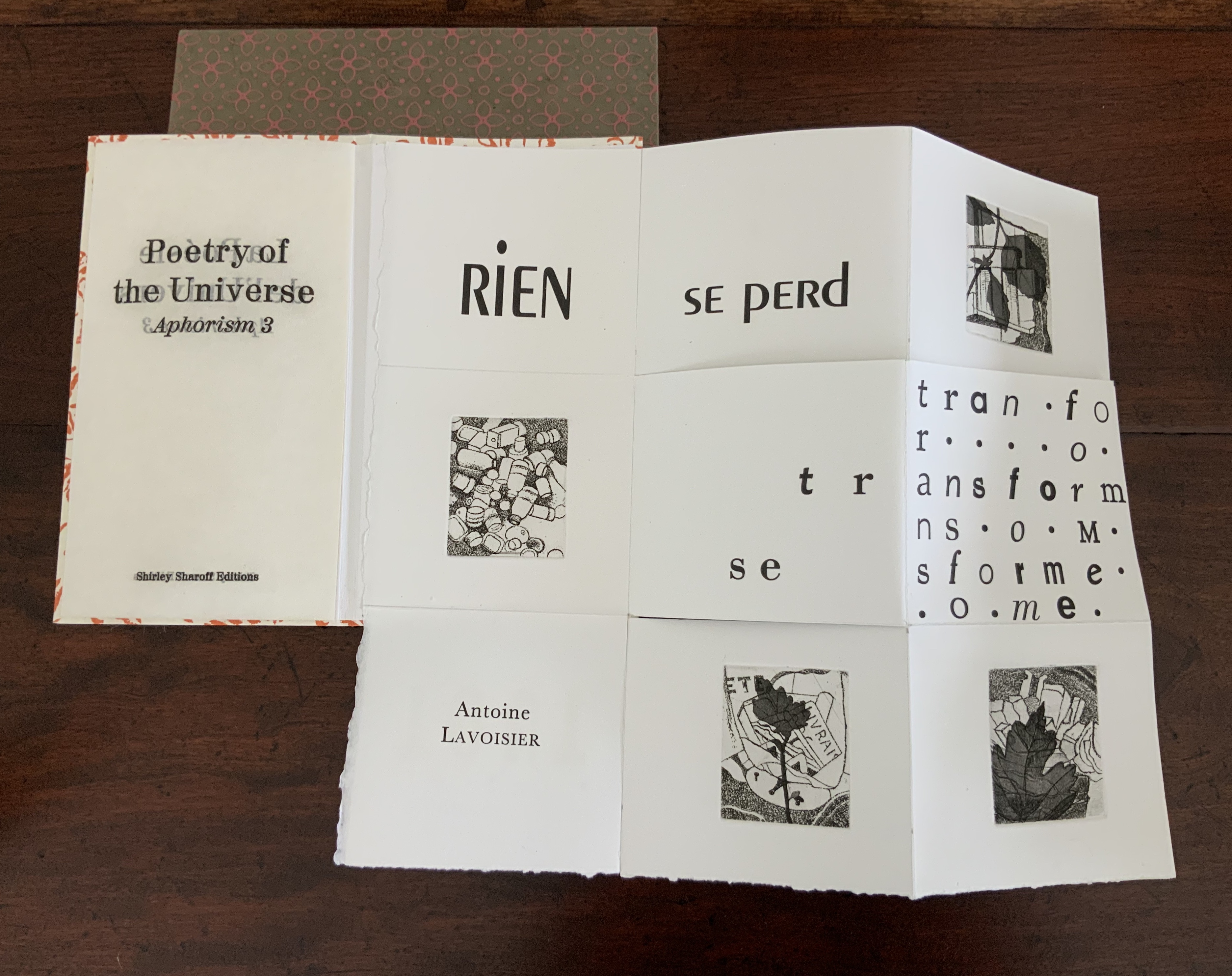
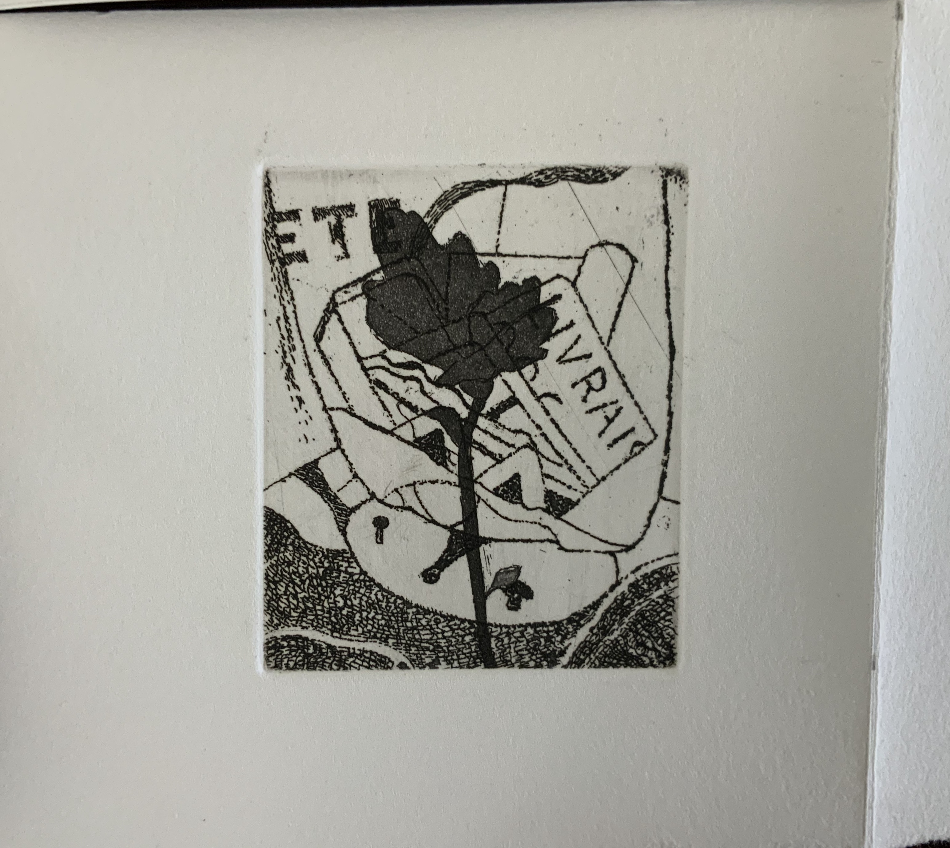
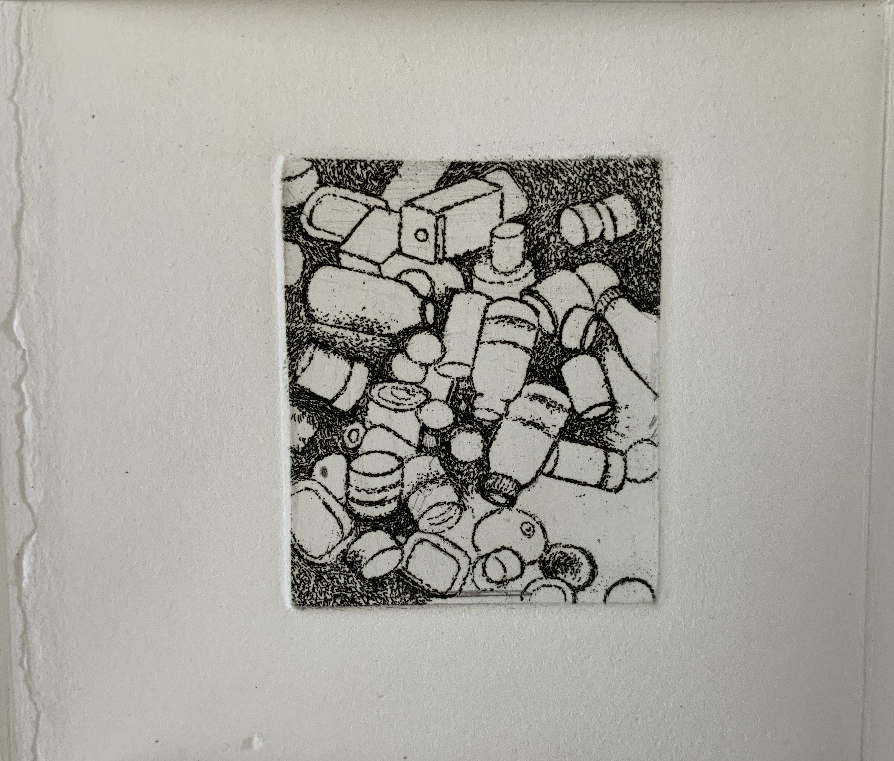
Chapter 16, The Ship, pp. 76-89.
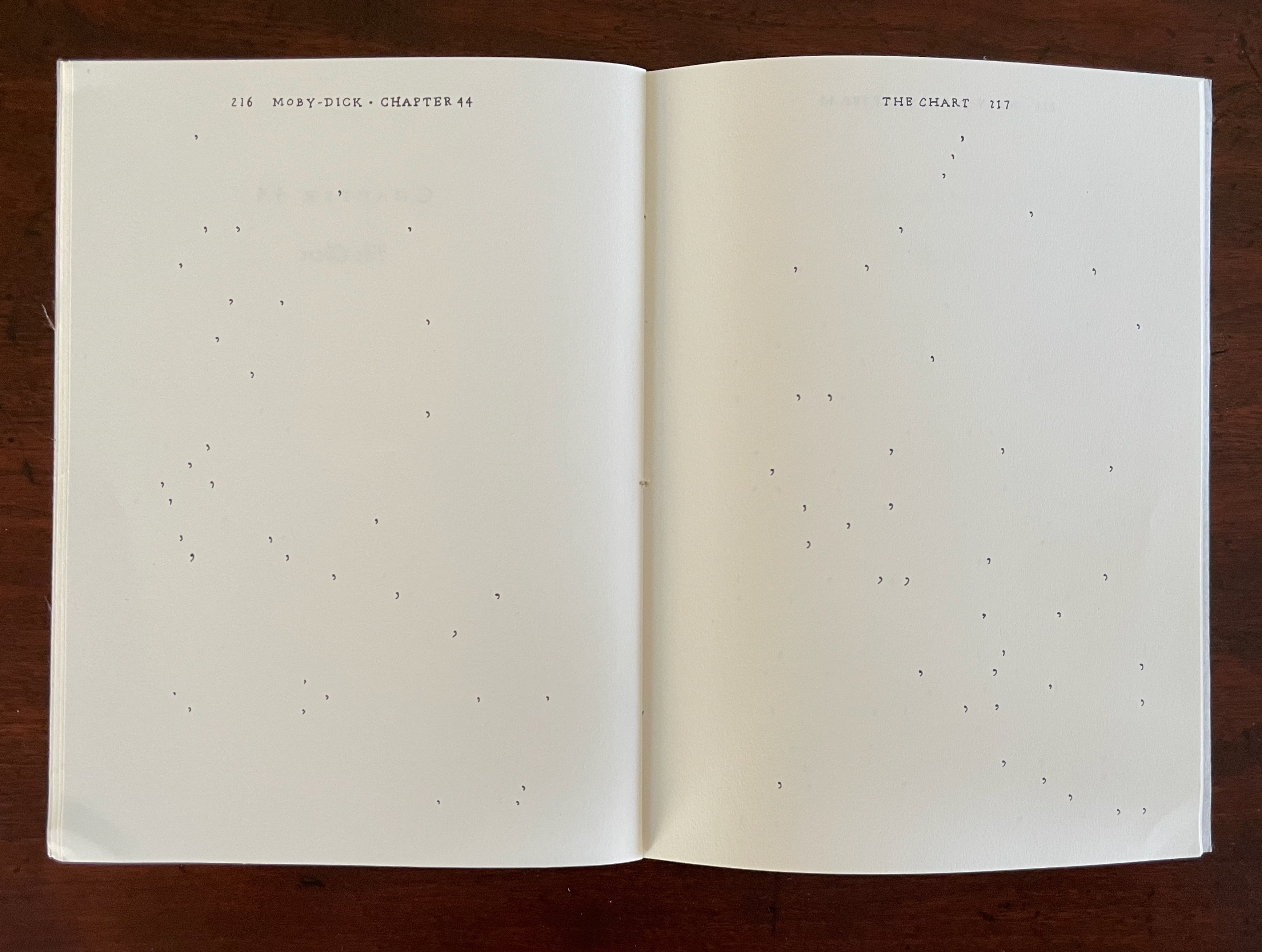
Chapter 44, The Chart, pp. 215-20.
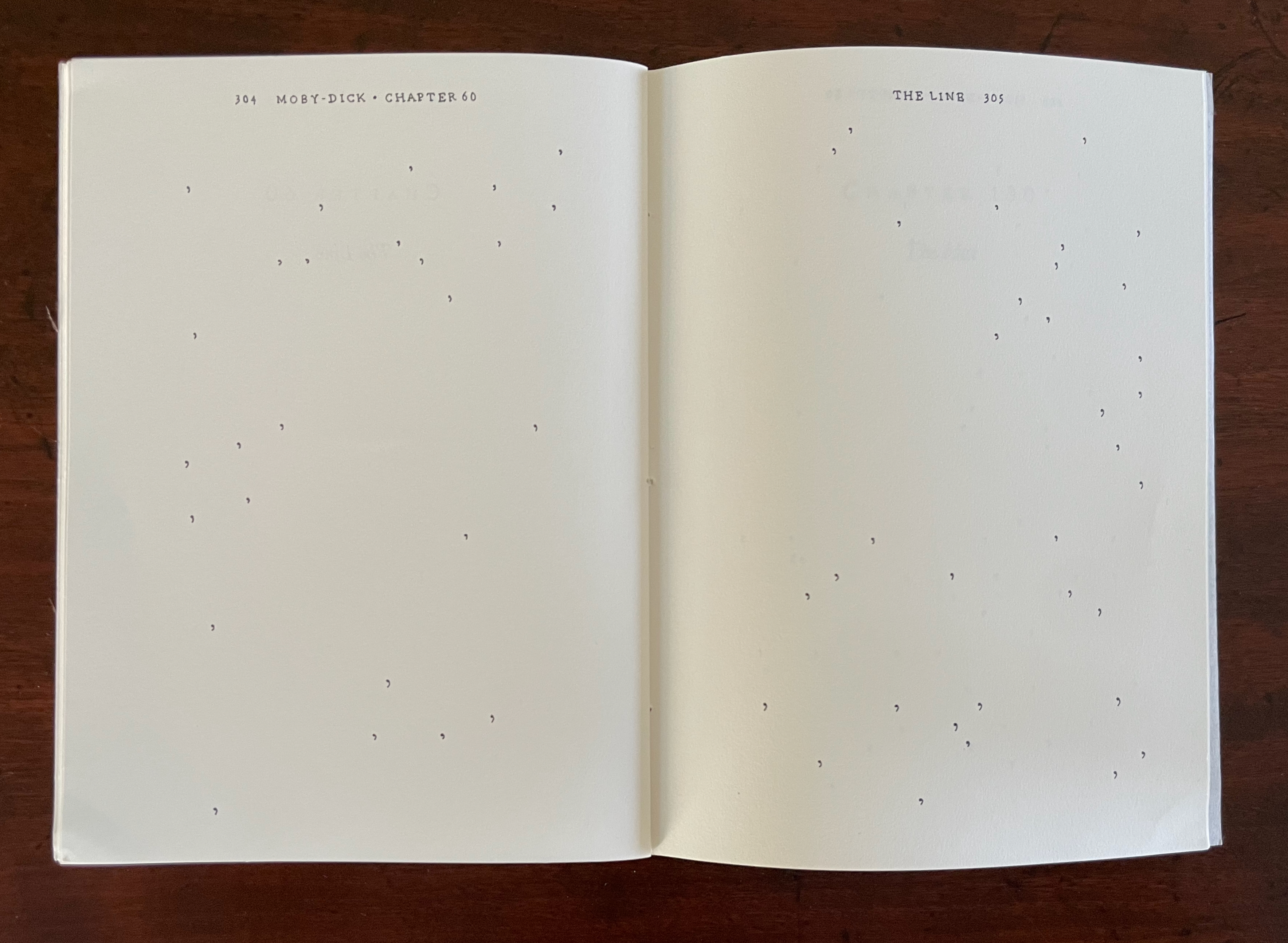
Chapter 60, The Line, pp. 303-06.
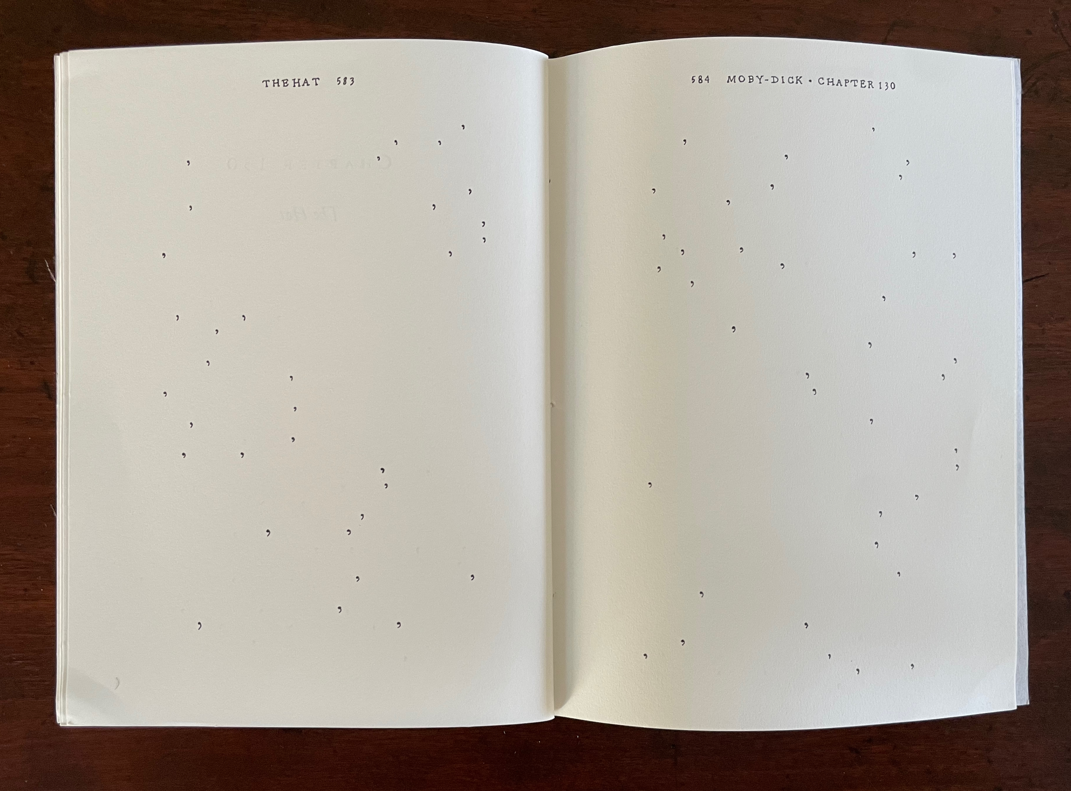
Chapter 130, The Hat, pp. 582-86
Cox’s “Punctuation Studies” are examples of inverse ekphrasis, turning a text into visual or conceptual art. Other works in the collection that use the technique of erasure, excision, etc., for that purpose are listed below. That technique is only one means of inverse ekphrasis; examples using other techniques can be found in “Notes on ‘Inverse Ekphrasis’ as a way into book art“.
Further Reading
“Derek Beaulieu“. In progress. Books On Books Collection.
“Jérémie Bennequin“. 15 December 2020. Books On Books Collection.
“Doug Beube“. 21 April 2020. Books On Books Collection.
“Marcel Broodthaers“. In progress. Books On Books Collection.
“herman de vries“. 5 July 2020. Books On Books Collection.
“Evans, Cerith Wyn“. 16 April 2020. Books On Books Collection.
“Jonathan Safran Foer“. 8 November 2024. Books On Books Collection.
“Jo Hamill“. 23 June 2026. Books On Books Collection.
“Ines von Ketelhodt“. 1 February 2021. Books On Books Collection.
“Michel Lorand“. 22 December 2021. Books On Books Collection.
“Masoumeh Mohtadi“. 5 February 2021. Books On Books Collection.
“Caroline Penn“. 11 June 2020. Books On Books Collection.
“Michalis Pichler“. 19 August 2020. Books On Books Collection.
“Benjamin Shaykin“. 3 December 2022. Books On Books Collection.
“Rachel Smith“. In progress. Books On Books Collection.
“Buzz Spector“. 24 September 2021. Books On Books Collection.
“Carolyn Thompson“. 19 December 2023. Books On Books Collection.
“Notes on ‘Inverse Ekphrasis’ as a way into book art“. 16 June 2022. Bookmarking Book Art.
Bochner, Mel. 1967. “the serial attitude”. Artforum 6.4: 28–33.Search in Google Scholar
Borsuk, Amaranth, Jesper Juul, and Nick Montfort. 2015. “Opening a Worl in the World Wide Web: The Aesthetics and Poetics of Deletionism” in Media-N: Journal of the New Media Caucus 11:1, The Aesthetics of Erasure.
Bursey, Jeff. March 2015. “Masterpieces Can’t Be Willed Into Existence: Review Portrait of a Man Known as Il Condottiere by Georges Perec“. Numéro Cinq 3.
Caws, Mary Ann. 2001. “Tom Phillips: Treating and Translating‘. Mosaic: An Interdisciplinary Critical Journal, 34(3), 19–33.
Clercx, Byron, and Marian Cohn,. 2011. ‘Turning in on the Self’, in Marian Cohn (ed.), Doug Beube: Breaking the Codex. New York: The Iconoclastic Museum Press. pp 121-42.
Drucker, Johanna. 2004. The Century of Artists’ Books [Second edition] ed. New York City: Granary Books, pp. 109-19, “The Book Transformed”.
Dworkin, Craig Douglas. 2003. Reading the Illegible. Evanston, Ill.: Northwestern University Press.
King, Andrew David. 6 November 2012. ‘The Weight of What’s Left [Out]: Six Contemporary Erasurists on Their Craft.’ Kenyon Review Blog.
Klee, Paul. 1968. Pedagogical Sketchbook. London: Faber and Faber.
Mayar, Mahshid. 2025. “Erasure and Seriality: The “Serial Attitude” in A Humument and Tree of Codes” Anglia, 143:1, pp. 184-198.
Penn, Cheryl. 2009. “The Artists Book in General, the Altered Book in Particular“. Paper based on the dissertation The Use of the Artist’s Book as a Versatile Form of Expression in the Work of Selected Artists, With Particular Reference to the Altered Book submitted in partial fulfillment of the requirements for the degree Master of Technology in Fine Arts, Durban University of Technology (DUT): Durban, 2009. “By violating the ready made book, the artist challenges traditional reading patterns and inherent meaning, being at once destructive and constructive. ” (64)