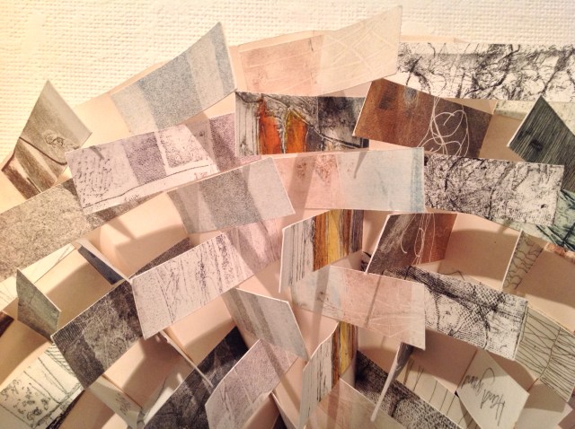
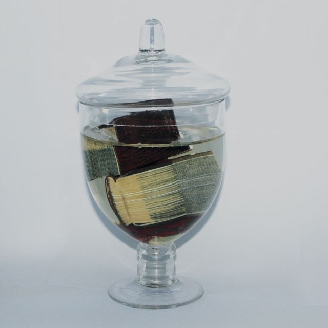
Cardboard Box (White) for Invisible Text, “Called Back,” Epitaph for Emily Dickinson Jeanne Silverthorne, 2017 Platinum silicone rubber, acid free paper, archival invisible ink 9 x 17 x 13 inches / 23 x 43 x 33 cm Edition 1/3 with 1 A.P
Dare you see a soul at the white heat? Then crouch within the door. Red is the fire’s common tint; But when the vivid ore Has sated flame’s conditions, Its quivering substance plays Without a color but the light Of unanointed blaze. Least village boasts its blacksmith, Whose anvil’s even din Stands symbol for the finer forge That soundless tugs within, Refining these impatient ores With hammer and with blaze, Until the designated light Repudiate the forge. – Emily Dickinson, Part One, Life, XXXIII
MARC STRAUS, the contemporary art gallery in the Lower East Side of New York, opened “an exhibition of white paintings and sculptures by an international selection of artists” on 3 June 2017. It runs through 3 July, and its title The White Heat comes from the first line of Dickinson’s poem above.
Books on Books offers this “white book report” on book art not included to put attendees in the mood for their experience of the works in white by artists such as
Damien Hirst
Nicole Eisenman
Enrico Castellani
Robert Barry
Fernanda Gomes
Antonio Santin
Jeanne Silverthorne
Joan Levison and others.
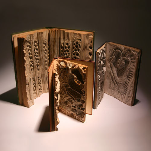
Book Faced Down – Embedded in Plaster, 1999 Found cook book and plaster block Irwin Susskind, born 1935 34.6 x 20.9 x 6.5 cm (13 5/8 x 8 1/4 x 2 9/16 in.) The Allan Chasanoff, B.A. 1961, Book Art Collection, curated with Doug Beube
Irwin Susskind‘s “Book Faced Down” is an example of the technique of mixed media – a stark white plaster block facing down the objectified cookbook – to create book art. A piece of sheet cake, a cutting board?
Zurbarán’s Color Plates, 2011 Jonathan Callan Chiseled book in perspex 46.4 × 71.1 × 5.7 cm
Jonathan Callan‘s piece denies viewers the colorful still lifes of Francisco de Zurbarán and leaves them with this drained-of-color, chiselled double-page spread of a book on the artist.
Work of Linear – Actions, 2000 Noriko Ambe
Where Callan chisels away from the edges inward, Noriko Ambe carves from the inside almost to the edges in her work above.
Absence, 2004 J. Meejin Yoon
As the Straus exhibition notes, “In Chinese cultures, White is associated with Death.” In J. Meejin Yoon’s book Absence, the absence of color in a solid white block of thick stock cardboard pages and the “text” of one pinhole and two identical squares die-cut into each of its 120 pages – one for each story of New York’s Twin Towers including the antenna mast – lead the reader down through the missing buildings to the final page where the footprint of the absent structures ends in a die cut of the entire site of the World Trade Center.
Your House, 2006 Olafur Eliasson Teixeira de Freitas, Lisboa, PortugalYour House, 2006 Olafur Eliasson
Olafur Eliasson seems to have followed Yoon’s technical approach in Your House, 2006, although the effects are far more intricate.
Coral Colony, 2017 in progress Julie K. DoddUntitled Julie K. Dodd
Echoing Yoon’s somber note, Julie K. Dodd‘s paper and book art often dwell on environmental issues, such as the death of a coral colony above and the contours of the natural landscape versus manmade as shown in Untitled.
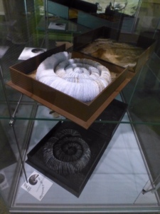
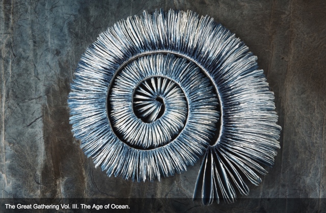
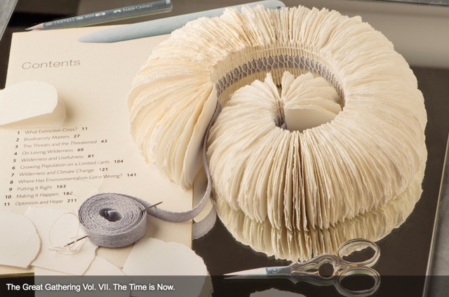
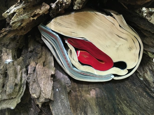
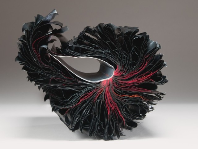
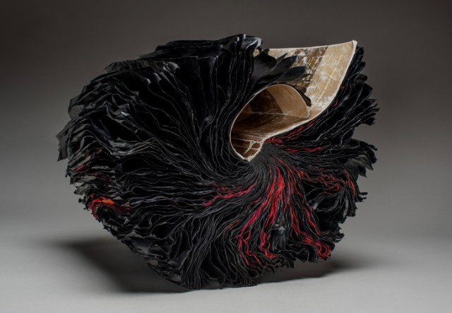
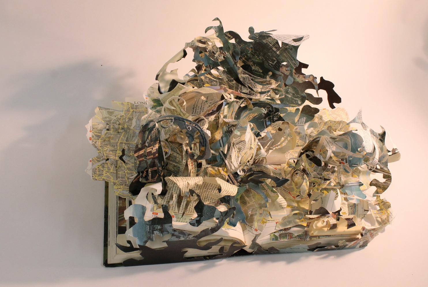
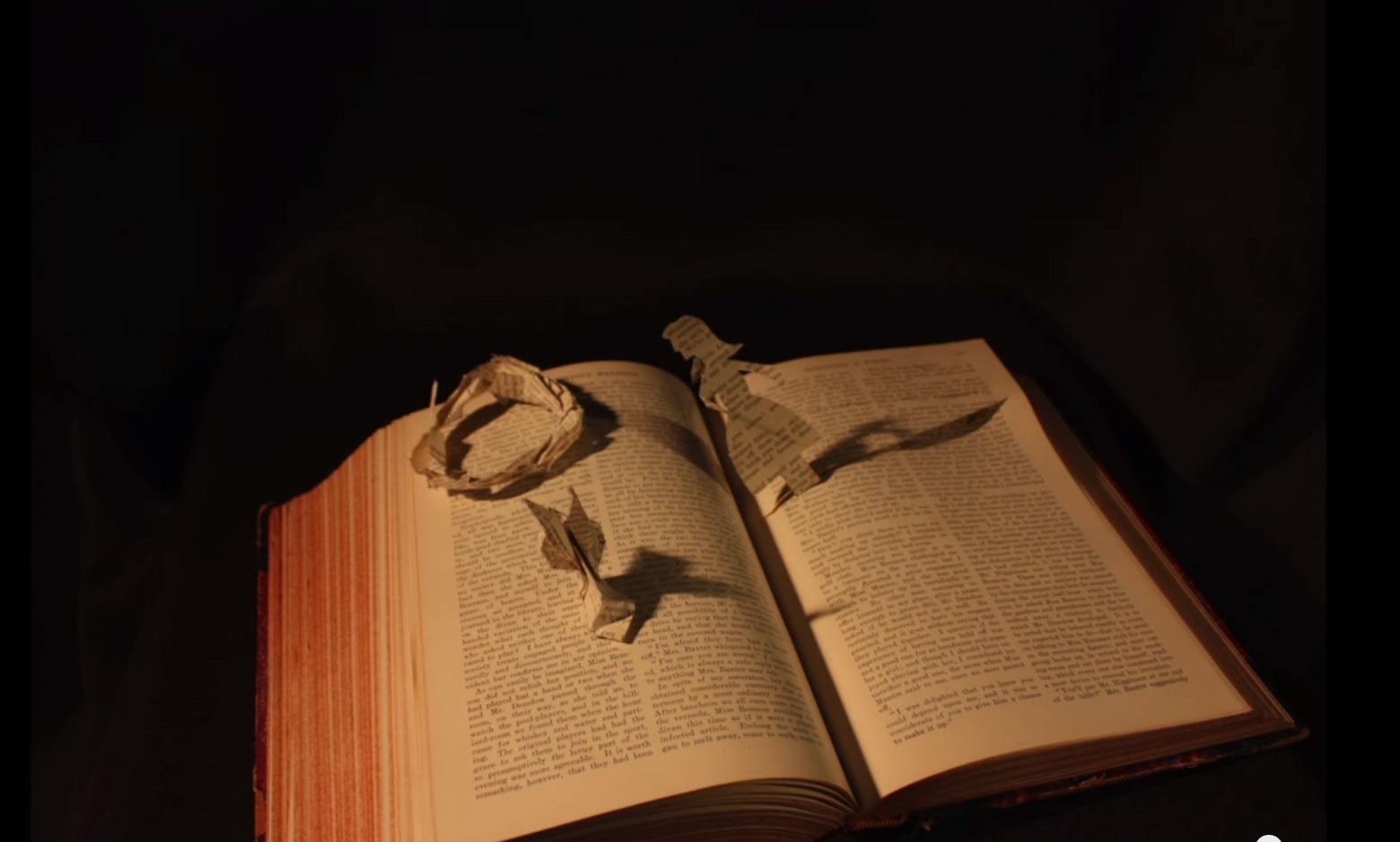
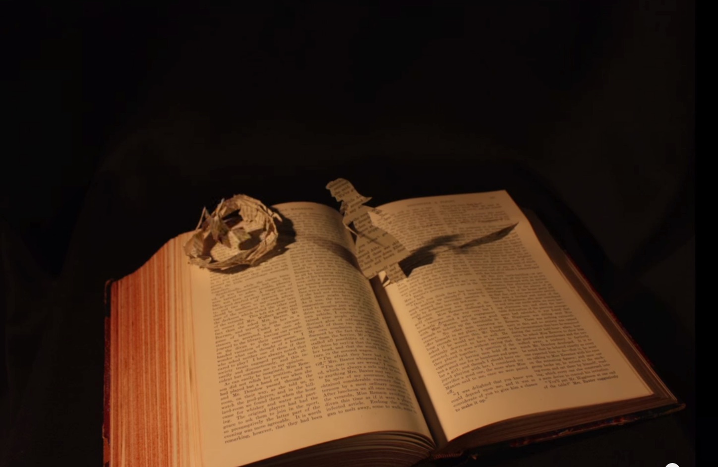
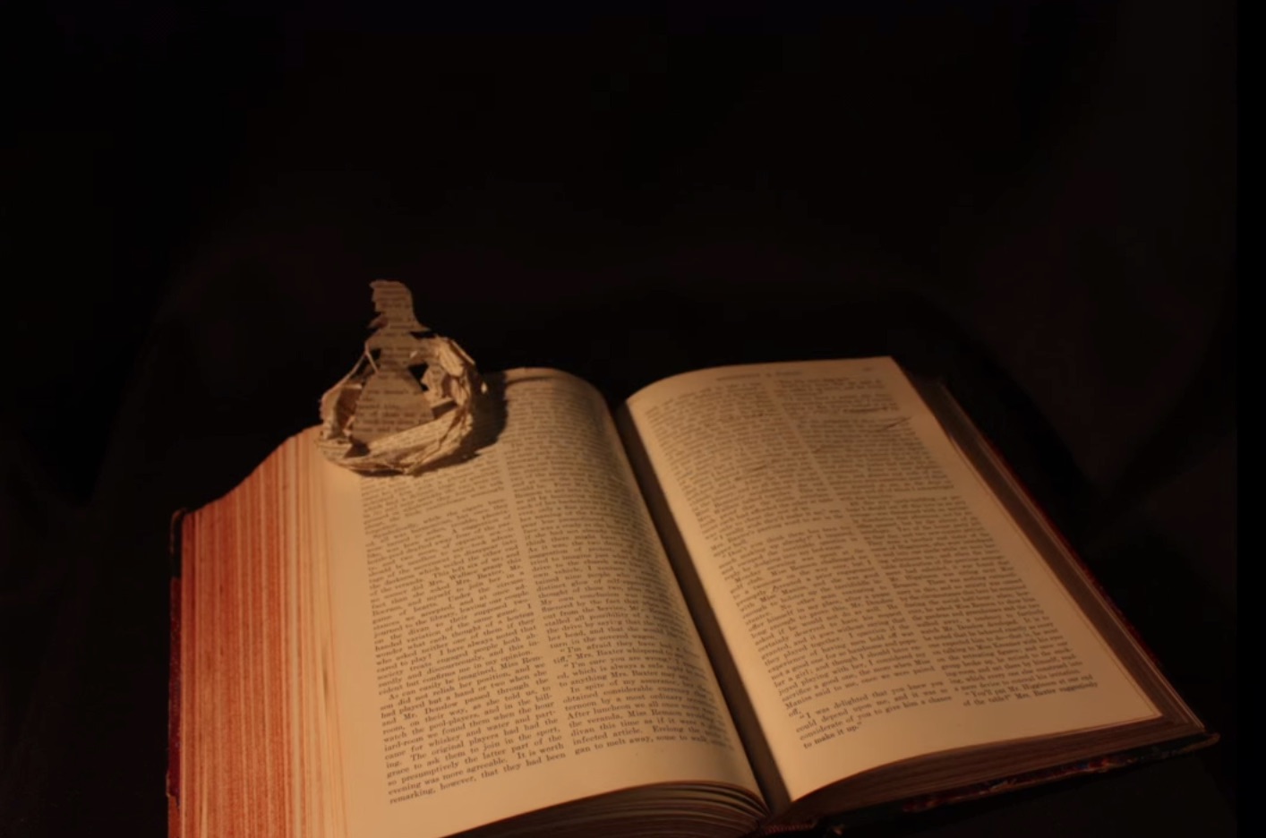
The Great Gathering, VII The Time is Now, 2016 Chris Ruston Photo credit: Chris Matthews
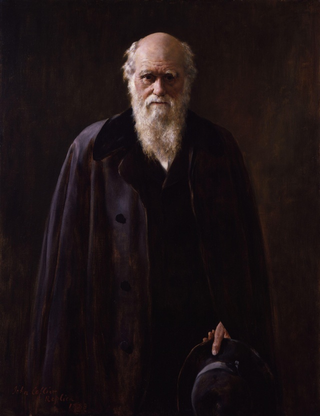
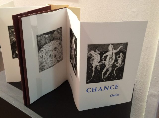
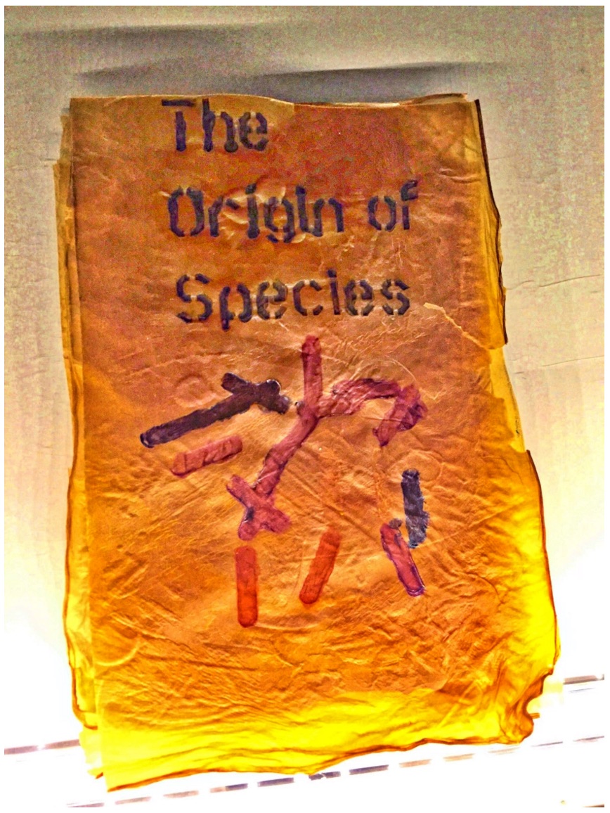
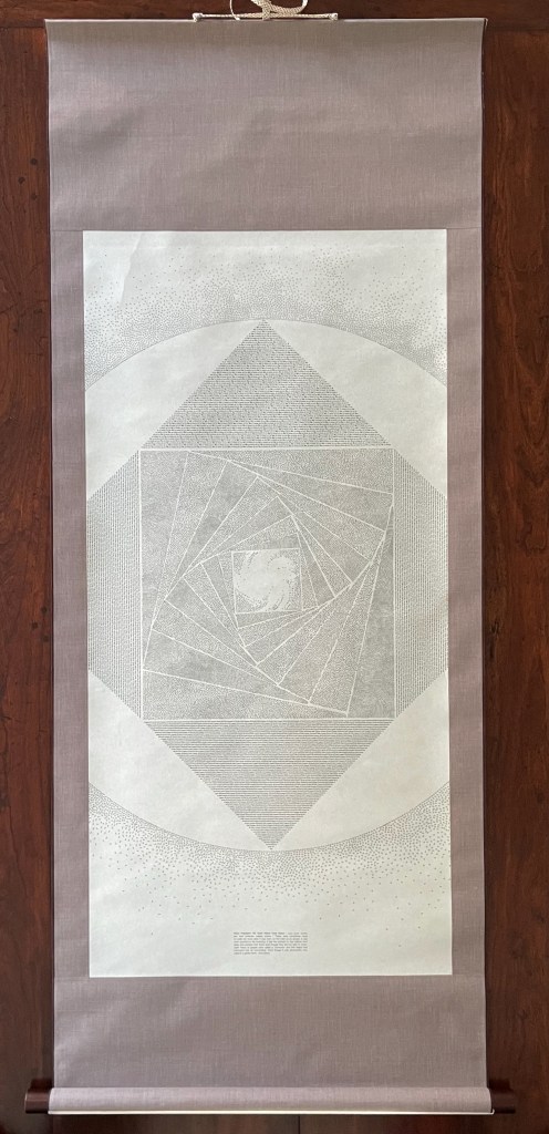
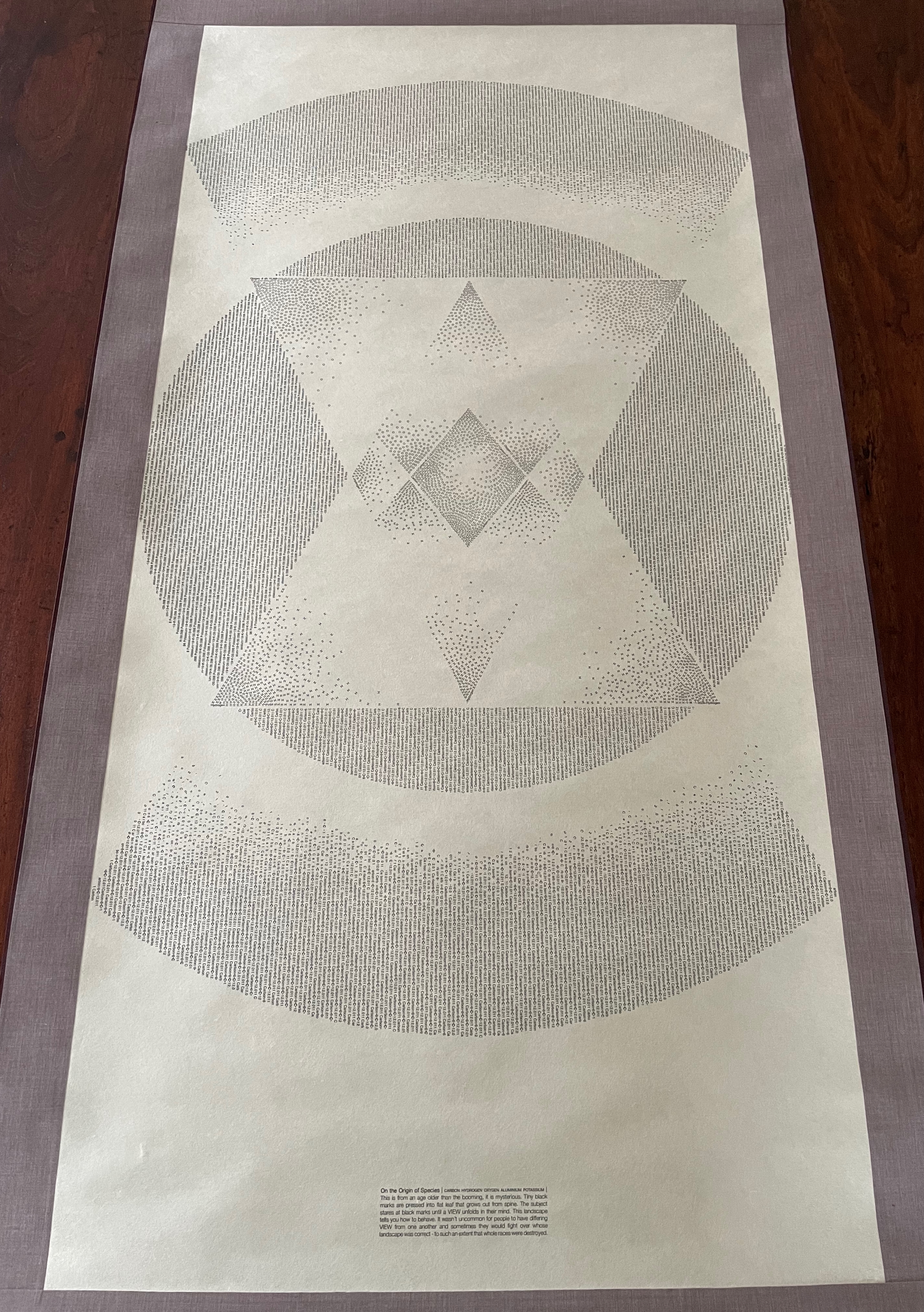
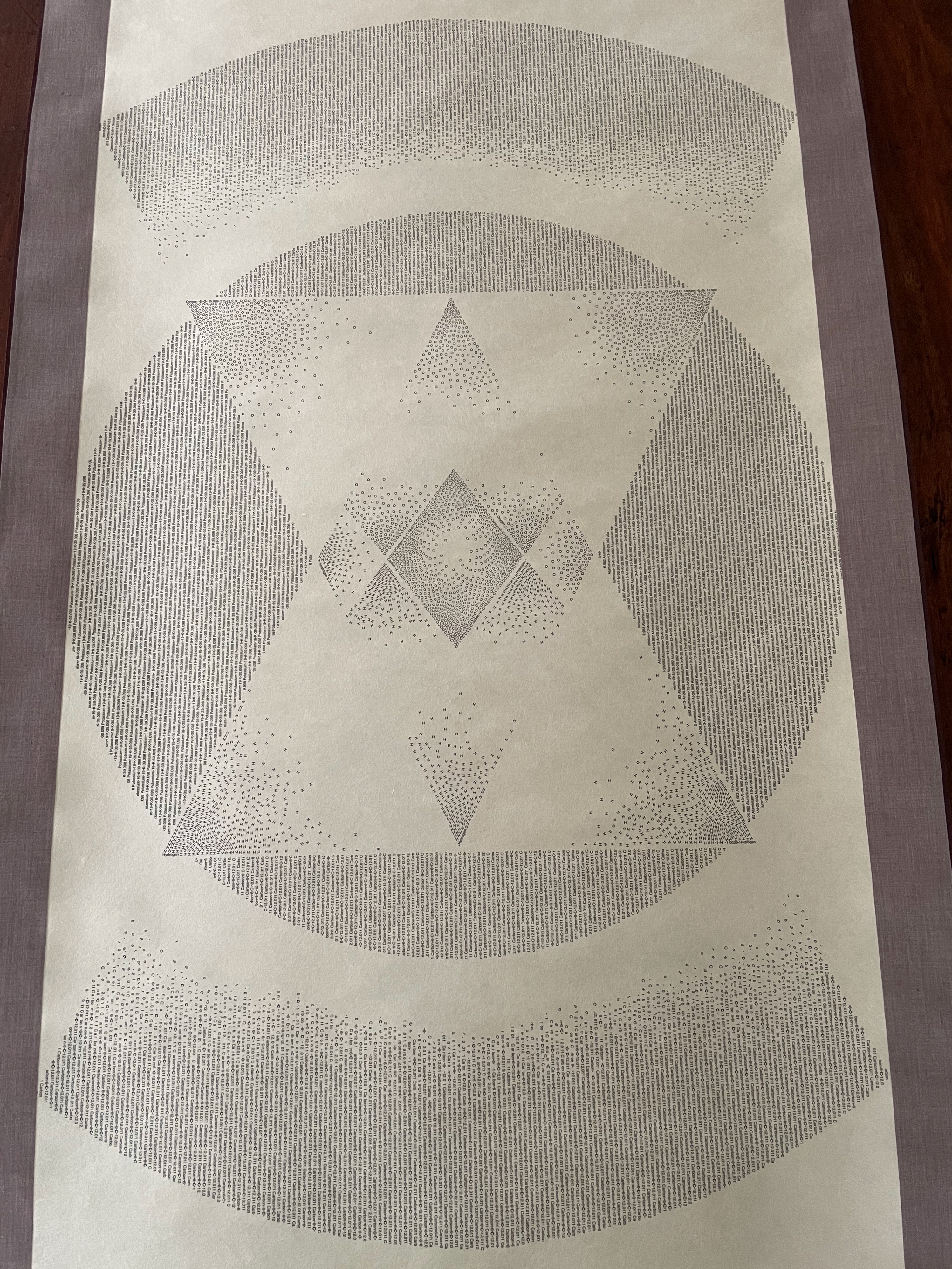
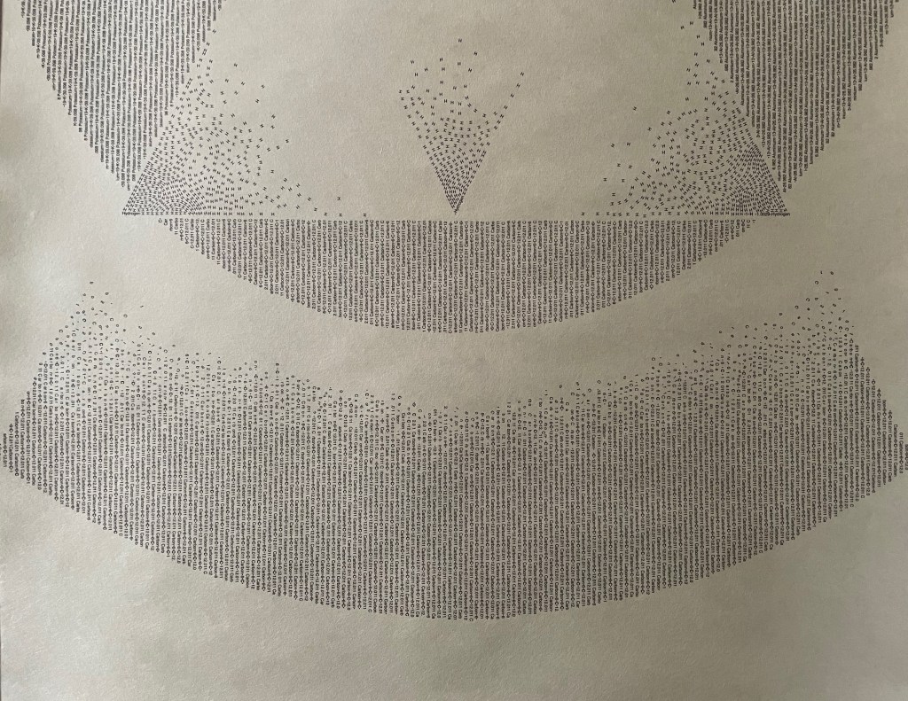
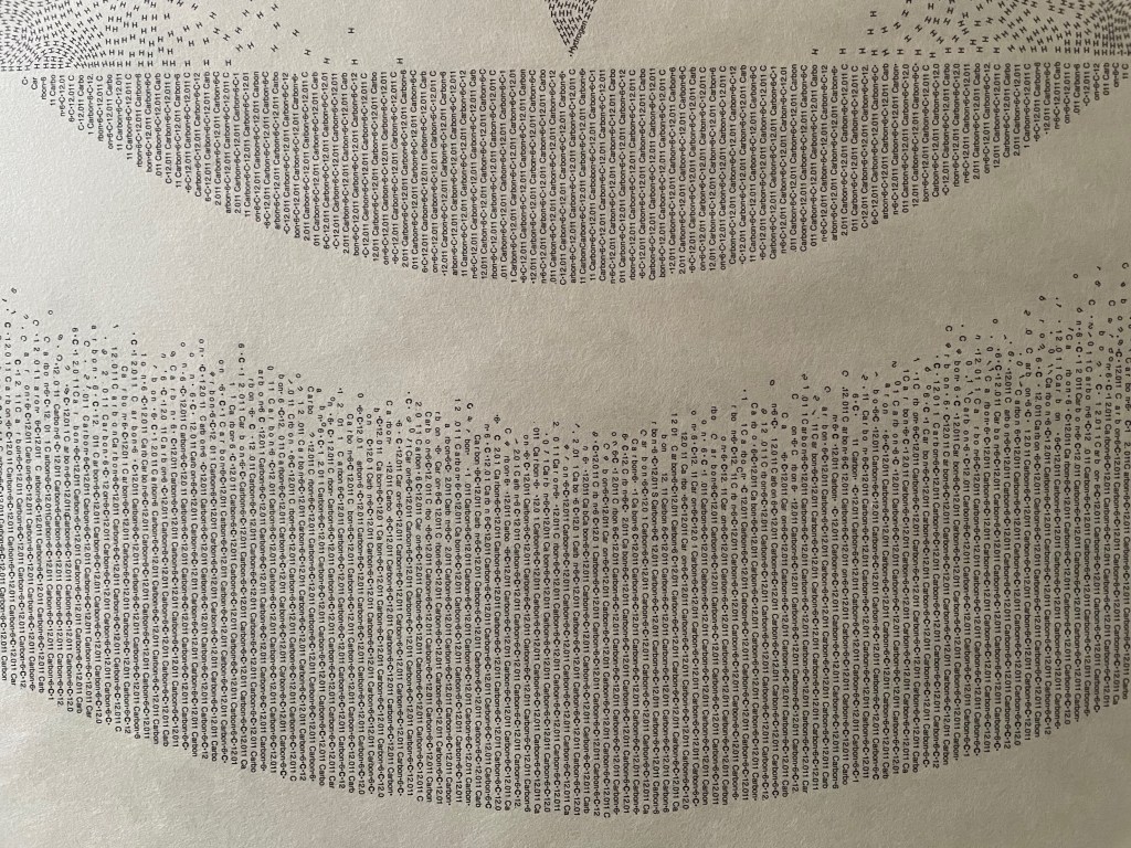
A more hopeful note is struck in the whiteness of Chris Ruston’s final “ammonite” book in the series The Great Gathering, inspired by Darwin’s On the Origin of Species. The mirror under the maker’s tools and the made thing implicate the viewer here and now in an optimistic ongoing evolutionary process of making and remaking.
Michael Mandiberg, Print Wikipedia, 2015 Exhibition “From Aaaaa! to ZZZap!” by the Denny Gallery, 261 Broome Street in New York City, 18 June through 11 July, 2015.
Where the white of Yoon’s and Dodd’s works evokes absence and the white of Ruston’s work evokes the blank invitation to singular creativity, Michael Mandiberg‘s installation of multiples, Print Wikipedia, evokes the plenitude of white noise that is our online lives.
Swiss Army Book, 1990 M. L. Van Nice Gift of Lois Pollard Price National Museum of Women in the Arts
And just as technologically allusive, M.L. Van Nice‘s Swiss Army Book poses (tongue in cheek?) the single volume as somehow able to capture, store and transmit knowledge in ways it need not, albeit the meaning of the whiteness here is a bit elusive.
Legal Process Narrative, 1996 Werner Pfeiffer Law Library, University of Connecticut at Storrs
Werner Pfeiffer’s works constitute an extensive treatment in white. The installation at UConn Storrs represents a small proportion of the works shown in retrospectives in the last ten years at Bucknell, Cornell and the Toledo (Ohio) Museum of Art. Pfeiffer’s works touch on censorship, and from his Cornell exhibition, he explains:
The objects I create are made with real books. They are not casts, nor are they sculpted imitations. At its core each piece has bound, printed pages. Glued together and painstakingly covered with gesso, they are silenced and sealed for good. I practice this destruction, this obvious censorship, simply as metaphor. It is to visualize, to demonstrate, to provoke. For these acts of violence are not about the damage done to stacks of paper, to books. The objects are about the harm inflicted on the human spirit. The ropes, the nails, the clamps, the hooks and knifes are real as well. They are symbols of pain, of torture, of suppression which are inevitably brought on by the censor’s act.
Knotty Story Werner PfeifferDifficult to Fit Werner Pfeiffer
With the advent of ebooks, Pfeiffer celebrates the tangibility of the book with his white gessoed book objects and their punning titles as well as origami-like works such as Zig-Zag.
But back to the white works of art at the MARC STRAUSS gallery. Book art is not entirely neglected. Following in their tradition since 1984, Tim Rollins and K.O.S. (“Kids of Survival”) pondered, discussed and “jammed” on 1895 novella by H.G. Wells to produce THE TIME MACHINE (after H.G.Wells), which is included in the exhibition.
THE TIME MACHINE (after H.G. Wells) Tim Rollins and K.O.S., 2013 Matte acrylic, pencil, book pages on canvas 4 parts, each: 12 x 12 inches / 30.5 x 30.5 cm Overall: 24 x 24 inches / 61 x 61 cm Courtesy Studio K.O.S. and Lehmann Maupin, New York and Hong Kong.
According to the artists, “We believe that every total work of art is a time machine – a synthesis of a living past and present located in an object that can only be completed by the social experience of a viewer in the future. The total work of art exists in the invisible fourth dimension of space/time and it is this notion that unites the works in the exhibition. We paint on historic texts in the present so that they can haunt our futures.”
Suitably prepared? Jump in your time machine and head over to 299 Grand Street, on the Lower East Side in New York, and immerse yourself in “The White Heat“.
It is interesting to contemplate an entangled bank, clothed with many plants of many kinds, with birds singing on the bushes, with various insects flitting about, and with worms crawling through the damp earth, and to reflect that these elaborately constructed forms, so different from each other, and dependent on each other in so complex a manner, have all been produced by laws acting around us…. There is grandeur in this view of life, with its several powers, having been originally breathed into a few forms or into one; and that, whilst this planet has gone cycling on according to the fixed law of gravity, from so simple a beginning endless forms most beautiful and most wonderful have been, and are being, evolved.
– On the Origin of Species, 1869, the final paragraph.
In disparate “entangled banks” and micro-climates around the world, book artists and Charles Darwin have evolved a symbiotic relationship. By date and place, here are some bookmarks on that evolution.
1995, Washington, D.C., USA
Carol Barton and Diane Shaw organized the exhibition “Science and the Artist’s Book” for the Smithsonian Institution Libraries and the Washington Project for the Arts. Barton and Shaw invited book artists to respond to works in the Heralds of Science collection in the Smithsonian’s Dibner Library. Among twenty-one other pairings, George Gessert was invited to respond to Charles Robert Darwin’s On the Origin of Species by Means of Natural Selection, London, 1859.
Gessert’s response wasNatural Selection(1994), an artist’s book consisting of computer-printed handwriting and Cibachrome prints of the results of Gessert’s own experiments in hybridizing irises. Citing Darwin’s description of the breeding of pigeons for their ornamental characteristics, Gessert contends “that Darwin also recognized aesthetics as an evolutionary factor”. Since the 1980s, Gessert’s work and writings have focused on the way human aesthetics can affect evolution and the aesthetic, ethical and social implications. His work and that of artists/theorists such as Suzanne Anker, Eduardo Kac, Marta De Menezes, the Harrisons and Sonya Rapoport have constituted the bio art and eco art movements. A collection of his essays appeared as Green Light: Toward an Art of Evolution in the Leonardo Book Series, published by The MIT Press in 2010.
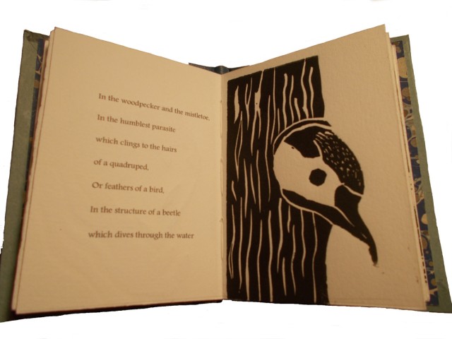
Emma Lloyd Evolution Triptych (2004) Part 1 – 10 x 7.5 x 1, Part 2 – 12 x 9 x 2, Part 3 – 8.5 x 6.5 x 1
Inspired by Darwin’s The Descent of Man, Part I, and cell structures in biology texts, Emma Lloyd‘s Evolution Triptych sparks thoughts of fossils, woodcarved altarpieces or the tooled cover of the St Cuthbert Gospel, the code of life embedded in DNA structure and the code of information embedded in the codex.
The artistic technique here – carving the book as artifact – is prevalent in book art; see the work of Doug Beube, Brian Dettmer and Guy Laramée, for example. Lloyd’s treatment of the Darwin volume is the only one of its type in this collection of bookmarks. Given the influence of On the Origin of Species, though, it would be unusual if other “book surgeons” have not been similarly inspired by it.
2009, London, UK
Storyteller and book artist Sam Winston set about categorizing the words in On the Origin of Species and poet Ruth Padel’s Darwin, A Life in Poems (Chatto & Windus, 2009). He sorted them by nouns, verbs, adjectives and “other”. As Winston puts it, he “wanted to present a visual map of how a scientist and a poet use language – a look at how much each author used real world names (Nouns) and more abstract terminology (Verb, Adjective and Other) in their writings.”
To do that, he categorized the 153,535 words in On the Origin – a dot with a 4H pencil for the 50,567 words categorized as “Other”, a 2H pencil for the 38,266 categorized as “Noun”, an HB pencil for the 26,435 categorized as “Verb” and a 4B pencil for the 38,266 categorized as “Adjective”. The result – Darwin, a series of visual “frequency poems” on display at Le Gun Studio in London – is a book altered through the DNA-like pattern of its own words into a completely “other” scroll and into a topographical map of itself – guided by the artist’s hand and mind.
Sam Winston Darwin (2009)
Right view. Sam Winston, Darwin (2009) Le Gun Studio, 19 Warburton Road, London, E8 3RT, UK
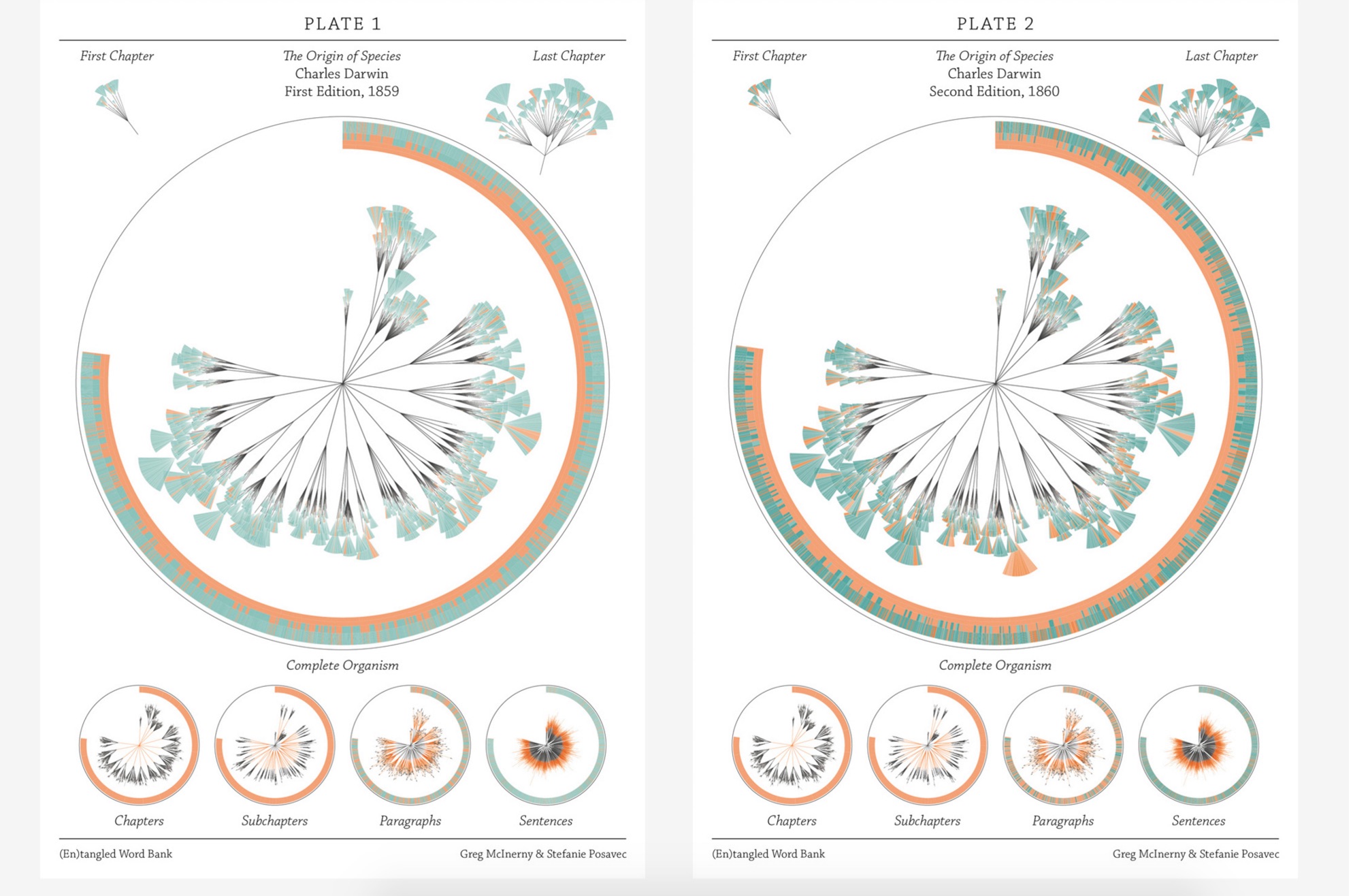
In the same sesquicentennial year, in the same city, Stefanie Posavec collaborated with Greg McInerny to issue (En)tangled Word Bank, a series of diagrams, each representing an edition of On the Origin of Species, and the work’s title alluding to Darwin’s “entangled bank” passage presented above.The pressed-dandelion-shaped chapters and subchapters are divided into paragraph ‘leaves’ with wedge-shaped ‘leaflets’ representing their sentences.
The sentences forming the ‘leaflets’ of the organism are of orange, senescent tones when they will be deleted in following editions. The green, growth tones are applied to those sentences that have life in the following edition. The tone of each colour is determined by its age, in editions, to that point. Through these differences in colouration the simplicity in structure in the early stages of the organism’s life develops into a complex form, showing when the structures developed to its changing environment. Around the organisms the textual code is provided, showing the changes in the size of the organism, and where the senescence and growth is derived in that code. A series of re-arrangements of the organism focus on changes at each level of organisation.
This is “structural infographic” as art.
Stefanie Posavec and Greg McInerny for Microsoft Research, Cambridge (En)tangled Word Bank (2009)
2009, Boston, MA, USA
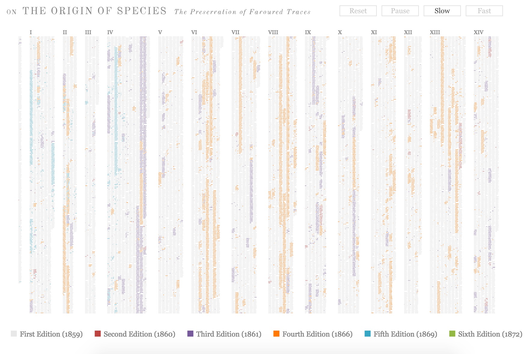
Across the Atlantic, Ben Fry, author of Visualizing Data (O’Reilly, 2007), created a similar work of art called The Preservation of Favoured Traces. Fry color-coded each word of Darwin’s final text by the edition in which it first appeared and used the data to build an interactive display at fathom.com demonstrating the changes at the macro level and word-by-word. Fry went on to produce a poster version and print-on-demand book version.
Ben Fry The Preservation of Favoured Traces (2009)
2009, Vancouver, Canada
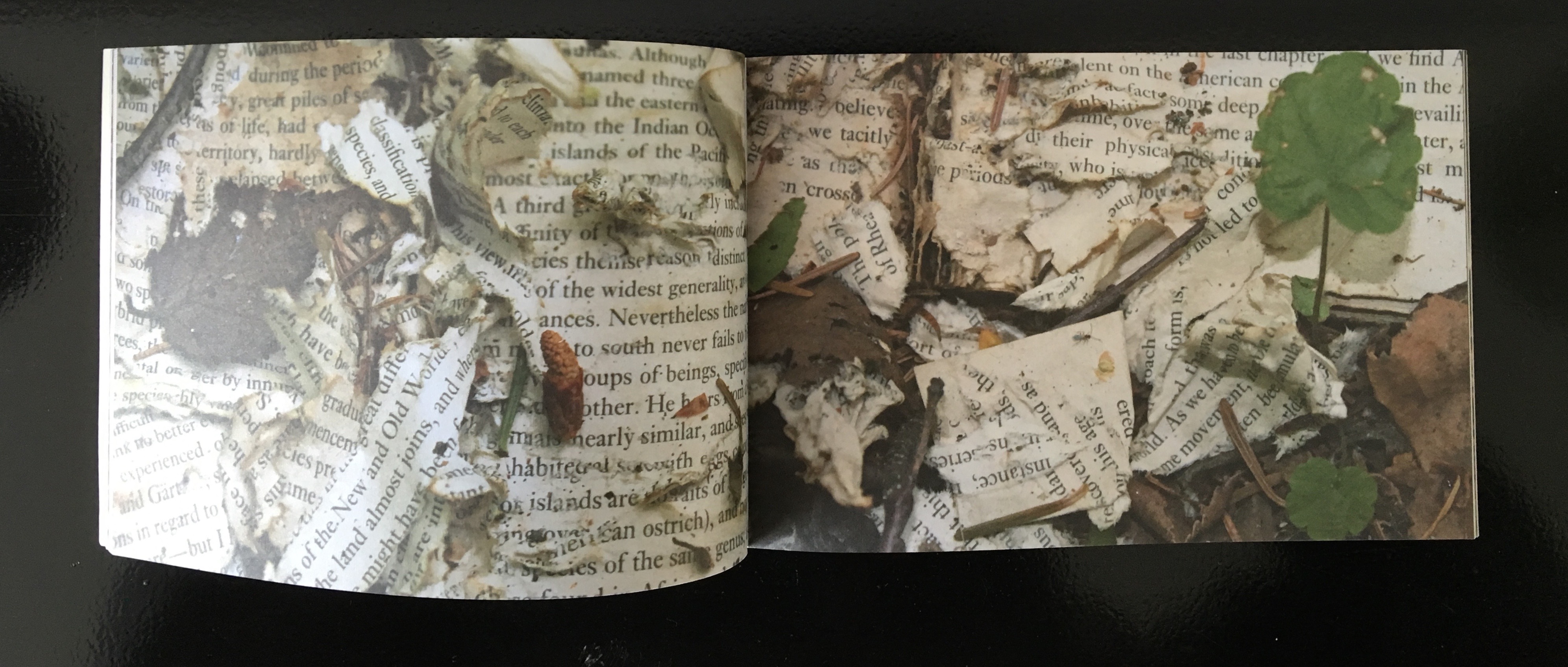
Three thousand miles away that summer, Canadian poets Stephen Collis and Jordan Scott placed multiple copies of On the Origin of Species in various outdoor locations “not … to put the natural into the text, [but] … to put the text out into the natural world and see what happens to it” (p. 2). After a year, Collis and Scott photographed the results in situ and collected and used the some of the still decipherable words as found text for their volume Decomp (Coach House Press, 2013).
Former science teacher and now botanical artist and bookmaker, Kelly Houle embarked on a 10-year plan to create an illuminated and scribed copy of the first edition of On the Origin. Where medieval scribes and rubricators had abbots to preside over them and their book art, Houle has University of Chicago Professor Emeritus Jerry A. Coyne and several other academics. As she notes about her process, the past techniques have also yielded to present concerns:
Kelly M. Houle The Illuminated Origin (2009 – ) Watercolor, gouache, interference watercolor, gold foil, shell gold on Fabriano Artistico, 22 x 30 inches
Today many artists still practice the tradition of illumination using medieval and renaissance-era materials and techniques. While many of these have stood the test of time, there are more earth-friendly materials than those used in the past….
Detail of frontispiece Courtesy of the artist
The Illuminated Origin of Species will be written on hot-pressed Fabriano Artistico paper made in Italy. It is the best paper in the world for both calligraphy and botanical art. These are extremely smooth, beautiful, and durable papers. They are chlorine-free, acid-free, and 100% cotton. No animal by-products are used in the sizing. Combined with Winsor and Newton watercolors and gouache, this paper will be perfect for the demands of The Illuminated Origin.
Detail of frontispiece Courtesy of the artist
To mimic the play of light on various shiny and iridescent surfaces in nature, I am using 23k gold foil, shell gold, and interference watercolors, which contain small flecks of mica to produce an iridescent effect. These metals will distinguish The Illuminated Origin as a truly “illuminated” manuscript. — Kelly M. Houle, “The Making of a Modern Illuminated Manuscript“
Houle aims to complete her work in 2019,On the Origin‘s 160th anniversary.
2009, Farnham, Surrey, UK
Between its hardback covers lined in marbled papers, Angela Thames’ Darwin’s Poetic Words has distilled the often liturgical, poetic passages of On the Origin of Species.
Angela Thames Darwin’s Poetic Words (2009) Hardbound, 12 pages, 12 x 8 cm, 8 linocuts, Somerset paper
Between 2009 and 2013, Thames created four more artist’s books besides Darwin’s Poetic Words, based on excerpts from On the Origin of Species. In this focus and technique, Thames takes and interprets portions rather than the whole of the source as do Houle, Collis and Scott, Fry, McInerny and Posavec, Winston, and Lloyd in their differing ways.
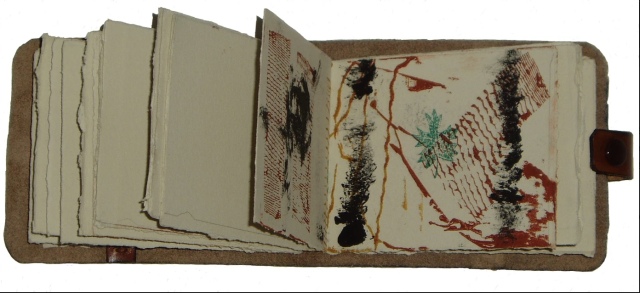
Angela Thames Evident Evolution (2009-13) Collagraph images of bone structures and text, 8 pages, Silkscreen covers, Spiral bound edition
Angela Thames A Grain in the Balance (2009-13) Collagraph images with rubber-stamped text, 8x10cm, 15 pages, Somerset beige paper
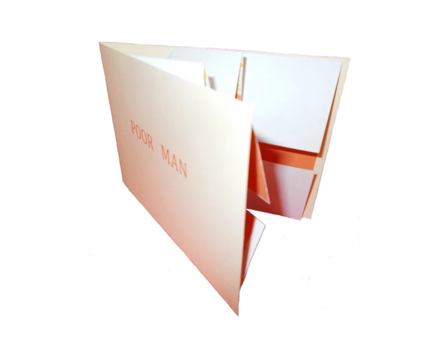
Angela Thames Poor Man (2009-13) Folded card with pop up flower, Words spoken by his gardener, Silkscreen, wood-stamped text, Open edition
Poor Man (2009-13) is the only exhibit in this survey that demonstrates the pop-up technique in book artistry, but as evolutionary biology and fossil-hunting have shown, who knows what undiscovered forms are out there.
2012, New York, NY, USA
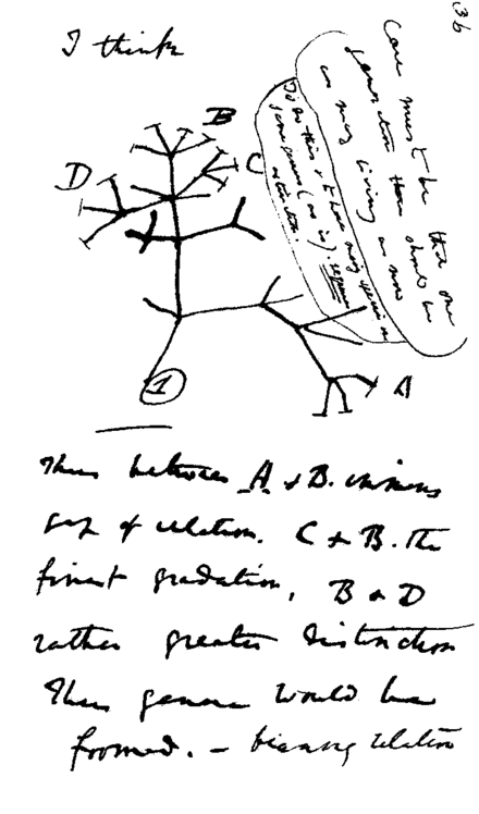
Following in their tradition since 1984, Tim Rollins and K.O.S. (“Kids of Survival”) seized on Darwin’s “Tree of Life” diagram
Darwin’s notebook sketch of an evolutionary tree. Charles Robert Darwin, Transmutation of Species, 1837
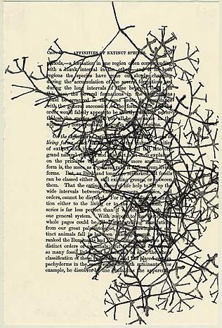
and “jammed” to produce a series of paintings and preliminary works in ink and watercolor on pages of the book to create ON THE ORIGIN OF SPECIES (after Darwin). Eighteen students, aged 13 to 16, worked with Rollins on the preliminary studies, one of which appears below, that preceded the 2013 exhibition of paintings at the Lehmann Maupin Gallery.
Tim Rollins and K.O.S. Studies for ON THE ORIGIN OF SPECIES (after Darwin) (2014) Ink and watercolor on book page, 22.9 x 15.2 cm Photo credit: Lehmann Maupin Gallery
The large-scale paintings consist of almost all of the 360 pages of On the Origin fixed to canvas and ink-stamped over and over with the “Tree of Life” image, which had been cut into 60 handstamps. Rollins described the concept of the works in an interview for Brooklyn Rail:
The whole book is 360 pages but we don’t ever want to be literal so it’s not all of the pages. They’re there to inspire. It’s like an opera. The libretto inspires the music. You can watch an opera in a language you don’t know, without reading. It’s the same with our work. It’s about a visual correspondence with the text. The work is not about something. That’s why you can’t get hung up on interpretation. That’s a big issue, especially with so much politically engaged art. We want to create a situation, learning machines, so everyone is learning in the process of making and then hopefully the audience will be inspired too. Maybe they will pick up Darwin or continue with the idea. These are catalysts for action.
In a video interview with ArtNet, Rollins also refers to the K.O.S. jamming process -reading aloud from the book in a studio setting, discussing it with students and seeking inspiration from the text – not as a school lesson or classroom exercise but as a kind of séance, an assertion that touches the essence of “reverse ekphrasis” in book art. Rather than the literary work or book capturing the spirit of a work of art, the work of art captures the spirit of the book.
2013/14, Oxford, OH, USA
At the University of Puget Sound (2013) and Center for Book Art in New York (2014), Diane Stemper exhibited her Darwin-inspired book art that explores “the intersection between the natural world, daily living, science and the collective and individual experience of landscape”.
Diane Stemper Universal Sample (2014) Edition of 4, Intaglio and letterpress on Arches
Diane Stemper Universal Sample (2014) Edition of 4, Intaglio and letterpress on Arches
Diane Stemper Universal Sample (2014) Edition of 4, Intaglio and letterpress on Arches
Hand bound, printed and produced in her Plat 21 Studio, in Oxford, her Galapagos Map (2013), Darwin’s Atlantic Sea (2014) and Universal Sample (2014), these works have an eerie physical presence. At the Center for Book Art, I have seen and, with the kind permission of Alex Campos, the curator there, touched the works. The intaglio printing and richly textured creamy paper still communicate themselves even across the digital divide.
2014, Amsterdam, The Netherlands, and London, UK
Simon Phillipson completed a variorum edition of On the Origin of Species, in which every verso page is the evolved or amended text and the recto page is the final text from the the Sixth edition.
Charles Robert Darwin, On the Origin of Species, variorum edition designed by Simon Phillipson, 2014. Printed in the Netherlands on special 60gsm bible paper and finished with a special metallic bronze ink
The verso pages are completely printed in a special metallic bronze ink. The recto is printed in a combination of black and bronze ink. The bronze highlighted words in the recto correspond to the evolving or amending text in the verso. Very reminiscent of, but distinct from, Ben Fry’s The Preservation of Favoured Traces (see above).
2014, Minneapolis, MN
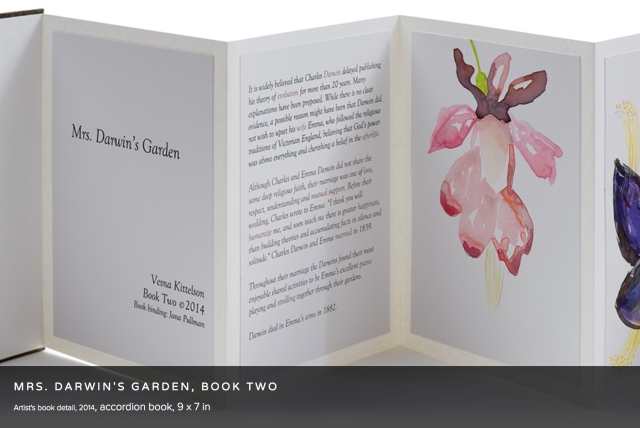
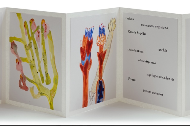
Vesna Kittelson, Mrs. Darwin’s Garden, Book Two (2014) Accordion book, 9 x 7 in
Vesna Kittelson is an American-Croatian artist based in Minneapolis. Her résumé cites public collections ranging from Tate Britain and Minnesota Museum of American Art to Cafesjian Center for the Arts in Armenia and the Modern Museum of Art in Croatia. In 2009, she spent time at Churchill College, Cambridge University, where she learned about the life and marriage of Charles Darwin and Emma Wedgwood. Subsequently she created four artist books titled Mrs. Darwin’s Garden depicting primitive-seeming plants imagined as flora that Darwin might have seen from the deck of the Beagle. The names of the plants are made-up Latin names or variations on those of contemporary plants.
Vesna Kittelson, Mrs. Darwin’s Garden, Book Two, 2014 Accordion book, 9 x 7 in
These abstract images are imagined plants for Mrs. Darwin’s garden. They are illustrations of named floral specimens that never existed in reality. In Mrs. Darwin’s Garden they are presented as if they correspond to data derived from Darwin’s experimentation in his greenhouse. In this book I replaced the 19th C methods of botanical drawing with pouring paints to incorporate the contemporary notion of valuing an accident, followed by drawing with brushes and pencils to gain control and give the images a place and time in the 21st C.
2014, Grasswood, Saskatchewan, Canada
Jonathan Skinner (Warwick University) wrote in his preface to Decomp (see above):
Writing rots, meaning flees. … Yet the book is written to locate (some) meaning here. Would it make any difference to leave Decomp itself in the wilderness? Probably not.
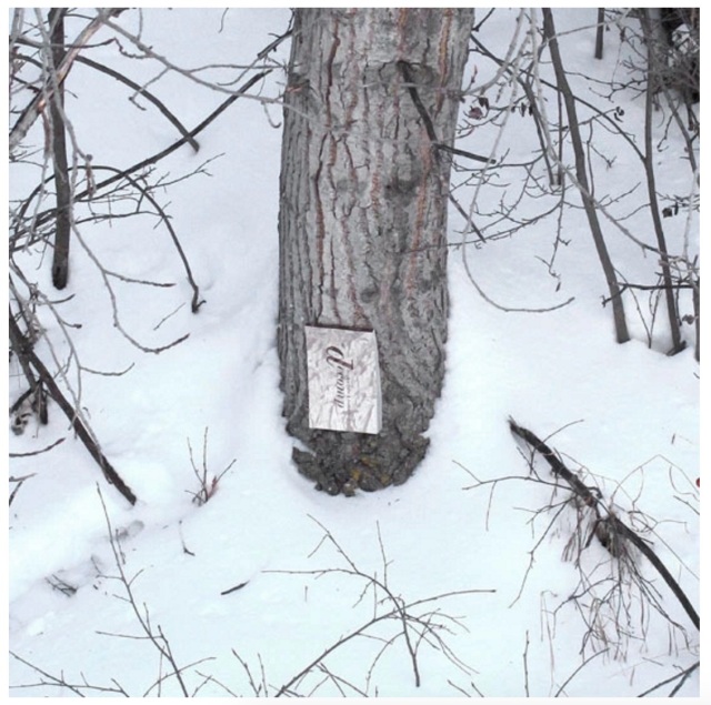
Book artist, papermaker and co-founder with her husband David Miller of Byopia Press, Cathryn Miller reviewed Decomp in 2013. If not prompted by Skinner’s preface, Miller must have felt how appropriately evolutionary it would be to attempt to replicate the Decomp experiment by substituting the result of that experiment for the subject of the replicating experiment. Thus, in January 2014, Miller nailed to a tree “a book based on letting brand new copies of On the Origin of Species rot in various locations”.
Cathryn Miller Recomp (2014) Copy of Decomp, Collis and Scott (2013) nailed to a tree Photo credit: David G. Miller
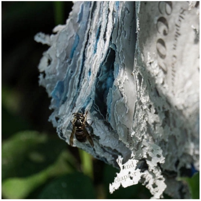
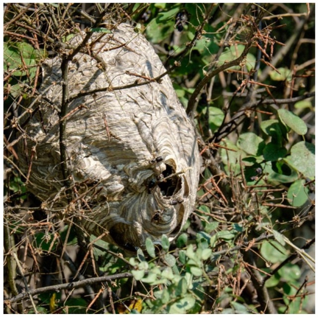
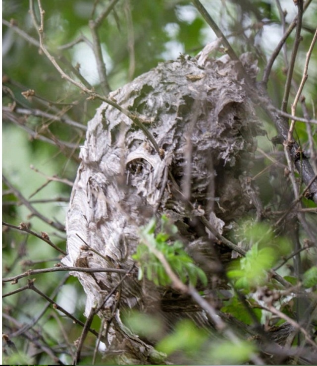
For over twenty months, Miller monitored and husband David photographed the book’s weathering. That, however, was not the transformation that would result in an altered book and possibly a work of book art. Nature had some ironic appropriateness in store for Miller, Skinner, Collis, Scott and all of us. The blown pages were visited by Bald-faced Hornets, who digested them á la John Latham and his students but regurgitated them as cellulose with which to build a large nest.
Cathryn Miller Recomp (2015) Photo credit: David G. Miller
Cathryn Miller and Bald-faced Hornets Recomp (2015) Nest composed of pages from Decomp, Collis and Scott (2013) Photo credit: David G. Miller
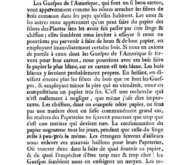
In the context of book art, the nest offers a curiously serendipitous digression. In 1719, the French naturalist René Antoine Ferchault de Réaumur published an essay to the Royal Academy of Sciences on the natural history of wasps. In the passage below, he hypothesizes how their natural papermaking industry could be adopted by man.
In 2015, Miller presented the results as Recomp in her blog at Byopia Press. In September that year, however, critics (raccoons, the artist thinks) visited the work and deconstructed it.
Recomp vandalized, 2015 Photo credit: David G. Miller
Might this prove that, to paraphrase the last paragraph of On the Origin, “by laws acting around us…. from the war of nature, from famine and death, the most exalted object which we are capable of conceiving, namely, the production of the higher animals [and their art], directly follows”? If so, that makes raccoons and critics equal laws of nature.
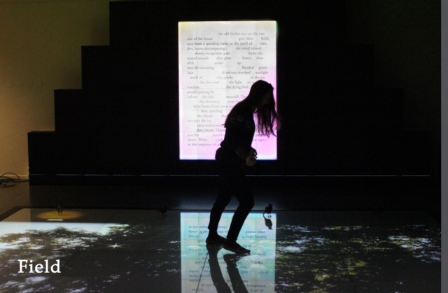
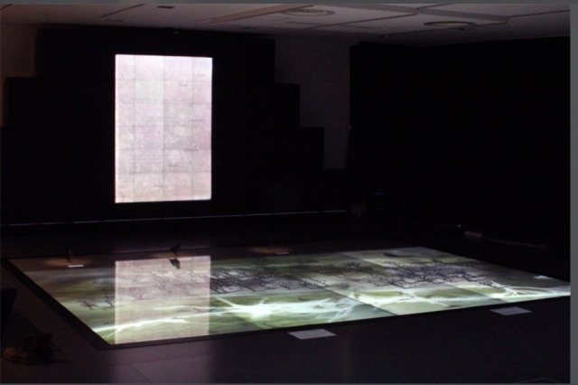
2015, Umeå, Sweden
Johannes Heldén’s work Field is book, visual art and installation all in one. Heldén’s is perhaps the darkest variant on Darwin’s theme here.
It consists of interactive landscape animations on a floor touchscreen of 20 sqm,
Johannes Heldén Field (2015) Produced, and premiered, at HUMlab, Umeå University
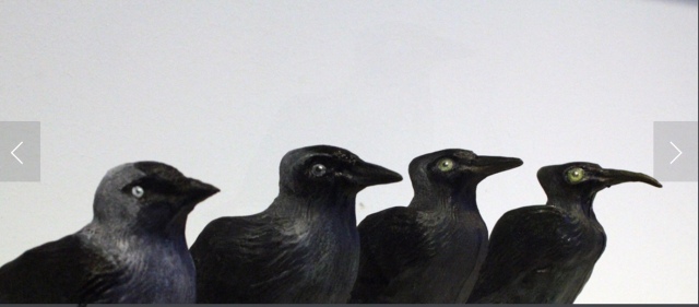
a series of sculptural mutations of the Eurasian Jackdaw*,
Johannes Heldén Field (2015) Produced, and premiered, at HUMlab, Umeå University
an ever-changing soundscape and an interactive screen wall with a text responding to the changing DNA of the bird
Johannes Heldén Field (2015) Produced, and premiered, at HUMlab, Umeå University
– as the ”code” of todays species is slowly lost, so is the code and context of language. The gaps in the text correspond to the shift in the DNA sequence, prose turns into dark poetry, connections and meaning changing for each iteration.
Johannes Heldén Field (2015) Produced, and premiered, at HUMlab, Umeå University
Johannes Heldén Field (2015) Produced, and premiered, at HUMlab, Umeå University
All these pieces are connected: as you explore the landscape and trigger the glowing touch points with your body, time is rapidly speeding up (clouds move over the scene, trees wither away, a flood is coming), one by one the four bird sculptures in the installation will be ”activated” with light and sound, spiraling the species further down into mutations. At the end of the piece, no lights remain in the landscape, the sound is immense, all mutations have occurred, the last poetry dissolves into entropy. Then all fades to black.
Since Darwin’s theory encompassed extinction, perhaps Heldén’s vision is not so much a variant on Darwin as it is a pessimistic appreciation and warning about the impact of our interaction with the entangled bank.
2016, Guildford, Surrey, UK
Cathryn Miller’s “bio-book-art” and that of Collis and Scott stand at the collaboration end of the bio art spectrum, where the artist yields considerable control to nature in the creative process. At the coordination end of the spectrum – closer to domestication of species – stands Dr. Simon F. Park’s bio-book-art – The Origin of Species – perhaps “the first book to be grown and produced using just bacteria”. Presented at the Edinburgh International Science Festival, the small book has pages made of bacterial cellulose, produced by the bacterium Gluconoacetobacter xylinus (GXCELL). Its cover is even printed with naturally pigmented bacteria.
Dr. Simon F Park The Origin of Species “The small book shown here was grown from and made entirely from bacteria. Not only is the fabric of its pages (GXCELL) produced by bacteria, but the book is also printed and illustrated with naturally pigmented bacteria. ” Posted 27 March 2016 Photo credit: Dr. Simon F. Park
Although Park’s science-driven process for paper manufacturing and printing echoes the speculations of French naturalist René Antoine Ferchault de Réaumur (see above), it seems to have much in common with the painstaking craft of handmade paper and hand letterpress printing. The first sheet of Park’s micro-organically grown paper took a little under two weeks to be generated and stencilled with his bacterial ink.
2016, Colchester, Essex, UK
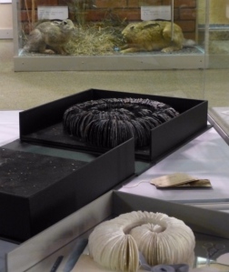
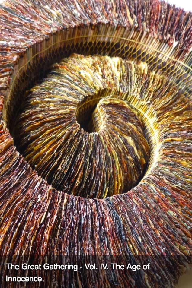
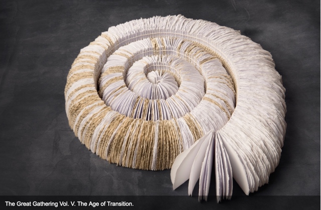
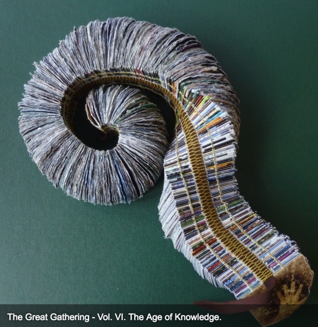
It seems chronologically backwards to move from bio-book-art’s live media to Chris Ruston’s ammonites of The Great Gathering. As should be evident by now, however, the evolution of the symbiotic relationship between book artists and Darwin has been anything but a straight line. It has curved, circled and recursed.
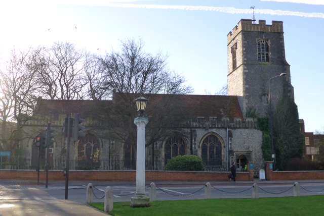
Tim Rollins + K.O.S may have had their séance 30-50 feet away from Darwin’s lodgings in Edinburgh, but Chris Ruston brought her Darwin-inspired book art to an even more fitting venue: a church converted into Colchester’s Natural History Museum.
Natural History Museum Colchester, Essex, England Photo credit: Chris Ruston
As the artist comments at her site:
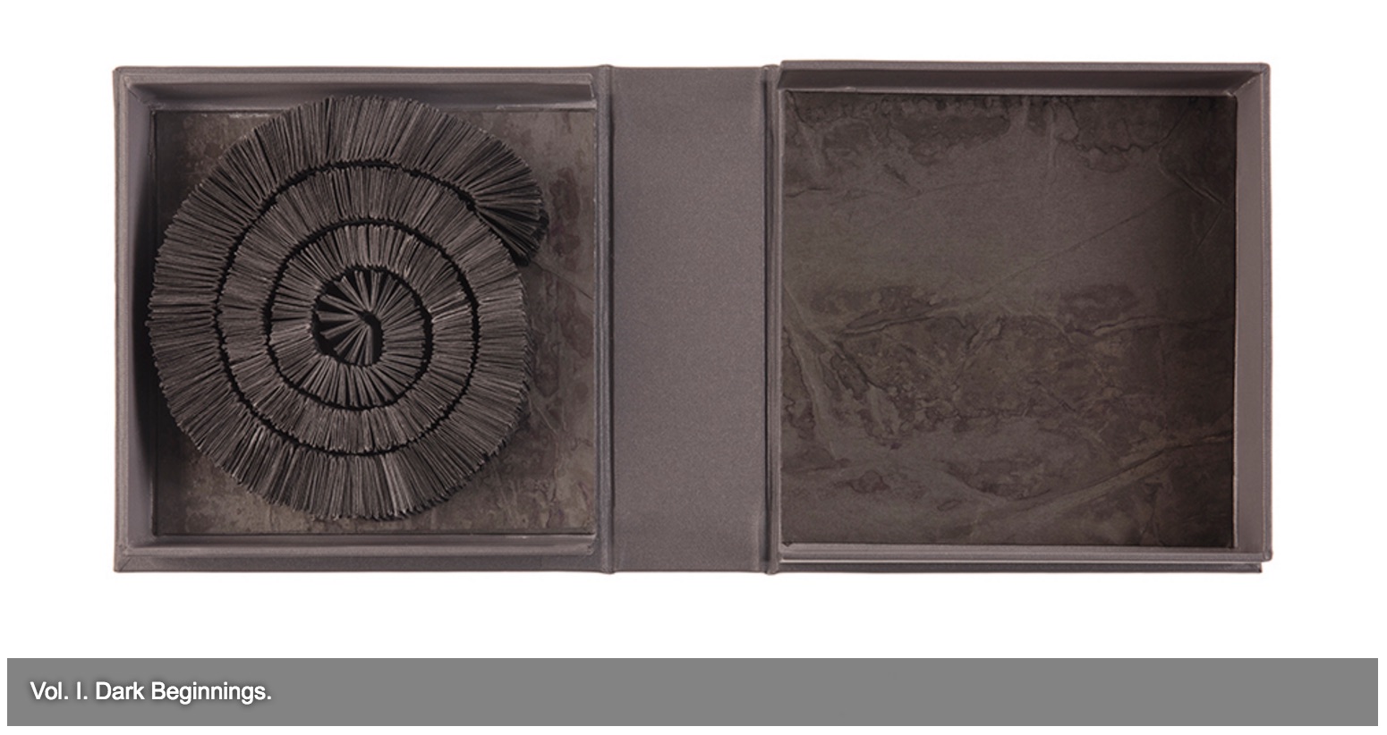
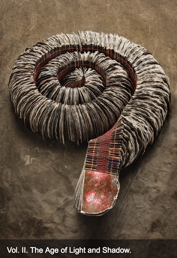
The Great Gathering refers to our continued exploration of where we have come from, and where we are going. Combined the seven volumes tell an amazing story spanning 650 million years. Sculptural in form, each book reflects a moment of this journey. From black holes and dark beginnings, through ocean and sediment layers, Darwin’s On the Origin of Species, and recycled National Geographic magazines the work charts the inevitability of change.
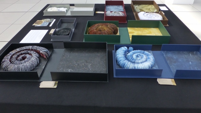
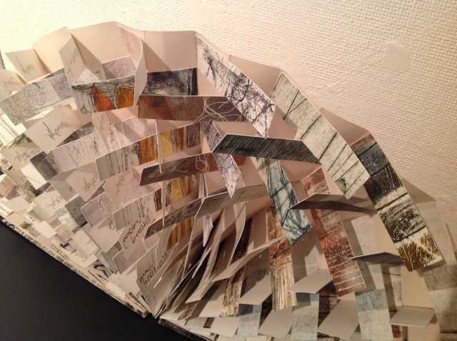
View of exhibition of The Great Gathering Natural History Museum, Colchester Photo credit: Chris Ruston
They are a response to visiting Museum collections, in particular the Natural History Museum, Colchester and the Sedgwick Museum of Earth Sciences Cambridge. Fossils have enabled us to unlock the story of our Origins – from the largest creatures to the smallest organisms. The 19th century saw an explosion of knowledge and understanding, culminating in Darwin’s publication of On the Origin of Species. By piecing together the riddle of the fossil record, Darwin and his contemporaries began asking revolutionary and challenging questions, the results of which are still felt today.
View of exhibition of The Great Gathering Natural History Museum Photo credit: Chris Ruston
Science and art are the presiding geniuses over The Great Gathering. In The sciences of the artificial (1969), Herbert Simon emphasized: “The natural sciences are concerned with the way things are” and engineering, with the way things ought to be to attain goals. Like the scientist, the artist, too, is concerned with the way things are. They are the raw material with which the artist works or to which he or she responds. But like the engineer or the designer, the artist is concerned with the way things ought to be:
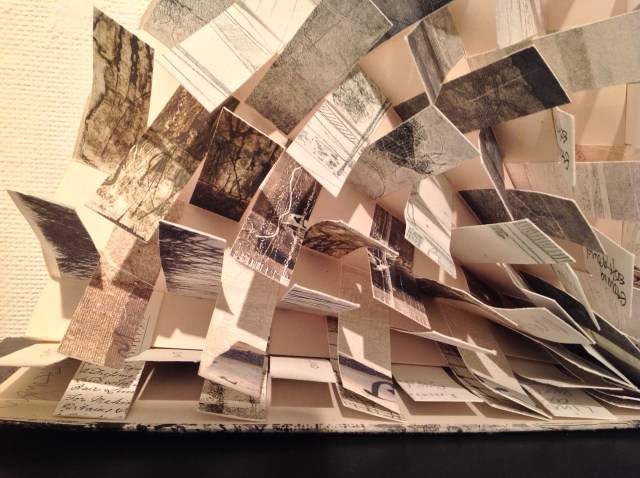
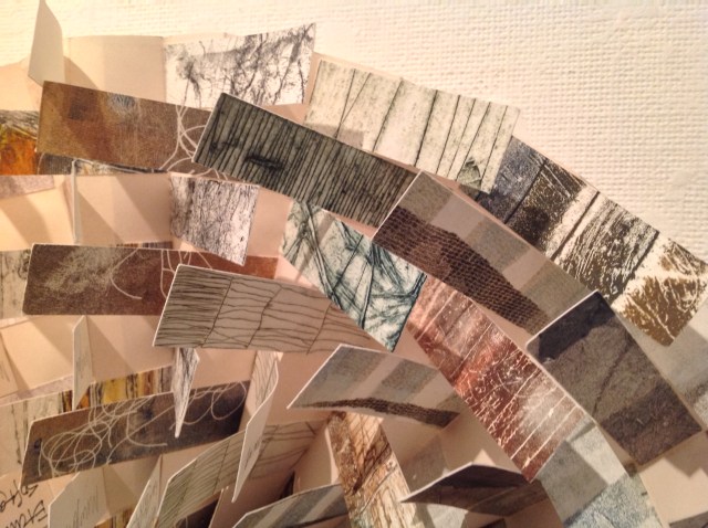
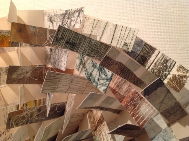
Chris Ruston The Great Gathering, 2016 Photo credit: Chris Matthews
how a solander box ought to be constructed to operate with the work and, in enclosing it, be “the work”;
Chris Ruston The Great Gathering (2016) Photo credit: Chris Matthews
what materials (photos from the Hubble telescope) ought to be used to reflect a moment in time;
Chris Ruston The Great Gathering (2016) Photo credit: Chris Matthews
how thread, tape and stitch ought to be to hold together a spine that will flex and spiral into the shape of a fossil;
Chris Ruston The Great Gathering (2016) Photo credit: Chris Matthews
how the color of the material ought to be juxtaposed with the material’s altered shape to carry meaning;
Chris Ruston The Great Gathering (2016) Photo credit: Chris Matthews
how the shift from content to blankness ought to be juxtaposed with the material’s altered shape to carry meaning;
Chris Ruston The Great Gathering (2016) Photo credit: Chris Matthews
how the selection and alteration of text ought to be made to show the fixity and flux of knowledge and ourselves;
Chris Ruston The Great Gathering (2016) Photo credit: Chris Matthews
and how our reflection in the mirror in Volume VII under the maker’s tools and the made thing ought to implicate us — the viewer here and now – in an ongoing process of making and remaking.
On display at “Turn the Page”, Norwich, England (2016) Photo credit: Chris Ruston
If you have come this far with these bookmarks on the evolution of book artists’ symbiosis with Darwin, note that today and every 12th of February is Darwin Day, marking international celebrations of the birth of Charles Darwin and his contributions to science. From today’s engagements and all those to come with the concepts of On the Origin of Species and (I hope) with these bookmarks, perhaps new discoveries and new creations of book art will emerge.
Update
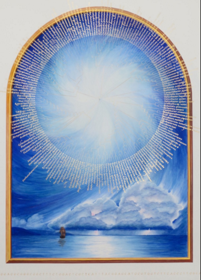
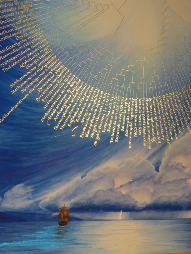
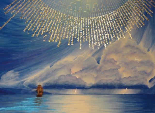
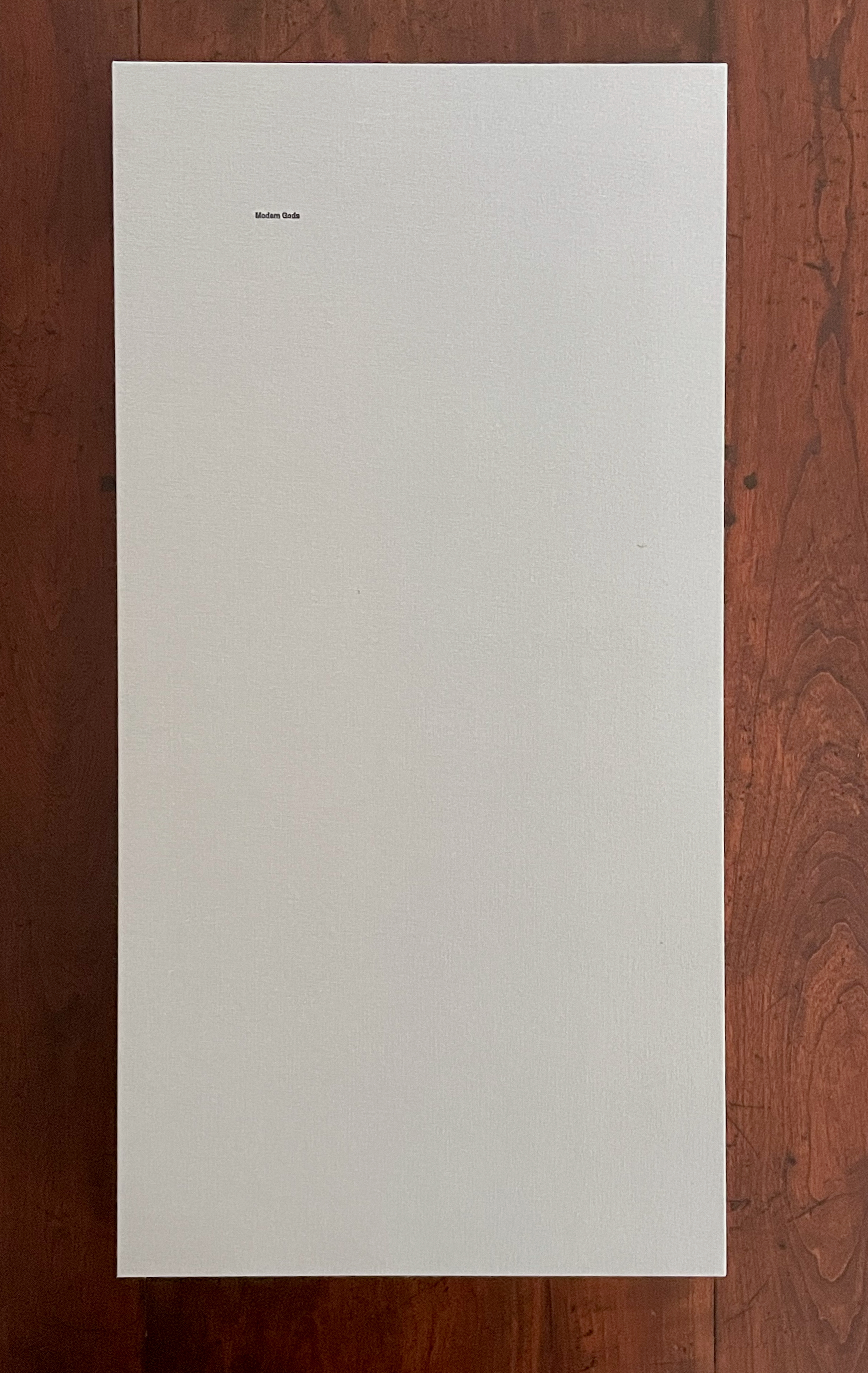
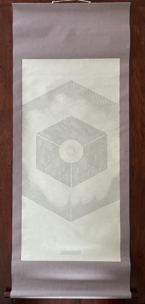
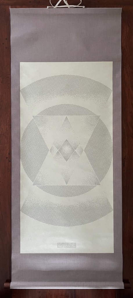
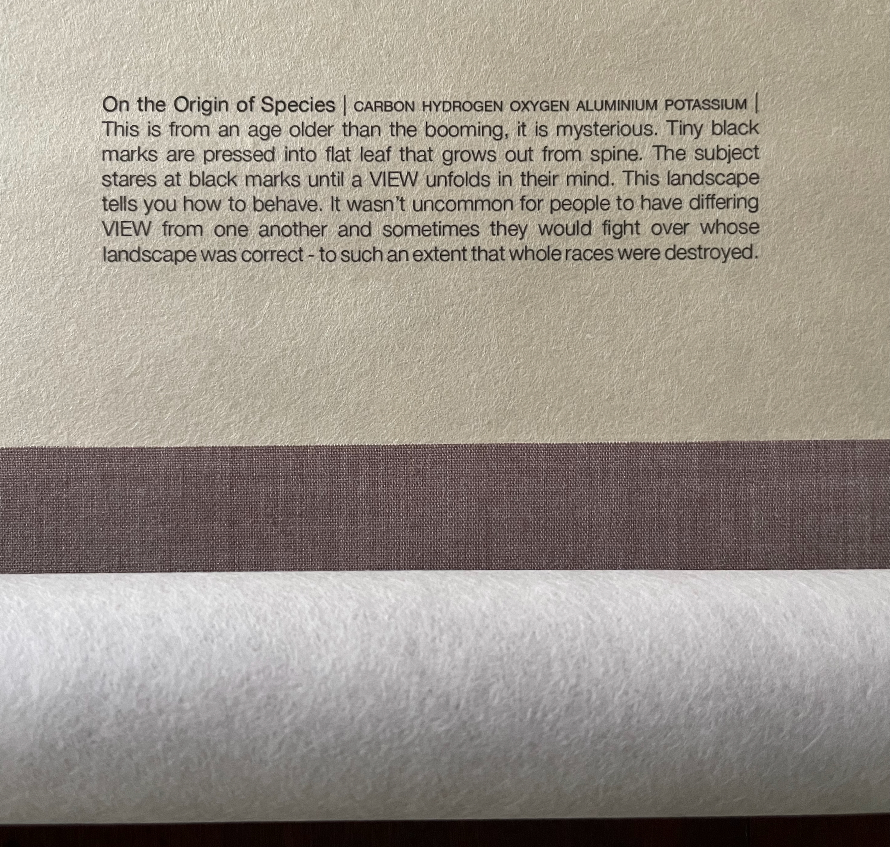
Sam Winston Modern Gods (2013) Photo: Books On Books Collection
Modern Gods follows on from Winston’s Darwin (2009) and consists of three “sacred” scrolls, each bearing a mandala formed by the names and symbols in type of the chemical elements that compose the modern god the scroll represents: the Rolex President watch, the pay-as-you-go SIM card, and Darwin’s On the Origin of Species.
Modern Gods is partially an example of inverse ekphrasis — where a visual artwork aims to re-present something already presented by a written text. Not the same thing as an illustrated book or livre d’artiste.
Rolex, SIM, On the Origin of Species
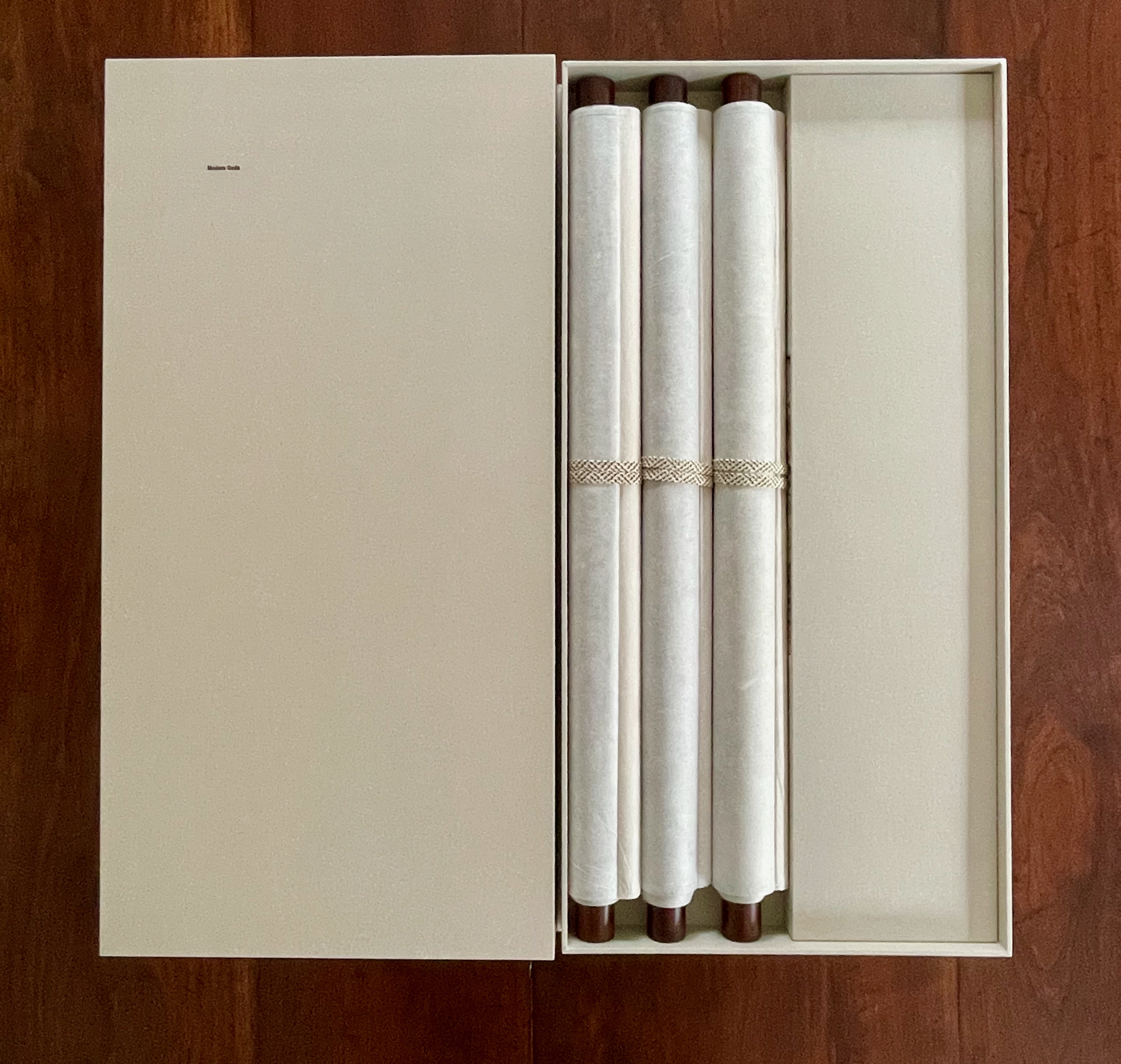
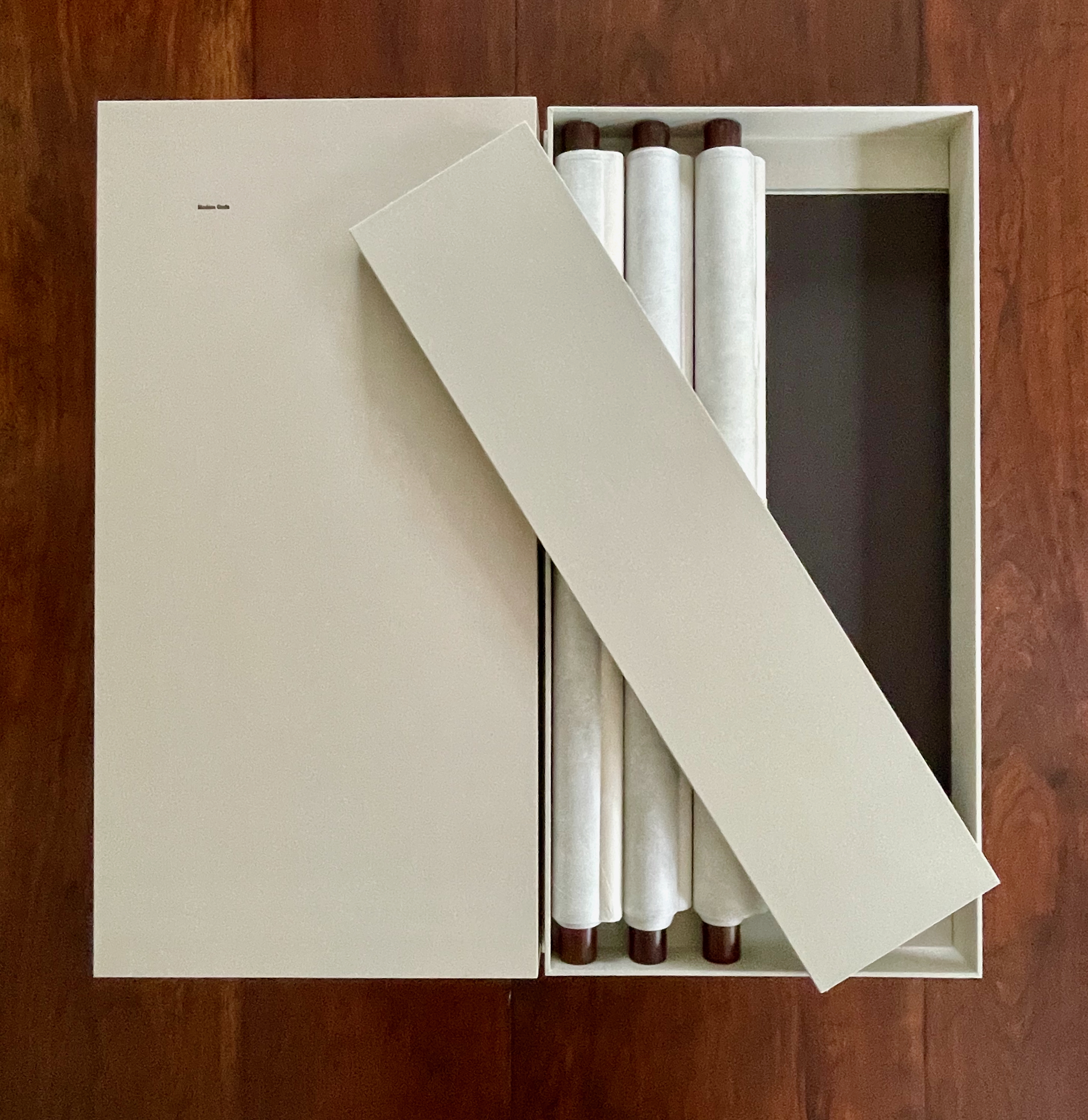
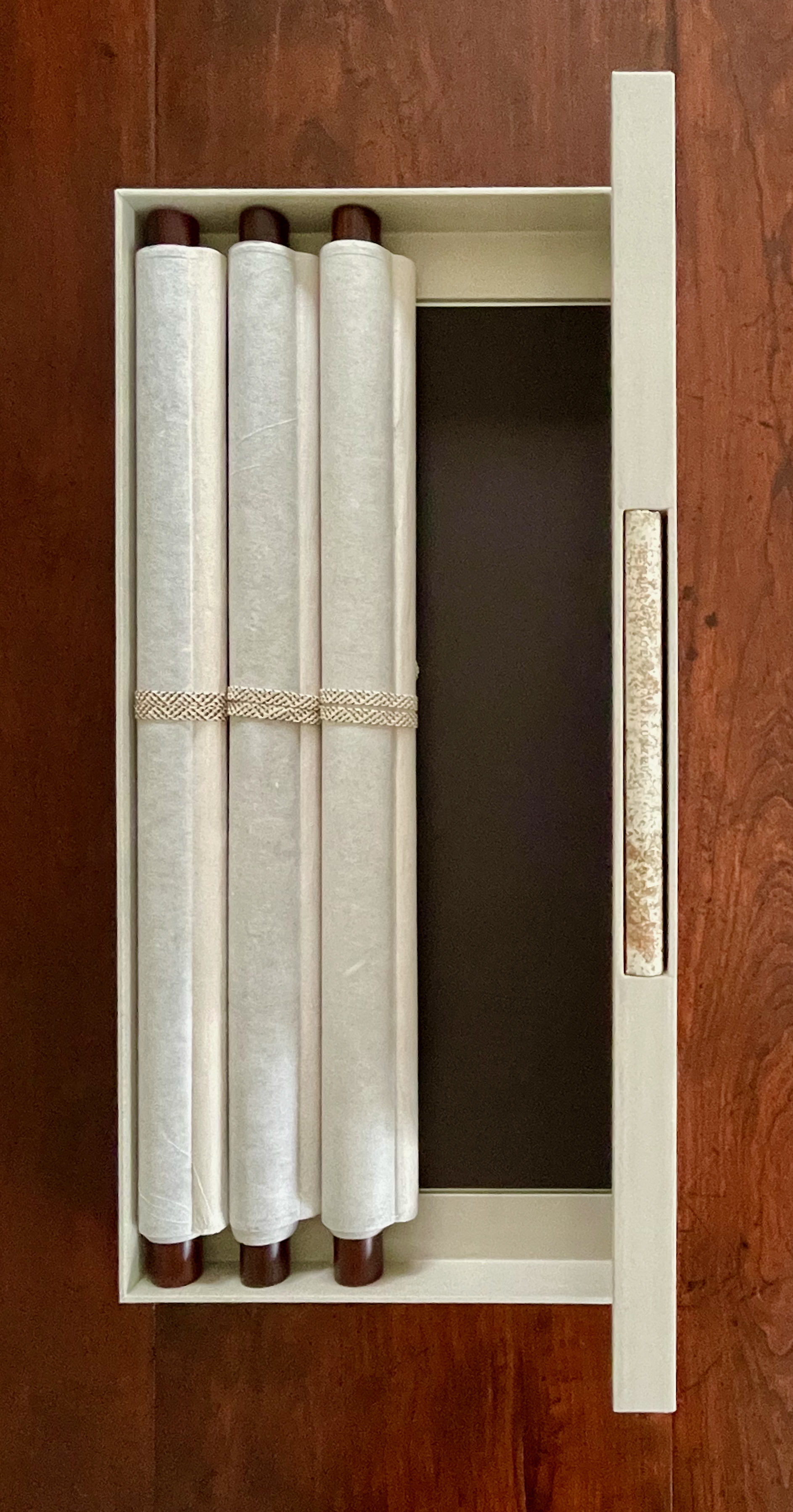
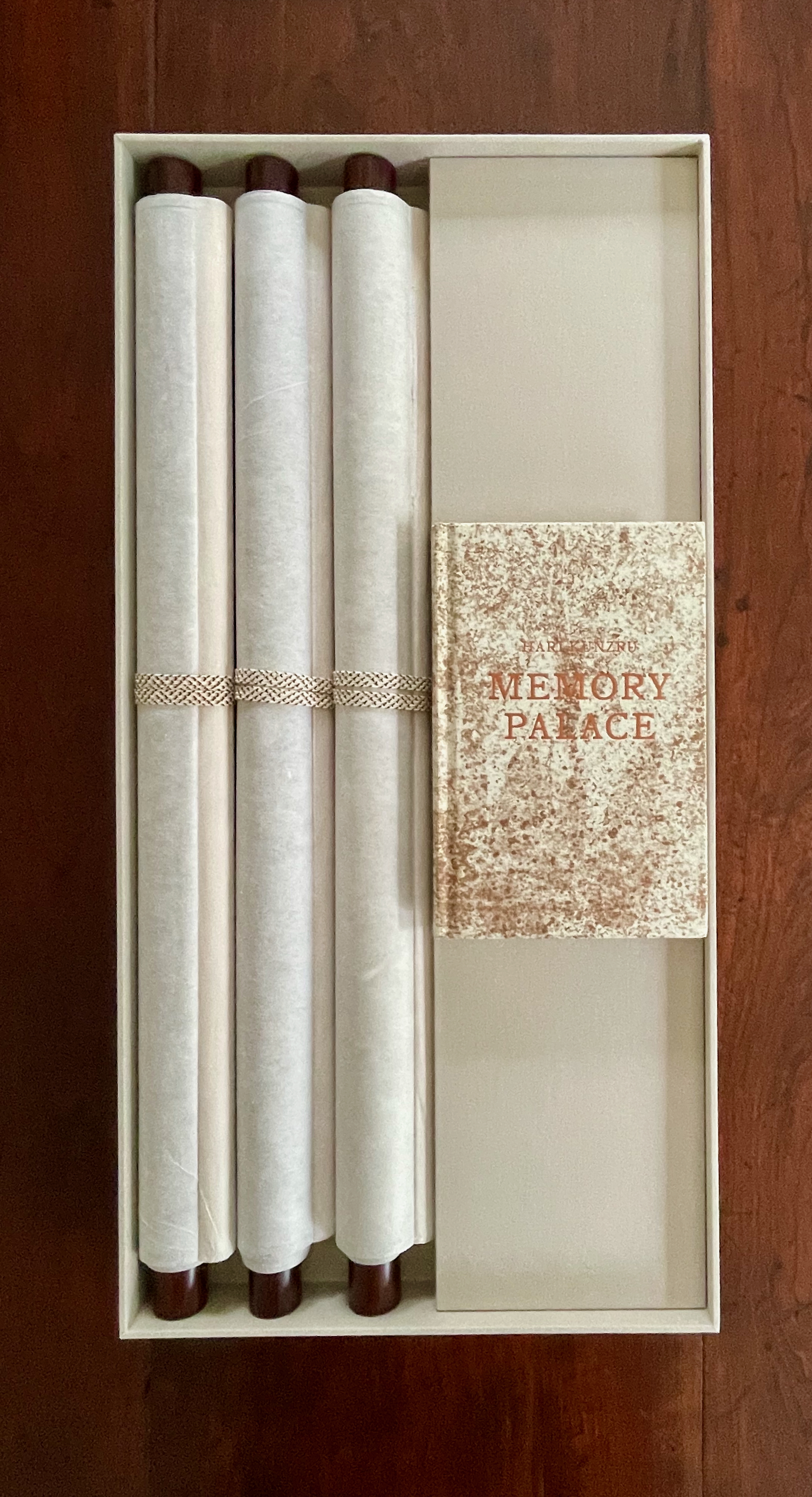
Like the works displayed above, Winston’s third scroll offers an example of visual and textual representation of Darwin’s On the Origin of Species, which adds to the unusually lengthy list of works inspired by Darwin’s book. (Perhaps no surprise, but the Memory Palace project also commissioned Stephanie Posavec, whose earlier work also appears above).
Modern Gods was commissioned by Victoria & Albert Publishing as a response to a new piece of fiction it had commissioned from novelist Hari Kunzru along with 19 other visual works in response. As the V&A curators put it, Kunzru’s Memory Palace (2013) and the original commissions from the 20 graphic designers and illustrators would form the basis of an “exhibition that can be read. … [to explore] what happens when a story leaves the pages of a book and enters the gallery space.” Modern Gods stands on its own as an extraordinary fusion of type, word, image, material, and structure.
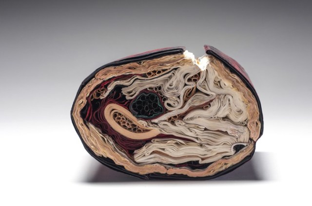
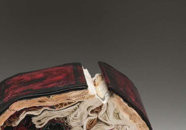
The First Cut, 2015 Transformed Harvard Loeb Library Translation of Ovid’s Metamorphoses H7.75″ x W5.5″ x D6.5″ Photo: Paul Kodama In Private Collection, NL
By its compressed and sealed form, reticulation and shifting colors, The First Cut evokes Ovid’s epic poem about “bodies which have been transformed into shapes of different kinds.” The words and stories of the three Loeb Library volumes are locked away beneath the bent covers in the penetrating and embracing furls and whorls of the pages. Much like the human cries and feelings of the subjects transformed into mute trees and senseless stones in Ovid’s tales of the awful and the tender, the terrifying and beautiful, the violent and loving.
The end-on image looks like a cross section of a tree, appropriate for the work material’s etymology: Old English bōc, Dutch boek, German Buch, and Gothic bōka. Highly appropriate, in fact, as the artist whimsically devised this form of sculpture as
The First Cut, 2015 Transformed Harvard Loeb Library Translation of Ovid’s Metamorphoses H7.75″ x W5.5″ x D6.5″ Photo: Paul Kodama In Private Collection, NL
a result of an ongoing series of work started in 2013 in which [she] inserted a sculptural book form into the cavity of a tree to simulate a whorl in a tree hollow. What was initially an artistic, whimsical gesture became one where conditions were set in action, and consequently, over time the books returned to their botanical origins and were gradually subsumed by nature. The books changed state; at first “painted’ by a natural patina of mold in which the colours mutated and muted over time. The forms then became petrified and wood-like, with traces of their former texts still present, but like cultural artifacts: positing how time, changing weather conditions, and insect activity would finally affect the narrative of the original work. As iconic vessels of culture, knowledge, and classification systems, WHORL resonates as an imprint on how we leave our mark on nature, and how nature eventually leaves its mark on us a larger, comprehensive system at work.
In the following commissioned work — based on Ovid’s Tristia — the artist has applied the technique from her 2007 inked series “… when [she] was also working with the sculptural and expressive qualities of paint and sumi-e ink. Referencing page layering, and the earlier faded ink fore edges of [her] Volumes series..this work invokes the meditative through the act of applying ink and obliterating meaning to create new meaning.”
Silenda (Black Sea Book), 2015 (Sister of Nous) Transformed Peter Green Translation of Ovid’s Tristia and the Black Sea Letters H9.5″ x W12″ x D6.5.” Manipulated Text, Ink, Graphite Photo: Paul Kodama In Private Collection, NL
The Tristia consists of letters and meditations that Ovid sent to Rome from Tomis on the Black Sea Coast, where the Emperor Augustus had exiled him for what Ovid mysteriously calls his carmen et error (poem and mistake). Silenda is from the Latin for “mysteries” and “that which must be kept silent.” The ink-saturated and unfurled pages of Silenda echo the poet’s black despair, the barrenness of exile, and the scarlet edging echoes his bleeding heart.
The sister work referred to in the caption is shown below.
Nous (There’s no why Here), 2014 Manipulated Philosophy Book, Ink, Graphite Reason & Responsibility: Readings in Some Basic Problems of Philosophy, Fourteenth Edition. Feinberg & Shafer-Landau H34.5 x W30.5 x D23cm Photo Paul Kodama
In informal usage, nous means common sense or practical intelligence; in its more formal philosophical usage (from the Greek), it means the mind, intellect or intuitive apprehension. The artist’s alliance of title, technique and material here enriches the work but also presents the viewer of Nous and Silenda with questioning insight into book art.
Since the technique has blacked out the volume’s essays on central issues in metaphysics, epistemology, philosophy of religion, philosophy of mind, and ethics, as well as debates over the value of philosophy and the meaning of life, of course there is “no why Here”. Rush Lee is an exceptionally witty artist, so I wonder whether the pun also arises from the absence of a section on Aesthetics in the Feinberg anthology.
But that’s not the main query that Nous and Silenda taken together prompt. Both works are so similar in appearance that they could be mistaken for one another. For book art in which the innovative technique yields such similarity of works, how should we react to pieces where meaningful distinction is implicit in such differences in the material used that can only be known from labels that may or may not accompany the works? If we were to switch the labels of these two works, would we “mis-appreciate” them?
I think we would. Despite the close technical similarities of these two works, my reaction to each is enriched by knowing those differences and matching the choice of title of the work to the material used. That is a lesson I would apply even to works titled “Untitled” — the lesson really being to look harder, even beyond the “why”.
Jacqueline has been working with books for fifteen years and is recognized for working with the book form. Her artworks are featured in blogs, magazines, books and international press. Selected bibliography include: BOOK ART: Iconic Sculptures and Installations Made from Books; PAPERCRAFT: Design and Art with Paper and PLAYING WITH BOOKS: The Art of Up cycling, Deconstructing, and Reimagining the Book. Jacqueline’s work will also be featured in Art Made from Books, Chronicle Press, 2013 by Laura Heyenga. … She exhibits her artwork nationally and internationally and her work is in private and public collections, including the Allan Chasanoff Book Under Pressure Collection, NY.
The Chasanoff collection connects Lee with Doug Beube, whose work has been noted here. Beube was the curator of the Chasanoff Collection from 1993 to 2011. In his interview with Judith Hoffberg in Umbrella, Vol 25, No 3-4 (2002), he comments on the purposes of Allan Chasanoff, a book artist in his own right, in putting together the collection The Book Under Pressure:
There are a number of ideas that meets Allan’s criteria in acquiring work, of which I’ll try to convey a couple. The first is; the problem of the book to perpetuate information is inefficient, it’s an obsolete technology due to the advent of the computer. Another premise is; at the latter part of the 20th century the book is being used for purposes other than its utilitarian design. Allan has been working extensively with computers and digital imaging since 1985 and understands that the book is as “an outdated modality”, he’s fond of saying. He’s not interested in the book decaying or in its destruction, nor is he referring to the content of books, artist’s books, production costs, mass appeal or where they get exhibited. His interest is in the book as an antiquated technology.
Lee’s process of kiln firing to transform individual books, as with the dictionary above, strikes a harmonious chord. The kiln does not reduce the book to ash but rather petrifies it. Another way of exploring “the book under pressure.” Lee’s and Beube’s work are brought together again by Paul Forte at the Hera Gallery for an exhibition entitled Transformed Volumes.
Printmaker, photographer and book artist, Frances Kiernan is based in Richmond, UK. I first saw her work in The Riverside Gallery exhibition (29 November 2014 – 14 February 2015).
… made from the discarded prints during 2010. Rather than destroy them I liked the idea of creating a new piece of work out of damaged and unwanted prints.
The book also serves as a reference to the different processes in printmaking. (Kiernan)
All the Prints I Have Made, 2010 From “Artists’ Books” exhibition at The Riverside Gallery, Richmond, UK 29 November 2014 – 14 February 2015
All the Prints I Have Made, 2010 From “Artists’ Books” exhibition at The Riverside Gallery, Richmond, UK 29 November 2014 – 14 February 2015
All the Prints I Have Made, 2010 From “Artists’ Books” exhibition at The Riverside Gallery, Richmond, UK 29 November 2014 – 14 February 2015
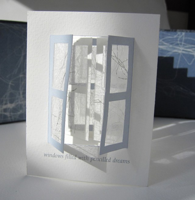
Like this flag book shown, her “Princess Caroline” series vaults over mere craftwork into indelible book art. Her work can be found in collections at the V&A, Kensington and Kew Palaces and the Sanskriti Foundation in New Delhi.
Beyond the Window windows filled with pencilled dreams Princess Caroline was a forward thinking woman with interests in politics, the arts and science. This book represents Caroline’s longing to go out into the world. We imagine her dreaming of a world beyond the window looking out to reach the marvels of the universe. The book was placed in a compartment in the Cabinet of Curiosities. The compartment was lined with mirrors so that the windows appear to be never ending and to help convey how her dreams could never be attained. She contented herself with collecting curiosities that the men brought back from their travels. The windows of this concertina book are handcut. The window panes are covered with Matsuo kozo paper that have been screenprinted from pencil drawings to reflect her dreams. The ‘Maru-chitsu’ wraparound case is screen printed onto bookcloth and can be closed with a Japanese bone clasp. Book commission for the Enchanted Palace Exhibition at Kensington Palace 2010/11.
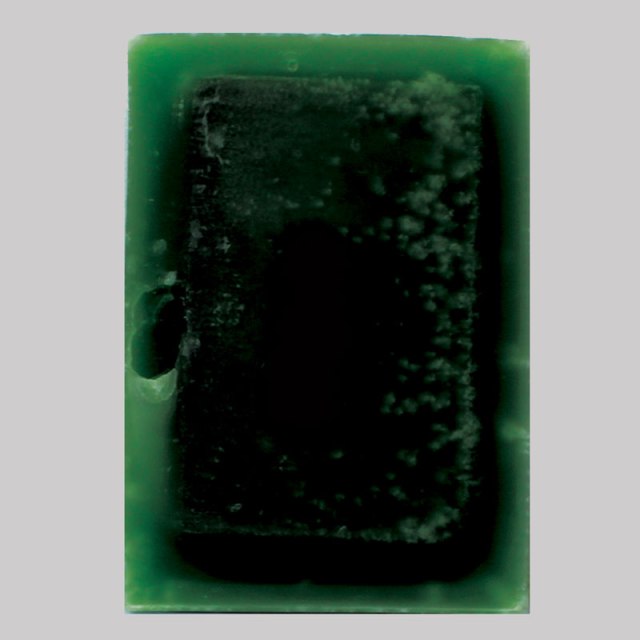
Australian artist Mary Ann Santin studied at the Adelaide Central School of Art and has exhibited at the State Library of South Australia, the Miele Gallery and Loreto Spring Art Show. Her techniques and themes echo those of Jessica Drenk, Guy Laramee and Georgia Russell.
A5 green, 2012 found encyclopaedia, paraffin wax, dye 21cm x 15cm x 5cm
“1962”, 2012 Sanded work Found encyclopaedia 28cm x 92cm x 13cm
Spring two, 2012 Books in rubber and glass
Material investigations were also an important process in the search for the most relevant means to suspend, submerge, and cover-up objects and paintings. Books treated as if they were blocks of wood, paper erasures buried under paint, and print techniques on glass allowed the metamorphosis of forms or objects to embody these ideas of absence denoting presence.
I see my body of work as a positive process of repurposing objects and old paintings that no longer fear the loss of remembrance. That holding pattern between grief and loss remains suspended within memory and our day- to- day acknowledgement of their existence. This sense of quiet melancholy finally gives way to acceptance and permission to start anew.
At 6 minutes in, there is a wonderful riff on the book as elemental cultural artifact, being able to stand for each of the four elements. Here are links to the images to which Spector refers – so much more enjoyable to see as well as hear!
There is a related brief note about Spector’s “The Rise and Fall of Books” here. Spector’s works — especially his collages with found poems drawn from book jackets — strike deeply. With them, book art goes beyond the read artifact into the relationship of writing and reading.
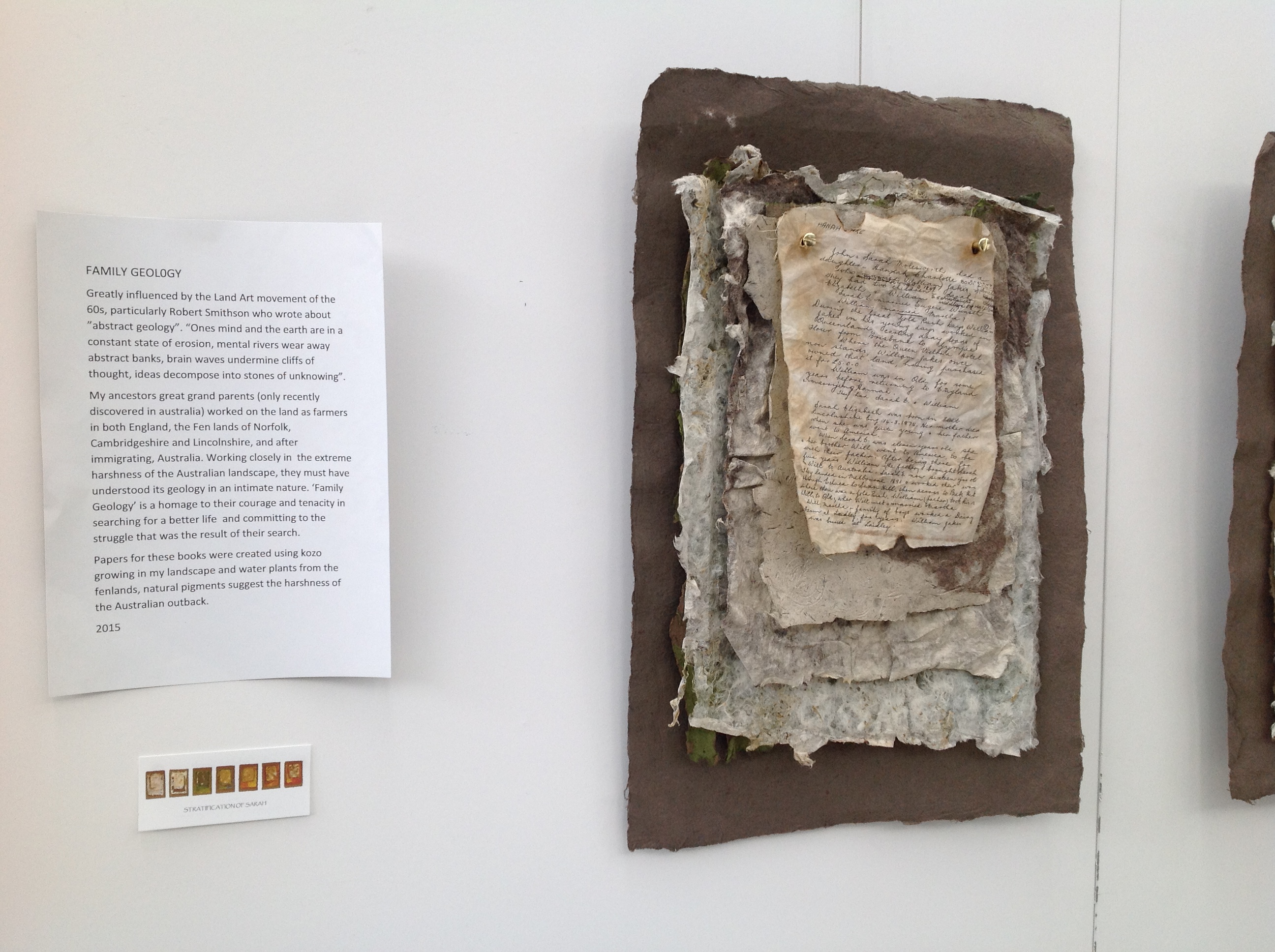
Family Geology by Jan Fairbairn-Edwards consists of multiple related works to create the visual narrative of her Victorian era family’s emigration from the Norfolk fens to Australia. One of the central characters is her great aunt Sarah, who is the focus of the work Stratification of Sarah shown below.
Stratification of Sarah, 2015 Jan Fairbairn-Edwards
Stratification of Sarah, 2015 Jan Fairbairn-Edwards
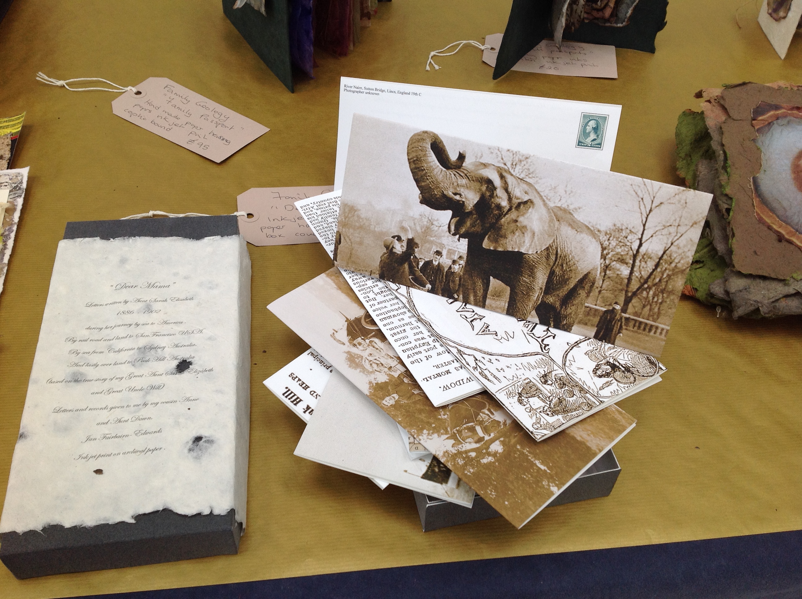
Symbolically, the six hanging “chapters” of Sarah’s journey move from the dun colors of the English fens to the hotter colors of Australia. The artist uses sheets of paper handmade from plants native to the Norfolk fens as well as traditional clothing fabric. The “geological” layers of the journey’s story are reflected in the stratified sheets that diminish in size from back to front. The weathered documents appearing in each hanging are copies of found items from the family’s possessions or allusive artifacts, such as the article about Alice, “Jumbo’s widow“.
Alice was the African elephant being shipped aboard the HMSS Egyptian Monarch to join P.T. Barnum’s Jumbo in the US. Also on board the Monarch was Sarah, 10 years old when she embarked for the first sea leg of the journey to Australia. In another work in Family Geology called “Dear Mama”, the artist has invented a series of letters from Sarah, several of which tell of Sarah’s searching the ship for Alice.
“Dear Mama”, 2015 Jan Fairbairn-Edwards
The other related works feature only fens-originated material, with the exception of a few pieces whose spines are branches of eucalyptus trees. Those spines and the hot Australian colors are the main physical manifestation of the Australian destination. As seen below, the stamps from the officialdom of the empire on which the sun never set provide another of the numerous unifying threads in the narrative.
William’s Story, 2015 Jan Fairbairn-Edwards Handmade papers with kozo and fenland plants, natural pigments, ink jet print (archival quality) on tracing paper, inks, string and eucalyptus wood binding
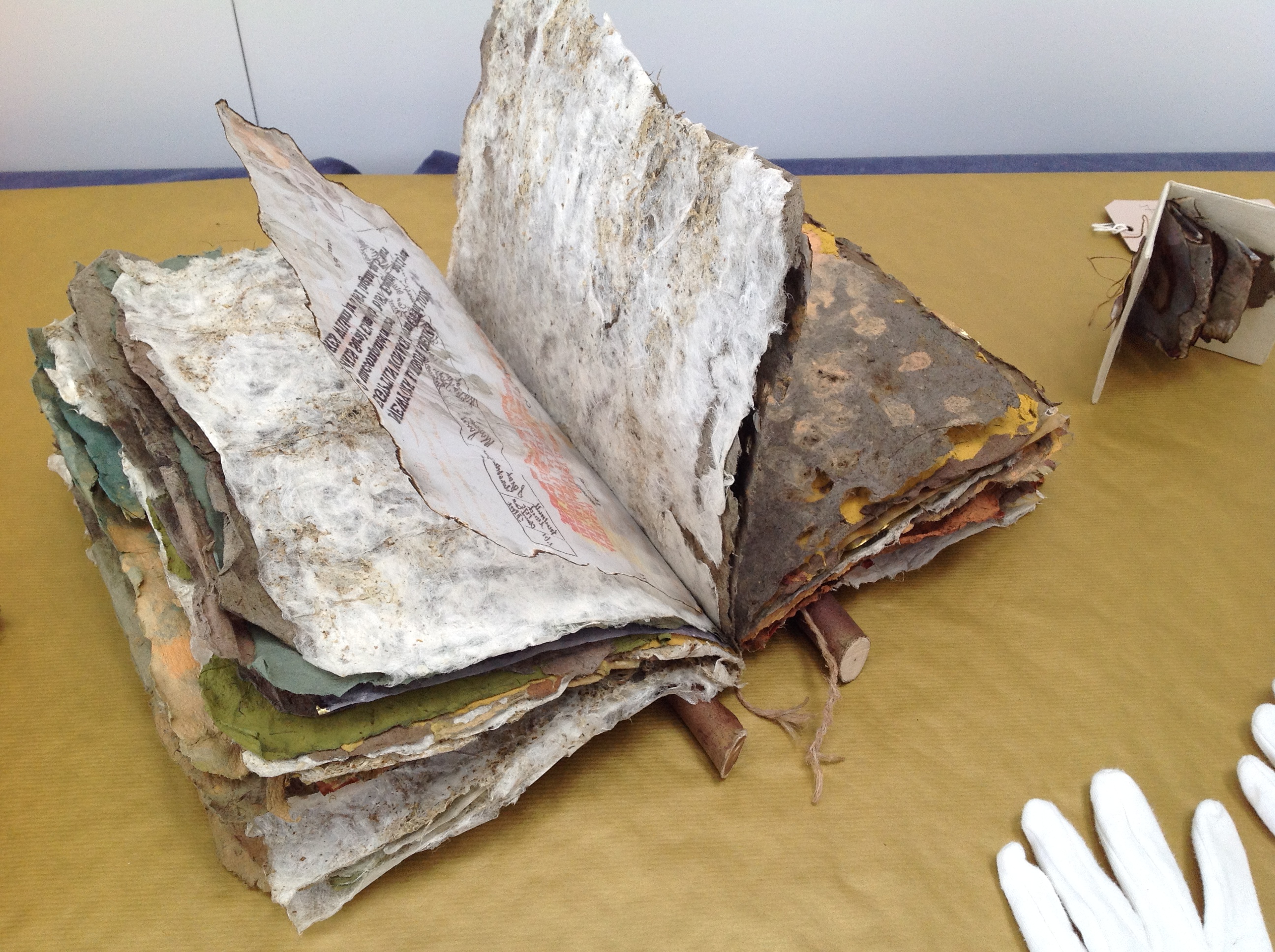
The artist suggested that I call this an installation. It is, but with the difference that there is this multi-threaded, narrative unity across and among the individual works that I have not noticed before in other installations. That unity makes me stumble a bit over the fact that the constituent works are purchasable individually, which casts the “installation” in something of a contrasting light. The work as a whole is one of remembrance and restoration. Doesn’t the removal of pieces of Family Geology undermine that?
Remember the 2014 installation Blood Swept Lands and Seas of Red created by artists Paul Cummins and Tom Piper at the Tower of London: 888,246 ceramic poppies progressively filling the Tower’s famous moat between 17 July and 11 November? Each red bloom represented a British military fatality in the First World War. The installation as installation resides only in the memories of its viewers and can be experienced only partially in photos, video clips or the website. The poppies sold individually over the web (I am one of the lucky owners of one of them). When I look at this single ceramic poppy, sometimes there is a failure of metonymic power – the ability of the part to stand for the whole. Other times, it starts the image of a cascade of blood from a stone window into a moat of red. And so, what of a single work plucked from Family Geology?
The full impact of the installation– a family speaking to one another in and across time, from across seas and continents – something on which the viewer eavesdrops – rises like the musk from the back of an inherited chest’s bottom drawer full of old letters, curled newspaper clippings, fading photographs, pressed leaves and flowers. At first, you think it is the volume of this manufactured memorabilia and their semi-invented, semi-found connectedness that is the source of that impact. But then you pick up William’s Story. The texture of its papers, the rough, dry sound of the leaves turning and the ash that flakes to the table from their edges take you deep into that musk through the one work.
You can sift through the several pieces of Fairbairn-Edwards’ Family Geology, and some will take you to the same place on their own, others lean much more on the presence of the installation. The thought of taking away from the whole one of its stronger parts leaves me hoping for an institutional white knight to purchase the “installation”. Yet the scent of William’s Story on some visitor’s fingers is probably making him or her reach for a checkbook or credit card right now.
See also Turn the Page 2015, where Family Geology had its debut and was one of the eight finalists.
Family Geology will next be on show at Art & Papiers, Vézénobres (Gard), France, this month (June 2015).
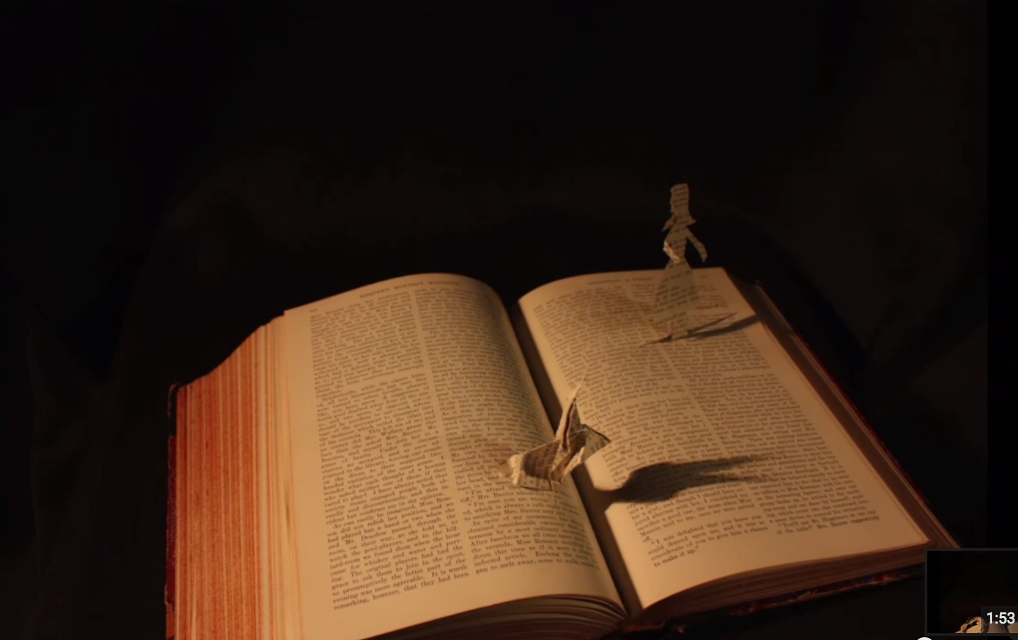
John Cheever’s short story “The Swimmer” is an all-time favorite. After seeing the short film of it with Burt Lancaster, I can’t imagine Ned Merrill’s appearance any other way. Even in Michelle Ku’s animated book art version, I see Burt Lancaster’s big grin and its sorrow.
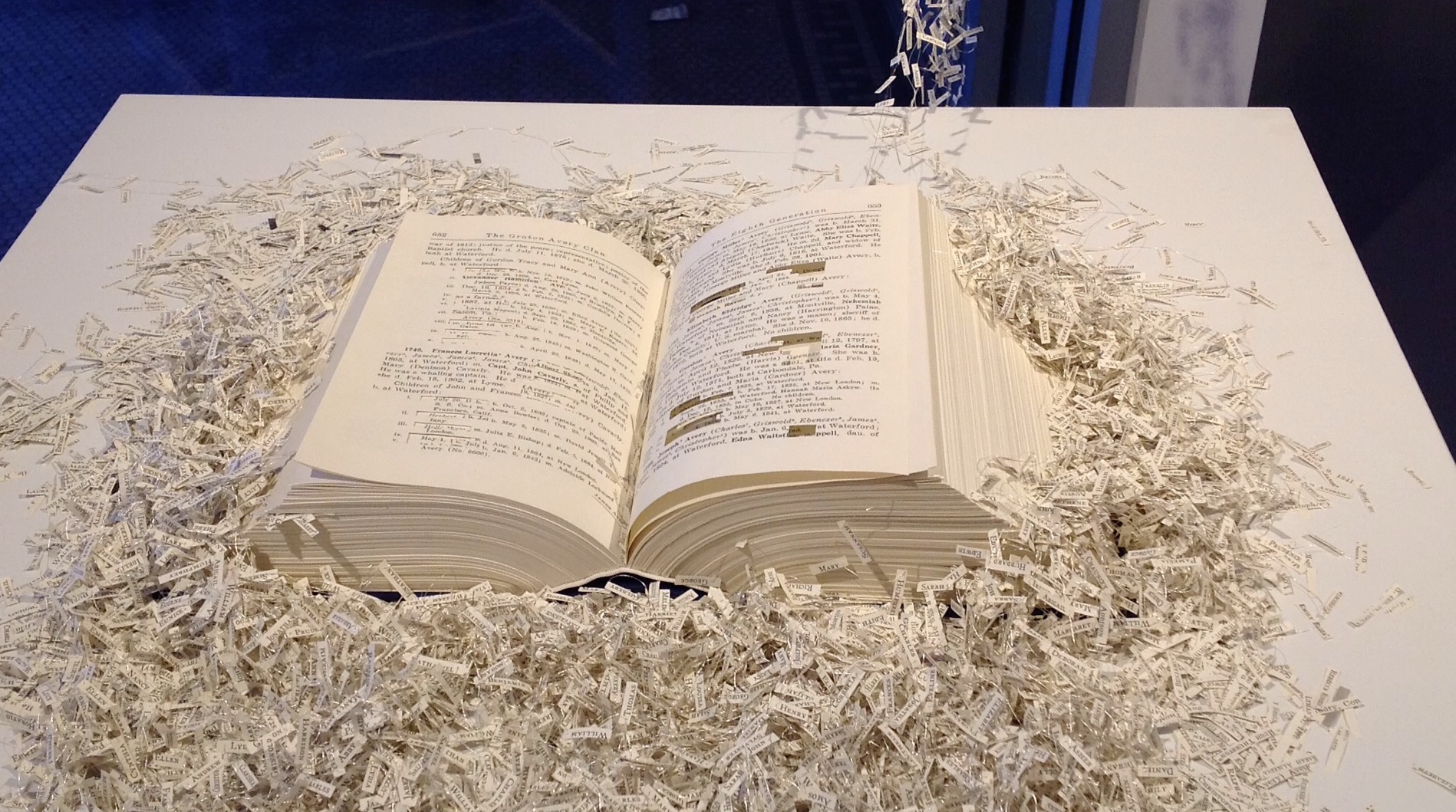
Before seeing Ku’s work, which has planted the urge to seek even more examples of animated book art, I had enjoyed Regan Avery’s The Groton Avery Clan at the CT(un)Bound exhibition in New Haven, Connecticut. The work consists of a handmade book, metallic thread, motor and an Arduino microcontroller. The Avery clan has inhabited the state since the 1600s. Regan Avery’s handmade book is a copy of the family history published over 100 years ago. From it, the name of each descendant of Christopher Avery, the original immigrant, has been excised and the ten thousand names handwritten on miniscule scraps of yellowed paper that emerge from the book along interconnected threads put into motion by the motor and microcontroller.
Regan Avery, The Groton Avery Clan, 2015
When the motor engages, the name slips become “a teeming mass of humanity”.
In 2011, Saara Tuulia posted City and Snow Book on YouTube, which is a simple stop motion animation comparable to Ku’s more complex The Swimmer.
Saara Tuulia, City and Snow Book, 2011
In 2013, Danielle Lathrop posted Book Art, whose stop motion animation highlighted the figurative and origami-based vein of the art form and its practitioners’ obsession with Alice in Wonderland.
Danielle Lathrop, Book Art, 2013 The White Rabbit and Alice sequence
Danielle Lathrop, Book Art, 2013 The White Rabbit and Alice sequence
Danielle Lathrop, Book Art, 2013 The White Rabbit and Alice sequence
Danielle Lathrop, Book Art, 2013 The White Rabbit and Alice sequence
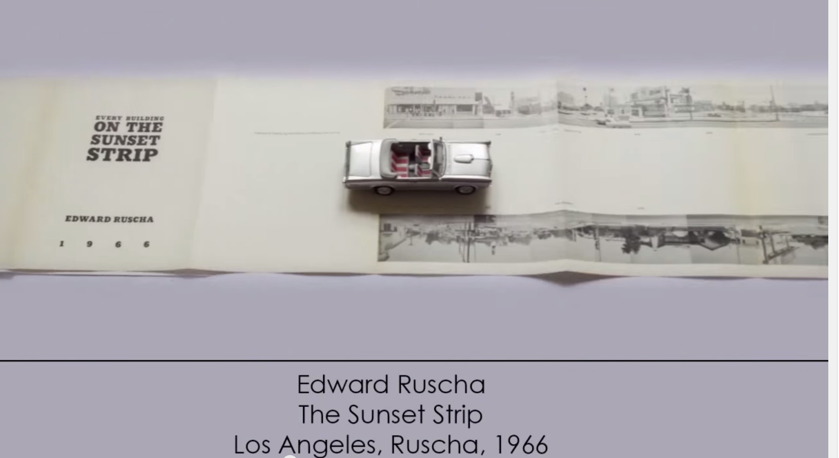
More recently, and posted here, another example of animated book art – Giulio Maffei’s series Le Vite dei Libri (The Lives of Books) – demonstrates the increasing engagement and sophistication in this variant form of book art.
Giulio Maffei, Edward Ruscha’s The Sunset Strip, 1966, 2015
For 2014-15, the New England Guild of Book Workers have organized a traveling exhibition: Geographies: New England Book Work, its itinerary covering each of the 6 New England states. Last year, the Rhode Island School of Design (RISD), the Wishcamper Center at the University of Southern Maine and the Bailey Howe Library at the University of Vermont hosted it. This year, the show has appeared at Williams College Library and is scheduled for Dartmouth College Library and the Creative Arts Workshop in New Haven, CT. Criss-crossing geographical boundaries as well as those of book art and the book arts, Geographies calls to mind the last line of Elizabeth Bishop’s “The Map“:
More delicate than the historians’ are the map-makers’ colors.
Or, in this case:
More delicate than the historians’ are the [book-artists’] colors.
Although born in Nova Scotia, Elizabeth Bishop grew up as a New Englander in Massachusetts with her paternal grandparents. As a far-traveller and visual artist as well as poet, she would have enjoyed this exhibition and found it fitting if it had included a broadside of “The Map”.
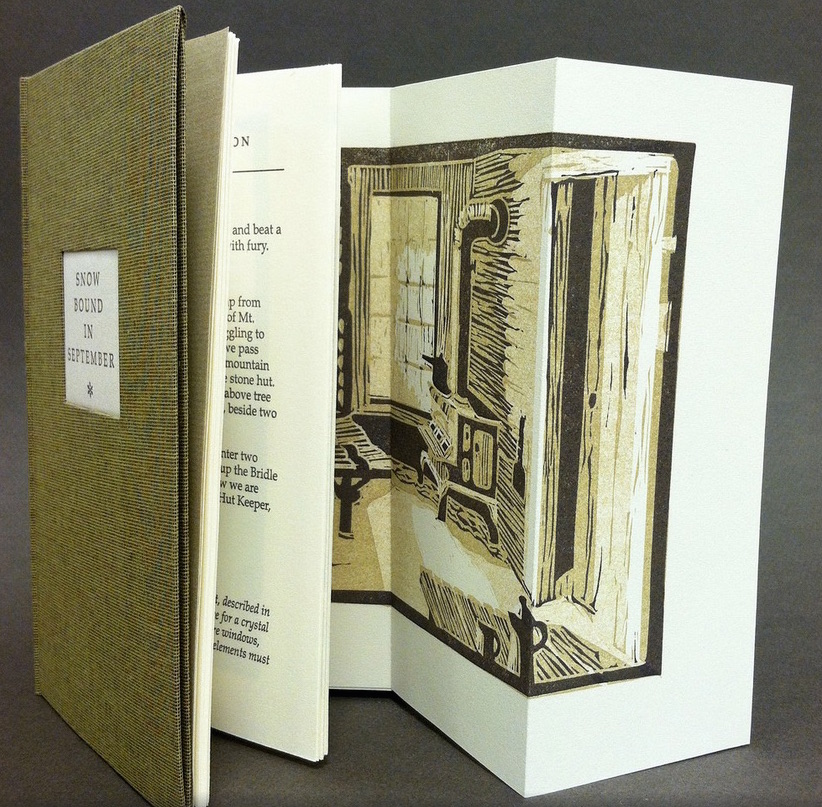
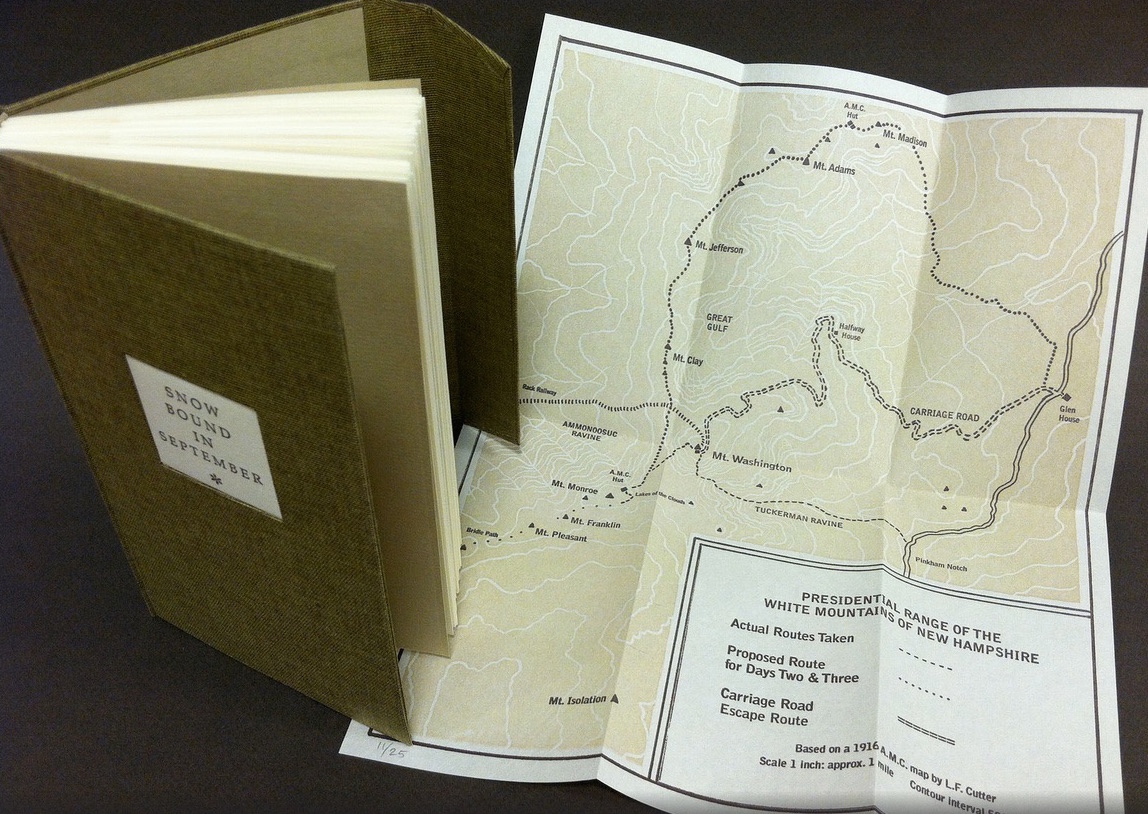
Nevertheless, what a range of “colors” from all the New England states and beyond – from historic to modern, from fine and design bindings to traditional and creative bookbinding, from artist books to calligraphic manuscripts, from masters to apprentices and from object to narrative. The latter finds a wintry exemplar in Snow Bound in September: A Re-Imagining by Laurie Whitehill Chong, retired Special Collections librarian and curator of Artists’ Books at RISD.
The artist made this book the same size as her grandfather’s Appalachian Mountain Club hiking guide. Snow Bound is an invented ancestral narrative, in which the artist uses a surviving photograph and her grandfather’s notes about being stranded with his wife for five days on Mount Washington by a hurricane-driven snowstorm in September 1915 to re-imagine the ordeal from her grandmother’s perspective. Note the slotted front cover into which the flap extending from the back cover fits to keep the book closed, snug against the elements.
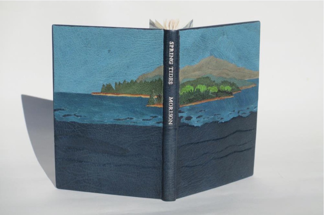
Julie B. Stackpole’s creative re-binding of Samuel Eliot Morison’s Spring Tides takes us from the New England mountains to the shore as can be seen from the layered binding.
Spring Tides by Samuel Eliot Morison Boston: Houghton-Mifflin Co., 1965. Julia B. Stackpole, Design binding 21.8 x1 5.0 x 1.6 cm January 2014
In Stackpole’s words:
The traditional tight-joint binding is covered in navy blue Niger goatskin with waves in the lower parts created by paring before covering. Cut-outs in the onlays of the lighter blue leather of the water help it transition from the dark of the navy to the sky’s azure. Onlays of other leathers create the forested landscape of the shoreline and hills. These blues were chosen because the only blue leather in a large enough piece to cover the whole binding was the dark navy, while I only had scraps of the water and sky’s blue. The endpapers are a Cockerell marbled paper over-painted with blue, with leather hinges.
Pictures of the works in the catalog (and others not) can also be found at the Williams College Flickr site (for now). I say “for now” because they will be pushed downstream inevitably in the way of today’s digital flow. They may even disappear; although as Matthew Kirschenbaum has explained in Mechanisms, something digitally forensic will remain. That boundary of the tangible and the digital, the haptic and the virtual, is only lightly but evocatively touched in this collection.
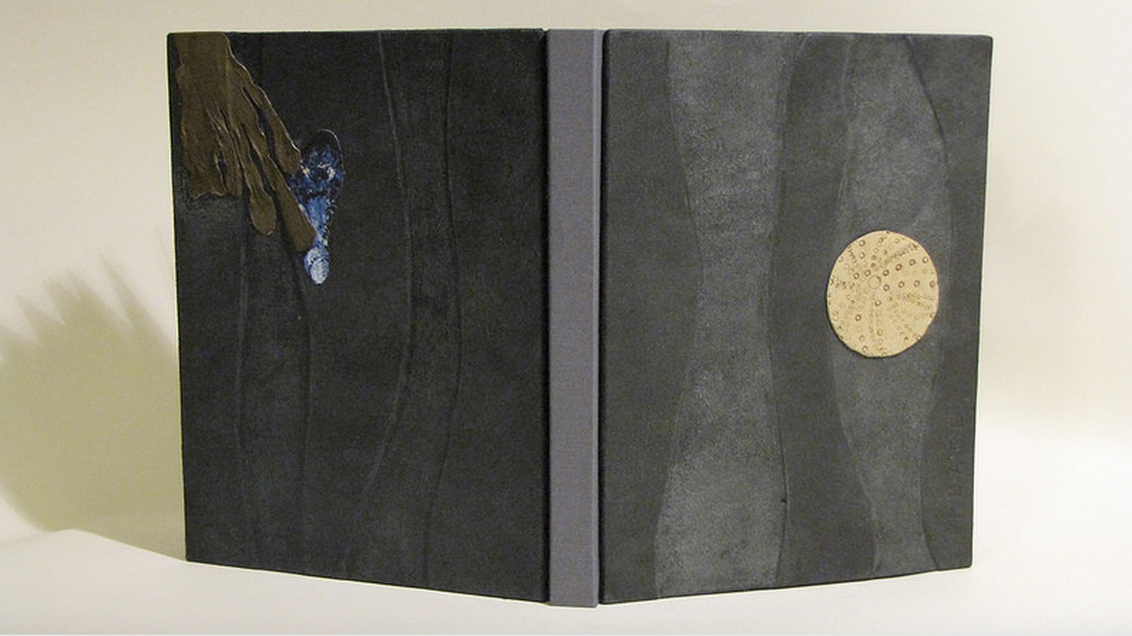
When Julia Stackpole writes in the online catalog about that Cockerell marbled paper that it “felt to me like the waves and the shoals and ledges of Maine waters”, you long to lay hands on the Spring Tide. Anne McClain’s Place includes photographs taken digitally of places on Maine’s midcoast that have been special to her her “entire life and will continue to be a constant as other things change and move on”. What is captured digitally is reproduced physically to fix those places that will “continue to be a constant”. But places do change.
Anne McClain, Place Drum Leaf Binding 19 x 15 x 1.8 cm February 2014
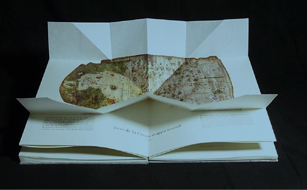
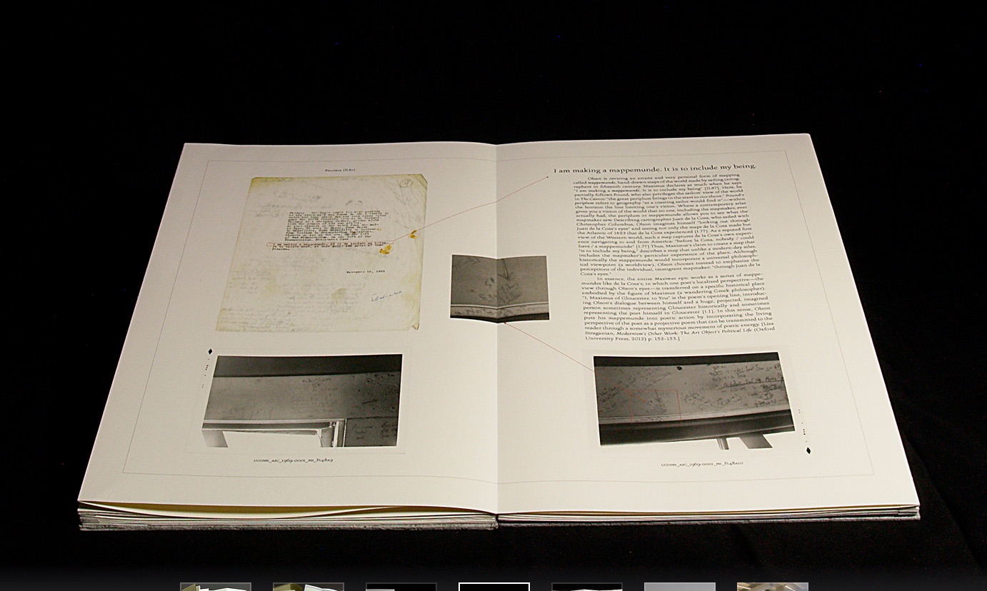
Rutherford Witthus’ contribution touches the boundary between the digital and physical most directly. His artist’s book is entitled 28 Fort Square: What Charles Olson wrote on the window casings of his apartment in Gloucester, Massachusetts, of which there are eleven copies.
Rutherford Witthus, 28 Fort Square: What Charles Olson wrote on the window casings of his apartment in Gloucester, Massachusetts, 2014
In these 11 copies, Witthus digitally reconstructs the windows of Charles Olson’s apartment at 28 Fort Square where he wrote his main work, The Maximus Poems, and covered the window casings with meteorological data. The artist book “presents for the first time all of the images of the window casings”.
Rutherford Witthus 28 Fort Square: What Charles Olson wrote on the window casings of his apartment in Gloucester, Massachusetts Artist book 42 x 28 x 2.5 cm 2014 Edition of 11
Athena Moore, chapter secretary of The New England Guild of Bookworkers, produced the catalog for this itinerant exhibition organized by Stephanie Wolff, Exhibitions Coordinator and Todd Pattison, Chapter Chair. If you have the chance to see the exhibition in its next venue, take it.
Just as Elizabeth Bishop questioned the depiction of the boundary between land and water on her map – “Shadows or are they shallows at its edges …”, you will find the juxtaposition of these works reminds you that the boundary between book art and the book arts can be shadowy or shallow indeed.
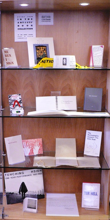
The Paul D. Fleck Library & Archives at The Banff Centre has over 4,000 artists’ books and multiples. Inspired by Ed Ruscha’s seminalbook “Every Building on the Sunset Strip”, we will display every item in the collection in a case in the library, rotating through 15 items weekly. Here you will find a photo log documenting the items, chosen randomly for display. Click through on any photo for title and creator caption.
For more information and full catalogue records for the items pictured, visit banffcentre.ca/library/.
Kudos to book artist Jaye Fishel for setting up Every Item in the Artists’ Books Collection and to Silvio Lorusso for the interview with Fishel.


