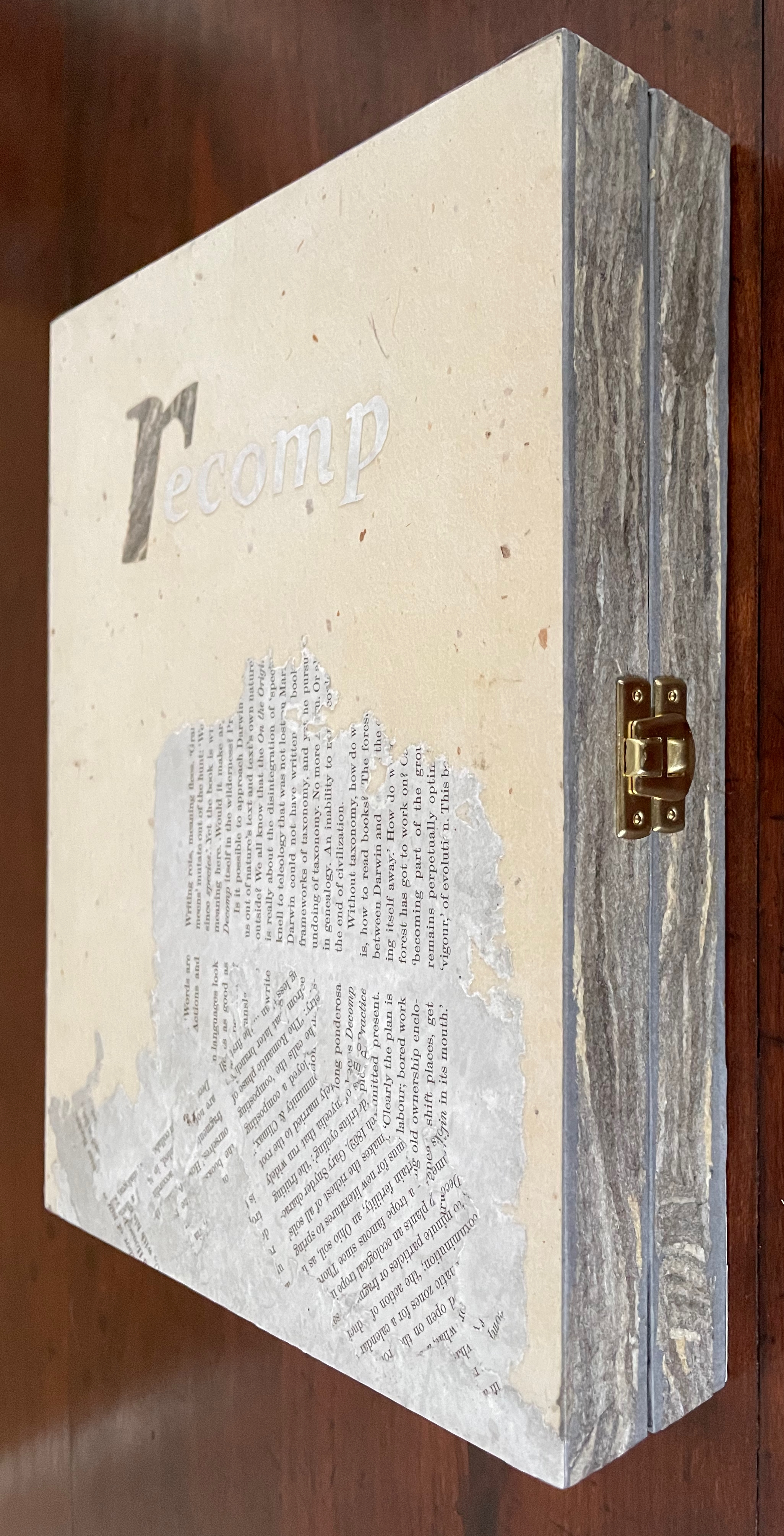
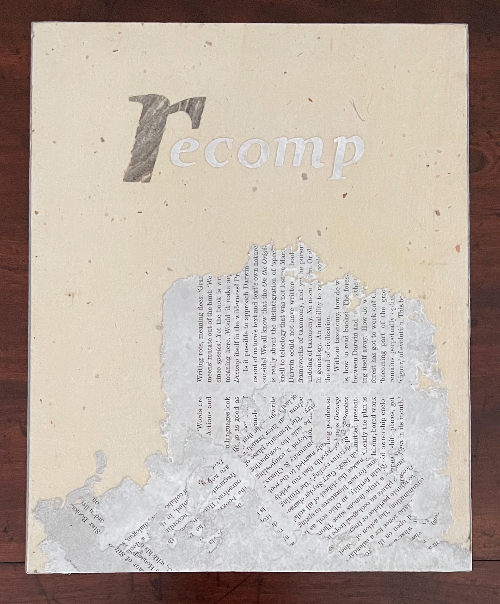
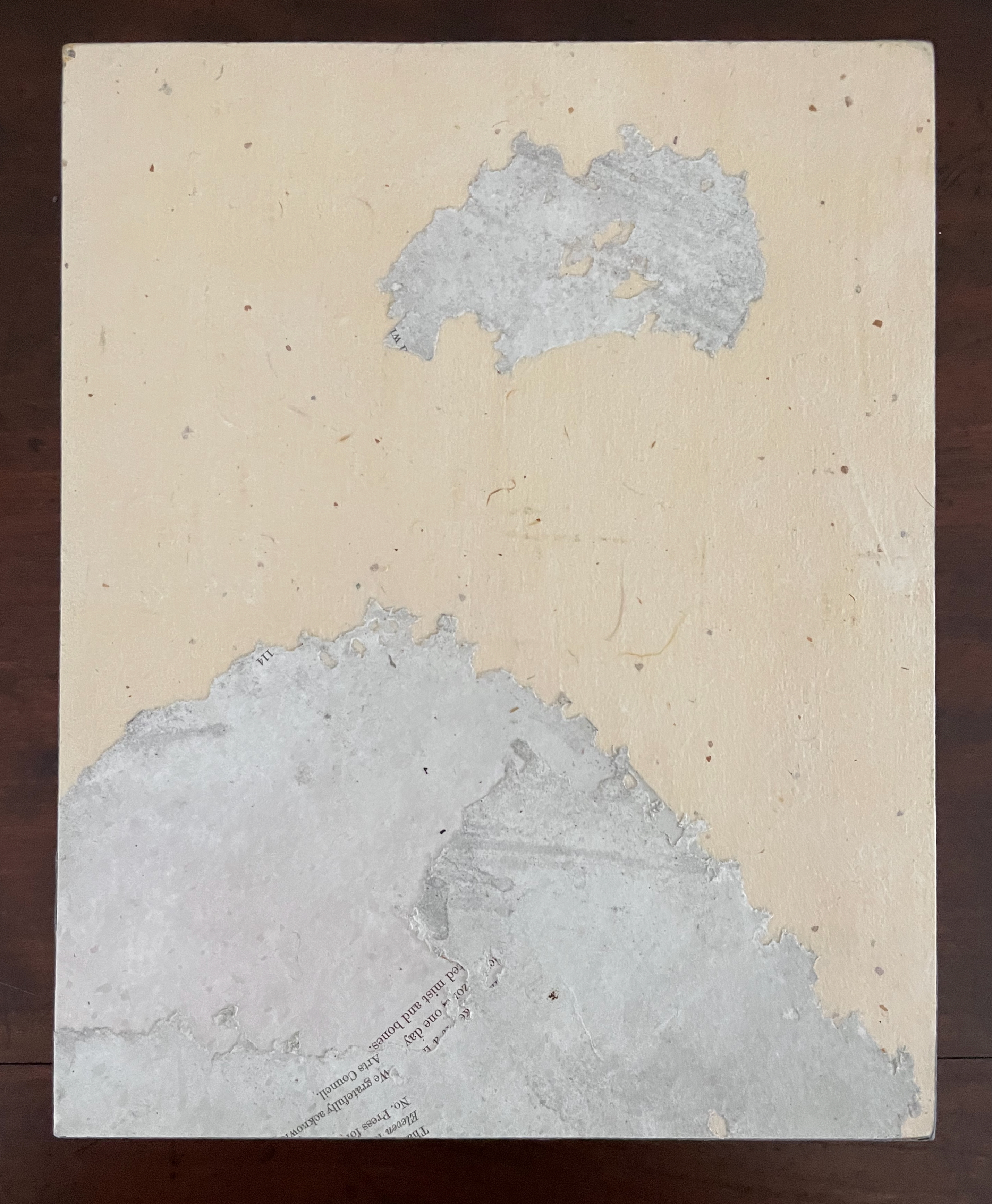
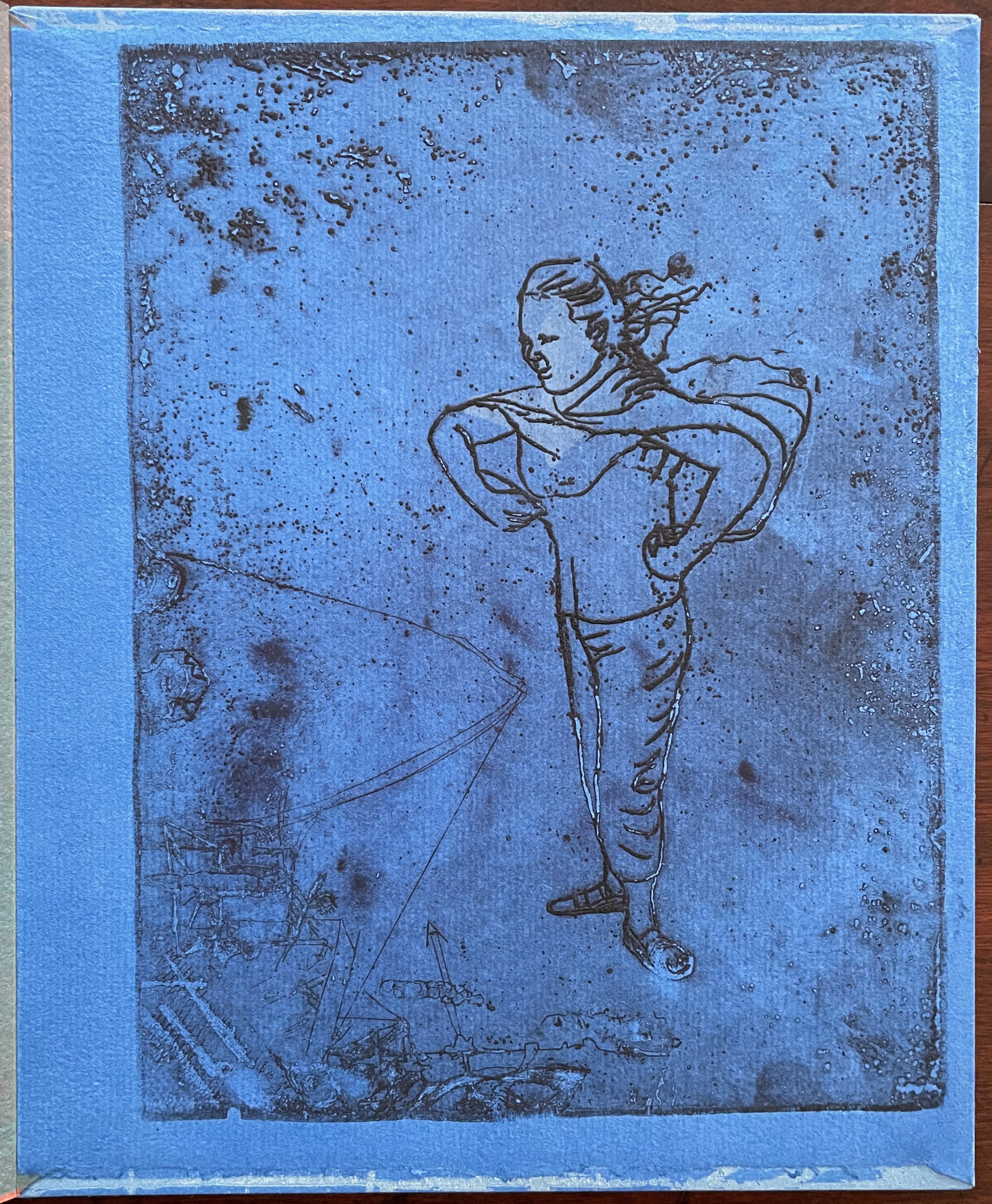
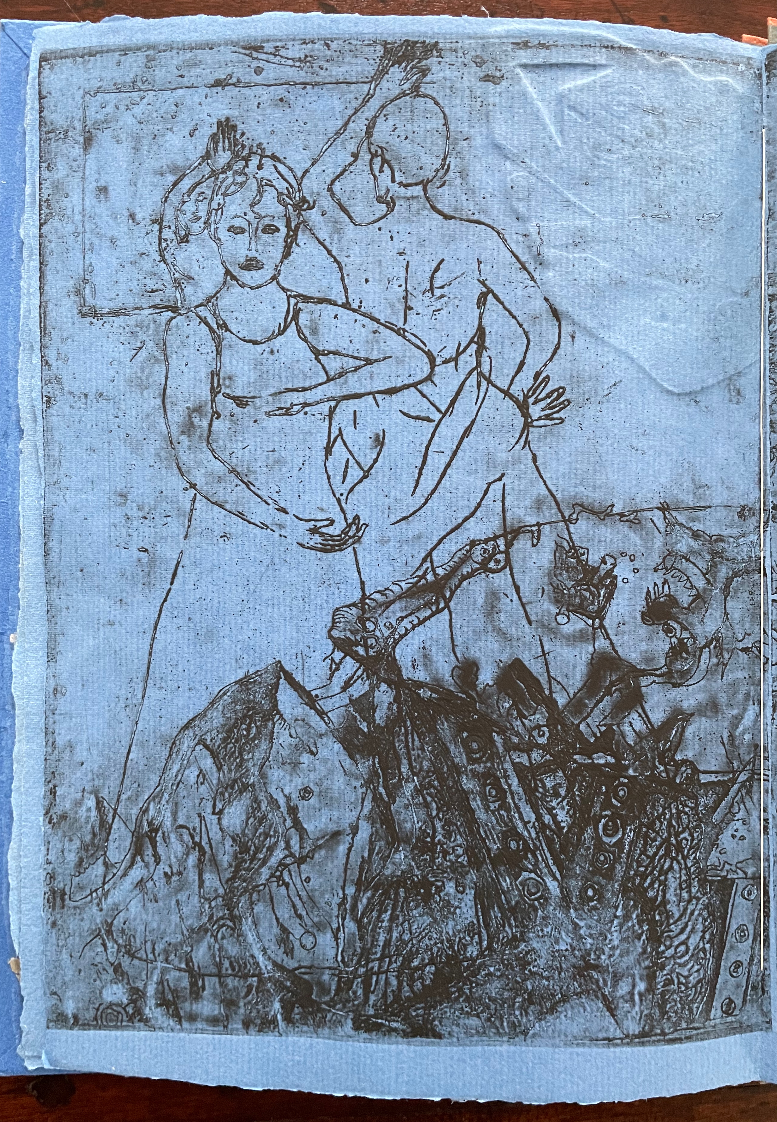
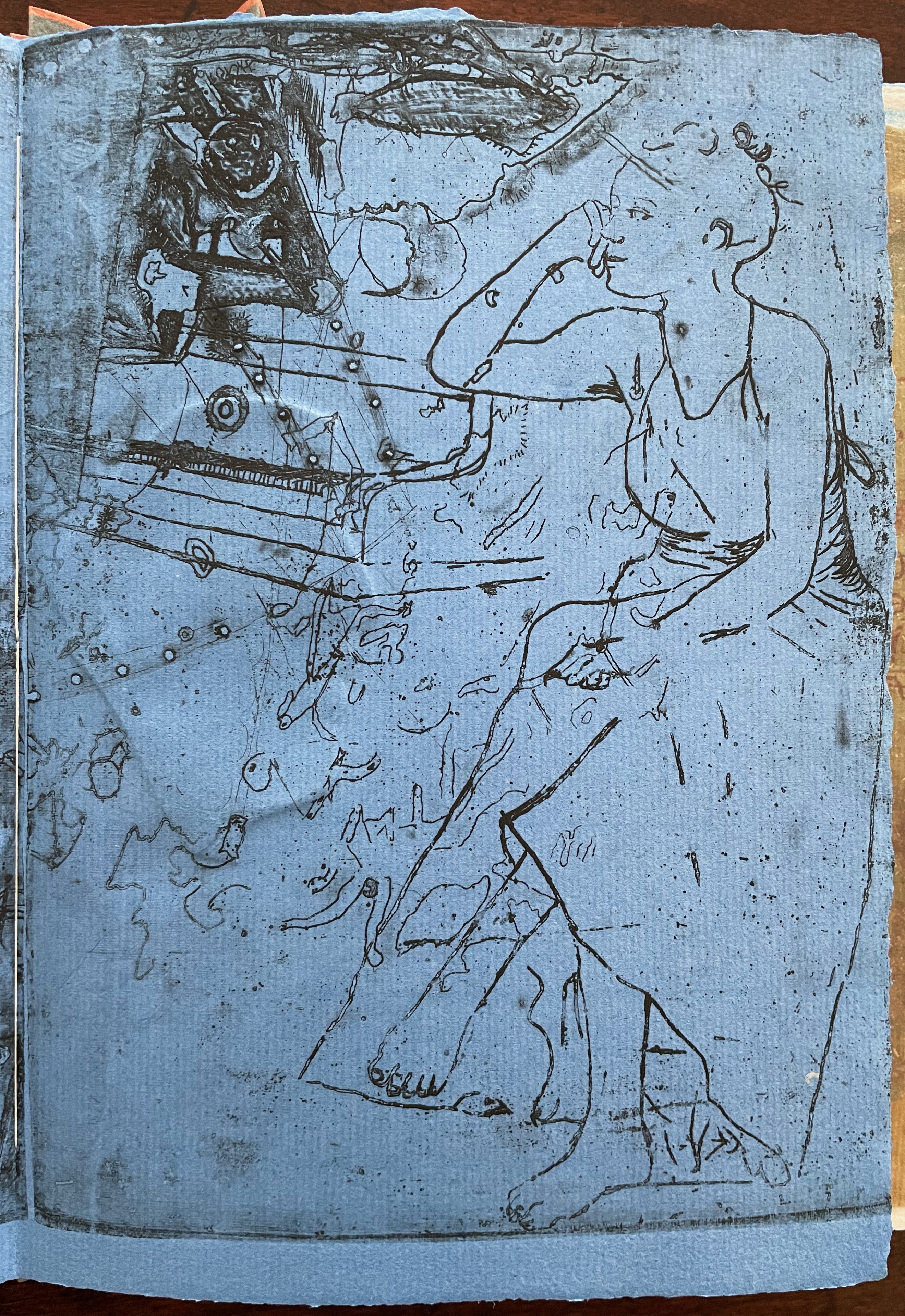
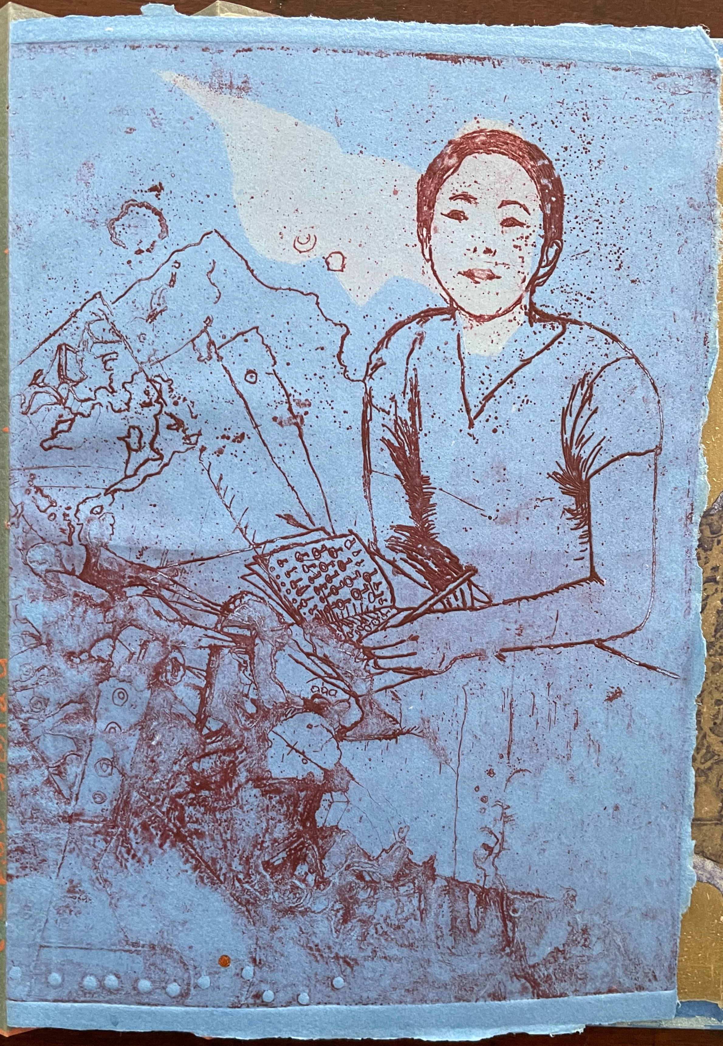
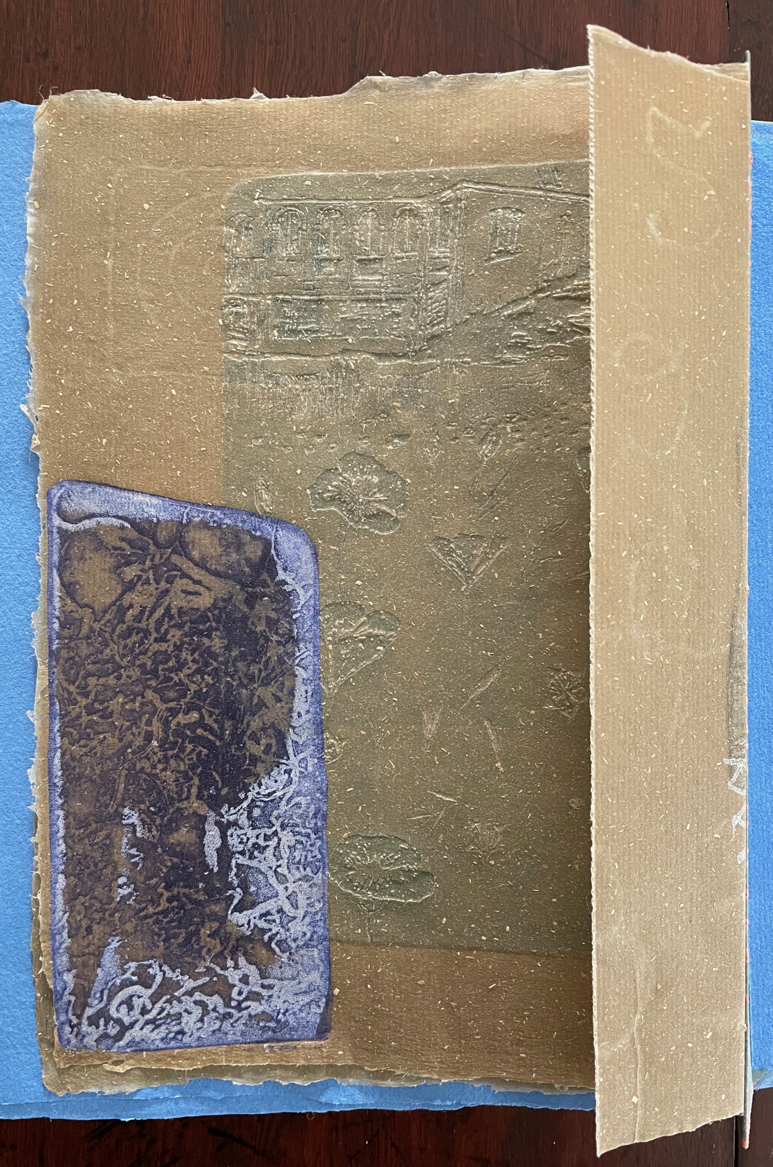
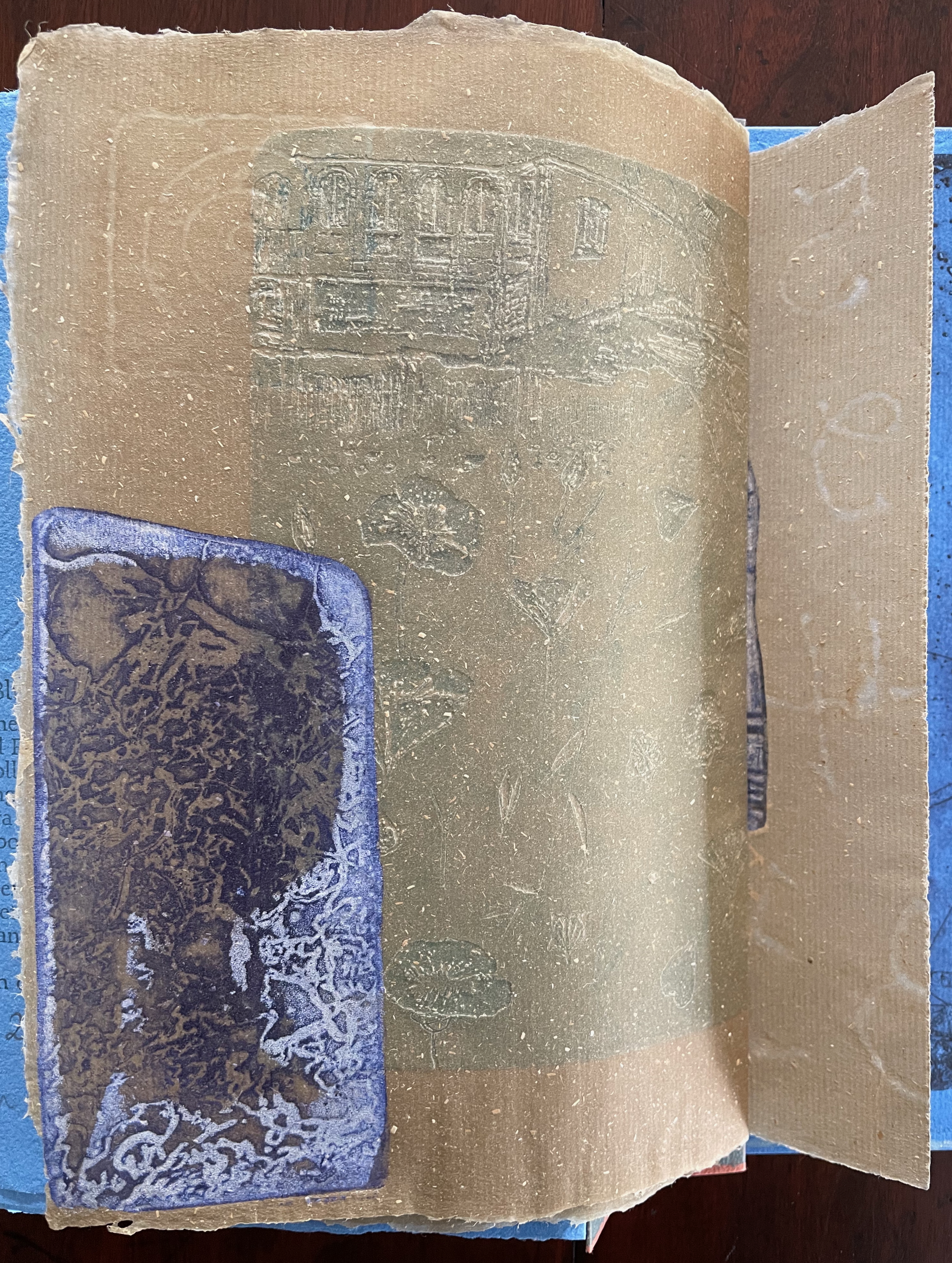
recomp (2013-23) Cathryn Miller Hinged and clasped diptych, housing an altered book, explanatory booklet, and loose colophon. Unique. Acquired from Vamp & Tramp Booksellers, 2025. Photos: Books On Books Collection.
Recomp (2013-2023) is a collaboration with a colony of bald-faced hornets. Having reviewed Stephen Collis and Jordan Scott’s decomp (2013), their artists’ book devised by exposing several copies of Darwin’s On the Origin of Species to the elements, Cathryn Miller followed suit and hung her reviewer’s copy of decomp in a tree. Over time, the wind, rain, and snow sent the book to the forest floor where it fell apart. Hornets had done their part in its decomposition, nibbling away at its edges and weakening the structure. Their conversion of the book into cellulose for their nest was also the start of their artistic partnership with Miller. Eventually the nest, too, became prey to the elements or marauders and fell and broke apart on the ground. Miller and photographer husband David recorded all this and gathered up the book fragments and broken nest.
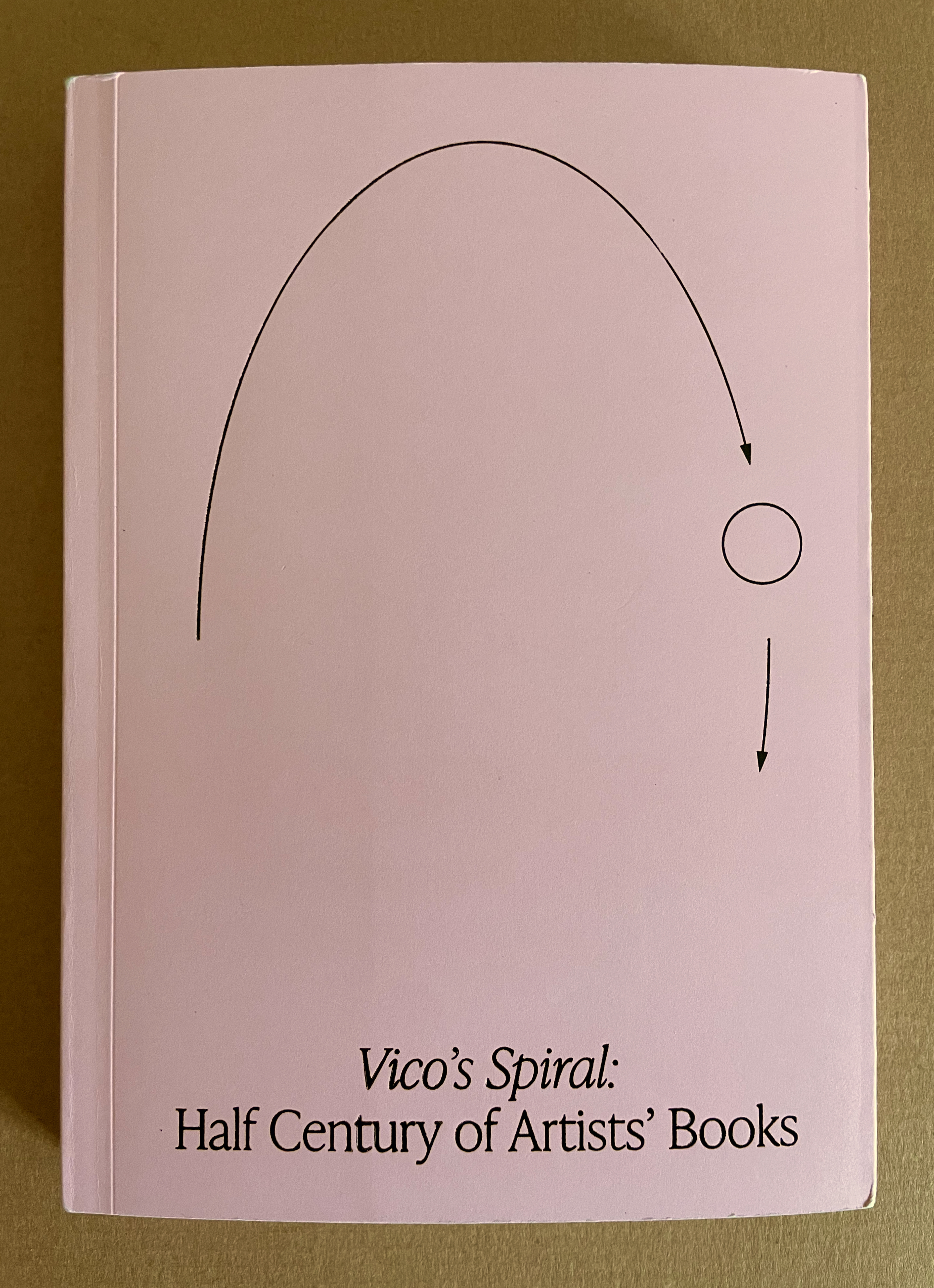
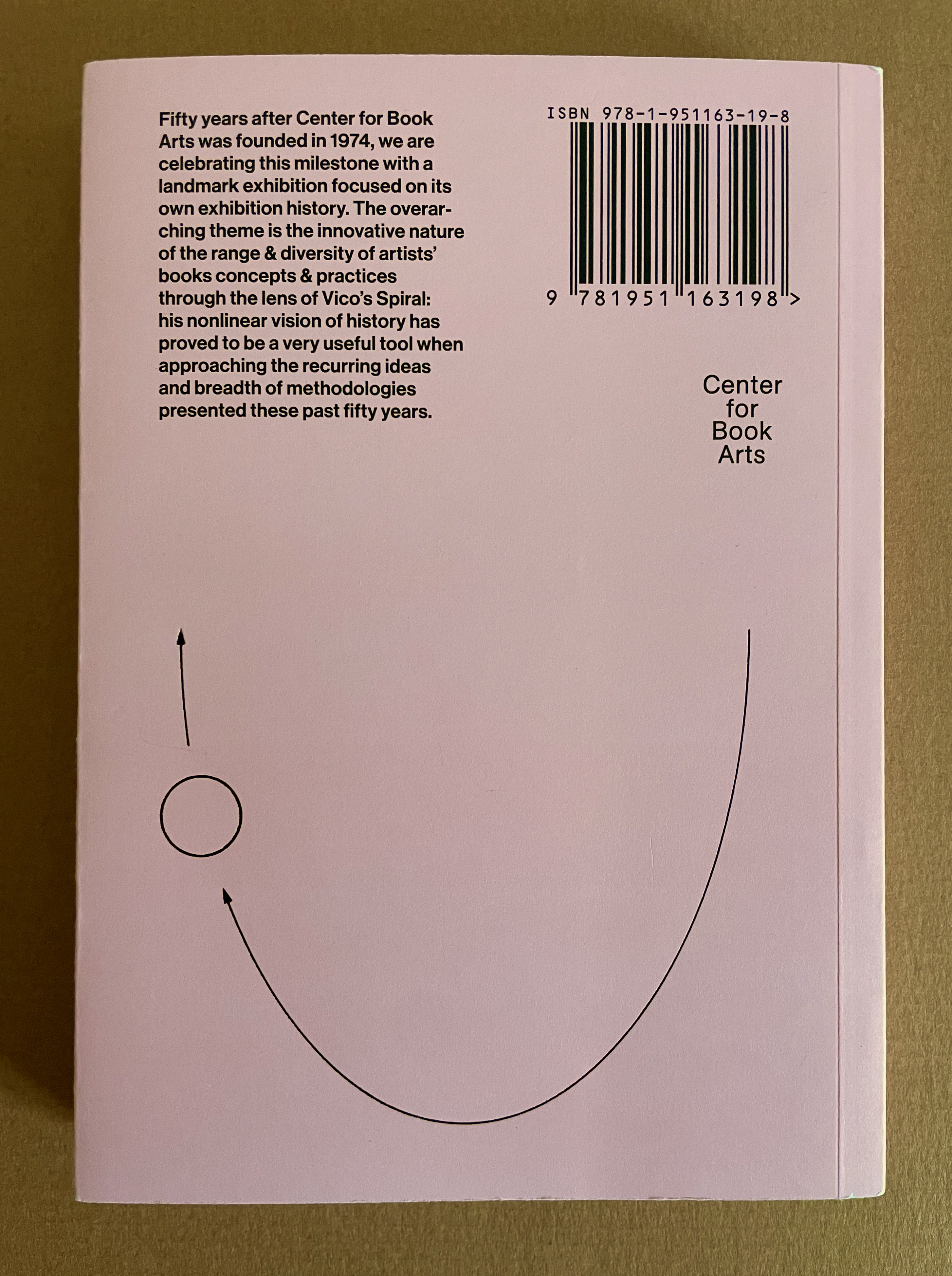
With Vico’s Spiral, Robbin Ami Silverberg, Carole Naggar, and Kinohi Nishikawa have made a significant contribution to how we can better appreciate artists’ books. The publication accompanied the exhibition by the same name celebrating the 50th anniversary of New York’s Center of Book Arts from 26 September through 14 December 2024.
The exhibition’s curators — Silverberg and Naggar — chose their organizing metaphor well. The 16th century philosopher Giambattista Vico proposed that history did not proceed in a straight line but instead spiraled, with patterns of events recurring with near similarity in different periods and even different regions. Naggar writes, As in Vico’s Spiral, artists’ books disregard linear chronology and geographies. Based on recurrent concepts and forms, they “meet” in vastly different time-spaces.
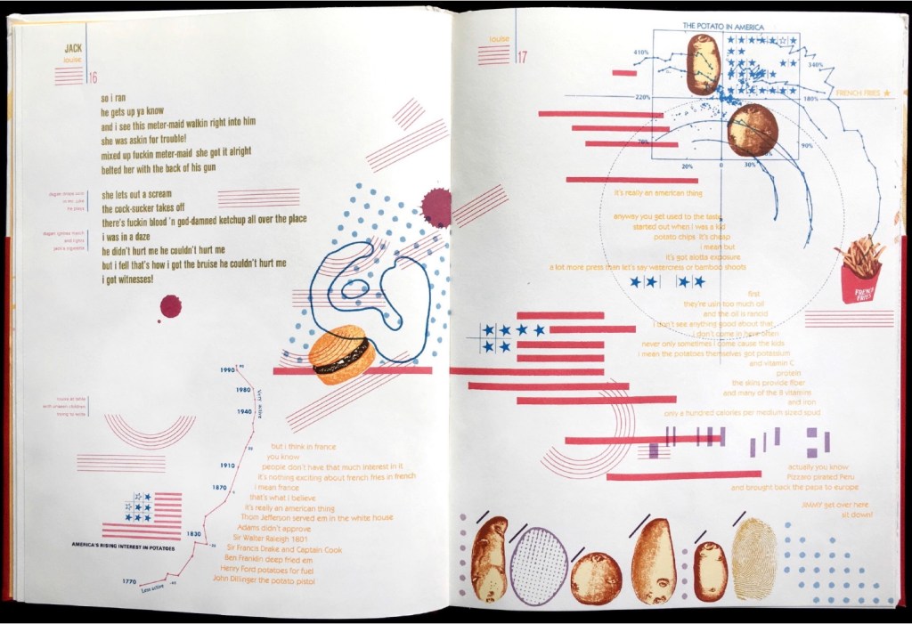
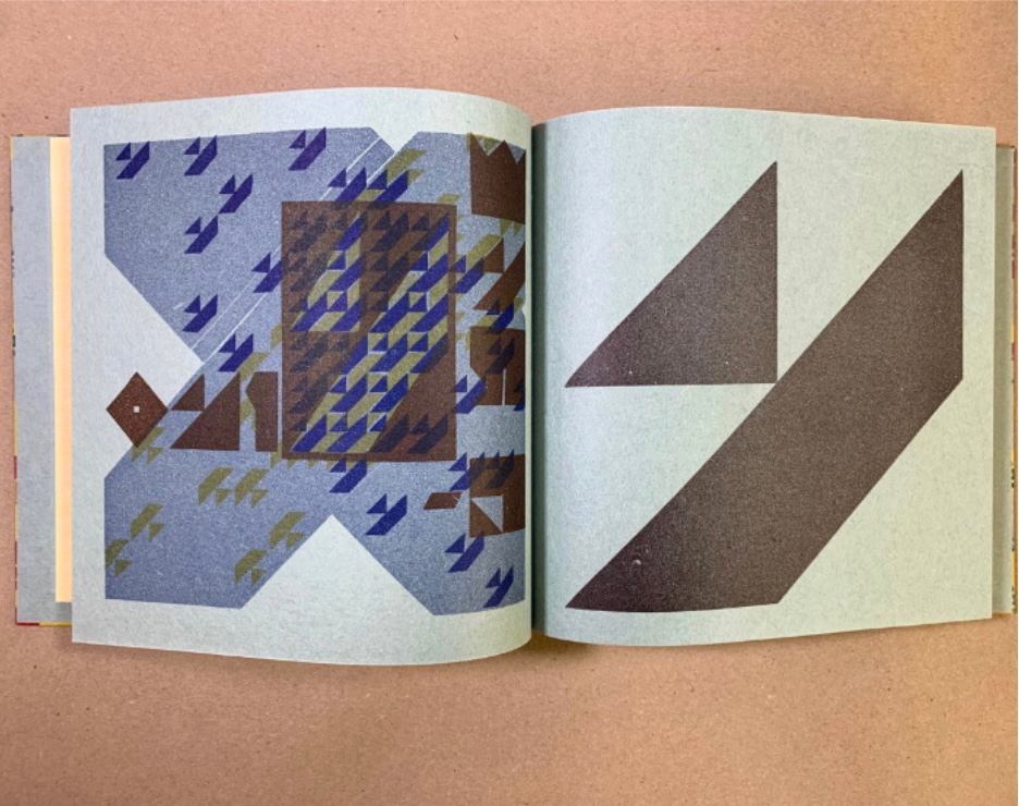
To prove the aptness of Vico’s model of history for book art, the curators paired art works from different times and places. For example, New York-born Warren Lehrer’s French Fries (1984) is paired with Israeli-born Uriel Cidor’s Greetings from America (2018).
Lehrer’s satiric take on “what is America” aims to visualize the text of a ten-part play set in a DREAM QUEEN restaurant with its “core of regulars: four faithful customers, three employees and one mobile juke-box on wheels”. He calls it a “psycho-acoustic” translation in which “each character is typecast into a distinct color and typographic arrangement”. On the pages, “an array of images and marks accompany the text, evoking an appropriate ambiance, and further serving to chart the cacophony of shifting internal projections that make up the characters’ collective consciousness”.
If the satiric target of French Fries isn’t clear, consider the A assembled on the double-page spread by the text’s layout and the stars-bars-and-stripes.
Cidor’s abecedary is populated with words that are the artist’s answers to the question “what is America?”. Each letter of the Hebrew alphabet appears on a recto page, and a word beginning with that letter is worked into an abstract image on the facing verso page. At a further level of abstraction, all the letters are formed with Cidor’s stylized Hebrew font Octavk’tav.
From right to left, the Octavk’tav version letter ayin (ע) is for shem’at ha’omes (שְׁעַת הַעוֹמֶס) or “rush hour”. The words’ letters sprawl in brown across an intersection gridlocked with ayins.
As Lehrer does in French Fries, Cidor uses the arbitrary abstraction of letters and page order along with not-so-arbitrary typographical layout and words in translation (for example, Resh for the Hebrew for Rocknroll and Ronald Reagan, Tsade for Extra large Cheezburger with fries and a soda) to capture his satirical target: the big Aleph (New York and America).
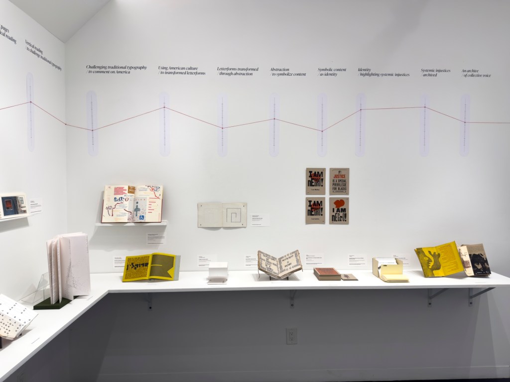
Above or beside each work displayed, a vertical time scale showing the exhibition’s span (1964-2024) was repeated on the walls. A red pin designated the nearby item’s year of publication, and a red thread ran from pin to pin around the room. Along with the spiral of tables displaying past exhibition catalogues, this fluctuating red line evoked Vico’s Spiral for visitors.
“Vico’s Spiral” at the Center for Book Arts, New York. Photo: Daniel Wang.
“Vico’s Spiral” at the Center for Book Arts, New York. Photo: Daniel Wang.
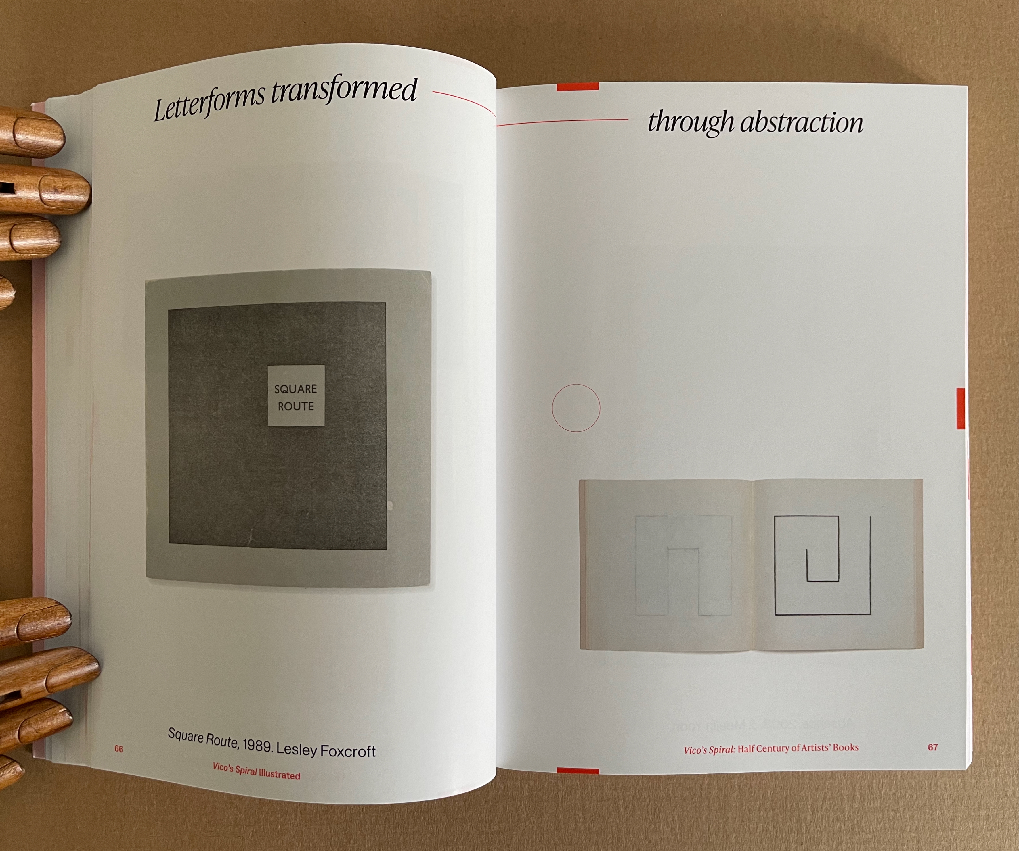
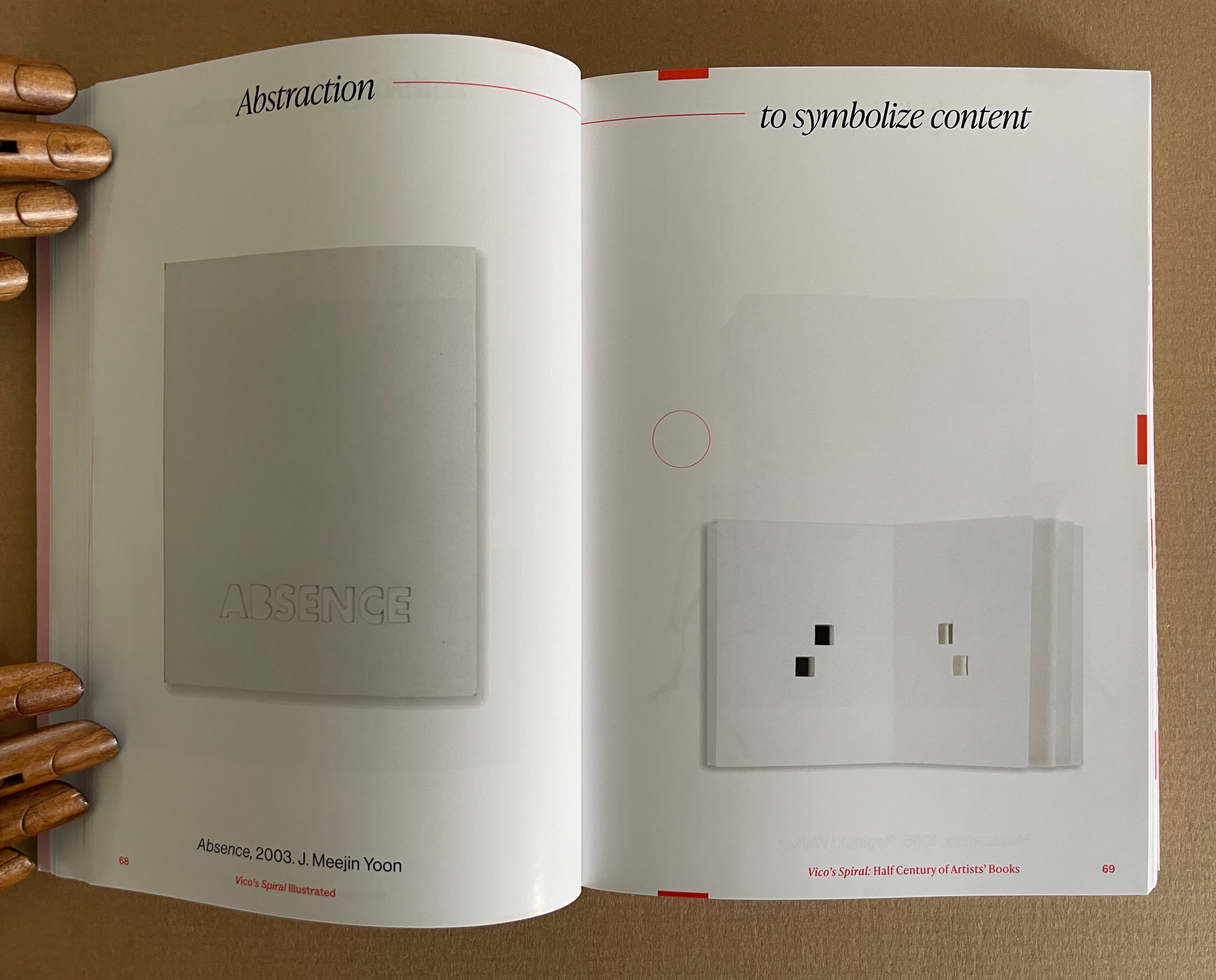
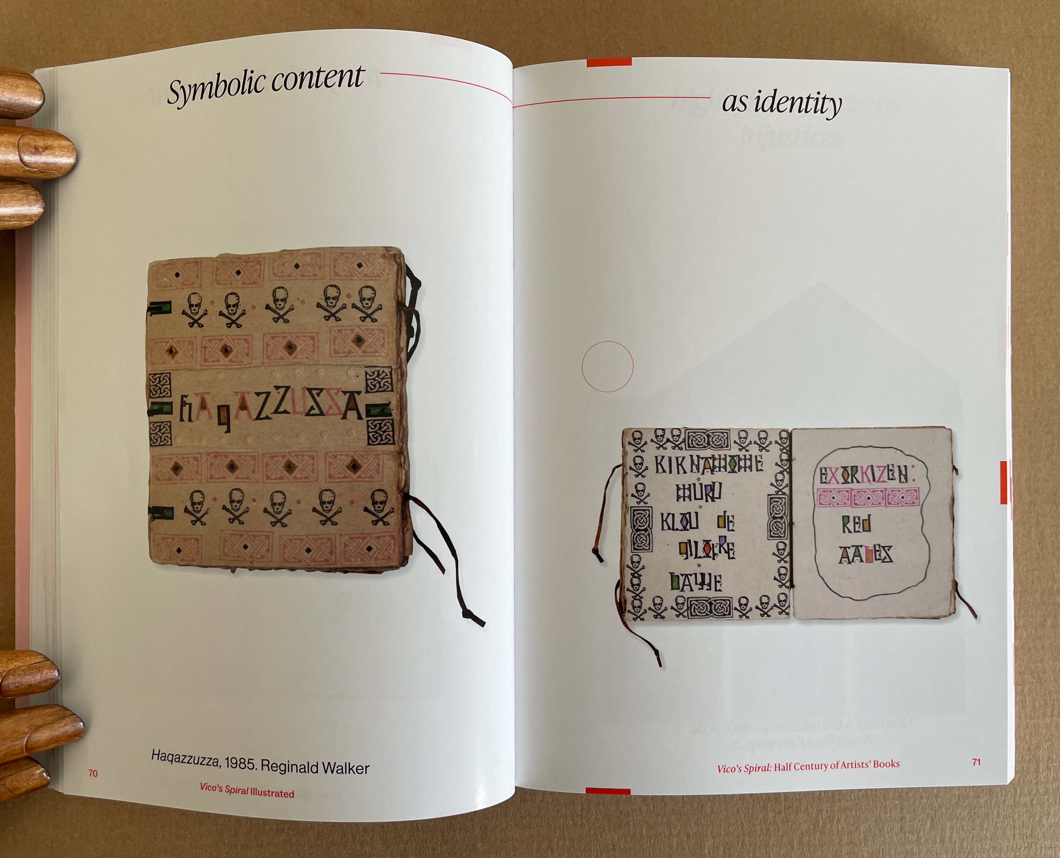
The exhibition’s catalogue emulates some of this design across pages 17-120, and what can be seen more clearly is how the curators daisy-chain their pairs with the headings used on the exhibition walls. Below are the two pairs that follow Lehrer, whose heading is “Challenging typography … to comment on America”, and Cid0r, whose heading is “Using American culture … to transform letterforms”. Foxcroft’s Square Route picks up the chain …
Pages 66-69. Photos: Books On Books Collection.
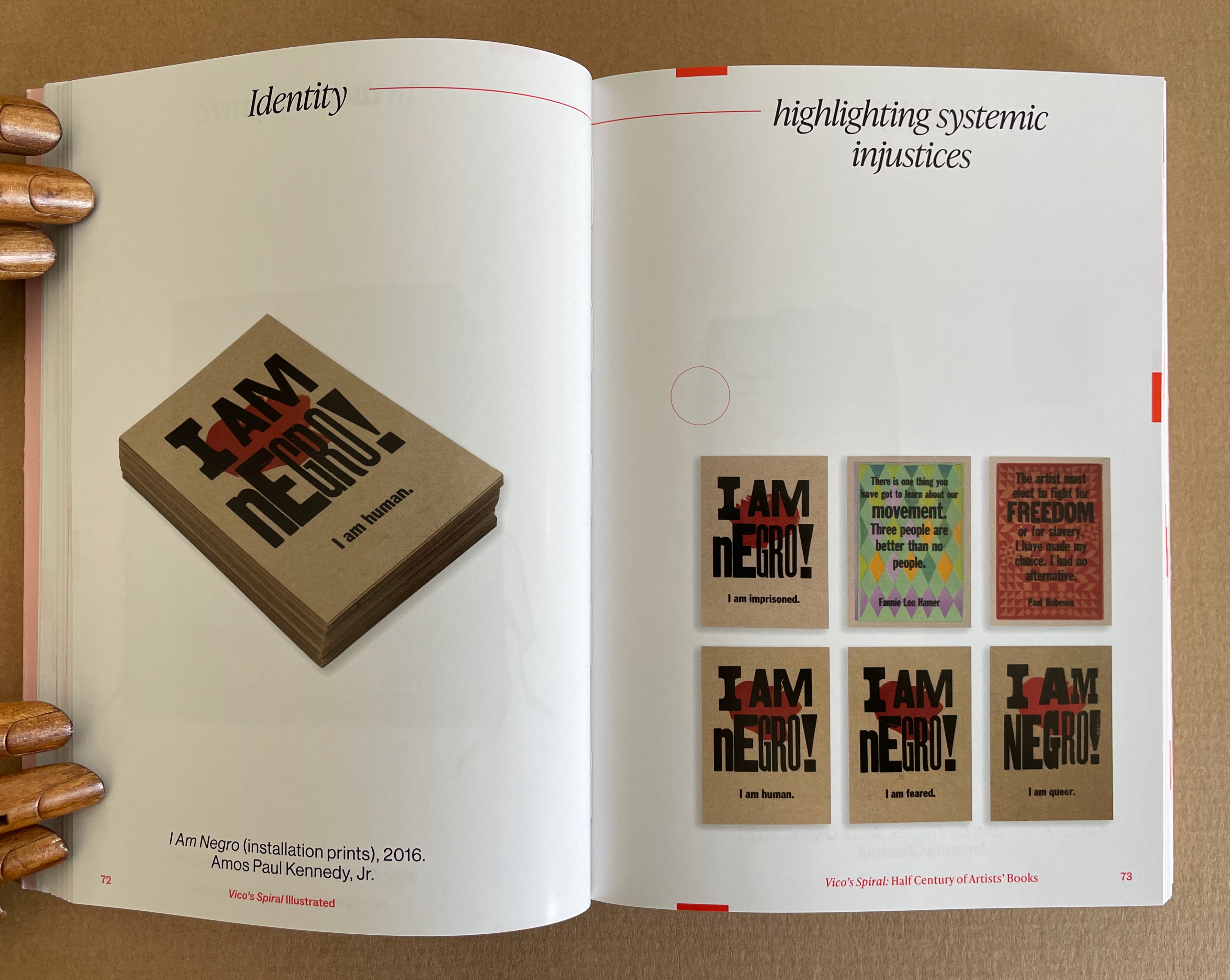
Pages 70-73. Photos: Books On Books Collection.
Kinohi Nishikawa’s essay “Strange Loops” brings a related metaphor to the party. He begins with another anniversary: the 2oth anniversary edition of Douglas R. Hofstadter’s Gödel, Escher, Bach: The Eternal Golden Braid (1979/1999).
At the heart of GEB, as devoted readers call it, is an exploration of how selfhood emerges from repeating patterns of cognition that mirror repeating patterns of the natural world, only for the cognitive patterns to turn inward and mirror themselves. GEB’s thesis is derived from Austrian mathematician Kurt Gödel’s incompleteness theorem, which contends, “All consistent axiomatic formulations of number theory include undecidable propositions.” Gödel’s theorem defines the constitutive externality of any set and, in so doing, identifies the minimal gap within a system for self-awareness to emerge. Crucially, Hofstadter does not limit his account of selfhood to the operation of cognitive processes. The metaphor of strange loops suggests how patterns that fold on themselves are perceived, felt, and, indeed, experienced by an embodied being. (p. 175)
Nishikawa’s immediate task in Vico’s Spiral is to survey the CBA’s previous half century of exhibitions, and he uses the strange loops metaphor to understand the CBA through the “set” of its exhibitions. All well and good, it is a brilliantly written and insightful essay. But if only he had also been asked to apply the metaphor to the set of artists’ books in the CBA’s archive or the set selected by Silberberg and Naggar!
In The Century of Artists’ Books, Johanna Drucker highlighted the self-interrogatory nature of the artist’s book as its defining characteristic. The application of these metaphors of Vico’s Spiral and strange loops to the history of artists’ books adds a new sense to that. The self-interrogatory nature of the artist’s book is a pattern recurring similarly but differently across time and space in those works of art created by artists who play with the book whether as material object as a whole or in its parts, as vehicle, as site of performance, as a tool-made and tool-making technology, or as concept. As each of those aspects yield fresh artists’ books with differences, we have new opportunities to perceive, feel, and experience an artwork’s pursuit of its self, the artists’ pursuit of their selves and our pursuit of our selves.
Nishikawa comes tantalizingly close to applying the strange loops metaphor to the domain of artists’ books when he writes, “Book arts is about discovering the self at the edge (fold, seam, spine) of insight and creation” and, when he writes, “… the essential question of selfhood isn’t What? or Why? but How? How do these patterns work, how do I know myself better through them?”
Indeed, “how?” is the question to be brought to each artist’s book. How do I encounter this artwork? How is it manifesting its patterns? And then to bring ourselves full circle back to Vico’s Spiral, How are those patterns manifest in other works in other times and other places?
Nishikawa’s approach to the CBA’s catalogues also offers a baton that we can hope others will carry forward. The CBA’s exhibitions provided not only a way into understanding the CBA itself but one into researching the world of artists’ books. Aware of this opportunity, Silberberg concludes the volume with a listing of artists’ books exhibitions from around the world. Who will grasp this baton next in the race along Vico’s Spiral?
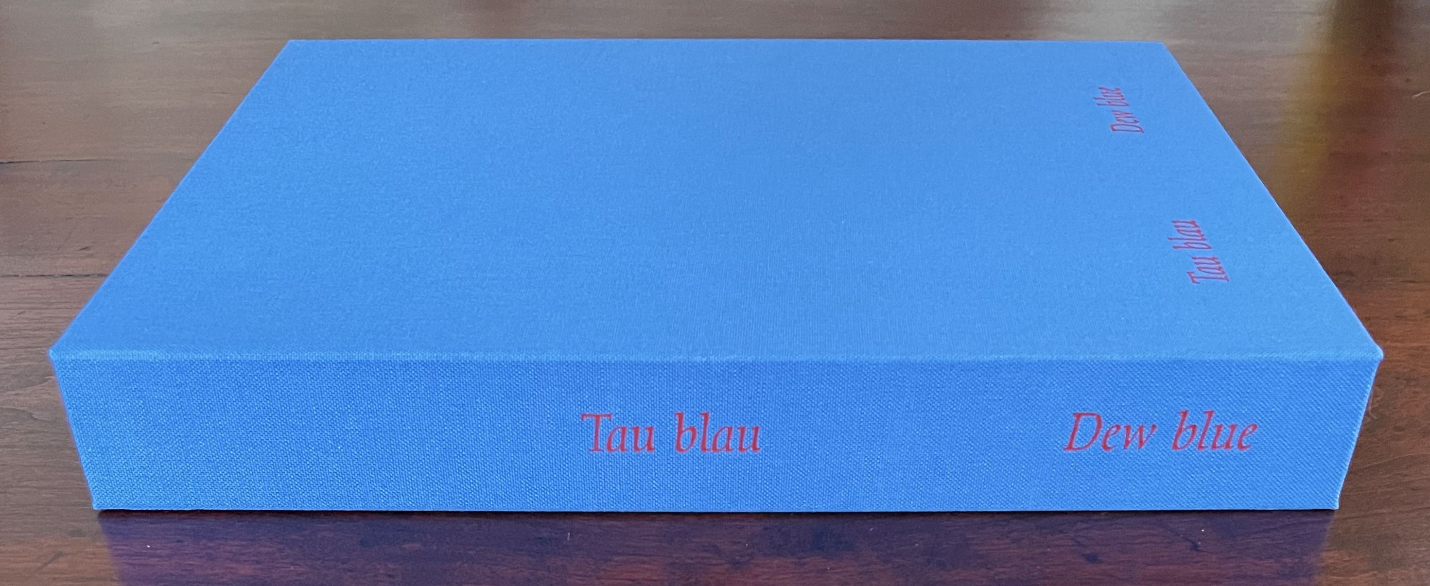
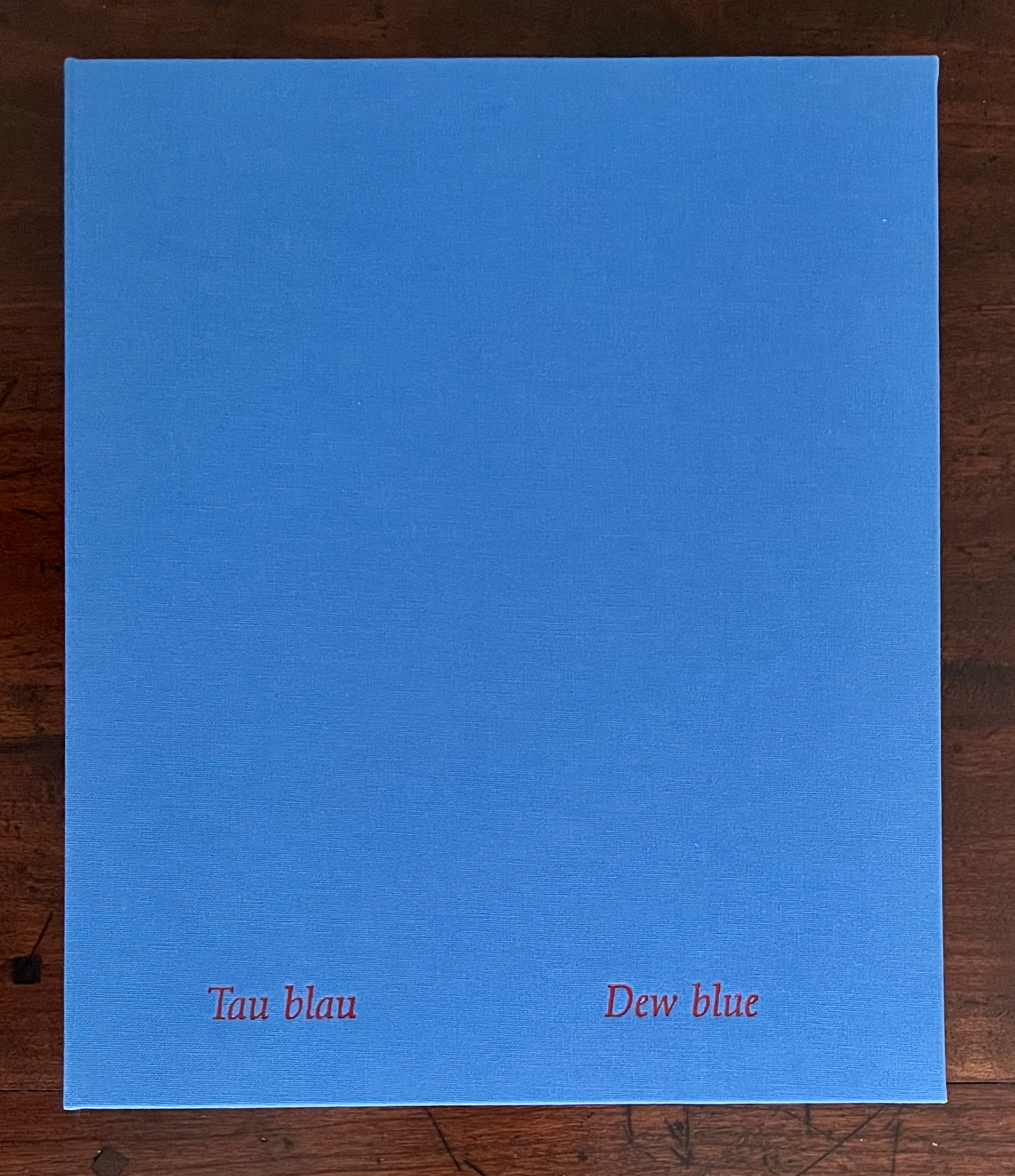
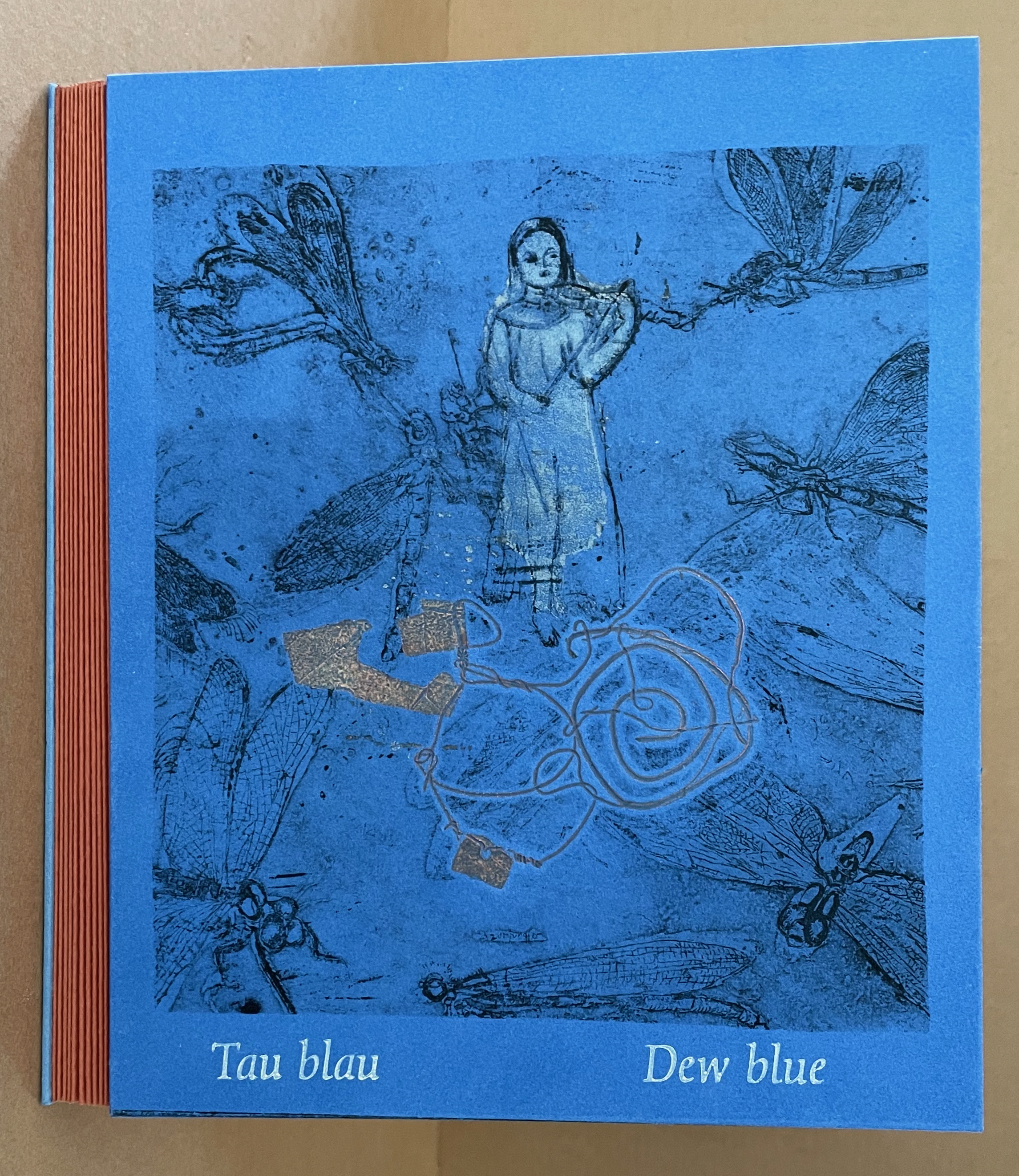
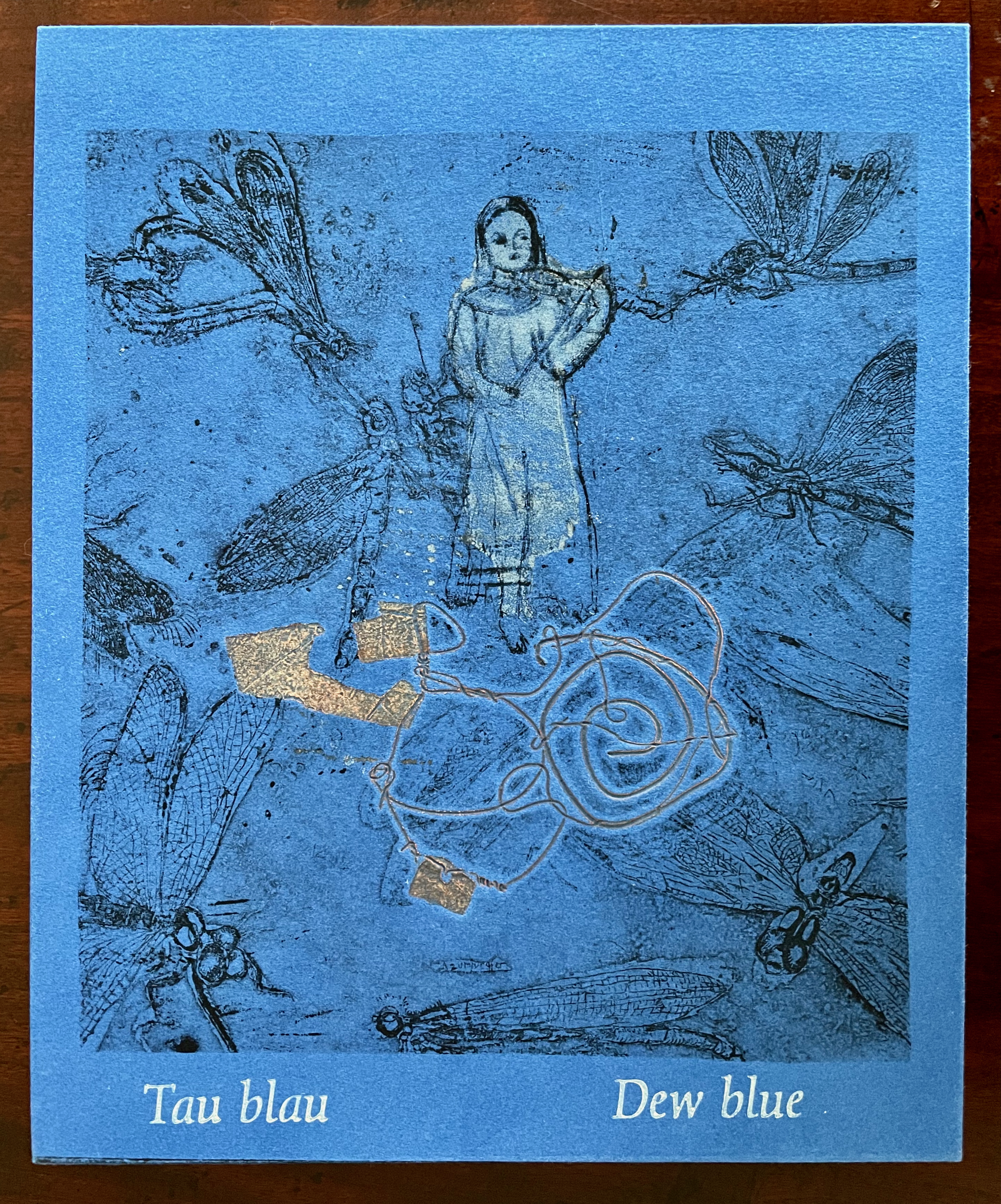
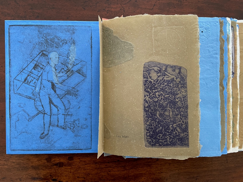
Tau blau / Dew Blue (2013) Barbara Beisinghoff ; Solander box in linen, handbound Vera Schollemann; Flax paper, handmade by John Gerard. Solander box: H240 x W200 x D32 mm. Flagbook: H220 x W180 mm. Edition of 38, of which this is #22. Acquired from the artist, 30 December 2024. Photos: Books On Books Collection.
Familiarity with Hans Christian Andersen’s fairy tale Hørren /The Flax enhances appreciation of Barbara Beisinghoff’s Tau blau / Dew Blue. Andersen gives a voice to the plant that expresses its joy, pain, hope and observations at each stage of its blooming, being harvested, turned into linen and clothing then paper, and finally consigned to flames. The H.C. Andersen Centre offers Jean Hersholt’s translation of it here.
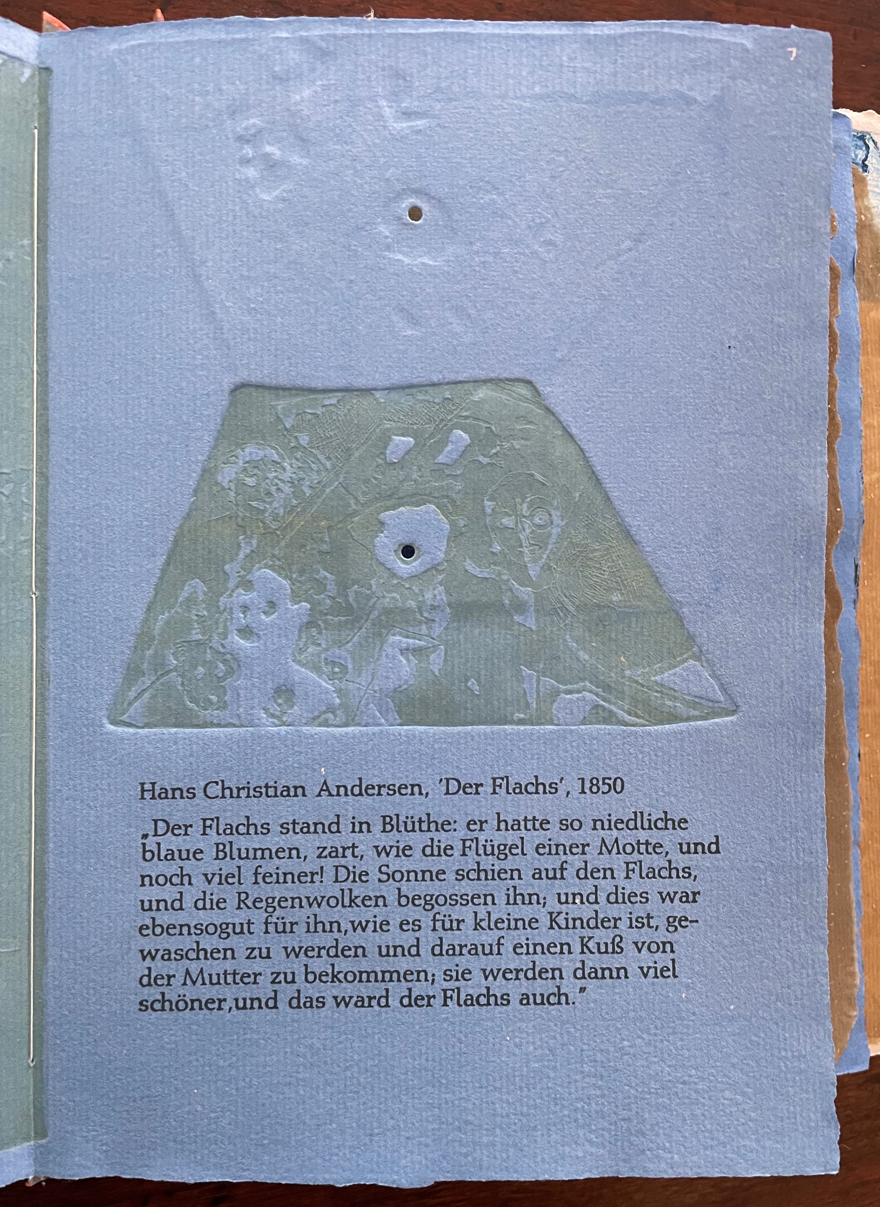
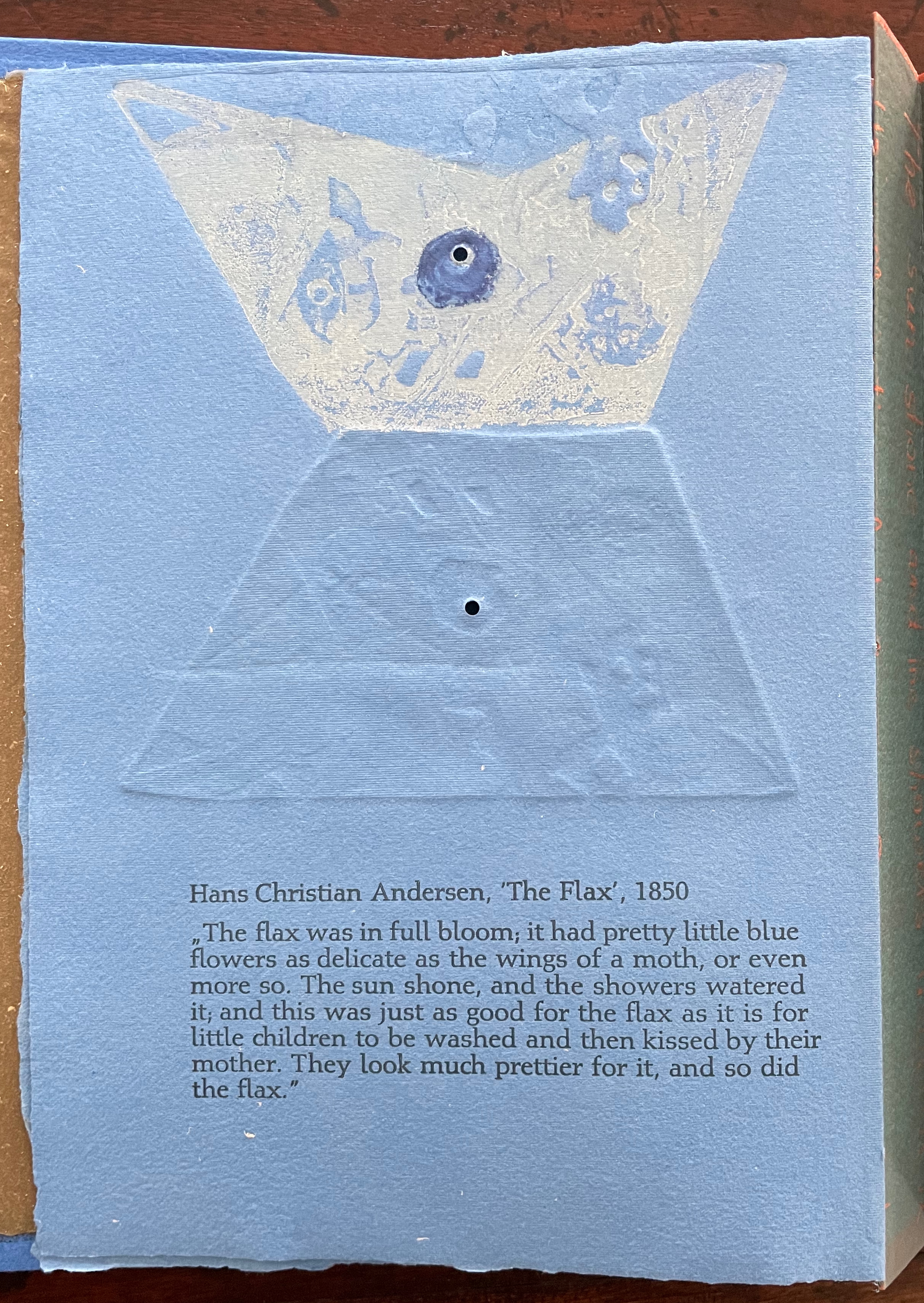
Only the opening paragraph of the story appears in Tau blau / Dew Blue, but Beisinghoff documents and illustrates the stages from her own cultivation of flax, observation of its growth and preparation of its processing. And with the etching, drawing, watermarking, handmade papers, linen cloth and thread, and binding structure, Beisinghoff suffuses the spirit of the tale’s metamorphosizing plant throughout the whole of Tau blau / Dew Blue.
From the blue of the plant’s blossoms to the white of its change into linen and paper to the red, burnt orange and black of its sparks and ash when it is consumed by fire in the end, all of the story’s colors are replayed across Tau blau / Dew Blue from its Solander box to its covers and spine like motives in a Baroque musical piece.
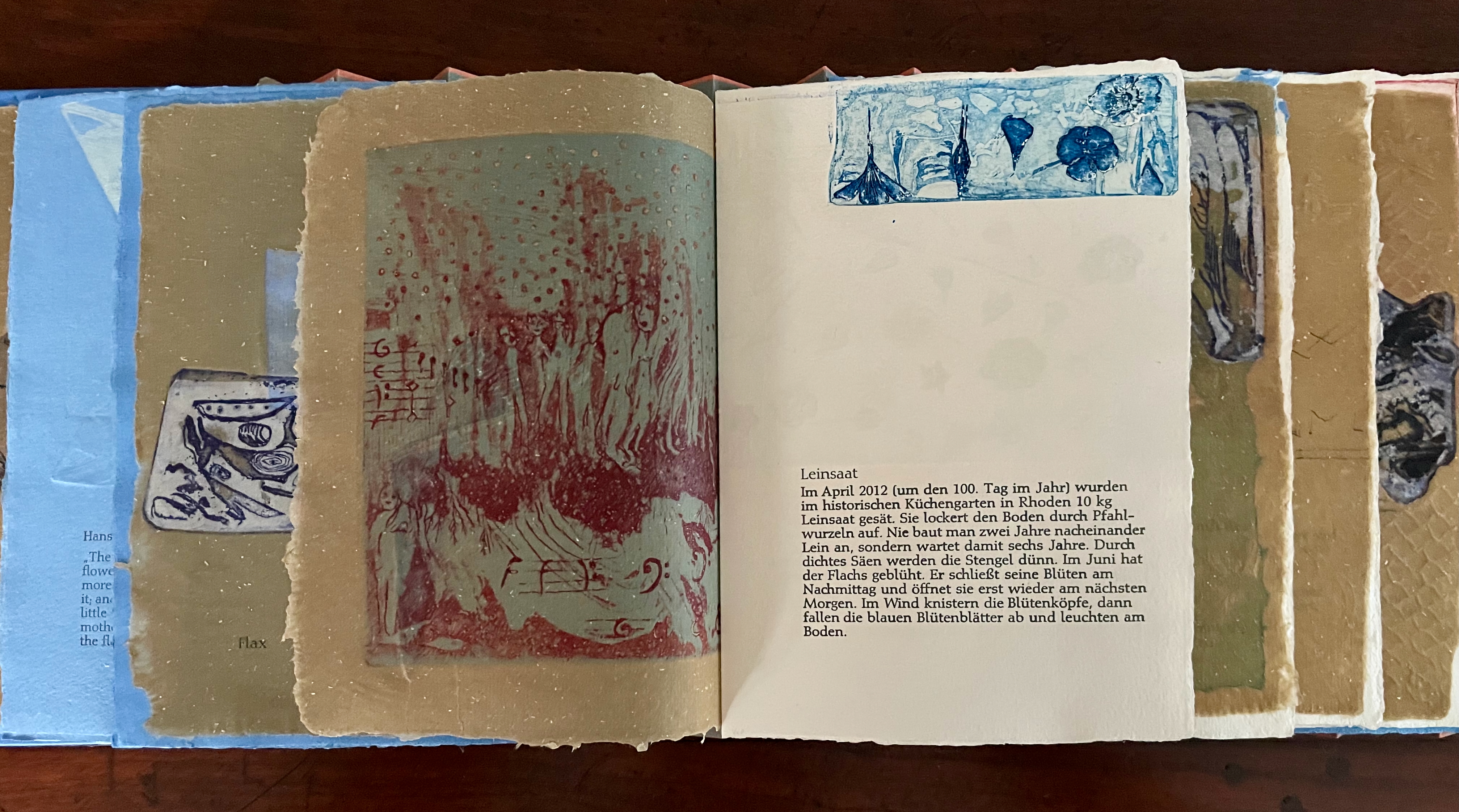
In a concerto, motives play off one another and develop. In Tau blau / Dew Blue, the motif of nature (the plant) plays off the motif of artifice and the manmade (the fairy tale, music, linen, paper, etc.). On the front cover (above), a young girl, surrounded by large damselflies, plays a fiddle or violin and seems to hover above a silver foil image of flax thread and tools for making it. In the spread above alongside the front cover, the specks rising over the staves and musical notes (a recurring motif in itself) recall the tale’s final passage in which the bundle of papers (made from linen rags) is cast into a fire:
“I’m going straight up to the sun!” said a voice in the flame. It was as if a thousand voices cried this together, as the flames burst through the chimney and out at the top. And brighter than the flames, but still invisible to mortal eyes, little tiny beings hovered, just as many as there had been blossoms on the flax long ago. They were lighter even than the flame which gave them birth, and when that flame had died away and nothing was left of the paper but black ashes, they danced over the embers again. Wherever their feet touched, their footprints, the tiny red sparks, could be seen.
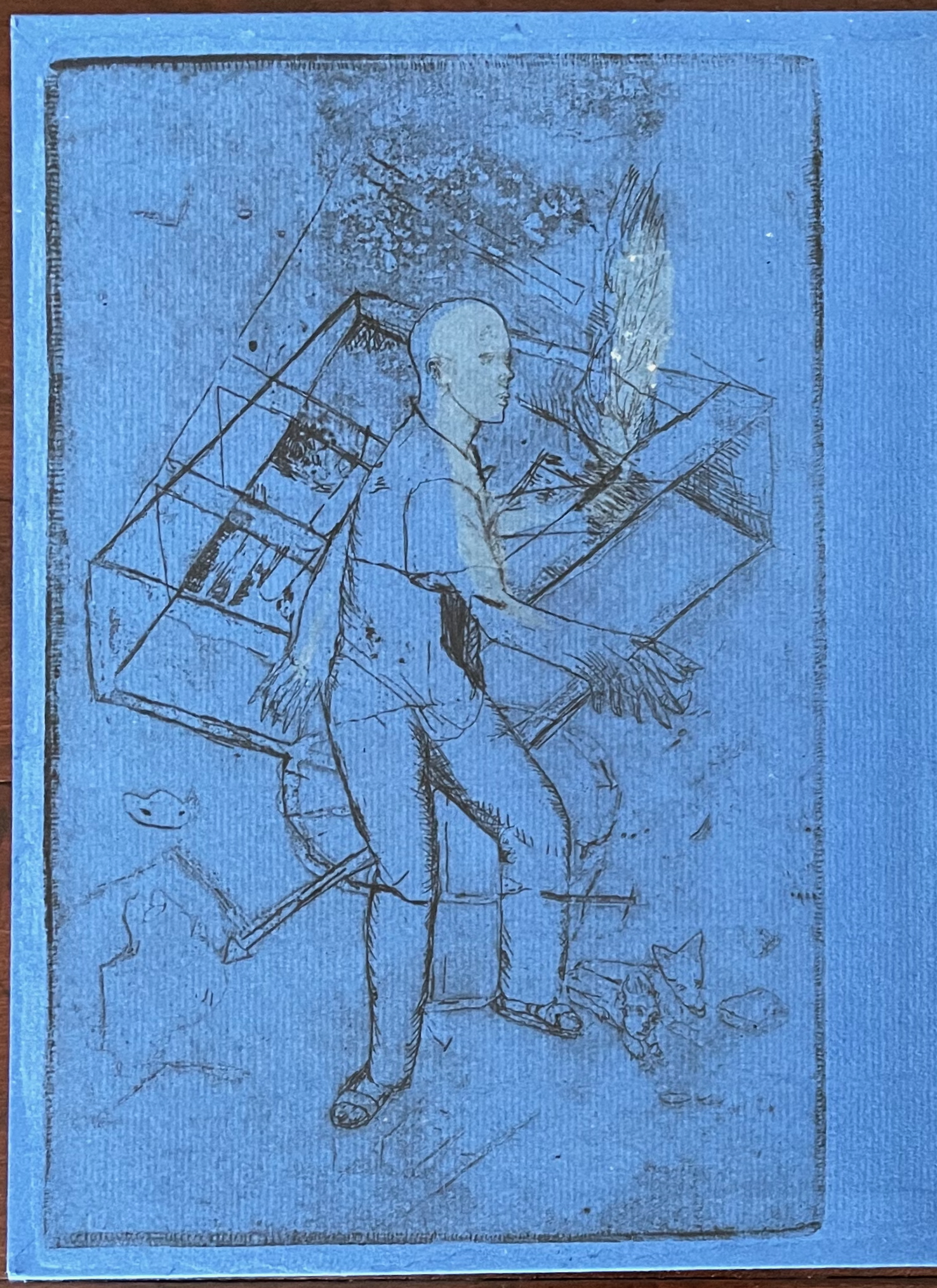
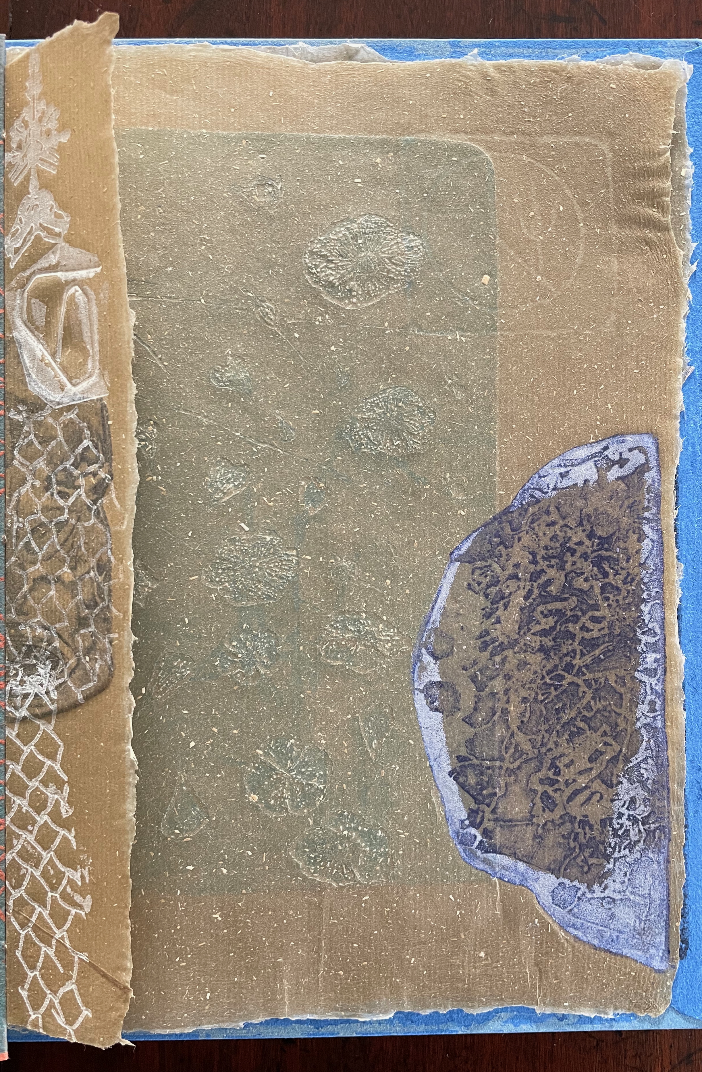
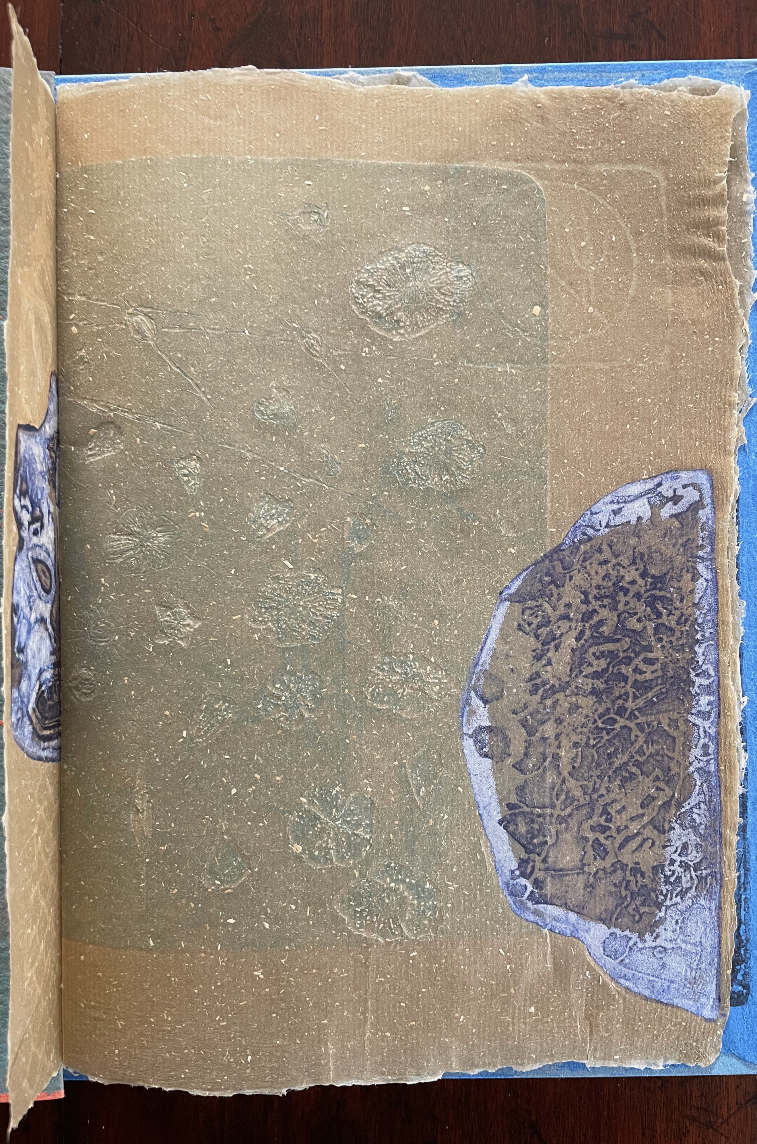
Images of tools — whether for preparing flax or for making the products from it — also recur on the inside of the front and back covers and throughout the book. The human figures alongside the tools, however, appear engaged in more than manufacturing. Elsewhere in the book, they dance, they sit and meditate or write, they row on ponds beside the growing flax. The fairy tale, too, has these Romantic juxtapositions of nature, art and craft. So, again, the spirit of Andersen’s tale finds another way into Tau blau / Dew Blue.
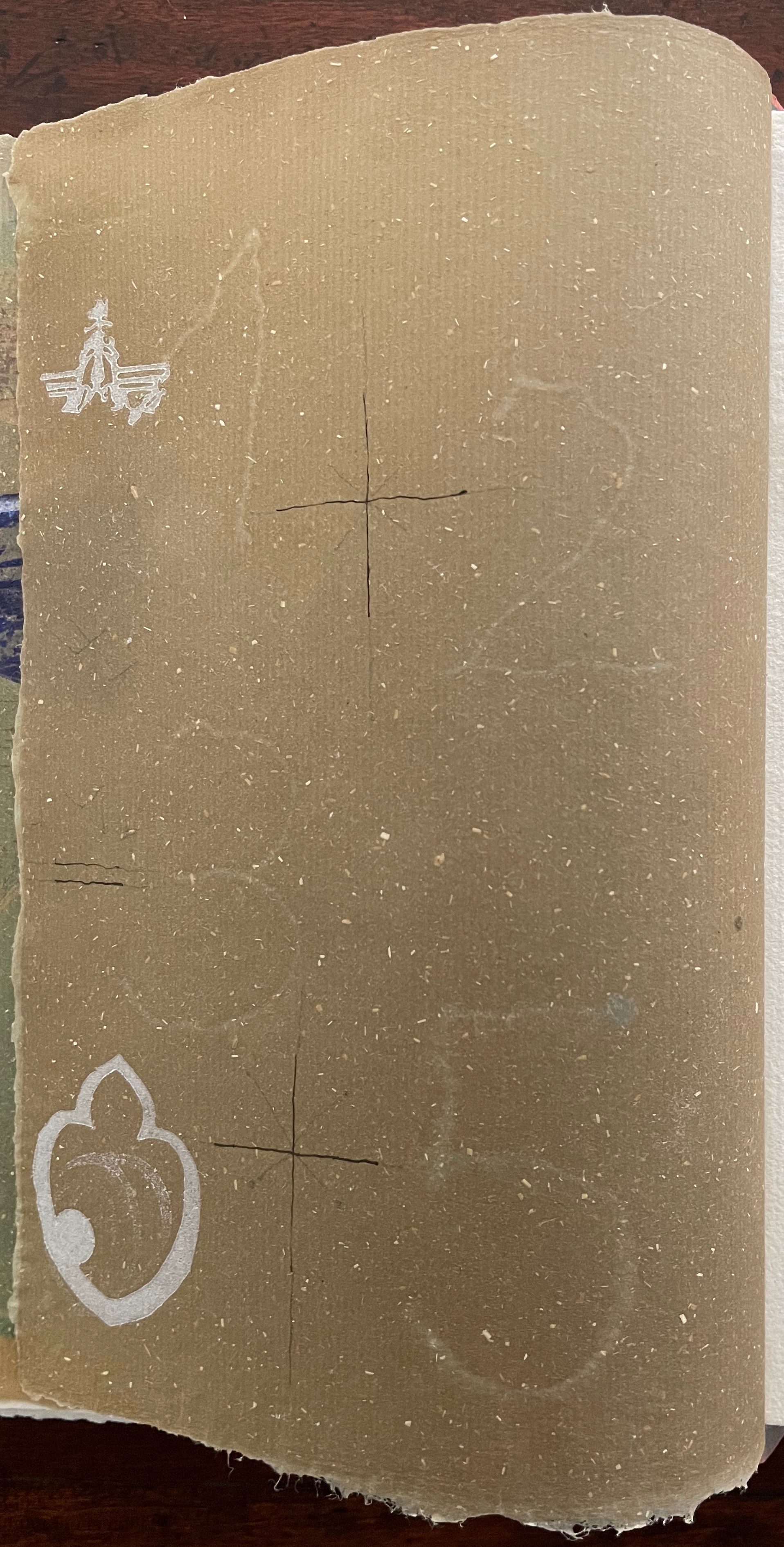
Inside front and inside back covers.
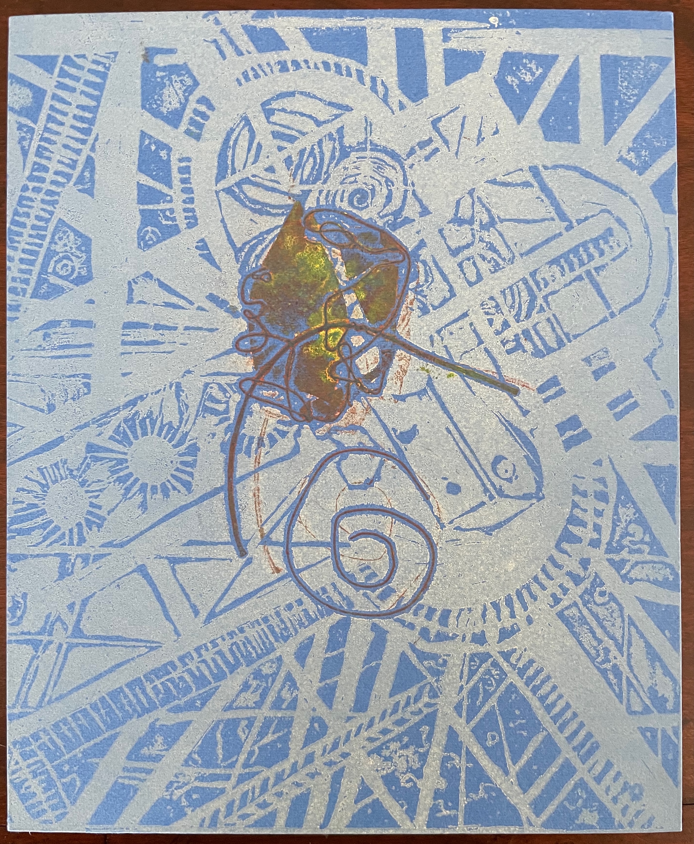
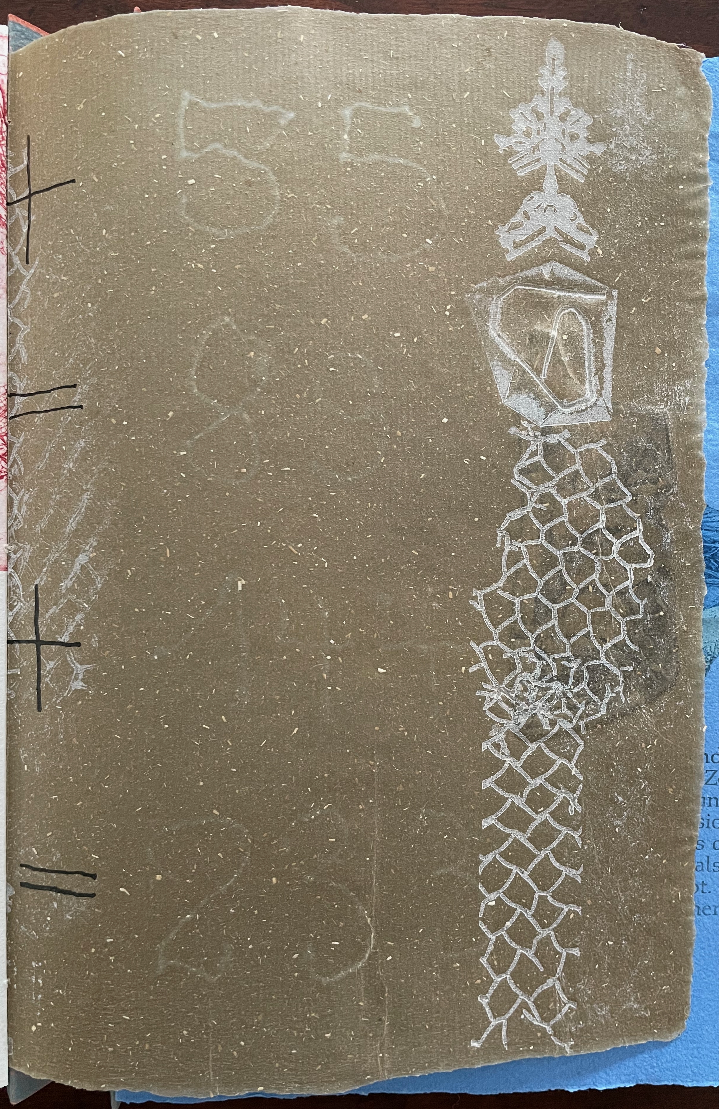
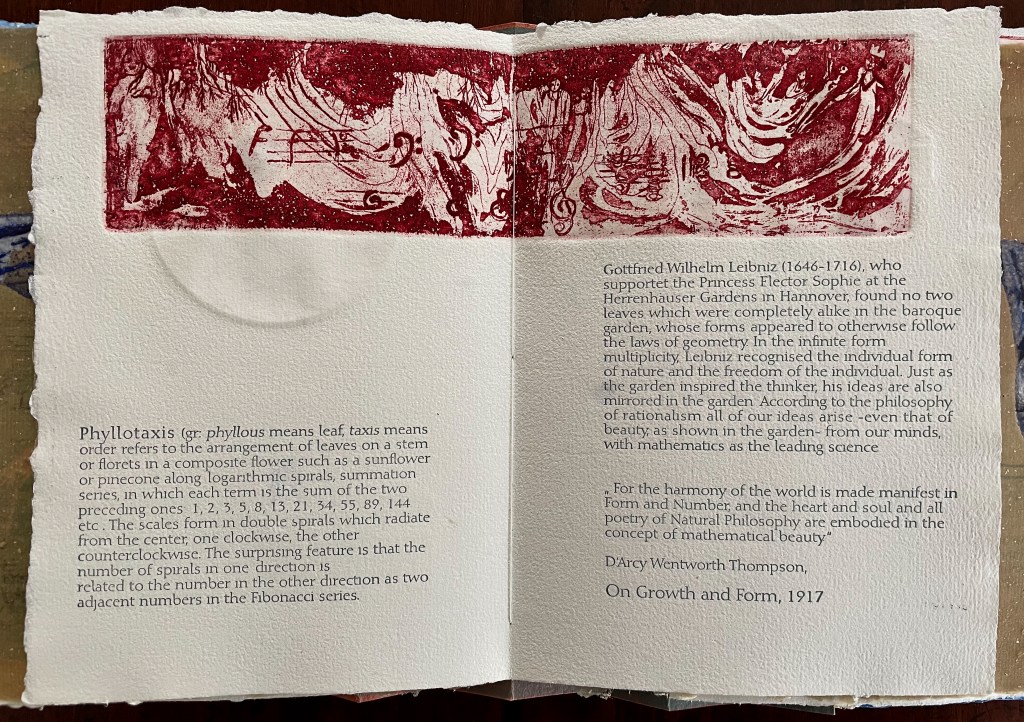
The front cover also announces another motif in those coils of thread below the young girl’s feet. Within the coils is the image of a Fibonacci spiral, which appears on the back cover and throughout the book in different ways. It can be found drawn and printed. It can be found in watermarks in the handmade paper. It can be found in the arrangement of florets in flax. Being a composite flower, flax blossoms display the spiral based on the Fibonacci sequence 1, 2, 3, 5 … 233, and so on. These numbers are waterjet-drawn on the pure flax paper below and explained in an entry printed on the adjacent plain handmade paper folio. By appearing on the book’s front and back covers, the spiral echoes the beginning and ending cycles of birth and rebirth the flax goes through in the folktale.
The Fibonacci spiral on the front and back covers.
The sequence of Fibonacci numbers 1, 2, 3, 5 … 55, 89, 144, 233 … watermarked on handmade flax paper with a water jet.
Description of the Fibonacci spiral side by side with quotation from Thompson’s On Growth and Form (1917), drawing on Leibniz’s Rationalist philosophy.
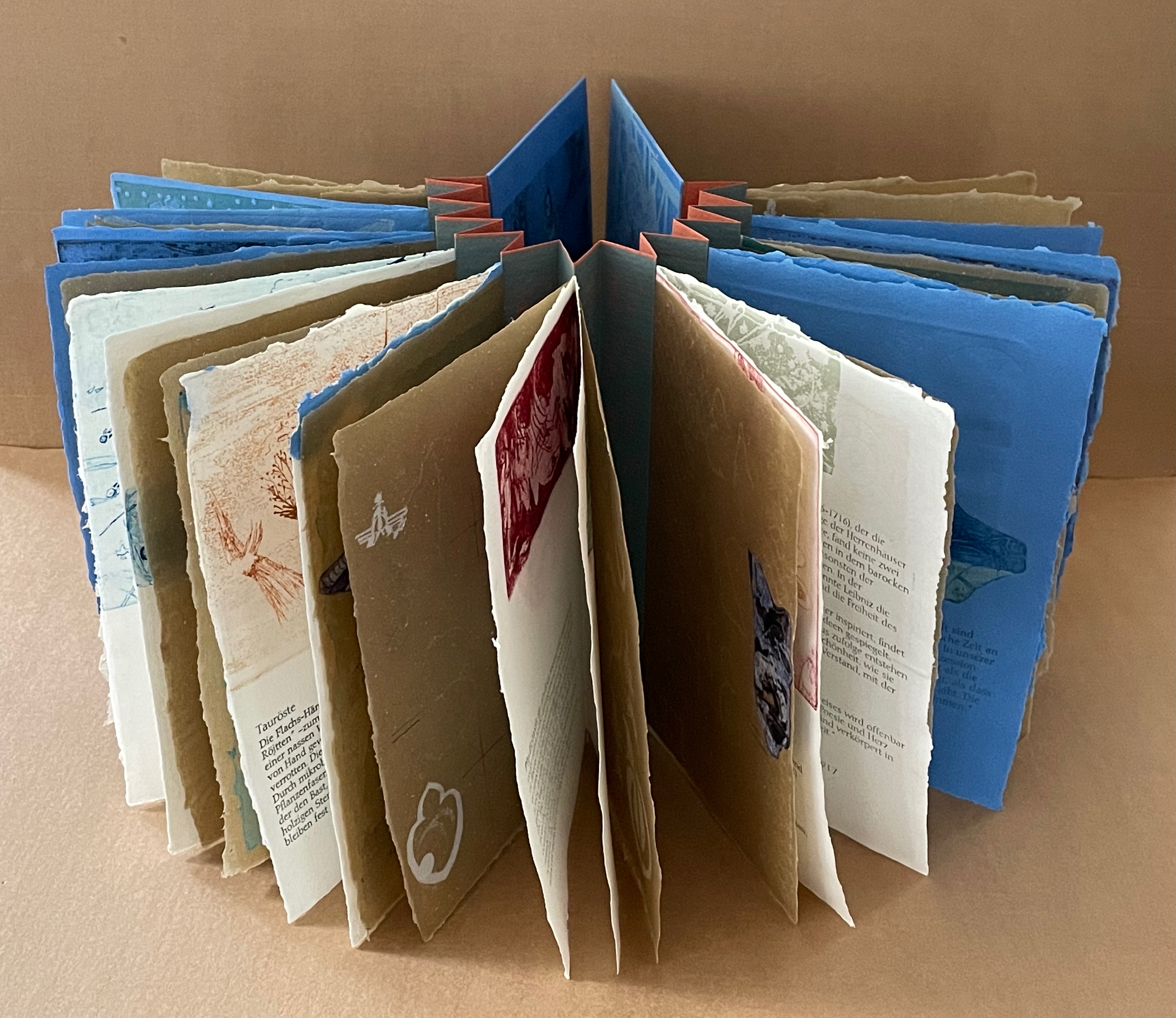
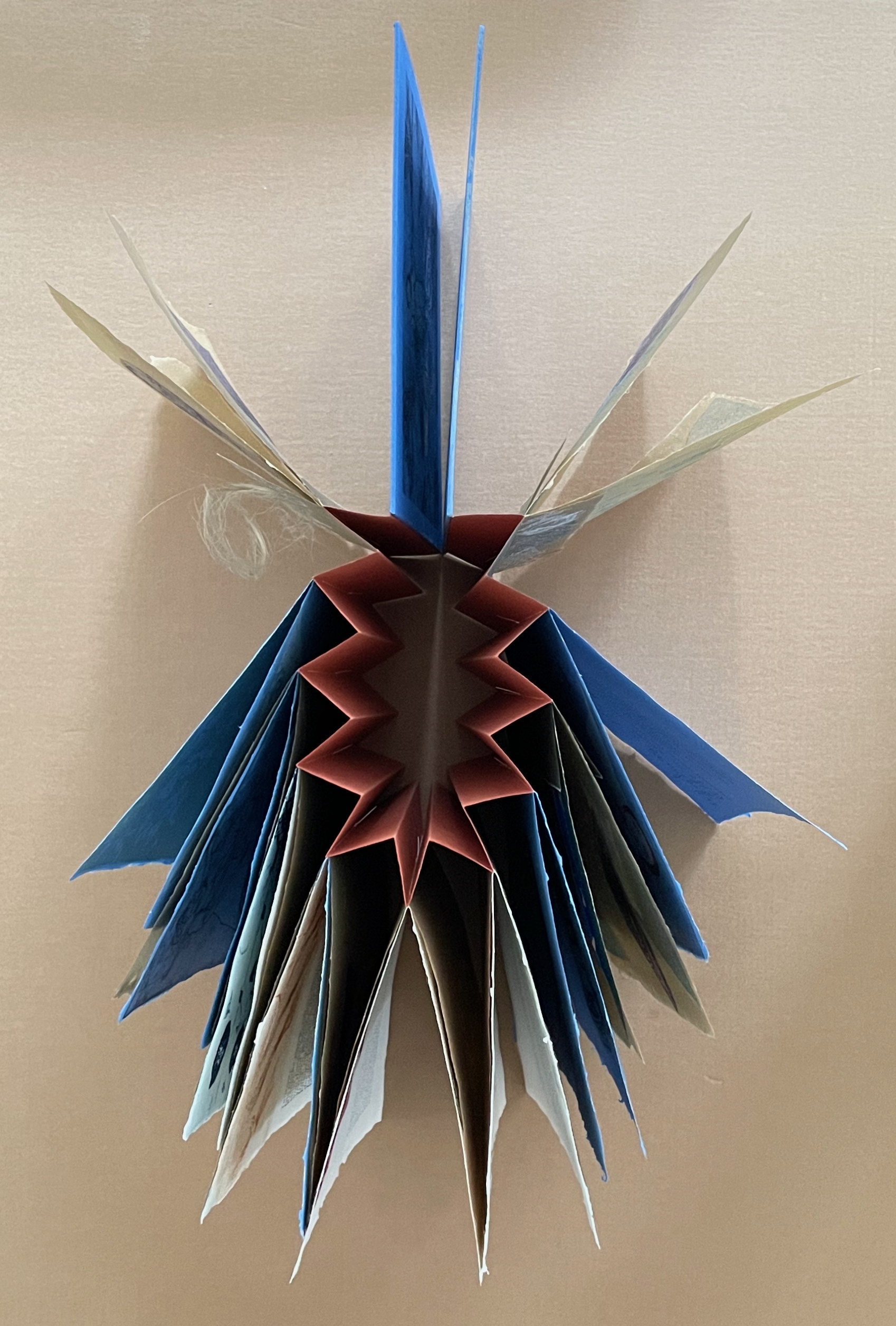
To organize and weave her motives together, Beisinghoff uses an accordion spine to whose peaks eleven sets of folios are sewn with linen thread. Three of the eleven are 4-page folios consisting of blue handmade paper. Another three 4-page folios consist of pure flax paper (handmade by John Gerard). The remaining five gatherings have 8-page folios, each consisting of a pure flax paper folio around a blue or plain one.
Side and top views of the accordion spine.
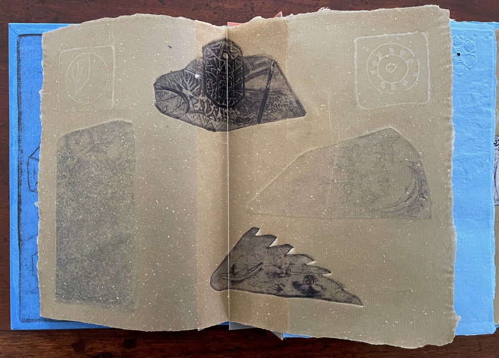
The first pure flax folio begins the book, displaying two title pages (German and English) and two etchings on its first and last pages. In the center spread, two more etchings appear. A watermark symbolizing phyllotaxis shows through in the upper left, balanced by a watermark with a cross section of a flax stalk in the upper right of the center spread. The texture and weight of the flax paper allows the impress and shadow of the etchings to stand out on both sides against the inking and watermarks.
Inside front cover and Tau blau title page and etching.
Center spread of first flax paper folio. Note the watermarks in the upper left and right corners.
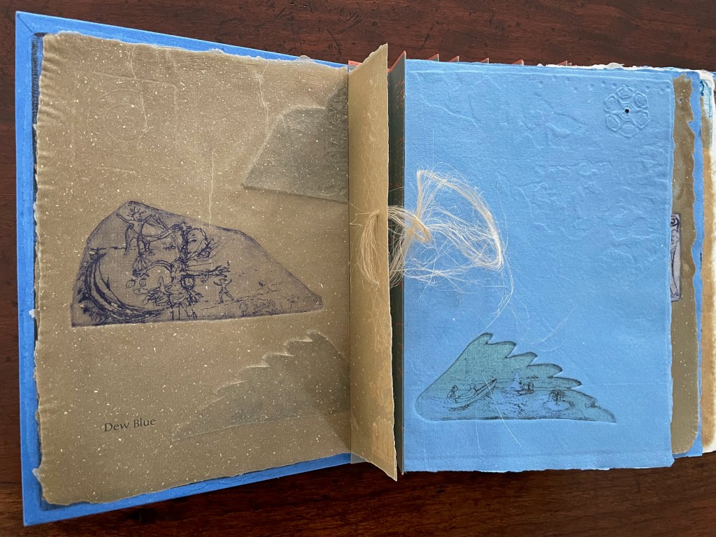
Dew Blue title page and etching, loop of flax fibers, first page of blue handmade paper folio; note its boating image repeated from the prior center spread.
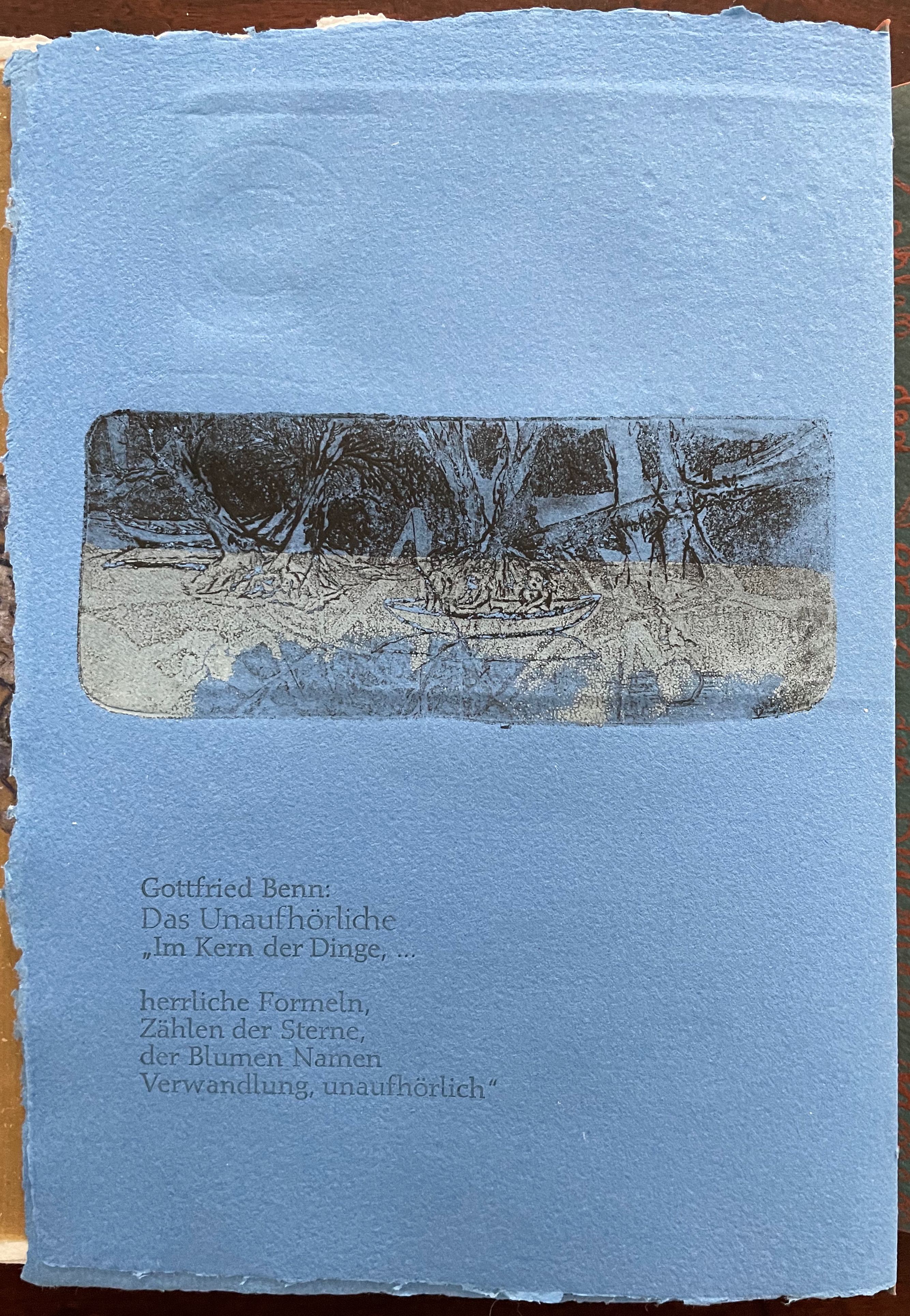
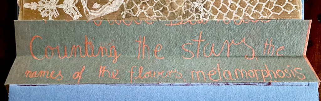
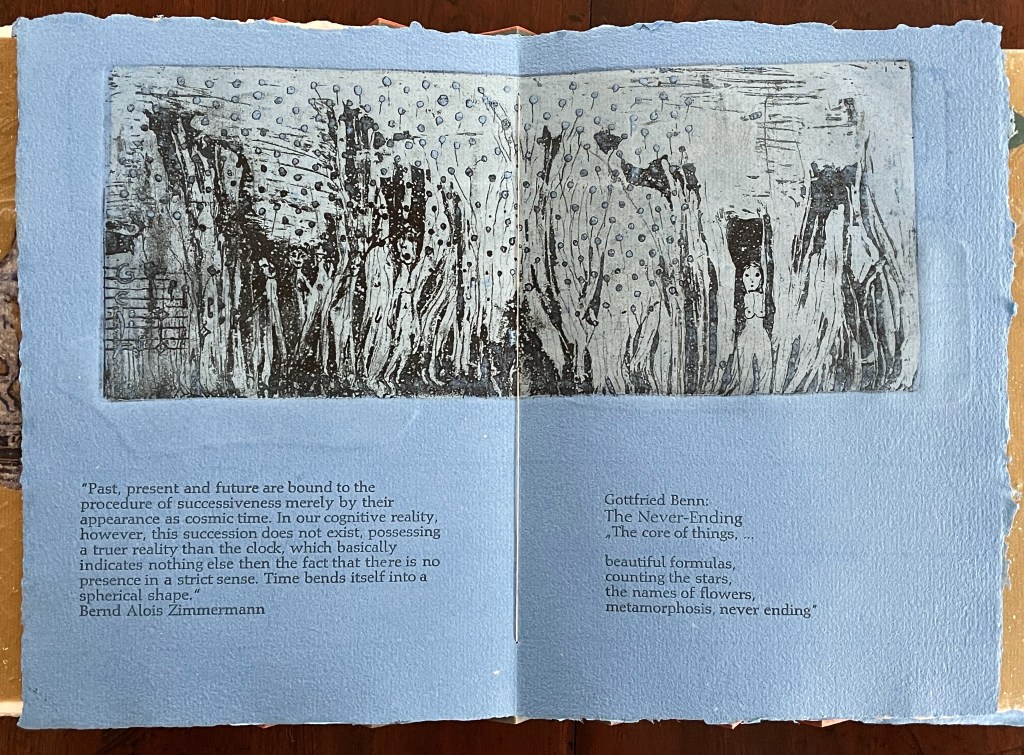
Following the pure flax folio, the first all blue folio gives us that introductory excerpt from Andersen’s fairy tale. Next comes a description of flax comes from Leonhart Fuchs’ Book of Herbs (1543), then the series of planting and harvesting observations from Beisinghoff, then the refrain from Clemens Brentano’s poem “Ich darf wohl von den Sternen singen” (1835), then philosophical observations drawing on G.W. Leibniz from D’Arcy Wentworth Thompson’s On Growth and Form (1917), a much-quoted theorem of musical composition from Bernd Alois Zimmermann’s Intervall und Zeit (1974), and finally (below) a passage of text by Gottfried Benn from the Hindemith oratorio Das Unaufhörliche / The Neverending (1936). In the valleys of the accordion spine, some of the lines from Andersen, Fuchs, Beisinghoff and Been appears handwritten in orange paint.
Translated fragment of Benn’s lyrics for Paul Hindemith’s oratorio Das Unaufhörliche / The Neverending (1936).
Even with these additional texts, Andersen’s fairy tale remains the most central text in Tau blau / Dew Blue, despite the brevity of its excerpt. Brentano’s Romantic/religious expostulations (“O Star and Bloom, Garb and Soul, Love, Hurt and Time for evermore”) sound like those of the plant in the story’s final passage. The occurrence of Fibonacci’s spiral in the plant may be a physical fact, but Beisinghoff turns it into something more mystical by placing the description of phyllotaxis next to Leibniz’ and Thompson’s transcendental view of mathematical science and natural philosophy. Likewise she links the texts from Bernd Alois Zimmermann and Gottfried Benn to the fairy tale by placing them beneath the etching that captures the flax plant’s singing and dancing into its transformation by fire.
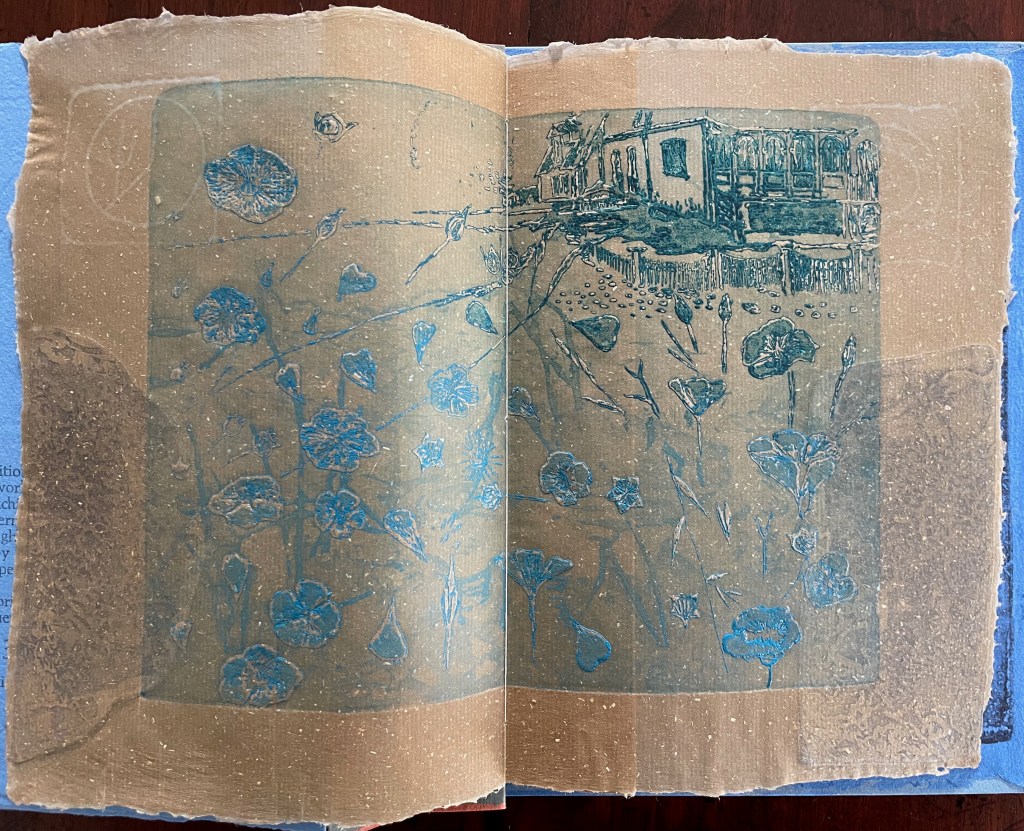
Below is the final folio of the work. Like the first, it is made completely of flax paper, but its center spread offers a fuller image: flax blossoms and stalks float in the foreground, and in the background is a sketch of Beisinghoff’s residence where she grows her flax. Like the Fibonacci spiral on the front and back covers, the first and last flax folios round out the work. But go back and listen for the hidden sound installations accompanying Dew Blue. Noticing Beisinghoff’s abstract musical notation, indulge yourself with recordings of a Swedish folk song (“Today is supposed to be the big flax harvest” here or here) to which the notation and phrases allude, and as the flax papers turn and wave on their accordion peaks, listen carefully for their musical rustle.
The final pure flax paper folio.
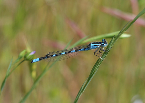
Tule Bluet damselfly perched on flax leaf. Photo: John Riutta, The Well-Read Naturalist (2009). Displayed with permission.
Die wilden Schwäne (2001)
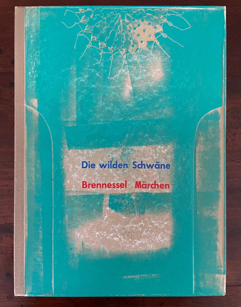
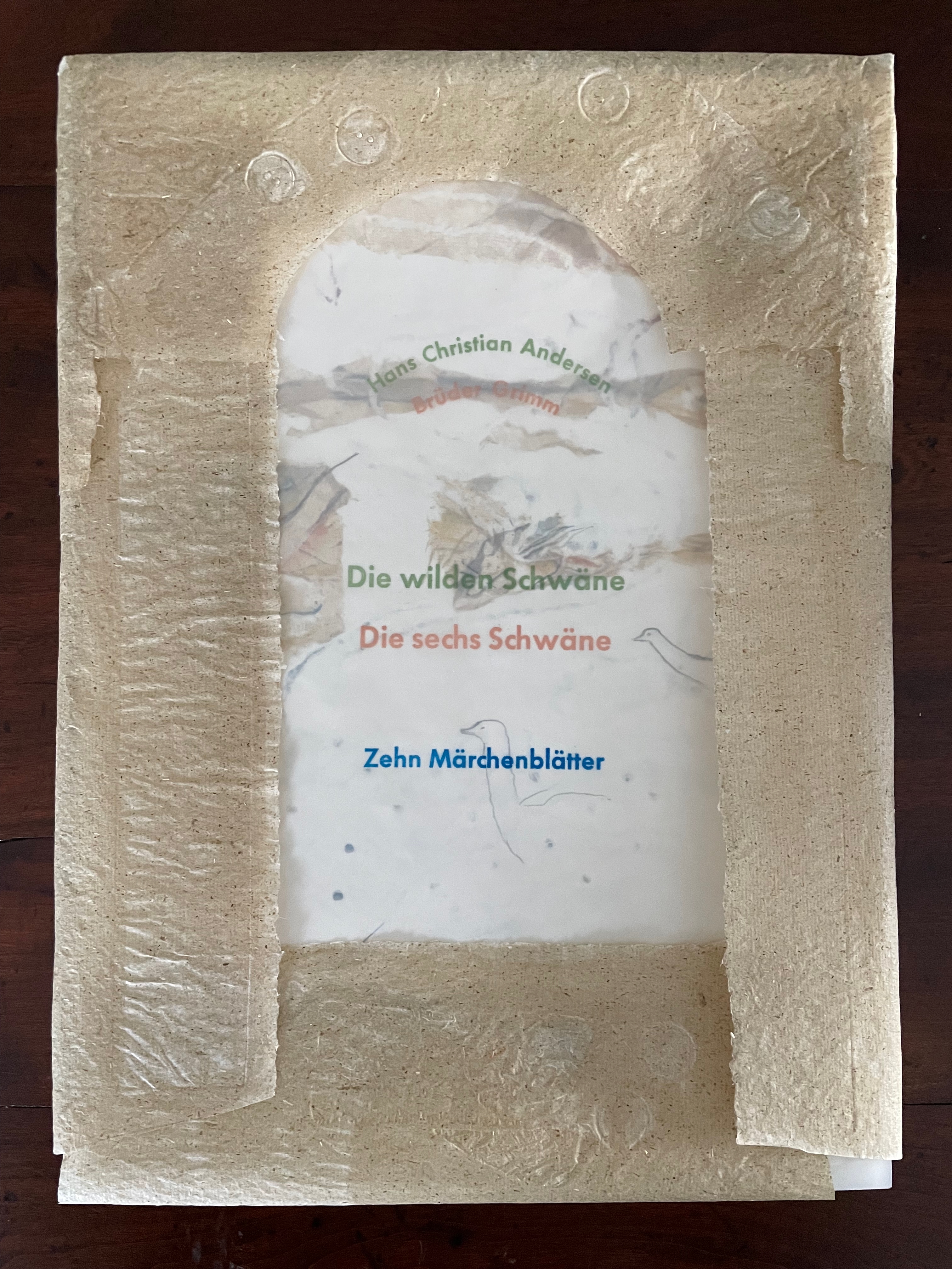
Die wilden Schwäne (2001) Barbara Beisinghoff Box with embossed cover holding folios wrapped in chemise. H35o x W250 mm. 18 folios. Edition of 25, of which this is #6. Acquired from the artist, 20 December 2024. Photos: Books On Books Collection.
Barbara Beisinghoff’s Die wilden Schwäne is an exemplar of collaboration and craft. In it, she even requires collaboration between Hans Christian Andersen and the Brothers Grimm. Andersen’s Die wilden Schwäne and the Grimms’ Die sechs Schwäne are based on the same tale of brothers turned into swans who are saved by their sister Elisa’s diligent and mute harvesting, pulping, spinning and sewing of stinging nettles into shirts that break the spell when donned. H.C. Andersen, however, is verbose and elaborate in his telling (even including vampires!), and Beisinghoff has done a bit of nipping and tucking with the more succinct Brothers Grimm to create a version more suited to the artist’s book she creates.
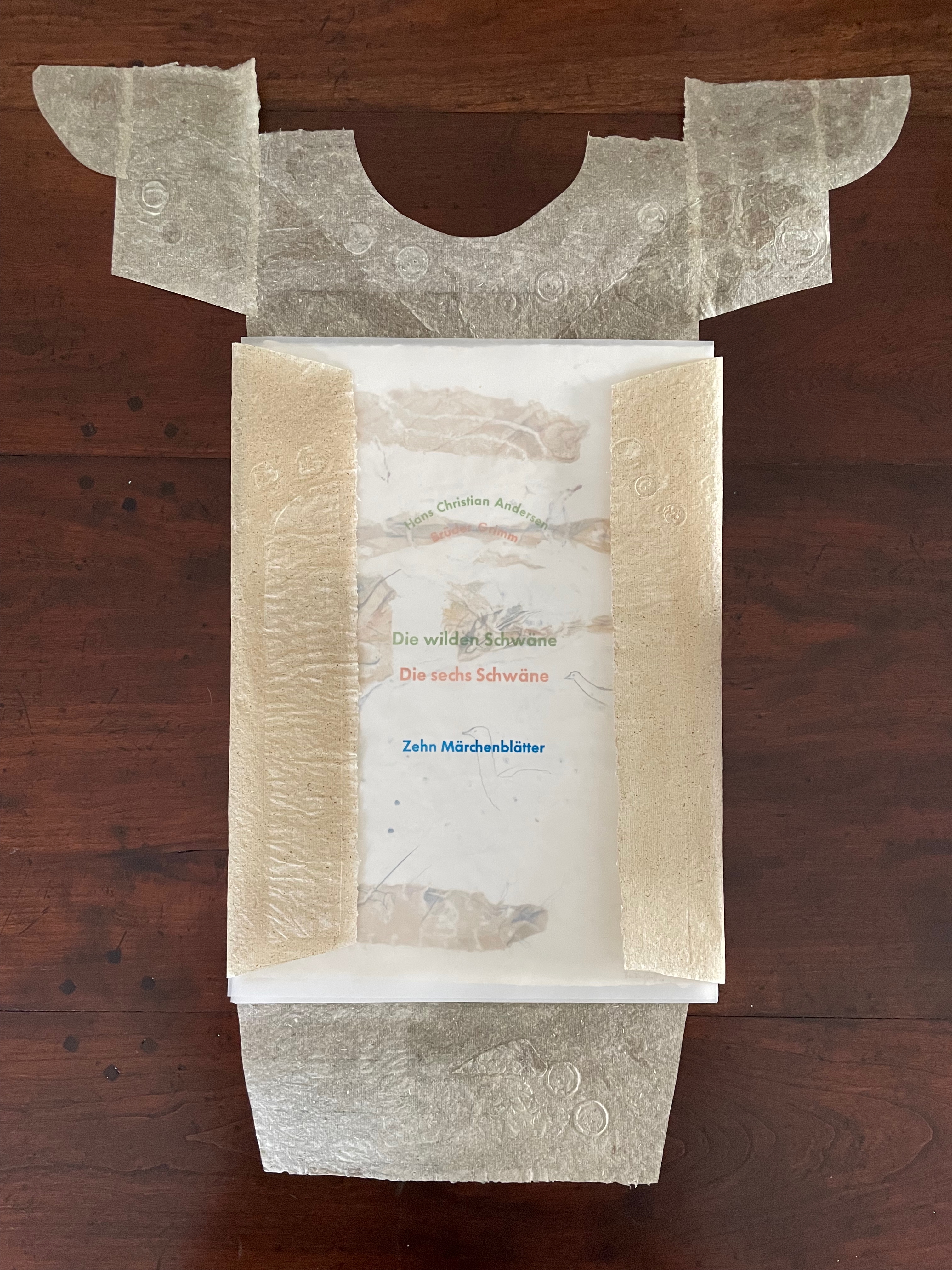
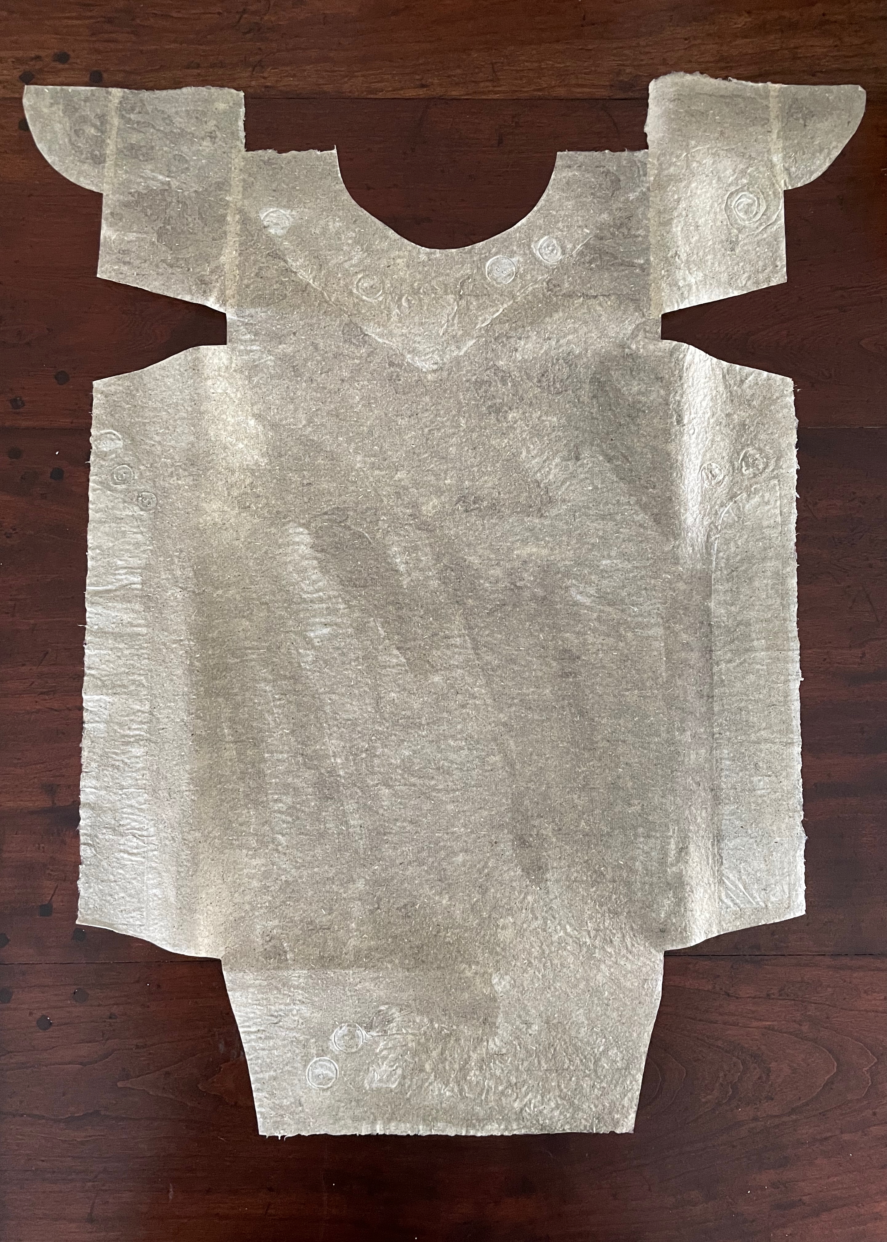
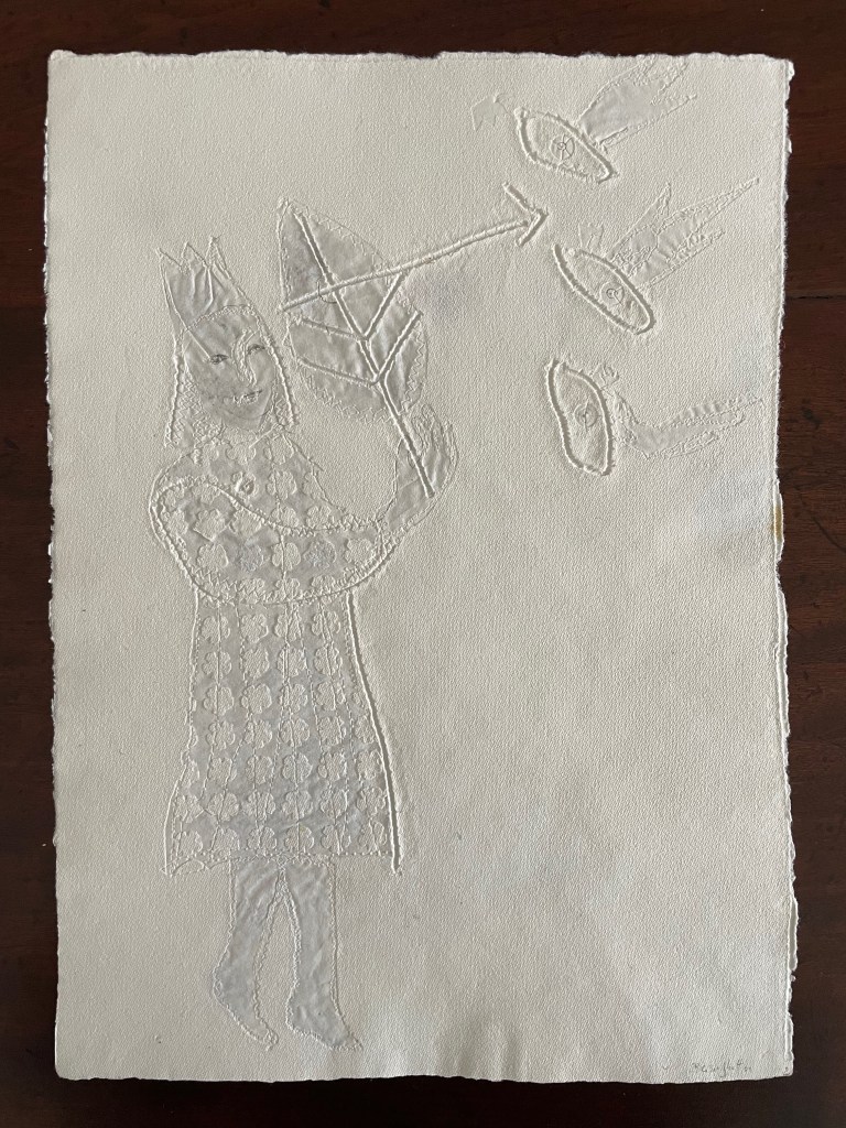
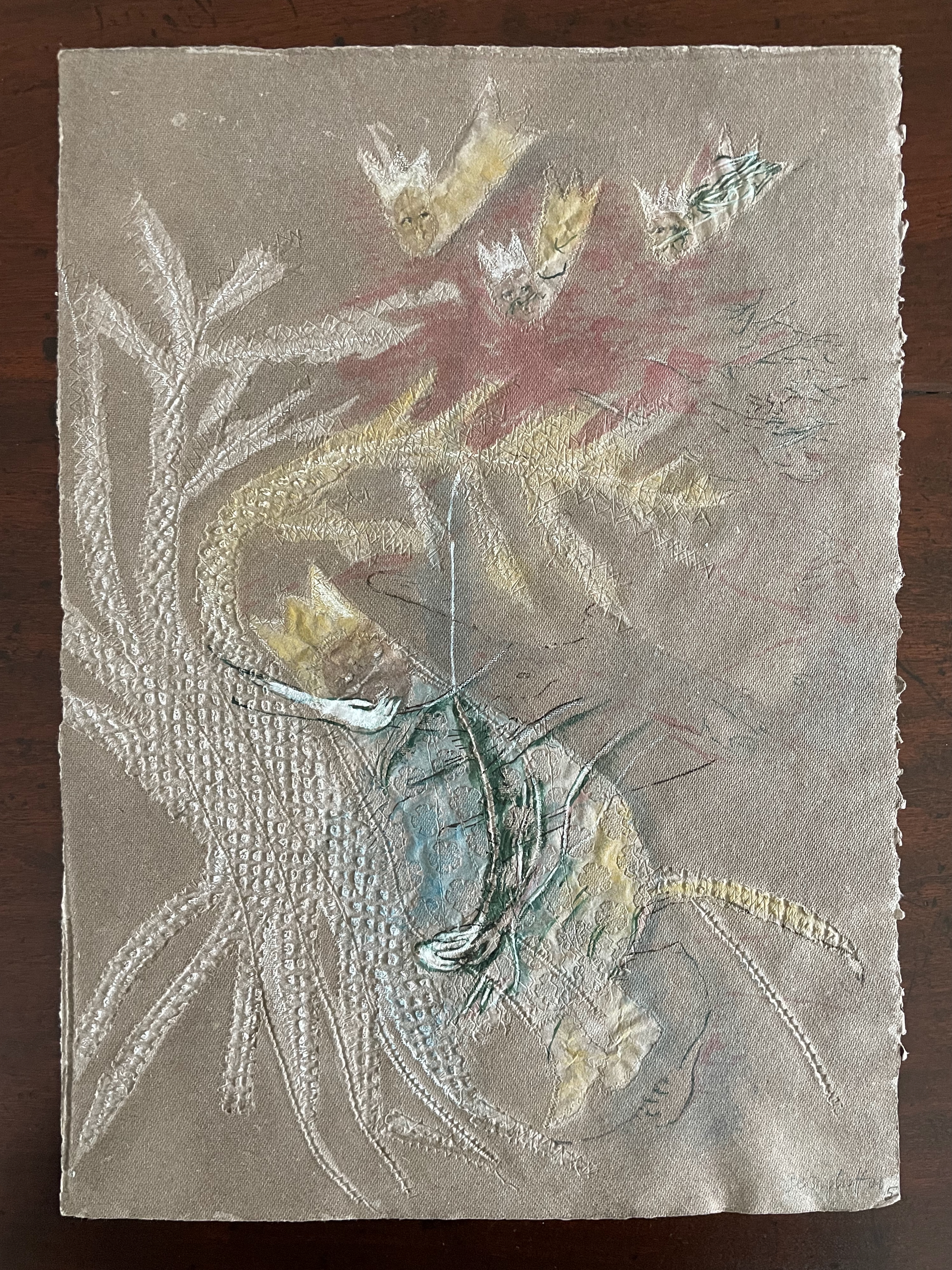
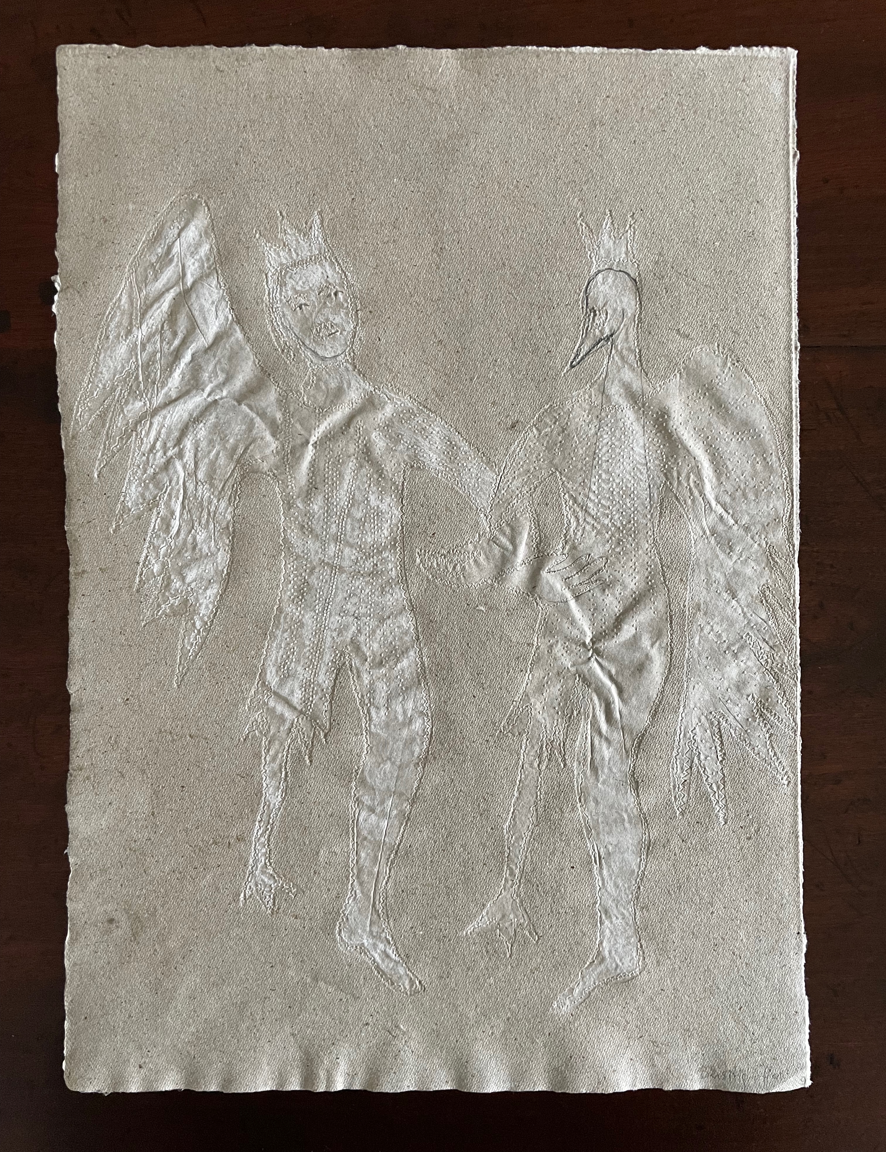
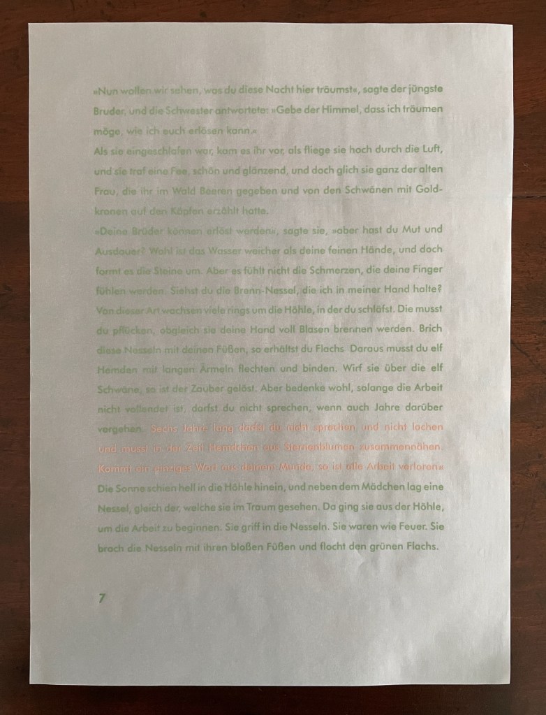
To match Elisa’s effort with stinging nettles, Beisinghoff enlisted the collaboration of Johannes Follmer, the owner of a paper mill. Together they obtained cultivated stinging nettles from the Institute for Applied Botany in Hamburg, cut the fibers, left them to rot, boiled them into a pulp, mixed that with water in a vat, scooped up layers in a sieve embroidered with illustrations, couched the sheets, then pressed and dried them into paper. Beisinghoff applied further drawings with a water jet, watercolor and pencil to the watermark-embossed sheets to illustrate aspects of the tale. To present the Andersen/Grimm “collage”, Beisinghoff had the type set and printed at the Gutenberg Museum. Andersen is printed in light green and Grimm in light red on seven numbered translucent sheets and interleaved with the nine folios of paper art (two more translucent sheets carry the cover page and colophon). To wrap the folios together, Beisinghoff made an embossed chemise or “feather dress” of pure nettle fiber, which could represent Andersen’s description of the brothers’ blowing off each other’s feathers every evening when the sun has set or one of the shirts that their sister makes to break their spell.
The “feather dress” of stinging nettle fiber.
“The King’s little daughter was standing in the cottage room, playing with a green leaf, for she had no other toys. She pricked a hole right through the leaf, looked up at the sun, and there it was, she saw the clear eyes of her brothers, but every time the warm rays of the sun shone on her cheeks, she thought of all their kisses.” Translation with DeepL.
“When she had fallen asleep, it seemed to her as if she were flying high through the air, and she met a fairy, beautiful and radiant, yet she looked very much like the old woman who had given her berries in the forest and told her about the swans with gold crowns on their heads.” Translation with DeepL.
“The swans swooped down to her and lowered themselves so that she could throw the shirts over them: and as she touched them, the swan skins fell off, and her brothers stood before her in the flesh, fresh and beautiful.” Translation with DeepL.
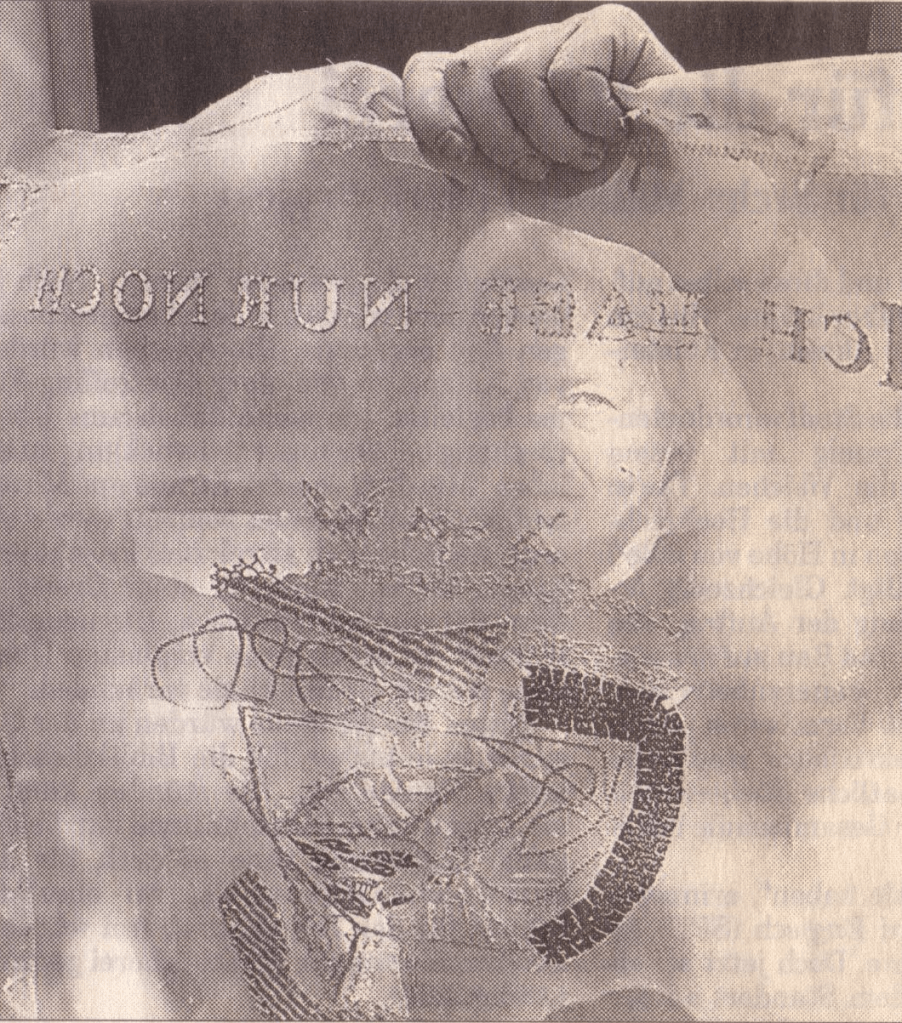
“Barbara Beisinghoff (head in the background) covers the frame with this transparent, embroidered and sewn gauze, which is used to scoop and emboss her nettle papers. This is how her large-format watermark illustrations end up on the sheets.” Translation with DeepL. Peter Holle. 30 August 2001. Frankfurter Rundschau. Photo: Oliver Weiner.
This art by watermarking recalls that of other artists in the collection: Fred Siegenthaler and Gangolf Ulbricht, in particular. The technique of pulp painting also finds other practitioners in the collection: Pat Gentenaar-Torley, John Gerard, Helen Hiebert, Tim Mosely, Maria G. Pisano, Taller Leñateros, Claire Van Vliet and Maria Welch. Beisinghoff’s blend of embroidered watermarks, waterjet marking and pulp painting, however, creates a bas relief effect that is echoed only in the collection’s works by Mosely, Taller Leñateros and Van Vliet, albeit achieved differently. These workings of the substrate — as material, color, surface, and even narrative — with the workings of book structure is one of the more magical locations of book art. It is perfect for Beisinghoff’s metamorphical interpretation of the Andersen/Grimm fairy tale.
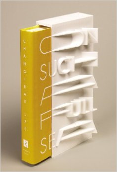
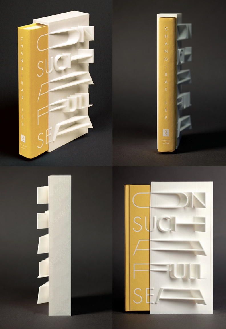
On Such a Full Sea (2013) Chang-rae Lee Jacket and slipcase design Helen Yentus Book in slipcase. H23o x W150 mm; slipcase only, W110 mm. 368 pages. Edition of 500, of which this is #178. Acquired 1 October 2018. Photo: Riverhead Books and AIGA.
Riverhead art director Helen Yentus and members of the MakerBot team designed this slipcase for Lee’s novel. An edition of 500, made with the MakerBot® Replicator® 2 Desktop 3D Printer with MakerBot PLA filament, a bioplastic made of corn and fabricated by MakerBot in Brooklyn, New York, appeared in 2013 just before the trade edition in 2014.
Marlene MacCallum’s latest artist’s books remind me of Claude Monet’s two series of paintings of the Rouen Cathedral’s façade and a field of haystacks. The series were influenced by Japanese ukiyo-e prints (“pictures of the floating world”). Rather than changing vantage points on Mt. Fuji, Monet used one perspective on one façade and sought to capture the instants of light and atmosphere on its surface at several different hours of the day. He rendered his vision of them with thick layers of paint, brushstrokes, and colors. MacCallum, too, has chosen a fixed-viewpoint: in her case, of Lake Ontario. She, too, follows different hours and, also, different seasons as Monet did with his haystacks. She, however, renders her vision with an intricate verbal-visual dance of metaphor, book structure, registration, photographic filters, print technique and paper.
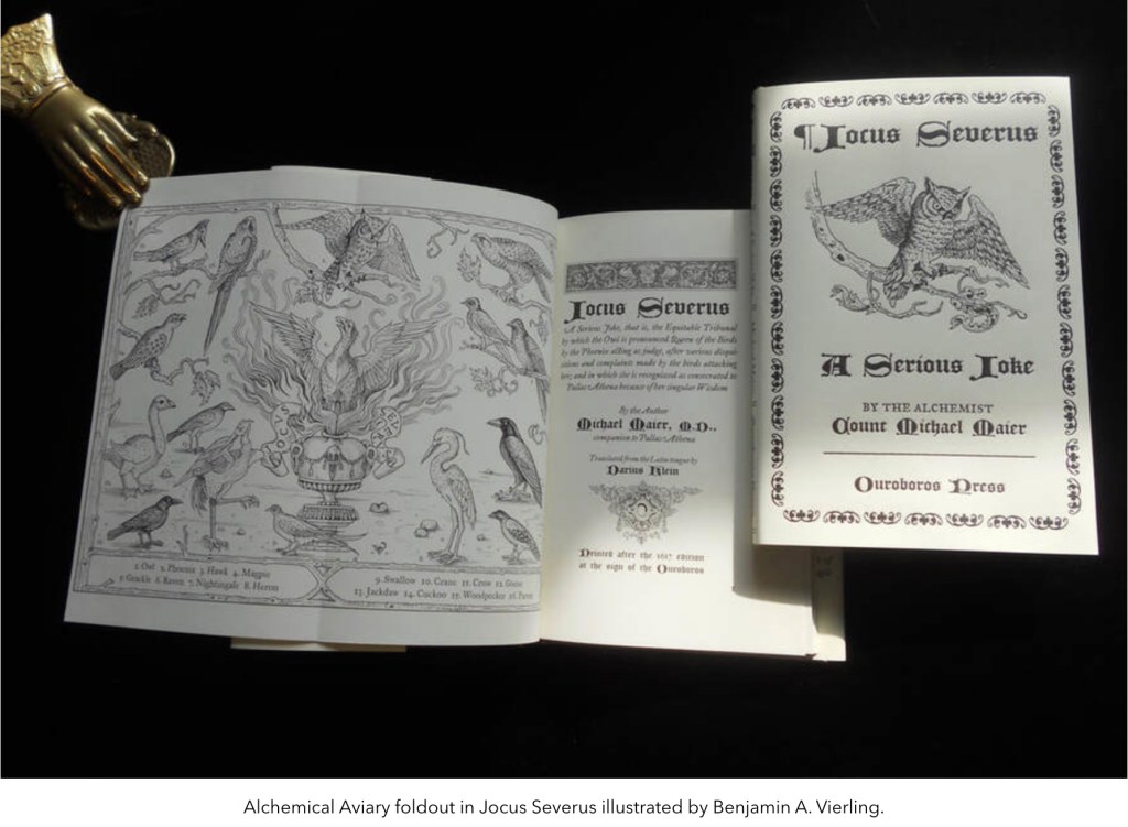
William Kiesel, founder of Ouroboros Press, has an insightful essay with impressive examples of the “fold out” device here. Among the examples are
Manly P. Hall’s The Secret Teachings of All Age and Codex Rosicrucis
Elias Ashmole’s Theatrum Chemicum Britannicum
Zoroaster’s Telescope: The Key to the great divinatory Kabbala of the Magi
Napoleon’s Book of Fate
Heinrich Cornelius Agrippa von Nettesheim’s De Occulta Philosophia
Semiphoras et Shemhamphoras Solomon Regis
E. A. Budge’s The Book of the Dead
Don’t let the occultism of the examples put you off. After all, the earliest forays into movable books occurred in alchemical and Kabbalistic tomes. As Kiesel, also a book maker, points out:
Opening a folding plate causes an interruption in the reading process. It offers the reader an opportunity to think about what was read while contemplating the materials on the printed sheet. Again alchemy and mysticism share this meditative approach, a kind of inner reading read through the visual language of the birds or abecedarium.
From the screenshot of one of his productions above, you may be able to make out the book’s author: Count Michael Maier, whose more famous emblem book Atalanta Fugiens Daniel E. Kelm transformed into the Möbius version Neo Emblemata Nova.
The Paris-based publishers Les Trois Ourses announced that Katsumi Komagata died on 29 March 2024. Although the Bologna Children’s Book Fair responded quickly with a memorial on 8 April, it is strange that no significant obituary has yet appeared for such a major figure in the book arts, children’s books and artists’ books. Fortunately there is extensive biographical information on the site of his publishing firm One Stroke.
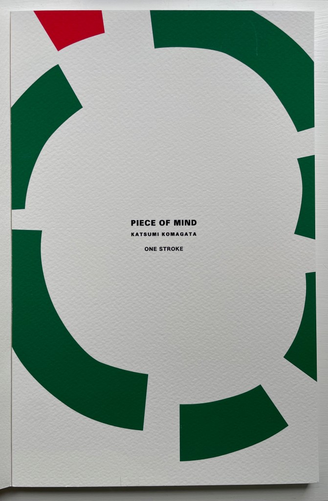
Piece of Mind (2022), one of his last limited edition works, becomes all the more treasured.
Piece of Mind (2022) Katsumi Komagata Casebound, card around perfect bound block of lighter card stock. H300 x W196 mm. [30] pages. Edition of 100, of which this #67. Acquired from One Stroke, 7 August 2023. Photos: Books On Books Collection.
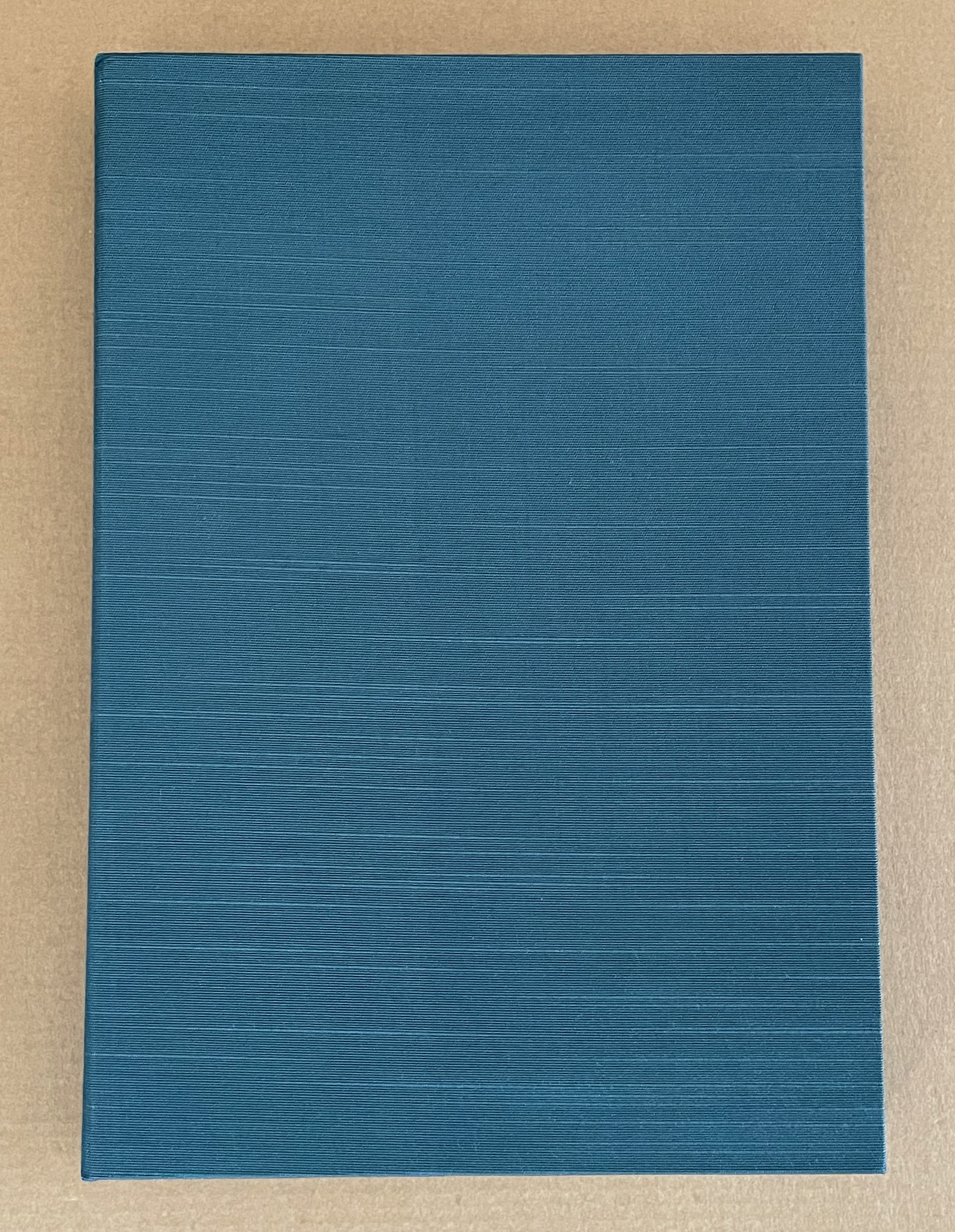
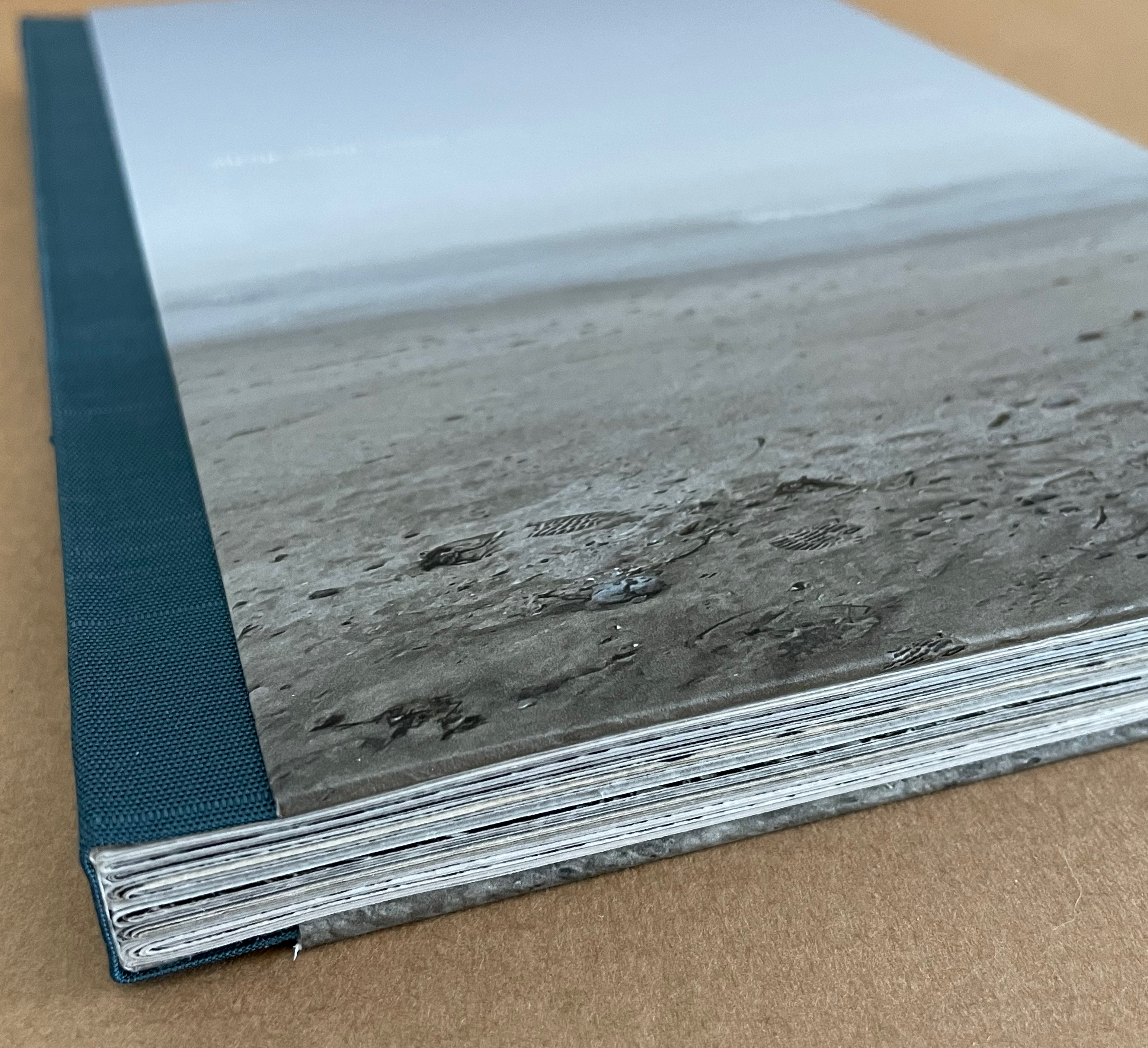
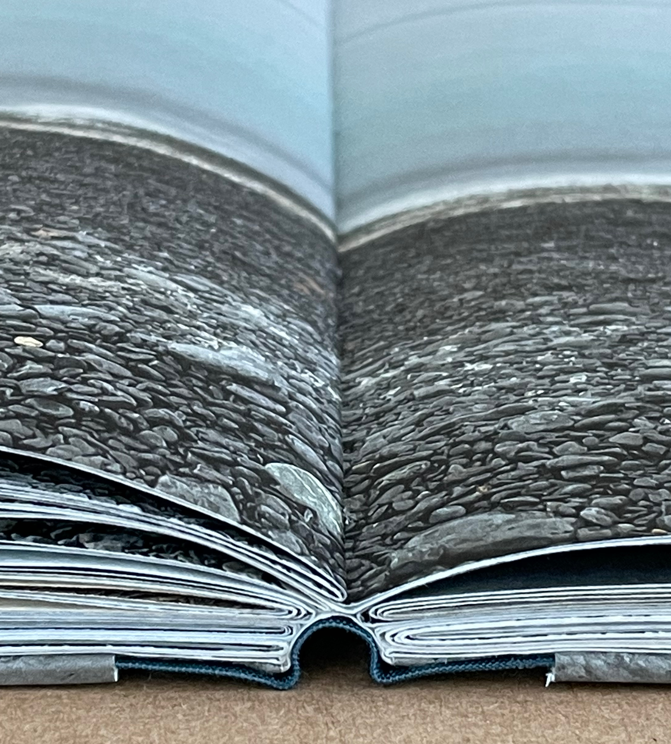
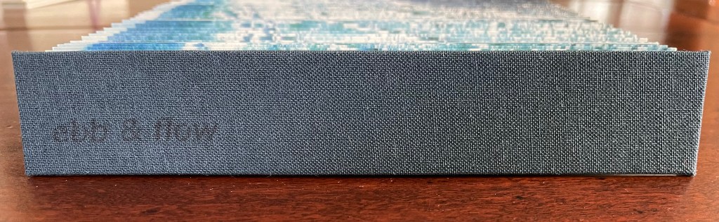
Ebb and Flow (2023) Jane Cradock-Watson Concertina book with cloth hard bound covers. H155 x W27 mm (closed), W680 mm (open). 64 panels. Edition of 20. Acquired from the artist, 21 January 2024. Photos: Books On Books Collection. Displayed with artist’s permission.
An exploration, both visually and physically, the ‘edge’ of the sea where it meets the land, with its continuous ebb and flow of the breaking waves, rhythmically rolling back and forth onto the sand. (Artist’s description)
With the binding and her photography in Ebb and Flow, Jane Cradock-Watson has sculpted and painted the sea’s edge. Four digital photographs printed on Zerkal paper have been spliced together between two cloth-covered boards. The flexibility and extent of the concertinaed paper create an undulating structure that turns seascape stills into mesmerising cinema.
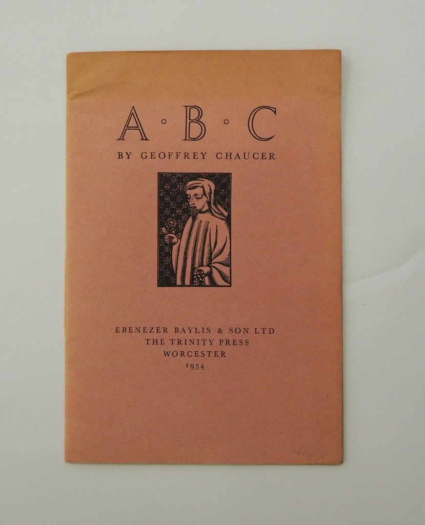
ABC by Geoffrey Chaucer (1934) [Eleanor] Joyce Francis Chapbook, softcover sewn. H250 x W170 mm. 16 pages. Edition of 500? Acquired from Antiquariaat Fokas Holthuis, 30 April 2021. Photos: Emilia Osztafi.*
Chaucer’s ABC (ca. 1369) is an intriguing early work in the history of abecedaries. There are alphabet poems in the Hebrew Bible, but according to the artists’ book collector and scholar Nyr Indictor, this Chaucer lyric seems to be the earliest surviving English “ABC poem” of known authorship. Possibly on commission from Blanche, Duchess of Lancaster, Chaucer cribbed and translated a lyric embedded in Guillaume de Deguilleville’s La pelerinage de vie humaine [“Pilgrimage of Human Life”] (ca. 1330).