Henry James, The Beast in the Jungle, 1903. Allen Press, 1963. The copy shown is one of only 15 copies with an extra suite of 16 artist’s proofs, each titled, numbered 9/15 and signed by the artist in a separate portfolio. Displayed online at Sophie Schneideman – Rare Books and Prints.
In his Books and Vines essays, Chris T. Adamson provides fresh, personal and insightful comments on fine book productions and their content such as Henry James’ “The Beast in the Jungle” from the Lewis and Dorothy Allen Press in 1963, pictured above. An oenophile, as the title of his series suggests, Adamson also occasionally offers tips on the best wines with which to decant and read these works.
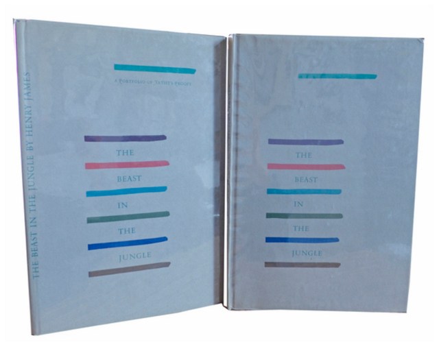
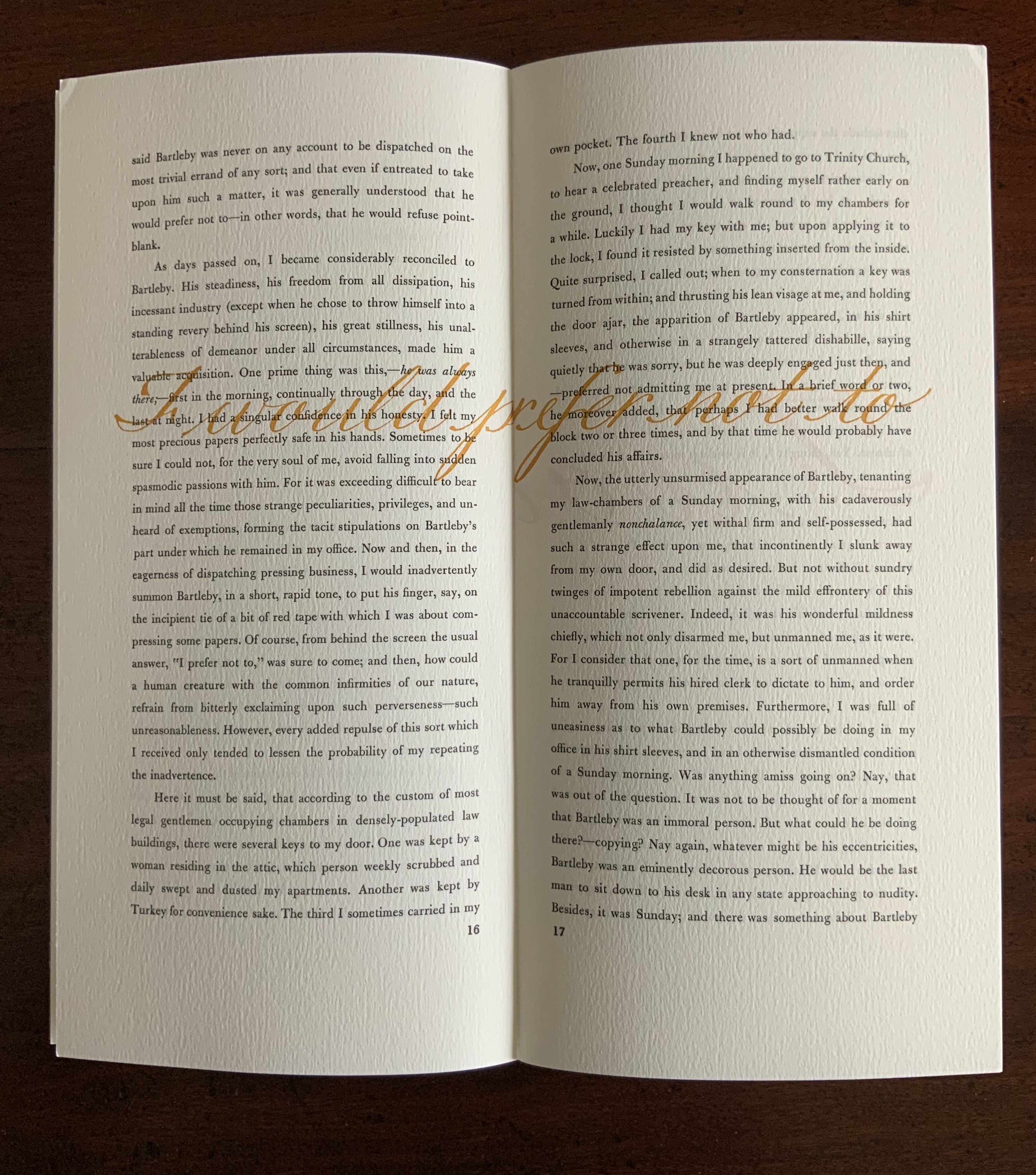
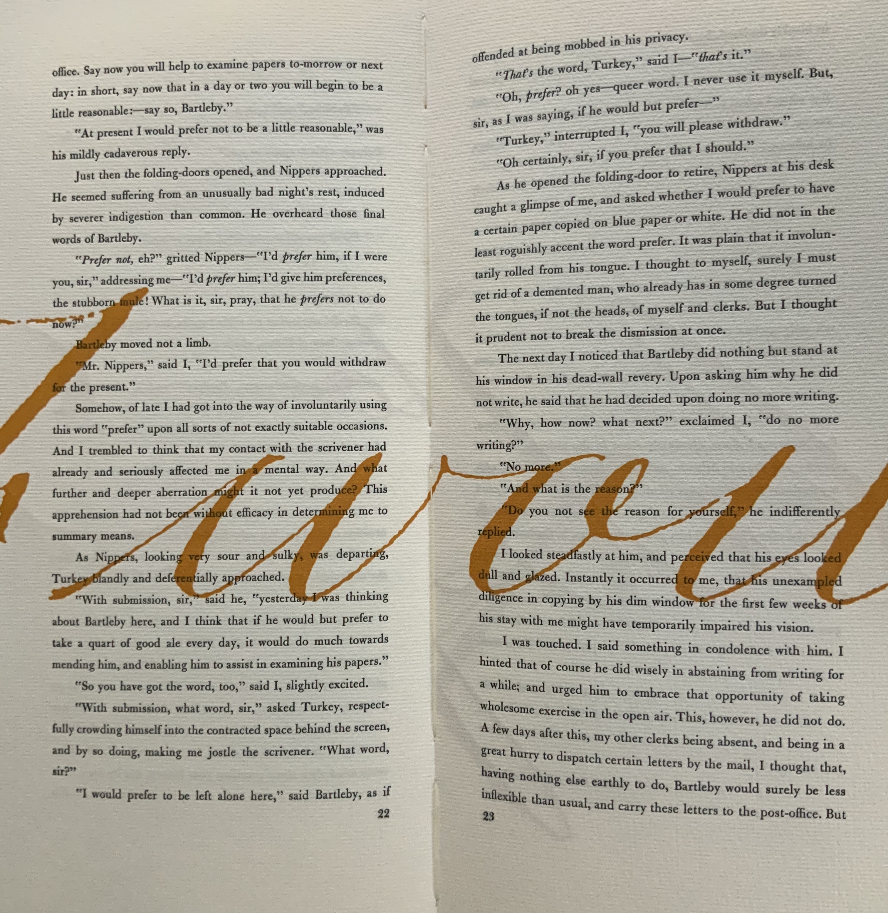
James is a favorite author at Books On Books as is Herman Melville. Indulge the punning coincidence of Adamson’s introducing us to Wilber Schilling’s Indulgence Press and his edition of Melville’s “Bartleby the Scrivener: A Story of Wall Street“. Schilling’s edition of “Bartleby” – with Suzanne Moore’s original hand lettering of Bartleby’s classic statement “I would prefer not to” first appearing fully legible then becoming larger until it literally falls off the bottom of the final page – was an early career statement of an interest in more than fine press work but in book art as well.
Consider Schilling’s Half-Life/Full-Life and its binding a variation on the accordion/flag structure of Hedi Kyle and Claire Van Vliet. The complexity of the form marries well with that of the intertwining, interleaving text and photos along the timelines of the Doomsday Clock and global warming.
Half Life/Full Life Wilber Schilling, 2009 ISBN: 0-9742191-5-0 Cover
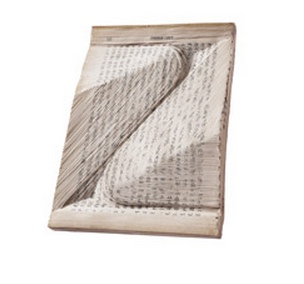
Schilling’s photography in Half Life/Full Life speaks to the importance of that craft in his overall portfolio. His photos of aging, decayed and unbound books are haunting and remind me of the found art of M.L Van Nice.
Schilling has collaborated with Thomas Rose (visual artist and professor at the University of Minnesota), Michael Dennis Browne (poet and librettist), Rick Moody (author of The Ice Storm) and Patricia Hampl (MacArthur Fellow poet and novelist). He has collaborated with Daniel E. Kelm (book artist, founder of the Garage Annex School for Book Arts and a collaborator with Suzanne Moore).
Given the influence of Marcel Duchamp and Joseph Cornell on works such as Arthur & Barbara (Arthur Danto and Barbara Westman) or Surplus Value Books: Catalog Number 13, you might say that Schilling has attempted to collaborate with them as well. The danger in that, of course, is highly derivative artwork. That early-career whiff of genius in commissioning the now famous calligrapher Suzanne Moore to hand letter “I would prefer not to” and spreading it in ever larger size across the pages might be what takes Schilling’s work beyond the derivative. His work is worth examining with that anticipation.
Postscript
The Books On Books Collection now holds a copy of Schilling’s edition of Bartleby as well as works by Suzanne Moore.
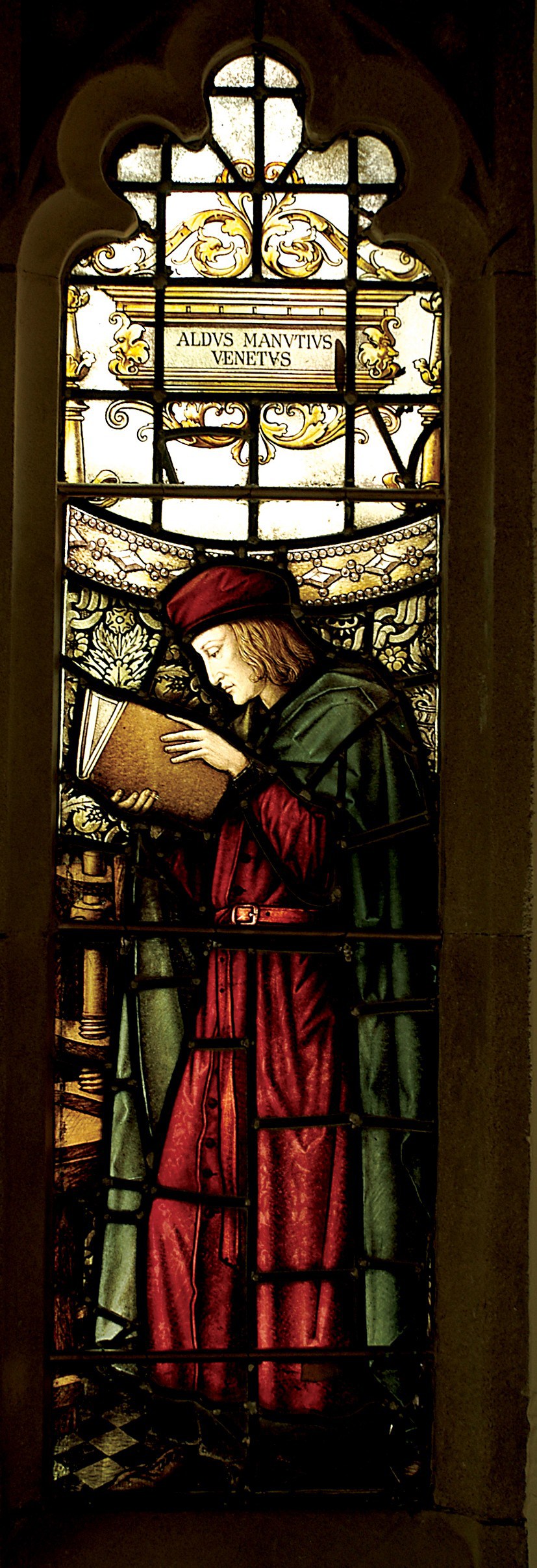
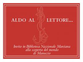
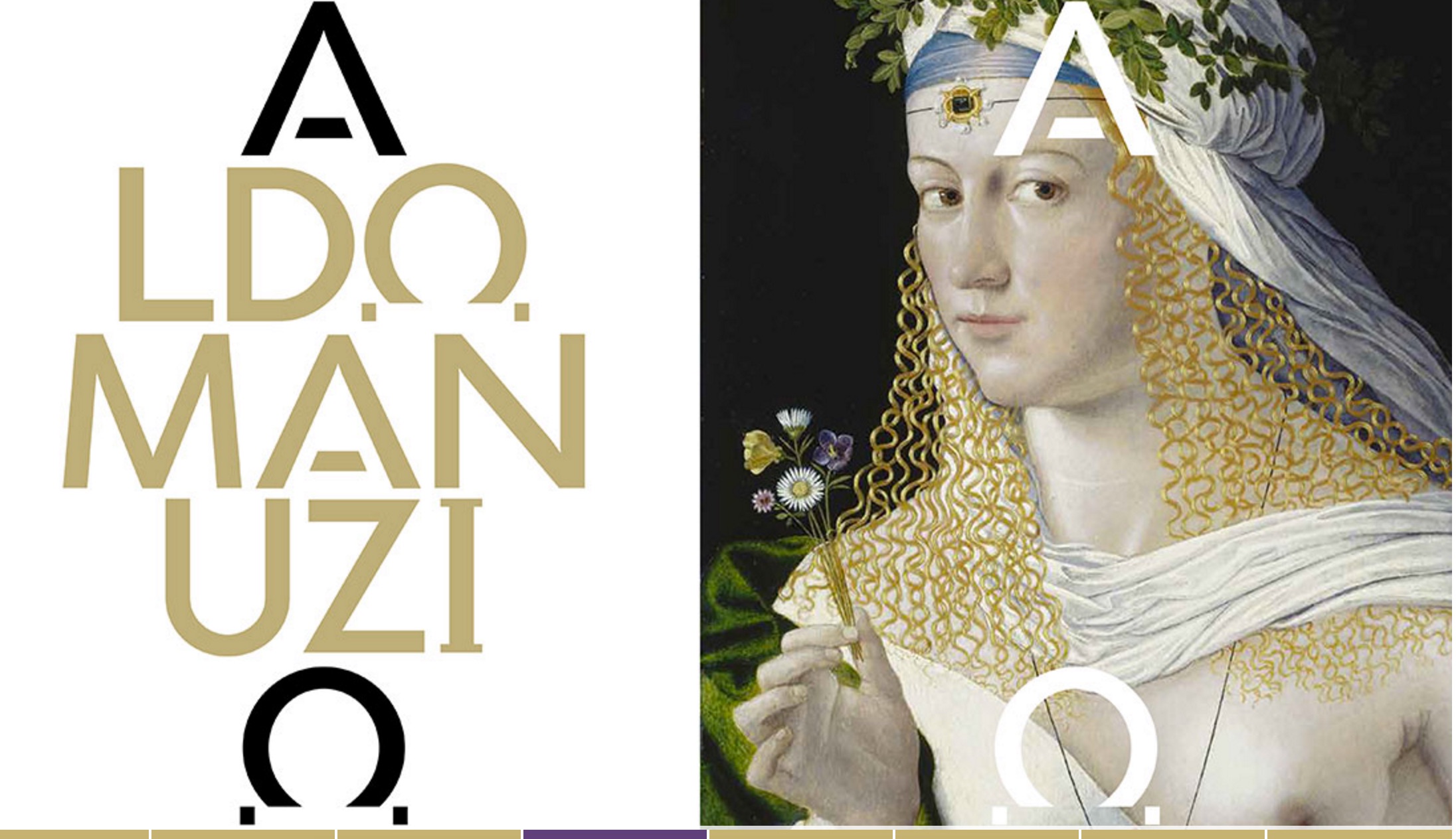
Aldus Manutius, John Rylands Library, University of Manchester
Merchants of Print from Venice to Manchester, 29 January to 21 June 2015, John Rylands Library, University of Manchester, UK:
This exhibition celebrates the legacy of Aldus Manutius (1449 – 1515), an Italian humanist scholar who founded the Aldine Press at Venice. His publishing legacy includes scholarly editions of classical authors, the introduction of italic type, and the development of books in small formats that were read much like modern paperbacks. The firm was continued after his death by his son and grandson until 1598. John Rylands Library, University of Manchester website, accessed 17 May 2015
Back in February as I enjoyed Oxford’s recognition of the 500th anniversary of the death of Teobaldo Manucci, the Manchester exhibition was already running. Where the Oxford event focused on the more architectural motifs distinguishing early Venetian from Roman printing, the Manchester event dwelt more on the educational thrust, technical and business aspects of the Aldine legacy and provenance of the Manchester collection.
The Manchester focus on provenance wends its way back through the library’s donors dedicated to the cause of education (if not to impressing its practitioners with the importance of the woolen industry’s contribution to it) to the Renaissance circle on which Manutius depended:
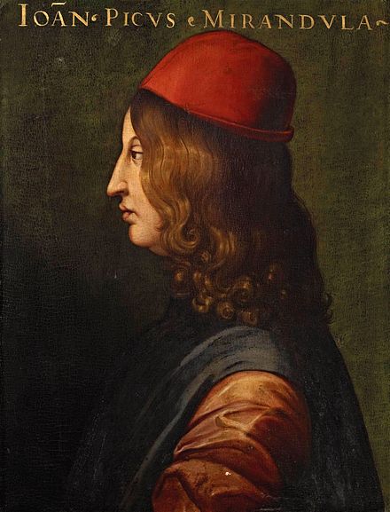
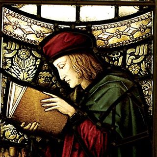
Giovanni Pico della Mirandola, 1463-1494 Uffizi Gallery, Florence
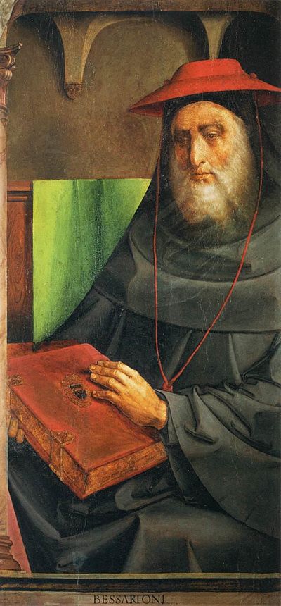
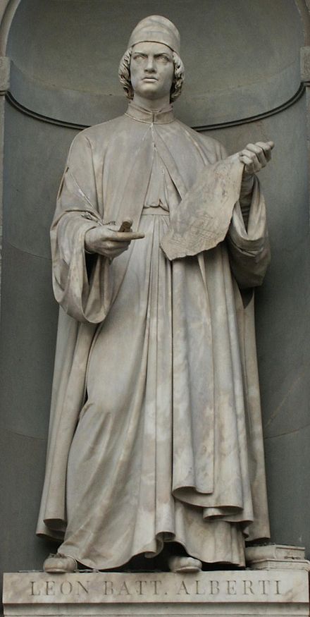
In 1482 Manutius lived with Pico della Mirandola and served as tutor to his nephews, the sons of the Princess of Carpi. Like the later, beneficent Manchester merchants, Pico’s family contributed financially to the cause: they funded the opening of the Aldine printing office in Venice in 1494. Of course, Pico made more than a patron’s financial contribution to the cause. Along with Cardinal Bessarion, Marsilio Ficino, Leon Battista Alberti and Erasmus – all known intimately to Manutius – Pico drove the revival of learning embodied in the output of the Aldines and numerous other printers (John Addington Symonds, Renaissance in Italy, Volume 2 (of 7): The Revival of Learning, John Murray, 1914).
Cardinal Bessarion, Justus van Gent and Pedro Berruguete , (Les Hommes Illustres)
Marsilio Ficino, Duomo, Florence
Leon Battista Alberti, Piazza degli Uffizi, Florence
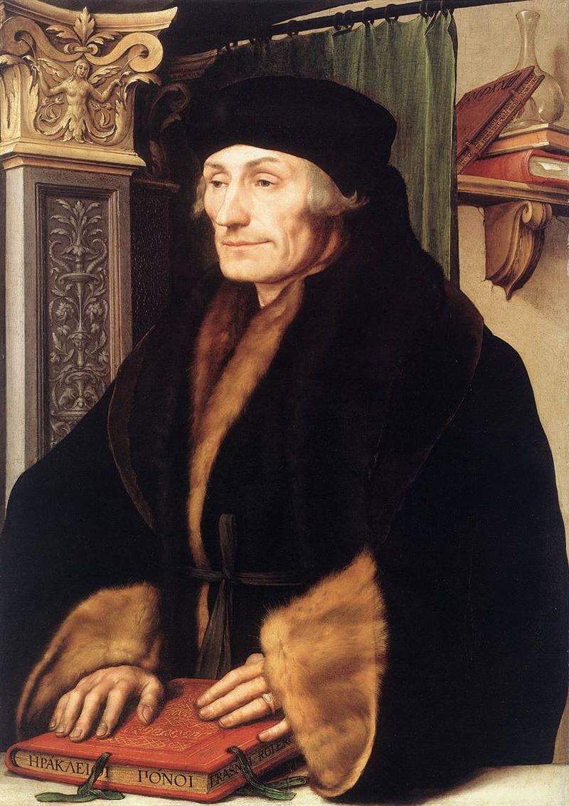
Desiderius Erasmus, 1523?, Hans Holbein the YoungerThe Manchester exhibition closes this month.
The next major Aldine event is the summer school hosted by The Catholic University in Siena (31 August – 3 September) and jointly organized by the Centro di ricerca europeo libro editoria biblioteca (CRELEB). Other events with dates still to be confirmed are planned in Brighton, Treviso, Milan and Arezzo.
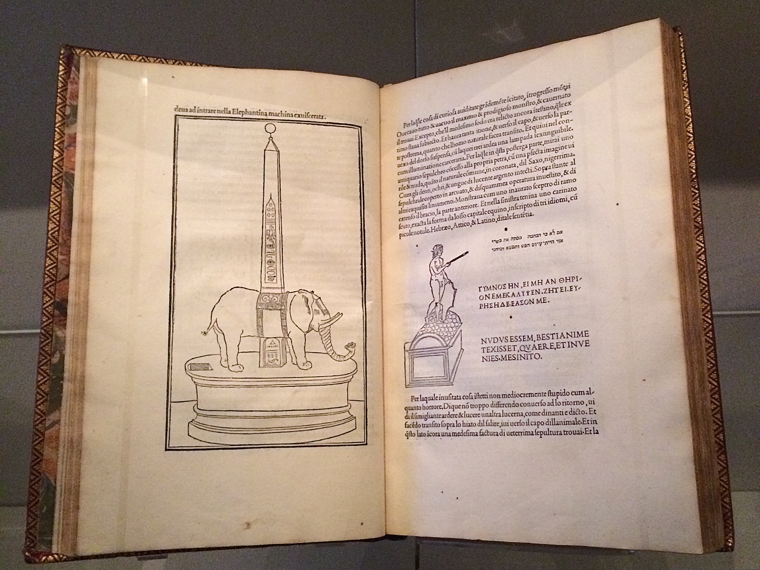
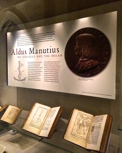
Late afternoon before the long worn wooden benches in the Bodleian’s Convocation Hall, 500 years after the death of Aldus Manutius, Oren Margolis served his audience well, providing them with a richer appreciation of the “finest printed book of the entire Renaissance”* – the Hypnerotomachia Poliphili – and of its publisher Aldus Manutius.
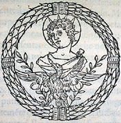
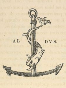
Drawing our attention to the more sculptural qualities of Venetian Renaissance printed books over the Florentine and to the evidence of the humanist agenda that drove Manutius, he led us to the page where Poliphilo (lover of all things, but in particular Polia, the ideal woman pursued to the end of the book) stands before a carving that foreshadows the Aldine Press device: a dolphin entwined around the shank of an anchor. The Aldine Press device was inspired by a similar image on an ancient Roman coin given by Pietro Bembo to Aldus, who wrongly associated it with Augustus and his proverb Festina lente (“Make haste slowly”) and adopted both for his printing and publishing business.
Erasmus praised Aldus, saying that he was “building a library which knows no walls save those of the world itself”.
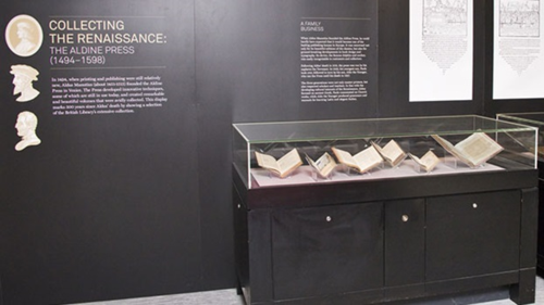
For all of 2015, the world enjoyed a multitude of celebrations of the contribution of Aldus Manutius to publishing, printing and the book. After Gutenberg, Fust and Schoeffer, Aldus Manutius was perhaps the most important printer of the Renaissance. His portable books are still here, although locked away or displayed under glass, no longer so portable. Until now.
The Manutius Network 2015 provides a running list, links for some of which are provided below, including the online exhibition associated with Margolis’s talk. See also below, added in May 2016, the belated exhibition “Aldo Manutius: The Renaissance in Venice” at the Gallerie dell’Accademia in Venice.
From Crispin Elsted’s review of the Thames & Hudson facsimile edition of the Hypnerotomachia Poliphili. Parenthesis, December 2000, No. 5:
I once spent three hours in a library with a copy of the Aldine edition of Hypnerotomachia Poliphili, and I have never known a book take my breath away so consistently. Every page is a masterpiece: the dance of text with the more than 170 woodcuts; the firm, male stature of the typeface; the crisp spring of the impression; the elegant proportion of the page — all combine to an end in which the craft of printing and design carry the text into an atmosphere not of its own making. This new edition has the appearance of a fine actor in a part lately played by a great one. Here are the signs of the grace that greatness lent the commonplace five centuries ago; and in these signs, the commonplace finds here another advocate for its small claims to our time.
Timelines are, of course, for looking further back as well as forward. Earlier this year, April 2012 marked the fifteenth anniversary of the publication of Liane Lefaivre’sLeon Battista Alberti’sHypnerotomachia Poliphili: Re-Configuring the Architectural Body in the Early Italian Renaissance (Cambridge, MA: MIT Press, 1997) and the online publication of The Electronic Hypnerotomachia, which contains the facsimile text and illustrations. The online publication of extracts from Lefaivre’s book illustrates the linking prefigured by the “card stack” approach of HyperCard. What MIT Press and TU Delft, Lefaivre’s affiliation, host on their servers are not ebooks or even e-incunabula of the sort we experience today, but they are clearly forerunners to them.
In twenty-eight more months, December 2014, we will see the 515th anniversary of the original work’s publication by Aldine Press (Venice, December 1499). The founder Aldus Manutius did not normally publish heavily illustrated books. The Hypnerotomachia Poliphili was the exception and the only commissioned work that Manutius undertook. The exception reflects favorably on the overall success of his business and supports the view that Venice had become the capital of printing and publishing very shortly after the invention of printing by moveable type.
The book unveils an inscrutable, almost comic-book-illustrated story, glittering with made-up words in Greek, Latin, Hebrew and Arabic (including proto-Greek, -Hebrew and -Arabic fonts). In addition to the page displays sculpted into shapes such as goblets, this one volume displayed the technological mastery of and improvement on the new Roman (as opposed to the heavy Gothic) typeface Bembo. According to Norma Levarie in The Art & History of Books (New York, 1968), this singular volume revolutionized typography in France in less than twenty-five years.
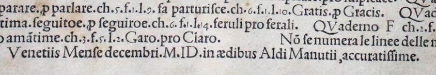
Somewhat like software releases, though, the 1499 edition came with bugs. The colophon to the Hypnerotomachia Poliphili falls at the end of a full page of errata.
“Venice Month December. 1499. in the house of Aldus Manutius, most accurately done.”
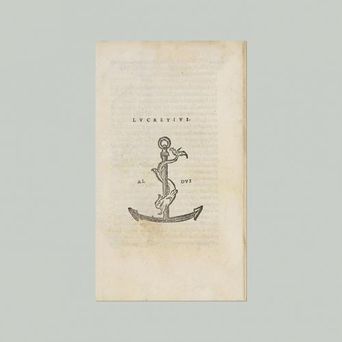
Initiated in 2015 in celebration of the anniversary and acknowledgement of the more than 100 Aldine editions in the Wosk McDonald Collection, Simon Fraser University’s Aldus@SFU is the digitization of 21 Aldine volumes published between 15011 and 1515. The image above is the edition of Lucretius’ De rerum naturam, published just after Manutius’ death in 1515.
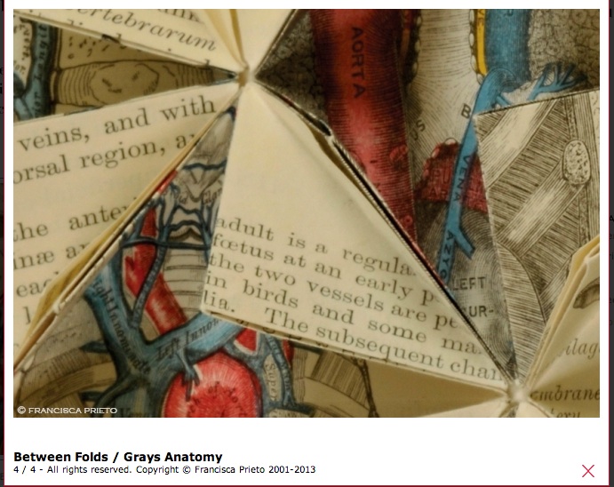
Trained at Central St Martins, Francisca Prieto is a Chilean artist living and working in London where her work has featured in collections at the Victoria and Albert Museum, the Tate Gallery and the British Library among others. From 29 May through 21 June, her solo exhibition Underlined runs at Jagged Art, off Marylebone High Street in London.
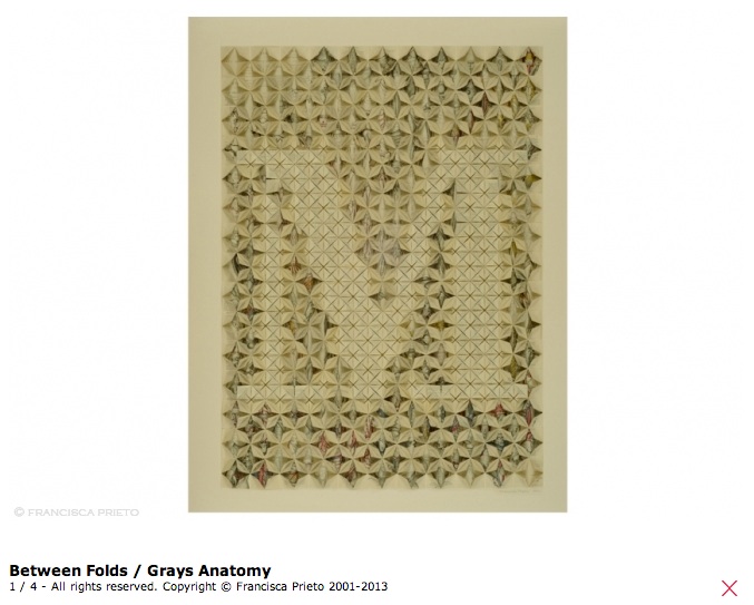
Underlined extends — or rather deepens — her series Between Folds, which according to her artist’s statement “explores pages of rare and damaged books or forgotten ephemera, emphasising the beauty and detail of print that would otherwise go unseen.” Prieto’s grounding in typographical design drives Between Folds as is obvious from the letters created from the pages of Grays Anatomy and Bartlett’s British Scenery.
Detail of Between Folds/Anatomy
The precision of the folds in Prieto’s work becomes even more evident in the eight compositions of Underlined, which is fitting as she now delves through source material past the letterforms and down to the line. Look how the folds align and intersect with the lines of the source material in the detail below.
The source material in this case is The Wanderers Cricket Club Logbook, whose red lines strike vertically down the diagonal, the folds of the work “playing with direction and motion, as the ball of the game dictated each log of play”. Prieto’s art is not only playful but thought-provoking, the cause of a sudden intake of breath from delight or even shock — what we most seek in our experiences of art. Do you not draw in your breath as you read between the folds and past the title and shape of Composition No. 2: One Horizontal Line to see that it is the line drawn under the life from whose last will and testament Prieto has created this work?
This dialogue between the parts and the whole to which Prieto’s craft and vision continuously draw the eye, heart and mind elevate her work and its audience.
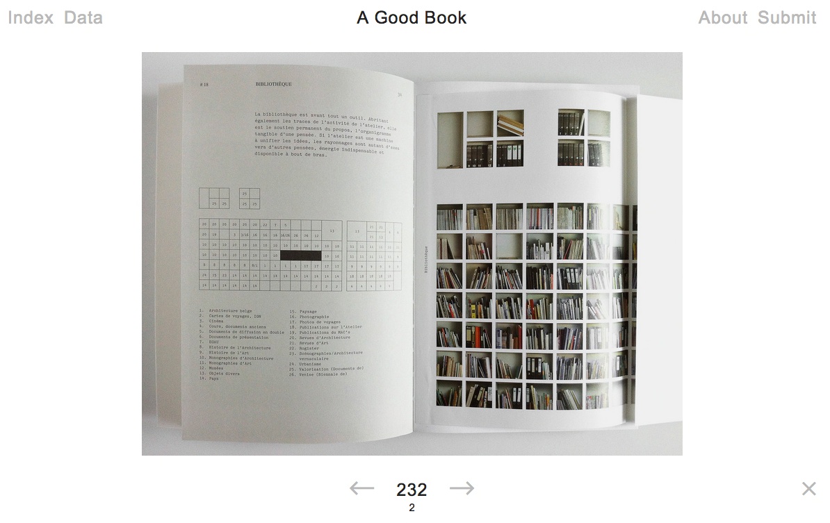
A hard question? A trick question? Yes and no. Since 2011, Bernd Kuchenbeiser, the Munich-based book designer, has been attempting an answer. He began by posting entries to a database on Twitter. With the demise of Twitter’s gallery function, Kuchenbeiser migrated the diary-like collection of photos and comments to A Good Book site with help from Simon Zirkunow. Below is a screenshot of part of the 232nd entry.
Screenshot of Méthodes, cover designed by Manuela Dechamps Otamendi, Entry #232 in A Good Book.
Until recently, the entries were Kuchenbeiser’s alone. The entries started on a daily basis, but as with many diary projects, the execution flagged. With 349 entries of his own (plus 3 from friends), he is now inviting entries from far and wide. Notice “Submit” in the upper righthand corner of the screenshot. Behind it lie the instructions and requirements for submission. Kuchenbeiser’s own entries are often brief, but his choices and comments are interesting because Kuchenbeiser and his oeuvre are interesting. See Michael Cina’s interview with him in The New Graphic(15 August 2011). For this venture to reward constant revisiting beyond that interest, however, Kuchenbeiser wisely holds potential contributors to the following standard:
Here’s what you need in order to submit a book:
– A short description of your book or the aspect that makes it ‘good’. From 140 characters to a maximum of 560, including spaces.
– The bibliographic details: author, title, year of publication, publisher, designer (if known). A questionnaire is already set up within the email that opens when you click ‘Submit now’.
– One to five photos of your book (at least 1400 pixels wide for landscape format and 1200 pixels high for portrait format).
Think of Pinterest or Flickr with serious feeling and intellectual rigor behind them. Kuchenbeiser’s design work and his own words exude that feeling:
Books have personalities. They can be our companions and friends. A good book doesn’t deserve to languish on a bookshelf; it wants to be opened, read, savoured, displayed, recommended. That’s why this website exists.
…
This site is like a message in a bottle hoping to be discovered. It will work only if it manages to generate communication.
The London Centre for Book Arts must have picked up the bottle from one of the Thames overswellings last week and placed a notice on its home page about the website. Although Kuchenbeiser does not promote it as such, if A Good Book thrives, it could generate a rich database worth semantic analysis for the book art and book arts community. All materials on A Good Book are being made available for noncommercial and educational use only.
English: Comparative Bauer Bodoni versus Bodoni Català: Comparativa Bauer Bodoni vs Bodoni (Photo credit: Wikipedia)
This year marks the 200th anniversary of the passing of a great contributor to the linked histories of the book and typography: Giambattista Bodoni (1740-1813). Bodoni among others such as Fournier and Didot established the “Modern” fonts, typefaces characterized by the extreme contrast of their thick and thin strokes, delicate and sharp serifs and a chilly sparkling engraving-like quality heightened by generous leading and made possible by improvements in 18th and 19th century typecasting and manufacture of ink and paper. Bodoni planned and formed the royal printing house for the Duke of Parma in the Palazzo della Pilotta, where the Museo Bodoniano resides today. Associated with Pope Sixtus V, Carlos III of Spain and the Duke of Parma, Bodoni became one of the most celebrated printers in Europe.
View of Palazzo della Pilotta. (Photo credit: Wikipedia)
Although Bodoni’s fame in his lifetime was of a piece with that of the Romantic figures Chopin, Liszt, Byron, Goethe and Shelley, his output was Neoclassical with editions of Homer, Catullus, Virgil, Horace and the English poets Thomas Gray and James Thomson. His two-volume Manuale Tipografico (1788, 1818) is a meticulous monument of typographic art with more than 14 sets of roman and italic typefaces, a wide selection of decorative designs and symbols and alphabets from the Greek, Hebrew, Russian, Arabic, Phoenician, Armenian, Coptic, and Tibetan languages. The 1818 two-volume edition can be viewed online at the Bibiloteca Bodoni.
Portrait of Bodoni (c. 1805-1806), by Giuseppe Lucatelli. Museo Glauco Lombardi. (Photo credit: Wikipedia)
This flowering of typography and design – reflective of the age and technical developments of book printing – prompts a thought toward the impact of today’s technology – screen display, ereaders, XML and HTML, cascading style sheets, etc. – not only on type and design but their purpose as well.
“The type and pages beg to be admired – that is looked at – which is well and good, except that looking and reading are quite different, actually contradictory, acts…. To look at things, we either disengage and let them flow by on their own or we stop them in their tracks. To look we hold our breath or (in the worst of cases) pant. To read we breathe.” So say Warren Chappell and Robert Bringhurst in their critical comments on Bodoni and the Moderns. (A Short History of the Printed Word, pp. 173-74; 1970,1999.)
Perhaps we are still in the age of e-incunabula and have not reached the point where type and design on the screen beg to be admired. The improvements delivered by Readmill and Readability have been welcome for their contribution to ease of reading. It may be perverse to wish for developments that may interfere as Chappell and Bringhurst assert the Modern faces interfere with reading. But that assumes that they are right in their hieratic statement “To read we breathe.” Might it be as legitimate to assert “To read we click. To read we link. To read we dim or brighten. To read we tilt from portrait to landscape causing the page to reflow.”?
Will High Definition play the role that improved paper surfaces played to allow those thinner strokes and delicate serifs in the 18th and 19th centuries? And if it does, what on-screen design, comparable to Bodoni’s increased leading, will perform the same heightening effect for new faces and design that beg to be admired?
Bodoni Ornaments (Photo credit: Bene*)
For more on the subject of Bodoni, see “Biblioteca Bodoni Launched on Bicentennial Anniversary of Giambattista Bodoni’s Death” by Yves Peters, The Font Feed, 11 December 2013.
rankfurt and its book fair continues, so here is a celebration of type and the book. The initial “F” comes from Boekwetenschap en Handschriftenkunde Amsterdam, wherePaul Dijstelberge and others have posted over 30,000 photos of initials, ornaments and type in cooperation with the Special Collections, Amsterdam; the Royal Library, The Hague; and the Archive at Alkmaar.
Much has been made in recent years about the emergence of the ebook and the ‘death’ of the printed book. Such discussions are fashionable and fruitless. As long as people read, the shape or form of the book is irrelevant. In fact, the ebook may well be a blessing in disguise for those who passionately defend the printed book. Photography did not kill off portrait painting as it was once feared; neither will the ebook refer the printed text to the dustbin of history.
Photography may not have killed off portaiture, but digital photography did kill off Eastman Kodak. Which entities ebooks will see off will be debated until the event. The shape or form of extended narrative and discourse, however, is surely not irrelevant. The Fantastic Flying Books of Mr. Morris Lessmore and the walk-in book exhibition Memory Palace at the Victoria & Albert Museum are recent evidence. While more evidence may be adduced, do we need it to know that shape and form matter, or that we gather each year in Frankfurt to celebrate reading and its shape and form?
This year is the centenary of Gerard Meynell’s trade periodical The Imprint, which was the scene of Stanley Morison’s first appearance in print. How appropriate then that Morison’s book A Tally of Types tells the story of the journal’s founding and, equally important, how the historic font called Imprint Old Face came into being. The font’s importance is that “the design had been originated for mechanical composition. … the first design, not copied or stolen from the typefounders, to establish itself as a standard book-face.”(p.21) Ironically, Meynell and his colleagues intended for the font to be freely available to the trade, but eventually it came into the ownership of Monotype Imaging, where it can be obtained today under the OpenType family.
As the world of print morphs into its digital incarnation, we see the same impetus behind the new generation of typographers, the ones born digital, but we see varying degrees of adherence to the “type wants to be free” movement.
The Fine Press Book Association’s inaugural Student Type Design Competition sprang from the hope that by building bridges between printers and young type designers we might end up creating new material resources for the fine press community.
Oratorical Type A by Nerhol (Ryuta Iida and Yoshihisa Tanaka)
Oratorical Type Z by Nerhol (Ryuta Iida and Yoshihisa Tanaka)
The Japanese artists and partners Ryuta Iida and Yoshihisa Tanaka are known as NERHOL. Interviewed by Rebecca Fulleylove in the online magazine It’s Nice That, they explain the name:
We met at one of Iida’s exhibition and realised we had so much in common in regards to experience, design and taste. Gradually, we began working together. Our very first piece, Oratorical Type, used books as the theme, after sculpting them by carefully carving out certain sections of each page, it resulted in interesting dimensions. At that time, we still hadn’t decided on our name but soon came up with “NERHOL”, a mash-up of two words, “neru” to plan ideas and “holu” to sculpt and carve.
“To plan ideas” and “to sculpt and carve” those ideas in air, time, stone, wood or paper is that not a poem, a book, a building, a city — the work of art? That these two artists chose the letters of the alphabet as their first work together, that the alphabet and each of its letters came into being by collective human art and craft, marking our passage from orality to literacy, and that the alphabet, type and book are tools by which we have strived to evolve — how could they not be named Nerhol and their first work of art not be called Oratorical Type?
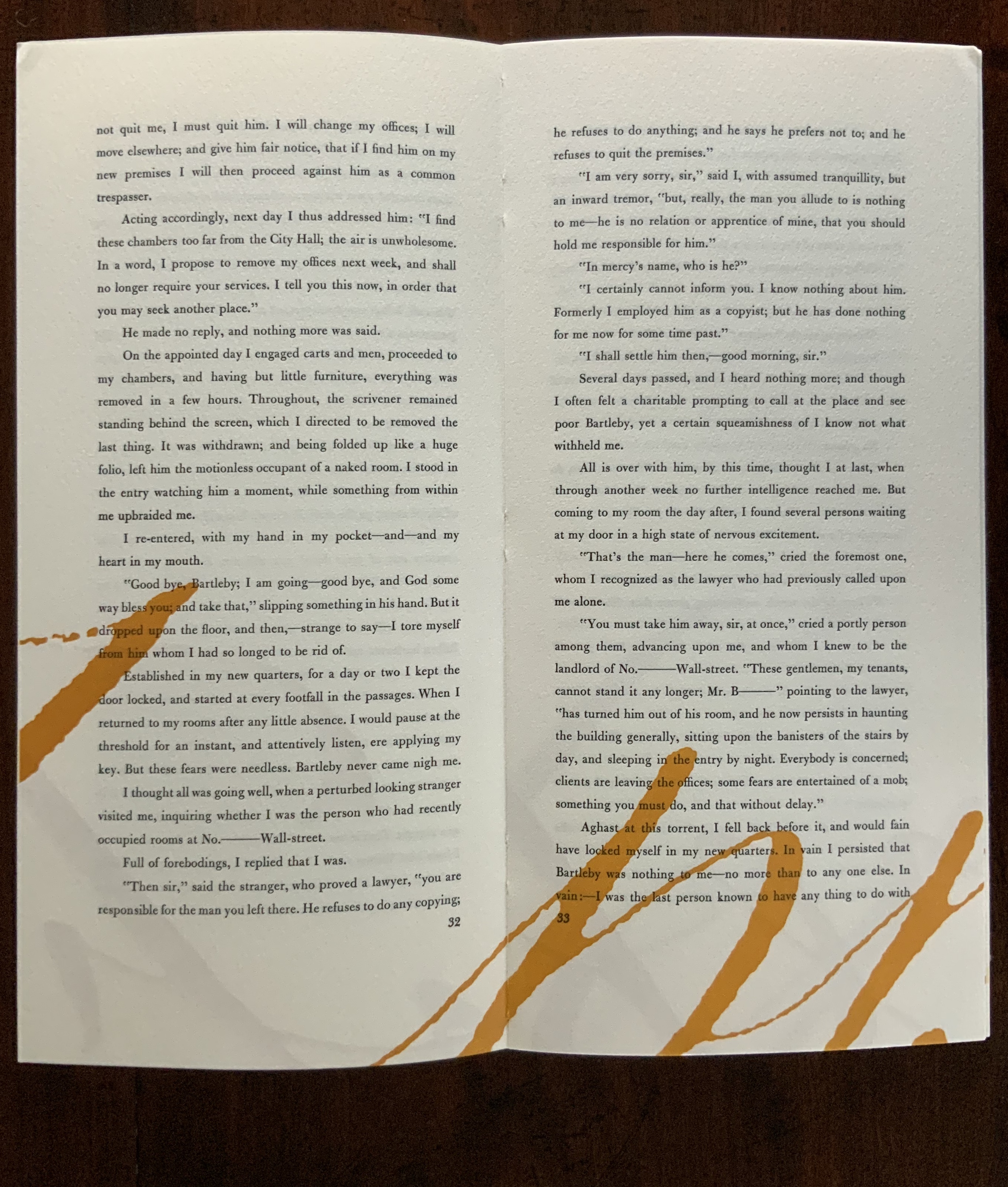 Consider Schilling’s Half-Life/Full-Life and its binding a variation on the accordion/flag structure of Hedi Kyle and Claire Van Vliet. The complexity of the form marries well with that of the intertwining, interleaving text and photos along the timelines of the Doomsday Clock and global warming.


, by Giuseppe...")