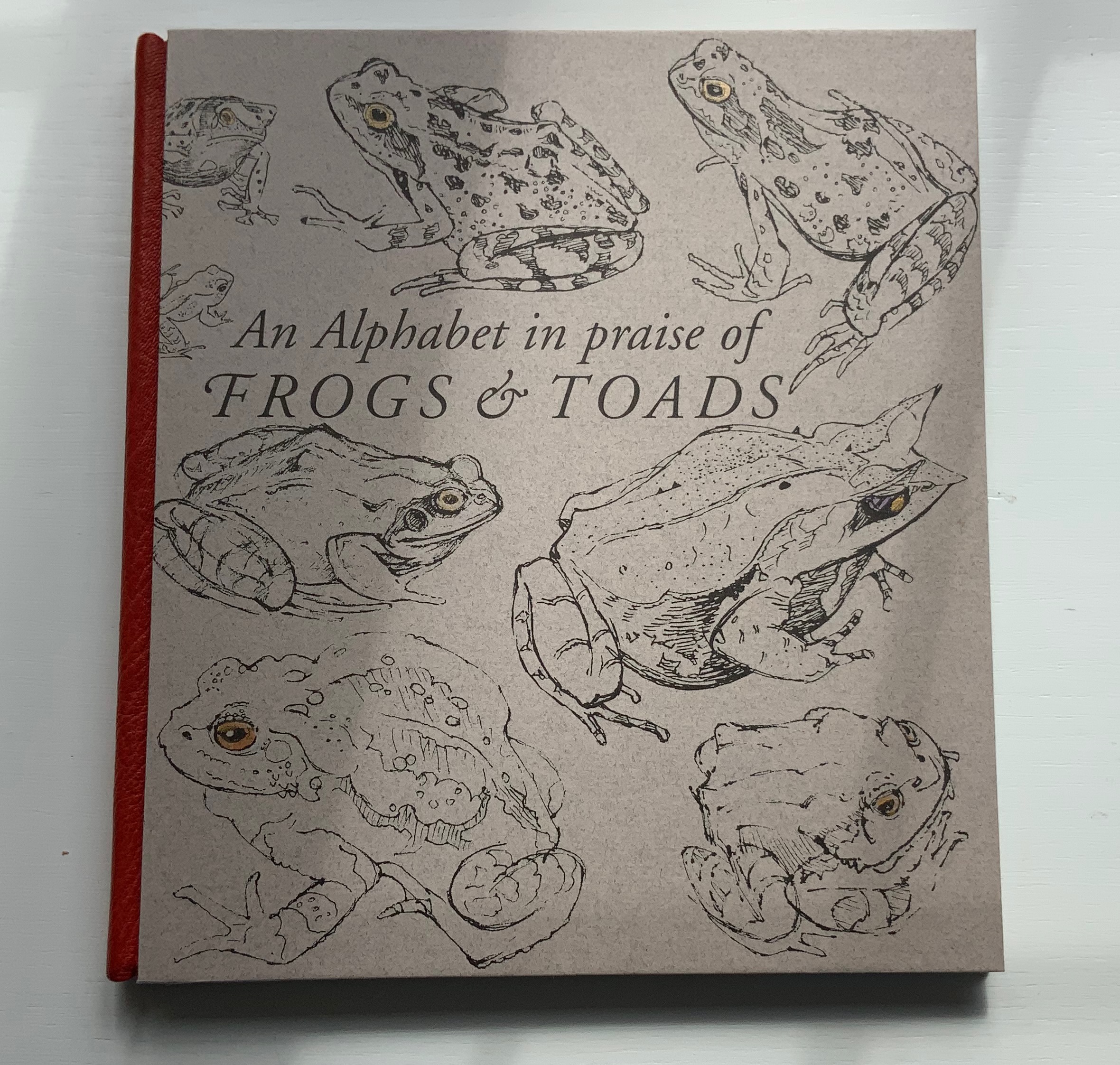
The Neolithic Adventures of Taffi-Mai Metallu-Mai (1997)

The Neolithic Adventures of Taffi-Mai Metallu-Mai (1997)
Gerald Lange and Rudyard Kipling
H216 x W260 mm. 55 pages with 17 additional illustrated page inserts. Edition of 150, of which this is #149. Acquired from the artist, 11 Febuary 2023.
Photos: Books On Books Collection. Displayed with the artist’s permission.
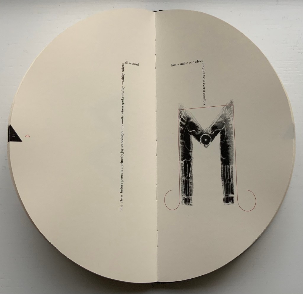
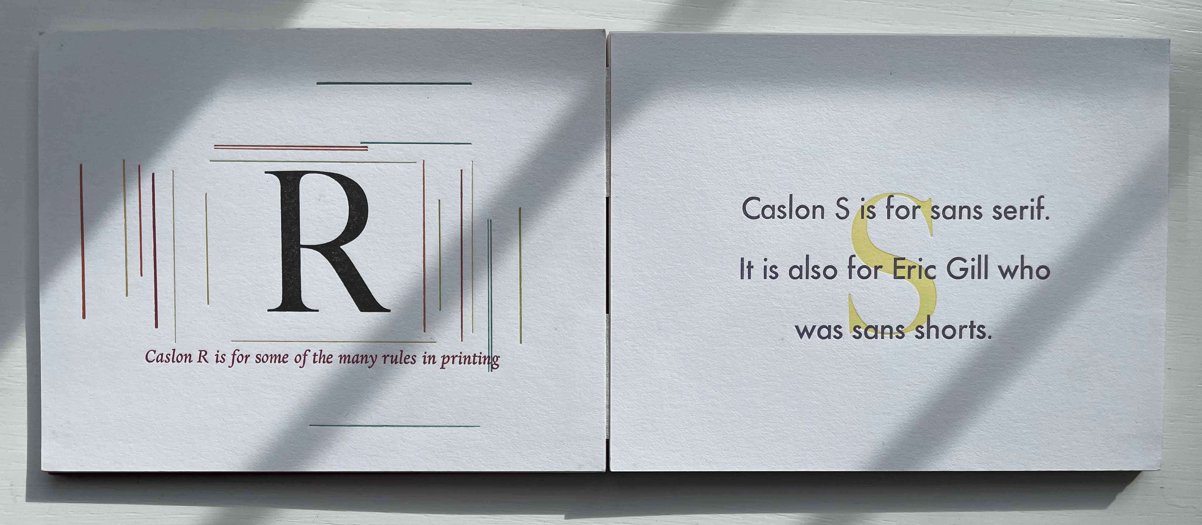
Gerald Lange’s choice of “How the First Letter Was Written” and “How the Alphabet Was Made” from Rudyard Kipling’s Just So Stories (1902) for this elaborate, delicate but robust edition was fitting. By 1997, he had founded the Bieler Press (1975), co-founded the Alliance for Contemporary Book Arts (1987) and edited its journal AbraCadaBrA for seven years, had been the Master Printer at USC Fine Arts Press and selected as the first recipient of the prestigious Carl Hertzog Award for Excellence in Book Design (1991) and was about to publish the first edition of his Printing Digital Type on the Hand-Operated Flatbed Cylinder Press (now in its fifth edition, 2018). In keeping with his interests leading up to this work, Lange letterpress-printed it from handset Monotype Pastonchi and a digitally altered version of Berthold Post Antiqua. More to the point, as he noted on the Bieler Press site, he chose the stories for “their affinity with subjects related to the lettering arts”. If that affinity is not clear enough from the text, Lange’s treatment underscores it in subtly ingenious ways.
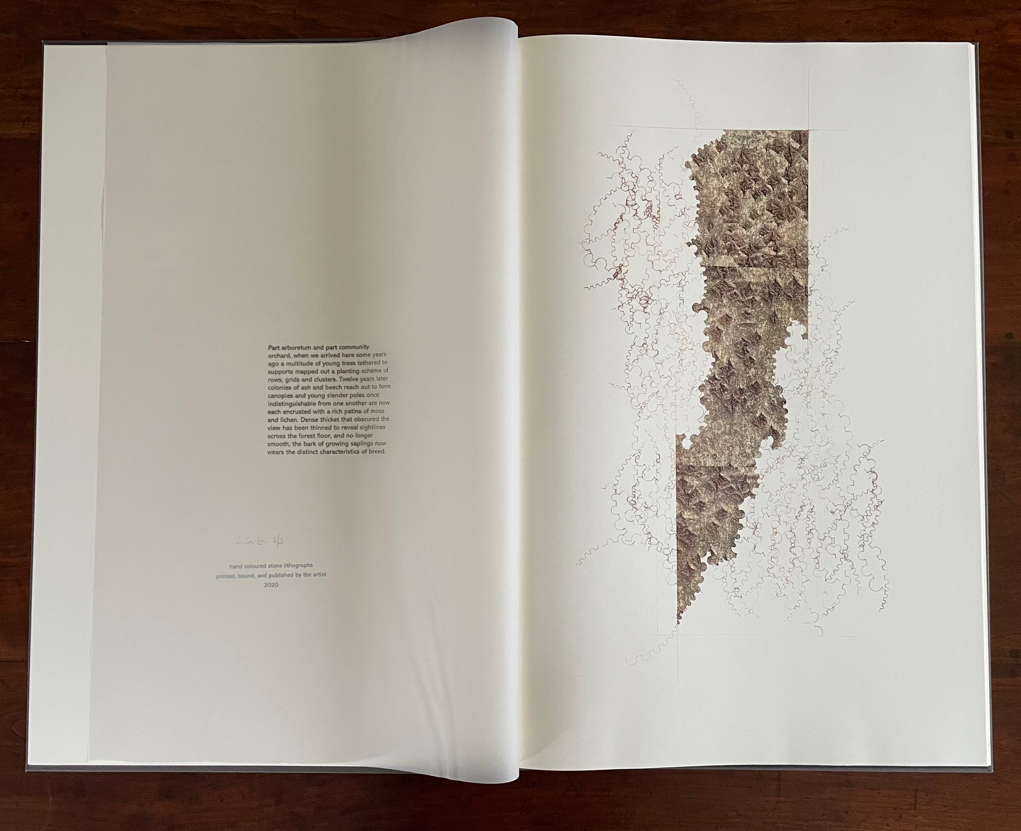
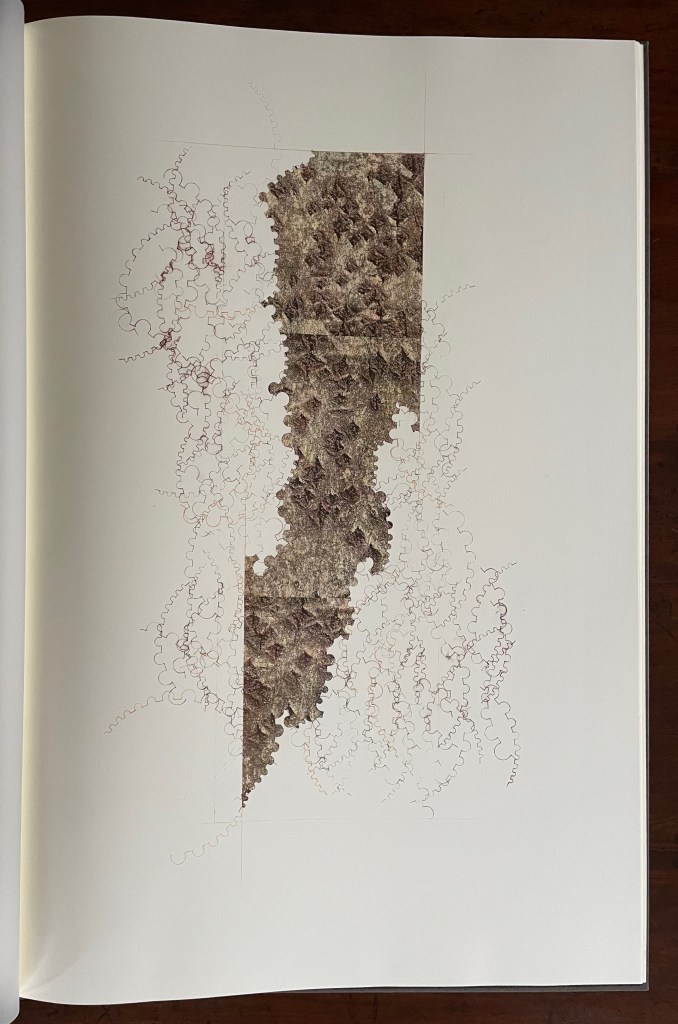
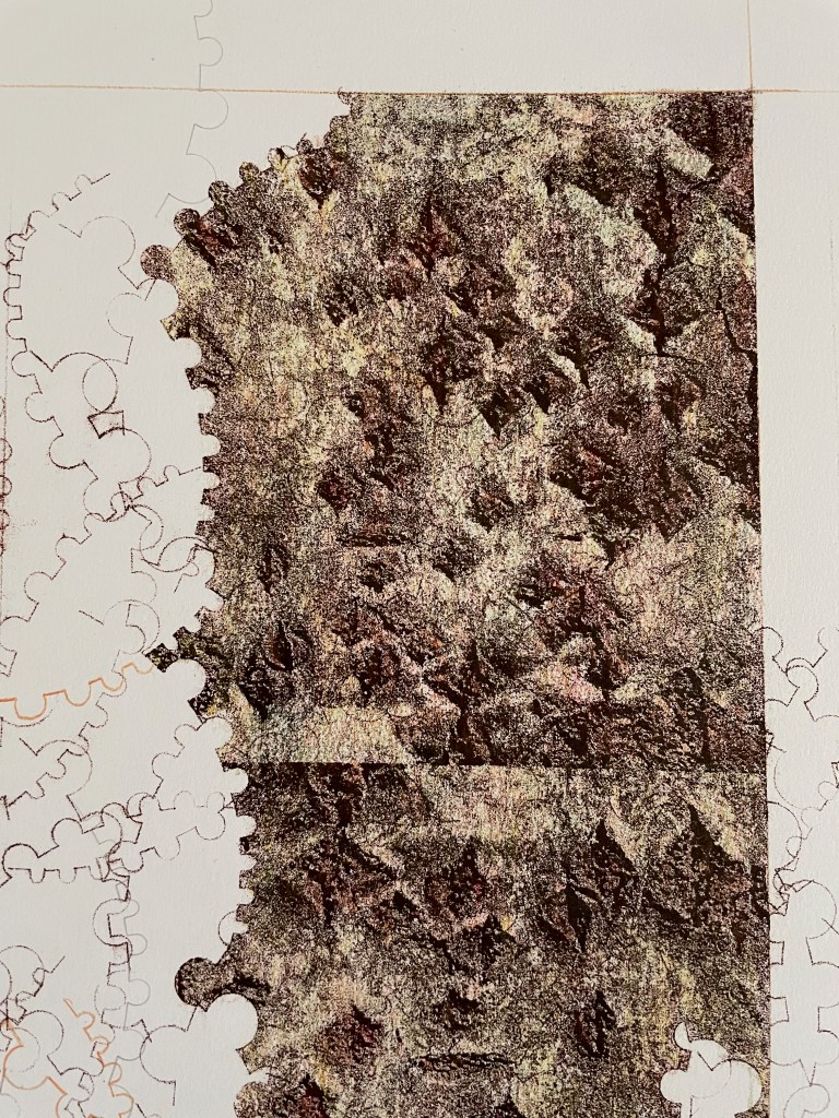
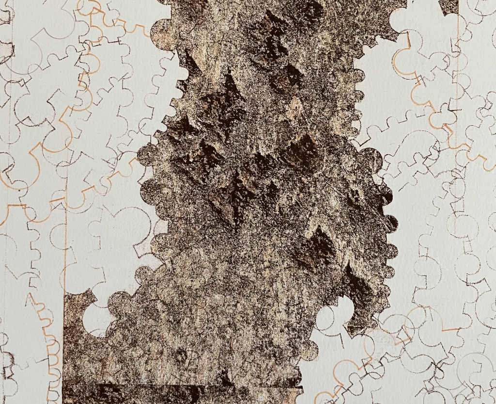
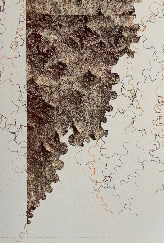
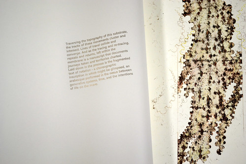
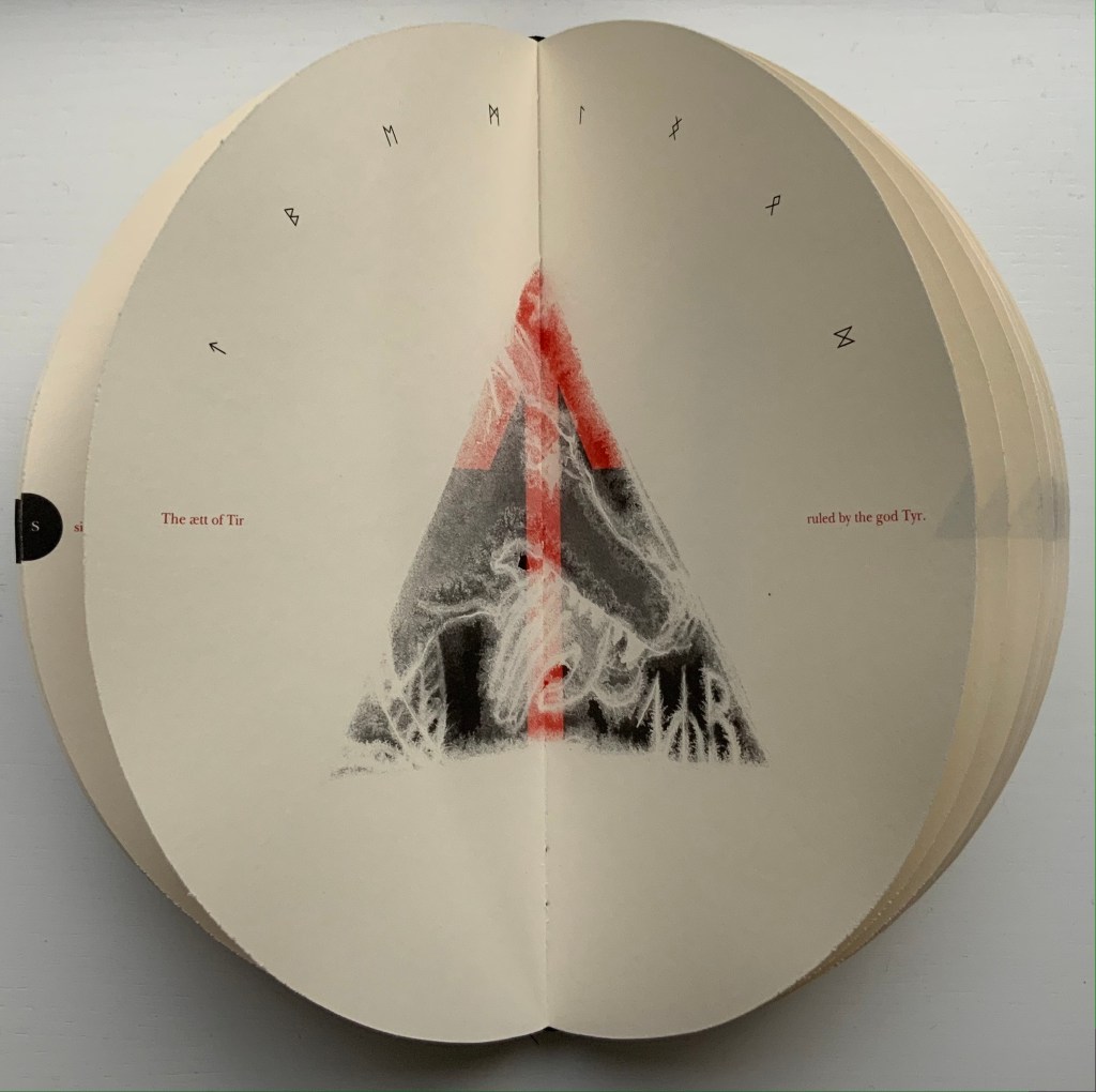
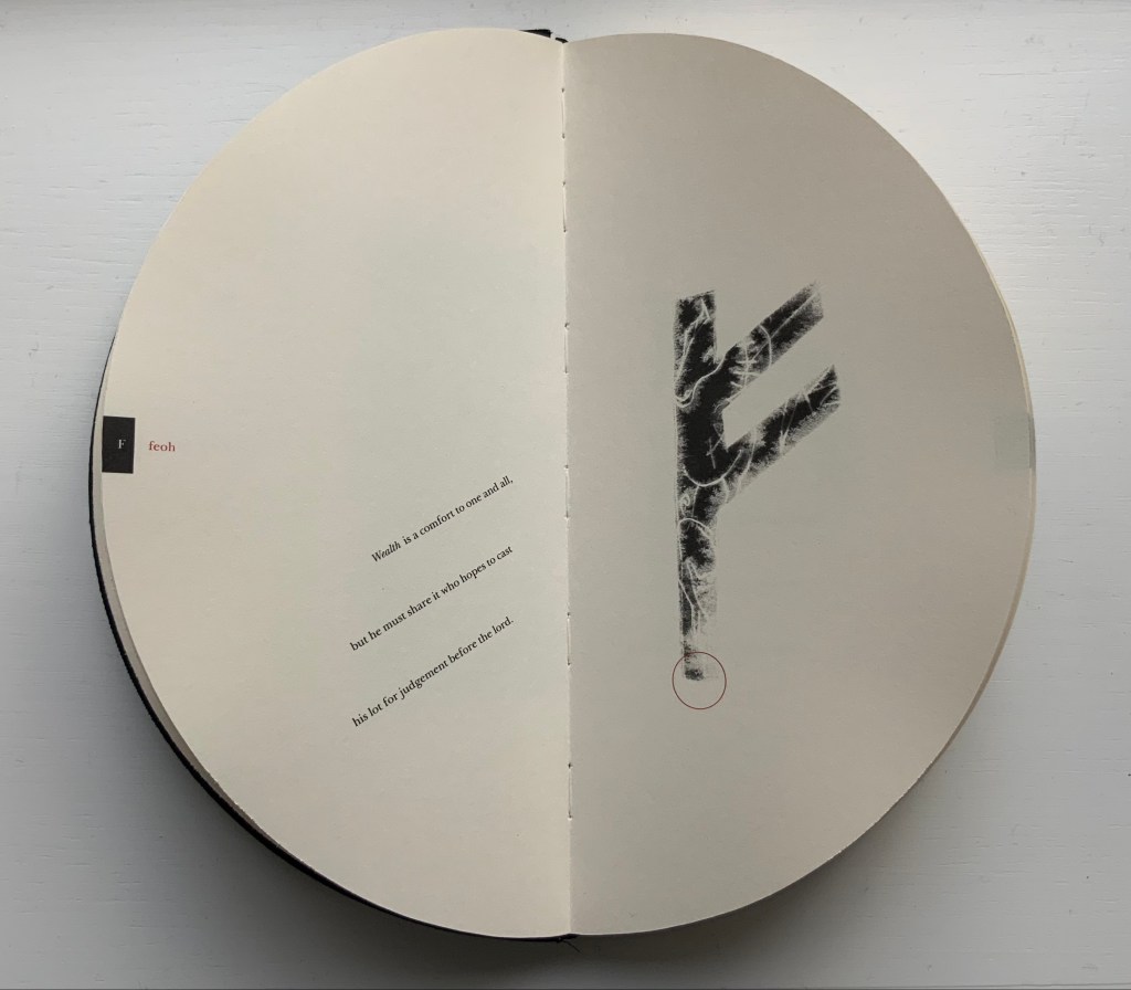
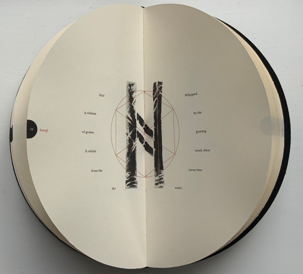
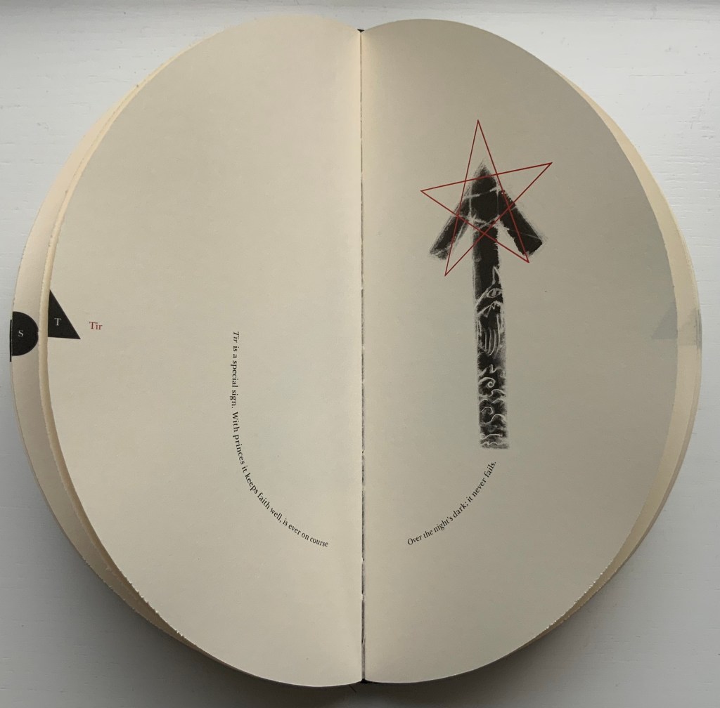
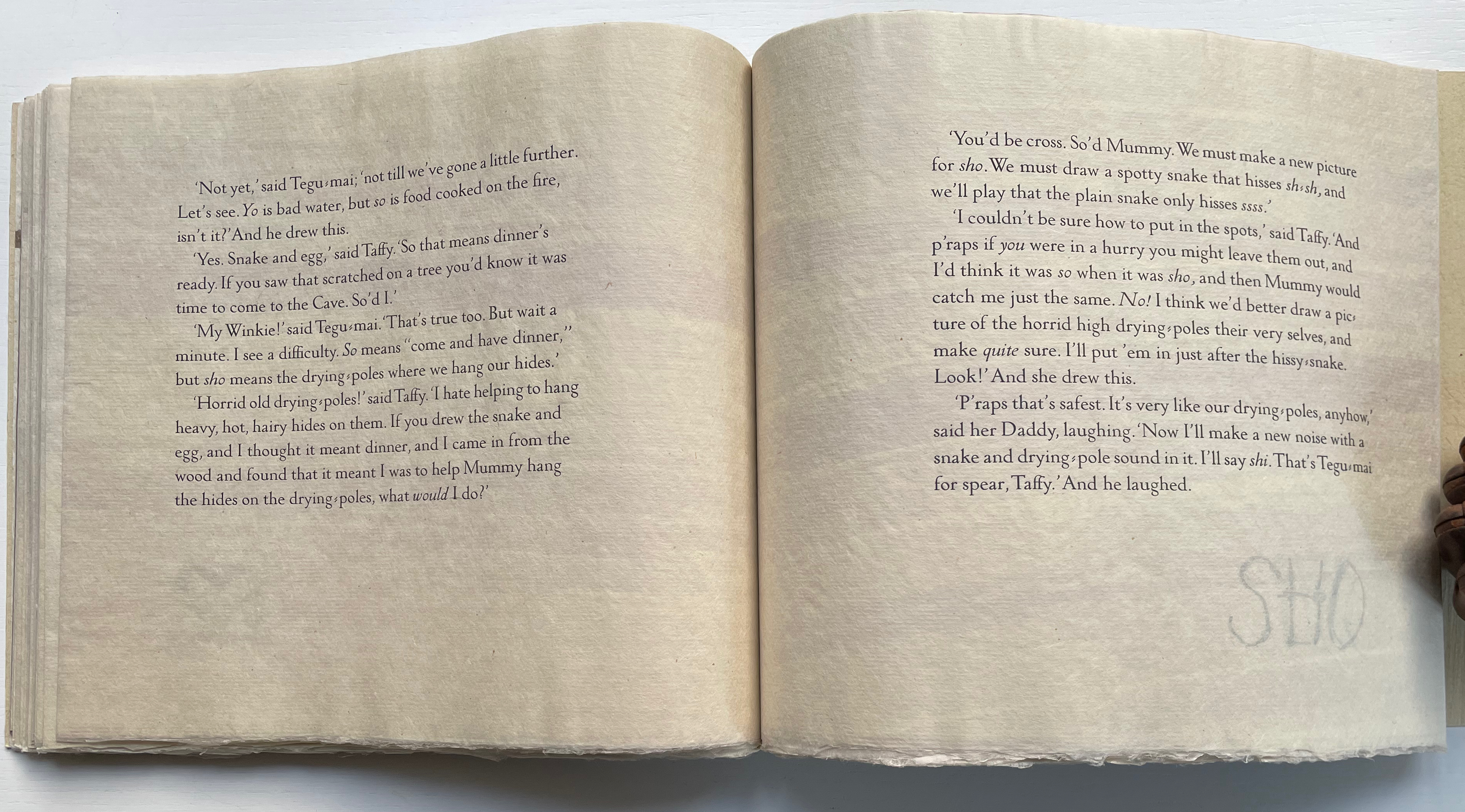
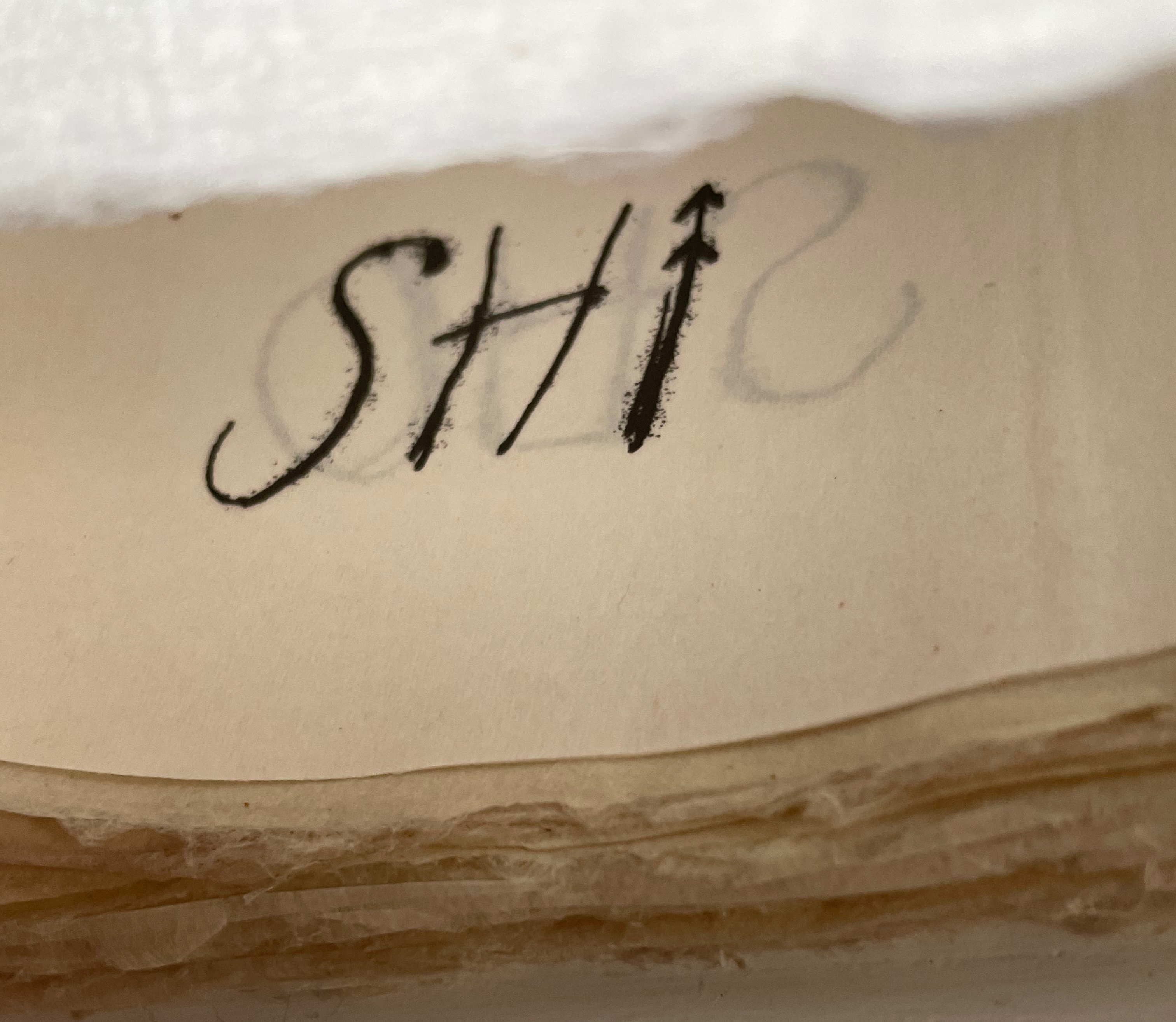
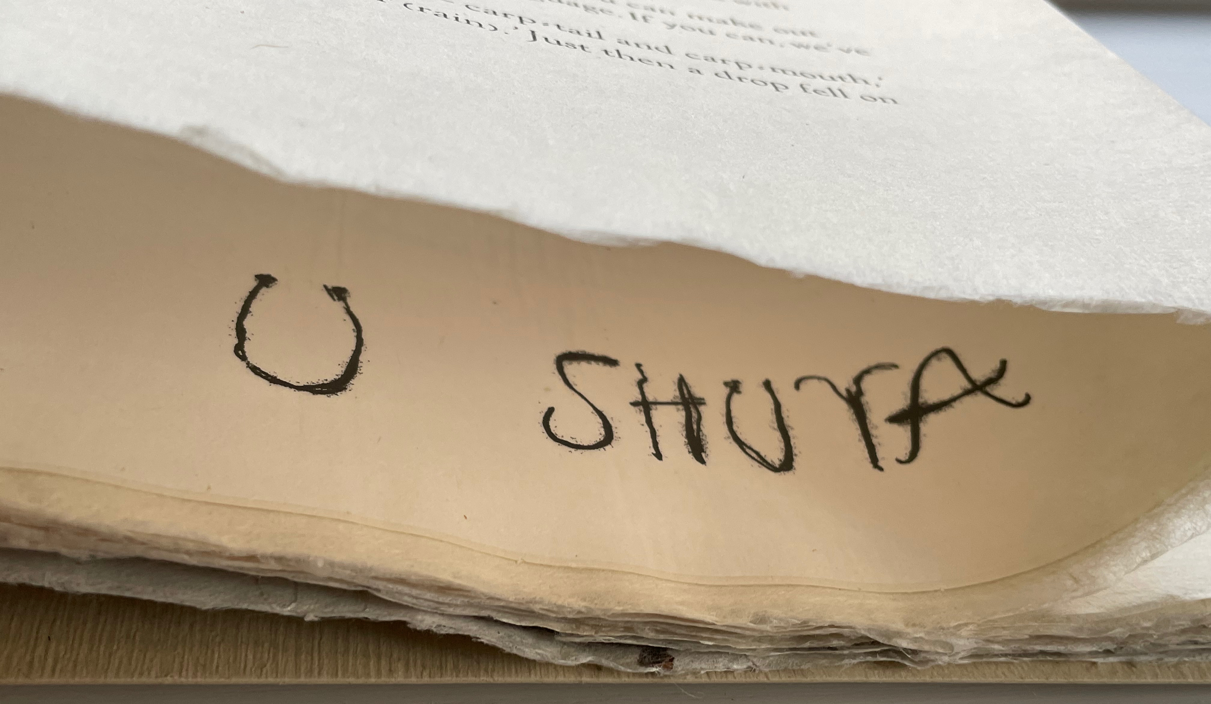
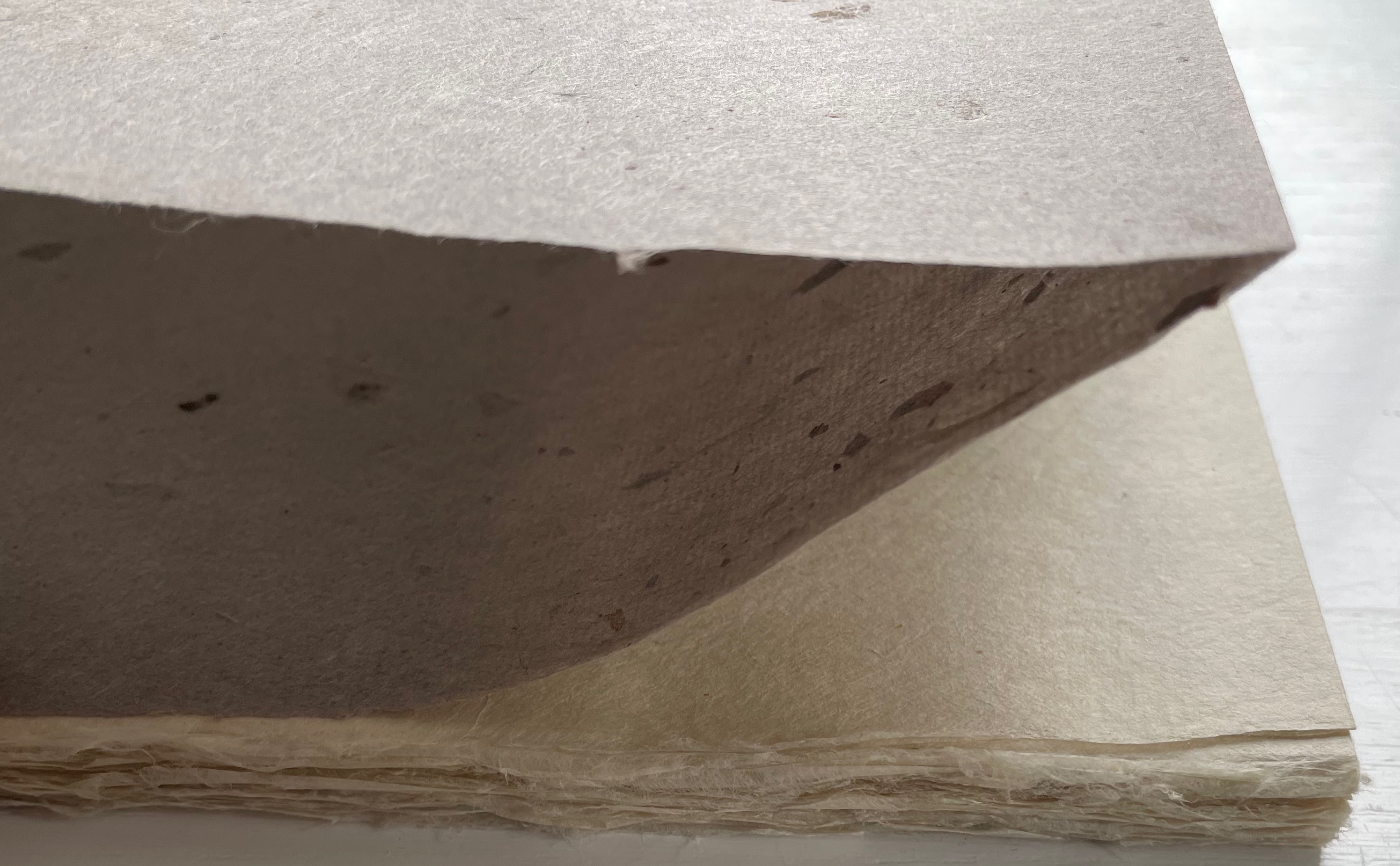
Kipling attributes the drawings throughout to his heroine, Taffi and her father. Where others like Macmillan Children’s Books have rendered them boldly, Lange prints the primitive petroglyph-like images on separate Gampi sheets inserted between the folded Kitakata text leaves of the tortoise shell edge-sewn binding. Those text leaves are individually water colored on their reverse sides (urazaiki manner based on nihonga painting) so that the pictographs beneath reveal themselves through a striated layer. The color and striations are reminiscent of cave paintings. Additional Asian papers (Kasuiri and Chirizome for end sheets, Cogan Grass for covers) increase the work’s tactility — simultaneously soft and rough, flimsy and tough — and contribute a grassy smell redolent of the stories’ physical setting.


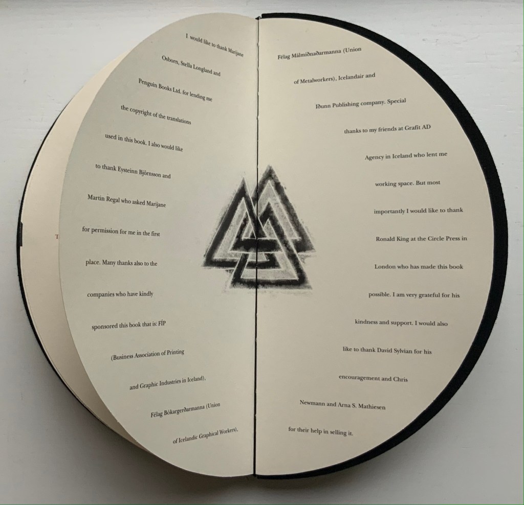
The quality and rightness of choices in structure, material and process have placed several of Lange’s works in The British Library, University of California (various), Columbia University, Harvard University, University of Minnesota, New York Public Library, Princeton University, Stanford University, Victoria and Albert Museum, Yale University and others. The initial reason bringing this particular work into the Books On Books collection was its representation of book art inspired by the alphabet. That Robin Price, several of whose works are also in the Books On Books collection, assisted with the design came as a bonus. That this is one of the last bound copies of The Neolithic Adventures of Taffi-Mai Metallu-Mai makes it a treasure.
Further Reading
“Abecedaries I (in progress)“. Books On Books Collection.
“Lyn Davies“. 7 August 2022. Books On Books Collection. Reference and fine print.
“Timothy Donaldson“. 1 February 2023. Books On Books Collection. Reference.
“Cari Ferraro“. Books On Books Collection. Artist’s book.
“David J. Goldman“. Books On Books Collection. Reference.
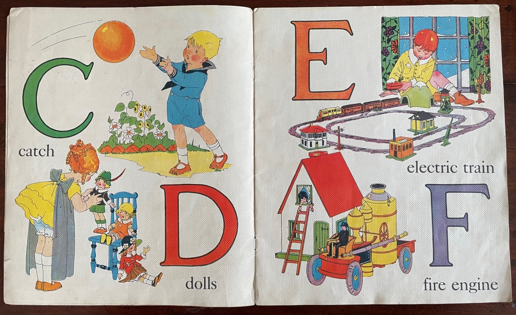
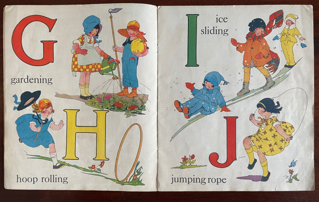
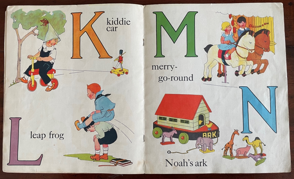
“Rudyard Kipling and Chloë Cheese“. 15 February 2023. Books On Books Collection. Illustrated children’s book.
“James Rumford. 21 November 2022. Books On Books Collection. Illustrated children’s books.
“Tommy Thompson“. 21 August 2022. Books On Books Collection. Reference.
Drucker, Johanna. 1999. The alphabetic labyrinth: the letters in history and imagination. New York, N.Y.: Thames and Hudson. Reference.
Ege, Otto. 1921/1998. The Story of the Alphabet, Its Evolution and Development… Embellished Typographically with Printer’s Flowers Arranged by Richard J. Hoffman. Van Nuys, CA: Richard J. Hoffman. A miniature. The type ornaments chosen by Hoffman are arranged chronologically by designer (Garamond, Granjon, Rogers) and printed in color.
Firmage, Richard A. 2001. The alphabet. London: Bloomsbury. Reference.
Fischer, Steven Roger. 2008. A history of writing. London: Reaktion Books. Reference.
Jackson, Donald. 1997. The story of writing. Monmouth, England: Calligraphy Centre. Reference.
Lange Gerald. 2018. Printing Digital Type on the Hand-Operated Flatbed Cylinder Press. Fifth edition, revised, updated & expanded ed. Seattle: Chatwin Books.
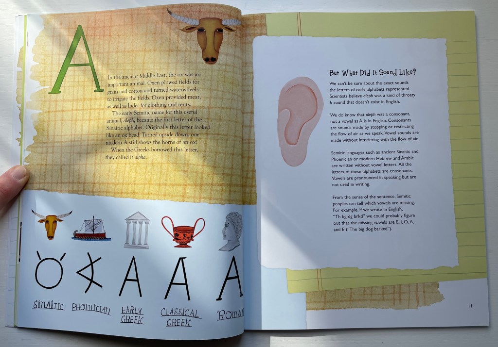
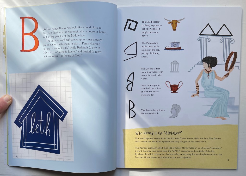
Robb, Don, and Anne Smith. 2010. Ox, house, stick: the history of our alphabet. Watertown, MA: Charlesbridge. Children’s book.
Robinson, Andrew. 1995. The story of writing. London: Thames and Hudson. Reference.
Rosen, Michael. 2014. Alphabetical: how every letter tells a story. London: John Murray. Reference.
Sacks, David. 2003. Language visible unraveling the mystery of the alphabet from A to Z. New York: Broadway Books. Reference.
Samoyault, Tiphaine. 1996, 1998 trans. Alphabetical order: how the alphabet began. New York: Viking. Reference and illustrated children’s book.