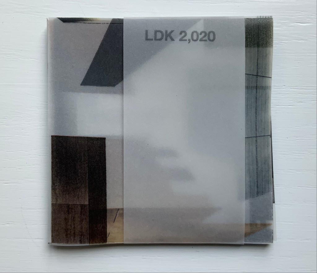
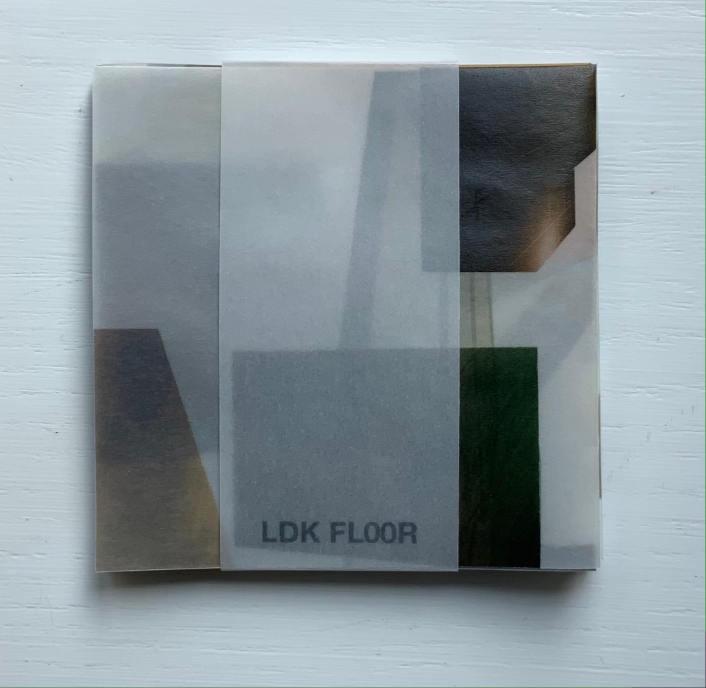
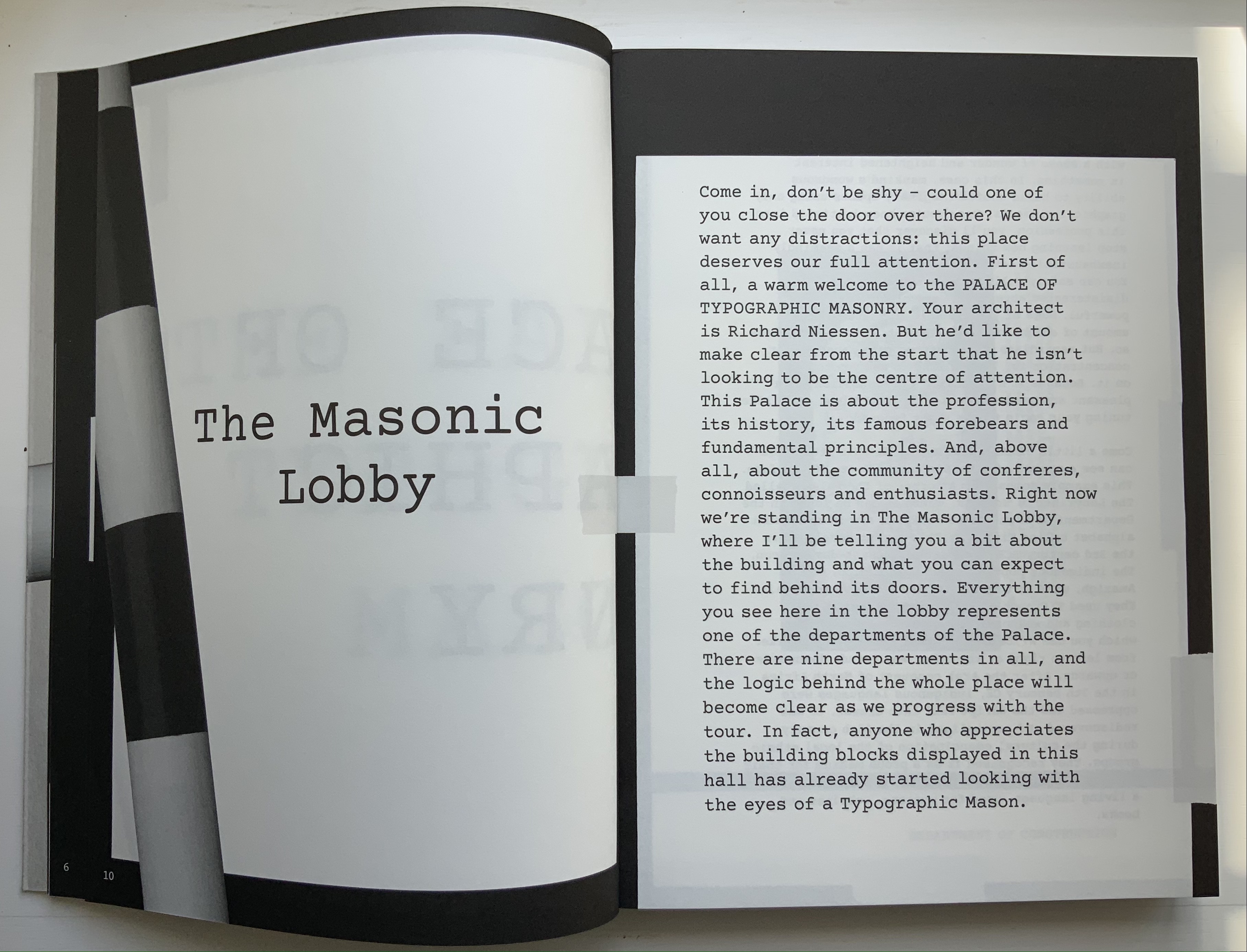
Books On Books Collection – Olafur Eliasson

Your House (2006)

Your House (2006)
Olafur Eliasson
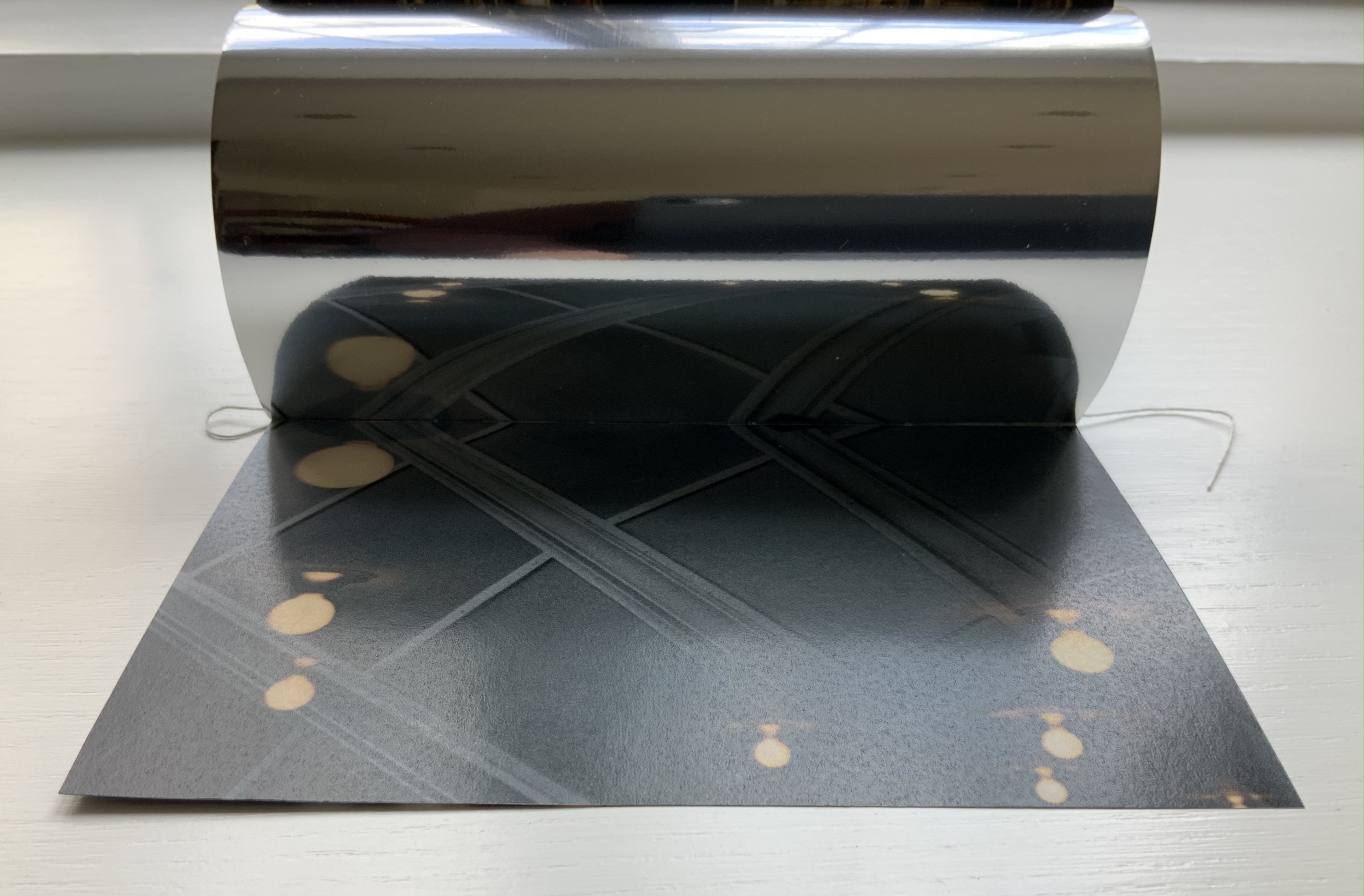
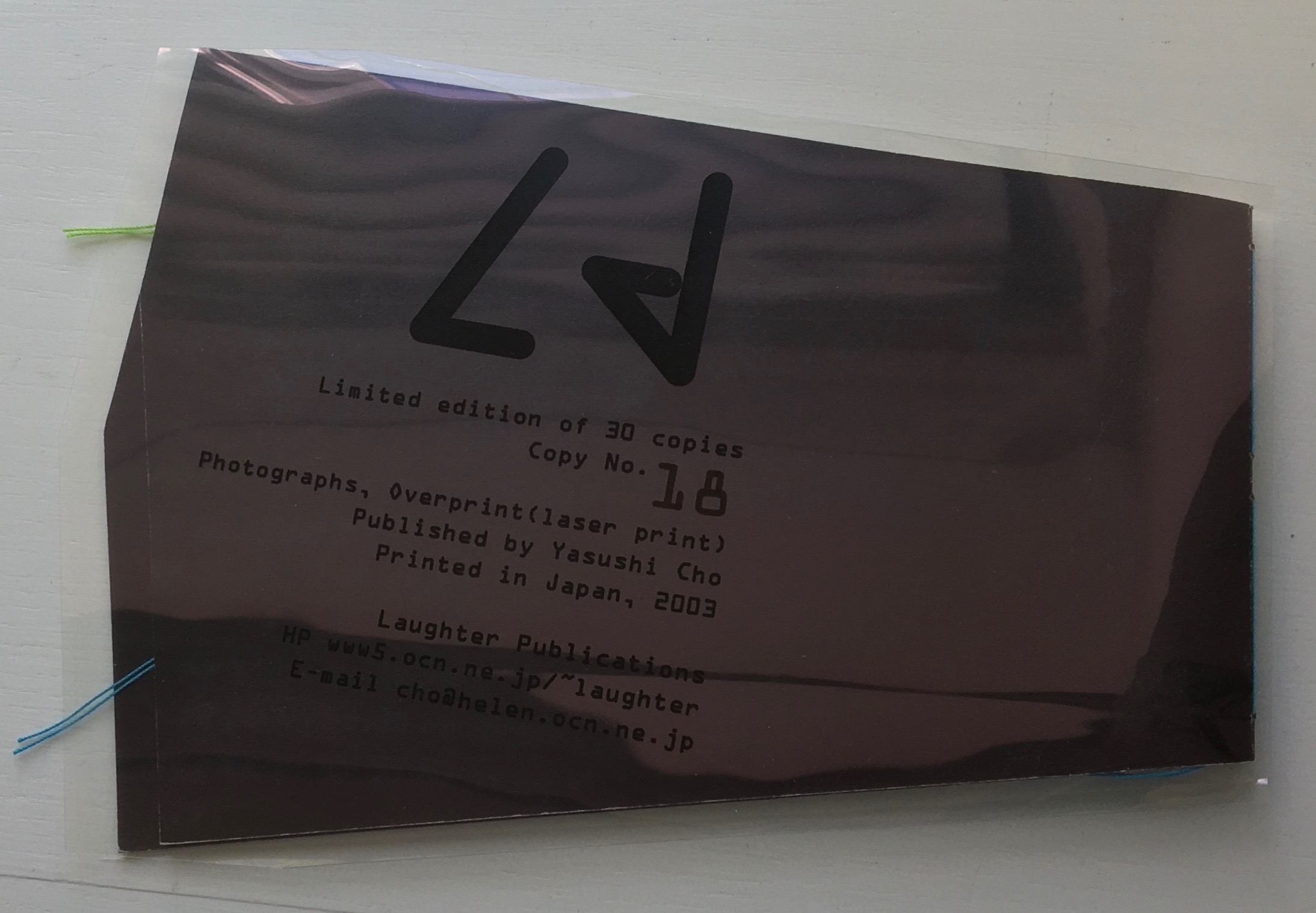
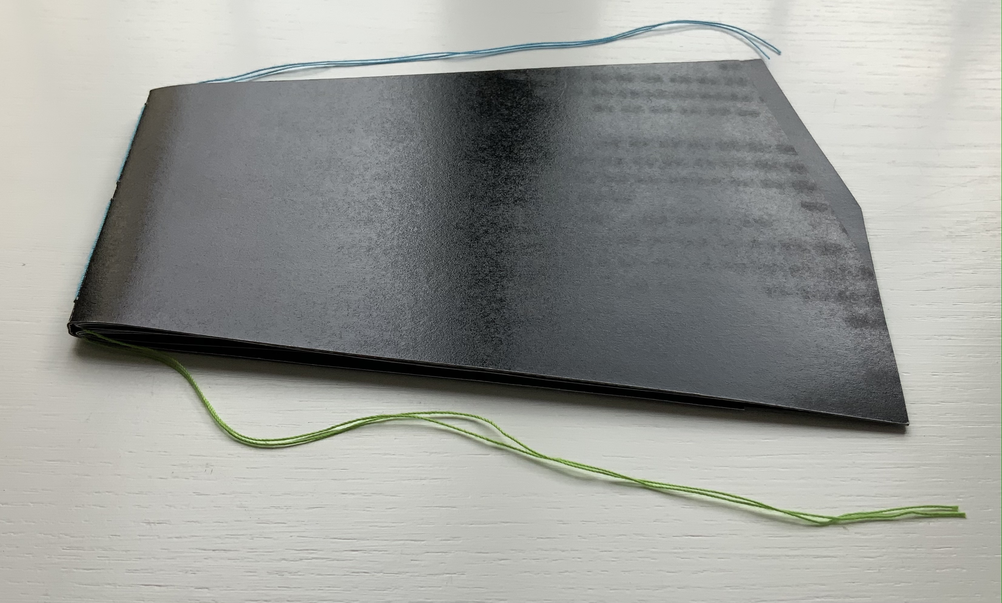
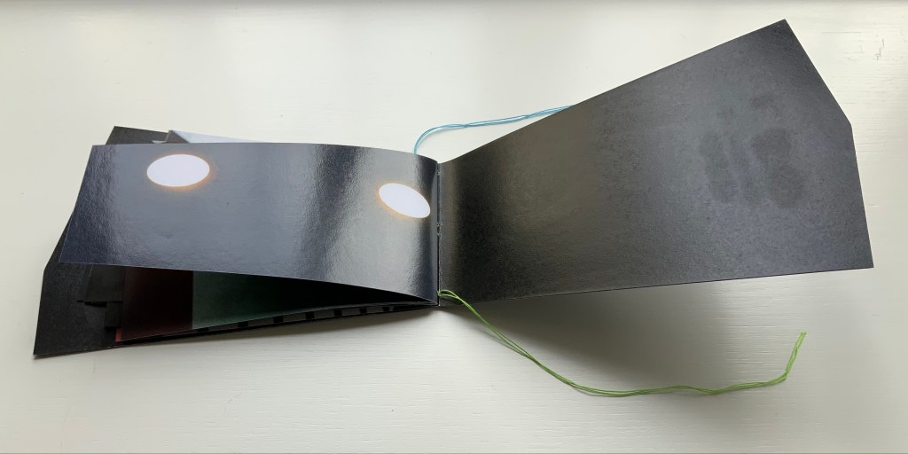
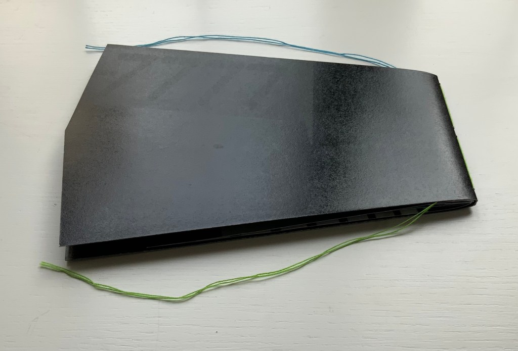
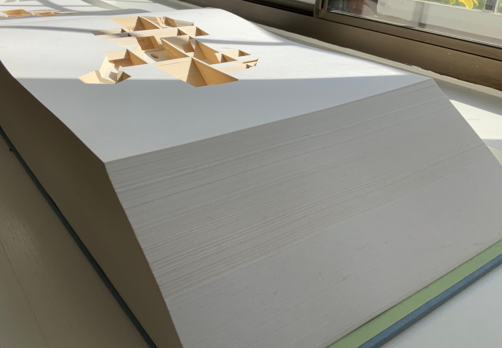
Hardback handbound with 454 laser cut leaves. H273 × W432 × D114 mm. Edition of 225, of which this is #210. Acquired from Carolina Nitsch Contemporary Art, August 2020. Photos: Books On Books Collection, displayed with permission of the artist.

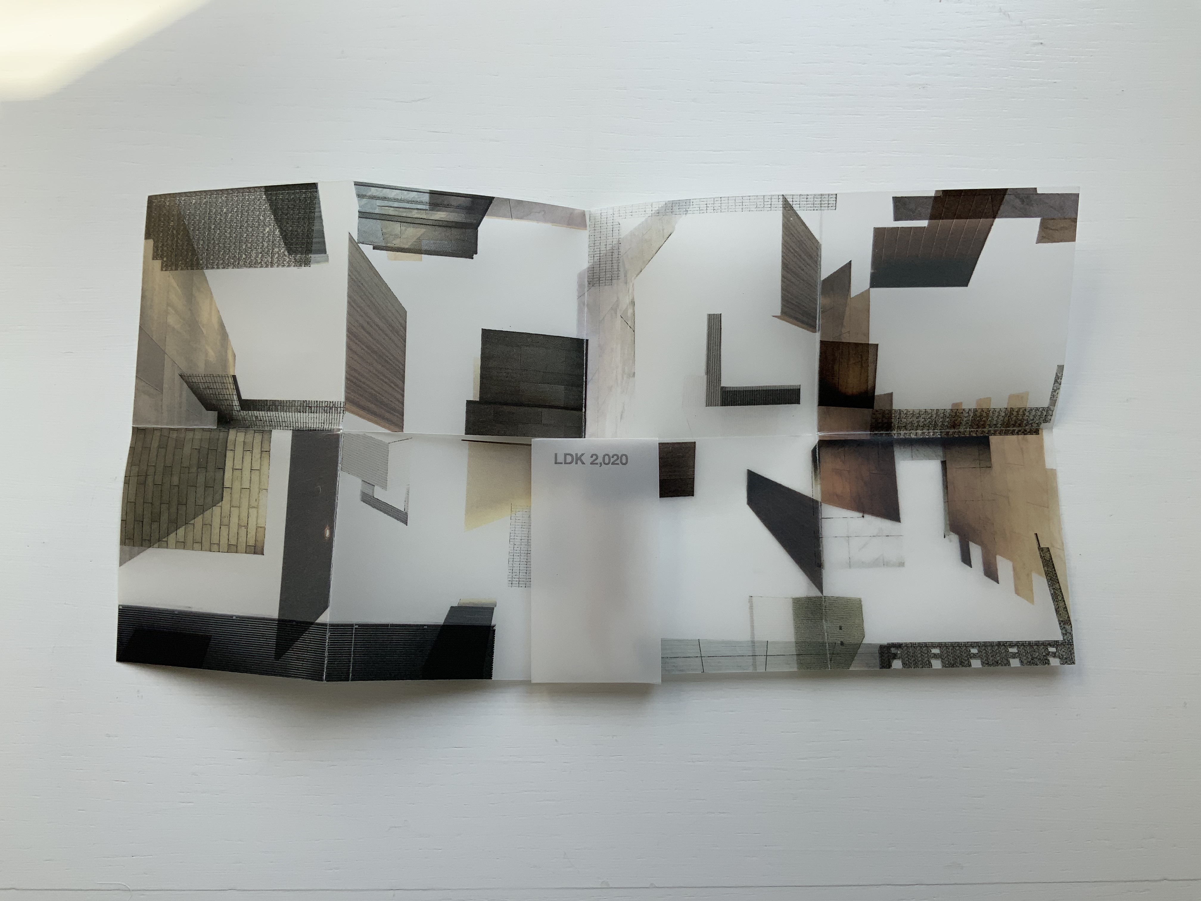
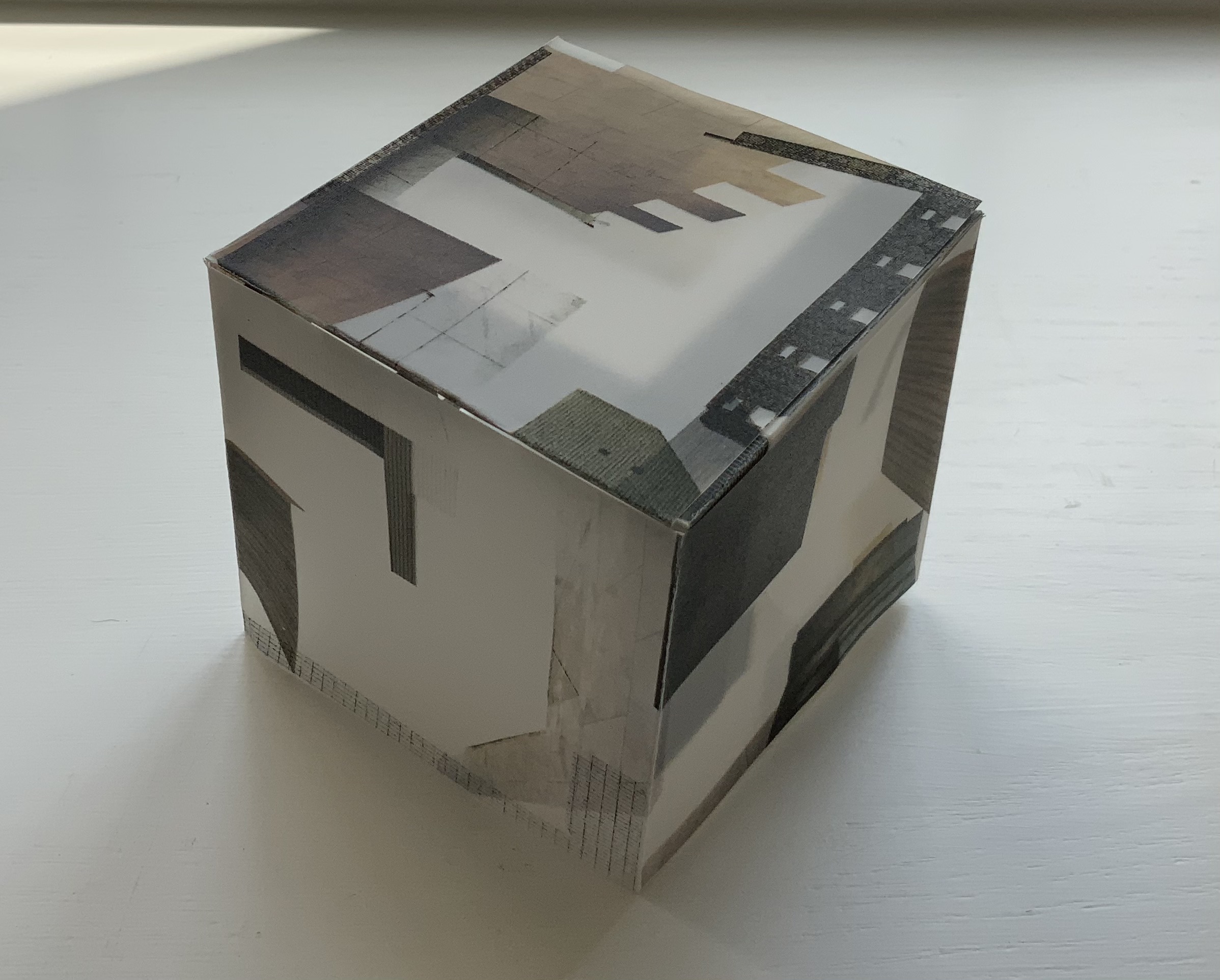
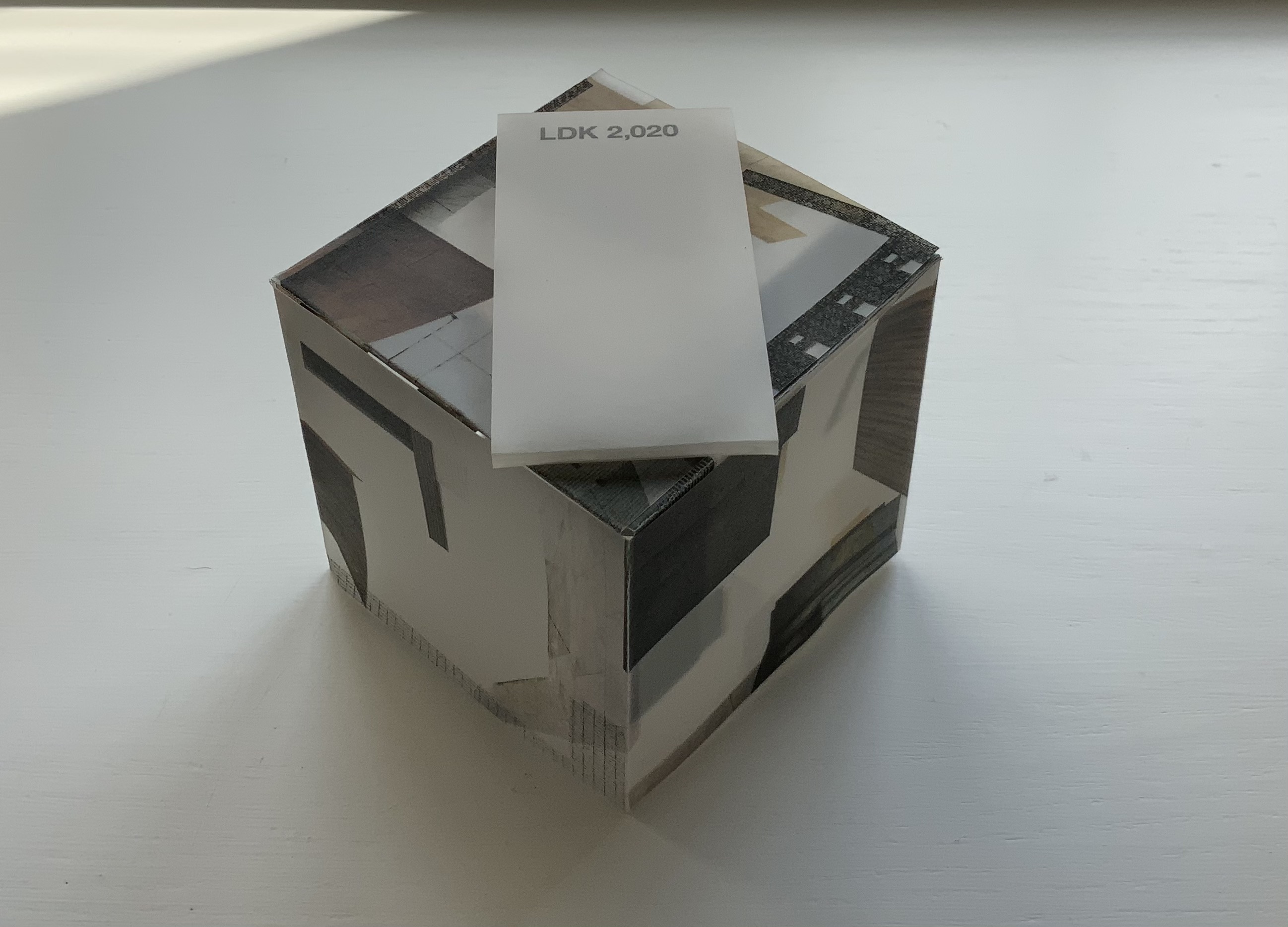
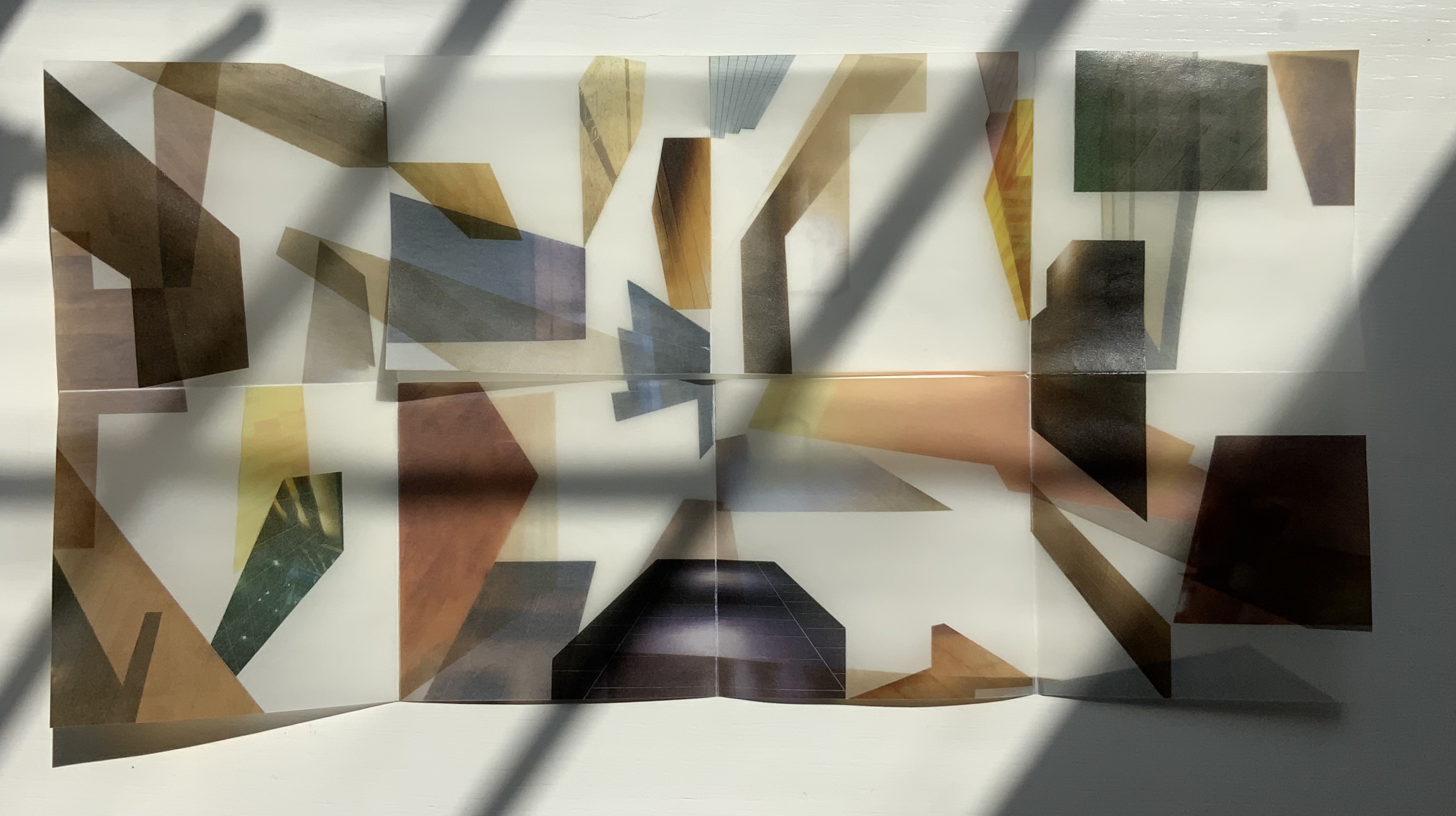
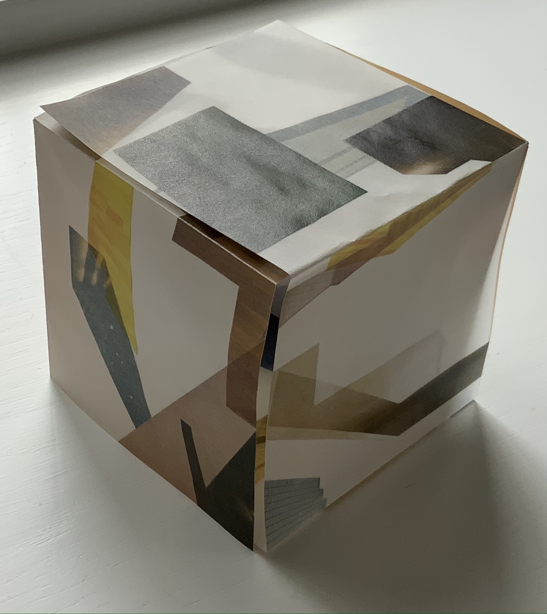
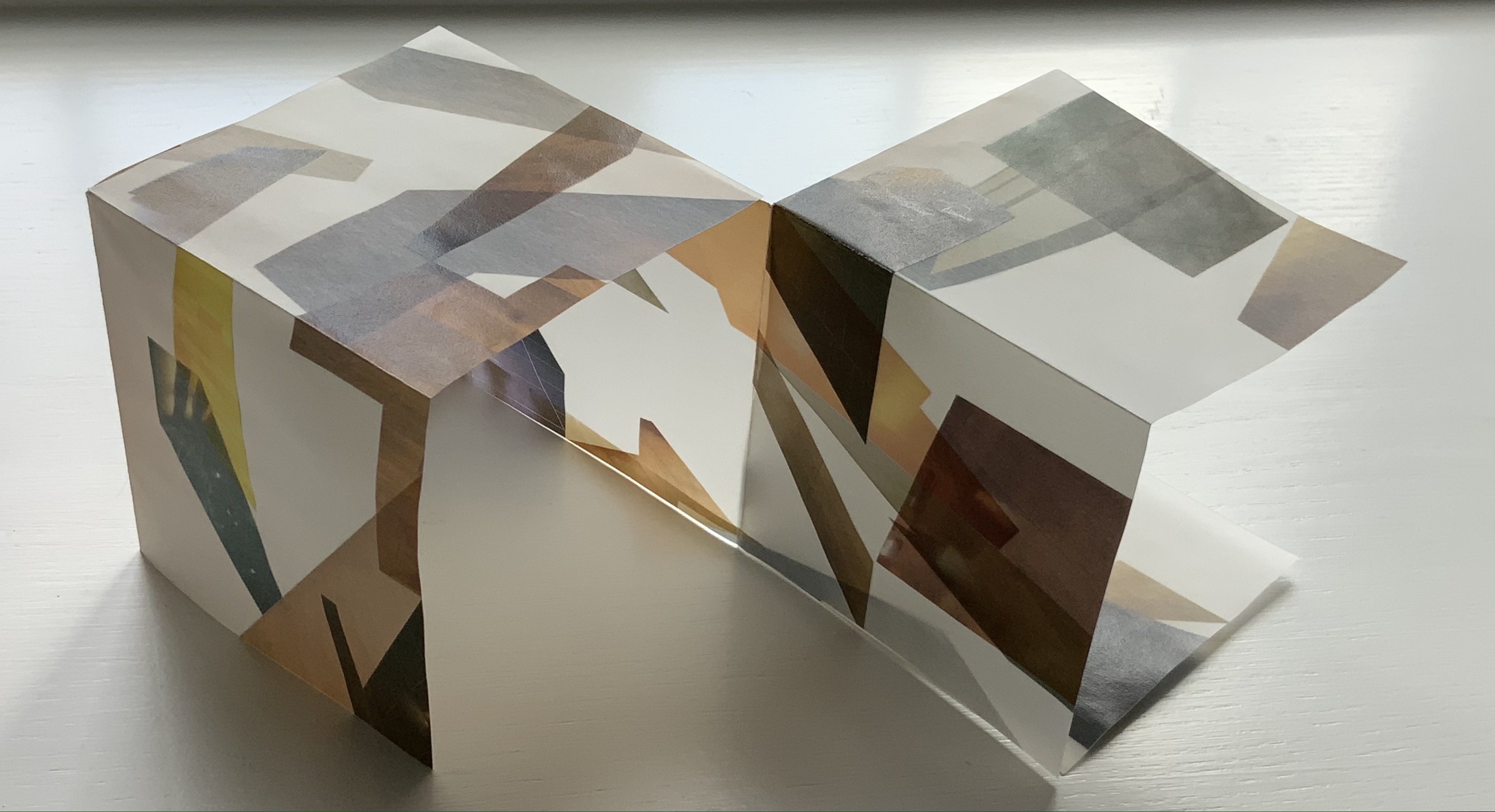
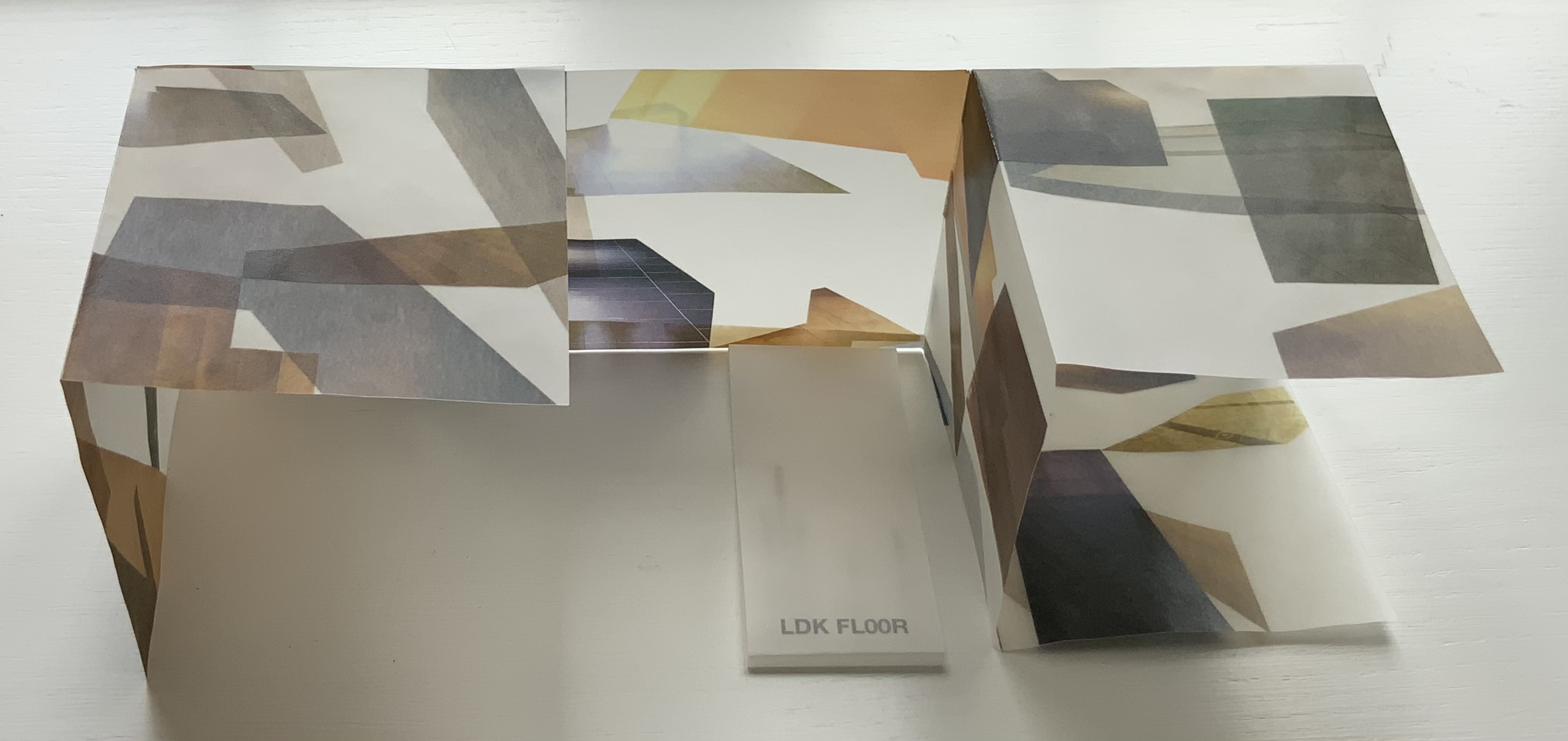
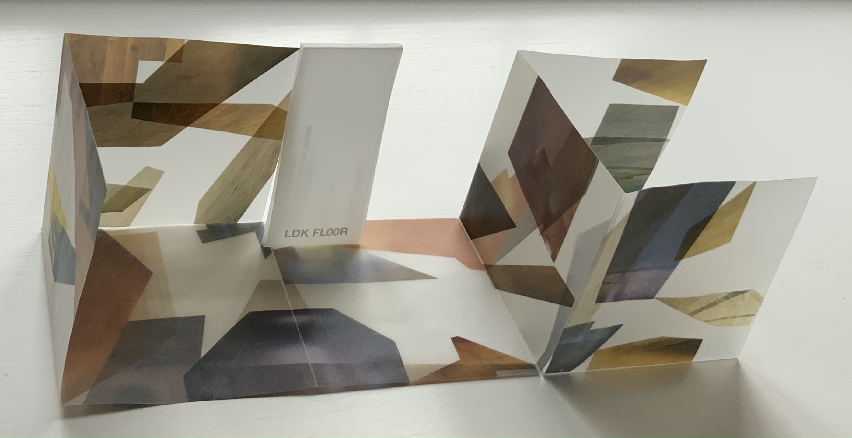
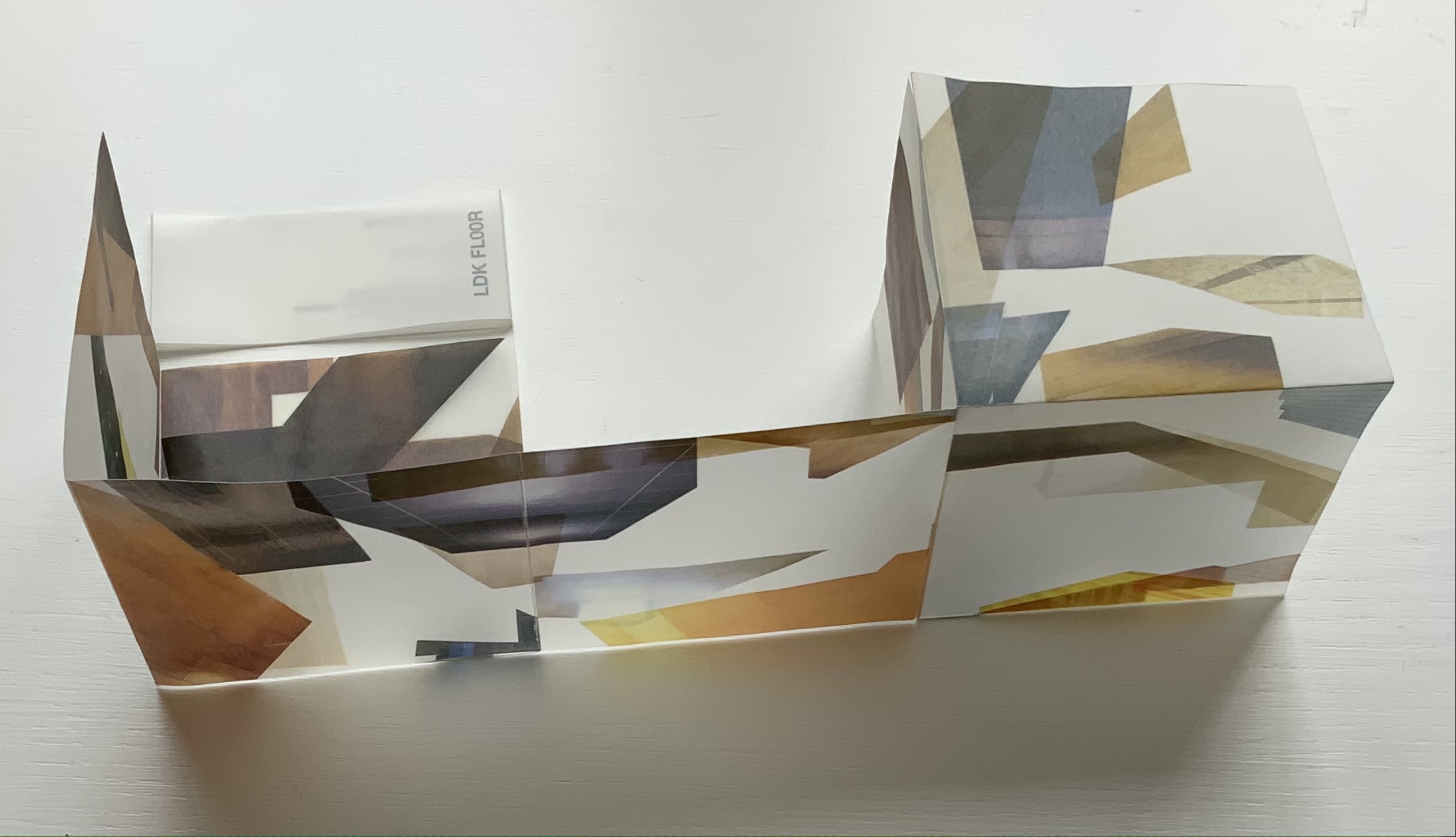
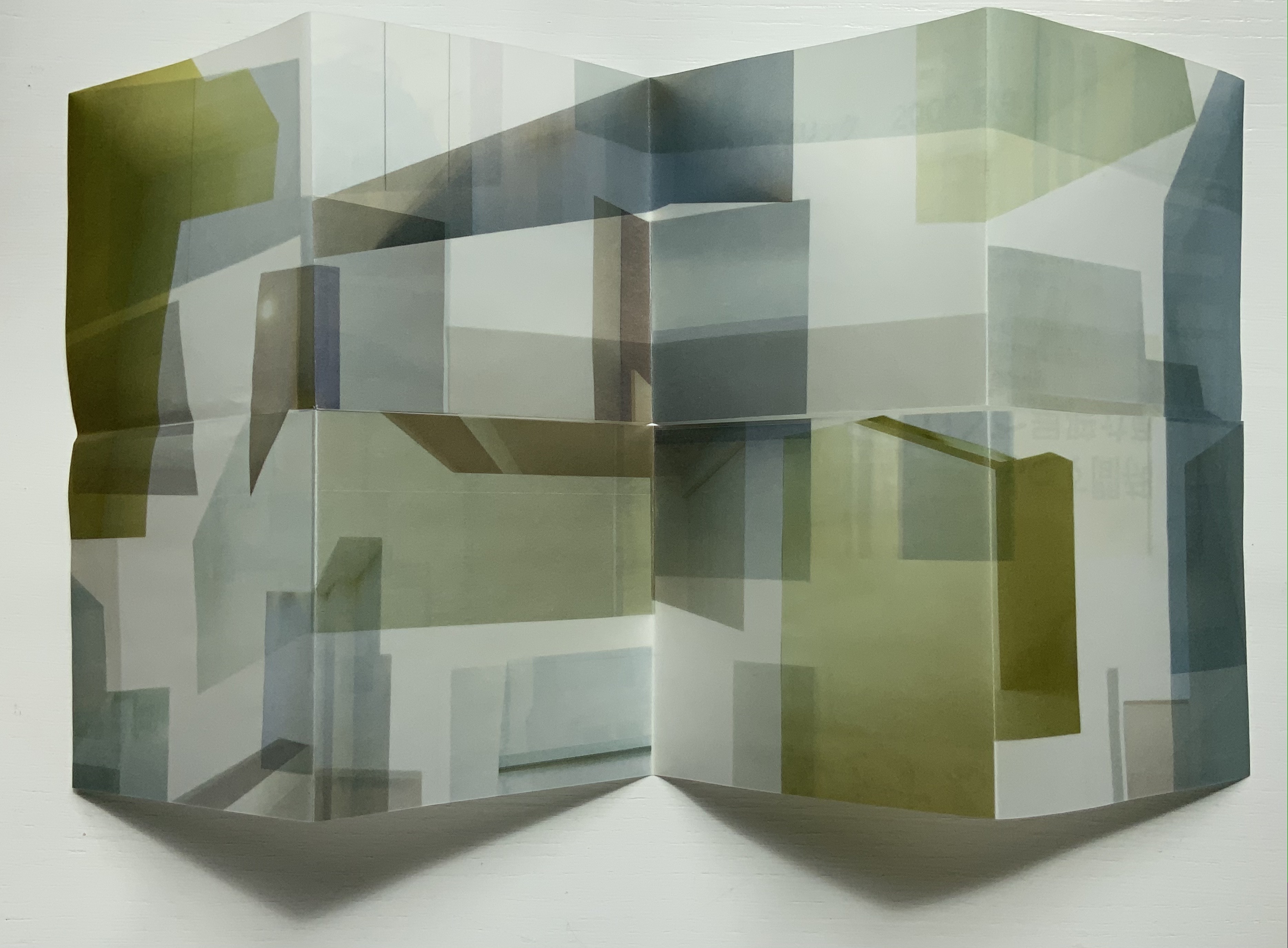
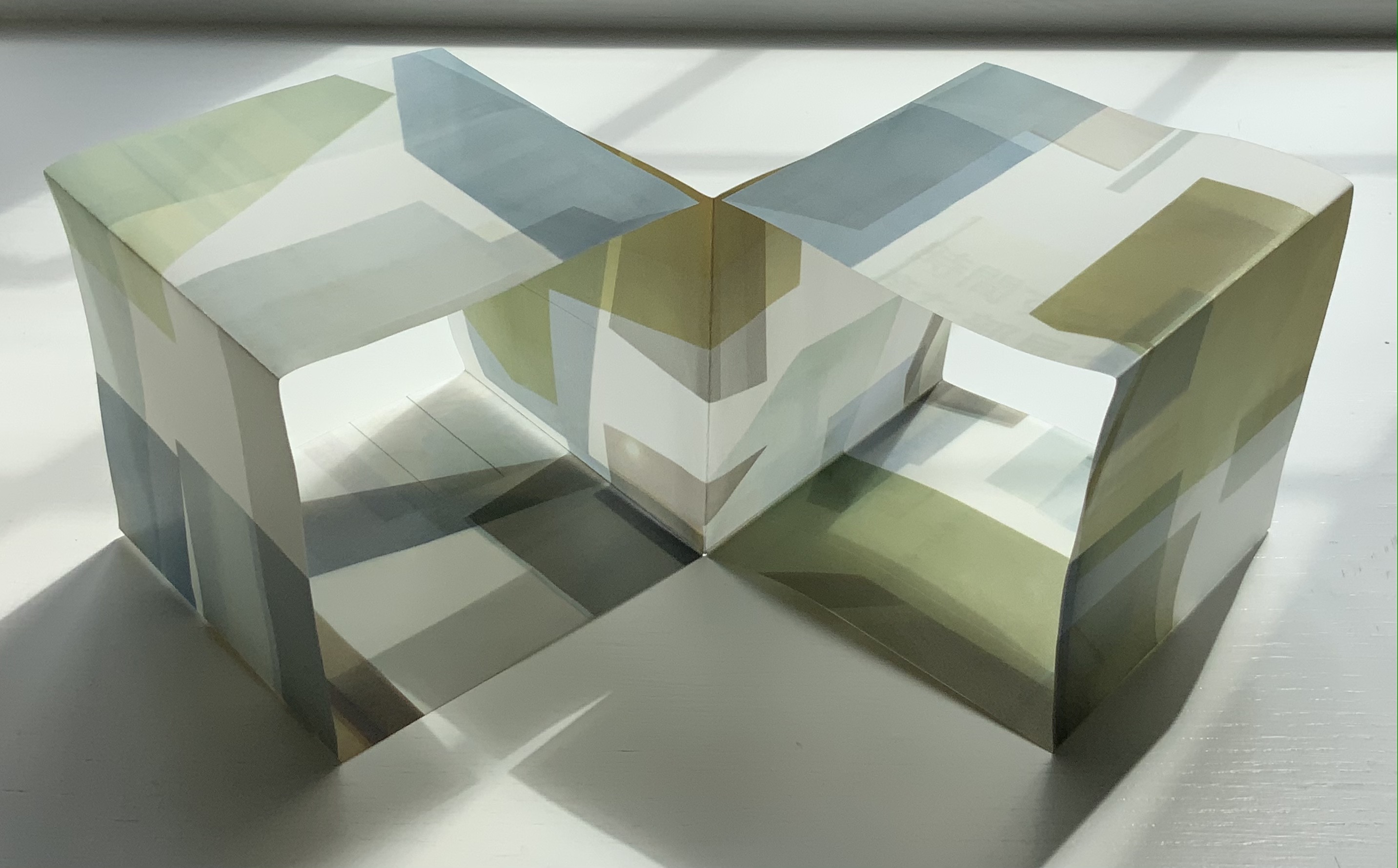
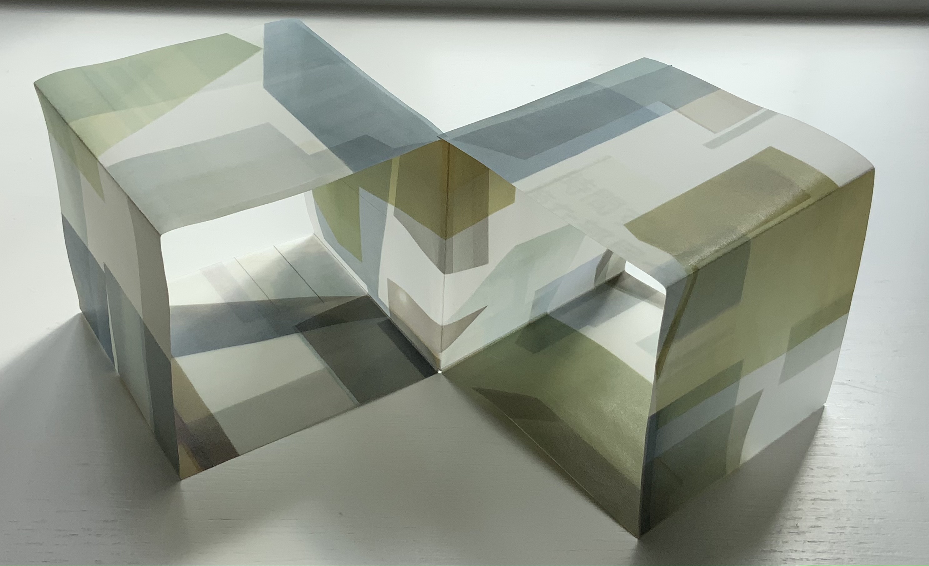
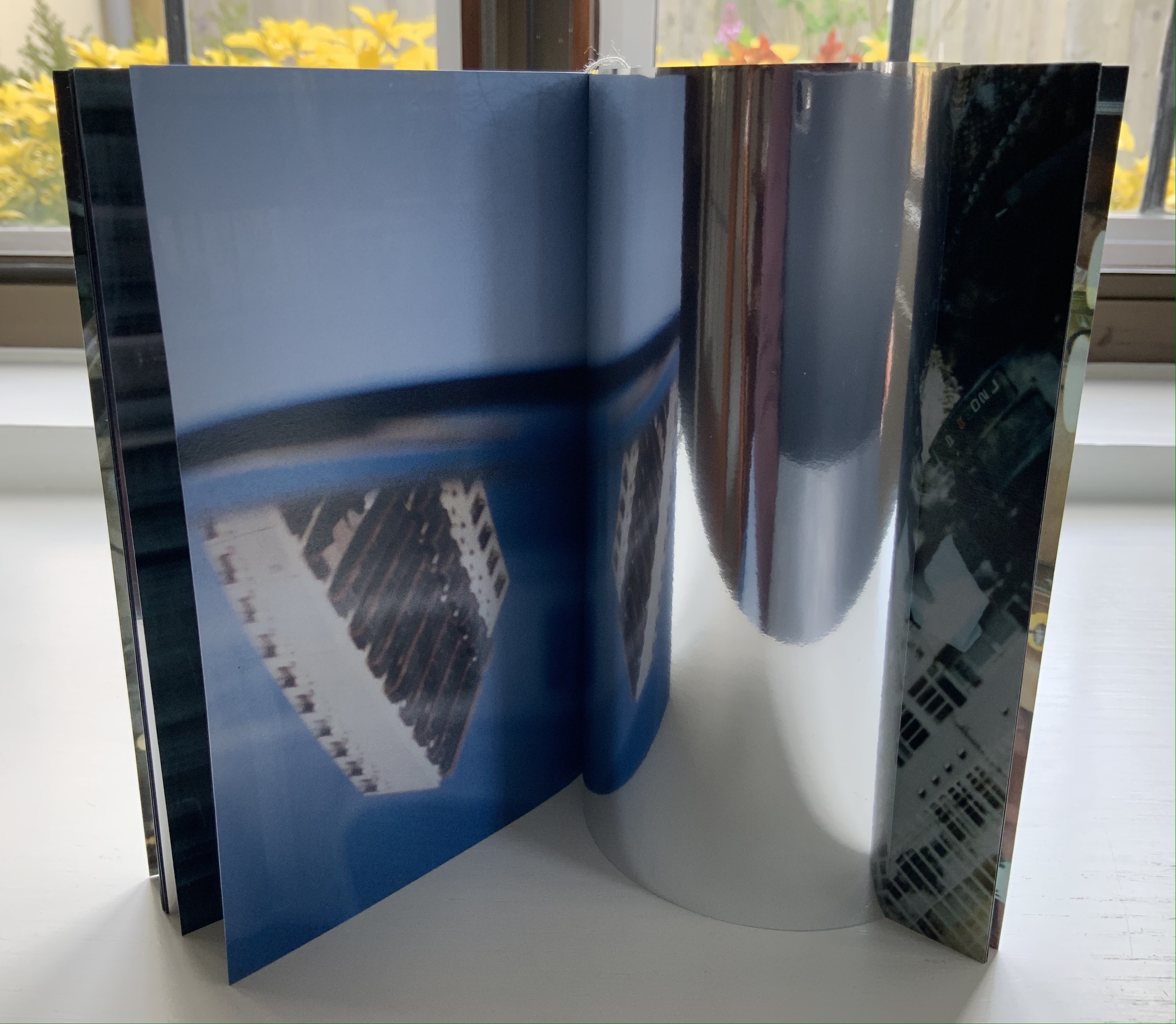
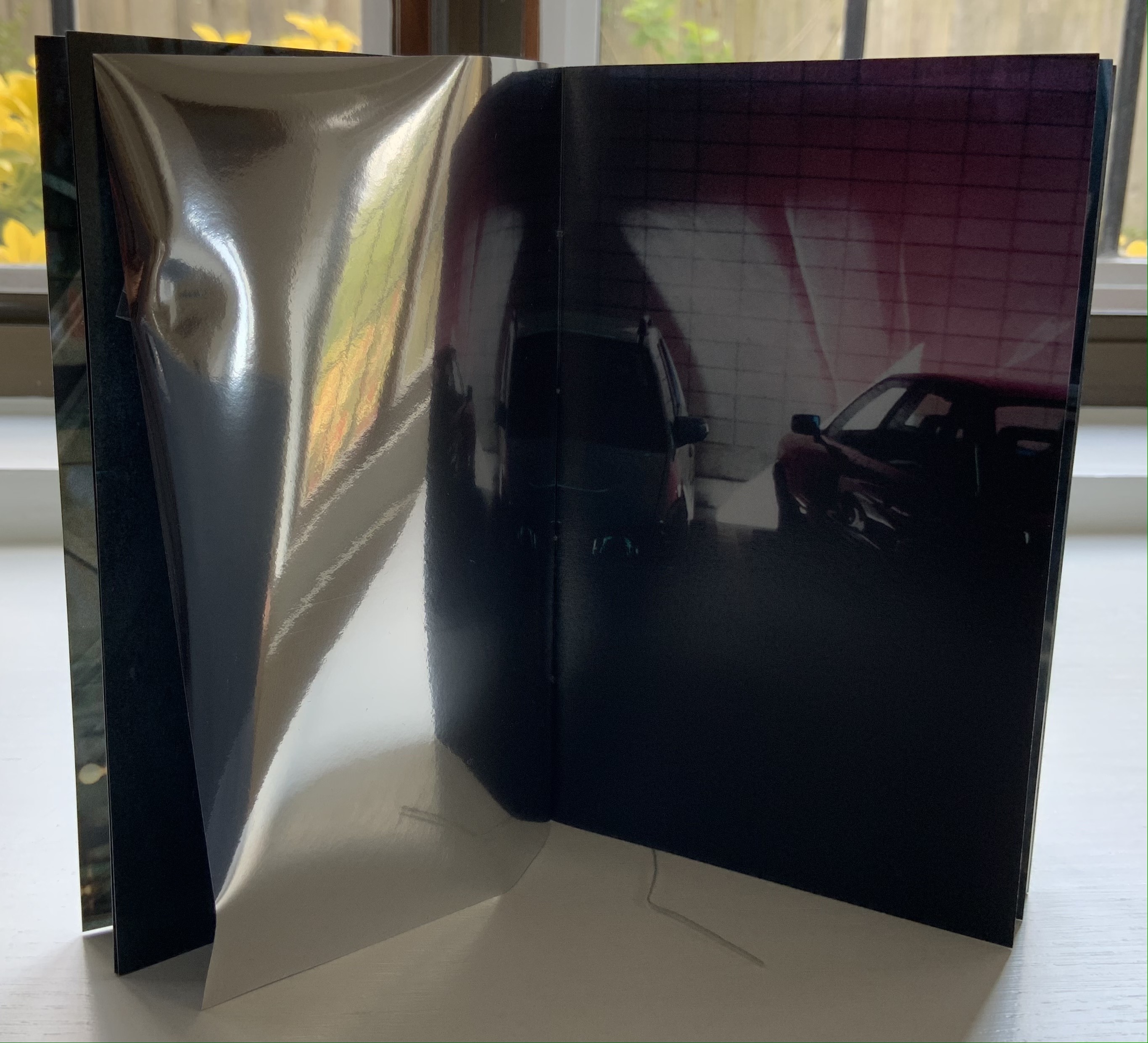
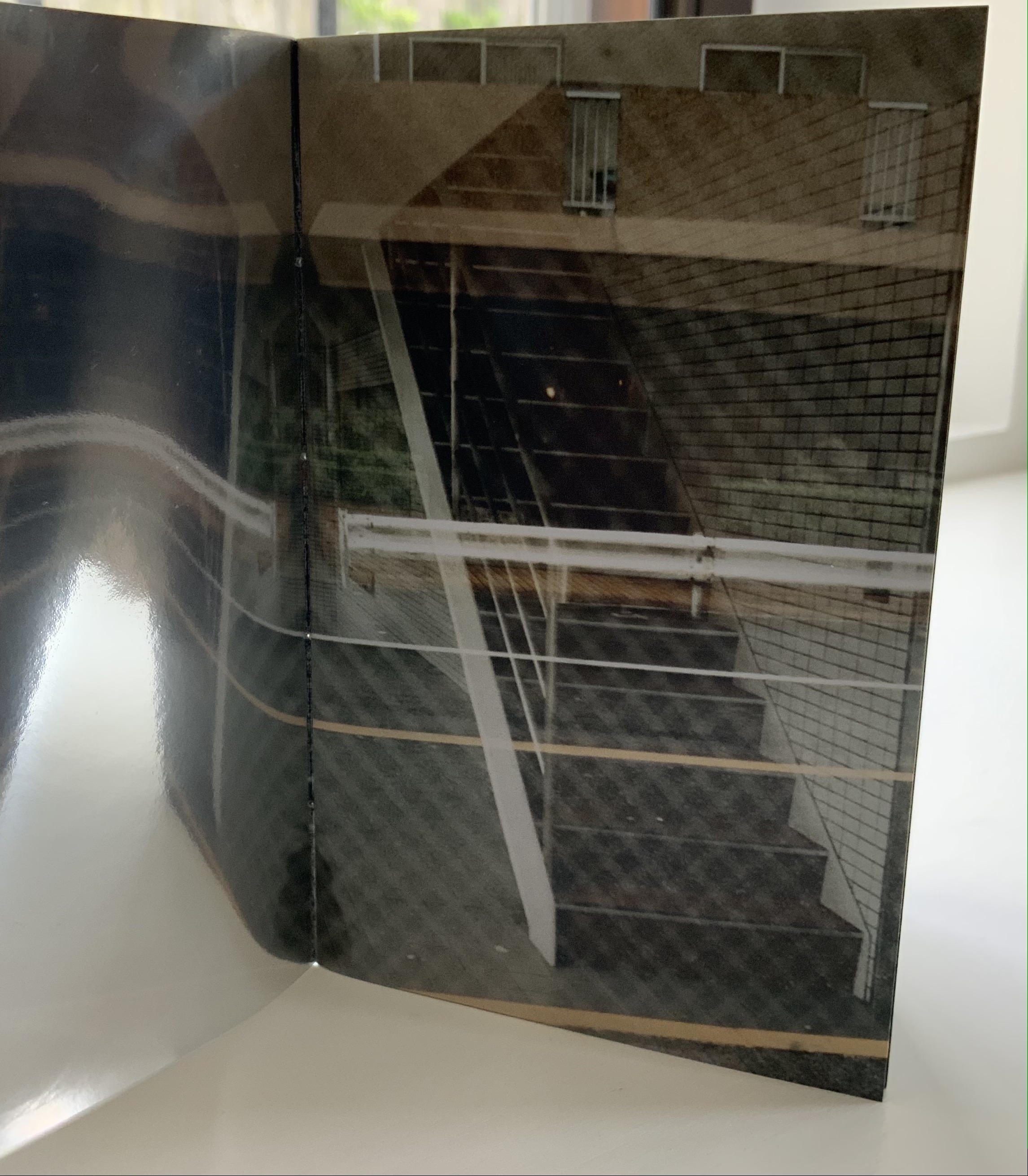
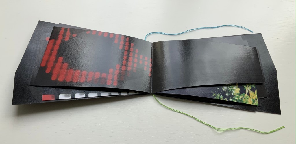
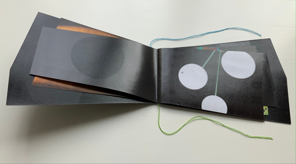
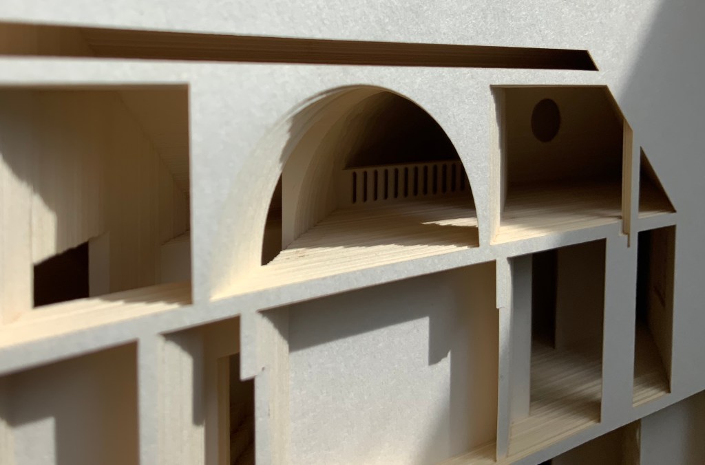
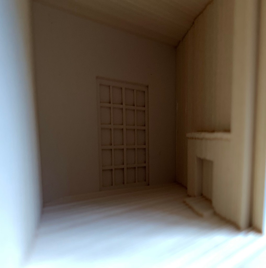
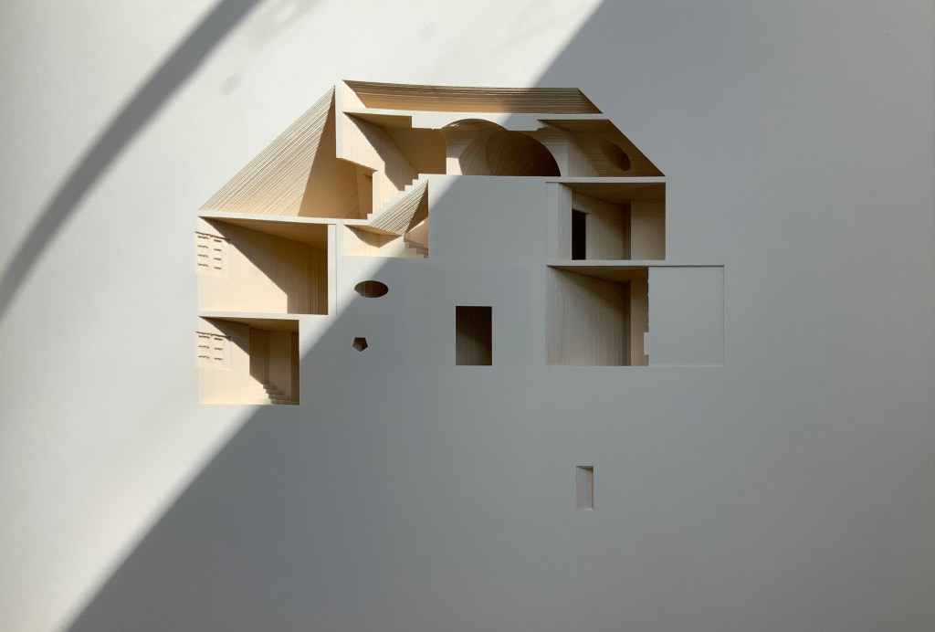
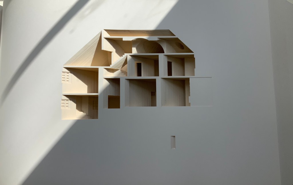
Your House is a laser-cut model of Olafur Eliasson’s residence in Copenhagen at a scale of 1:85, which means that each page equates to a 220 mm section of the actual house. How do you read a work like this — physically? At the 22″ mark in the video below, the pages fall in a cascade like a flipbook, but for the most part, their size, accumulated bulk and weight — and delicacy — defy that handling. They must be turned slowly and carefully. Your House heeds the task of the arts as posed by the architect Juhani Pallasmaa, “in our age of speed, …to defend the comprehensibility of time, its experiential plasticity, tactility and slowness” (The Embodied Image, p. 78).

Your House (2014)
Studio Olafur Eliasson

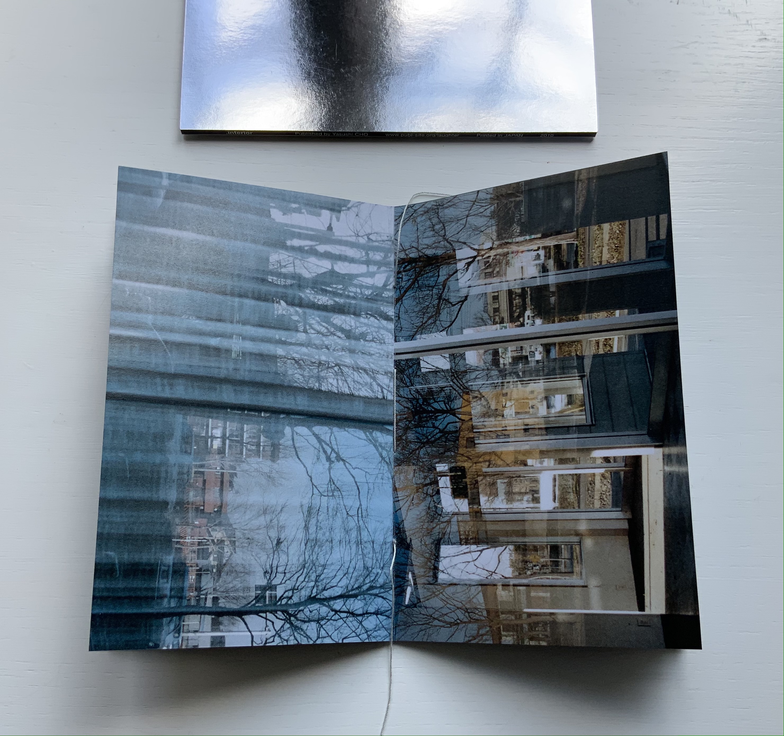
As you move from Your House‘s entrance to its exit, the outlines of walls, floors, stairs, doors, domes, windows, fireplaces and bookcases tremble in the air. Is this what Gaston Bachelard calls “the material imagination”? What Juhani Pallasmaa calls “the embodied image”?

Video: Books On Books Collection. Displayed with permission of Studio Olafur Eliasson.

Photos of the work: Books On Books Collection. Displayed with permission of Studio Olafur Eliasson.

There is something meditative about reading Your House properly. The cautious repetitive turning of pages can induce a daydream of inhabiting the space revealed. At some point in turning the pages, the empty shapes begin to become “your house”. Perhaps you see yourself moving through its spaces, and imagined furnishings occupying its rooms.

Photos of the work: Books On Books Collection. Displayed with permission of Studio Olafur Eliasson.

Or perhaps as in the sequence above — the end of one room (or chapter or part) and the start of another — you become a ghost — with all the work’s past and future readers — passing through the walls.

Video: Books On Books Collection. Displayed with permission of Studio Olafur Eliasson.

In The Poetics of Space, Bachelard writes of poetic time and prosodic time. The one is vertical, a spot in time, a frozen moment; the other is horizontal, a narrative, a continuity. But they are not mutually exclusive. Your House is a site where poetic and prosodic time occupy the same space. More than that, it is a site where temporality, as Eliasson puts it, “becomes something you perform by involving yourself physically over time” and thereby you become, “in the end, the createur” (“Not how, but why!”, p. 108).

Eliasson’s house in Hellerup, a suburb of Copenhagen, was advertised for sale in 2024. For comparison with the book, you can see photos of the exterior and interior here. Also, with thanks to Byopia Press, an X-ray documentation of the book can be found here.

Contact is Content (2014)

Contact is Content (2014)
Olafur Eliasson
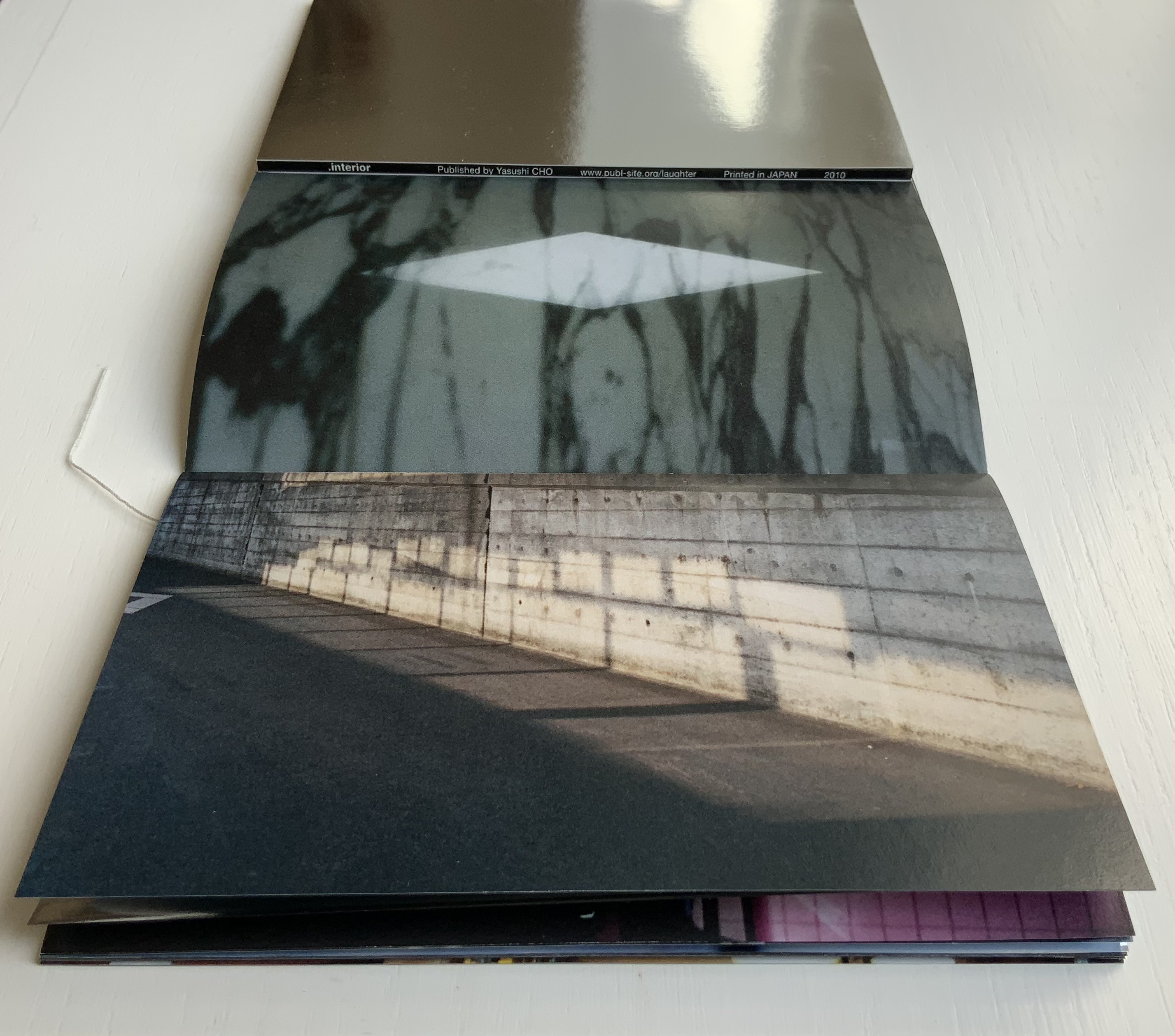
Casebound, cloth mesh-covered board. H345 x W310 x D50 mm, 416 pages. Photos: Books On Books Collection. Displayed with permission of the artist.

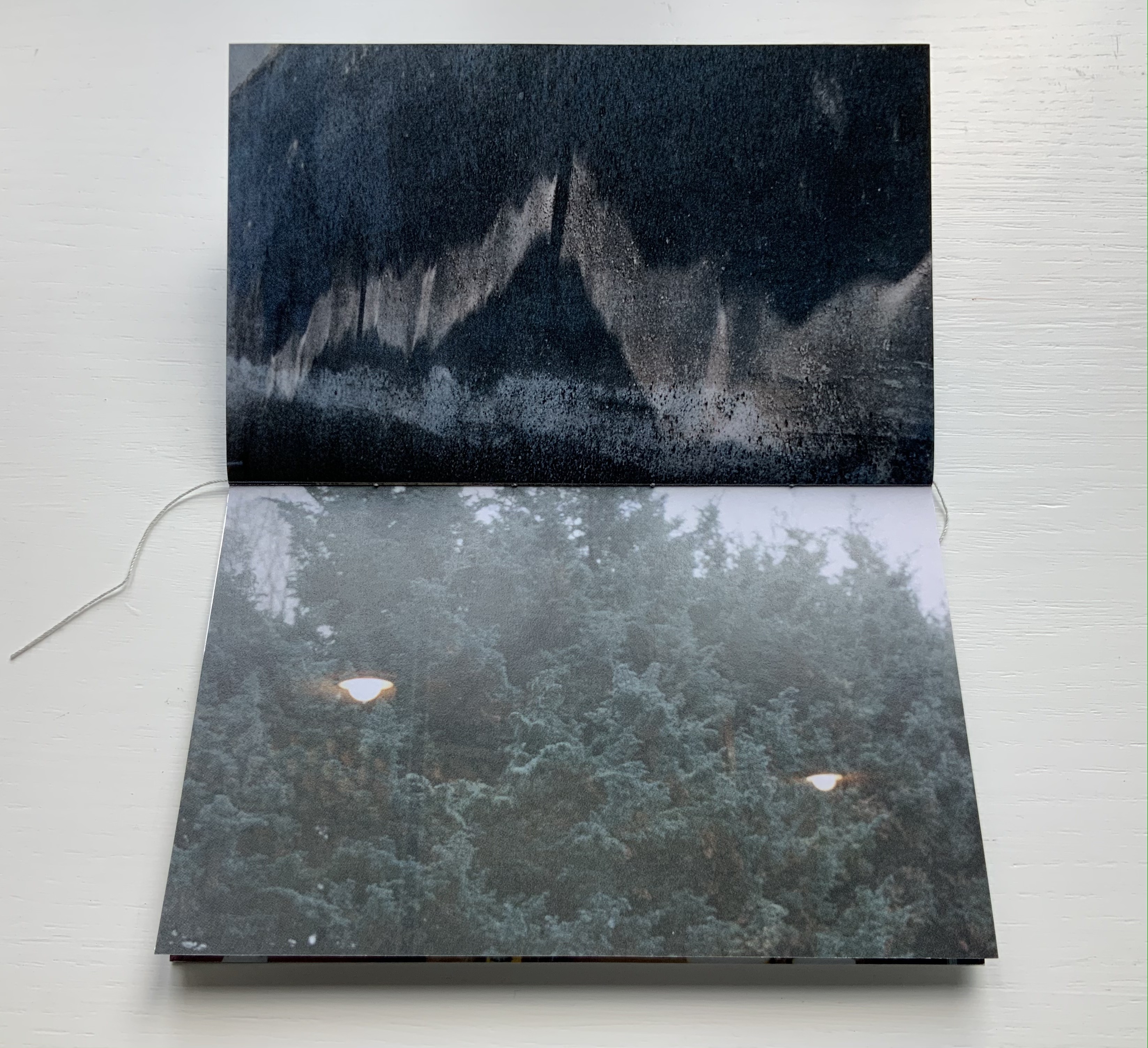
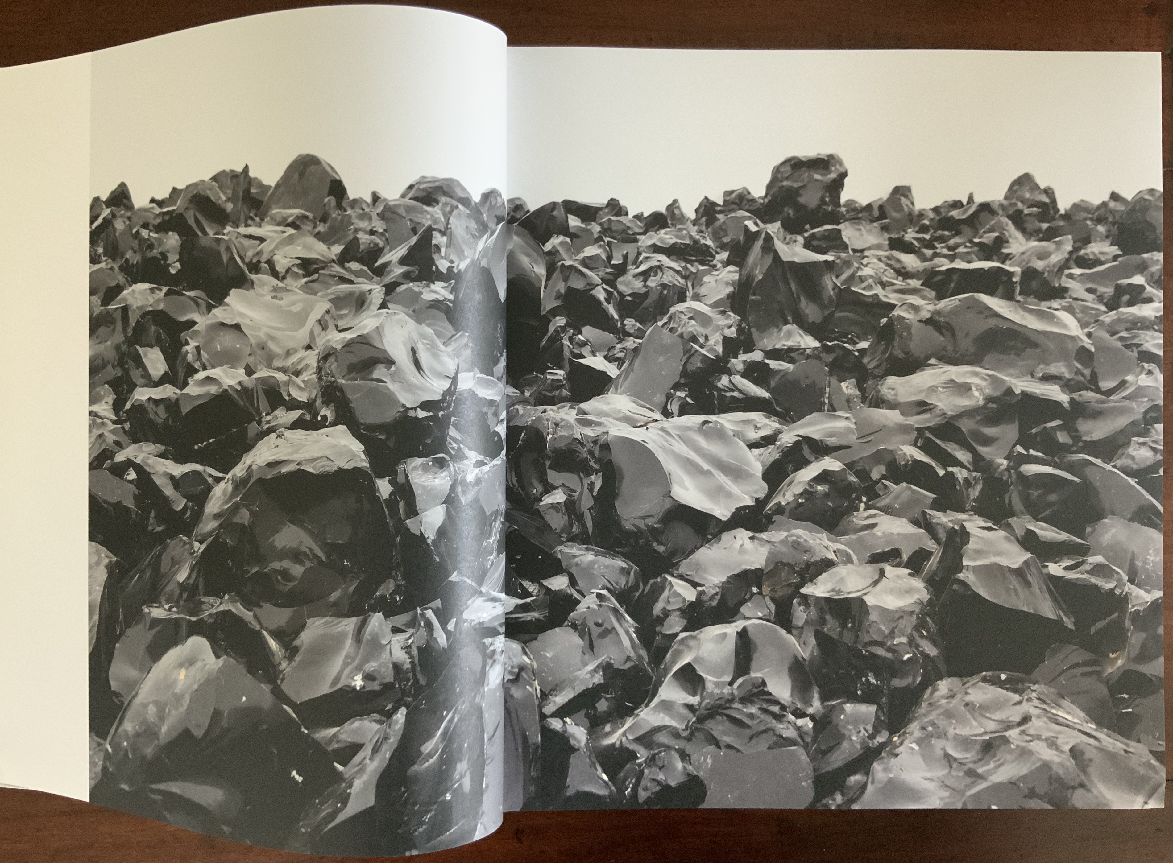
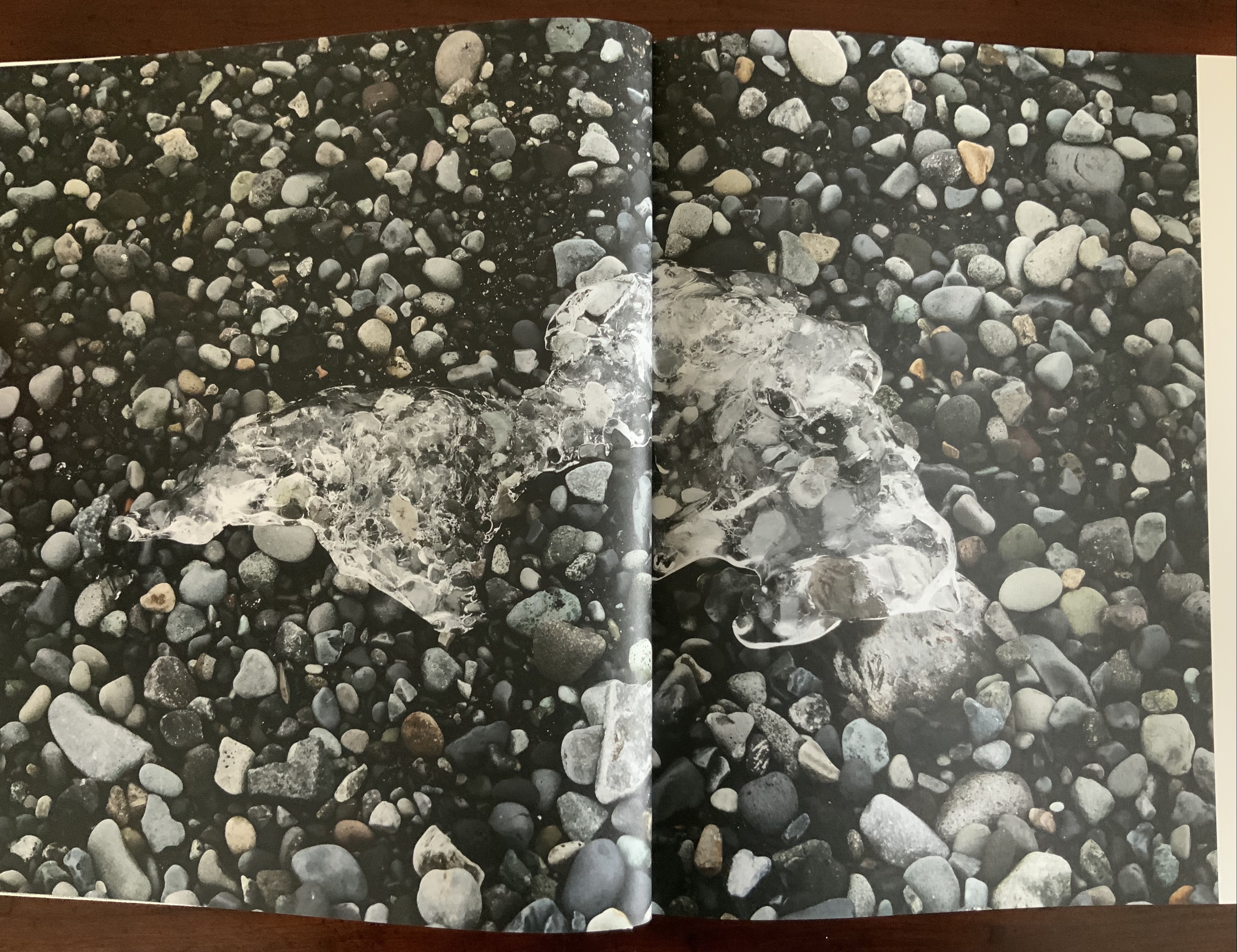
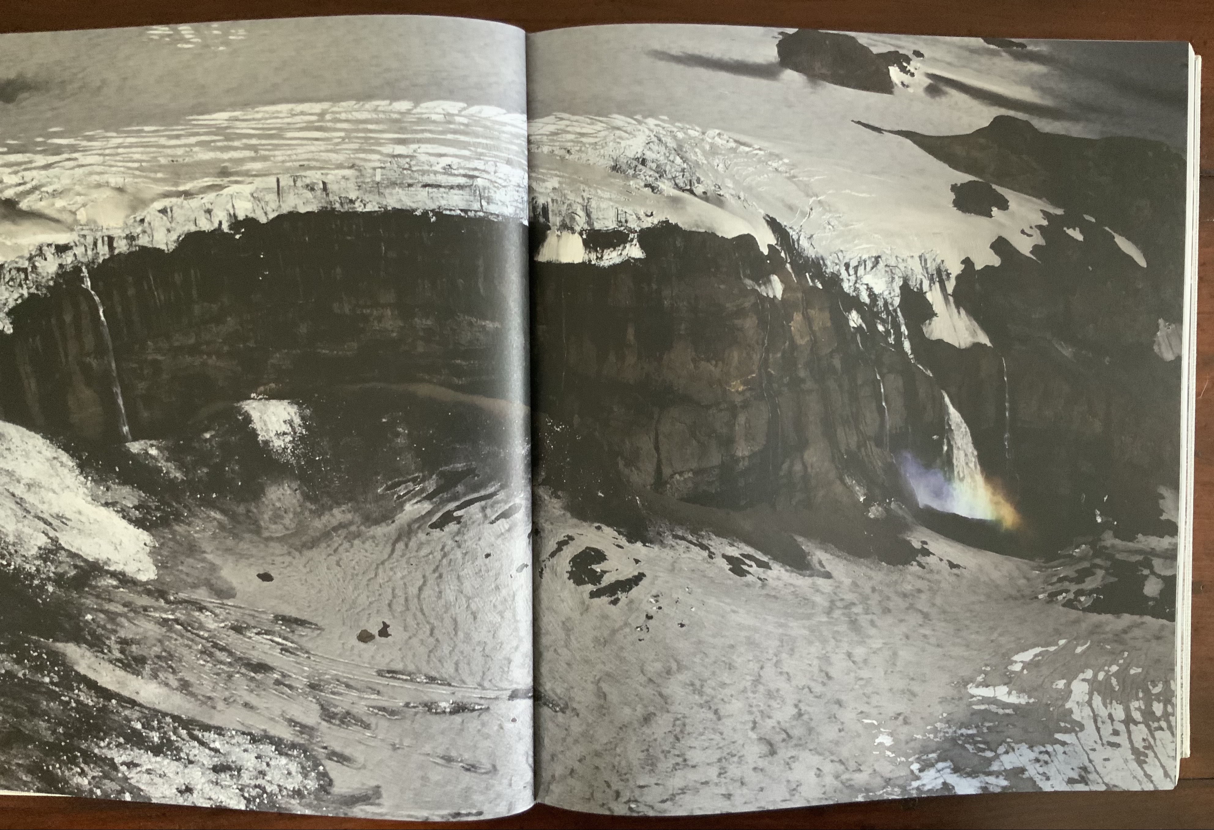
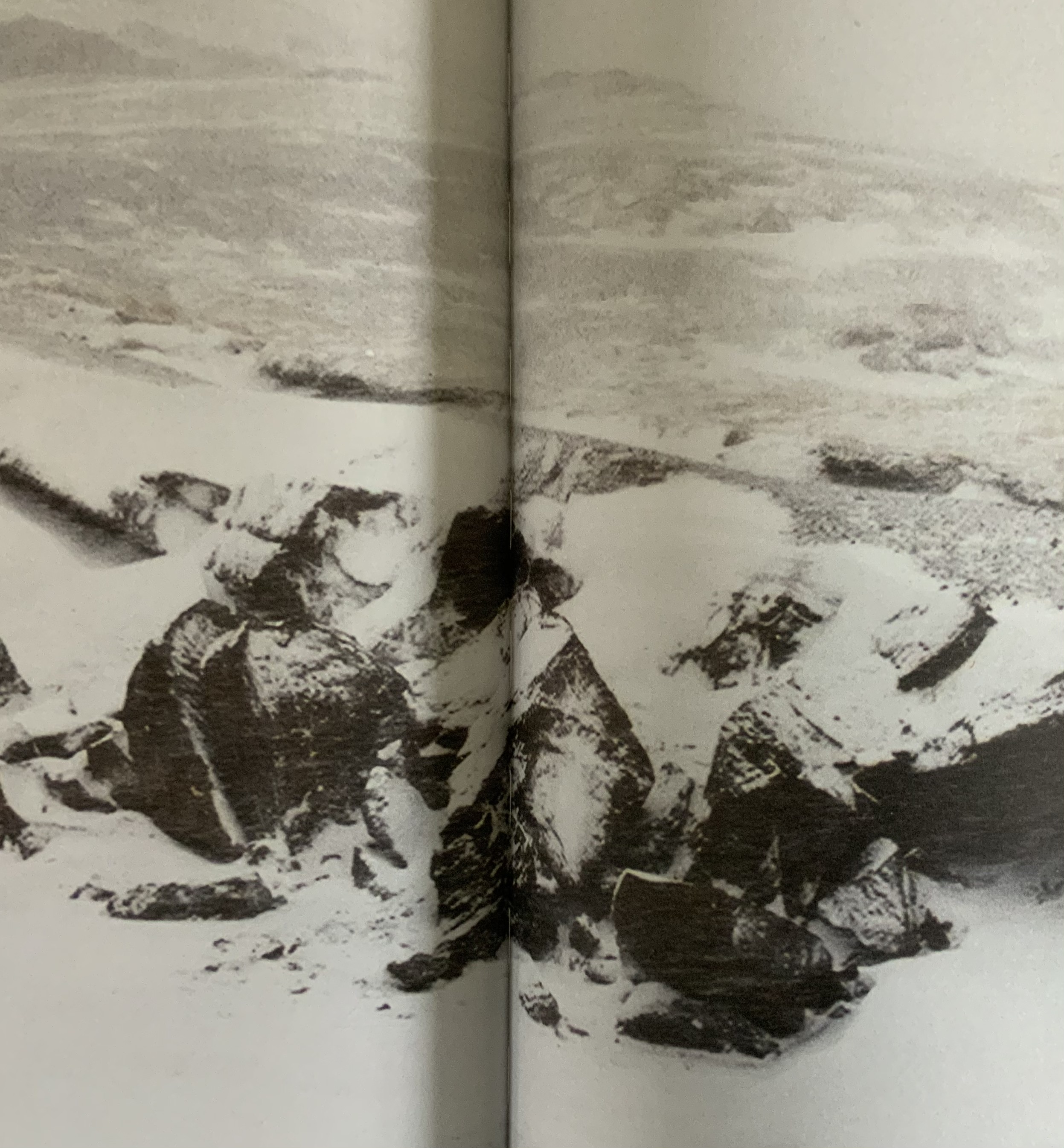
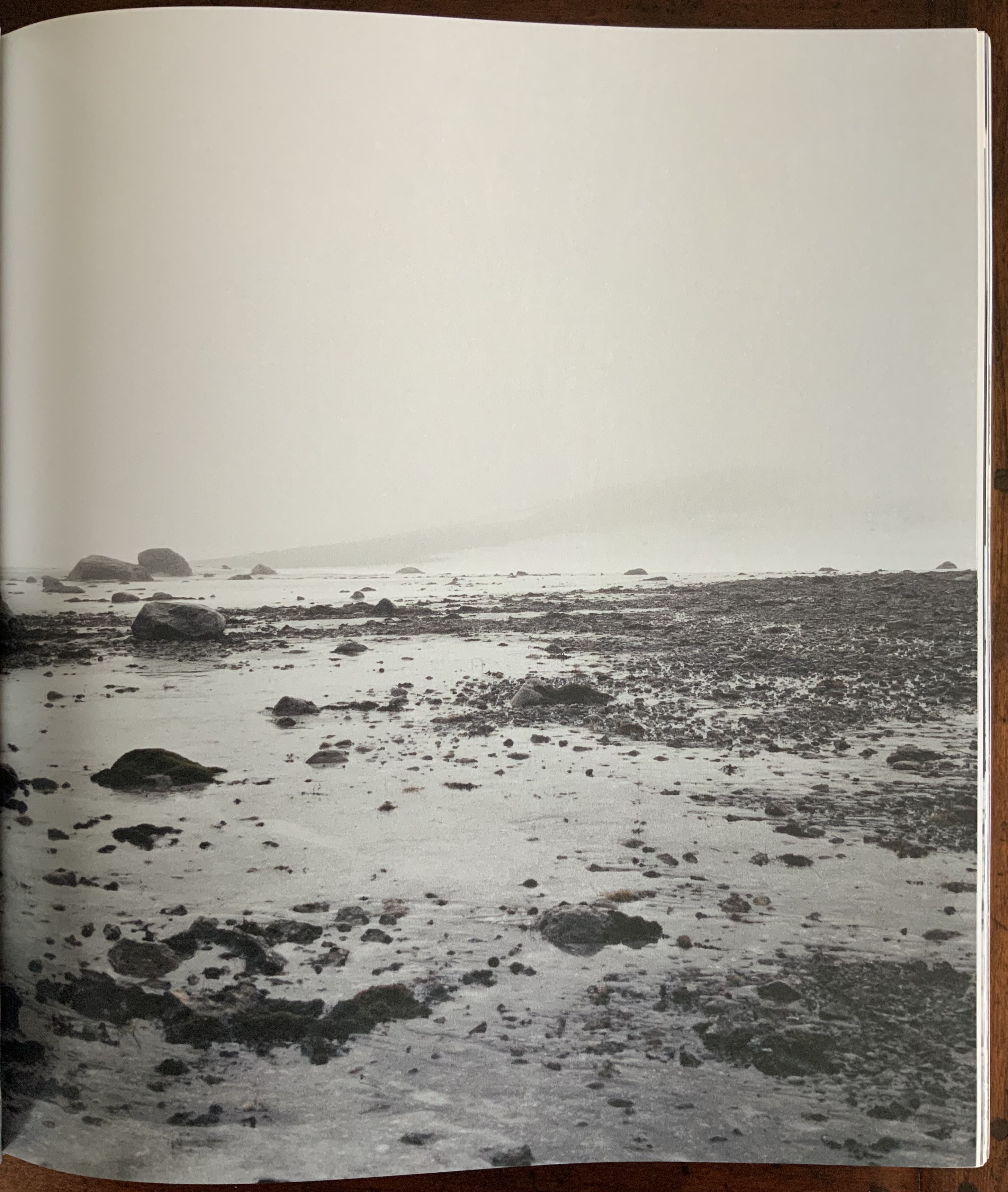
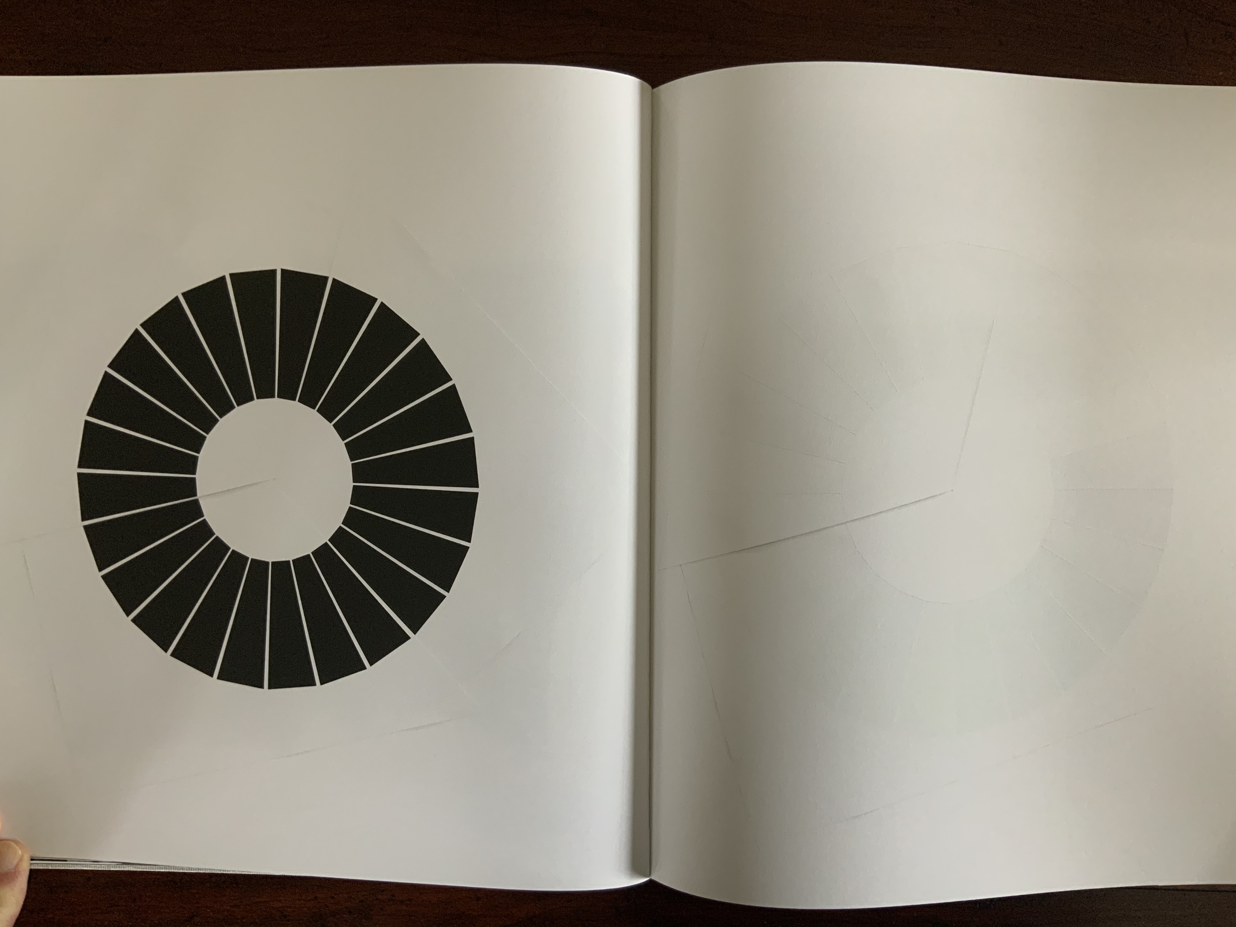
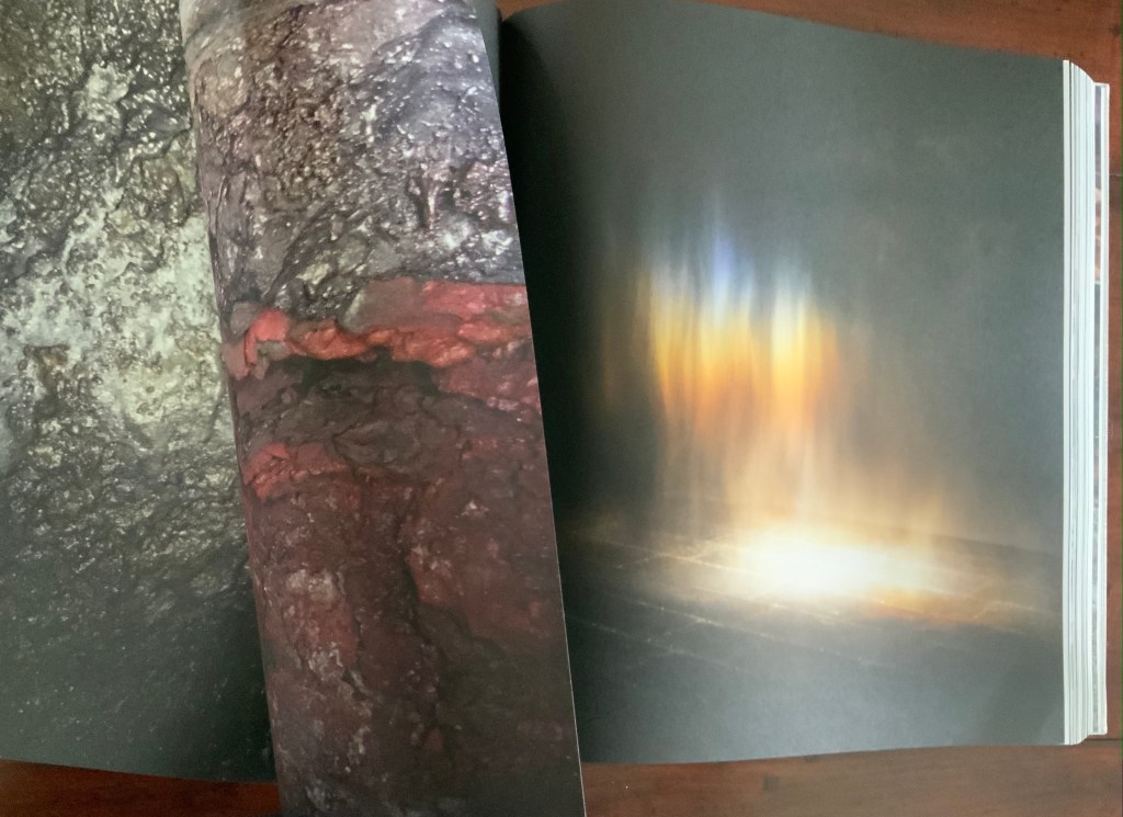
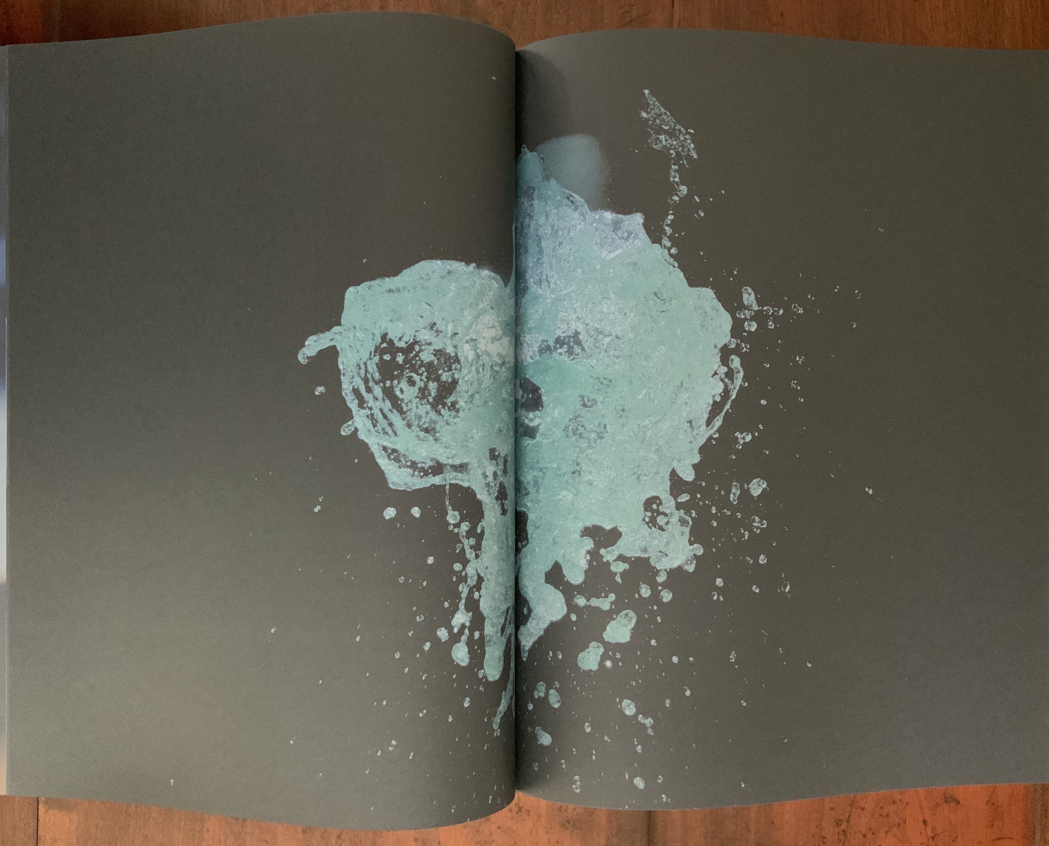
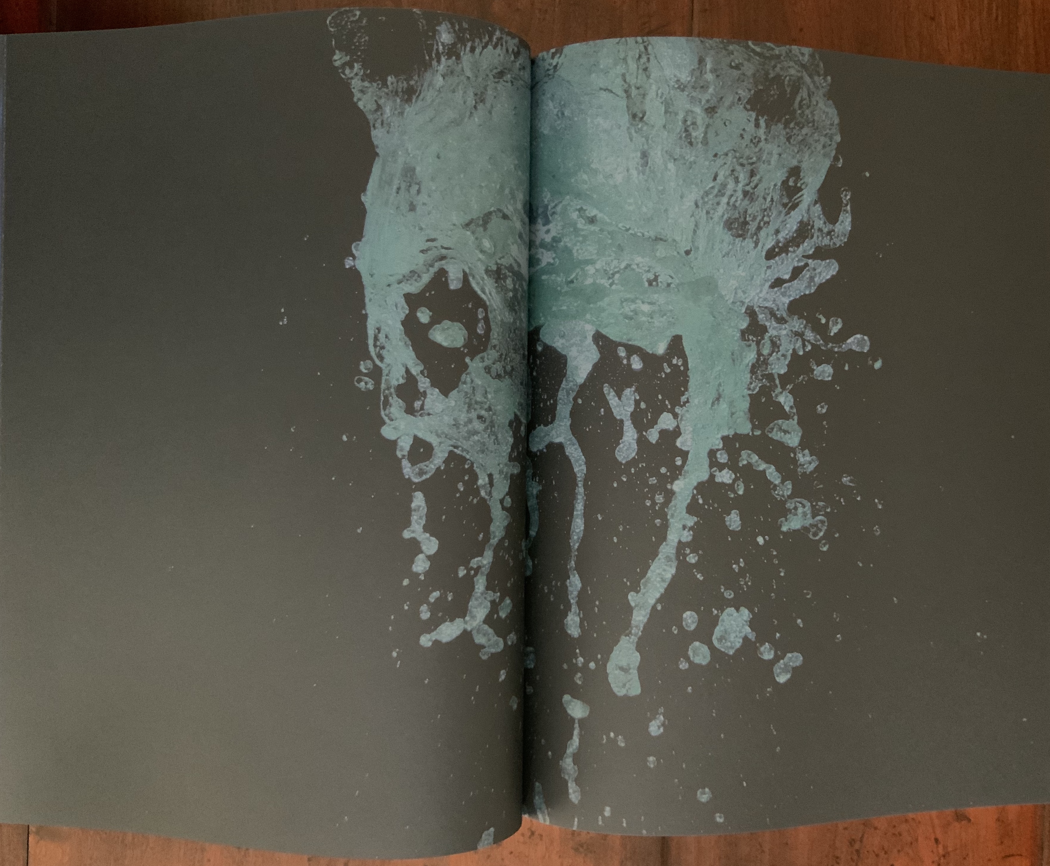
Like Your House, this work requires a slow, careful interaction in which viewing becomes learning the language of Eliasson’s images, discovering its syntax and exploring its rhymes and rhythms — reading the content presented with it. Unlike Your House, which focuses on contact with one source of content, Contact is Content draws on multiple sources: photographs Eliasson took in Iceland between 1986 and 2013 as well as images from his other projects and artworks. Over 80 different series make up the content of this work. The overwhelming number of round images — artificial and natural — in Contact is Content might suggest that Eliasson is completely sold on Bachelard’s pronouncement in The Poetics of Space that all being is round. But Eliasson’s world is spikier.

Within Contact is Content, images converse with one another — over near and far subjects, over aerial and ground level perspectives, over contrasting textures, over colors and their absence or presence, over artifice and nature

Often the conversations are reverse echoes: the reflective surface of blocks of ice echoes that of basalt.

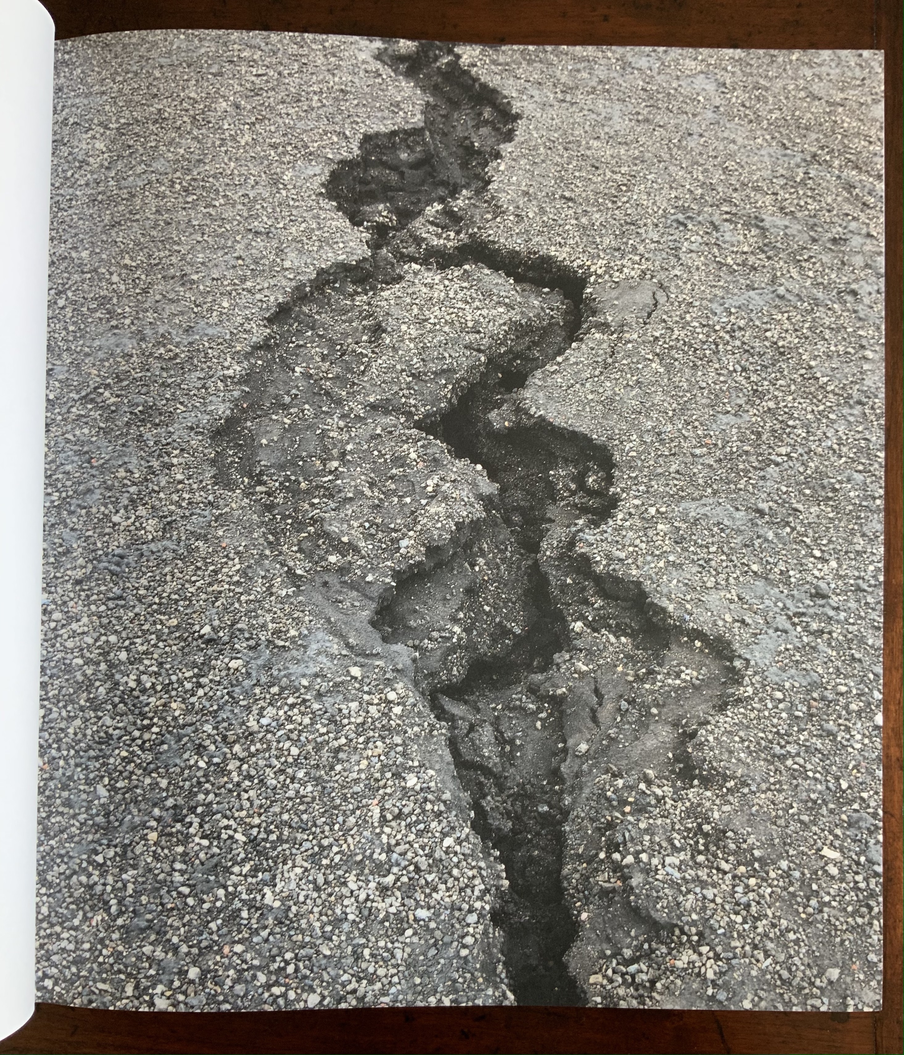
The echo of near and far becomes a theme in itself: black-and-white aerial views of landscapes elide into black-and-white close-ups.

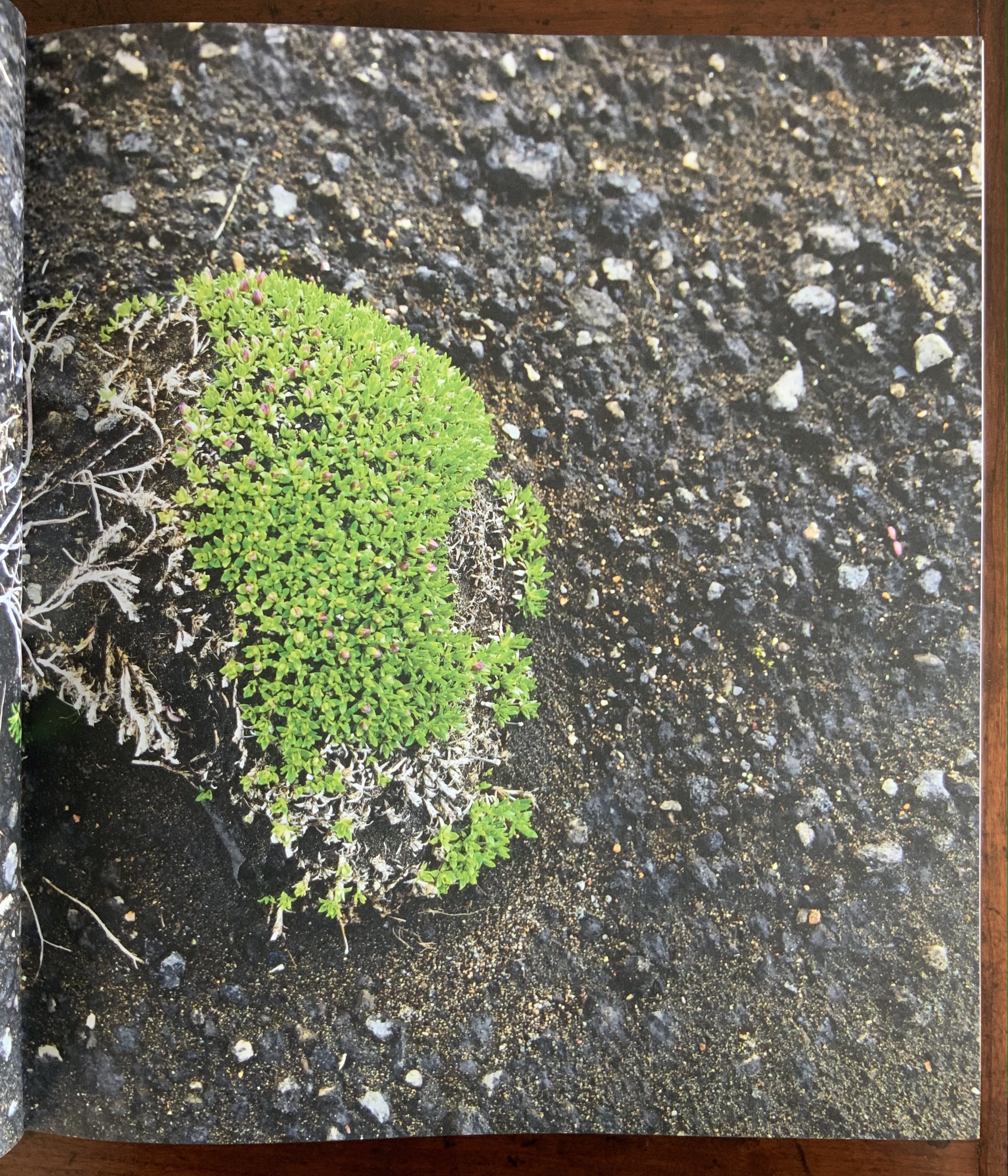
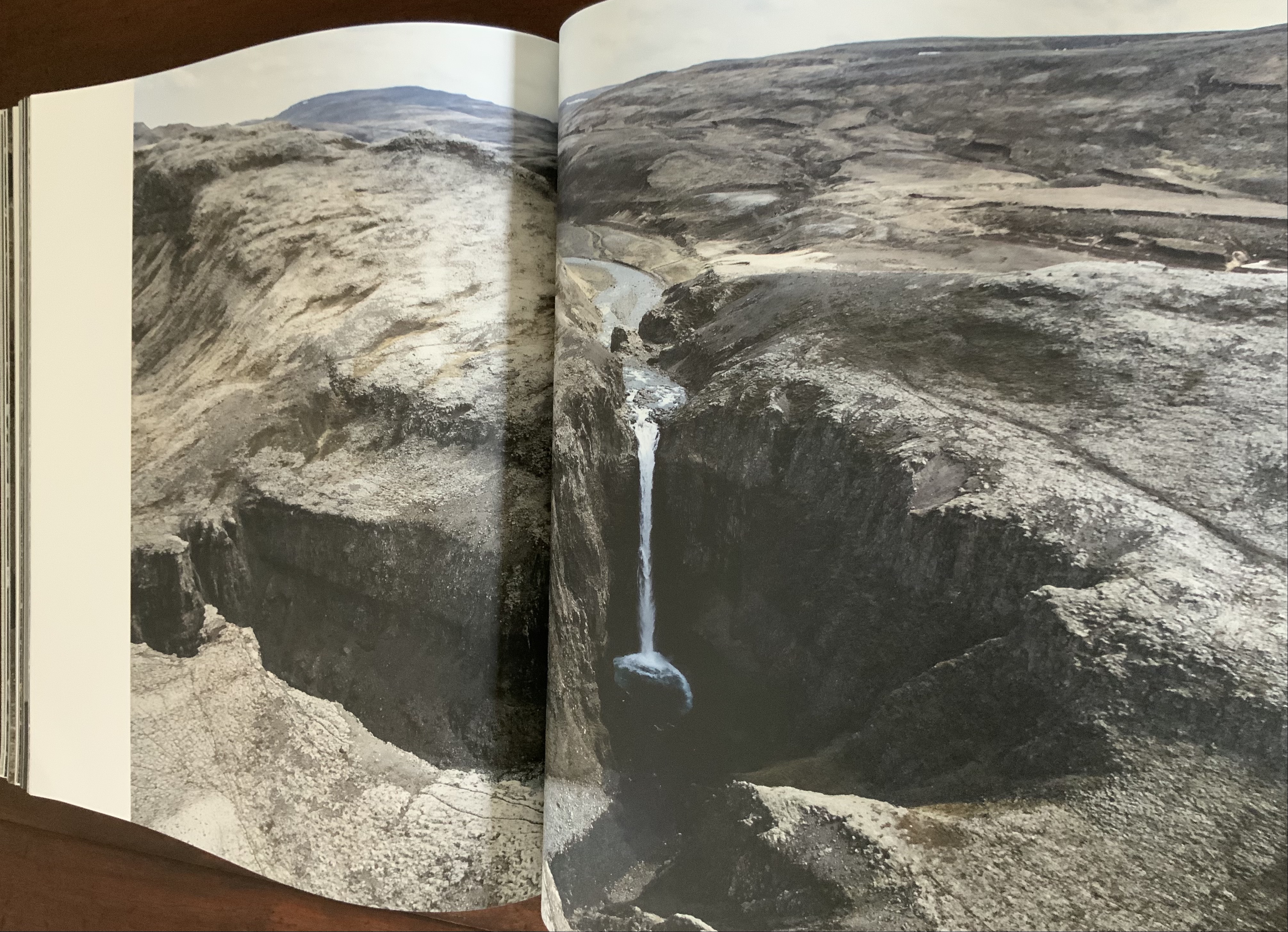
The absence and presence of color also emerges as a theme in its own right that interweaves with that of “near and far”: waterfalls without color vs waterfalls with the barest hint of color; close-ups of rocky terrain without color vs those dotted with intensely green or blue flora.

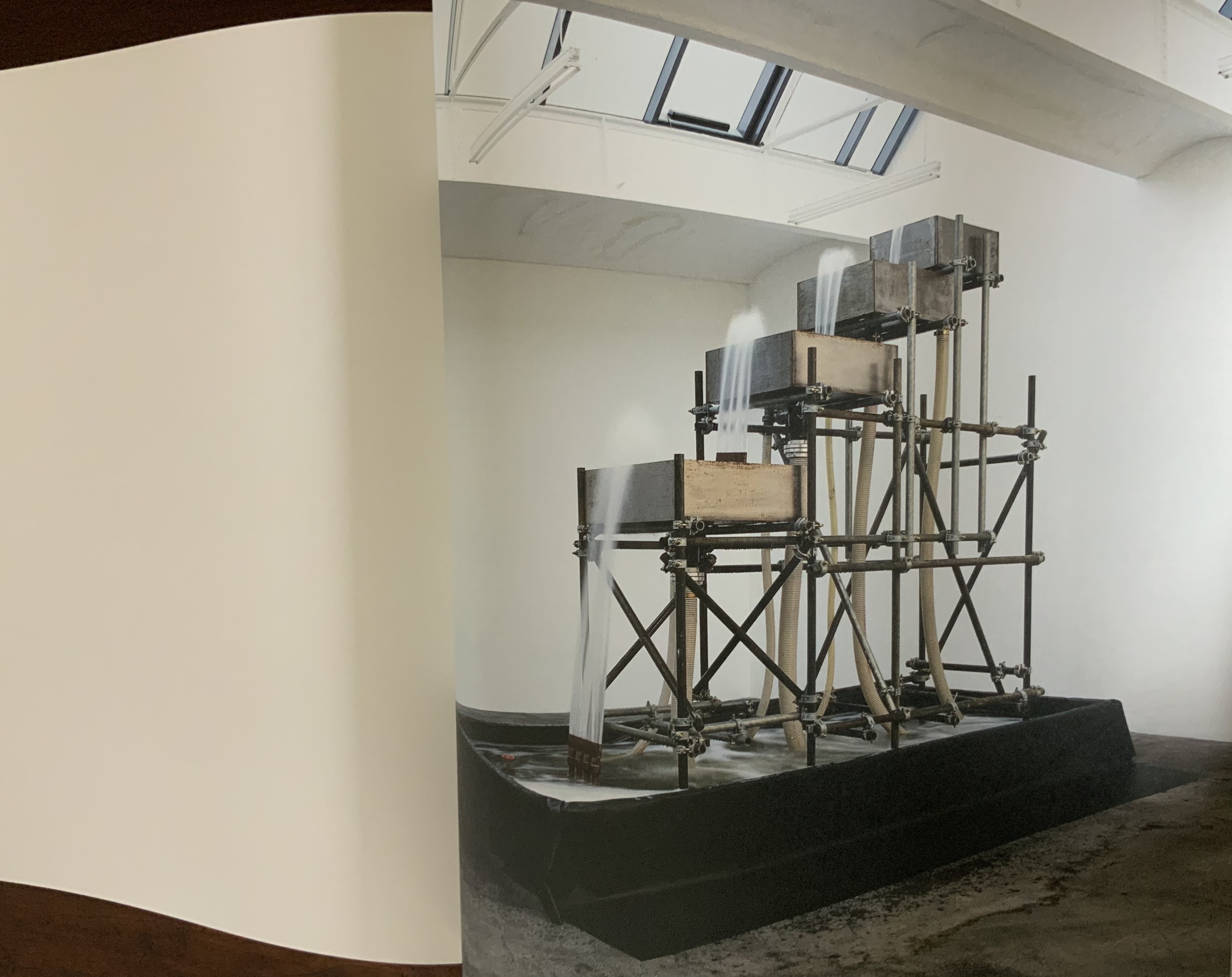
Some reverse echoes are the artificial conversing with nature: a gallery room containing a construction pumping water upwards over four levels echoes an Icelandic waterfall; or shorescapes under fog echo human outlines swallowed up in gallery rooms flooded with color-lit mists. Down to up; outside to inside; black-and-white to color; nature to artifice. And back.

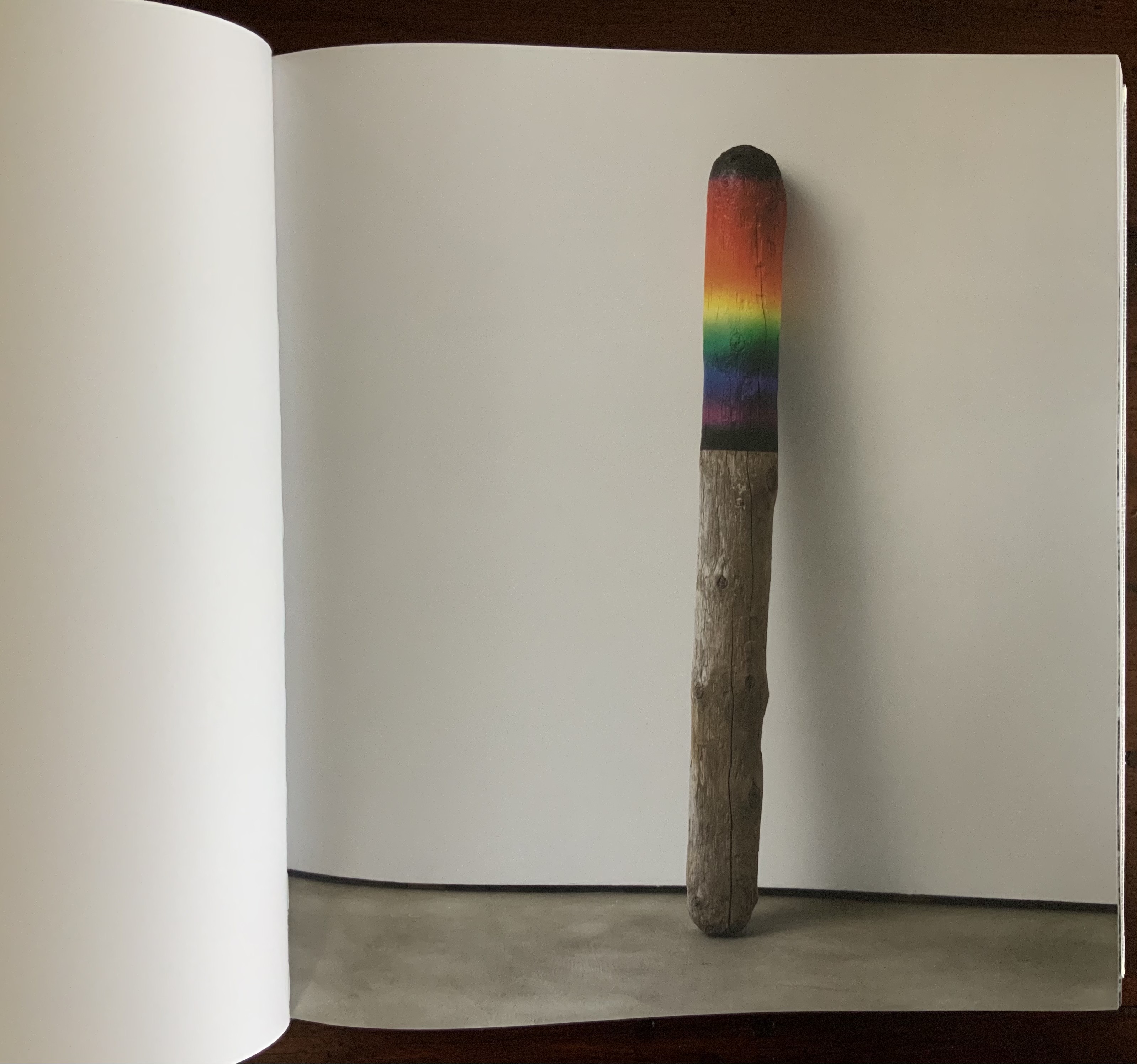
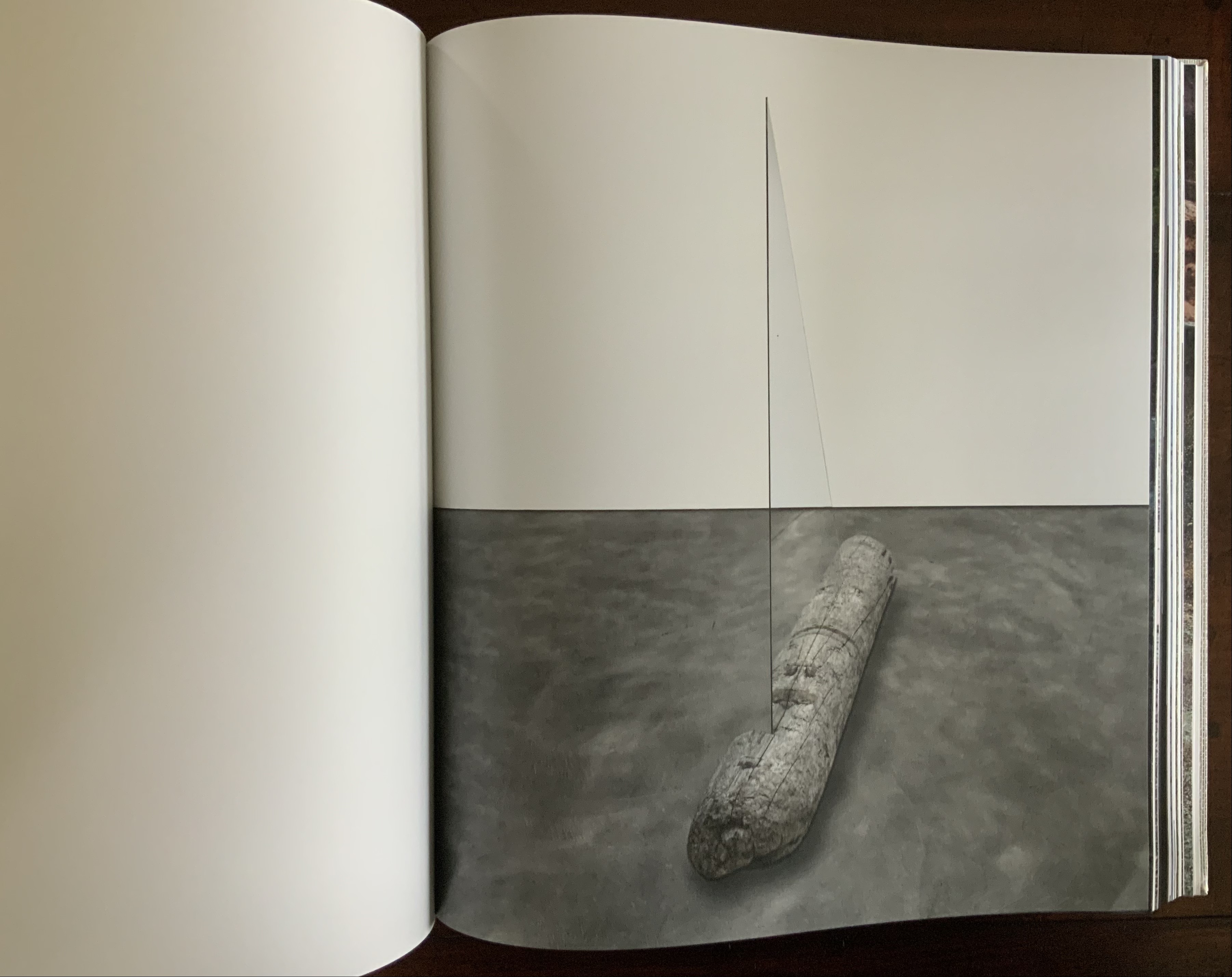
Some of these artifice/nature echoes are compressed into one image: a brightly half-painted stick of driftwood echoes the multiple color wheels used to punctuate the stretches of landscape images.

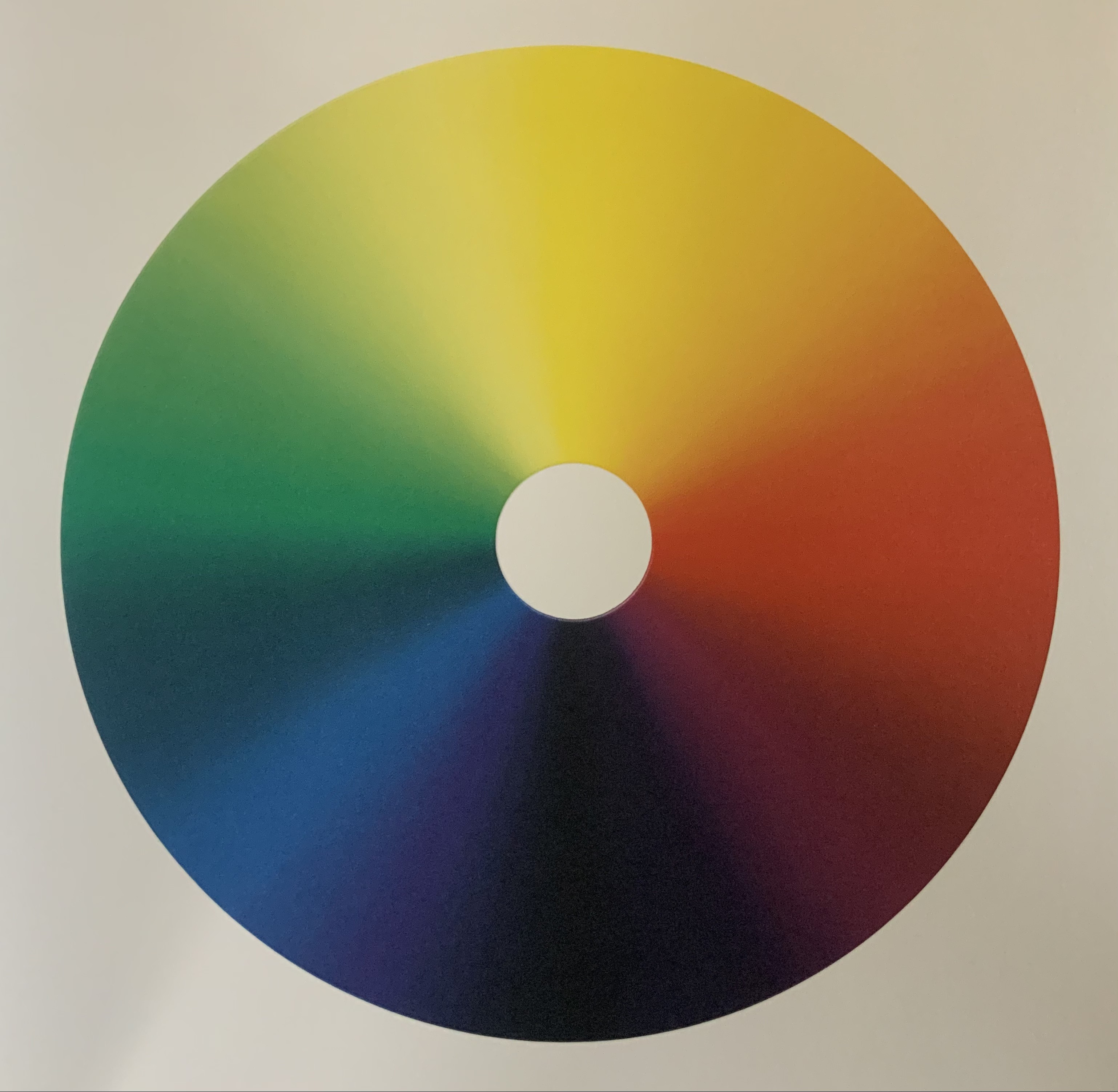
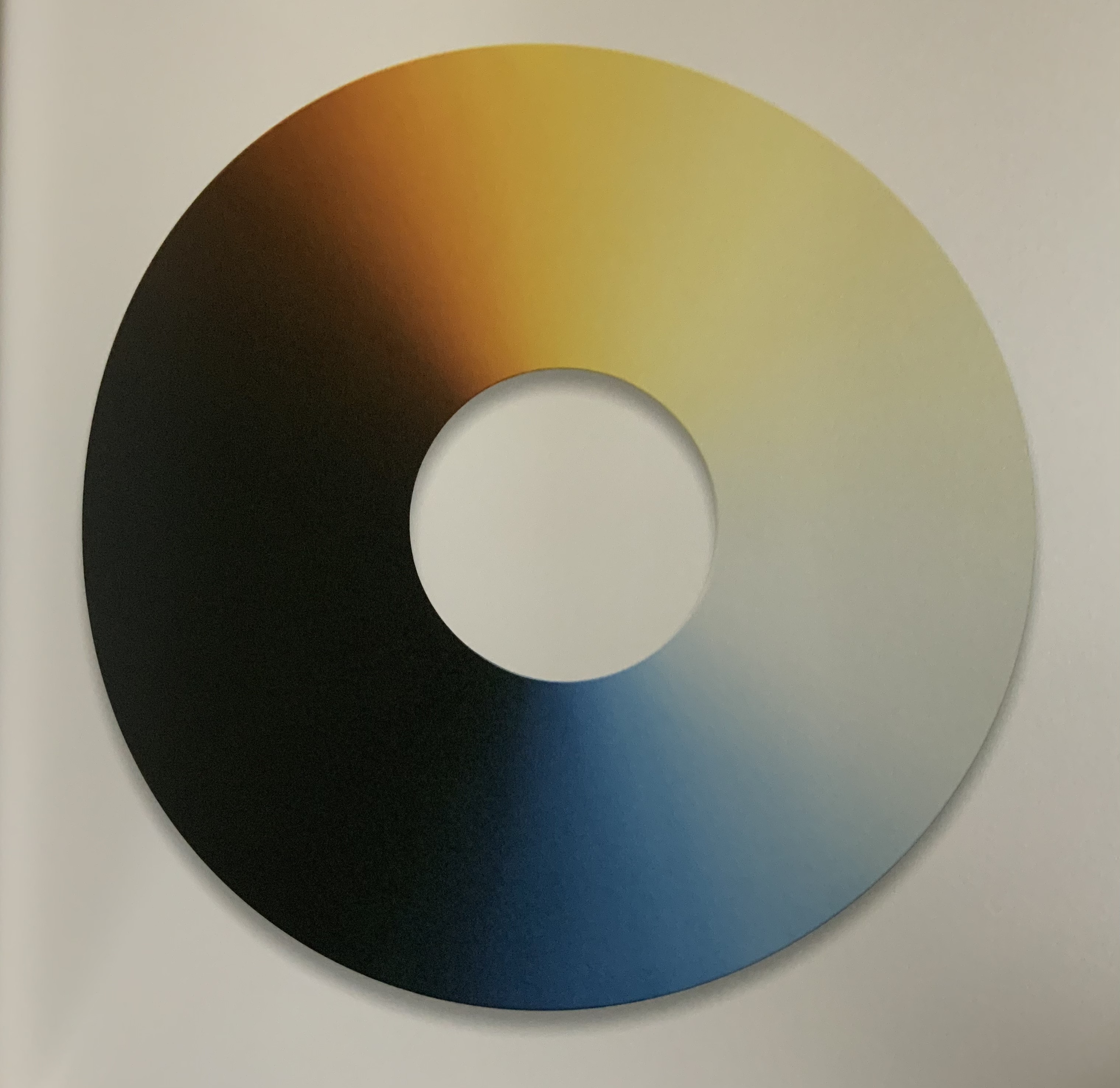
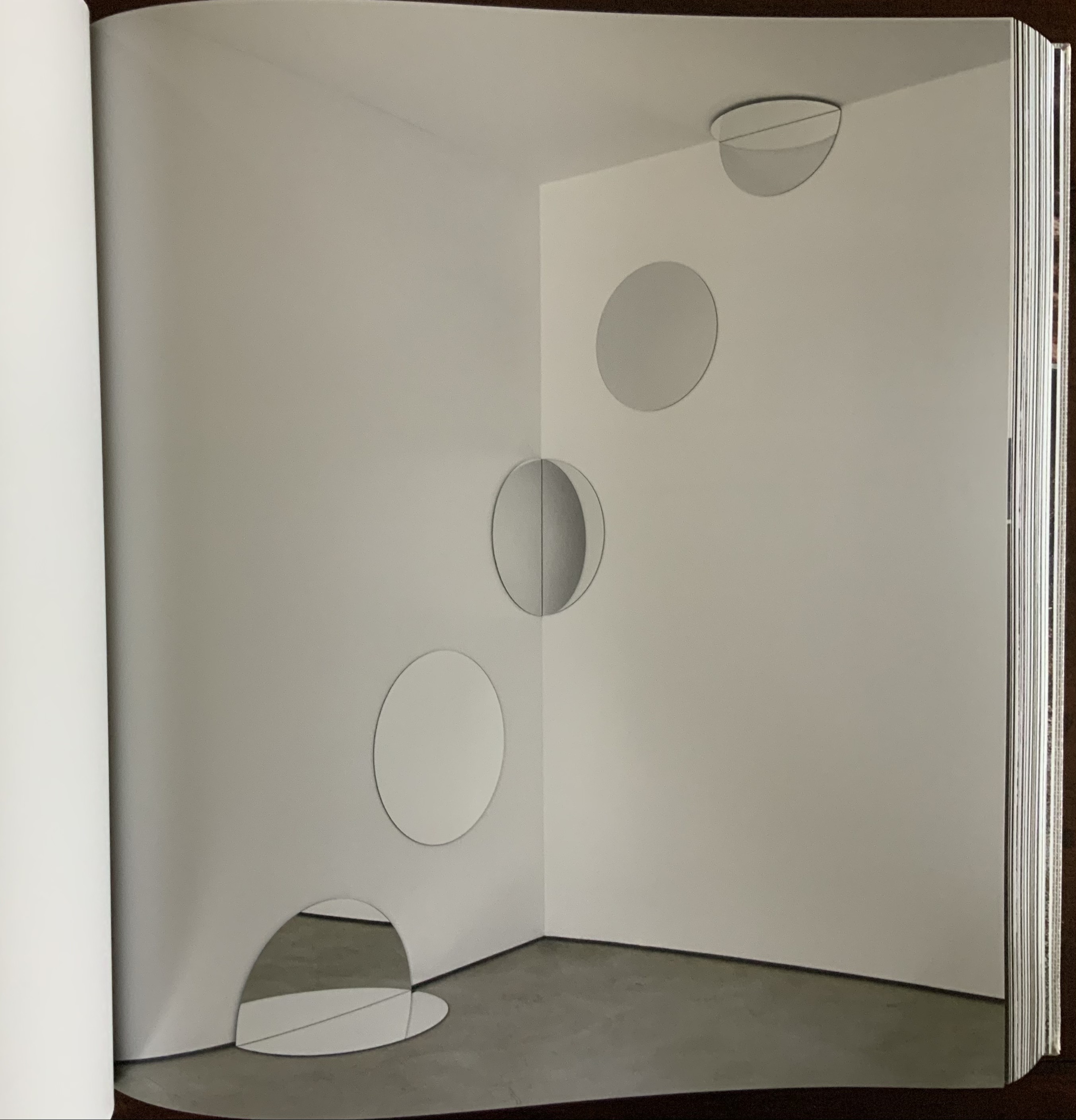
Other echoes occur within the span of artifice (whole color wheels echoed by sliced black ones) before colliding with nature (a piece of driftwood impaled by a glass triangle) and then jumping back to artifice (round mirrors bisected at floor and wall and cascading upwards to be bisected by wall and ceiling).

Some echoes occur across dozens and dozens of pages. Still others occur in the single turn of a page.

These are but a few of the themes that Eliasson weaves into a narrative with his images, artworks and projects. Every encounter with this book as container seems to reveal a new theme.

Contact (2014)

Contact (2014)
Olafur Eliasson
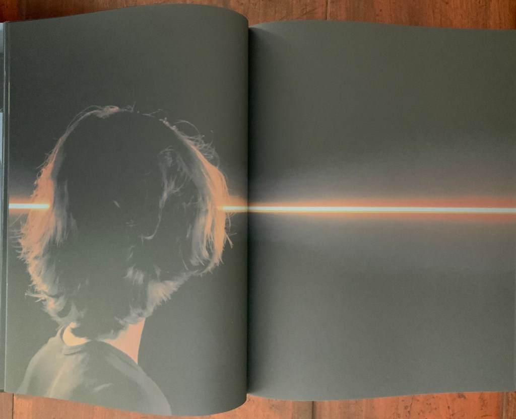
Front and back covers and center spread of exhibition catalogue in paperback. Designed by Irma Boom. Acquired from Artbooksonline.eu, 27 September 2020. Photos of the work: Books On Books Collection. Displayed with permission of Studio Olafur Eliasson.

Contact interprets the eponymous site-specific exhibition, commissioned by the Fondation Louis Vuitton and held in its Frank Gehry-designed building, 17 December 2014 through 23 February 2015. Here is the artist’s statement on Contact:

being in contact is the opposite of being disconnected. to be in contact is to be aware of the consequences that your actions have in and on the world. contact is about experience rather than consumption. to be in contact is to be in touch with the good things in life as well as with the difficult things in life. contact can be a greeting, a smile, the feeling of another person’s hand in your hand. contact is not a picture, it is not a representation; it is about your ability to reach out, connect, and perhaps even put yourself in another person’s place. for me, contact is where inclusion begins. contact is the highest luxury of all. olafur eliasson

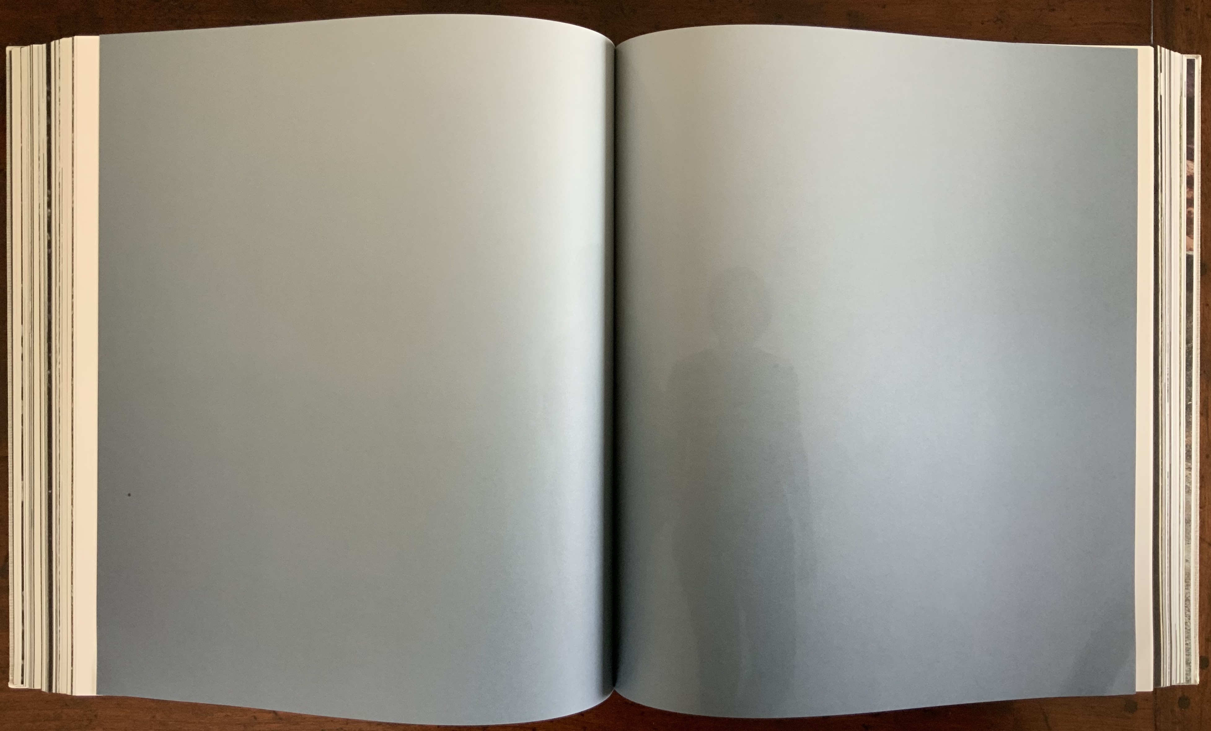
Contact is also between page and page. Eliasson and Irma Boom, “the queen of books”, have worked together on several works. Boom’s mastery of the full bleed, double-page spread and gutter is the perfect match for this volume that brings the virtual into contact with the material.

Contact is also between paper and ink, between black and white as well as between dark and light when the book’s fluorescent title glows in a darkened room. The cover’s fluorescent ink, however, is not integral enough with the rest of the book to rise above an amusing touch; whereas contact between black and white extends to the division of the book into black and white halves.

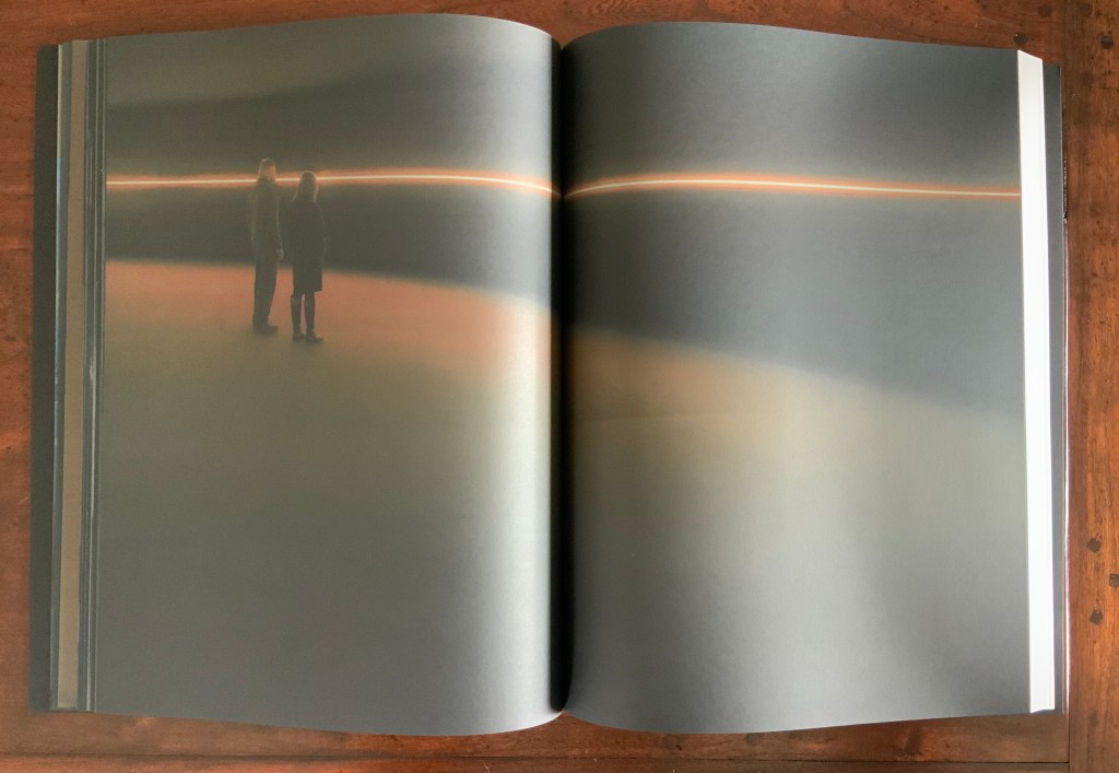
In the first half of the book, photographs on entirely black paper present a codex-experience of the exhibition. In the second half of the book, drawings take the viewer behind the scenes of the exhibition’s design and, retrospectively, train the eye to read the book as exhibition.

This incorporation of design drawings draws attention to time, and Contact is very much about our perception of time. In her book Binding Space: The Book as Spatial Practice, Marian Macken refers to “the tenses of the book”. Especially when presented in a book, architectural plan drawings “are not fixed in their sequence, but instead may be read and interpreted as existing within a range of times, such as the time of their making, of the present of the reader, the future they may refer to, and the contextual moment of apprehension” (p. 157). In the case of this “book of the exhibition”, published to coincide with the exhibition, the plan drawings and photographs exist in the exhibition’s past and present. For an exhibition attendee, they exist as a reminder of a personal past performance of contact with the exhibition. For attendees and non-attendees, they bring the exhibition’s past and future together in the present in a performance of contact guided by the architecture of the book.

How appropriate it is that, in her essay in the book’s white section, Caroline A. Jones writes, “Personally, I will not have seen the installations that the present text accompanies” — as is/will be the case for many of us experiencing Contact only in its book form. Jones’ essay is entitled “Event Horizon: Olafur Eliasson’s Raumexperimente”, which confirms that contact is not only about perception of time, but of space as well. While Jones teases out how the exhibition will play/plays/played with the astrophysical conundrum, she cites a comment from Eliasson in conversation that captures a simpler view: “There is a tradition of the horizon as a boundary between the known and unknown. But as you approach, it fades in, or comes into your experience. You can think of it as a space” (p. 133).

Space — which brings up the awkward point of the setting in which the exhibition occurred. Since the Renaissance, imagination in art and science has sat sometimes uneasily, sometimes too easily with wealth and privilege. There may be nothing democratic in Eliasson’s expensive, spectacular art, but Contact’s fusion of science, art, nature (Earth-bound and cosmic) and social connectedness contrasts pointedly and paradoxically with its setting in the opulent property of a global luxury brand — “the blandishments of follies and bling” as Jones puts it. As Eliasson’s artist statement asserts: “contact is about experience rather than consumption….is where inclusion begins….is the highest luxury of all”. But without the Fondation’s patronage, the experience of Contact in situ or even in these artfully designed pages would be denied.

Somewhat less reconcilable is the statement “contact is not a picture,… is not a representation”. Placing contact with art (a picture, a representation) in opposition to contact through human touch and empathy is not quite right. Just as Your House resonates with the perspective of the physicist/philosopher/humanist Bachelard, for whom the image is language, so too does the language of Contact as exhibition, images, objects, book — and experience. We cannot have contact without it.

Studio Olafur Eliasson. 2015. Olafur Eliasson, Contact, Fondation Louis Vuitton, Paris 2014 – 2015.

Further Reading, Looking & Listening

Architecture“, Bookmarking Book Art, 12 November 2019.

Bachelard, Gaston, M. Jolas, and Etienne Gilson. 1964. The poetics of space. Boston: Beacon Press.

Chavasse, Paule. Interviewer. 1959. “Gaston Bachelard – Entretien : La poétique de l’espace.” Radiodiffusion Française (RDF). 1959. Accessed 8 February 2021.

Denis, Claire. 2016. Contact by Olafur Eliasson. Video. 8 March 2016. Accessed 7 February 2021.

Eliasson, Olafur. 2009. “Not how, but why!” in Concrete Design Book on Implicit Performance. Eds. Siebe Bake and Billy Nolan. Brussels: FEBELCEM.

Fondation Louis Vuitton. 2015. Contact – Olafur Eliasson. Video. 13 January 2015. Accessed 7 February 2021.

Jones, Caroline A. 2014. “Event Horizon: Olafur Eliasson’s Raumexperimente”, pp. 132-37, in Contact. Paris: Flammarion.

Marian Macken. 2018. Binding Space: The Book as Spatial Practice. London and New York: Routledge.

Pallasmaa, Juhani. 2016. “Matter, Hapticity and Time Material Imagination and the Voice of Matter.” Building Material, no. 20: 171-89. Accessed February 8, 2021.

Pallasmaa, Juhani. 2011. The embodied image: imagination and imagery in architecture. Chichester: J. Wiley & Sons.

Razzall, Katie. 2013. “Celebrating books… with pages made of glass“, Channel 4 News, 20 September 2013. Accessed 3 November 2020.

Books On Books Collection – Yasushi Cho

LDK 2,020 (2020)

LDK 2,020 (2020)
Yasushi Cho
Banderole bound, single sheet cut and folded accordion style. 75 x 75 mm. Edition of 45, of which this is #7. Acquired from the artist 10 April 2021.
Photos: Books On Books Collection.

LDK 2,020, LDK FL00R and LDK 2,009 make up part of a series. Their letters L, D and K stand for Living, Dining and Kitchen and are the usual abbreviations in Japanese apartment/flat sales leaflets. Every day they arrive or can be picked up on the street, and Cho creates collages from them, digitally printing them on stiff translucent paper to be cut and creased, then folded into an accordion-style booklet. For the reader, the folds and cuts of the stiff translucent paper make a tricky “assembly and disassembly” — or reading — of the work to make it into a cube or other three-dimensional shape.

In the process of flattening the booklets into a single sheet, then folding and creasing and re-creasing, the reader wonders how the aspects of LDK may have fit together before their abstraction into the collage. Eventually though, the assembly creates objects whose interiors are their exteriors — and vice versa — and inevitably recall the shoji screens still used in traditional houses and even apartments.

LDK FL00R (2010)

LDK FL00R (2010)
Yasushi Cho
Banderole bound, single sheet cut and folded accordion style. 85 x 85 mm. Edition of 45, of which this is #3. Acquired from the artist, 10 April 2021.
Photos: Books On Books Collection.

Like the commas in LDK 2,020 (above) and LDK 2,009 (below), the zeroes in LDK FL00R play on the apartment prices listed in the sales leaflets, but also allude to the apartments’ floor numbers. The wordplay of the titles echoes the playful multiple shapes that the sheets can take and the resulting multiple views of the collages. The collaged images in LDK FL00R, however, are of the floor surfaces only.

LDK 2,009 (2009)

LDK 2,009 (2009)
Yasushi Cho
Banderole bound, single sheet cut and folded accordion style. 75 x 75 mm. Edition of 45, of which this is #36. Acquired from the artist, 10 April 2021.
Photos: Books On Books Collection

With smaller works of book art, size can disguise their depth and impact. In “reading” LDK 2,009 and its companions, an extraordinary depth and impact emerge. As the opened books assume their shapes and take their place in display, another element of the artful choice of material and printing technique emerges: the resulting play of light. This is a theme that Cho explores in two very different ways in the next works.

.interior (2010)

.interior (2010)
Yasushi Cho
Slipcase. Booklet, sewn. H150 x W98 mm, 24 pages. Edition of 30, of which this is #4. Acquired from the artist, 10 April 2021.
Photos: Books On Books Collection.

The photos in Cho’s book display views of the outside world, some of which appear to have been taken from inside an apartment whose interior is reflected in its window. Other photos display interiors — a café, an empty store — taken from an exterior vantage, resulting in reflections from the establishments’ window fronts. Some — a carpark, a walkway — seem unmediated. The playful title .interior, taken from the transposition of ・インテリア printed in the window below, and displayed on the spine of the mirrored slipcase above, confirms the artist’s theme of exploring the paradox of interior vs exterior, reflection and the mediation of vantage points.

The work’s theme of reflection is also compounded by the flimsy mirrored paper interpersed between some (not all) of the recto and verso pages. Depending on the image reflected and how the mirrored paper is turned, the reader may find a simple duplicate or an extension of a pattern. Above, the shop’s interior duplicates itself upside down; below, the high rise against a blue sky duplicates itself.

Above, the staircase seems to curve behind itself, the reflected car extends the row of parked cars, and below, the ceiling and light fixtures extend their pattern into the mirror.

Where the recto and verso are not divided by the mirrored paper, other permutations on the theme of reflection occur. Below, in the center of the book, the window in the recto page seems to reflect the vantage point from which the verso page’s photo was taken. The virtuosity in manipulating vantage points here recalls that of Michael Snow’s Cover to Cover (1975) and Marlene MacCallum’s Theme and Permutations (2012) or Shadow Cantos (2018-19).

In its composition, the photography fascinates the eye, and Cho’s use of the book and mirrored paper to present and transform the photos fascinates the mind, provoking contemplation of the paradoxes of interior, exterior and their reflections. No doubt, a gallery show could deliver similar fascination, but as a book, .interior is more than a gallery of artwork: it is a work of art.

Ld (2003)

Ld (2003)
Yasushi Cho
Acetate sleeve. Booklet, handsewn. A5 nonstandard trim, 32 pages. Edition of 30, of which this is #18. Acquired from the artist, 10 April 2021.
Photos of the work: Books On Books Collection.

If the stylized letters “L” and “d” do not suffice to distinguish this work from the LDK series, its shape, content and source certainly do. The way the images, surfaces and shapes play off one another suggests that “L” stands for light, and “d” for dark. The very different source from which the work arises — a night-time walk and shoot in Tokyo — confirms it.

On the black pages, the artist has overprinted in black to give a shadowy depth to the images and surface. The images in the dark sometimes reflect the images in the light — sometimes from the facing page, other times from previous pages. Below, for instance, the film-sprocket shapes just visible on a previous verso page’s lower edge reappear faintly, enlarged and in black over the red lights. The red lights, in turn, reappear faintly, also enlarged and in black on the lower half of the narrowing recto page.

These reflections begin to suggest those retinal images that appear after a flash of light or when eyes are held too tightly closed — both of which conjure up a night-time photo shoot in an environment of contrasts between neon lights or spotlights and the shadows they cast. By staring at the bright images on one page (below), the reader may also experience additional retinal images on the facing page.

The irregularly shaped pages recall Philip Zimmermann’s High Tension (1993) or Helmut Lohr’s Visual Poetry (1995). Cho’s pages alternate at angles, narrow or widen. With the flashes between light and dark, they evoke the photographer’s searching eye, focusing lens and movement through night-time Tokyo.

Both .interior and Ld are sophisticated — materially, conceptually and in execution. With the LDK series, they make a strong addition to the Books On Books Collection.

Further Reading

Marlene MacCallum“, Books On Books Collection, 2 September 2019.

Marlene MacCallum and the Shadow Cantos, Books On Books Collection, 9 February 2021.

An Online Annotation of The Cutting Edge of Reading: Artists’ Books“, Bookmarking Book Art, 7 September 2017.

Michael Snow“, Books On Books Collection, 3 March 2021.

Philip Zimmermann“, Books On Books Collection, 14 January 2020.

Books On Books Collection – Steven Heller & Gail Anderson

The Typographic Universe (2014)

The Typographic Universe (2014)
Steven Heller and Gail Anderson
Hardback, paper on board. H250 x W177 mm, 352 pages. Acquired from Music Magpie, 15 April 2021.
Photos: Books On Books Collection.

Heller and Anderson’s exploration of “the alphabet of everyday things” goes beyond finding the alphabet in everyday things (a form of pareidolia or “the tendency to perceive a specific, often meaningful image in a random or ambiguous visual pattern” — Merriam-Webster). Many (most?) of their examples involve making the alphabet from everyday things. Some, not so everyday like this one by Ceol Ryder.

Photo of the work: Books On Books Collection. Displayed with permission of Ceol Ryder.

Not all are as intricate or as long in the making as the alphabetic architectural efforts of Johann David Steingruber or Takenobu Igarashi, who are not mentioned. Still, the book serves as a useful mixed spice of images with which to season any appreciation of the interaction of the imagination with the alphabet.

Further Reading

Abecedaries I (in progress), Books On Books Collection, 31 March 2020.

Johann David Steingruber”, Books On Books Collection, 23 April 2021.

Bromwich, Kathryn. “Steven Heller and Gail Anderson’s Typographic Universe – in pictures“, Guardian, 9 August 2014. Accessed 28 April 2021.

Books On Books Collection – Louise Levergneux

Finding Home (2019)

Finding Home (2019)
Louise Levergneux
Explosion box with cloth over board binding with inkjet printed images (H114 x W115 x D115 mm, closed); 4 Turkish map fold booklets (H95 x W95 mm, closed) inkjet-printed on Lasal paper, each attached to the interior of a box flap; 3D printed house. Third edition of 3 copies, of which this is #2. Acquired from the artist, 5 February 2021.
Photos of the work: Books On Books Collection.

An explosion box, Turkish map fold, and small 3D-printed plastic house — the inventive combination reflects the many-featured domain of book art. That alone would warrant adding this work to the collection, but its union of material with content clinched the decision.

The work’s nomadic theme may have its roots in Levergneux’s various places of residence over time, but it also echoes her blog, entitled 1/2 Measure Studio, which began at the end of 2015 with her moving from a 20×12-foot studio into one measuring 10×10. The blog records indefatigable travels and visits with fellow book artists at all points of the compass to which Finding Home‘s four flaps might also allude — just as the small model might also allude to the half-measure studio.

Among the Turkish fold maps, the small house also conveys centrality and both a point of departure and one of arrival. The spirals and concentric circles within the open maps emphasize further the theme of seeking a center. But the work is not only about place. With all the maps open, we have a house surrounded by four blooms of color, which implies a still point in time among the shifting seasonal imagery.

There’s much about this work that recalls Gaston Bachelard’s The Poetics of Space (1969). There is, of course, the miniature house itself, for which Bachelard has entire chapters, but also in the maps, there is the butterfly recalling the chrysalis (pp. 85-86); the sun-kissed foothills, the recurrent theme of the horizon, distance and immensity (passim); the red maple leaf, the autumnal recollections (p. 179); and the prairie snowscape, the paean to snow (p.61); and the longitudinal and latitudinal references, recalling this passage:

Each one of us, then, should speak of his roads, his crossroads, his roadside benches; each one of us should make a surveyor’s map of his lost fields and meadows. Thoreau said that he had the map of his fields engraved in his soul. And Jean Wahl once wrote:

Le moutonnement des haies 
C’est en moi que je l’ai. Poème, p. 46 

(The frothing of the hedges 
I keep deep inside me.) 

Thus we cover the universe with drawings we have lived (p. 33).

City Shields, Vol 1: No 7 Ontario (2017)

City Shields, Vol 1: No 7 Ontario (2017)
Louise Levergneux
Jewel case cover (H103 x W105 mm) with insert printed on Inkpress Matte paper holding 21 die-cut photos of manhole covers printed on Generations G-Chrome Lustre paper. Edition of 25 copies. Acquired from the artist, 5 February 2021.
Photos of the work: Books On Books Collection.

Like Finding Home, this work is autobiographical, documenting Levergneux’s travels from 1999 to 2020, from Scotland, Canada and the US. As summarized on the insert for this one issue, the shapes and design of the actual manhole covers vary — as do their die-cut photos — some round, some square, rectangular, flanged. Small as they are, their colors and shadows nevertheless entice thoughts of miniature tunnels and drains lying beneath them and winding their way under whatever surface on which the manhole covers rest. City Shields‘ evocation of hidden space and their reminder to look down as well as up at city architecture create a strange and welcome fit with the architectural theme in the Books On Books Collection.

Levergneux celebrated the close of the City Shields project with a 20th Anniversary Edition, described here.

Further Reading

Architecture“, Books On Books Collection, 12 November 2018.

Guy Bigland“. 31 August 2023. Books On Books Collection. (See his Square Photographs of White Circle Paintings (2022) for comparison).

Bachelard, Gaston, Maria Jolas, Mark Z. Danielewski, and Richard Kearney. 2014 (1964). The Poetics of Space. New York: Penguin Books.

Chen, Julie. 2013. 500 Handmade Books. Volume 2. New York: Lark. P. 20 (see Will Karp’s 49 Masterpieces of Art (2011) for comparison).

Levergneux, Louise. 1/2 Measure Studio.

Books On Books Collection – Timothy Epps and Christopher Evans

Alphabet (1970)

Alphabet (1970)
Timothy Epps and Christopher Evans
Booklet. 250 x 250 mm, 16 pages. Acquired from Antiquariaat Frans Melk, 23 November 2020. Photos: Books On Books Collection.

This is the alphabet that inspired Raffaella della Olga’s LINE UP (2020), also in this collection. At the UK’s National Physical Laboratory, Epps and Evans created their alphabet in 1969 in response to the challenge to overcome machine-readable typefaces’ human-unreadability. Perhaps because it was the second of three responses to Wim Crouwel‘s New Alphabet (1967), published in the Kwadraatblad/Quadrat-prints series, the Dutch graphic designer and series editor, Pieter Brattinga, snatched it up for publication in his series of experiments in printing ranging over the fields of graphic design, the plastic arts, literature, architecture and music. This particular issue was designed by John Stegmeijer at Total Design. 

While the bright blue (above left) stands out strikingly against the black background, the booklet appropriately makes the human eye strain to see the letters darkly printed against the black. Would a scanner pick them up? Does the similar elusive effect created by debossed printing in della Olga’s collaboration with Three Star Press allude to this as well? What would that ingenuity create if applied to Crouwel’s New Alphabet or to Gerard Unger‘s A Counter-Proposal (the first response to Crouwel’s booklet) or Anthon Beeke‘s Alphabet (the third and strangest response — letters composed of naked women)?

Further Reading

Abecedaries I (in progress)“, Books On Books Collection, 31 March 2020.

Raffaella della Olga“, Books On Books Collection, 8 December 2020.

Beeke, Anthon, Geert Kooiman, Anna Beeke, and Ed van der Elsken. 1970. Alphabet. Hilversum: Steendrukkerij de Jong & Co.

Crouwel, W.H. 1967. New alphabet: a possibility for the new development = een mogelijkheid voor de nieuwe ontwikkeling = une possibilité pour le développement nouveau = eine Möglichkeit für die neue Entwicklung : [proposal for a new type that, more than the traditional types, is suited for the composing system with the cathode-ray tube (CRT). Hilversum: Steendrukkerij De Jong & Co.

Owens, Sarah. 2006. “Electrifying the Alphabet“, Eye, No. 62, Vol. 16. Accessed 25 April.

Unger, Gerard. 1967. Een tegenvoorstel. A counter-proposal, etc. Hilversum: Steendrukkerij de Jong & Co.

Books On Books Collection – Edward Andrew Zega & Bernd H. Dams

An Architectural Alphabet : ABC (2008)

An Architectural Alphabet : ABC (2008)
Edward Andrew Zega & Bernd H. Dams

Slipcase, casebound in a variation of the Chinese fashion. H210 x W178 x D25 mm, 96 pages. Edition of 400, of which this is #21. Acquired from Architectural Watercolors, 8 April 2021.
Photos: Books On Books Collection, displayed with permission of the artists.

Since 1995, Zega & Dams have published several volumes of their architectural watercolors, almost all focused on the Ancien Régime but with some diversions to New York’s Central Park and Russia’s Tatarstan. An Architectural Alphabet is, however, not quite a diversion and certainly more than a divertissement. Two elegant essays — “Letter Pictures” and “Artists’ Alphabets” — bracket the elevational drawings of A to Z with their accompanying illustrations. The essays weave together reference points from the history of the Latin alphabet, architectural history, histories of architectural and natural science illustration and those of typography and graphic design. They do this lightly and knowingly just as the letters and images do, which play simultaneously with typographic and calligraphic traditions and the vocabulary of the architecture and decorative arts of the Ancien Régime and the Grand Tour.

The acanthus leaf commonly used to decorate a column’s capital, hence the gentleman’s upward gaze.

Balustrade: a rail supported by balusters (vase-shaped columns), used for balconies from which a lady might like to peer.

The authors/artists’ choice and use of fonts offer other examples of their subtle erudition. The body text is set in Capsa italic, a rather allusive and self-allusive choice. Dino dos Santos, its designer, was inspired by fonts created by the 18th-century type-founder Claude Lamesle. One of those Ancien Régime fonts is Gros Romain Ordinaire, whose name draws further attention to Zega & Dams’ decision to use italic in place of the usual Roman for the body text. With its “Romain” roots, Capsa italic performs as the perfect foil to the choice of display font, which also serves as the template for the “letter pictures”: Carol Twombly’s Trajan. The name and design are based on the Roman capitals entwining Trajan’s Column in Rome. The fact that the ancient Roman capitals had no letter U, only the letter V to stand in for both, provides the artists with the opening for the following visual joke.

Urn versus Vase

The authors take the stylistic development of chinoiserie during the Ancien Régime for two rides in the work: one for vocabulary with the letter C and another for structural allusion with the binding.

The binding is a variation on Chinese casebinding. Here the sewn book block has been placed on the middle board of three hinged boards and is attached to the left-hand and middle boards by the endpapers (CD and YZ, respectively). The right-hand board is hinged to fold on top of the left-hand board. The Curtis by Curtis 1.5 paper (a 200 gms vellum stock) is stiff, and the sewing is so tight that the book does not easily open or lie flat. The casing, however, allows extensive pressure without the hazard of breaking the spine’s covering. In two finishing Oriental touches, the artists called for grey silk for the board coverings and green for the inside of the right-hand board and hinge.

With its architectural and alphabetic themes, An Architectural Alphabet makes a fitting addition to the Books On Books Collection, and its essays serve as welcome reminders of the more discursive volumes by Laurence de Looze, Marian Macken, Hugh McEwen and Chrysostomos Tsimourdagkas (see Further Reading).

Further Reading

Abecedaries I (in progress)“, Books on Books Collection, 31 March 2020.

Architecture“, Books on Books Collection, 12 November 2018.

Federico Babina“, Books On Books Collection, 20 April 2021.

Antonio Basoli“, Books On Books Collection, 20 April 2021.

Antonio & Giovanni Battista de Pian“, Books On Books Collection, 20 April 2021.

Richard Niessen“, Books On Books Collection, 20 April 2021.

Paul Noble“, Books On Books Collection, 20 April 2021.

Johann David Steingruber“, Books On Books Collection, 20 April 2021.

De Looze, Laurence. 2018. The Letter and the Cosmos: How the Alphabet Has Shaped the Western View of the World. Toronto: University of Toronto Press.

Macken, Marian. 2018. Binding Space: The Book as Spatial Practice. London and New York: Routledge.

McEwen, Hugh. Polyglot Buildings. 12 January 2012. Issuu. Accessed 13 March 2021.

Tsimourdagkas, Chrysostomos. 2014. Typotecture: Histories, Theories and Digital Futures of Typographic Elements in Architectural Design. Doctoral dissertation, Royal College of Art, London. Accessed 13 March 2021.

Books On Books Collection – Paul Noble

Nobson Newtown (1998)

Nobson Newtown (1998)
Paul Noble
Paperback, H17 x W120 mm, 32 pages with foldout map. Acquired from Marcus Campbell Art Books, 13 March 2021.
Photos: Books On Books Collection.

With Nobson Newtown, Paul Noble extends the tradition of alphabetical architecture to full-scale city planning and landscape architecture. Some of Antonio Basoli’s 19th-century designs — for example, the letter A — display a letter-shaped built environment, as does Steven Holl’s The Alphabetical City (1980), but in seaside Nobson Newtown, the buildings spell out words, and the mapped habitation (although without any depiction of inhabitants) rests on a founding myth as bizarre and misanthropic as its current civic arrangements.

In addition to a map of the town and the environs, Nobson Newtown includes a key to its alphabetical and typographic building blocks, which are, of course, rendered in Nobfont. Easy legibility is not a characteristic.

The Museum Boijmans Van Beuningen commissioned a film from Noble exploring Nobson Newtown, insightfully characterized as “an ever-incomplete inner landscape of the person building the town”.

Further Reading

Abecedaries I (in progress)“, Books on Books Collection, 31 March 2020.

Architecture“, Books on Books Collection, 12 November 2018.

Federico Babina“, Books On Books Collection, 20 April 2021.

Antonio Basoli“, Books On Books Collection, 20 April 2021.

Antonio & Giovanni Battista de Pian“, Books On Books Collection, 20 April 2021.

Jeffrey Morin“, Books On Books Collection, 20 April 2021.

Richard Niessen“, Books On Books Collection, 20 April 2021.

Johann David Steingruber“, Books On Books Collection, 20 April 2021.

Côme, Tony. “The Typotectural Suites“, The Palace of Typographic Masonry. Accessed 5 April 2021.

Holl, Steven. 1980. The alphabetical city. New York: Princeton Architectural Press.

Macken, Marian. 2018. Binding Space: The Book as Spatial Practice. London and New York: Routledge.

McEwen, Hugh. Polyglot Buildings. 12 January 2012. Issuu. Accessed 13 March 2021.

Noble, Paul, and Georgina Starr. “N is for Nobson“, ARTtube, 21 October 2018. Accessed 13 March 2021.

Polano, Sergio. January 2019. “Architectural Abecedari“, Casabella, 893, pp. 62-75 + 100-101 (eng.). Milan.

Tsimourdagkas, Chrysostomos. 2014. Typotecture: Histories, Theories and Digital Futures of Typographic Elements in Architectural Design. Doctoral dissertation, Royal College of Art, London. Accessed 13 March 2021.

Books On Books Collection – Richard Niessen

The Palace of Typographic Masonry (2018)

The Palace of Typographic Masonry (2018)
Richard Niessen
Paperback, perfect bound. H300 x W215 mm, 348 pages. Acquired from Wordery, 29 March 2021.
Photos of the work: Books On Books Collection. Displayed with permission of Richard Niessen.

Website, perforated poster, exhibition and paperback, The Palace of Typographic Masonry occupies its place in the Books On Books Collection unlike any other work. The book itself is a shape shifter. Its size competes with those of museum catalogues. In fact, the Palace of Typographic Masonry is like a museum, so much so that it requires a tour guide, which is one shape the book takes. With its nine departments (Sign, Symbol, Ornament, Construction, Poetics, Play, Order, Craft and Practice), it is like a working museum of graphic design, and Dirk van Weelden, our tour guide, often hands us off to departmental “staff” for a lecture or overheard interview.

Given the guided-tour premise, the page layouts strangely, or perhaps appropriately, disorient. On almost every page, at almost every turn, we are rubbernecking and twisting to follow text that appears in a typewriter font on sheets and cards that seemingly have been stuck to a black surface with masking tape, photographed and then printed. Some of the text-bearing cards wrap from the recto page to the verso, leading the reader to think that perhaps the pages are on Chinese fold sheets. A card or sheet may be displayed complete on a page, but the next page may show its edge as if an overlapping photo had been taken. On some pages, the items overlap like a collage. At times, the effect is one of moving down a corridor of blackboards that are covered with notices and captioned photos on white, green and fluorescent orange paper. At other times, the page contains multiple cards as if lying on a flat surface — much the same as objects might be arranged in gallery glass cases — and in different orientations so that the book has to be turned clockwise or anti-clockwise to read each item — much the same as having to walk around a glass case to look at each object in it.

Interspersed glossy sections showcase projects illustrating or responding to the text or the department. For example, Slovenian graphic designer Nejc Prah delivers variations on Masonic tools for Symbols; Paris-based Fanette Mellier, on grid-based design for Poetics; and the Amsterdam-based studio Moniker, “board game cut-ups” for Play. While these sections fit their context in the book, their content and “slippery floor” substrate ratchet up the sense of disorientation. Museum visitors easily tire, and they can be bored in some departments.

Nejc Prah‘s variations on Masonic tools and symbols. Photo: Books On Books Collection. Displayed with artist’s permission.

For example, the palace’s labyrinth of scripts — also reproduced separately on the perforated poster — is followed by a discussion of the revival of Tifinagh, the nearly extinct written language of the Tuareg in the Maghreb. The labyrinth presents thirty-six scripts in those varying orientations mentioned above and is wonderful in its breadth but also tiring — especially from the effort required by the font size and orientations. The story of Tifinagh’s revival and integration through typeface design is inspiring, usefully makes the point about the cultural conventionality of alphabets and more, but also makes for a long trek before our guide moves us along into the next department.

With the website for The Palace of Typographic Masonry, Richard Niessen aims for both a collective (imagined) building and an encyclopedic (digital) space, organized into those nine departments or frames. Contributors can add to the source collections or, within the departments and their subdivisions, create new rooms based on the source collections. One contribution particularly appropriate for the Books On Books Collection comes from Tony Côme: “The Typotectural Suites“. Here in one location, the visitor can find those “language towers, typographic islands, cities to decipher, plans in the shape of letters, encrypted walls, speaking bricks, habitable capitals” created by Johann David Steingruber, Antonio Basoli, Antonio and Giovanni Battista de Pian, Paul Noble and others.

The Departments of Sign, Symbol or Order could give more prominence to the role of numbers in the world of typographic masonry. Numerals do appear in the tables for Morse Code and International Maritime Signal Flags, but the visitor would not know that counting and numbers preceded writing and letters. Perhaps the curator could persuade the art historian and archaeologist Denise Schmandt-Besserat to contribute images of those clay tokens to which

The Mesopotamian cuneiform script can be traced furthest back into prehistory to an eighth millennium BC counting system using clay tokens of multiple shapes. The development from tokens to script reveals that writing emerged from counting and accounting. (Schmandt-Besserat, 2015)

Clay counting tokens and bullae (containers).

Or perhaps the curator could persuade William Joyce to donate some clips from The Numberlys (2012) to the Palace source collection, even preferably some snippets of interactive code with which the visitor can help the five animated characters transform numbers into letters.

Universal languages are highlighted in an Annex, which has been compiled by Edgar Walthert. An update soon to come includes excerpts from Book from the Ground by Xu Bing. A link to Xu’s film The Character of Characters would make a useful addition. It will be interesting to see whether the Annex’s accompanying lecture covers the stir over a “post-text future” and whether typographic masons are returning full circle to pictographic language.

Further Reading

Architecture“. 12 November 2018. Books on Books Collection

The Art of Reading in a “Post-Text Future“. 21 February 2018. Bookmarking Book Art.

Federico Babina“. 20 April 2021. Books On Books Collection.

Antonio Basoli“. 20 April 2021. Books On Books Collection.

Giovanni Battista de Pian“. 20 April 2021. Books On Books Collection.

From a Visit to Art for the People, Xu Bing (Centro del Carme, Valencia, Spain, 2019)”. 22 May 2020. Bookmarking Book Art.

Jeffrey Morin“. 20 April 2021. Books On Books Collection.

Paul Noble“. 20 April 2021. Books On Books Collection.

Johann David Steingruber“. 20 April 2021. Books On Books Collection.

Côme, Tony. “The Typotectural Suites“. The Palace of Typographic Masonry. Accessed 12 March 2021.

de Looze, Laurence. 2018. The Letter and the Cosmos: How the Alphabet Has Shaped the Western View of the World. Toronto: University of Toronto Press.

Macken, Marian. 2018. Binding Space: The Book as Spatial Practice. London and New York: Routledge.

McEwen, Hugh. Polyglot Buildings. 12 January 2012. Issuu. Accessed 13 March 2021.

Schmandt-Besserat, Denise. 2006. How writing came about. Austin, Texas: University of Texas Press.

Schmandt-Besserat, Denise. 2015. “Writing, Evolution of”, in James Wright, ed., International Encyclopedia of Social and Behavioral Sciences, 2d. Edition. New York: Elsevier. Accessed 15 April 2021.

Tsimourdagkas, Chrysostomos. 2014. Typotecture: Histories, Theories and Digital Futures of Typographic Elements in Architectural Design. Doctoral dissertation, Royal College of Art, London. Accessed 13 March 2021.

Xu, Bing, Britta Erickson, and Jay Xu. 2012. The character of characters: an animation by Xu Bing. San Francisco: Asian Art Museum of San Francisco.

Xu, Bing. 2018. Book from the ground: from point to point. Cambridge, MA: MIT Press.

Books On Books Collection – Federico Babina

Archibet (2015)

Archibet (2015)
Federico Babina
Perfect bound card. H165 x W120 mm, 26 cards. Acquired from Laurence King Publishing, 12 March 2021.

Mostly modern architects, the letters of their first or last names integrated with a surreal building reminiscent of their styles, but the handling of colors and flattening of perspective, which signal Babina’s style, dominate as can be seen below with Aalto, Barragán and Le Corbusier.

Further Reading

Abecedaries I (in progress),” Books On Books Collection, 31 March 2020.

Antonio Basoli“, Books On Books Collection, 20 April 2021.

Architecture“, Books on Books Collection, 12 November 2018.

Antonio & Giovanni Battista de Pian“, Books On Books Collection, 20 April 2021.

Jeffrey Morin“, Books On Books Collection, 20 April 2021.

Richard Niessen“, Books On Books Collection, 20 April 2021.

Paul Noble“, Books On Books Collection, 20 April 2021.

Johann David Steingruber“, Books On Books Collection, 20 April 2021.

Macken, Marian. 2018. Binding Space: The Book as Spatial Practice. London and New York: Routledge.

McEwen, Hugh. “Polyglot Buildings“. 12 January 2012. Issuu. Accessed 13 March 2021.

Tsimourdagkas, Chrysostomos. 2014. Typotecture: Histories, Theories and Digital Futures of Typographic Elements in Architectural Design. Doctoral dissertation, Royal College of Art, London. Accessed 13 March 2021.

Books On Books Collection – Antonio Basoli

Alfabeto Pittorico, ossia raccolta di pensieri pittorici composti di oggetti comincianti dalle singole lettere alfabetiche (“Pictorial Alphabet, a collection of pictorial thoughts composed of objects beginning with the individual letters of the alphabet”) (1839/1998)
Antonio Basoli
Facsimile edition created by Joseph Kiermeier-Debre and Fritz Franz Vogel (1998) as part of the boxed set Alphabets Buchstaben Calligraphy, published by Ravensburger Buchverlag. H275 x W255 mm, 144 pages. Acquired from Antiquariat Terrahe & Oswald, 14 March 2021. Photos: Books On Books Collection.

The Ravensburger Alfabeto pittorico is like a “Black Forest Cake” — a lot of ingredients. The recipe starts with Antonio Basoli’s design of monuments based on letters of the alphabet and his original Italian and French descriptions. To this, the chefs Joseph Kiermeier-Debre and Fritz Franz Vogel add German and English translations. Then, alongside Basoli’s inventions, they place reduced versions of Antonio and Giovanni Battista de Pian’s contemporaneous alphabetical/architectural fantasies. And sprinkled throughout, providing comparative context to Basoli’s career in Bologna as a professionally and academically recognized scenographer, there are dozens of reduced versions of lithographs of opera settings by the more renowned scenographers associated with Vienna, Milan, Venice, Naples and Munich. It is entirely a pudding in the spirit of Basoli.

Basoli creates densely illustrated scenes based on each letter of the alphabet. For each view, his goal is to incorporate the letter structurally or ornamentally in a central building, which in the most successful attempts would begin with the letter. For instance, the large A-shaped building is an orangerie (as in arancia for oranges). B hints at the Tower of Babel and the destruction of the Babylonian empire. C stands for catafalque (or “crypt”) and the Capuchin monks attending to a burial.

Setting a further standard of success, the artist populates each scene with people, activities, objects and symbols that begin with the designated letter. Around the orangerie, agricultural attrezzi (“implements”) are strewn, stone aquile (“eagles”) perch on the building, alms are being distributed by a man in Arab dress, trees beginning with the letter A forest the background and pop up from pots, and the whole setting evokes Arabia according to the 19th-century perception of the region encompassing “Persia, Syria, Egypt and Ethiopia”.

As Kiermeier-Debre and Vogel point out in the preface and afterword, this scene and many others reflect the time’s preoccupation with the Orient and antiquity from the not-too-distant Napoleonic campaign in Egypt (1798-1801) that spawned the archaeological industry of Egyptology. They also reflect the scenography arising from a half century’s operas such as The Escape from the Seraglio(1782), The Caliph of Baghdad (1800), Abu Hassan (1811), Ciro in Babilonia (1812), L’Italiana in Algeri (1813), Il Turco in Italia (1814), Semiramis (1818), Maometto (1820) and Belsazar (1836). Drawing attention to the alphabetical scenes’ evidence of the wide range of Basoli’s cultural, historical, mythological and religious insights, Kiermeier-Debre and Vogel rightly conclude that the work is as much an encyclopedic pictorial dictionary as abecedary.

The author who provided the original commentary on Basoli’s scenes was G.C. Lossada, an art historian. He, too, notes Basoli’s erudition, but on the artistic success of each scene, he swings between acclamation and deprecation. Here is his concluding paragraph on the letter C:

Despite the fact that the shape of the letter C, the theme of this picture, does not lend itself to the main object that is depicted, and the larger part of the building actually lies outside of the initial, such that the whole design could well exist without it, despite all this the perspectives and proportions are so well thought out that this picture can be acclaimed as one of the best in the collection. P. 110.

Equally balanced in their appraisal of Basoli, Kiermeier-Debre and Vogel rank him behind his contemporary scenographers such as Karl Friedrich Schinkel but rate his alphabetical architecture over that of Giovanni Battista de Pian. The latter may be a matter of color and taste. Even reduced, Pian’s scenes draw the eye over Basoli’s, and if the criteria for ranking include a consistency in integrating concept, subject, technique and material, Pian’s letters strain less in their achievement. The letter C certainly takes the cake for Pian.

Basoli does, however, gain a point over Pian with his concluding ampersand. As Lossada remarks, in recapitulating the alphabet and images emblematic of each letter, Basoli’s “&” is entirely a scenic etcetera. The ampersand can be viewed online with the complete alphabet, thanks to the Civic Museum of the Risorgimento in Bologna and also RMR Productions (video, 7 June 2014; accessed 5 April 2021). Neither replicates the clarity of the Ravensburger reproductions.

Further Reading

Abecedaries I (in progress)“, Books on Books Collection, 31 March 2020.

Architecture“, Books on Books Collection, 12 November 2018.

Federico Babina“, Books On Books Collection, 20 April 2021.

Giovanni Battista de Pian“, Books On Books Collection, 20 April 2021.

Jeffrey Morin“, Books On Books Collection, 20 April 2021.

Richard Niessen“, Books On Books Collection, 20 April 2021.

Paul Noble“, Books On Books Collection, 20 April 2021.

Johann David Steingruber“, Books On Books Collection, 20 2021.

Côme, Tony. “The Typotectural Suites“, The Palace of Typographic Masonry. Accessed 5 April 2021.

de Looze, Laurence. 2018. The Letter and the Cosmos: How the Alphabet Has Shaped the Western View of the World. Toronto: University of Toronto Press.

Macken, Marian. 2018. Binding Space: The Book as Spatial Practice. London and New York: Routledge.

McEwen, Hugh. Polyglot Buildings. 12 January 2012. Issuu. Accessed 13 March 2021.

Tsimourdagkas, Chrysostomos. 2014. Typotecture: Histories, Theories and Digital Futures of Typographic Elements in Architectural Design. Doctoral dissertation, Royal College of Art, London. Accessed 13 March 2021.