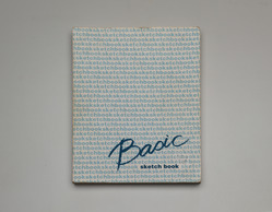
I first came across Noriko Ambe’s book art in 2013 through her site and MoMA’s Inside/Out. Two years later and preparing to attend the closing of Yale University Art Gallery’s special exhibition of Allan Chasanoff’s collection of book art, I spotted her Basic Sketch Book. The latter provided me with a way of making sense of what seemed like a slight contradiction of assertions in her artist’s statement and the MoMA interview.
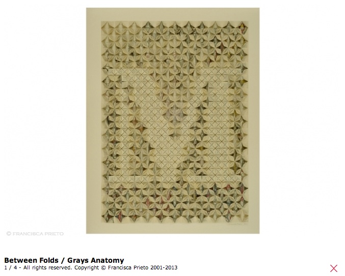
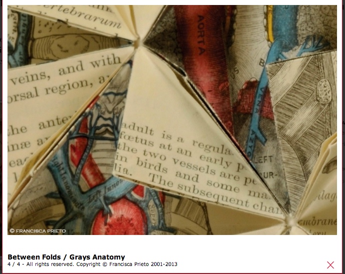
27.9 x 21.6 cm (11 x 8 1/2 in.)
The Allan Chasanoff, B.A. 1961, Book Art Collection, curated with Doug Beube- See more here.
Referring to the series Work of Linear – Actions, Ambe writes, “It looks like annual rings of a tree or topographical map or wave, but it isn’t. It is absolutely the traces of actions of a person, which is me.” So here is book art as abstract self-portraiture.
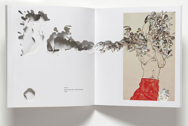
But in her interview with Hanna Exel and referring to the seriesキル –Artist Books Project, Ambe comments, “I am not trying to express myself or insert myself into the other artist’s work by cutting their catalogue …”. In that series, Ambe selected 24 artists’ books and catalogues, and, studying each carefully , excavated or rather drew by excision. Aren’t these “absolutely the traces of actions of a person” — Noriko Ambe?
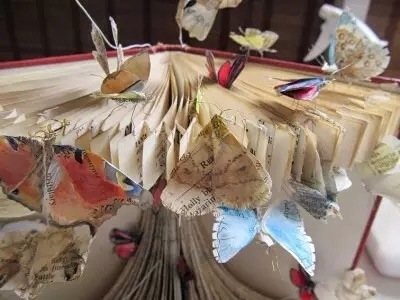
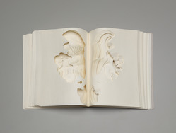
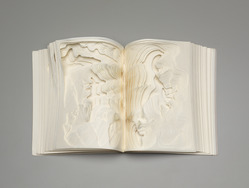
 Noriko Ambe, CUT: Egon Schiele, 2009
Artist’s book
The Museum of Modern Art, New York.
Fund for the Twenty-First Century.
© 2013 Noriko Ambe
Reproduced with the artist’s permission
Here is the list of works in the series:
His heart, his life: Andy Warhol
Collected Beauties: Damien Hirst
Art Victims: Damien Hirst
Prologue: Sugimoto + Foer
Sculpture: Richard Serra
Spiritual America: Richard Prince
Crash!: Takashi Murakami
Kiru- Cut : Egon Schiele
In the Studio: Arberto Giacometti
Current – War Cut: Gerhard Richter
Current – A Private Atlas: Gerhard Richter
In the bathtub?!: Jeff Koons
Diamond Dust Shoes: Andy Warhol
Warning!: Richard Pettibone
Sailing to…: Cy Twombly
Anatomy of Love: John Currin
Listning to Tom Freidman: Tom Freidman
Thoughts on Tom Freidman: Tom Freidman
Beautiful Inside of My Head Forever: Damien Hirst
Dots on Dots and Leyers: Roy Lichtenstein
To Perfect Lovers: Felix Gonzalez-Torres
A Study of Robert Therrein: Robert Therrien
Double sides: Gilbert & George
Artists, Believe in Yourself.: Piotr Uklanski
In her series statement, Ambe elaborates:
The process of creation was divided into roughly three stages. First, I earnestly established a deep respect for the artists and verified what they expressed through their art. After assimilating that information I decided on the theme (title) that needed to be expressed. Through a filter, the filter being me, the work was made while cutting as though I was having a dialogue with each single page.
When cutting something from the back I didn’t know what kind of image would appear next. Each time I decided to cut away or to leave behind and the process continued to a point where the book was on the verge of destruction, and then following my theme I re-constructed. Finally, while I clearly remained in the work as a filter, the essence of the artist was emphasized. It became a collaboration for the first time when these two things were balanced.
She calls the results dialogues and collaborations. I see unique works of art. Literally taking tradition as her material, Ambe delivers book art with its own unmistakeable, individual style. Each interpretation through her eyes, hands and scalpel is a unique, new work and a self-portrait in an abstract sense.
There is not the slightest contradiction.