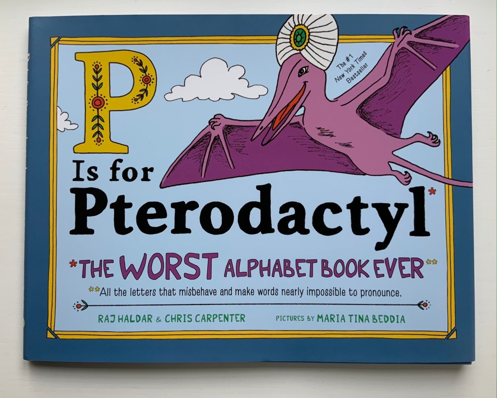
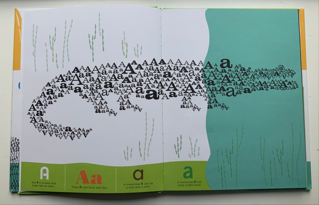
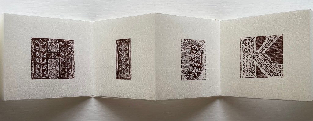
P is for Pterodactyl: The Worst Alphabet Book Ever (2018) Raj Haldar, Chris Carpenter & Maria Tina Beddia Hardback, illustrated paper on boards, dustjacket. H222 x W286 mm. 40 pages. Purchased from Amazon, 17 August 2021. Photos: Books On Books Collection.
If a posthumous revision of Eric Partridge’s Comic Alphabets were possible, this one would have to be included. But why did it take so long for the oddball abecedary and the oddities of spelling to meet in “The Worst Alphabet Book Ever“? Or maybe the 19th century spelling reformer Alexander J. Ellis compiled a still-to-be-discovered abecedary displaying a carp above the word ghoti.
Apropos of carp, though: the entry for bdellium is irritating on two scores. First, it is not the only word dumb enough to begin with “b”; there is also bdellatomy and bdellometer. Second, while true that the tree producing the gum resin bdellium is native to the East Indies and Africa, there are words other than dumb ending in a silent /b/ that the authors might have chosen to underscore their point. But they didn’t and fell into the sticky colonial trap illustrated (somewhat more obviously) below.
From Abc En Relief(1955) Jo Zagula and Marguerite Thiebold Photo: Books On Books Collection.
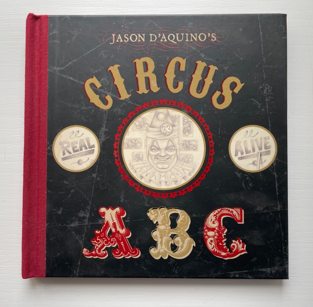
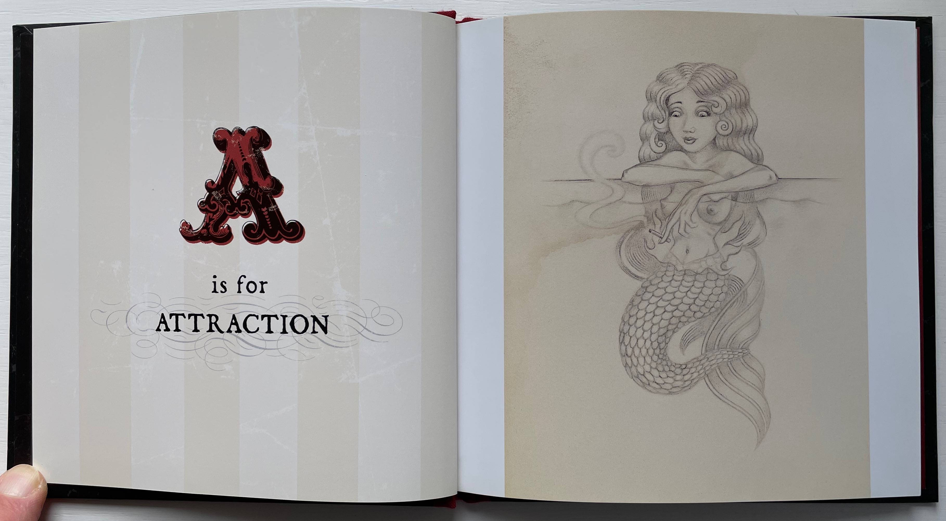
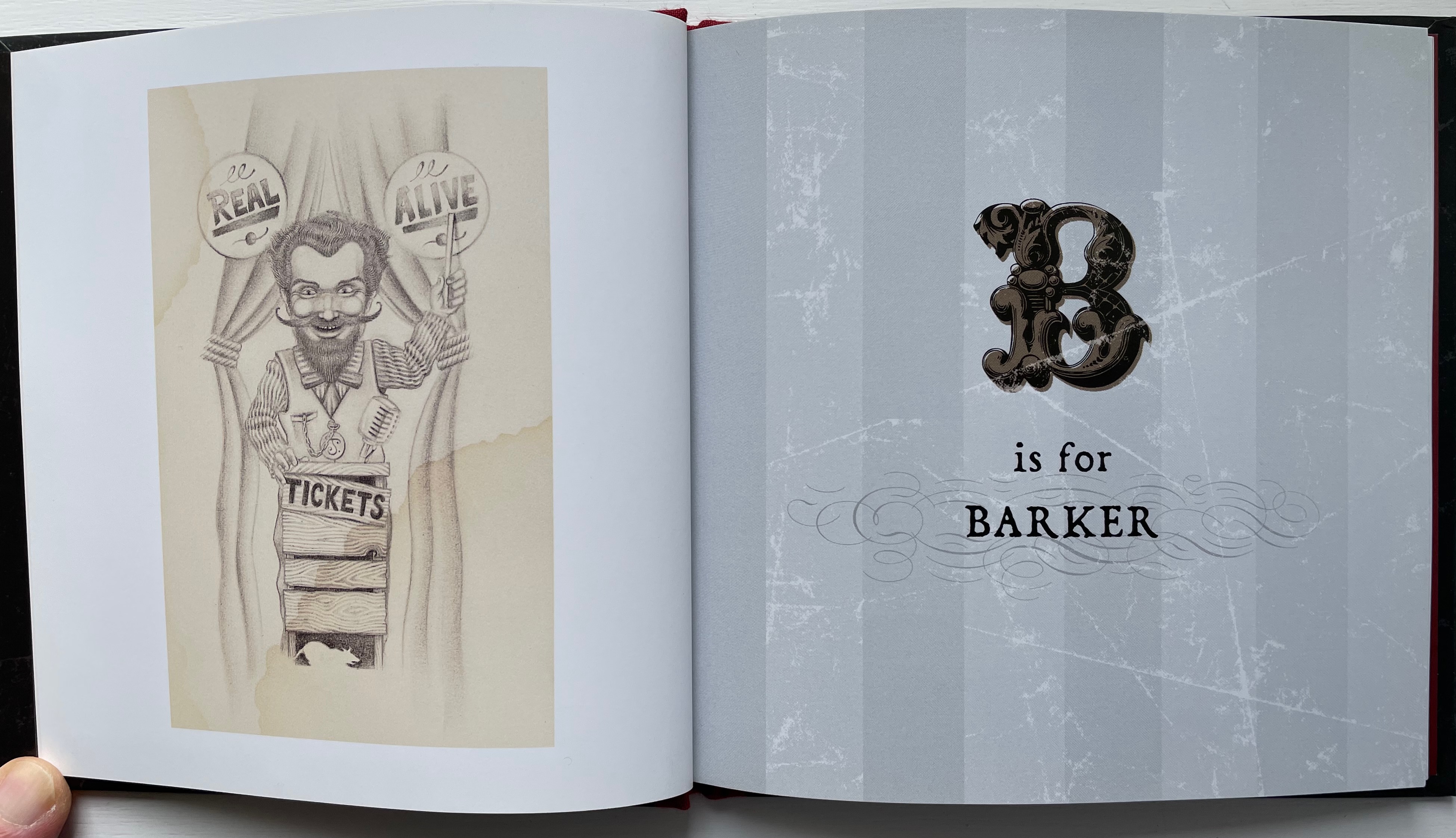
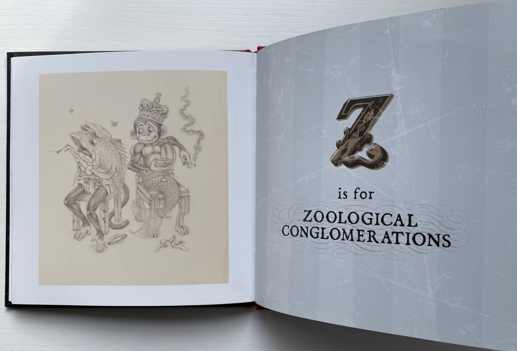
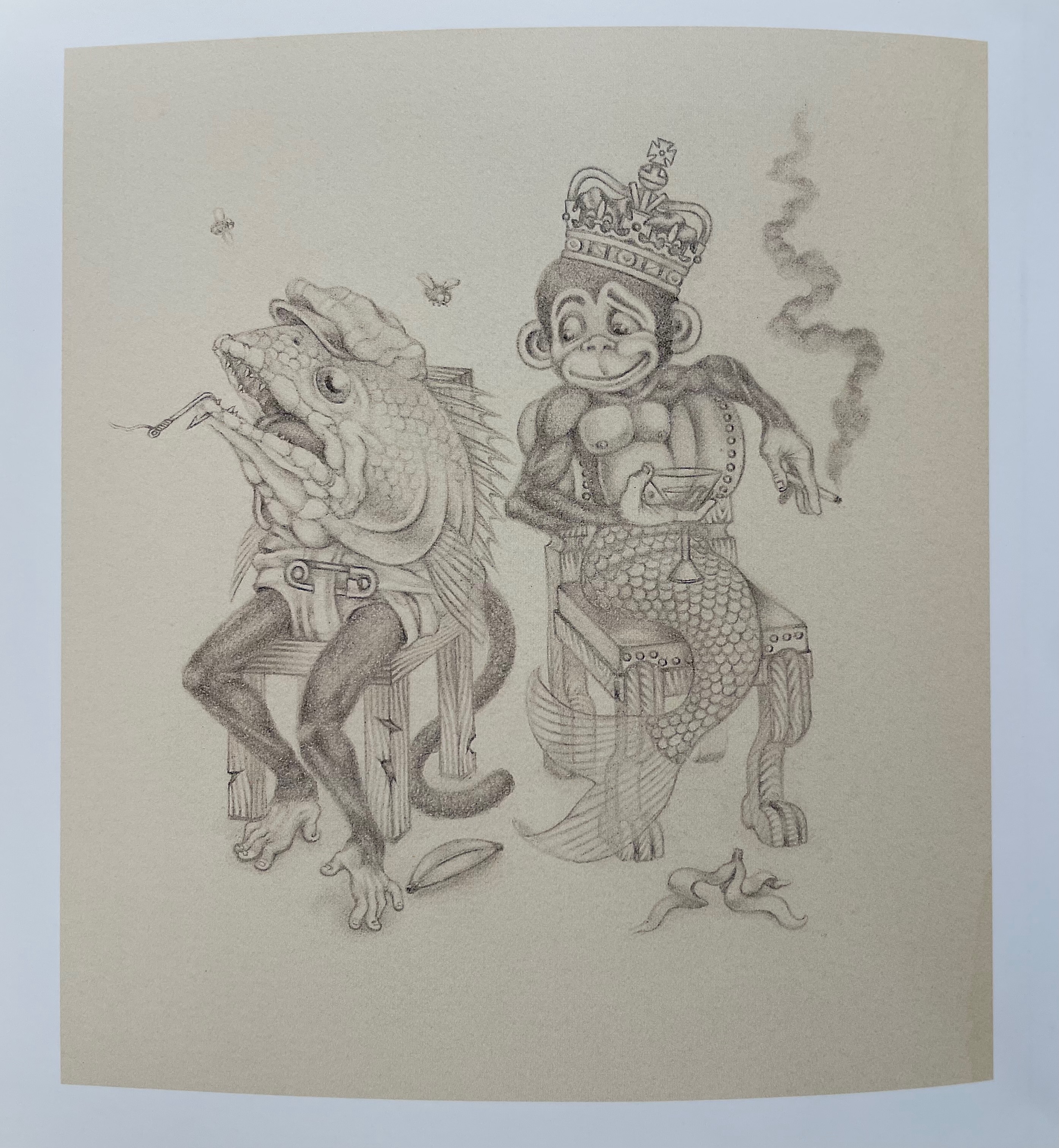
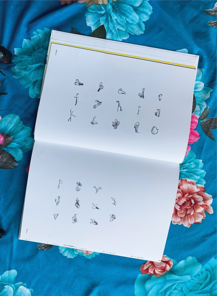
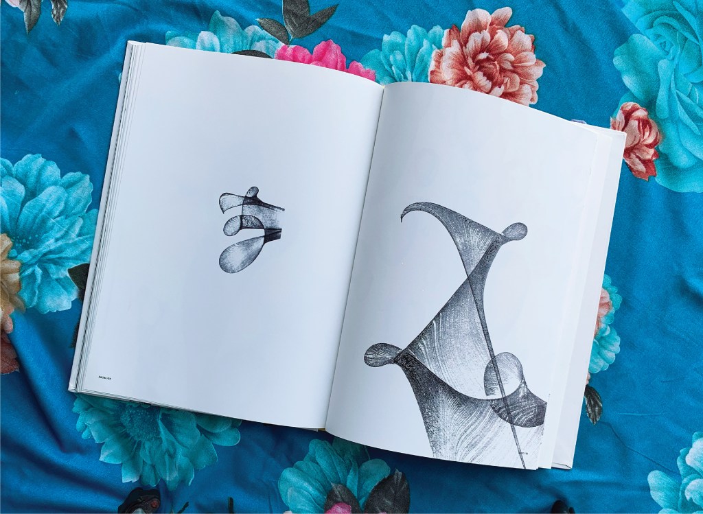
Jason D’Aquino’s Circus ABC (2010) Jason D’Aquino Hardcover, cloth spine, printed paper over boards. H158 x W 158 mm. 56 pages. Acquired from Amazon, 24 September 2022. Photos: Books On Books Collection
At the intersection of alphabet books and artists’ books, surrealists and neo-surrealists come sailing, unicycling, swimming, stilt-walking and crossbreeding. Jason D’Aquino distinguishes his contribution with a circus theme and miniaturist’s hand, although his publisher Simply Read Books expands it to 158 mm square (6 x 6 inches).
The illustrations are more R. Crumb than Max Ernst, and the letters themselves hark back to Jean Midolle’s Écritures Ánciennes D’après Des Manuscrits & Les Meillers Ouvrages (1834). But in concept and execution, Jason D’Aquino’s Circus ABC is original. The fineness of D’Aquino’s drawings fascinates the eye.
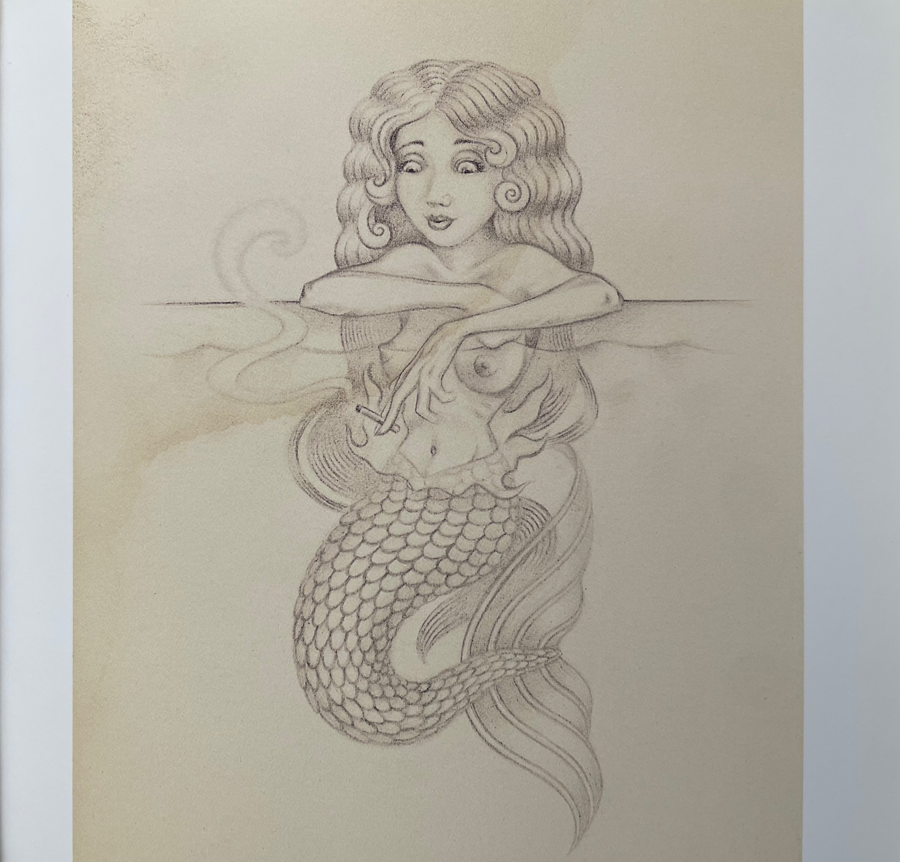
D’Aquino’s book is also eclectic in its abecedary approach. Above, where the illustration for the letter C offers several things beginning with that letter, those for A and B do not play the “find the object” game, although they do have their jokes. The mermaid’s is an optical illusion.The barker’s joke is that he is D’Aquino’s self-portrait. And with the letter Z below, for which nothing shown begins with the letter Z, the visual puzzle lies in figuring out what the crown, martini and cigarette have to do with the anatomical swap-out between the goldfish and chimp — and why the image so strongly echoes that for letter A.
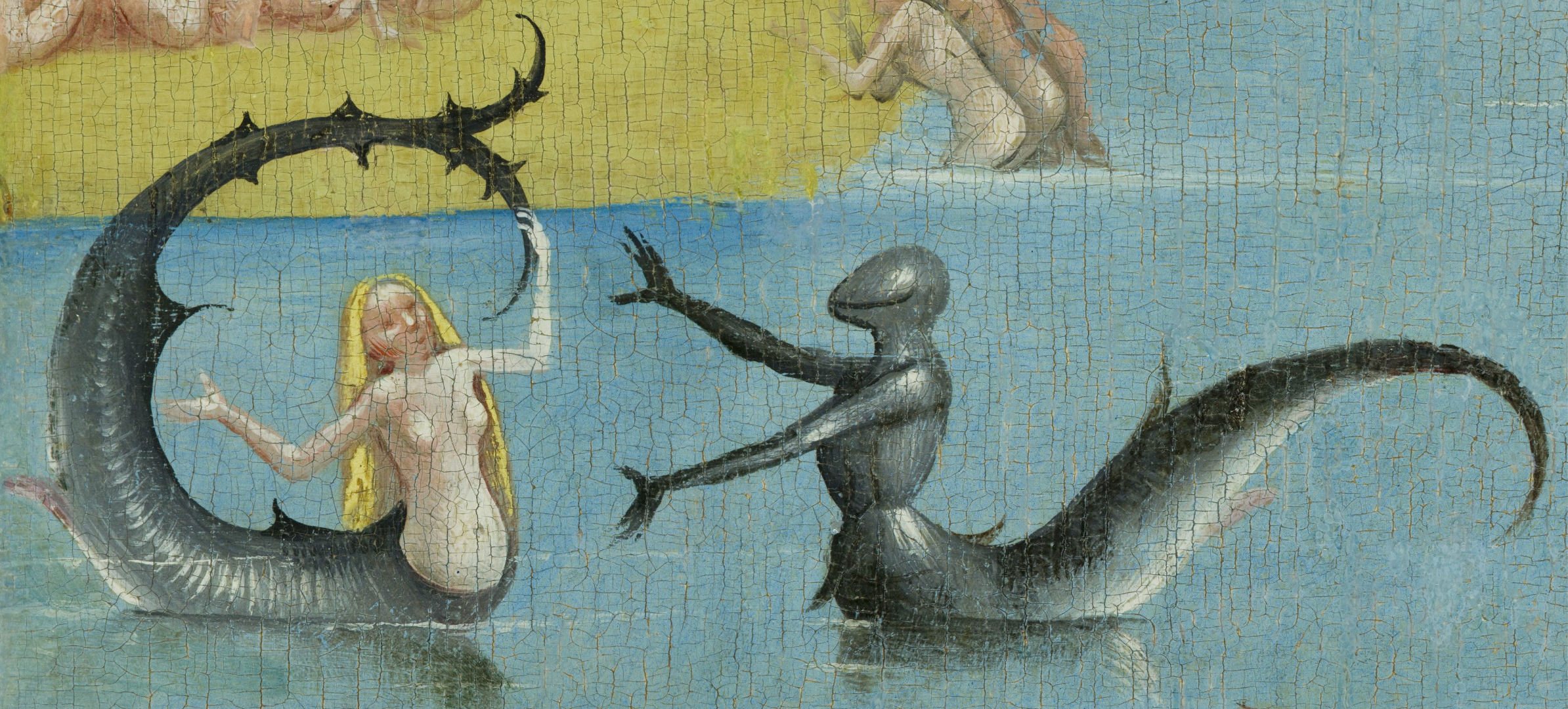
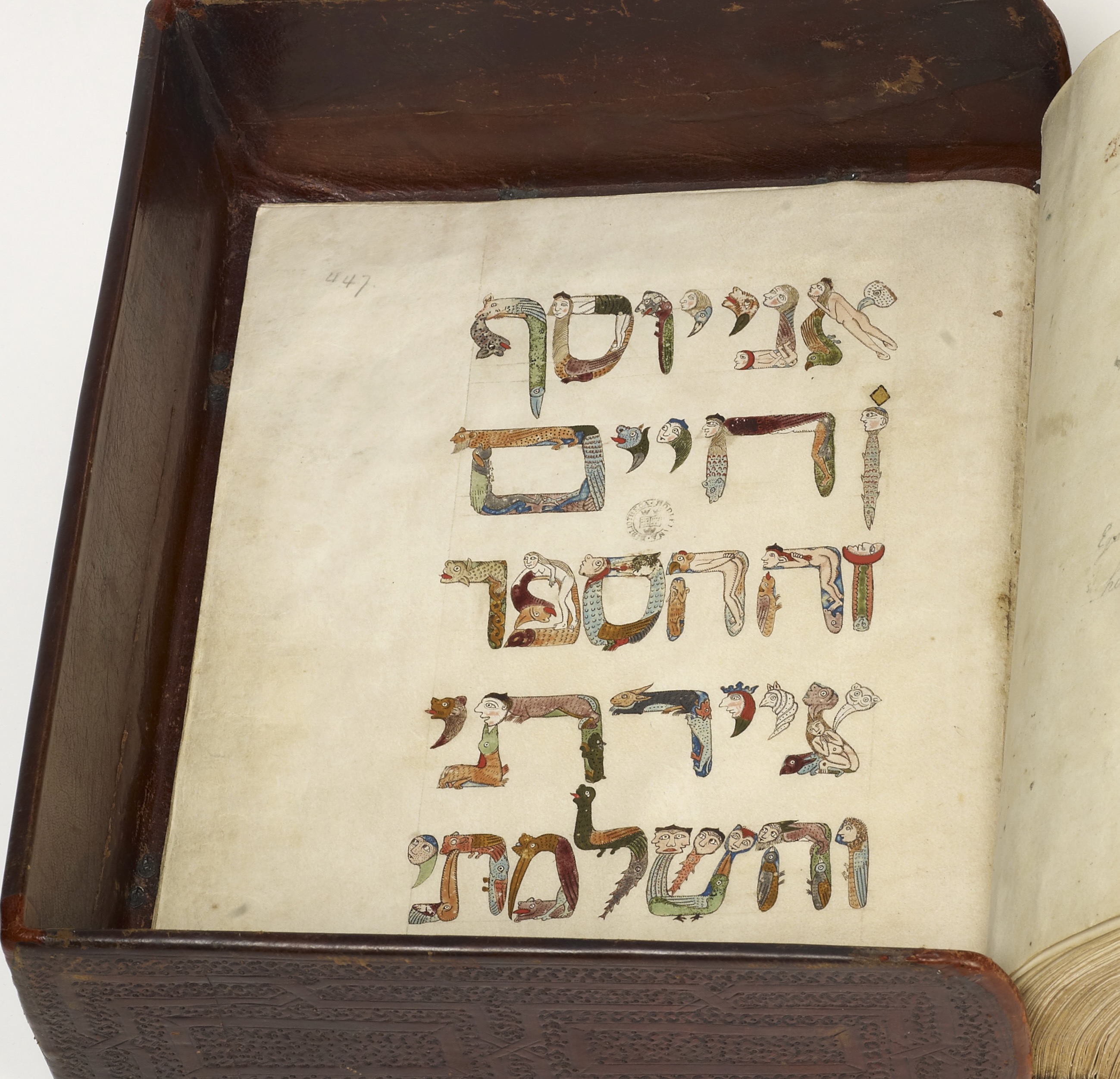
Surrealism has roots in the art of Hieronymus Bosch as well as in the fantastical alphabets of Jean Midolle and his medieval predecessors. Not surprising then that elements of D’Aquino’s world can be found in the Garden of Earthly Delights and the Kennicott Bible. Other surrealist alphabets from the Books On Books Collection are listed below.
Above: Detail from Hieronymus Bosch, The Garden of Early Delights (1490-1510). Below: Hebrew Bible (Former Prophets with Targum and various commentaries), Bodleian Library MS. Kennicott 5, 446v.
“Leslie Haines“. 4 November 2022. Books On Books Collection.
“Lynn Hatzius“. 2 December 2022. Books On Books Collection.
“Peter Hutchinson“. Books On Books Collection. In progress.
“Peter Malutzki“. Books On Books Collection. In progress.
“Clément Meriguet“. 13 November 2021. Books On Books Collection.
“Paul Noble“. 20 April 2021. Books On Books Collection.
“Judy Pelikan“. 2 June 2023. Books On Books Collection.
“Rose Sanderson“. 30 May 2023. Books On Books Collection.
“Pat Sweet“. 18 January 2023. Books On Books Collection.
“Ludwig Zeller“. 24 March 2020. Books On Books Collection.
Druker, Elina, and Kümmerling-Meibauer, Bettina. 2015. Children’s Literature and the Avant-Garde. Amsterdam: John Benjamins Publishing Company. Especially Philip Nel’s “Surrealism for Children”, pp. 267-83.
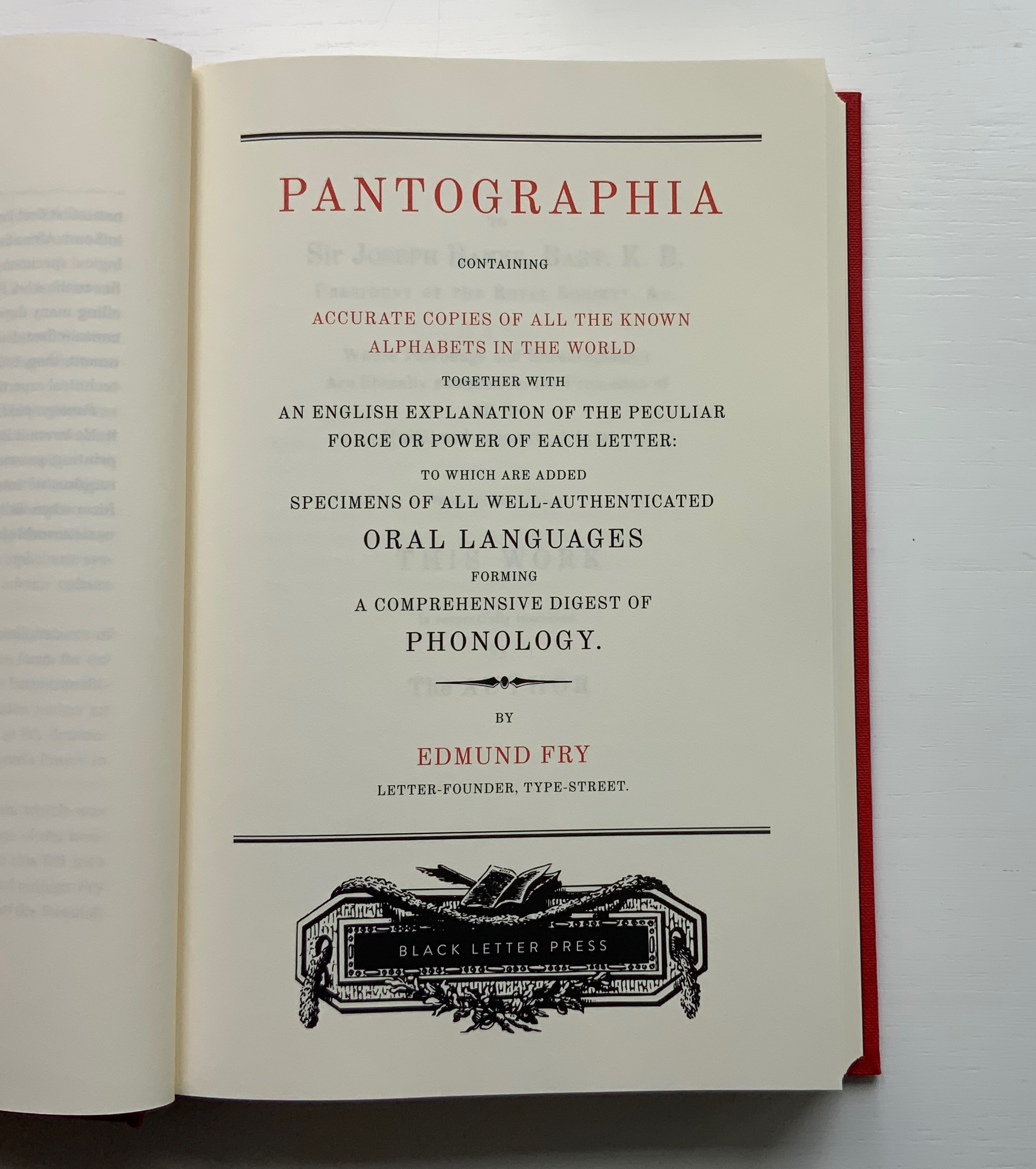
For the Enlightenment, everything that existed was meant to be in an encyclopedia. For Dr. Edmund Fry, scholar, typographer and owner of The Polyglot Foundry, this notion (and the spur of profit) led to his Pantographia (1799). Extraordinarily, Fry made the matrix for each of the roughly 5,000 characters for the 405 alphabet specimens, then handcast each — a monumental sixteen-year accomplishment in craftsmanship. Quite a type sampler for a printer specializing in foreign languages.
Fry was also driven by the importance of the subject: the origin of speech, its being made visible and the varieties of doing so. “The art of drawing ideas into vision, or of exhibiting the conceptions of the mind, by legible characters, may justly be deemed the noblest and most beneficial invention of which human ingenuity can boast — an invention which has contributed, more than all the others, to the improvement of mankind.” (xviii)
Fry is even handed in presenting the arguments and evidence for and against the two possible origins of speech he identifies — divine gift or human invention. He is unequivocal though “that all languages … that have been conveyed in alphabetical characters, have been those of people connected ultimately or immediately with the Hebrews, to whom we are indebted for the earliest specimens of the communication of ideas by writing” and “that there was but one truly original language, from which all others are derivations variously modified”. (xxxviii, xliii)
Plenty has been written about Fry’s accomplishment. Johanna Drucker has explored it in her Alphabetic Labyrinth and more recent Inventing the Alphabet. Even more recently, Hunter Dukes, editor of The Public Domain Review, posted a brief celebration, citing Drucker. Jan Düsterhöft, a German academic now affiliated with the Georg Eckert Institute, provides the publisher’s preface to the Black Letter Press edition shown above. All three identify the two features of Pantographia that echo two other works in the Books On Books Collection: Sam Winston’s One & Everything (2023) and Claire Jeanine Satin’s The Hebrew Alphabet Expressing the Celestial Constellations (2017).
Original at Mansfield College Library, Oxford University
Even in 1799 several of the alphabets displayed by Fry represented extinct languages. Today the Endangered Alphabets Project initiated by Tim Brookes aims rescue languages and their alphabets from that fate. Brookes’ project inspired Sam Winston’s story. More forcibly than Drucker and Dukes, Düsterhöft identifies the imperialist and Western perspective in Fry’s endeavor. Winston’s fable is populated with “story characters”, drawn as various sized and colored blobs, each filled with its distinguishing alphabet. Some are filled with hieroglyphic dogs (presumably for Egyptian shaggy-dog stories), others with Greek, Cherokee and so on. The one story that decides it is the “One and Only story” is filled with the English (Latin or Roman) alphabet and proceeds to eat up all the others.
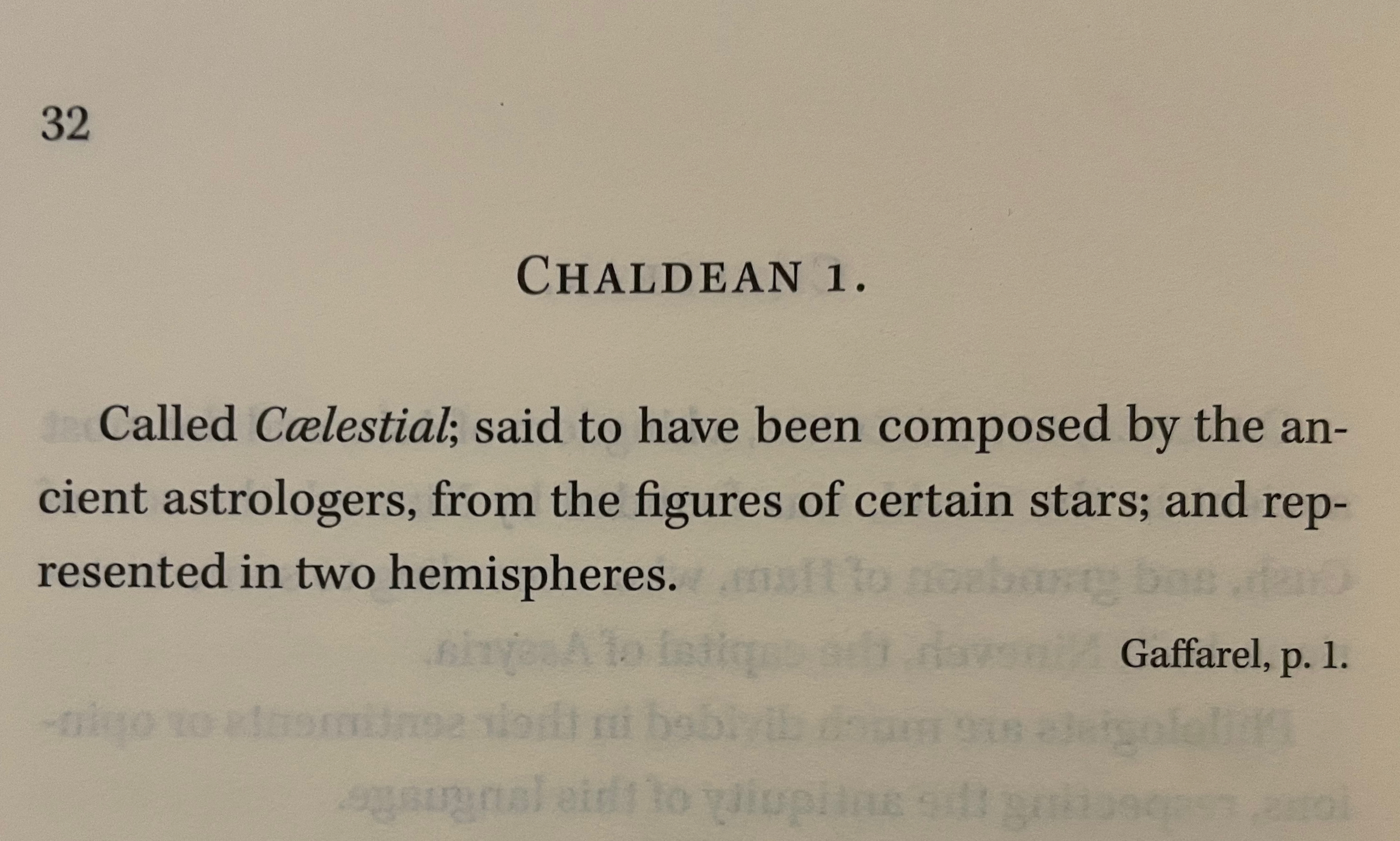
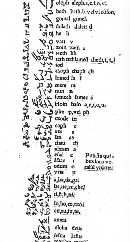
In Pantographia, Chaldean, one of the extinct languages, is a special case, not because Fry includes 20 variant specimens (Greek has 39) but because it is reportedly celestial. The first of Fry’s cited sources for this alphabet is Jacques Gaffarel (1601–1681), a French scholar and astrologer. A bit of digging reveals the source to be more precisely a woodcut from a 1650 translation of Gaffarel’s Curiositez inouyes sur la sculpture talismanique des Persans, horoscope des Patriarches et lecture des estoiles (1629).
In addition to its astrological character, Gaffarel’s work sits in the traditions of gematria, the Kabbalah and alchemy, which Johanna Drucker has thoroughly explored in Alphabetical Labyrinth (1999) and Inventing the Alphabet (2022). Among the earlier contributors to these traditions is Heinrich Cornelius Agrippa. Like his mentor Johannes Trithemius, Agrippa was a polymath, occultist and theologian as well as physician, legal scholar and soldier. The Latinized Hebrew letters and their corresponding characters in the celestial alphabet seen below come from Agrippa’s De occulta philosophia (1533), which is more legible than Gaffarel’s above.
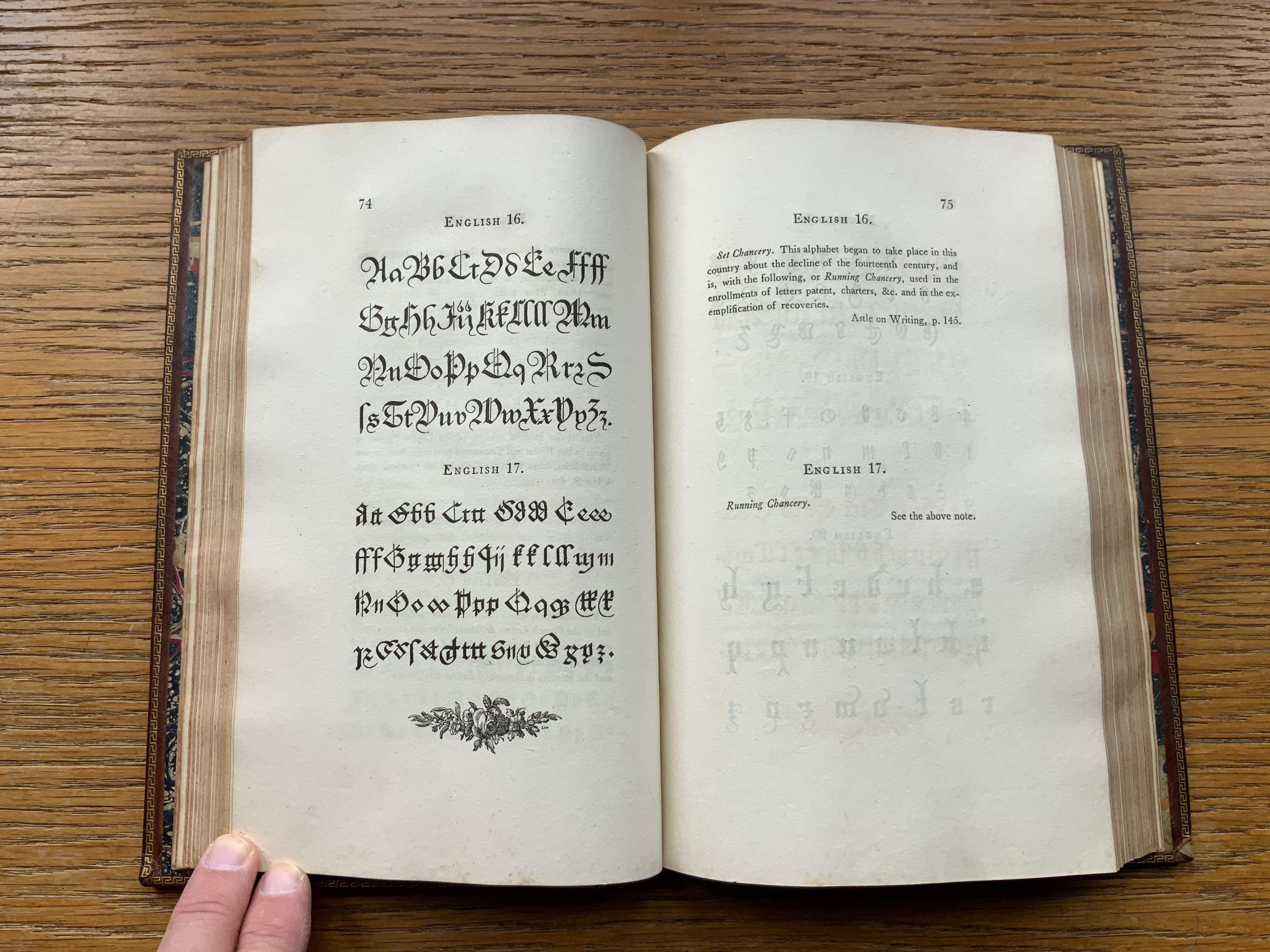
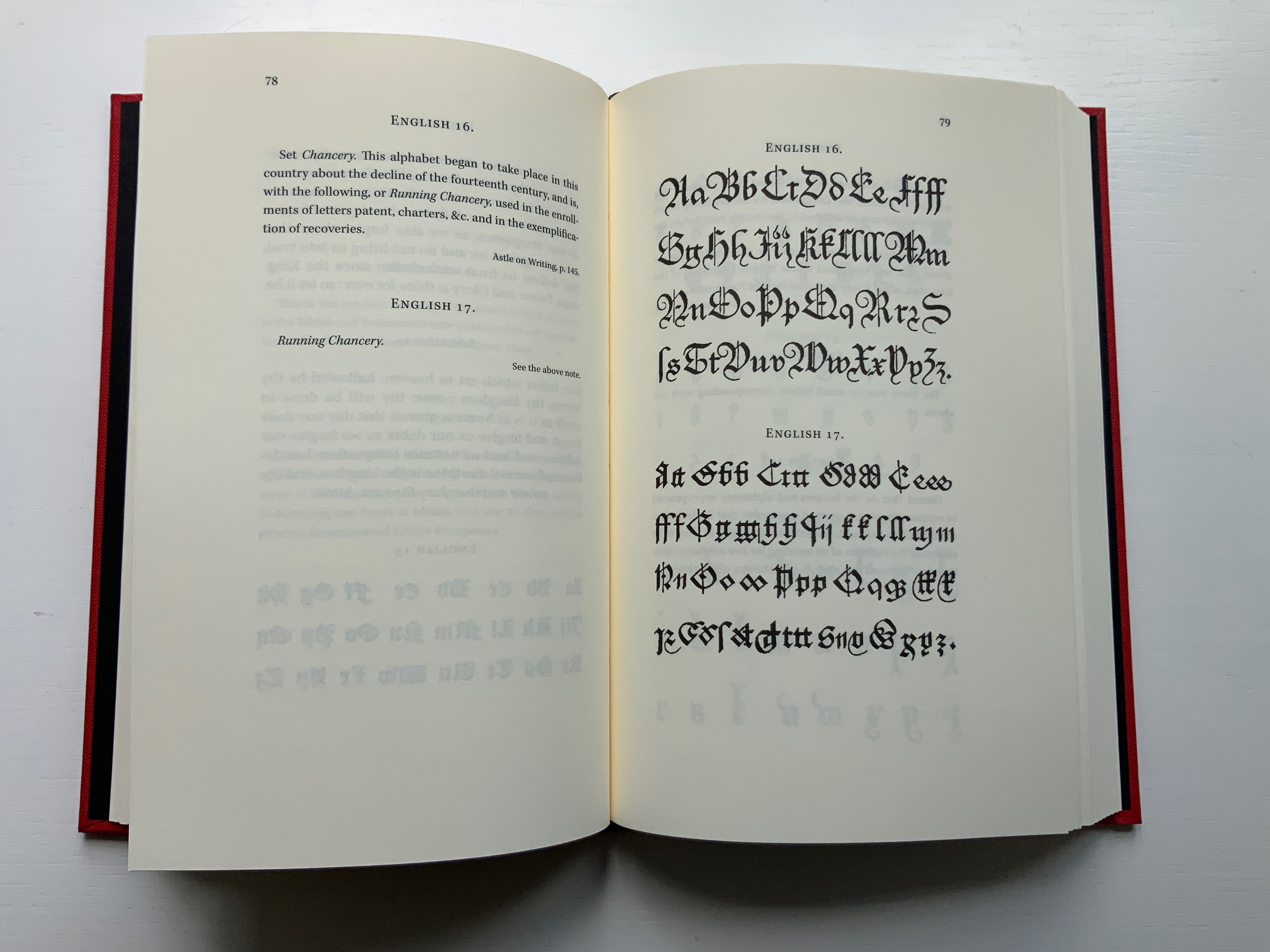
Black Letter Press issued this edition in 2022. As indicated in the caption at the head of this entry, considerable attention to materials was given, including blind debossing and hotfoil printing on the front and spine. The edition is not a photographic facsimile; rather it has been scanned and phototypeset. Scanning in lieu of resetting does not eliminate errors, even if the scan is reviewed carefully. Aside from occurrences of “mod” instead of “most”, “mall” instead of “shall”, and “2ist” instead of “first”, though, the most unusual variation from the original is the deliberate movement of openings on the verso to openings on the recto and, in the specimen section, the reversal of all verso and recto pages. On his verso pages, Fry placed the specimen, and on the recto pages, he placed comments, explanations and sources. For Black Letter Press, the reverse seems to have made more sense. Below are comparisons of pages from the original (left) and the Black Letter Press edition (right).
Left: 1799 original. Right: Black Letter Press facsimile.
Most uncaught scanning errors leap out, so despite the niggling worry about accuracy, the greater legibility and probable accessibility of the 2022 edition is welcome for explorers of alphabets and alphabet-related works. For the Books On Books Collection, its enhancement of the pleasure in Winston’s and Satin’s works and others such as Golnar Adili’s BaaBaa Aab Dad, Islam Aly’s 26 Letters and Ben Shahn’s The Alphabet of Creation (1954), it is more than welcome.
Another 25 images of Fry’s original edition can be found here, courtesy of The Letterform Archive.
Drucker Johanna. 2022. Inventing the Alphabet : The Origins of Letters from Antiquity to the Present. Chicago: University of Chicago Press. Not just another in the long line of histories of the alphabet, rather it explores “Who knew what when about the alphabet?” How did the way they knew it affect how they imagined its identity and origin? For Drucker, Pantographia marks an endpoint and transition. These printed compendia of alphabetic scripts began in 1518 with Johannes Trithemius. Initially spurred by interest in the occult as well as exotic and ancient scripts and a search for the “original” alphabet, compendia gradually became more secular but still eclectic. By 1799, Fry ‘s was an exception by still including the Celestial Alphabet and citing sources in trackable ways. Simultaneously an investment in imagination and a significant step forward for scholarship.
Dukes, Hunter. 10 October 2023. “Pantographia: A Specimen Book of All the Alphabets Known on Earth (1799)“. Public Domain Review. Dukes, editor of the Review, celebrates Pantographia‘s iconic presence in the public domain. In his celebrating, Dukes also notes the presence of the Celestial Alphabet in Pantographia and Drucker’s singling out Fry for taking the antiquarian compendium of alphabets to the earliest stage of specialized, professional research. He also surrounds Fry’s effort with other interesting direct and indirect contexts: the discovery of the Rosetta stone in the same year as Pantographia’s publication and the extinction of several of the languages that Fry’s alphabet represents.
Düsterhöft, Jan. 2022. “Foreword”. In Fry, Edmund. 1799. Pantographia, Containing accurate Copies of all the known Alphabets in the World.Turin, Ialy: Black Letter Press. A German academic now affiliated with the Georg Eckert Institute, Düsterhöft also raises the point about extinction and relates it to the West’s imperial colonial perspective, which Fry displays in his omissions and dismissal of the Chinese mind’s intellectual and rational capacity “as evidenced” by the lack of an alphabet. Düsterhöft also identifies Gaffarel’s source for the celestial alphabet: Guillaume Postel ‘s Linguarum Duodecim Characteribus Differentium Alphabetum Introductio [An Introduction to the Alphabetic Characters of Twelve Different Languages] (1538). Postel (1510 – 1581) was a polyglot French linguist, astronomer, Christian Cabalist, and diplomat.
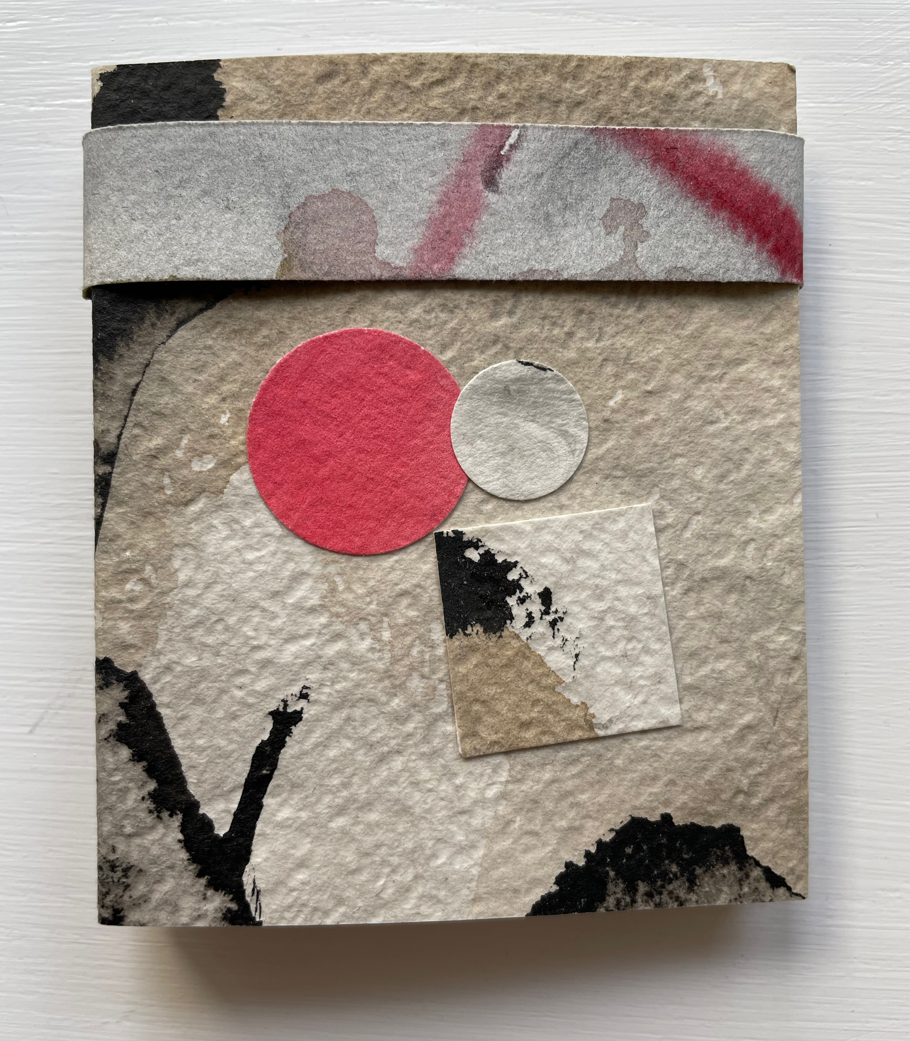
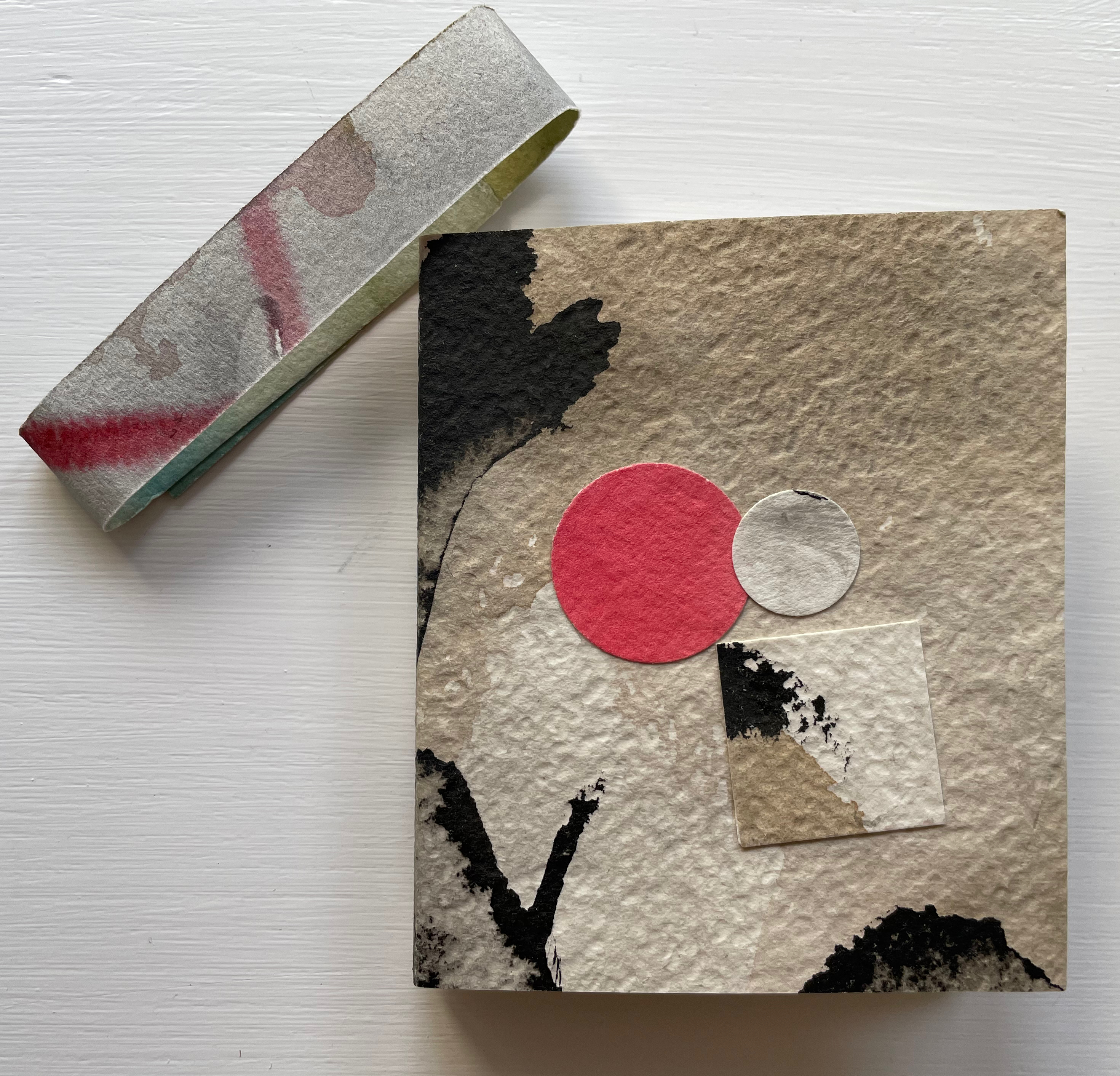
A Bookbinder’s ABC (2003) Christopher Hicks, Leaning Chimney Press Editions Soft cover (buff card, illustrated paper jacket glued to spine, sewn block). H200 x W150 mm. 34 pages. Edition of 75. Acquired from Barter Books, 18 October 2023. Photos: Books On Books Collection.
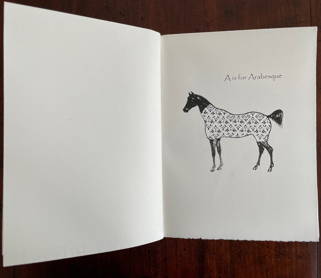
Although Glaister’s Encyclopedia of the Book is the canonical dictionary for book terminology, A Bookbinder’s ABC provides 26 humorous visual reminders.
An Arabian stallion in a decorative onsie for recalling the description of fleurons and other devices derived from Islamic patterns.
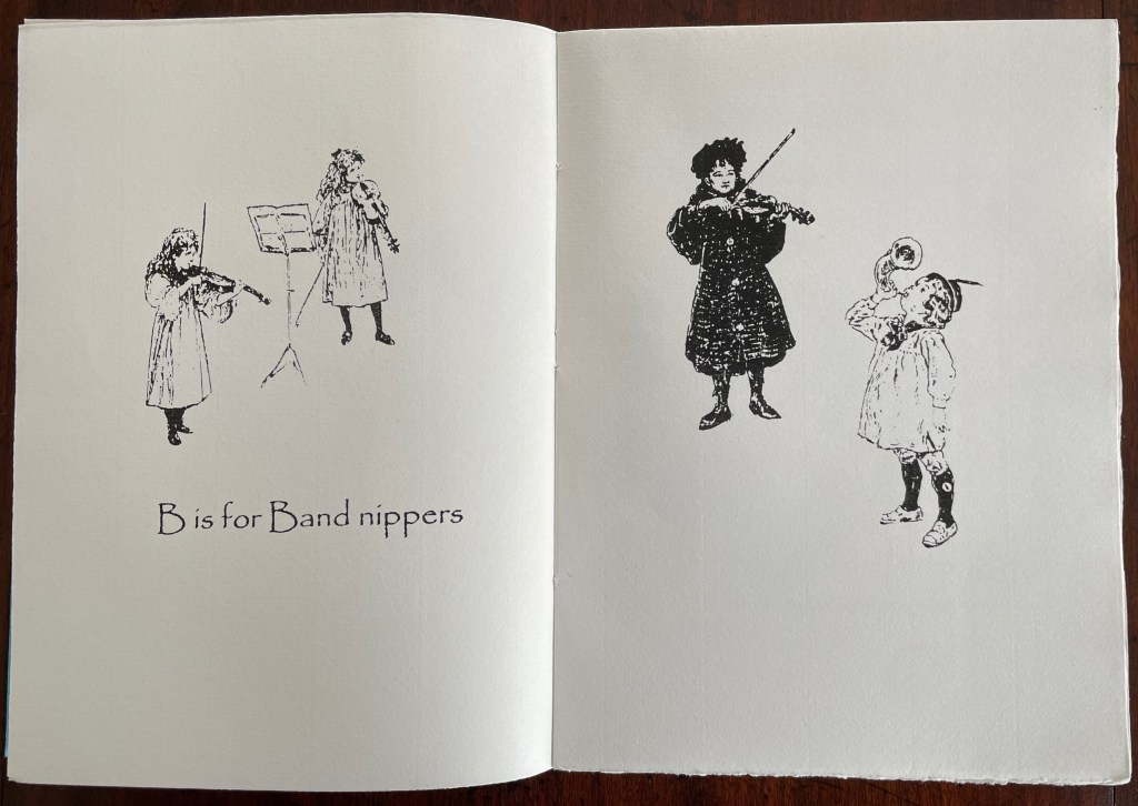
What else would a binder call a children’s orchestra?
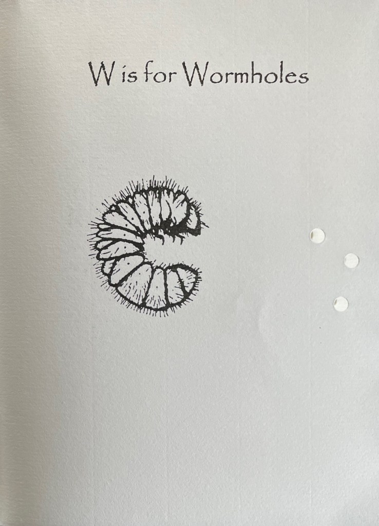
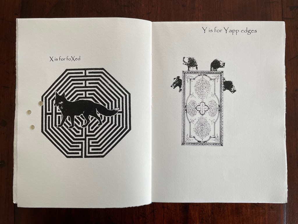
A fox flummoxed by a maze is certainly “foxed”. This one is also likely puzzled by the holes carried over from “Wormholes” on the previous page. Barking dogs springing from a book cover might be a helpful mnemonic for the name of the wide soft edges or flaps for Bible covers devised by the 19th century London bookseller Yapp.
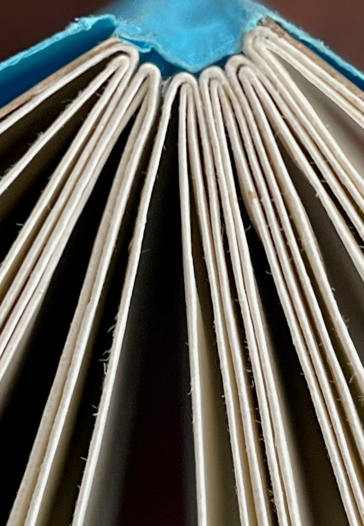
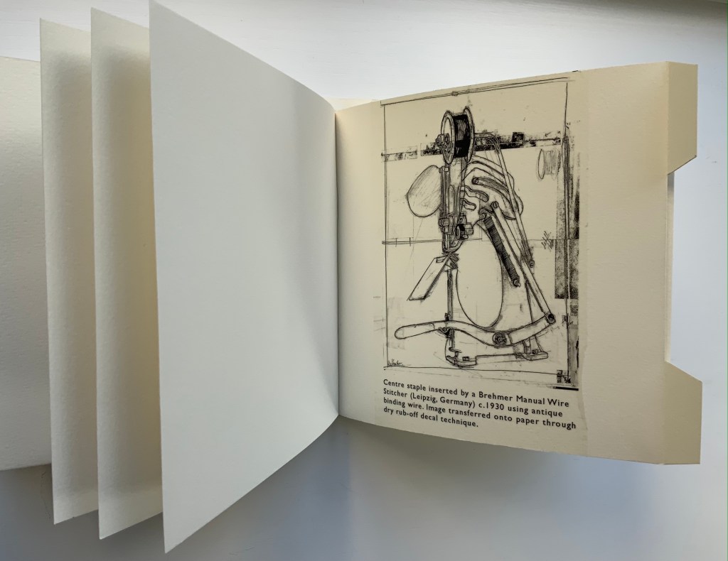
The work’s own binding has simple but interesting features. The front and back covers in buff card are glued to the first and last sewn gatherings, respectively, and the sewn gatherings are glued in between and sewn together. The blue paper jacket’s spine is glued to the spines of the gatherings and its fore edges fold over the fore edges of the buff card. Curious but not as self referential as the features of two nearby birds of a feather from Andrew Morrison’s Two Wood Press.
Detail of uncut top edges and gluing of gatherings and spine.
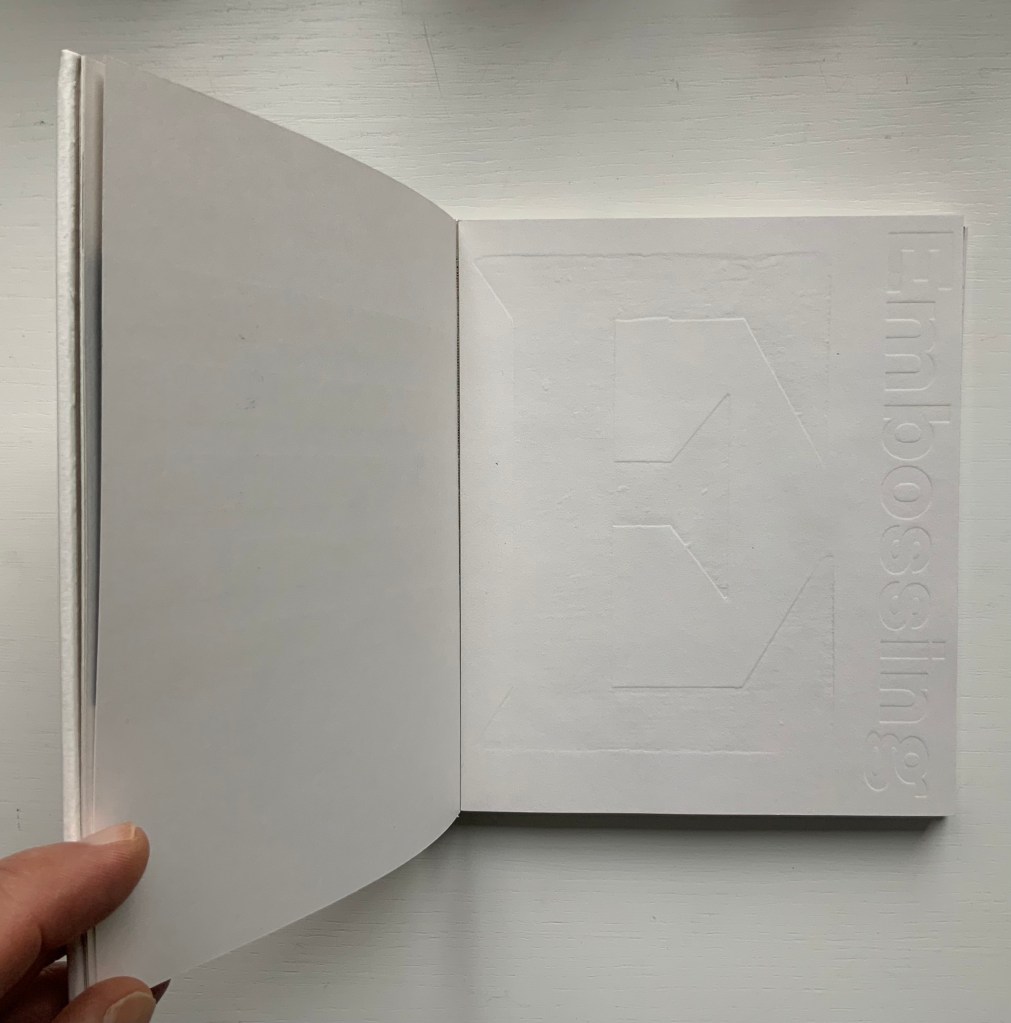
From Morrison’s Provenance (2018), showing an actual wire-stitched gathering and then an illustration of the mechanism; from Morrison’s Two Wood Press A-Z (2003), showing showing an embossed page illustrating E for Embossing. Photos: Books On Books Collection.
But what would a self-referential binding for A Bookbinder’s ABC look like — especially one that might carry on the punnery of the contents? Presumably because they are closer to the words, entries in letterpress abecedaries such as Morrison’s Two Wood Press A-Z (2003) and Kevin M. Steele’s The Movable Book of Letterforms (2009) have an easier time of the visually self-referential.
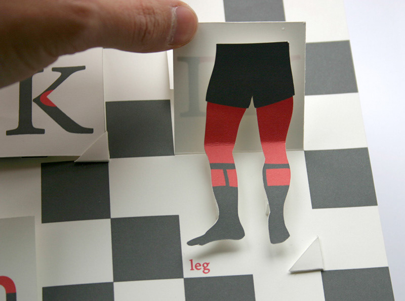
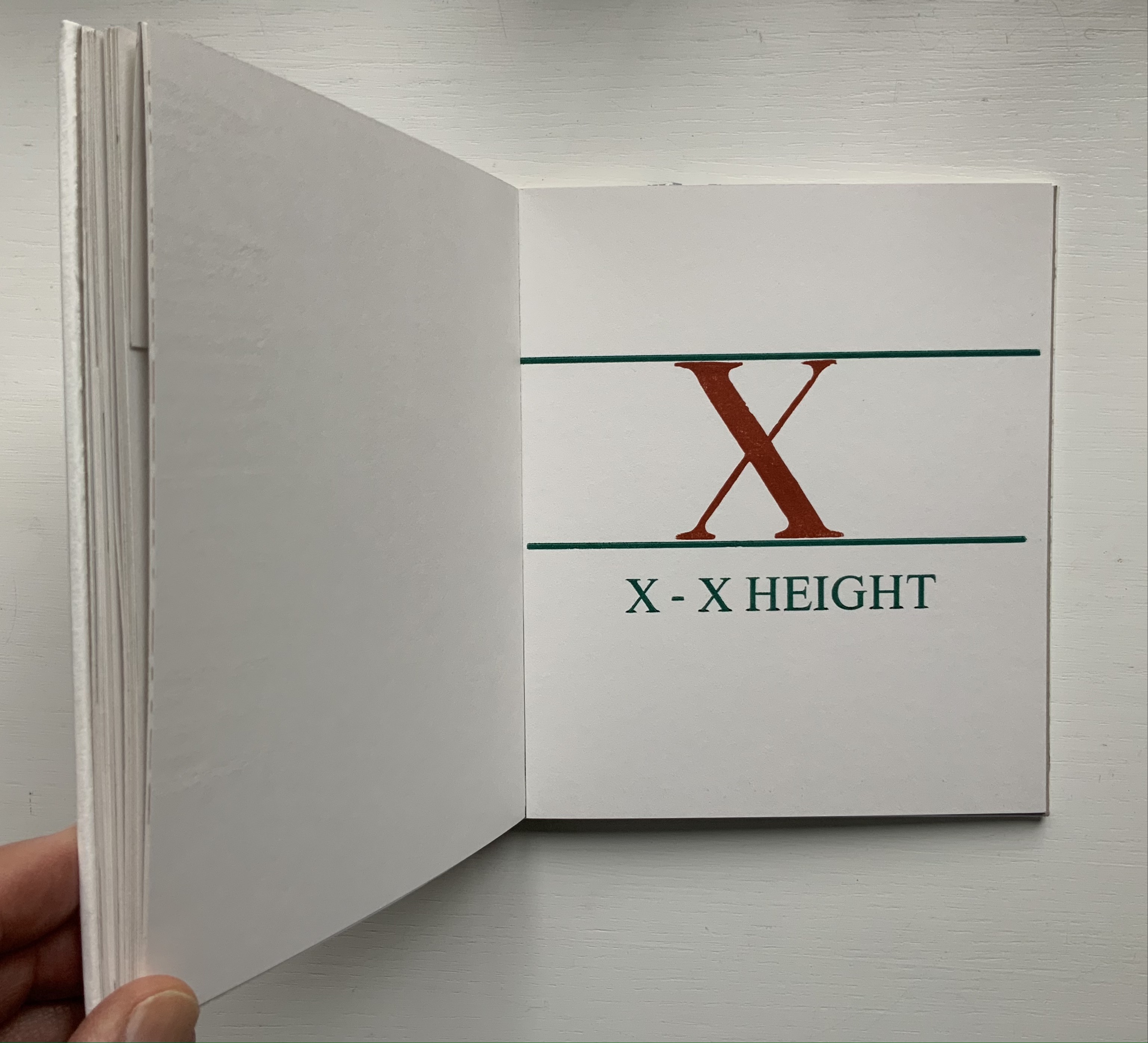
From Steele’s A Movable Book of Letterforms, showing the anatomical term for the red areas of the L & R (a leg lift?); from Morrison’s Two Wood Press A-Z, showing x’s definition of its height.
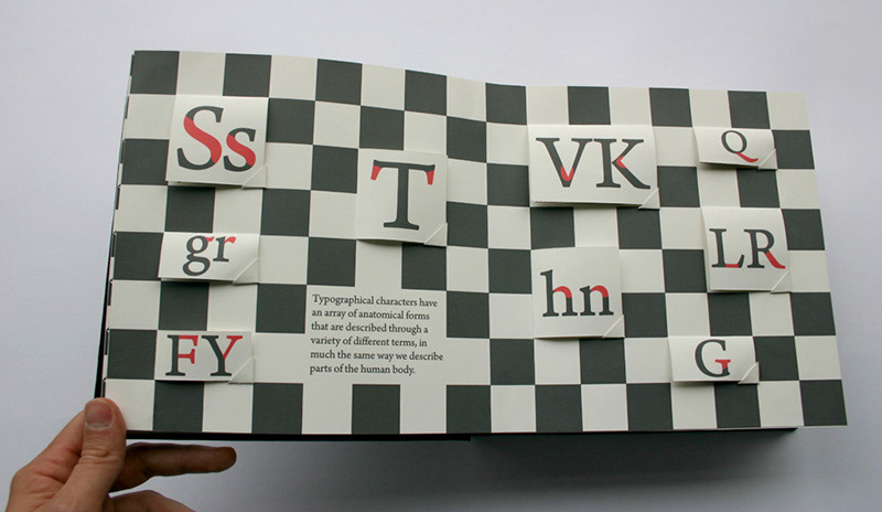
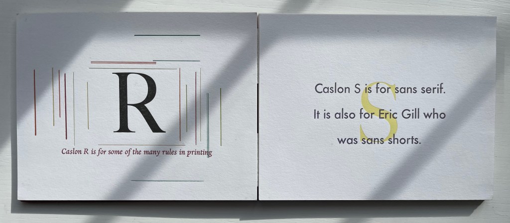
Closer still to the words are the typographical punsters such as Marie Dern and William Caslon’s Typographic ABC (1991), Nicolas McDowall and A Bodoni Charade (1995) or Sharon Werner & Sharon Forss and Alphabeasties and Other Amazing Types (2009).
From Dern’s William Caslon’s Typographic ABC, McDowall’s A Bodoni Charade and Werner & Forss’ Alphabeasties and Other Amazing Types.
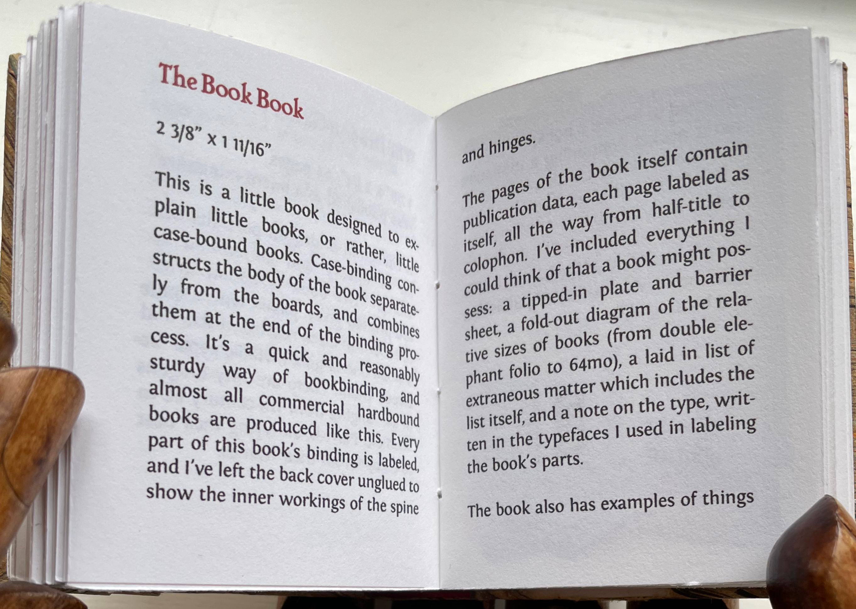
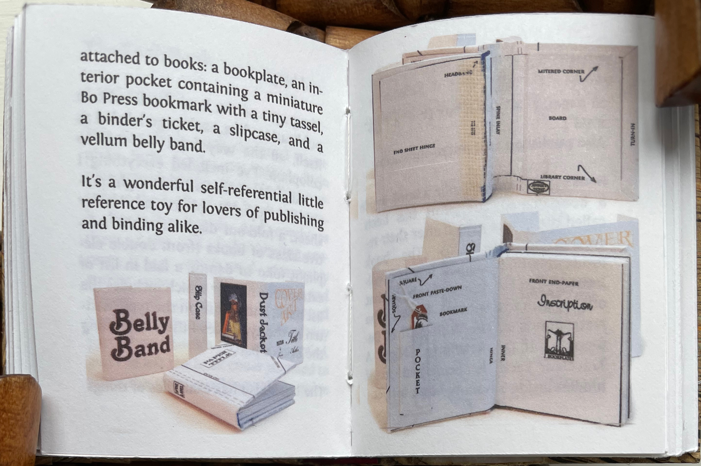
Perhaps Pat Sweet’s miniature The Book Book (2010) comes closest on self-referentiality in a work about binding. For the puns, we will have to wait for another bookbinder to take a stab at it.
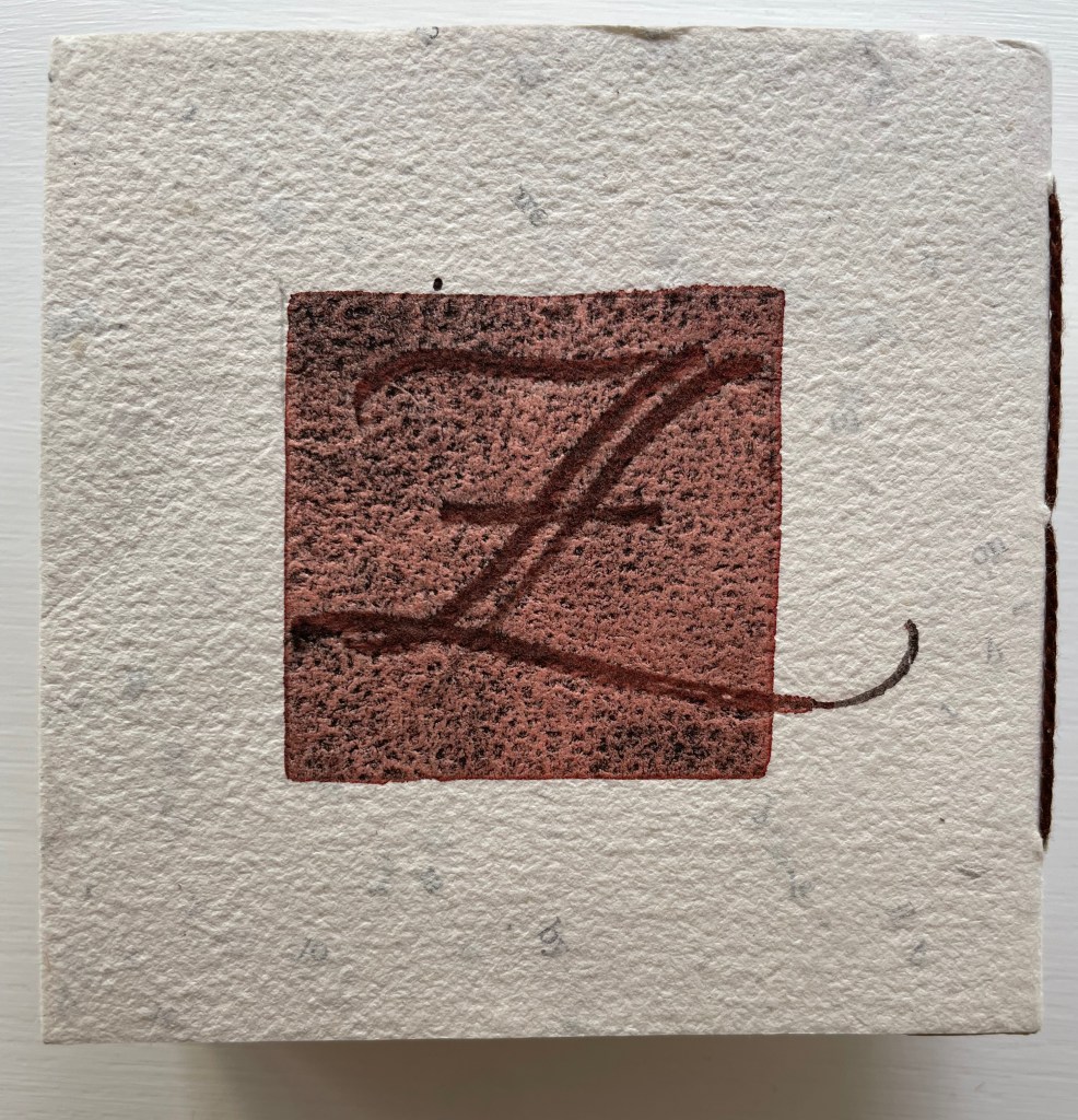
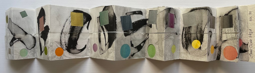
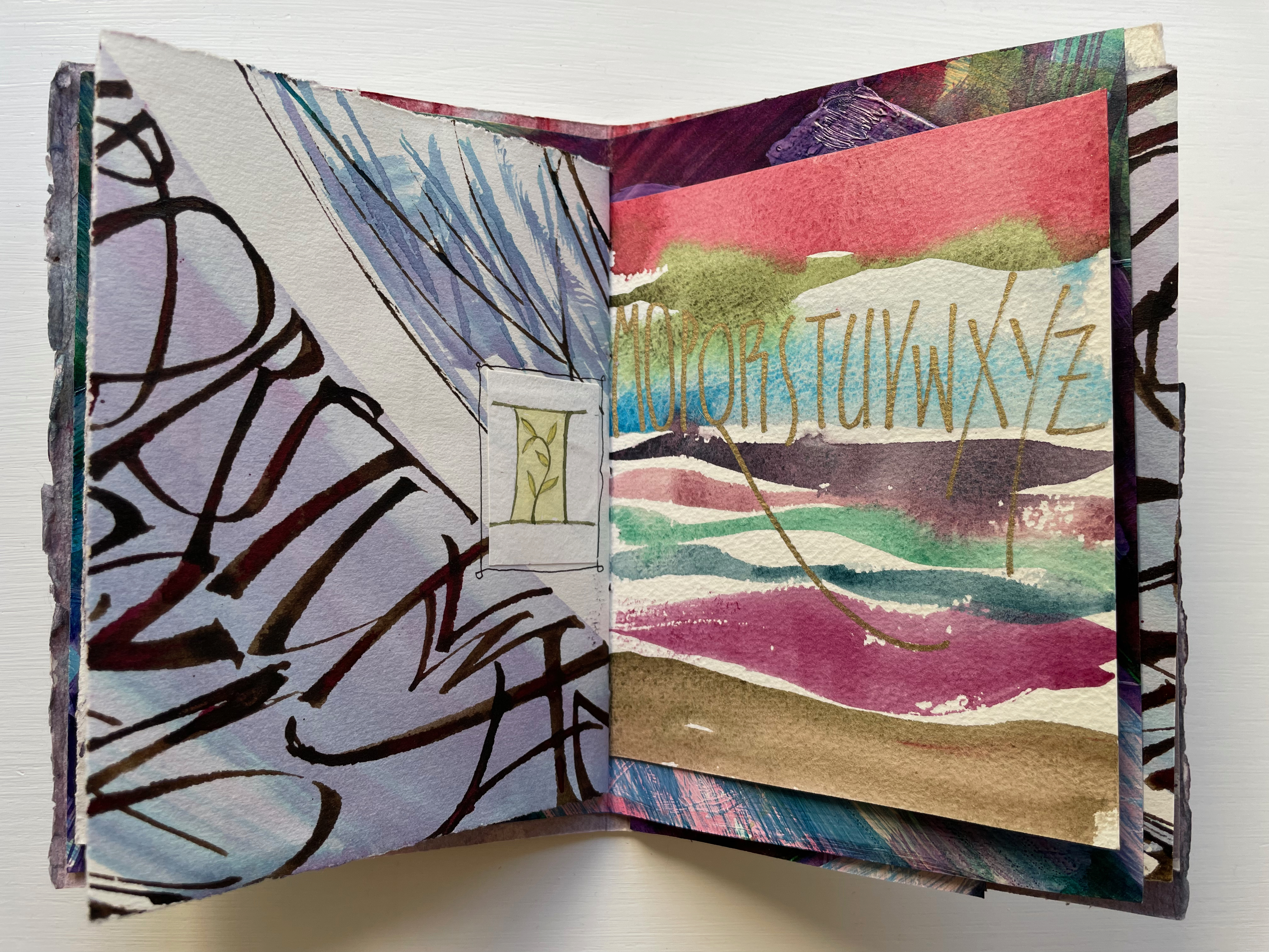
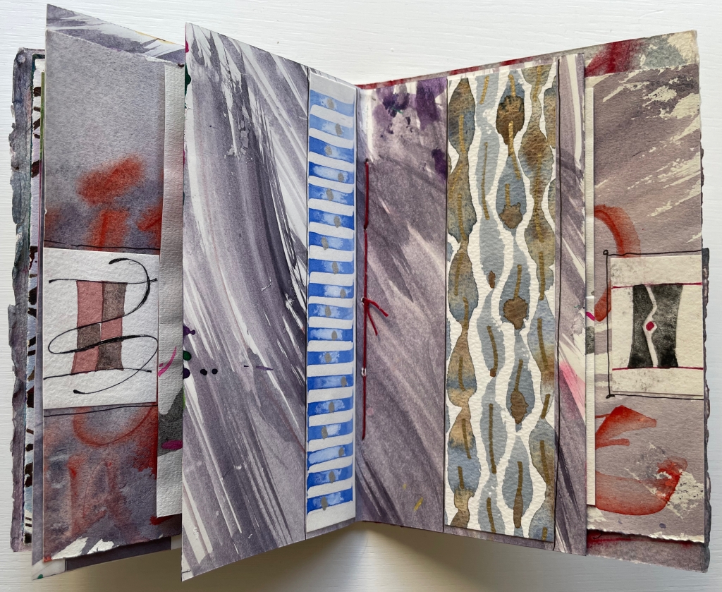
Patterned Alphabet (2013) Annie Cicale Sewn, casebound leporello. H104 x W104 mm. 34 panels. Edition of 41, of which this 26. Artist 4 July 2023. Photos: Books On Books Collection.
Patterned Alphabet could well have been entitled Textured Alphabet. The number of different textures almost equals that of the patterns. It is the textures’ interaction with each other as well as with the patterns that particularly appeals. The cover, appropriately made of Cave Paper’s Alphabet Heavyweight, initiates the interplay. While the calligraphic style and patterned background of the copperplate engravings of A and Z do not vary, the textures around and beneath them multiply, mirror and contrast. The surface of the Cave Alphabet paper echoes that of the copperplate’s stippled background. The softness of the thick cotton string, binding the cover, contrasts with the roughness of the paper.
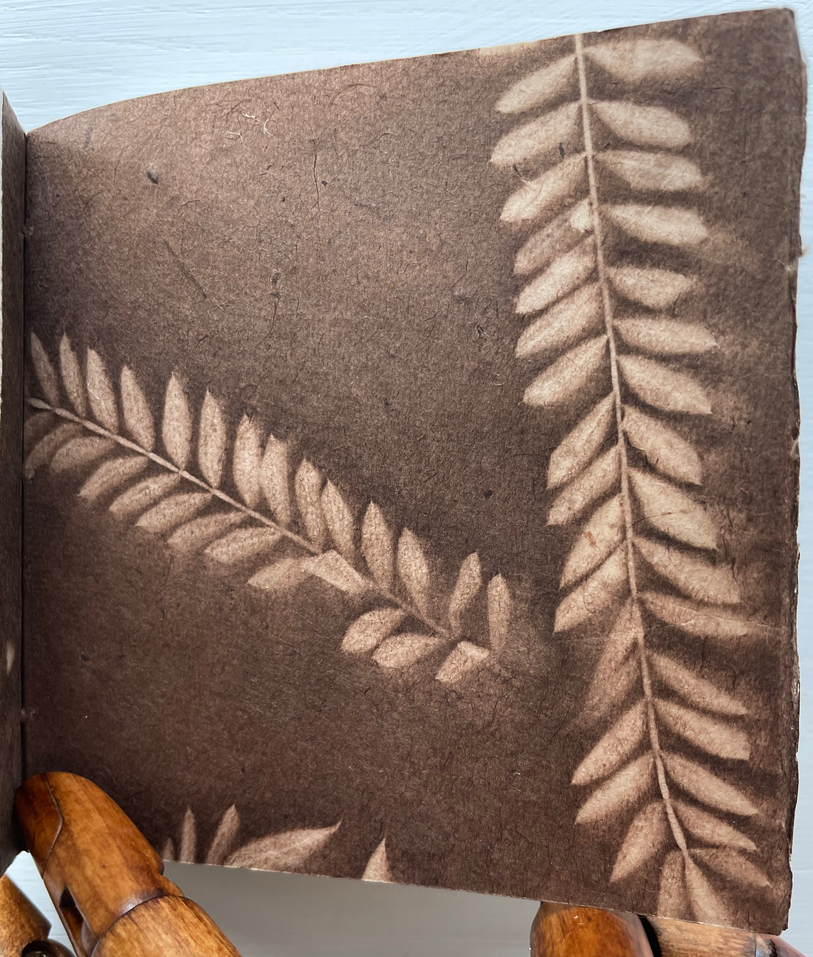
Before coming to the leporello, hand and eye are slowed by another texture. Like the self-referential Cave Alphabet paper cover, the flyleaf refers to itself with a leaf print. It contrasts with the cover, however, in its lightness, surface and color. While that dance of contrasting textures goes on, the flyleaf’s embedded image strikes up its own contrast with the relief technique and letters on the covers.
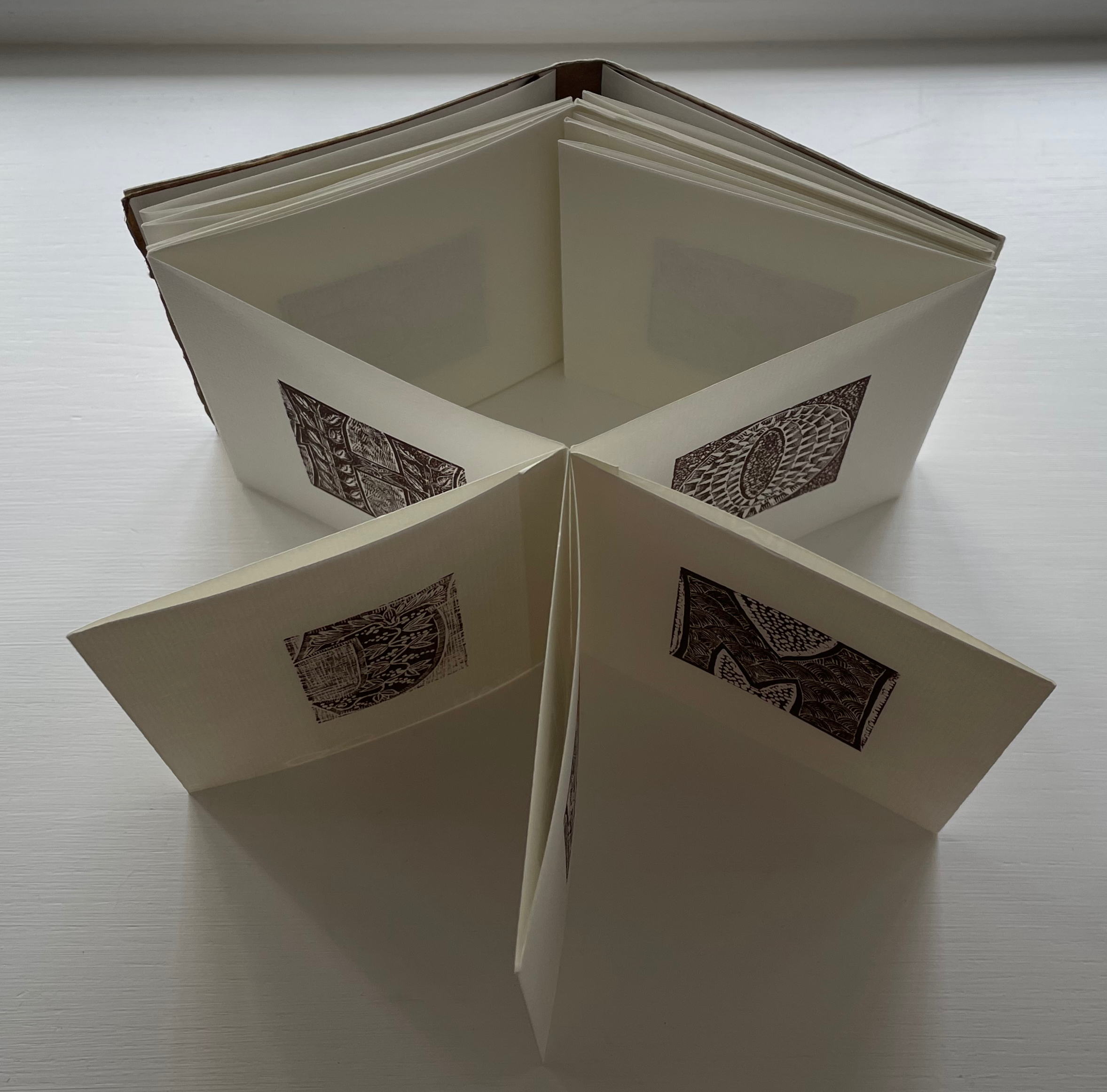
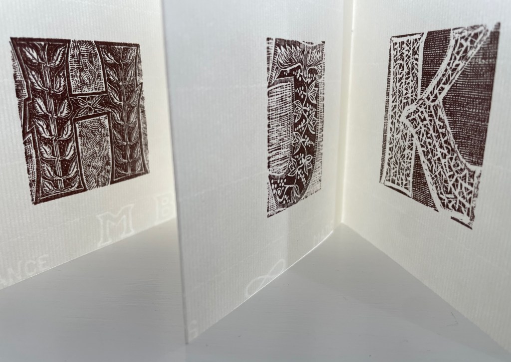
When the leporello comes on stage, the print pattern and paper texture exchange the roles they played at the beginning. Before, the print pattern held the stillpoint around which the cover, binding string, flyleaf and copperplate danced. Now, the smoother laid texture of the Ingres d’Arches paper becomes the stillpoint. Its weight, surface and color — very different from those of the cover and flyleaf — serve that constancy well. For each letterform (including the ampersand), different patterns make up the anatomy and background, which adds quite a number of dancers around the stillpoint.
The printing technique for all those dancers — Resingrave engraving — contributes to their variety of pattern. Invented by Richard Woodman, Resingrave is a synthetic substitute for boxwood. It consists of a thin layer of resin atop a block of MDF wood and, since the ’90s, was famously used by Barry Moser (e.g., the Pennyroyal Caxton Bible). More than lino or blocks for woodcuts, it allows for the thin lines necessary for close and fine patterns. Standing the leporello against the light offers a chance to enjoy the interaction of the “texture” of those patterns with the texture of the paper.
Like Moser, Cicale has engaged with watercolors as well as prints and embraced the abstract as well as the figurative, as can be seen in the next work.
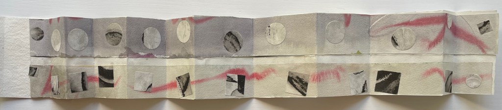
Detritus No. 30 (2020)
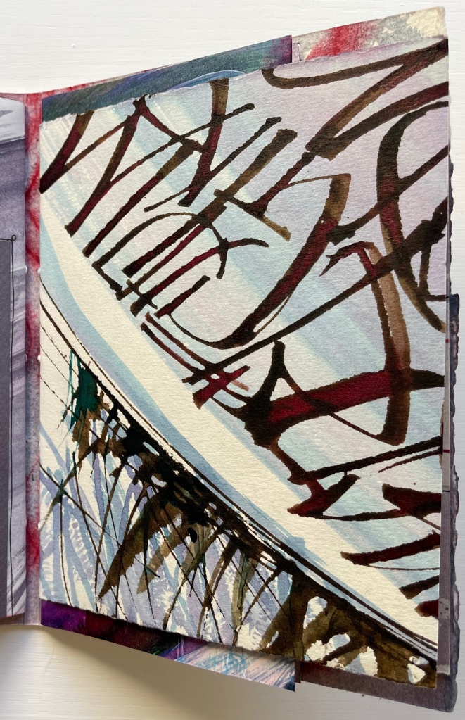
Detritus No. 30: Floppy Alphabet, Brush Alphabet (2020) Annie Cicale Modified leporello, pasted to paper cover, bellyband closure. Closed: H95 x W80; Open: W750. 12 panels. Acquired from the artist, 4 July 2023. Photos: Books On Books Collection.
Here, Cicale has compiled and collaged cast off letters, ornaments and marks from completed works to create a modified double-sided leporello bound in painted and inked watercolor paper, held together with a belly band. The leporello’s two modifications are its variation in panel size and the cut across the mountain folds. Except for a reversal on the first panel, the upper row’s panels bear square cutouts, and the lower row’s bear circular ones. Although constant in shape and distribution, the recurrent squares and circles vary in their color and size, highlighting the variation in size of panels. With their constant black and gray, the ink-brushed letters A-H contrast with the variance of color and size of the circles and squares.
On the reverse side of the leporello, the circles and squares exchange position. They are, in fact, circular and square patches, black and white on this side of the leporello and colored on the other, supplying the color to the other side’s square and circular cutouts. The circular patches are generally consistent in size, as are the square patches, which contrasts with the varied sizes of the cutouts on the other side. The reverse side of the leporello is more muted, and with its black and white patches, it seems more abstract, but is it? Letters themselves are abstract, which may the tongue-in-cheek point of the underlying patches.
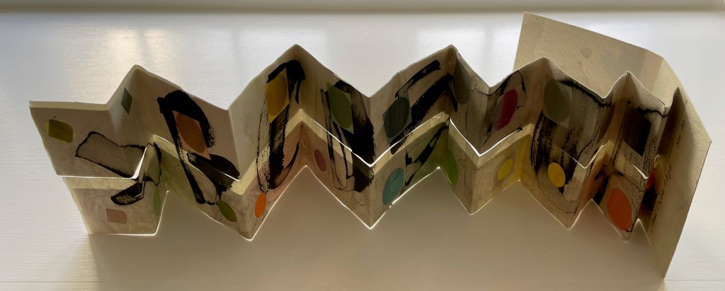
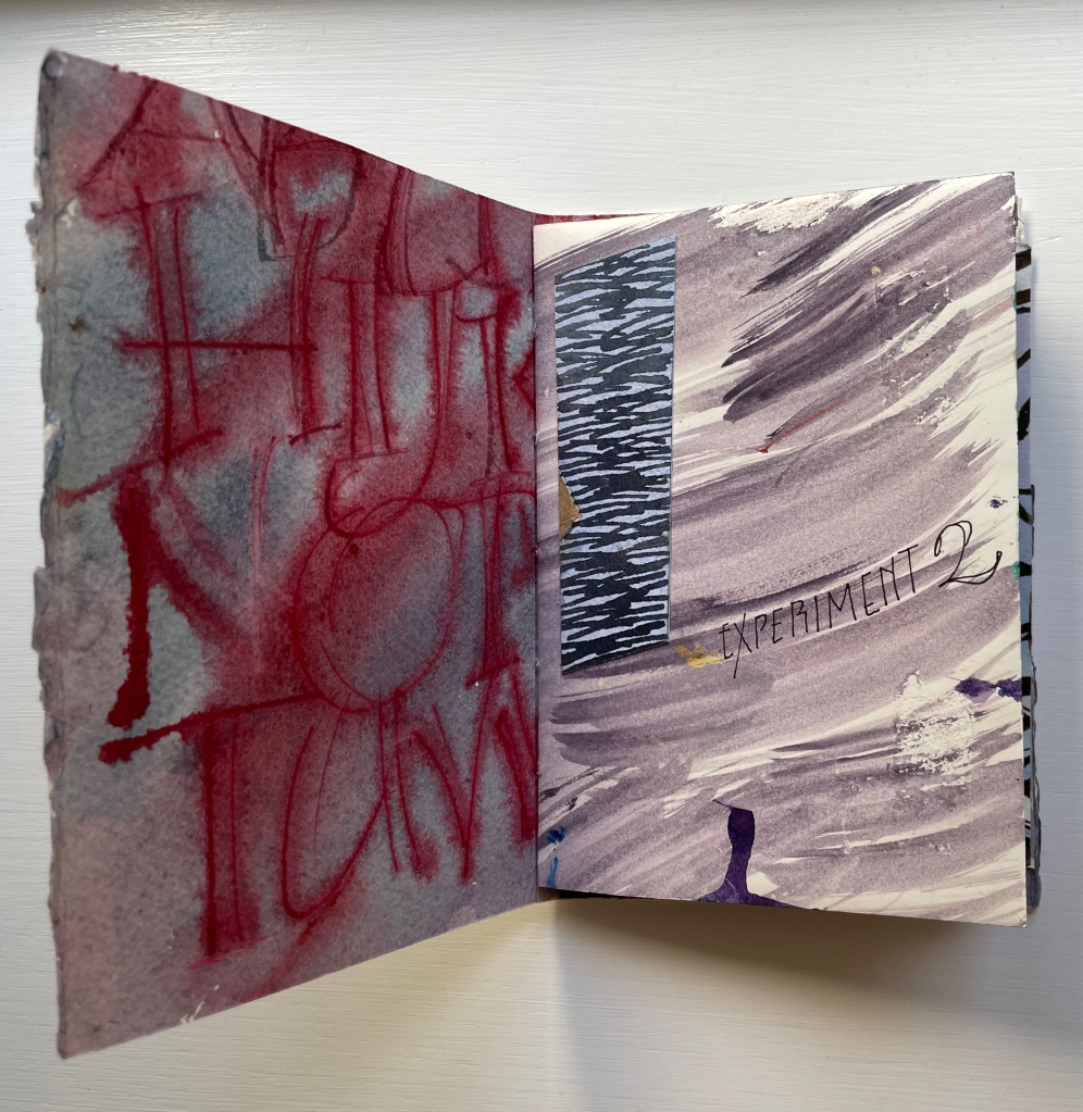
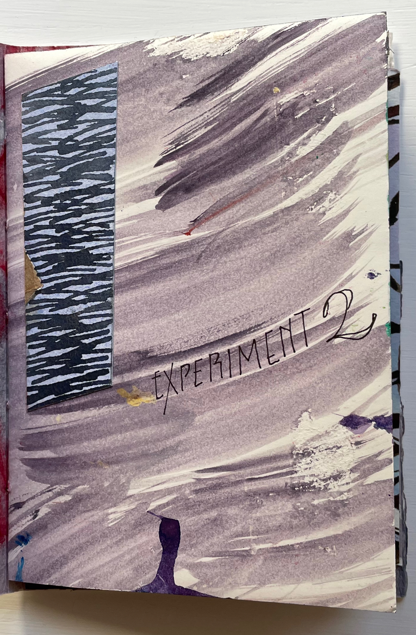
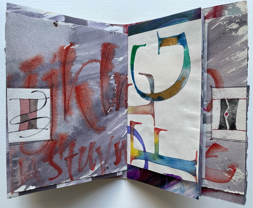
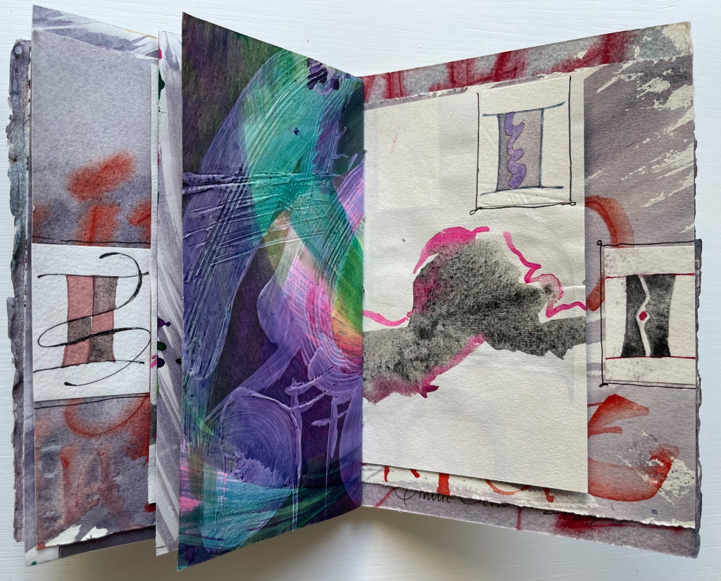
Experiment No. 2 (2023)
Experiment No. 2: Step by Step (2023) Annie Cicale Pamphlet stitch book. H185 x W 130 mm. Seven folios of varying trim size and papers, one set of four folios gathered and sewn to upper fold of spine, one set of three folios gathered and sewn to lower fold of spine. Acquired from the artist, 4 July 2023. Photos: Books On Books Collection. Displayed with permission.
Cicale continues her dance of contrasts and similarities with Experiment No. 2 (2023). Here are some of her comments on process and material:
Teaching watercolor for many years has allowed me to try many exuberant techniques, using good rag paper and a wide gamut of colors, shapes and techniques.… An alphabet written on another sheet of paper has been collaged on these pages. I’ve used walnut ink, watercolor and iridescent pigments, which create an interesting series of contrasts as you move through the book.
Another experimental aspect of this pamphlet stitch book is the gathering of the folios into two separate gathers and the variation in size of the folios. The exterior image of the spine above and its interior below show the attachment of the gatherings to the right and left folds of the spine. Two pamphlets in one.
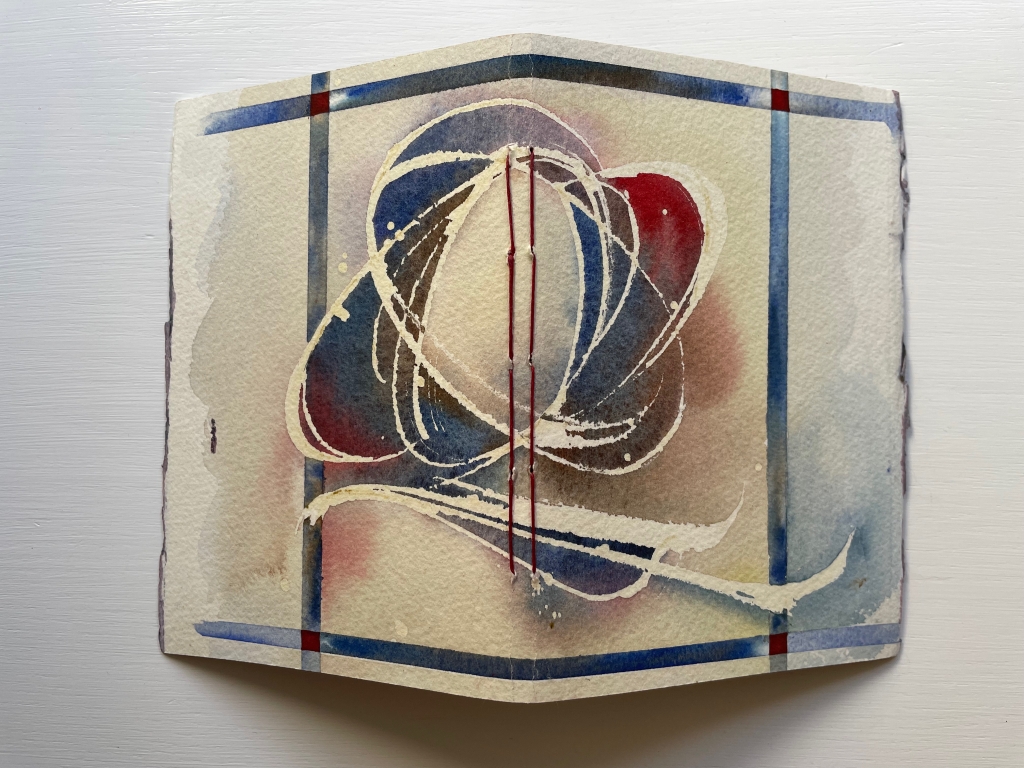
The first gathering’s title-bearing folio measures H176 x W246 mm when spread out fully. On its title-bearing page, there is one of the collage elements that Cicale mentions; three others appear on the other half, which is the final page of the first gathering.
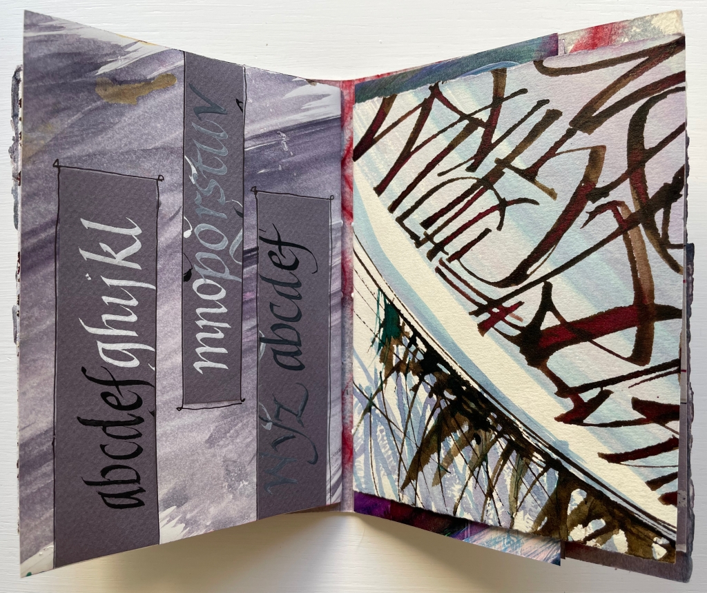
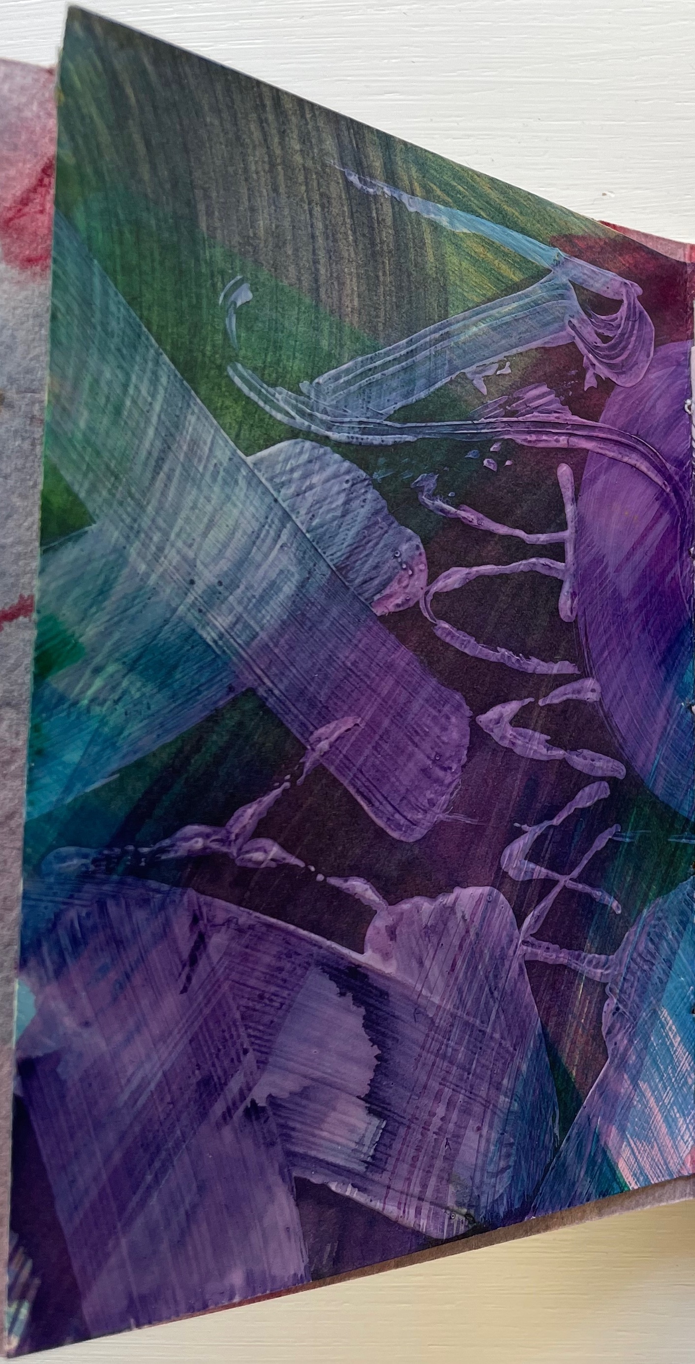
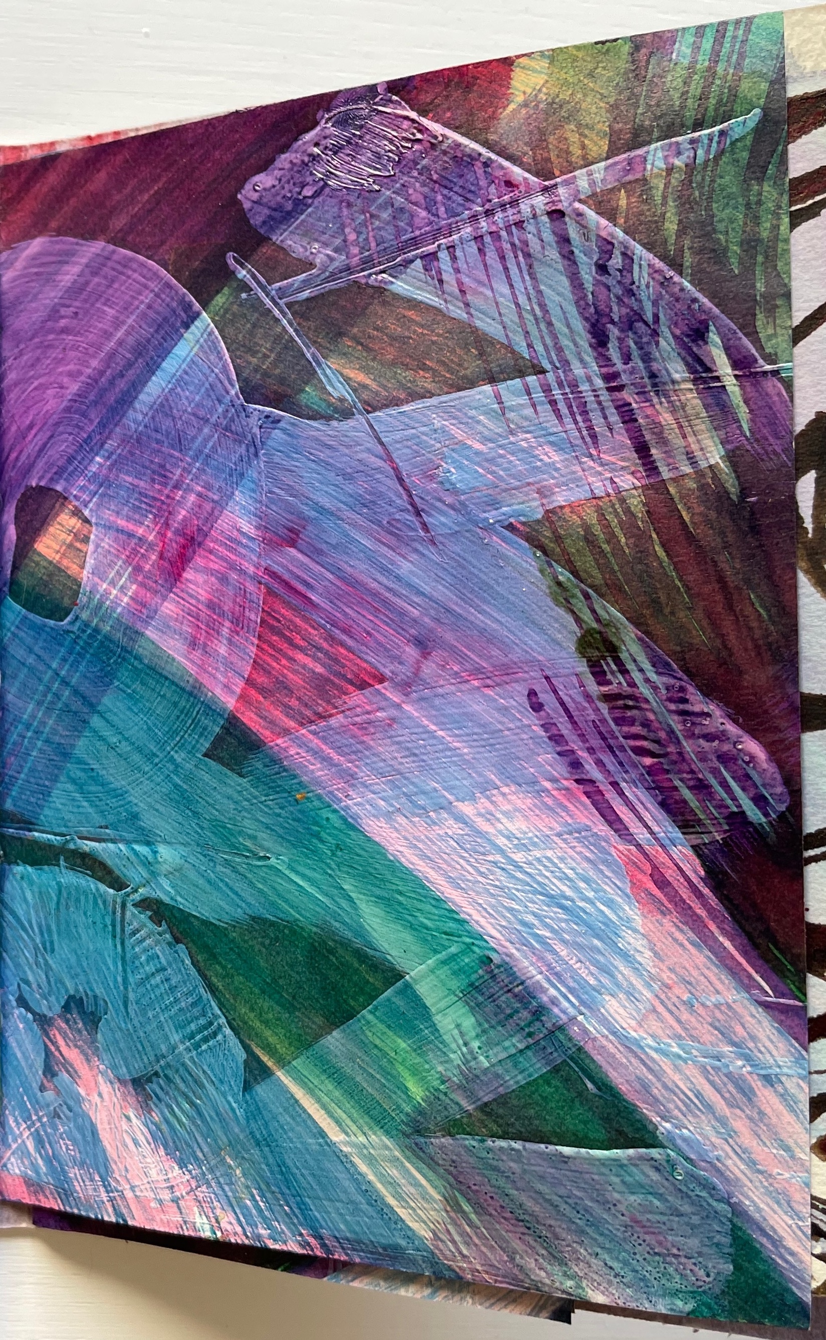
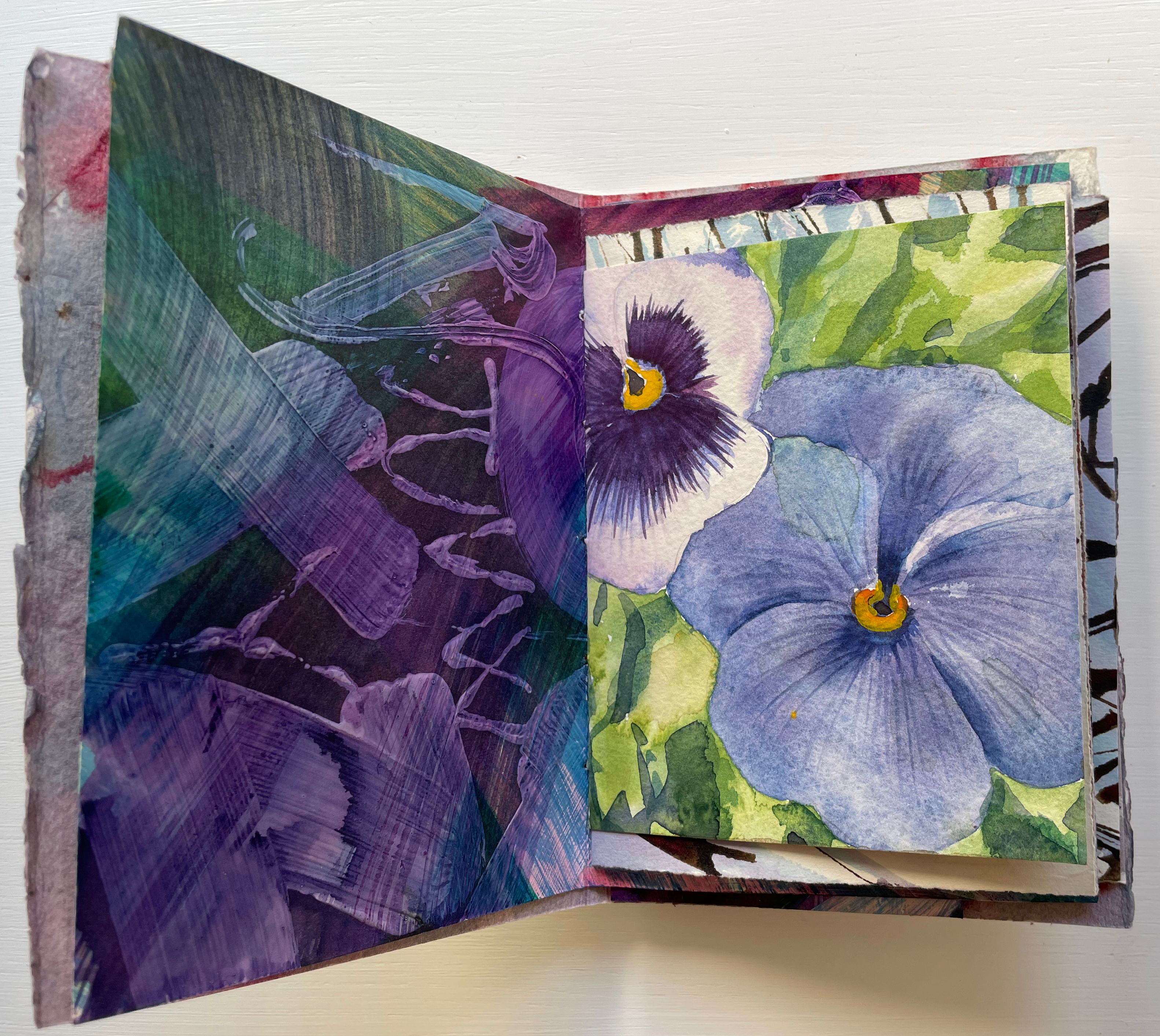
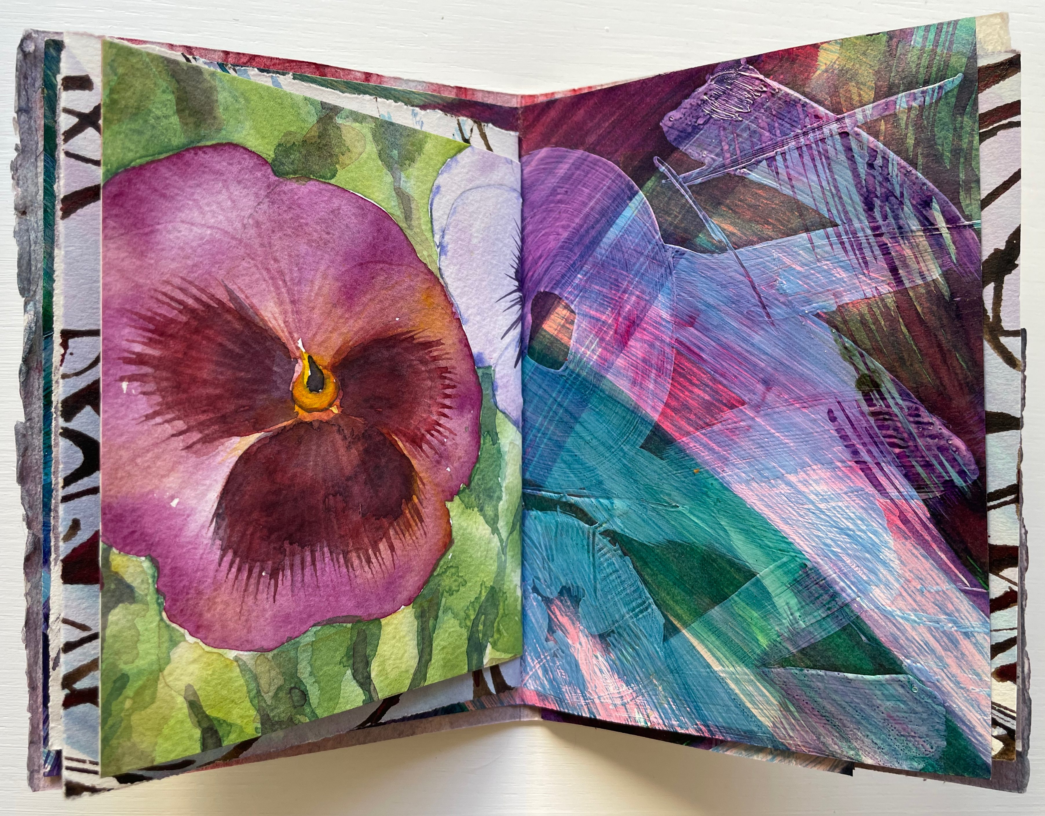
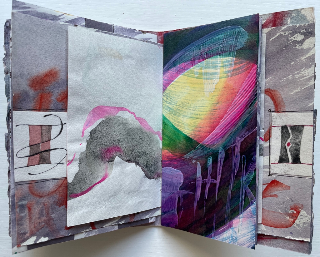
Of course, the full images on either side of the title-bearing folio cannot be seen all at once because of the intervening, contrasting and differently sized folded folios. It’s those different sizes and contrasts that somehow urge the reader/viewer to jump forward then back not only to see those full images for every folio but also to enjoy the magic of the contrasts and similarities. Two of the more effective spreads prompting this jumping forward and backward are these below. On the reverse side of the title-bearing folio is a colorful impasto painting of letters, some in sequence, some overlapping.
Perhaps it’s the impasto of the verso page that prompts the jump forward to find its recto mate, but once there, the mirrored colors of the pansy and letters surely prompt a jump back to enjoy again the different colors mirrored before.
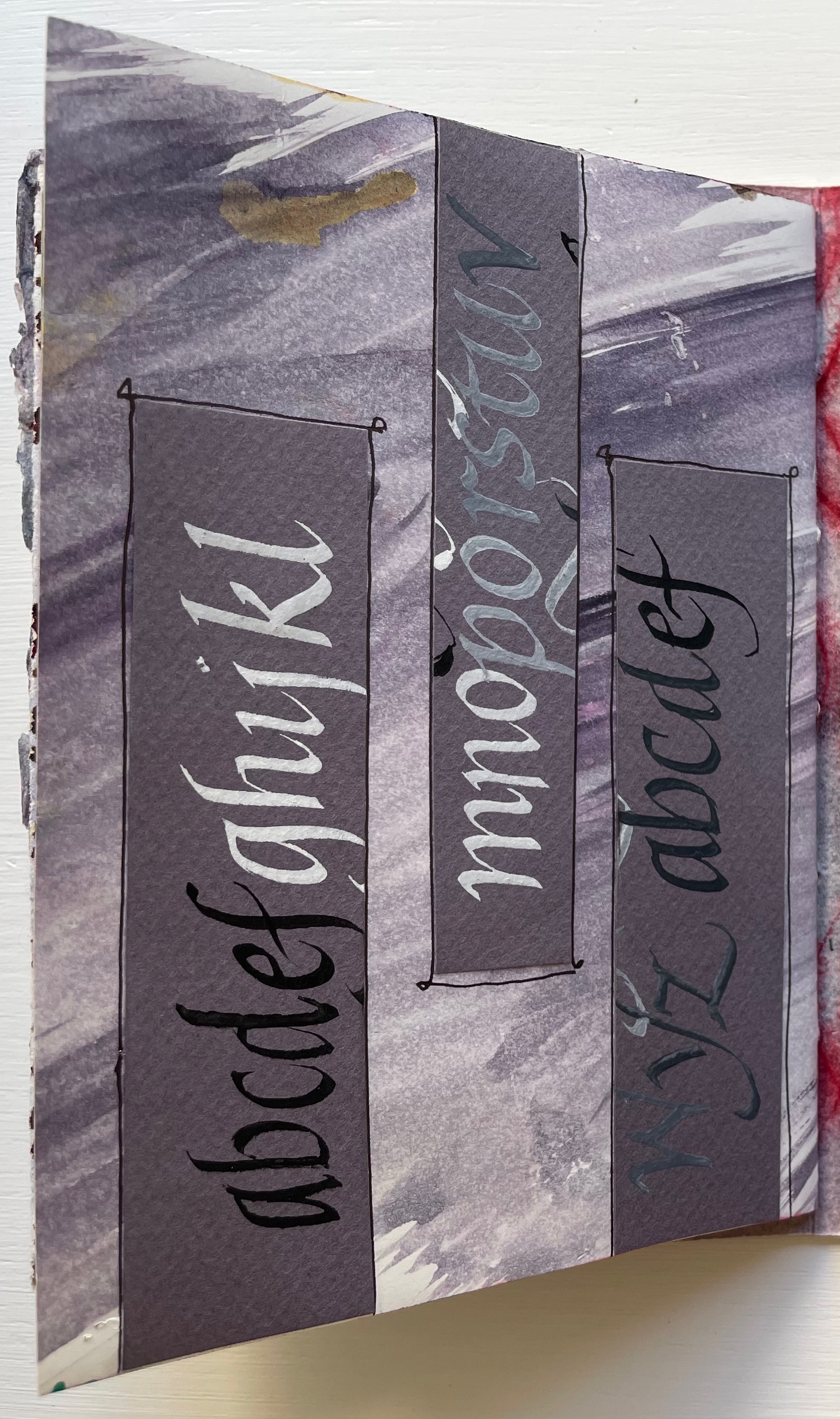
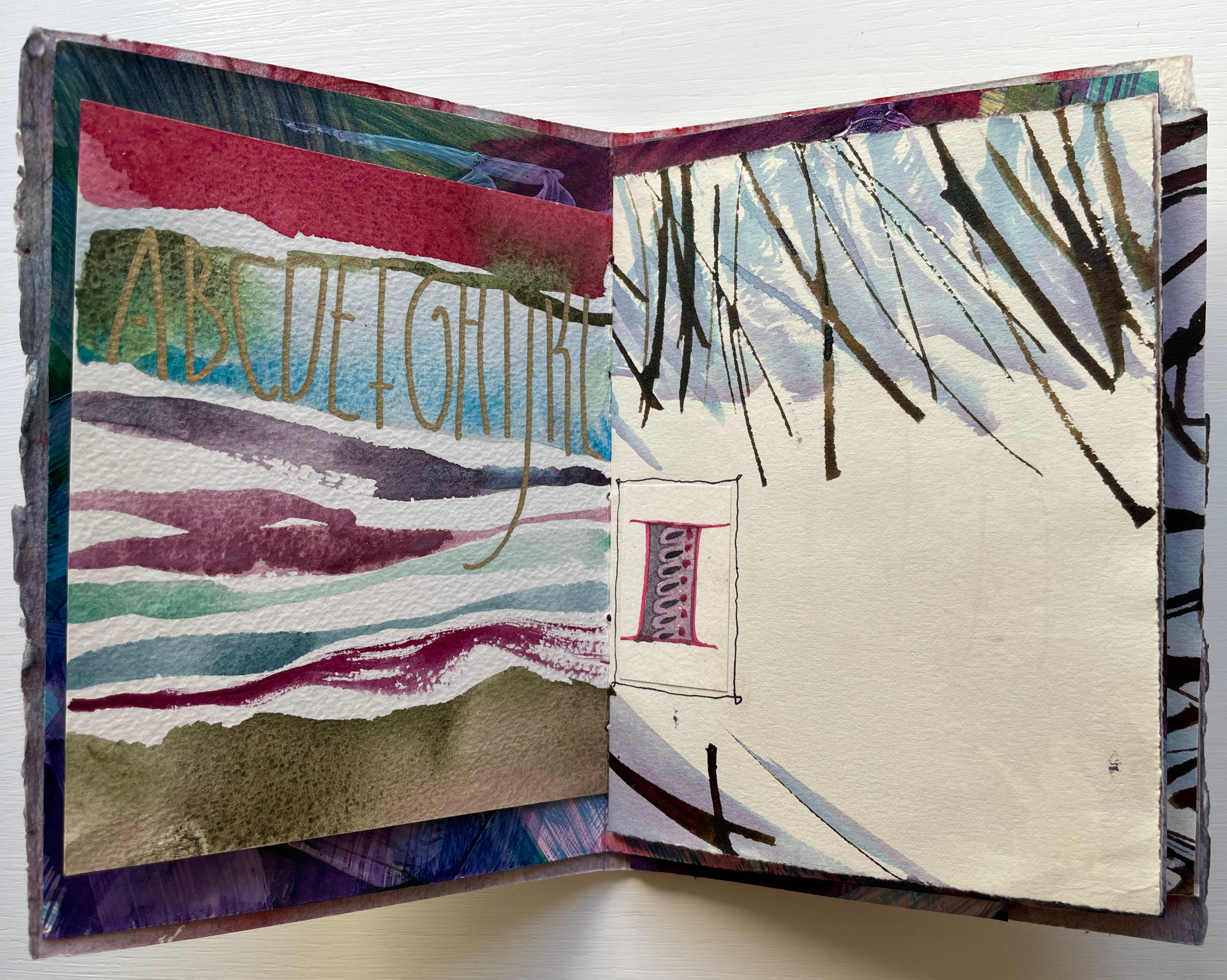
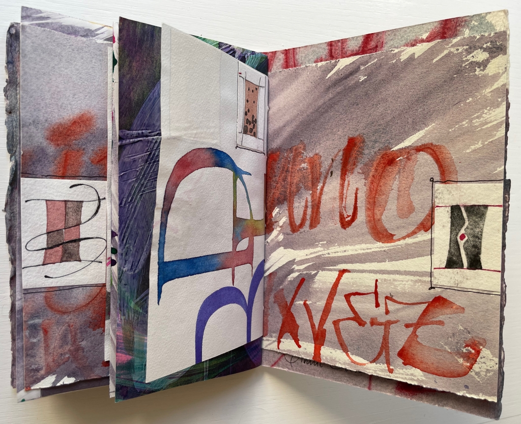
Below, the truncated alphabet prompts the leap forward to find its other half, and the contrasting wintry calligraphy facing M through Z sends us back to its other half to puzzle over those collaged thumbnail letter I’s.
Mind that all of this has occurred in just the first gathering.
The second gathering has fewer folios and perhaps fewer prompts to jump forward and back, but there is at least one prompt to jump back to the first gathering. The first page of the second gathering recalls from the first gathering the folio of wintry calligraphy — the one above with the two puzzling thumbnail letter I’s.
Curiously, the second gathering has several more of those thumbnail letter I’s than the first gathering has. In fact, due to the narrowness of the inner folios, the collaged thumbnails are also more constantly present to the eye. In general, the thumbnails and narrow inner folios make the second gathering more about the collage effect and strong contrasts across the differently sized pages and less about jumping forward and back.
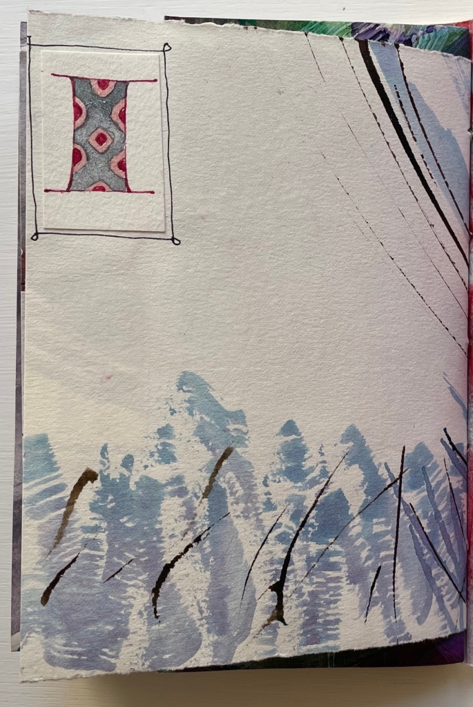
When we reach the final page of the second gathering, there sits the thumbnail, almost as if it were the illuminated initial of “Incipit” — except, of course, this is the end.
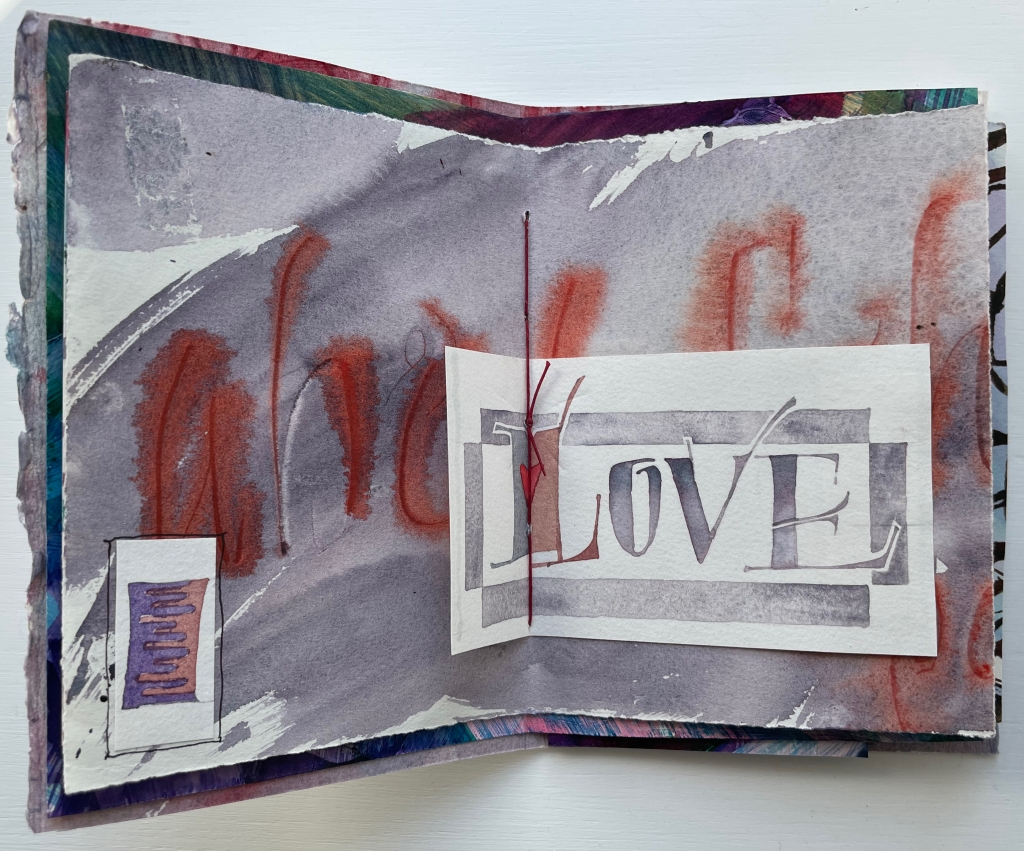
Tantalizing and enchanting as those thumbnail letter I’s are, they also draw attention to the experiment’s one jarring folio. It appears in the center of the first gathering and is quirkily the only off-center folio in the whole book. It is also the folio that, with an explicit message, forecloses the surrounding incipience. With that twee red heart beneath the red thread, out the window goes the structural and material subtlety so enjoyable in the rest of the book.
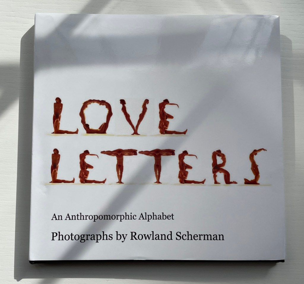
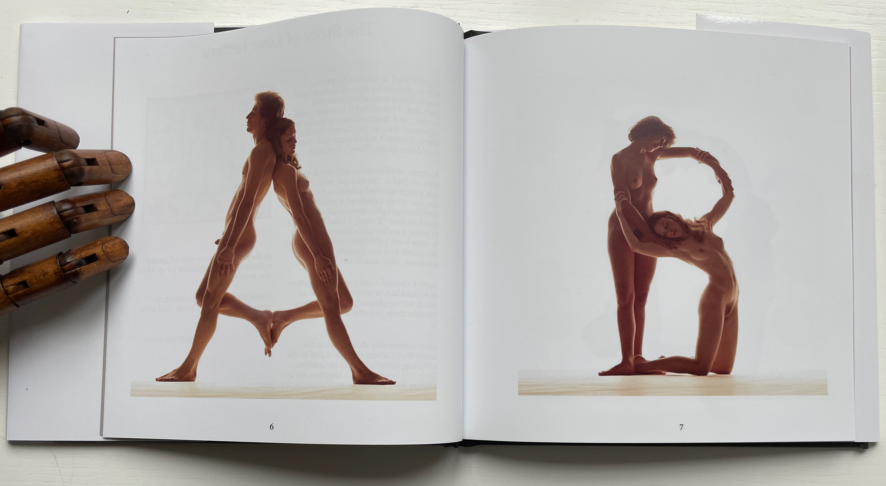
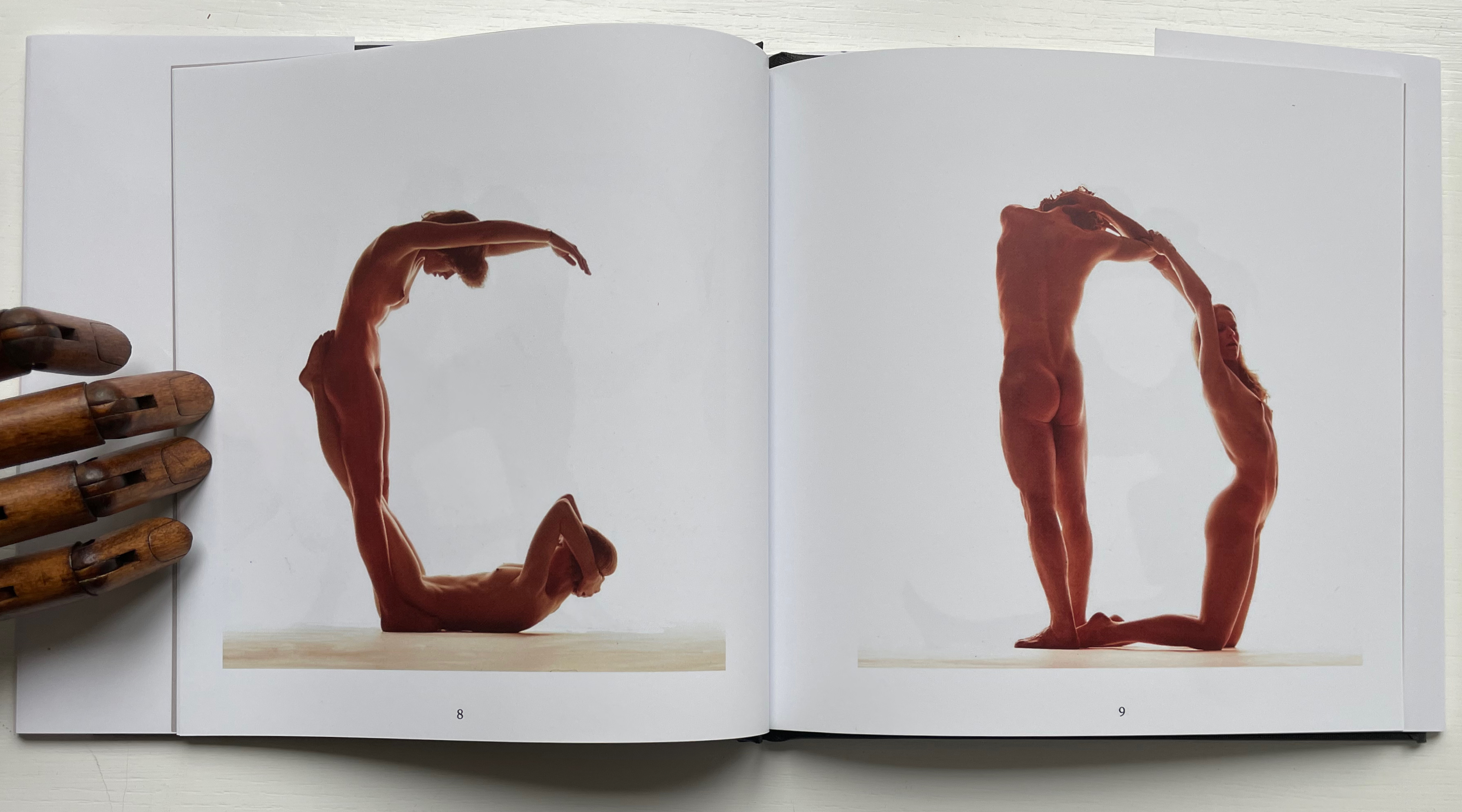
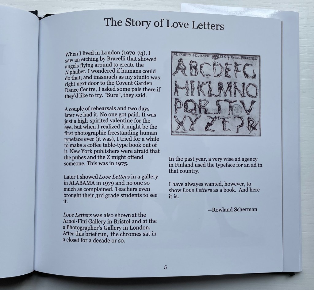
Love Letters: An Anthropomorphic Alphabet (2008) Rowland Scherman Casebound, doublures, perfect bound. H178 x W180 mm. 34 pages. Acquired from Rowland Scherman, 3 March 2023. Photos of the book: Books On Books Collection. Displayed with permission of Rowland Scherman.
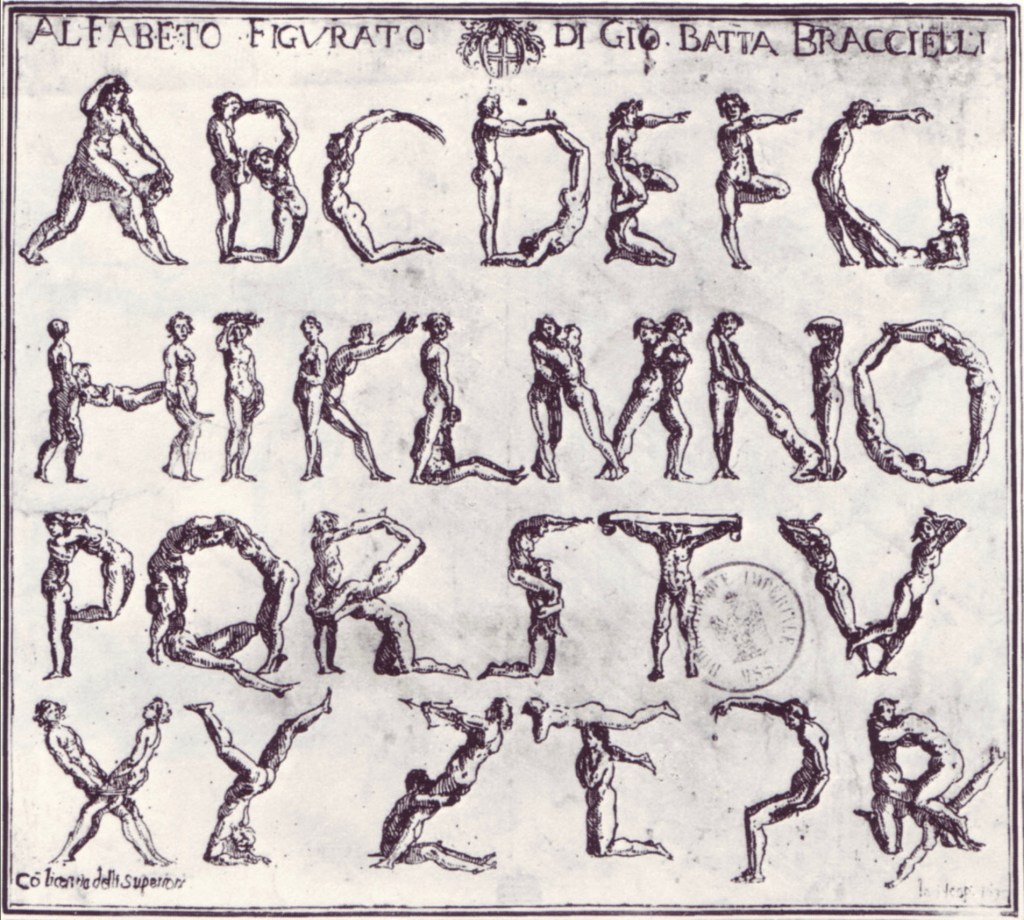
Giovanni Battista Bracelli’s “Alfabeto Figurato”, a single-sheet etching, occurred well after Carravagio’s presence there earlier in the century but well within the sphere of his ongoing influence. The print’s contortions of human bodies to display that most human of inventions — the alphabet — would probably have pulled a sneer of admiration from him. Maybe Bracelli had heard of the 5th-century comic playwright Kallias, who had his chorus dance (no doubt “cheek to cheek”) the shapes of the Ionian contenders for letterforms. In 1969, Anthon Beeke and Ed van der Elsken had their naked models arrange themselves into the alphabet on the studio floor and took photos from above. When Rowland Scherman saw Bracelli’s print on a London bus 340 years later, he wondered if human bodies could actually hold those poses or ones like them.
In the third decade of the 21st century, when book bannings and body shaming have reached new heights (or depths), Scherman’s “Story of Love Letters” might leave the reader wondering if we are now running headlong past Kallias and the 5th century into the pre-alphabetic world.
Dukes, Hunter. 27 April 2023. “Punctuation Personified (1824)“. The Public Domain Review. Not only could letters be formed with the human body, so could quotation marks and square brackets.
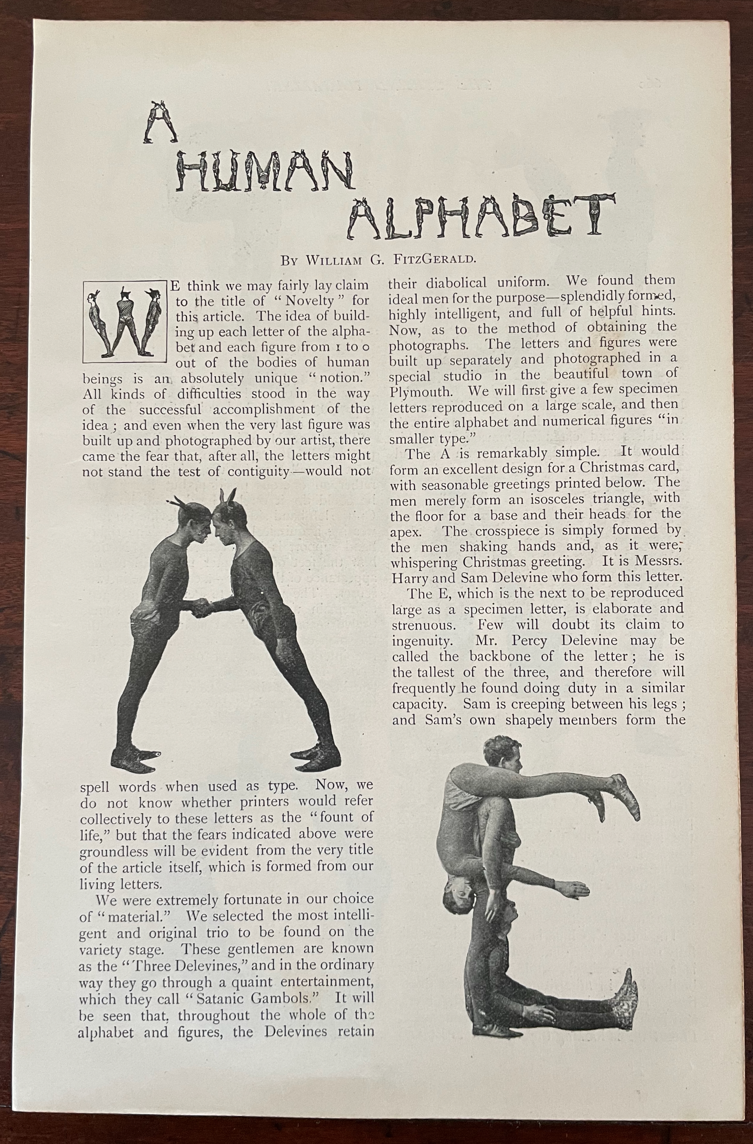
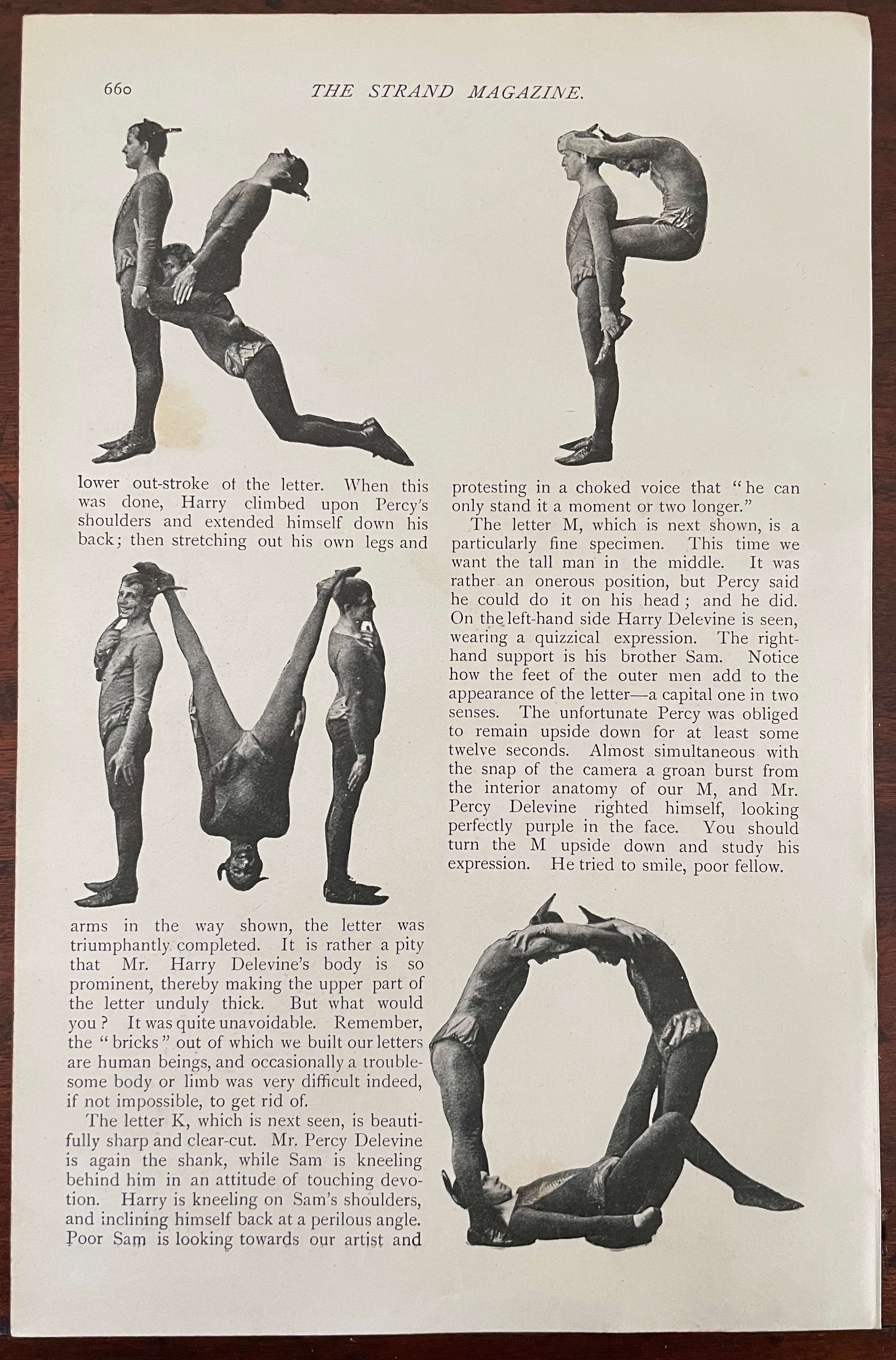
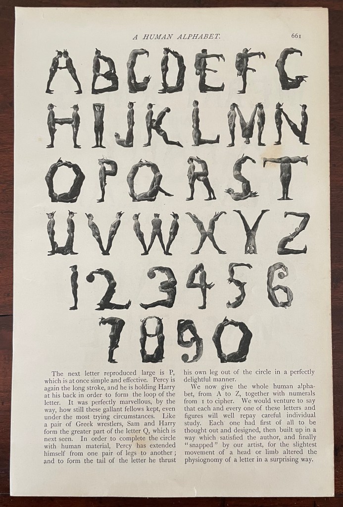
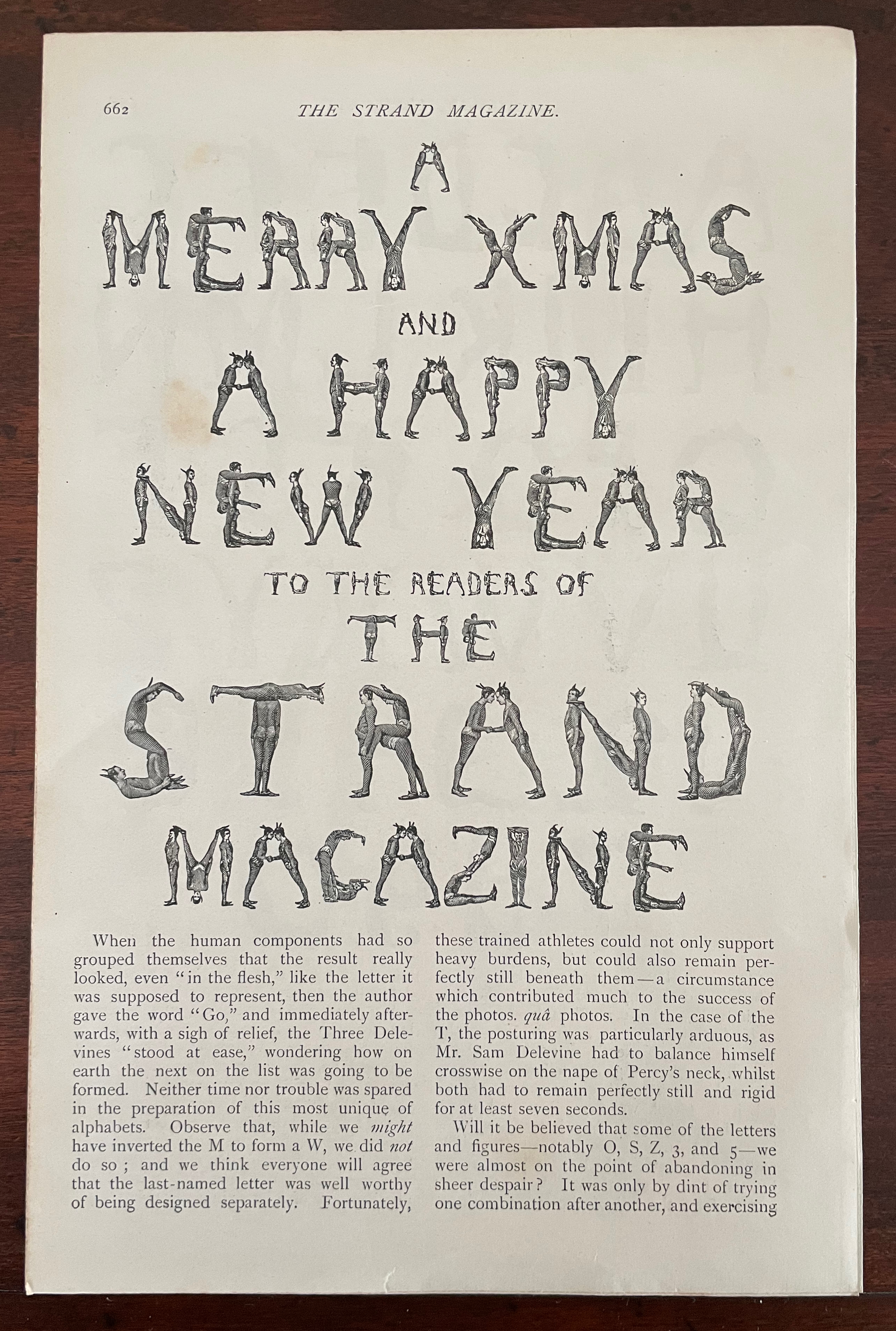
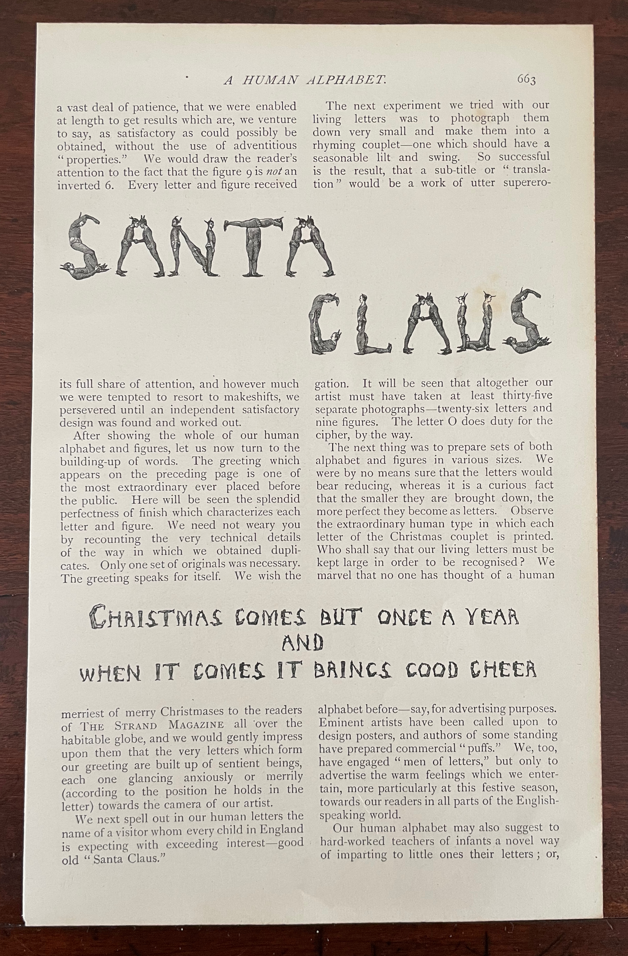
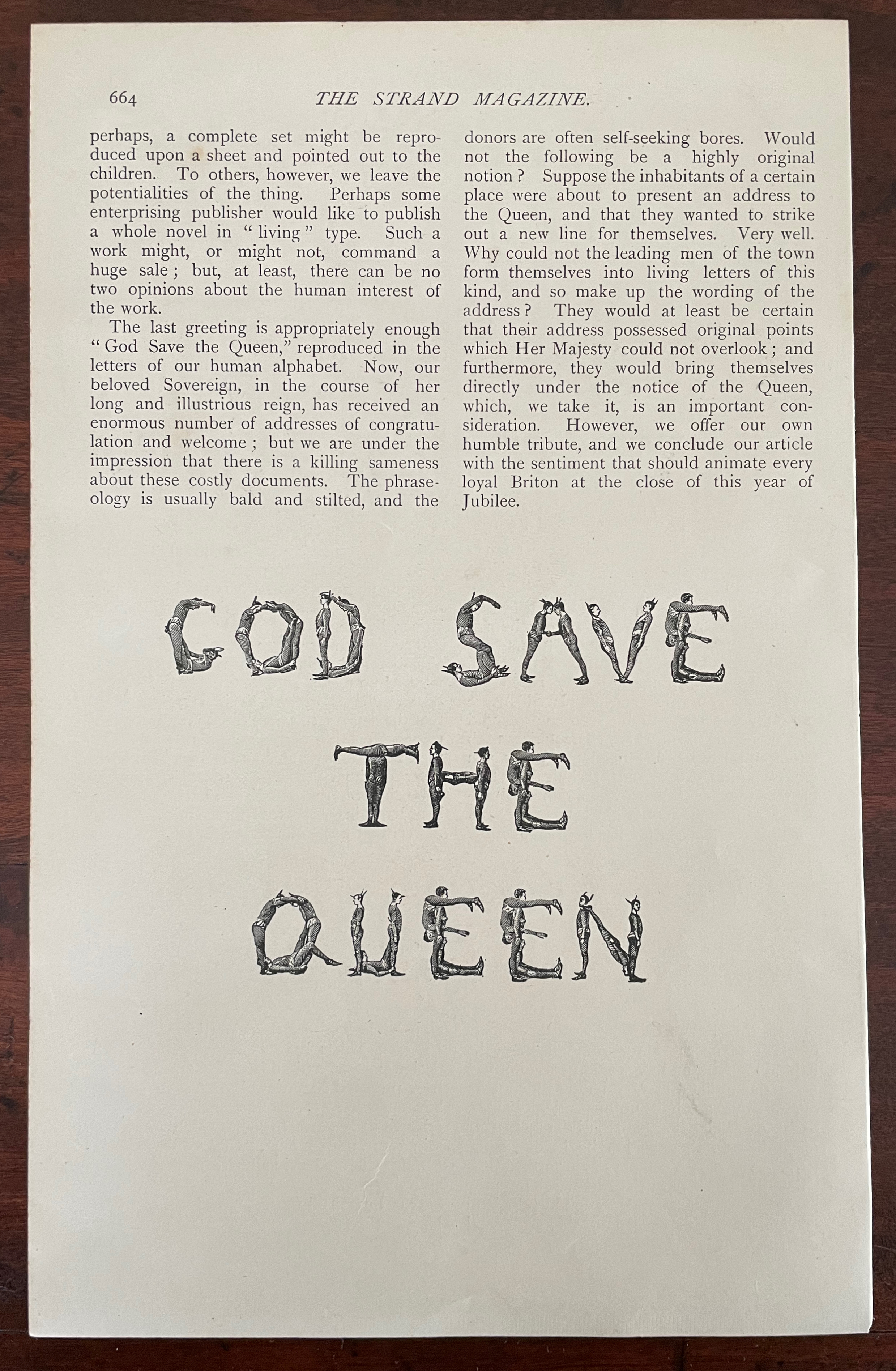
A Human Alphabet (1897) The Three Delevines Loose folios, William G. Shepherd’s article in The Strand Magazine, Vol. XIV, December, pages 660-64.H230 x W160 mm. Acquired from Cosmo Books, 26 August 2023. Photos: Books On Books Collection.
Only remembered after the Alphabets Alive! exhibition opened at the Bodleian in July 2023, The Three Delevines and W.G. Shepherd (their impresario on the occasion in 1897) have nevertheless demanded an appearance online among the other embodied alphabets (or lettered bodies) included in the “B for Bodies” display.
Shepherd is not merely the author of the Strand article but asserts his authorship of the alphabet performed by The Three Delevines. Although generous in his praise of the Australian brothers Sam, Harry and Percy for holding each of their poses for at least seven seconds and, in some uppercases, for twelve, Shepherd does not identify the Strand’s photographer by name or acknowledge his skill beyond “snapping”. At least, he refers to him as “our artist”.
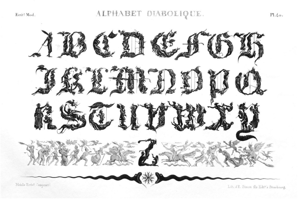
So much of his effort went into discovering the music hall troupe and its performance called the “Satanic gambols”, and congratulating himself on his sculptural instruction, and then describing superfluously what his “artist” and the Delevines rendered, Shepherd neglected to do the research at the British Museum (before the Library was hived off) to realize that his claim to “Novelty” had been superseded several times over. Even right back to the diabolical calligraphy of the — oh the shame of it — French graphic artist Jean Midolle (b. 1794). Blame the oversight on the combination of Christmas and the Jubilee.
Devroye, Luc. 2022. “Jean Midolle“. On Snots and Fonts. McGill University, Montreal. Accessed 6 September 2023.
Dukes, Hunter. 27 April 2023. “Punctuation Personified (1824)“. The Public Domain Review. Not only could letters be formed with the human body, so could quotation marks and square brackets.
FitzGerald, William G. December 1897. “A Human Alphabet”. The Strand Magazine. Vol. XIV. London.
Goetz, Sair. 11 June 2020. “Letterforms / Humanforms“. Letterform Archive News. Accessed 30 January 2022.
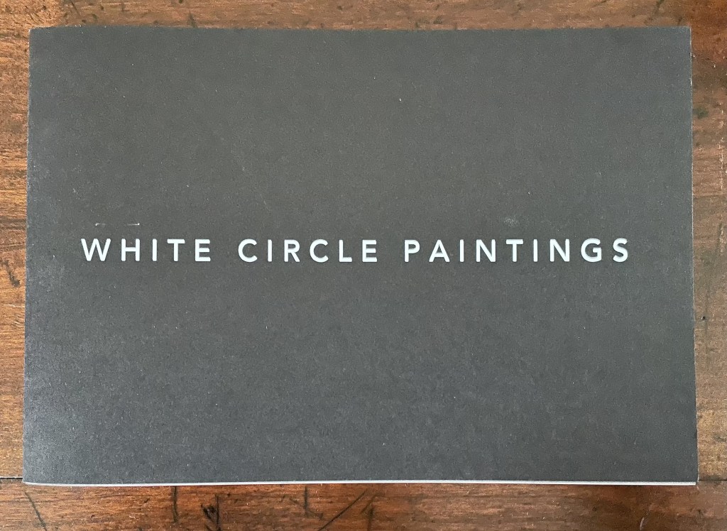
Square Photographs of White Circle Paintings (2022)
Square Photographs of White Circle Paintings (2022) Guy Bigland Saddle stitched soft cover. H150 x W220 mm. [40] pages. Edition of 100. Acquired from the artist, 12 October 2023. Photos of the work: Books On Books Collection.
The cover and title of this artist’s book create an odd road sign to appreciating the work. White on heavy black stock (320 gsm), only the second half of the title appears on the front cover. Opening the book to its bright white sturdy 148 gsm interior, we find photographs of the promised “white circle paintings” framed in dark gray to black squares. So far, so expected. But on closer inspection, the dark squares emerge as road surface. At the end of the book, almost all is revealed by a short text on the rules and history of the mini-roundabout.
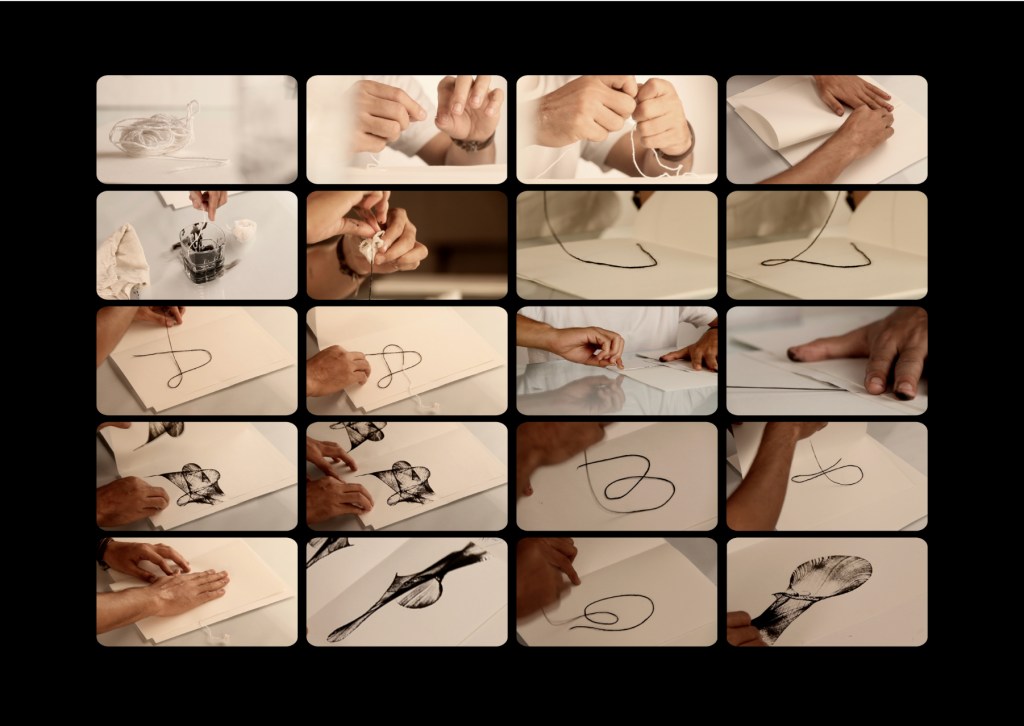
The Voice of the Yarn (2022) Pramod Chavan Casebound, glued, illustrated paper over boards, plain doublures. H325 x W235 mm. 66 pages. Acquired from the Artist, 20 May 2023. Photos: Courtesy of the artist.
The technique of painting or printing by pulling a soaked string from a folded sheet of paper will be familiar to Western kindergarten and elementary school teachers. In India, the technique has been raised to an art form. The tradition of painting with rope, string or thread had its champion in the late B.K.S. Varma. Joining that tradition to the tradition of alphabet-inspired art is a new champion: Pramod Chavan.
Chavan calls his art “thread typography”. These process photos showing his manipulation of inked thread between folds of paper suggest that “thread calligraphy” might be just as apt. Whichever term, the results achieved — without direct sight of ink, tool and surface — are astonishing. It evokes the Punch cartoon of the kingfisher sitting on a branch and calculating in its speech bubble Snell’s law for entering the water to catch the fish swimming below the surface. Pramod Chavan must have a similar speech bubble filled with calculations for Bézier curves.
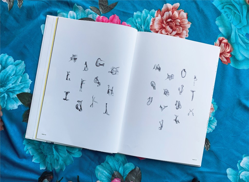
Between A and Z, The Voice of the Yarn lays out both the upper- and lower-case letters individually and the alphabet entire on double-page spreads like that above and below. The role of the fold in this technique is echoed in similar but very different ways by Jim Clinefelter’s A Rohrshach Alphabet (1999) and Étienne Pressager’s Mis-en-pli (2016).
The choice of background for photographing the double-page spreads makes a nod and smile to the usual floral images that arise when the technique is introduced for school — or after-school — art projects. Chavan’s thread typography springs from simple elements and opens into complex images — very much in the spirit of the alphabet itself.
“Carol DuBosch“. 25 February 2023. Books On Books Collection. If DuBosch recapitulates her Alphabet of Calligraphic Tricks (2014), perhaps she can persuade Chavan to contribute an ampersand!
ABC of Typography (2019) David Rault Casebound, sewn, illustrated paper-over-boards cover, endbands, sewn, red doublures. H265 x W195 mm. 128 pages. London: Self Made Hero [Translated from French (Gallimard, 2018)]. Acquired from The Saint Bookstore, 29 June 2023. Photos: Books On Books Collection.
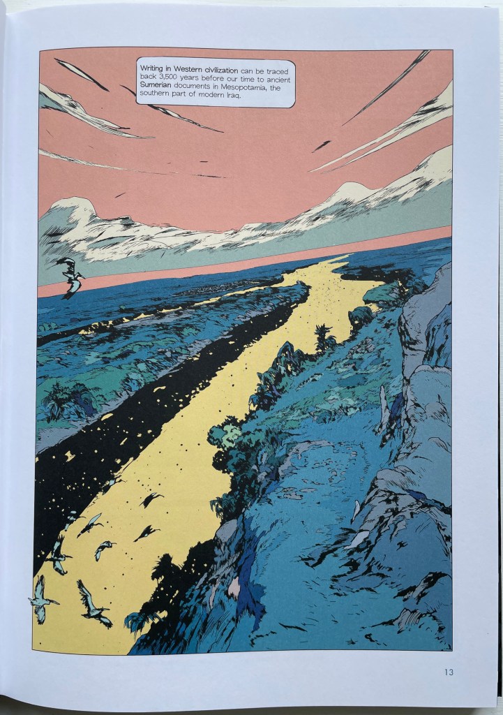
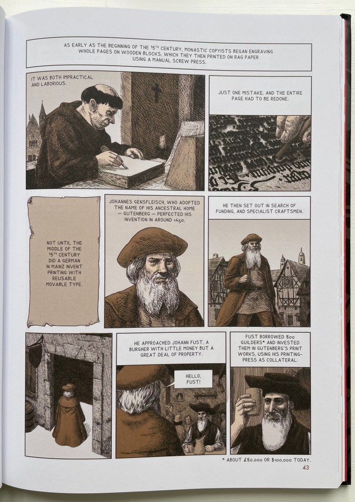
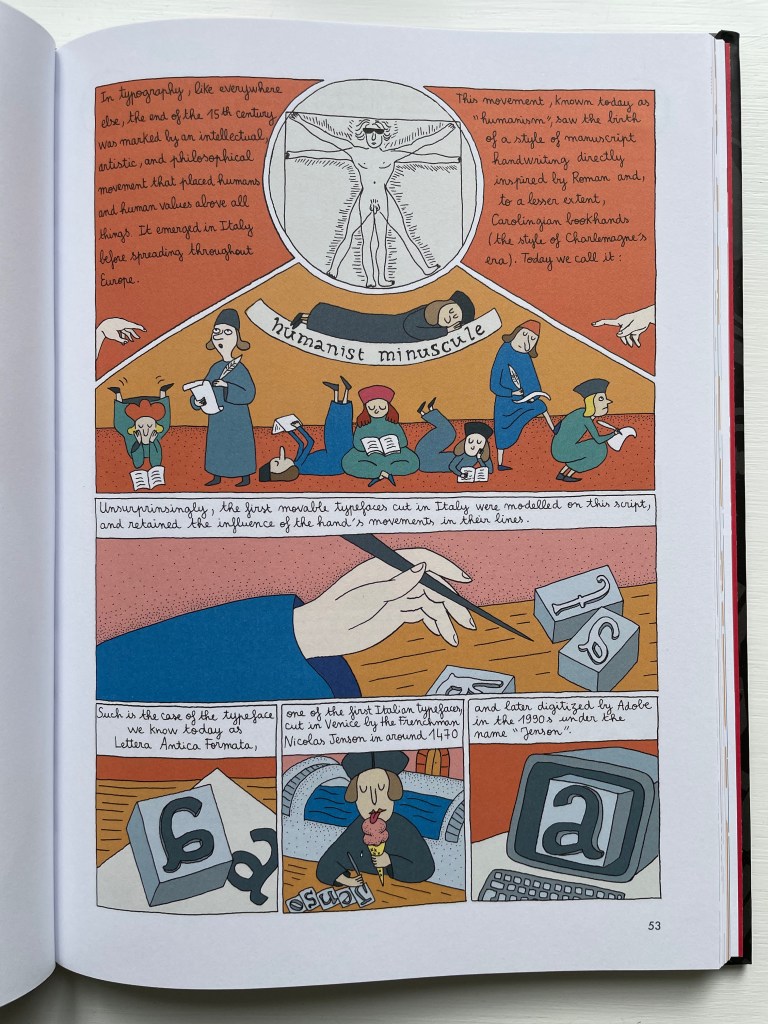
David Rault’s ABC of Typography traces 3,500 years of letters and type from pictographs and cuneiform through Roman lettering and Gutenberg to the Bauhaus and beyond. For the Books On Books Collection, it enriches the focus on the alphabet, typography and artists’ books — in particular, that subset of illustrated histories of the alphabet and type. These include Tommy Thompson’s The ABC of Our Alphabet (1952), William Dugan’s How Our Alphabet Grew (1972), Tiphaine Samoyault’s Alphabetical Order (1998), James Rumford’s There’s a Monster in the Alphabet (2002), Ada Yardeni’s A-dventure-Z’ (2003), Don Robb and Ann Smith’s Ox, House, Stick (2007) and Renzo Rossi’s The Revolution of the Alphabet (2009).
While enhancing that subset of illustrated reference works, ABC of Typography also highlights a gap in the collection. Rault and his team of invited artists hail from the Franco-Belgian tradition of lesbandes dessinées (BDs), which the French and Belgians call laNeuvième Art (“the Ninth Art”). English-language readers will likely be familiar with BDs from seeing Hergé’s Tintin or René Goscinny’s Asterix. Other than Chiavelli’s Arthur R./Un Coup de DÉS Jamais N’Abolira le HASARD (1988) and its two companion volumes, the collection has no BDs. The Rault volume does, however, deliver a mini-survey of styles among contemporary bandes dessinateurs with its assignment of chapters to eleven different artists.
The book’s overall design by Jean-Christophe Menu simultaneously embraces and sets off the individual styles of drawing and lettering. Menu’s consistent use of a slab serif font (Lubalin Graph Std?) for chapter titles alongside oversized chapter numbers that bleed off the facing page signals his intent and success.
The variety of “strip” layouts pushes the boundaries of unity. Some, like Libon’s and Clérisse’s, float on the page. Others, like Singeon’s and Simon’s, are ruled off. Within the strip layouts, panels vary in shape, and the images within them tilt at different angles, all creating as much of a sense of movement as any action comic. Even where a strip is ruled off, sketches sometimes encroach across panels as well as the book’s margins or gutter to give depth and perspective as well as movement. as happens with the gulls in flight below from Aseyn’s chapter.
Note how the gulls in flight in Aseyn’s chapter appear within panels but also cross them and the gutter.
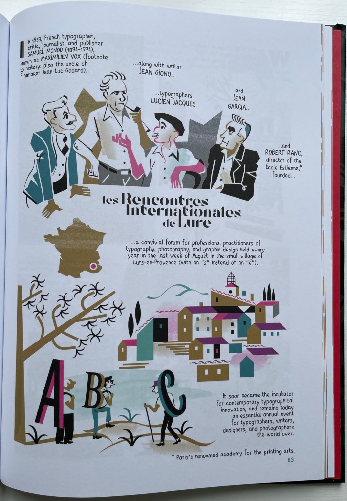
Evident from Clérisse’s recounting of “Les Rencontres internationale de Lure” (an influential annual forum in Provence), Simon’s homage to the typologist Maximilien Vox (one of the forum’s founders) and Ayroles’ positioning of the typeface DIN, the volume’s European roots are never far from the surface, which also makes ABC of Typography a useful and necessary addition to this collection or any shelf of Anglo-centric works about the alphabet, type or design. It’s interesting that, while the French have categorized BDs as the ninth among the ten officially designated arts, typography and design do not yet rate a category. Neither does the livre d’artiste for that matter, which raises a question:
Between the traditional BD and livres d’artistes by graphic artists, is there fertile ground for artists’ books that blend subject, material, form and metaphor into innovative works of book art? The above-mentioned BD by Chiavelli, paying homage to Mallarmé’s Un Coup de Dés, represents one end of that spectrum. Hervé di Rosa, part of the Figuration libre movement, associated with Keith Haring and graffiti artists, can provide the other end of the spectrum with his Un Coup de Dés jamais n’abolira le Hasard (2021), published by Virgile Legrand. For the work of book art between them, Nanette Wylde’s Babar Redacted: ABC Free (2020) might be a case in point. Likewise, Catherine Labio’s curated exhibition in 2013 — “From Bande Dessinée to Artist’s Book” — finds earlier exemplars in the works of Lars Arrhenius, Felicia Rice, Omar Olivera and Mamiko Ikeda.
Babar Redacted: ABC Free (2020) Nanette Wylde Based on an altered copy of the board book B is for Babar: An alphabet book by Laurent de Brunhoff. French link exposed spine on tapes. 9″ x 9″ x .5″ closed. Edition of 3. Photos: Courtesy of the artist.
“Richard Niessen“. 23 April 2021. Books On Books Collection.
Library of Congress. “Bande Dessinée: Comics & Graphic Novels“, in “Reading in French: A Student’s Guide to Francophone Literature & Language Learning”. Library of Congress Research Guides. Accessed 11 August 2023.