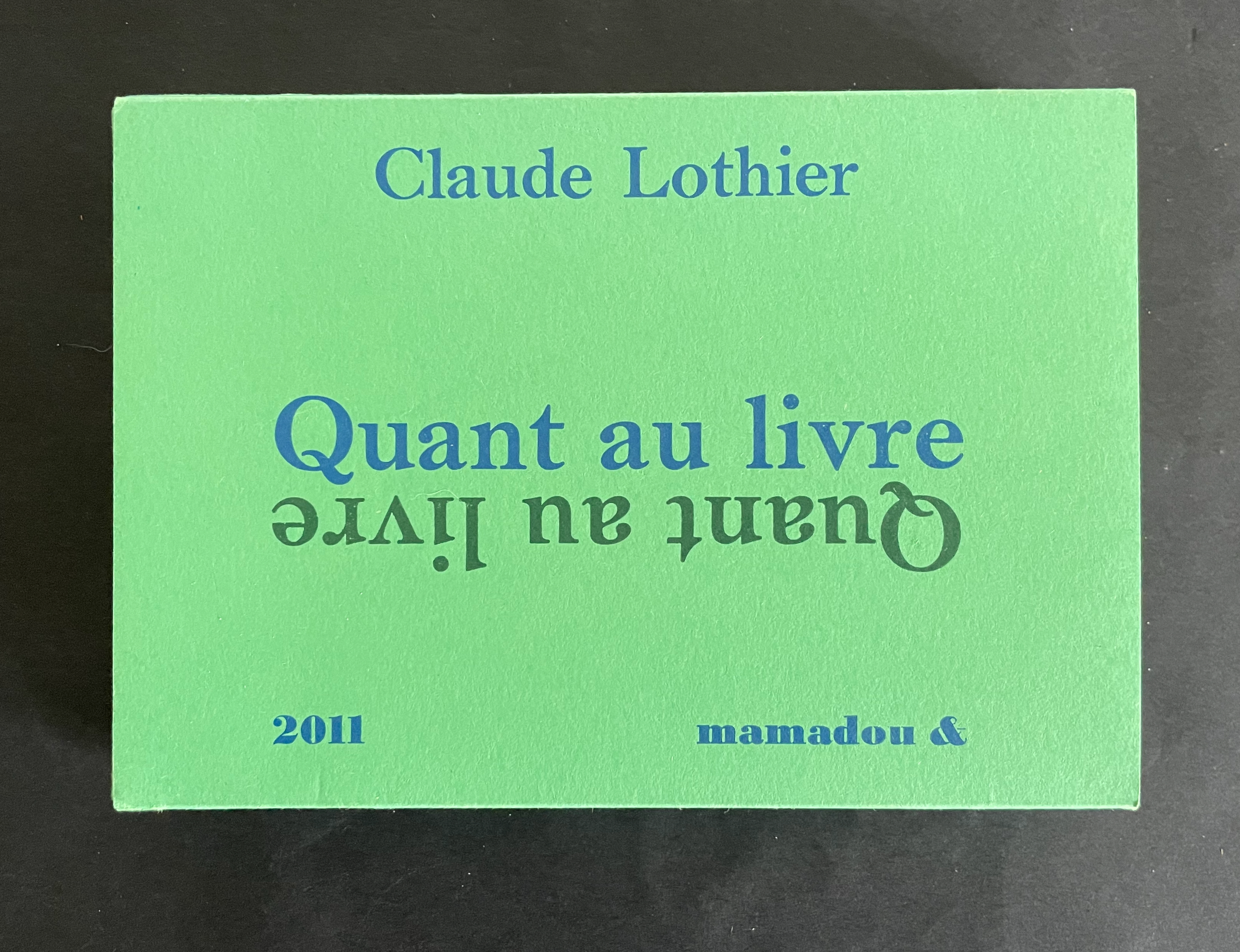
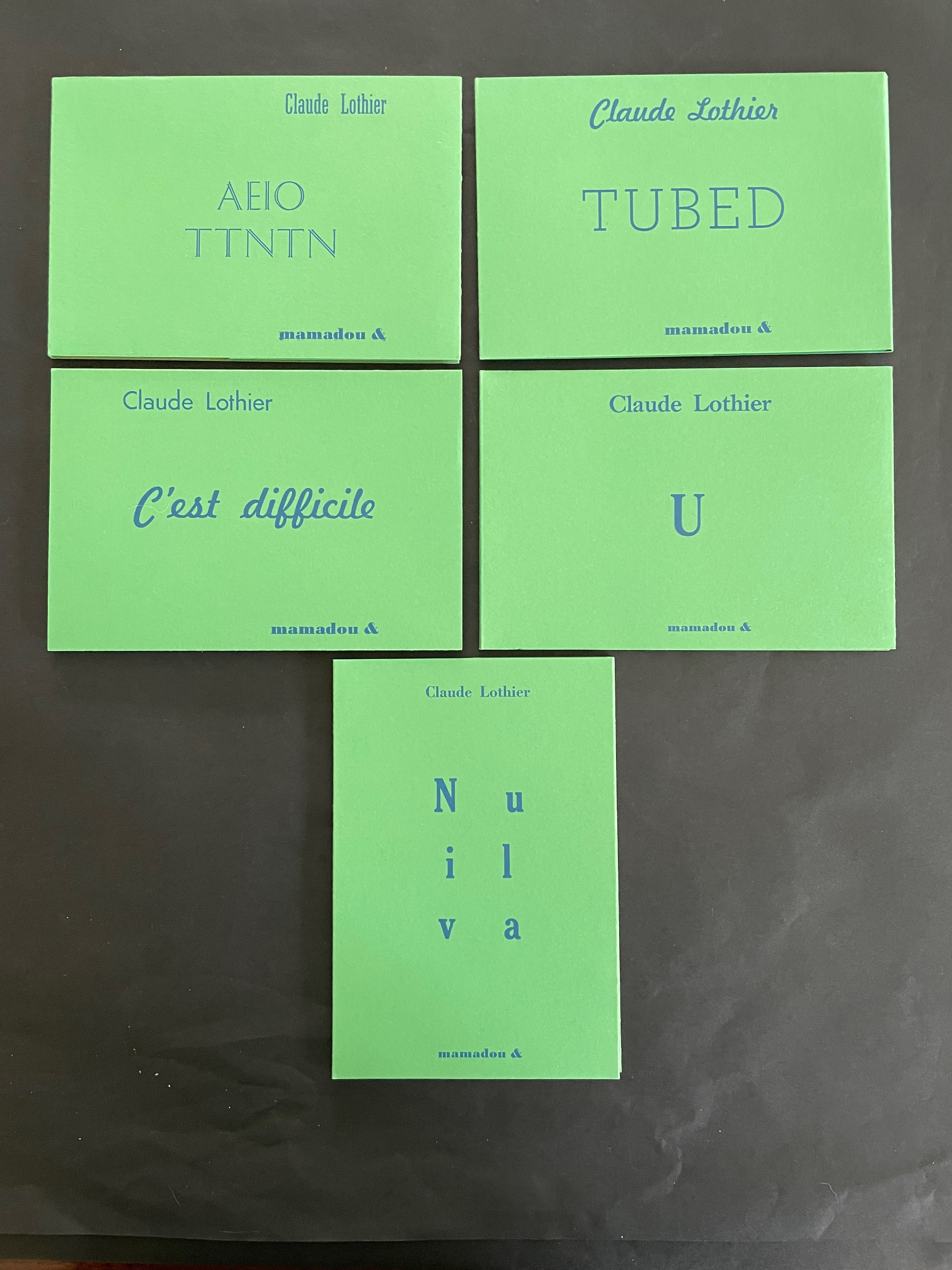
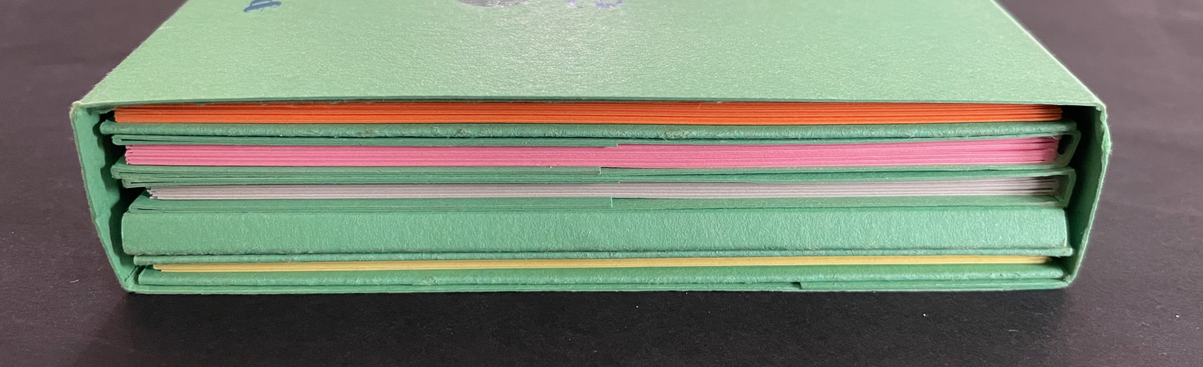
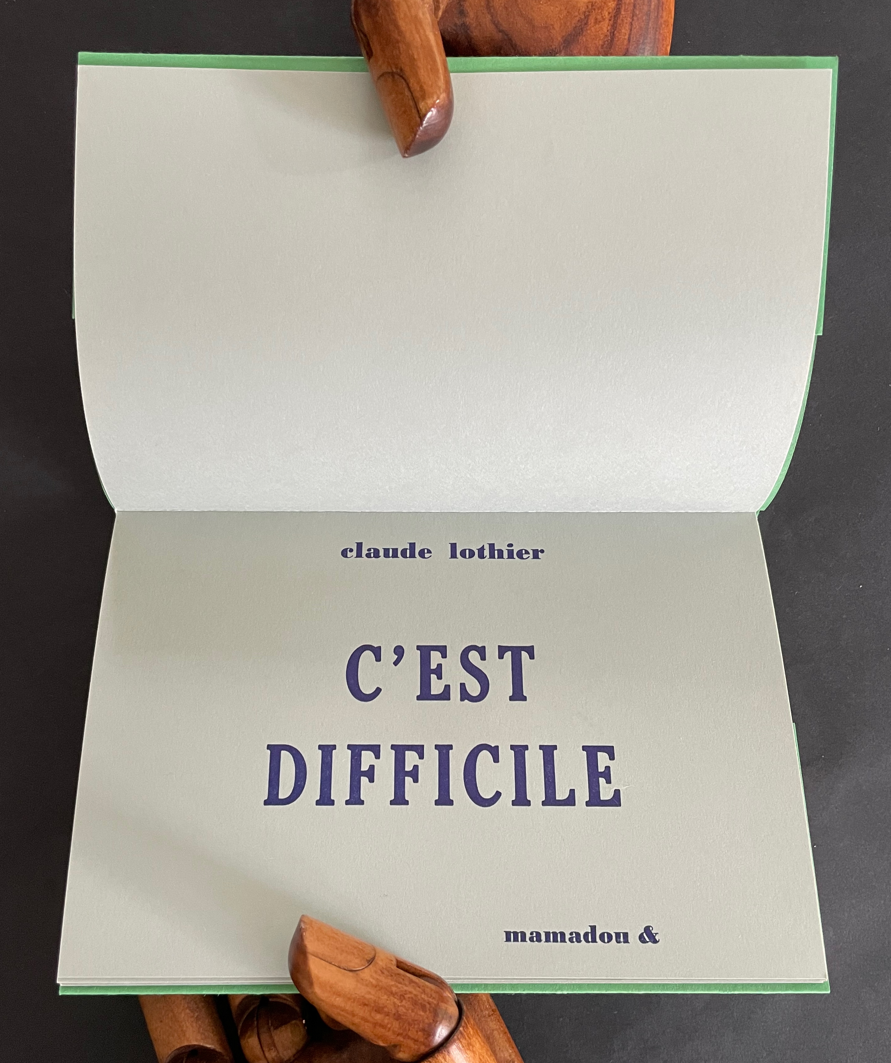
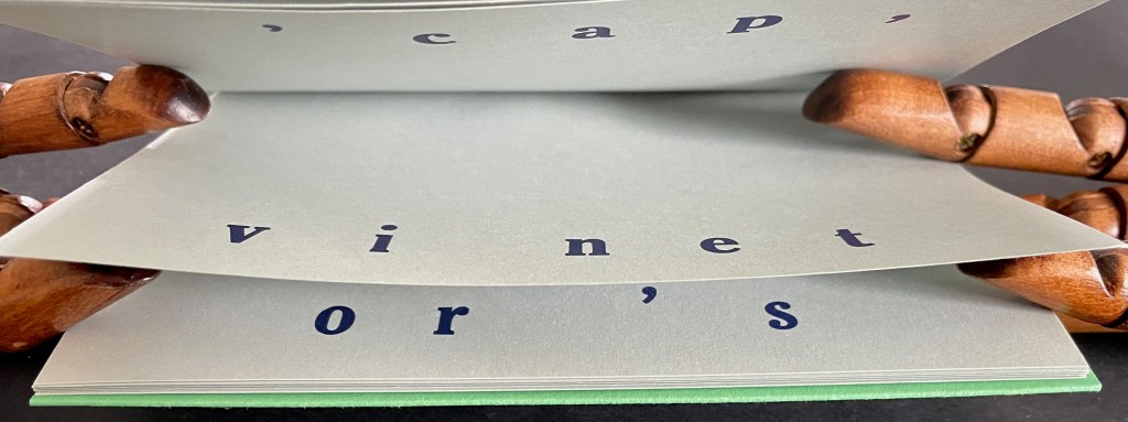
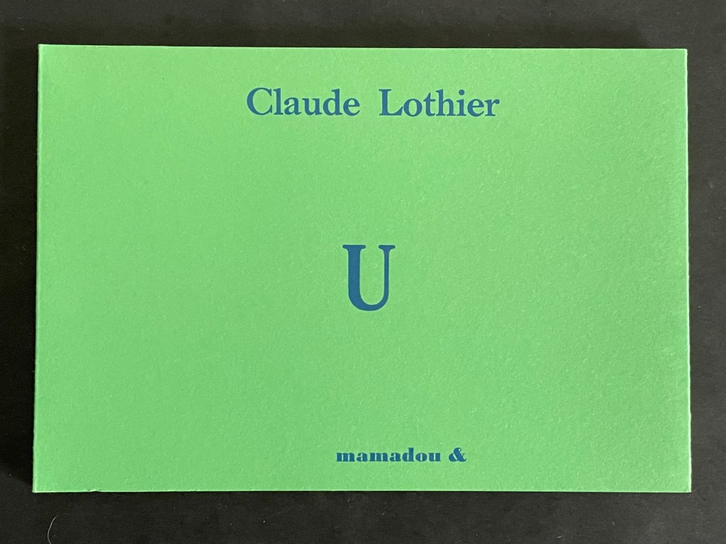
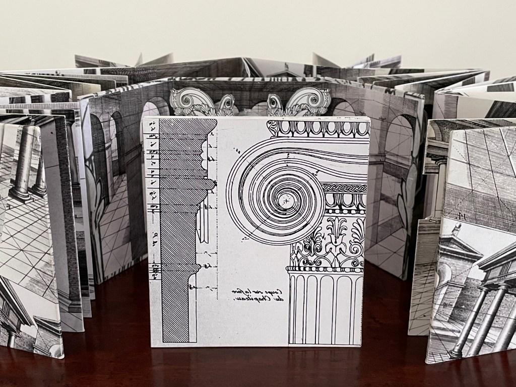
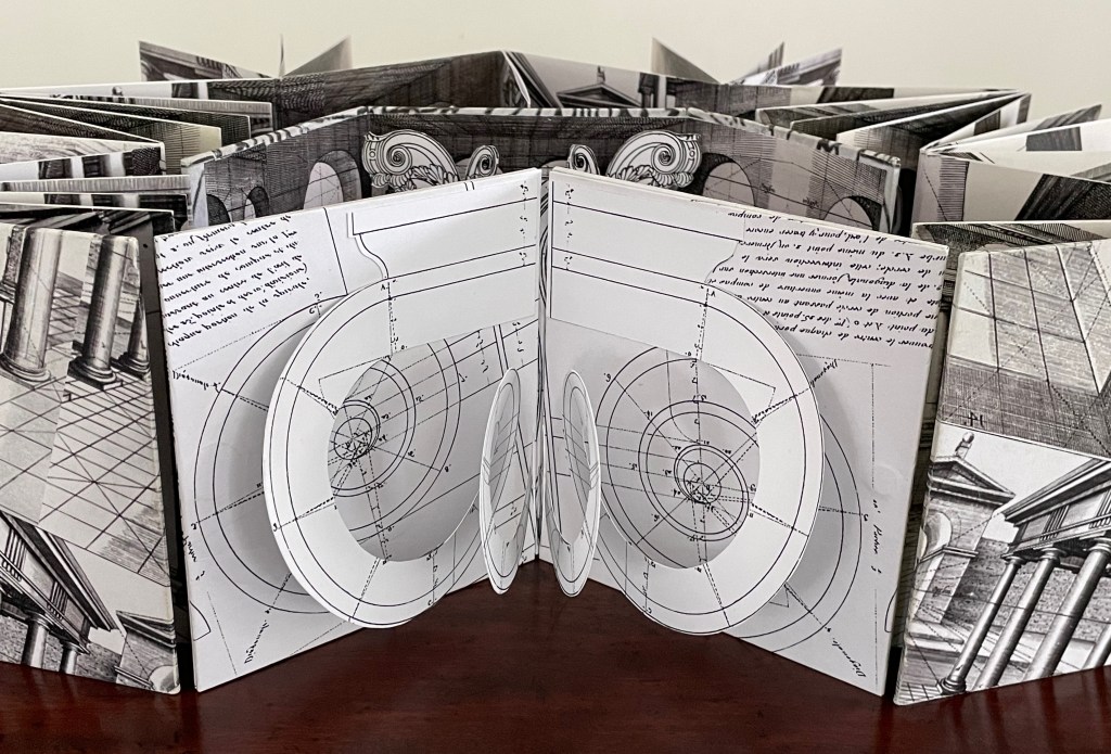
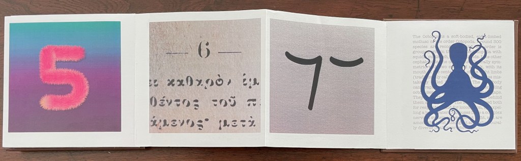
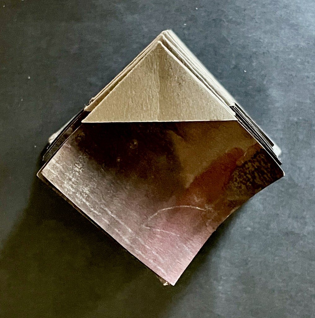
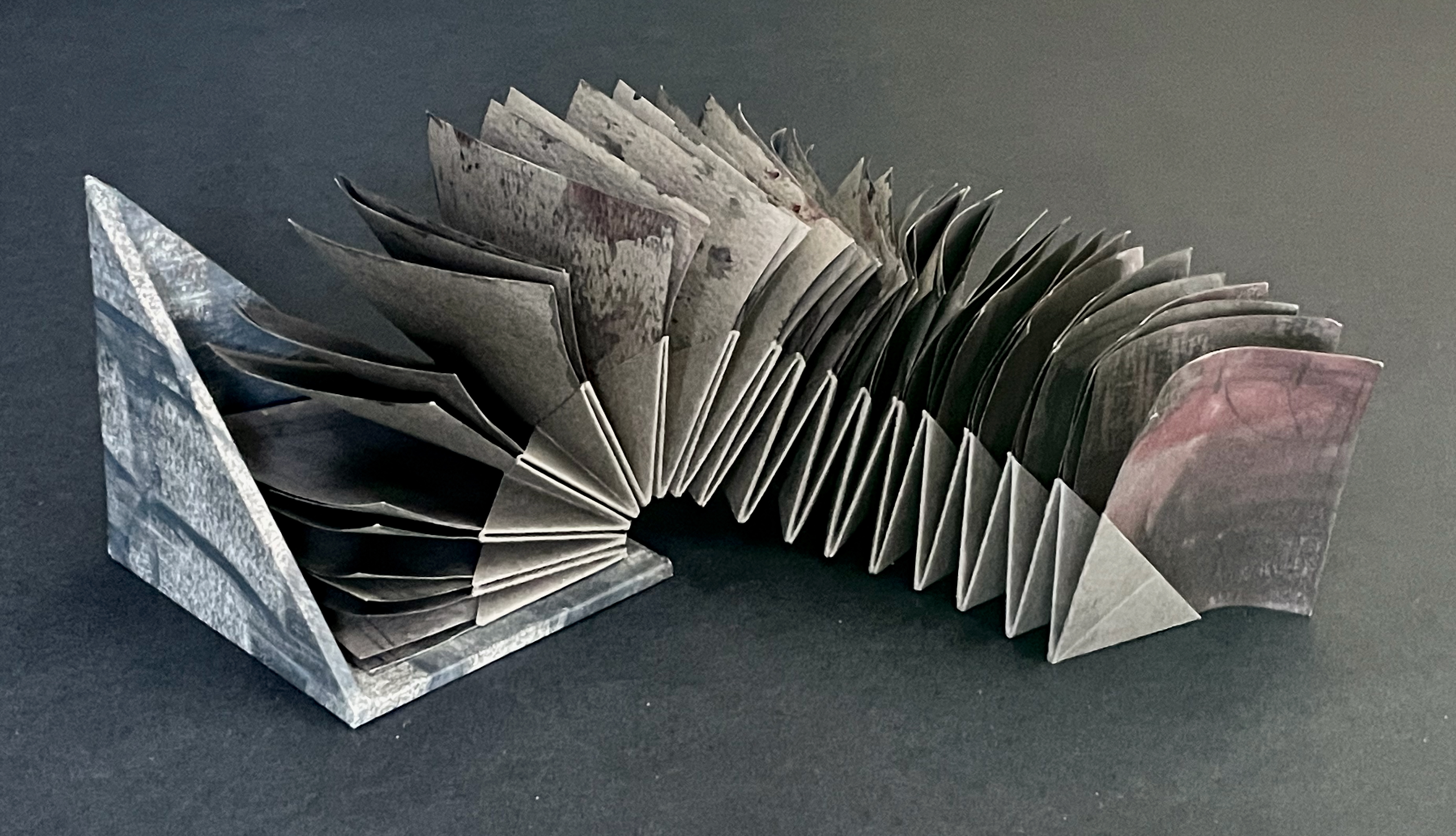
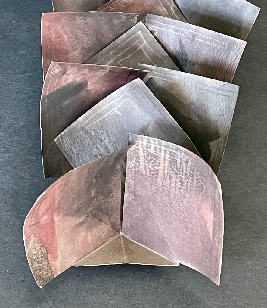
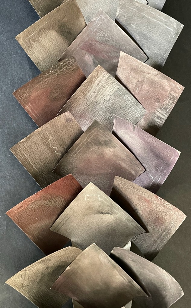
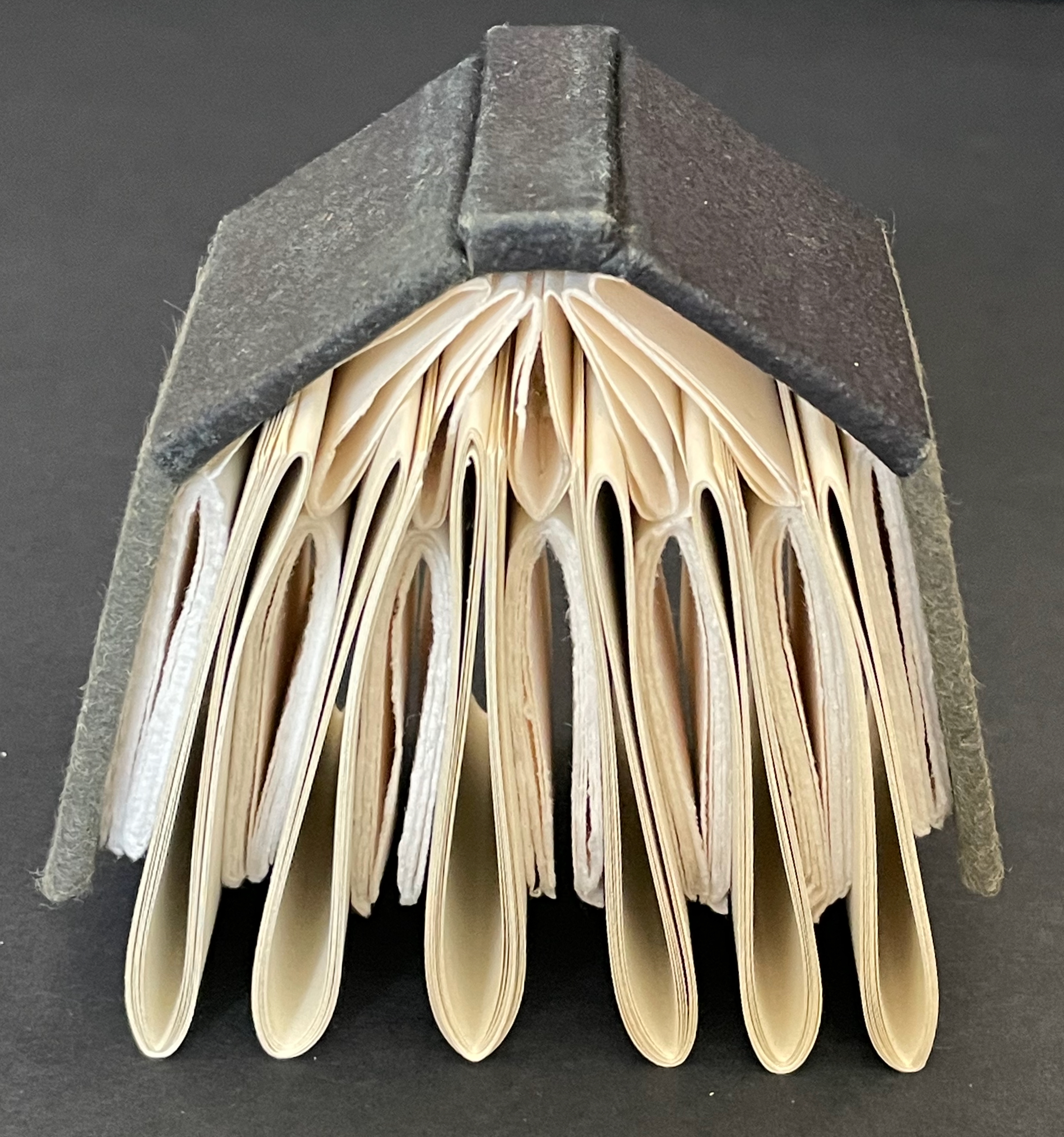
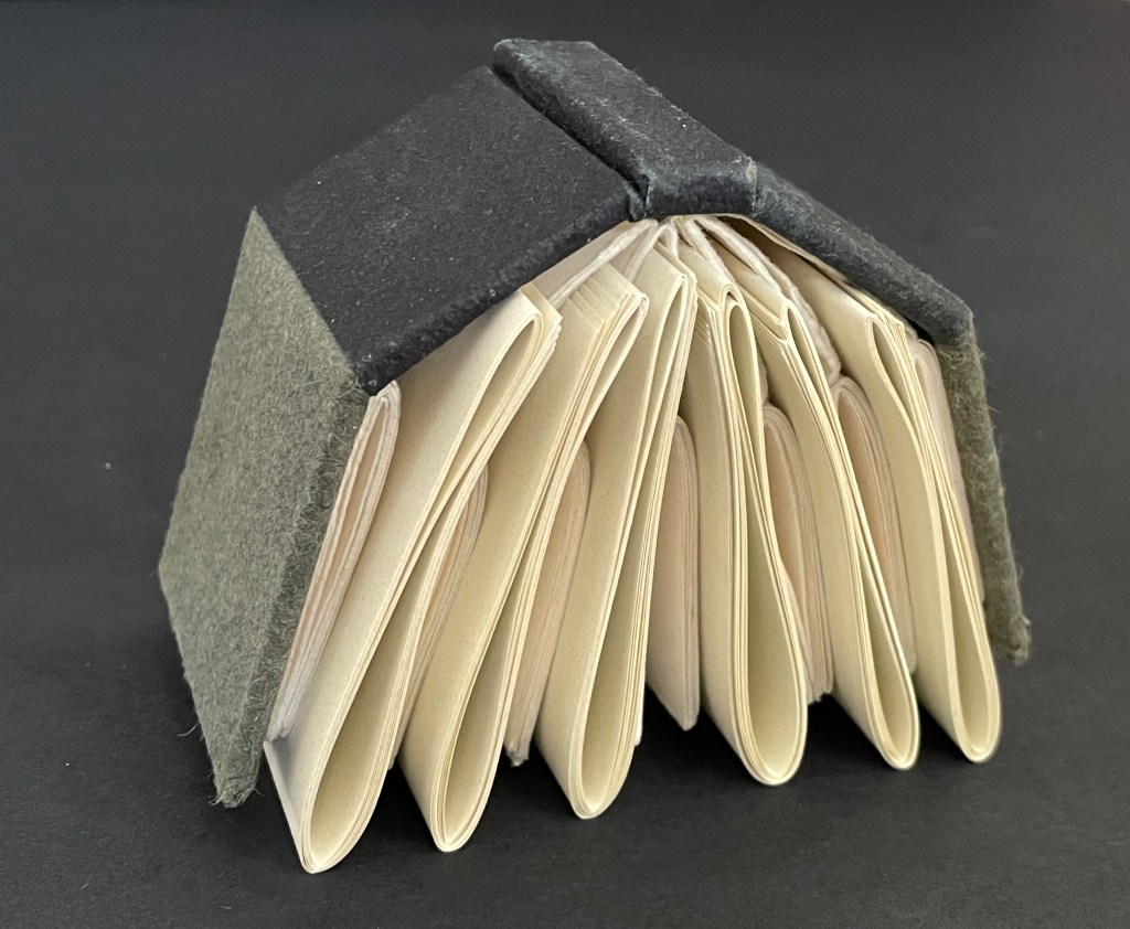
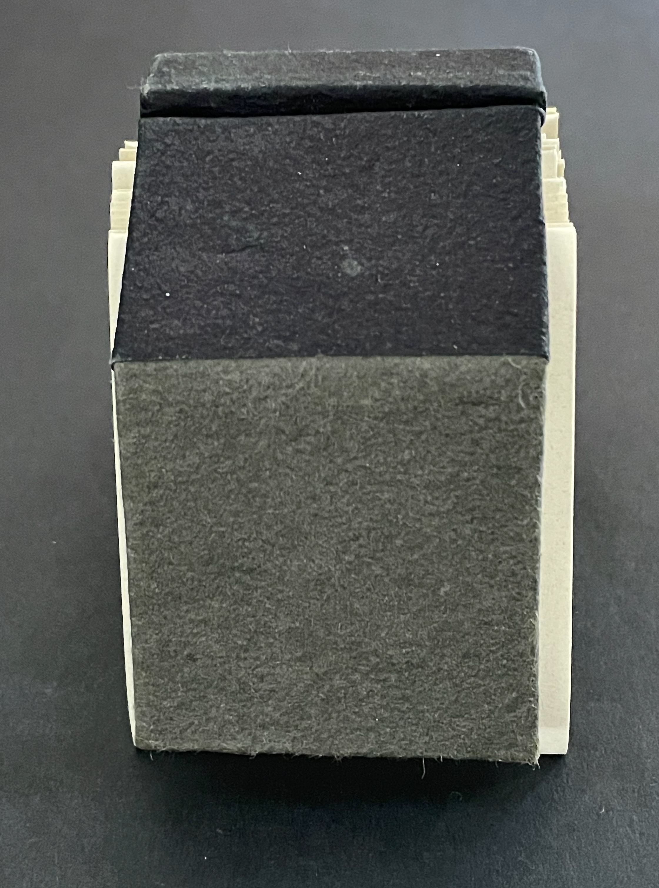
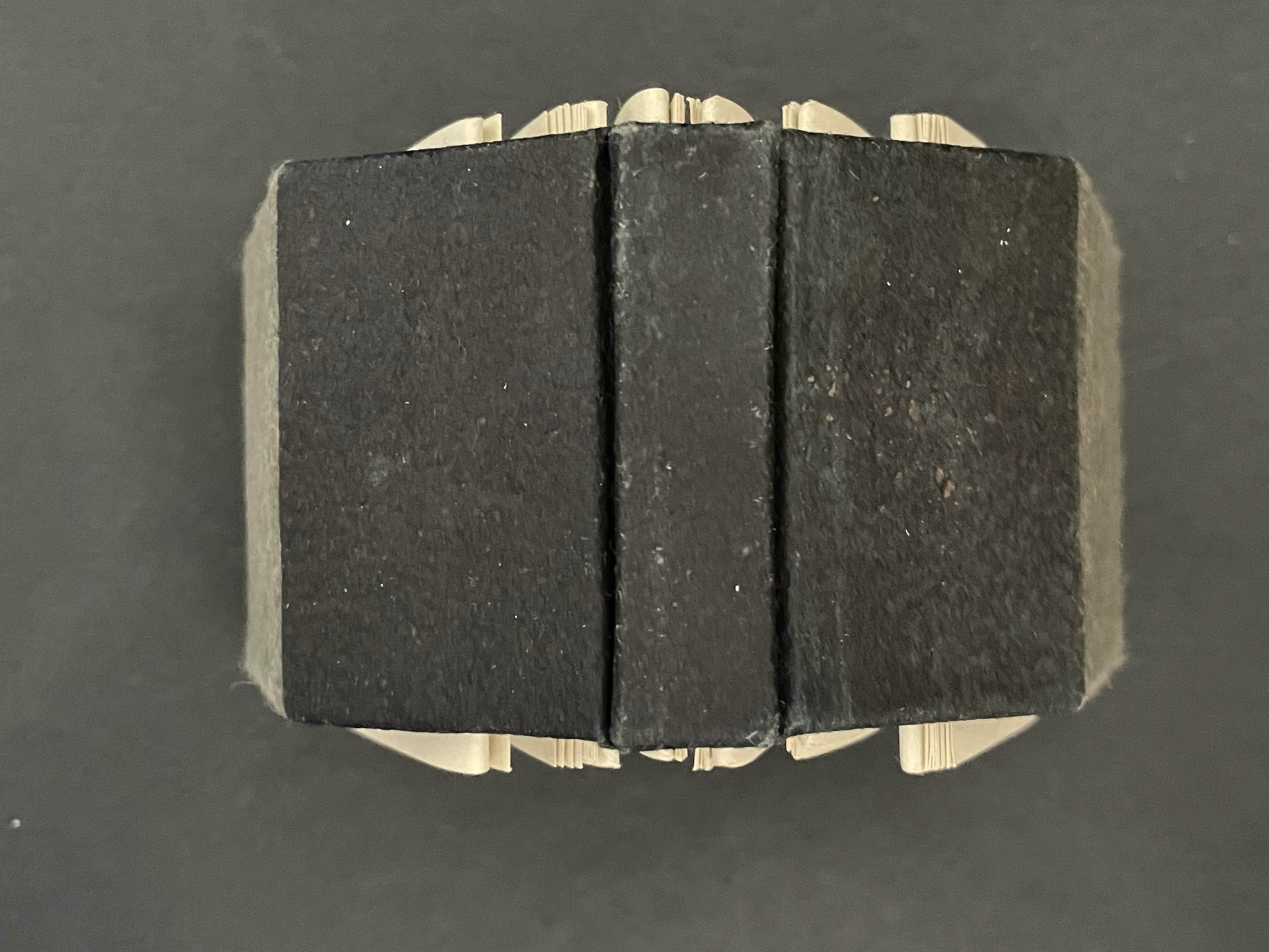
Quant au Livre(2011) Claude Lothier Slipcase around five cased and glued softcover booklets. Slipcase: H110 x W158 x D25 mm. AEIO TTNTN: H108 x W157 mm. Niv ula: H157 x W108 mm. C’est difficile: H108 x W157 mm. TUBED/NIF: H108 x W157 mm. U: H108 x W157 mm. [28] pages each except for TUBED/NIF, which has [20], and U, which has [24]. Edition of 200. Acquired from Biblio-Net, 16 October 2025. Photos: Books On Books Collection
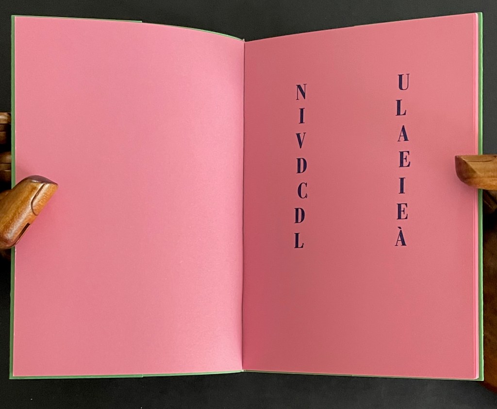
In English, the phrase quant au livre would be “as for the book” or “concerning the book”. What is lost in translation is the phrase’s association with Stéphane Mallarmé’s volume of essays Divagations (1897) in which one section was entitled Quant au Livre. It included the essay “Le Livre, Instrument Spirituel”, which delivered the proclamation “tout, au monde, existe pour aboutir à un livre” (“everything in the world exists to end up in a book”). It was the proclamation scholars seized on to give artists’ books their metaphysical underpinning. If it swallows up everything in the world, What is a book? Many book artists have simply bypassed the discussion and jumped in with works of art that challenge how we read, how we make sense of a book, how we make sense of what a book is. Claude Lothier is one of those book artists.
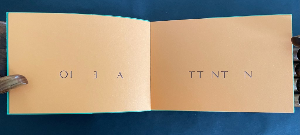
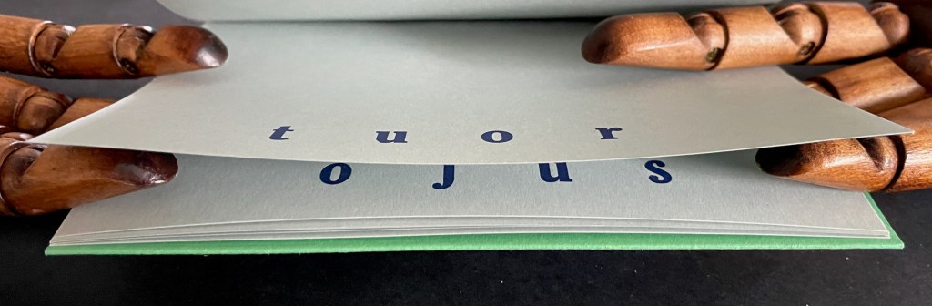
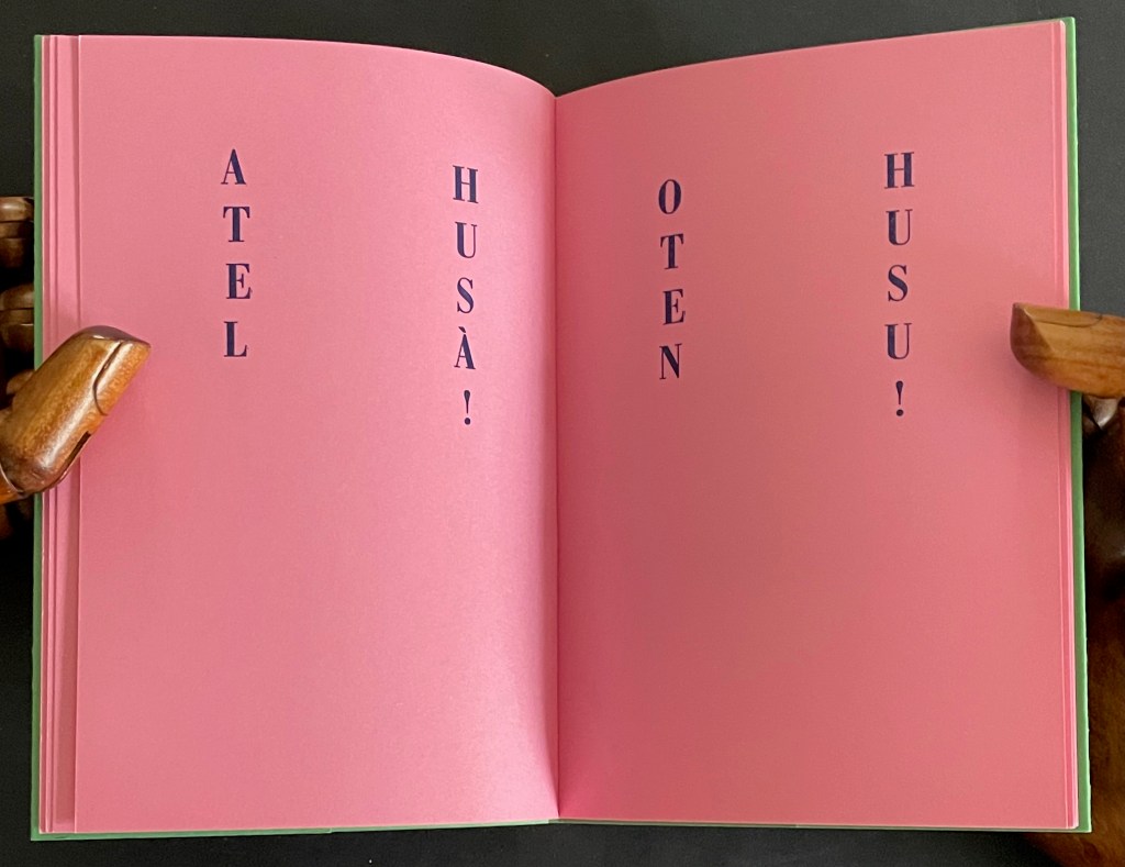
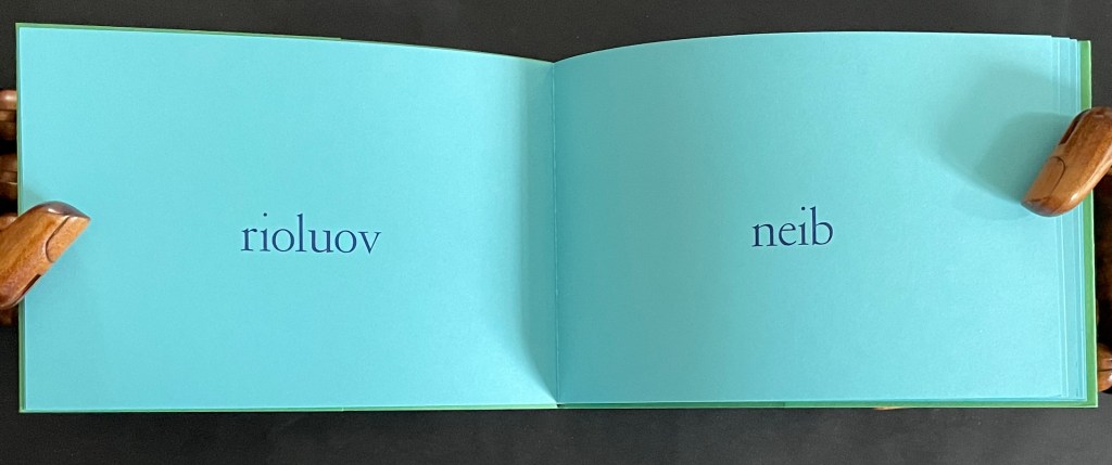
In AEIO/TTNTN, Lothier challenges us to construct this one paragraph as we turn the booklet’s pages:
Attention, cher lecteur, vous déchirez l’histoire en ouvrant le livre. Tachez au moins de reconstituer mentalement l’intégrité de tous les mots puis refermez le pourqu’il se reforme en dormant. [Attention, dear reader, you tear the story apart when you open the book. At least try to mentally piece together all the words, then close it so that it can reform while sleeping.]
ATTENTION / CHER LECTEUR (Attention / dear reader)
As if to prove the author’s accusation that we tear apart stories when we open a book, the verso page has “peeled away” the vowels from the word on the recto page, where only the consonants remain. The verso page naturally displays the vowels in reverse order and printed backwards. The author cheekily scolds us to try at least to reconstruct the torn-apart words (which we have to have done to receive the scolding) and then close the book so that the story can reassemble itself while the book sleeps (which paradoxically is the imagined story of what will happen before the next reader opens the book, figures out the message, and closes the book). The book that contains everything in the world that exists to end up in the book is, of course, a never-ending book, of which this is just one example.
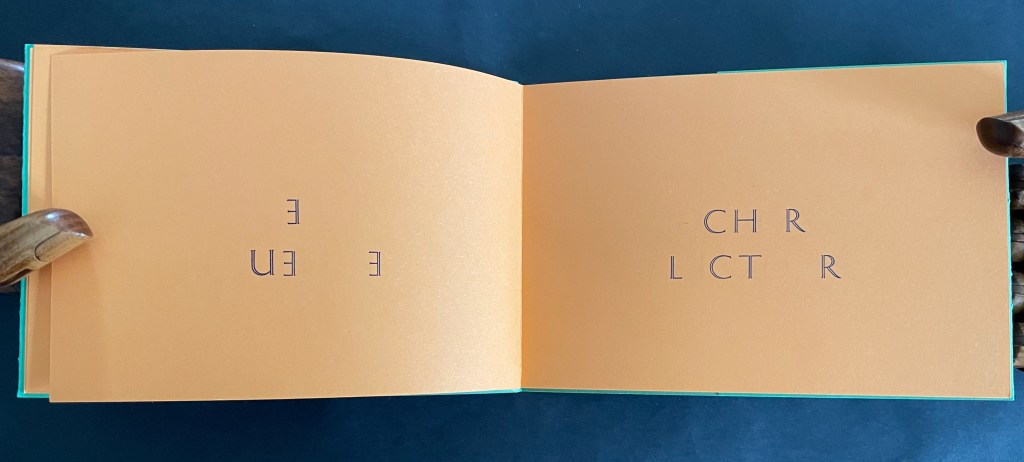
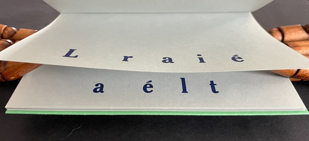
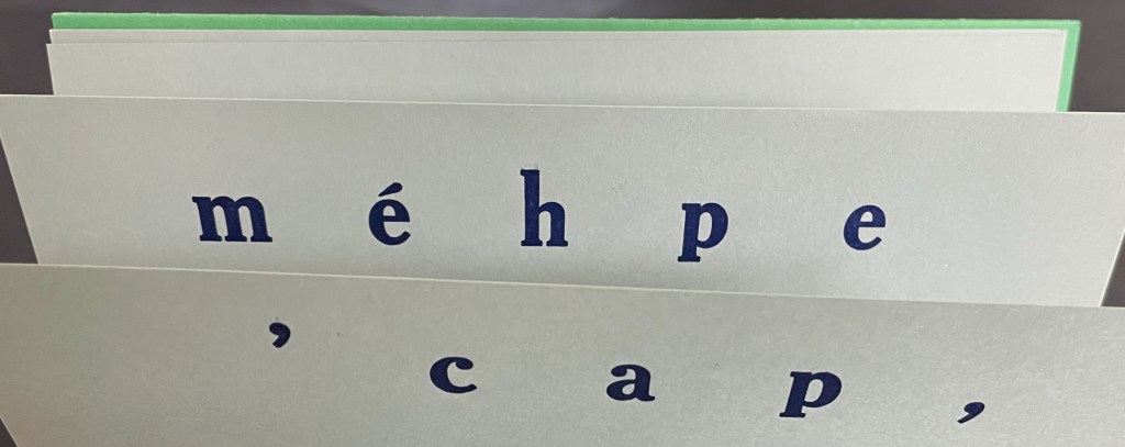
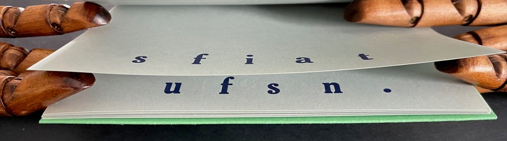
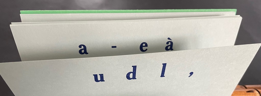
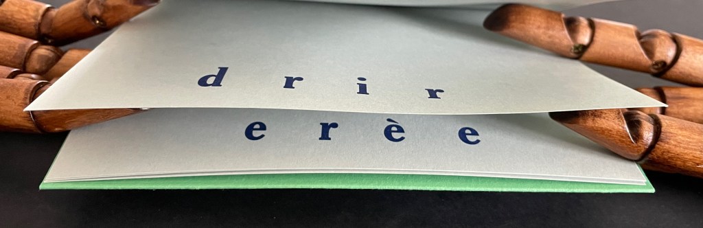
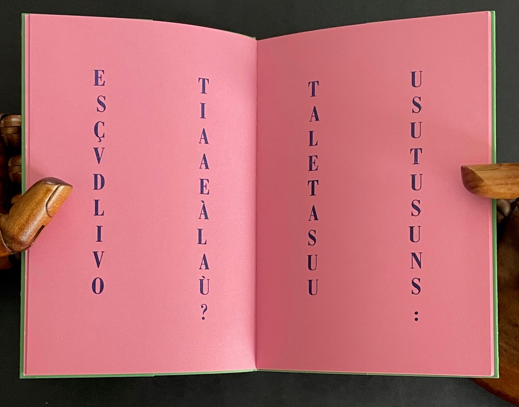
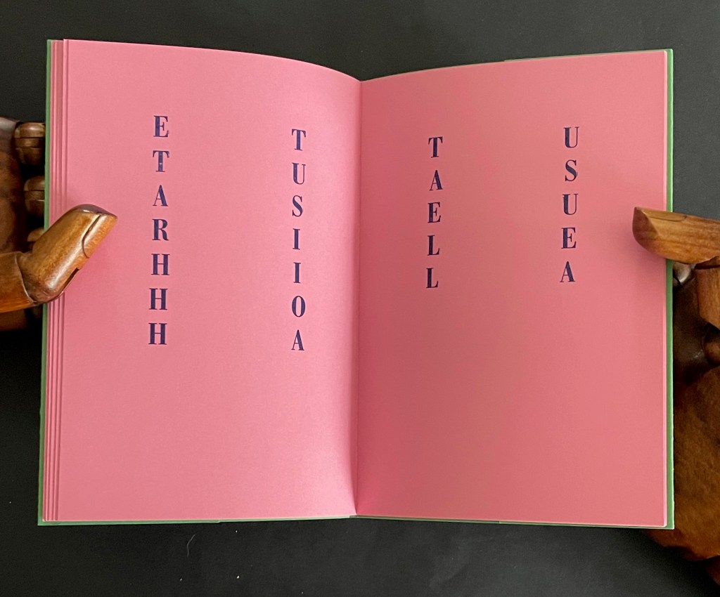
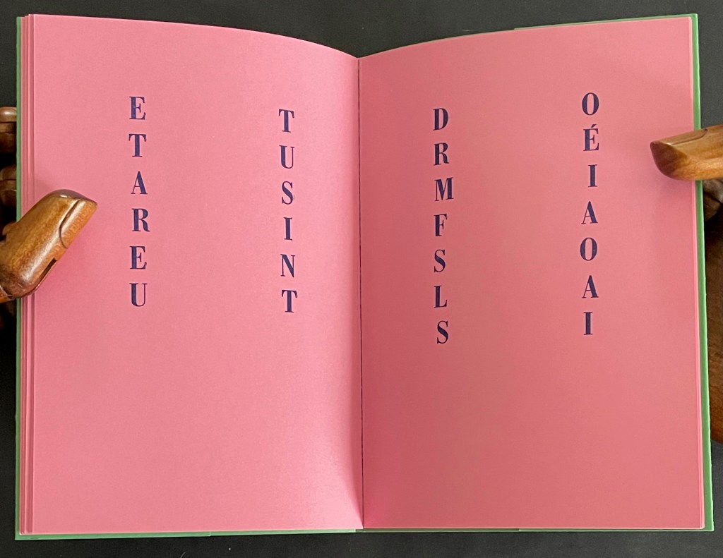
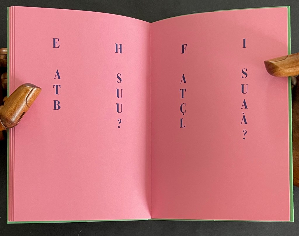
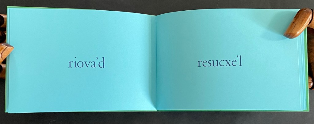
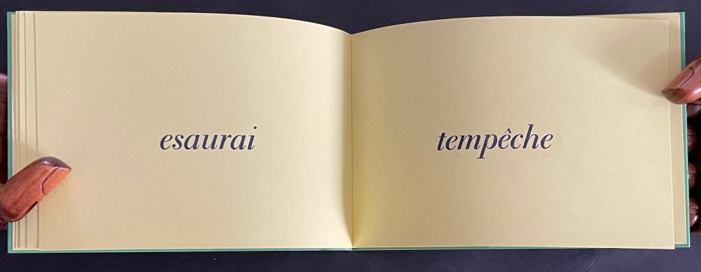
In C’est difficile, Lothier presents the booklet in landscape format and marches us through our recto/verso paces to construct the story’s message: La réalité m’échappe, voir n’est jamais suffisant. Elle est toujours au-delà, derrière l’image. [Reality escapes me, seeing is never enough. It is always beyond, behind the image.]
Reading C’est difficile is indeed difficult. Only gradually do we realize that the letters needed to complete the word on the first recto page lie ahead on the second recto page, and that the word on the first verso page is completed with the letters on the second verso page. Piecing together the words requires a moving beyond, then moving back, then moving beyond, and so on until the last pair of verso pages yields the word “l’image”. Again, our actions with the book’s structure enact the book’s message.
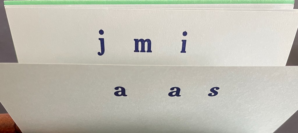
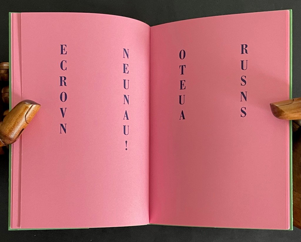
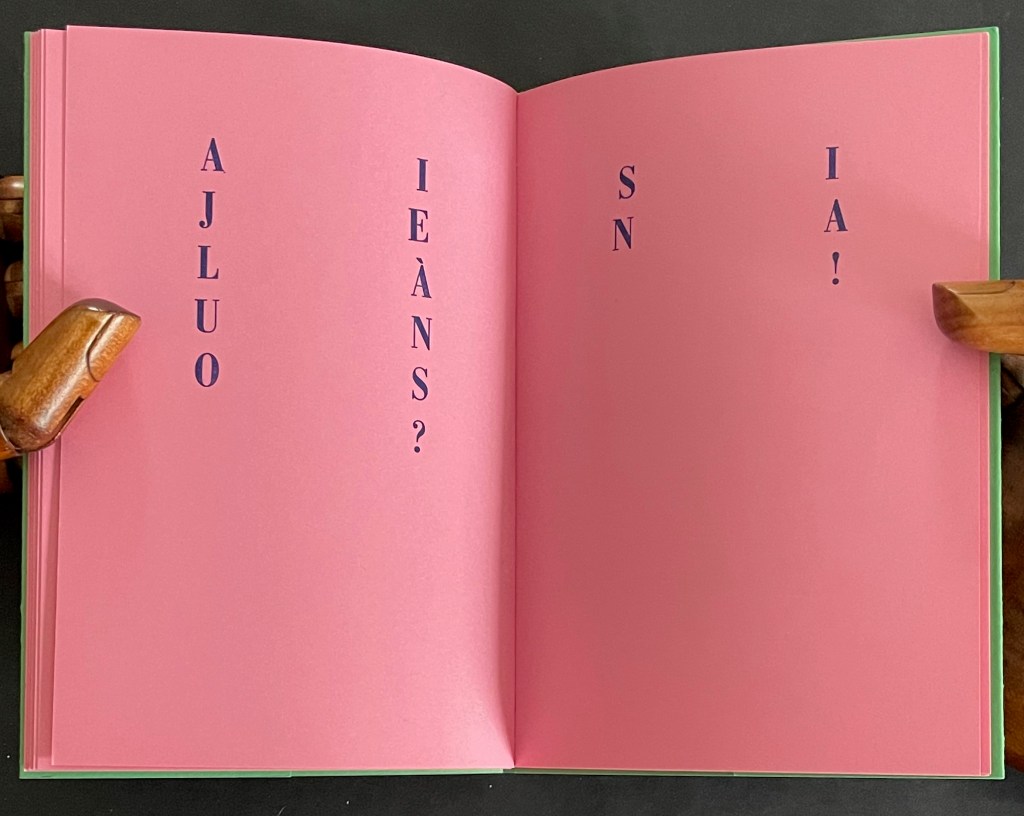
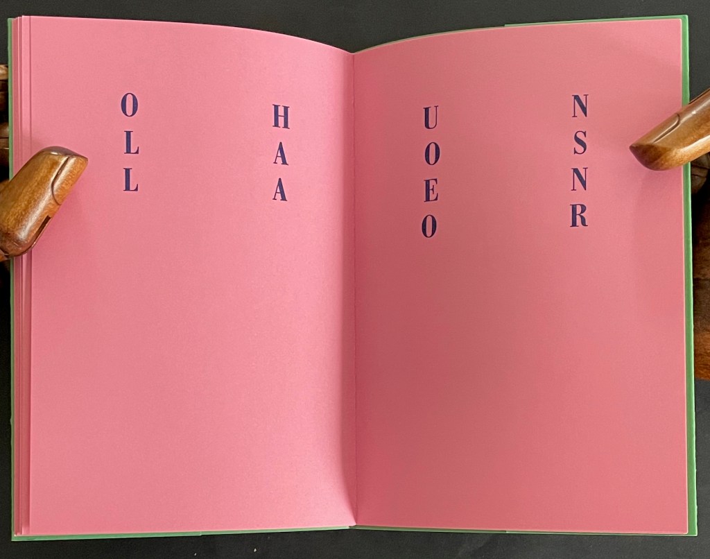
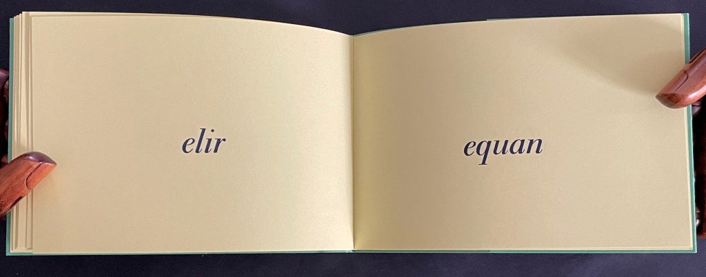
Given the typographical play in the first two booklets, it is hardly surprising that, at first in Nu il va, the reader’s eye might jump here and there trying to find words in each column until it makes the jump across the gap between the columns and finds a series of two-letter words. There are twenty pages of them, and they seem to make up a Dada-esque interlude of riddling dialogue.
NU IL VA DE CI DE LÀ [Naked it goes here and there] ET SI ÇA VA DE LÀ IL VA OÙ? [and if that goes there, where does it go?] TU AS LU ET TU AS SU UN US [you read and you learned a rule]
EN CE RU ON VA NU! [in this brook, we go naked] OR TU ES UN AS [now you are an expert] NI VU NI SU [neither seen nor known] MÛ TU ES LÀ OÙ IL VA [driven you are there where it goes]
AH TU ES LÀ! [ah, you are there!] OH TU ES NU! [oh, you’re naked!] ET TU AS RI HI HO HA [and you laughed hi ho ha] TU AS EU LE LA [you got the “la”]
ET TU AS RI EN UT [and you laughed in C] DO RE MI FA SO LA SI [do re mi fa so la si] EH AS TU BU? [eh, have you been drinking?] FI AS TU ÇA LÀ? [fi, have you got that, there?]
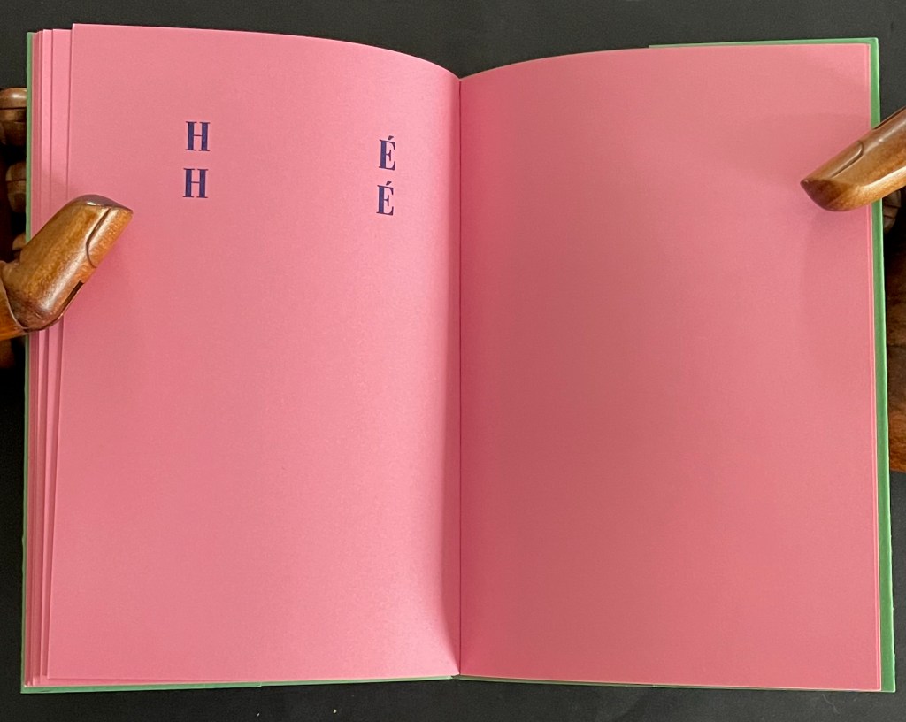
AI JE LÀ UN OS? [do I have a bone there?] SI NA! [yes, so there!] OH LA LA [oh la la] UN OS EN OR [a bone of gold]
HÉ HÉ [he he]
As with any Dada-esque poem, who knows what it means, but its structure moves the reader’s naked eye here then there and back as its riddling words turn to mock the reader’s sing-song drunken rocking. There’s also a bit of sexual innuendo throughout. It comes closer to the surface in the penultimate verse, underlined by the snicker of the last.
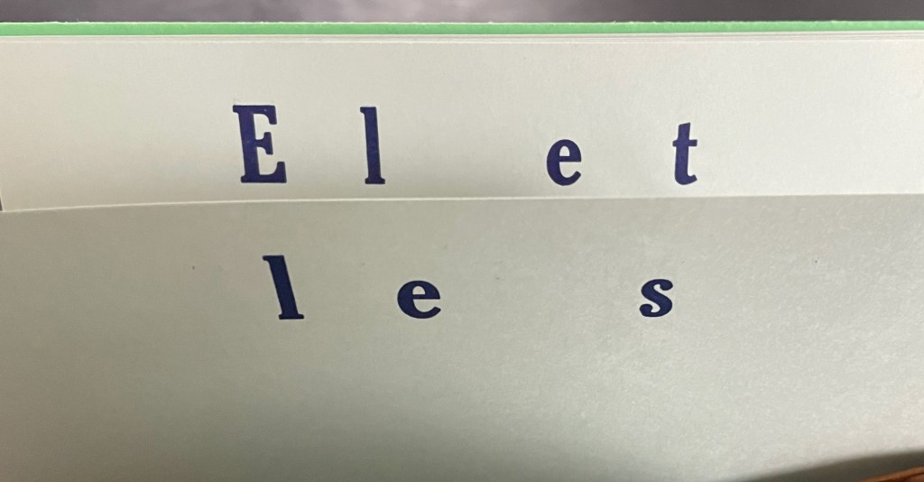
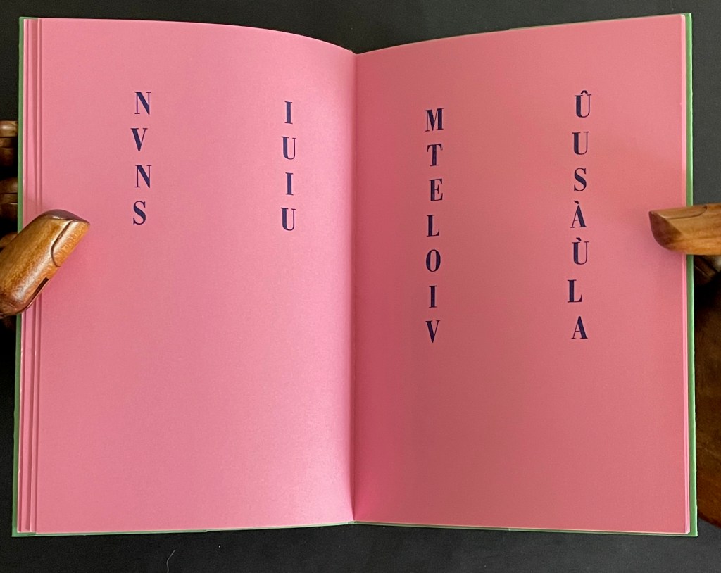
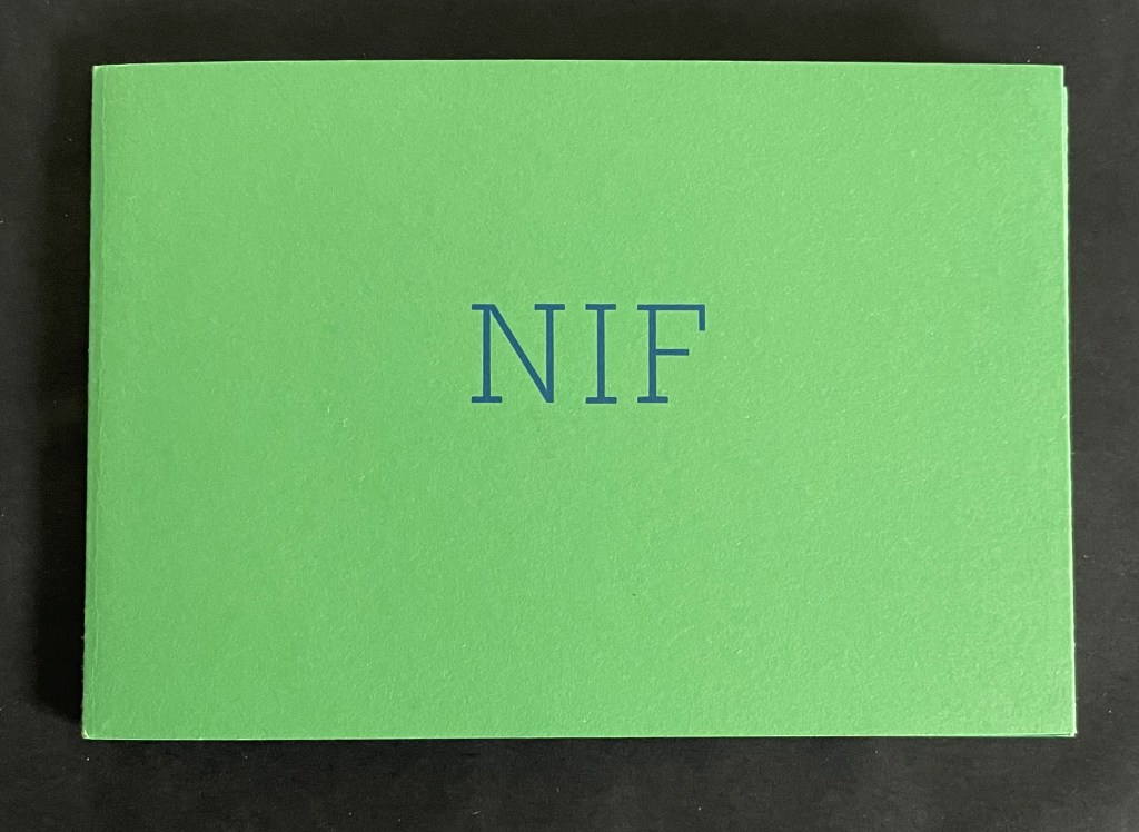
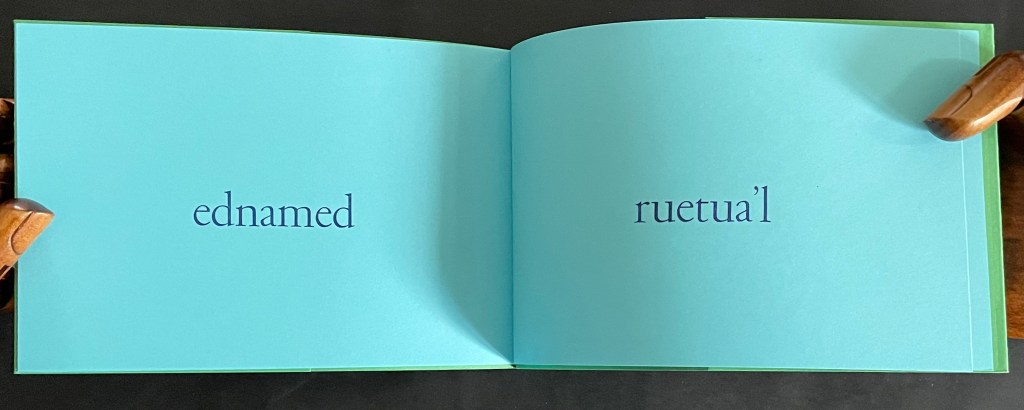
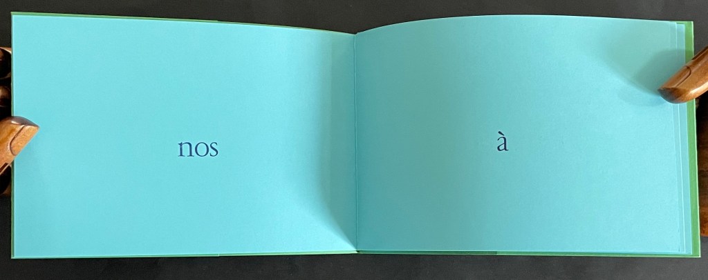
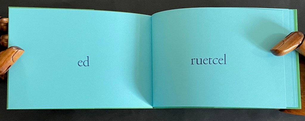
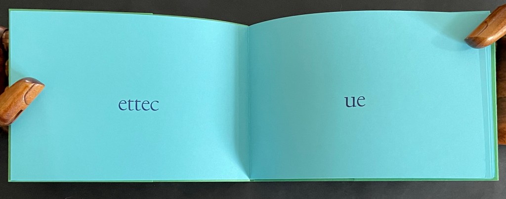
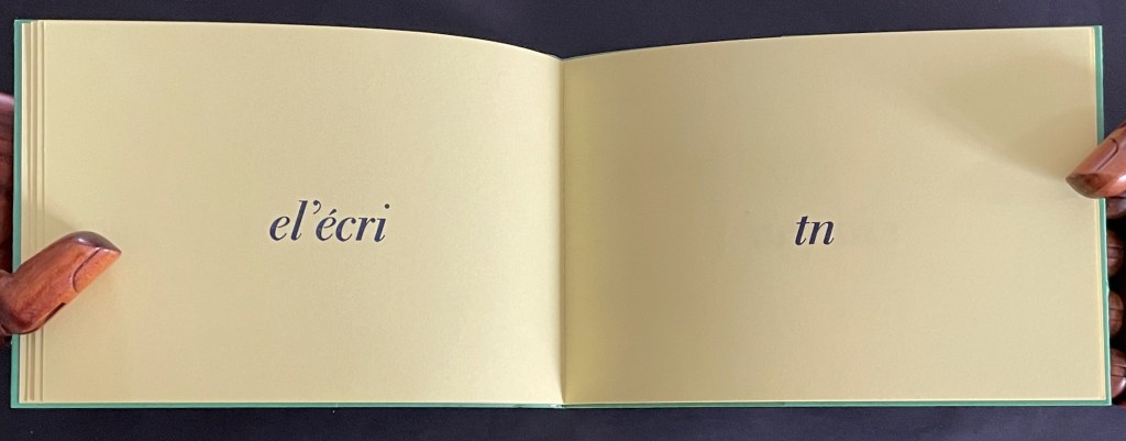
As its front and back covers hint, TUBED/NIF invites a back-to-front deciphering of words. TUBED is debut backwards — the “beginning” as we would expect on the front cover — and NIF is fin backwards — the “end” naturally on the back cover.
In the booklet, we not only have to decipher the backwards words, we also have to construct the text by reading the recto page first and then its facing verso page. At least the author apologizes rather than mocks this time:
l’auteur demande à son lecteur de bien vouloir l’excuser d’avoir eu cette idée saugrenue [the author asks of his reader to kindly excuse him for having had this absurd idea]
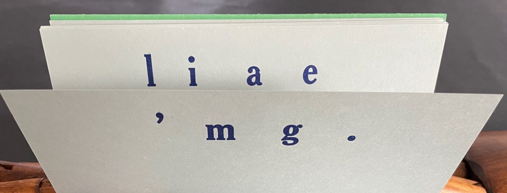
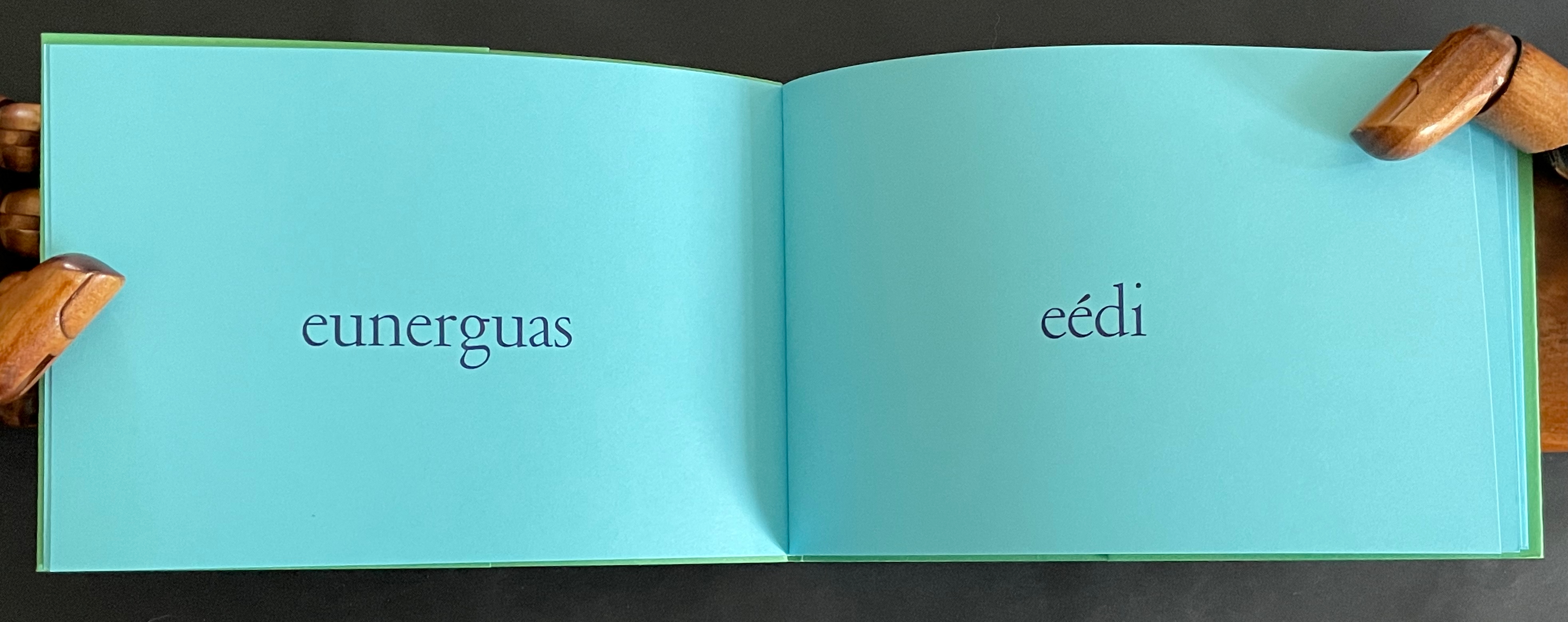
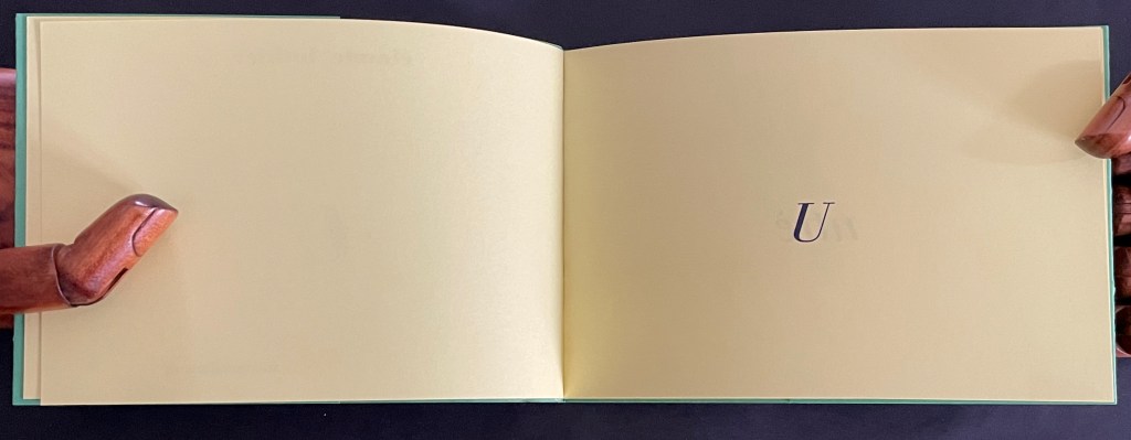
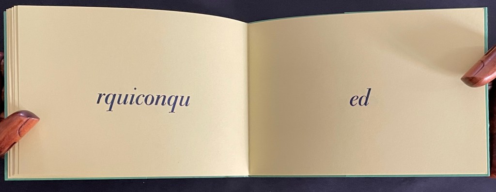
As for U, the last volume, we seem to overhear the author muttering as he shrugs his shoulders:
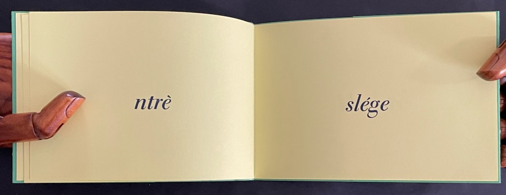
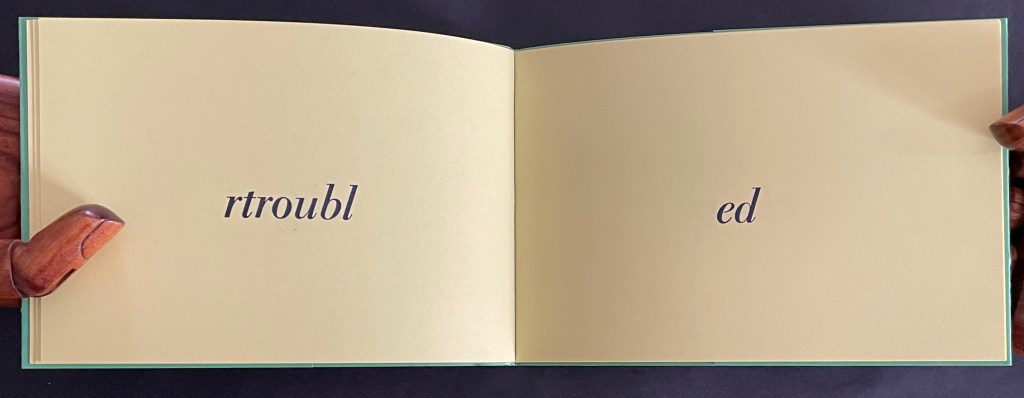
un très léger trouble de l’écrit ne saurait empêcher quiconque de lire quand même [a very slight disorder in the text will not prevent anyone from reading it anyway] The words un très léger trouble de l’écrit doubly imply an alteration or change or disordering in the text as well as an impairment or trouble in writing/reading.
In correspondence, Lothier confirms the supposition of the shrug when he confides that the idea for this booklet has its roots in his frequent errors in spacing while typing — which he says still occur.
Of course, we haven’t overheard the artist until we have figured out that the last letter of each word has been lopped off and moved to the following page and jammed up against the following word, whose last letter in turn has been lopped off and moved to the next page, and so on. And of course, if we have deciphered this, we have proved the truth of the book.
The French expression quand même has several meanings and uses: “even so”, “still”, “all the same”, “anyway”, “nevertheless”, “right?” , and more. Here, as the last phrase of the five booklets, it has the added fillip of echoing the polyvalent expression quant au in their collective title and so reminding us that, as with any book, the turn of the page is that slight trouble in the text we tolerate as we still continue reading — quand même, nevertheless, anyway, even so, etc.
*Many thanks to the artist for his patience with my rough translations and for sharing some of the background to Quant au livre.
Further Reading and Viewing
As well as an artist and book artist, Claude Lothier is what he calls an “unremitting perspectivist”, which has led to paper construction of mazzocchio hats, deltoidal icositetrahedra, and other fantastic geometrical objects. Currently he teaches perspective from time to time in Guangzhou, an experience reflected in his Instagram account.
For other artistico-philosophical inquiries of the book, see
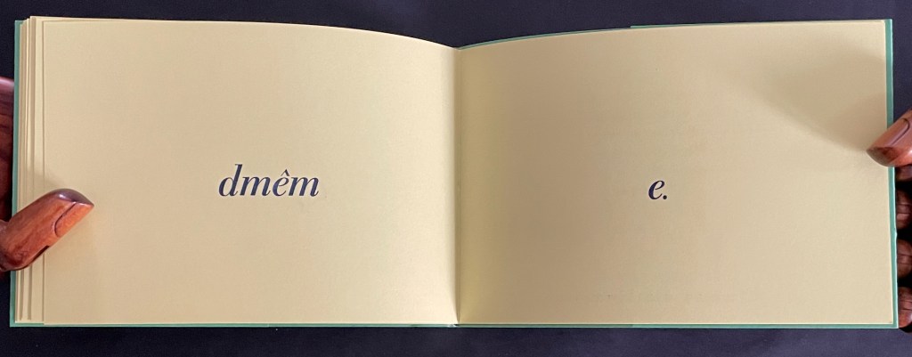
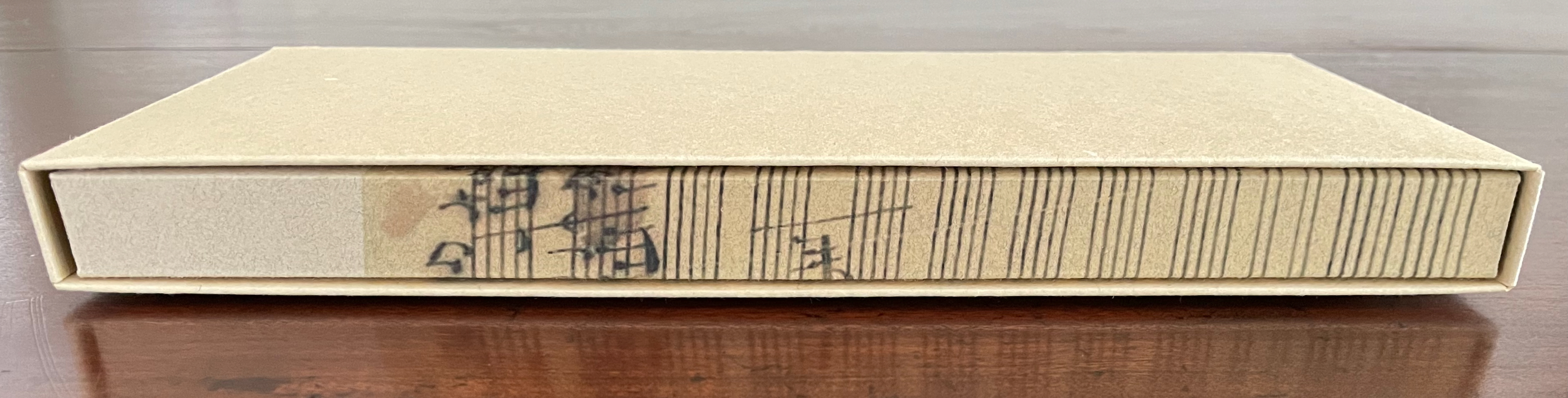
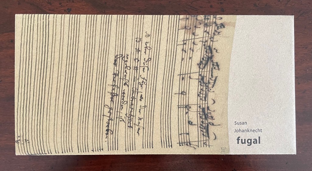
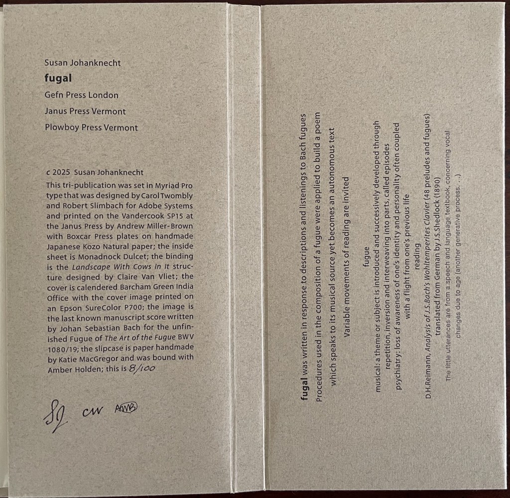
Fugal (2025) Susan Johanknecht , Claire Van Vliet, and Andrew Miller-Brown Vertical double-sided accordion book bound in “Landscape with Cows In It” structure designed by Claire Van Vliet, cover in calendered Barcham Green India Office, interior in handmade Japanese Kozo Natural fixed to Monadnock Dulcet; slipcase of handmade paper. Slipcase: H123 x W248 x D22 mm. Book: H120 x W240 x D18 mm. [6] double-sided panels. Edition of 100, of which this is #8. Acquired from Susan Johanknecht, 26 September 2025. Photos: Books On Books Collection
In the hands of multiple readers, this collaboration among Susan Johanknecht’s Gefn Press, Claire Van Vliet’s Janus Press, and Andrew Miller-Brown’s Plowboy Press becomes the “book as performance” and “book as musical score”. Fugal is an artwork that works best with several simultaneous readers/voices/viewers.
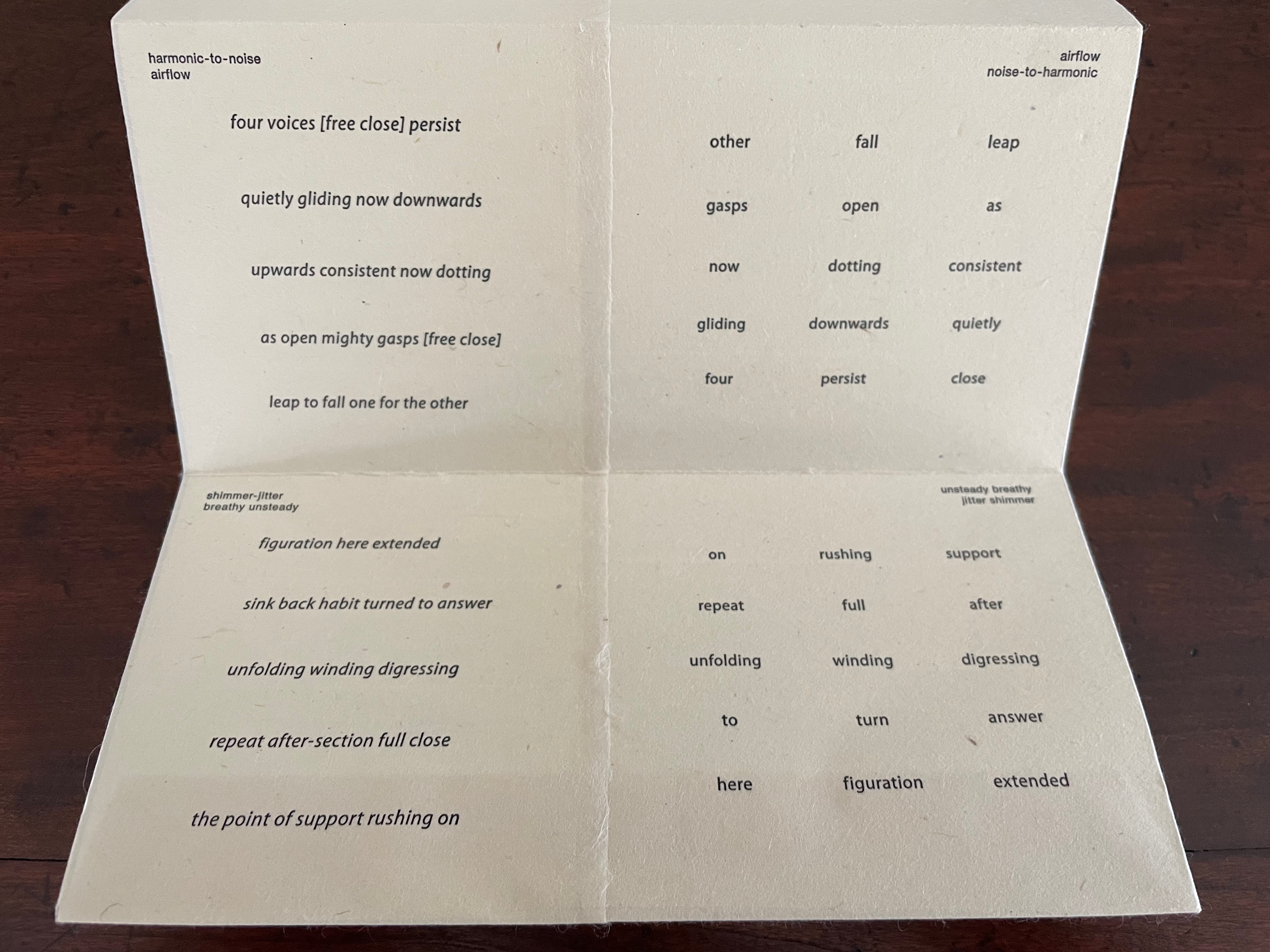
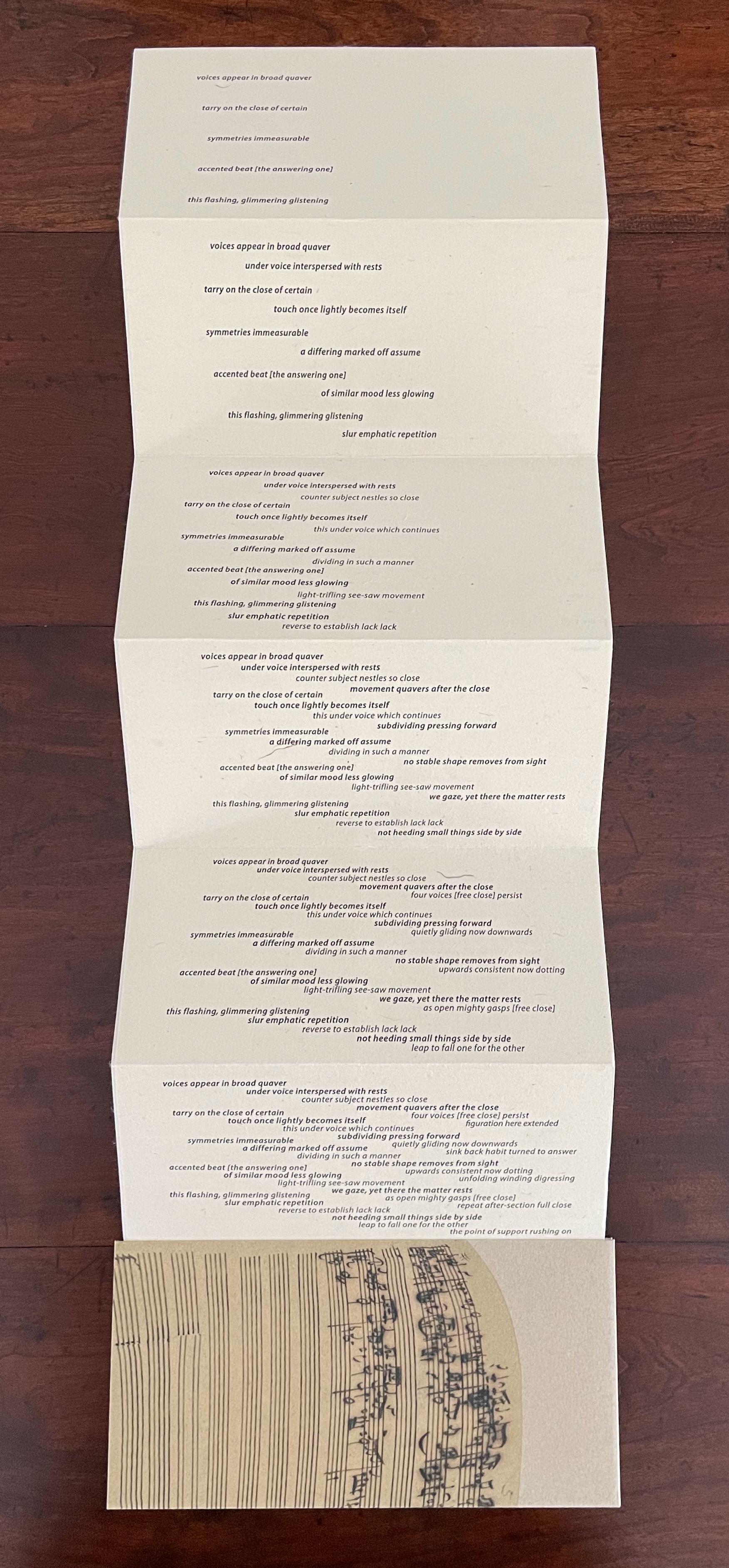
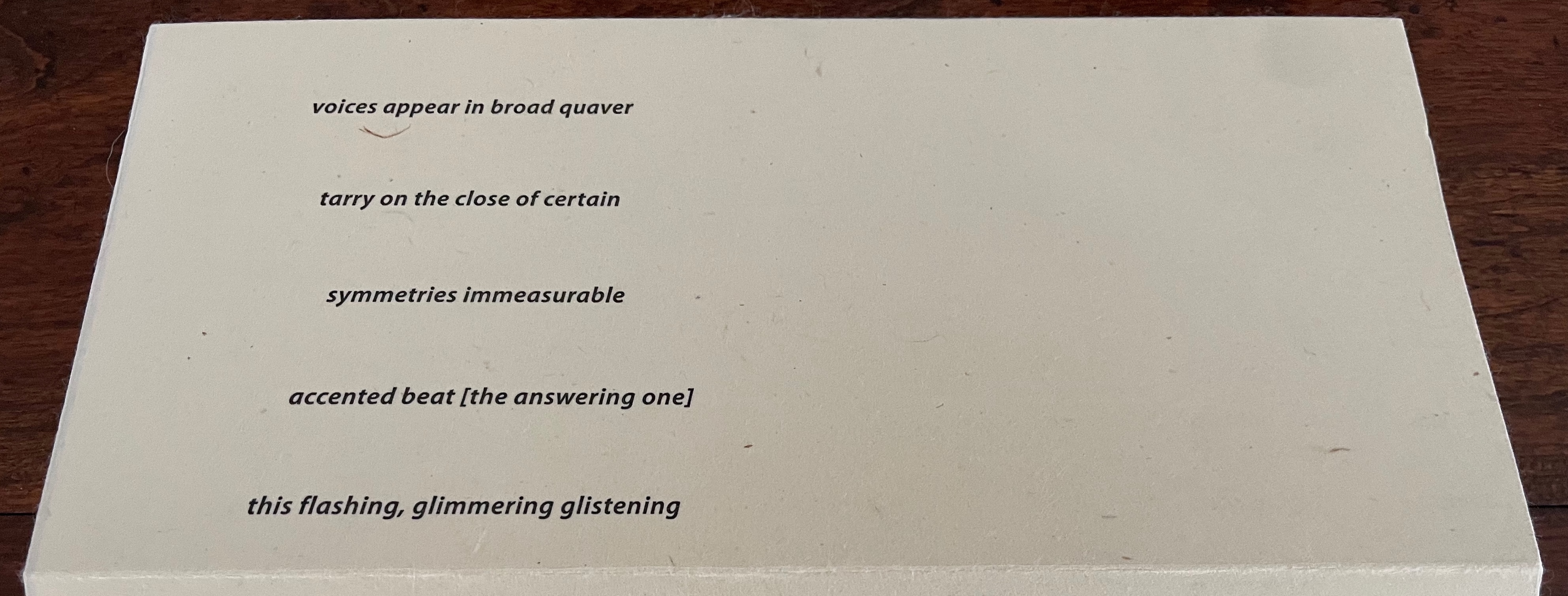
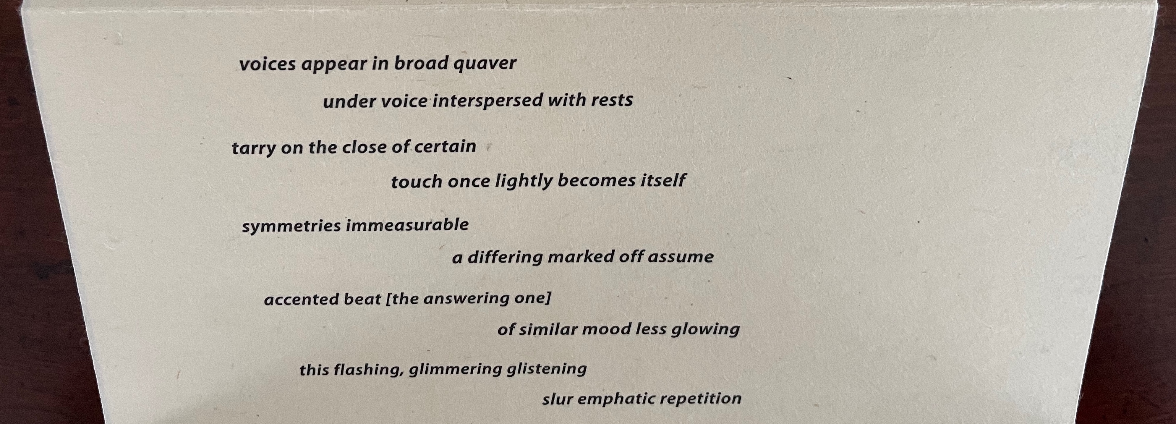
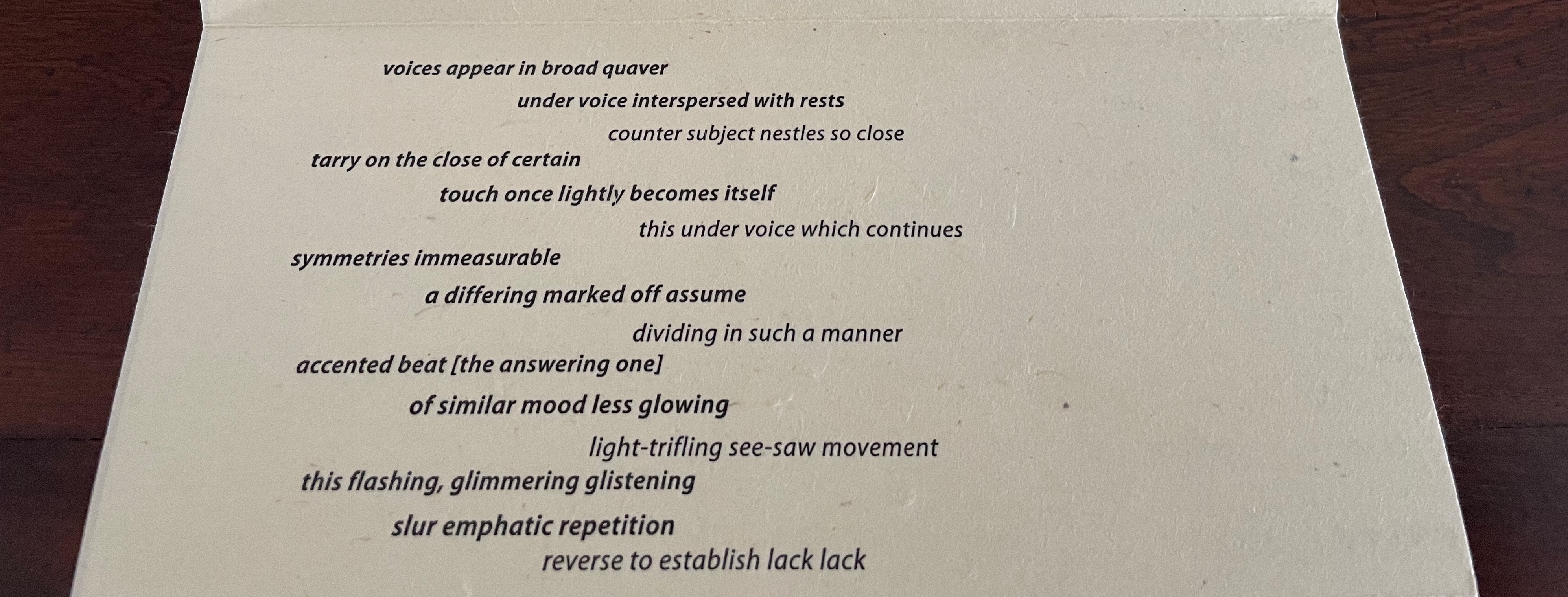
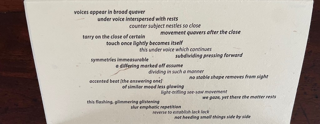
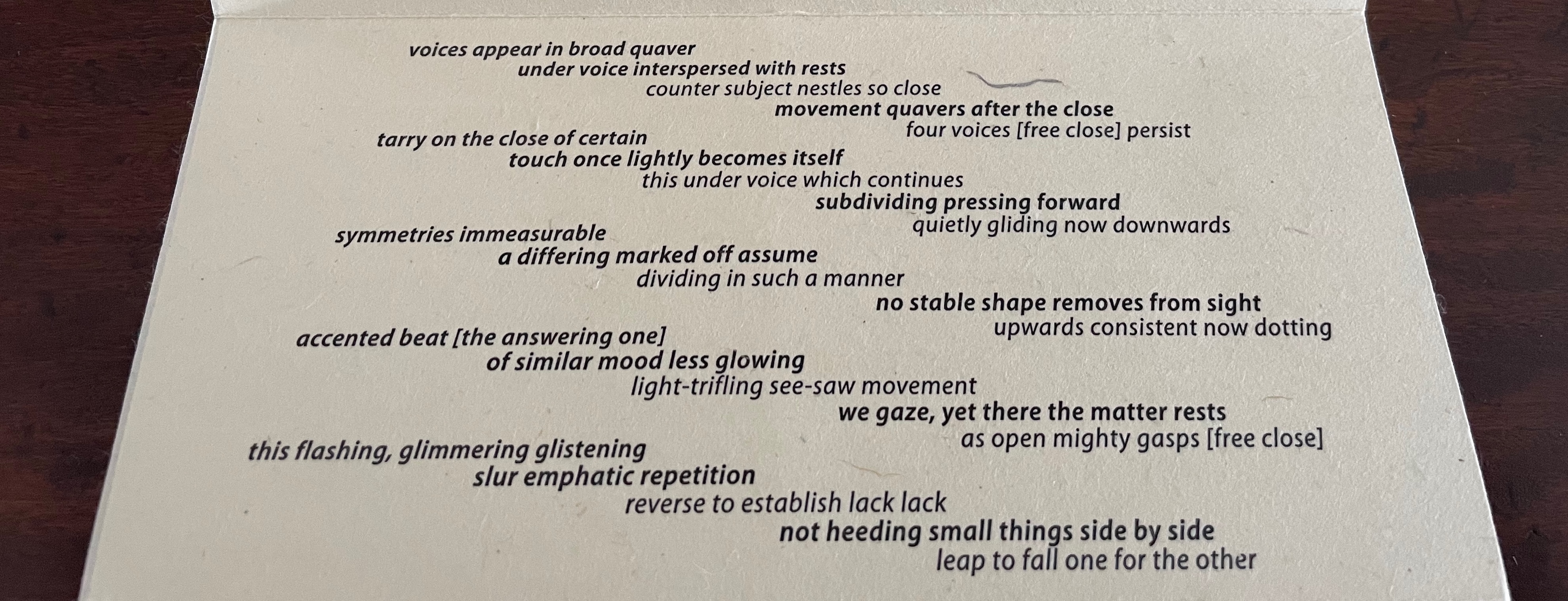
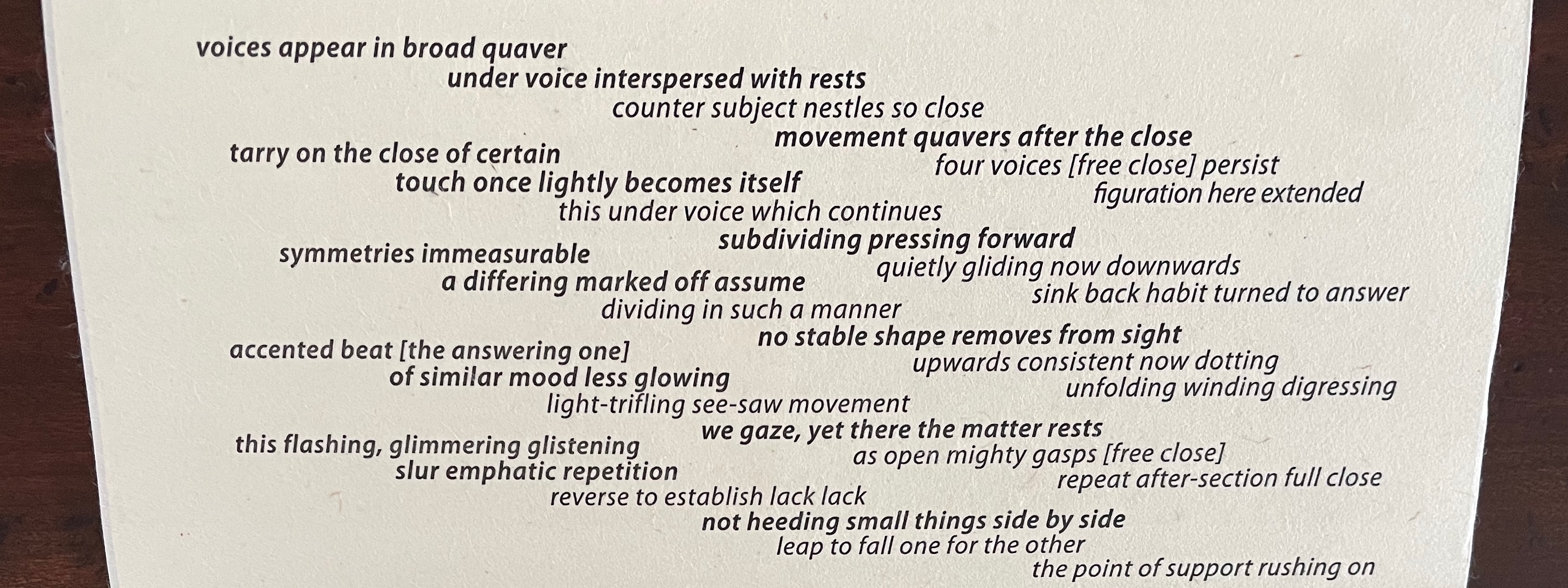
A fugue generally has a “subject” (or main theme), an “exposition” in which voices or instruments each play out the subject, then an “episode” (or connecting passages) that builds on the previous material, then further alternating “entries” in which the subject is heard in related keys until a final entry that returns to the opening key. The subject of Fugal is the generative process of vocal changes due to aging. The phrases of the poem have been drawn from an unidentified speech and language textbook.
Van Vliet calls this the “sudoku” side of the book. In each panel, the words in the columns and rows on the right side come from the stanza on the left side. In keeping with the inversion of notes that appear in the upper left and right corners of each panel, the words from the stanza’s first line in each panel appear in the fifth line on the right; those from the stanza’s second line appear in the fourth line on the right; and so on.
On a separate folio provided by Van Vliet, I have used colored lines to show the textual connections between lines on the left with those on the right.
The fugue term “episode”, referenced in the first panel’s inverted notes in the upper left and right corners, nudges the reader to treat the right side of the panel as a “connecting passage”, building on the stanza to the left. The inverted notes suggest reading the words on the right side of the panel from right to left (“this flashing glistening / accented answering beat / symmetries immeasurable” and so on.
If treated as a score and assuming two voices for this panel, the first voice might read the first line on the left from left to right, and following on, the second voice might read the first line on the right from right to left (as suggested by the inverted notes and the positioning of the lines). Likewise with the two second lines. And on reaching their third lines, the voices would read simultaneously since the lines align with one another. At the fourth and fifth lines, the second voice might reverse its course and read from left to right to echo the first voice’s order in which the second and first lines had been read.
As Johanknecht urges in the colophon, “Variable movements of reading are invited”. The performance suggested above is just one possible performance. The other side of the leporello offers a more directed score for a reading in five voices. I had the pleasure to join Johanknecht’s sharing of Fugal with members of the Oxford University Society of Bibliophiles. Everyone noted how this side used indentation and regular and bold weights of type to suggest score lines, note stems, and whole notes. Everyone noted how this side presented a visual metaphor of the fugue by conflating the other side’s six stanzas panel by panel until the final panel depicted an overlapping five-voice rendering of all the stanzas at once.
Five of us rose to the challenge to take on a stanza each and read it aloud in concert, which gave us the opportunity to hear the work’s verbal emulation of a musical fugue.
Fugal prodded recollection of Douglas Hofstadter’s “Ant Fugue” from Gödel Escher Bach (1979). In the “Ant Fugue”, Hofstadter provides a different fugal experience, one that explores the overlapping relationships among Gödel’s theorem, Escher’s images, and Bach’s preludes and fugues. It is especially an illustrated narrative enactment of the concepts of prelude and fugue and so happens to provide a contrast with how Johanknecht, Van Vliet, and Miller-Brown turn type, layout, book structure, and content into their fugal artists’ book.
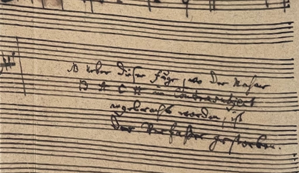
The cover image comes from Johann Sebastian Bach’s last known manuscript score for the unfinished fugue in The Art of the Fugue BWV 1080/19.
“Susan Johanknecht“. 28 May 2025. Books On Books Collection. Scroll down in this entry to find Johanknecht’s (Compound Frame) Seven Poems by Emily Dickinson (1998).
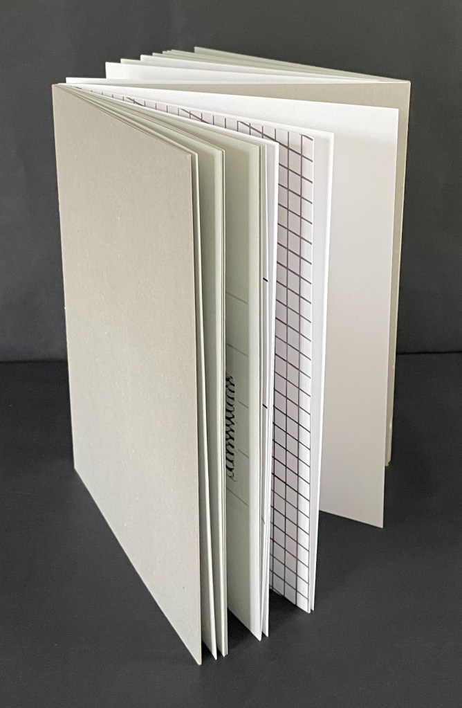
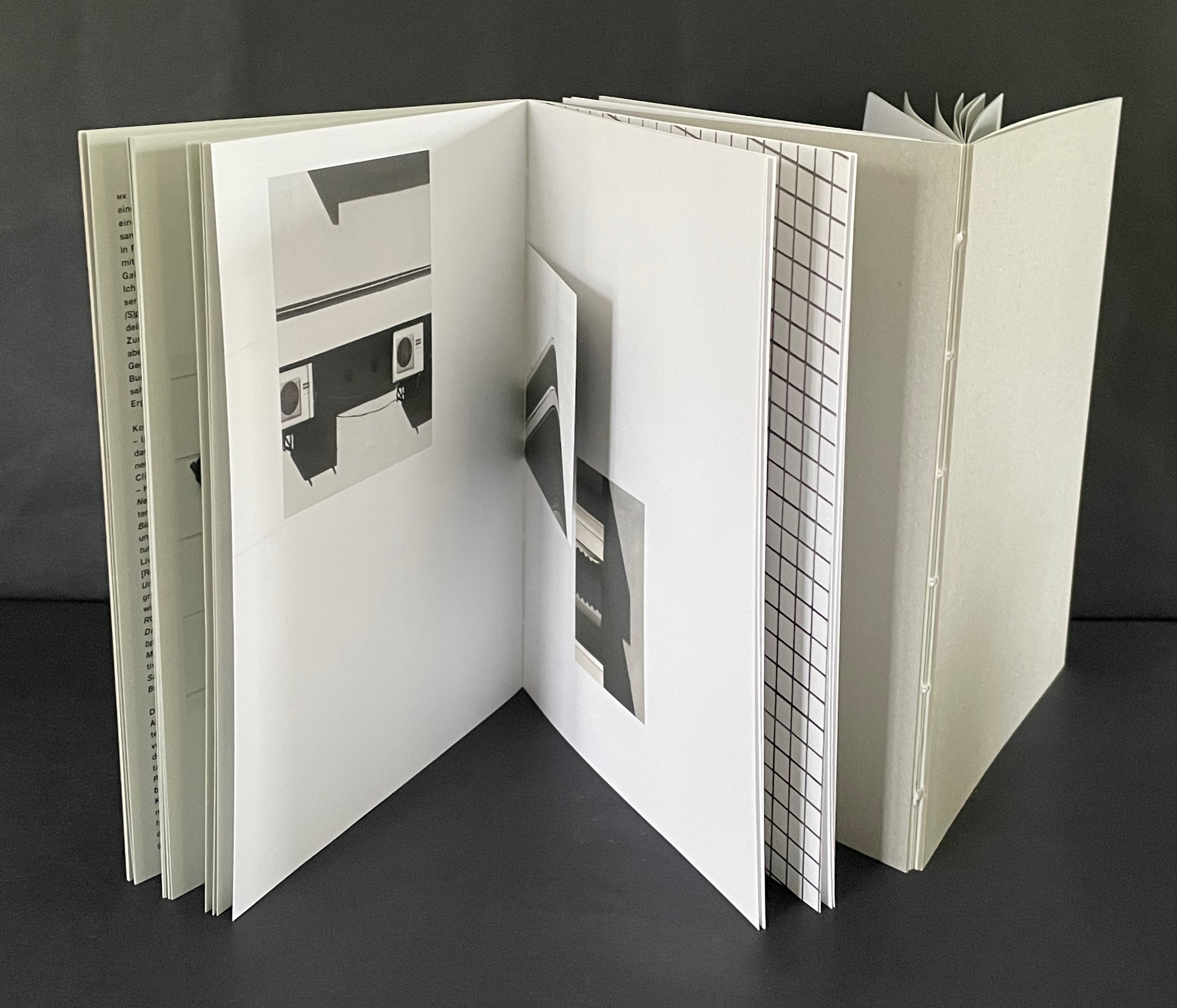
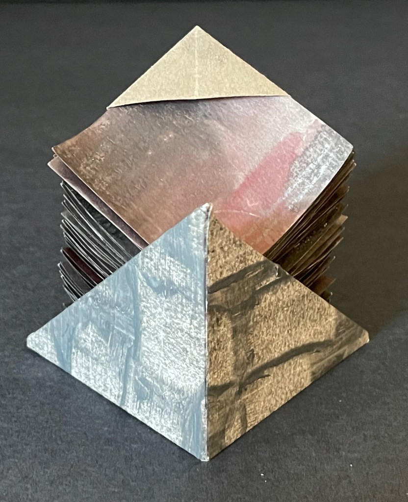
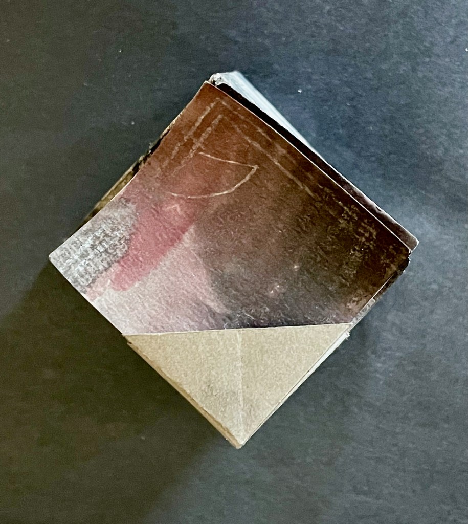
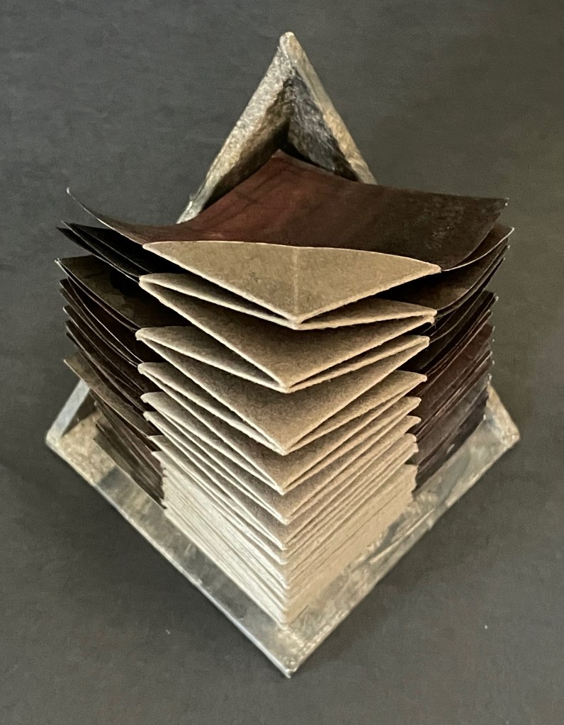
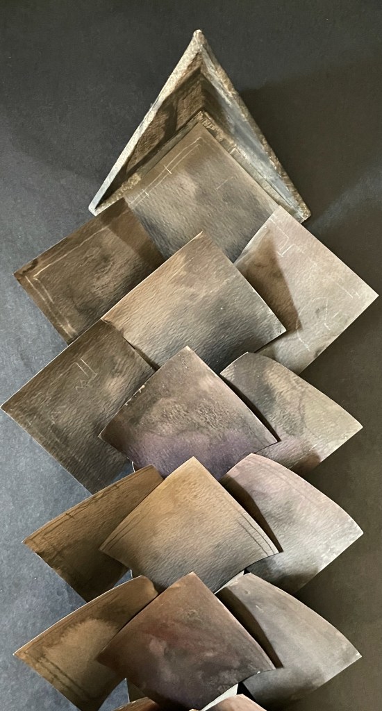
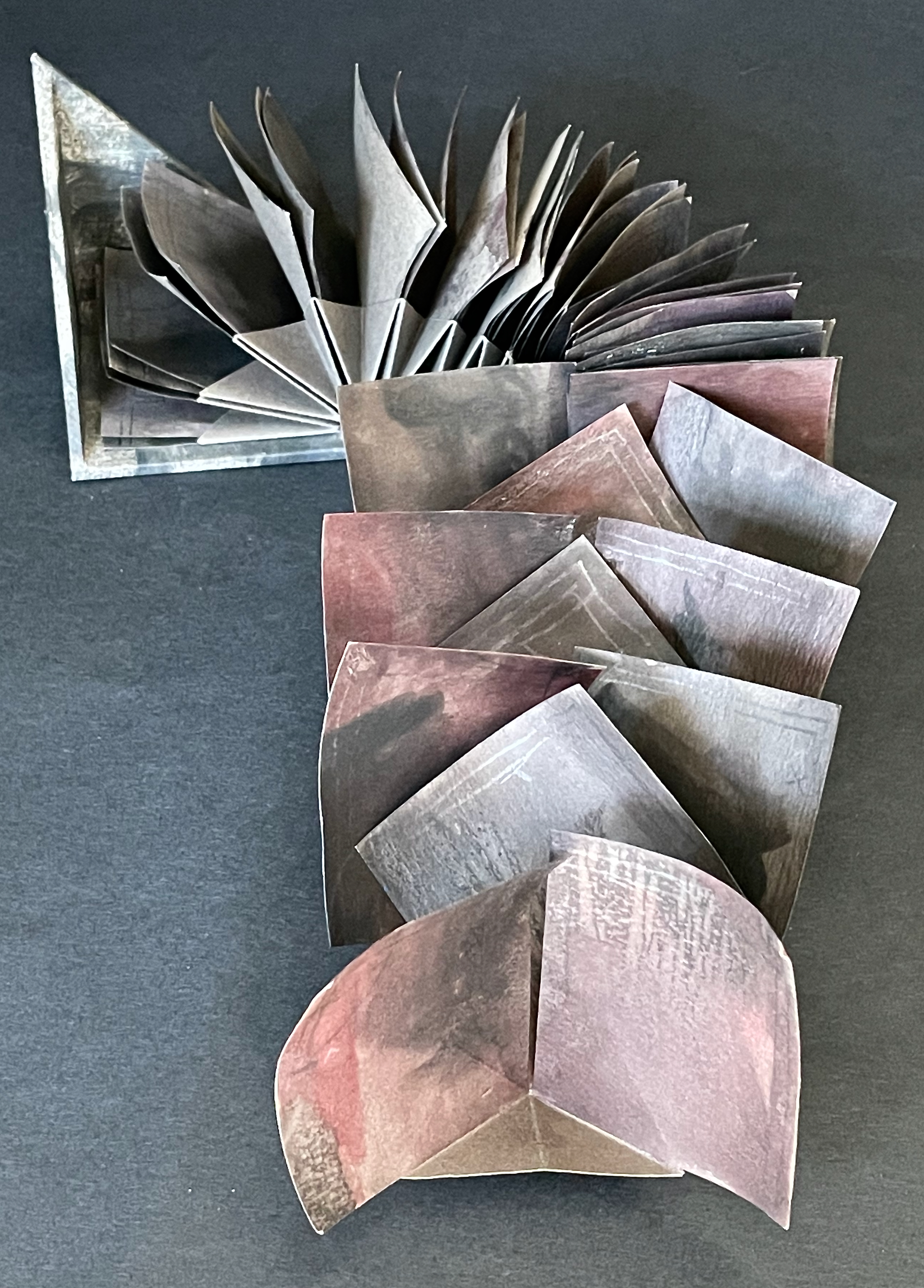
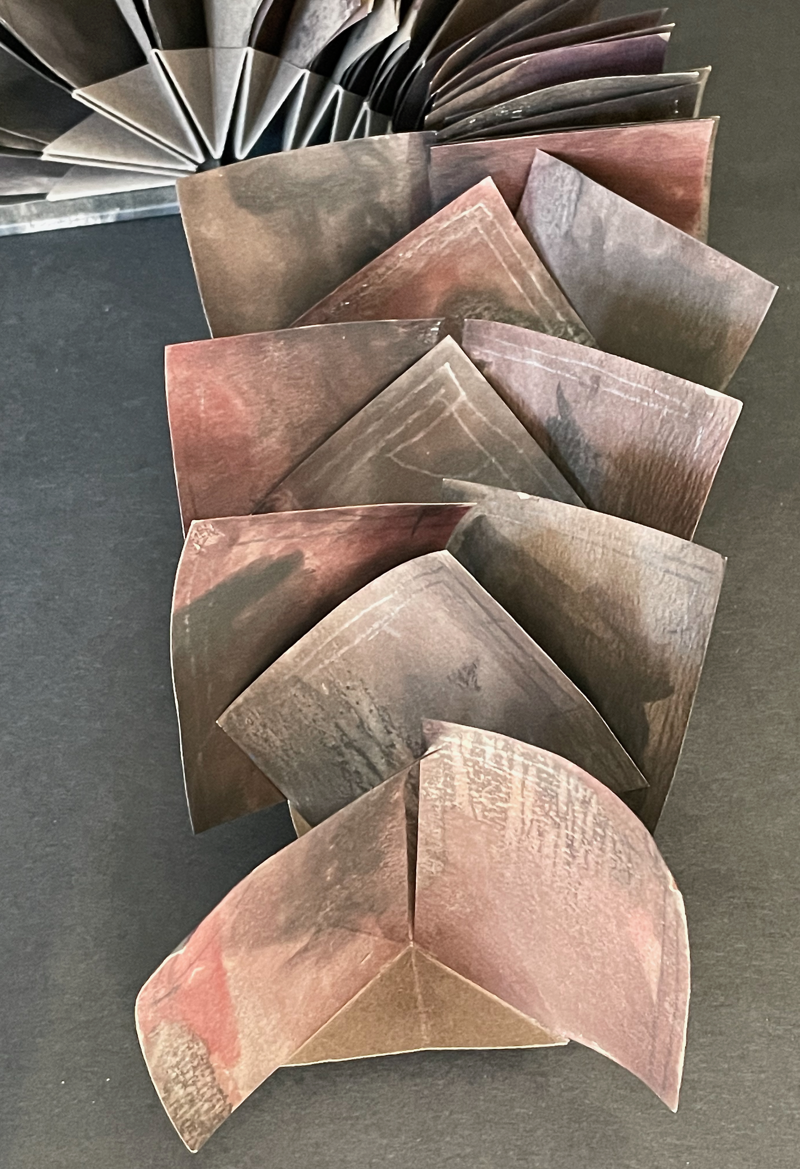
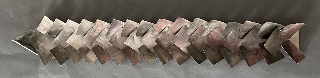
A Never-Ending Stone (2025) Laure Catugier Open spine, dos-à-dos with grey bookbinding board. 210 x H260 x 210 mm. 104 pages. Edition of 250. Acquired from einBuch.haus, 3 December 2025. Photos: Books On Books Collection.
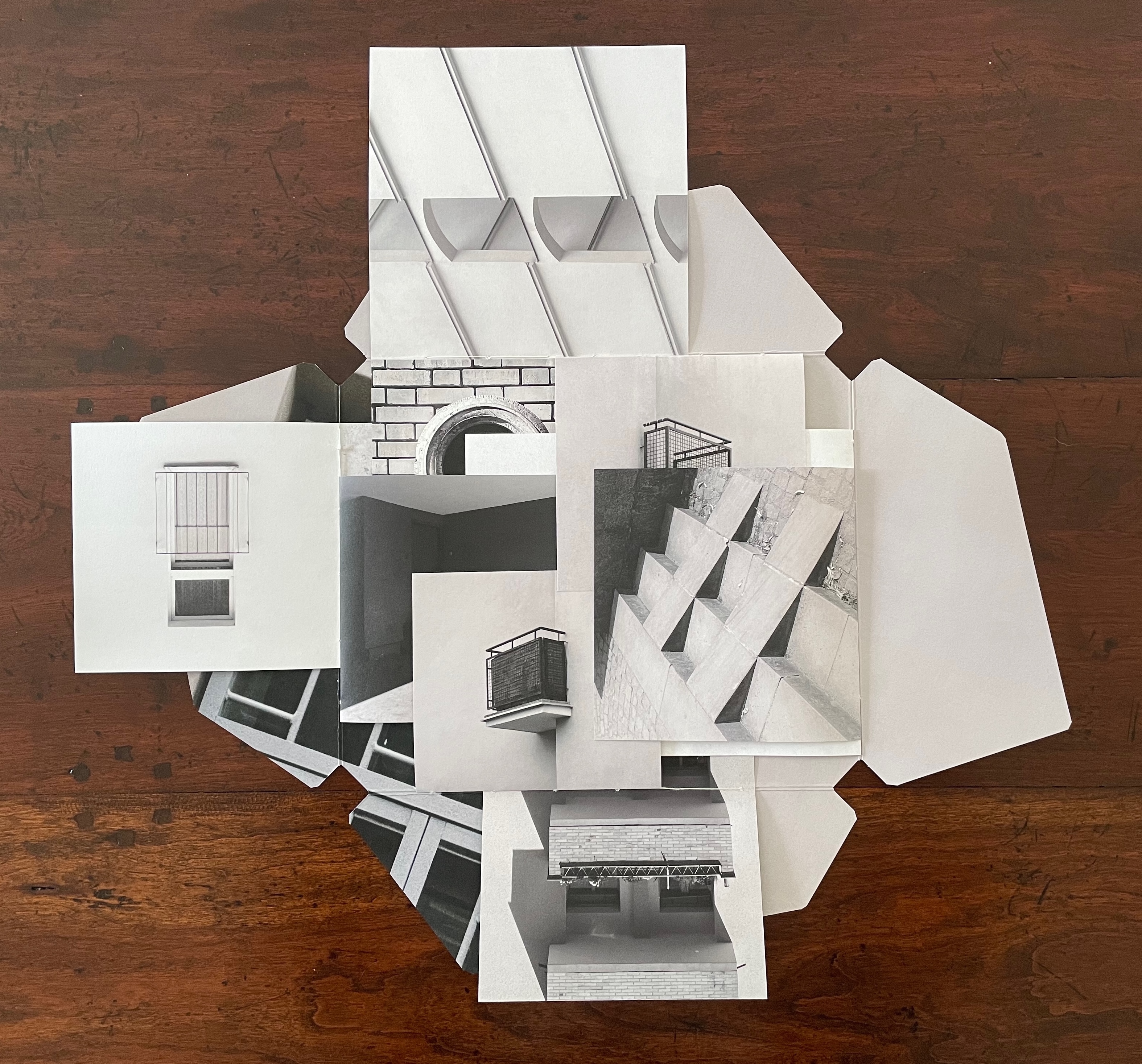
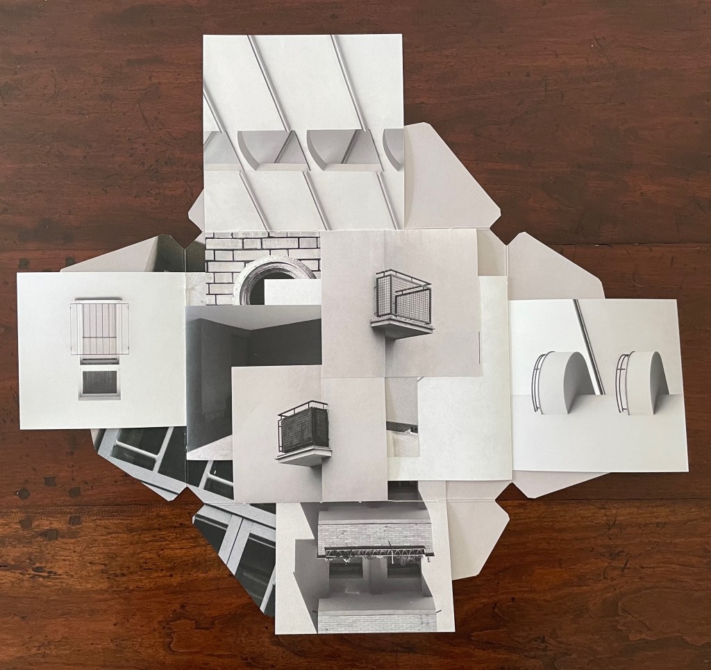
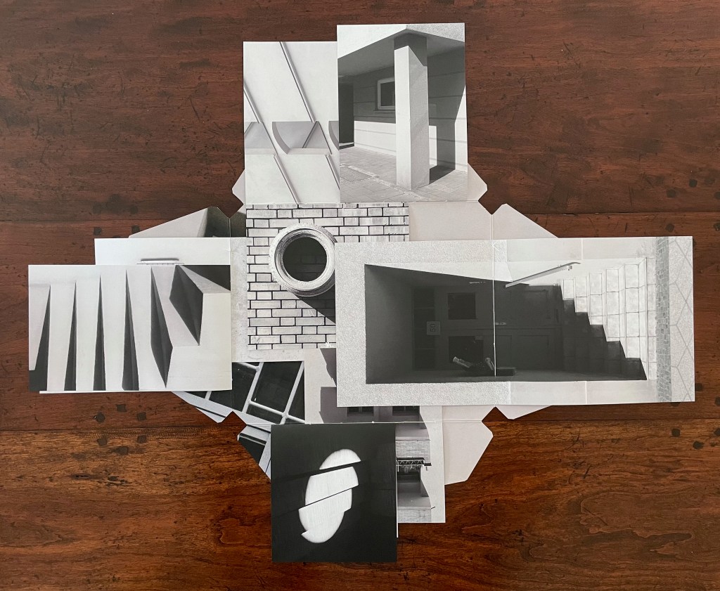
A Never-Ending Stone is Laure Catugier’s first monographic catalog. Her skill with collage, alignment, shadows, materials, and the book format transform it into an artist’s book very much driven by her fascination with architecture and especially the architectural theories and practice of Oskar and Zofia Hansen. The Hansens eclectically embraced “human-scale” architecture, “environment art”, and what they called the “open form” structure, using space and time as its key elements. The Hansens also proposed that the architect should not be the all-knowing expert but should partner with clients as co-authors of their space, respecting how their interior and outside activities and relations with one another defined them and their space. Though somewhat a forerunner to User-Centered Design, Open Form radically aimed at structures that would evolve with interaction with the user and, as they unfolded, also align with nature.
For Catugier and the book form, this translates into “no hierarchy between elements; each element influences the next and modifies the original situation … no table of contents, no beginning, and no end, no reading direction: the usual order of the book is upset” (Catugier, p.9). Her publisher einBuch.haus chimes in: “By superimposing and intersecting lines through collage, Catugier multiplies the potential variations of form. Playing with scale, perspective, and framing, she disrupts the conventional Cartesian coordinates of the x, y, and z axes”.
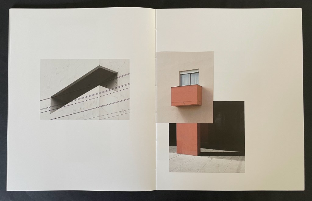
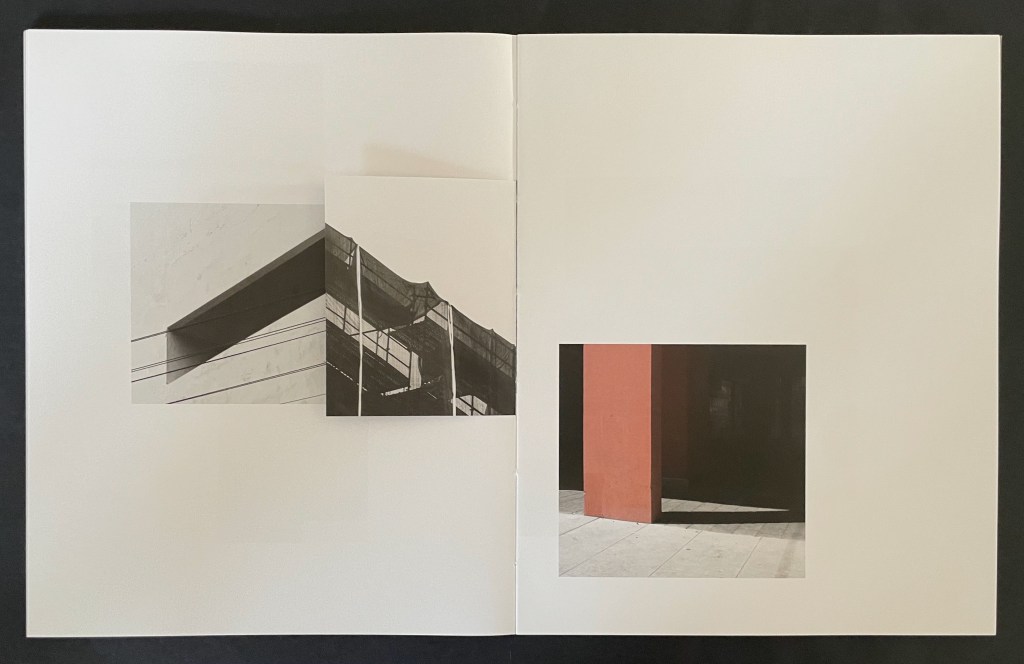
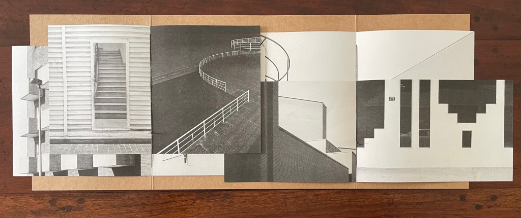
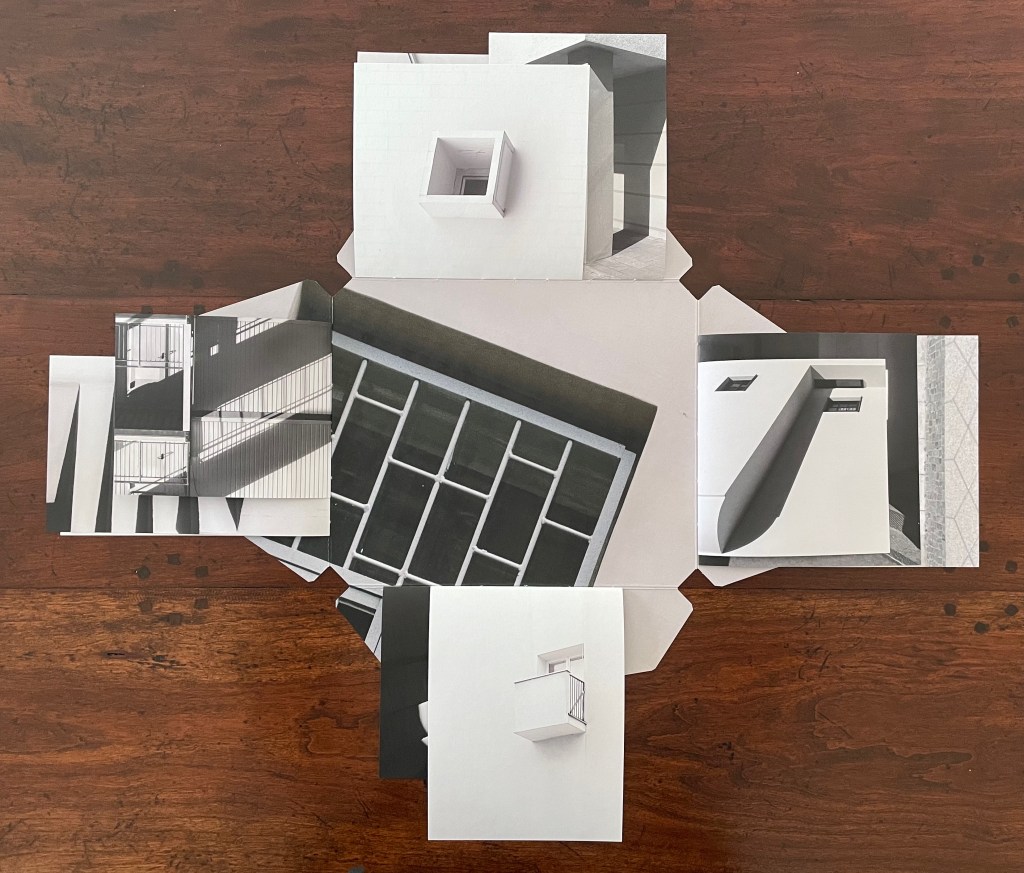
Variable page height and width combined with exacting registration form the key with which Catugier unlocks her superimpositions, intersections, collage, and disruptions. Below is a set of spreads that demonstrates this.
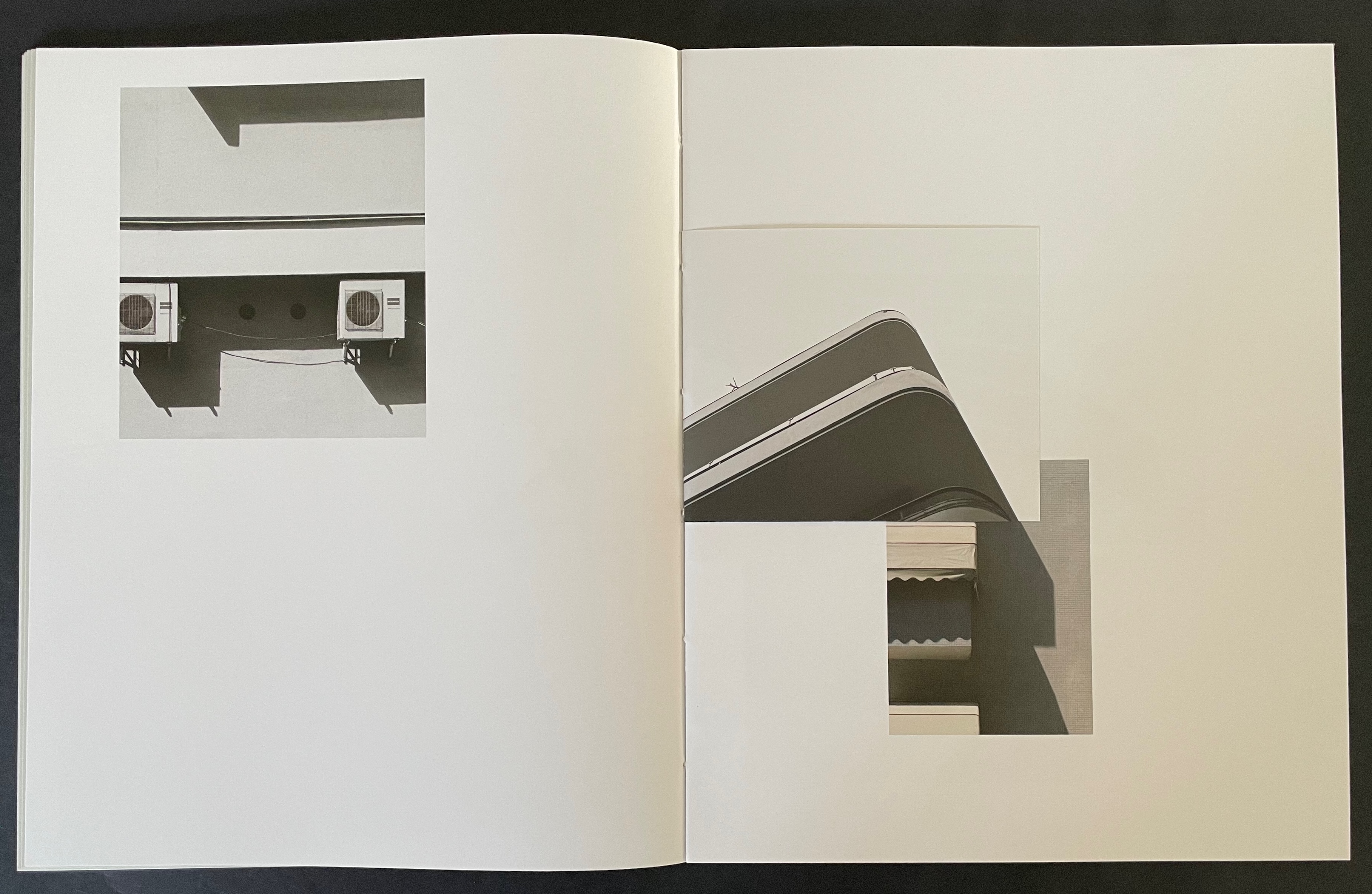
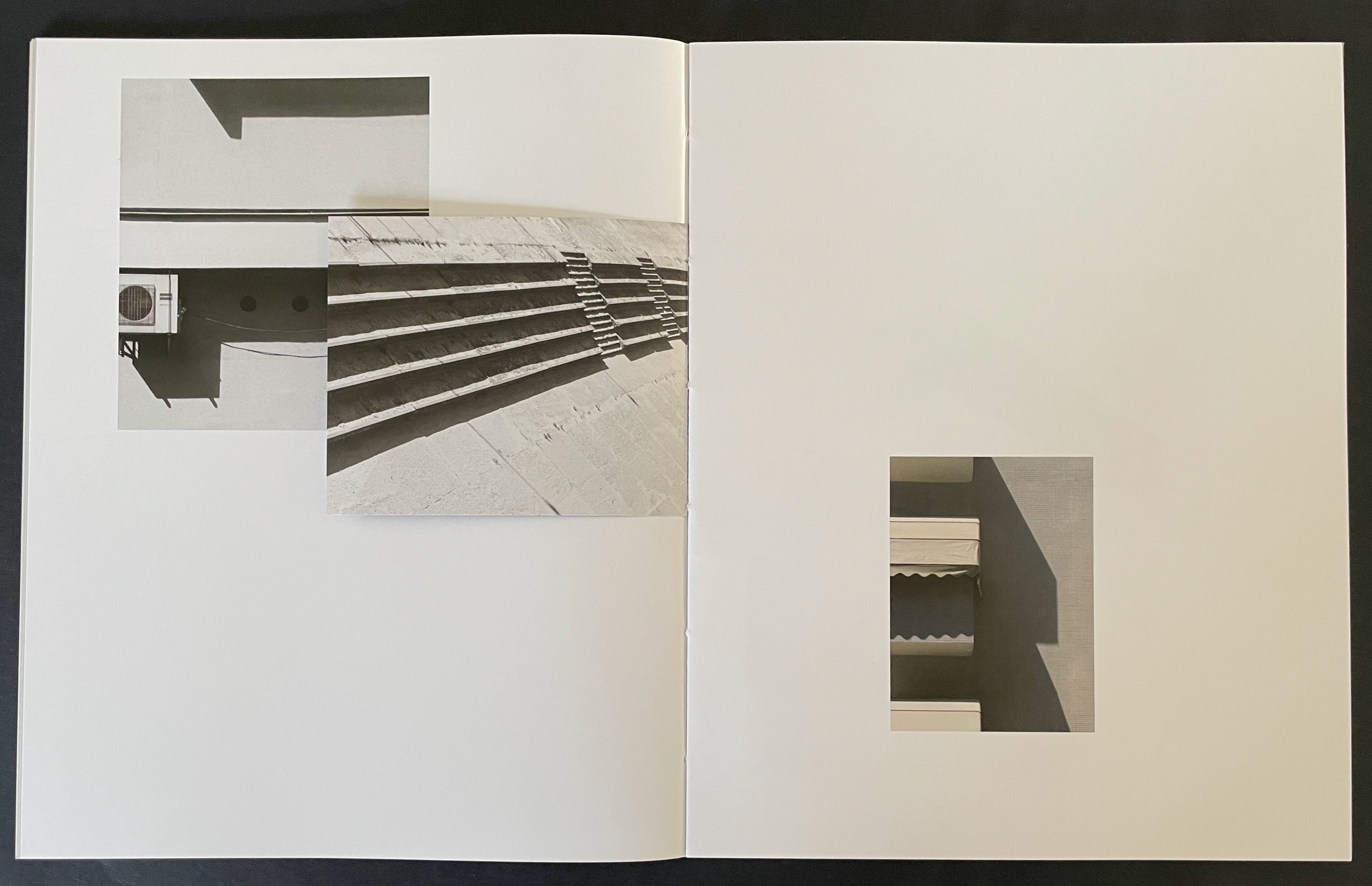
Above, in the spread on the left, the triangular image that falls on the recto page is actually a small folio to itself. The triangle’s right-hand edge aligns with the shadow of the image below it. This becomes apparent when the small folio is turned to the left, and now its verso image of shadows aligns with the shadow between the air-conditioning units (the small turned folio now hides nearer of the units).
Above, in the spread on the left, a small folio displays the russet concrete window box that seems to hang above the same-colored concrete pillar. When the small folio is turned to the left, the shadow on its verso page aligns with the shadow of a balcony to create the appearance of a building’s corner.
Given these architectural snapshots presented as dynamic collages echoing the Hansens’ theories, Catugier’s degrees in architecture and design at the École Nationale Supérieure d´Architecture de Toulouse are no surprise. Her turn to photography and then video, performance, installations and finally to artist’s books has been fortunate, in particular, for book art. The dos-à-dos structure of A Never-Ending Stone neatly echoes her trajectory. The title and choice of board for the covers reflect more specifically the architectural element. It was the French engineer and builder François Coignet (1814-88), one of the early inventors of concrete in France, who described it as “a never-ending stone.”
Bracketing the 28 folios that perform the dynamic collages above are an essay by Anna-Lena Wenzel covering Catugier’s background in architecture, photography, performance, video, installation, and book design, and an interview with curator Moritz Küng highlighting from the start another Catugier passion that also has its inspiration in Oskar Hansen’s architectural work: music and sound.
Architecture is Frozen Music # (2023)
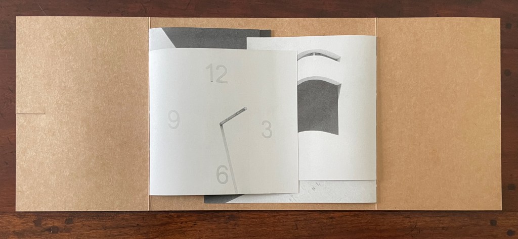
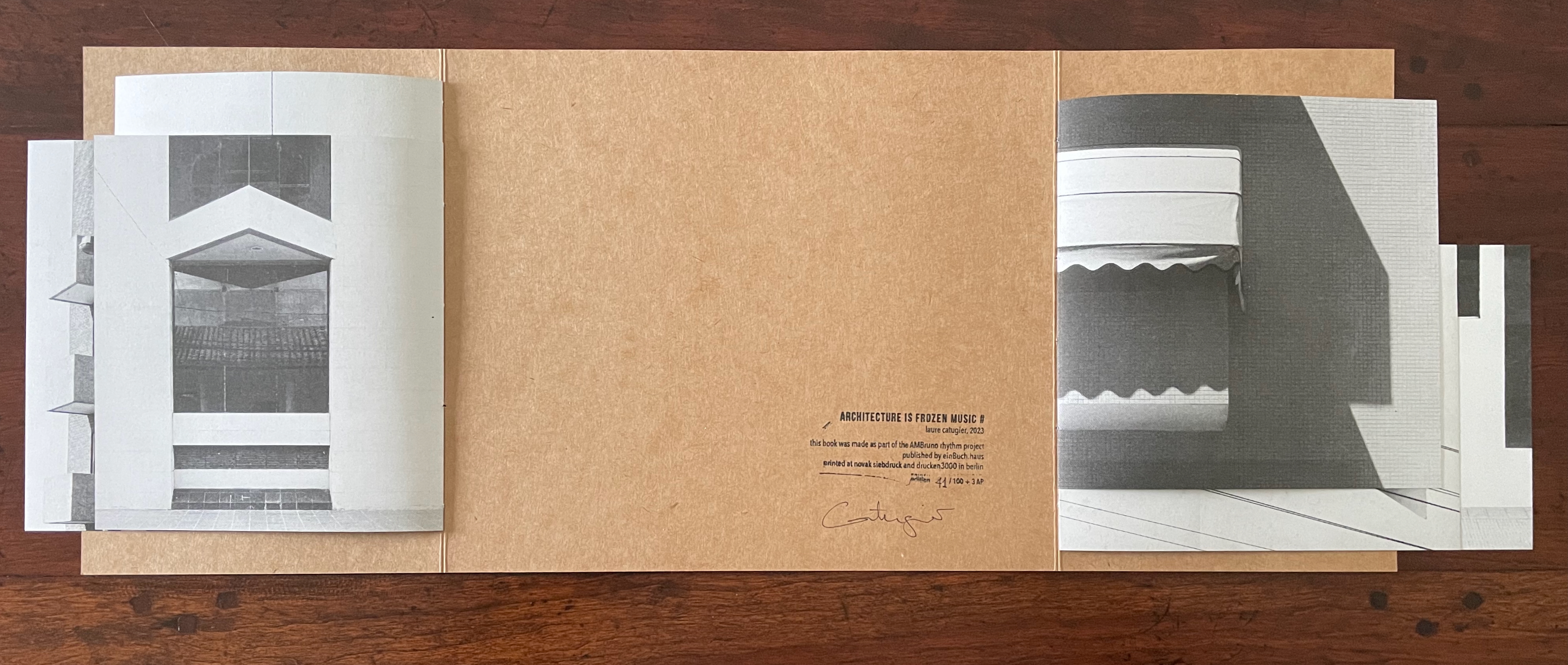
Architecture is Frozen Music # (2023) Laure Catugier “Open Form” binding (French fold cover with slot fastening; two pamphlet-sewn booklets attached to verso and recto edges of cover with staggered top and bottom margins). Cover: H230 x W270 mm (closed), W575 mm (open); Pamphlet verso: H197 x W180 mm (closed), W330 mm (open); Pamphlet recto: H197 x W204 mm (closed), W384 mm (open). [8] pages in each pamphlet. Edition of 100, of which this is #41. Acquired from einBuch.haus, 1 October 2025. Photos: Books On Books Collection. Displayed with permission of the publisher.
Hansen was commissioned to design a music pavilion “that would reflect contemporary thinking in music”, which he translated into a “search for ” ‘time and space’ qualities in music” [and a structure that would picture] the spatiality of music … enabling viewers to search for their ‘audio’ place and simultaneously experience visual transformations — to be in audio-visual space-time, and later on he would refer to design as “compos[ing] space like music” (Scott, pp. 140-47).
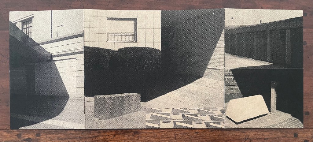
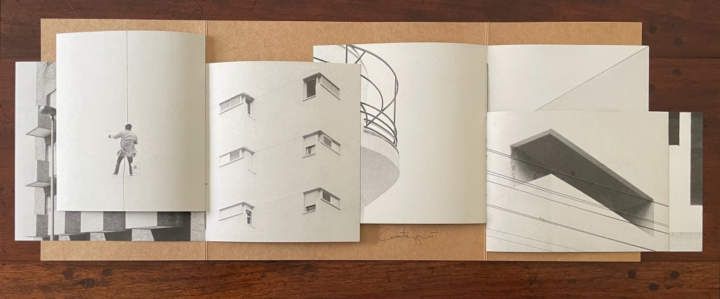
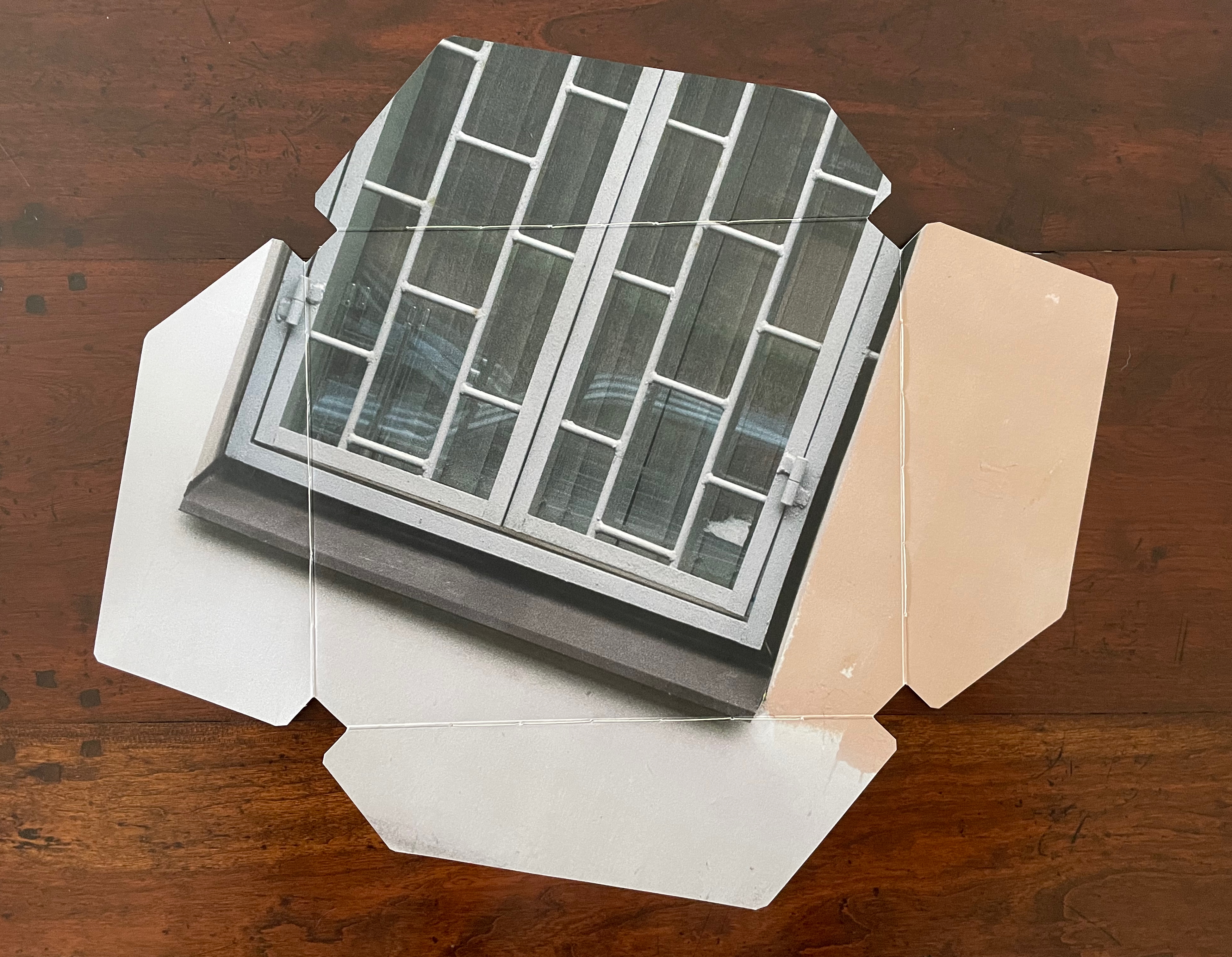
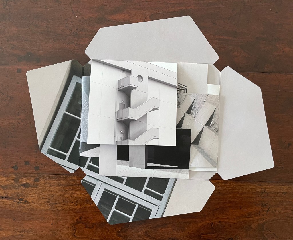
Catugier’s Architecture is Frozen Music project translates Hansen’s analogy into her installations and artist’s books. In Architecture is Frozen Music # (2023), she adds a French fold structure that engages the techniques of variable page height and width, registration, and dynamic collage across two facing interleaving booklets. Even the book’s fastening (see above) participates in the registration and dynamic collage techniques, which can be further appreciated by turning over the extended French fold cover (see below).
French fold cover opened, displaying two booklets interleaved. Note the fastening slot on the left.
The two booklets separated, revealing the colophon. Note the difference in margins above and below from one booklet to the other, facilitated by the structure’s two spines.
Reverse of the extended French-fold cover, showing the collaged images that form the dynamic collage on the front of the closed book.
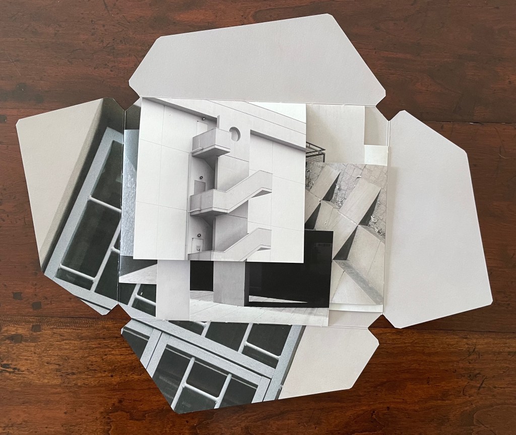
When the two booklets’ pages are turned, the differences in the top and bottom margins, the size of the leaves, and their positioning on the two spines become more evident.
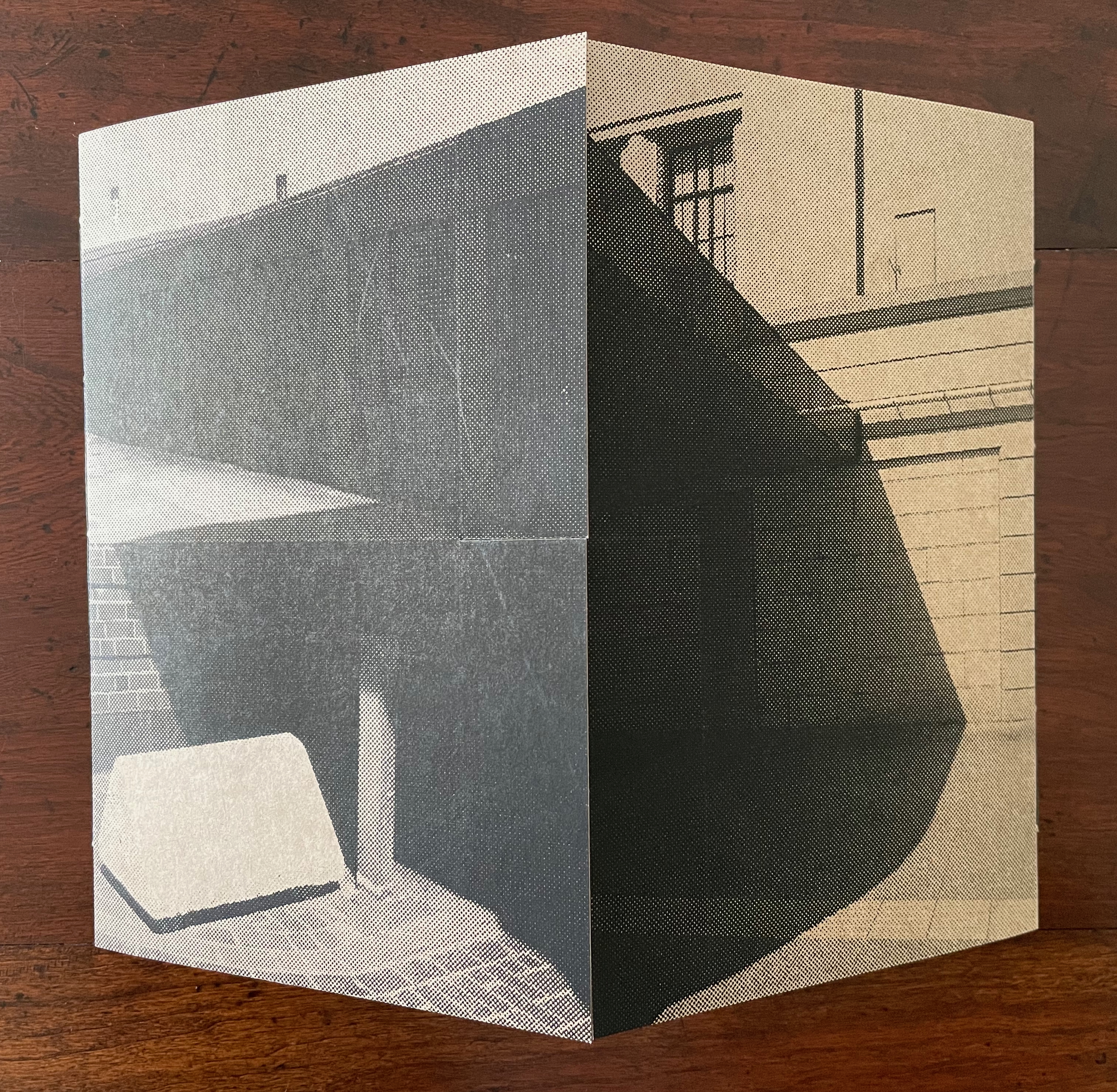
Below, the linear registration across the overlapping leaves of the two booklets suggest lined music sheets with the collage in the center playing the role of an oversized treble clef and musical note and enacting the title’s assertion that architecture is frozen music. Structure and image meet metaphor.
Architecture is Frozen Music (2022)
Architecture is Frozen Music (2022) Laure Catugier Thin cardboard box; four pamphlet-sewn signatures attached to poster stock cut and folded into four overlapping flaps. Box: H218 x W258 mm; Cover: H210 xW250 mm (closed); Verso signature: H145 x W190 mm (closed); Recto signature: H155 x W190 mm (closed); Bottom signature: H162 x W172 mm (closed); Top signature: H210 x W170 mm (closed). All heights measured along sewn edge. [8] pages to each signature. Edition of 30, of which this is #14/30. Acquired from einBuch.haus, 1 October 2025. Photos: Books On Books Collection. Displayed with permission of the publisher.
Preceding Architecture is Frozen Music # (2023), which was part of that year’s AMBruno Project, an even more complex and smaller editioned version of Architecture is Frozen Music appeared. In every sense, it was occasioned by exhibitions of the same title. Its cover is even a fragment of an artwork made of poster paper for one of the exhibitions. It exemplifies what Dick Higgins described in 1965 and 1981: intermediality.* It also exemplifies Catugier’s interpretation of the Hansens’ concept of “open form”.
Book closed.
Reverse side of extended cover. Note the binding threads along the four spines/folds.
The binding and interleaving of four pamphlet-sewn signatures, each to an edge of the square in the middle of the cover, facilitates this “open form” book. On first opening it, there is, of course, a page on top. To that degree, the artist has imposed a beginning, and once all of each signature’s pages have been turned, there seems to be an end.
Top: book open to four interleaved signatures. Bottom: All four signatures’ pages turned.
But go back to the opening. Although the structure imposes a first page to turn, it also offers four different orientations the reader could adopt. In the orientation below, the first page turns upwards, but with a 90° reorientation to the left, it would turn as a Western codex is expected to do. Another 90°, and the first page would turn downwards. And with a third 90°, it would open as an Eastern codex is expected to do.
We might turn to the idea of the fugue as a rough analogy for this particular “open form” book. A fugue generally has a “subject” (or main theme), an “exposition” in which voices or instruments each play out the subject, then an “episode” (or connecting passages) that builds on the previous material, then further alternating “entries” in which the subject is heard in related keys until a final entry that returns to opening key. Like the fugue, Catugier’s “open form” book is more a style of composition than a structural form.
Catugier’s main theme is “architecture is frozen music”. Her technique of dynamic collages creates a “fugal” effect with at least six elements or motifs or voices. One is the architectural motif (balcony, window, stairs, vents, or even furniture such as a chair) displayed. Another is the source or direction of light. Another is the alignment of shadows cast by the architectural motifs. Another is a geometric motif arising from the motifs of architecture, light, and shadow. Another is the dimension of the folios in the signatures. And yet another is the position of the signatures along the spines.
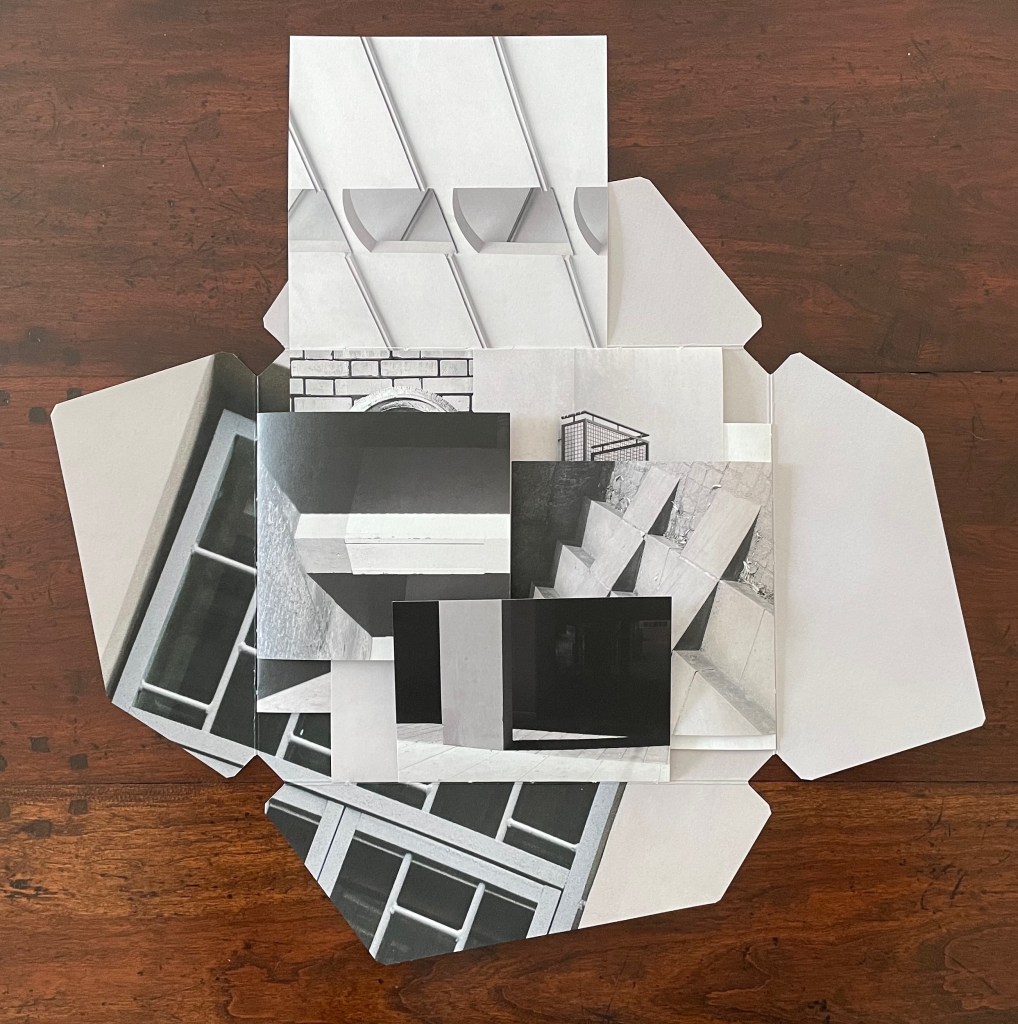
Below in the opening of the book, the architectural motif of an external staircase “sounds” out the subject on the first page. The geometric voice picks out a circular opening atop a rectangular column crossed by parallelograms ending in square balconies. The voice of signature placement aligns and extends the rectangular column with another column on an underlying signature’s top page. When the first page is turned (upwards), the voices of folio dimension, direction of light, and shadows come into play, and we find that the underlying column has been truncated and is perpendicular to a bright column of light on a wider structure receding into shadow. The architectural voice counterpoints the perpendicular columns with stairs slanting away from them at 45°. When the bottom signature’s top page is turned (downwards), those stairs are almost fully “sounded” on the right while the balconies motif returns in the downturned bottom signature.
Left: book open to four interleaved signatures. Right: top signature’s first page turned (upwards).
The balconies motif increases in volume as the left signature’s top page turns (leftwards) to display a balcony grating and reveal another balcony in the center.
Left: bottom signature’s first page turned (downwards). Right: verso signature’s first page turned (leftwards).
From the view on the right above to the view below, the turning of the right signature’s top page (rightwards) reveals two more balconies. We now have a passage of balcony motifs moving from left to right like musical notes on a score.
Recto signature’s first page turned (rightwards).
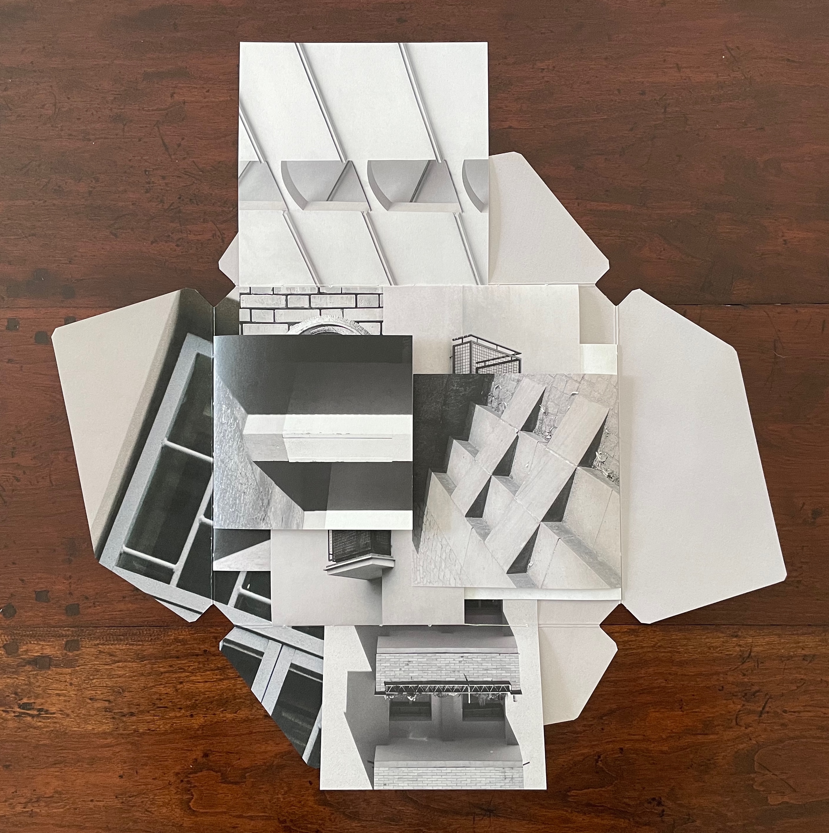
The spread below provides an example of the geometric motif at work. In this view, the center of the open book presents a circular ornament, rectangles of bricks, window squares in a shadowed door, and a small triangle of shadow to the ornament’s lower right. In the overlapping pages above the center are small triangles and arcs alongside rectangles and squares. Below the center are a large broken circle of light on a black square page, and, beside that, the truncated rectangles of a balcony. The geometric parallels running from the top, the center, and to the bottom are matched by another set of geometric parallels formed by stair-stepping shadows moving from the left signature, across the center in the bricks, and onto the right signature’s shadows in the steps leading to the door. Across the harmonizing center, the top and bottom of the open book perform a counterpoint of breaking geometric forms to the theme of stair-stepping shadows from left to right.
Geometric motifs.
There are as well, of course, geometric parallels between the top and left, the bottom and left, and between the top and right, and the bottom and right, but enough of verbal description of the visual music. Each of the signatures and motifs can be “heard” in its own right. Likewise, each view of the open book can be “heard” in its own right. And likewise, as each page turns, new harmonies and counterpoints can be “heard”. It all leaves us with the question to be debated, to paraphrase Douglas Hofstadter’s reflection in the “Ant Fugue” chapter in Gödel Escher Bach: Is the book more than the hum of its parts? What is certain is that, in bringing together architecture, music, photography, and the book, Architecture is Frozen Music offers an exceptional example of the artist’s book as intermedia.
*“Intermedia” is a term adopted by Dick Higgins from Samuel Taylor Coleridge in 1812 used “to define works which fall conceptually between media that are already known” but useful to Higgins in demystifying the avant-garde.
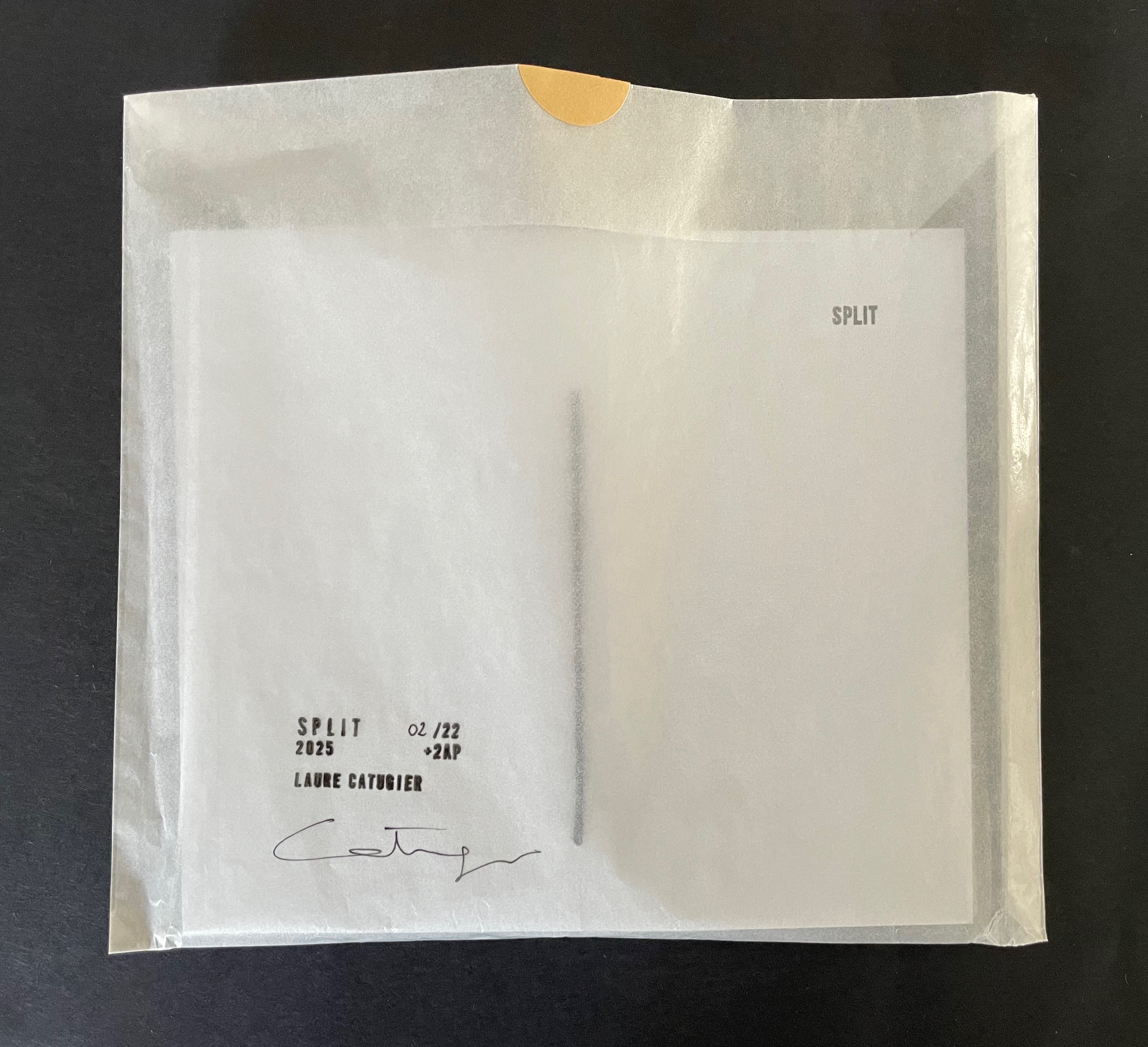
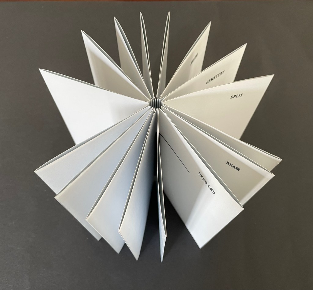
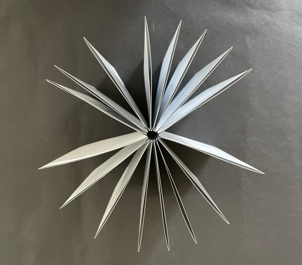
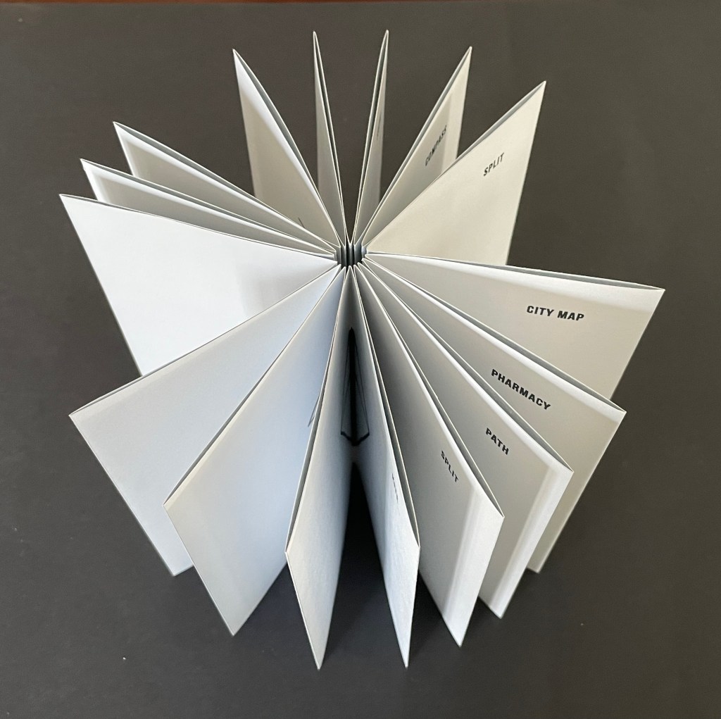
Split (2025)
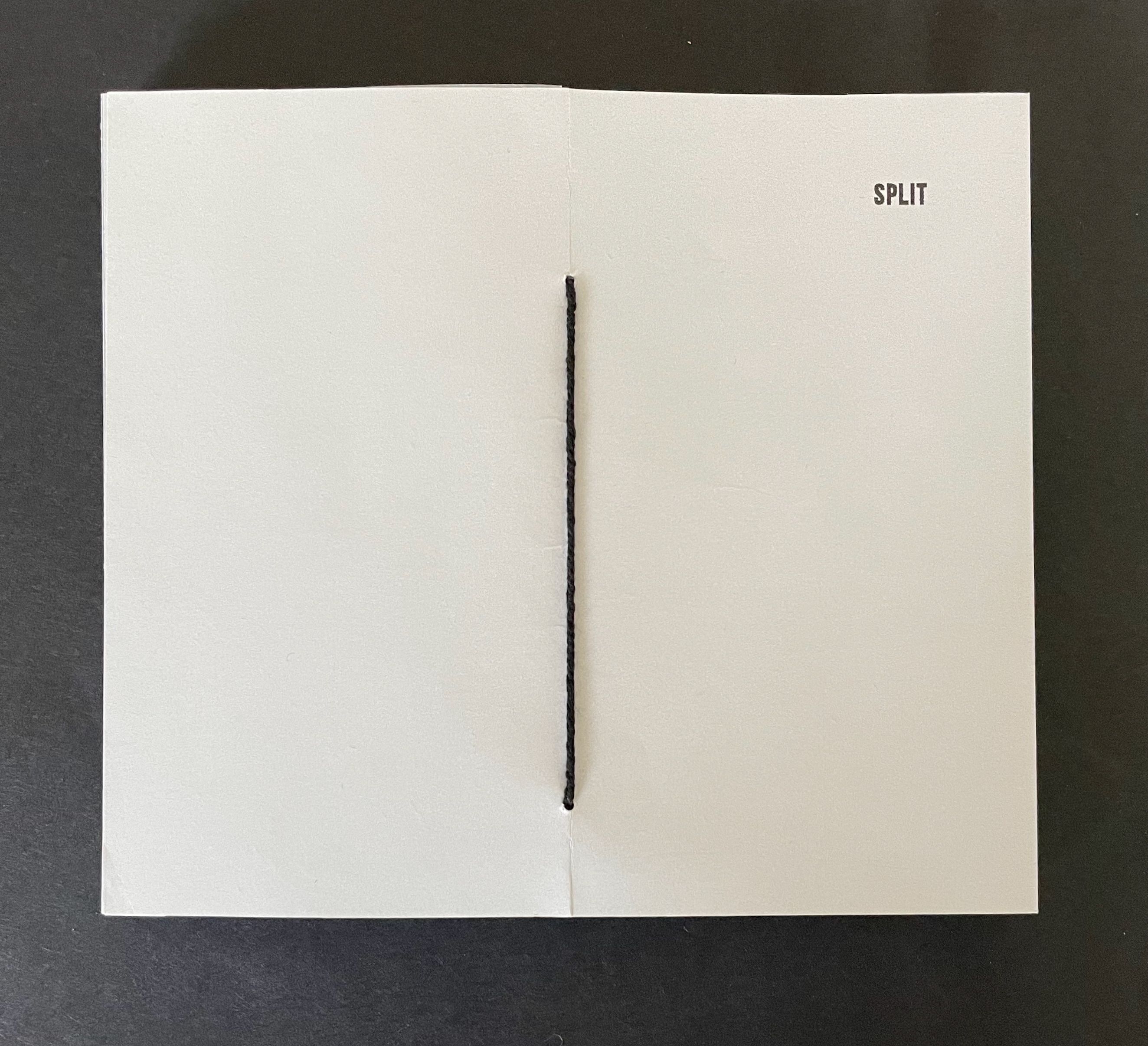
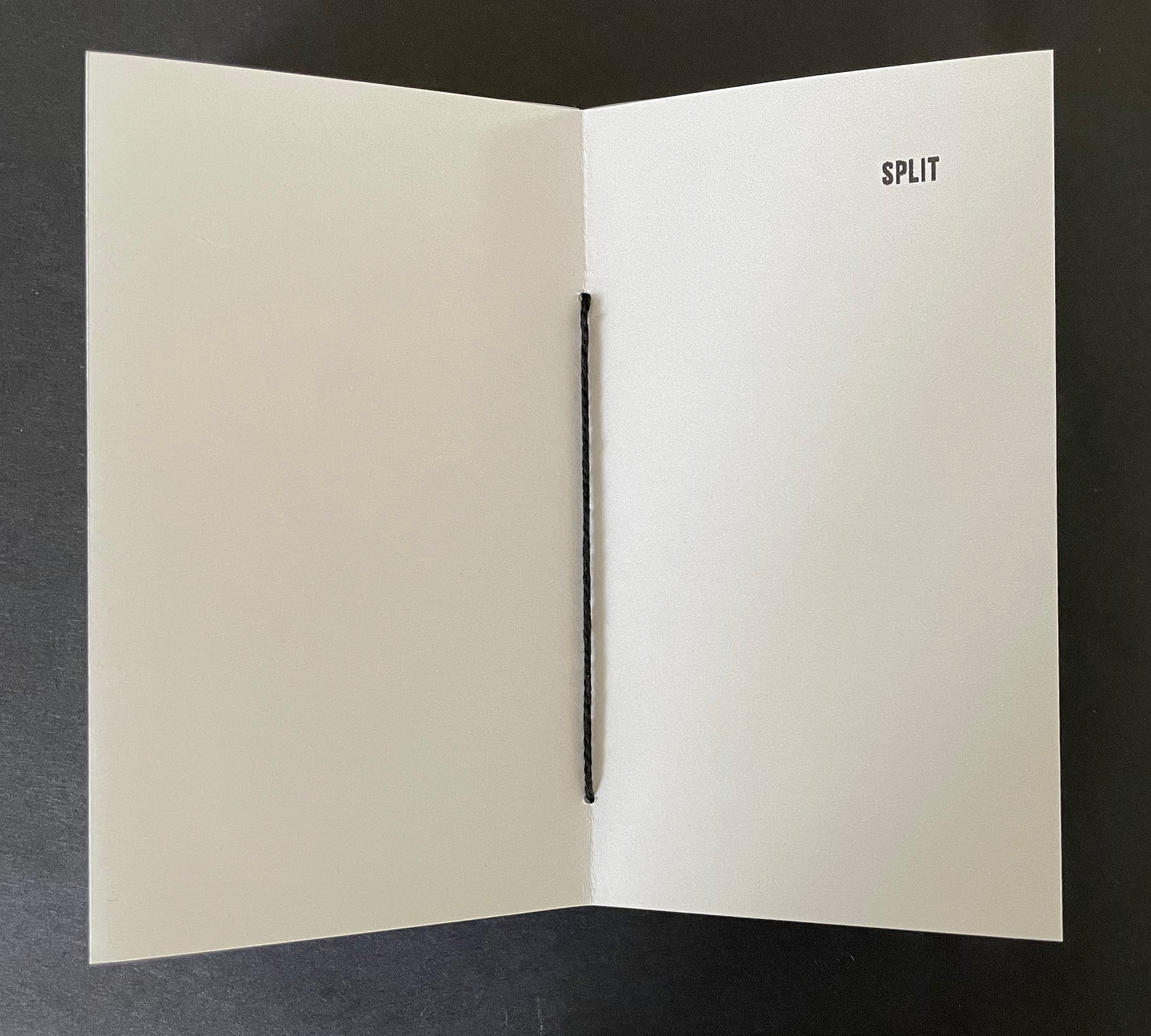
Split (2025) Laure Catugier Pamphlet-sewn star book. H170 x W150 mm. [32] pages.Edition of 22, of which this is #2. Acquired from einBuch.haus, 1 October 2025. Photos: Books On Books Collection. Displayed with permission of the publisher.
Split (2025) is another stab at the “open form” book. As a pamphlet-sewn star book without a front or back cover, it has no beginning or end.
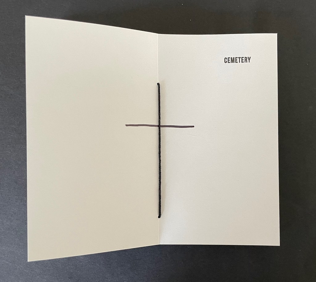
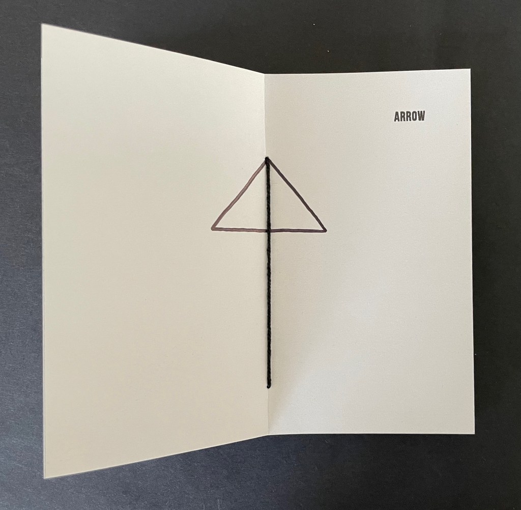
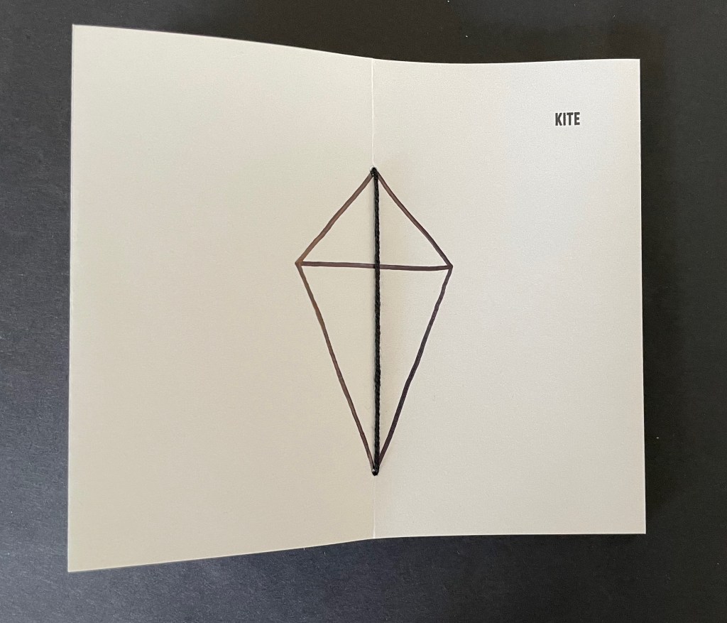
It has sixteen double-page spreads. Each has a word in the upper right corner and an image in the center. Four spreads are the same, showing the word SPLIT and the binding’s single thick black thread. The heavy black thread is the drawing that illustrates the word or that the word defines or implies. In between those four, three spreads appear, each using the binding’s thread as part of the drawing on the double-page spread.
The subjects of the drawings in each of the triads do not seem related to one another, but there is a progression from one drawing to the next. CEMETERY only requires one line intersecting the binding thread to construct the image suggesting it, ARROW requires two more lines, and KITE requires yet two more. The next triad — PATH, PHARMACY, CITY MAP — requires one line, then three, and then eight. The next triad — COMPASS, SNOW, WHEEL — requires one, then three, and one more. The next triad — DEAD END, BEAM, WINDOW — requires one, then one more, and finally two more.
Many star book structures have front and back covers, so even if the text and images suggest no beginning or end, the covers undermine it. When exploring SPLIT, however, whether the reader chooses to turn the pages codex-style or carousel-style and whether the reader chooses the direction of adding lines or subtracting them from the images encountered, there is no beginning or end.
These four artist’s books demonstrate that Laure Catugier has found an effective muse in the Hansens’ open-form architectural theory. Her intermedial thinking, design skills, and craftsmanship have responded with inventive and outstanding artwork. It deserves a wide audience.
UPDATE: Laure Catugier receives the Herzog August Bibliothek and the Curt Mast Jägermeister Foundation Artists’ Book Prize 2026.
Further Reading
“Architecture“. 12 November 2018. Books On Books Collection.
Deguy, Michel, and Bertrand Dorny. 1989. Le Métronome. Paris: Self-published. Interesting for a contrast and comparison on how structure in an artist’s book can analogize with music.
Hubert, Renée Riese, and Judd David Hubert. 1999. The Cutting Edge of Reading : Artists’ Books. New York City: Granary Books. See pp. 104-06 for discussion of music and structure in Deguy and Dorny’s Le Metronome.
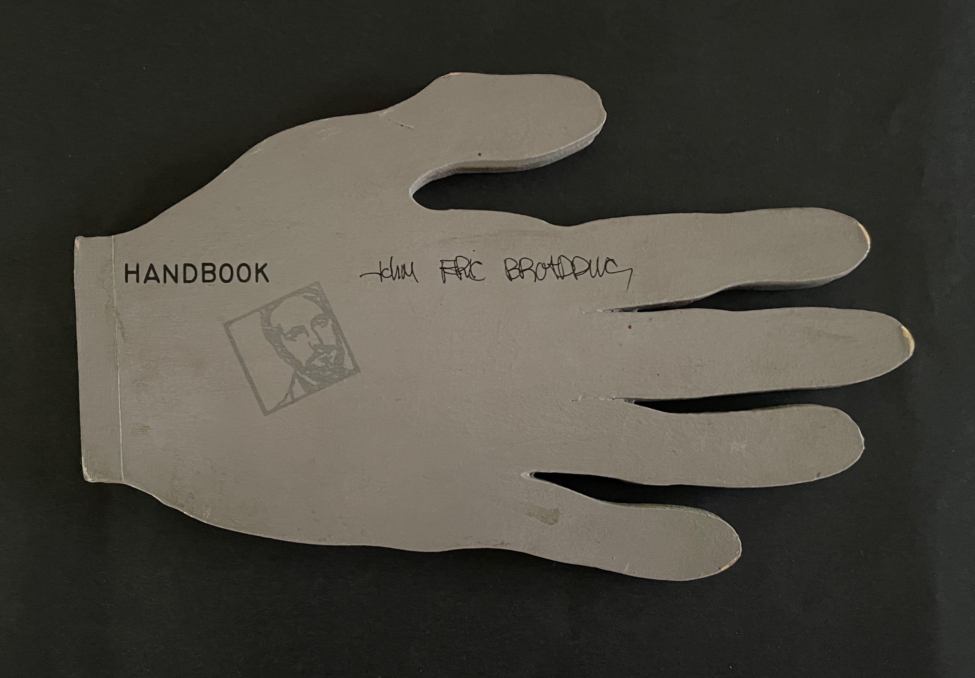
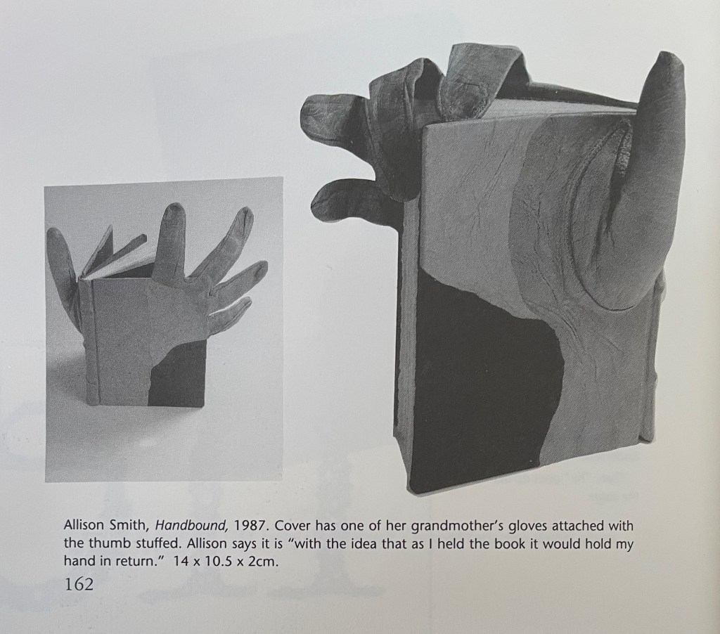
John Eric Broaddus (1943 1990) was perhaps one of the most inventive and creative artists to approach the book form. He was a prominent figure in the New York City art scene in the 1970s and 1980s, creating books before the book form even had a suggestion of acceptance in the art world. He also created one-of-a-kind costumes that he wore out on the streets of New York and in iconic places like Studio 54. He was vibrant, outlandish, and did much to contribute to the world of artistic interplay in New York City of that time. His inspired life was cut short by AIDS in 1990. but his legacy lives on in the work he left behind, a muse in itself for book artists even twenty years later.” Visual AIDS
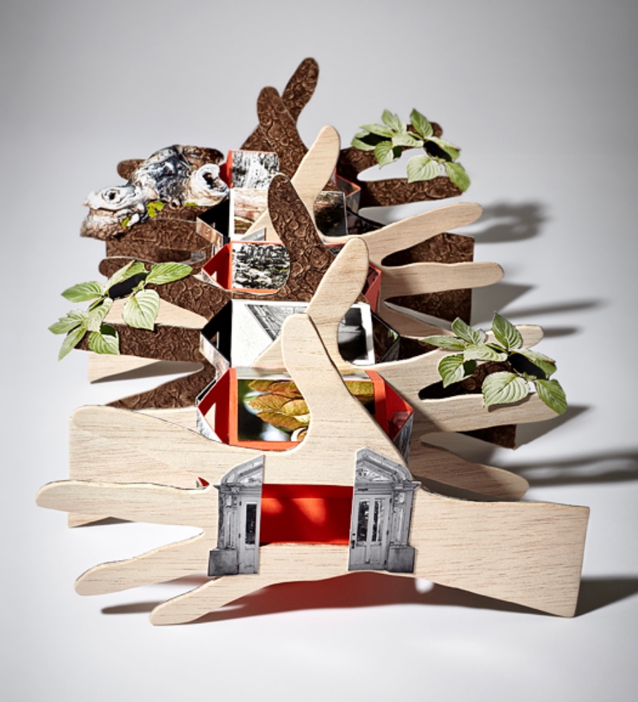
Since first seeing references to and images of John Broaddus’ artist’s books in 2012, I have watched for opportunities to add his work to the Books On Books Collection. So many of his artist’s books were unique works and already in institutional collections or private hands, it would be a long watch. In late 2025, this appeared: “Achingly scarce work from a major figure in the early book arts movement. Minimal shelf/edge wear, else tight, bright, and unmarred. Shape book (human hand), grey painted boards, black ink lettering, cut paper forms.”
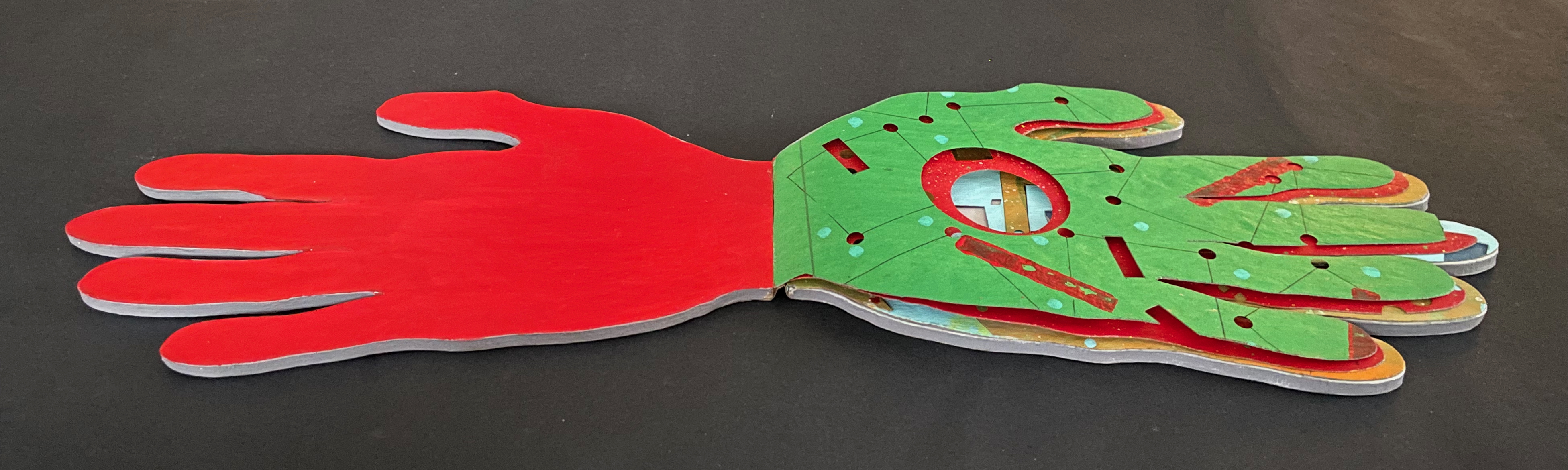
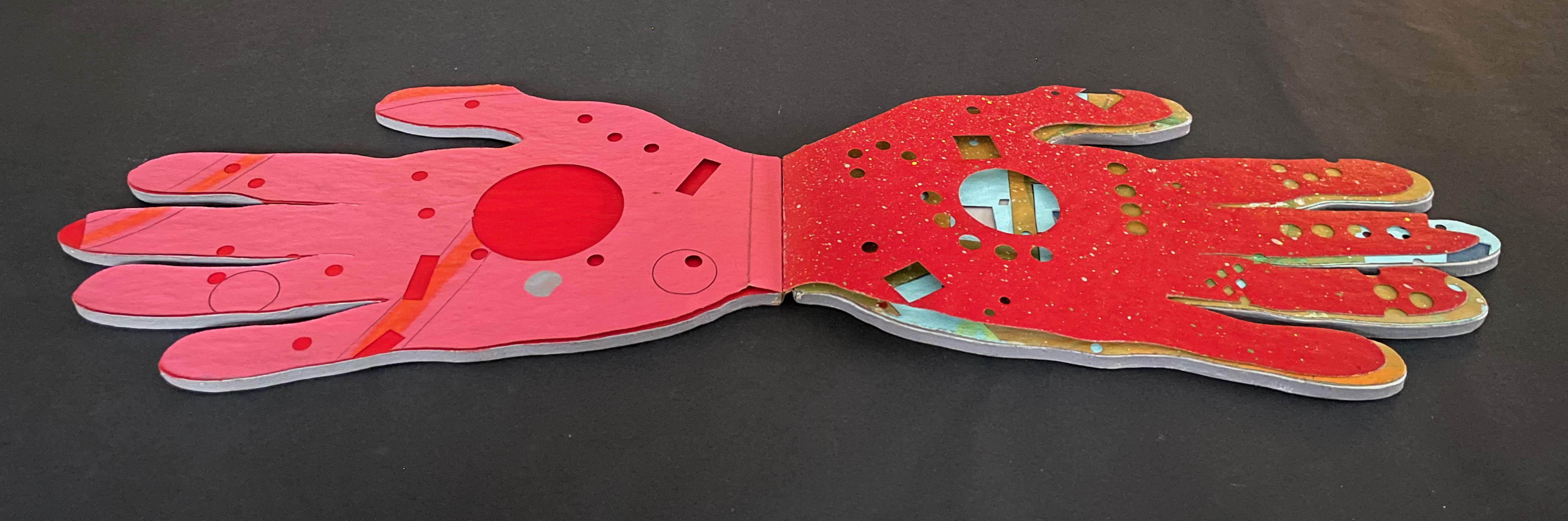
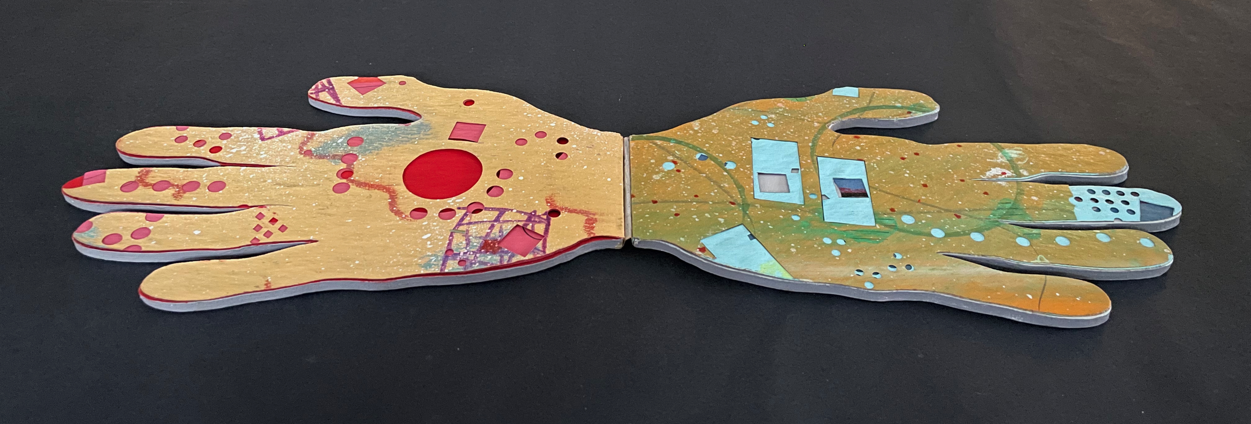
Handbook (1980) John Eric Broaddus Hand-shaped boards over hand-shaped painted and cut pages, nailed tape hinge. Variable: H123 x W205 mm. [10] pages. Limited edition, unknown quantity. Acquired from Lux Mentis, 3 December 2025. Photos: Books On Books Collection.
Inside front cover, first page. Last page, inside back cover.
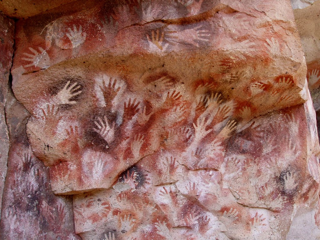
Hand stencils may be the oldest art form. Those below from the Cuevas de las Manos in Argentina are 9,300 years old. More recent discoveries in Indonesia go back 67,800 years (Oktaviana). So no surprise that kindergarteners and book artists have carried on the tradition.
Drawings at the Cuevas de las Manos in Santa Cruz Province, Argentina. Photo: Mariano – Own work, Public Domain.
Broaddus’ Handbook (1983) joined the tradition “before the book form even had a suggestion of acceptance in the art world”, as the dealer’s announcement points out. He produced this as one of a limited edition, but the number is uncertain. What is certain, given the painted pages and their various perforations, each copy must be unique. Two of them reside with John Cutrone (Florida Atlantic University) and others with the Jack Ginsberg Center, the University of Southern California, and the University of California at Santa Barbara.
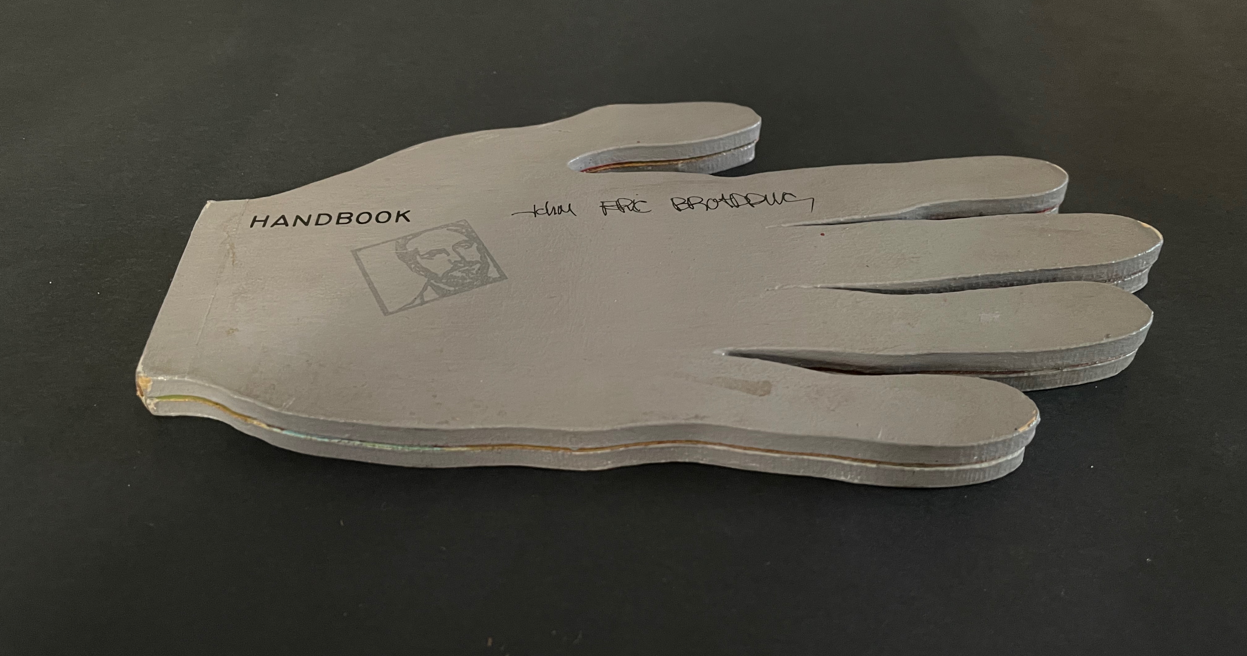
I noticed in my copy that the third out of five folios was missing the third digit’s tip. Was it a faulty copy? Was I due a discount from the dealer? Or was it deliberate? Was the third digit’s treatment common to all the copies, making a flippant flipping off by the artist?
With Broaddus’ penchant for the outré, I liked that last interpretation, but having misinterpreted an artist’s book on more than one occasion, I asked the other collections for comparisons. John Cutrone kindly provided images of his copies so that I could check for myself. Disappointed to say, but the bird fingers in Cutrone’s copies were intact. Still, I might warm to the interpretation that my copy with its unique and precisely placed gesture is the culmination of the edition.
The Books On Books Collection copy
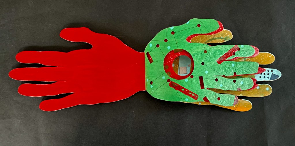
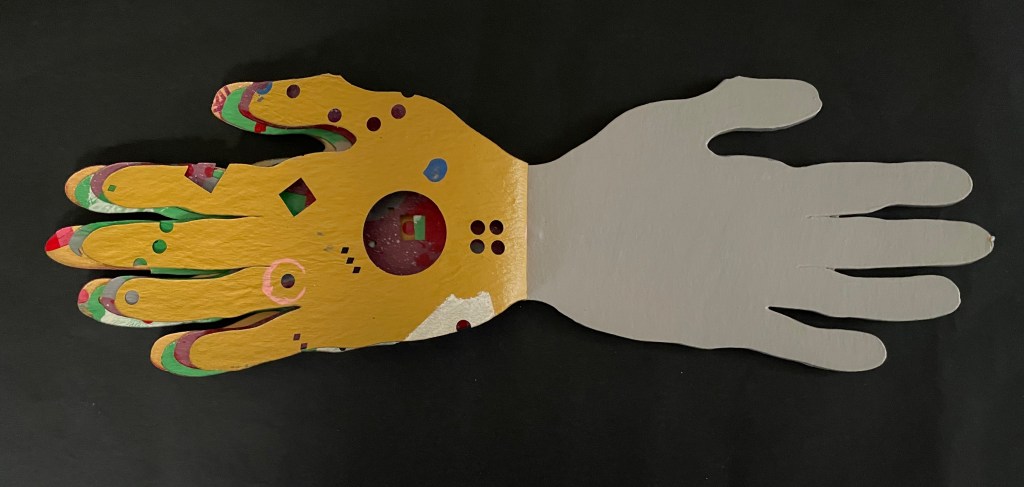
As a glance at FAU’s videos of Broaddus’ The Jell-O Book (1973) and Sphinx and the Bird of Paradise (1981-91) will confirm, his color palette is distinctive. Handbook is an enthusiastic celebration of it.
The circular, square, and rectangular perforations may have been created with an eXacto knife, one of Broaddus’ frequently used tools. The missing one-third of the middle digit on the recto page, however, appears to have been torn away.
Recto page missing one-third of middle digit.
Verso page missing one-third of middle digit.
The close patterns of circular perforations on several of the pages suggest band-aids (plasters). Perhaps he was indeed using an eXacto knife.
Throughout, the painted and cut patterns combine to create a kaleidoscope. There is no “on the one hand” or “on the other hand” thought process here but rather Broaddus’ many-handed guide to the fun an artist’s handbook can be.
“The Tongue and Heart th’intention oft divide: The Hand and Meaning ever are ally’de”. (Guil. Diconson, from Bulwer’s Chirologia)
[t]he hand does not only grasp and catch, or push and pull. The hand reaches and extends, receives and welcomes — and not just things: the hand extends itself, and receives its own welcome in the hands of others. The hand holds. The hand carries … [e]very motion of the hand in every one of its works carries itself through the element of thinking, every bearing of the hand bears itself in that element. All the work of the hand is rooted in thinking. (Martin Heidegger from What is Called Thinking?)
… what the artist’s hand, the craftsman’s hand, the poet or scholar’s hand, and the lover’s hand has always been: a means of marking, touching, selecting, interacting, molding, expressing, and refusing that remains essential to human thinking … (Tyrus Miller from CrossPollenBlog)
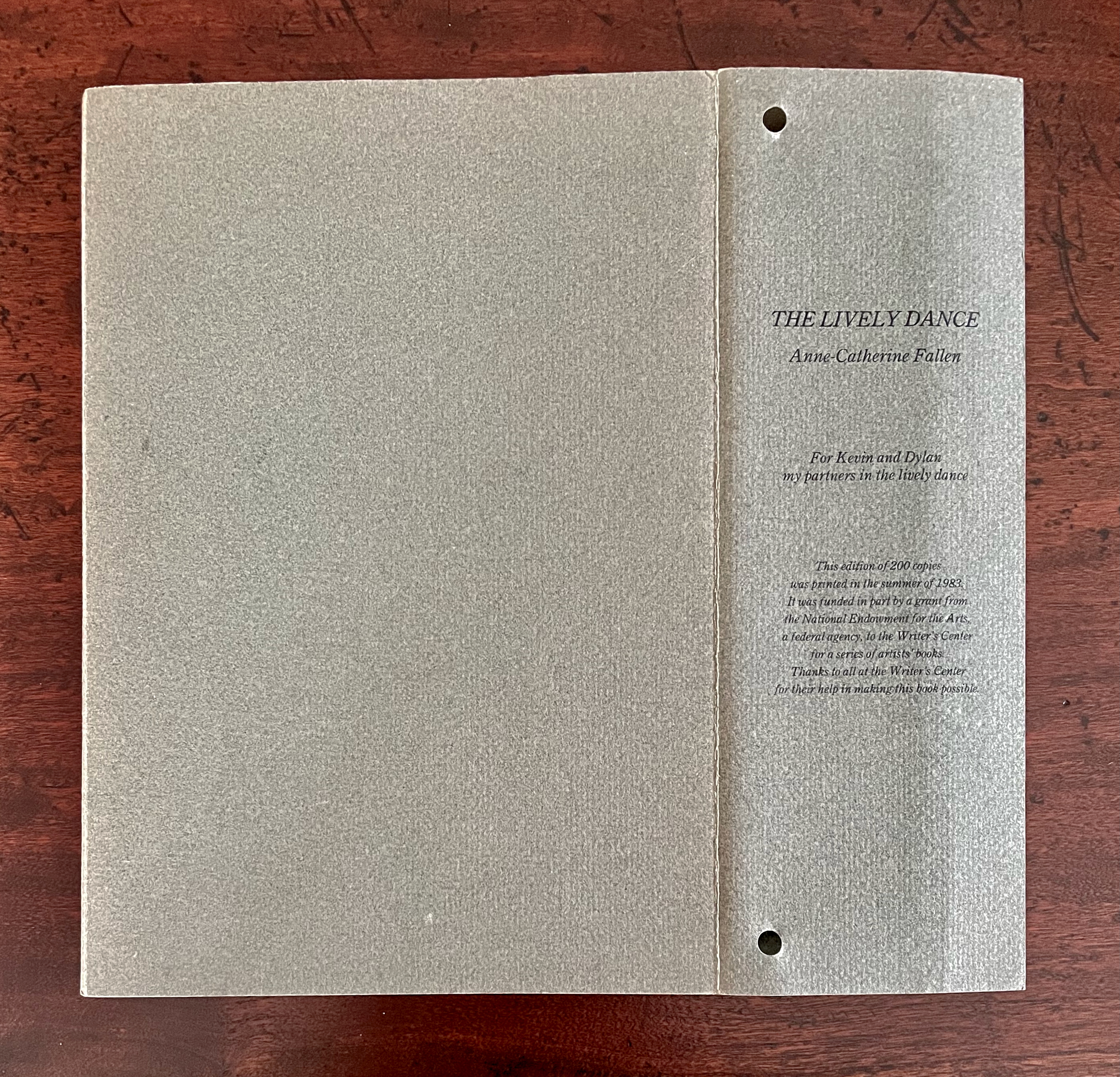
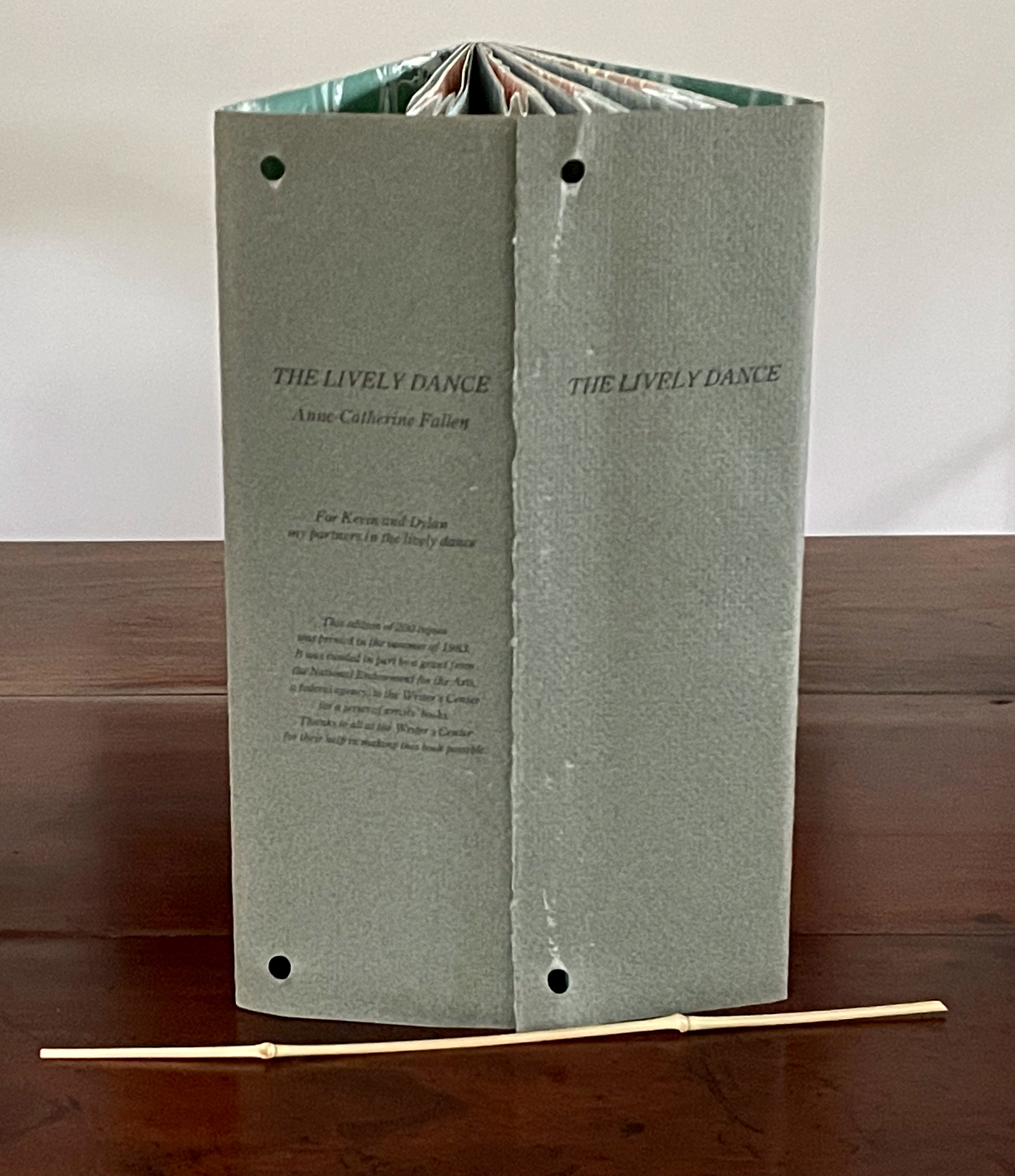
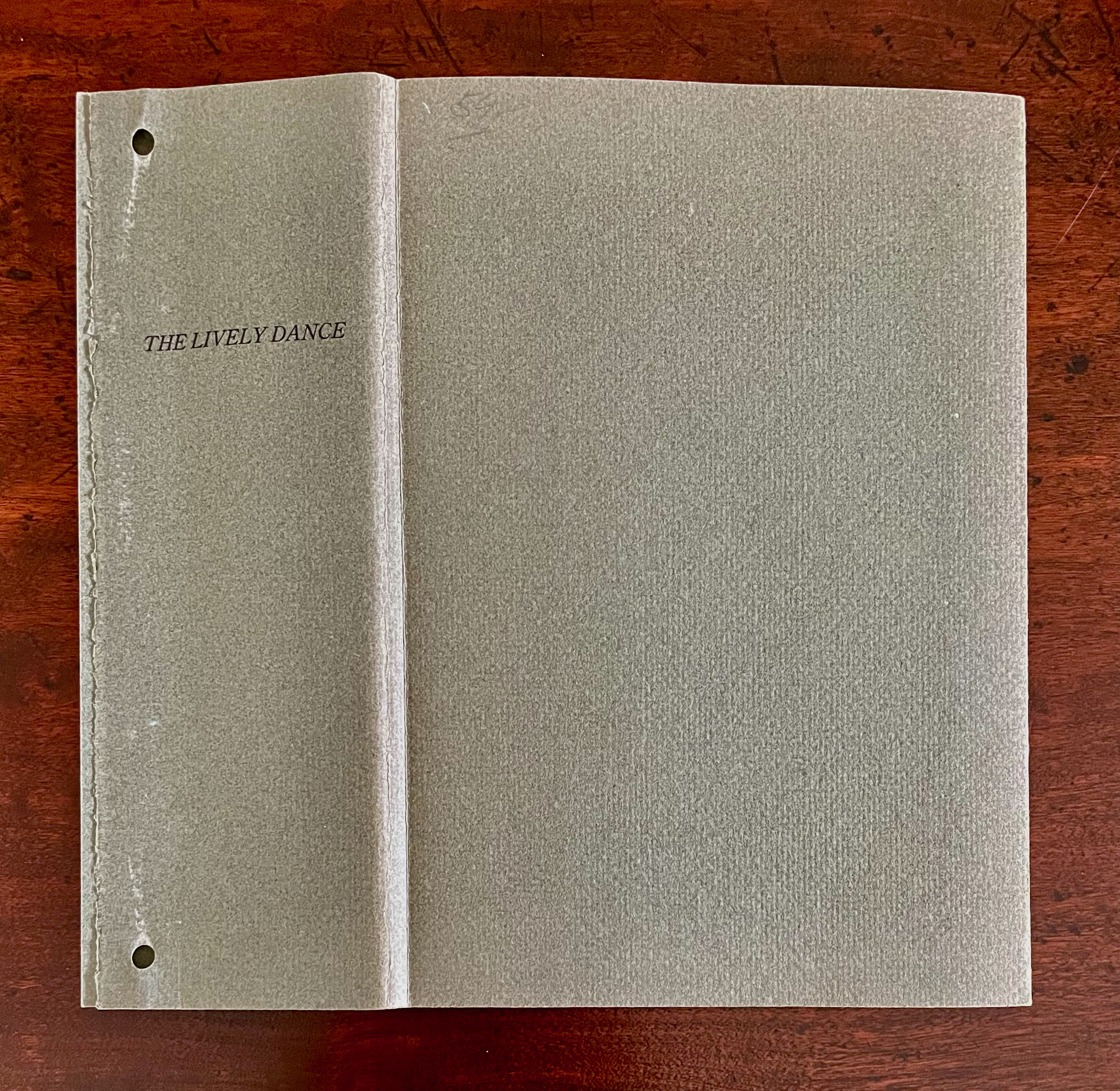
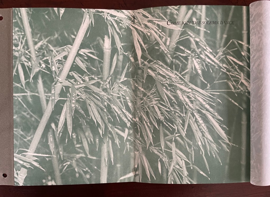
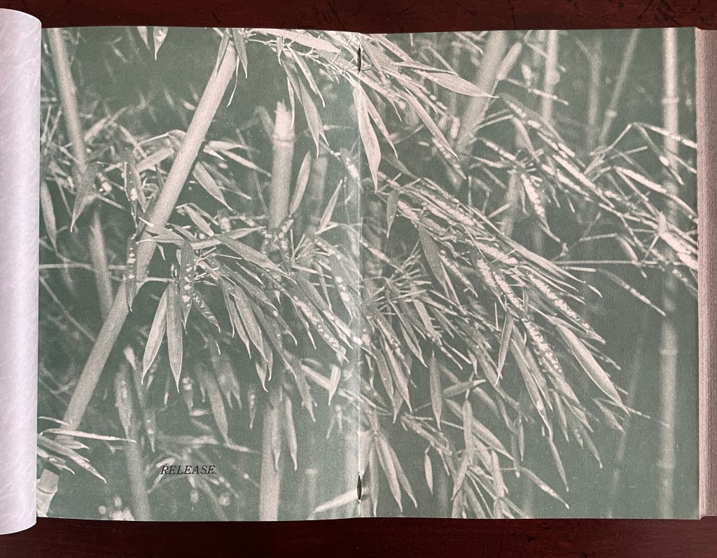
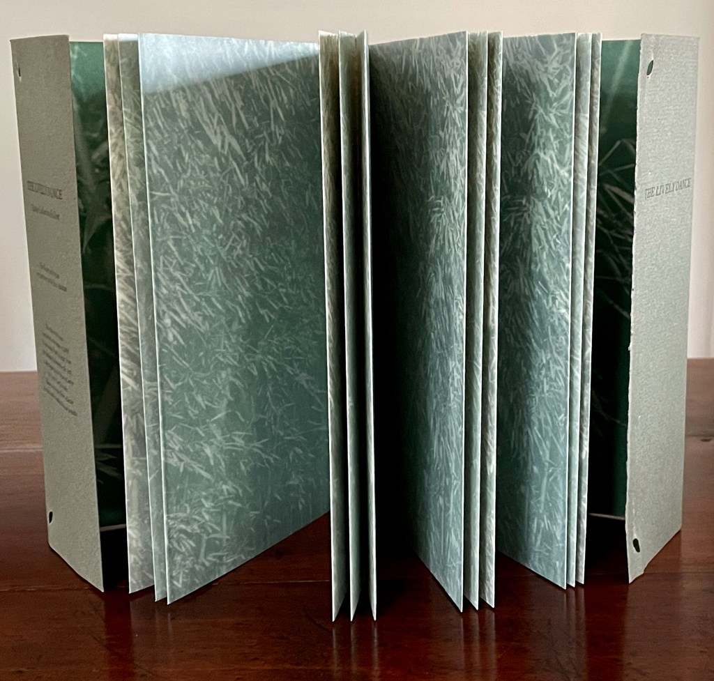
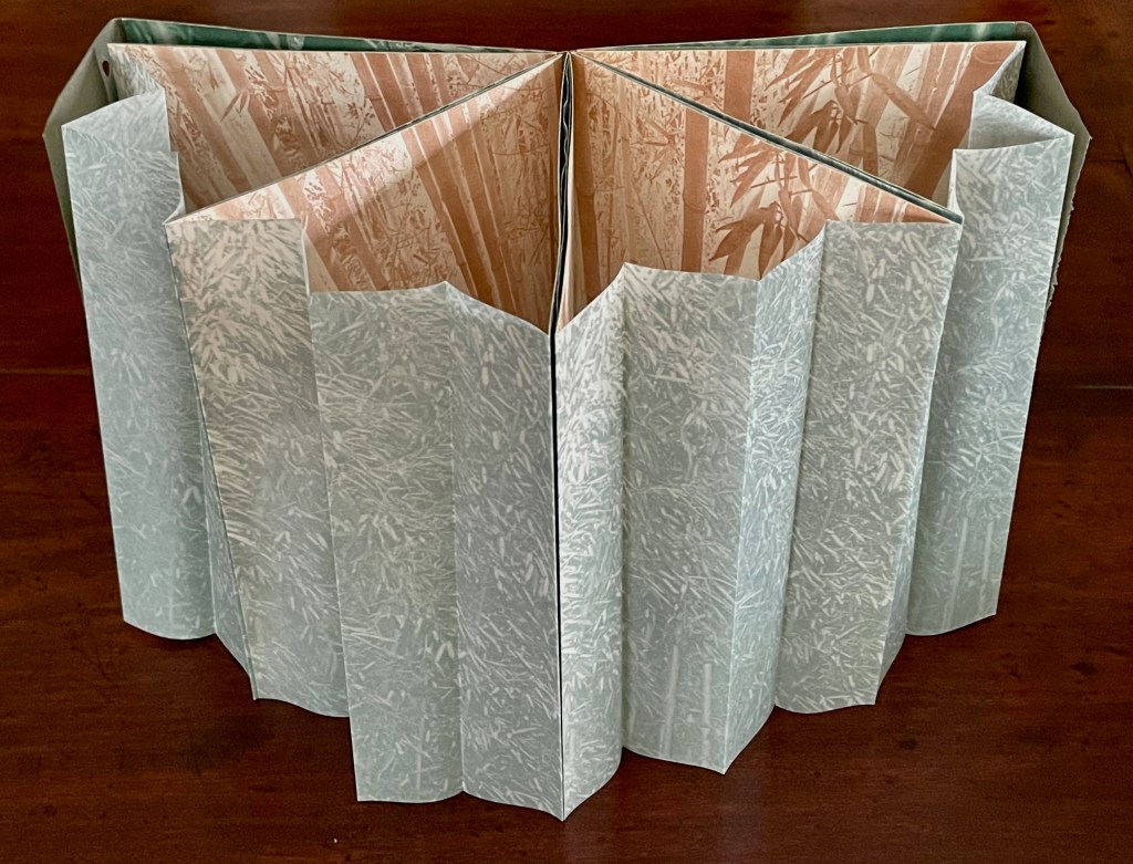
The Lively Dance (1983) Anne-Catherine Fallen Handbound book, sewn; endflaps secured at fore edge with bamboo twig to create wedge-shaped book. Laid flat, H223 x W157 mm; wedge fore edge, W75 mm. [18] pages. Edition of 200. Acquired from Stand 132, Zurich. 18 January 2026. Photos: Books On Books Collection. Displayed with the artists permission.
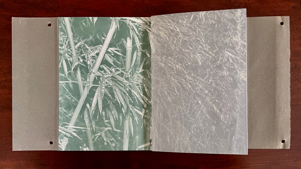
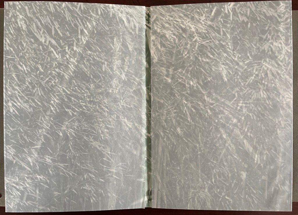
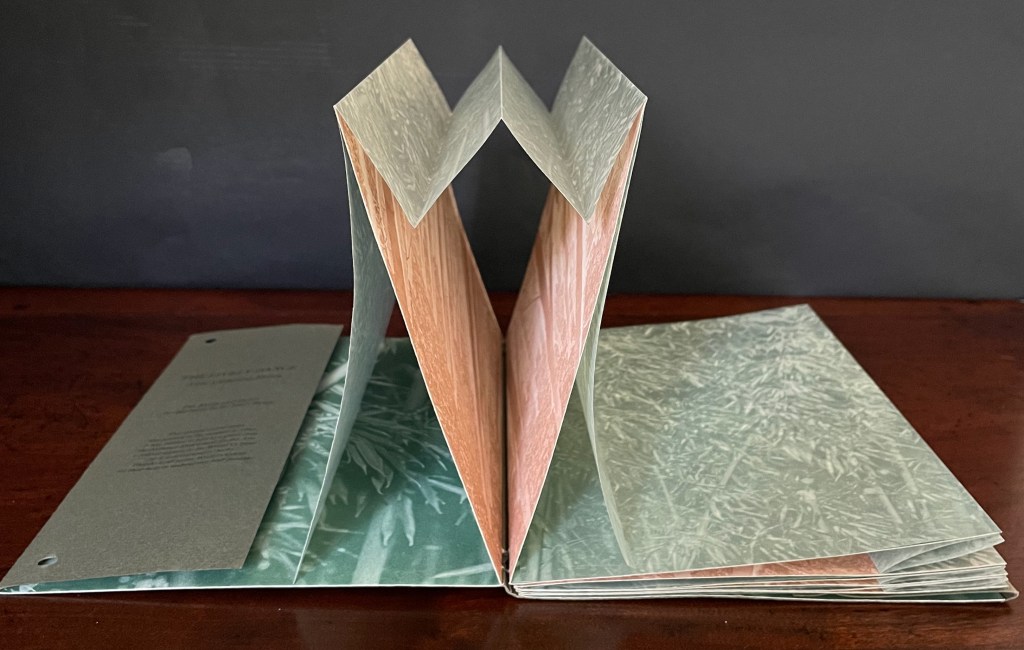
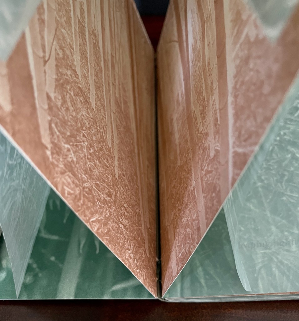
The Lively Dance is an elaborate and simple artist’s book. It consists of an eleven-line poem arranged across ten of eighteen pages displaying a stand of bamboo. Four pleated sheets of translucent paper, also displaying the stand of bamboo, overlap and bind those ten pages at the fore edge. Here is the book’s opening double-page spread with the translucent overlay first in place and then pulled back to reveal the poem’s invitation: “Come join the solemn dance”.
COME JOIN THE SOLEMN DANCE
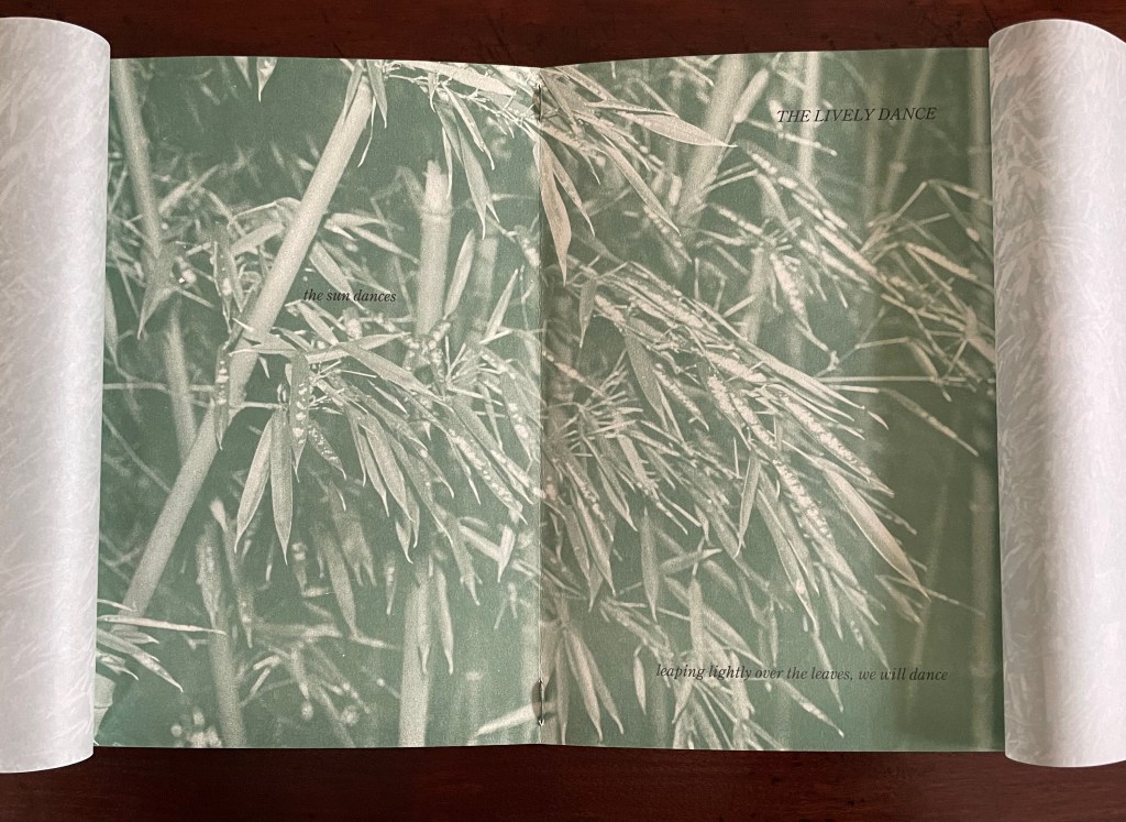
The second double-page spread with translucent overlays in place.
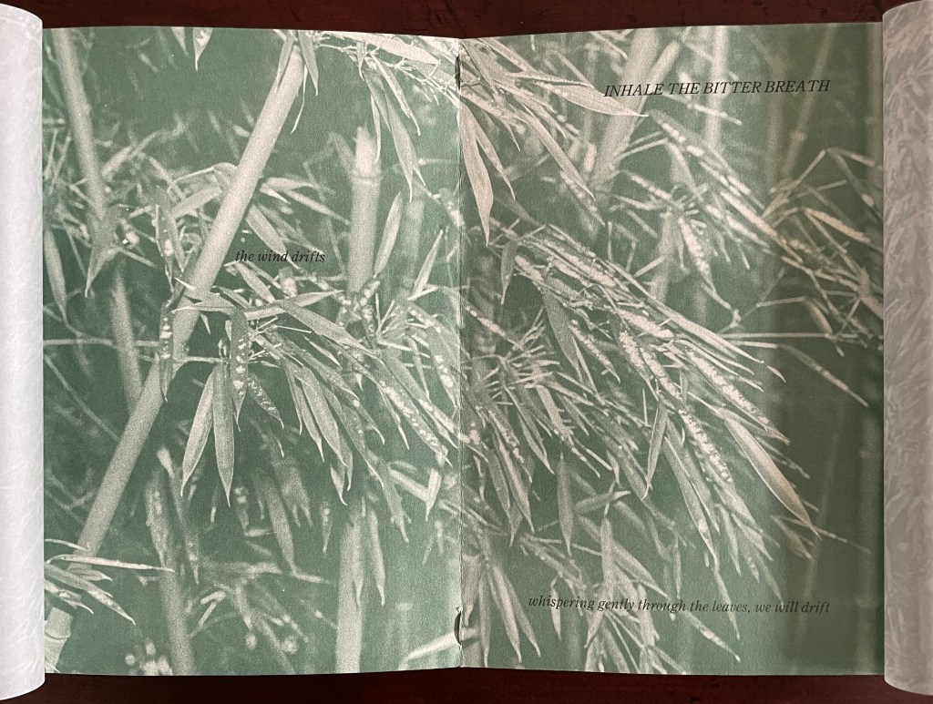
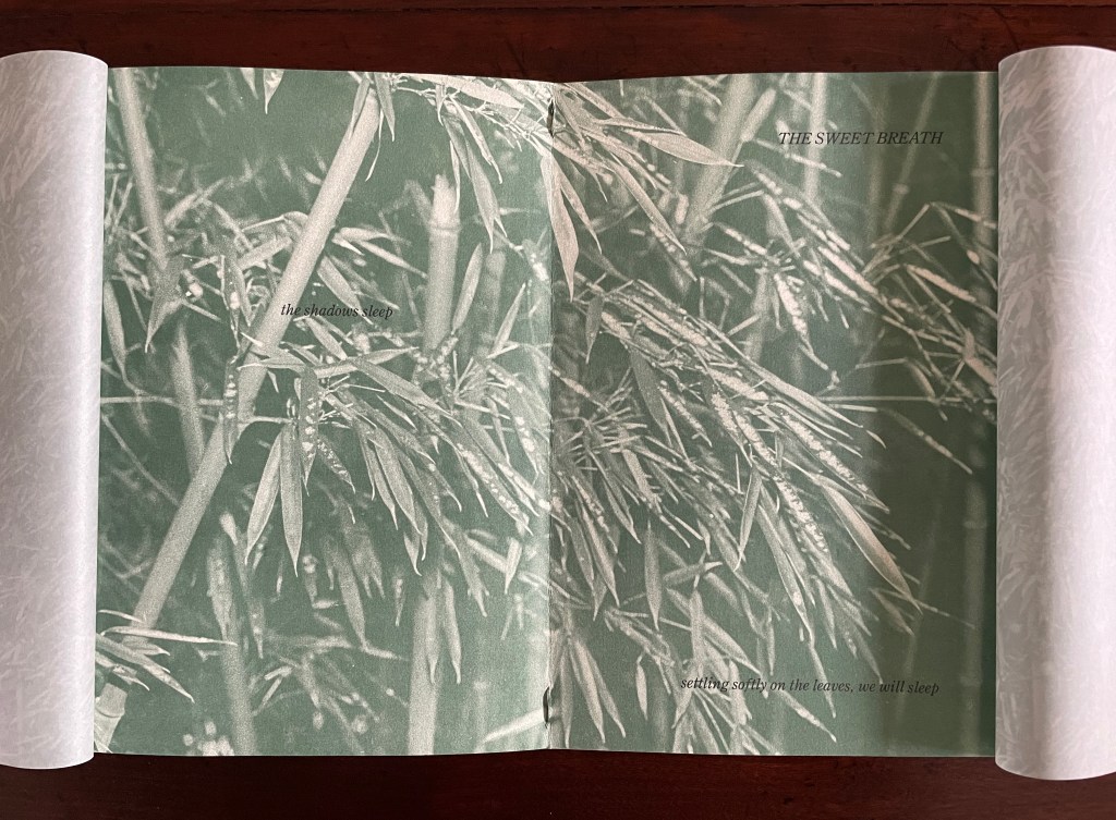
Lifting and holding back each translucent overlay, the reader/viewer may have the sense of wading into a stand of bamboo. Although each double-page spread displays the same image of bamboo, the overall impression is otherwise because the images on the translucent overlays differ from the one repeating underneath. Also slowing the perception of the sameness of that image underneath (or behind) the overlays, the text is physically and syntactically scattered. The eye jumps about to find the text and, having found it, jumps back and forth with its syntactic ambiguity. Is it that “the sun dances / leaping lightly over the leaves”, or is it that “leaping lightly over the leaves, we will dance”? Undoubtedly, it is both. If you have ever peered into the confusing density of a stand of bamboo, you will recognize that the syntactic jumping around echoes the visual jumping around as the eye tries to sort out the foreground from the background and vice versa.
THE LIVELY DANCE the sun dances leaping lightly over the leaves, we will dance
INHALE THE BITTER BREATH the wind drifts whispering gently through the leaves, we will drift
THE SWEET BREATH the shadows sleep settling softly on the leaves, we will sleep
RELEASE
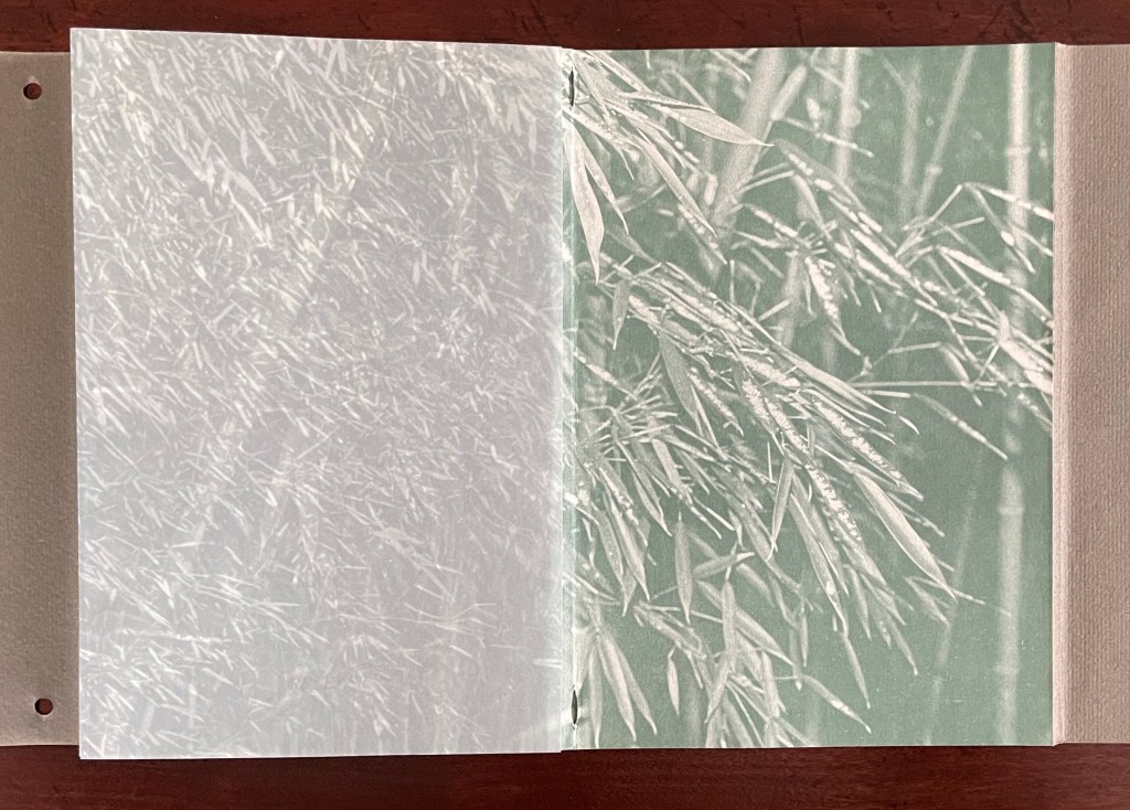
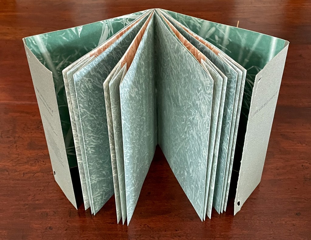
Stood upright, the book makes it difficult to access the underlying text and images, but it adds a sculptural dance that complements the memory of what has been read and viewed in codex fashion with the book laid flat. It also reveals another and crucial set of images. Closed, the book’s wedge shape created by the twig-fastened flaps gave a clue to that other set of images. Opened, the book’s pleated attachment of pairs of folios reiterated the clue to our fingers as we paged through the codex structure.
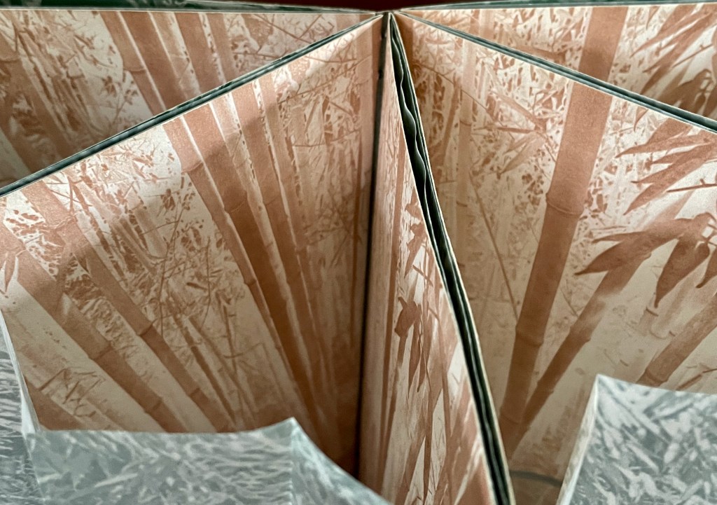
Behind the pleated translucent attachment with its faint green images of the bamboo forest, we find sepia images of the forest’s interior. Like the image on the double-page spreads, the sepia images are really only one repeating image. We can only view it from the top or bottom edge of the book. Looking down, we see the brown individual trunks or stems of the trees rising from the forest floor.
Looking from the bottom edge, we can see the forest floor.
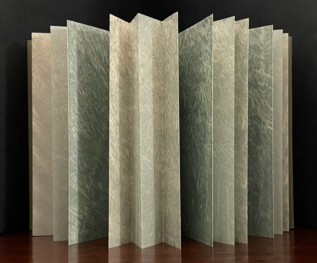
One other view or step in the dance can be had with the upright display. If the cover flaps are refastened to bring the book into a star book display with the translucent overlay’s pages pulled out and its pleated edges pinched together, we have the dense stand of bamboo in the round with its sepia interior hidden away.
By now, all this playing with the codex laid flat and stood upright will have prised apart the text and perhaps reminded the reader/viewer of the meaning of other woods “lovely, dark and deep”.
Fallen describes The Lively Dance on her website here. Among her observations on her site, she notes that her house is surrounded by bamboo. Except for one entry displaying snow on bamboo, The Lively Dance seems to be her primary artistic celebration of it. It is a celebration that provides a dual personal pleasure in the collection. When I am exploring the book, I am reminded of the local stand of bamboo and its density. When I am passing the bamboo on the daily dog walks, I am reminded of The Lively Dance.
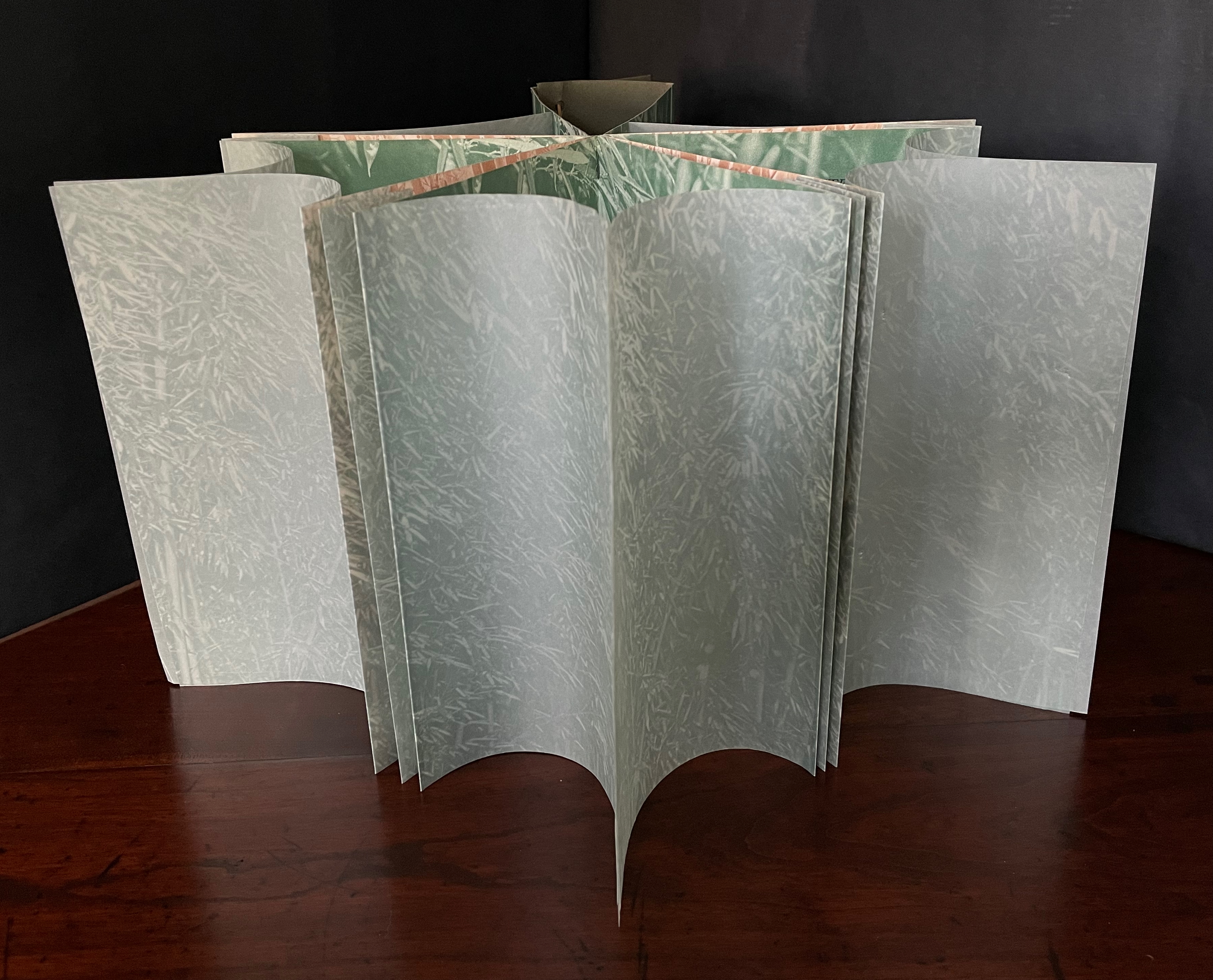
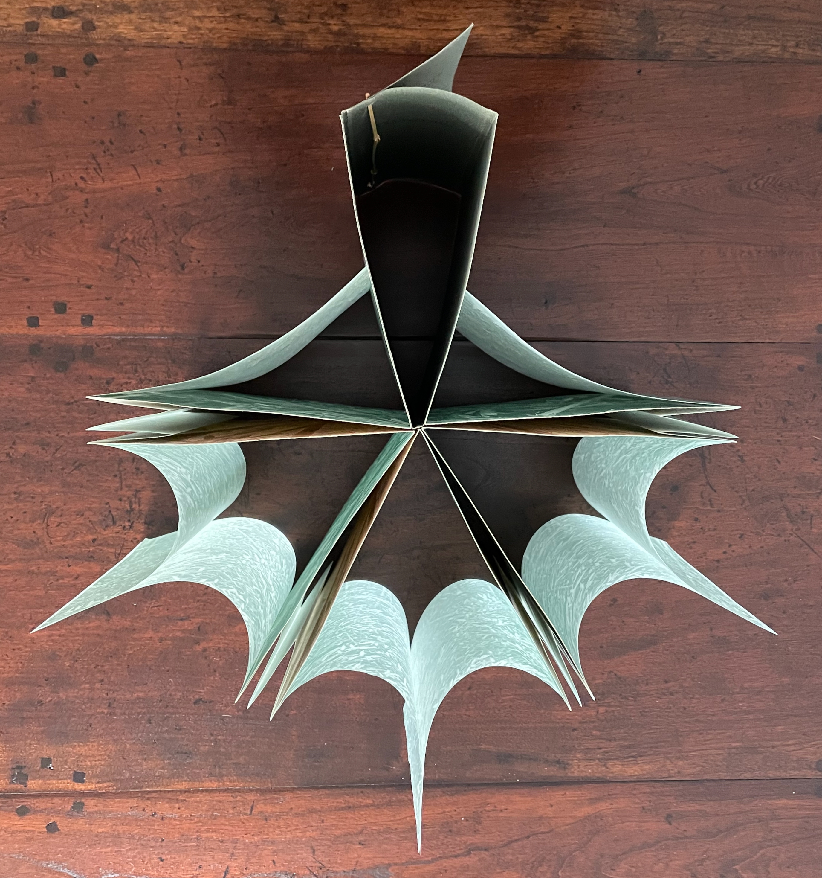
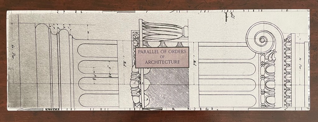
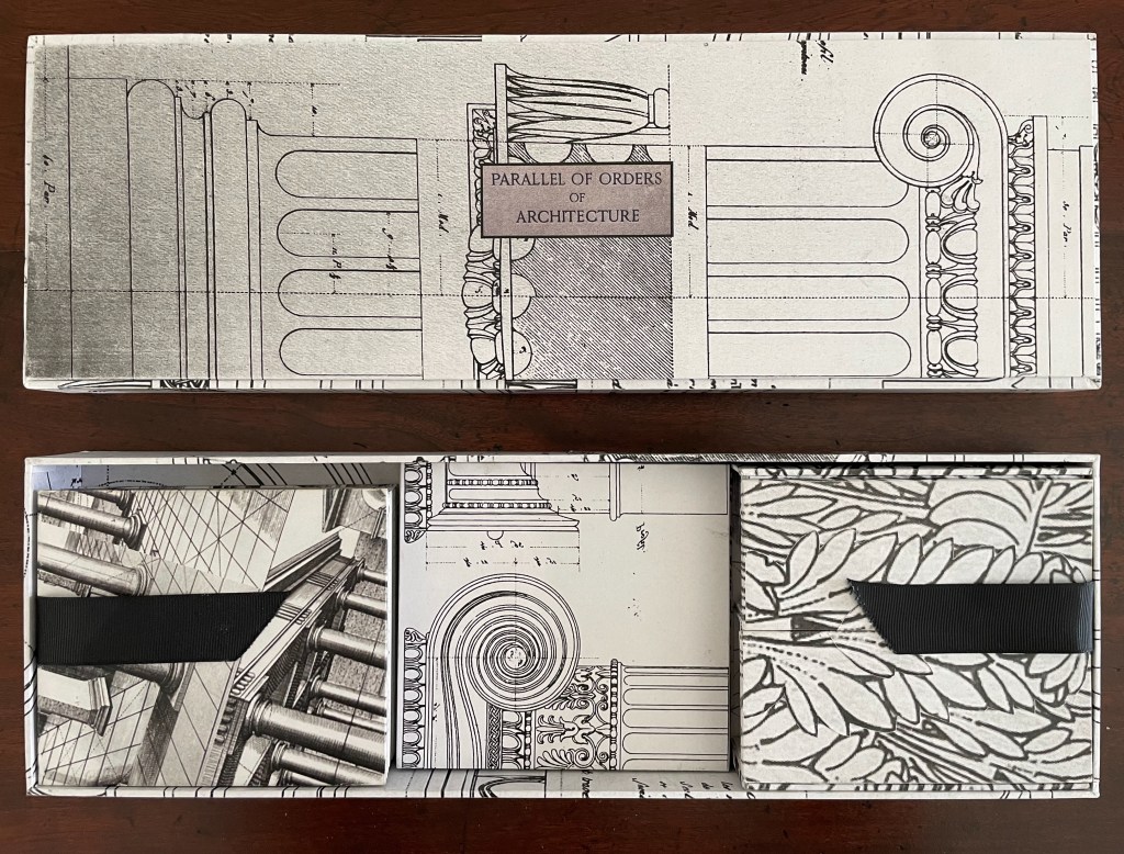
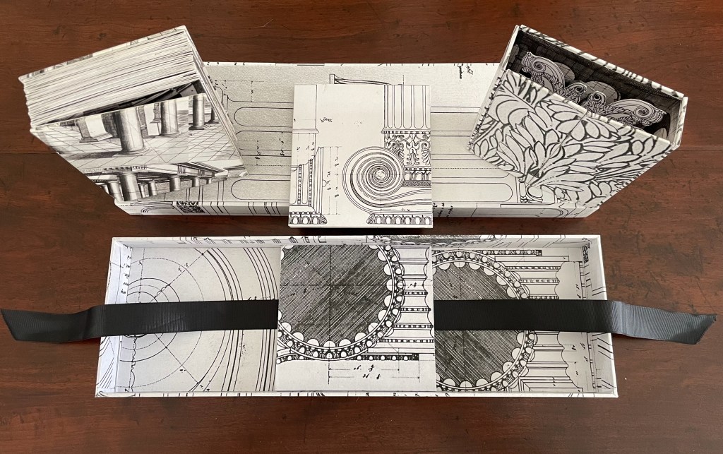
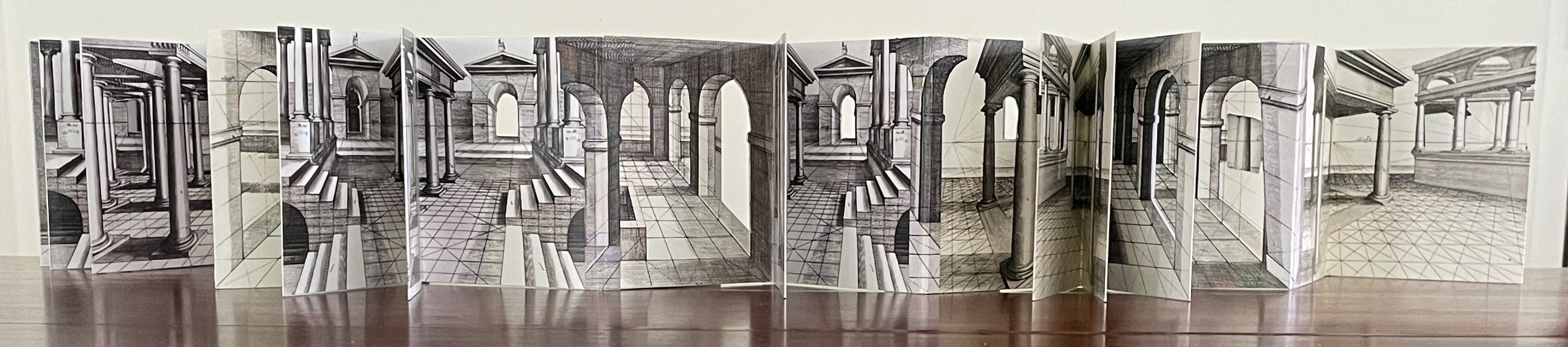
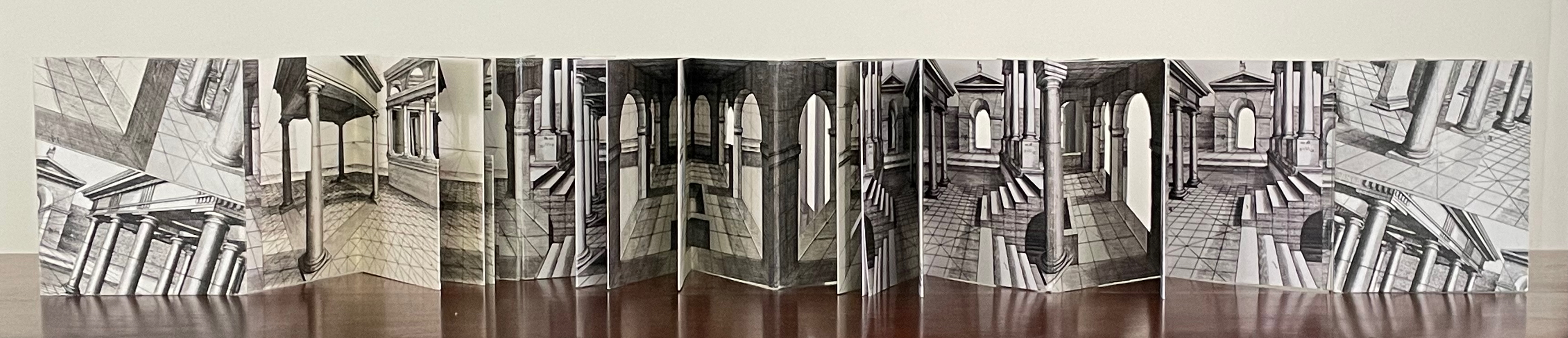
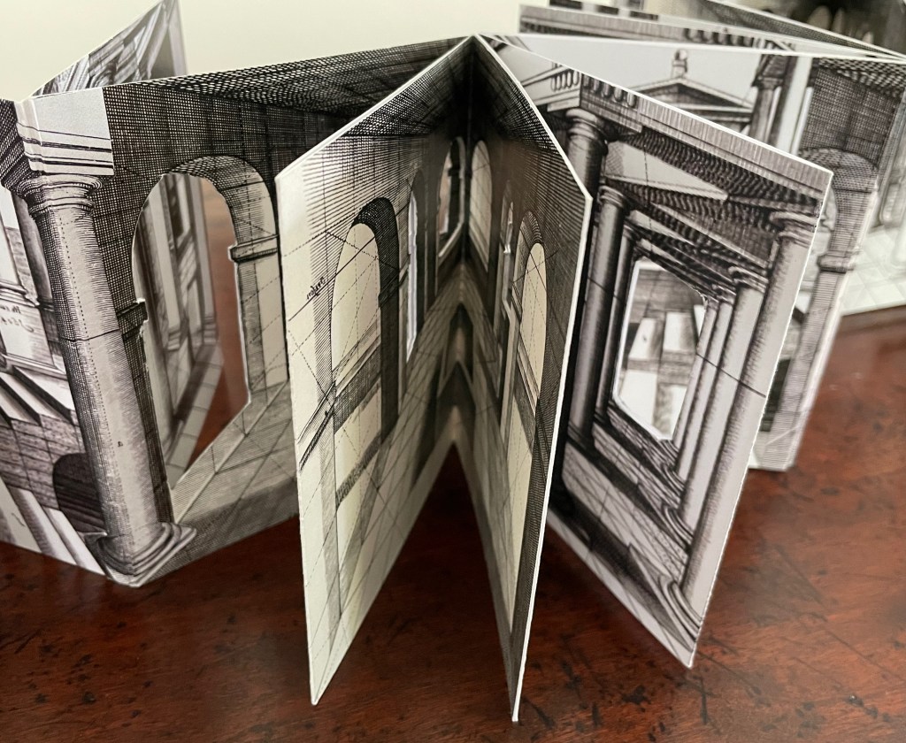
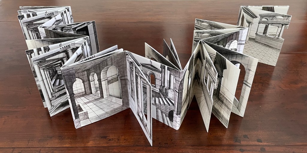
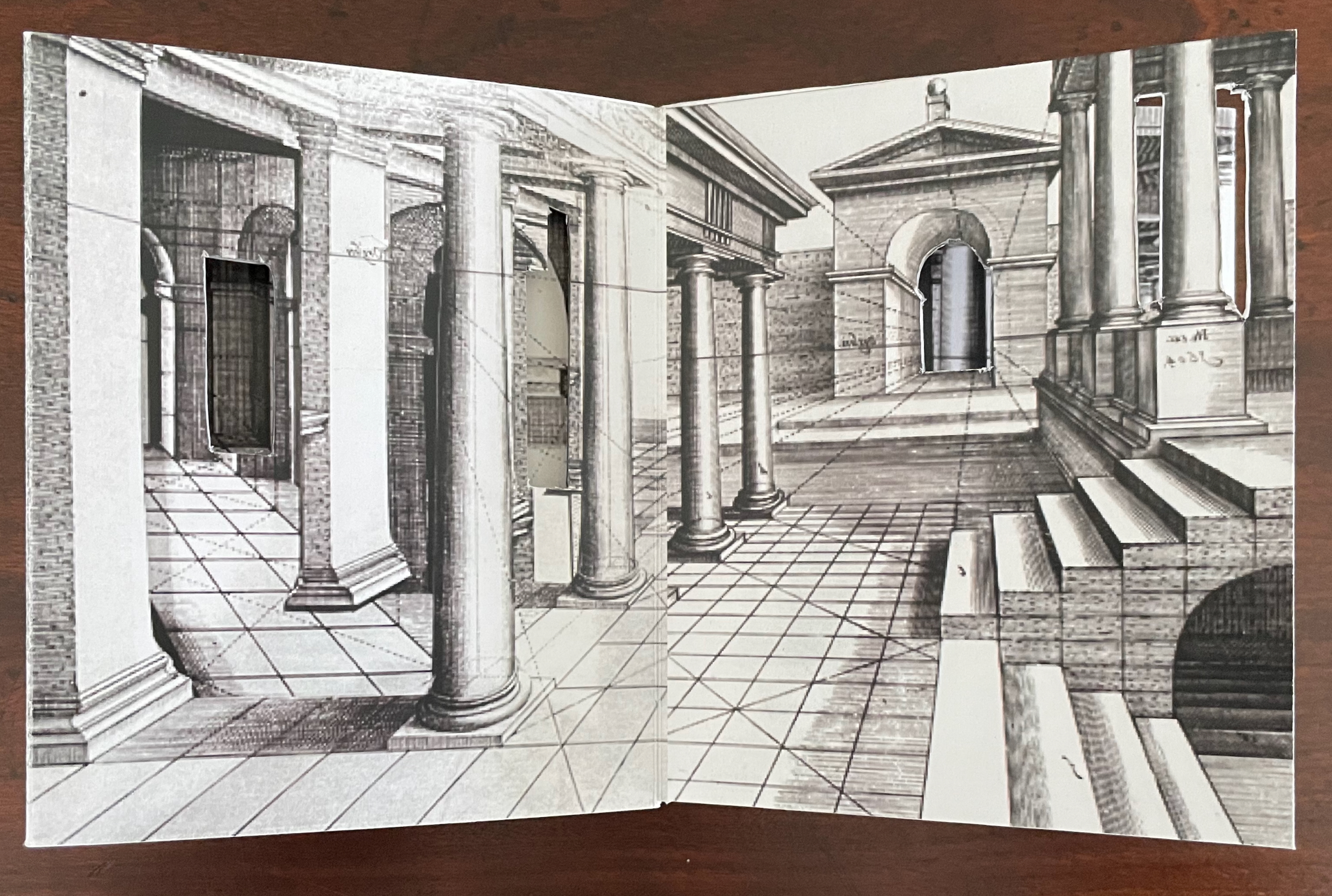
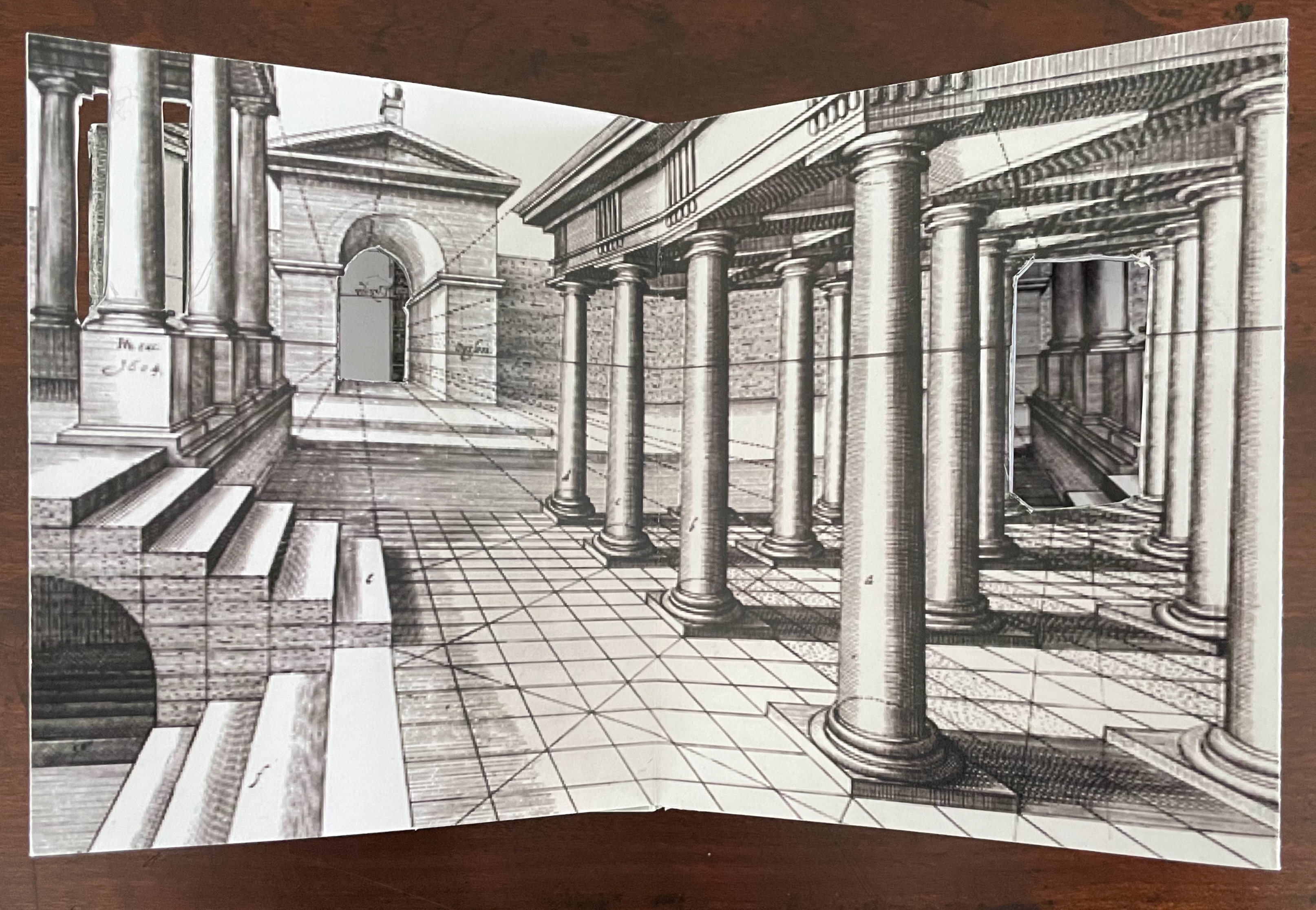
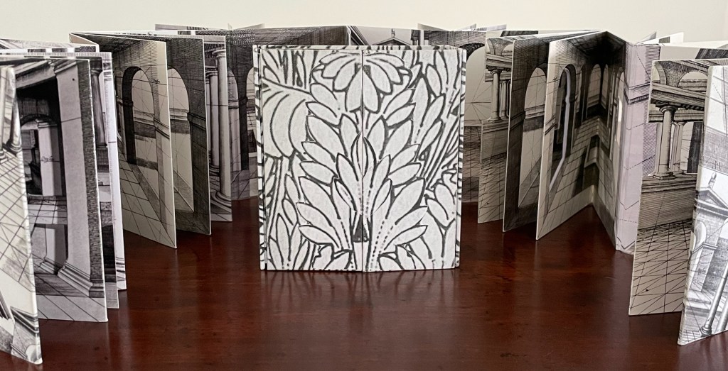
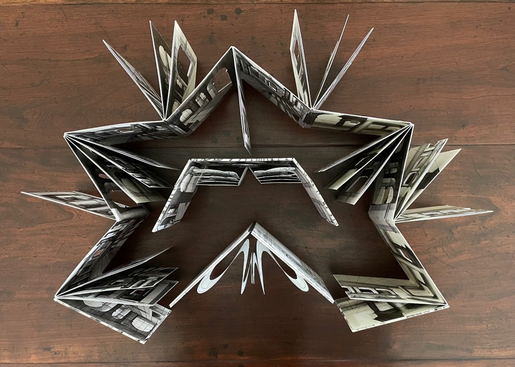
Parallel Orders of Architecture (2024) Tony Broad Box with illustrated paper over boards with title board pastedown on top; enclosing three volumes. First volume: double-sided accordion with single- and triple panel inserts. Second volume: pop-up between illustrated paper over boards with magnet closure. Third volume: pop-up within French-fold box covered with illustrated paper over boards with magnet closure. Box: H137 x W413 x D45 mm. First volume: H130 x W110 x D30 mm. Second volume: H130 x W120 mm. Third volume: H130 x W120 x D38 mm. First volume: 60 panels. Second volume: spiral pop-up. Third volume: 4-layer pop-up. Unique. Acquired from the artist, 23 July 2025. Photos: Books On Books Collection.
Tony Broad’s Parallel Orders of Architecture (2024) consists of three differently structured volumes enclosed in a handmade illustrated box. The first is a double-sided accordion with single- and triple-panel inserts on both sides. The second is a single-panel pop-up book. The third is a variant on the tunnel book. With the raised outlay on its cover and the platformed interior, the box offers yet another order of structure that runs in parallel with the architectural orders from which Broad draws his inspiration.
Top of cover and interior of box.
The three volumes placedd atop box cover; empty interior of box.
The three works: accordion, pop-up, and modified tunnel book.
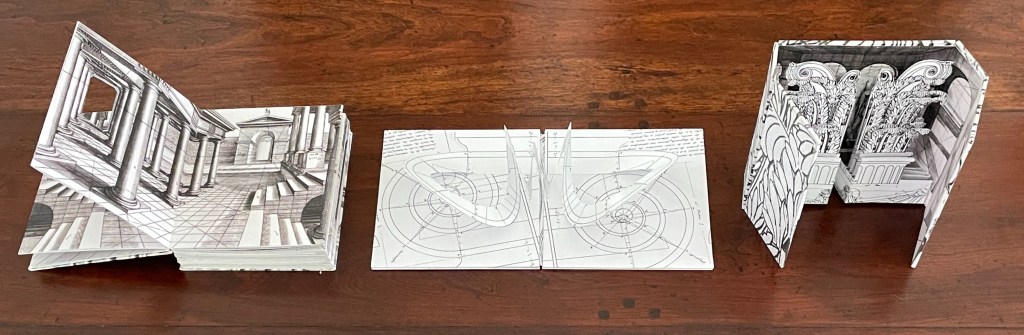
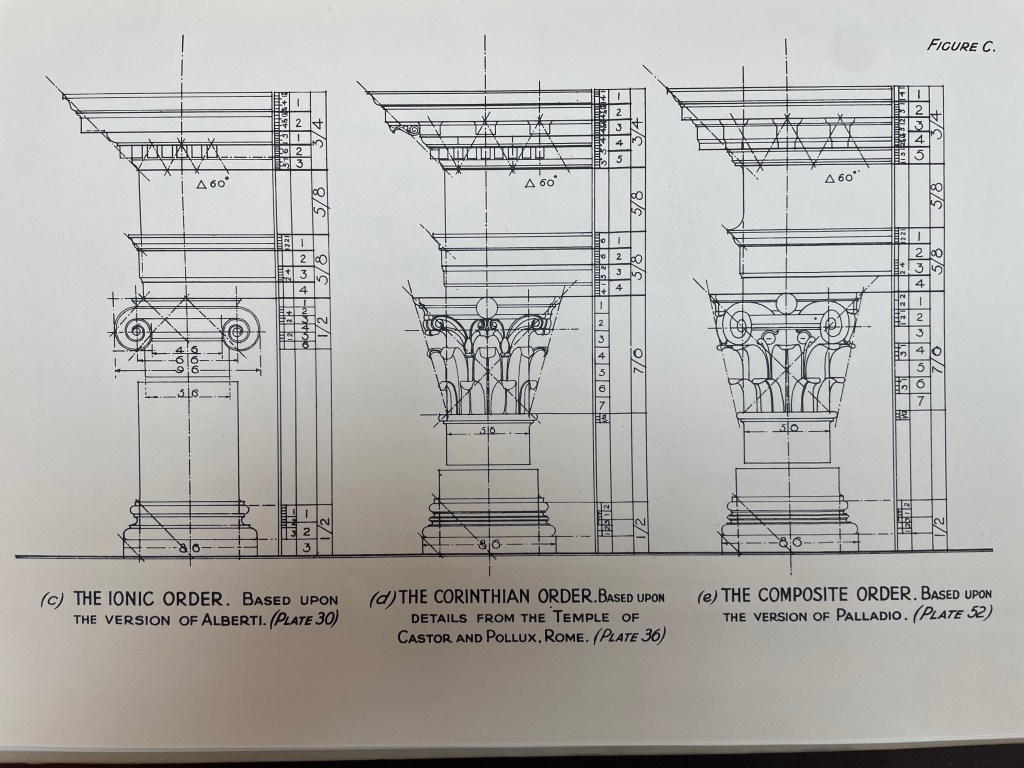
The kaleidoscope of perspective and viewpoints offered in the accordion volume echoes the effects of Giambattista Piranesi’s Carceri d’invenzione (1745-61), especially those in the second edition. Where Piranesi invented his architectural fantasies with pen and burin, Broad relies on collage with reproductions and on book structure. For the collage work, he reproduces prints from Perspective (1604-05) by Jan Vredeman de Vries and A Parallel of the Orders of Architecture (1936) by Charles Normand.
Broad’s sources of inspiration and images: left column, Charles Normand’s A Parallel of the Orders of Architecture; right column, Vredeman de Vries’ Perspective.
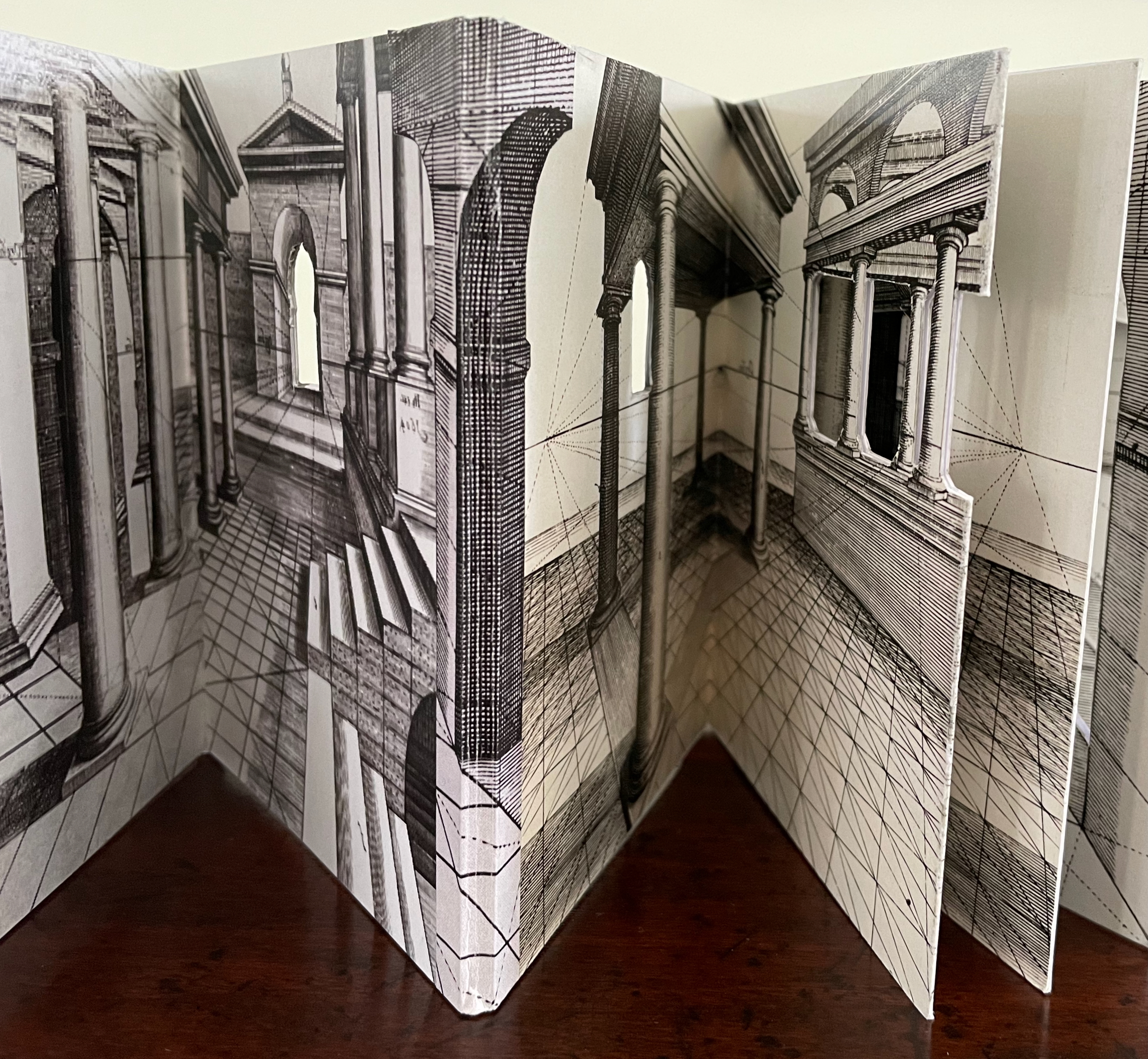
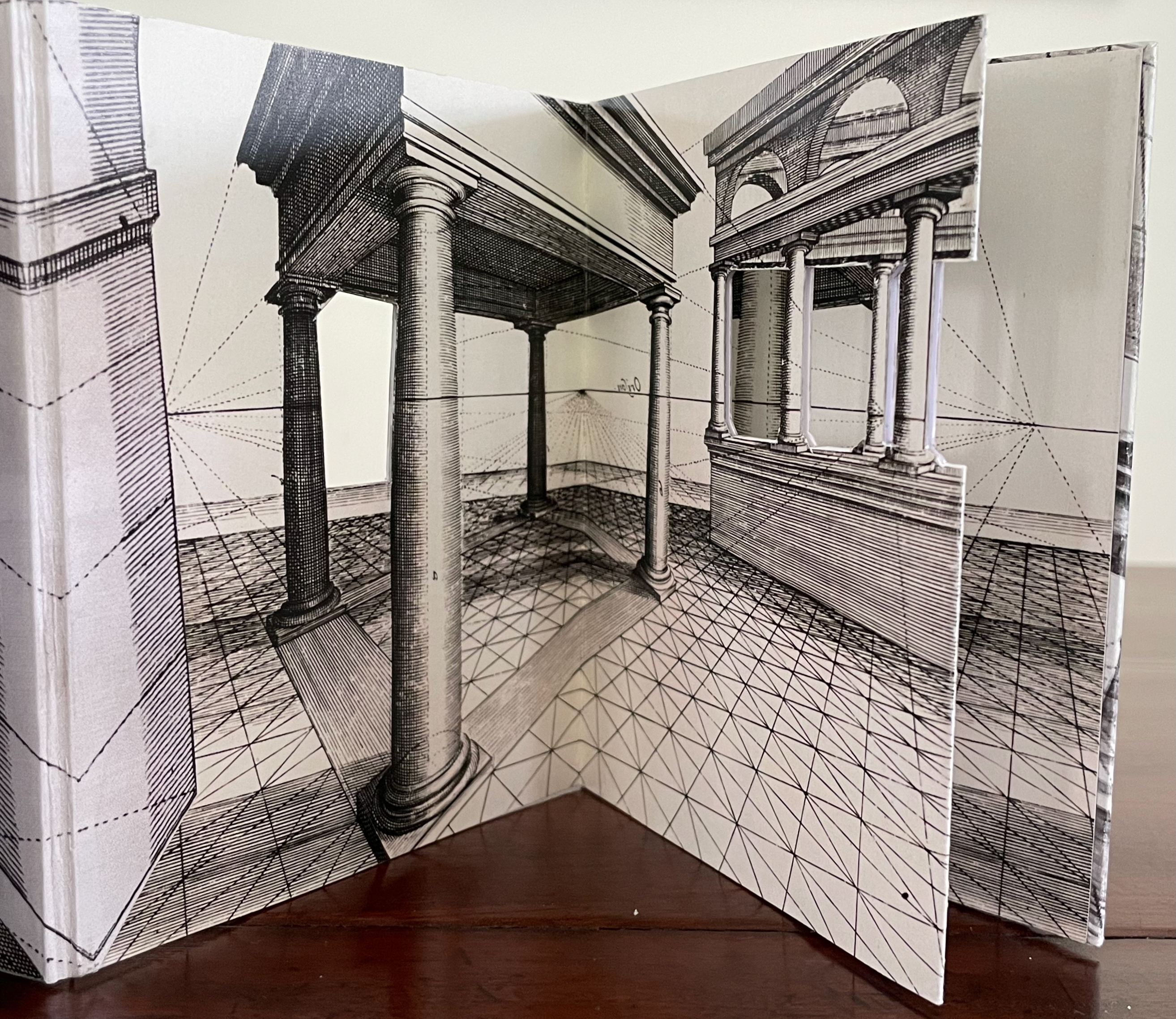
The accordion’s panels and its inserts play with Normand’s and Vredeman’s illustrations to generate labyrinthine and impossible structures. Staircases disappear. Valley folds sometimes reinforce, sometimes defeat, vanishing points. Arches wrap over mountain folds, coming forward and receding at the same time. Cutouts and notches in the panels multiply the views, but what can be viewed through the cutouts are parts of other panels whose perspectival lines sometimes extend, sometimes clash with, those of the framing cutout.
Front and rear views of the extended accordion book.
Center: valley fold reinforcing the vanishing point. Left and right: cutouts giving onto contrasting views.
Arches wrapping over mountain folds. Notch emphasizing horizon line.
The placement of single- and triple-panel inserts adds additional asymmetry. On the front of the accordion, moving from left to right, we have an insert sequence of triple-triple-single-triple-single. On the reverse side, moving in the same direction, we have a sequence of single-triple-triple-triple. Whether perceived by turning the accordion pages codex-style or viewing their extension from above, the asymmetry of the inserts runs parallel to a symmetry of recurrent spreads and a mirror-image symmetry created by image reversal.
Asymmetry of panel inserts seen from above.
Mirror-image symmetry.
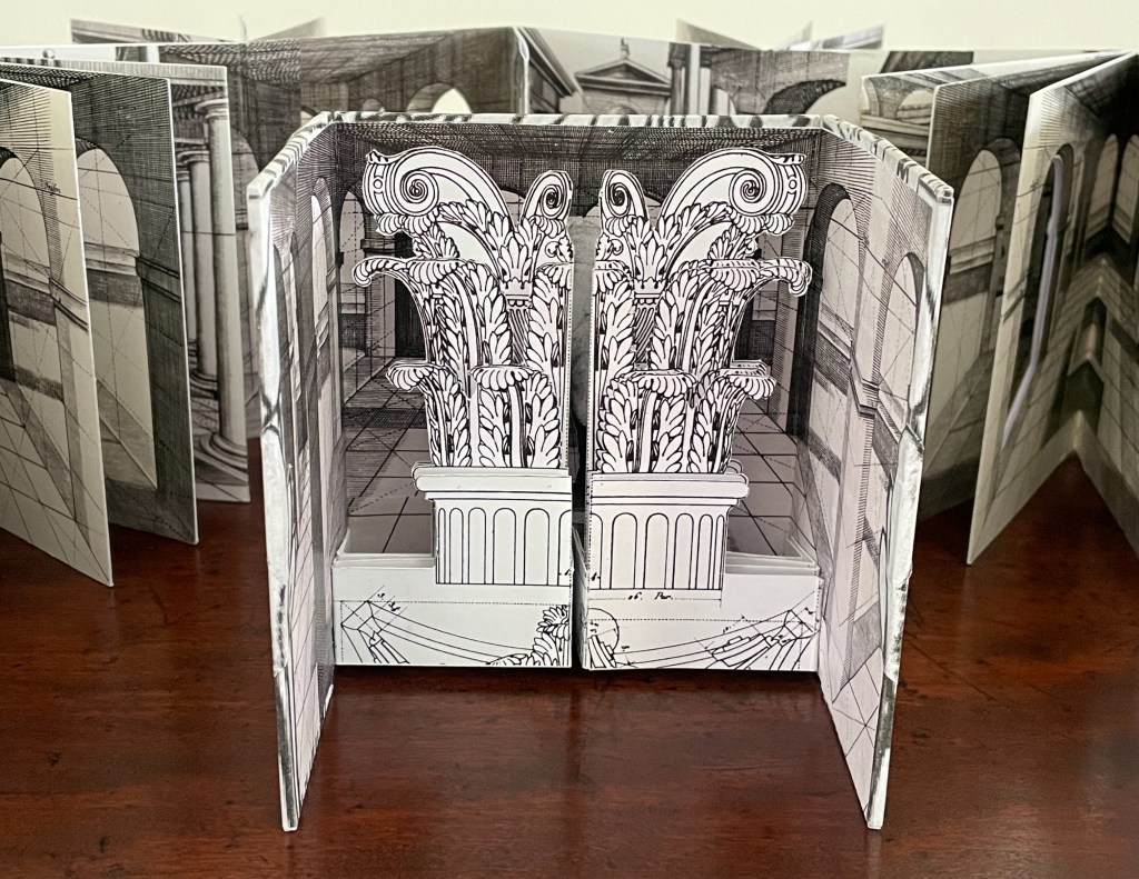
The second and slimmest of the three books turns attention to columns, with its front cover displaying half of an inverted base of a Composite Order column alongside half of a capital of an Ionic Order column. When the magnetically sealed front and back covers are prized apart, a complete Ionic capital pops up, or at least the suggestion of one created by the joining of cross-sections of two volutes.
Second volume displayed against a background of the first volume.
Ionic capital pop up.
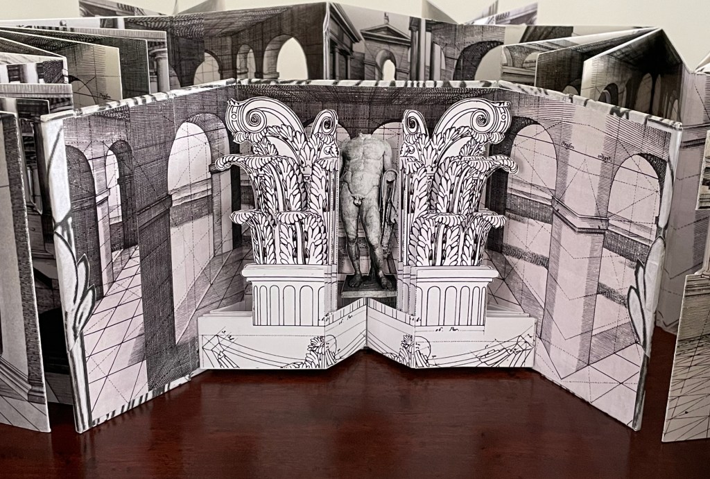
The third volume, displayed here against the first volume extended, highlights the Corinthian Order with the acanthus leaves and stalks that decorate its capitals.
Third volume displayed against background of the first volume.
When the magnetically sealed French fold cover opens, the Corinthian capital appears in two halves that will spread apart to reveal in tunnel-book fashion a headless Greek or Roman statue. The double visual pun on the leaf-covered capital hiding the caput-less but still well-endowed fig-leafless statue adds to the delight at the tunnel book’s action.
The Corinthian capital.
The Corinthian capital split to reveal a caput-less and figleaf-less statue.
The views available by rearranging the accordion book on its own or by arranging displays with the other two books seem endless. Having received the
Broad’s plinth box and three artist’s book structures underscore his parallels of symmetry and asymmetry, his visual puns, and his originality. Parallel Orders of Architecture deserves its own slowly rotating plinth to offer maximum.
Recipient of the UK Society of Bookbinders’ John Purcell Award, 1st Prize, in 2024,
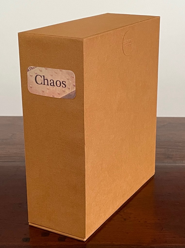
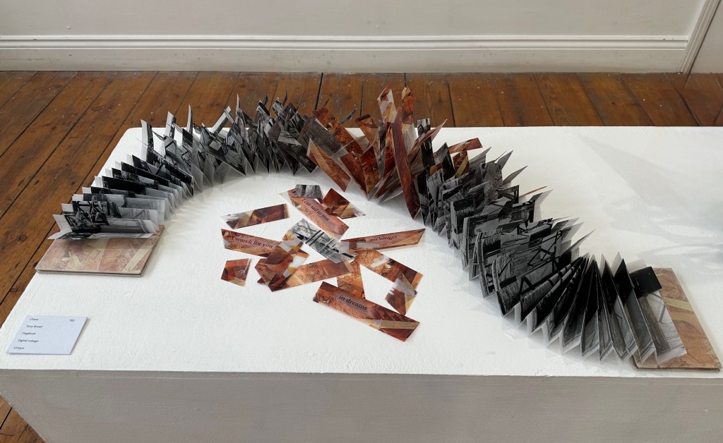
Chaos (2023)
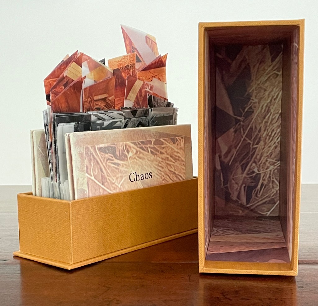
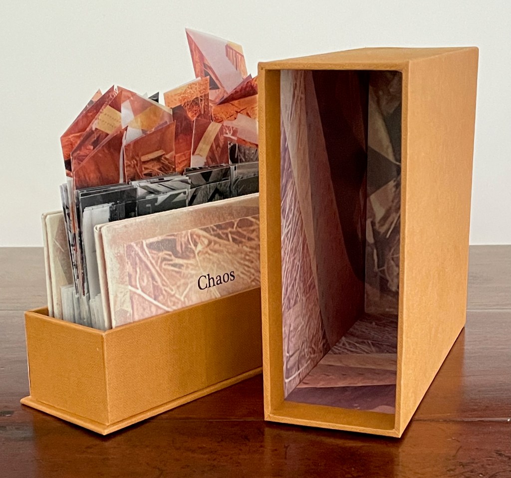
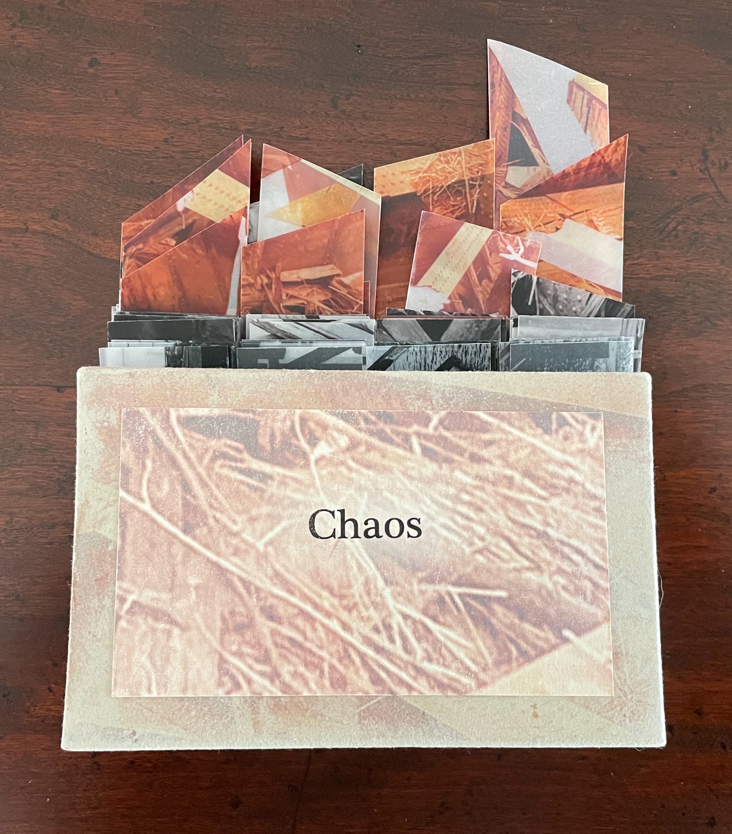
Chaos (2023) Tony Broad Box: H200 x W170 x D70 mm. Modified flagbook: H145 x variable W90-180 mm. 44 folds. Unique. Acquired from the artist. 23 July 2025. Photos: Books On Books Collection.
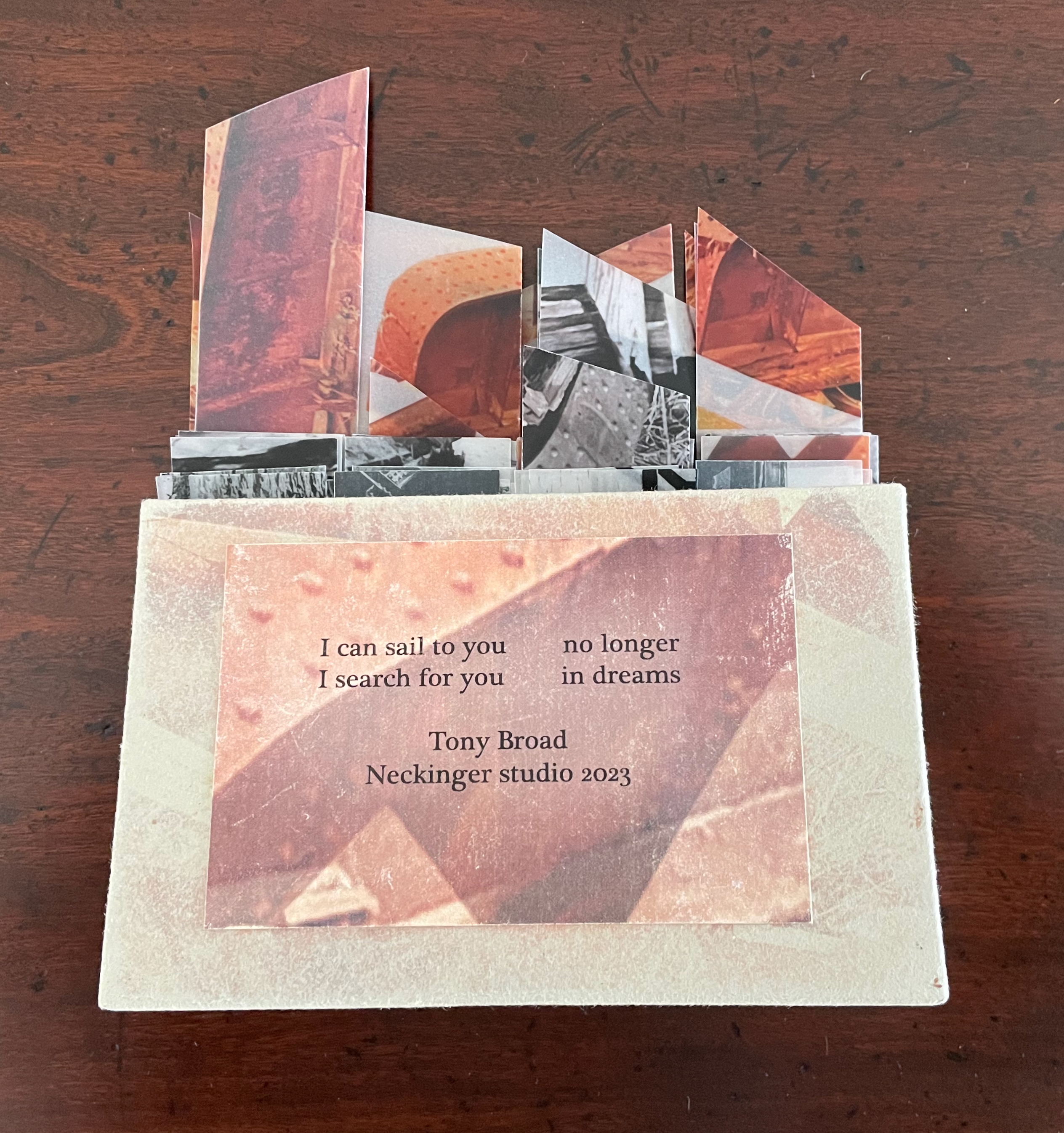
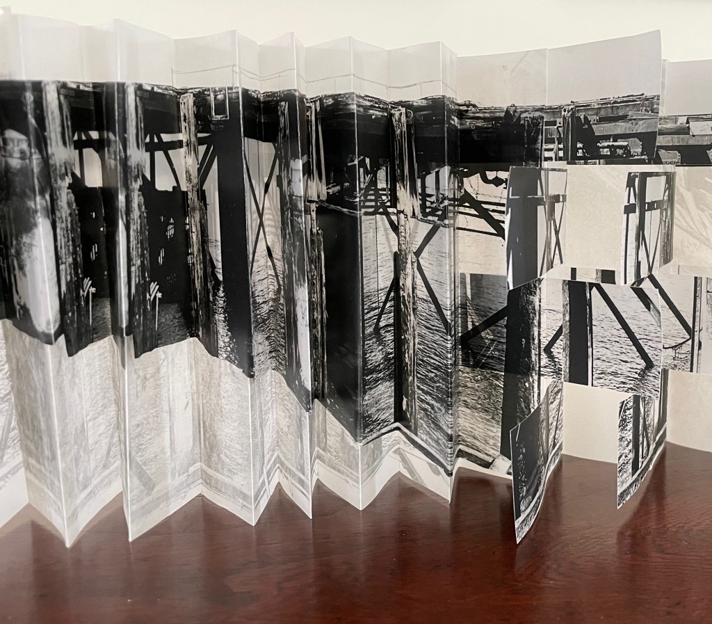
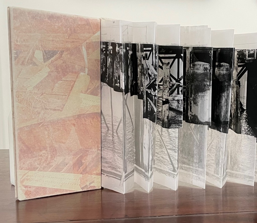
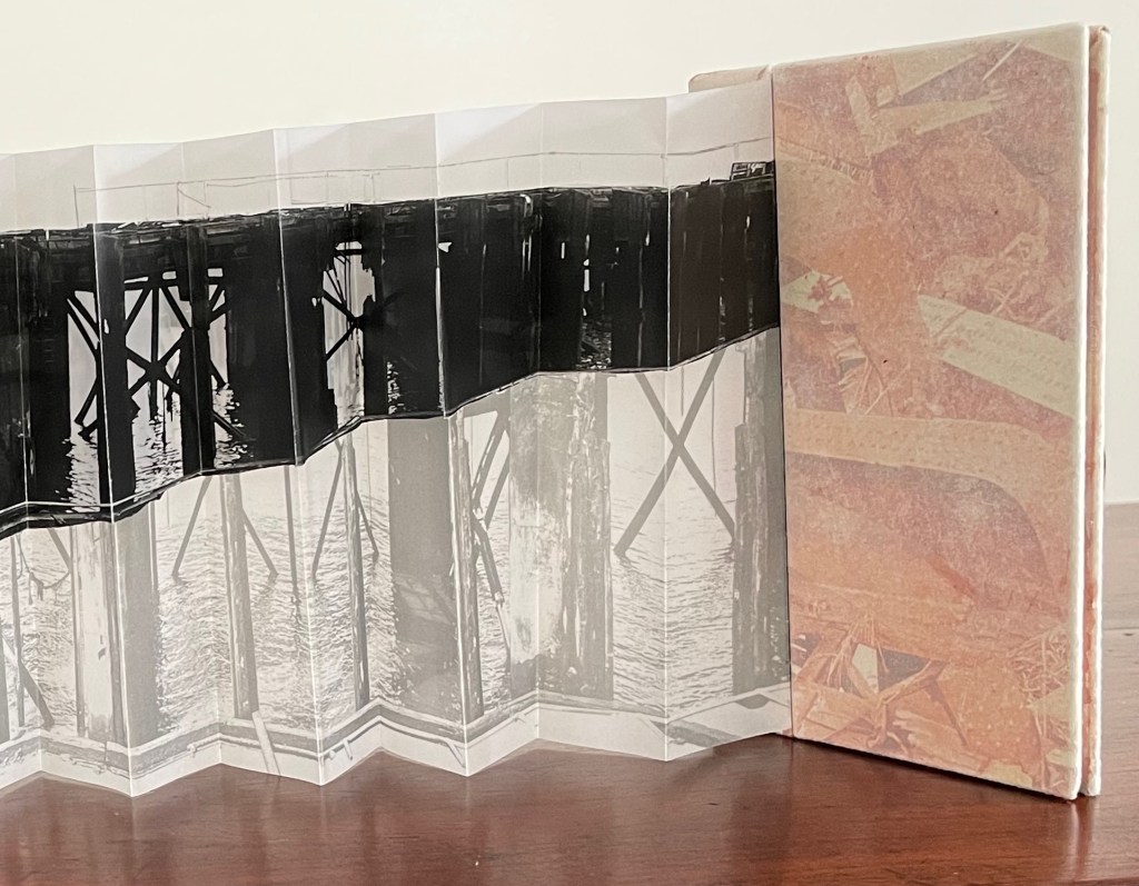
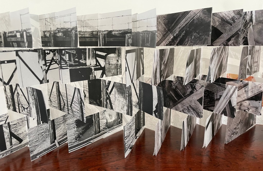
Similar to the paradox of symmetry and aysmmetry in The Parallel Orders of Architecture, Broad’s next work offers us chaos — simultaneously contained and exploding, bound and unbound, intact and shattered, in color and black-and-white, linear and cyclical, dark and translucent. It contrasts a derelict pier (Hotwells Dock in Bristol) with a working pier (parallel to Glaisher Street, upstream from Deptford Creek, London).
Front cover and back cover.
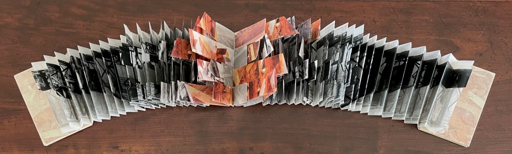
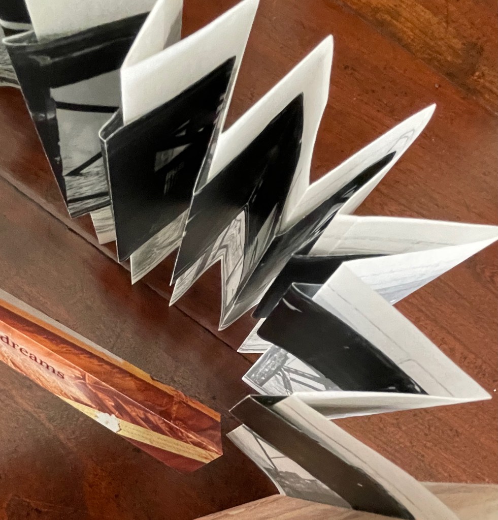
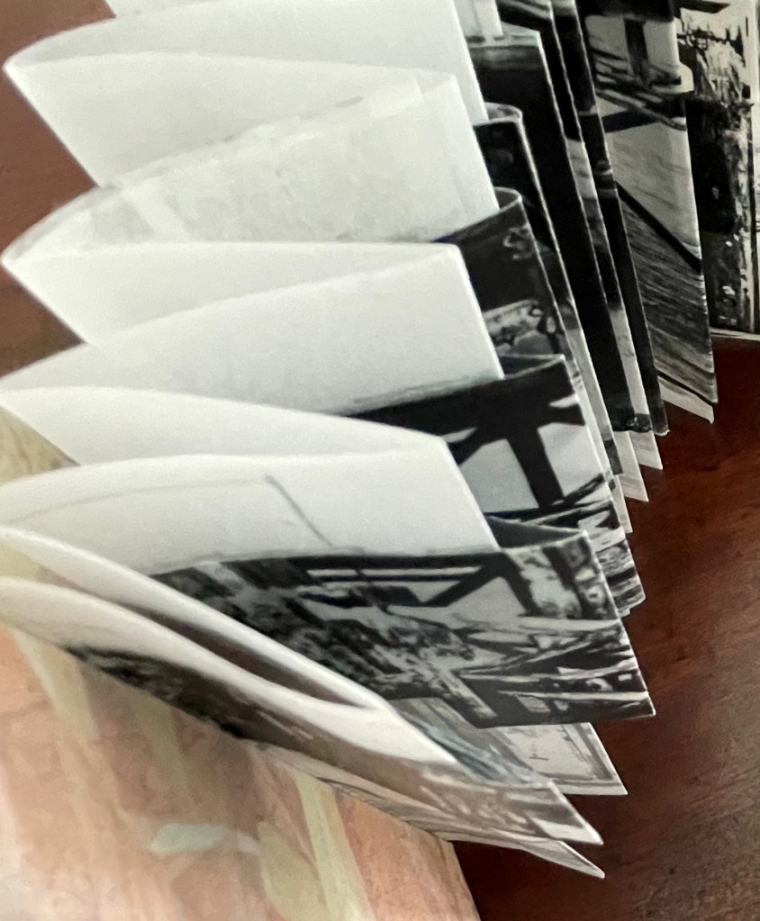
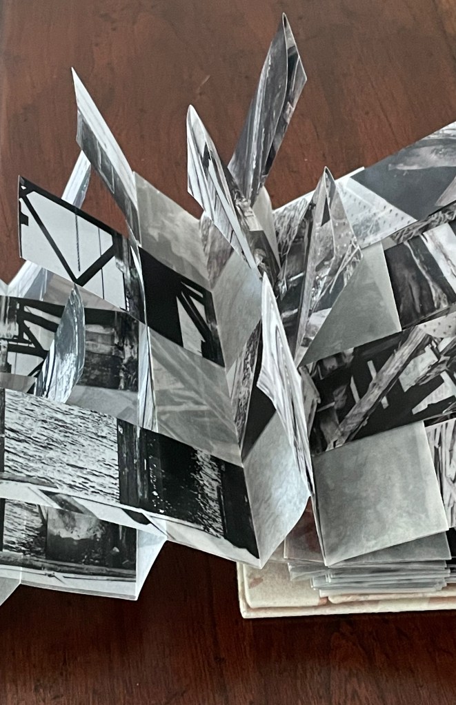
Broad blends artist’s book structures in Chaos. An accordion of translucent parchment anchors the construction from the front cover to back cover. From either end, another accordion, cut on a slant, overlays the translucent accordion. Both the overlying and underlying accordions depict the working London pier. Images of the derelict Bristol pier occupy the orange-tinted center. Midway to that center, the overlaid accordion yields place to a modified flag book structure, which eventually takes over the center of the book.
Chaos extended.
Details of the darker cut accordion folded over the lighter parchment accordion.
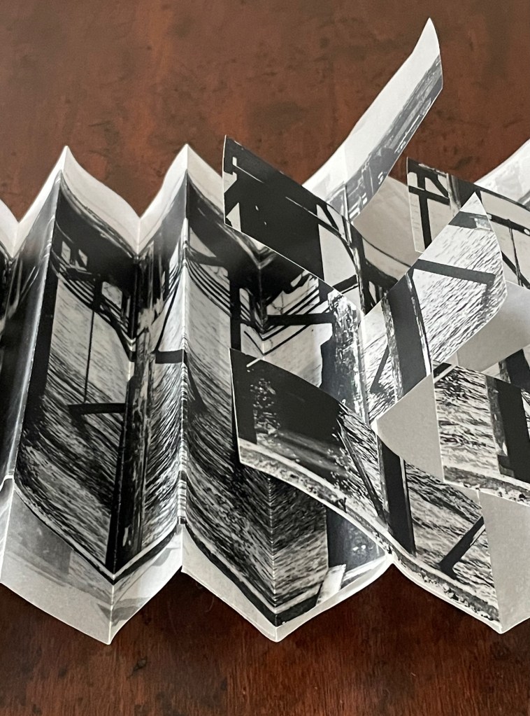
The point at which the layered accordions shift into a four-row flag book.
The flag book structure is well-suited to weaving multiple impressions together. The layered accordions build up to this ingeniously with multiple impressions of their own. Their images of the working pier are not aligned, so already we have multiple impressions. Also, from the center of the book, we have a split-view perspective, looking out to the end of the pier simultaneously on the left and on the right.
Split-view perspective. Detail from front cover moving right; detail from back cover moving left.
After the two layered accordion books become a four-row flag book, Broad introduces another effective transformation. As the structure approaches the center, a horizontally folded flag replaces the single-sheet flag in each of the four rows. In addition to intensifying the imagery, the combination draws further attention to the downward view into the water and the outward view to the end of the working pier.
The point at which the single-sheet flag shifts to a horizontally folded flag.
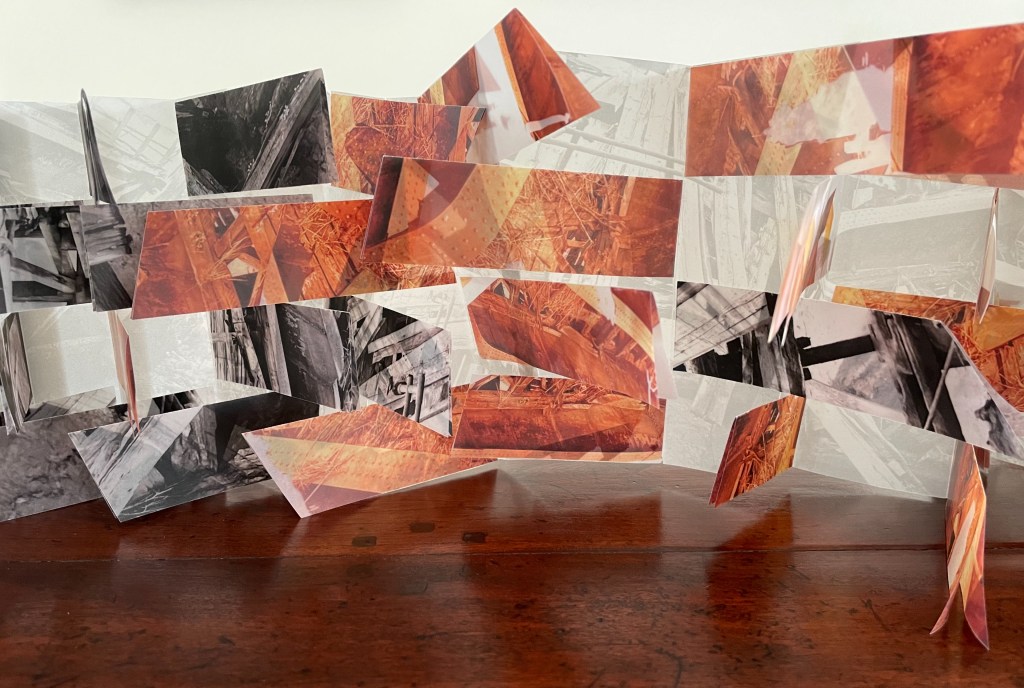
Broad does not stop there. At the center of the book, where the orange-tinted images of the derelict pier appear, he introduces angular folds and cuts. These have the effect of chaos exploding from the center of the book.
Harmonic chaos, chaotic harmony?
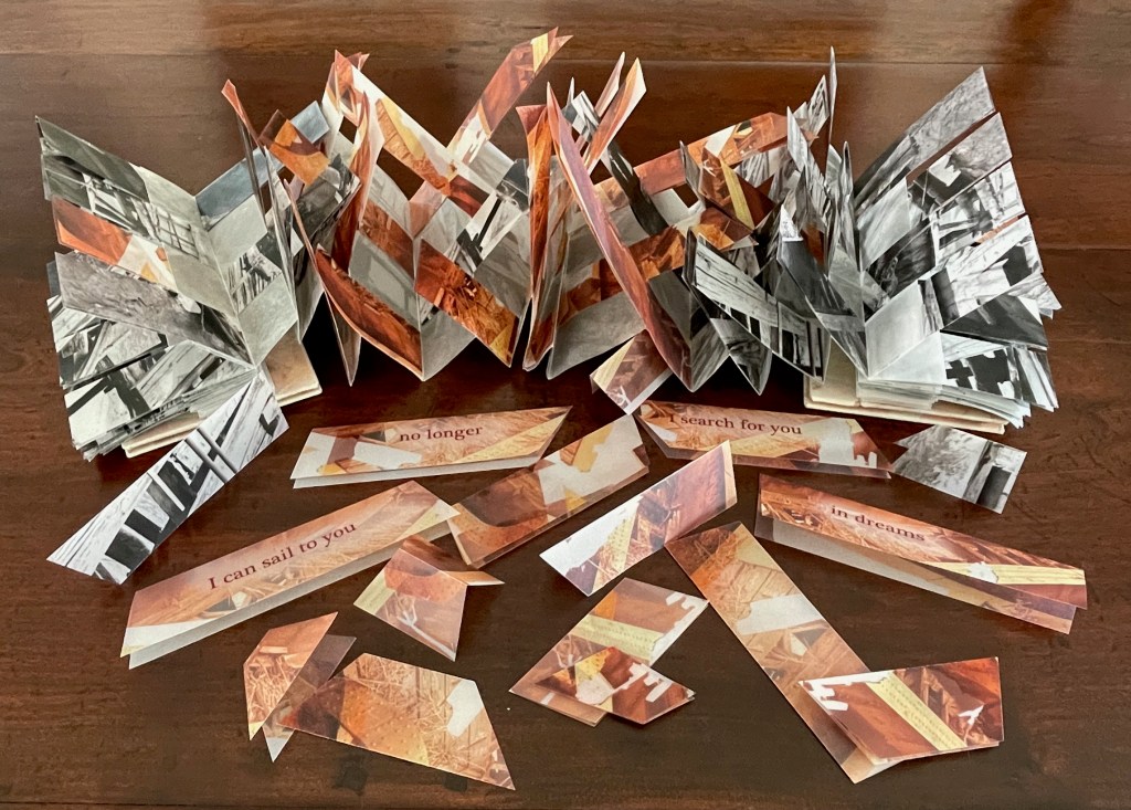
Finally, Chaos comes with an envelope of offcut shards to be scattered as display permits. Some of the shards bear the words from the book’s outside back cover, which gives the overall structure and its contrast of the two piers an enigmatic emotional coloring. The viewer wonders whether the author/artist once stood at the end of the now derelict pier and now stands in dreams at the end of the working pier.
Photo: Courtesy of the artist.
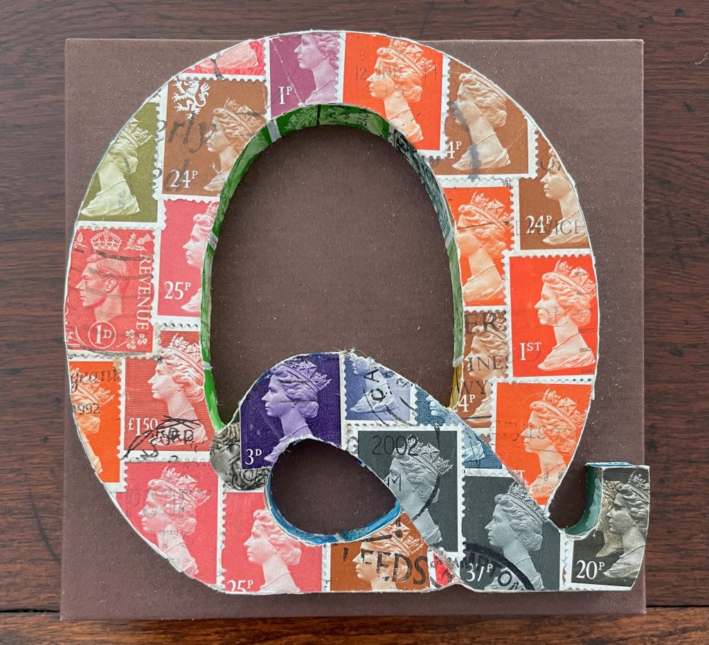
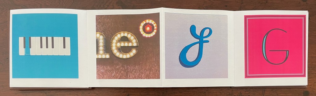
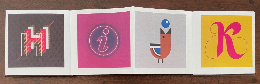
36 Days of Type (2019)
36 Days of Type (2019) Tony Broad Accordion with hardcover and raised letter Q. 110 mm square, D20 mm. [38] panels. Acquired from the artist, 23 July 2025. Photos: Books On Books Collection.
A welcome addition to the collection’s artists’ books inspired by the alphabet.
Key of D, electric e, flourishing f, and geometric g.
Holographic H, incandescent i, blue j, and kingly k.
Within Every Room There is an Echo of the First (2018)
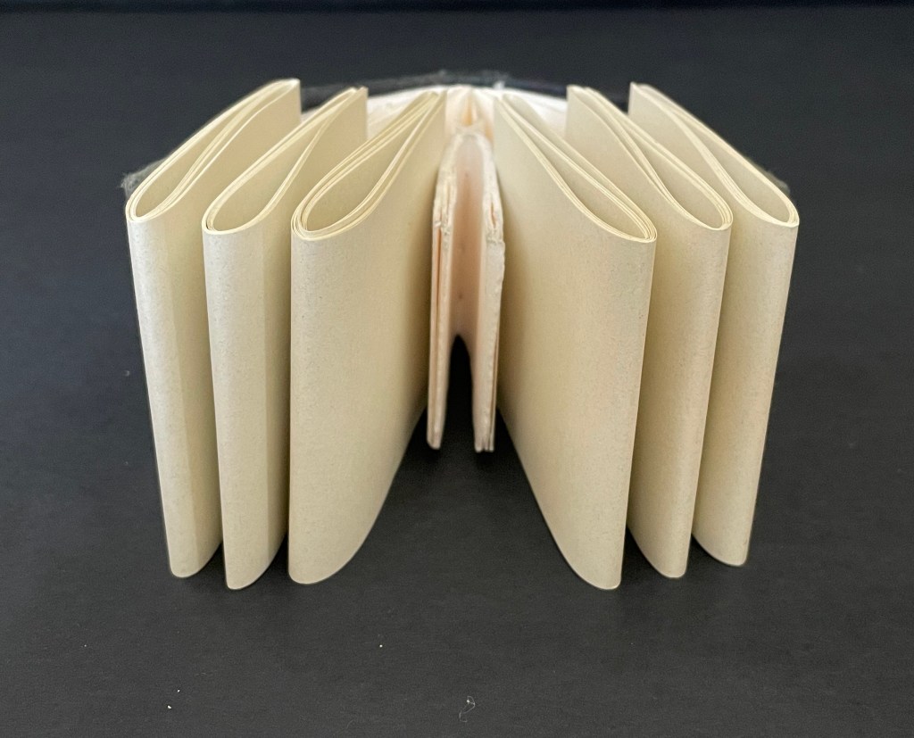
Within Every Room There is an Echo of the First (2018) Sarah Maker Diagonally halved box, painted-paper over millboard, paste paper. H65 x W65 x D65 (closed) mm, W730 (extended diagonally) mm. [45] panels Unique. Acquired from Ink and Awl, Seattle, US, 10 December 2025. Photos: Books On Books Collection. Displayed with permission of the artist.
This small sculptural artist’s book that enacts its title is an engineered accordion with architectural pencil drawings on paste paper. Every aspect is remarkable. The millboard “cover” is a diagonally halved cube that forms the “corner” of the room from which its echoes will unfold. The accordion spine consists of folded tabs into which the pages are pasted. The pages have been shaped so that as the book is opened (the top page being pulled by its tab), they curve against each other like artichoke leaves and then spread as the angled spine pleats push them outwards.
The engineering recalls the ingenuity of Benjamin Elbel, Ed Hutchins, and Hedi Kyle, and Within Every Room exemplifies what happens when “material meets metaphor” in the hands and mind of an original book artist. The phrase comes from Richard Minsky, founder of the Center for Book Arts in New York, whose path Maker seems to be following and extending in Seattle, Washington. In 2017, she initiated (and still runs) the online program “areyoubookenough“, a bookbinding challenge to artists to create works within a month that respond to the month’s theme. In the same year, she founded Editions Studio, a community for book artists run by book artists. All that activity — along with Within Every Room and the next work — suggests that this artist is not only a maker but a builder.
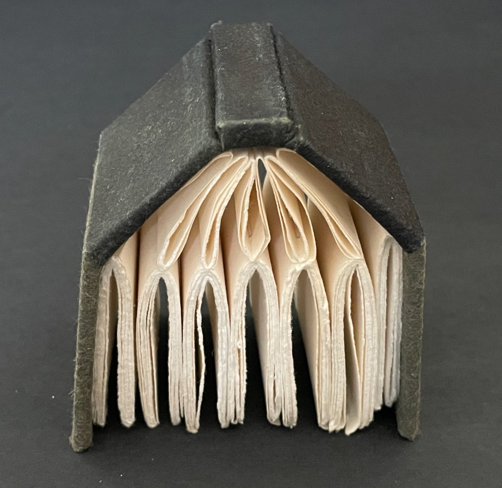
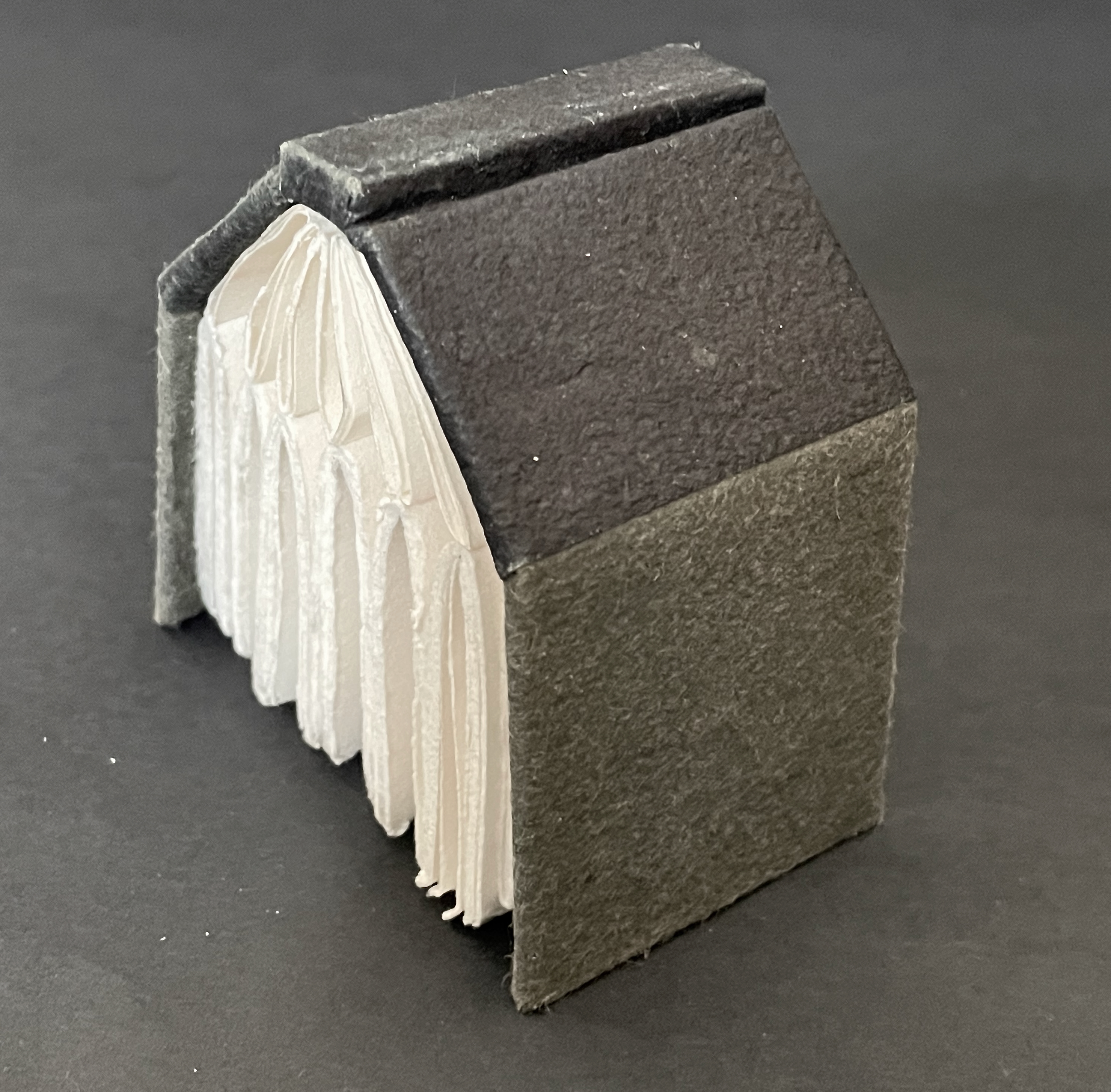
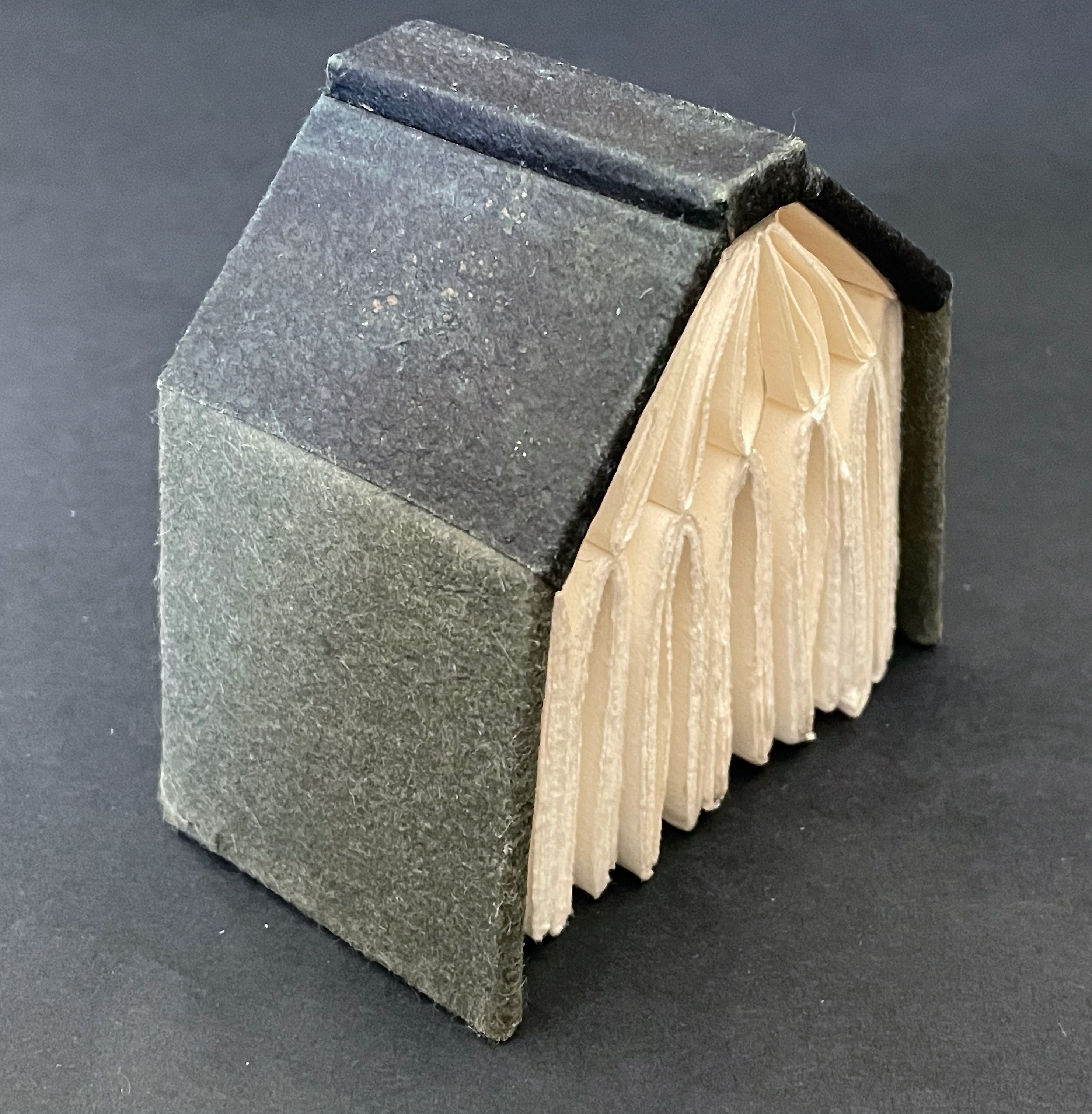
The House that Book Built (2018)
The House that Book Built (2018) Sarah Maker Case-bound hard cover, felt and paper over boards, seven stub-sewn gatherings of folios of cotton printmaking paper, six loose twice-folded gatherings of folios of Cave(?) paper inserted between the stub-sewn gatherings. H85 x W105 x D58 mm. [220] pages in stub-sewn gatherings; [96] pages in loose gatherings Unique. Acquired from Ink and Awl, Seattle, US, 10 December 2025. Photos: Books On Books Collection. Displayed with permission of the artist.
In another connection to Richard Minsky, all of the paper and boards for The House that Book Built were salvaged from recycling at the Center for Book Arts in New York City. Like the book artists’ studios and homes I have seen, The House that Book Built is stuffed to the rafters with its core material. Of course, even the roof and exterior walls enter into the spirit. It would not be the same artwork with a flat roof of asphalt tiles and plexiglas siding.
The color of the laid-in folios reminds me of Your House (2006) by Olafur Eliasson, which in turn reminds me how inadequate a simple side-by-side exhibition of the two works would be. Both demand the viewer’s touch.
Below, the laid-in folios have been removed, letting the house exhale and give more visual room to the stud-sewn gatherings of cotton printmaking paper. If viewers were allowed do this in an exhibition, they would be appreciating the contrast between the rough cotton paper and the smoother book paper just removed as well as appreciating how the house front now takes on a semblance to a Gothic window without the stained glass.
Your House and The House that Book Built both offer the pleasure of nosing through another’s house. Your House invites the viewer to a page-by-page meditation of laser-cut interior space while doing so. Maker’s snug abode offers the Quaker-like contemplation of the homespun that has been spun with tools made by the spinner.
Punch cradle made specifically to punch the sewing stations for The House that Book Built. Photo: Courtesy of the artist.
Further Reading
“Architecture“. 12 November 2018. Books On Books Collection.
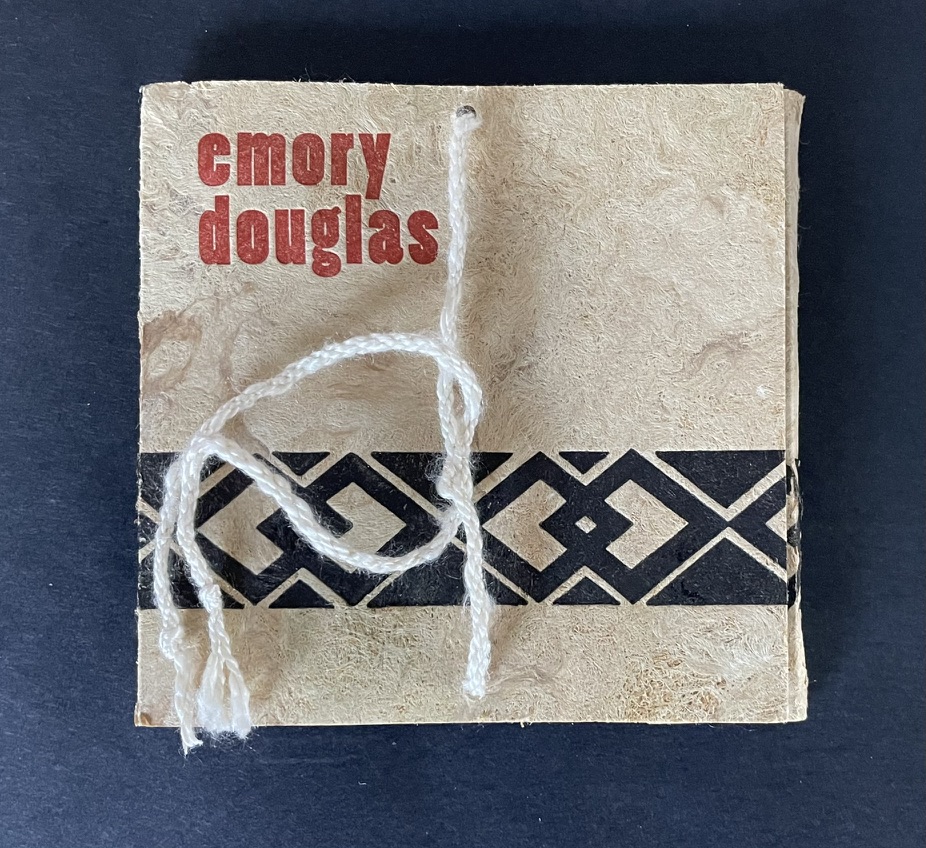
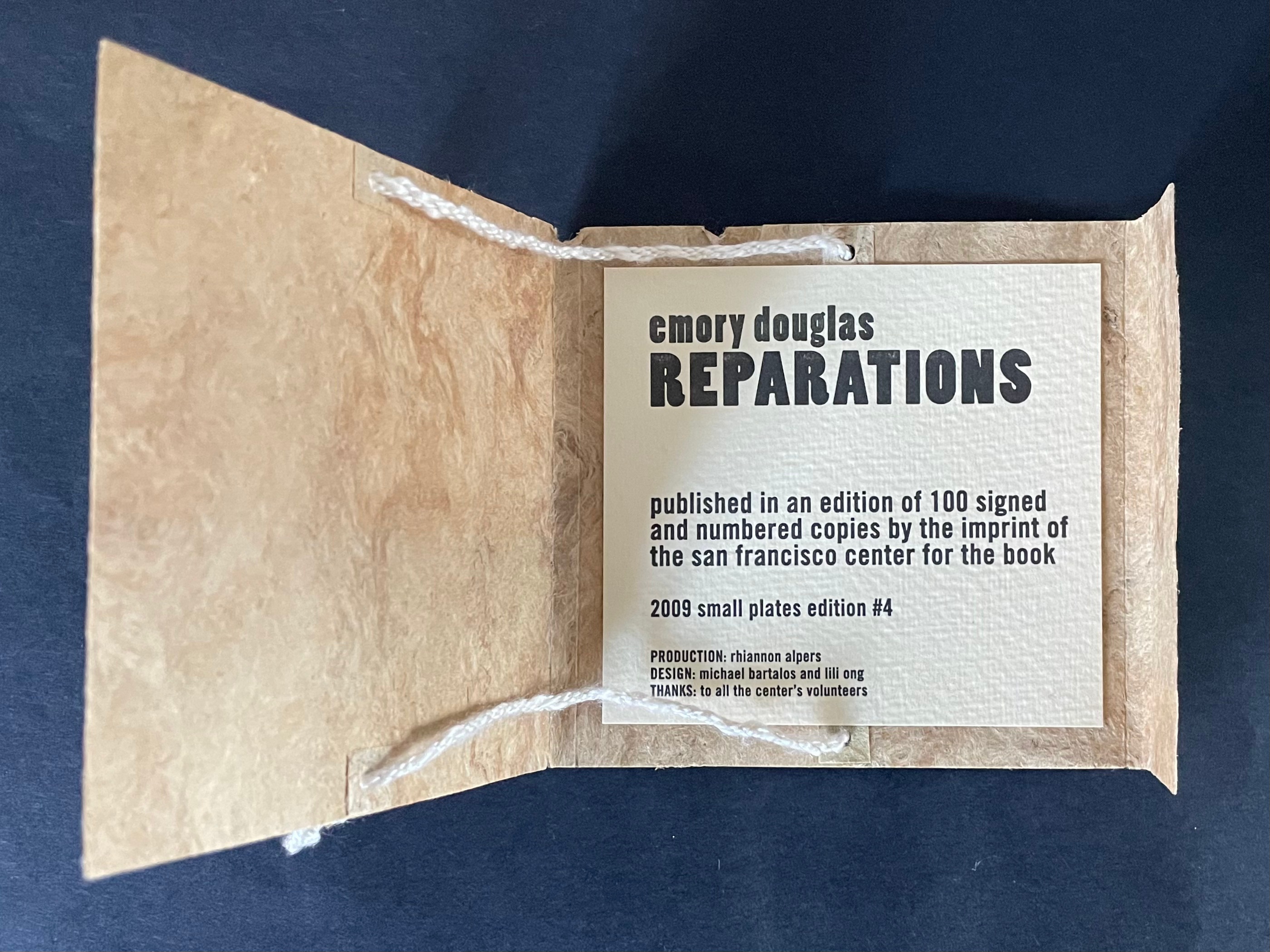
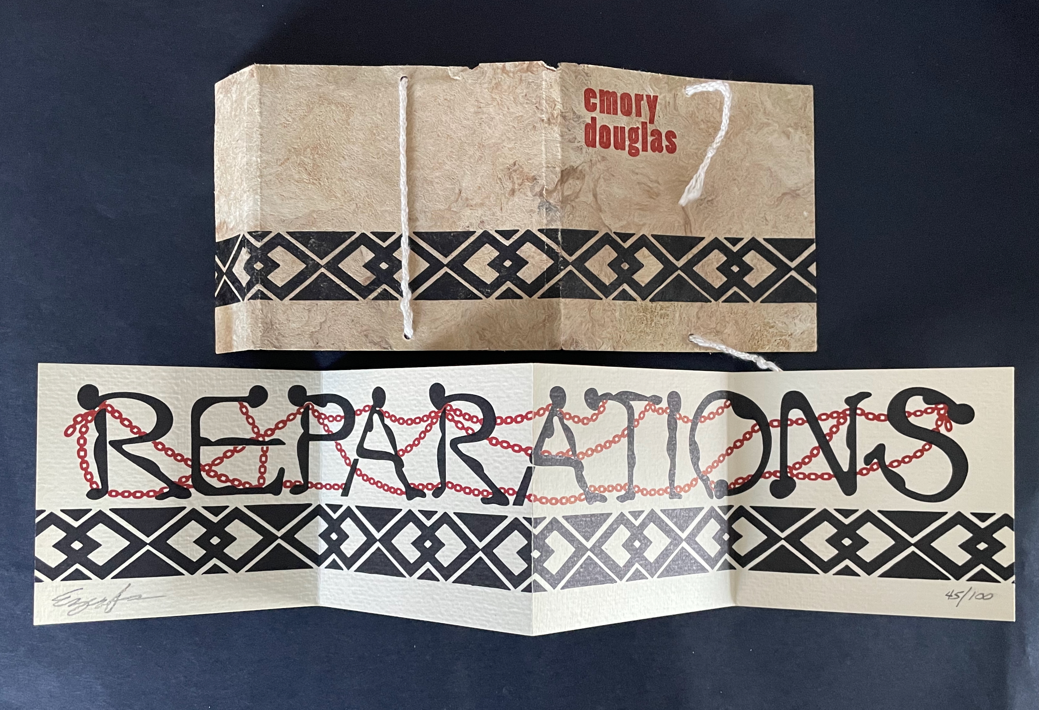
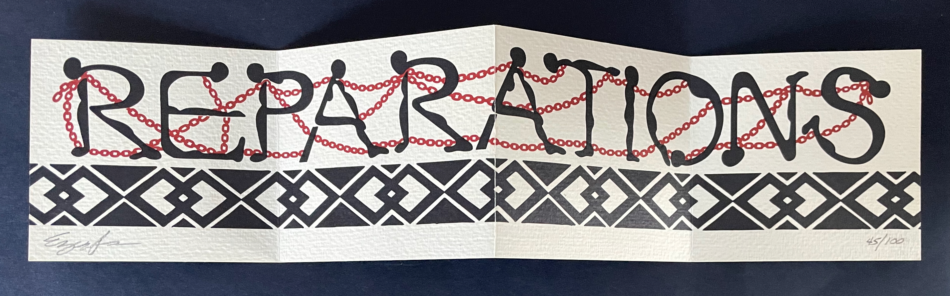
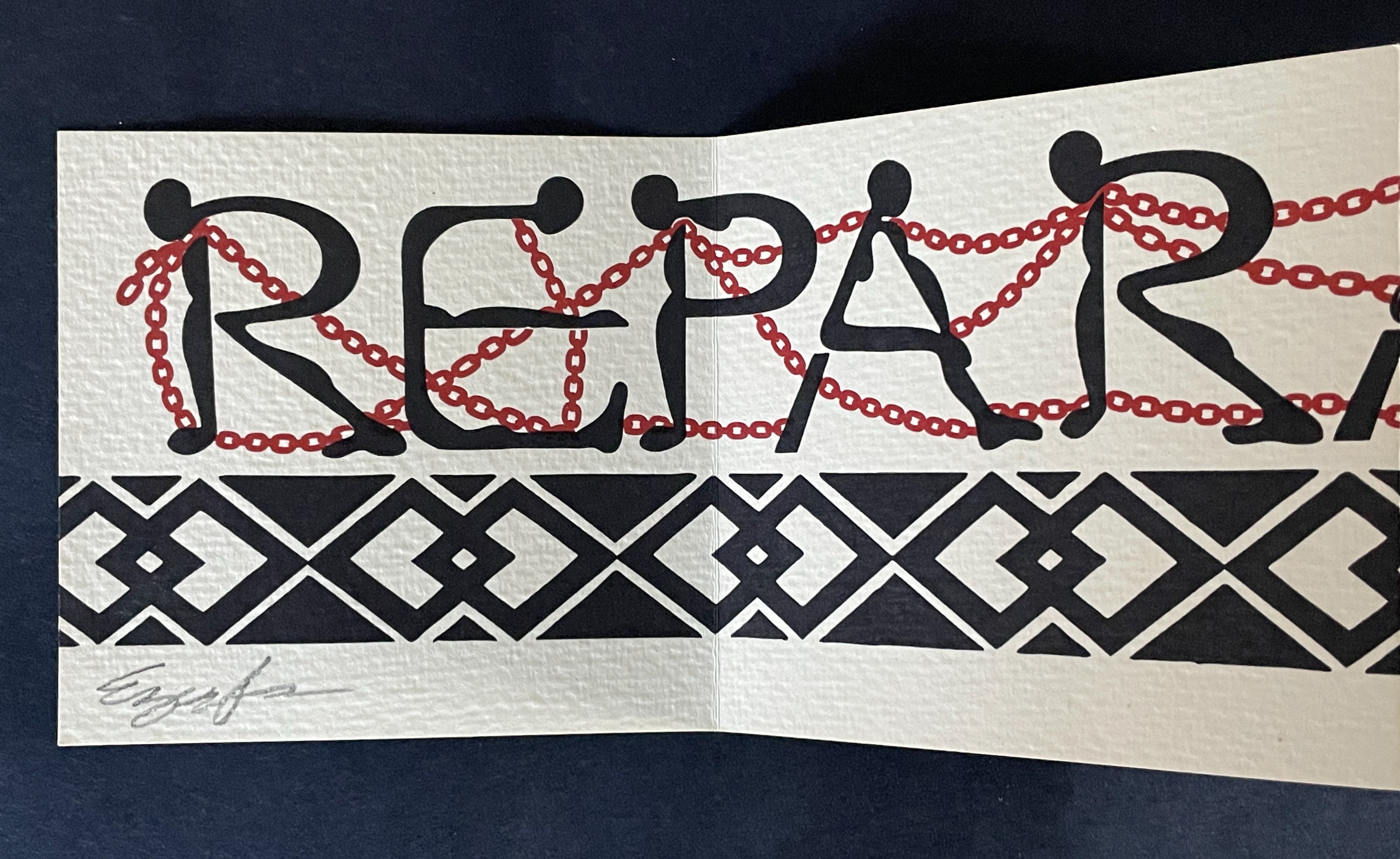
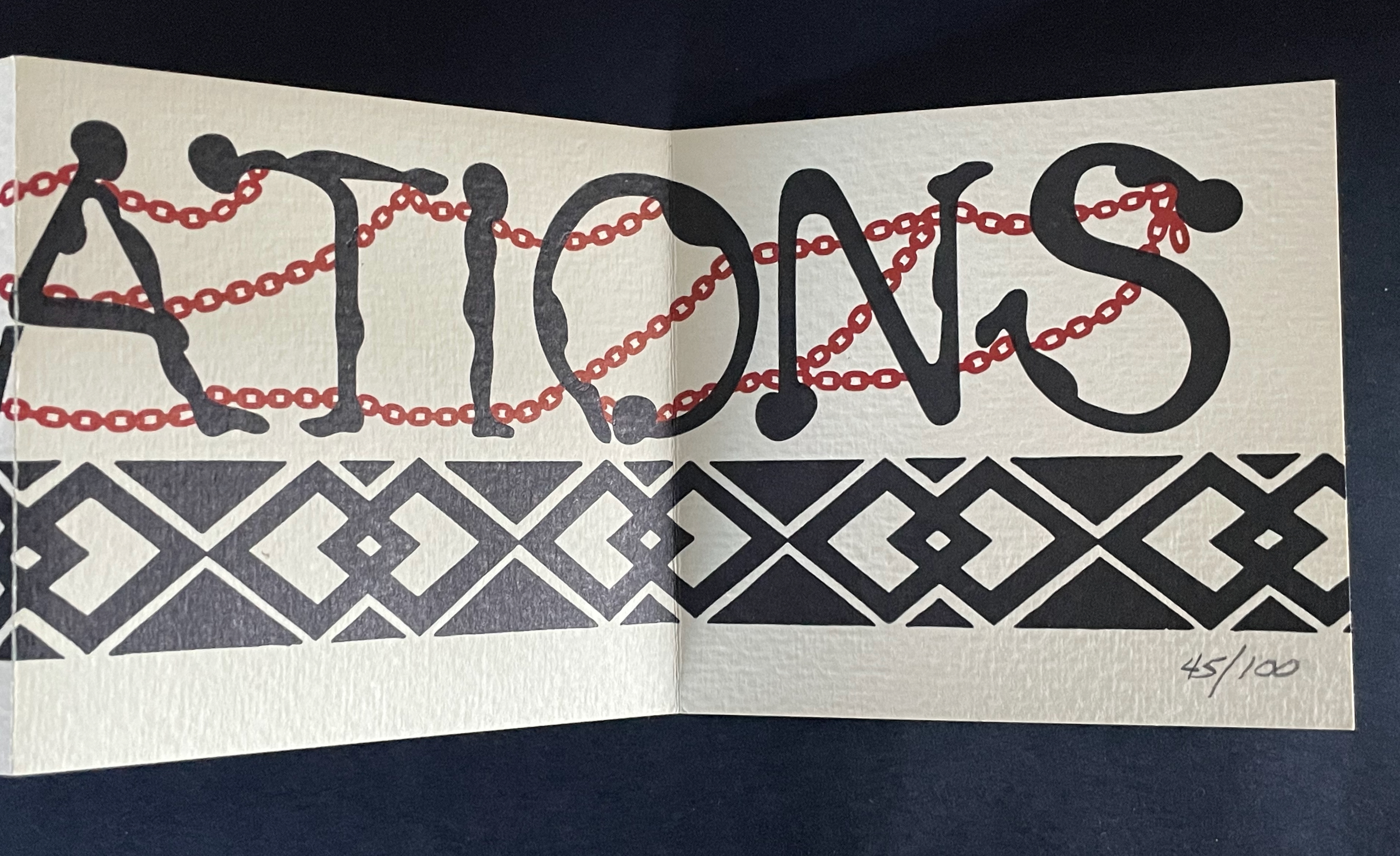
Reparations (2010) Emory Douglas Cover enclosing leporello. Cover: H102 x W105 mm. Leporello: H89 x W95 mm (closed); W380 mm (open). [4] panels.Edition of 100, of which this is #45. Acquired from the San Francisco Center for the Book, 30 June 2025. Photos: Books On Books Collection. Displayed with permission of the publisher.
“Emory Douglas is renowned for his iconic representations of the Black Panther Party through his work as the Party’s Minister of Culture. For decades, he communicated the power and charisma of the movement through his compelling straightforward graphic style. … The imagery for this edition was initially a painting by Mr. Douglas’ which was then translated into a 2 color, letterpress graphic. The pages of the book are a one-sided, accordion fold piece. The folded cover is made of Amate bark with hand-spun hemp and silk thread and letterpress printed in 2 colors with interior colophon page attached””–San Francisco Center for the Book
The chains fastened at the neck, wrist, and ankle of each letter and linking each human figure to the next propose a new orthography. What was spilled spells out the case. In the original mural on which this quietly loud artist’s book is based, the chains were colored red, white, and blue.
Happy 250th Anniversary, fellow citizens.
Further Reading
“Tia Blassingame“. 17 August 2020. Books On Books Collection.
Gabor, Nora. 18 February 2021. “Black History and Experiences through Book Arts“. The Full Text: News about library resources and services. Chicago, IL: DePaul University. Accessed 22 January 2024.
Gleek, Charlie. “Centuries of Black Artists’ Books“, presented at “Black Bibliographia: Print/Culture/Art” conference at the Center for Material Culture Studies, University of Delaware, 27 April 2019, pp. 7-8. Accessed 20 July 2020.
Its curatorial element makes Dave Dyment’s Artists’ Books and Multiples site an excellent resource for lovers of book art. Its existence also slyly highlights the recursive nature of his own bookwork. Book art is inherently self-referential. Be it the newspaper, a Kubrick film, a Ruscha work, a Beatles album, pop singles, TV series, photos or crossovers among media — all media constitute Dyment’s palette, brush, canvas, armature, chisel, pen, pencil, camera, sound recorder, surface and raw material for his own book art.
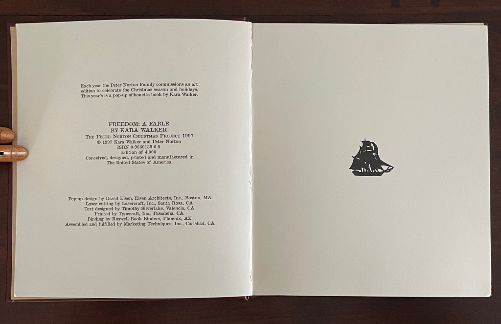
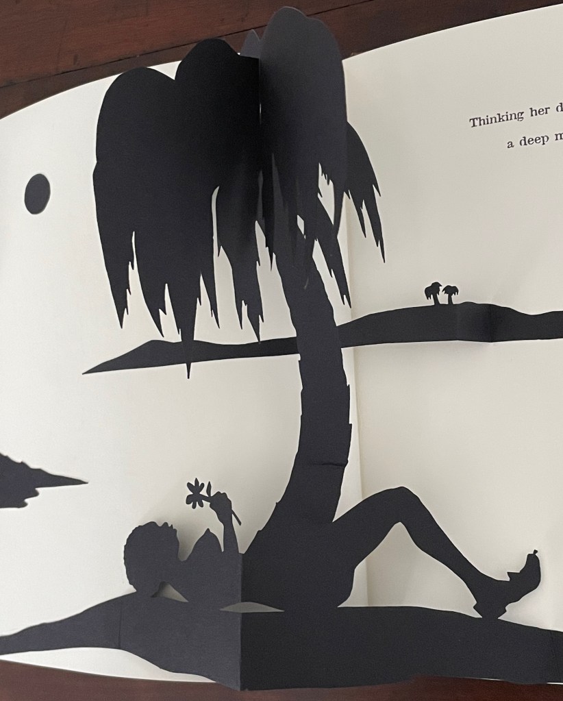
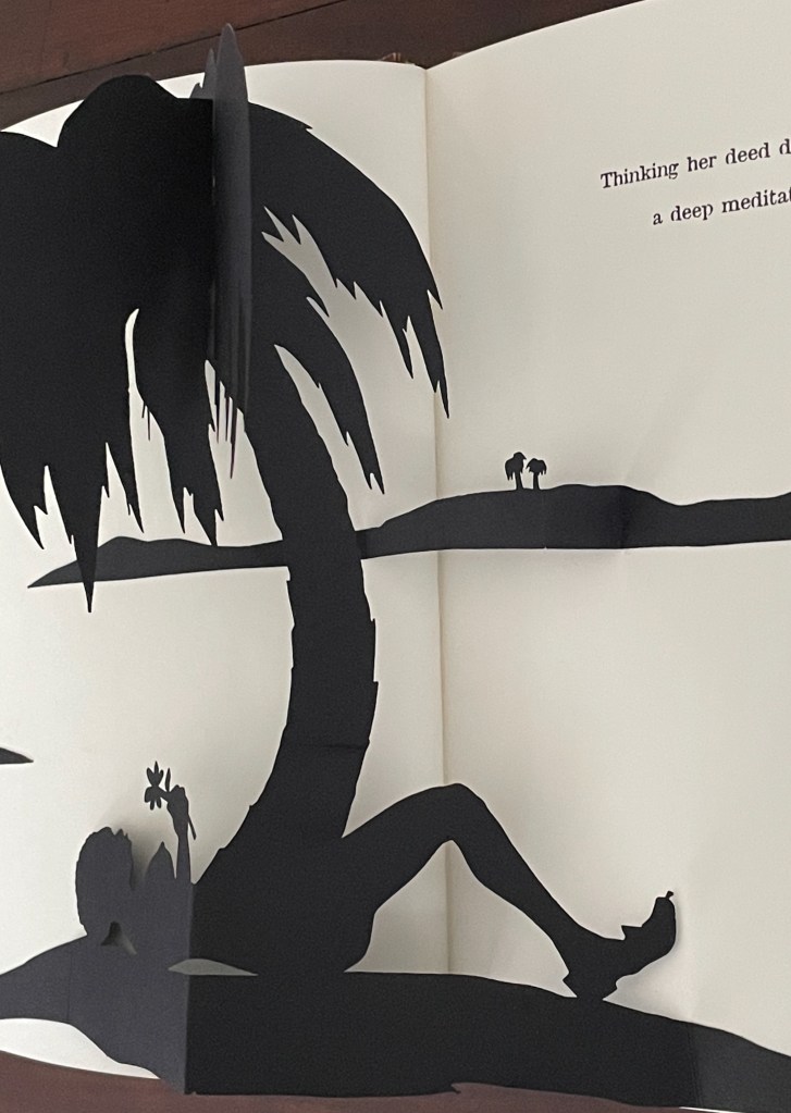
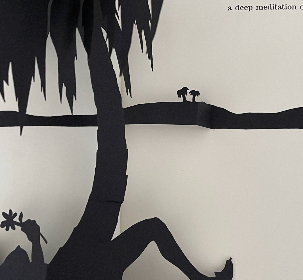
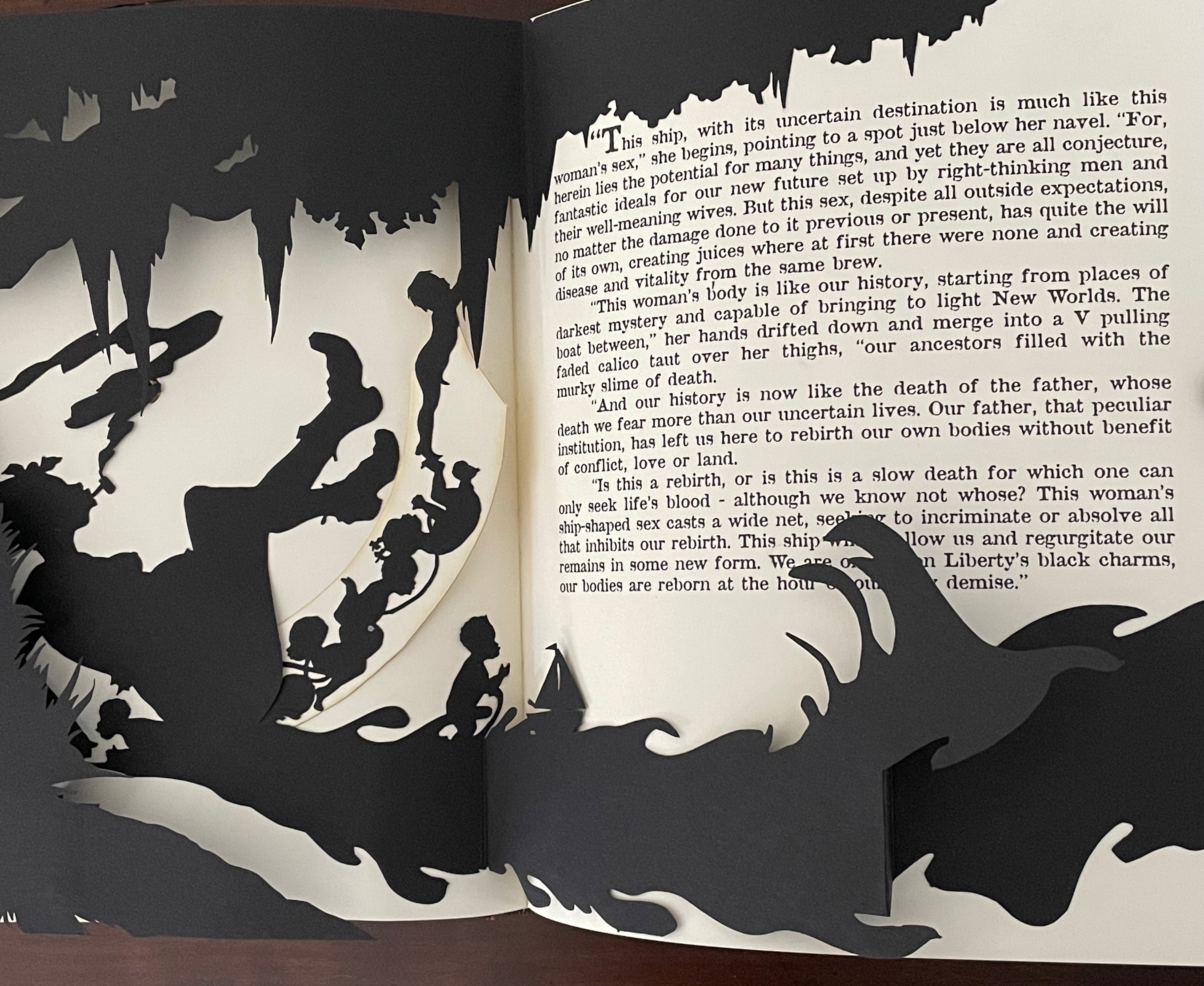
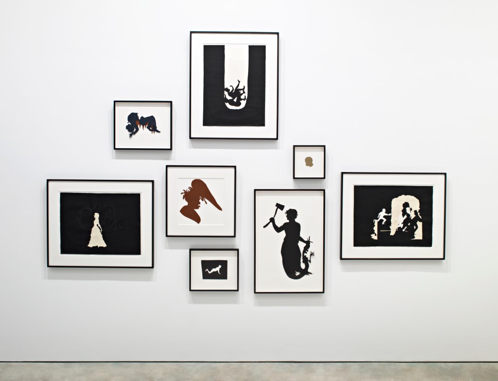
The book as medium has played a minor adjunct role in Kara Walker’s art. Freedom: A fable … (1997) is one of the few exceptions. Its paper engineering lifts Walker’s signature silhouettes off the page physically, and the pop-up’s association with children’s books fits well with Walker’s uneasy blend of humor, horror, the individual and the stereotype. It is also the first of her three-dimensional works, which emerged more frequently around 2007-09 and rose to the monuments of Fons Americanus (2019) and Unmanned Drone (2025).
Source: Kara Walker, “Riots and Outrages”, The Georgia Review , Spring 2010, 64:1, pp. 59-68. Images courtesy of Sikkema Jenkins and Company, New York.
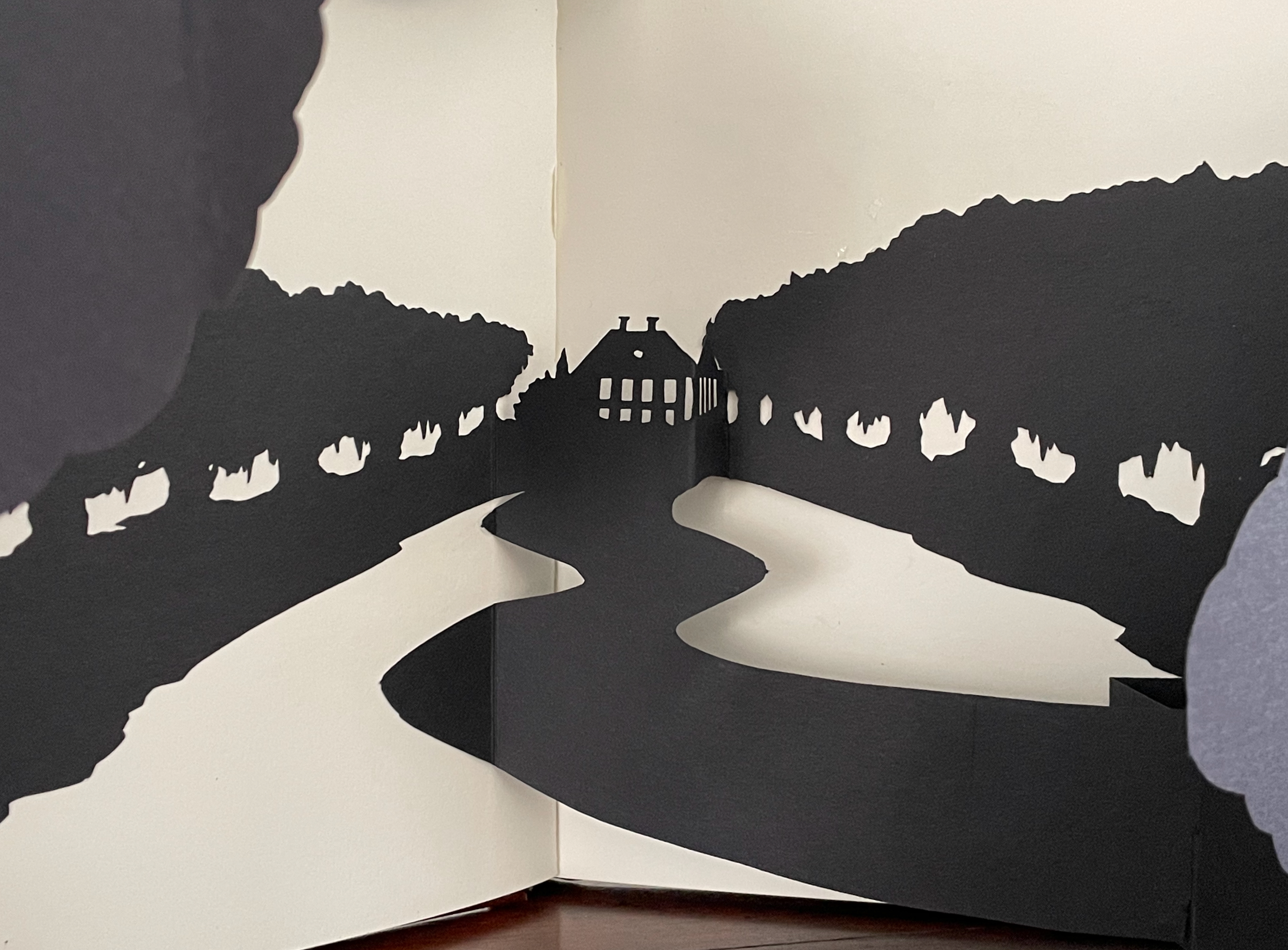
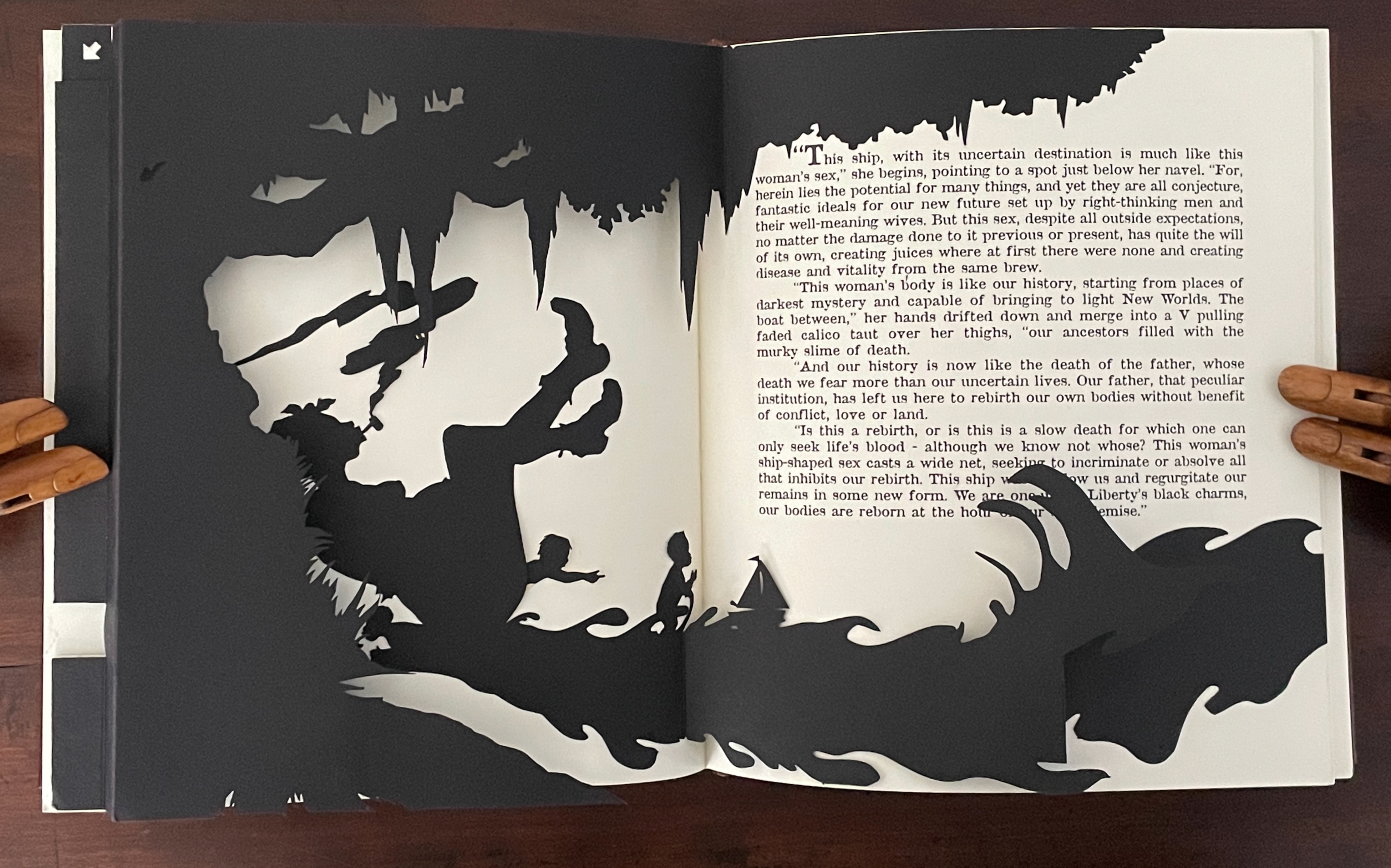
Freedom goes beyond an illustration of text. Its offset lithographs and five laser-cut pop-up silhouettes on wove paper extend and complicate the fable in the self-reflexive manner often found in artists’ books.
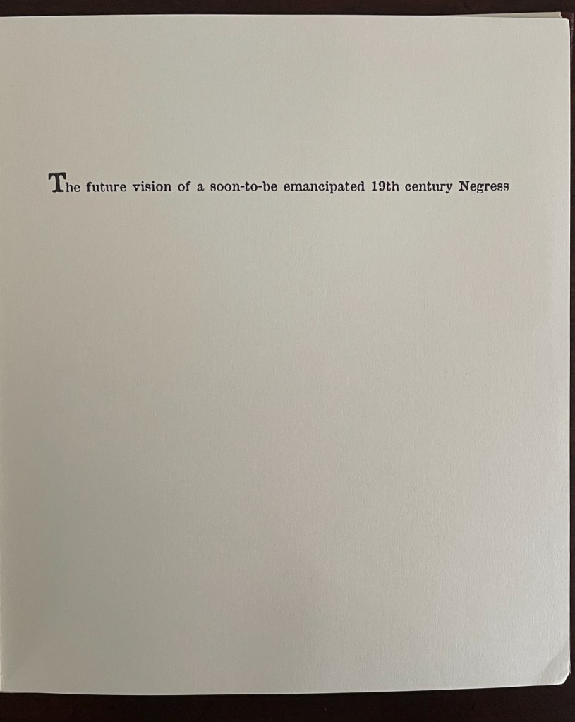
First and last image of the book: the “Freedom” ship; opening line of the book.
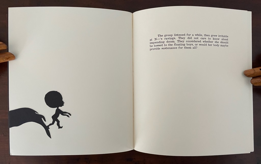
The book’s title taunts the reader, artist, and narrator all at once (both the narrative and freedom are fables). Likewise, the black-on-white cutouts and lithographs trip up every party’s sensibilities, racial prehensions, and cultural memories. The opening display may evoke Gone with the Wind, but the heroine is the Negress. The narrator and artist matter-of-factly elevate the sexualization of “N____” to bisexual, scatological Creator/Mistress status. The abbreviated name, as if in a 19th-century tale of erotica, evokes denigrating of the “N” word. Designed to make the viewer tilt the book every which way to see what can be (and is meant to be) seen, the pop-ups evoke a feeling of prurience. In the final spreads, Walker and David Eisen, the collaborating paper engineer, use a pull tab to involve that prurience in a procreative delivery.
The power of this artwork is that it merges the self-reflexivity of the artist’s book with a self-cannibalizing societal condition.
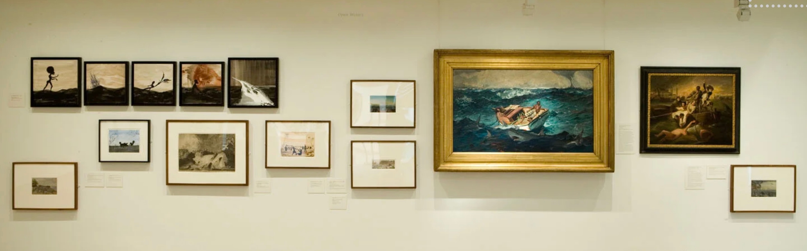
After the Deluge (2007)
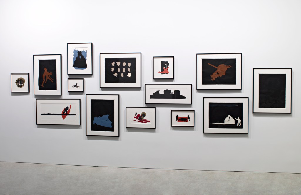
After the Deluge (2007) Kara Walker Casebound, illustrated paper over boards, black doublures. H270 x W225 mm. 120 pages. Acquired from Lacey Books, 26 August 2025. Photos: Books On Books Collection.
The immediate spur to After the Deluge (2007) and its associated exhibition was the aftermath of Hurricane Katrina in 2005. The book is not a straightforward catalogue of the exhibition. Several works in the exhibition are not included; in fact, an entire wall is missing, and juxtapositions in the exhibition differ from those in the book. It is one of those books that goes beyond its proximate cause and differs from the exhibition that occasioned it.
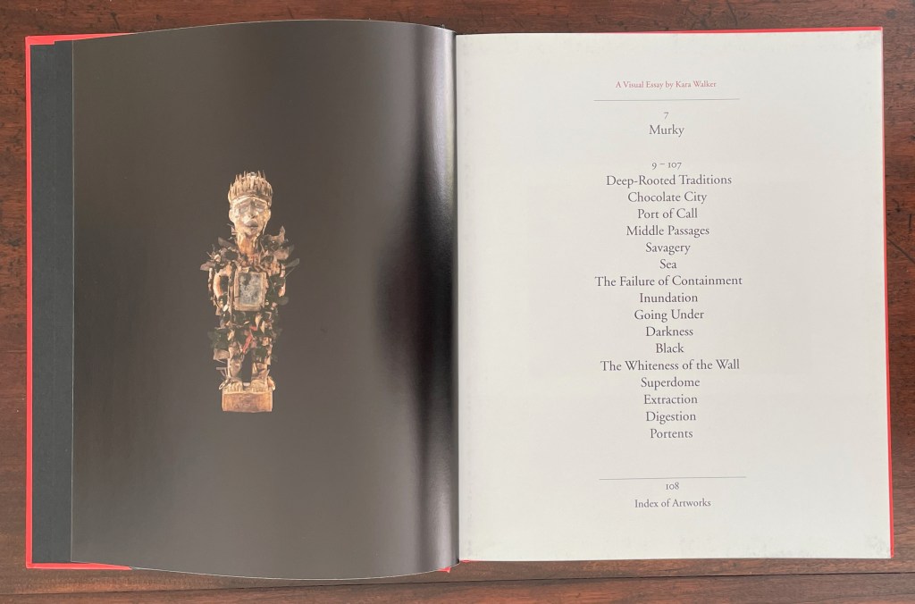
Walker labels it a visual essay. While its blending of original work and appropriations with collage nudges it toward being an artist’s book, its structural principle is uncertain. Even the Table of Contents is puzzling. Preceded by a single-page black bleed, “Murky” begins with Walker’s brief introduction on page 7. The last page of that text concludes, however, on page 9, which is assigned to the visuals of pages 9 to 107. Perhaps 9 is a typo and should be 10. Whatever the case there, the individual labels in the Table of Contents are not given specific page references, and it is not always easy to match up the visuals with the labels.
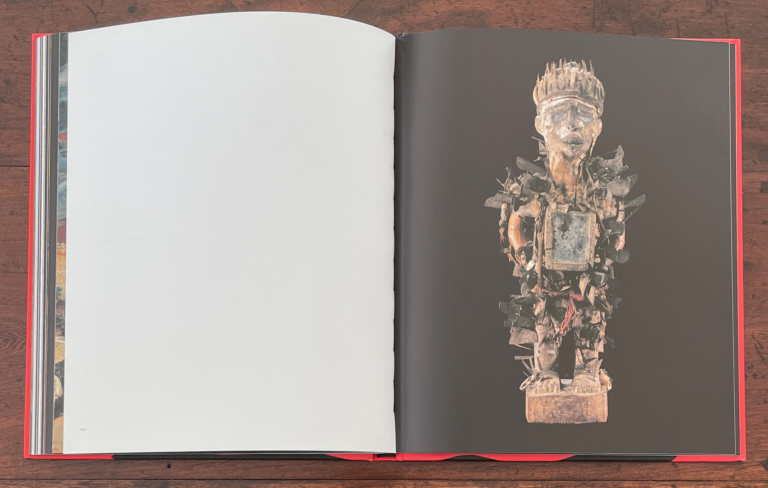
Male Power Figure; Table of Contents.
Introduction; AP Images/Bill Haber.
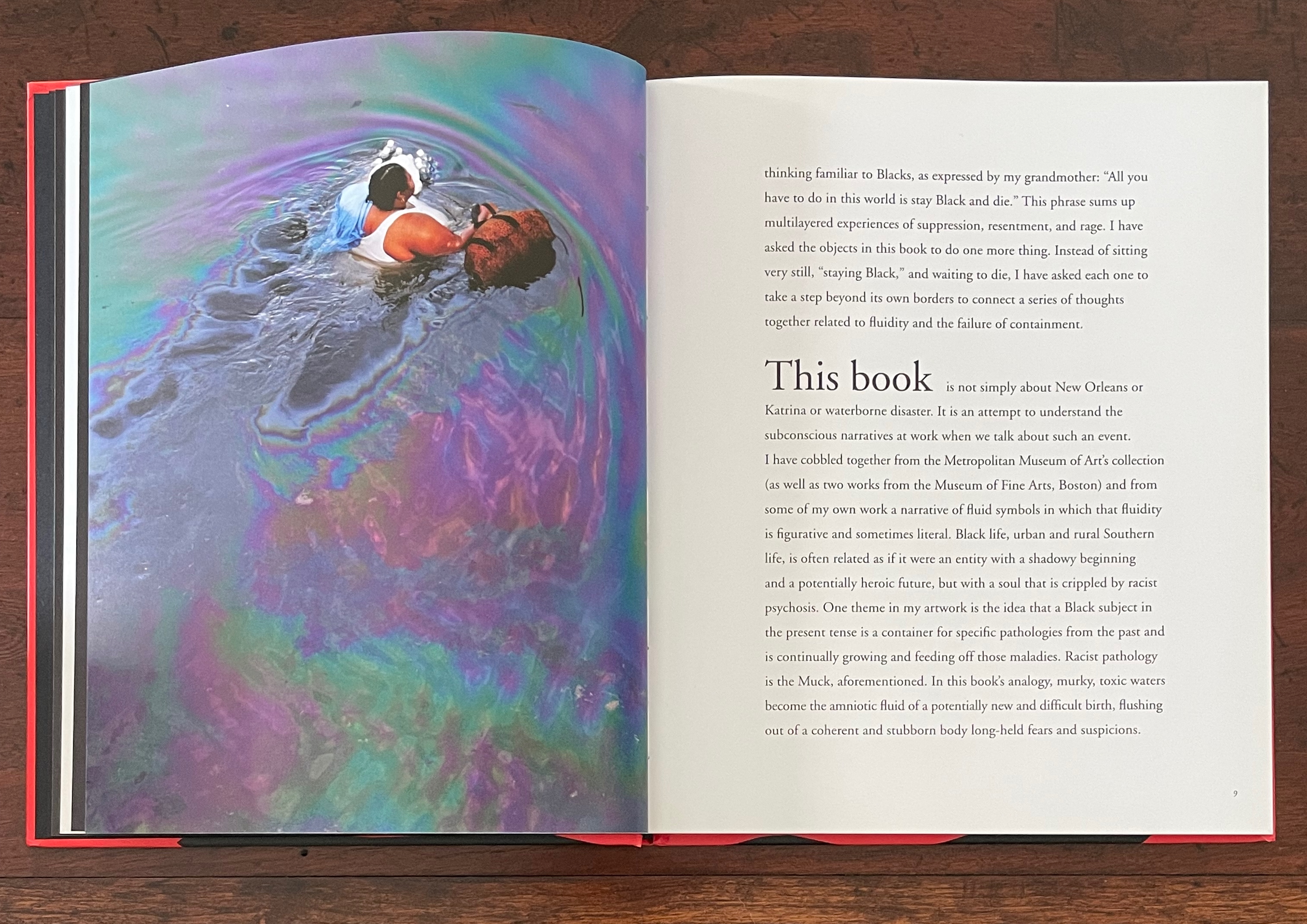
The brief introduction sets out the driving analogy clearly enough though. Perhaps, when we cannot pin down the organization at every point, we have to fall back on the analogy of a murky muck:
Racist pathology is the Muck, aforementioned. In this book’s analogy, murky, toxic waters become the amniotic fluid of a potentially new and difficult birth, flushing out of a coherent and stubborn body long-held fears and suspicions.
Among the book’s other signals are the placement and handling of full-page bleeds. Contrasts of bleeds of black ink with white pages often serve to underscore juxtapositions of white western art with African artifacts and Walker’s works. Above, the single-page bleed of black preceding the Table of Contents presents us with Nkisi, a large African male power figure. In the exhibition, it loomed under a glass cover for viewing in the round. As can be seen above, and underscoring the difference between book and exhibition, it is a reduced figure, although Nkisi returns as a larger presence toward the end of the book.
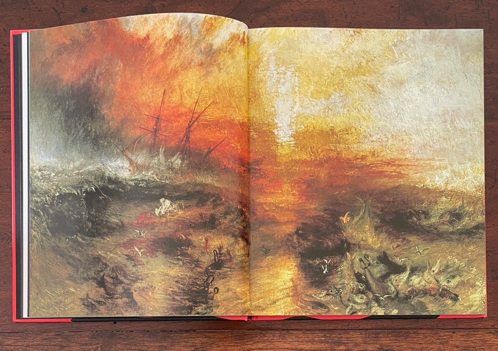
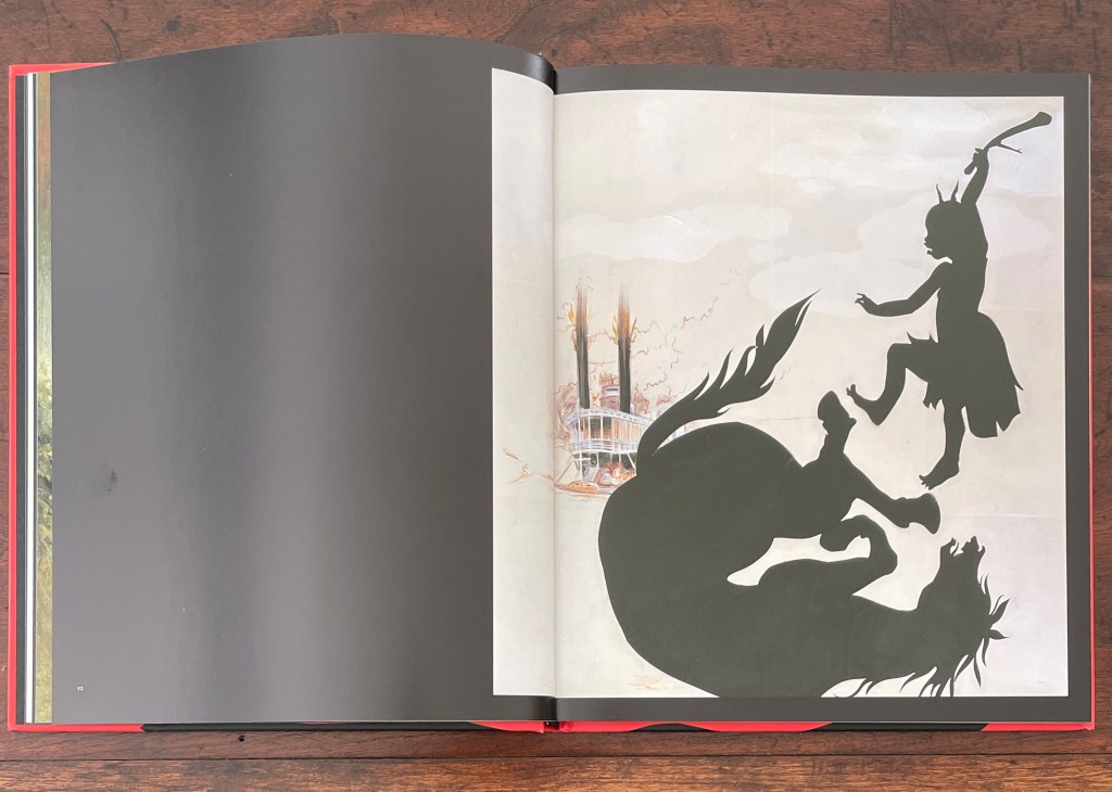
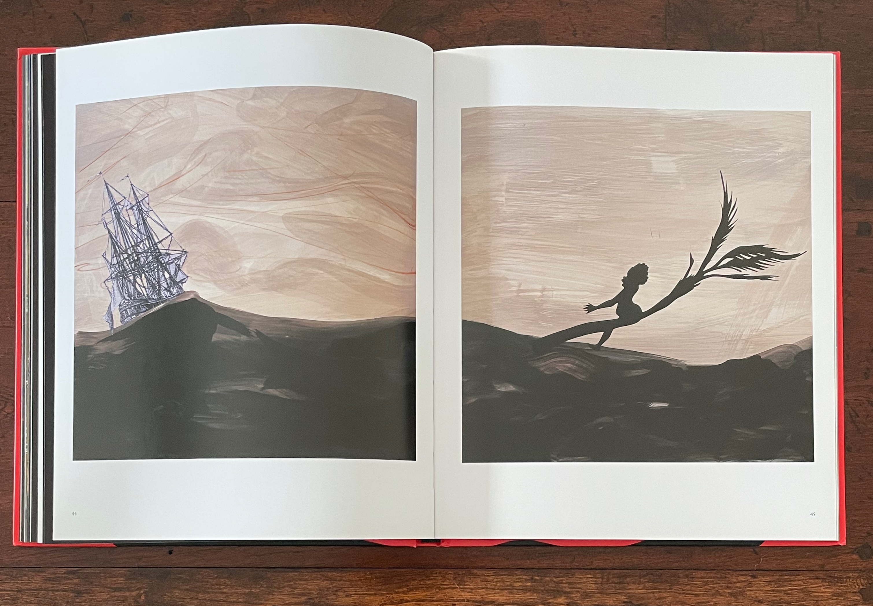
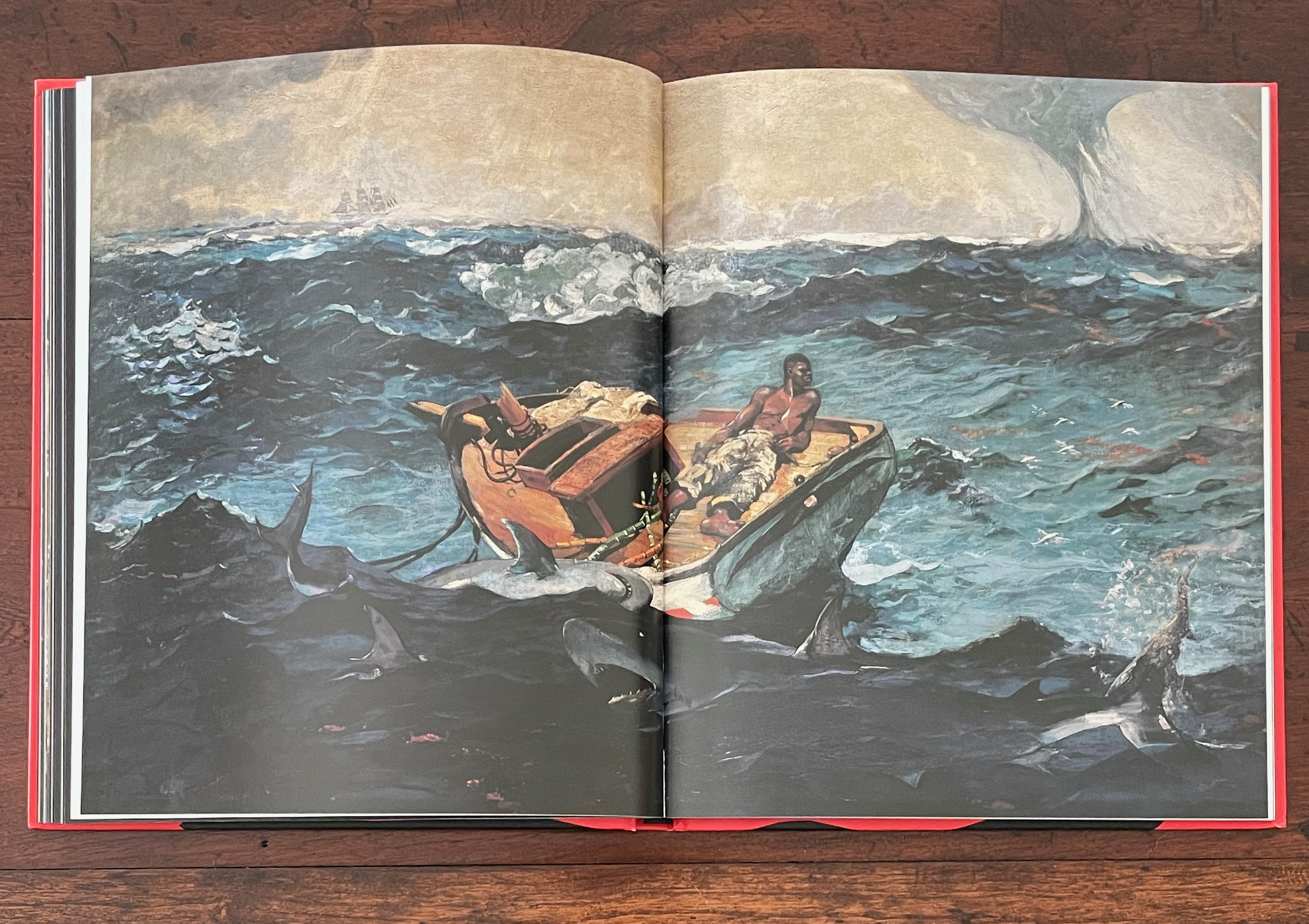
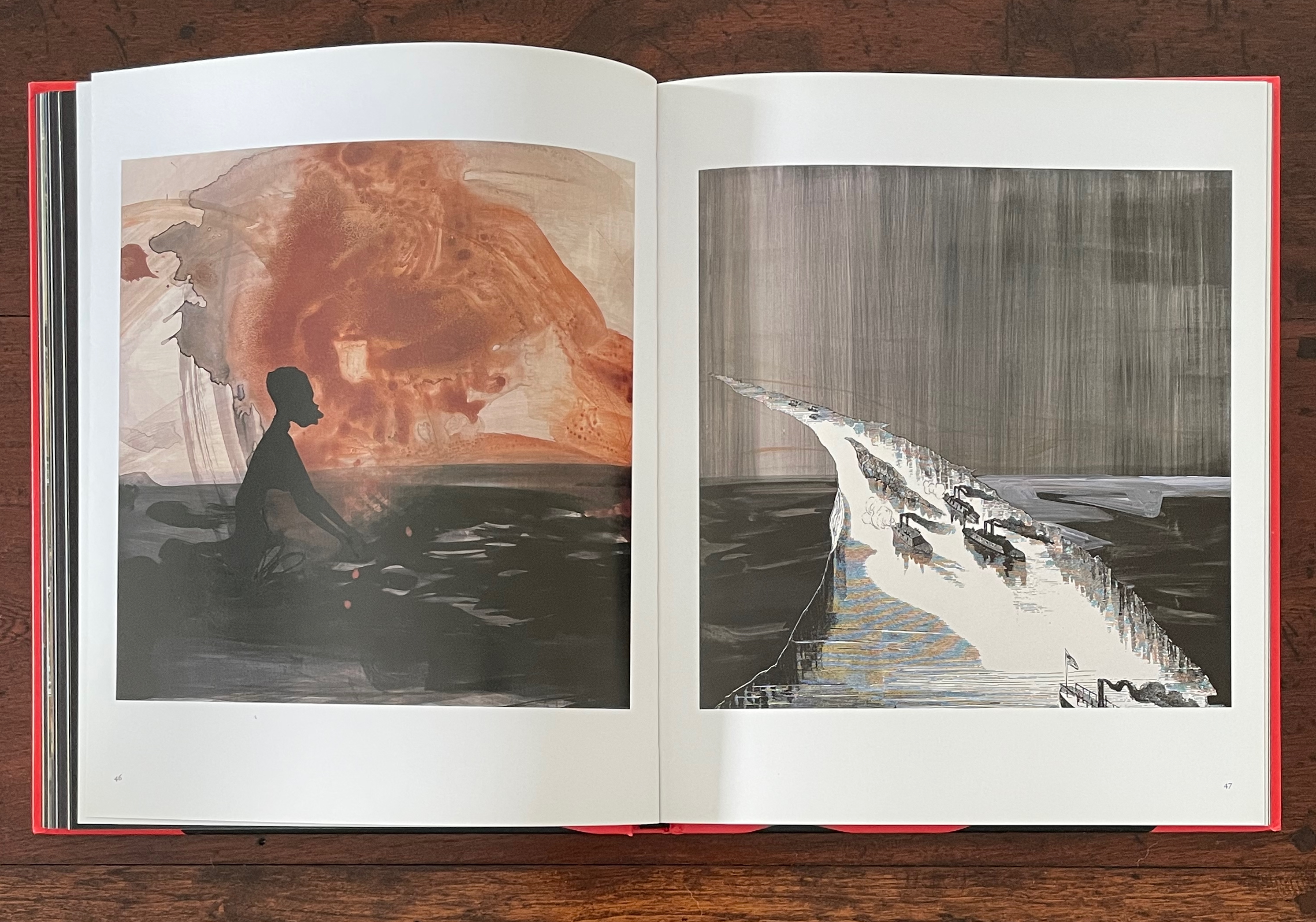
The first double-page bleed is one in full color and does seem to match up with the label “Deep-Rooted Traditions” in the Table of Contents. It presents JMW Turner’s 1840 Slave Ship (Slavers Throwing Overboard the Dead and Dying, Typhoon Coming On). In the following double-page spread, Walker’s 1996 Untitled, a cut-out silhouette and pastel on a white background, is crowded to the right and surrounded by a full-bleed margin of black. Its pastel double-stack steamboat spews fire in the background, perhaps frightening a black silhouetted horse into a fall in the foreground. Whatever the cause, the black silhouetted girl with an upraised cudgel becomes a visualization of the expression “beating a dead horse”. In Walker’s typical perverse irony, it’s a 19th-century white painter’s condemnation of slavery followed by a 20th-century Black artist’s black cutouts, shoved off center and shoving us to conclude that slavery is a dead horse she is beating. Deep-rooted traditions, indeed.
But slavery is not a dead horse. Its carcass has mutated into the historical, cultural, and personal condition that Walker calls “the Muck” and amniotic fluid in her introduction. The Muck and fluid juxtapose works from Walker’s American Primitives series and Middle Passages series with selections from the Metropolitan Museum of Art and Boston’s Museum of Fine Arts. The full-bleeds of black on single pages and double-page spreads punctuate this maelstrom of art that includes white American primitives such as JW Barber (1798-1885), John Carlin (1813-91), WP Chappel (1800-80); the European-influenced JS Copley (1738-1815), Winslow Homer (1836-1910), and Joshua Shaw (1777-1860); the French silhouettist Auguste Edouart (1789-1861); and earlier artists such as Jean Audran (French, 1667-1756), RN Zeeman (Dutch, 1623-63), and Pieter Nolpe (Dutch, 1614-53).
The Table of Contents’ label “Middle Passages” clearly refers to the images on pages 43 to 49 and matches up with Walker’s five Middle Passages works in the upper left of the exhibition wall below. In the exhibition, however, the images proceed in an order different from that in the book.
The exhibition wall matching up with pages 43-49 (“Middle Passages”) in the book.
The order of images in pages 43-49 differing from their order on the exhibition wall, the last two of five Middle Passages works now coming after the Homer.
Also, later on, the book uses enlarged details from three of the works on this wall: RN Zeeman’s Water from his series Four Elements (ca. 1651-52), Pieter Nolpe’s The Bursting of St. Anthony’s Dike, 5 March 1651, and Winslow Homer’s The Gulf Stream (1899). Zeeman’s and Nolpe’s works are only represented by enlargements in the book, but this is not just a case of trimming to fit the book. Both are displayed across double-page spreads. Also, a full image of Homer’s The Gulf Stream appears in a double-page spread between the pages displaying three then two of Walker’s Middle Passages works. Moreover, an enlarged detail from The Gulf Stream also appears toward the end of the book. Clearly, the change of order and handling of enlargements are intentional and thematic, not simply forced by the format.
Details from Nolpe’s The Bursting of St. Anthony’s Dike, 5 March 1651; from Zeeman’s Water; and from Homer’s The Gulf Stream used later in the book.
Walker’s use of the typewritten index cards from her American Primitives series may shed light on the labels in the Table of Contents that seem difficult to align with the images in their order in the book. On the dustjacket, Walker writes:
I brought together the art in this book (and the exhibition that preceded it) thinking like a draughtsman, perhaps absurdly so, as even the typewritten texts are from an ongoing series of text pieces I think of as drawings.
If Walker thinks of the American Primitives index cards “as drawings”, might we ought not consider the centered labels without pagination in the Table of Contents as textual drawing, too? Stacked as they are, they certainly echo the totemic Nkisi on the facing page. In Walker’s mind, labels such as “The Failure of Containment”, “Inundation”, “Going Under”, “Darkness”, and “Black” could also be strokes of charcoal, ink, or paint as evocative of Hurricane Katrina or any natural disaster such as those used by the genre painters. The power of After the Deluge lies in its collage of the commonplaces of such disasters with the silhouetted savagery and perversity of our racist pathology. After the Deluge presents that muck as the commonplace landscape (or Lands Cave) that is the US.
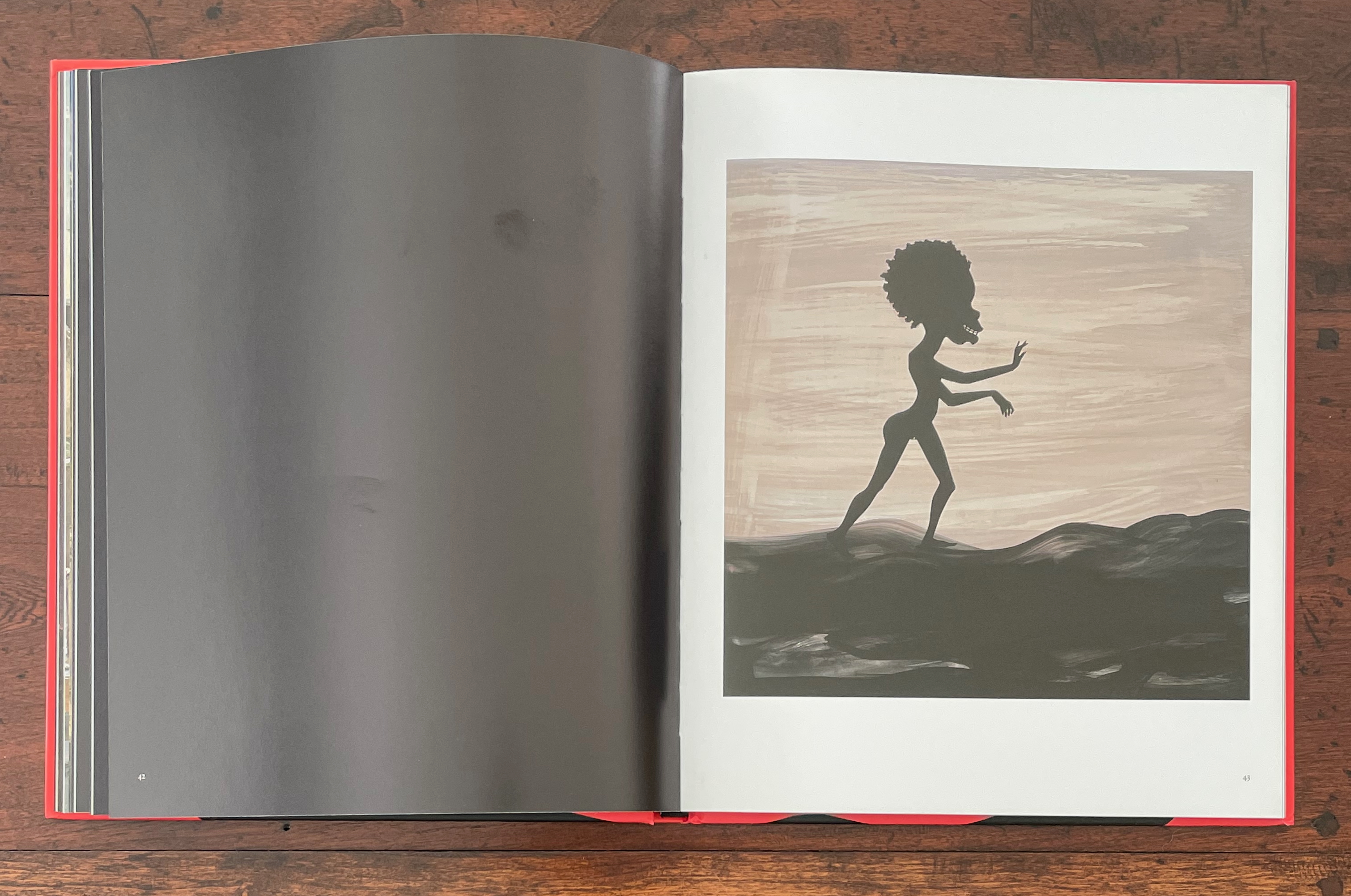
Kara Walker’s Lands Cave from the series American Primitives (2001), pairing silhouettes of a sailor-hatted, thumbsucking white boy with a mutilated Black woman about to give birth.
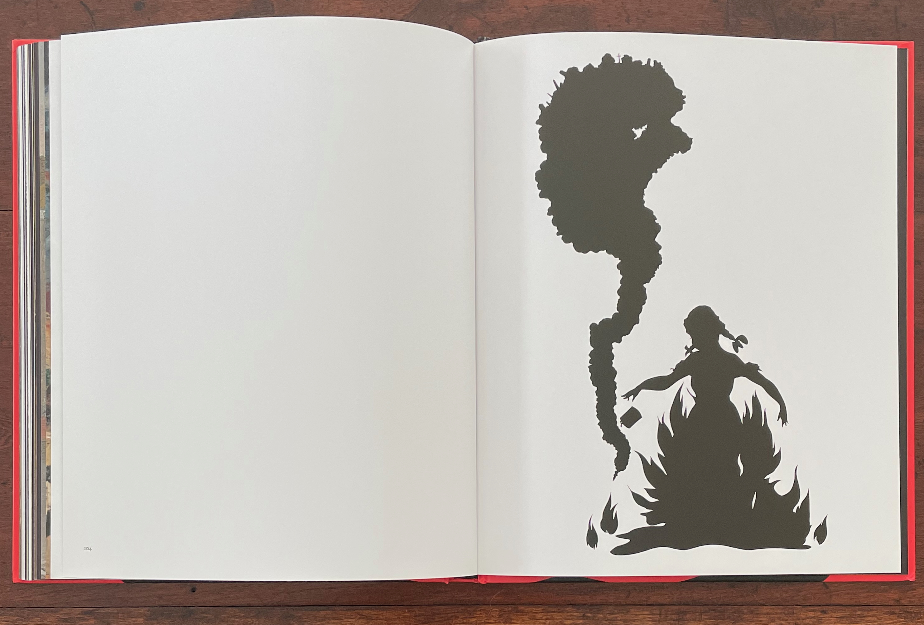
If it is not easy to match up all of the images with the labels in the Table of Contents, the final three double-page spreads align unmistakably with “Portents”: a single white page facing a single black page with Nkisi looming larger now than at the start, a double-page spread of white with Walker’s Burn (1998), a silhouette image of a pig-tailed girl immolating herself as a column of smoke rises in the shape of a Black female, and then the double-page spread of black that concludes these scenes and the entire book.
Bureau of Refugees (2008)
Bureau of Refugees (2008) Kara Walker Casebound paperback, sewn and glued. H240 x W215 mm. 120 pages. Acquired from Judd Books, 3 March 2024. Photos: Books On Books Collection.
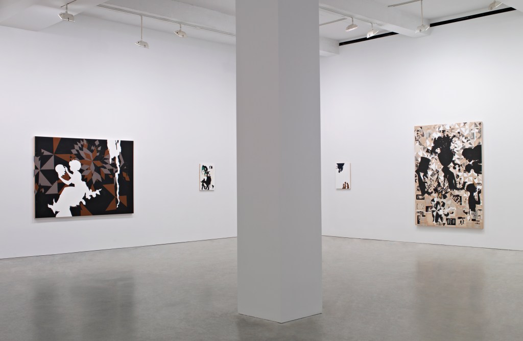
To judge from images of the exhibition at Sikkema Jenkins & Co., 20 October – 21 November 2007, in New York, Bureau of Refugees (2008) does go beyond an aim at replicating that experience. But it barely exploits or challenges the codex form — less than do After the Deluge and Freedom, respectively.
Installation view: Bureau of Refugees New work, Kara Walker, Sikkema Jenkins & Co., New York, NY, 2007 Photo: Luciano Fileti, courtesy of Sikkema Malloy Jenkins.
The exhibition was divided between primarily figurative works and others entirely text-based. Large-scale figurative works like Authenticating the Artifact and The Treasure Hunters, left and right above, dominated one room. The show took its name, however, from a series of smaller figurative works, which in turn took its name from its source: The Bureau of Refugees, Freedmen and Abandoned Lands that operated from 1865 to 1872. Groupings of these smaller scale works occupied their own walls. In the Bureau’s Records, “Miscellaneous Papers” National Archives M809 Roll 23, Walker found a list of “Riots and Outrages”, and from this list, she incorporated into the titles of the figurative works the descriptions of the events and acts inspiring the images.
Grouping of the figurative works from the series Bureau of Refugees, Freedmen and Abandoned Lands- Records, “Miscellaneous Papers” National Archives M809 Roll 23 New work, Kara Walker, Sikkema Jenkins & Co., New York, NY, 2007 Photo: Luciano Fileti, courtesy of Sikkema Malloy Jenkins. Titles of the five works on the left, Committed an outrage and July 16 Black Girl Beaten and Threatened to kill her and her sister if they did not leave the county and Committed an outrage on a freedwoman and Mr. Alexander, colored preacher brutally beaten and forced to leave.
Another grouping of the figurative works from Bureau of Refugees series New work, Kara Walker, Sikkema Jenkins & Co., New York, NY, 2007 Photo: Luciano Fileti, courtesy of Sikkema Malloy Jenkins. Titles of the four larger works, clockwise from the top, Freedman and Freedwoman thrown into a well in Jefferson Co. and A gang of ruffians and Bradley killed freedwoman with an axe and Between Danville + Somerville.
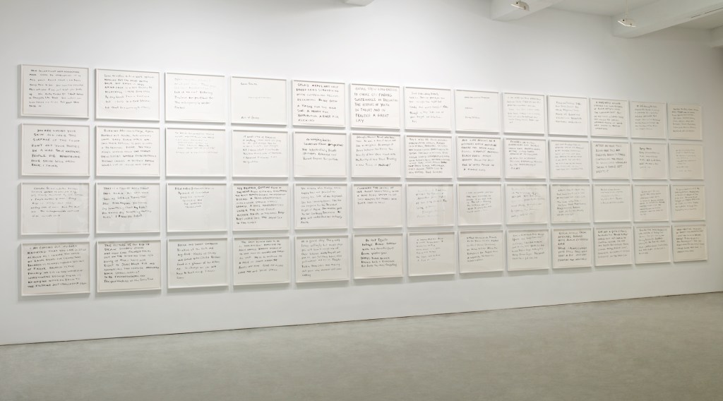
The second series in the show was the 52-panel Search for ideas supporting the Black Man as a work of Modern Art/Contemporary Painting. A death without end: an appreciation of the Creative Spirit of Lynch Mobs. Its title comes from the search string that Walker entered into Google to generate content for a series of panels handwritten in Sumi-e ink. Each panel (measuring 22.5 by 28.5 inches) compiles phrases that Walker culled from the search string’s results.
Installation view of the textual series: Search for ideas supporting the Black Man as a work of Modern Art / Contemporary Painting; a death without end, and an appreciation of the Creative Spirit of Lynch Mobs New work, Kara Walker, Sikkema Jenkins & Co., New York, NY, 2007 Photo: Luciano Fileti, courtesy of Sikkema Malloy Jenkins.
The panel’s handwritten text delivers a rushing stream of consciousness, including misspellings, incomplete and ungrammatical sentences, half-scrawled letters and jumps in topic — much as occurs with the American Primitives text pieces in After the Deluge. As Merrily Kerr’s review puts it:
Search for ideas is a cacophonous brew of observations and perspectives. Here Walker explores the potential analogy between racist attitudes in America and those perpetuated by Americans overseas in texts that refer to Saddam Hussein as a “porch monkey” or Arabs as “sand niggers.” Under the rubric of aggressor and complicit victim, the text details rapes and torture, proffers that black soldiers are willing Klansmen, and asks, in the face of global jihad, “how can colored folks get on the winning side w/o giving up their hard-won right to jeans that fit …” Because the fifty-four [sic] parts are hung cheek by jowl and there is no obvious sequencing, it is unclear whether one is supposed to read them left to right, or top to bottom.
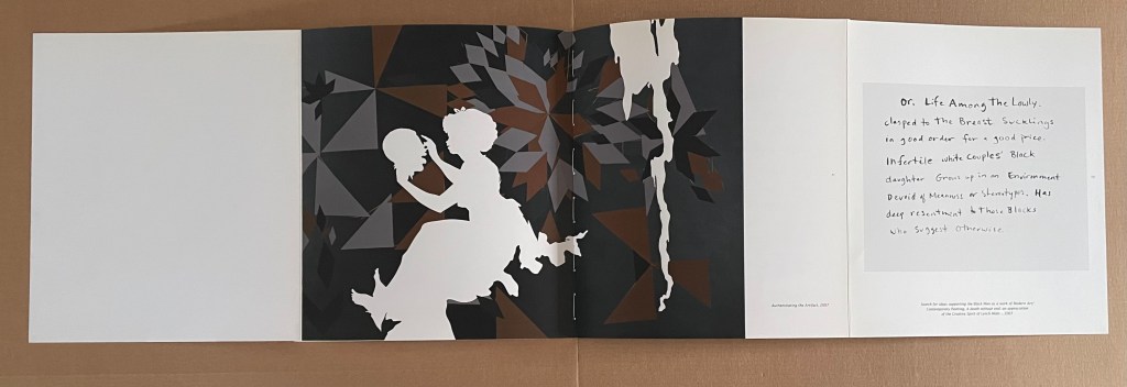
Where the exhibition separated the figurative from the textual, the book weaves them together. Three double foldouts are the closest the book comes to exploiting the codex form. The first presents two Search for ideas panels folded inwards and, when unfolded, a quadriptych of text panels. The second likewise consists of two text panels folded inwards, but when unfolded, they reveal a double-page image of the exhibition’s figurative 5-foot by 7-foot Authenticating the Artifact (2007) alongside one of the Search panels. Like the first, the third double foldout unfolds to present a quadriptych of text panels.
First double foldout still folded.
First double foldout unfolded.
Second double foldout unfolded.
The Search panels horrify with their words while the Bureau images horrify with their figures. Not all of the figurative works focus on America’s Reconstruction past. Some arise in the post-9/11 world and, like the Search series, find their horrors in the Sudan, the Congo, and Iraq. Woven together in the book, the two series underscore Walker’s perception of, in her words,
the continuity of conflict, the creation of racist narratives, or nationalist narratives, or whatever narratives people use to construct a group identity and to keep themselves whole–such activity has a darker side to it, since it allows people to lash out at whoever’s not in the group.
When viewing Kara Walker’s art, I am reminded of the refrain from one of Carly Simon’s songs: “You’re so vain, you probably think this song is about you, don’t you?”. It’s a double-edged irony. The addressee is damned if he doesn’t think it’s about him and damned if he does.
Walker’s is a multi-edged irony that cuts in many directions. Walker inhabits or projects a persona who is masochist and sadist, subject and object, self-centered and self-loathing, other-obsessed and other-fearing, Slave and Mistress. As a white viewer, collector, and writer about these works of book art, am I not entangled and complicit, too, however I respond to it? Caught out in shame and privilege, am I so vain that I think this art is about me? Damned if I don’t, damned if I do. Walker’s is the art of portraying a social madness. All parties — artist and viewer — are stuck in the muck of After the Deluge (2007), the muck of racist pathology. The terrible power of Walker’s art keeps our eyes fixed on it. Where either party can find solace is uncertain.
Further Reading
“Tia Blassingame“. 17 August 2020. Books On Books Collection.
“Emory Douglas“. 9 January 2026. Books On Books Collection.
“Sarah Matthews“. 15 February 2025.Books On Books Collection.
“Arial Robinson“. 15 May 2023. Books On Books Collection.
“Ruth E. Rogers“. 17 November 2025.Books On Books Collection.
“Clarissa Sligh“. 2 September 2020. Books On Books Collection.
“Carrie Mae Weems“. 14 February 2025. Books On Books Collection.
Gabor, Nora. 18 February 2021. “Black History and Experiences through Book Arts“. The Full Text: News about library resources and services. Chicago, IL: DePaul University. Accessed 22 January 2024.
Gleek, Charlie. “Centuries of Black Artists’ Books“, presented at “Black Bibliographia: Print/Culture/Art” conference at the Center for Material Culture Studies, University of Delaware, 27 April 2019, pp. 7-8. Accessed 20 July 2020.
Walker, Kara Elizabeth et al. 2003. Kara Walker : Narratives of a Negress. Edited by Ian Berry, Darby English, Vivian Patterson and Mark Rienhardt. Cambridge, MA: MIT Press. This exhibition-based volume is closest to the Bureau of Refugees‘ near-artist’s-book status. Walker’s writings on 3×5 index cards play the same role that the 54 panels of Search for ideas play in Bureau of Refugees. The landscape book’s monumentality evokes the scale of installations such as Virginia’s Lynch Mob (1998) and For the Benefit of All the Races of Mankind (Mos’ Specially the Master One, Boss. An Exhibition of Artifacts, Remnants, and Effluvia EXCAVATED from the Black Heart of a Negress VIII (2002) that appeared in the exhibitions organized by The Frances Young Tang Teaching Museum and Art Gallery at Skidmore College and the Williams College Museum of Art in 2003.