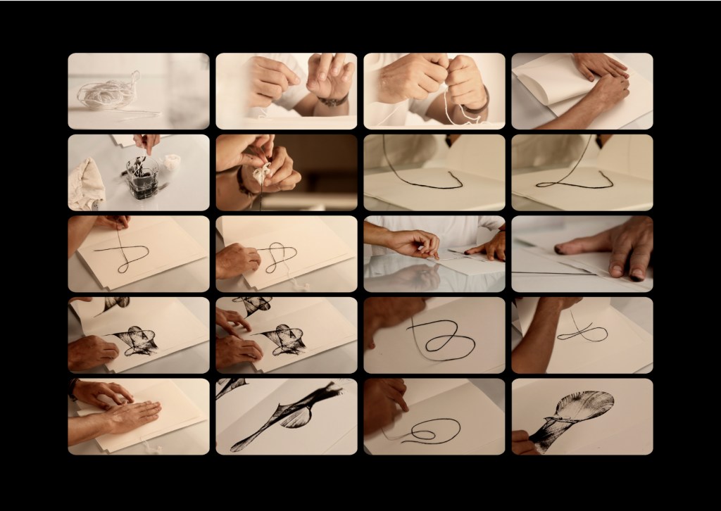
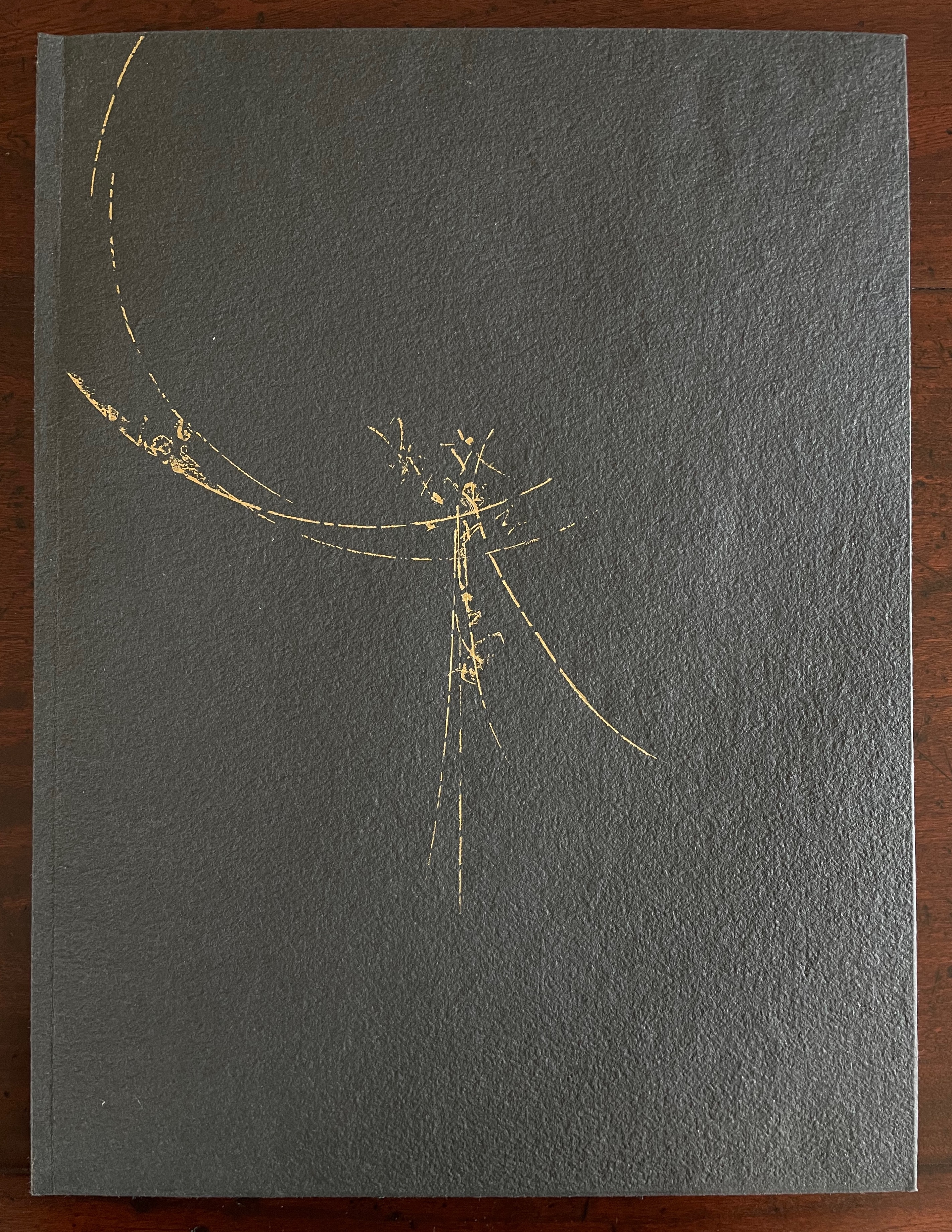
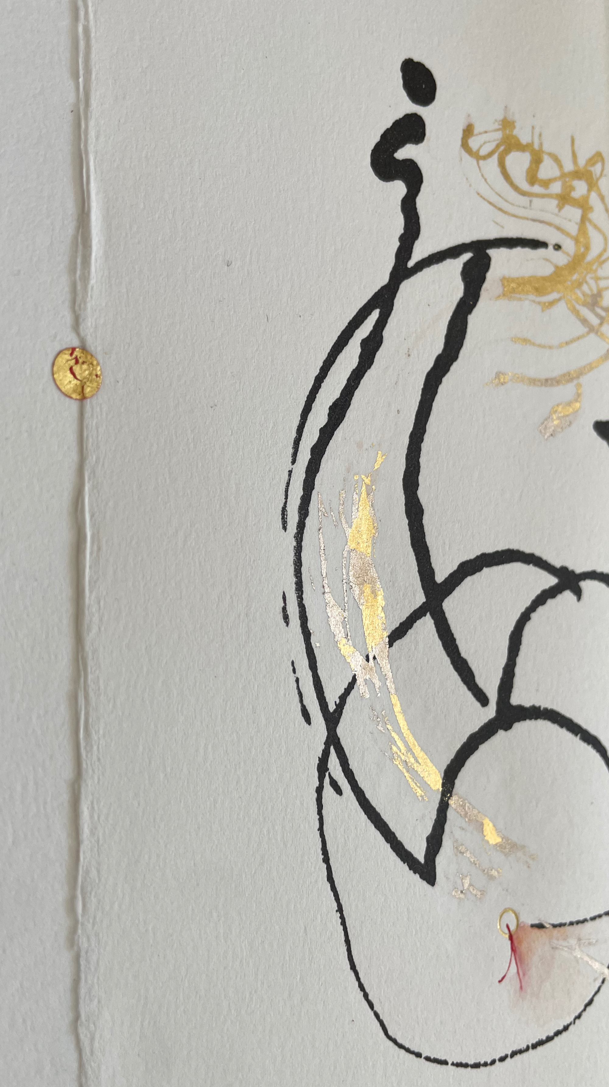
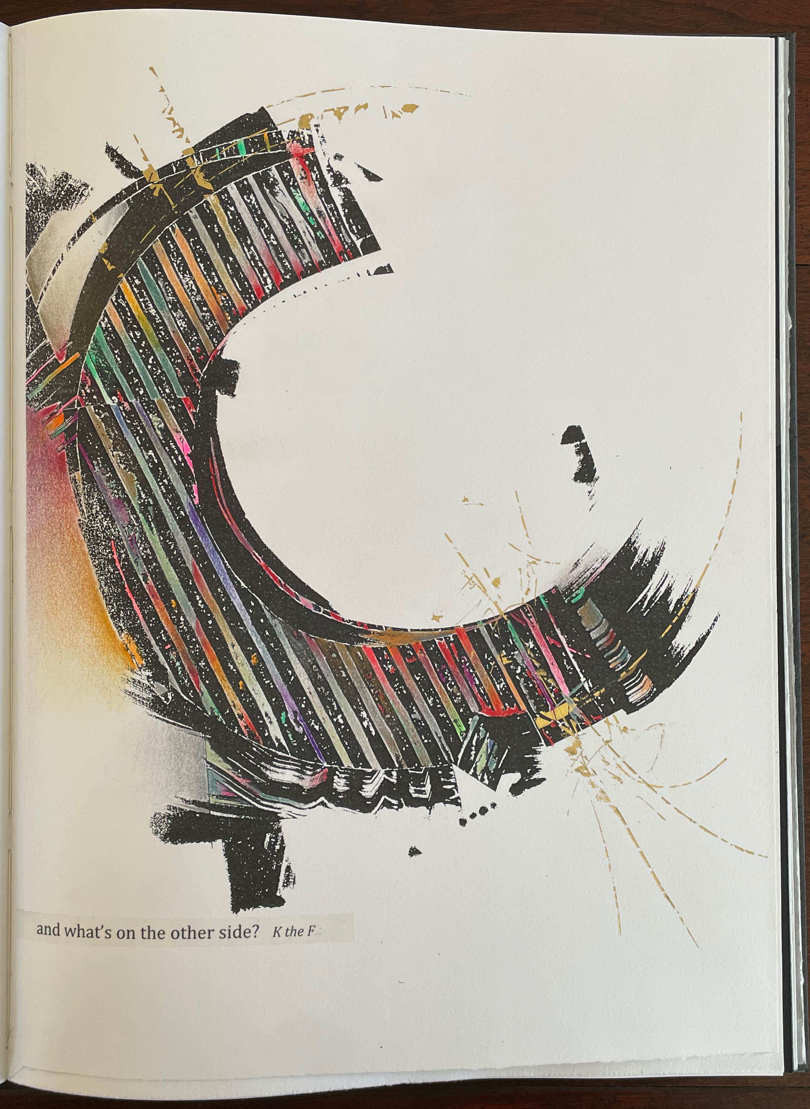
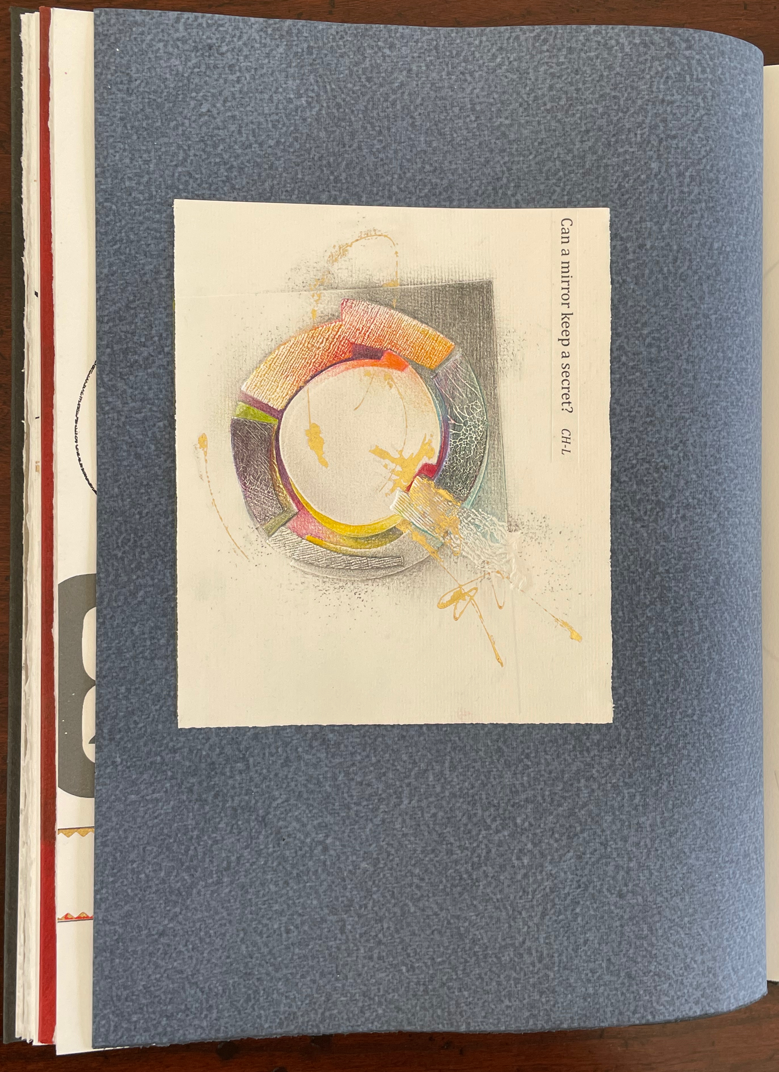
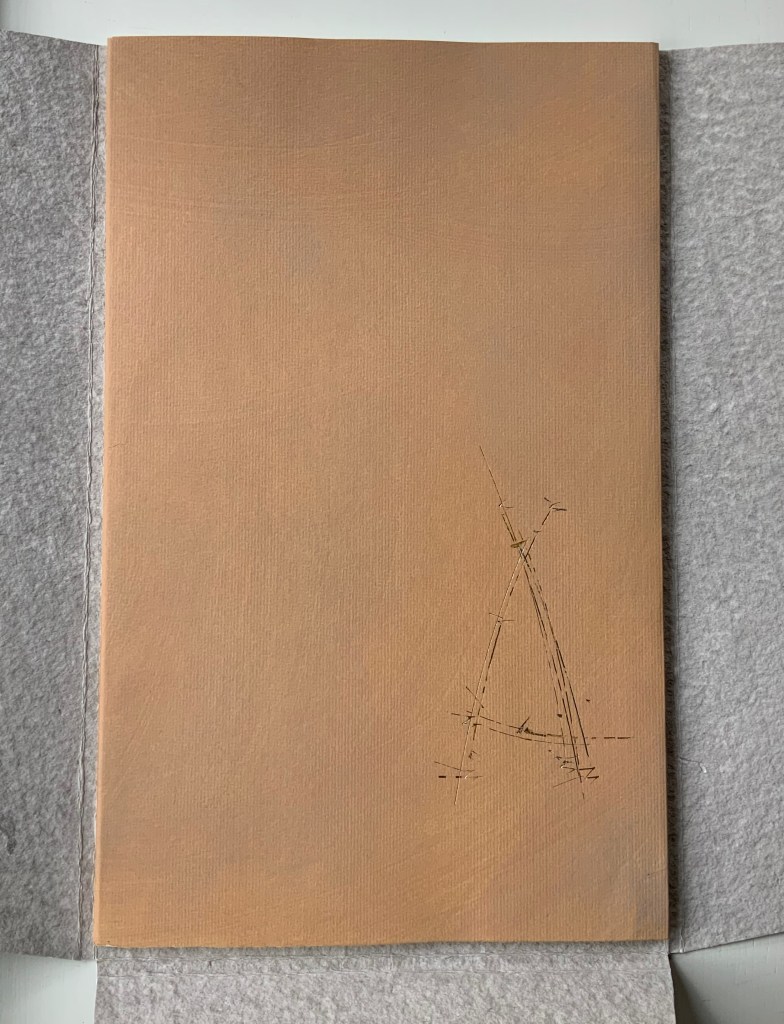
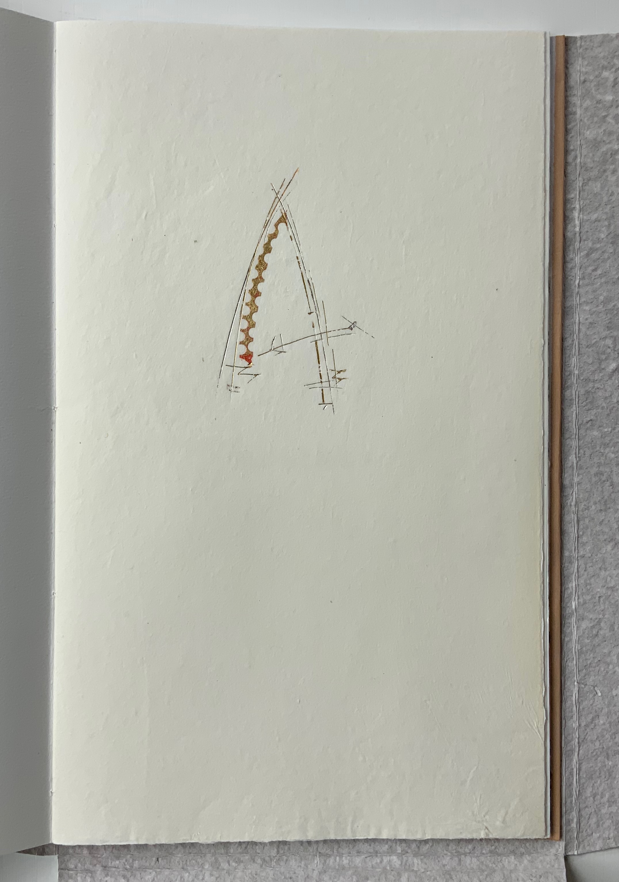
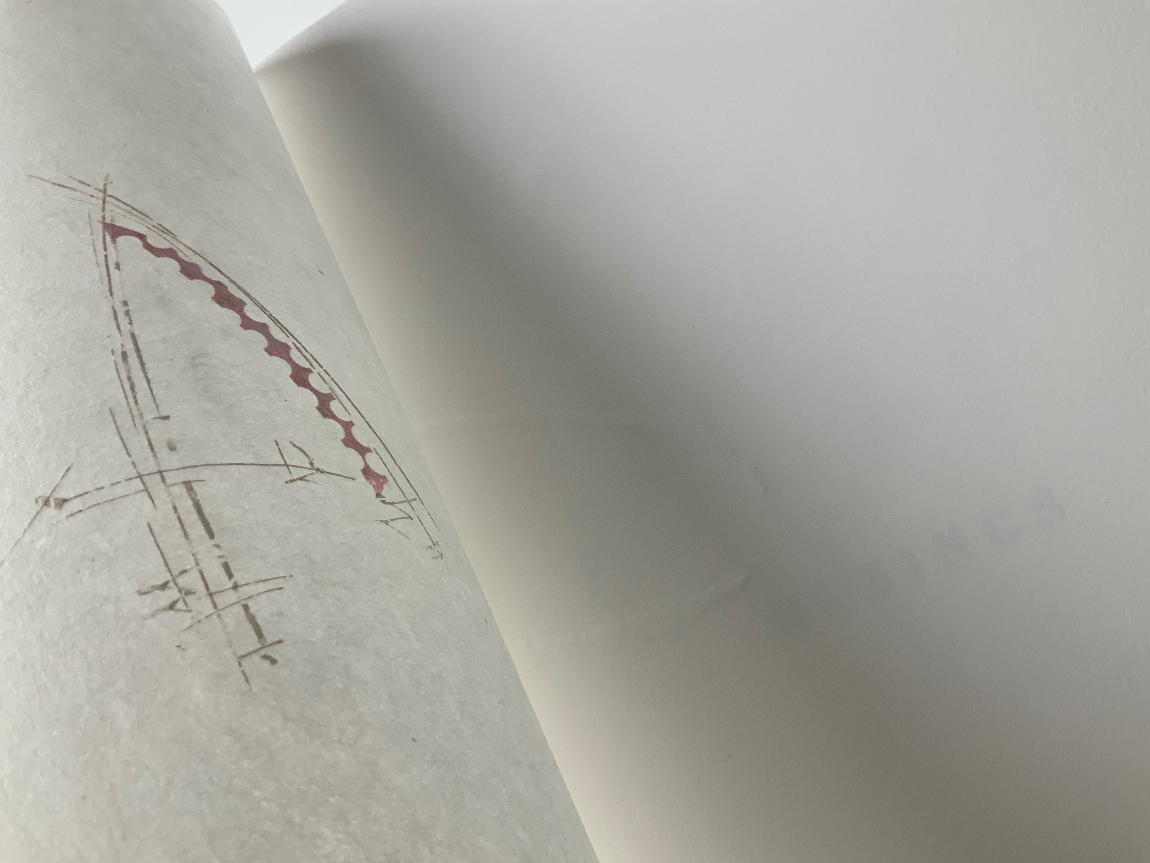
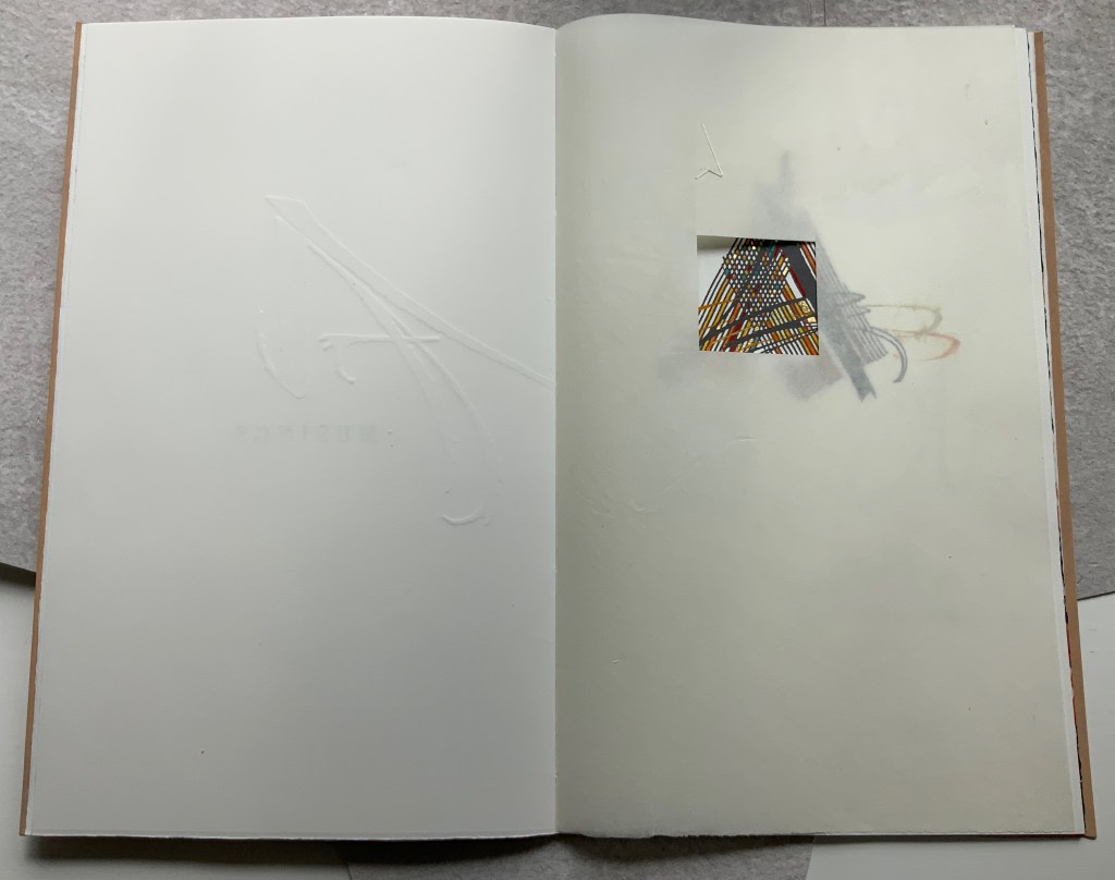
The Voice of the Yarn (2022) Pramod Chavan Casebound, glued, illustrated paper over boards, plain doublures. H325 x W235 mm. 66 pages. Acquired from the Artist, 20 May 2023. Photos: Courtesy of the artist.
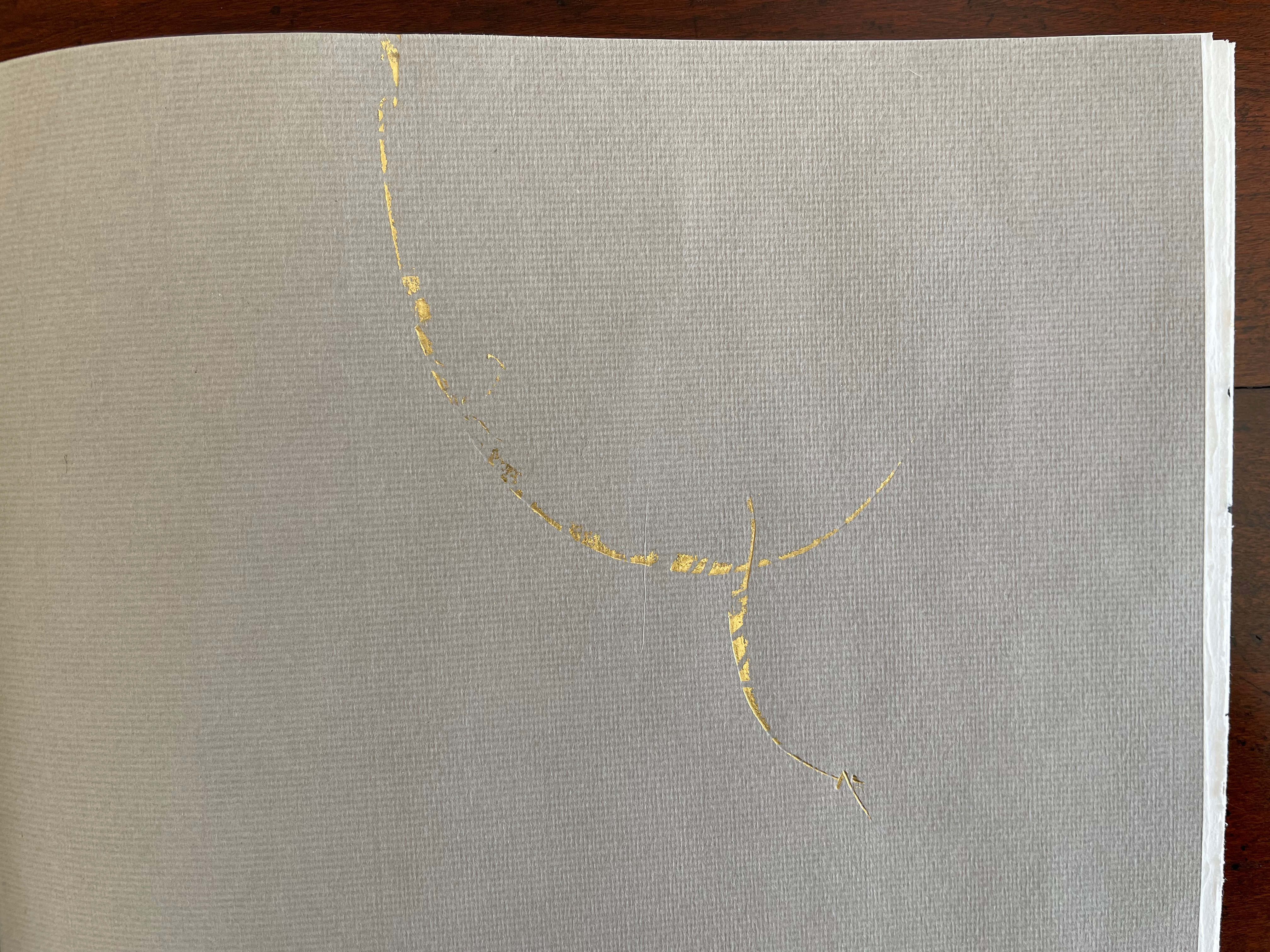
The technique of painting or printing by pulling a soaked string from a folded sheet of paper will be familiar to Western kindergarten and elementary school teachers. In India, the technique has been raised to an art form. The tradition of painting with rope, string or thread had its champion in the late B.K.S. Varma. Joining that tradition to the tradition of alphabet-inspired art is a new champion: Pramod Chavan.
Chavan calls his art “thread typography”. These process photos showing his manipulation of inked thread between folds of paper suggest that “thread calligraphy” might be just as apt. Whichever term, the results achieved — without direct sight of ink, tool and surface — are astonishing. It evokes the Punch cartoon of the kingfisher sitting on a branch and calculating in its speech bubble Snell’s law for entering the water to catch the fish swimming below the surface. Pramod Chavan must have a similar speech bubble filled with calculations for Bézier curves.
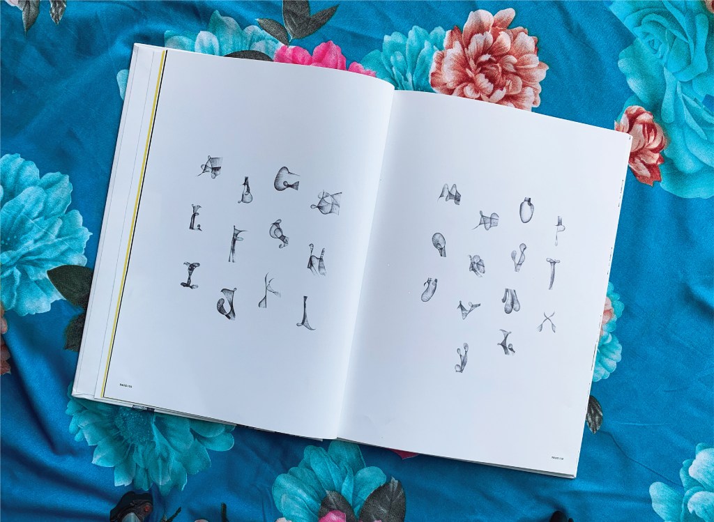
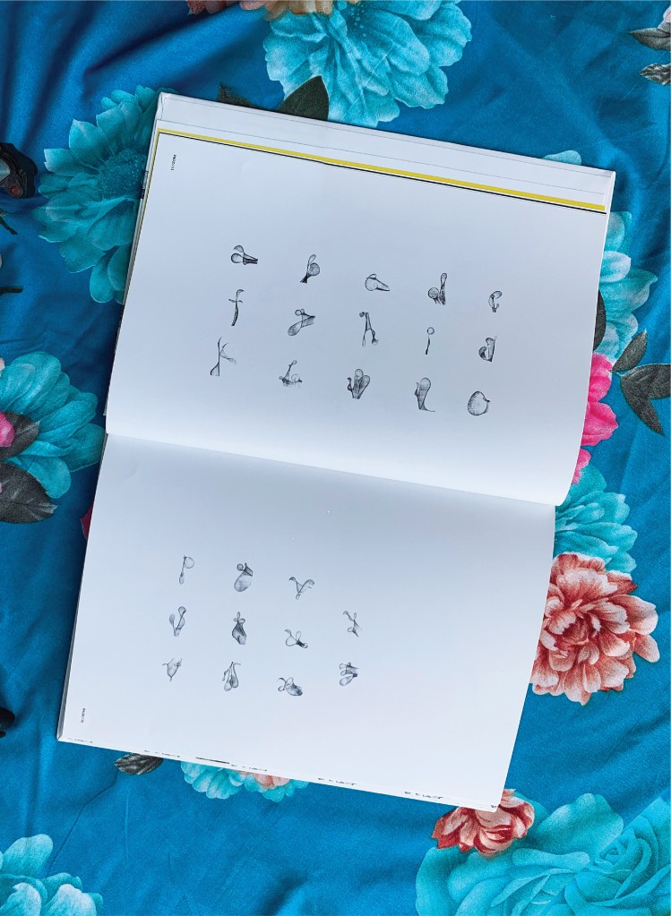
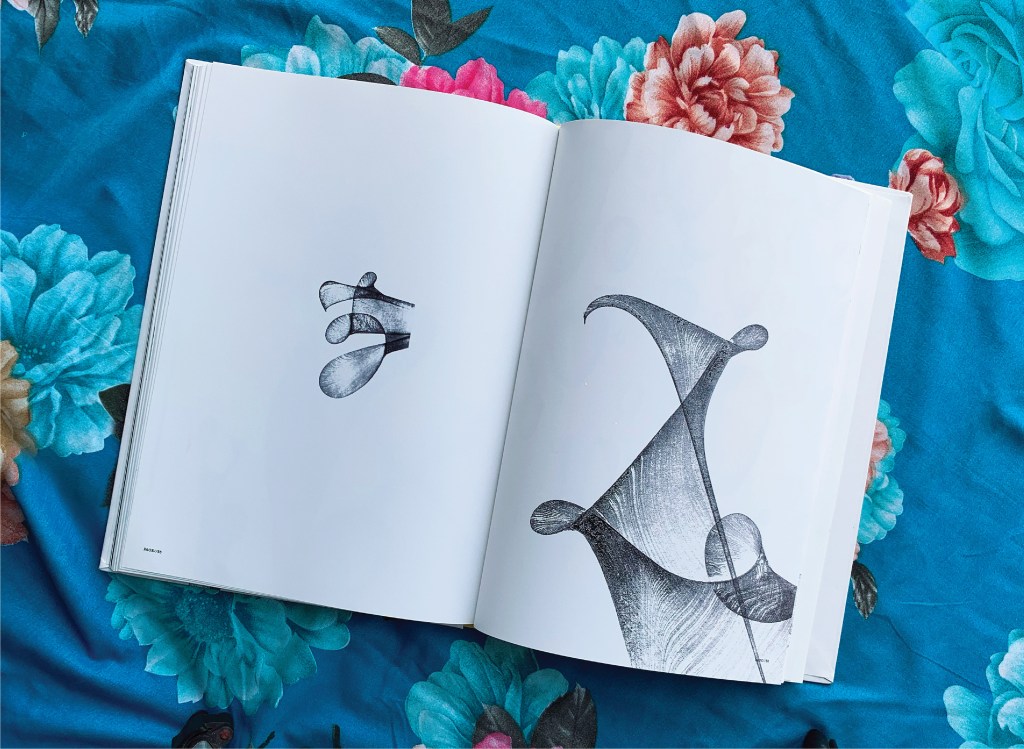
Between A and Z, The Voice of the Yarn lays out both the upper- and lower-case letters individually and the alphabet entire on double-page spreads like that above and below. The role of the fold in this technique is echoed in similar but very different ways by Jim Clinefelter’s A Rohrshach Alphabet (1999) and Étienne Pressager’s Mis-en-pli (2016).
The choice of background for photographing the double-page spreads makes a nod and smile to the usual floral images that arise when the technique is introduced for school — or after-school — art projects. Chavan’s thread typography springs from simple elements and opens into complex images — very much in the spirit of the alphabet itself.
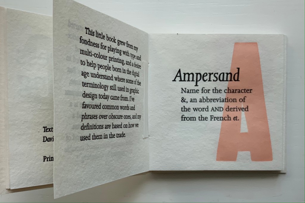
“Carol DuBosch“. 25 February 2023. Books On Books Collection. If DuBosch recapitulates her Alphabet of Calligraphic Tricks (2014), perhaps she can persuade Chavan to contribute an ampersand!
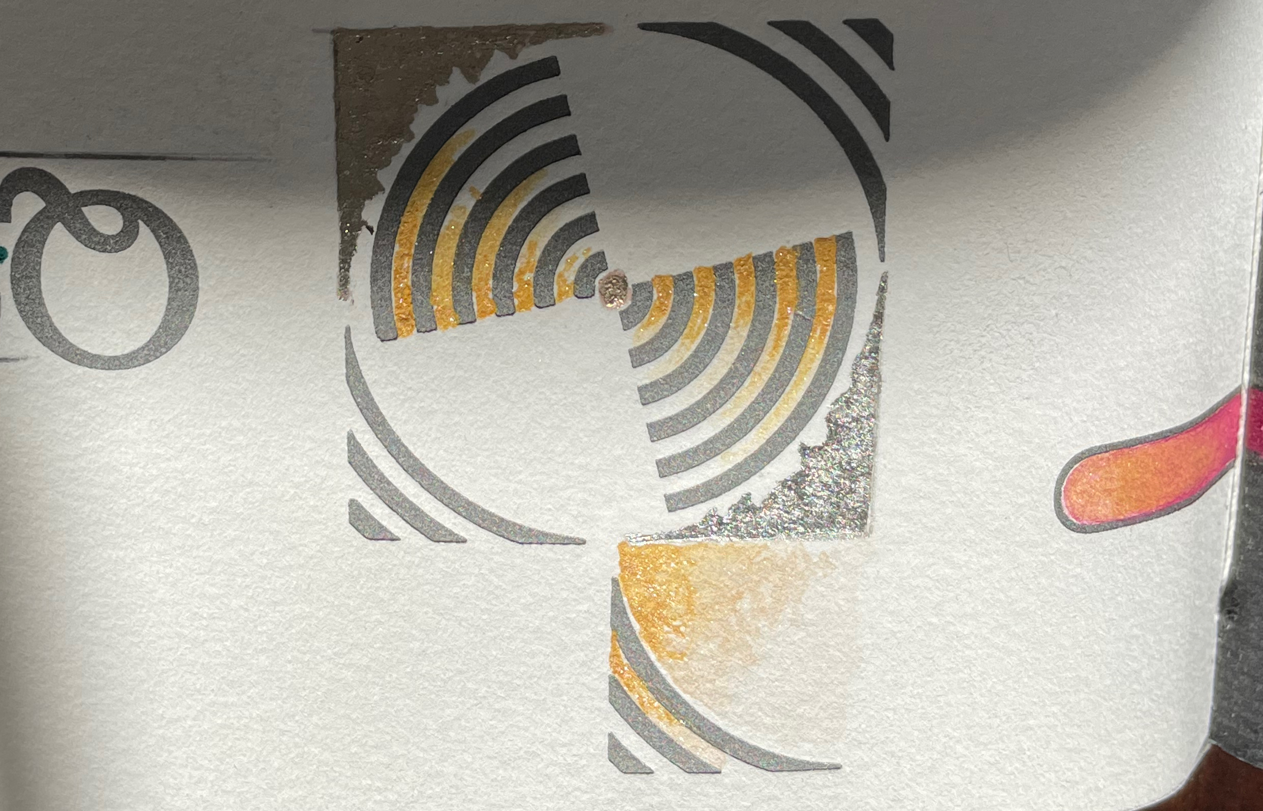
ABC of Typography (2019) David Rault Casebound, sewn, illustrated paper-over-boards cover, endbands, sewn, red doublures. H265 x W195 mm. 128 pages. London: Self Made Hero [Translated from French (Gallimard, 2018)]. Acquired from The Saint Bookstore, 29 June 2023. Photos: Books On Books Collection.
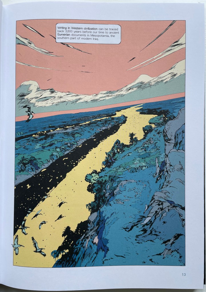
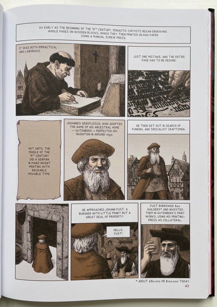
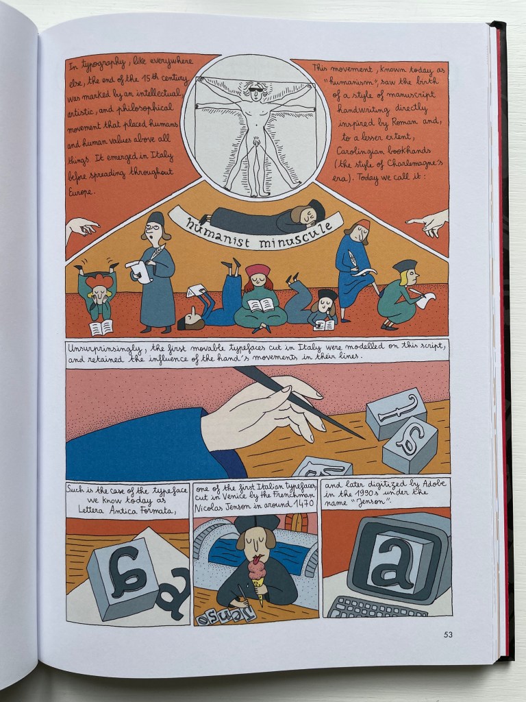
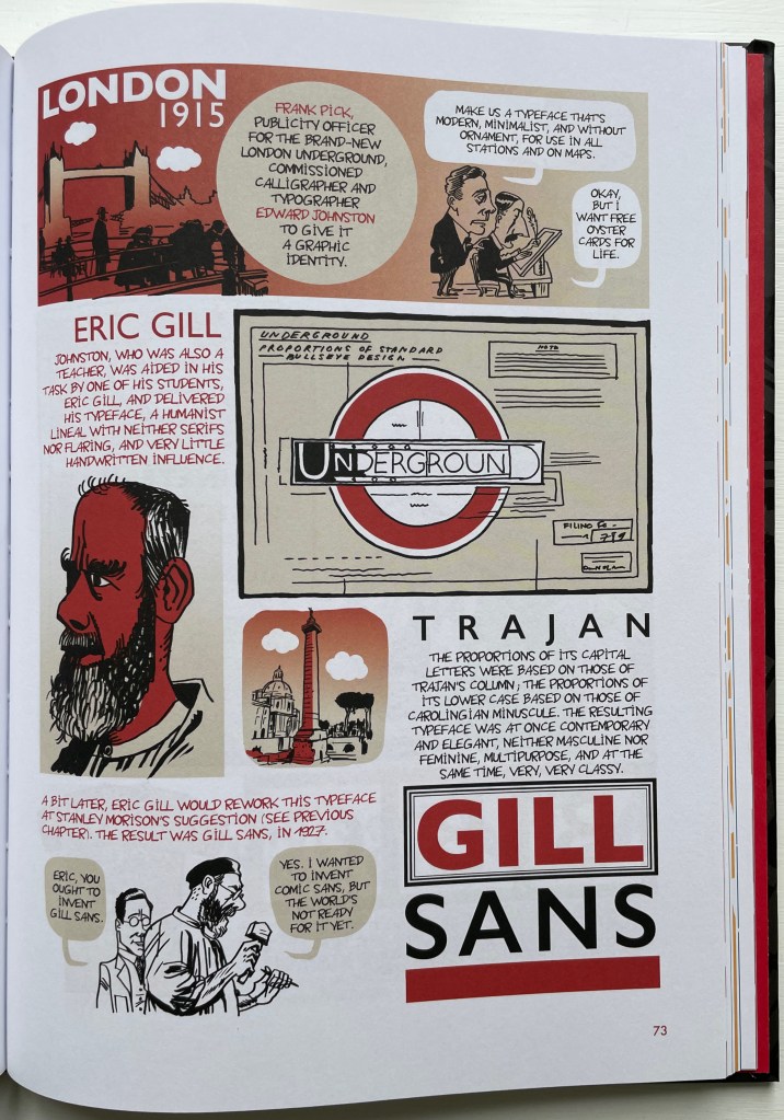
David Rault’s ABC of Typography traces 3,500 years of letters and type from pictographs and cuneiform through Roman lettering and Gutenberg to the Bauhaus and beyond. For the Books On Books Collection, it enriches the focus on the alphabet, typography and artists’ books — in particular, that subset of illustrated histories of the alphabet and type. These include Tommy Thompson’s The ABC of Our Alphabet (1952), William Dugan’s How Our Alphabet Grew (1972), Tiphaine Samoyault’s Alphabetical Order (1998), James Rumford’s There’s a Monster in the Alphabet (2002), Ada Yardeni’s A-dventure-Z’ (2003), Don Robb and Ann Smith’s Ox, House, Stick (2007) and Renzo Rossi’s The Revolution of the Alphabet (2009).
While enhancing that subset of illustrated reference works, ABC of Typography also highlights a gap in the collection. Rault and his team of invited artists hail from the Franco-Belgian tradition of lesbandes dessinées (BDs), which the French and Belgians call laNeuvième Art (“the Ninth Art”). English-language readers will likely be familiar with BDs from seeing Hergé’s Tintin or René Goscinny’s Asterix. Other than Chiavelli’s Arthur R./Un Coup de DÉS Jamais N’Abolira le HASARD (1988) and its two companion volumes, the collection has no BDs. The Rault volume does, however, deliver a mini-survey of styles among contemporary bandes dessinateurs with its assignment of chapters to eleven different artists.
The book’s overall design by Jean-Christophe Menu simultaneously embraces and sets off the individual styles of drawing and lettering. Menu’s consistent use of a slab serif font (Lubalin Graph Std?) for chapter titles alongside oversized chapter numbers that bleed off the facing page signals his intent and success.
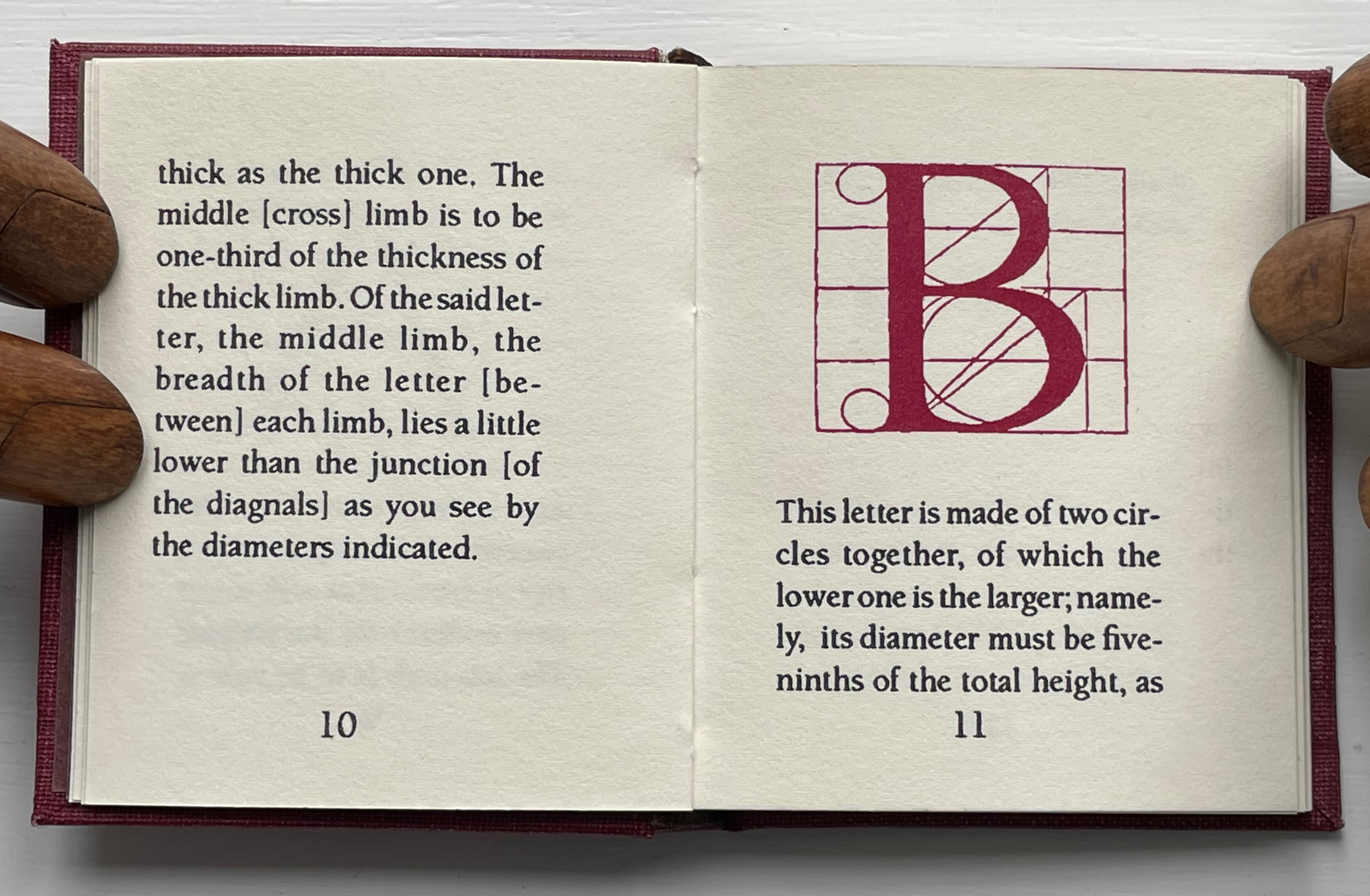
The variety of “strip” layouts pushes the boundaries of unity. Some, like Libon’s and Clérisse’s, float on the page. Others, like Singeon’s and Simon’s, are ruled off. Within the strip layouts, panels vary in shape, and the images within them tilt at different angles, all creating as much of a sense of movement as any action comic. Even where a strip is ruled off, sketches sometimes encroach across panels as well as the book’s margins or gutter to give depth and perspective as well as movement. as happens with the gulls in flight below from Aseyn’s chapter.
Note how the gulls in flight in Aseyn’s chapter appear within panels but also cross them and the gutter.
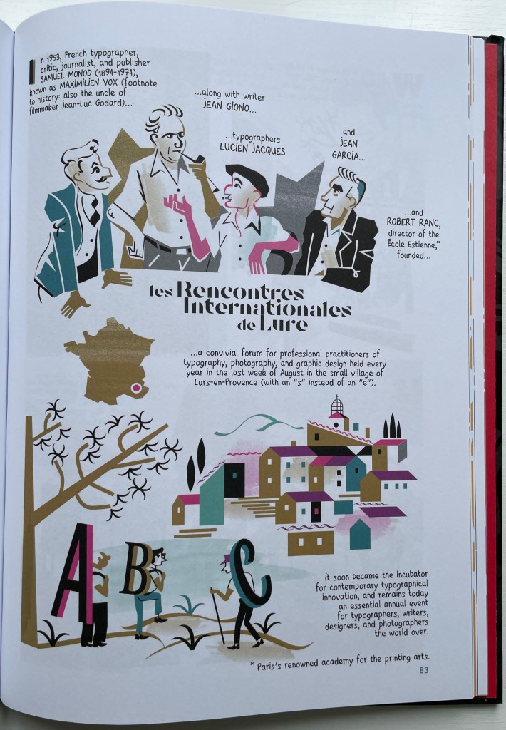
Evident from Clérisse’s recounting of “Les Rencontres internationale de Lure” (an influential annual forum in Provence), Simon’s homage to the typologist Maximilien Vox (one of the forum’s founders) and Ayroles’ positioning of the typeface DIN, the volume’s European roots are never far from the surface, which also makes ABC of Typography a useful and necessary addition to this collection or any shelf of Anglo-centric works about the alphabet, type or design. It’s interesting that, while the French have categorized BDs as the ninth among the ten officially designated arts, typography and design do not yet rate a category. Neither does the livre d’artiste for that matter, which raises a question:
Between the traditional BD and livres d’artistes by graphic artists, is there fertile ground for artists’ books that blend subject, material, form and metaphor into innovative works of book art? The above-mentioned BD by Chiavelli, paying homage to Mallarmé’s Un Coup de Dés, represents one end of that spectrum. Hervé di Rosa, part of the Figuration libre movement, associated with Keith Haring and graffiti artists, can provide the other end of the spectrum with his Un Coup de Dés jamais n’abolira le Hasard (2021), published by Virgile Legrand. For the work of book art between them, Nanette Wylde’s Babar Redacted: ABC Free (2020) might be a case in point. Likewise, Catherine Labio’s curated exhibition in 2013 — “From Bande Dessinée to Artist’s Book” — finds earlier exemplars in the works of Lars Arrhenius, Felicia Rice, Omar Olivera and Mamiko Ikeda.
Babar Redacted: ABC Free (2020) Nanette Wylde Based on an altered copy of the board book B is for Babar: An alphabet book by Laurent de Brunhoff. French link exposed spine on tapes. 9″ x 9″ x .5″ closed. Edition of 3. Photos: Courtesy of the artist.
“Richard Niessen“. 23 April 2021. Books On Books Collection.
Library of Congress. “Bande Dessinée: Comics & Graphic Novels“, in “Reading in French: A Student’s Guide to Francophone Literature & Language Learning”. Library of Congress Research Guides. Accessed 11 August 2023.
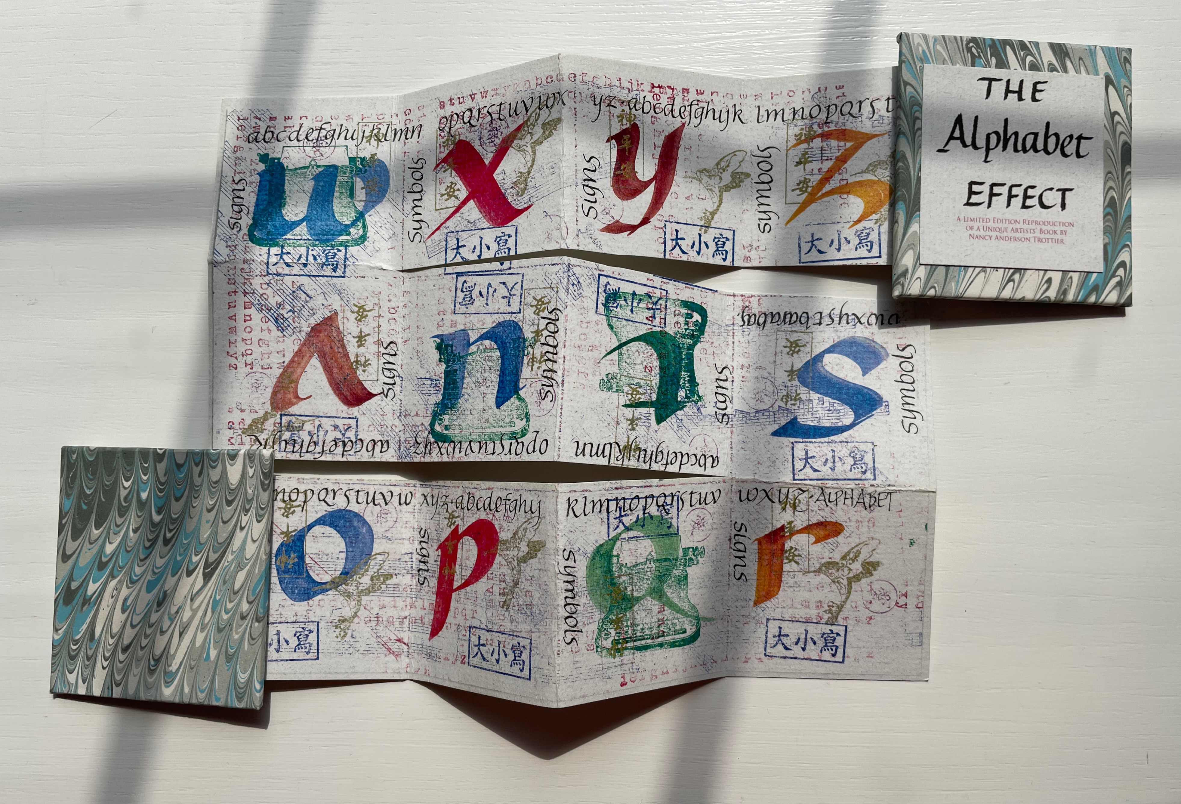
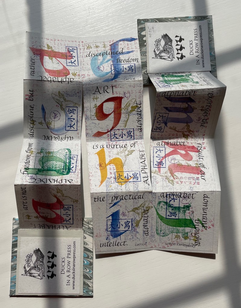
The Alphabet Effect (2013) Nancy Anderson Trottier Double-sided meander fold. 630 x 630 mm. 24 panels. Edition of 15. Acquired from Bromer Booksellers, 2 August 2022. Photos: Books On Books Collection.
This miniature reproduces a larger unique artist’s book created by Nancy Anderson Trottier. Bound in marbled boards with ribbon ties, the small book’s text concerning art and philosophy meanders among stamped signs and symbols and calligraphed letters of the alphabet printed on both sides of a single sheet cut and following the meander fold structure. When the “pages” are unfolded and rearranged into the single sheet fully extended, the alphabet effect appears. To squeeze 26 letters into 24 panels, the letters e and f are paired on one panel, as are k and l on another.
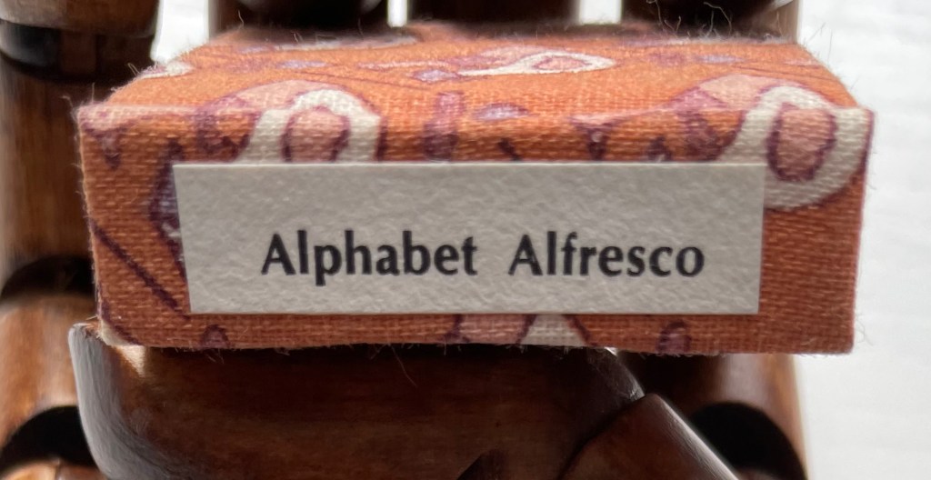
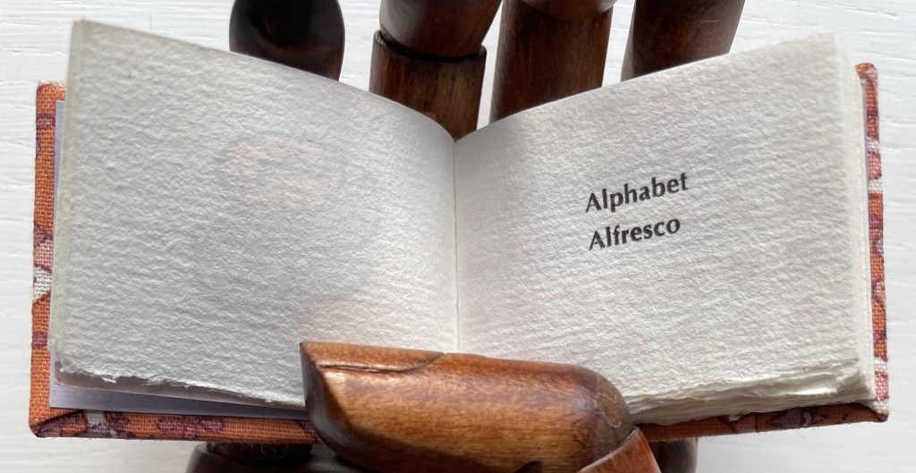
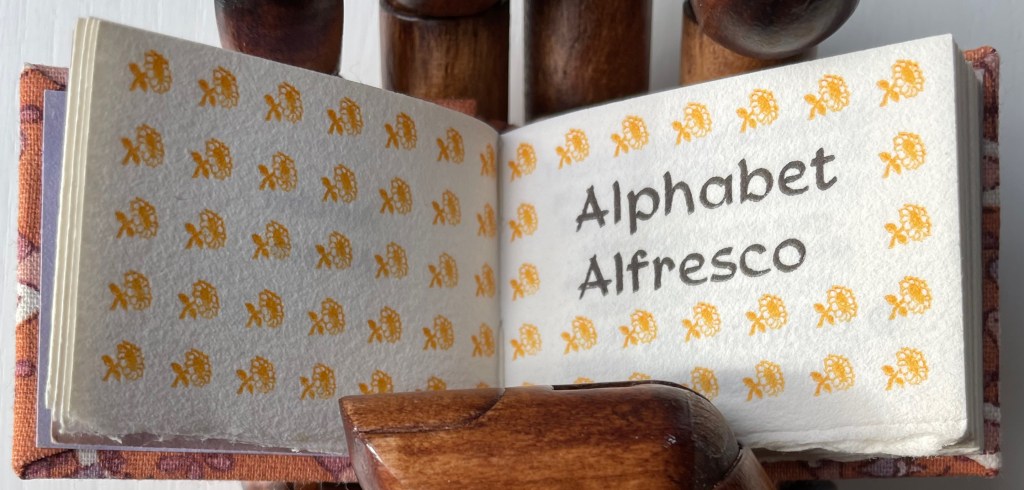
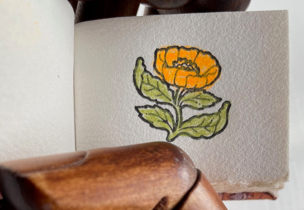
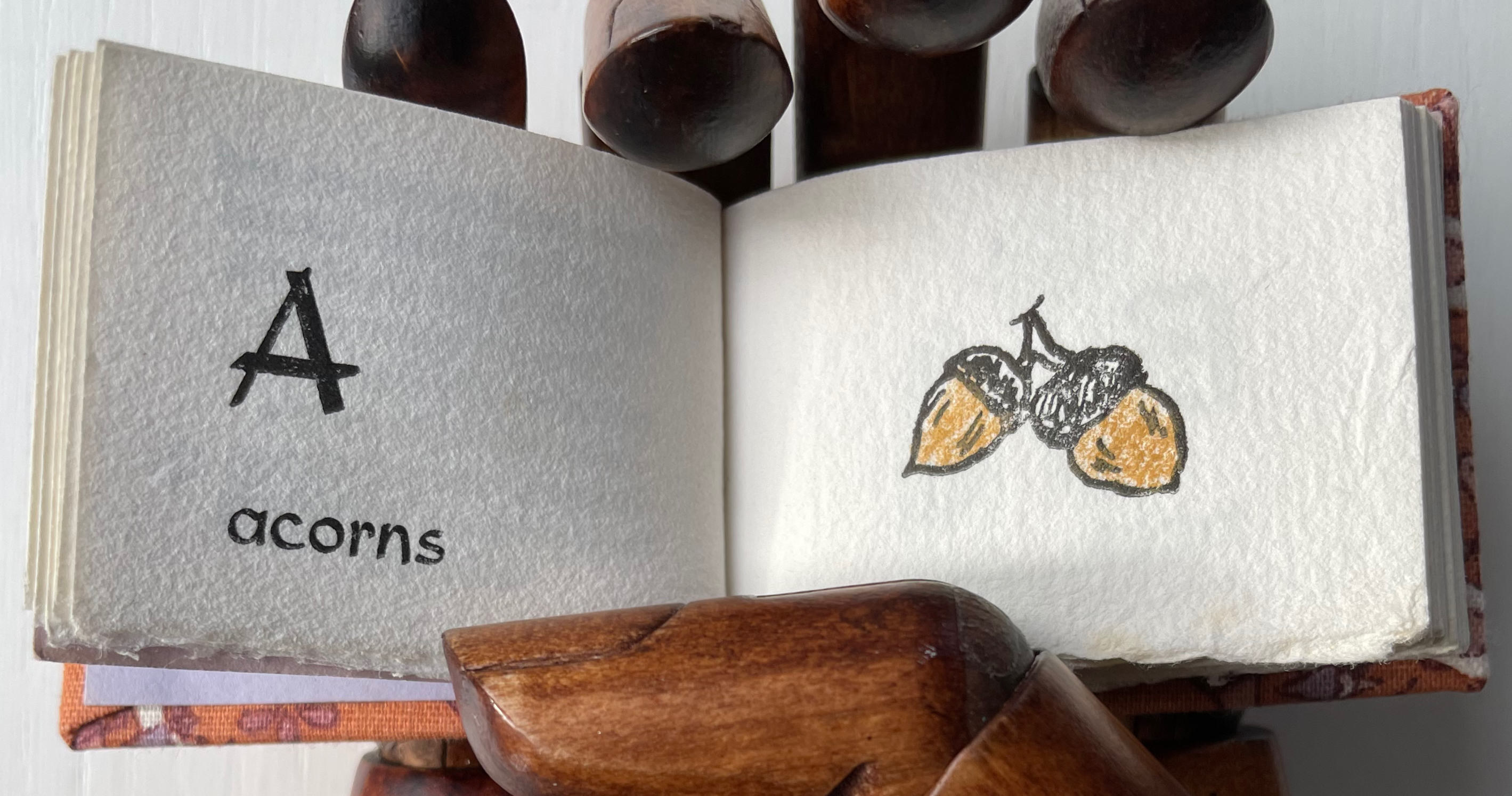
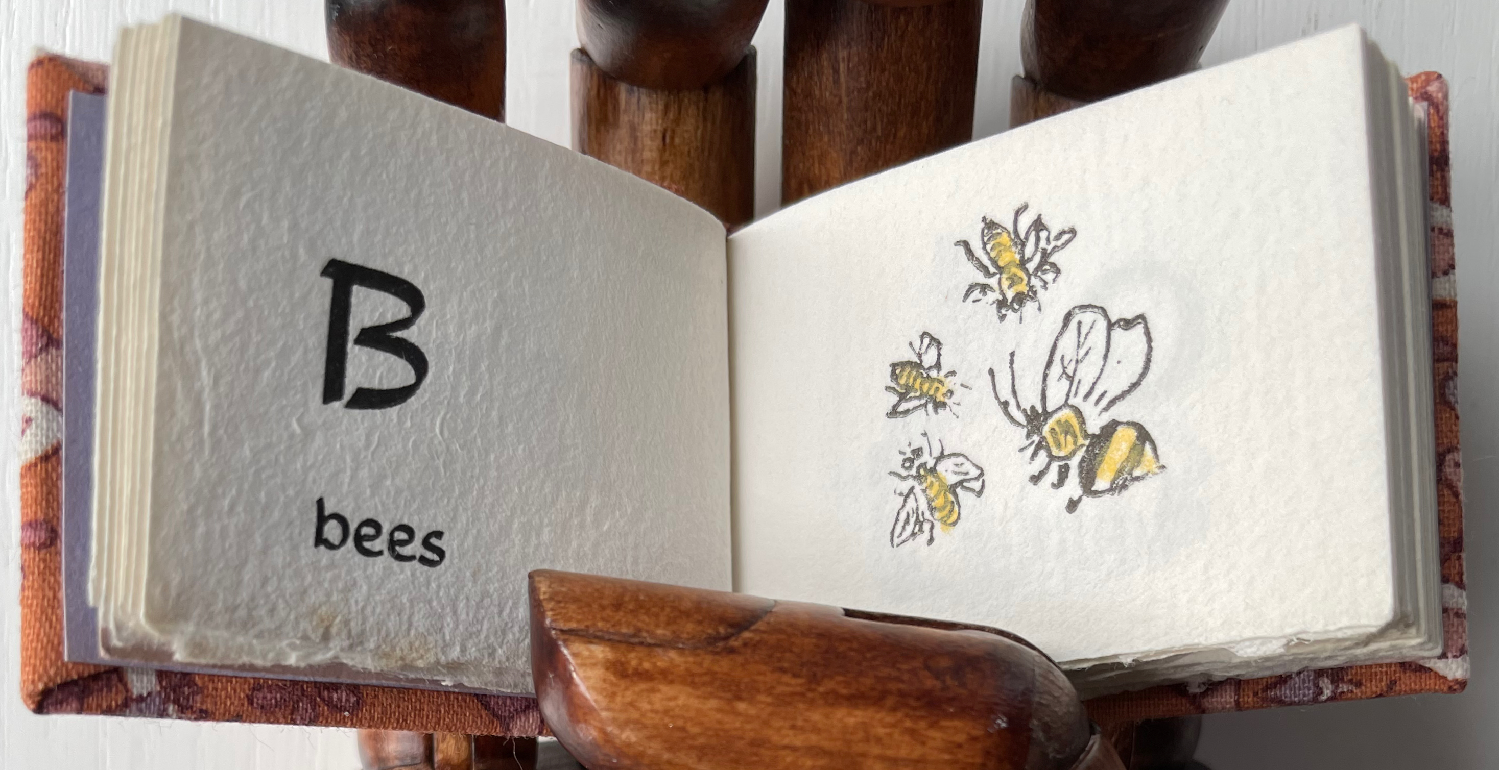
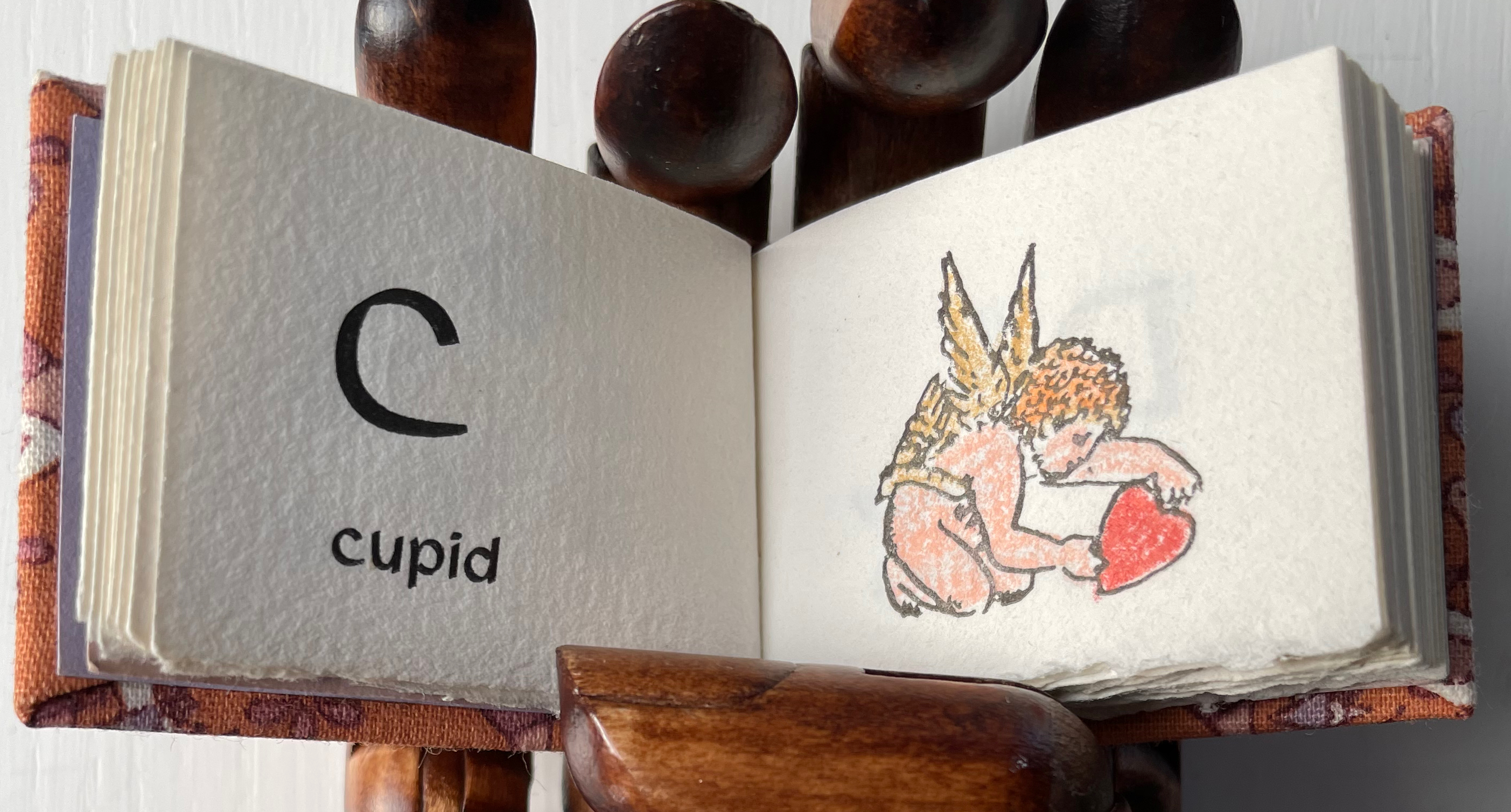
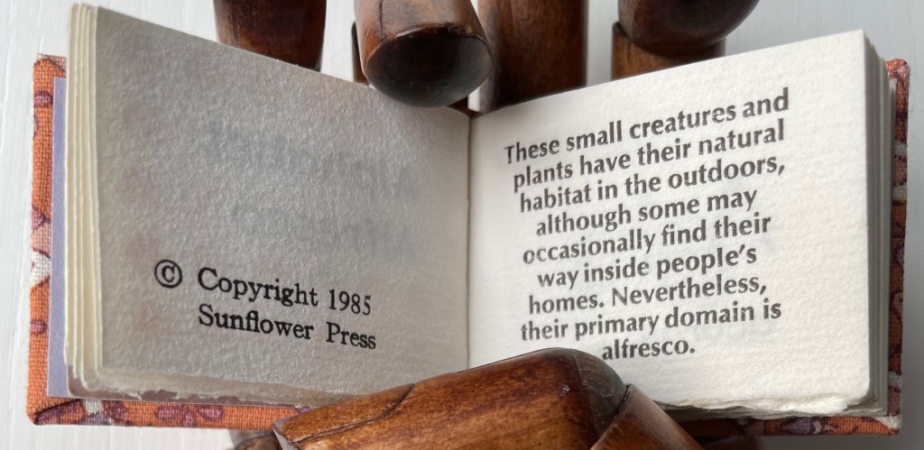
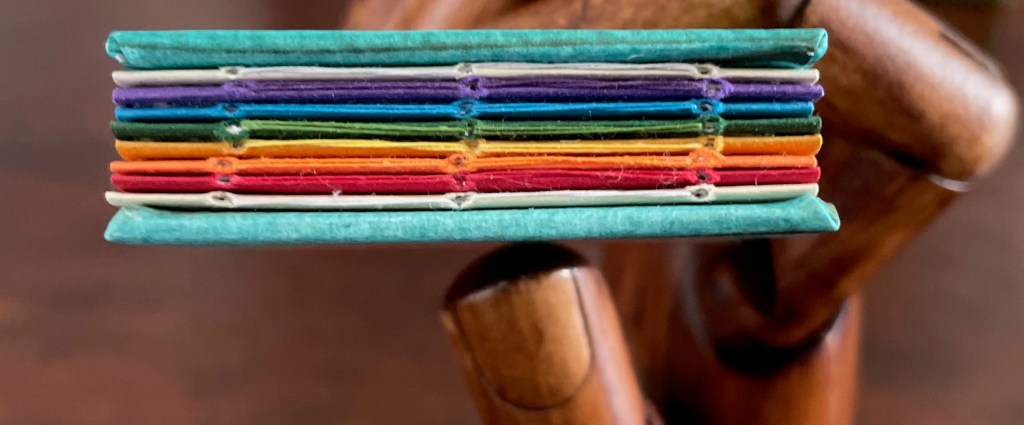
Alphabet Alfresco (1985) Carol Cunningham Casebound miniature, decorated cloth, colored doublures. H40 x W52 mm. 68 pages. Acquired from Lorson’s Books & Prints, 5 December 2022. Photos: Books On Books Collection.
Carol Cunningham’s Sunflower Press produced many gems like this. Founder of the Miniature Book Society in 1983, Cunningham also produced numerous oil paintings and prints, some of which can be found here.
If ever the dictum “Less is more” applied, it applies here — with miniaturized tongue in cheek, of course. [Links in the captions will take you to more images and details.]
These two miniatures — Albrecht Dürer’s Directions for the Construction of the Text or Quadrate Letters (1993) and Fra Luca de Pacioli’s The Divine Alphabet (1993) — were produced by Tabula Rasa Press for a three-volume set, including Ben Shahn’s The Alphabet of Creation (1954). Although the miniature edition of Shahn remains elusive, the original edition can be seen here.
Mark Van Stone, The Evolution of the Medieval Decorated Letter(1985) In the spirit of medieval illuminators, Van Stone has imitated the hand of twenty-three of what he calls the “semi-precious jewels” of “‘minor’ illumination that usually receives little attention in the Art-History books”.
Carol DuBosch, Embossed Alphabet Gallery (2019).* This gallery structure combines elements of the flag-book and leporello to create a freestanding sculptural book to be read “in the round” — although in the Bodleian exhibition it was fixed in a wall case that allowed 180º view.
Claire Van Vliet, Tumbling Blocks for Pris and Bruce (1996).* A meander-fold book hinged to keep the cube unfolding, refolding and unfolding as it falls from hand to hand.
Carol Cunningham, Alphabet Alfresco(1985). One of several gems created by the founder of the Miniature Book Society (1983).
William Cheney, ABC for Tiny Schools ( 1975). Along with “A was an archer”, the “A was an apple pie” was among the earliest themes for secular alphabet books.
Alphabet Salmagundi(1988) and Golden Alphabet (1986) demonstrate the breadth of Rebecca Bingham’s interest in various periods and techniques of calligraphy.
Another Tabula Rasa Press production, Arthur Maquarie, The Uffizi ABC: a facsimile reproduction in miniature (1992)
Pat Sweet’s wit led her to fill the ancient Egyptians’ previously unperceived need for an alphabet book with Hieroglyphs (2009).
June Sidwell, Lady Letters (1986). Another production by Rebecca Bingham, which also led to a miniature nod to another alphabetist — Erté.
Nicolas McDowall, A Bodoni Charade (1995). Don’t let delight in the verbal/visual punnery distract you from wondering at the skill with type and letterpress needed to pull this off.
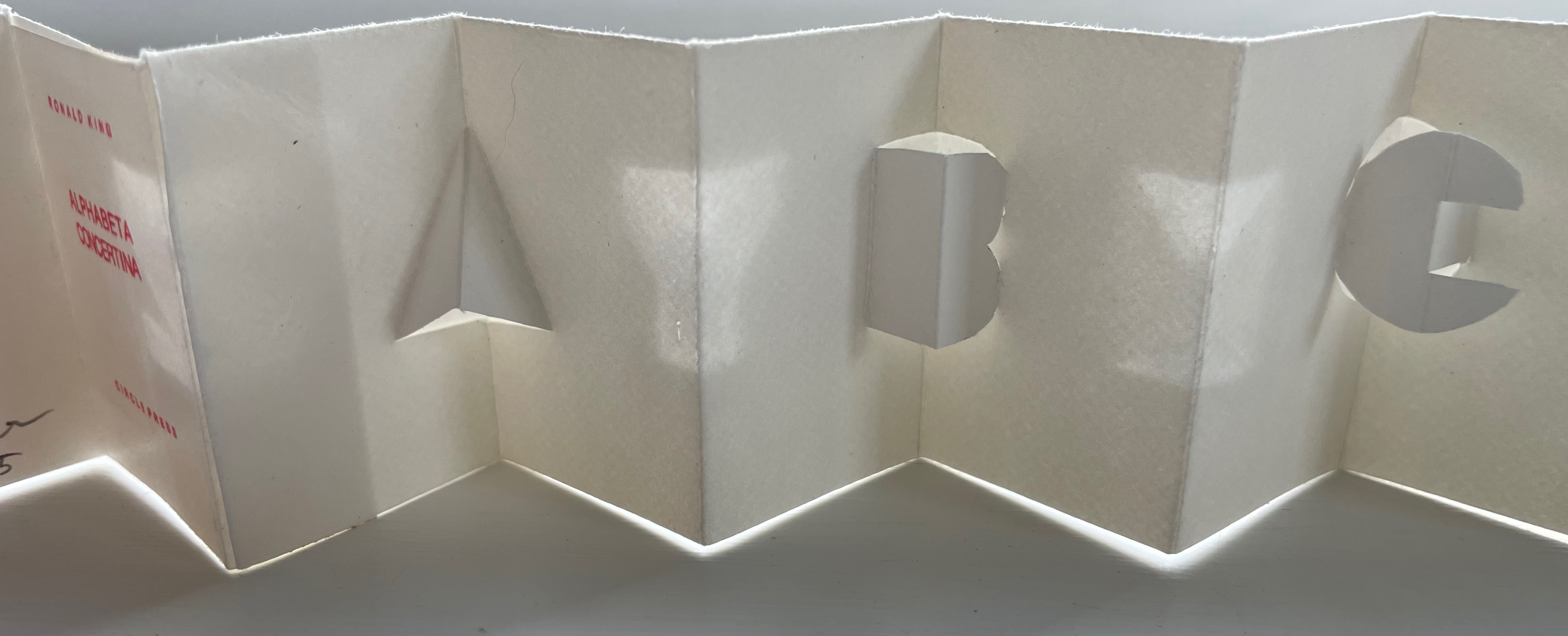
Erwin Huebner and Ron King, Alphabeta Concertina Majuscule (2015) and alphabeta concertina miniscule (2022). Miniaturist and microbiologist, Huebner obtained Ron King’s permission to reproduce King’s two signature pop-up alphabets with extraordinary results.
Juniper Von Phitzer, An Alphabet Coloring Book by Theodore Menten (1997). Lloyd L. Neilson compiled the name of his Juniper Von Phitzer Press from the names of his three cats. Theodore Menten had produced a coloring book called The Illuminated Alphabet in 1971 for Dover Publications. Obviously Juniper Von Phitzer could not fail to pounce.
Online Exhibition Bonus!
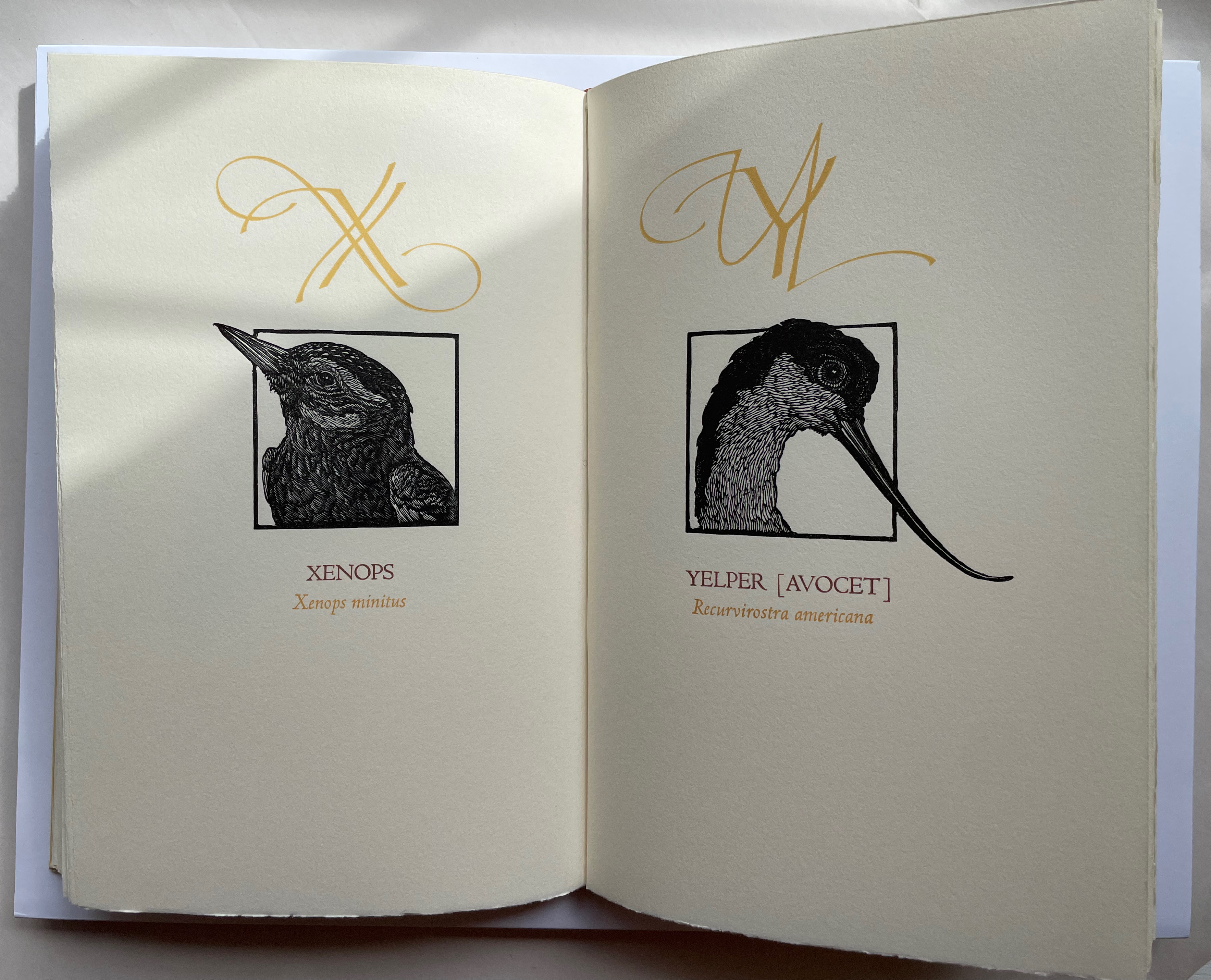
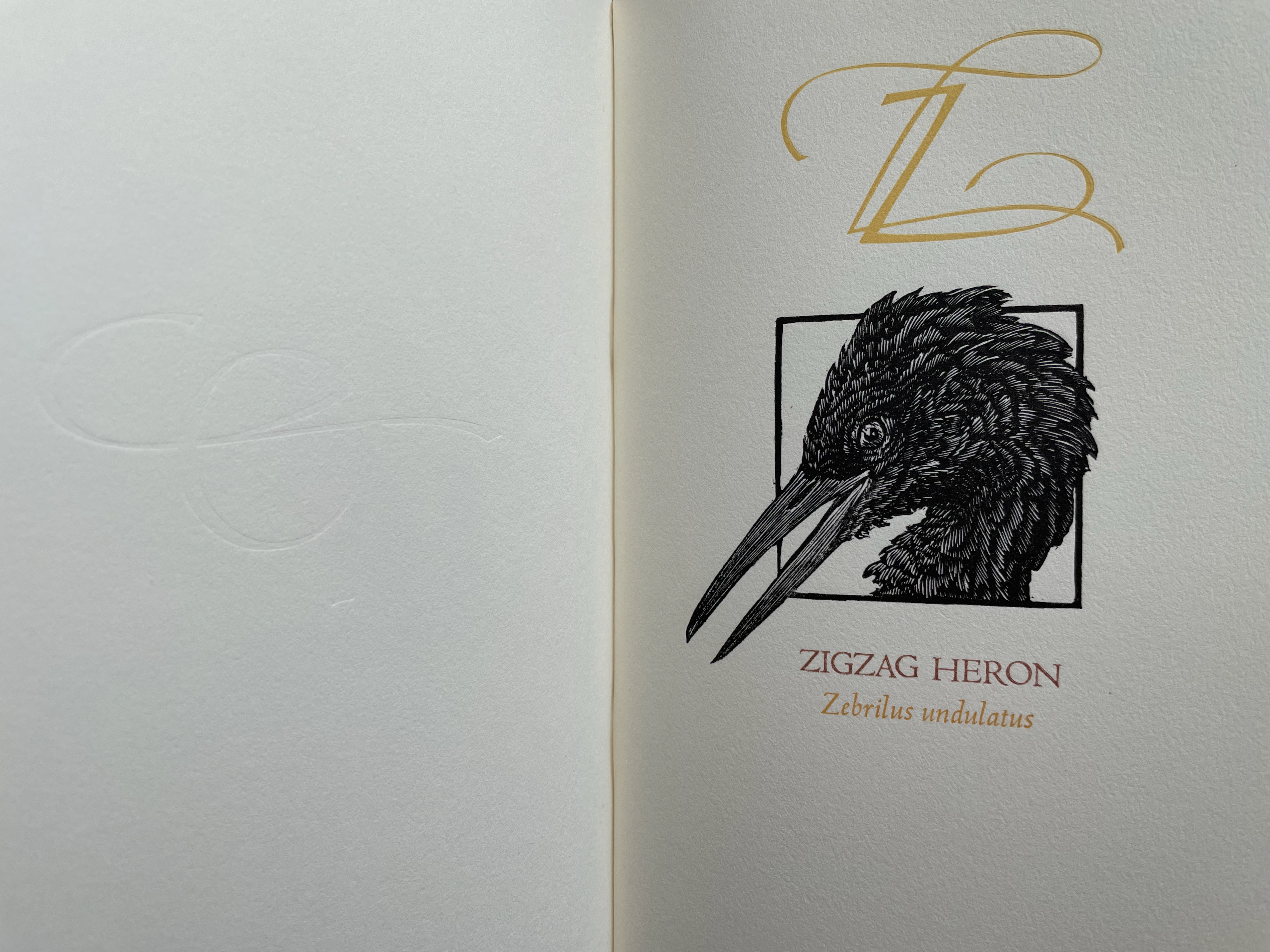
Many of the ABC books in the collection use the accordion, concertina or leporello structure, but none but Maria G. Pisano’s XYZ (2002) combine fine beaten abaca in two colors and the watermark technique to achieve their effect.
With 260 illustrated books to his name and 90 of them authored by him, Leonard Everett Fisher would have been remiss not to have contributed works to the category of alphabets and artists’ books.
Leonard Everett Fisher offers thirteen non-English languages — Arabic, Cherokee, Chinese, Cyrillic, Eskimo, Gaelic, German, Greek, Hebrew, Japanese, Sanskrit, Thai and Tibetan — each with an illustrative image alongside a page of background text followed by a double-page spread of hand-drawn characters of the writing system. Unlike Tommy Thompson’s The ABC of Our Alphabet (1952) and William Dugan’s How Our Alphabet Grew (1972), Fisher’s book does not focus on the development of the Latin alphabet, but unusually aims instead to interest the children’s market in the variety of non-Latin alphabets. In this, it is a precursor to Sam Winston’s One & Everything (2022).
The book has no bibliography or indication of sources, and the background text’s few slightly off-center assertions (e.g., that the Chinese writing system is a syllabary) create a slight unease about the accuracy of the character sets. Nevertheless, for calligraphic inspiration, the double-page presentation of consistent hand-drawn character sets delivers strong impressions of the differences in the look and feel among the languages’ writing systems.
The ABC Exhibit (1991)
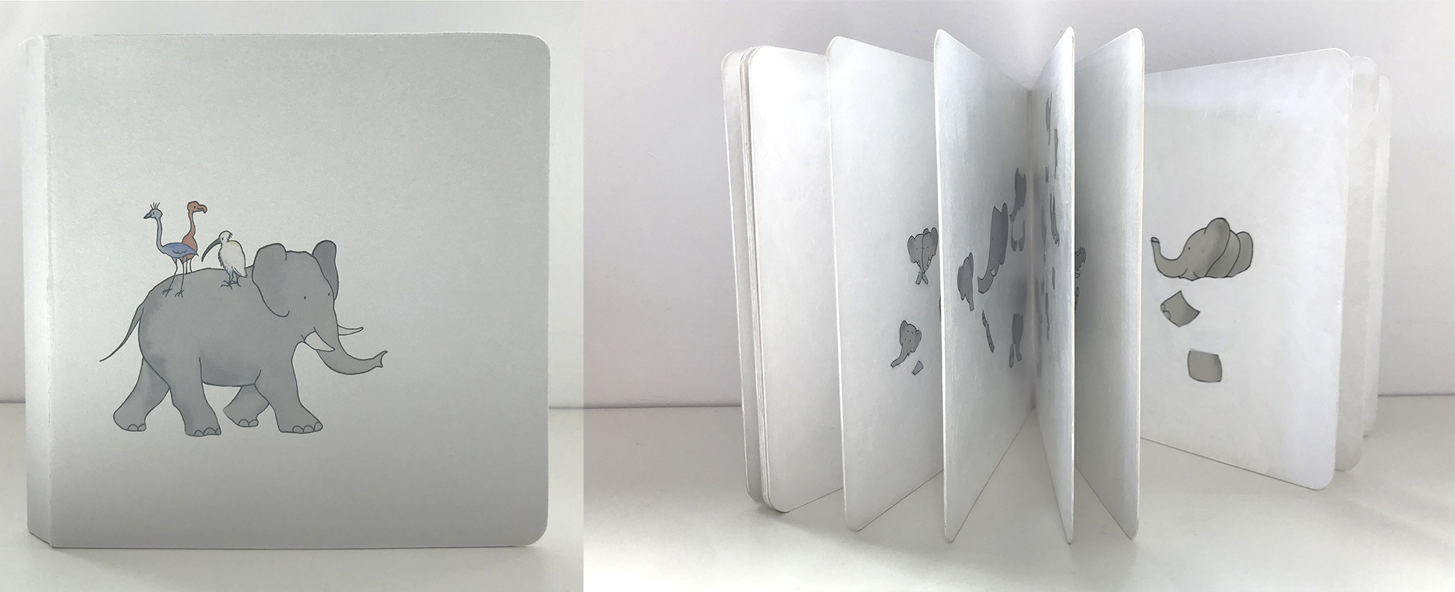
The ABC Exhibit(1991) Leonard Everett Fisher Dustjacket. Casebound, one-eighth cloth and paper over board. Doublures. Sewn binding. H287 x W225 mm. 32 pages. Acquired from Books End, 28 August 2022. Photos: Books On Books Collection.
The ABC Exhibit emphasizes image more than letter or text. Forgoing other usual features of a children’s alphabet book (such as presenting upper and lowercase letters), the book steers more toward an artist’s book or catalogue of the artist’s style of illustration and art. The colophon even specifies that the original artwork was prepared as acrylics on board. While the image of the elephant and several others can be easily imagined in a children’s book, the rendering of the Brooklyn Bridge in fog stands out as do a sailboat in motion and a still life of oranges.
The book features around the 24′ mark in this interview with the Hennepin County Library in 1991.
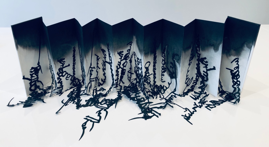
Babel(2019) Lizzie Brewer Box: H278 x W158 mm. Leporello: Closed H195 x W97 mm. Open 825 mm. 14 panels. Unique edition. Acquired from the artist, 14 February 2023. Photos: Books On Books Collection and courtesy of the artist.
Inspired by a 2019 exhibition at the Scuola Internazionale di Grafica in Venice, Lizzie Brewer created this work that sculpturally explores the border between image and letters. The laser-cut letters and words in black calligraphy from various languages (Farsi, Chinese, Kufic, Arabic, English, Greek, Japanese, etc.) seem to pour off the pages of a white leporello. Recalling the tower with which the Babylonians dared to reach heaven (Genesis 11:9), the multiple languages and randomness of the script accentuate the disorder visited on humankind when God decided they were being blasphemous.
Whatever Ur language preceded those languages is lost in the blackness of the cloud of ink from which the texts seem to rain. And perhaps the blackness also implies the punitive nature of the Old Testament deity. The leporello and calligraphy should certainly remind us of the pre-codex and pre-typesetting time of the story.
Some of the letters and words, all made from 150gms black Canford paper, are attached to the white 220gms cartridge panels, some are left free to be leaned against the panels or puddled in front, adding to the watery effect of the thinning black India ink in the background.
Library of Babel (2019)
Library of Babel (2019) Lizzie Brewer Leaflet. H210 x W105 mm. Acquired from the artist, 14 February 2023. Photos: Books On Books Collection. Displayed with artist’s permission.
With its hand-printed title, gold leaf mark and insert, this folded leaflet of hand-made paper made its appearance in an exhibition at the Westminster Reference Library in 2019. The quotation in the insert comes from the “The Library of Babel” by Jorge Luis Borges, and the phrase “[t]his set of works” refers to several of Brewer’s striking sculptures in homage to the story. These works are not in the Books On Books Collection (yet?), but these images (courtesy of the artist) are too complementary to the works above to be overlooked.
Hexagon (2019) “The Universe (which others call the library) is composed of an indefinite, perhaps infinite number of hexagonal galleries” — Borges “The Library of Babel”
410 pages (2019) and detail “Each book contains four hundred and ten pages.” — Borges, “The Library of Babel”
Lead Page (2019)
Untitled [Labyrinth] (2019)
Further Reading
“Sean Kernan“. 23 February 2013. Books On Books Collection. For another homage to Borges.
“Ines von Ketelhodt“. 1 February 2021. Books On Books Collection. For another homage to Borges.
“Peter Malutzki“. Books On Books Collection. For another homage to Borges.
“Aurélie Noury“. 9 November 2020. Books On Books Collection. For another homage to Borges.
“Hanna Piotrowska (Dyrcz)“. 13 December 2019. Books On Books Collection. For another homage to Borges.
“Benjamin Shaykin“. 3 December 2022. Books On Books Collection. For another homage to Borges.
“Rachel Smith“. In progress. Books On Books Collection. For another homage to Borges.
“Sam Winston“. 18 May 2023. Books On Books Collection. For another related alphabet work.
Frate, Kathryn Shank. 2019. “Tower of Babel Exhibit“. Scuola Internazionale di Grafica, Venice. Accessed 28 June 2023.
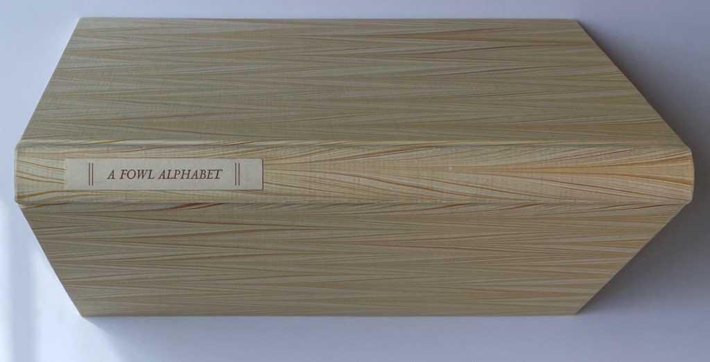
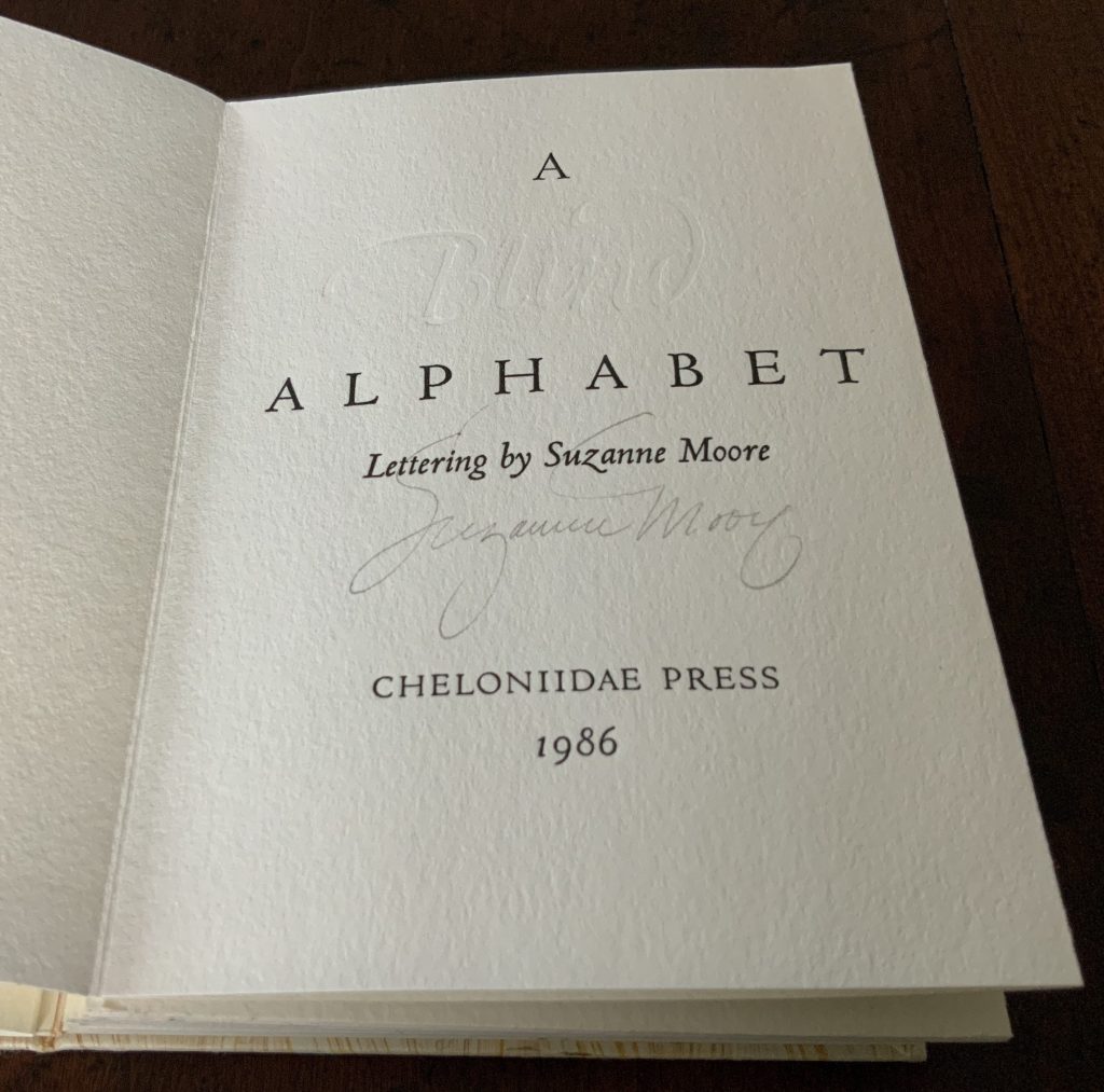
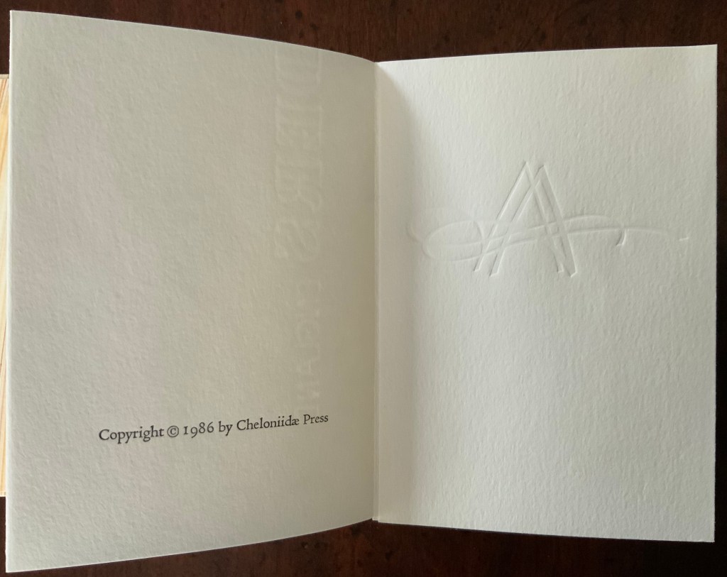
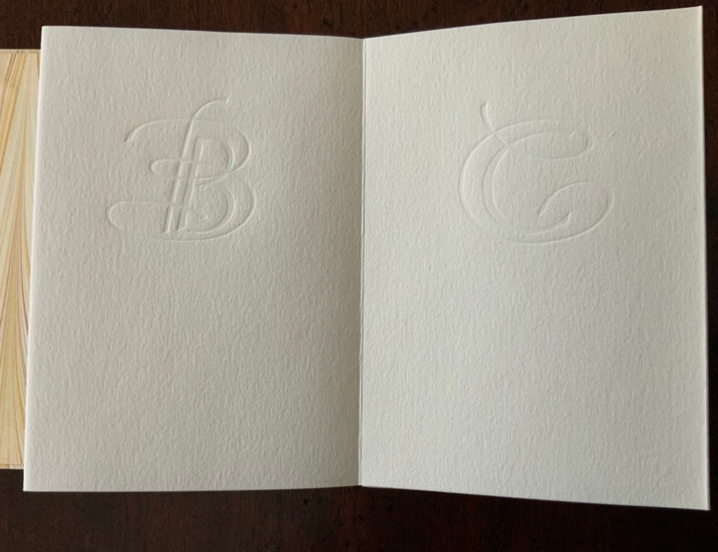
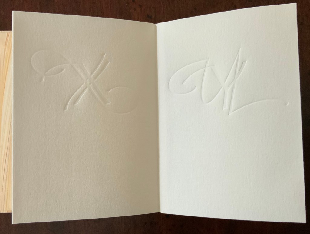
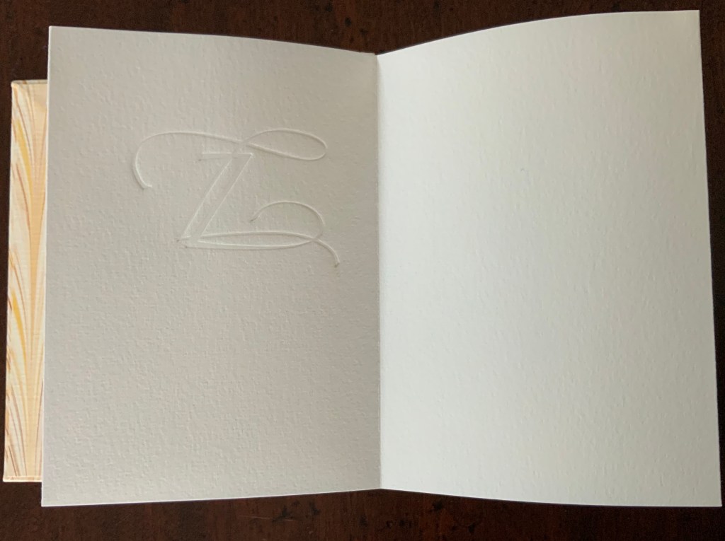
A Fowl Alphabet (1986) Alan James Robinson (etchings), Suzanne Moore (calligraphy) Casebound. Marbled paper over boards. Doublures and flyleaves. H218 x W145 mm. 26 Folios untrimmed at head. Four-page prospectus loose. Acquired from Bromers Bookseller, 16 August 2022. Photos: Books On Books Collection. Displayed with permission of the artists.
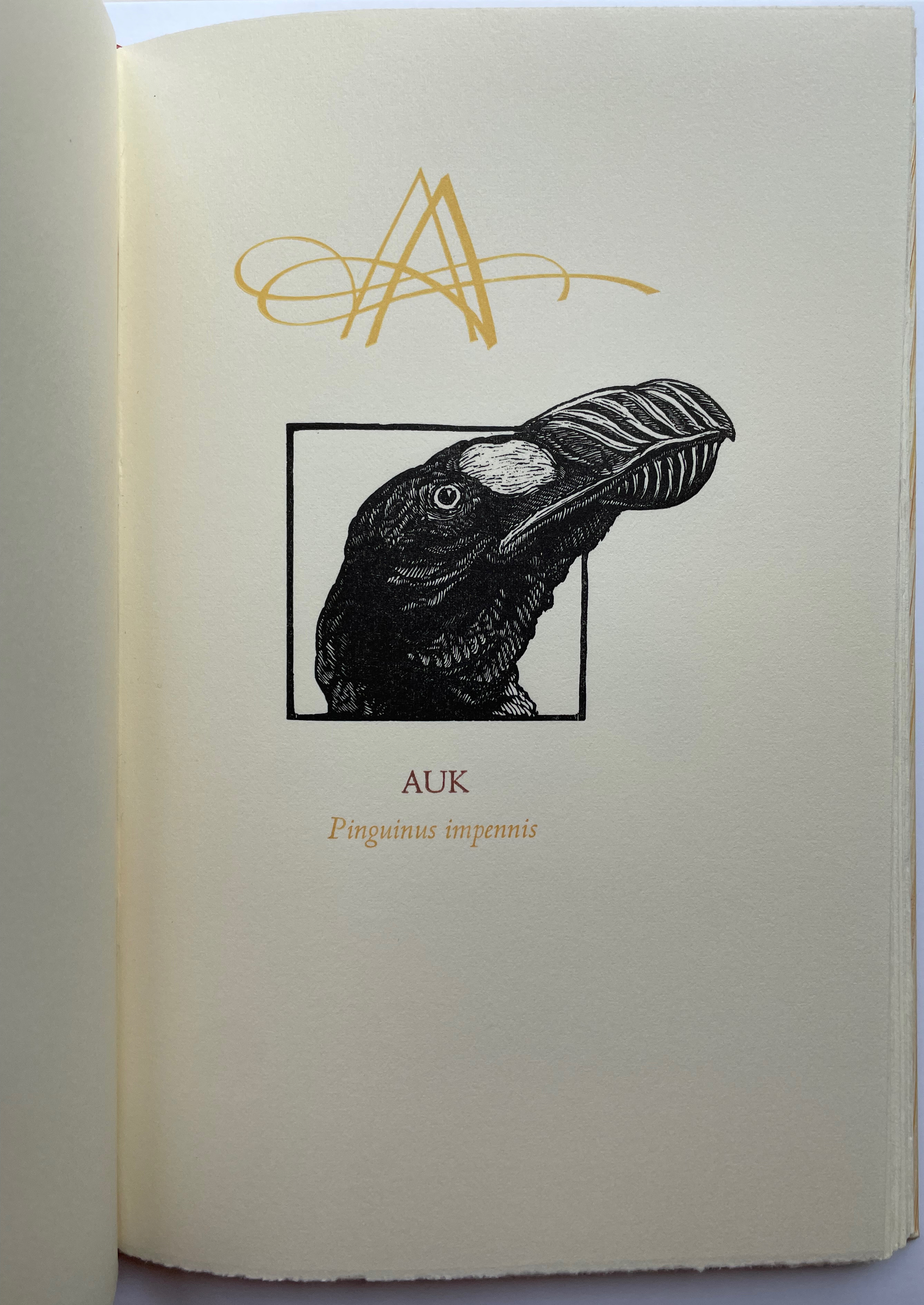
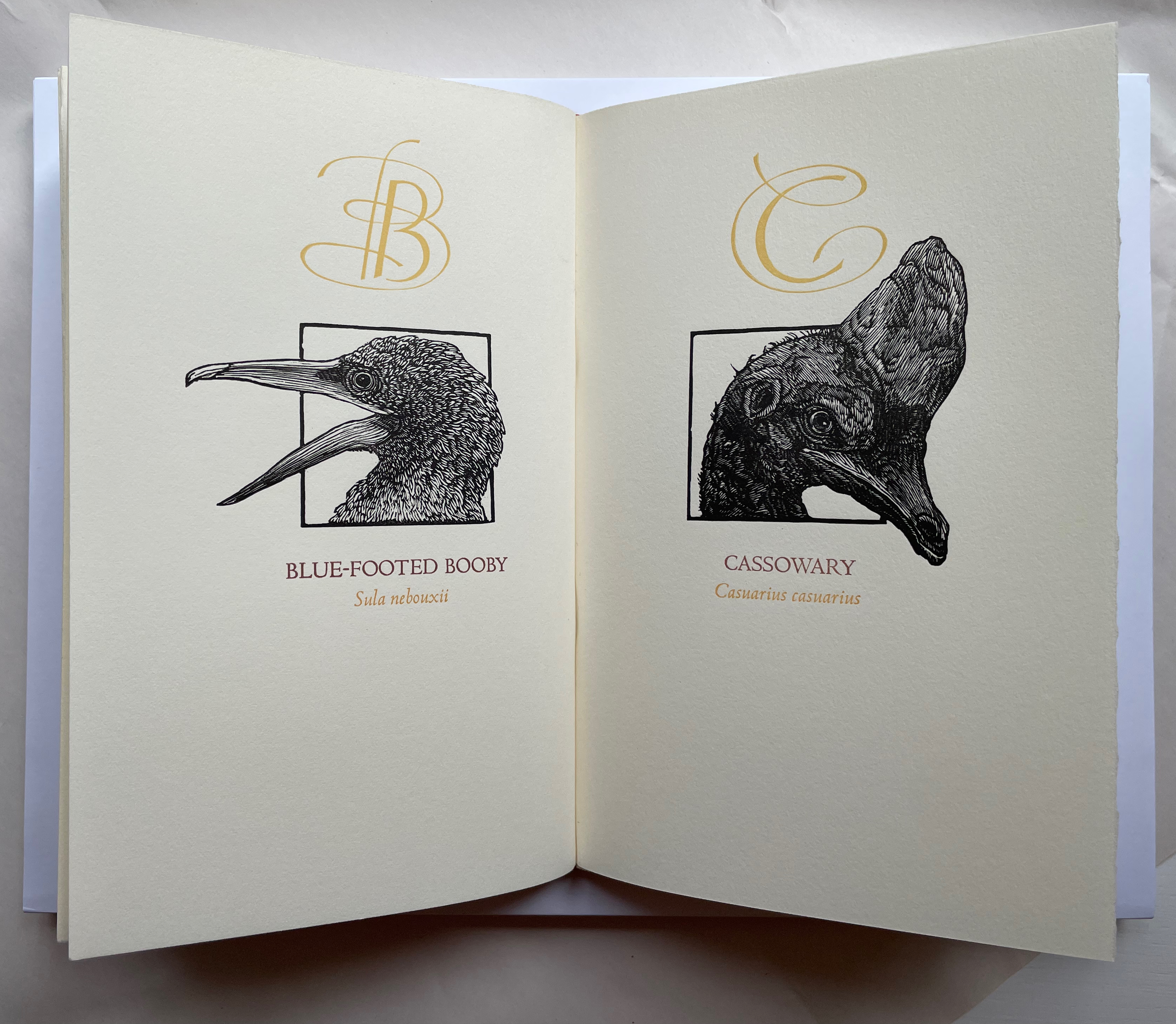
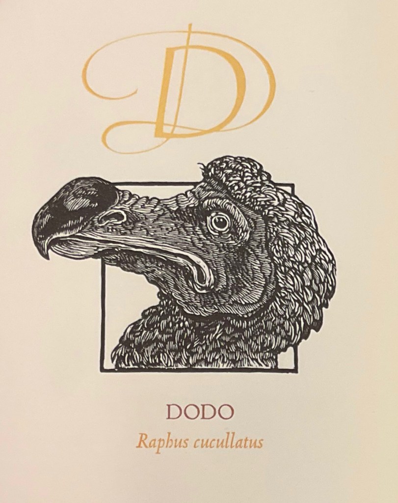
Under his Cheloniidae Press imprint, Alan James Robinson created three artist’s alphabets: A Fowl Alphabet with Suzanne Moore; An Odd Bestiary (1982) and The Birds and Beasts of Shakespeare (1990), arranged as a double abecedary, first the birds and then the beasts. Although this copy of A Fowl Alphabet comes from the regular edition and does not have the color of the deluxe editions of all three abecedaries, it does demonstrate the extraordinary fineness of Robinson’s wood engraving as well as his compositional talent, which also informs the book’s design. The positioning of the birds’ heads in their printed black frames conveys a sense of movement and three dimensionality on the individual page, but notice how Robinson varies the positioning from page to page and across double-page spreads to enhance the sense of movement.
With its core thick strokes shadowed and entwined with thinner flourishes, Suzanne Moore’s calligraphy creatively complements the way that the heft of Robinson’s engraved heads plays against those compositional features.
“Cheloniidae” is the scientific term for the family of sea turtles, and much of Robinson’s art is marine related. But the dominant and consistent impression conveyed by the ouput of Cheloniidae Press is that of Robinson’s artistic skill as an impresario and conductor of artistic talents. Added to the background of his duet with Moore are Master Printer Harold Patrick McGrath, Faith Harrison and her hand marbled paper, Arthur Larson and his hand typesetting and the binding skills of Claudia Cohen.
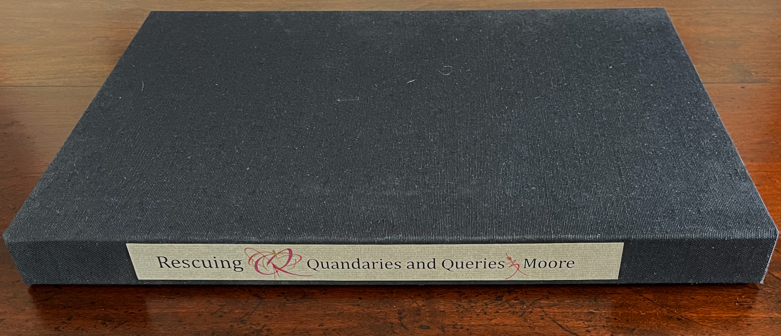
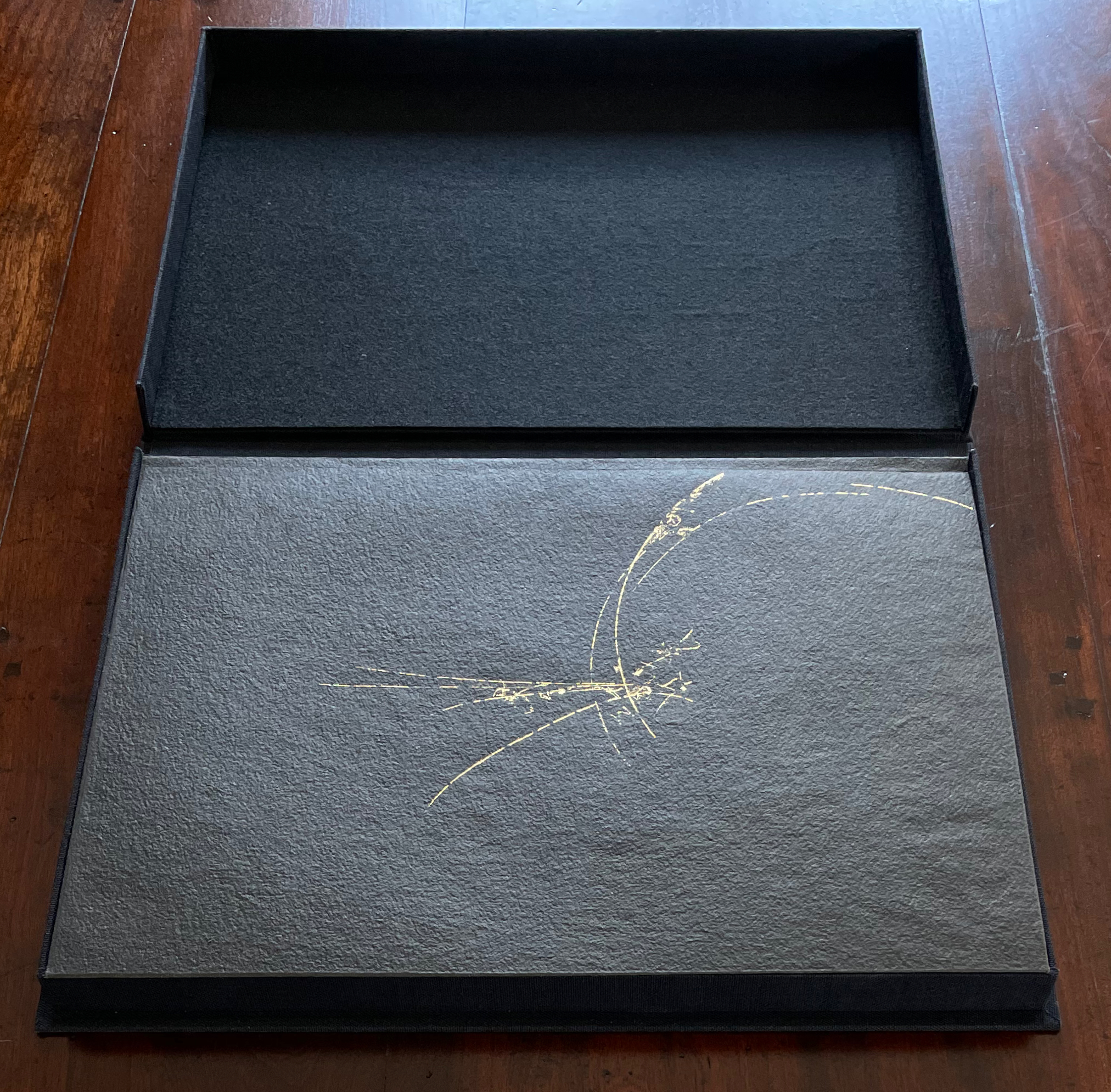
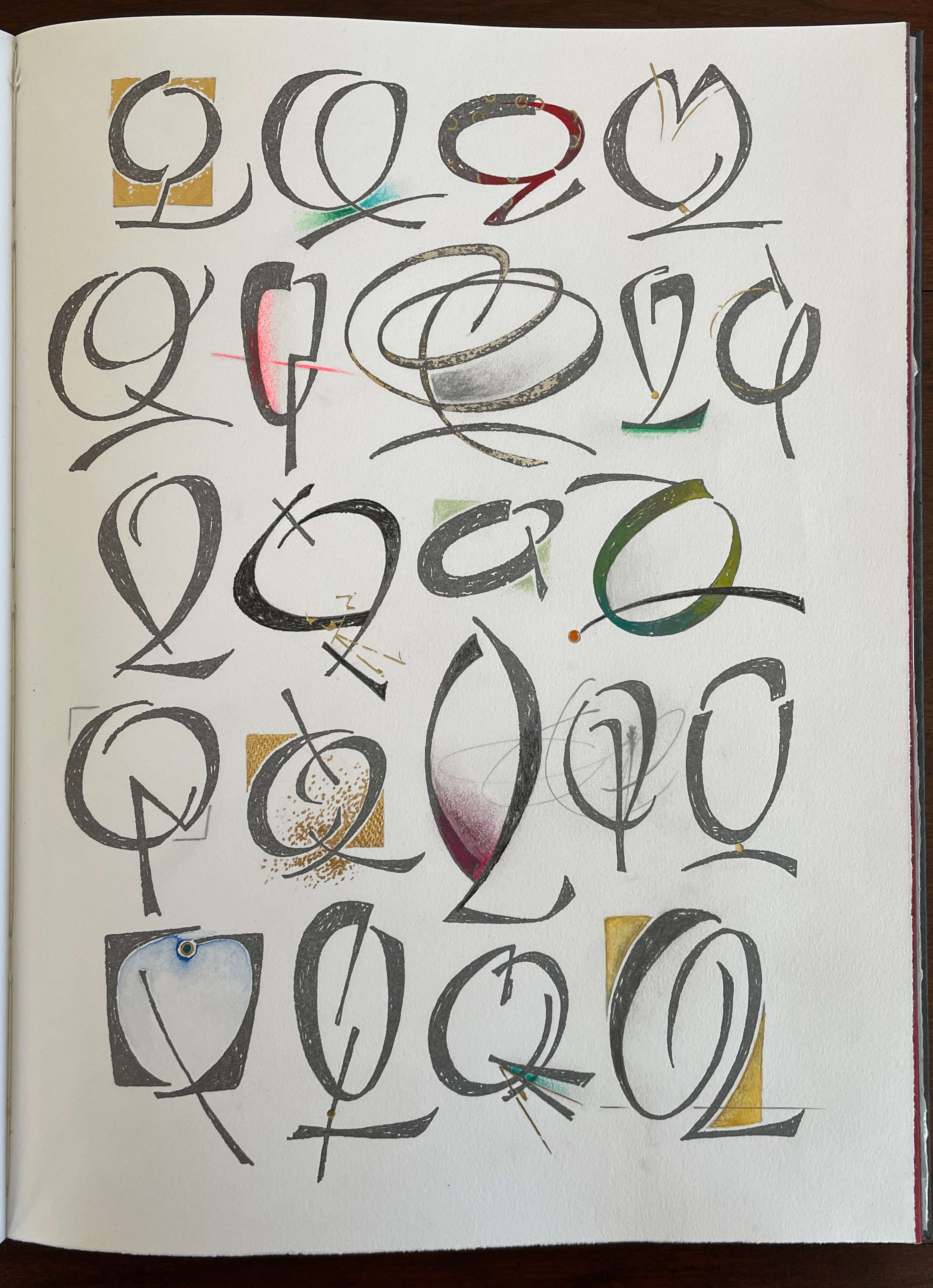
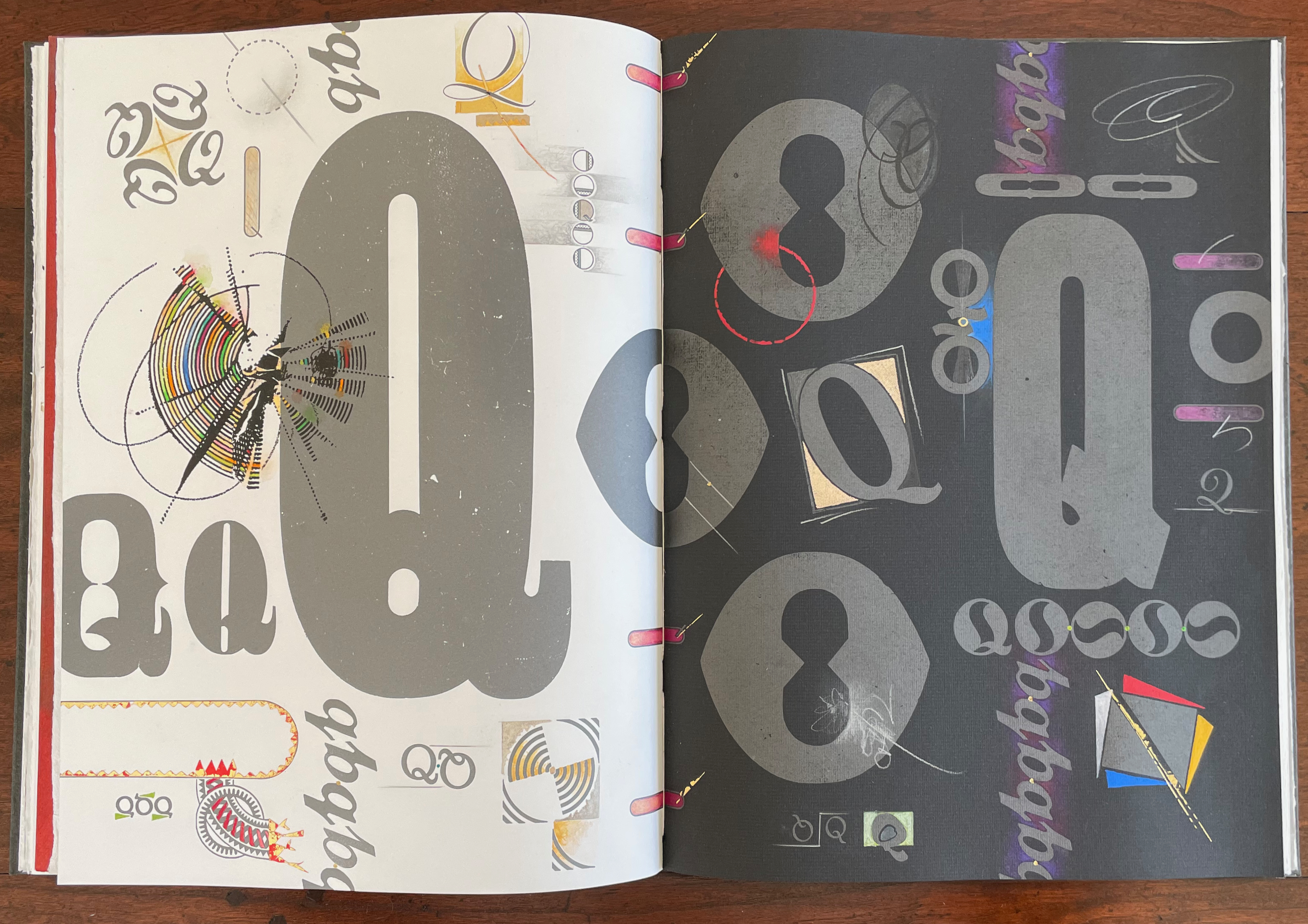
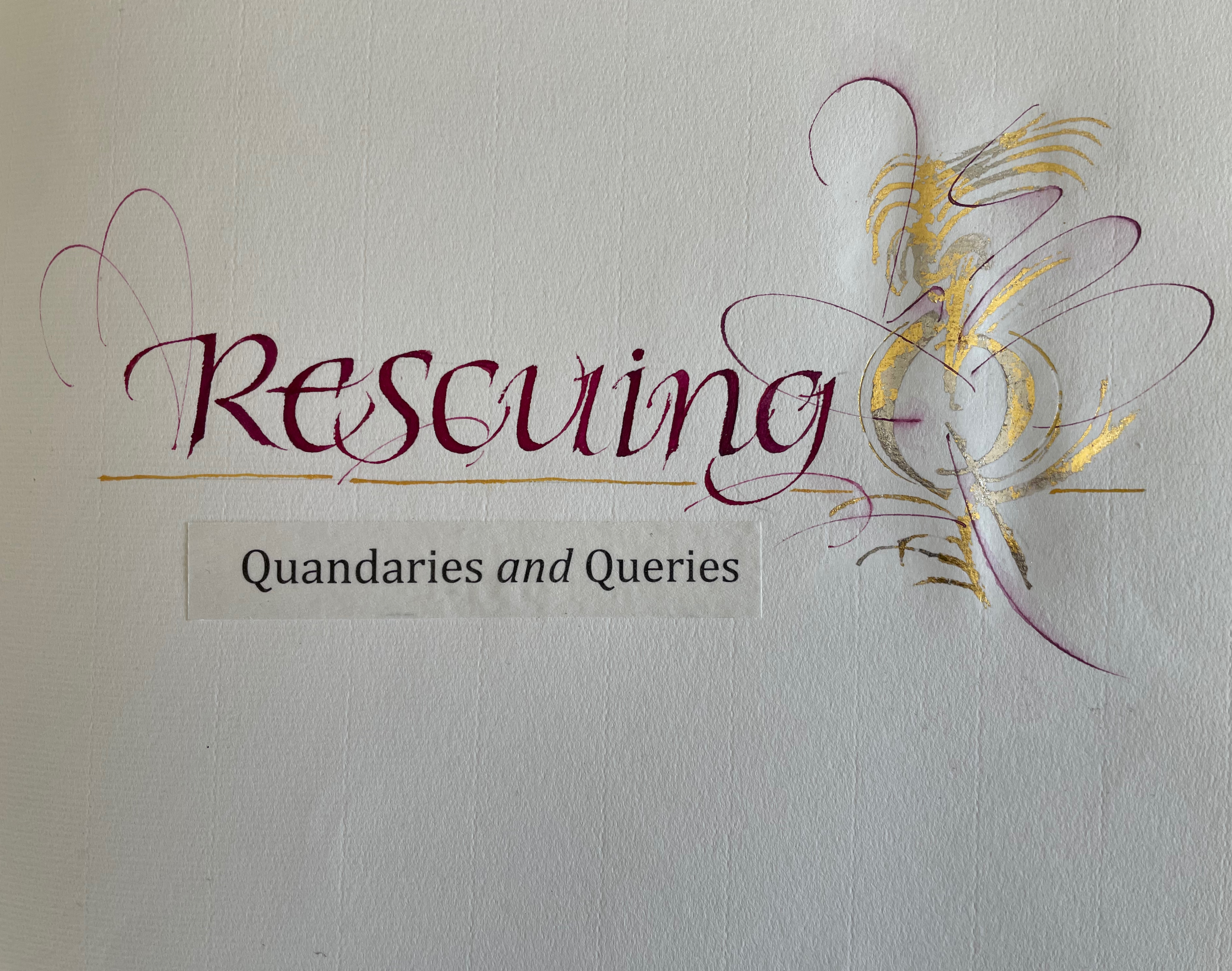
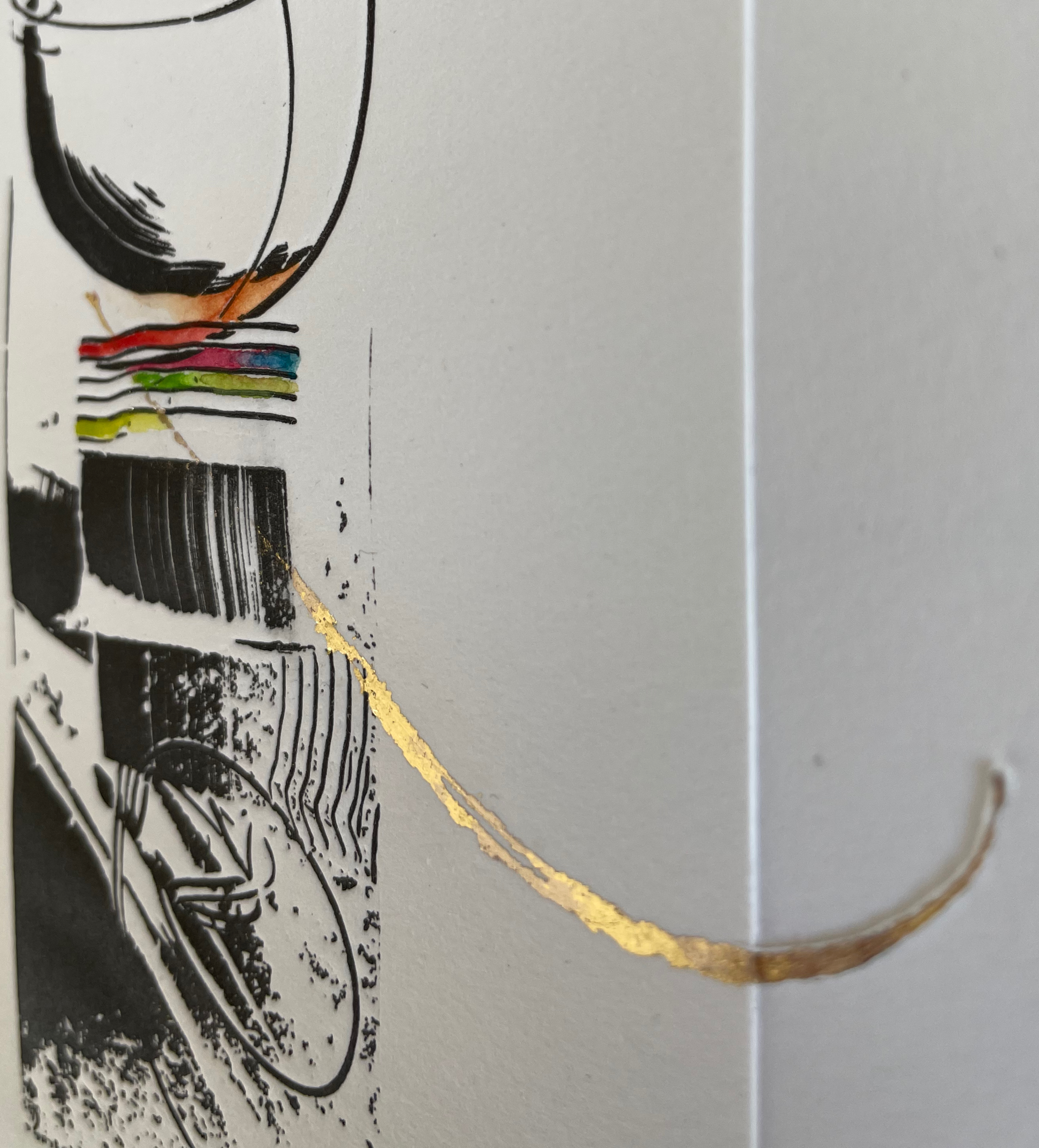
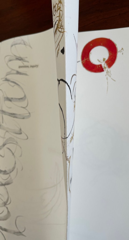
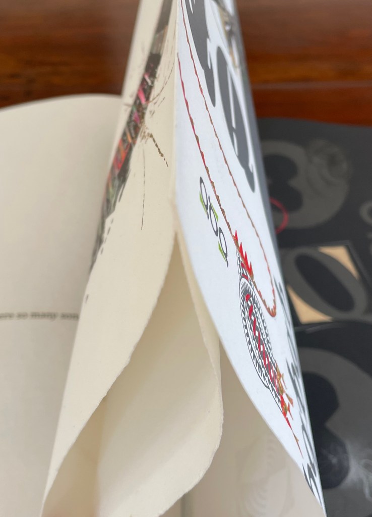
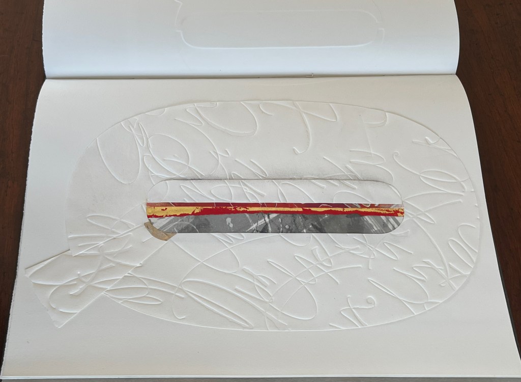
Rescuing Q (2023) Suzanne Moore Box enclosing softcover book. Box: H400 x W300 x D30 mm. Book: H380 x W285 mm. 32 pages. Printing by Sandy Tilcock (and Phoebe) at Lone Goose Press and Jessica Spring, Springtide Press. Unique edition. Acquired from the artist, 25 April 2023. Photos: Books On Books Collection. Displayed with permission of the artist.
Rescuing Q is a manuscript book, consisting of original paintings, monoprints, collage, pigmented prints, embossing, debossing, gilding and handwork complementing the letterpress printing. It is one of several such works designed and created by Suzanne Moore after more than 20 years of experimentation.
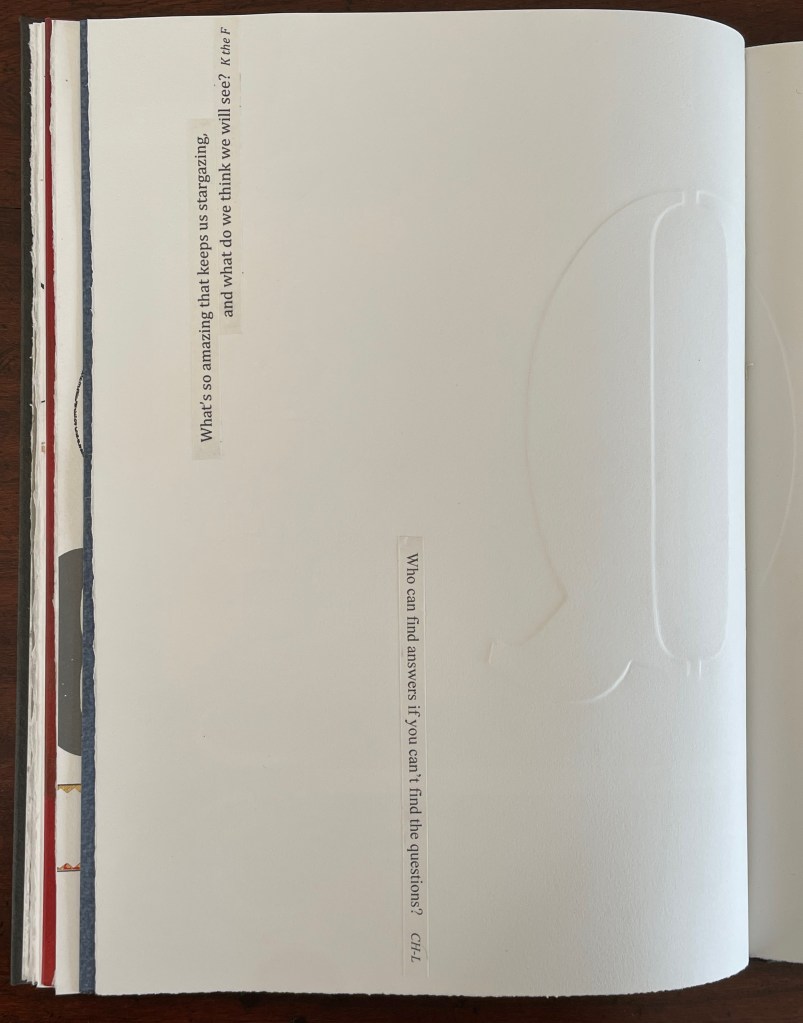
Q is not normal. Q is quirky. Q floats away. Q comes in too many shapes and sizes and colors. So attractive, Q was bound to be hijacked by Q-Anon, political operatives and social anarchists.
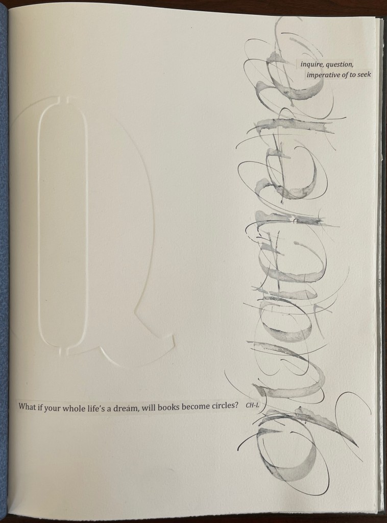
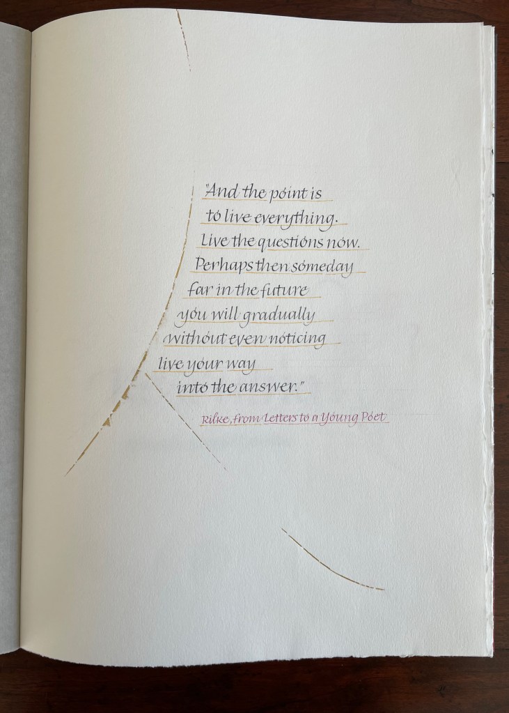
But Q will not remain captive for long because it is always asking questions. And, if we want answers, then as Rilke says, we must “live the questions now”.
For most readers though, the question that will be uppermost is “How did she do that?” Moore is quick in her generosity and would insist on amending that question to “How did they do that?” Consider the selection of paper. More than Arches (a laid paper with visible mesh and watermark) had to be considered for these interactions of ink, gouache, gold leaf, palladium, debossing/embossing by etching press and hand, cuts and overlays.
What notes, movements and rhythms were playing when these colors and the sequences were chosen?
How do they think of paper and ink in three dimensions?
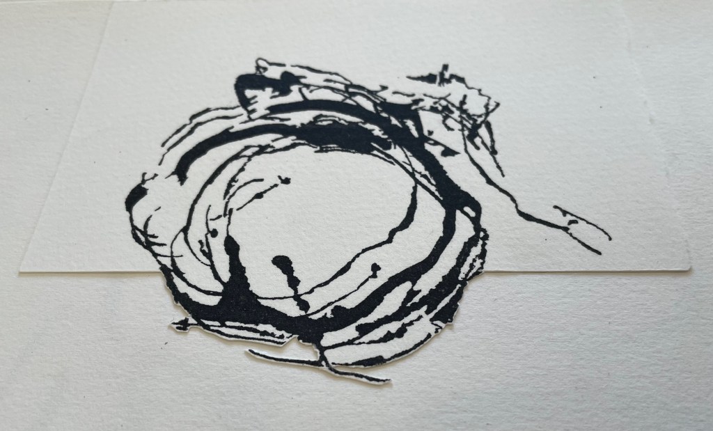
Who saw Q and questions in a bird’s nest?
And someone’s memory called up Cave Alphabet paper for the endpapers.
The fact that Moore and her colleagues can do all that (and more) and the fact that their gentle and pointed questions fuse with the art ensure that Rescuing Q does and will succeed.
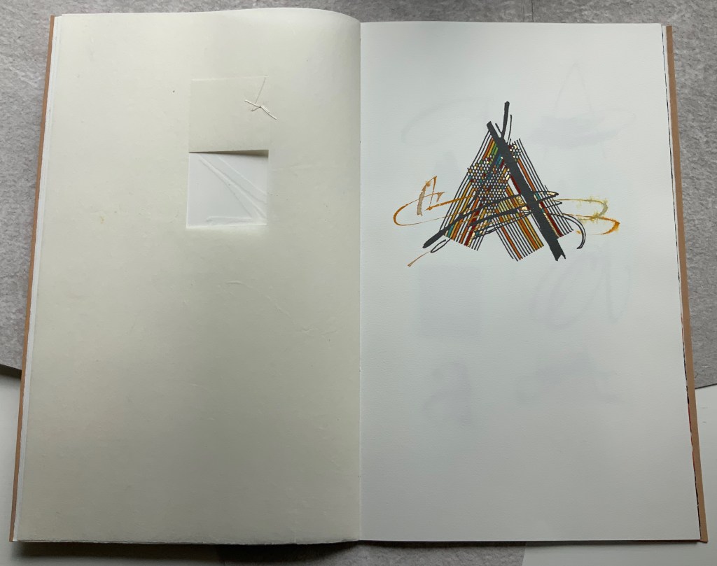
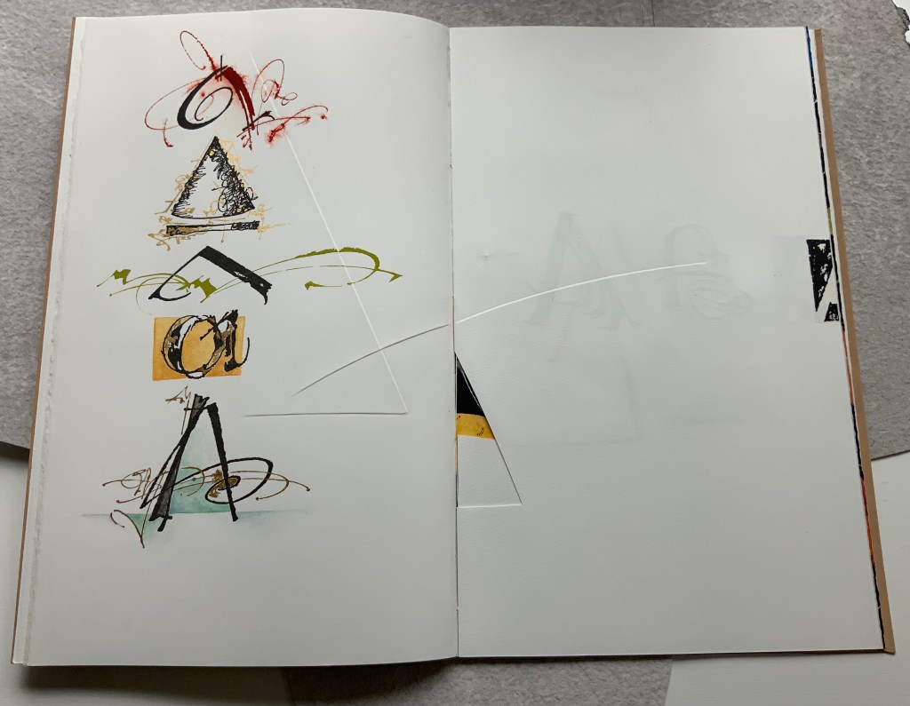
A Musings (2015)
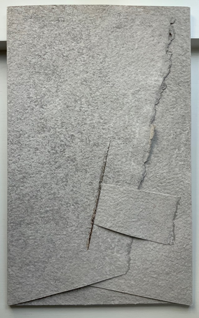
A Musings (2015) Suzanne Moore Tab-insert portfolio around softcover book. H370 x W230 mm, 24 pages. Edition of 26 variants, of which this is N. Acquired from Abecedarian Gallery, 13 February 2022. Photos: Books On Books Collection. Displayed with permission of Suzanne Moore.
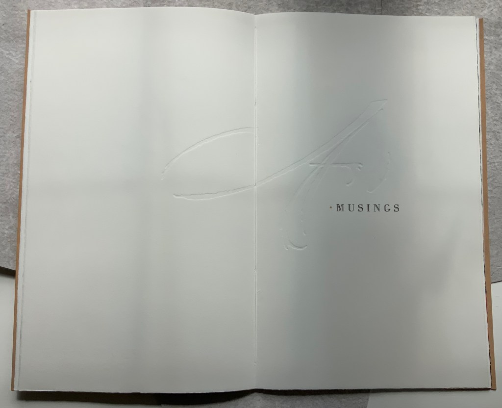
Title page
Another manuscript book, A Musings is an encounter between Suzanne Moore and the letter A, one of her 26 muses. As with any artist and muse, this naturally leads to portrayals of A in such varied positions, with such varied tools and techniques and such varied materials that the boxed and bound portfolio must take the amusing title A Musings. The muse finds itself posed across Magnani Aquaforte, Arches Text Wove, transparent kozo and other handmade papers enveloped by a stiffened, painted handmade paper. Moore’s musings fall on the historical, symbolic and spiritual aspects of the letter A with acrylic paint, pencil, freehand foil tooling, gold and palladium leaf, collage, debossing and embossing, sumi ink and gouache, sizing and varnish, monoprint, letterpress, folds and cutouts.
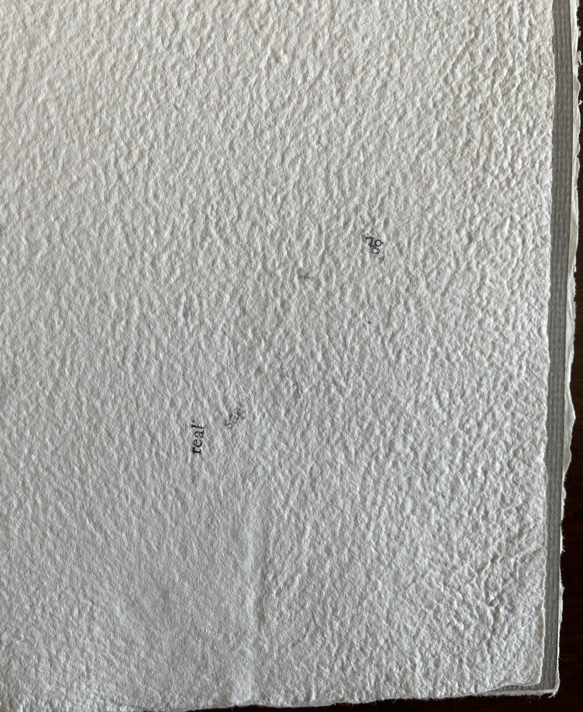
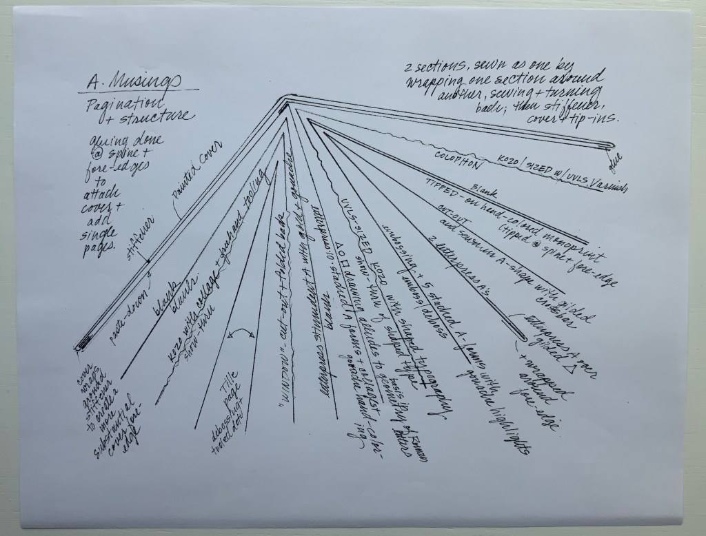
A separately provided copy of the artist’s plan for the pagination, structure and treatment per page offers a useful insight into the questions of how such a work is thought through and made. Page layout and the type of paper, in particular, play together sometimes like a clockwork mechanism and sometimes organically.
Painted cover
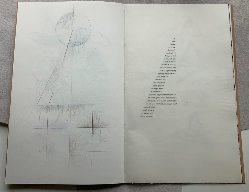
Left: Half-title. Right: Half-title turned to show translucency of kozo; note on the facing recto how the stroke from the debossed A on the title peeks through.
After the title page (see further above), the next double-page spread shows the title page’s debossed A in reverse on the verso page. Facing it is a square cutout through which multicolored lines forming overlapping As appear. Because the cutout page is translucent paper, we can see that the multicolored lines extend into a larger A on the next recto page. Turning the cutout page reveals that the cutout is actually a flap folded up and secured with white thread sewn in the shape of an A. This three-dimensionality of the flap is echoed by the way the crossbar swashes of the facing A seem to swirl around its two legs implying a spinning A.
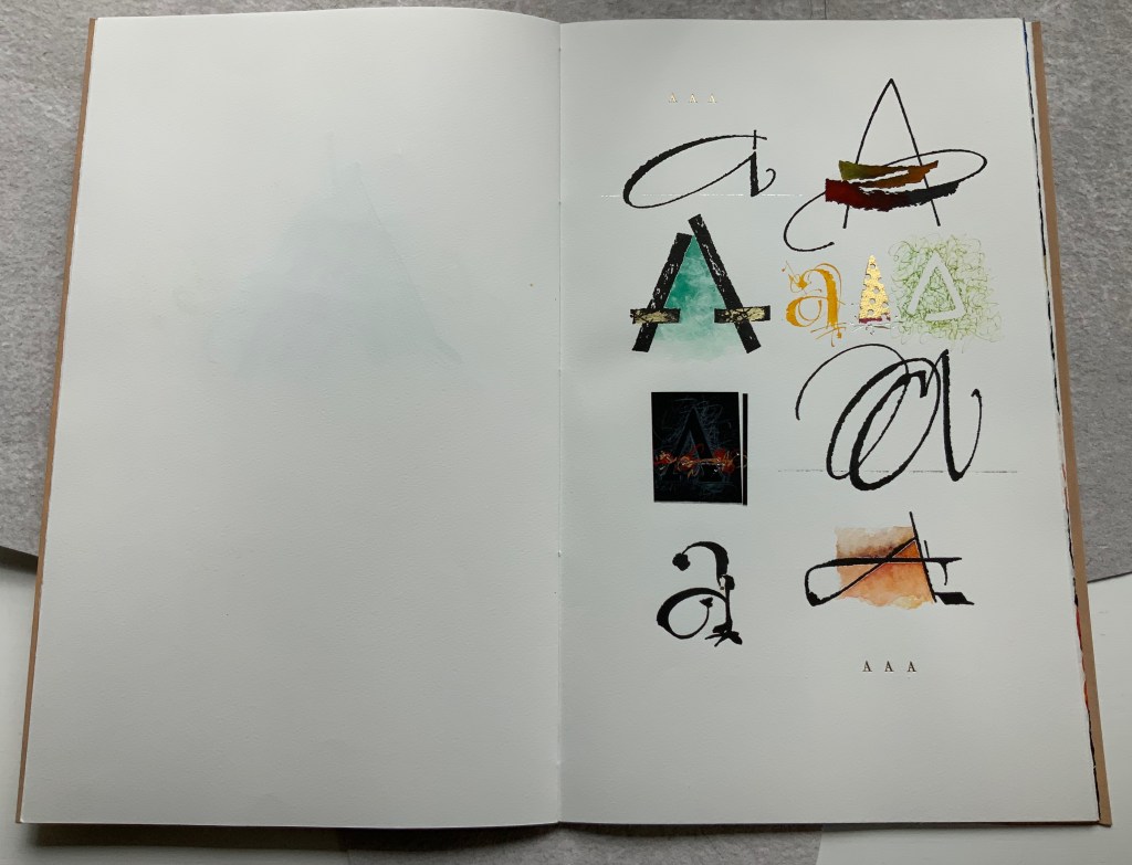
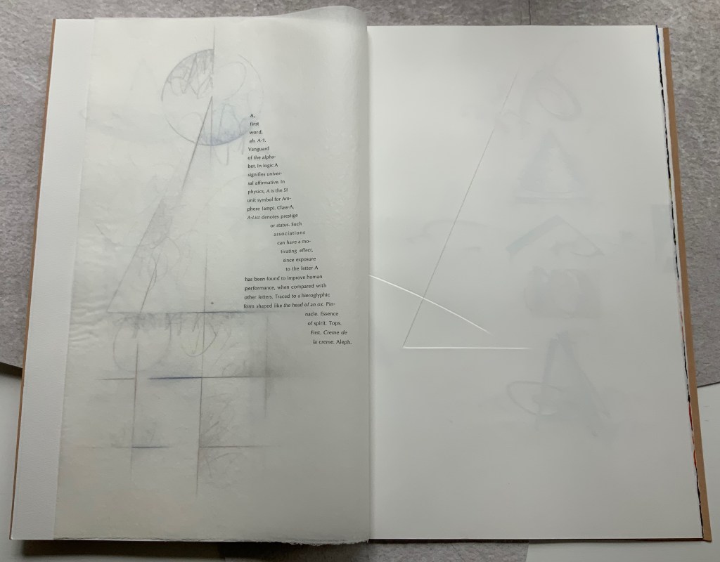
From the single A interacting with a cutout, we move to a dozen evocations of the historic forms that the lowercase and uppercase A have taken. The lowercase “closed a” from the semi-uncial hand starting in the 5th century appears second down in the lefthand column, and the “perfected” Roman uppercase A appears at the bottom of the right column. Amusingly, some evocations blend periods of history. In the lower left, the drawing of a lowercase “open a”, which comes from the 8th century Carolingian miniscule hand, takes on the stylization of the 15th century’s bianchi girari (white-vine stem decoration). Just across from it, the stylized version of the Proto-Sinaitic (1700 BCE) form of aleph, meaning “ox”, has a burnt umber background that suggests markings in early cave dwellings.
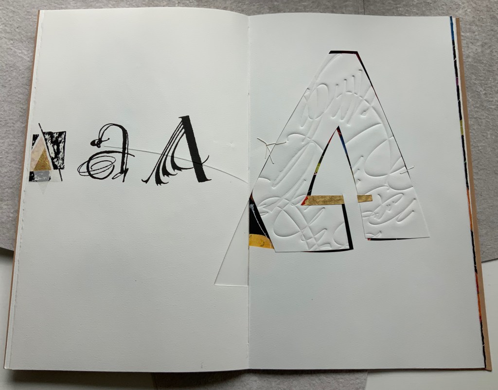
Using a translucent leaf with set type shaping half an A, the next two double-page spreads play (or muse) on uppercase A’s bilateral symmetry poised between geometric and freehand approaches to lettering, between typography and calligraphy and between inking and debossing.
When the recto page above with its debossed line and angle is turned, another extraordinary integration of composition, paper, printing (inking, debossing and “embossing”) and, now, cutting occurs. Notice how the ink of the first and third As overlaps the now “embossed” angle, how the now “embossed” line becomes debossed as it crosses the gutter, how the previous double-page spread’s themes of geometry/freehand, printing/drawing and lowercase/uppercase likewise cross over, and how the cutout triangle uses the yellow ink showing through to form the crossbar of an A and the gutter to form the A’s lefthand stem.
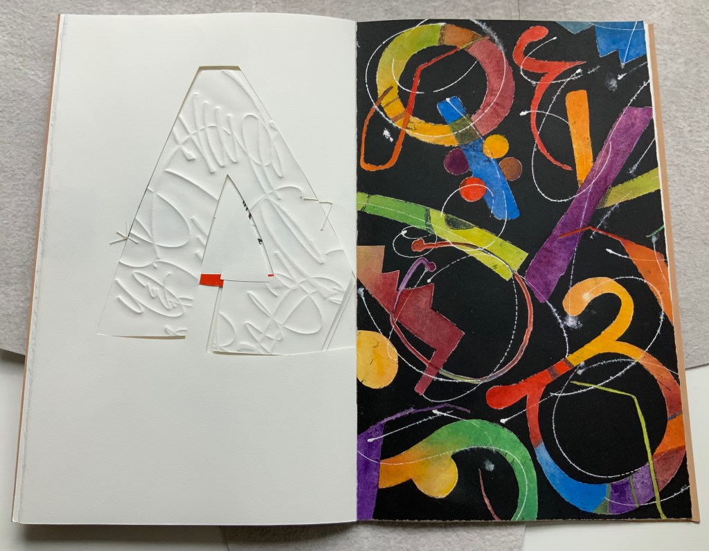
There is much else to muse upon in the spreads above, but it’s in the last two spreads where Moore builds and unfolds a fantasia of calligraphy, color, debossing, cutting, gilding and painting. Notice how the gilt crossbar slots through the page and helps secure the debossed piece behind the cutout to the page.
And when the page turns, notice how its gilt crossbar reveals its red paper beneath and becomes the spot of red completing the crossbar for the cutout A. The red spot against white seems to set off the explosion of color and calligraphy on the black final page, printed by Jessica Spring from polymer. The different shapes for A here come from African alphabets. The images are unique monoprints, done on an etching press. With the letters placed to block out the black and overlap one another, a sense of depth and texture arises. Contributing to that sense of texture, the white letters are hand-painted in gouache — sometimes layered, sometimes blended.
Books are inherently collaborative affairs, and for artists’ books, collaboration can become almost another tool for the artist. Jessica Spring, mentioned above, also debossed the opening A, hand-set the half-A composition and contributed to Rescuing Q. Now a fine binder in her own right, Gabby Cooksey, a studio assistant to Moore and Don Glaister, was essential to A Musing‘s hand work, binding and wrapper. Part of Moore’s creative progression from contributing to overseeing to orchestrating can be traced from here across three other works in the Books On Books Collection.
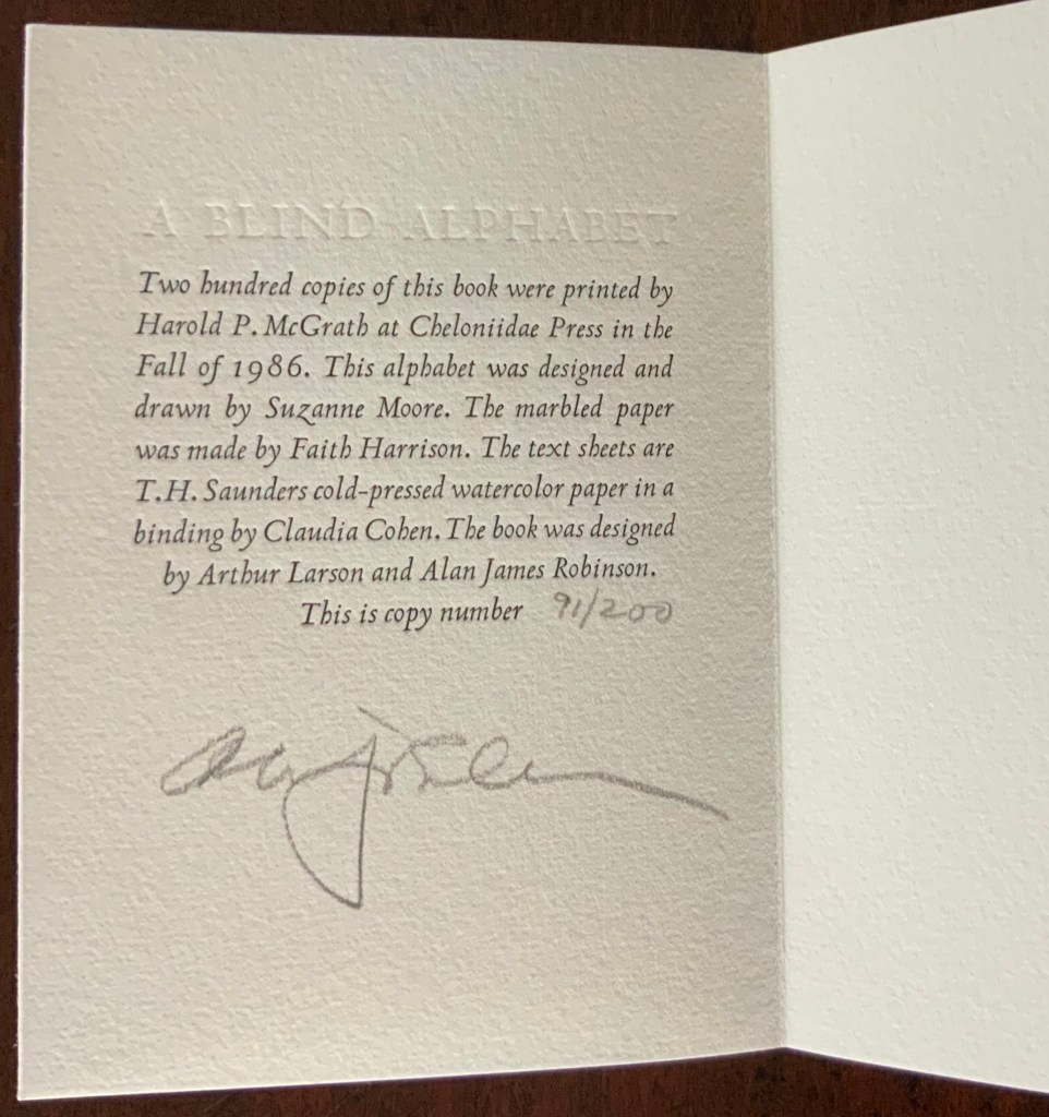
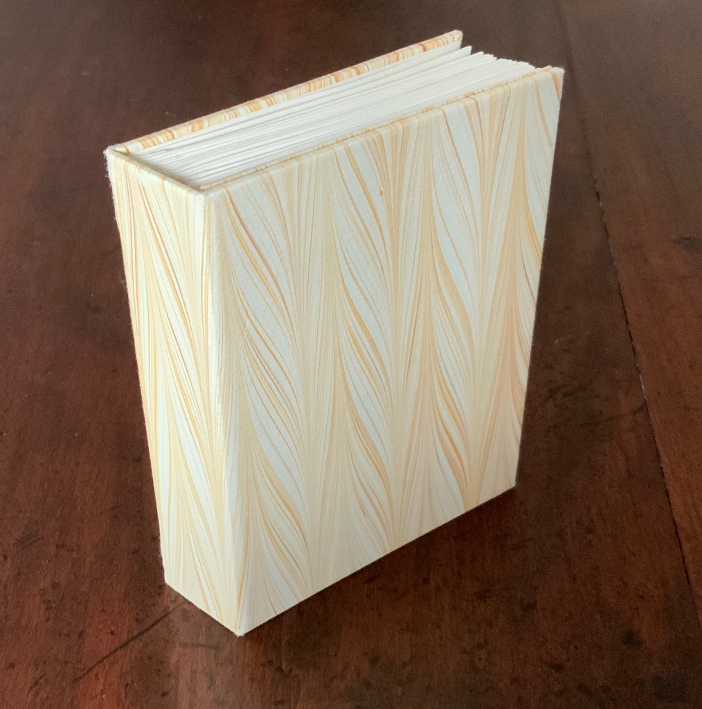
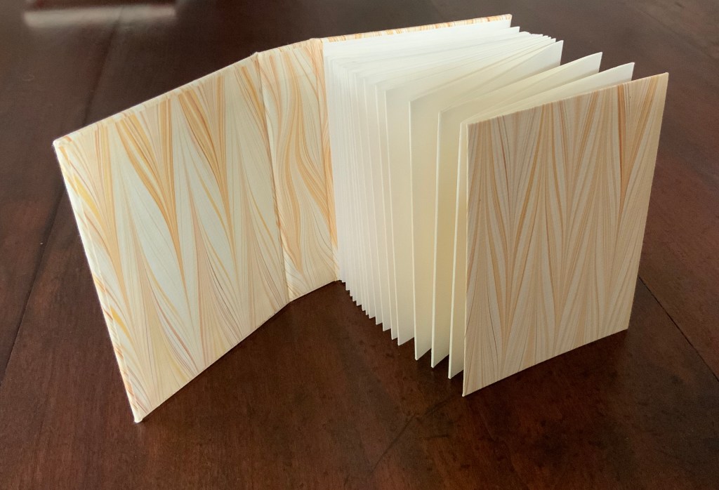
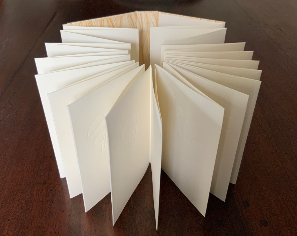
A Blind Alphabet (1986)
A Blind Alphabet (1986) Suzanne Moore Accordion-fold. Closed H128 x W93 D28 (spine) D22 (fore-edge) mm; open 3200 mm. 34 pages. Edition of 200 of which this is #91. Calligraphic letters designed and drawn by Suzanne Moore, printed by Harold McGrath on T.H. Saunders cold-pressed watercolour paper, bound by Claudia Cohen in marbled paper by Faith Harrison. Acquired from Veatchs, 1 May 2018.
Here, as noted in the colophon to A Blind Alphabet, Moore has the creative role of originating artist, designing and drawing the alphabet — soloist, as it were, in the Cheloniidae Press reportory orchestrated by Alan James Robinson.
In Robinson’s wood engravings of birds, Moore plays a creative contributing role with much the same repertory company.
A Fowl Alphabet (1986)
A Fowl Alphabet(1986) Alan James Robinson (etchings), Suzanne Moore(calligraphy) Casebound. Marbled paper over boards. Doublures and flyleaves. H218 x W145 mm. 26 Folios untrimmed at head. Four-page prospectus loose. Acquired from Bromers Bookseller, 16 August 2022. Photos: Books On Books Collection. Displayed with Suzanne Moore’s permission.
Again, Cheloniidae Press’ master printer Harold Patrick McGrath and “usual suspects” Arthur Larson (hand typesetting), Faith Harrison (hand marbling) and Claudia Cohen (binding) played their roles in this book. Here, Moore has the creative contributing role of designing the alphabet and, for the deluxe and full vellum editions (not shown), hand lettering.
In book art, an artist’s progression from contributor to orchestrator is not necessarily linear as can be seen in this subsequent work.
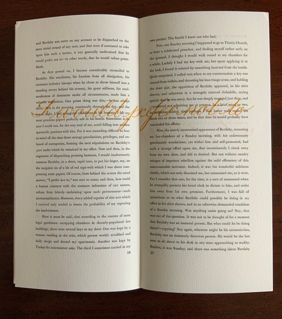
Bartleby, The Scrivener: A Story of Wall Street (1995)
Herman Melville, Bartleby the Scrivener: A Tale of Wall Street, 1853. Indulgence Press, 1995. Typeetting, printing and binding by Wilber Schilling; Calligraphy by Suzanne Moore. Text paper by Janus Press. Endpapers by MacGregor & Vinzani. Edition of 100 of which this is #71. H320 x W158 x D14 mm. Acquired from Indulgence Press, 17 December 2015. Photos: Books On Books Collection. Displayed with permission of the publisher.
Wilber Schilling (Indulgence Press) orchestrated this edition of Herman Melville’s well-known story. Part of Schilling’s genius was to invite Moore to provide the calligraphy for Bartleby’s hallmark (his only) words “I prefer not to”. Another part was to print Moore’s calligraphy in ever-increasing size in ghostly ochre and in descending position across the pages of the book.
For more of Suzanne Moore’s works and artistic roles as well as others’ insight into them, see below.
Moore, Suzanne. 2016. Studies in Love the Question. Handlettered pages in book bound by the artist. 34 images available at Letterform Archives. ______________. 2014. Zero – Cypher of Infinity. 24-page handlettered pages in book bound by the artist. Letterpress pages by Jessica Spring. 20 images available at Letterform Archives.
______________. 2014. Origins and Spectrum. Process portfolio for Zero — Cypher of Infinity. Includes notes from the artist. 28 images available at Letterform Archives.
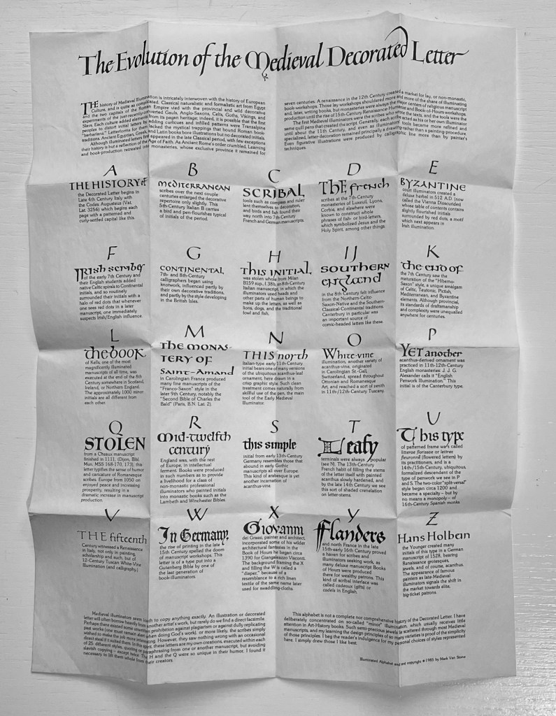
The Evolution of the Medieval Decorated Letter (1985)
The Evolution of the Medieval Decorated Letter (1985) Mark Van Stone Leporello attached to black boards with ribbon tie and pocket for folded information sheet. Leporello: H65 x W68 mm closed; W1630 mm (including board) open. Sheet: H280 x W215 mm. 25 panels. Acquired from Lorson’s, 5 December 2022. Photos: Books On Books Collection. Displayed with permission of the artist.
Mark Van Stone is a professor of art history at Southwestern College in California. Scholarly books and a documentary attest to his expertise in his academic specialty: the interpretation of Mayan hieroglyphs and calligraphy. He also teaches workshops in versals and white vine decoration. His workshop qualification needs no endorsement beyond this miniaturized history of medieval illuminated letters: a calligraphic, bookmaking and scholarly tour de force.
In the spirit of medieval illuminators, Van Stone has imitated the hand of twenty-three of what he calls the “semi-precious jewels” of “‘minor’ illumination that usually receives little attention in the Art-History books”. Because of their medieval humor, two initials were copied outright rather than imitated. Below, you will find eight of these semi-precious jewels along with Van Stone’s commentary on each. Use the WorldCat link to find your way to the closest institution holding a copy of this work to revel in the rest.
The folded onionskin of text contained in the binding pocket is like a miniature poster. On it, Van Stone documents each of the 25 styles of illumination that he reproduces in the leporello between the soft black boards stiffened by folding. The black-on-white parchment-like appearance of the “poster” complements beautifully what unfolds between those boards, and each of its 25 notes begins with the calligraphic bookhand that would be appropriate to the period of its initial. Correspondence with the artist reveals a possible origin story for the poster-like nature of the insert.
The project began life as a portfolio of individual letters of six inches square. For each letterform, Van Stone “drew the color-separations individually in black ink, rather than making finished illuminated initials in color and photographically color-separating”. After specifying the colors for the four plates and learning that the project would require eight dozen separate screens far outstripping the budget, Van Stone — without a Renaissance patron to come to the rescue — transformed the project into a poster. This involved finding another printer and photographing the separations in a ganged and reduced size. “An unfortunate accident in the pressroom resulted in the printing of 1000 copies with a marred title-line, but with the body of the sheet undamaged.”
After the poster was reprinted, Van Stone turned his attention to the 1000 posters he couldn’t use:
… we cut them all into strips, I folded and pasted them all by hand (with archival polyvinyl acetate), designed and folded the black covers to slip on the stubs at each end, and threaded the ribbon through the hand-cut slits. Like a 15th-century publisher, much of the work was performed by hand.
So if you find your closest institution holding a copy of The Evolution of the Medieval Decorated Letter, keep in mind the work’s real-life evolution and that you might have been looking at individual letter prints or a poster ready for framing rather than this red-ribboned treasure ready to unfold and display gem after gem.