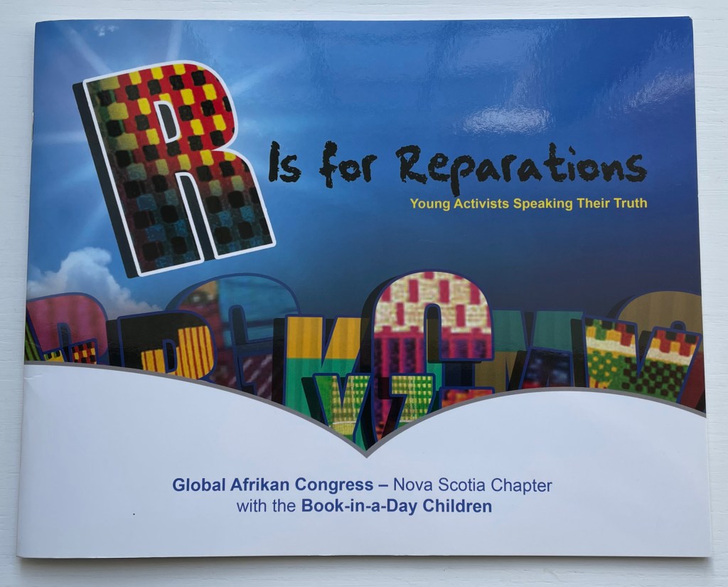
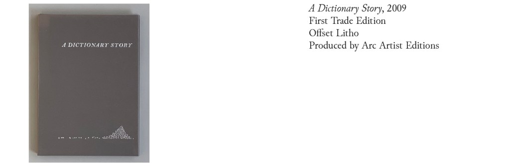
One & Everything (2022)
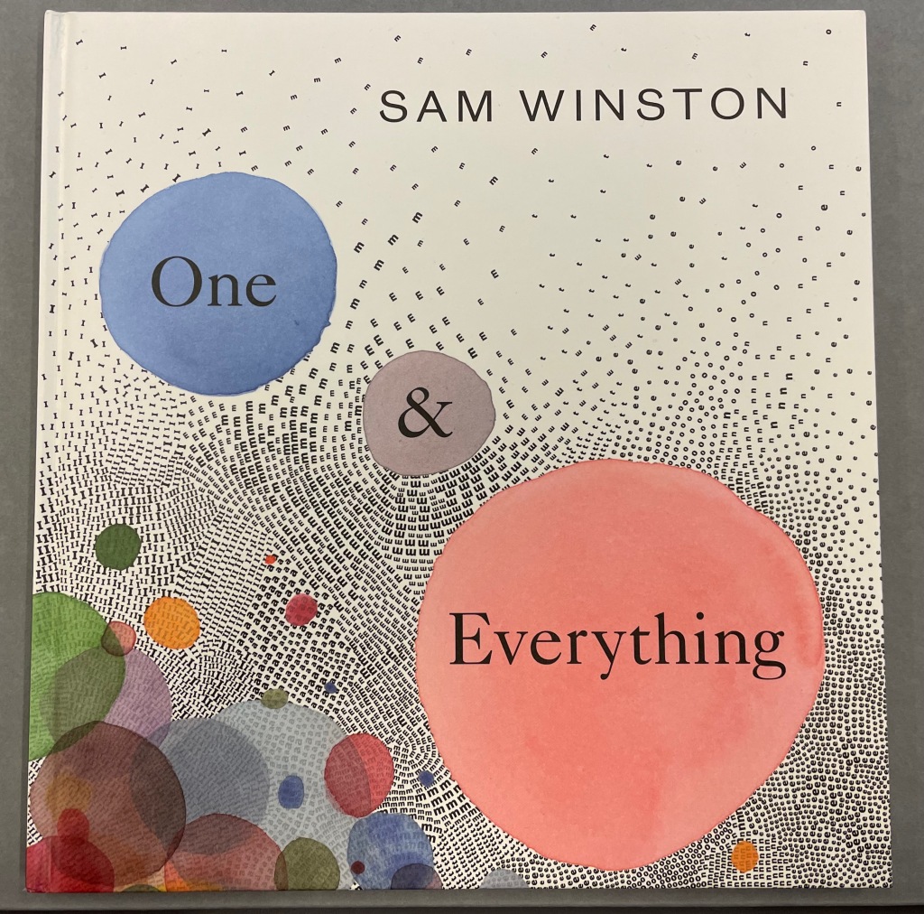
One & Everything (2022)
Sam Winston
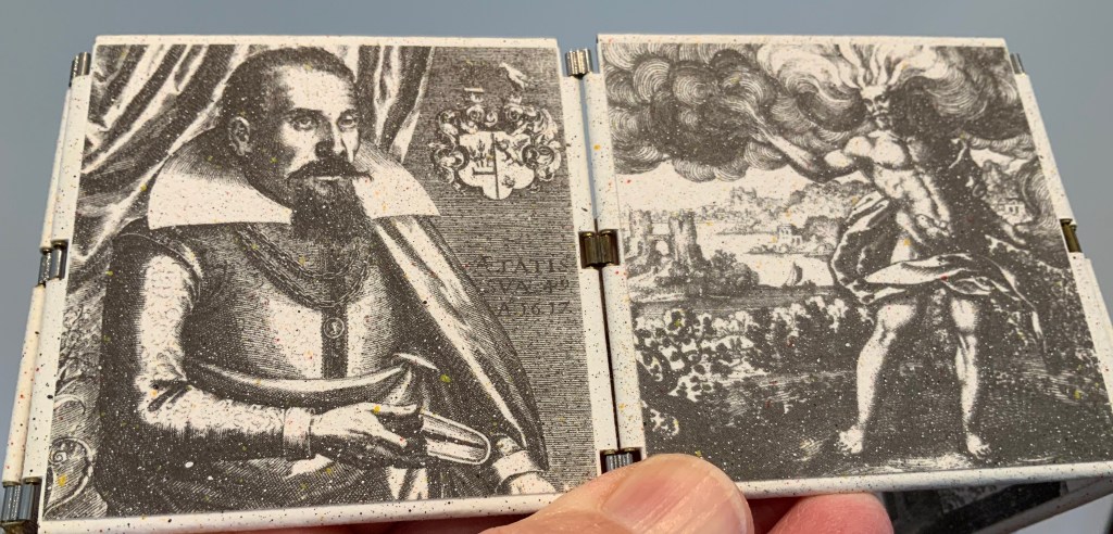
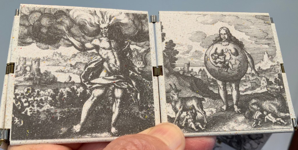
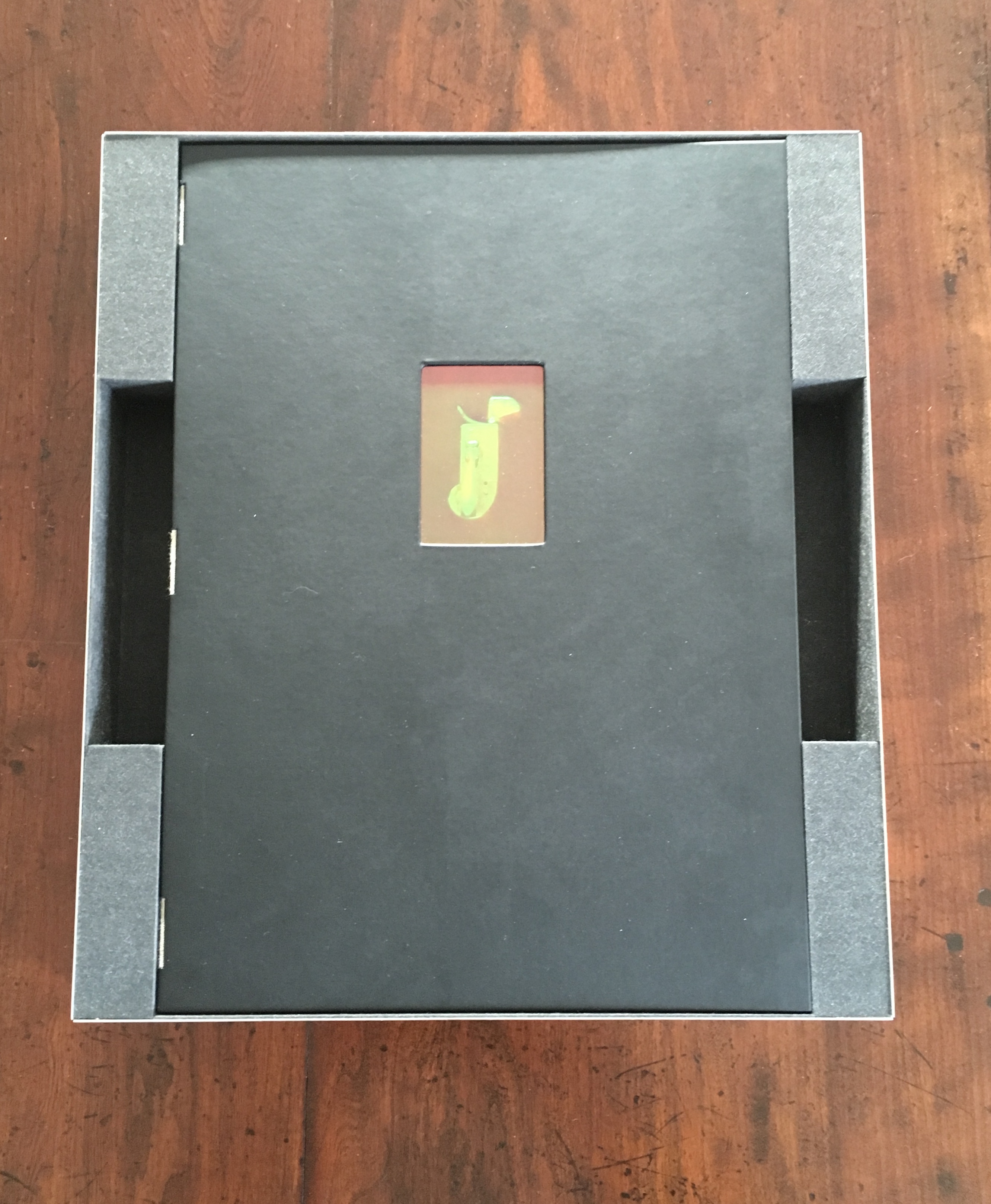
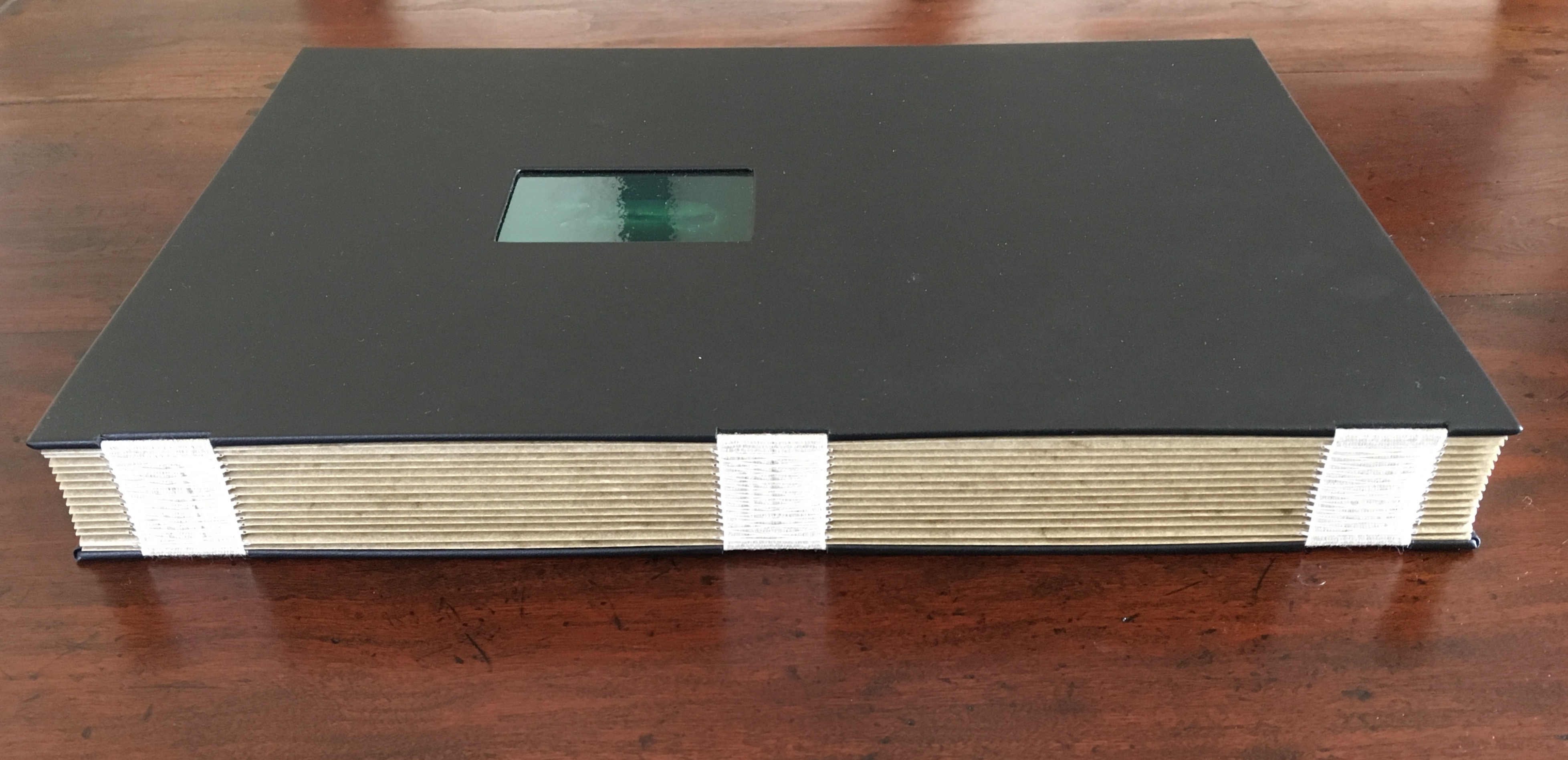
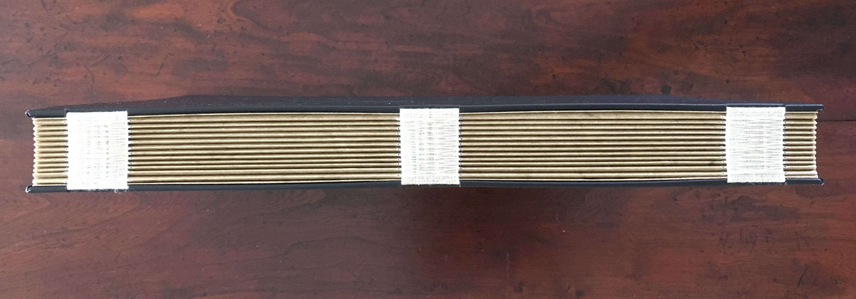
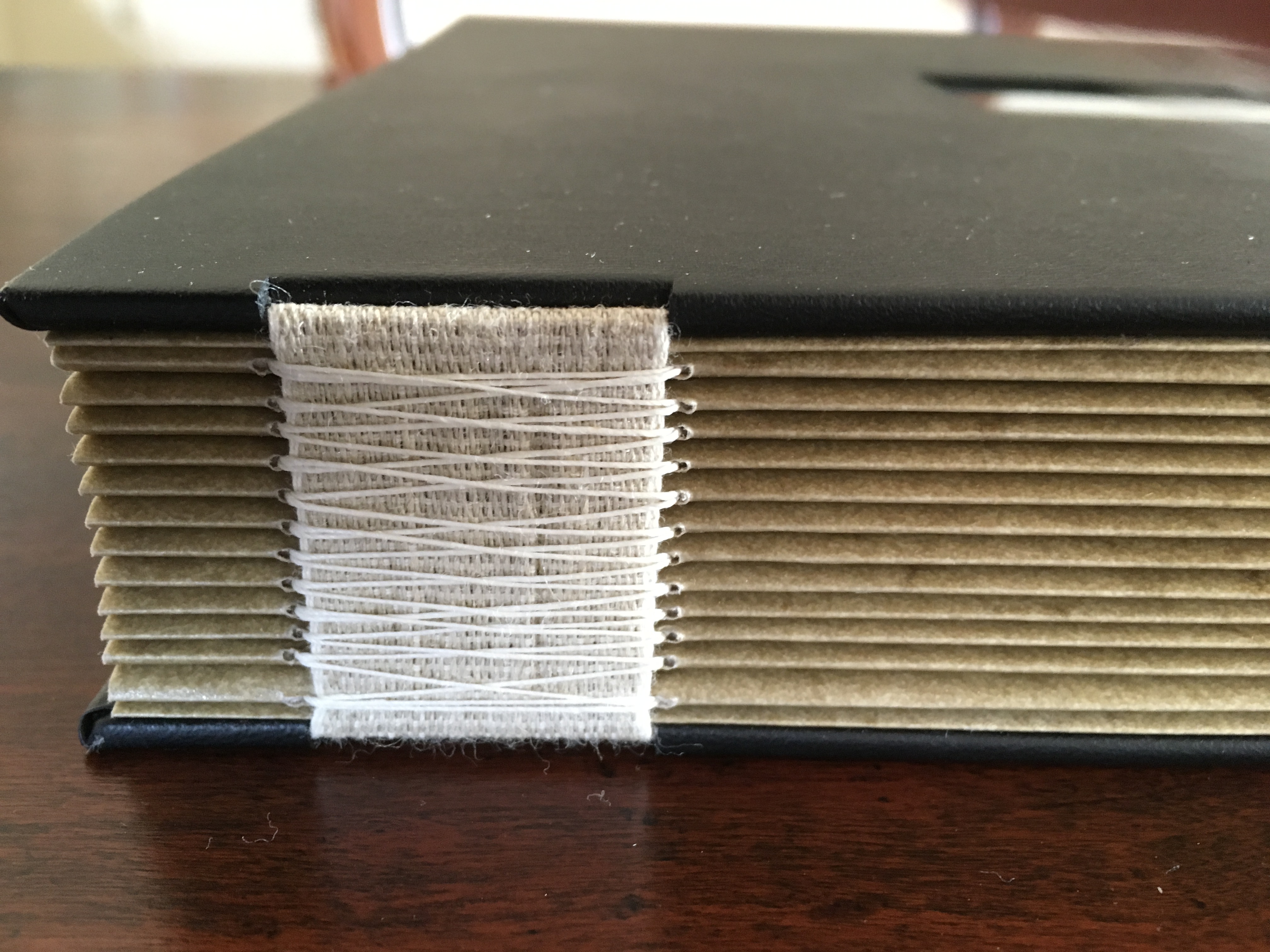
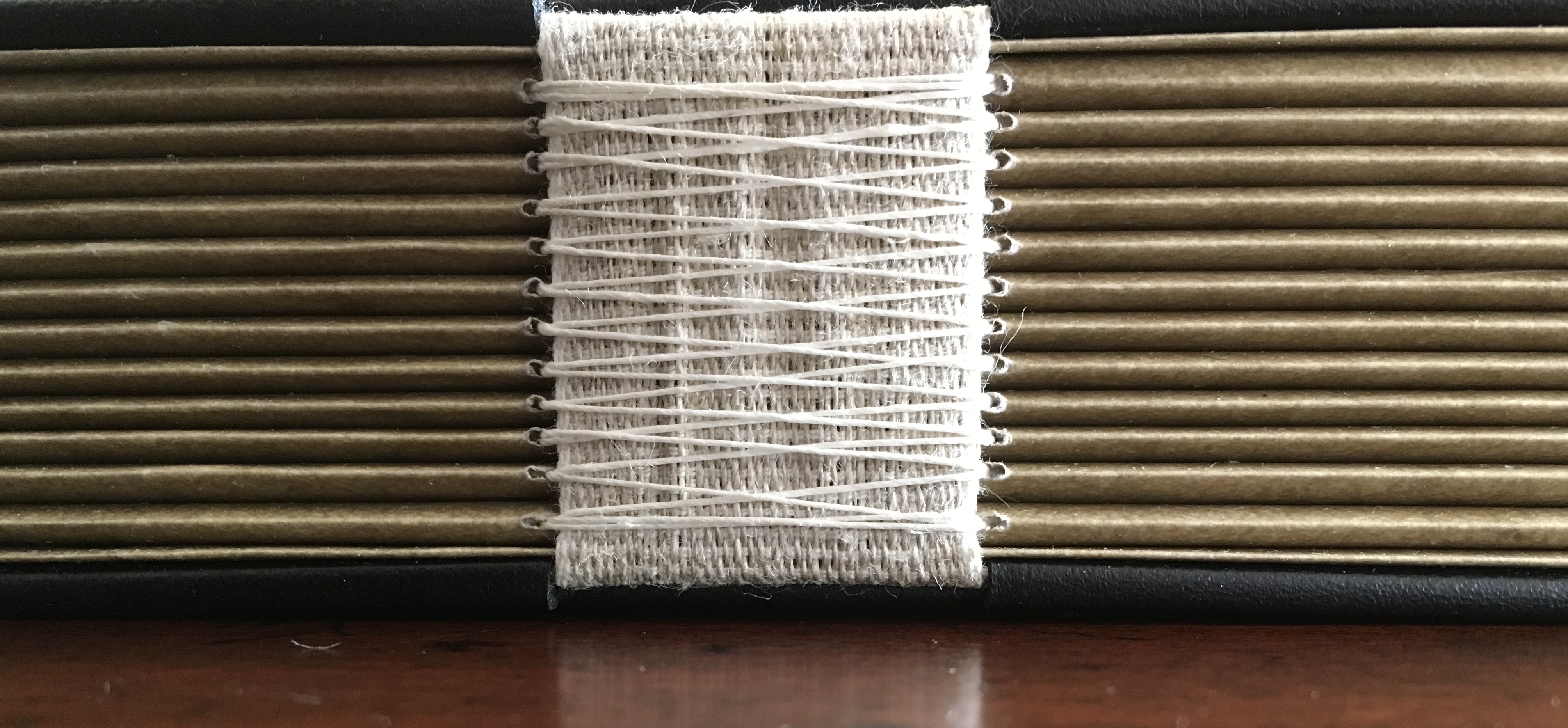
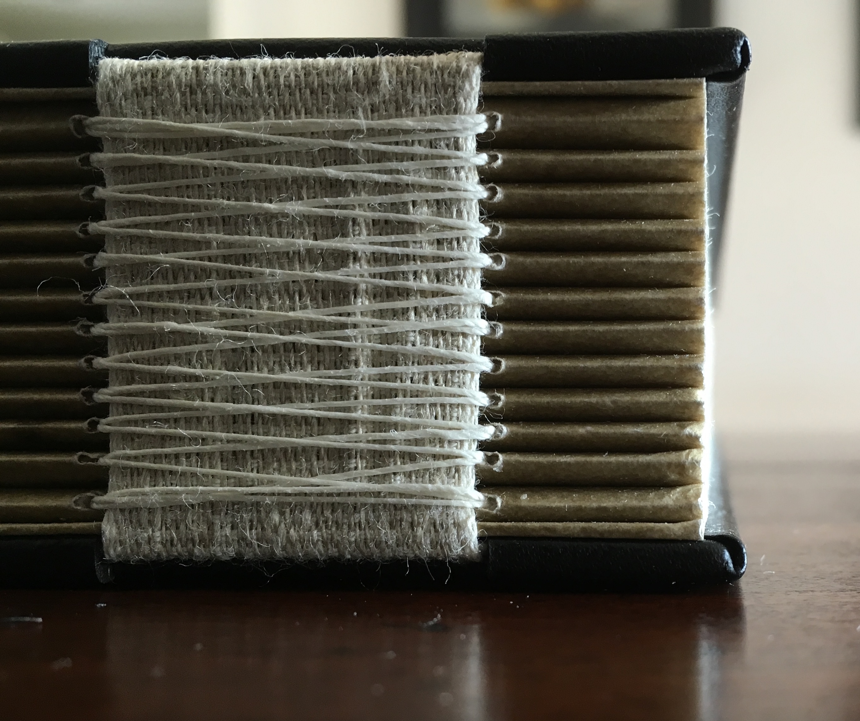
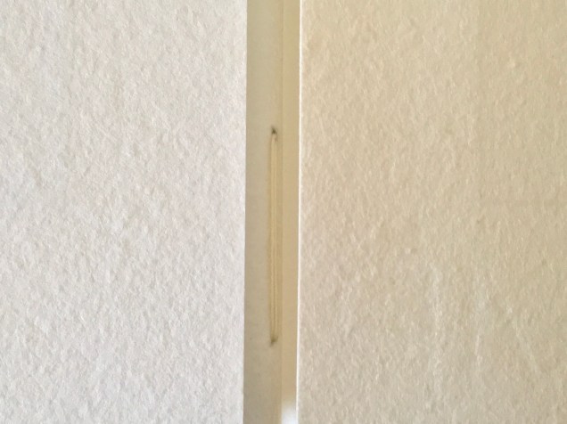
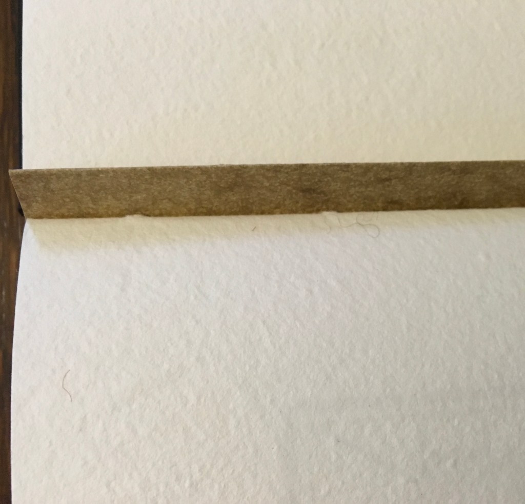
Casebound with illustrated paper over boards. H265 x W255 mm. 48 unnumbered pages. Acquired 23 November 2022.
Photos: Books On Books Collection. Displayed with artist’s permission.
Sometimes you just know that you have read a classic. This is one of those times. Winston and Candlewick Press (Walker Books in the UK) have worked a fresh tale, tone and meaning together with image, color, design and production values to an extraordinary level. Inspired by Tim Brookes’ “Endangered Alphabets Project“, Winston uses the striking shapes of letters and scripts from the Latin, Ogham, Cherokee, Armenian, Hebrew, Tibetan and dozens more alphabets and syllabaries to create the characters in his fable about the story that decides one day that it is the One and Only story.
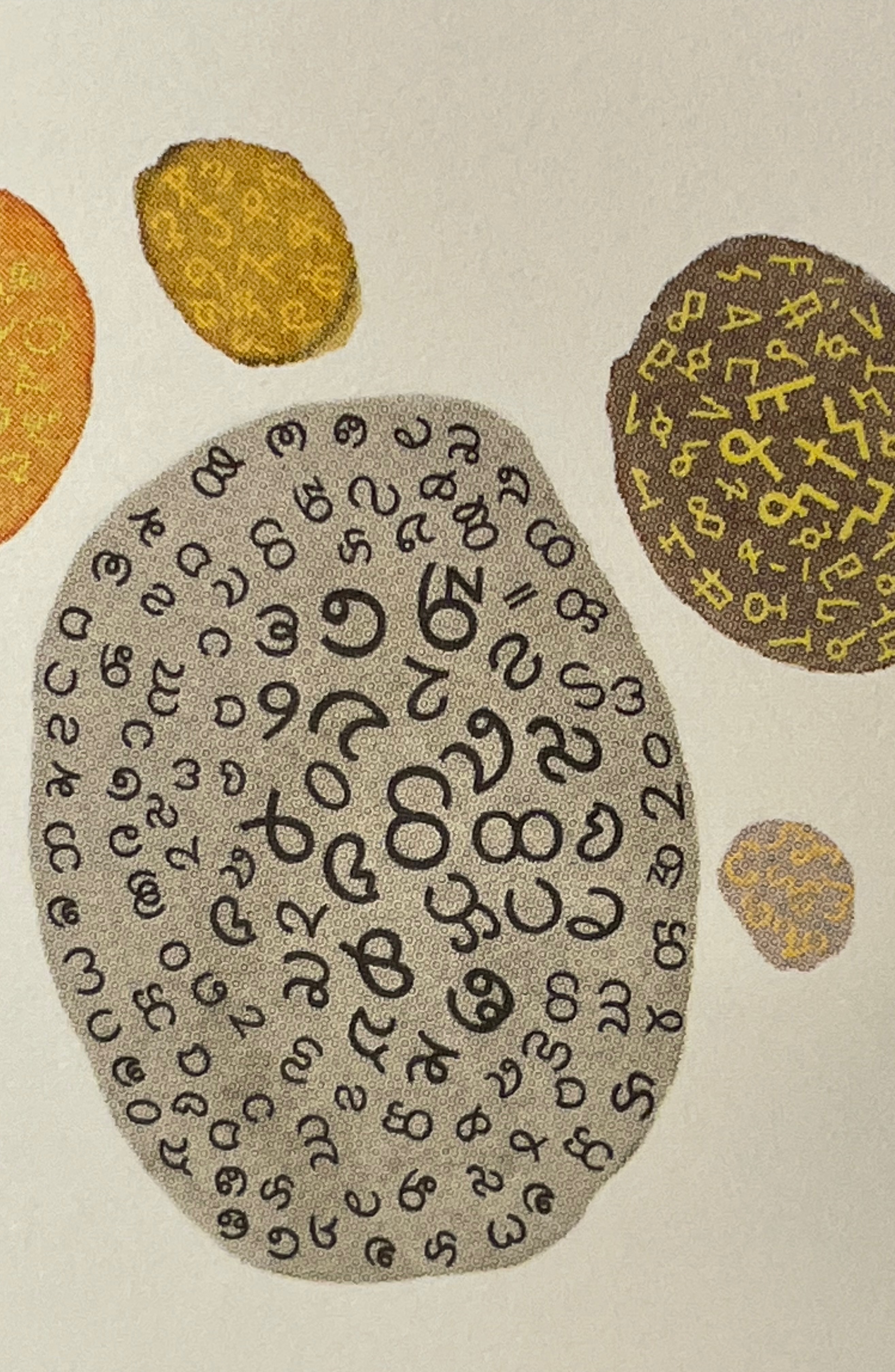
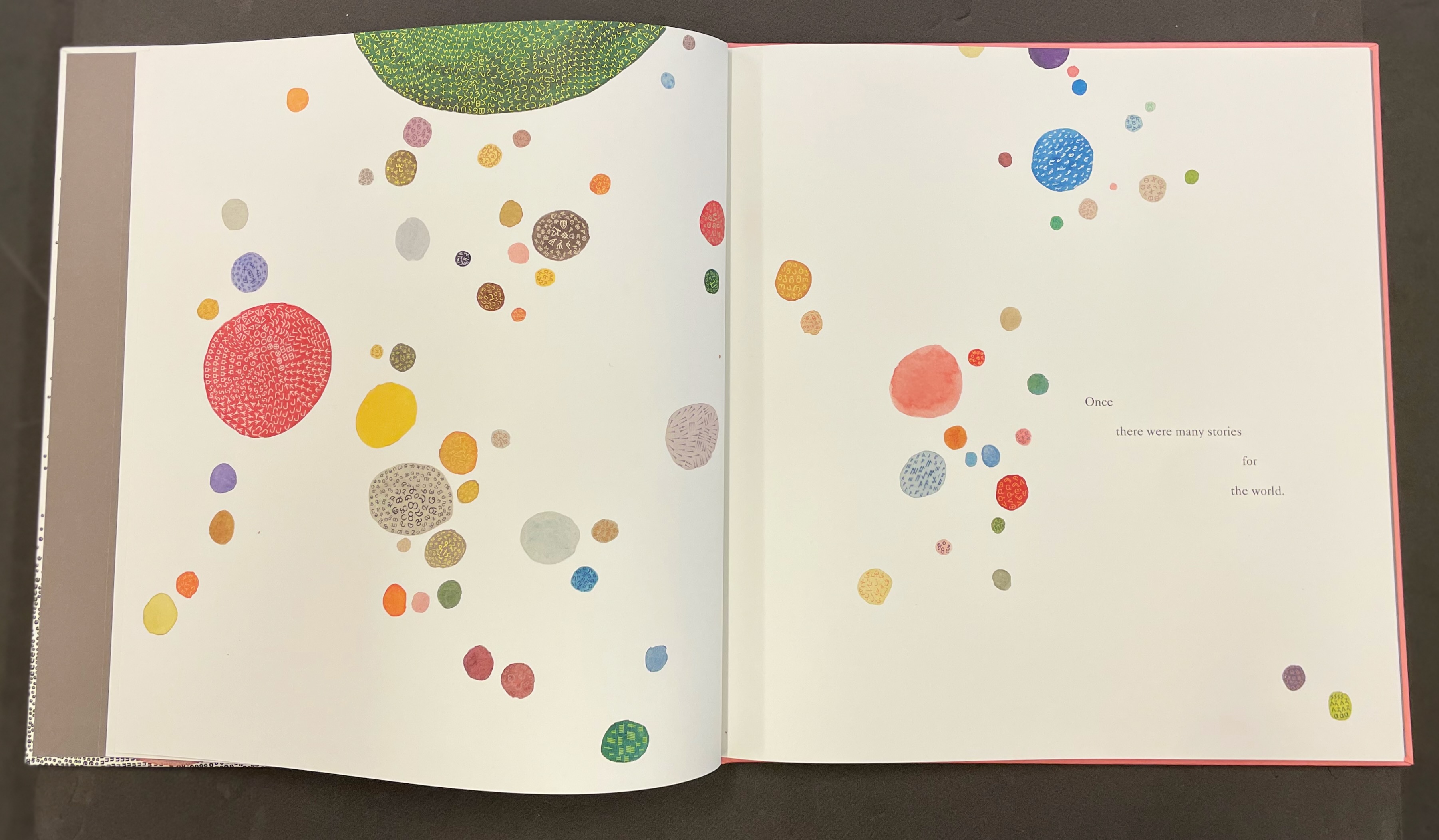
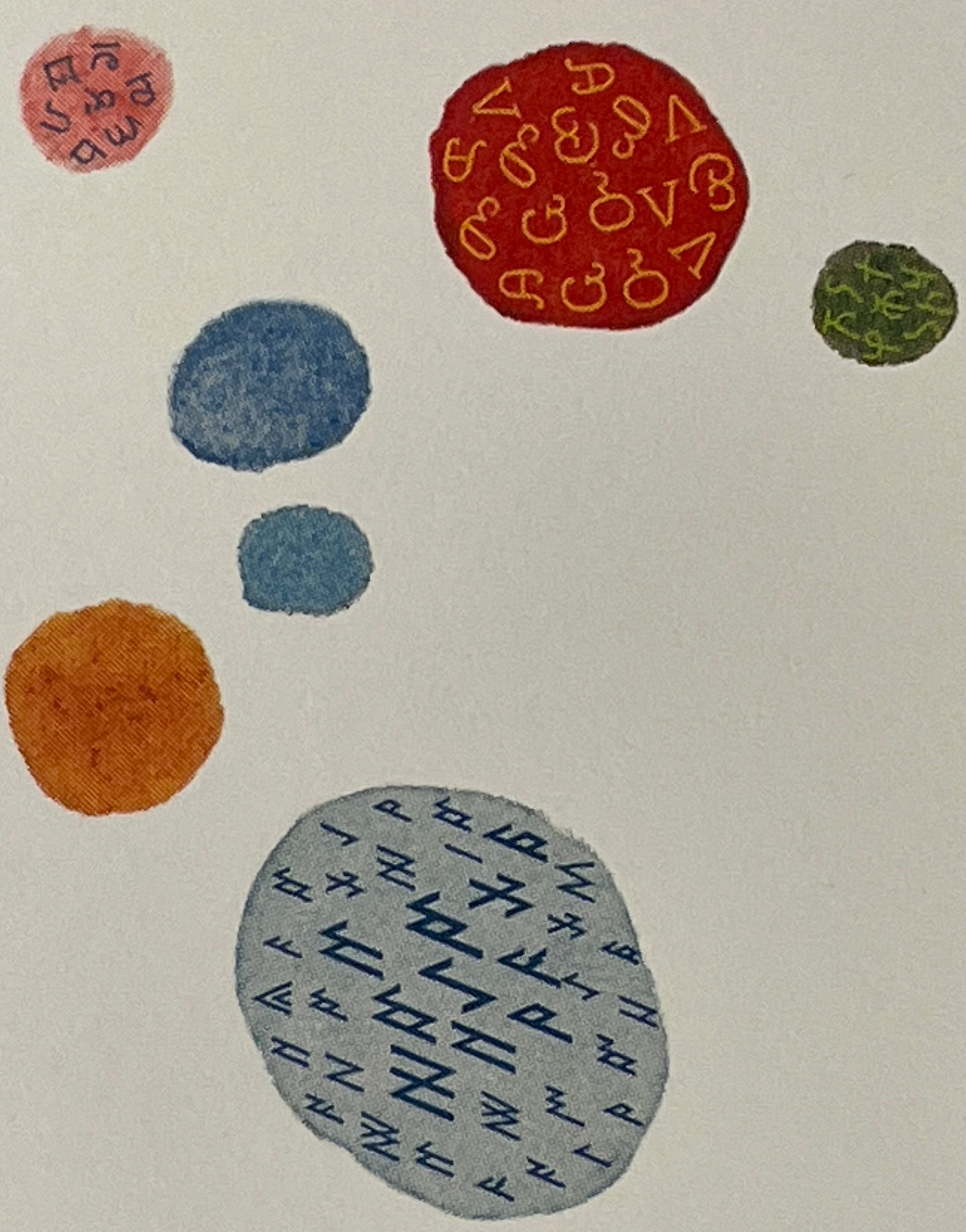
Shapes like single-celled creatures (each filled with a different alphabet) represent the many stories existing before “The One” arrives.
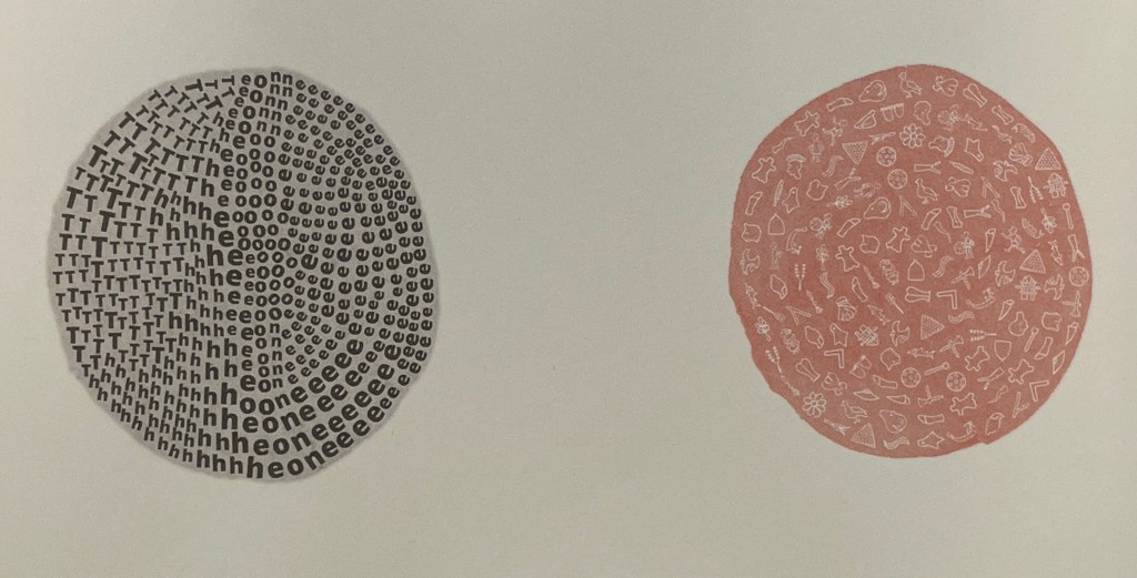
“The One” is made of the English (i.e., Latin or Roman) alphabet. Will it listen to and make sense of all these other stories?
The fable of One & Everything does more than support the notion that alphabets and languages can be endangered. Implicit in the fate of the “One & Everything” story” is the message that Babel was more of a blessing than a curse.
Readers familiar with Winston’s A Dictionary Story and his collaboration with Oliver Jeffers in A Child of Books (both below) will recognize a growing refinement and, now, breadth and depth in Winston’s storytelling. The youngest audience and beginning readers will be held by the shapes, colors and simplicity of the story. Older readers will easily grasp its underlying meanings and be intrigued by the variety of letters and scripts and the idea that languages and alphabets can die. Still older readers and teachers will appreciate the helpful resources following the story’s ending invitation. At all levels, the audience will delight in Winston’s creation of his characterful abstractions with letters from the alphabets and scripts identified in those resources. Those with an eye for such artistry will appreciate Winston’s extension of a tradition embraced by Paul Cox, Roberto de Vicq de Cumptich, Sharon Forss and Nicolas McDowall.
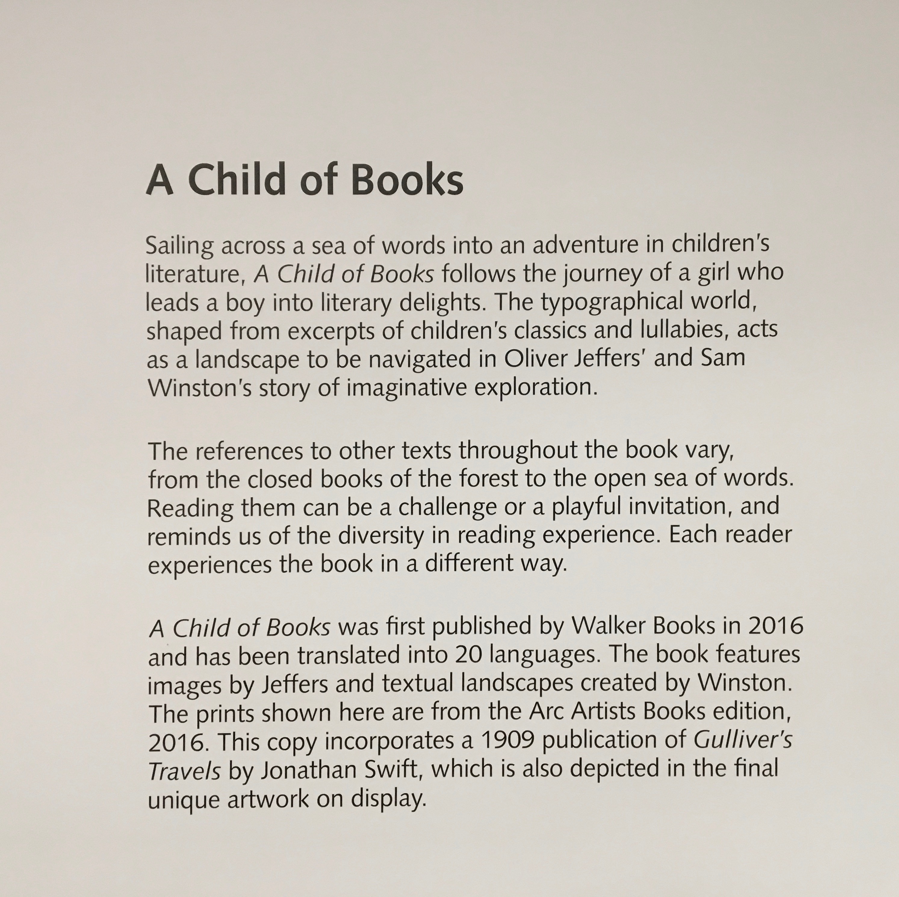
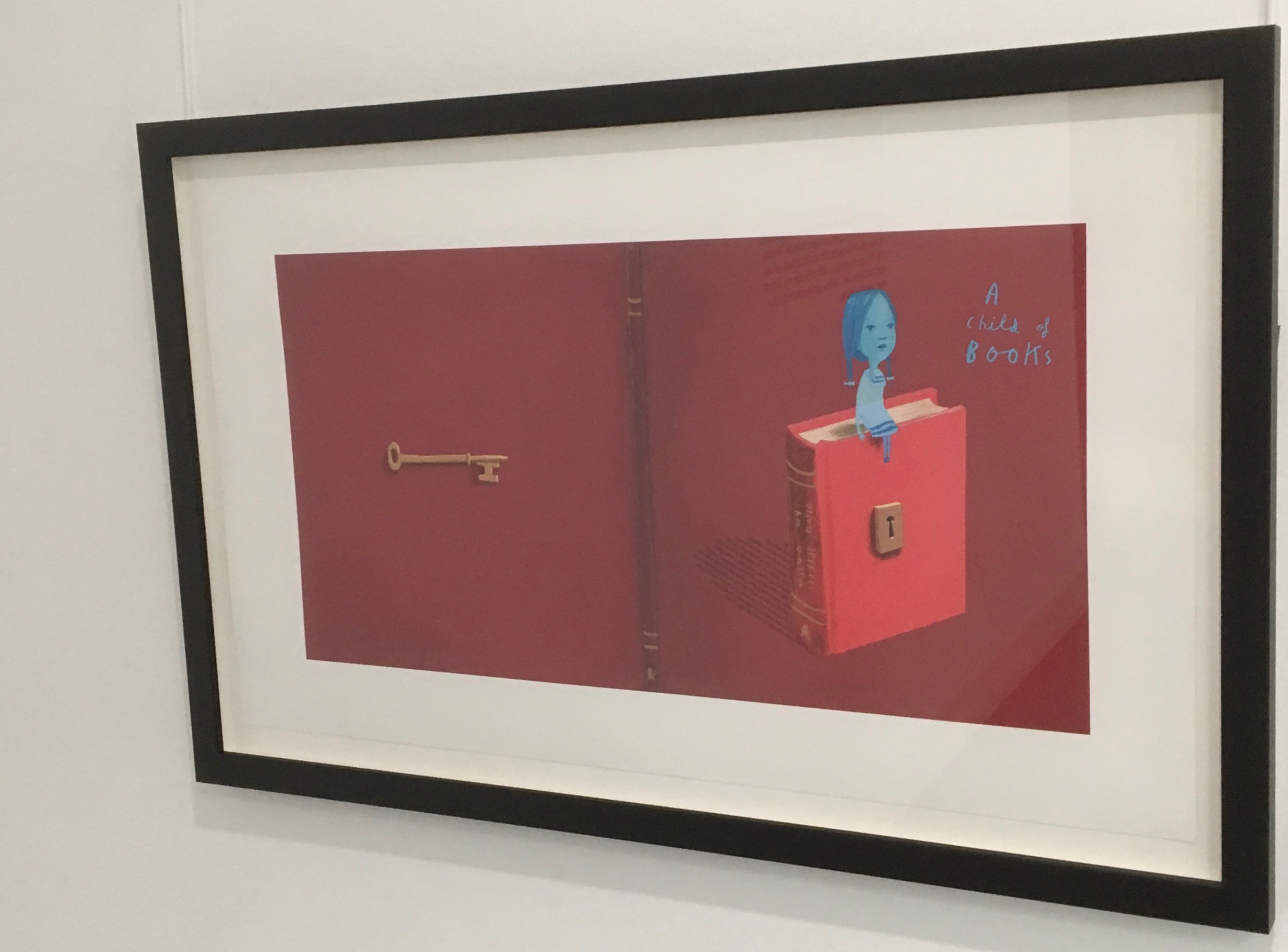
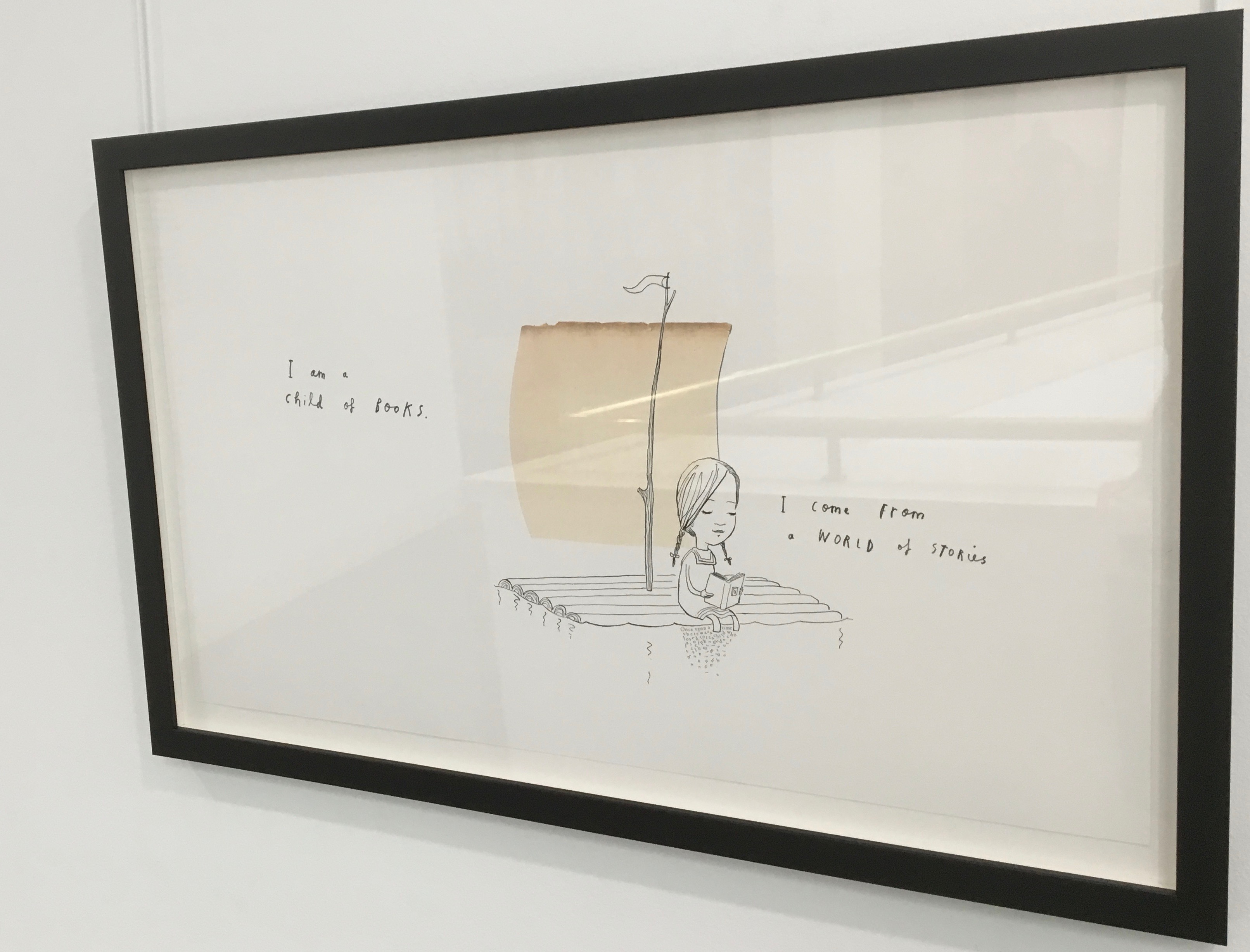
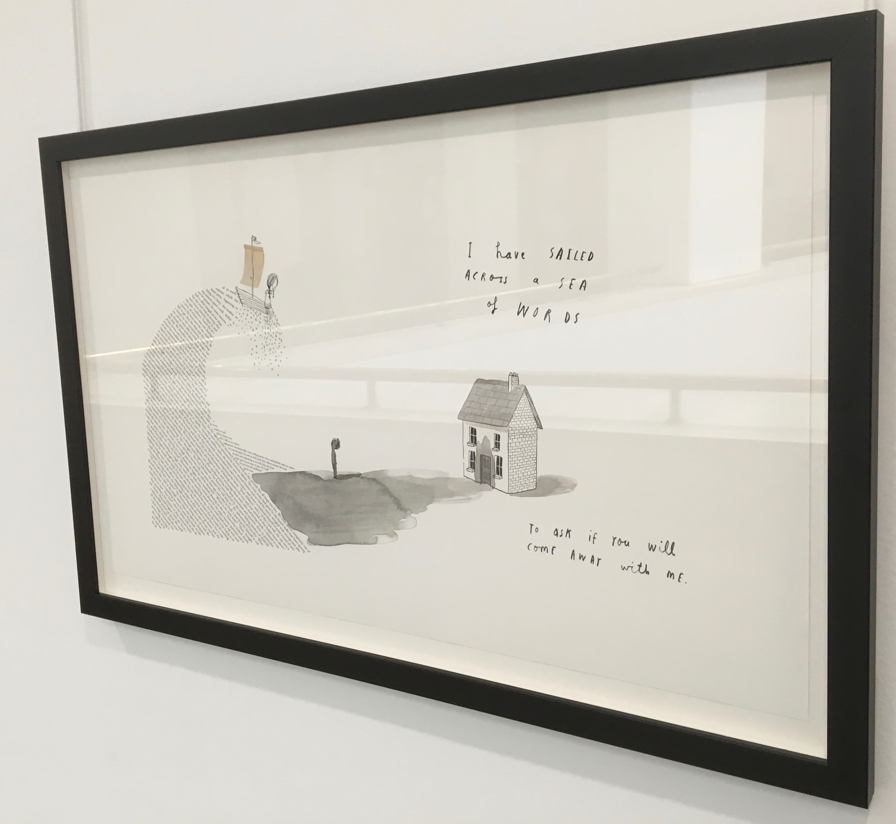
A Child of Books (2019)
A forest made of fore-edges. A raft made of spines and its sail a book page. A wave and a path made of excerpts from books. In this fabulous world made from the features of books, the simpatico imaginations of Oliver Jeffers and Sam Winston deliver a heroine and an invitation that are hard to resist.
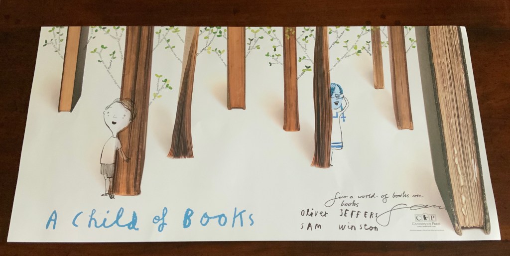
Promotional poster. Displayed with permission of Sam Winston.
In addition to the poster above and the trade book it promotes, Winston created an artist’s book edition celebrated by this hallway gallery below mounted by the British Library shortly after its appearance.
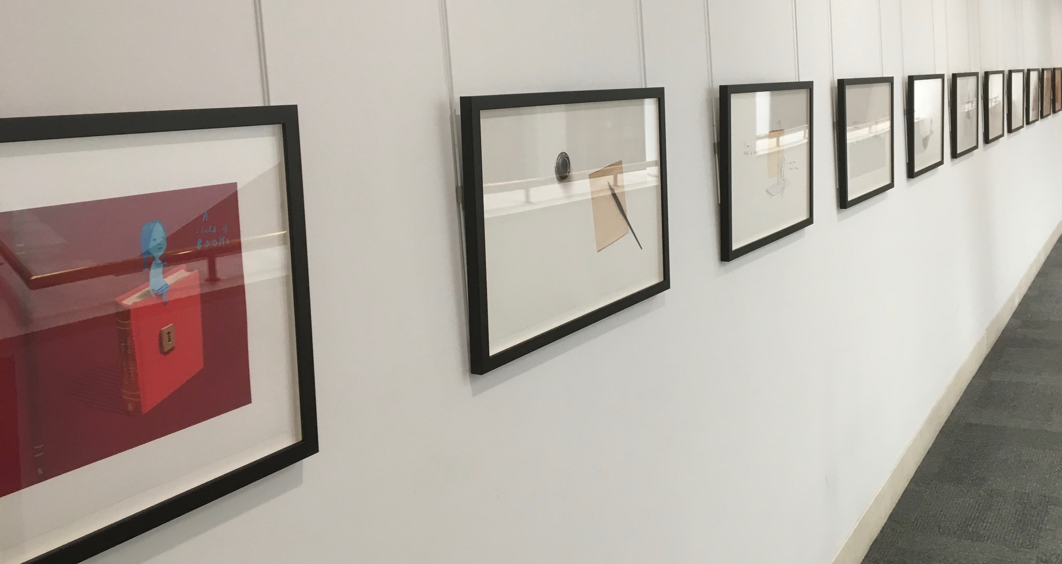
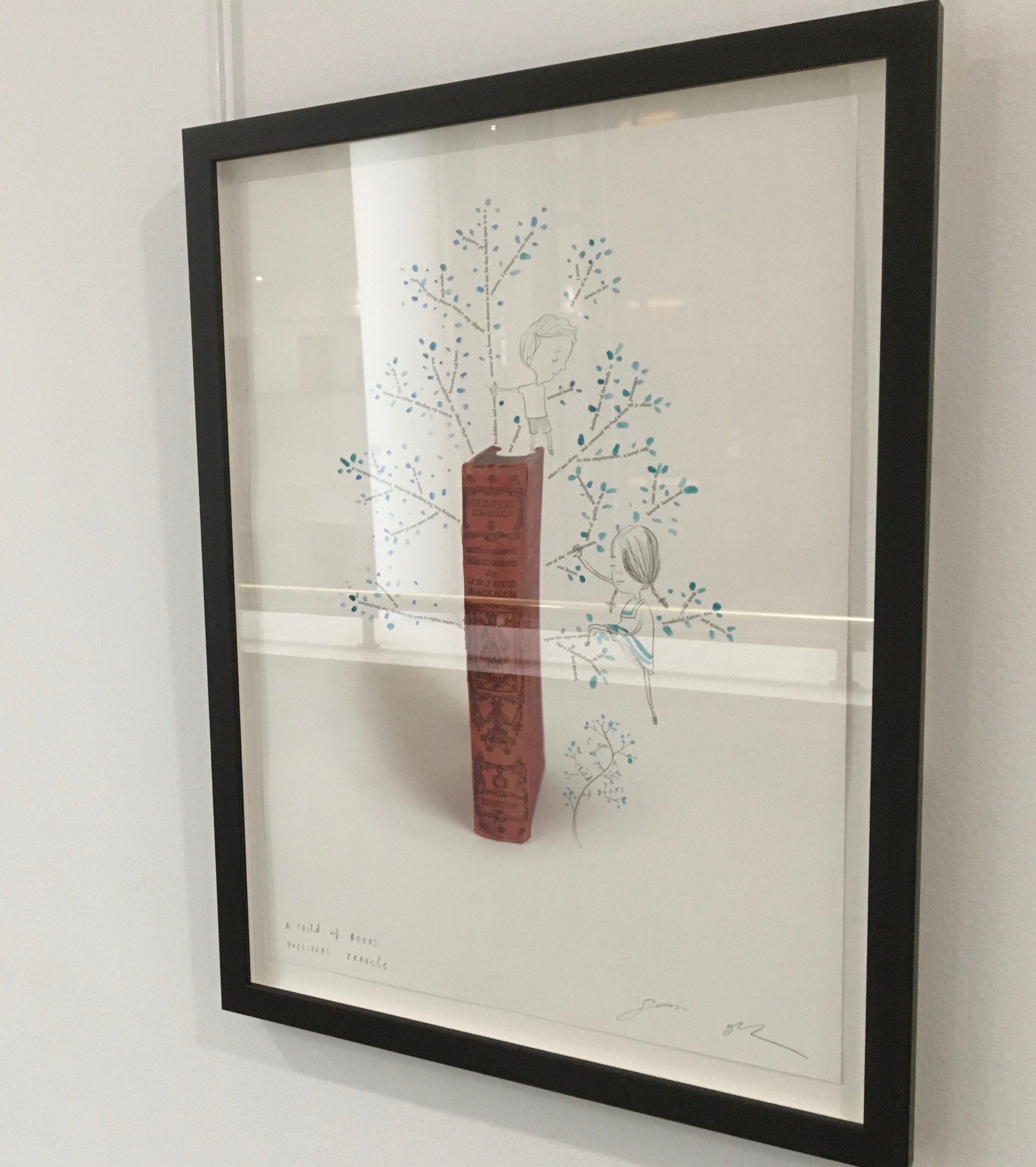
A Child of Books prints displayed at the British Library, 9 August – 27 September 2019.
Winston’s abiding love of letters, words and stories shines through in A Child of Books. Arguably, it has its origins in an earlier work whose story is told by his invention of a very different “child of books”.
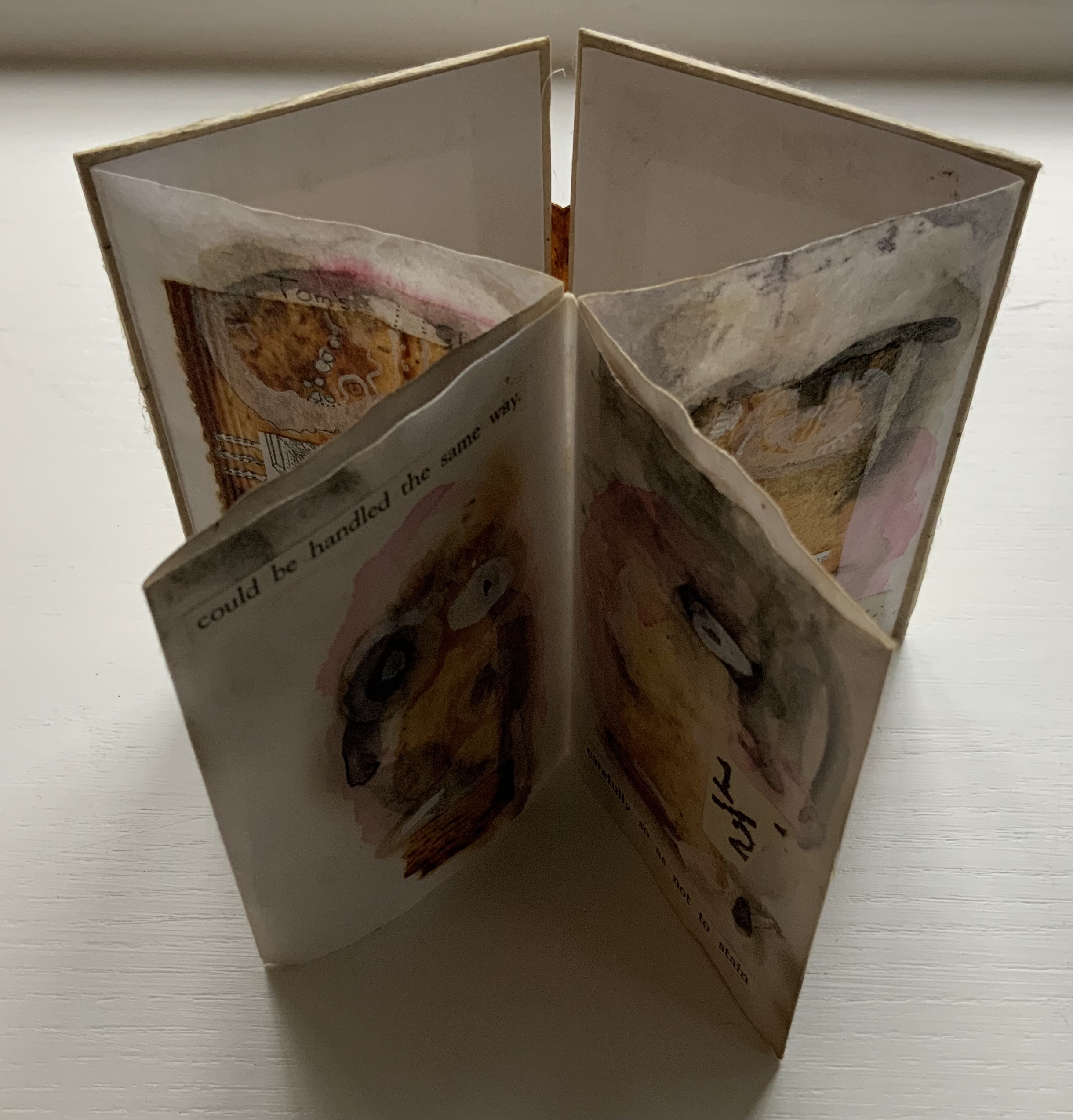
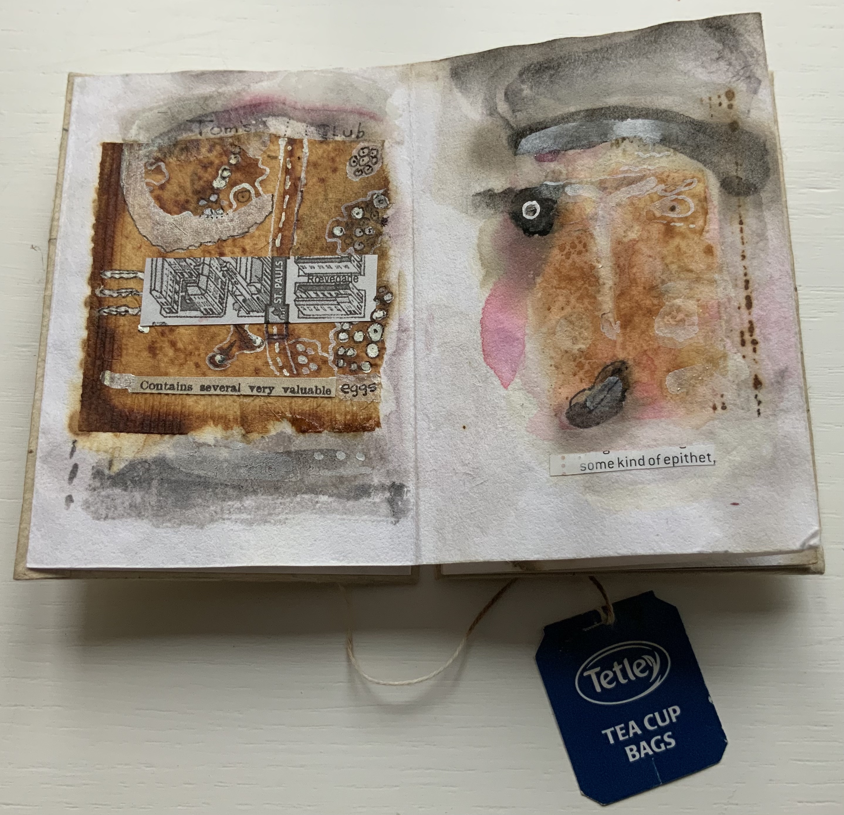
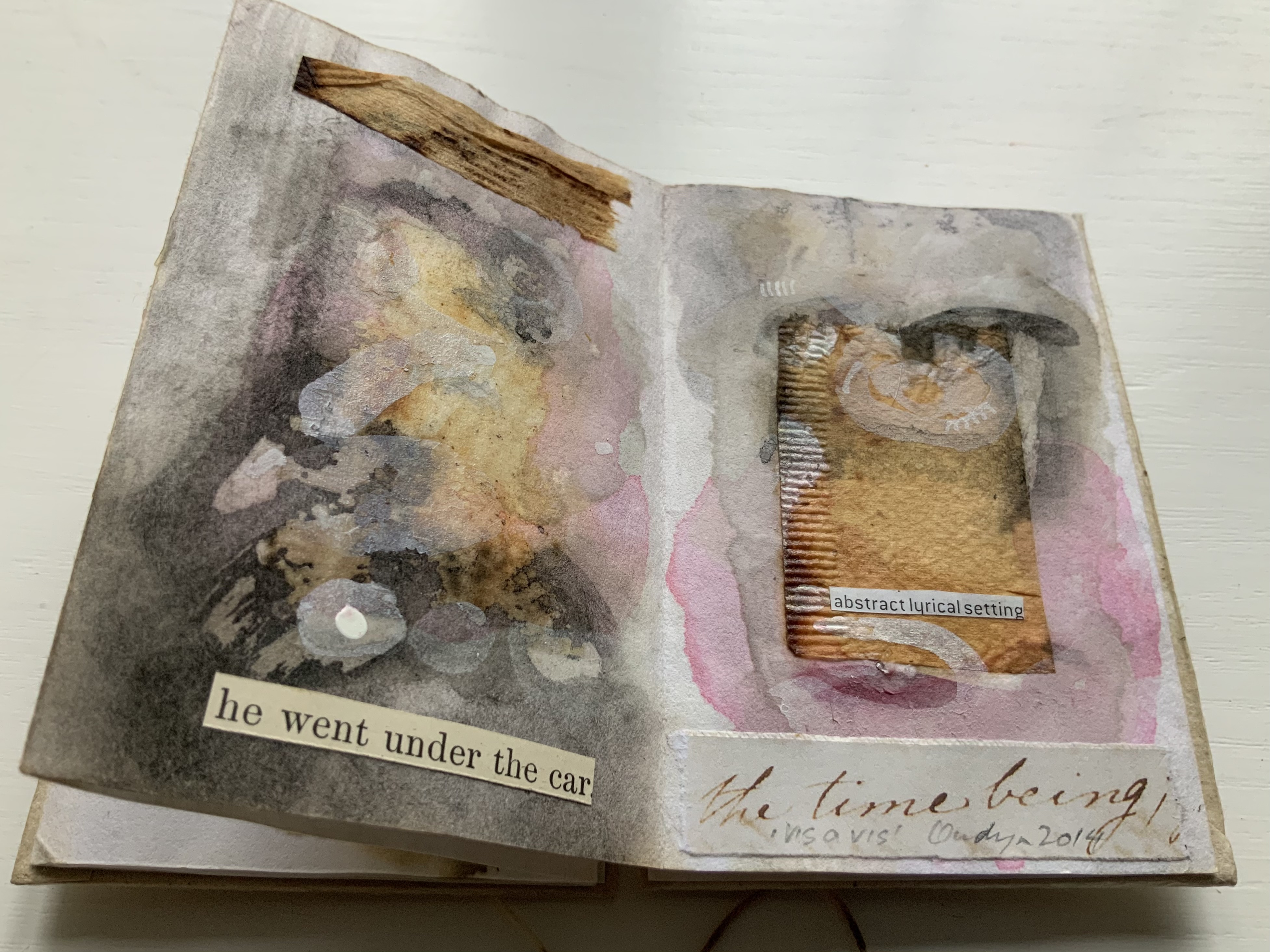
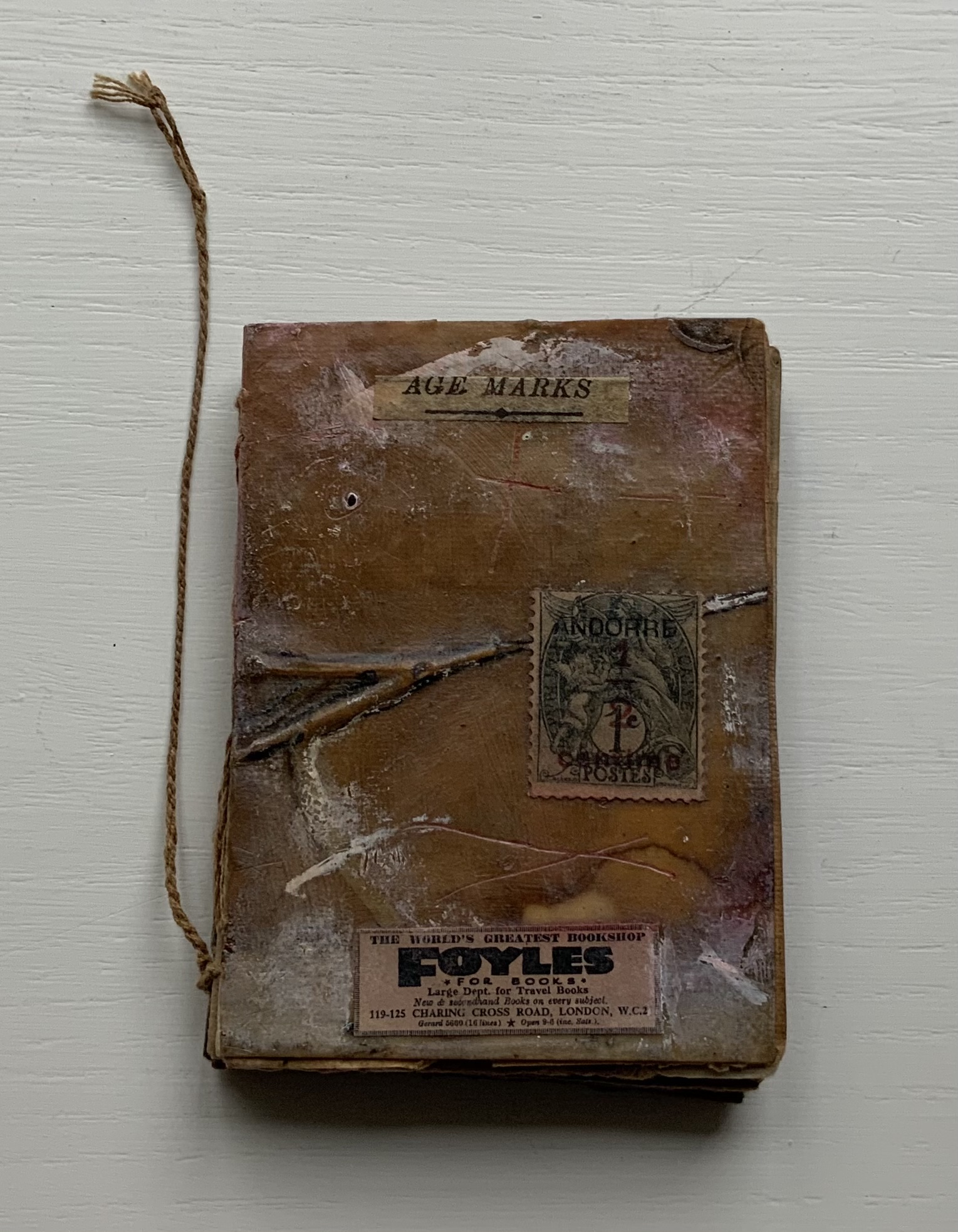
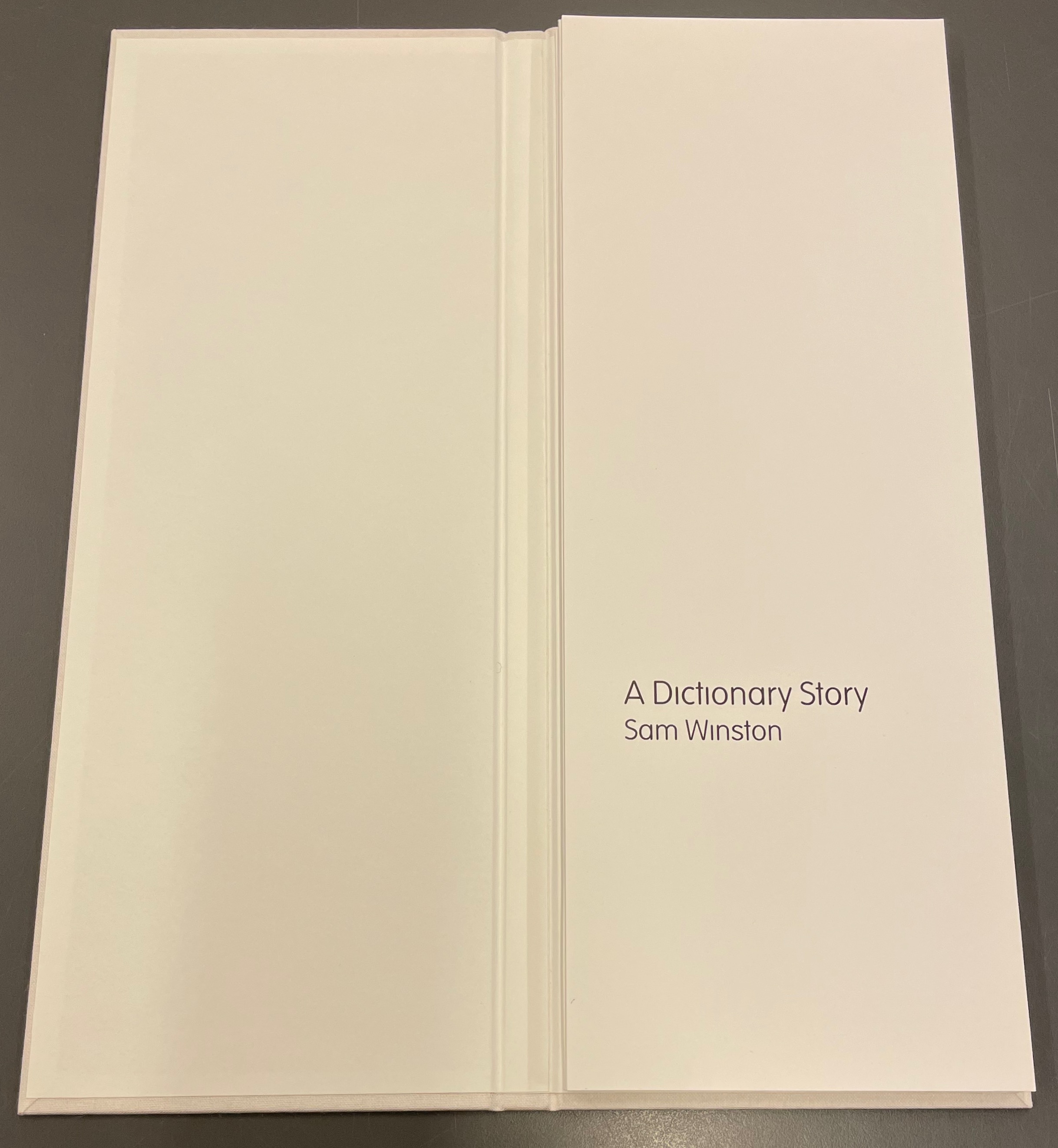
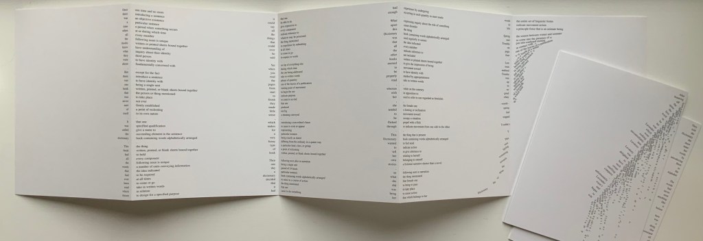
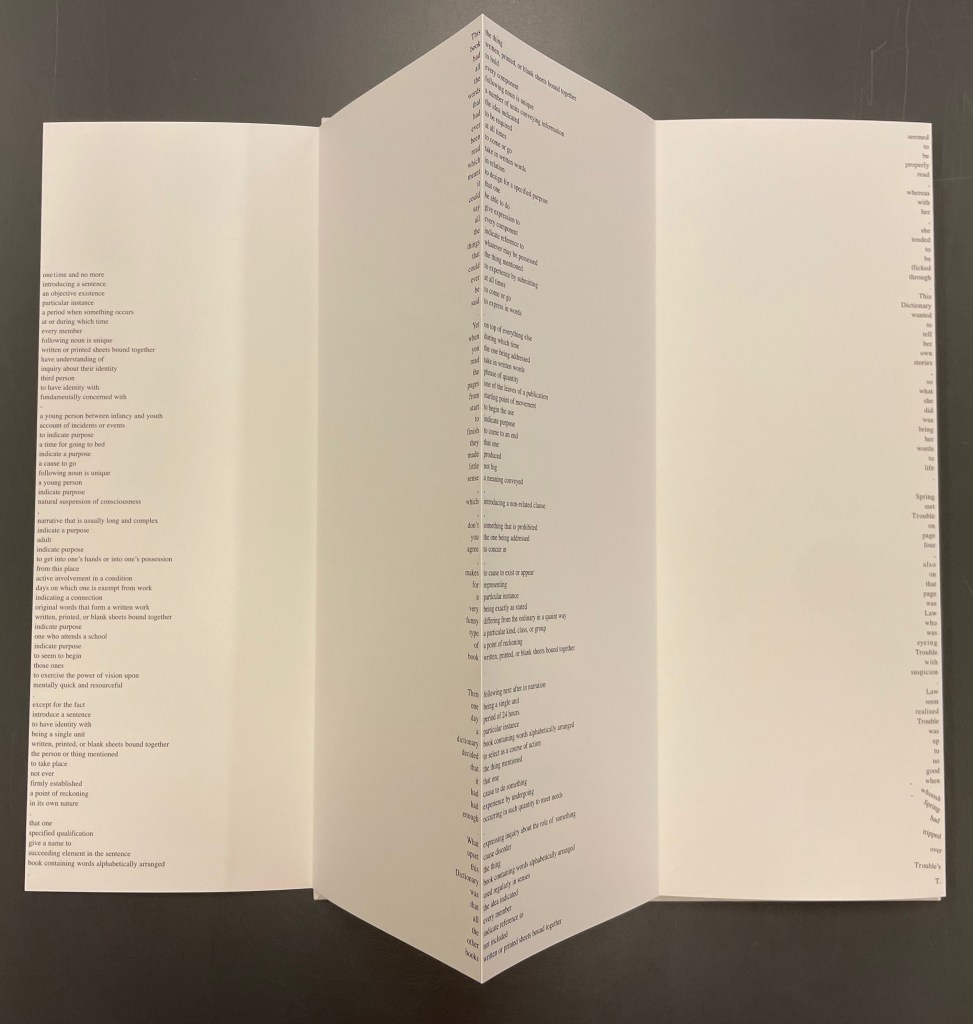
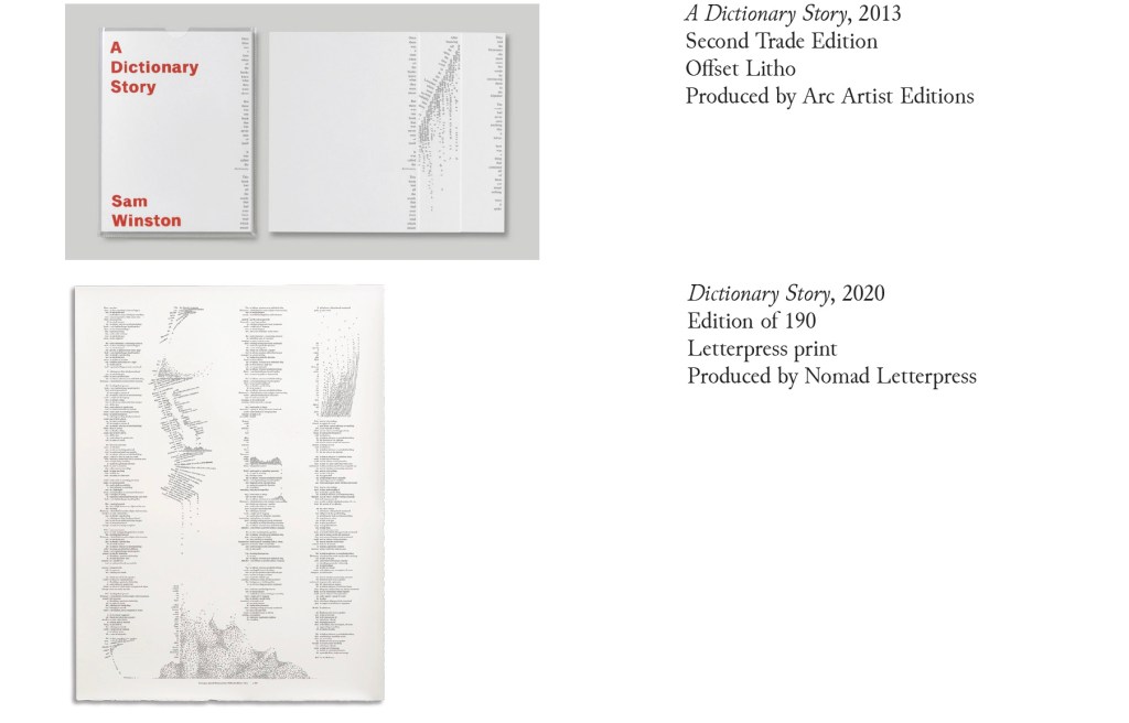
A Dictionary Story (2001 – 2020)
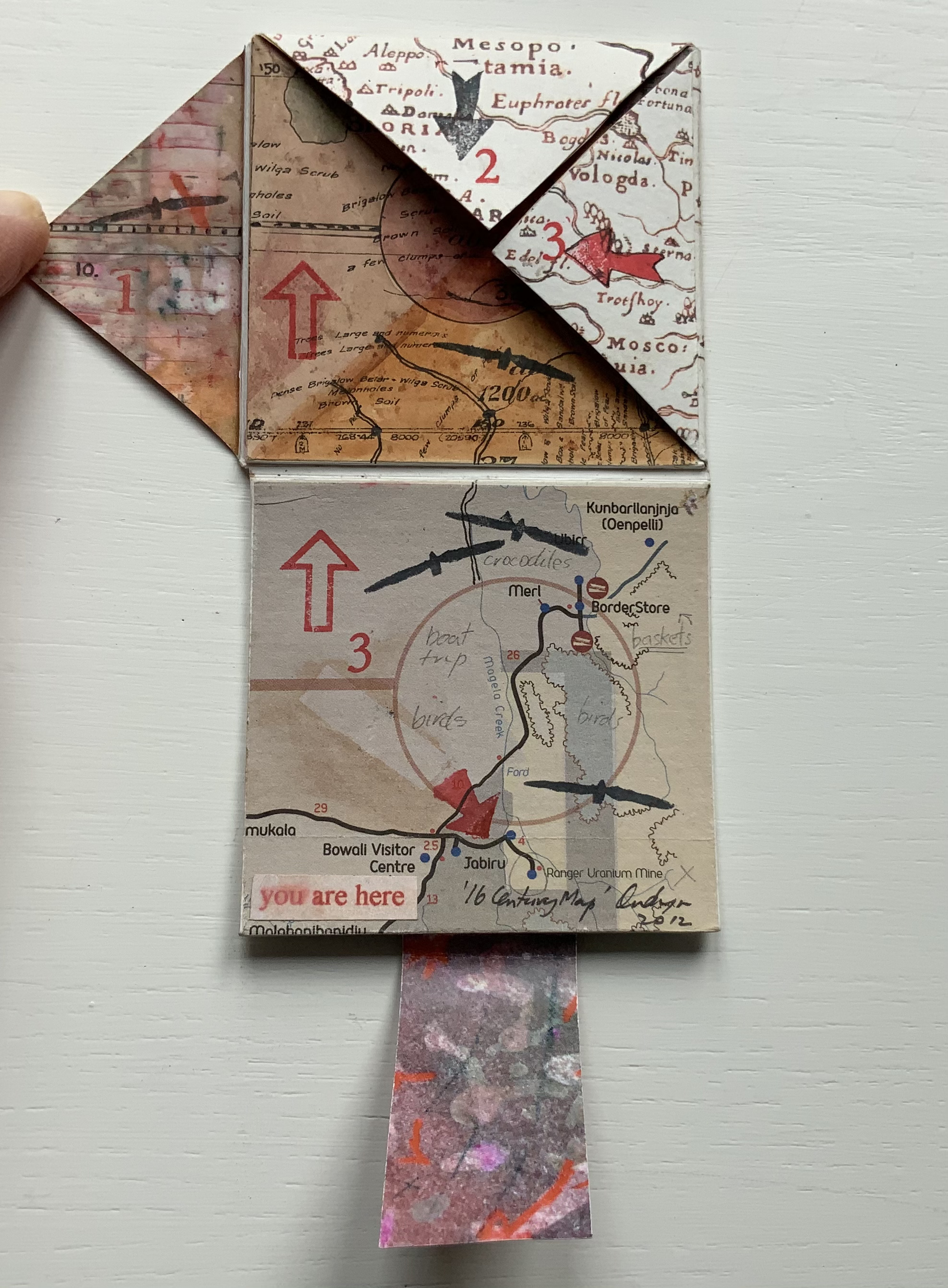
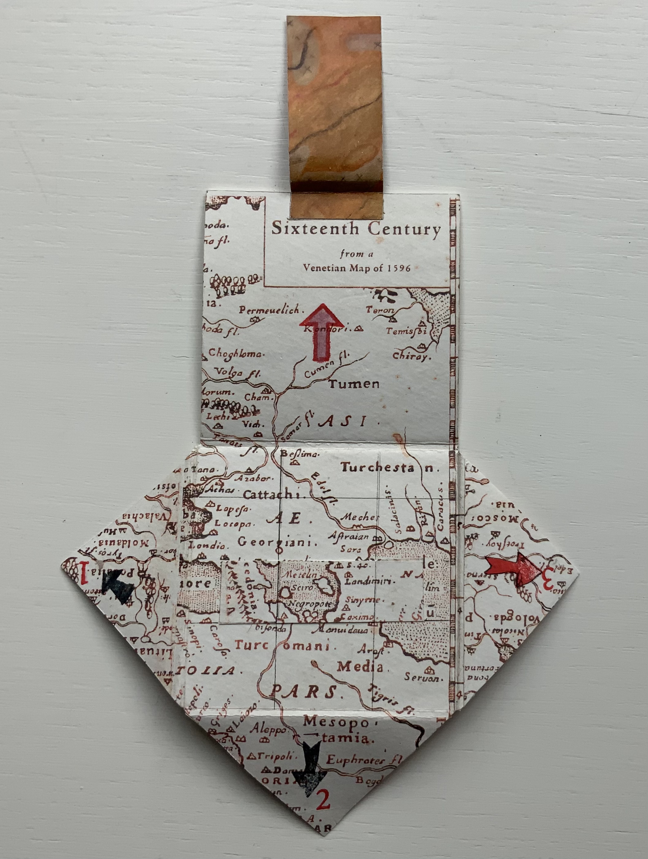
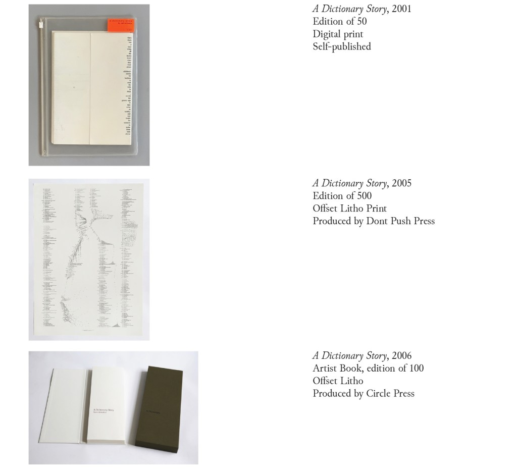
Since its origin as a student project in 2001, A Dictionary Story has appeared in an accordion book form as a fine press edition and two trade editions and as single-sheet prints. The Books On Books Collection holds the fine press edition and the second trade edition, both of which have in common a vertical flush-right single-word column that tells the story and the immediately adjacent vertical flush-left column of definitions of the words in the story. In the fine press edition, the two columns meet at each mountain peaks of the accordion fold.
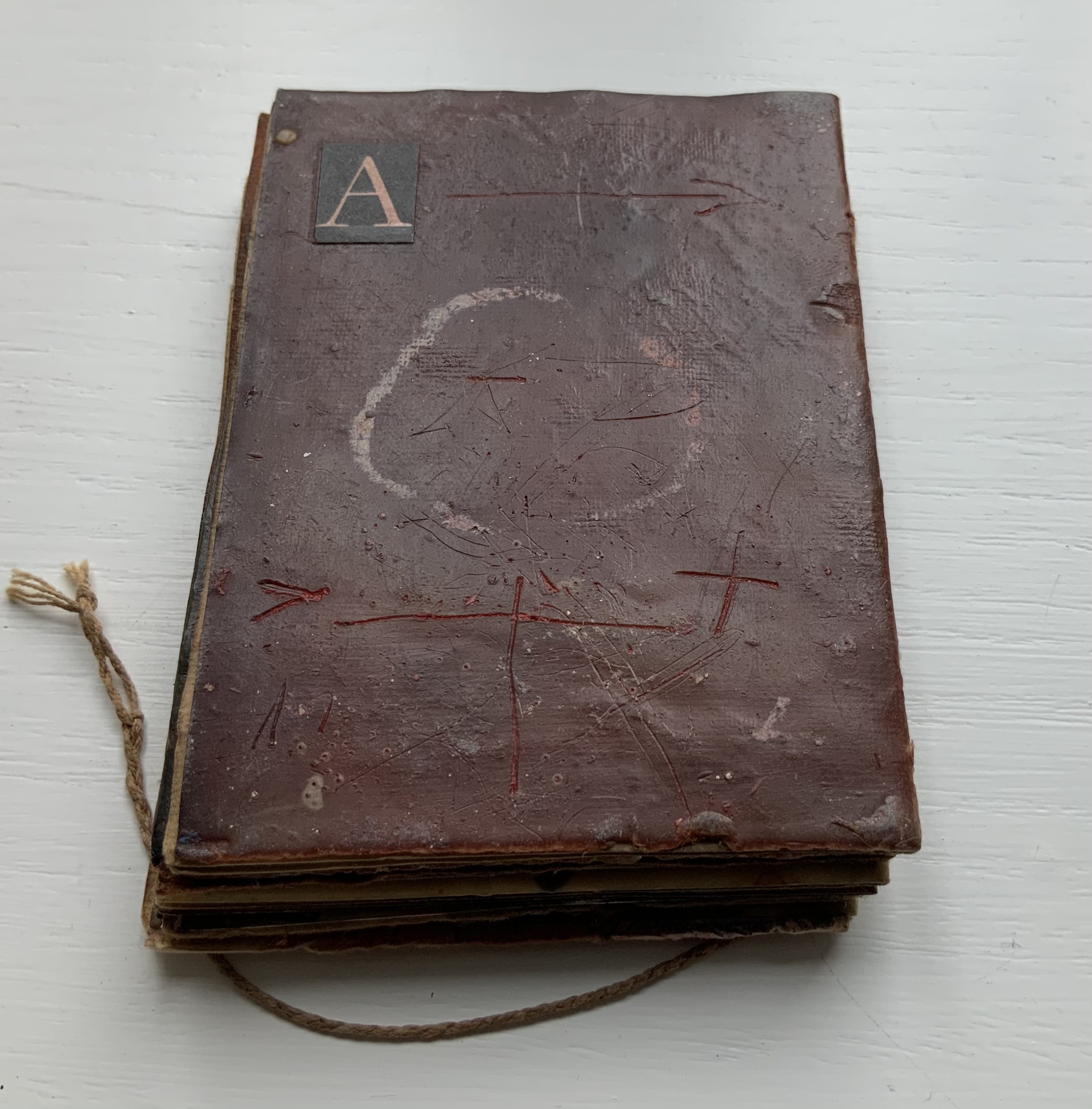
A Dictionary Story (2006)
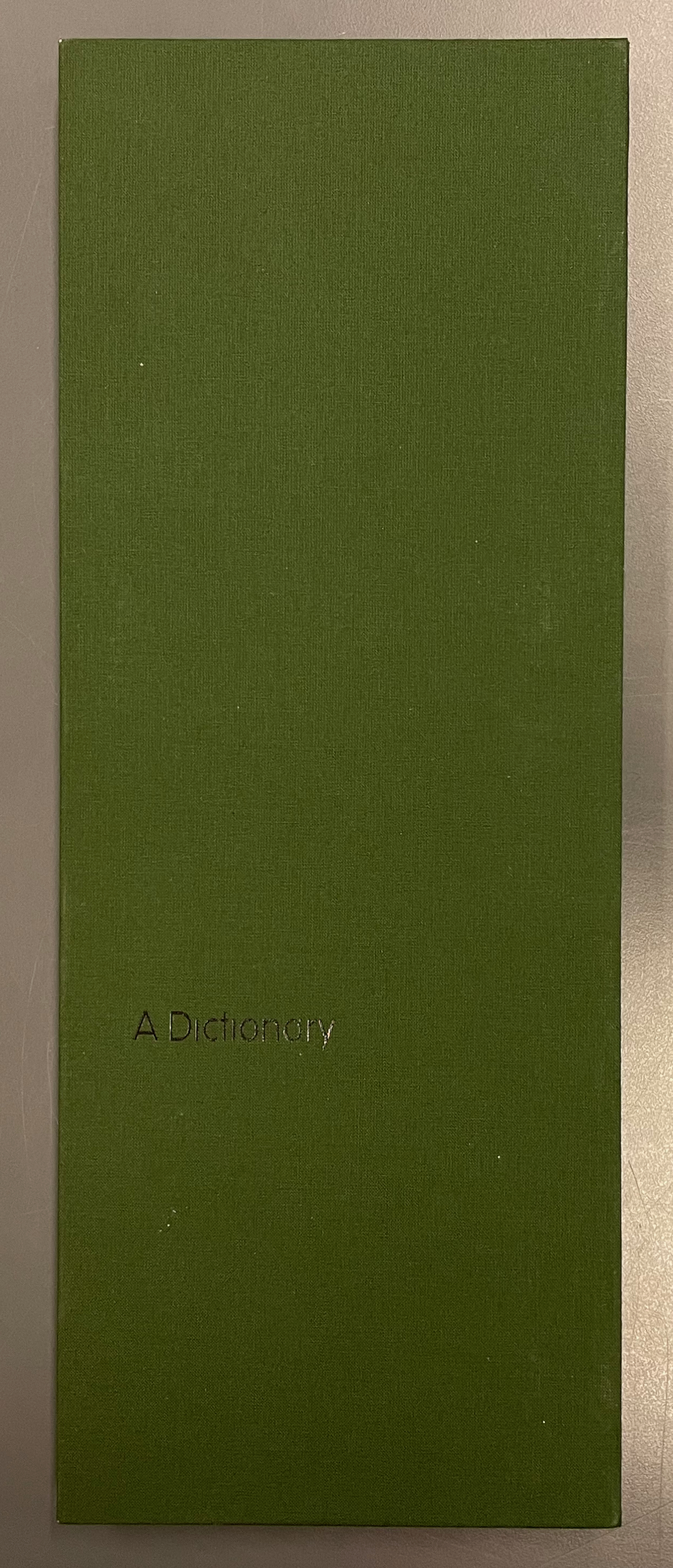
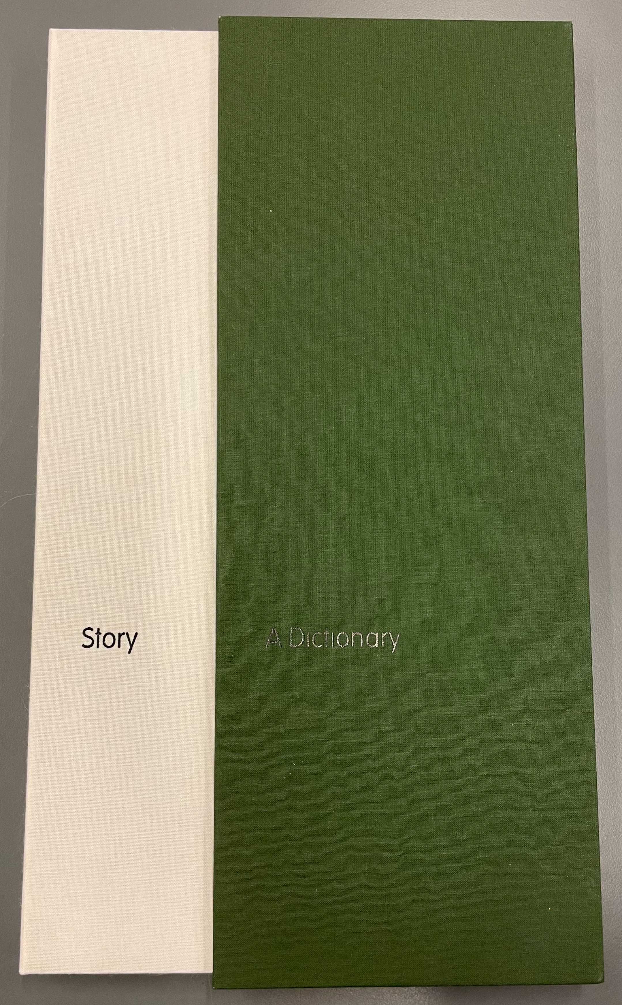
A Dictionary Story (2006)
Sam Winston
Slipcased leporello between cloth-covered boards.H360 x W140 mm, 25 panels. Story text set in 9 point Times Roman by Sam Winston. Book designed by Richard Bonner-Morgan and Sam Winston. Printed by David Holyday at Trichrom Limited. Bound at Quality Art Reproductions, England. Published by Circle Press. Edition of 100, of which this is #68. Acquired from the artist, 30 May 2018.
Photos: Books On Books Collection. Displayed with artist’s permission.
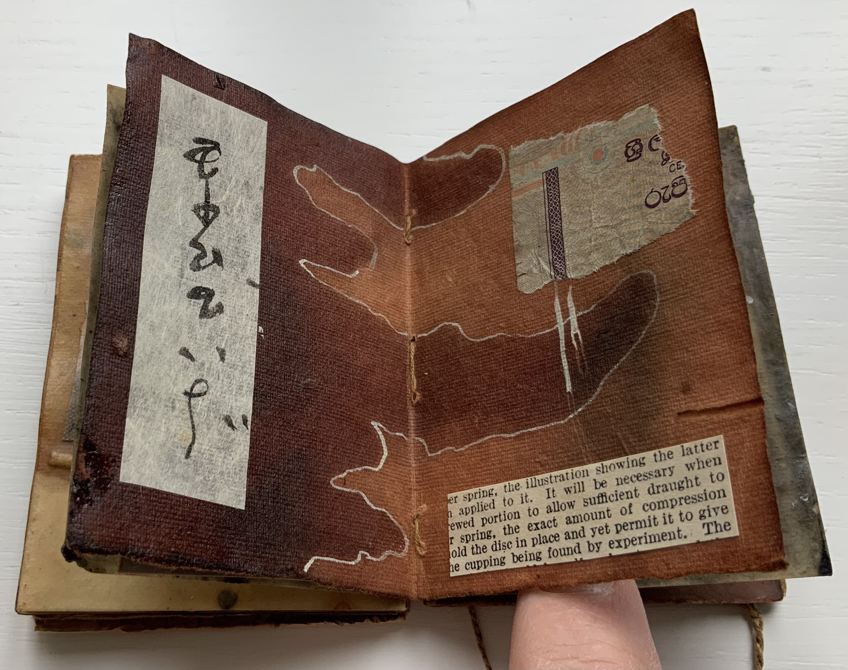
“Once there was a time when all the books knew what they were about. But there was one book that was never sure of itself.”
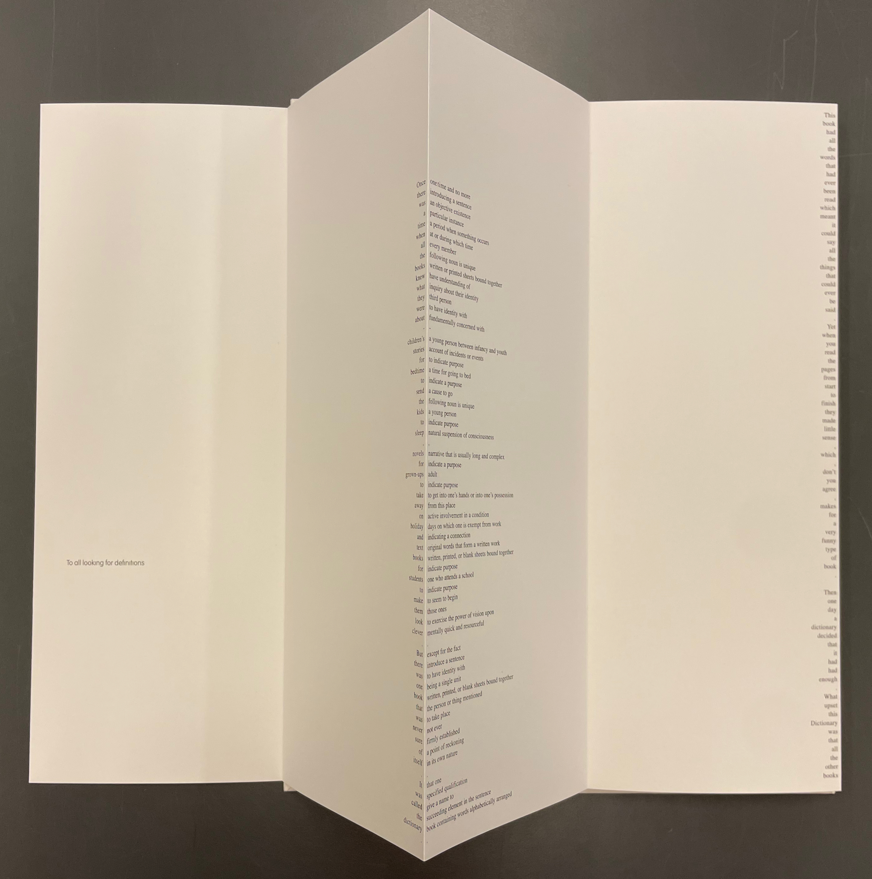
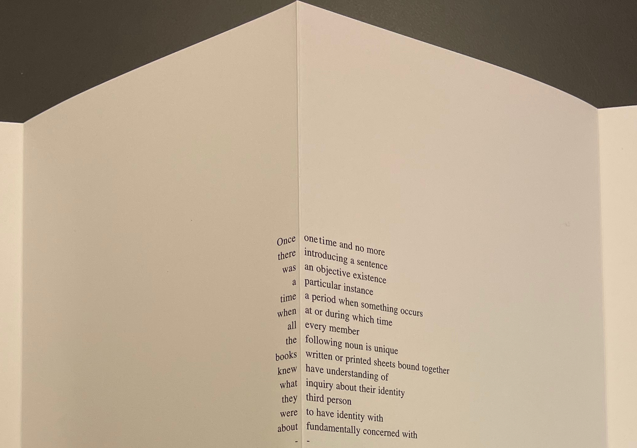
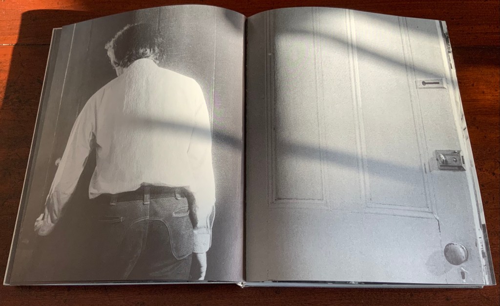
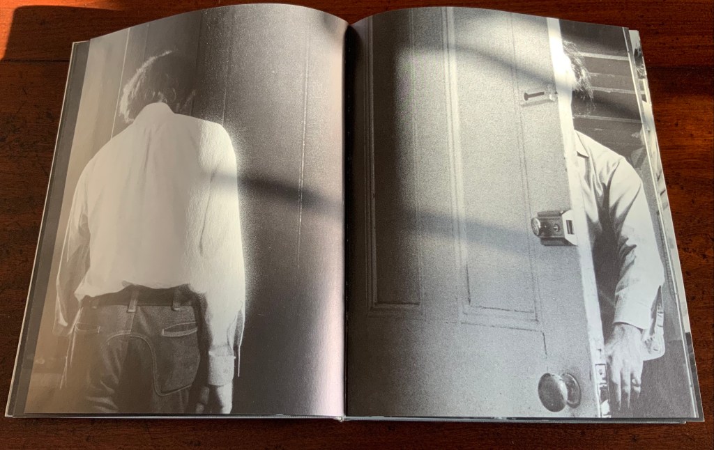
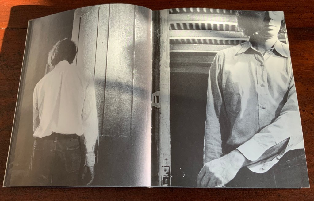
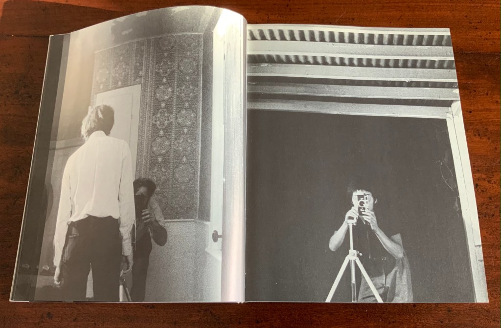
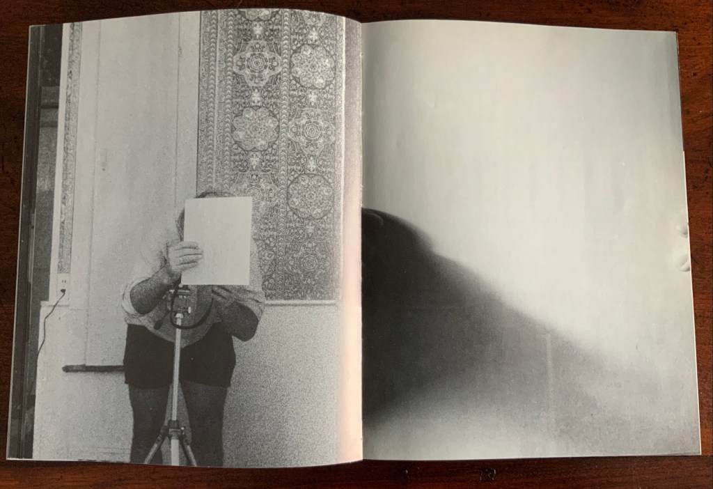
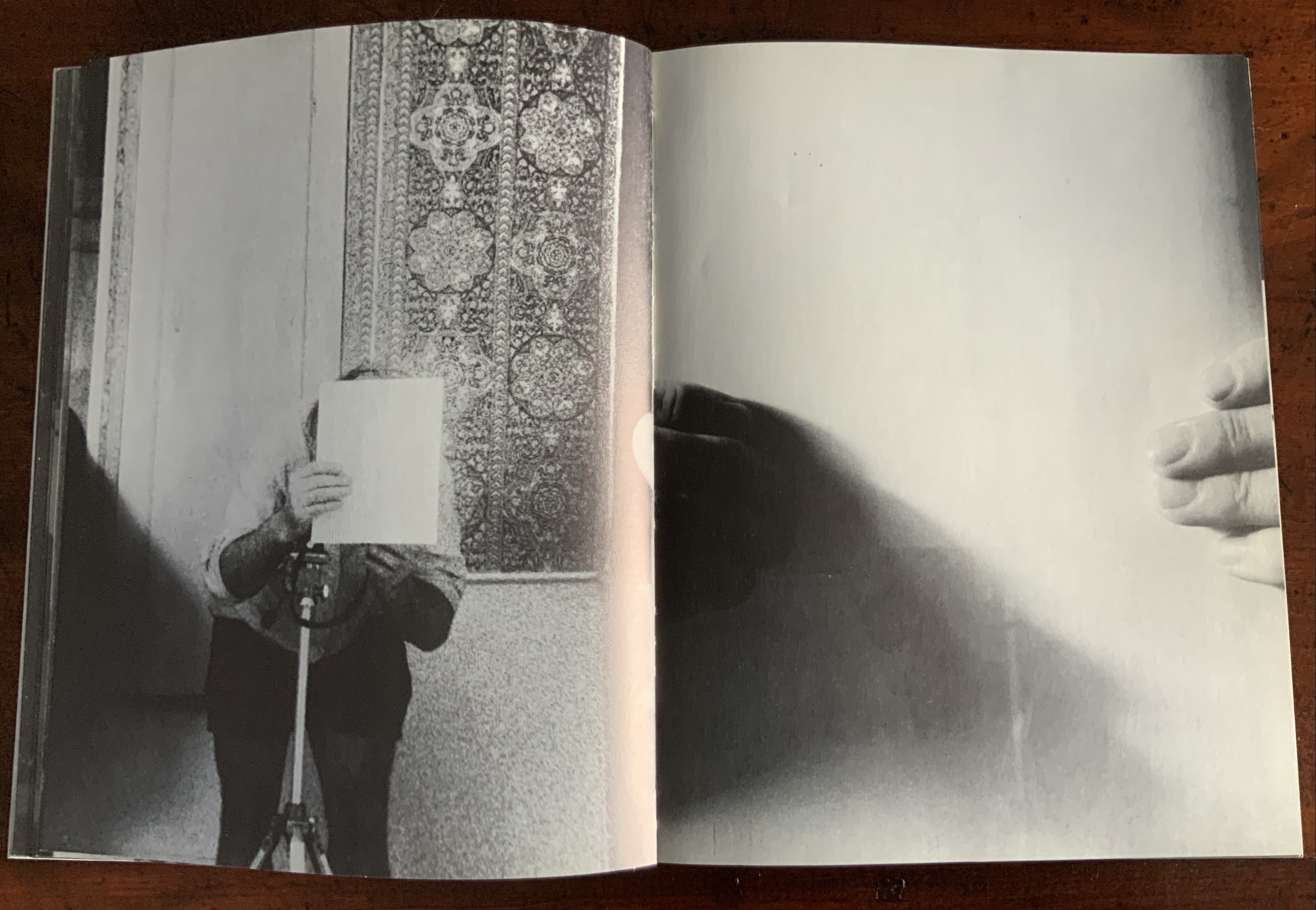
Panels 2-5 from the fine press edition; detail of panels 2-3.
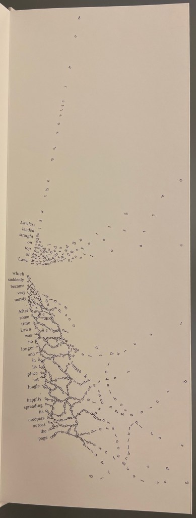
So begins Winston’s tale about this uncertain book. The book never sure of itself is the Dictionary, which of course it must be, otherwise the tale would not be called “A Dictionary Story”. The Dictionary is jealous of all the other books because they are “properly read”, whereas she is just flicked through from time to time. A bit like the “One” in One and Everything, the Dictionary seems to think she contains all the stories imaginable, because she contain all the words — just not in the right order. So she decides to bring her words to life as characters to see what will happen. Words and letters fly about, enacting the story as if in a concrete poem. A meaningful tussle between text and image is a frequent feature for artists’ books as well as visual poetry.
Another defining aspect of book art is its self-referential nature. In an interview with Typeroom, Winston captures this in his response to the question “What is Dictionary Story all about?”:
Dictionary Story is a playful way of exploring some of our presumptions around the printed word. Or you could say that it looks towards a tool we are given at a very young age – the Dictionary – and invites us to actually think about how that works. Here’s a device that is designed to explain a word’s meaning by offering further words in its place – to me that is remarkable. This is a type of knowledge that can only explain itself through referencing itself. As a visual person the image that comes to mind is a giant, never ending, Möbius strip of language twisting back on itself.
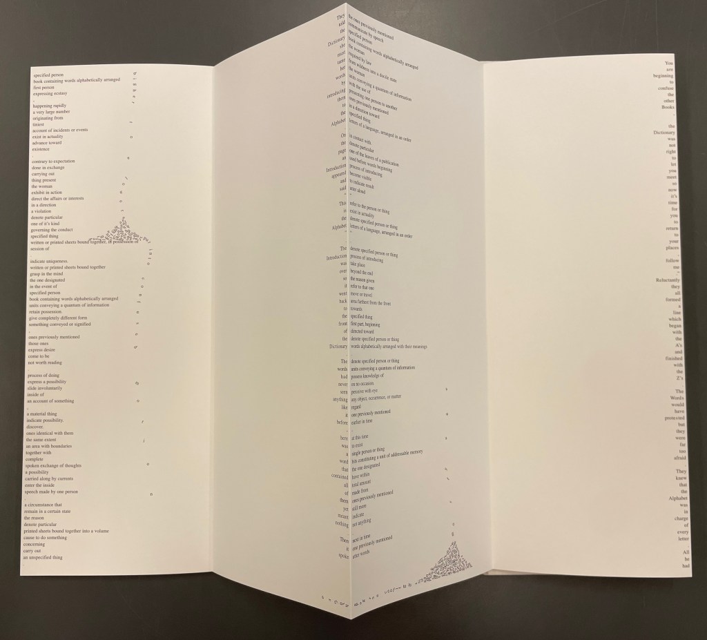
Of course for less visual persons, the Dictionary’s whim engenders chaos, which Winston, a dyslexic, can appreciate. So he brings onstage (or “onpage”) the Books, of whom the Dictionary was jealous, to remonstrate that if words become disconnected from their definitions, how will they the Books know what they are about? Insisting that she tame her words, they have the Dictionary’s Introduction introduce her bewildered words to the character “Alphabet”.
Making the journey over the hills and valleys of A Dictionary Story is satisfying, and re-making it is even more satisfying and delightful each time. The making and re-making of A Dictionary Story must also have been satisfying and delightful for Sam Winston; he has done it so many times.
A Dictionary Story (2013)
A Dictionary Story (2013)
Sam Winston
Three five-panel accordion folded sections in a plastic sleeve cover. Second trade edition. Sleeve: H205 x W160 mm. Sections: H200 x W150 mm, 15 panels. Acquired from the artist, 13 December 2020.
Photos: Books On Books Collection.
Watching the artist adjust the typography of A Dictionary Story to changing dimensions is like watching a star tennis player who is also a star basketball player and star soccer (football) player. There’s always a ball, there’s always a net, there’s always genius.
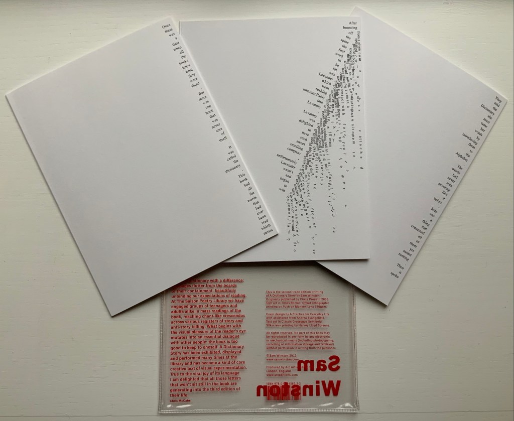
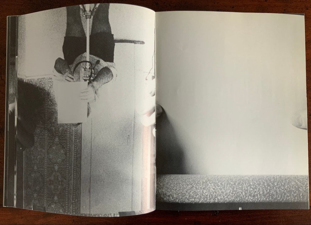
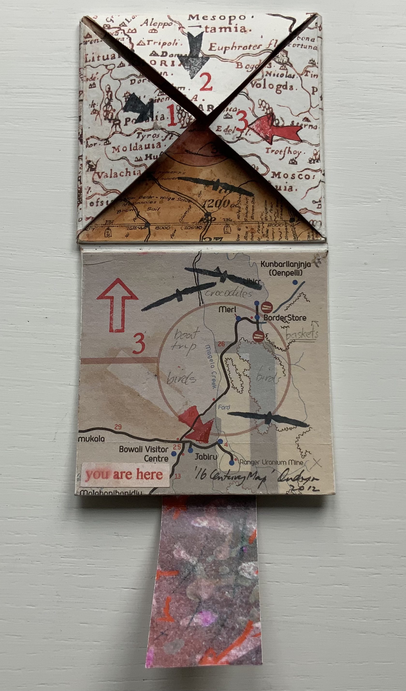
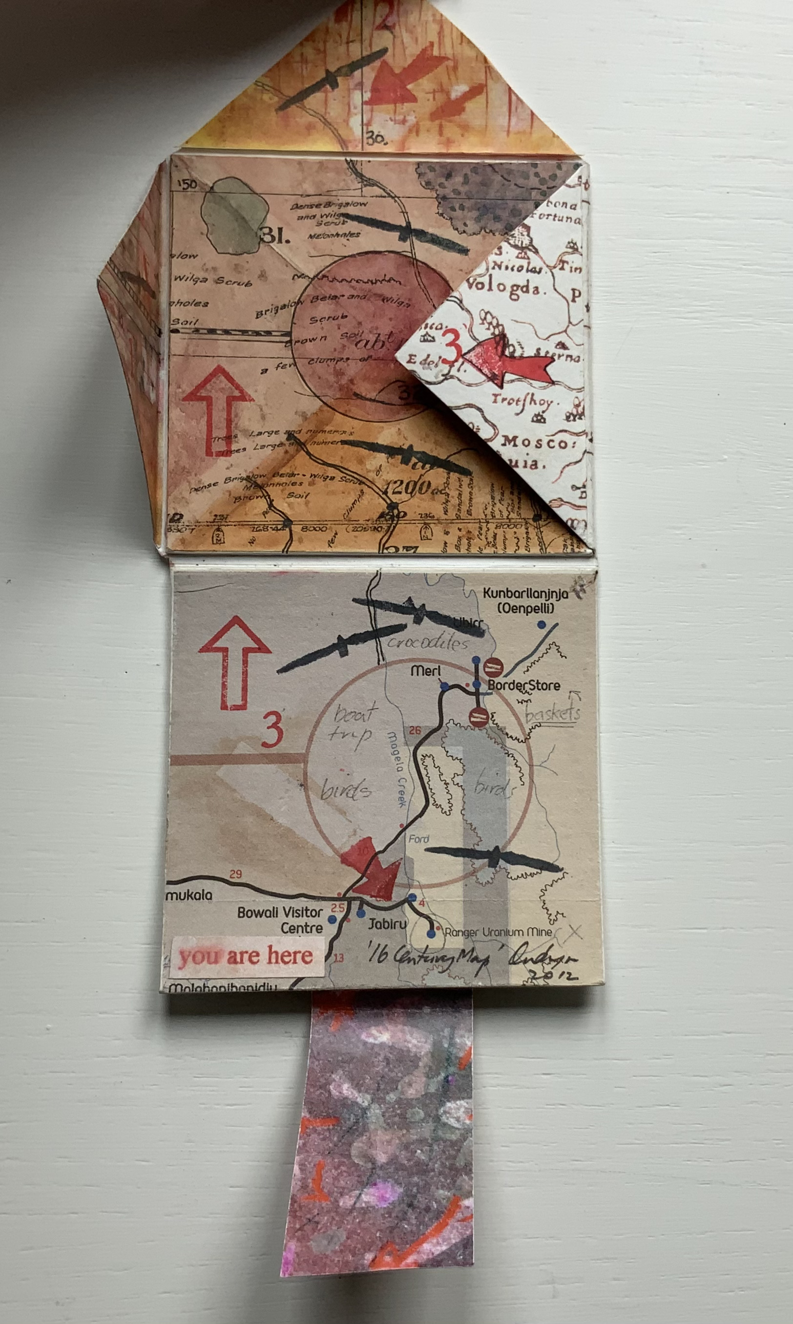
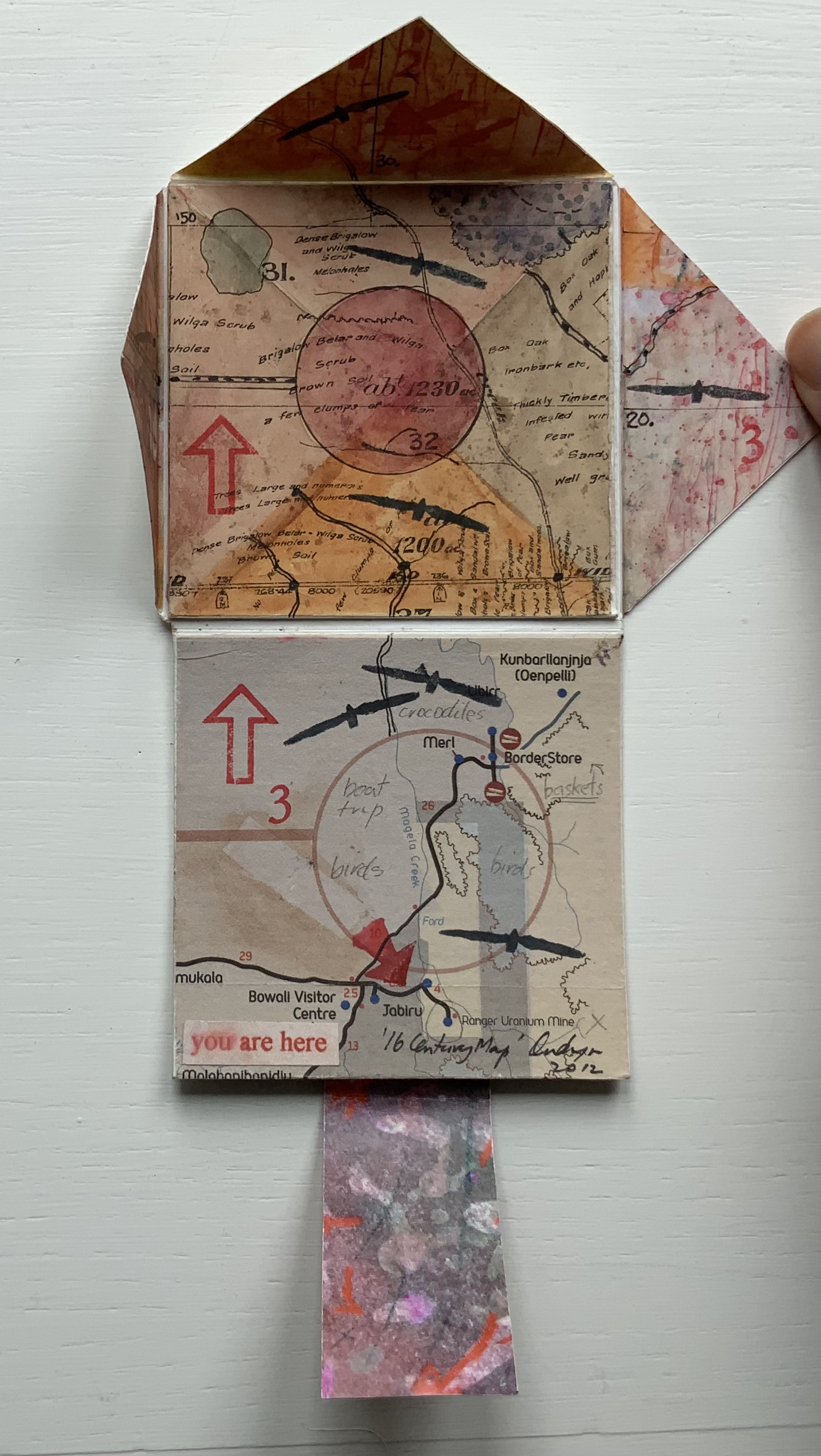
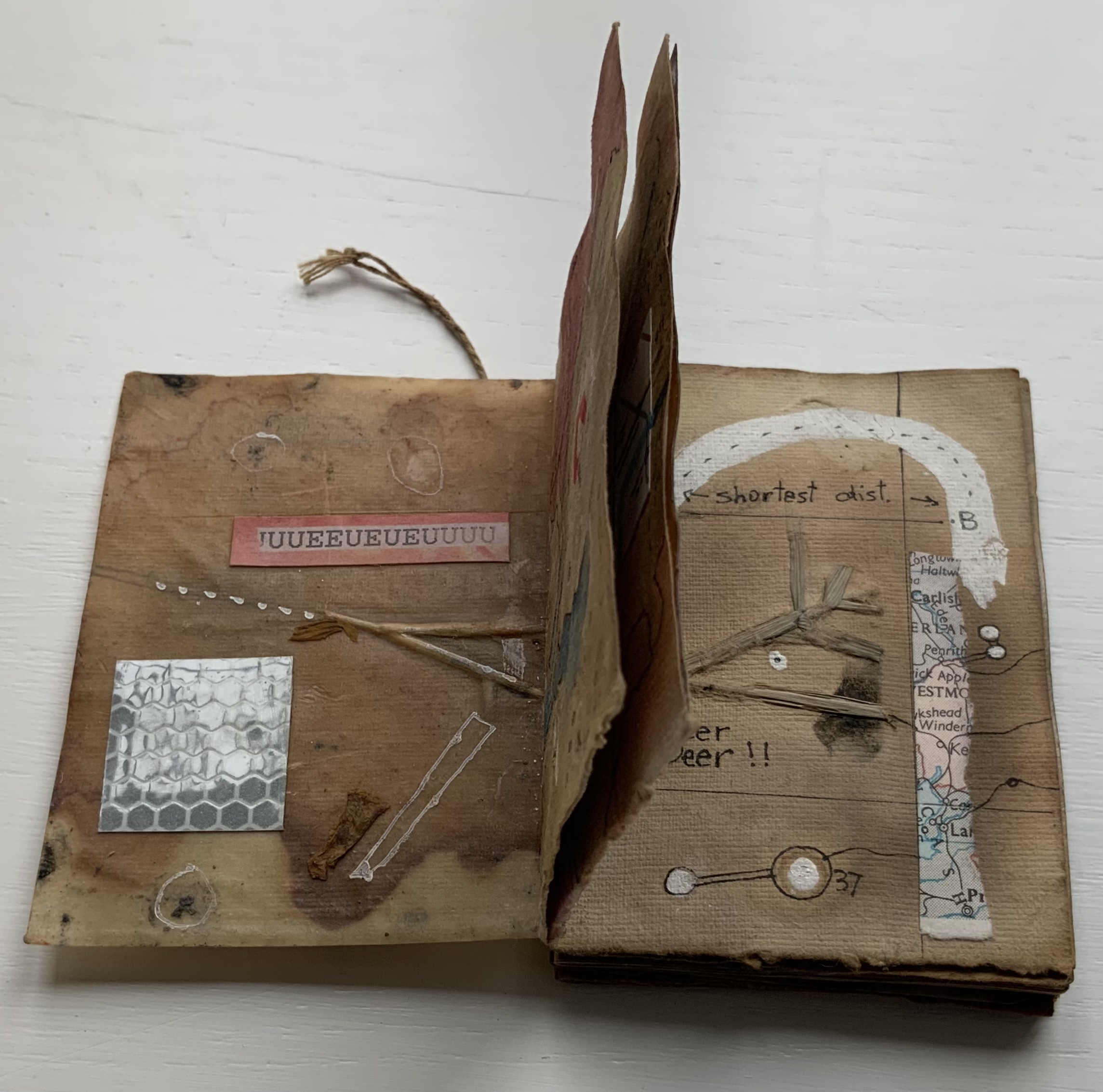
The trade edition splits the fine press edition into three less narrow leporellos and nudges some of the two columns (story/definition) into the valley fold. Below, in the trade edition across panels 3 and 4 is where the Dictionary decides to bring her words to life, and on the right side of the fourth panel, the words begin to slip away from the fold.
The same part of the story in the fine press edition occurs on the fourth panel below, and the words tilt against the fold.
These variations create subtly different narrative paces and visual impressions in the two editions. Not one better than the other, just different. The poster variations, however, subordinate narrative pace entirely to visual impression. At present, the posters are not in the collection, but the images below help to make the point. As with movie goers, some will like the prints more than the books, others the books more than the prints, and still others will marvel at the genius in all of them.
Further Reading
“‘Darkness Visible’, Sam Winston’s performative installation”. Books On Books, 30 December 2017.
“Sam Winston”. Bookmarking Book Art. 22 June 2013.
Howard, Alex. 16 February 2015. “Sam Winston – Art as a Spiritual Practice“. Conscious Life. Interview.
Jeffers, Oliver, and Sam Winston. 31 August 2016. “A Child of Books“. Entry at Picturebook Makers. Ed. dPictus. Accessed 30 July 2023.
Lambert, Léopold. 9 February 2011. # Fine Arts /// Dictionary Story by Sam Winston“. The Funambulist. Accessed 20 April 2018. Brief note.
Perkins, Stephen. 11 March 2021. “Sam Winston, A Dictionary Story, Arc Artist Editions, London, 2005/2013“. Accordion Publications. Accessed 26 March 2023.
Russell, Lindsay Rose. “Dictionary, Shaped: Artists’ Books and Lexicography”. Dictionaries: Journal of the Dictionary Society of North America, Volume 41, Issue 2, 2020, pp. 115-146
Sant’Ana Pereira, Felipe. 27 August 2020. “The World’s 5 Most Beautiful Alphabets You’ll Never Learn To Read“. Matador Network. Accessed 26 March 2023. Re One and Everything.
Sperling, Matthew. 28 November 2013. “Open Book“. Apollo Magazine. Mention of Folded Dictionary. Accessed 20 April 2018. Re Folded Dictionary.
Valentino, Andrea. 21 January 2020. “The alphabets at risk of extinction“. BBC Future. Accessed 26 March 2023. Re One and Everything.
Typeroom. 15 July 2016. “An interview with Sam Winston“. Typeroom. Accessed 17 September 2017. Accessed 20 April 2018.
Typeroom. 25 November 2020. “Dictionary Story: Sam Winston’s letterpress classic typographic tale just got upgraded“. Typeroom. Accessed 1 December 2020.
Wood, Heloise. 15 February 2017. “A Child of Books wins Bologna Ragazzi Award for fiction“. The Bookseller. Accessed 2o April 2018.
Yin, Maryann. 26 May 2016. “Book Trailer Unveiled for ‘A Child of Books’”. GalleyCat, Adweek. Accessed 20 April 2018.
Images: Courtesy of the artist.