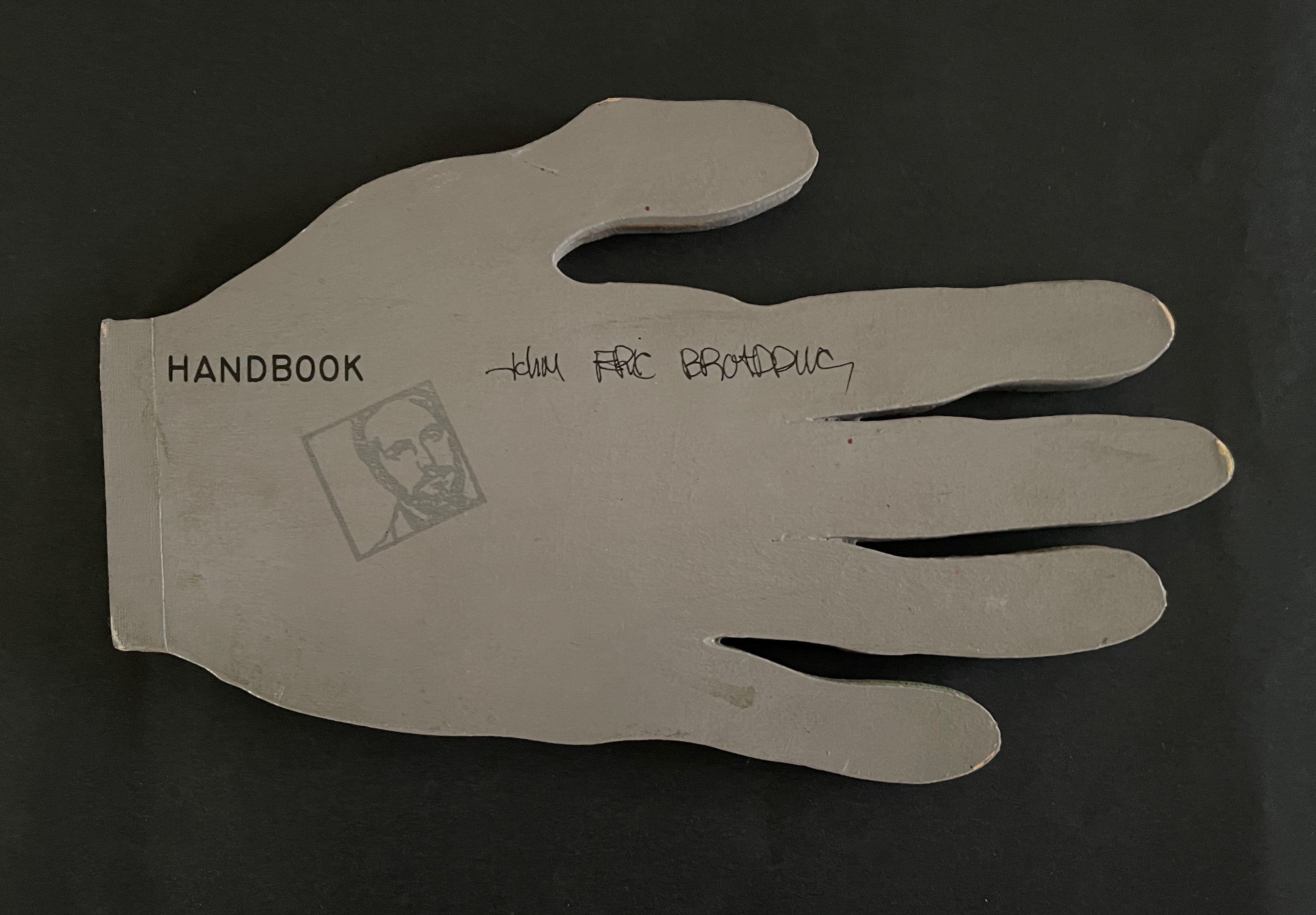
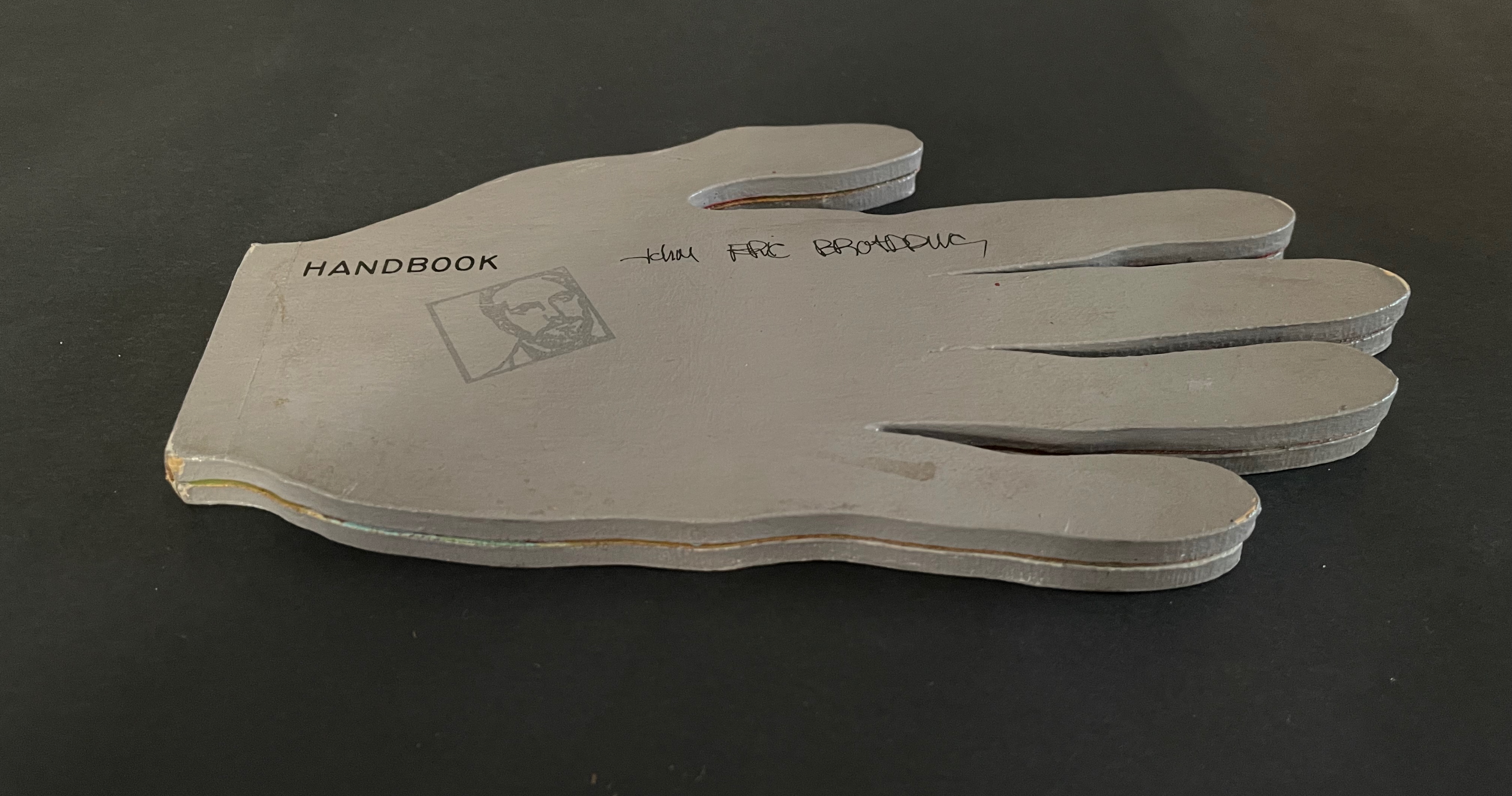
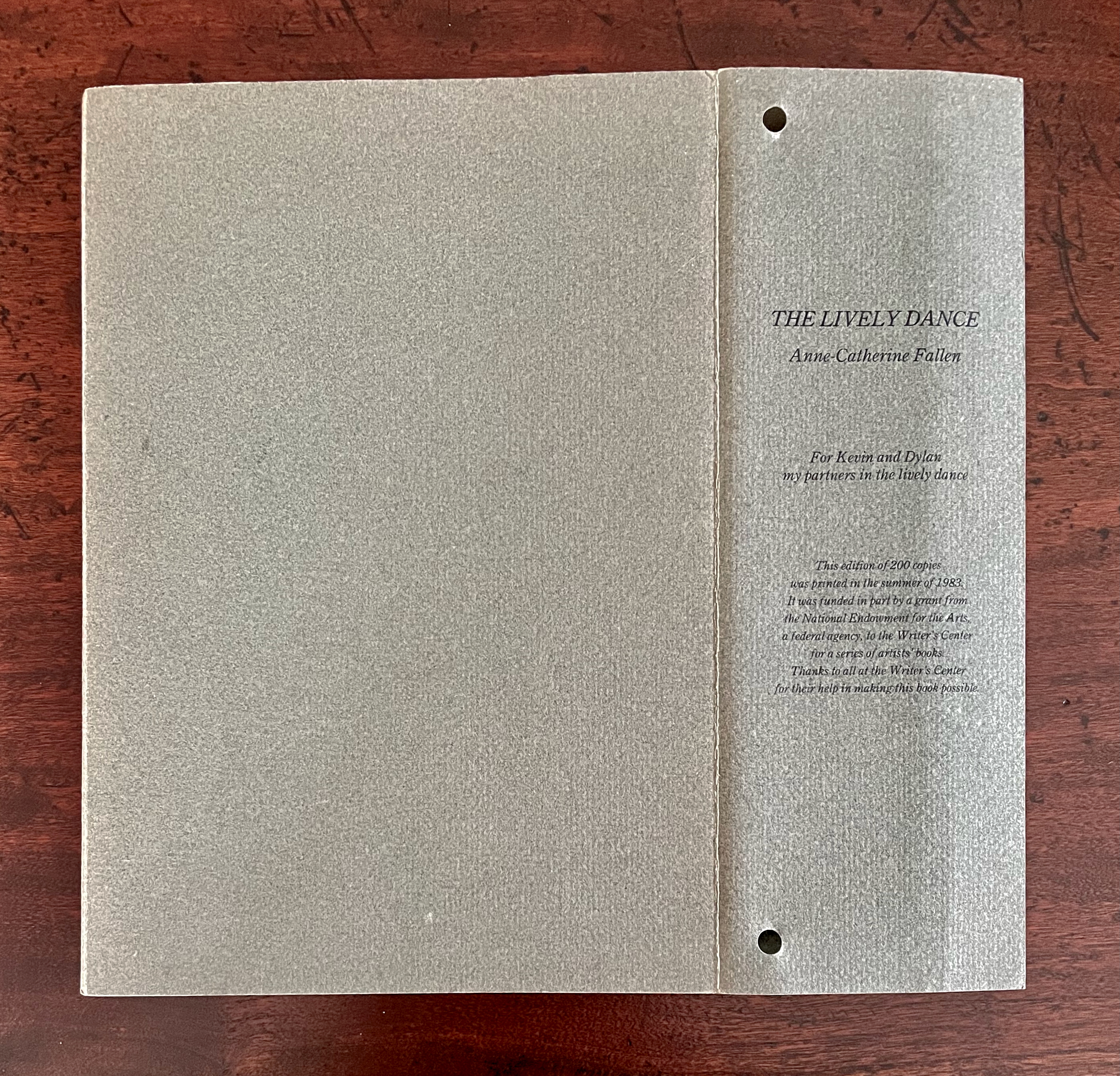
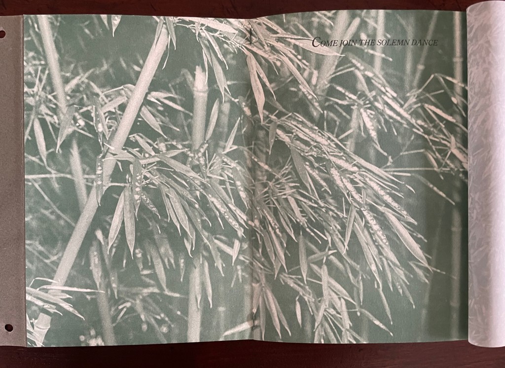
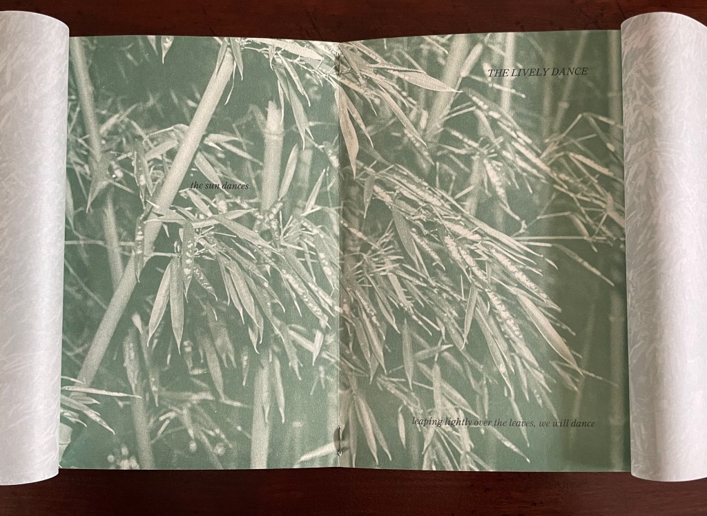
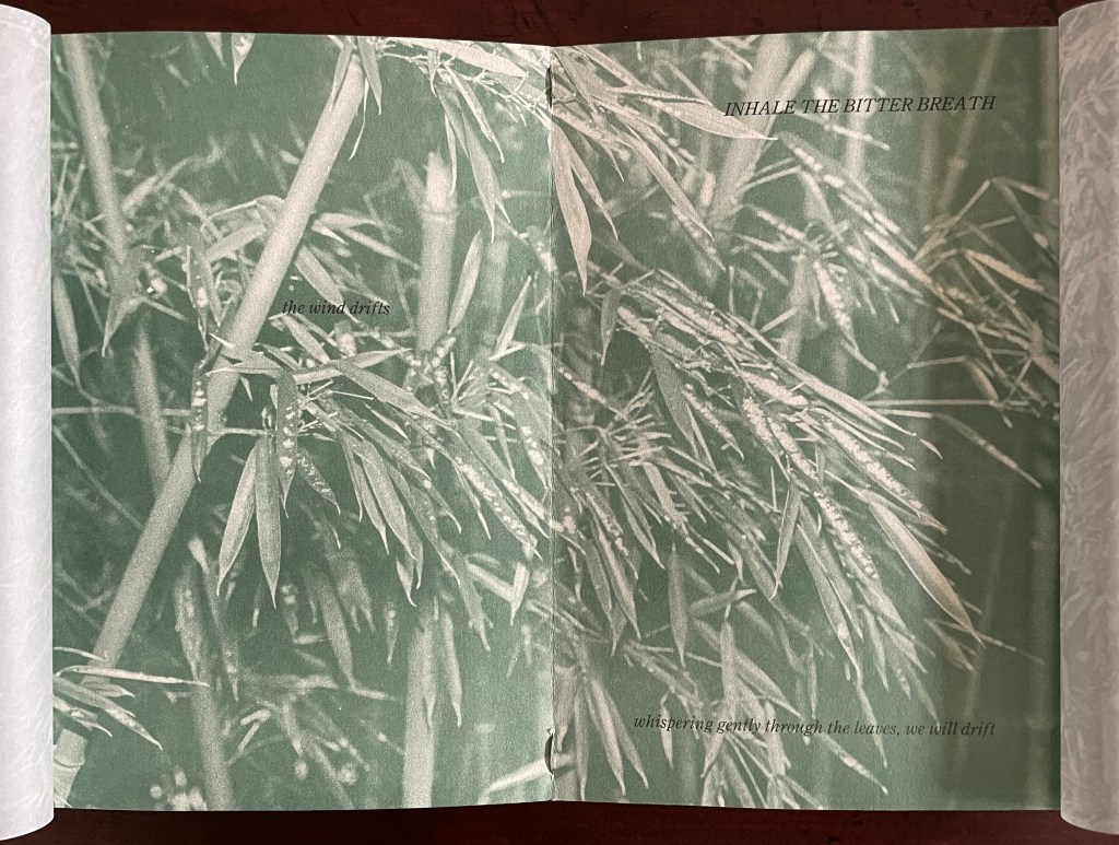
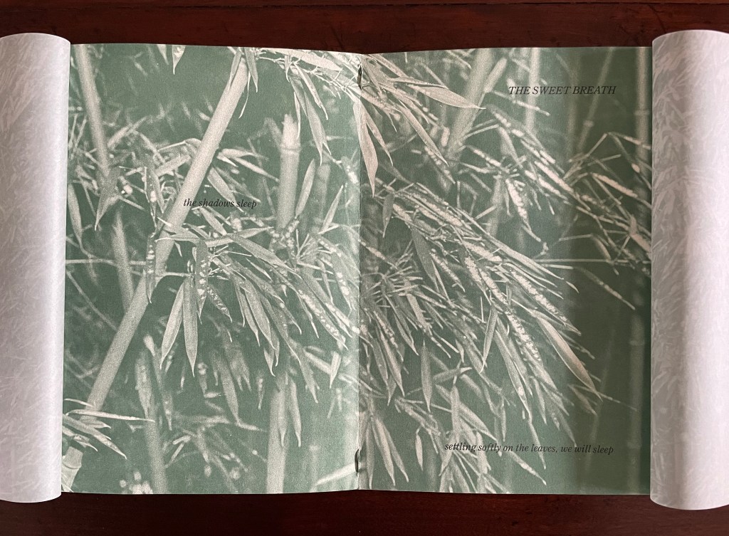
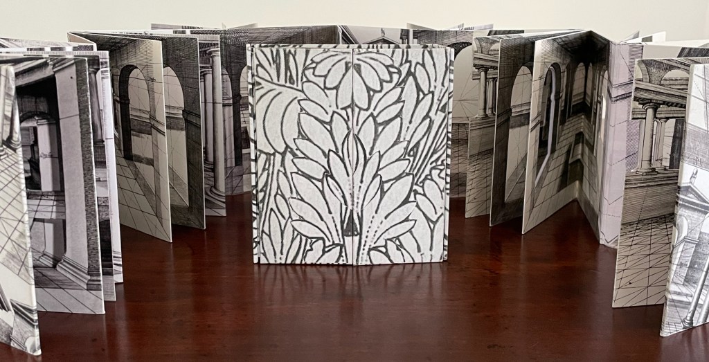
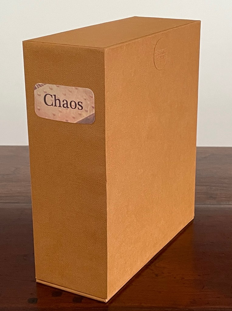
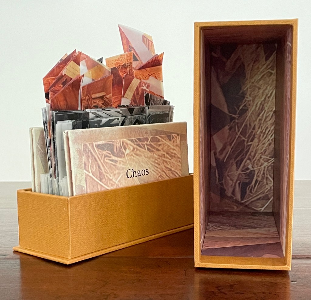
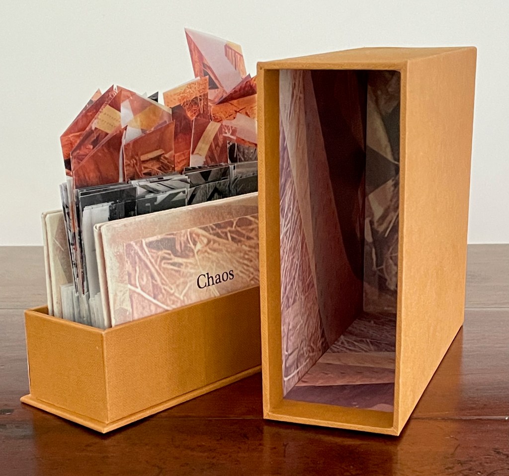
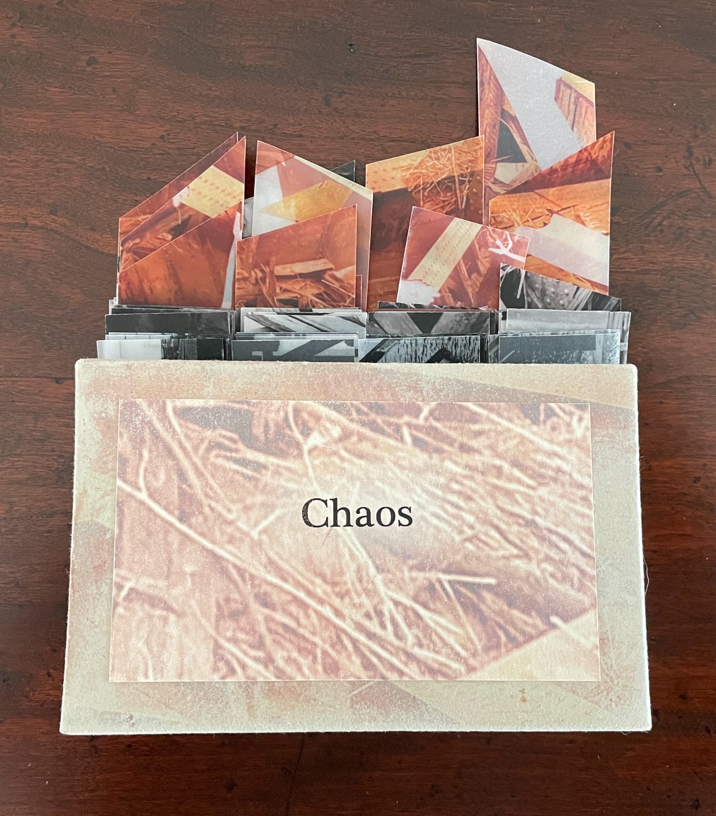
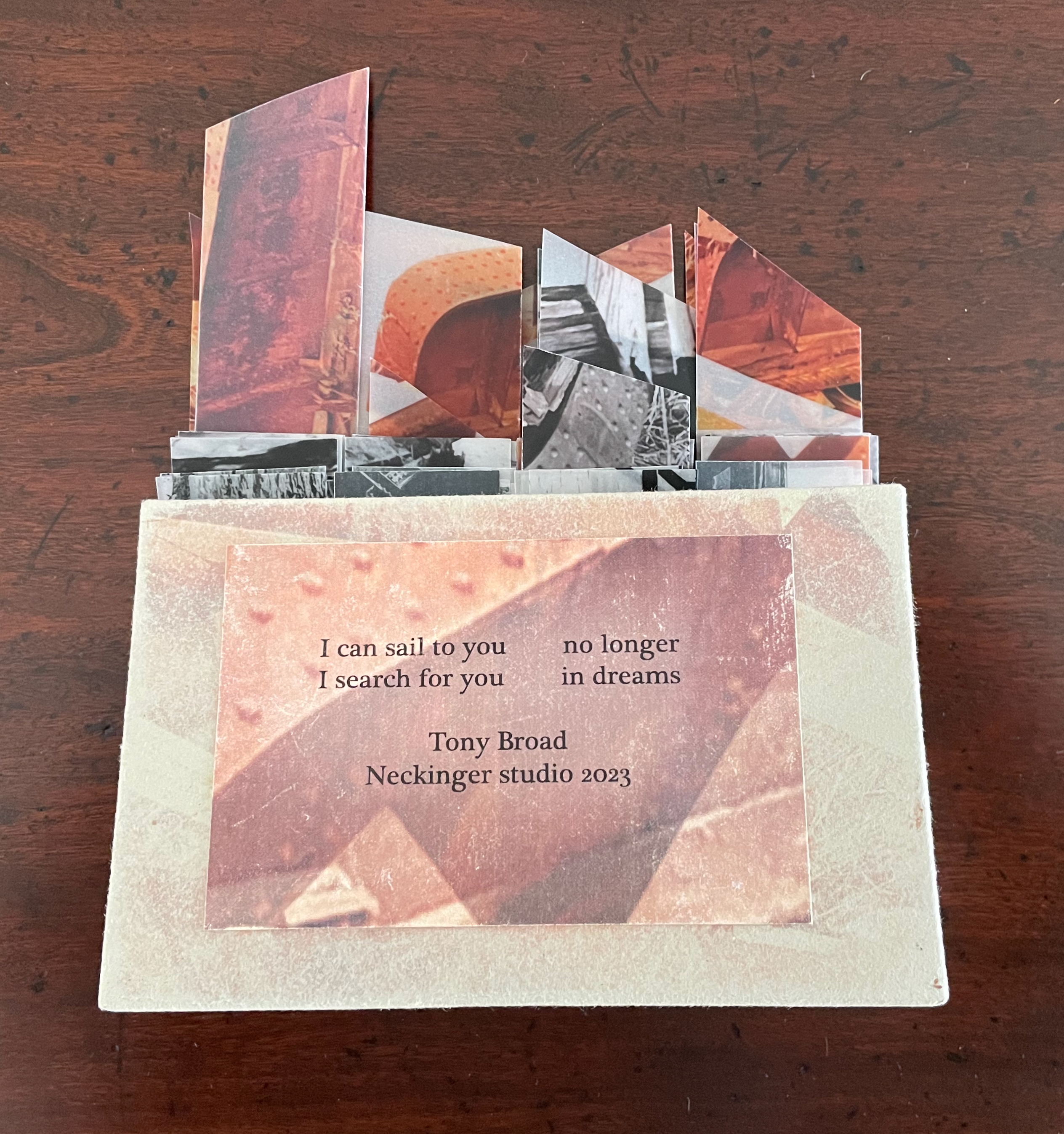
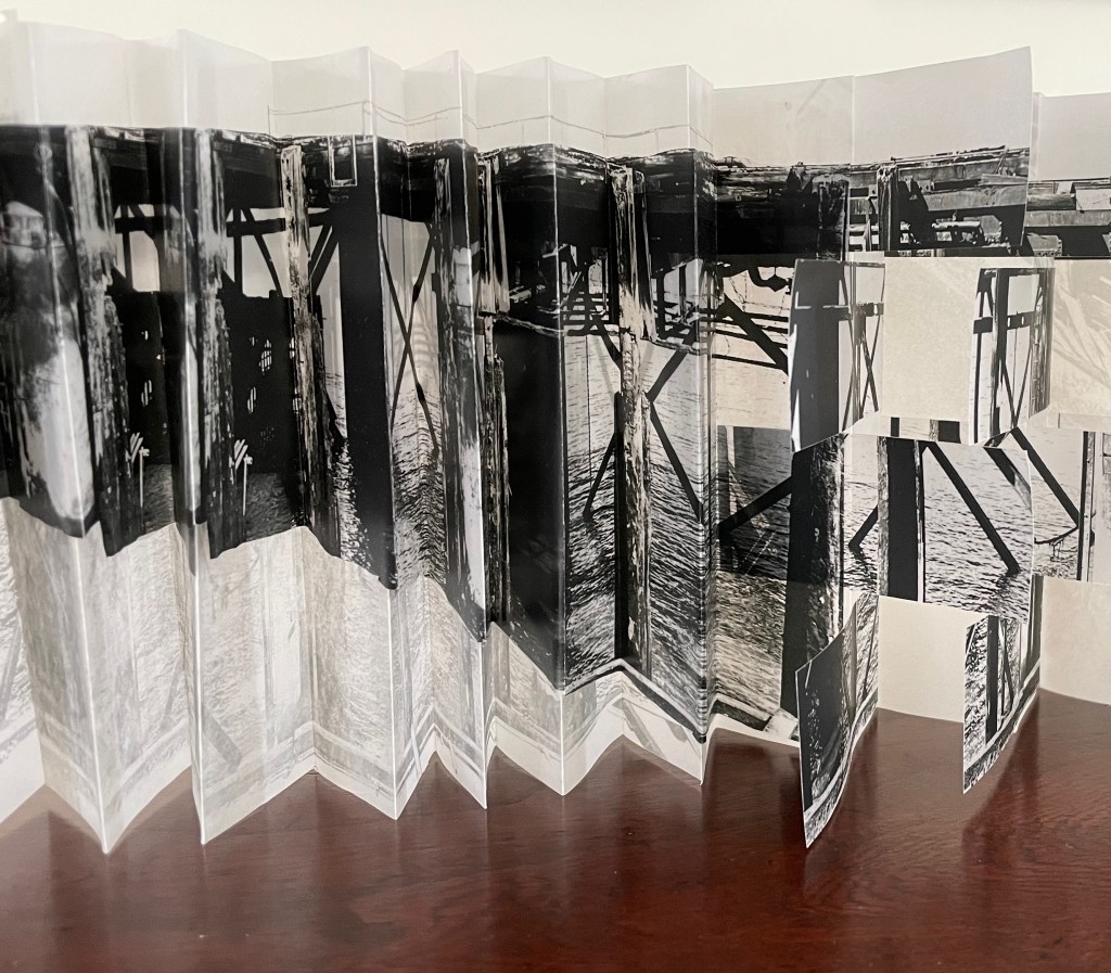
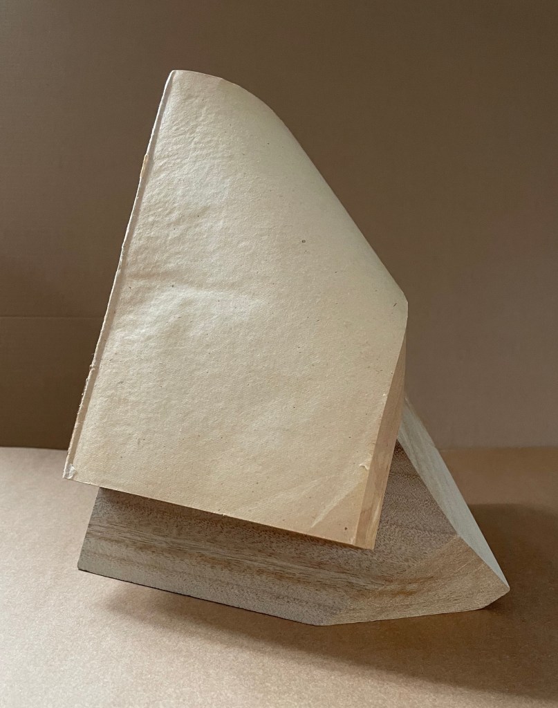
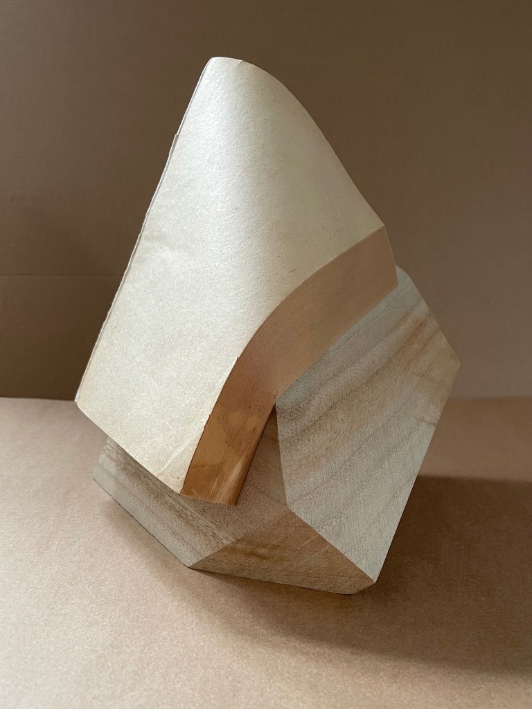
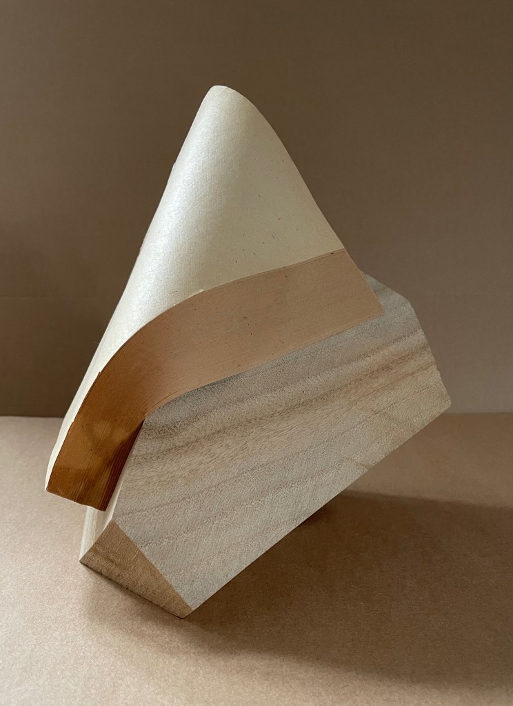
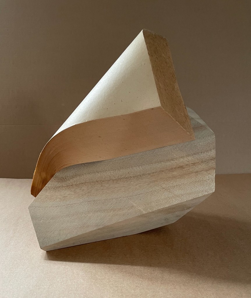
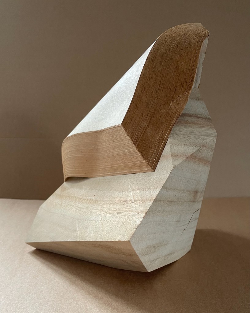
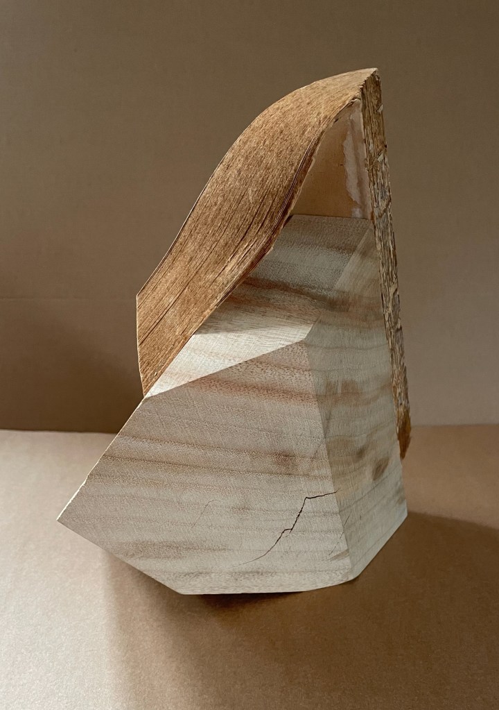
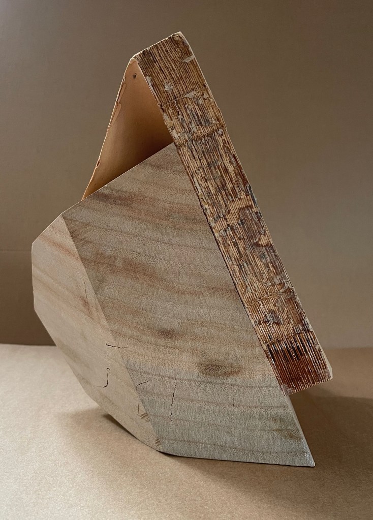
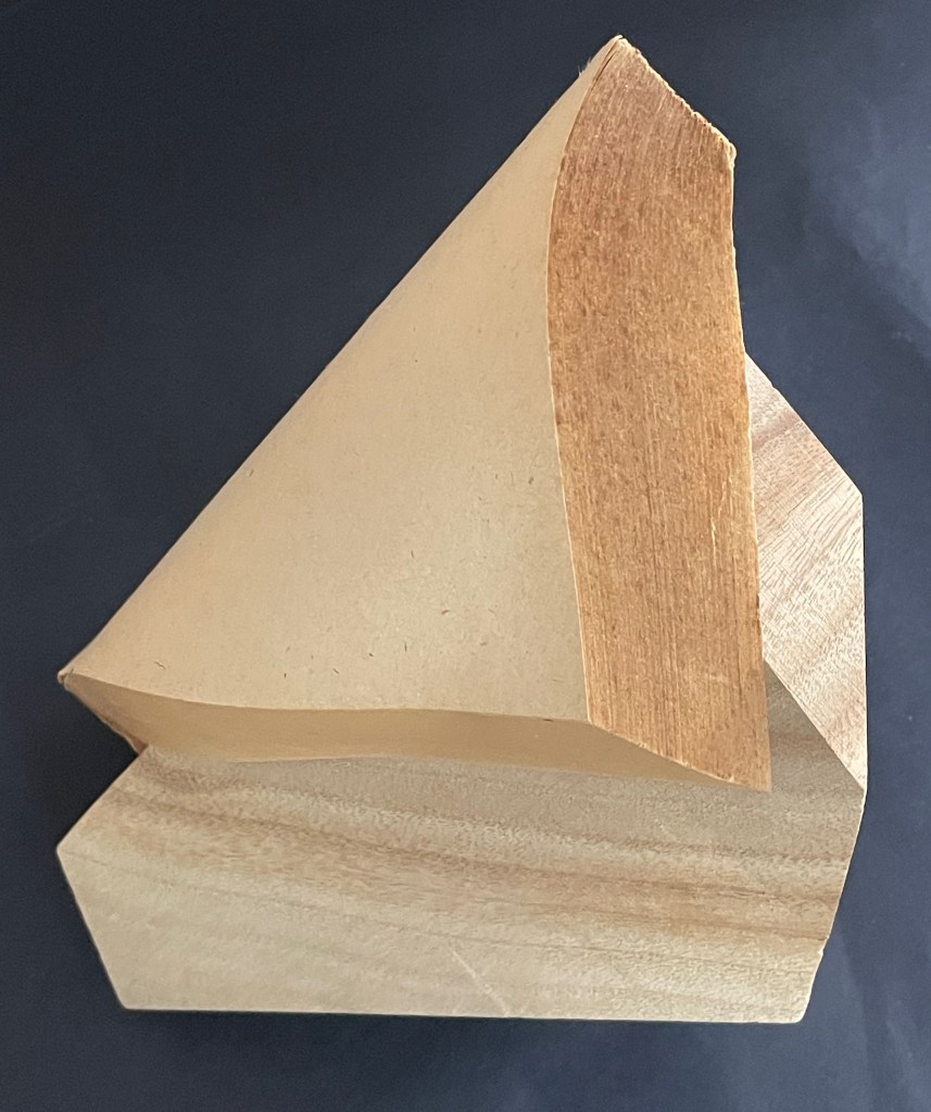
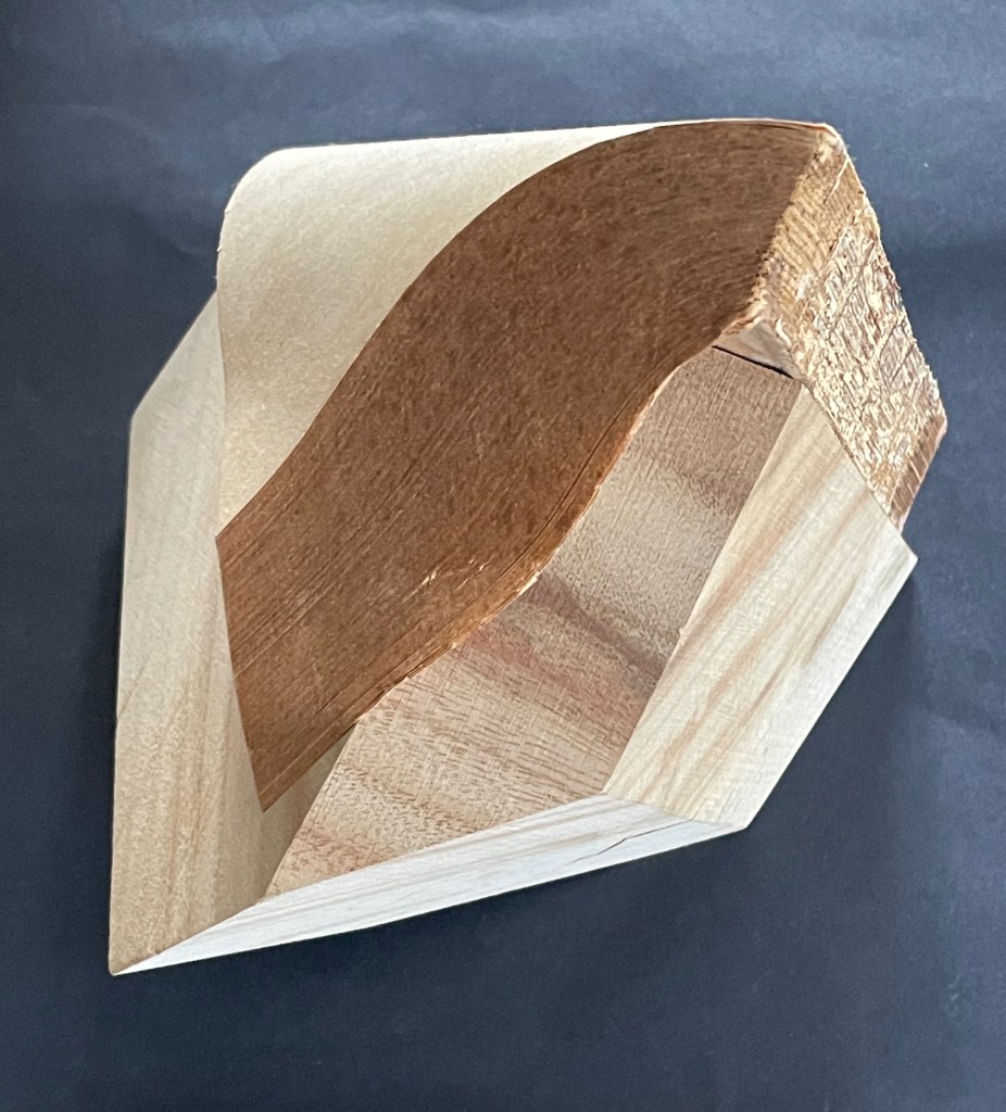
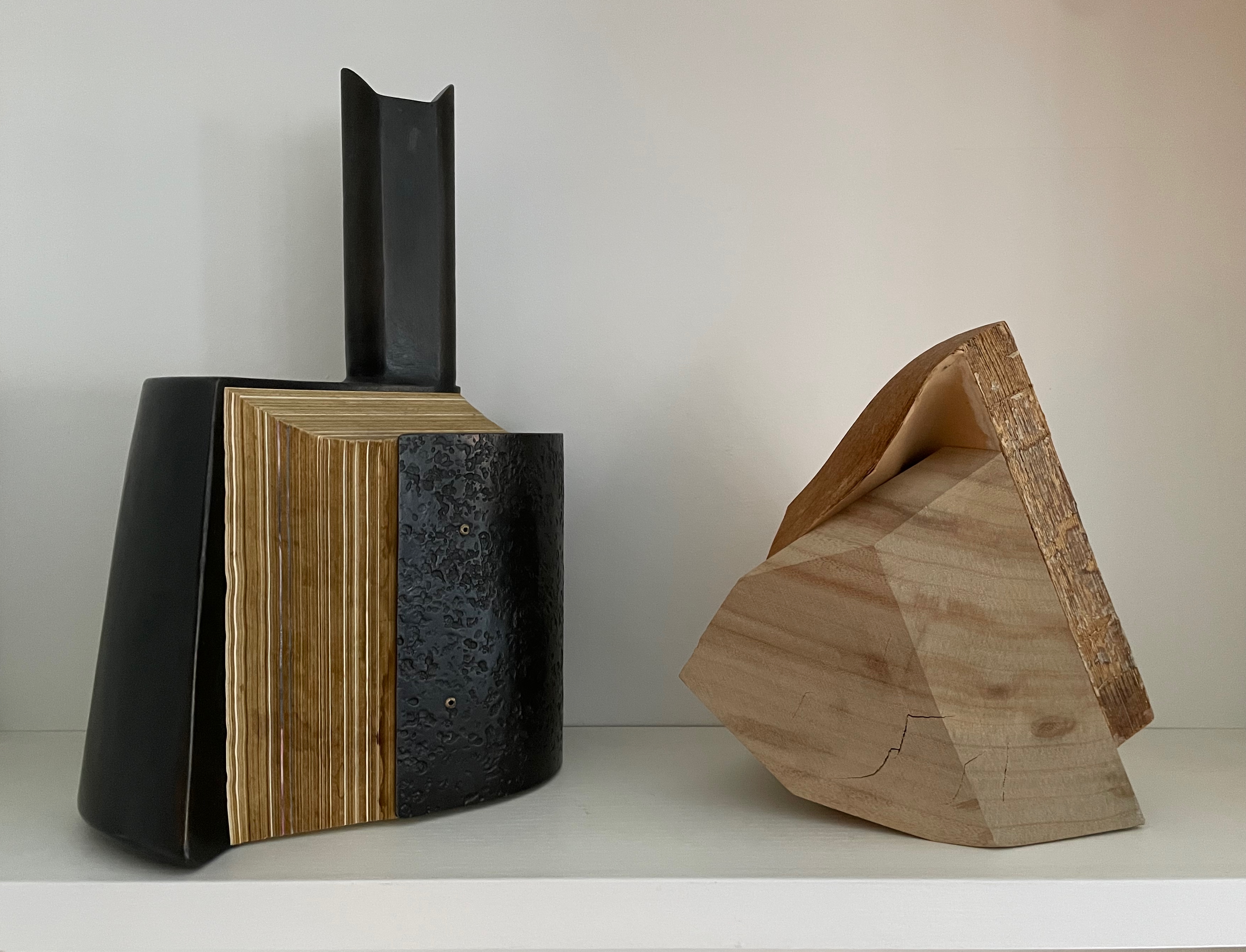
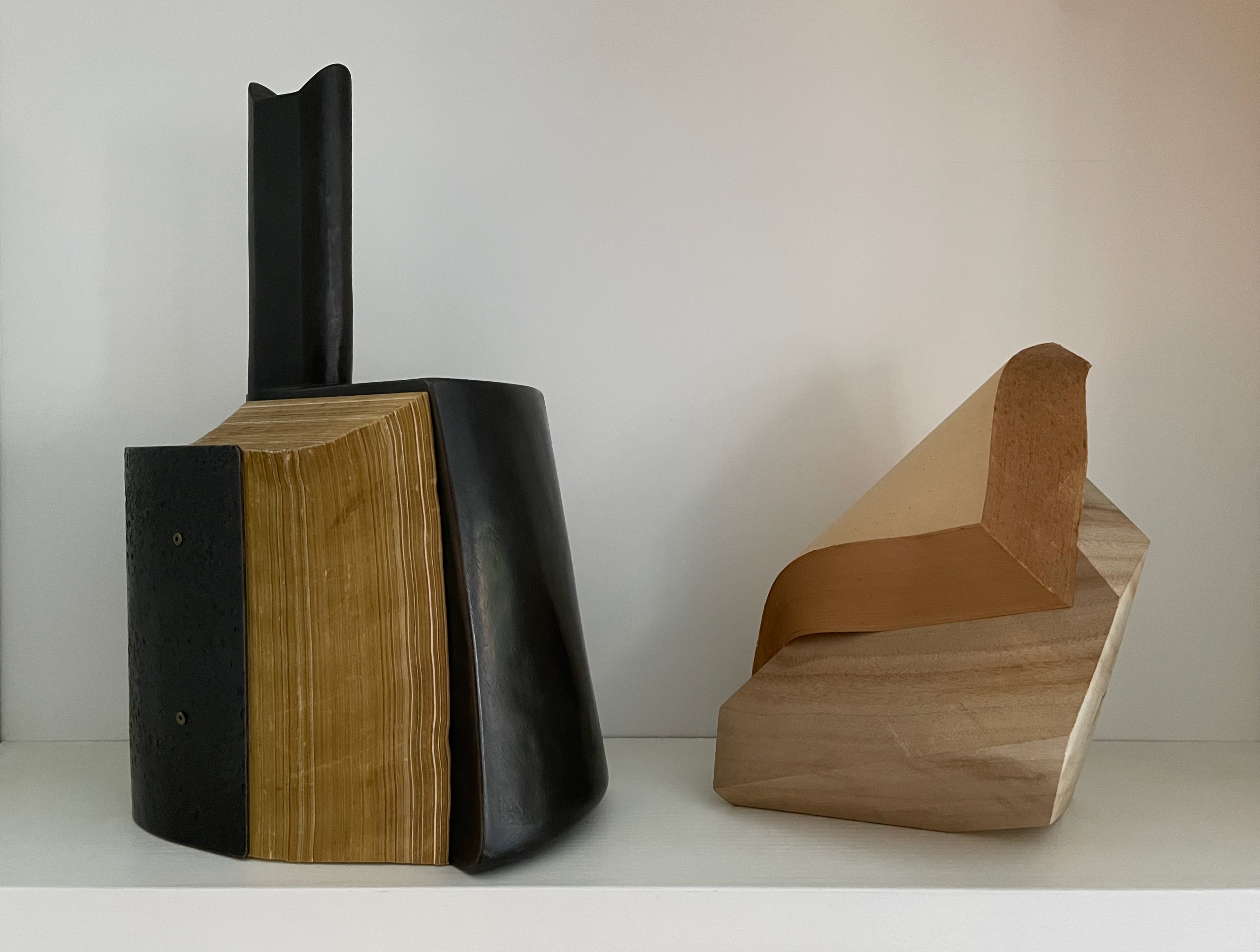
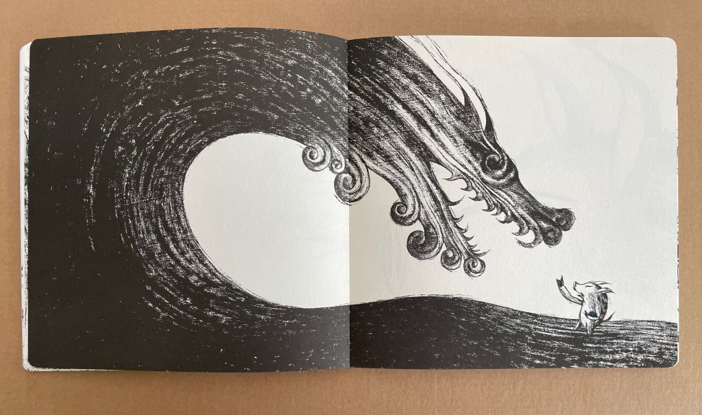
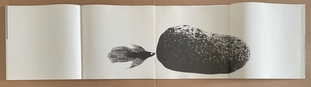
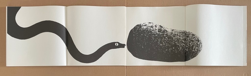
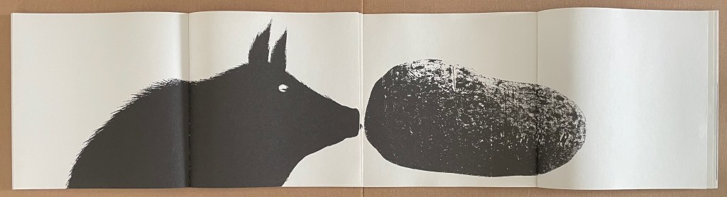
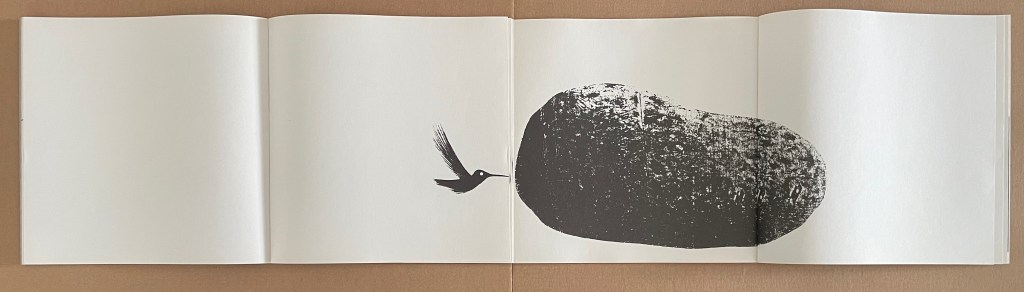
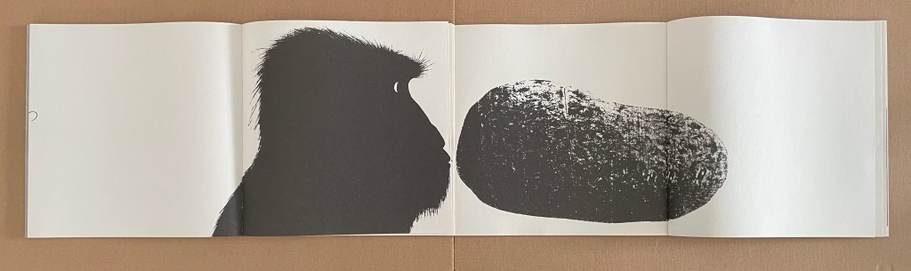
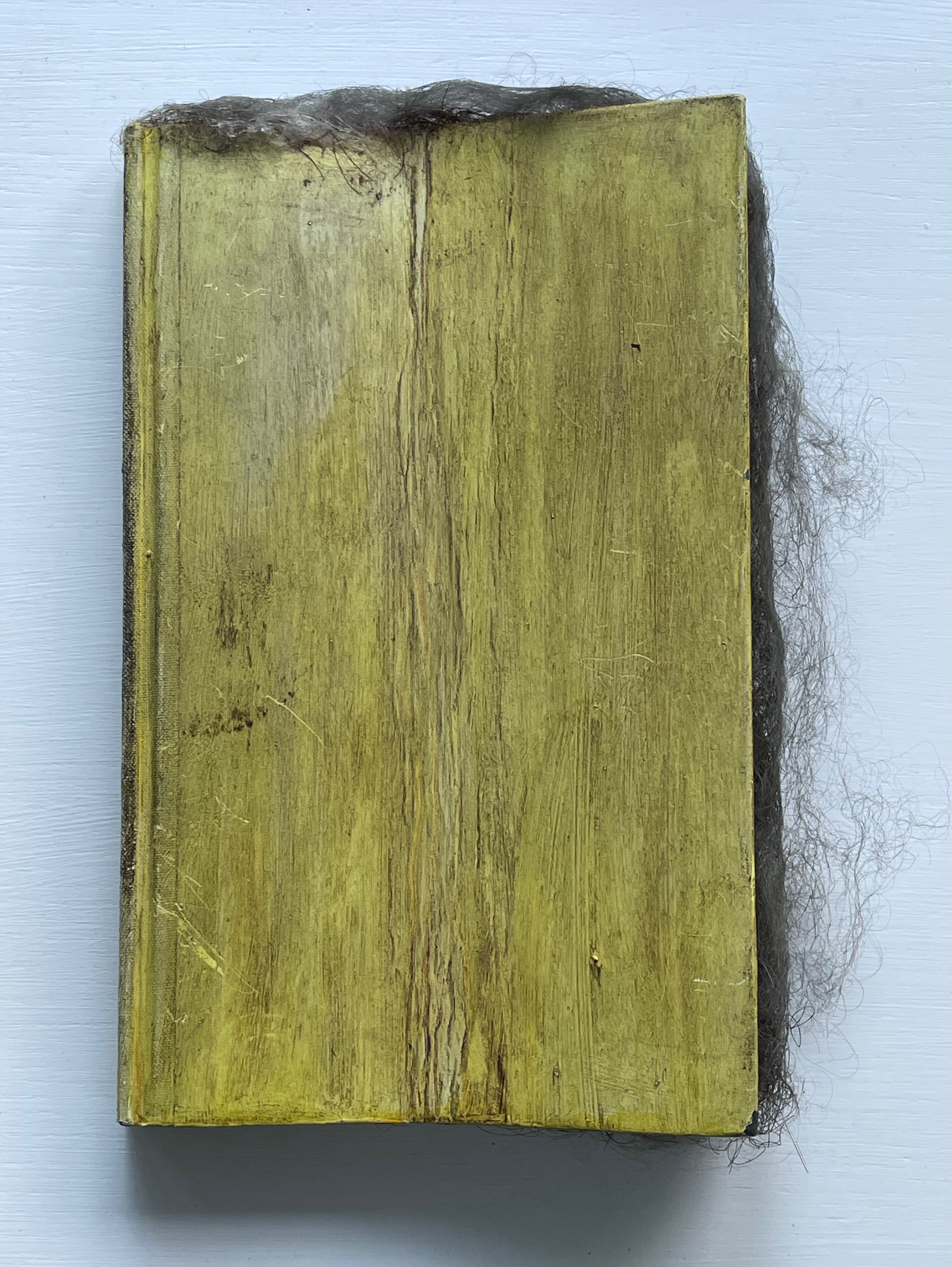
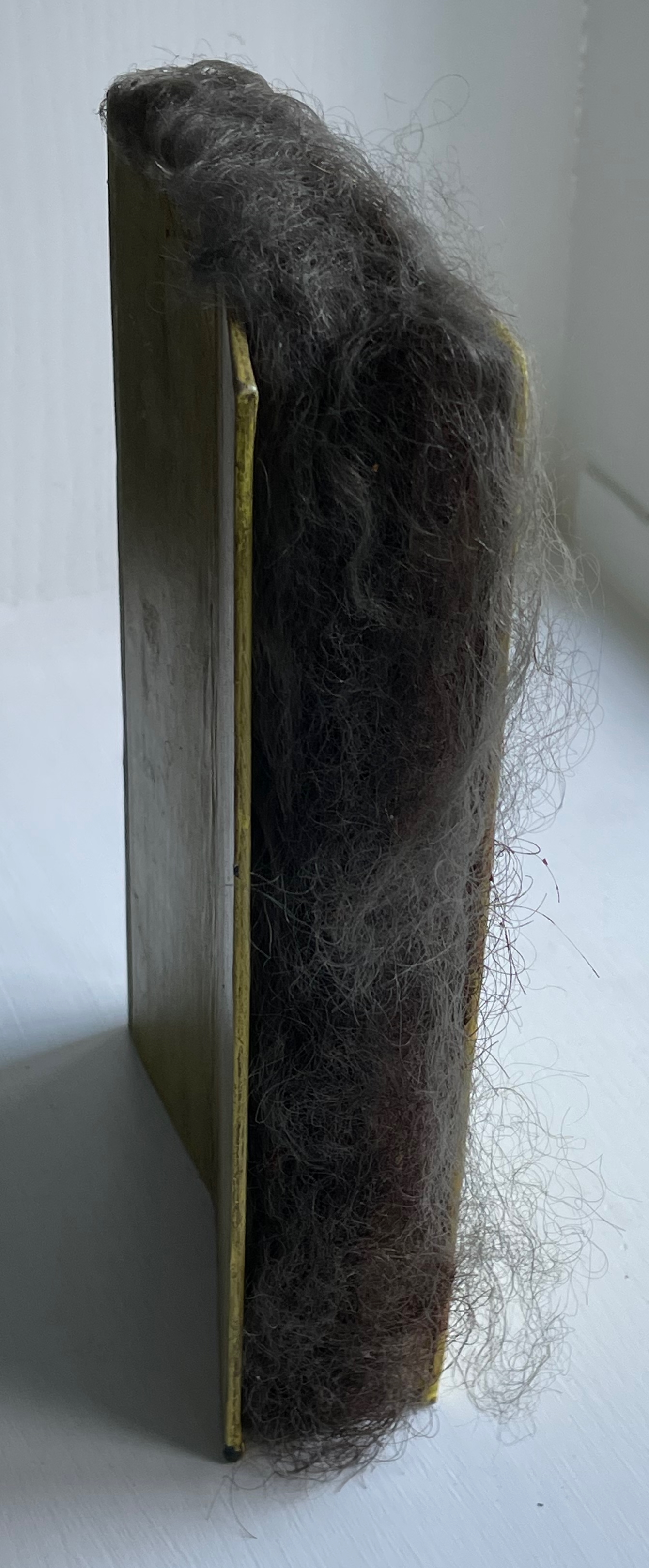
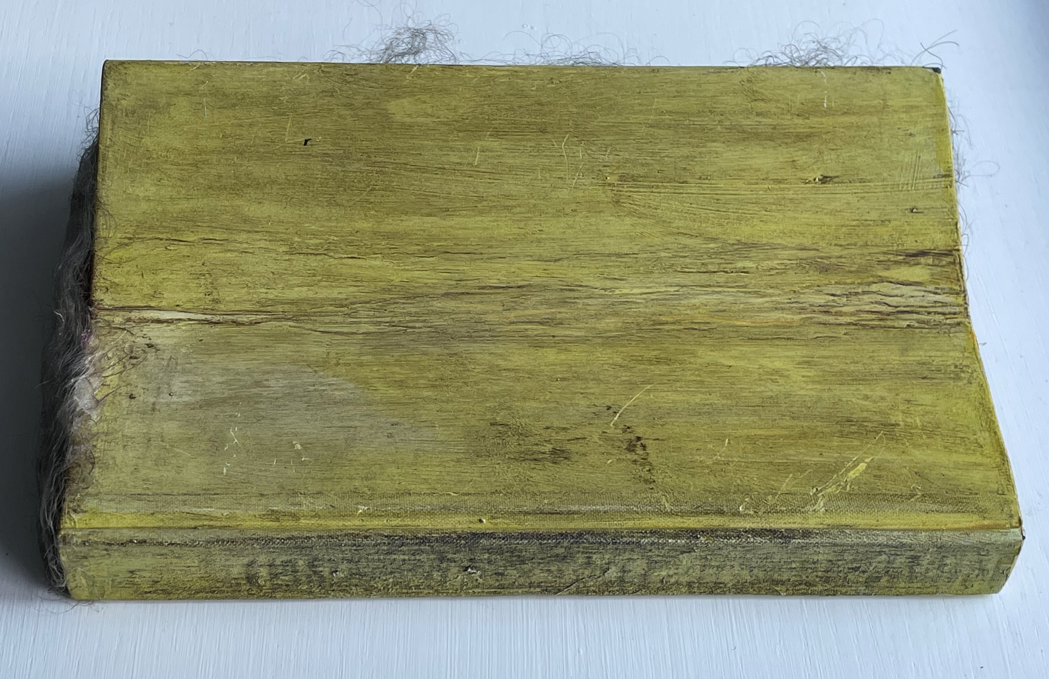
A Never-Ending Stone (2025)
A Never-Ending Stone (2025)
Laure Catugier
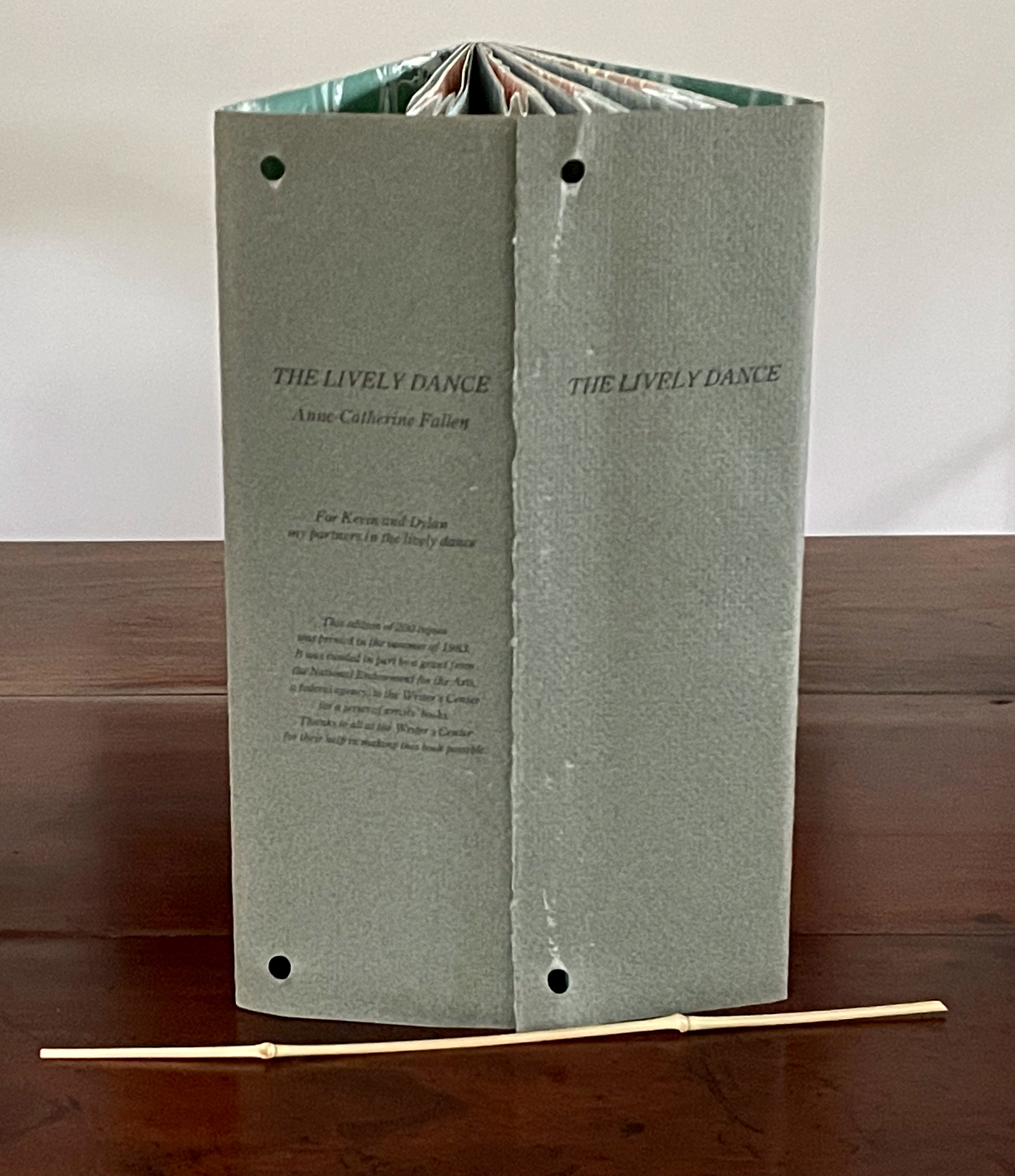
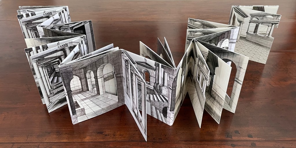
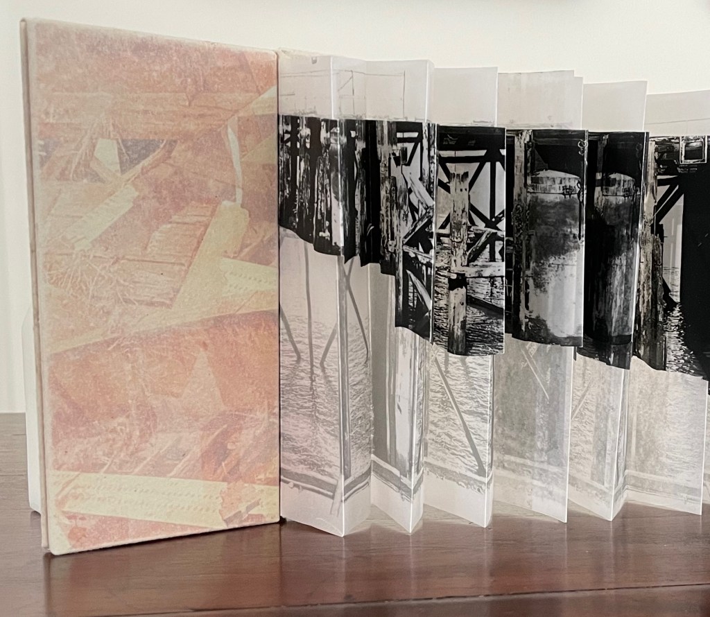
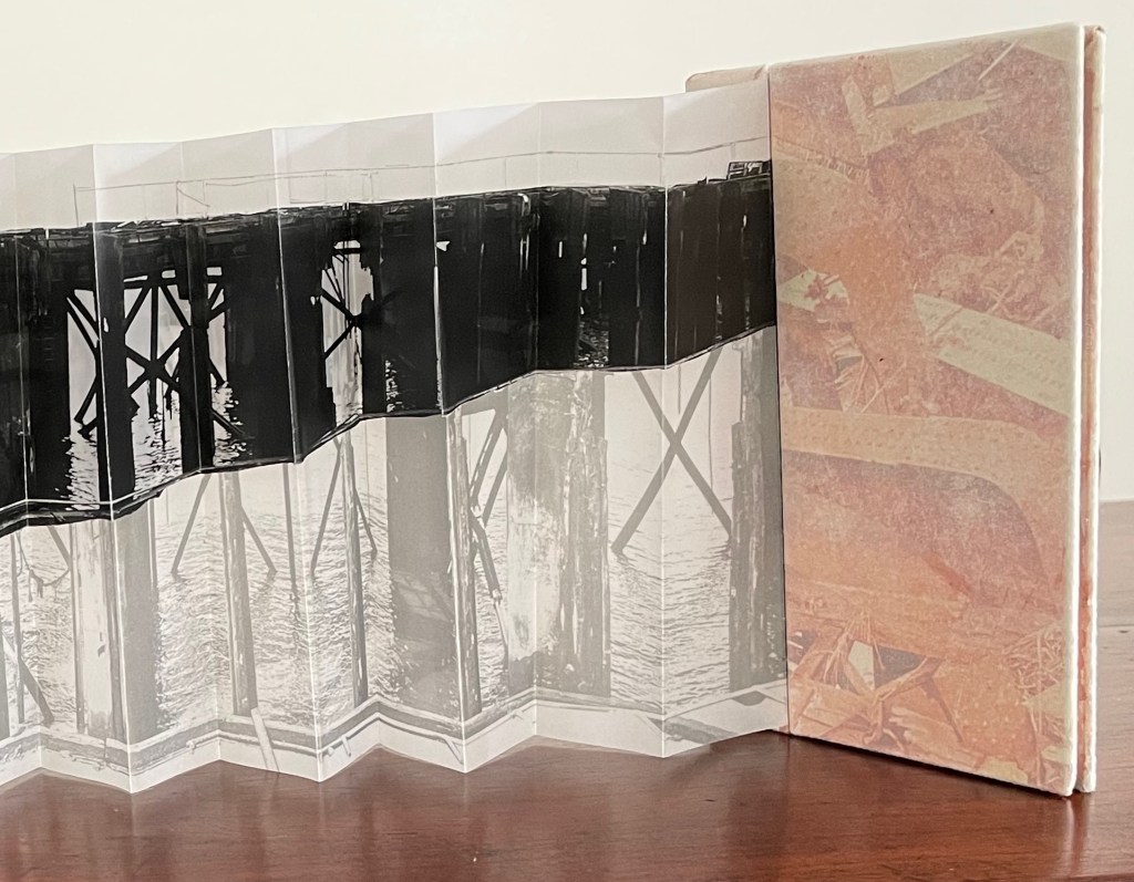
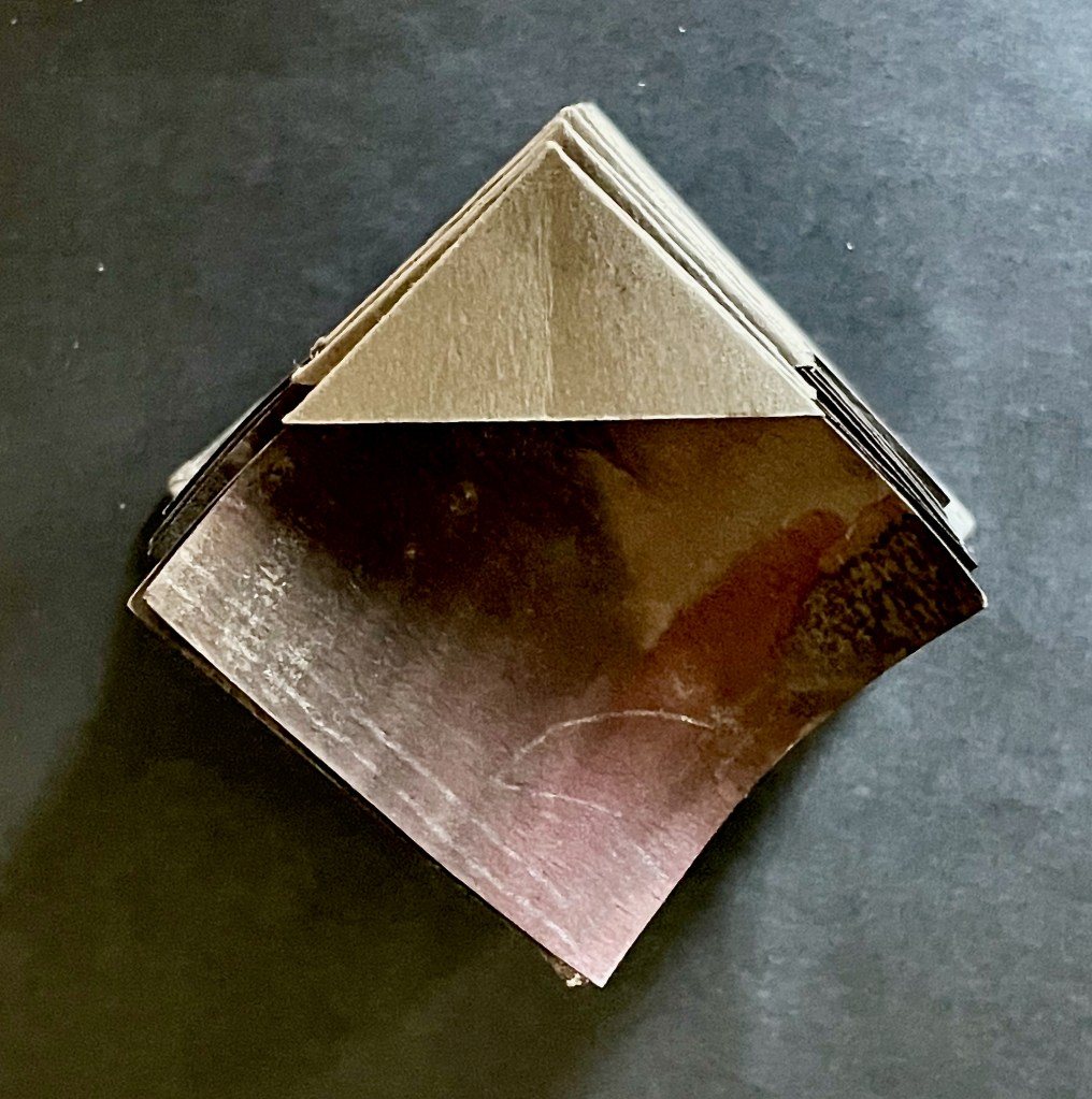
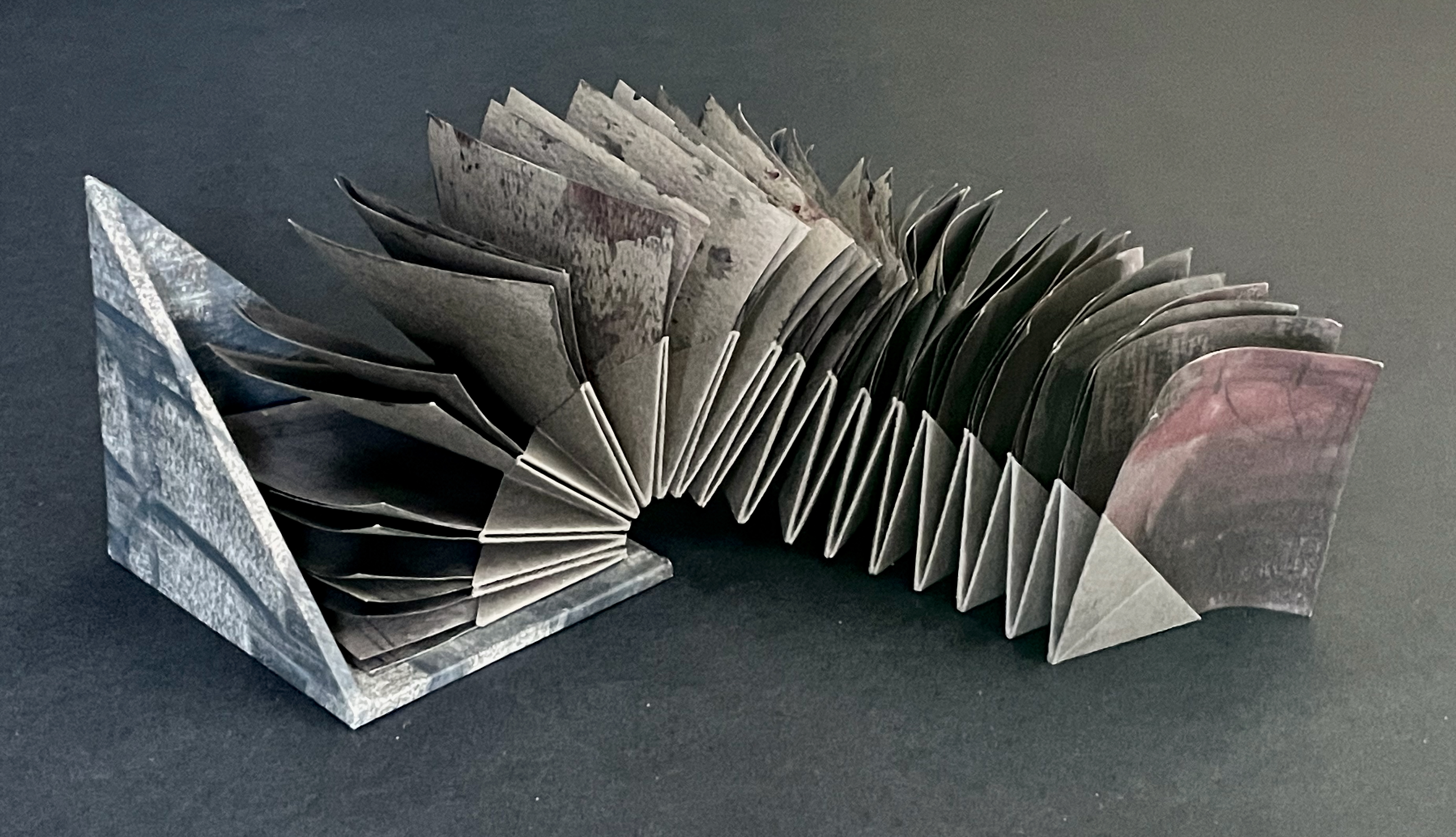
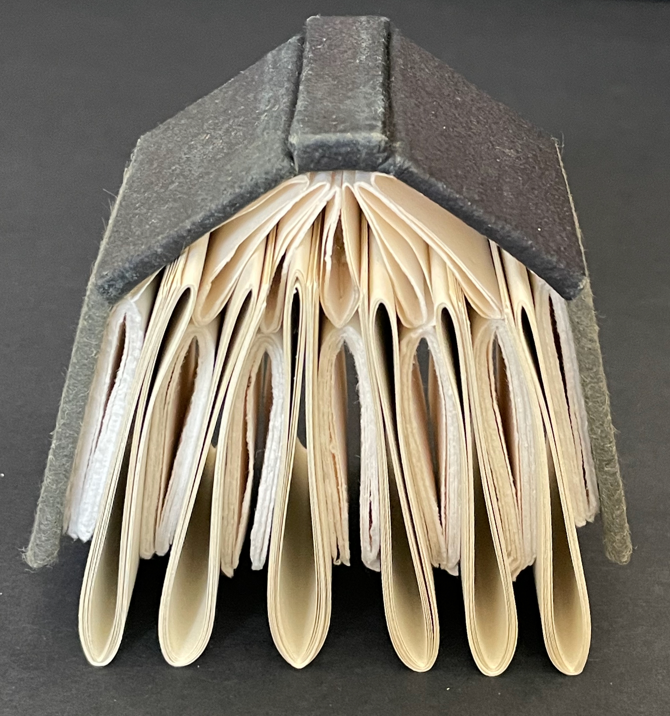
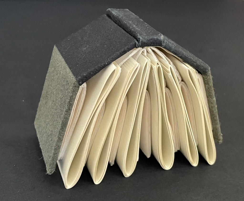
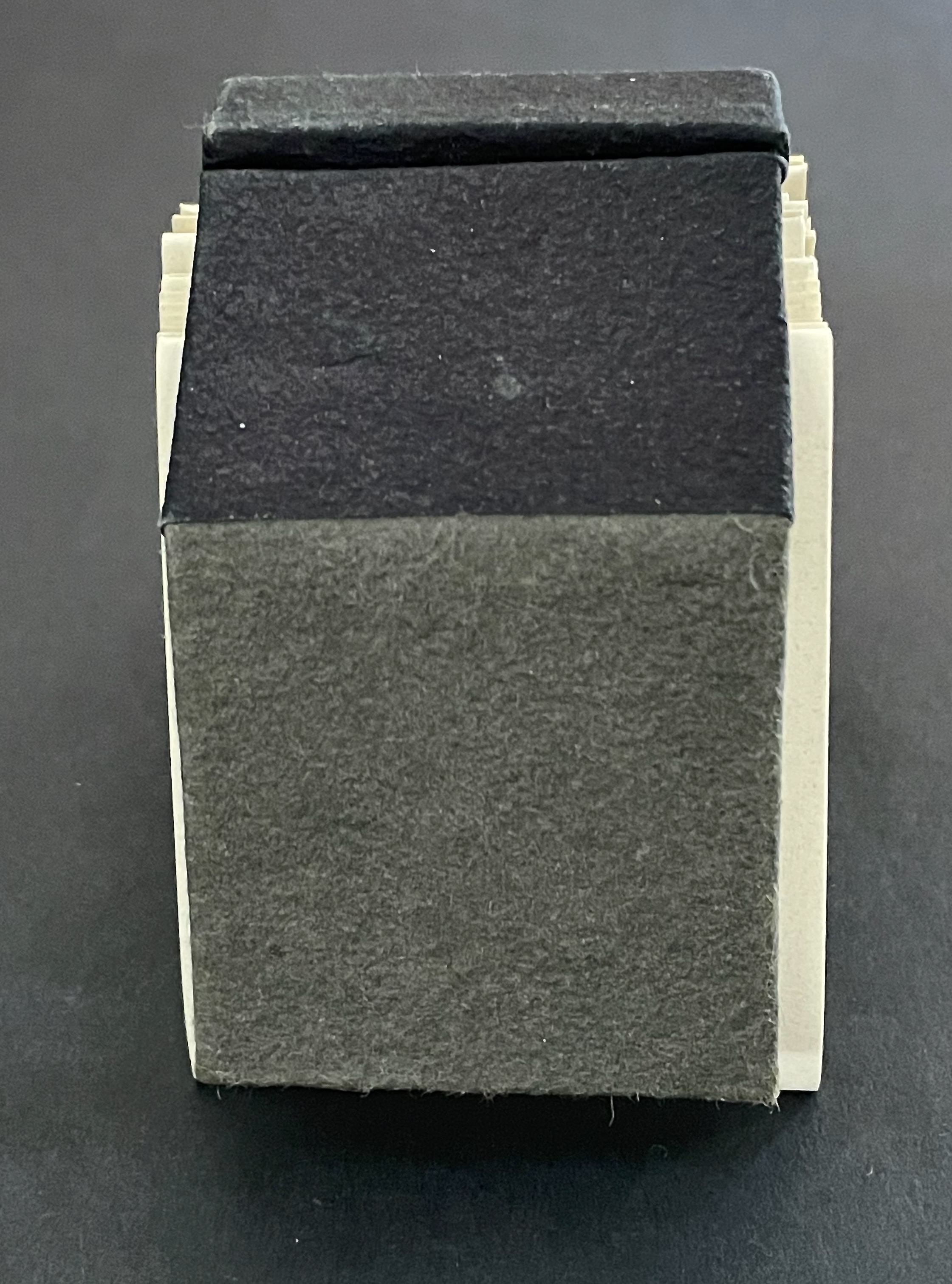
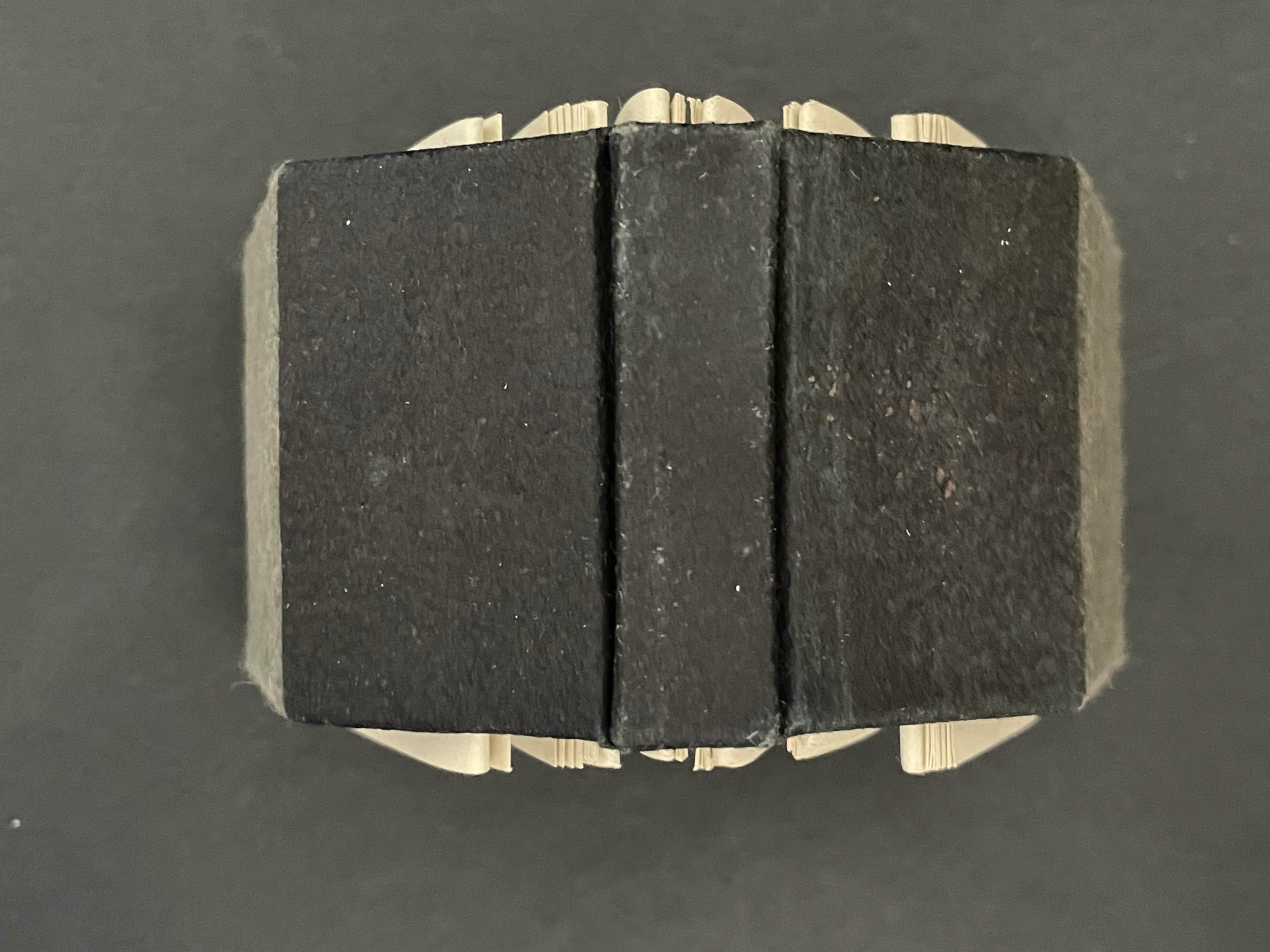
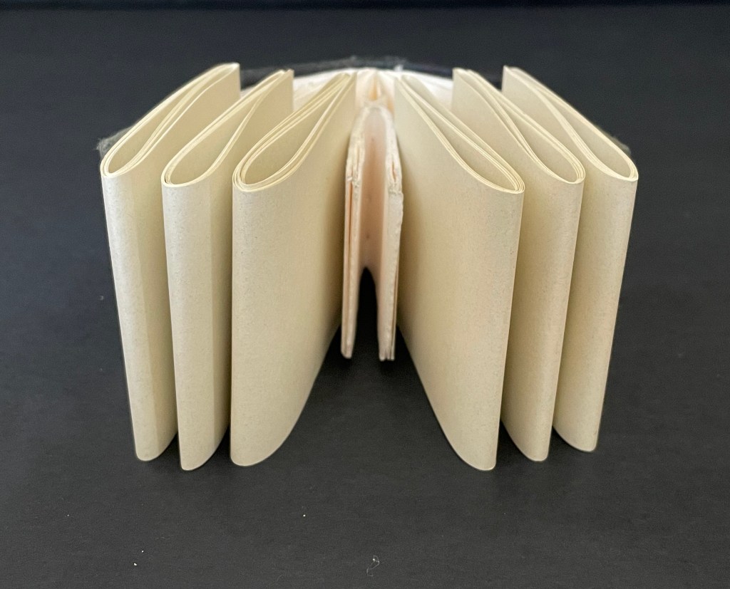
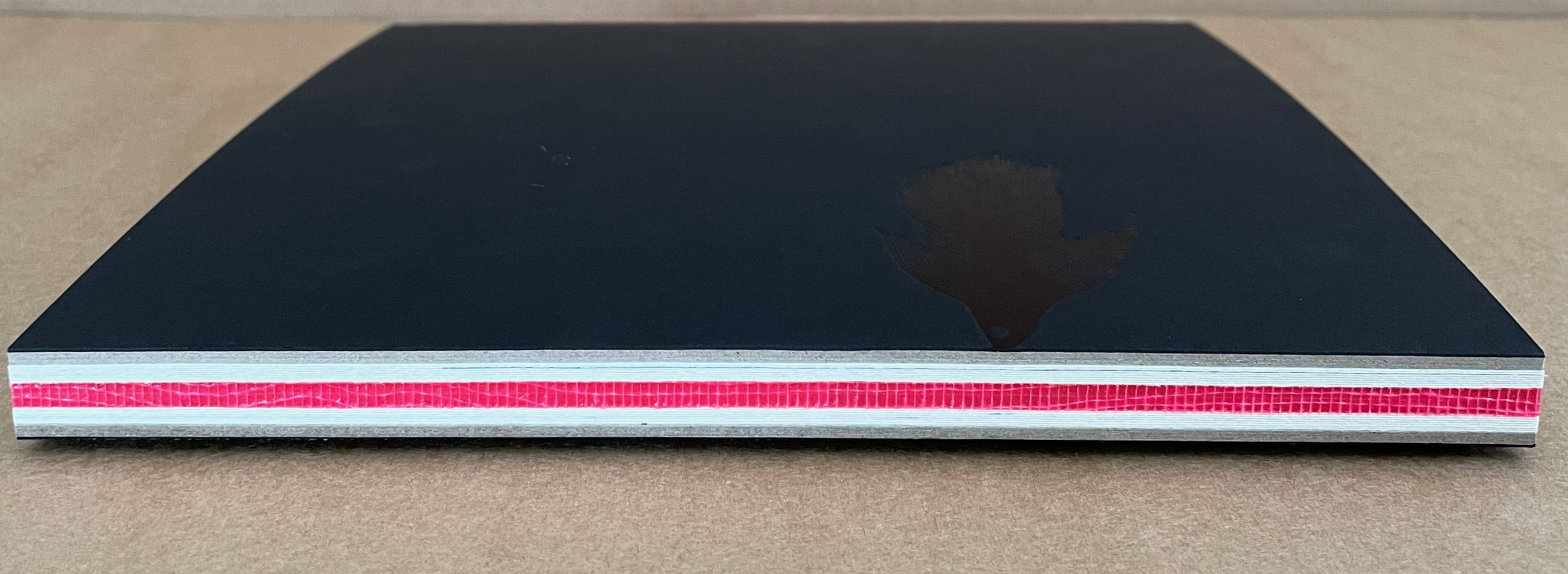
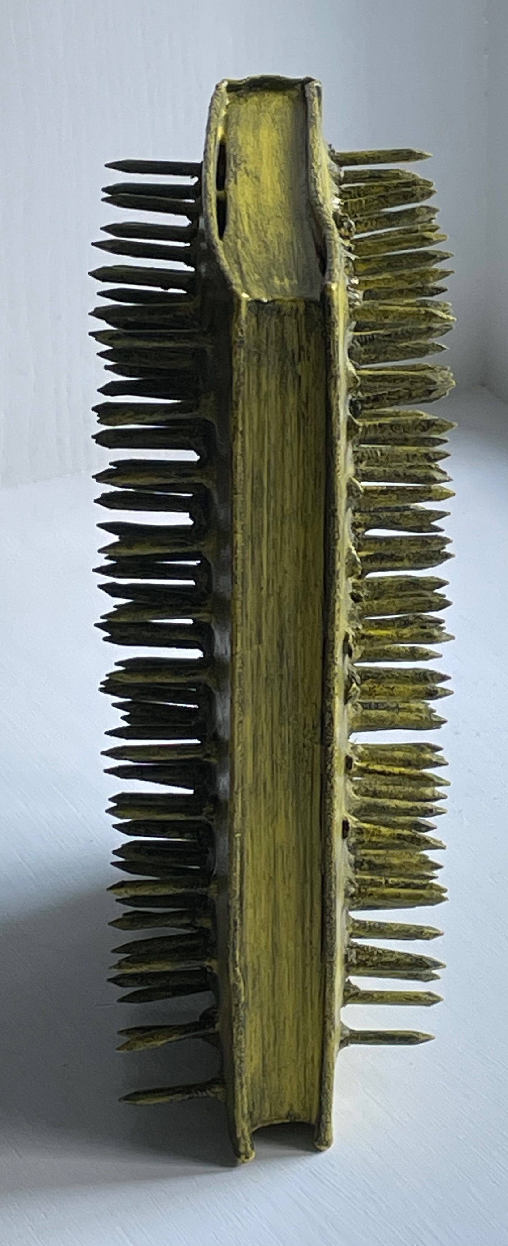
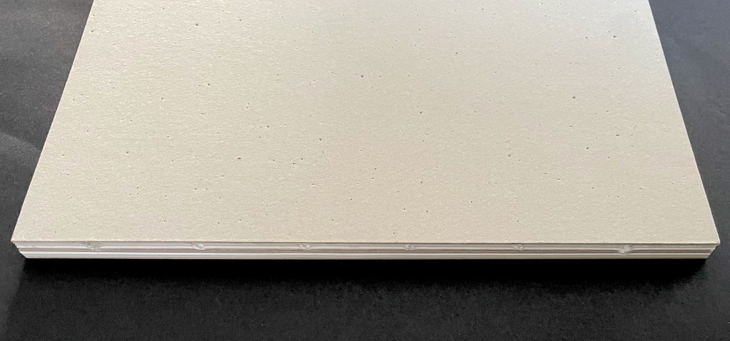
Open spine, dos-à-dos with grey bookbinding board. 210 x H260 x 210 mm. 104 pages. Edition of 250. Acquired from einBuch.haus, 3 December 2025.
Photos: Books On Books Collection.
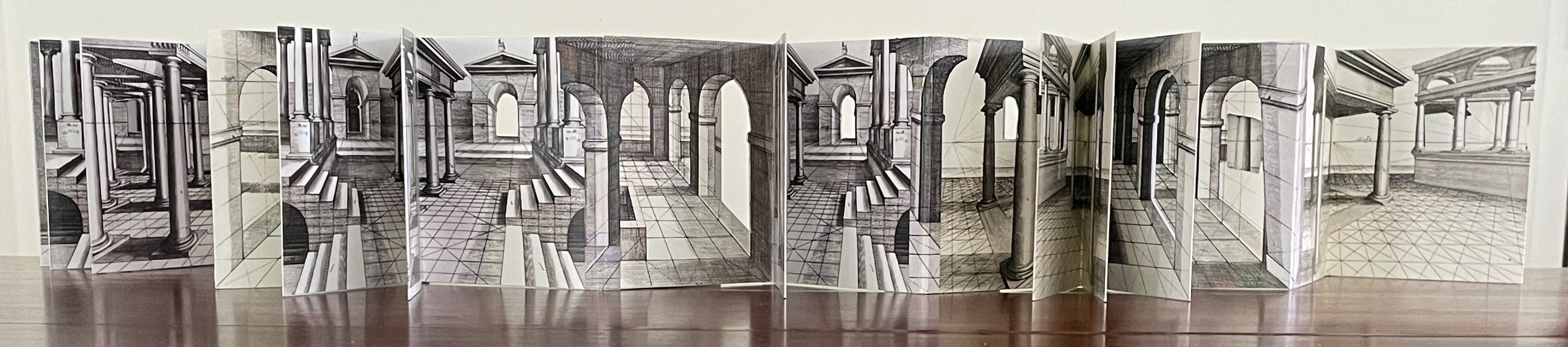
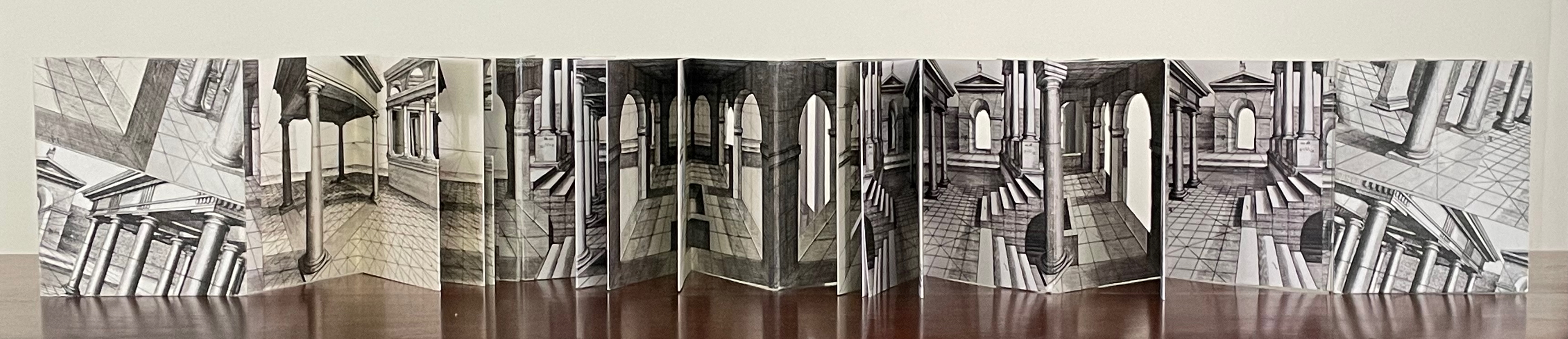
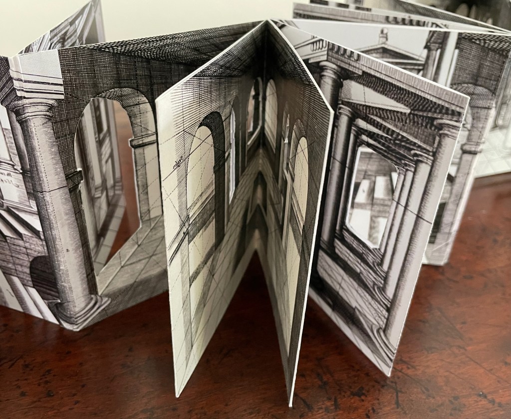
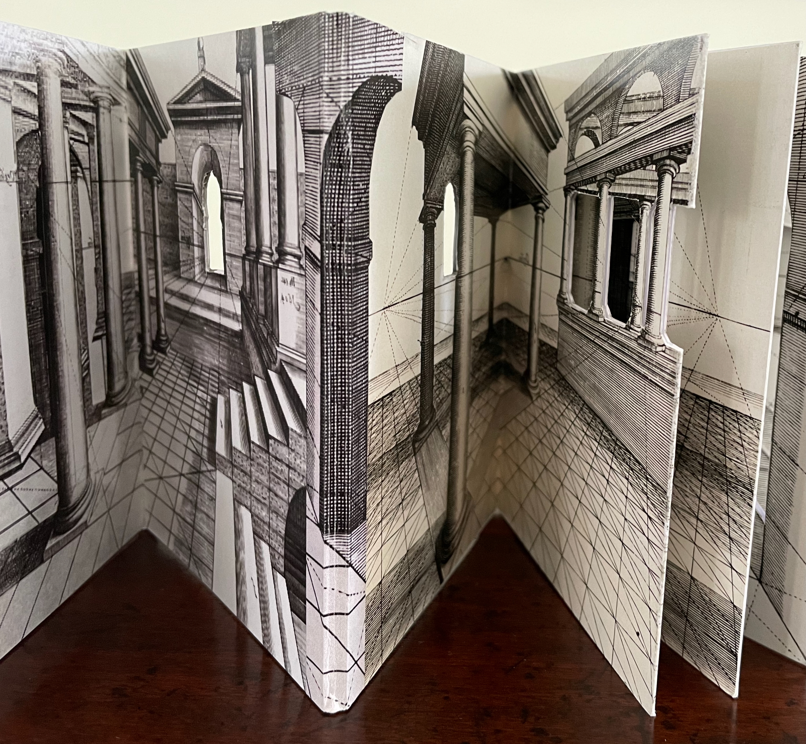
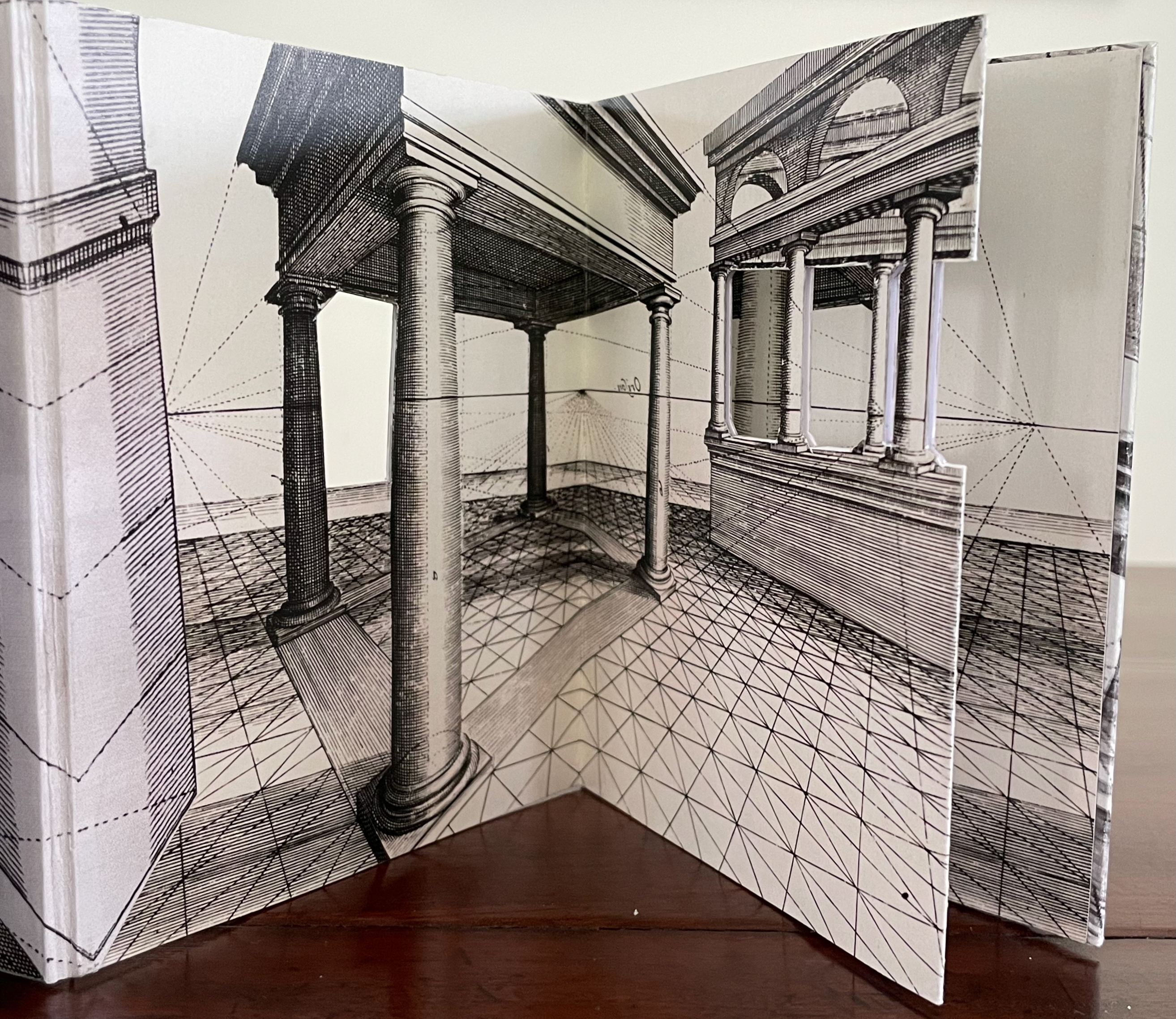
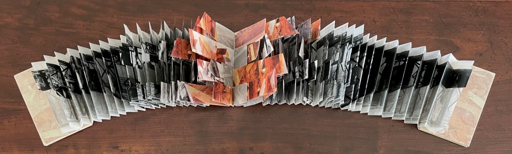
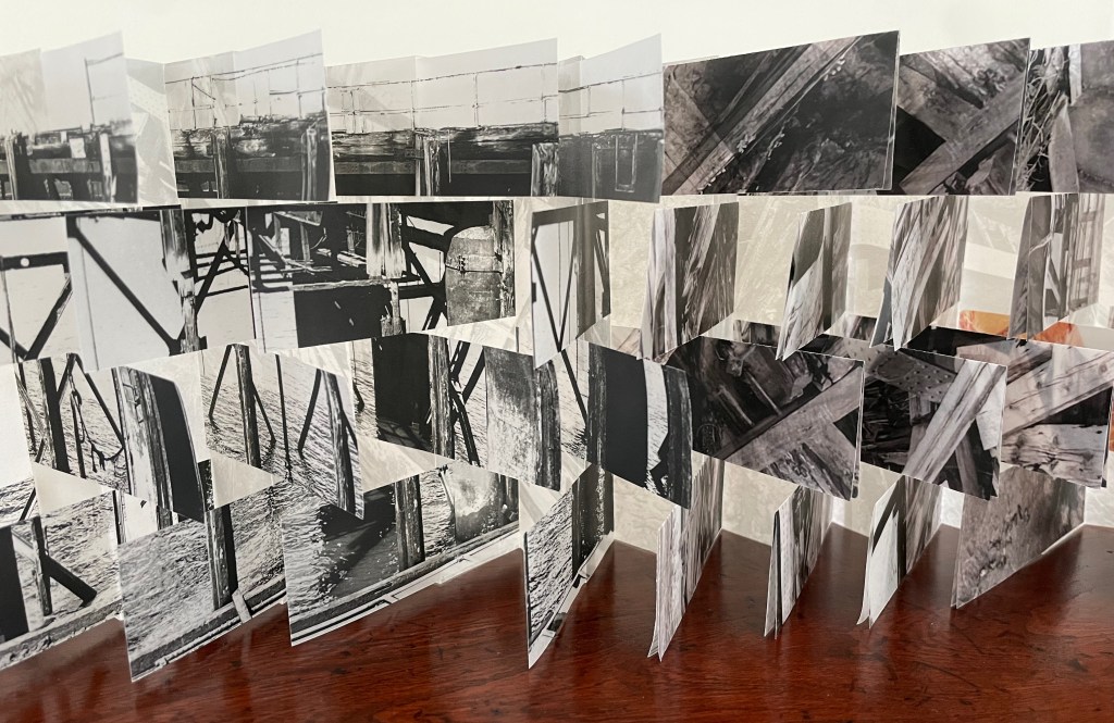
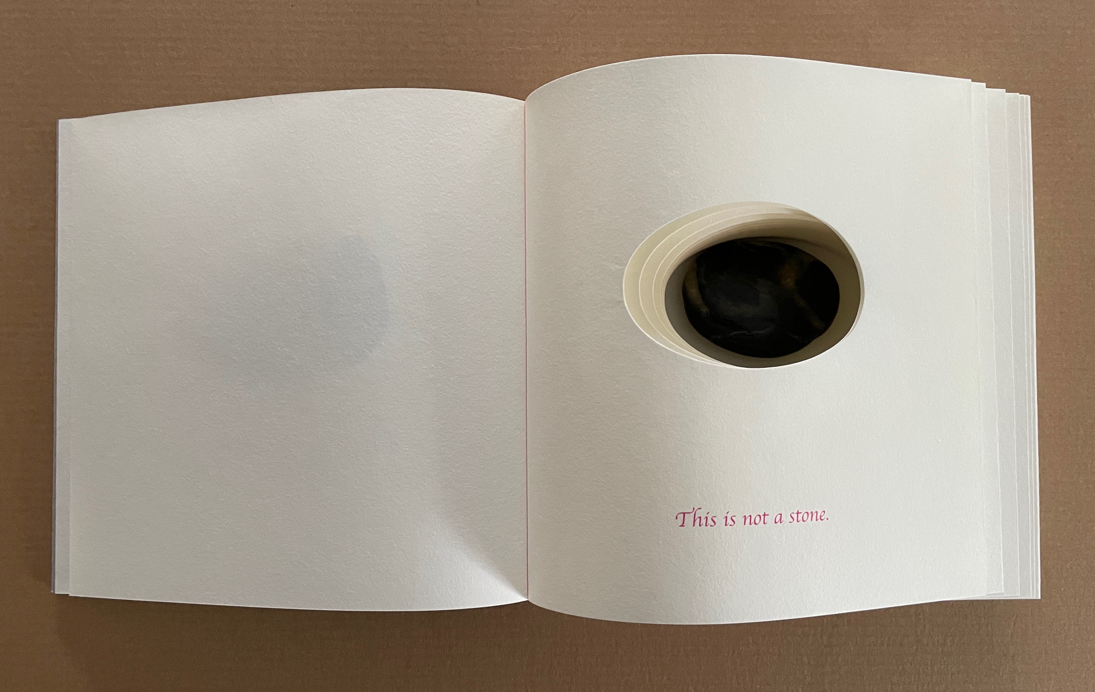
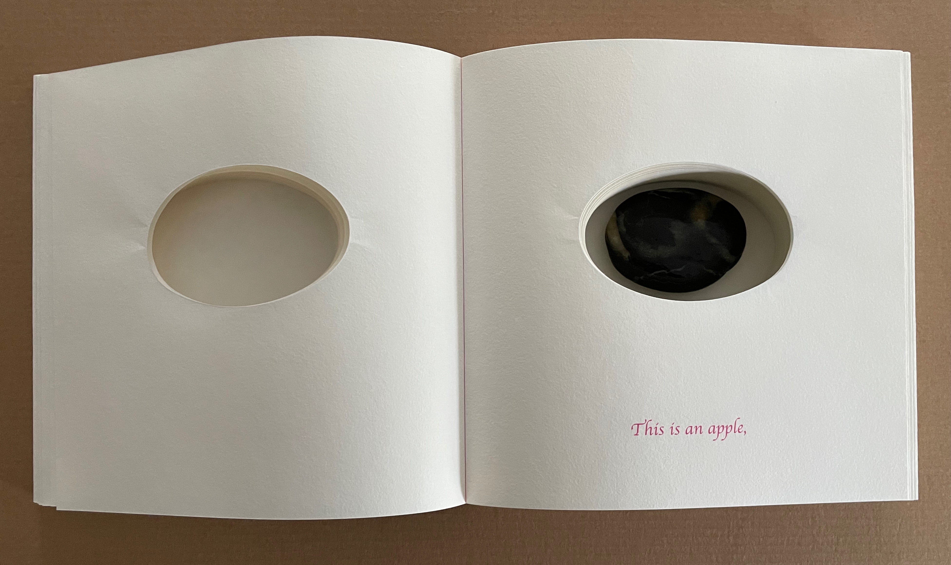
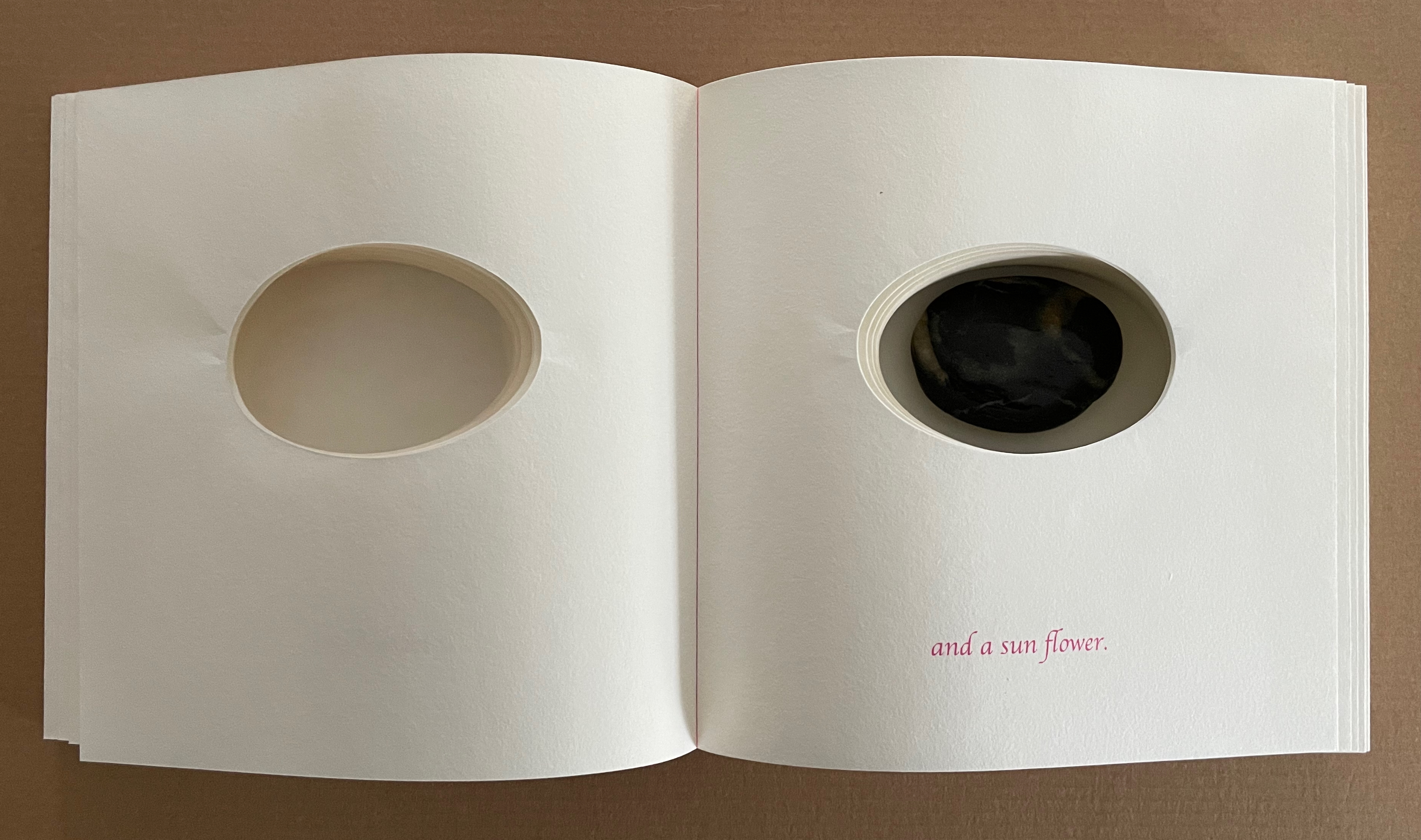
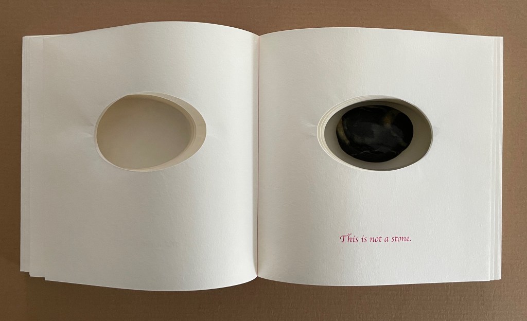
A Never-Ending Stone is Laure Catugier’s first monographic catalog. Her skill with collage, alignment, shadows, materials, and the book format transform it into an artist’s book very much driven by her fascination with architecture and especially the architectural theories and practice of Oskar and Zofia Hansen. The Hansens eclectically embraced “human-scale” architecture, “environment art”, and what they called the “open form” structure, using space and time as its key elements. The Hansens also proposed that the architect should not be the all-knowing expert but should partner with clients as co-authors of their space, respecting how their interior and outside activities and relations with one another defined them and their space. Though somewhat a forerunner to User-Centered Design, Open Form radically aimed at structures that would evolve with interaction with the user and, as they unfolded, also align with nature.
For Catugier and the book form, this translates into “no hierarchy between elements; each element influences the next and modifies the original situation … no table of contents, no beginning, and no end, no reading direction: the usual order of the book is upset” (Catugier, p.9). Her publisher einBuch.haus chimes in: “By superimposing and intersecting lines through collage, Catugier multiplies the potential variations of form. Playing with scale, perspective, and framing, she disrupts the conventional Cartesian coordinates of the x, y, and z axes”.
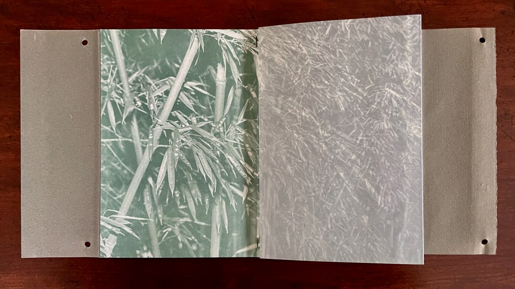
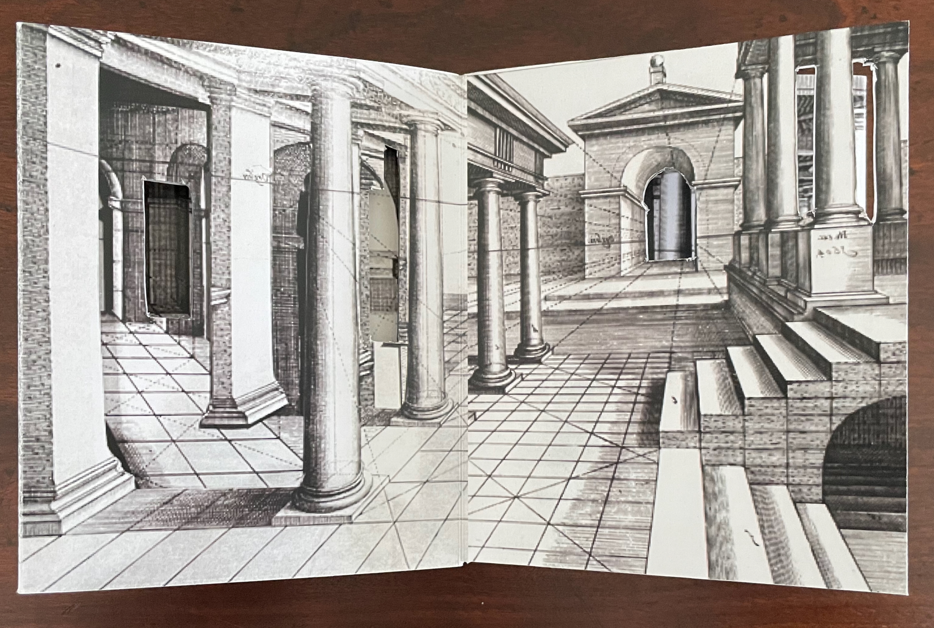
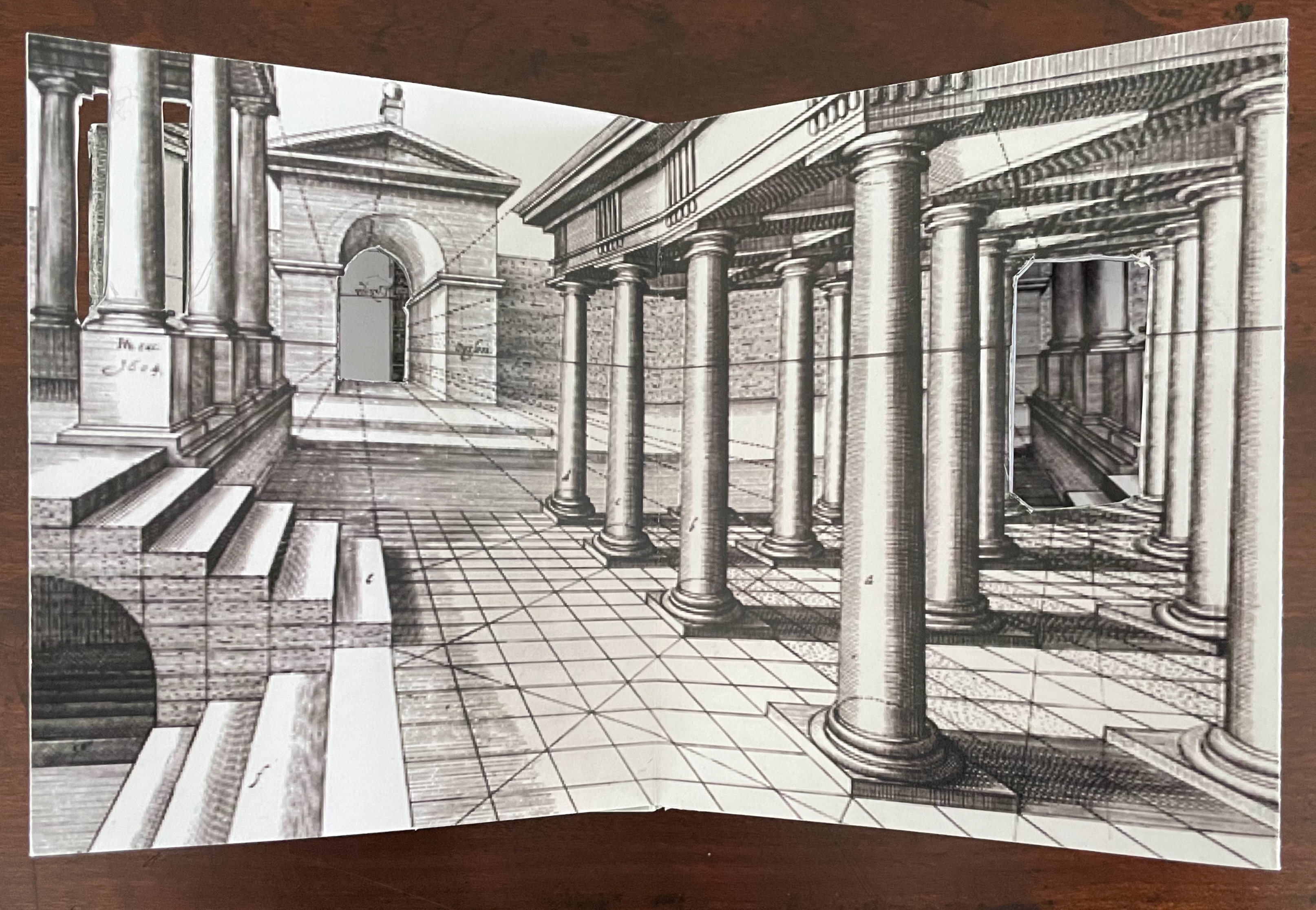
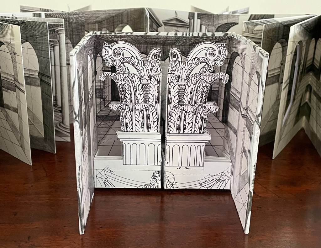
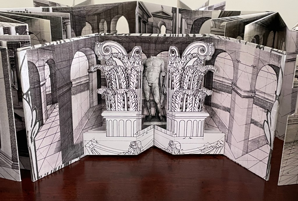
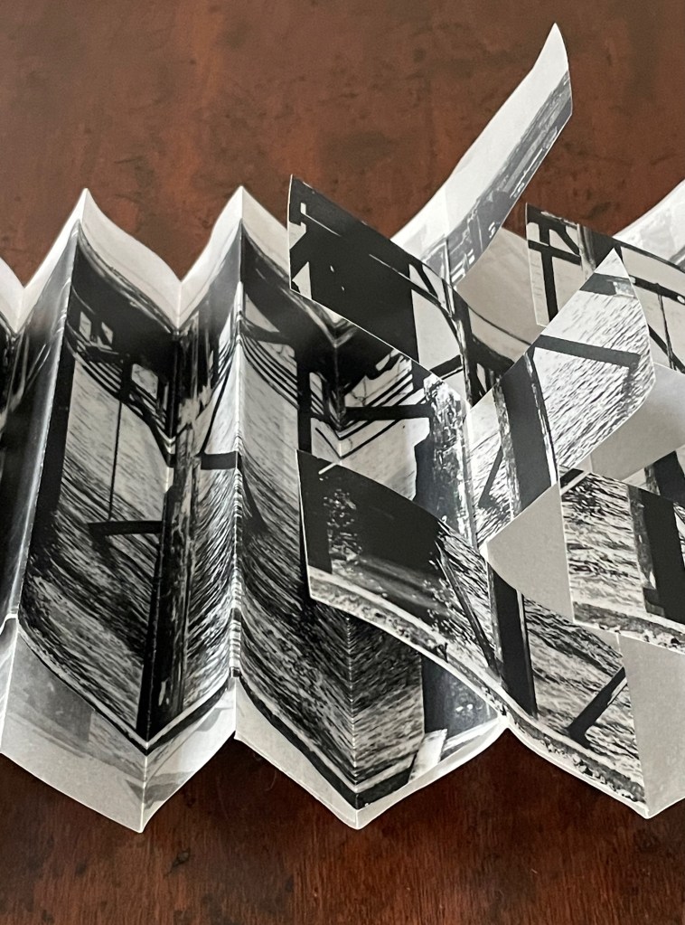
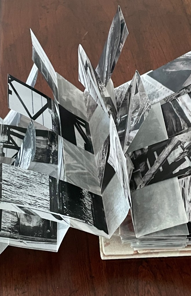
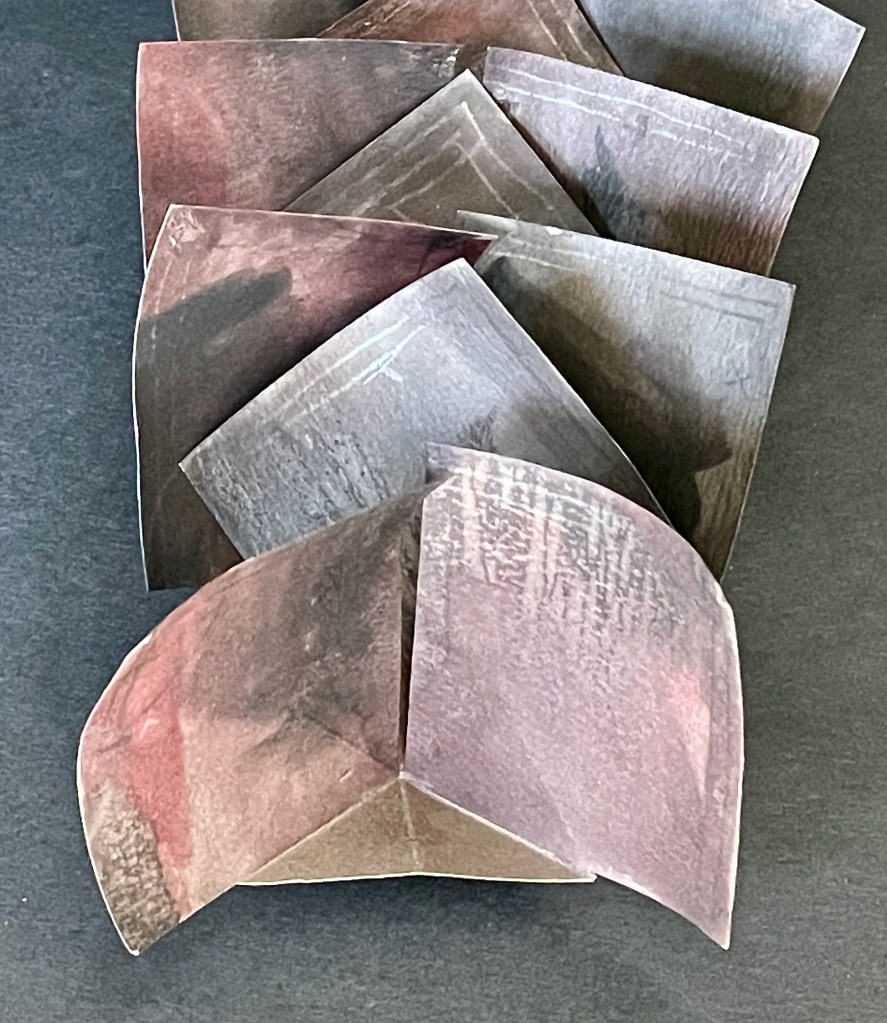
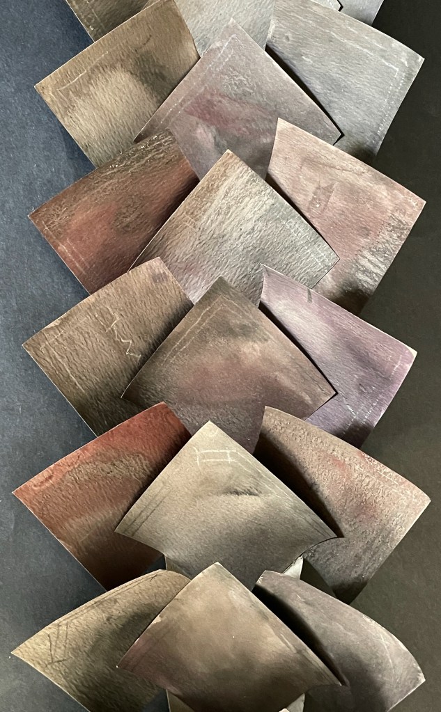
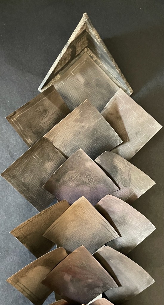
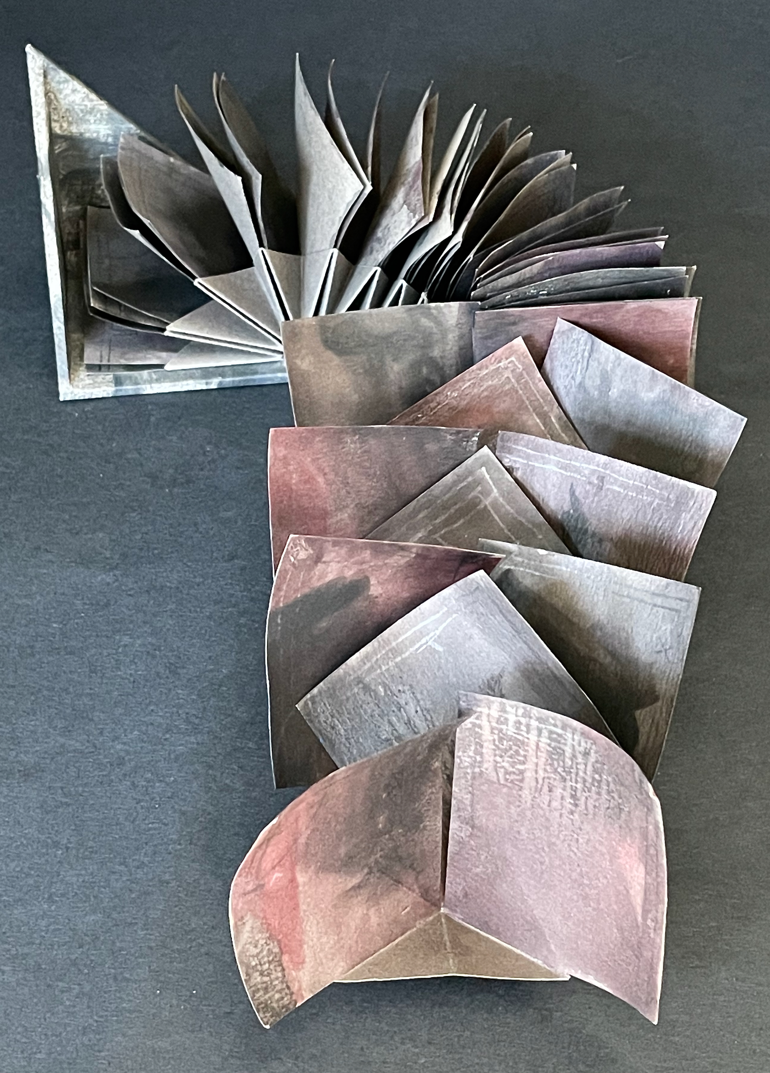
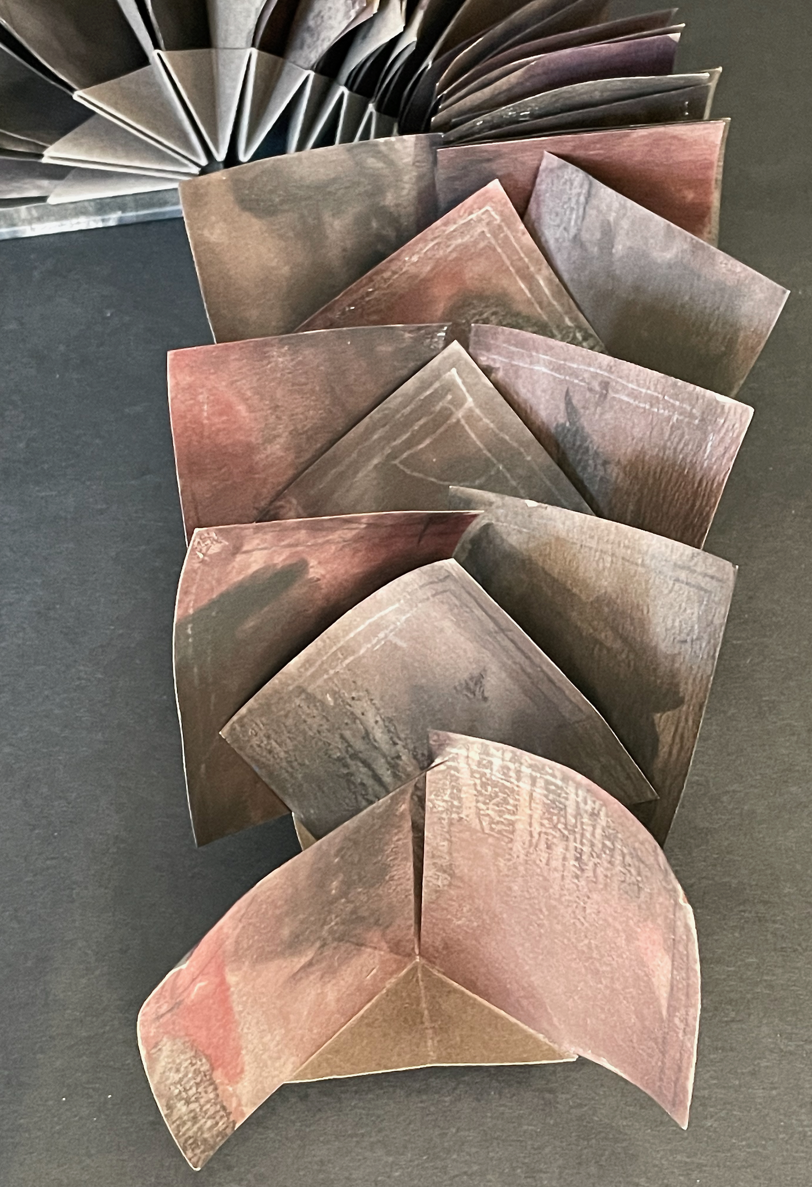
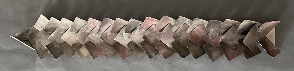
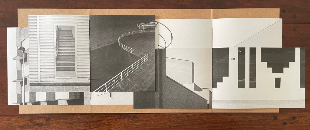
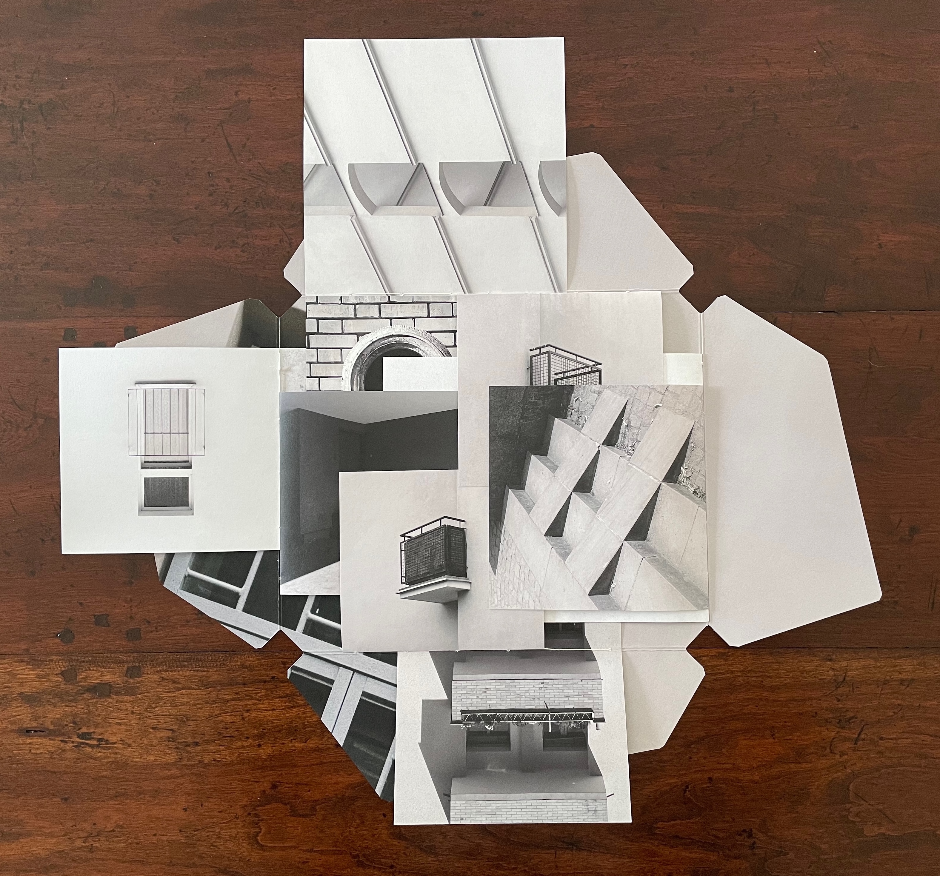
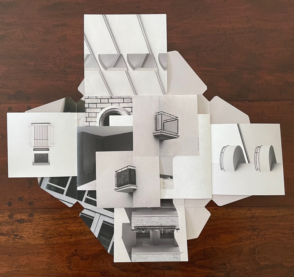
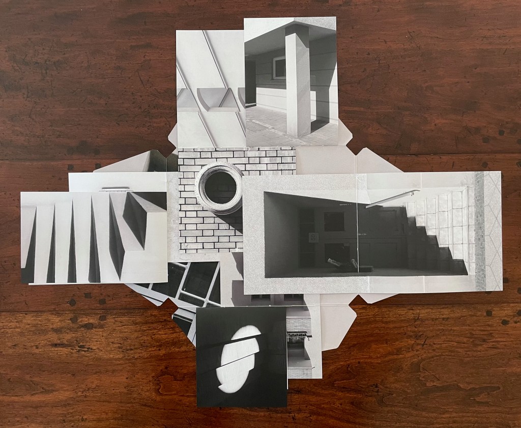
Variable page height and width combined with exacting registration form the key with which Catugier unlocks her superimpositions, intersections, collage, and disruptions. Below is a set of spreads that demonstrates this.
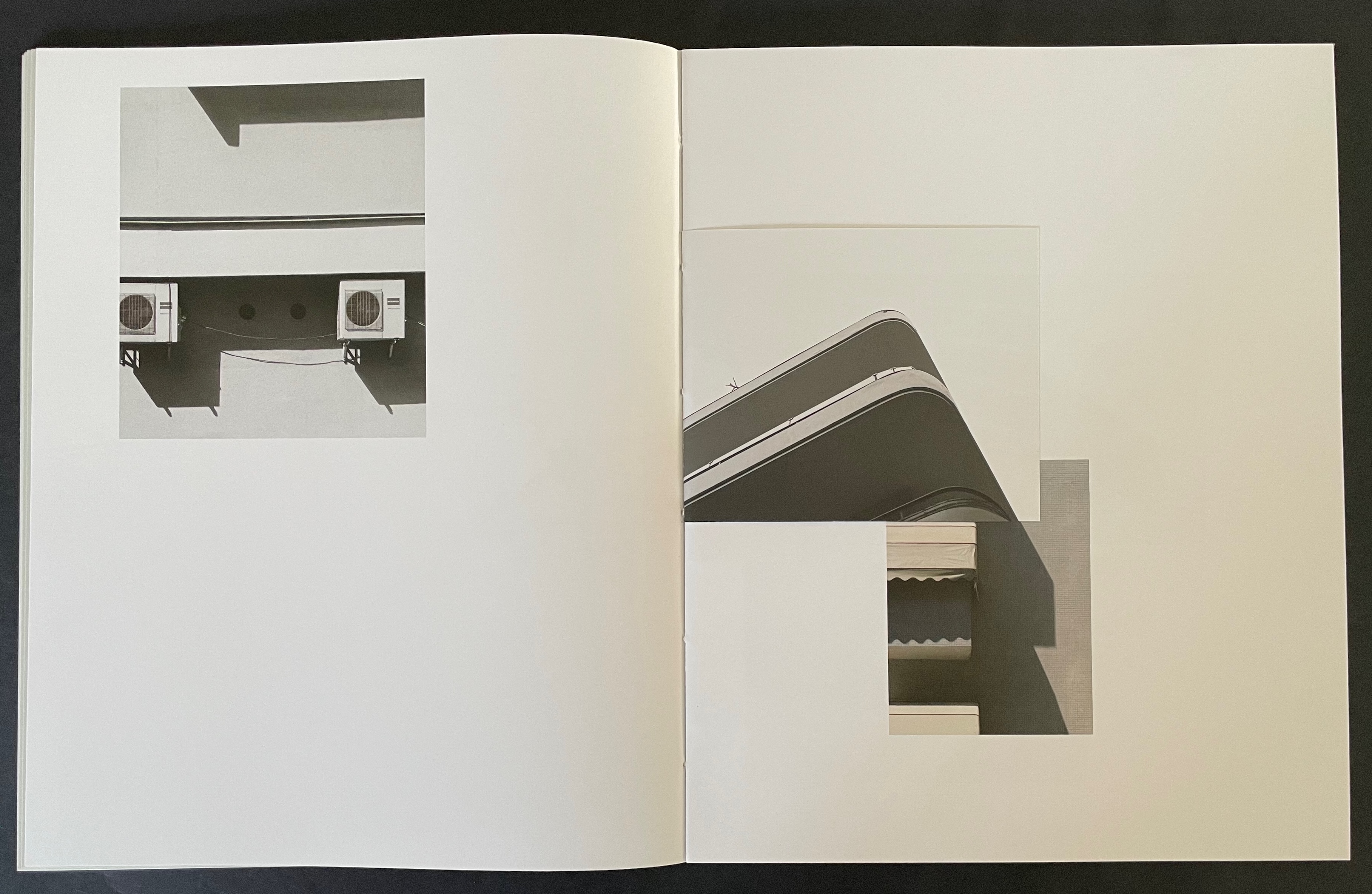
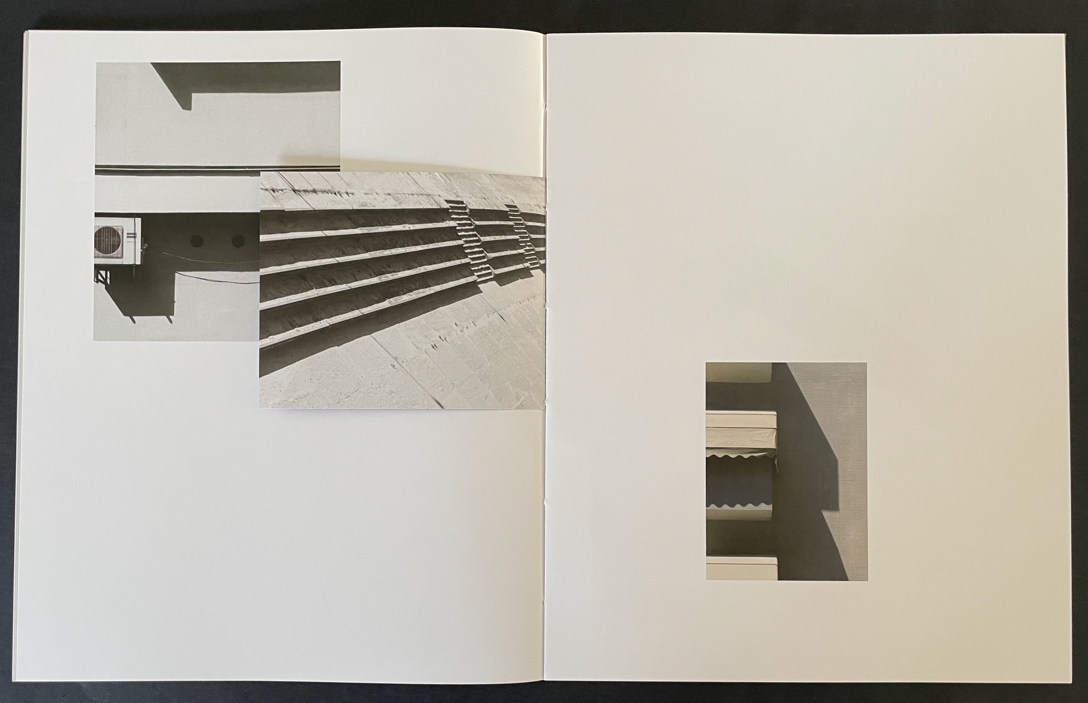
Above, in the spread on the left, the triangular image that falls on the recto page is actually a small folio to itself. The triangle’s right-hand edge aligns with the shadow of the image below it. This becomes apparent when the small folio is turned to the left, and now its verso image of shadows aligns with the shadow between the air-conditioning units (the small turned folio now hides nearer of the units).
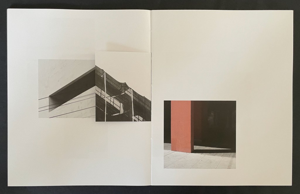
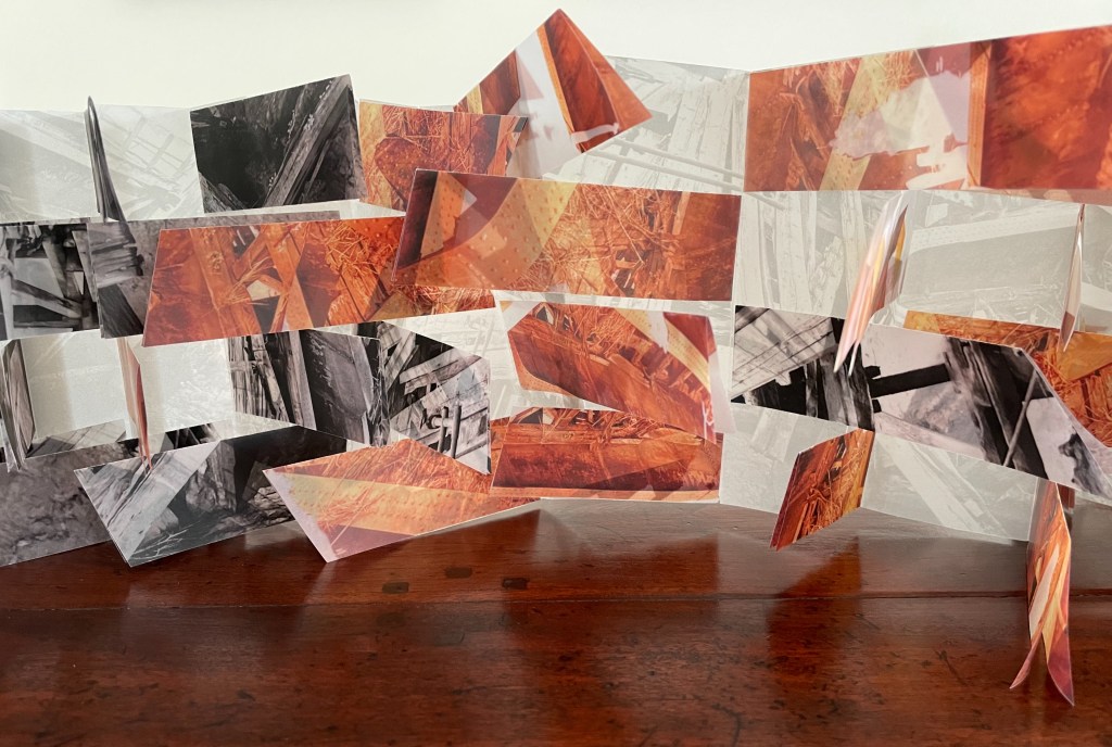
Above, in the spread on the left, a small folio displays the russet concrete window box that seems to hang above the same-colored concrete pillar. When the small folio is turned to the left, the shadow on its verso page aligns with the shadow of a balcony to create the appearance of a building’s corner.
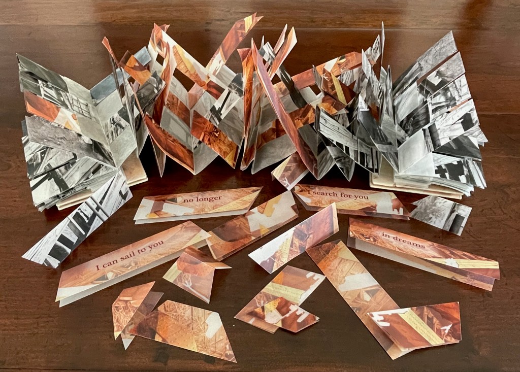
Given these architectural snapshots presented as dynamic collages echoing the Hansens’ theories, Catugier’s degrees in architecture and design at the École Nationale Supérieure d´Architecture de Toulouse are no surprise. Her turn to photography and then video, performance, installations and finally to artist’s books has been fortunate, in particular, for book art. The dos-à-dos structure of A Never-Ending Stone neatly echoes her trajectory. The title and choice of board for the covers reflect more specifically the architectural element. It was the French engineer and builder François Coignet (1814-88), one of the early inventors of concrete in France, who described it as “a never-ending stone.”
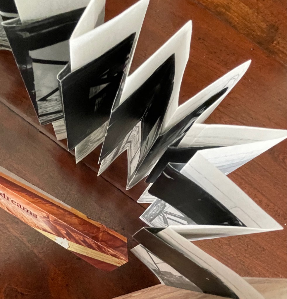
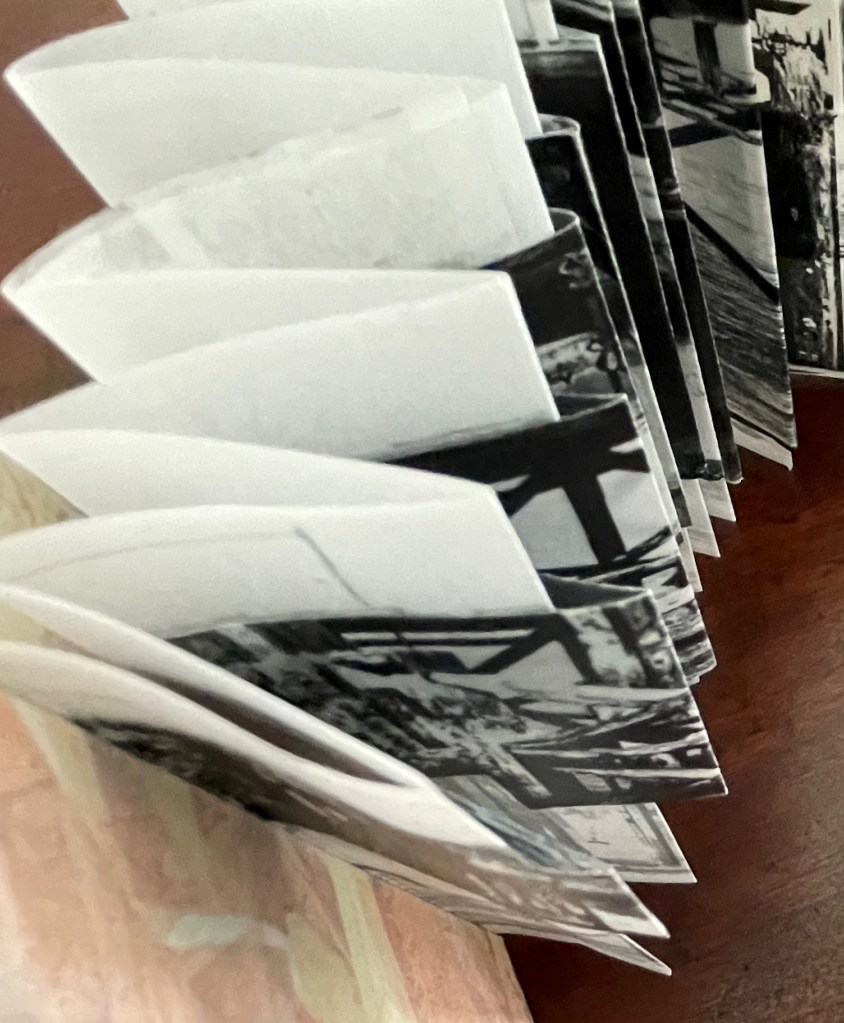
Bracketing the 28 folios that perform the dynamic collages above are an essay by Anna-Lena Wenzel covering Catugier’s background in architecture, photography, performance, video, installation, and book design, and an interview with curator Moritz Küng highlighting from the start another Catugier passion that also has its inspiration in Oskar Hansen’s architectural work: music and sound.
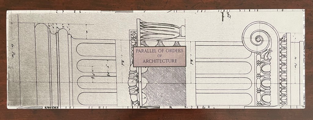
Architecture is Frozen Music # (2023)

Architecture is Frozen Music # (2023)
Laure Catugier
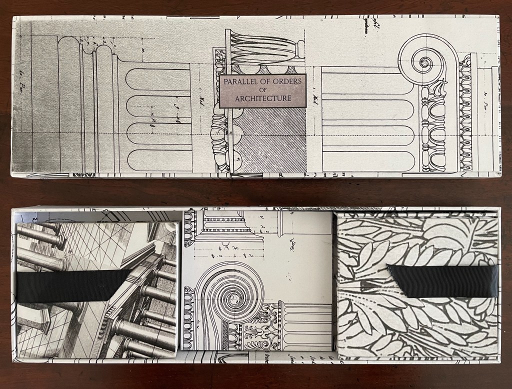
“Open Form” binding (French fold cover with slot fastening; two pamphlet-sewn booklets attached to verso and recto edges of cover with staggered top and bottom margins). Cover: H230 x W270 mm (closed), W575 mm (open); Pamphlet verso: H197 x W180 mm (closed), W330 mm (open); Pamphlet recto: H197 x W204 mm (closed), W384 mm (open). [8] pages in each pamphlet. Edition of 100, of which this is #41. Acquired from einBuch.haus, 1 October 2025.
Photos: Books On Books Collection. Displayed with permission of the publisher.
Hansen was commissioned to design a music pavilion “that would reflect contemporary thinking in music”, which he translated into a “search for ” ‘time and space’ qualities in music” [and a structure that would picture] the spatiality of music … enabling viewers to search for their ‘audio’ place and simultaneously experience visual transformations — to be in audio-visual space-time, and later on he would refer to design as “compos[ing] space like music” (Scott, pp. 140-47).
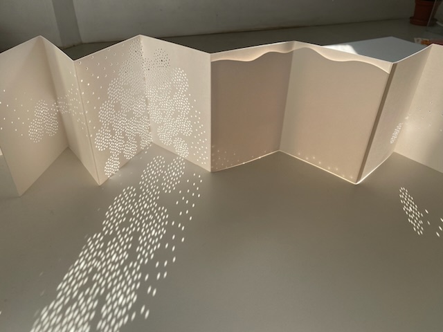
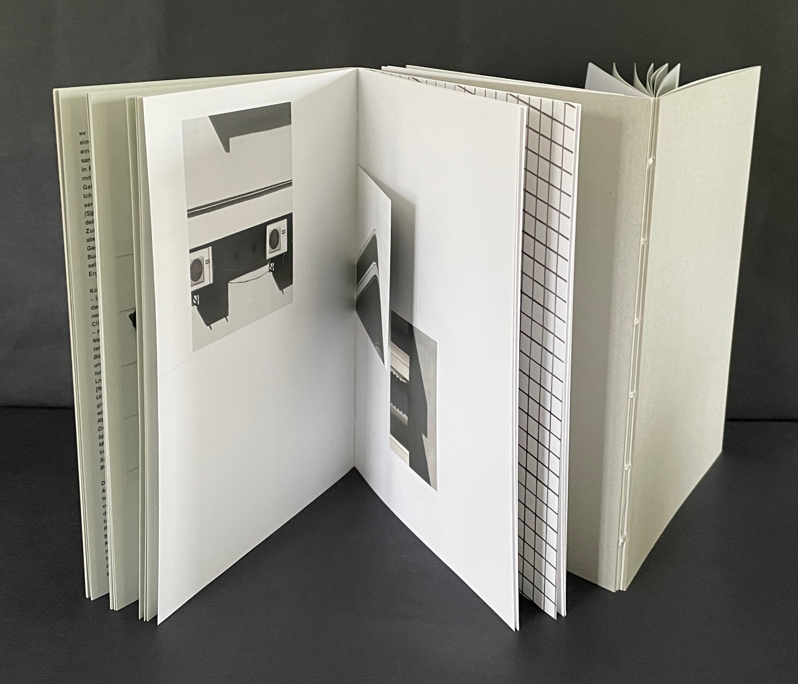
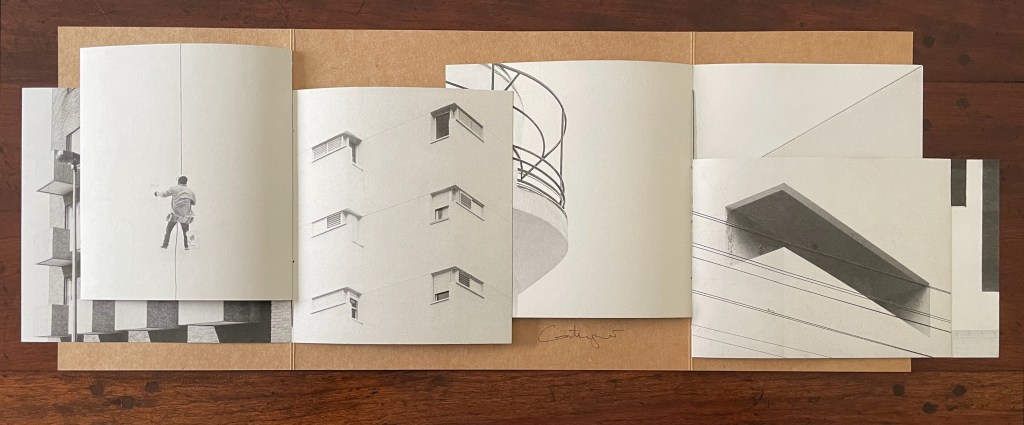
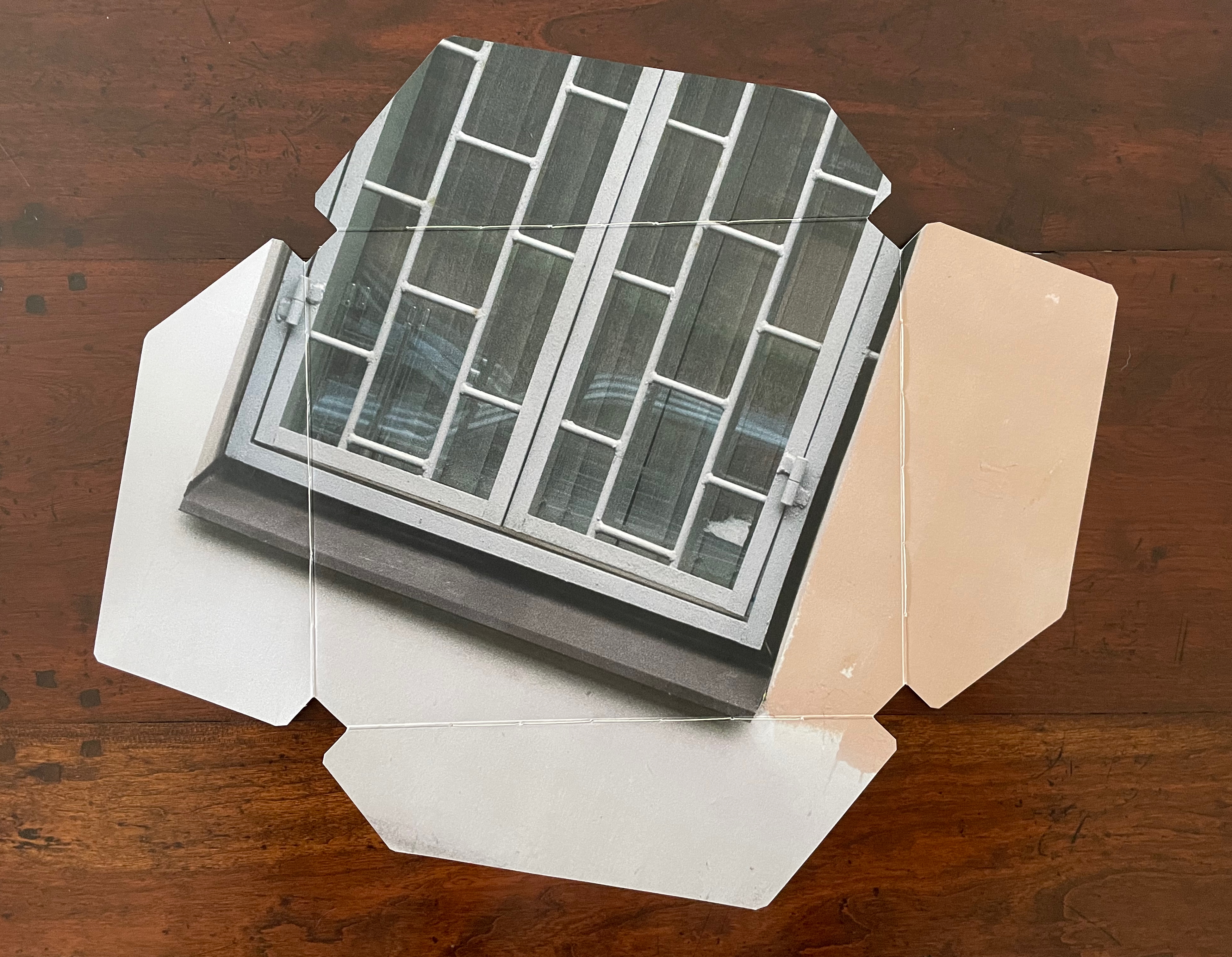
Catugier’s Architecture is Frozen Music project translates Hansen’s analogy into her installations and artist’s books. In Architecture is Frozen Music # (2023), she adds a French fold structure that engages the techniques of variable page height and width, registration, and dynamic collage across two facing interleaving booklets. Even the book’s fastening (see above) participates in the registration and dynamic collage techniques, which can be further appreciated by turning over the extended French fold cover (see below).
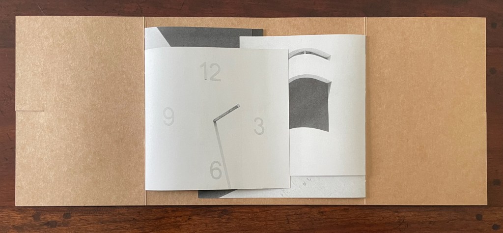
French fold cover opened, displaying two booklets interleaved. Note the fastening slot on the left.
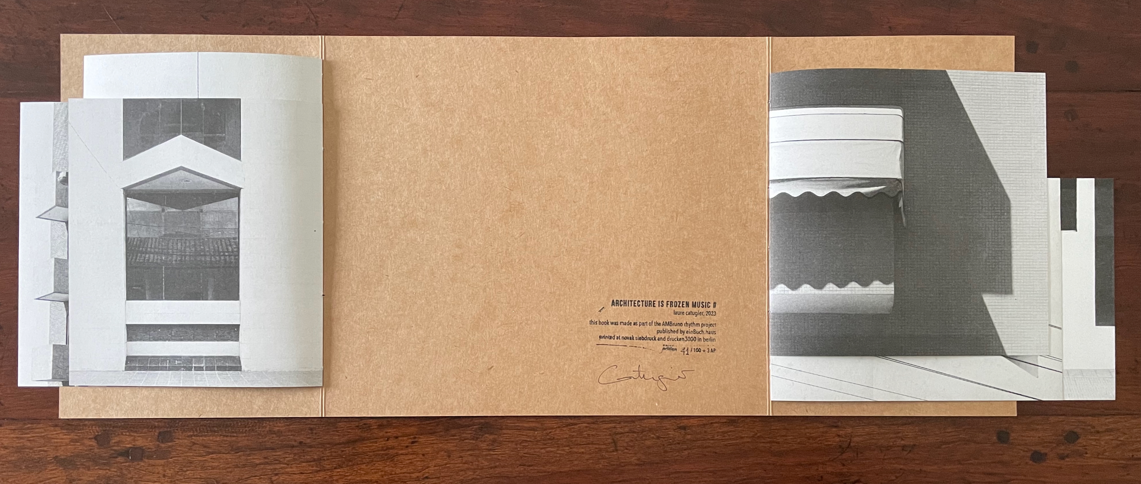
The two booklets separated, revealing the colophon. Note the difference in margins above and below from one booklet to the other, facilitated by the structure’s two spines.
Reverse of the extended French-fold cover, showing the collaged images that form the dynamic collage on the front of the closed book.
When the two booklets’ pages are turned, the differences in the top and bottom margins, the size of the leaves, and their positioning on the two spines become more evident.
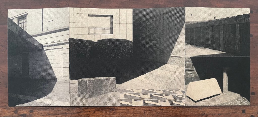
Below, the linear registration across the overlapping leaves of the two booklets suggest lined music sheets with the collage in the center playing the role of an oversized treble clef and musical note and enacting the title’s assertion that architecture is frozen music. Structure and image meet metaphor.
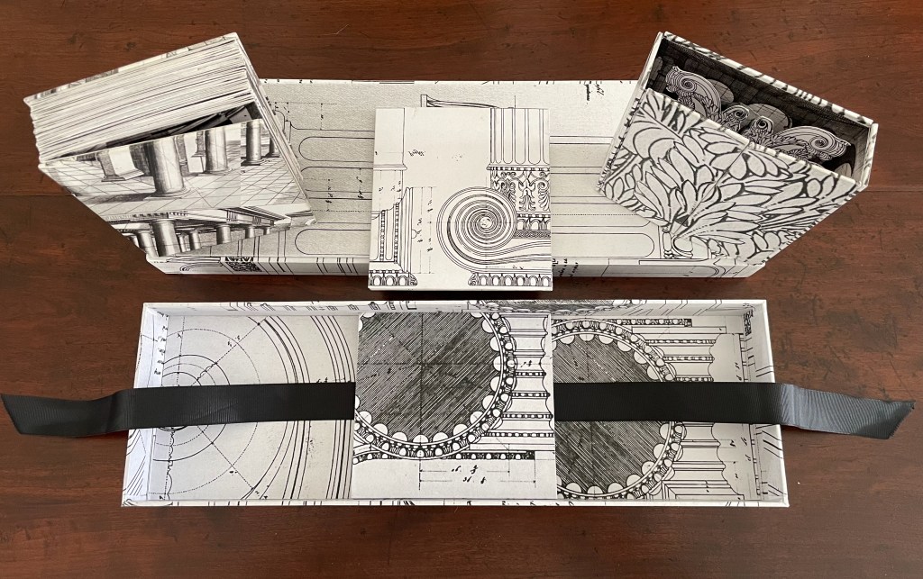
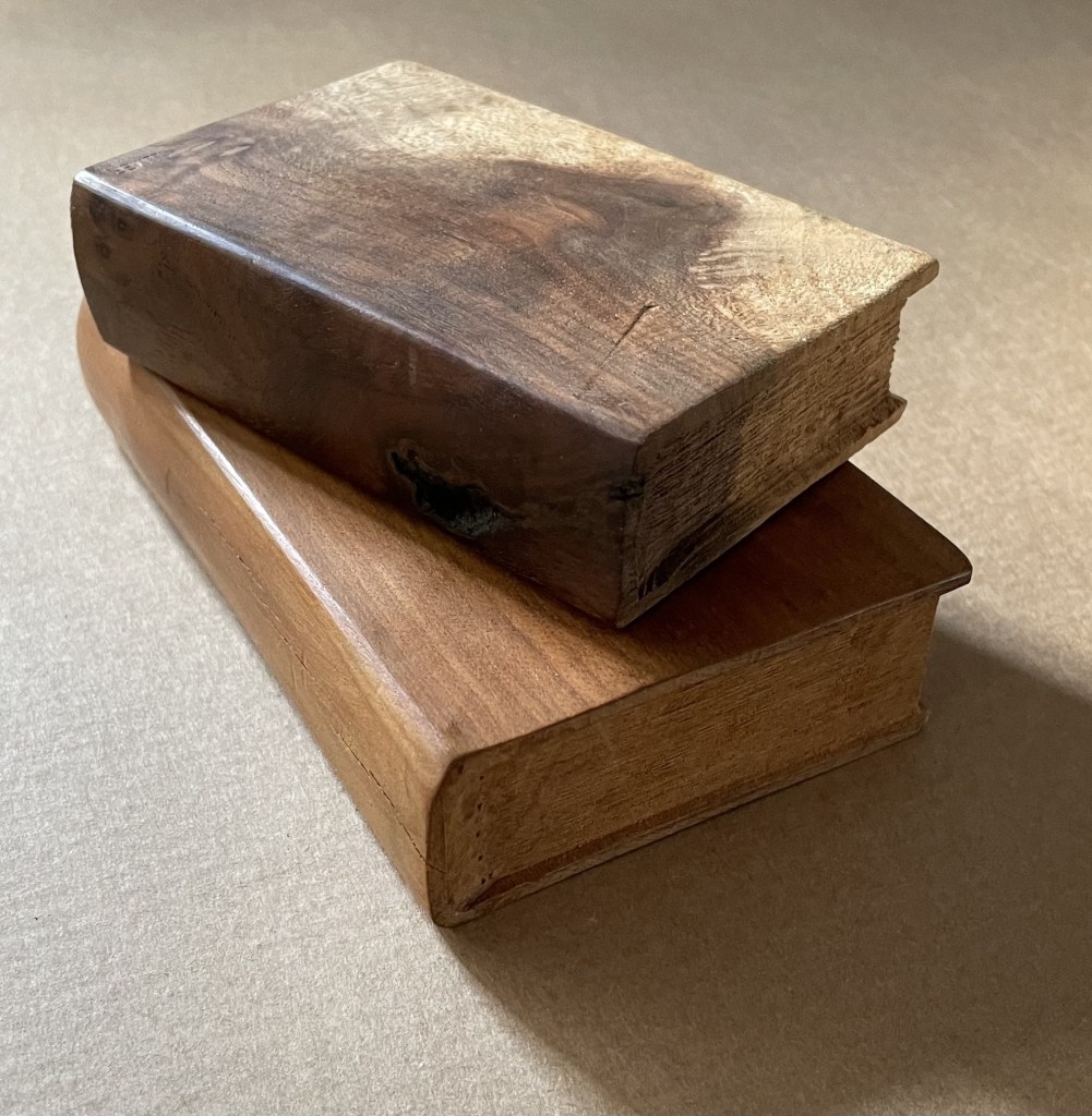
Architecture is Frozen Music (2022)
Architecture is Frozen Music (2022)
Laure Catugier
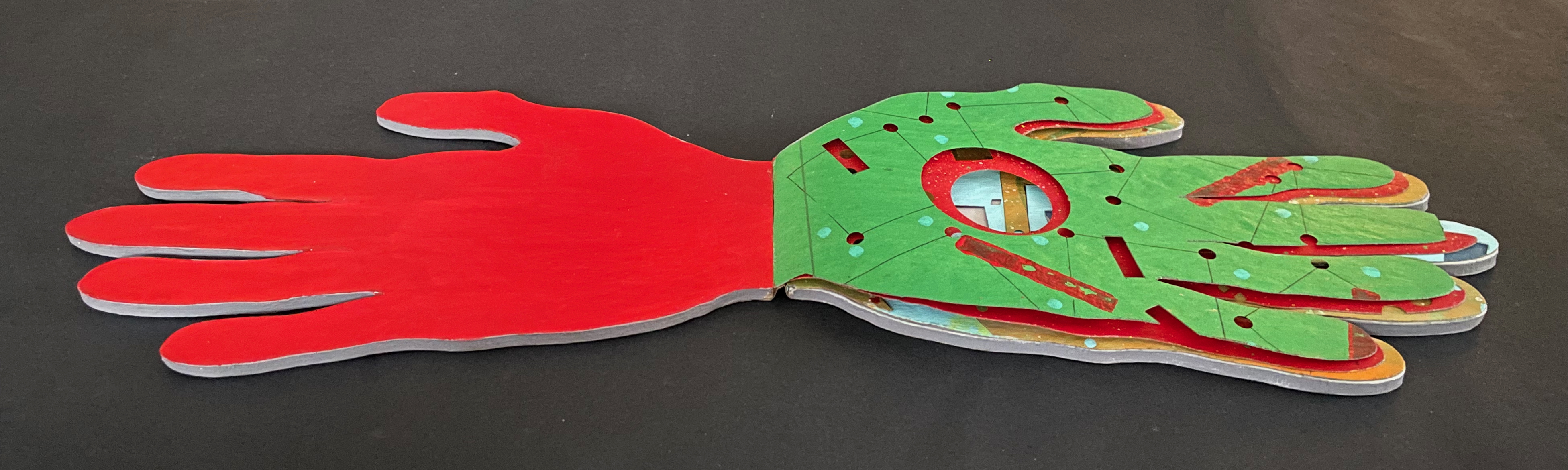
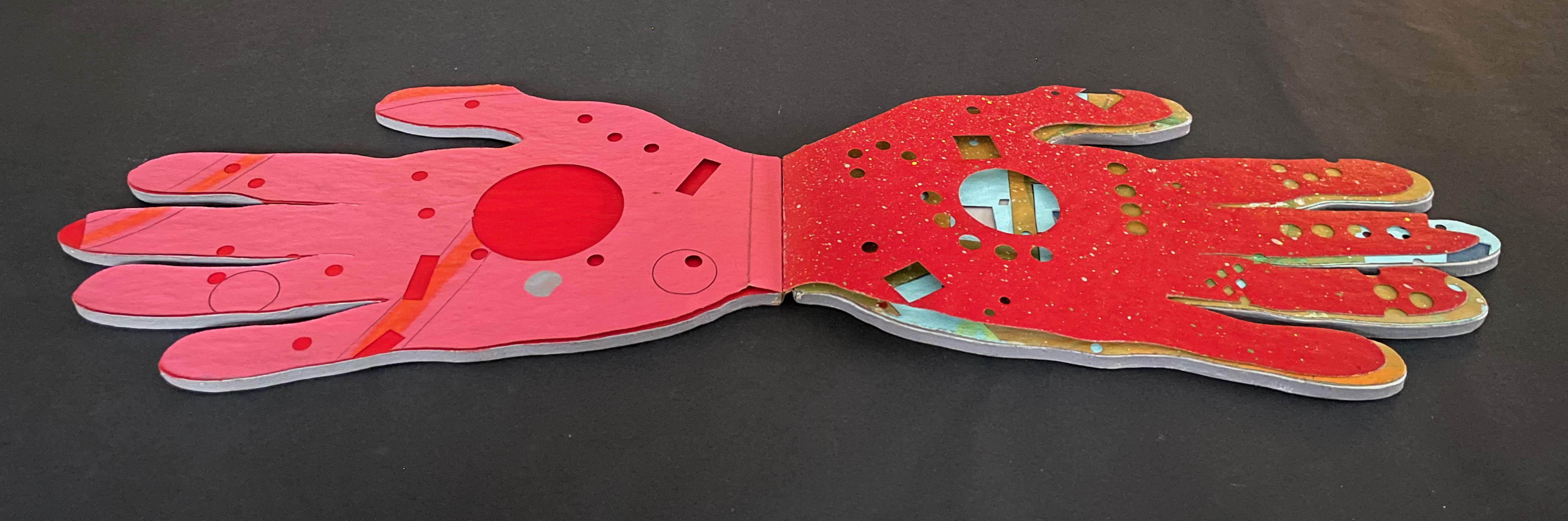
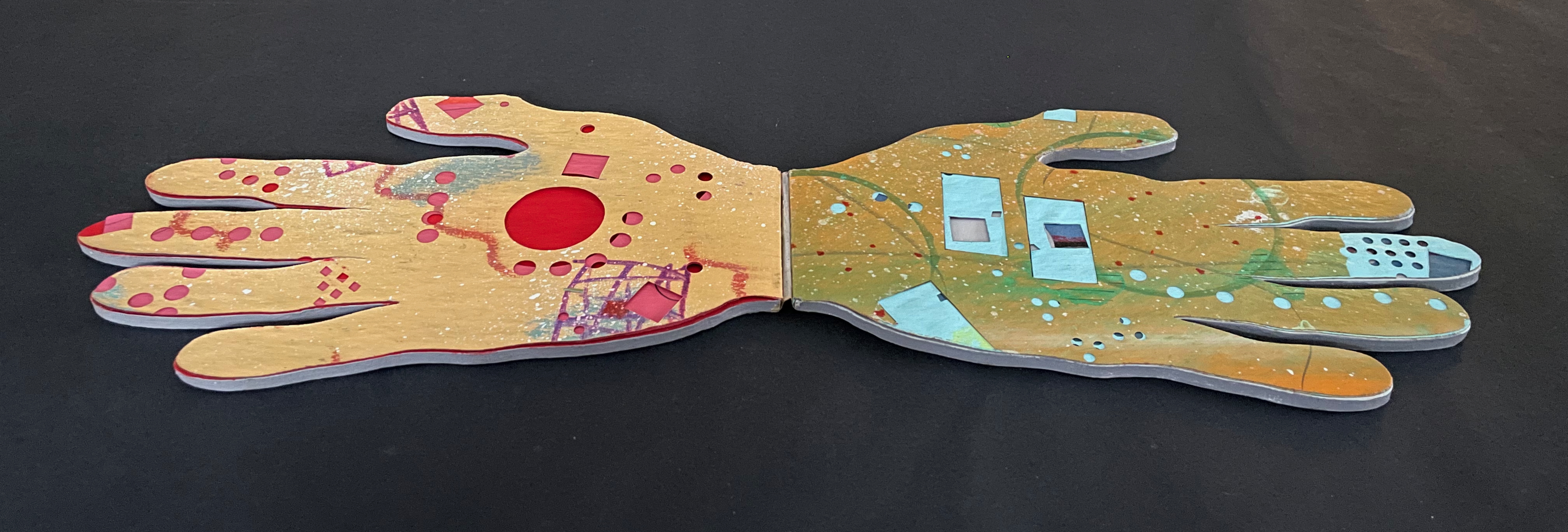
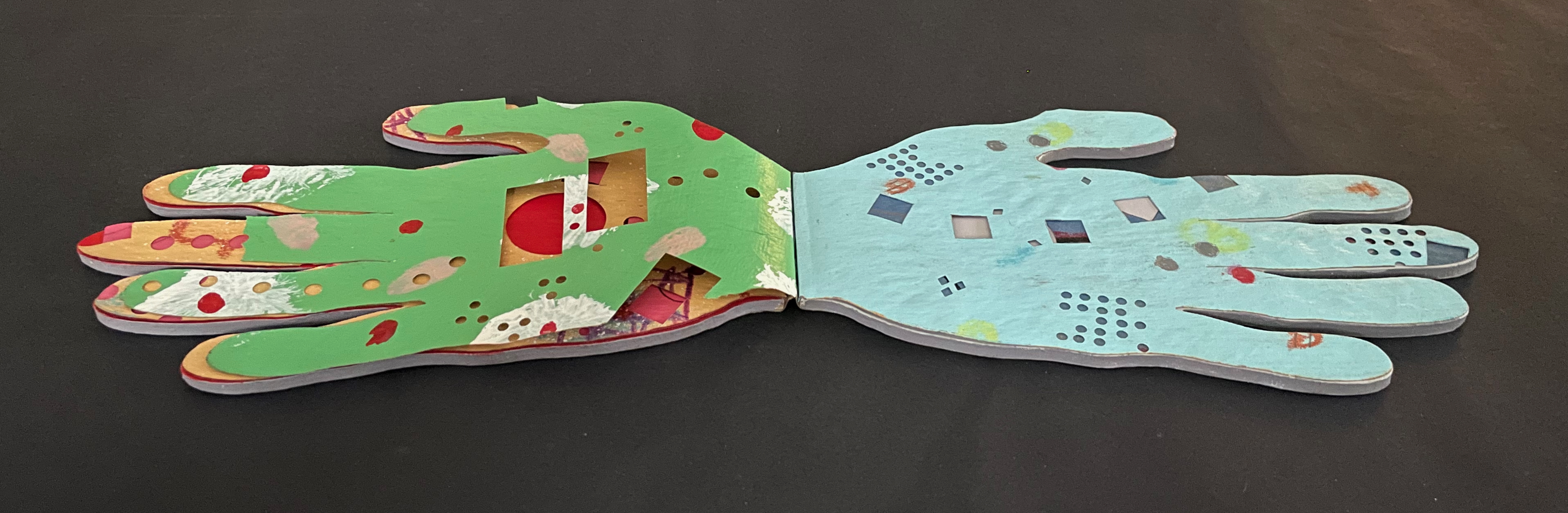
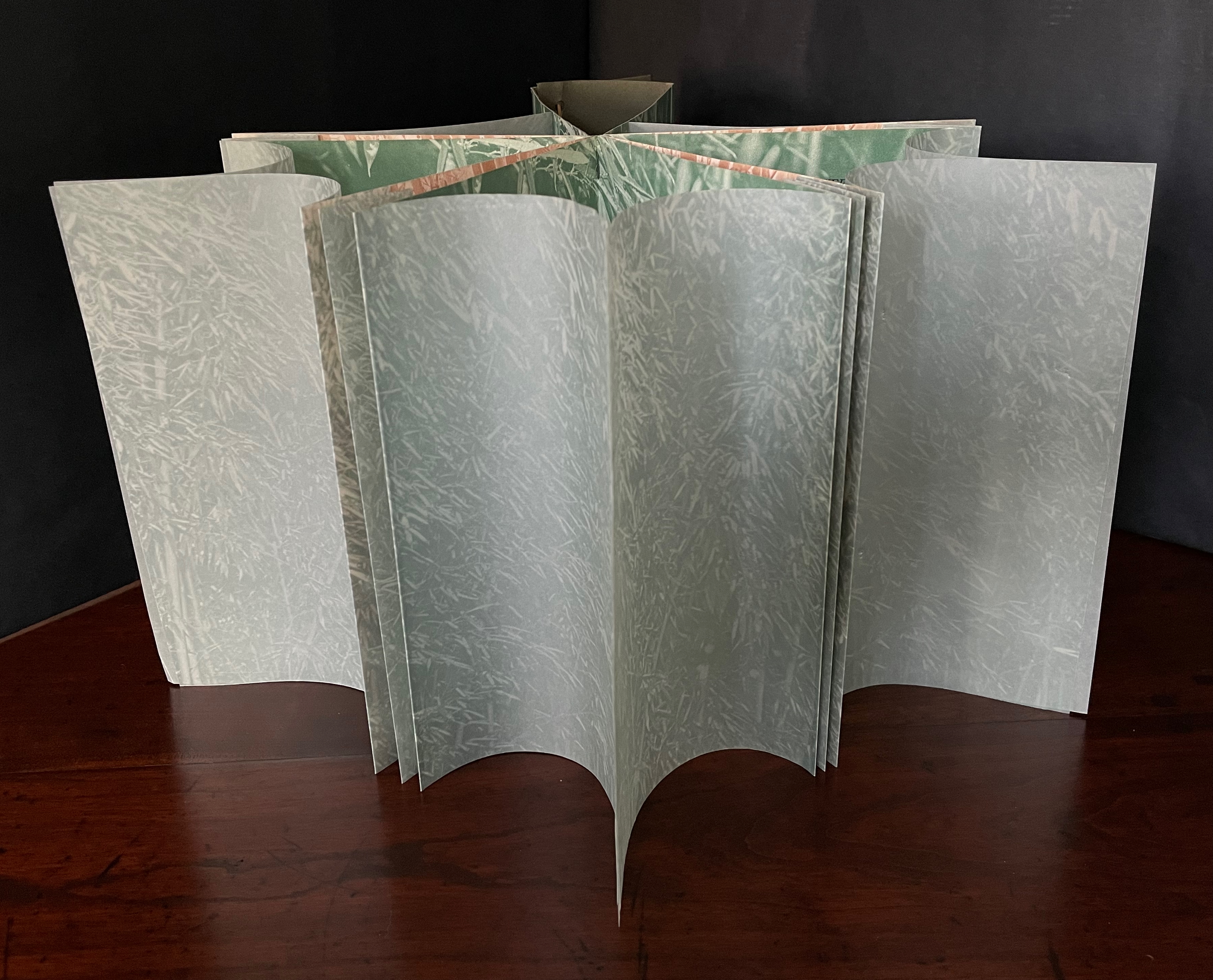
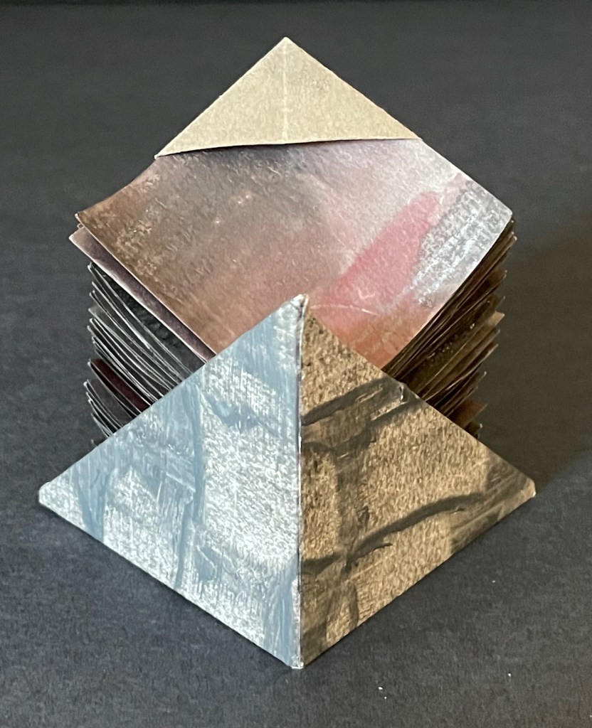
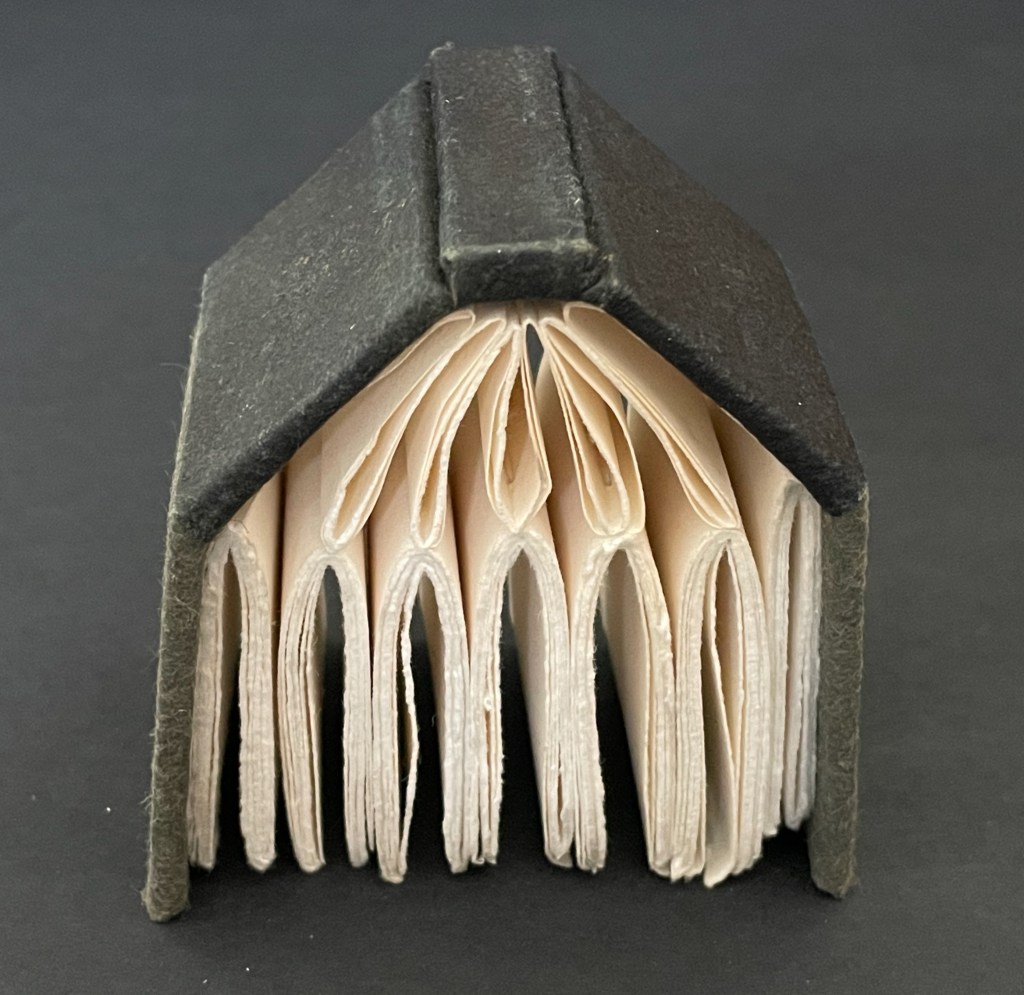
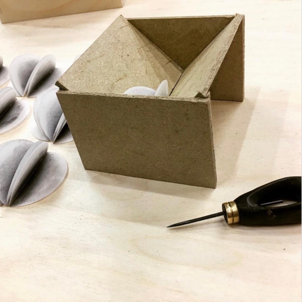
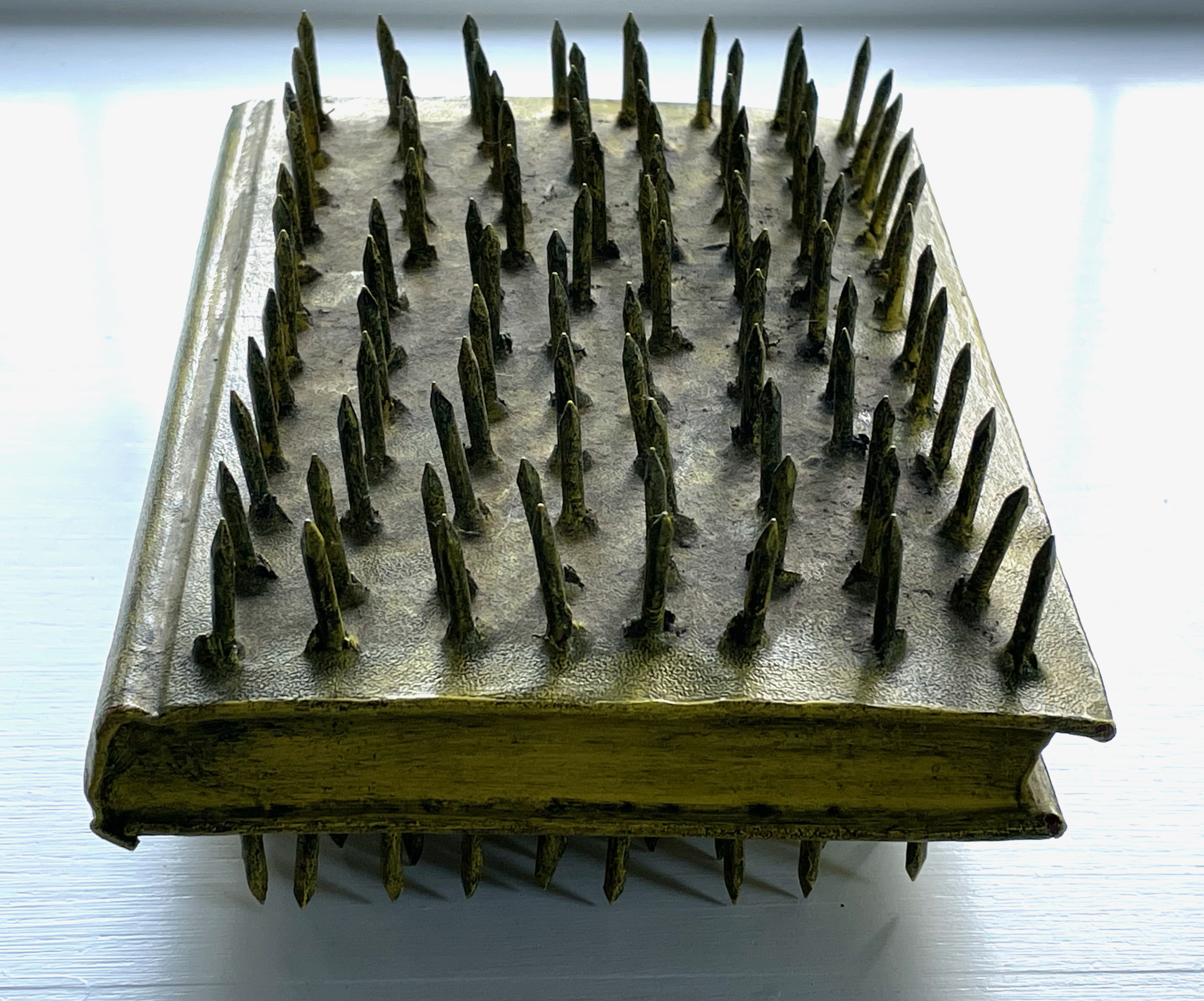
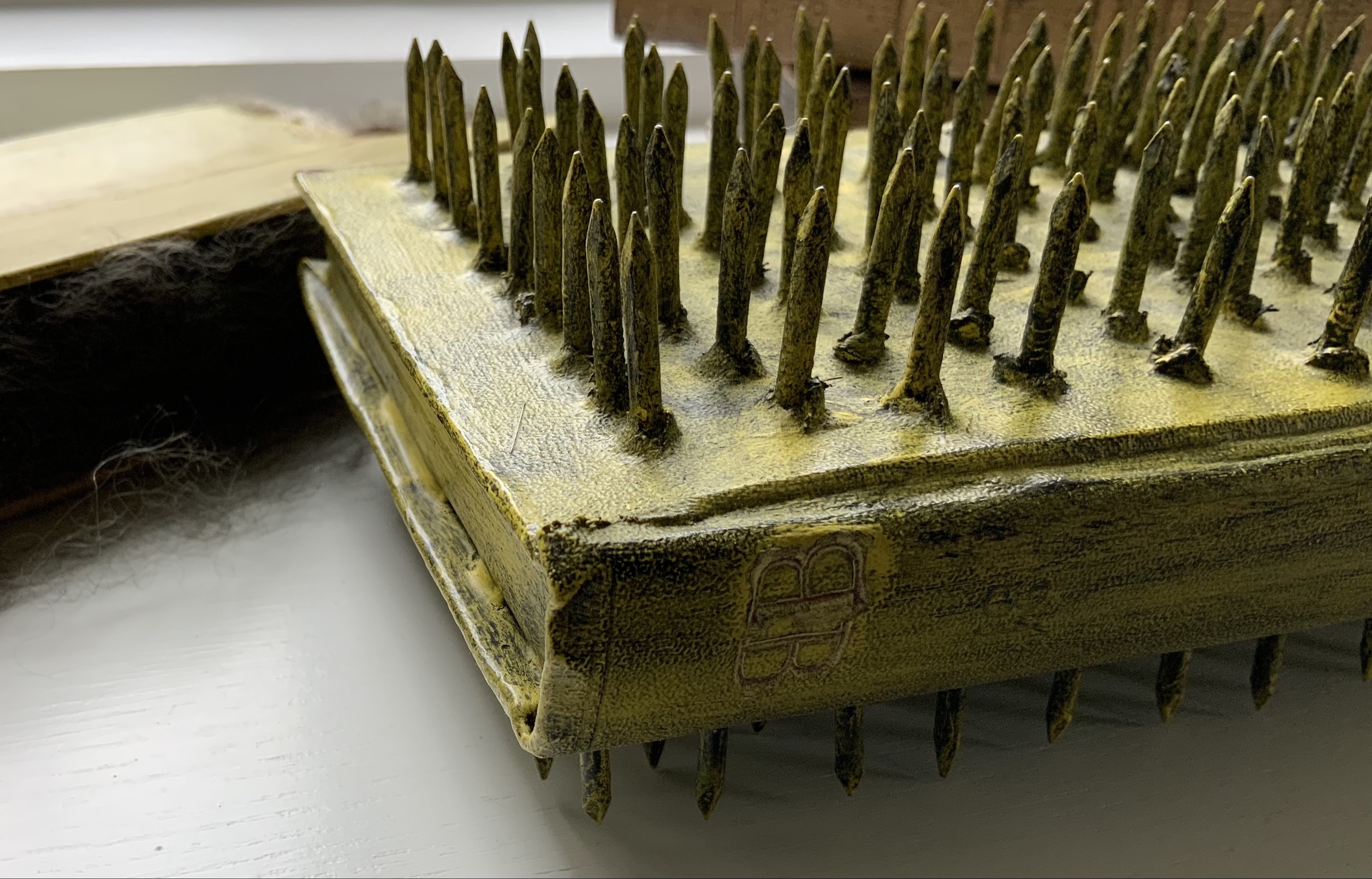
Thin cardboard box; four pamphlet-sewn signatures attached to poster stock cut and folded into four overlapping flaps. Box: H218 x W258 mm; Cover: H210 xW250 mm (closed); Verso signature: H145 x W190 mm (closed); Recto signature: H155 x W190 mm (closed); Bottom signature: H162 x W172 mm (closed); Top signature: H210 x W170 mm (closed). All heights measured along sewn edge. [8] pages to each signature. Edition of 30, of which this is #14/30. Acquired from einBuch.haus, 1 October 2025.
Photos: Books On Books Collection. Displayed with permission of the publisher.
Preceding Architecture is Frozen Music # (2023), which was part of that year’s AMBruno Project, an even more complex and smaller editioned version of Architecture is Frozen Music appeared. In every sense, it was occasioned by exhibitions of the same title. Its cover is even a fragment of an artwork made of poster paper for one of the exhibitions. It exemplifies what Dick Higgins described in 1965 and 1981: intermediality.* It also exemplifies Catugier’s interpretation of the Hansens’ concept of “open form”.

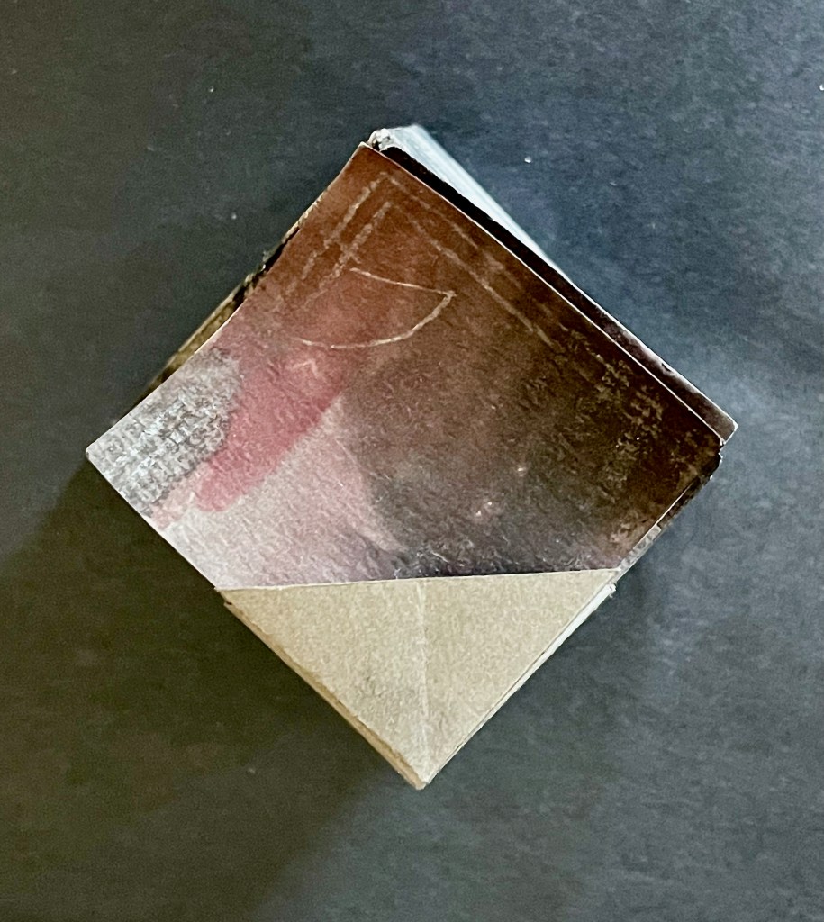
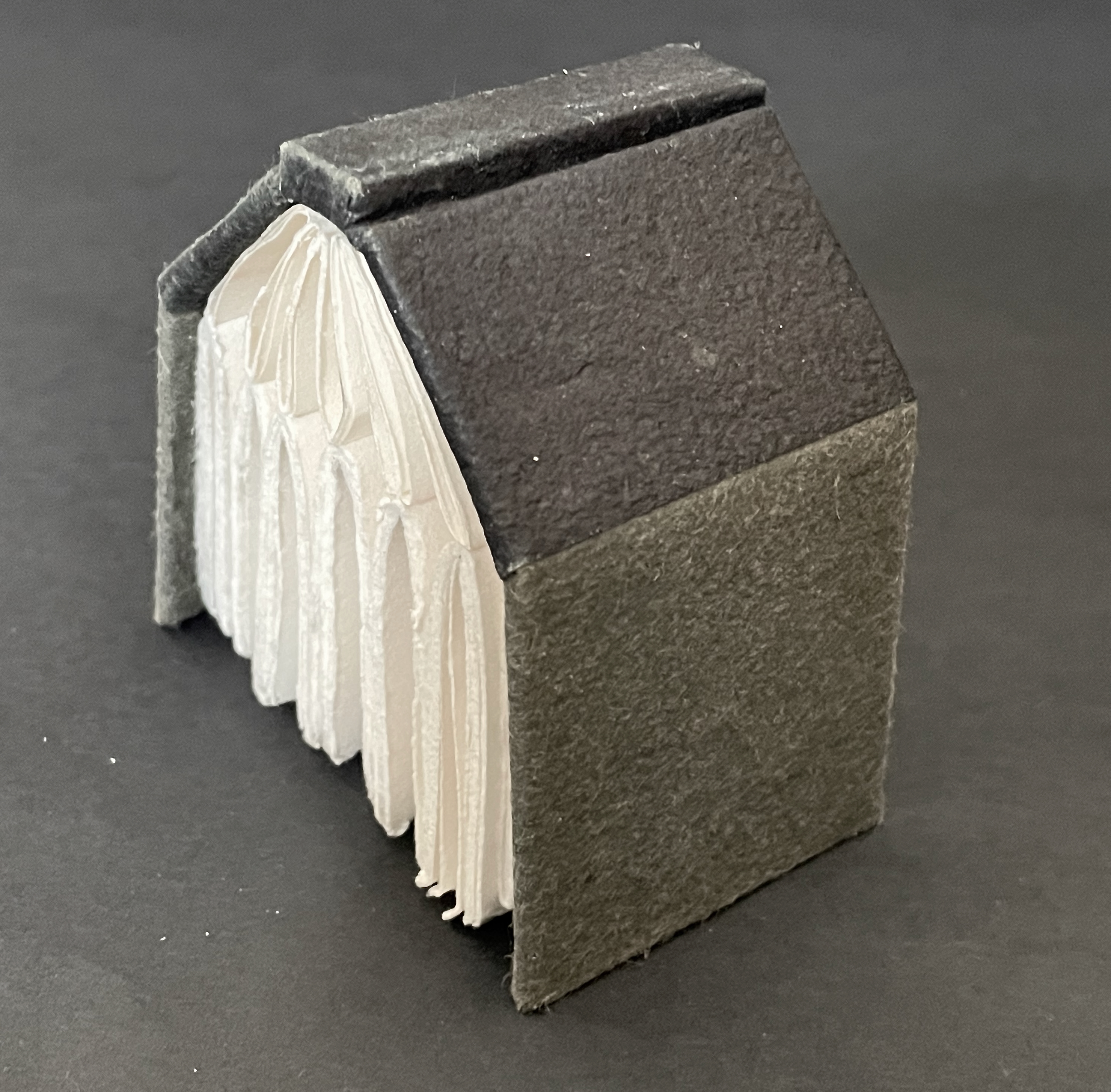
Book closed.
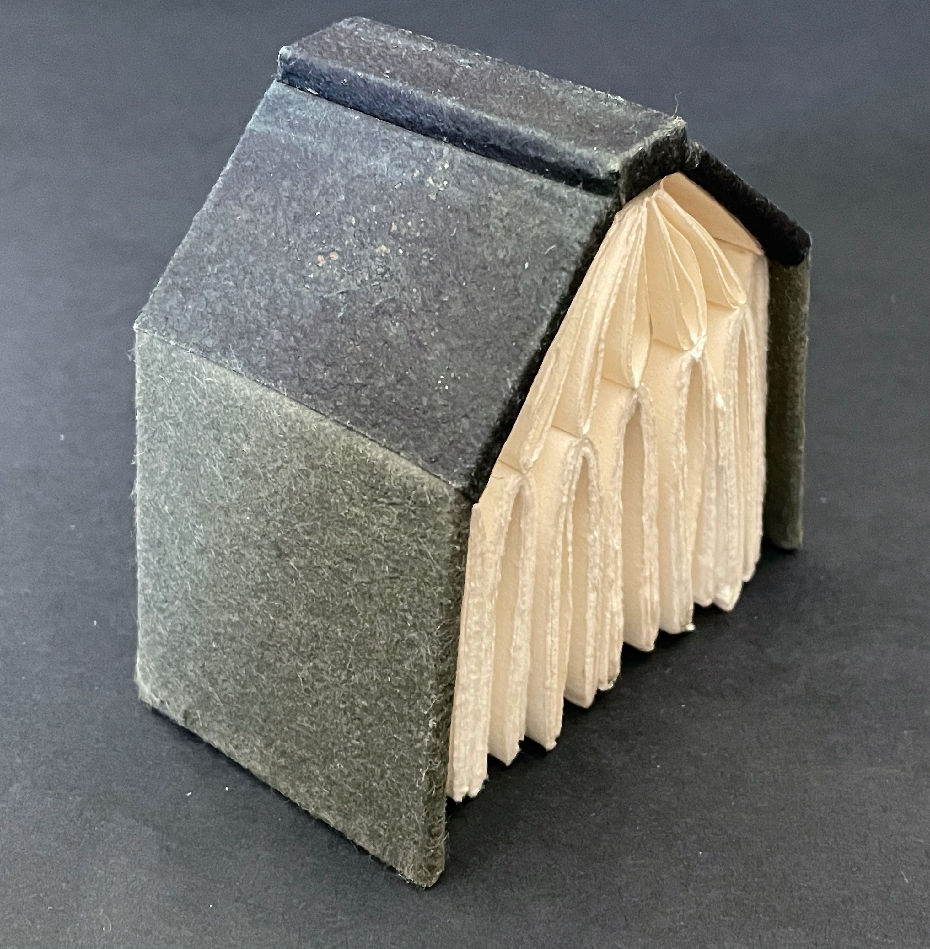
Reverse side of extended cover. Note the binding threads along the four spines/folds.
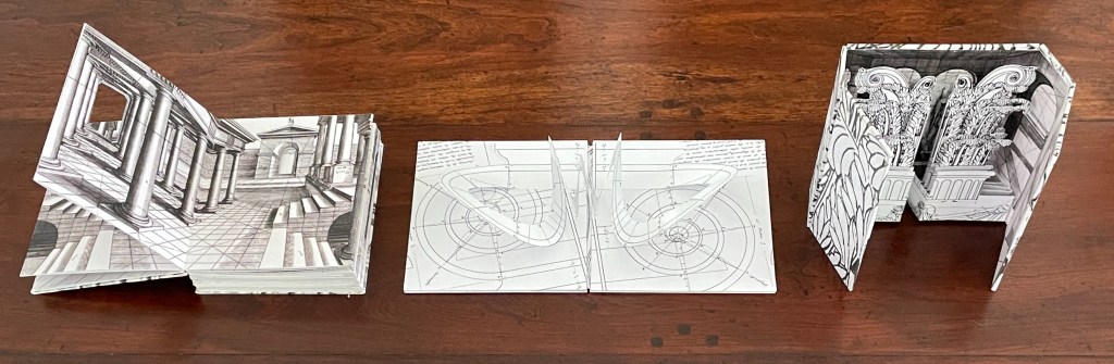
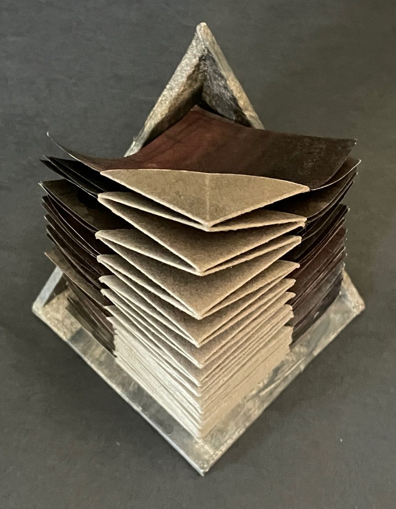
The binding and interleaving of four pamphlet-sewn signatures, each to an edge of the square in the middle of the cover, facilitates this “open form” book. On first opening it, there is, of course, a page on top. To that degree, the artist has imposed a beginning, and once all of each signature’s pages have been turned, there seems to be an end.
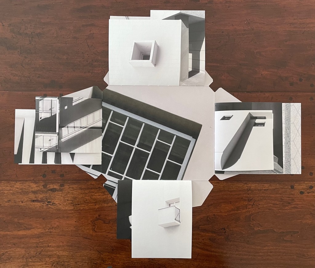
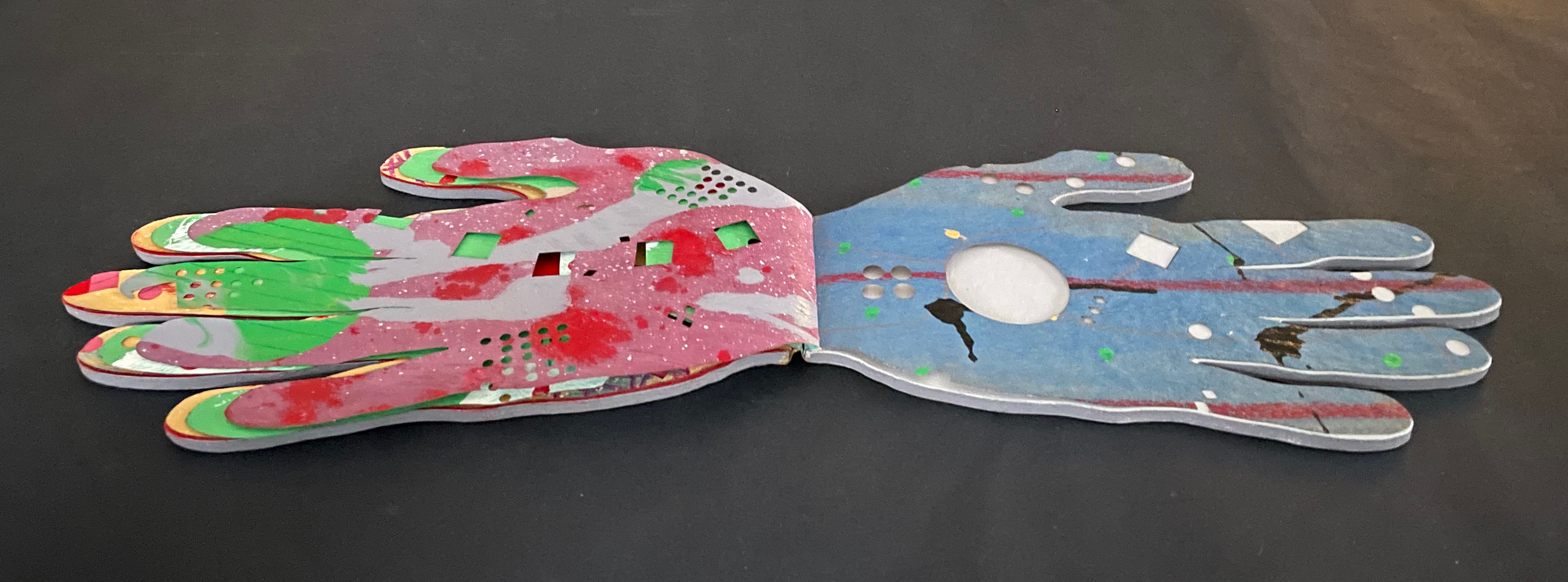
Top: book open to four interleaved signatures. Bottom: All four signatures’ pages turned.
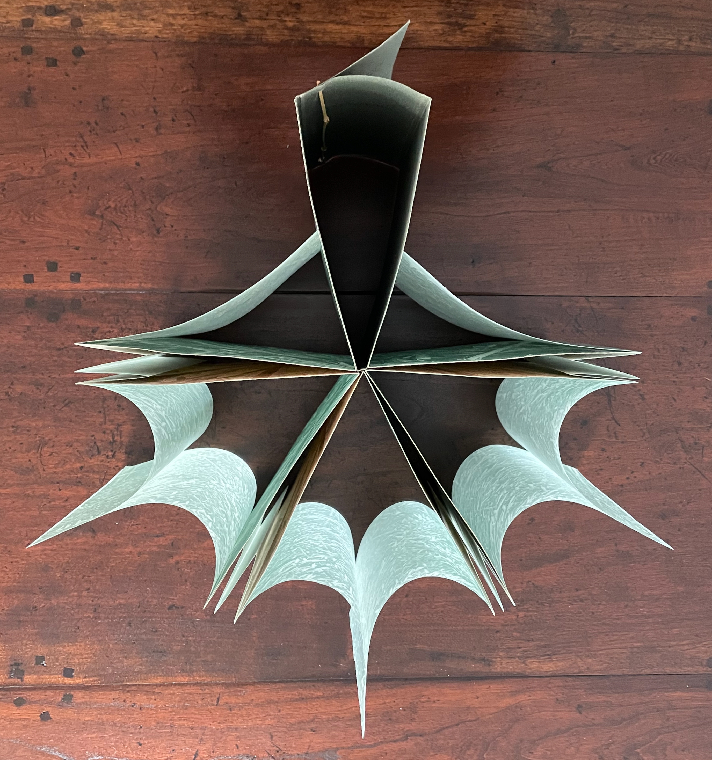
But go back to the opening. Although the structure imposes a first page to turn, it also offers four different orientations the reader could adopt. In the orientation below, the first page turns upwards, but with a 90° reorientation to the left, it would turn as a Western codex is expected to do. Another 90°, and the first page would turn downwards. And with a third 90°, it would open as an Eastern codex is expected to do.
We might turn to the idea of the fugue as a rough analogy for this particular “open form” book. A fugue generally has a “subject” (or main theme), an “exposition” in which voices or instruments each play out the subject, then an “episode” (or connecting passages) that builds on the previous material, then further alternating “entries” in which the subject is heard in related keys until a final entry that returns to opening key. Like the fugue, Catugier’s “open form” book is more a style of composition than a structural form.
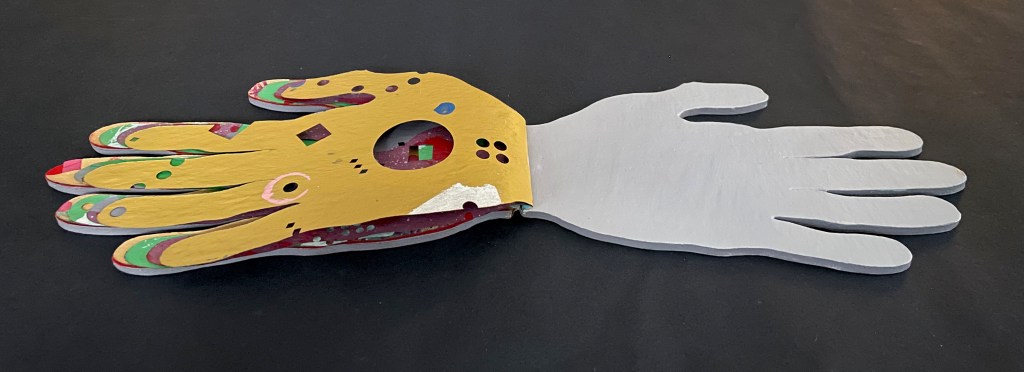
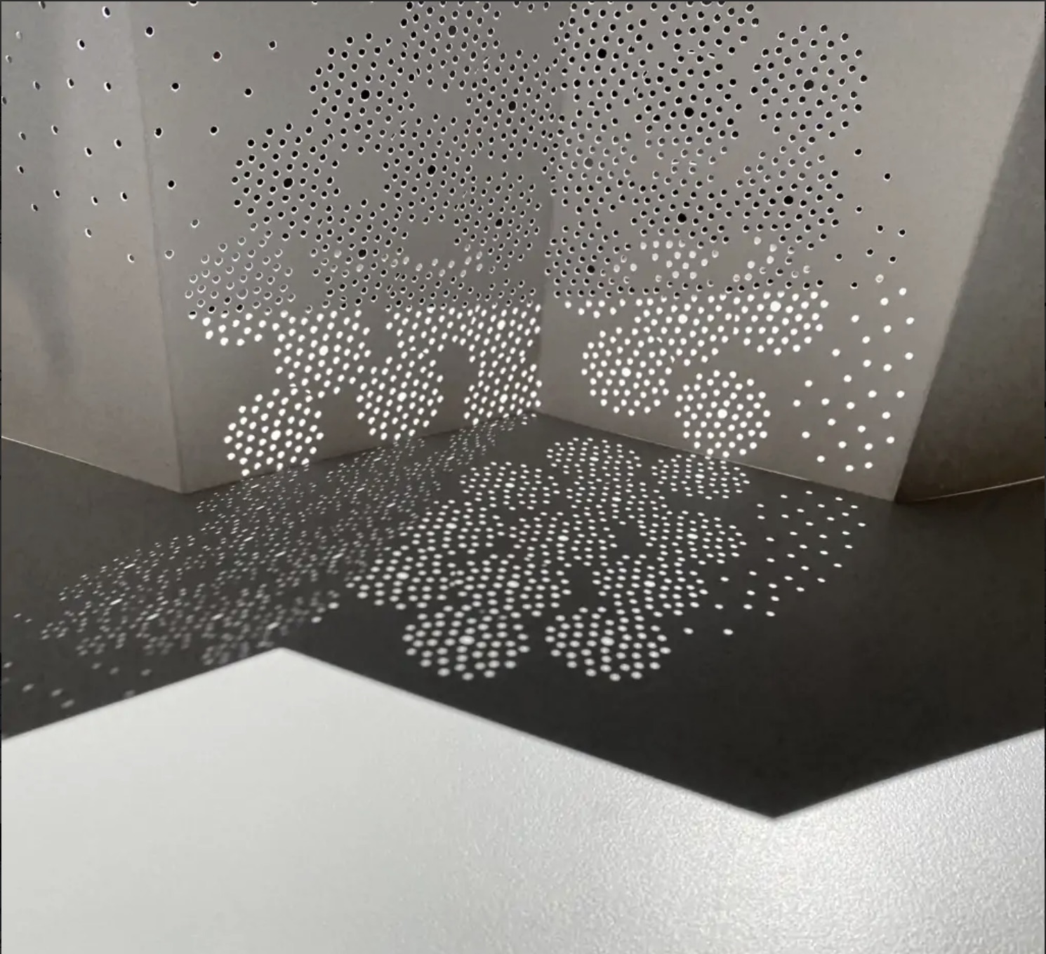
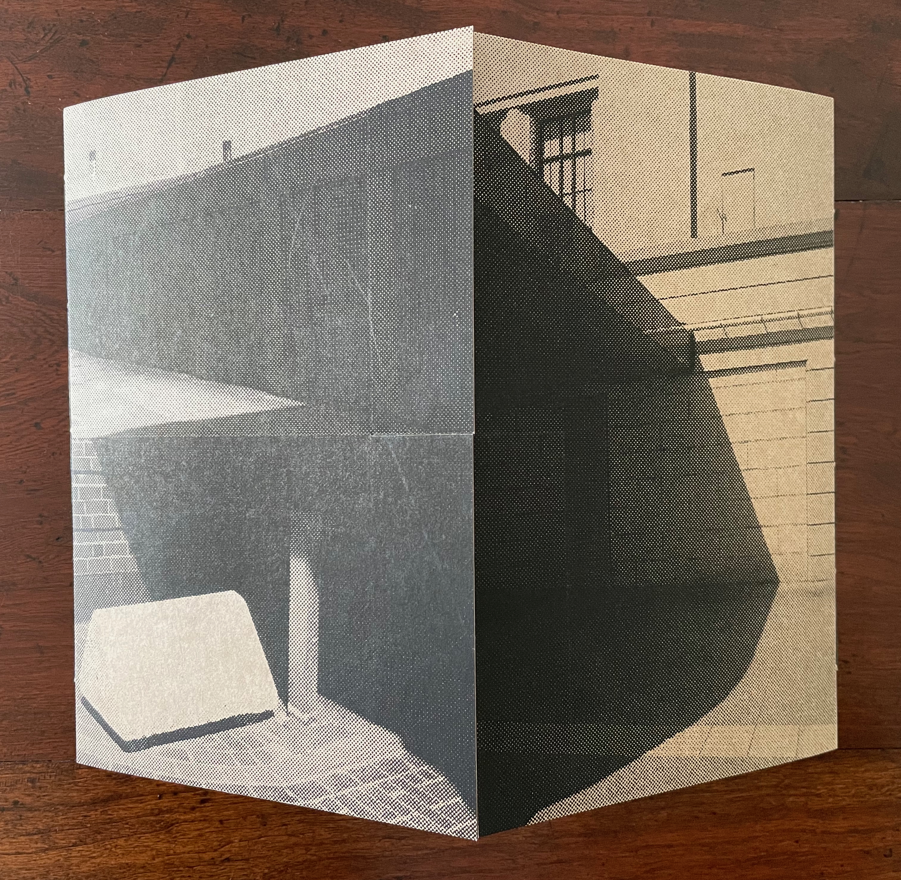
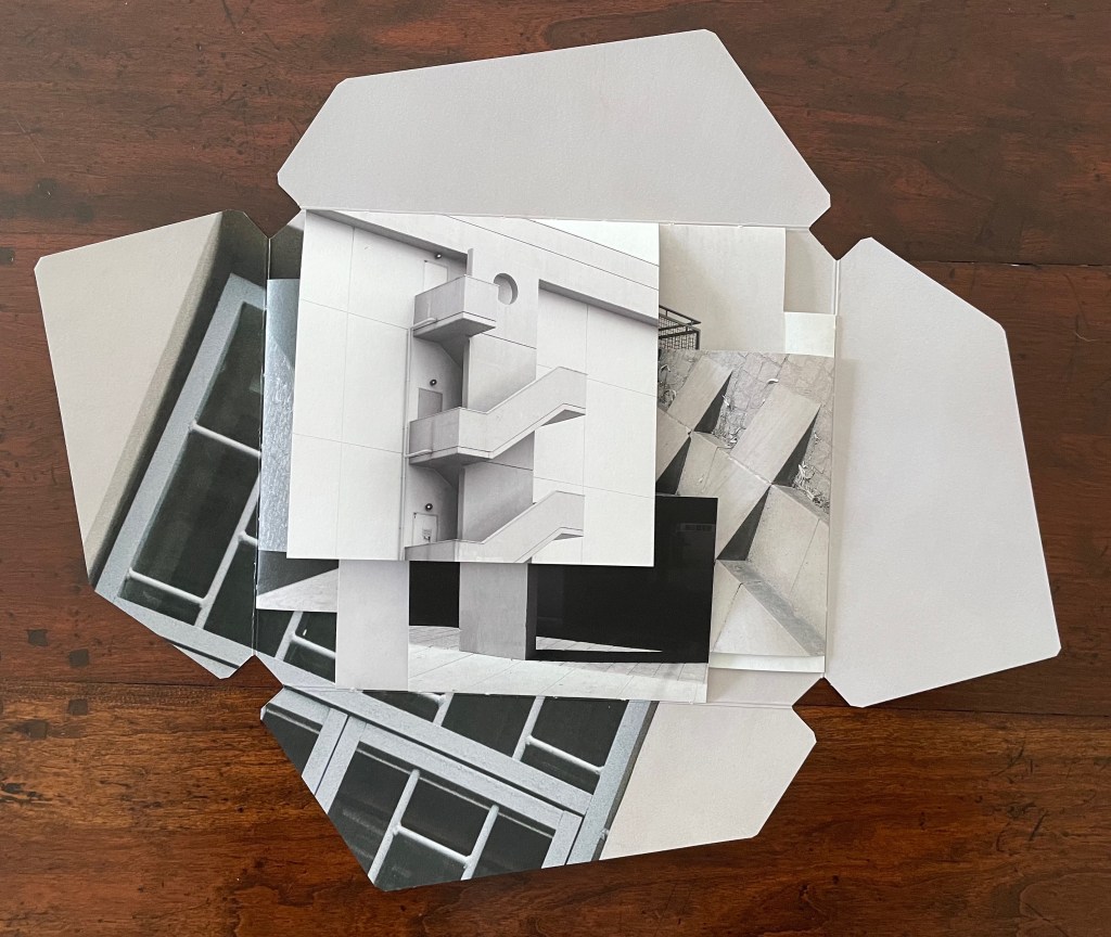
Catugier’s main theme is “architecture is frozen music”. Her technique of dynamic collages creates a “fugal” effect with at least six elements or motifs or voices. One is the architectural motif (balcony, window, stairs, vents, or even furniture such as a chair) displayed. Another is the source or direction of light. Another is the alignment of shadows cast by the architectural motifs. Another is a geometric motif arising from the motifs of architecture, light, and shadow. Another is the dimension of the folios in the signatures. And yet another is the position of the signatures along the spines.
Below in the opening of the book, the architectural motif of an external staircase “sounds” out the subject on the first page. The geometric voice picks out a circular opening atop a rectangular column crossed by parallelograms ending in square balconies. The voice of signature placement aligns and extends the rectangular column with another column on an underlying signature’s top page. When the first page is turned (upwards), the voices of folio dimension, direction of light, and shadows come into play, and we find that the underlying column has been truncated and is perpendicular to a bright column of light on a wider structure receding into shadow. The architectural voice counterpoints the perpendicular columns with stairs slanting away from them at 45°. When the bottom signature’s top page is turned (downwards), those stairs are almost fully “sounded” on the right while the balconies motif returns in the downturned bottom signature.
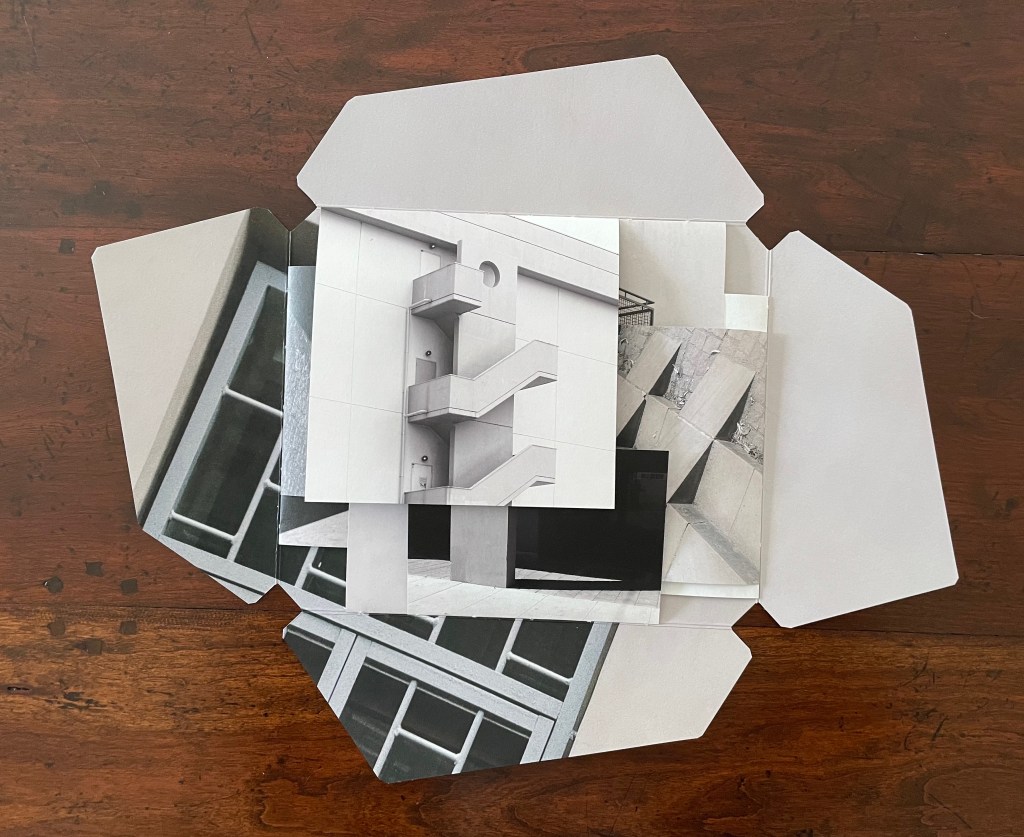
Left: book open to four interleaved signatures. Right: top signature’s first page turned (upwards).
The balconies motif increases in volume as the left signature’s top page turns (leftwards) to display a balcony grating and reveal another balcony in the center.
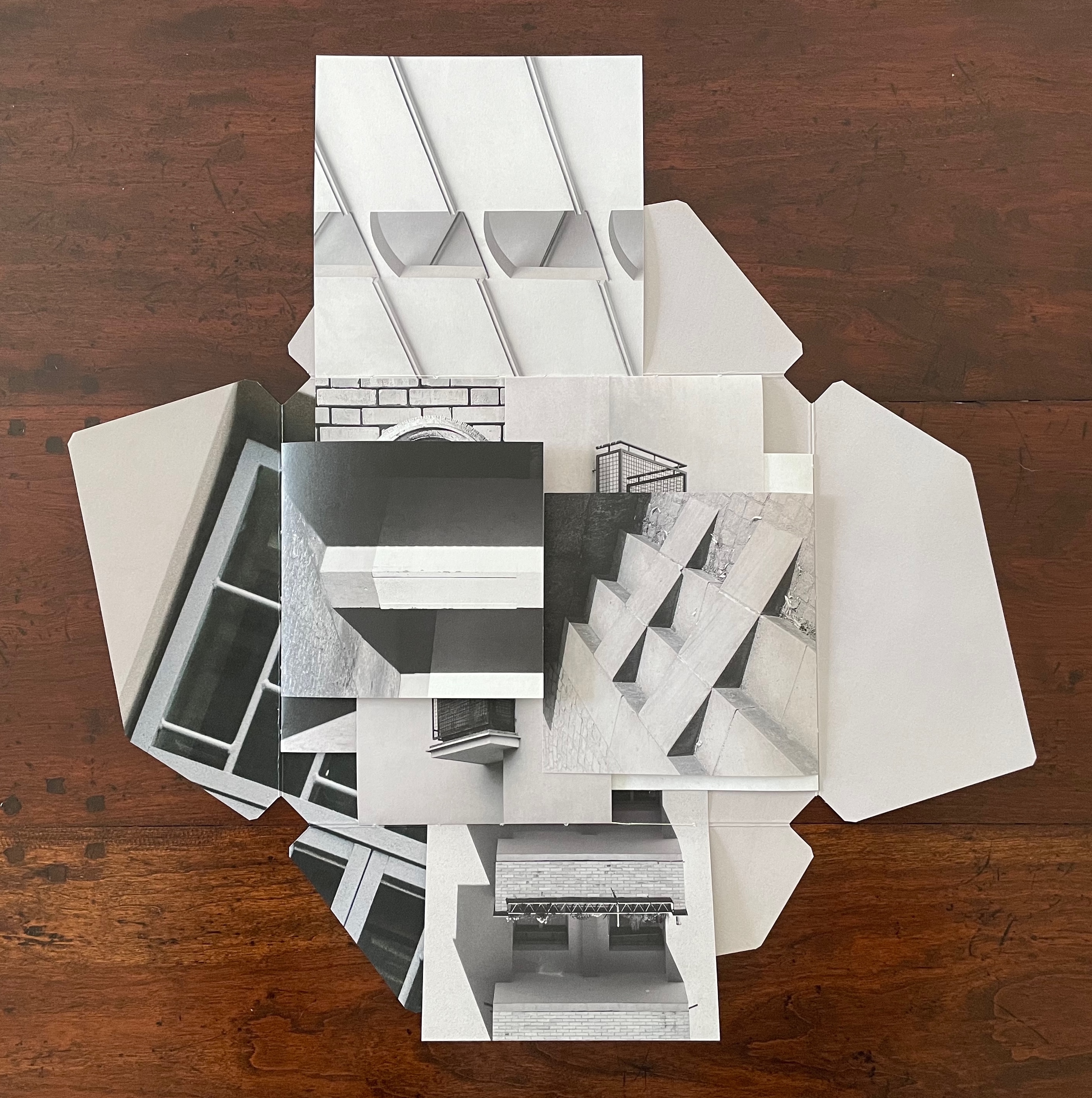
Left: bottom signature’s first page turned (downwards). Right: verso signature’s first page turned (leftwards).
From the view on the right above to the view below, the turning of the right signature’s top page (rightwards) reveals two more balconies. We now have a passage of balcony motifs moving from left to right like musical notes on a score.
Recto signature’s first page turned (rightwards).
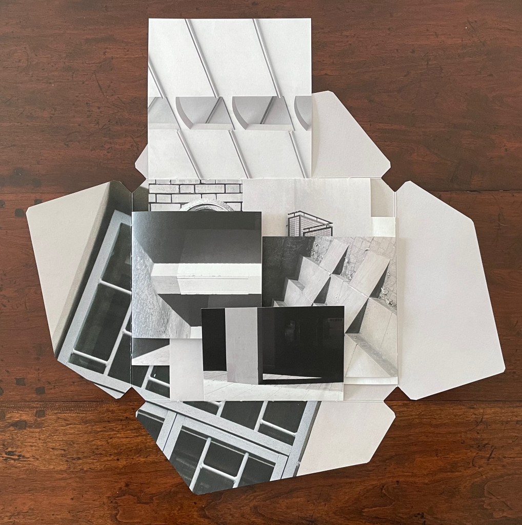
The spread below provides an example of the geometric motif at work. In this view, the center of the open book presents a circular ornament, rectangles of bricks, window squares in a shadowed door, and a small triangle of shadow to the ornament’s lower right. In the overlapping pages above the center are small triangles and arcs alongside rectangles and squares. Below the center are a large broken circle of light on a black square page, and, beside that, the truncated rectangles of a balcony. The geometric parallels running from the top, the center, and to the bottom are matched by another set of geometric parallels formed by stair-stepping shadows moving from the left signature, across the center in the bricks, and onto the right signature’s shadows in the steps leading to the door. Across the harmonizing center, the top and bottom of the open book perform a counterpoint of breaking geometric forms to the theme of stair-stepping shadows from left to right.
Geometric motifs.
There are as well, of course, geometric parallels between the top and left, the bottom and left, and between the top and right, and the bottom and right, but enough of verbal description of the visual music. Each of the signatures and motifs can be “heard” in its own right. Likewise, each view of the open book can be “heard” in its own right. And likewise, as each page turns, new harmonies and counterpoints can be “heard”. It all leaves us with the question to be debated, to paraphrase Douglas Hofstadter’s reflection in the “Ant Fugue” chapter in Gödel Escher Bach: Is the book more than the hum of its parts? What is certain is that, in bringing together architecture, music, photography, and the book, Architecture is Frozen Music offers an exceptional example of the artist’s book as intermedia.
*“Intermedia” is a term adopted by Dick Higgins from Samuel Taylor Coleridge in 1812 used “to define works which fall conceptually between media that are already known” but useful to Higgins in demystifying the avant-garde.
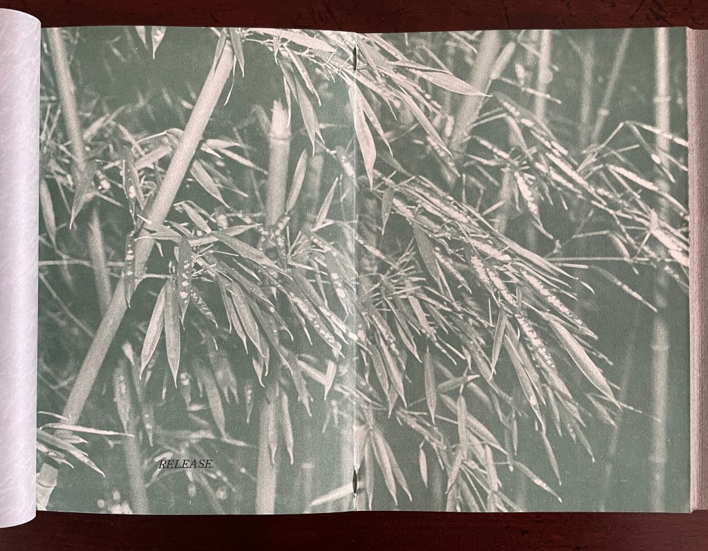
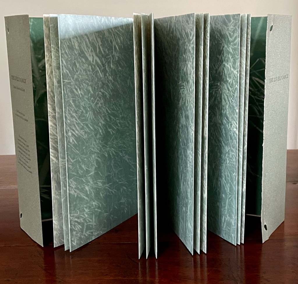
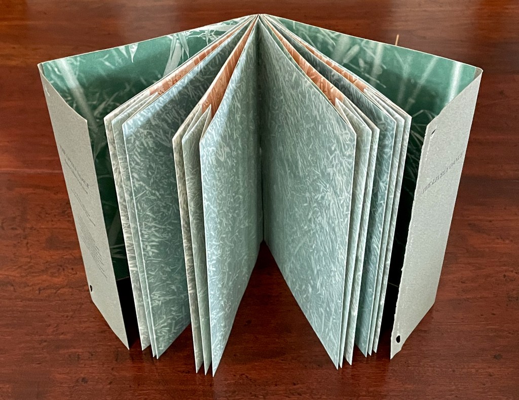
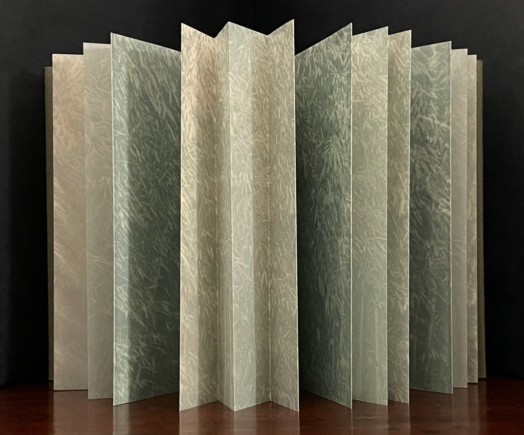
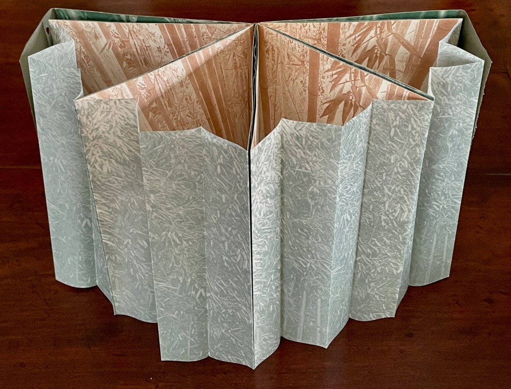
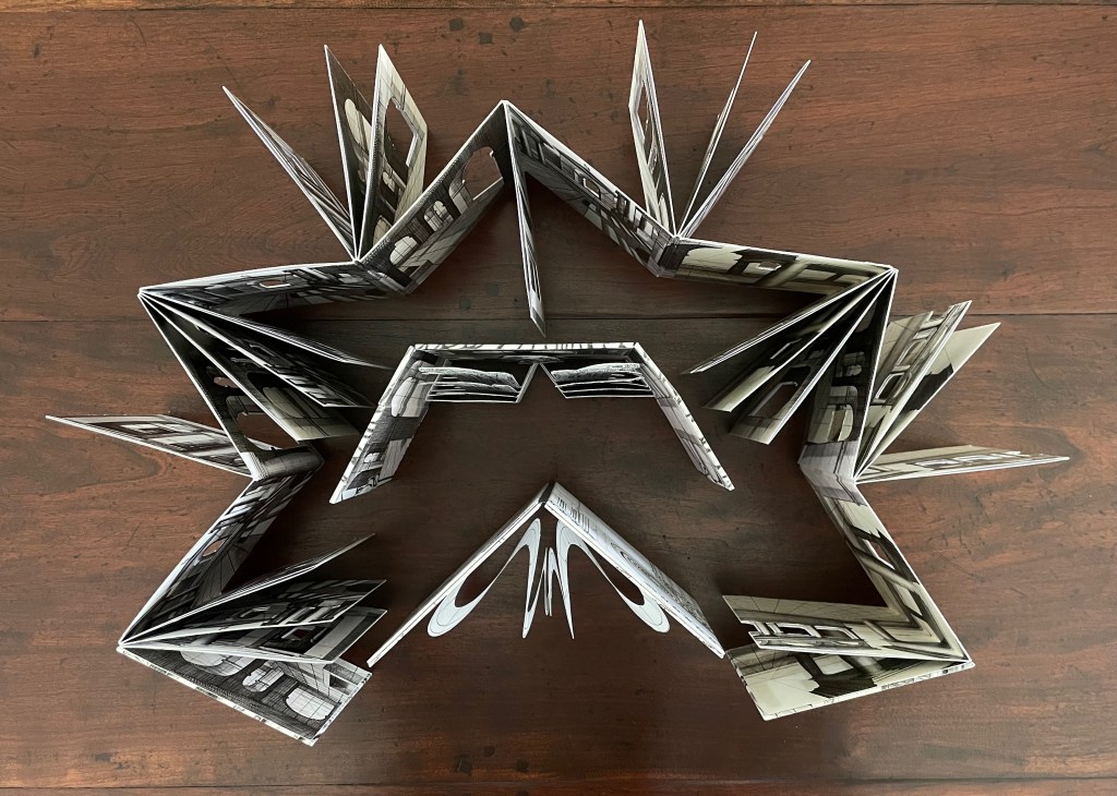
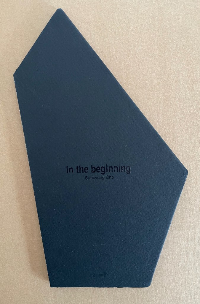
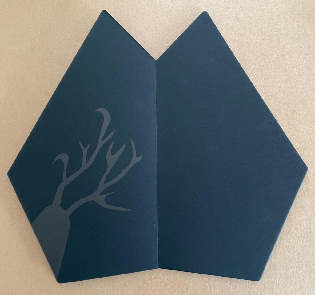
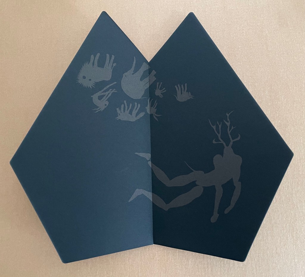
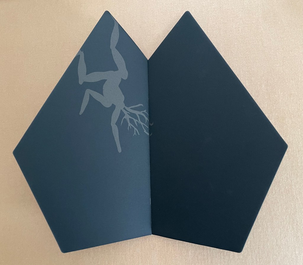
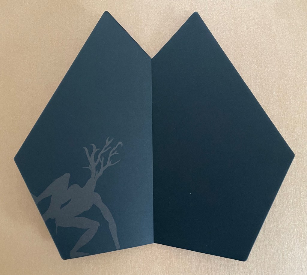
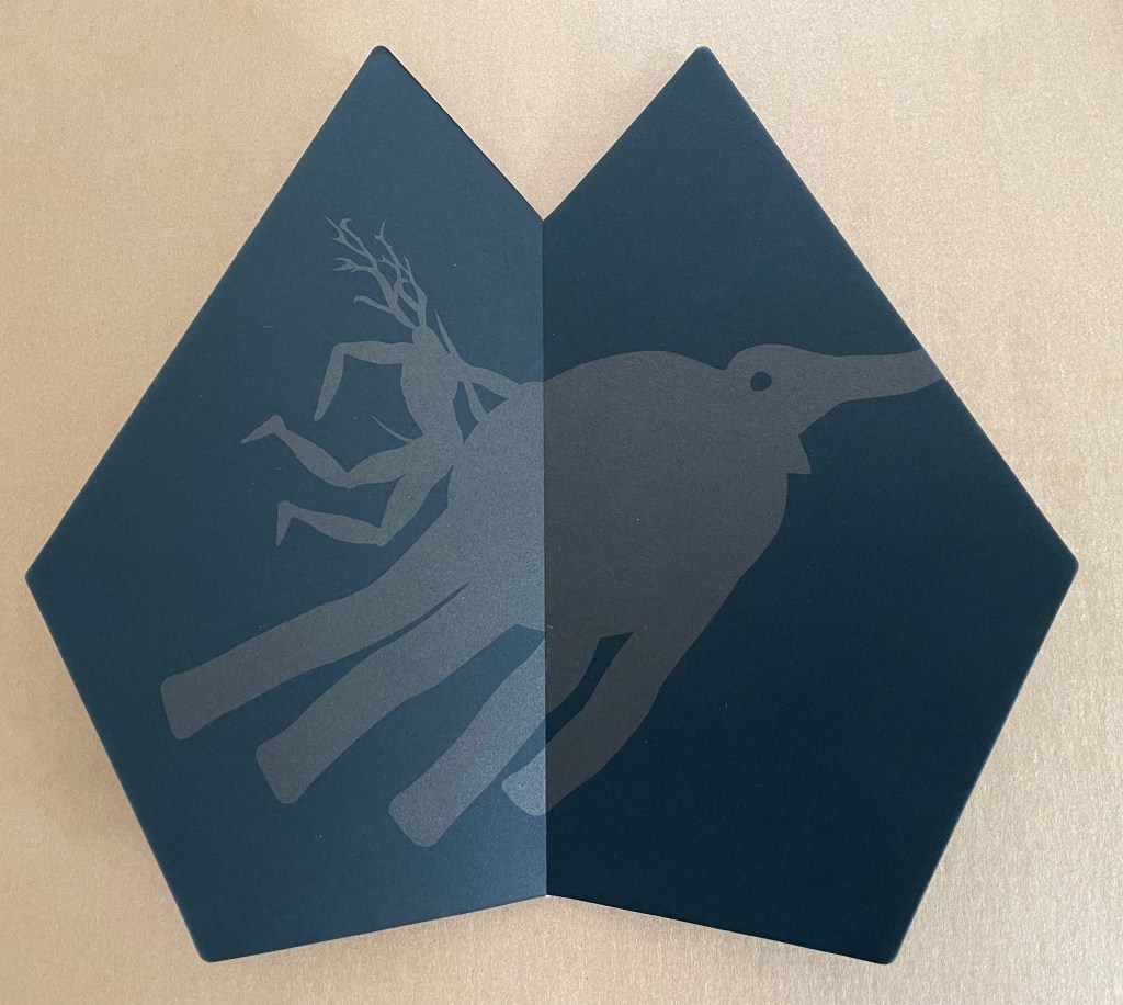
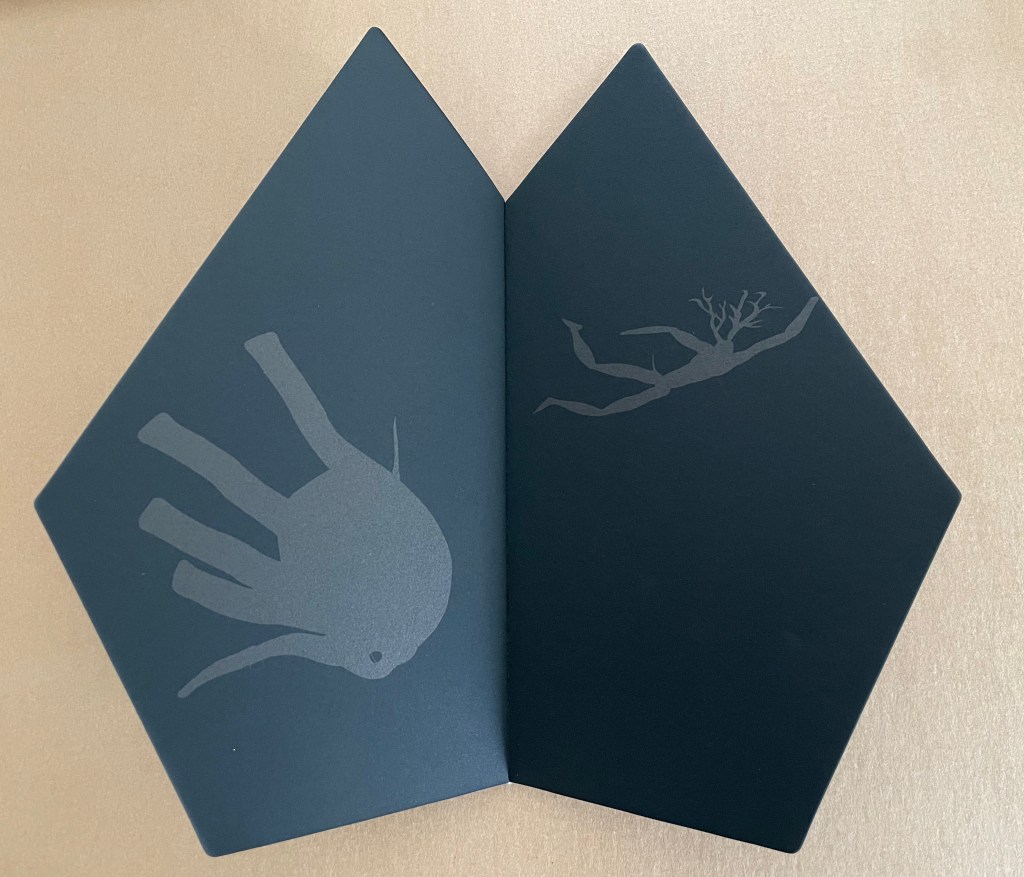
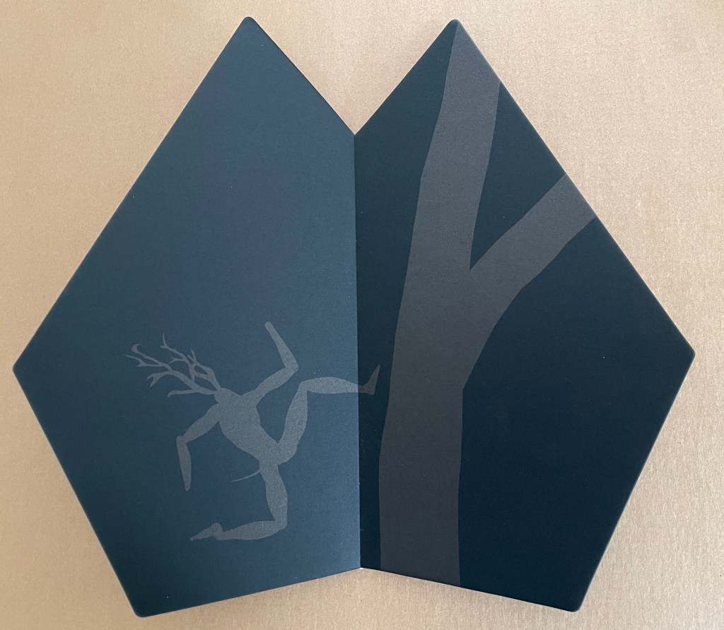
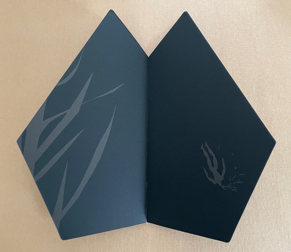
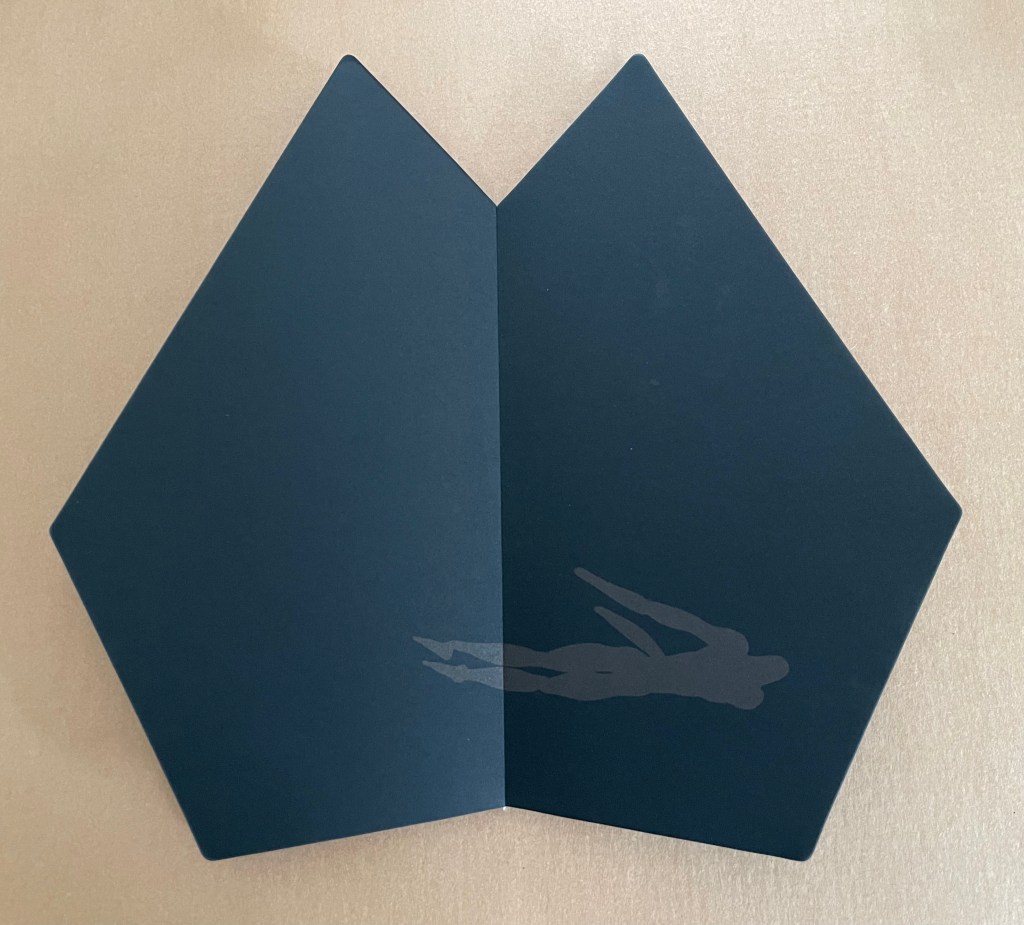
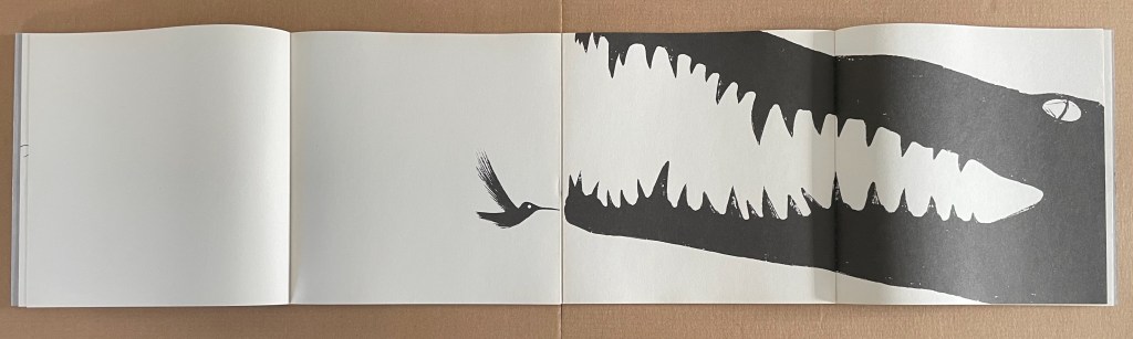
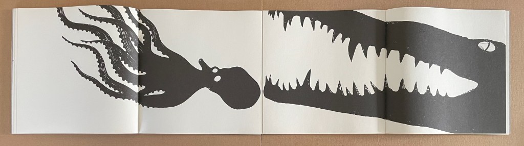
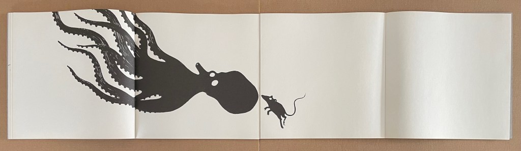
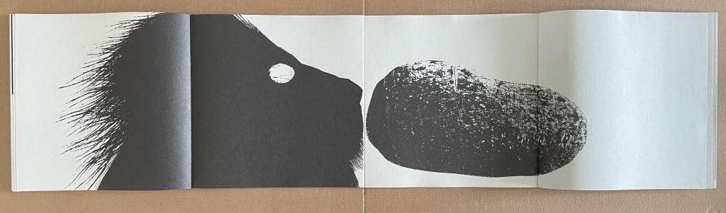
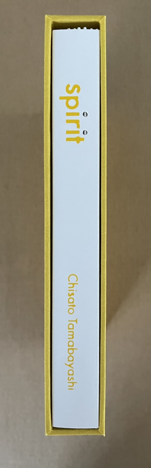
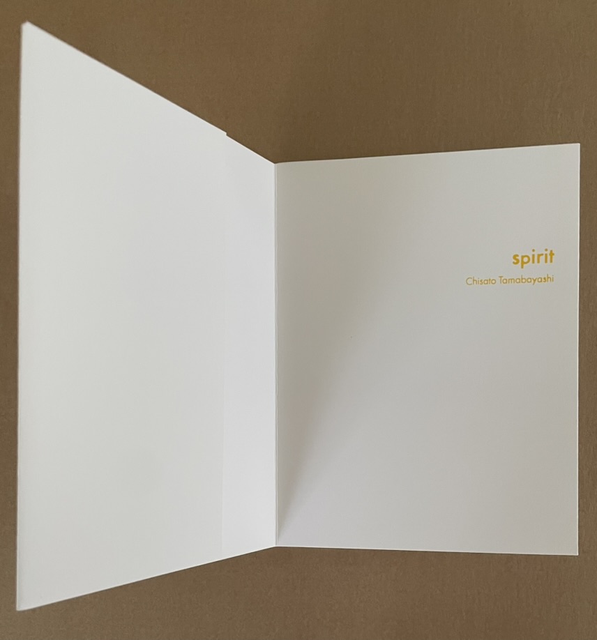
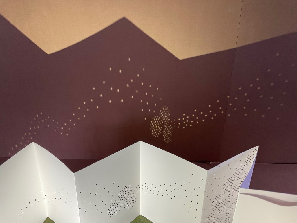
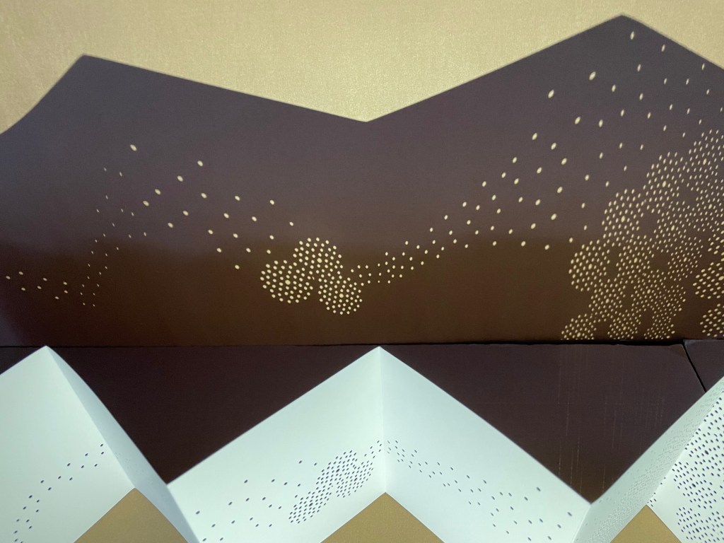
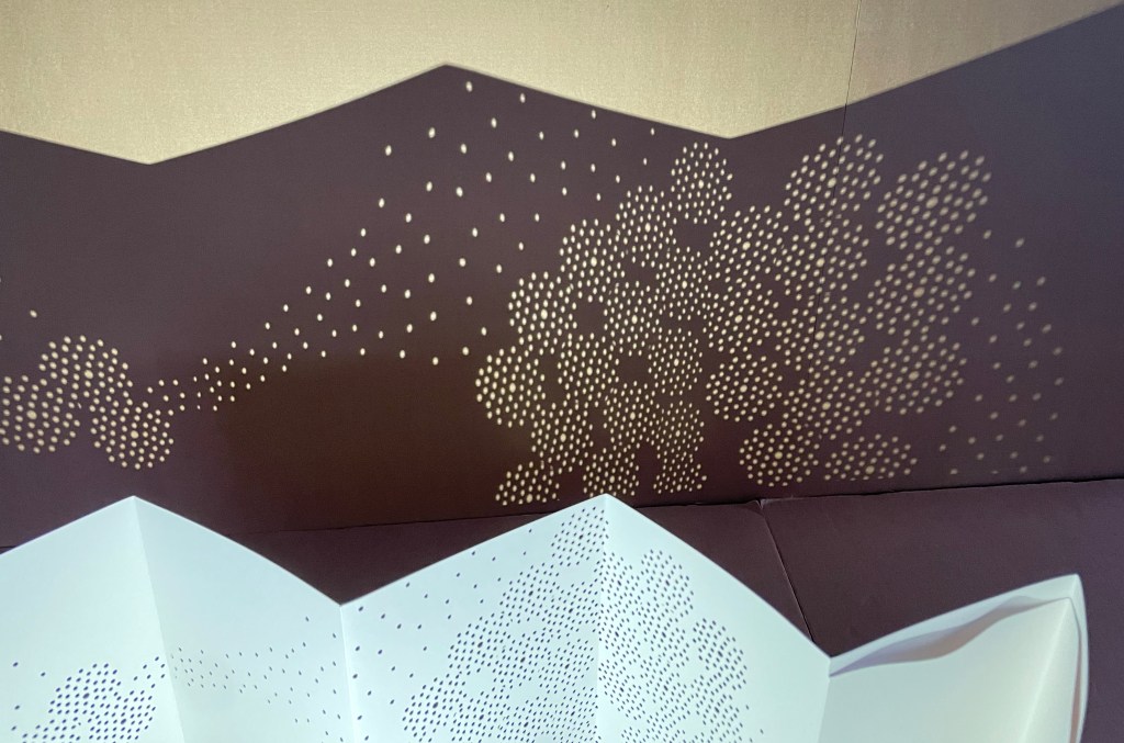
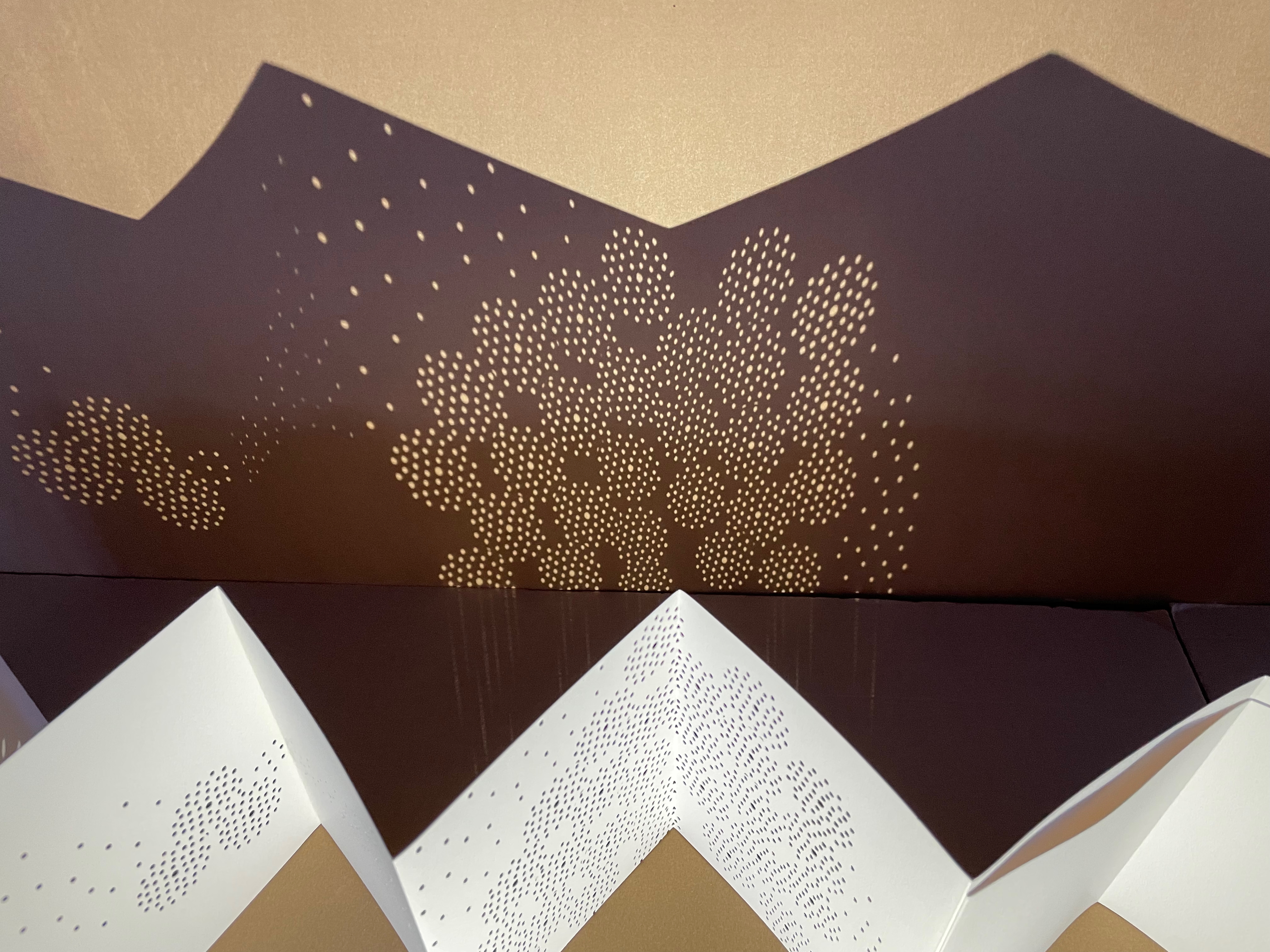
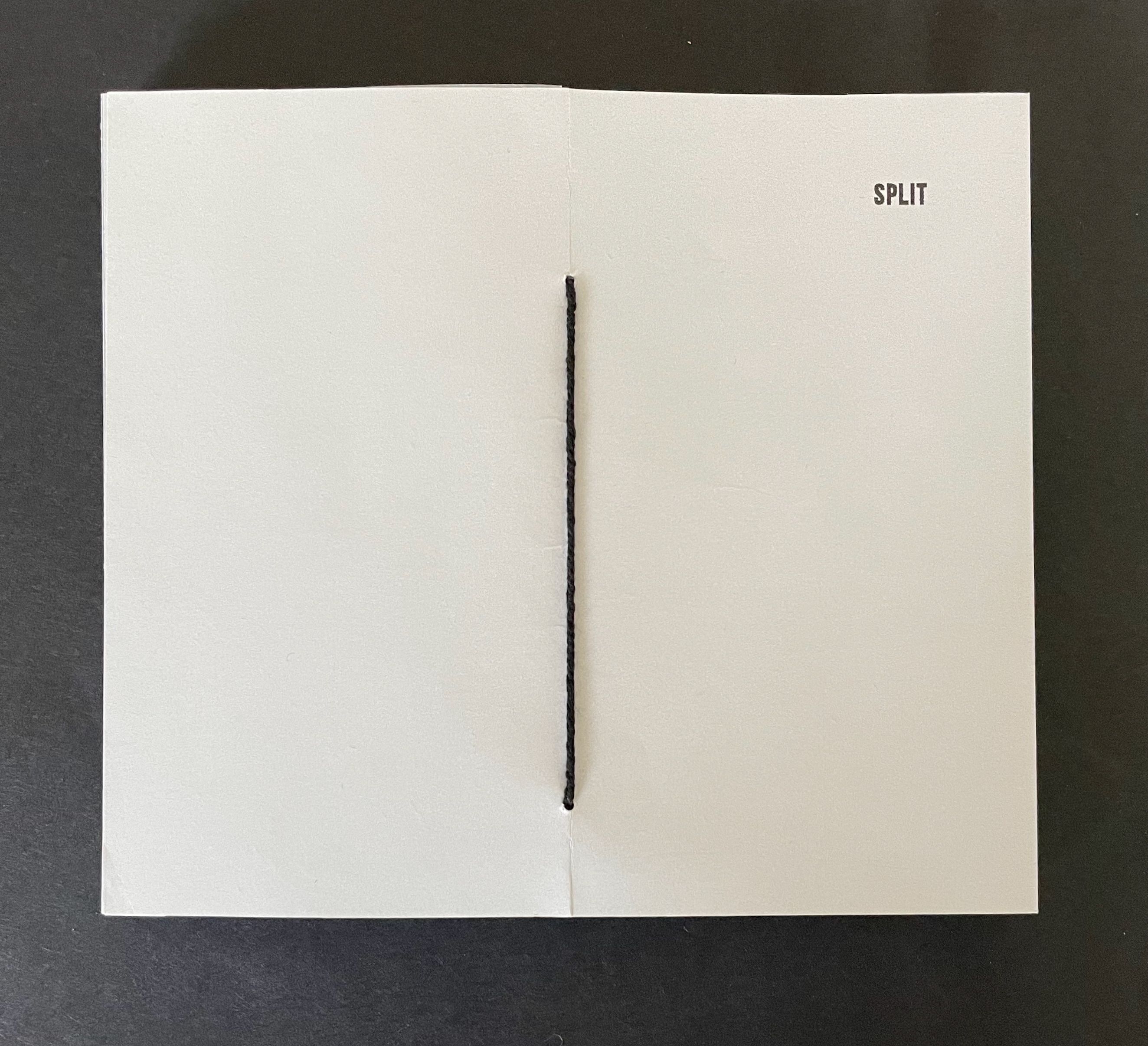
Split (2025)
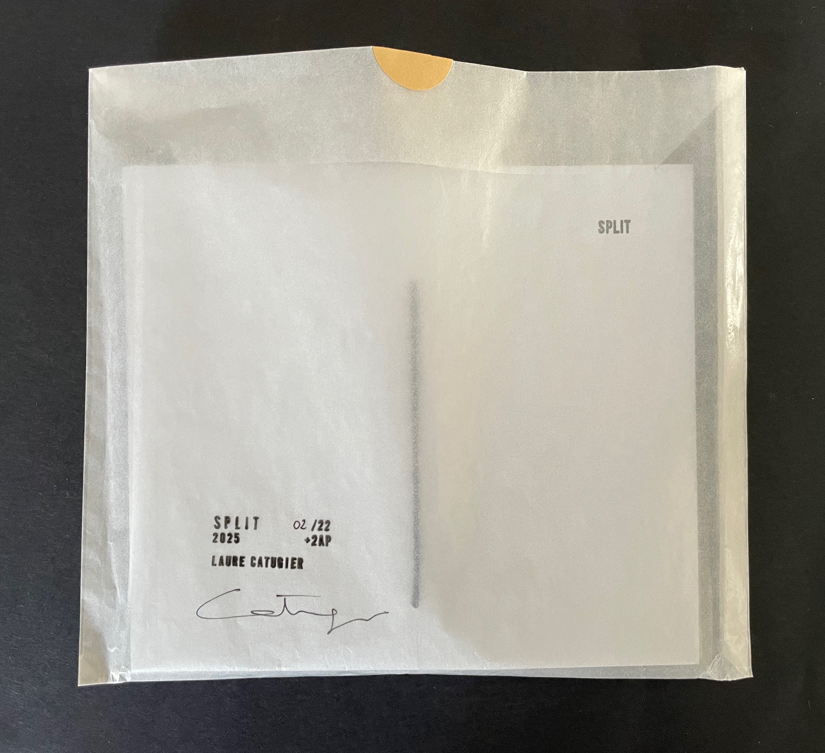
Split (2025)
Laure Catugier
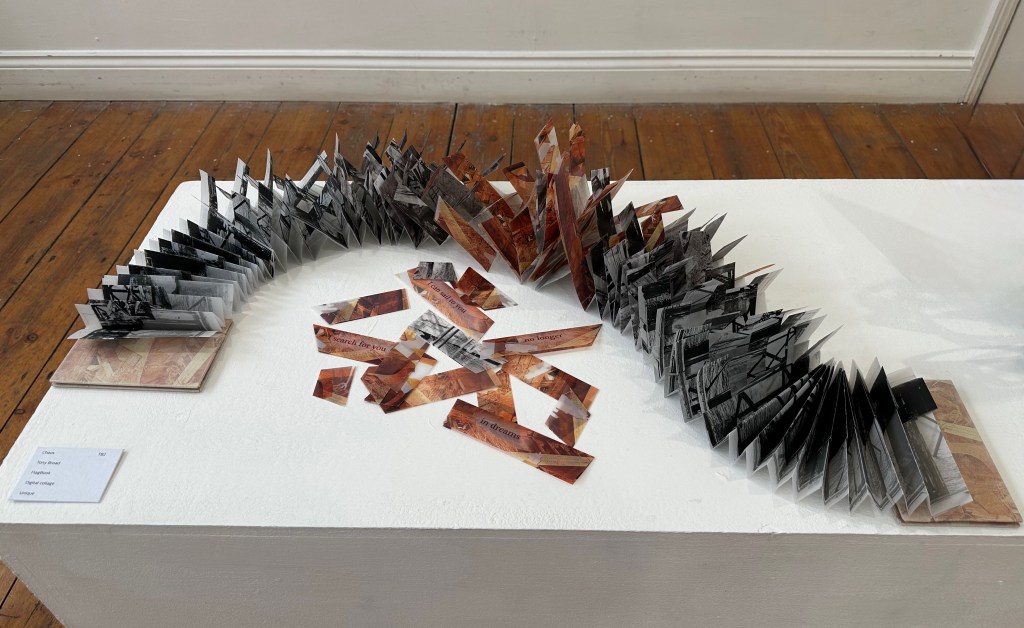
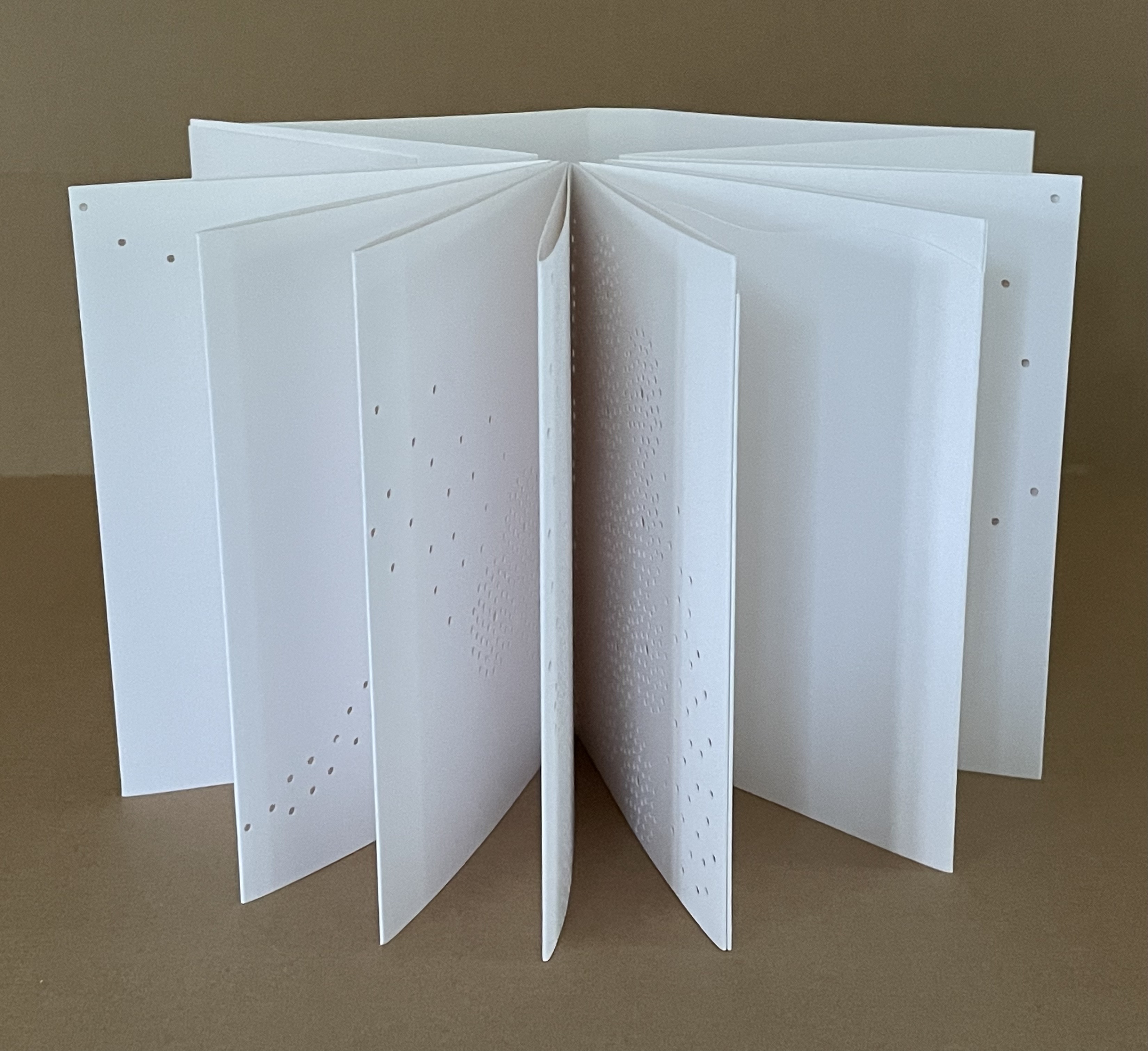
Pamphlet-sewn star book. H170 x W150 mm. [32] pages.Edition of 22, of which this is #2. Acquired from einBuch.haus, 1 October 2025.
Photos: Books On Books Collection. Displayed with permission of the publisher.
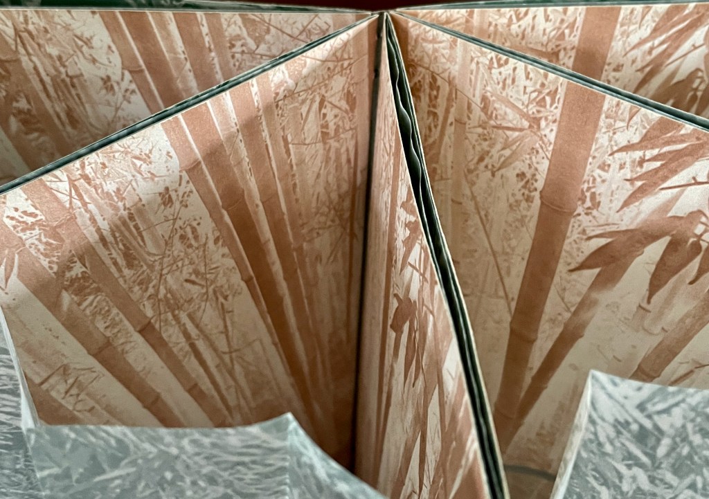
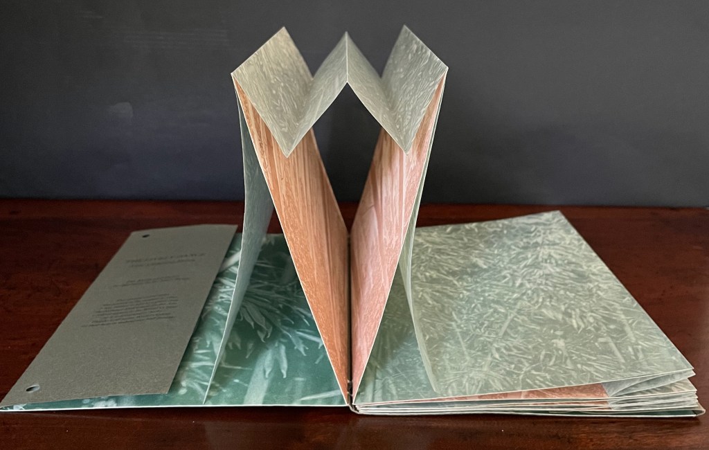
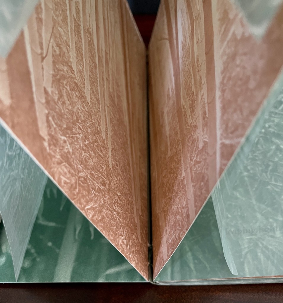
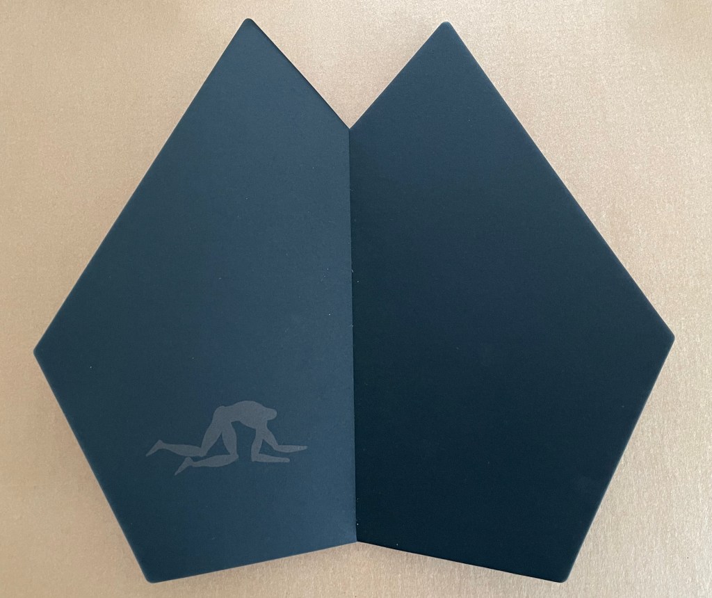
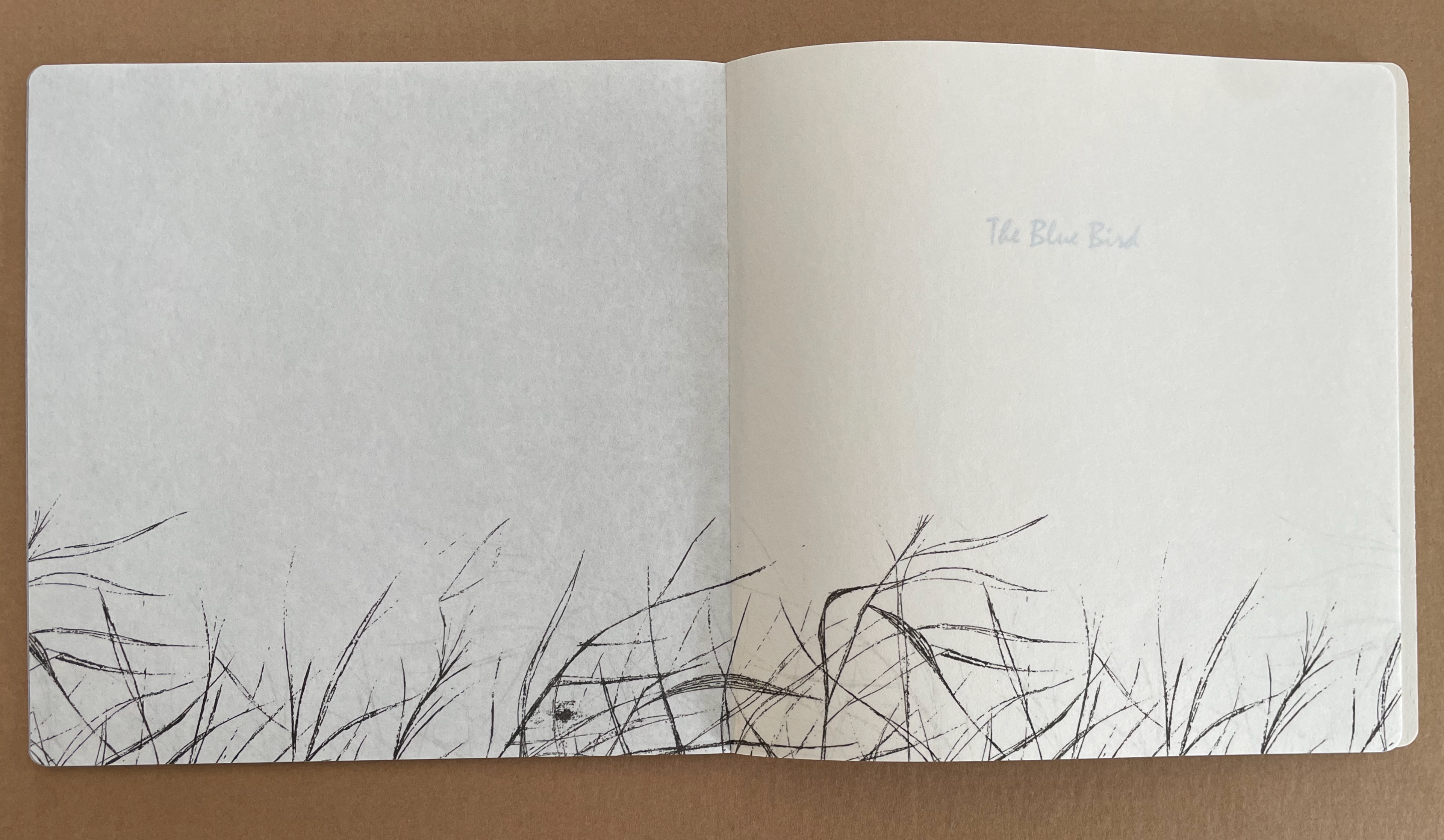
Split (2025) is another stab at the “open form” book. As a pamphlet-sewn star book without a front or back cover, it has no beginning or end.
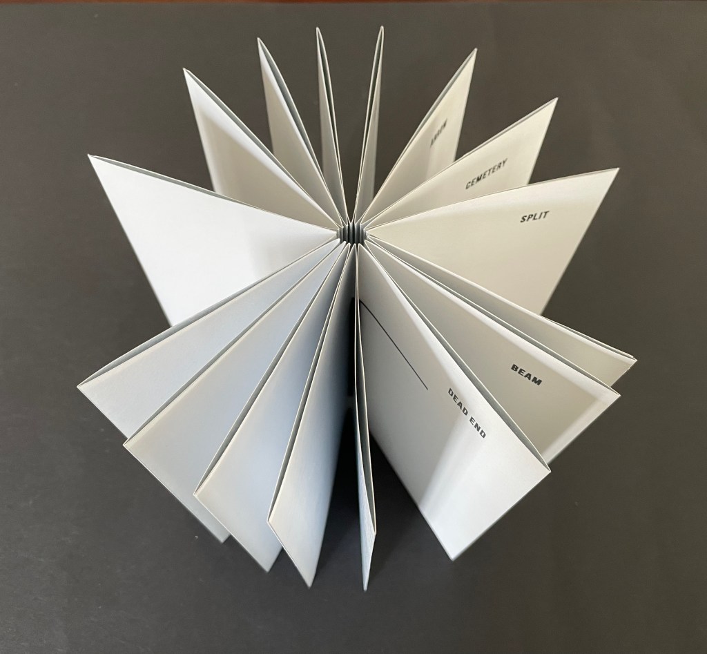
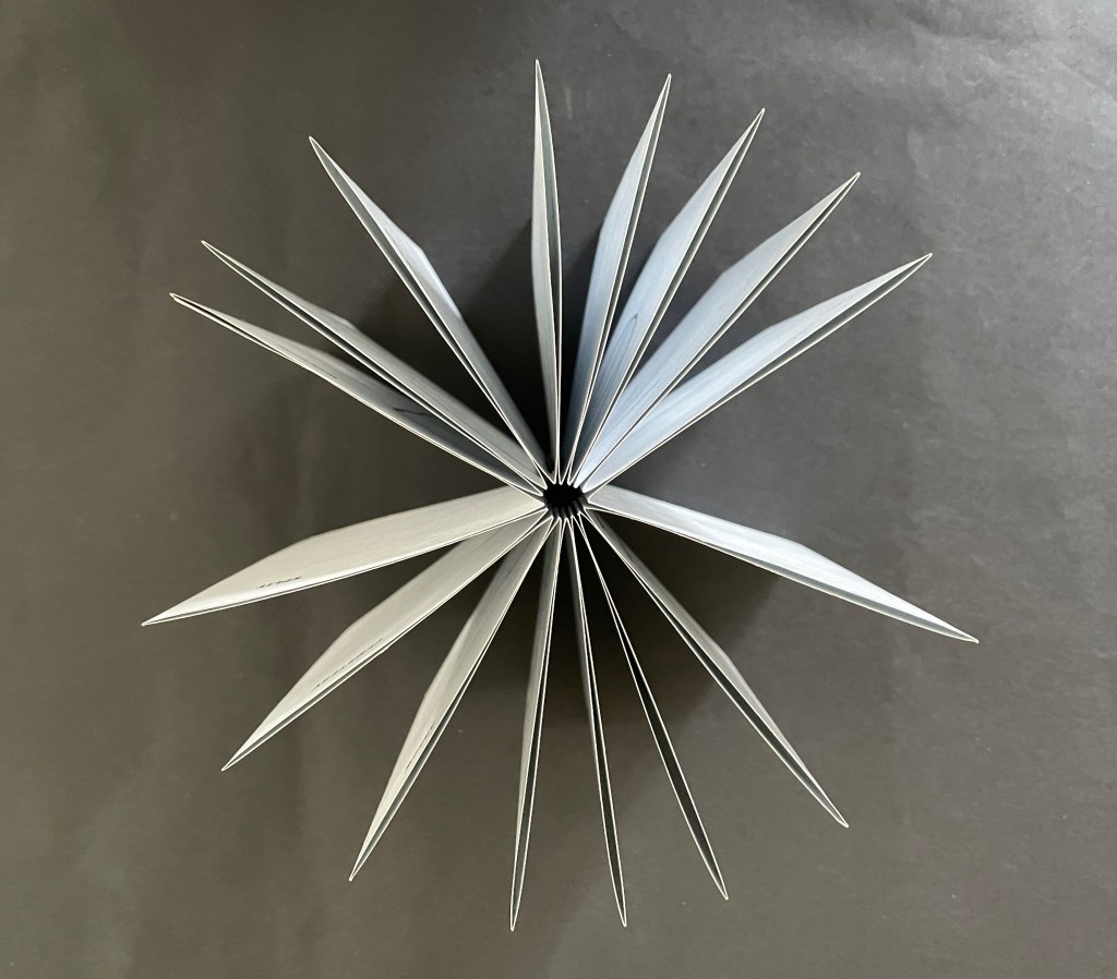
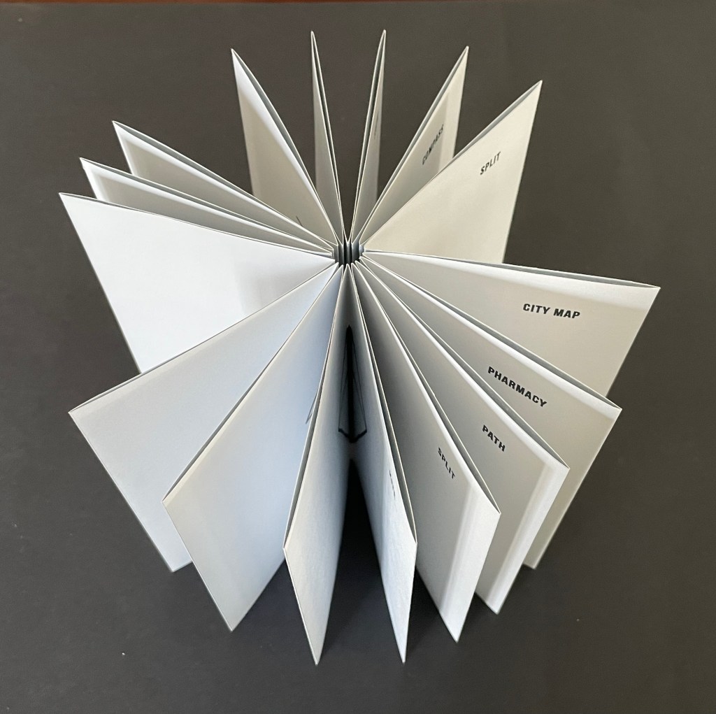
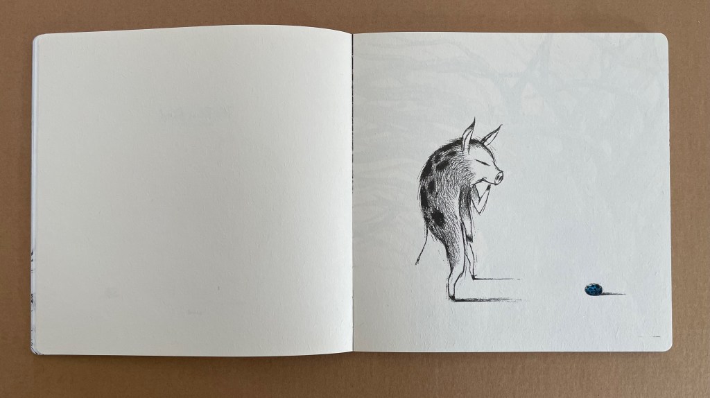
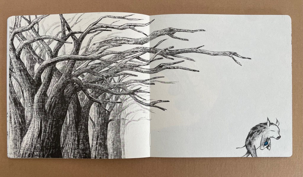
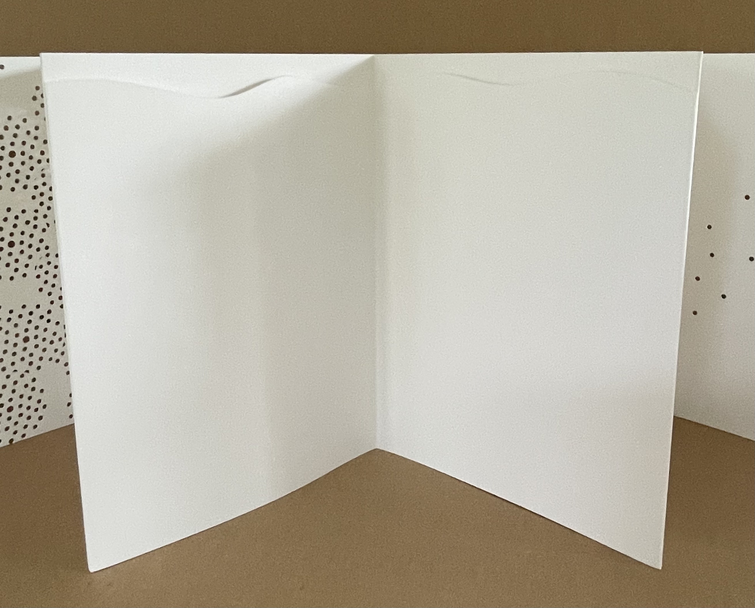
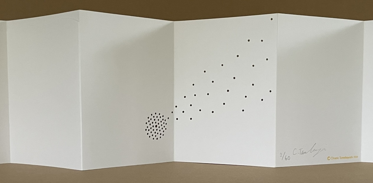
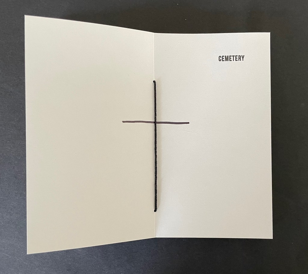
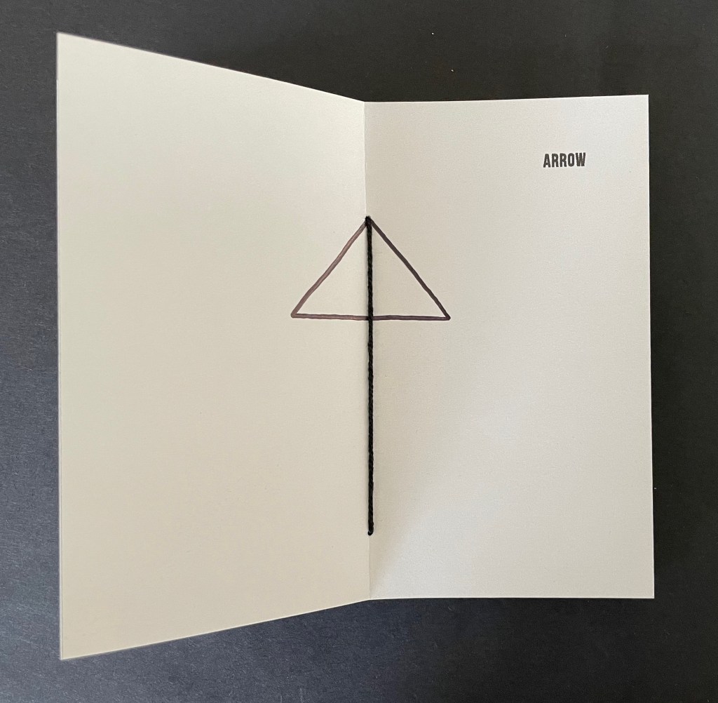
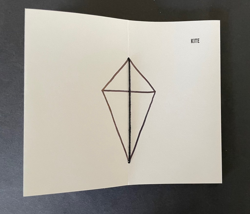
It has sixteen double-page spreads. Each has a word in the upper right corner and an image in the center. Four spreads are the same, showing the word SPLIT and the binding’s single thick black thread. The heavy black thread is the drawing that illustrates the word or that the word defines or implies. In between those four, three spreads appear, each using the binding’s thread as part of the drawing on the double-page spread.
The subjects of the drawings in each of the triads do not seem related to one another, but there is a progression from one drawing to the next. CEMETERY only requires one line intersecting the binding thread to construct the image suggesting it, ARROW requires two more lines, and KITE requires yet two more. The next triad — PATH, PHARMACY, CITY MAP — requires one line, then three, and then eight. The next triad — COMPASS, SNOW, WHEEL — requires one, then three, and one more. The next triad — DEAD END, BEAM, WINDOW — requires one, then one more, and finally two more.
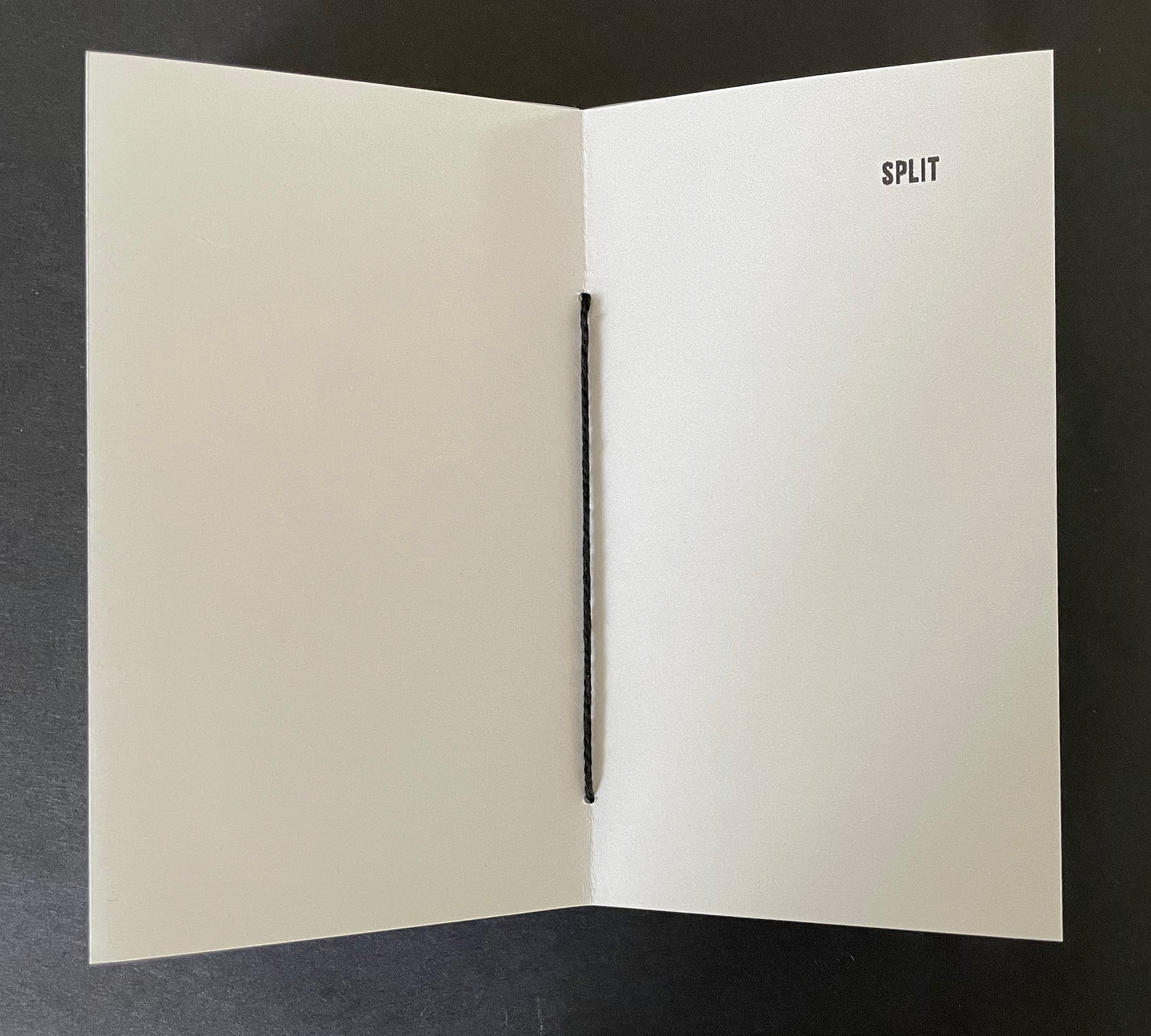
Many star book structures have front and back covers, so even if the text and images suggest no beginning or end, the covers undermine it. When exploring SPLIT, however, whether the reader chooses to turn the pages codex-style or carousel-style and whether the reader chooses the direction of adding lines or subtracting them from the images encountered, there is no beginning or end.
These four artist’s books demonstrate that Laure Catugier has found an effective muse in the Hansens’ open-form architectural theory. Her intermedial thinking, design skills, and craftsmanship have responded with inventive and outstanding artwork. It deserves a wide audience.
UPDATE: Laure Catugier receives the Herzog August Bibliothek and the Curt Mast Jägermeister Foundation Artists’ Book Prize 2026.
Further Reading
“Architecture“. 12 November 2018. Books On Books Collection.
“Celebrating the 250th Anniversary of Steingruber’s Architectural Alphabet“. 1 January 2023. Books On Books Collection.
Burzec, Marcelina. 16 November 2025. “Home is where the Hansen is: Poland pays tribute to open form architecture pioneers“. Euro.news. May remind you of Jim Ede’s Kettle’s Yard in Cambridge, England.
Deguy, Michel, and Bertrand Dorny. 1989. Le Métronome. Paris: Self-published. Interesting for a contrast and comparison on how structure in an artist’s book can analogize with music.
Higgins, Dick. 2001. “Intermedia.” Leonardo 34, no. 1: 49–54.
Hofstadter, Douglas R. 1979. Gödel, Escher, Bach : An Eternal Golden Braid. New York: Basic Books. P. 191.
Hubert, Renée Riese, and Judd David Hubert. 1999. The Cutting Edge of Reading : Artists’ Books. New York City: Granary Books. See pp. 104-06 for discussion of music and structure in Deguy and Dorny’s Le Metronome.
Scott, Felicity D. 2014. “Space Educates” in Alęksandra Kedziorek and Łukasz Ronduda (eds). Oskar Hansen : Opening Modernism : On Open Form Architecture, Art and Didactics. Warsaw: Museum of Modern Art in Warsaw. Pp. 137-60.
MacCallum, Marlene, et al. 2007. The Architectural Uncanny. Corner Brook: Sir Wilfred Grenfell College Art Gallery.