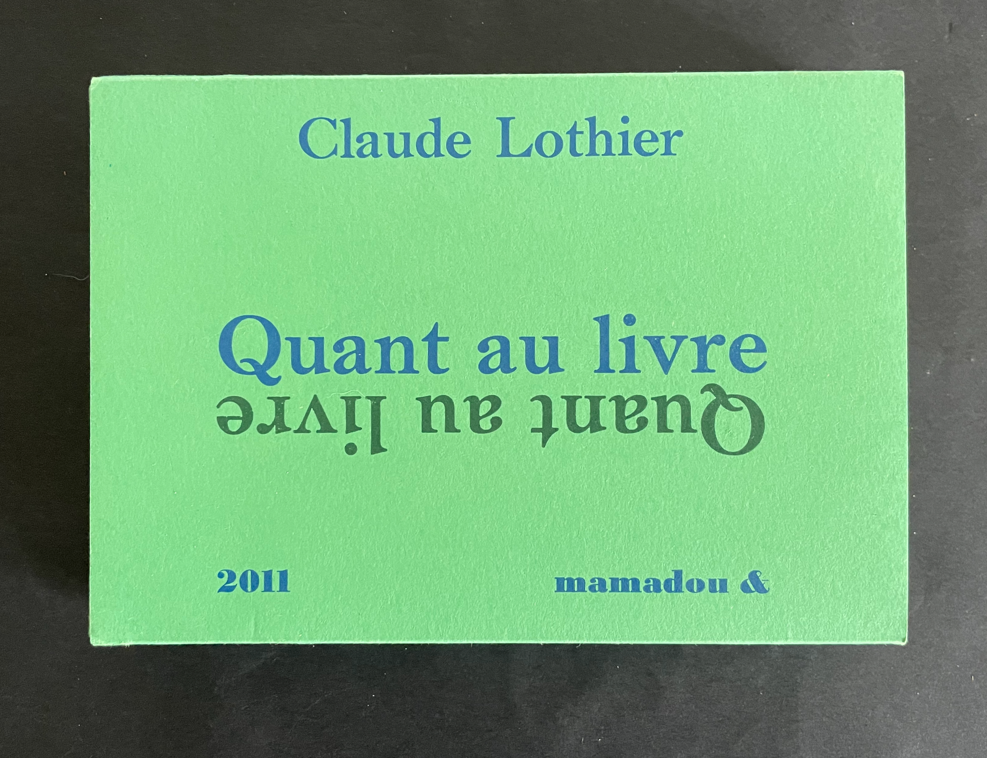
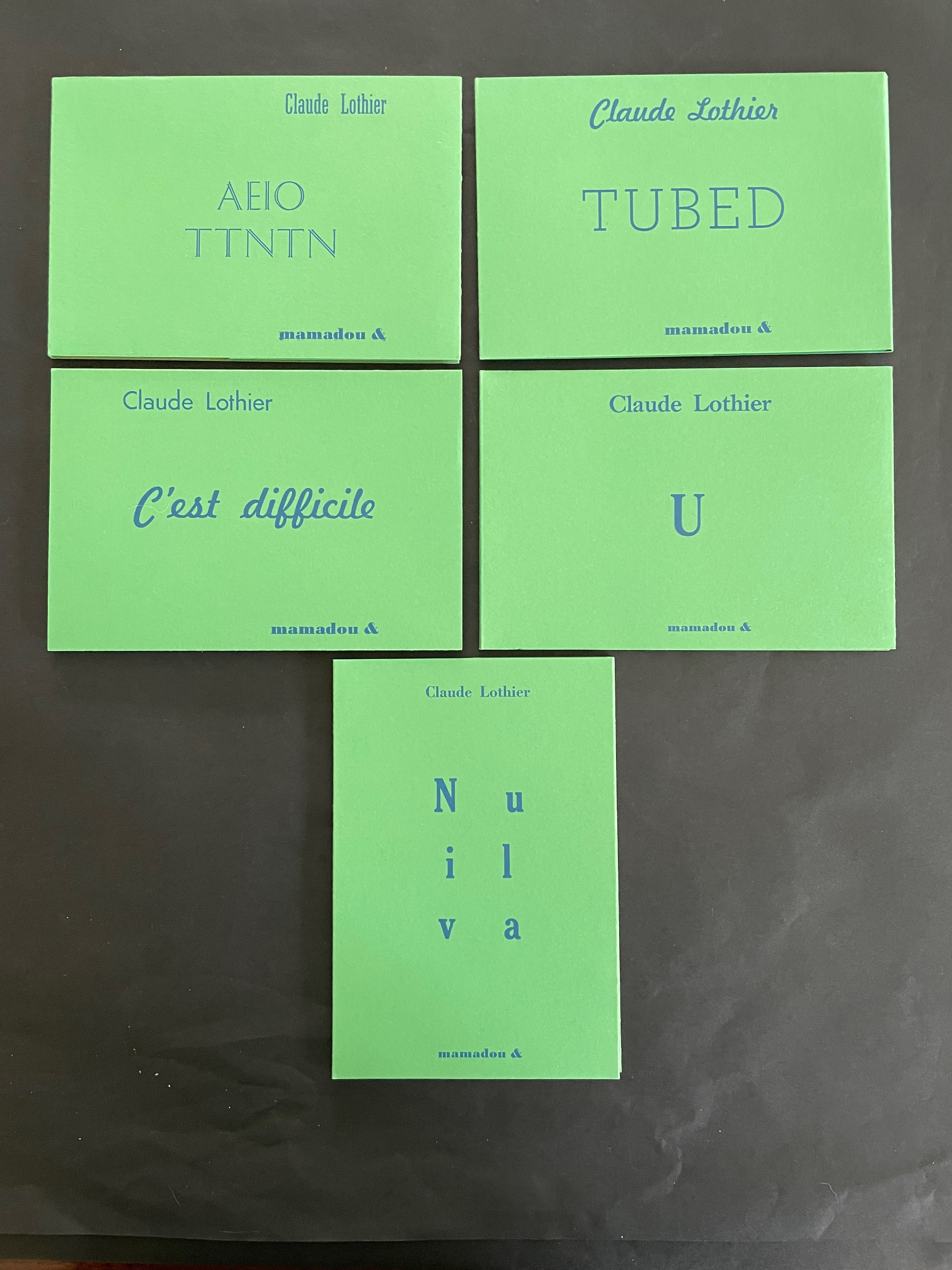
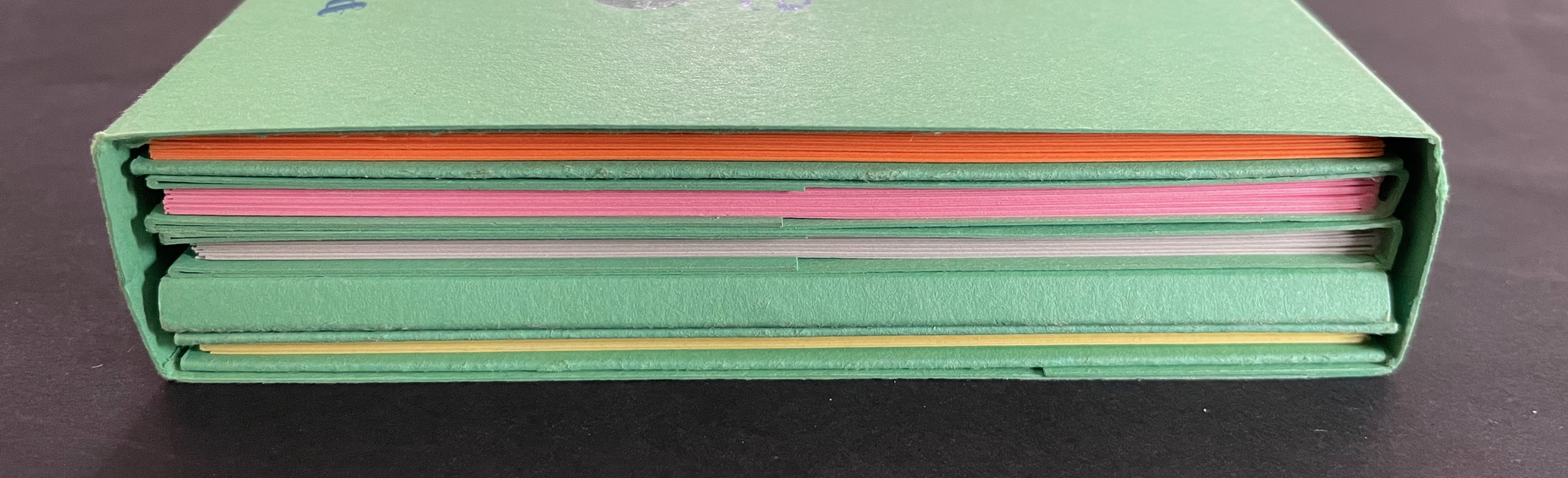
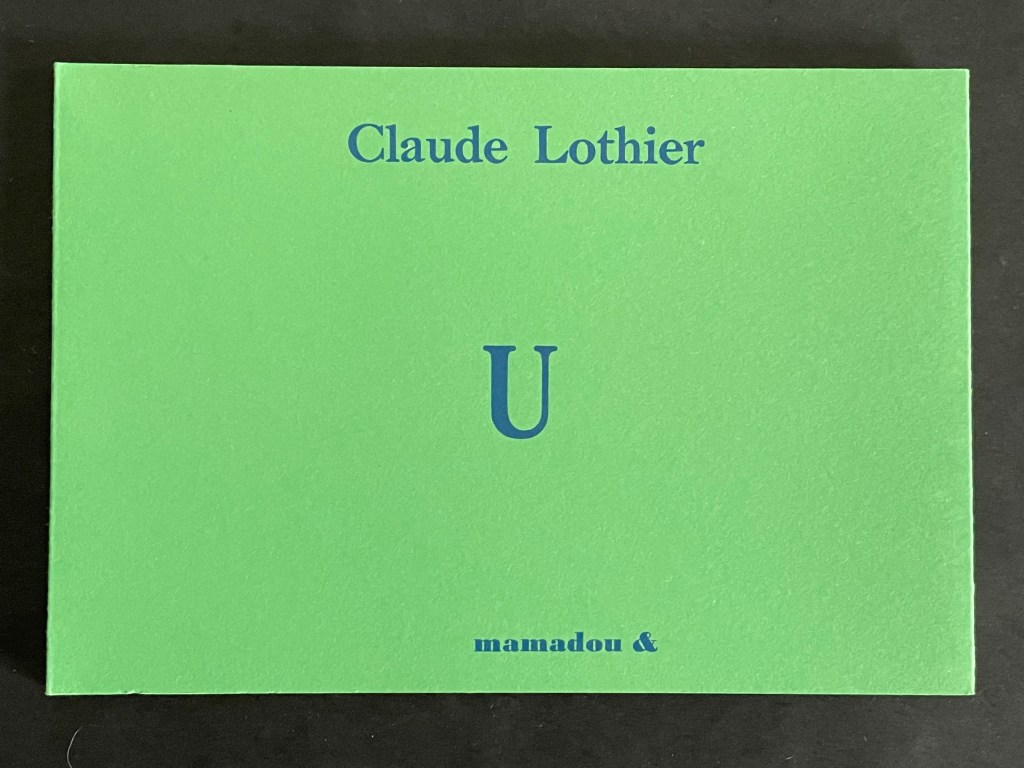
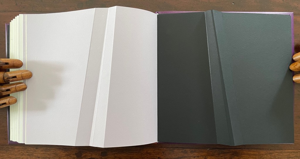
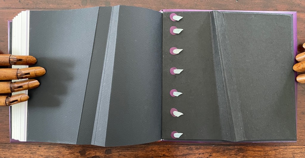
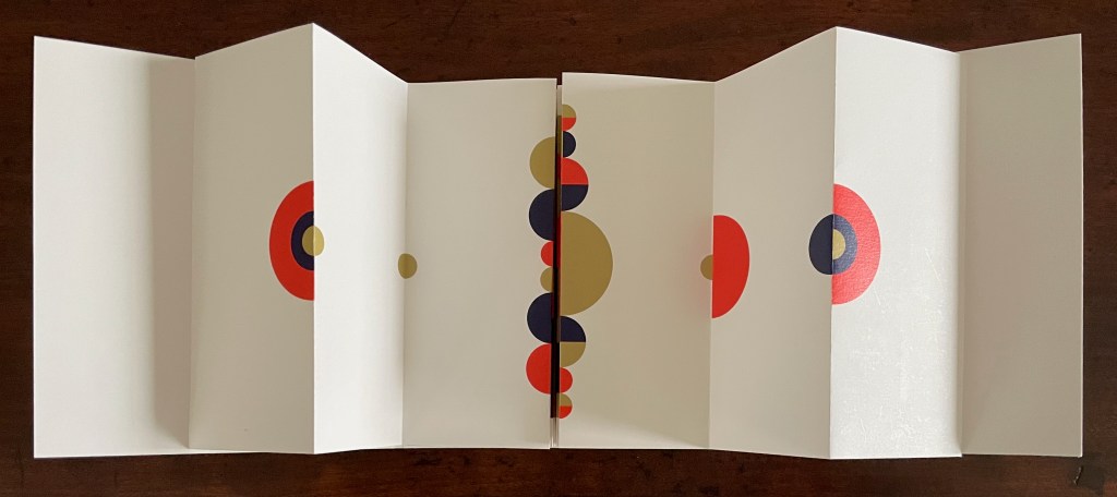
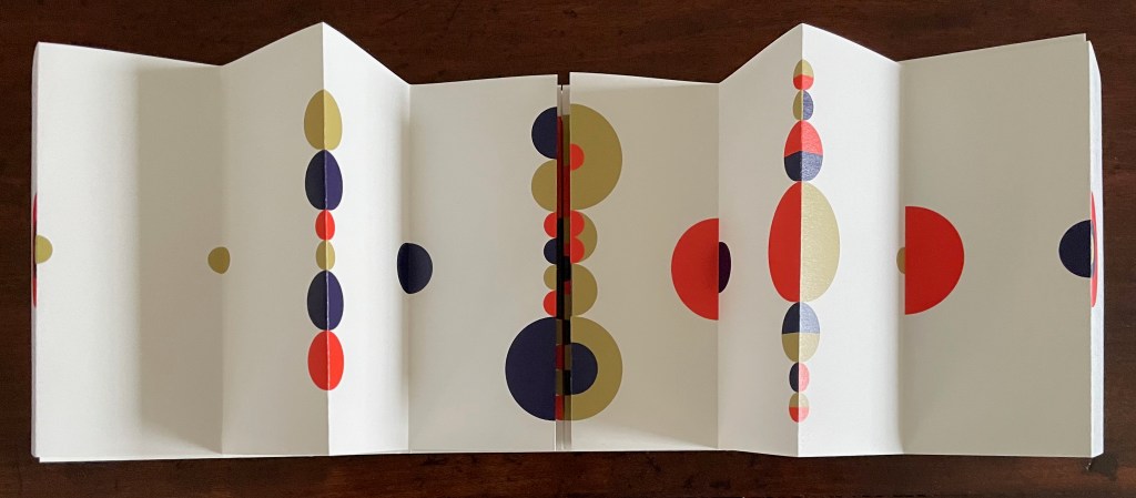
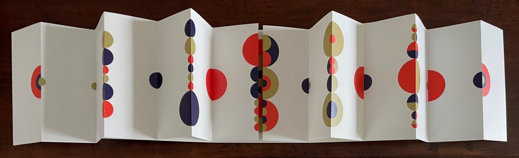
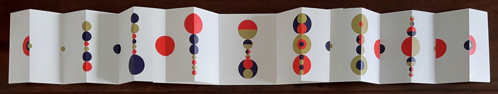
Quant au Livre(2011) Claude Lothier Slipcase around five cased and glued softcover booklets. Slipcase: H110 x W158 x D25 mm. AEIO TTNTN: H108 x W157 mm. Niv ula: H157 x W108 mm. C’est difficile: H108 x W157 mm. TUBED/NIF: H108 x W157 mm. U: H108 x W157 mm. [28] pages each except for TUBED/NIF, which has [20], and U, which has [24]. Edition of 200. Acquired from Biblio-Net, 16 October 2025. Photos: Books On Books Collection
In English, the phrase quant au livre would be “as for the book” or “concerning the book”. What is lost in translation is the phrase’s association with Stéphane Mallarmé’s volume of essays Divagations (1897) in which one section was entitled Quant au Livre. It included the essay “Le Livre, Instrument Spirituel”, which delivered the proclamation “tout, au monde, existe pour aboutir à un livre” (“everything in the world exists to end up in a book”). It was the proclamation scholars seized on to give artists’ books their metaphysical underpinning. If it swallows up everything in the world, What is a book? Many book artists have simply bypassed the discussion and jumped in with works of art that challenge how we read, how we make sense of a book, how we make sense of what a book is. Claude Lothier is one of those book artists.
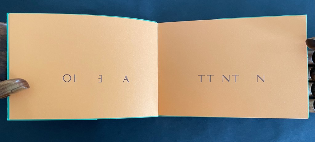
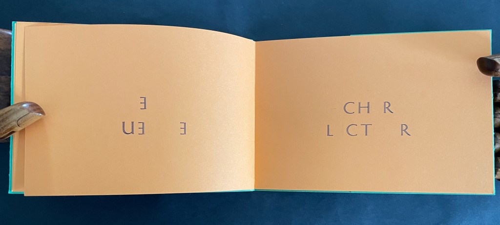
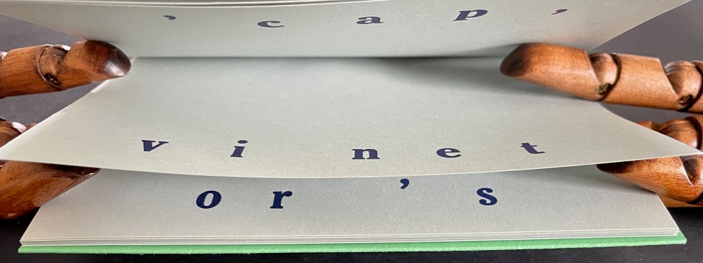
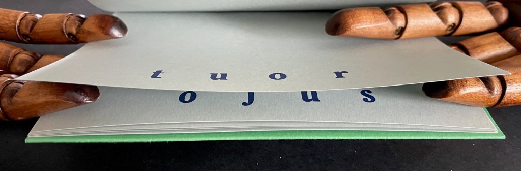
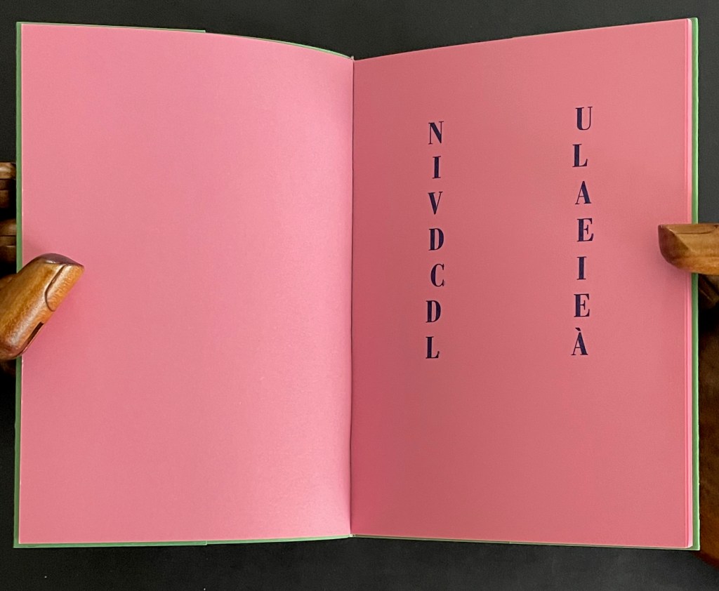
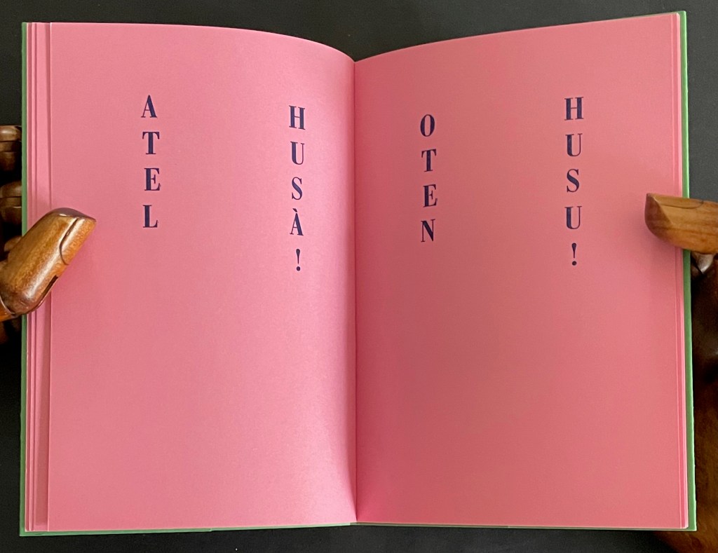
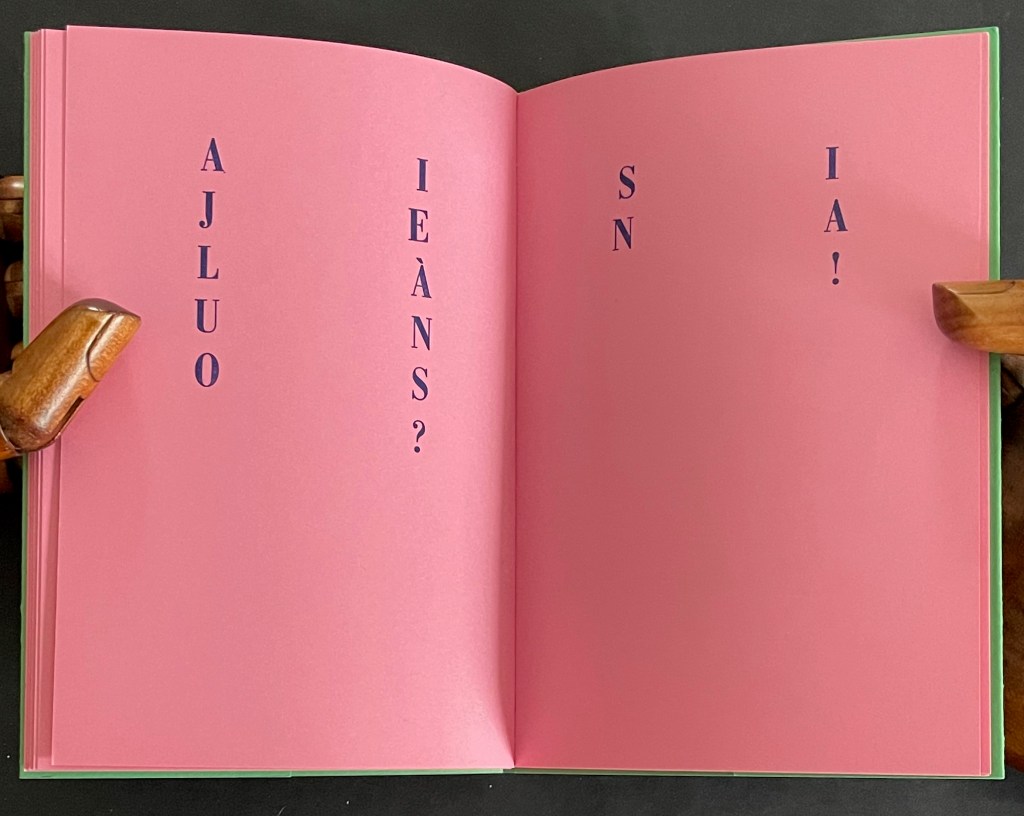
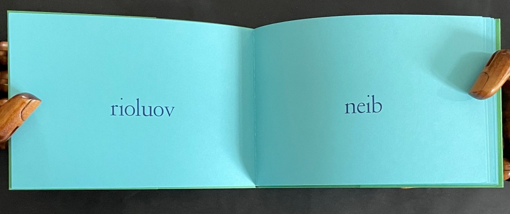
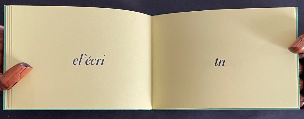
In AEIO/TTNTN, Lothier challenges us to construct this one paragraph as we turn the booklet’s pages:
Attention, cher lecteur, vous déchirez l’histoire en ouvrant le livre. Tachez au moins de reconstituer mentalement l’intégrité de tous les mots puis refermez le pourqu’il se reforme en dormant. [Attention, dear reader, you tear the story apart when you open the book. At least try to mentally piece together all the words, then close it so that it can reform while sleeping.]
ATTENTION / CHER LECTEUR (Attention / dear reader)
As if to prove the author’s accusation that we tear apart stories when we open a book, the verso page has “peeled away” the vowels from the word on the recto page, where only the consonants remain. The verso page naturally displays the vowels in reverse order and printed backwards. The author cheekily scolds us to try at least to reconstruct the torn-apart words (which we have to have done to receive the scolding) and then close the book so that the story can reassemble itself while the book sleeps (which paradoxically is the imagined story of what will happen before the next reader opens the book, figures out the message, and closes the book). The book that contains everything in the world that exists to end up in the book is, of course, a never-ending book, of which this is just one example.
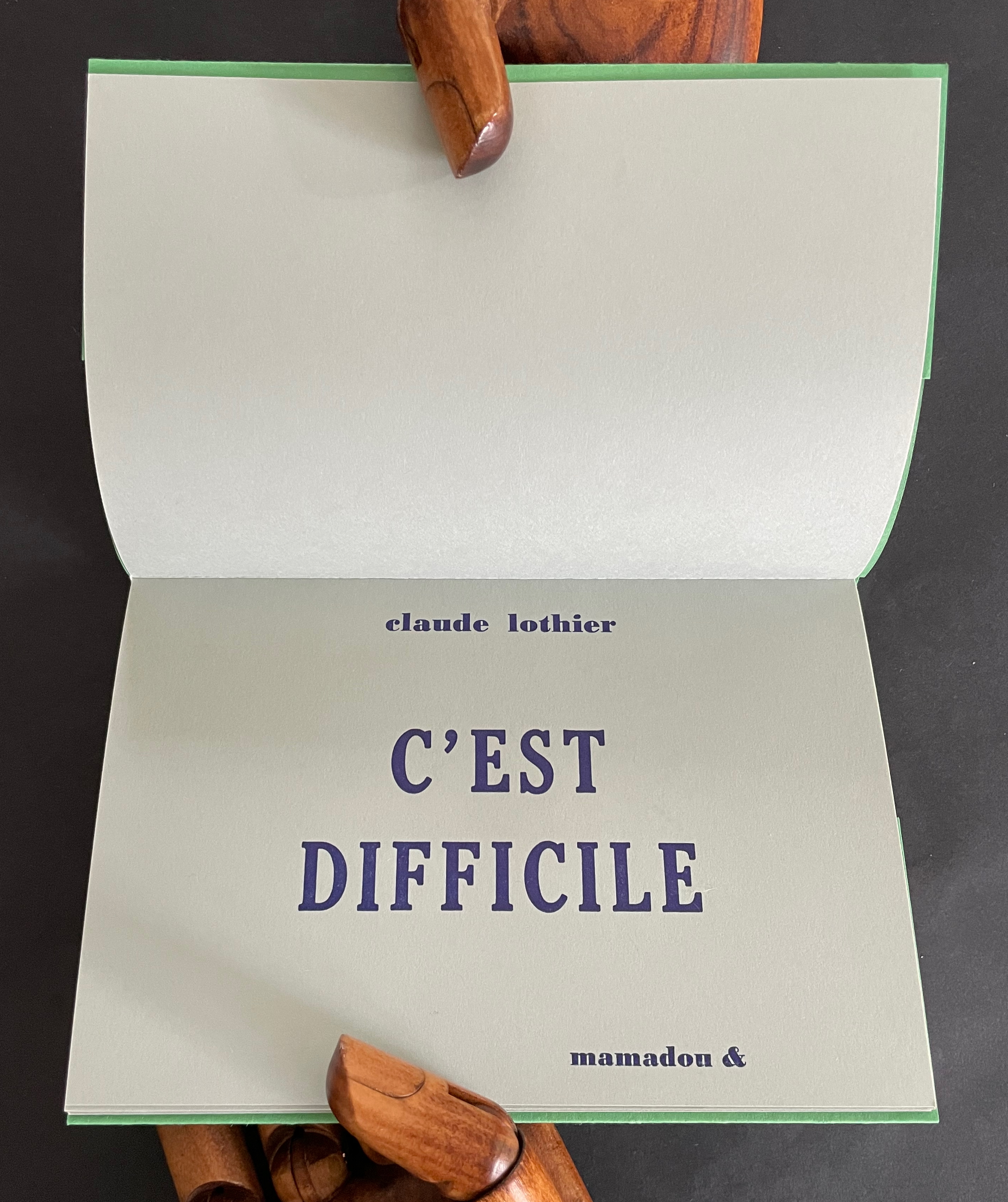
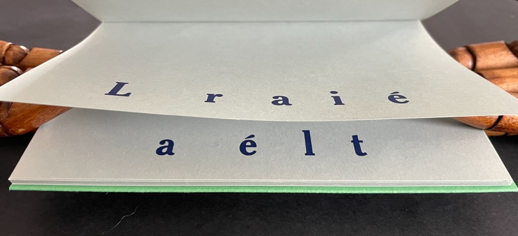
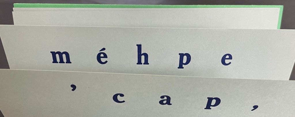
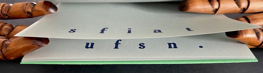
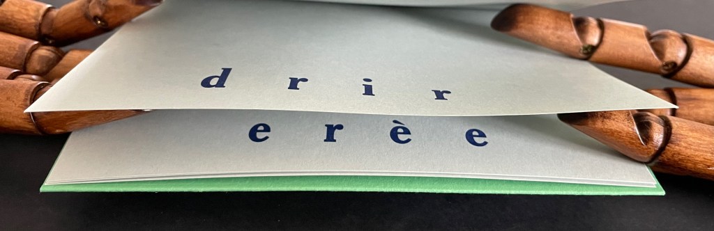
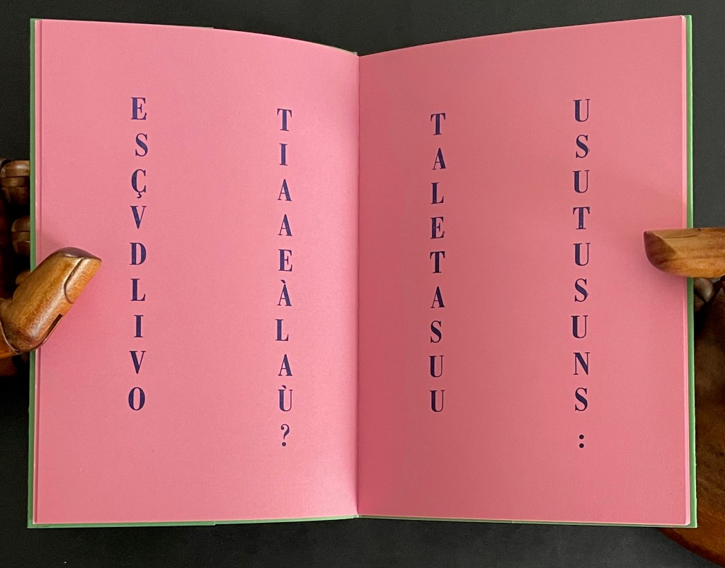
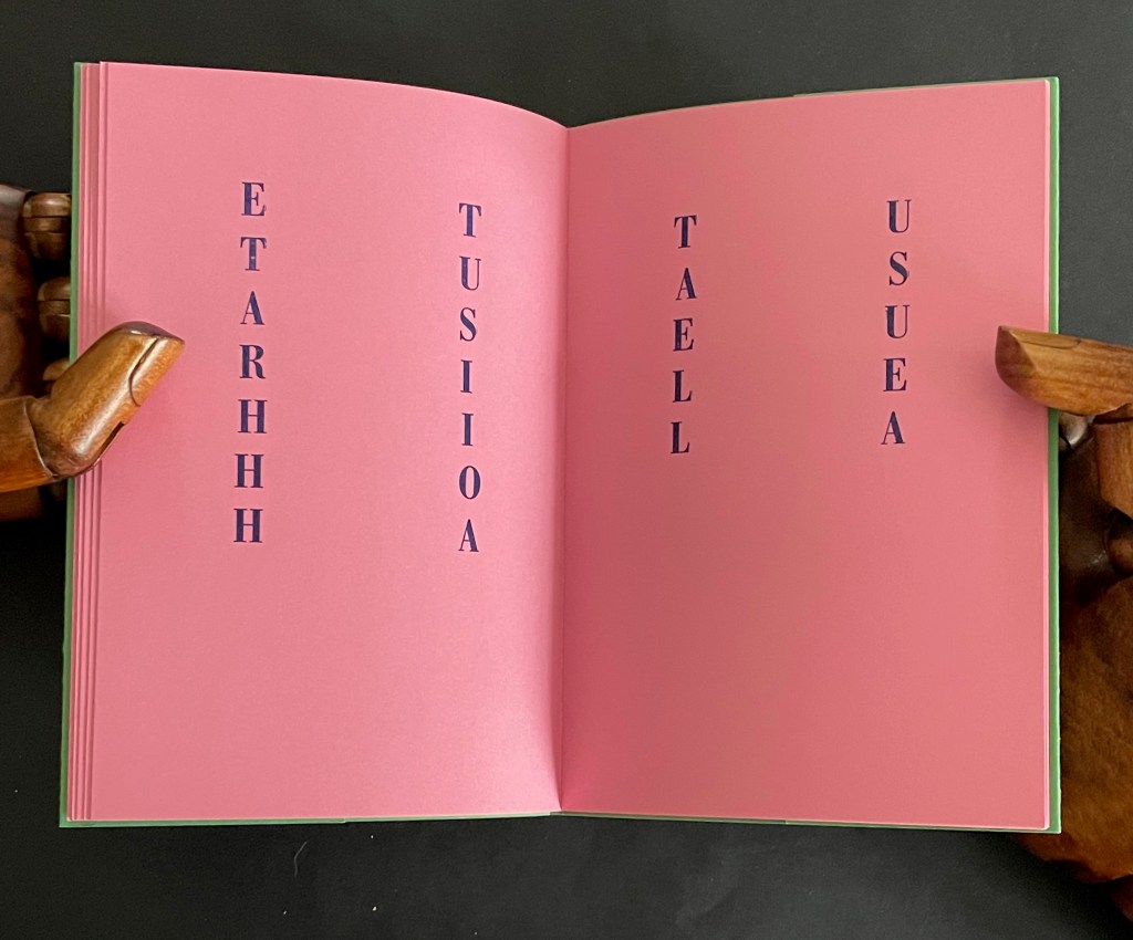
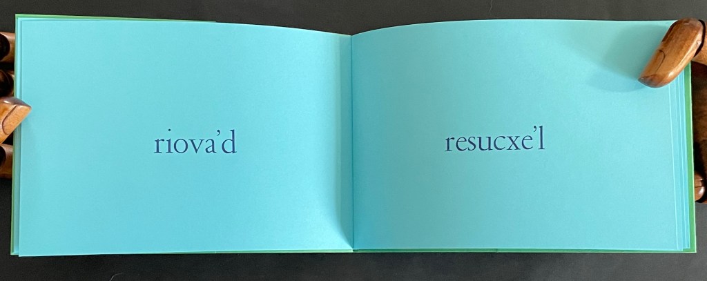
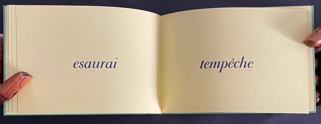
In C’est difficile, Lothier presents the booklet in landscape format and marches us through our recto/verso paces to construct the story’s message: La réalité m’échappe, voir n’est jamais suffisant. Elle est toujours au-delà, derrière l’image. [Reality escapes me, seeing is never enough. It is always beyond, behind the image.]
Reading C’est difficile is indeed difficult. Only gradually do we realize that the letters needed to complete the word on the first recto page lie ahead on the second recto page, and that the word on the first verso page is completed with the letters on the second verso page. Piecing together the words requires a moving beyond, then moving back, then moving beyond, and so on until the last pair of verso pages yields the word “l’image”. Again, our actions with the book’s structure enact the book’s message.
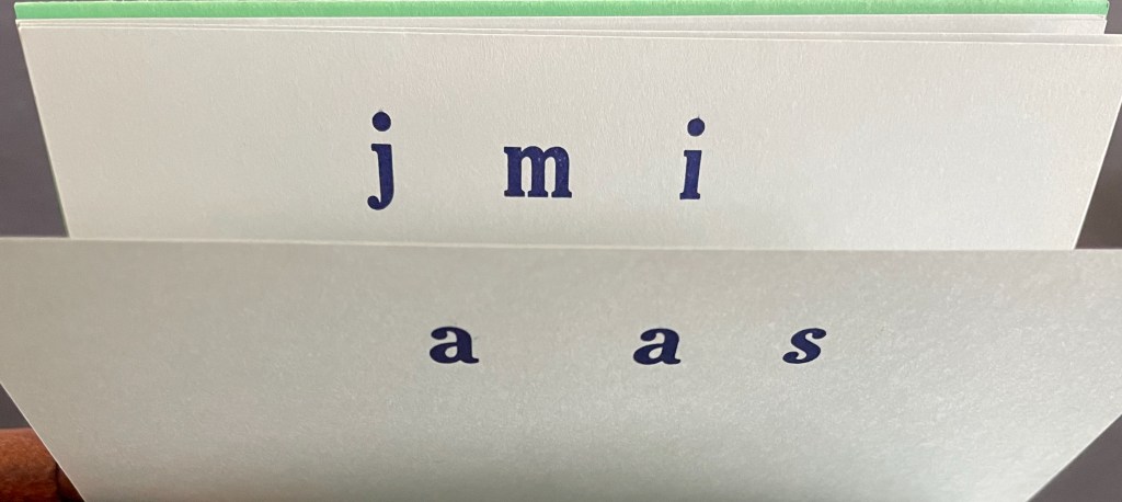
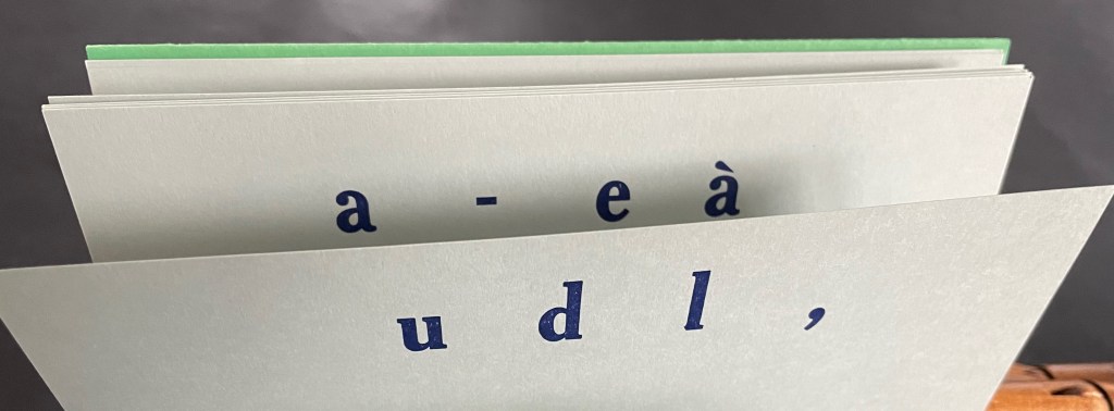
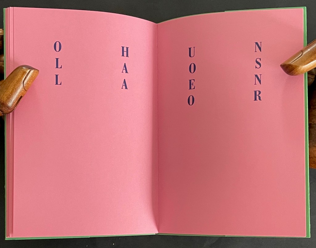
Given the typographical play in the first two booklets, it is hardly surprising that, at first in Nu il va, the reader’s eye might jump here and there trying to find words in each column until it makes the jump across the gap between the columns and finds a series of two-letter words. There are twenty pages of them, and they seem to make up a Dada-esque interlude of riddling dialogue.
NU IL VA DE CI DE LÀ [Naked it goes here and there] ET SI ÇA VA DE LÀ IL VA OÙ? [and if that goes there, where does it go?] TU AS LU ET TU AS SU UN US [you read and you learned a rule]
EN CE RU ON VA NU! [in this brook, we go naked] OR TU ES UN AS [now you are an expert] NI VU NI SU [neither seen nor known] MÛ TU ES LÀ OÙ IL VA [driven you are there where it goes]
AH TU ES LÀ! [ah, you are there!] OH TU ES NU! [oh, you’re naked!] ET TU AS RI HI HO HA [and you laughed hi ho ha] TU AS EU LE LA [you got the “la”]
ET TU AS RI EN UT [and you laughed in C] DO RE MI FA SO LA SI [do re mi fa so la si] EH AS TU BU? [eh, have you been drinking?] FI AS TU ÇA LÀ? [fi, have you got that, there?]
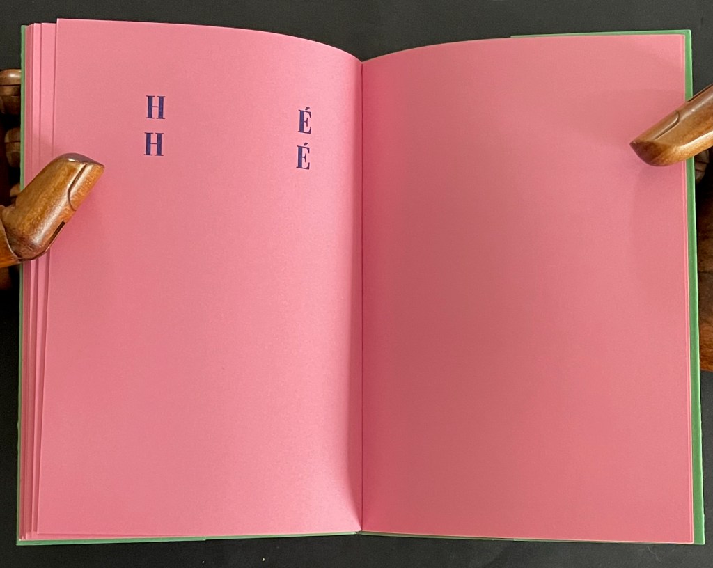
AI JE LÀ UN OS? [do I have a bone there?] SI NA! [yes, so there!] OH LA LA [oh la la] UN OS EN OR [a bone of gold]
HÉ HÉ [he he]
As with any Dada-esque poem, who knows what it means, but its structure moves the reader’s naked eye here then there and back as its riddling words turn to mock the reader’s sing-song drunken rocking. There’s also a bit of sexual innuendo throughout. It comes closer to the surface in the penultimate verse, underlined by the snicker of the last.
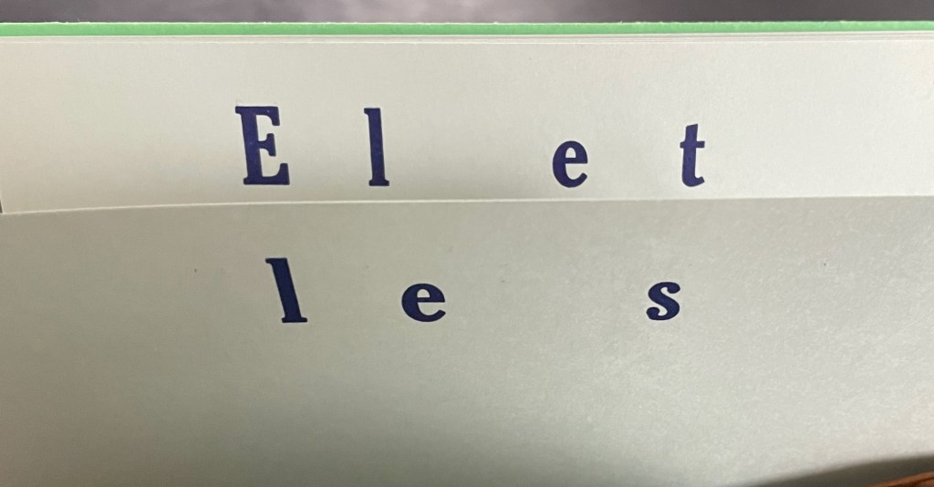
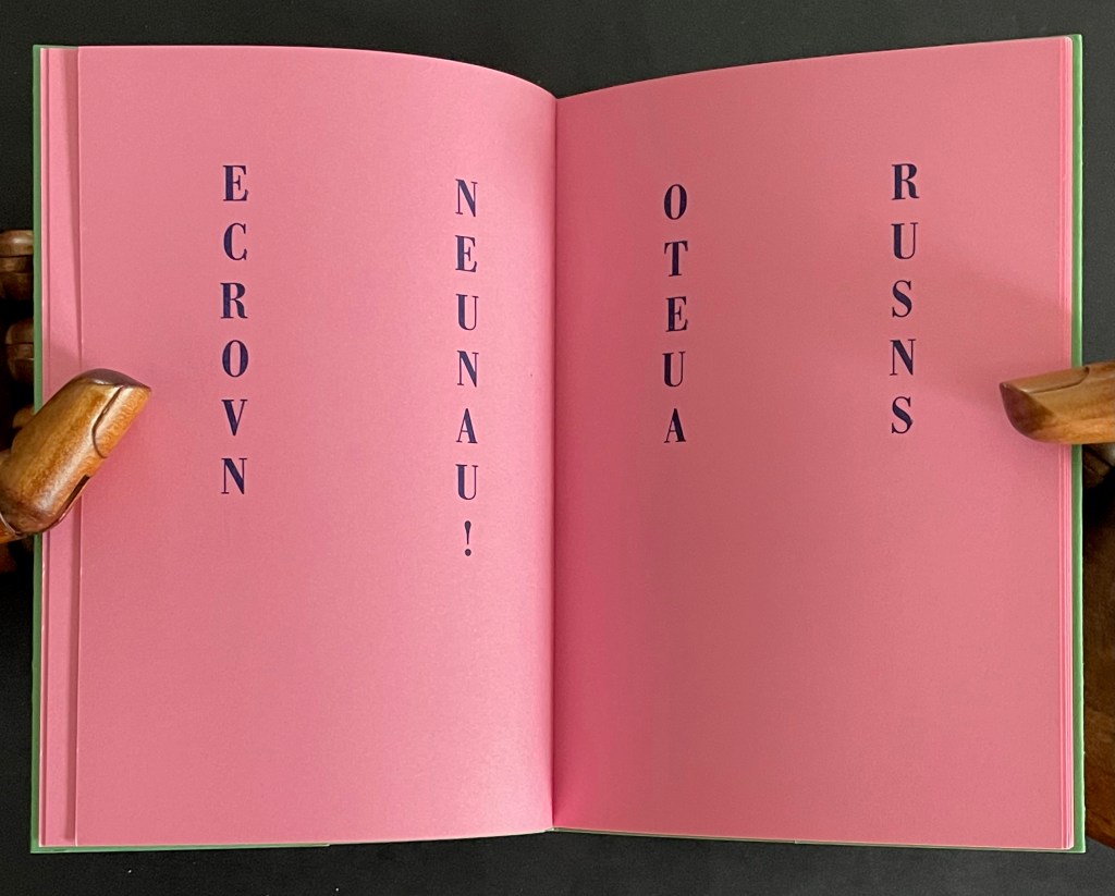
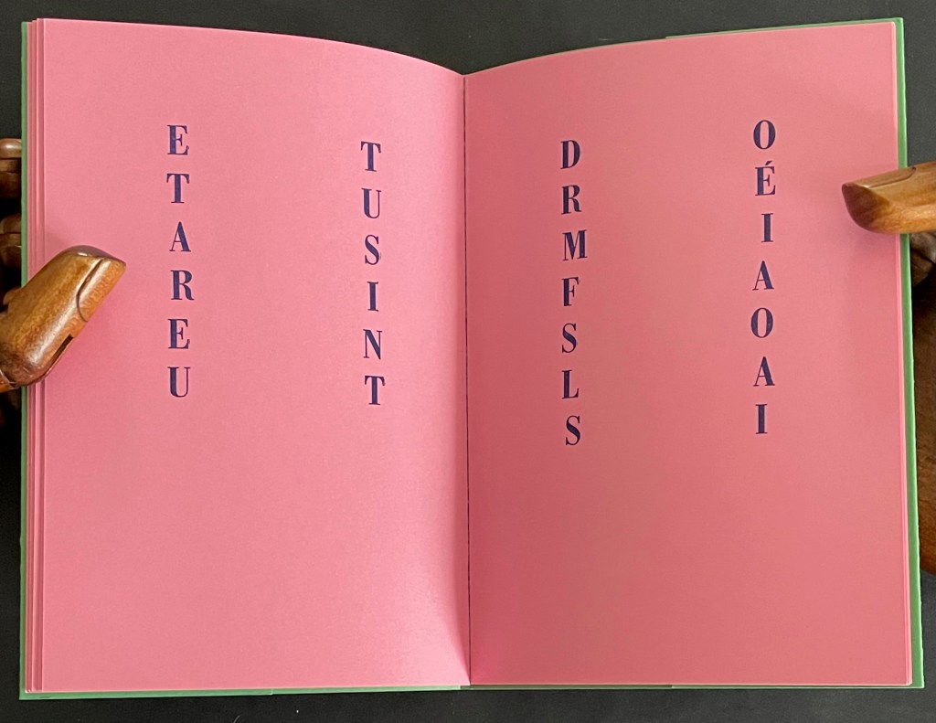
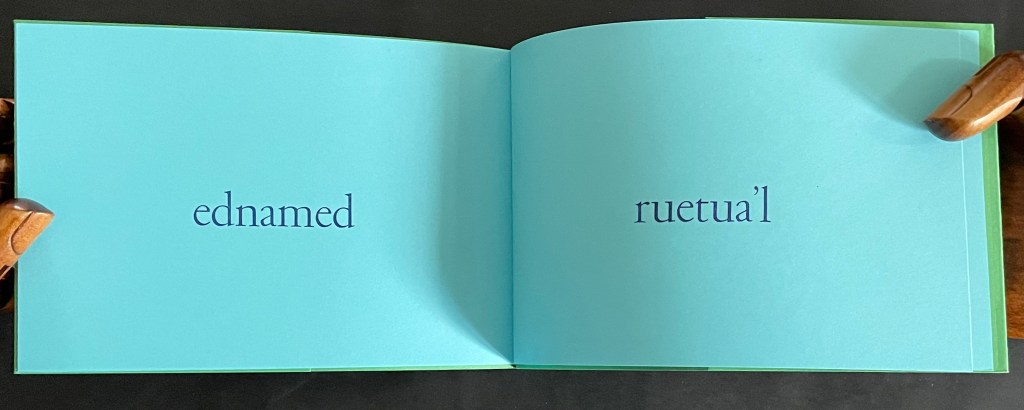
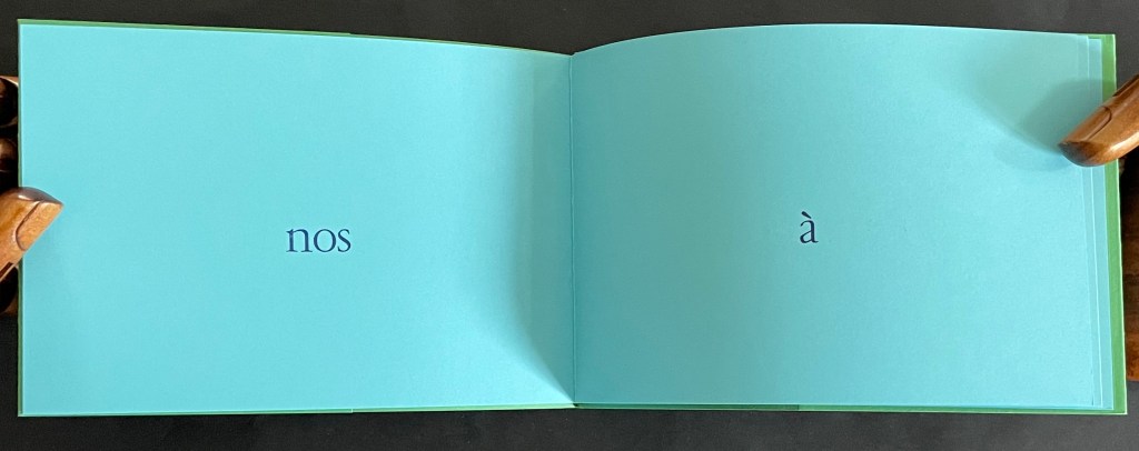
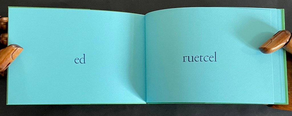
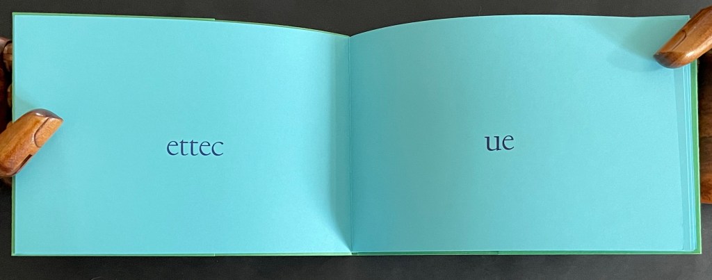
As its front and back covers hint, TUBED/NIF invites a back-to-front deciphering of words. TUBED is debut backwards — the “beginning” as we would expect on the front cover — and NIF is fin backwards — the “end” naturally on the back cover.
In the booklet, we not only have to decipher the backwards words, we also have to construct the text by reading the recto page first and then its facing verso page. At least the author apologizes rather than mocks this time:
l’auteur demande à son lecteur de bien vouloir l’excuser d’avoir eu cette idée saugrenue [the author asks of his reader to kindly excuse him for having had this absurd idea]
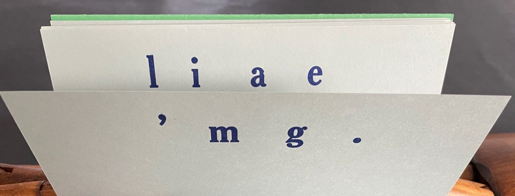
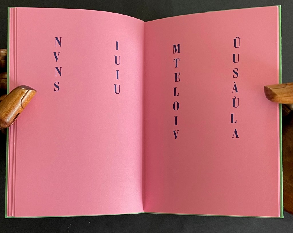
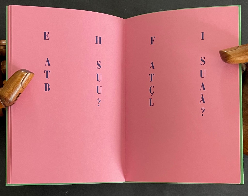
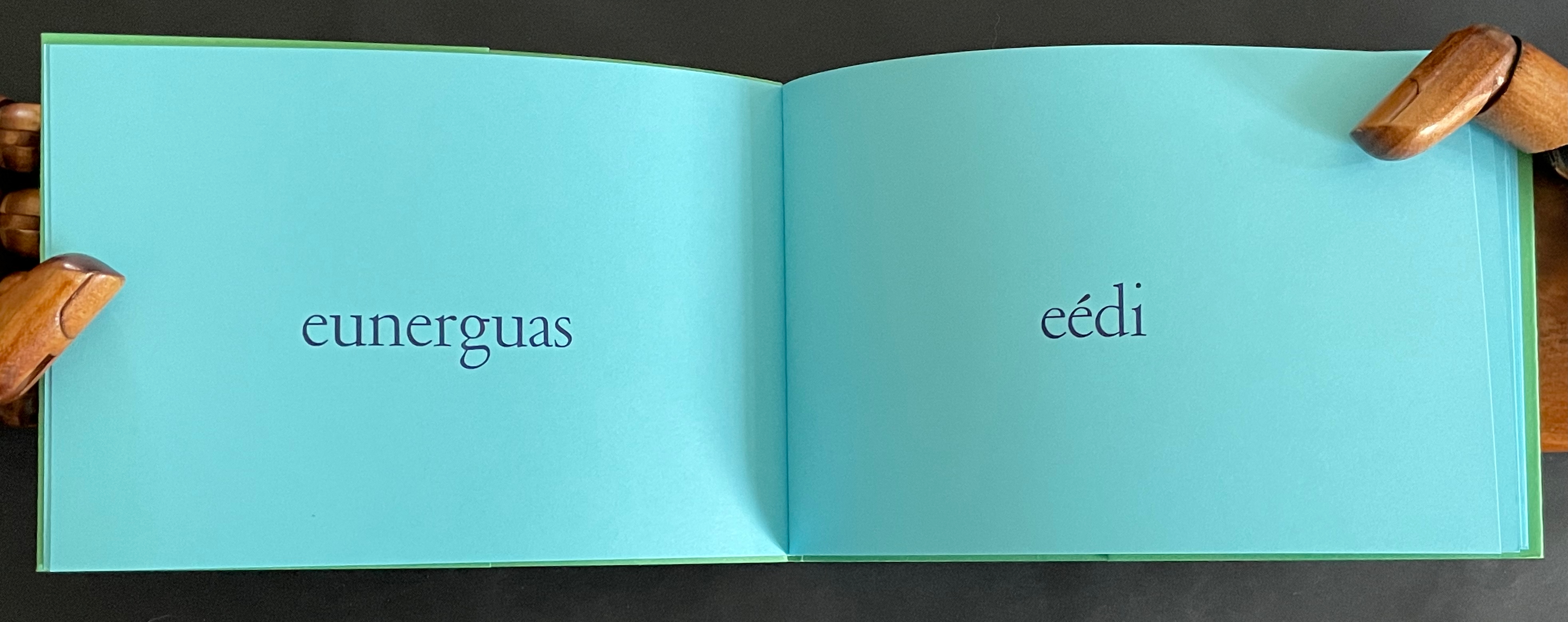
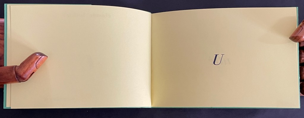
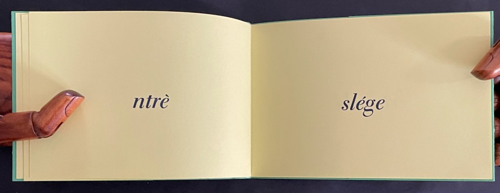
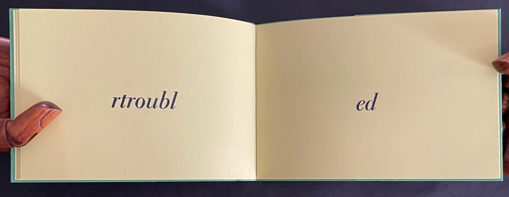
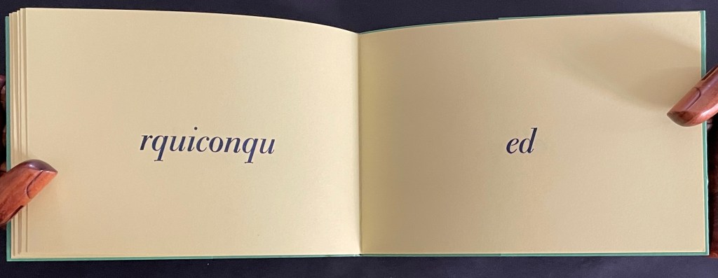
As for U, the last volume, we seem to overhear the author muttering as he shrugs his shoulders:
un très léger trouble de l’écrit ne saurait empêcher quiconque de lire quand même [a very slight disorder in the text will not prevent anyone from reading it anyway] The words un très léger trouble de l’écrit doubly imply an alteration or change or disordering in the text as well as an impairment or trouble in writing/reading.
In correspondence, Lothier confirms the supposition of the shrug when he confides that the idea for this booklet has its roots in his frequent errors in spacing while typing — which he says still occur.
Of course, we haven’t overheard the artist until we have figured out that the last letter of each word has been lopped off and moved to the following page and jammed up against the following word, whose last letter in turn has been lopped off and moved to the next page, and so on. And of course, if we have deciphered this, we have proved the truth of the book.
The French expression quand même has several meanings and uses: “even so”, “still”, “all the same”, “anyway”, “nevertheless”, “right?” , and more. Here, as the last phrase of the five booklets, it has the added fillip of echoing the polyvalent expression quant au in their collective title and so reminding us that, as with any book, the turn of the page is that slight trouble in the text we tolerate as we still continue reading — quand même, nevertheless, anyway, even so, etc.
*Many thanks to the artist for his patience with my rough translations and for sharing some of the background to Quant au livre.
Further Reading and Viewing
As well as an artist and book artist, Claude Lothier is what he calls an “unremitting perspectivist”, which has led to paper construction of mazzocchio hats, deltoidal icositetrahedra, and other fantastic geometrical objects. Currently he teaches perspective from time to time in Guangzhou, an experience reflected in his Instagram account.
For other artistico-philosophical inquiries of the book, see
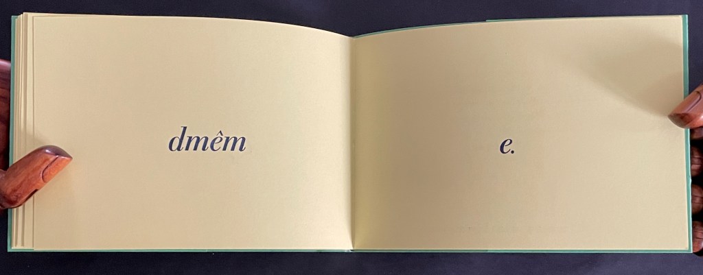
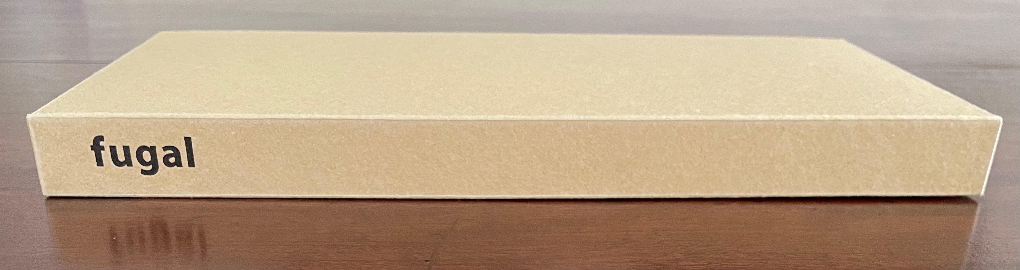
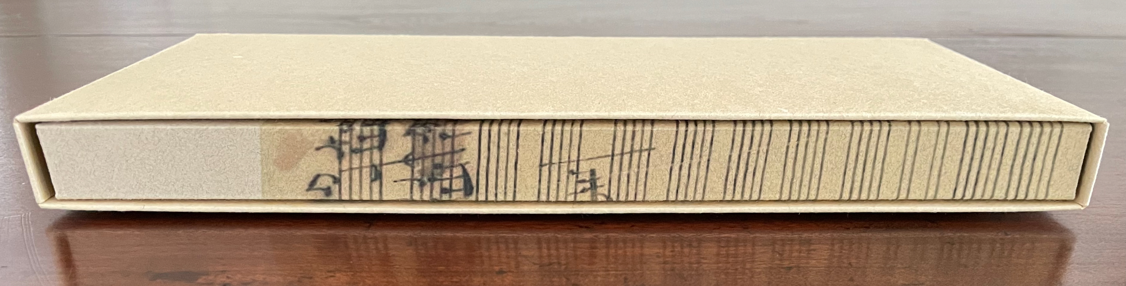
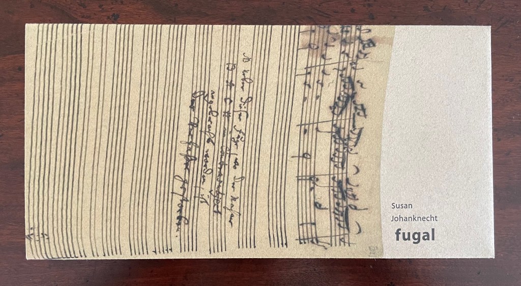
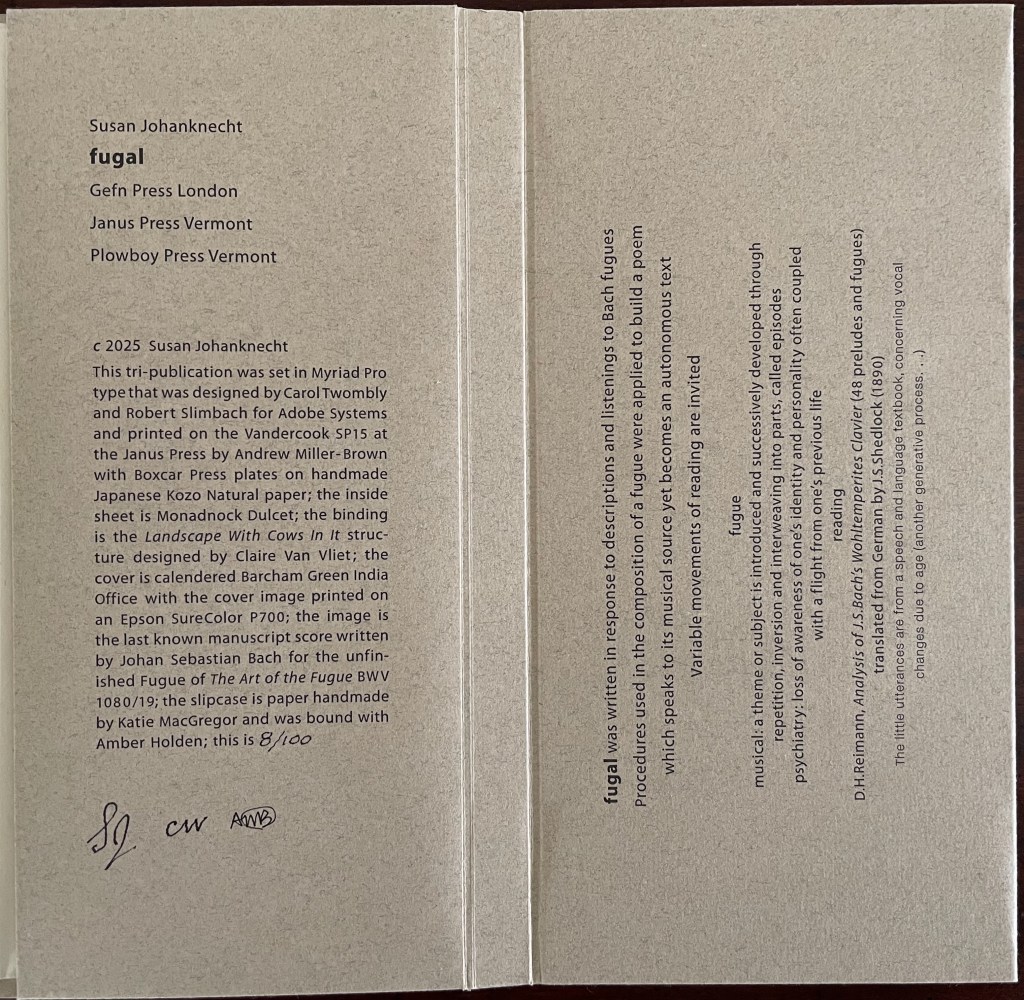
Fugal (2025) Susan Johanknecht , Claire Van Vliet, and Andrew Miller-Brown Vertical double-sided accordion book bound in “Landscape with Cows In It” structure designed by Claire Van Vliet, cover in calendered Barcham Green India Office, interior in handmade Japanese Kozo Natural fixed to Monadnock Dulcet; slipcase of handmade paper. Slipcase: H123 x W248 x D22 mm. Book: H120 x W240 x D18 mm. [6] double-sided panels. Edition of 100, of which this is #8. Acquired from Susan Johanknecht, 26 September 2025. Photos: Books On Books Collection
In the hands of multiple readers, this collaboration among Susan Johanknecht’s Gefn Press, Claire Van Vliet’s Janus Press, and Andrew Miller-Brown’s Plowboy Press becomes the “book as performance” and “book as musical score”. Fugal is an artwork that works best with several simultaneous readers/voices/viewers.
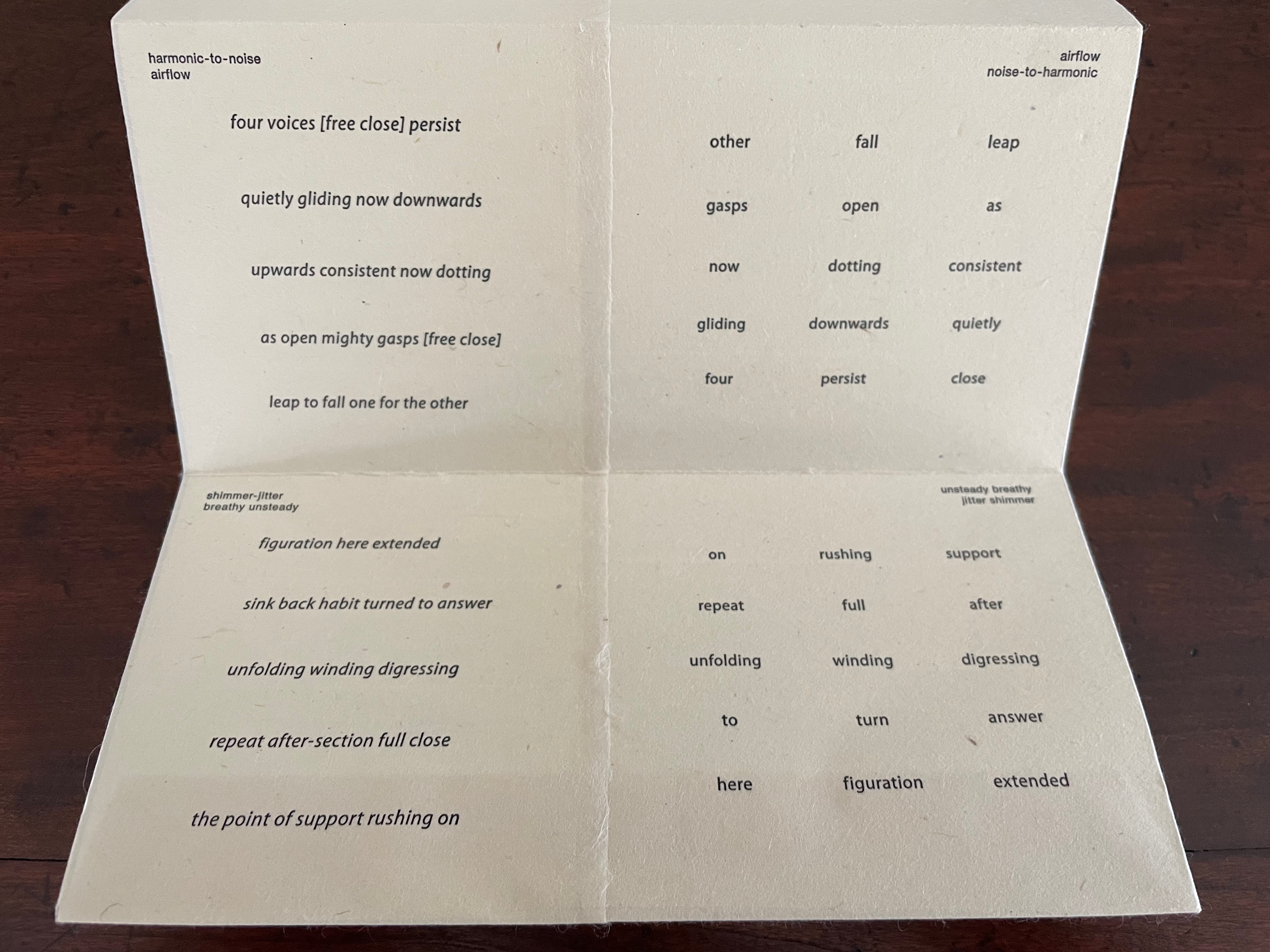
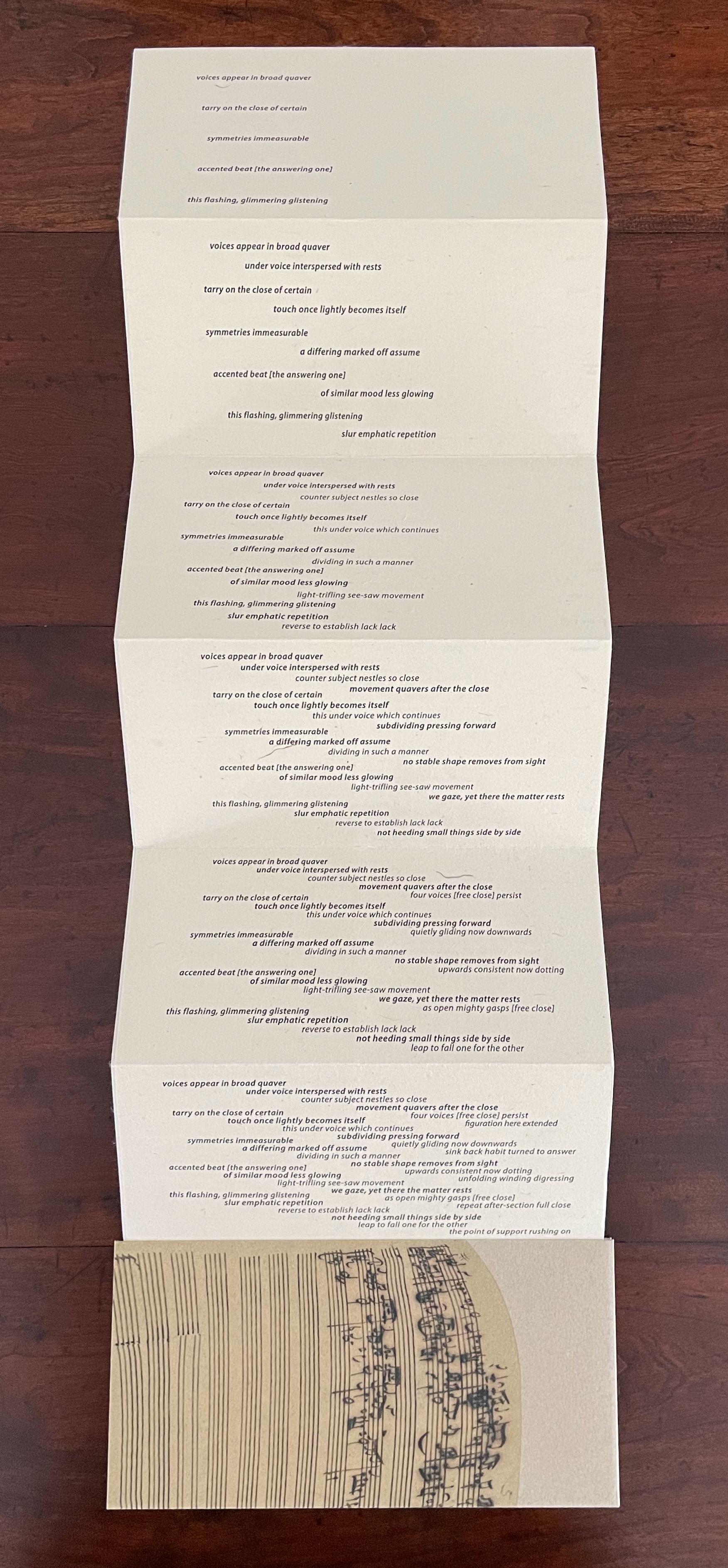
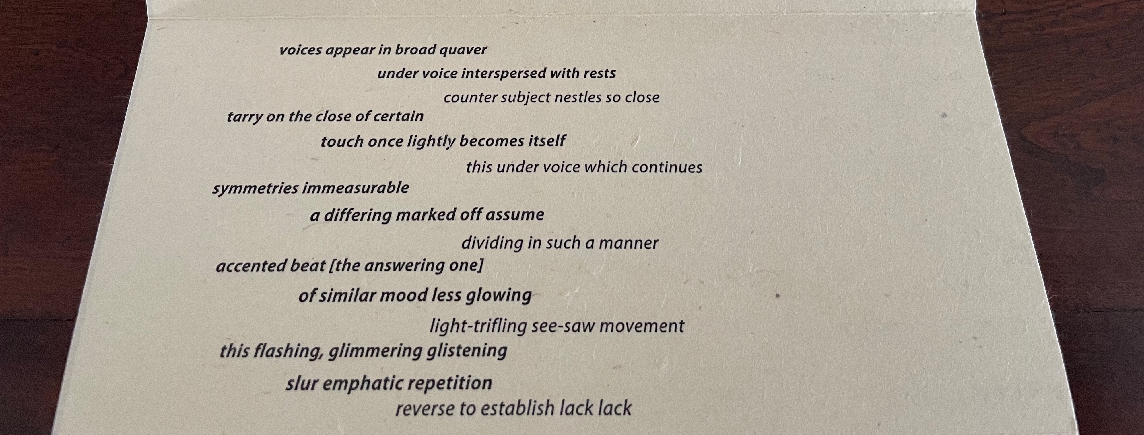
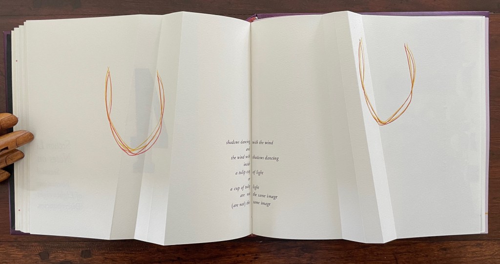
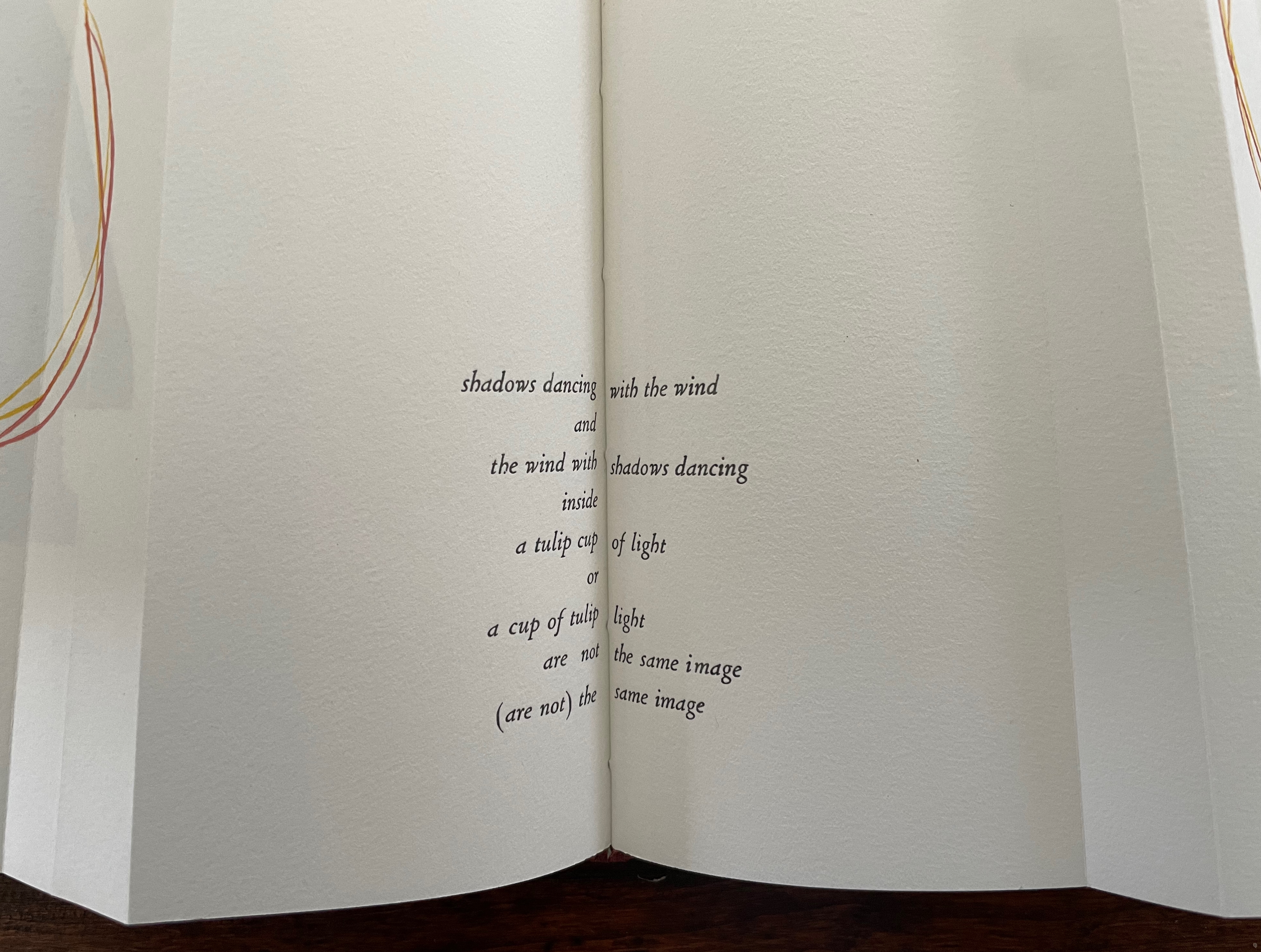
A fugue generally has a “subject” (or main theme), an “exposition” in which voices or instruments each play out the subject, then an “episode” (or connecting passages) that builds on the previous material, then further alternating “entries” in which the subject is heard in related keys until a final entry that returns to the opening key. The subject of Fugal is the generative process of vocal changes due to aging. The phrases of the poem have been drawn from an unidentified speech and language textbook.
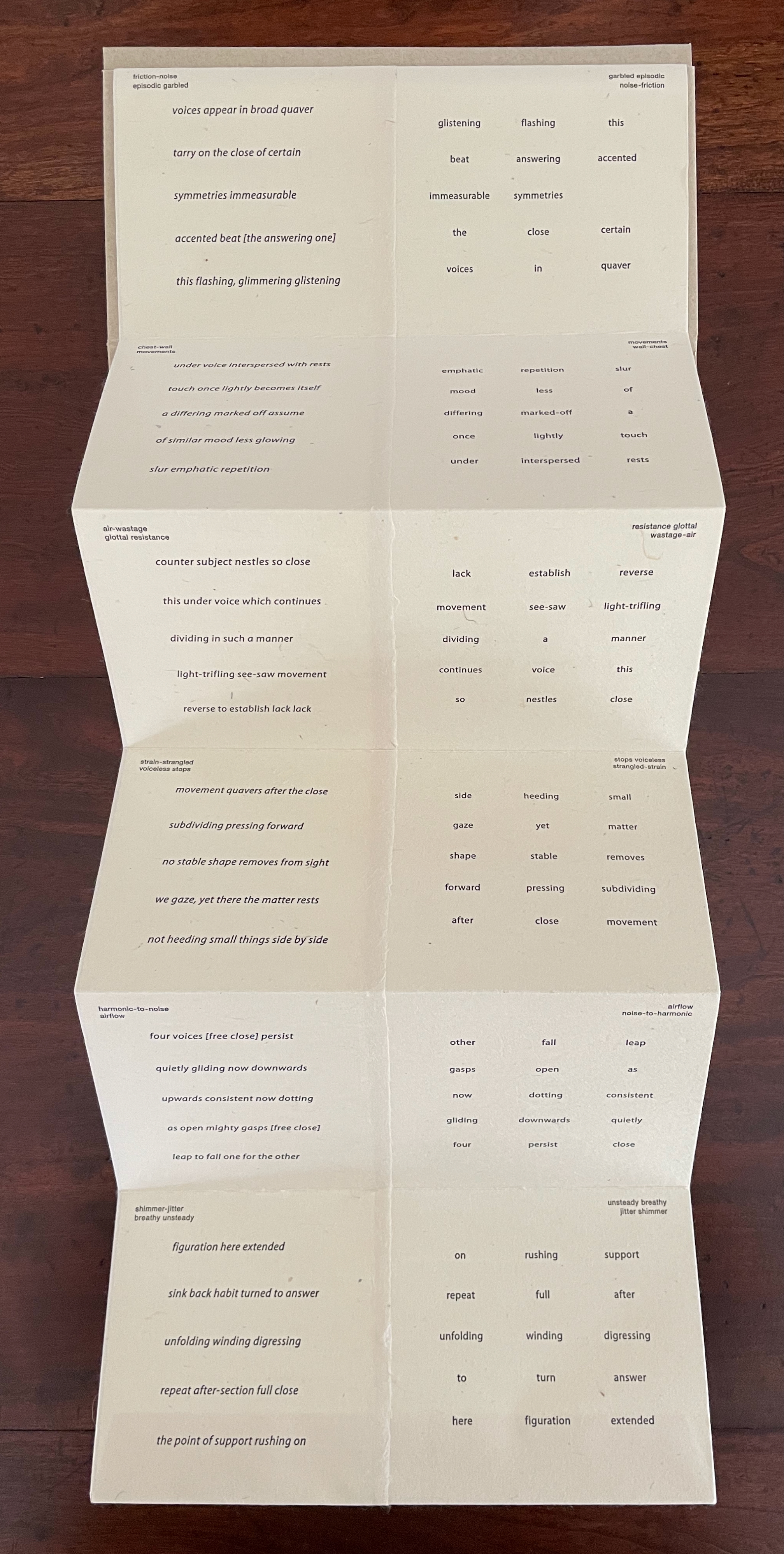
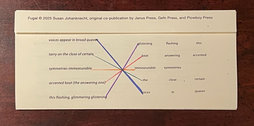
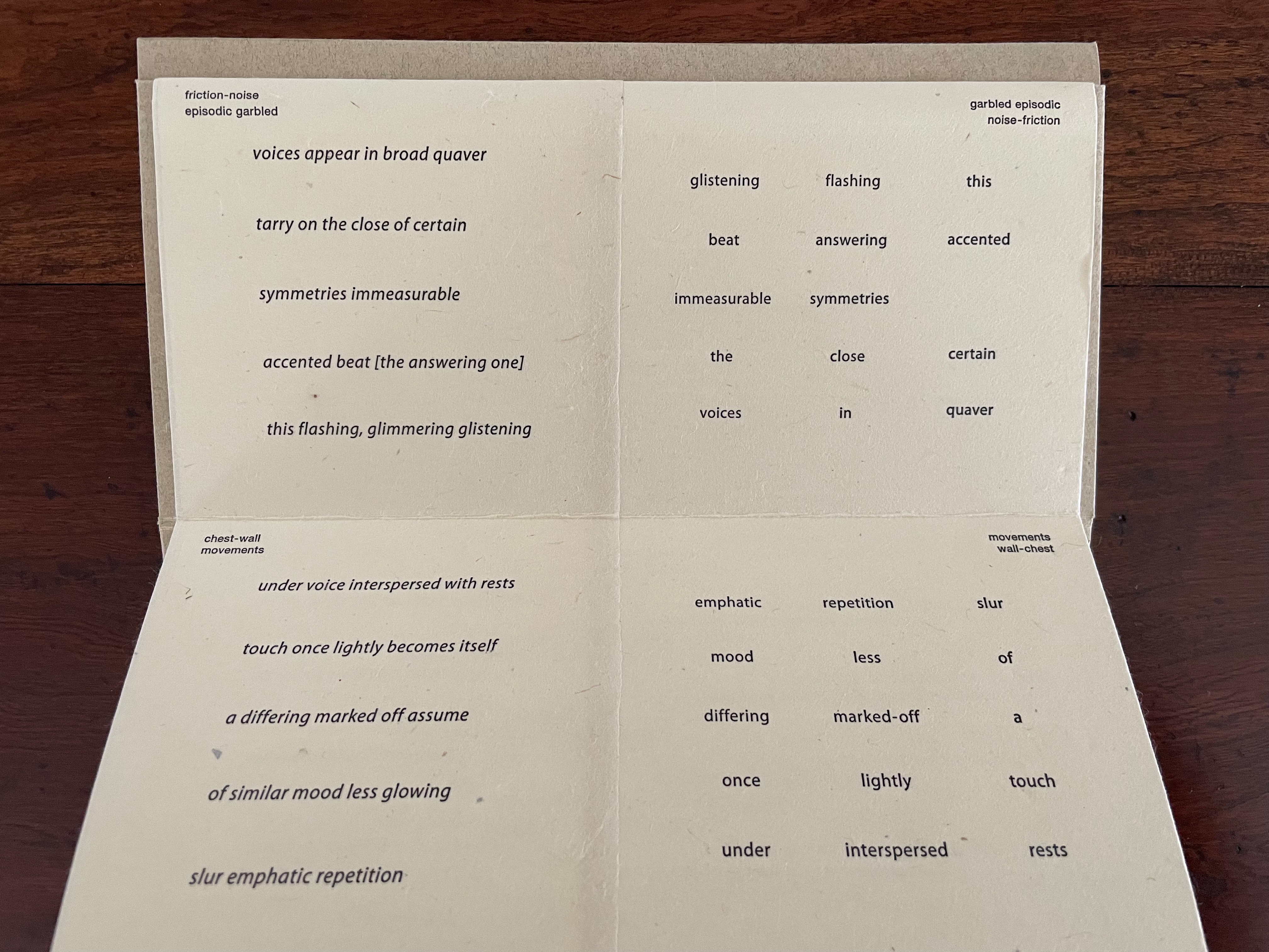
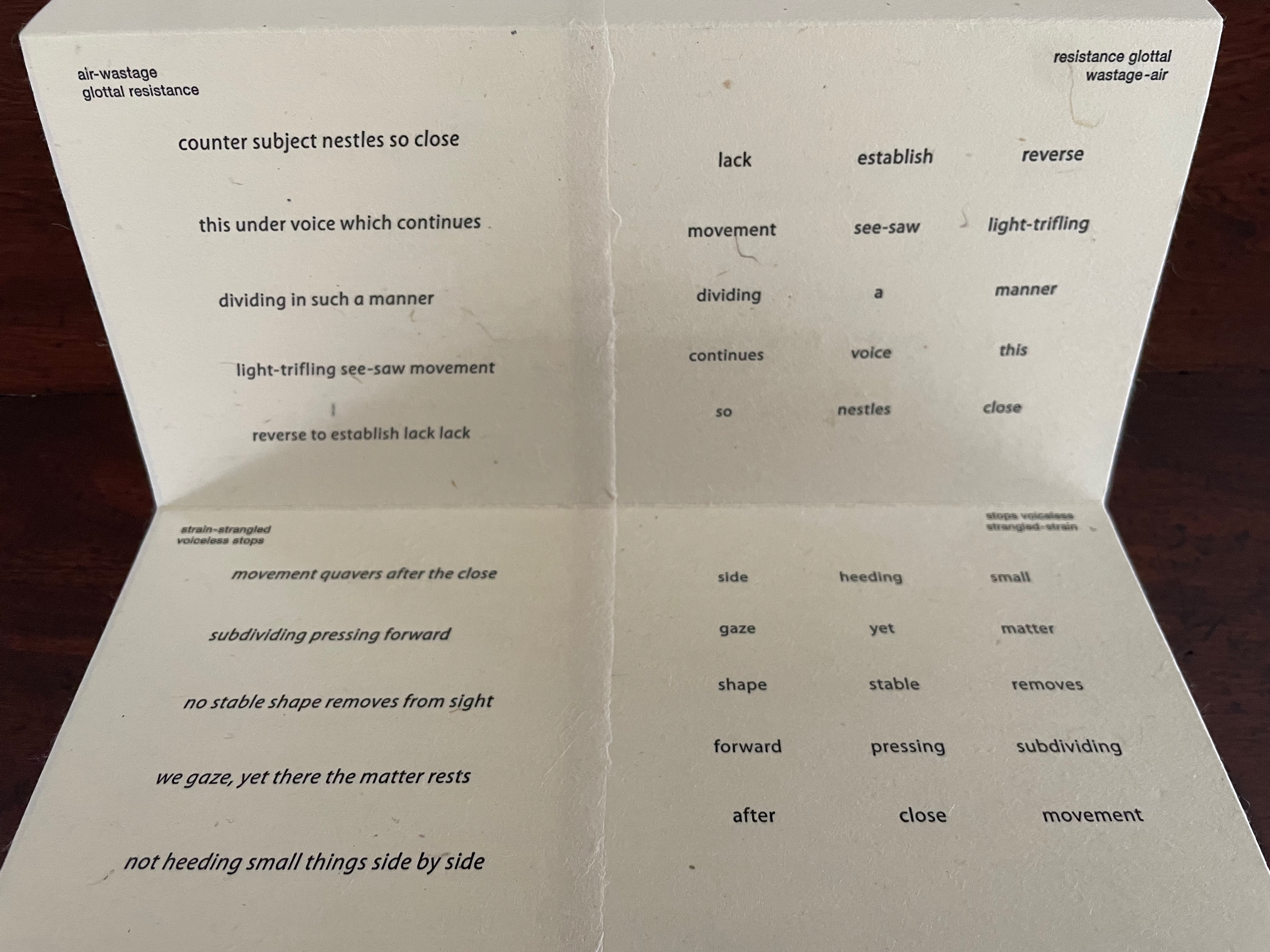
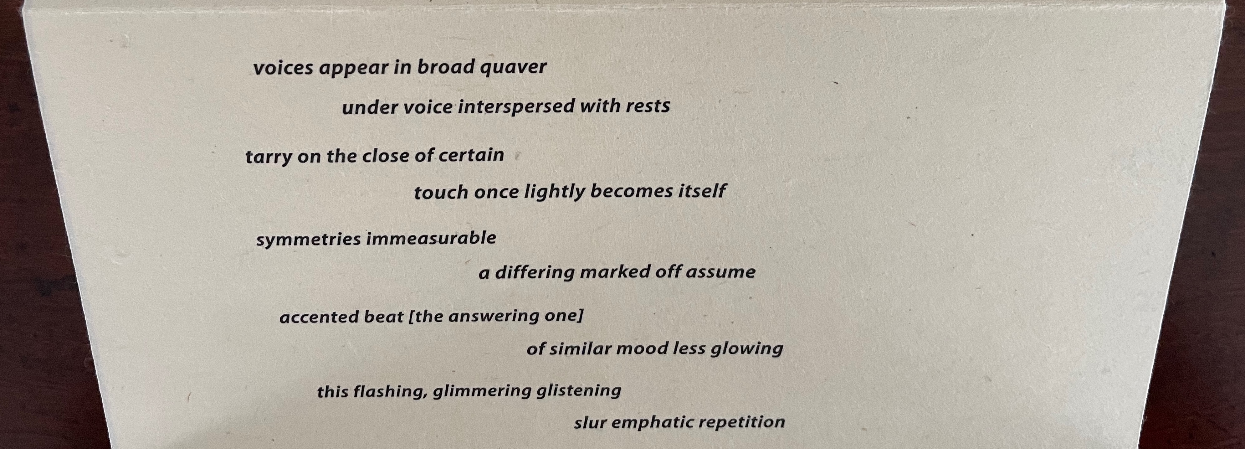
Van Vliet calls this the “sudoku” side of the book. In each panel, the words in the columns and rows on the right side come from the stanza on the left side. In keeping with the inversion of notes that appear in the upper left and right corners of each panel, the words from the stanza’s first line in each panel appear in the fifth line on the right; those from the stanza’s second line appear in the fourth line on the right; and so on.
On a separate folio provided by Van Vliet, I have used colored lines to show the textual connections between lines on the left with those on the right.
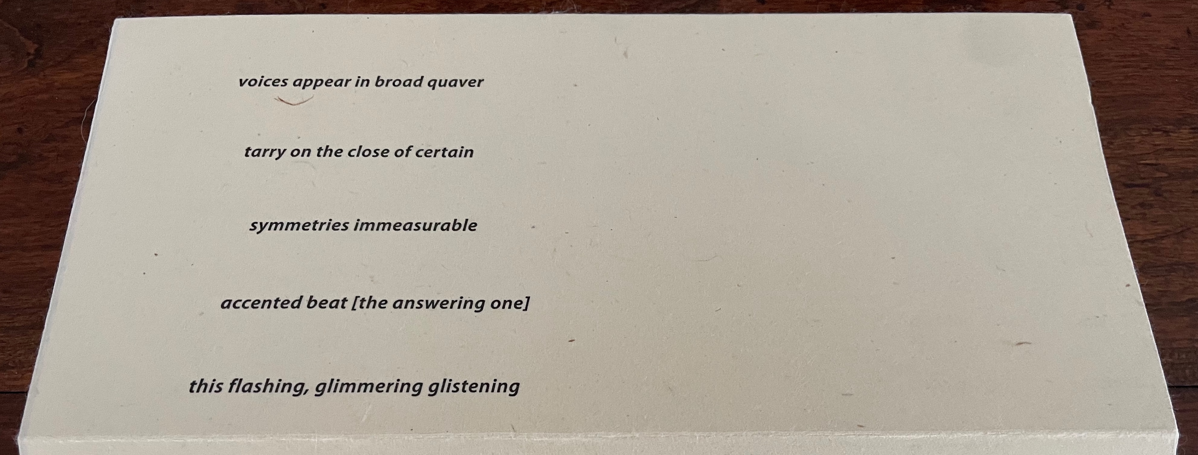
The fugue term “episode”, referenced in the first panel’s inverted notes in the upper left and right corners, nudges the reader to treat the right side of the panel as a “connecting passage”, building on the stanza to the left. The inverted notes suggest reading the words on the right side of the panel from right to left (“this flashing glistening / accented answering beat / symmetries immeasurable” and so on.
If treated as a score and assuming two voices for this panel, the first voice might read the first line on the left from left to right, and following on, the second voice might read the first line on the right from right to left (as suggested by the inverted notes and the positioning of the lines). Likewise with the two second lines. And on reaching their third lines, the voices would read simultaneously since the lines align with one another. At the fourth and fifth lines, the second voice might reverse its course and read from left to right to echo the first voice’s order in which the second and first lines had been read.
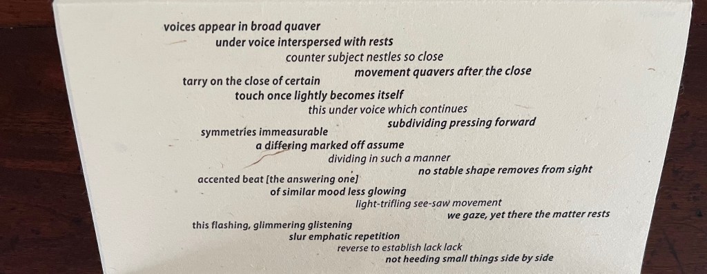
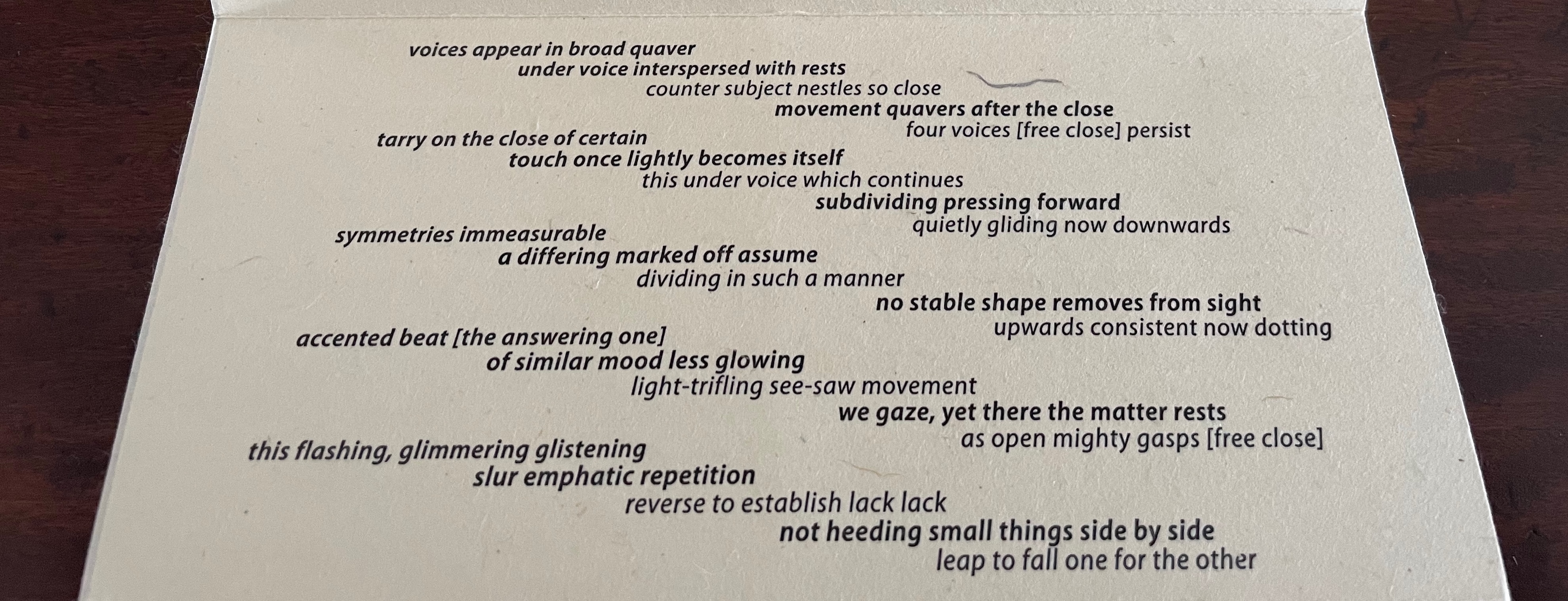
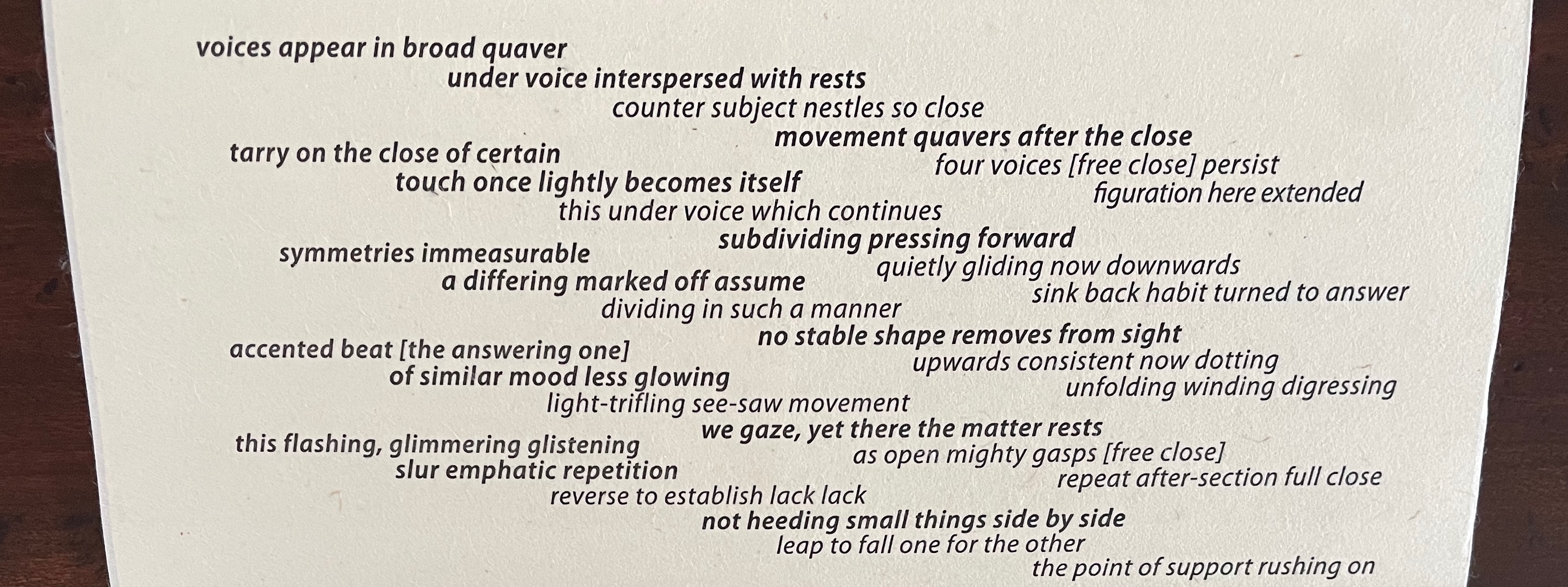
As Johanknecht urges in the colophon, “Variable movements of reading are invited”. The performance suggested above is just one possible performance. The other side of the leporello offers a more directed score for a reading in five voices. I had the pleasure to join Johanknecht’s sharing of Fugal with members of the Oxford University Society of Bibliophiles. Everyone noted how this side used indentation and regular and bold weights of type to suggest score lines, note stems, and whole notes. Everyone noted how this side presented a visual metaphor of the fugue by conflating the other side’s six stanzas panel by panel until the final panel depicted an overlapping five-voice rendering of all the stanzas at once.
Five of us rose to the challenge to take on a stanza each and read it aloud in concert, which gave us the opportunity to hear the work’s verbal emulation of a musical fugue.
Fugal prodded recollection of Douglas Hofstadter’s “Ant Fugue” from Gödel Escher Bach (1979). In the “Ant Fugue”, Hofstadter provides a different fugal experience, one that explores the overlapping relationships among Gödel’s theorem, Escher’s images, and Bach’s preludes and fugues. It is especially an illustrated narrative enactment of the concepts of prelude and fugue and so happens to provide a contrast with how Johanknecht, Van Vliet, and Miller-Brown turn type, layout, book structure, and content into their fugal artists’ book.
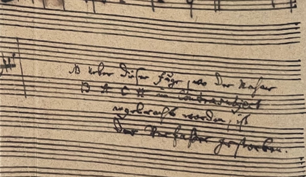
The cover image comes from Johann Sebastian Bach’s last known manuscript score for the unfinished fugue in The Art of the Fugue BWV 1080/19.
“Susan Johanknecht“. 28 May 2025. Books On Books Collection. Scroll down in this entry to find Johanknecht’s (Compound Frame) Seven Poems by Emily Dickinson (1998).
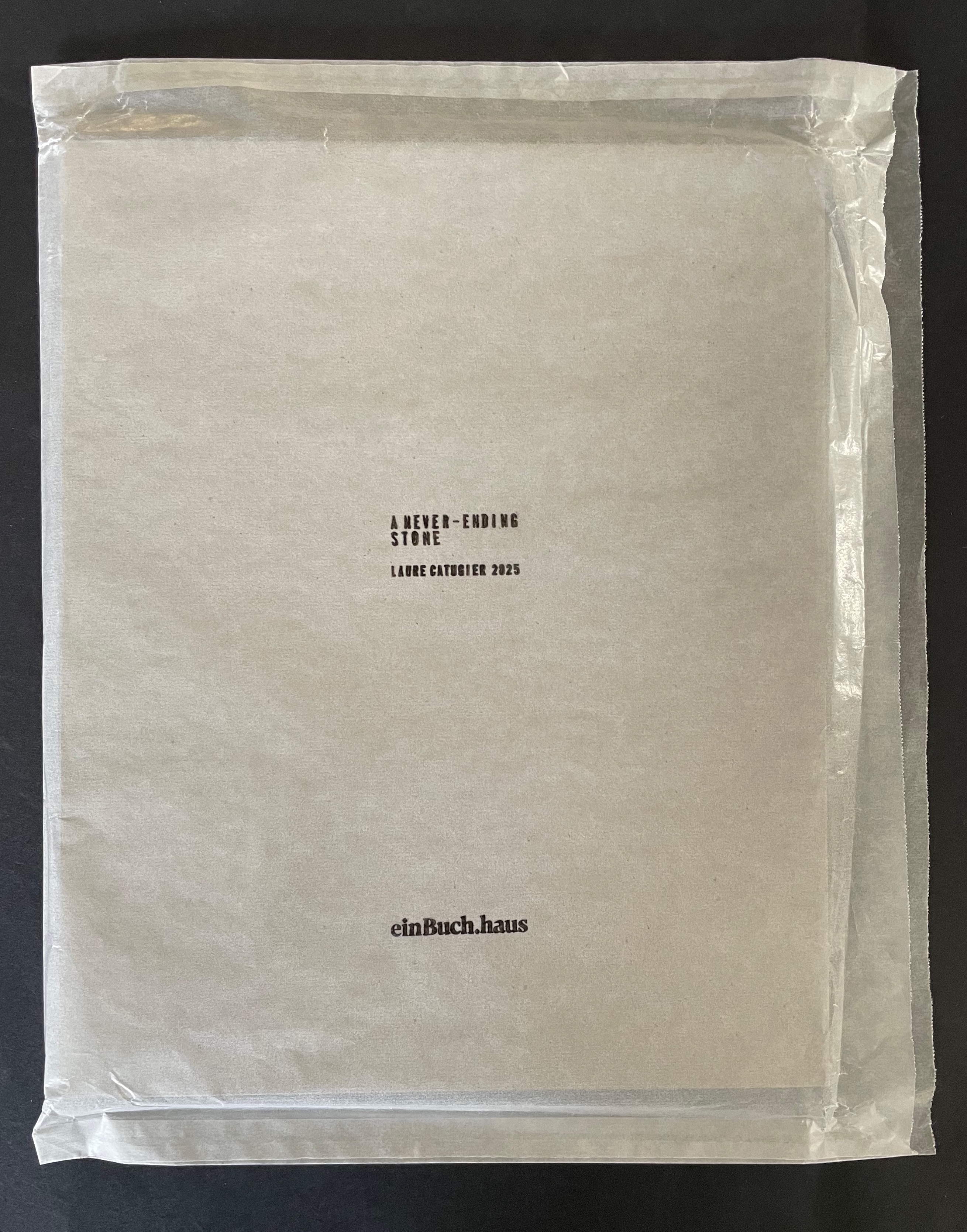
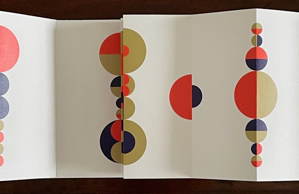
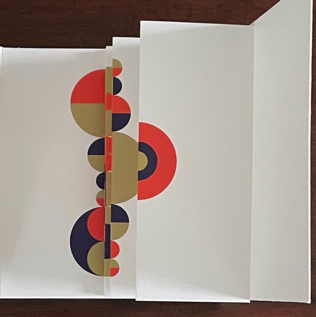
A Never-Ending Stone (2025) Laure Catugier Open spine, dos-à-dos with grey bookbinding board. 210 x H260 x 210 mm. 104 pages. Edition of 250. Acquired from einBuch.haus, 3 December 2025. Photos: Books On Books Collection.
A Never-Ending Stone is Laure Catugier’s first monographic catalog. Her skill with collage, alignment, shadows, materials, and the book format transform it into an artist’s book very much driven by her fascination with architecture and especially the architectural theories and practice of Oskar and Zofia Hansen. The Hansens eclectically embraced “human-scale” architecture, “environment art”, and what they called the “open form” structure, using space and time as its key elements. The Hansens also proposed that the architect should not be the all-knowing expert but should partner with clients as co-authors of their space, respecting how their interior and outside activities and relations with one another defined them and their space. Though somewhat a forerunner to User-Centered Design, Open Form radically aimed at structures that would evolve with interaction with the user and, as they unfolded, also align with nature.
For Catugier and the book form, this translates into “no hierarchy between elements; each element influences the next and modifies the original situation … no table of contents, no beginning, and no end, no reading direction: the usual order of the book is upset” (Catugier, p.9). Her publisher einBuch.haus chimes in: “By superimposing and intersecting lines through collage, Catugier multiplies the potential variations of form. Playing with scale, perspective, and framing, she disrupts the conventional Cartesian coordinates of the x, y, and z axes”.
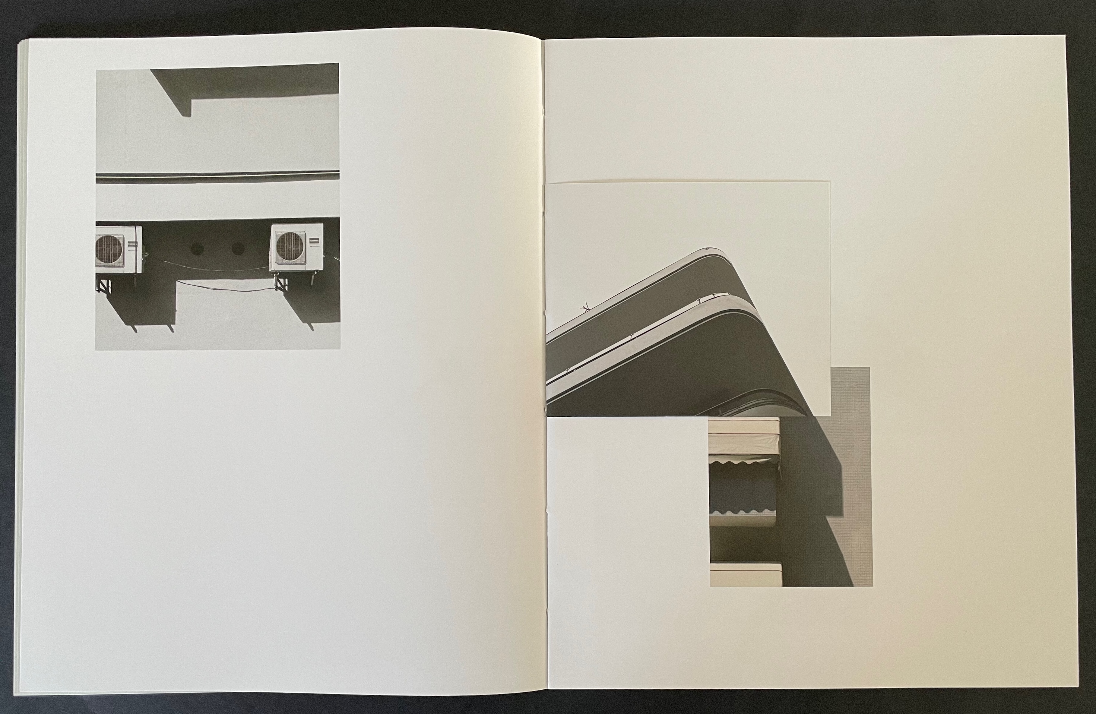
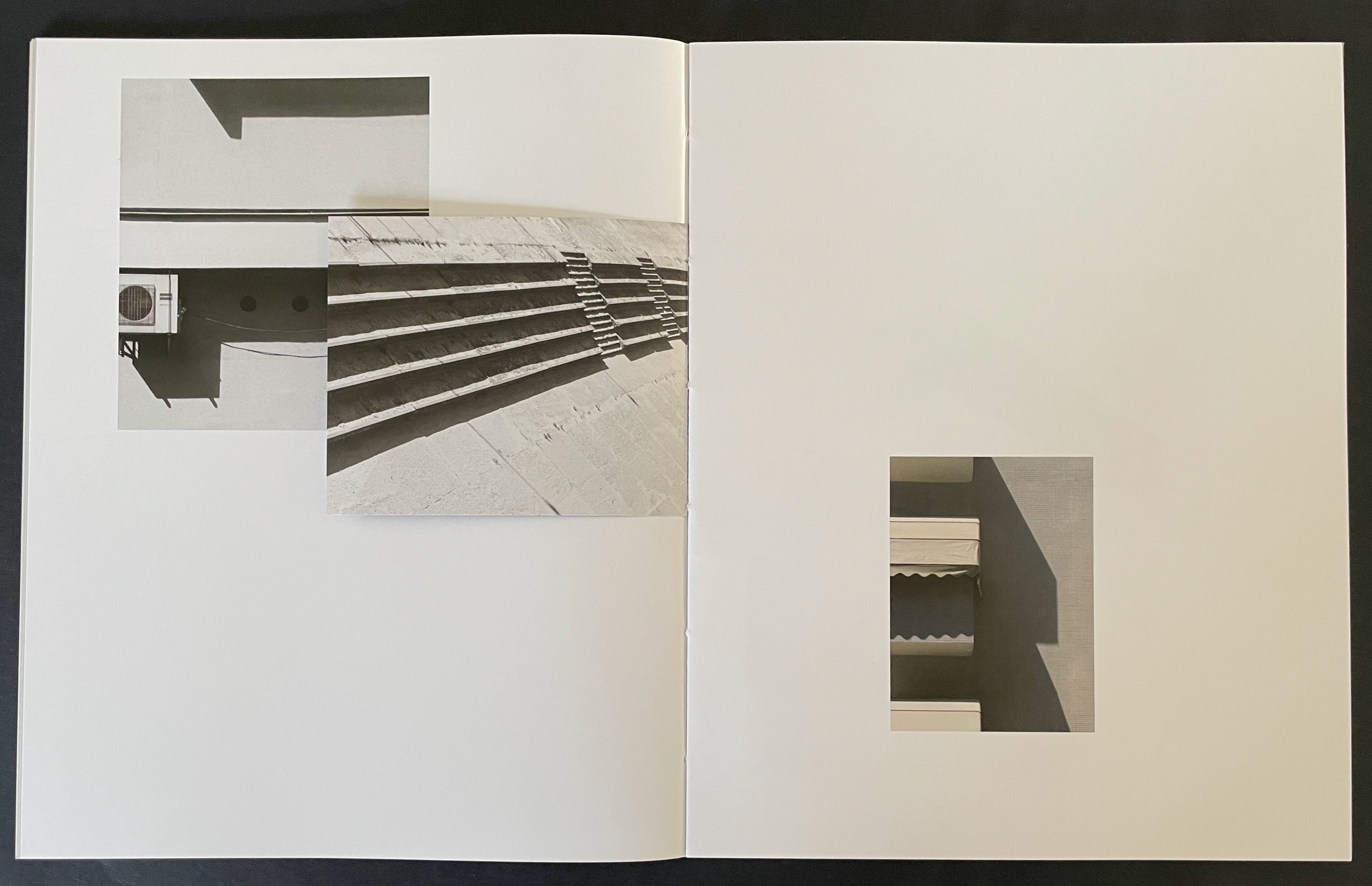
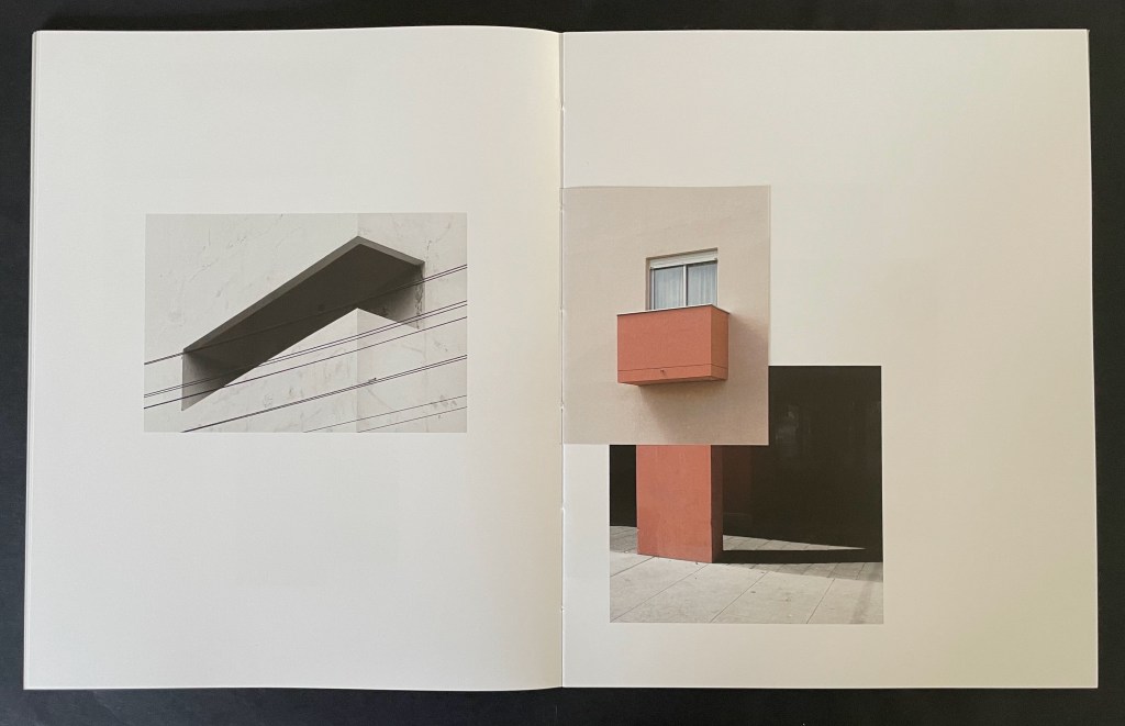
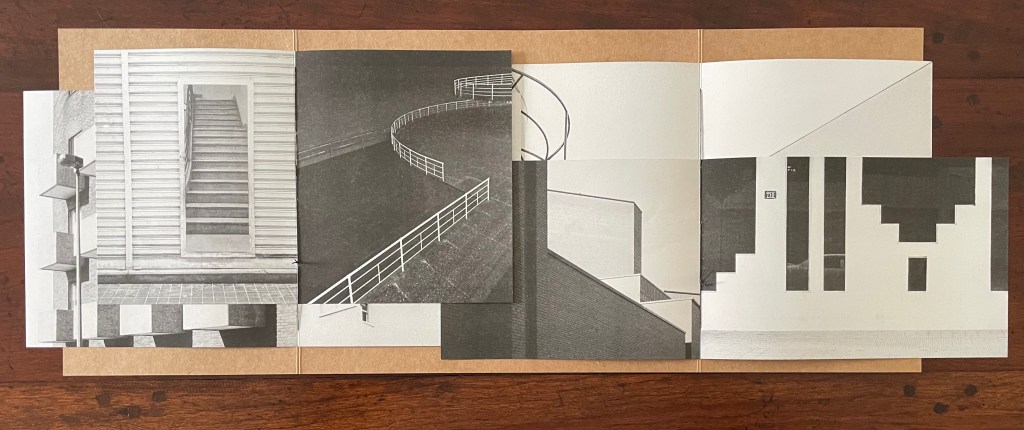
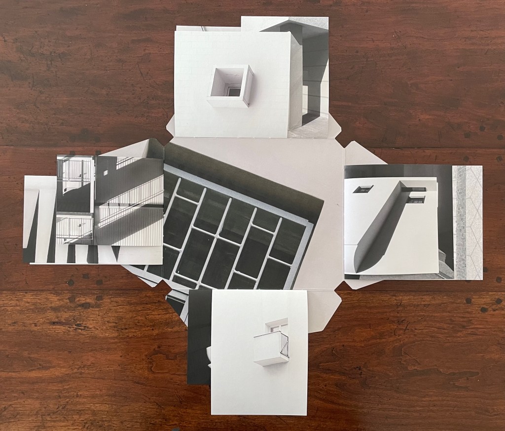
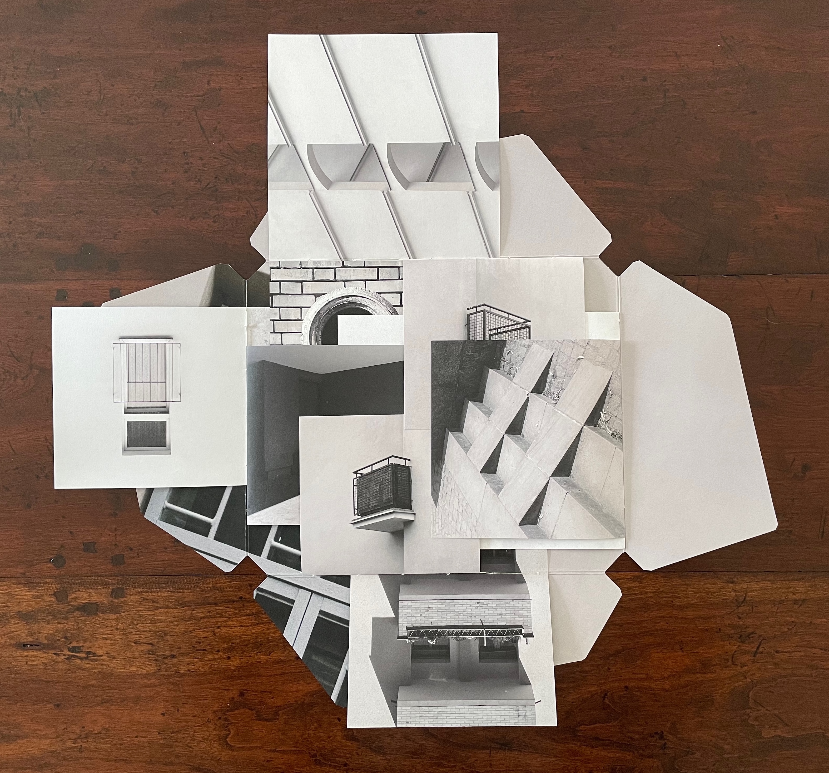
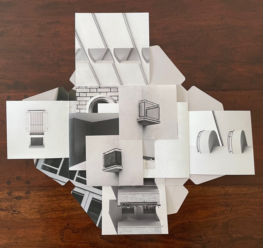
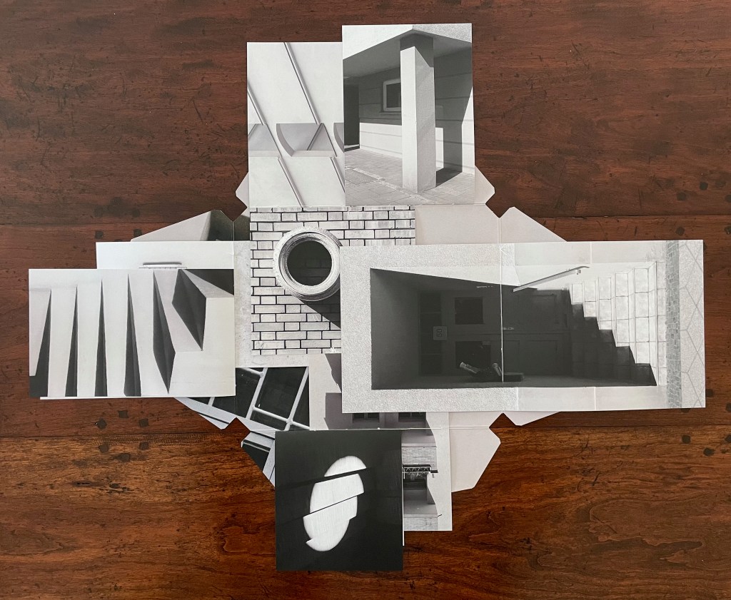
Variable page height and width combined with exacting registration form the key with which Catugier unlocks her superimpositions, intersections, collage, and disruptions. Below is a set of spreads that demonstrates this.
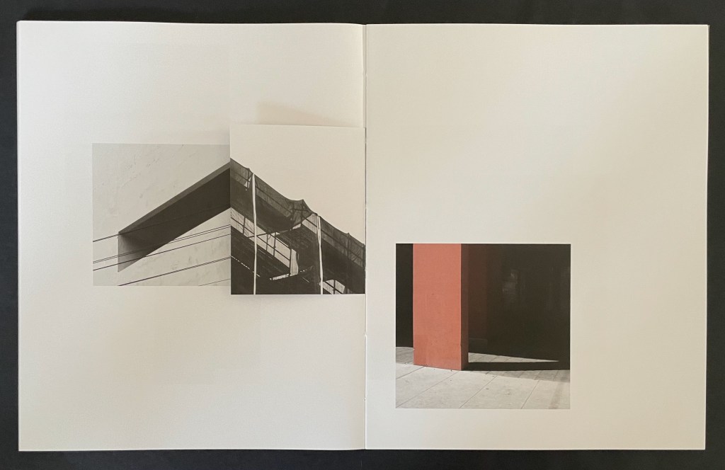
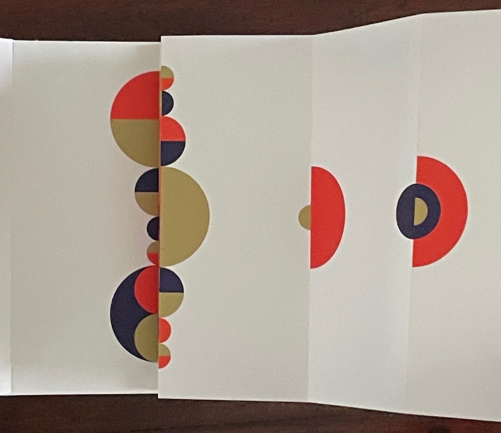
Above, in the spread on the left, the triangular image that falls on the recto page is actually a small folio to itself. The triangle’s right-hand edge aligns with the shadow of the image below it. This becomes apparent when the small folio is turned to the left, and now its verso image of shadows aligns with the shadow between the air-conditioning units (the small turned folio now hides nearer of the units).
Above, in the spread on the left, a small folio displays the russet concrete window box that seems to hang above the same-colored concrete pillar. When the small folio is turned to the left, the shadow on its verso page aligns with the shadow of a balcony to create the appearance of a building’s corner.
Given these architectural snapshots presented as dynamic collages echoing the Hansens’ theories, Catugier’s degrees in architecture and design at the École Nationale Supérieure d´Architecture de Toulouse are no surprise. Her turn to photography and then video, performance, installations and finally to artist’s books has been fortunate, in particular, for book art. The dos-à-dos structure of A Never-Ending Stone neatly echoes her trajectory. The title and choice of board for the covers reflect more specifically the architectural element. It was the French engineer and builder François Coignet (1814-88), one of the early inventors of concrete in France, who described it as “a never-ending stone.”
Bracketing the 28 folios that perform the dynamic collages above are an essay by Anna-Lena Wenzel covering Catugier’s background in architecture, photography, performance, video, installation, and book design, and an interview with curator Moritz Küng highlighting from the start another Catugier passion that also has its inspiration in Oskar Hansen’s architectural work: music and sound.
Architecture is Frozen Music # (2023)
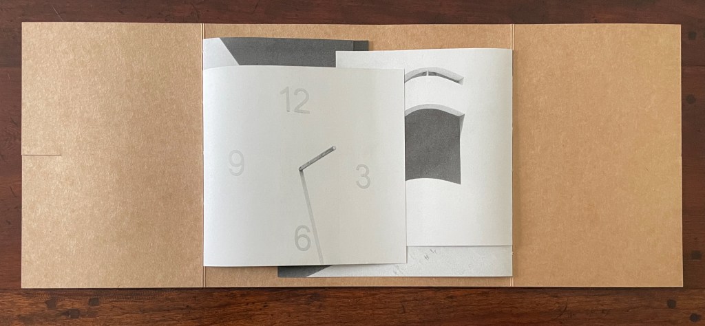
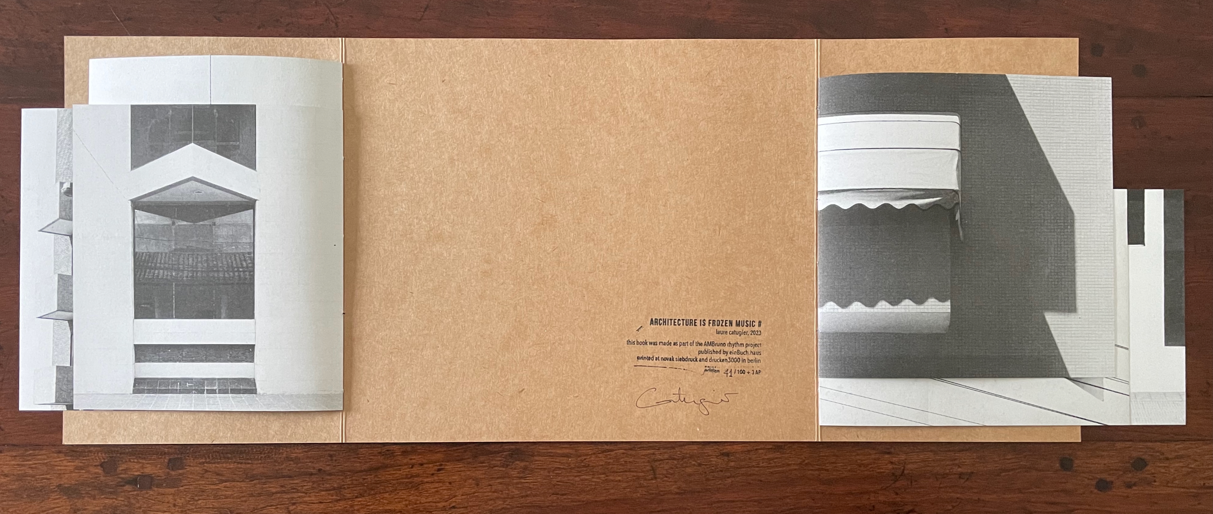
Architecture is Frozen Music # (2023) Laure Catugier “Open Form” binding (French fold cover with slot fastening; two pamphlet-sewn booklets attached to verso and recto edges of cover with staggered top and bottom margins). Cover: H230 x W270 mm (closed), W575 mm (open); Pamphlet verso: H197 x W180 mm (closed), W330 mm (open); Pamphlet recto: H197 x W204 mm (closed), W384 mm (open). [8] pages in each pamphlet. Edition of 100, of which this is #41. Acquired from einBuch.haus, 1 October 2025. Photos: Books On Books Collection. Displayed with permission of the publisher.
Hansen was commissioned to design a music pavilion “that would reflect contemporary thinking in music”, which he translated into a “search for ” ‘time and space’ qualities in music” [and a structure that would picture] the spatiality of music … enabling viewers to search for their ‘audio’ place and simultaneously experience visual transformations — to be in audio-visual space-time, and later on he would refer to design as “compos[ing] space like music” (Scott, pp. 140-47).
Catugier’s Architecture is Frozen Music project translates Hansen’s analogy into her installations and artist’s books. In Architecture is Frozen Music # (2023), she adds a French fold structure that engages the techniques of variable page height and width, registration, and dynamic collage across two facing interleaving booklets. Even the book’s fastening (see above) participates in the registration and dynamic collage techniques, which can be further appreciated by turning over the extended French fold cover (see below).
French fold cover opened, displaying two booklets interleaved. Note the fastening slot on the left.
The two booklets separated, revealing the colophon. Note the difference in margins above and below from one booklet to the other, facilitated by the structure’s two spines.
Reverse of the extended French-fold cover, showing the collaged images that form the dynamic collage on the front of the closed book.
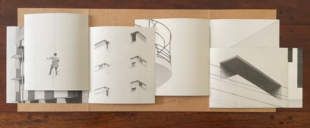
When the two booklets’ pages are turned, the differences in the top and bottom margins, the size of the leaves, and their positioning on the two spines become more evident.
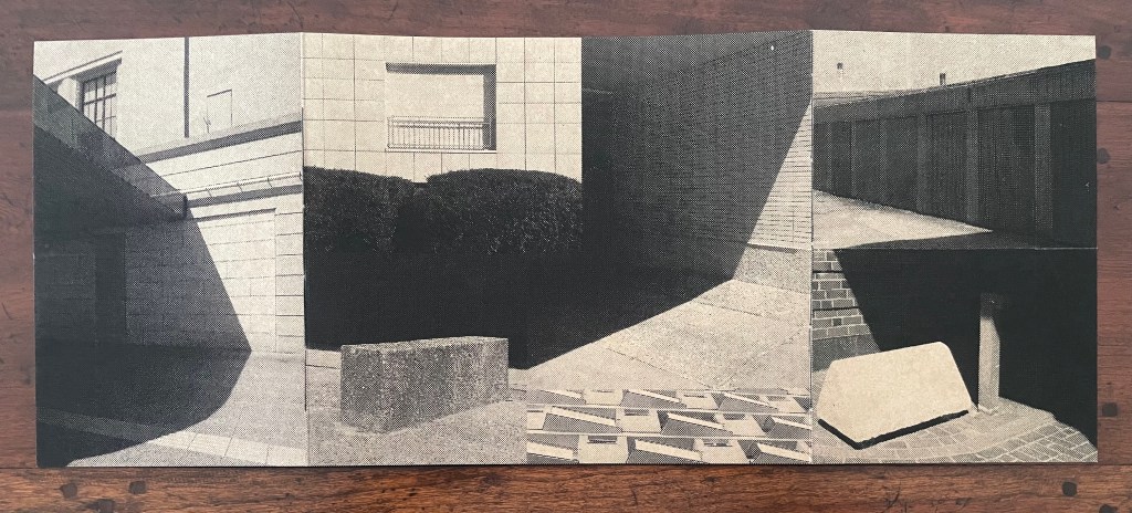
Below, the linear registration across the overlapping leaves of the two booklets suggest lined music sheets with the collage in the center playing the role of an oversized treble clef and musical note and enacting the title’s assertion that architecture is frozen music. Structure and image meet metaphor.
Architecture is Frozen Music (2022)
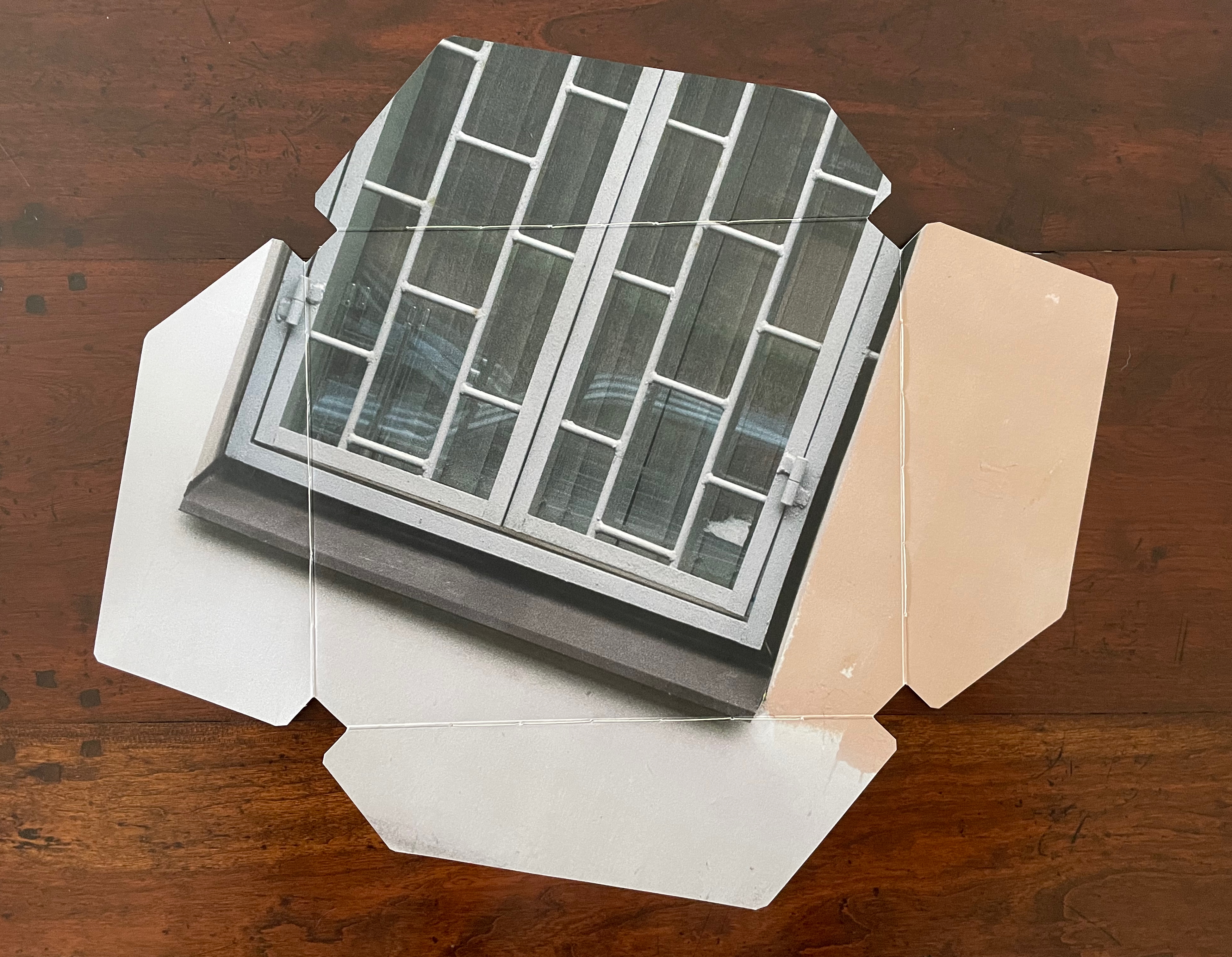
Architecture is Frozen Music (2022) Laure Catugier Thin cardboard box; four pamphlet-sewn signatures attached to poster stock cut and folded into four overlapping flaps. Box: H218 x W258 mm; Cover: H210 xW250 mm (closed); Verso signature: H145 x W190 mm (closed); Recto signature: H155 x W190 mm (closed); Bottom signature: H162 x W172 mm (closed); Top signature: H210 x W170 mm (closed). All heights measured along sewn edge. [8] pages to each signature. Edition of 30, of which this is #14/30. Acquired from einBuch.haus, 1 October 2025. Photos: Books On Books Collection. Displayed with permission of the publisher.
Preceding Architecture is Frozen Music # (2023), which was part of that year’s AMBruno Project, an even more complex and smaller editioned version of Architecture is Frozen Music appeared. In every sense, it was occasioned by exhibitions of the same title. Its cover is even a fragment of an artwork made of poster paper for one of the exhibitions. It exemplifies what Dick Higgins described in 1965 and 1981: intermediality.* It also exemplifies Catugier’s interpretation of the Hansens’ concept of “open form”.
Book closed.
Reverse side of extended cover. Note the binding threads along the four spines/folds.
The binding and interleaving of four pamphlet-sewn signatures, each to an edge of the square in the middle of the cover, facilitates this “open form” book. On first opening it, there is, of course, a page on top. To that degree, the artist has imposed a beginning, and once all of each signature’s pages have been turned, there seems to be an end.
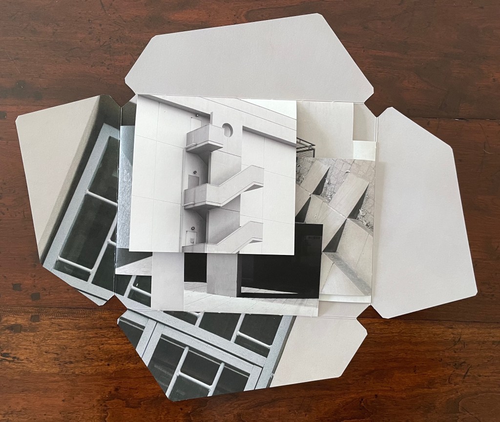
Top: book open to four interleaved signatures. Bottom: All four signatures’ pages turned.
But go back to the opening. Although the structure imposes a first page to turn, it also offers four different orientations the reader could adopt. In the orientation below, the first page turns upwards, but with a 90° reorientation to the left, it would turn as a Western codex is expected to do. Another 90°, and the first page would turn downwards. And with a third 90°, it would open as an Eastern codex is expected to do.
We might turn to the idea of the fugue as a rough analogy for this particular “open form” book. A fugue generally has a “subject” (or main theme), an “exposition” in which voices or instruments each play out the subject, then an “episode” (or connecting passages) that builds on the previous material, then further alternating “entries” in which the subject is heard in related keys until a final entry that returns to opening key. Like the fugue, Catugier’s “open form” book is more a style of composition than a structural form.
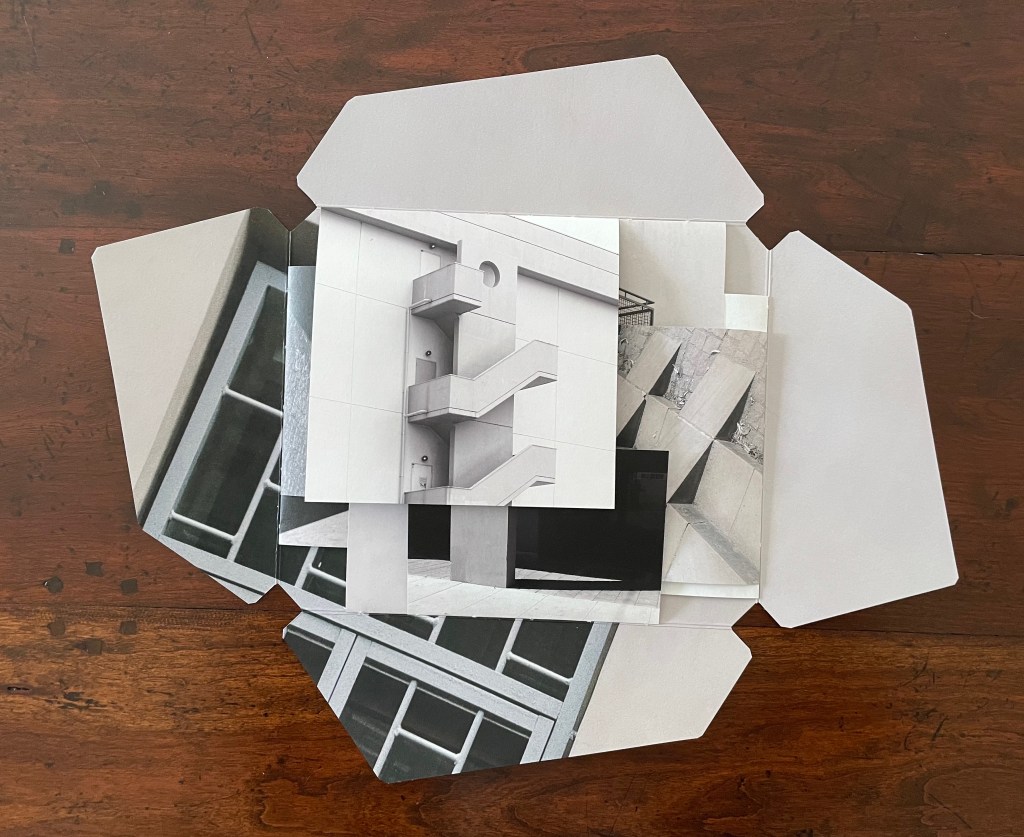
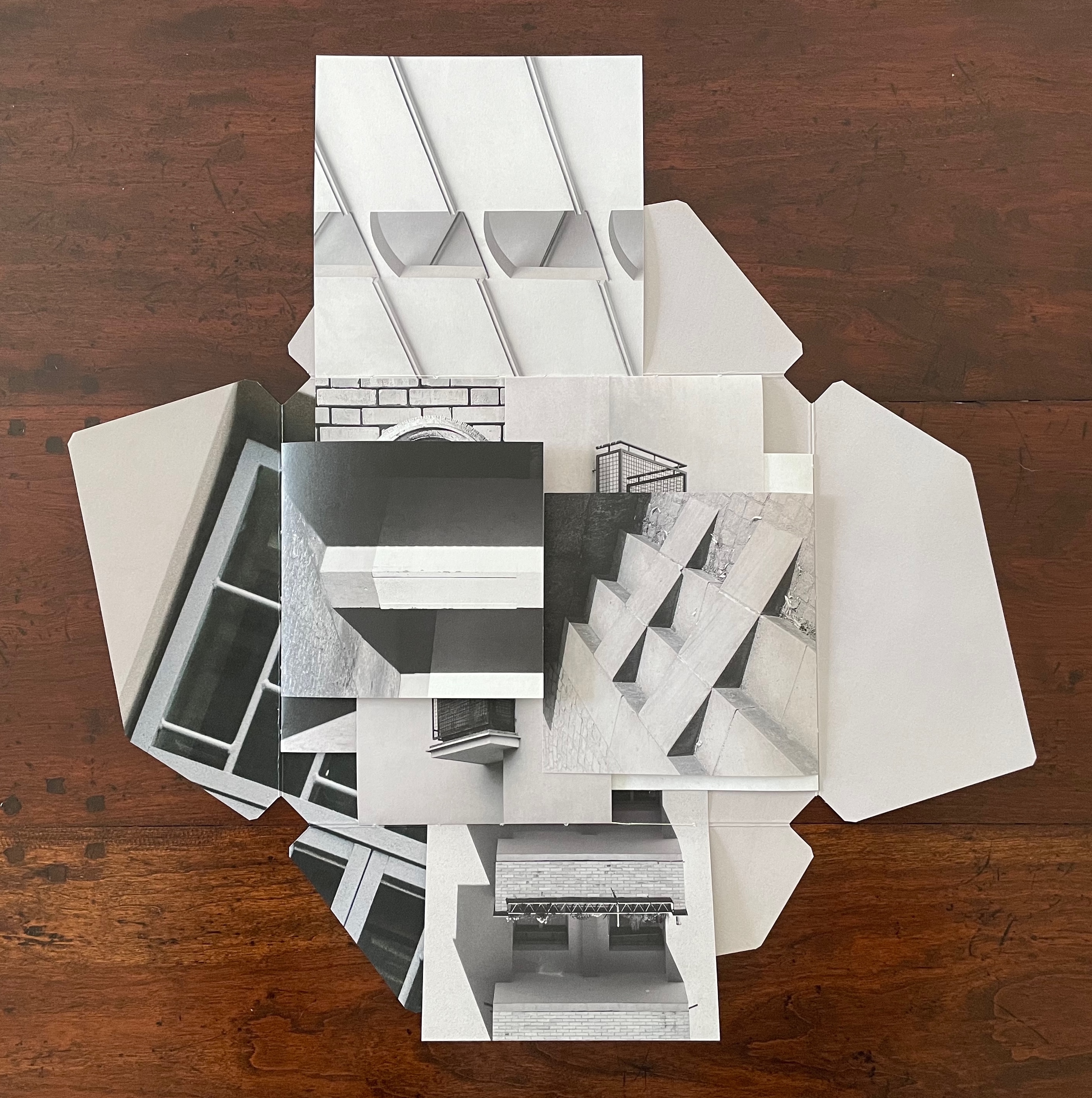
Catugier’s main theme is “architecture is frozen music”. Her technique of dynamic collages creates a “fugal” effect with at least six elements or motifs or voices. One is the architectural motif (balcony, window, stairs, vents, or even furniture such as a chair) displayed. Another is the source or direction of light. Another is the alignment of shadows cast by the architectural motifs. Another is a geometric motif arising from the motifs of architecture, light, and shadow. Another is the dimension of the folios in the signatures. And yet another is the position of the signatures along the spines.
Below in the opening of the book, the architectural motif of an external staircase “sounds” out the subject on the first page. The geometric voice picks out a circular opening atop a rectangular column crossed by parallelograms ending in square balconies. The voice of signature placement aligns and extends the rectangular column with another column on an underlying signature’s top page. When the first page is turned (upwards), the voices of folio dimension, direction of light, and shadows come into play, and we find that the underlying column has been truncated and is perpendicular to a bright column of light on a wider structure receding into shadow. The architectural voice counterpoints the perpendicular columns with stairs slanting away from them at 45°. When the bottom signature’s top page is turned (downwards), those stairs are almost fully “sounded” on the right while the balconies motif returns in the downturned bottom signature.
Left: book open to four interleaved signatures. Right: top signature’s first page turned (upwards).
The balconies motif increases in volume as the left signature’s top page turns (leftwards) to display a balcony grating and reveal another balcony in the center.
Left: bottom signature’s first page turned (downwards). Right: verso signature’s first page turned (leftwards).
From the view on the right above to the view below, the turning of the right signature’s top page (rightwards) reveals two more balconies. We now have a passage of balcony motifs moving from left to right like musical notes on a score.
Recto signature’s first page turned (rightwards).
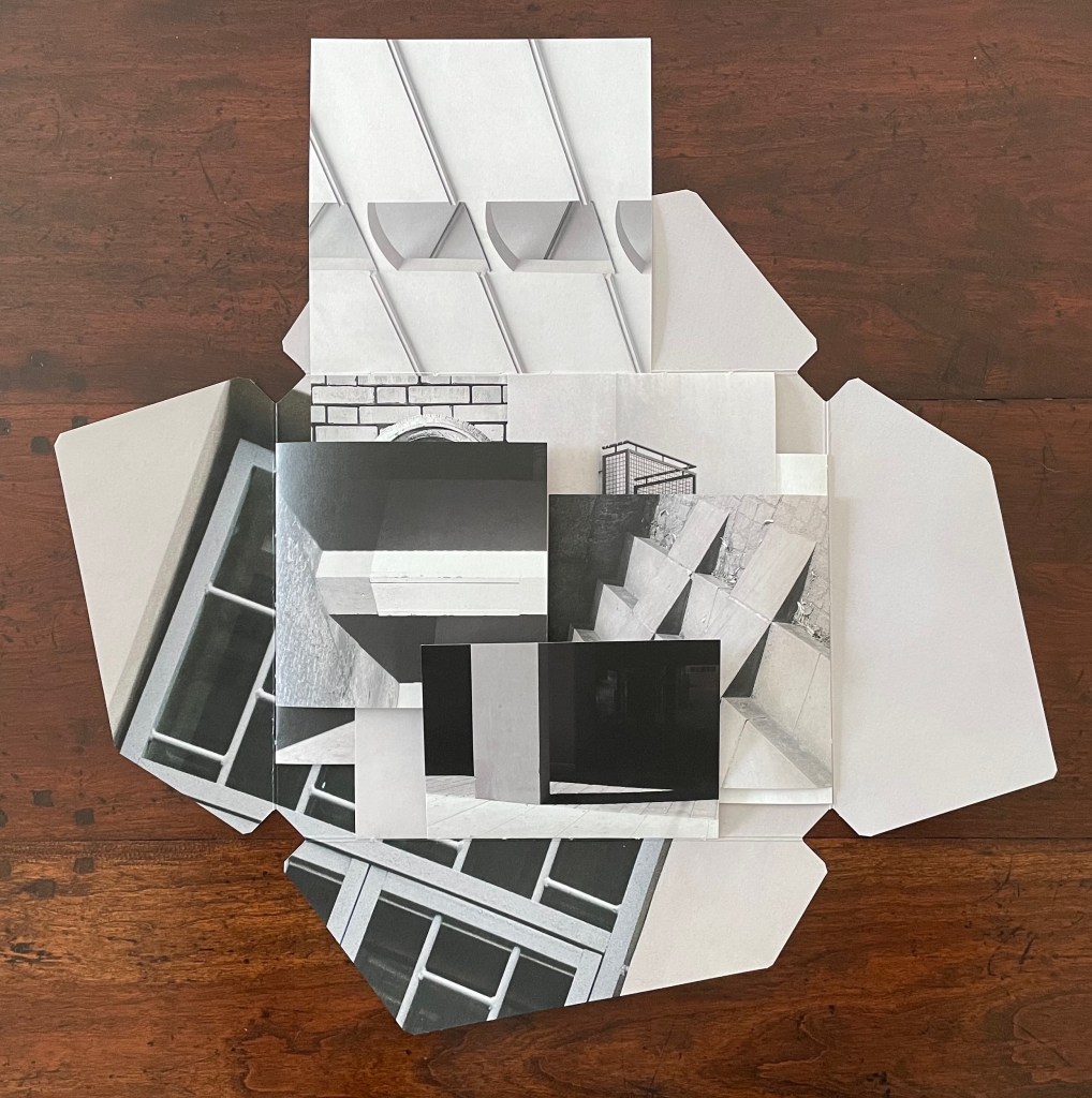
The spread below provides an example of the geometric motif at work. In this view, the center of the open book presents a circular ornament, rectangles of bricks, window squares in a shadowed door, and a small triangle of shadow to the ornament’s lower right. In the overlapping pages above the center are small triangles and arcs alongside rectangles and squares. Below the center are a large broken circle of light on a black square page, and, beside that, the truncated rectangles of a balcony. The geometric parallels running from the top, the center, and to the bottom are matched by another set of geometric parallels formed by stair-stepping shadows moving from the left signature, across the center in the bricks, and onto the right signature’s shadows in the steps leading to the door. Across the harmonizing center, the top and bottom of the open book perform a counterpoint of breaking geometric forms to the theme of stair-stepping shadows from left to right.
Geometric motifs.
There are as well, of course, geometric parallels between the top and left, the bottom and left, and between the top and right, and the bottom and right, but enough of verbal description of the visual music. Each of the signatures and motifs can be “heard” in its own right. Likewise, each view of the open book can be “heard” in its own right. And likewise, as each page turns, new harmonies and counterpoints can be “heard”. It all leaves us with the question to be debated, to paraphrase Douglas Hofstadter’s reflection in the “Ant Fugue” chapter in Gödel Escher Bach: Is the book more than the hum of its parts? What is certain is that, in bringing together architecture, music, photography, and the book, Architecture is Frozen Music offers an exceptional example of the artist’s book as intermedia.
*“Intermedia” is a term adopted by Dick Higgins from Samuel Taylor Coleridge in 1812 used “to define works which fall conceptually between media that are already known” but useful to Higgins in demystifying the avant-garde.
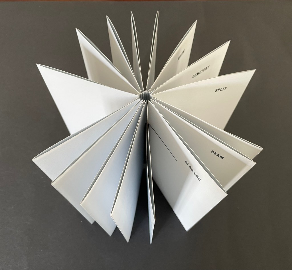
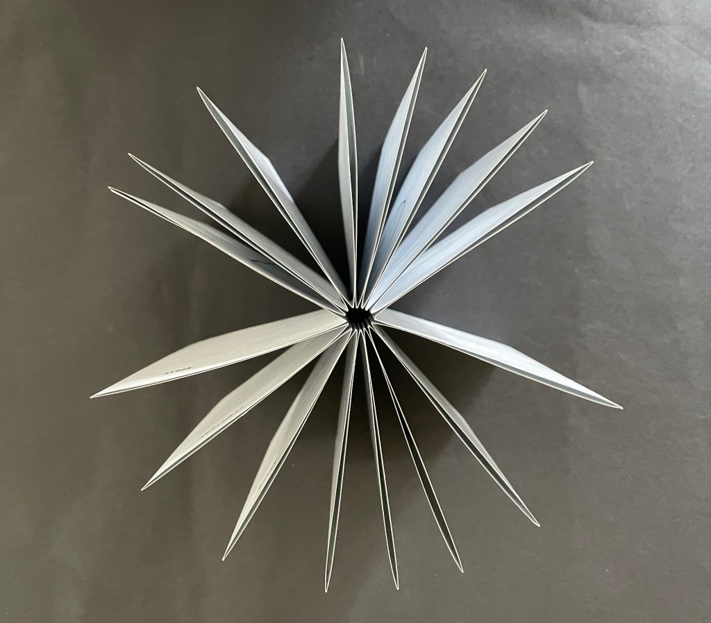
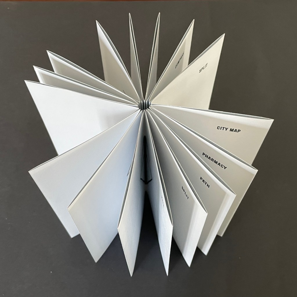
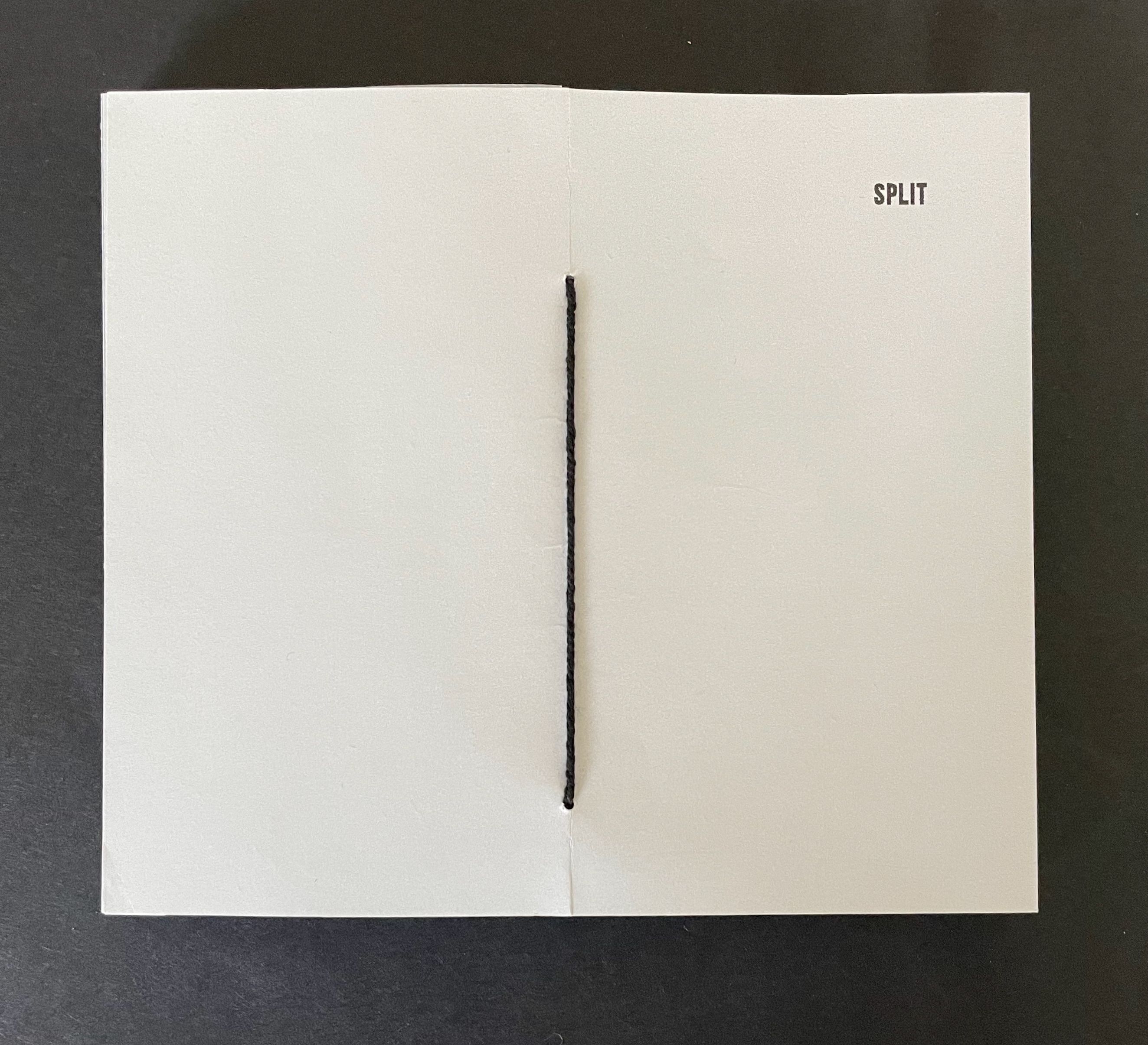
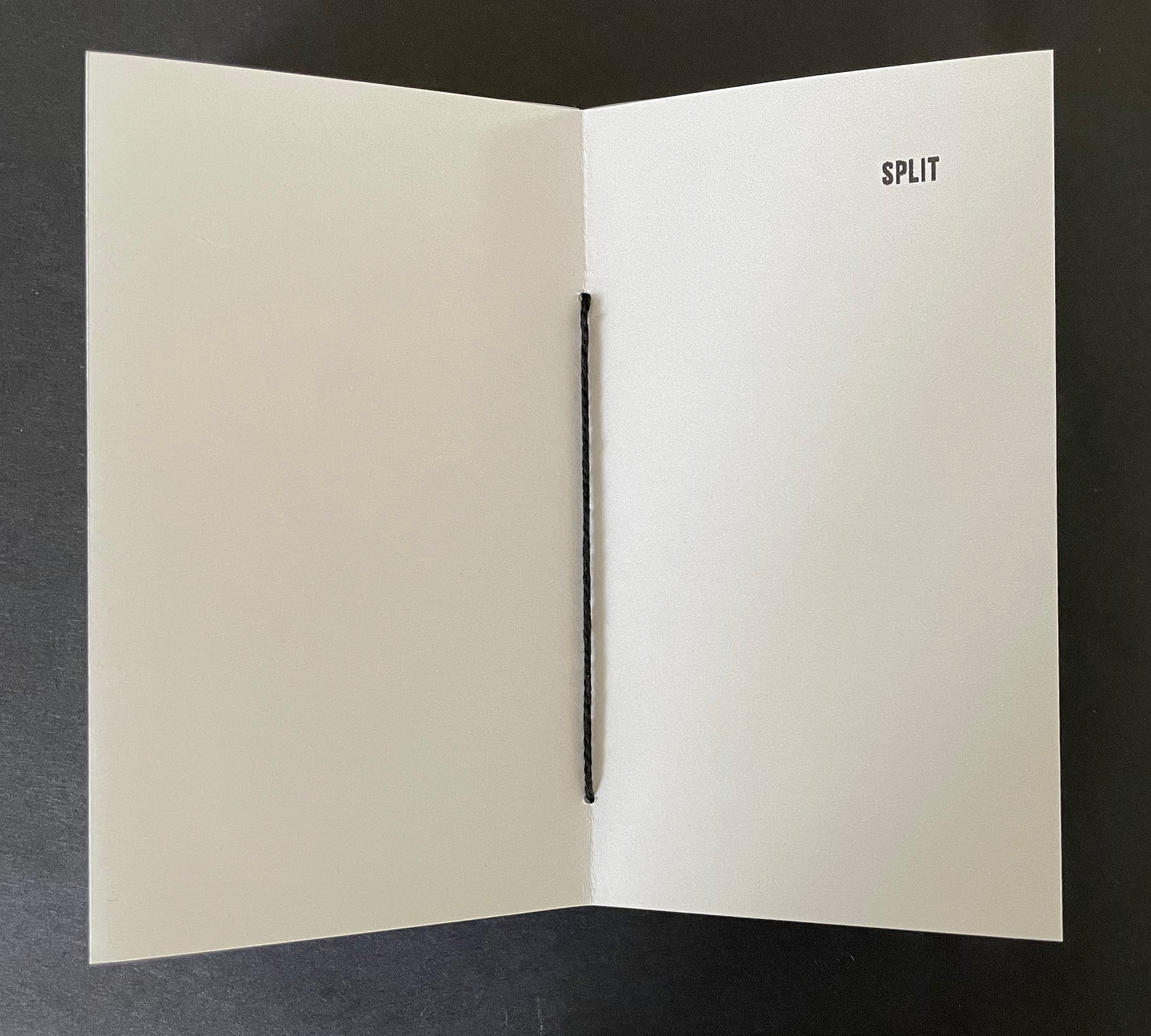
Split (2025)
Split (2025) Laure Catugier Pamphlet-sewn star book. H170 x W150 mm. [32] pages.Edition of 22, of which this is #2. Acquired from einBuch.haus, 1 October 2025. Photos: Books On Books Collection. Displayed with permission of the publisher.
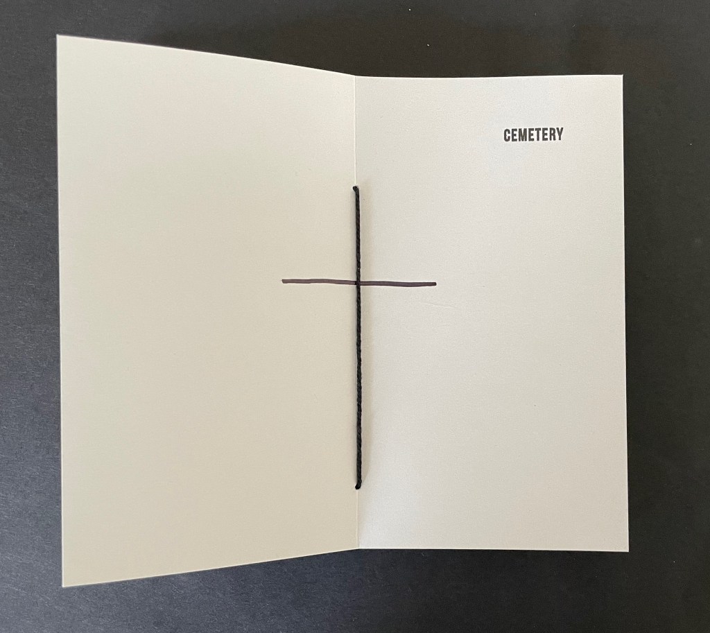
Split (2025) is another stab at the “open form” book. As a pamphlet-sewn star book without a front or back cover, it has no beginning or end.
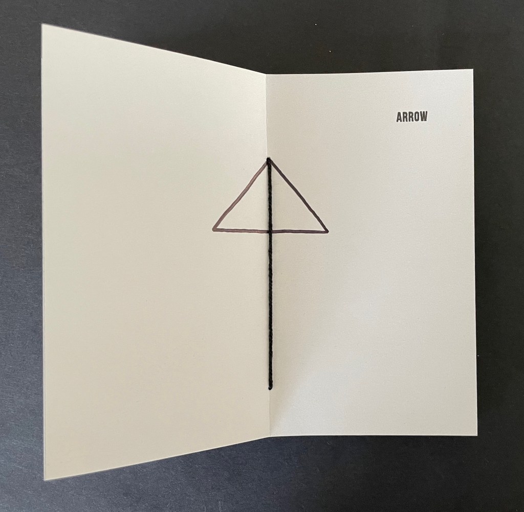
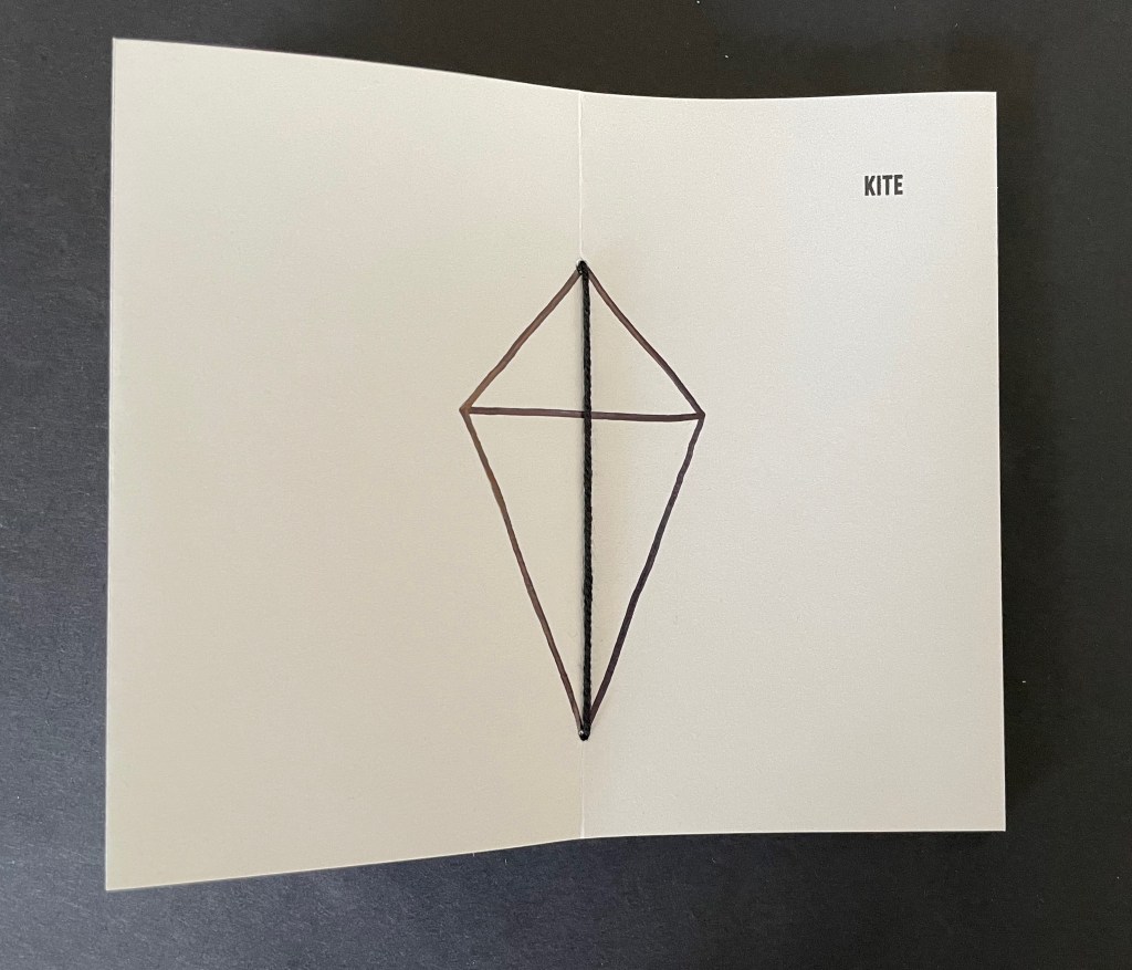
It has sixteen double-page spreads. Each has a word in the upper right corner and an image in the center. Four spreads are the same, showing the word SPLIT and the binding’s single thick black thread. The heavy black thread is the drawing that illustrates the word or that the word defines or implies. In between those four, three spreads appear, each using the binding’s thread as part of the drawing on the double-page spread.
The subjects of the drawings in each of the triads do not seem related to one another, but there is a progression from one drawing to the next. CEMETERY only requires one line intersecting the binding thread to construct the image suggesting it, ARROW requires two more lines, and KITE requires yet two more. The next triad — PATH, PHARMACY, CITY MAP — requires one line, then three, and then eight. The next triad — COMPASS, SNOW, WHEEL — requires one, then three, and one more. The next triad — DEAD END, BEAM, WINDOW — requires one, then one more, and finally two more.
Many star book structures have front and back covers, so even if the text and images suggest no beginning or end, the covers undermine it. When exploring SPLIT, however, whether the reader chooses to turn the pages codex-style or carousel-style and whether the reader chooses the direction of adding lines or subtracting them from the images encountered, there is no beginning or end.
These four artist’s books demonstrate that Laure Catugier has found an effective muse in the Hansens’ open-form architectural theory. Her intermedial thinking, design skills, and craftsmanship have responded with inventive and outstanding artwork. It deserves a wide audience.
UPDATE: Laure Catugier receives the Herzog August Bibliothek and the Curt Mast Jägermeister Foundation Artists’ Book Prize 2026.
Further Reading
“Architecture“. 12 November 2018. Books On Books Collection.
Deguy, Michel, and Bertrand Dorny. 1989. Le Métronome. Paris: Self-published. Interesting for a contrast and comparison on how structure in an artist’s book can analogize with music.
Hubert, Renée Riese, and Judd David Hubert. 1999. The Cutting Edge of Reading : Artists’ Books. New York City: Granary Books. See pp. 104-06 for discussion of music and structure in Deguy and Dorny’s Le Metronome.
Marlene MacCallum often applies unusual folds in her works. They appear in sleep walk (2024) and The Shadow Quartet (2018-25). With the two works below, however, — as with Chicago Octet (2014) — the fold becomes central to the whole work. Any other structural presentation would not deliver the precise fusion of image, text, and material to deliver the metaphor embodied by the work.
Send (2020)
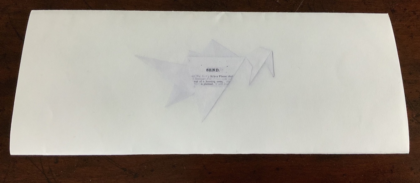
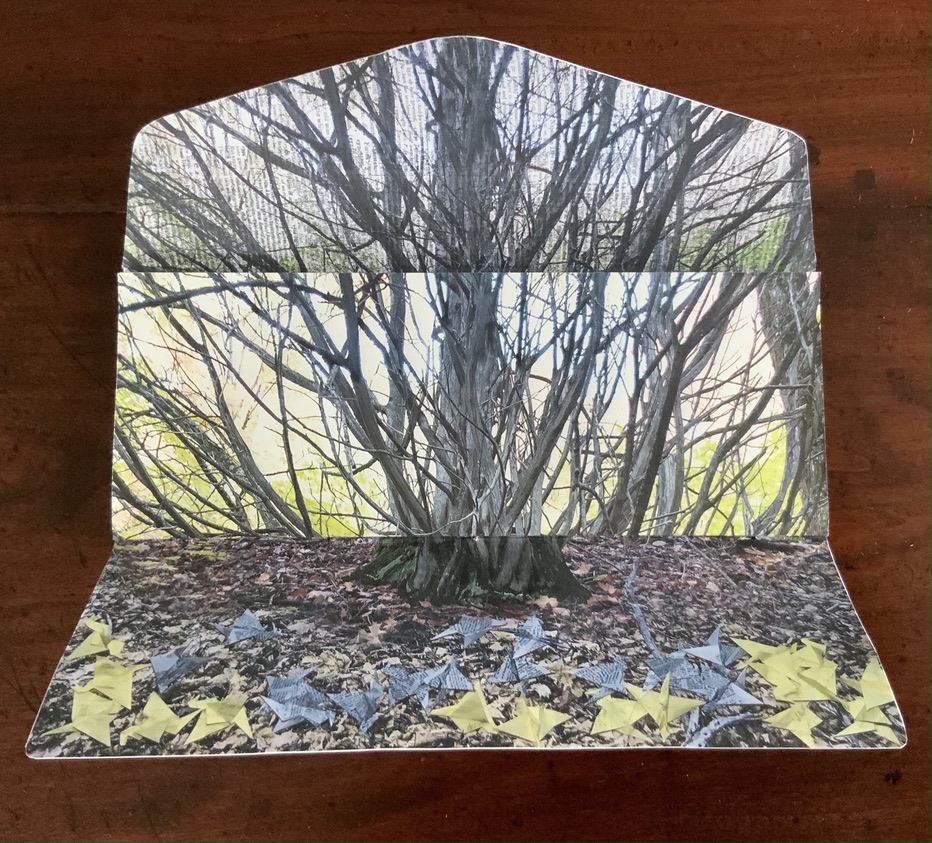
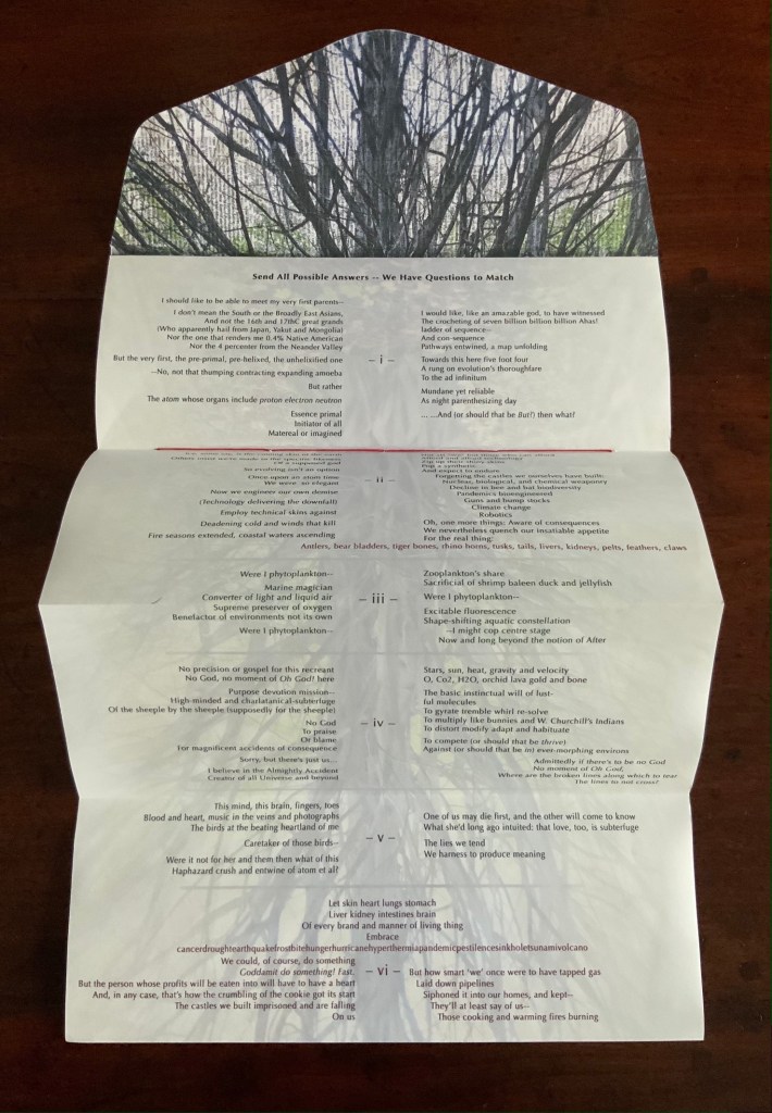
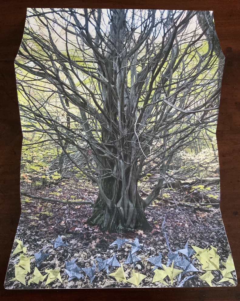
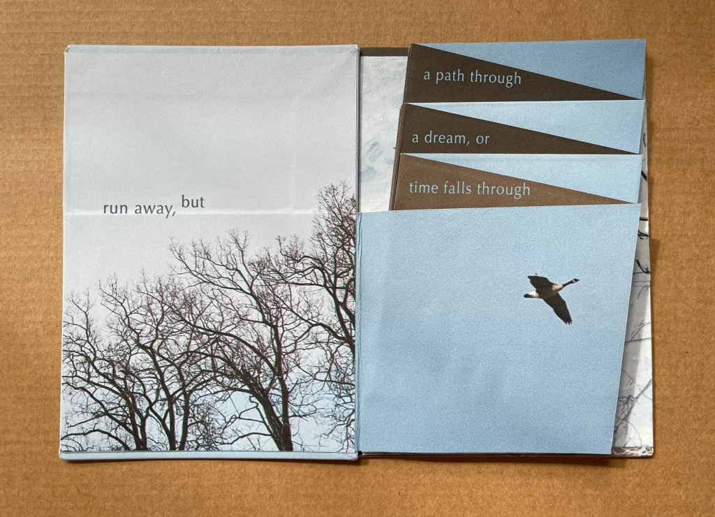
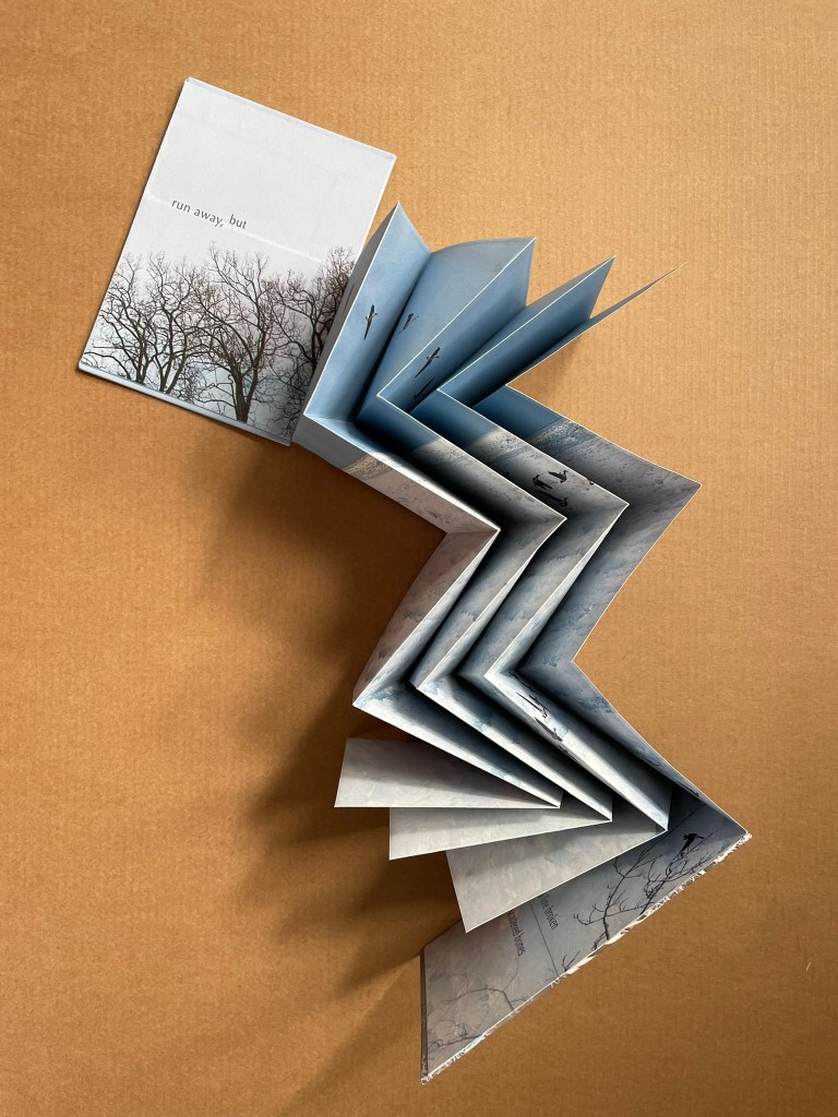
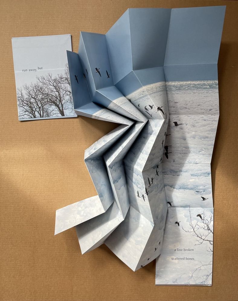
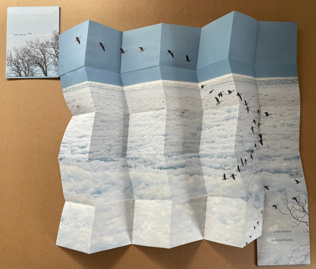
Send(2020) Marlene MacCallum and Shani Mootoo A double-sided archival digital pigment print on paper, folded and pamphlet bound in an envelope enclosure. Images, design, printing and binding by Marlene MacCallum, poem by Shani Mootoo. Dimension: 10 × 25.4 cm (closed) and 47.5 × 10 cm (expanded). #11. Acquired from Marlene MacCallum, 26 October 2022. Photo of the work: Books On Books Collection.
Author’s statement: Send is a correspondence piece; a conversation between my images and structural concept and Shani Mootoo’s poem “Send All Possible Answers – We Have Questions To Match”. Shani Mootoo, writer and artist, gave me the gift of this poem to use in a piece as I saw fit, and together we send this letter to the world.
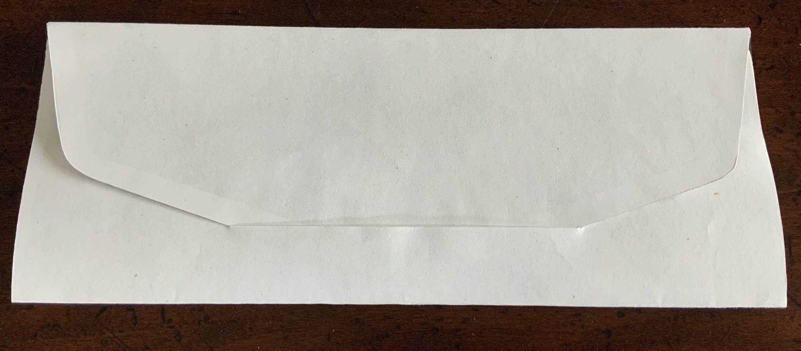
Opening envelope; inside of envelope.
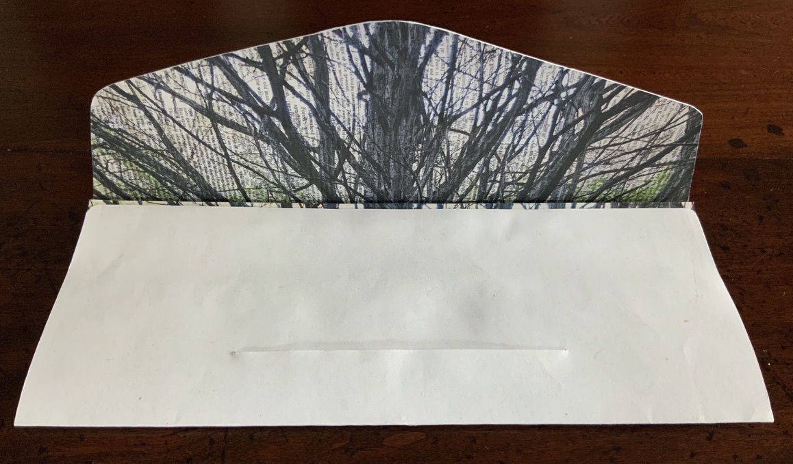
First opening and unfolding.
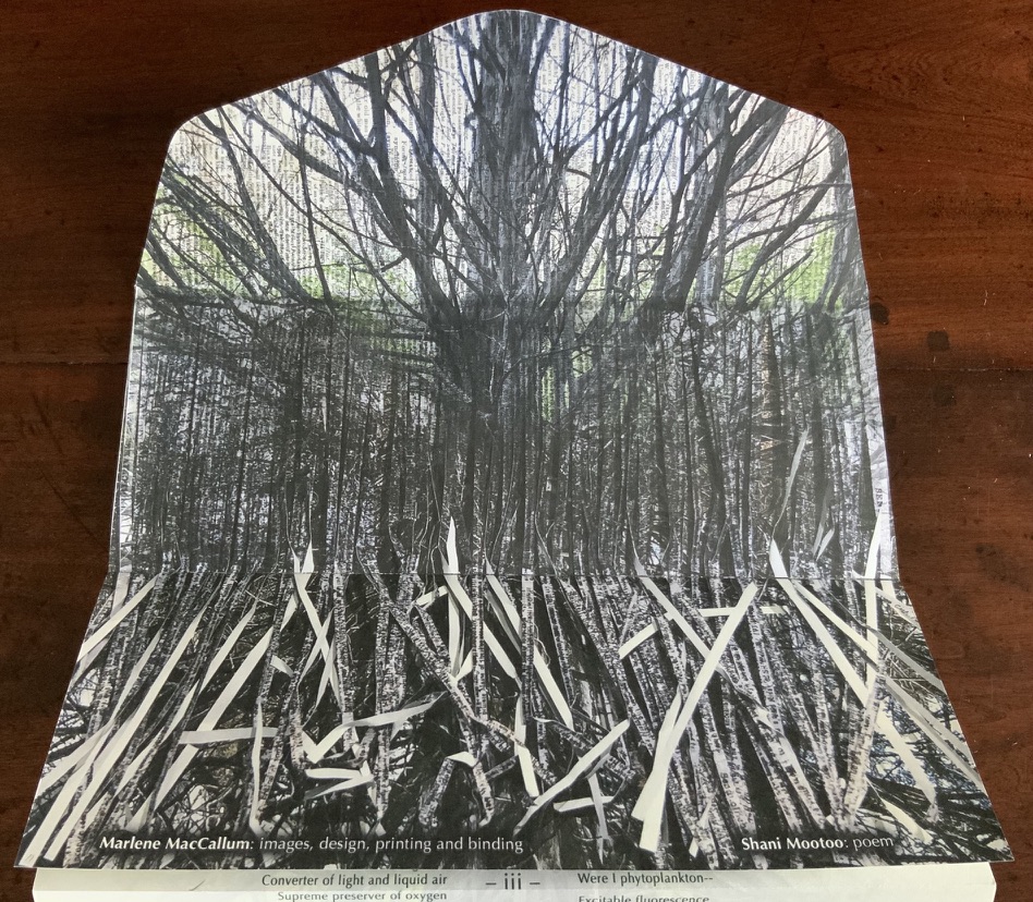
Fully open view of poem.
Fully open view of image.
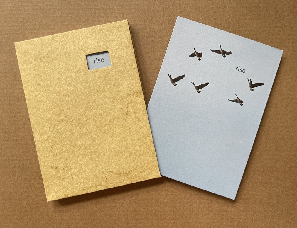
Rise (2020)
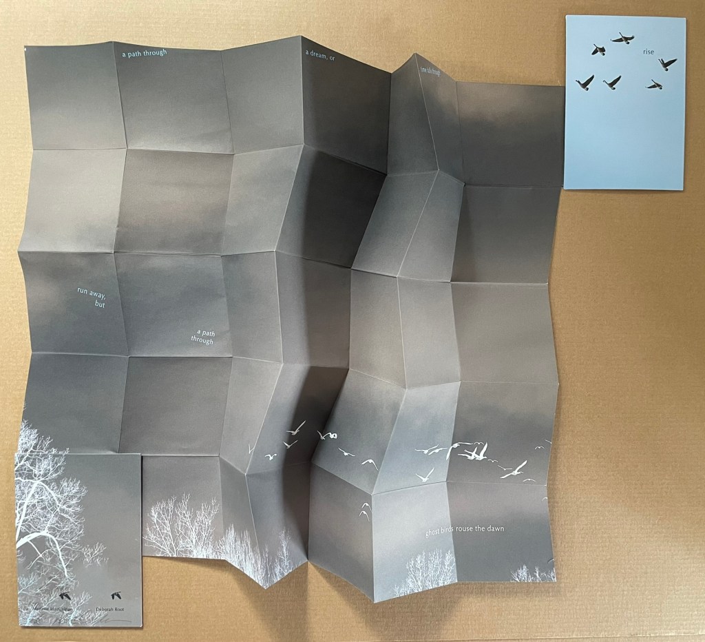
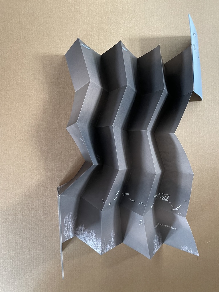
Rise(2020) Marlene MacCallum and Deborah Root Slipcase enclosure with passe-partout showing title. Double-sided folio in miura fold between two boards. Printed paper over boards. Slipcase H135 x W97 mm. Double-sided folio H133 x W93 mm (closed), W483 × H633 mm (open). Acquired from Marlene MacCallum, 26 October 2022. Photos of the work: Books On Books Collection.
Artists’ statement: Rise is a collaborative artwork by Marlene MacCallum and Deborah Root. This piece grew out of discussions about our shared fascination with the implications and meanings of the fold. The images and poem evolved through a call and response process, sharing them back and forth. The miura fold structure was selected early on for its structural strength and the way it allowed us to take a seemingly small object that expanded quite surprisingly to reveal a large field of imagery and poetry.
The fold is named for its inventor, Japanese astrophysicist Kōryō Miura.
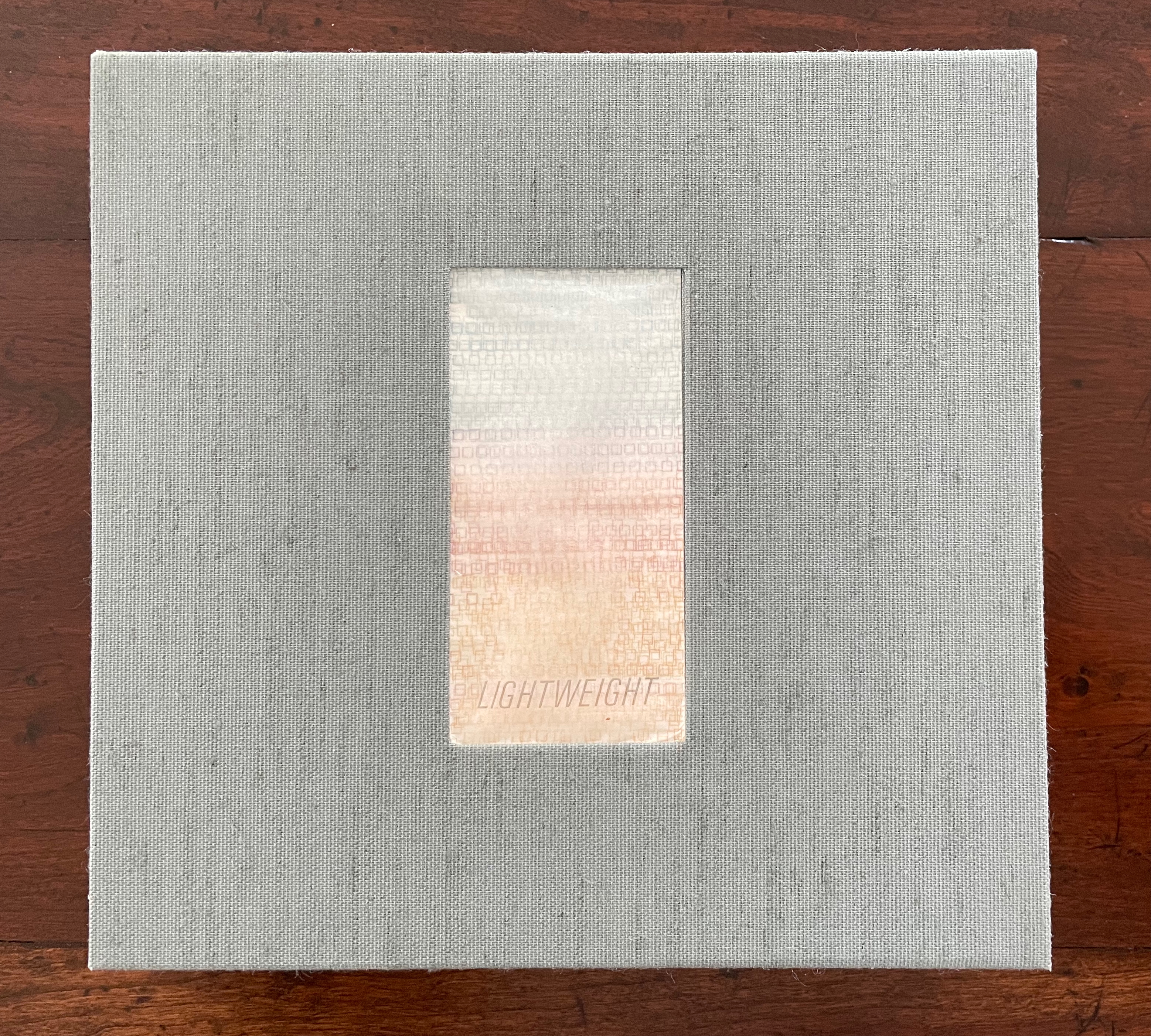
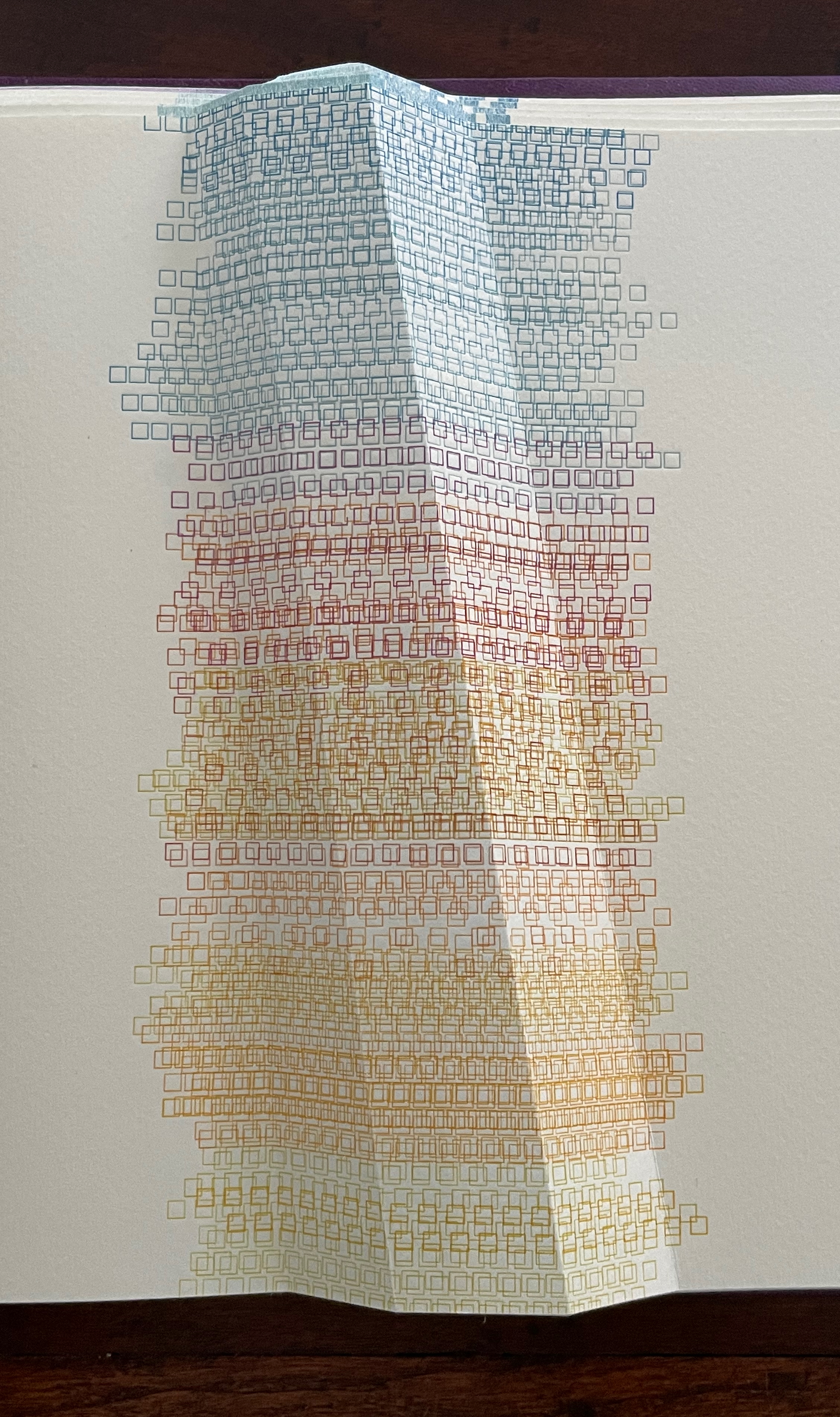
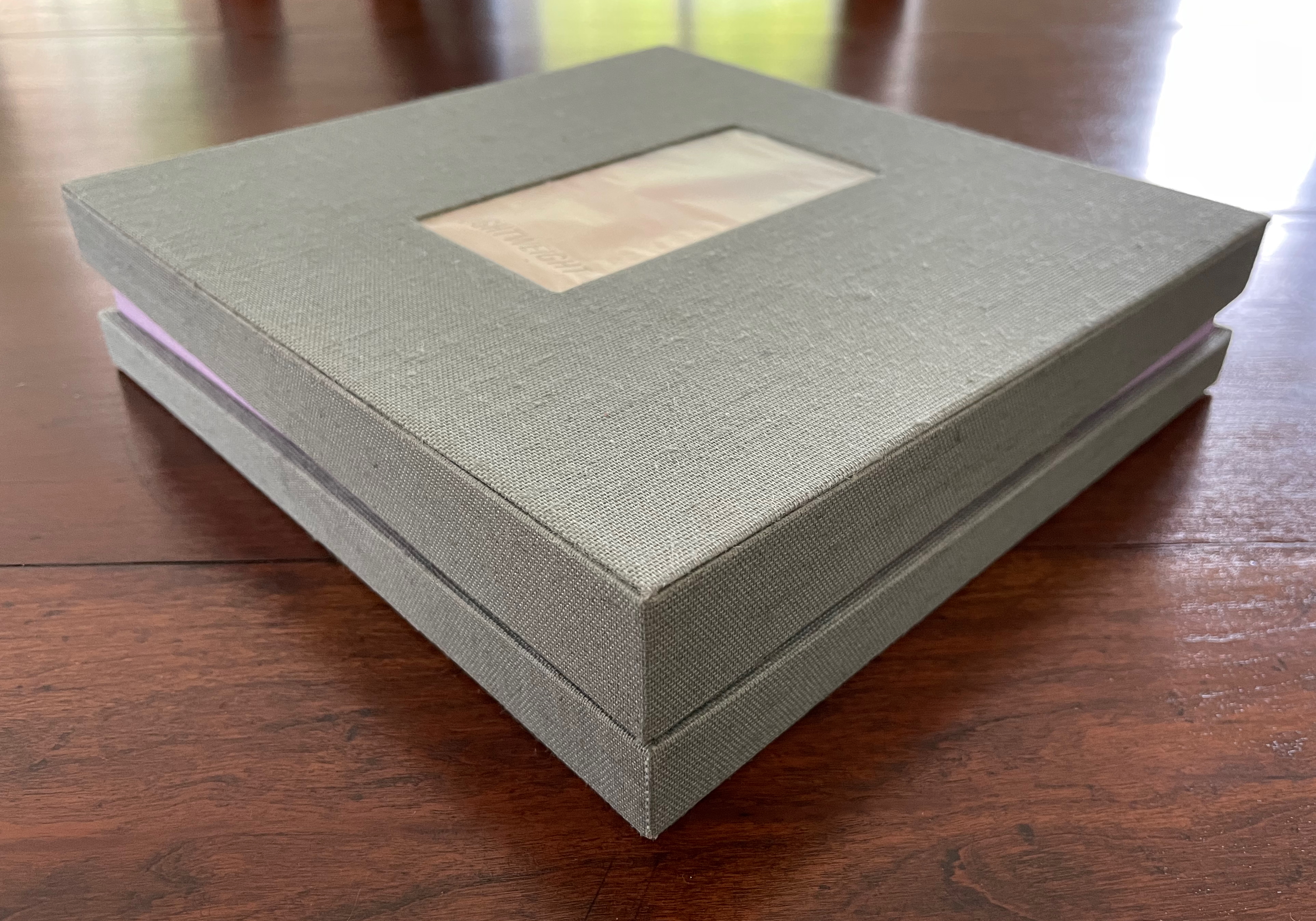
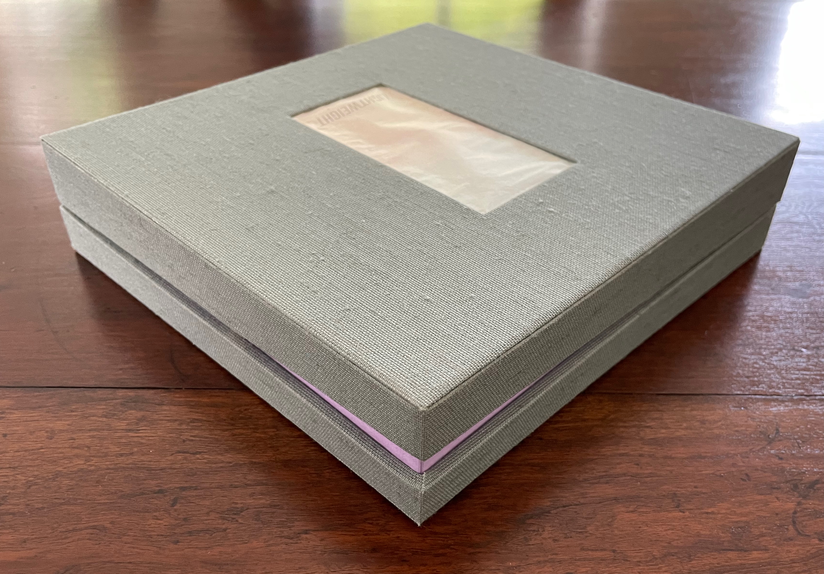
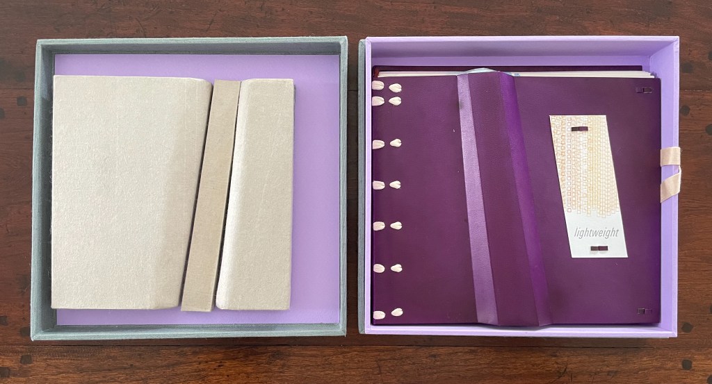
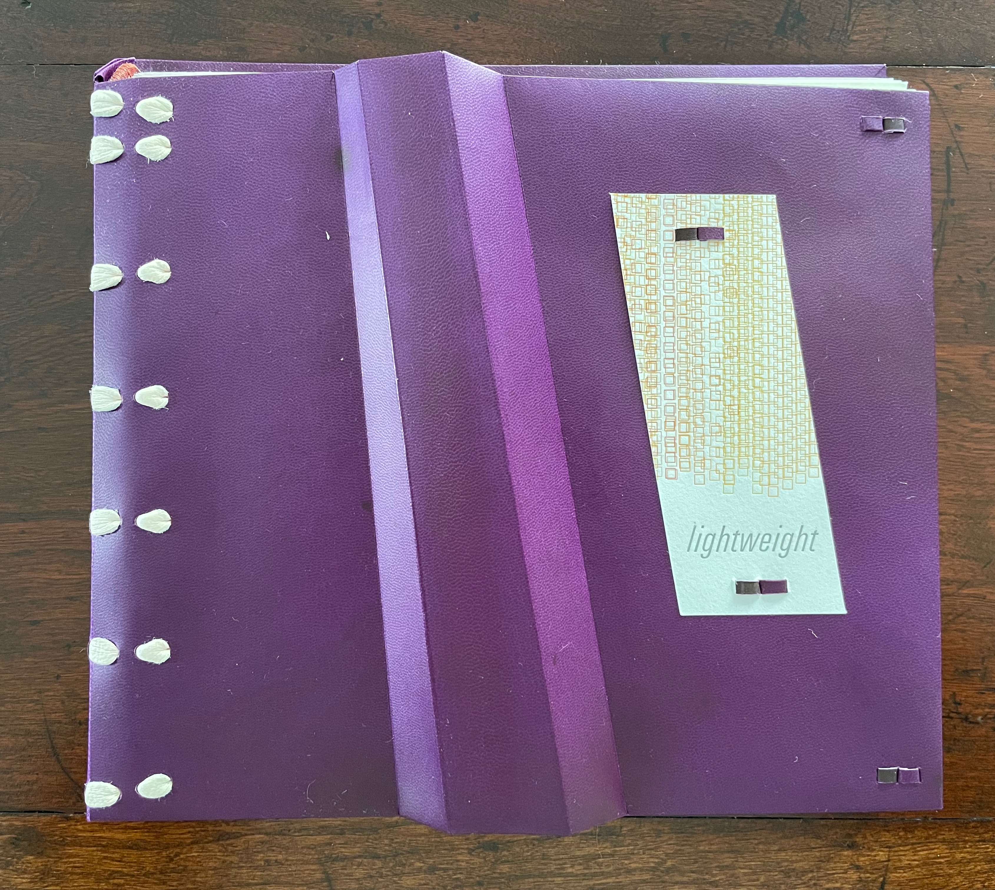
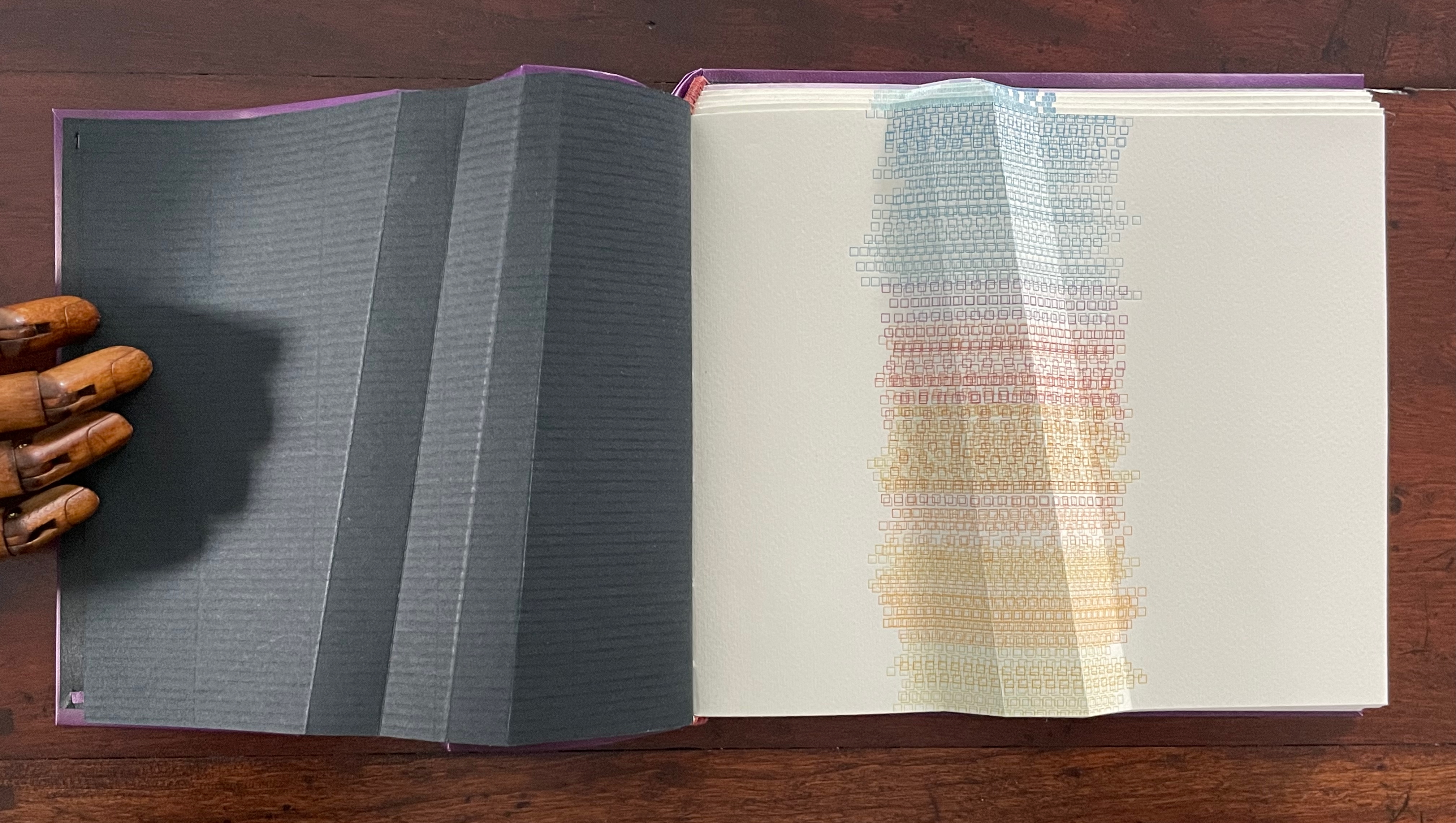
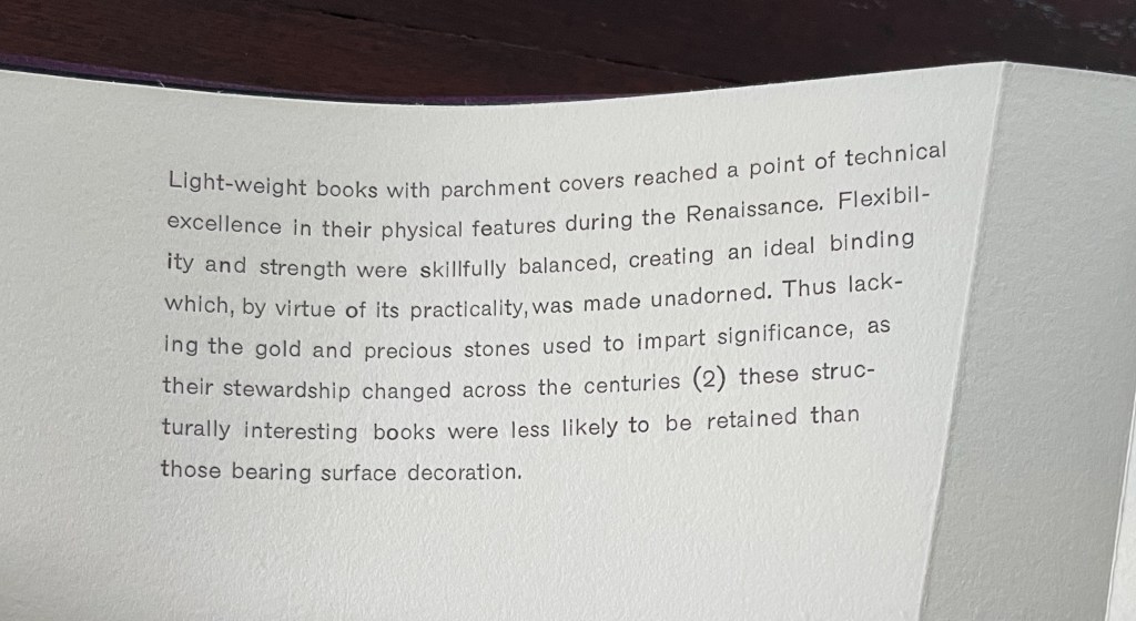
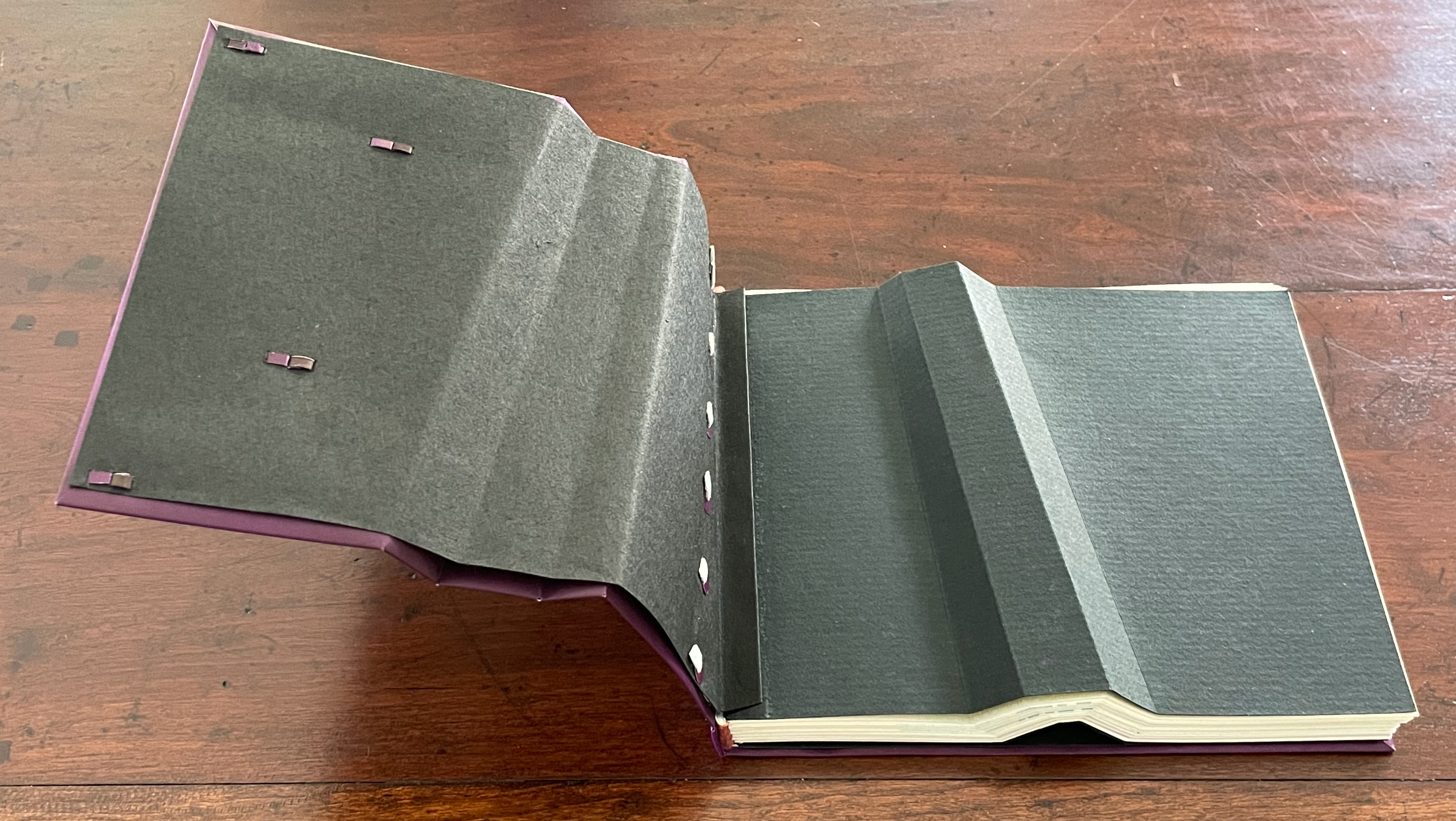
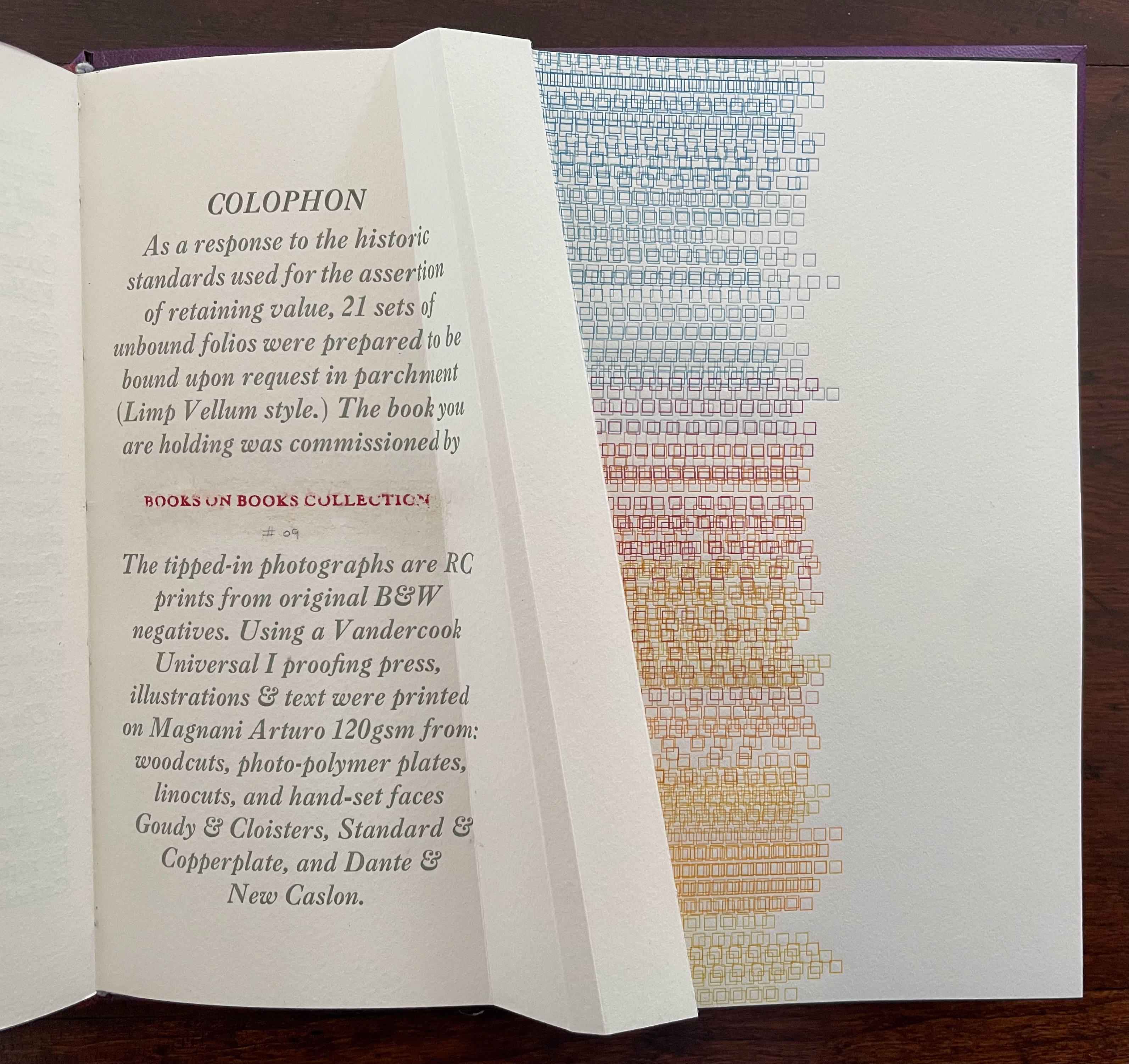
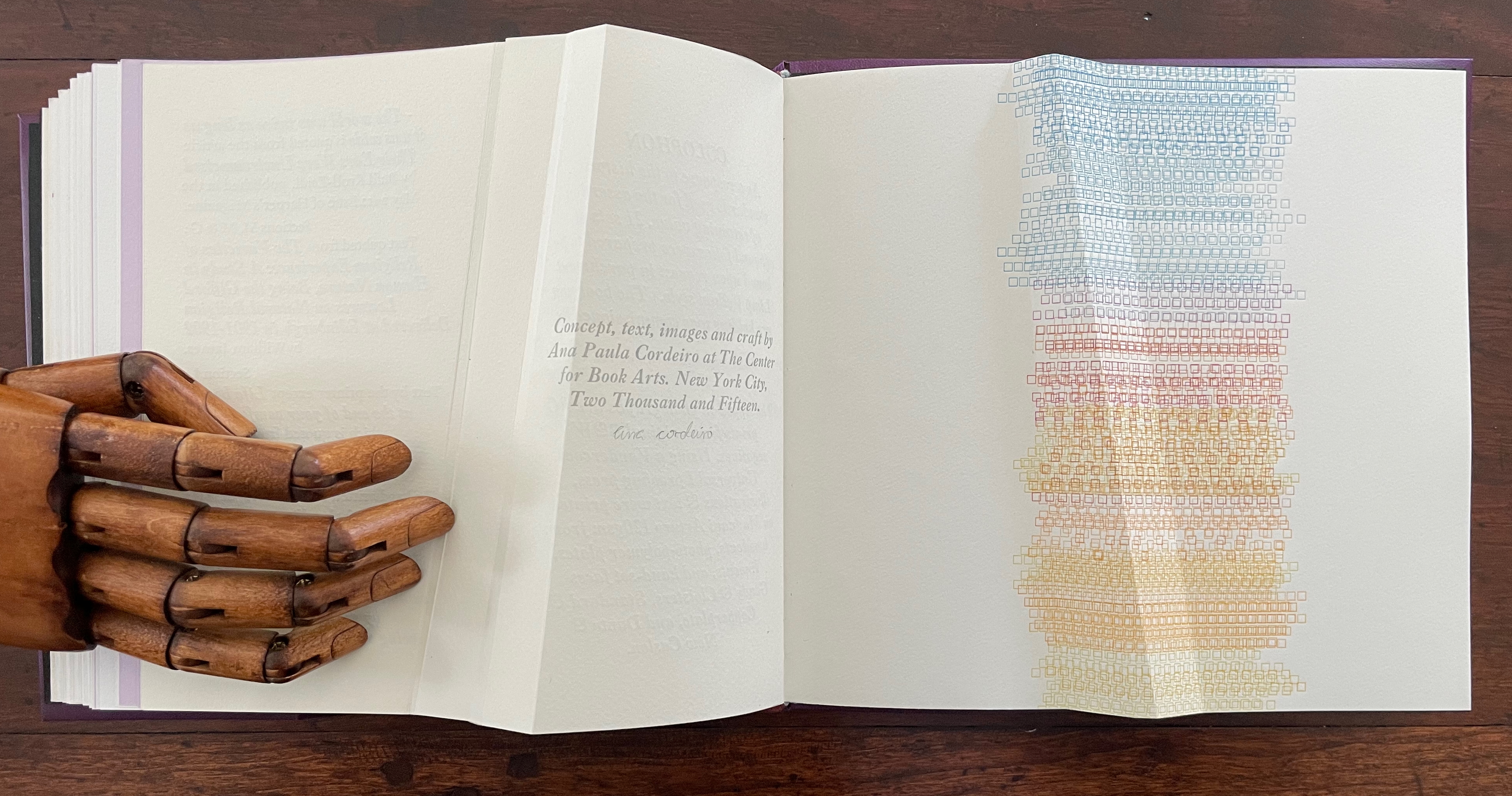
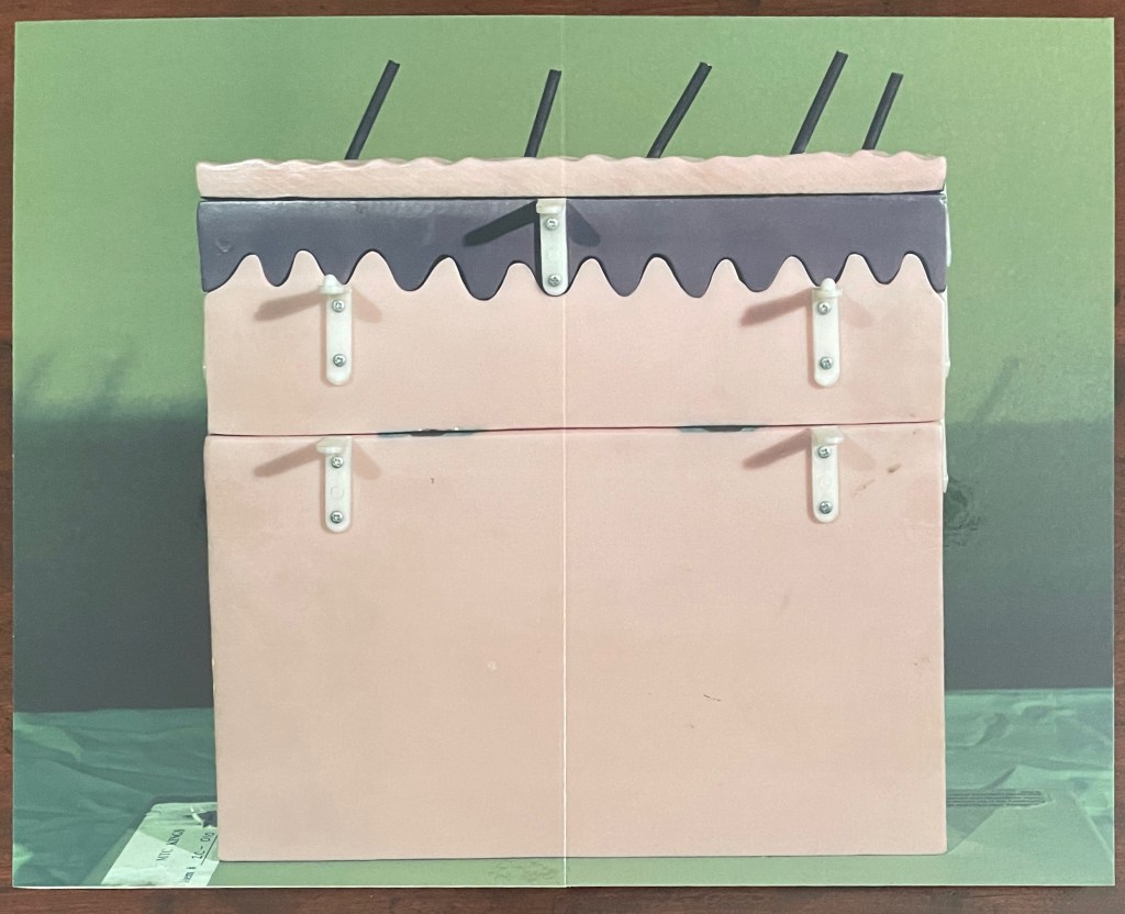
Lightweight(2015) Ana Paula Cordeiro Custom storage box with passepartout on cover with title printed on translucent paper with colored diagram beneath and sculptural element inside top. Three-part construction Limp Vellum binding on dyed parchment. Box: H215 x W224 x D47v & D53r. Book: H190 x W215 x D18 mm [90] pages. 88 + 2 half pages for colophon. Edition of 21 sets, copy bound on request. Acquired from the artist, 27 August 2025. Photos: Books On Books Collection.
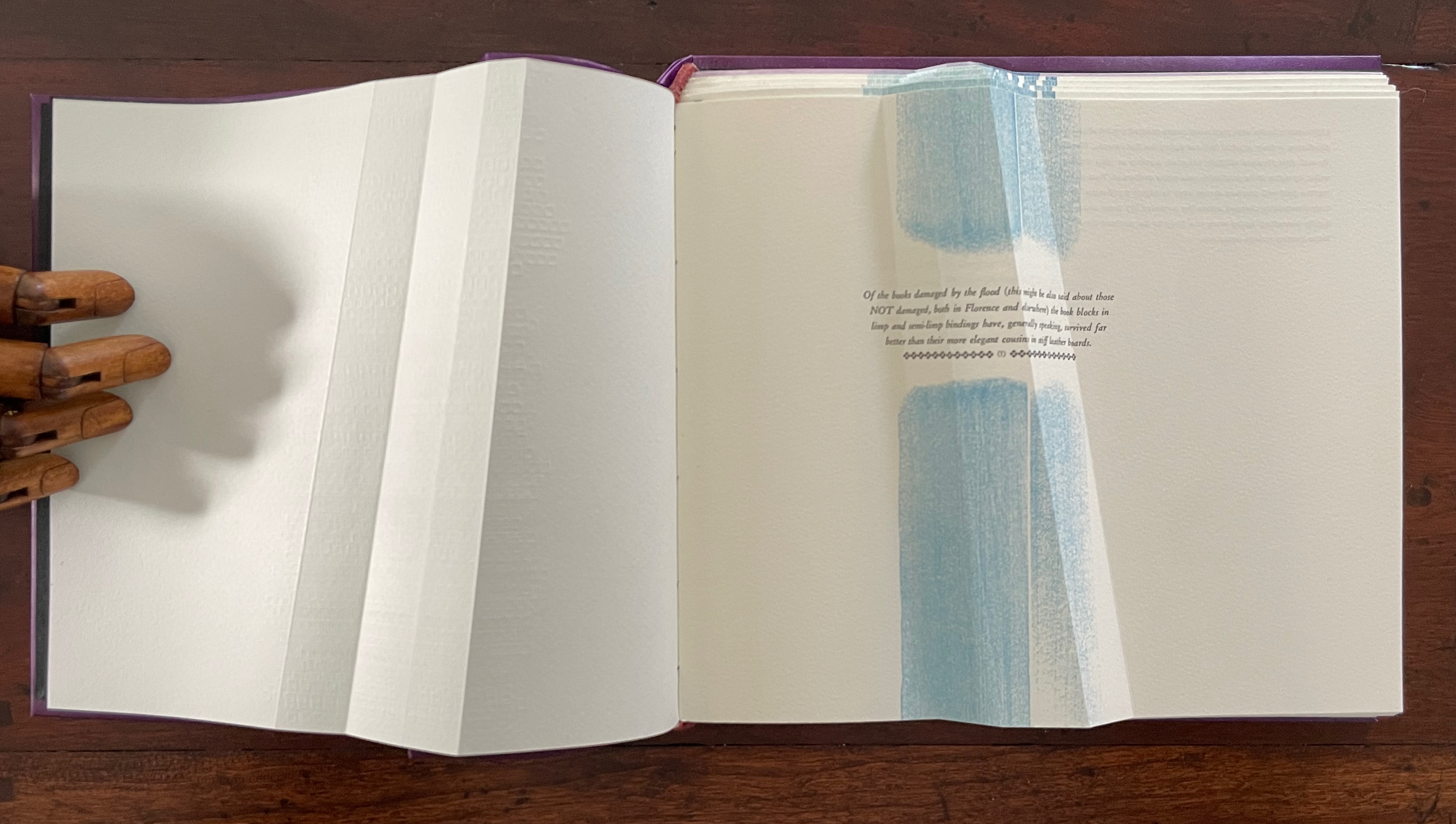
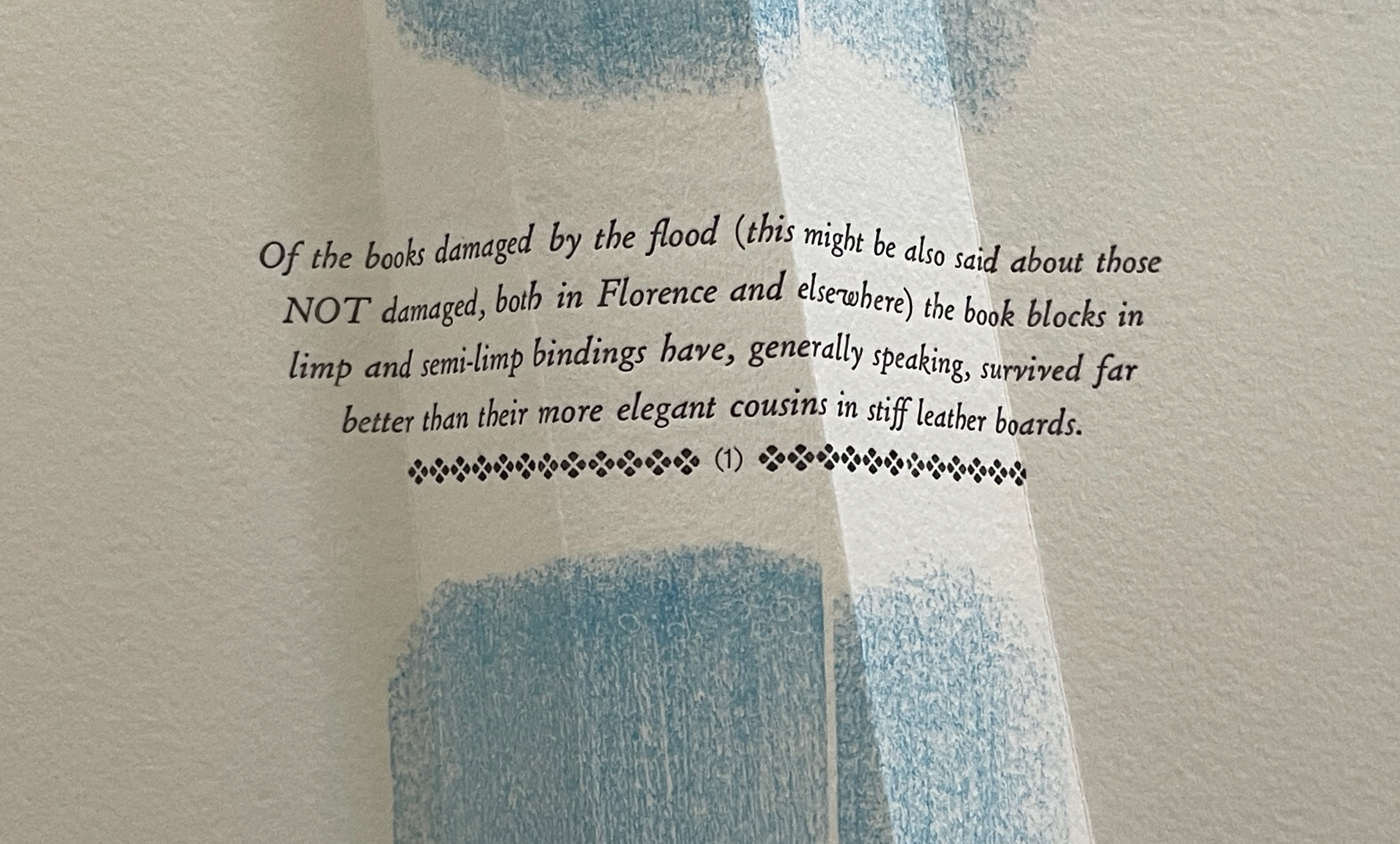
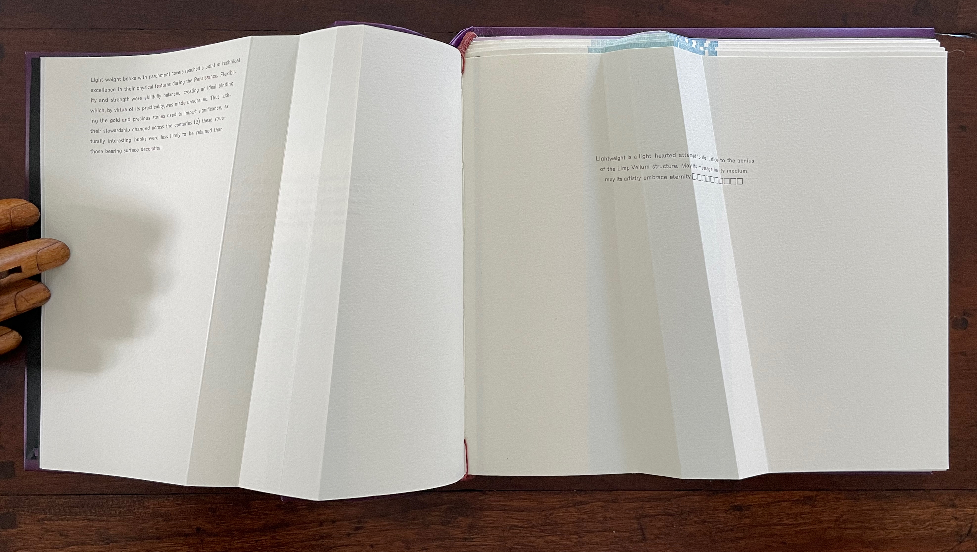
Dating back to the 13th century, the limp vellum binding for books involves a parchment or other flexible covering material that is the sole component of the cover. No stiff boards. It attaches to the textblock usually by sewing and without adhesive. According to the American Institute for Conservation, it was not merely a temporary solution until a more luxurious one with boards and ornamentation could be commissioned. Its presence in collections, its variety of formats, and its superior protection of works proven in the aftermath of the 1966 flooding of Florence, all suggest that, for a time, it was deliberately chosen for joining the artistic with the functional.
Ana Paula Cordeiro’s Lightweight is an artist’s book that pays elaborate homage to this distinctive form of binding. It weaves together metaphor, structure, material, and content in extraordinary ways.
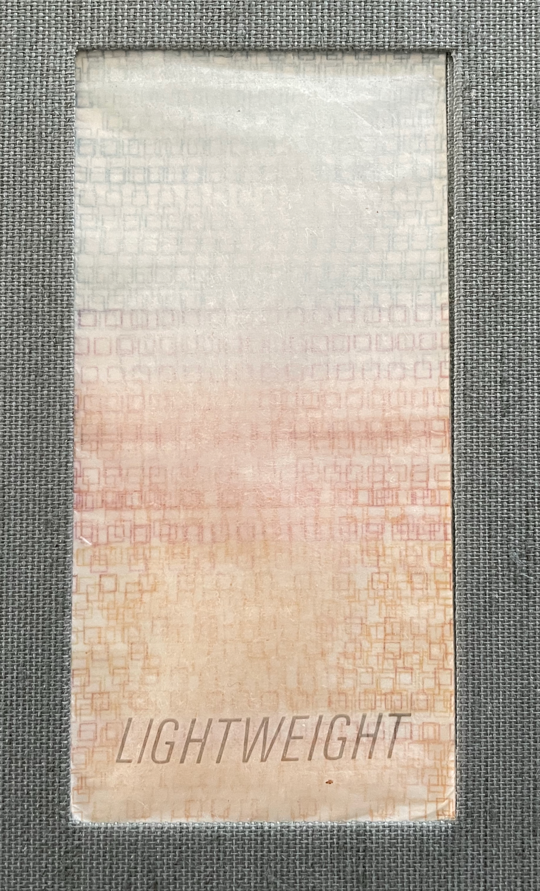
Begin with the container, which offers a multitude of metaphors. On top of the cloth-covered box, a rectangular window has been cut. To look down through this window is to begin peering into the past. Beneath the translucent sheet bearing the title, a print motif appears whose mingling layers suggest the water, paper, ink, and silt that had to be sifted to save a Renaissance legacy of manuscripts, incunabula, and books from the Florence flood of 1966.
Left: passe-partout (window) on box top. Right: recurrent print motif appearing later in the book.
That strata of links running from blue to rust to gold becomes a recurrent print motif in the book, suggesting abstractly another metaphor: that of a continuum with endpoints playing off one another. As soon as you pick up the Canapetta cloth-covered box, the title itself — Lightweight — sets in motion a fresh instance of this continuum metaphor. Floating above the recurrent print motif, the title contrasts with the weight in your hands. As if to underscore this diametric contrast, the corners of the top and bottom of the box sit flush at the ends of one diagonal but gap at the other, easing the lifting of the weighted top from the box.
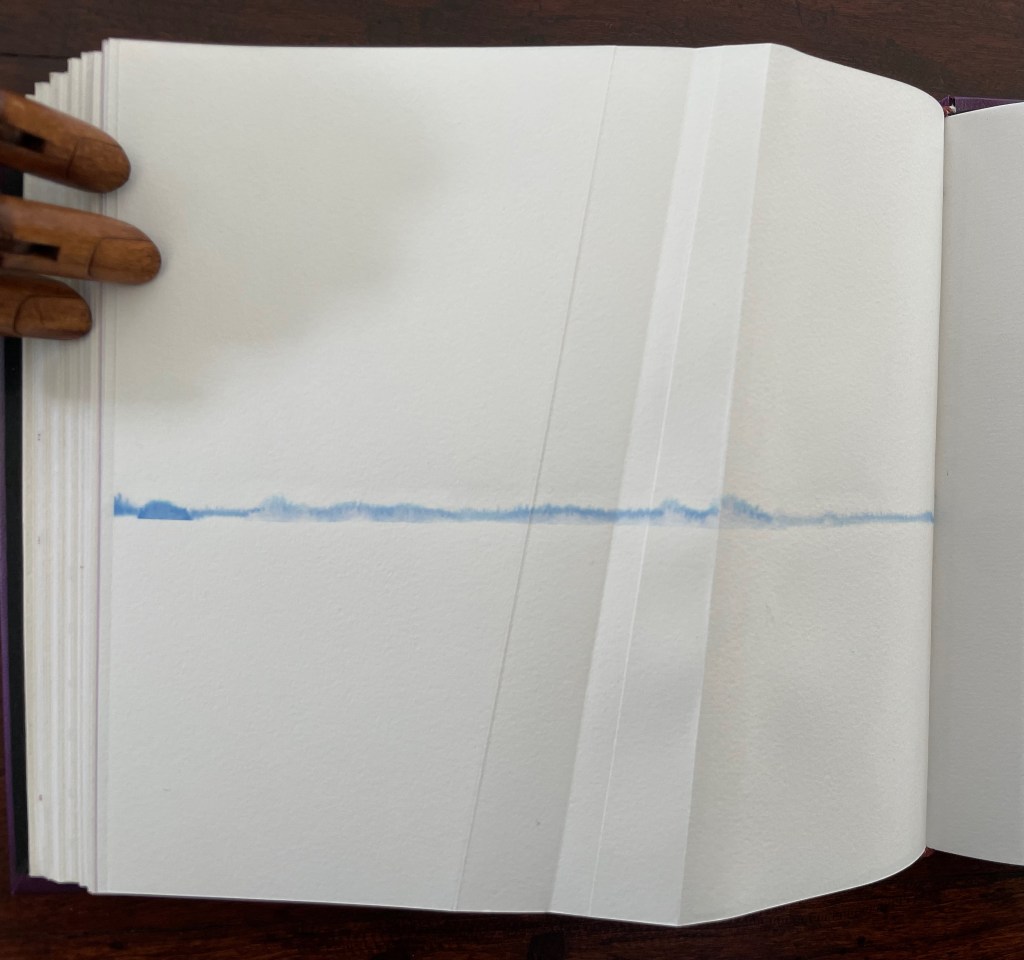
Inside, other decorative features offer further dual functionality. The sculptural element that provides the top’s weight also serves as a protective mould inside for the book and mirrors its dominant and recurrent physical feature: the creased shape slanting in parallel to the title slip tacked to the cover. Cordeiro refers to the creased shape as an “angled beam”.
For her, the angled beam distills the essence of the limp vellum structure and “supports” the variety of contemplation she pours into it. The angled beam puts forward the limp vellum structure as a historical link from binding’s past to its present. It stands for the binding structure’s durability, again linking past to present. Its linearity stands in for that continuum. It prompts thoughts of other continua along which one thing becomes another such as the line between night and day (twilight), between light and shadow, between one season and another. It evokes the continua between extremities, between the ordinary and the extraordinary, between mental acuity and dementia, and between life and death.
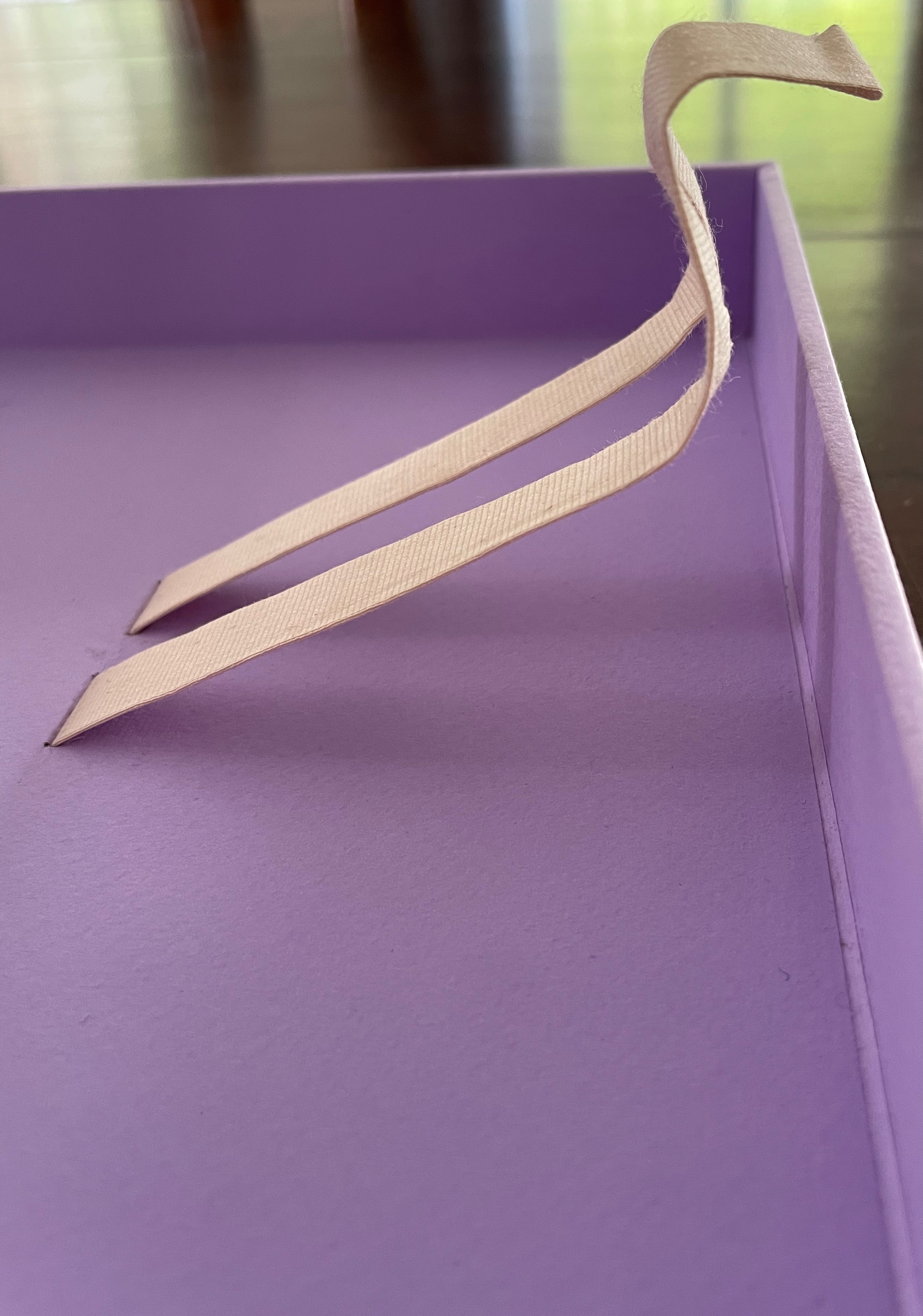
Following Emily Dickinson’s injunction — “Tell all the truth but tell it slant” — Cordeiro plants other angles in Lightweight. The ribbon tape that lies under the book is stiff, not soft and flexible, and it twists once and folds twice into an angular tool for lifting up the book. The trim of the book’s top and bottom edges slants. Creased into the covers, end sheets, and text block of this limp form, the angled beam is a physical constant echoing the metaphor of a continuum whose endpoints contrast and balance with one another.
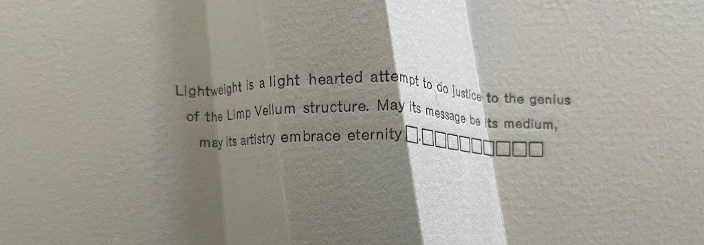
Altogether there are seven gatherings in Lightweight. The “prelims” gathering provides the historical context underlying Cordeiro’s homage. Note the artist’s wish expressed in the envoi to this artist’s book in our hands: “May its message be its medium, may its artistry embrace eternity”. Here, Cordeiro introduces that self-reflexivity we expect in the best of artists’ books.
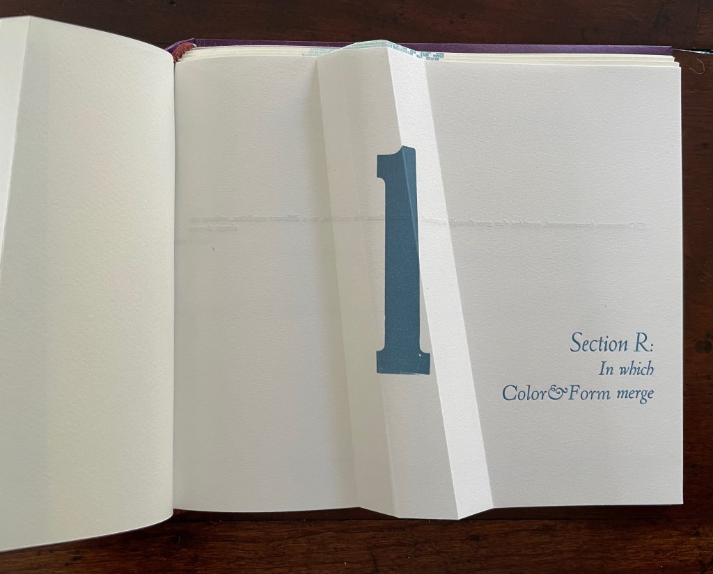
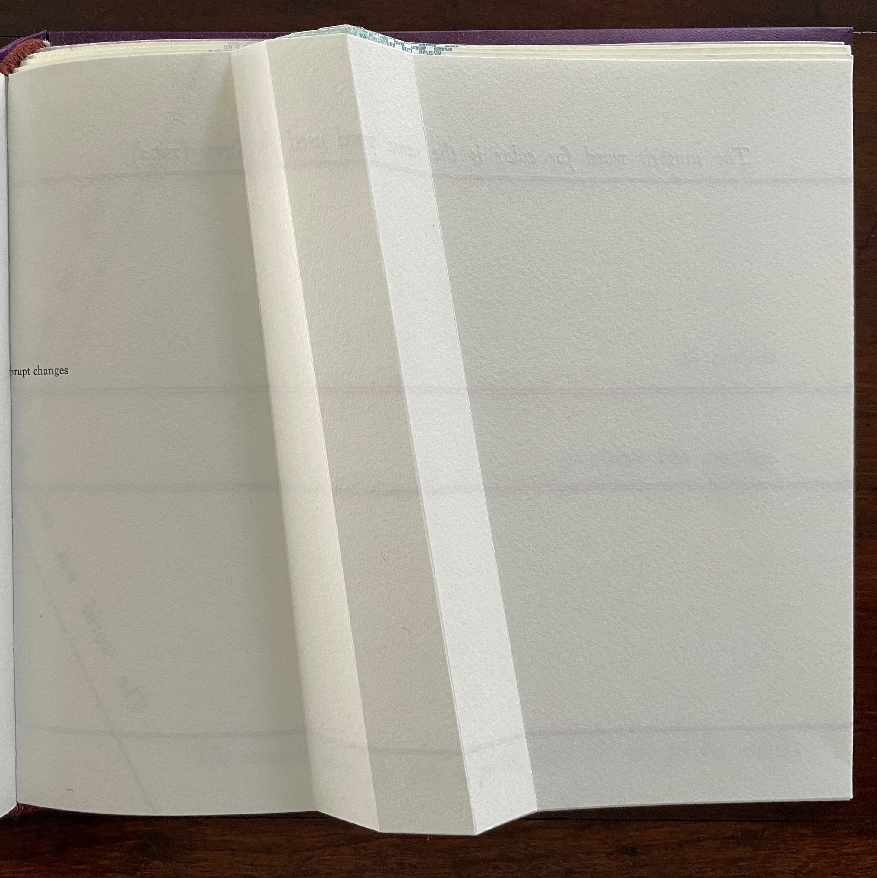
After the prelims gathering, the other six gatherings are labeled. In addition to bearing the creased angled beam, all six carry an “on-end outline” of it (see below). The five that are numbered, lettered, and labeled introduce themes reflecting different responses that relate to the continuum motif.
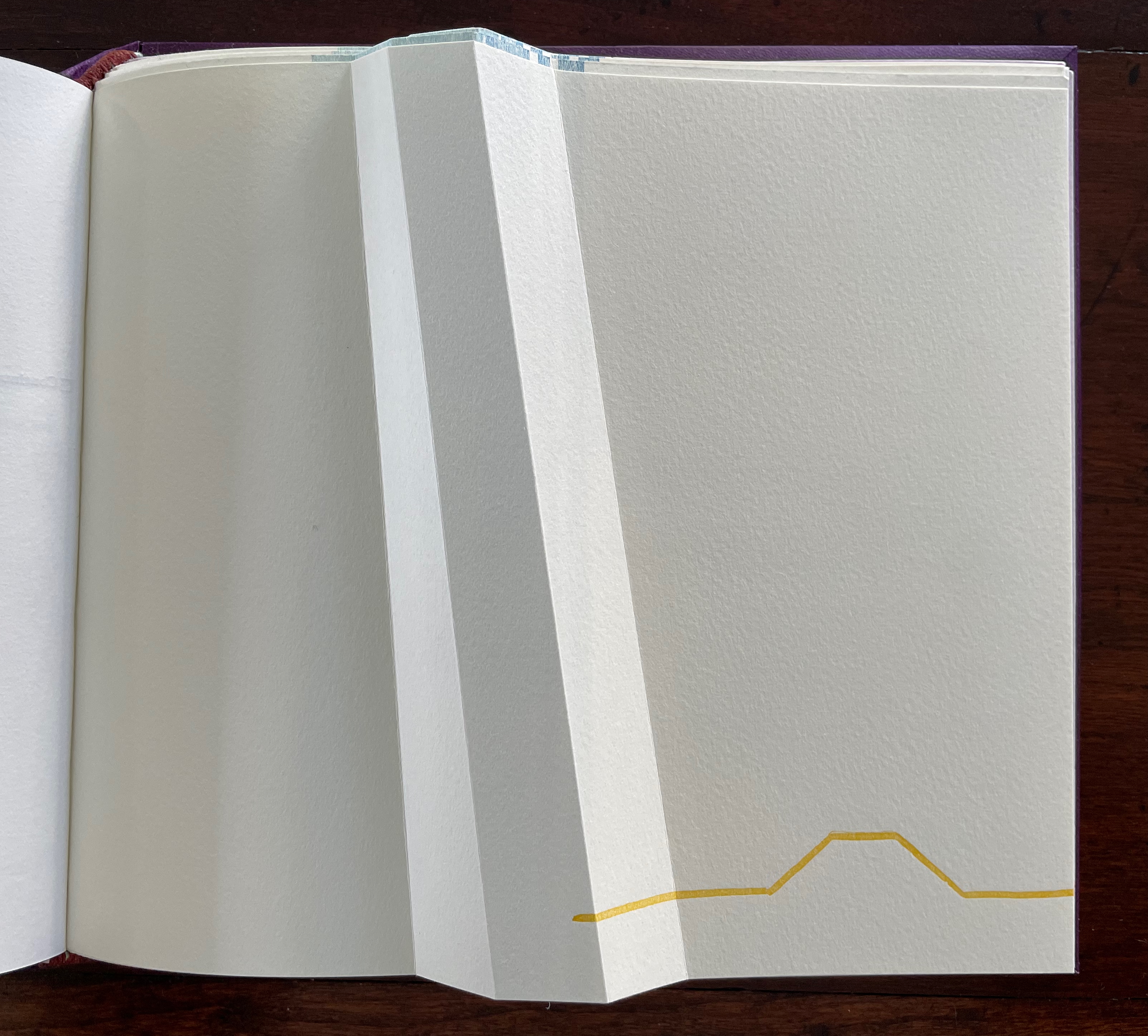
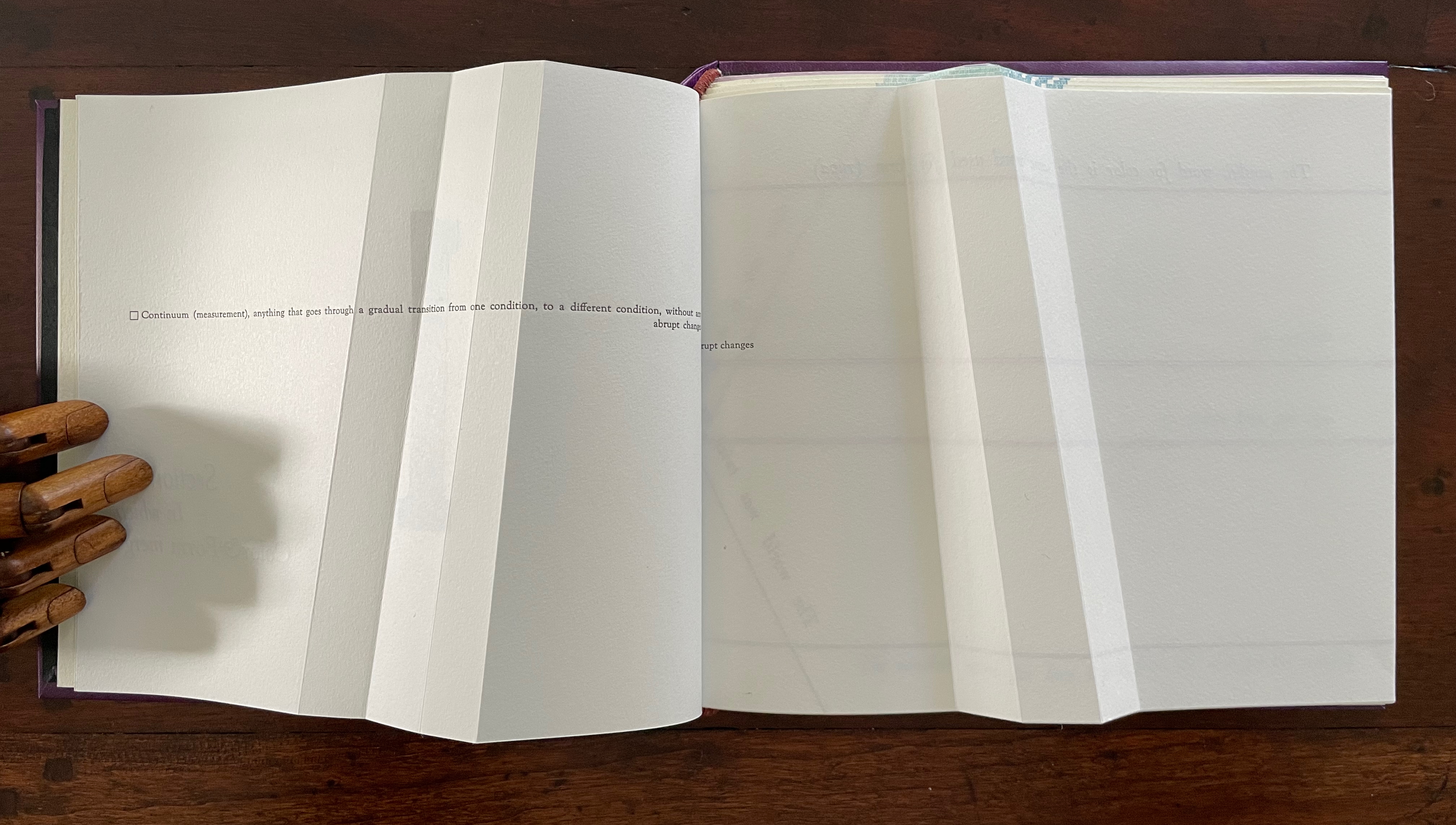
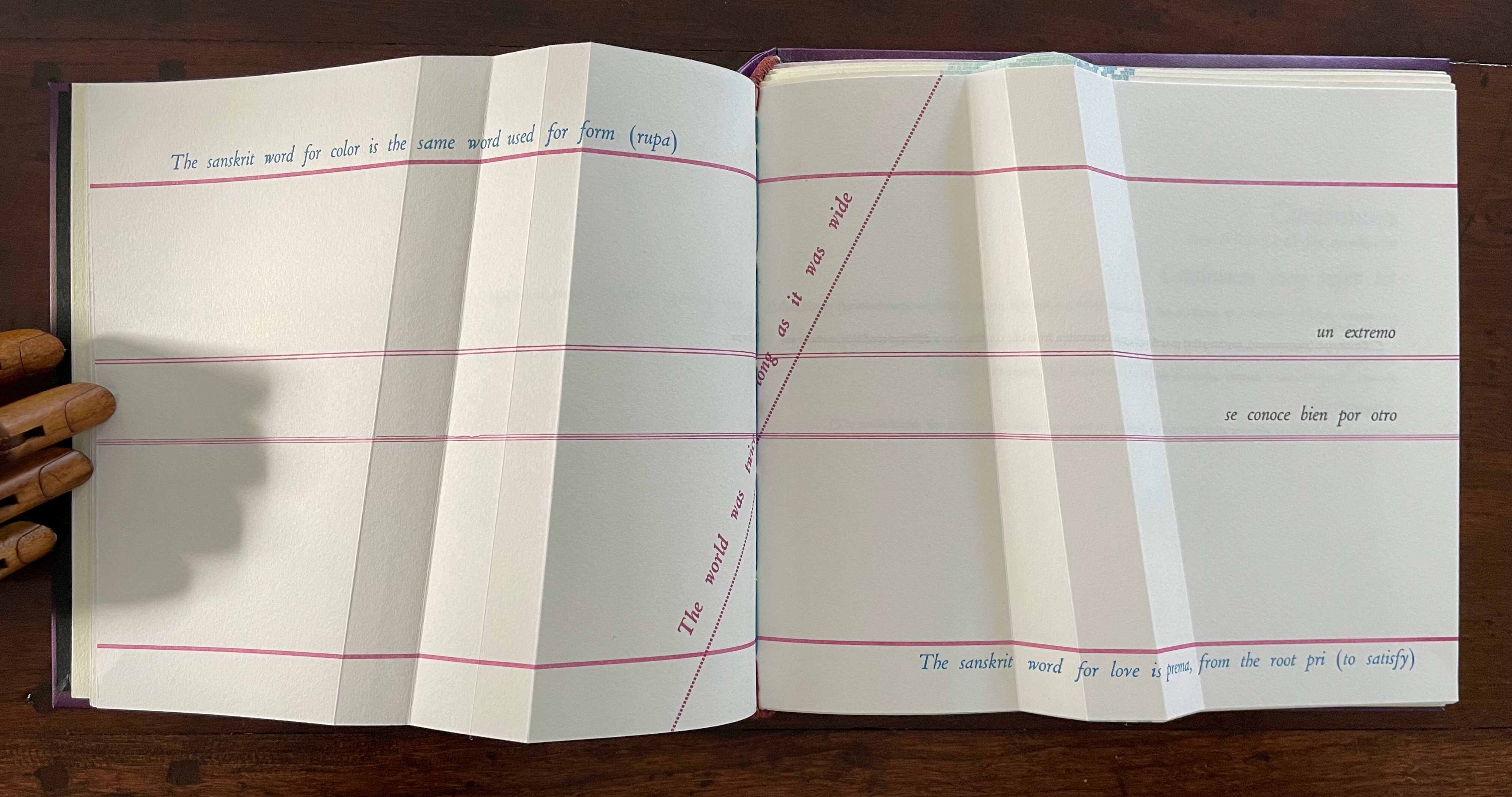
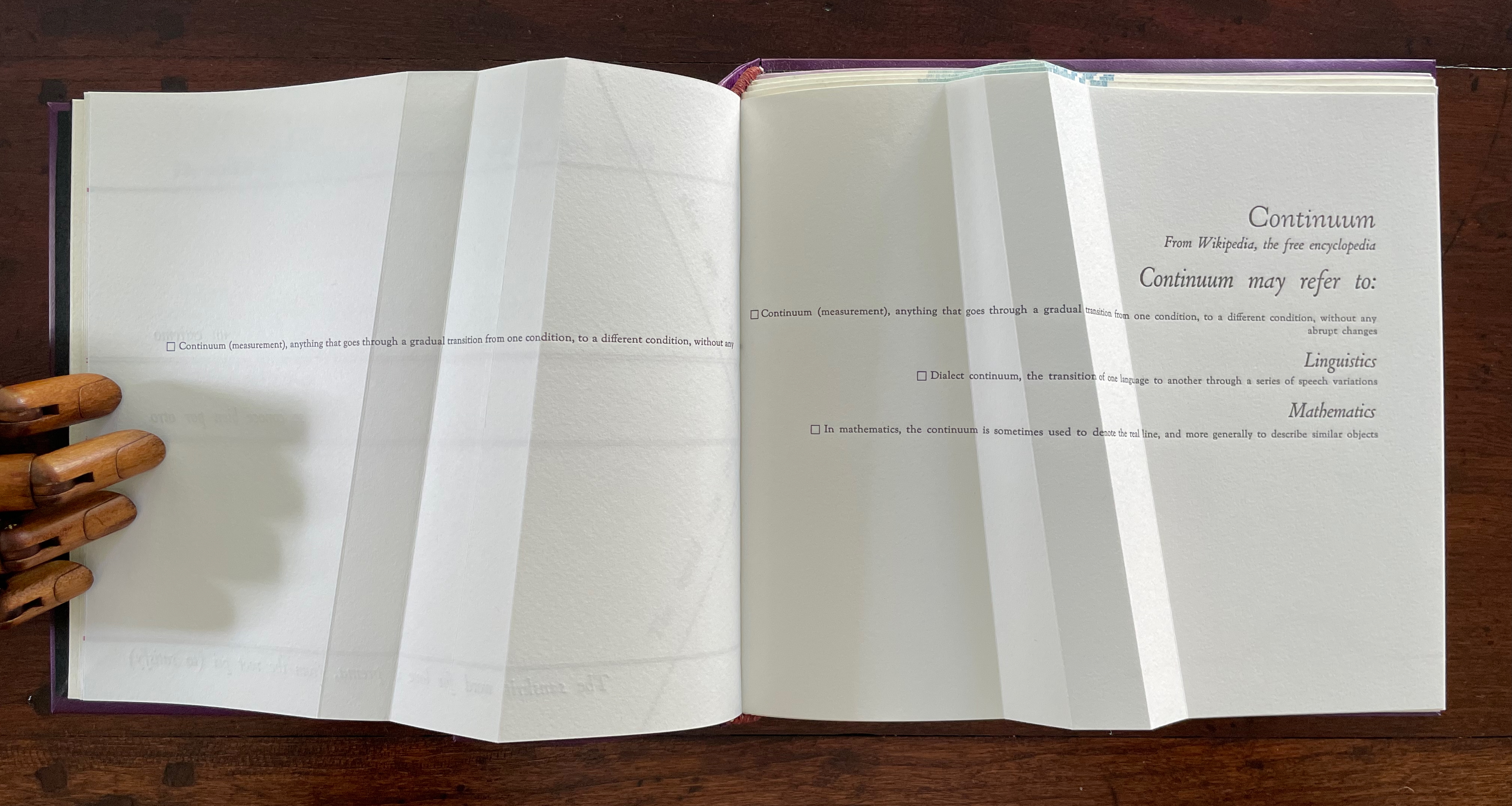
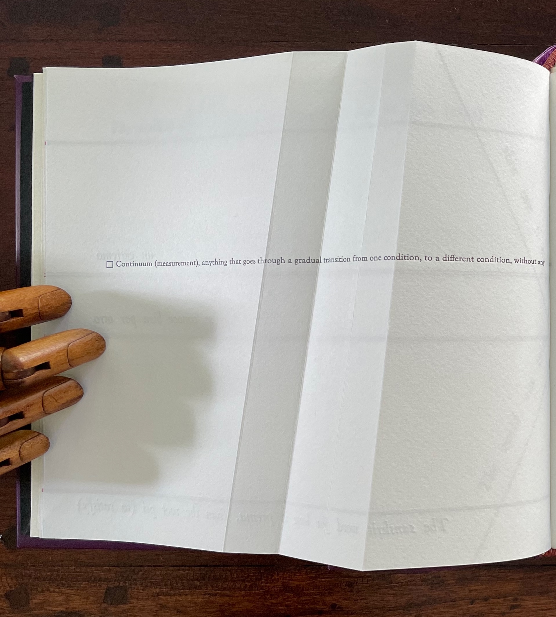
The Part 1, Section R gathering has announced cryptically that color will merge with form. How will this happen? As you turn the page, the opening text suggests how — along a continuum: “Continuum (measurement), anything that goes through a gradual transition from one condition, to a different condition, without any abrupt changes”.
The spread lays out this definition in a peculiar manner that seems to contradict the definition. On the verso page, the definition seems to run abruptly up against the seam, which bumps the words “abrupt changes” to the next line, while the recto page presents a truncation of those words: “rupt changes”. Hold that puzzle for a moment. So how can color and form be on a continuum? And will they merge gradually or abruptly? On the next spread, Cordeiro answers with the Sanskrit word rupa, which represents “color” and “form” and from which the section draws its label “R”.
un extremo se conoce bien por otro [one extreme knows well its other]
So, the merger is etymological. But at the same time, another spectrum comes into play: the color spectrum and the blue and red at its opposite ends. On the spectrum, of course, one gradually becomes the other, enacting the expression “un extremo se conoce bien por otro” [one extreme knows well its other]. If this seems a stretch, the next double-page spread reassures us that “continuum” has additional linguistic as well as mathematical roots.
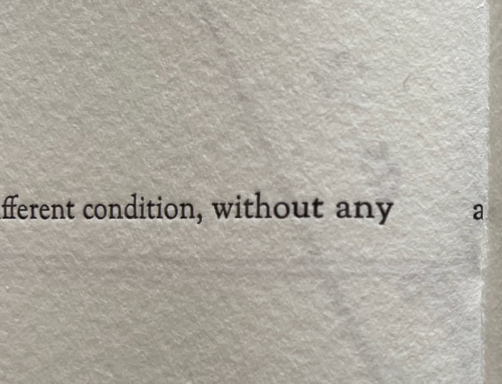
Before the reassurance, however, we come back to the puzzle of “rupt changes”. Again, on the verso page above, the definition of “continuum” runs pell mell into the crease. To solve the puzzle, we have to look more closely at the structure of the Section R gathering. It consists of three oblong folios folded in half. On the reverse side of the center folio (what would be pages 5 and 8 of this gathering if the pages were numbered), the definition of “continuum” has been printed so that the fold splits the word “abrupt” between its syllables: “Continuum (measurement), anything that goes through a gradual transition from one condition, to a different condition, without any a | brupt changes.” In effect, the layout draws attention to our perception of breaks in continua.
View of “pages 5 and 8” separated by a detailed view of the break in the word “abrupt”.
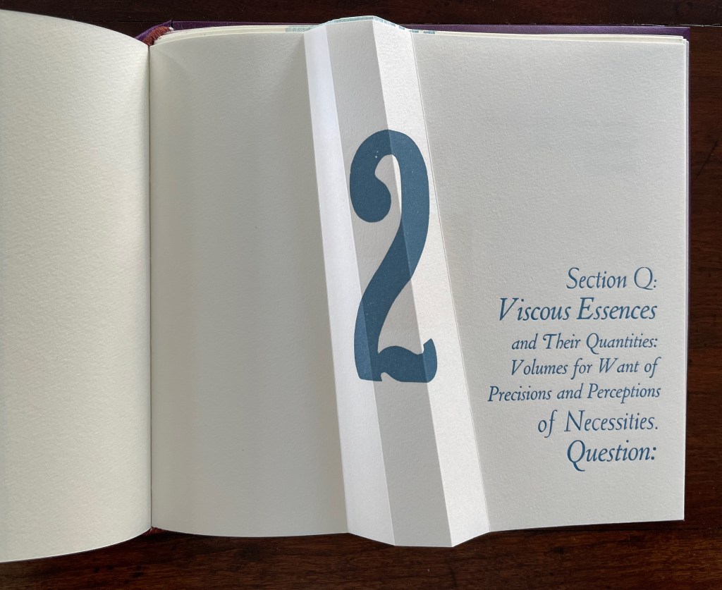
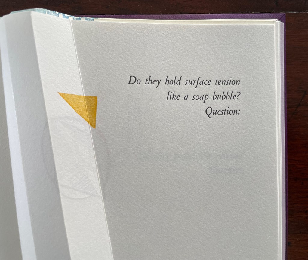
If Section R has not prompted the reader to propose questions about the structure of the book or this book in particular, the Part 2, Section Q gathering provides a series of oblique questions very much focused on that but also on metaphorical matters. Again, what happens structurally in the gathering and on the surface of its pages presents puzzles and hints at solutions.
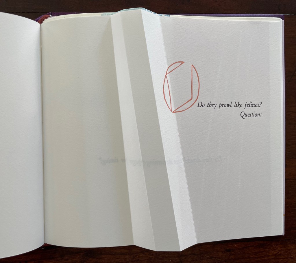
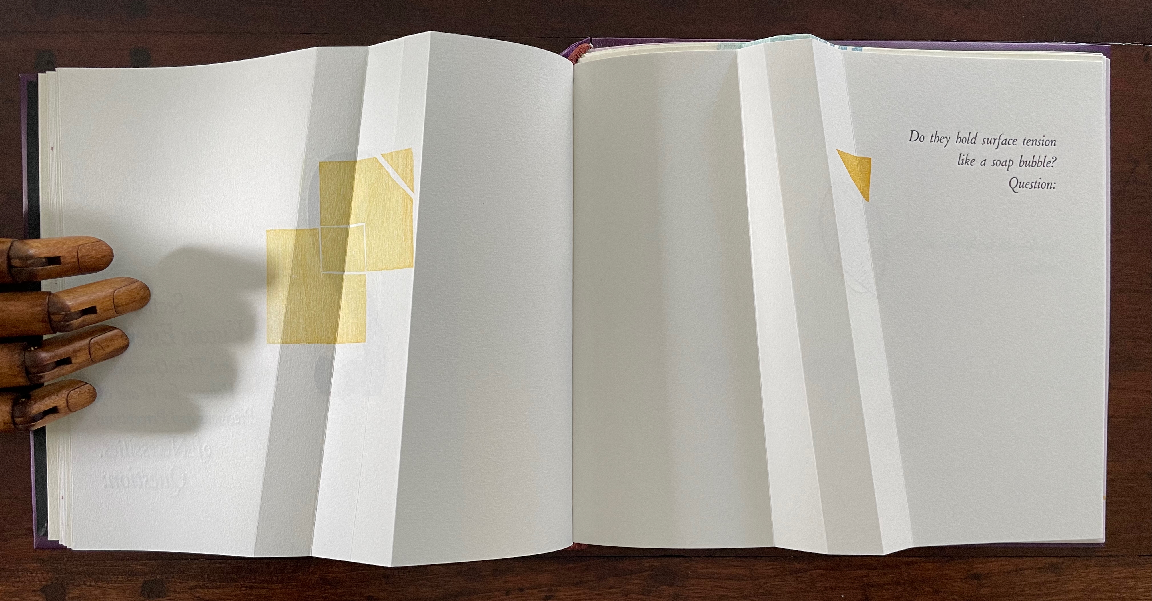
The geometrical images associated with the first question (“Do they hold surface tension like a soap bubble?”) seem to float or progress across the double-page spread, breaking up to punctuate the question. Reminding us of opposites and abrupt changes, the angular yellow overlapping squares and triangles puncture the text’s round verbal soap bubble. Before we can ask to what or whom does “they” refer, we are prompted by “Question:” to turn the page.
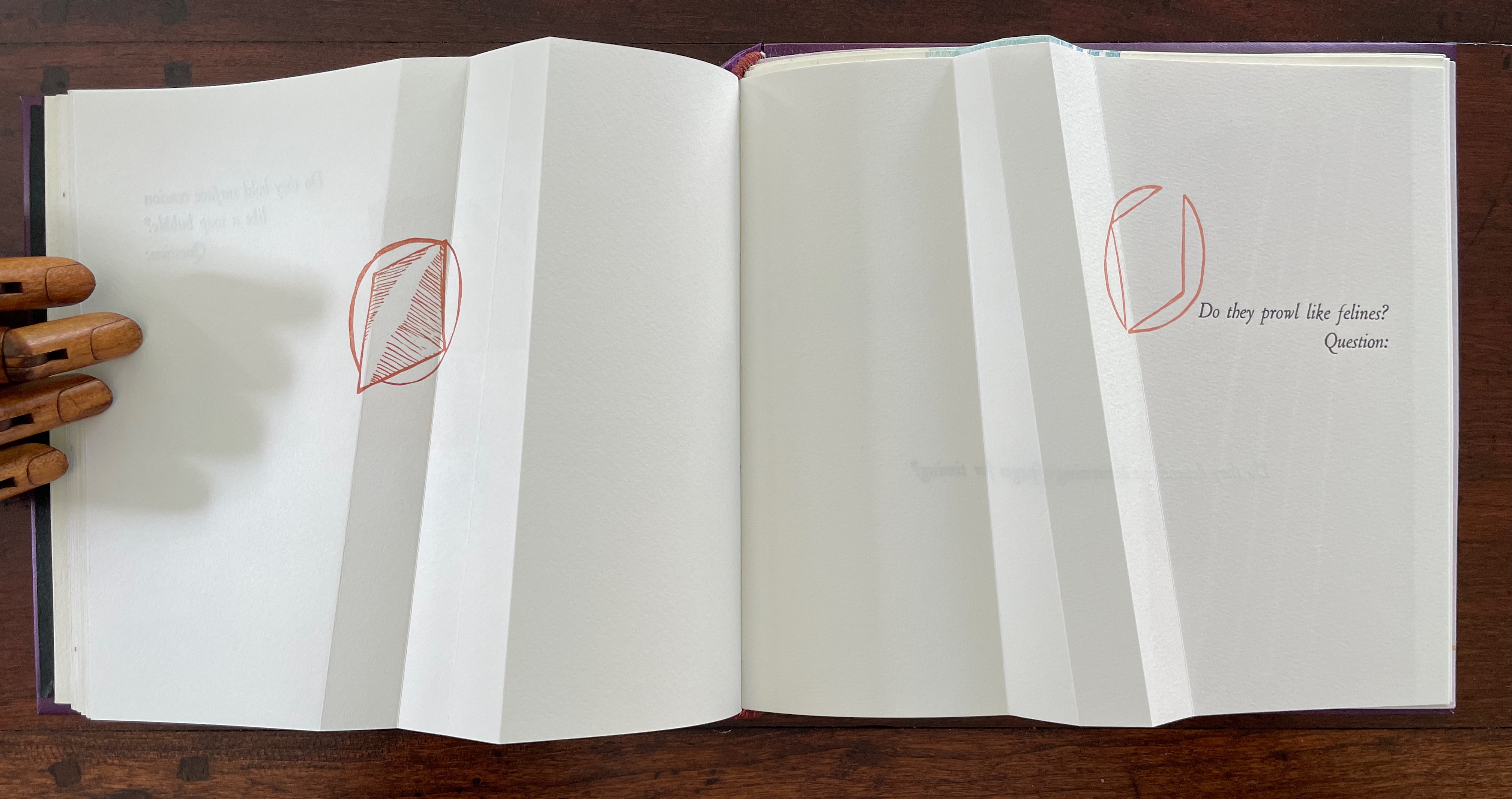
The next question (“Do they prowl like felines?”) prods at the unasked question: what or who are “they”? How is it that “they” are like prowling felines? Again, the images seem to progress across the spread, with the first image’s central diamond shape disappearing to leave the curvilinear second shape leaning over the printed question. Might these be diagrams of the limp vellum structure’s sewing holes and lacing? If so, has Cordeiro found another metaphor for limp vellum structures in the supple and sinuous strength of prowling felines? Do “they” refer to limp vellum structures?
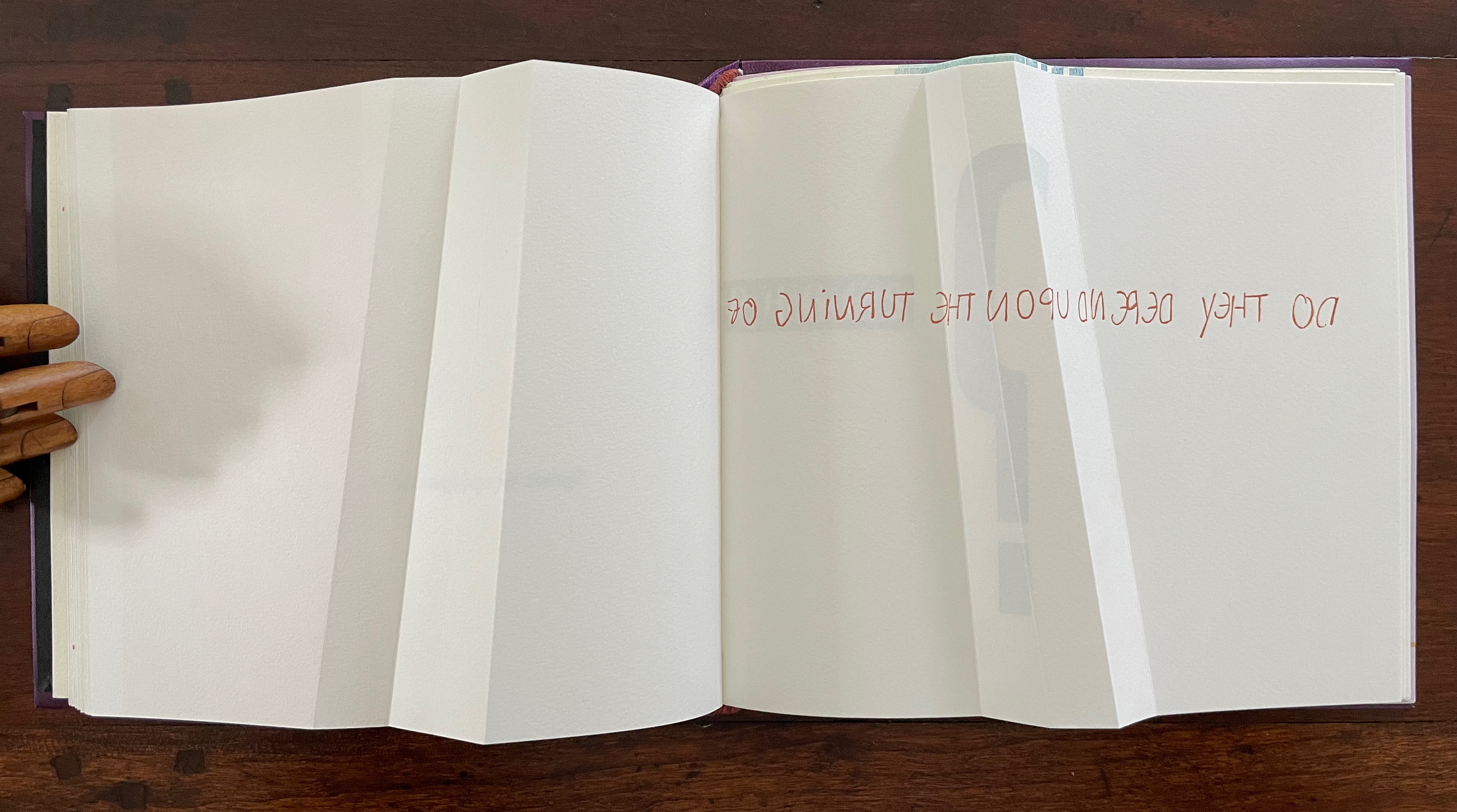
The next question turns directly to a functional attribute of the book structure: turning pages. The yellow print gives an ambiguous view. The two-dimensional representation of the angled beam fluctuates between a mountain view and a valley view. Are we looking down on the splayed spine of a book or its gutter with pages splayed open? Either way, the print angles away from the physical angled beam, which sets up a metronomic pattern in the spread — the beam leaning to the right, then to the left, and again to the right — or a page turned to the right, then to the left, and back again to the right — or mountain fold, then valley fold, then mountain, then valley (the gutter), then mountain, then valley, then mountain until we come to the ambiguous two-dimensional print. Again, this is a continuum, and “they” seems to refer to limp vellum structures.
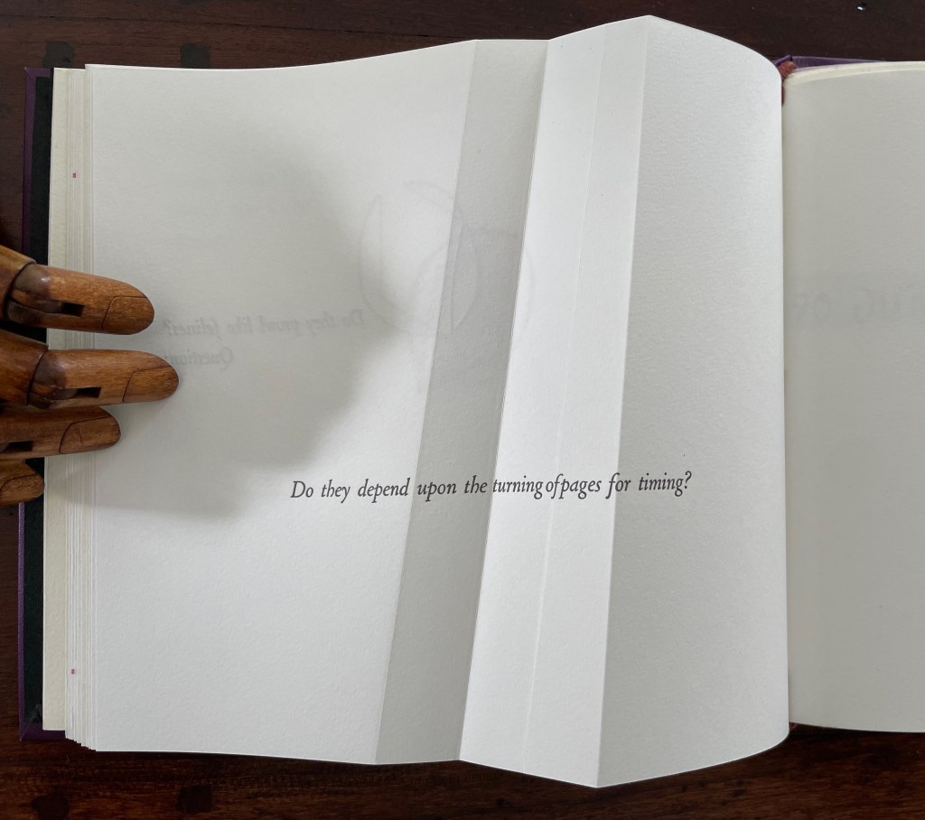
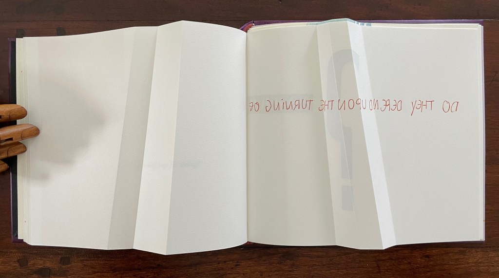
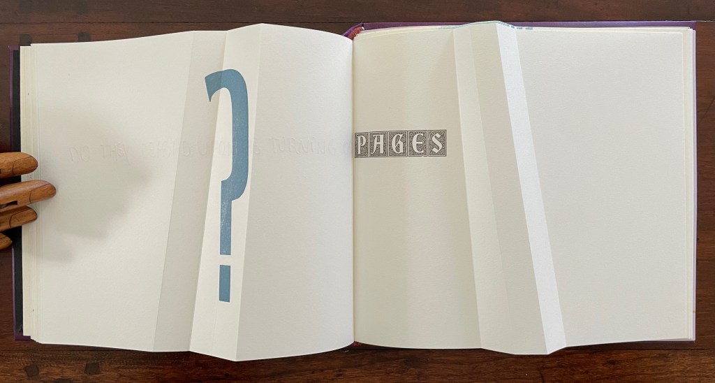
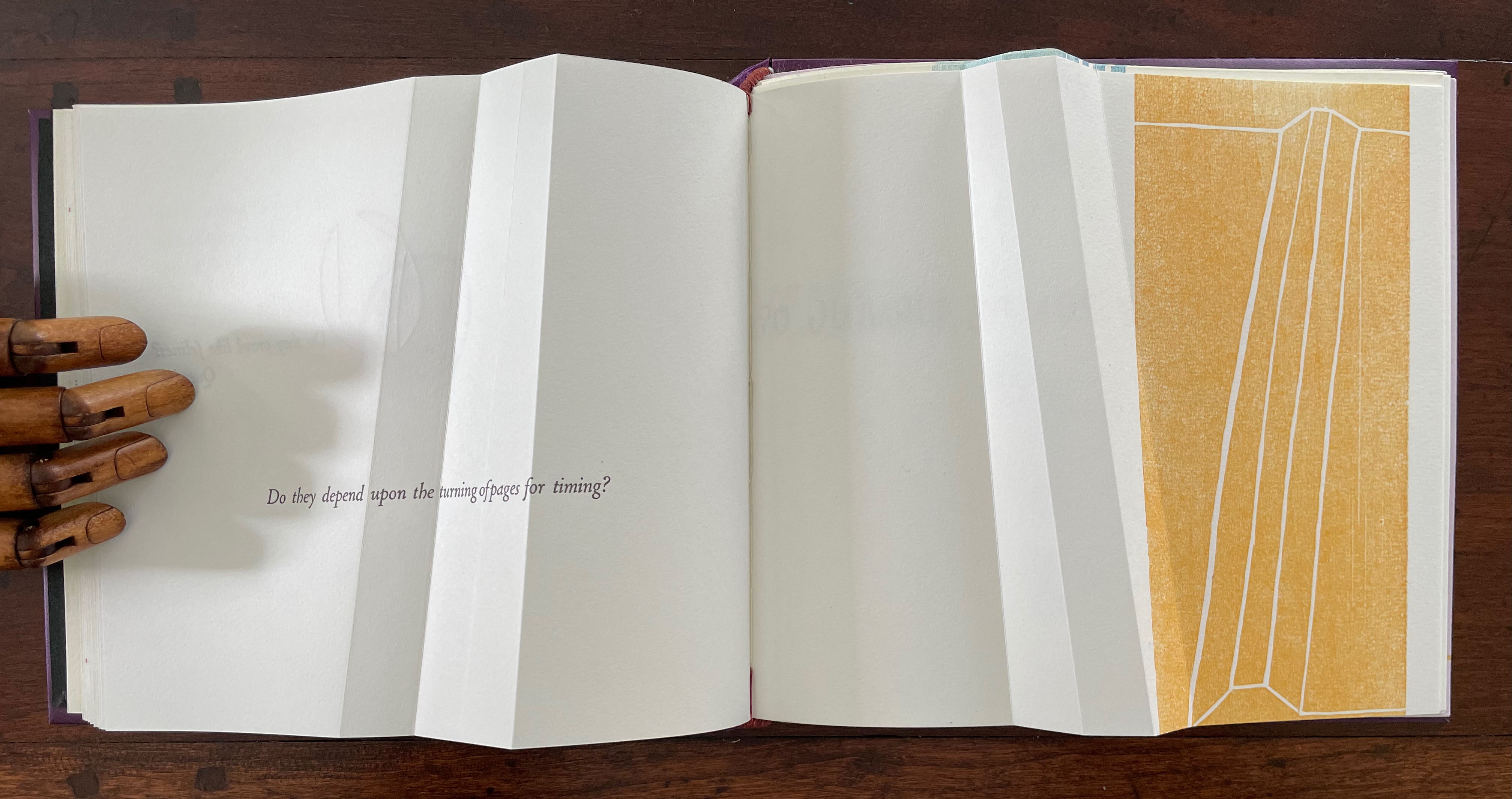
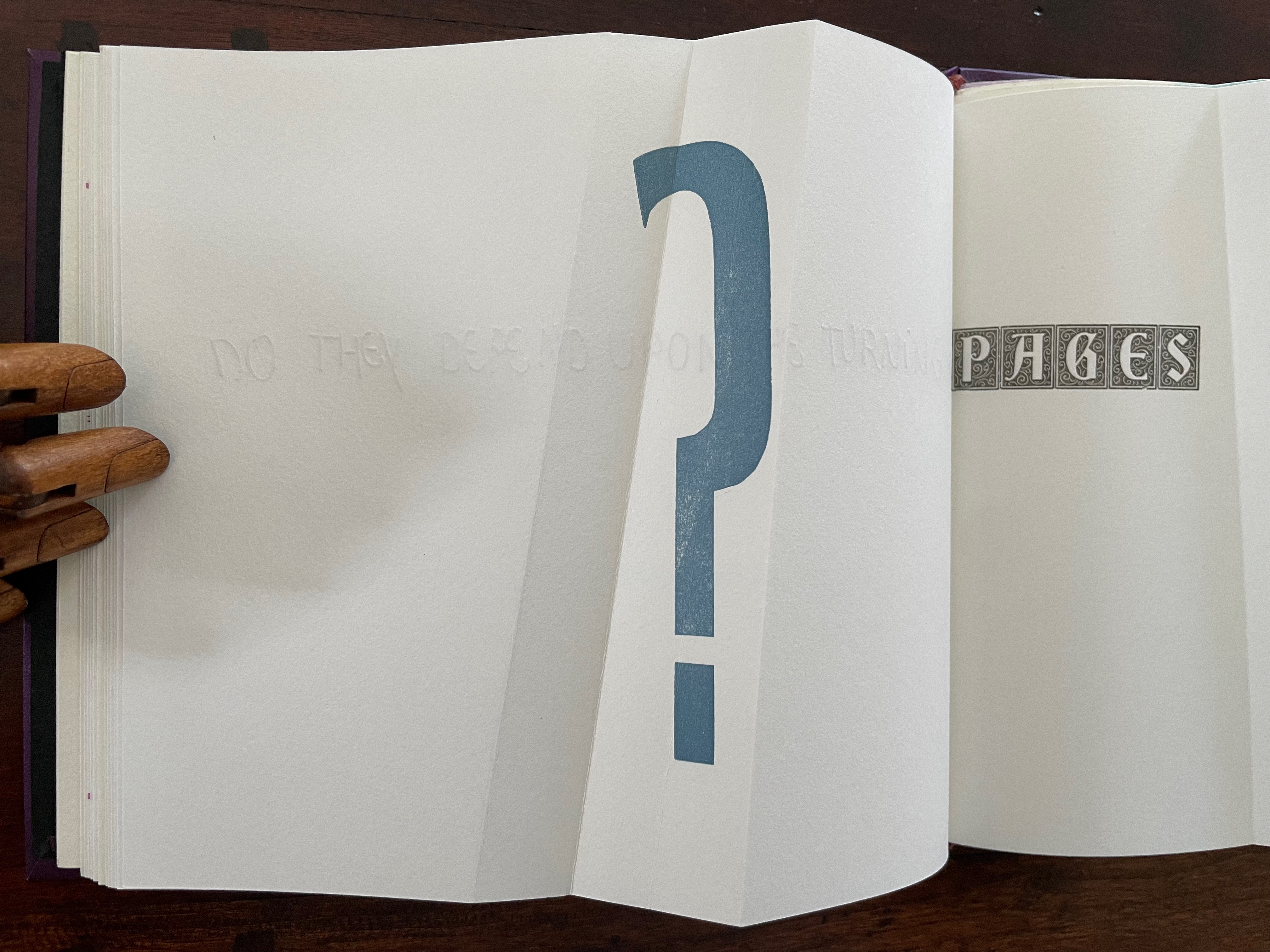
The next question enacts itself. To read the mirror-written script, we have to turn the page and look through its surface to the right-reading words: “Do they depend upon the turning of”. The question completes itself in a curious (again) metronomic motion. The syntax draws our eyes to “PAGES” on the right, while the oversized punctuation mark syntactically draws our eyes back to the left. The play between the reversed writing on a recto page, the right-reading script on the verso, the display type on the next recto, and oversized question mark on the adjacent verso provide self-reflexively an affirmative answer: Yes, limp vellum structures depend on the turning of pages.
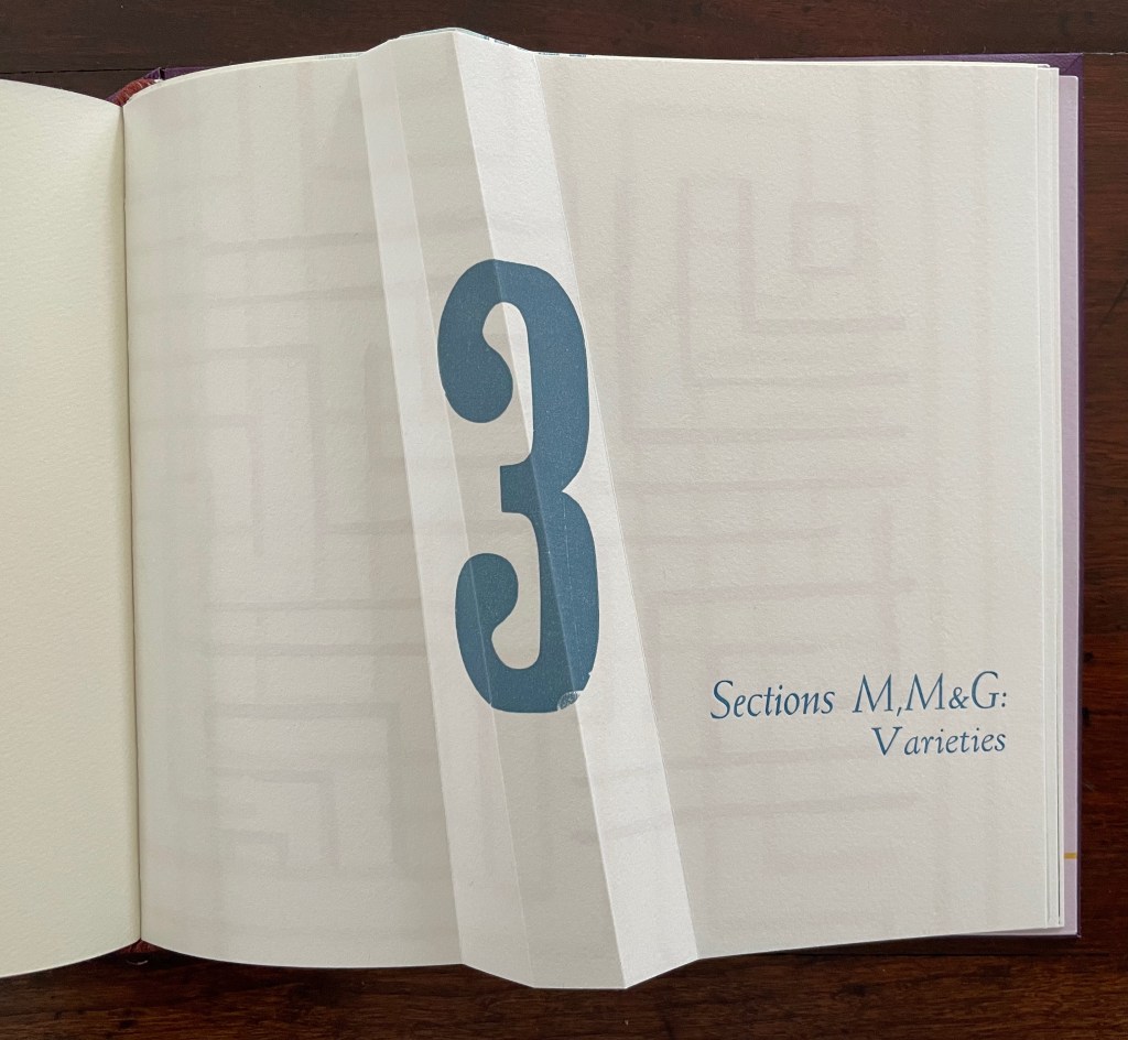
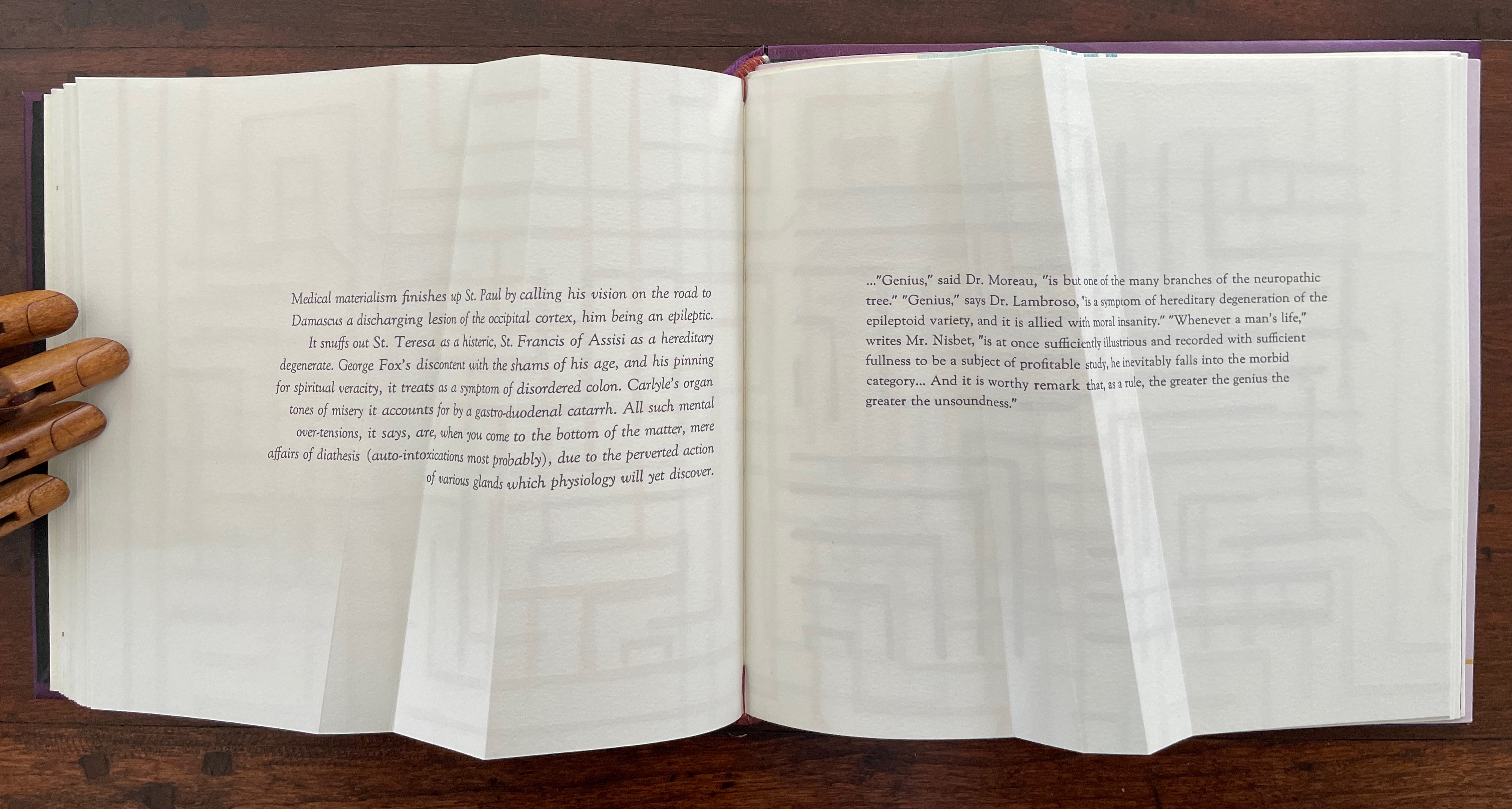
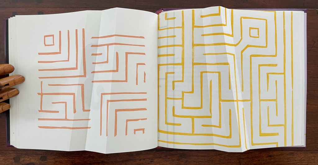
Part 3 introduces rather more esoteric continua with which Cordeiro seeks to connect the genius of the limp vellum structure. The Section letters M, M and G are her reminders-to-self that this section excerpts passages from William James’ The Varieties of Religious Experience (1902): one on medical materialism (p.14) and another on genius (p.18).
Cordeiro brackets the excerpts with maze-like images constructed of mirrored forms across four different colors. So we have the continua of mind to matter and of genius to madness embedded in a continuum of color and form (color and form merging).
Note the 18o° turn of the beige image in the upper left to be mirrored by the magenta image in the lower right.
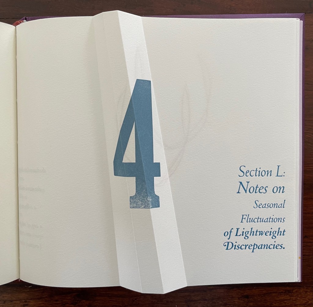
Part 4, labeled “Section L: Notes on Seasonal Fluctuations of Lightweight Discrepancies”, is the densest of the gatherings. Drawings, verse typeset in English and scribed in Portuguese, typographic arrangements, trimmed and segmented photographs, and linocut prints of a stone wall all find their way into Part 4.
Note how the colors of the tulip shapes echo the colors of the maze in Part 3.
The “Epilogue” tells us, “The handwritten text in Portuguese is a word play with the alliteration afforded by that language between the verb to see and the season summer, and translates roughly as: ‘summer shall see gone that which / by going is now new being. / seeing such an hour at birth is to / be seen alive.” Another continuum.
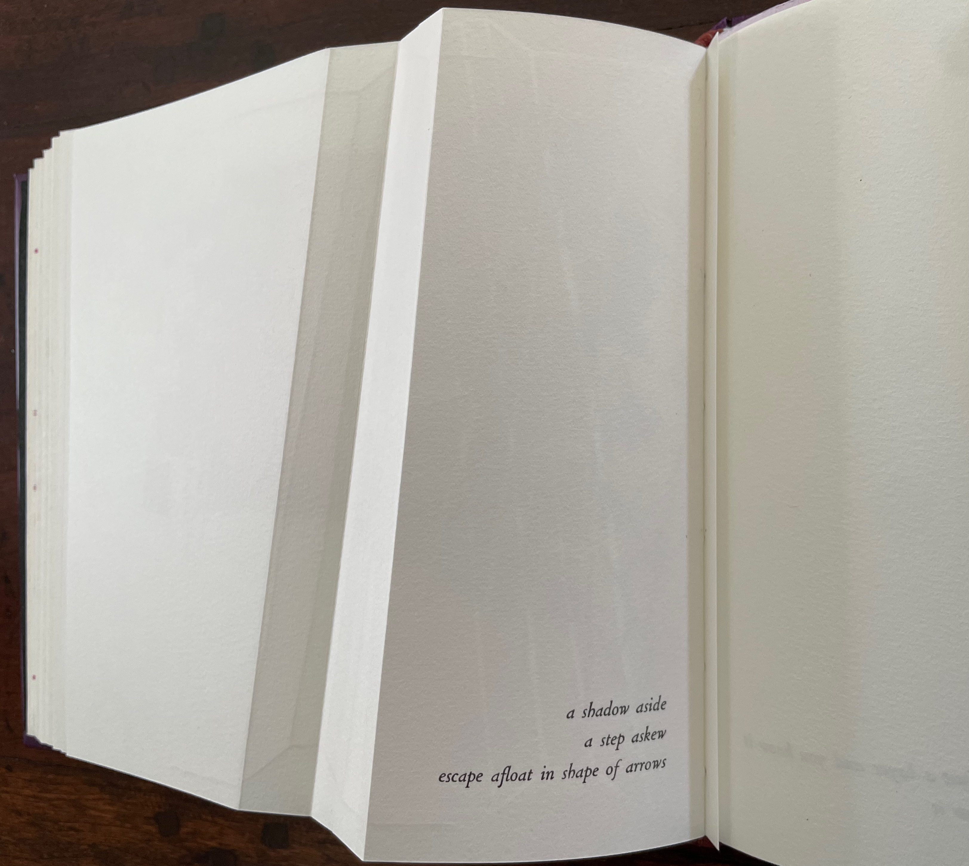
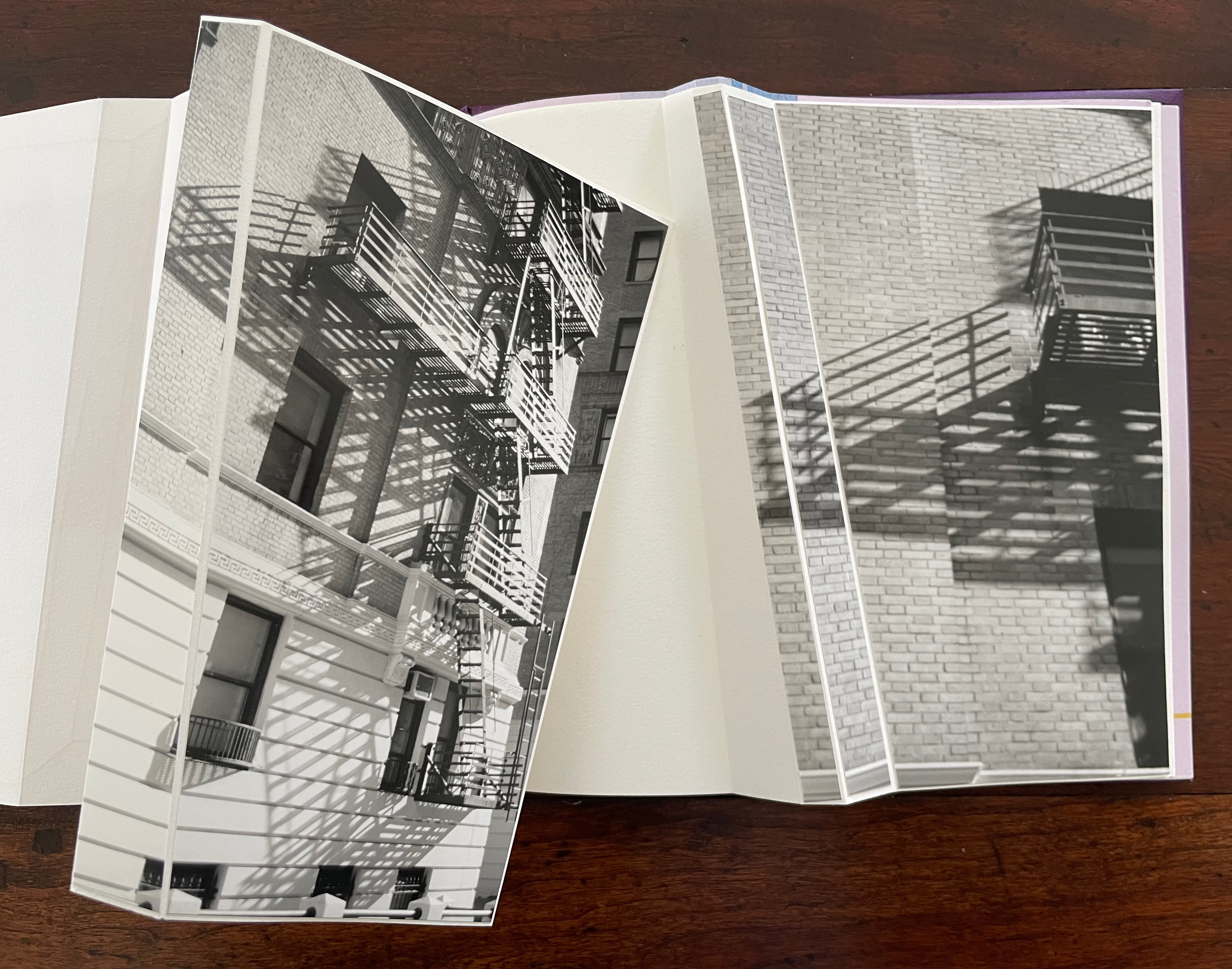
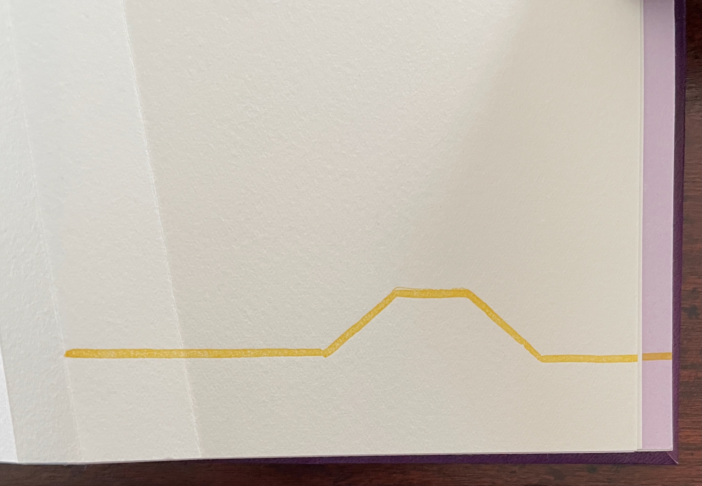
“a shadow aside / a step askew / escape afloat in shape of arrows”. The segmented photos of an Upper West Side building’s fire escape articulate with the angled beam shape to echo the text.
The text before the concluding “end-on” image in this gathering introduces another continuum: “(Life begins at the end of your comfort zone.)”
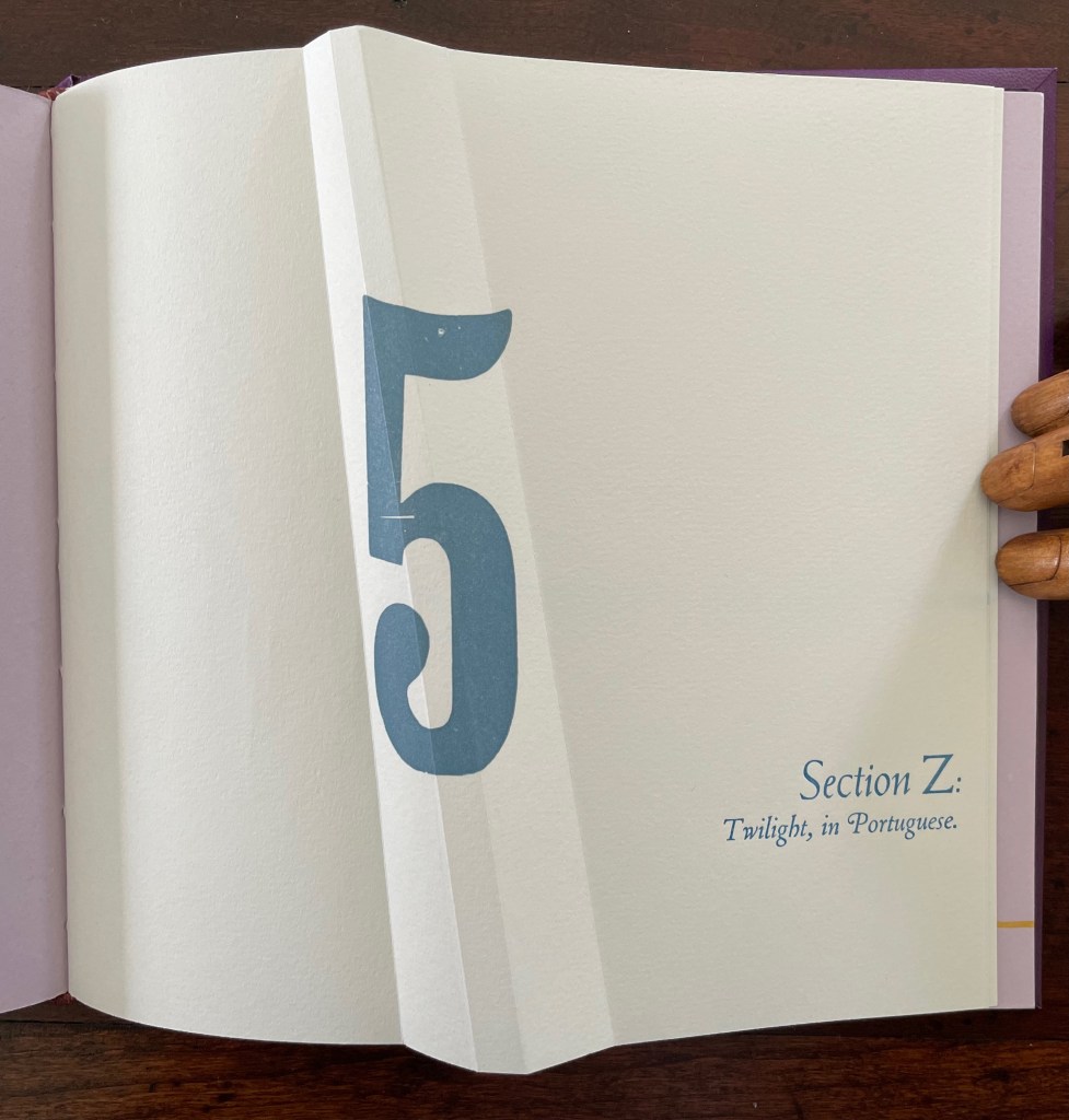
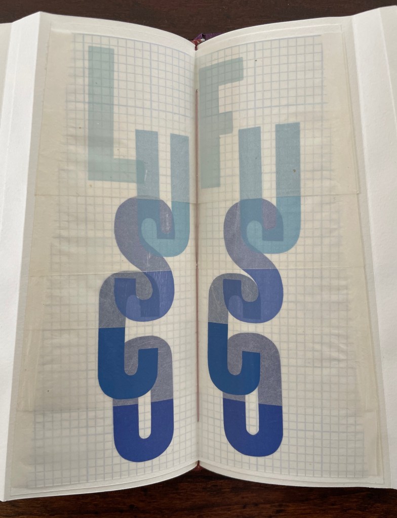
Part 5, Section Z is the wrap-up, conflating the end of the alphabet with the end of the day (twilight), but of course, twilight is also a point on the continuum of day into night.
Lusco-fusco = twilight.
At this point, the reader might register that a continuum whose extremities hang in the balance against one another and yet are still connected is also a description of metaphor itself. Two disparate terms are brought together to make a figure of speech. Cordeiro brings two disparate objects together — a softcover codex and the shape of an angled beam, a hard form of structural support — to shape her artist’s book. She materializes that metaphor, then uses it as a platform for textual, graphical, material, and structural metaphors that celebrate the limp vellum structure. It is a striking accomplishment that challenges readers to think with their hands as well as their minds.
Further Reading
“Carol Barton“. 10 August 2024. Books On Books Collection.
Drucker, Johanna. 2004. The Century of Artists’ Books [Second edition] ed. New York City: Granary Books. For investigation “of the book as a form through examination of its material, thematic, and formal properties “, see p. 93.
Hebert, Henry. 18 December 2011. “Limp Paper and Vellum“. Work of the Hand. Accessed 23 October 2025.
Magee, Cathie (compiler). 23 February 2024. “BPG Parchment Bookbinding“. AIC (American Institute for Conservation) Wiki. Accessed 22 October 2025. Citing Clarkson and Giuffrida.
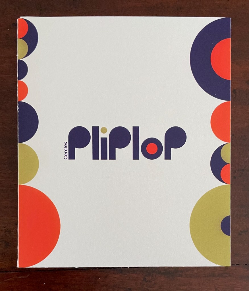
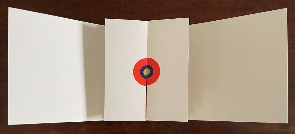
Pliplop (2020) iOiOStudio Trifold cover, side-by-side leoporellos. H120 x W105 (closed), W895 mm (open). 16 half-panels, 1 full center panel. Acquired from StudioiOiO, 6 November 2025. Photos: Books On Books Collection.d from StudioiOiO, 6 November 2025. Photos: Books On Books Collection.
Based in Montélimar, France, and Seoul, South Korea, iOiO Studio produced this ingenious micro-edition leporello that invites its audience to behold and play. The folds and registration of images allow the viewer to find and create new shapes and color combinations. Its shapes and colors might remind viewers of Heinz Edelmann’s art for The Yellow Submarine. In its appeal to the child in the adult, it will remind book art enthusiasts of the works of Katsumi Komagata, Warja Lavater, Bruno Munari, and Peter and Donna Thomas. In its sophistication, it might remind them of the contributions to LL’Éditions leporello series. Many other connections can be found in Stephen Perkins site Accordion Publications, where Pliplop first came to my attention.
Two works that explore the curious but natural connection between children’s books and artists’ books are Johanna Drucker’s contribution to The Routledge Companion to Picturebooks and Sandra Beckett’s Crossover Picturebooks.
Drucker, Johanna. 2017. “Artists’ Books and Picture Books: Generative Dialogues” in The Routledge Companion to Picturebooks, edited by Bettina Kümmerling-Meibauer, Taylor & Francis Group..
Making Memeries (2016) Lucas Blalock Board book consisting of nine 3mm thick card leaves with 8 double-page large colour photos, all of which interact with a down-loadable app. H330 x W210 x D28 mm. [18] pages. Edition of 500. Acquired from David Bunnett Books, 31 July 2023. Photos of the work: Books On Books Collection.
How do we respond to an artwork of collage or assemblage that is missing a piece — assuming that we can tell ? And if all of the elements are ephemera, does it matter to our appreciation of it? Do we keep returning in annoyance to the gap — like a tongue to a missing tooth? Do we give up on it — like the purchaser of a secondhand jigsaw puzzle missing a piece or two? Or do we sigh and suppose appreciatively that the disappearance of an element of ephemera from a collage or assemblage of ephemera proves the artwork’s point?
Lucas Blalock is an artist of augmented realities. With the right device and app pointed at his artwork, we should be able to see images floating and moving over its surface or seemingly in the surface among its images or transforming them. According to the back cover, we can download this app from the iTunes App Store to interact with the book’s images. The app, however, was removed from the App Store in July 2023. Using the WayBack Machine, we can find the publisher’s announcement of the Making Memeries installation with Blalock in the Tate Modern’s Turbine Hall:
The London-based curatorial project Self Publish, Be Happy presents a programme of events that explore the blurring boundaries surrounding on/offline existence and distribution of photographs. The event, titled Making Memeries, will take place at Tate Modern during this year’s Offprint London art book fair from 20-22 May.
Artist Lucas Blalock has created an installation for the middle of the Tate Modern’s Turbine Hall that functions as a staging area for workshops and performances. The installation consists of a set of eight movable panels that display a new suite of photographs by Blalock. The elements of the installation, conceived of specifically for this project, can be further activated via this app, Making Memeries.
The audience will be able to immerse themselves in, and interact with the work through the app, which uses your camera to produce a digitally augmented reality. Blalock’s work has long been interested in the cohabitation of the worldly and the virtual behind the photographic surface, and this project has allowed the artist to picture this cohabitation on both sides of that plane. Blalock has collaborated with REIFY, the augmented reality (AR) creative studio, to build an experience that blurs traditional boundaries and challenges one’s expectations of viewership.
Photos from old website of Self Publish, Be Happy. Accessed 26 October 2025.
Among the performances facilitated by the installation was Anouk Kruithof’s Connection, which also contributed to the aim of blurring the boundaries of the physical and digital.
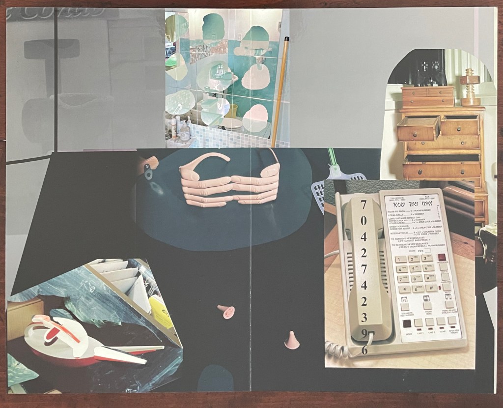
But without the app or memory of the installation, we have a gap like that missing tooth. We can bridge the gap somewhat with online links and the book’s collaged imagery of mixed media and photographs to recognize that Making Memeries is also about how we perceive surfaces and what lies beneath — and what might come between. Consider the earplugs alongside the telephone below. Then there’s the pair of spectacles in the shape of fingers that would cover the wearer’s eyes. Now look back to the cover, and we find the view from behind those finger-spectacles.
Photo of the work: Books On Books Collection.
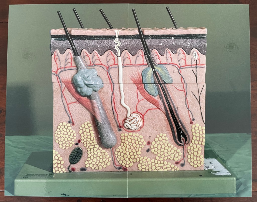
Or consider the images of the model of the epidermis with which the book opens and closes. ortunately, we have a YouTube link and Olga Yatskevich’s review to let us know that the “augmented reality radically changes the experience, making the image active rather than static – the app brings rounded depth to the model, shows blood running through the vessels, and allows us to explore the space around the object, its sides and the top”.
First and last double-page spreads. Photos: Books On Books Collection.
There’s something childlike, playful but serious conveyed in all this. Physically Making Memeries presents itself as an oversized children’s board book (or perhaps a board book for undersized adults). The use of the board book to make this cross-over can also be found in other artists’ books — Colleen (Ellis) Comerford’s ABCing and Phil Zimmermann’s Sonorensis, for example.
Fore edge of Making Memeries.
What the board book only partially conveys with the Connection link in hand, so to speak, is the intent expressed on the back cover and in the Tate’s announcement:
Making Memeries is set in a time when everyone has become a lifestyle photographer. It is still your life but the image production is decidedly public; and in that case temporary, verging on fleeting, because these public channels have so many content providers and, along with our attention spans, are in a perpetual state of refresh. [back cover]
Before the advent of the Internet the act of taking a photo was often intended to make memories; to store and preserve our past in still, printed images. In today’s digital age the act of taking photos can be enough for the photograph-taker. The act is exhausted by the process. This can be seen in the way a mobile phone camera offers immediate satisfaction — producing a file that may never be looked at again. Today a photo has a different claim to time, being much more in the “now” than in the “this has been” of its 19th and 20th century pre-internet forbearers. We, in turn, live in a culture of the perpetual present, in a meme-driven world where photos can effortlessly be shared, but where they most often disappear into digital oblivion. [Tate Modern announcement]
It feels ironic that Making Memeries‘s “missing tooth” is digital. The same year of Blalock’s installation at the Tate, Pokémon Go arrived, and people began wandering into traffic to capture Pokémon figures that their cameras projected onto the streets around them. Nine years later, the company owning the app has sold for $3.5 billion, and the world’s richest country is governed by meme. Is art miming life, or life miming art?
Further Reading
“Colleen Ellis“. 7 March 2024. Books On Books Collection.
“Anouk Kruithof“. 19 July 2021. Books On Books Collection.
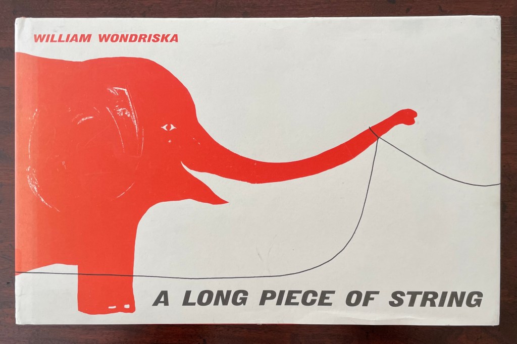
A Long Piece of String (2010 [1963]) William Wondriska Casebound, illustrated paper over boards, illustrated pasteboards. H185 x W290 mm. [44] pages. Acquired from Thrift Books, 25 May 2025. Photos: Books On Books Collection.
Marlene MacCallum achieves distinctive results by painting with photography and sculpting with book structure in her artist’s books. Her painting with photography has involved not only collage work but pinhole cameras, digital cameras, digital layering and masking as well as a variety of transfer processes — digital and analogue photogravure, lithography, digital pigment printing, and digital inkjet printing. Sculpting with book structure mainly includes varying the binding as in the accordion with fold-out of Obvert (1997), the tunnel book structure of Do Not Enter (1998), the gatefold of Domestic Arcana (1999), the tile format fold-outs of pink story (2004-05), the accordion of Quadrifid (2009), the dos-à-dos of Glaze: Reveal and Veiled (2013), and the Miura fold of Rise (2020). It also includes altering books as in Withdrawn (2010) and varying the substrate as in the lace paper, Moriki, double matte Mylar, Lanaquarelle, and embossed leather of Townsite House (2006) and the etched copperplate and Tyvek of Trompe l’Oreille (2011).
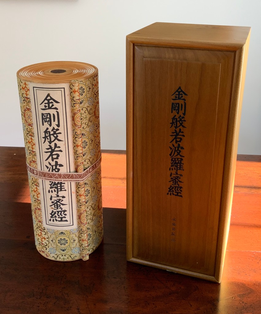
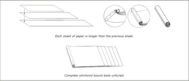
Diamond Sutra in 32 zhuan (seal) fonts (2017) Zhang Xiaodong Scroll in dragon scale binding. 152 x 382 x 160 mm. Edition of 300, of which this #197. Acquired from Sin Sin Fine Arts (Hong Kong), 31 October 2019. Photos: Books On Books Collection.
In 1900, in China’s Dunhuang province, the Diamond Sutra (868 CE), the world’s earliest complete and dated printed book, was discovered in a cave along with 40,000 scrolls. One of those other scrolls — Or.8210/S.6349 — was possibly just as important for the book arts as the Diamond Sutra was for the history of printing. Like the Diamond Sutra, Or.8210/S.6349 resides in the British Library and is “the only known example of whirlwind binding in the Stein collection of the British Library” (Chinnery). The structure is also known as dragon scale binding, although distinctions between the two have been debated (Song). It came into use in the late Tang dynasty (618-907 CE) then fell away in the face of the easier to handle butterfly and wrapped-back bindings. Besides Or.8210/S.6349, there are few surviving examples of original whirlwind or dragon scale bindings.