The Hidden Alphabet (2003) Laura Vaccaro Seeger Die-cut dustjacket. Casebound, alphabet-decorated paper over boards, doublures attached as first and last pages. H225 x W210 mm. 54 unnumbered pages. Acquired from Plain Tales Books, 18 September 2022. Photos: Books On Books Collection.
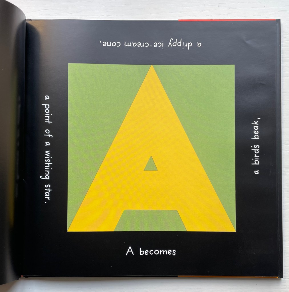
When removed, The Hidden Alphabet‘s die-cut dustjacket offers a clue to the magic about to happen.
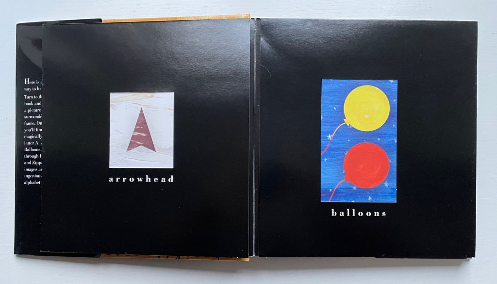
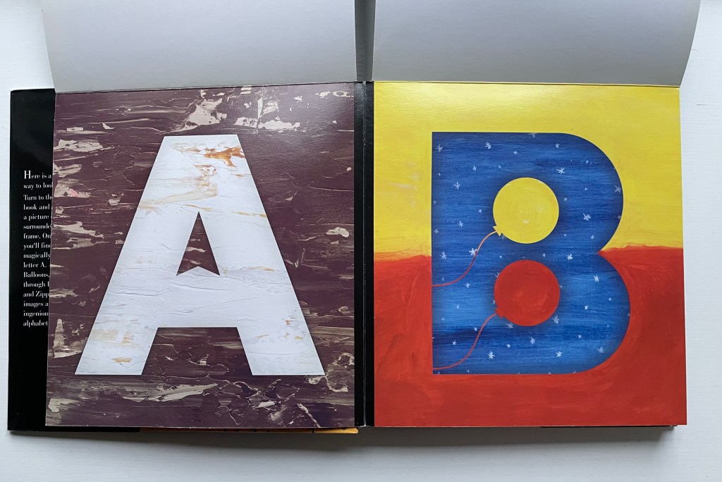
Inside the book, white letters on a glossy black die-cut sheet name the object framed inside the cutout. But lift the black frame, and the object disappears into the uppercase letter appearing on the page underneath: the first letter of the object’s name that just disappeared.
The optical illusion created by the shifting foreground mesmerizes and will prompt a race through this abecedary to see the next bit of magic. But for the teacher or parent reading with the child, Laura Vaccaro Seeger has subtly planted another traditional feature of the alphabet book to be used in a second pass through the book. Learning the difference between lowercase and uppercase characters becomes part of the trick of lifting the flap to move from the small to the big. And for the more serious students of the alphabet and art, the magic calls attention to the metamorphic boundary between text and image
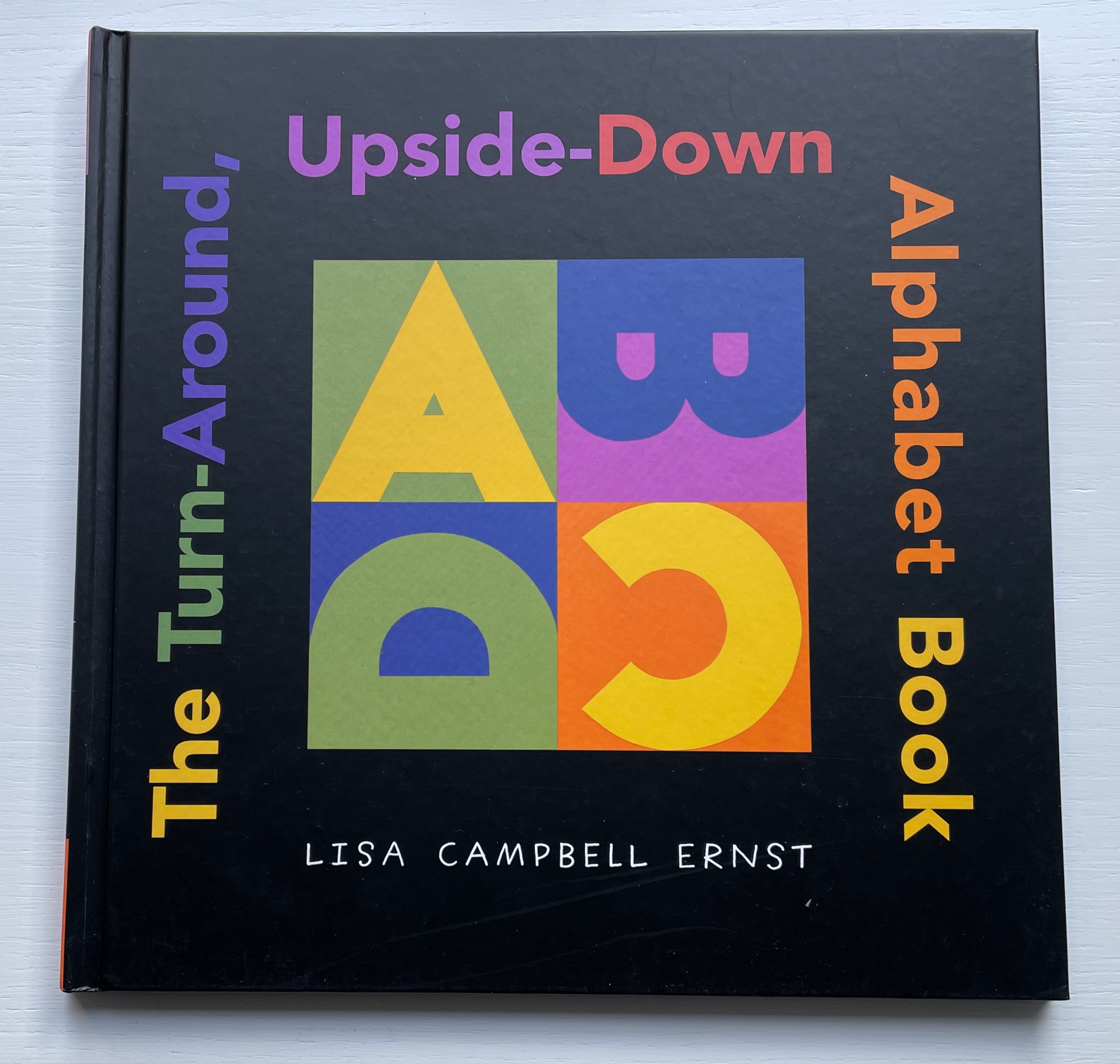
From children’s picture book to artist’s book and back, certain techniques and tropes with the alphabet recur. Finding an image in a letter or making an image from a letter may be the oldest, not surprising given the pictorial origins of almost all writing systems. Lisa Campbell Ernst freshened this approach with a structural twist that does not rely on pop-ups, flaps, pull-tabs, a volvelle, accordion tunnel or any of the other moving part standbys of children’s books. Rather the whole book moves — as its title suggests.
Two non-alphabetic predecessors to this book are Katsumi Komagata’s Walk & Look and Go Around (1992). Ernst’s inventiveness with foreground, background and negative space holds its own in the illustrious company of illustrators, designers and artists below under Further Reading.
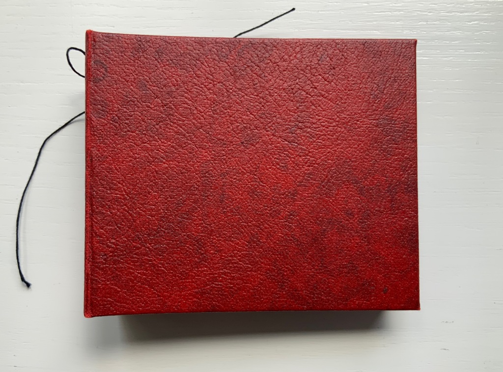
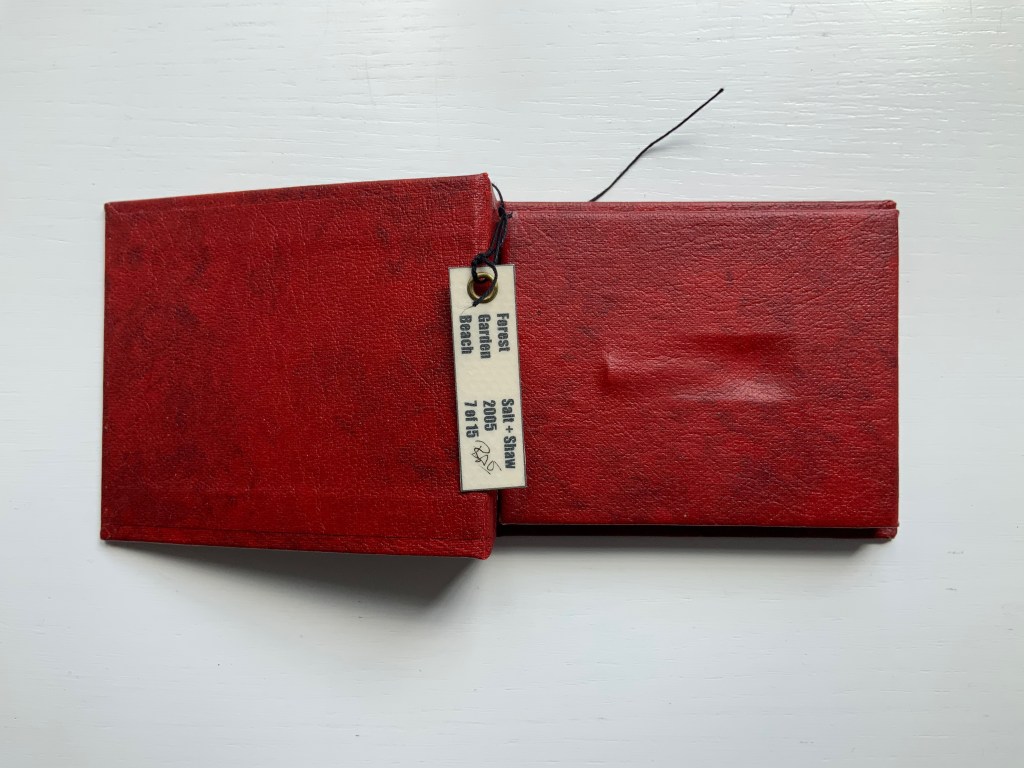
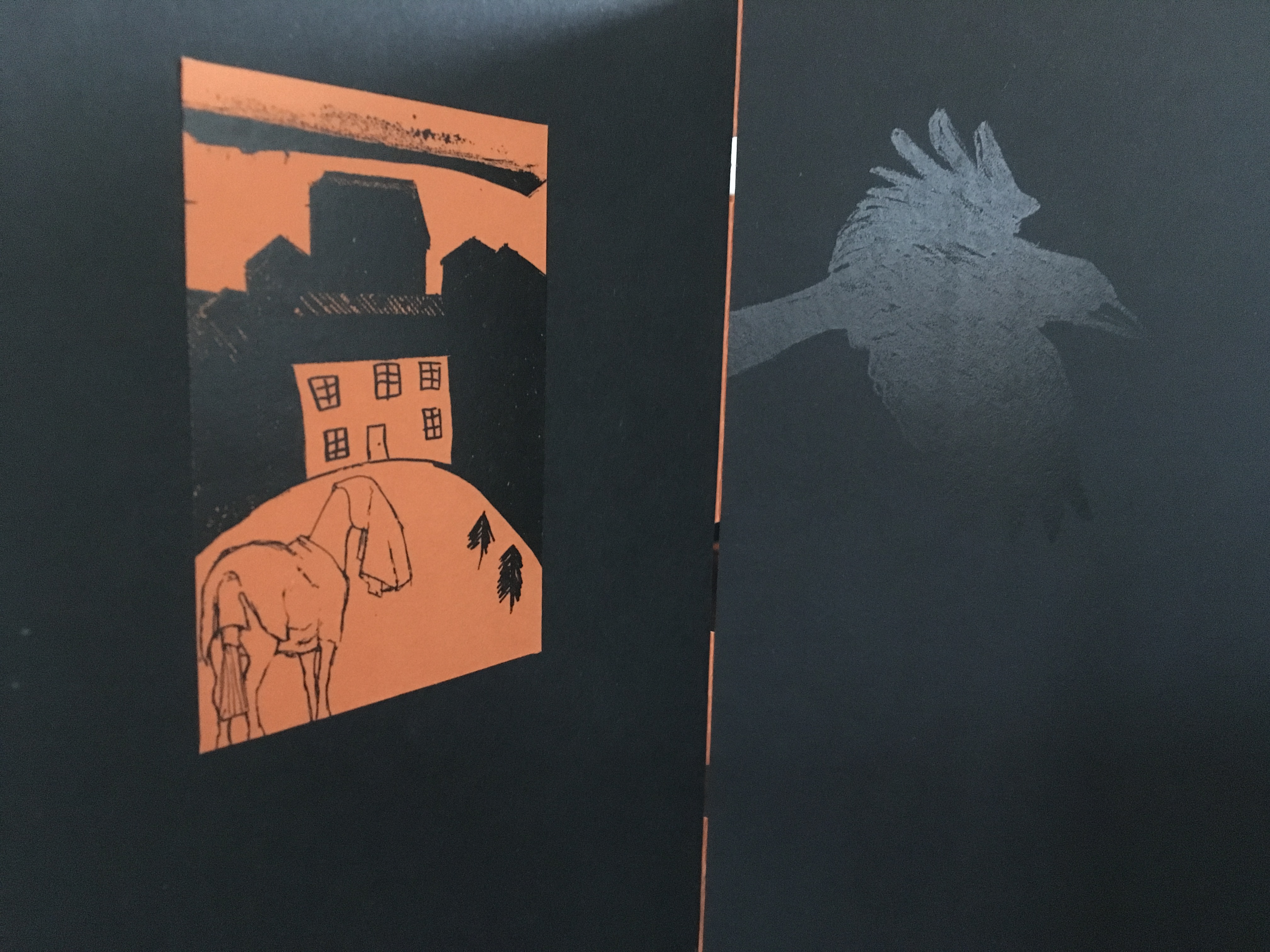
Paul Salt and Susan Shaw collaborate under the name Salt+Shaw. Individually and together, they present a wide range of book art. Much of it finds its most striking expressions in unusual bindings, sometimes to the extent that the binding absorbs the content — as is the case with a spent bullet in Forest Beach Garden.
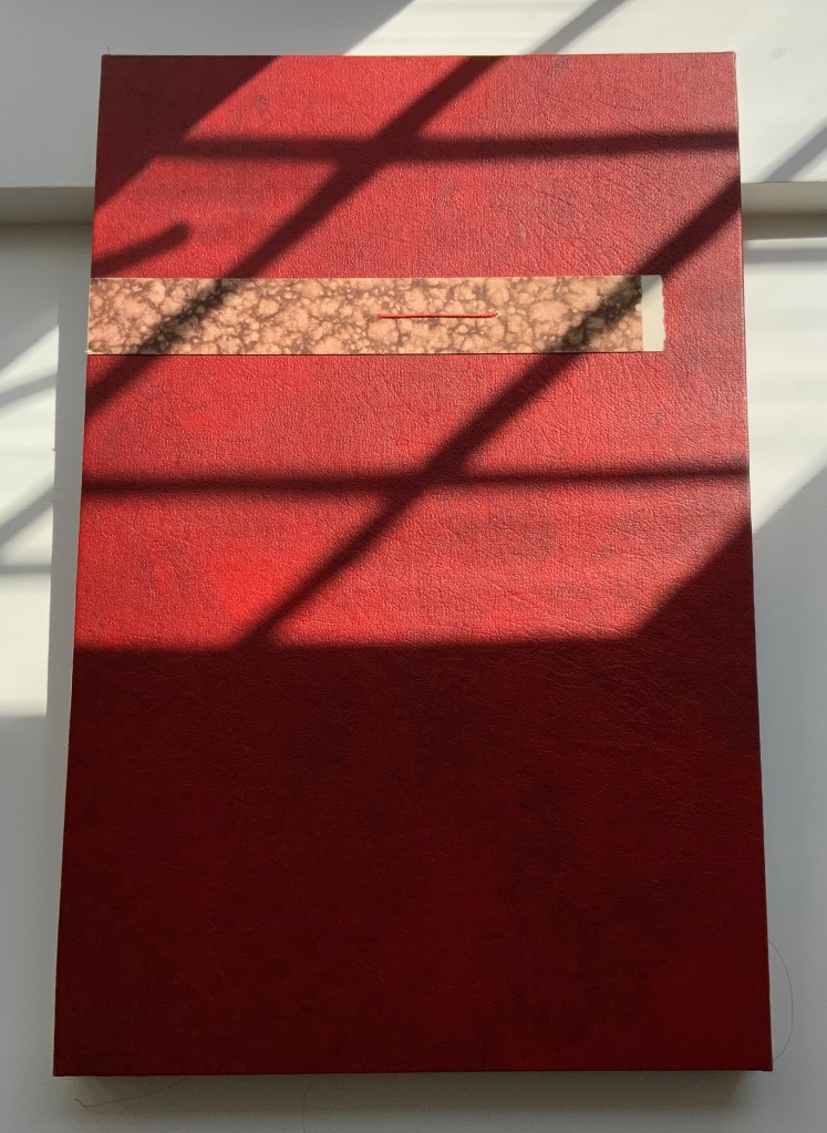
FOREST GARDEN BEACH (2005)
FOREST GARDEN BEACH(2005) Salt + Shaw Hardcover. H90 x W110 x 30 mm. Edition of 15, of which this is #7. Acquired from the artist, 13 December 2021. Photos: Books On Books Collection. Displayed with permission of the artist.
The book block between the covers here is not a book block of pages. The only text in Forest Garden Beach is found on the tag attached to the work. On one side is the title, artists’ names, date and edition. On the other are UK National Grid Reference coordinates for locations in Scotland, South Yorkshire and East Yorkshire. The coordinates’ suggestion of precision, however, run into visual, tactile and textual ambiguities. This book shape opens on something concealed. The red leather case binding holds and withholds.
The shape seen and felt beneath it seems to be that of a bullet’s shell casing. There is an indentation, almost like a rifle chamber from which the casing is being ejected. According to the artists’ online description, it is a spent bullet “found in a forest, on a beach or in the garden”. But that is information apart, or evidence external to the work and its tag. Even if it were squeezed onto the tag somehow, the information leaves ambiguities: from which of the three locations did this single found object, now covered by leather, come; and why the precision of the coordinates if the source is uncertain?
Fusing location with the element(s) of the book form that they have chosen to exploit is another frequent characteristic of Salt+Shaw’s combined work. The next item is one of their most effective works of “local color”.
Mill (2006)
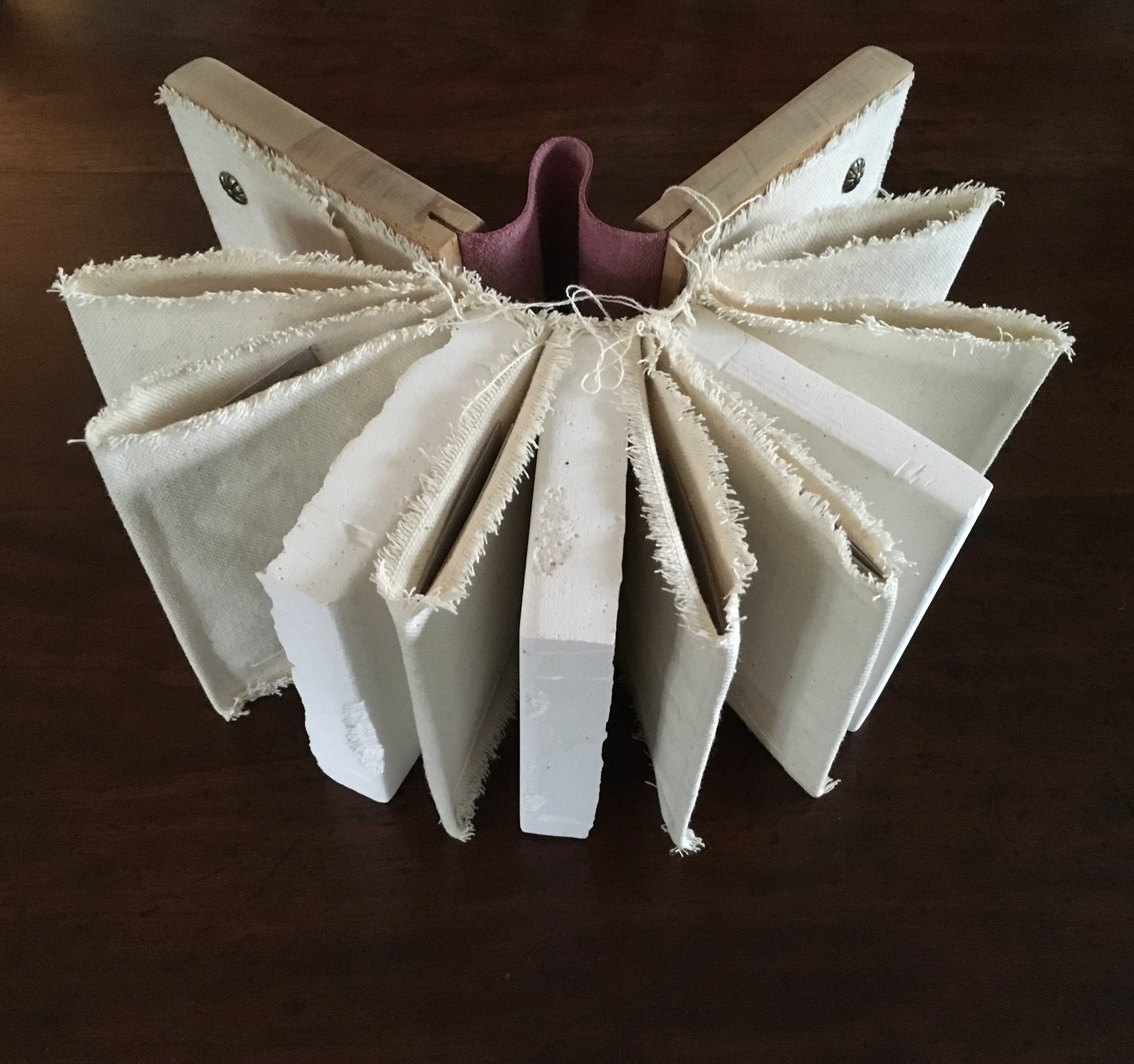
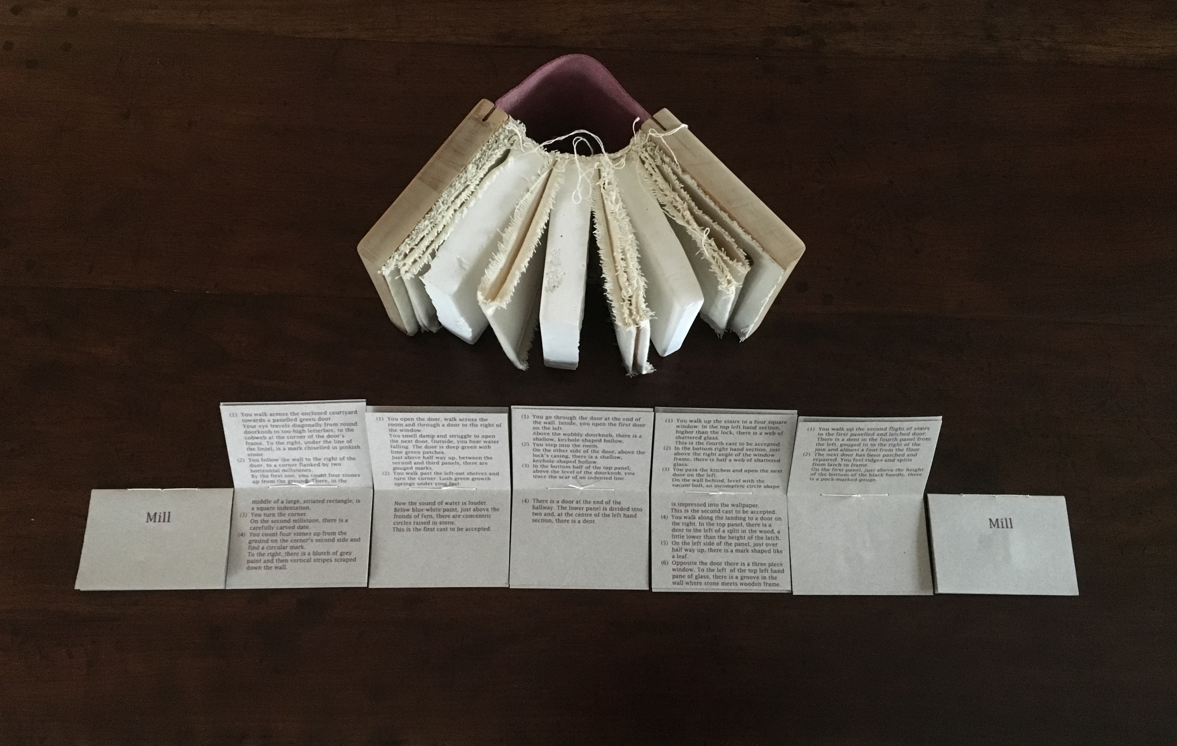
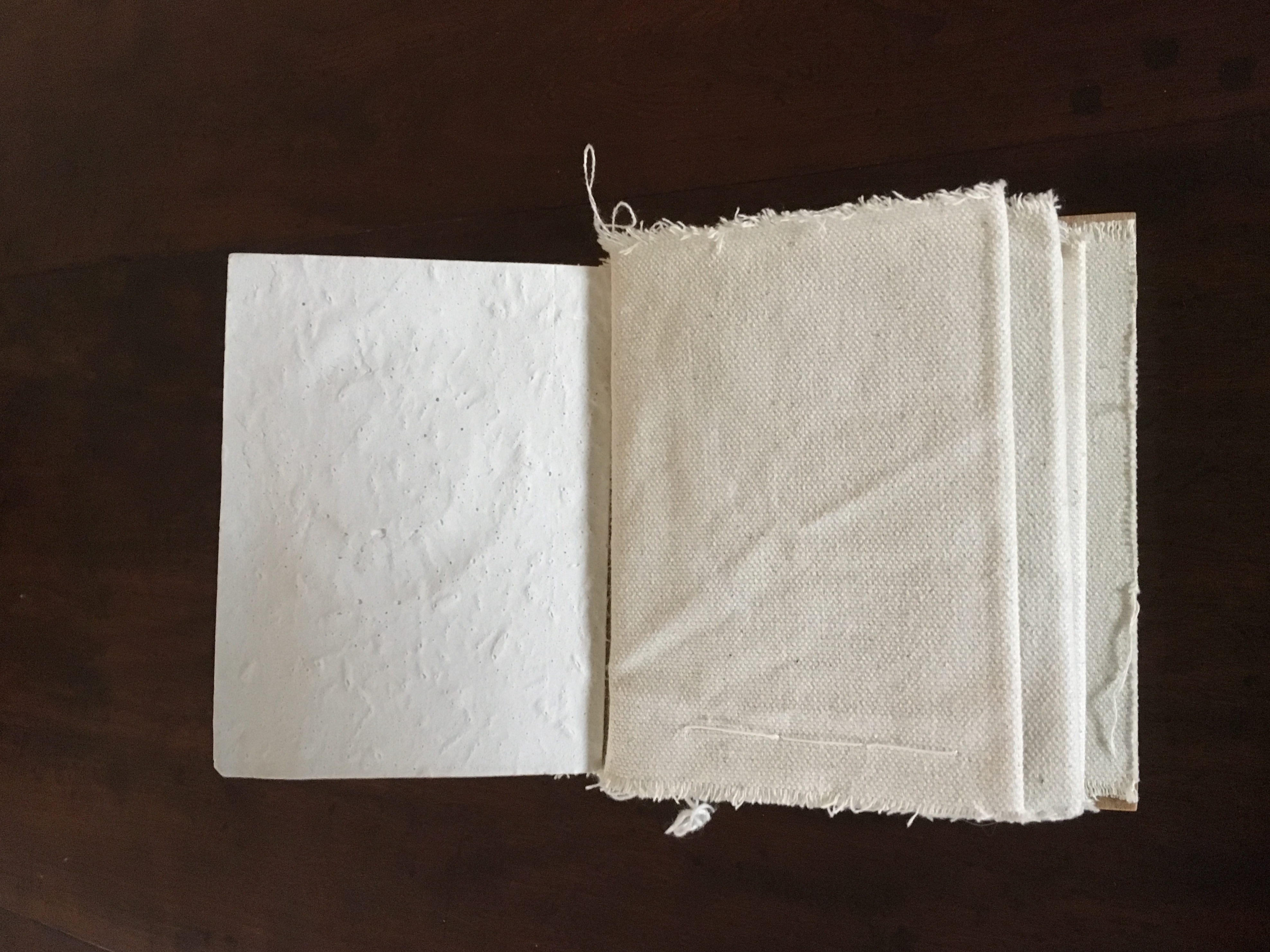
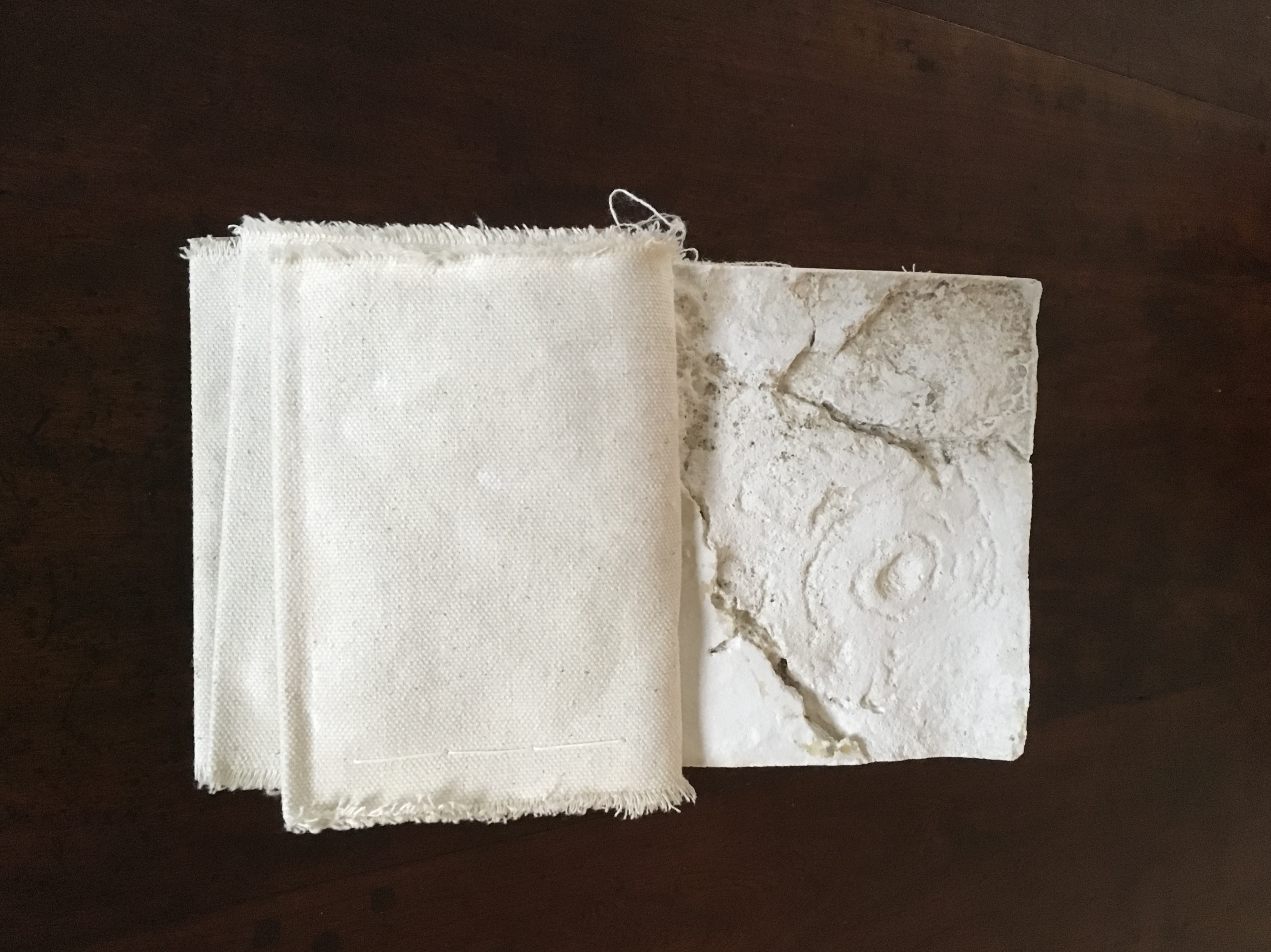
Mill (2006) Salt+Shaw Wood and leather binding, using discarded library shelves, canvas and upholstery nails. Plaster cast and canvas pages with individual pamphlet book text inserts printed on Canson paper. Casts made using water extracted in dehumidifying the building. H143 x W114 mm closed, H143 x W310 mm open. Edition of 24, of which this is #2. Acquired from the artists, 25 November 2018.
The work is a tactile exploration of the interior and exterior space of a corn mill in Cromford, built c.1780 to grind grain for workers at Arkwright’s cotton mill.A journey around Cromford Mill, Derbyshire.
Mill is an investigation of the marks of passage, which have become part of the fabric of the space and reveal time, energy, endeavour and change:
(i) recording the interaction of the human body with the building
(ii) recording the impact of natural forces upon the built environment
(iii) locating the marks that reveal a momentary connection or repetitious action
(iv) examining clues and ephemera.
Silicone moulds were taken from marks of usage around the mill, including the spotwhere a door handle impressed upon a wall and the shape of a break in a pane of glass. Plaster casts were then produced, using water from a dehumidifier within the building to make the plaster. A text piece, contained within canvas pocket pages, creates a unique map of the mill and takes a journey through the building – both to experience the environment and locate the plaster casts. [Correspondence from the artists, 5 December 2018.]
Just as the spent object in Forest Garden Beach lies buried or hidden but still tangible beneath the cover of the work, the spent object of Mill is plain to the touch but only through plaster impressions of it. Where the text related to Forest Garden Beach plays a game with precision and ambiguity, the text of Mill plays a game of hide-and-seek or blind man’s bluff.
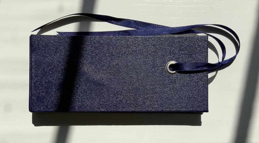
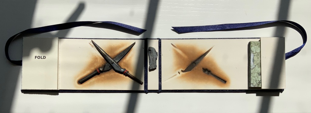
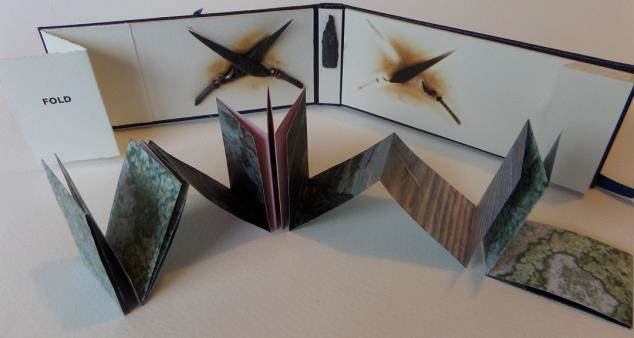
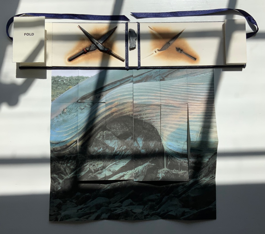
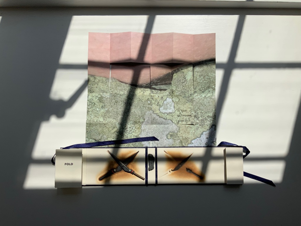
FOLD (2008-2015)
FOLD (2015) Salt + Shaw Cloth over board with eye-and-ribbon closing. H60 x W140 x D1.5 mm. Edition of 35, of which this is #19. Acquired from the artists, 13 December 2021. Photos: Provided by the artists and Books On Books Collection. Displayed with artists’ permission.
The cloth-over-board binding opens to reveal a single-fold title page on the inside front cover and a small book tucked into a receptacle on the inside back cover. Bolted to the inside front cover, a found miniature pair of Sheffield scissors. Glued to the inside spine, a small rock. And imprinted on the inside back cover, a rust-transferred reverse image of the scissors.
On removal and opening, the small book turns out to be a single sheet of paper in a “meander” fold.
On one side, it displays a close-up photograph of a beached whale’s skin lying in folds over rocks and shingle. On the other side is a close-up of human skin resting on a similar bed.
So here is a fourth option in the game of Rock-Paper-Scissors, but the game is one rather of Risk in which, whatever the craft, whatever the objects found and whatever the strategy played in rock-paper-scissors, the environment enfolds and binds.
This sort of implicit visual/verbal play becomes more explicit in the next work.
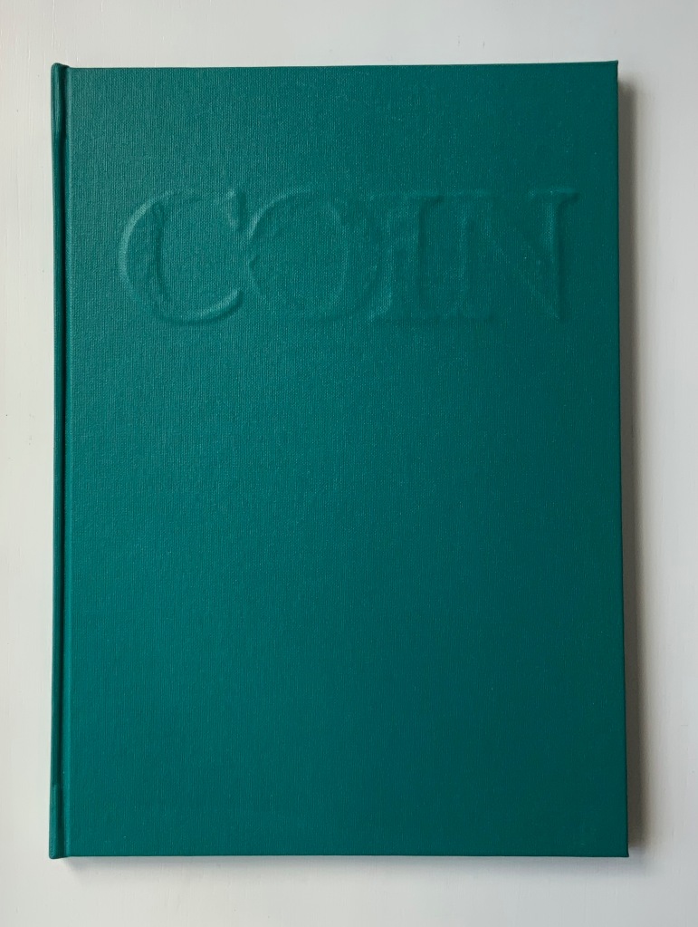
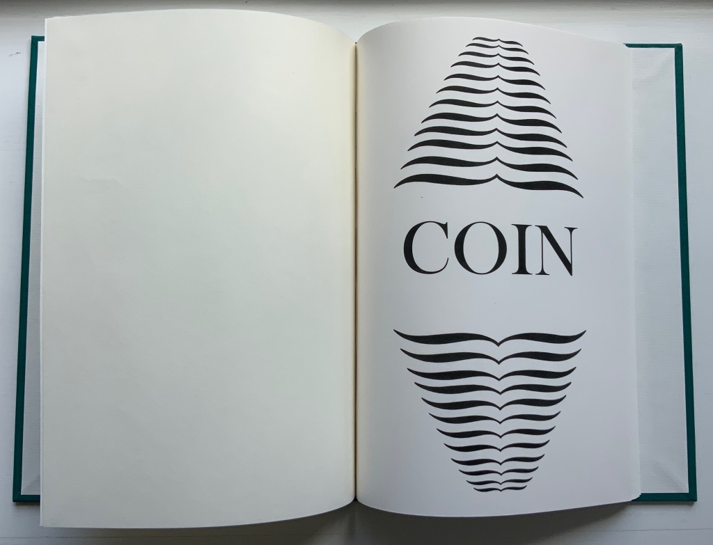
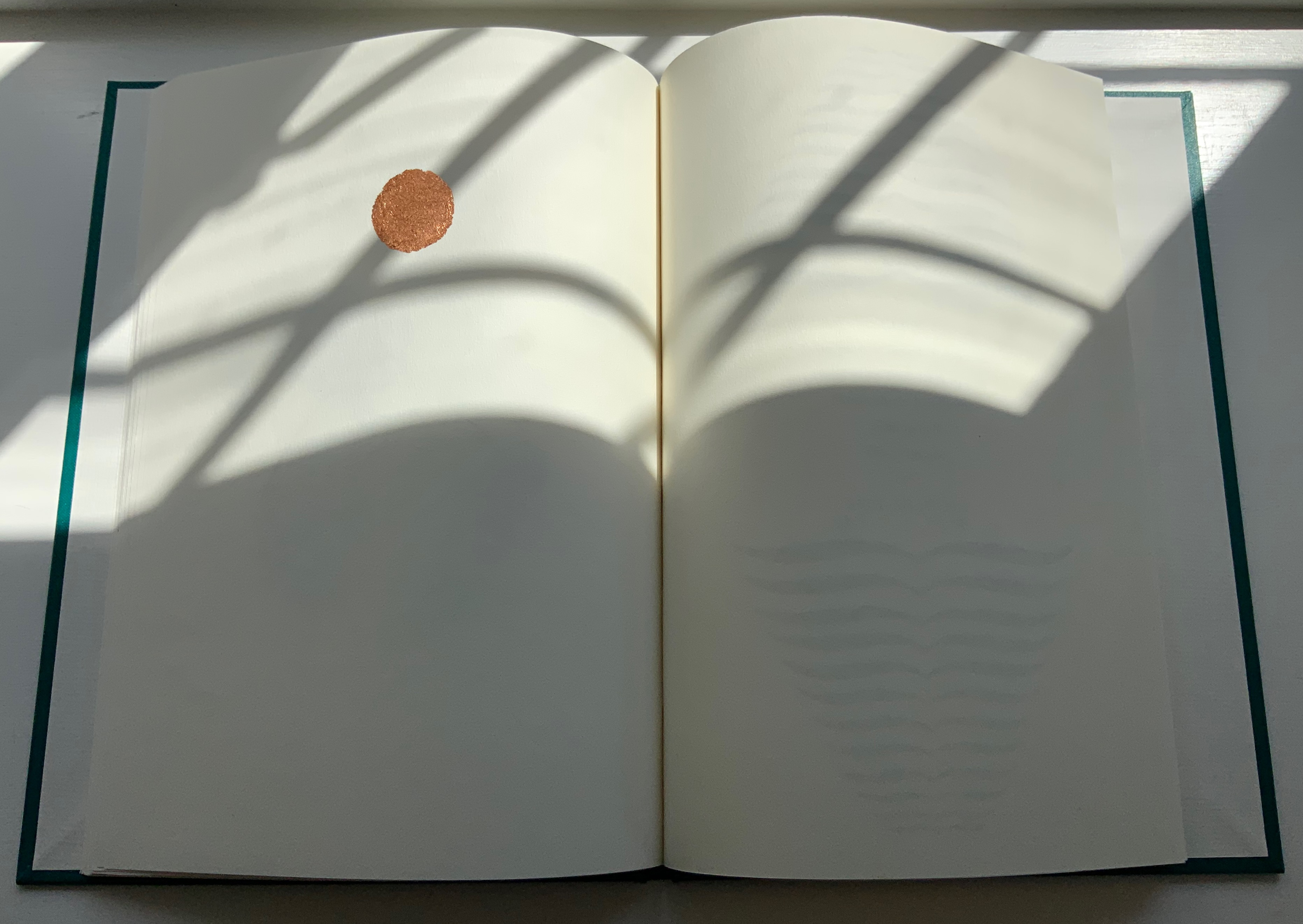
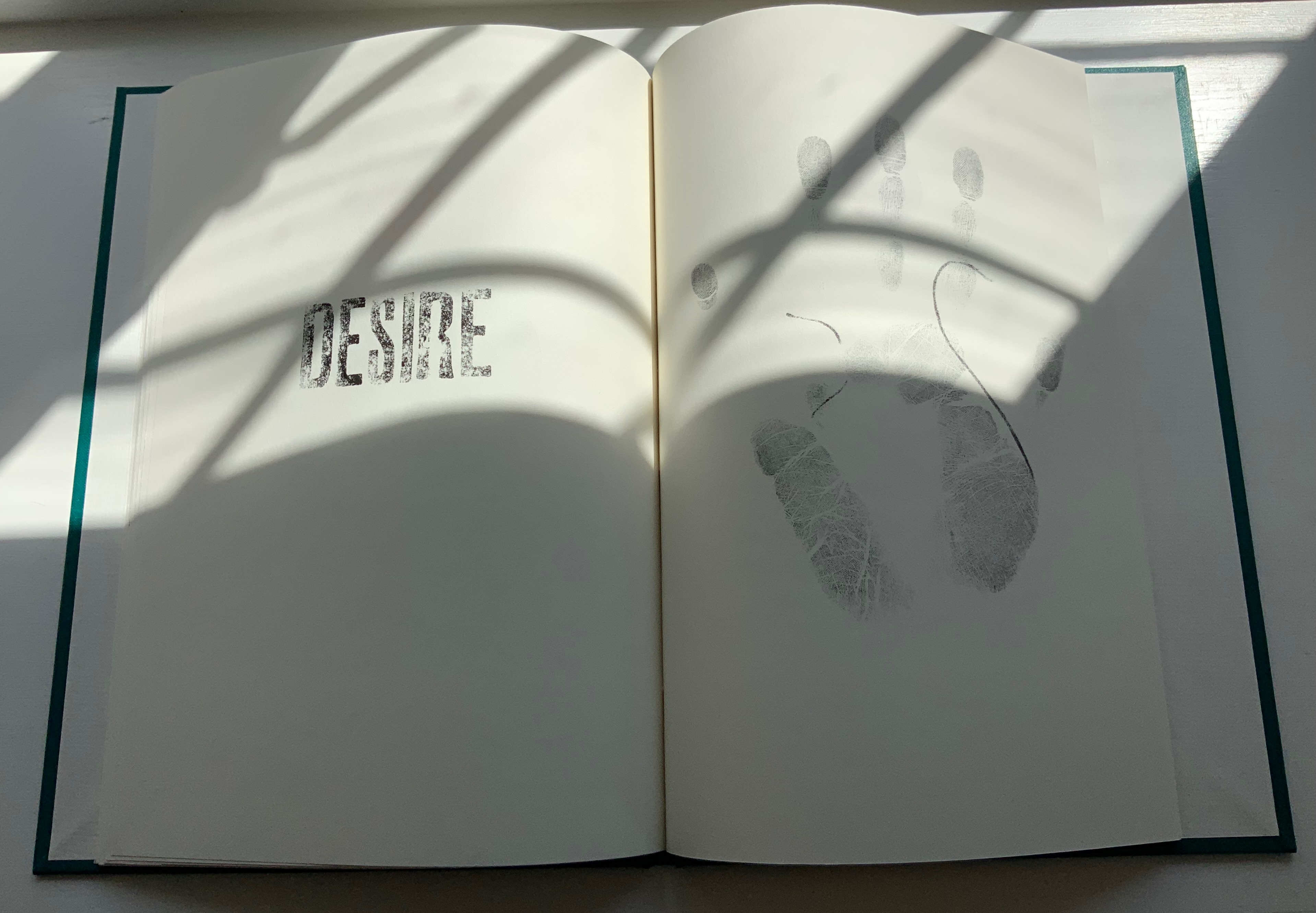
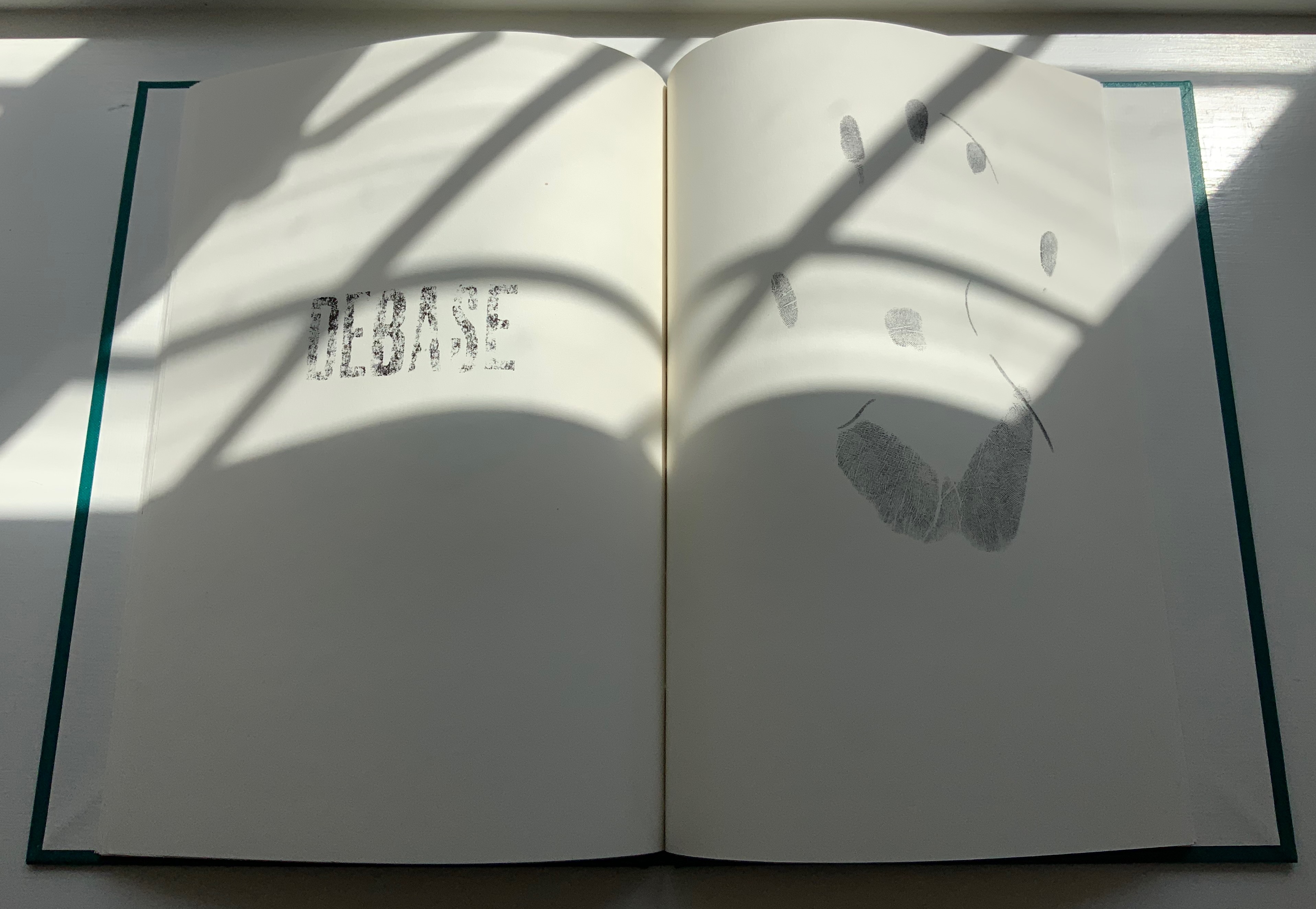
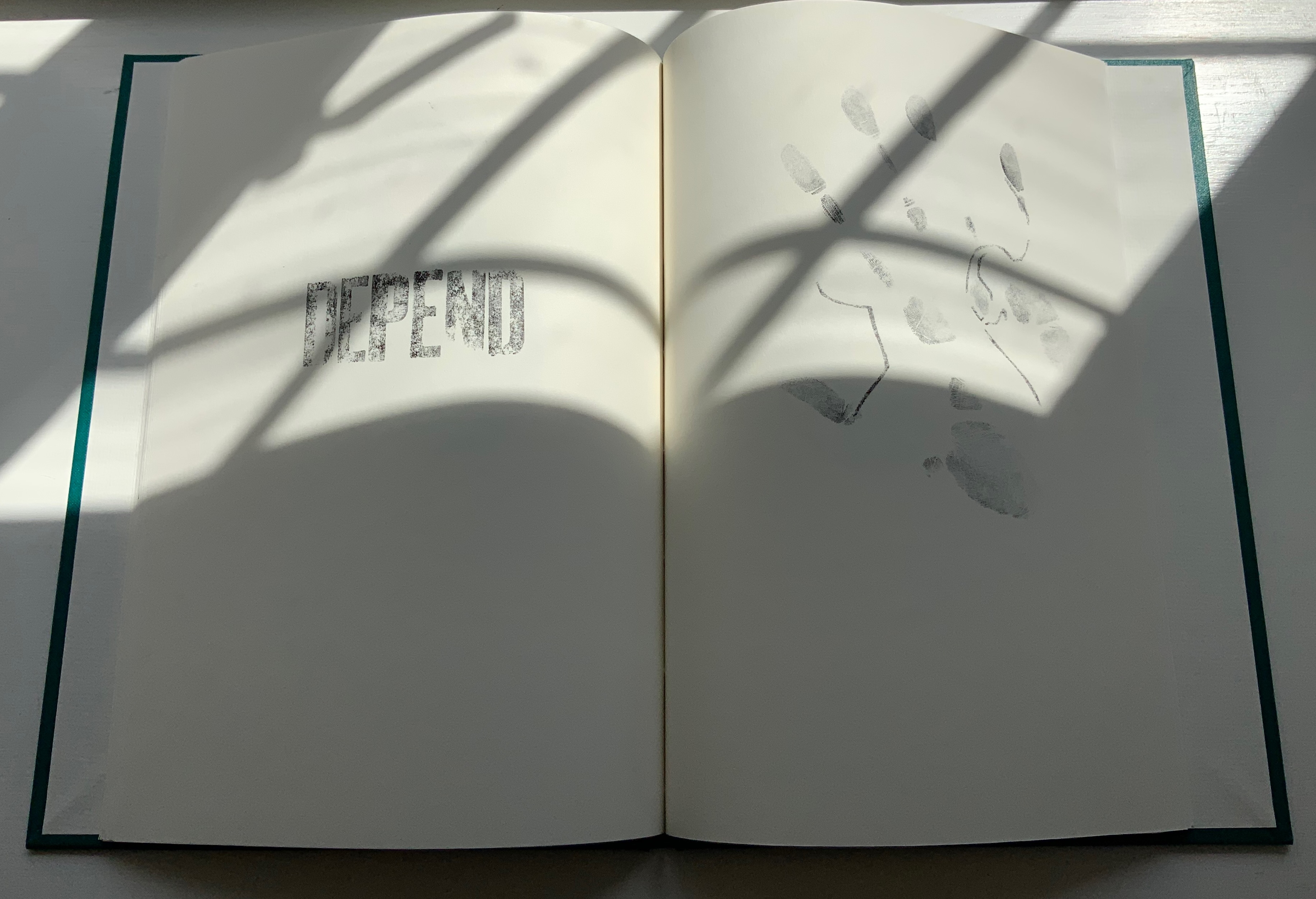
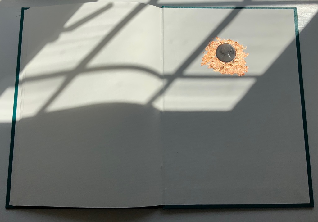
COIN (2017)
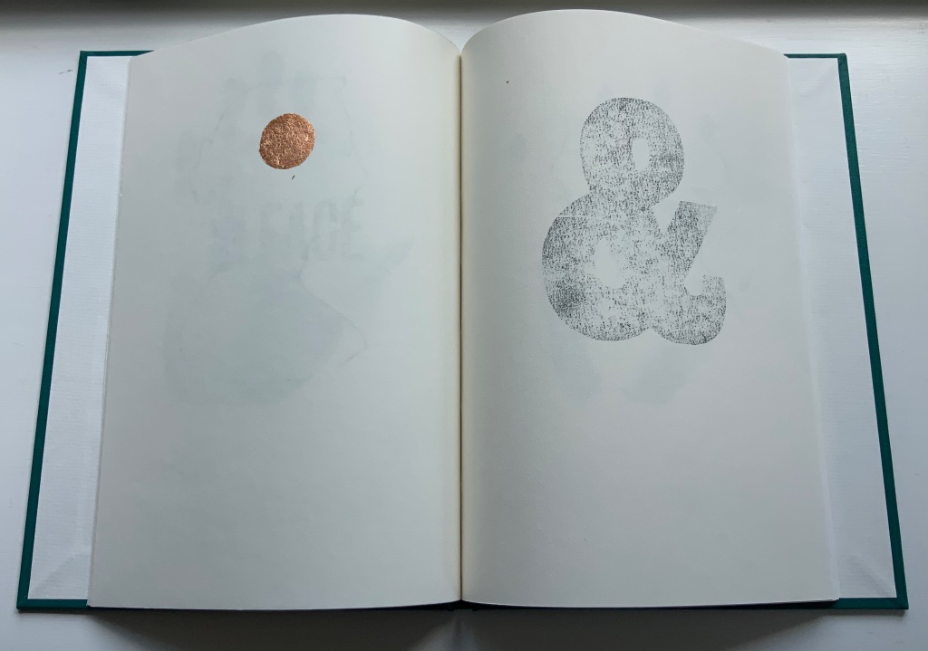
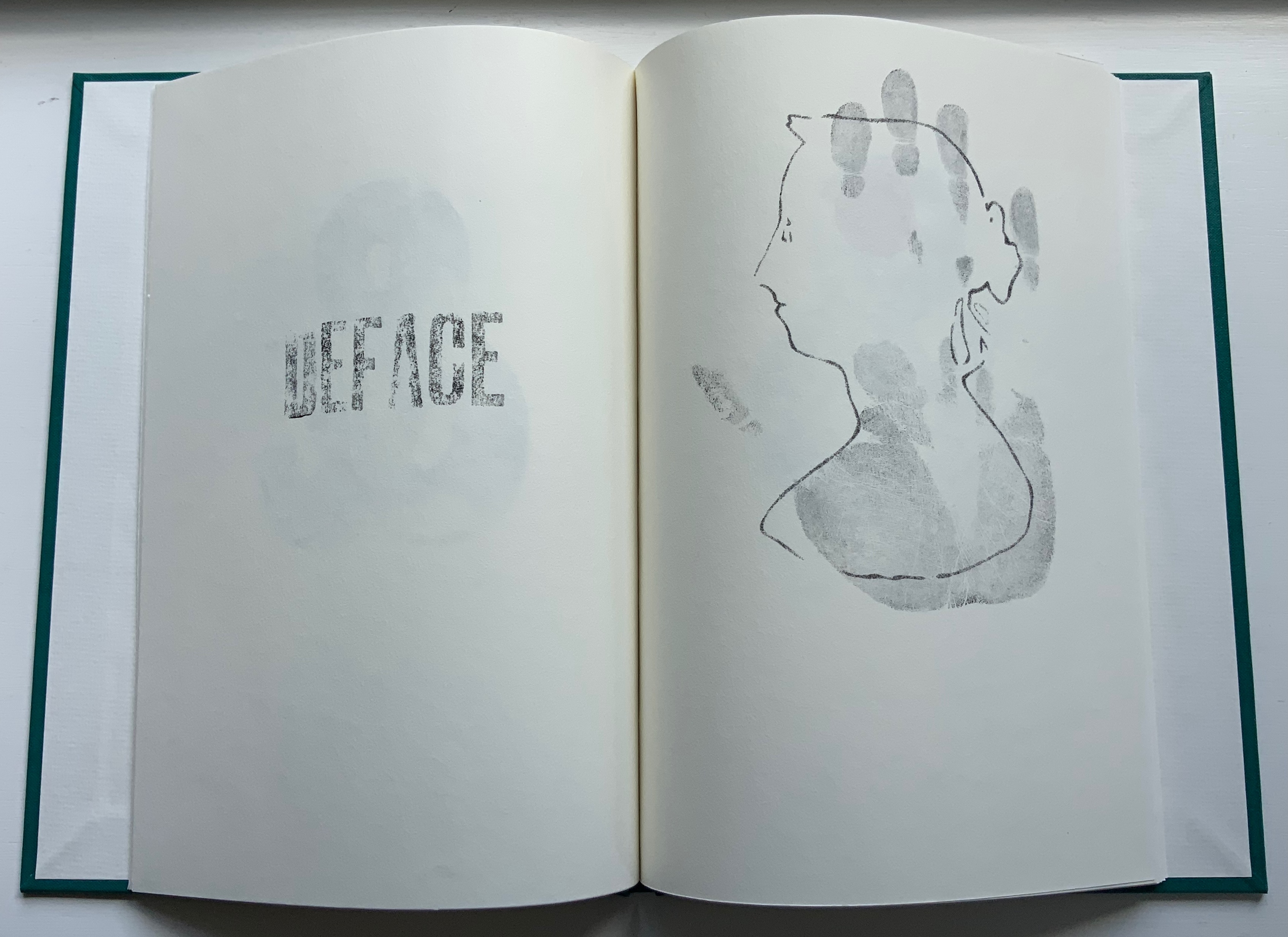
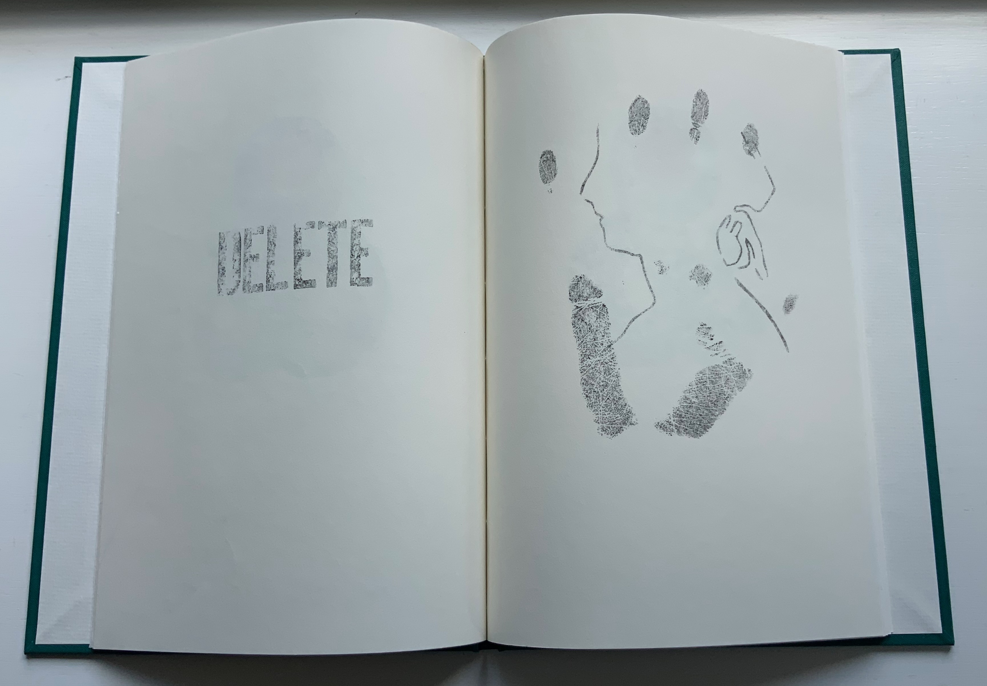
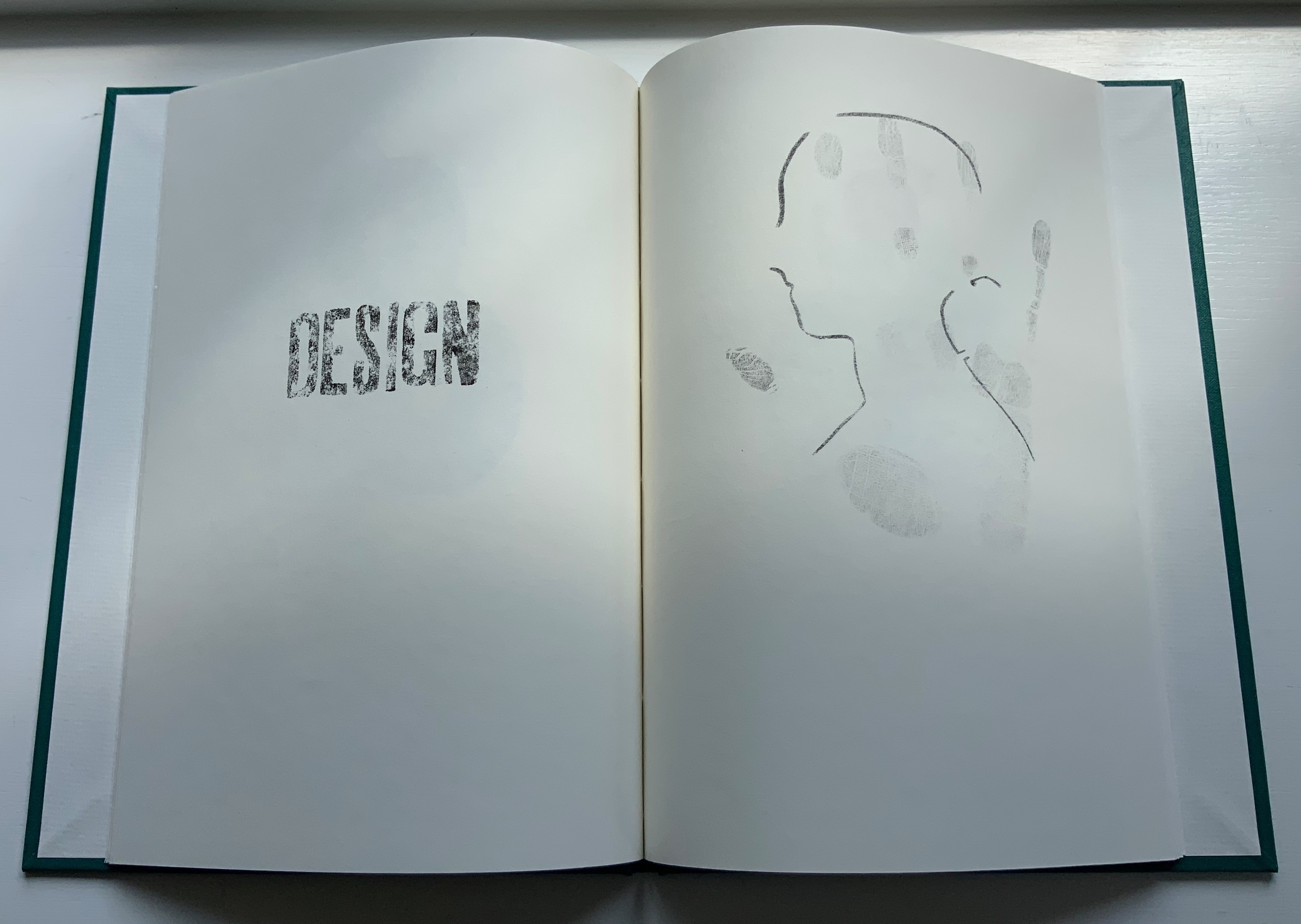
COIN (2017) Salt + Shaw Hardcover. H300 x W215 mm, 44 unnumbered pages. Edition of 9, of which this is #2. Acquired from the artists, 13 December 2021. Photos: Books On Books Collection. Displayed with permission of the artists.
Faint handprints from nine individuals. Light imprints from an ampersand and a series of words all prefixed with “de”. A gradually disappearing profile of Queen Victoria. A hand-worn 1860-1894 penny coin fixed to a splatter of copper leaf. Along with the front cover’s embossed, eroded letters, this progression of letterpress and stencil work toward that coin echoes the archaeological aura of Forest Garden Beach, Mill and Fold, but through its progression, COIN enacts the strange movement through time that such found objects take.
The brackets on either side of the word on the title page might suggest a coin dropped in a pool of time, except that the brackets narrow rather than widen outwards. So, maybe the coin is rising through time. Or, look again at the title page and the coin on the last page, and maybe the brackets should be seen as “leaking” from the word just as the copper leaf can be seen as “leaking” from the coin.
Like the tangible shell casing in Forest Garden Beach beneath the leather, the letters of the word “COIN” rise beneath the front cover cloth. Take another look at those letters, and it becomes clear that their forms beneath the cloth are eroded, just as the bullet is spent and just as the copper coin has been worn. The mix of “de” words and the handprints over the queen’s deteriorating profile add the kind of irony to be found in Shelley’s sonnet “Ozymandias“.
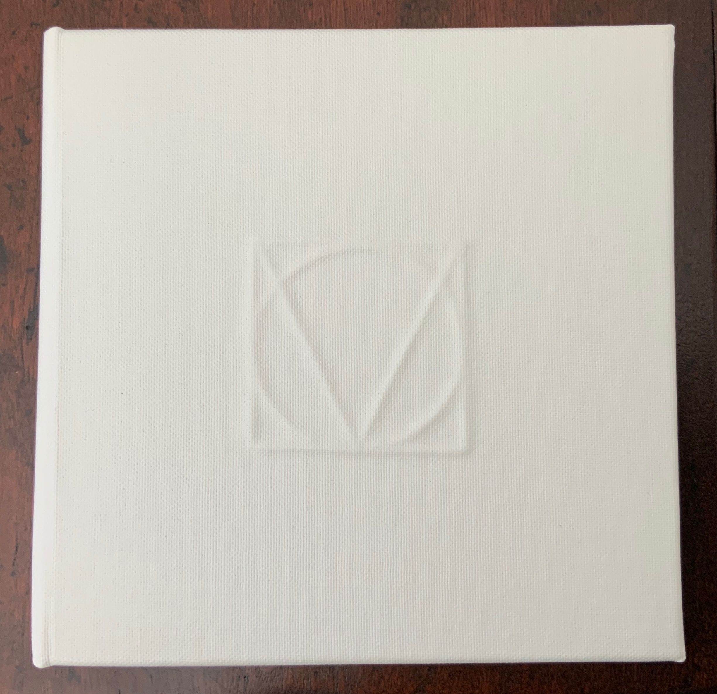
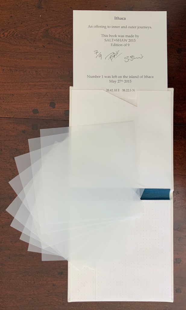
ITHACA(2015)
ITHACA(2015) Salt + Shaw Hardcover. 140 x 140 mm, 9 sheets of architectural tracing paper with hand-cut lines. Edition of 9, of which this is #7. Acquired from the artists, 13 December 2021. Photos: Books On Books Collection. Displayed with permission of the artists.
Ithaca gives a few twists both to the theme of the present’s interaction with the past and to the artists’ affection for blind printing. As the colophon indicates, the first copy of the edition of nine was left on the island of Ithaca and performs the act of an offering, much as objects left as offerings to the gods. “Journeys” and the work’s title, of course, suggest the most famous of journeying heroes — Odysseus; however,
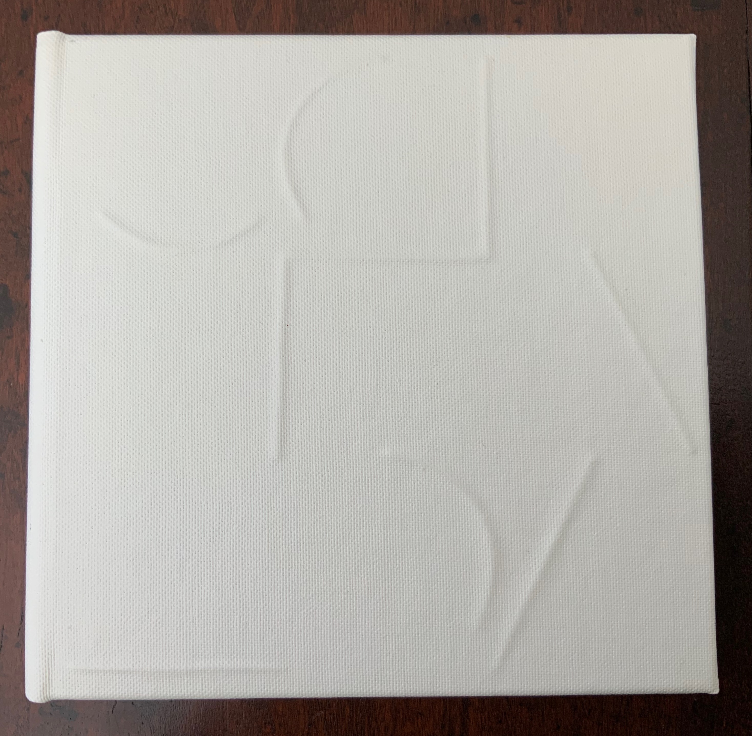
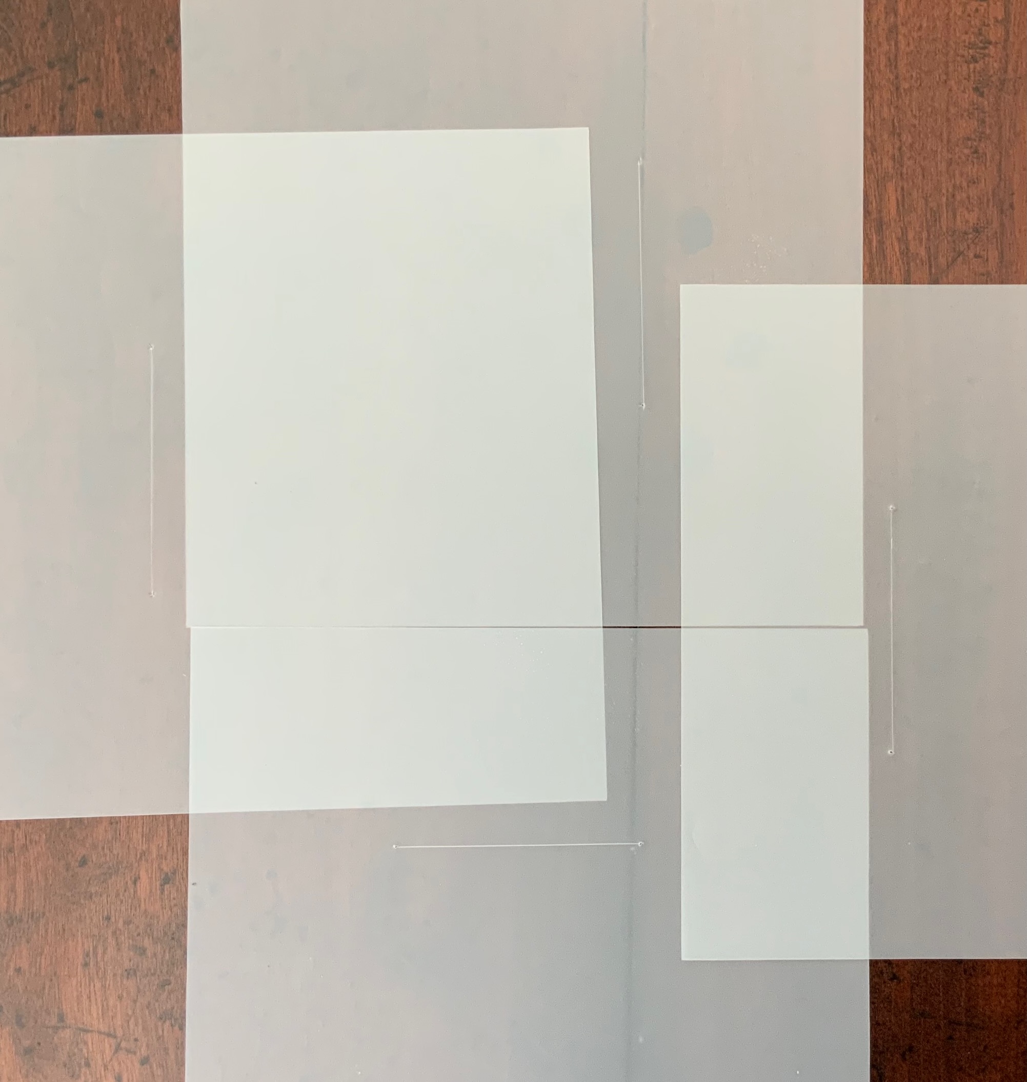
the journeys to which the offering is dedicated are “inner and outer”, suggesting an allusion beyond the hero. The nine translucent sheets of architecture paper bear cuts whose shapes are each replicated by an embossed printing on the back (or front) cover of the work. If the sheets are rightly arranged, they will replicate the image of the circle and triangle embedded in the square on the front (or back cover).
The combined images of square, circle and triangle and the reference to inner and outer journeys suggest associations with sacred geometry (reflected elsewhere in the Books On Books Collection: Bruno Munari’s compendia on the square, circle and triangle and Jeffrey Morin’s and Steven Ferlauto’s two works) and with Zen (also reflected elsewhere in the collection: Julie Johnstone’s works).
The playing with the sheets of paper — a kind of inner and outer journey itself — to which Ithaca invites us highlights a growing insistence on audience interaction in all the works so far and especially so in the next.
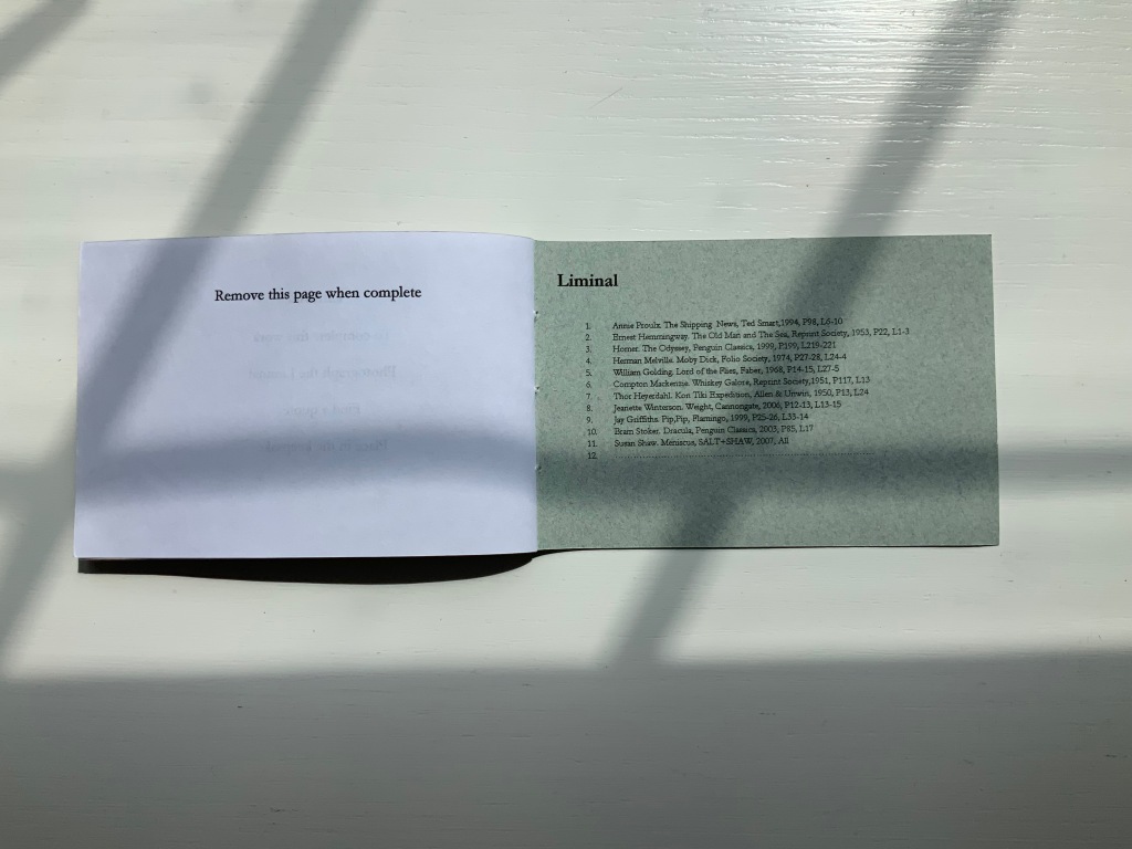
LIMINAL KEEPSAKE (2015)
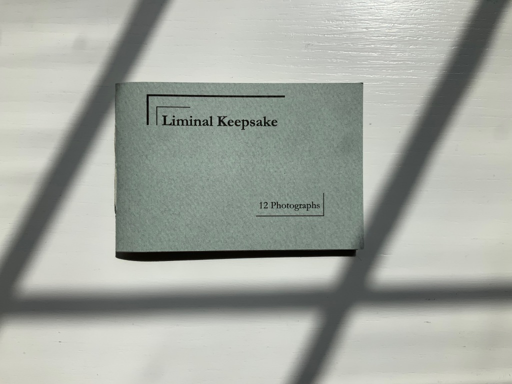
LIMINAL KEEPSAKE (2015) Salt + Shaw Pamphlet book. H70 x W105 mm, 12 unnumbered pages, half-sheet insert. Edition of 15, of which this is #11. Acquired from the artists, 13 December 2021. Photos: Books On Books Collection. Displayed with permission of the artists.
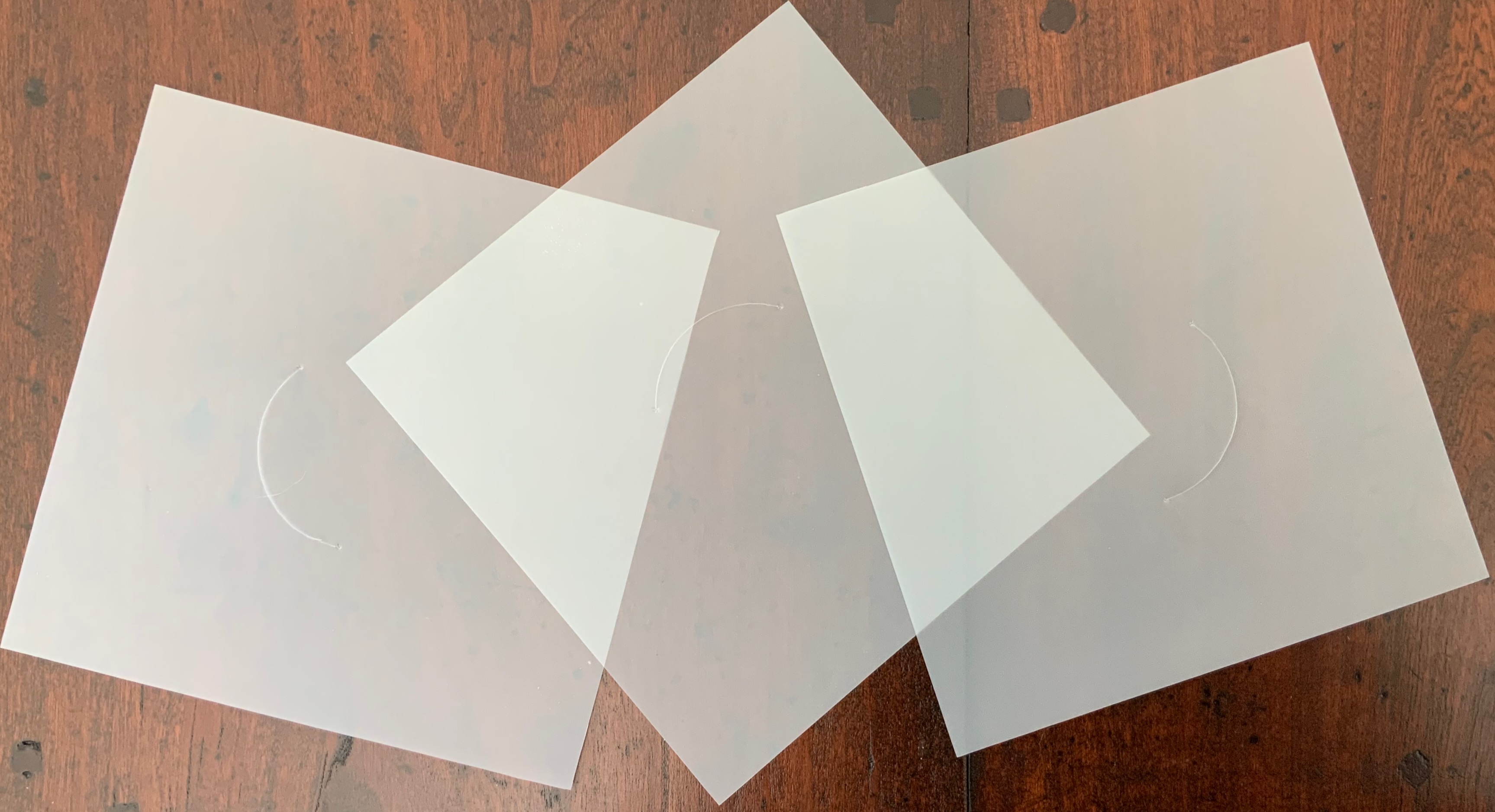
Liminal Keepsake realizes the sea:land allusion of Ithaca‘s title by presenting its audience with eleven photographs of sea and land meeting. The photos, unique to each copy in the edition, are held in hand-cut mounts. “Liminal” refers to “a space between” or “where edges meet”. The photos in Liminal Keepsake seem to be a collection of memories about where the edges of the sea and land meet.
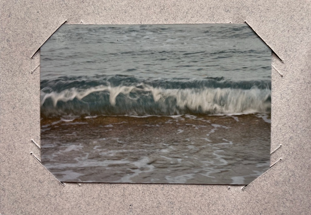
But on the inside back cover is a list of references to literary works, each of which has a passage that aligns with the photo matching in the sequence. Here is another space between — the space between the images and the passages — a space into which any curious viewer is thrust. If the viewer expects to enjoy this work fully, the viewer has to seek out the passages in that list to see how the text matches the photo. Not that easy a task since each text is specific to a specific edition of the cited literary work. The For instance, the tenth photo in the sequence is aligned to a passage from Bram Stoker’s Dracula — specifically from page 85, line 17 of the 2003 Penguin edition. Fortunately, that edition can be easily found online. Here’s the passage (the 17th line is in bold):
… The day / was unusually fine till the afternoon, when some of the gossips / who frequent the East Cliff churchyard, and from that com- / manding eminence watch the wide sweep of sea visible to the / north and east, called attention to a sudden show of ‘mares’- / ‘tails’ high in the sky to the north-west. …
And here is the relevant photo in the collection’s copy of Liminal Keepsake.
So the viewer has to become researcher and reader to experience Liminal Keepsake fully, and the viewer/researcher/reader has to become something even more to finish Liminal Keepsake. Just as Ithaca invites its audience to arrange its translucent sheets to form the symbol on its cover, Liminal Keepsake invites its completion by the viewer/researcher/reader-cum-artist’s taking a photo of “the Liminal” and a bibliographical reference that echoes the photo.
In pondering completion of the work, would-be artists come across across other “spaces between” — the space between the visual and textual imaginations and the space between concept and execution. Apparently the artists took their photos, then found the texts to match. To hold an image in mind and be constantly on the lookout for matching text in whatever literary work happens to be in hand seems a tall order. To start the other way around — to have some sea:land text in hand and then seek a setting in which an appropriate image is likely to be found — looks easier to the more textual imagination. On top of this are the artist-manqué’s anxiety of crossing that space between concept and execution and the curator’s anxiety of sacrificing the object as-was and the aura of possibilities for perhaps a lesser object and one definitely without the aura of possibilities.
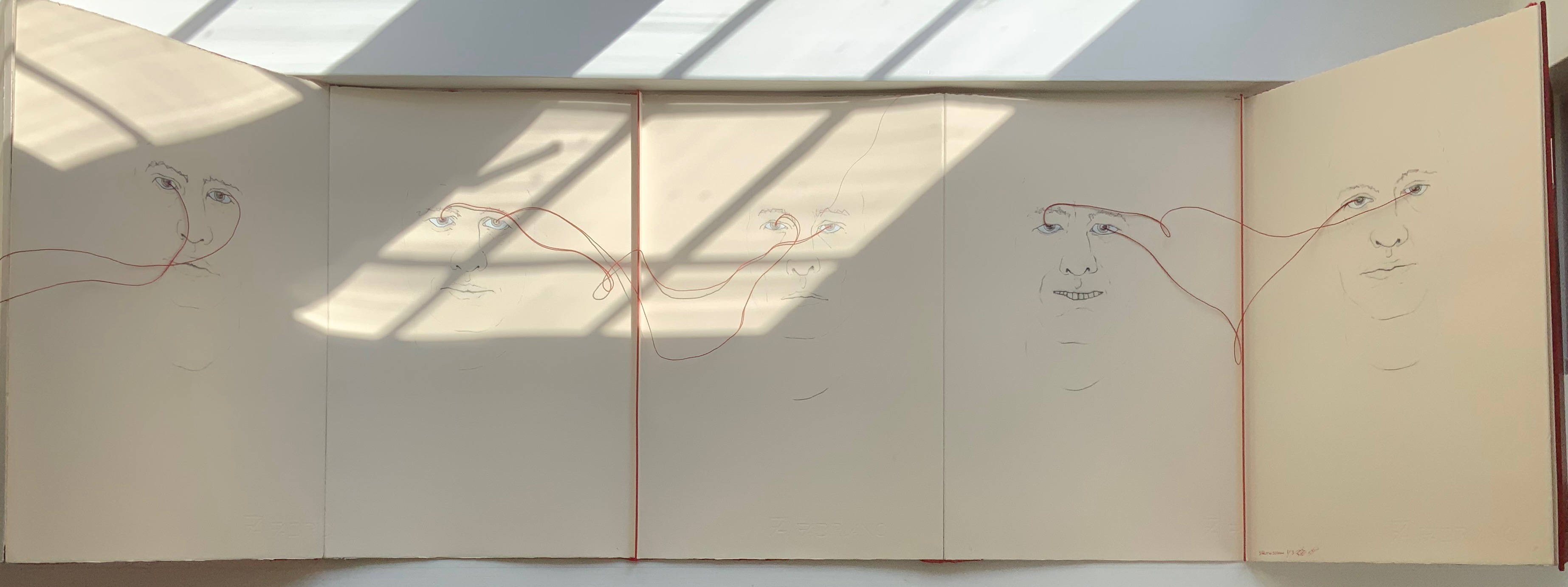
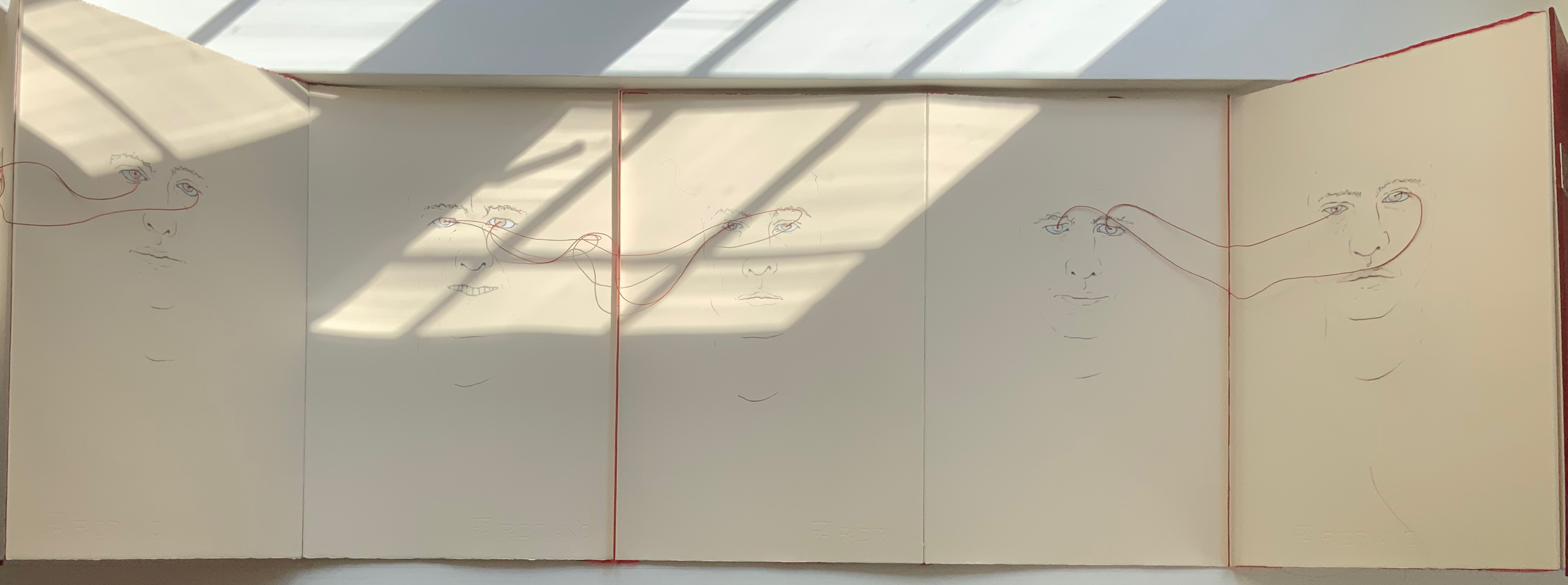
LOOK(2021)
LOOK (2021) Salt + Shaw Hardcover, double-sided concertina book. H350 x W230 mm, 10 unnumbered panels. Edition of 3, of which this is #1. Acquired from the artists, 13 December 2021. Photos: Books On Books Collection. Displayed with permission of the artists.
The core features of two individuals’ faces head-on have been drawn on both sides of this concertina book — “core” meaning no delimitation by hair, ears or other details at the edges of the visages. The red thread connecting the pairs of eyes with one another draws attention back to the title: Is it an instruction for the viewer to look? Is it a noun referring to appearance, the look of the faces? Or to expression, the look in the faces? Is it a noun referring to an action occurring between the depicted faces — if only via the thread connecting the pairs of eyes? Only when the concertina is closed do the faces face one another. Yet the color red, echoed between the cover and thread, suggests an intensity connecting these looks, these gazes.
A more textual predecessor to Look is Whorl (2007).
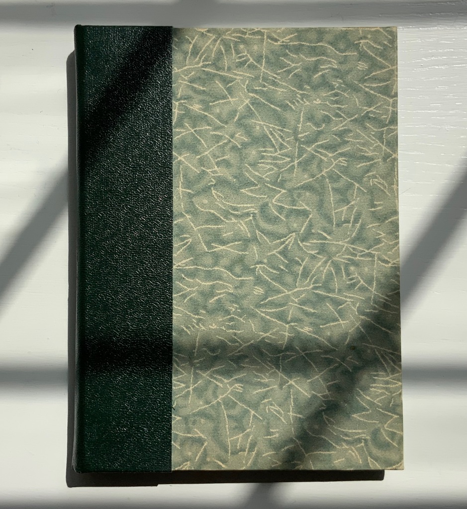
WHORL(2007)
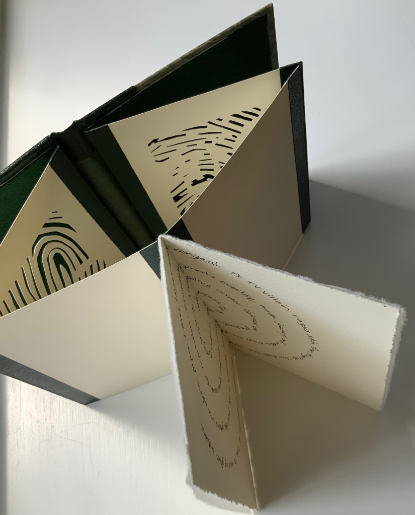
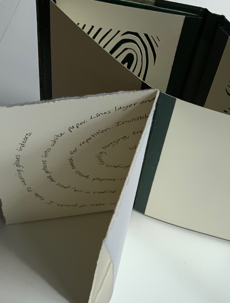
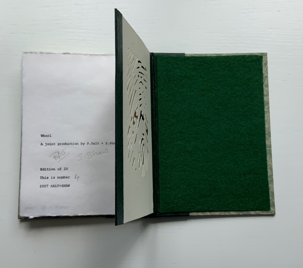
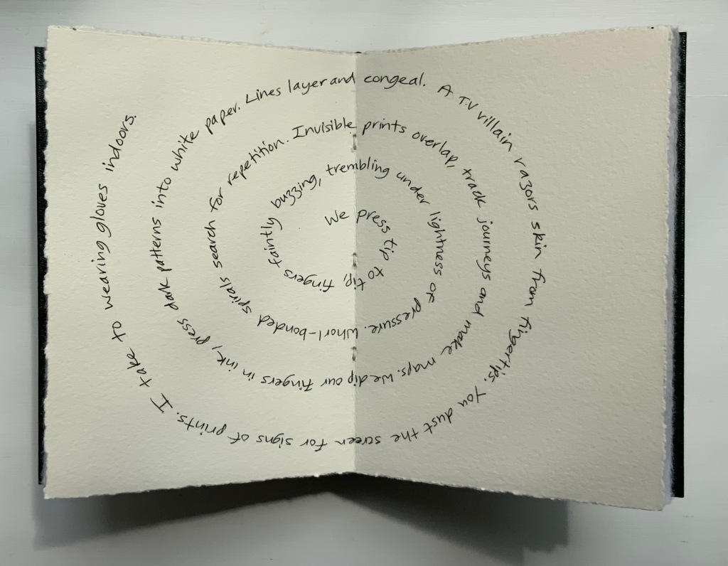
WHORL(2007) Salt + Shaw Hardcover, modified concertina and pamphlet book, H115 x W155 mm, 4 unnumbered panels, 2 unnumbered central sheets. Edition of 20, of which this is #4. Acquired from the artists, 13 December 2021. Photos: Books On Books Collection. Displayed with permission of the artists.
Here is a rare instance of a poem’s metaphysicality being physically enacted by the surface and structure on which the poem is inscribed. On a double-page spread at the work’s center, a poem begins at the center of its spiral, or whorl, with the words “We press tip to tip fingers ….” Pull the double-page spread outwards away from the spine. Because the spread’s centerfold serves to bind four panels into a diamond shape, two hand-cut stencils of two different fingerprints approach (“tremblingly” as the poem describes) to touch one another when the double-page spread is pulled completely outwards and away from the spine. If this does not renind the reader of John Donne’s poetry, nothing will.
The following works are individual to Susan Shaw and Paul Salt, respectively. Shaw’s individual works also deliver complete textual works — short stories or a poem — that fuse with their containers.
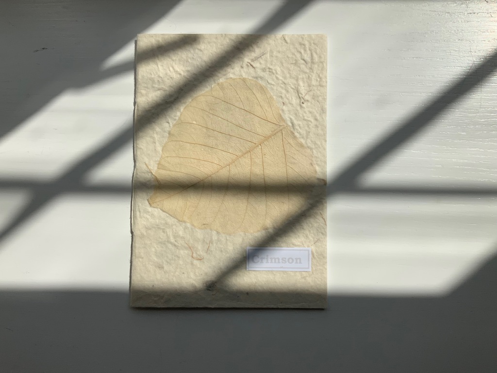
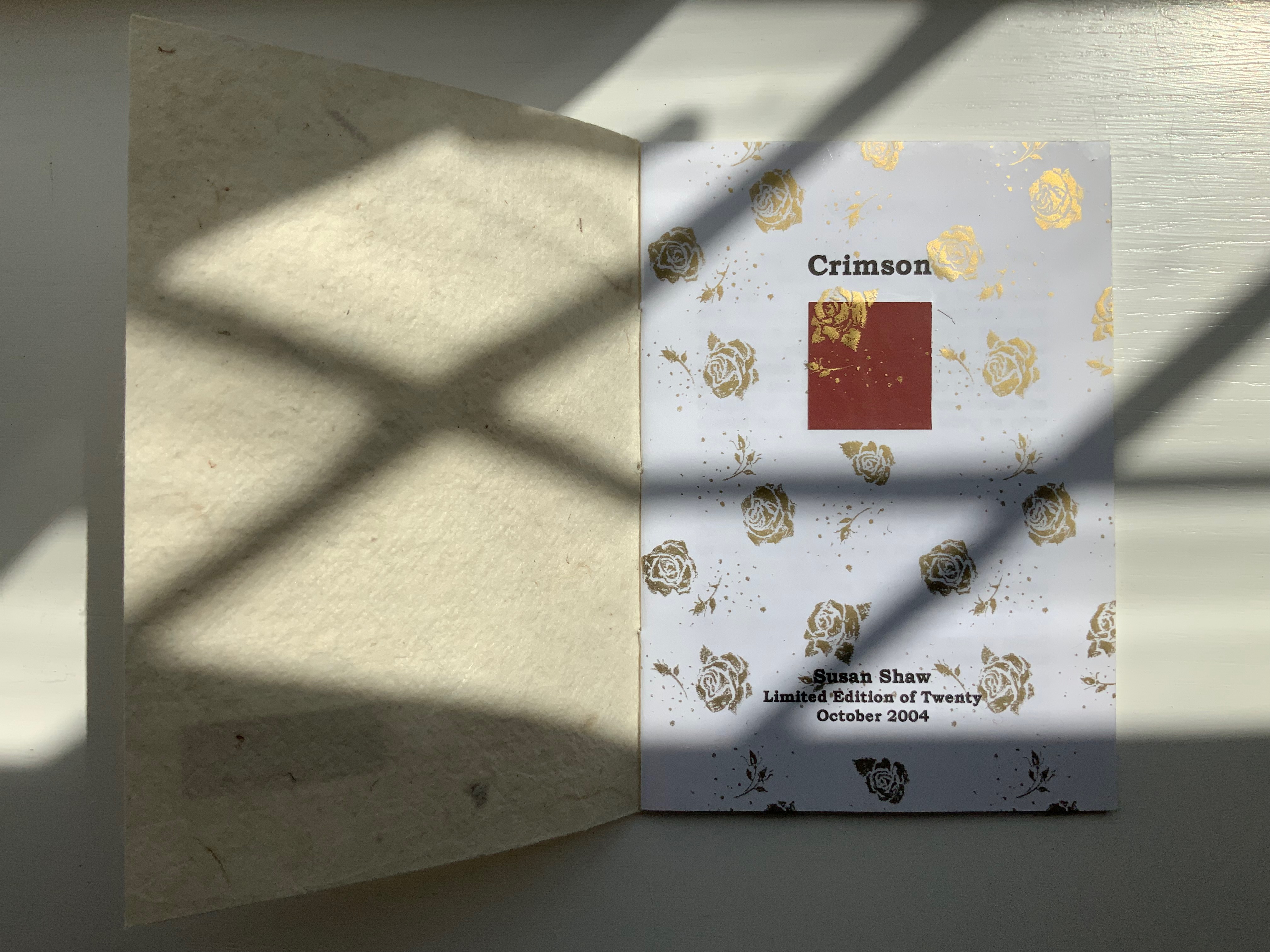
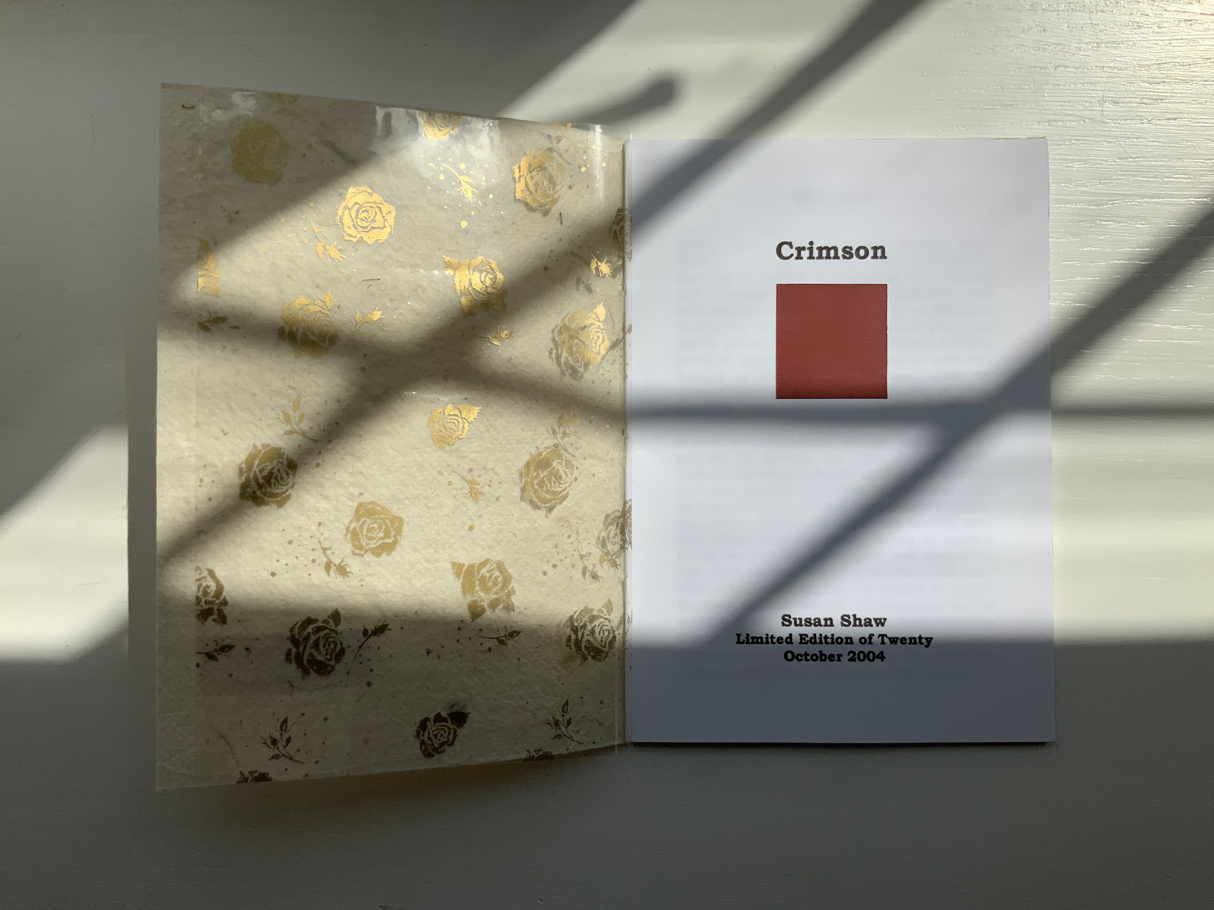
CRIMSON(2004)
Crimson(2004) Susan Shaw Hand-made paper cover. H155 x W110 mm, 8 unnumbered pages. Edition of 10, of which this is #2. Acquired from the artist, 13 December 2021. Photos:Books On Books Collection. Displayed with permission of the artist.
The washed-out cover, pressed fallen leaf and faded title signal the conclusion of the short story Crimson, in which a couple seemingly argue incessantly about choice of colors, both indoors and out in their garden.
Shaw’s attraction to fiction narrative perspective flutters recurs in the next work, but its leporello structure and photos add a different otherworldly touch.
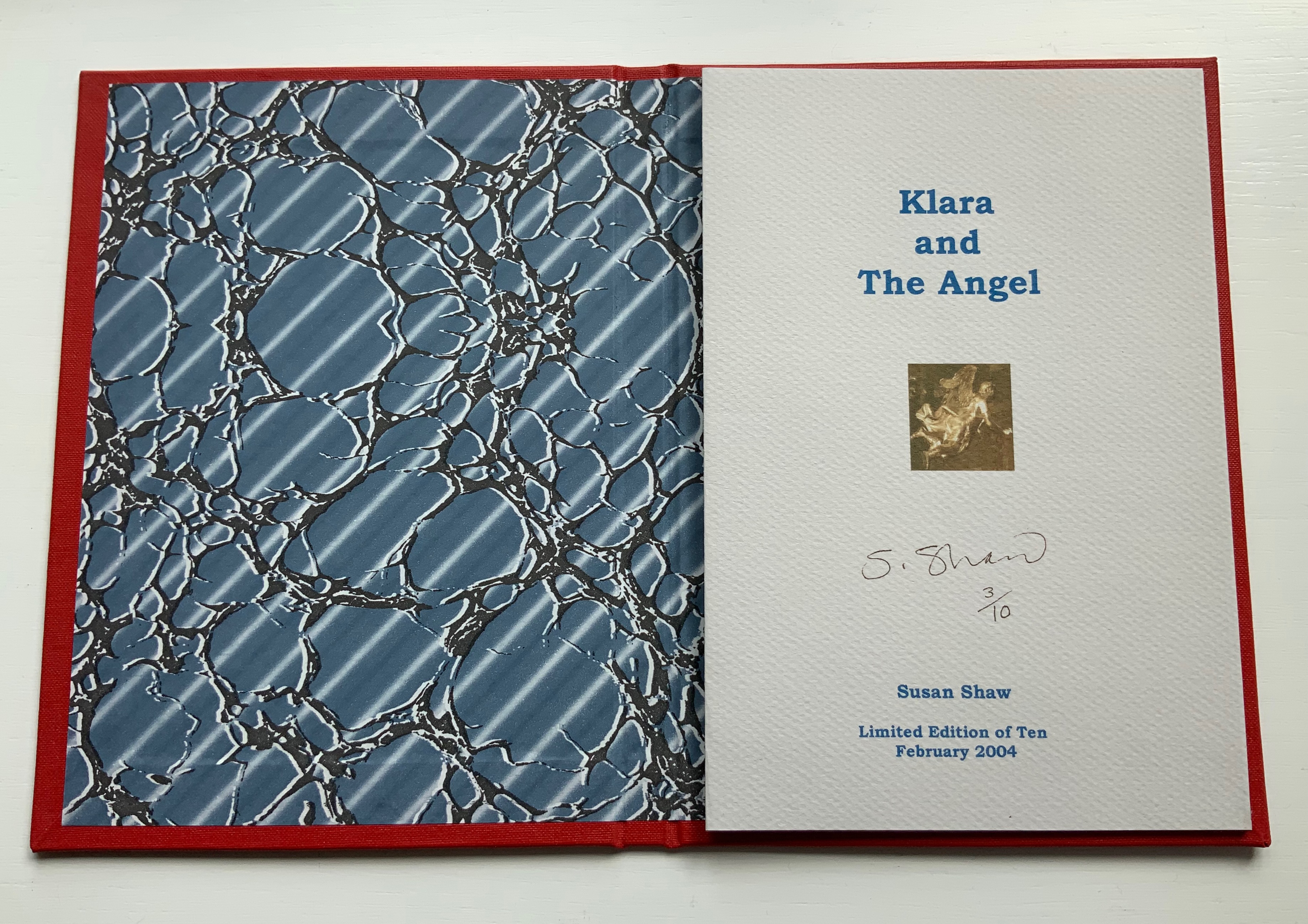
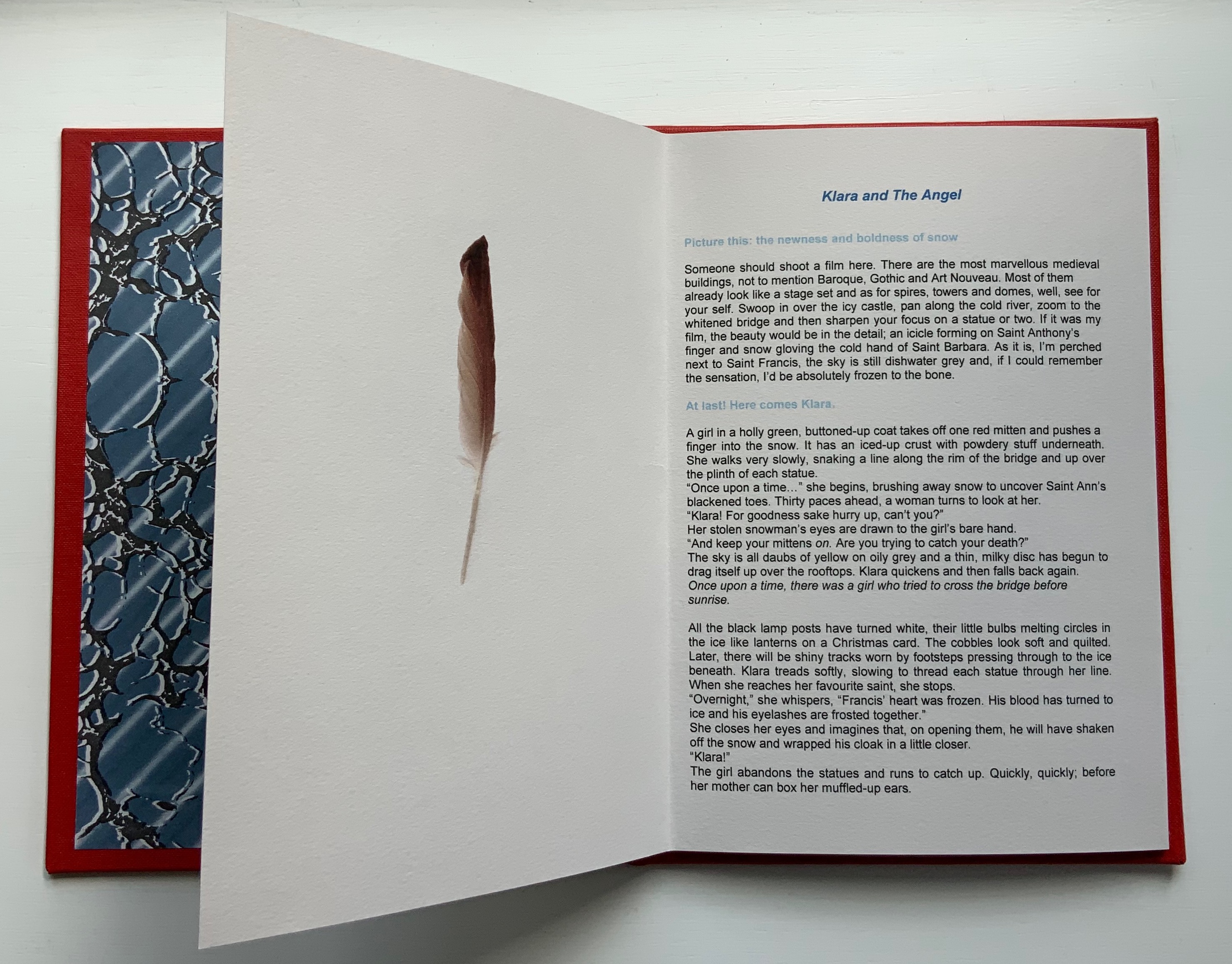
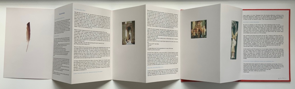
KLARA AND THE ANGEL (2004)
KLARA AND THE ANGEL(2004) Susan Shaw Hardcover, double-sided concertina book. H220 x W160 mm, 15 unnumbered panels. Edition of 10, of which this is #3. Acquired from the artists, 13 December 2021. Photos: Books On Books Collection. Displayed with permission of the artists.
The story begins in a Prague cemetery covered in snow, to which the reader’s attention is directed by the narrator’s direct address in light blue type. As the type shifts into black, the narrator continues to address the reader, and with the reference to being perched on St. Francis’s shoulder, the narrator gives some of the game but then deflects with the introduction in blue of Klara’s arrival. As the leporello unfolds, so does Klara’s story and the narrator’s identity as the angel with whom Klara has an appointment.
Snow and evocative photos feature in the next work but with less drama.
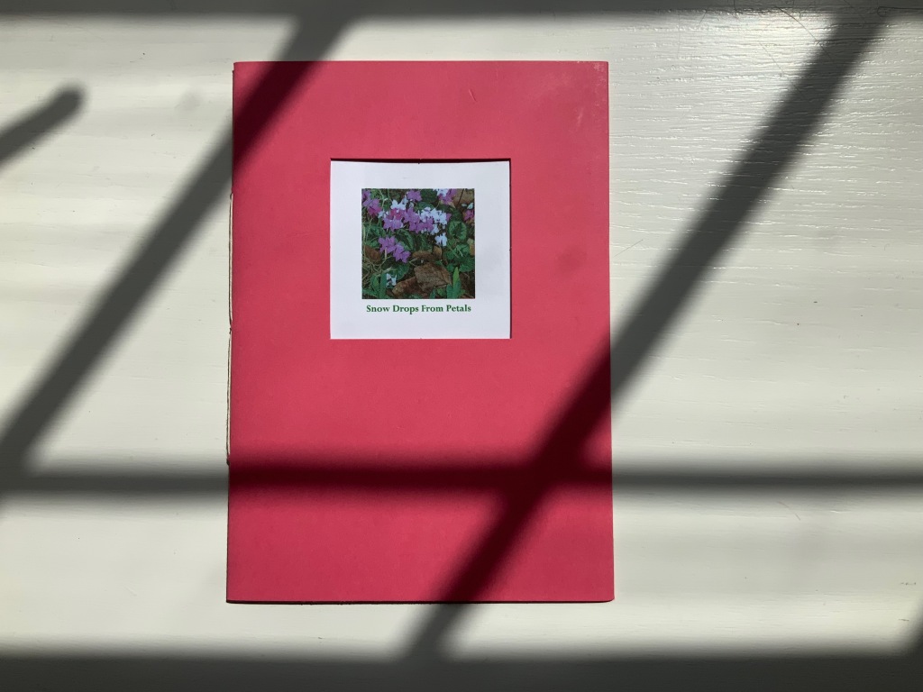
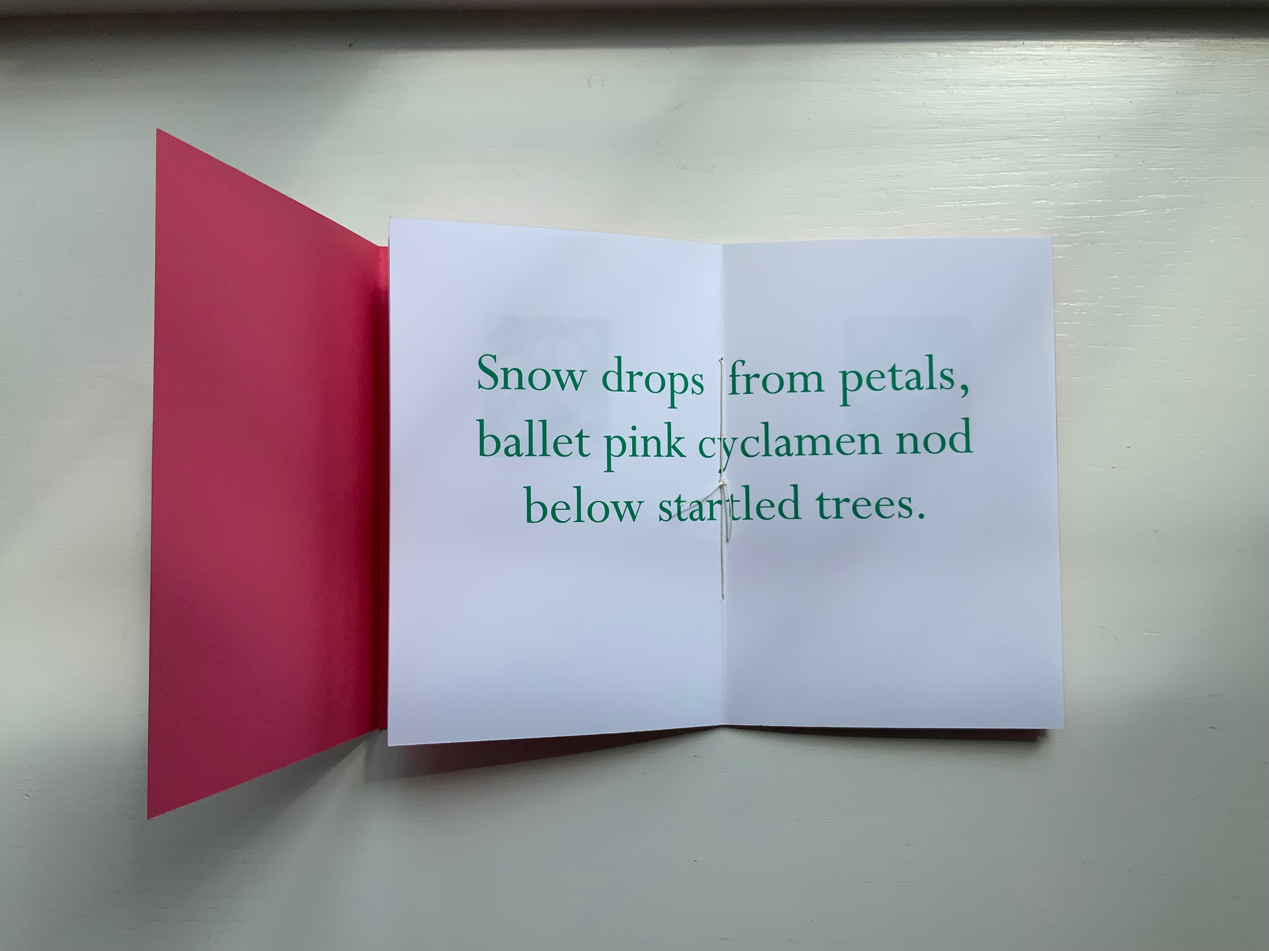
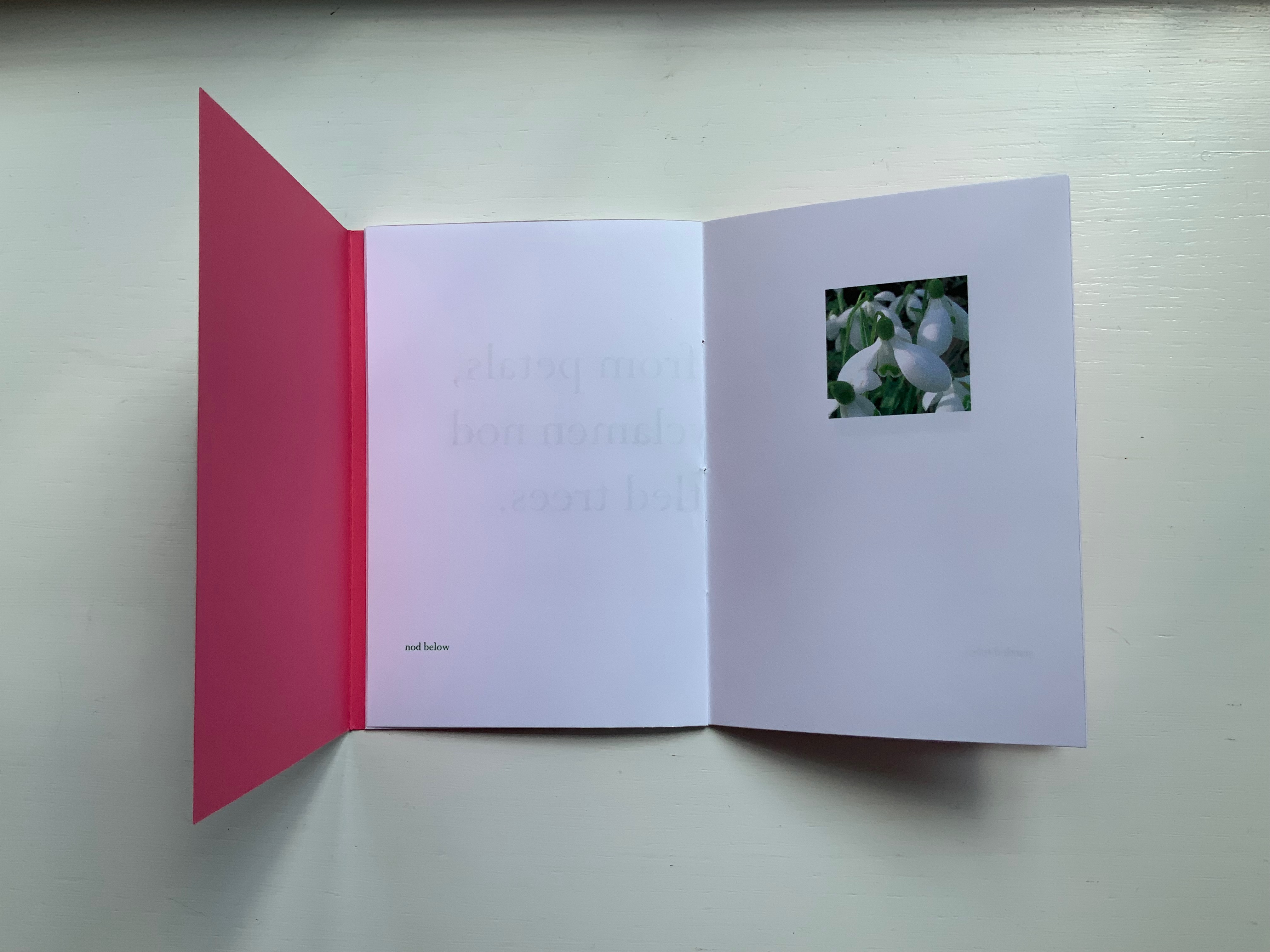
SNOW DROPS FROM PETALS(2008)
SNOW DROPS FROM PETALS(2008) Susan Shaw Pamphlet book. H150 x W105 mm, 12 unnumbered pages. Edition of 17, of which this is #4. Acquired from the artist, 13 December 2021. Photos: Books On Books Collection. Displayed with permission of the artist.
The front cover wraps around to overlap the back cover, which is rather like the way in which words often play multiple roles in poems. Here, the subject snow and its verb drops coincide with the flower’s name and its two photos that appear later. The center of the work presents the entire haiku, but more interesting and curious, the haiku’s traditional structure (lines of 5, 7 and 5 syllables) breaks up into four segments (5, 6, 3, 3) to appear on verso pages facing a photo.
Daffodils face the first line. Snow drops face the words “ballet pink cyclamens”. More snow drops face the words “nod below”. A bee perched on a blossom faces the words “startled trees”. The effect is to send the reader back and forth across these spreads and page turns like a bee moving from flower to flower.
Paul Salt’s individual works in the collection take a more sculptural expression. Even though this next work is garden-inspired like Snow Drops, its physical presentation reflects the more sculptural garden that inspired it.
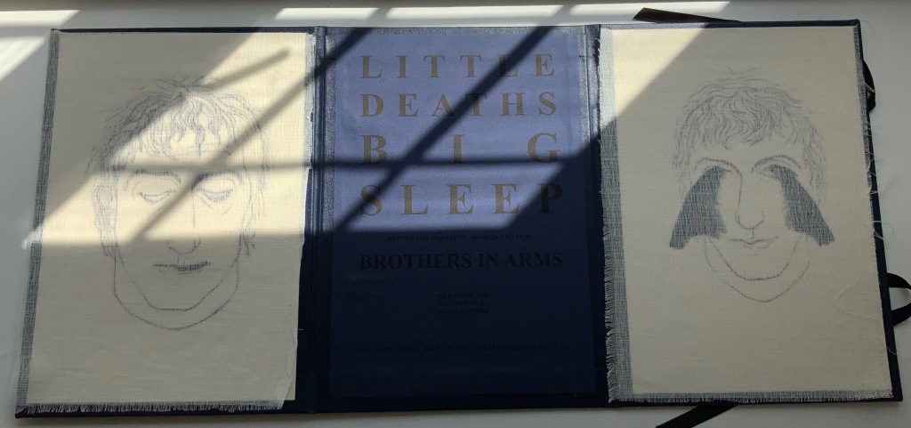
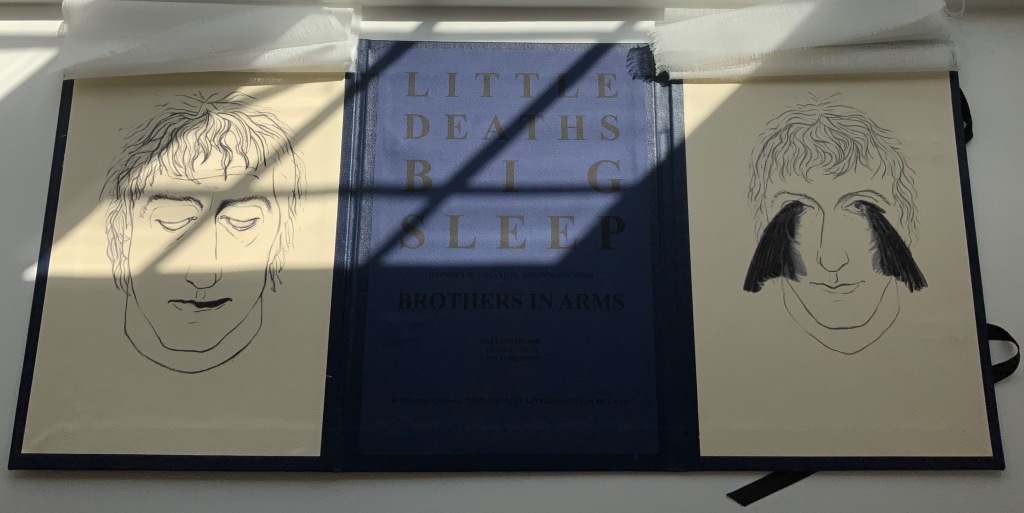
BROTHERS IN ARMS(2008)
BROTHERS IN ARMS(2008) Paul Salt Hardcover, folio. H300 x W220 mm close, W655 open. Edition of 24, of which this is #2. Acquired from the artist, 13 December 2021. Photos: Books On Books Collection. Displayed with permission of the artist.
The garden in question here is the more severe but still playful Little Sparta, created by Ian Hamilton Finlay. On a visit there, Salt found a pair of wings at the base of one of the sculptures.
In its imagery and structure, the final work by Salt reflects the physicality and preoccupations found in many of the works above: especially Mill, Coin and Fold. Although it has less whimsy than Coin or Fold, its abrupt title recalls Ed Ruscha’s humorous rule of thumb for distinguishing between bad and good art: Bad art makes you say ‘Wow! Huh?’ Good art makes you say ‘Huh? Wow!’
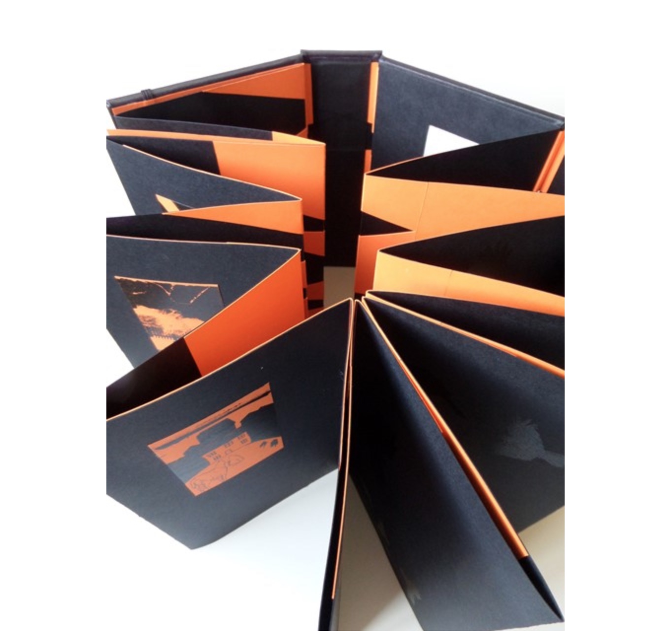
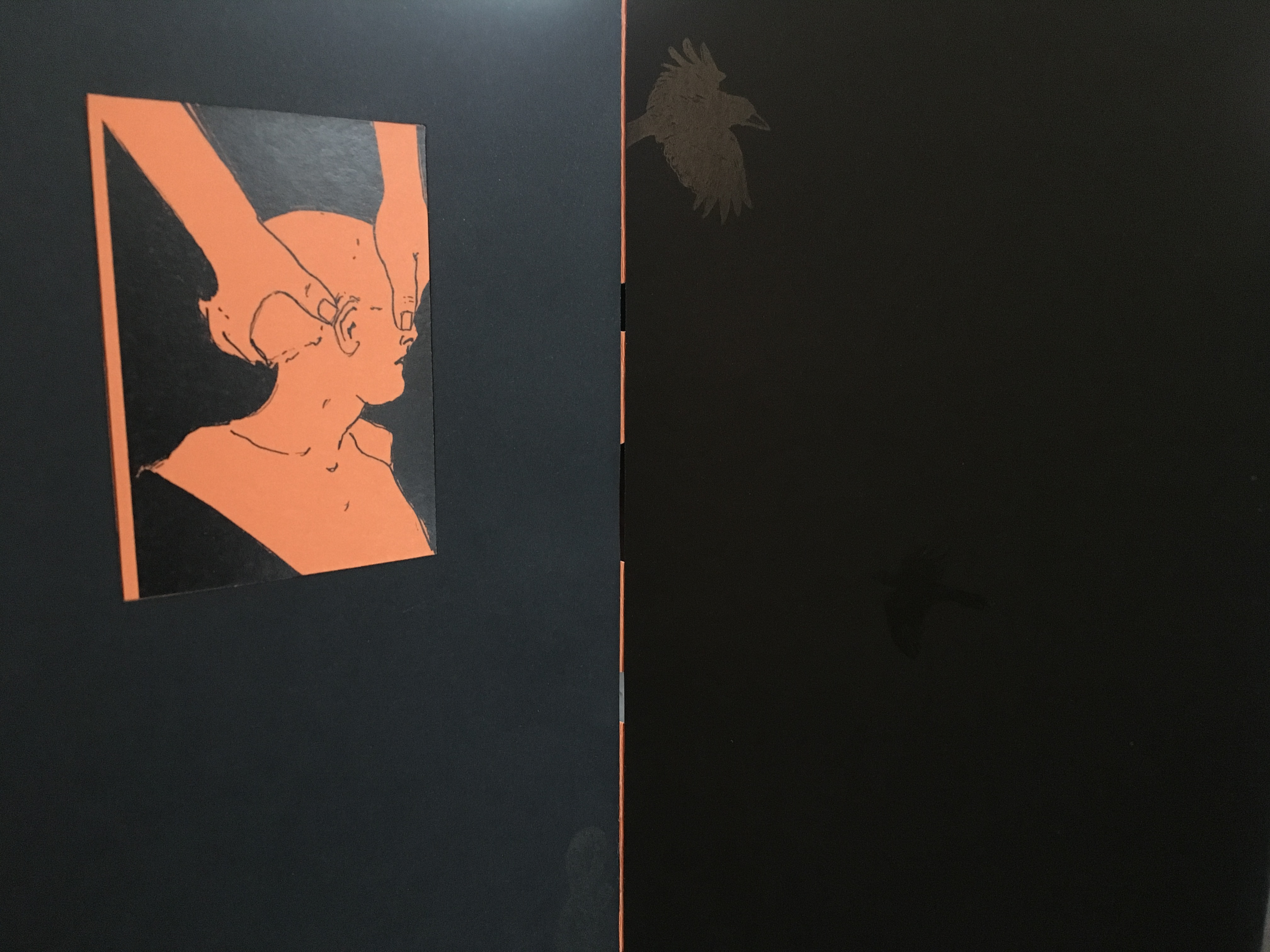
What …? (2018)
What …? (2018)
Salt+Shaw Hardback, boxed-bound, black book cloth, concertina book with magnetised and elasticated fastening. Drawings and collages printed on black and orange Canson card. Letterpress. Hinges engineered in Canson card to create a spring in the turning of the pages. H213 x W80 mm closed, H213 x W830 mm open Edition of 5, of which this is #2. Acquired from the artists, 25 November 2018.
What? is a book about finding solutions, both in its construction and content. Made over a period of several years, from the first drawing to the final binding, it prefers to raise questions, rather than provide answers. Hence the title. The relationship between What? and viewer therefore depends upon response, perception and making connections. Clues could include: • William Blake • harbingers • manipulation • dislocation • loss • finding a way out • George Orwell. [Correspondence with artists, 5 December 2018.]
What? … Wow!
Further Reading
Sarah Bodman (University of Western England) has highlighted their work in a-n News with some outstanding photos:
“At the recent 21st International Contemporary Artists’ Book Fair in Leeds, they launched Ocean Bestiary, a unique book of strange and miraculous Medieval-inspired sea creatures that features a concertina construction, letterpress text, acrylic paint, gold foil, whale bone and a leather inlay.” Sarah Bodman, “Artists’ Books #28: Salt+Shaw, collaborative book makers“, a-n News, 6 March 2018.
In late February 2011, HarperCollins announced new limits on e-book lending for libraries. Beginning March 7, e-books would only be allowed to circulate 26 times before the license expired and the book would need to be replaced. — Benjamin Shaykin, colophon to Z-A (The Library of Babel)
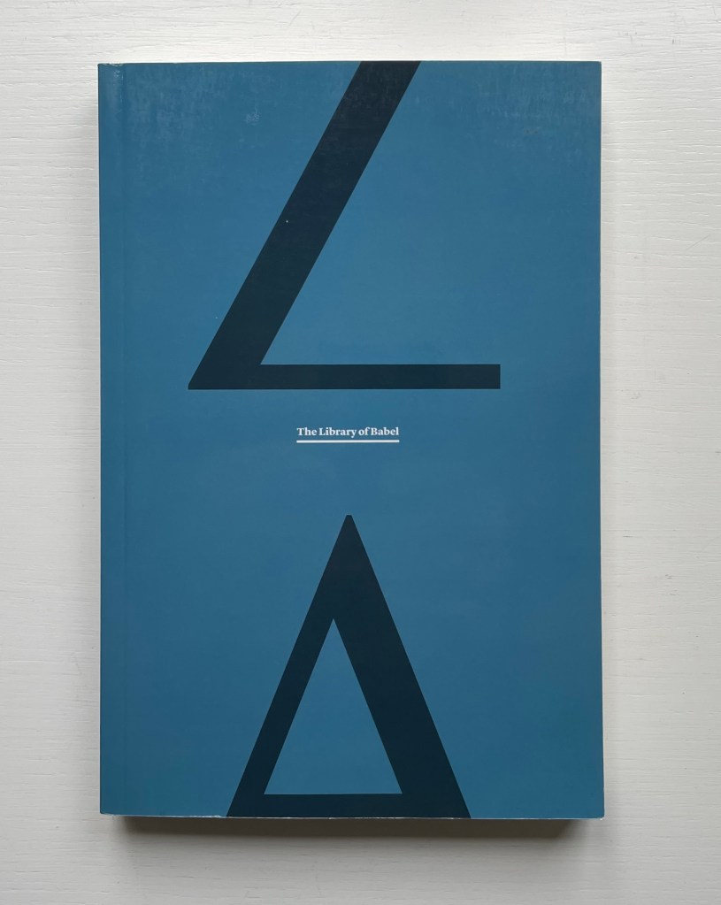
Z-A (The Library of Babel) (2011)
Z-A (The Library of Babel) (2011) Benjamin Shaykin Perfect bound H230 x W155 mm. 336 pages. Acquired from Printed Matter, Inc., 23 September 2022. Photos: Books On Books Collection.
Shaykin’s response to that HarperCollins announcement about its library customers’ purchases (or rather licenses) of its digital books was to create a physical book. Aptly he chose Jorge Luis Borges’ story “The Library of Babel” with which to do it and, taking his alphabetic cue from HarperCollins’ precisely dictated number of loans, proceeded to repeat the story 26 times and, in reverse alphabetic order, to remove one letter at a time with each repetition.
This is a variant on the OuLiPo movement’s lipogrammatic (letter-removal) constraint, probably the most well-known example being Georges Perec’s Disparition (“A Void“), a mystery novel told with only words without the letter “e”. Another variant on the constraint can be found in Mark Dunn’s more recent work of Ella Minnow Pea, the epistolary novel about a small South Carolina town council’s outlawing use of the letter Z. A whole-word variant can be found in Jonathan Safran Foer’s Tree of Codes, in which he creates a completely other, coherent novel from Bruno Schulz’s novel The Street of Crocodiles by cutting out words and letting the ones beneath appear. While this has a visual and tactile result far from Perec’s or Dunn’s work, its narrative remains just as intact.
The final pages of Shaykin’s variant, however, has a more purely visual rather than narrative cast. It is somehow the opposite of a reduction print, the process whereby an image is built up by removing chunks of the printing surface after each pass through the printer. At the end of Shaykin’s printed book, Borges’ narrative has been torn down letter by letter. We have a strange set of images achieved through removal, but it’s a Babel of nothing but punctuation marks and numerals. It is almost an anti-narrative, except that the satiric point of Z-A‘s narrative is clear: here is an analogue mirror to a topsy-turvy algorithmic policy bound to constrain access to books in a digital world that is boundless.
In the Books On Books Collection, other visual artists at play with erasure and excision are Jérémie Bennequin and Masoumeh Mohtadi. Like Shaykin, these artists are also engaged in another tradition of book art: inverse ekphrasis and homage to the textual author. Bennequin pays homage to Stéphane Mallarmé and creates book art from his Poème: Un Coup de Dés Jamais N’Abolira le Hasard. Mohtadi pays homage to José Saramago and creates book art from his Ensaio sobre a Cegueira romance (“Blindness“).
A Semaphore Alphabet: From Angels to Zebras (2002) Lynn Hatzius Softcover, saddle stitched, staples. H148 x W105 mm. 32 pages. Edition of 300. Acquired from Blackwell’s Antiquarian & Rare Books, 15 November 2022. Photos: Books On Books Collection. Displayed with permission of the artist.
Lynn Hatzius’s blend of the traditional and surreal in her abecedarium of linocuts foreshadows her more photographic collage and printmaking work, especially her book cover for Edith Grossman’s translation of Happy Families by Carlos Fuentes, her contributions to the Faces exhibition at the Topolski Gallery in 2010 and her series Limbs from the same period.
Hatzius finds several layers of whimsy and meaning by wordlessly jamming an inanimate template of limbs together with the heads, trunks, hands and actions of creatures usually associated with children’s ABC books (B for bird, C for cat, X for xylophone playing and Y for yo-yoing). Further surrealism — such as the bird’s wearing a beard and a headdress of bananas and basket of berries or the cat’s having lobster claws for paws — keeps readers on their toes. As the xylophonist and other occasional changes to the template’s lower extremities demonstrate, Hatzius also keeps her semaphore-forming template on its toes, blurring the line between animate and inanimate.
Perhaps that is Hatzius’s way of drawing our attention to the arbitrary association of letters and signs with things, actions and ideas. The usually inanimate part of a template can become animated, and the usually animate part of the template can just as well become the inanimate fence rail over which the zebra leans its head.
A photographer since 1991, Brazilian Lucia Mindlin Loeb turned to the book as the surface and form for her art. Works such as Livro sobre Livros (“Book about Books“), Entre páginas (“Between Pages”) and Biblioteca (“Library“) speak to an academic fascination with the structural elements of the book — especially its volume, edges, pages and spine. Along with Memória fotográfica (“Photographic memory”), they explore what photography and the book can tell us about time, space, memory, the world we see and a familial experience of it. The works below from the Books On Books Collection show only a fraction of how far beyond the photobook Loeb has gone.
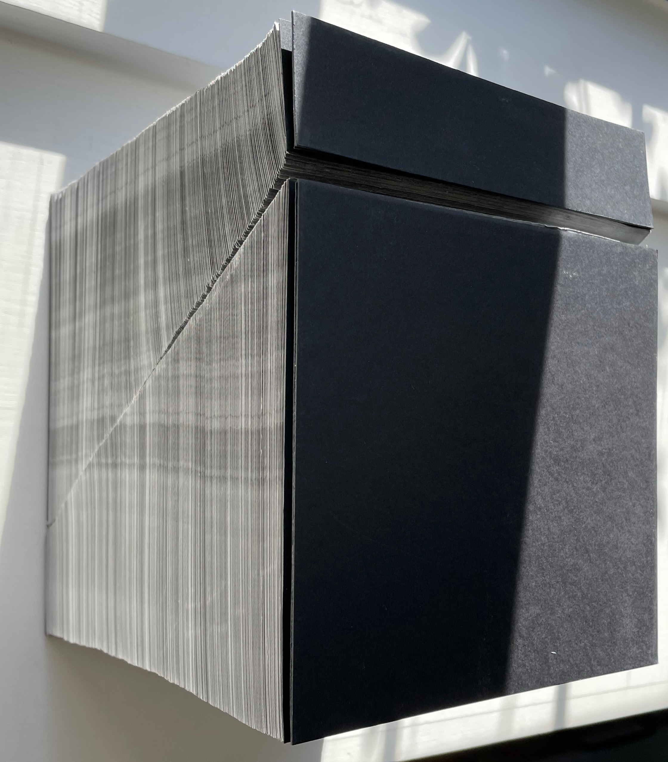
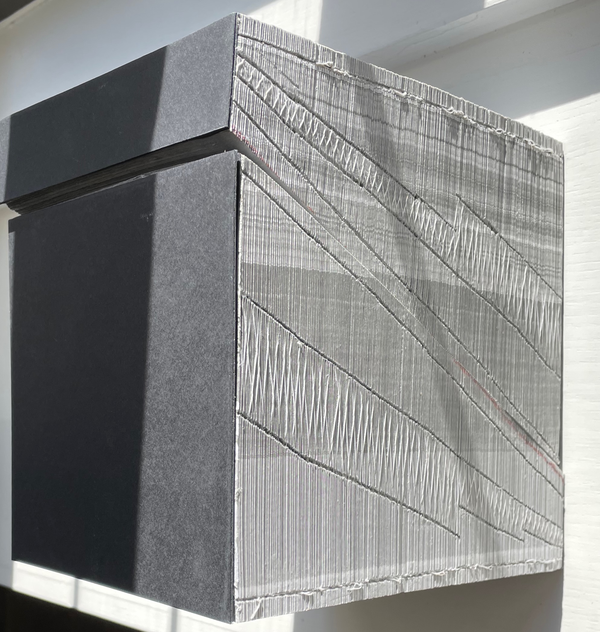
Abismo (2012)
Abismo (2012) Lucia Mindlin Loeb Front and back card covers on a sewn, exposed-spine book block cut diagonally into two volumes, each housed in a custom archival box. H210 x W210 x D175 cm. Edition of 5 and 2 artist’s proofs, of which this is A/P #2. Acquired from the artist, 5 October 2022. Photos: Books On Books Collection.
Fore-edge view (L) and spine view (R) of the cut halves resting against each other.
Close up of spine.
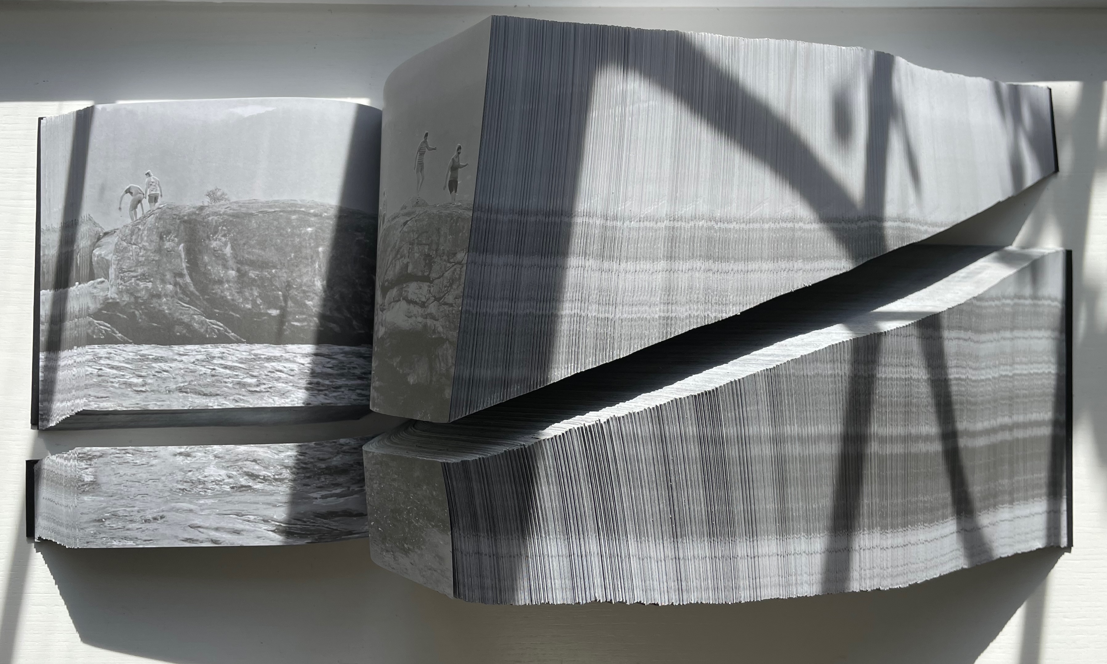
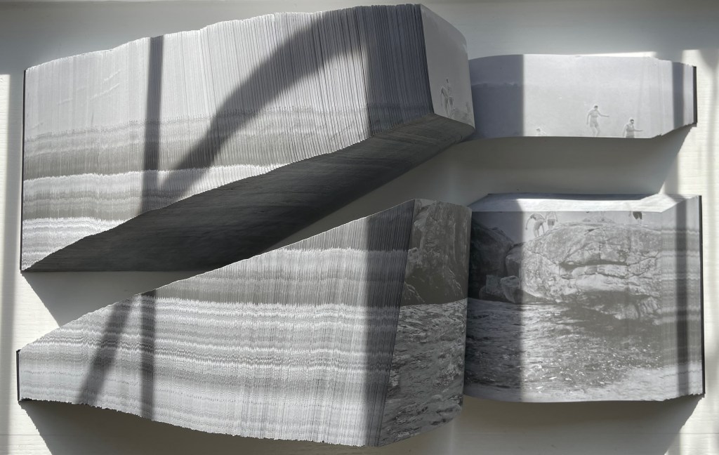
With the two halves open and positioned properly, their parallel opening and page turning soon creates a disorientation. The top half thickens and narrows, while the bottom half thickens and deepens.
Below, a close-up view of the abyss and the cliffwalkers evokes a sense of precariousness and vertigo.
Few books allow views of double-page spreads simultaneously from two different places in the book, and varying the position of the two halves can widen the abyss.
The brief clip below conveys more of the disorienting effects that “reading” this work offers. Perhaps the same feelings the cliffwalkers experienced.
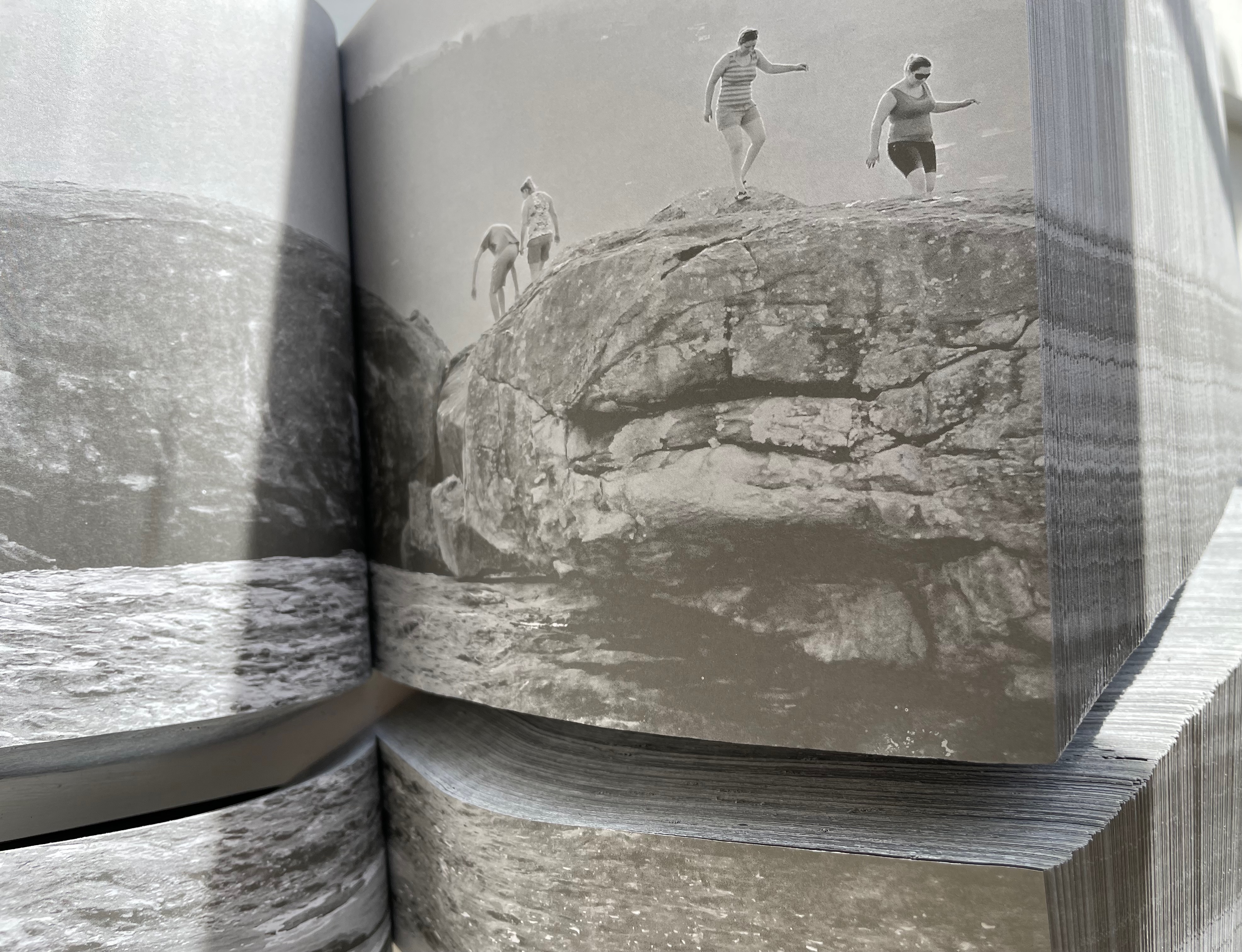
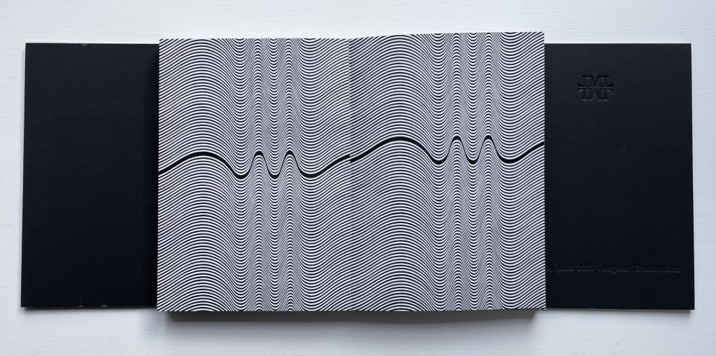
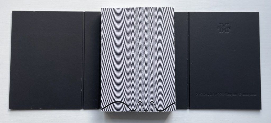
Devaneio (2015)
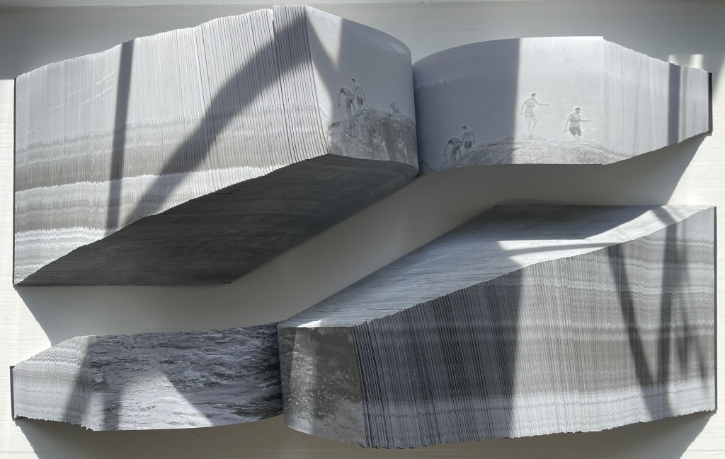
Devaneio (2015) Lucia Mindlin Loeb Exposed spine book block, handsewn and glued, loose in trifold case. H180 x W130 x D3 mm. 384 pages. Edition of 12, of which this is #5. Acquired from the artist, 5 October 2022. Photos: Books On Books Collection.
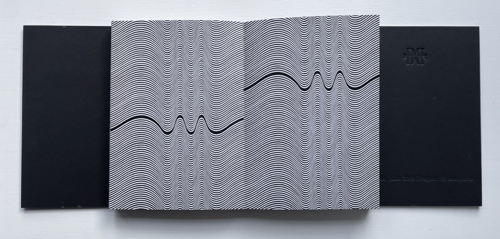
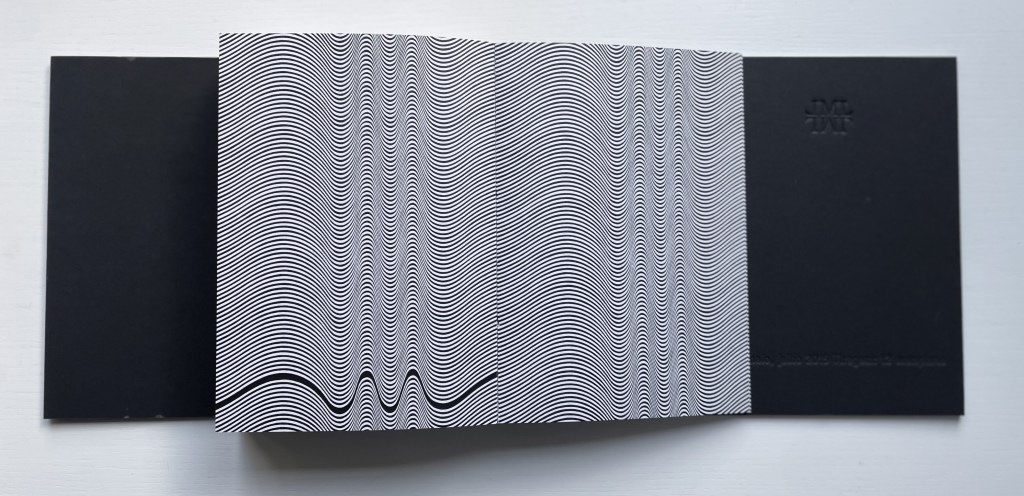
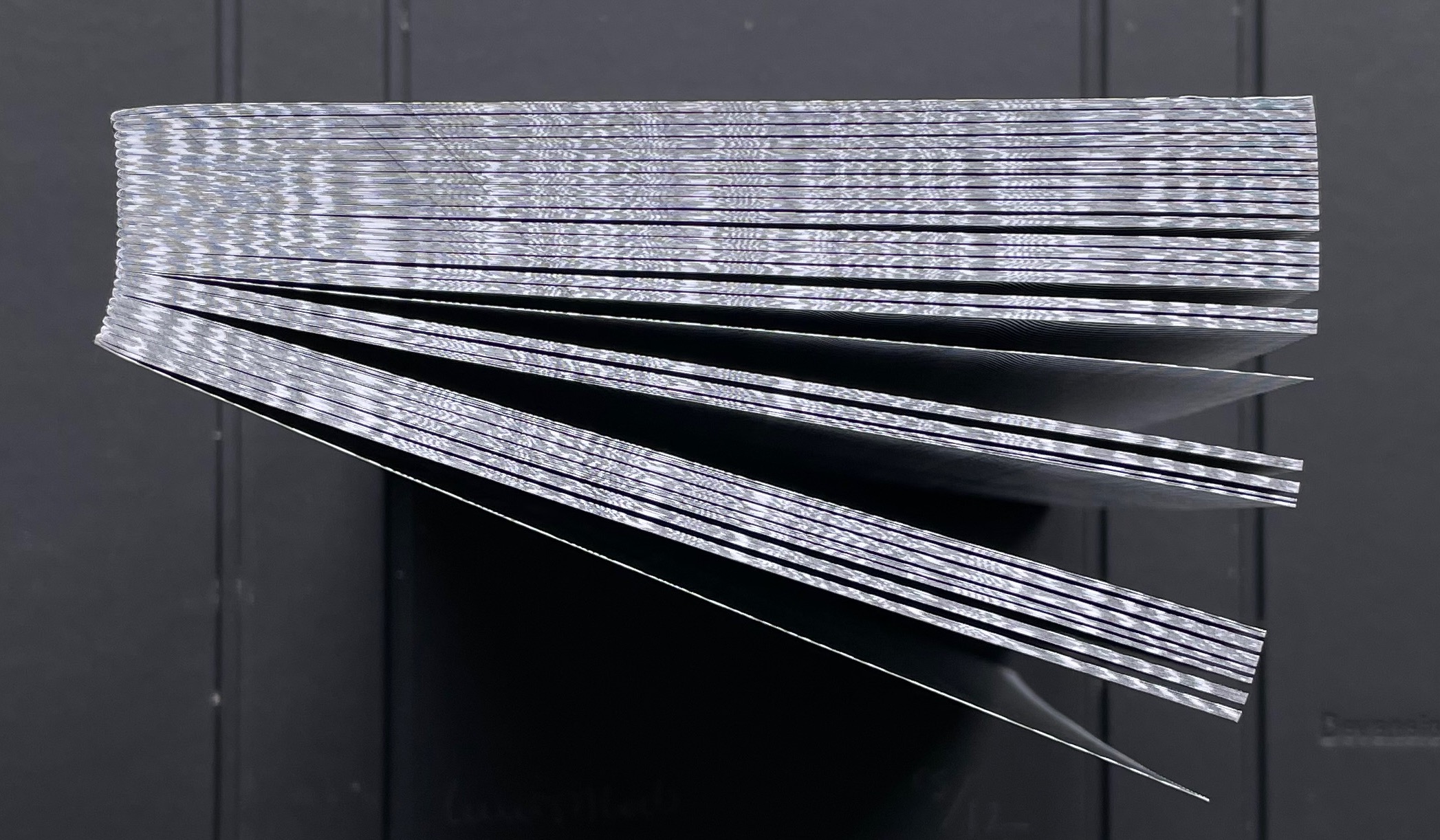
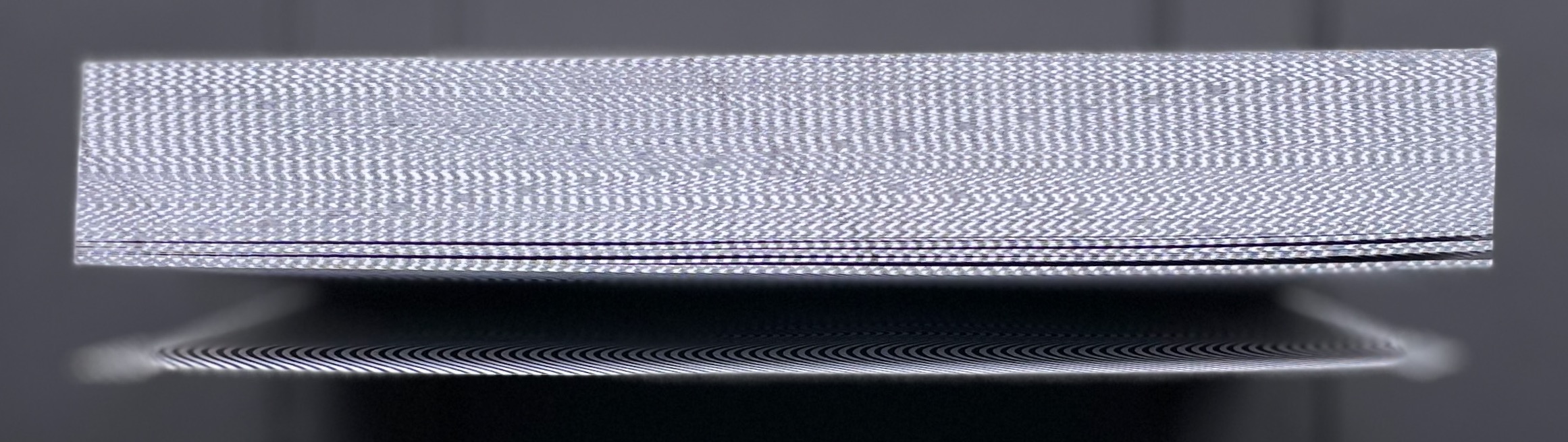
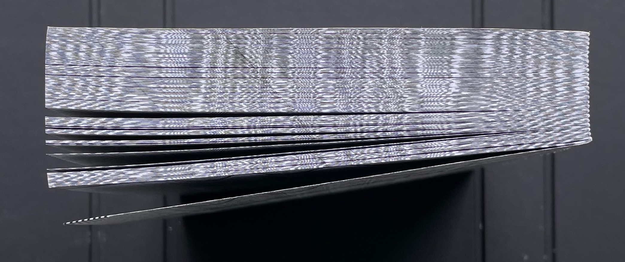
Devaneio means “daydream”, which is certainly elicited by the thick black line undulating over the hills and valleys optically created by the thinner lines parallel to each other and the thicker line. Over the first seventeen pages, the thick line appears only at the bottom of the recto page, but almost imperceptibly rises up the page.
First recto page
Seventeenth recto page
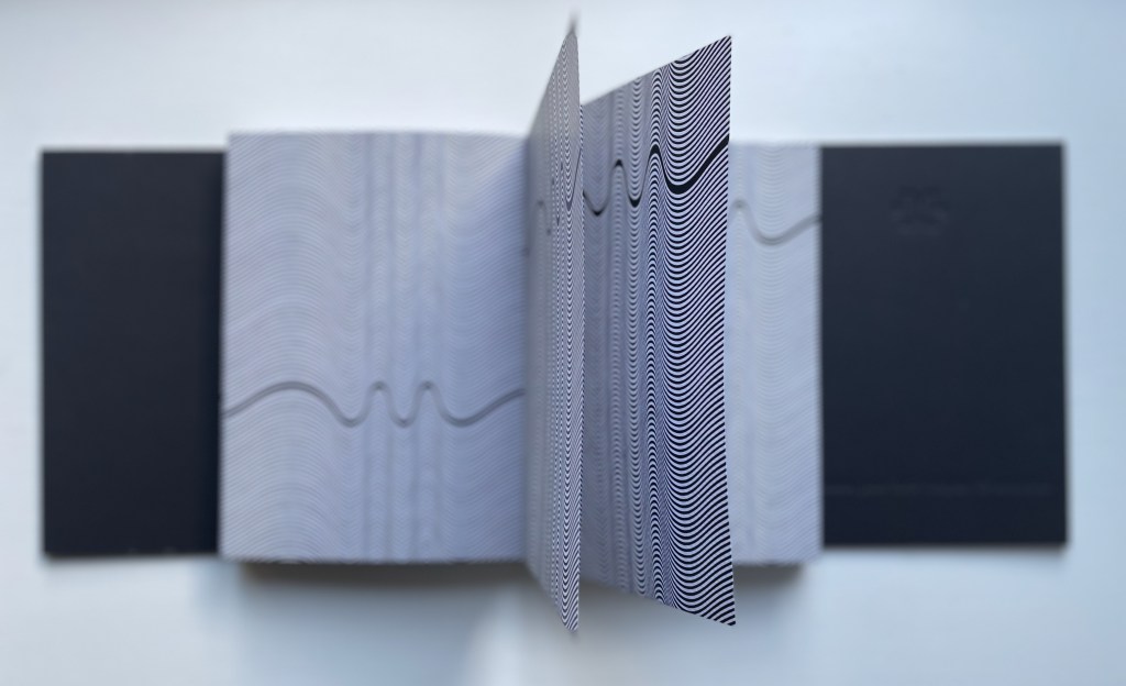
As the seventeenth recto page turns, another thick line begins its descent seemingly from outside the top edge of the eighteenth verso page. From here on, in their respective downward and upward movements, the thick lines on the verso and recto pages appear headed for convergence. The stroboscopic effect of the background of tightly packed thinner lines enhances this appearance of downward and upward motion. Although they converge, the thick lines skip over any direct intersection and continue their journeys toward the bottom edge of the verso page and top edge of the recto page.
The thick line on the verso page makes its appearance.
The lines begin to converge,
but do not intersect.
The lines diverge, the verso continuing downwards and the recto, upwards.
As the daydream begins to end, the upward bound thick line has almost disappeared at the top of its recto page. As the page turns, only the downward bound thick line remains to finish its journey at the bottom of the last verso page, the last page of the book. Of course, the the thick line’s end position on the last verso page is the same as its start position on the first recto page.
The upward bound thick line almost gone on the recto page.
The thick line has gone from the recto page.
The thick line at rest on the last verso page.
The crossover of the verso and recto thick lines can be observed on the book’s fore edge, and the thinner lines’ stroboscopic effect shows up even on the top and bottom edges.
Devised by Robert Sayer (1756), “harlequinade” was a form of children’s book. Also called a “metamorphosis” or “turn-up” book, its pages were cut horizontally so that their parts could turn independently of one another and generate amusing mix-and-mismatch images. Book artists such as Emily Martin have seized on the form to great satirical effect.
Loeb’s “Memories of You” maintains the form’s comic nature but blends it with the forms of the photobook and family photograph album to deliver a whimsical and sentimental celebration of four generations. Loeb plays her title’s deliberate ambiguity out with the form’s interchange of resemblances in faces, poses and costumes and lifts her work out of mere sentimentality. The video below provides a better view of the work than would photos of the book.
The sculptural mastery in Loeb’s works makes for intriguing and enjoyable comparison with that of Doug Beube, Andrew Hayes and Guy Laramée in the Books On Books Collection, while the photographic mastery calls up Scott Kernan, Marlene MacCallum and Michael Snow for similar revisits.
Further Reading
“Doug Beube“. 21 April 2020. Books On Books Collection.
“Andrew Hayes“. 4 September 2019. Books On Books Collection.
“Guy Laramée“. 18 September 2019. Books On Books Collection.
“Scott Kernan“. 22 February 2019. Books On Books Collection.
Baabaa Aab Daad (Father Gave Water) (2020) Golnar Adili Wood, felt, board and cloth, 5 x 7 x 1.5 inches (closed). Edition of 25. Acquired from the artist, 1 July 2022 Photos: Books On Books Collection unless indicated otherwise. Displayed with artist’s permission.
Helpfully for a Western audience, the box cover of this homage to the traditional Persian sentence for first-year readers links the right-to-left-reading words with their roman alphabet transcription and English translation. Beyond that, understanding just these few characters and appreciating the artistry involved require some research.
Close-up of box cover.
The character called ‘alef and making an aa sound is آ. From the transcription, we know that the sound should appear four times — twice in “Baabaa” and once in each of “Aab” and “Daad”. The character called be and eliciting a b sound is ب . The transcription indicates it should appear three times — twice in “Baabaa” and once at the end of “Aab”. The character named daal and making a d sound is د . The transcription calls for it to appear twice — at the beginning and end of “Daad”.
As in Arabic, from which Persian adopts most of its characters, some characters’ appearance changes depending on their position in a word or syllable. If a word begins with ‘alef (آ) and is the aa vowel (as opposed to the “o” or “é” vowel), the character for it has a “roof” — as in the word “Aab” — but if the sound falls in the middle of a word — as in “Daad” — the “roof” comes off: (ا). Also as in Arabic script, Persian letters can be linked with one another, altering their appearance. In “Baabaa”, ‘alef (ا) links up with be (ب); so not only does its “roof” disappear, but it squeezes the width of ب and shifts its diacritic (the dot underneath): با. To Western eyes, the linked characters look like one character. In some typefaces, we have the similar phenomenon of ligatures, in which, for example, the letter f and the letter i will join into the single character fi.
Spine of the box.
Even if Gutenberg’s type mimicked scribal lettering, roman type was not cursive script, which explains in part the hard work by Francesco Griffo da Bologna and Aldus Manutius to come up with italic. For Arabic and Persian or any calligraphically represented language with characters changing shape with position and linkage, with diacritics and a slantable baseline to allow stacking of letter combinations, the development of movable type would be and has been even harder — if not impossible as designers Rana Abou Rjeily and Bahman Eslami explain (see references below).
All of this preamble helps in appreciating the linguistic and cultural bridging that Adili’s artwork performs. The miniaturized shape of traditional alphabet blocks meets pixellated and sculpted Persian in Adili’s modular wooden cubes and recessed felt base. Her invented typography mostly skirts the calligraphic concerns by leaping into the third dimension. Language becomes tactile and three-dimensional not only in this work but in almost all of the work emanating from her studio.
Colophon.
Larger set of letter modules. Photo: Courtesy of the artist.
The Jasmine Scented Ones is a particularly good example. This series of works uses the pixellated shapes from Father Gave Water to screenprint Persian characters and words this time taken from a Hafez poem and exploits the play of light through superimposed sheets of Japanese Rayon Lens paper and across 3D resin prints to embody the tension in the poem’s wordplay with the verbs to sit and to settle. For touch that would see and sight that would touch, Adili offers highly expressive works.
Many thanks from Books On Books — or Ketab bar Ketab (کتاب برکتاب) — to Golnar Adili and friend for assistance with the crash course in Persian characters. Any errors rest with Books On Books.
Center for Book Arts. 14 January – 26 March 2022. “Father Gave Water/Baabaa Aab Daad: An Homage to Childhood, Persian, and Process“. Exhibition. New York: Center for Books Arts Gallery. Accessed 1 March 2022. Center for Book Arts’s description of the work: “Adili drew inspiration from her own childhood education in Iran, where all first graders learn the phrase “Baabaa Aab Daad” (translates to “Father Gave Water”) as a foundational example of the elemental letter and sound composition in the Persian language. As a mother to a multilingual toddler, Adili was further inspired to employ a system of blocks and puzzles within her artist book as a reference to her daughter’s tactile style of play. In conducting research for this project, Adili learned of Iranian educator Seyyed Abbas Sayyahi, who drafted the country’s first-grade curriculum and co-founded a system of schools to serve the nomadic population. Adili could not find any formal recognition of Seyyed Abbas Sayyahi’s immense contributions by Iran’s education department, Sazman é Aamoozesh va Parvaresh, so she decided to celebrate his important work by including him in her book. Ultimately, Adili views her artist’s book as a didactic tool for English readers to fully understand the Persian sentence “Baabaa Aaab Daad.” The book includes an English phonetic key for the Persian alphabet and color-coded diagrams that break the sentence down word-by-word. A bilingual speaker and reader herself, Adili is fascinated by the connections between English and Persian, which are both Indo-European languages, and pursues new formal and visual translations through her art practice.”
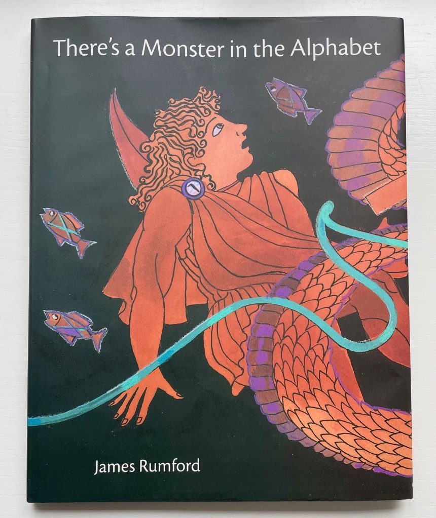
There’s a Monster in the Alphabet (2002) James Rumford Dustjacket, hardcover. H285 x W230 mm. 32 pages. Acquired from Bud Plant and Hutchison Books, 3 November 2022. Photos: Books On Books Collection. Displayed with permission of the author.
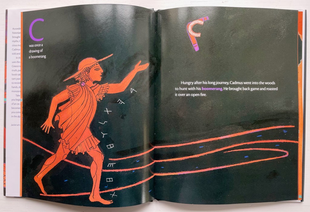
James Rumford subtly weaves fanciful, speculative and well-founded points about the origin and transmission of the alphabet into his inventive reframing of Herodotus’s tale of how the Phoenicians brought the alphabet to Greece. In the double-page spread above, the letter A’s evolution can be found in the ox’s head on the right and among the fish on the left.
Rumford’s painting with letters is another reminder of the fluidity of picture and letter. Phoenician and early Greek letters are used white on black to outline figures and suggest motion (as with the stick-throwing Cadmus above) or orange on black to evoke the decorative patterns of Greek pottery (as with the vase below).
The note shaped within the vase makes for a deft graphic transition from the pictorial to the fully textual appendix on the recto page, whose explanations will send an attentive reader back to the preceding pages to look more closely at their images.
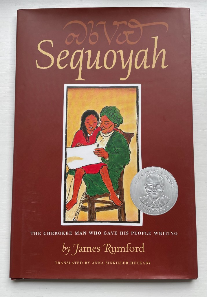
Sequoyah (2004)
Sequoyah (2004) James Rumford Dustcover, hardback. H285 x W230 mm. 32 pages. Acquired from Amazon EU, 25 September 2022. Photos: Books On Books Collection. Displayed with permission of the author.
Rumford’s Hawaiian residence places him on the equivalent of a linguistic equator reflected in the range of languages his books have engaged: Arabic, Bamum, Chinese, English, French, Ikinyarwanda, Persian and, of course, Hawaiian. He might be suspected of aiming to create an A-Z library of stories about the world’s languages. He has even covered hieroglyphics and Latin.
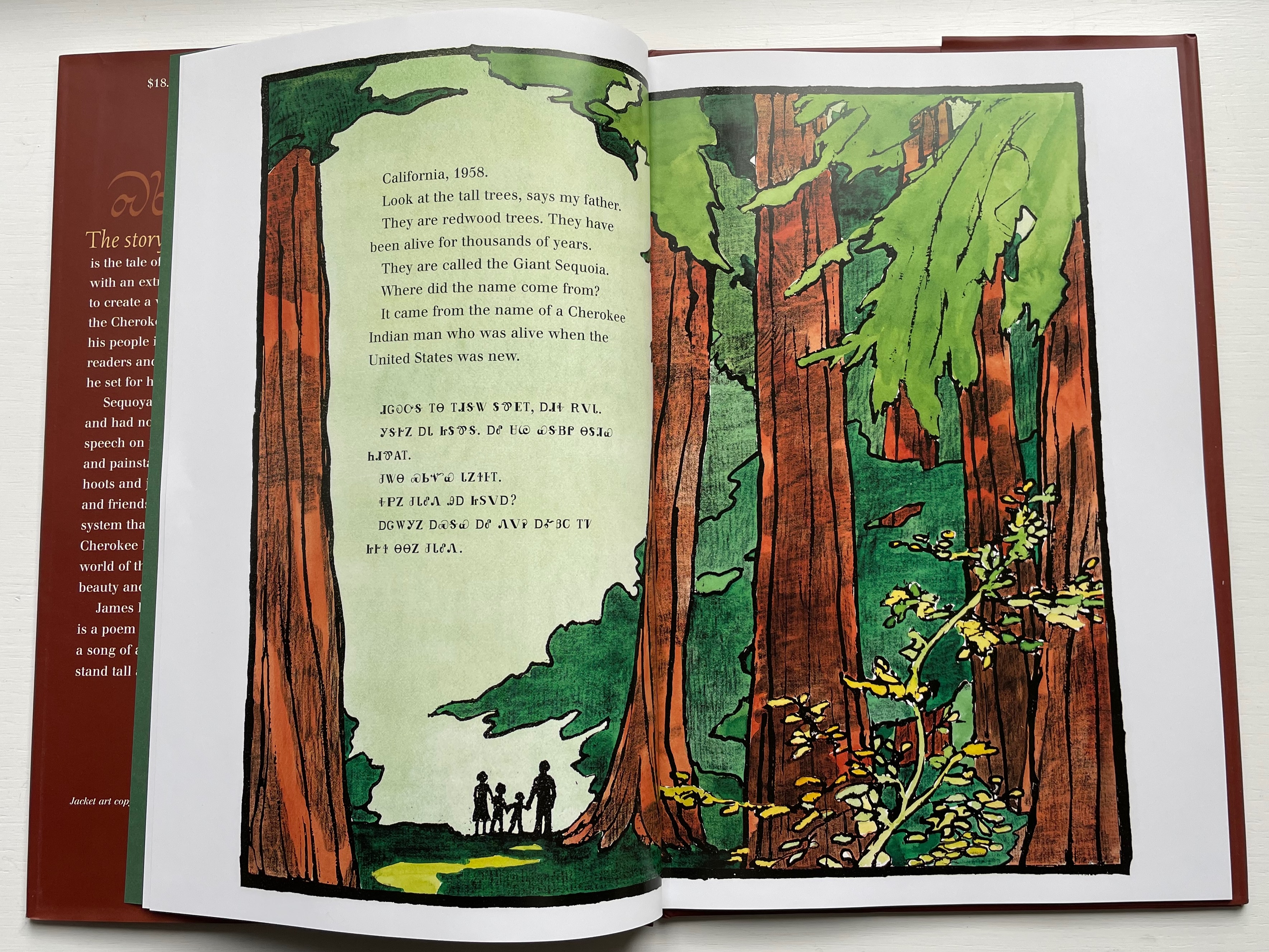
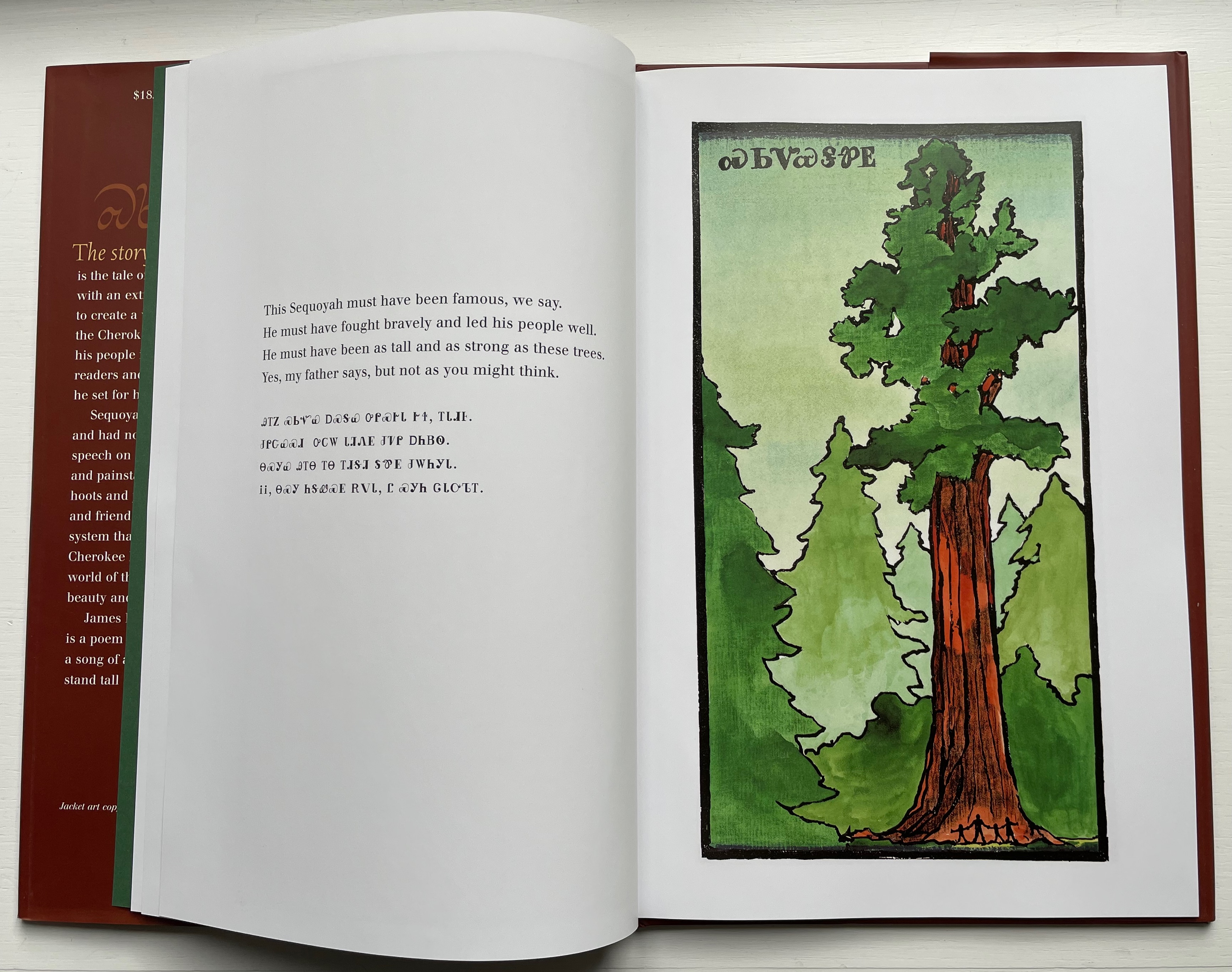
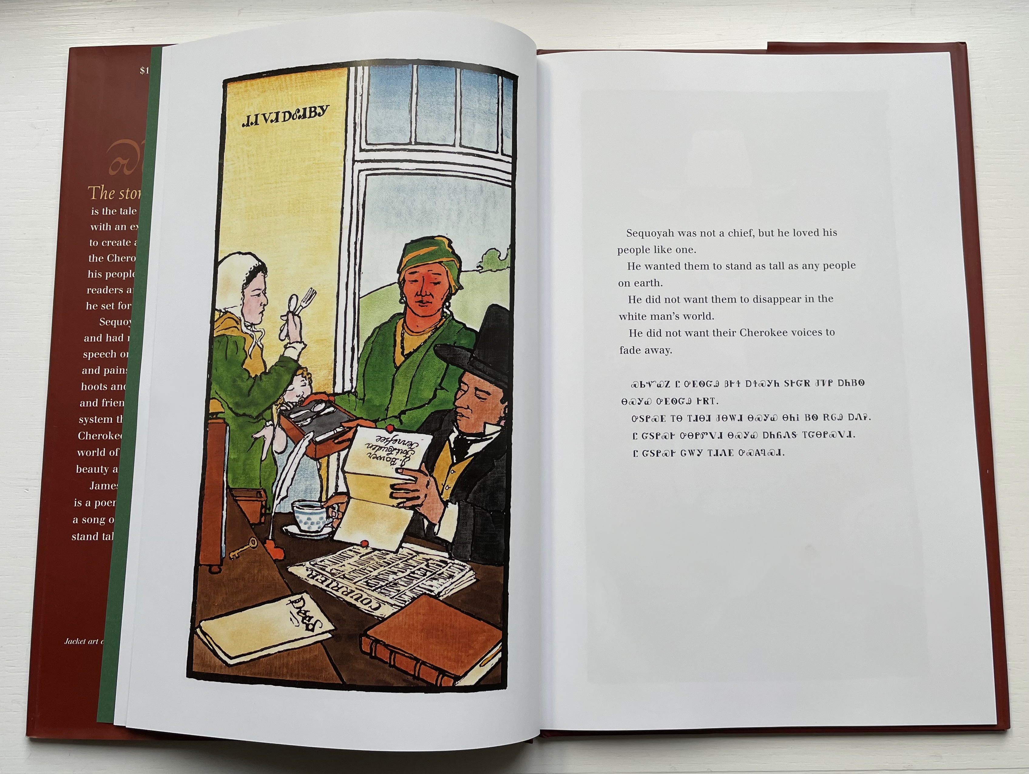
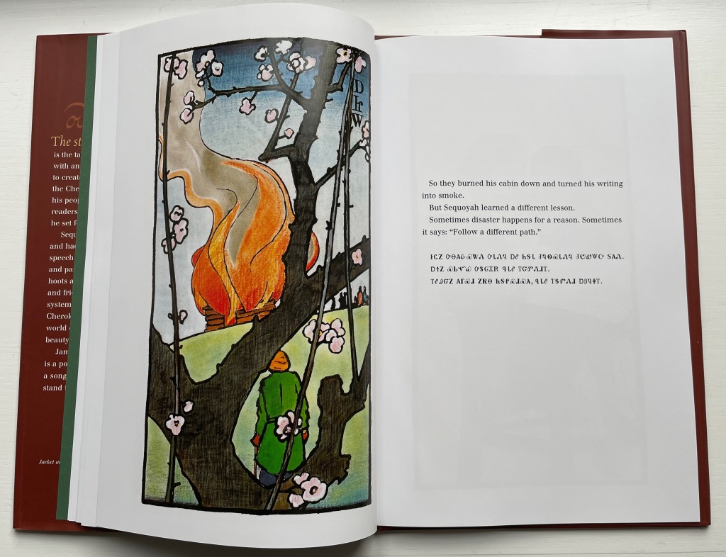
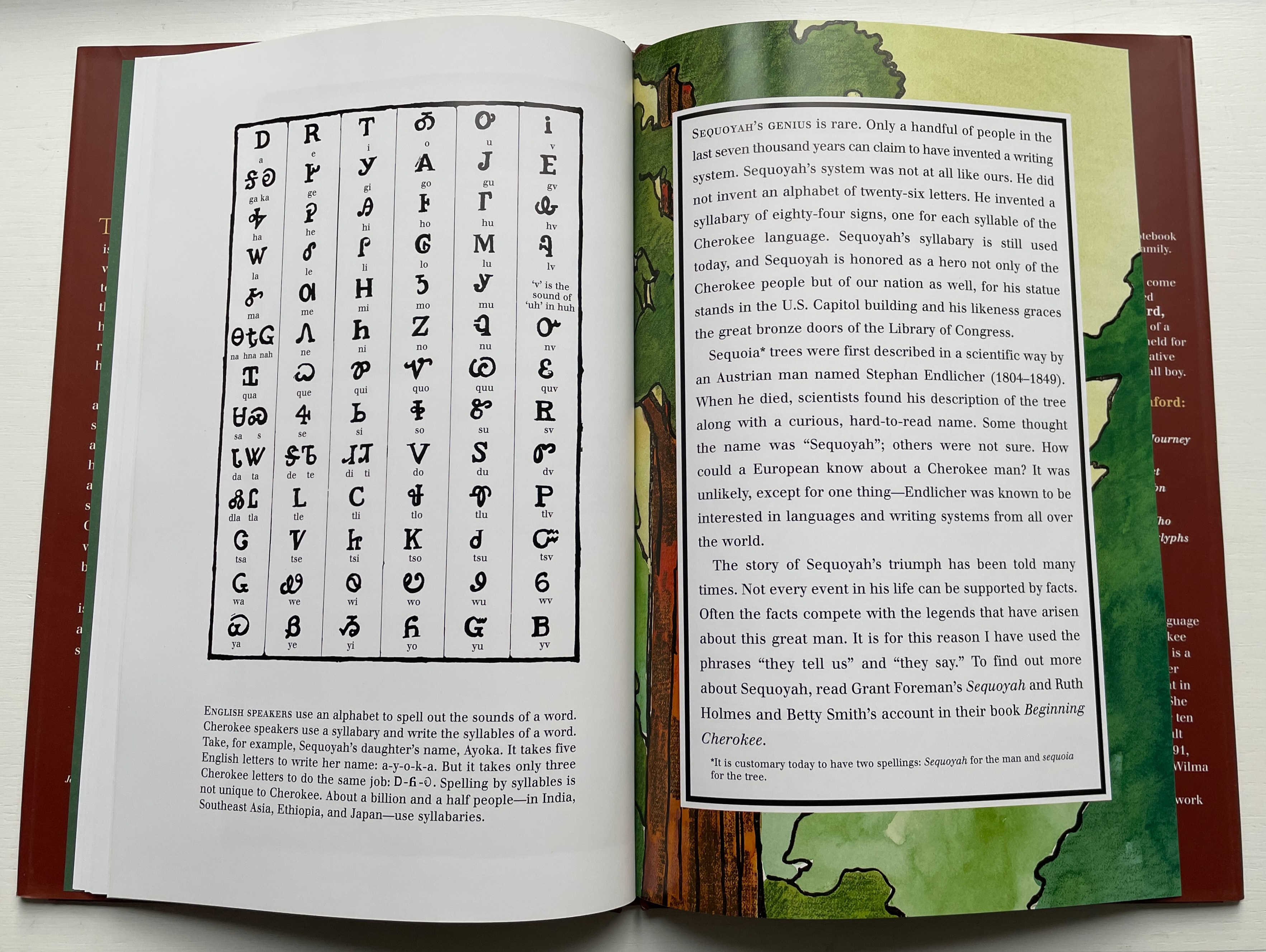
With Sequoyah, Rumford gives bilingual treatment to an astonishing feat — the creation of a syllabary within decades as opposed to the centuries it has taken for most other languages’ alphabets and syllabaries.
Rumford’s style in this book takes on elements of Japaneses woodcuts and the perspective and color that Gaugin found in them.
As with There’s a Monster in the Alphabet, the audience for Sequoyah is older children (probably ages 8 and older), but supporters of the Endangered Alphabets Project and fans of works such as Sam Winston’s One and Everything (2022) would also enjoy Rumford’s two books.
Diringer, David, and Reinhold Regensburger. 1968. The alphabet: a key to the history of mankind. London: Hutchinson. A standard, beginning to be challenged by late 20th and early 21st century archaeological findings and palaeographical studies.
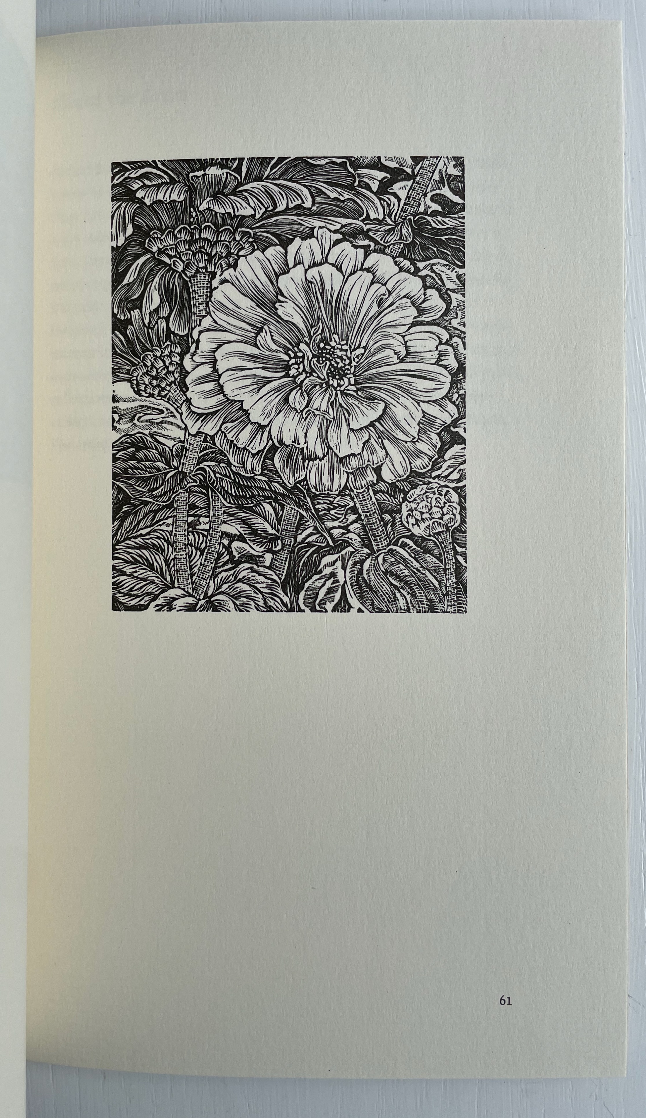
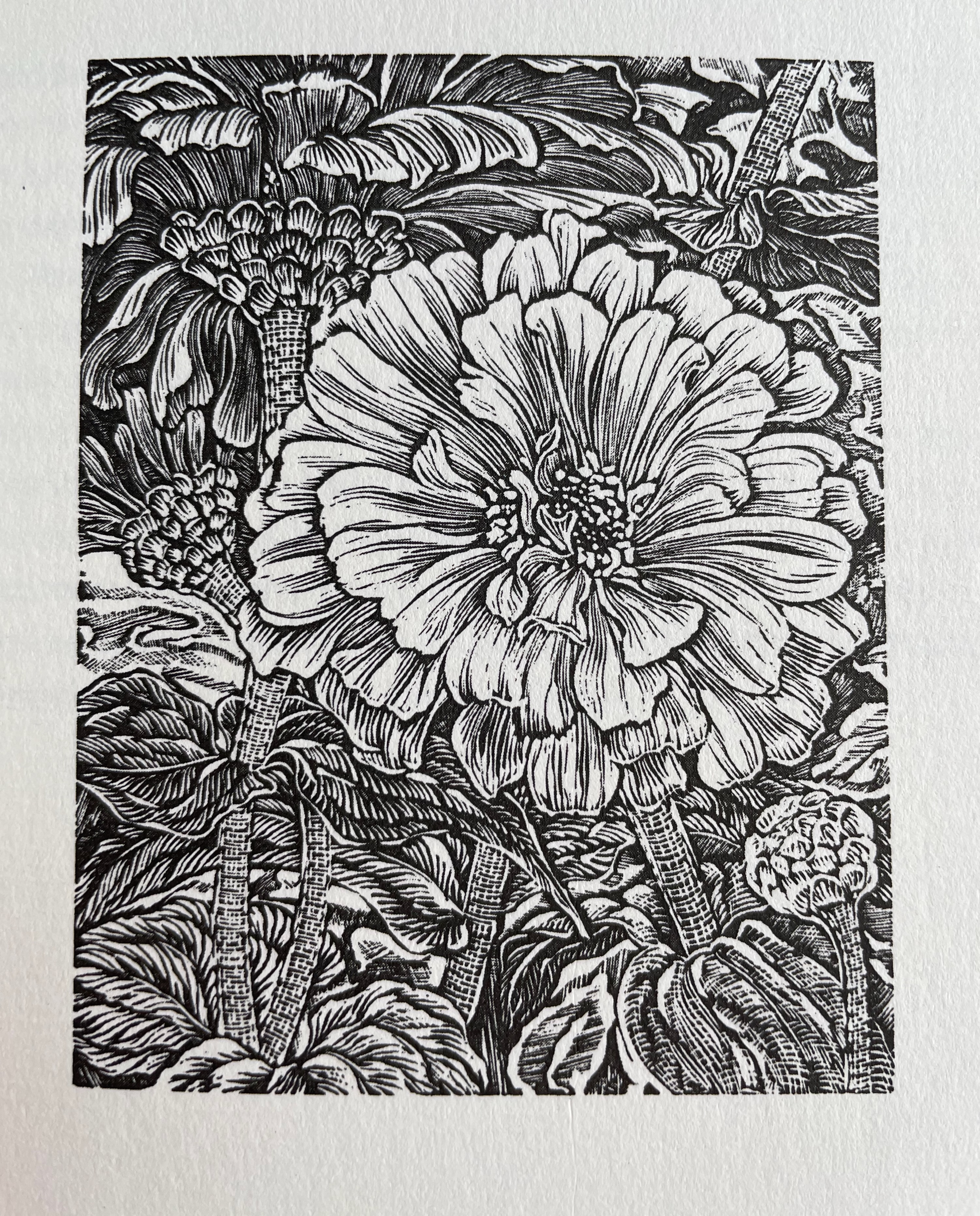
“Working on this series of engravings reminded me that the Victorians delighted in employing flowers to send messages, having an established lexicon of meanings for many common flowers. One might send foxgloves to express a suspicion of insincerity, snapdragons to underscore offence at another’s presumptiveness (and don’t the tight-lipped snapdragons in my engraving have an offended air about them?)” — Gerard Brender à Brandis
Further Reading
“E.N. Ellis“. 30 October 2022. Books On Books Collection.
“Enid Marx“. 1 August 2022. Books On Books Collection.
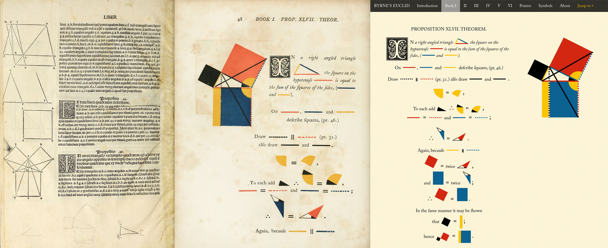
Innovative combinations of color and geometry in artists’ books — think of Ursula Hochuli-Gamma’s 26 farbige Buchstaben (1986), Jeffrey Morin & Steven Ferlauto’s Sacred Space (2003), Sarah Bryant’s The Radiant Republic(2019) or Ana Paula Cordeiro’s Body of Evidence (2020) — make for a useful angle on which to focus in appreciating book art.
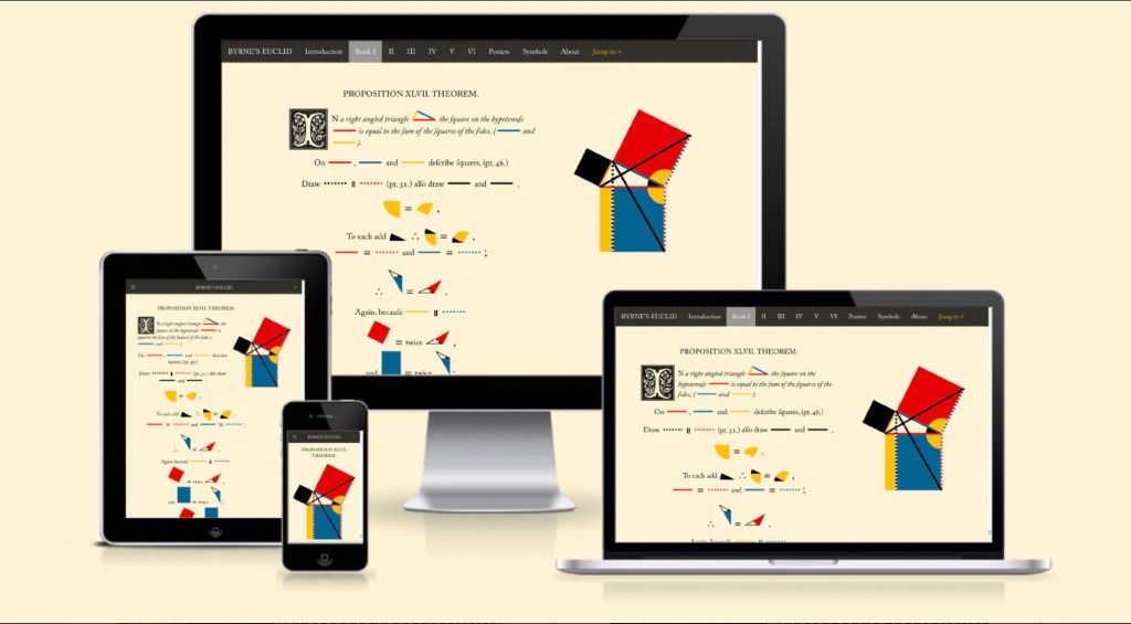
Nicholas Rougeux shows that it is also a useful inspiration for interactive digital art.
Rougeux describes himself as a “data artist”, and his works might also be considered “found art” given such sources of data as Nicolas Bion’s treatise on mathematical instruments from 1709, Spencer Fullerton Baird’s Iconographic Encyclopædia of Science, Literature, and Art (1852) and John Southward’s A Dictionary of Typography and its Accessory Arts (1875). While the resulting works recall Ben Fry’s and Stefanie Posavec & Greg McInerny’s celebrations of Darwin’s On the Origin of Species, two different and more apropos, even if analogue, points of comparison are Edward R. Tufte’s Envisioning Information (1990) and Francisca Prieto’s Composition No. 1. The connection with Tufte is the more obvious, but Rougeux’s digital manipulation of antique works feels very much like Prieto’s manual folding of them.