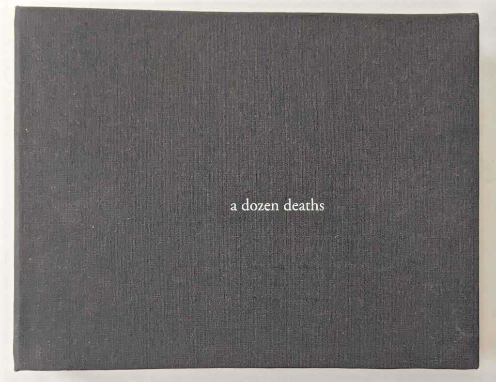
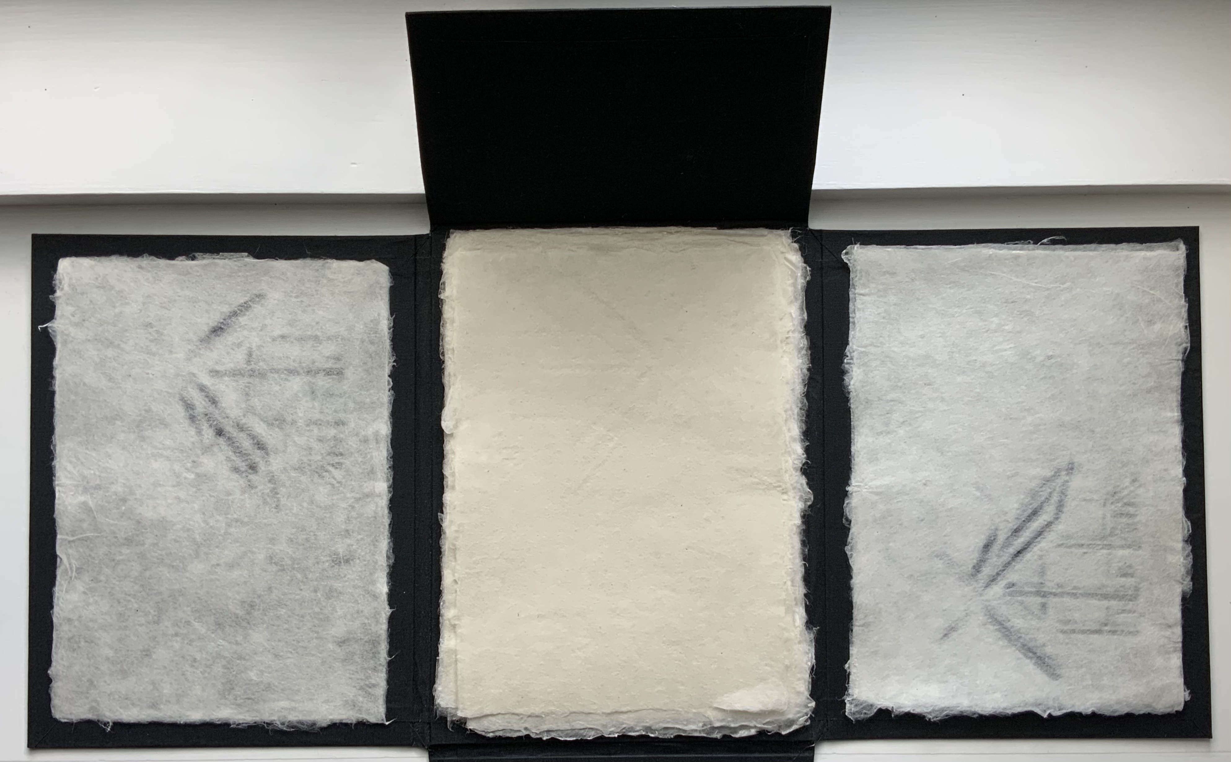
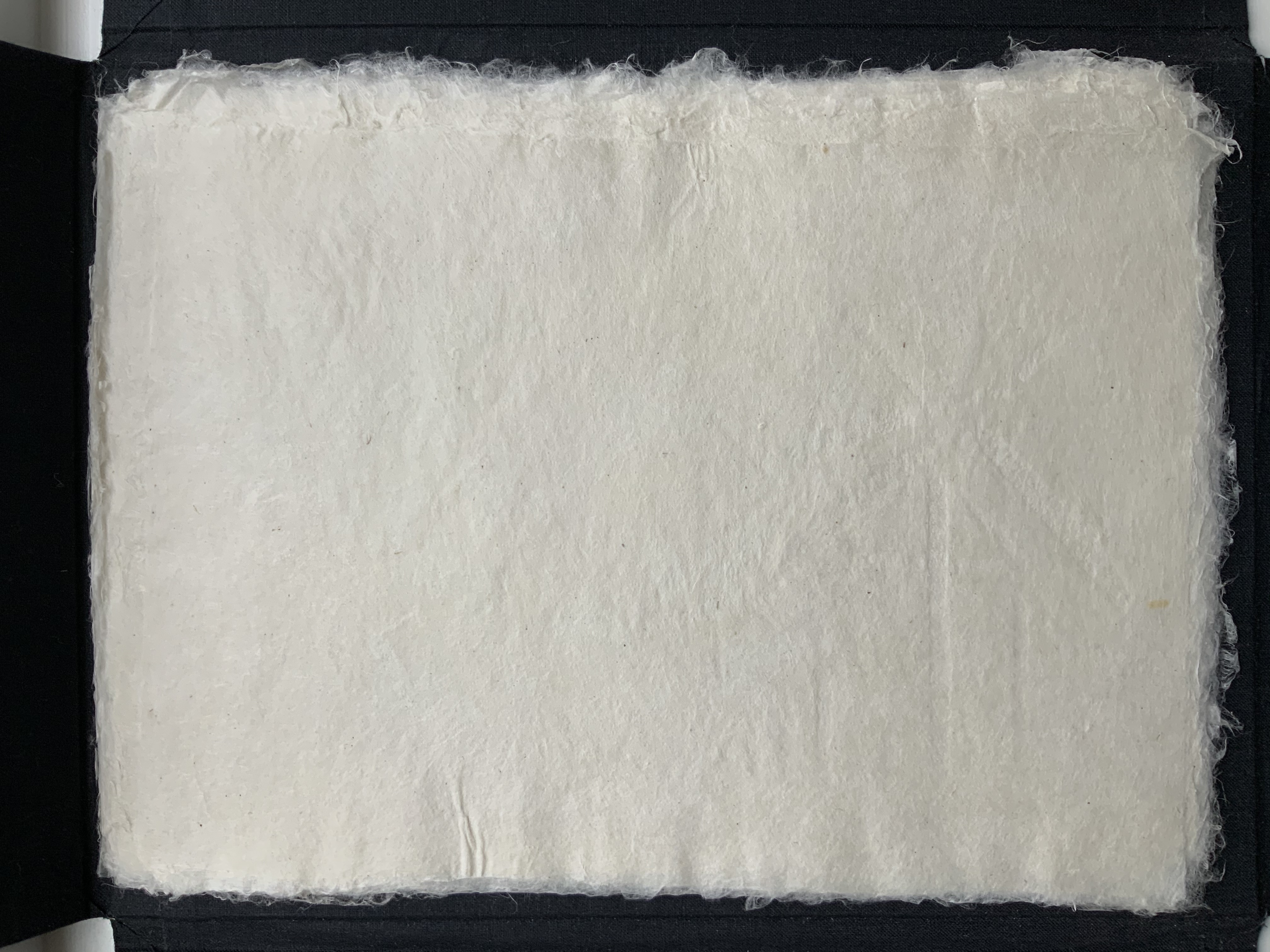
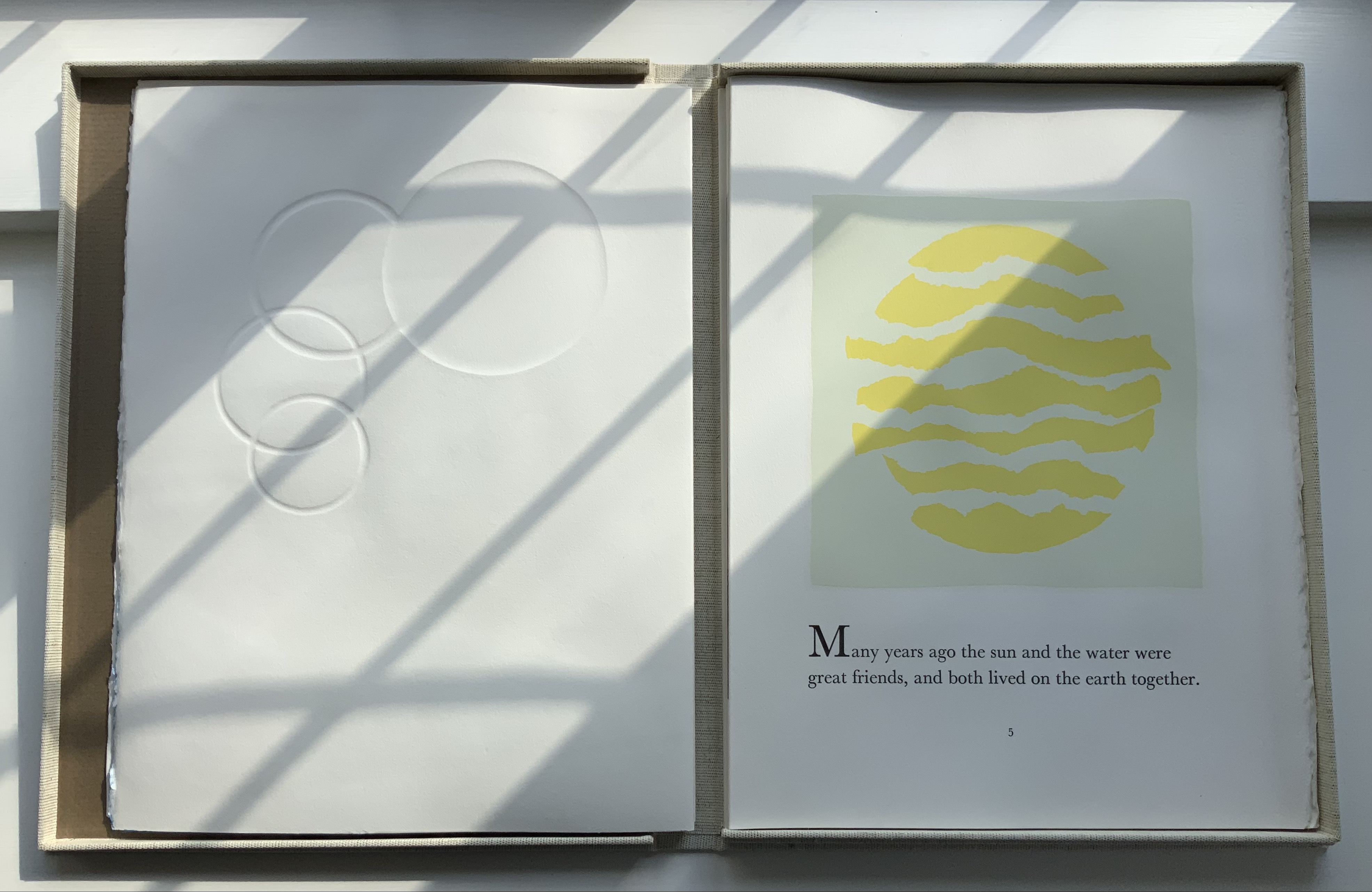
a dozen deaths(2015) Nia Easley Case bound, cloth-covered book board, modified accordion structure. H7 x W9 x D1 inches, 24 pages. Text laser-printed on 90lb Neenah paper; interior images stencil-printed in acrylic, exterior pattern inkjet-printed on bamboo paper. Edition of 5. Photo: Courtesy and permission of the artist.
Nia Easley’s birthday in 2012 felt very different. The day before, George Zimmerman had killed Trayvon Martin. Over the days, weeks and months after, the outpouring in the mainstream and social media in reaction to the event and the jury trial that followed only intensified and complicated the emotions and memories evoked on the day.
Turning to art, Easley asked twelve individuals to recount Trayvon Martin’s last moments based on their memories of the reported event. An implicit rule in Easley’s request led to the stories being told from the first person. Her only explicit rule for the retelling was that the imagined teller must die at the end. She recorded each retelling and, with the participant’s collaboration, polished it into a transcript.
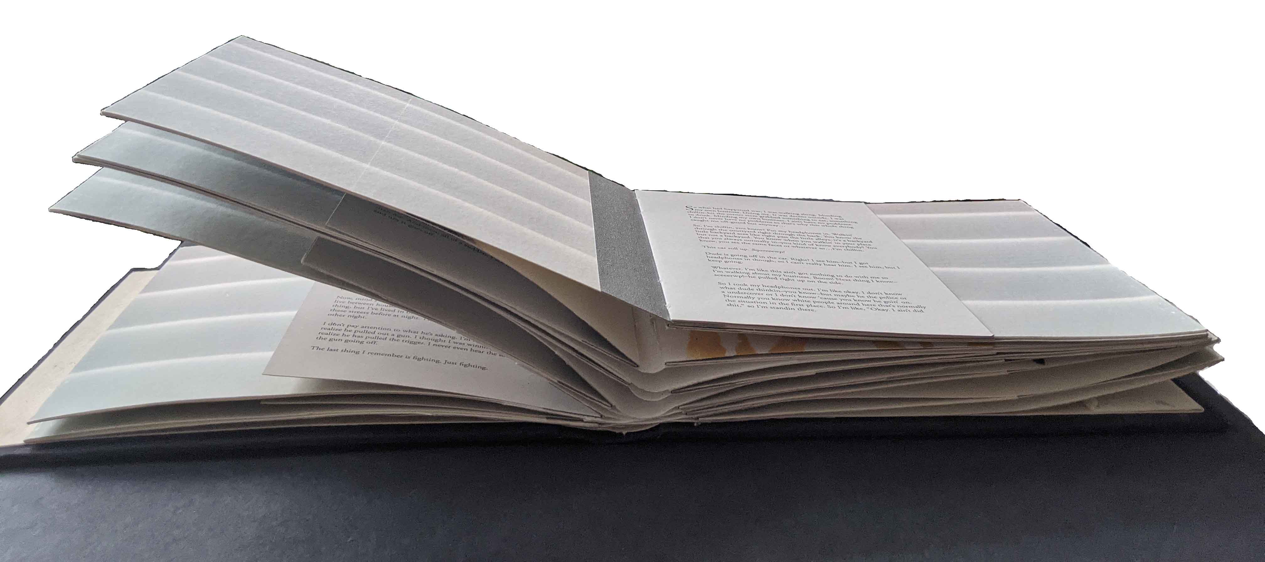
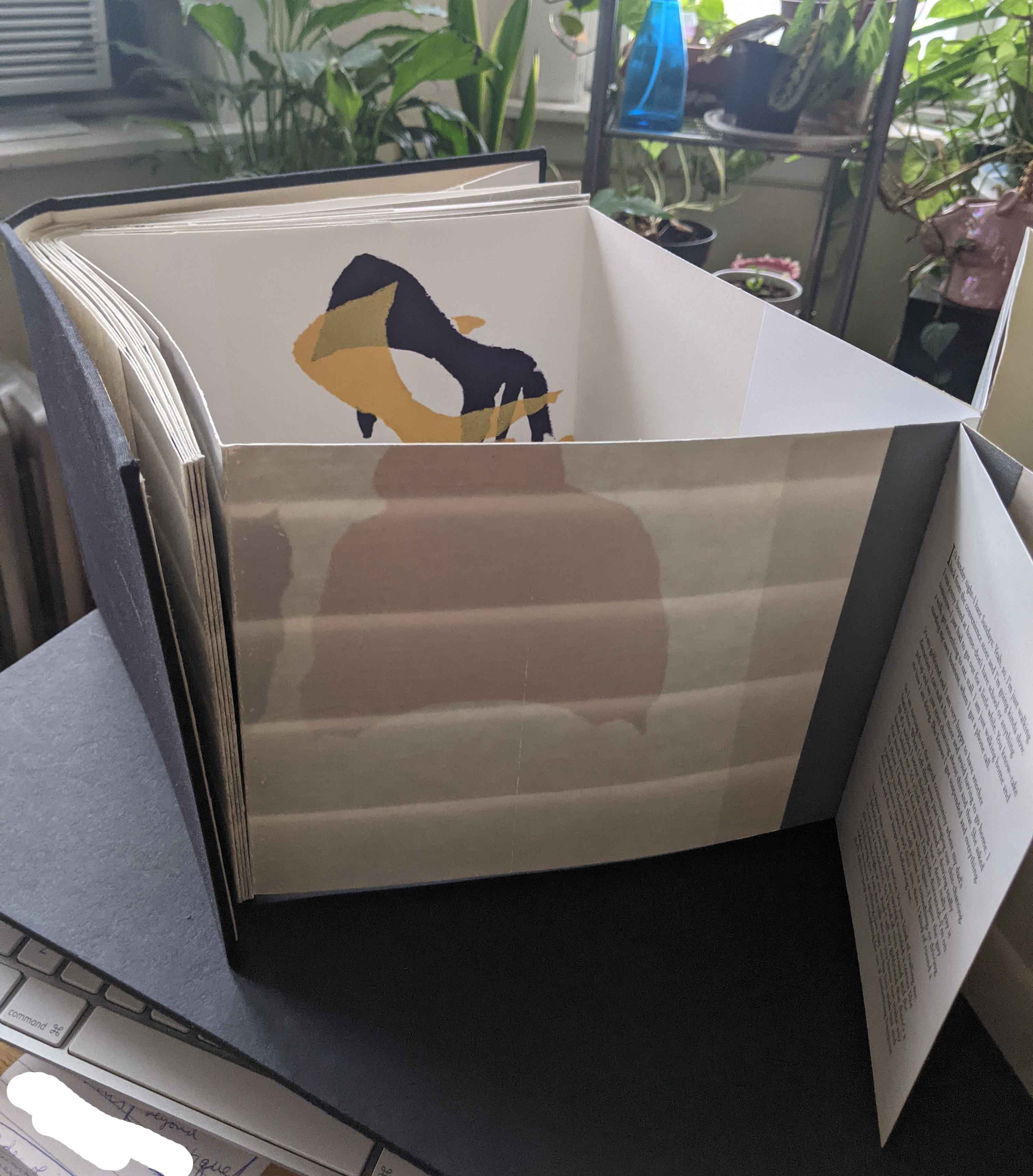
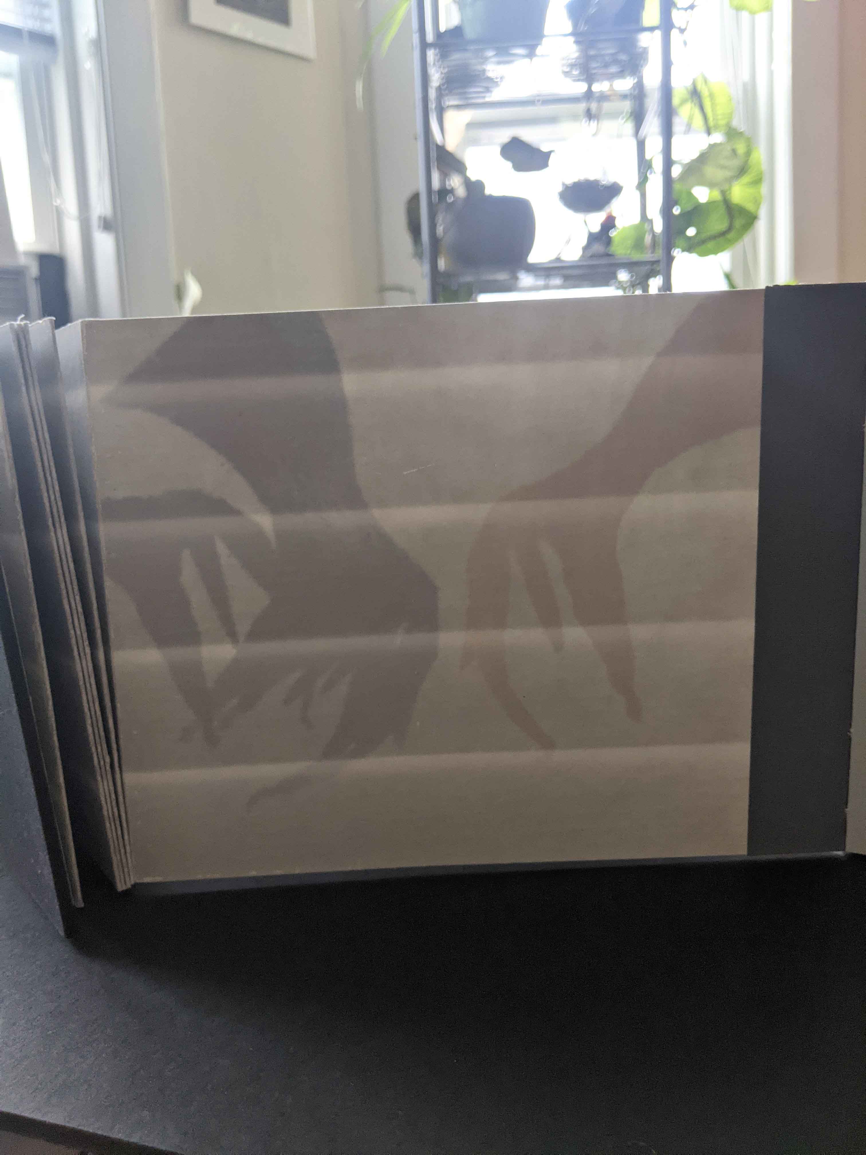
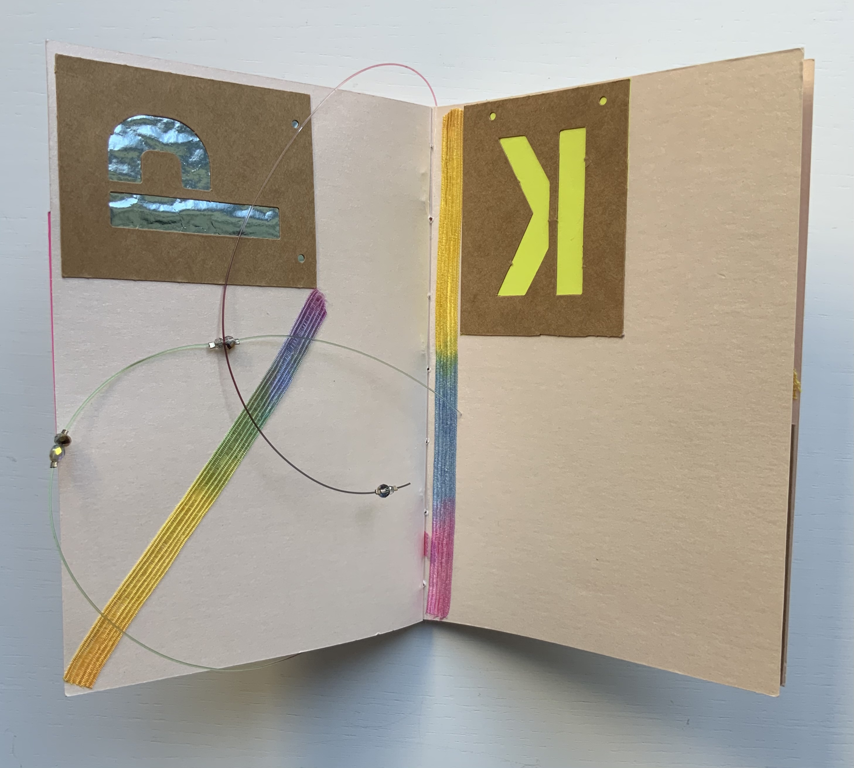
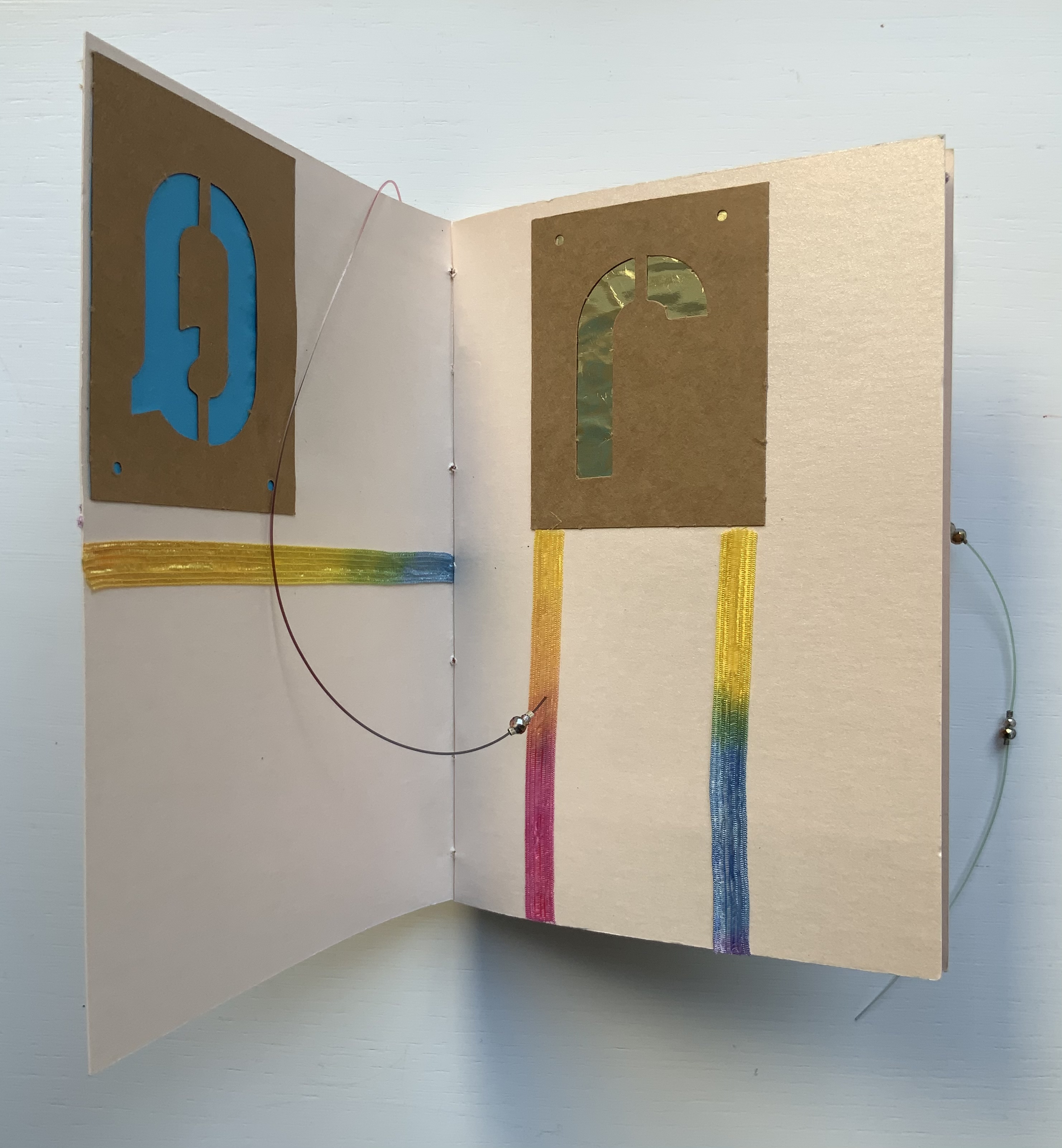
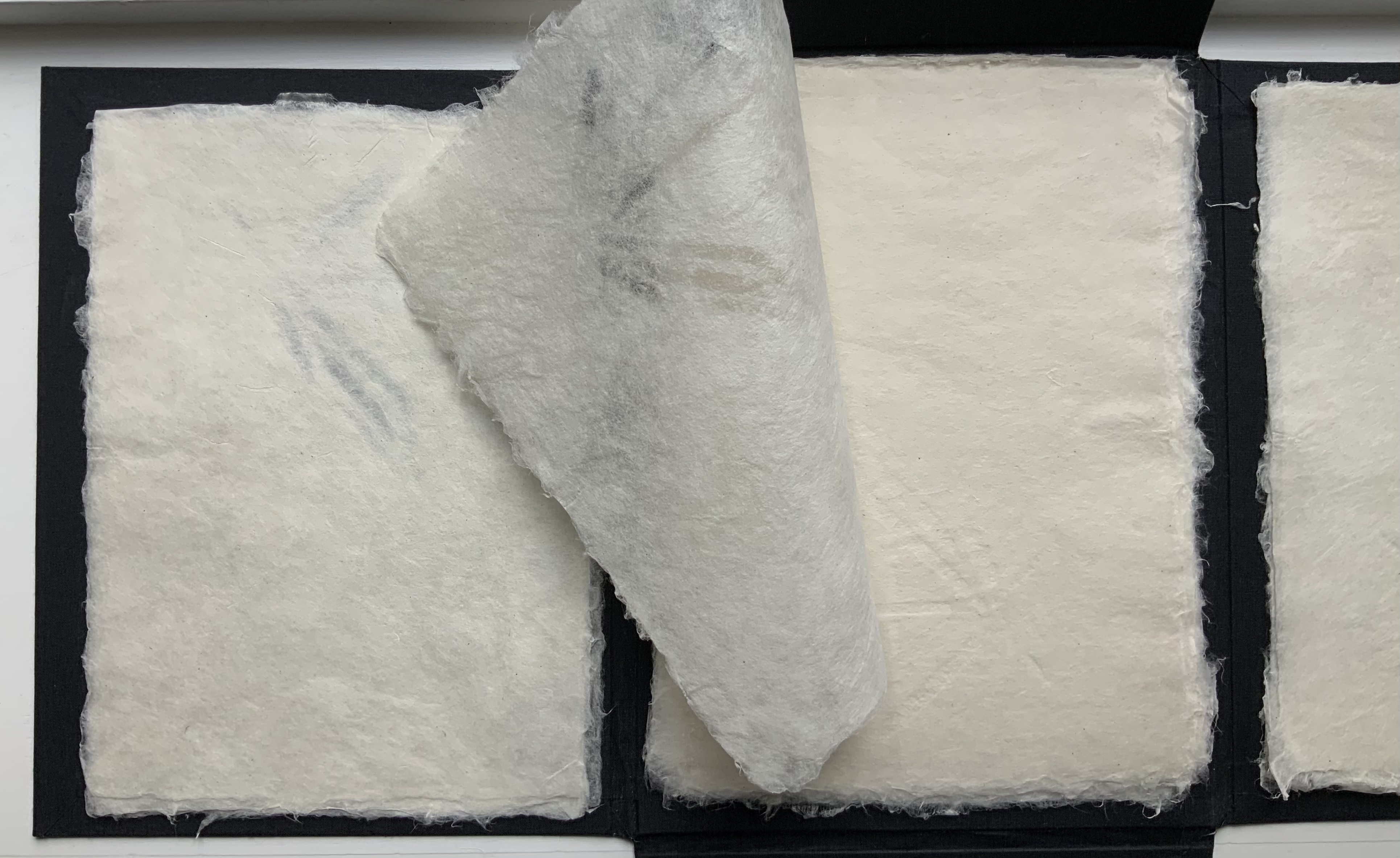
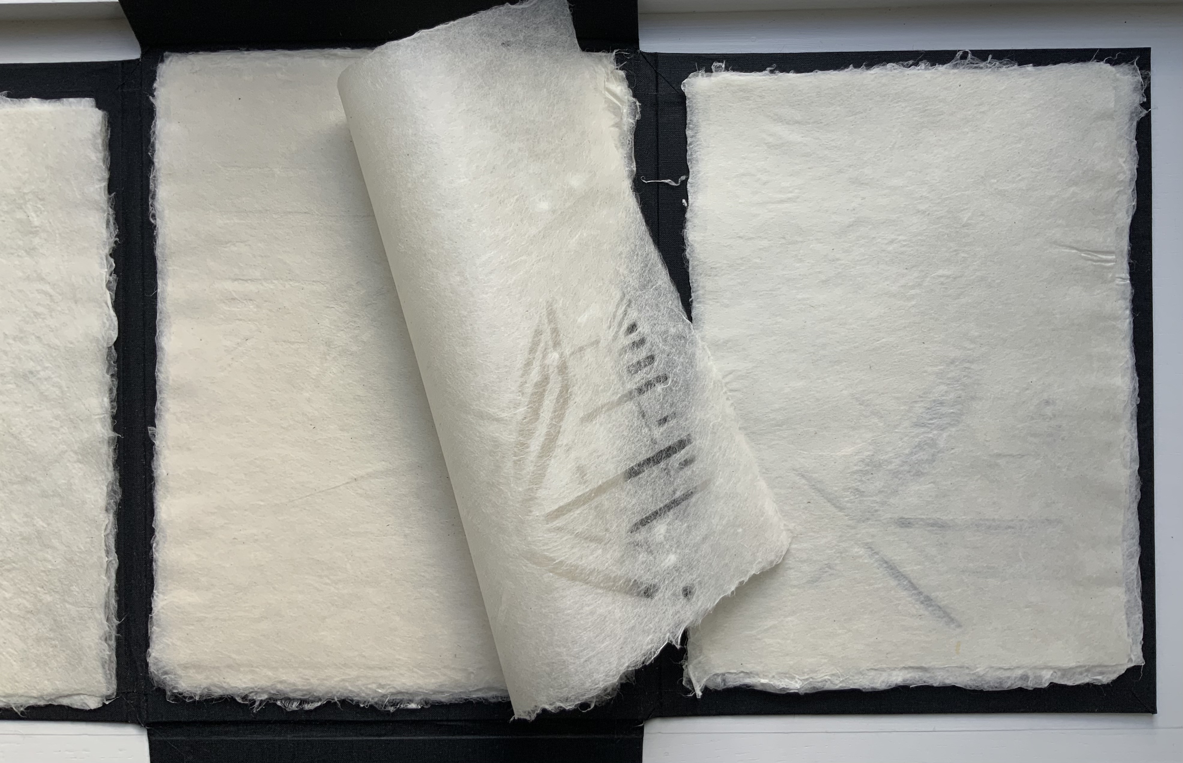
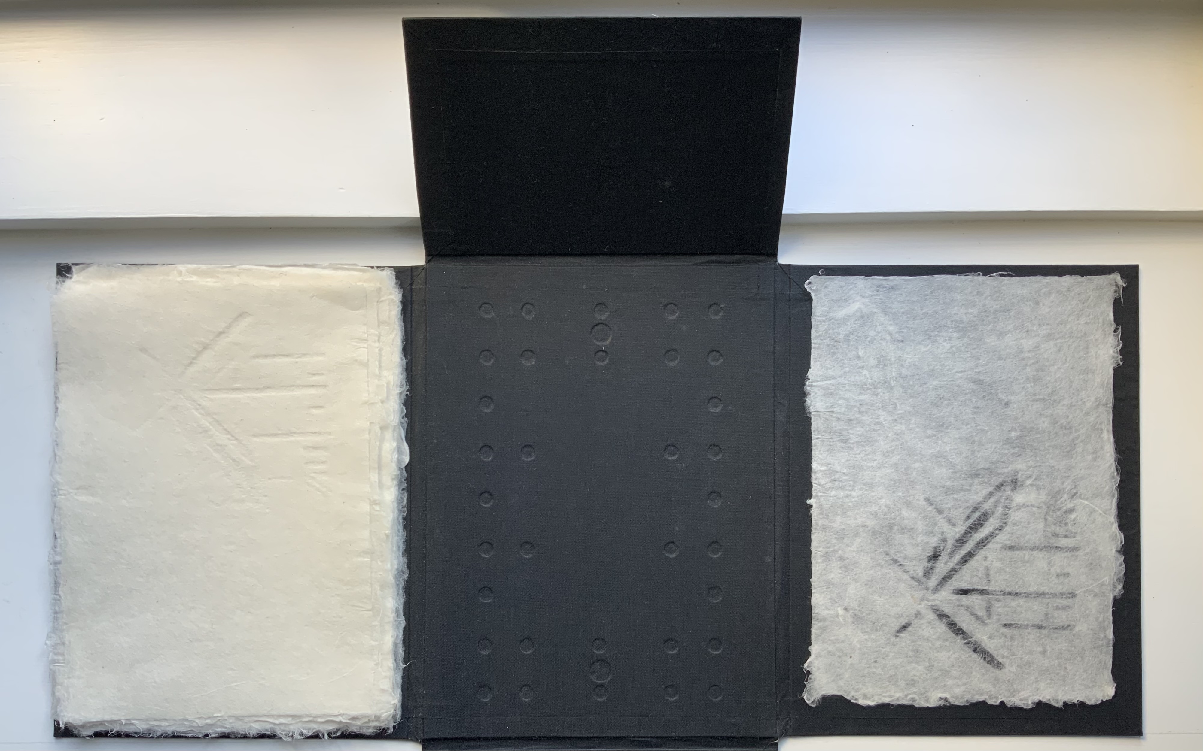
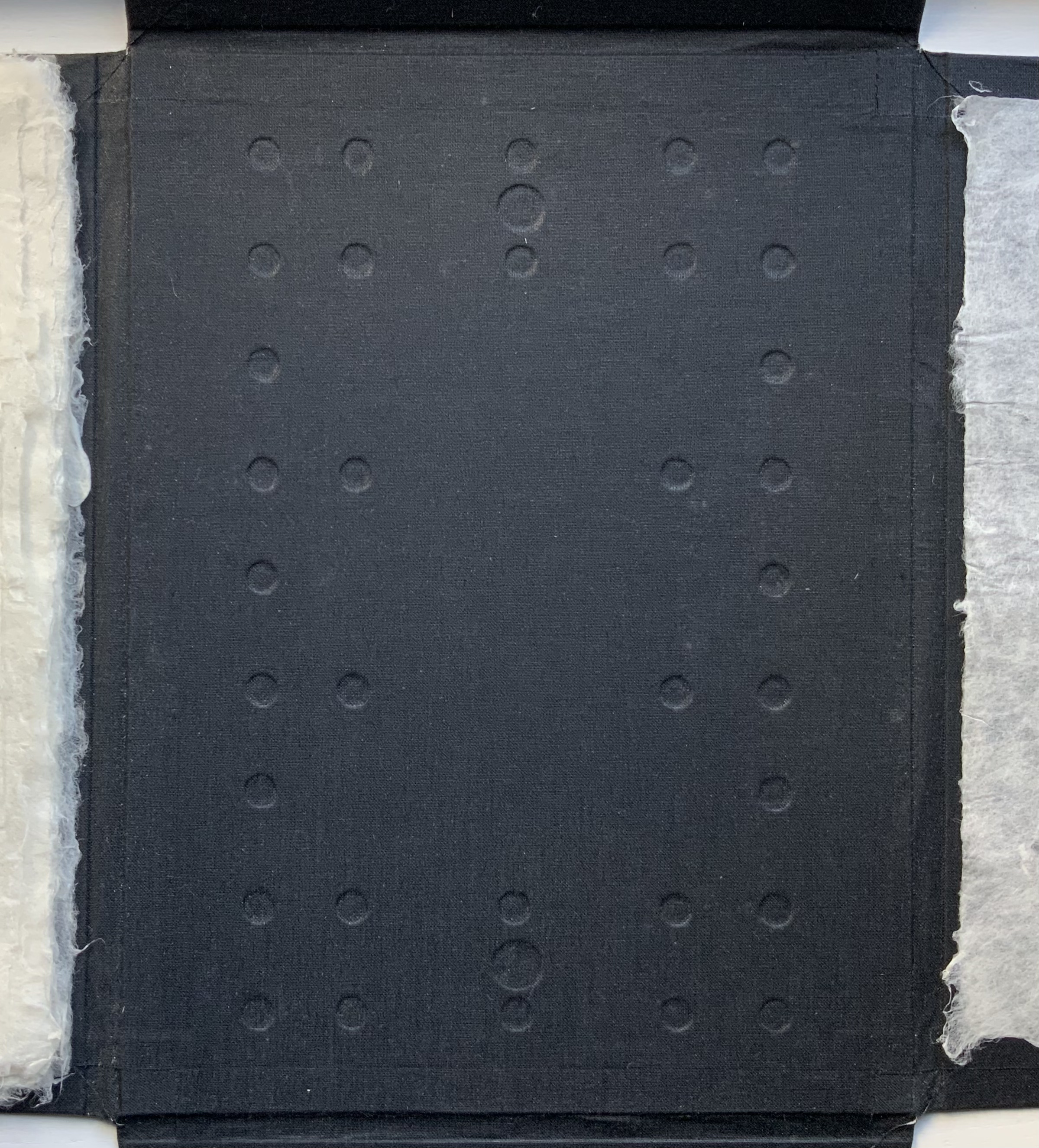
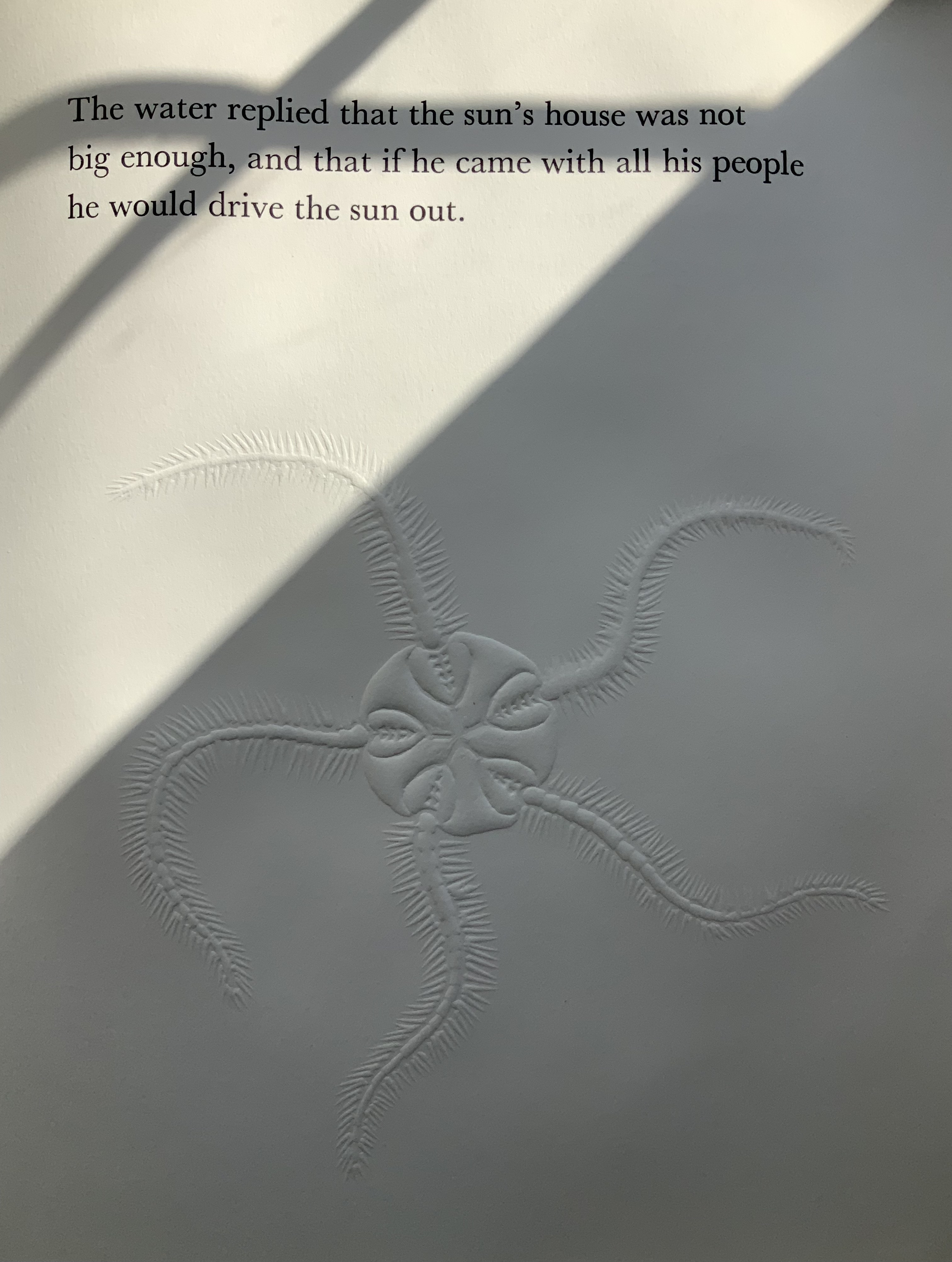
Two double-sided bamboo-paper accordions are joined together, a structure influenced by The Diary of a Sparrow by Kazuko Watanabe. On their exterior is a horizontal gray-white pattern, ink-jet printed, that seems to shift between an image of house siding panels and that of backlit drawn venetian blinds. In the exterior valley folds of the accordions, gatherings of the twelve retellings, laserjet-printed, are sewn to book tape used to join the accordions together. With the twelve narrators, we are on the outside. For this white reader, here begins an uneasiness that will not ease.
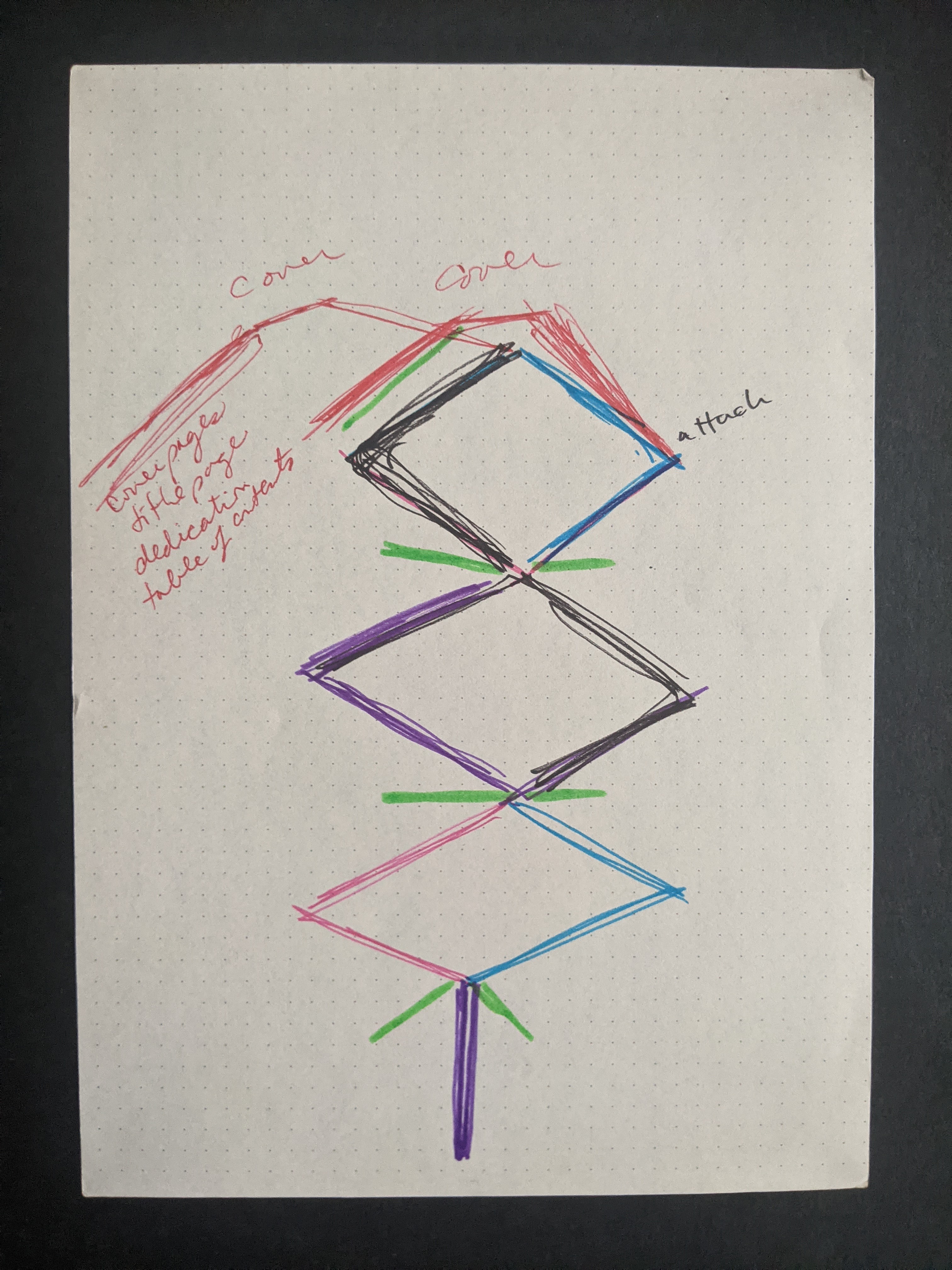
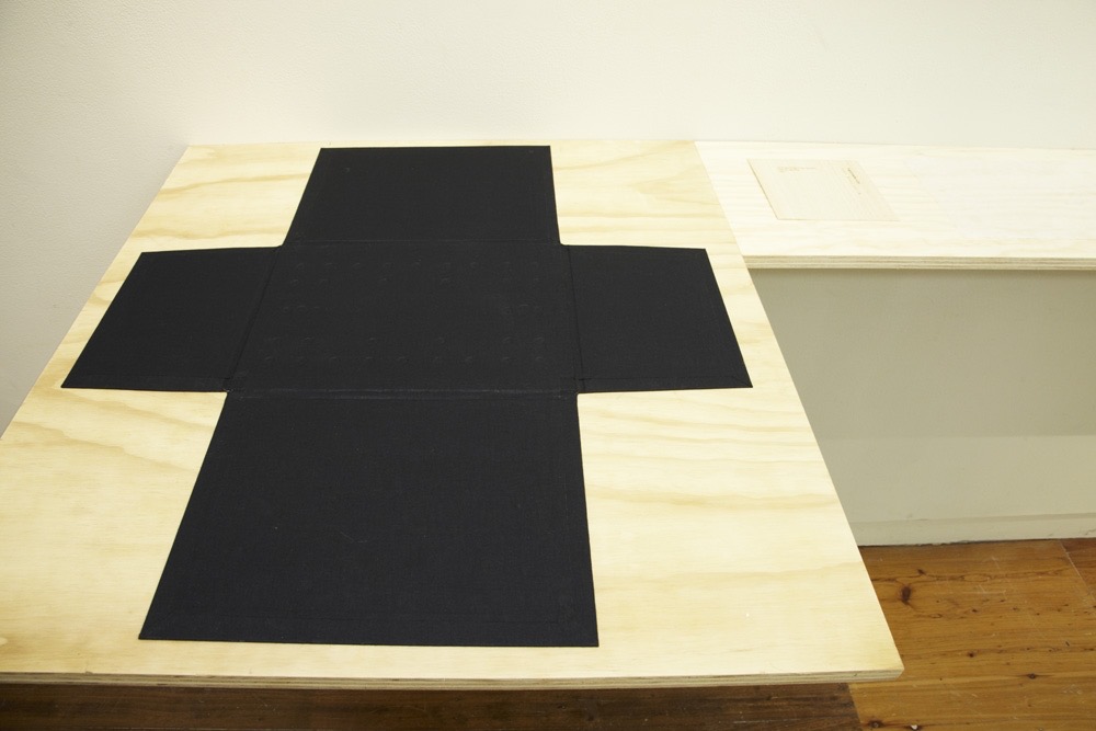
The structural plan shows how the double-sided accordions attach to the cover and, in green, where the narratives attach. Photos: Courtesy and permission of the artist.
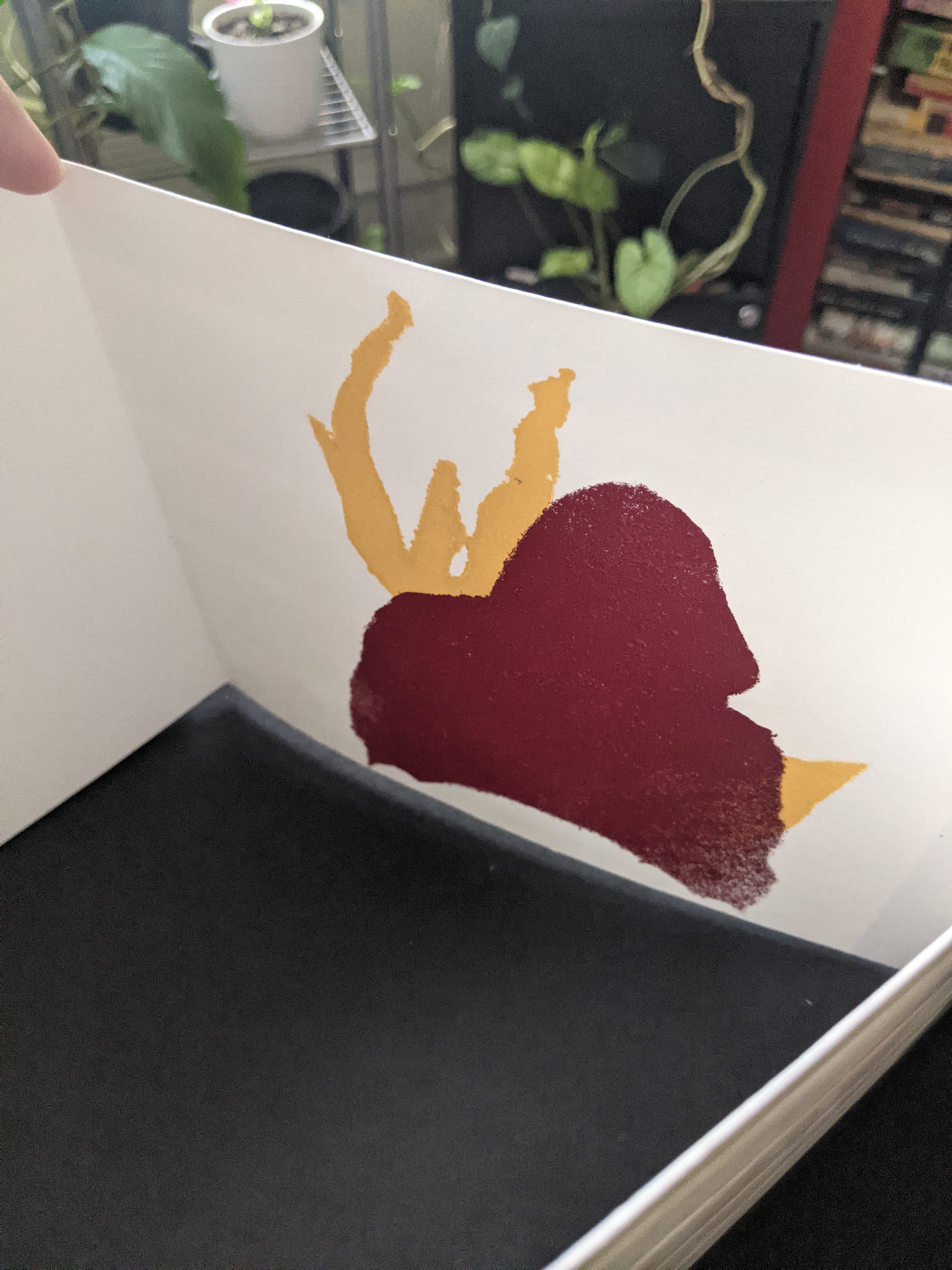
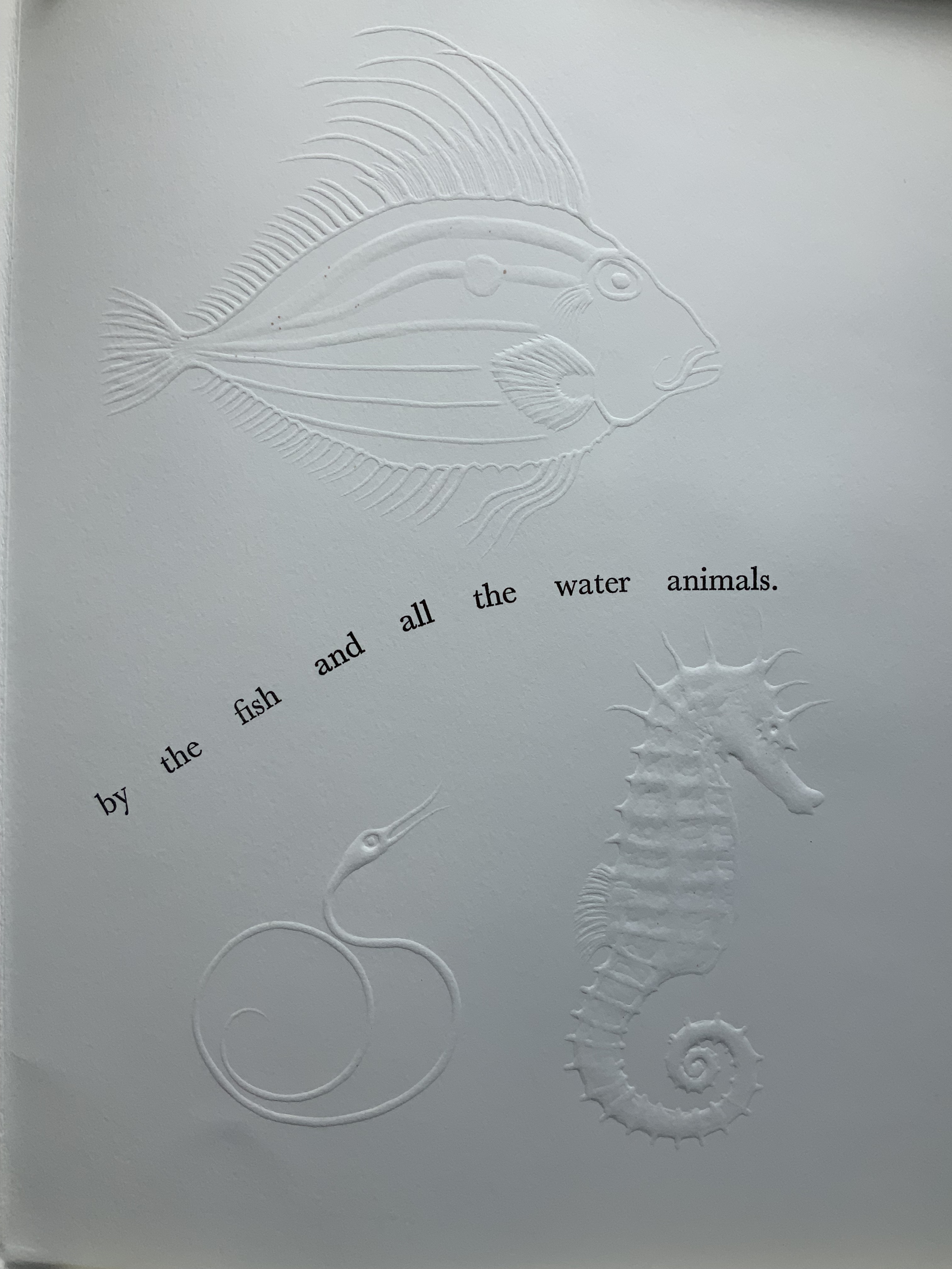
On the inner side appear stencil-printed images in naples yellow, maroon, deep blue-violet, cobalt blue, moss green, neon orange and sienna brown; however, each copy in the edition differs in colors and orientation of the images made from two stencils of hoodie-wearing figures taken from neighborhood-watch signs. More uneasiness as the images’ shifting orientation creates a threatening abstraction, a suggestion of claws. Are they clawing to get in or out? Are the hooded figures real monsters whose shadows we see cast against the venetian blinds? Are they imagined from inside the house, projected on the venetian blinds?
Views of the stencil prints. Photos: Courtesy and permission of the artist.
The modified accordion structure lets the reader move through the work codex-fashion or extend it to its 4-foot length as a sculpture to be read/viewed in the round. When read the former way, the hooded images peek out from the edges of the interior; when viewed the latter way, the work takes on a sort of mise-en-scène of the event — or of Easley’s twelve gathered around a jurors’ table even though they are each taking on the role of the deceased Martin as witness to his own death.
Just as each copy of the edition differs in its colors and orientation of images, each of the twelve retellings differs. In selecting the twelve from her circle of acquaintances, Easley aimed for a representative diversity of members. Only at the end and then only their first names — Allison, Damien, Deandre, Derek, Doc, Jae, Molly#1, Molly#2, Natasha, Ronnie, Tanuja and Werner –are given and not in the order in which their retellings appear. As each of the twelve takes over Martin’s voice, we cannot tell whether it is actor, actress, young or old, or what race. The ground of identity and perspective under the reader/viewer’s feet keeps shifting.
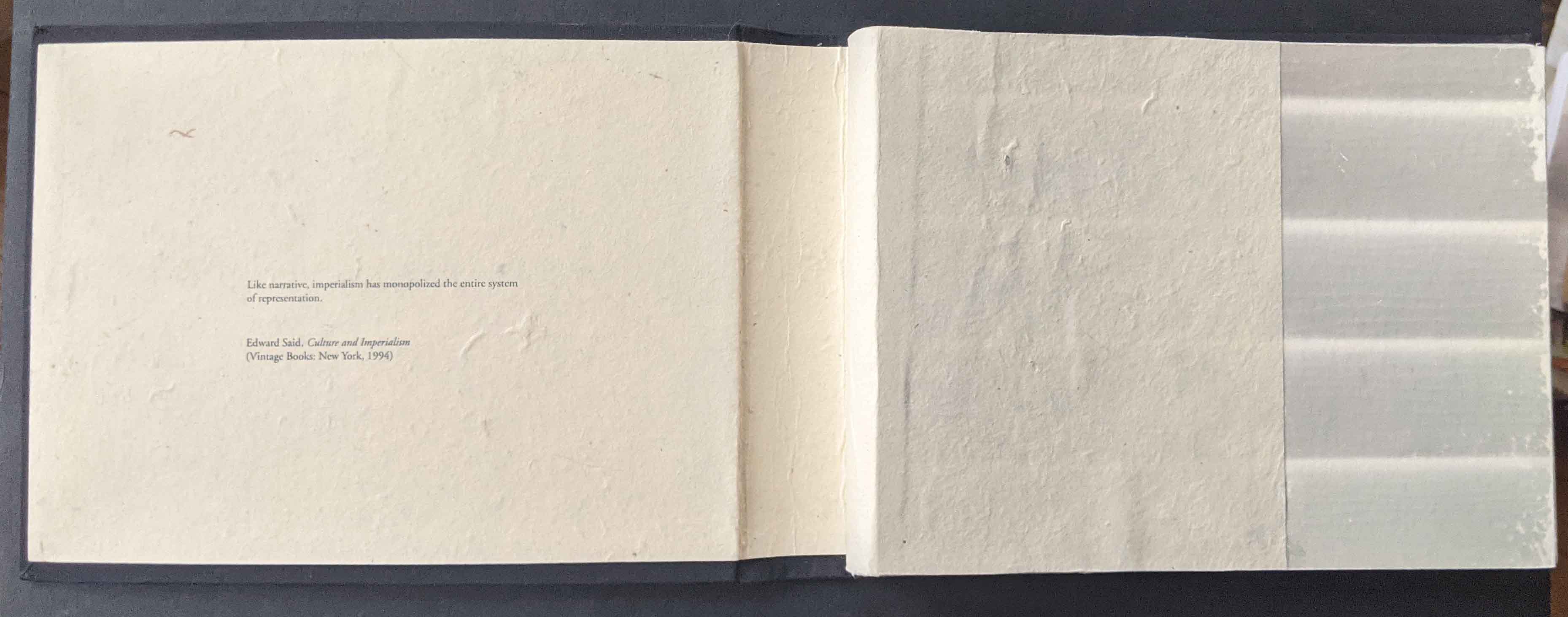
Easley suggests, “the narratives are a meditation of sorts, into the kind of people we are together and how we see others.” The artwork’s epigraph — “Like narrative, imperialism has monopolized the entire system of representation” (Edward Said,Culture and Imperialism, 1993) — frames that meditation. By “destabilizing” narrative and perspective, a dozen deaths makes us uneasy. In that uneasy meditation, we may indeed recognize the kind of people we are together, how we see each other, and find a way to change the narrative.
Four copies of the work reside at Depaul University Library, Northwestern University, University of Iowa Libraries and the Joan Flasch Artists’ Books Collection, Art Institute of Chicago.
Easley’s other work includes For Safety’s Sake (2015),It’s Just OK (2019), And you hold power(2020-21) and Annotated Graphic Design Timeline, an ongoing Instagram project addressed to the book Graphic Design Timeline (2000) by Steve Heller and Elinor Pettit. At the School of the Art Institute of Chicago, where she works as an Administrative Coordinator, she also teaches the graduate seminar “History as Material” and the course “Drawn to Print”.
Further Reading
“Tia Blassingame“, Books On Books Collection. 17 August 2020.
“Clarissa Sligh“, Books On Books Collection. 2 September 2020.
Gleek, Charlie. “Centuries of Black Artists’ Books“, presented at “Black Bibliographia: Print/Culture/Art” conference at the Center for Material Culture Studies, University of Delaware, 27 April 2019, pp. 7-8. Accessed 20 July 2020.
I tried to “define the book” when I designed (one of my books) Cover to Cover hoping that the “reader” would have a multi-sensory experience of the nature of what she/he held in her/his hands. (from The Book: 101 Definitions)
Cover to Cover (1975)
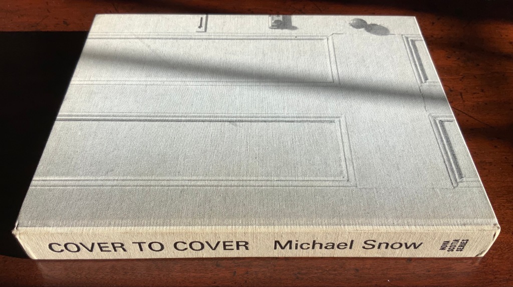
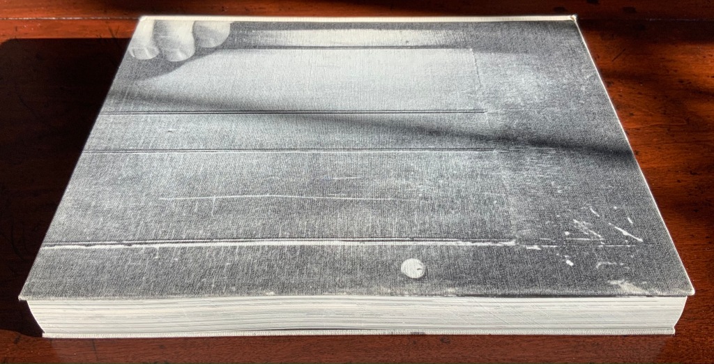
Cover to Cover (1975) Michael Snow Cloth on board, sewn and casebound. H230 x W180 mm. 310 unnumbered pages. Published by Nova Scotia College of Art and Design. Unnumbered edition of 300. Acquired from Mast Books, 10 December 2020. Photos of the work: Books On Books Collection.
After a long search since first sight of it in 2016 at Washington, D.C.’s now defunct Corcoran Gallery library, the original hardback edition of Michael Snow’s Cover to Cover (1975) finally joins the Books On Books Collection. Thanks to Philip Zimmermann, more readers/viewers have the chance to experience Cover to Cover — if only through the screen — than the original’s 300 copies and Primary Information’s 1000 facsimile paperback copies will allow.
Amaranth Borsuk describes the work and experience of it in The Book(2018), as do Martha Langford in Michael Snow (2014), Marian Macken in Binding Spaces (2017) and Zimmermann in his comments for the exhibition “Book Show: Fifty Years of Photographic Books, 1968–2018” (for all, see links below). Like Chinese Whispers by Telfer Stokes and Helen Douglas and Theme and Permutation by Marlene MacCallum, Michael Snow’s Cover to Cover evokes an urge to articulate what is going, how the bookwork is re-imagining visual narrative, how it is making us look, and how it makes us think about our interaction with our environs and the structure of the book.
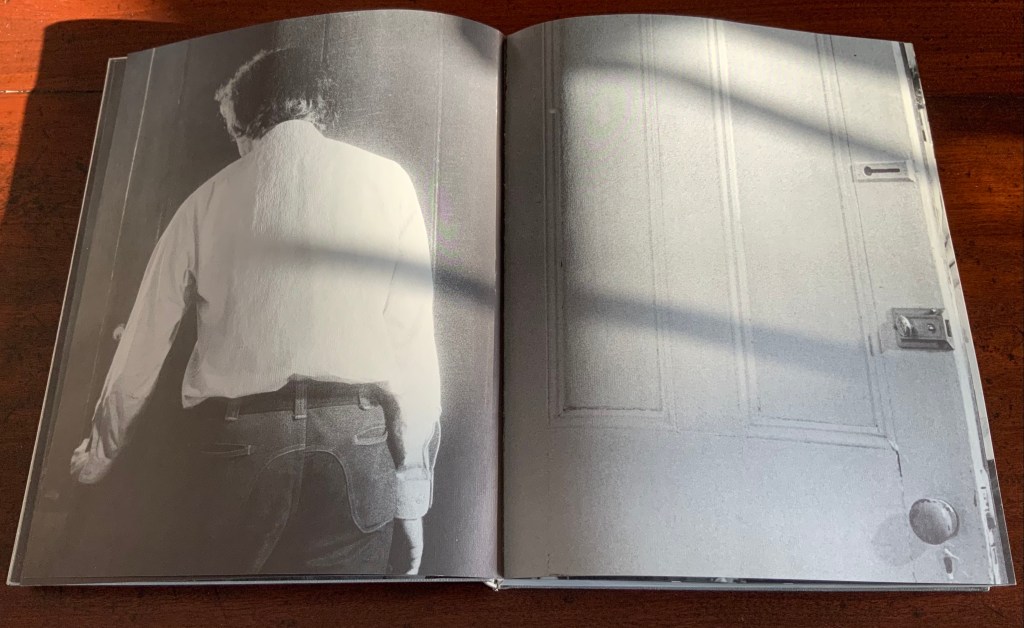
The already existing commentary about Cover to Cover sets a high hurdle for worthwhile additional words. One thing going on in the book, though, seems to have gone unremarked. Some critics have asserted that, other than its title on the spine, the book has no text. There is text, however. It occurs within what I would call the preliminaries, and they show us how to read the book.
On the front cover, we see a door from the inside. Then, on its pastedown endpaper, the author outside the door with his back to us.
Front cover; pastedown end paper and page “1”.
On turning the “inside door” (page “1” of the preliminaries), we see in small type a copyright assertion and the Library of Congress catalogue number appearing vertically along the gutter of pages “2-3” (a tiny clue as to what is going on).
Pages “2-3”
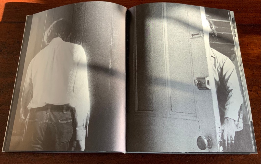
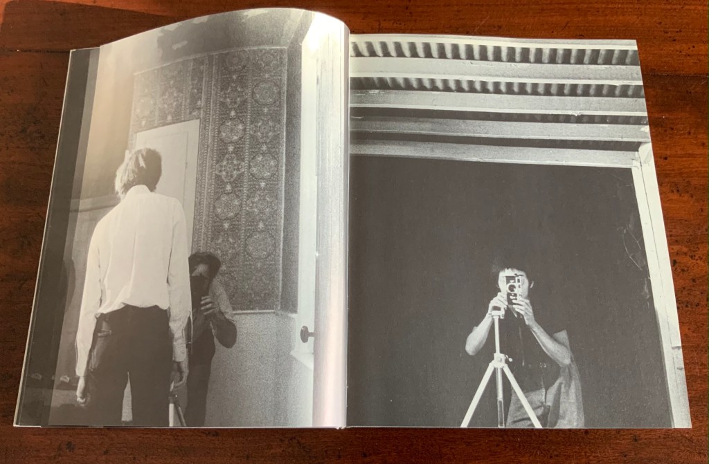
Over pages “4” through “14” from the same alternating viewpoints, the author reaches for the door handle, the door is seen opening from the inside, and the artist is seen walking through the door (from the outside) and into the room (from the inside). But who is recording these views?
Pages “10-11”, “12-13”, “14-15”
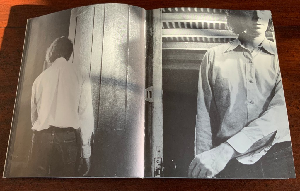
Over pages “16” through “24”, two photographers appear. Facing us, they are bent over their cameras — the one outside, clean shaven and wearing a short-sleeved shirt, is behind the author, and the one inside, bearded and wearing shorts, is in front of the author. As the author moves out of the frame, we see that the photographer inside is holding a piece of paper in his right hand. All of this occurs through the same alternating viewpoints. At page “21”, the corner of that paper descends into the frame of the inside photographer’s view of the outside photographer, and after the next switch in viewpoint that confirms what the inside photographer is doing, we see a completely white page “23”, presumably the blank sheet that is blocking the inside photographer’s camera aperture. Page “24” is the outside photographer’s view of the inside photographer whose face and camera are blocked by the piece of paper.
Pages “16-17”, pages “20-21” and pages “24-25”
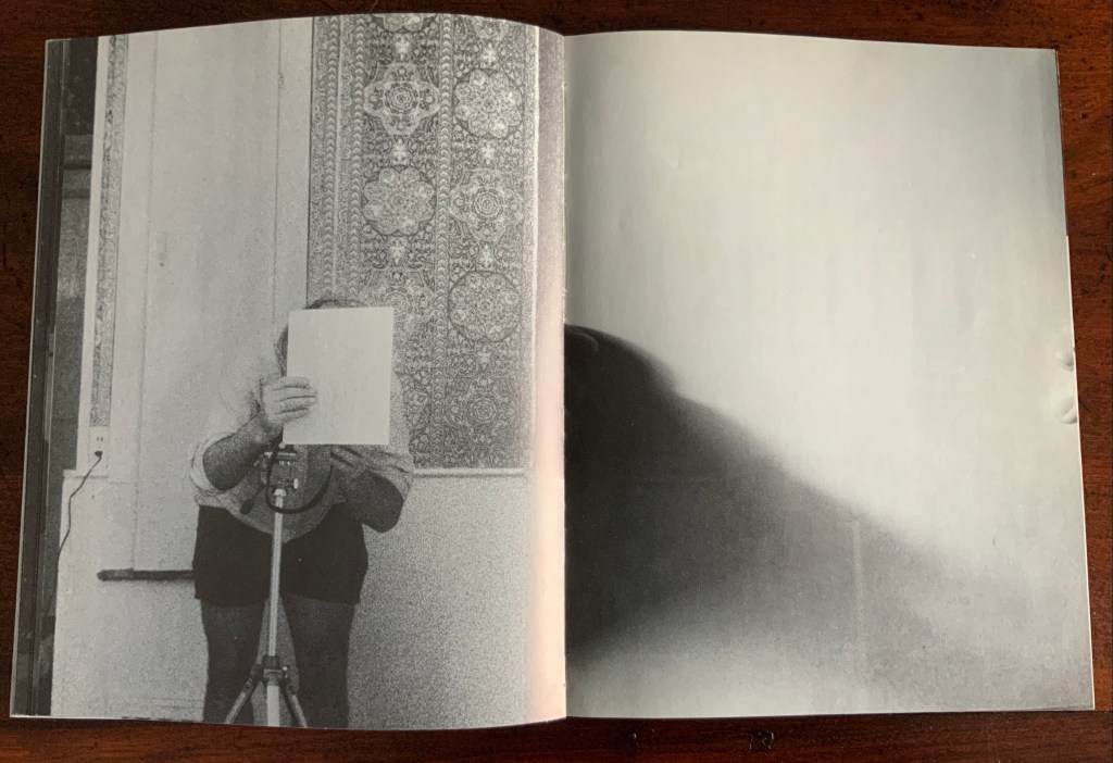
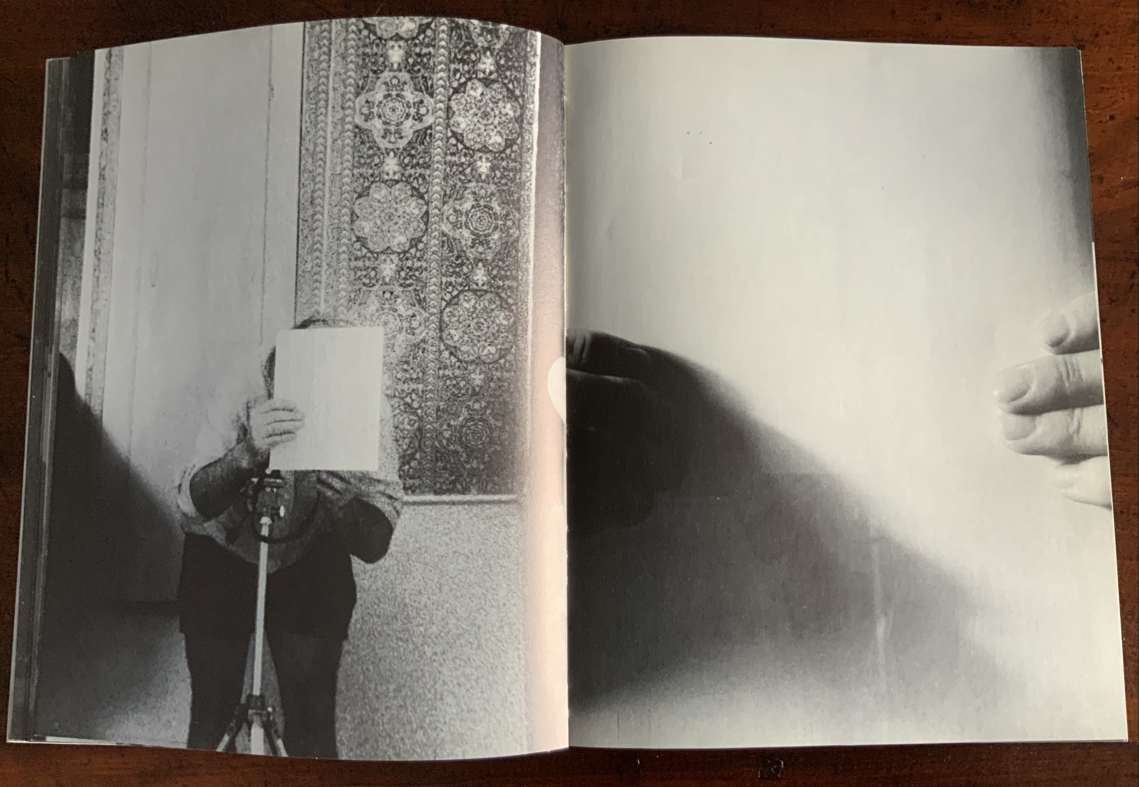
After the sequence above, something stranger still happens: on the left, a photo of the inside photographer holding the blank paper in front of his face appears. We can tell it is a photo by the tip of the thumb holding it (look in the gutter) between pages “26 and 27”. It is the developed photo the outside photographer just took of the inside photographer with his face and camera hidden by the sheet of paper. The image on page “27” is the reverse of that photograph. We can tell by the fingers on the right holding it.
Pages “26-27”
We are looking at images of images. But on pages “30-31”, whose fingers are holding the image of images?
Pages “30-31”
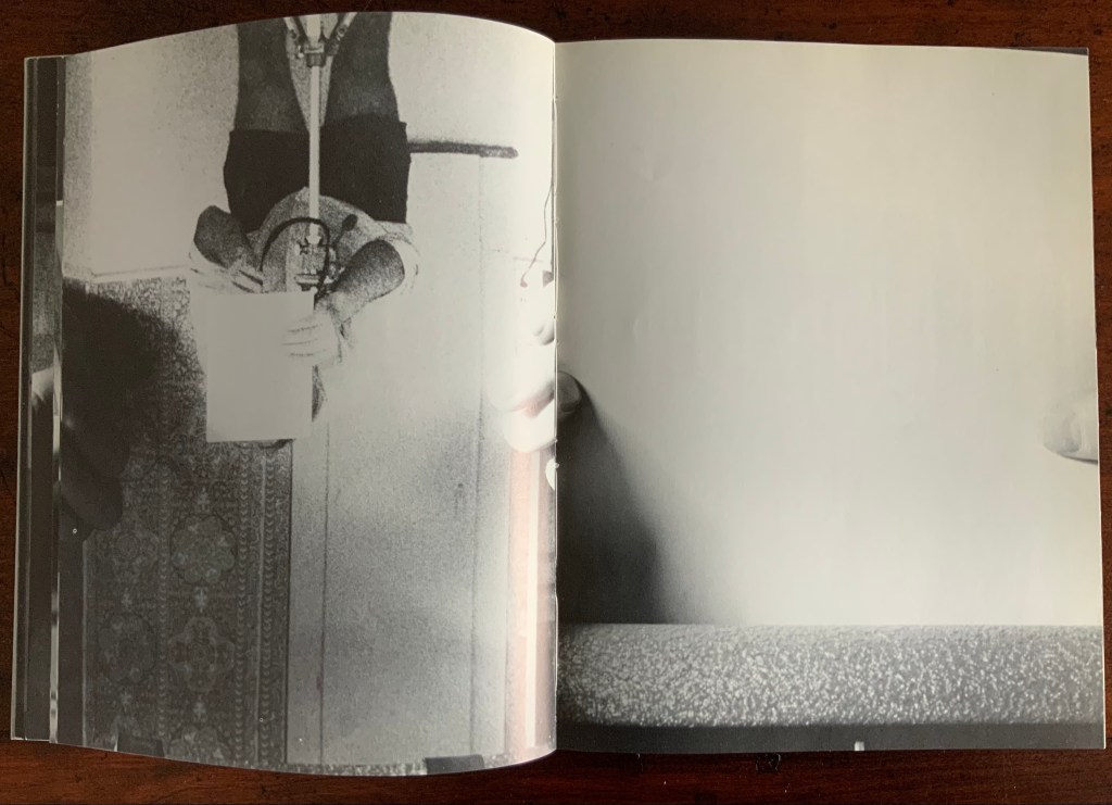
From there on, we see images of this piece of paper being manipulated by one pair of hands. The thumbs appear on the verso (the view from the outside photographer’s perspective), the fingers on the recto (the view seen by the inside photographer). By page “34”, it has been flipped upside down (the inside photographer is standing on his head), and on page “35”, we see a close up of the blank reverse side of the paper being held between the two photographers. By page “37”, we can see the blank side of the photo paper being fed into a manual typewriter. The pair of hands feeding the paper into the typewriter cannot belong to one of the photographers. Who is the typist — the author?
Pages “34-35” and pages “36-37”
For both pages “42” and “43”, the perspective is that of a typist advancing the photo paper and typing the title page of the book. On both pages, we can see the ribbon holder in the same position. As it progresses, more and more of the outside photographer’s camera appears above the typed page. Page “45” presents itself as the full text of the book’s title page, curling away from the typist and revealing the inside photographer on the other side of the typewriter. Page “46” shows the upside-down view of the title page as it moves toward the inside photographer and reveals the outside photographer on the other side of the typewriter. Not only are we seeing images of images, we are witnessing the making of the book’s preliminaries.
Pages “42-43”, “44-45”, and “46-47”.
From page “48” through page “54”, the photographers alternate views of blank paper advancing through the typewriter. By pages “55” and “56”, the typewriter has moved out of the frame. Look carefully at page “56”, however, and you can see the impression of the typewriter’s rubber holders on the paper. As a book’s preliminaries come to a close, there is often a blank verso page before the start of the book. If Cover to Cover is following that tradition, page “56” is that blank page at the end of the preliminaries, and page “57”, showing a record player, is the start of the book.
Pages “56-57”.
Zimmermann notes that, at somewhere near the book’s midpoint, the images turn upside down, and that readers who then happen to “flip the book over and start paging from the back soon realize that they are looking at images of images produced by the two-sided system, and indeed the very book that they are holding in their hands”. He notes this as another mind-bender added to the puzzlement of the two-sided system with which the book begins. Yet the long set of preliminaries foretold us that the upside-downness, back-to-frontness and self-reflexivity of images of images were on their way. Without doubt, Cover to Cover is an iconic work of book art.
Further Reading
Afterimage (1970). No. 11, 1982/83. On the occasion of an exhibition of his films at Canada House in London, an entire issue on Snow’s work.
… Cover to Cover is the result of another distanced use of self in the course of art-making. Snow is subject/participant as he and his actions are observed and analyzed by two 35 mm cameras… simulataneously recording front and back, the images then placed recto-verso on the page… Snow is subject observed in the book at the same time that he is also choosing and making decisions about images. Cover to Cover in 360 pages, [sic] becomes a full circle — front door to back door or the reverse. The book is designed so that it can be read front to back and in such a way that one is forced to turn it around at its centre in order to carry on. Regina Cornwell in Snow Seen and “Posting Snow”, Luzern catalogue.
But as the scene “progresses,” an action is not completed within the spread, but loops back in the next one, so that the minimal “progress” extracted from reading left to right is systematically stalled each time a page is turned, and the verso page recapitulates the photographic event printed on the recto side from the opposite angle. This is the disorienting part: to be denied “progress” as one turns the page seems oddly like flashback, which it patently is not; it might be called “extreme simultaneity.” Two versions of the same thing (two sides of the story) are happening at the same time. Zimmerman.
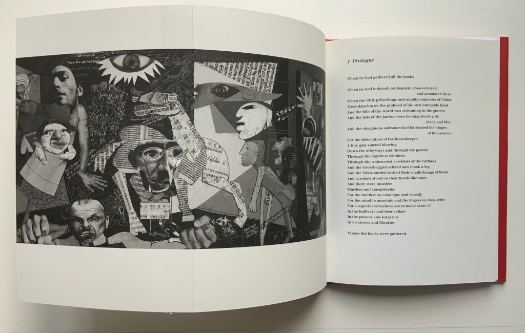
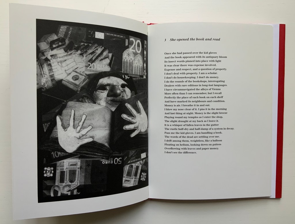
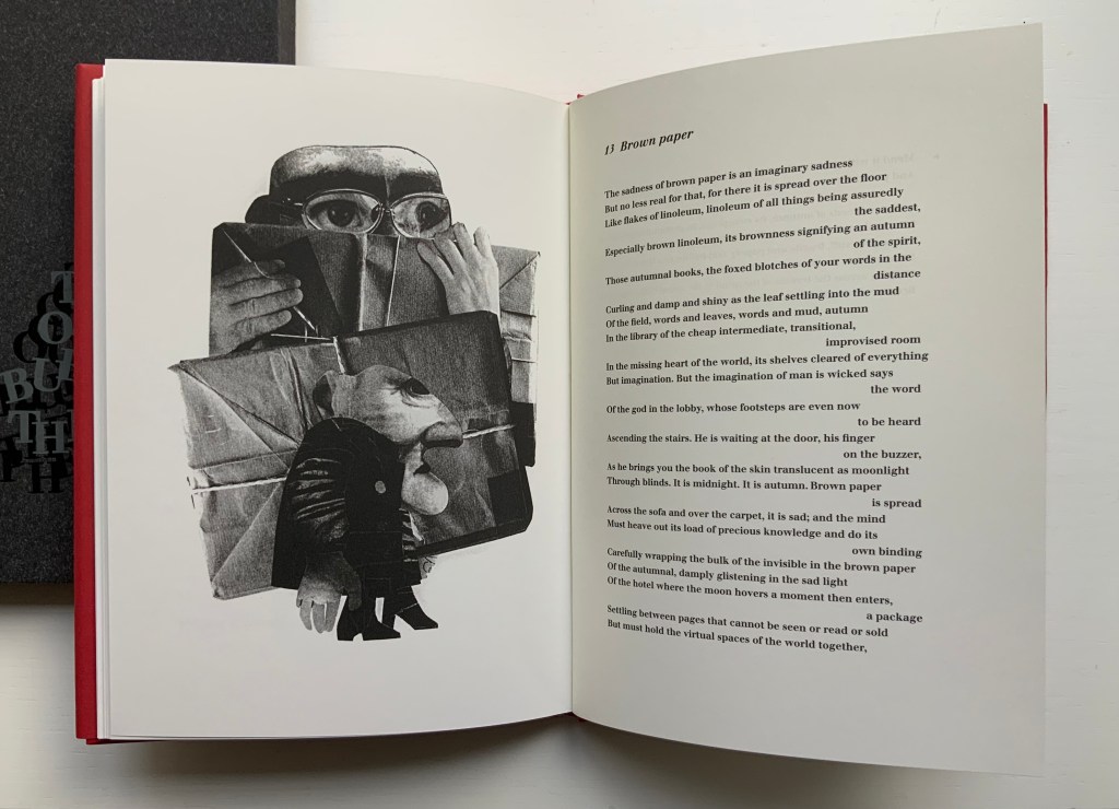
The Burning of the Books(2009) George Szirtes (poems) and Ron King (prints) Slipcase with sewn hardback, duotone letterpress reproduction of the 2008 artist book version. H220 x W160 mm, 66 unnumbered pages. Edition of 1000, the first 100 signed and numbered by the author and artist and presented in a specially designed slipcase. Acquired from the artist, 28 January 2021. Photos of the work: Books On Books Collection.
The Burning of the Books is the harshest of Ron King’s work in the Books On Books Collection. According to the artist, this work’s genesis was his long fascination with Elias Canetti’s Auto da Fe (1946). King commissioned Szirtes to respond to Canetti’s work with a text to accompany the etchings that King had been holding in abeyance. The result in 2008 was a large format artist book, of which this work is a reproduction.
With its photo-collages of a Guernica-like fold-out, newspaper clippings of shamed collaborators, fists and human limbs, The Burning of the Books delivers a visual indictment of the 20th century that creeps into the 21st century with the added images of celebrity police ID photos and Euro currency notes. Szirtes’ take on King’s take on Canetti’s take on his main character’s solipsistic slip from obsession into madness in a world of alienating -isms is the work of art with which we — sadly, more than a decade later — keep catching up.
This work’s fascination with horrors may have its roots in a childhood experience in Brazil — seeing a photograph of a bandit gang’s mass beheading — but, more often than not, King’s works emphasize a humor in blackness (as does this work in its recurrent image of Mr. Punch-like figures). Most often, though, a sheer joy of making and material prevails.
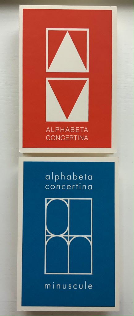
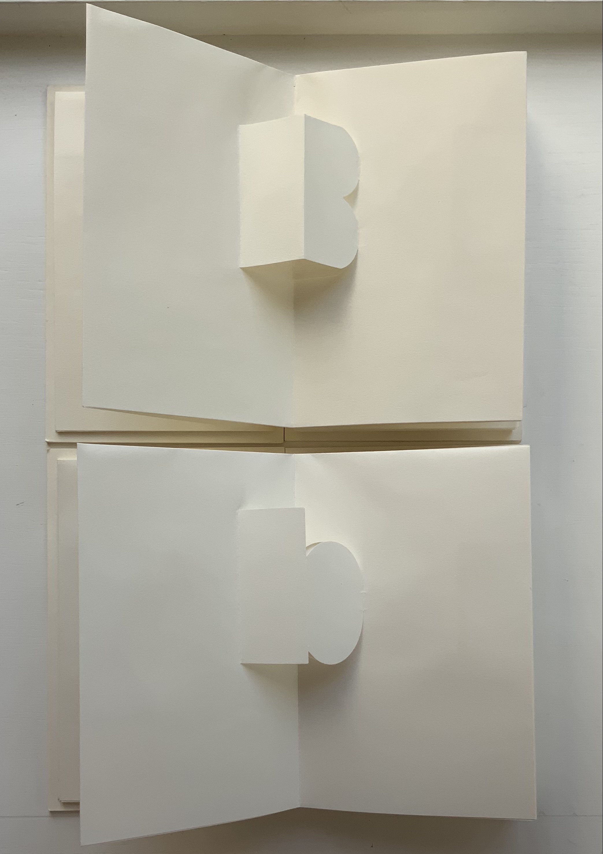
Alphabeta Concertina and alphabeta concertina (2007)
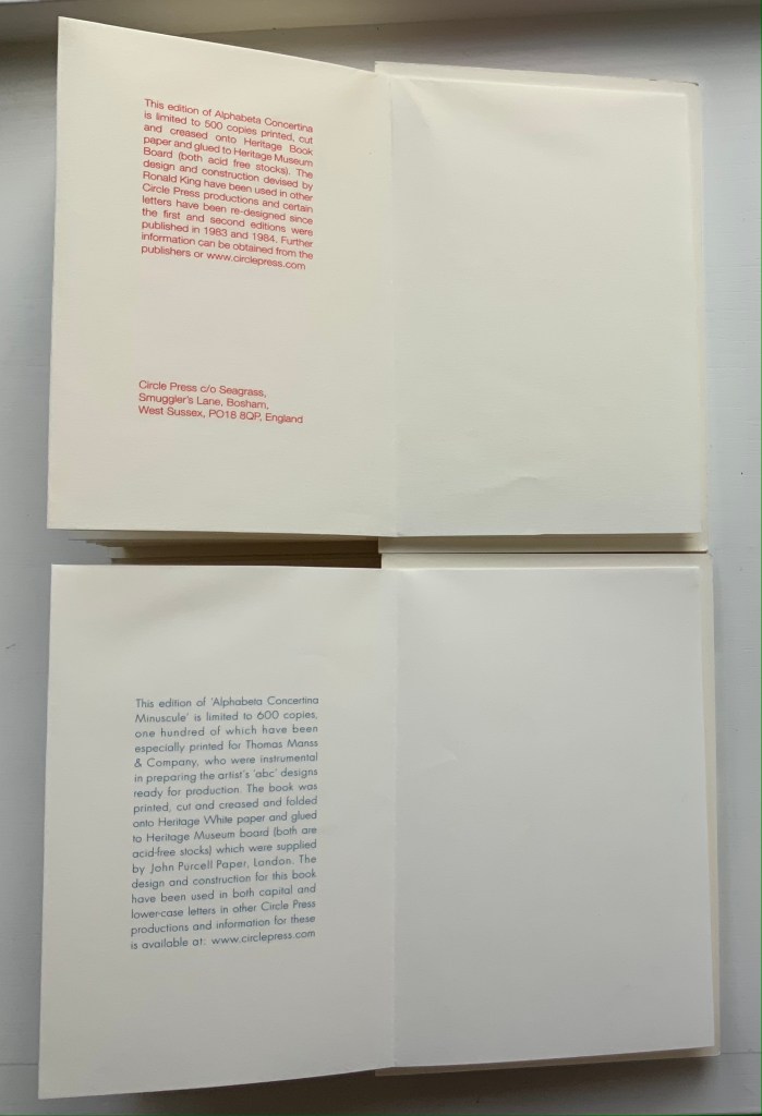
Alphabeta Concertina and alphabeta concertina miniscule (2007) Ron King Printed, cut and creased onto Heritage paper and glued to Heritage Museum board. H170 x W110 x D30 mm,stretching to 3 meters. Edition of 600. Majuscule acquired from the artist, 24 July 2021; miniscule acquired from Sophie Schneideman Rare Books and Prints, 27 November 2020. Photos: Books On Books Collection.
The “abc” series displays the restrained, minimalist side of King’s inventiveness. With more than one of these works to hand, his enjoyment and humor come through — especially in the subtle and not-so-subtle variations. Take alphabeta concertina miniscule as an example. It arrived like a long awaited chuckle after the majuscule version — Alphabeta Concertina (1983) — which had been expanded into the poster versions Alphabet I and Alphabet II (below). Size and surprise seem to matter in King’s sense of humor. For size, see the large-scale steel version of the alphabet in 2016. For surprise, consider his catalogue raisonné Cooking the Books or this set of paperweights.
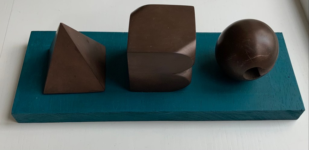
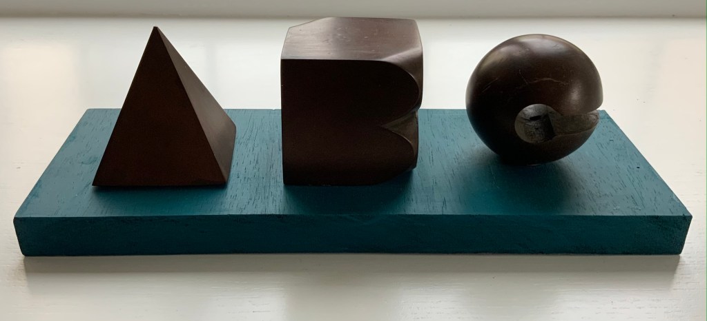
ABC[nd] Ron King Resin sculptures on painted wooden board Acquired from the artist, 24 July 2021. Photos: Books On Books Collection.
Further down are Alphabet II (1999) and The White Alphabet (1984). Compare their uppercase letter C with that above to see how King developed his sculpting over time.
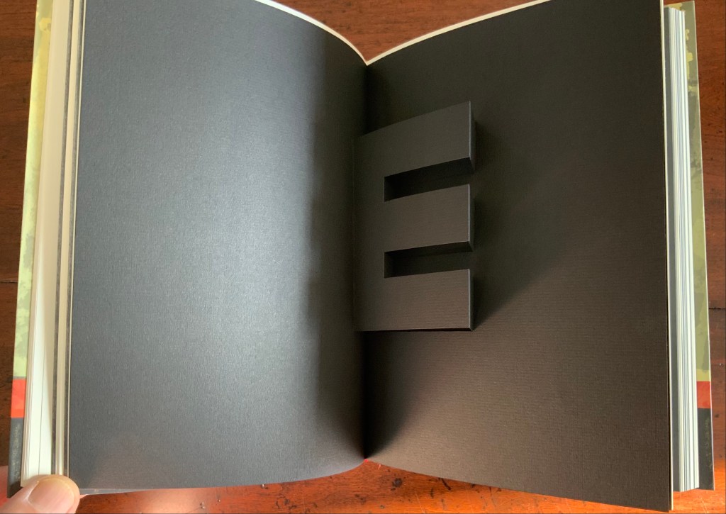
Cooking the Books (2002)
Cooking the Books: Ron King and the Circle Press (2002) Ron King, Andrew Lambirth Paperback with end flaps, sewn with headbands. Pop-up and metallic paper inserts. H225 x W165 x D20 mm, 180 pages. Acquired from the artist, 24 December 2020. Photo: Books On Books Collection.
King’s catalogue raisonné does not merely illustrate his work, it illustrates it. Inserts of mirror paper, wax paper and a pop-up letter E transform what appears to be a simple codex into a treasure chest.
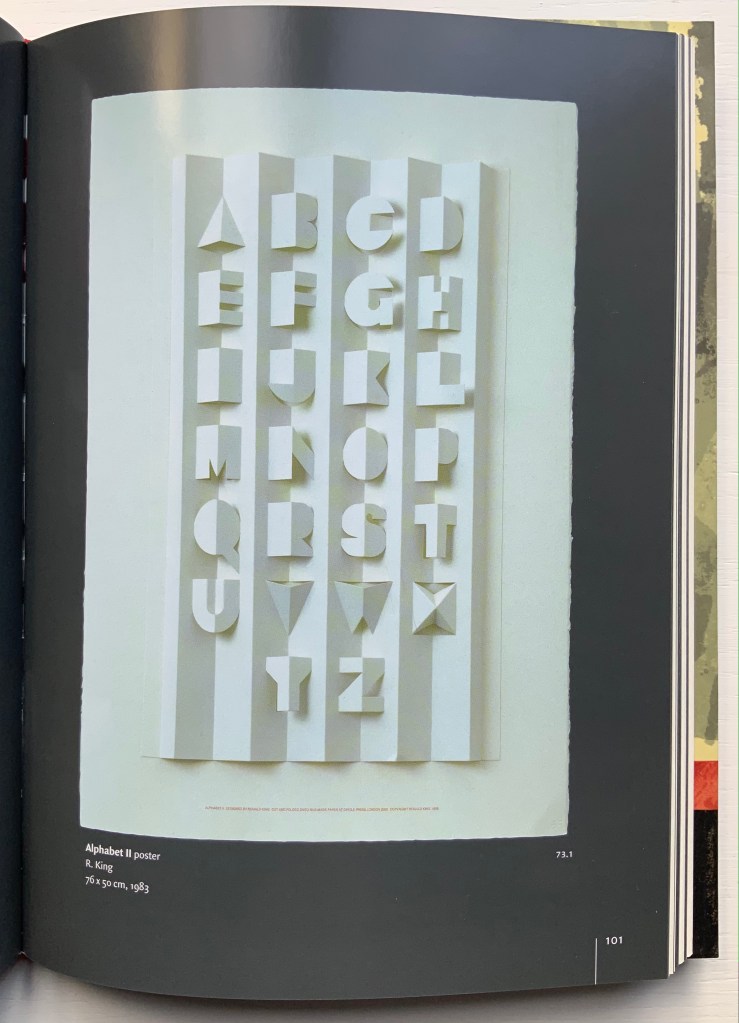
Alphabet II (1999)
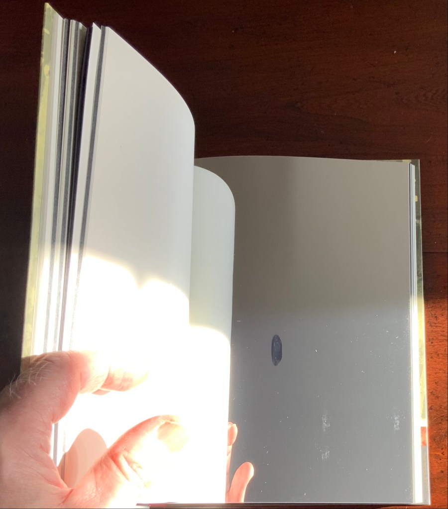
Alphabet II (1999) Ron King Pop-up poster. H760 x W500 mm. The letters have been cut onto a 190lb Waterford paper and mounted onto a heavier version of the same stock. Edition of 200 signed. Acquired from Circle Press, 26 June 2015. Photo of Cooking the Books, p. 101: Books On Books Collection.
The collection’s framed poster interferes with photography, but Cooking the Books provides the alternative.
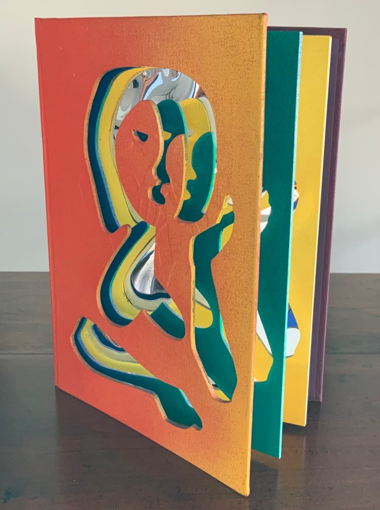
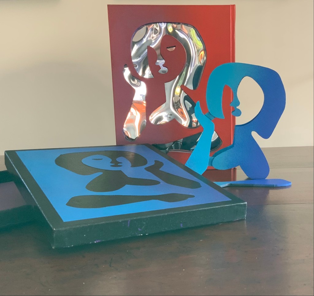
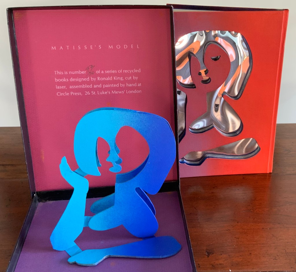
Matisse’s Model (1996)
Matisse’s Model (1996) Ron King An edition of 50 signed book-works made by the same process as Acrobats. 23 x 17 cm with mirror-foil, sprayed pages, and a removable freestanding figure in collaged cardboard box. Photos: Books On Books Collection.
The sculptural element toward which King’s work has always turned is on display in the title and forms of Matisse’s Model. The mirror paper appears as it must for any attractive model.
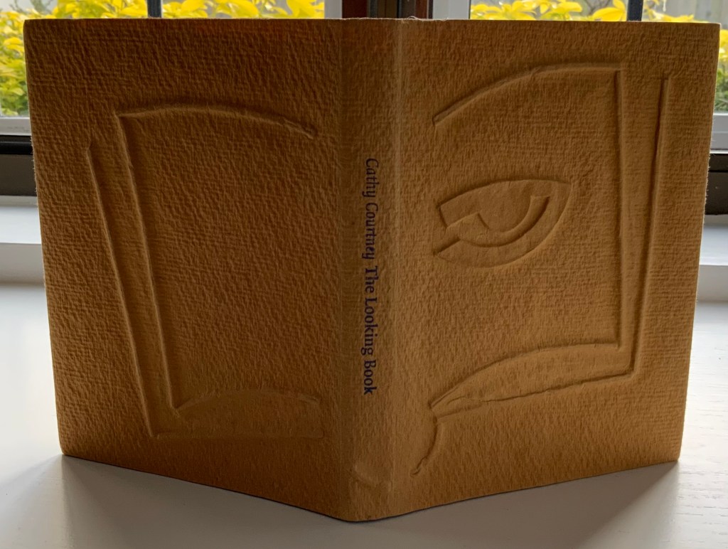
The Looking Book (1996)
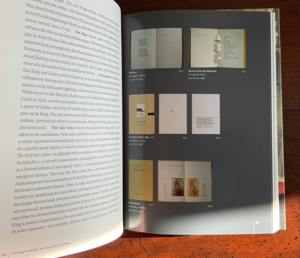
The Looking Book: A Pocket History of Circle Press, 1967-96 (1996) Cathy Courtney Casebound in wire print paper. H160 x W120 xD20 mm Edition of 1000, of which this #67 and initialled by Ron King. Acquired from Peter J. Hadley Bookseller ABA ILAB, 25 June 2015. Photos: Books On Books Collection
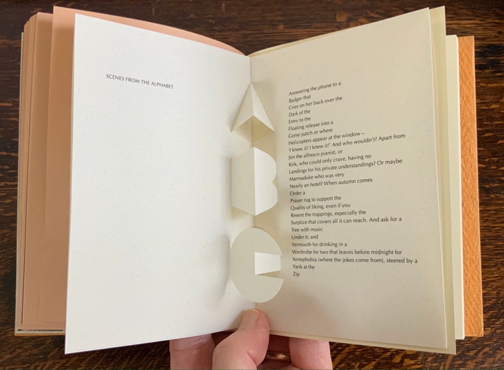
Pop-up insert of “Scenes from the Alphabet” by Roy Fisher. Photo: Books On Books Collection.
As with Cooking the Books, this catalogue raisonné, prepared by Cathy Courtney, provides samples of the artist’s work. They appear in the wire debossed cover and this centrepiece of “Scenes from the Alphabet” done with Roy Fisher, which led to a full-scale alphabet book at Fisher’s suggestion.
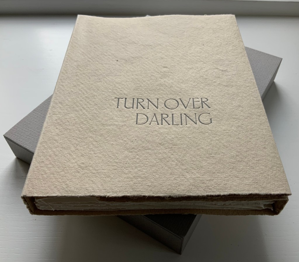
Turn Over Darling (1994)
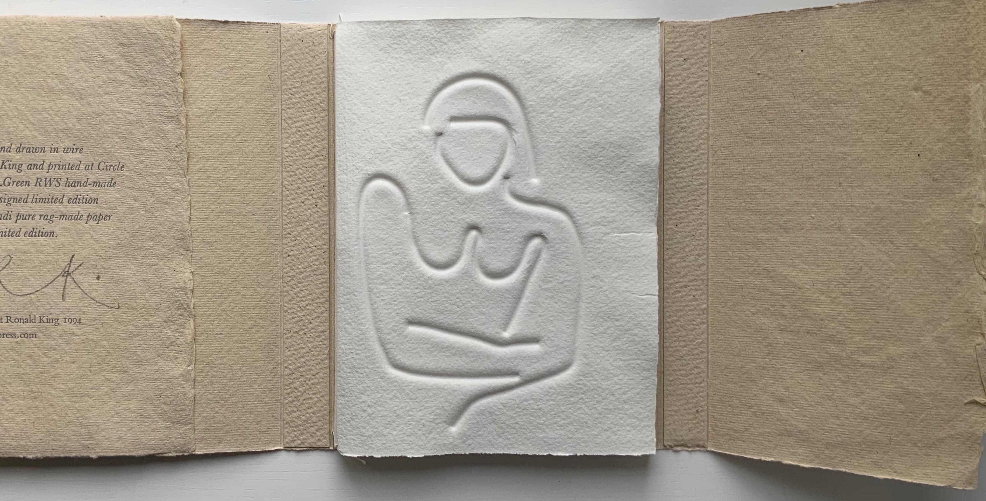
Turn Over Darling (1994) Ron King Slipcase (H204 x W153 x D28 mm) containing a light brown paper portfolio (H195 x W150 x D24) into which are hand-sewn six sheets (H190 x W282) of J. Green RWS hand-made paper, folded in half, bearing embossed and debossed images of a female figure. A signed copy from the limited edition of 75. Acquired from the artist, 1 December 2020. Photos: Books On Books Collection, displayed with artist’s permission.
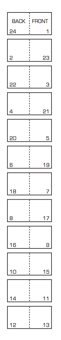
The six embossed and debossed drawings were created from wire forms pressed into dampened sheets of paper. Turn Over Darling elegantly combines King’s sculptural skills with his printer’s skills. When folded and juxtaposed in sequence, they make for eleven reclining female nude images that change position from front to back view as the pages turn. Determining the folds and sequence is a form of imposition, although quite different from the usual imposition for a single sheet with twelve pages on either side as shown below. Again, here is a work that evokes a joy in the material and in its handling.
JBG 1984 watermark in J. Green RWS paper
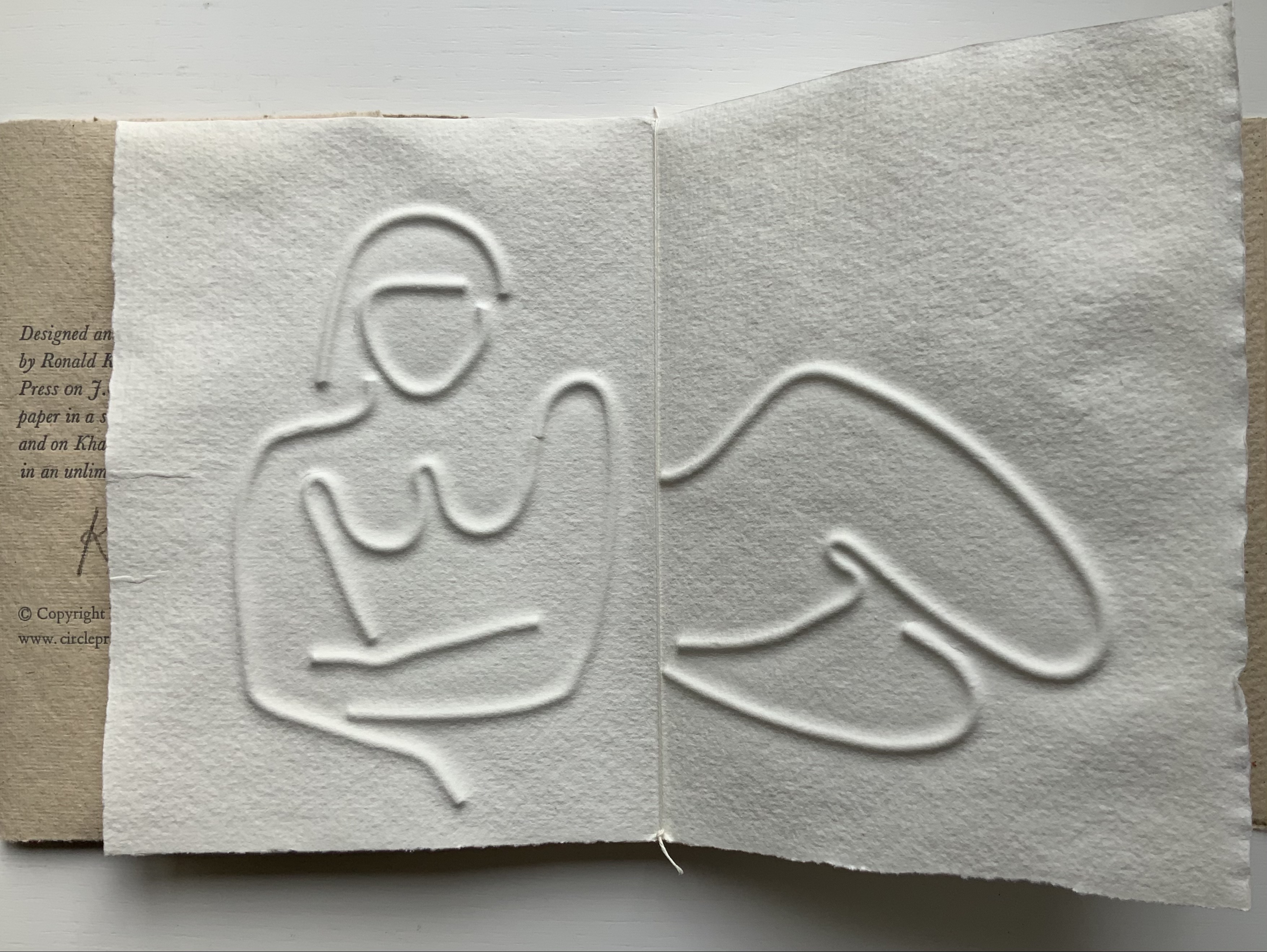
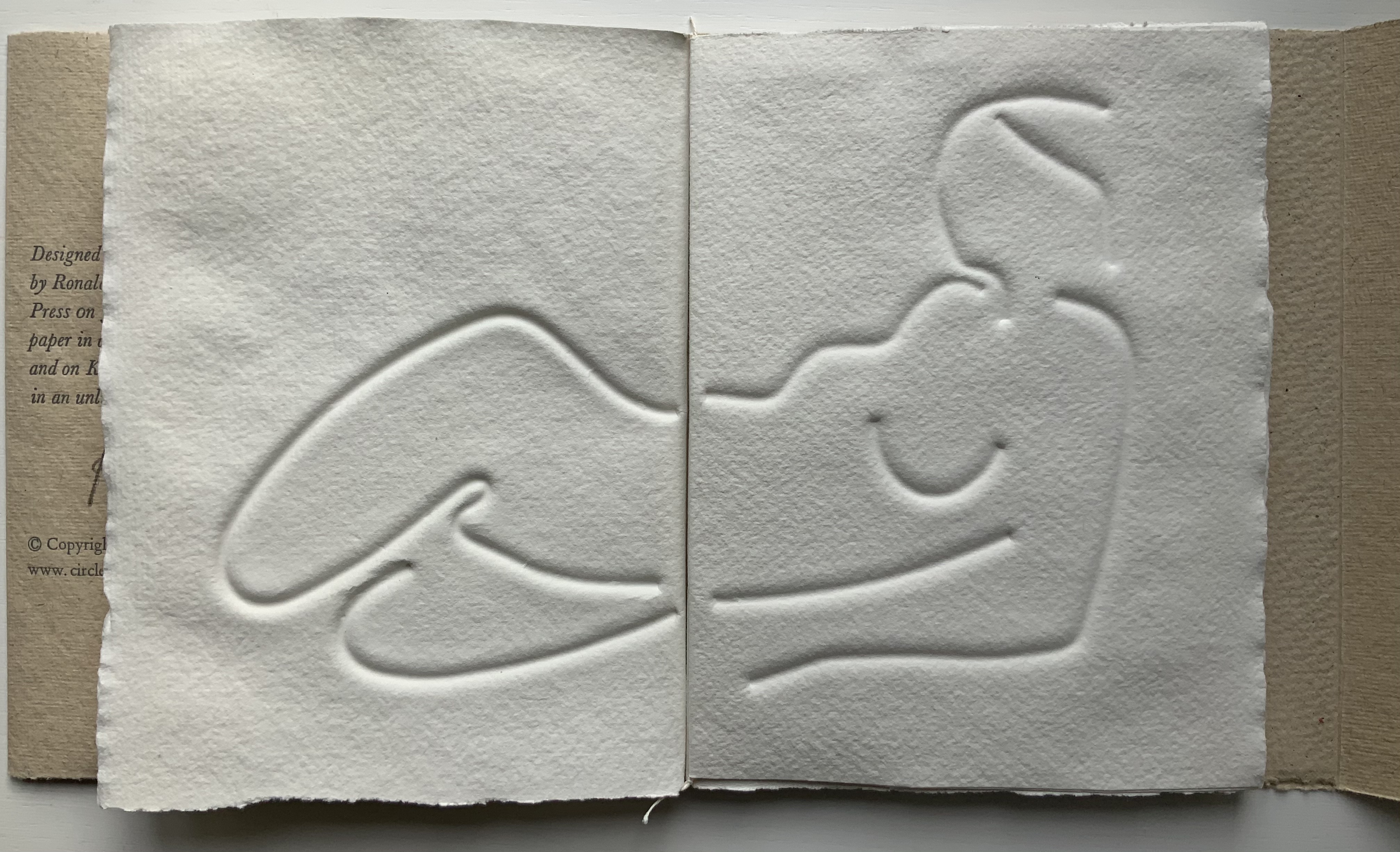
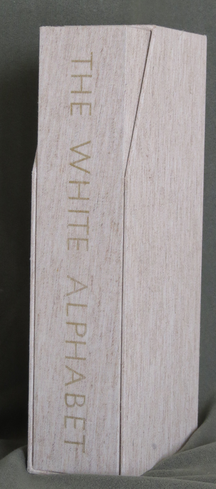
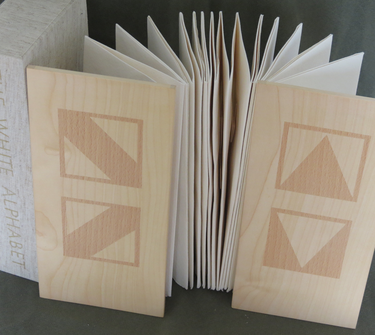
The White Alphabet (1984)
The White Alphabet (1984) Ron King Box made of two slipcases, one inside the other. Gilt lettering on spine of inner slipcase. Back-to-back leporellos with wooden front and back covers. Outer slipcase: H305 x W140 x D70 mm. Leoprello: H290 x W135 mm. Edition of 150, of which this is #99. Acquired from Veatch’s, 11 June 2021. Photos: Books On Books Collection.
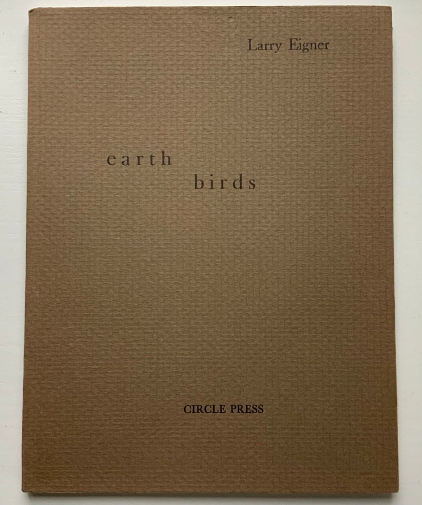
Earth Birds (1981)
Earth Birds: forty six poems written between May 1964 and June 1972 (1981) Larry Eigner (poems) and Ron King (plates) Fifty hard-bound copies, I-L, printed on pure rag-made paper with six plates printed blind intaglio and one hundred and fifty copies, 51-200, printed on Glastonbury Book stock with the same plates printed relief, in one color. Photos: Books On Books Collection.
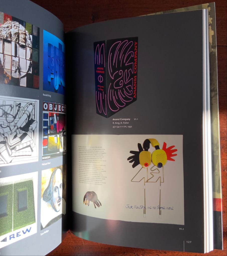
As with George Szirtes, King has collaborated more than once with Larry Eigner. Looks like nothing, the shadow through air (1972) was the earlier joint effort. Compared to Earth Birds, later works like The Burning of the Books (2008) and Anansi Company(1992) with Roy Fisher show King’s development toward more deeply collaborative efforts.
Earth Birds does recall the wide range of similar works by others at Circle Press that King made possible: Hadrian’s Dream (1990) by Asa Benveniste and Ken Campbell and Machines (1986) by Michael Donaghy and Barbara Tetenbaum.
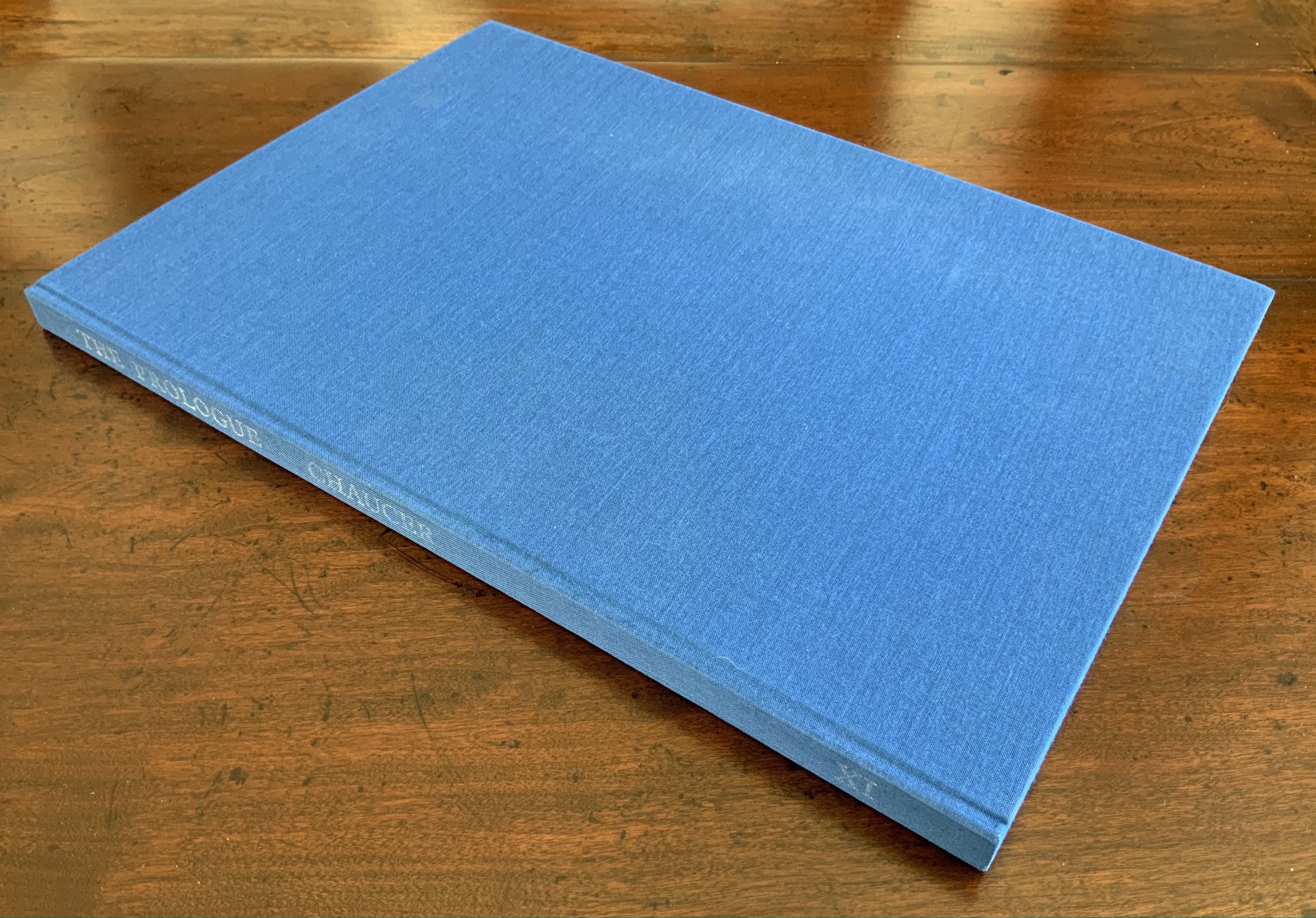
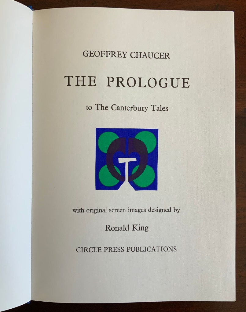
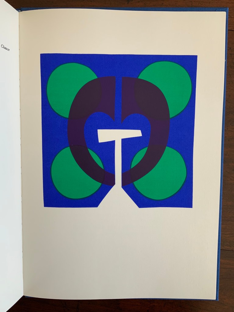
Chaucer’s The Prologue, 2nd Edition (1978)
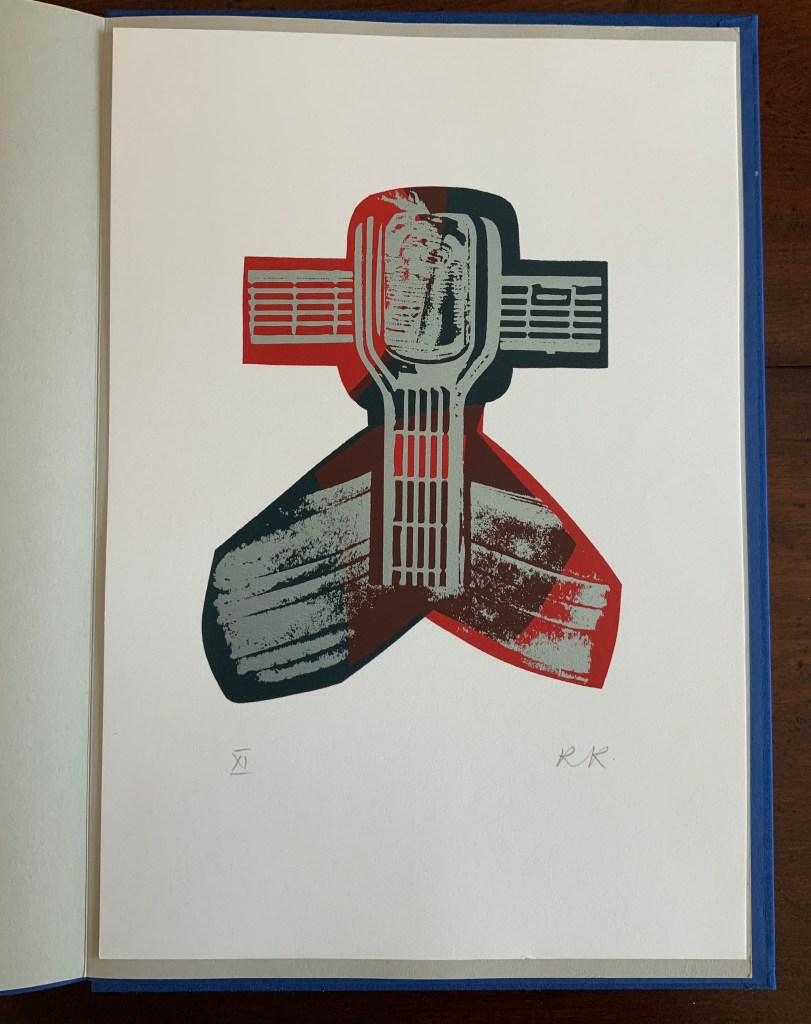
Chaucer’s The Prologue, 2nd Edition (1978) Ron King Casebound sewn, letterpress printed on 190 gsm Queen Anne Antique White. Hand-set in Monotype Plantin series 110. H405 x W281 mm, 72 pages. Edition of twenty separate versions I-XX each of 250 copies, of which this is XI, #131, and includes a folder of Buckler Light Grey Plain with a poem by Roy Fisher and screen-print on 190 gsm Bockingfordby Ron King entitled “Webbe”. Acquired from private seller, 27 February 2021. Photos of work: Books On Books Collection. Displayed with permission of artist.
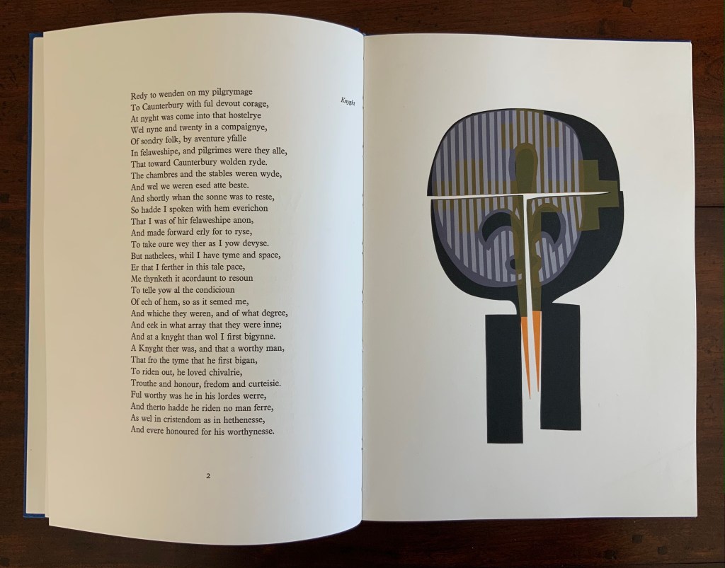
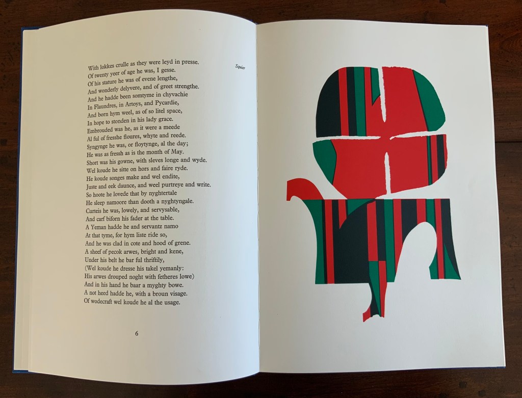
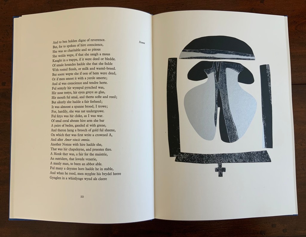
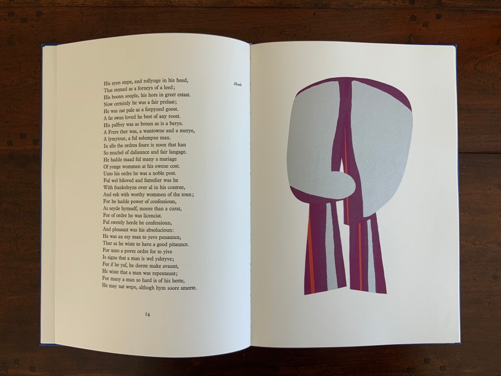
King originally prepared The Prologue for Editions Electo in 1966, then published a limited edition of 125 copies in 1967 under the Circle Press imprint. In this collection, the work represents King’s straightforward fine press work and a successful livre d’artiste. The screenprints of Chaucer’s characters and Chaucer himself are based on African and Brazilian masks as well as heraldic symbols. King’s inspiration to match these richly colored masks to the personae captures the pageantry and individuals within the social hierarchy of Chaucer’s Canterbury Tales. Opening this oversized fine press edition, turning its stiff, creamy pages with their 18 pt Plantin type and confronting these human-sized masks are reminders of the monumentality that this human-scale work of literature has achieved.
Knight and Squire masks
Nun and Monk masks
Chaucer’s mask and King’s original print “Webbe”
Ephemera
Almost always, small gifts of ephemera arrive with purchases from the Ron King Studio. They illustrate how King marshals his artistry even in marketing his art and that of those he has published.
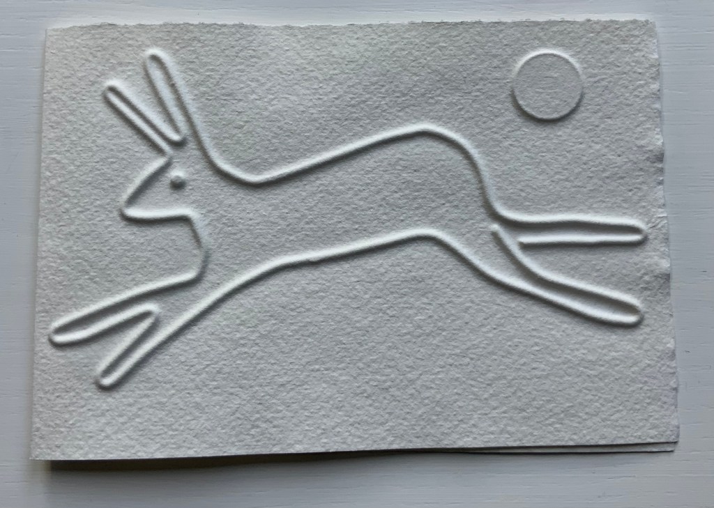
Hare (single-fold card, H125 x W180 mm), blind-embossed. 2021.
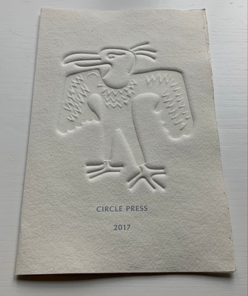
Announcement (single-fold card, H216 x W140 mm) with blind embossed image of a fulmar. Describes artist book Sednar and the Fulmar with Richard Price’s poems. 2017.
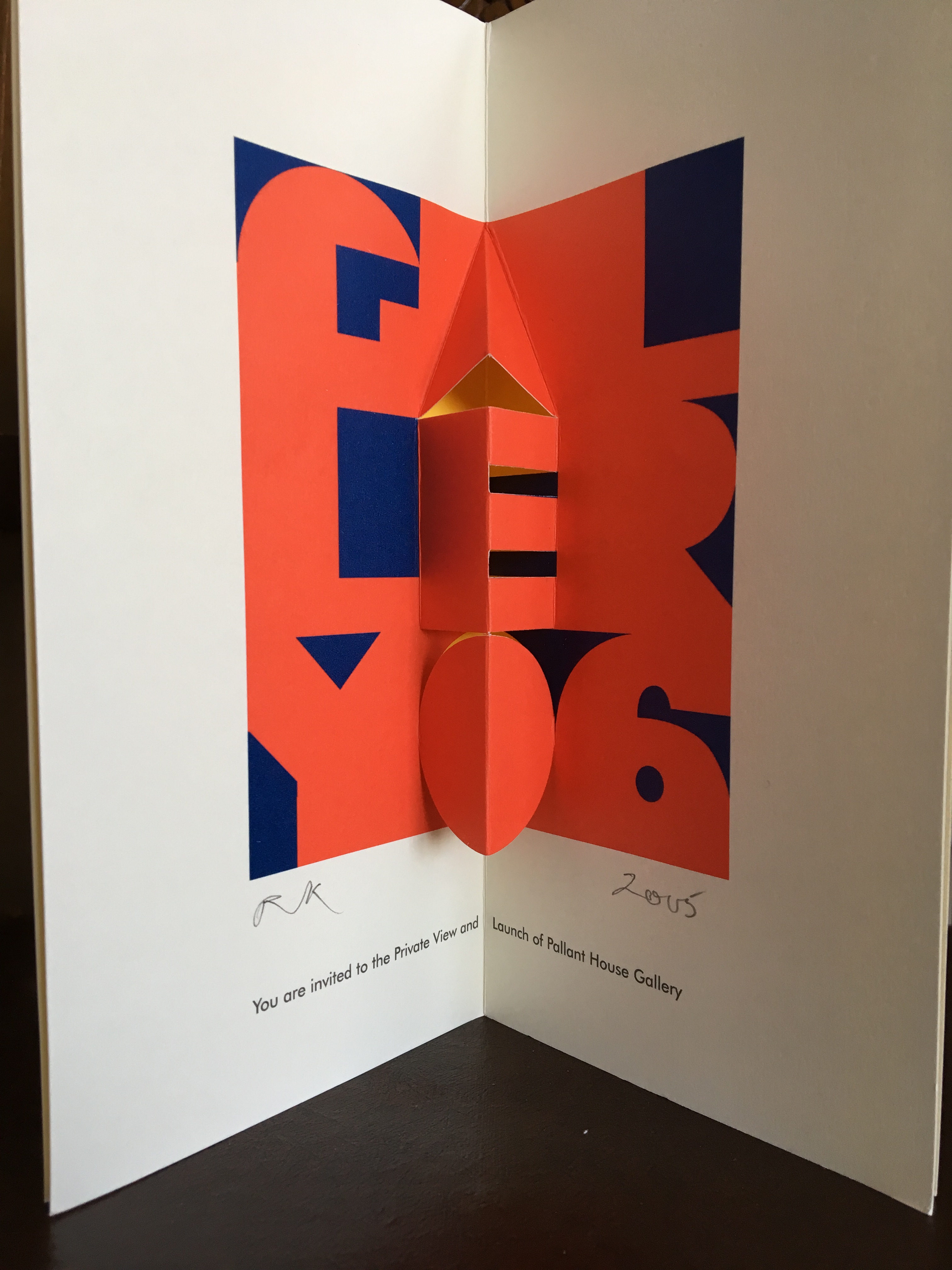
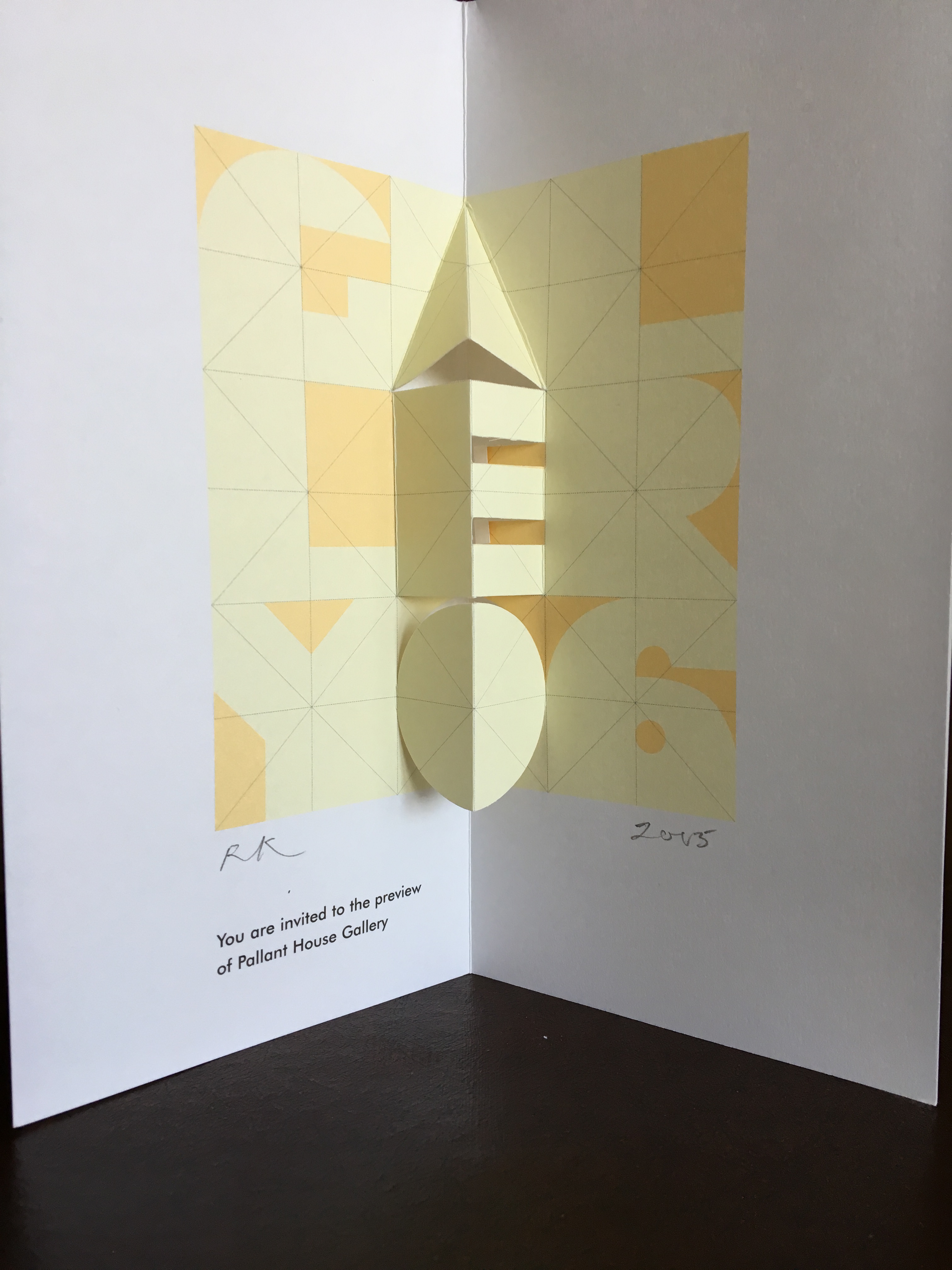
Invitations (four-fold pop-up cards) to Pallant House Gallery opening preview. 2005.
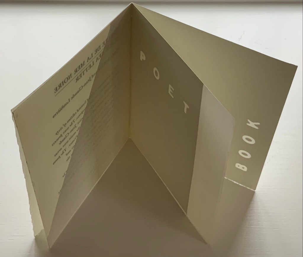
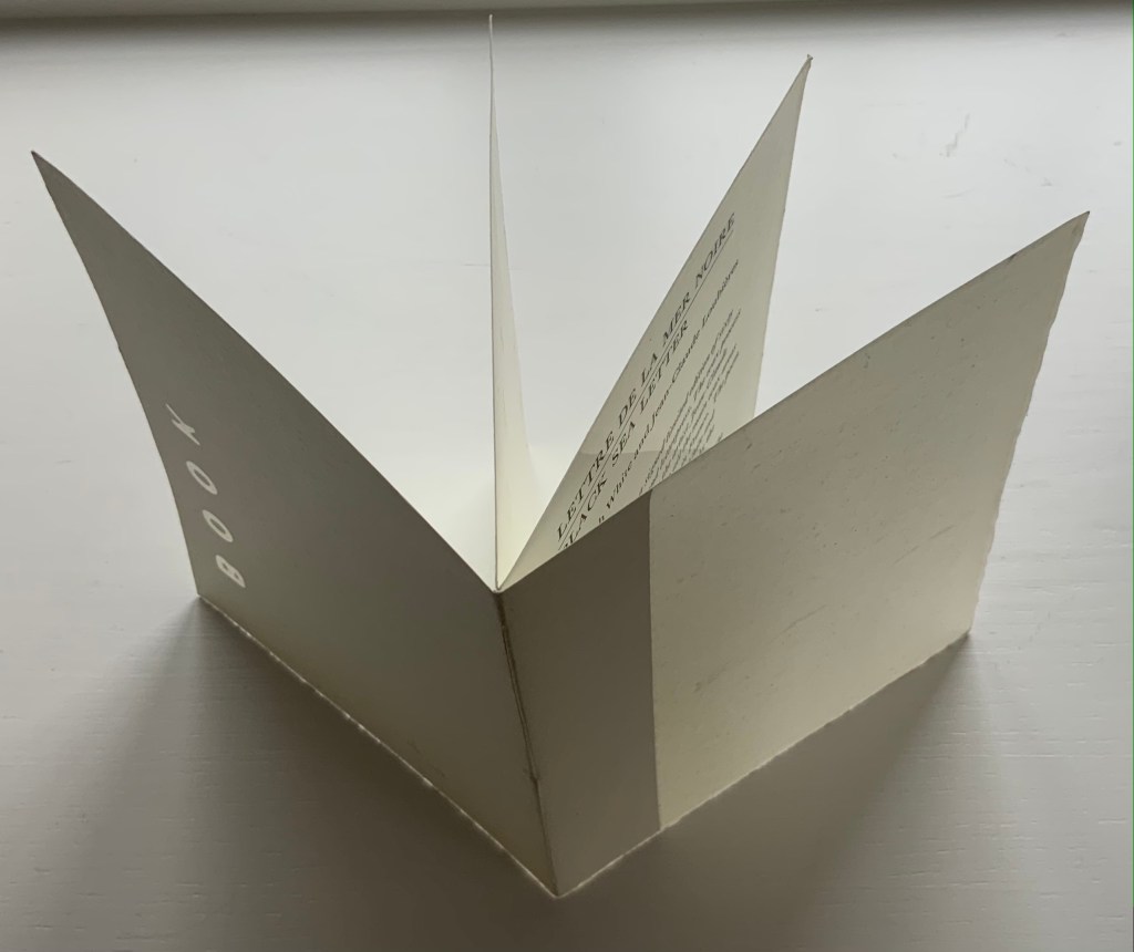
Announcement (wax and paper pamphlet, H174 x W134 mm) of Lettre de la Mer Noire/Black Sea Letter by Kenneth White (poem) and Jean-Claude Loubières (images and wax dipping). 1997.
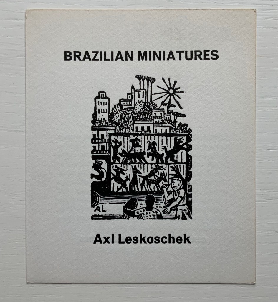
Announcement (card, line block reproduction, H150 x W125 mm) of the 200 portfolios of fifty-one woodcut designs reproduced from the only remaining proofs of Brazilian Miniatures, an unpublished book with a bilingual introduction; printed in two versions. 1973?
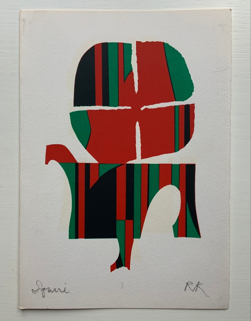
“Squire” (single-fold card, H235 x W165 mm) with hand-printed serigraph from Chaucer’s “Prologue” to The Canterbury Tales. 1969?
Poem: a throw of the dice will never abolish chance (1990)
Mallarmé, Stéphane, D. J. Waldie (trans.), Gary Young, and Felicia Rice. 1990. Poem: a throw of the dice will never abolish chance. [Santa Cruz, Calif.]: Greenhouse Review Press. The binding is full goatskin leather, 15.5 x 11.375 in, 44 pages. Edition of 60. Photos: Courtesy of D. J. Waldie and Gary Young.
To the growing body of homage to Un Coup de Dés, D.J. Waldie and Gary Young added this fine press livre d’artiste. In keeping with Waldie’s reading of Danielle Mihram’s analysis of the proofs of the intended Mallarmé/Vollard livre d’artiste and Waldie’s own examination of the proofs at Harvard, Young’s four woodcuts are presented separately from the text and aim to honor Mallarmé’s desire for images that are “blond and pale” in relation to the white of les blancs and the sharp black of the type. The design by Young and Felicia Rice used several cuttings of Bodoni to approximate the Firmin-Didot of the original proofs.
Waldie, D.J. 2001.”The Ghost of an Obsession: Translating Mallarmé’s A Throw of the Dice will Never Abolish Chance“. Parnassus: Poetry in Review , 26.1: 180-85.
Just as Stéphane Mallarmé’s Un coup de Dés jamais n’abolira le Hasard (1897) launched a new host of visual poems in the 20th and 21st centuries, it also launched a host of homage and parodies. Perhaps the quickest off the dock was the Australian Christopher Brennan. Already a fan of Mallarmé, Brennan, who worked at the New South Wales Public Library, seized on the May 1897 issue of Cosmopolis when it arrived and found in Mallarmé’s poem just the form with which to respond to the rough ride Australian critics had given to his own XXI Poems: MDCCCXCIII-MDCCCXCVII: Towards the Source (1897).
Not until 1981, though, was his tinker’s damn published. Given the debated choices of layout, typeface and illustrations that Un coup de Dés in book form had faced since 1897 and would continue to face after 1981, the choice to publish a facsimile of Brennan’s calligraphic effort was well made — perhaps even artistically original. Book artists have blotted out the poem, excised it, collaged, illustrated, performed, recorded (and cast the sonographs in three-dimensional PVC), programmed it into computer graphics, typed it out on a modified typewriter, and more. André Masson‘s may be the only calligraphic treatment so far…
Further Reading
“Jim Clinefelter“, Books On Books Collection, 17 July 2020. An American-English mis-translation.
“Chris Edwards“, Books On Books Collection, 7 December 2020. An Australian-English mis-translation.
“Rodney Graham“, Books On Books Collection, 3 July 2020. Un coup de Dés as instructions to a tattoo artist.
Fagan, Kate. “‘A Fluke? [N]ever!’: Reading Chris Edwards“, Journal for the Association for the Study of Australian Literature, Vol. 12, No. 1 (2012). Accessed 25 November 2020.
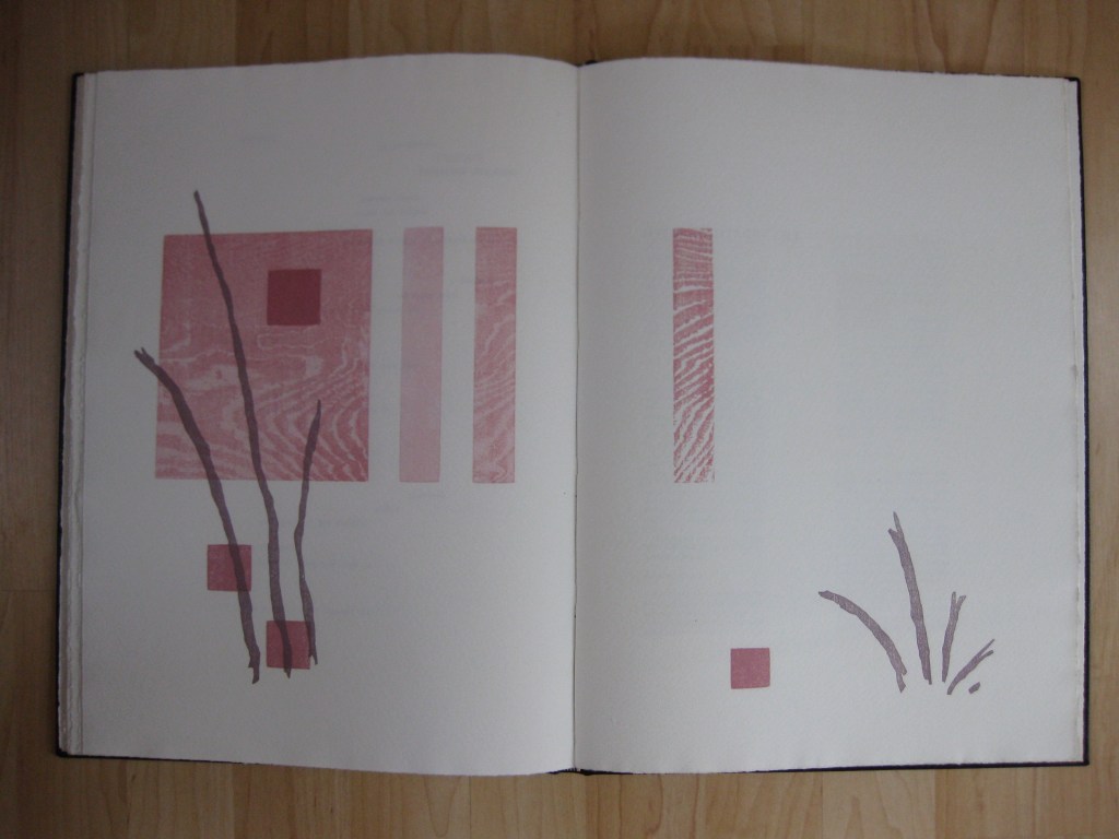
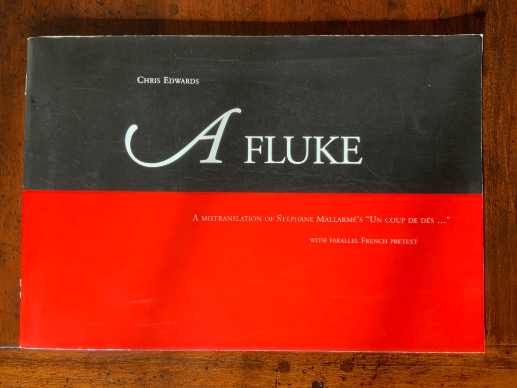
A Fluke follows in the footsteps of several parodists of Un coup de Dés and even more “homageurs”. Edwards mingles bilingual homophonic mistranslation with the monolingual variety, false cognates, mis-contextualization and more to deliver his “fluke”. Part of that “more” leads off with the subtitle and the side-by-side prefaces.
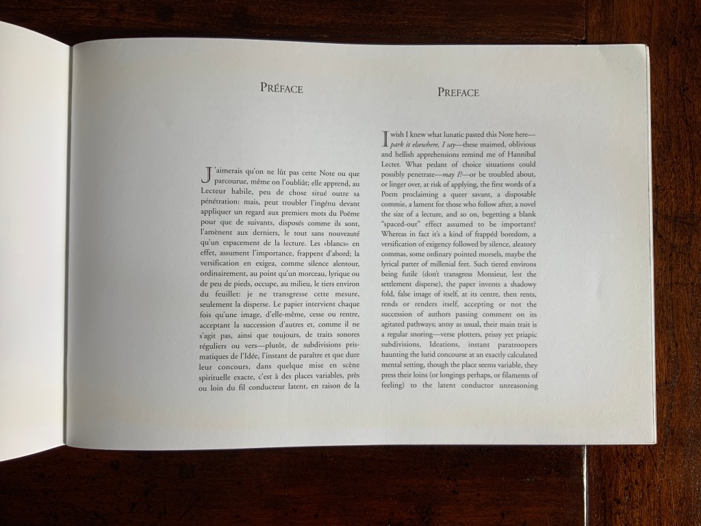
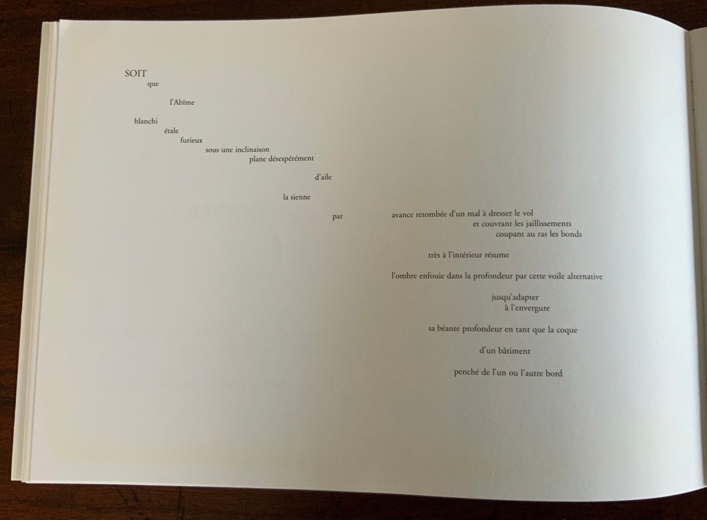
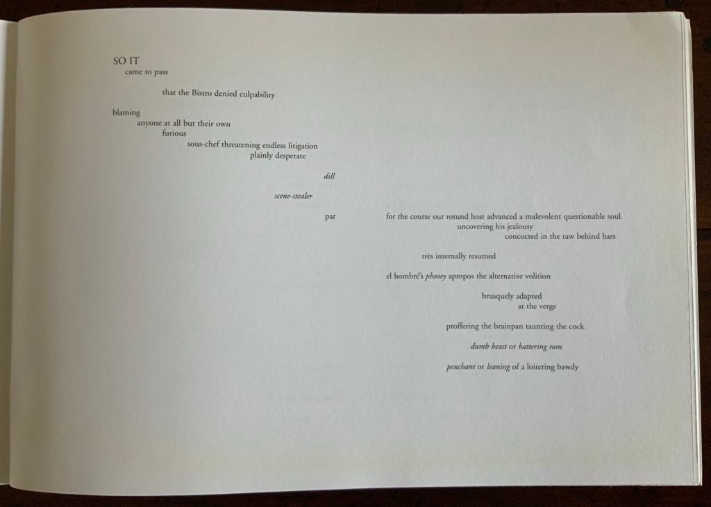
The pun in “pretext” plays out not just in the word itself but in Edwards’ squeezing into one page the French predecessor alongside its English exaggeration. The squeeze harks back to Mallarmé’s “Note” being added to the Cosmopolis issue, where it first appeared, at the insistence of the editors. Having led with the pun and clown-car layout, Edwards follows on with a fright wig (mixed metaphors, too, are part of the “more”). He turns Mallarmé’s tongue-in-cheek “I would prefer that one not read this Note or that having read it, one forgets it” into “I wish I knew what lunatic pasted this Note here– …”.
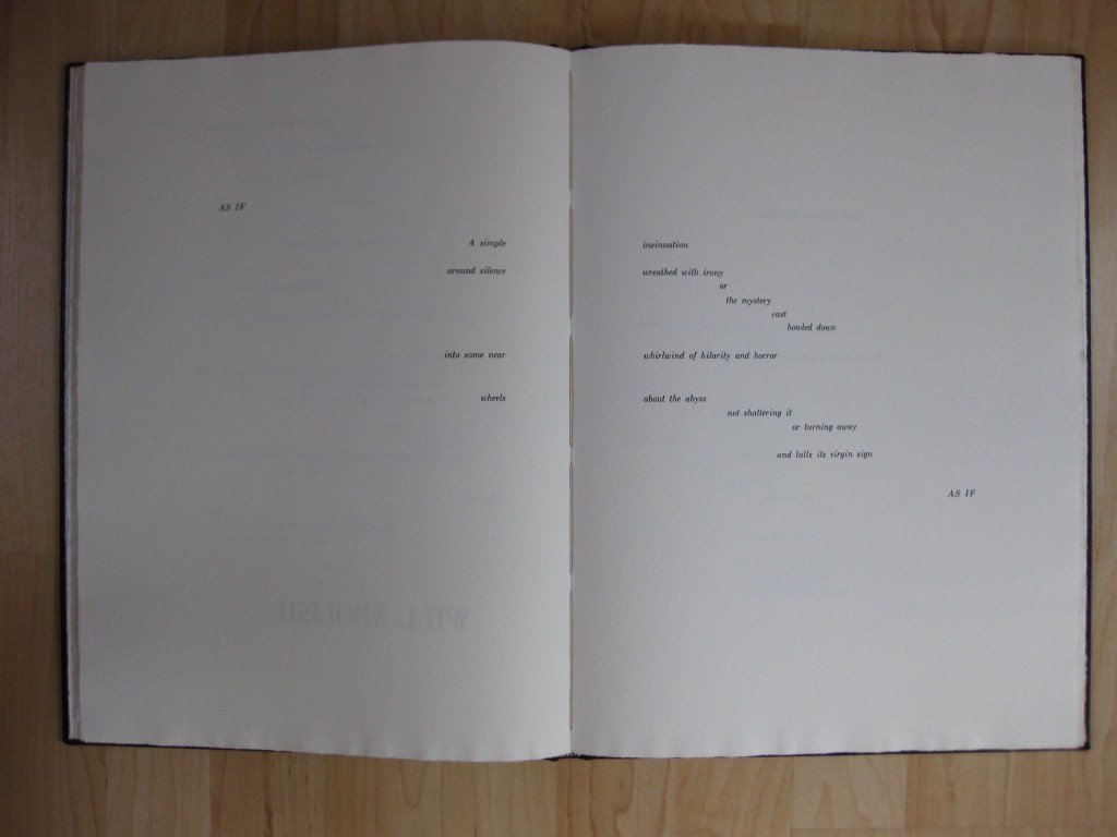
Edwards’ preface is proleptic — to use the word with which the overlording associate professor interrupted the teaching assistant’s nervous first lecture on how a poem’s opening line can encapsulate the working of the whole. (But nevermind the digression, though digression is another part of Edwards’ “more”). In transforming “Lecteur habile” [“practiced Reader”] into “Hannibal Lecter”, Edwards forecasts such transformations as “SOIT / que” [“Whether”] to “SO IT / came to pass”, “l’Abîme” [“the Abyss”] to “the Bistro” and “LE HASARD” [“CHANCE”] to “BIO-HAZARD”. After the preface, Edwards spreads his sails — so to speak. The French moves to the verso, the English to the recto. The double-page spreads of the 1914 edition of Un coup de Dés are nevertheless crammed into a single page to facilitate enjoyment of the pretext’s mistranslation.
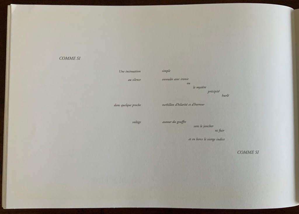
But no, “proleptic” is not le mot juste (which juste goes to prove that the professor remains mal dit, if not maudit). Nothing in the side-by-side prefaces prepares the reader (or Hannibal Lecter) for Mallarmé’s “COMME SI …. COMME SI” becoming Edwards’ exactly mapped, appropriately italicized, all caps loan phrase “COMME SI … COMME ÇA“. And so it goes — linguistic, spatial, typographic, cultural antics piled atop each other.
Edwards’ madcapping his way to A Fluke must have been part of a global warming trend in pastiche. How else to explain Jim Clinefelter’s A Throw of the Snore Will Surge the Potatoes (1998), John Tranter’s “Desmond’s Coupé” (2006) and Rodney Graham’s Poème: Au Tatoueur (2011)? The trend had its beginning distant in time but close in proximity to Edwards.
In New South Wales Public Library in 1897, when that issue of Cosmopolis arrived, a cataloger-cum-poet/scholar named Christopher Brennan seized on it. Shortly after publishing his own XXI Poems: MDCCCXCIII-MDCCCXCVII: Towards the Source (1897), Brennan received several negative reviews of his Mallarmé-influenced poetry. Turning to Un coup de Dés for solace and a format with which to tear the critics to shreds, he performed his own coup in calligraphied manuscript where it remained undelivered until 1981, when it was published in facsimile by Hale & Iremonger (see below). In length alone, its title — Prose-Verse-Poster-Algebraic-Symbolico-Riddle Musicopoematographoscope — must have had some influence on Edwards’ subtitle. Or perhaps it was just a coincidence, a fluke.
A perceptive reading of Brennan, Edwards and Tranter has become available from Toby Fitch, courtesy of the Cordite Poetry Review. It is a dynamite work itself.
Further Reading
“Jim Clinefelter“, Books On Books Collection, 17 July 2020. An American-English mis-translation.
“Rodney Graham“, Books On Books Collection, 3 July 2020. Un coup de Dés as instructions to a tattoo artist.
Edwards, Chris. People of Earth: Poems (Sydney: Vagabond Press, 2011). The mistranslation is printed without the “French pretext”. The briefest comparison provides a convincing argument for the artistic and comic genius of the 2005 version. People of the Earth itself does reveal more of Edwards’ poetic and philosophical grasp of the issues that preoccupied Mallarmé and the avant garde when it comes to language, glyphs, meaning and the technique of collage.
Fagan, Kate. “‘A Fluke? [N]ever!’: Reading Chris Edwards“, Journal for the Association for the Study of Australian Literature, Vol. 12, No. 1 (2012). Accessed 25 November 2020.
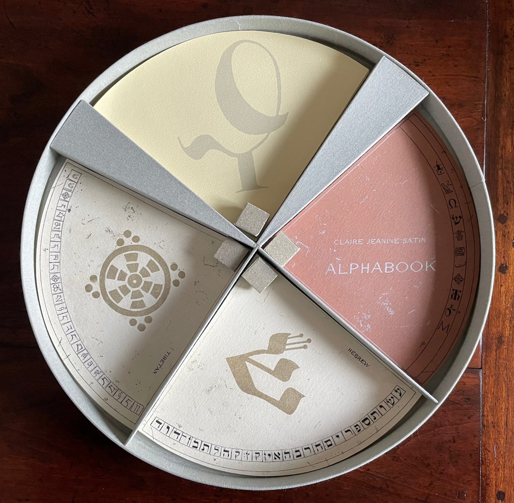
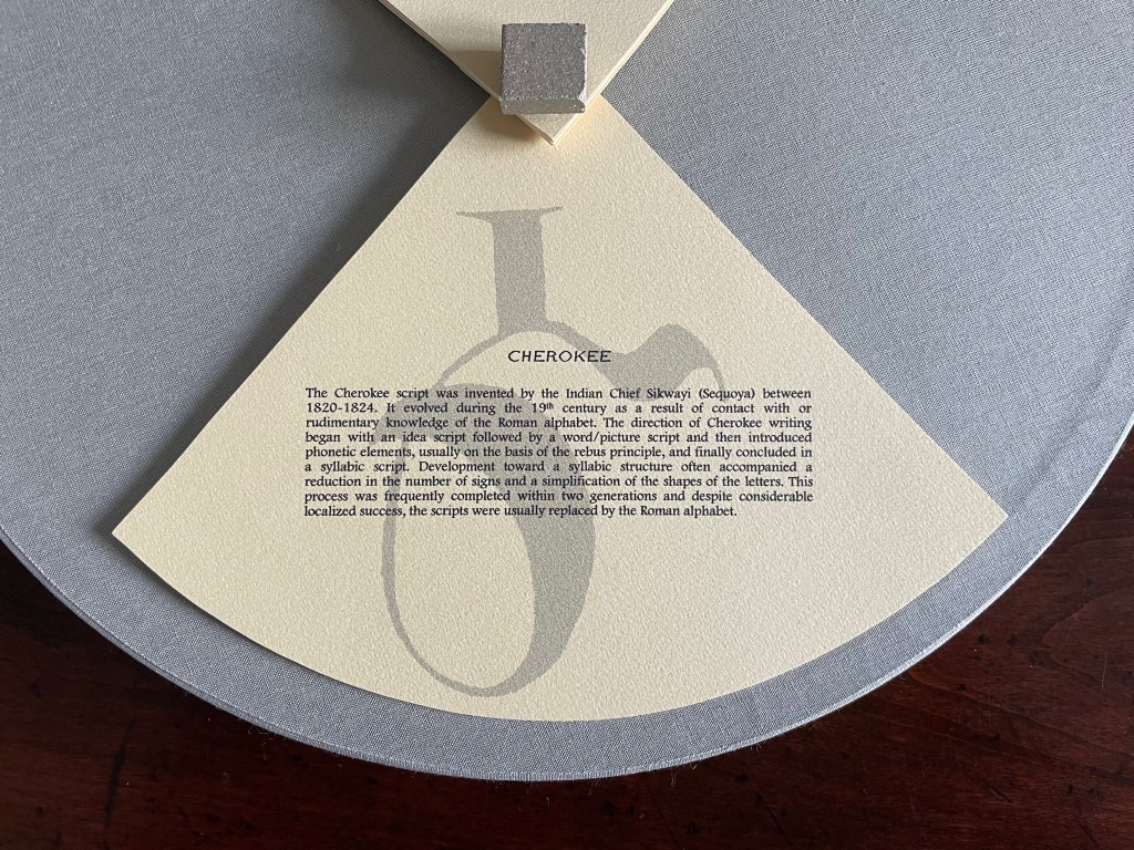
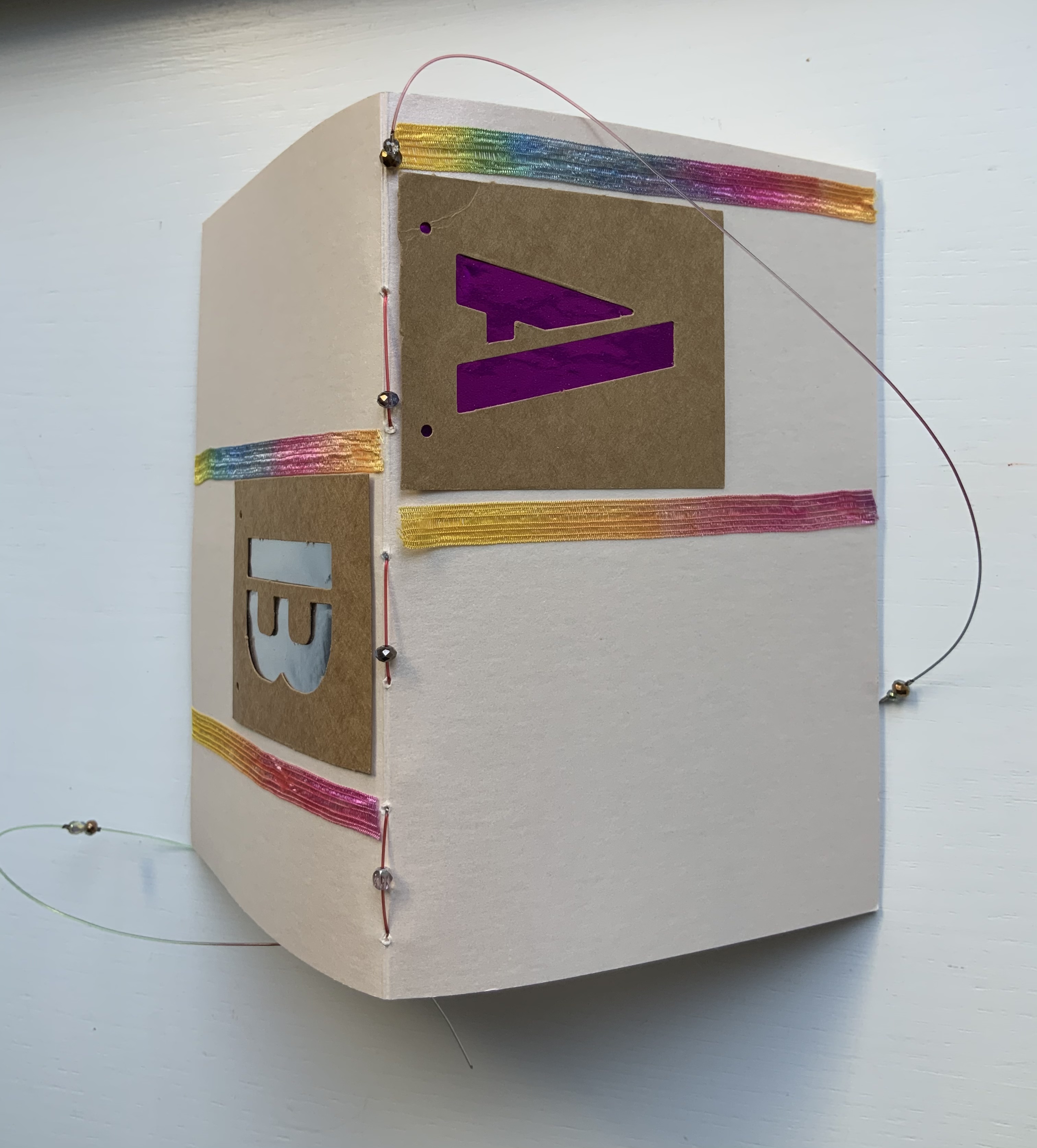
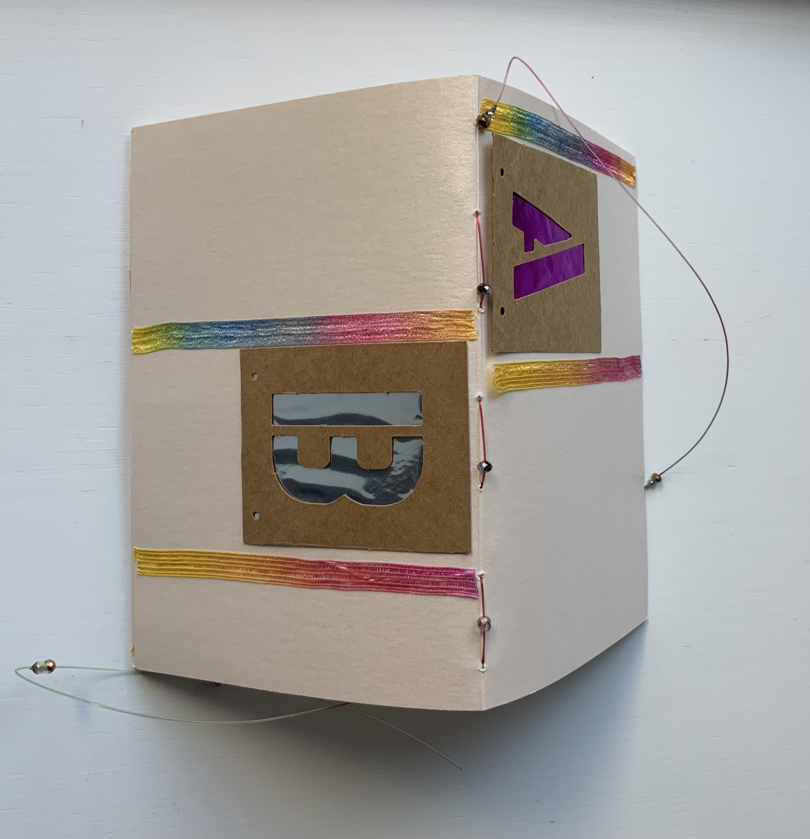
Alphabook (1998/9) Claire Jeanine Satin Circular box containing four segments of post-bound pages. Diameter 356 x D51 mm. Limited variable edition of 11, this copy with a segment on the Cherokee syllabary and a Cherokee sign tile on the cover. Acquired from the artist, 15 December 2022. Photos: Books On Books Collection. Displayed with artist’s permission.
From the artist’s description:
Alphabook is photo-etched and printed on 360 gm/m2 Fabriano Murillo with inks and metallic colors. The sets of pages are grouped in four segments. Three consist of alphabetic notations, images, phrases, and poetry. The fourth set consists of accompanying texts describing the alphabet or notations, (in this case Cherokee). The pages form circles when fully opened. A colophon page is included and signed at the end. The circular containers were constructed and bound in Italian Ciralux cloth and topped with a water-jet cut tile designed by the artist. The rim is gold stamped with the Latin phrase: VERBA VOLENT, SCRIPTA MANENT.
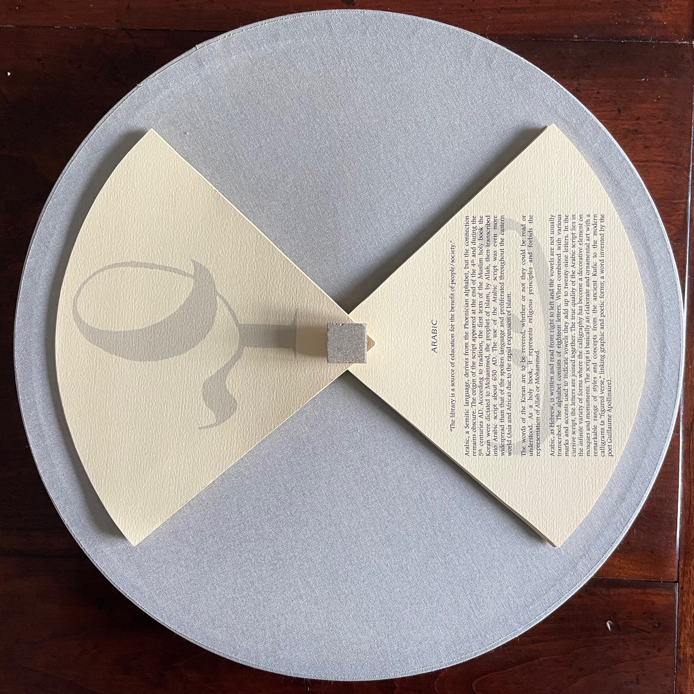
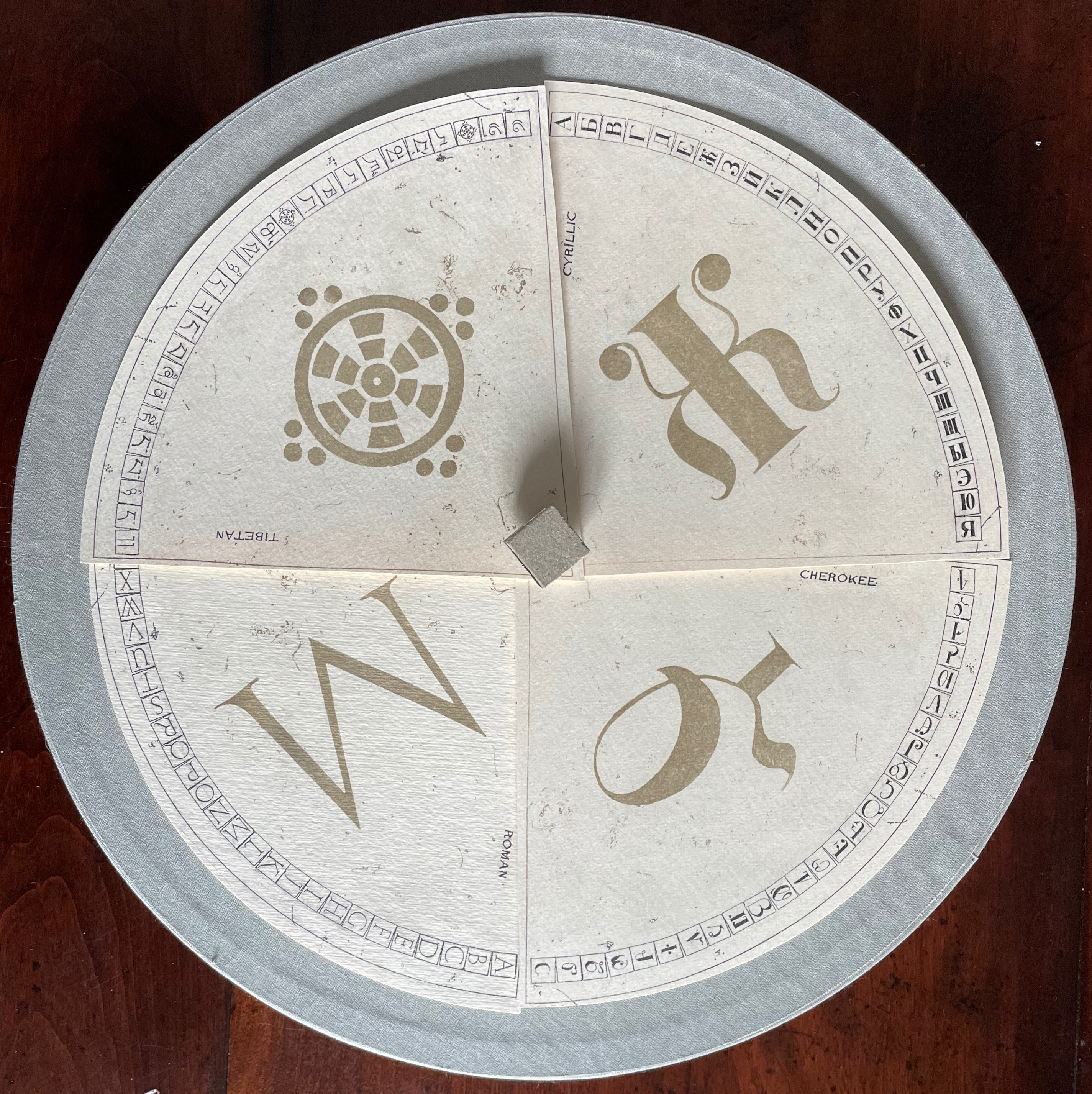
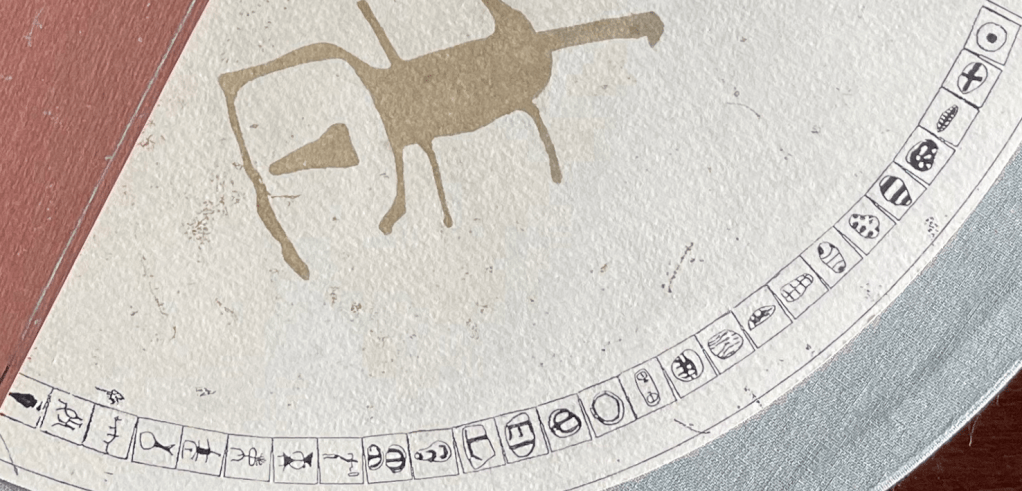
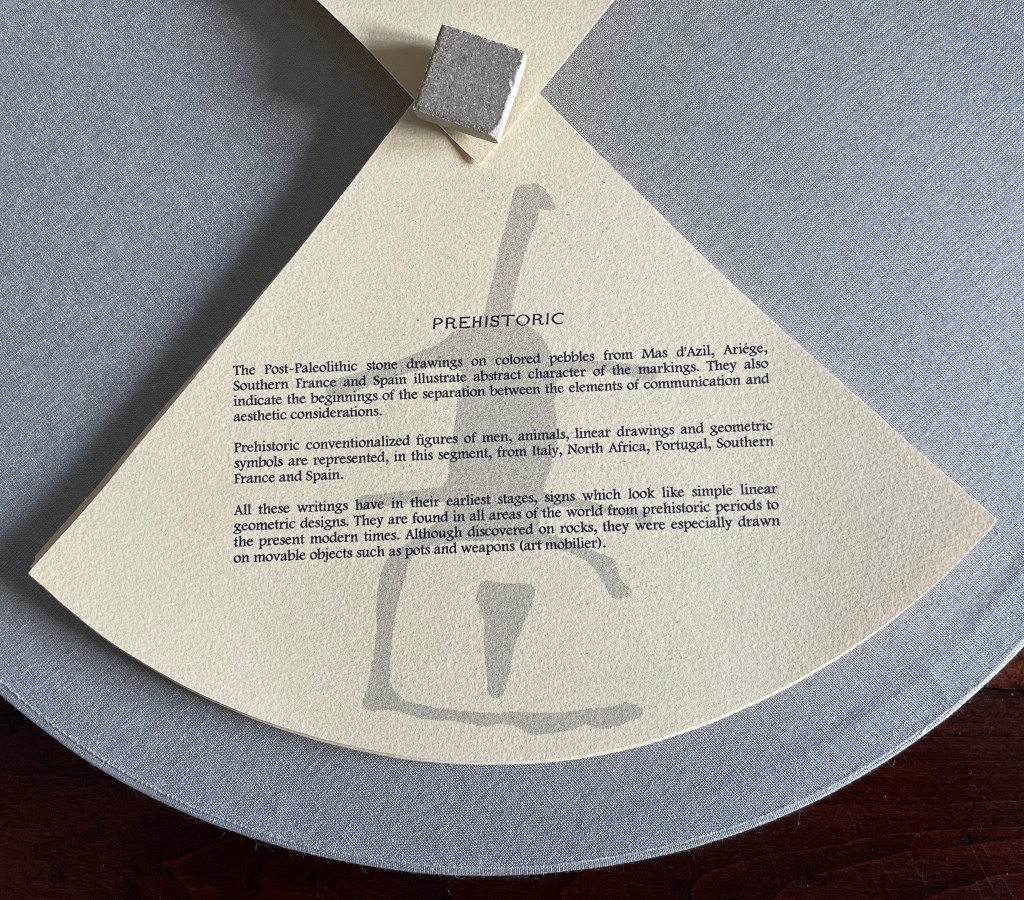
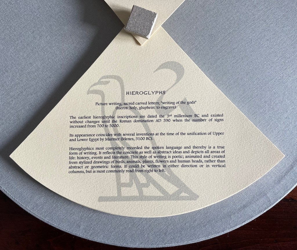
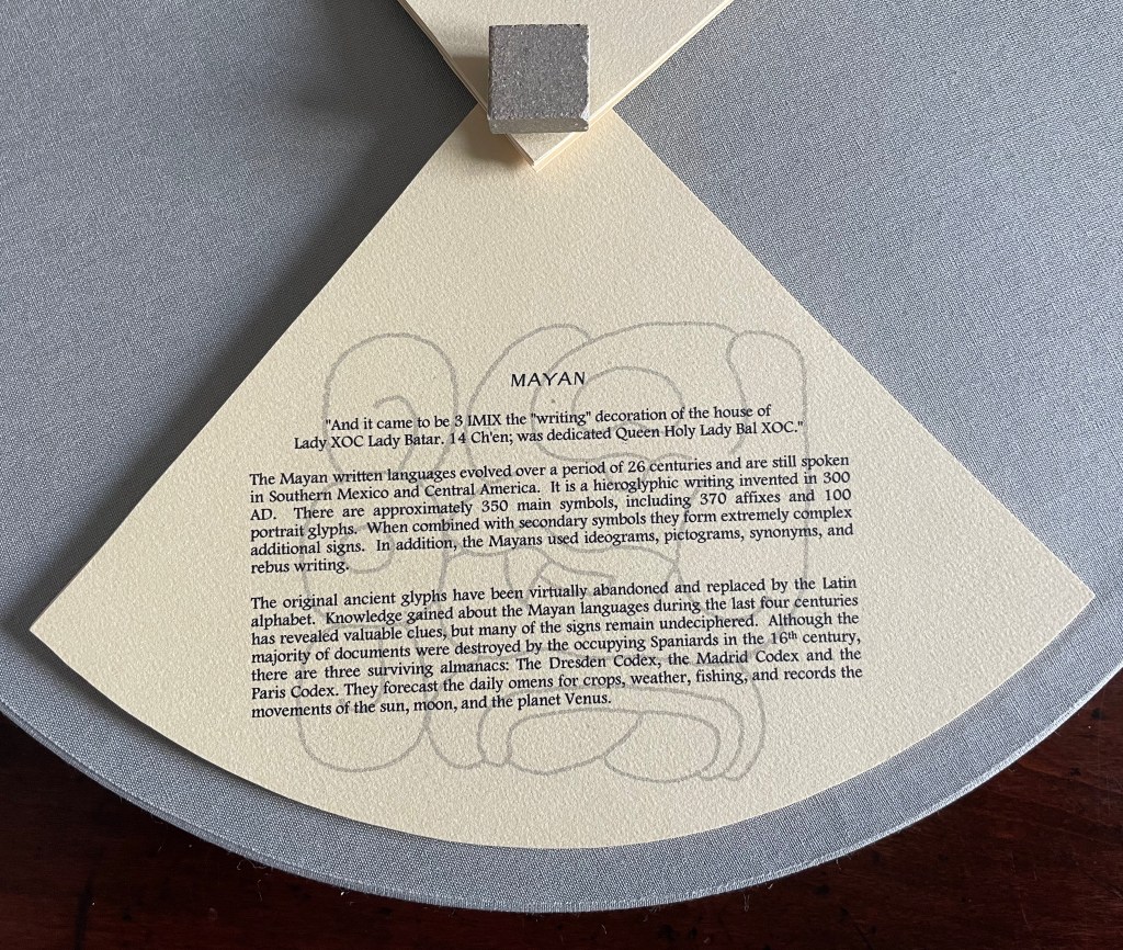
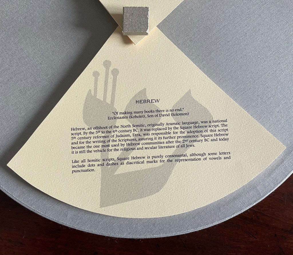
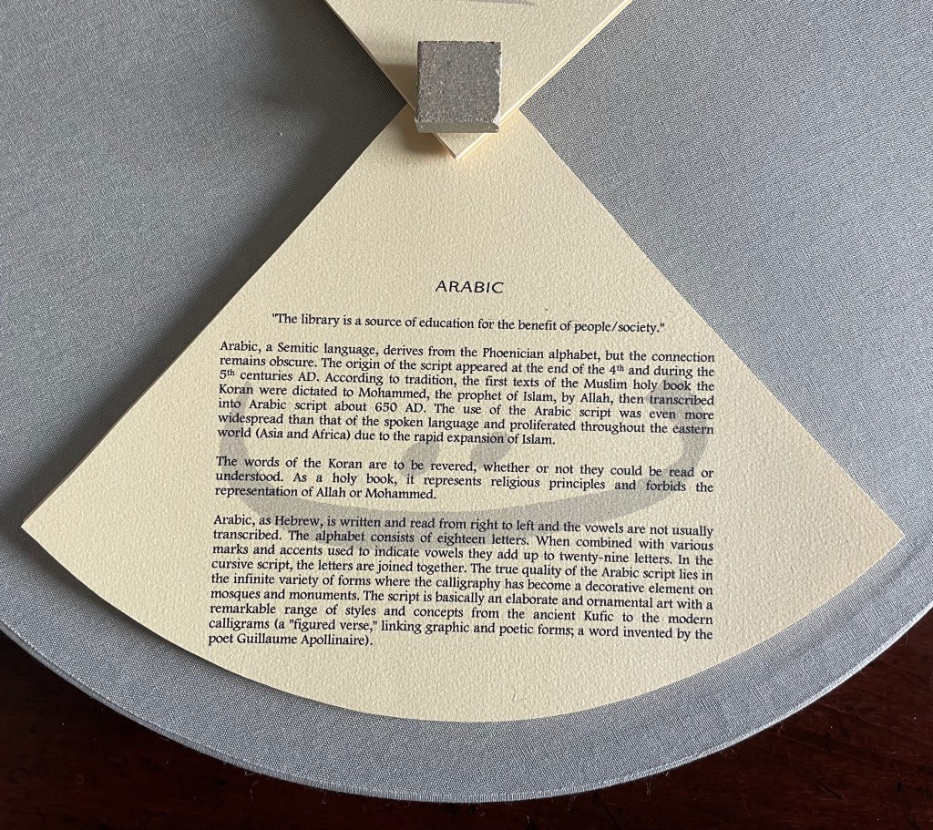
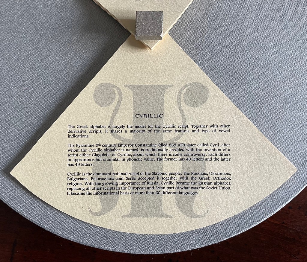
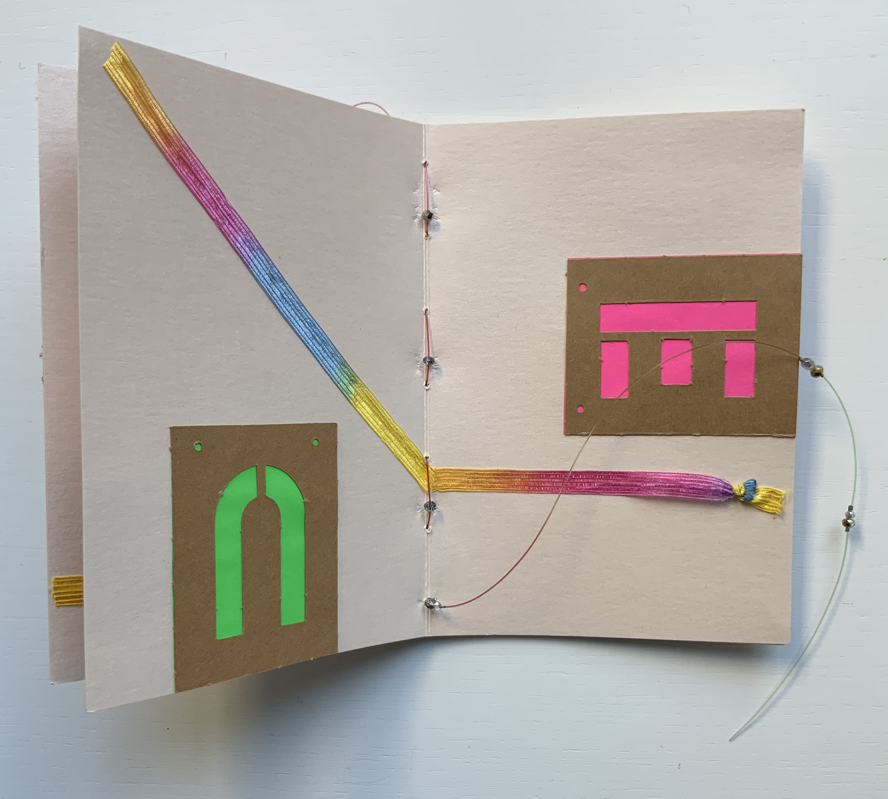
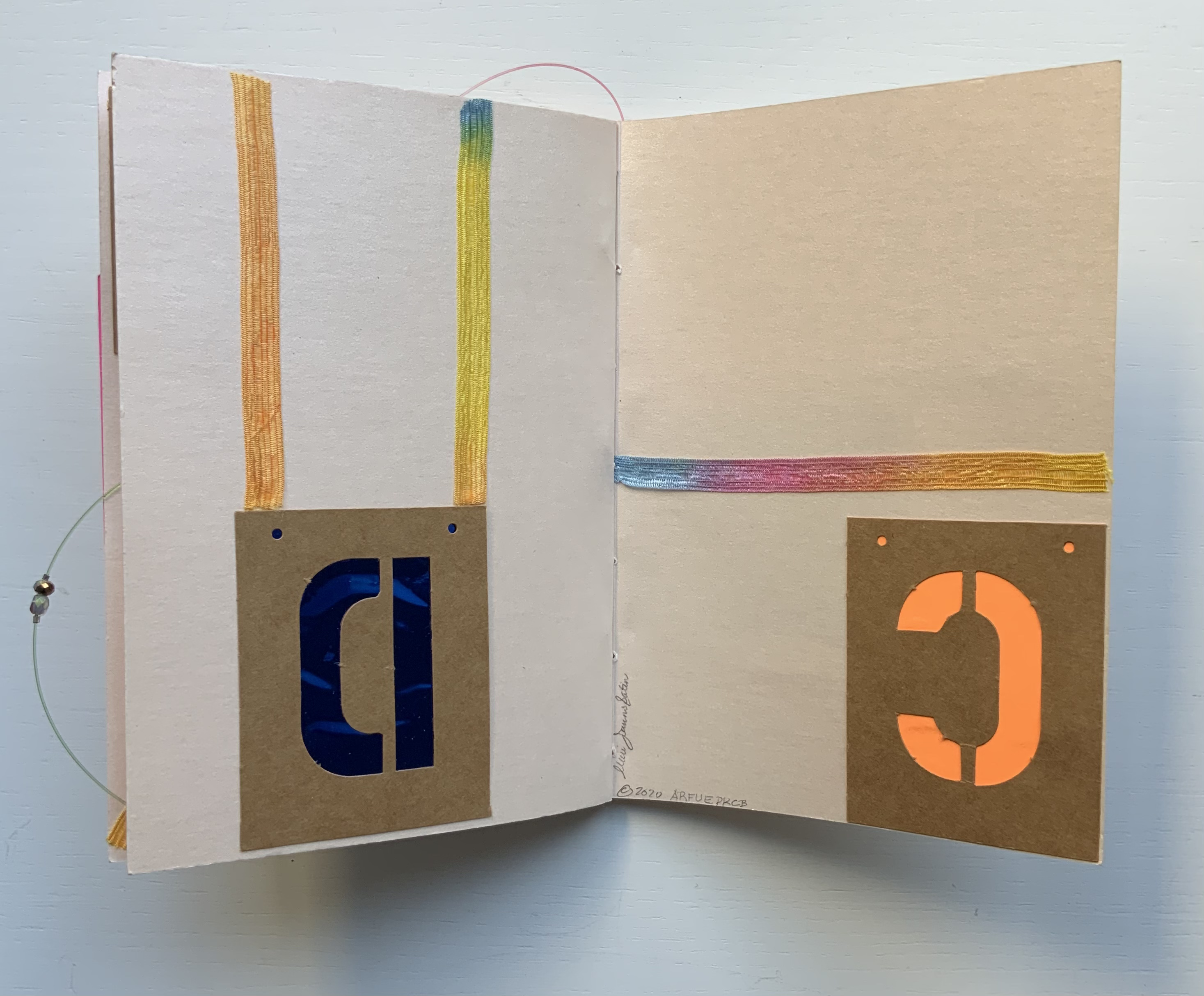
This work has no externally visible title, only the Cherokee letter Ꮉ (for the sound “ma”) on the tile and that gold-stamped Latin phrase. Traditionally the proverb runs in the indicative — Verba volant, scripta manent (“Words fly, writing remains”) — but presumably to draw yet more attention to the solidity of the written word over the iffy ephemerality of the spoken word, the subjunctive volent (“Words may fly” or “If words fly”) comes into play. As the lid lifts, the work’s title Alphabook appears, indicating that, at its heart, this work of art is a book. The container’s circular shape, its inner segmentation and the post-bound segments may challenge the traditional notion of a book, but the segments’ text just as strongly asserts a bookish purpose, highlighting eleven prewriting and writing systems: Prehistoric, Hieroglyphs, Mayan, Hebrew, Arabic, Greek, Roman, Chinese, Tibetan, Cyrillic and Cherokee.
With their pages pivoting on their central posts, the segments can sometimes display wingspans, nudging forward an interpretation of Verba volent, scripta manent that a writing system’s shapes permanently out-soar sounds on the air.
Segment open to Chinese page on the left, Arabic page on the right.
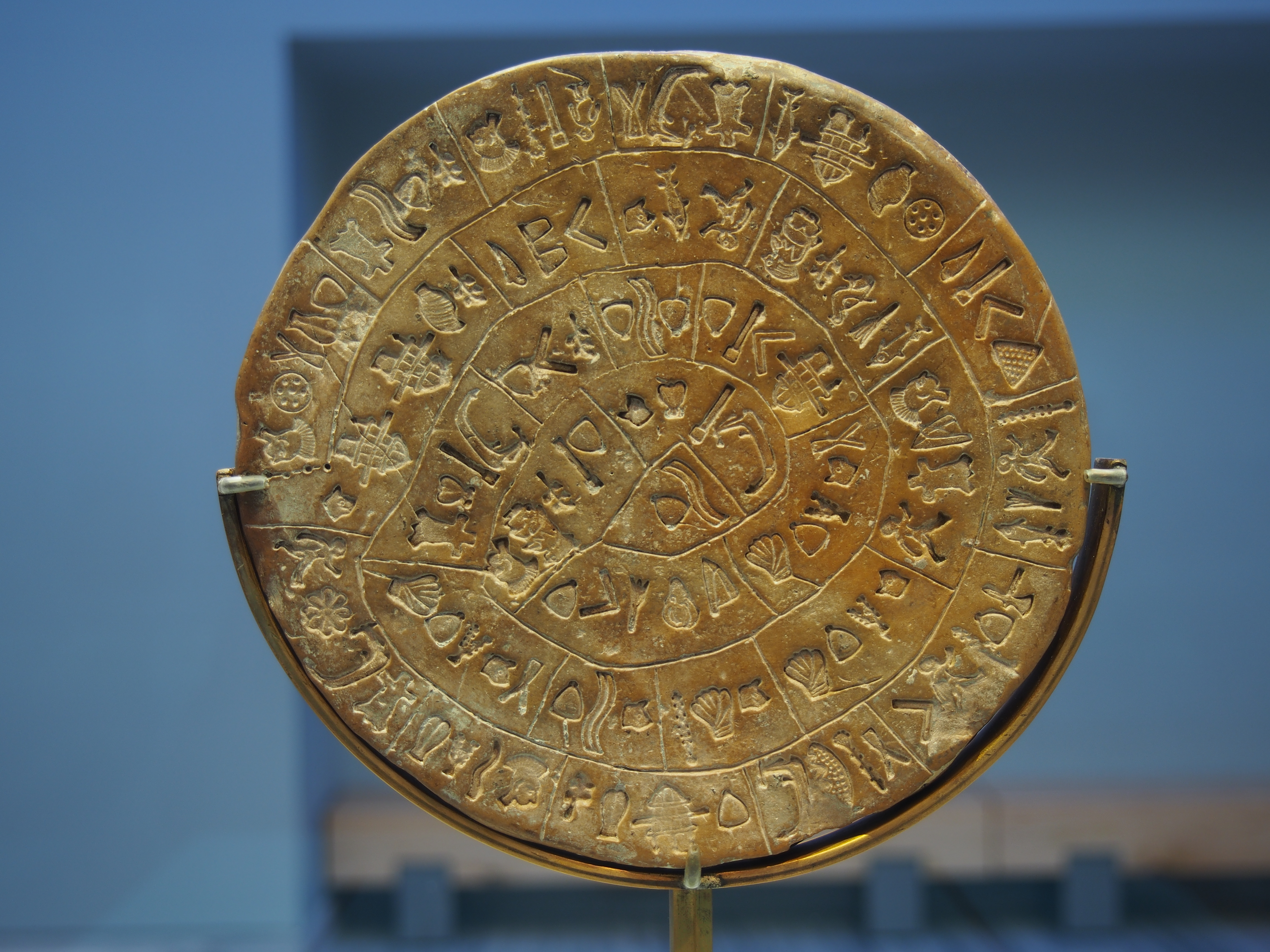
Fully opened, the segments evoke the Phaistos Disc, resident in the Archaeological Museum of Heraklion on Crete. Dating sometime between 1850 B.C. and 1600 B.C, the disc remains undeciphered, hovers indeterminately among statuses of hieroglyph, syllabary and alphabet and is still subject to speculation about its source — Linear A or Linear B.
Phaistos disc, sides A and B after the 2014 renovation. Photos by C. Messier – Own work, CC BY-SA 4.0.
Drawing on pebble and cave art images from France and Spain created as long as 36,000 years ago, Alphabook reaches back further than the Phaistos Disc. The depicted shapes along the rim of the Prehistoric segment mark the millennia-long trail to the formation of any writing system, alphabetic or non-alphabetic.
Sequoya’s Cherokee syllabary is the youngest of the eleven marking and writing systems that Alphabook covers, a distinction that made this particular version of the limited variable edition attractive. In the Books On Books Collection, works of book art such as Gerald Lange’s The Neolithic Adventures of Taffi-Mai Metallu-Mai (1997), Cari Ferraro’s The First Writing (2004) and Helen Malone’s Alphabetic Codes (2005) among others address the origin period, but besides James Rumford’s children’s book Sequoyah (2004), no others address this remarkable single-handed creation of the Cherokee script.
Opportunities for book art inspired by newly invented alphabets and syllabaries or even by endangered languages abound. There is the Odùduwà alphabet (for the Yorùbá people) and ADLaM (for the Fulani language) as well as the syllabary that “comes with” its own artist: Frederic Bruly Bouabré and his syllabary for the Bété language (Ivory Coast). The Endangered Languages Project andEndangered Alphabets Projectcan both offer inspiration. In fact, the latter sparked Sam Winston’s One and Everything (2023), now part of the collection.
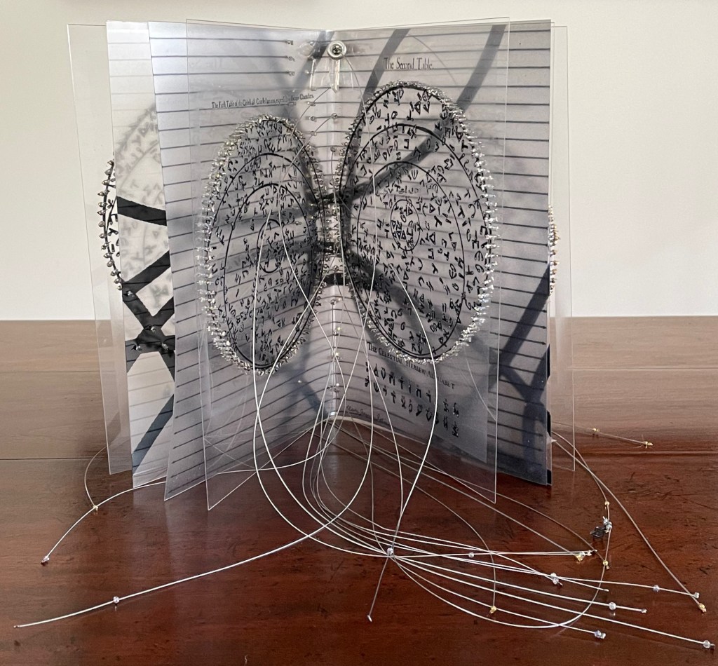
The Hebrew Alphabet Expressing the Celestial Constellations (2017)
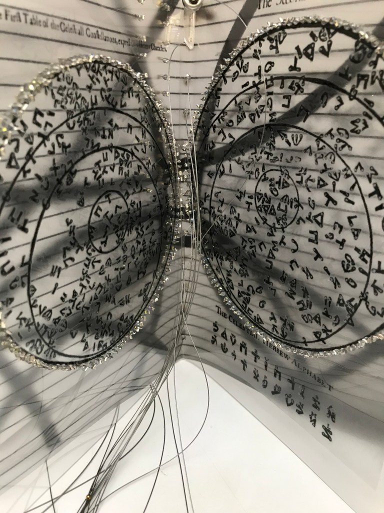
The concept of the celestial alphabet is simple: the forms of the letters are supposedly derived from observation of configurations of stars in the heavens which can be ‘read’ as a form of sacred writing. These alphabets are visually recognizable by the use of nodal points to indicate the stars at the intersection of the bars or lines in their forms, the empty spots in the ink lines signalling the bright point of light in the dark sky. — Johanna Drucker, The Alphabetic Labyrinth, p. 125.
A volume in New York’s Morgan Library by Jacques Gaffarel (1601–1681), a French scholar and astrologer, provides inspiration and material for Satin’s artist’s book The Hebrew Alphabet Expressing the Celestial Constellations (2017). More precisely, two woodcuts from the 1650 English translation of Gaffarel’s Curiositez inouyes sur la sculpture talismanique des Persans, horoscope des Patriarches et lecture des estoiles (1629) are the source.
The Hebrew Alphabet Expressing the Celestial Constellations (2017) Claire Jeanine Satin Saddle stitched with fishline. Box: H277 x W225 mm. Book: H 240 x W165 x D42 mm. 16 pages. Unique edition. Acquired from the artist, 12 April 2023. Photos: Books On Books Collection. Displayed with permission of the artist.
In addition to its astrological character, Gaffarel’s work sits in the traditions of gematria, the Kabbalah and alchemy, which Satin conjures up with gold and silver beads, and crystals. Among the earlier contributors to these traditions is Heinrich Cornelius Agrippa. Like his mentor Johannes Trithemius, Agrippa was a polymath, occultist and theologian as well as physician, legal scholar and soldier. The Latinized Hebrew letters and their corresponding characters in the celestial alphabet seen below come from Agrippa’s De occulta philosophia (1533), which is more legible than Gaffarel’s above.
But there’s a much later inspirational source of esoterica at play elsewhere in the book and in the silver letter adhering to the black box that holds the book. The letter on the box is He, the fifth letter of the Hebrew alphabet, which according to Satin was chosen at random in homage to John Cage’s theory of chance and its role in music and creativity.
The rules printed on the acetate pages suggest a school composition book, an ordered contrast to Cage’s indeterminacy. Or perhaps they are recurring lines of musical staves, and the beads clamped to the fish line are meant to suggest a chaos of errant musical notation. The alphabetic order projected on the heavens in earlier centuries is belied by the disorder of chance projected in later centuries.
With the transparency of the pages, with gold on one side of them and silver on the other, and with two distinct “projections”, Satin leaves us in suspense or a suspenseful state of simultaneity.
Alphabet Cordenons paper book (2020)
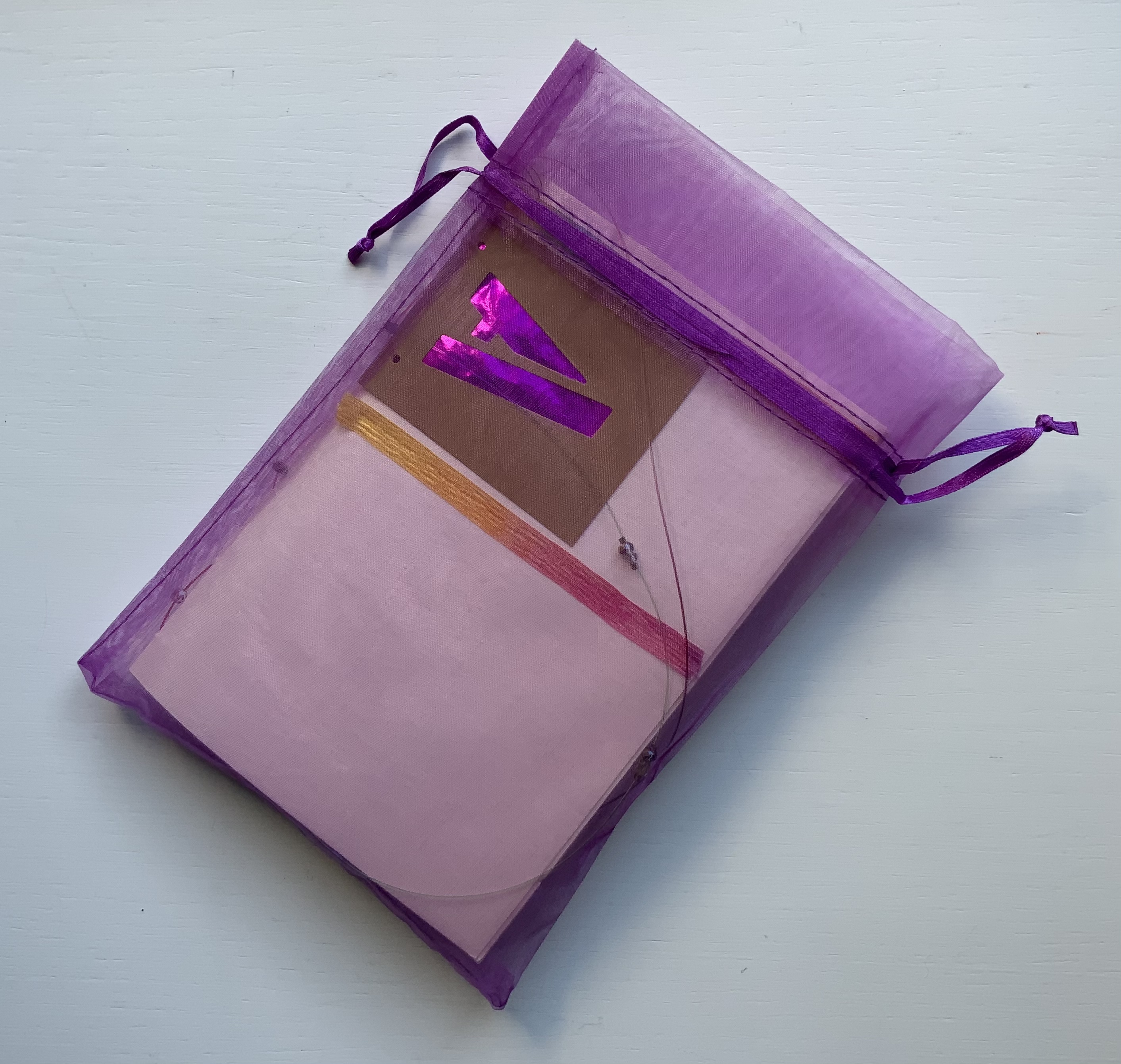
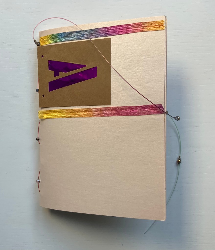
Alphabet Cordenons paper book (2020) Claire Jeanine Satin One of a series of unique works, each created with Cordenons paper, a fine paper that has been manufactured in Italy since 1630. This book uses alphabet letters, glittery strips of ribbon, sequins, crystals, and monofilament to create precise and inventive designs on the cover and each page. In a lavender cloth bag. Measures 9 x 7 inches. 10 unnumbered pages. Acquired from The Kelmscott Bookshop, 8 February 2021. Photos of the work: Books On Books Collection. Displayed with permission of the artist.
In Alphabet Cordenons, as the title suggests, the elemental meets the material. The ancient Greeks called the letters of the alphabet stoicheia (“elements”). In a sense, the elemental yields to the material. Not every letter of the alphabet appears in Alphabet Cordenons, and those that do, appear out of sequence, upside down, sideways, in varied colors and types of paper appearing through their cut stencil shapes. These aspects of materiality draw attention to the paper itself, which comes from a mill established in Corden0ns, Italy in 1630 and is still produced there.
Also drawing attention to the paper are satin ribbon with graduated shifts of color, colored foil backing that lightens and darkens, and glittering beads threaded on multi-colored fish line. Each calls attention to the encaustic-like sheen that comes from the inclusion of mica in making Cordenons Stardream (285 gms) paper.
The finish’s indeterminacy under shifting light seems to find a mirror in the random order, selection and placement of the letters as well as the changing orientation of the ribbon.
Even more indeterminate is the fish line that flips about, curls within, and slips without the turning pages. But while materiality seems to outshine the elemental at every turn, the elemental reasserts itself in the peculiar orientation of the letters and the incompleteness of the alphabet.
“Lyn Davies“. 7 August 2022. Books On Books Collection. Reference and fine print.
“Timothy Donaldson“. 1 February 2023. Books On Books Collection. Reference.
“Cari Ferraro“. 1 February 2023. Books On Books Collection. Artist’s book.
“Edmund Fry“. Books On Books Collection. (For more on the “begats” of the celestial alphabet, see this entry for the near-facsimile copy of Fry’s Pantographia.)
“David J. Goldman“. Books On Books Collection. Reference. [In progress]
Clodd, Edward. 1913. The Story of the Alphabet. London: Hodder and Stoughton. 1913. Superseded by several later works, but is freely available online with line illustrations and some black and white photos.
Diringer, David, and Reinhold Regensburger. 1968. The alphabet: a key to the history of mankind. London: Hutchinson. A standard, beginning to be challenged by late 20th and early 21st century archaeological findings and palaeographical studies.
Thompson, Tommy. 1952. The ABC of our alphabet. London: Studio Publications. Not a fine press publication, but its layout, illustrations and use of two colors bear comparison with the Davies book. It too is out of print and unfortunately more rare.
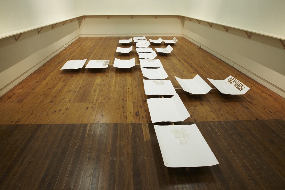
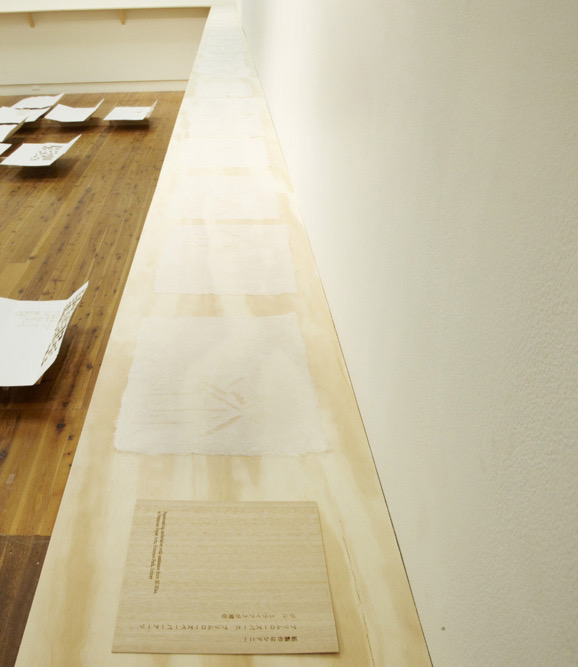
Ise Jingū: Beginning Repeated(2011) Marian Macken Black Cotona bookcloth portfolio, with embossed base; 61 sheets of handmade washi paper, made from kozo, with watermark images. H245 x W330 x D80 mm. Papermaking undertaken at Primrose Paper Arts, Sydney, with assistance from Jill Elias. Unique. Acquired from the artist, 5 February 2021. Photos of the work: Books On Books Collection. Displayed with permission of the artist.
Ise Jingū is a Shinto shrine complex in the Mie Prefecture, Japan, consisting of the Kōtai Kaijijingū, or Naikū (Inner Shrine), and the Toyouke Kaijingū, or Gekū (Outer Shrine). “Once every 20 years, since the reign of Emperor Tenmu in the seventh century, every fence and building is completely rebuilt on an identical adjoining site, a practice of transposition known as shikinen-zōkan. While empty and awaiting the next iteration of building, the unused site or kodenchi sits silently, covered with an expanse of pebbles” (Binding Space, p. 101). For Macken, this ritualistic rebuilding poses architecture as performative process rather than as inert object; it “manifests the replication of a beginning, of a process” (“Reading time”, p. 100).
What better suited phenomenon to be captured with book art?
Referring to the shikinen-zōkan process, Ise Jingū: Beginning Repeated consists of 61 loose sheets with a watermarked image within each, the number reflecting the 61 iterations of the shrine up until the making of Ise Jingū: Beginning Repeated. The watermark is a perspective image based on Yoshio Watanabe’s photograph of the East Treasure House of the Inner Shrine, taken in 1953 on the occasion of the 59th rebuilding. The contrast of the reduction of a photo to a drawing with the subtle embodiment of that image in kozo entices reflection on the phenomenon of representation.
By shifting the image’s placement on every other sheet to mirror its placement on the preceding one, Macken makes the reader’s page-turning replicate the process of shikinen-zōkan. As one sheet yields to the next, the differences between them, arising from the washi papermaking process, reflect the subtle variations within similarity arising in the shrine’s transposition from one site to the other. When the last sheet is removed from the portfolio, the position of the temple supports are revealed.
Macken’s book Binding Space: The Book as Spatial Practice offers further insight into Ise Jingū: Beginning Repeated, but more than that, it provides penetrating discussion of various forms of book art and specific works such as Olafur Eliasson’s Your House, Michael Snow’s Cover to Cover and Johann Hybschmann’s Book of Space. Although the book’s principal argument is why and how the artist book can serve as an important tool for design, documentation and critique of architecture, Macken’s perceptive descriptions show how to observe materiality and its functioning and understand how they contribute to the making of art. Reading Macken’s book will sharpen the ability of any reader or viewer to appreciate book art.
Exhibition: “The Book as Site”, Research Gallery, Sydney College of the Arts, University of Sydney, Australia, 2012. Photos: Joshua Morris. Displayed with permission of the artist.
Further Reading
“Architecture“, Bookmarking Book Art, 12 November 2018.
“Fred Siegenthaler“, Books On Books Collection, 10 January 2021. For more on “watermark art”.
Küng, Moritz, and John McDowall. 2022. “Of Artists’ Books and Architecture“. In Bodman, Sarah (ed.) 2022. Artist’s Book Yearbook. 2022-2023. Bristol: Impact Press at the Centre for Print Research, University of the West of England.
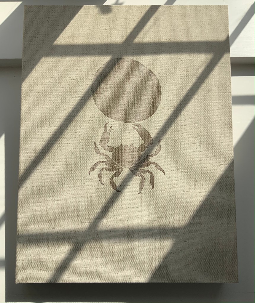
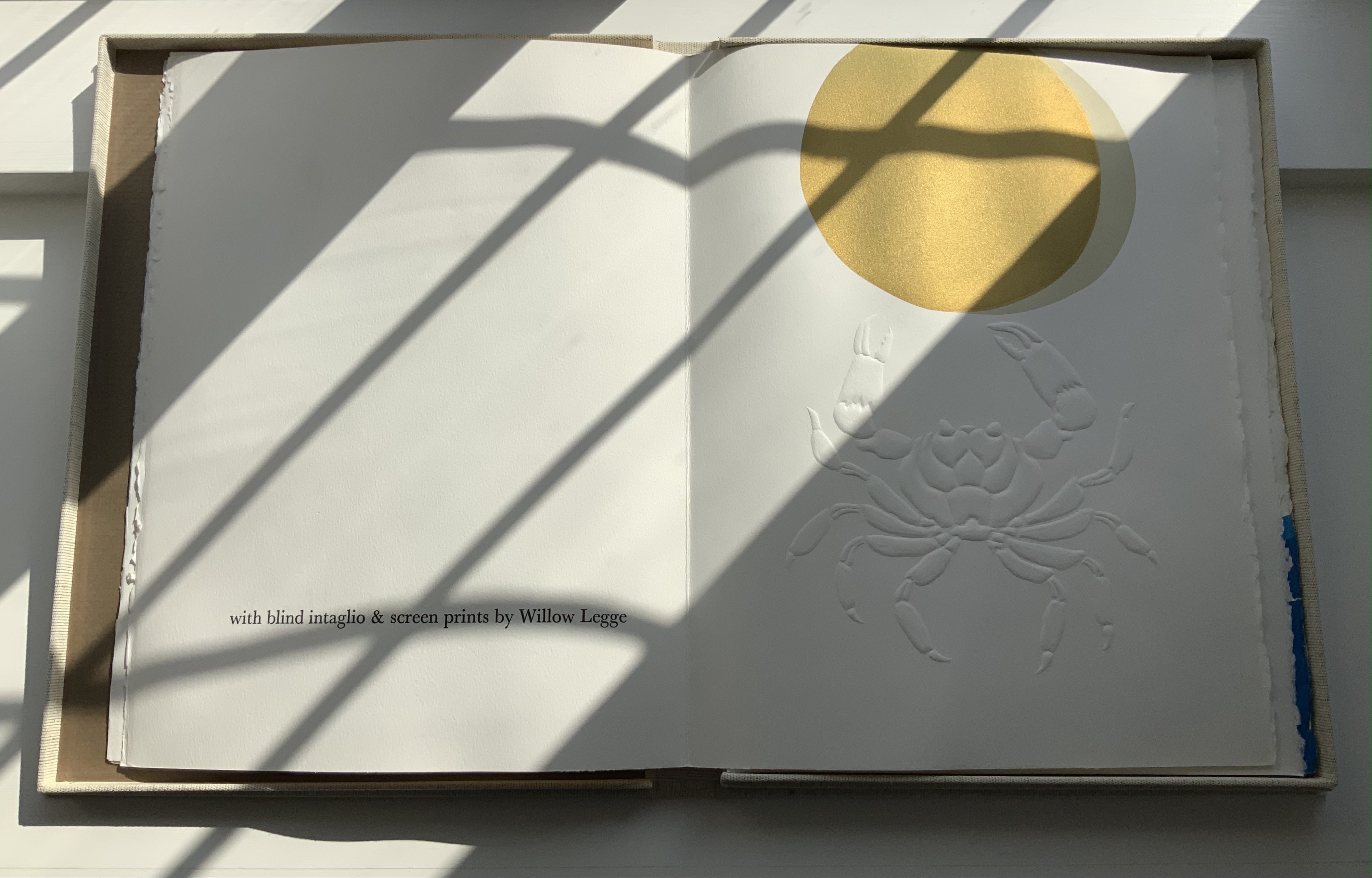
An African Folktale(1979) Willow Legge Cloth-covered case. H405 x W308 mm. Nine unbound folios. H380 x W 285 mm. Acquired from Upstate Treasures, 4 March 2022. Photos: Books On Books Collection.
The Flea (1980)
The Flea (1980, 2nd edition) Willow Legge Sewn pamphlet, J. Green mould-made paper; dark brown card cover with one-eighth fold for end leaves. H300 x W200 mm cover; H285 x W190 mm, 8 pages. Blind-embossed intaglio design printed from carved linoleum in combination with a reversed photo-engraving. Text printed letter-press in 14 pt Baskerville. Acquired from Ron King Studio, 2 February 2021.
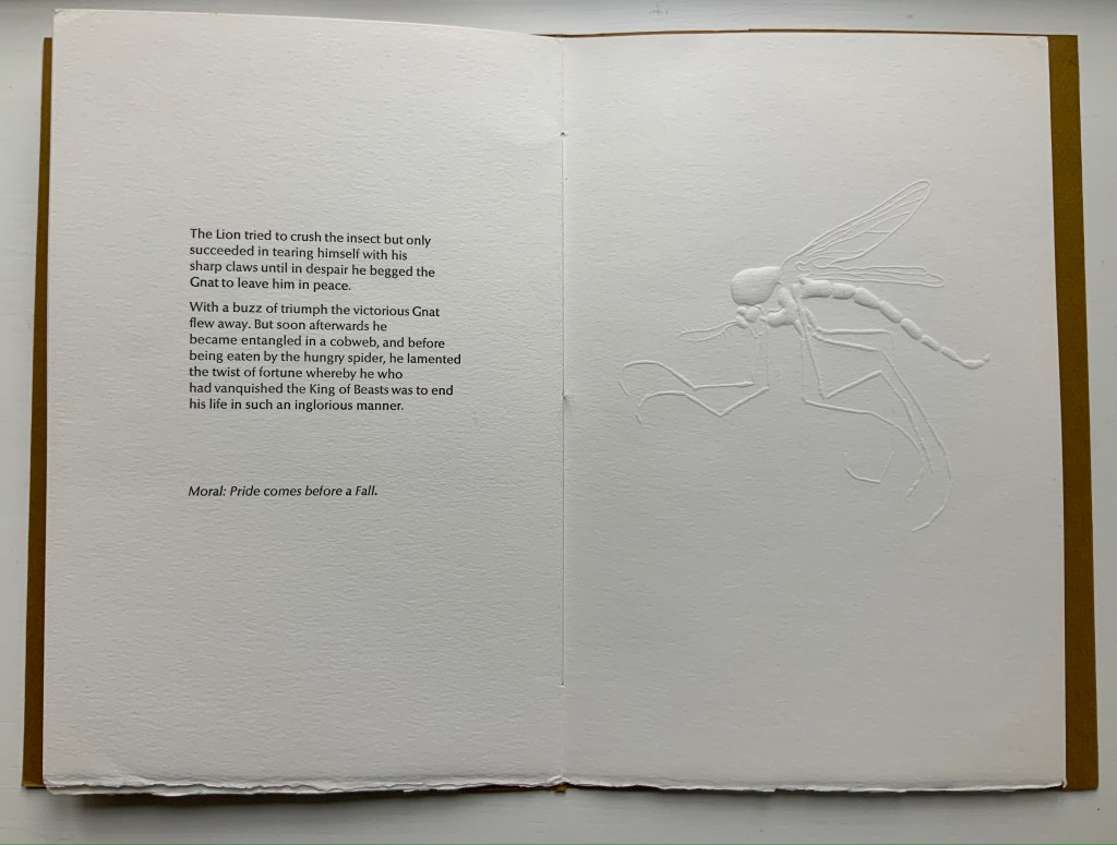
The Gnat and the Lion (1982)
The Gnat and the Lion (1982) Willow Legge Sewn pamphlet, 300 gsm Somerset rag-made paper; gold brown card with two-thirds fold for end leaves. H290 x W203 mm cover; H290 x W190 mm, 8 pages. Two blind-intaglio designs carved from lino. Printed letter-press in 14 pt Optima. Acquired from Ron King Studio, 2 February 2021. Photos: Books On Books Collection.
Further Reading
“Willow Legge“, Society of Portrait Sculptors, n.d. Accessed 4 February 2021.
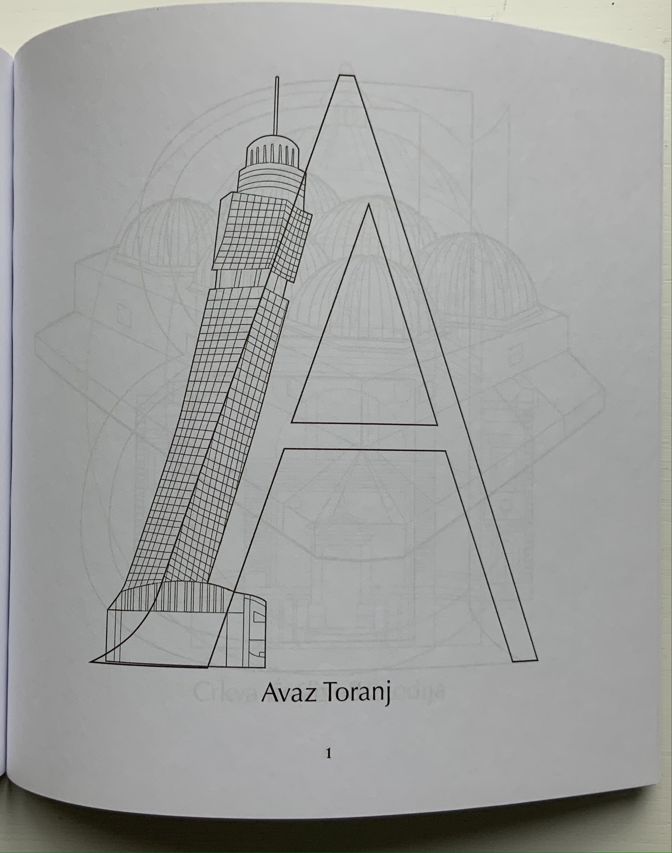
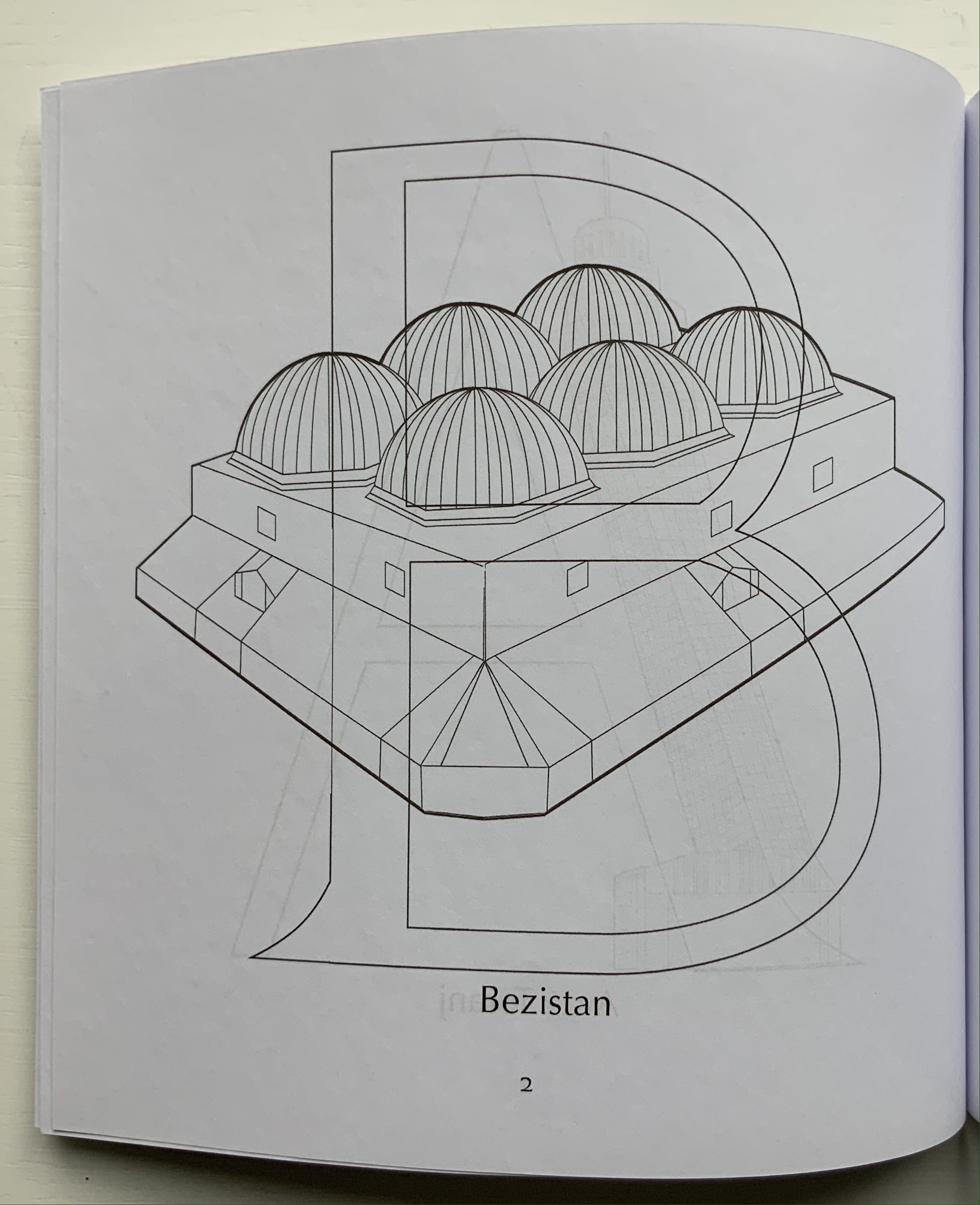
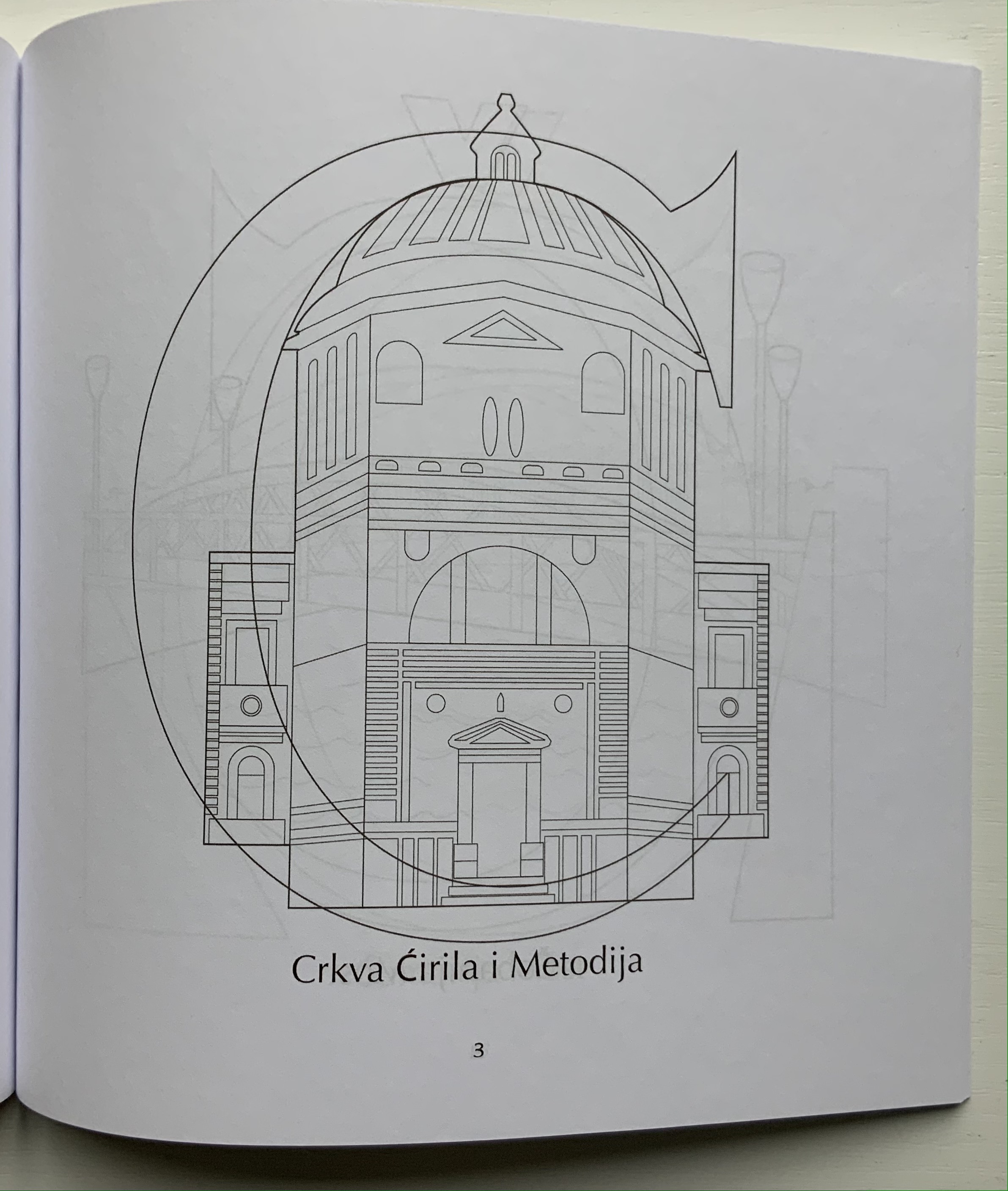
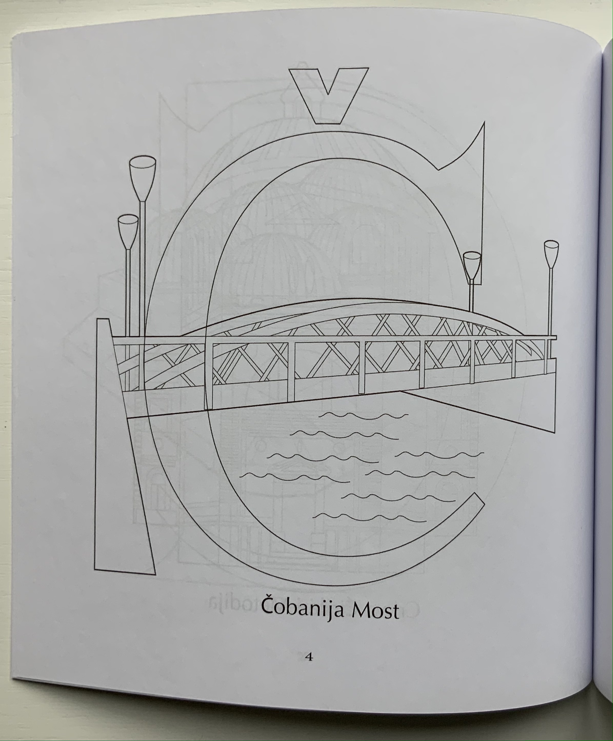
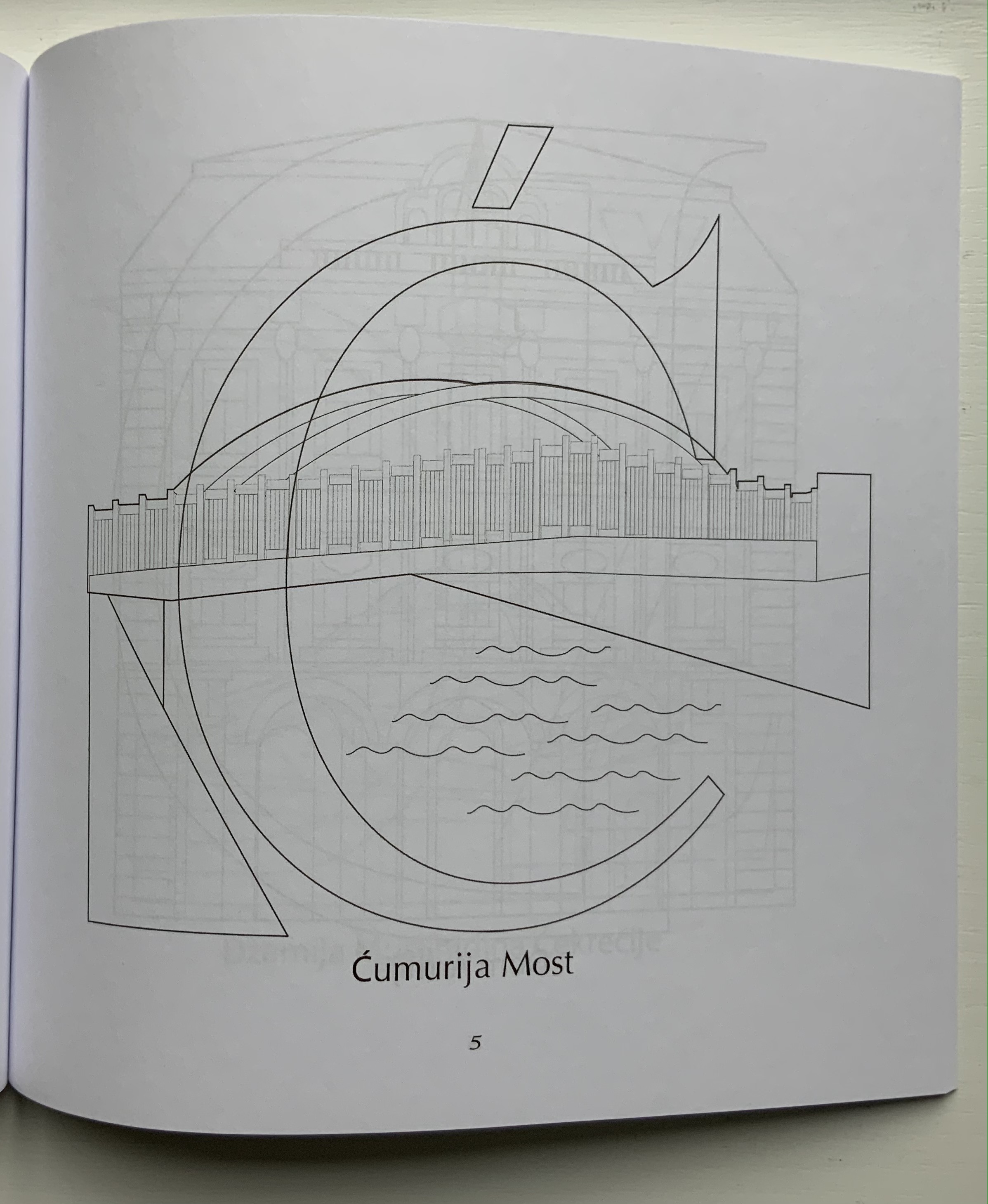
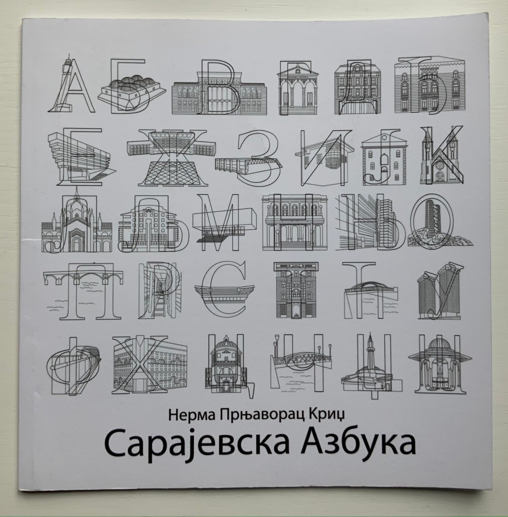
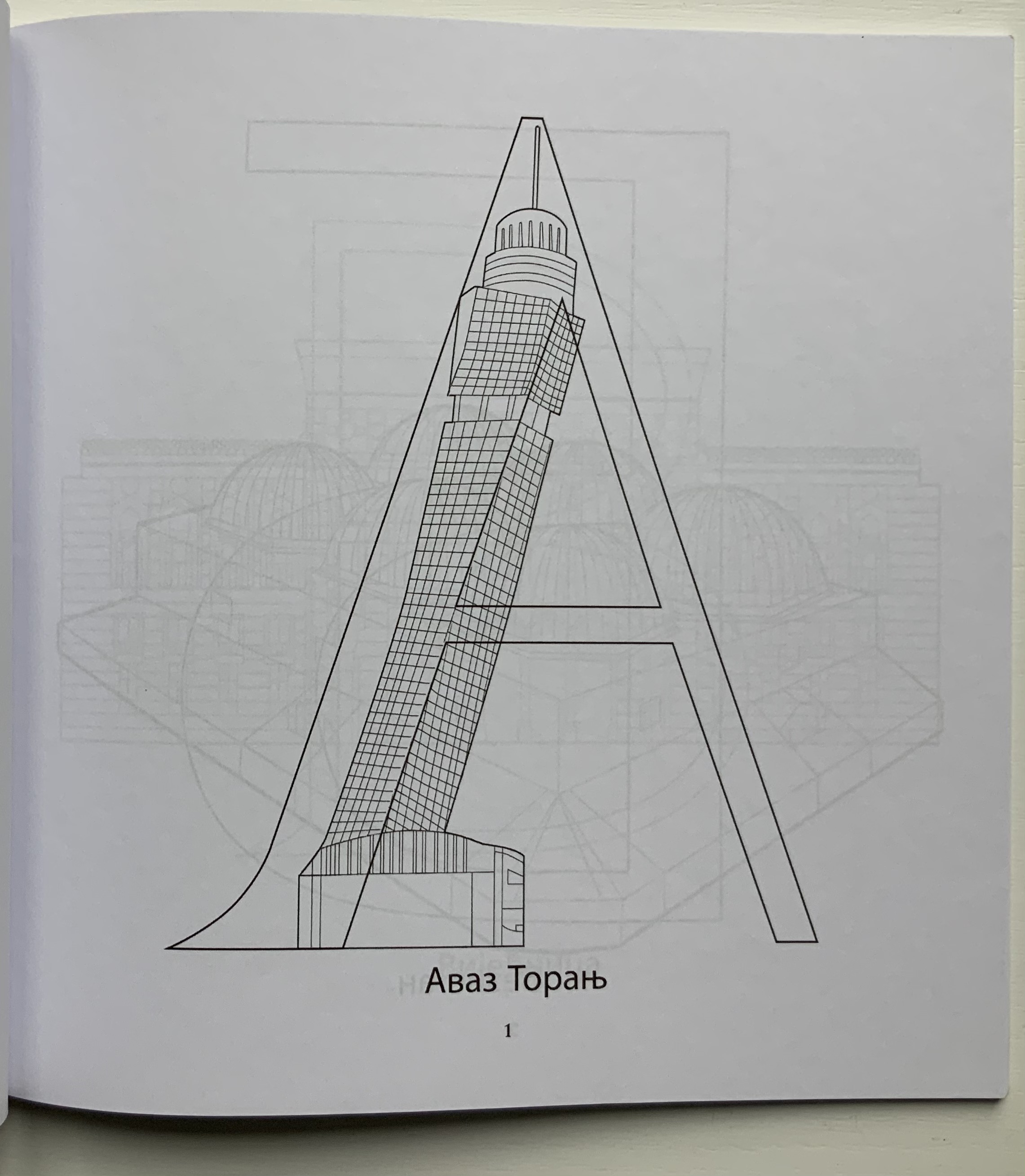
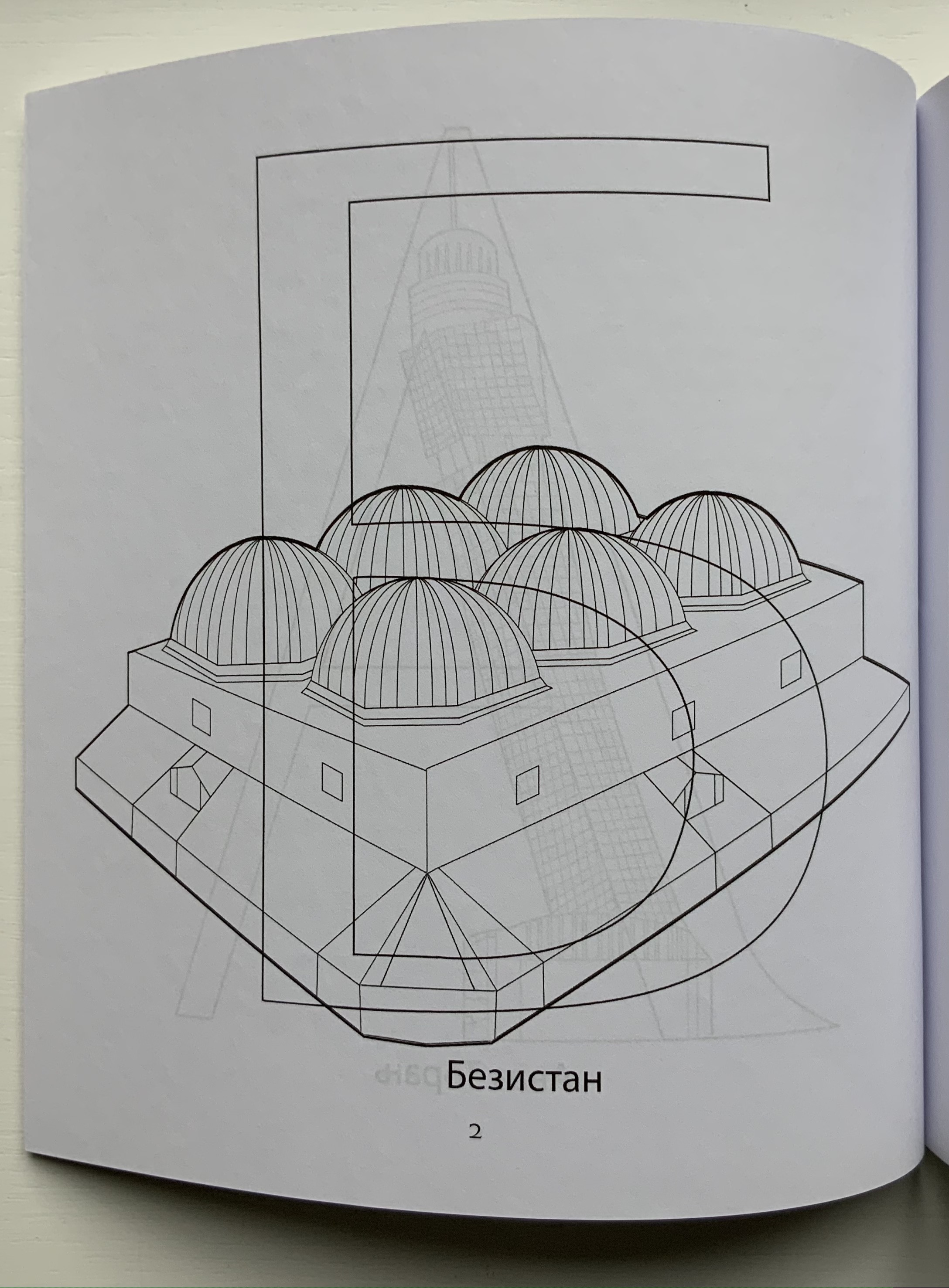
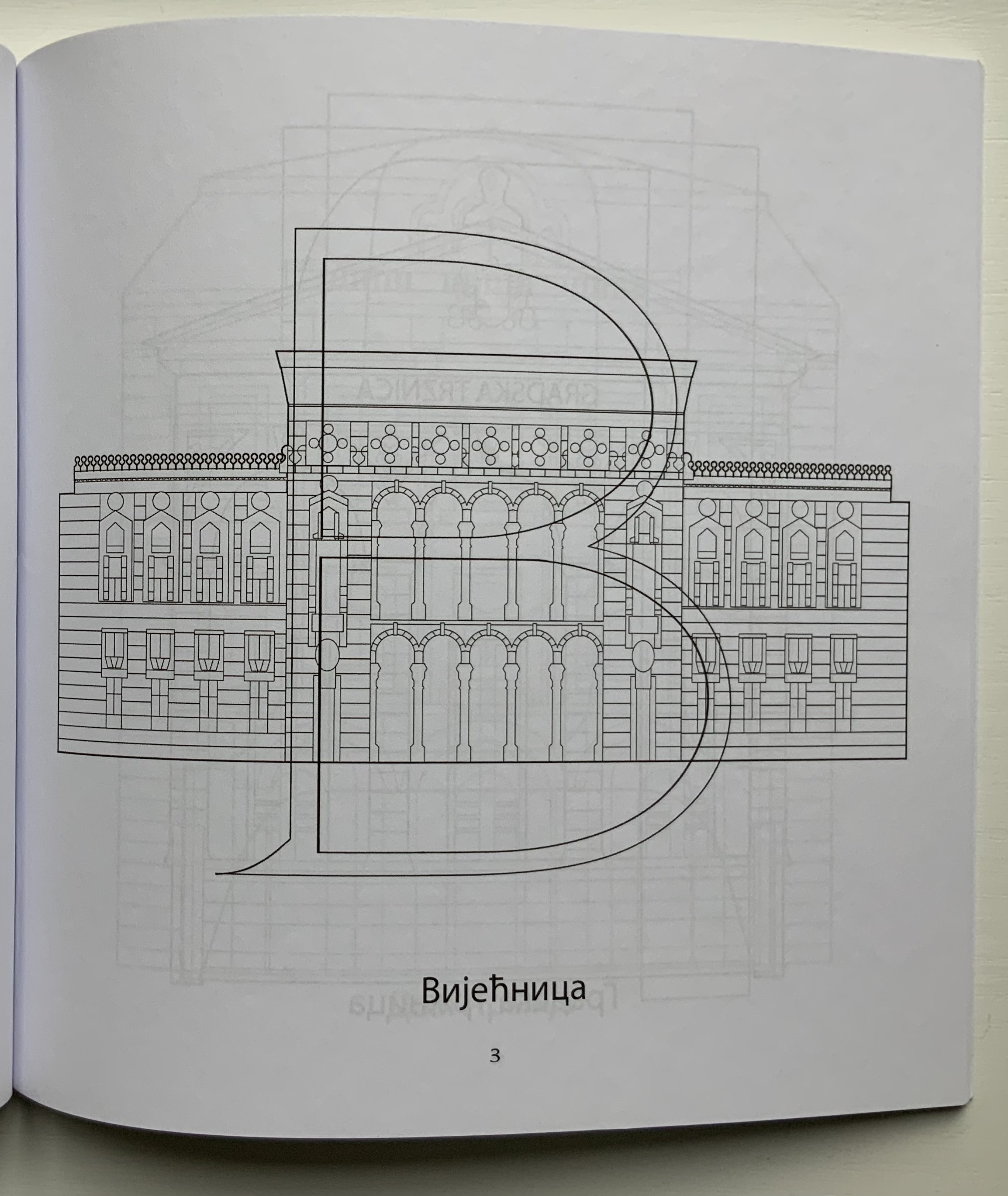
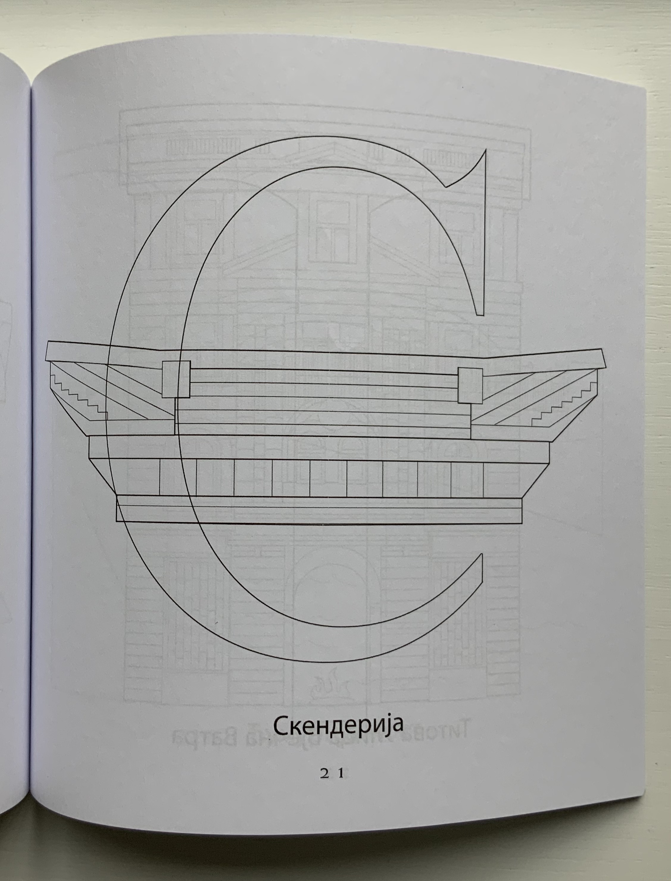
Sarajevska Abeceda (2019) Nerma Prnjavorac Cridge Paperback coloring book. H217 x W215 mm, 34 pages. Acquired from Amazon, 3 January 2021. Photos: Books On Books Collection.
Сapajeвск Aзбукa (2020)
Сapajeвск Aзбукa (2020) Нермa Прњaворaџ Криџ Paperback coloring book. H217 x W215 mm, 36 pages. Acquired from Amazon, 6 January 2021. Photos: Books On Books Collection.
These two coloring books do not integrate letters and buildings as Johann David Steingruber’s Architectural Alphabet does, but they speak to the multilingual theme recurrent in book art and the abecedaries in the Books On Books Collection (see Further Reading). In this case, the artist uses the two alphabets and the besieged city’s architecture as a memorial to her father, who was wounded in the siege.
The books also act as an entry point to Cridge’s installation art, which engages with what Ian Wallace has called “the literature of images”. Two particular installations — both curated by Cambridge’s Art Language Location (ALL) — serve to demonstrate the affinity of her art with themes in the Books On Books Collection: comm(o)nism(2018) and Antonym/Synonym(2019).