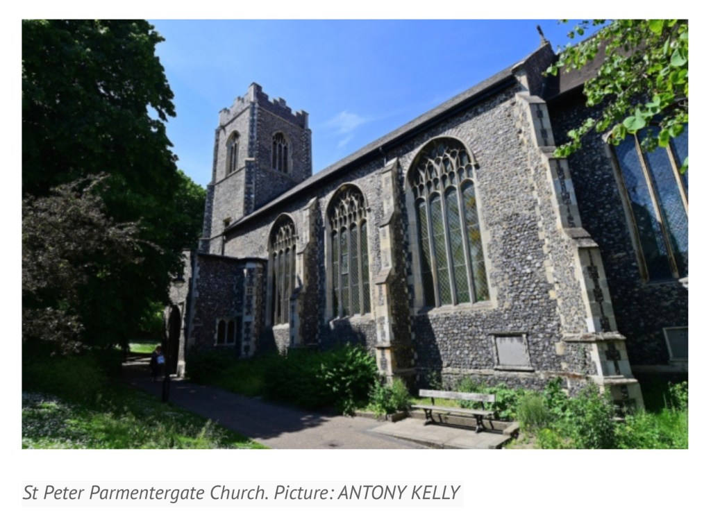
Last November, the post below appeared under the title “Saving the John Jarrold Printing Museum”. News has arrived that the museum will be renamed the “Norwich Printing Museum” and moved to St. Peter Parmentergate in King Street, Norwich. The Norwich Printing Museum’s volunteer supporters aim to open it in the summer 2020.
How fitting it would be if the organisers of the Leiden Book Arts Fair, held in St Pieterskirche, Leiden, every November, were to celebrate the event next year. The connections between The Netherlands and Norwich/Norfolk run deep. And, given that the great-great-grandson of John Folger who came to America from Norwich in 1635 and settled in Watertown, MA, was Benjamin Franklin, arguably America’s “uncle of printing”, how fitting it would be if the members of the New England chapter of the American Printing History Association played printer’s devil to the affair.
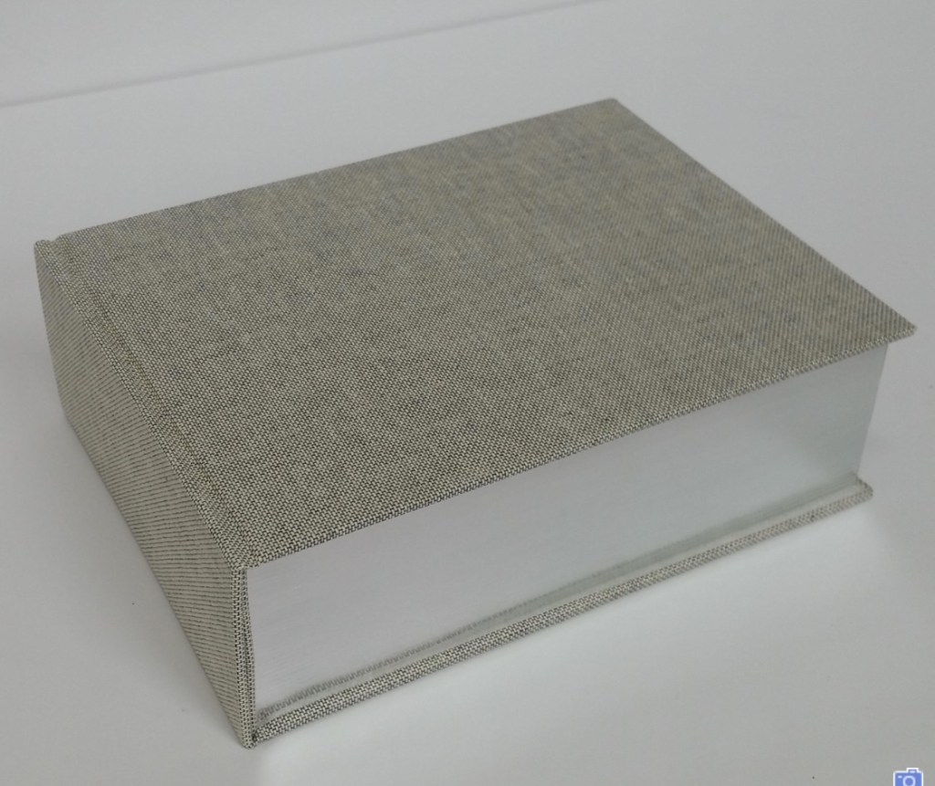
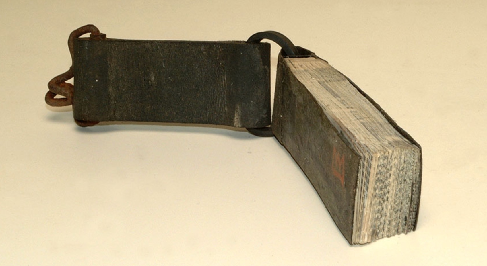
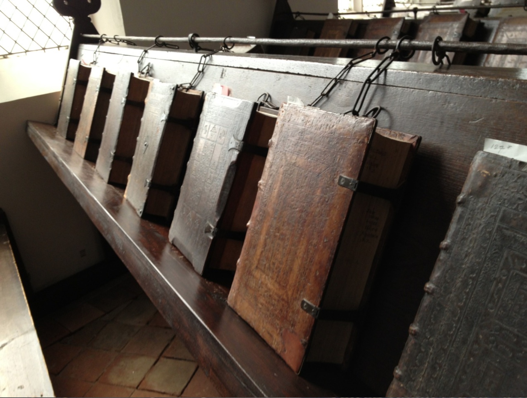
The John Jarrold Printing Museum in Norwich, England, is one of the few working print museums in the world. Here’s a selection of ten from among its hundreds of holdings:
Star wheel etching press. Wood & Company, West Smithfield, London. 1858. No.1250. Donated by Midlands Art Centre, Birmingham, June 2010.
Albion. Hopkinson & Cope, Finsbury. 1845. No. 1900. From Mr Gott of Watts & Rowe, King’s Lynn.
Albion. Hopkinson. Jonathan & Jeremiah Barrett, executors of R. W. Cope, Finswbury, London. 1840. No. 1273. From William Booth, Woodbridge.
Columbian. Probably George Clymer. c.1845. Was purchased new by Jarrold & Sons Ltd, and was their longest serving machine. (Lent to the Norwich School of Art for the Caxton Quincentenary).
Stanhope. 1825. Donated by Cambridge University Press.
Side-lever lithographic hand press. Hughes & Kimber. ex Norwich College of Art & Design.
Top lever lithographic hand press. D. & J. Greig, Lothian Road, Edinburgh. c.1840. 24 x 17 in. Presented to John Jarrold Printing Museum, May 1999 by Geoffrey Dunn, 22 Henry Drive, Leigh on Sea, Essex, SS9 3QQ.
Ratcliff direct lithographic press. John Ratcliff & Sons Ltd, Wortley & Leeds. 1927. Double demy. Donated by Curwen Studios, London. Thought to be the only surviving example.
Furnival stop-cylinder. 1984. Double demy. Donated by H. Hawes, Elmswell.
Heidelberg one-revolution cylinder press, c.1950. Donated by Jarrold & Sons Ltd. Heidelberg. Schnellpressenfabrik A.G. Heidelberg, Germany.
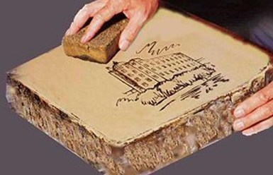
The developers aiming to tear down the building that houses the John Jarrold Printing Museum have mooted keeping some of the older printing presses now there and using them as mood or accent pieces for the café to be built as part of their residential development plans.
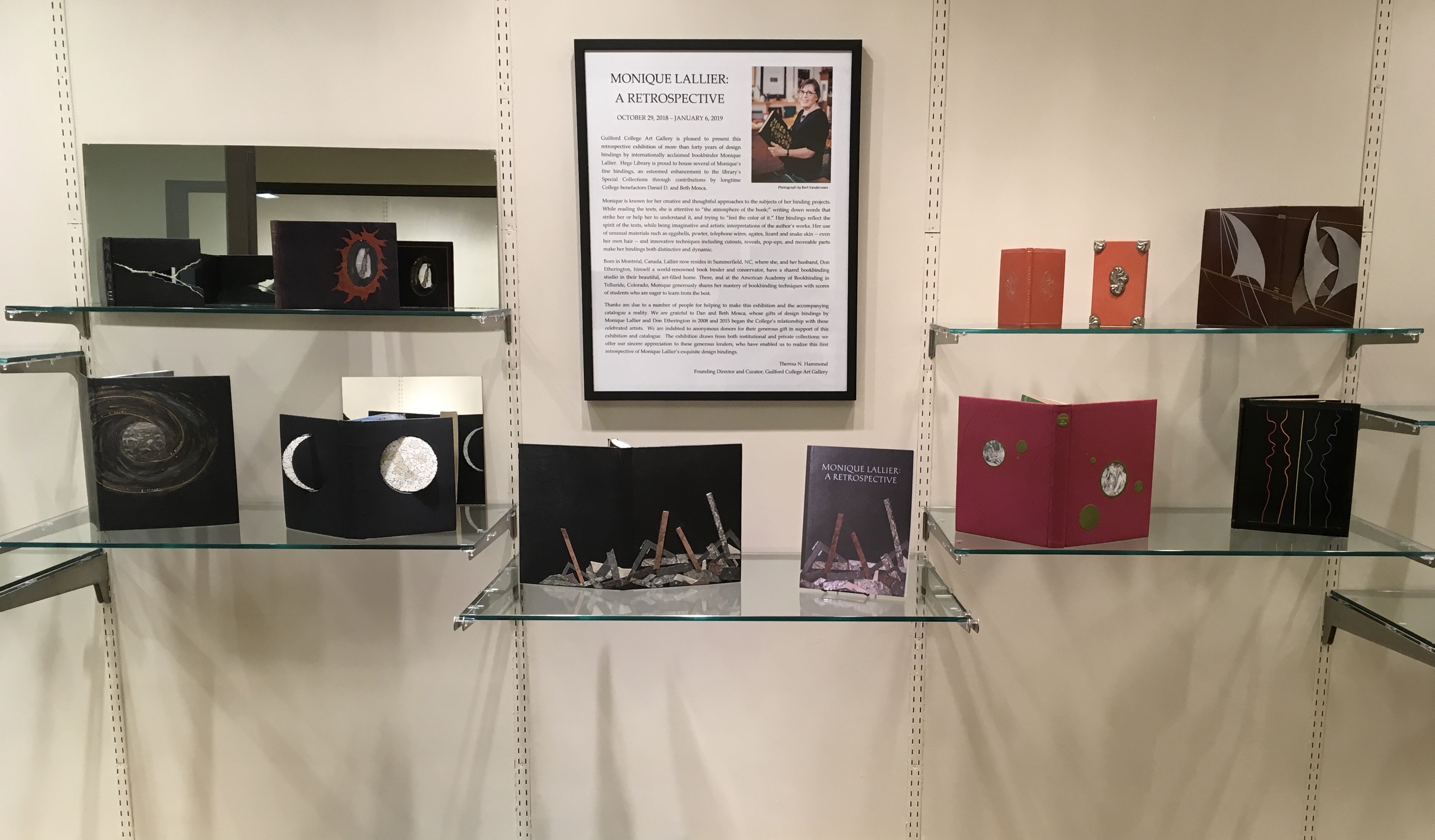
Monique Lallier: A Retrospective Guilford College Art Gallery
North Carolina can be a quiet state of hidden gems. Particularly those of the book arts, book art and publishing variety. The art gallery fronting the library on the Quaker-founded Guilford College campus in Greensboro is one such gem. Within that gem for the next two months is another. The Gallery’s director and curator Theresa N. Hammond has marshaled its collection of Monique Lallier’s bindings and dozens of others from around the world for a retrospective on forty-six years of work by Lallier.
Lallier’s roots are in the tradition of fine French binding, which goes back to the practice of book buyers’ purchasing unbound books and taking them to their favorite specialist binder for customized binding, most often in leather. Lallier has written here about the technique in detail. While it is true to call Lallier a bookbinder, it misses what the displayed works say she is: a sculptor and artist of the book. For anyone lucky enough to visit Guilford College Art Gallery, the comments and photos below offer a handful of pointers to details and background supporting that statement. The exhibition catalogue including an insightful essay by Karen Hanmer as well as multiple views of the works displayed and several outside the exhibition will clinch the argument.
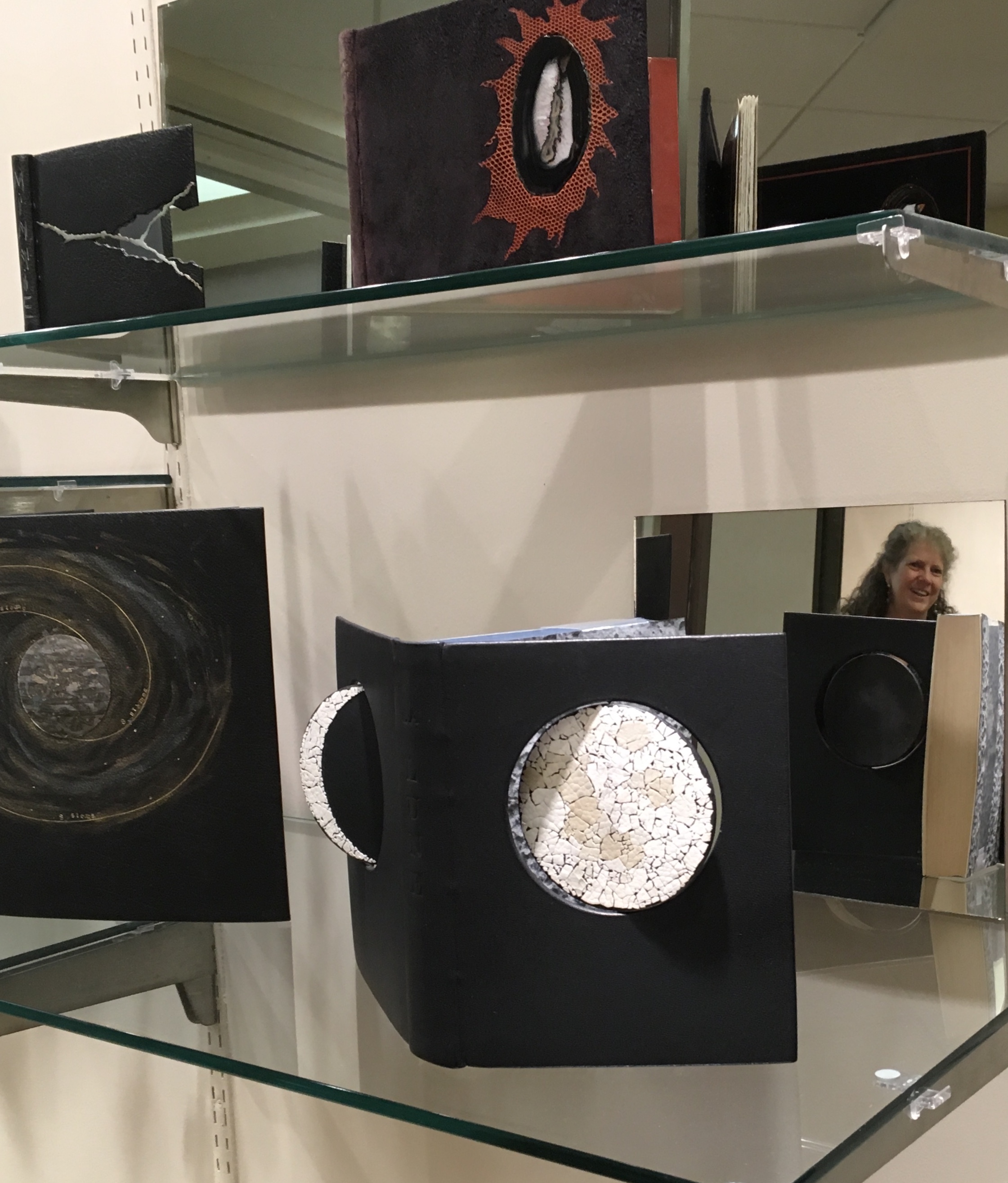
Be sure to take in all angles provided by the mirrors behind many of the works. Theresa N. Hammond, the Gallery’s director and curator, reflected here behind La Lune (1971) and its swiveling “phases of the moon”, rounds coated in eggshells of differing colors.
One of the distinguishing characteristics of Lallier’s artistry is her innovative use of materials: eggshells in La Lune (1971), her own hair in L’Eloge de la Folie (1974), translucent agates in Portes Sud (1979), silver in Histoire de Minnie (1982), wires from old telephones in Lignes (1986) and pewter in The Song of Songs, which is Solomon’s (2002).
L’Eloge de la Folie (1974) Rarely does Lallier use on the cover an image from within the book at hand. Here is one of the exceptions. The cavorting monks from Erasmus’ satire come from Albert Dubout’s 1951 illustration of the classic. Lallier, however, couldn’t resist using her own hair to form their tonsures.Portes Sud (1979) Note in the reflection the light coming through the agate embedded in the cover.Histoire de Minnie (1982) In the exhibition, be sure to look at the back cover where Lallier has used the silver piece, embedded in the front cover, to stamp the back cover.Lignes (1986) This is Lallier’s only collaboration from scratch. For a Montréal exhibition whose organizers set the theme of “lignes” or lines, she conceived the cover design. Sharing only blank pages and not the design, she then asked Claude Péloquin to provide text and illustrations on the theme. The “telephone wires” attached to the front cover are loose and manipulable by the reader — a tongue-in-cheek form of interactivity with lines of communication in the pre-Web age. The Song of Songs, which is Solomon’s (2002) Visiting a Parisian builders’ store with a friend selecting decor items, Lallier was entranced by sheets of pewter and its varying thicknesses. She bought some. The inspired result above sits alongside another in the exhibition — The Enchiridion of Epictetus (2003); be sure to look at the reflection of The Enchiridion to spot the use of pewter in the interior.
The odd materials chosen are frequently highly apropos of the book in question. In the catalogue, take a look at Le Papier, Le Livre (2015), which has embedded pieces of a wasp’s nest, entirely in keeping scientifically and historically with the subject. In 1719, the French naturalist René Antoine Ferchault de Réaumur published an essay to the Royal Academy of Sciences on the natural history of North American wasps and hypothesized how man could adopt their natural papermaking industry.
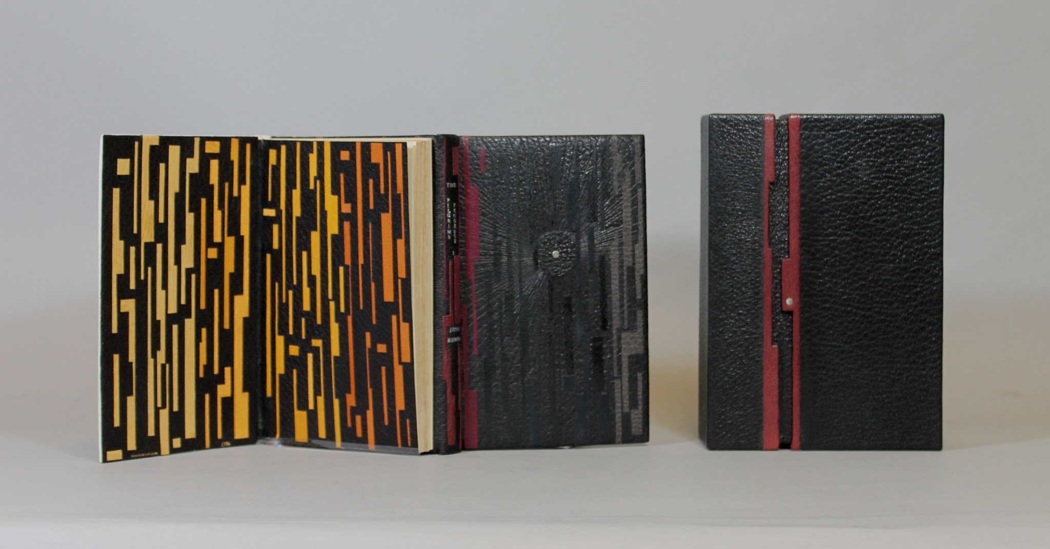
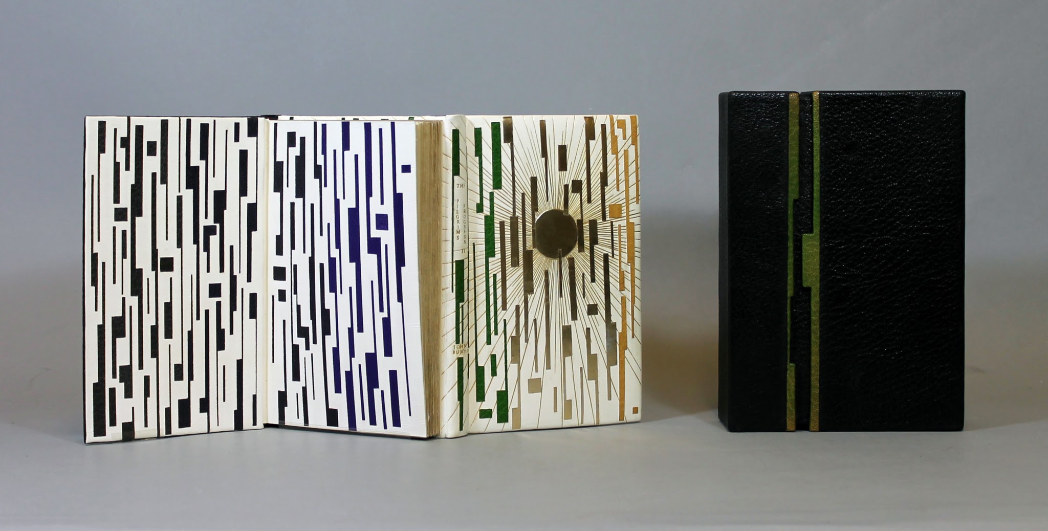
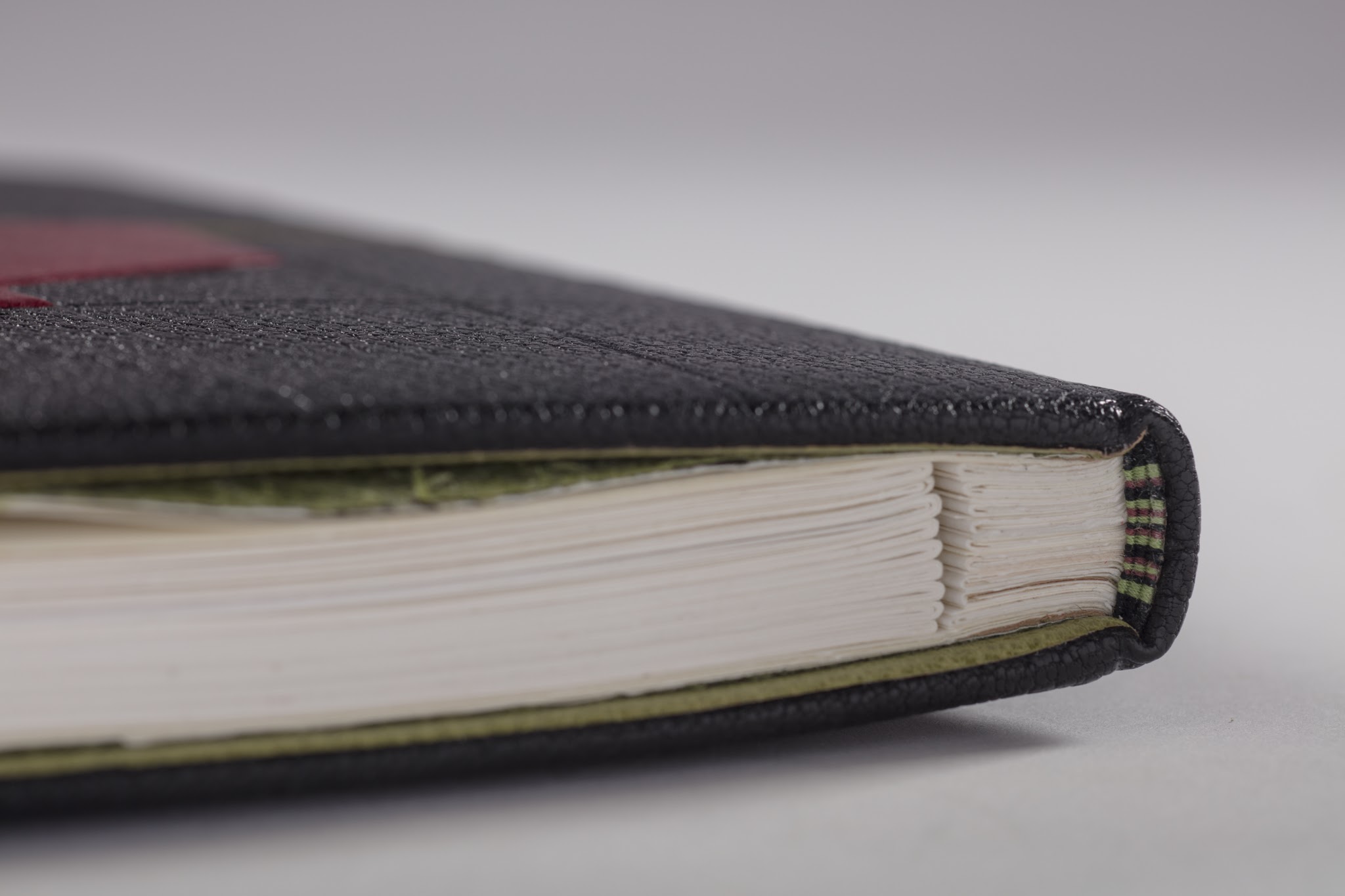
Another element of Lallier’s work to look for is the form of binding — not just the covers but the interior structure. Despite the glass cases protecting these items, it is easy to spot and enjoy the structural features, for example, the book in the form of a distinctively shaped Southern lady’s fan for The Birthday (1990). The catalogue shows a dos-à-dos (back-to-back) binding of the volumes of Pilgrim’s Progress (2003), a daring rebinding of a rare 18th century production. The Friends of the Library at University of Alberta made the courageous right decision.
Pilgrim’s Progress (2003) Dos-à-dos binding, showing the first part of the book, in which Pilgrim sets out on his journey in darkness, which Lallier marks with a black leather circle with a palladium dot at its center. Photo credit: University of Alberta. Pilgrim’s Progress (2003) Dos-à-dos binding, showing the second part of the book, in which Pilgrim arrives at the Celestial City, which Lallier marks with a gold tooling radiating from a gold circle. Photo credit: University of Alberta.
Some of the interior and exterior forms are more subtle. Lallier has made extensive use of the stub binding technique (see below), and there are several examples of cross structure binding (see below).
Look for this style of binding called montage sur onglets or stub binding that allows pages to lay flat or even be easily detached. Look for Le Chevalier Troyen (2014) and Inside the Book (2016), displayed side by side in the exhibition and showing this form of binding.Le Livre des Origines / The Book of Origins by André Ricard, 2005 In the exhibition, be sure to look closely at the spine’s deliberately exposed cross-structure binding in full goatskin leather.
Le Livre des Origines is another one of those rareties where Lallier uses on the cover something from within the book. Stamped on the front, the phrase alternating in English and French comes from the text relating the Huron Nation’s creation myth as recorded in French by ethnologist Marius Barbeau, reinterpreted and rewritten by André Ricard. The alternating roman and italic presentation of languages reflects the book’s alternating pages of English and French. Note how the simple design in black and red with the diagonal onlays of green leather captures characteristic elements of the art of the Wyandot tribes, which can be explored here. A design philosophy of using imagination and craftsmanship in service to the book exemplifies itself again and again throughout the exhibition.
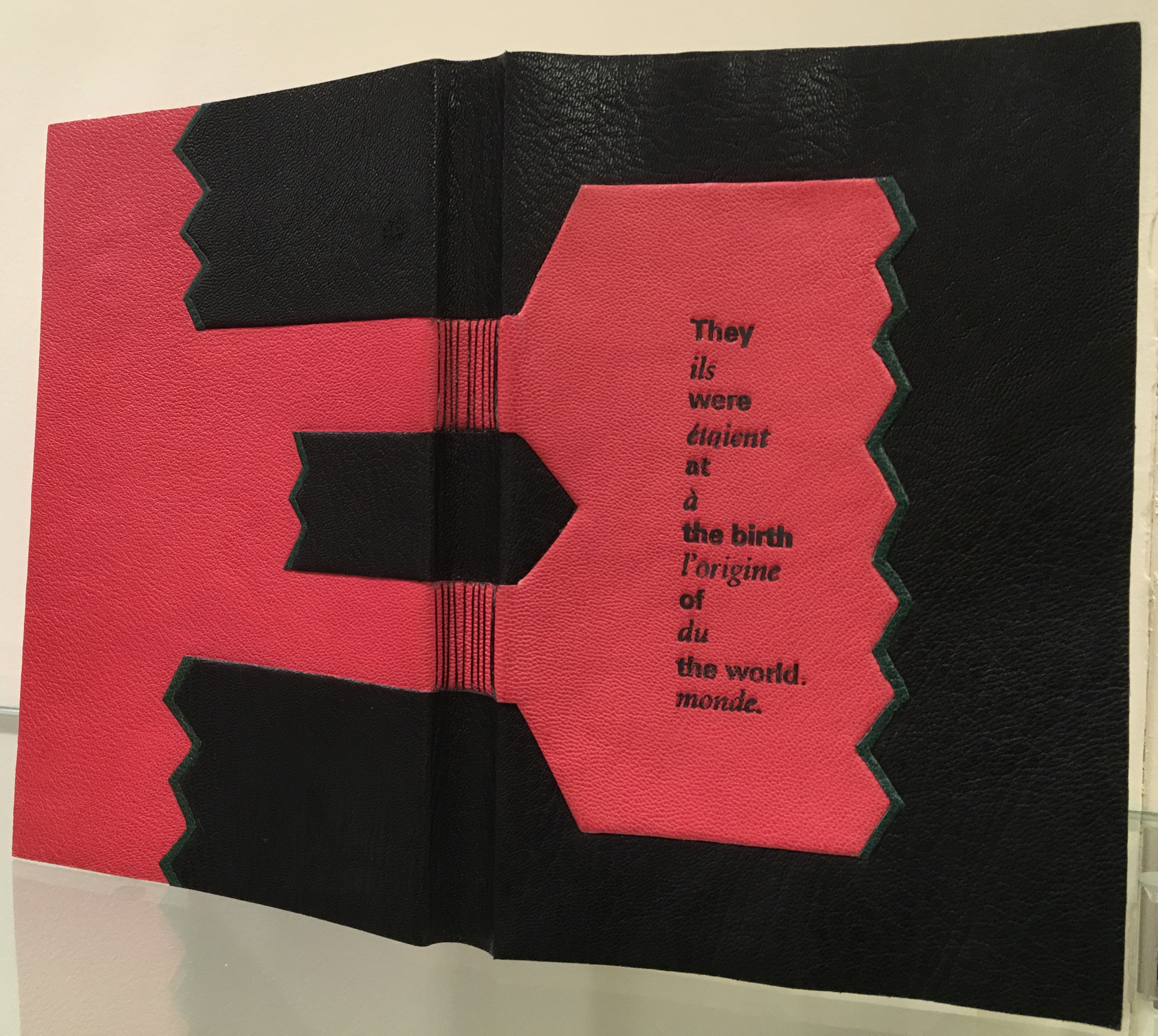
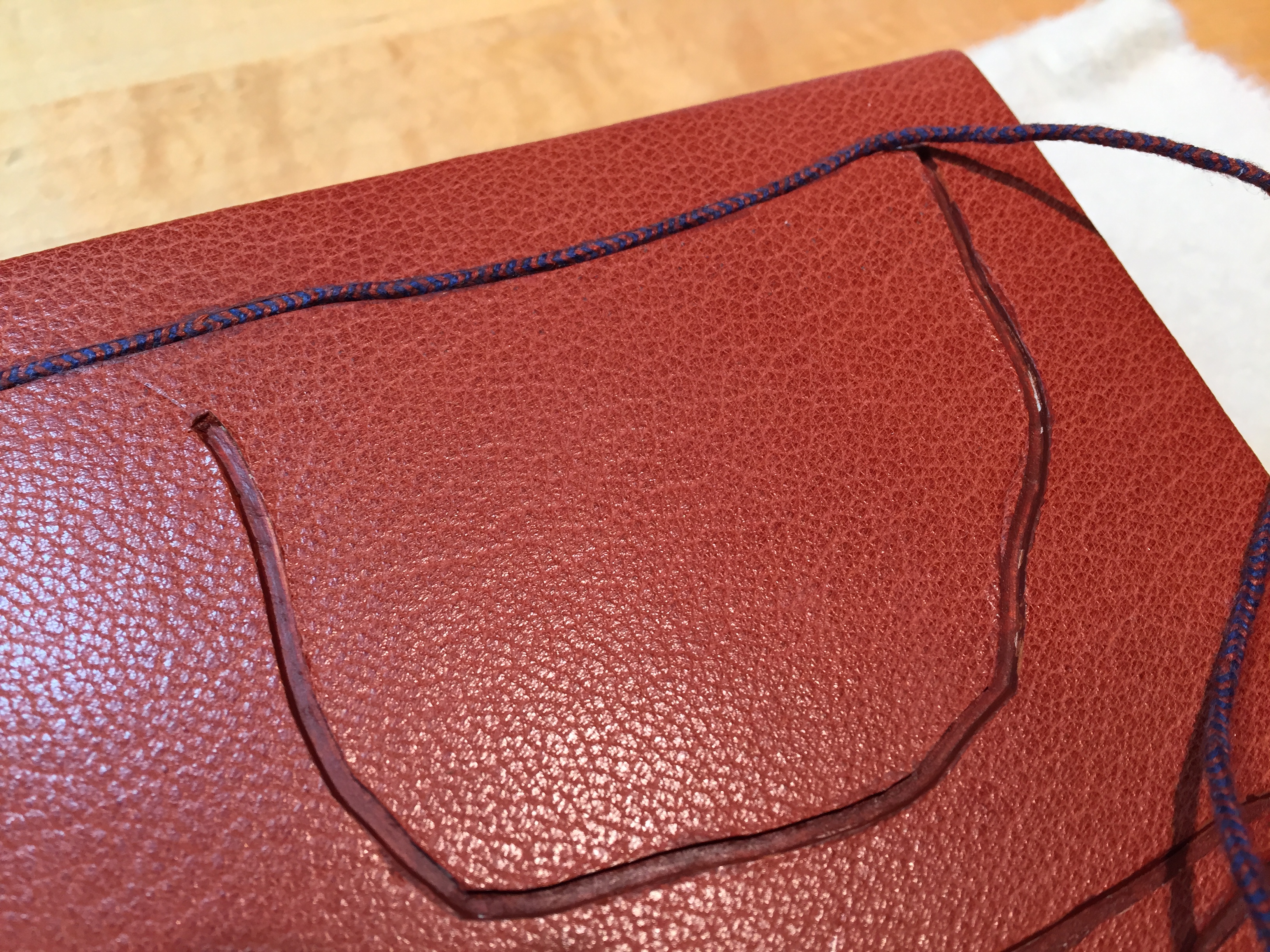
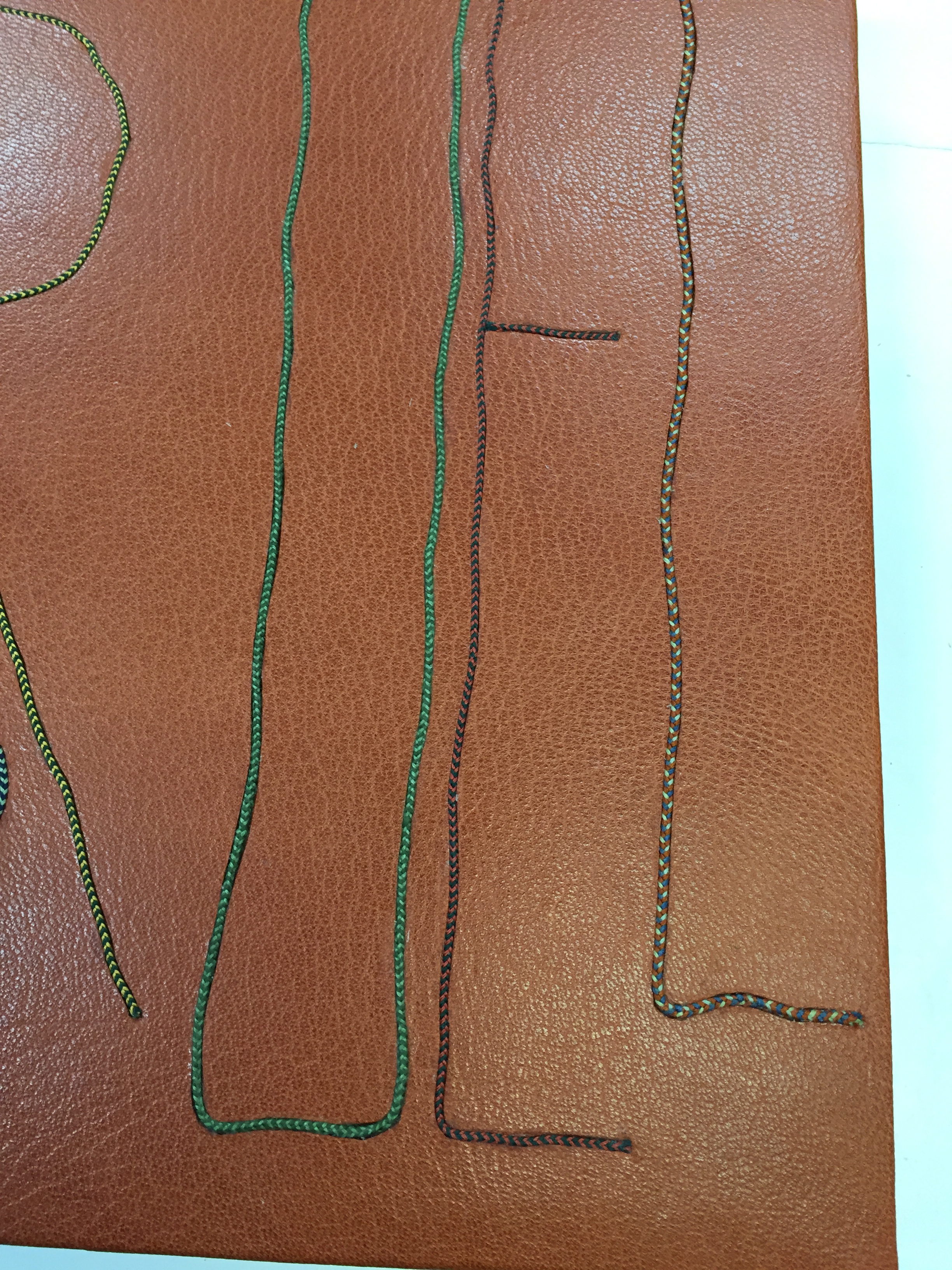
Which brings us to another characteristic of Lallier’s art to seek out: the painstaking handwork. For this, Pantagruel (2016) is worth a long look. Lallier once observed a student engaged in kumihimo braiding (the Japanese technique of using a disk to gather multiple threads of different colors into a single strand) and asked to be taught. Inspired by André Derain’s illustrations of Rabelais’ riotous satire, she set out to use braids for the title’s letters, filled and surrounded with the colors from the illustrations. Some of the leather inlays are handpainted; all — even the smallest — are handcut, beveled, tucked in the covering leather and tooled. The series of process photos below — all courtesy of the artist — provide a look behind the scenes.
Pantagruel (2016) Awarded one of 25 Silver Prizes at the International Competition of Designer Bookbinders (2016)
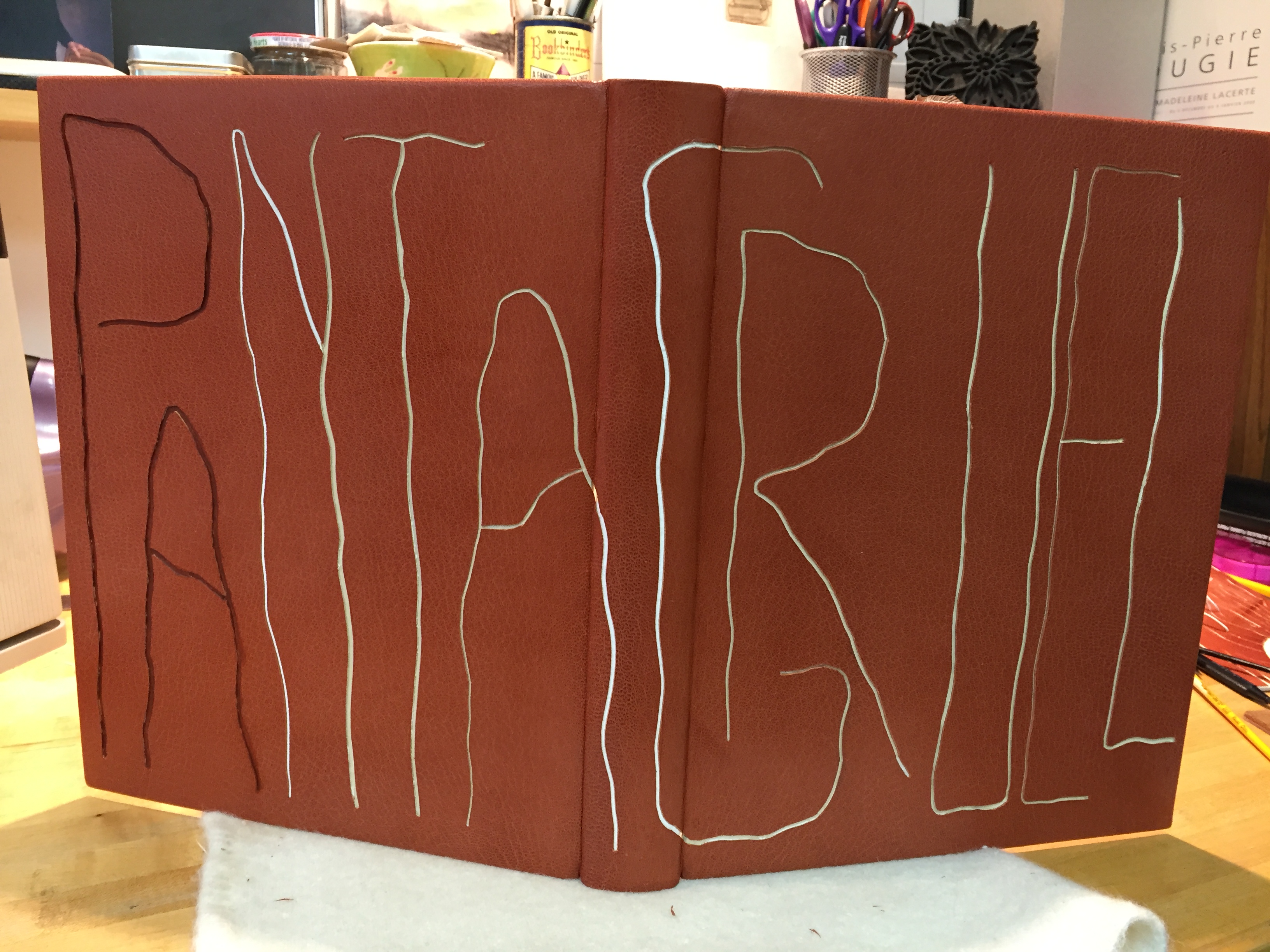
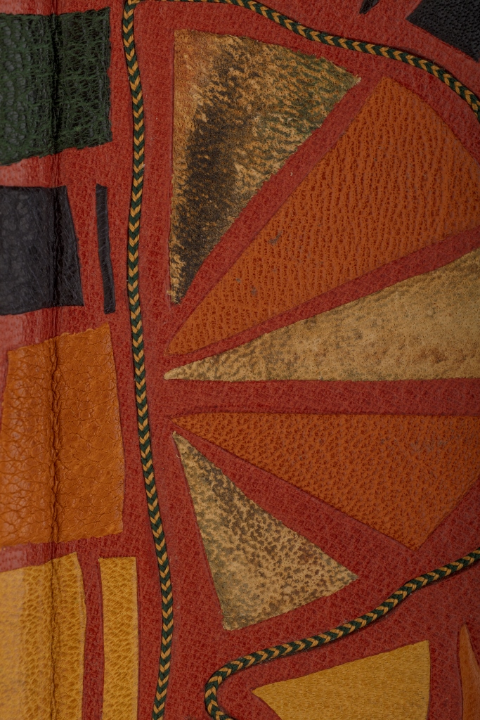
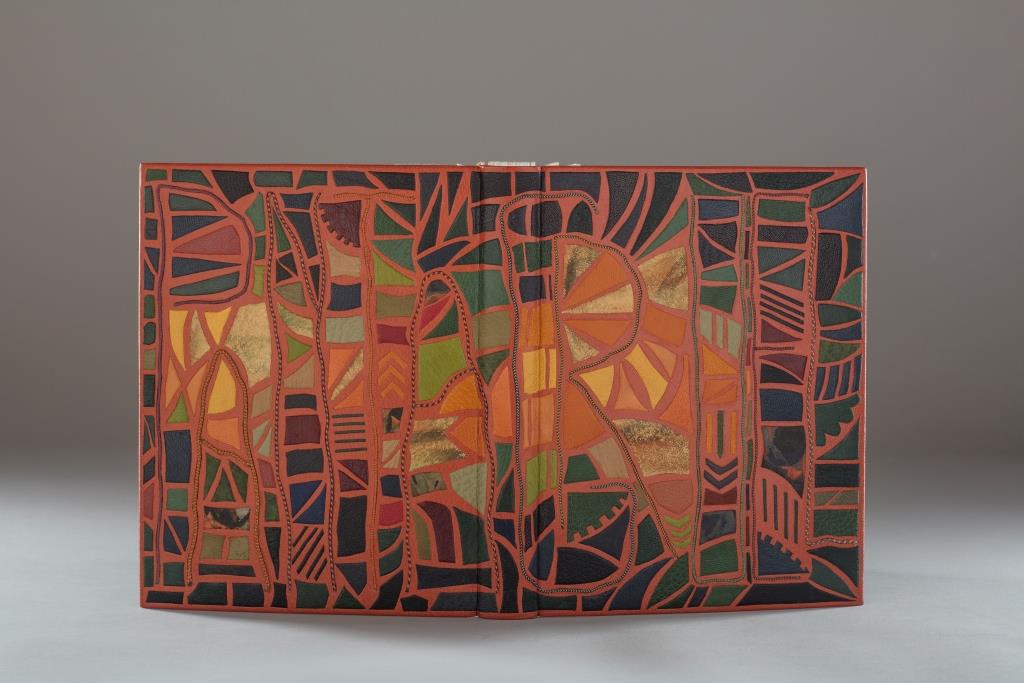
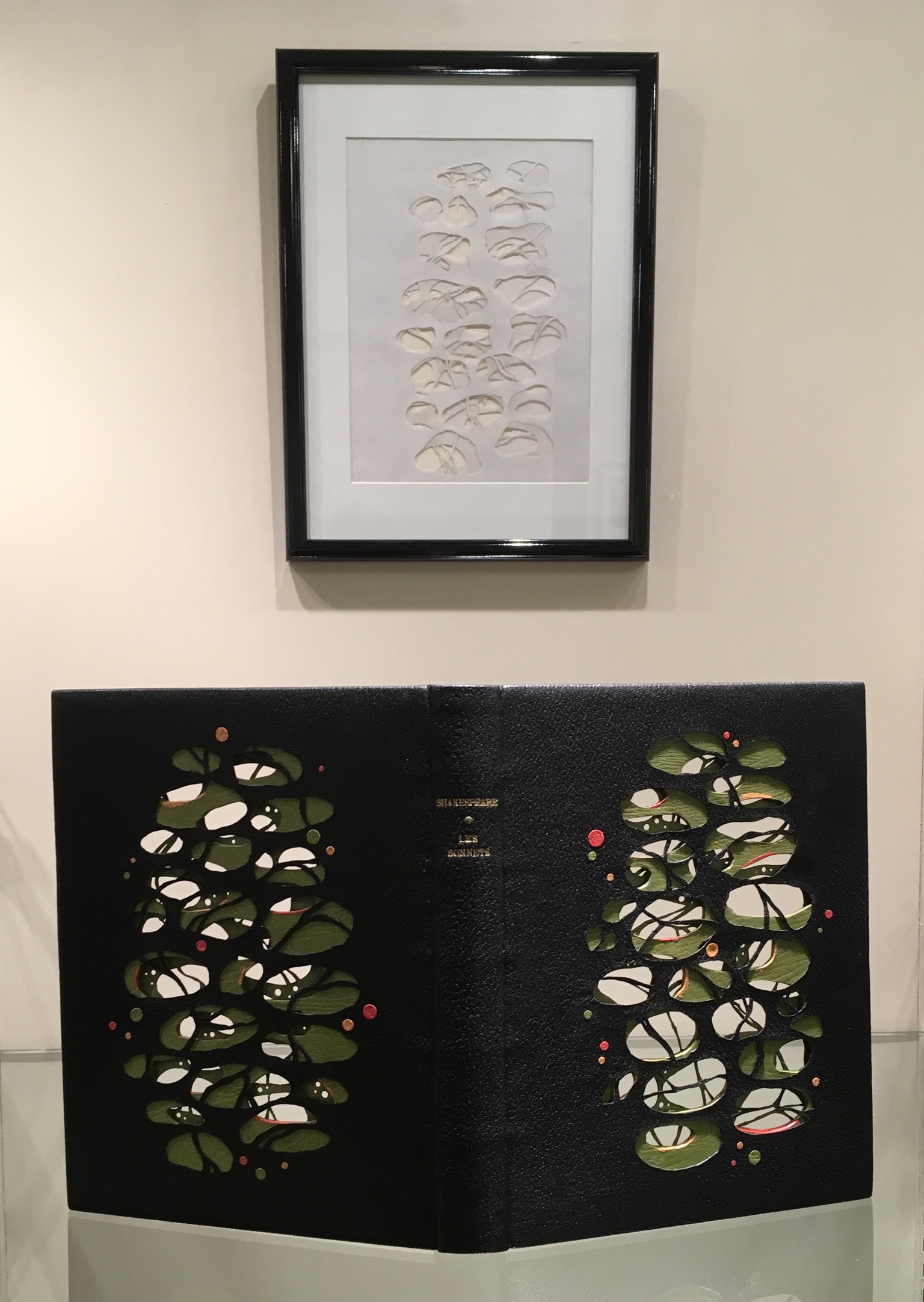
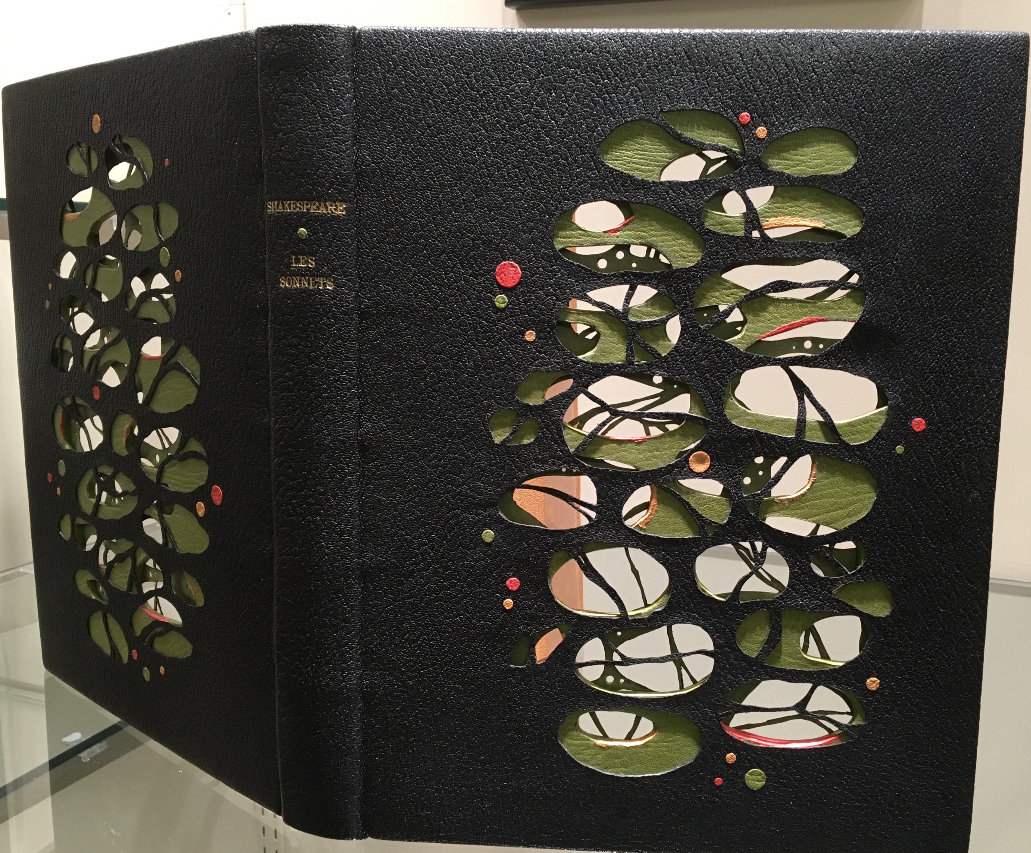
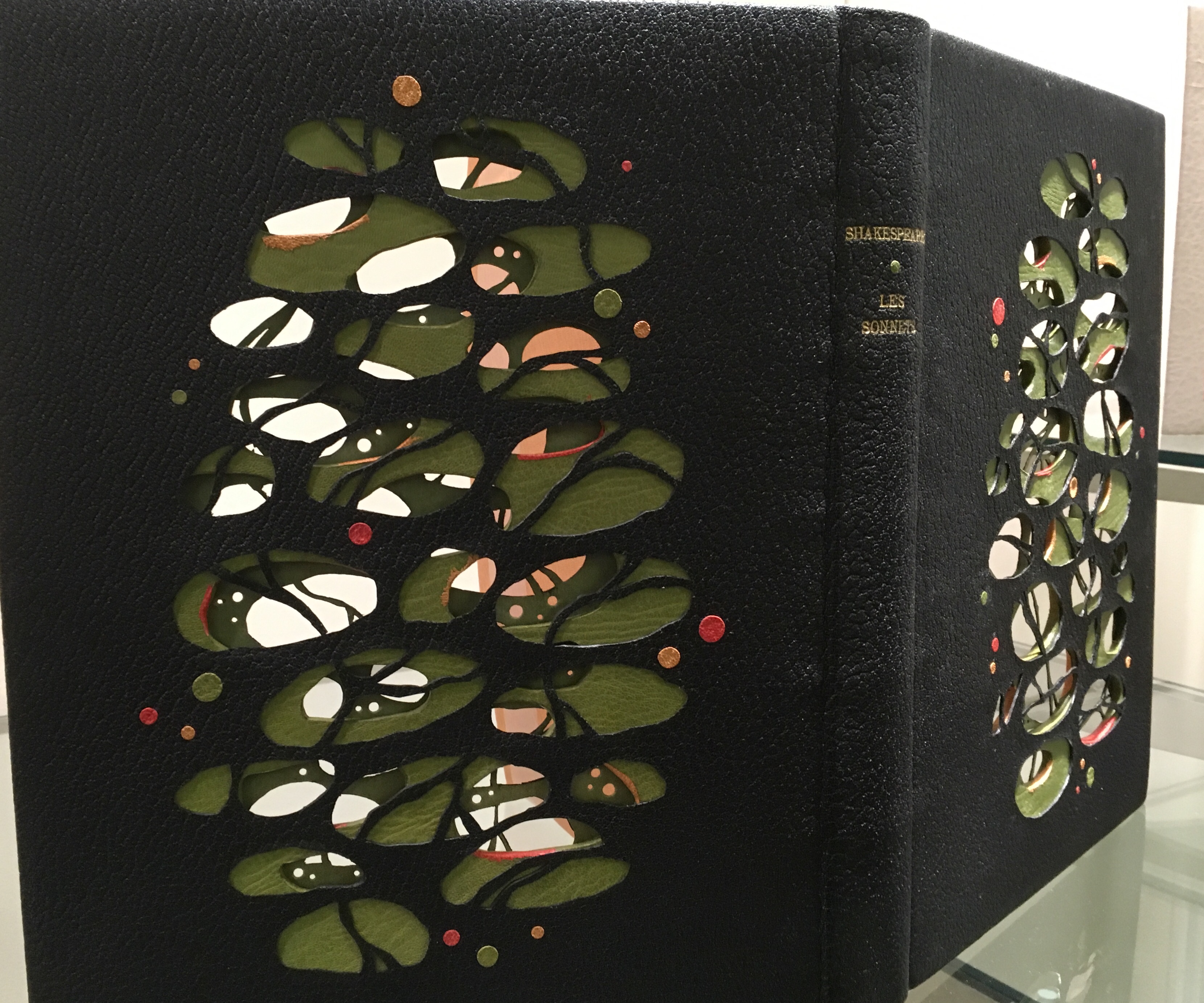
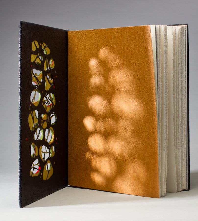
Shakespeare: Les Sonnets (2012) is another case in point of craftsmanship. Creation of this work began with a drawing (shown below) and then a maquette to enable Lallier to visualize the sculptural and aesthetic implications of multiple layers’ surfaces and edges being seen from all angles. The boards were cut out and lined with a green goat skin. The covering leather was also cut out and lined with green Japanese paper before covering. The doublures (linings of the book cover) received the same treatment before being applied to the inner boards.
Shakespeare: Les Sonnets (2012)
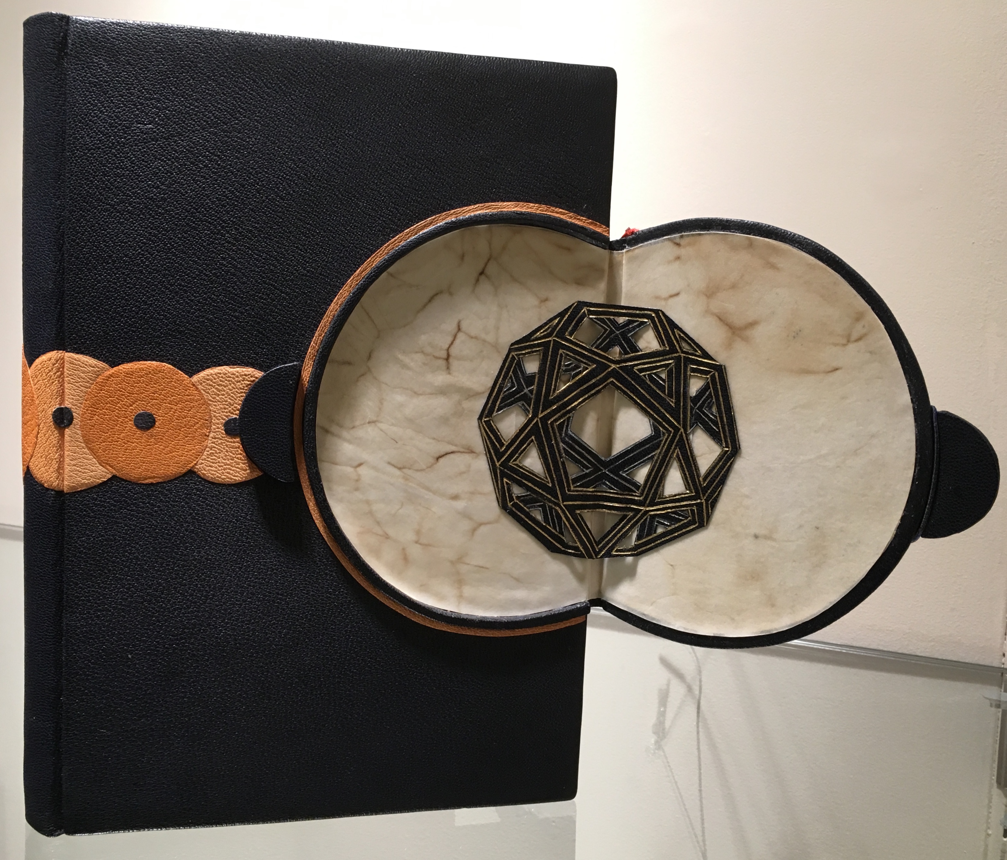
There is a sense of movement in this three-dimensional, sculptural treatment of the cover, which brings us to a final pointer for visitors. Lallier’s signature and most original technique — the front cover panel that swings open along the fore-edge to reveal a hidden design.
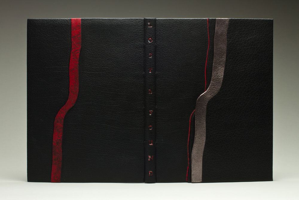
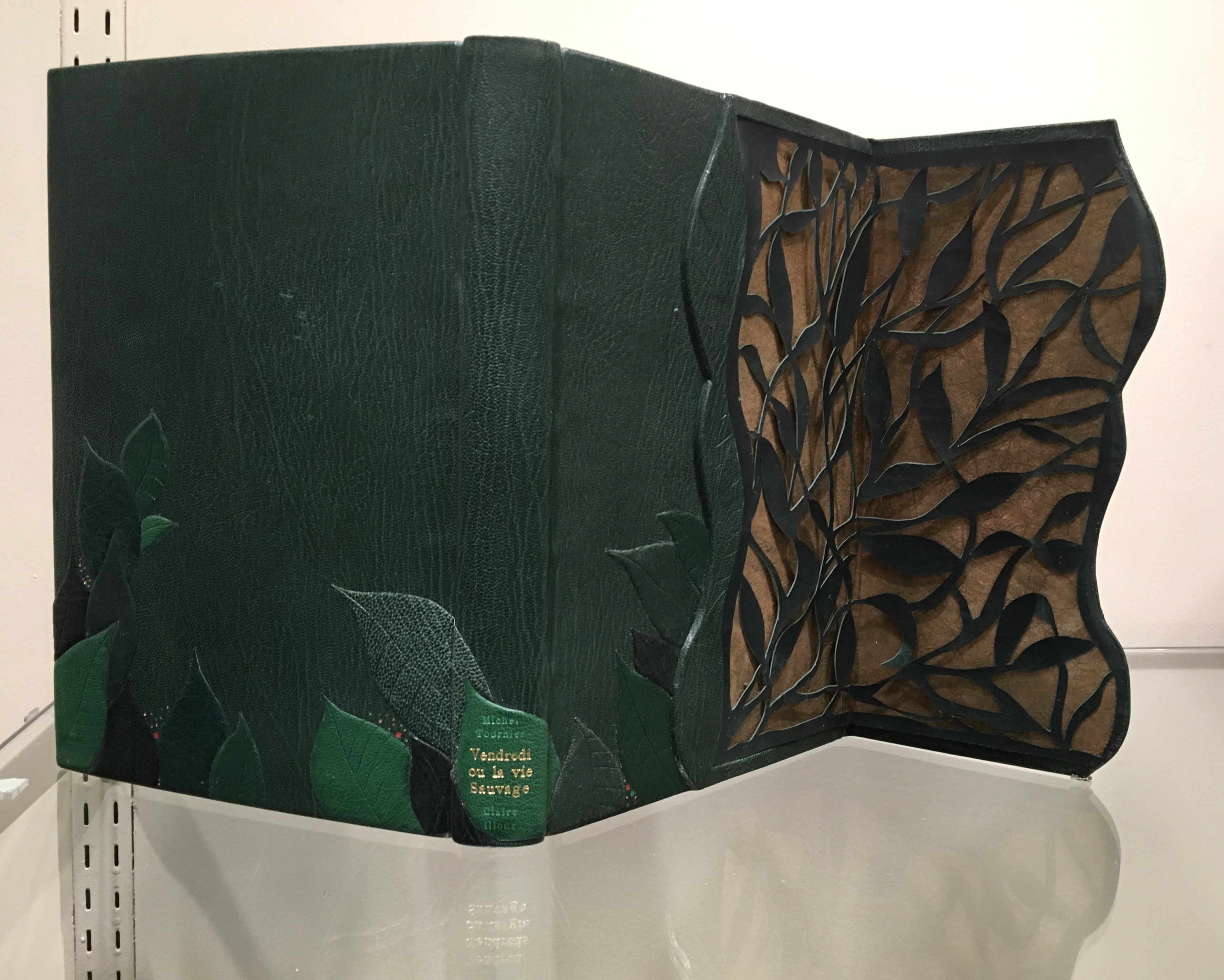
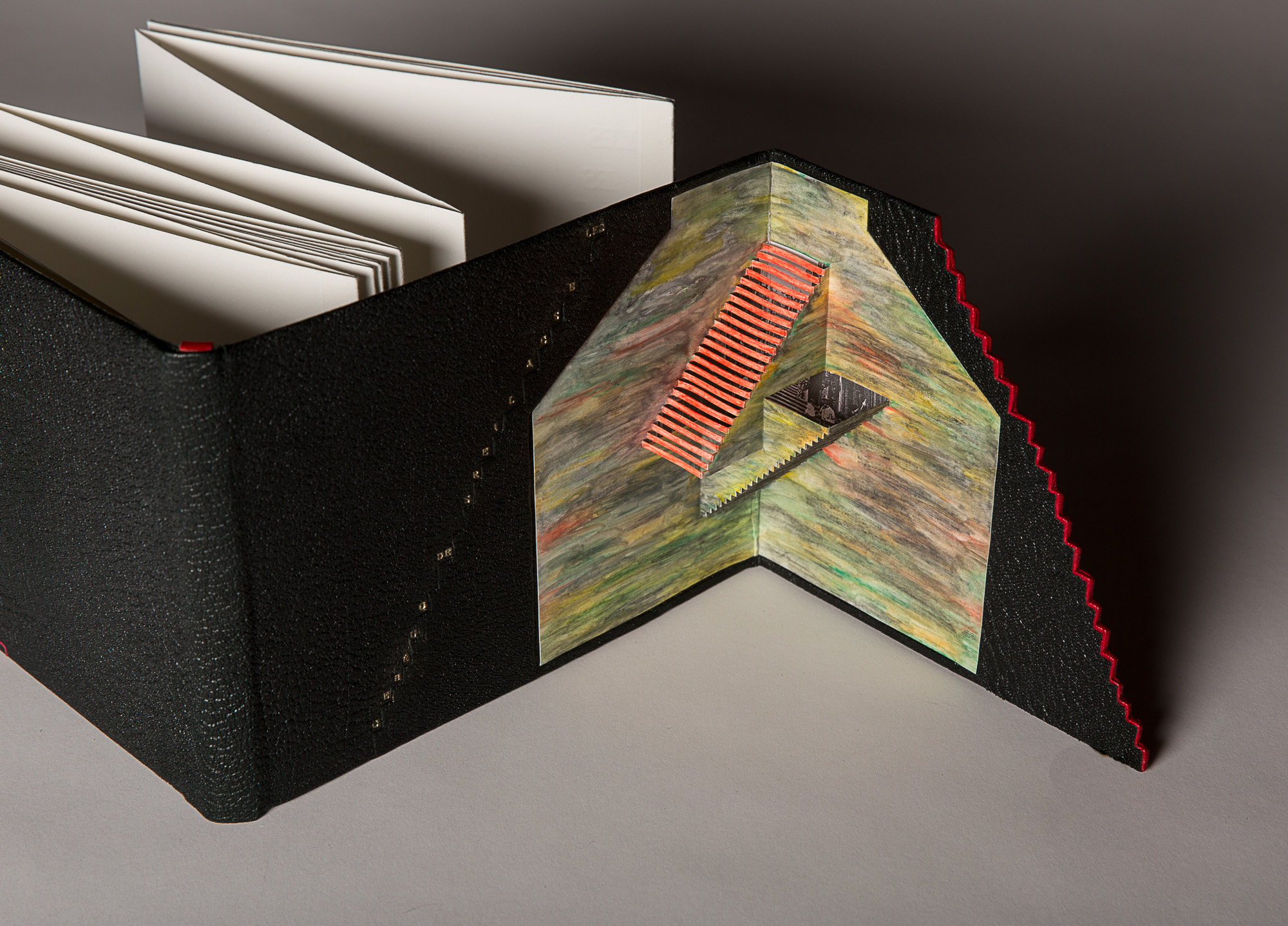
Excerpts from the Humorous Writings of Leonardo da Vinci (1996) The open panel reveals a geodesic dome in leather with gold and palladium tooling. With the panel closed, the front cover’s design echoes a Da Vinci machine.Lost and Found (2014)The illustrations inside the book come from previously lost engravings by Rachel Reckitt, some showing the blitz of London from which Lallier has drawn the inspiration for her hidden panel.Vendredi ou la Vie Sauvage (2015) Opening on layers on layers of carved foliage, the panel evokes the island on which Friday finds himself castaway in Michel Tournier’s version of Defoe’s Robinson Crusoe. In the exhibition, stand on tiptoe or someone’s shoulders to see the top edge’s coloring. Extraordinarily it resembles flower petals submerged in water. Les Escaliers de Québec (2013) Bound in black Morocco leather in the “drop spine” technique, this work unites the stair-stepping accordion form of the text with a gold-tooled title climbing the steps of the front cover panel, which opens on a hand-colored pop-up set of Escher-like stairs.
Lallier’s unity of design with the text by Luc Bureau and illustrations by Ghislaine Bureau celebrating the famous thirty sets of stairs between the upper and lower parts of Québec can hardly be excelled. Except that she does — again and again — with the examples on display. This retrospective resoundingly affirms Lallier’s intention always to serve the book in front of her. Go judge for yourself.
Monique Lallier: A Retrospective runs from 29 October through 6 January 2019 at The Guilford Art Gallery on the campus of Guilford College. For more background on Lallier’s work, there is a series of interviews with Erin Fletcher of Herringbone Bindery here.
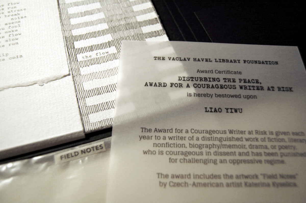
Field Notes (2018) Katerina Kyselica Photo credit: Katerina Kyselica
Field Notes was commissioned by the Václav Havel Library Foundation for its 2018 “Disturbing the Peace, Award for a Courageous Writer at Risk“, presented to the Chinese author, writer, musician and poet Liao Yiwu (aka Lao Wei) on 27 September 2018 at the Bohemian National Hall in New York. Across nine loose leaves, the typewritten words and lines of the poem are dispersed, arranged among fields of regimented rows of vertical strokes, drawn on handmade Losin paper. The drawings could represent anything: a field of grain, a tower block with windows, or marks on a prison wall to count the days. The loose format of the book allows readers to arrange the drawings or compose the text in an order as they see fit, although a colophon presents the full poem in its intended order.
Kyselica’s website provides more views of Field Notes as well as views of her other artist’s books: American Colonies (2016), Code Red (Nicholas and Alexandra)(2016), News About Nothing (2015), 2×2 (2013) and untitled (2012).
What is striking about Kyselica’s works is how she combines a collage of book art techniques in each work to create a unified, unique effect.
I am wide awake when I see artist books. Here are people using actual ink on paper in the eventual age of total digital. For this reason I am retaining my hope and expectation of more books. — Ed Ruscha. Interview with Stephanie LaCava
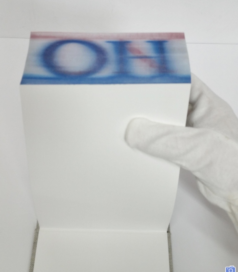
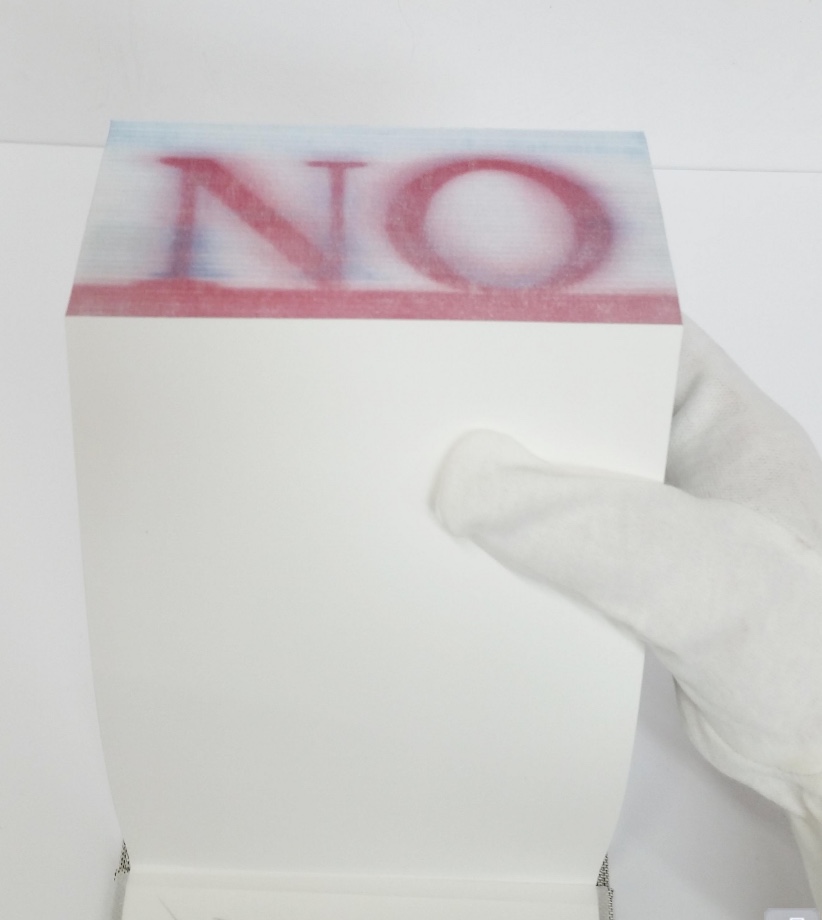
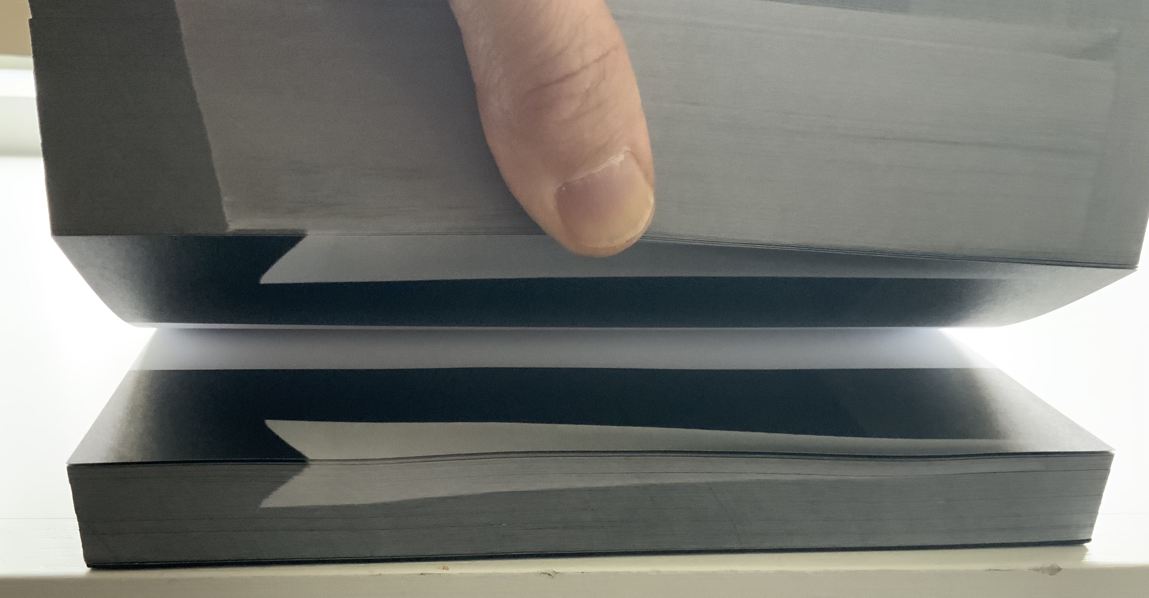
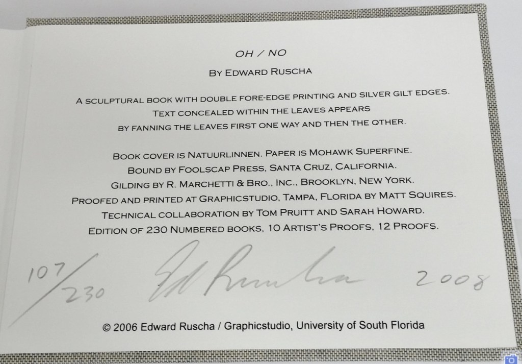
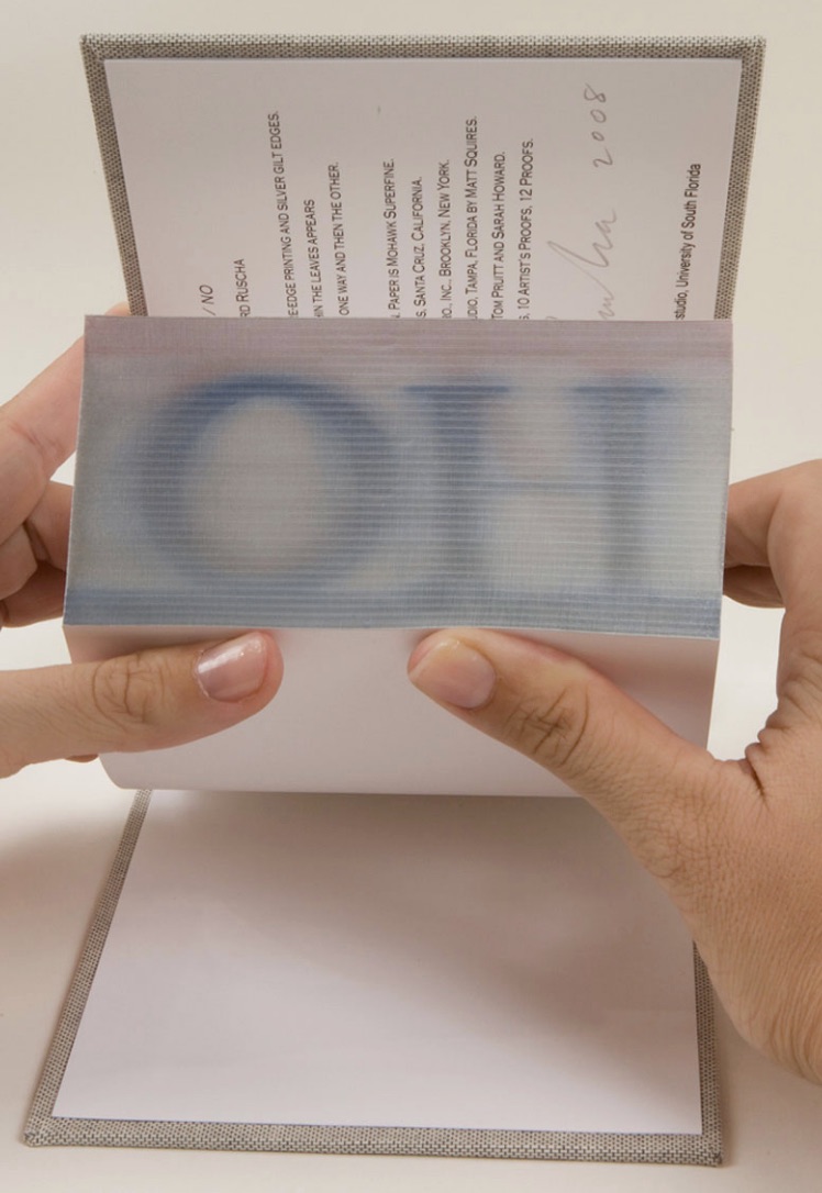
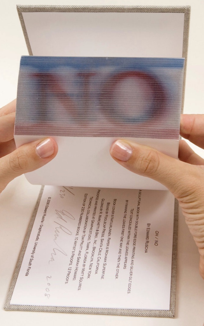
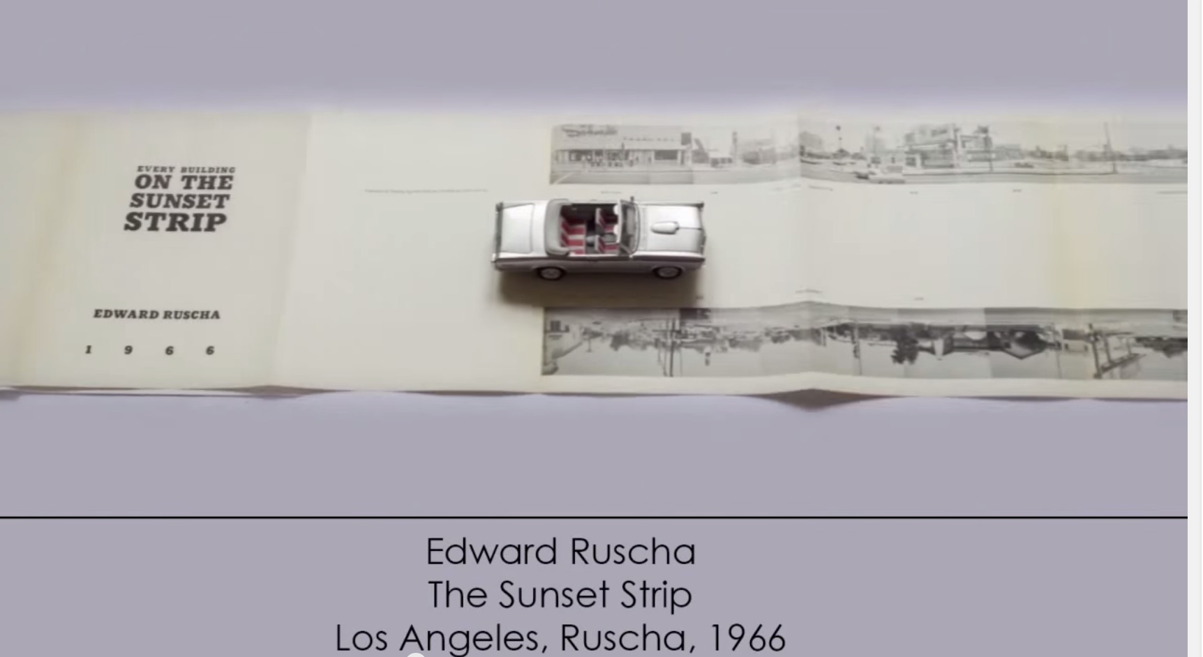
Any collection of book art must recognize the presence and contribution of Ed Ruscha’s work. For Books On Books, this has been not only a financial challenge but a thematic one. Every Building on the Sunset Strip and the elusive Dutch Details certainly speak to the collection’s representation of the accordion book structure, but so do many others in the collection. Even if one of those works in pristine condition could be afforded, it would not be the most satisfactory way of recognizing Ruscha’s work in this collection. For Ruschavian reasons, OH/NO (2008) scratches that itch.
OH/NO (2008)
OH/NO (2008) Ed Ruscha Sculptural book with silver gilt covered printed fore-edge. H5.25 x W7.25 x D2.25 in. Acquired from Hess Fine Art, 14 November 2020. Photos: Courtesy of the gallery.
In an interview in Artforum in 1965, Ed Ruscha commented, “What I am after is … a mass-produced product … none of the nuances of the hand-made and crafted limited edition book”. Well, here is OH/NO, clearly not a hand-crafted work, but nevertheless a limited edition and signed by the artist. It is a tongue-in-cheek machine-produced, if not mass-produced, product. Production and structure draw all attention to an element peculiar to the codex – its fore-edge. It applies printing in the place of hand-crafted fore-edge painting, and the interior is blank. Here is Ruscha applying his deadpan approach to a physical aspect of the book not addressed by those more famous accordion works.
OH/NO is not Ruscha’s first foray into fore-edge printing. In 2002, there was Me and The. Neither work extends the technique per se, but unlike their historical predecessors, Ruscha’s two works, whose pages are otherwise blank, focus entirely on the fore-edge of the book form and depend on its interaction with facetious text.
OH/NO provides a distinctive “other end of the spectrum” to Ximena Pérez Grobet’s Around the Corner (2020). Other than its title, Around the Corner is textless. By progressively manipulating images across all of the book structure’s planes, Pérez Grobet makes a sculpture out of the relationship of the fore-edge to the rest of the book. With OH/NO and Around the Corner side by side, we have a useful and satisfying point of comparison and contrast for considering the breadth of artists’ books.
Around the Corner(2020) Ximena Pérez Grobet Japanese bound in slip case open at both ends. H200 x W175 x D70 mm. Edition of 20, of which this is # 2. Acquired from the artist, 1 December 2020. Photos: Books On Books Collection.
Another aspect of artists’ books and Ruscha’s work that OH/NO addresses is production by a third party. As he happily acknowledges, not all of his photographic works are of his own hand, and production is often handed over to a third party. In the various histories and commentary on book art, though, those early works like Every Building on the Sunset Strip are heralded for their cheap one-man-band, democratic production values. But listen to Ruscha himself in the video below about Every Building, and it is clear that the concept of his artist’s books does not lie in their production. OH/NO‘s high production values could not be further from Every Building‘s. Look instead to the interaction of the text with the structure. Given Ruscha’s sense of humor, the title and sculptural object itself might be commenting on the studio approach of high-concept artists as much as it might be on the absence of text in the pages.
Various
Even though they are not works of appropriation themselves, Every Building and Ruscha’s Various Small Fires have engendered a small industry of appropriation in book art. Various Small Fires lent itself to a Gulbenkian/Calouste exhibition’s placing it as a high-concept centerpiece “reflecting on” Bruce Naumann’s appropriation Burning Small Fires.
Display of Ed Ruscha’s Various Small Fires and Milk (1964) at “Pliure: La Part du Feu”, 2 February – 12 April 2015, Paris. Photo credit: Books On Books Collection. Reflected in the lower left hand corner is the display of Bruce Nauman’s Burning Small Fires; in the upper right corner, the film clip of Truffaut’s 1966 Fahrenheit 451; and in the upper left, Maria Helena Vieira da Silva’s La bibliotheque en feu (1974).
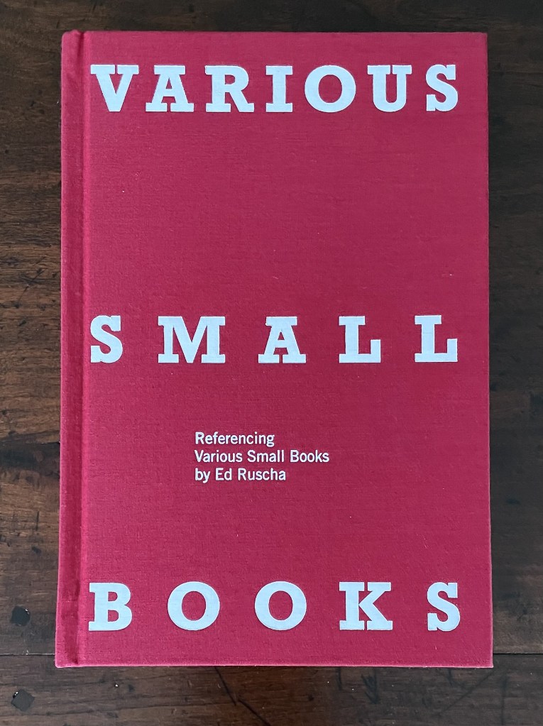
There is even an entire book devoted to the appropriation of Ruscha’s works.
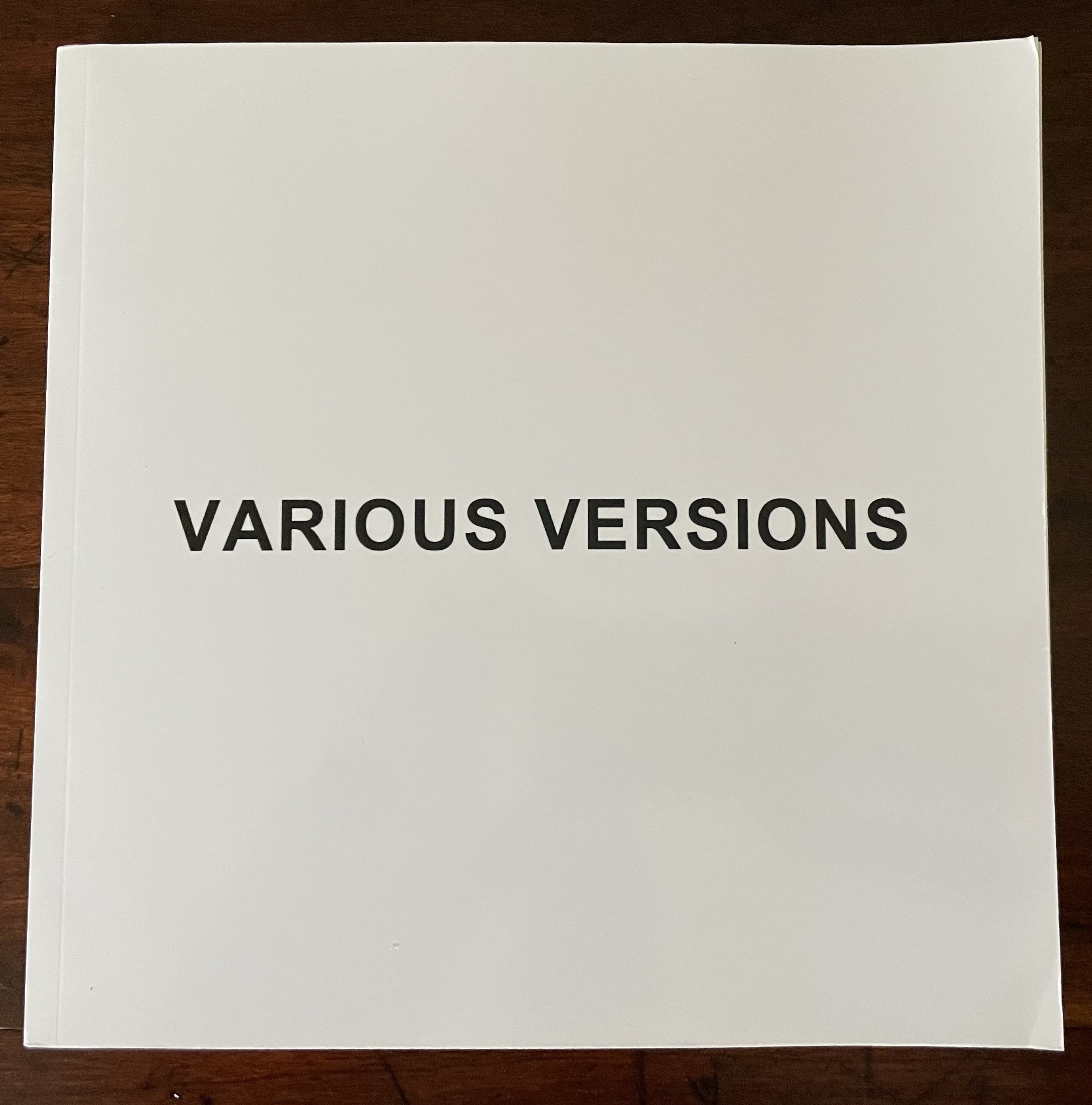
Beyond this brilliant collection of examples and commentary, additional appropriative works have appeared — so many that a second edition may be required.
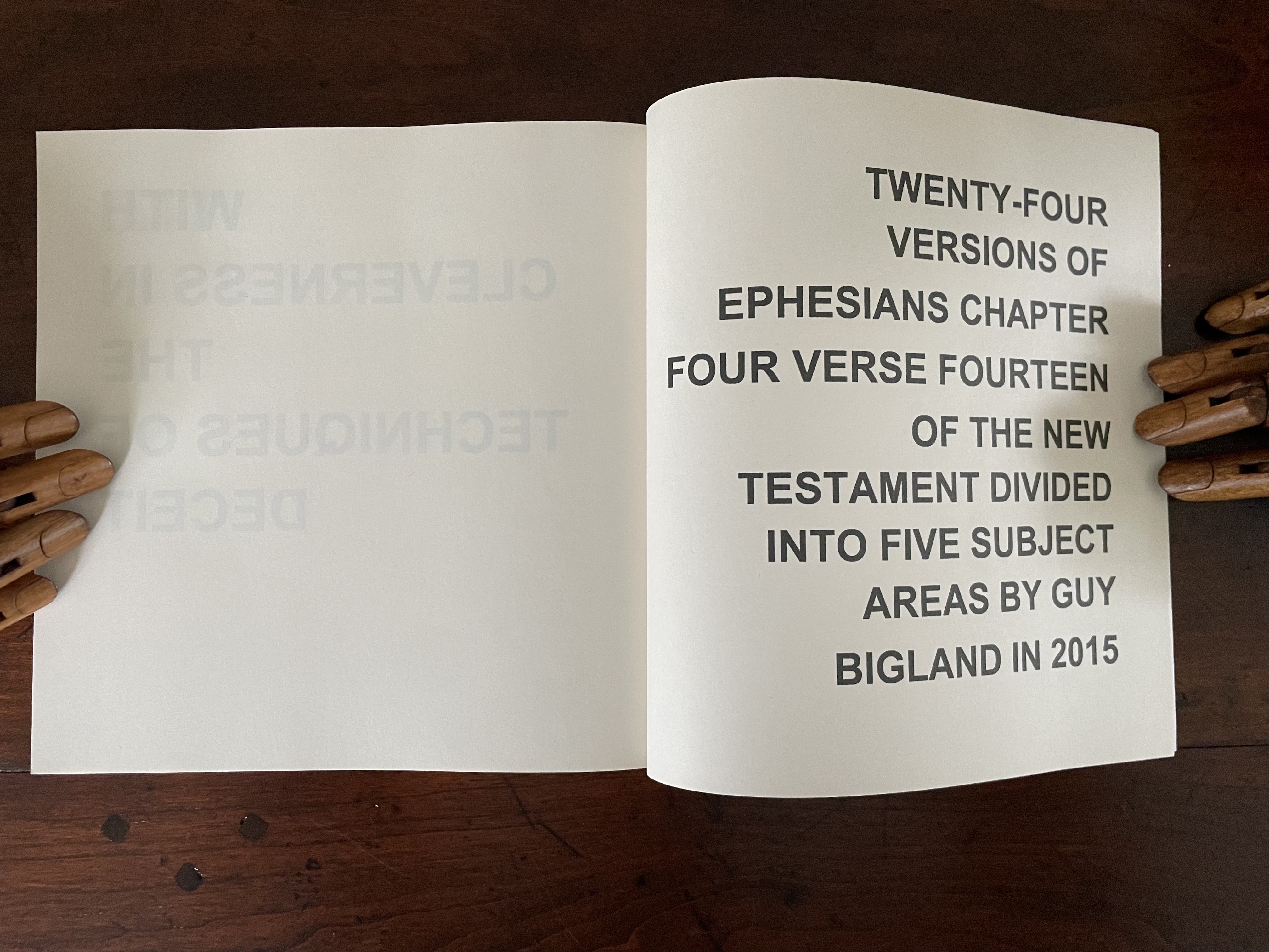
Various Versions (2015) Guy Bigland Perfect bound soft cover. H190 x W190 mm. [158] pages. Acquired from the artist, 12 October 2023. Photos: Books On Books Collection.
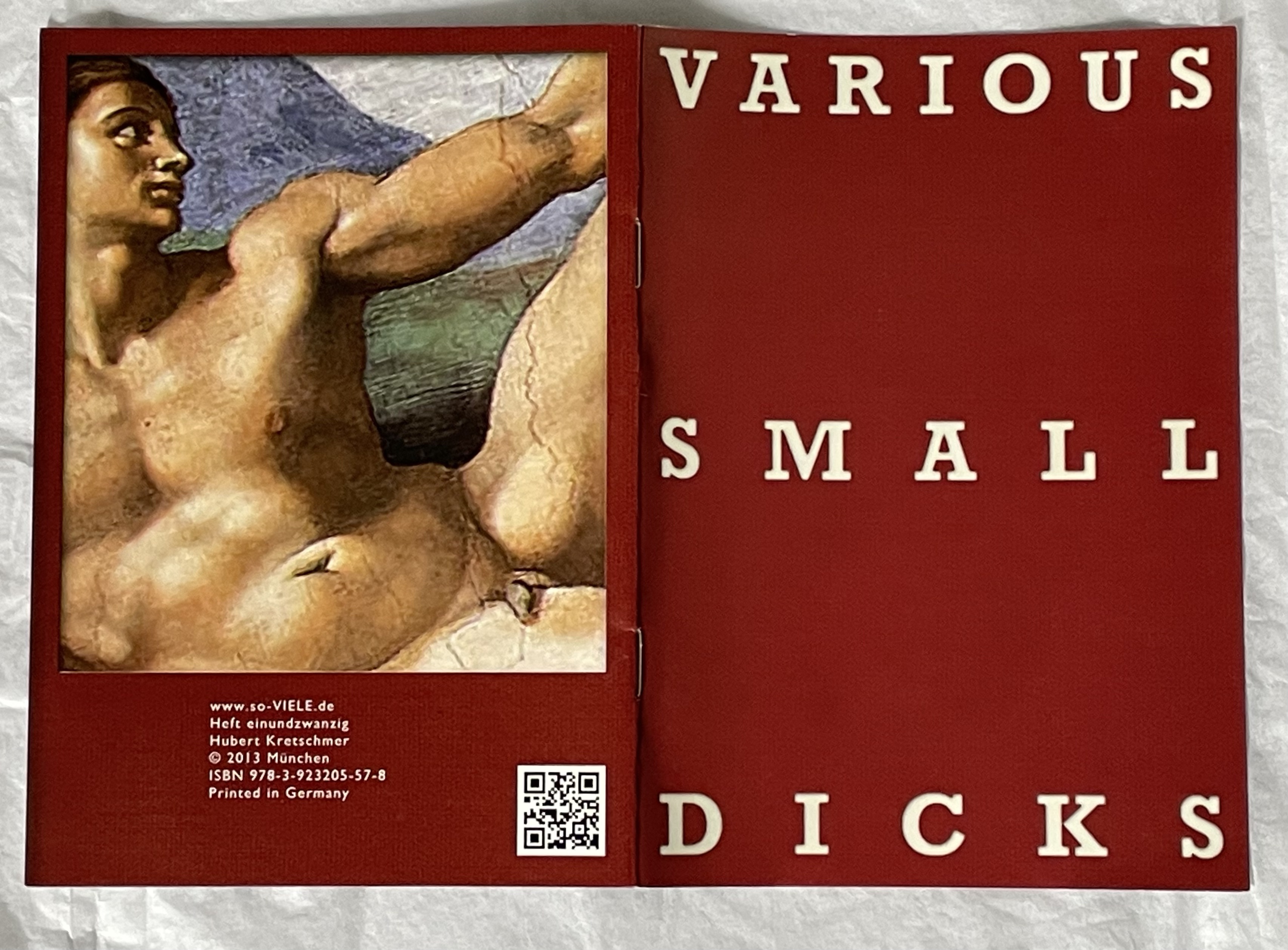
Various Small Dicks (2013) Hubert Kretschmer Saddle stitched booklet. H149 x W105 mm. [8] pages. Acquired from the artist, 11 July 2019. Photo: Books On Books Collection.
It is fun to place OH/NO as an expression of mock horror in response to all that.
Cain, Abigail. 27 September 2018. “Unpacking Ed Ruscha“, Aperture. This is Cain’s review of the Harry Ransom Center’s 2018 exhibition Ed Ruscha: Archaeology and Romance, which used 150 displayed items to focus on 16 of Ruscha’s books. It contextualizes Various Small Fires neatly. Quoting the Center’s photography curator Jessica S. Macdonald, Cain writes: “… lack of artistry is one of the hallmarks of Ruscha’s artist books. ‘The photographs of gas stations are bad photographs on purpose,’ McDonald noted. ‘He’s trying to do the opposite of what a photographer trying to make an artistic photograph would be doing.’ In a 1965 Artforum interview concerning his second book, Various Small Fires and Milk (1964), Ruscha explained that it didn’t even matter to him who took the photographs. ‘In fact, one of them was taken by someone else,’ he said. ‘I went to a stock photograph place and looked for pictures of fires, there were none.'”
Coplans, John. February 1965. “Concerning ‘Various Small Fires’: Edward Ruscha Discusses His Perplexing Publications”. Artforum. 3:5, 25.
Hoyle, Ben. 25 February 2017. “Ed Ruscha, the pop painter with ‘the coolest gaze in American art’“. TheTimes. London. Ben Hoyle’s easygoing interview with Ed Ruscha introduces his work as the heart of the British Museum’s exhibition “The American Dream: pop to the present” (9 March 9 to 18 June 2017). That is a bold assertion as the show included Claes Oldenburg, Jasper Johns, Andy Warhol, Roy Lichtenstein, Cy Twombly, Louise Bourgeois, Robert Rauschenberg and others recognizable to anyone who was briefly awake in a college art history class — even as long ago as the 70s. But, back then, not so much “Ed Ruscha”. Hoyle’s article – with its paragraphs’ casual packing in of news, telling descriptive detail and sharp observations (whether his or others’) of Ruscha’s art – makes a persuasive case.
Danish artist Hanne Stochholm Exe‘s “assemblages”, which garnered first prize in the 7th International Artist’s Book Triennial Vilnius 2015, have cousins far afield — geographically and chronologically.
Remake (2015) Hanne Stochholm Exe Reproduced with permission of the artistTalks (2005) Hanne Stochholm Exe Reproduced with permission of the artistSmall Talk (2005) Hanne Stochholm Exe Reproduced with permission of the artist
Geographically, this merging of book and metal finds common cause in the US (see Andrew Hayes’ works) and Israel (see the work of Neil Nenner and Avihai Mizrahi, represented — as is Hayes — by the Seager/Gray Gallery).
Offset (2013) Andrew HayesCover Story #4 (2017) Neil Nenner and Avihai Mizrahi
Chronologically, the hold that books and metal have had on one another reaches far past the moveable type of Gutenberg’s Bible and Master Baegun‘s earlier Jikji.
Of course, those 11th century metal fittings probably passed unnoticed by studious readers. Not so with these studious artists in the 21st century whose imaginations have seized on the contrast of materials to recast the book object as an art object.
Fore-edge of Shelia Hicks: Weaving as Metaphor by Nina Stritzler–levin and Arthur C. Danto (Yale University Press, 2006) Designed by Irma Boom
“AM: How would you sketch the future of the book?
IB: The book has a great future. In the statement in my little red book [Irma Boom: The Architecture of the Book] I talk about the renaissance of the book. It is already happening now. …
At a recent event, Massimo Vignelli claimed ‘The book is dead’. …
I was shocked when Massimo repeated that sentence, I read it everywhere. But the printed book does not need any defender. It has survived 600 years or so. The way information spreads depends on the inventions of that time; paintings have survived, photos, and the book is another form.
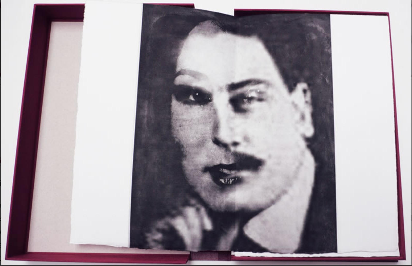
The Albertine Workout is a collaboration between artist Kim Anno and poet Anne Carson.
Albertine is Albertine Simonet, the central love interest in Proust’s In Search of Lost Time. The Workout explores her character in text and image. The illustration above touches the biographical note that, according to Proust, the Albertine character was based on Alfred Agostinelli, sometime chauffeur and typist for Proust.
The images resting in the burgundy Solander box on Anno’s website are well worth a look. (Carson’s text not seen.)
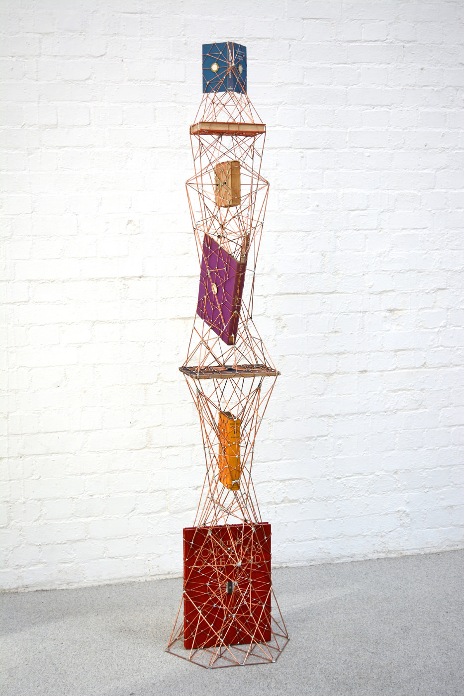
At the base of this sculpture is The Times Concise Atlas of the World, and at its top, The Observer’s Book of Manned Space Flight (No. 48). These two elements of the piece resonate with its rocket-like thrust, metallic gantry-like frame and micro-chip nodes, as does the textbook on projective geometry. Euclidean geometry describes shapes “as they are” while projective geometry describes them “as they appear”.
It is hard to suss what Walter Starkie’s picaresque travelogue about life with the Roma (Raggle Taggle) or Cyril Connolly and Jerome Zerbe’s picture book on 18th century French “pavillons” or Yehiel Dinur’s autobiographical novel of his post-holocaust life in Israel (Ka-Tzetnik 135633, House of Love) have to do with the rest of it.
Art composed of found elements is like that, I suppose. Just enough connectedness to suggest order and intentionality, just enough disconnectedness to suggest disorder and randomness. Ulian’s other works, incorporating electronic parts soldered together in “microchip synapses” and “technological mandalas”, however, imply other tensions — between technology and the human, the digital and the spiritual. Or in the case of his Contrived Objects (wooden tennis rackets, microchips and copper wire), between the physical and the artificially cerebral.
Ulian’s more recent work has changed from that of 2010-11 (A fragile forest and From zero to one). Even though some of the themes, materials and techniques are the same, the more recent works (those noted above) are more focused, self-contained, polished, static and perhaps decorative. I suspect there may be another cycle and even more engaging art coming from this artist.
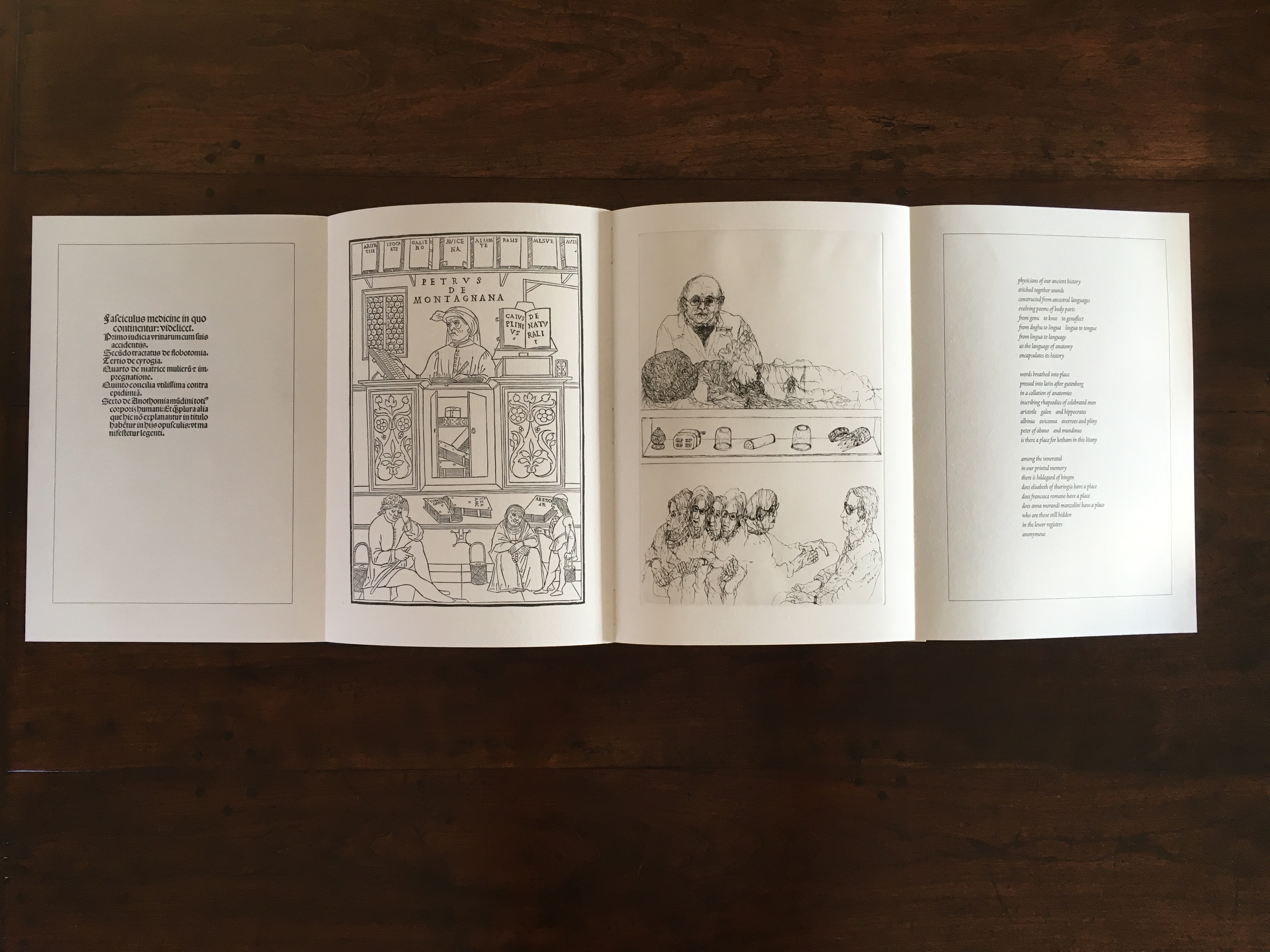
In 1995, the Smithsonian Institute Libraries’ exhibition Science and the Artist’s Book explored “how science can serve as a springboard for artistic creation” and showed how “aspects of creativity … are common to science as well as to art”. The exhibition juxtaposed twenty-five rare books from the Heralds of Science collection at the Dibner Library with twenty-five bookworks commissioned as responses to them. For example,
Joyce Cutler-Shaw responded to Johannes de Ketham’s Fasciculus Medicinae (Venice: Impressus per Ioannes [et] Gregorius de Gregorijs fratres, 1495) with The Anatomy Lesson (Middletown, CT: Robin Price, Publisher, 1995);
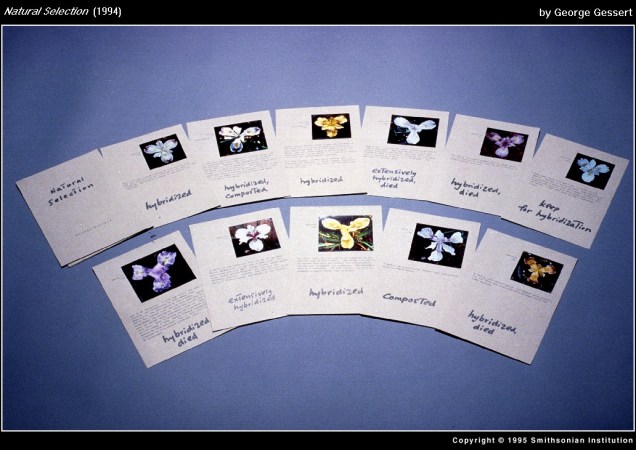
George Gessert responded to Darwin’s On the Origin of Species (London: John Murray, 1859) with Natural Selection (Eugene, OR: self-published, 1994);
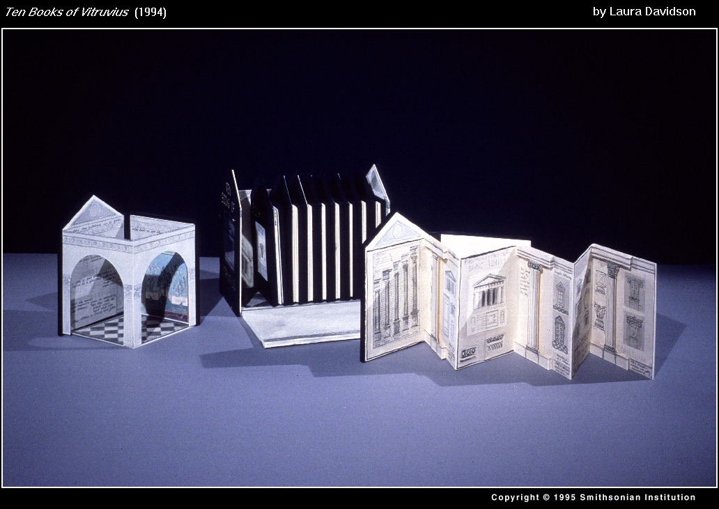
and Laura Davidson responded to Vitruvius Pollio’s’ De Architectura libri Dece [The Ten Books on Architecture] (Como, Italy: Gottardo de Ponte, 1521) with Ten Books of Vitruvius (Boston, MA: self-published, 1994).
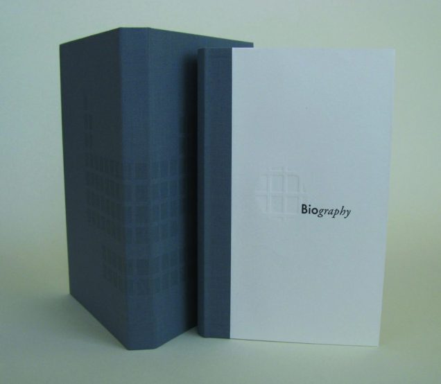
As the exhibition demonstrated, the overlay of the dual traditions — those of art and those of the book — on the domains of science creates a rich soil for ingenuity and genius. Since that exhibition, science- and maths-driven book art has yielded harvest after harvest of outstanding book artists. Sarah Bryant is one of them. Bryant won the MCBA Prize in 2011 with Biography (2010) and was a finalist in 2015 with Figure Study (2015).
“[A]n exploration of the chemical elements in the human body and the roles they play elsewhere in the world”, Biography (2010) is bound as a hard cover drumleaf and enclosed in a clamshell box. It begins with the periodic table and assigns a coloured square to each of the chemical elements found in the human body. Using those coloured squares, the six subsequent diagrams show the presence of the body’s chemical elements in the earth’s crust, man-made weapons, medicines, sea water, etc. The flip-up folio (above right) displays their presence in various man-made tools and building materials. Bryant’s inventive handling of colour, the flip-up folio and blind embossed printing foreshadow developments in her later work.
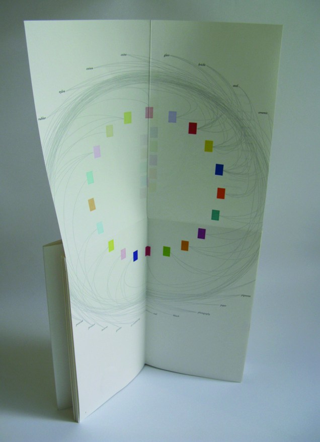
Collaborating with David Allen, a professor at Middlebury College in Vermont, Bryant created Figure Study (2015), a graphical “comparison of population data for every region on earth”. In this work, Bryant takes her handling of shape and colour to a new level.
All 114 of these figures have been printed from linoleum onto drafting film and are housed together alongside a grid. The figures are each numbered and can be interpreted using a booklet containing an alphabetical and numerical index, as well as a short essay by David Allen about our process and the source of the data. The design of the enclosure encourages the viewer to layer the forms to create different combinations of shape and color. This process and the resulting imagery is initially reminiscent of elaborate dresses, paper dolls, and dissection plates, but the source of the data gives a different picture, laying bare the vast and critical differences between the basic equations of life in different parts of the world.2015 MCBA Prize Finalists
In correspondence with Books On Books, Bryant has noted the influence of Edward R. Tufte. Figure Study particularly may remind the reader/viewer of Tufte’s The Visual Display of Quantitative Information (1983) and Envisioning Information (1990). In his books and lectures, Tufte champions the connection of art and science as well as information display that is interactive, which Bryant’s statement above echoes.
As her two bookworks above and those below associated with the collective Shift_Lab demonstrate, she has the gift of transforming analytical data, diagrammatic imagery , text derived from reference materials as well as personal experience and taking them beyond “visual display” and into art.
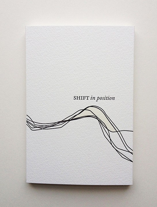
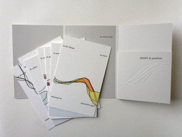
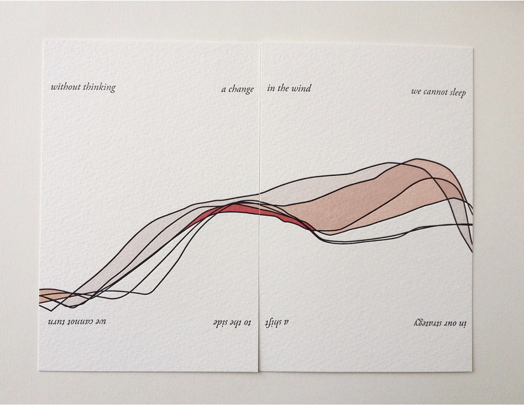
In Shift in Position (2014), Bryant draws on her own sleep patterns and movements. Extraordinary how, in Shift in Position, she manipulates the elements of the book to embody the “message” of the work. Note how she plays with layout, in particular, by running text syntactically over the loose folios (“a change/ in the wind” and ensuring the alignment of the graphical image. The work invites the reader/viewer to turn the two folios 180º — like a restless sleeper — to read/see the additional run-on text (“a shift/ to the side”) and the aligned image from another perspective. This use of the material and form draw the reader/viewer into a kind of creative act — negotiating the act of close reading with that of close looking.
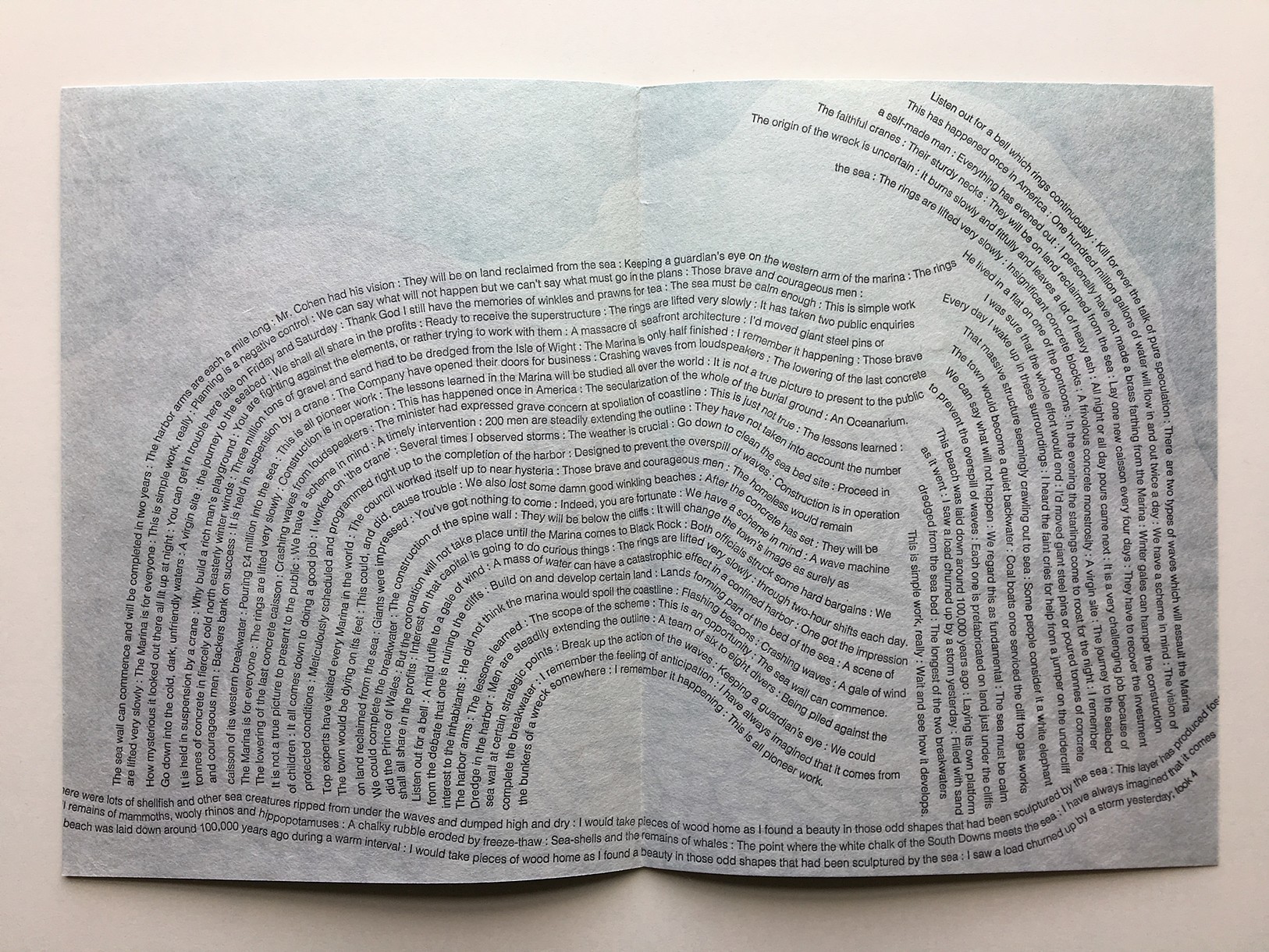
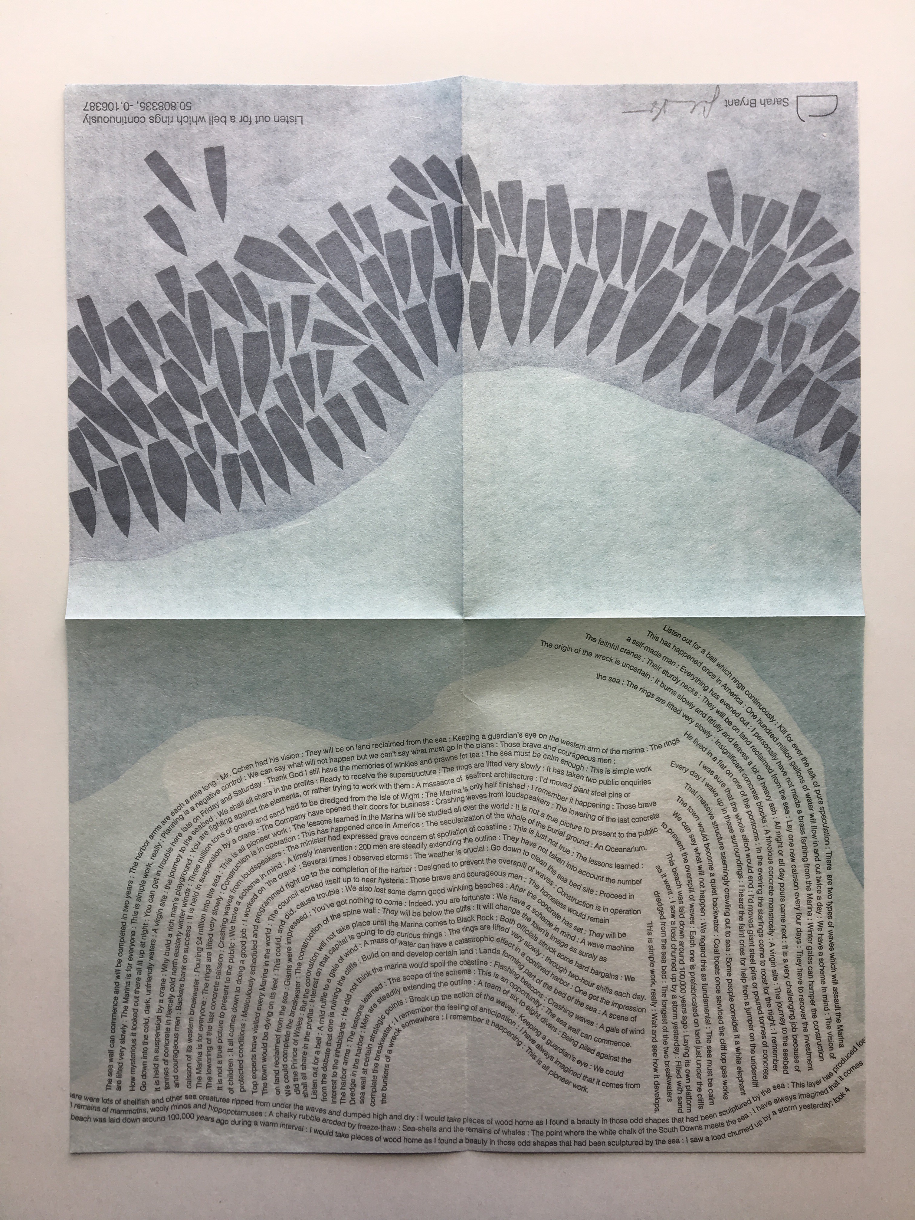
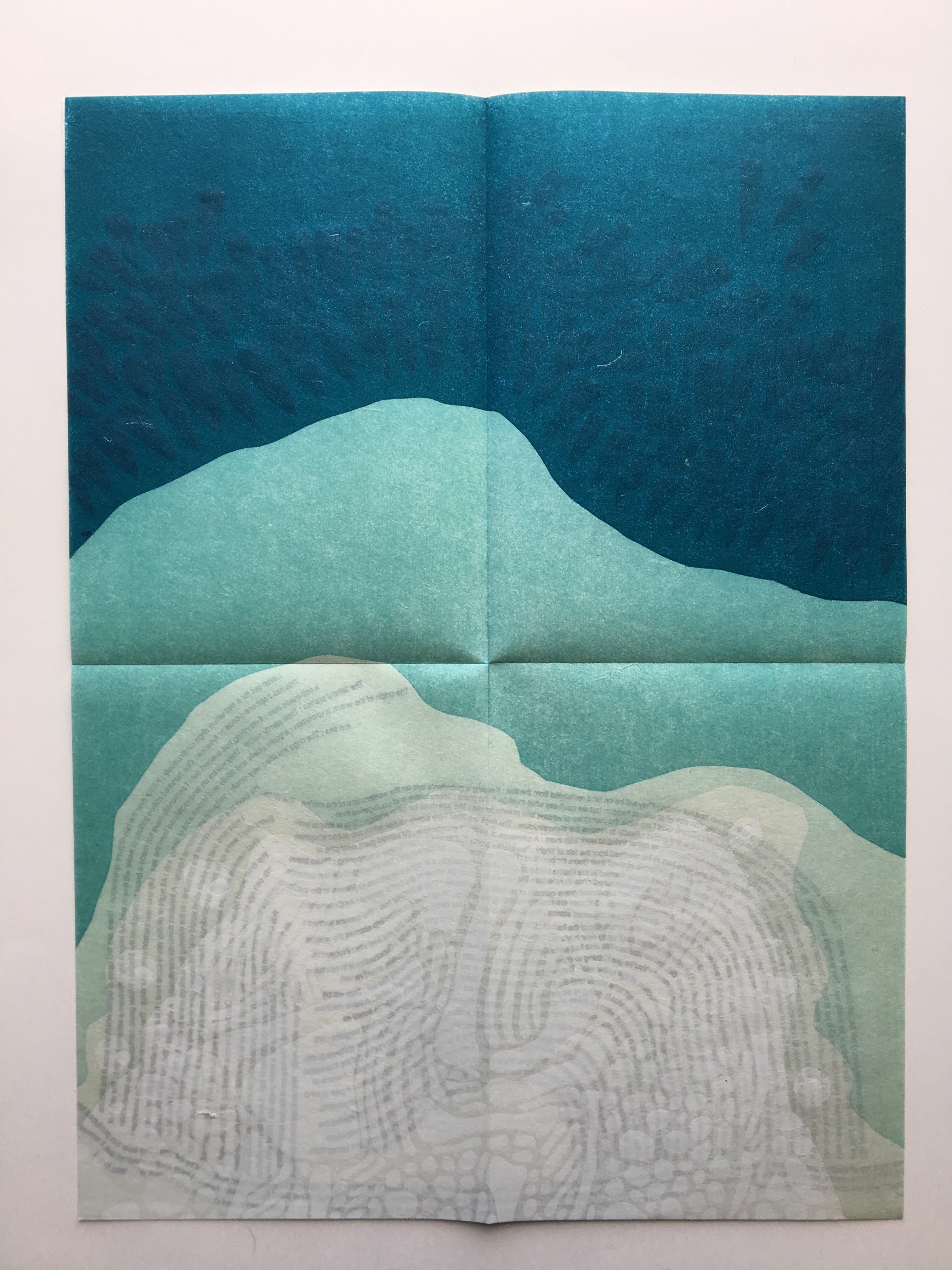
Another collective work from Shift_Lab is Trace (2015). Bryant’s contribution is Listen Out for a Bell which Rings Continuously, which draws on sound and coastal mapping. It is based on her residence at the Brighton Marina, “a strange space between land and sea” where she immersed herself “in the quiet rhythm of the place”. In the first image above from Listen Out, it is obvious how the typography mimics the tide’s ebb and flow, perhaps less obvious how the overlapping texts’ rhythm and syntax surge, overlap, peter out. Look even more closely at the two lower images, two sides of the same sheet: note how the colours on the two sides of the sheet register against one another to create the kind of topographical mapping found in marine maps. Beyond that effect, the two pages challenge one’s sense of place in the world. On the left hand side, one is looking down on the boats crowding in on the marina; on the right, one is below the water and looking up at the hulls. To achieve a further infusion of place with the work, the work is even printed using chalk from the surrounding cliffs.
The Radiant Republic(2019) is one of Bryant’s more recent solo works. In her own words:
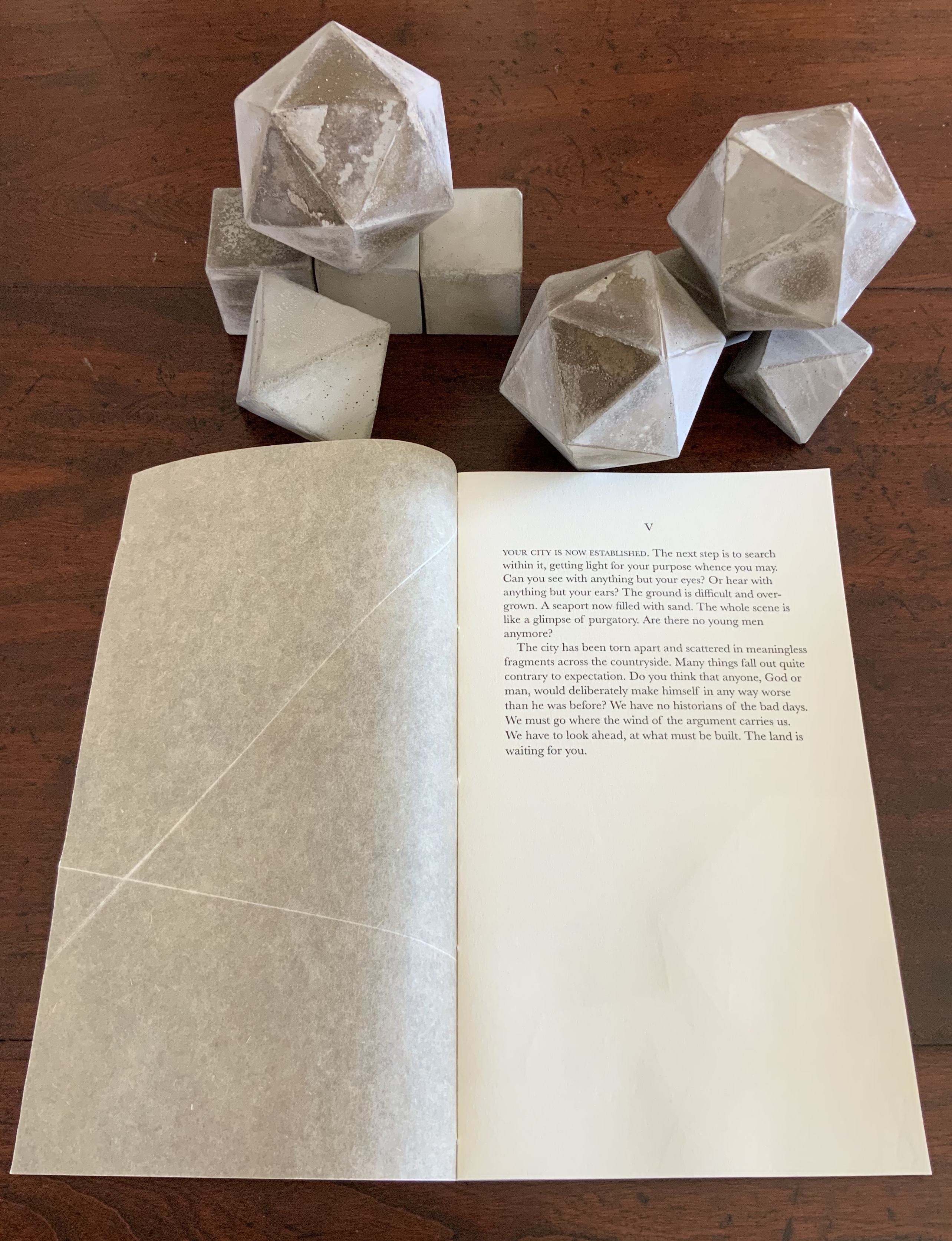
The Radiant Republic[is] built entirely out of language found in Plato’s Republic and Le Corbusier’s The Radiant City. In these texts, separated by more than two thousand years, Plato and Le Corbusier each describe a city plan designed to provide a framework for morality and ethics. These works are revered, but they are also deeply troubling. In The Radiant Republic, language from Plato and Le Corbusier has been combined to create a narrative in five parts.Big Jump Press/Portfolio/Artist Books/The Radiant Republic
When Bryant writes “combined”, she means it as the work’s title performs it. Paragraphs in each of the five volumes merge sentences from Plato with those of Le Corbusier. In its combination of the titles of Le Corbusier’s and Plato’s works, respectively, The Radiant Republic signals its textual ambition: to merge the two different texts. The disconcerting oracular tone and coherence of the narrative underscore the revered yet troubling nature of the two works, which is reflected in the epigraph to The Radiant Republic:
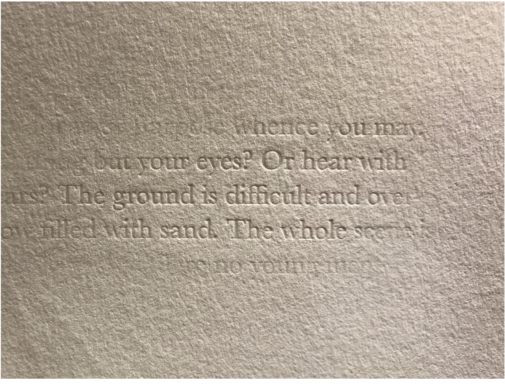
Every physical thing carries within its deepest layers a tendency towards its own destruction.
— Moshen Mostafavi and David Leatherbarrow, On Weathering: The Life of Buildings in Time (MIT Press, 1993)
But we are getting ahead of ourselves.
In The Radiant Republic, Bryant uses techniques and materials old and new to her in an aim for new heights of art and depths of thought. The box enclosure itself is the first new technical feature we encounter.
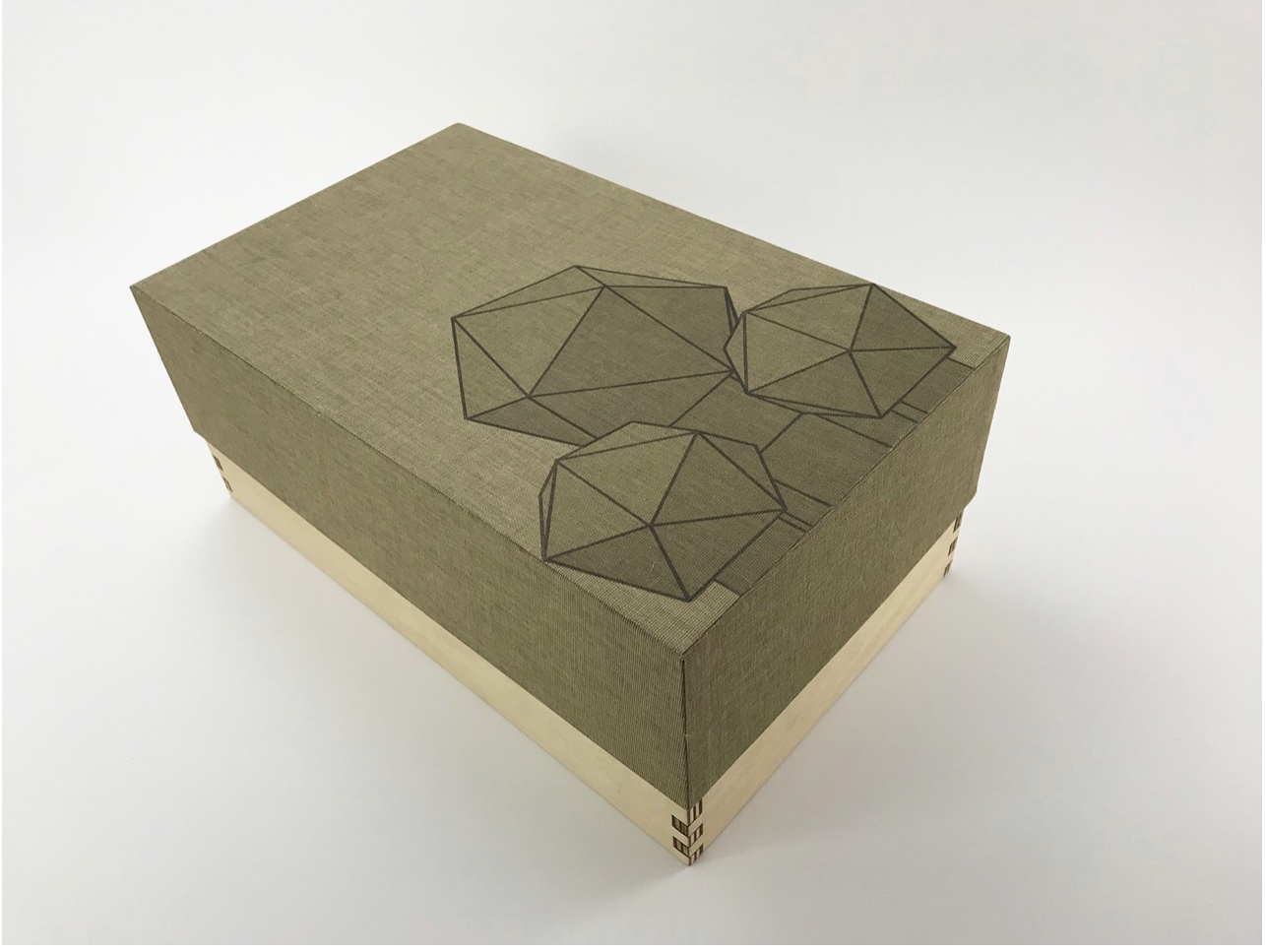
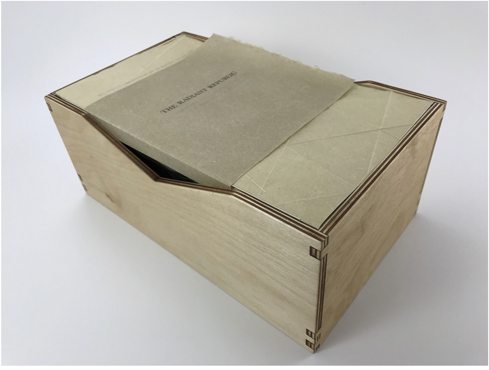
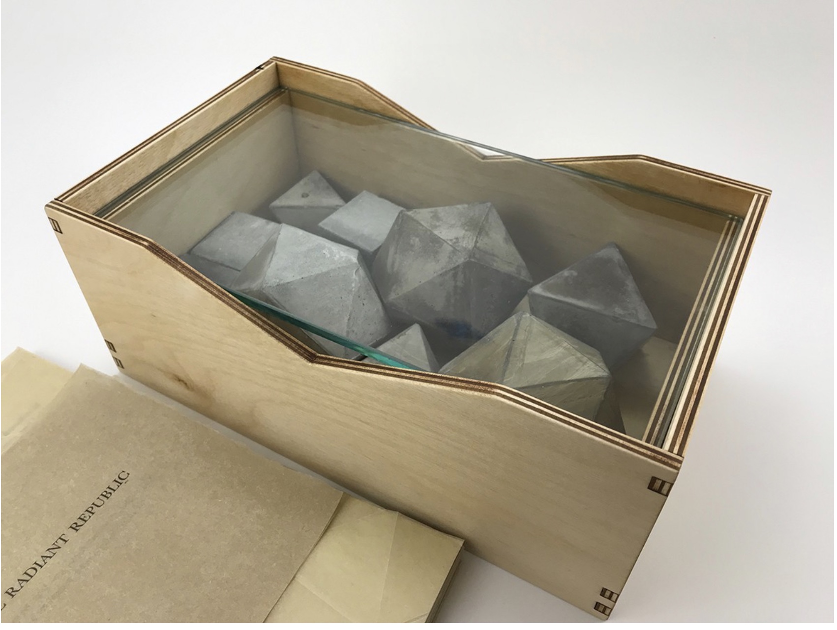
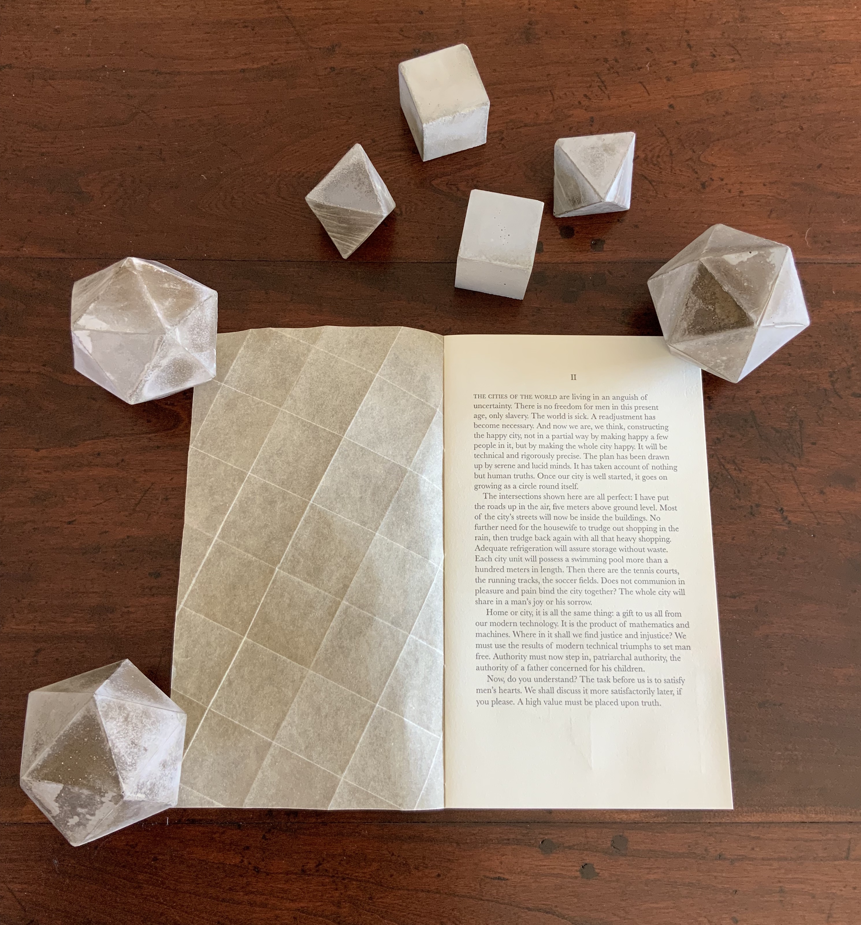
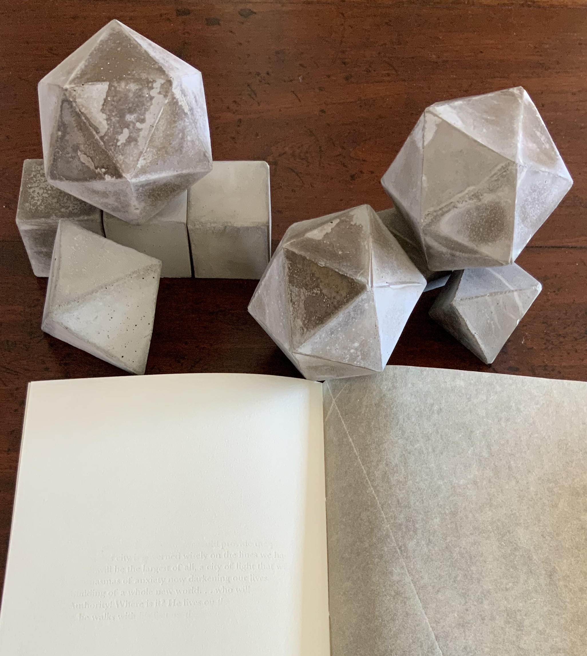
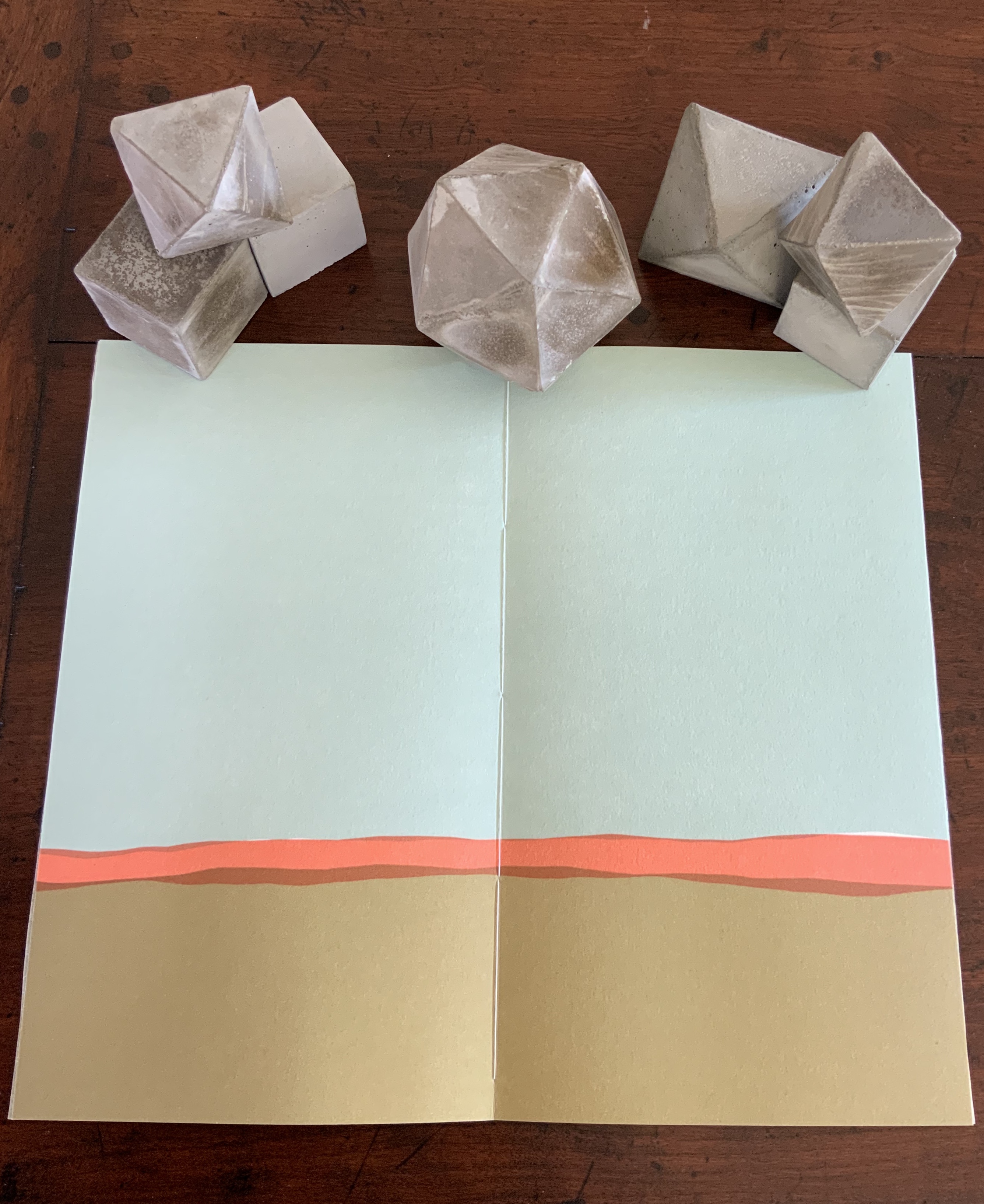
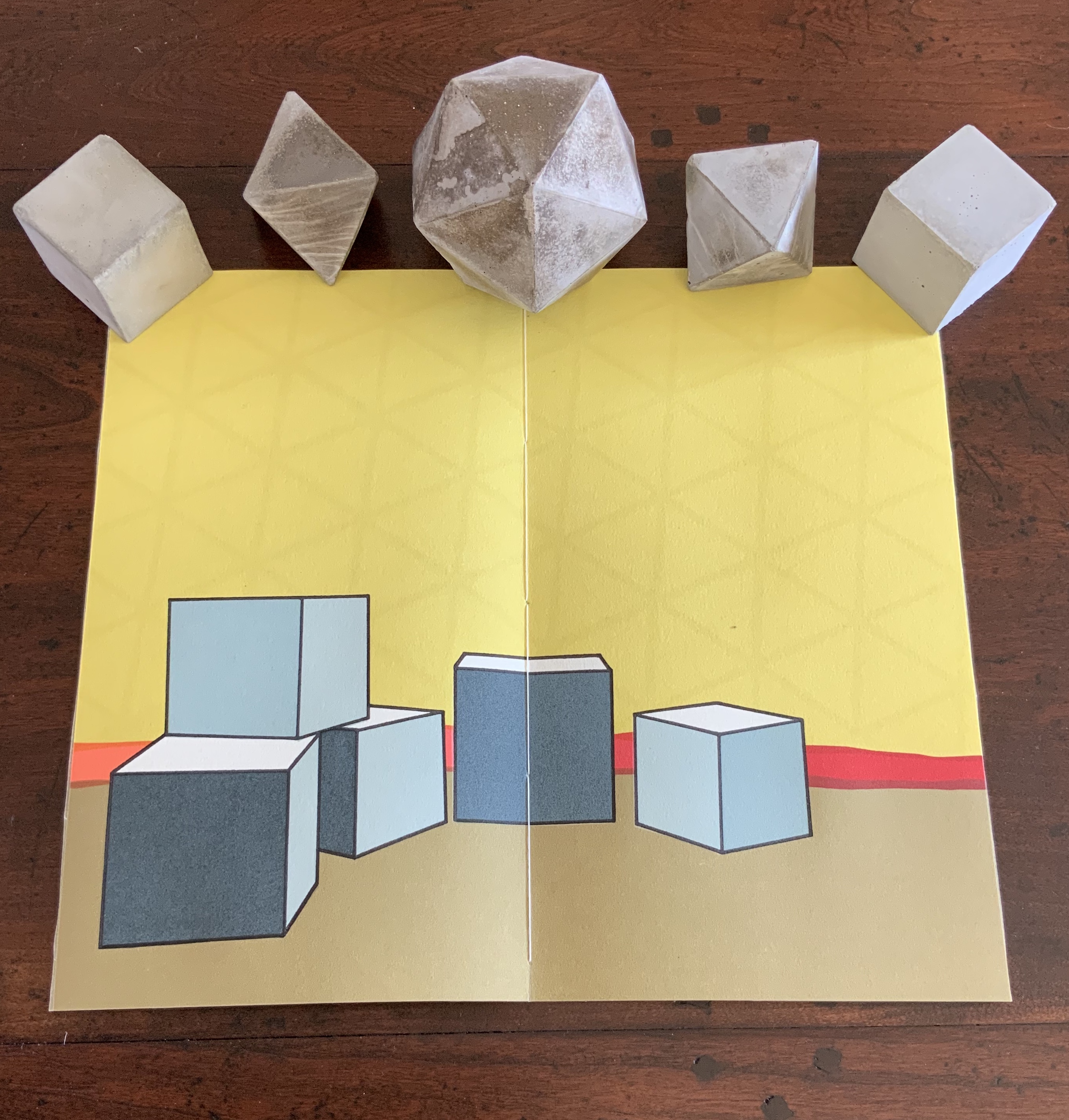
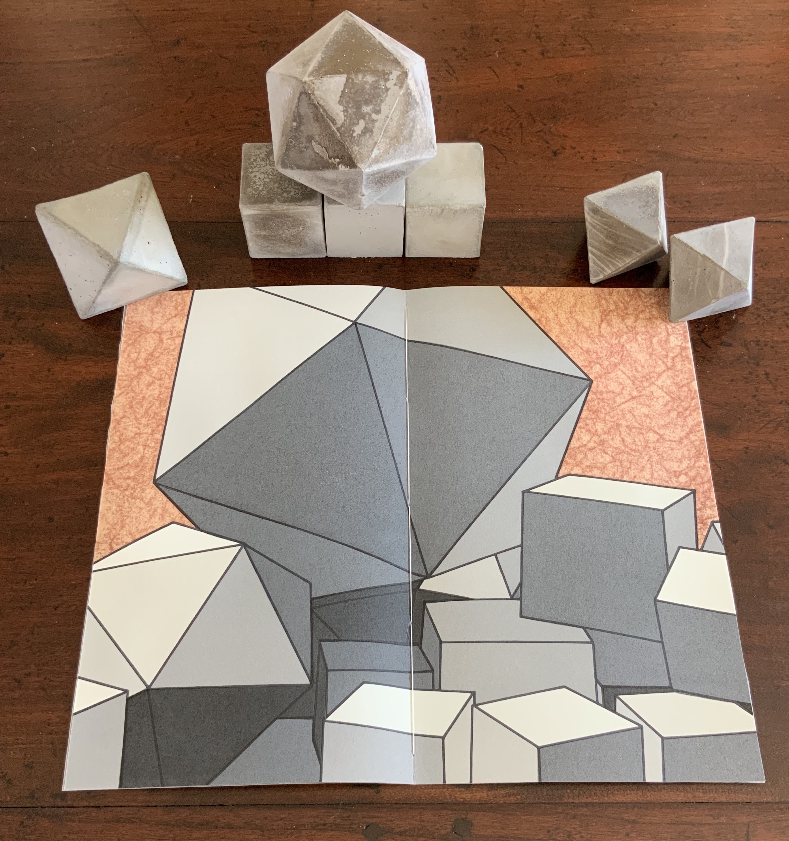
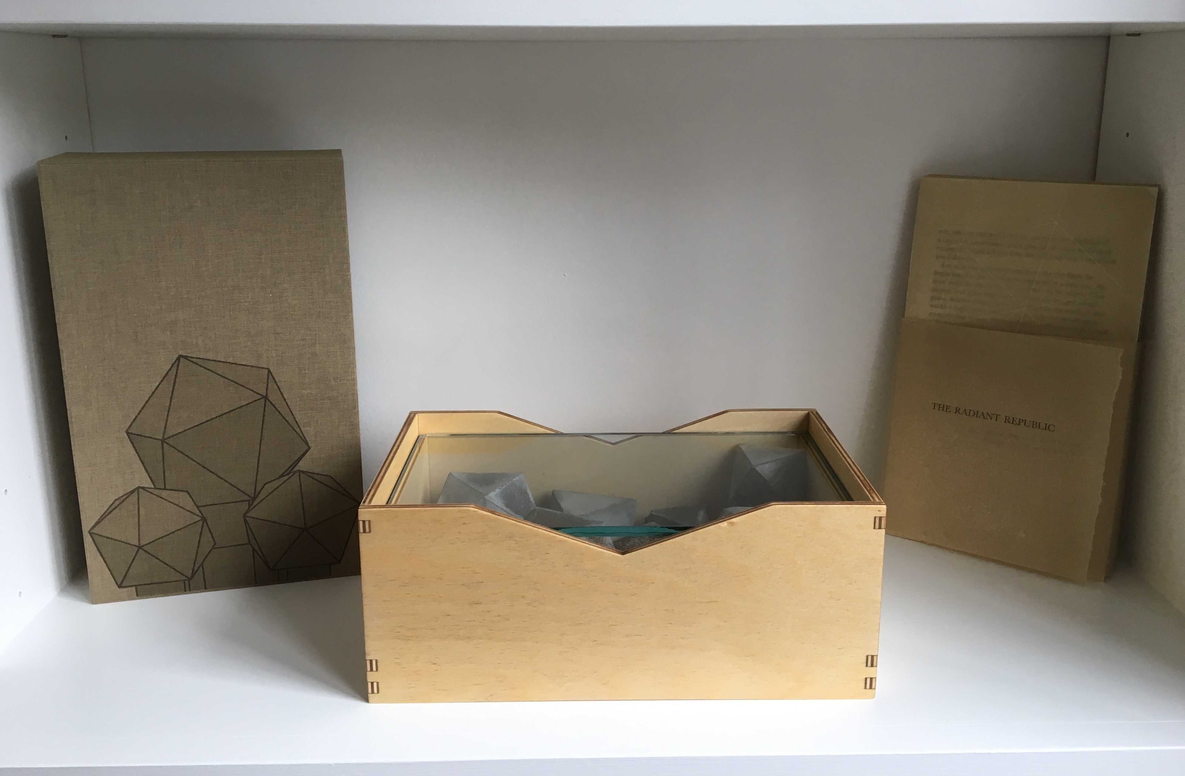
The Radiant Republic (2019) Sarah Bryant Box, glass, cement blocks, pamphlets. Edition of 50, of which this is #5. Acquired from the artist, 20 February 2019. Photos: Courtesy of the artist; Books On Books Collection.
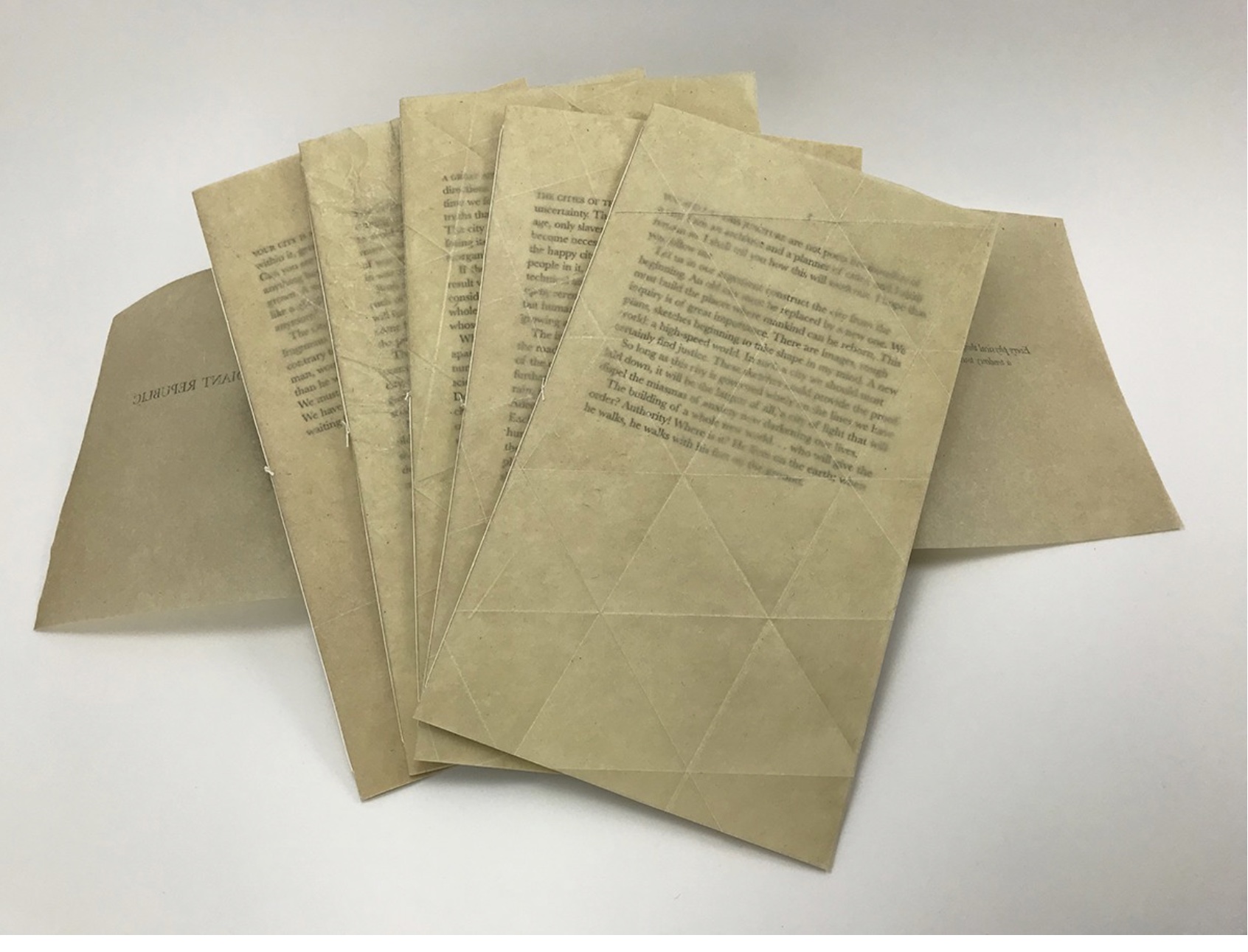
Although the collective works comprising Trace are housed in a box, this one is more elaborate in material and media. It is made of laser-cut Baltic Birch plywood, lightly treated with Tung oil. The lid is covered in Dubletta book cloth, which has been printed letterpress with polymer plates and linoleum. Lifting off the cover reveals yet further new materials and techniques. Five pamphlets each consisting of Rives Heavyweight paper sewn to a lightweight cover made of handmade Belgian Flax, produced at the Morgan Conservatory in Cleveland, and held together with a wrapper rest on a sheet of glass.
In several ways, the book component shows the encounter of previous techniques/media with the new. The precise fold work and registration to be found in Biography and Listen Out reappear, as does the meaningful integration of separate parts in Figure Study. Here, it is the geometric fold patterns in the covers echoing the geometric solids. Flax paper is a new element in Bryant’s repertoire.
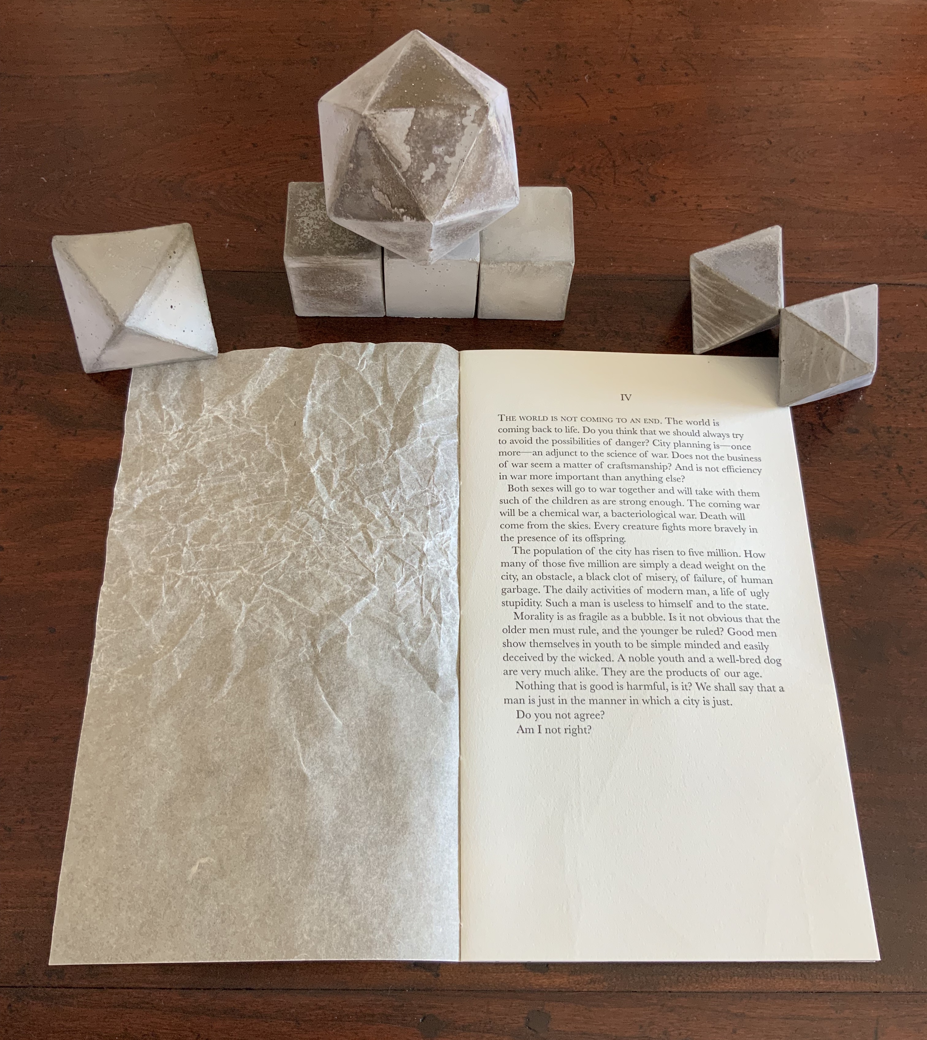
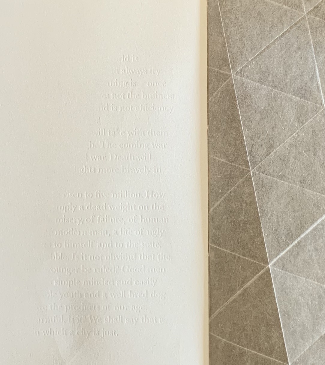
The blind embossed printing from Figure Study moves from the cover there to the interior of the book component here and with substantive, non-decorative intent. Across the five volumes, the embossed text is the same as that printed in ink and always appears on the last folio. But here is the catch: the text that appears comes from the succeeding volume’s inked text, and it appears in fragments. When the last page of the fifth volume appears, the embossed text on its folio’s last page is a fragment of the inked text in the first volume. The fragmentation of the embossed printed version and its variation in depth mime the weathering of structures and ideas.
The circular movement and fusion of the past and present are also reflected in the double-page prints centered in each volume. Note how the technique of prints interlocking across folios in Shift in Position replays here in the prints interlocking across the five volumes to assert a narrative thrust but in a landscape with no fixed beginning or end.
The contrast of materials — cloth, wood, flax paper, Rives paper and concrete — plays out in the concrete solids. Some edges are sharp, others blunted; some surfaces are smooth, others rough. This happens also with the covers to the five volumes according to the absence or presence (and density) of folds and, in one case, of crumpling or no crumpling. It happens in the prints, where the backgrounds include faint images mirroring the structures in the other media. This technique of contrasting materials/media and that of recapitulating the contrast within one or more of the materials/media seems to be a new development in Bryant’s art or, at least, an intensified one.
The multiple materials and techniques and their many-sided interactions pose a pleasurable dilemma for the work’s display. As soon as one is in place, another beckons.
No surprise then that the first pamphlet’s opening words are “You and I at this juncture are not poets but founders of a city”. This self-reflexive invitation to creativity is like that invitation to negotiate reading with looking — an invitation to participate and to recognise our participation as part of the creative act. An increasingly characteristic aspect of book art.
Nicholas Dames’s readable New Yorker piece presents telling episodes in the history of authors’ use of the chapter in non-fictional and fictional works — from Cato the Elder, Pliny, the Venerable Bede, Caxton, Fielding, Gissing and others.
Latin capitulum, Spanish capítulo, French chapitre, Czech kapitola, German Kapitel, Romanian capitol, Italian capitolo, English chapter: is it anything different in the digital age? The page can “disappear”, scrolling down a window, replaced by a percentage of book completed. What about the chapter?
The following paragraph from Dames is telling when juxtaposed with the final chapters of Amaranth Borsuk’s The Book (MIT Press, 2018), which brings to bear on the history of the book and its elements the perspective of an artist; reviewed here.
Like the momentary lifting of a pianist’s fingers while a chord still resonates, the classic novelistic chapter evokes time by dwelling in a pause rather than a strong ending. We feel time in the novel by marking it out into bits, but only bits that have no strong shape, that fade or blur into one another in the recollection. The greatest practitioners of the chapter have preferred to cast their divisions as fleeting caesuras with lingering aftereffects, scarcely memorable in their specifics but tenacious in the feeling they evoke. (italics added) Situations yielding silently to new configurations, feelings fading imperceptibly or stealing upon us, shifts in the atmosphere around us: time in the novel is made up of these chromatic transitions, and the usual name for them in the history of the form is the chapter.