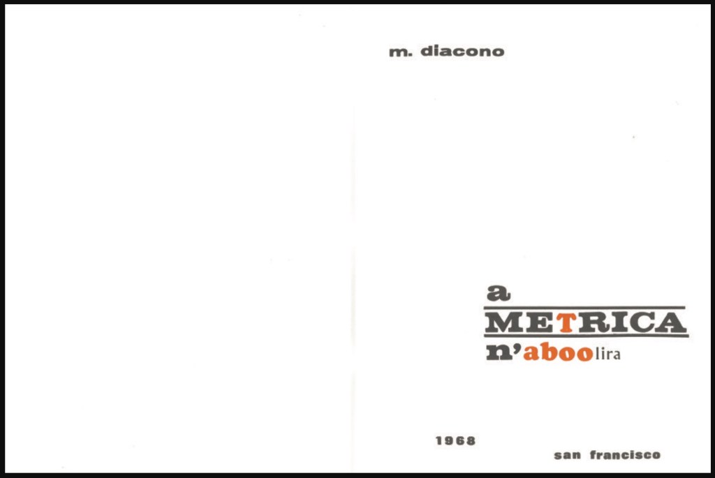
Besides being first out of the gate with an “homage by redaction” of Un Coup de Dés, Mario Diacono is perhaps the first hommageur to give a sociopolitical cast to the effort. In an interview in Ursula, Diacono comments
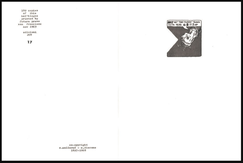
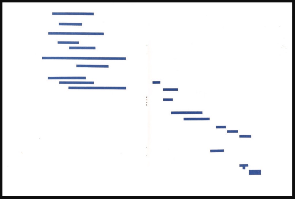
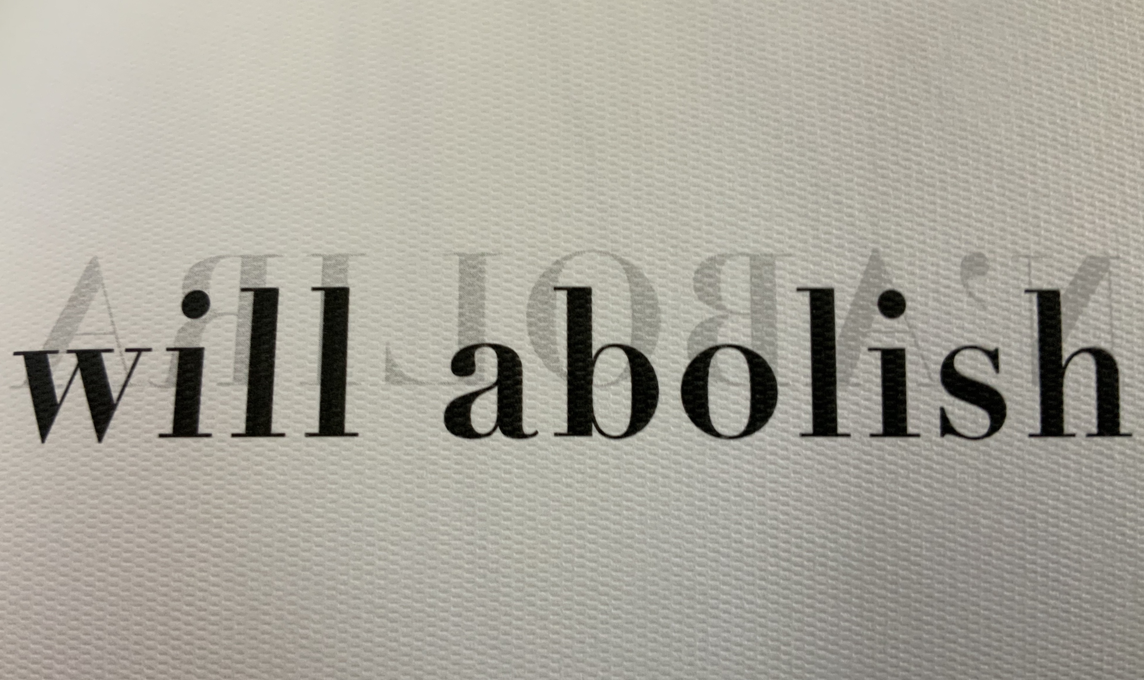
1968 was a year in which many things were abolished, or felt tempted to be abolished. Language was one of them, at least the traditional language of poetry, but also the language of ‘bourgeois/capitalist’ society. Berkeley is also present in the book through the reproduction of three frames from a cartoon in a local magazine, which functions as a kind of preface. The title alternates not only colors, black and orange, but also uppercase and lowercase letters. The wordplay in essence says: the absence of metrics, of language, will not abolish poetry. Neither will the American taboos.(Nickas, 2019).
Those comments align with the element of “pop” art and the underground comic in this homage.
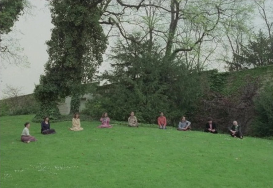
Later in the 1970s, Danièle Huillet and Jean-Marie Straub would pick up the thread of social critique by staging and filming a choral reading of the poem on the lawn of the Père Lachaise cemetery,
where there are the great memorials of the concentration camps: Ravensbrück, Auschwitz… it is in the corner of the cemetery where you can guess something about the city. Under this hill are buried the last members of the Paris Commune, who were shot in that same place. – Jean-Marie Straub
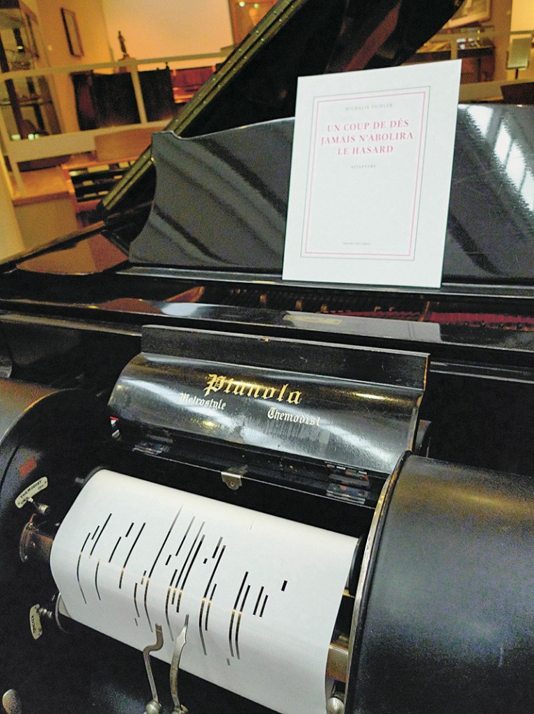
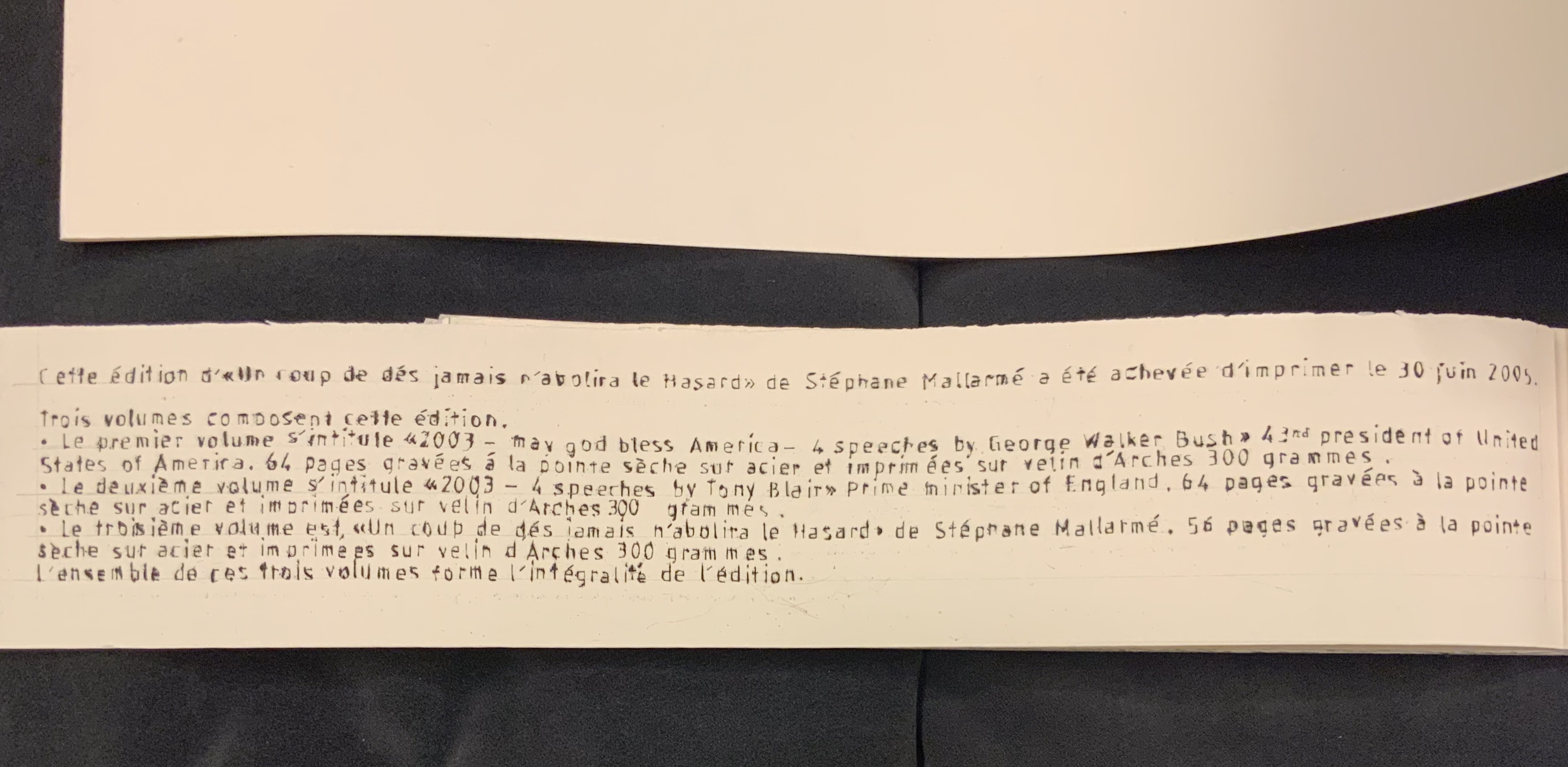
These three connected volumes explore graphic transpositioning from oral speeches to a visual representation. Though a new way to read/experience the speeches–to visualize their patterns–you can [still] not tell the truth from fiction. You can not tell what you are reading. “In the 3-part, 4 Speeches/Coup de Des, the images of audio waves are the same—but one purports to be a group of speeches by Bush 43 ; another, a group by Tony Blair; and the last—the real thing—is an unidentified man reading Mallarme’s “Un Coup de Dés Jamais N’Abolira Le Hasard”, that modern masterwork that launched a thousand artists’ books. The concept is trenchantly funny; the books are beautifully executed. [from the preface to Didier’s Manifesto by Tim Young]
Like Huillet, Straub and Mutel, Diacono is trying to balance his socio-political drive with the visual and historical homage to Un Coup de Dés. Huillet/Straub’s performative vocalization delivers its message only through the visual of its location. Mutel delivers his message by muting the poem with its sonographic visualization and sleight-of-hand substitution for political speeches. a METRICA n’aboolira delivers its message by balancing the textual and the visual, reminding us that Mallarmé wanted Un Coup de Dés to be looked at as well as read.
With the exception of Unpacking my Library and Between the Sheets, Spector’s works in the Books On Books Collection fall into the category of ephemera. More than most book artists’ ephemera such as invitations, broadsides and the like, however, Buzz Spector’s ephemera have that self-reflexiveness so characteristic of book art.
Artist, curator and historian Jeffrey Abt wrote that the “irresistible” idea of placing an exhibition of artists’ books alongside the University of Chicago Library’s collection “broadly representative of the history of the book” started with a visit to famed art dealer Tony Zwicker‘s studio. It was also, however, almost as if he were taking a cue from this statement by artist-printers Betsy Davids and Jim Petrillo just the year before:
A representative collection of artists’ books often does not seem visually remarkable in a gallery, where a wide range of visual experience is the norm. The same collection, installed in a library or bookstore, can seem visually startling almost beyond the limits of decorum. — “The Artist as Book Printer: Four Short Courses”).
While Abt’s introductory essay rings the historical changes on the roots of book art — once there was Mallarmé’s Un Coup de Dés Jamais N’Abolira Le Hasard, but before Mallarmé, there was William Blake — the works included and the catalogue’s design ring some chimes of their own about book art. One way or another, all book art self-consciously draws attention to some particularly bookish element. For the most part, the 49 works listed in this catalogue ring true. The catalogue’s design itself, however, not only chimes to that notion of self-reflexiveness but also to wider notions about the nature of book art within contemporary art.
Not long after this exhibition, Spector wrote of “the language of the book” and all its parts — pages, signatures, cover, letter forms and their placement on the page, etc. — as having a syntax (“Going Over the Books”). With its pencil-circled numbers, alignment guides, pastedowns and other designer’s marks appearing throughout — as if a printer’s devil had run amok and let the marked-up proofs go to press unchanged — the catalogue draws attention to that syntax, the underlying processes of bookmaking and, therefore, this object’s “bookness”. The colophon’s note initialed by Jeffrey Abt to Buzz Spector and “pasted” on the last page jokingly rings the self-reflexive chime of the markings throughout the catalogue.
The second chime comes in the catalogue’s verbal and visual punning. Like book art, punning is self-reflexive, words playing on words. The title ”the book made art” can be read with different meanings: “the book made into art”, “art that is bookish” and so on. The catalogue’s trim and two-dimensional representation of three-dimensions create the visual pun of a glass or white cube. The verbal and visual puns also play with Abt’s “irresistible” context. Here in the Joseph Regenstein Library was an exhibition catalogue, teasing the viewer with a reminder that vitrines separated them from the bookworks. Reviewing two other exhibitions of book art, Spector elaborated explicitly on his visual tongue-in-cheek irony:
The dilemma in staging exhibitions of books as art objects is the denial of access to the work that conservation necessarily demands. … and it is a morethan passing irony that implications of hermeticism and elitism should surround books shown to a public using the library as a means of gaining access to texts. — “Art Readings”.
The catalogue also teases with its title and design by suggesting that once books have been placed on display like this, the setting is no longer a library but a “white cube gallery“. As the catalogue progresses, black-and-white photos of items from the exhibition appear on the verso page in frames that appear to be hanging on the trompe l’oeil cube’s rear wall.
Poster distributed on the University of Chicago campus. The image combines Michael Kostiuk’s Airplane Shadow Book (1981/82) with a variation of the catalogue cover. Photo: Courtesy of the artist.
But a viewer standing in the “brutalist” construct of the Regenstein Library and holding the finished catalogue might have asked, “What makes these objects I cannot touch — or, in some cases even if I could, cannot read — art?” There is the catalogue’s third chime. From the start, book art has faced a constant definitional or identity crisis and even the challenge “but is it art?” The catalogue’s title echoes Lucy Lippard’s Duchampian proposition: “It’s an artist book if an artist made it, or if an artist says it is”. The catalogue’s design says, “This is the gallery, these are the objects on display in it, they are art”.
The “white cube gallery” brings on a fourth and final ironic chime. In the 1970s and early ‘80s, artists’ books were pitched as a “democratic” medium and means by which art could escape the clutches of the gallery and reach a wider public. In another catalogue — the one for the 1973 Moore College exhibition, nominated as the first of book art — John Perreault writes:
Books as art, from the artist’s point of view and the viewer’s point of view, are practical and democratic. They do not cost as much as prints. They are portable, personal, and, if need be, disposable. Because books are easily mailed, books as art are aiding in the decentralisation of the art system. — “Some Thoughts on Books as Art”.
By the mid-80s, lo and behold, The Book Made Art’s catalogue-cum-gallery jokingly recaptures “books as art”. And in a further irony, by the mid-80s and since, the increased rareness and price of such bookworks have made them into galleries‘ and museums’ expensive objects of desire. Including this catalogue.
The Library of Babel (1991)
The Library of Babel Curated and edited by Todd Alden; catalogue designed by Buzz Spector. Dos-à-dos binding, offset. H241 x 177 mm Buffalo, NY: Hallwalls Contemporary Art Center, Hallwalls Inc., 1991. Photo of the work: Books On Books Collection.
As with The Book Made Art, Spector uses the cover (this time with a photograph of The Library of Babel) to introduce the self-reflexivity so characteristic of book art, but he does not stop there. Pagination and the back-to-back binding structure work together to evoke a mirror’s reflection; the last page of the first half “faces” the last page of the second half.
Photo of the work: Books On Books Collection.
The first half contains Todd Alden’s essay “The Library of Babel: Books to Infinity”, Paul Holdengräber’s “Unpacking Benjamin’s Library: Bibliomania in Dark Times”, and a checklist of the 34 works by their 10 artists.
Photo of the work: Books On Books Collection.
The second half contains half-tones of selected works and brief CVs of the artists. Among the half-tones are also photographs of works referenced by Alden (one by Jasper Johns, two by Marcel Broodthaers). Notice how the rules change position in the footers of the two halves, again evoking the back-to-front theme of the dos-à-dos binding.
Photo of the work: Books On Books Collection.
As in The Book Made Art, Spector had an entry in “The Library of Babel“ exhibition. With its torn pages, North Sea (for M.B.) (1990) echoes Altered LeWitt (1985), further below, but it is instead a work 10 feet long and presented on a table appropriately jutting out from the wall like a pier. “M.B.” is Marcel Broodthaers, to whose works there are multiple and layered references. The eleven “waves” of torn pages placed in a row on top of the steel shelf come from eleven copies of the Walker Art Center’s 1987 catalogue to Broodthaers’s first U.S. retrospective. Spector had all the pages in each copy painted with white gesso before tearing out the pages.
Marcel Broodthaers (1990) Buzz Spector An altered copy of: Marcel Broodthaers (Minneapolis/New York: Walker Art Center/Rizzoli, 1989). Photos: Courtesy of Buzz Spector.
He saved the excised “wedges” and bound them at the fore edges. Because the gesso does not completely obscure the text and images from the catalogues, viewers who come close to the work can see slivers of some of Broodthaers’ works along with the word fragments typical of Spector’s altered books.
North Sea (for M.B.) (1990) Buzz Spector Books, steel, gesso, 25 x 96 x 10 inches Collection Orange County Museum of Art,CA; Museum purchase with additional funds provided by Peter and Eileen Norton and the National Endowment for the Arts, a federal agency. Photo: Courtesy Orange County Museum of Art.
Spector’s library contains a copy of Broodthaers’ 1974 artist book, A Voyage on the North Sea. These layered references and self-references — direct references to Broodthaers’ A Voyage, indirect references through the self-reference to Spector’s Marcel Broodthaers (1990) — bring into sparkling focus two features of book art and, in particular, late 20th century book art: reverse ekphrasis and bookworks in conversation with one another.
When a visual work of art inspires poetry or prose, the literary result is called ekphrastic: “the verbal representation of visual representation”. But where the poets Keats, Auden and Jarrell, for example, use words to “recreate”, re-present, evoke or respond to works of art — an antique urn, a painting by Brueghel and Donatello’s sculpture of “David” — book artists have in turn used the letter, words, actual books, the physical materials of the book or even the shape of books, their functions or processes of making them to create works of art. A kind of ekphrasis in reverse.
Not only does Spector perform this reverse ekphrasis with exhibition catalogues in North Sea (M.B.), he does it in conversation with a multimedia work by Broodthaers. Works in conversation with one another is also a common occurrence in poetry. An entire anthology showcases these poems that talk to other poems. The later work not only evokes the earlier work, it illuminates and adds to it. In book art, other instances include Bruce Nauman’s Burning Small Fires (1968), a one-sheet folded book of photos of Ed Ruscha’s Various Small Fires and Milk (1964) being set on fire and burning to ash, and Dennis Oppenheim’s Flower Arrangement for Bruce Nauman (1970), a leporello which refers to Nauman’s Flour Arrangements (1967), a video in which the artist pours over 50 pounds of flour on a mock talk-show studio floor and then sculpts it into ephemeral shapes. Nauman’s shift to an ingenious folded single-sheet structure and Oppenheim’s shift (and pun) to an accordion view of flowers are part of the addition to their conversations with their very structurally different counterparts. Spector’s shift to the sculptural is part of the addition to his conversation with Broodthaers’ book and video. Consider not only Spector’s gessoed sea of pages and the pier, but also those two 19th century black bronze sailing ship bookends evoking the 19th century nautical painting that Broodthaers appropriated in A Voyage on the North Sea.
North Sea (for M.B.) (1990) Buzz Spector Books, steel, gesso, 25 x 96 x 10 inches Collection Orange County Museum of Art,CA; Museum purchase with additional funds provided by Peter and Eileen Norton and the National Endowment for the Arts, a federal agency. Photo: Courtesy Orange County Museum of Art.
Unpacking my Library (1994-95) Buzz Spector Leporello full-colour offset printed; folded H100 x W155 mm, unfolded W3600 mm; Cleveland Center for Contemporary Art. Installation exhibited at the San Diego State University Art Gallery, 1-31 October 1994. Photo of the work: Books On Books Collection.
Clearly from his entry in The Library of Babel, Spector’s artistic output extends beyond altered books and catalogue design to larger scale installations. One of the more well-known, Unpacking my Library imposes multiple orders on what Walter Benjamin called “the chaos of memories”. How “multiple orders”? First, because of its subtleties; second, because of its several forms.
From the start at the San Diego State University Art Gallery, 1-31 October 1994, the installation imposed the order of “descending height” on Spector’s library, unpacked and displayed across one shelf attached along the white walls of a room in the gallery. The single shelf ran 188 feet.
Although Spector is rejecting the library’s traditional method of making sense of a collection of books — ordering by academic category — in favor of a physical criterion, the title imposes another method of making sense — allusion. The installation makes “more” sense if you have read Walter Benjamin’s essay “Unpacking My Library — A Talk on Collecting” (1931). If you haven’t, then, on the reverse of the leporello produced with the Cleveland Center for Contemporary Art, are these two sentences from the essay:
This or any other procedure is merely a dam against the spring tide of memories which surges toward any collector as he contemplates his possessions. Every passion borders on the chaotic, but the collector’s passion borders on the chaos of memories.
So what has ordering by height to do with the chaos of memories? Well, if the order of the personal library had been chronological by acquisition, that would be an assertion against chaos, a kind of aide- mèmoire. If the order had been by the library’s traditional method, again that would be an assertion against chaos. Benjamin and Spector embrace the chaos. Spector’s at-first amusing and puzzling organization of his library prods the viewer into the chance to do somewhat the same — to wander along the shelf with that phrase of process hovering in the mind and be reminded of books once read (when? where?), familiar and almost-familiar names and places (from when or where?) and subjects studied (what did that cover?). But the viewer also experiences a surge of unknown names, places and subjects, and spines that mystify.
The allusion to Benjamin’s essay offers another way of making sense of this experience into which the viewer is prodded. If a personal library is a kind of self portrait you can detect from the clues that its usual groupings into fiction, biographies, history, science, etc., give us about the owner, then here the order by height washes them and the portrait away. And if the viewer knows the essay, Benjamin’s last sentence may come to mind:
So I have erected one of [the real collector’s] dwellings, with books as the building stones, before you, and now he going to disappear inside, as is fitting. — Walter Benjamin, “Unpacking My Library”
Spector mentions this disappearance in a video record of the making and showing of the installation. Whether or not the installation’s spectator knows Benjamin’s essay, the installation’s title is a clue to the imposition of a fictional order. “Unpacking my library” is a phrase implying an activity that is just getting going. For his essay, Benjamin created the fiction of the reader’s being present as the library is being unpacked. Likewise for Spector’s installation, any spectator walking into it has entered a fiction. Spector’s library has already been unpacked, sorted on the floor and placed on the single shelf running around the room.
Of course, however, the owner of the leporello form of Unpacking my Library does not experience this fiction as directly. The opening and arranging of the leporello is a hands-on activity; the unpacking of Spector’s library occurs panel by panel in the reader’s hands. The library’s arrangement by height appears more gradually than in the gallery. Once the bookwork is fully extended, the installation’s fiction then becomes more readily available to the leporello’ s reader/viewer.
Photo of the work: Books On Books Collection.
As fictions, Benjamin’s essay and Spector’s installation need an ending. Benjamin’s technique is to disappear into his collection. Spector chooses a different technique. In correspondence with Books On Books, he writes:
The length of all the publications in my library was 165 feet; the single shelf, at the UCSD Art Gallery, on which they were placed ran 188 feet. That additional space implied a future, and life-affirming, growth of my collection. — Buzz Spector, 26 March 2020.
Photo of the work: Books On Books Collection.
Whether it is leporello or installation, the reader/viewer of Unpacking my Library is launching and launched on this open-ended ending.
The Book Maker’s Desire (1995)
The Book Maker’s Desire: Writings on the Art of the Book Buzz Spector Pasadena, CA: Umbrella Editions, 1995. 2nd printing. Cover design by Buzz Spector. Image: History of Europe (1983) by Buzz Spector; plaster over found book, 10.5 x 12 x 15 inches. Photo of the work: Books On Books Collection.
Spector’s essays are tonic. His comments on Margaret Wharton’s bookworks could refresh any reader and viewer lucky enough to see her works (Union League Club-Chicago or Yale) or remind the viewer of them when looking at works by later artists such as Thomas Wightman or the “Mystery Book Artist of Edinburgh”. In the past few months, Walter Hamady and John Baldessari have died, and Spector’s essays on them bring them both and particular works of theirs to present life. His essay and letter on Broodthaers would enhance any reading of the artists who have stood on Broodthaers’ shoulders to address Mallarmé’s Un Coup de Dés: Bennequin, Mutel, Pichler, Wyn Evans, Zboya. The essay “Going Over the Books” may have inspired Alden’s curation of ‘The Library of Babel” exhibition.
The essays are not entirely the point of having The Book Maker’s Desire in the Books On Books Collection. What completes the point is the cover design. The object on the book’s front cover is Spector’s own work History of Europe (1983), which pays homage to Broodthaers’ Pense-Bête (1964). But look closer. The cover stock has elements of text and colour seeping through, almost as if it were made of shredded books. The aptness and artistry of the cover design make The Book Maker’s Desire an object of desire in and of itself.
Detail of cover: Books On Books Collection.
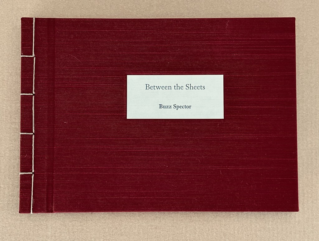
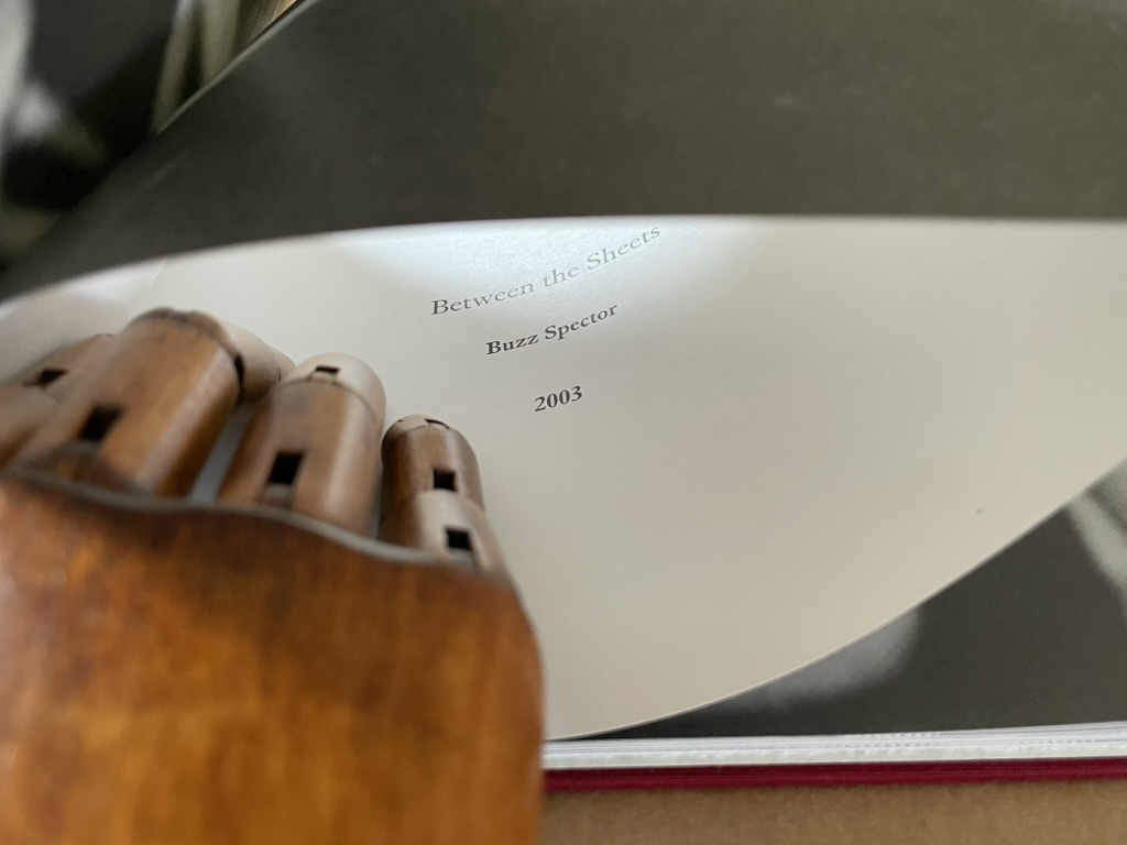
Along with Unpacking my Library, Between the Sheets (2003) is the only other of Spector’s limited edition artist’s books in the Books On Books Collection. It is the solo exhibition to the joint exhibition of The Book Made Art (1986), described at the outset of this entry. In Between the Sheets, Spector again shows the self-reflexiveness of book art but also demonstrates how originality can spring from it.
Between the Sheets (2003)
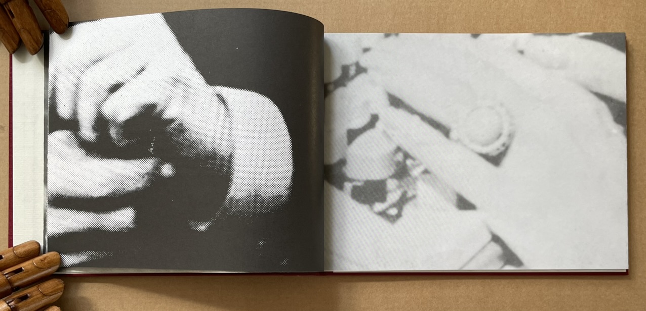
Between the Sheets (2003) Buzz Spector Cloth over boards, Japanese stab binding, 15 folded sheets, outer sides offset printed with enlarged “authors’ photos” clipped from dust jackets of art books repurposed by Spector for his bookworks, inner side printed (recto only) with text by and selected by Spector. H157.5 x W216 x D12.7 mm. Edition of 40, of which this is #40. Acquired from Olive Branch Press, 26 June 2020. Photos of the work: Books On Books Collection.
Unlike Altered Lewitt (1985) and North Sea (for M.B.) (1990), which appropriate and alter named works, Between the Sheets is made at two or three removes from its source material. In the first instance, Spector clipped authors’ photos from the dust jackets of their books (unnamed), then rephotographed and printed them at enlarged scale in offset editions. These prints were then bound together to make books. As with Altered Lewitt and other works, Spector then tore strips in a sequence of decreasing increments from the spreads so as to form a wedge-shaped cross section of the image block. In the next remove, this process left a pile of torn strips, and from these torn strips, Spector has proceeded to create Between the Sheets. With images on one side and text imposed on the reverse, these folios are folded and bound at their open ends with Japanese stab binding.
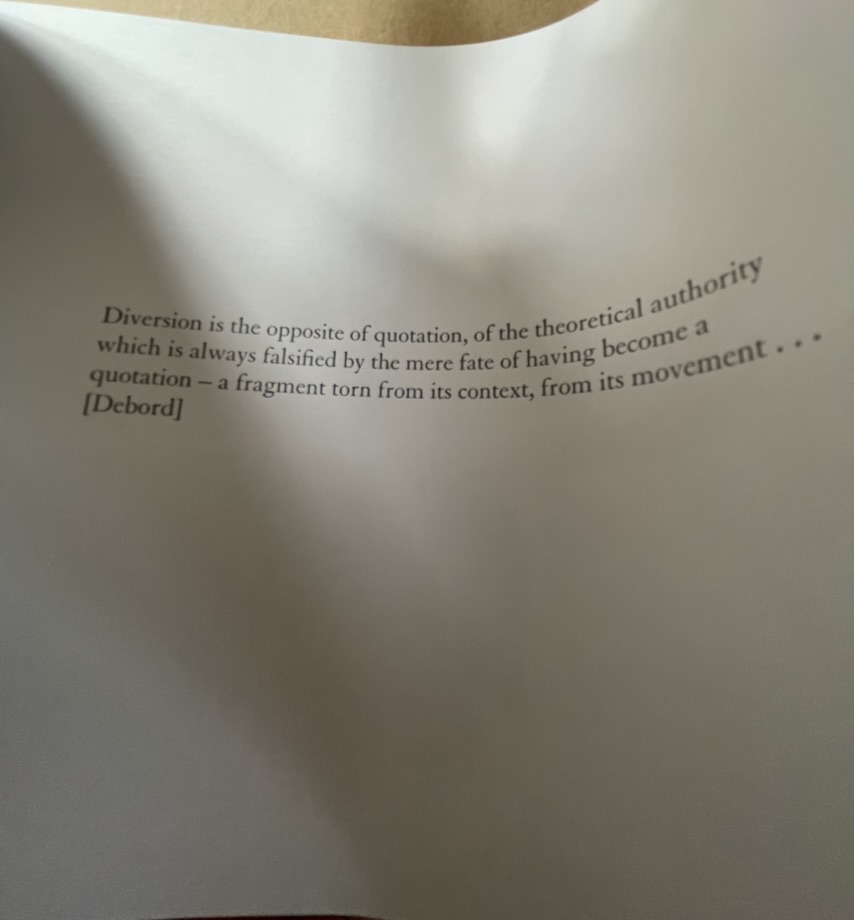
The work’s main thrust is philosophically, artistically and self-reflexively aesthetic. It quotes from the French philosopher Guy Debord, the Belgian artist Marcel Broodthaers and Spector himself. The quotation from Debord comes early on, the first after the title page and two of prefatory explanation, and very much sets the tone.
Diversion is the opposite of quotation, of the theoretical authority which is always falsified by the mere fate of having become a quotation — a fragment torn from its context, from its movement … [Debord]
With Between the Sheets, we have on our hands a decidedly multi-layered diversion. At one layer, it diverts by questioning Debord’s own words, consigning their “theoretical authority” to a fate of falsification by “having become a quotation — a fragment torn from its context”. Like a fun-house mirror, the page bows to give this distorted reflection of Debord’s words.
But is it a diversion? After all, the “truth” of Between the Sheets rests at least in part in its composition from fragments. At this other layer, Between the Sheets “quotes” the fragments torn from the context of another of Spector’s artwork. In turn, that other artwork was composed of prints of photographic “quotations”, the fragments torn from authors’ images on dust jackets (the coverlets for the source books and their sheets). It is no accident that, when the sheets of Between the Sheets are bowed to permit a look inside, the images bracket the text pages like single quotation marks.
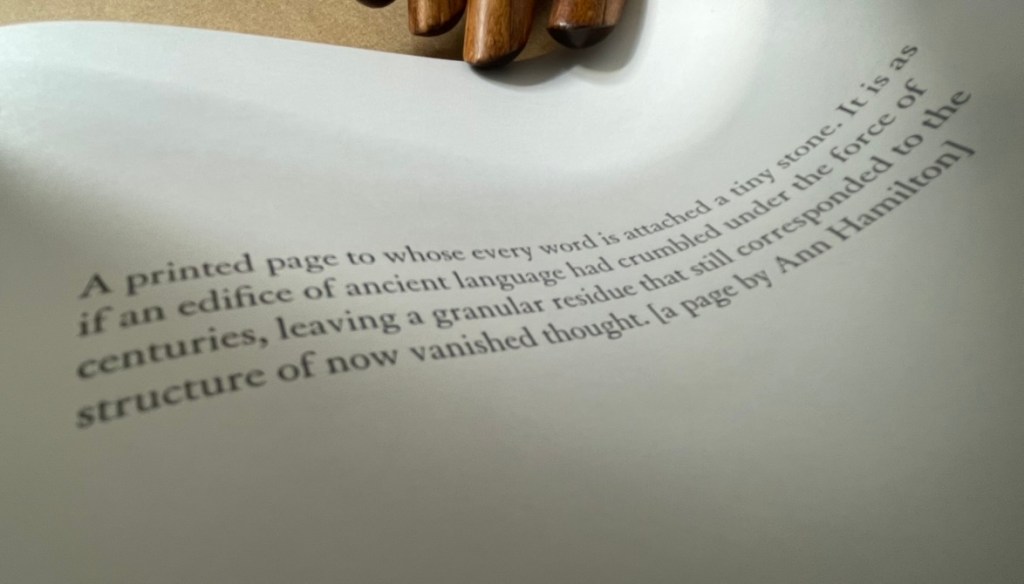
Another quotation resting between the sheets comes from Spector’s own essay on Ann Hamilton in The Book Maker’s Desire (p.63):
A printed page to whose every word is attached a tiny stone. It is as if an edifice of ancient language had crumbled under the force of centuries, leaving a granular residue that still corresponded to the structure of now vanished thought. [a page by Ann Hamilton]
Spector runs the risk of “Debord-ing” himself here with his self-quotation, but he only succeeds in diverting this reader back to the essay on Hamilton’s work and specifically the four works commissioned to benefit The New Museum of Contemporary Art in New York:
The artist chose a total of fifty four volumes (40 in the edition, plus 14 artist’ proofs) for the untitled project. These found books, mostly old novels or poetry, were selected for a variety of physical characteristics –size, wear, and paper quality — and for their typographic layout. Each book was opened to its middle, where six or eight pages were cut from the text block and reattached, edge-to-edge, to the right-hand side of the opened page spread, making an accordian-fold [sic] extension from the book. The eight pages thus displayed were meticulously rendered unreadable by Hamilton and several attendants who glued tiny stones over every word on the visible side. (p. 63)
Is it a coincidence that Between the Sheets also consists of 40 in the edition just like Hamilton’s commission? Spector quotes not only images and words from others’ works and his own, he quotes the details of their production and form. It is certainly no coincidence that Between the Sheets quotes the stab bound structure of Marcel Broodthaers’ A Voyage on the North Sea. After all, in his hidden prefatory explanation, Spector makes no bones about the fact that Between the Sheets arose in part from his astonishment at finding the page numbers hidden within the bound edge of A Voyage. But how did he find them? In the process of creating his own North Sea (for M.B.) (1990). So yet another self-quotation of production process.
Spector’s forthright quotations are divertingly sly. When he cites Broodthaers between these sheets,
he is also echoing Broodthaers’ injunctions in A Voyage on the North Sea:
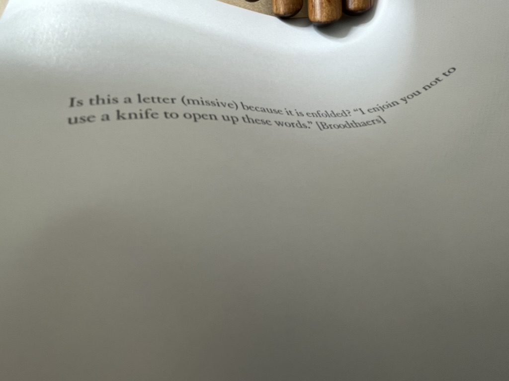
Before cutting the pages the reader had better beware of the knife he will be wielding for the purpose. Sooner than make such a gesture, I would prefer him to hold back that weapon, dagger, piece of office equipment which, swift as lightning, might turn into an indefinite sky. … These pages must not be cut.
Of course, Spector did not cut the pages; he tore them.
Another sly diversion is sex. By using photos of male and female authors and by interposing suggestive phrases inside the folds (“a movement of bodies together as one body” and “peek between the sheets”), Spector spices up the obvious diversion of sex in his work’s title. But the slyness re-diverts via Broodthaers to Mallarmé, whose poem Un Coup de Dés Jamais N’Abolira le Hasard (1897) Broodthaers “knifed up” at the very level of the words and whose contemplations of the letter, the page and the fold have taken on an erotic tone that Spector embraces in A Book Maker’s Desire:
When Stéphane Mallarmé described the folded and uncut signatures of books as “virginal,” awaiting the penetration of the “paper knife,” he identified an erotics of reading. (p.15)
The topography of an open book is explicit in its erotic associations: sumptuous twin paper curves that meet in a recessed seam. Page turning is a series of gentle, sweeping gestures, like the brush of fingers on a naked back. Indeed, the behavior of readers has more in common with the play of intimacy than with the public decorum of art viewing or music listening. Most of us read lying down or seated and most of us read at least partially unclothed. We dress up to go out and look at art; undressed, in bed, we read. We seek greater comfort while reading than the furnishings of museums or concert halls will ever grant us. When we read — the conventional distance between eye and page is around fourteen inches — we often become the lectern that receives the book: chest, arms, lap, or thighs. This proximity is the territory of embrace, of possession; not to be entered without permission. (p.17)
There is much more between the sheets of Between the Sheets. I wish that the 40 copies could find many more readers/lovers to embrace its diversions.
Buzz Spector: Alterations (2020)
Buzz Spector: Alterations (2020) Buzz Spector Gretchen L. Wagner; Elizabeth Wyckoff; Andrea Ferber Brochure. H254 x W256 mm, 4 unnumbered pages. Acquired from the artist, 23 June 2020. Photos of the work: Books On Books Collection.
Three items of ephemera conclude this entry. The first is a pristine copy of the announcement for Spector’s retrospective at the Saint Louis Art Museum, held 20 November 2020 through 31 May 31 2021, along with a copy of it with the front cover hand torn by the artist. The second is the catalogue from his show in 2021 Between the Lines. With both, Spector makes an ephemeral piece echo the works in the exhibition. The third item is a hand torn postcard reproducing his drawing Torn Flag (2022).
Between the Lines (2021)
Between the Lines (2021) Buzz Spector Elizabeth Wyckoff, Gretchen L. Wagner, Meredith Malone, Michael Garzel, Jane E. Neidhardt Perfect bound paperback. H268 x W 230 mm, 81 pages. Acquired from the artist, 10 March 2021. Photo of the work: Books On Books Collection.
The Zolla/Lieberman Gallery, which has supported Spector’s work since 1995, sponsored this monograph following 2020/21 retrospective held at the Saint Louis Art Museum. As a slightly less ephemeral item, it neatly rounds off this entry. Its cover image shows one of Spector’s well-known alterations: Altered LeWitt (1985), one of five of the found and hand-torn catalogue: Sol LeWitt, Drawing Series I, II, III, IIII A & B (Turin, Italy, at the Galleria Sperone, 1974). Compare it with North Sea (for M.B), above, which Spector created five years after Altered LeWitt. Spector extends the technique and concept across the two works in distinctive ways to echo two distinctive artists and yet also speak to commonalities and originality among the three artists.
Photo of Between the Lines (pp. 12-13): Books On Books Collection.
Between the Lines‘ presentation of the works is spectacular. Recalling the effect in The Book Made Art (above), they seem to float three dimensionally on the page. The detail photo of Unpacking my Library across a double-page spread offers a good example, especially when compared with the images above.
Photo of Between the Lines (pp.16-17): Books On Books Collection.
Between the Lines also provides the opportunity to end this entry with an image of the work incorporating an image of the author and his generosity toward his fellow bookworkers. Note in particular the reference to Michael Garzel, the monograph’s designer and creator of the typeface used so strikingly on the cover, for chapter titles and here in the heading “Acknowledgments”.
Photo of Between the Lines (pp. 4-5): Books On Books Collection.
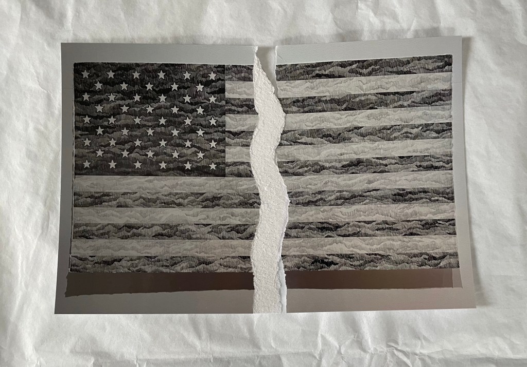
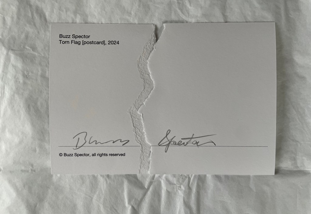
Torn Flag (2024)
Torn Flag(2024) Buzz Spector Postcard. Acquired from the artist, 26 February 2024. Photos: Books On Books Collection.
Revisiting Spector’s works this time was prompted by an invitation from the Center for Book Arts to “BookTalk: Full Dress or Half Dress, Not Casual with Buzz Spector” on 8 October 2024. The postcard reproduces the drawing Torn Flag (2022), a 565 × 1118 mm drawing (graphite on paper) that appeared in the Zolla/Lieberman Gallery. Spector describes the postcard as an “(informal) edition … Elegy to the Divided States”. Ephemeral though the postcard may be, its tearing makes a self-reflexive artistic gesture. But it also serves as an injunction: Vote. Always.
Revised entry: 7 October 2024; 24 September 2021; original entry, 31 March 2020.
Further Reading
“Buzz Spector“, Bookmarking Book Art, 12 March 2016.
Davids, Betsy, and Jim Petrillo. “The Artist as Book Printer: Four Short Courses” in Artists’ Books: A Critical Anthology and Sourcebook, edited by Joan Lyons (Rochester, NY: Visual Studies Workshop Press, 1985), p. 160.
Drucker, Johanna. 2004. The Century of Artists’ Books [Second edition] ed. New York City: Granary Books. See pages 118-19 for perceptive comments on Spector’s A Passage (1994) and his method of torn pages.
Lippard, Lucy. “New Artist’s Books” in Artists’ Books. A Critical Anthology and Sourcebook, edited by Joan Lyons (Rochester, NY: Visual Studies Workshop Press,1985), p. 53.
Mathews, Emily, and Sylvia Page. “Off the Shelf and Into the Gallery: Librarians on Spector”, Buzz Spector: Off the Shelf, Grunwald Gallery of Art, October 19 — November 16, 2012 (Bloomington, IN: Grunwald Gallery of Art, Indiana University, 2012), pp. 9-15.
Otten, Liam. “A sea of torn pages“, The Source, Washington University in St. Louis, 26 February 2010. Accessed 26 March 2020.
Perloff, Nancy. 2016. Explodity : Sound, Image, and Word in Russian Futurist Book Art. Los Angeles, California: Getty Research Institute. See pages 179-81 for perceptive comments on Spector’s A Passage (1994), a variant on biblioclasm and example of what Spector calls “a ‘conceptual purity’ because it engages completely with the book as a book.” (p.180)
Perrault, John. “Some Thoughts on Books as Art” in Artists Books, Moore College of Art, 23 March – 20 April 1973, curated by Dianne Perry Vanderlip (Philadelphia, PA: Moore College of Art, 1973), p. 21.
Schlesinger, Kyle. “The Missing Book”, Buzz Spector: Off the Shelf, Grunwald Gallery of Art, October 19 — November 16, 2012 (Bloomington, IN: Grunwald Gallery of Art, Indiana University, 2012), pp. 17-25.
Spector, Buzz. “Going Over the Books” in The Book Maker’s Desire (Pasadena, CA: Umbrella Editions, 1995), p. 8.
Spector, Buzz. “Art Readings” in The Book Maker’s Desire (Pasadena, CA: Umbrella Editions, 1995), p. 13.
Spector, Buzz. “I stack things. I tear stuff up”, Buzz Spector: Shelf Life: selected works, Bruno David Gallery, January 22 — March 6, 2010 (Saint Louis, MO: Bruno David Gallery, 2010).
Spector, Buzz. 25 March 2021. “Art Speaks“. Saint Louis Art Museum. Video series of artists’ talks. Accessed 23 August 2021.
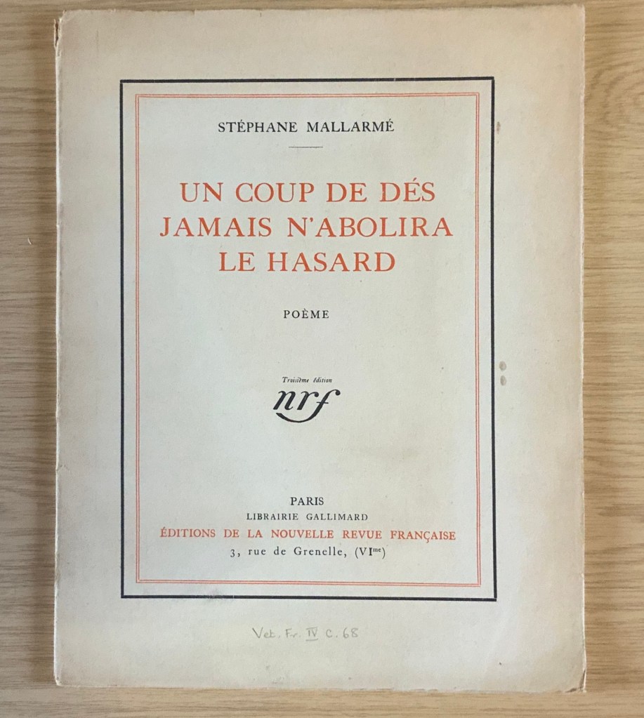
It was 1913. Stravinsky’s ballet “The Rite of Spring” debuted. The Cubists, Constructivists, Suprematists, Futurists all bound onto the art scene, many of them showcased in the Armory Show in New York that year. The Nouvelle revue française (NRF) attempted the first book form of Stéphane Mallarmé’s Un Coup de Dés Jamais N’Abolira le Hasard, which revived that 1897 typographic disruption of the page and prepared the ground for dozens of works of book art since. And Blaise Cendrars and Sonia Delaunay-Terk announced and published what they called le premier livre simultané. It was La Prose du Transsibérien et de la petite Jehanne de France.
From the Bodleian Library collection Photos: Books On Books
From the National Art Library, Victoria & Albert Photo: Books On Books
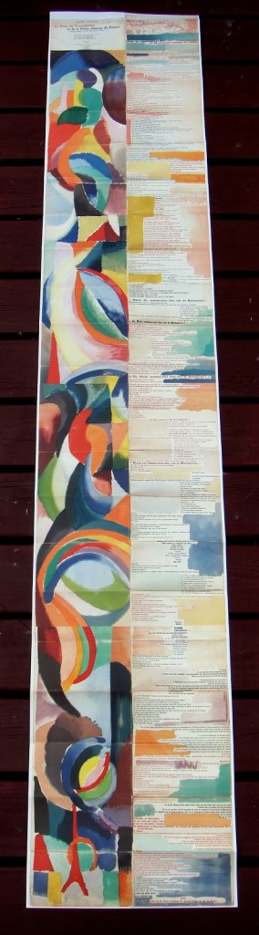
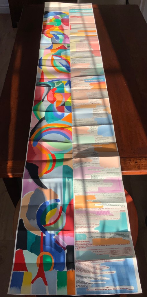
Like Mallarmé, Cendrars disrupts the page with multiple typefaces (thirty distinct ones in his case) and scattered placement of lines and stanzas. But La Prose presents an even more physical and structural disruption of the page and book than Un Coup de Dés. Unlike the latter, La Prose unfolds — twice — in an accordion format to over two metres in length or rather height since the text descends on the right and ends alongside the interlinked images of the Eiffel Tower and a Ferris wheel at the foot of the accordion. Cendrars and Delaunay had aimed to produce 150 copies of La Prose because, placed end to end, that would have equalled the Eiffel Tower’s height.
More than this monumental, sculptural, typographic and physical disruption of page and book, La Prose presents a temporal disruption. By le premier livre simultané, Cendrars meant a simultaneity of the verbal and visual — the way that text and image appear all at once — en un éclair. Early Bohemian that he was, Cendrars was co-opting a fair bit of artistic and literary theorising by the Cubists, Futurists and others. Most important and of the moment was his co-opting of Robert and Sonia Delaunay’s colour theory of simultanéisme. The “couleurs simultanées de Mme Delaunay-Terk” had also appeared in her 1913 robe simultanée and paintings. Building on a French scientist’s exposition on how perception of colours changes depending on the colours around them, the Delaunays claimed that rhythmic, musical and spatial synaesthetic elements were also at play. Sonia Delaunay asserted that the artwork produced for La Prose was not in response to reading the poem but hearing it from Cendrars. (Listen to it for yourself here.)
In presenting the adolescent Cendrars travelling physically eastward on the Transsibérien, travelling mentally to Flanders-Basle-Timbuctoo-Auteuil-Longchamps-Paris-New York while still registering the landscape outside, seeing the maimed and wounded returning from the front of the Russo-Japanese war, conversing with a prostitute named after Joan of Arc, doubting himself as a poet, and so on until a sudden transposition back to Paris, the process poem juxtaposes the sacred and profane, past/present/future, stationary and dynamic, national and international in outlook and locale. In short, simultaneously. In a format that is bound and unbound, the poem mirrors the swirling, interacting shapes and colours beside and in which it moves — and vice versa.
However more disruptive of the page and book La Prose may have been, it did not inspire the profusion of direct re-interpretations (or appropriations) that Un Coup de Dés prompted from artists such as Jérémie Bennequin, Ellsworth Kelly, Man Ray, Didier Mutel, Michel Pichler, Eric Zboya and dozens of others.
Not until 2001 did a re-versioning of La Prose appear. Tony Baker and Alan Halsey published an English translation and codex re-formatting. Its black on white imagery is reminiscent of the Russian Futurists, the type is monochromatic, and the typefaces, fonts and weights vary but not as much as in La Prose.
Baker and Halsey note in their colophon:
So far as we’re aware no translation of the poem into English has ever been attempted to give a sense of Cendrars and Delaunay’s original conception, not the least reason for which may have been the difficulty until recently of seeing the first edition, even in reproduction. — Prose of the Trans-Siberian and of the Little Jeanne de France (Sheffield: West House Books, 2001)
A well-founded lament — at least for the book art community. Not until 2000 had there been a reduced-scale reproduction of La Prose. It appeared in Granary Books’ A Book of the Book by Jerome Rothenberg and Steven Clay across a four-page foldout in the embrace of Ron Padgett’s English translation. Only in 2008 was there a full-scale, full-colour offset facsimile, produced by Yale University Press with an appended translation. It is now out of print.
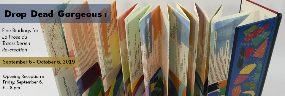
With her work La Prose du Transsibérien Re-creation (2019), Kitty Maryatt has changed all that. With this deuxième livre simultané, she has more than caught the echo of Cendrars/Delaunay’s original and its arrival. As scholar, artist and veritable impresaria, she has reinvigorated the book art/arts community with the legacy of La Prose.
Her blogspot documents the research and production with rich details about sourcing the type, learning about stencil-cutting from Atelier Coloris (one of the few remaining businesses devoted to pochoir), determining the recipes for the ink colours, testing papers (Zerkall Crème, Biblio, and Rives HW), creating a census of the existing 1913/14 originals and their locations — all that and more, including the use of bacon fat and a wine bottle filled with lead shot. She also organized a documentary by Rosylyn Rhee: “The Pochoir Re-creation of La Prose du Transsibérien”. It brings the importance of the original and this re-creation to life in the expressions and voices of prominent collectors, librarians and scholars, artists, rare book dealers and the project’s funders.
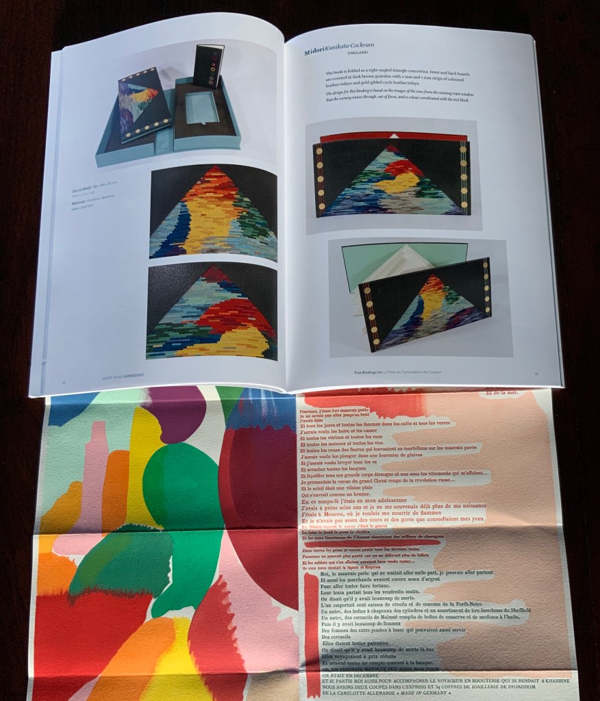
In addition, Maryatt has been either a contributor to, or the motivating force behind, several symposia and exhibitions such as “Paris 1913: Reinventing the Artist’s Book” (at the Legion of Honor Museum in San Francisco, 2018) and “Drop Dead Gorgeous”. The latter is a travelling exhibition resulting from invitations to twenty-four book artists and designer bookbinders to design and create bound copies of La Prose du Transsibérien Re-creation. For the San Francisco venue, Maryatt prepared a workshop on traditional French pochoir and provided text for the exhibition catalogue (available from the online store of the San Francisco Center for Books).
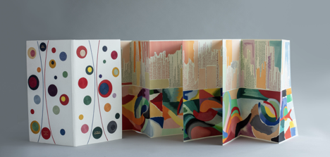
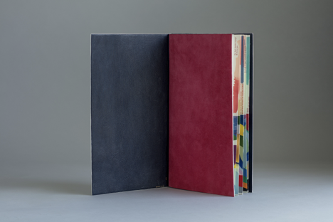
Monique Lallier’s fine binding of La Prose du Transsibérien Re-creation Photos: Courtesy of Monique Lallier
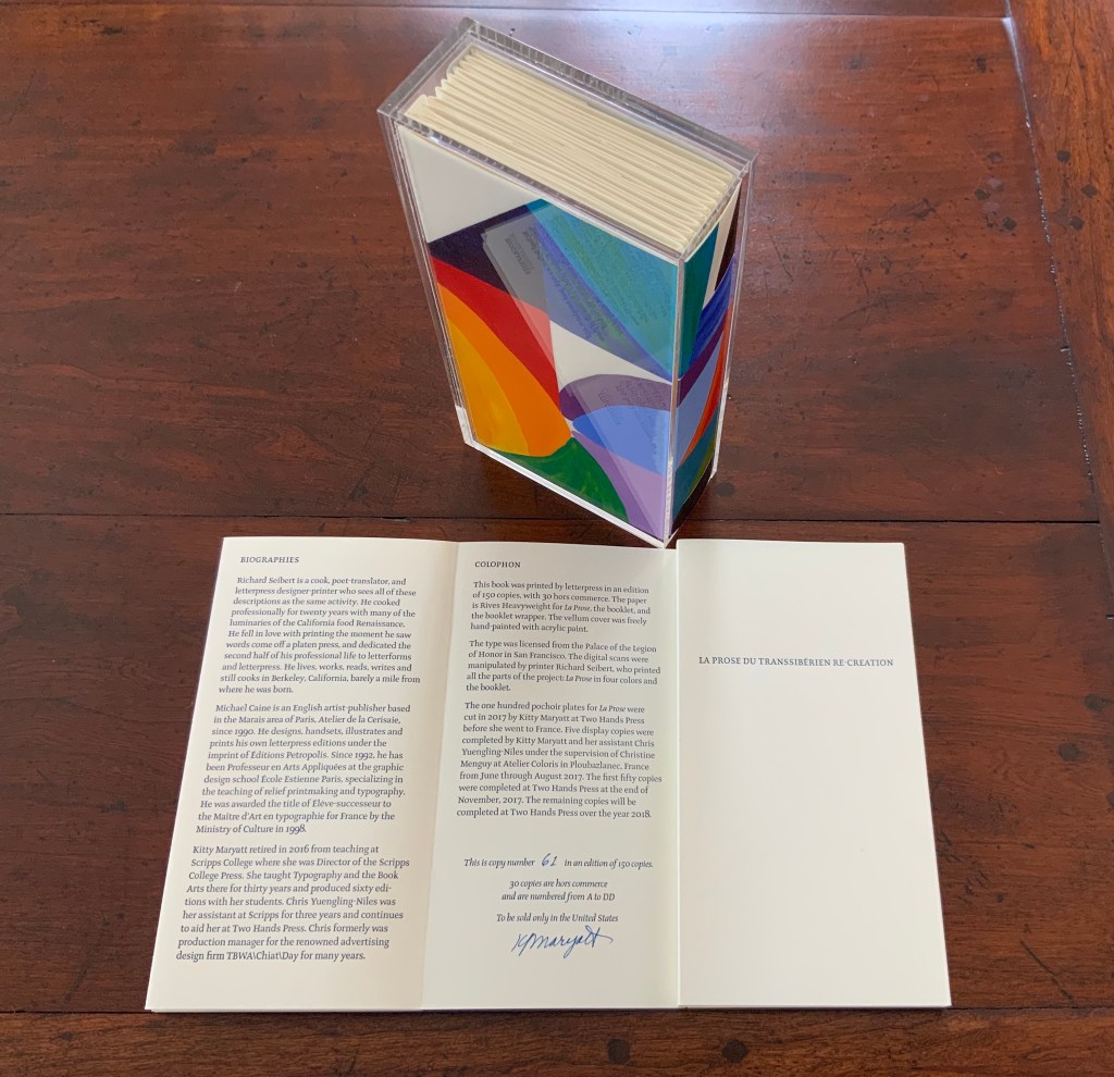
The pinnacle of Maryatt’s efforts, of course, is the standard and deluxe editions of La Prose. Both editions consist of 4 pages, glued together to create the tall single page. For the standard edition, the page is folded into 21 sections and loosely placed in a painted vellum cover with a booklet describing the project and production. An acrylic slipcase houses the covered bundle.
The standard edition Slipcase: H195 x W108 x D45 mm. Wrapper: H182 x W97 x D35 mm. Leporello: H81 x W95 mm (closed). H1954 x W160 mm (open). Booklet: H81 x W94 mm (closed), W1055 mm (open). Photo: Books On Books
Photo: Books On Books
Photos: Books On Books
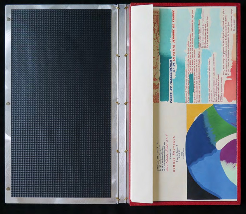
For the deluxe edition, the single page is left double-wide, accordion-folded double-tall between aluminum covers and housed in a clamshell box. A separate case holds the painted vellum cover, colour cards, Sonia’s visual vocabulary, 27 progressives for page one, 5 pochoir plates with tracing paper and registration system, the booklet with introduction and colophon, and the list of 30 typefaces Cendrars used. A large clamshell box houses this separate case and the boxed book. The colour cards include the recipe for mixing the gouache, and Sonia’s visual vocabulary shows the numbered steps of operations. The progressives for page one show the steps for doing the pochoir stencils and handwork.
The deluxe edition Photos: Courtesy of Kitty Maryatt
Any institution with a focus on book art or the graphic arts should seek out the standard edition of La Prose du Transsibérien Re-creation. Any institution with a focus on teaching and practice in those domains should seek out the deluxe edition. As indefatigable as Cendrars and as productive as Delaunay, Kitty Maryatt has provided the basis of master classes for generations. Now it is up to the book art community to respond as it has to Un Coup de Dés.
A shorter version of this essay appears in Parenthesis 39, Fall Issue, 2020.
Further Reading
Ashton, Doré. “On Blaise Cendrars. . . But I Digress.” Raritan 31, no. 2 (2011): 1-42,164. An entertaining extended anecdote sketching Cendrars and his milieu.
Gage, John. Colour and Meaning : Art, Science and Symbolism(Berkeley, CA: University of California Press, 1999). Despite her works’ better quality and representation of simultanéisme, Gage focuses on Robert and mentions Sonia only in passing or footnotes. (Telling that the Tate chose Sonia not Robert for a retrospective in 2015.) Nevertheless, there are passages that place her work in context.
P.198: Chevreul’s “privileging of the harmony of complementaries was essentially in the context of ‘painting in flat tints’, a method developed largely in the decorative arts, but which was increasingly integrated into many branches of French painting in the second half of the nineteenth century …”.
P.254 “When, probably early in 1912, Delaunay wrote to Kandinsky outlining his theories, he had shifted to a rather different approach, claiming: ‘the laws I discovered … are based on researches into the transparency of colour, that can be compared with musical tones. This has obliged me to discover the movement of colours.’ …
P.256 [Delaunay’s] Essay on Light, which was composed in the summer of 1912, attributed the movement of colours less to transparency than to the qualities of hue: ‘Movement is given by the relationship of unequal measures, of contrasts of colours among themselves which constitute Reality. The reality has depth (we see as far as the stars), and thus becomes rhythmic Simultaneity.’”
P.257 “For Chevreul in 1839 such painting [in flat tints] had only a decorative, accessory function, but the Delaunays did not feel the distinction, and Sonia had recently been experimenting with flat colours in appliqué textiles and in bookbindings decorated with collage.”
Maryatt, Kitty. “A Bookmaker’s Analysis of Blaise Cendrar’s and Sonia Delaunay’s La Prose du Transsibérien et de la Petite Jehanne de France”, The Quarterly Newsletter(Fall 2016), The Book Club of California. Online version available here.
Maryatt, Kitty. Interview with Steve Miller, Book Arts Podcasts, School of Library Information and Sciences, University of Alabama, 13 January 2006.
Rothenberg, Jerome; Clay, Steven. A Book of the Book: Some Works & Projections about the Book & Writing (New York City: Granary Books, 2000). Contains an excerpt from Perloff’s book above, Ron Padgett’s translation of La Prose and a four-page foldout showing a full-color photo-reduction of the 1913 original.
Shingler, Katherine. “Visual-verbal encounters in Cendrars and Delaunay‘s La Prose du Transsibérien“, e-France: an on-line Journal of French Studies, Vol. 3, 2012, pp. 1-28. Accessed 15 November 2019. Along with Perloff’s book, this is the best explication of the work and its lineage with Mallarmé’s Un Coup de Dés.
Woodall, Stephen. “La Prose du Transsibérien et de la Petite Jehanne de France”, Insights from the de Young and Legion of Honor (San Francisco: Fine Arts Museums of San Francisco, 2020. A spectacular website presenting the original work in its context and its influences on subsequent book art. The work can be viewed panel by panel, and its overall structure is presented in an animation of its unfolding and refolding.
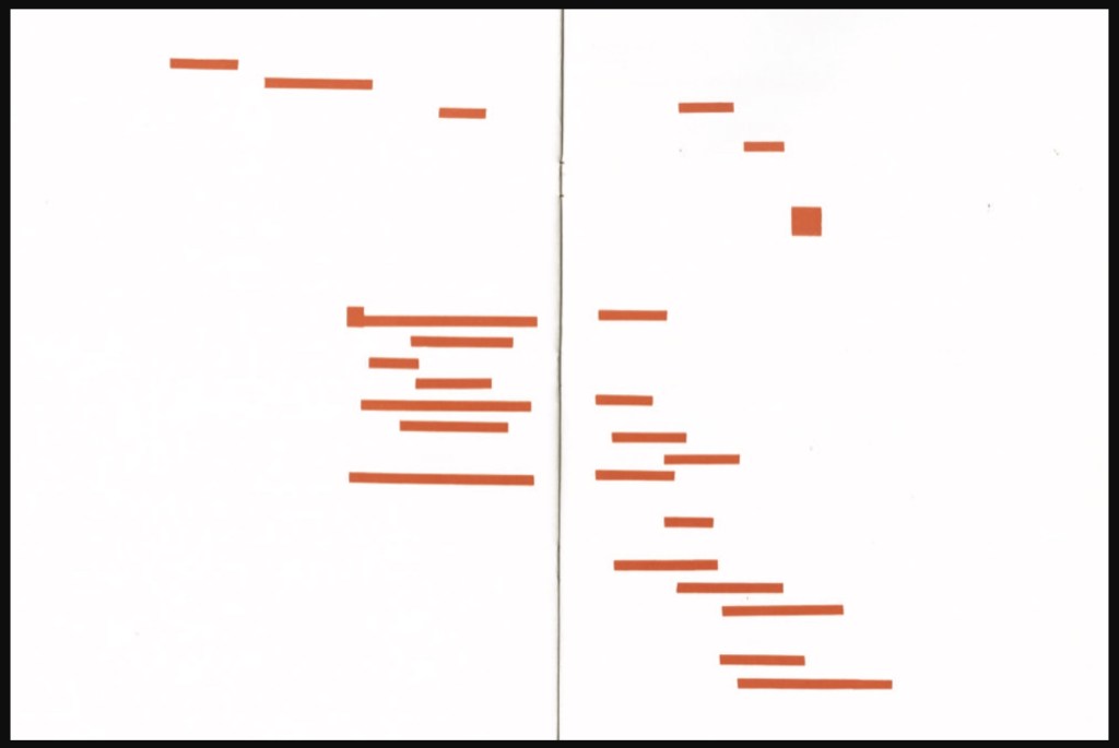
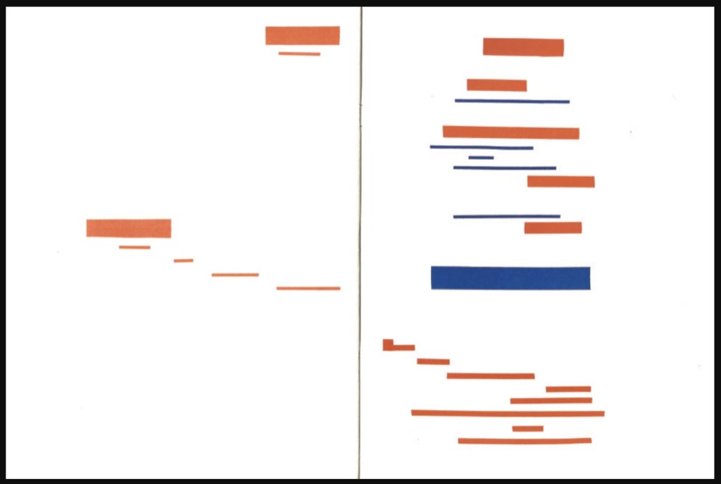
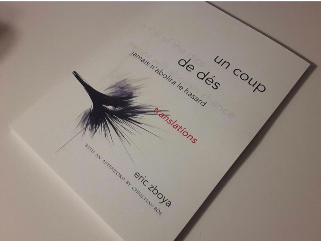
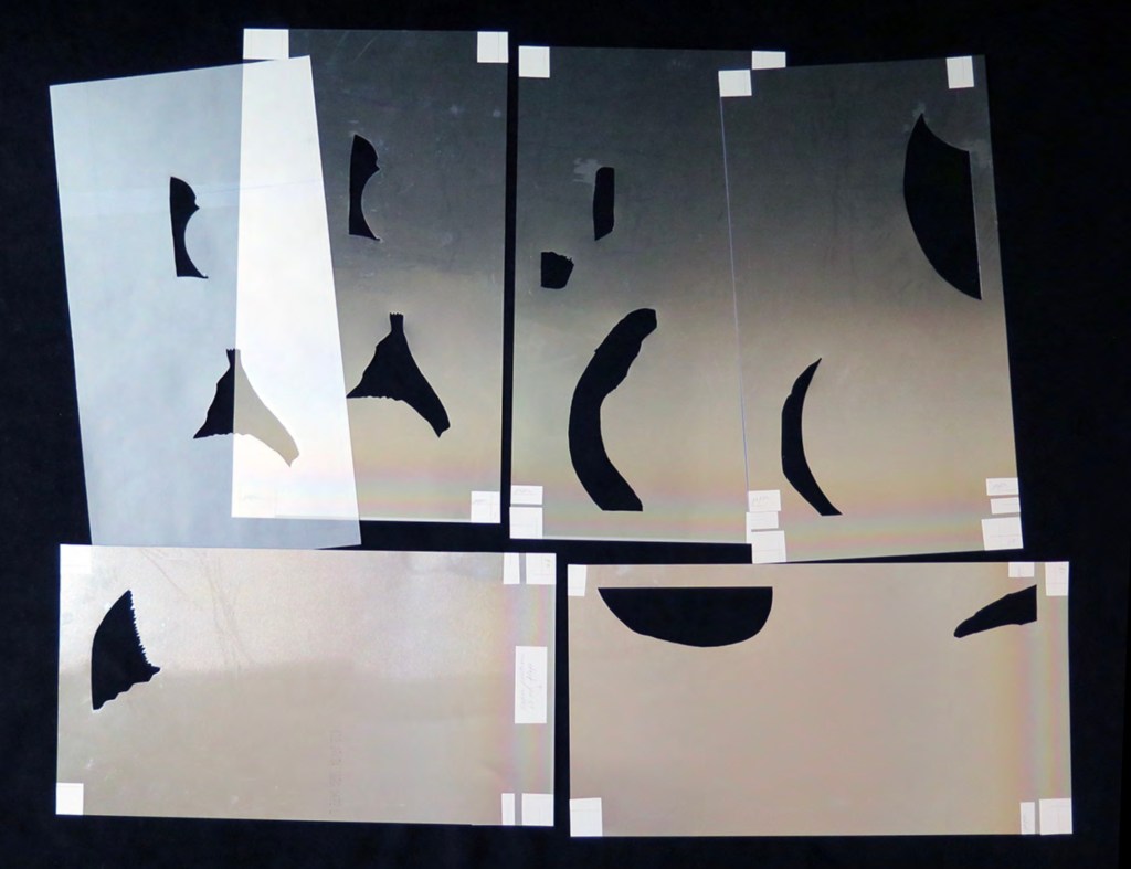
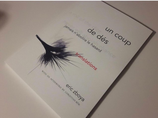
Eric Zboya is poet, writer and artist. Years before this book, he wrote for Ubu Web about the dialogues between Mallarmé’s groundbreaking poem and artists such as Marcel Broodthaers, Guido Molinari and Michalis Pichler, who explore “the higher-dimensional characteristics of the poem”. Broodthaers’ and Molinari’s solid-colored horizontal blocks take the place of lines of text and, reflecting its typographic size, deliver the poem’s page-oriented image(s) without its words. Pichler goes a sculptural step further and excises the lines altogether.
In one sense, Zboya returns to the traditional “collaborative” livre d’artiste, where the artist’s images illustrate the author’s text. But Zboya’s process for generating the images and his handling of the text are anything but traditional.
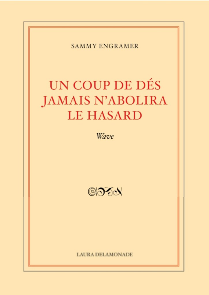
Just as Mario Diacono runs parallel to Broodthaers, so too do Didier Mutel (2003) and Sammy Engramer (2009) to Zboya. His Ubu Web essay appeared in 2011. While similar, the three artists’ approaches to images differ far more from one another than those of Diacono and Broodthaers differ. Mutel’s sonographs come from recordings of three different speeches. Engramer’s come from the recording of his reading of Un Coup de Dés. Although Zboya’s images come from the translated text of Un Coup de Dés, they do not come from sound recordings.
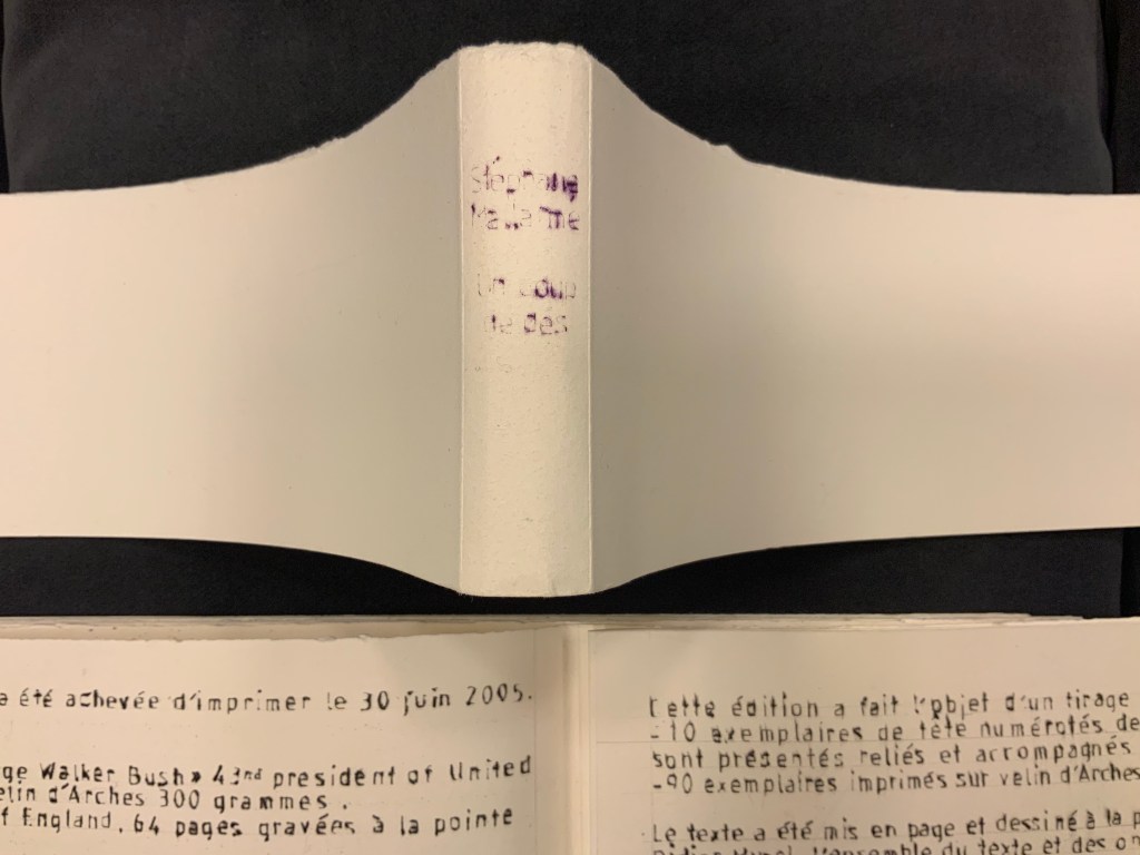
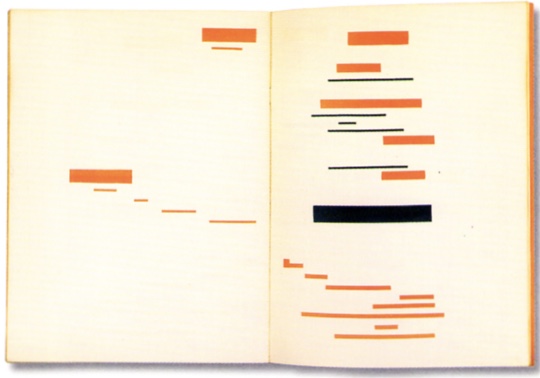
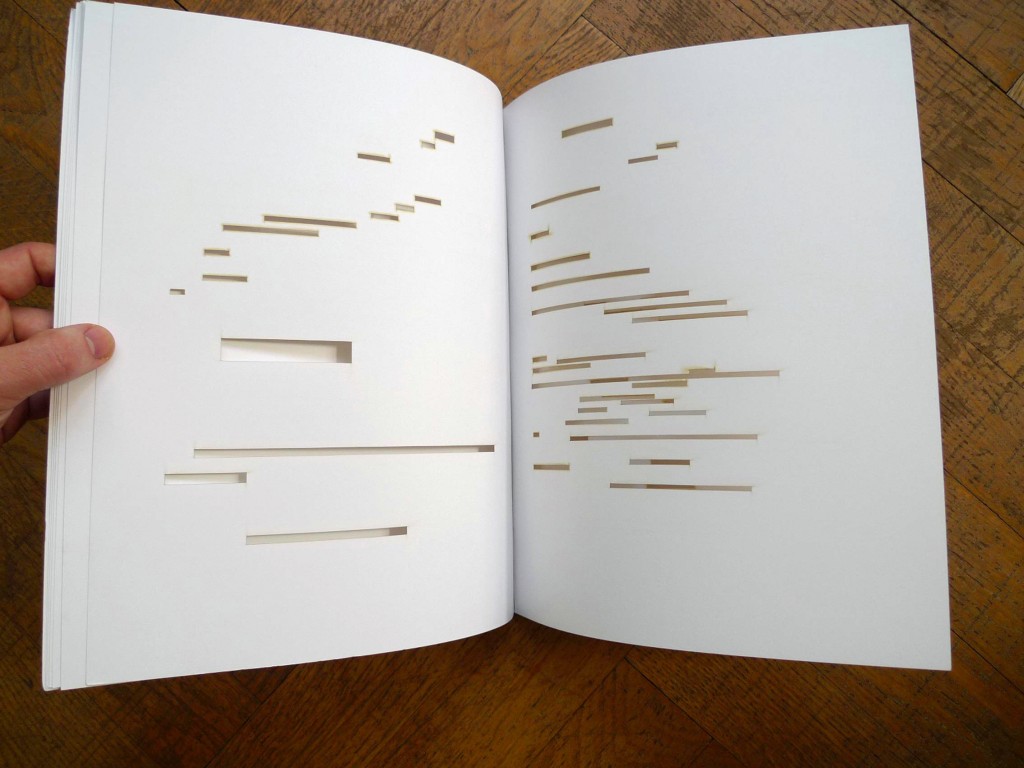
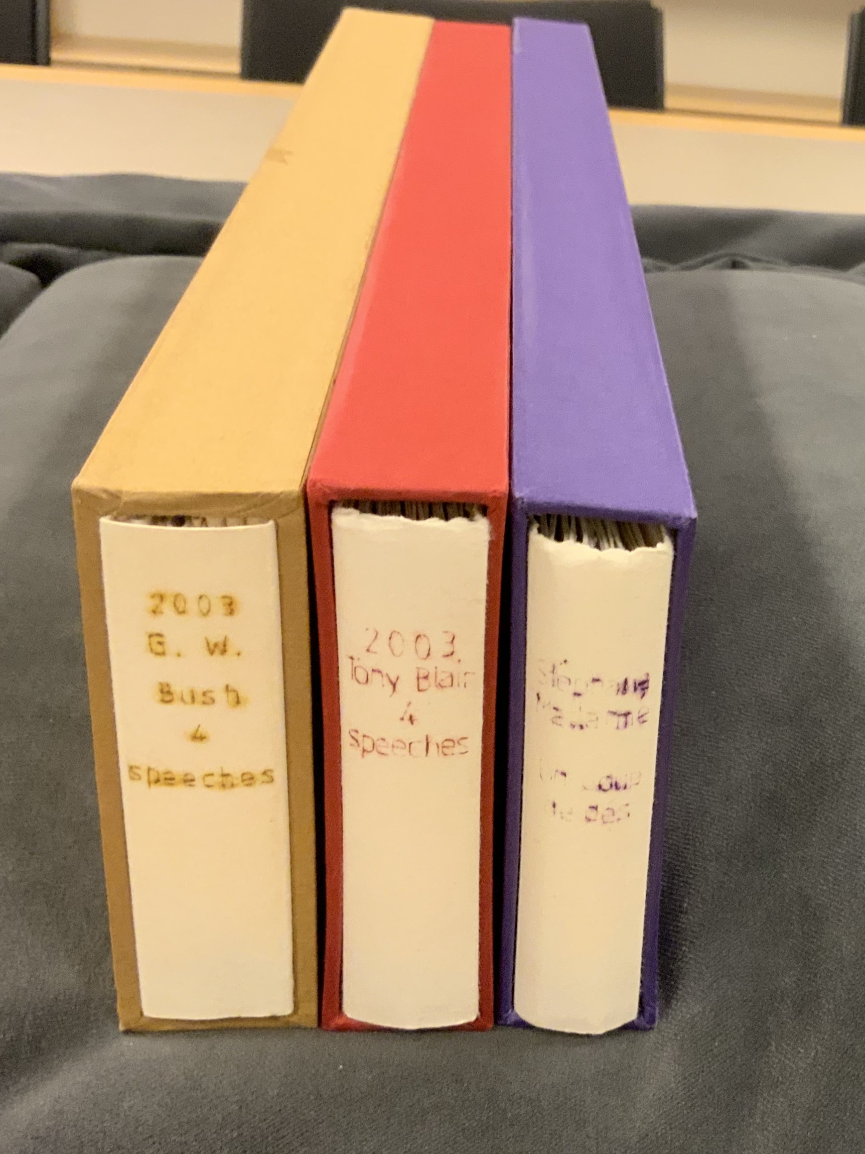
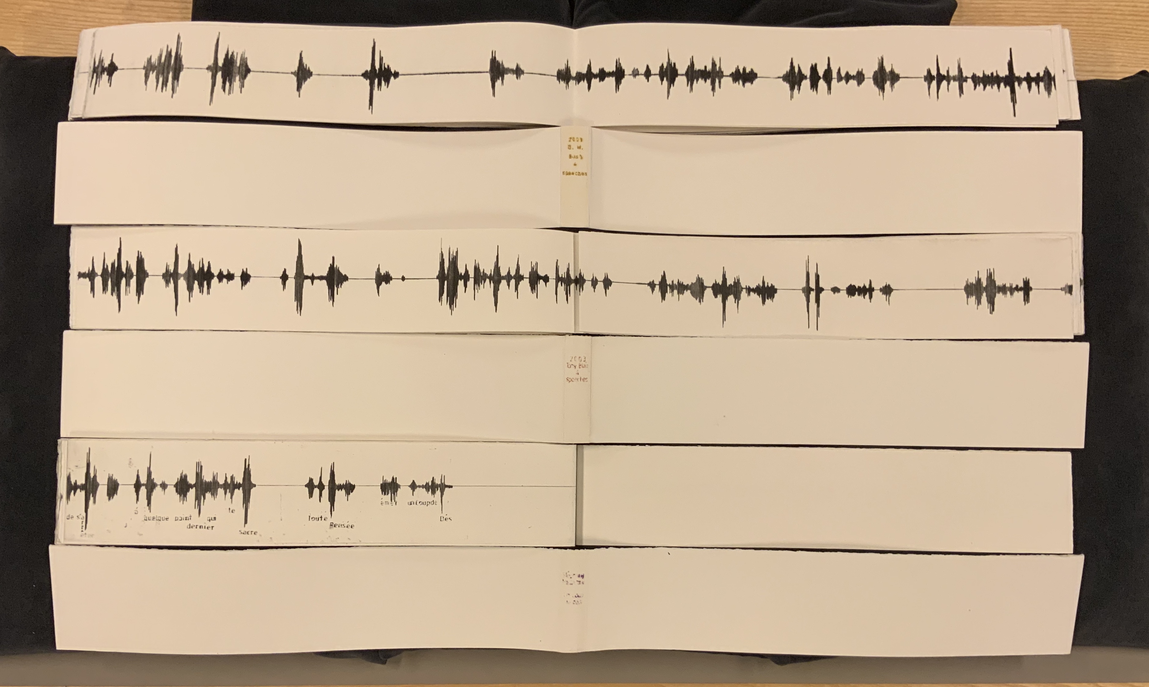
Un Coup de Dés Jamais N’Abolira le Hasard: Poème (2005) Didier Mutel Consists of three volumes: the first entitled “2003 — may god bless america — 4 speeches by George Walker Bush”; the second, “2003 — 4 speeches by Tony Blair”; the third, “Un coup de dés jamais n’abolira le hasard”. Each engraved in drypoint on steel and printed on Velin Arches 300 gsm.
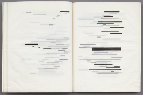
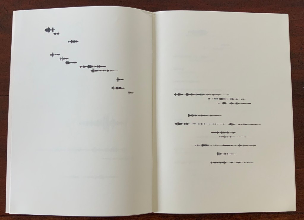
Un Coup de Dés Jamais N’Abolira le Hasard: Wave (2009) Sammy Engramer H340 x W240 mm, 32 pages. Recording his own reading aloud of the poem, Engramer then ran the recording through sonographic equipment. The rendering of each line’s soundwave became his graphic substitute for Mallarmé’s line of verse and, by extension, each black block that Broodthaers used to displace Mallarmé’s text.
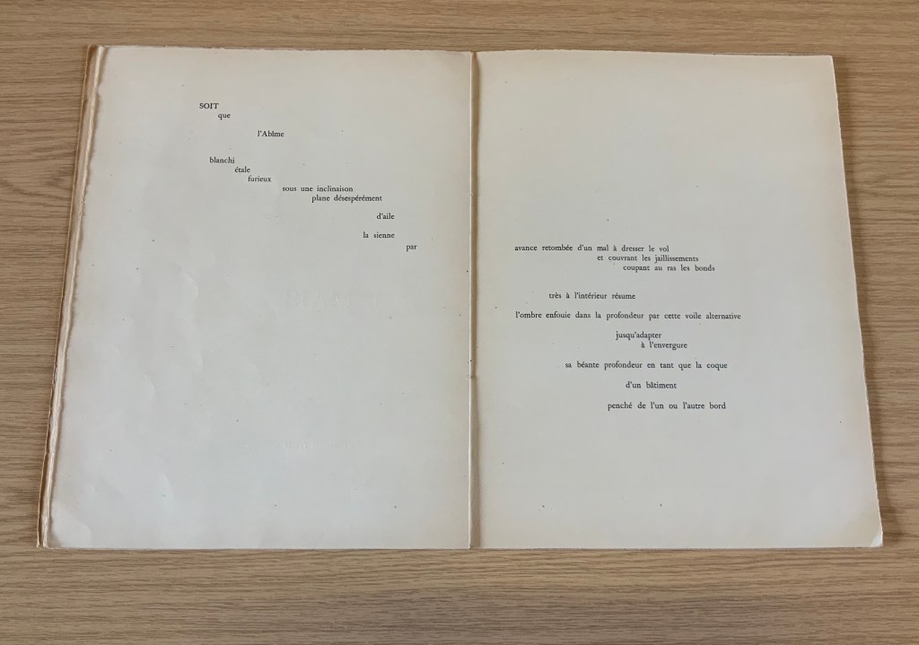
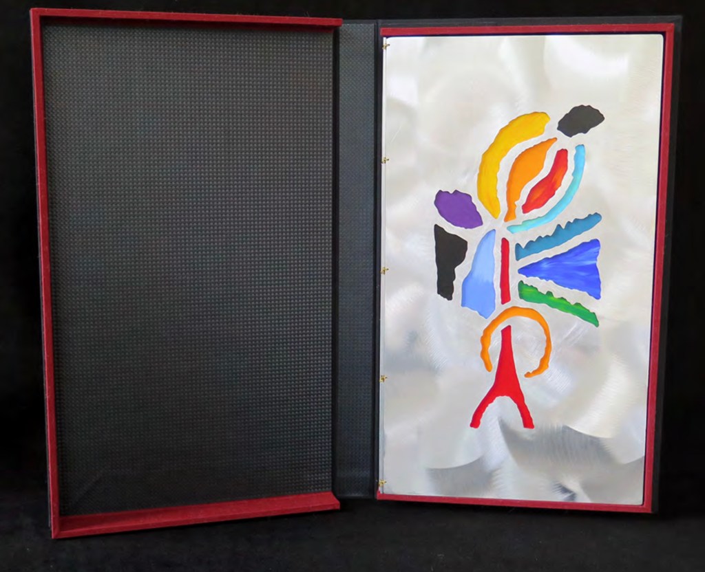
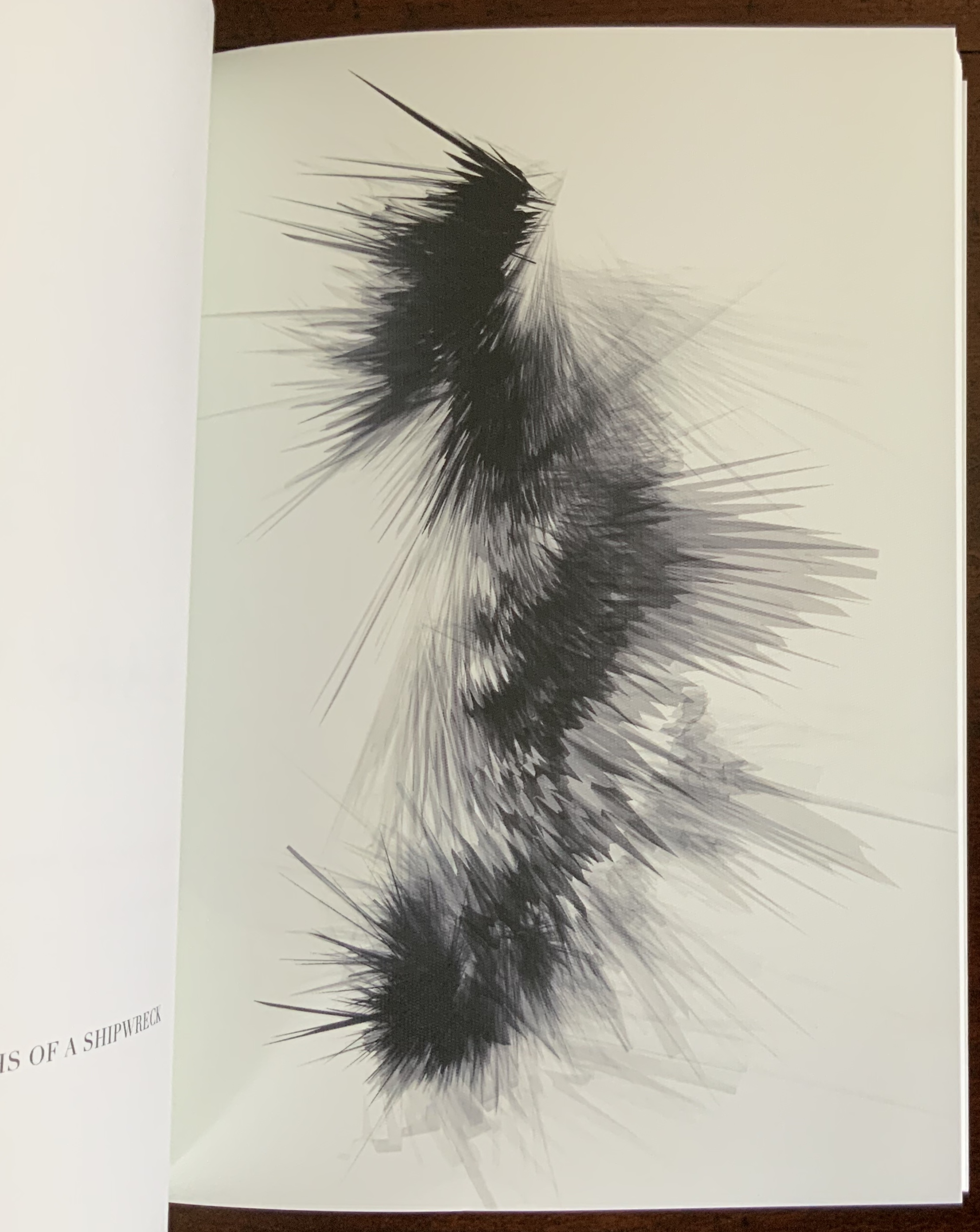
Zboya uses graphic imaging software to transform each letter, mark of punctuation and pixel into an abstract image based upon the original topographical placement of the type on the space of the page. Text mutates into a graphic, nonlinear entity. Zboya calls this Algorithmic Translation.Due to a randomization function, the program never yields the same image from the same input. In keeping both with the title (Un Coup de Dés Jamais N’Abolira le Hasard) and the poem’s last line (Toute pensée émet un Coup de Dés), no run of the program ever abolishes chance, and every input (thought) generates a roll of the dice.
Zboya’s artist book presents more than these graphic, constellation-like translations of the text. Literally shadowing the right-reading English translation of the title is the French text set in reverse. Drawing the reader closer to the synaesthesia promoted by Mallarmé, Valéry and, before them, Baudelaire, the contrast of black (English) and gray (hcnerF) echoes the tonality of the algorithmically translated images; the reversed letters of the French emphasize the physical reversing that occurs when printing text; and the movement from the original hcnerF to the translated English urges the “mind’s ear” to play along with the mind’s eye. The choice to print everything on the same highly textured Rives Design, Brilliant White, enlists hand and eye in support of a synaesthetic equation of text, page and image.
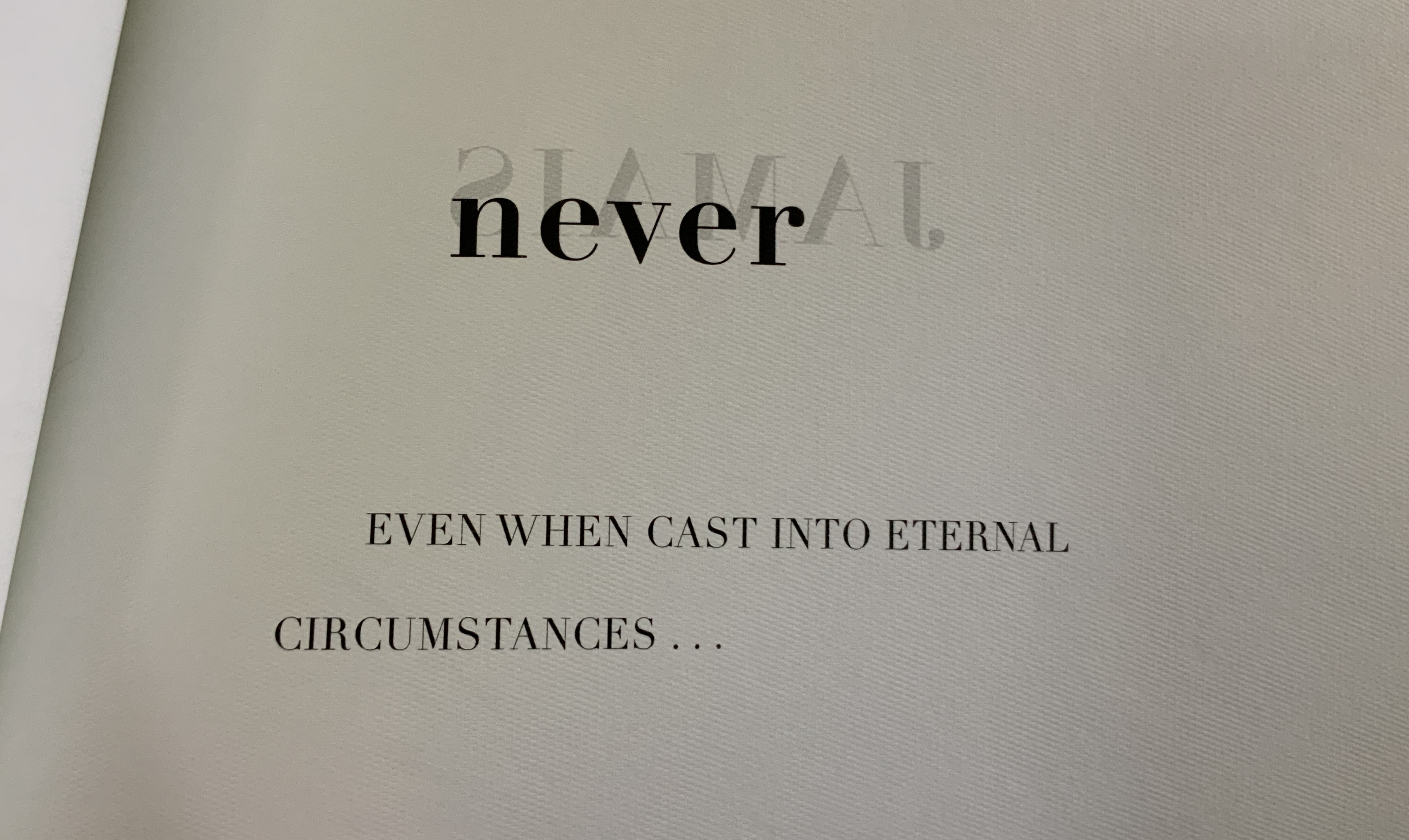
Just as important in another dimension is Zboya’s creative manipulation of the poem’s English translation by Basil Cleveland and preface by Charles Bernstein. The preface is the first clue. Only words selected by Zboya appear in black, left in their original position on the page and creating an envoi to Zboya’s book:
This Note beyond the space of the page vanishes. Narrative is avoided. Intonation falls. Courageous Poem, open a few eyes to this unforeseen symphony.
Zboya has done the same with the text of the translated poem. He erases certain lines and leaves those not erased in their topographical position as close to Mallarmé’s intention as interpreted by Zboya’s numerous predecessors (Broodthaers in 1969, Pichler in 2008, Meillassoux in 2012, Bononno and Clark in 2015, Bloch in 2017 among others). In this way, Zboya’s appropriation occurs across multiple dimensions.
By “erasing” text to select text that syntactically creates new content, Zboya is also following in the footsteps of Tom Phillips (A Humument, 1966-2016), but the effect and result of doing so differs distinctively from Phillips’ work, which is decidedly narrative. The concept of translation in Zboya’s book is closer to Ezra Pound’s approach in Personae (1926). The fragments and sentences created by the “translated” words are close but not the same as those in the source. In Pound’s case, not the same sentences as those of the troubadours. In Zboya’s case, not the same as Mallarmé’s, Cleveland’s, Bernstein’s, etc. The appropriation/translations make something new.
Occurring in its several dimensions, Zboya’s manipulation of text, image and surface recalls Valéry’s description of reading and looking at the worksheets for the book version of Un Coup de Dés:
It seemed to me that I was looking at the form and pattern of a thought, placed for the first time in a finite space. Here space itself truly spoke, dreamed, and gave birth to temporal forms. Expectancy, doubt, concentration, all were visible things. With my own eye I could see silences that had assumed bodily shapes. Inappreciable instants became clearly visible: the fraction of a second during which an idea flashes into being and dies away; atoms of time that serve as the germs of infinite consequences lasting through psychological centuries — at last these appeared as beings, each surrounded with a palpable emptiness…. there in the same void with them, like some new form of matter arranged in systems or masses or trailing lines, coexisted the Word! — Paul Valéry, Collected Works of Paul Valery, Volume 8: Leonardo, Poe, Mallarmé (1972).
That is the effect of reading and looking at Zboya’s work of book art.