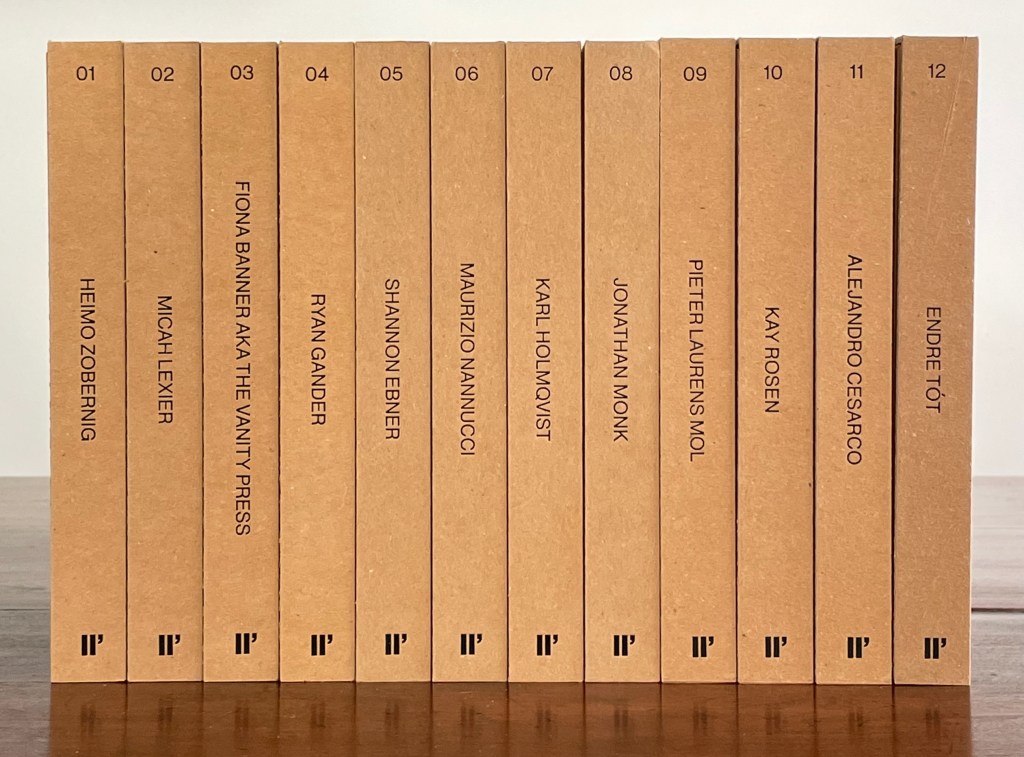
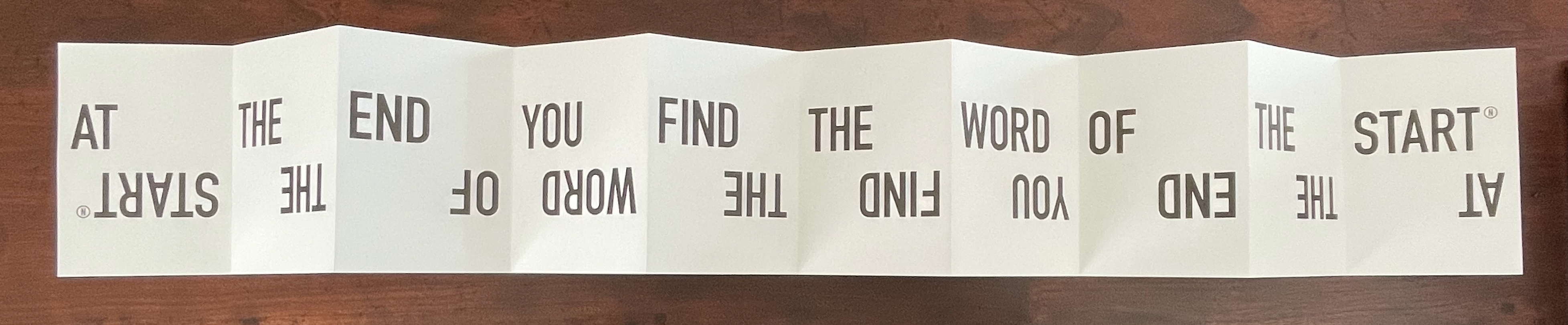
Enthusiasts and collectors of artists’ books should congratulate LL’Editions (Göteborg, Sweden) on its leporello series not only for the artists enlisted so far but for the constraint to inspire them. Critics of book art have opined that book artists turned to the accordion structure in the 20th century for more freedom with visual images and another tool with which to question the notion of the book as book. LL’Editions has challenged its invited artists with a constraint: a fixed-format leporello of ten panels, nine folds and always H140 x W100 mm (closed). The works are printed on Mohawk Superfine Eggshell paper. Housed in a custom box with the title hot foiled both on its front and spine, each volume in the series is limited to 250 numbered copies.
The real pleasure in each work and across the series is how each artist handles the shape to make it dance to a personal style or stamp. With each new addition — brick by brick — LL’Editions is building a monument to book art’s most common structure.
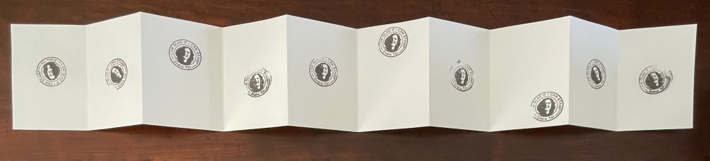
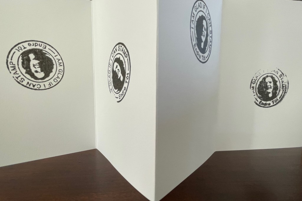
Leporello #12 (2025)
Leporello #12 (2025) Endre Tót Box: 148×191×23 mm. Leporello: H142 x W99 mm (closed); W990 mm (open). 10 panels. Edition of 250, of which this #70. Acquired from LL’Editions, 28 August 2025. Photos: Books On Books Collection. Displayed with permission of LL’Editions.
Bespoke Eska Board 1260 G/M2, Insert: F-Flute Black 500 G/M2, Hot-foiled title on front and spine. Mohawk Superfine Eggshell Ultrawhite 175 gsm.
Endre Tót has worked with a wide range of media: telegrams, postcards, posters, actions, and artist’s books. This one self-reflexively celebrates his signature gladness statements “We are glad if we are happy”, “I am glad that I have stood here”, “I’m glad that I can write one sentence after another”, “We are glad if we can demonstrate” and so on.
I am glad to have Endre Tót’s work in the Books On Books Collection.
Leporello #11 (2024)
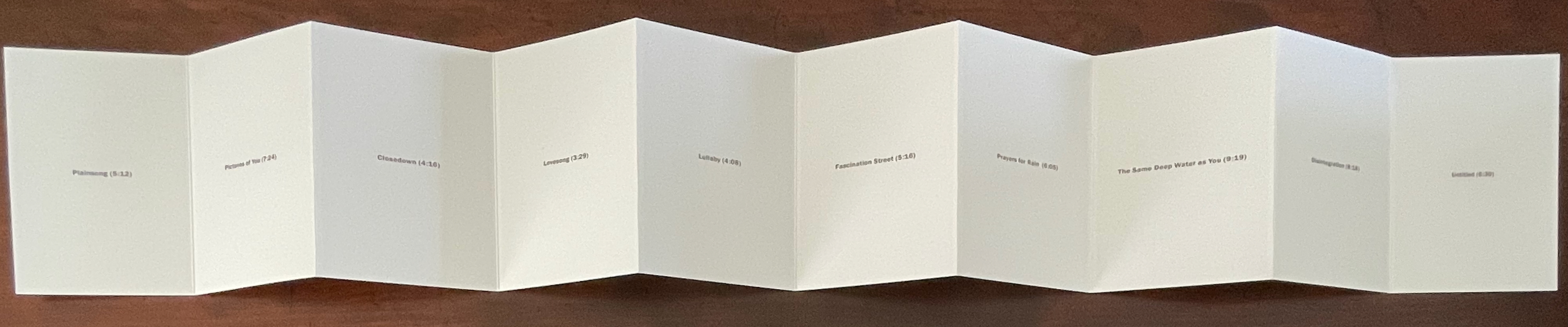
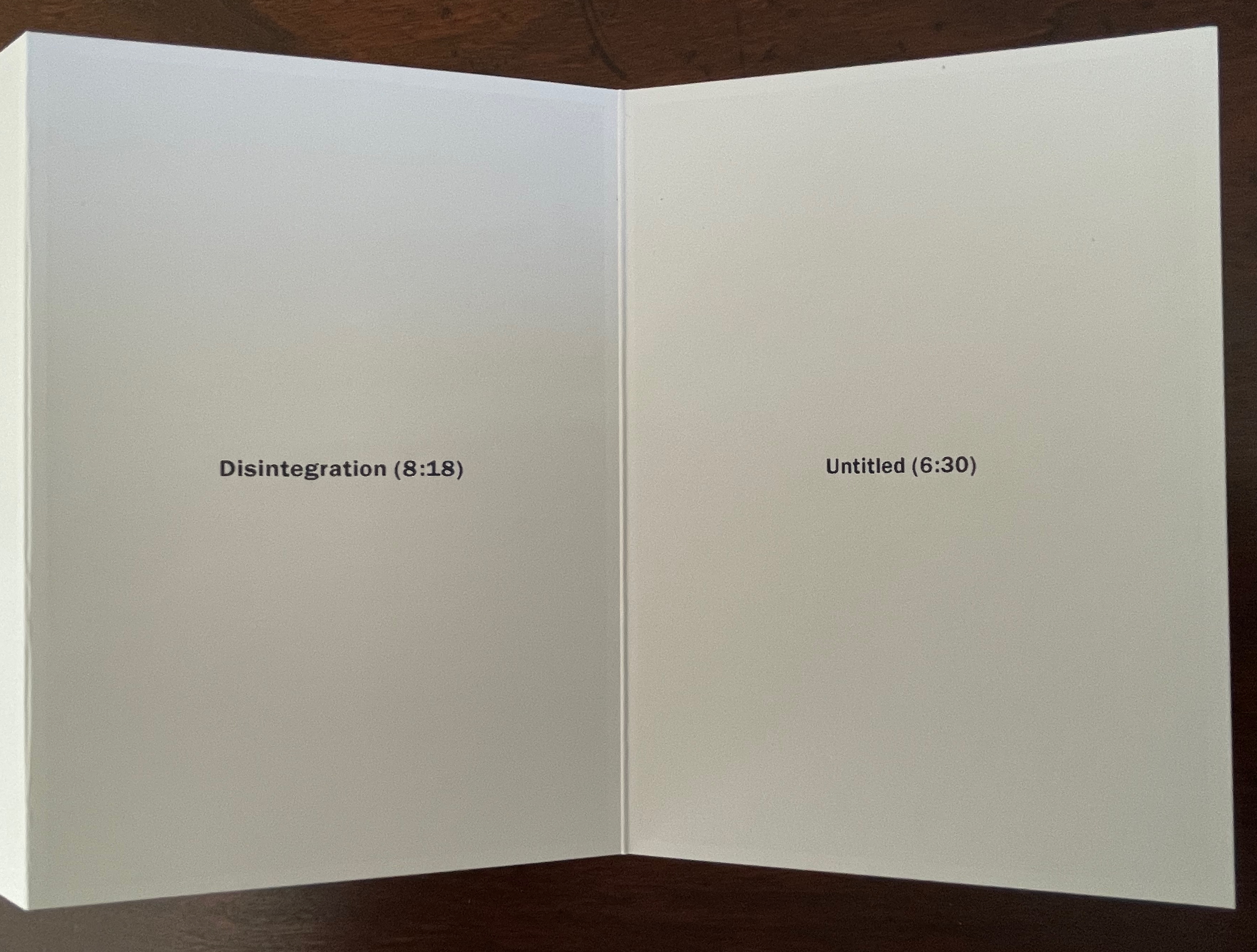
Leporello #11(2024) Alejandro Cesarco Box: H191 x W148 x D 23 mm. Leporello: H142 x W99 mm (closed). W990 mm (open). 10 panels. Edition of 250, of which this #229. Acquired from LL’Editions, 14 November 2024. Photos: Books On Books Collection. Displayed with permission of LL’Editions.
These are the titles and durations of the songs making up The Cure’s 1989 album. With each song on its own panel, Cesarco (b. 1975) seems to have created a photo album to remind himself of his youth. Given his artworks referencing/co-opting/implicating/appropriating John Baldessari, Marcel Broodthaers, Félix Gonzáles-Torres, Allen Ruppersberg, Ed Ruscha, and other book artists, the less-than-fans of The Cure may wonder if Cesarco is deliberately wrong-footing their expectations for his tackling the book artist’s platform. If you are one of them, consider that your horizons have been widened and that The Ramones (An Autobiography) (2008) — his list in chronological order of every Ramones song that begins with the pronoun “I” — does not neatly divide by 10.
Leporello #10 (2024)
Leporello #10 (2024) Kay Rosen Box: H191 x W148 x D 23 mm. Leporello: H142 x W99 mm (closed). W990 mm (open). 10 panels. Edition of 250, of which this #116. Acquired from LL’Editions, 14 November 2024. Photos: Books On Books Collection. Displayed with permission of LL’Editions.
There’s a lengthy and excellent essay entitle “The Gravity of Language” about Rosen’s work in Osmos Magazine (Winter 2019) by Stephanie Cristello. In it, she writes:
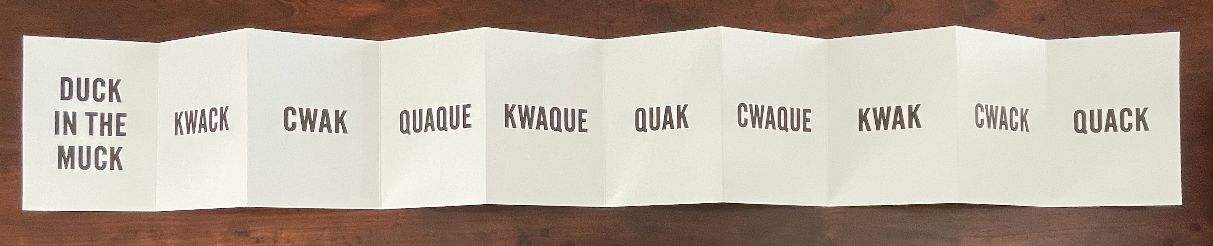
You will notice, by now, that the works discussed here are united by their allusions to the motions of up and down. Does this seem arbitrary to you? Or strike you as the imposition of a rule-based physics upon an artistic practice whose oeuvre certainly contains variances, divergences, and oddities–cut out for the purpose of being explored through a particular force?Perhaps. (Cristello, 2019)
Somehow this more recent artist’s book seems to confirm and repudiate the critic’s approach. As if to say, “Yes, I’m stuck in the muck despite my variances, divergences and oddities”, or “No, ducky, there’s no gravitas or gravity here”. Or perhaps it’s Rosen’s visual way of using permutations on language (starting with a common expression) to poke fun at LL’Editions’ constraint: “So you want to confine me like a duck in the muck? Well, quack, the joke’s on you”.
Leporello #9 (2024)
Leporello #9 (2024) Pieter Laurens Mol Box: H191 x W148 x D 23 mm. Leporello: H142 x W99 mm (closed). W990 mm (open). 10 panels. Edition of 250, of which this #111. Acquired from LL’Editions, 14 November 2024. Photos: Books On Books Collection. Displayed with permission of LL’Editions.
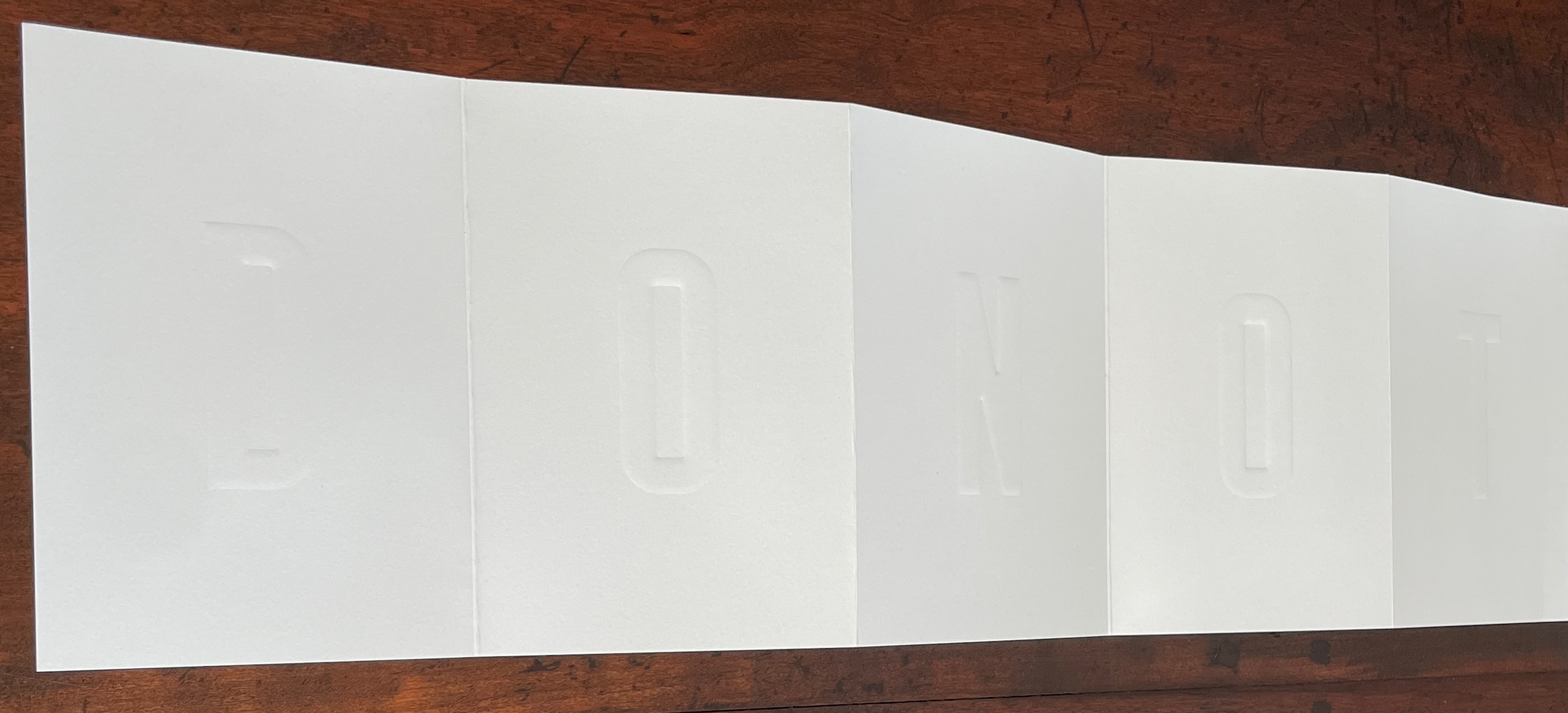
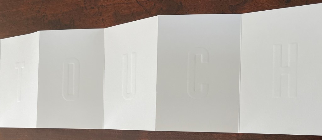
How many artists before and after Marcel Duchamp’s Prière de Toucher (1947) have played this joke in an artist’s book? Where Duchamp’s displayed work played against the usual museum injunction, Pol’s embraces and wrong-foots it with blind embossing.
Leporello #8 (2022)
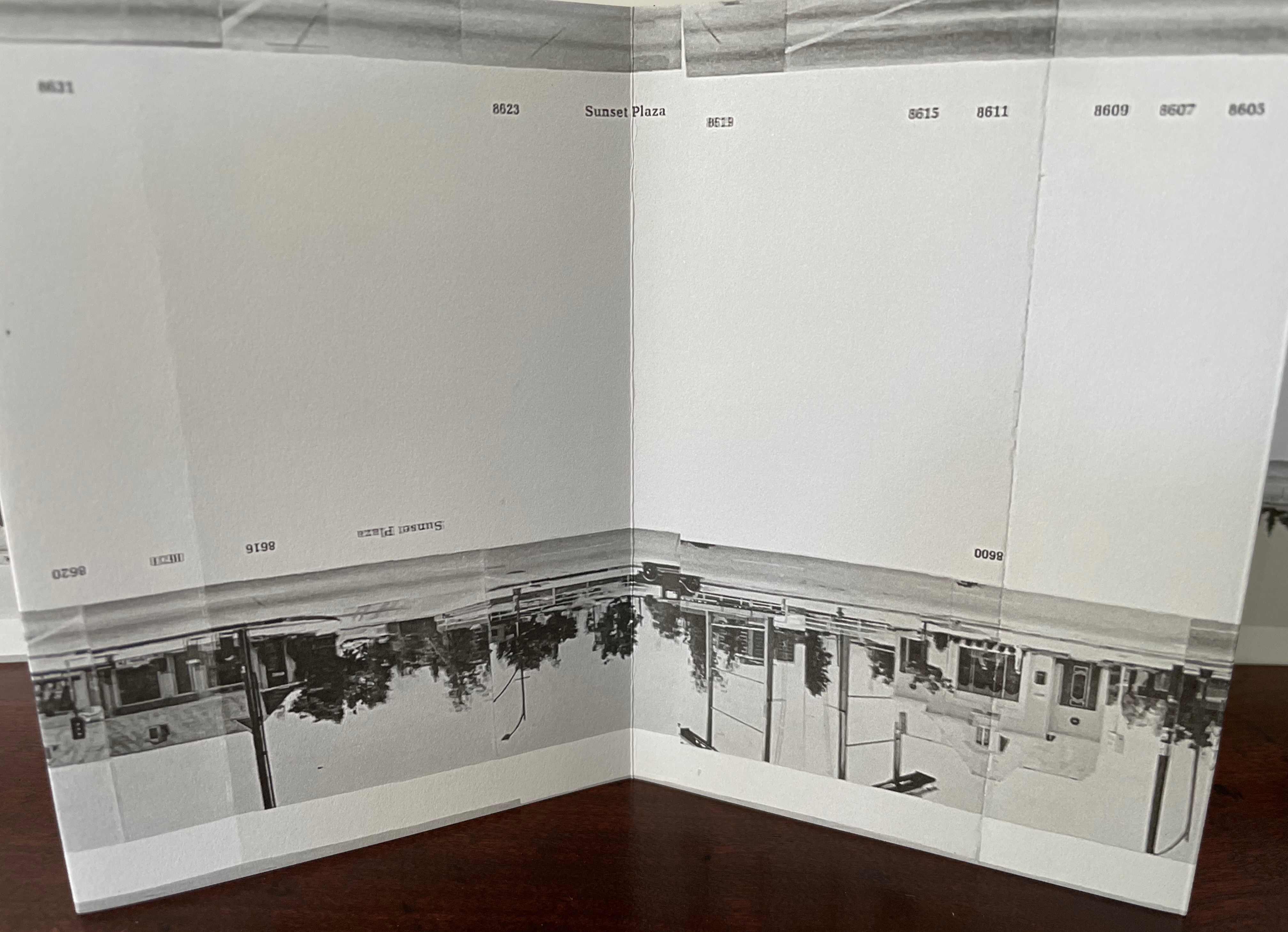
Leporello #8 (2022) Jonathan Monk Box: H191 x W148 x D 23 mm. Leporello: H142 x W99 mm (closed). W990 mm (open). 10 panels. Edition of 250, of which this #175. Acquired from LL’Editions, 14 November 2024. Photos: Books On Books Collection. Displayed with permission of LL’Editions.
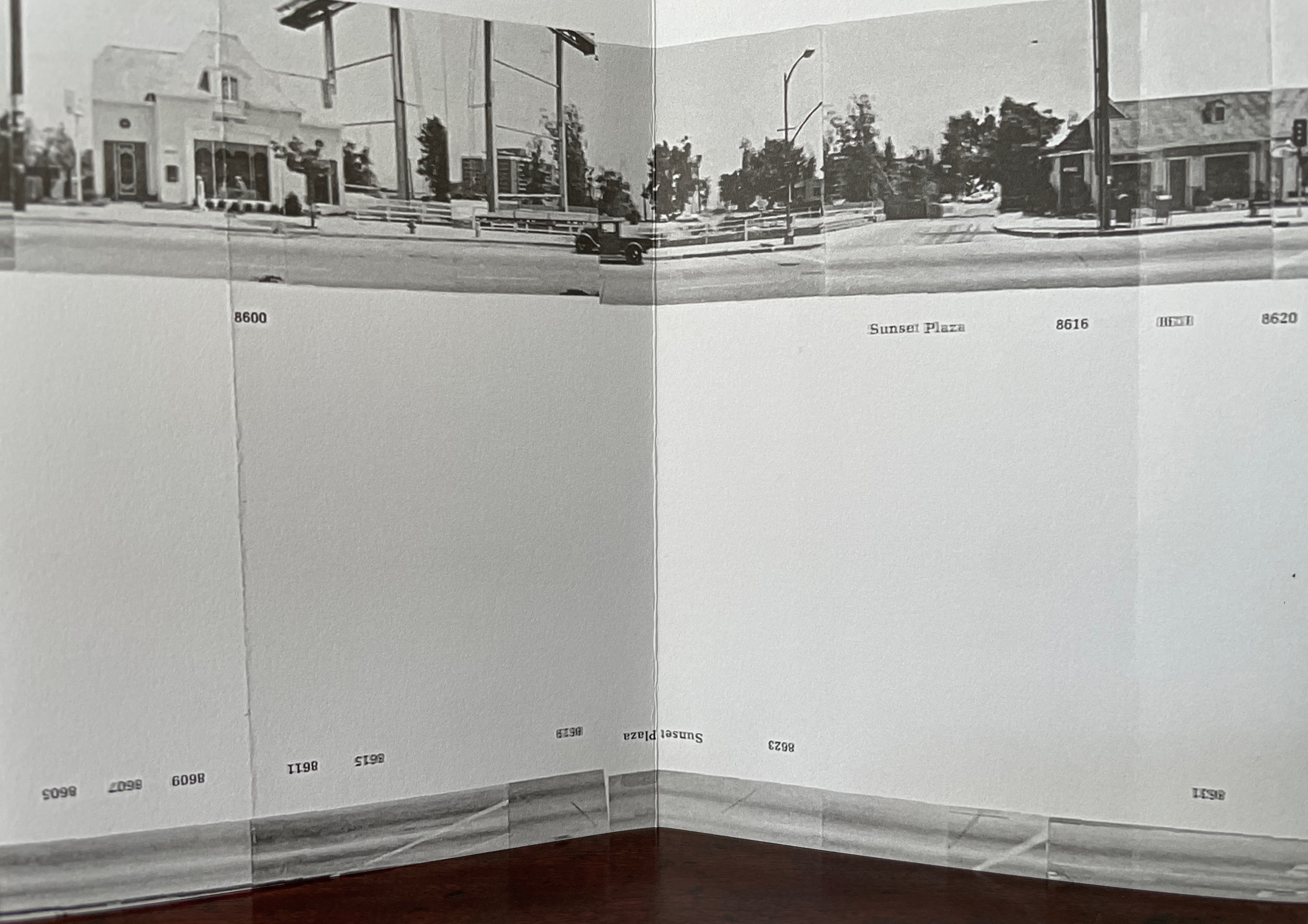
It helps to know or remember that in 2002, Jonathan Monk published None of the buildings on Sunset Strip with Revolver. Here, he has used his iPhone in panoramic mode to appropriate again Ed Ruscha’s Every Building on the Sunset Strip (1966). But when Monk’s leporello is turned over, notice that this side of the Strip has been truncated. Monk’s thoughts on appropriation and self-reflexivity can also be enjoyed in the three-handed interview Books on Books (2011) with Jérôme Saint-Loubert Bié and Yann Sérandour.
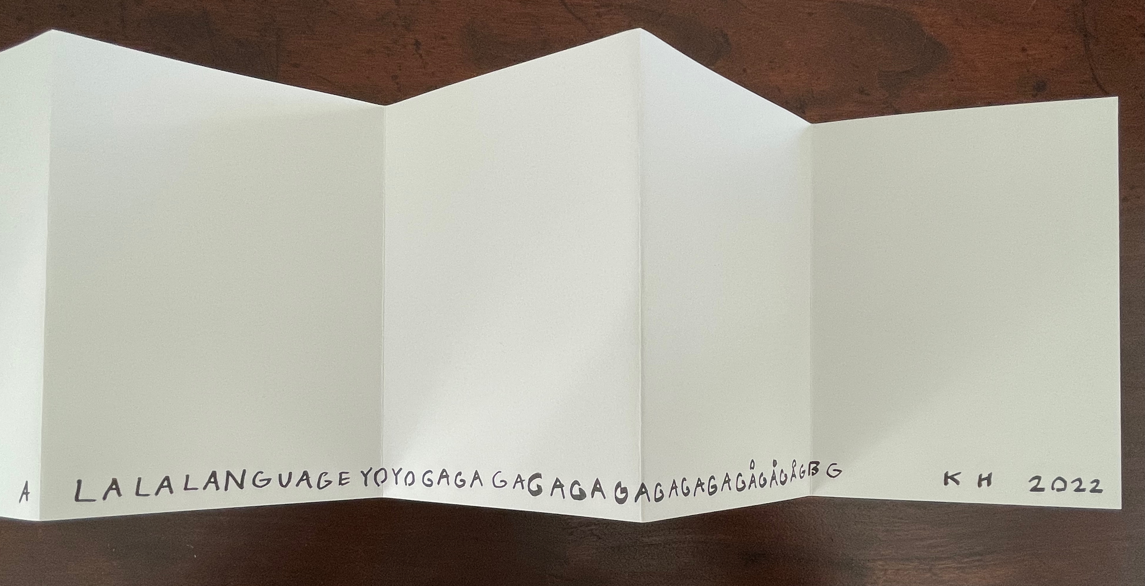
Leporello #7 (2022)
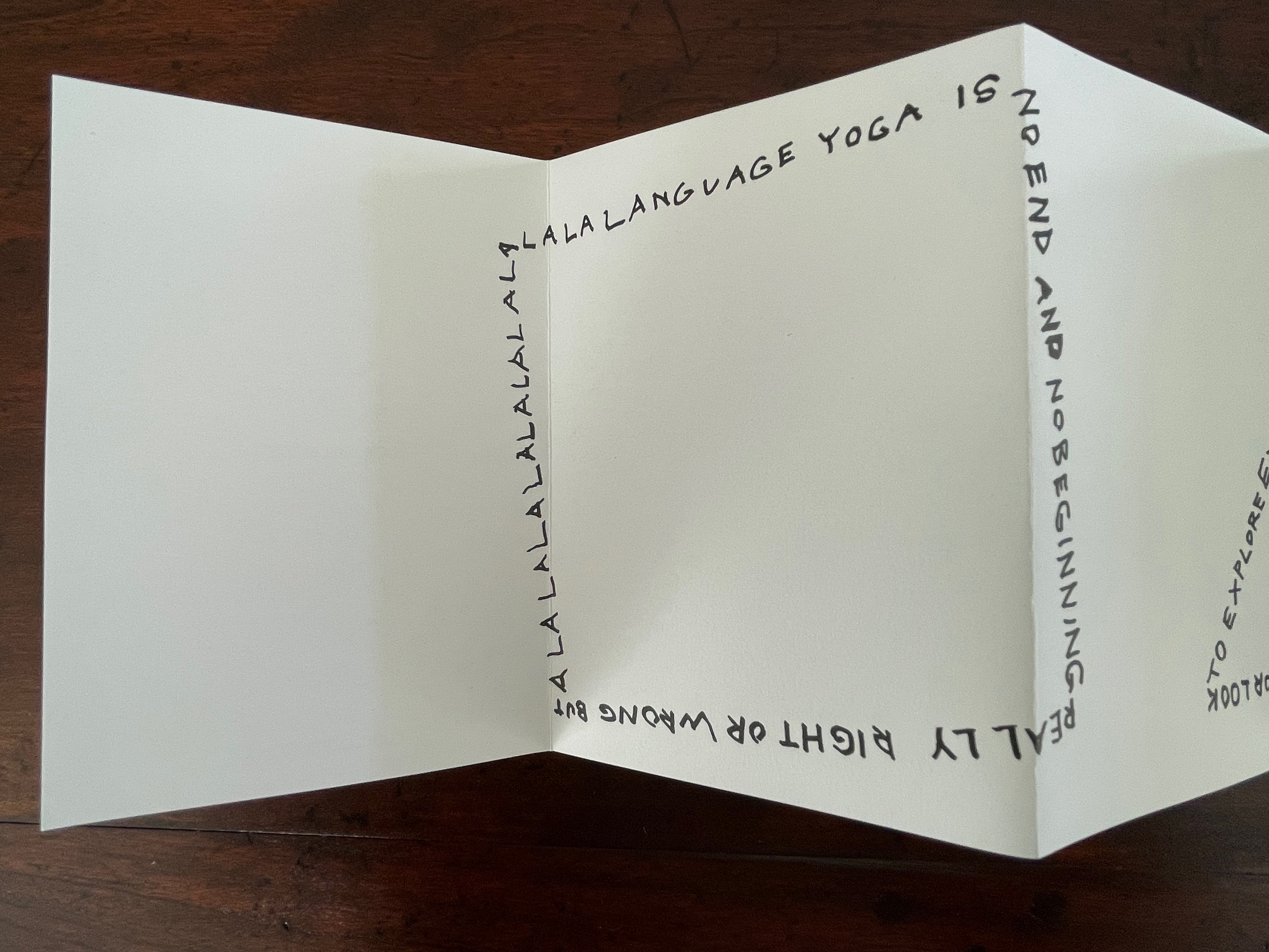
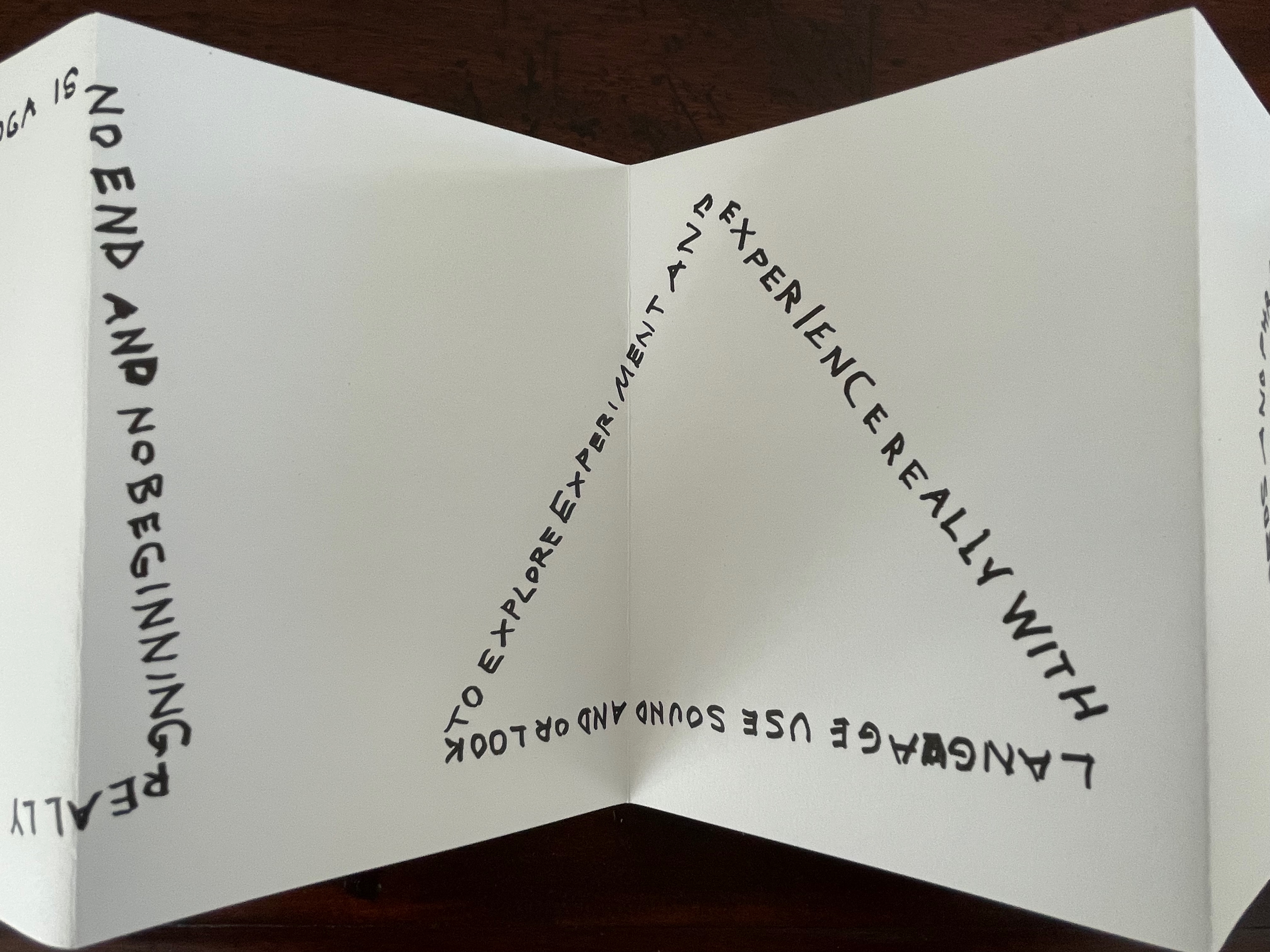
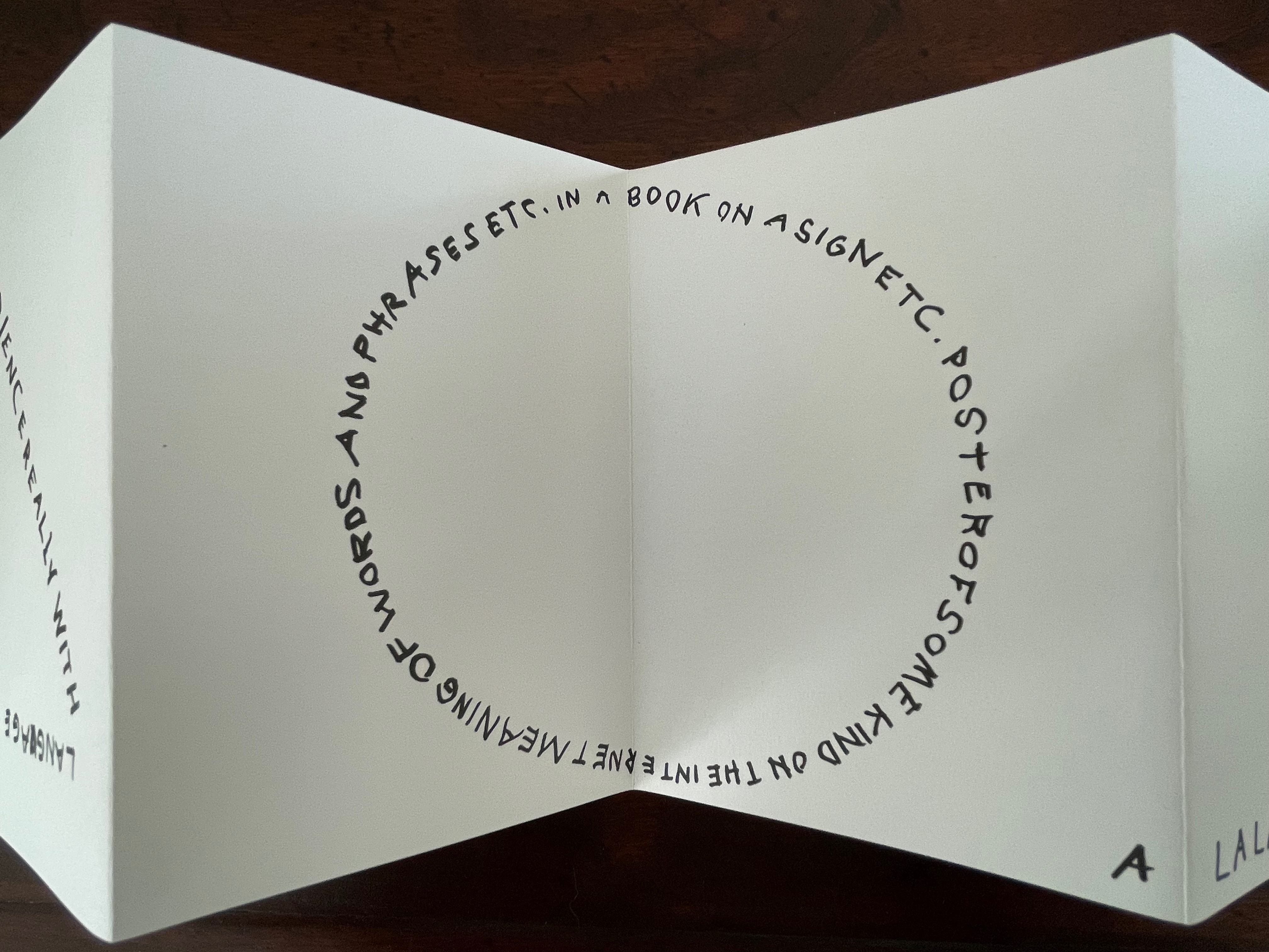
Leporello #7 (2022) Karl Holmqvist Box: H191 x W148 x D 23 mm. Leporello: H142 x W99 mm (closed). W990 mm (open). 10 panels. Edition of 250, of which this #110. Acquired from Unoriginal Sins, 14 November 2024. Photos: Books On Books Collection. Displayed with permission of LL’Editions.
Here’s one to add to Bruno Munari‘s collection of squares, circles, and triangles. While the yoga may also remind you of Ric Haynes‘s Aquatic Yoga with Dangerous Foods (1984), this leporello is a welcome opportunity to experience this Swedish artist’s ability to weld language and shapes together in perceptive and humorous (and sometimes acerbic) ways. Galerie Neu in Berlin has been astute enough to hold three solo exhibitions for Holmqvist since 2013; their display of his works here provides views of his several sculptures that chime with Leporello #7.
Leporello #6 (2022)
Leporello #6 (2022) Maurizio Nannucci Box: H185 x W148 x D 23 mm. Leporello: H143 x W90 mm (closed). W900 mm (open). 10 panels. Edition of 250, of which this #106. Acquired from Unoriginal Sins, 14 November 2024. Photos: Books On Books Collection. Displayed with permission of LL’Editions.
It’s hard to believe that Leporello #6 may be one of only three accordion books produced by this prolific and inventive artist associated with Fluxus. The other two are Sessanta Verdi Naturali (Sixty Natural Greens)(1977) and Up Above the Wor(l)d/A Guide for Aliens (1981). In Leporello #6, he has made the accordion structure, panel layout, and language reinforce one another simultaneously to create an ouroboros artwork.
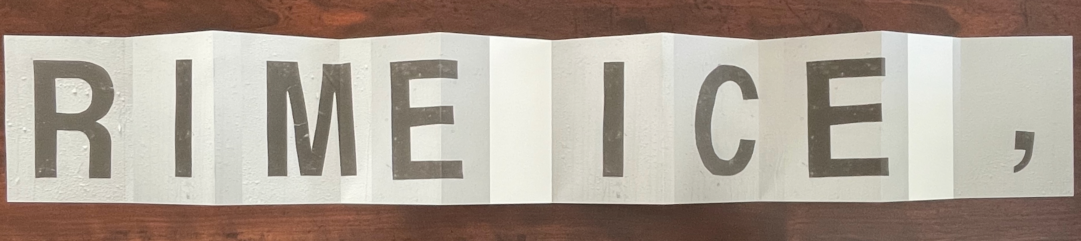
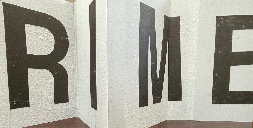
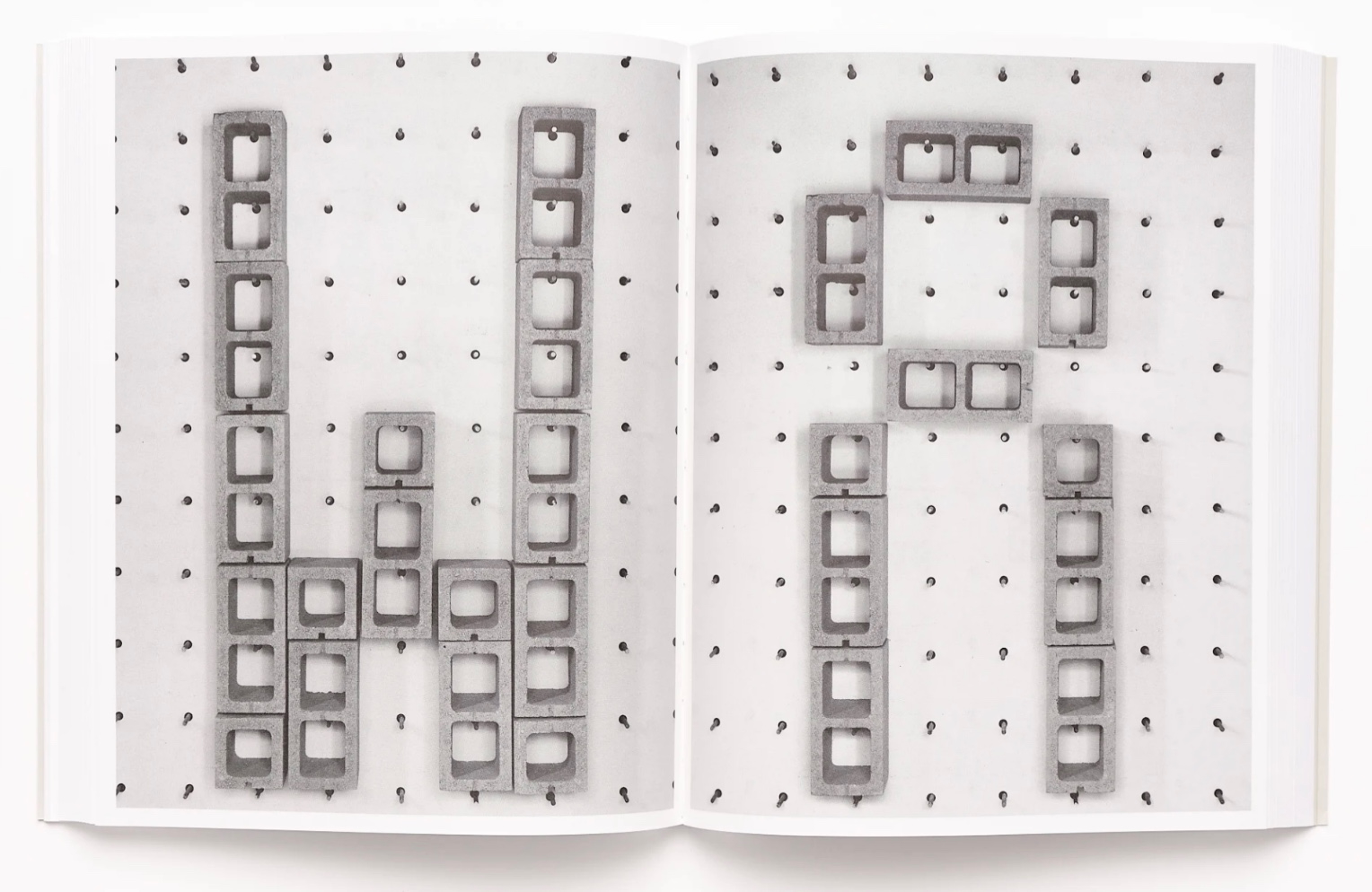
Leporello #5 (2022)
Leporello #5(2022) Shannon Ebner Box: H185 x W148 x D 23 mm. Leporello: H143 x W90 mm (closed). W900 mm (open). 10 panels. Edition of 250, of which this #132. Acquired from Unoriginal Sins, 14 November 2024. Photos: Books On Books Collection. Displayed with permission of LL’Editions.
Since her participation in MoMA’s Ecstatic Alphabets/Heaps of Language in 2012, Shannon Ebner has been a book artist to watch for bringing the alphabet and the artist’s book together.
Her Strike (2014) concretely rewarded the alert. The textures of melting ice in Leporello #05 and concrete blocks in Strike seem to leap off the letters and paper. From the LL’Editions’ description of Leporello #05:
Ebner has selected specific materials based on their self-reflexive relationship to the subject of the writing itself. Each photographic typeface is in essence a material response to the various cultural conditions and societal pressures at hand. For Ebner’s leporello, the meteorological term RIME ICE is its single subject, though the phenomenon itself falls into two categories, soft or hard rime. In either case it is rime ice that forms when liquid droplets comprised of supercooled water freeze onto surfaces. RIME ICE is an outtake from Ebner’s recent exhibition FRET SCAPES (2022). FRET is acronym for the Forecast Reference Evapotranspiration Report, a report that is generated by climate scientists to measure the rate at which water that falls to the ground will evaporate to the sky.
Leporello #04 (2021)
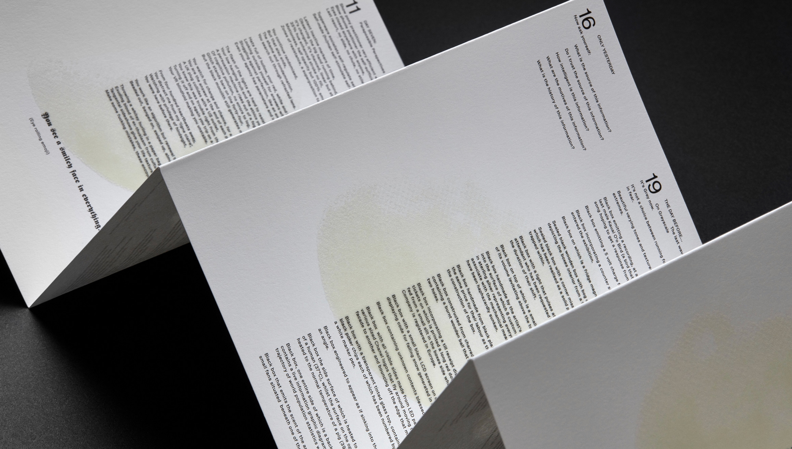
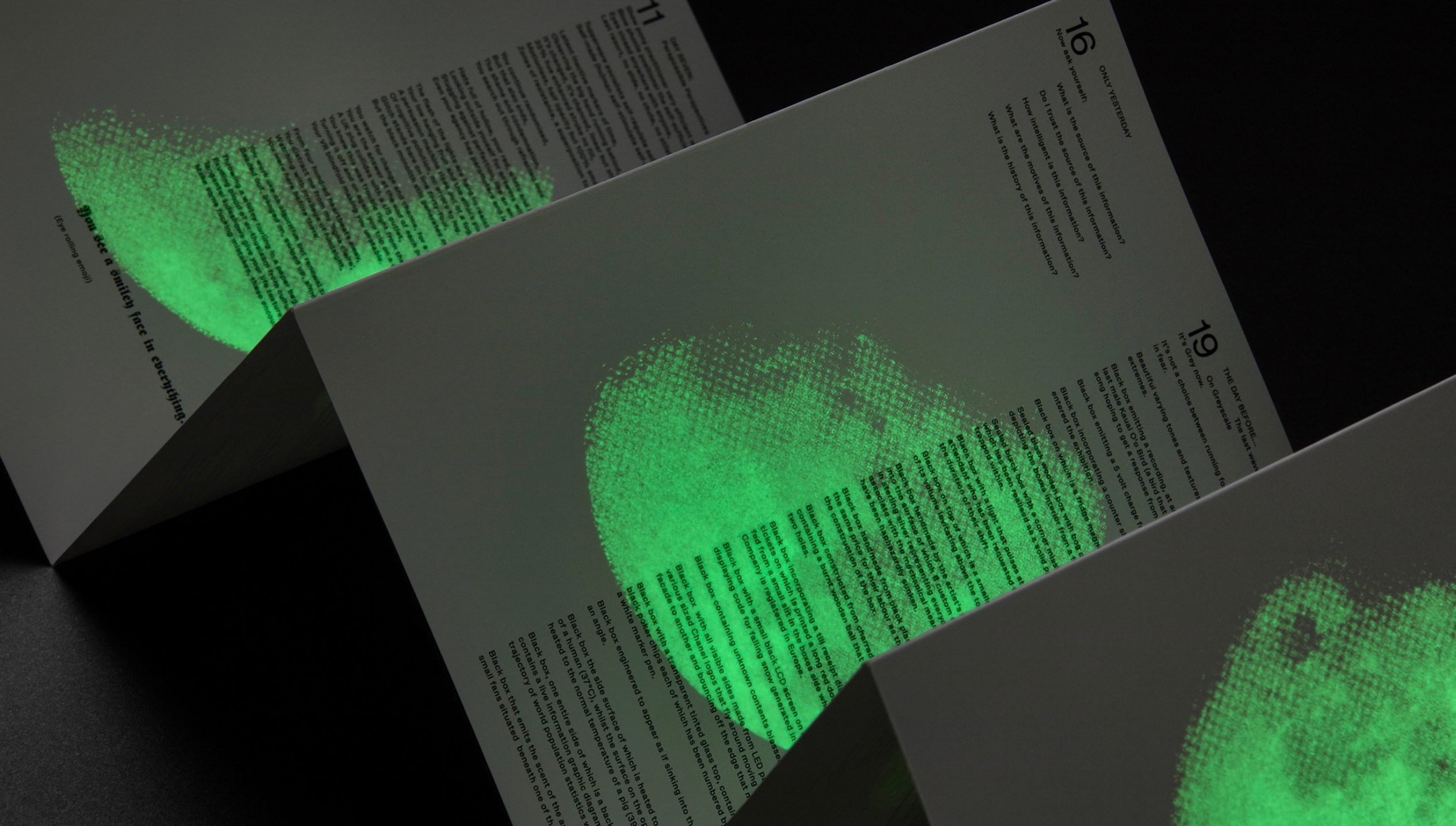
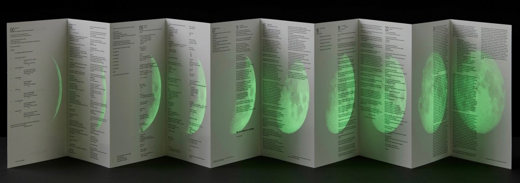
Leporello #04 (2021) Ryan Gander Box: H191 × W148 x D23 mm. Leporello: H142 x W99 mm (closed), W990 mm (open). 10 panels. Edition of 250, of which this #32. Acquired from Unoriginal Sins, 14 November 2024. Photos: Books On Books Collection. Displayed with permission of LL’Editions.
Ryan Gander has repurposed his installation Staccato Reflections (2017-20) to create Leporello #04. The tiny text originates from the artist’s notebook. In Staccato Reflections, it appears in a normal-sized font in business-directory format on a freestanding reflective screen. Gander describes the installation this way in an interview in Art in America:
Staccato Reflections is based on the idea of the self in culture, the obsession with the me and the selfie and the narcissist wand. The surface is mirrored, so as you read the words, you see yourself. The work has devices in it that are self-referential. It asks you to touch the screen, and then says “don’t touch the screen.” So it seems like it is responding to you, but it’s not.” (Fullerton, 107)
With its miniscule print requiring the enclosed rectangular plastic magnifying glass, and with its overprint in glow-in-the-dark ink of a waxing full moon, Leporello #04 marks quite a departure from the installation.
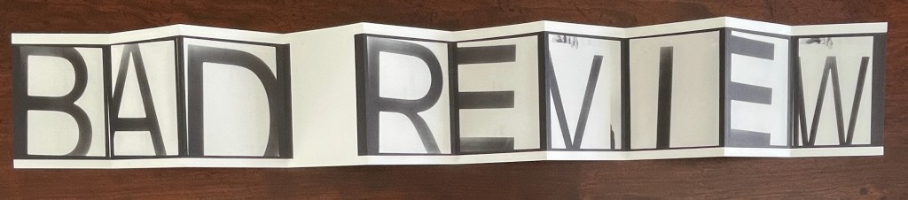
Leporello #03 (2021)
Leporello #03 (2021) Fiona Banner Box housing leporello. Box: H185 xW140 xD25 mm. Leporello: H140 x W100 mm. 10 panels. Numbered edition of 250, of which this #42. Acquired from Unoriginal Sins, 14 November 2024. Photos: Books On Books Collection. Displayed with permission of LL’Editions.
With Leporello #03, Fiona Banner repurposes the previously repurposed conceptual artwork Bad Review. It has appeared as a C-typeprint with the words overlaid on a rearview mirror and as a sculpture. To reproduce the two words, Banner uses found letters photographed held up by hand and badly positioned. Is it serendipity or cheeky genius that, like readymades, the nine letters and space of Banner’s conceptual artwork fit the ten panels imposed by LL’Editions to give us another re-view?
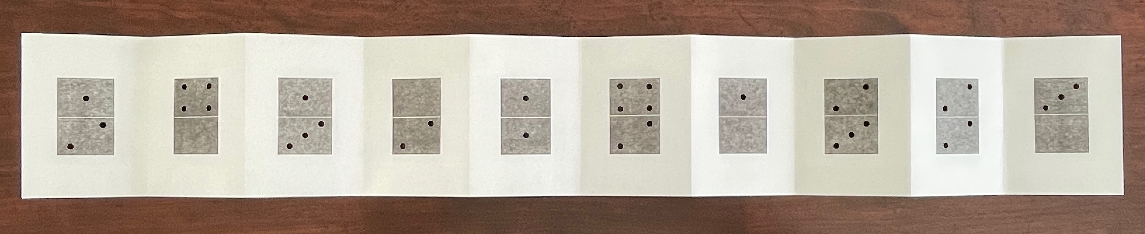
Leporello #02 (2021)
Leporello #02(2021) Micah Lexier Box housing leporello. Box: H185 xW140 xD25 mm. Leporello: H140 x W100 mm. 10 panels. Edition of 250, of which this #171. Acquired from Unoriginal Sins, 14 November 2024. Photos: Books On Books Collection. Displayed with permission of LL’Editions.
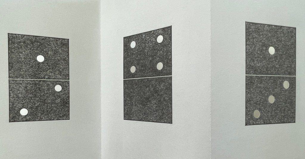
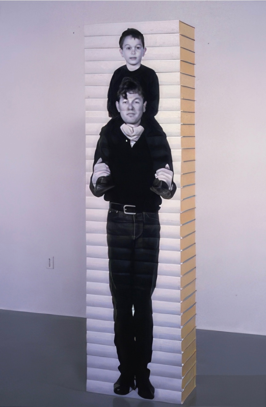
Publisher’s description: A number of years ago Micah Lexier purchased a small paperback publication about the game of dominoes. The very end of the book consisted of a series of pages that reproduced a complete set of twenty-eight domino tiles. The images were printed on right-hand pages, four to a page, while the left-hand pages were blank. The idea was that you were supposed to cut these images out of the book and glue them to empty matchboxes to create your own do-it-yourself set. That sequence of pages, combined with the quality of their reproductions, was the inspiration for Lexier’s leporello. To that, he added two favourite print techniques – perforations and die-cut holes – to create a set of ten domino tiles. Lexier chose the denomination of each tile and its order in the leporello so that none of the thirty-four die-cut holes line up with each other, allowing each hole to be misread as a printed white domino dot.
If you stand Leporello #02 on its edge on a table and then lean forward to view the panels at eye level, the domino images seem to have grown into oversized hangings on gallery walls. You can see some of the die-cut holes if you look closely at the lower right corner below.
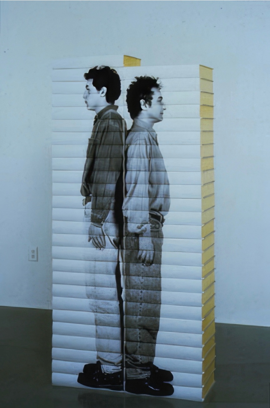
It’s a peculiar sensation, but it echoes Lexier’s website, which highlights mostly installations and large-scale works. Even more so it echoes Robert Birch Gallery in Toronto, which emphasizes his large wall displays. On both sites, Lexier’s play with patterns, shapes, tiles, and contrasts of black and white stands out. Although it’s not clear from those current sites, he has many book-related works. In the ’90s, he produced book sculptures in which each spine in a stack of books would have part of a life-size photo of a human subject printed on it. Properly stacked, the books display the human figure.
As can be seen in Leporello #02 and other works on display in the CCCA Canadian Art Database Project, Lexier likes to work with found objects. As can be seen in the book sculptures above and in the Database Project, Lexier’s art also reflects on relationships and community. Leporello #02 neatly and abstractly brings these two themes together with the found dominoes game book and the game’s communal roots.
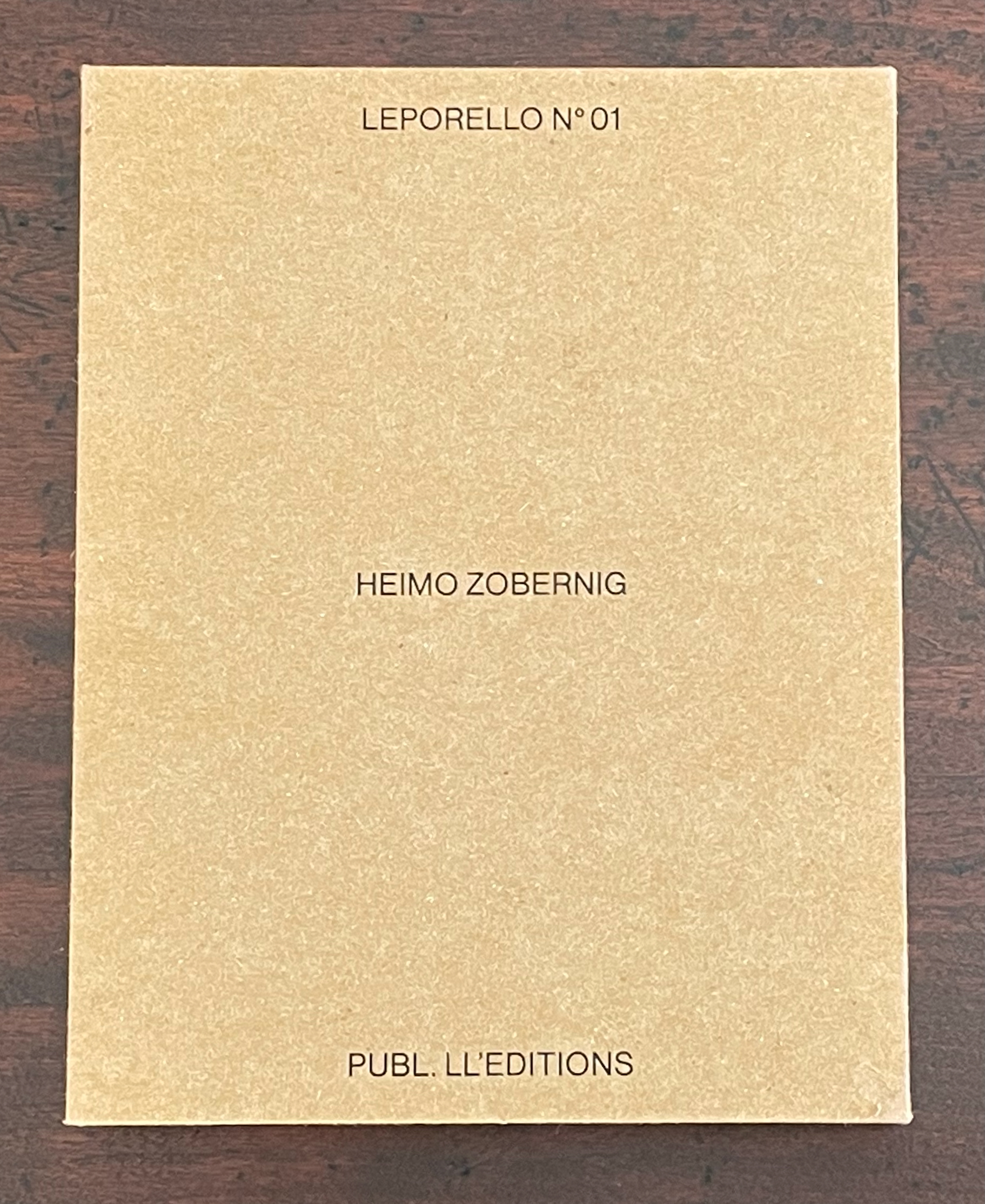
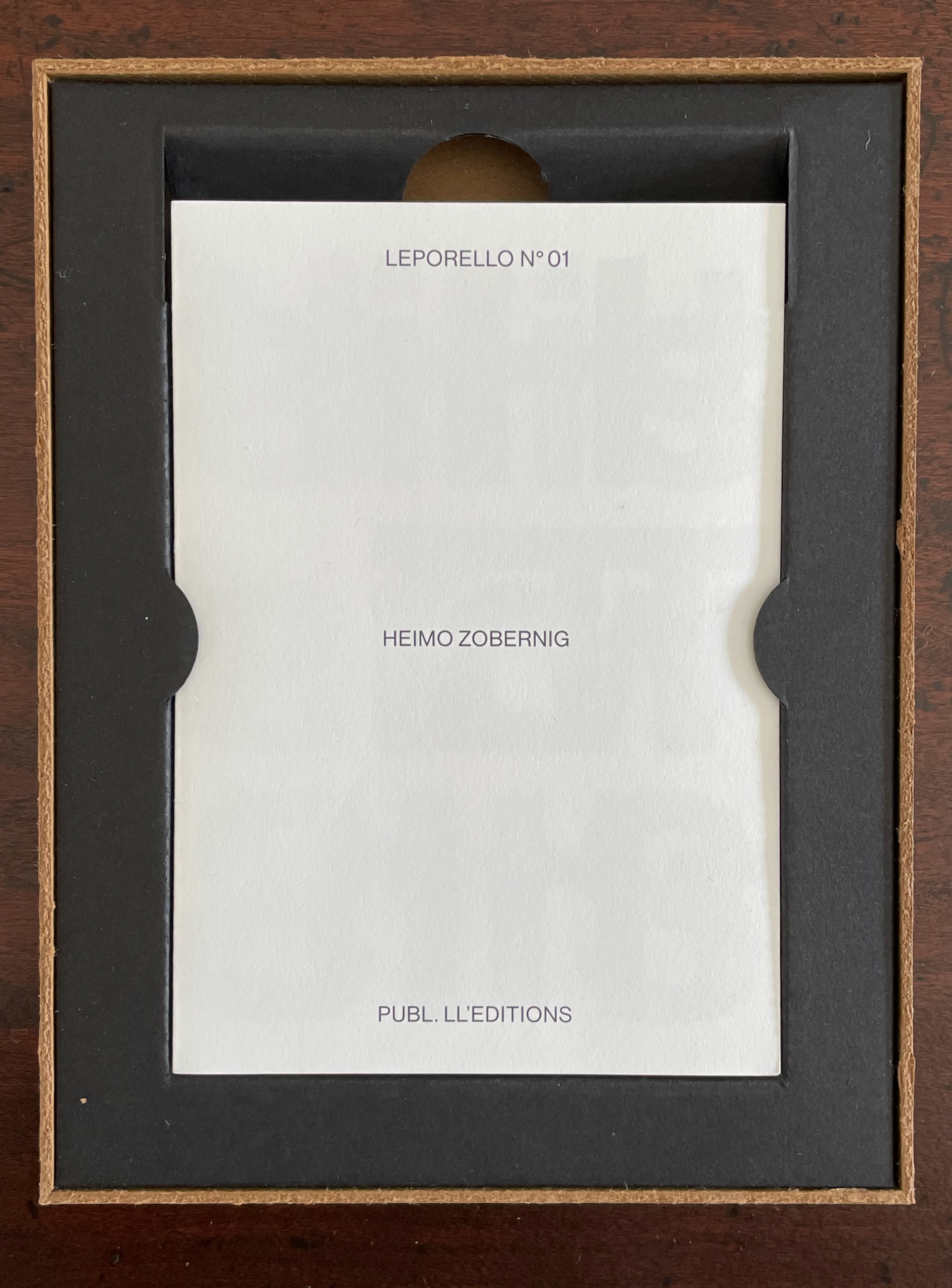
Leporello #01 (2021)
Leporello #01 (2021) Heimo Zobernig Box housing leporello. Box: H185 xW140 xD25 mm. Leporello: H140 x W100 mm. 10 panels. Edition of 250, unnumbered. Acquired from Unoriginal Sins, 14 November 2024. Photos: Books On Books Collection. Displayed with permission of LL’Editions.
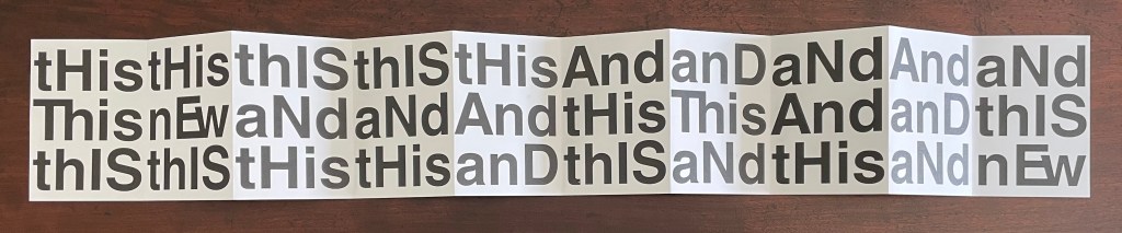
If you extend Leporello #01 fully, you are likely at first glance to project onto it the common expression “this and that”, but thwarted, you then start looking for another phrase comprised of “His”, “IS”, “And”, but you run into “Ew” or “nEw”, which throws you into renewed pattern-seeking behavior. Should you count the “this’s” and “and’s” in each row? Maybe there’s something in the pattern of lowercasing and uppercasing? Is there anything to the fact that the word “new” never begins with an uppercase N, or that it occurs only twice? Maybe you should read the rows aloud? With that, you may remember that, in earliest writings, words were not spaced and mixed majuscule and miniscule didn’t come along until later. Now you see how the folds are the primary means of separating the words in this book. This becomes clearer if you read the book panel by panel, or page by page codex-style. But now there are other possible patterns: does the book begin with “thIs, This, thIS” and proceed to “tHis, nEw, thIS”, and so on?
Somehow the acronym “WYSIWYG” — what you see is what you get — pops to mind, but Leporello #01 seems also a case of “WYGIWYS” — what you get is what you see. Fully extended or panel by panel, Leporello #01 offers more to see than a glance will get you.
Leporello #01 continues Zobernig’s love affair with Helvetica, which is also on display in Farben Alphabet (2018) and CMYK (2013), also in the Books On Books Collection.
Fullerton, Elizabeth. 28 April 2017. “In the Studio: Ryan Gander“. Art in America. Accessed 7 November 2025.
Hubert, Renée Riese, and Judd David Hubert. 1999. The Cutting Edge of Reading : Artists’ Books. New York City: Granary Books. See chapter 6, “Variations on the Accordion”, pp. 97-122.
With the exception of Unpacking my Library and Between the Sheets, Spector’s works in the Books On Books Collection fall into the category of ephemera. More than most book artists’ ephemera such as invitations, broadsides and the like, however, Buzz Spector’s ephemera have that self-reflexiveness so characteristic of book art.
Artist, curator and historian Jeffrey Abt wrote that the “irresistible” idea of placing an exhibition of artists’ books alongside the University of Chicago Library’s collection “broadly representative of the history of the book” started with a visit to famed art dealer Tony Zwicker‘s studio. It was also, however, almost as if he were taking a cue from this statement by artist-printers Betsy Davids and Jim Petrillo just the year before:
A representative collection of artists’ books often does not seem visually remarkable in a gallery, where a wide range of visual experience is the norm. The same collection, installed in a library or bookstore, can seem visually startling almost beyond the limits of decorum. — “The Artist as Book Printer: Four Short Courses”).
While Abt’s introductory essay rings the historical changes on the roots of book art — once there was Mallarmé’s Un Coup de Dés Jamais N’Abolira Le Hasard, but before Mallarmé, there was William Blake — the works included and the catalogue’s design ring some chimes of their own about book art. One way or another, all book art self-consciously draws attention to some particularly bookish element. For the most part, the 49 works listed in this catalogue ring true. The catalogue’s design itself, however, not only chimes to that notion of self-reflexiveness but also to wider notions about the nature of book art within contemporary art.
Not long after this exhibition, Spector wrote of “the language of the book” and all its parts — pages, signatures, cover, letter forms and their placement on the page, etc. — as having a syntax (“Going Over the Books”). With its pencil-circled numbers, alignment guides, pastedowns and other designer’s marks appearing throughout — as if a printer’s devil had run amok and let the marked-up proofs go to press unchanged — the catalogue draws attention to that syntax, the underlying processes of bookmaking and, therefore, this object’s “bookness”. The colophon’s note initialed by Jeffrey Abt to Buzz Spector and “pasted” on the last page jokingly rings the self-reflexive chime of the markings throughout the catalogue.
The second chime comes in the catalogue’s verbal and visual punning. Like book art, punning is self-reflexive, words playing on words. The title ”the book made art” can be read with different meanings: “the book made into art”, “art that is bookish” and so on. The catalogue’s trim and two-dimensional representation of three-dimensions create the visual pun of a glass or white cube. The verbal and visual puns also play with Abt’s “irresistible” context. Here in the Joseph Regenstein Library was an exhibition catalogue, teasing the viewer with a reminder that vitrines separated them from the bookworks. Reviewing two other exhibitions of book art, Spector elaborated explicitly on his visual tongue-in-cheek irony:
The dilemma in staging exhibitions of books as art objects is the denial of access to the work that conservation necessarily demands. … and it is a morethan passing irony that implications of hermeticism and elitism should surround books shown to a public using the library as a means of gaining access to texts. — “Art Readings”.
The catalogue also teases with its title and design by suggesting that once books have been placed on display like this, the setting is no longer a library but a “white cube gallery“. As the catalogue progresses, black-and-white photos of items from the exhibition appear on the verso page in frames that appear to be hanging on the trompe l’oeil cube’s rear wall.
Poster distributed on the University of Chicago campus. The image combines Michael Kostiuk’s Airplane Shadow Book (1981/82) with a variation of the catalogue cover. Photo: Courtesy of the artist.
But a viewer standing in the “brutalist” construct of the Regenstein Library and holding the finished catalogue might have asked, “What makes these objects I cannot touch — or, in some cases even if I could, cannot read — art?” There is the catalogue’s third chime. From the start, book art has faced a constant definitional or identity crisis and even the challenge “but is it art?” The catalogue’s title echoes Lucy Lippard’s Duchampian proposition: “It’s an artist book if an artist made it, or if an artist says it is”. The catalogue’s design says, “This is the gallery, these are the objects on display in it, they are art”.
The “white cube gallery” brings on a fourth and final ironic chime. In the 1970s and early ‘80s, artists’ books were pitched as a “democratic” medium and means by which art could escape the clutches of the gallery and reach a wider public. In another catalogue — the one for the 1973 Moore College exhibition, nominated as the first of book art — John Perreault writes:
Books as art, from the artist’s point of view and the viewer’s point of view, are practical and democratic. They do not cost as much as prints. They are portable, personal, and, if need be, disposable. Because books are easily mailed, books as art are aiding in the decentralisation of the art system. — “Some Thoughts on Books as Art”.
By the mid-80s, lo and behold, The Book Made Art’s catalogue-cum-gallery jokingly recaptures “books as art”. And in a further irony, by the mid-80s and since, the increased rareness and price of such bookworks have made them into galleries‘ and museums’ expensive objects of desire. Including this catalogue.
The Library of Babel (1991)
The Library of Babel Curated and edited by Todd Alden; catalogue designed by Buzz Spector. Dos-à-dos binding, offset. H241 x 177 mm Buffalo, NY: Hallwalls Contemporary Art Center, Hallwalls Inc., 1991. Photo of the work: Books On Books Collection.
As with The Book Made Art, Spector uses the cover (this time with a photograph of The Library of Babel) to introduce the self-reflexivity so characteristic of book art, but he does not stop there. Pagination and the back-to-back binding structure work together to evoke a mirror’s reflection; the last page of the first half “faces” the last page of the second half.
Photo of the work: Books On Books Collection.
The first half contains Todd Alden’s essay “The Library of Babel: Books to Infinity”, Paul Holdengräber’s “Unpacking Benjamin’s Library: Bibliomania in Dark Times”, and a checklist of the 34 works by their 10 artists.
Photo of the work: Books On Books Collection.
The second half contains half-tones of selected works and brief CVs of the artists. Among the half-tones are also photographs of works referenced by Alden (one by Jasper Johns, two by Marcel Broodthaers). Notice how the rules change position in the footers of the two halves, again evoking the back-to-front theme of the dos-à-dos binding.
Photo of the work: Books On Books Collection.
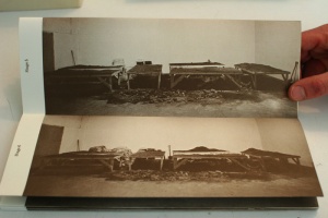
As in The Book Made Art, Spector had an entry in “The Library of Babel“ exhibition. With its torn pages, North Sea (for M.B.) (1990) echoes Altered LeWitt (1985), further below, but it is instead a work 10 feet long and presented on a table appropriately jutting out from the wall like a pier. “M.B.” is Marcel Broodthaers, to whose works there are multiple and layered references. The eleven “waves” of torn pages placed in a row on top of the steel shelf are the excised material from another of Spector’s works: Marcel Broodthaers, made from eleven copies of the Walker Art Center’s 1987 catalogue to Broodthaers’s first U.S. retrospective. Spector painted all the pages in each copy with white gesso before excising them and leaving behind his 1990 “altered Broodthaers”.
Marcel Broodthaers (1990) Buzz Spector An altered copy of: Marcel Broodthaers (Minneapolis/New York: Walker Art Center/Rizzoli, 1989). Photos: Courtesy of Buzz Spector.
He saved the excised “wedges” and bound them at the fore edges. Because the gesso does not completely obscure the text and images from the catalogues, viewers who come close to the work can see slivers of some of Broodthaers’ works along with the word fragments typical of Spector’s altered books.
North Sea (for M.B.) (1990) Buzz Spector Books, steel, gesso, 25 x 96 x 10 inches Collection Orange County Museum of Art,CA; Museum purchase with additional funds provided by Peter and Eileen Norton and the National Endowment for the Arts, a federal agency. Photo: Courtesy Orange County Museum of Art.
Spector’s library contains a copy of Broodthaers’ 1974 artist book, A Voyage on the North Sea. These layered references and self-references — direct references to Broodthaers’ A Voyage, indirect references through the self-reference to Spector’s Marcel Broodthaers (1990) — bring into sparkling focus two features of book art and, in particular, late 20th century book art: reverse ekphrasis and bookworks in conversation with one another.
When a visual work of art inspires poetry or prose, the literary result is called ekphrastic: “the verbal representation of visual representation”. But where the poets Keats, Auden and Jarrell, for example, use words to “recreate”, re-present, evoke or respond to works of art — an antique urn, a painting by Brueghel and Donatello’s sculpture of “David” — book artists have in turn used the letter, words, actual books, the physical materials of the book or even the shape of books, their functions or processes of making them to create works of art. A kind of ekphrasis in reverse.
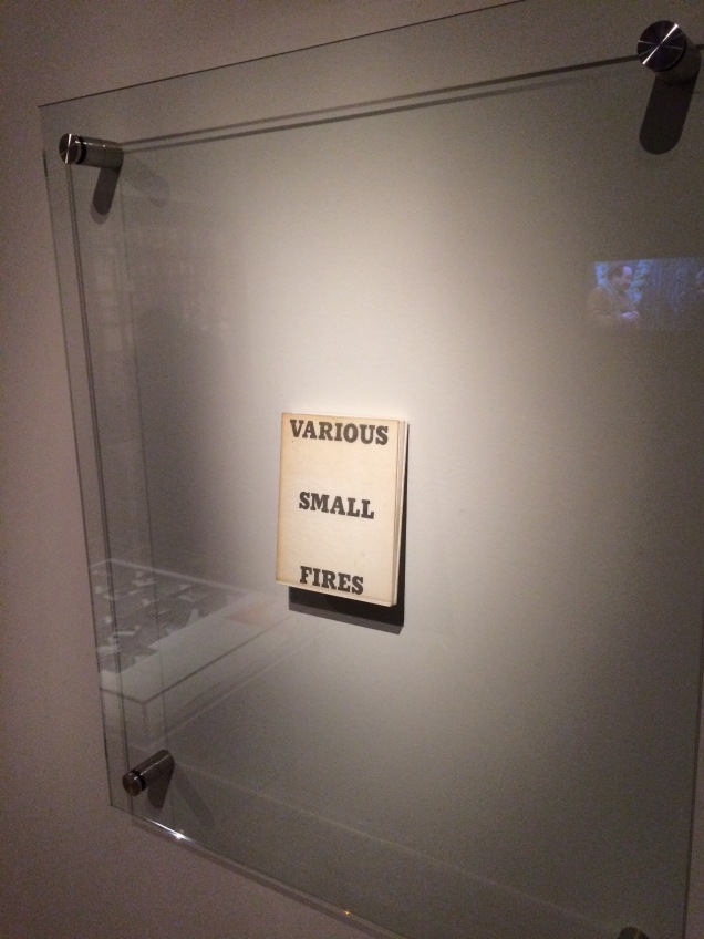
Not only does Spector perform this reverse ekphrasis with exhibition catalogues in North Sea (M.B.), he does it in conversation with a multimedia work by Broodthaers. Works in conversation with one another is also a common occurrence in poetry. An entire anthology showcases these poems that talk to other poems. The later work not only evokes the earlier work, it illuminates and adds to it. In book art, other instances include Bruce Nauman’s Burning Small Fires (1968), a one-sheet folded book of photos of Ed Ruscha’s Various Small Fires and Milk (1964) being set on fire and burning to ash, and Dennis Oppenheim’s Flower Arrangement for Bruce Nauman (1970), a leporello which refers to Nauman’s Flour Arrangements (1967), a video in which the artist pours over 50 pounds of flour on a mock talk-show studio floor and then sculpts it into ephemeral shapes. Nauman’s shift to an ingenious folded single-sheet structure and Oppenheim’s shift (and pun) to an accordion view of flowers are part of the addition to their conversations with their very structurally different counterparts. Spector’s shift to the sculptural is part of the addition to his conversation with Broodthaers’ book and video. Consider not only Spector’s gessoed sea of pages and the pier, but also those two 19th century black bronze sailing ship bookends evoking the 19th century nautical painting that Broodthaers appropriated in A Voyage on the North Sea.
North Sea (for M.B.) (1990) Buzz Spector Books, steel, gesso, 25 x 96 x 10 inches Collection Orange County Museum of Art,CA; Museum purchase with additional funds provided by Peter and Eileen Norton and the National Endowment for the Arts, a federal agency. Photo: Courtesy Orange County Museum of Art.
Unpacking my Library (1994-95) Buzz Spector Leporello full-colour offset printed; folded H100 x W155 mm, unfolded W3600 mm; Cleveland Center for Contemporary Art. Installation exhibited at the San Diego State University Art Gallery, 1-31 October 1994. Photo of the work: Books On Books Collection.
Clearly from his entry in The Library of Babel, Spector’s artistic output extends beyond altered books and catalogue design to larger scale installations. One of the more well-known, Unpacking my Library imposes multiple orders on what Walter Benjamin called “the chaos of memories”. How “multiple orders”? First, because of its subtleties; second, because of its several forms.
From the start at the San Diego State University Art Gallery, 1-31 October 1994, the installation imposed the order of “descending height” on Spector’s library, unpacked and displayed across one shelf attached along the white walls of a room in the gallery. The single shelf ran 188 feet.
Although Spector is rejecting the library’s traditional method of making sense of a collection of books — ordering by academic category — in favor of a physical criterion, the title imposes another method of making sense — allusion. The installation makes “more” sense if you have read Walter Benjamin’s essay “Unpacking My Library — A Talk on Collecting” (1931). If you haven’t, then, on the reverse of the leporello produced with the Cleveland Center for Contemporary Art, are these two sentences from the essay:
This or any other procedure is merely a dam against the spring tide of memories which surges toward any collector as he contemplates his possessions. Every passion borders on the chaotic, but the collector’s passion borders on the chaos of memories.
So what has ordering by height to do with the chaos of memories? Well, if the order of the personal library had been chronological by acquisition, that would be an assertion against chaos, a kind of aide- mèmoire. If the order had been by the library’s traditional method, again that would be an assertion against chaos. Benjamin and Spector embrace the chaos. Spector’s at-first amusing and puzzling organization of his library prods the viewer into the chance to do somewhat the same — to wander along the shelf with that phrase of process hovering in the mind and be reminded of books once read (when? where?), familiar and almost-familiar names and places (from when or where?) and subjects studied (what did that cover?). But the viewer also experiences a surge of unknown names, places and subjects, and spines that mystify.
The allusion to Benjamin’s essay offers another way of making sense of this experience into which the viewer is prodded. If a personal library is a kind of self portrait you can detect from the clues that its usual groupings into fiction, biographies, history, science, etc., give us about the owner, then here the order by height washes them and the portrait away. And if the viewer knows the essay, Benjamin’s last sentence may come to mind:
So I have erected one of [the real collector’s] dwellings, with books as the building stones, before you, and now he going to disappear inside, as is fitting. — Walter Benjamin, “Unpacking My Library”
Spector mentions this disappearance in a video record of the making and showing of the installation. Whether or not the installation’s spectator knows Benjamin’s essay, the installation’s title is a clue to the imposition of a fictional order. “Unpacking my library” is a phrase implying an activity that is just getting going. For his essay, Benjamin created the fiction of the reader’s being present as the library is being unpacked. Likewise for Spector’s installation, any spectator walking into it has entered a fiction. Spector’s library has already been unpacked, sorted on the floor and placed on the single shelf running around the room.
Of course, however, the owner of the leporello form of Unpacking my Library does not experience this fiction as directly. The opening and arranging of the leporello is a hands-on activity; the unpacking of Spector’s library occurs panel by panel in the reader’s hands. The library’s arrangement by height appears more gradually than in the gallery. Once the bookwork is fully extended, the installation’s fiction then becomes more readily available to the leporello’ s reader/viewer.
Photo of the work: Books On Books Collection.
As fictions, Benjamin’s essay and Spector’s installation need an ending. Benjamin’s technique is to disappear into his collection. Spector chooses a different technique. In correspondence with Books On Books, he writes:
The length of all the publications in my library was 165 feet; the single shelf, at the UCSD Art Gallery, on which they were placed ran 188 feet. That additional space implied a future, and life-affirming, growth of my collection. — Buzz Spector, 26 March 2020.
Photo of the work: Books On Books Collection.
Whether it is leporello or installation, the reader/viewer of Unpacking my Library is launching and launched on this open-ended ending.
The Book Maker’s Desire (1995)
The Book Maker’s Desire: Writings on the Art of the Book Buzz Spector Pasadena, CA: Umbrella Editions, 1995. 2nd printing. Cover design by Buzz Spector. Image: History of Europe (1983) by Buzz Spector; plaster over found book, 10.5 x 12 x 15 inches. Photo of the work: Books On Books Collection.
Spector’s essays are tonic. His comments on Margaret Wharton’s bookworks could refresh any reader and viewer lucky enough to see her works (Union League Club-Chicago or Yale) or remind the viewer of them when looking at works by later artists such as Thomas Wightman or the “Mystery Book Artist of Edinburgh”. In the past few months, Walter Hamady and John Baldessari have died, and Spector’s essays on them bring them both and particular works of theirs to present life. His essay and letter on Broodthaers would enhance any reading of the artists who have stood on Broodthaers’ shoulders to address Mallarmé’s Un Coup de Dés: Bennequin, Mutel, Pichler, Wyn Evans, Zboya. The essay “Going Over the Books” may have inspired Alden’s curation of ‘The Library of Babel” exhibition.
The essays are not entirely the point of having The Book Maker’s Desire in the Books On Books Collection. What completes the point is the cover design. The object on the book’s front cover is Spector’s own work History of Europe (1983), which pays homage to Broodthaers’ Pense-Bête (1964). But look closer. The cover stock has elements of text and colour seeping through, almost as if it were made of shredded books. The aptness and artistry of the cover design make The Book Maker’s Desire an object of desire in and of itself.
Detail of cover: Books On Books Collection.
Along with Unpacking my Library, Between the Sheets (2003) is the only other of Spector’s limited edition artist’s books in the Books On Books Collection. It is the solo exhibition to the joint exhibition of The Book Made Art (1986), described at the outset of this entry. In Between the Sheets, Spector again shows the self-reflexiveness of book art but also demonstrates how originality can spring from it.
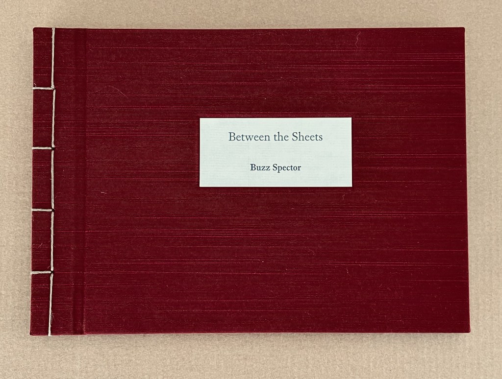
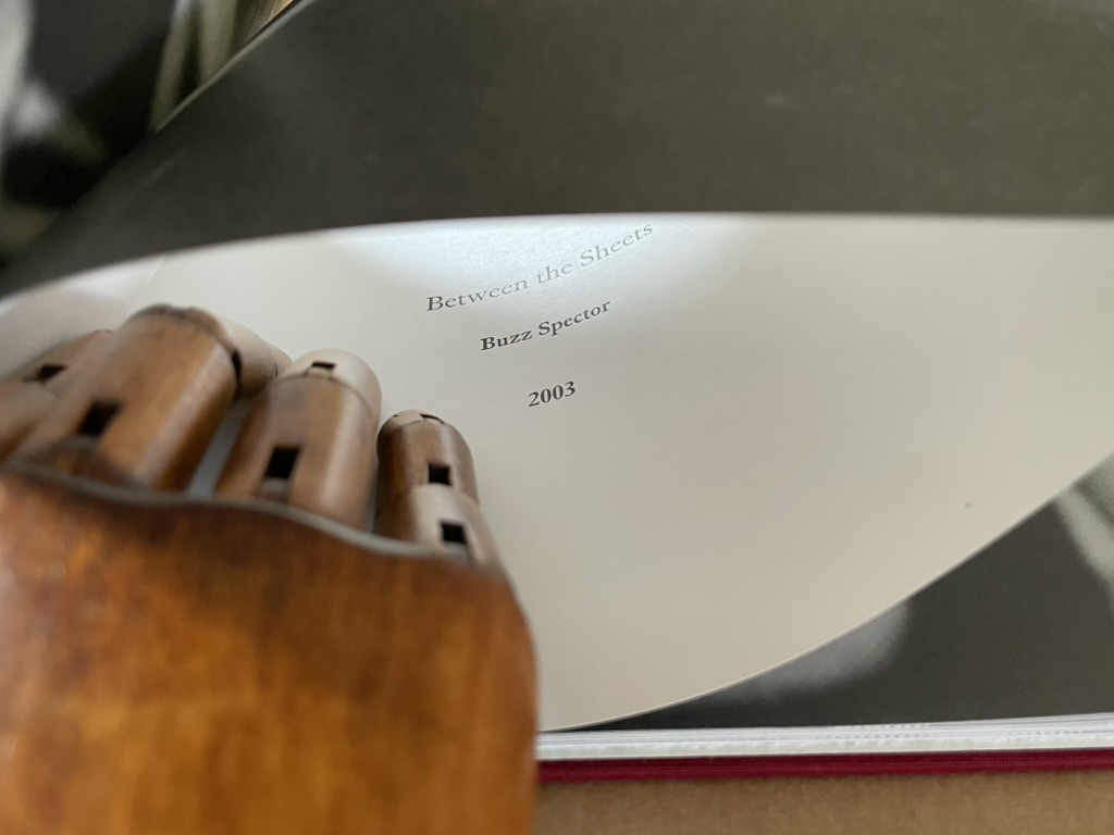
Between the Sheets (2003)
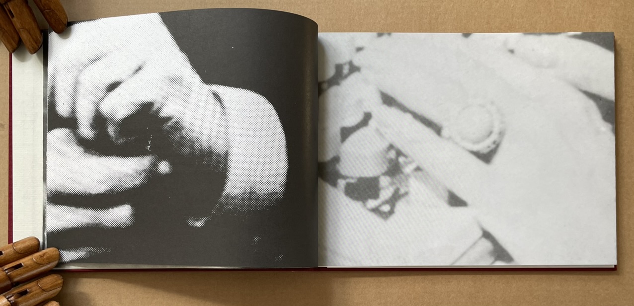
Between the Sheets (2003) Buzz Spector Cloth over boards, Japanese stab binding, 15 folded sheets, outer sides offset printed with enlarged “authors’ photos” clipped from dust jackets of art books repurposed by Spector for his bookworks, inner side printed (recto only) with text by and selected by Spector. H157.5 x W216 x D12.7 mm. Edition of 40, of which this is #40. Acquired from Olive Branch Press, 26 June 2020. Photos of the work: Books On Books Collection.
Unlike Altered Lewitt (1985) and North Sea (for M.B.) (1990), which appropriate and alter named works, Between the Sheets is made at two or three removes from its source material. In the first instance, Spector clipped authors’ photos from the dust jackets of their books (unnamed), then rephotographed and printed them at enlarged scale in offset editions. These prints were then bound together to make books. As with Altered Lewitt and other works, Spector then tore strips in a sequence of decreasing increments from the spreads so as to form a wedge-shaped cross section of the image block. In the next remove, this process left a pile of torn strips, and from these torn strips, Spector has proceeded to create Between the Sheets. With images on one side and text imposed on the reverse, these folios are folded and bound at their open ends with Japanese stab binding.
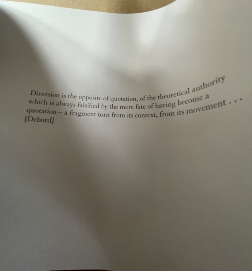
The work’s main thrust is philosophically, artistically and self-reflexively aesthetic. It quotes from the French philosopher Guy Debord, the Belgian artist Marcel Broodthaers and Spector himself. The quotation from Debord comes early on, the first after the title page and two of prefatory explanation, and very much sets the tone.
Diversion is the opposite of quotation, of the theoretical authority which is always falsified by the mere fate of having become a quotation — a fragment torn from its context, from its movement … [Debord]
With Between the Sheets, we have on our hands a decidedly multi-layered diversion. At one layer, it diverts by questioning Debord’s own words, consigning their “theoretical authority” to a fate of falsification by “having become a quotation — a fragment torn from its context”. Like a fun-house mirror, the page bows to give this distorted reflection of Debord’s words.
But is it a diversion? After all, the “truth” of Between the Sheets rests at least in part in its composition from fragments. At this other layer, Between the Sheets “quotes” the fragments torn from the context of another of Spector’s artwork. In turn, that other artwork was composed of prints of photographic “quotations”, the fragments torn from authors’ images on dust jackets (the coverlets for the source books and their sheets). It is no accident that, when the sheets of Between the Sheets are bowed to permit a look inside, the images bracket the text pages like single quotation marks.
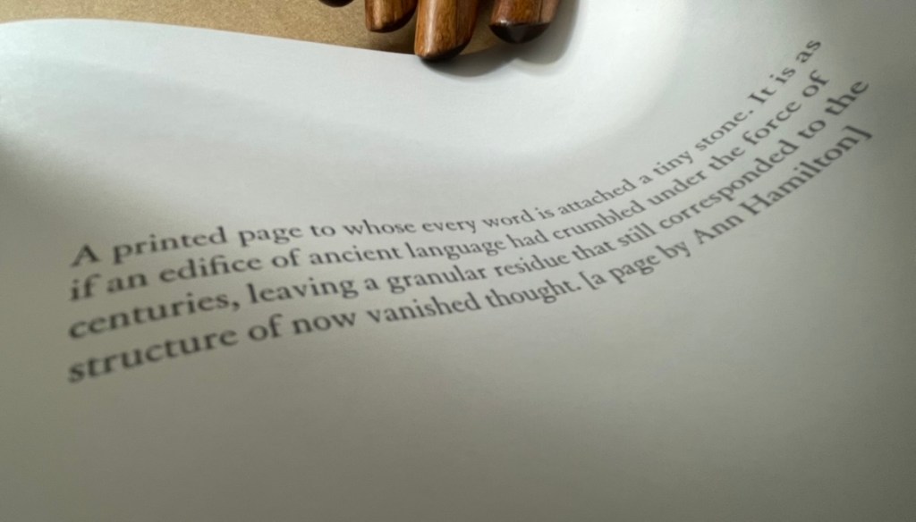
Another quotation resting between the sheets comes from Spector’s own essay on Ann Hamilton in The Book Maker’s Desire (p.63):
A printed page to whose every word is attached a tiny stone. It is as if an edifice of ancient language had crumbled under the force of centuries, leaving a granular residue that still corresponded to the structure of now vanished thought. [a page by Ann Hamilton]
Spector runs the risk of “Debord-ing” himself here with his self-quotation, but he only succeeds in diverting this reader back to the essay on Hamilton’s work and specifically the four works commissioned to benefit The New Museum of Contemporary Art in New York:
The artist chose a total of fifty four volumes (40 in the edition, plus 14 artist’ proofs) for the untitled project. These found books, mostly old novels or poetry, were selected for a variety of physical characteristics –size, wear, and paper quality — and for their typographic layout. Each book was opened to its middle, where six or eight pages were cut from the text block and reattached, edge-to-edge, to the right-hand side of the opened page spread, making an accordian-fold [sic] extension from the book. The eight pages thus displayed were meticulously rendered unreadable by Hamilton and several attendants who glued tiny stones over every word on the visible side. (p. 63)
Is it a coincidence that Between the Sheets also consists of 40 in the edition just like Hamilton’s commission? Spector quotes not only images and words from others’ works and his own, he quotes the details of their production and form. It is certainly no coincidence that Between the Sheets quotes the stab bound structure of Marcel Broodthaers’ A Voyage on the North Sea. After all, in his hidden prefatory explanation, Spector makes no bones about the fact that Between the Sheets arose in part from his astonishment at finding the page numbers hidden within the bound edge of A Voyage. But how did he find them? In the process of creating his own North Sea (for M.B.) (1990). So yet another self-quotation of production process.
Spector’s forthright quotations are divertingly sly. When he cites Broodthaers between these sheets,
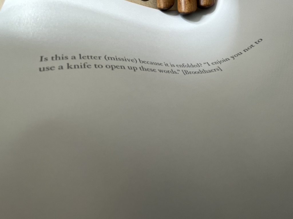
he is also echoing Broodthaers’ injunctions in A Voyage on the North Sea:
Before cutting the pages the reader had better beware of the knife he will be wielding for the purpose. Sooner than make such a gesture, I would prefer him to hold back that weapon, dagger, piece of office equipment which, swift as lightning, might turn into an indefinite sky. … These pages must not be cut.
Of course, Spector did not cut the pages; he tore them.
Another sly diversion is sex. By using photos of male and female authors and by interposing suggestive phrases inside the folds (“a movement of bodies together as one body” and “peek between the sheets”), Spector spices up the obvious diversion of sex in his work’s title. But the slyness re-diverts via Broodthaers to Mallarmé, whose poem Un Coup de Dés Jamais N’Abolira le Hasard (1897) Broodthaers “knifed up” at the very level of the words and whose contemplations of the letter, the page and the fold have taken on an erotic tone that Spector embraces in A Book Maker’s Desire:
When Stéphane Mallarmé described the folded and uncut signatures of books as “virginal,” awaiting the penetration of the “paper knife,” he identified an erotics of reading. (p.15)
The topography of an open book is explicit in its erotic associations: sumptuous twin paper curves that meet in a recessed seam. Page turning is a series of gentle, sweeping gestures, like the brush of fingers on a naked back. Indeed, the behavior of readers has more in common with the play of intimacy than with the public decorum of art viewing or music listening. Most of us read lying down or seated and most of us read at least partially unclothed. We dress up to go out and look at art; undressed, in bed, we read. We seek greater comfort while reading than the furnishings of museums or concert halls will ever grant us. When we read — the conventional distance between eye and page is around fourteen inches — we often become the lectern that receives the book: chest, arms, lap, or thighs. This proximity is the territory of embrace, of possession; not to be entered without permission. (p.17)
There is much more between the sheets of Between the Sheets. I wish that the 40 copies could find many more readers/lovers to embrace its diversions.
Buzz Spector: Alterations (2020)
Buzz Spector: Alterations (2020) Buzz Spector Gretchen L. Wagner; Elizabeth Wyckoff; Andrea Ferber Brochure. H254 x W256 mm, 4 unnumbered pages. Acquired from the artist, 23 June 2020. Photos of the work: Books On Books Collection.
Three items of ephemera conclude this entry. The first is a pristine copy of the announcement for Spector’s retrospective at the Saint Louis Art Museum, held 20 November 2020 through 31 May 31 2021, along with a copy of it with the front cover hand torn by the artist. The second is the catalogue from his show in 2021 Between the Lines. With both, Spector makes an ephemeral piece echo the works in the exhibition. The third item is a hand torn postcard reproducing his drawing Torn Flag (2022).
Between the Lines (2021)
Between the Lines (2021) Buzz Spector Elizabeth Wyckoff, Gretchen L. Wagner, Meredith Malone, Michael Garzel, Jane E. Neidhardt Perfect bound paperback. H268 x W 230 mm, 81 pages. Acquired from the artist, 10 March 2021. Photo of the work: Books On Books Collection.
The Zolla/Lieberman Gallery, which has supported Spector’s work since 1995, sponsored this monograph following 2020/21 retrospective held at the Saint Louis Art Museum. As a slightly less ephemeral item, it neatly rounds off this entry. Its cover image shows one of Spector’s well-known alterations: Altered LeWitt (1985), one of five of the found and hand-torn catalogue: Sol LeWitt, Drawing Series I, II, III, IIII A & B (Turin, Italy, at the Galleria Sperone, 1974). Compare it with North Sea (for M.B), above, which Spector created five years after Altered LeWitt. Spector extends the technique and concept across the two works in distinctive ways to echo two distinctive artists and yet also speak to commonalities and originality among the three artists.
Photo of Between the Lines (pp. 12-13): Books On Books Collection.
Between the Lines‘ presentation of the works is spectacular. Recalling the effect in The Book Made Art (above), they seem to float three dimensionally on the page. The detail photo of Unpacking my Library across a double-page spread offers a good example, especially when compared with the images above.
Photo of Between the Lines (pp.16-17): Books On Books Collection.
Between the Lines also provides the opportunity to end this entry with an image of the work incorporating an image of the author and his generosity toward his fellow bookworkers. Note in particular the reference to Michael Garzel, the monograph’s designer and creator of the typeface used so strikingly on the cover, for chapter titles and here in the heading “Acknowledgments”.
Photo of Between the Lines (pp. 4-5): Books On Books Collection.
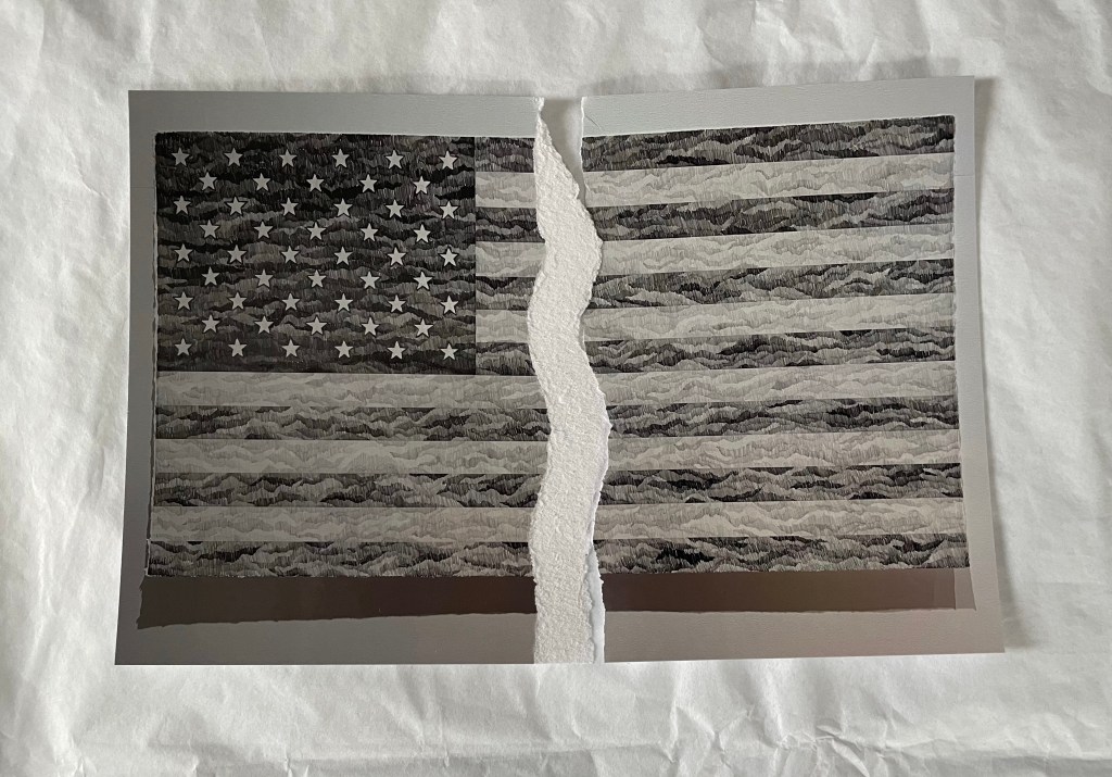
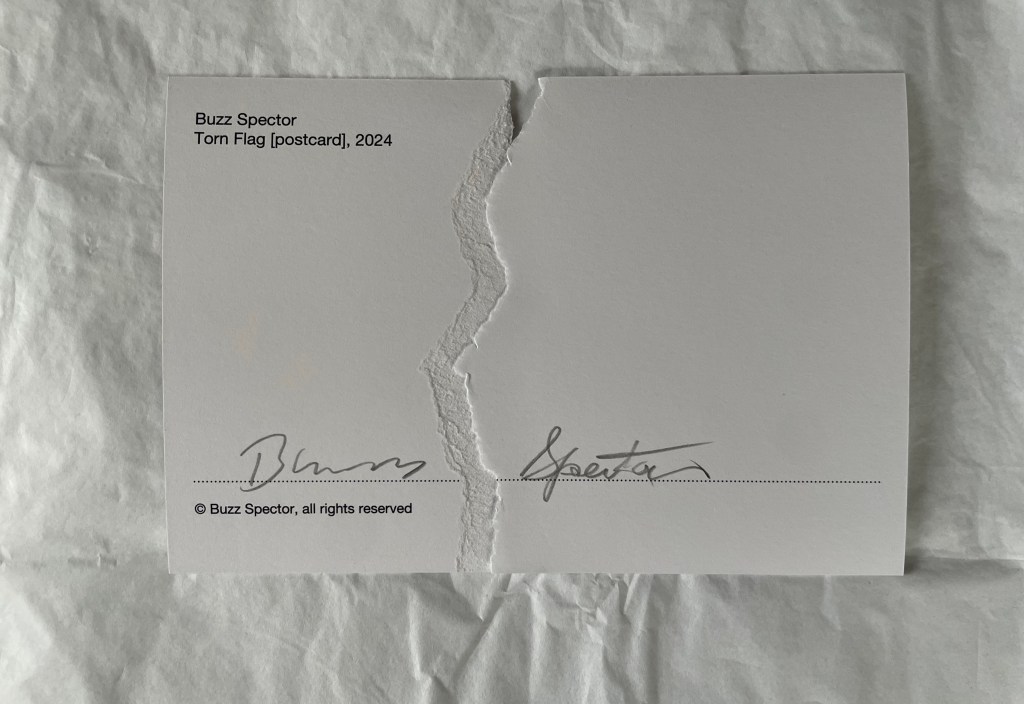
Torn Flag (2024)
Torn Flag(2024) Buzz Spector Postcard. Acquired from the artist, 26 February 2024. Photos: Books On Books Collection.
Revisiting Spector’s works this time was prompted by an invitation from the Center for Book Arts to “BookTalk: Full Dress or Half Dress, Not Casual with Buzz Spector” on 8 October 2024. The postcard reproduces the drawing Torn Flag (2022), a 565 × 1118 mm drawing (graphite on paper) that appeared in the Zolla/Lieberman Gallery. Spector describes the postcard as an “(informal) edition … Elegy to the Divided States”. Ephemeral though the postcard may be, its tearing makes a self-reflexive artistic gesture. But it also serves as an injunction: Vote. Always.
Revised entry: 7 October 2024; 24 September 2021; original entry, 31 March 2020.
Further Reading
“Buzz Spector“, Bookmarking Book Art, 12 March 2016.
Davids, Betsy, and Jim Petrillo. “The Artist as Book Printer: Four Short Courses” in Artists’ Books: A Critical Anthology and Sourcebook, edited by Joan Lyons (Rochester, NY: Visual Studies Workshop Press, 1985), p. 160.
Drucker, Johanna. 2004. The Century of Artists’ Books [Second edition] ed. New York City: Granary Books. See pages 118-19 for perceptive comments on Spector’s A Passage (1994) and his method of torn pages.
Lippard, Lucy. “New Artist’s Books” in Artists’ Books. A Critical Anthology and Sourcebook, edited by Joan Lyons (Rochester, NY: Visual Studies Workshop Press,1985), p. 53.
Mathews, Emily, and Sylvia Page. “Off the Shelf and Into the Gallery: Librarians on Spector”, Buzz Spector: Off the Shelf, Grunwald Gallery of Art, October 19 — November 16, 2012 (Bloomington, IN: Grunwald Gallery of Art, Indiana University, 2012), pp. 9-15.
Otten, Liam. “A sea of torn pages“, The Source, Washington University in St. Louis, 26 February 2010. Accessed 26 March 2020.
Perloff, Nancy. 2016. Explodity : Sound, Image, and Word in Russian Futurist Book Art. Los Angeles, California: Getty Research Institute. See pages 179-81 for perceptive comments on Spector’s A Passage (1994), a variant on biblioclasm and example of what Spector calls “a ‘conceptual purity’ because it engages completely with the book as a book.” (p.180)
Perrault, John. “Some Thoughts on Books as Art” in Artists Books, Moore College of Art, 23 March – 20 April 1973, curated by Dianne Perry Vanderlip (Philadelphia, PA: Moore College of Art, 1973), p. 21.
Schlesinger, Kyle. “The Missing Book”, Buzz Spector: Off the Shelf, Grunwald Gallery of Art, October 19 — November 16, 2012 (Bloomington, IN: Grunwald Gallery of Art, Indiana University, 2012), pp. 17-25.
Spector, Buzz. “Going Over the Books” in The Book Maker’s Desire (Pasadena, CA: Umbrella Editions, 1995), p. 8.
Spector, Buzz. “Art Readings” in The Book Maker’s Desire (Pasadena, CA: Umbrella Editions, 1995), p. 13.
Spector, Buzz. “I stack things. I tear stuff up”, Buzz Spector: Shelf Life: selected works, Bruno David Gallery, January 22 — March 6, 2010 (Saint Louis, MO: Bruno David Gallery, 2010).
Spector, Buzz. 25 March 2021. “Art Speaks“. Saint Louis Art Museum. Video series of artists’ talks. Accessed 23 August 2021.
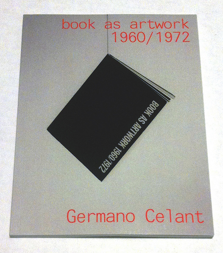
Where to go to compare and contrast the book art in Germano Celant’s pioneering “catalogue” of the Nigel Greenwood Gallery exhibition in London (1972) with that of the last half century?
Being a sort of small and portable catalogue and curator’s explanation for the gallery’s exhibition of ca. 300 works, Celant’s Book as Artwork is arranged chronologically and then alphabetically by artist. Presumably it was organized to match the exhibition’s organization (note the year 1967 in upper left of the photograph below and the distinctive Hidalgo cover, fifth from the left). With no photographs of the works, Book as Artwork gives no easily accessible visual sense of the 300 works in that exhibition. If we had that starting visual touchpoint, it would be easier to “place” the period or individual works in relation to book art from the 80’s onward.
Book as Artwork 1960 – 1972 – Exhibition Nigel Greenwood Gallery B, 1972.
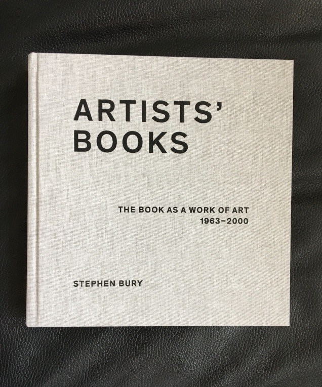
Stephen Bury’s Artists’ Books: The Book as a Work of Art, 1963 – 2000 (2015) includes, by design, only a handful of the artists and works selected for the Celano/Greenwood exhibition.
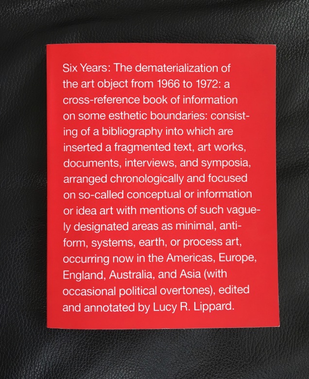
Lucy Lippard’s Six Years: The dematerialization of the art object from 1966 to 1972 (1973, 1997) — a “bibliography into which are inserted a fragmented text, art works, documents, interviews, and symposia, arranged chronologically” — comes as close as one might hope in black-and-white print for a starting visual touchpoint. Lippard’s scope, however, ranges beyond book art, so the number illustrated limits systematic visual comparison and contrast with the book art of the ensuing decades.
Phaidon’s Artists Who Make Books(2017) provides good coverage and bridges the 1960s to the 21st century. The essays and descriptions bring the book art off the page and into the mind’s hands.
Best of all is Lynda Morris’s mini-memoir of her role in organizing the Celant/Greenwood exhibition.
Germano had sent Nigel [Greenwood] a wonderful, arty handwritten letter in pink capitals … on December 22, 1970:
DEAR PUBLISHER I AM PREPARING FOR A NEW INTERNATIONAL MAGAZINE A COMPLETE ANTHOLOGY OF BOOKS MADE DIRECTLY BY ARTISTS.
…Nigel had met Germano and had his telephone number in Genoa. I was sitting beside him when he phoned and proposed Book as Artwork exhibition for September 1972. Germano immediately agreed.
For sources of book art since the close of the Celant/Greenwood exhibition, we are spoilt for choice. Print and digital, image-rich aggregations of book art abound. We can return to the Phaidon and Bury books. We can turn to the well-illustrated print and online publications from the Centre for Fine Print Research at the University of Western England, online library collections such as the MassArt Library or Chicago’s School of the Art Institute, the websites of dealers such as Zucker Art Books displaying their wares, the dozens of websites for recurring book art fairs such as International Artist’s Books Triennial Vilnius (1997 – present) and CODEX International Book Fair (2007 – present) and community sites suchas Artist Books 3.0. In the future, the Getty Research Institute‘s processing of the Steven Leiber Basement archive should also yield a rich source of images of works by the artists selected for the Celant/Greenwood exhibition.
Present-day online access challenges Mallarmé’s dictum: ”Everything in the world exists to end up in a book.” Now it seems:
Everything in the world exists to end up on the web.
As far as that premise holds, this annotation and rearrangement of Celant’s bibliography — a “webliography” — offers an online starting point for connecting the book as artwork 1960/1972 with the book as artwork since. In providing some images of the works and links to images, the webliography offers anyone interested in book art the means to gain a more colored impression of the period’s book art. That the primary impression is still black and white underscores the impact of xerographic technology on artists then as well as that of conceptualism driven by text or photograph. A webliographic approach also offers the opportunity to link the book art of the Celant exhibition with book-oriented Web-art or Net-art such as that of Amaranth Borsuk, Taeyoon Choi, Gunnar Green, Johannes Heldén, Bernhard Hopfengärtner and many others referenced below.
The reorganization here of Celant’s and Morris’s list — by artist alphabetically then chronologically — makes it easier to see the curators’ tendencies in selection as well as the influence of practical factors. The curators’ selection is obviously more Western, less Eastern European and even less Middle Eastern and Asian. Individuals’ prodigality surely played a role in whom and what was included. As Morris’s essay in the Phaidon book reveals, the geographical proximity of works available to be chosen played a role; so, too, the influence of the then-contemporary art network played a role (Atkinson, Beuys, Celant, Dwan,Greenwood, Hansjorg Mayer, Walther König, Maenz, Siegelaub, Sperone and the many other personalities of the Art-Language, Arte Povera, Conceptualist and Fluxus movements); and even the size of suitcases and availability of transport for bringing the artwork into the UK played a role.
Generally the online links for the artists’/authors’ names lead to biographies, either in their official websites, Wikipedia or other news sources. Where an artist/author is listed multiple times, the links vary from instance to instance to provide a wider range of information about the individual and, in some cases (such as Dieter Rot’s), more images. The links behind the publishers’ names go to publishers’ websites or Wikipedia entries about them. The links that follow each entry resolve to images of the work, videos, audio, interviews or essays relevant to the work. For selected entries in Celant’s list, a compare/contrast takes the user to websites or works whose juxtaposition might shed light on the similarities or differences between the item in Celant’s list and book art of the subsequent decades.
The webliography also supports the haptically as well as digitally inclined. The links behind the titles of the works provide information on the nearest library location of the work (although not all titles could be located). Be sure to enter your own location and refresh the results.
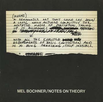
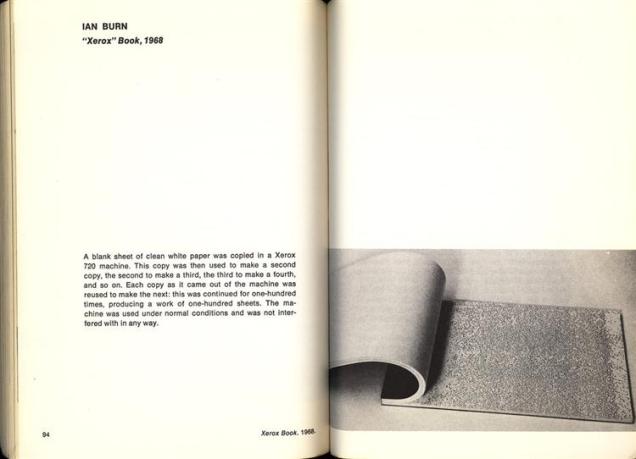
Bochner, Mel. The Singer Notes. New York: Self-published, 1968. [Images] [Compare/contrast Bochner’s notes and drawings resulting from conversations with scientists and engineers at Singer Labs in New Jersey with the Smithsonian Libraries’ online exhibition Science and the Artist’s Book, 1995]
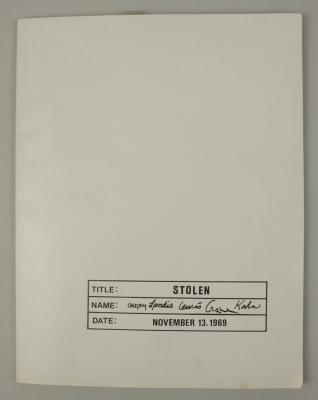
Gregory, Kathe; Landis, Marilyn; Lewis, Russell; Crane, David; Kahn, Scott. Stolen. New York: Colorcraft Lithographers/Dwan Gallery, 1970. [Images] [Compare/contrast with Andrew Savage’s Stolen White Goods, 2006, and then Cristina Garrido’s intervention White Goods, 2011]
Lole, Kevin; Smith, Paul. Handbook on Models. Coventry: Self-published, 1972. [Unable to locate a work of this title in WorldCat, but one with the title The Relativism of Emotion Handbook to the Model and same date of publication is described in Paul Robertson‘s “A Collection of Rare Art+ Language Books and Internal Documents – Many Unknown in Literature”, Gorebridge, Midlothian: Unoriginal Sins/Heart Fine Art, n.d.]
30 x 21cm, 50pp (printed recto only) plus printed card covers. Xerox inner pages as issued. The first and only edition of this theoretical work based on a physical model (electro-shock, photo beams and electronic buzzers) acting as metaphor for analogue, theoretical and representative models. Cover is very minority marked on the front and back cover has a faint diagonal crease else VG++. From the archive of David Rushton who believes only 10 or fewer of this book was published.
Display of Ed Ruscha’s Various Small Fires and Milk, 1964, at Pliure: La Part du Feu, 2 February – 12 April 2015, Paris. Photo by Robert Bolick. Reflected in the lower left hand corner is the display of Bruce Nauman’s Burning Small Fires; in the upper right corner, the film clip of Truffaut’s 1966 Fahrenheit 451; and in the upper left, Maria Helena Vieira da Silva’s La bibliotheque en feu, 1974.
Pilkington, Philip; Rushton, David; Lole, Kevin; Smith, Paul. Concerning the Paradigm of Art. Zurich: Editions Bischofberger, 1971. [Last author’s name corrected from “Paul” to “Peter”] [From Paul Robertson, “A Collection of Rare Art+ Language Books and Internal Documents – Many Unknown in Literature”, Gorebridge, Midlothian: Unoriginal Sins/Heart Fine Art, n.d.
“30 x 21cm, 16pp (recto only). White card covers – with offset title. A text published by Bischofberger from a theoretical document written by Kevin Lole, Philip Pilkington, David Rushton and Peter Smith (formerly Analytical Art and by this time fully regarded as members of Art & Language) which applied Thomas Kuhn’s theory of paradigm shift to art (the original theory by Kuhn being a view that revolutions in scientific thought only occurred when sufficient contrary evidence to the prevailing orthodoxy had mounted up and the original hypothesis could no longer explain the physical evidence emerging from empirical studies). It is worth noting that at this time Bischofberger bought a great deal of Art + Language material from the group and published other documents by them including some of the group’s rarest publications – storing many of the more three-dimensional works for later resale. Bischofberger did not print the books himself – rather Art and Language arranged design and publication in Coventry (for free using the University’s resources) and David Rushton drove the books over in a camper van to Switzerland (breaking down just on the edge of the city due to running out of petrol and having little money left, Rushton coasted the last mile down hill on an empty tank).
The limitations of these series of books are usually placed at c. 200 but Rushton remembers taking far fewer than that with him and this Analytical Art book was in fact only produced in 50 copies taken to Zurich plus a few retained by the artists in the UK.
That said this is one of ONLY 5 copies which were numbered in roman numerals (this one being III/V) and signed by ALL of the four writers in pencil on the first title page.”]
Pilkington, Philip; Rushton, David. Sample from a Topological Notebook. Coventry: Self-published, 1972. [Video] [From Paul Robertson, “A Collection of Rare Art+ Language Books and Internal Documents – Many Unknown in Literature”, Gorebridge, Midlothian: Unoriginal Sins/Heart Fine Art, n.d.
“30 x 21cm, 28pp carbon copy pages and printed cover. This was one of ONLY four copies made and published by the group – two copies being signed by David Rushton and Peter [sic] Pilkington and created from original typed sheets and two copies remaining unsigned and created (as here) using the carbon copies from the originals. These latter two examples were regarded by the group as artist’s proofs of the book. This is the only copy of this book available for sale anywhere as from the original four prices: one is in Paul Maenz’s archive and another two copies are in the hands of private collectors (who purchased them from ourselves). This copy is signed by David Rushton and Philip Pilkington and has been stamped on the inside front cover with the official Art & Language Stamp and also designated in blue ink “Second Copy”. Fine estate and clearly rare.”]
Magnet / Photo Series / Group 2000 / September 1968 / (4 Phase) / Continuous Photographic Photographs Continuously Photographs Up to 20,000 Shots / Run Time work / 10 years / annual series of 20,000 elements / technique / black and white photography / leafs / 3 M / K 203 3 / each 30 x 40 / constant time setting diaphragm / fixed tilt stand / 1969 / camera used maintains the original value and adds to the artistic market.
Ramsden, Mel. The Black Book. [Unable to find a work under this title in WorldCat]
Ramsden, Mel. Abstract Relations. New York: Art-Language, 1968. Edition of 5. [Unable to find a work under this title in WorldCat; the 5 images on the left in this photograph from the Philippe Méaille private collection at MACBA come closest.]
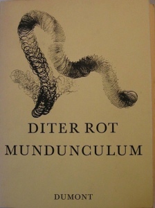
Rot, Dieter. Icelandic Leather. Reykjavik: Self-published, 1970. [Unable to locate by this title; may be referring to Volume 5, Bok 3 of the Collected Works]
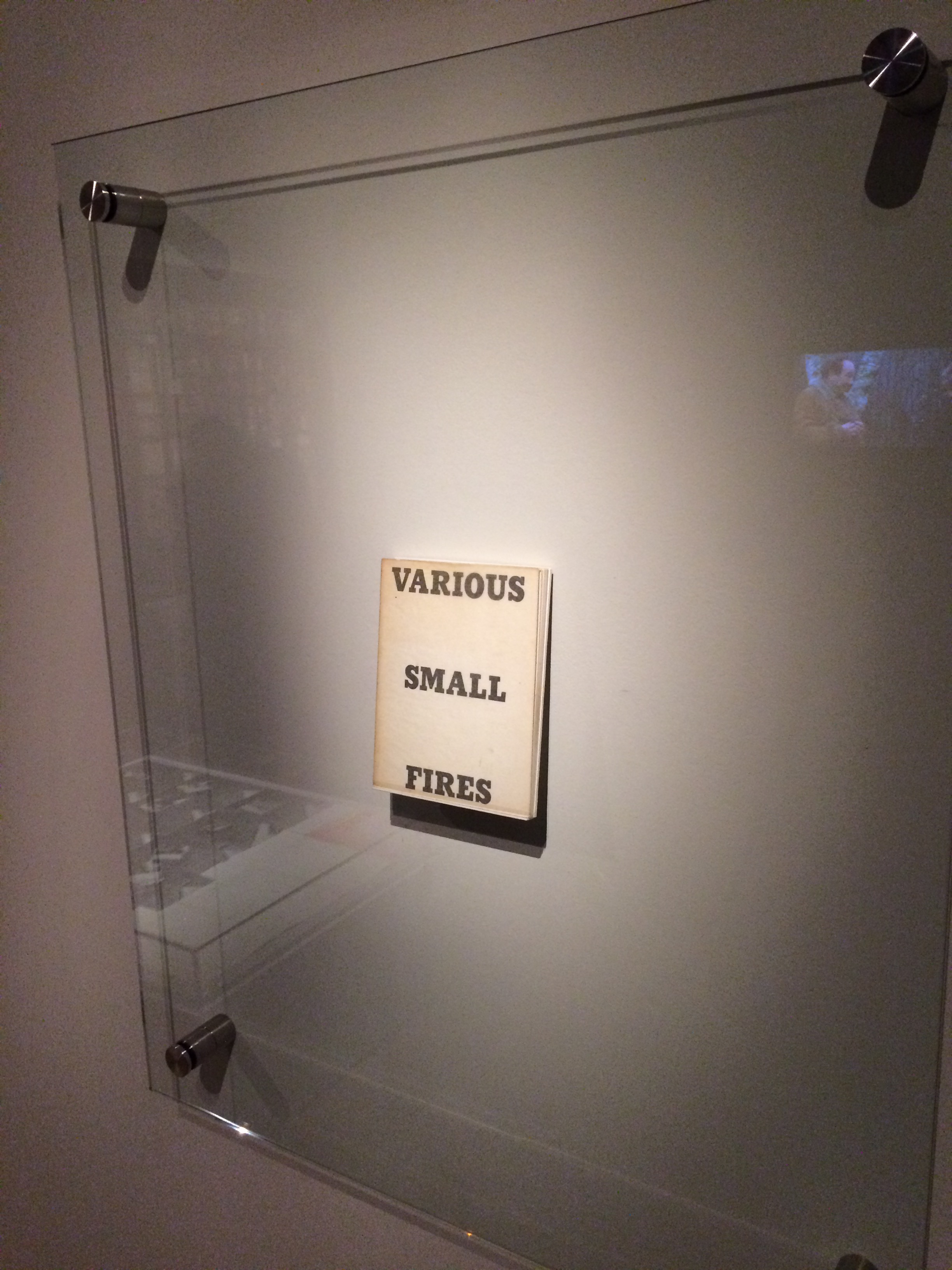
Display of Ed Ruscha’s Various Small Fires and Milk, 1964, at Pliure: La Part du Feu, 2 February – 12 April 2015, Paris. Photo by Robert Bolick. Reflected in the lower left hand corner is the display of Bruce Nauman’s Burning Small Fires; in the upper right corner, the film clip of Truffaut’s 1966 Fahrenheit 451; and in the upper left, Maria Helena Vieira da Silva’s La bibliotheque en feu, 1974.
Display of Ed Ruscha’s Various Small Fires and Milk, 1964 Pliure: La Part du Feu, 2 February – 12 April 2015, Paris, Fondation Calouste-Gulbenkian. Photo by Robert Bolick, 11 April 2015. Reflected in the lower left hand corner is the display of Bruce Nauman’s Burning Small Fires, 1968; in the upper right corner, the film clip of Truffaut’s 1966 Fahrenheit 451; and in the upper left, Maria Helena Vieira da Silva’s La bibliotheque en feu, 1974.
The Studio Bibliografico Giorgio Maffei specializes in original texts and book art by twentieth century visual and literary avant-garde artists such Baldessari, Lewitt, Munari, Man Ray, Ruscha and Warhol among others. Recently the owner’s son – Giulio Maffei – “started making film as a side activity” and introduced a series of short animations “to put on the social networks and reach new potential customers”. An anonymous pair of hands displays a variety of the books and book art in stock.
But Giulio’s videos are not always the straightforward marketing effort intended. They provide an experience of book art or artists’ books that most of us will never hold or touch. And that may be Maffei’s point in his series “Le Vite dei Libri” (The Lives of Books) in which these usually glassed-off works are playfully handled, gently made fun of and still honored.
Some of the videos are derivative artworks in their own right in the same vein as Bruce Nauman’s Burning Small Fires, 1968. Nauman poked fun at Ed Ruscha’s Various Small Fires and Milk, 1964, by composing a book of photos recording the burning of a copy of Various Small Fires. Maffei’s Nauman-esque handling of Various Small Fires and Milk involves flash paper or its Photoshop equivalent. His celebration of Ruscha’s The Sunset Strip is still more endearing with its soundtrack and toy convertible. His cheeky animations of the pop-ups in Warhol’s Index (Book) and the ironically daring destruction of Papa Maffei’s copy of Some/Thing No.3 are even better. In the latter, the plastering of a Banksy-like mural with Warhol’s “Bomb Hanoi” stickers torn from the perforated cover is a sharp-edged example of the arch, reflective commentaries throughout Maffei’s videos.
Most of the films’ credits pay typographical homage to the work at hand, which is a nice self-deprecating and affectionate touch. At my last viewing, there were twenty-two works in the Lives series. They are listed below, but once you reach one on YouTube, the others follow. Giulio Maffei has also created a longer video catalogue for his father’s enterprise: Tra Libro e Oggetto (Between Book and Object). The Maffeis are a knowing team. The catalog title can be read as the beginning of a statement displayed on the cover.
BETWEEN BOOK AND OBJECT
The artists’ book, the multiple and the object
become an artwork
A statement that refers not only to the works in the catalog but to the video catalog itself and to the elder Maffei’s lifework of collecting, selling and writing about book art.


![Image result for art & language: texte zum phänomen kunst und sprache [book]](http://igem.adlibsoft.com/wwwopacx/wwwopac.ashx?command=getcontent&server=images&value=coda%5CAB00318.jpg)