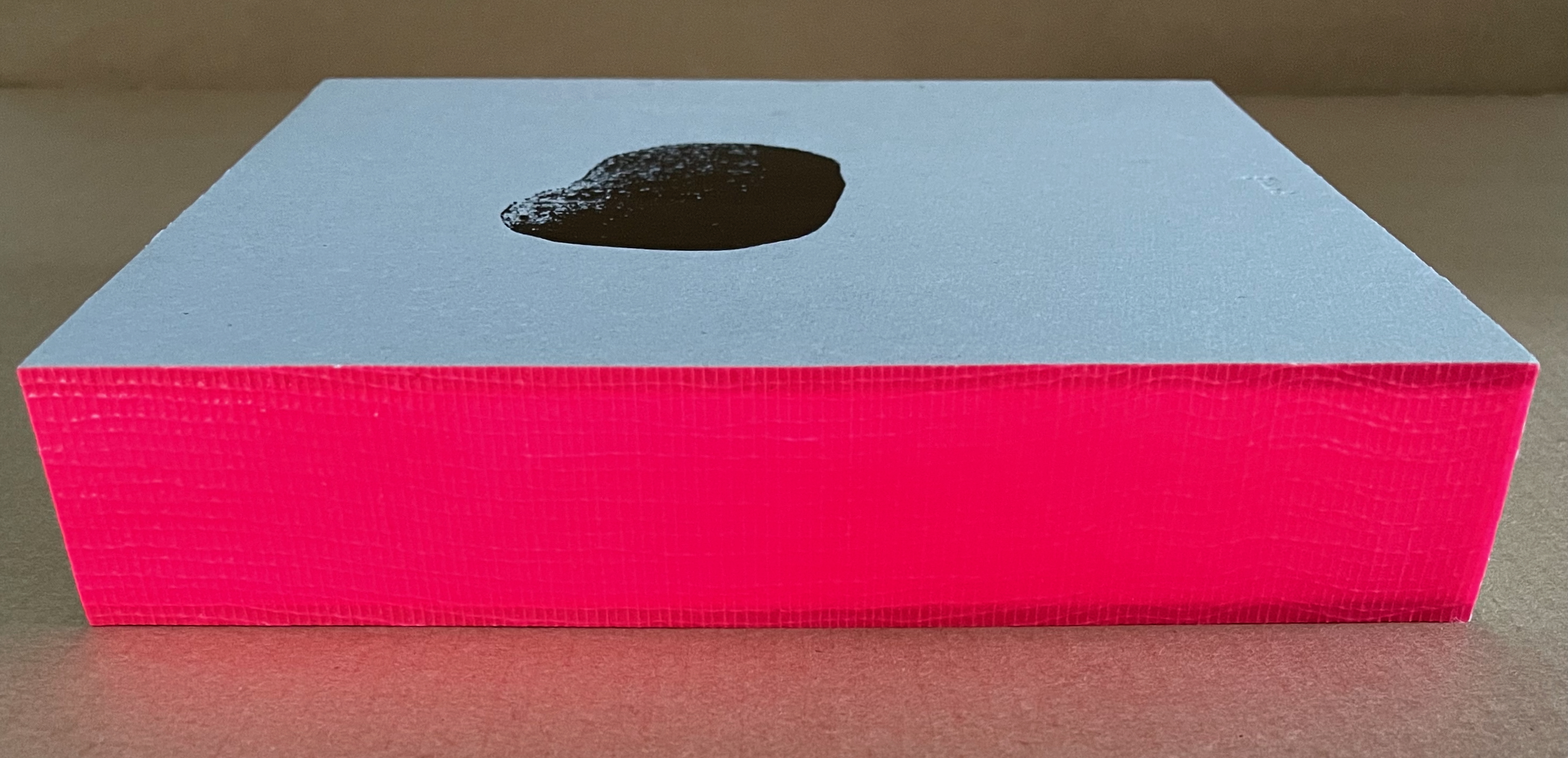
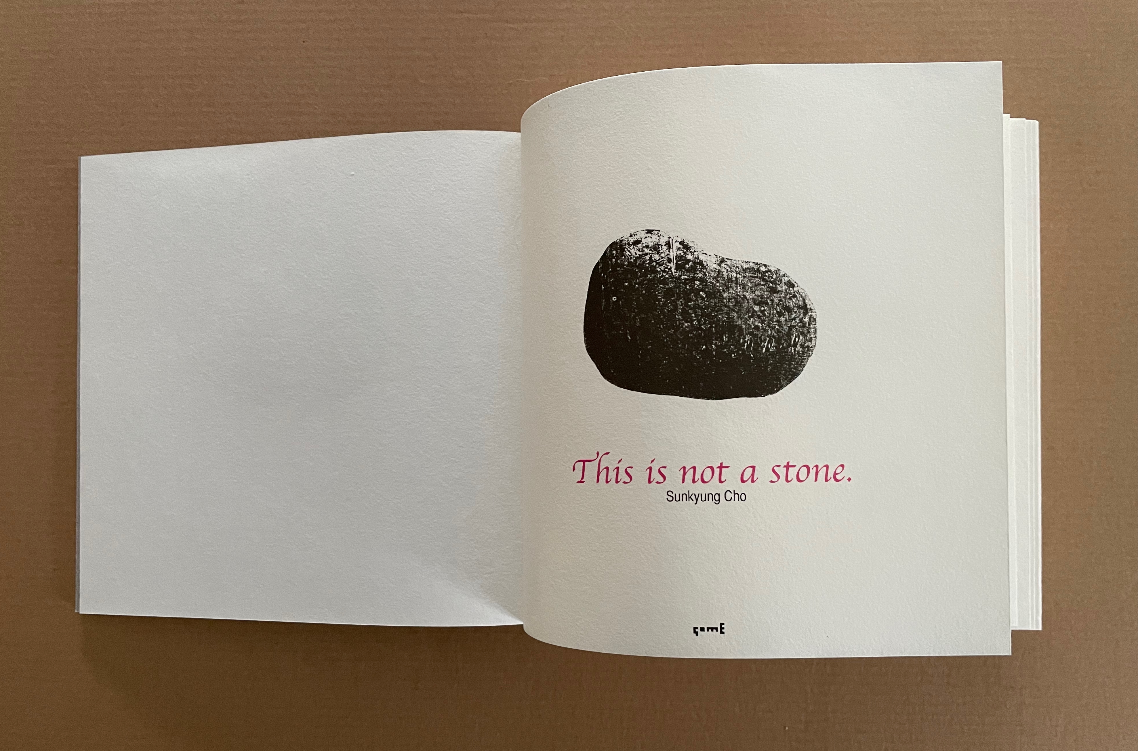
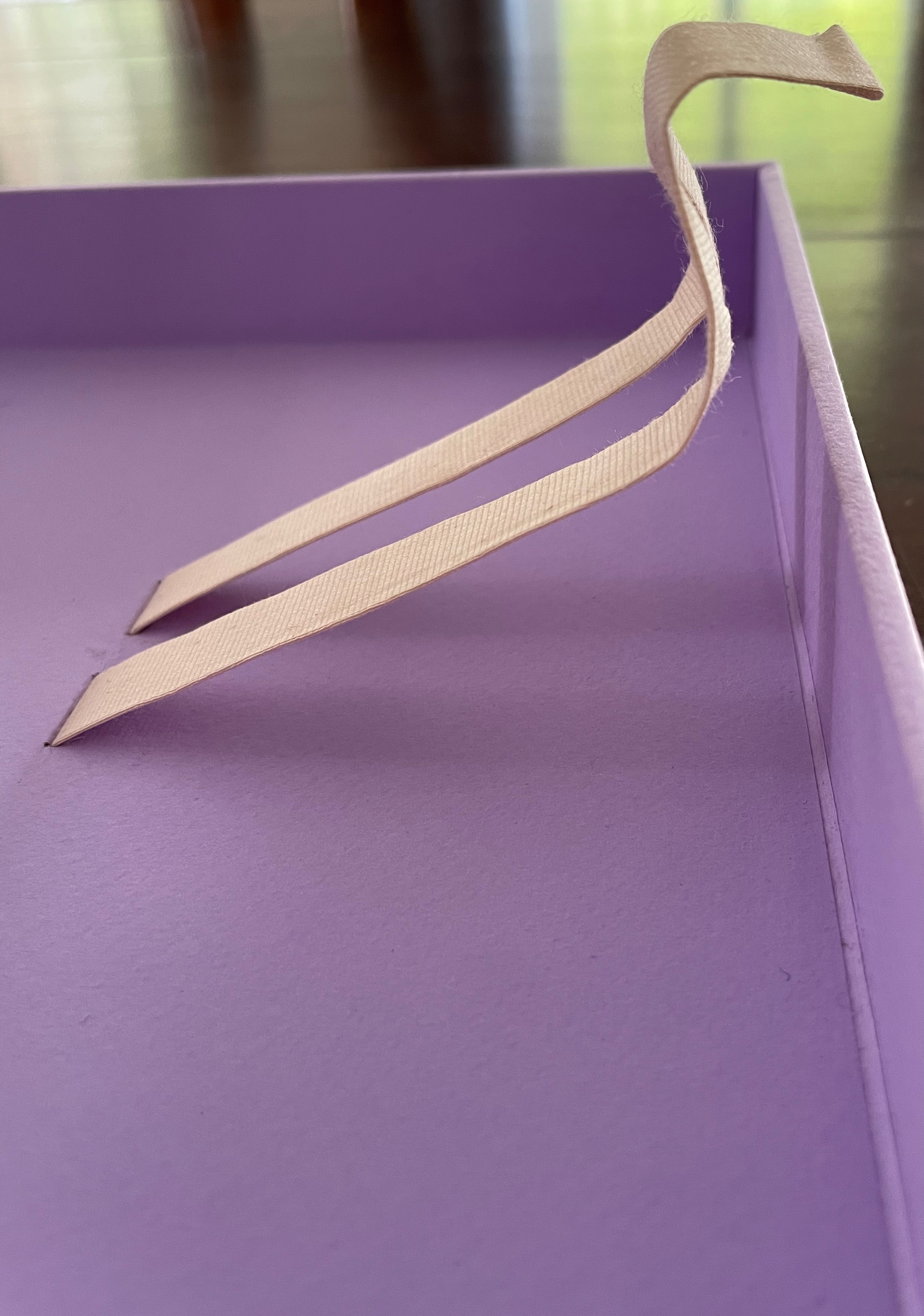
This is not a stone (2017) Sunkyung Cho Exposed spine binding with cross weave filament tape, board-covered. 170 x 170 mm. Acquired from SpazioB**K, 6 April 2025. Photos: Books On Books Collection.
Just as you think this will be another two-dimensional riff on René Magritte’s The Treachery of Images (aka Ceci n’est pas une pipe), the Chinese fold title page turns to reveal a cutout well with a stone at the bottom.
Anne Covell bridges the domains of book art and the book arts. The Record offers a skillfully constructed artist’s book that documents one of the first Trump Regime’s acts of depredation against history and truth. Historical Binding embodies her respect for the history of one of the book arts’ loveliest of crafts: stitching.
The Record (2017)
The Record (2017) Anne Covell Letterpress printed accordion on Masa paper with sumi wash and hand brayering. Housed in a 4-flap French paper enclosure with button and string ties. Enclosure: H165 x W110 x D6 mm. Book: H164 x W108 x D3 mm (closed); H327 x W1080 mm (open). 6.5 x 4.25 x .25 inches (closed), 13 x 42.5 x .25 inches (open) [36] panels. Edition of 60, of which this is #1. Acquired from the artist, 10 September 2025. Photos: Books On Books Collection.
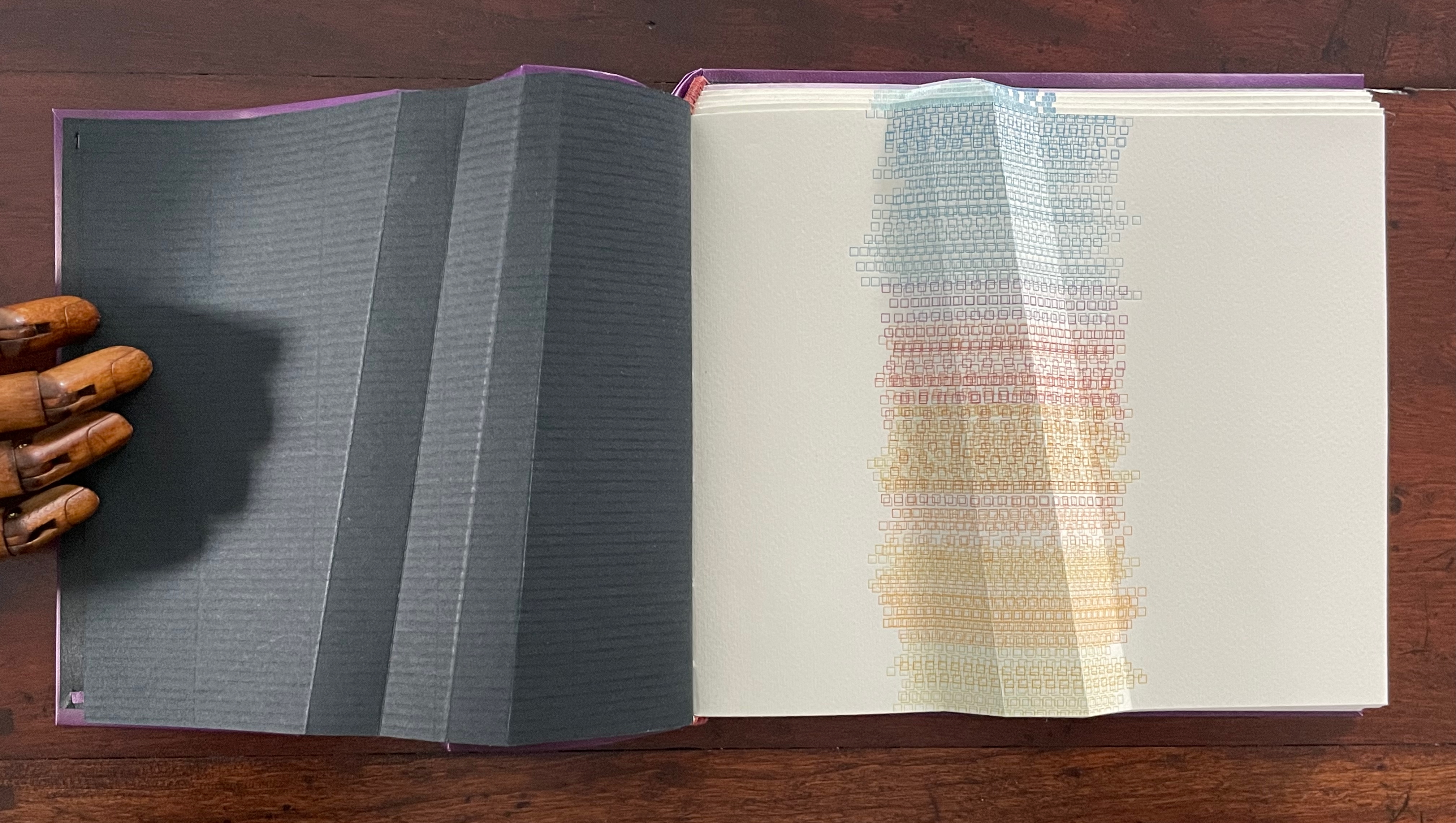
On January 20th, 2017, Donald J. Trump was sworn in as the 45th president of the United States. That same day, the official White House website (whitehouse.gov) began the digital transition to archive and replace Obama’s policies with those of the new administration. Immediately, people began to notice that key issues such as health care, education, and immigration were nowhere to be found. Keyword searches for terms such as “climate change,” “LGBT,” and “civil rights” all returned 404 errors. Even more conspicuously, the Spanish-language version and the disabled-accessible version of the site were no longer available. Internet Archive, a non-profit digital library that has been archiving webpages since 1996, captured 167 snapshots of whitehouse.gov that day. This book records the last snapshots taken of Obama’s policies before they came down, the 404 errors that followed, as well as the Internet Archive timestamps for when the information was last available and when it disappeared. (Anne Covell).
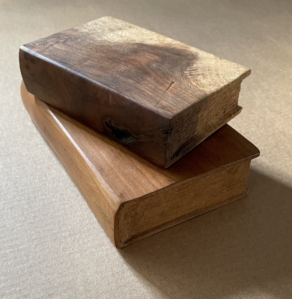
Untitled(2015) Ivon Illmer Book-shaped wood sculpture. Top: Almond wood, H100 x W65 x D27 mm.Bottom: Poplar wood, H123 x W78 x D27 mm. Unique. Acquired from the artist, 10 October 2014. Photos: Books On Books.
From Ivon Illmer’s website: Books preserve history and stories. Each book has its own individual story. This ranges from loving treatment to neglect to ostracism and even burning. The arc almost inevitably stretches from the fate of the book to the fate of man. Everyone should let their imagination run wild when touching the book sculptures and invent their own story for each book. Touching is important, the haptic experience flatters the sense of touch. You “grasp” the beauty of the wood. Imagining the book sculptures in the raw piece of wood is the art. Each piece is unique in shape, structure and grain. Accessed 14 October 2024.
Illmer categorizes his work as “book sculpture / book art”. The carvings from various woods primarily celebrate the shape and tactility of the closed codex. The similitude of the exterior, right down to the fore, top and bottom edges, belies the inaccessibility of the interior.
Drawn, Cut & Layered Werner Pfeiffer Plastic box containing illustrated pop-ups.Acquired from Toledo Museum of Art, 5 Jun 2017. Photos: Books On Books Collection.
Werner Pfeiffer’s playfulness finds its way into viewers’ hands with this offering from his Toledo Museum of Art exhibition in 2015. His archives are housed at Vassar College.
With its structures and photographic representation of Pfeiffer’s other works of paper engineering, Drawn, Cut & Layered demonstrates his breadth in that sub-domain of book art. Not detectable in the box, though, are Pfeiffer’s white altered book objects, which formed the 2010 exhibition at Cornell University, entitled censor, villain, provocateur, experimenter, and demonstrates his scope in the sub-domain of altered books.
In kind, they were preceded by Barton Lidicé Beneš‘ The Life of Gandhi and Beauty Book (both 1973), M.L. Van Nice‘s Swiss Army Book (1990) Irwin Susskind‘s Book Faced Down – Embedded in Plaster (1999). In kind and whiteness, they were followed by Jonathan Callan‘s Zurbarán’s Color Plates (2011), Michael Mandiberg‘s Print Wikipedia (2015), and Lorenzo Perrone‘s Kintsugi(2018).
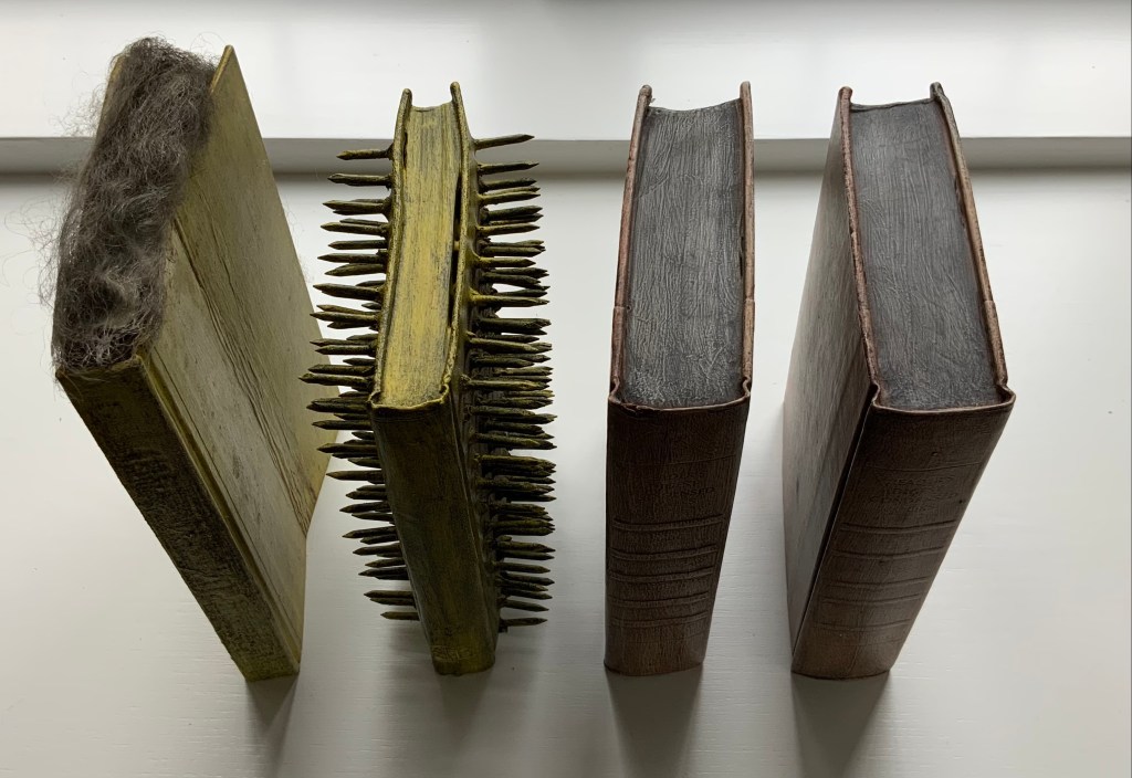
Beauty Book; The Life of Gandhi; Untitled (1973) Barton Lidice Beneš Mixed media book constructions. Acquired from Rago Arts and Auction Center, 23 March 2021; Allan Stone Gallery, New York; artist. Photos: Books On Books Collection.
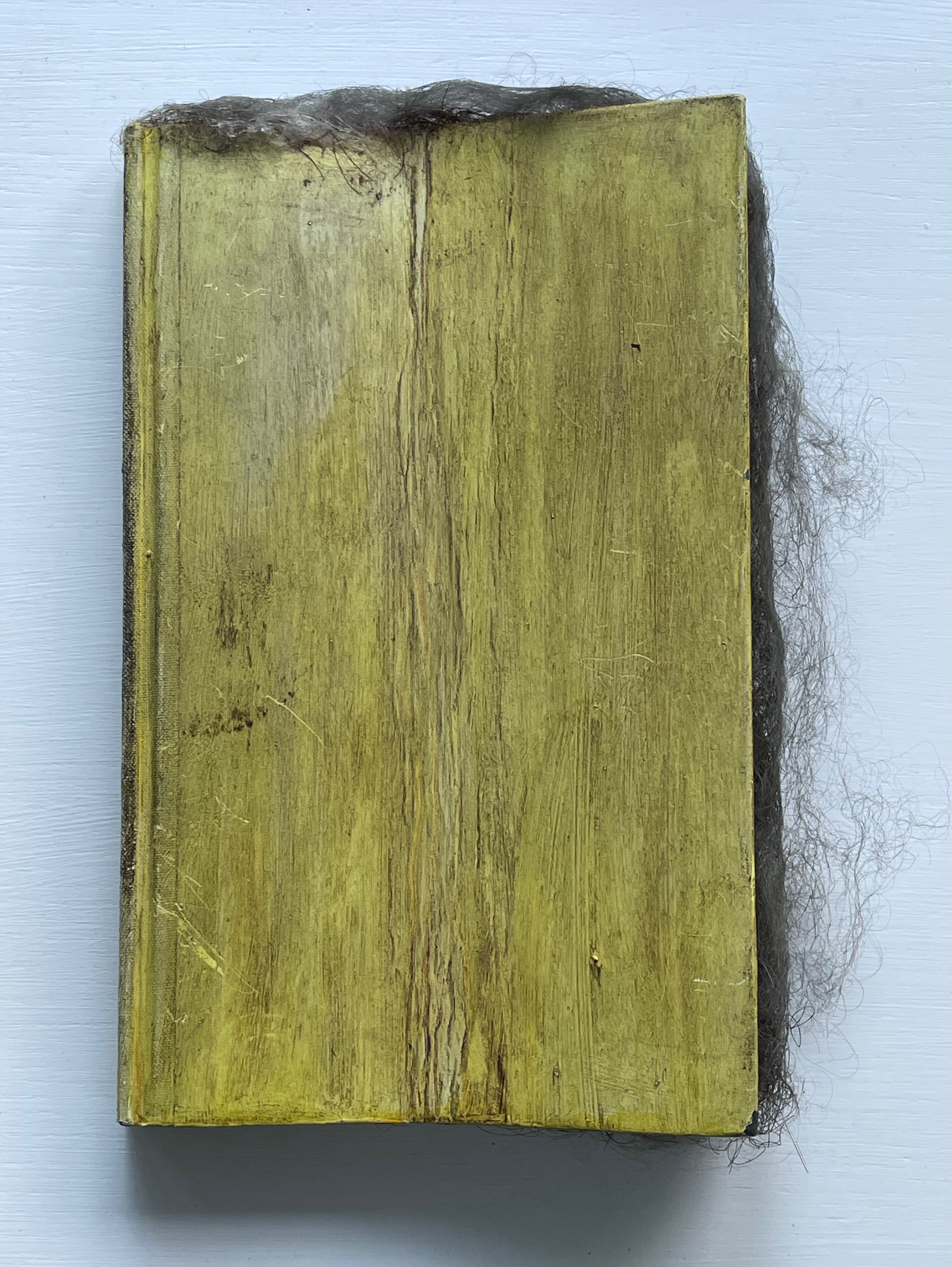
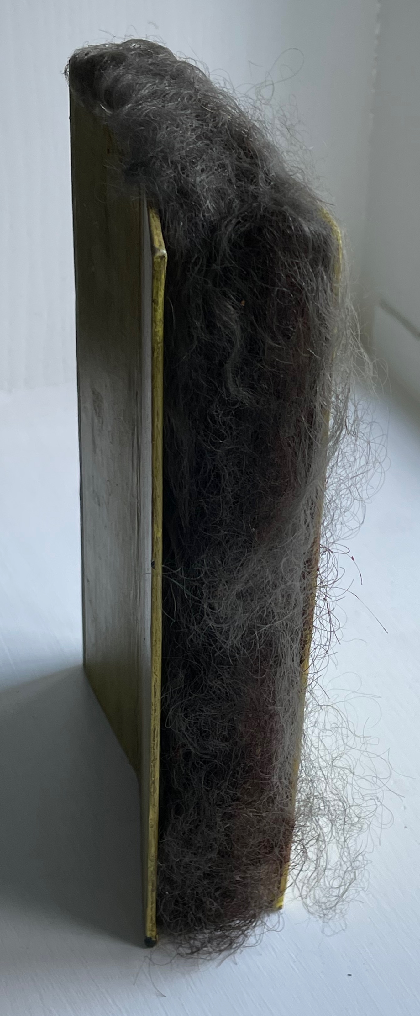
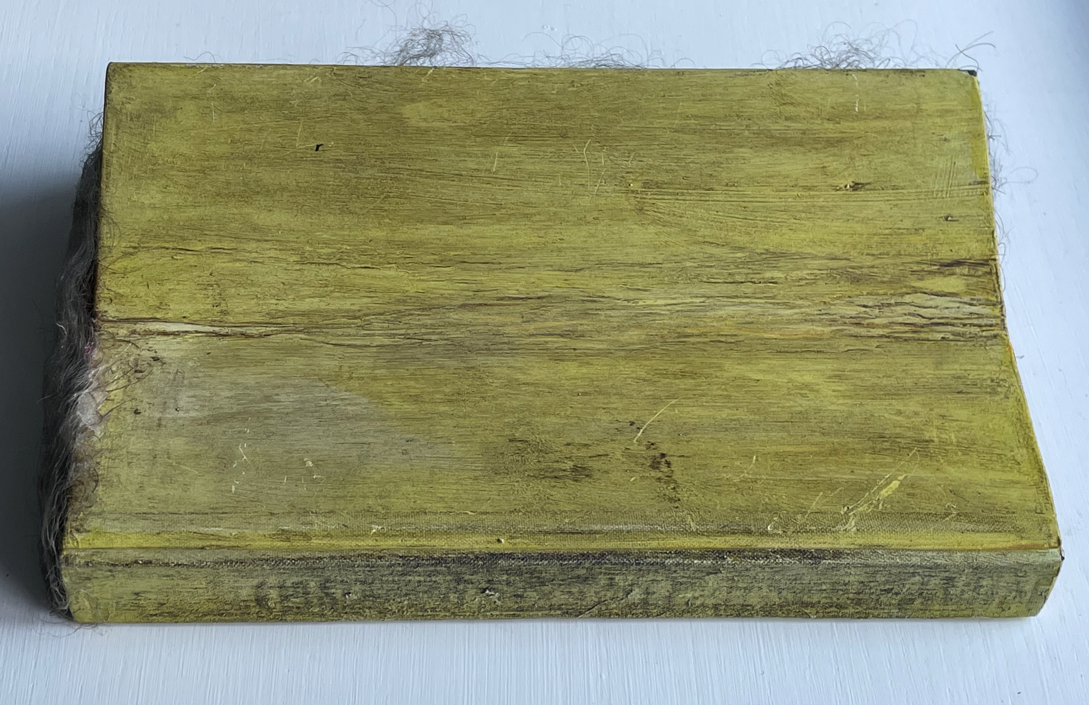
Beauty Book (1973) Barton Lidice Beneš Altered book with human hair. H220 × W140 × D50 mm. Unique. Acquired from Rago Arts and Auction Center, 23 March 2021; Allan Stone Gallery, New York; artist. Photos: Books On Books Collection.
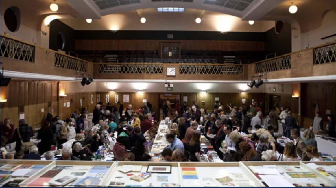
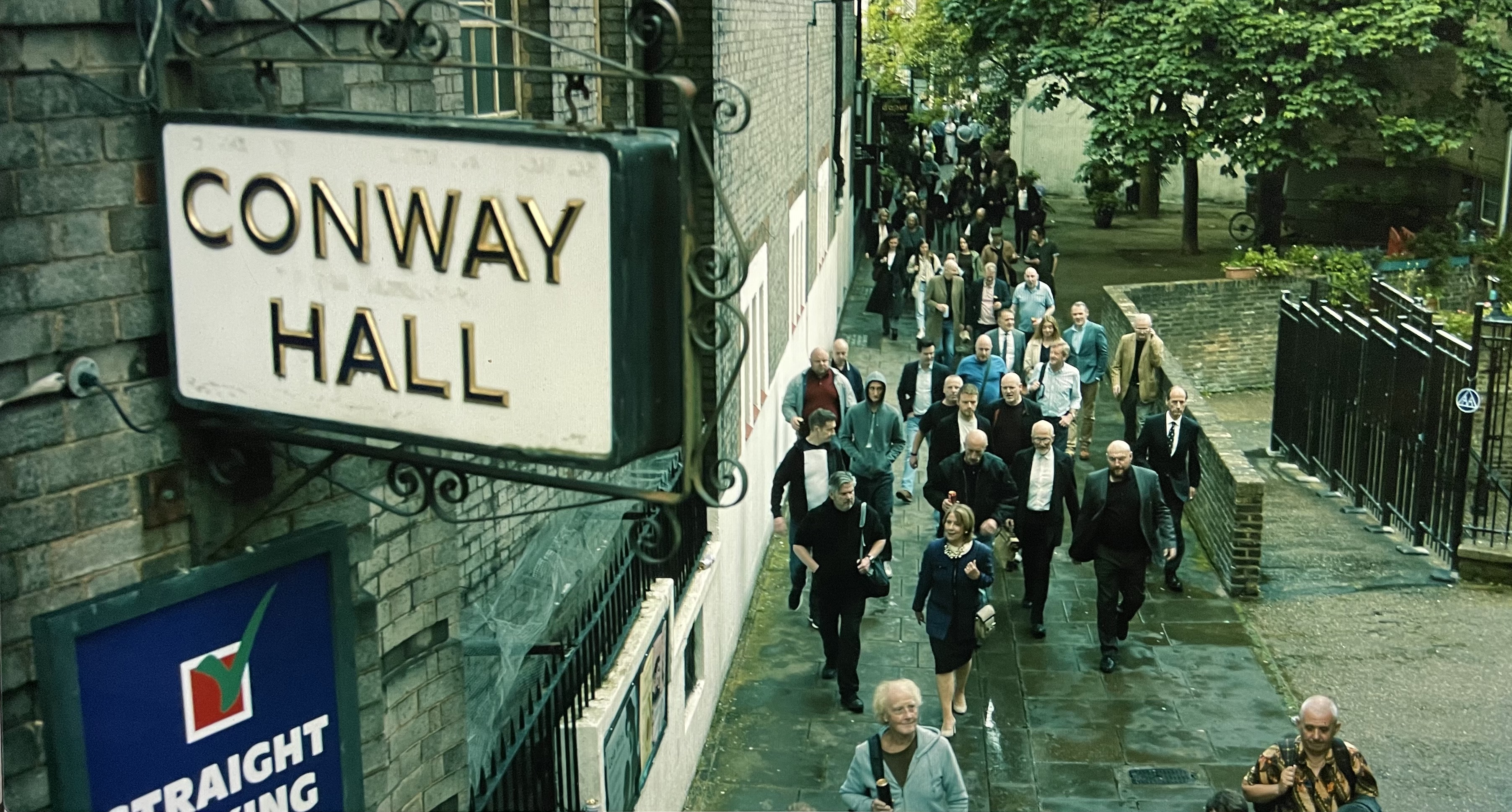
The hunt for Erica Van Horn’s Seven Lady Saintes has been long, but at last, in a glass case in Conway Hall at the Small Publishers Fair in London this year, there it was. Van Horn and Simon Cutts (co-founders of Coracle Press) have been a regular feature of the Small Publishers Fair since its first occurrence in 2002 at Royal Festival Hall.
Conway Hall, owned by the charity Conway Hall Ethical Society, first opened in 1929 and is named after Moncure Daniel Conway (1832-1907), an anti-slavery advocate and biographer of Thomas Paine. It has hosted the Fair since its second outing in 2003. In 2025, it had a cameo appearance in the spy drama series Slow Horses as the unlikely host for an ultra-right mayoral candidate’s campaign event. The setting provided the kind of sardonic humorous dig that Van Horn would appreciate (if she were a regular television viewer).
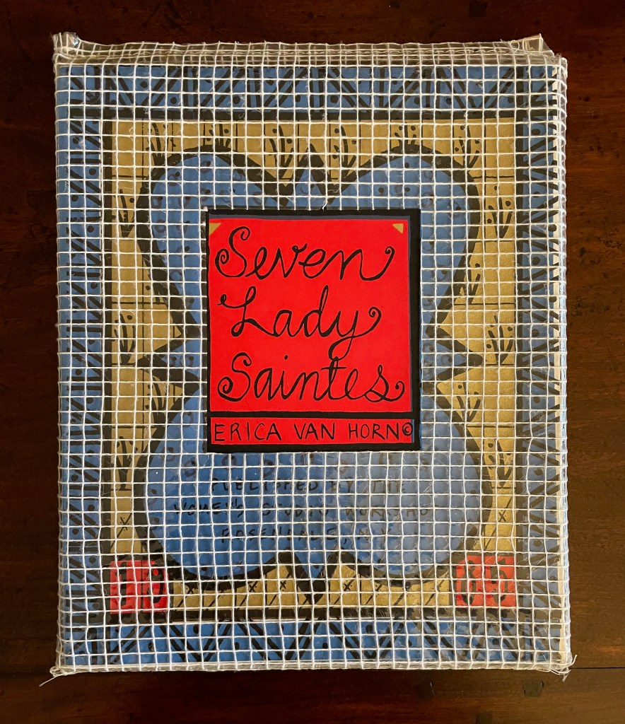
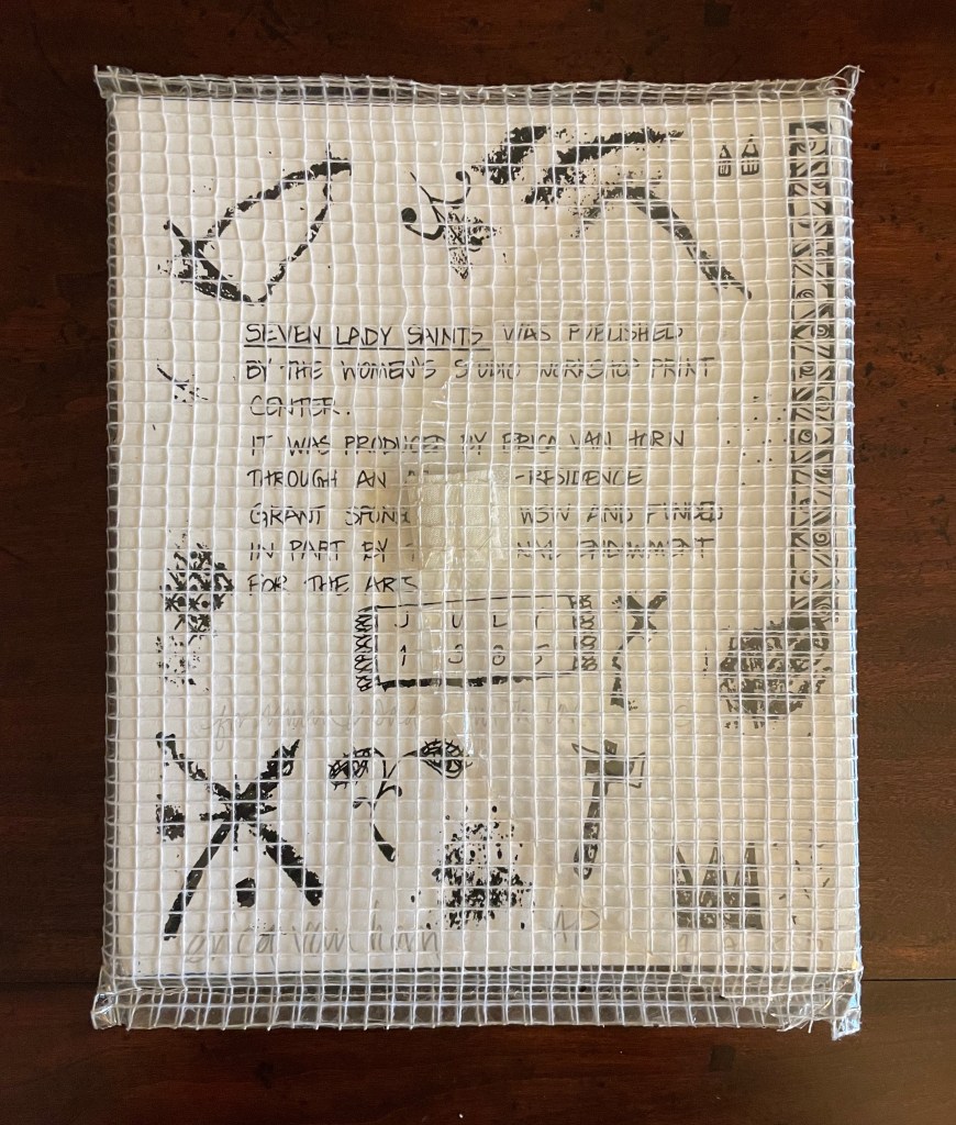
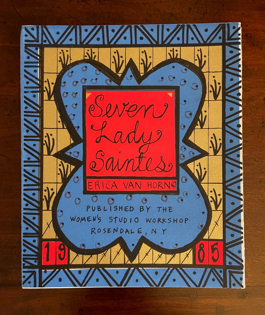
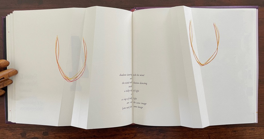
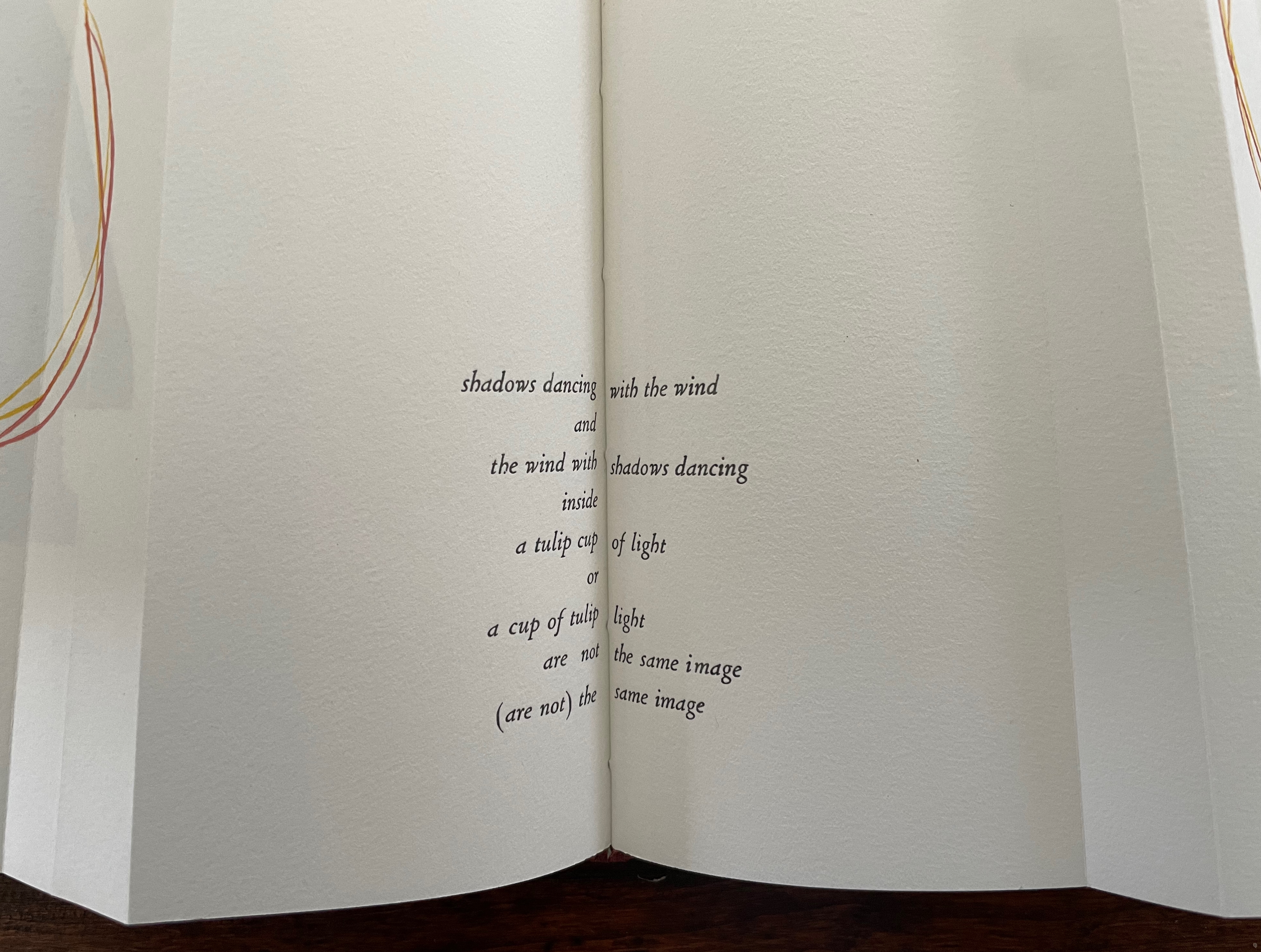
With stained-glass colors, Seven Lady Saintes splashes its own brand of sardonic humor across a stiff-card leporello produced in 1985 at the Women’s Studio Workshop Print Center in Rosendale, New York.
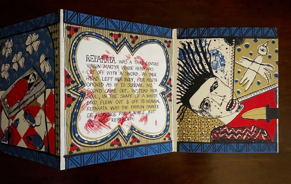
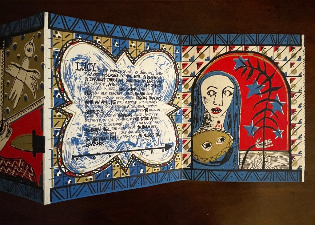
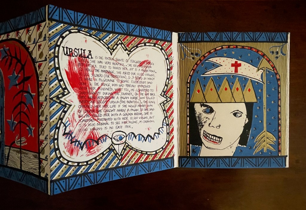
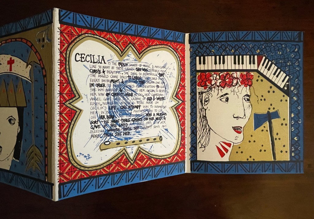
Seven Lady Saintes (1985)
Seven Lady Saintes (1985) Erica Van Horn Clear plastic-coated white-thread envelope, self-covered leporello, watercolor paper. Envelope: H270 x W215 mm. Leporello: H250 x W205 mm (closed), W3040 mm (open). 16 panels, including covers. Edition of 90, artist’s proof. Acquired from the artist 1 November 2025. Photos: Books On Books Collection.
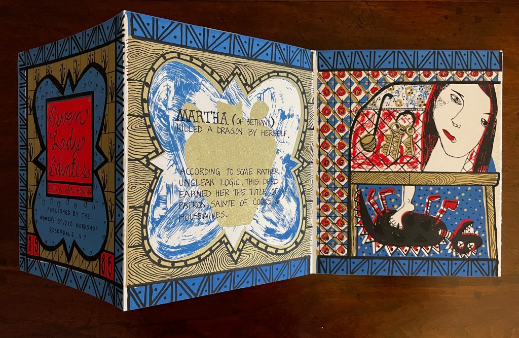
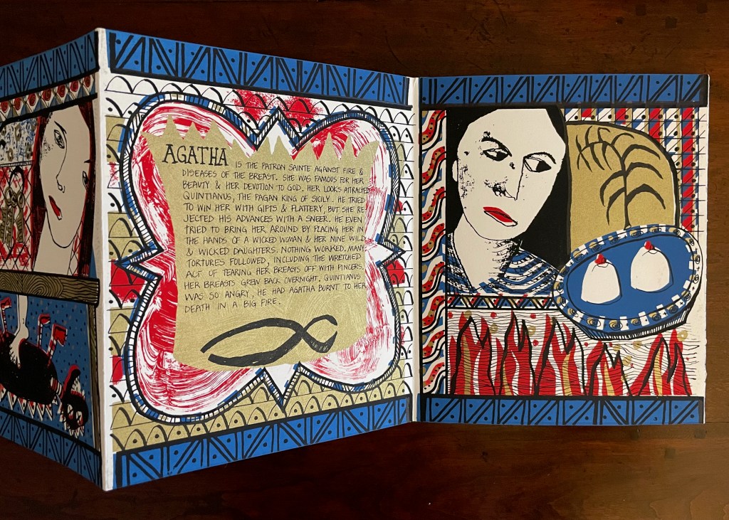
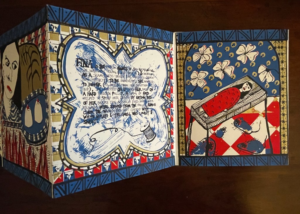
Van Horn uses a sophisticated child-like style of text and image to laugh slyly, wryly, and grimly at religion and patriarchy. Her summaries parody the descriptions in the handouts usually available in museums, convents, and churches or in the flood of hagiographies long on the market. The sophisticated-naivete of the drawing in Seven Lady Saintes appears in other works such as La ville aux dames (1983) and With or Without (2010). If the story of her plan for a series of four children’s books had turned out differently from the account in Scraps of an Aborted Collaboration (1994), we would have even more evidence of the influence of children’s books on many artists’ books that the Huberts propose in The Cutting Edge of Reading (1999).
Martha, patron sainte of cooks and housewives
Agatha, patron against fire and diseases of the breast
Fina, patron sainte of San Gemignano
Reparata, formerly patron sainte of Florence
Lucy, patron sainte of Syracuse and diseases of the eye
Ursula, patron sainte of teachers and young girls
Cecilia, patron sainte of music and musicians
Walking the Portes (2025)
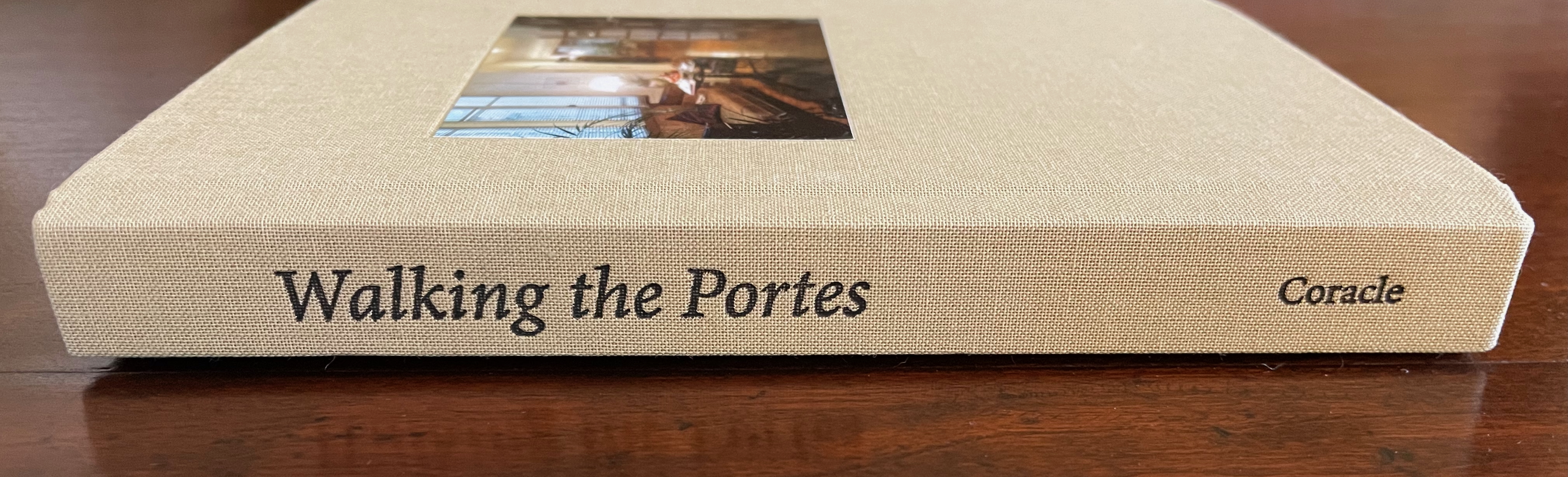
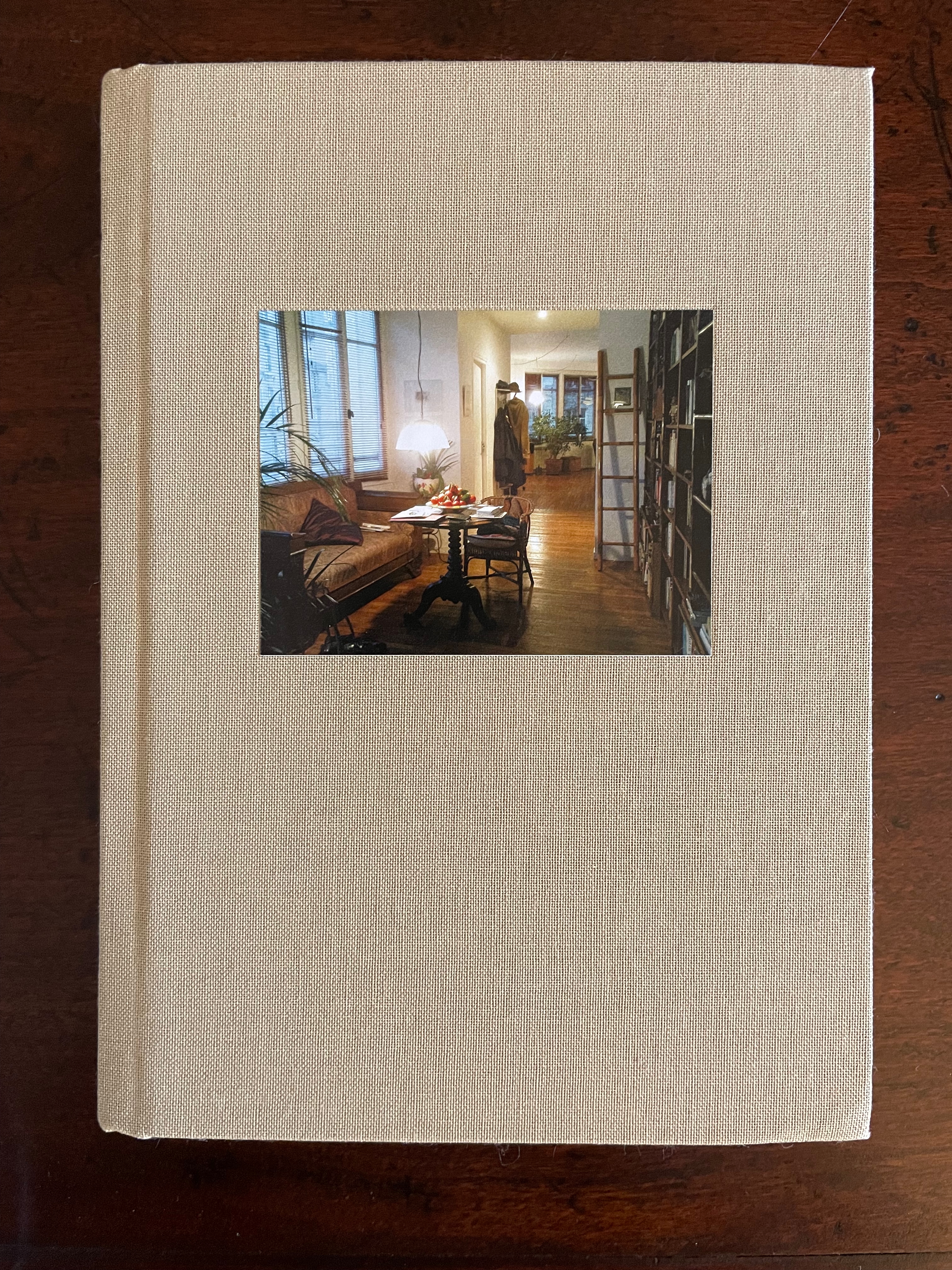
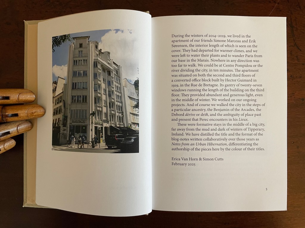
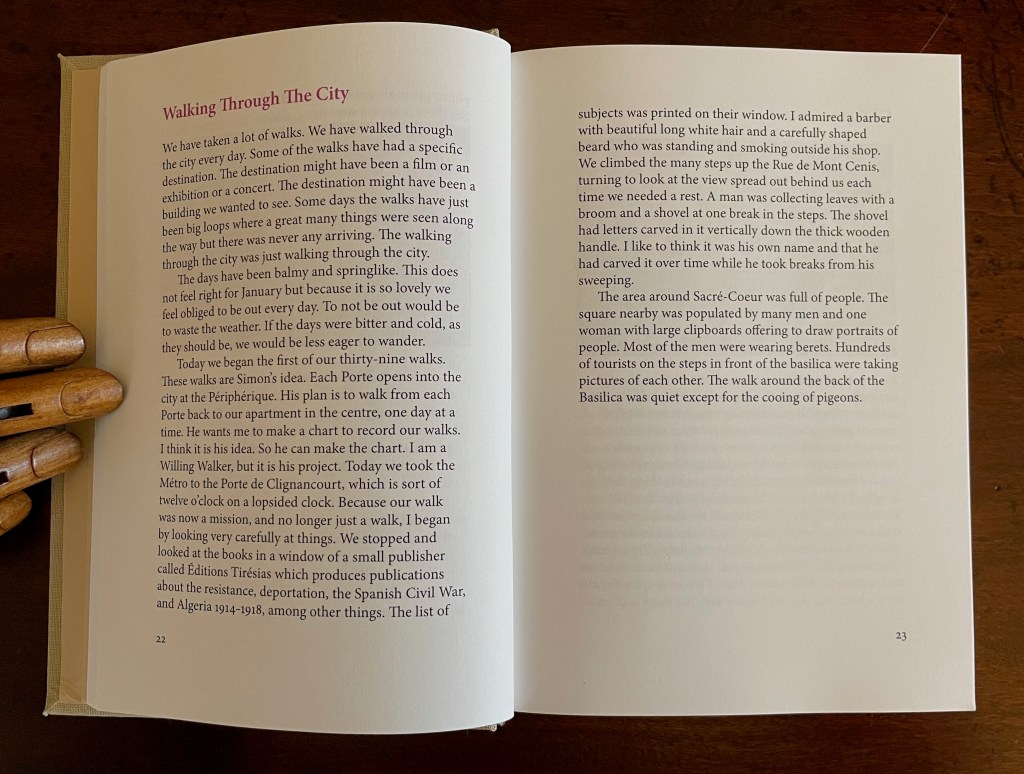
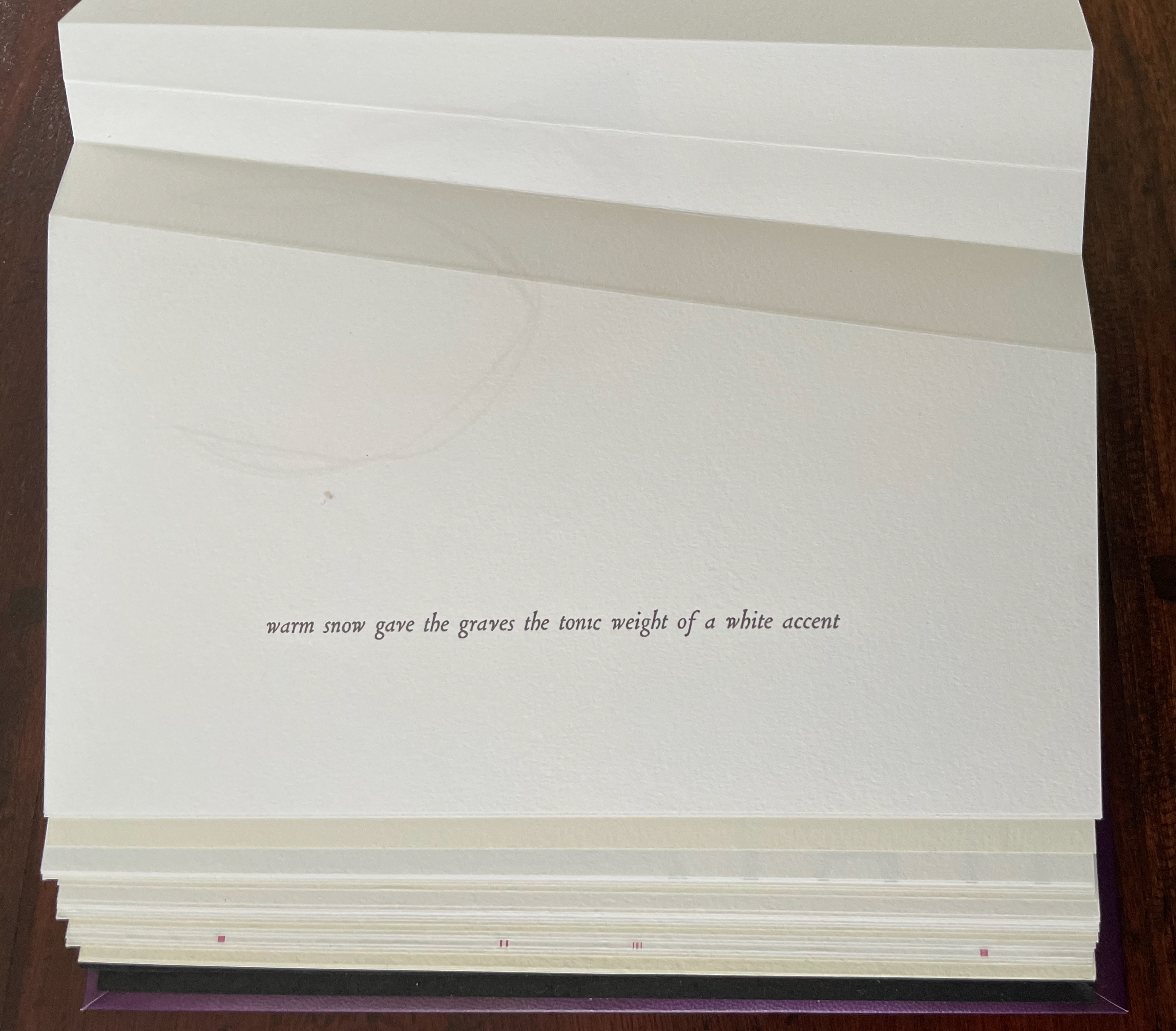
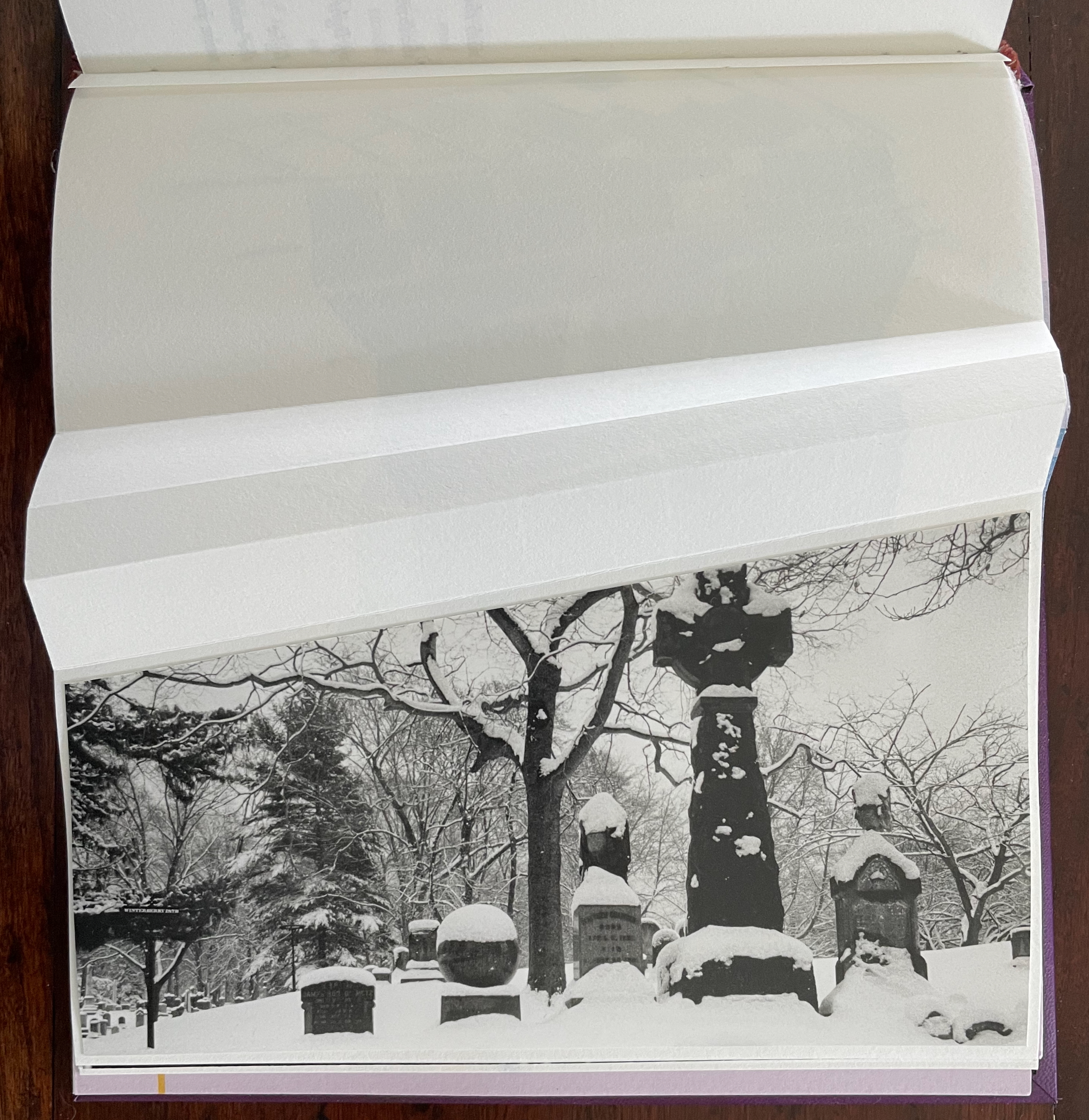
Walking the Portes: Winters in Paris 2014-2019 (2025) Simon Cutts and Erica Van Horn Casebound, book cloth over boards, blind stamped and inked spine, photo pastedown in recess on front cover, plain doublures. H182 x W132 mm. 216 pages. Edition of 300. Acquired from Books about Art, 15 September 2025. Photos: Books On Books Collection.
In the early 2000s, a series of hardbacks appeared called “Writer and the City”. John Banville covered Prague; Peter Carey, Sydney; Justin Cartwright, Oxford; Ruy Castro, Rio de Janeiro; David Leavitt, Florence; and Edmund White, Paris. White’s was the first, and it set the tone with its content and title: The Flâneur: A Stroll Through the Paradoxes of Paris. An enterprising paperback publisher might be enticed to reissue them and, allowing for a Parisian double-dip, to add Walking the Portes. Besides, I prefer Simon and Erica’s Paris to Edmund White’s, and Walking the Portes pairs better with Anne Moeglin-Delcroix’s Ambulo Ergo Sum (2015) anyway.
It is Simon’s plan to ride out to each of the entrances to Paris (the portes) and walk back to the apartment in the Marais. When it turns out that instead of twenty-one portes there are thirty-nine, Erica firmly responds accordingly:
In introducing Ambulo Ergo Sum, her extended essay on Hamish Fulton, Richard Long, and herman de vries, Moeglin-Delcroix writes:
The analysis of some artists’ books … should make it possible to show how the emphasis has been progressively placed no longer on landscape but on the search for the best means, differing according to the various artists, of rendering an experience in the strongest sense of the word: a lived experience of the world, a personal practice, that is to say, a deliberate way of being inthe world rather than before it. The walking body is the touchstone of this, because walking compels one to supersede the limits of a purely visual experience of nature to become the experience of the whole artist, with his body, in nature. (p. 6)
Whether Walking the Portes is an artists’ book or not, it does what Moeglin-Delcroix describes. It renders these artists’ lived experiences of Paris and their deliberate way of being in the world together.
Bates, Julie. 2023. “Erica Van Horn’s creative exercises“. Irish Studies Review, 31(1), 139–158. Interviewed Van Horn at the 2025 Small Publishers Fair, Conway Hall, London.
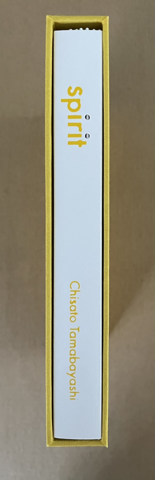
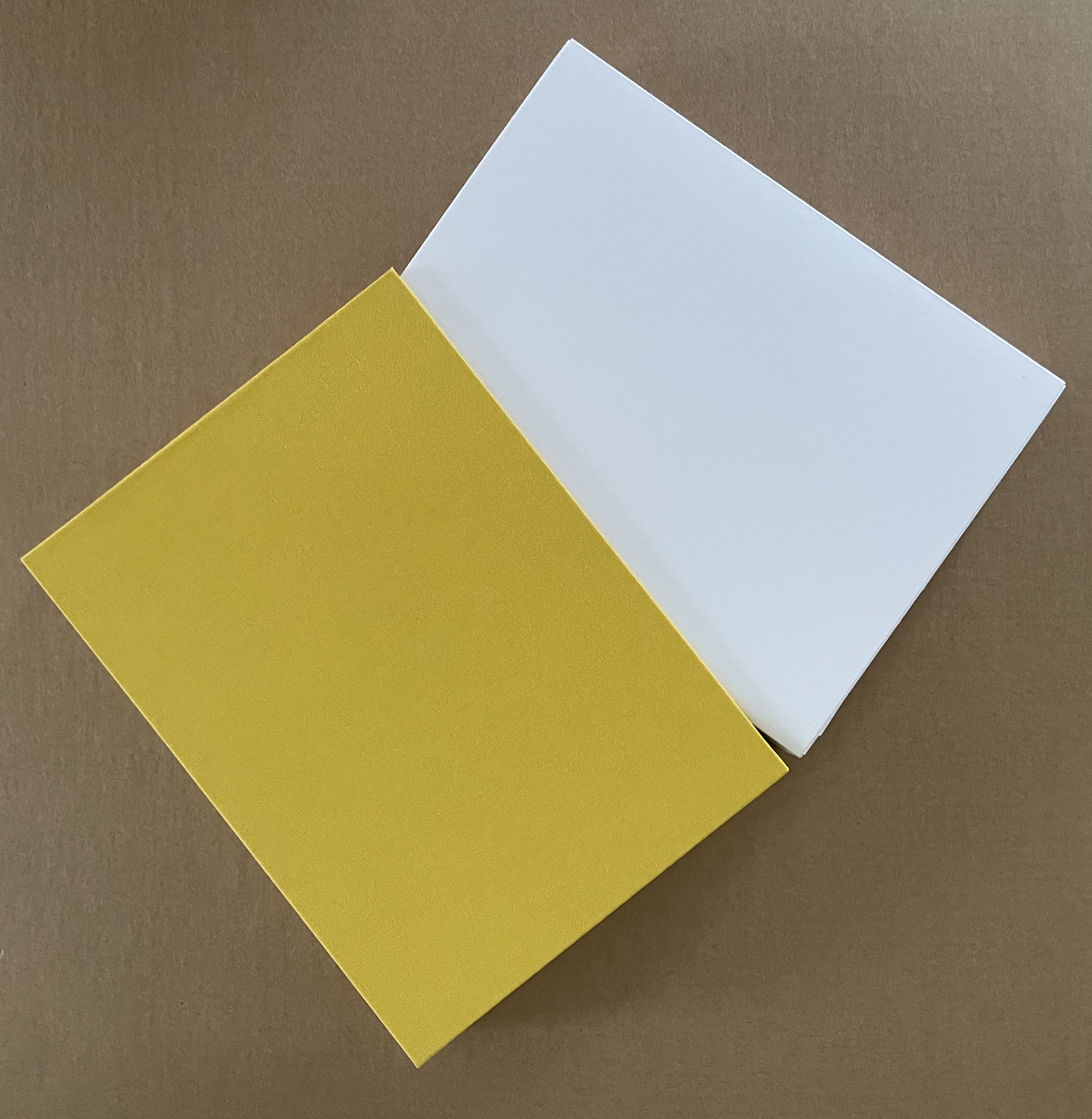
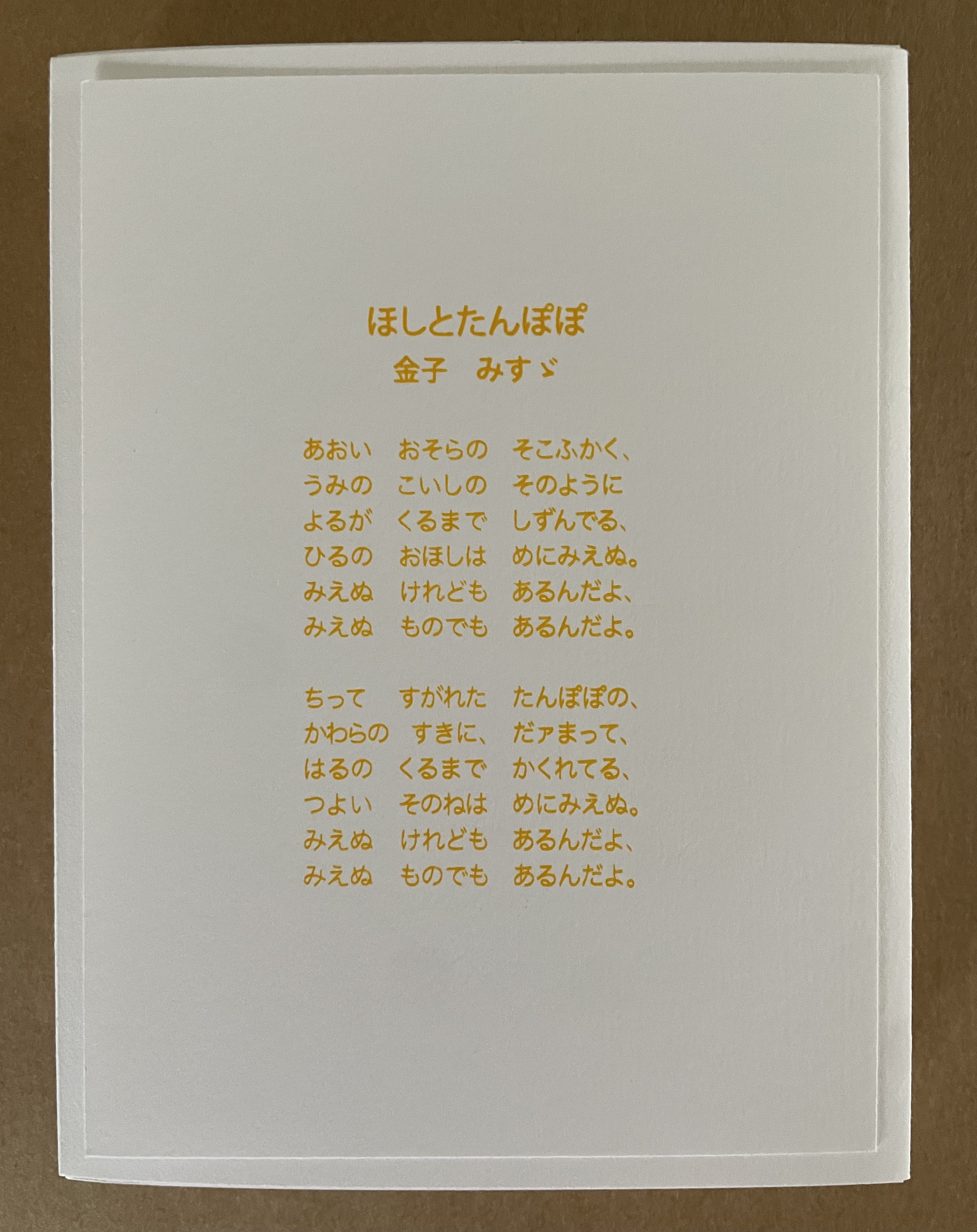
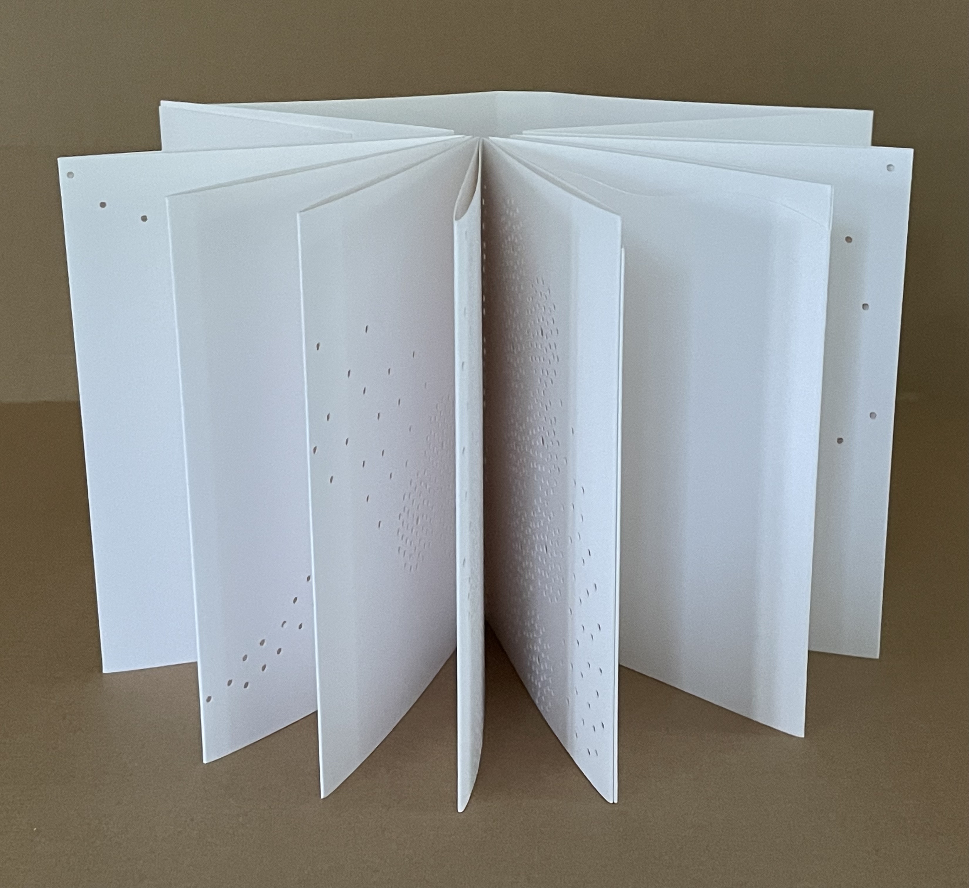
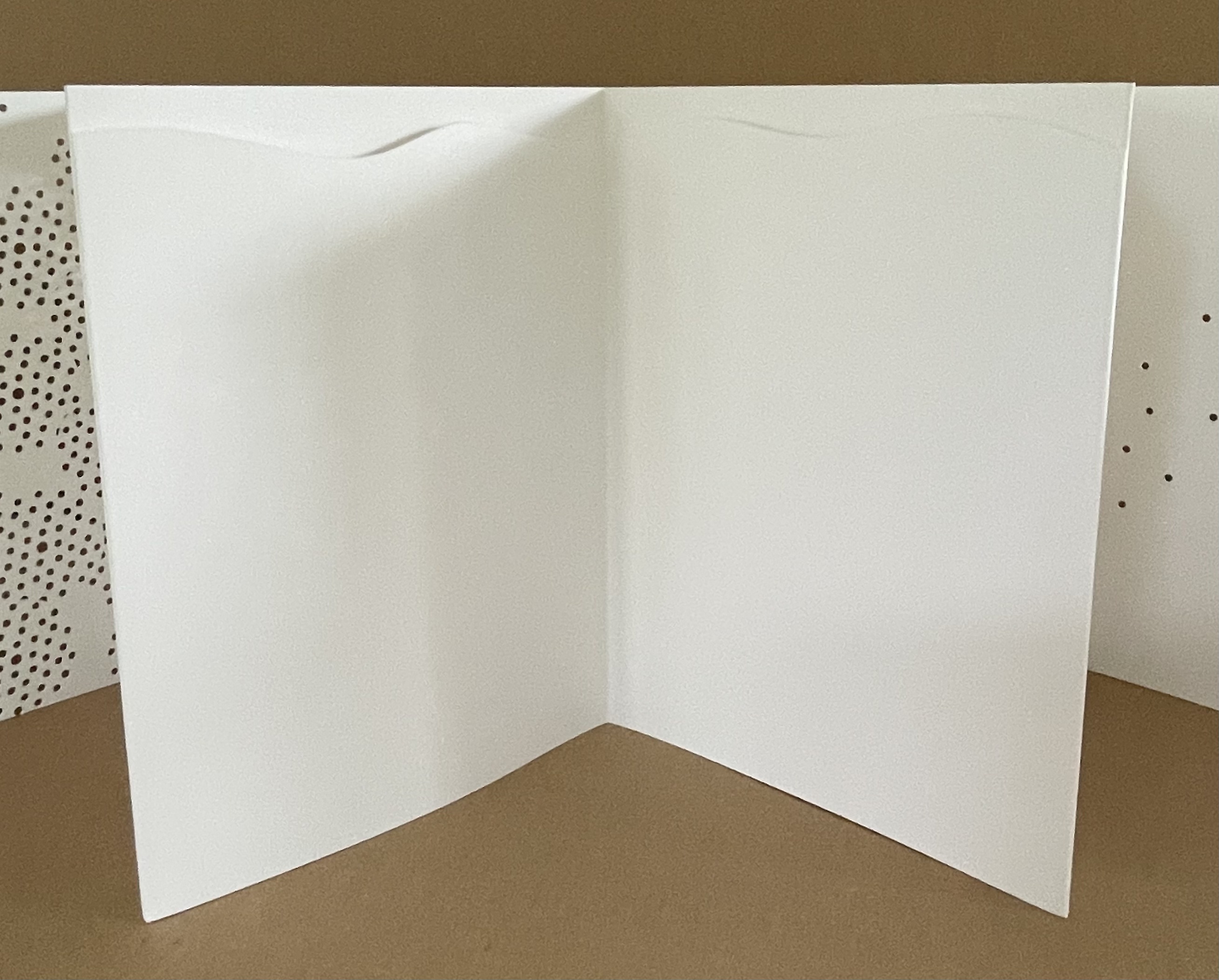
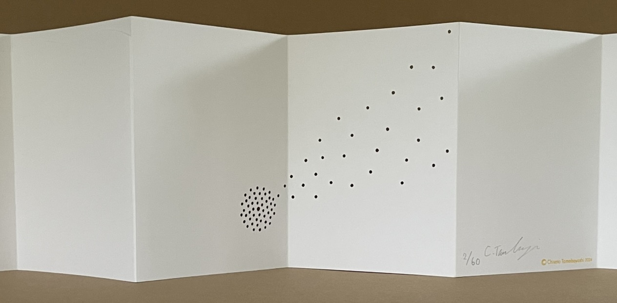
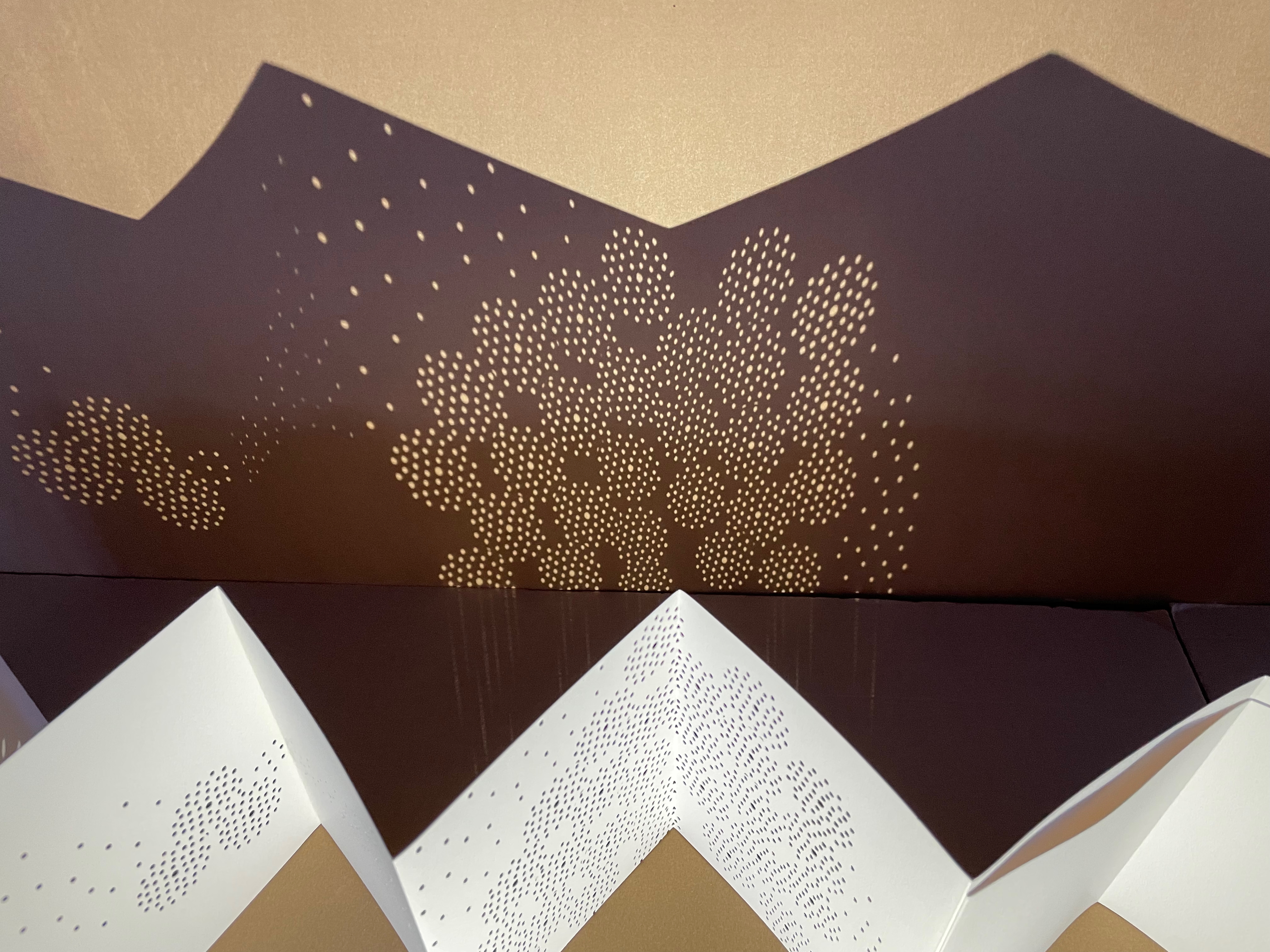
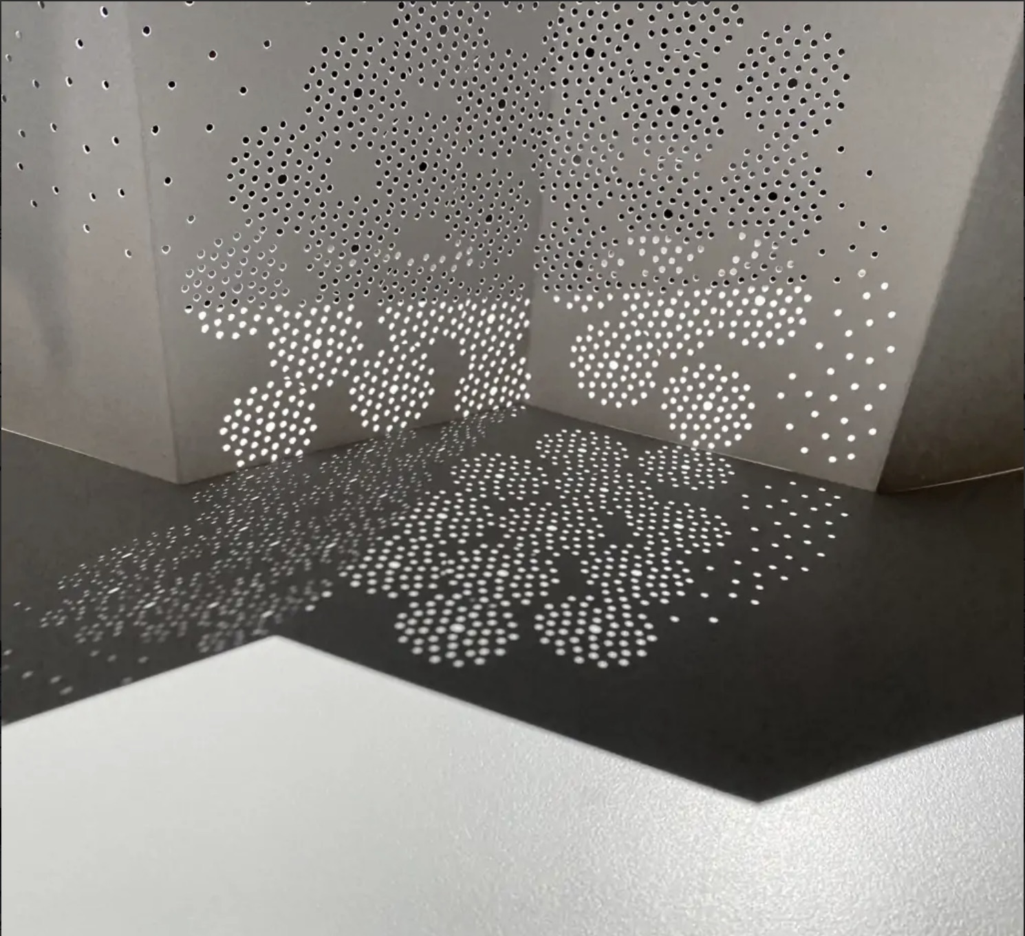
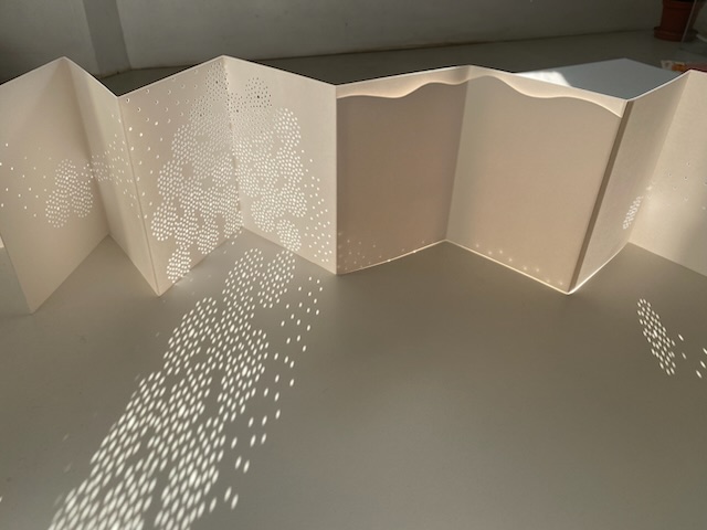
Spirit (2024) Chisato Tamabayashi Yellow cloth-covered slipcase. Leporello of 8 panels and enclosing cover. Slipcase: H168 x W129 x D24 mm. Book: H160 x W120 mm (closed); W2100 mm. 16 panels (excluding enclosing cover). Edition of 60, of which this is #2. Acquired from Chisato Tamabayashi, 5 November 2024. Photos: Books On Books Collection.
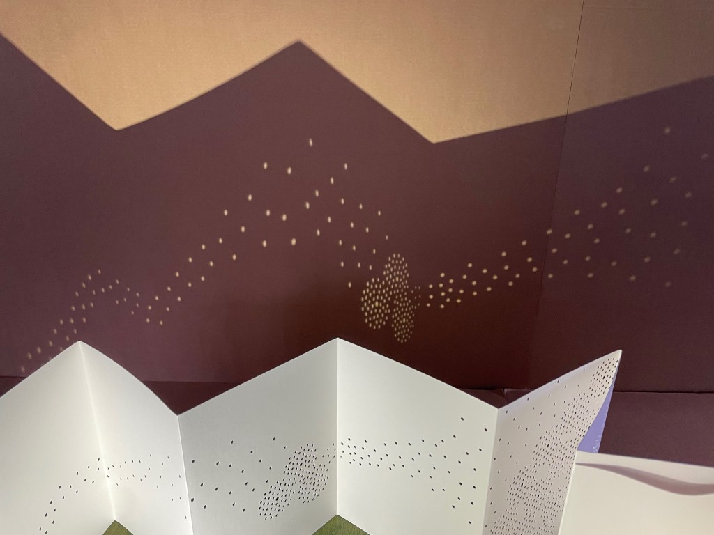
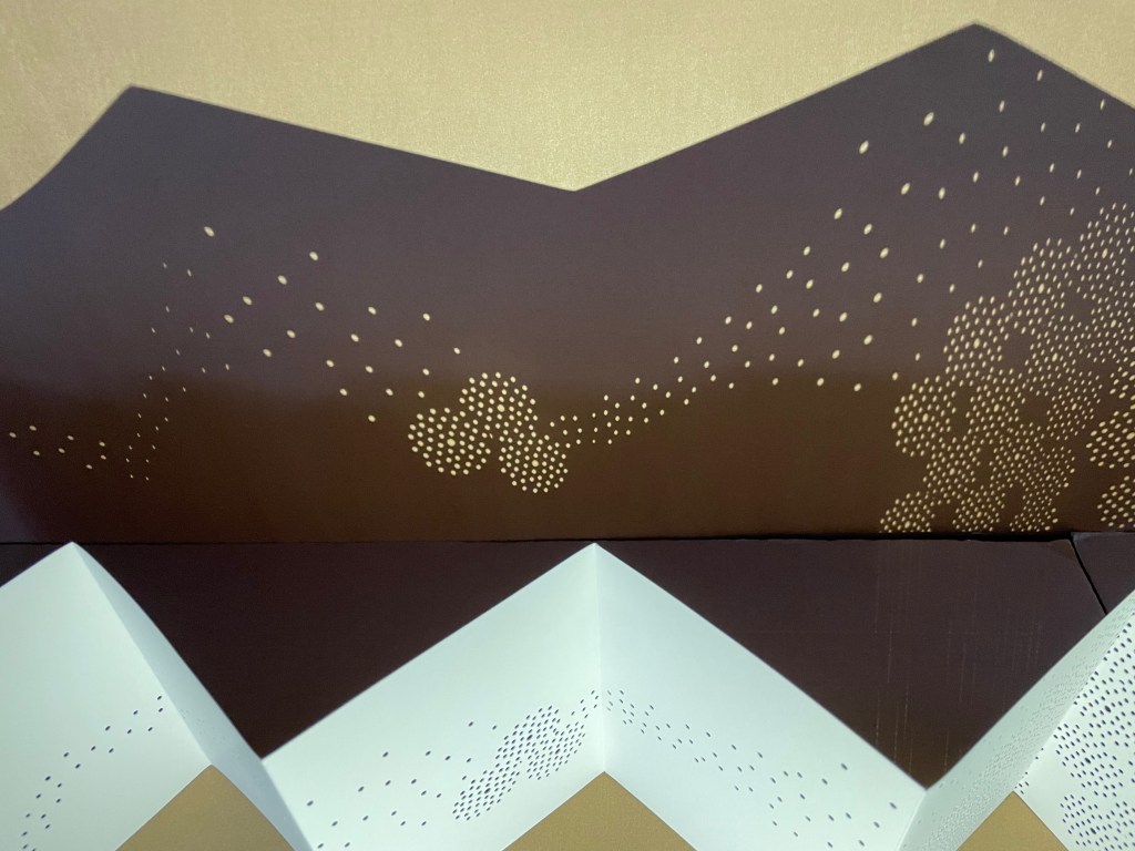
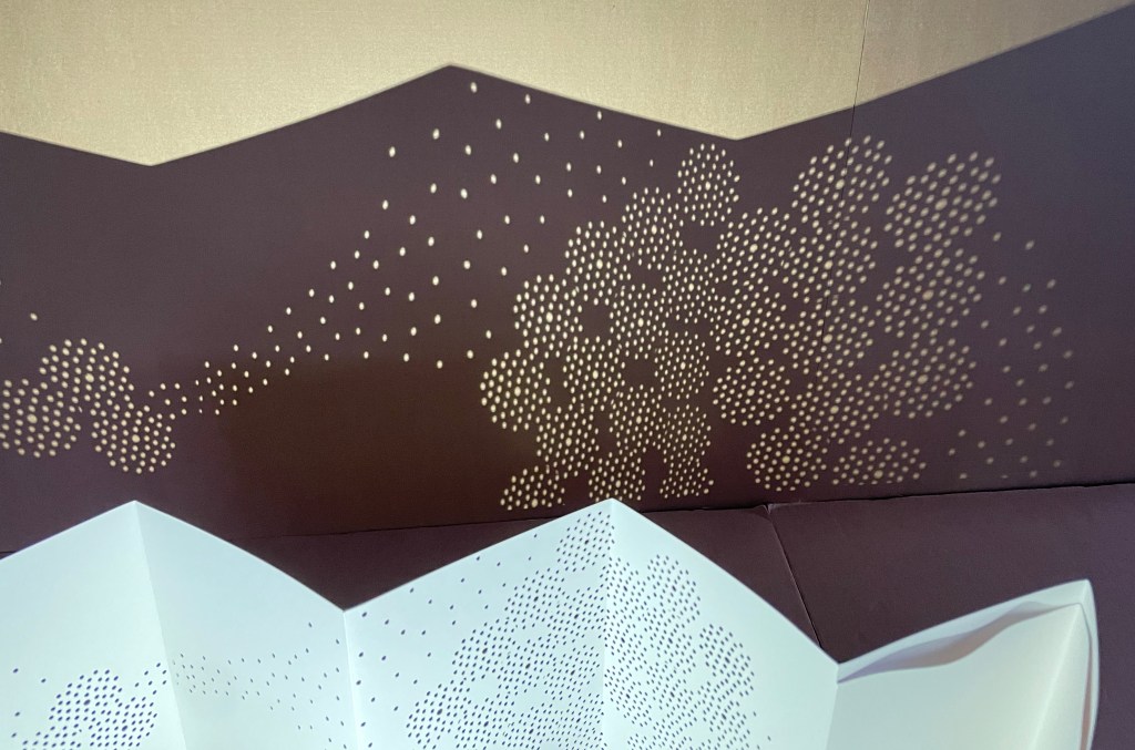
Chisato Tamabayashi’s leporello Spirit departs from her usual paper-engineering techniques. It relies on hole punching, paper sculpture, and display with light. Her crossover in techniques will remind close observers of Katsumi Komagata’s movement from Little Tree/Petit arbre (2008) to「Ichigu」(2015).
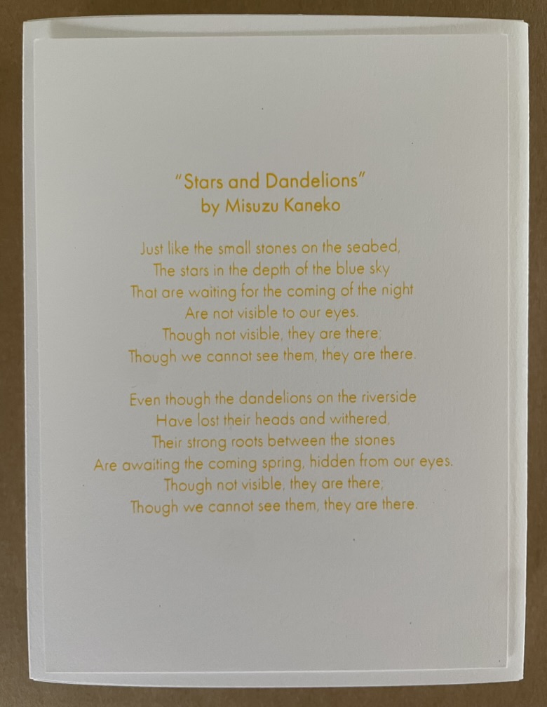
Spirit is accompanied by the 20th century poet Misuzu Kaneko‘s poem “Stars and Dandelions” (in English and Japanese) from which Tamabayashi has taken her inspiration.
Viewed standing or lying flat, the leporello’s arranged holes echo the seeds leaving the dandelion heads bare in the second stanza of the poem.
Just before the last spread of imagery, the upper edge takes on the shape of the ocean surface beneath which the stones mentioned in the first stanza lie.
A projection to the background echoes the stars from the first stanza of the poem.
A projection to the foreground echoes the stones on the seabed from first stanza of the poem. Photos: Courtesy of the artist.
Like Misuzu Kaneko’s poetry, Chisato Tamabayashi’s artwork appeals to children and adults, underscoring the link between children’s books and artists’ books explored so well by the Huberts in The Cutting Edge of Reading, Johanna Drucker in “Artists’ Books and Picture Books”, and Sandra Beckett in Crossover Picturebooks.
Tamabayashi’s and Komagata’s handling of holes, paper engineering, and display with light should be considered alongside the efforts of the book and paper artists’ explored in the second issue of Inscription as well as those of Eleonora Cumer and Jenny Smith.
Drucker, Johanna. 2017. “Artists’ Books and Picture Books: Generative Dialogues” in The Routledge Companion to Picturebooks, edited by Bettina Kümmerling-Meibauer. London: Taylor & Francis Group.
Marlene MacCallum often applies unusual folds in her works. They appear in sleep walk (2024) and The Shadow Quartet (2018-25). With the two works below, however, — as with Chicago Octet (2014) — the fold becomes central to the whole work. Any other structural presentation would not deliver the precise fusion of image, text, and material to deliver the metaphor embodied by the work.
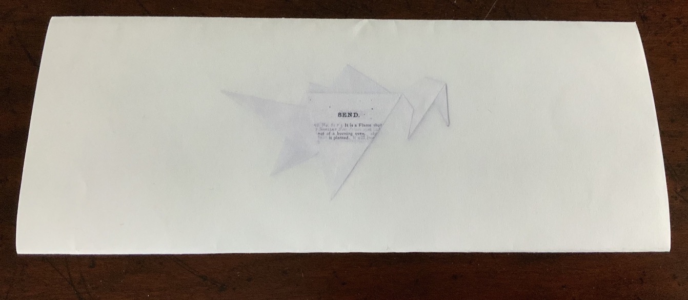
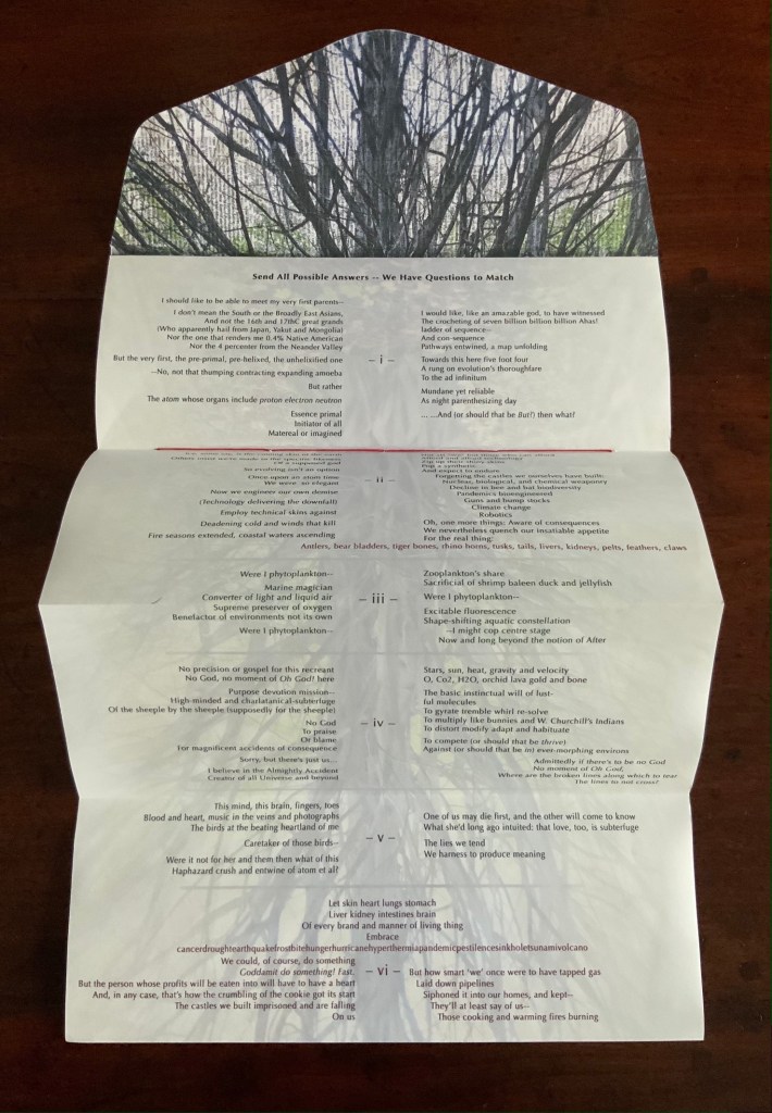
Send (2020)
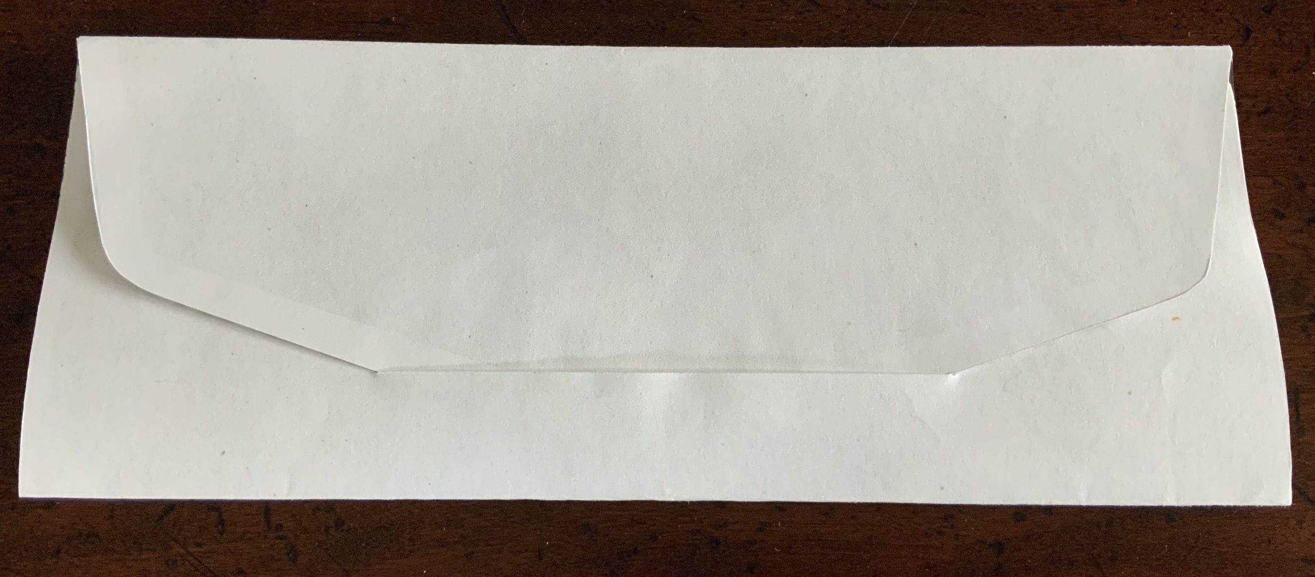
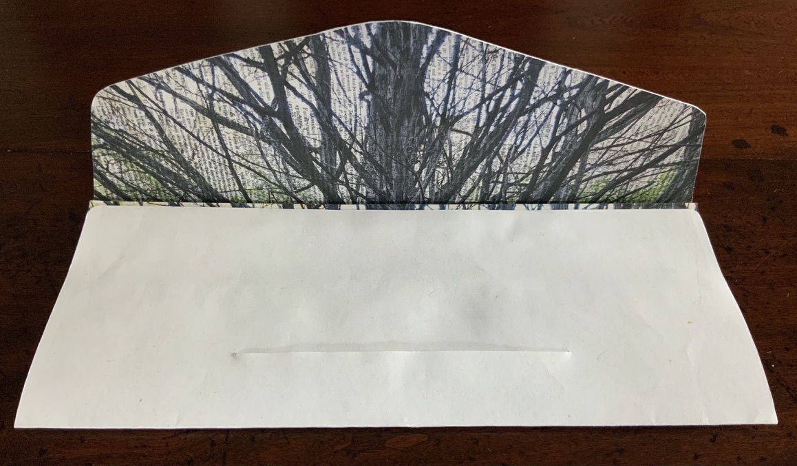
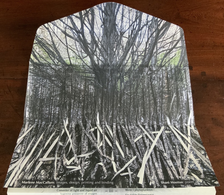
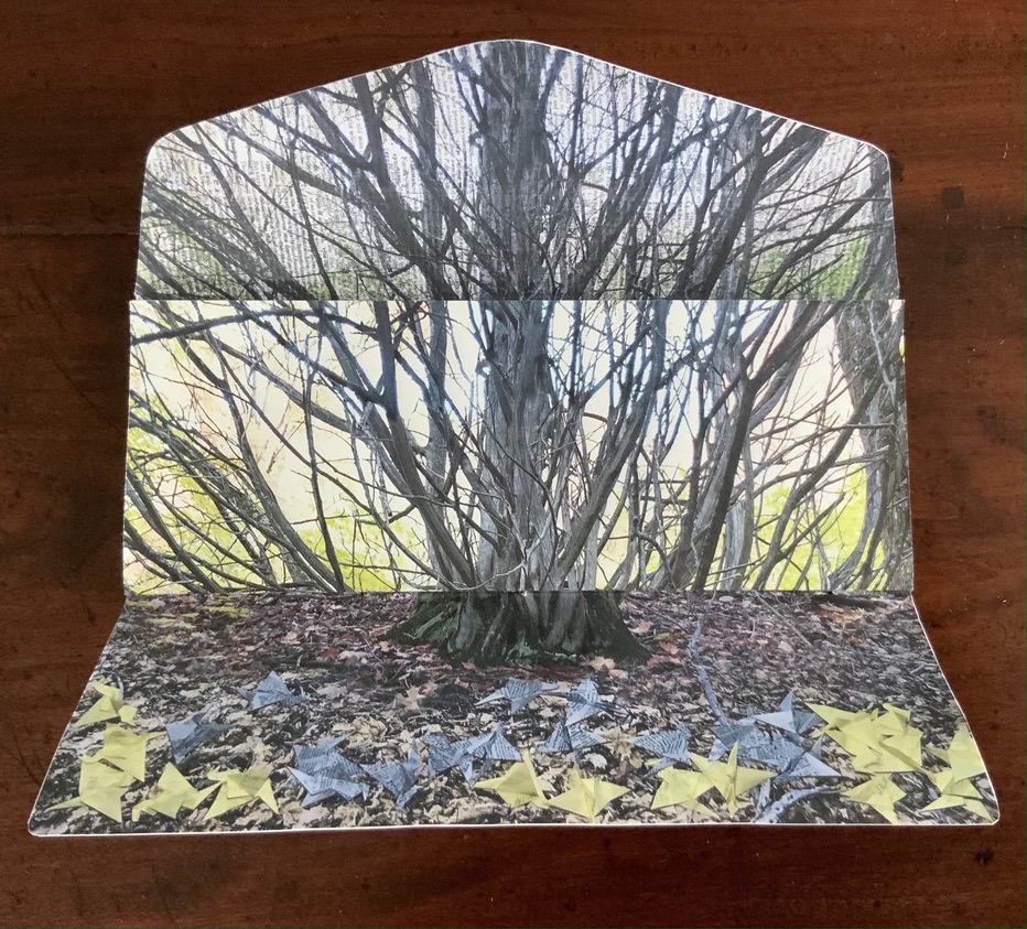
Send(2020) Marlene MacCallum and Shani Mootoo A double-sided archival digital pigment print on paper, folded and pamphlet bound in an envelope enclosure. Images, design, printing and binding by Marlene MacCallum, poem by Shani Mootoo. Dimension: 10 × 25.4 cm (closed) and 47.5 × 10 cm (expanded). #11. Acquired from Marlene MacCallum, 26 October 2022. Photo of the work: Books On Books Collection.
Author’s statement: Send is a correspondence piece; a conversation between my images and structural concept and Shani Mootoo’s poem “Send All Possible Answers – We Have Questions To Match”. Shani Mootoo, writer and artist, gave me the gift of this poem to use in a piece as I saw fit, and together we send this letter to the world.
Opening envelope; inside of envelope.
First opening and unfolding.
Fully open view of poem.
Fully open view of image.
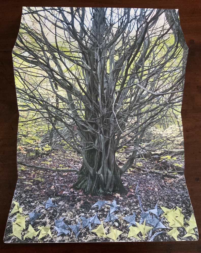
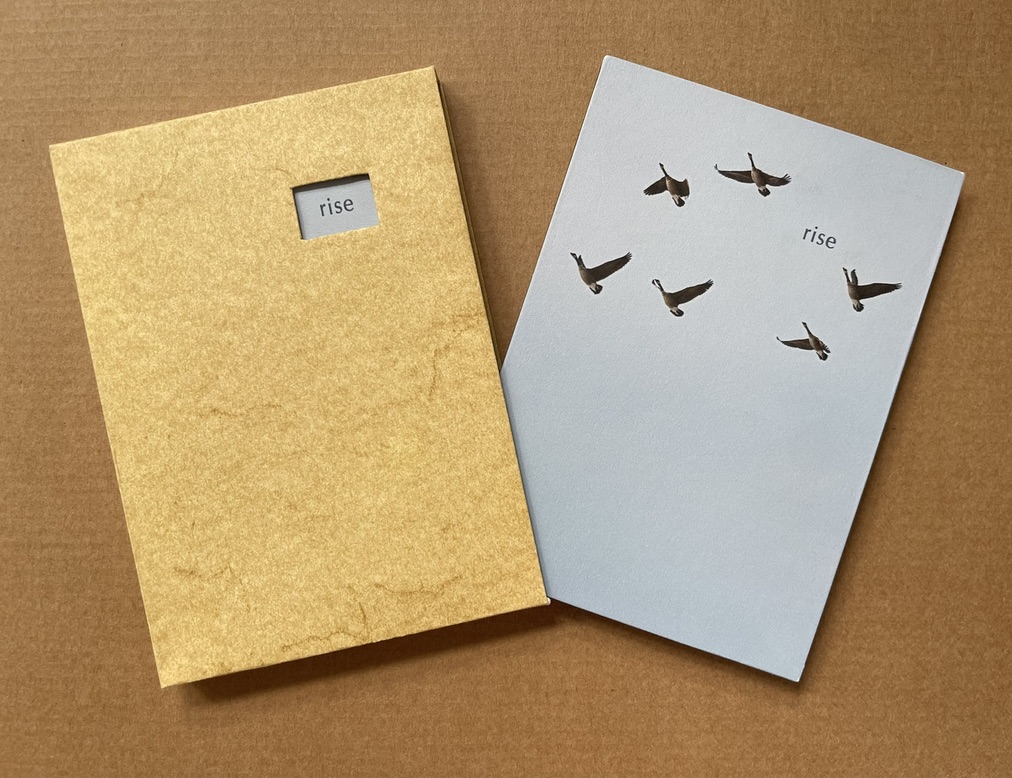
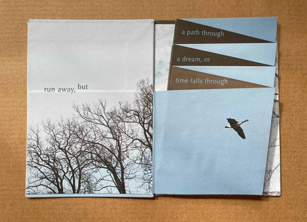
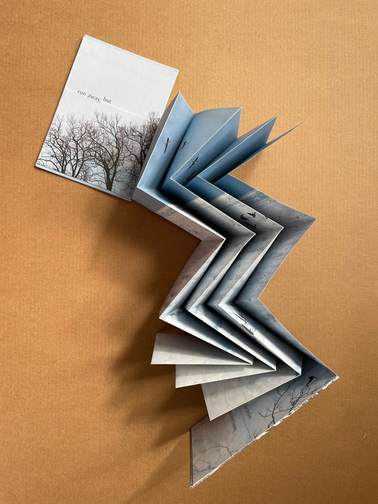
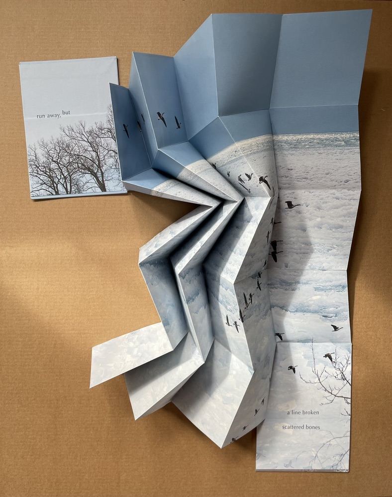
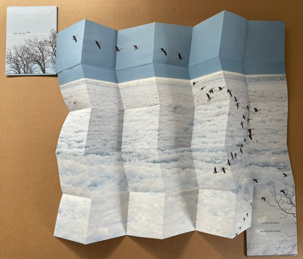
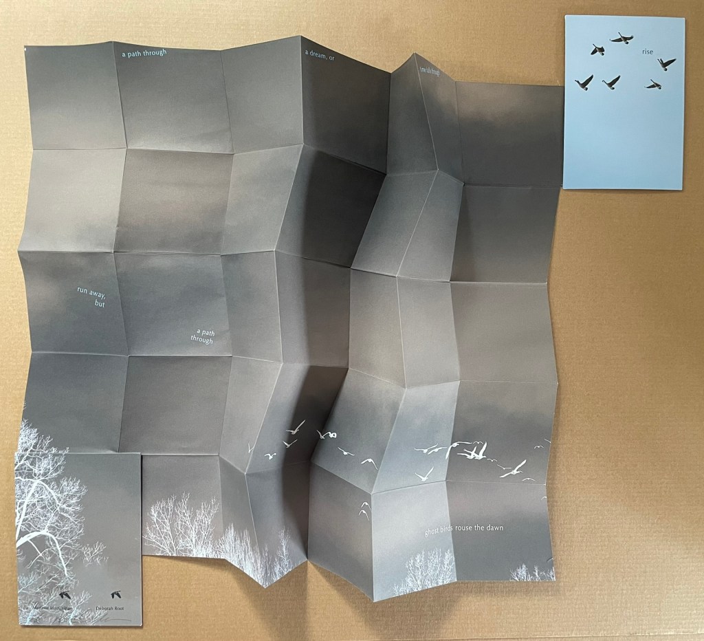
Rise (2020)
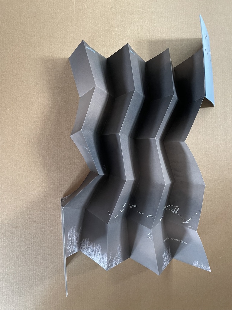
Rise(2020) Marlene MacCallum and Deborah Root Slipcase enclosure with passe-partout showing title. Double-sided folio in miura fold between two boards. Printed paper over boards. Slipcase H135 x W97 mm. Double-sided folio H133 x W93 mm (closed), W483 × H633 mm (open). Acquired from Marlene MacCallum, 26 October 2022. Photos of the work: Books On Books Collection.
Artists’ statement: Rise is a collaborative artwork by Marlene MacCallum and Deborah Root. This piece grew out of discussions about our shared fascination with the implications and meanings of the fold. The images and poem evolved through a call and response process, sharing them back and forth. The miura fold structure was selected early on for its structural strength and the way it allowed us to take a seemingly small object that expanded quite surprisingly to reveal a large field of imagery and poetry.
The fold is named for its inventor, Japanese astrophysicist Kōryō Miura.
The Unshelved videos from the Bainbridge Island Museum of Art and the Friday Night Flicks of Byopia Press sent me on a hunt for introductions to collections of artists’ books. For those who like to binge, here are the discoveries so far:
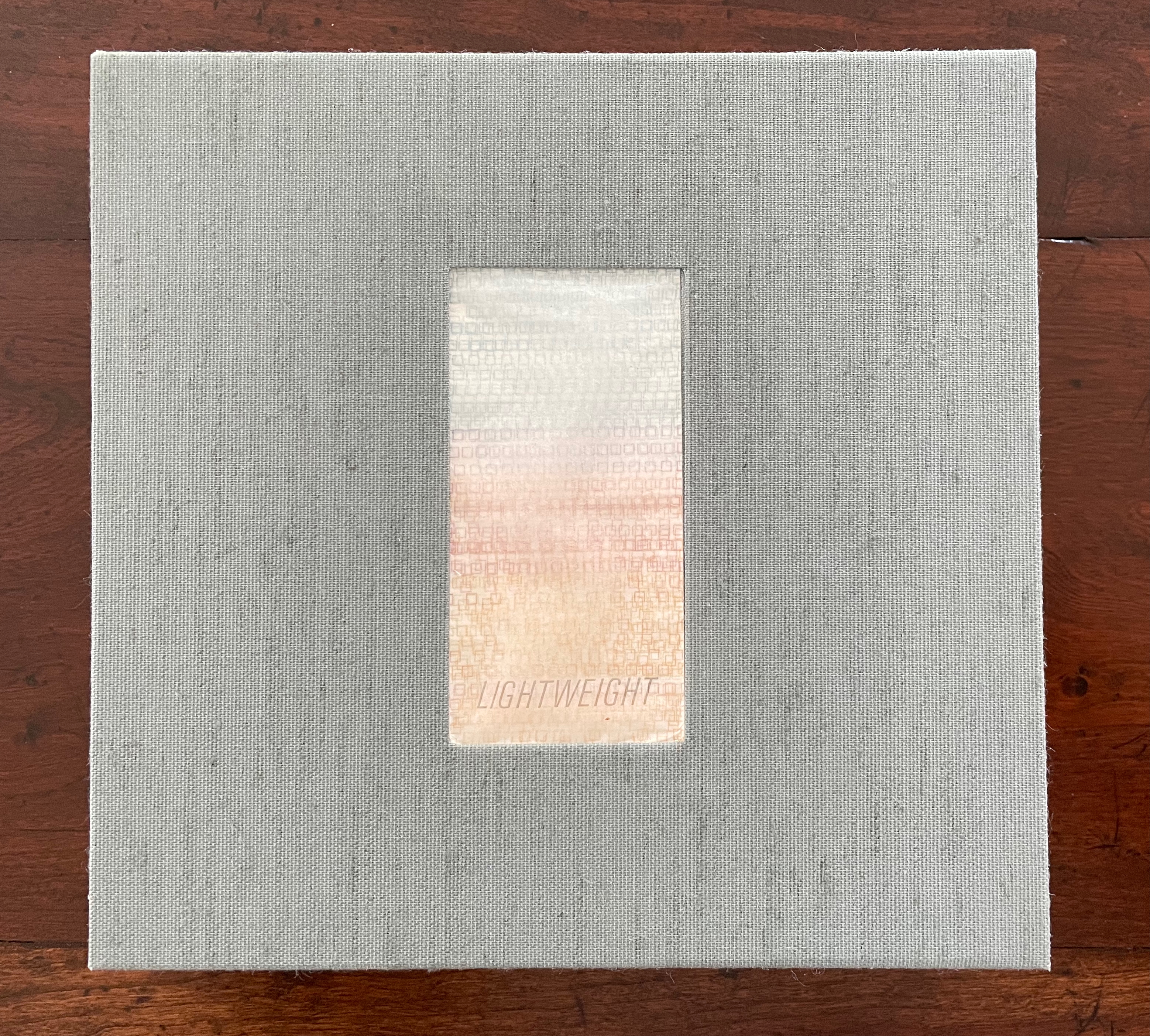
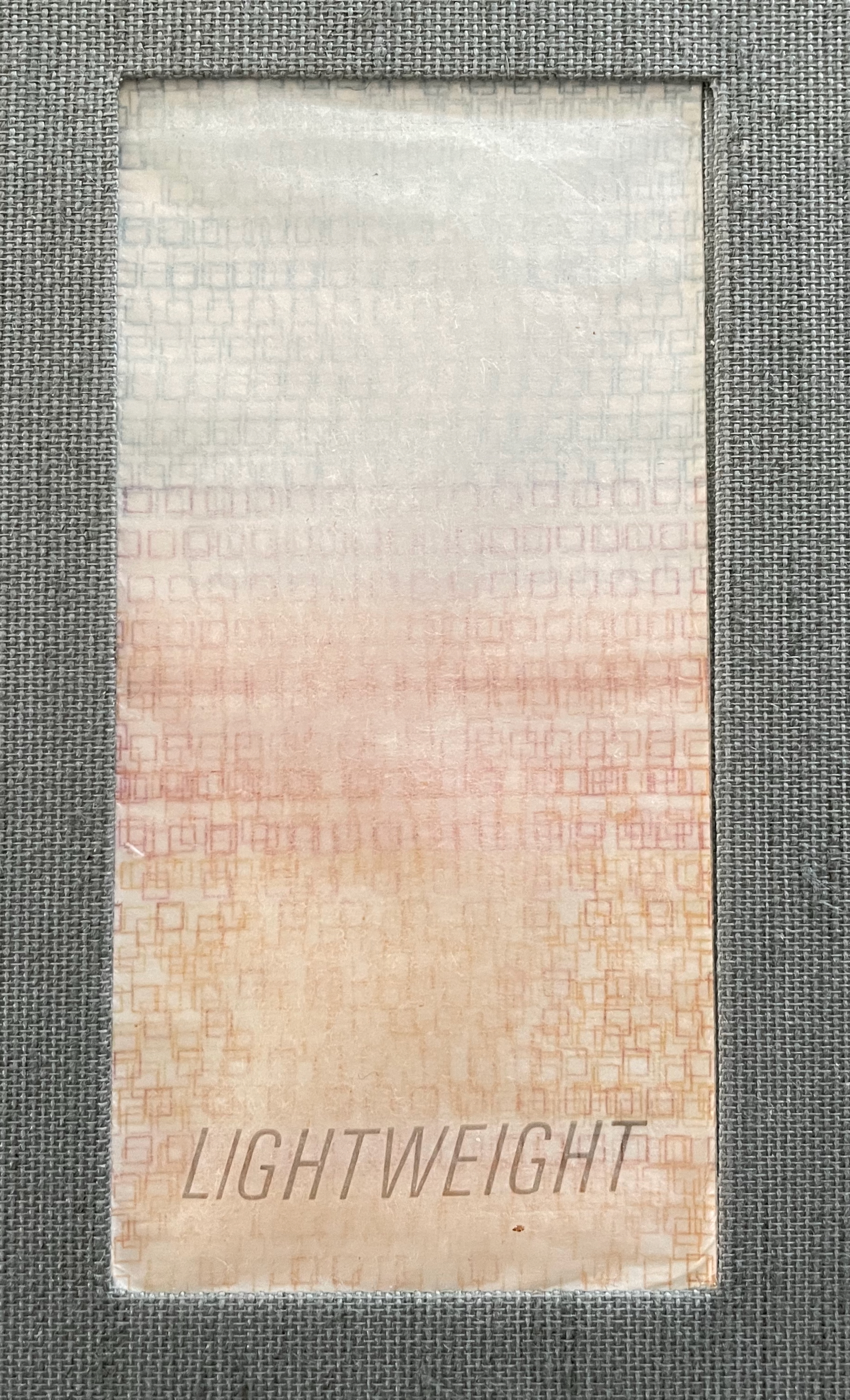
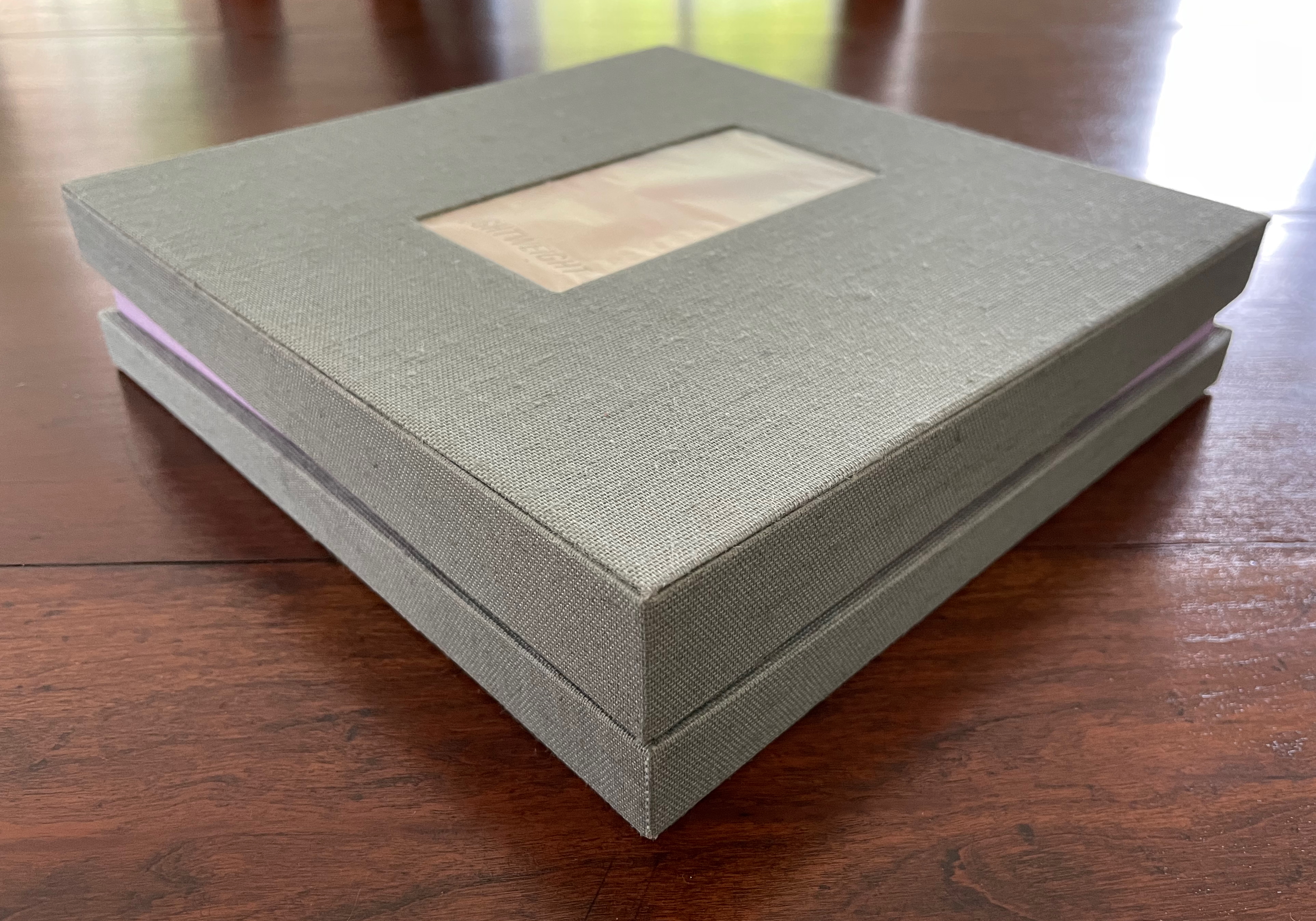
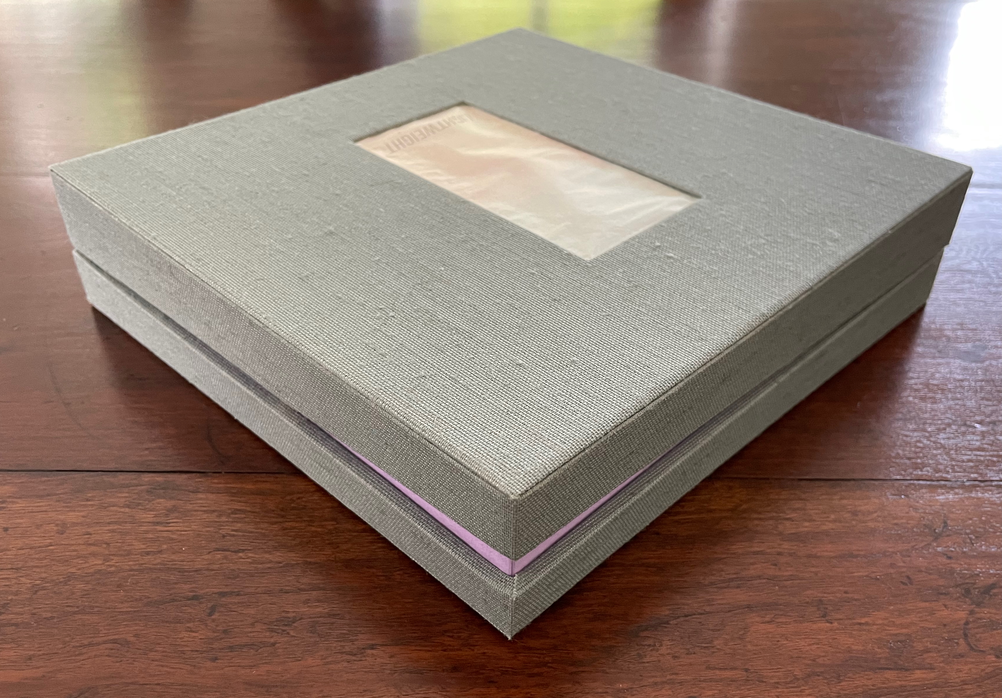
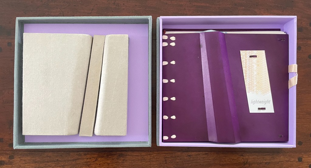
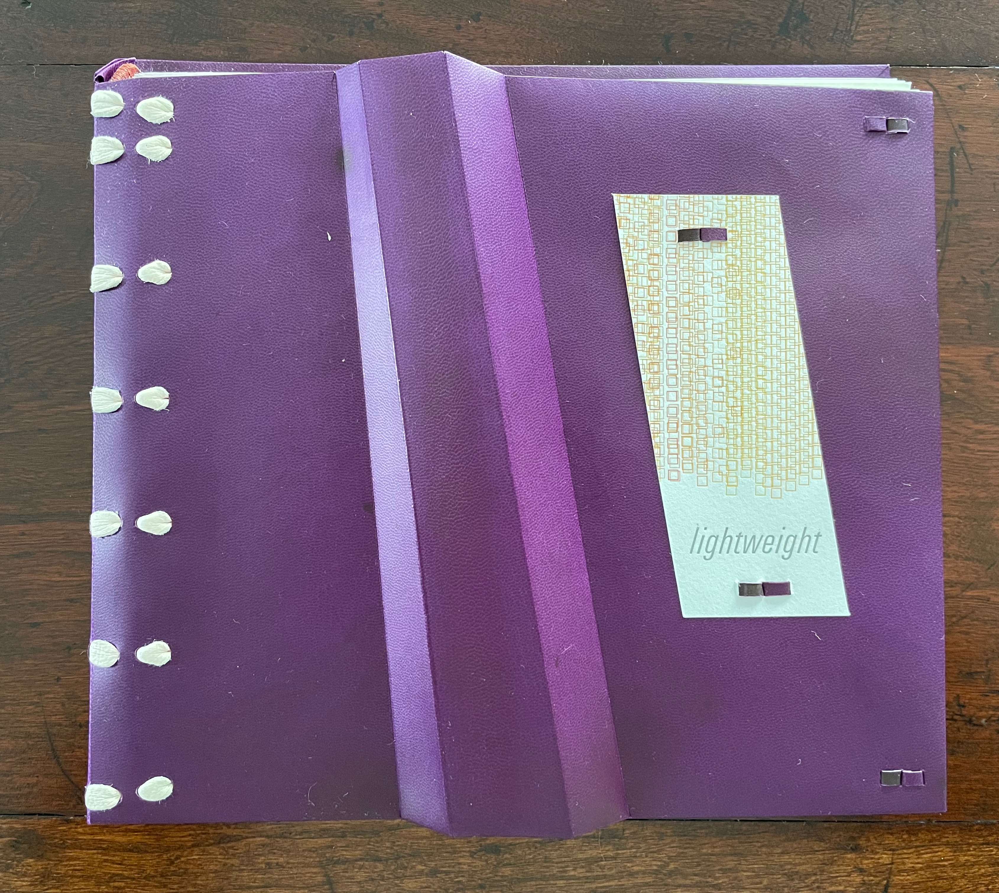
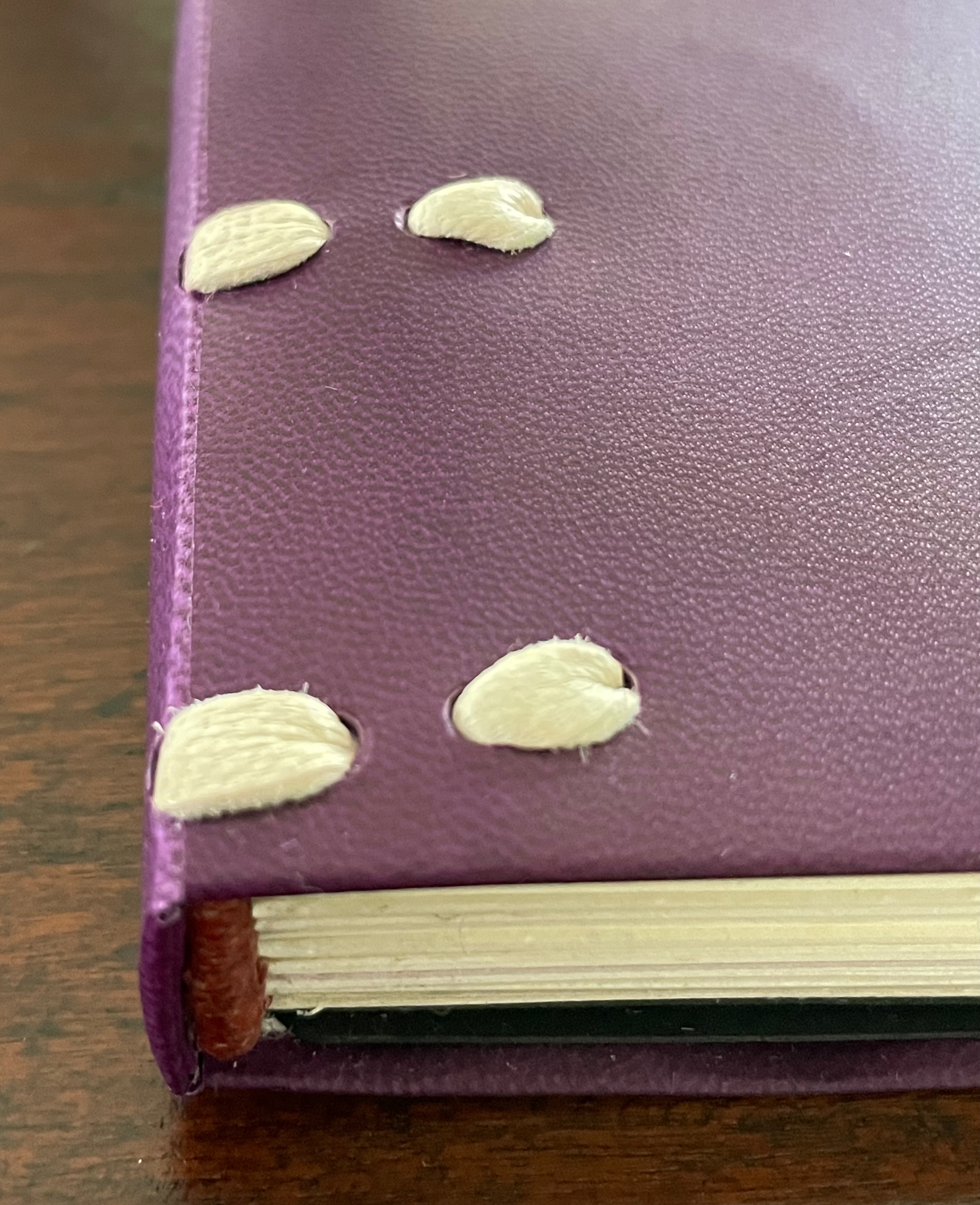
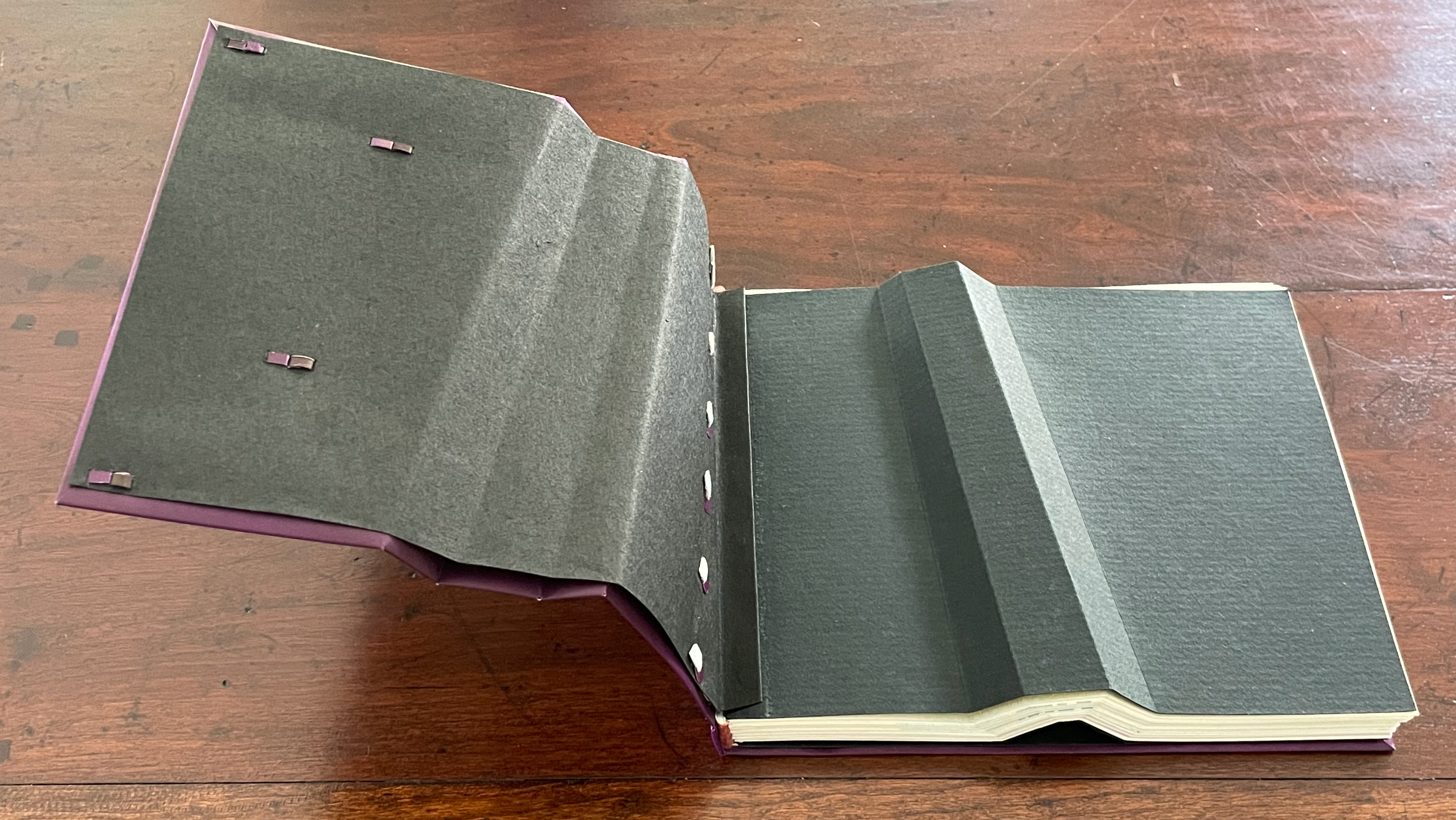
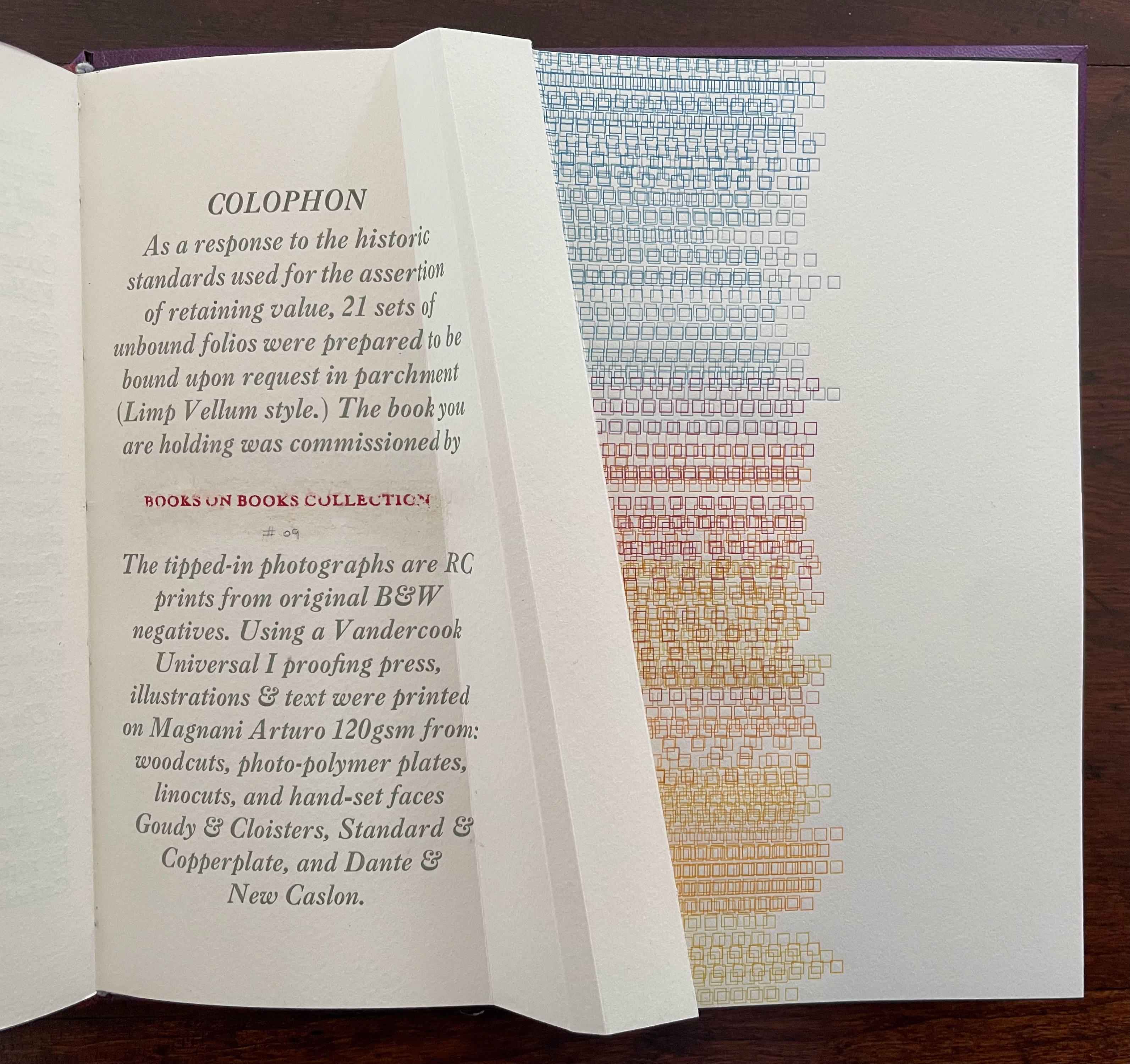
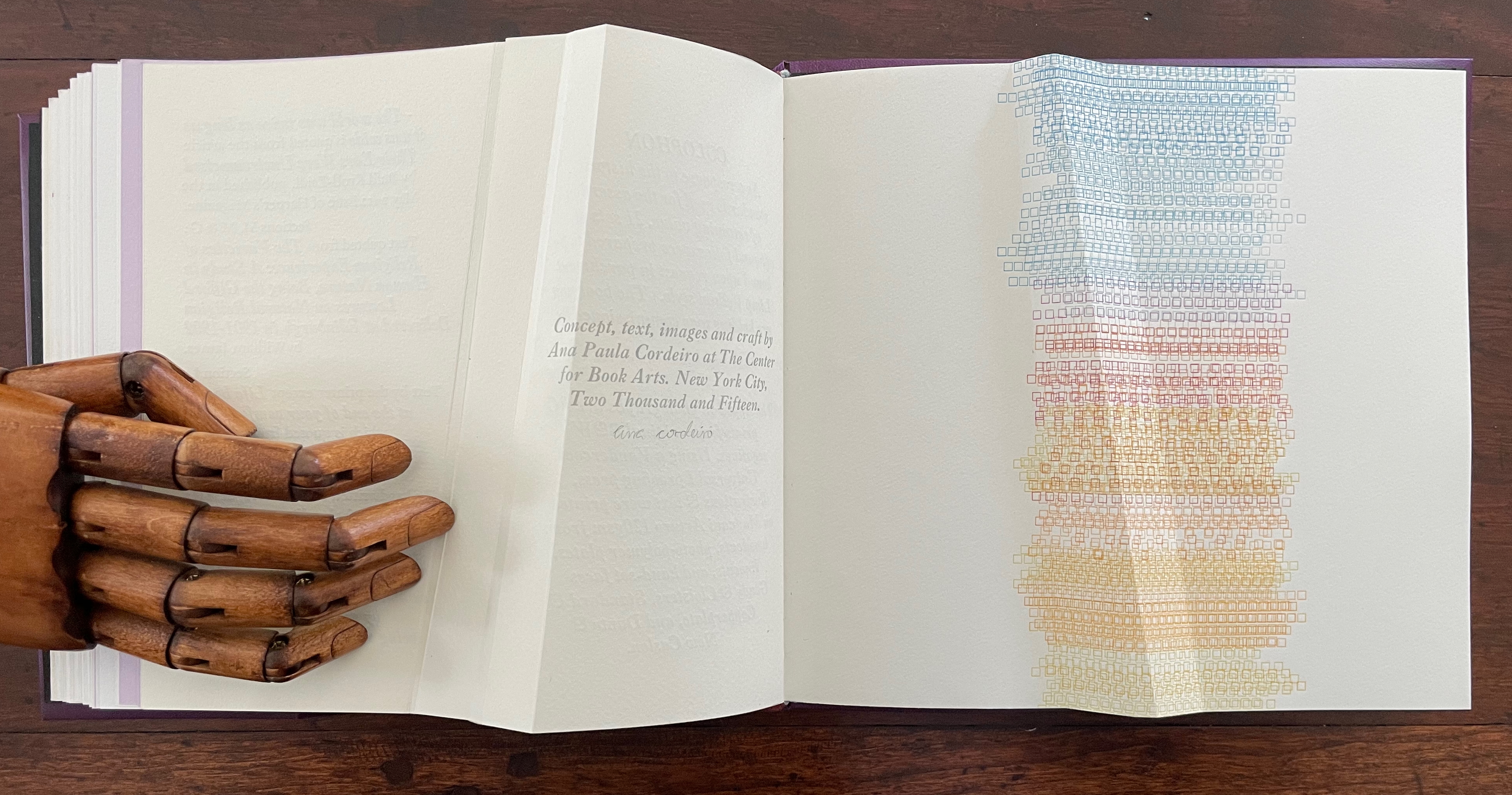
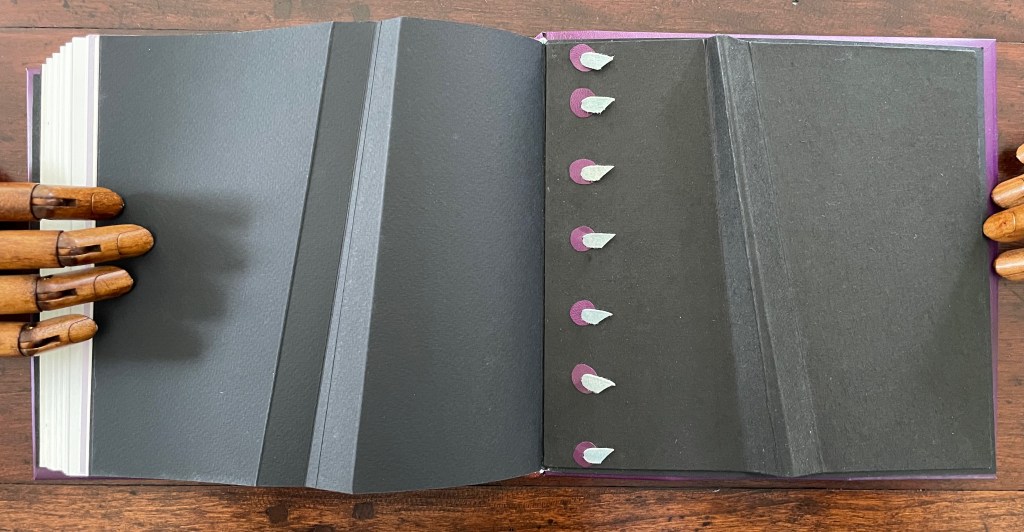
Lightweight(2015) Ana Paula Cordeiro Custom storage box with passepartout on cover with title printed on translucent paper with colored diagram beneath and sculptural element inside top. Three-part construction Limp Vellum binding on dyed parchment. Box: H215 x W224 x D47v & D53r. Book: H190 x W215 x D18 mm [90] pages. 88 + 2 half pages for colophon. Edition of 21 sets, copy bound on request. Acquired from the artist, 27 August 2025. Photos: Books On Books Collection.
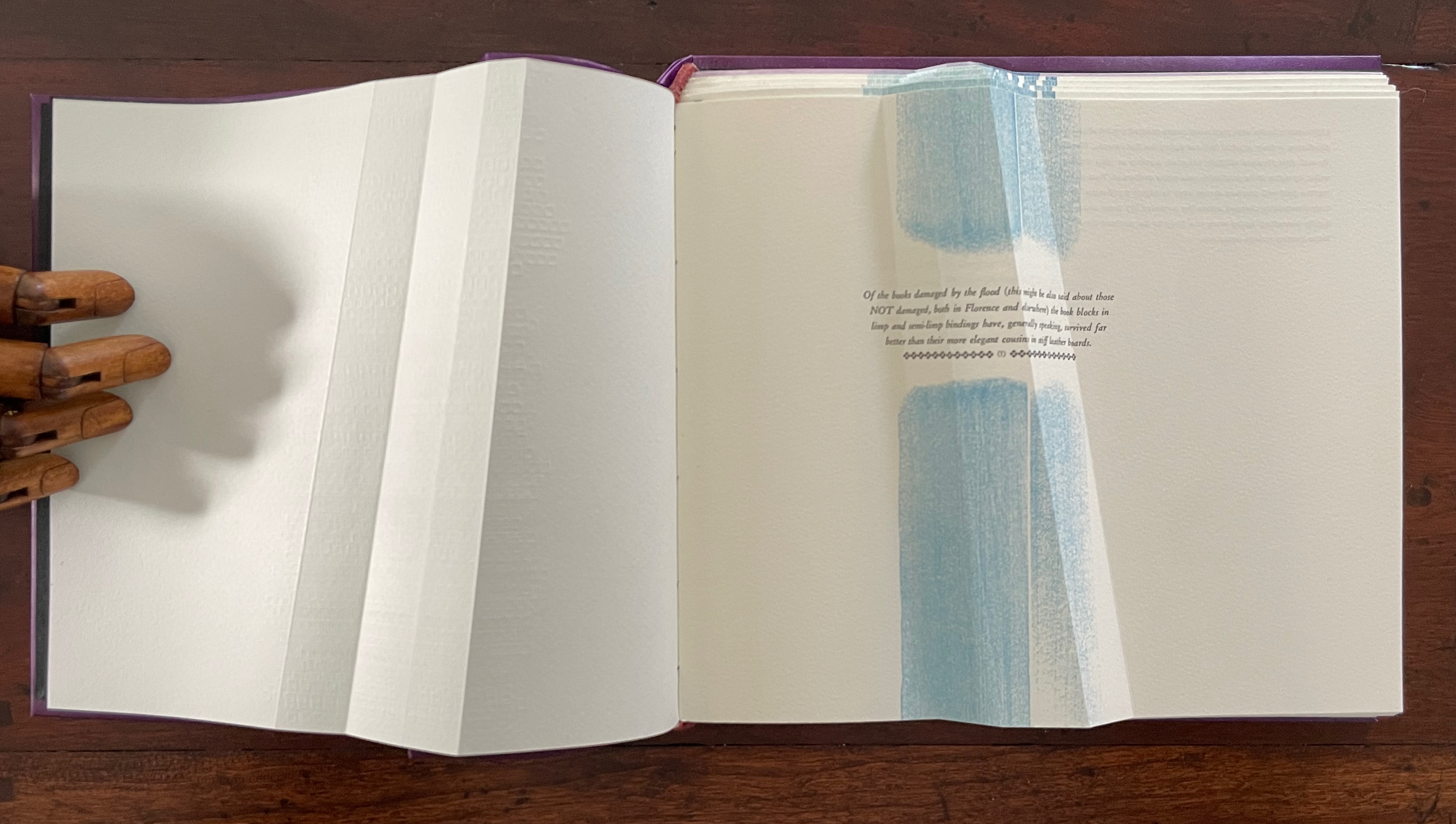
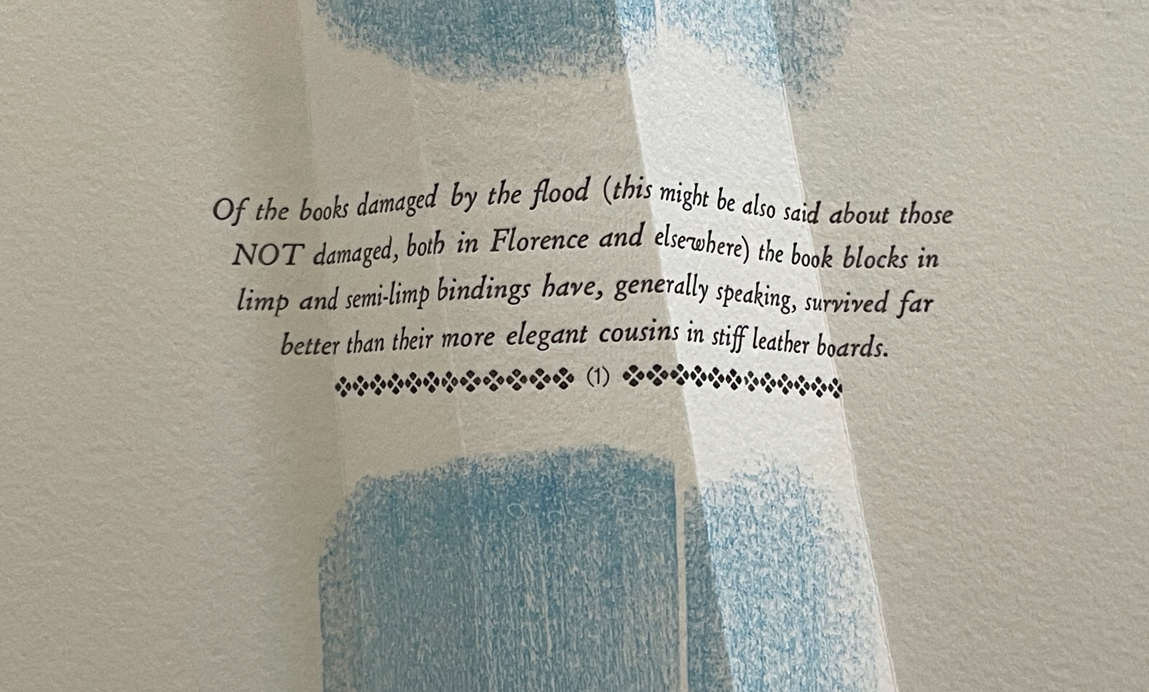
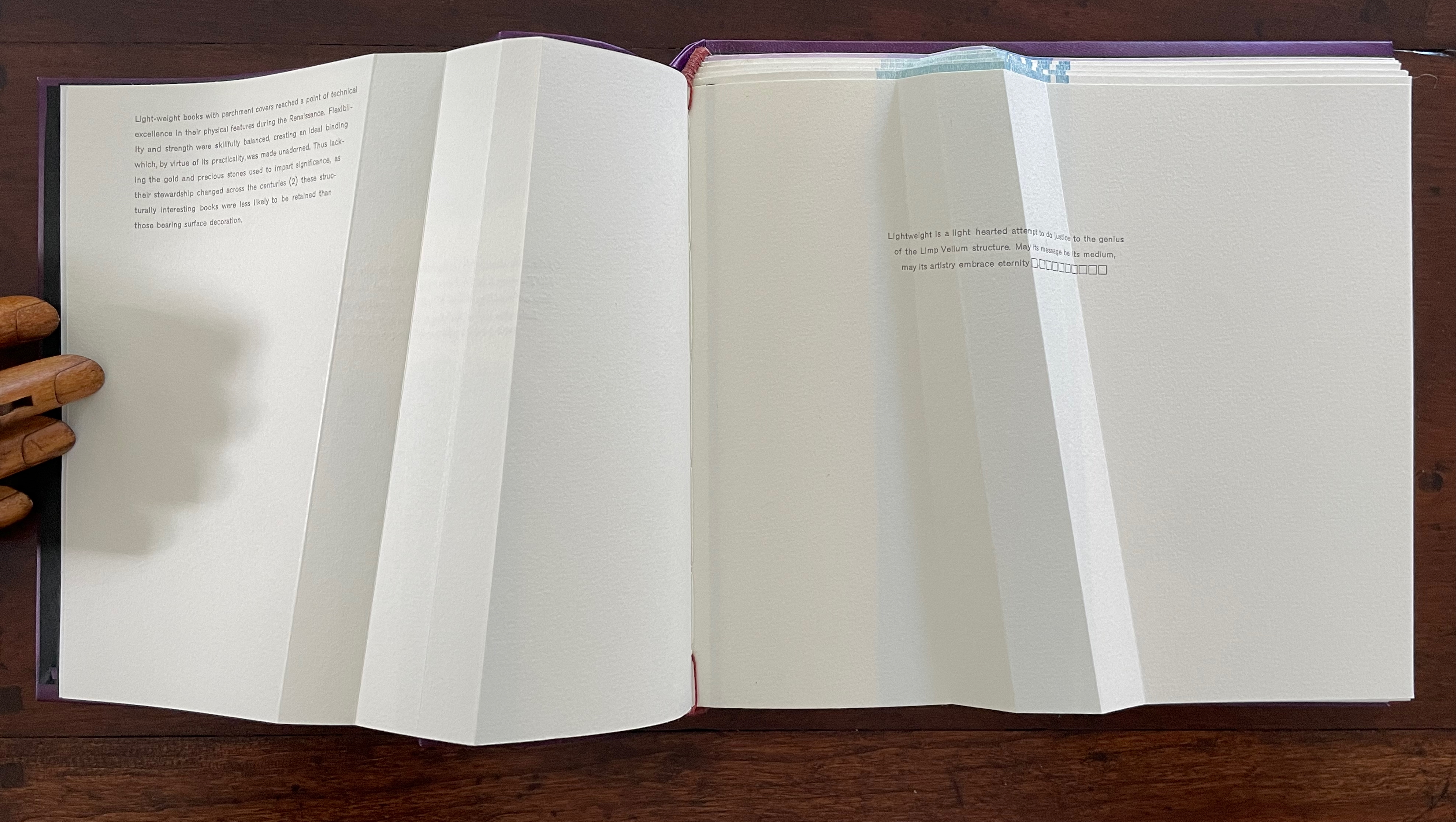
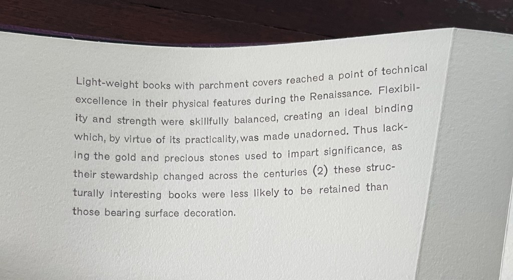
Dating back to the 13th century, the limp vellum binding for books involves a parchment or other flexible covering material that is the sole component of the cover. No stiff boards. It attaches to the textblock usually by sewing and without adhesive. According to the American Institute for Conservation, it was not merely a temporary solution until a more luxurious one with boards and ornamentation could be commissioned. Its presence in collections, its variety of formats, and its superior protection of works proven in the aftermath of the 1966 flooding of Florence, all suggest that, for a time, it was deliberately chosen for joining the artistic with the functional.
Ana Paula Cordeiro’s Lightweight is an artist’s book that pays elaborate homage to this distinctive form of binding. It weaves together metaphor, structure, material, and content in extraordinary ways.
Begin with the container, which offers a multitude of metaphors. On top of the cloth-covered box, a rectangular window has been cut. To look down through this window is to begin peering into the past. Beneath the translucent sheet bearing the title, a print motif appears whose mingling layers suggest the water, paper, ink, and silt that had to be sifted to save a Renaissance legacy of manuscripts, incunabula, and books from the Florence flood of 1966.
Left: passe-partout (window) on box top. Right: recurrent print motif appearing later in the book.
That strata of links running from blue to rust to gold becomes a recurrent print motif in the book, suggesting abstractly another metaphor: that of a continuum with endpoints playing off one another. As soon as you pick up the Canapetta cloth-covered box, the title itself — Lightweight — sets in motion a fresh instance of this continuum metaphor. Floating above the recurrent print motif, the title contrasts with the weight in your hands. As if to underscore this diametric contrast, the corners of the top and bottom of the box sit flush at the ends of one diagonal but gap at the other, easing the lifting of the weighted top from the box.
Inside, other decorative features offer further dual functionality. The sculptural element that provides the top’s weight also serves as a protective mould inside for the book and mirrors its dominant and recurrent physical feature: the creased shape slanting in parallel to the title slip tacked to the cover. Cordeiro refers to the creased shape as an “angled beam”.
For her, the angled beam distills the essence of the limp vellum structure and “supports” the variety of contemplation she pours into it. The angled beam puts forward the limp vellum structure as a historical link from binding’s past to its present. It stands for the binding structure’s durability, again linking past to present. Its linearity stands in for that continuum. It prompts thoughts of other continua along which one thing becomes another such as the line between night and day (twilight), between light and shadow, between one season and another. It evokes the continua between extremities, between the ordinary and the extraordinary, between mental acuity and dementia, and between life and death.
Following Emily Dickinson’s injunction — “Tell all the truth but tell it slant” — Cordeiro plants other angles in Lightweight. The ribbon tape that lies under the book is stiff, not soft and flexible, and it twists once and folds twice into an angular tool for lifting up the book. The trim of the book’s top and bottom edges slants. Creased into the covers, end sheets, and text block of this limp form, the angled beam is a physical constant echoing the metaphor of a continuum whose endpoints contrast and balance with one another.
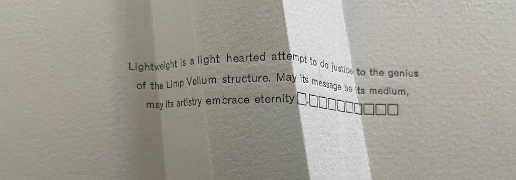
Altogether there are seven gatherings in Lightweight. The “prelims” gathering provides the historical context underlying Cordeiro’s homage. Note the artist’s wish expressed in the envoi to this artist’s book in our hands: “May its message be its medium, may its artistry embrace eternity”. Here, Cordeiro introduces that self-reflexivity we expect in the best of artists’ books.
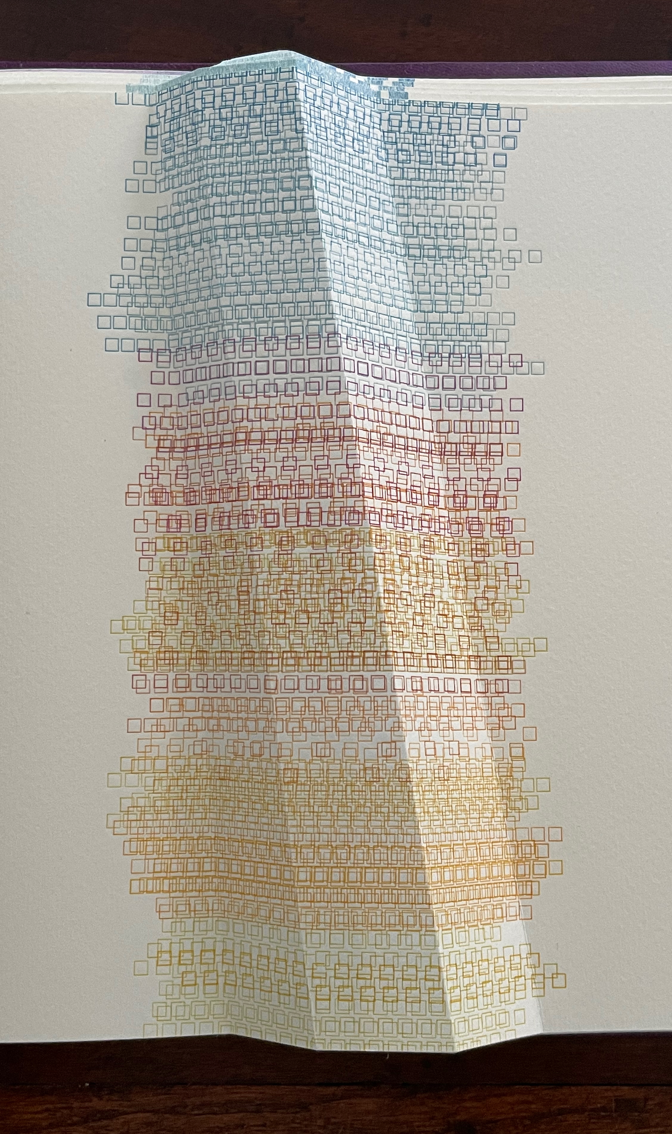
After the prelims gathering, the other six gatherings are labeled. In addition to bearing the creased angled beam, all six carry an “on-end outline” of it (see below). The five that are numbered, lettered, and labeled introduce themes reflecting different responses that relate to the continuum motif.
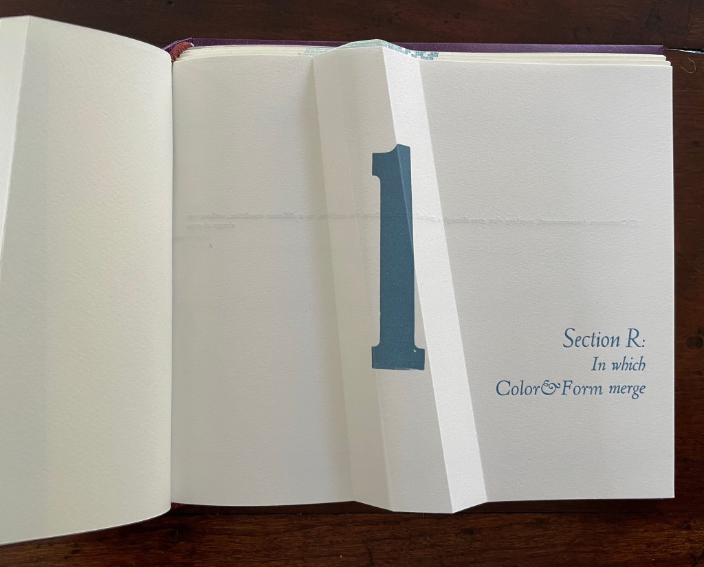
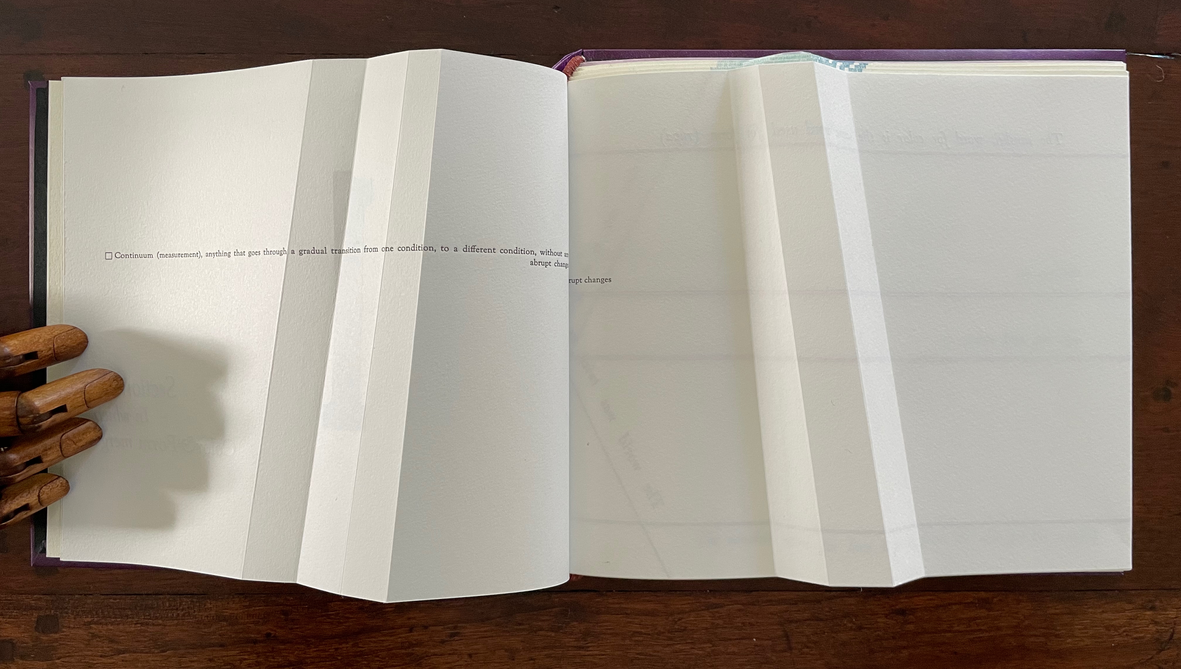
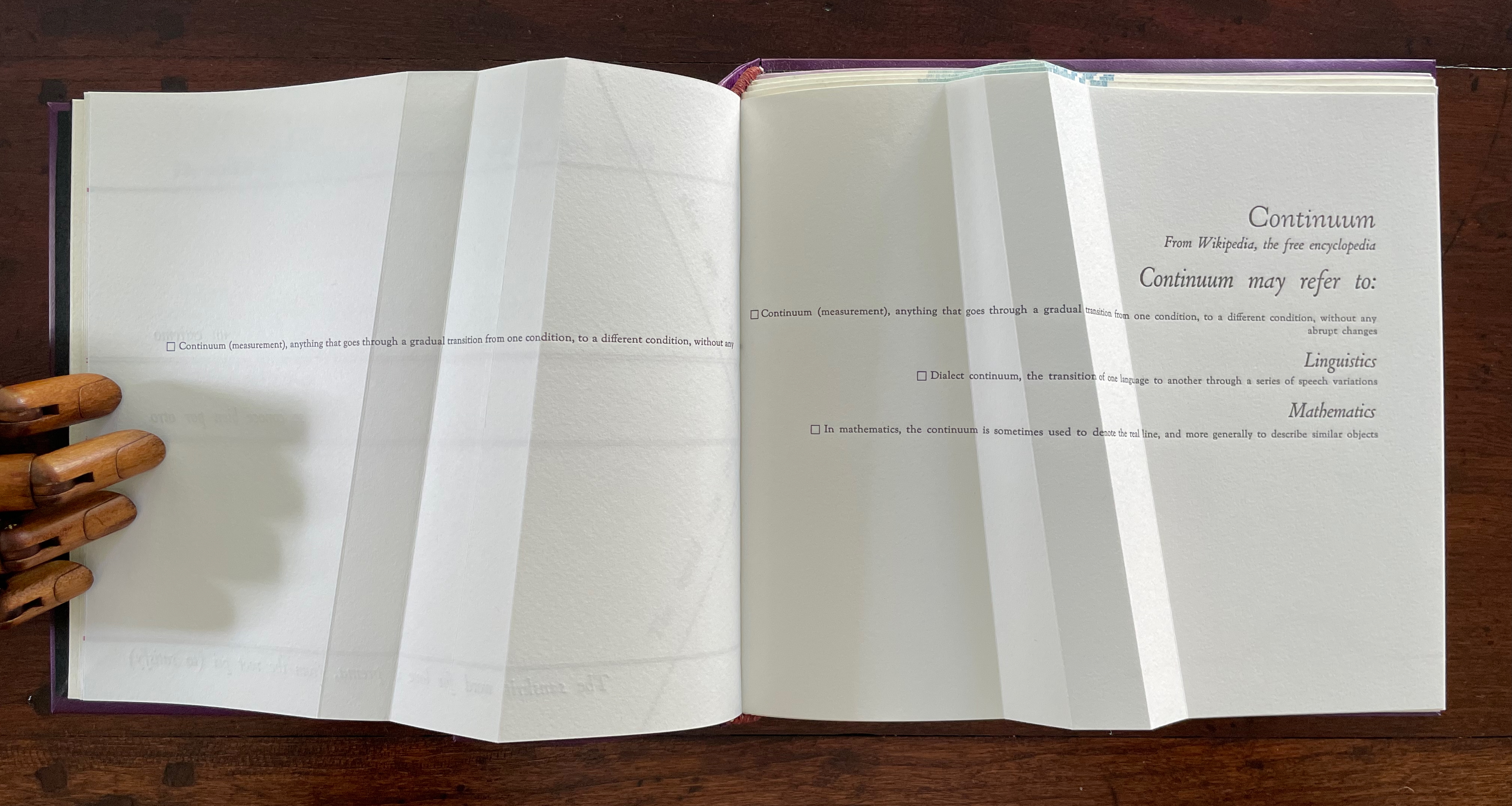
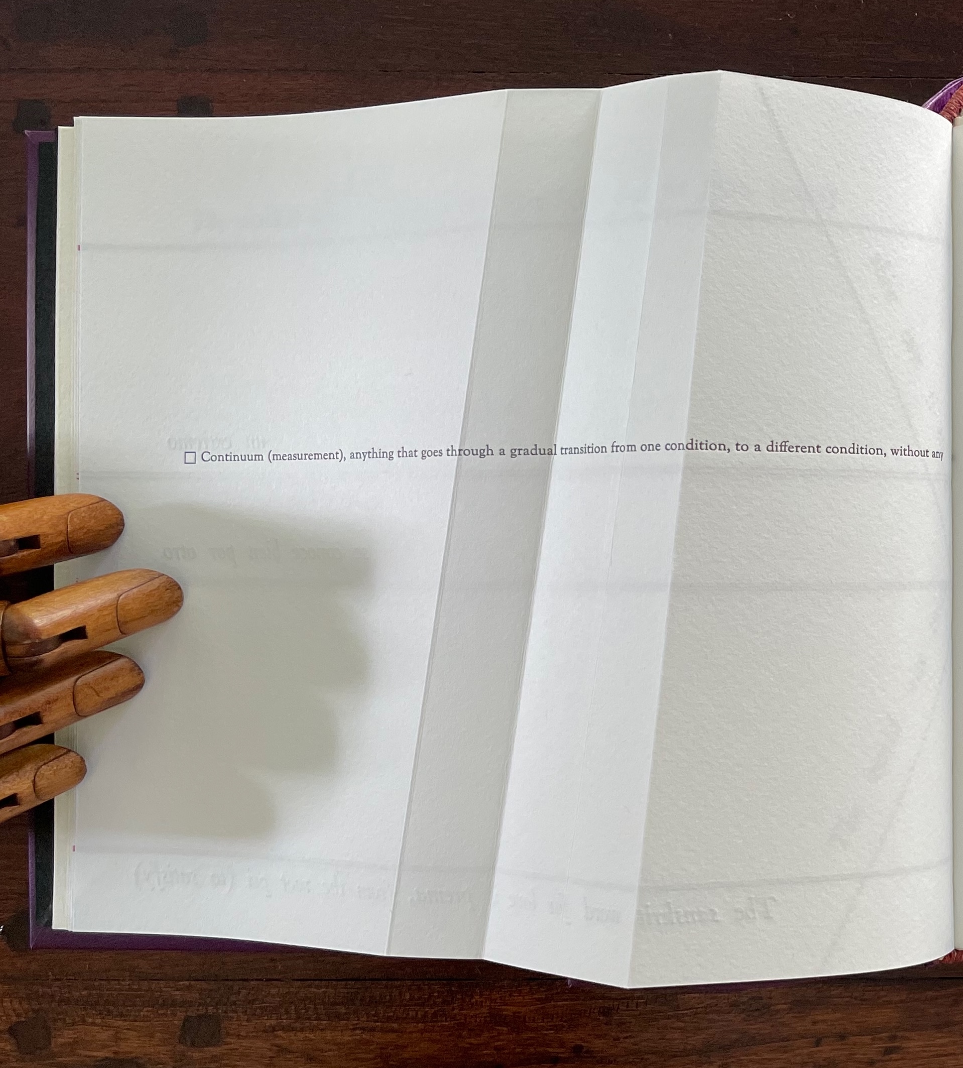
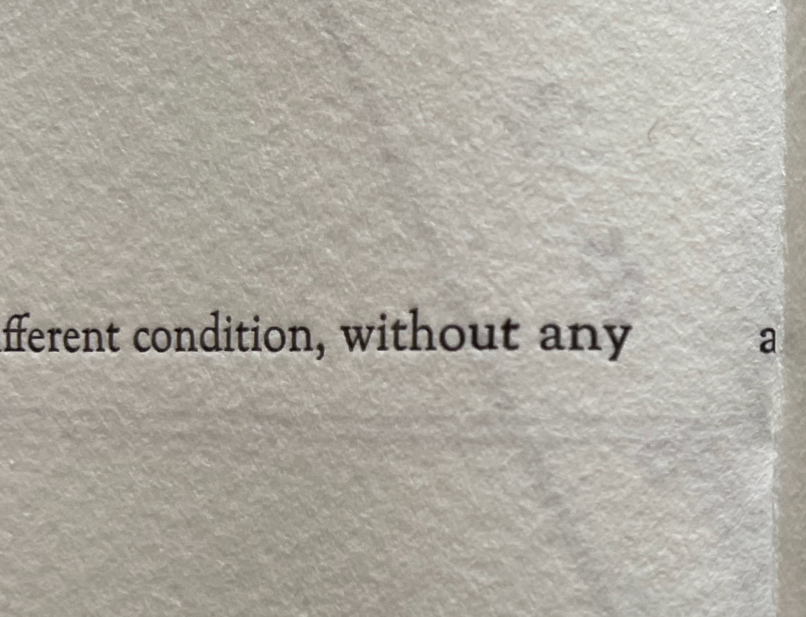
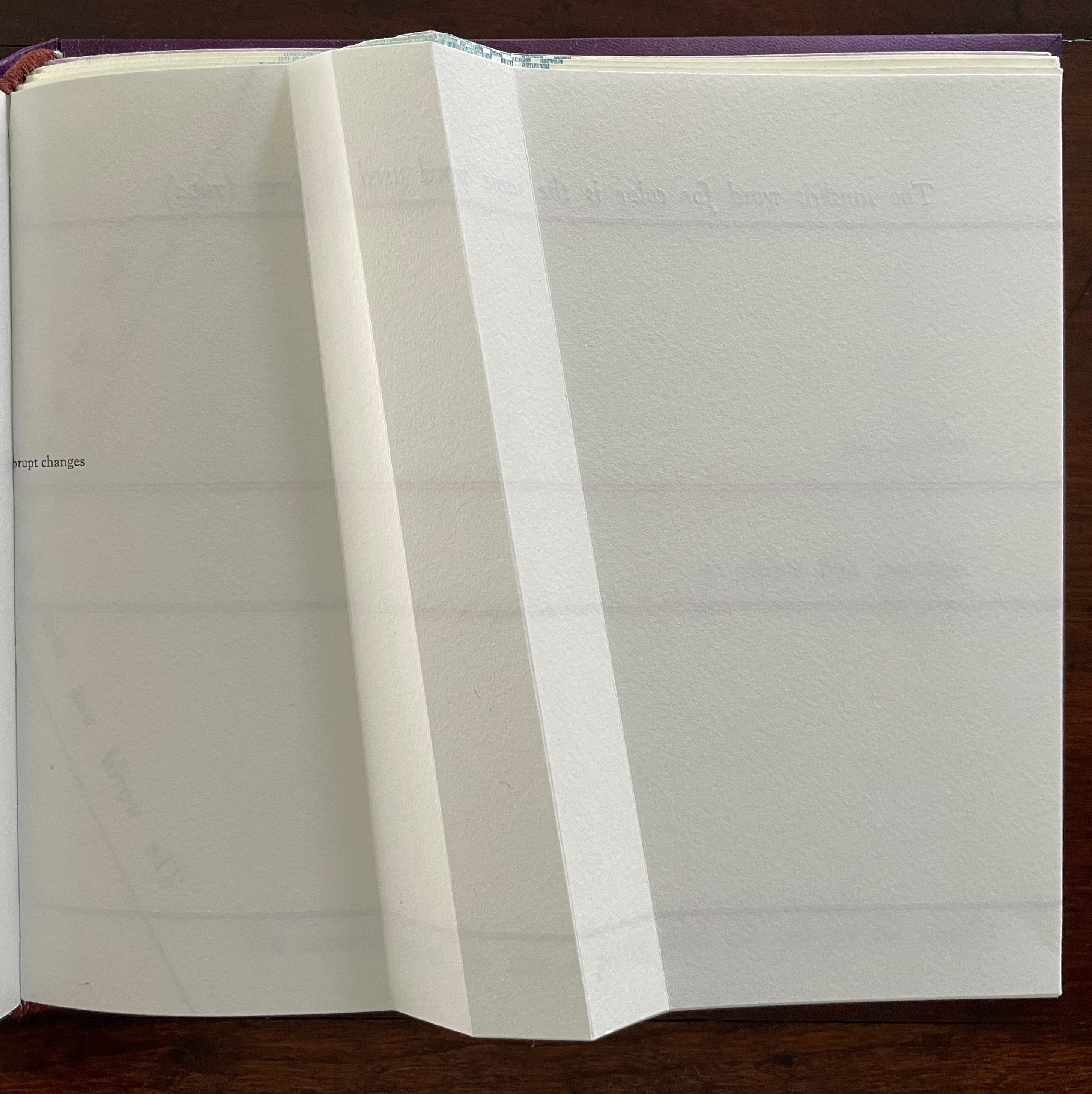
The Part 1, Section R gathering has announced cryptically that color will merge with form. How will this happen? As you turn the page, the opening text suggests how — along a continuum: “Continuum (measurement), anything that goes through a gradual transition from one condition, to a different condition, without any abrupt changes”.
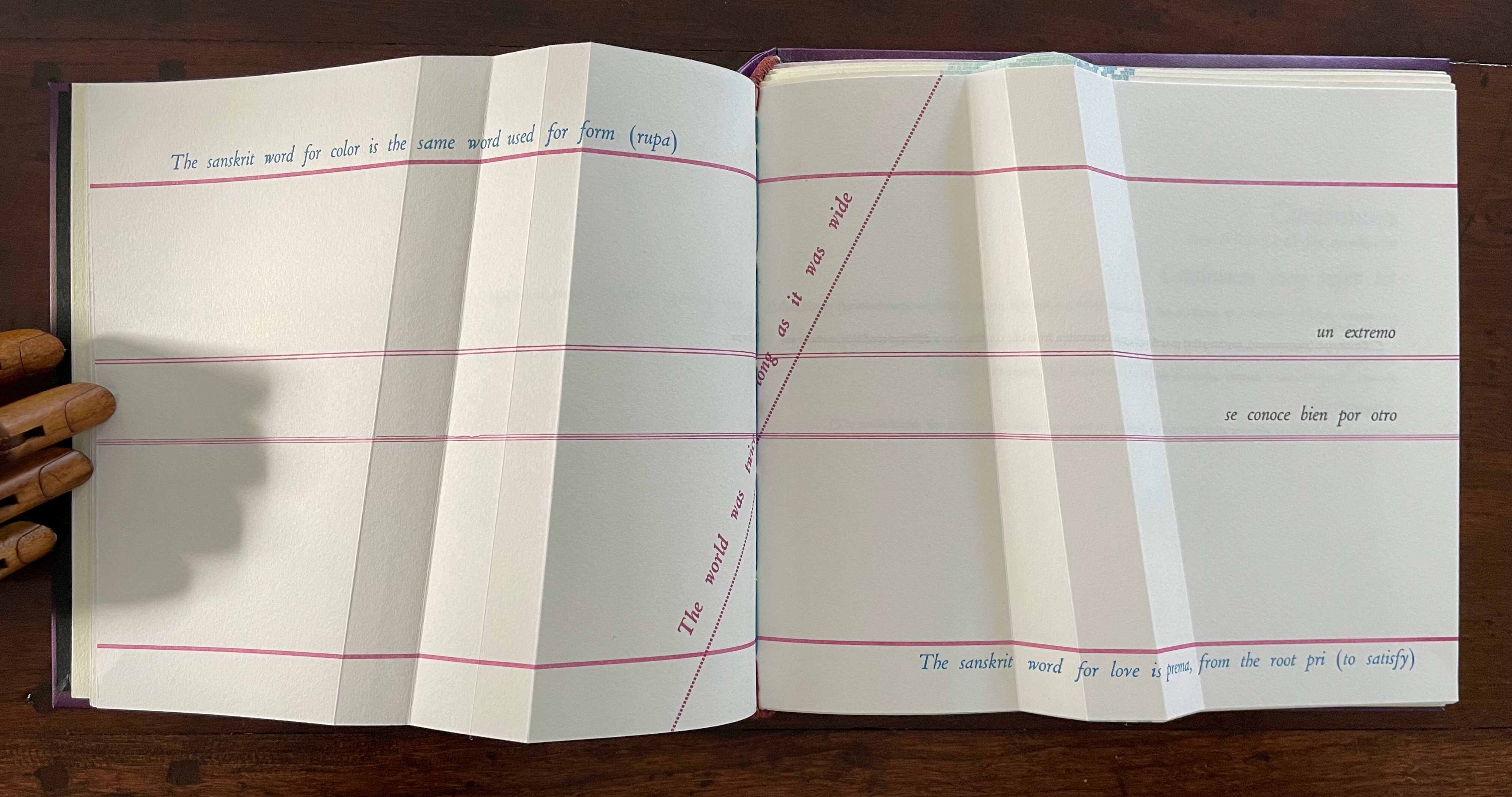
The spread lays out this definition in a peculiar manner that seems to contradict the definition. On the verso page, the definition seems to run abruptly up against the seam, which bumps the words “abrupt changes” to the next line, while the recto page presents a truncation of those words: “rupt changes”. Hold that puzzle for a moment. So how can color and form be on a continuum? And will they merge gradually or abruptly? On the next spread, Cordeiro answers with the Sanskrit word rupa, which represents “color” and “form” and from which the section draws its label “R”.
un extremo se conoce bien por otro [one extreme knows well its other]
So, the merger is etymological. But at the same time, another spectrum comes into play: the color spectrum and the blue and red at its opposite ends. On the spectrum, of course, one gradually becomes the other, enacting the expression “un extremo se conoce bien por otro” [one extreme knows well its other]. If this seems a stretch, the next double-page spread reassures us that “continuum” has additional linguistic as well as mathematical roots.
Before the reassurance, however, we come back to the puzzle of “rupt changes”. Again, on the verso page above, the definition of “continuum” runs pell mell into the crease. To solve the puzzle, we have to look more closely at the structure of the Section R gathering. It consists of three oblong folios folded in half. On the reverse side of the center folio (what would be pages 5 and 8 of this gathering if the pages were numbered), the definition of “continuum” has been printed so that the fold splits the word “abrupt” between its syllables: “Continuum (measurement), anything that goes through a gradual transition from one condition, to a different condition, without any a | brupt changes.” In effect, the layout draws attention to our perception of breaks in continua.
View of “pages 5 and 8” separated by a detailed view of the break in the word “abrupt”.
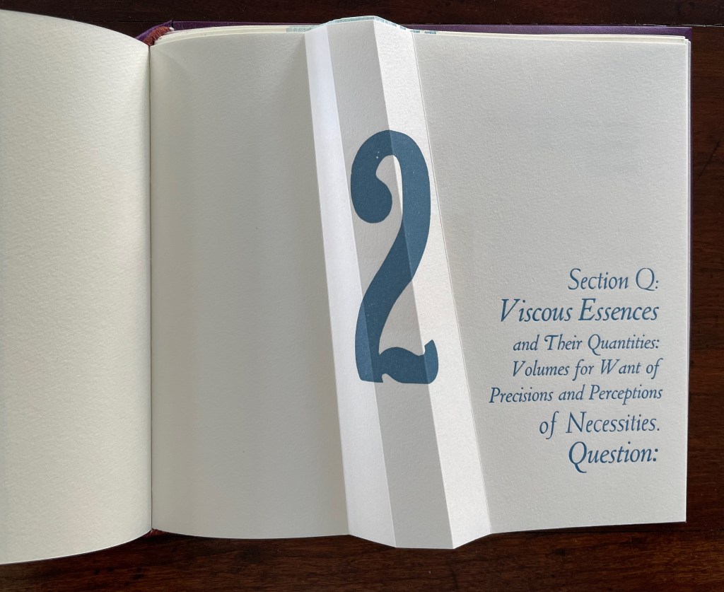
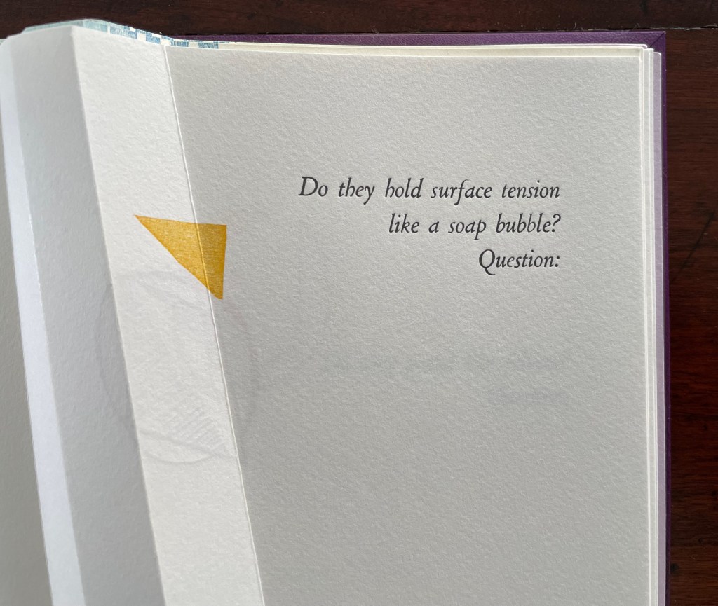
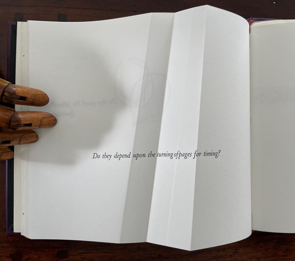
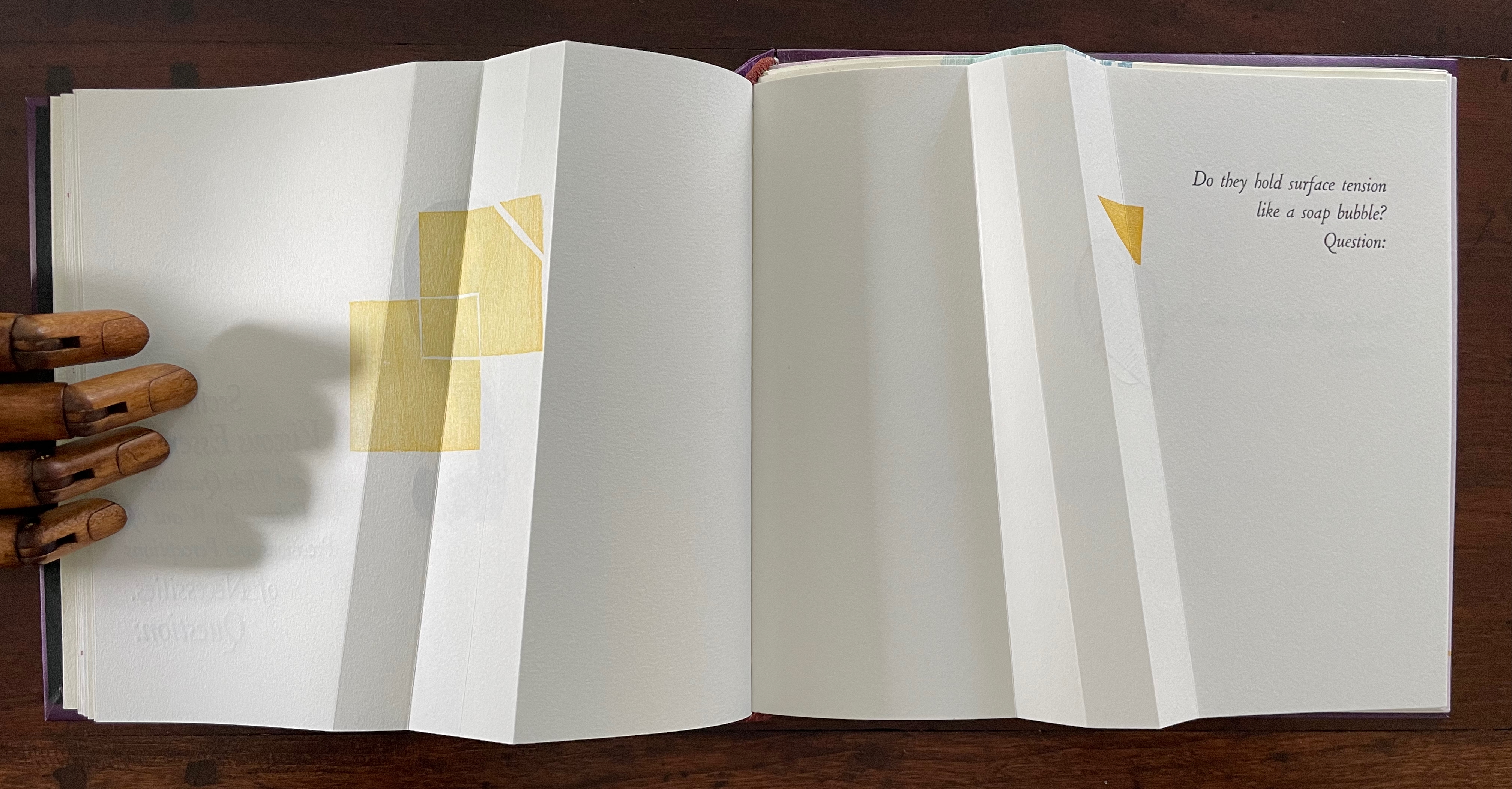
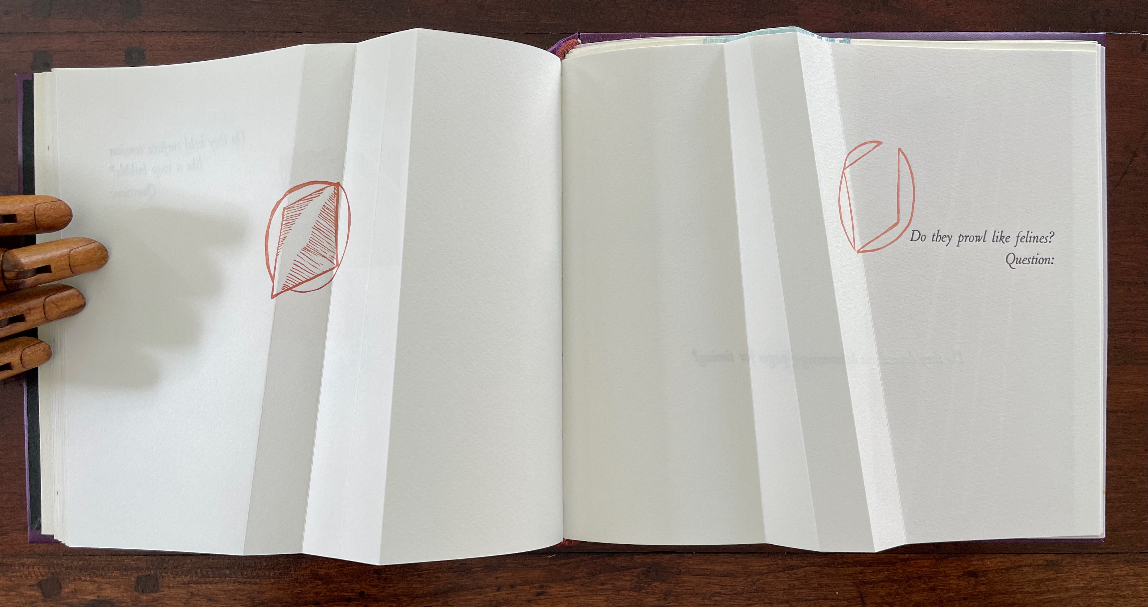
If Section R has not prompted the reader to propose questions about the structure of the book or this book in particular, the Part 2, Section Q gathering provides a series of oblique questions very much focused on that but also on metaphorical matters. Again, what happens structurally in the gathering and on the surface of its pages presents puzzles and hints at solutions.
The geometrical images associated with the first question (“Do they hold surface tension like a soap bubble?”) seem to float or progress across the double-page spread, breaking up to punctuate the question. Reminding us of opposites and abrupt changes, the angular yellow overlapping squares and triangles puncture the text’s round verbal soap bubble. Before we can ask to what or whom does “they” refer, we are prompted by “Question:” to turn the page.
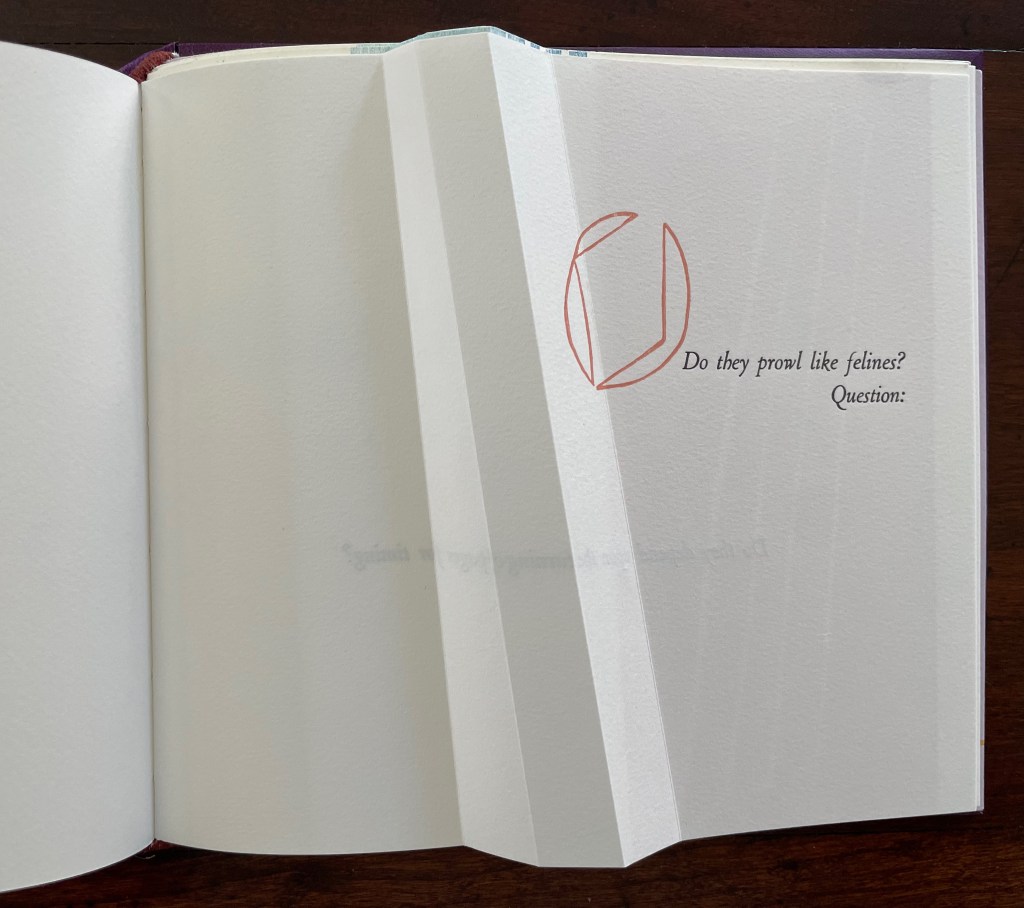
The next question (“Do they prowl like felines?”) prods at the unasked question: what or who are “they”? How is it that “they” are like prowling felines? Again, the images seem to progress across the spread, with the first image’s central diamond shape disappearing to leave the curvilinear second shape leaning over the printed question. Might these be diagrams of the limp vellum structure’s sewing holes and lacing? If so, has Cordeiro found another metaphor for limp vellum structures in the supple and sinuous strength of prowling felines? Do “they” refer to limp vellum structures?
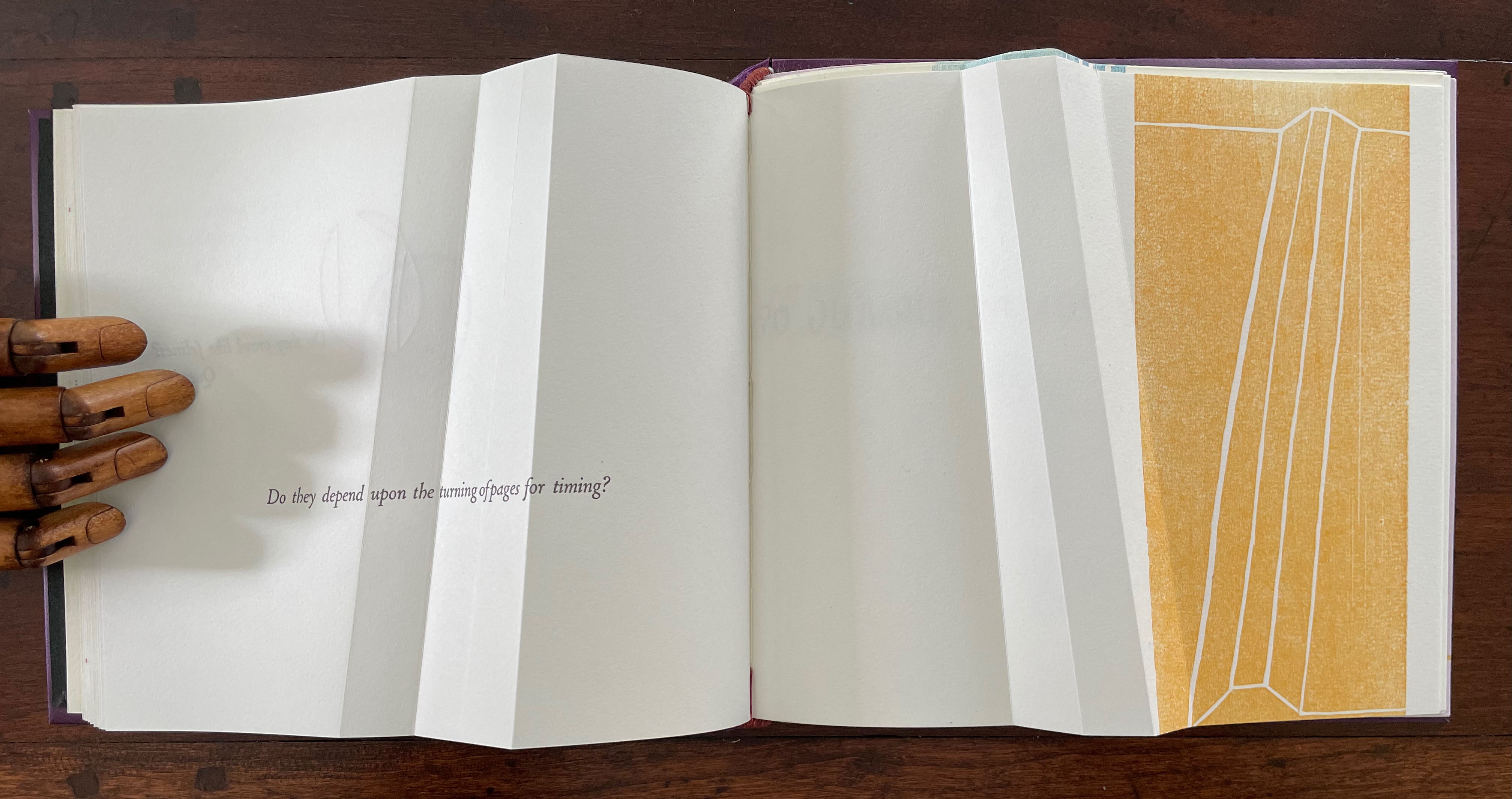
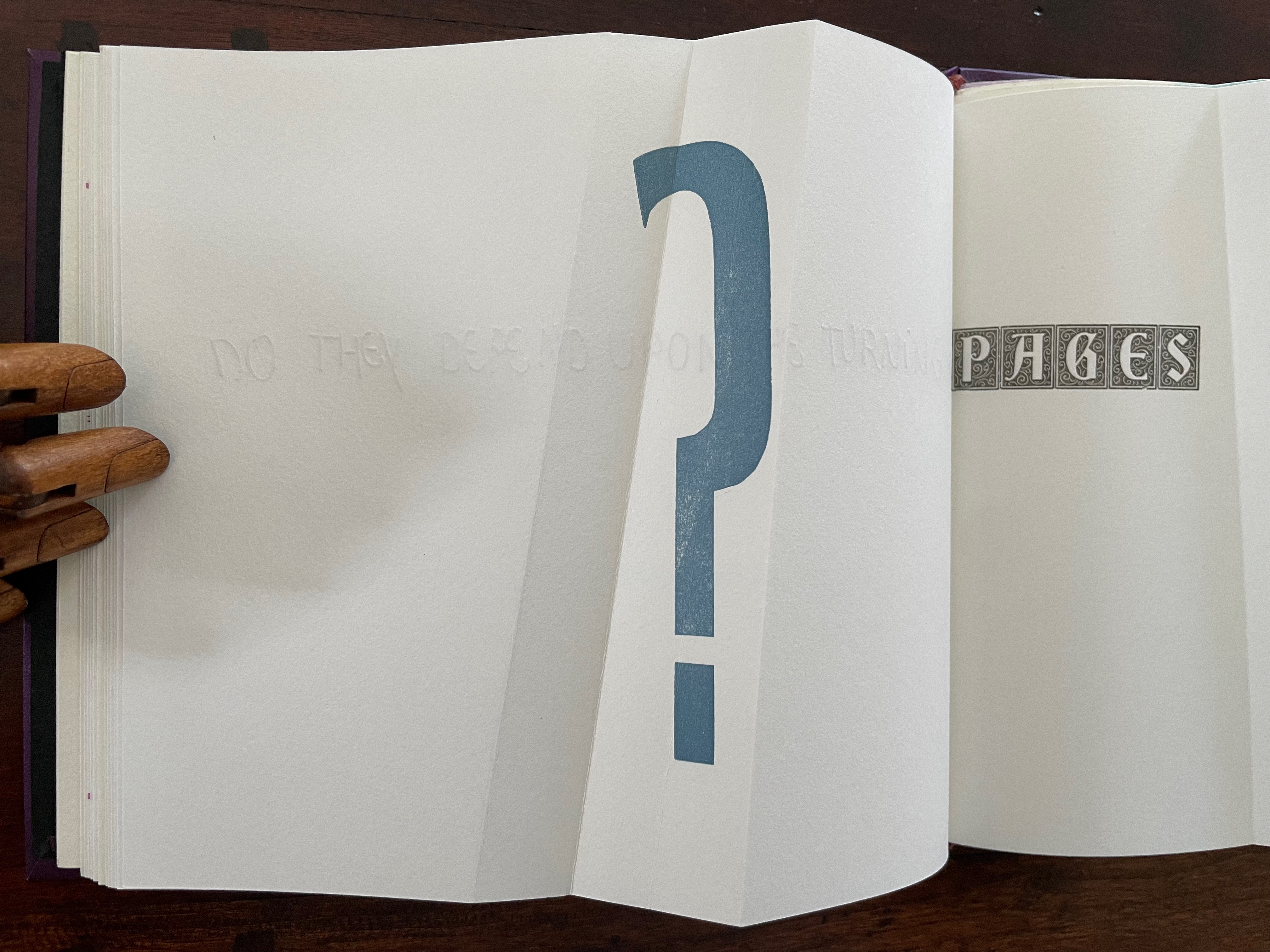
The next question turns directly to a functional attribute of the book structure: turning pages. The yellow print gives an ambiguous view. The two-dimensional representation of the angled beam fluctuates between a mountain view and a valley view. Are we looking down on the splayed spine of a book or its gutter with pages splayed open? Either way, the print angles away from the physical angled beam, which sets up a metronomic pattern in the spread — the beam leaning to the right, then to the left, and again to the right — or a page turned to the right, then to the left, and back again to the right — or mountain fold, then valley fold, then mountain, then valley (the gutter), then mountain, then valley, then mountain until we come to the ambiguous two-dimensional print. Again, this is a continuum, and “they” seems to refer to limp vellum structures.
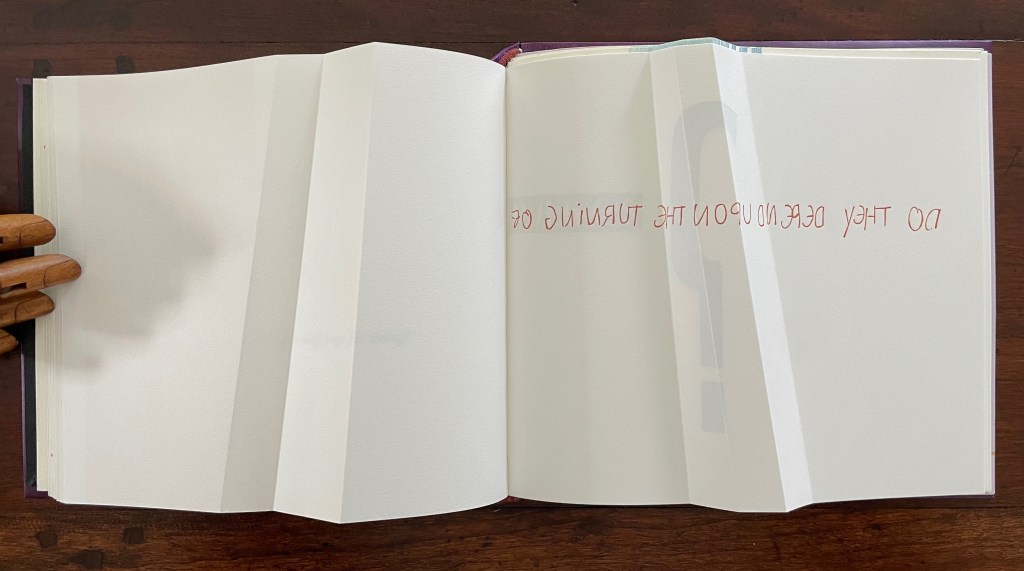
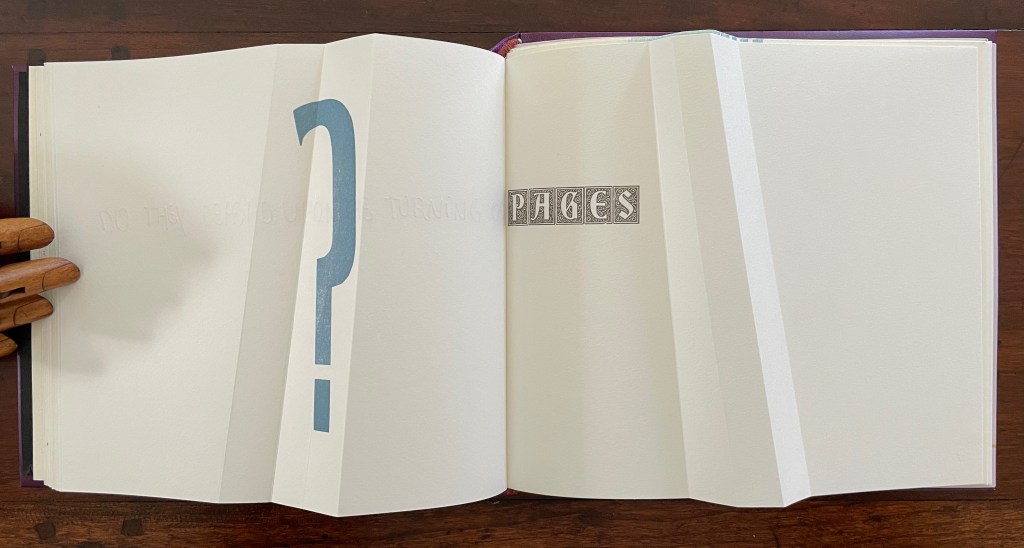
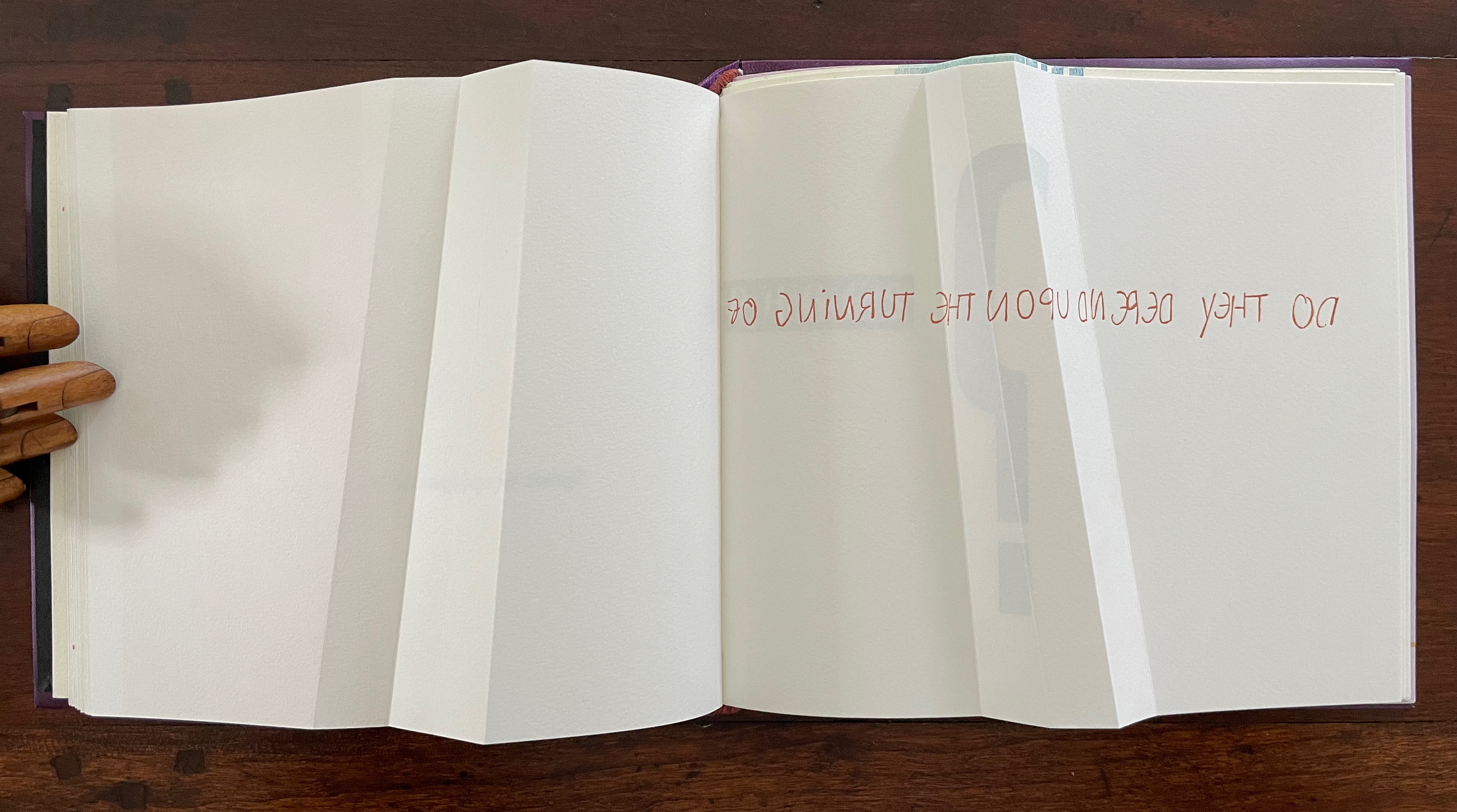
The next question enacts itself. To read the mirror-written script, we have to turn the page and look through its surface to the right-reading words: “Do they depend upon the turning of”. The question completes itself in a curious (again) metronomic motion. The syntax draws our eyes to “PAGES” on the right, while the oversized punctuation mark syntactically draws our eyes back to the left. The play between the reversed writing on a recto page, the right-reading script on the verso, the display type on the next recto, and oversized question mark on the adjacent verso provide self-reflexively an affirmative answer: Yes, limp vellum structures depend on the turning of pages.
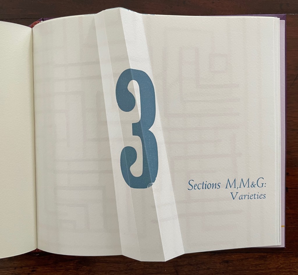
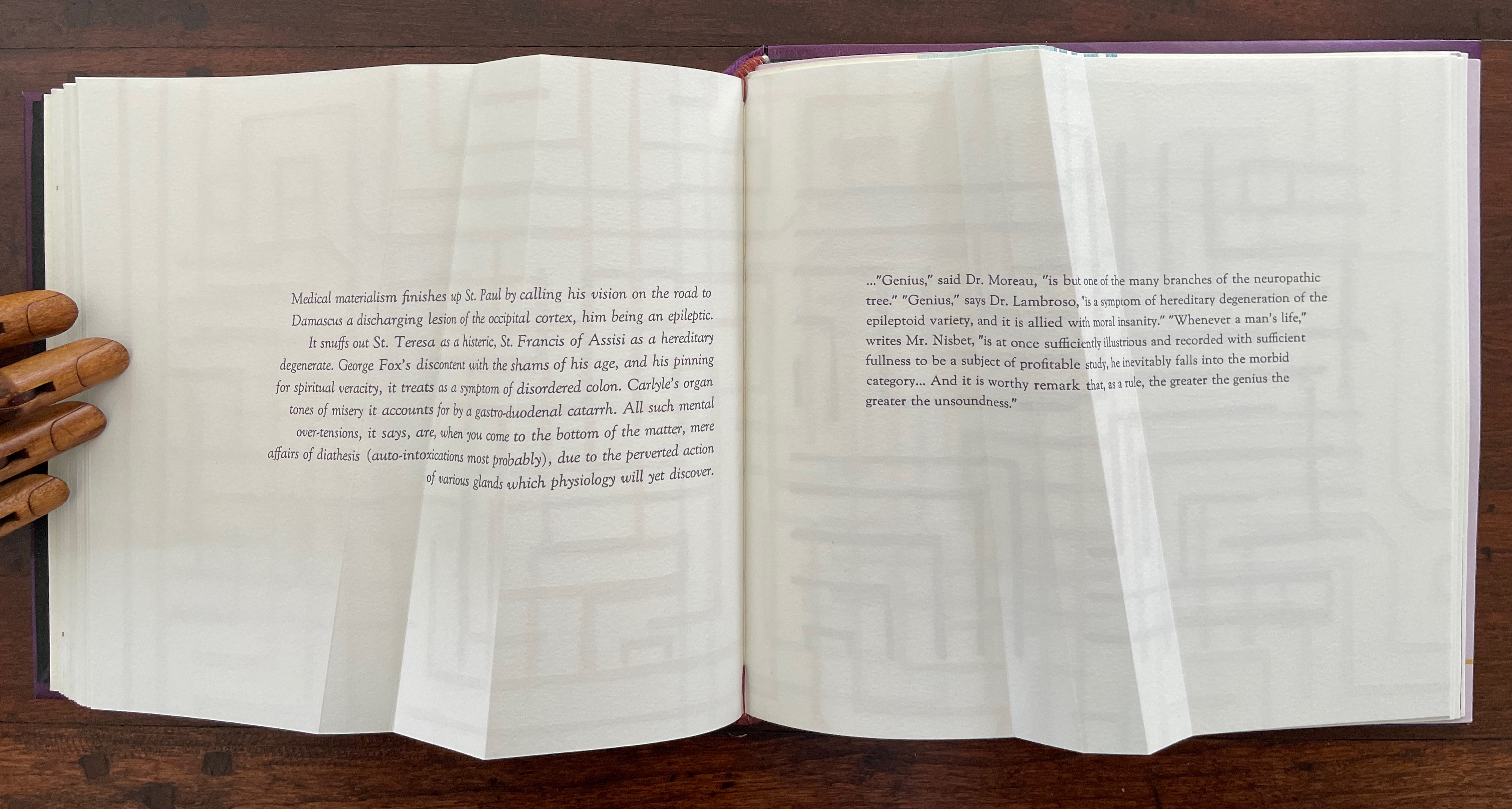
Part 3 introduces rather more esoteric continua with which Cordeiro seeks to connect the genius of the limp vellum structure. The Section letters M, M and G are her reminders-to-self that this section excerpts passages from William James’ The Varieties of Religious Experience (1902): one on medical materialism (p.14) and another on genius (p.18).
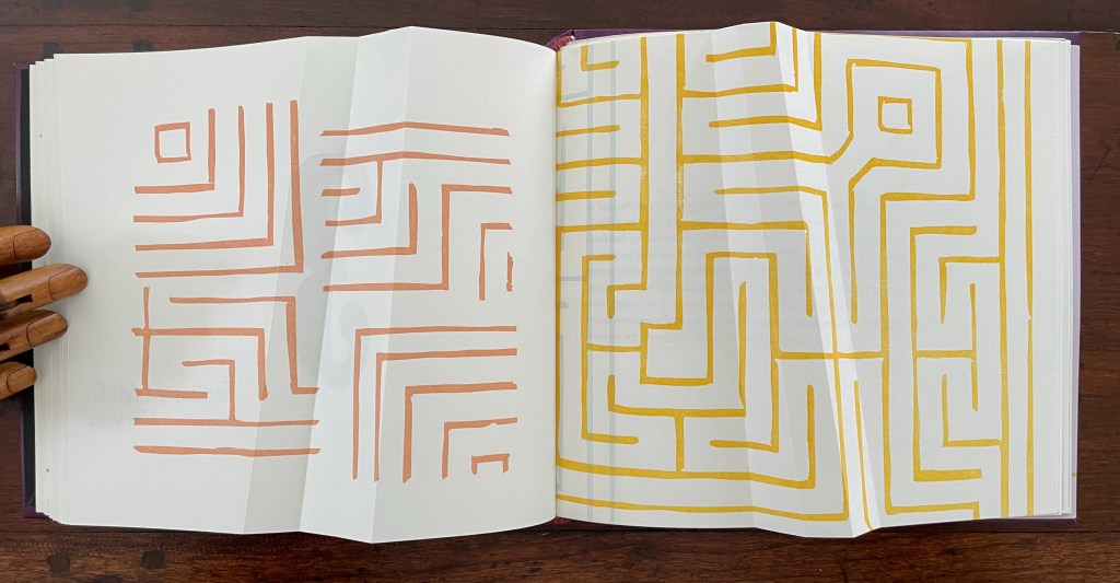
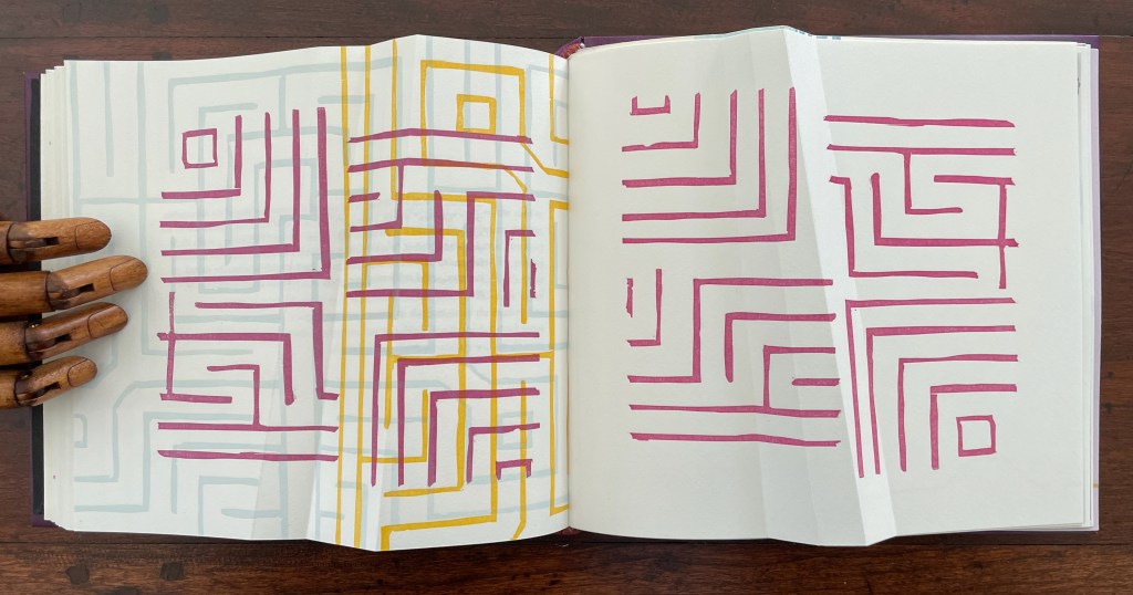
Cordeiro brackets the excerpts with maze-like images constructed of mirrored forms across four different colors. So we have the continua of mind to matter and of genius to madness embedded in a continuum of color and form (color and form merging).
Note the 18o° turn of the beige image in the upper left to be mirrored by the magenta image in the lower right.
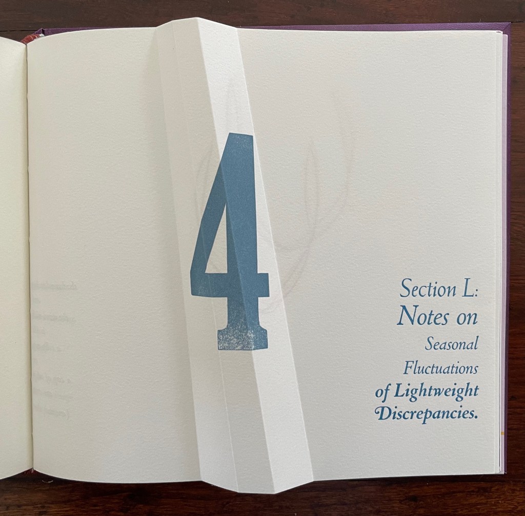
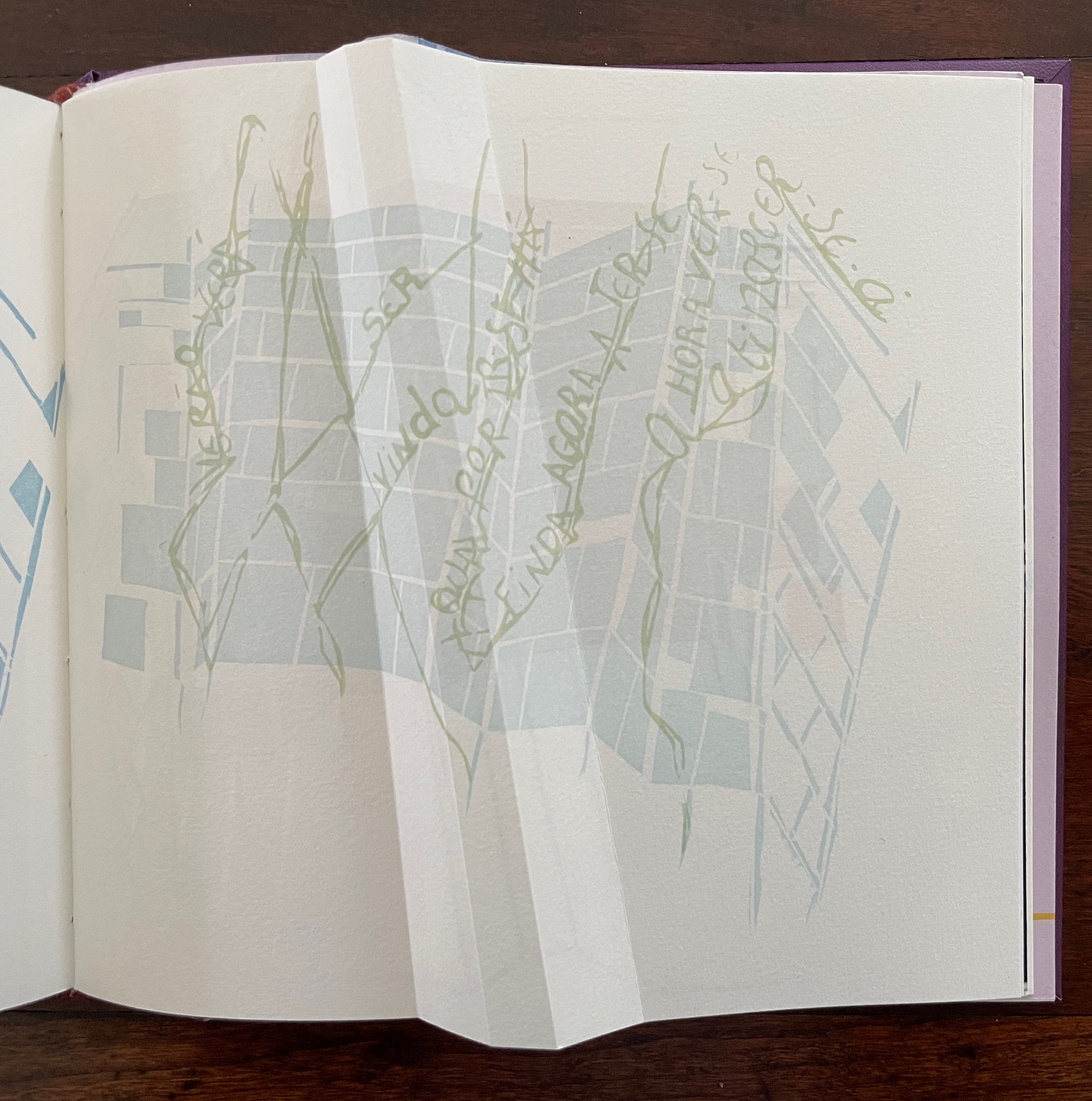
Part 4, labeled “Section L: Notes on Seasonal Fluctuations of Lightweight Discrepancies”, is the densest of the gatherings. Drawings, verse typeset in English and scribed in Portuguese, typographic arrangements, trimmed and segmented photographs, and linocut prints of a stone wall all find their way into Part 4.
Note how the colors of the tulip shapes echo the colors of the maze in Part 3.
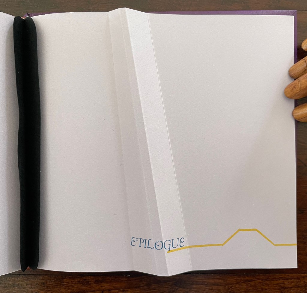
The “Epilogue” tells us, “The handwritten text in Portuguese is a word play with the alliteration afforded by that language between the verb to see and the season summer, and translates roughly as: ‘summer shall see gone that which / by going is now new being. / seeing such an hour at birth is to / be seen alive.” Another continuum.
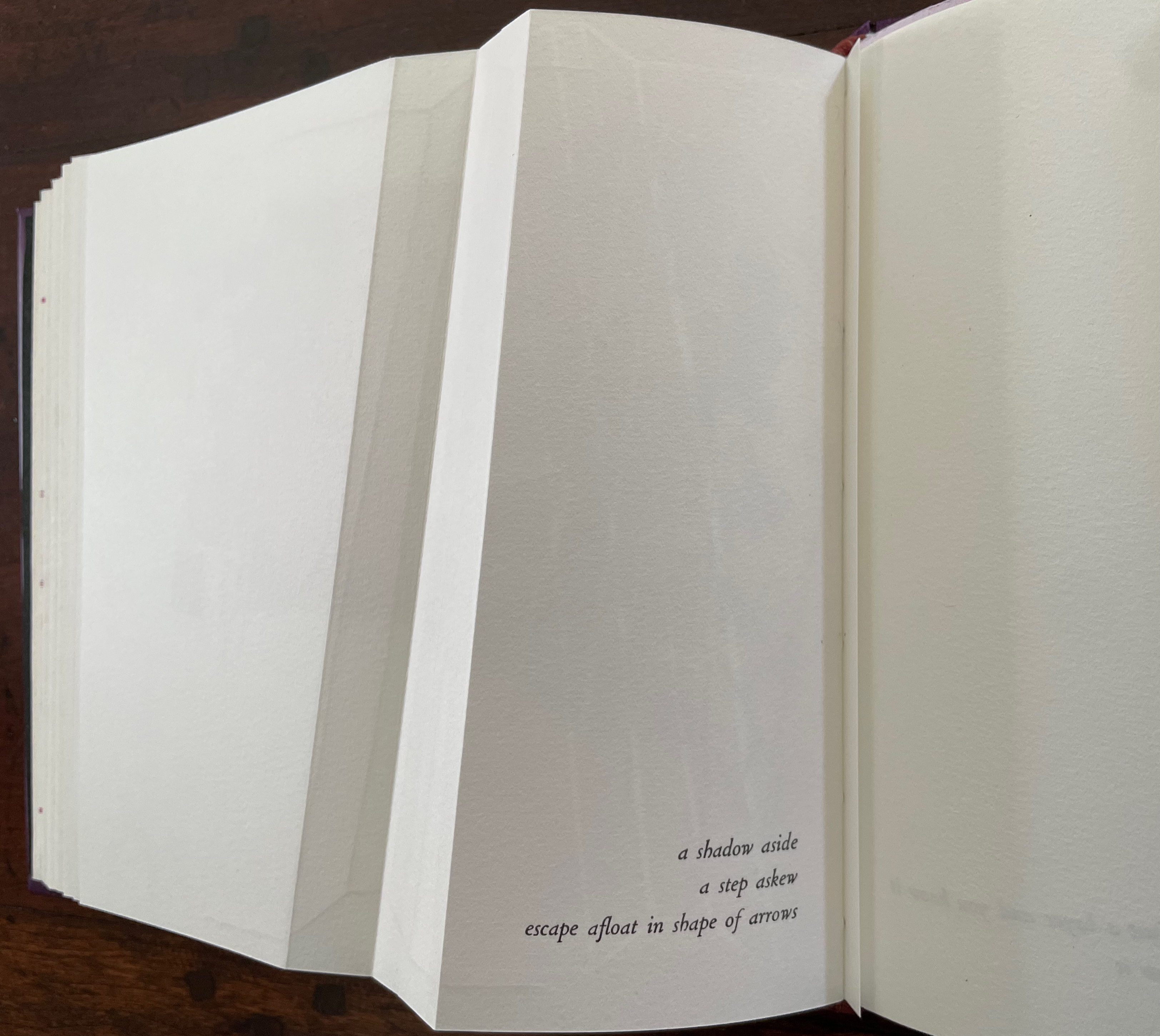
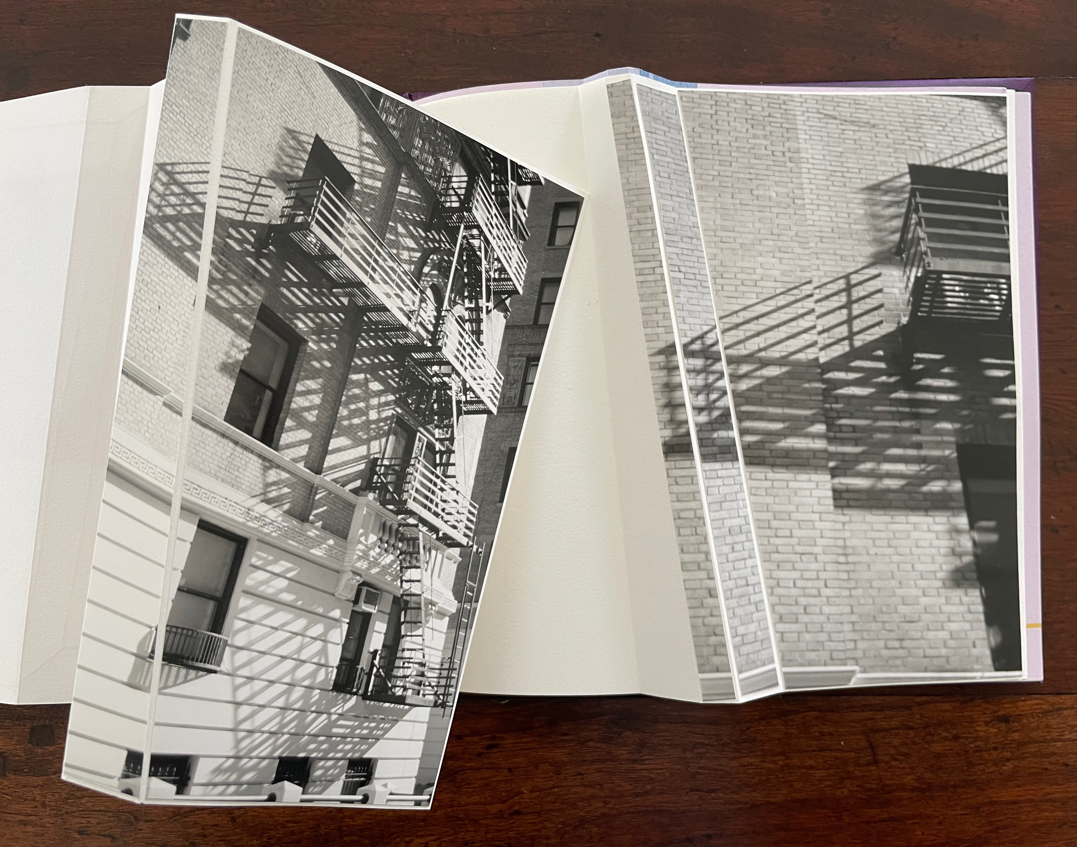
“a shadow aside / a step askew / escape afloat in shape of arrows”. The segmented photos of an Upper West Side building’s fire escape articulate with the angled beam shape to echo the text.
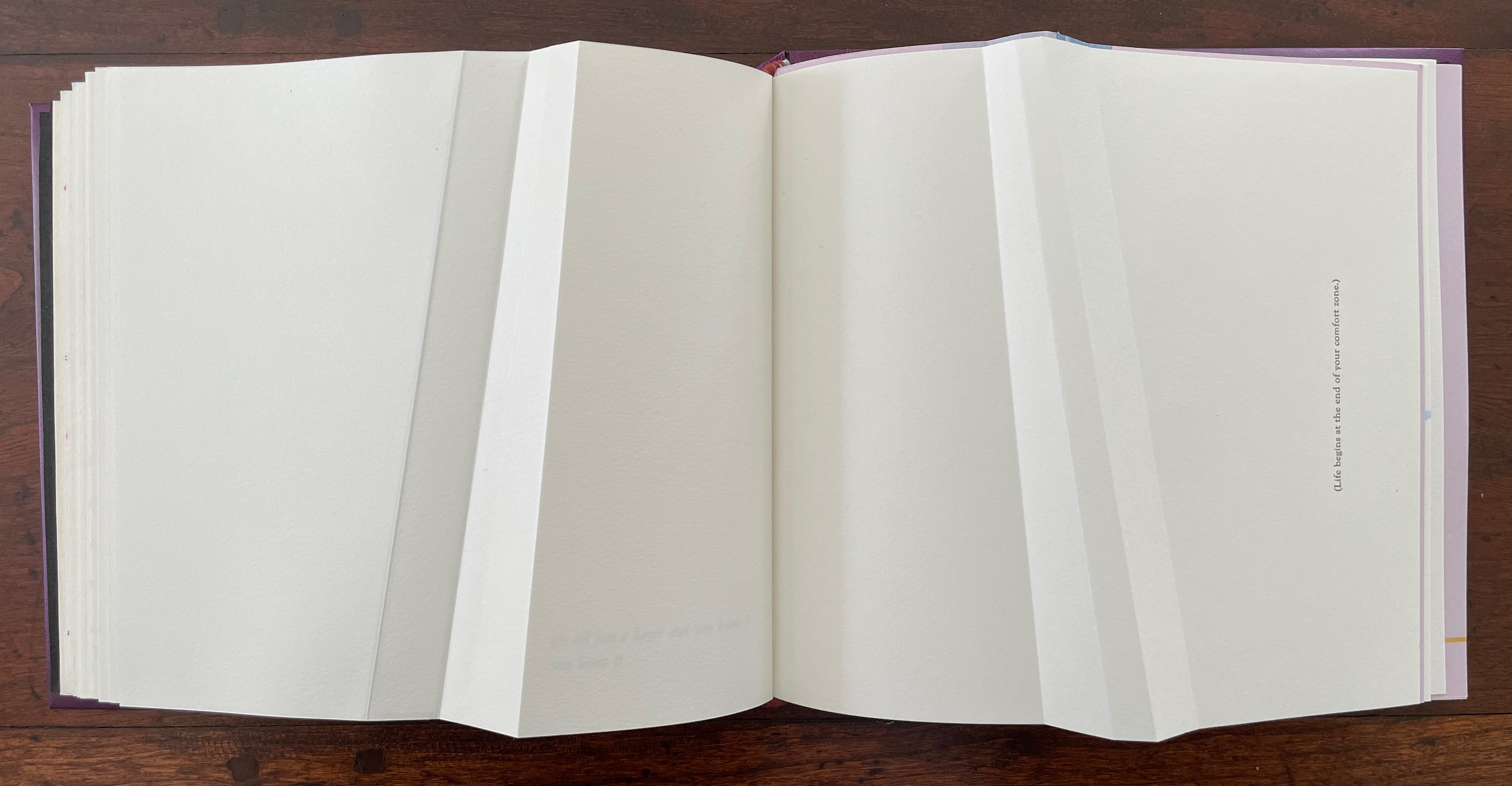
The text before the concluding “end-on” image in this gathering introduces another continuum: “(Life begins at the end of your comfort zone.)”
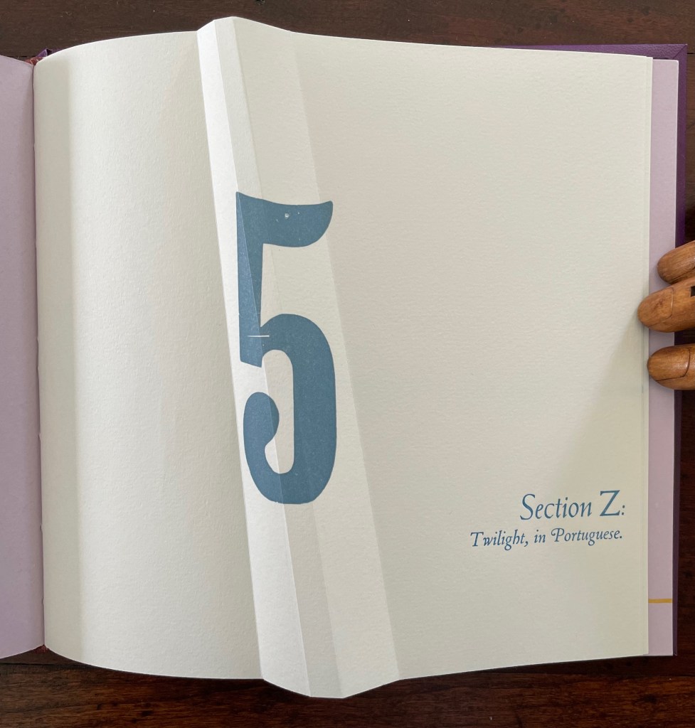
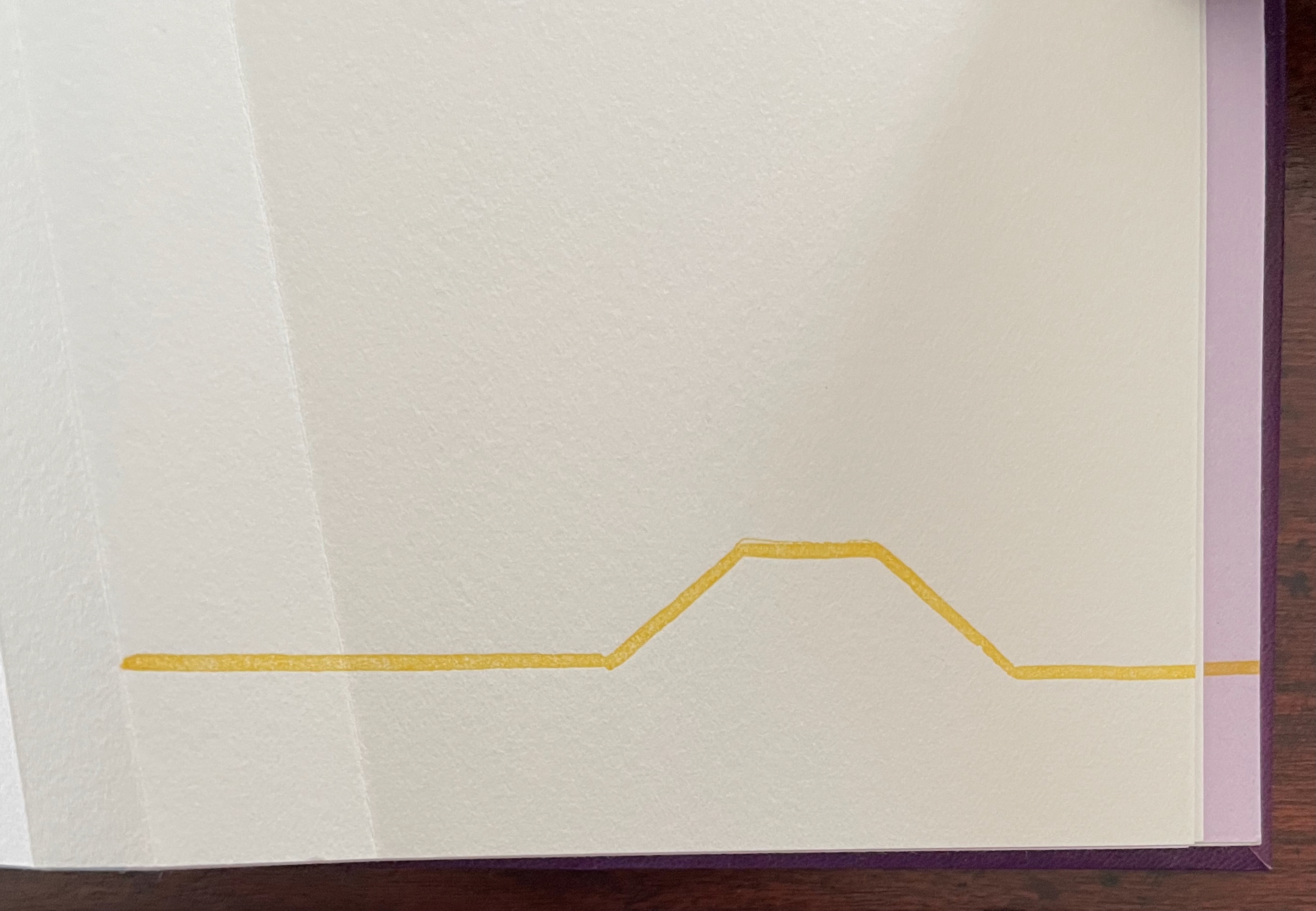
Part 5, Section Z is the wrap-up, conflating the end of the alphabet with the end of the day (twilight), but of course, twilight is also a point on the continuum of day into night.
Lusco-fusco = twilight.
At this point, the reader might register that a continuum whose extremities hang in the balance against one another and yet are still connected is also a description of metaphor itself. Two disparate terms are brought together to make a figure of speech. Cordeiro brings two disparate objects together — a softcover codex and the shape of an angled beam, a hard form of structural support — to shape her artist’s book. She materializes that metaphor, then uses it as a platform for textual, graphical, material, and structural metaphors that celebrate the limp vellum structure. It is a striking accomplishment that challenges readers to think with their hands as well as their minds.
Further Reading
“Carol Barton“. 10 August 2024. Books On Books Collection.
Drucker, Johanna. 2004. The Century of Artists’ Books [Second edition] ed. New York City: Granary Books. For investigation “of the book as a form through examination of its material, thematic, and formal properties “, see p. 93.
Hebert, Henry. 18 December 2011. “Limp Paper and Vellum“. Work of the Hand. Accessed 23 October 2025.
Magee, Cathie (compiler). 23 February 2024. “BPG Parchment Bookbinding“. AIC (American Institute for Conservation) Wiki. Accessed 22 October 2025. Citing Clarkson and Giuffrida.