Because he works with so many different materials, it is hard to classify Julien Nédélec as an artist: A polyfabricant? With language play being a more or less constant theme: A polywright? His website labels him a plasticien, the perfect French word that captures more of the media in which he works than its usual translation “visual artist” does. In Zéro2, Antoine Marchand writes:
Everything, with him, is subject to manipulation, appropriation, and diversion, at times in the most trivial and basic way imaginable. His work is based on permanent mischief, a desire to destabilize the viewer, and be forever creating a slight discrepancy, which barely ruffles the reading of the work—well removed from the showiness of many present-day productions. He bypasses the daily round and takes us towards somewhere else that is not that far away, but all the more joyful. … What should incidentally be underscored in this young artist’s praxis is his ability to move from one medium to another, without the slightest bother or apprehension. It is impossible to pigeonhole Julien Nédélec’s praxis in any one particular medium.
Several of his works have been hosted on the Greek island of Anafi by the Association Phenomenon and the Collection Kerenidis Pepe, whose website also notes that his
practice can take many forms, from sculpture to drawing, through books and photography, with a predilection for the paper, that he uses not only as a support, but also as a material that he bends, cuts, colors, stacks or crumples. His works are the result of linguistic and formal games that reveal the artist’s fascination with the potentialities of language, with a malice that places him as an heir apparent of the Oulipo, while his taste for geometric and serial shapes brings him closer to the tradition of minimalism.
With paper as a favorite medium, there are a handful of artist’s book among the many other forms. Taken together, his artist’s books almost make up an anthology of homage to book artists from the 1960s to the present. He also belongs to the school of appropriators embracing forerunners like Bruce Nauman, Richard Prince, and Richard Pettibone and contemporaries like Michalis Pichler, Antoine Lefebvre, and Jérémie Bennequin, all of whom have embraced the self-reflexive artist’s book as an appropriate medium for appropriation. No wonder Galaad Prigent’s Zédélé Éditions, the French publisher that hosts Anne Moeglin-Delcroix and Clive Phillpot’s Reprint Series of artists’ books, is so fond of his bookworks.
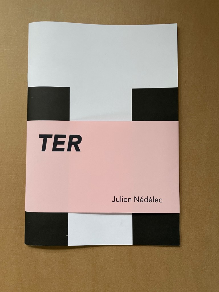
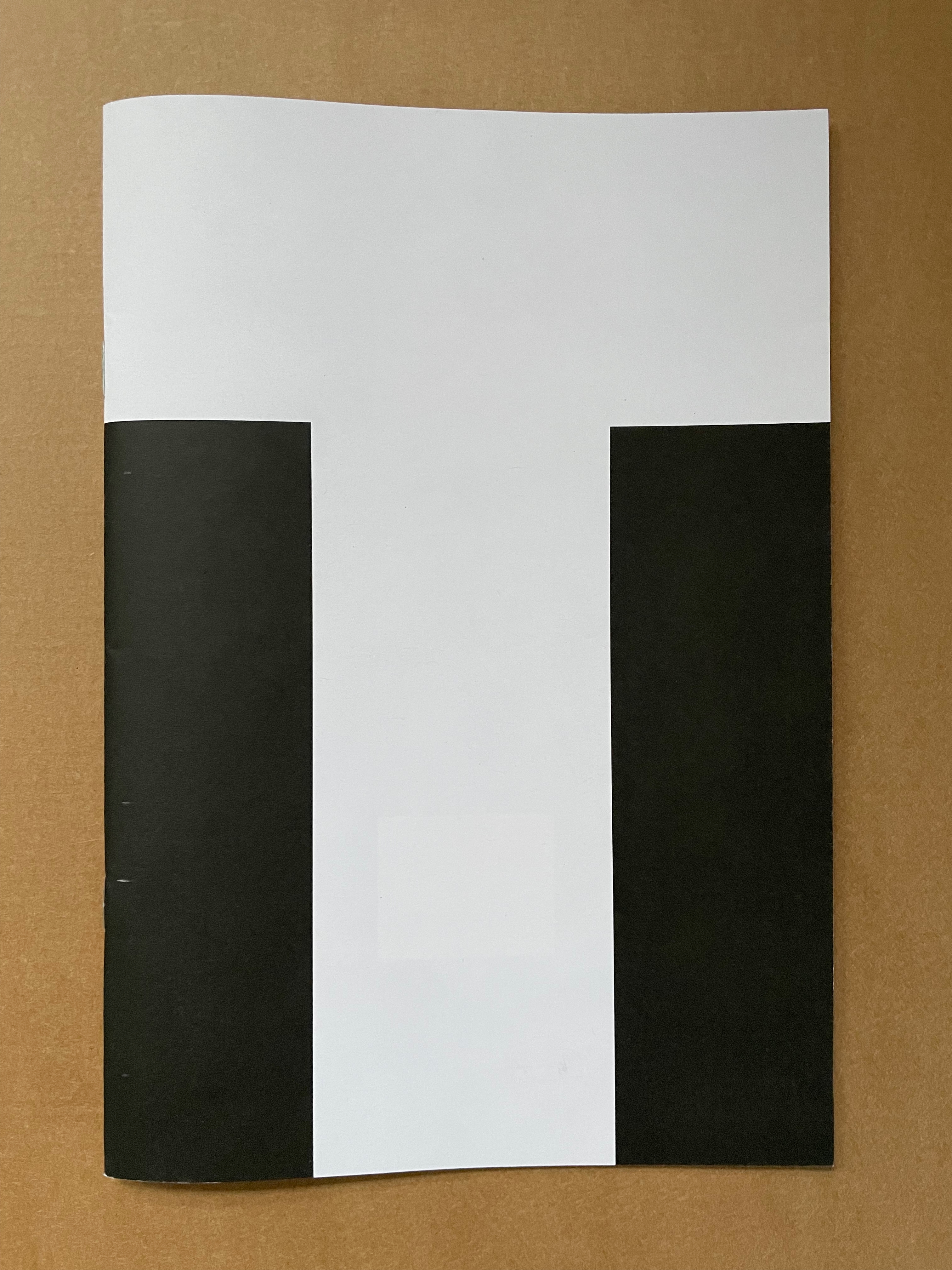
TER (2021)
TER (2021) Julien Nédélec Softcover, saddle stitch with staples. H240 W165 mm. [36] pages. Acquired from Zédélé Éditions, 21 September 2024. Photos: Books On Books Collection. Displayed with the artist’s permission.
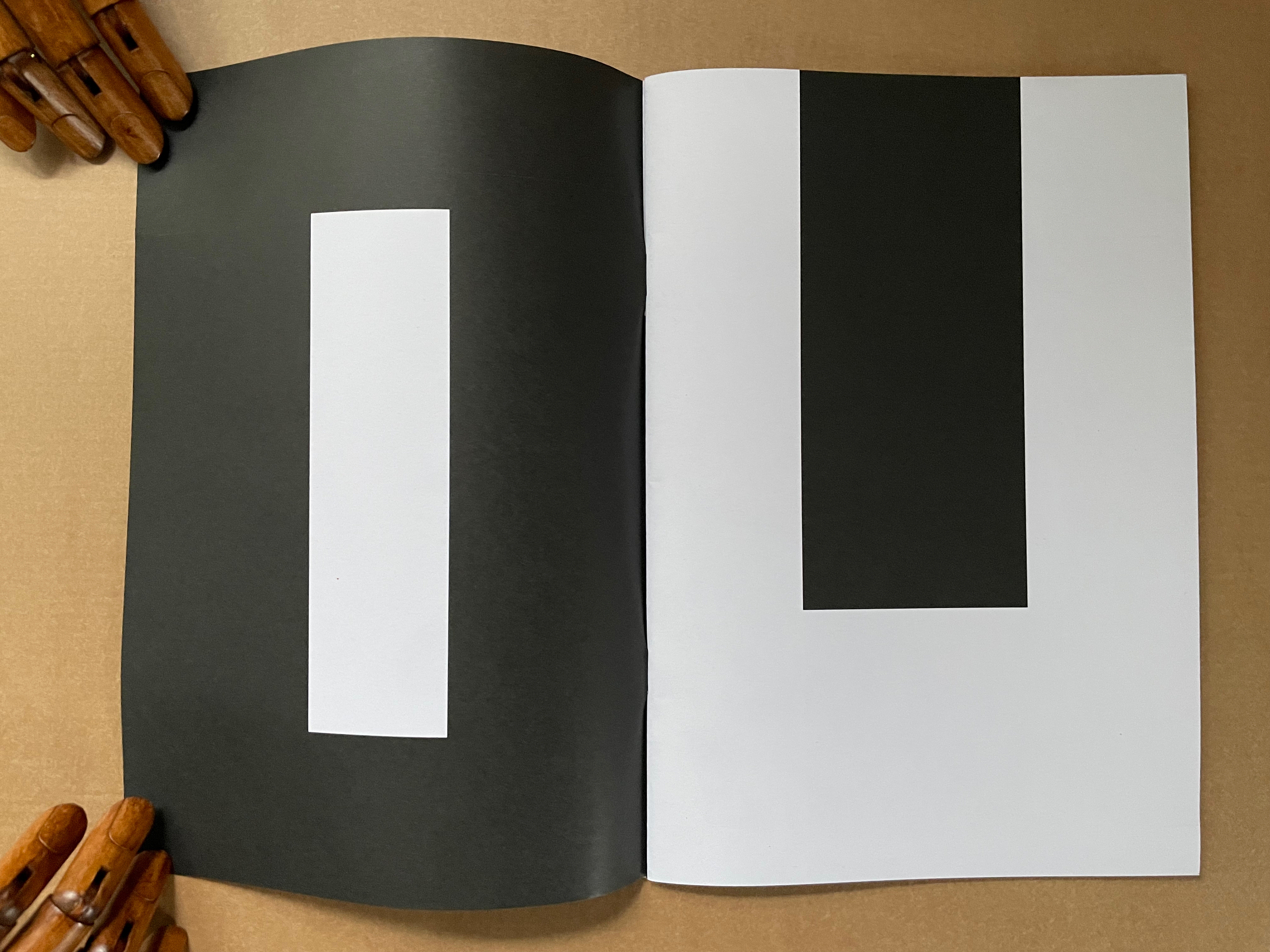
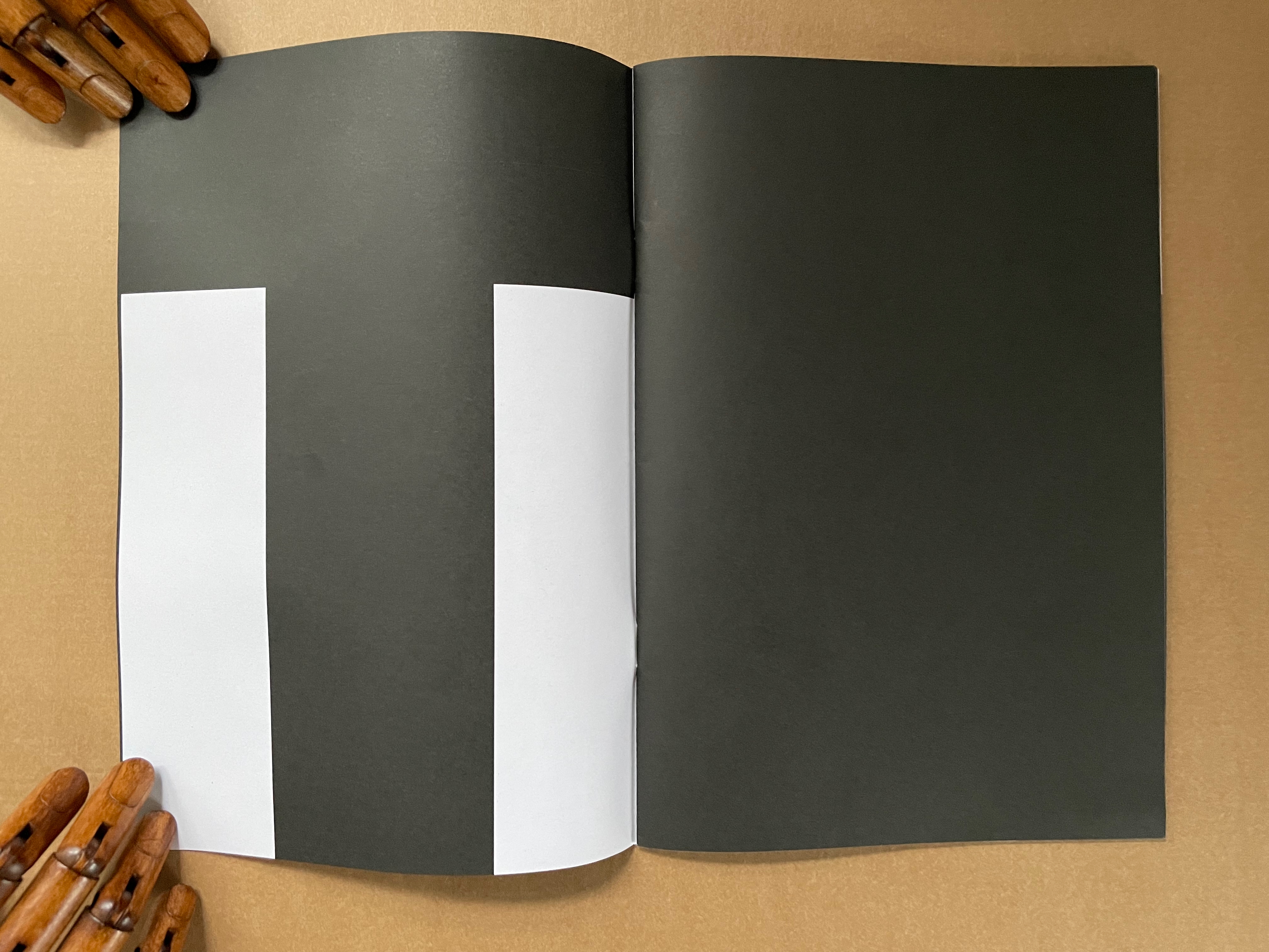
“Tout”
The sentences to be deciphered from these full-page-bleed letters are Tout a été redit. Tout a été refait, which, in English, would be “Everything has been said. Everything has been done.” But it also has the echoes of a French children’s song, “Tout ce que je fais“:
The entry on Transforming Hate by Clarissa Sligh, her first work acquired for the Books On Books Collection, was posted in September 2020, just over a month from an election that offered a step away from hate, prejudice, and bigotry. Unfortunately insurrection brushed the offer aside. Four years later, another election, and reactionism and revanchism seem to have the upper hand. In such times, Clarissa Sligh’s book art, photographs, and recorded lectures provide a tonic of bittersweet hope. You cannot help but be struck by the persistent but wary humanity of the art and the artist.
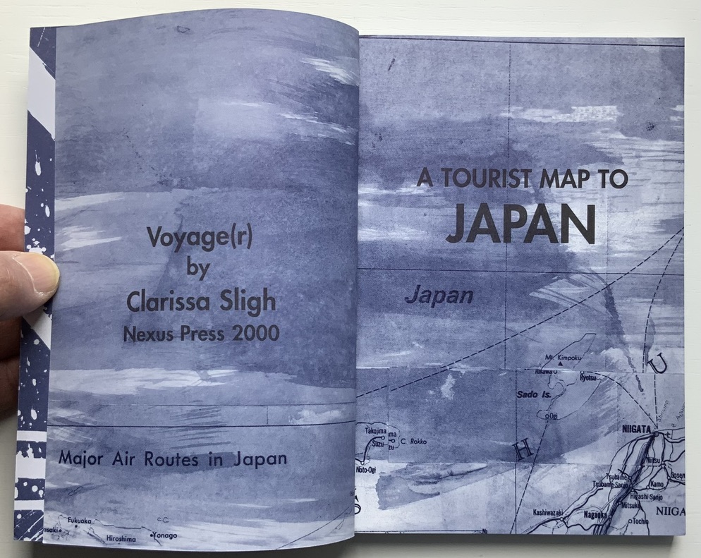
Voyage(r) (2000)
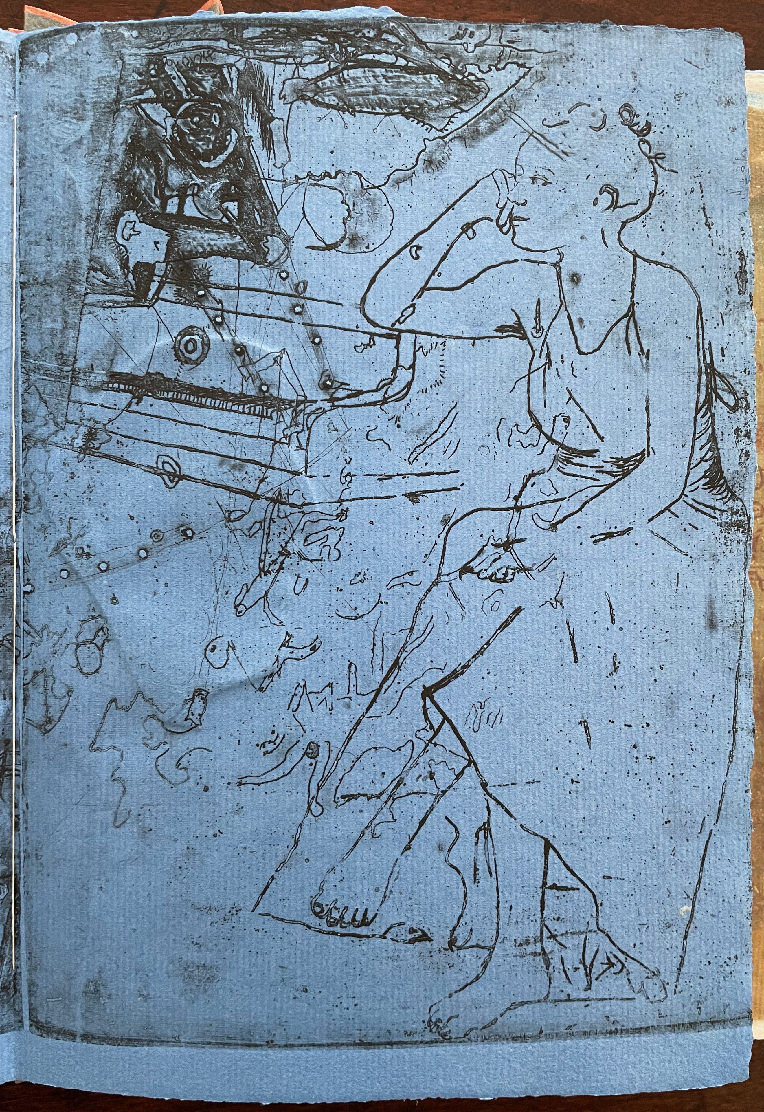
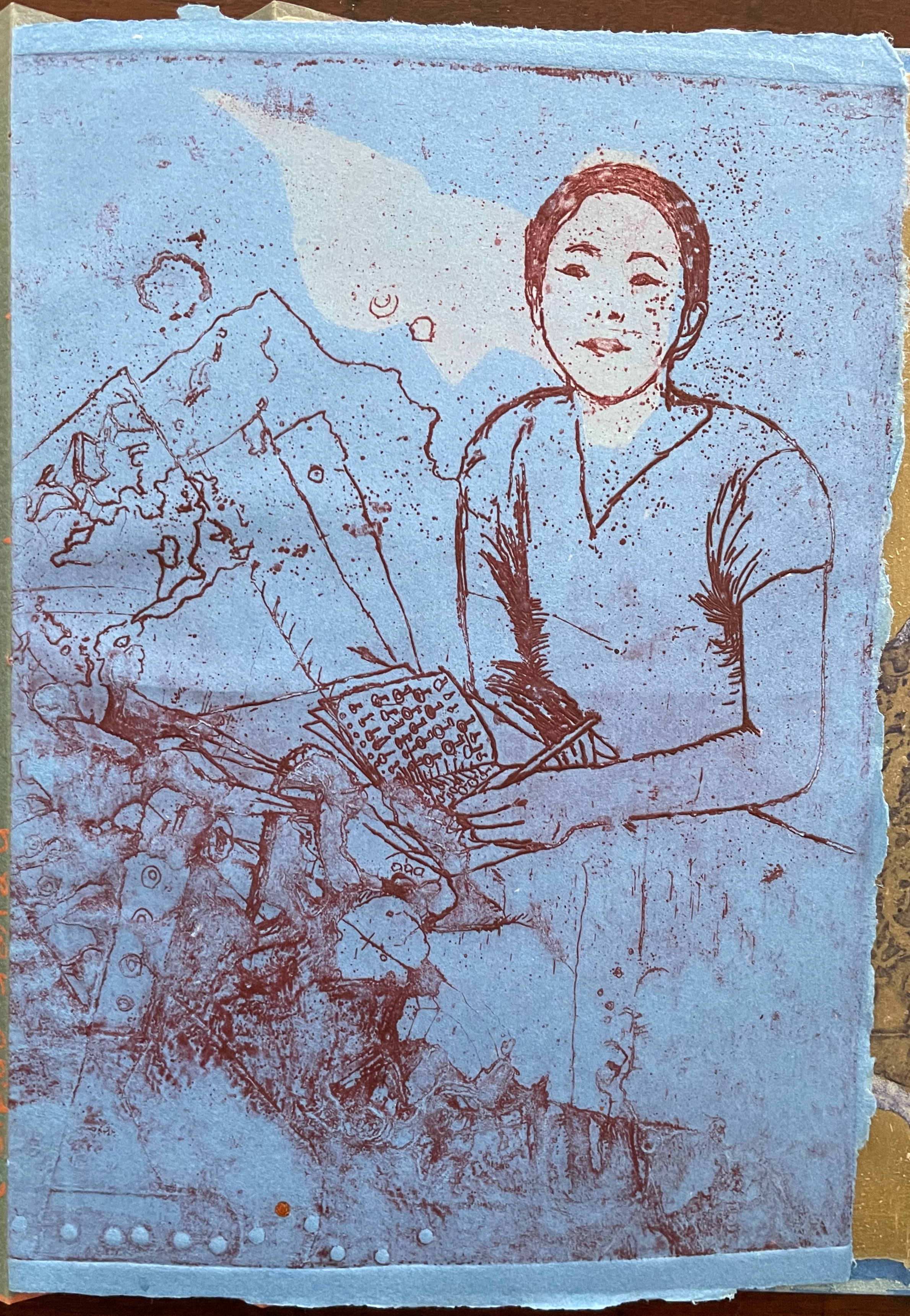
Voyage(r): A Tourist Map to Japan (2000) Clarissa Sligh Perfectbound paperback. H184 x W127 mm. [144] pages. Edition of 1000. Acquired from Hudson River Books, 11 February 2021. Photos: Books On Books Collection.
Artist’s description: “In this diary-like artist’s book, Sligh recounts a trip to Japan through a thoughtfully constructed montage of photography, texts, and abstract gestural paintings. In personal and poetic musings, the author ponders her relationship to Japanese culture, both as a first time visitor and as an African American woman. Beautifully printed in blue and black duotones, the book comes in a cloth bag.”
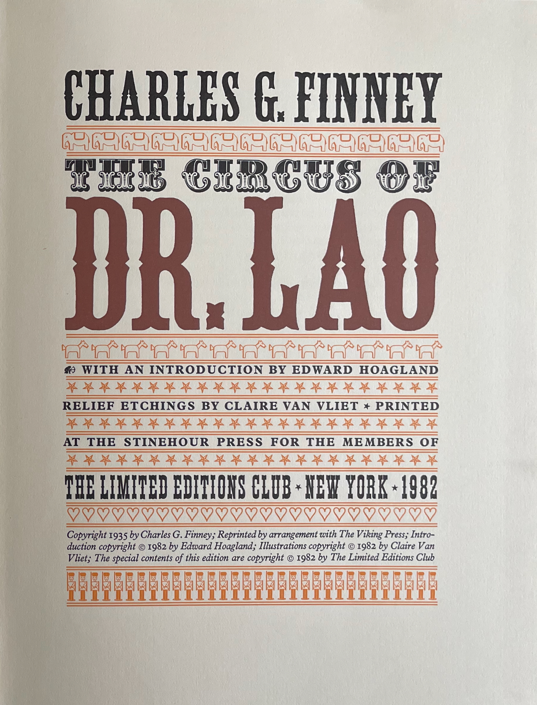
The Circus of Dr. Lao (1982) Charles G. Finney (text) Claire Van Vliet (design and illustration) Hardback, cased in cotton cloth over boards, head and tail bands, sewn. H x W mm. 9 1/4 x 12 inches 140 pages. Edition of 2000, of which this is #996. Acquired from BlueMamaBooks, 9 February 2025. Photos: Books On Books Collection.
If you have read Nathaniel West’s The Day of the Locust (1939) or Flannery O’Connor’s A Good Man Is Hard to Find (1955), Charles Finney’s novella illustrated by Claire Van Vliet will seem only marginally disturbing. If you have seen Tod Browning’s Freaks (1932), it will seem more than tame. Somewhere in between is the appropriate trigger warning for The Circus of Dr. Lao (1982).
Finney drops Dr. Lao’s circus of P.T. Barnum-esque carnival sideshows, a bestiary of distorted mythological creatures and exaggerated stereotypes, into the Arizona backwater of Abalone. The denizen of Abalone and their reactions — from gullibility, lubricious fascination, racist hazing, and violence to shrugs and a smug return to unexceptional normality — are the targets of Finney’s fevered satire. Van Vliet mirrors the range with her illustrations printed from original relief etchings and her selection of contrasting Plantin and Victoria display types.
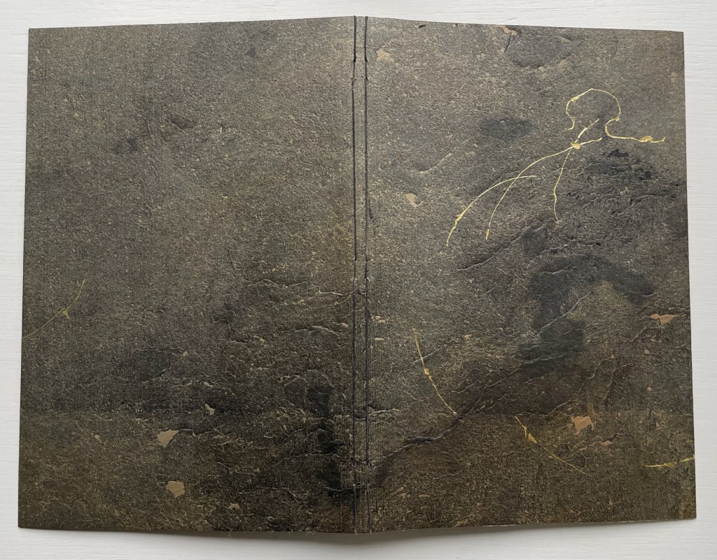
Amorous Embrace (2023) Suzanne Moore and Titus Lucretius Carus (trans. A.E. Stallings) Artist’s manuscript, stub bound to stone cover, tinted thread, gold leaf, kozo, paste paper. H220 x W148 mm. 12 pages. Unique. Acquired from the artist, 5 February 2024. Photos: Books On Books Collection.
Sometime in the first century BCE, the Roman poet Lucretius wrote the didactic epic De rerum natura (The Nature of Things). It celebrates the atomistic physics and philosophy that Epicurus and his followers recorded two hundred plus years before in thirty-seven volumes. Imagine the determination to press that Greek vision of the world from atoms to the cosmos into six volumes of Latin poetry. We’ll have to await further papyrology applied to the cinders of the Herculaneum library of scrolls and hope that it reveals more scraps of the Greek’s Περὶ φύσεως (On Nature). Only then will we know whether Lucretius based his poem directly on them.
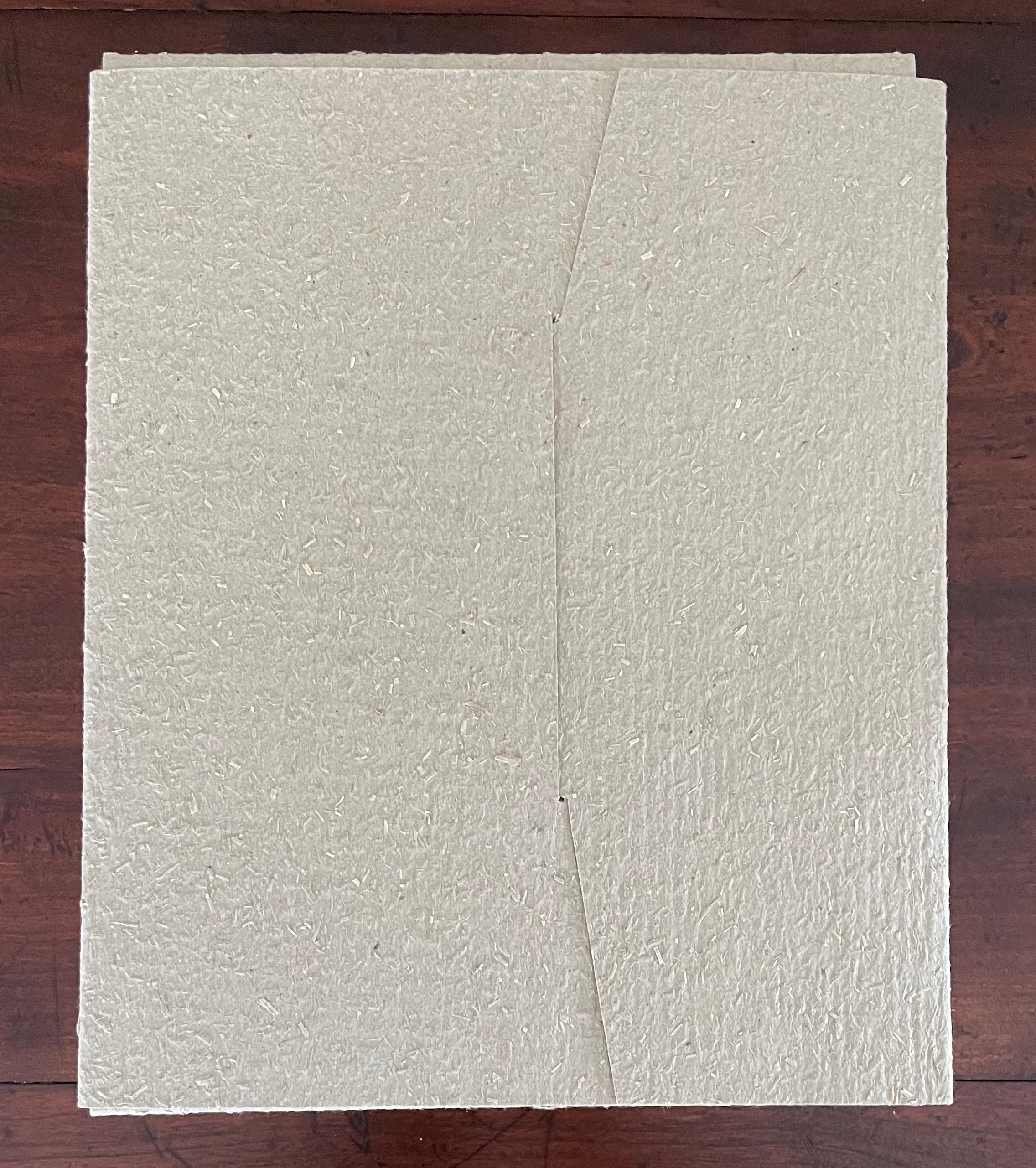
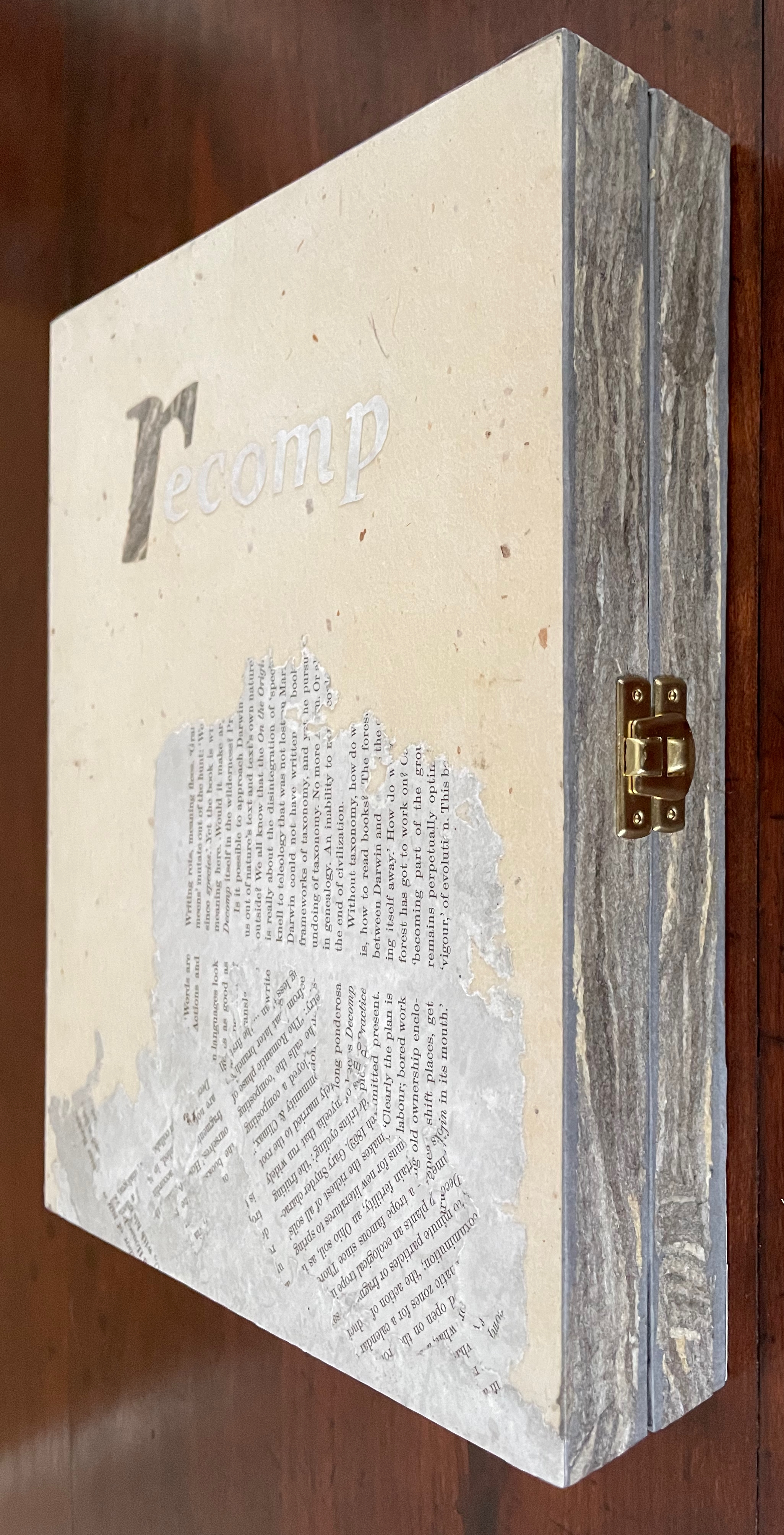
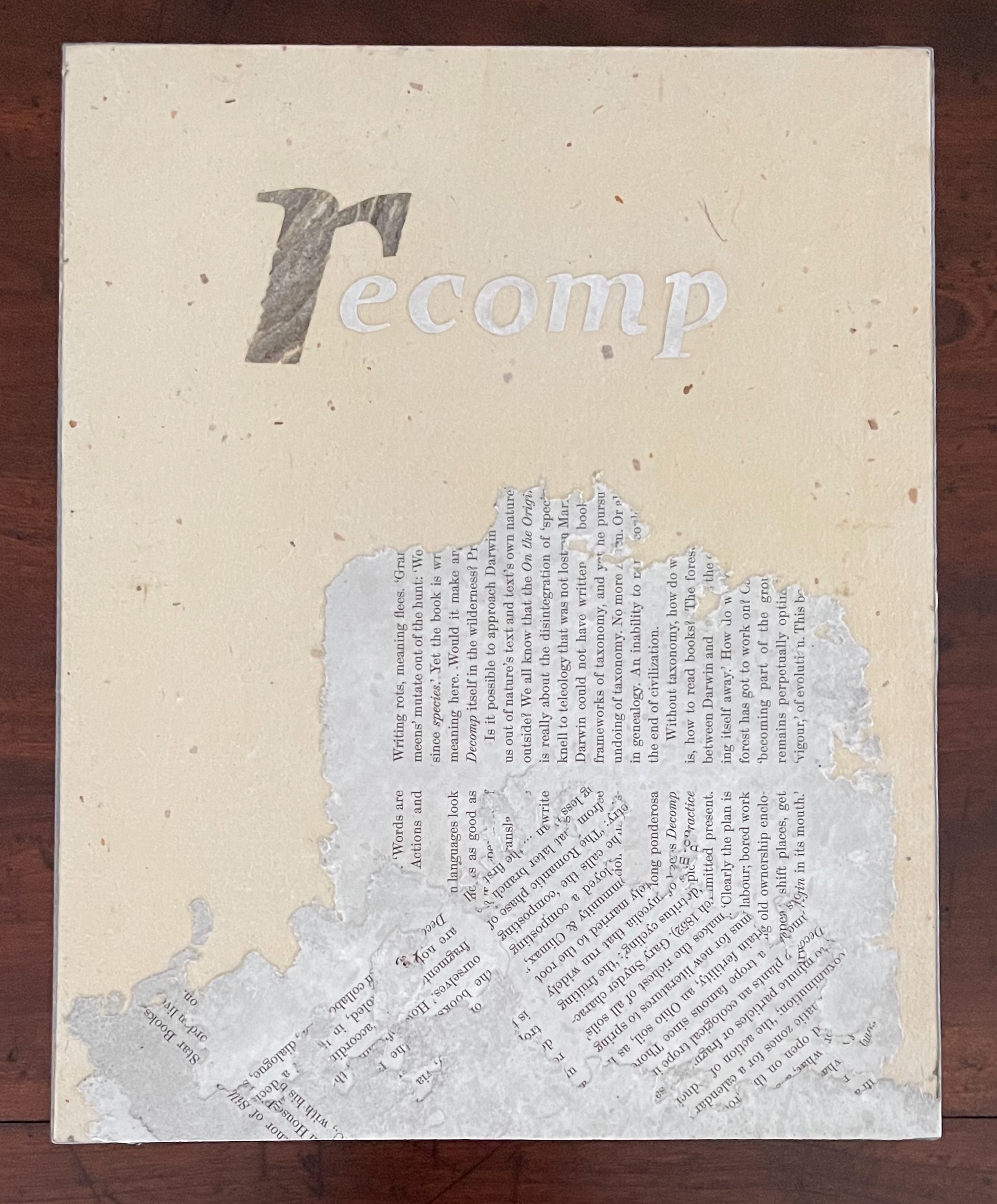
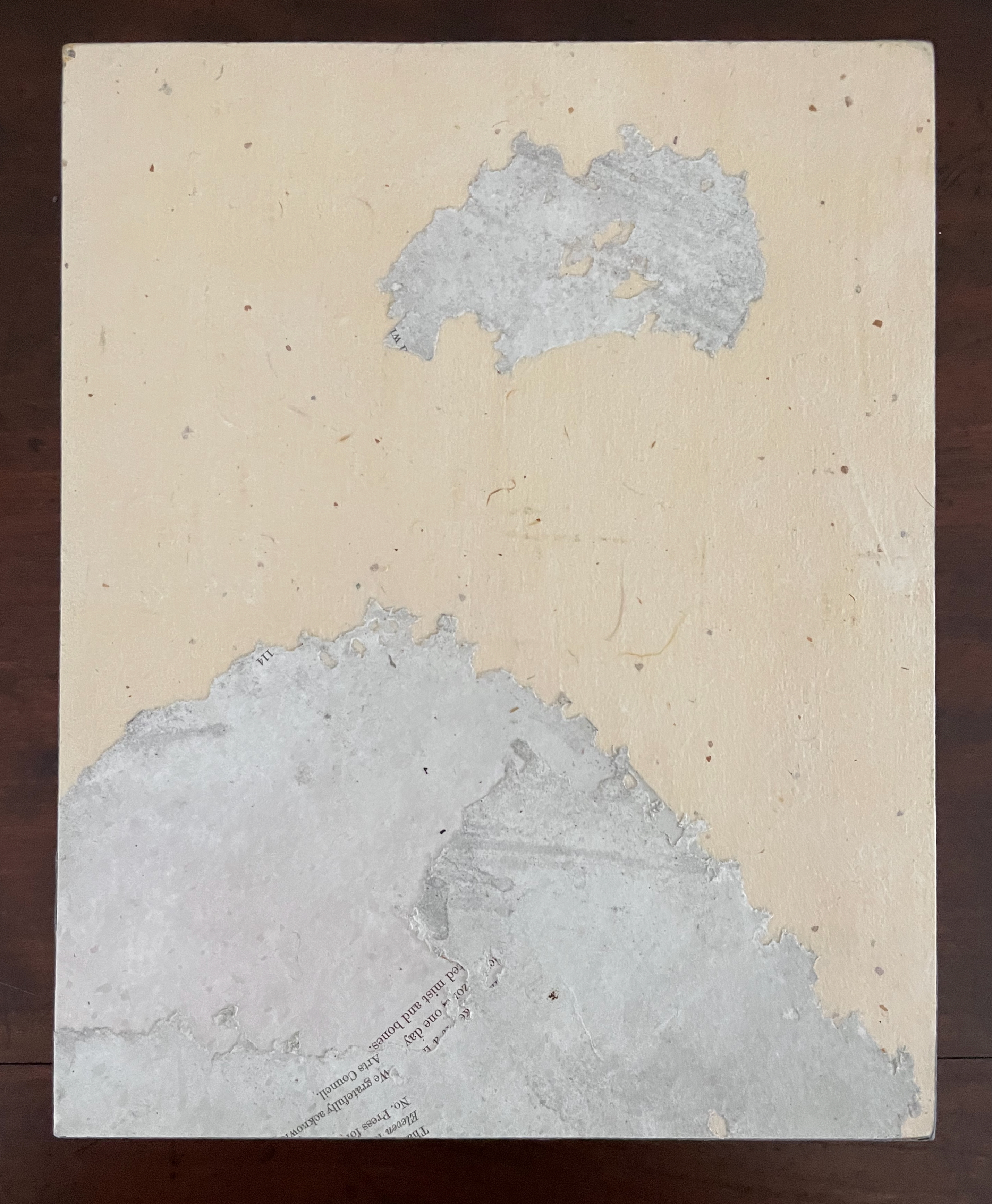
recomp (2013-23) Cathryn Miller Hinged and clasped diptych, housing an altered book, explanatory booklet, and loose colophon. Unique. Acquired from Vamp & Tramp Booksellers, 2025. Photos: Books On Books Collection.
Recomp (2013-2023) is a collaboration with a colony of bald-faced hornets. Having reviewed Stephen Collis and Jordan Scott’s decomp (2013), their artists’ book devised by exposing several copies of Darwin’s On the Origin of Species to the elements, Cathryn Miller followed suit and hung her reviewer’s copy of decomp in a tree. Over time, the wind, rain, and snow sent the book to the forest floor where it fell apart. Hornets had done their part in its decomposition, nibbling away at its edges and weakening the structure. Their conversion of the book into cellulose for their nest was also the start of their artistic partnership with Miller. Eventually the nest, too, became prey to the elements or marauders and fell and broke apart on the ground. Miller and photographer husband David recorded all this and gathered up the book fragments and broken nest.
These are Bruno Munari’s words that I share. I play and I have fun with my papers and my colours, but it is a job and a job, even if enjoyable, is a serious thing. My notes on image diaries are serious. A collection of thoughts translated into images, that are daily, just like a diary, “annotated” on nearly three hundred pages. I use the stencil technique with a monochromatic press, an imaginary thread connects them and creates a long history that develops, touching on events that have hit me in a particular way. It is my imaginary world, but at the same time, very real.Paper, card, fabric, needle, thread, colours and gouges are the materials that allow me to work and to leave my fantasy and creativity free. I have one very small study, but it is sufficient. It is welcoming, full of books, with a great ceiling window, three tables, two chalcographic presses and one press. When I am sitting in my workplace, I manage to isolate myself in my world. I can stay seated for hours without the passing time weighing on me, making me happy with this choice of life. — Eleonora Cumer
libro catalogo con interventi manuale (2019)
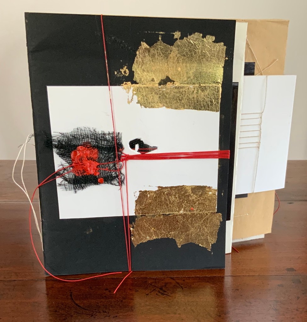
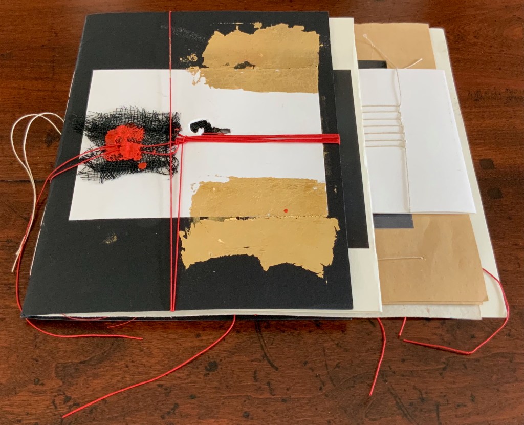
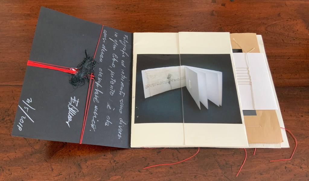
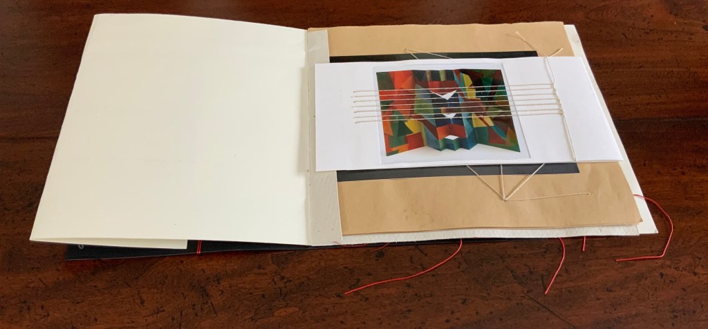
libro catalogo con interventi manuale / “book catalogue with manual interventions” (2019) Eleonora Cumer Sewn booklet, various papers including photographic, gold leaf, thread, mesh, string, wax. H200 x W220 (variable) mm. [16] pages. Unique. Acquired from the artist,. Photos: Books On Books Collection.
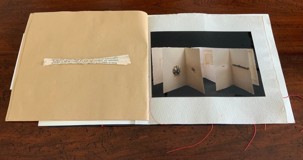
Many catalogues of individual artist’s books aim to be works of art themselves. Some attempt this with fine press production and limiting the edition, which sometimes succeeds. Some embody the very material and techniques that the artist used to create the items represented in their pages. Eleonora Cumer’s libro catalogo con interventi manuale / “book catalogue with manual interventions” (2019) is an extreme and stunning example of the latter. It is extreme because it is unique, not a limited edition. It lacks any identifying captions or list of works (the captions below appear only as a convenience for this entry in the Books On Books Collection). Libro catalogo con interventi manuale stands on its own as a stunning work of book art.
As the richly textured and gold-leafed cover turns, notice how Cumer presents the image of the catalogue’s first work: Parole non dette, frasi in sospeso / “Unspoken words, unfinished sentences” (2018). Split and pasted on two sides of the first folio, the glossy photograph of Parole non dette reunites with precise registration in the center of the folded folio.
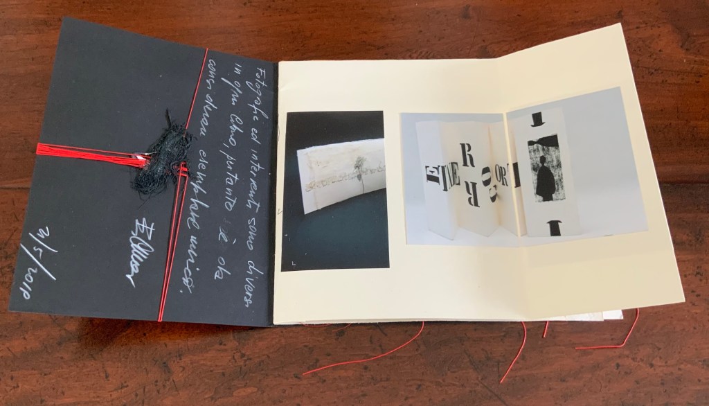
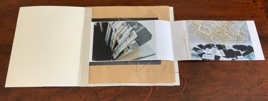
When the right half of Parole non dette turns, the second work — controcorrente /”against the current” (2010) — comes into view.
Although pasted on one side of the folio, the photograph of controcorrente splits in two at the fold, the left side and right side precisely registered with one another on either side of the fold. This is subtle. First an image reunited and aligned by virtue of cut and fold, then second an image separated but aligned by virtue of cut and fold. We may be long used to how juxtaposition works artistically on the flat surface of collage or the multiple surfaces of assemblage. Cumer teaches this afresh with the flat and multiple surfaces of book structure as well as with the materials and techniques of bookmaking.
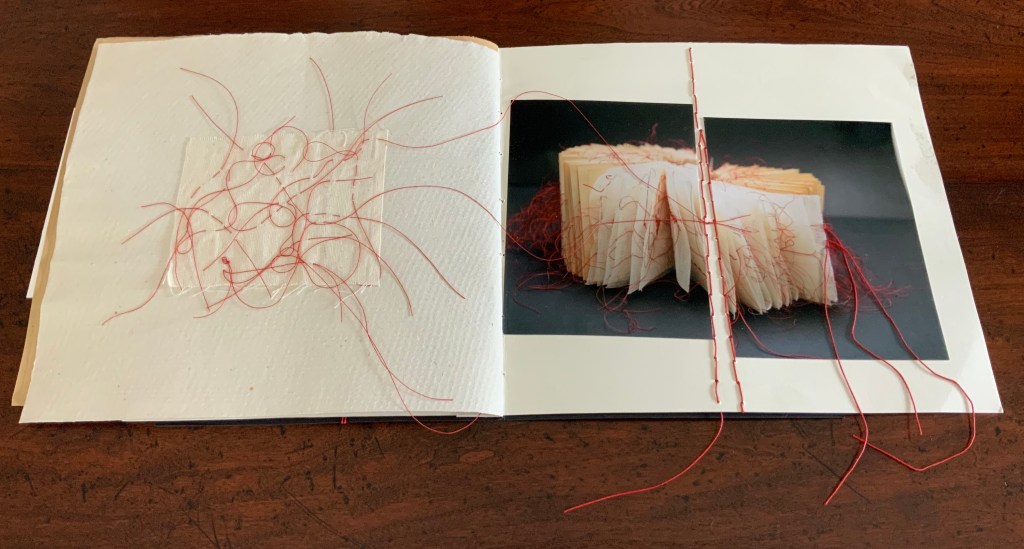
The next three works appear in a fold-out insert attached to the stub of a textured folio that also supports a brown paper folio following the insert. The colorful città / “city” (2018) reflects how Cumer’s palette and sculptural repertoire extends beyond the black and white leporello of controcorrente. The threads sewn in parallel over the photograph of città not only reflect another part of Cumer’s material repertoire, they also enact another part of her sculptural repertoire in the way they work with, in, and across the photographs and folios.
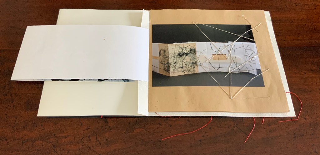
When the image of città / “city” folds out to the right, photographs of two more works appear: desiderio di … arte / “desire for … art” (2012) and illusione – delusione / “illusion – delusion” (2012). The image of desiderio highlights Cumer’s use of the flag book structure, although there is structurally much more to that work’s composition. The parallel threads that extended over the photo of cittá on the other side of the fold-out now pierce the photograph of illusione – delusione.
The next work to appear — il libro segreto /”the secret book” (2018) — carries on with the intervention and penetration by thread. The patterns formed by the thread reflect and extend those which can be seen in the photograph of il libro segreto. Leaping out of the photograph and penetrating the supporting brown paper folio, the thread introduces a new motif that will recur in just a few more pages.
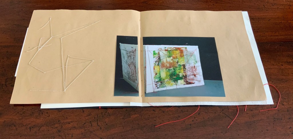
The spread presenting the next work — fili intrecciati / “twisted threads” (2018) — reverts to the split aligned photo as used with controcorrente, but here the division comes at the center of the double-page spread. Off to the left side, the abstract figure in stitched thread echoes the technique used in fili intrecciati itself and starts another recurring motif in the catalogue.
No intervention occurs in the photograph of cancellazioni e riscruttare / “cancellations and rewritings” (2018). No cuts, no folds, no threads, but on the facing verso page, Cumer brings to life one of the cancelled/rewritten objects that can be seen in the photograph. Just as in fili intrecciati, the thread-bound bundle of strips of cut text has leapt from two dimensions to three dimensions, highlighting again how Cumer uses the flat and multiple surfaces of book structure as well as the materials and techniques of bookmaking to re-teach us how juxtaposition works artistically on the flat surface of collage and the multiple surfaces of assemblage.
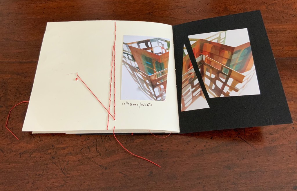
Following but elaborating on the previous spreads’ motif of juxtaposing an extract of the work with a photograph of the work, Cumer places a red-threaded square of tartalan across from the cut and misaligned photograph of la poesia dell’universo / “the poetry of the universe” (2018). The cut photograph is split by a red stitch that divides in two itself.
Here is where the variation on the two dimensional becoming three dimensional introduced by il segreto libro recurs. Defying the gutter’s separation of the tartalan sample from the whole work and the severing of the photo on the recto page, threads from the sample cross the gutter, fall across one half of the photograph, and link up with the severing stitch. The thicker thread of the severing stitch passes under the other half of the photograph to exit from it on the right and fall across the image of red threads similarly exiting the work itself. The ways in which this double-page spread speaks to the self-reflexive nature of book art and the paradoxical relationship of art to what it re-presents are remarkable.
The final work in the catalogue — visioni urbani / “urban visions”(2015) — resides in the Books On Books Collection. More about it can be found here. Threads do not make an appearance in visioni urbani, but their triangular appearance here does reflect on urbanivisioni. If the space to the left of the red stitching can be counted as a page, this is a “three-page” spread echoing the three-way split of the photo of the work, which echoes the tripartite physical structure of the work itself.
In the colophons of several earlier works, Cumer has drawn attention to this practice in libro catalogo of recycling her works. She labels them as part of projects “born of work with old books”, “born from her artist’s books”, and “born of her work with old theater posters”. Three of them are explored below, and three others can be found in a previous entry on her work.
PRESENTE/OTASSA (2015)
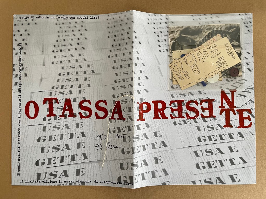
PRESENTE/OTASSA / “Present / Tax” (2015) Eleonora Cumer Sewn booklet. H287 x W204 mm. [8] including cover. Edition of 50, of which this is #19. Acquired from the artist, . Photos: Books On Books Collection.
Whether read as otassa presente or presente otassa, the translation of this sewn booklet’s title comes out the same: a present tax. The phrase in the background — usa e getta — stamped over ghosted images of cutout book pages means “disposable” and is used as the title of a 2014 work. The ghosted book pages come from the Italian edition of Mario Puzo’s last novel Fools Die, a Hollywood/Wall Street potboiler. The front cover’s sealed plastic envelope containing cut-up sewing patterns, buttons, thread and an old photograph of a little girl wearing a knit shawl and sitting in a white wicker chair makes the intriguing juxtapositions only more so. What do these collaged and assembled elements have to do with one another?
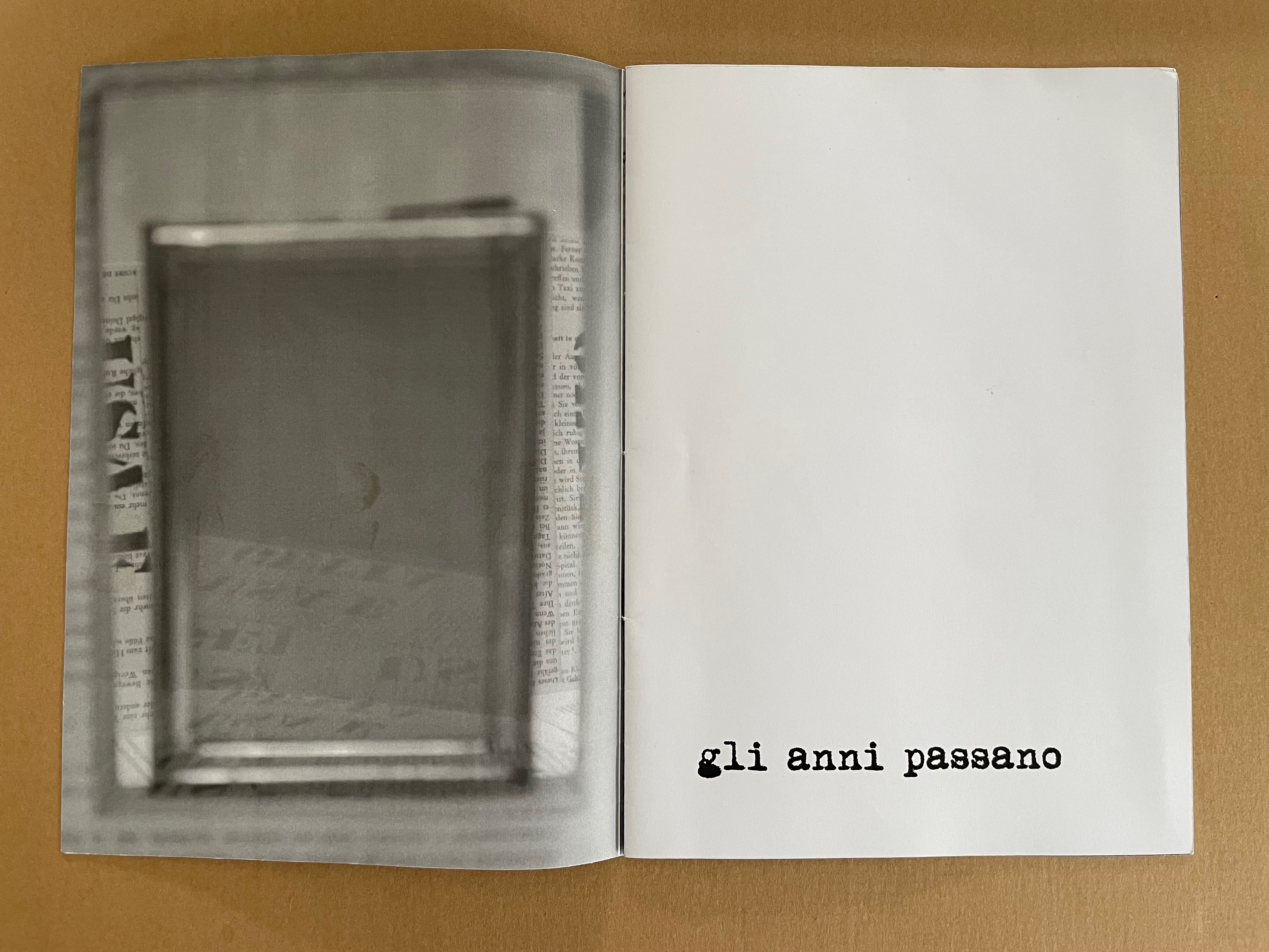
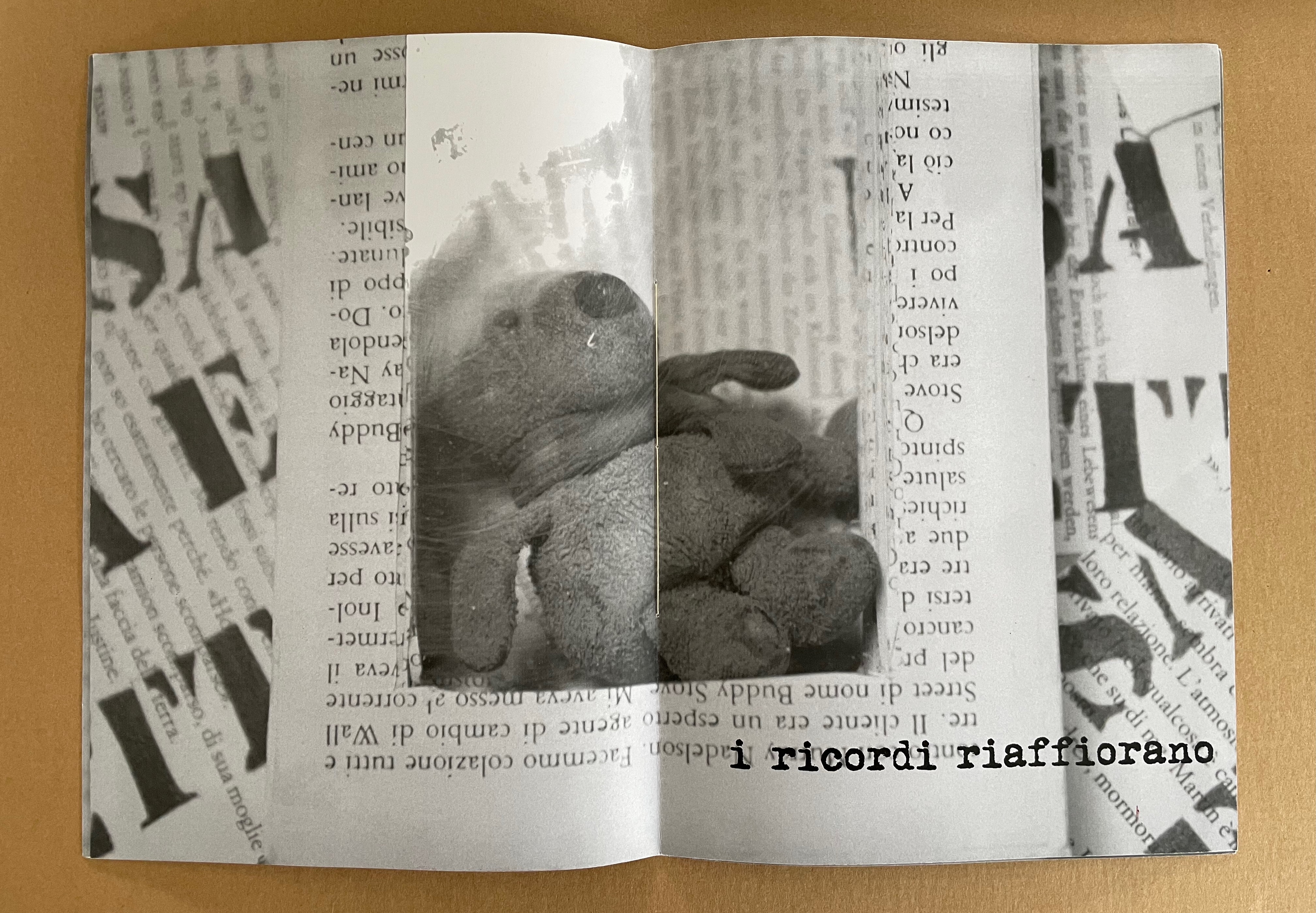
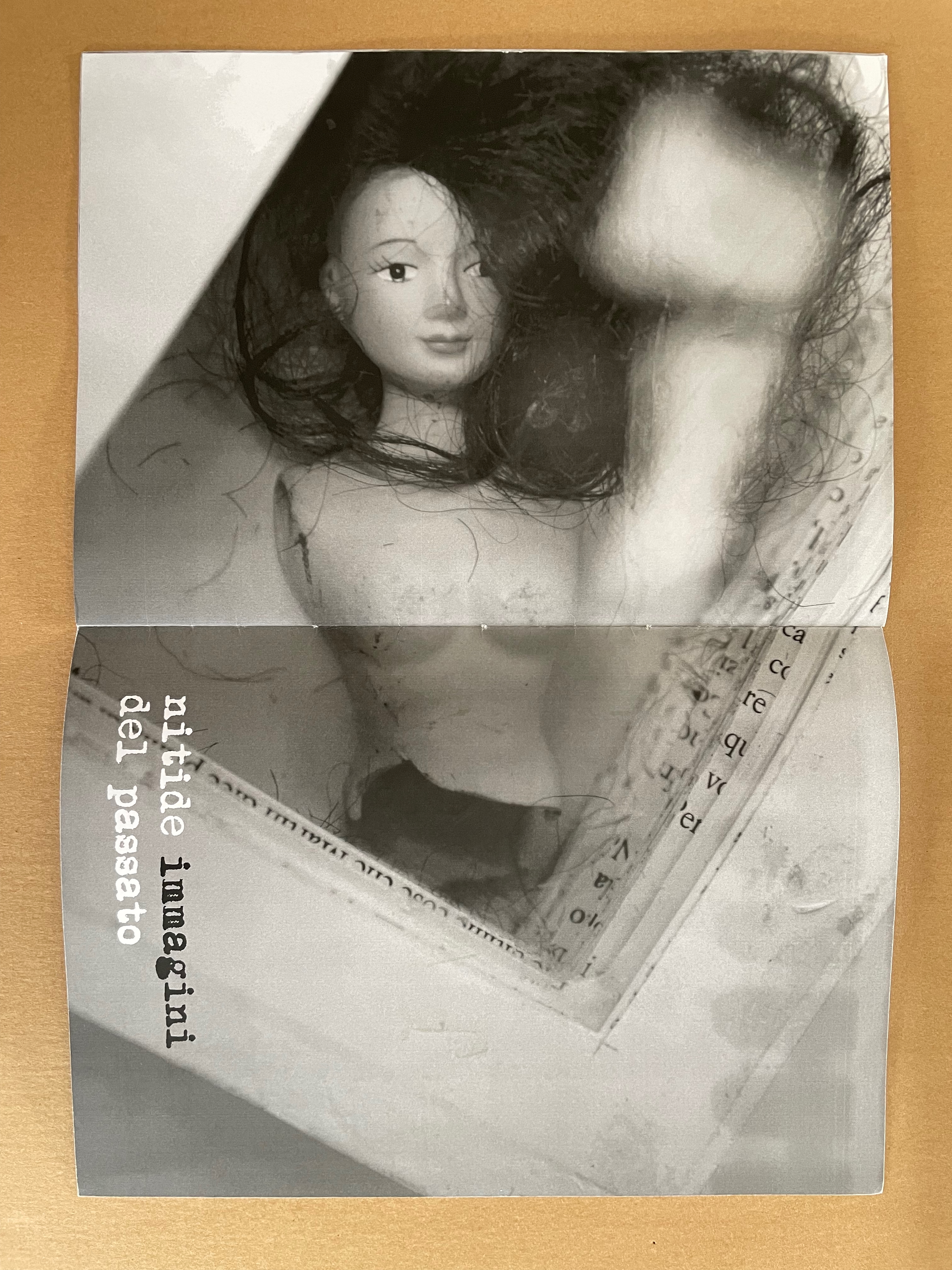
Some clarity dawns with phrases on the interior pages: gli anni passano (“years go by”), i ricordi riaffiorano (“memories come back”), and nitide immagini del passato (“clear images of the past). “Disposable” alludes not only to the novel whose pages wallpaper the cover and interior pages but also to Cumer’s work of the preceding year — USA E GETTA (2014), a series of unique altered books. The series is the source of the images inside PRESENTE/OTASSA. Each shows a hollowed-out book with an object held in place between clear plates — a picture frame (empty except for the reflection of the foreground — the rest of the work it comes from), a stuffed toy, and a broken dress-up doll. Things of the past that in general are disposable (like sewing patterns no longer needed or broken dolls) nevertheless come back as clear images: a tax on the present.
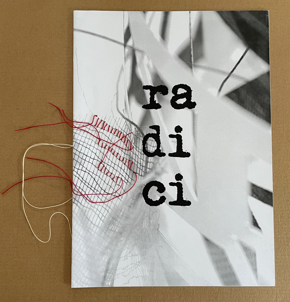
radici/ in memoria dei miei genitori (2015)
radici/ in memoria dei miei genitori / “roots/ in memory of my parents” (2015) Eleonora Cumer Sewn booklet with stitching. H287 x W206 mm. [8] pages. Edition of 50, of which this is #11. Acquired from the artist, . Photos: Books On Books Collection.
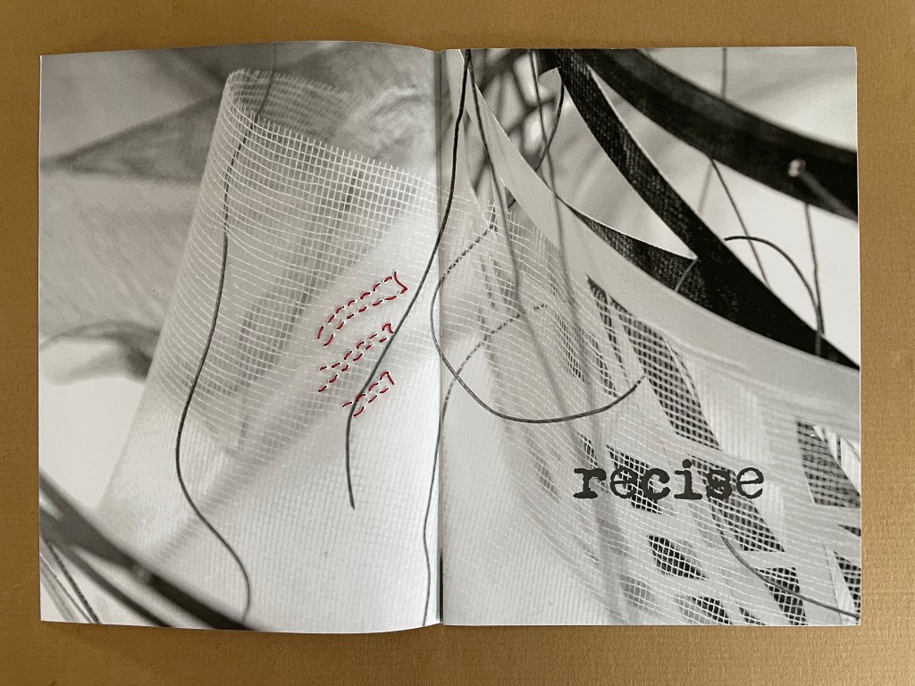
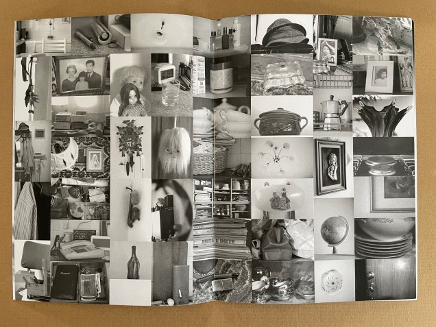
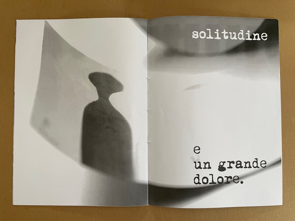
The theme of memory continues in radici/ in memoria dei miei genitori / “roots/ in memory of my parents” (2015) but perhaps more poignantly than in presente/otassa. Drawing on the previous works moltitudine e solitudine/ “multitude and solitude” (2013) and no time no space (2015), the booklet also evokes Cumer’s passion for textile and fabric art. The small image of a sewing box in the lower left hand corner of the central spread may speak to a parental source of that passion, but the words on the other spreads — recise and solitudine e un grande dolore (“severed or sever or cut” and “loneliness and a great sorrow”) — turn that central spread into a collage of loss almost more so than a collection of memories. It is one of the more somber works by Cumer in the Books On Books Collection.
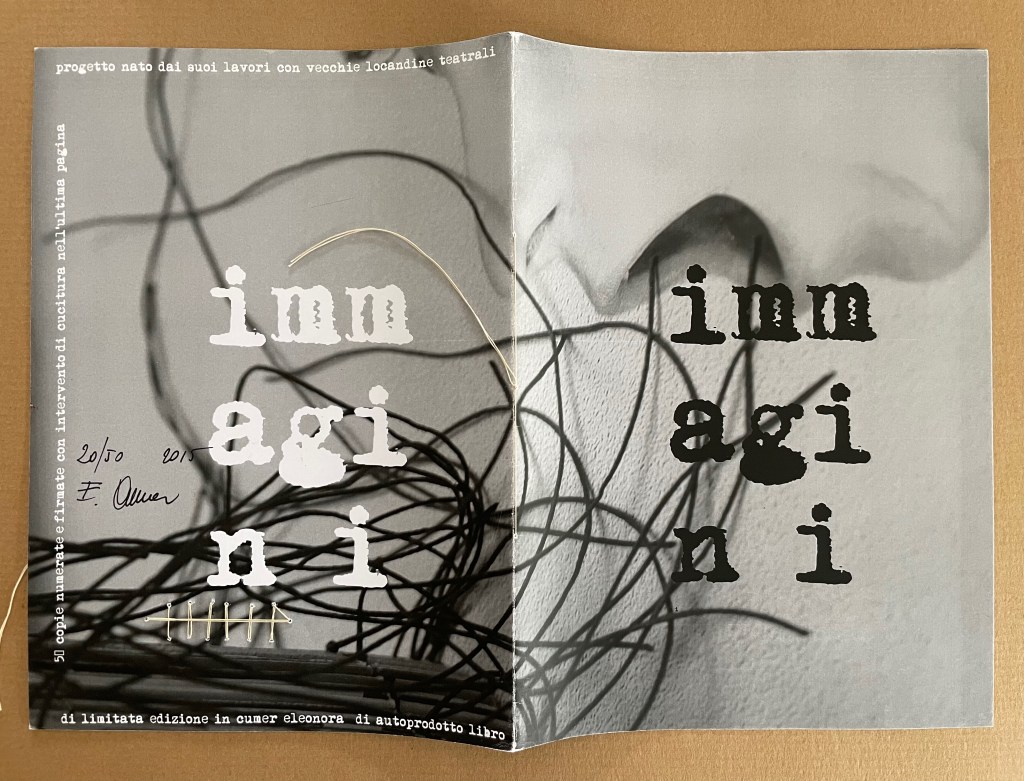
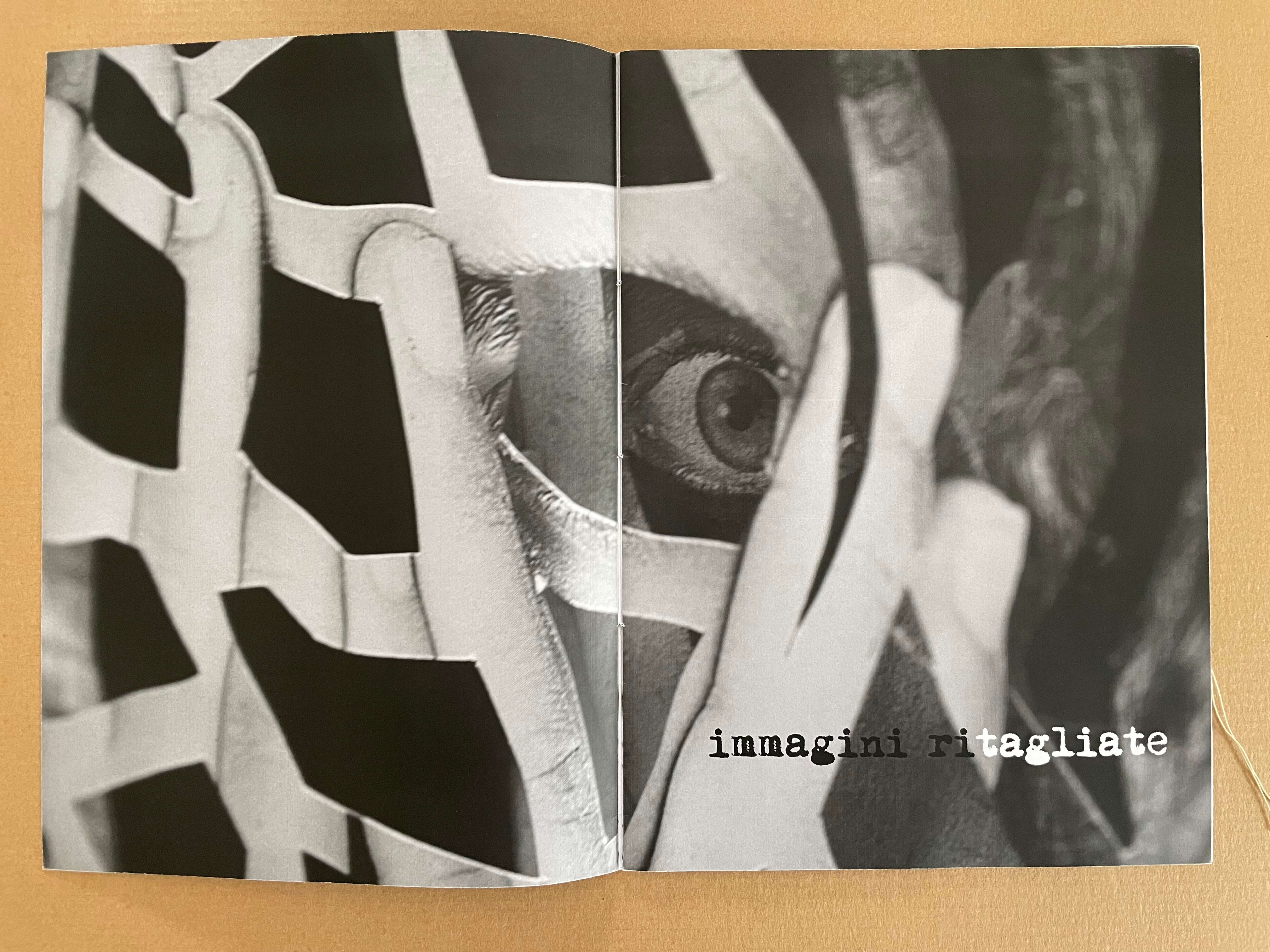
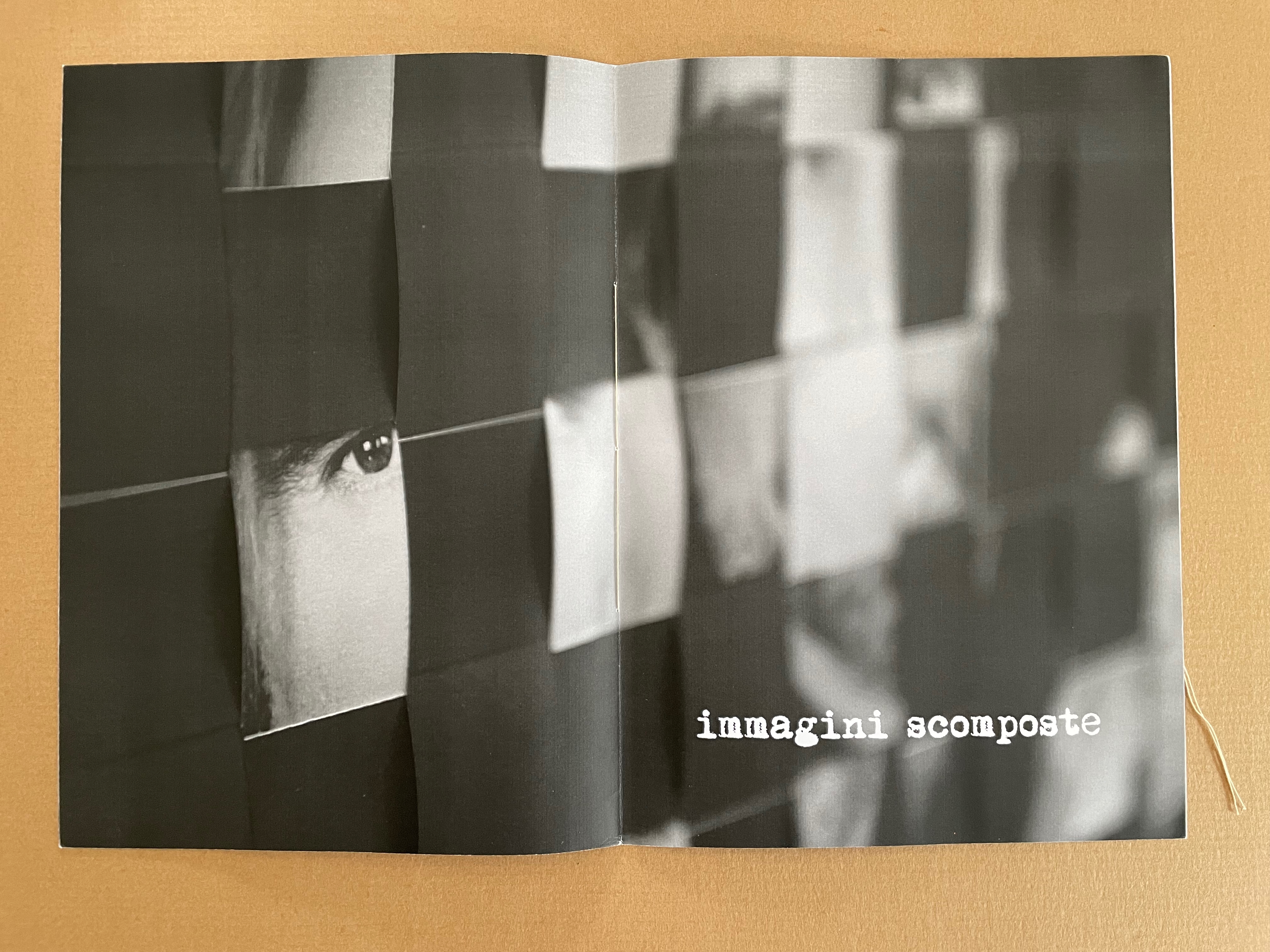
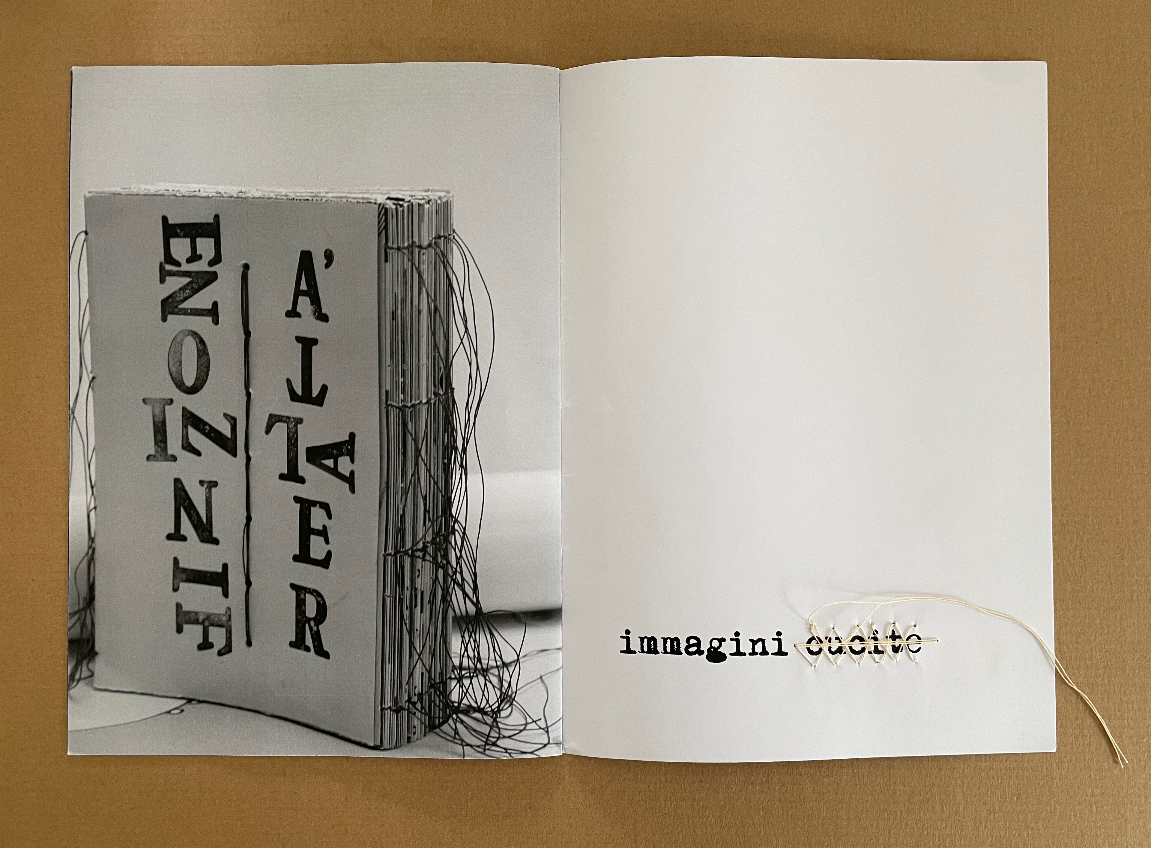
immagini (2015)
immagini / ‘“images” (2015) Eleonora Cumer Sewn booklet with stitching on the last page. H287 x W206 mm. [8] pages. Edition of 50, of which this is #20. Photos: Books On Books Collection.
The overlaid phrases immagini ritagliate, immagini scomposte, and immagini cucite can be translated as “cut out images”, “distorted images”, and “stitched images”, respectively. On the cover of the unreadable book displayed, the words FINZIONE / “fiction” and REALTÁ / “reality” are spelled in reverse. As in libro catalogo, there is self-reflexivity at play here. Cumer plays with the word ritagliate by printing ri in black and tagliate in white, creating two verbs — ritagliate (“cut out”) and tagliate (“cut”), which apply to the word itself, the technique in the poster displayed, and the fragment of it blown up on the double-page spread. By blurring the image on the recto page of the second double-page spread, she makes the spread play out the meaning of scomposte — “distorted”. And in the third spread, she playfully stitches over the word cucite — “stitched” — which comments not only on the word but also on the stitched unreadable book on the verso page.
*Giocare è una cosa seria! I bambini di oggi sono gli adulti di domani aiutiamoli a crescere liberi da stereotipi aiutiamoli a sviluppare tutti i sensi aiutiamoli a diventare più sensibili. Un bambino creativo è un bambino felice!
“Playing is a thing! Today’s children are tomorrow’s adults. Let’s help them grow up free from stereotypes. Let’s help them develop all their senses. Let’s help them become more sensitive. A creative child is a happy child!” Bruno Munari, on occasion of 1986
Bruno Munari, 1986, on occasion of a Children’s Workshop Laboratory, prompted by a series of seminars promoted in 1977 by Franco Russoli, Superintendent of the Pinacoteca di Brera.
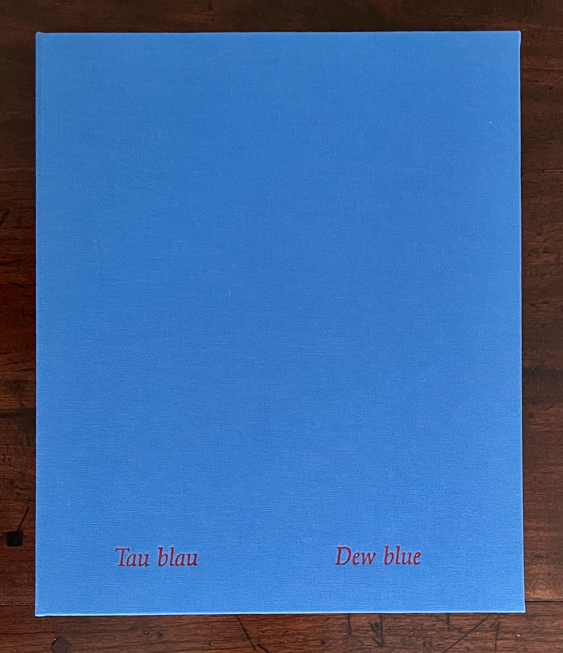
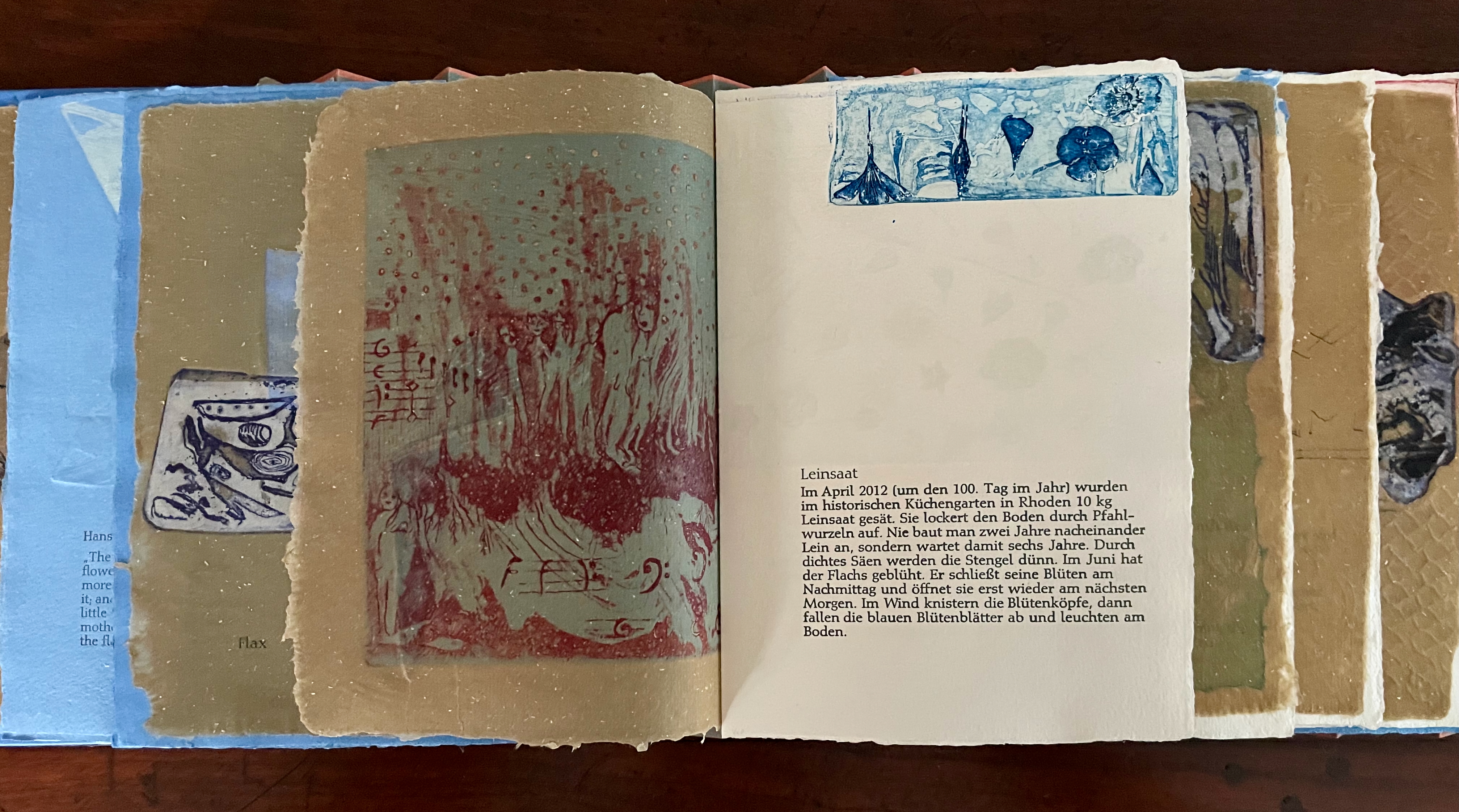
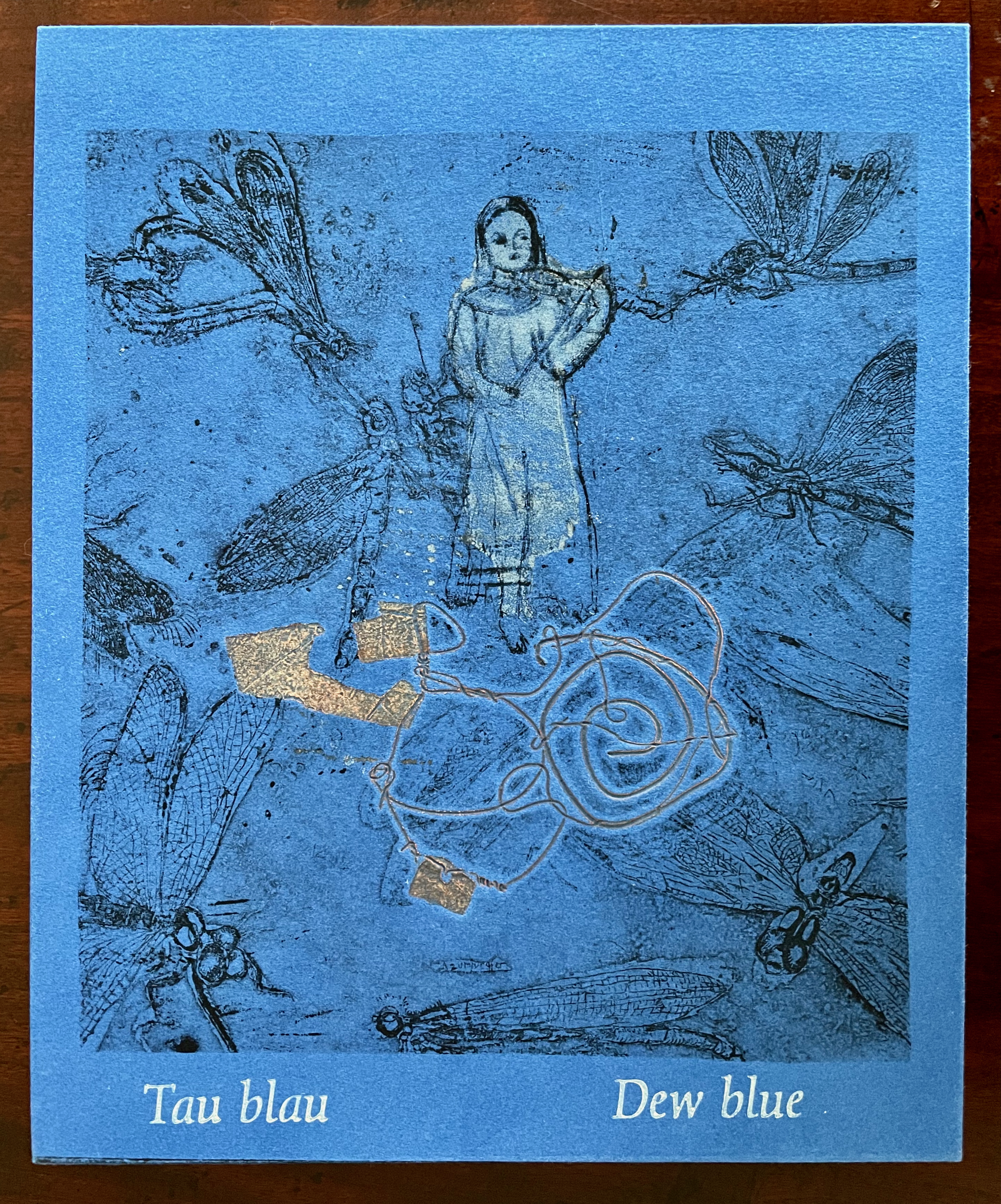
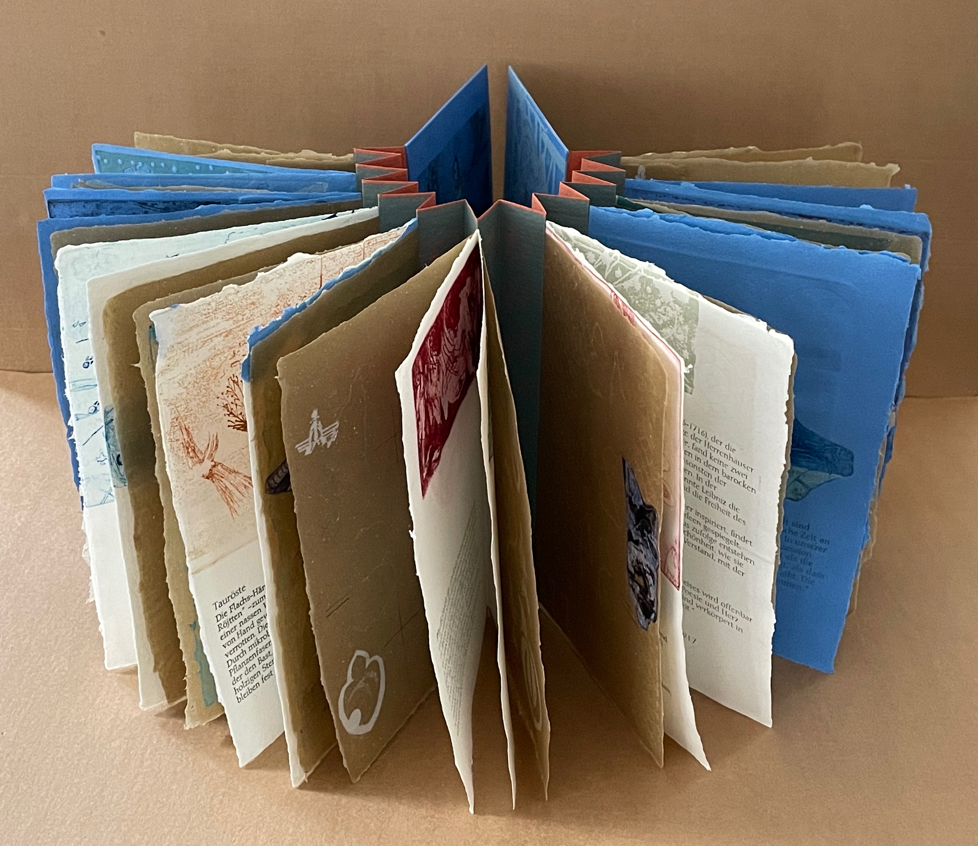
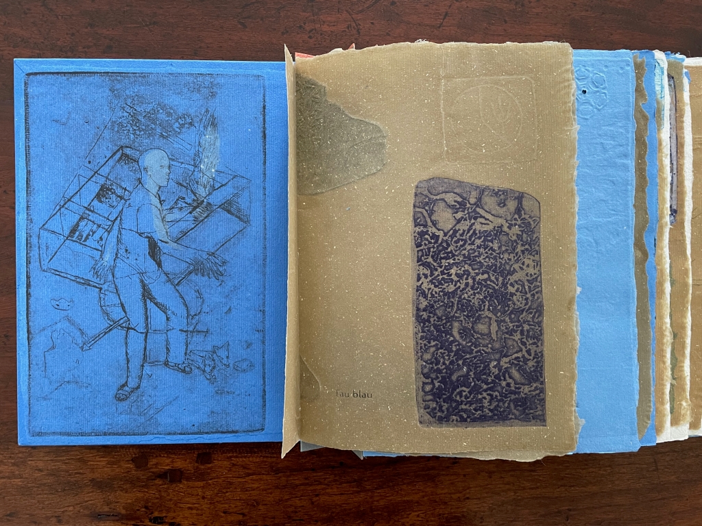
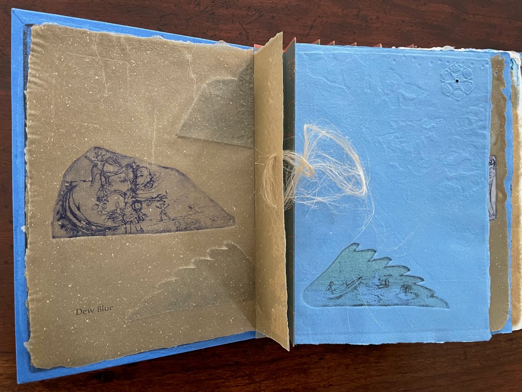
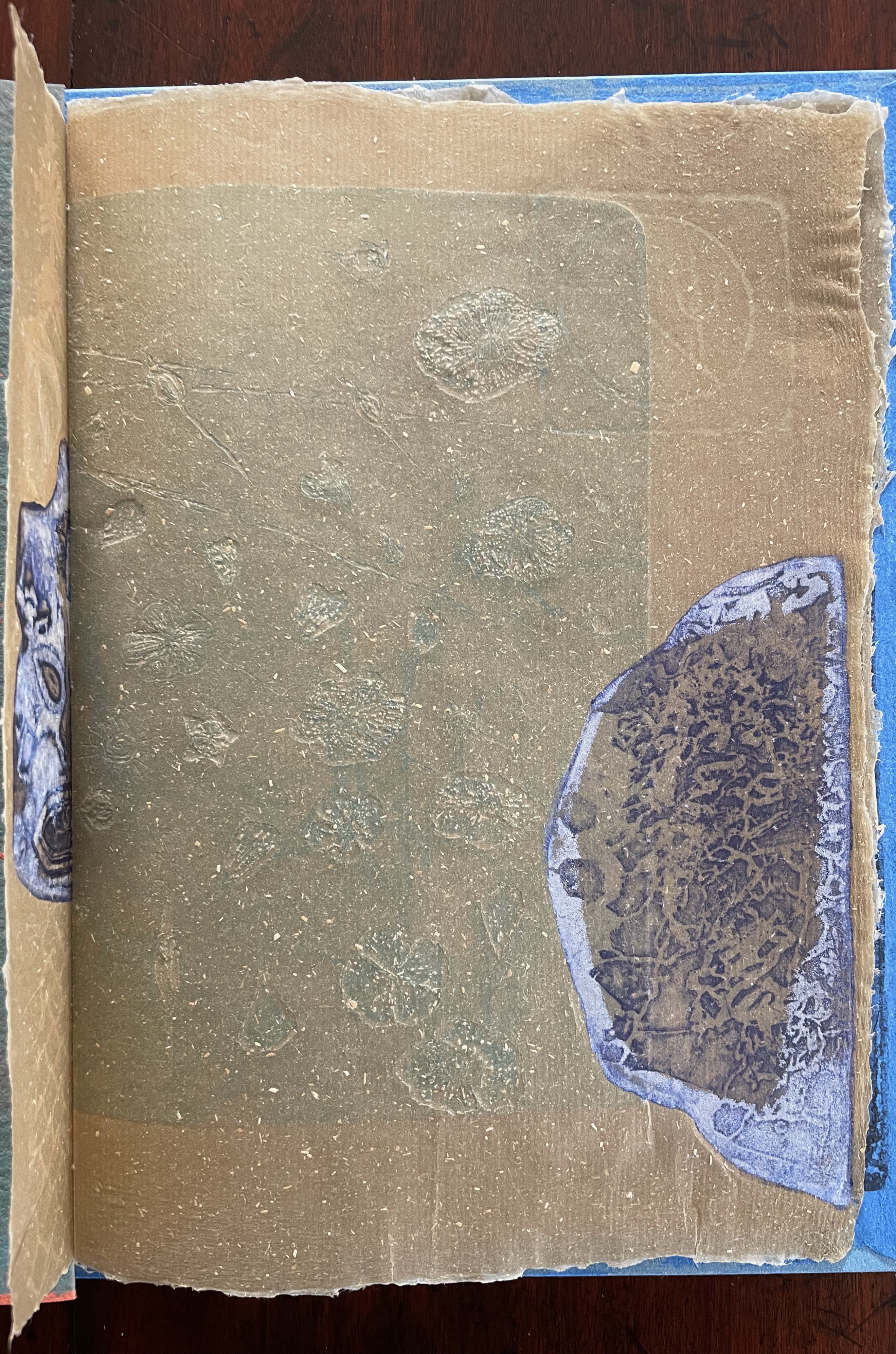
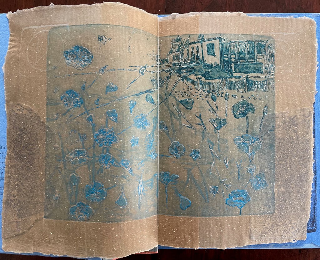
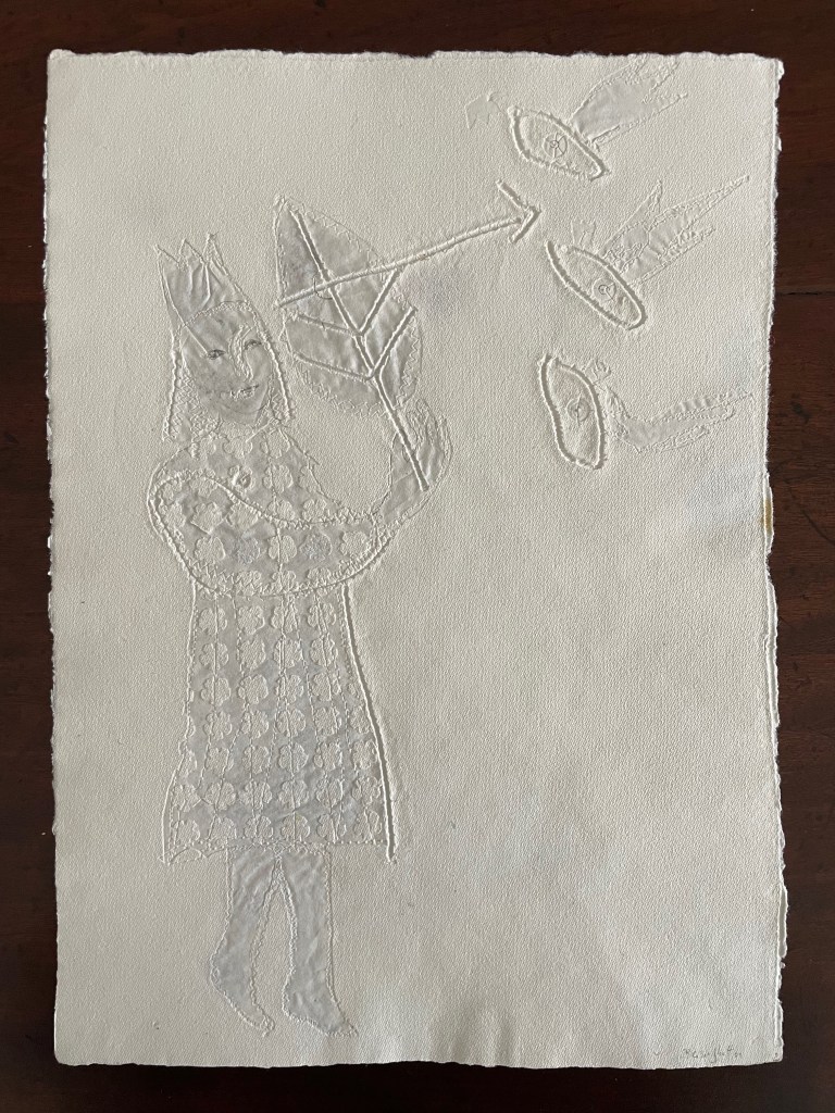
Tau blau / Dew Blue (2013) Barbara Beisinghoff ; Solander box in linen, handbound Vera Schollemann; Flax paper, handmade by John Gerard. Solander box: H240 x W200 x D32 mm. Flagbook: H220 x W180 mm. Edition of 38, of which this is #22. Acquired from the artist, 30 December 2024. Photos: Books On Books Collection.
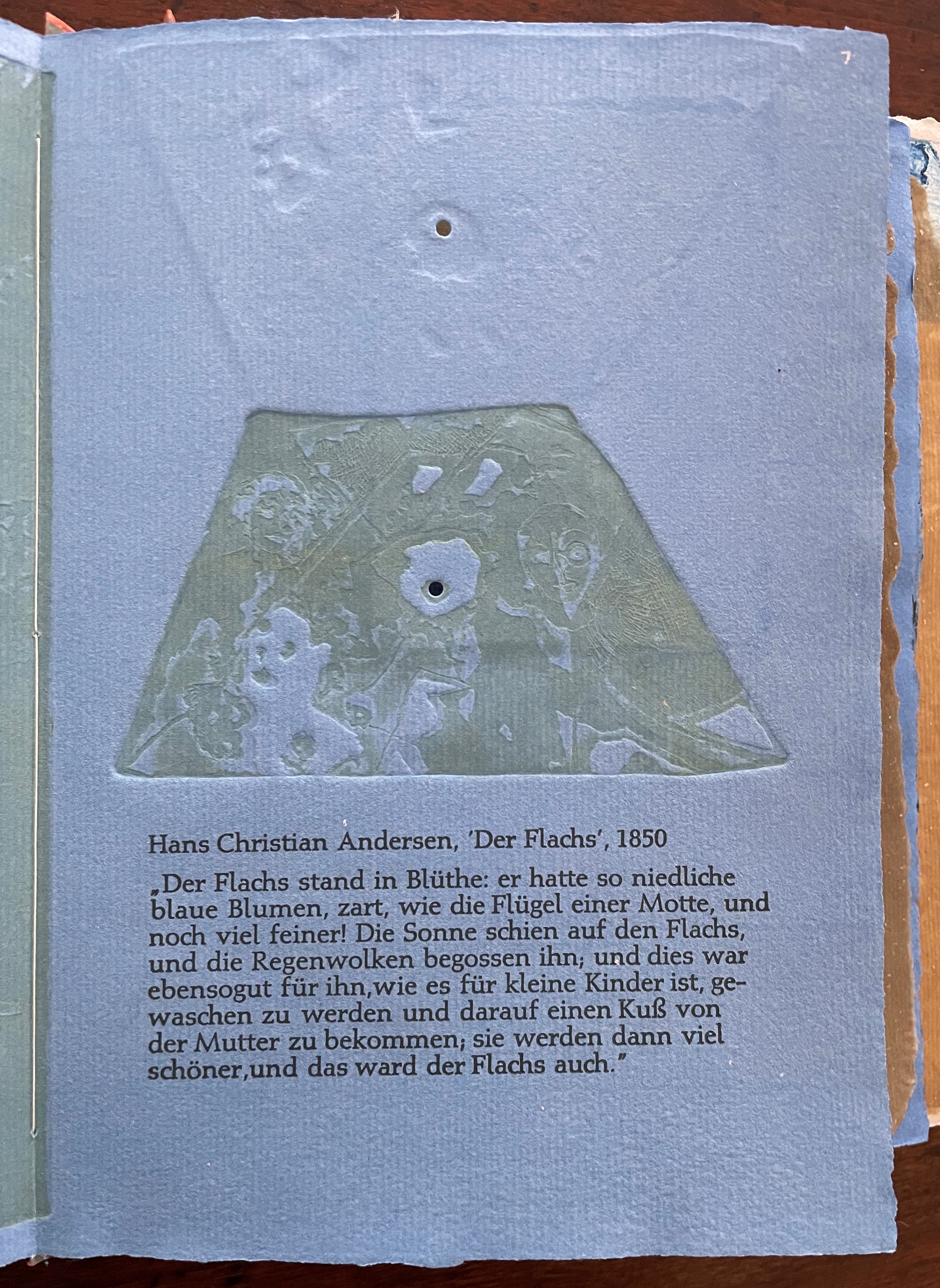
Familiarity with Hans Christian Andersen’s fairy tale Hørren /The Flax enhances appreciation of Barbara Beisinghoff’s Tau blau / Dew Blue. Andersen gives a voice to the plant that expresses its joy, pain, hope and observations at each stage of its blooming, being harvested, turned into linen and clothing then paper, and finally consigned to flames. The H.C. Andersen Centre offers Jean Hersholt’s translation of it here.
Only the opening paragraph of the story appears in Tau blau / Dew Blue, but Beisinghoff documents and illustrates the stages from her own cultivation of flax, observation of its growth and preparation of its processing. And with the etching, drawing, watermarking, handmade papers, linen cloth and thread, and binding structure, Beisinghoff suffuses the spirit of the tale’s metamorphosizing plant throughout the whole of Tau blau / Dew Blue.
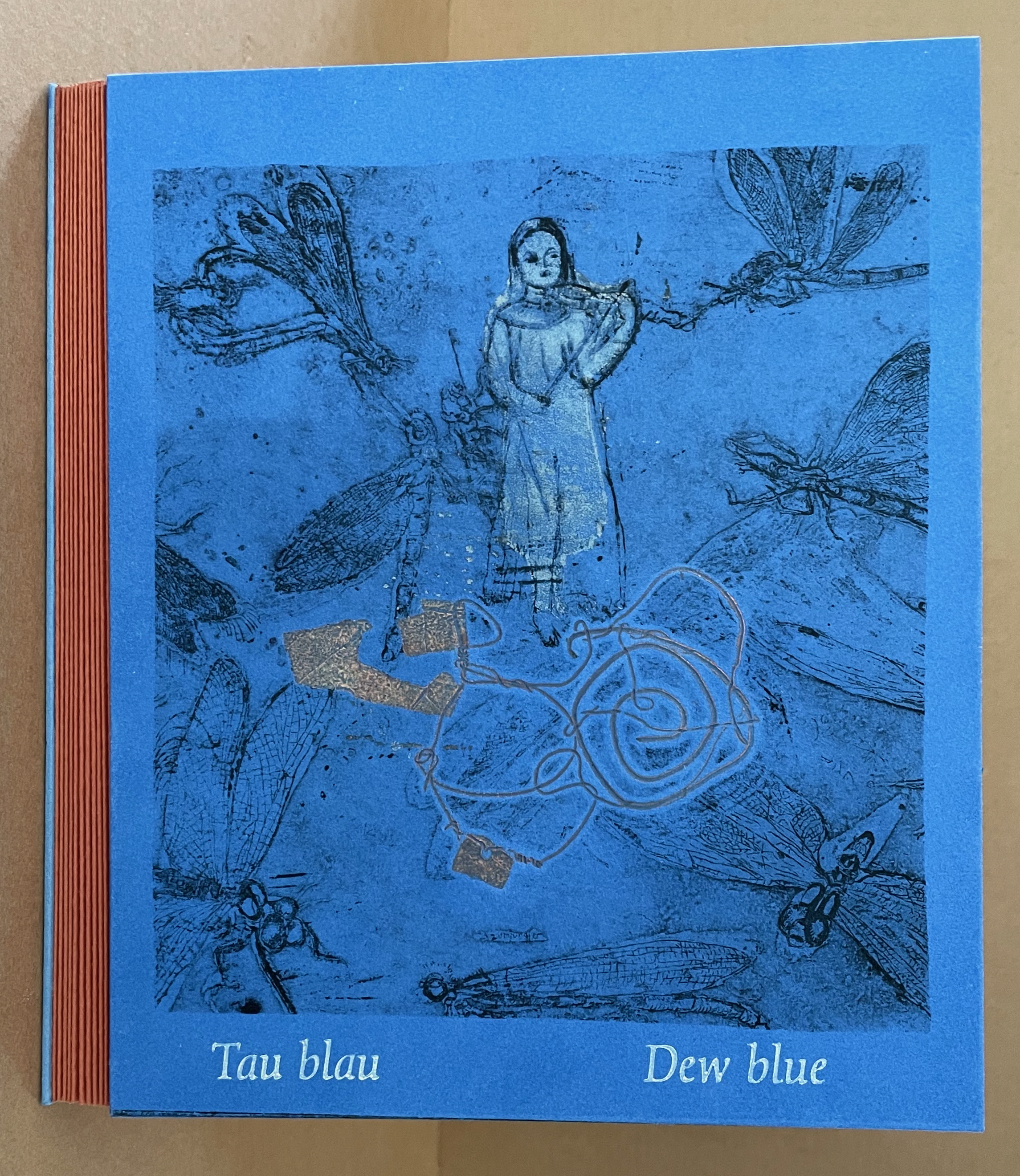
From the blue of the plant’s blossoms to the white of its change into linen and paper to the red, burnt orange and black of its sparks and ash when it is consumed by fire in the end, all of the story’s colors are replayed across Tau blau / Dew Blue from its Solander box to its covers and spine like motives in a Baroque musical piece.
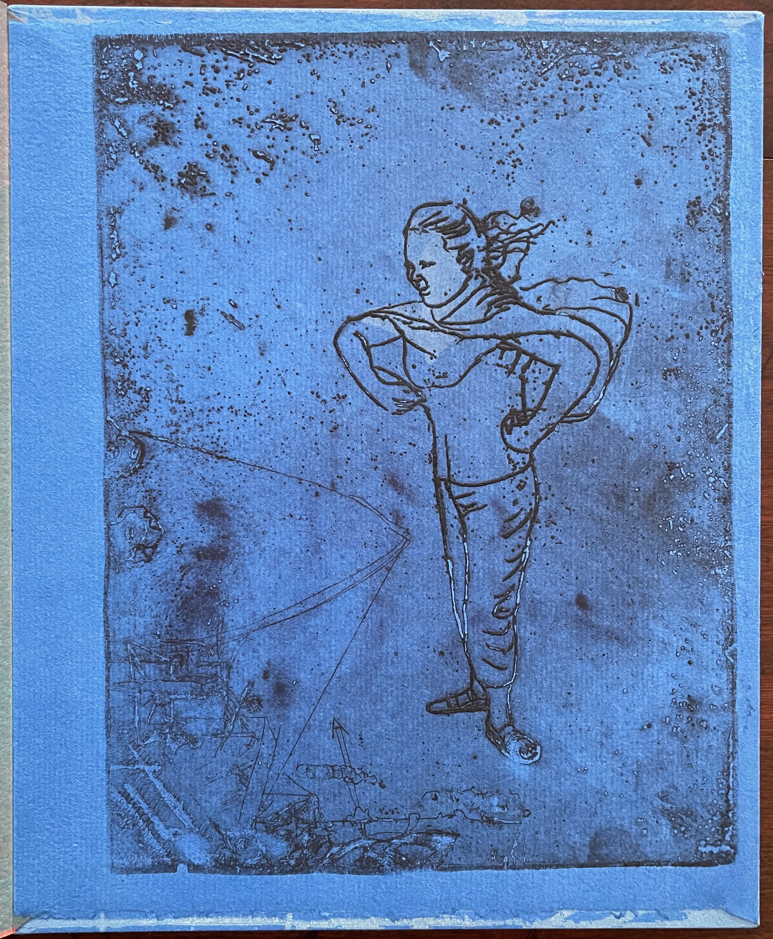
In a concerto, motives play off one another and develop. In Tau blau / Dew Blue, the motif of nature (the plant) plays off the motif of artifice and the manmade (the fairy tale, music, linen, paper, etc.). On the front cover (above), a young girl, surrounded by large damselflies, plays a fiddle or violin and seems to hover above a silver foil image of flax thread and tools for making it. In the spread above alongside the front cover, the specks rising over the staves and musical notes (a recurring motif in itself) recall the tale’s final passage in which the bundle of papers (made from linen rags) is cast into a fire:
“I’m going straight up to the sun!” said a voice in the flame. It was as if a thousand voices cried this together, as the flames burst through the chimney and out at the top. And brighter than the flames, but still invisible to mortal eyes, little tiny beings hovered, just as many as there had been blossoms on the flax long ago. They were lighter even than the flame which gave them birth, and when that flame had died away and nothing was left of the paper but black ashes, they danced over the embers again. Wherever their feet touched, their footprints, the tiny red sparks, could be seen.
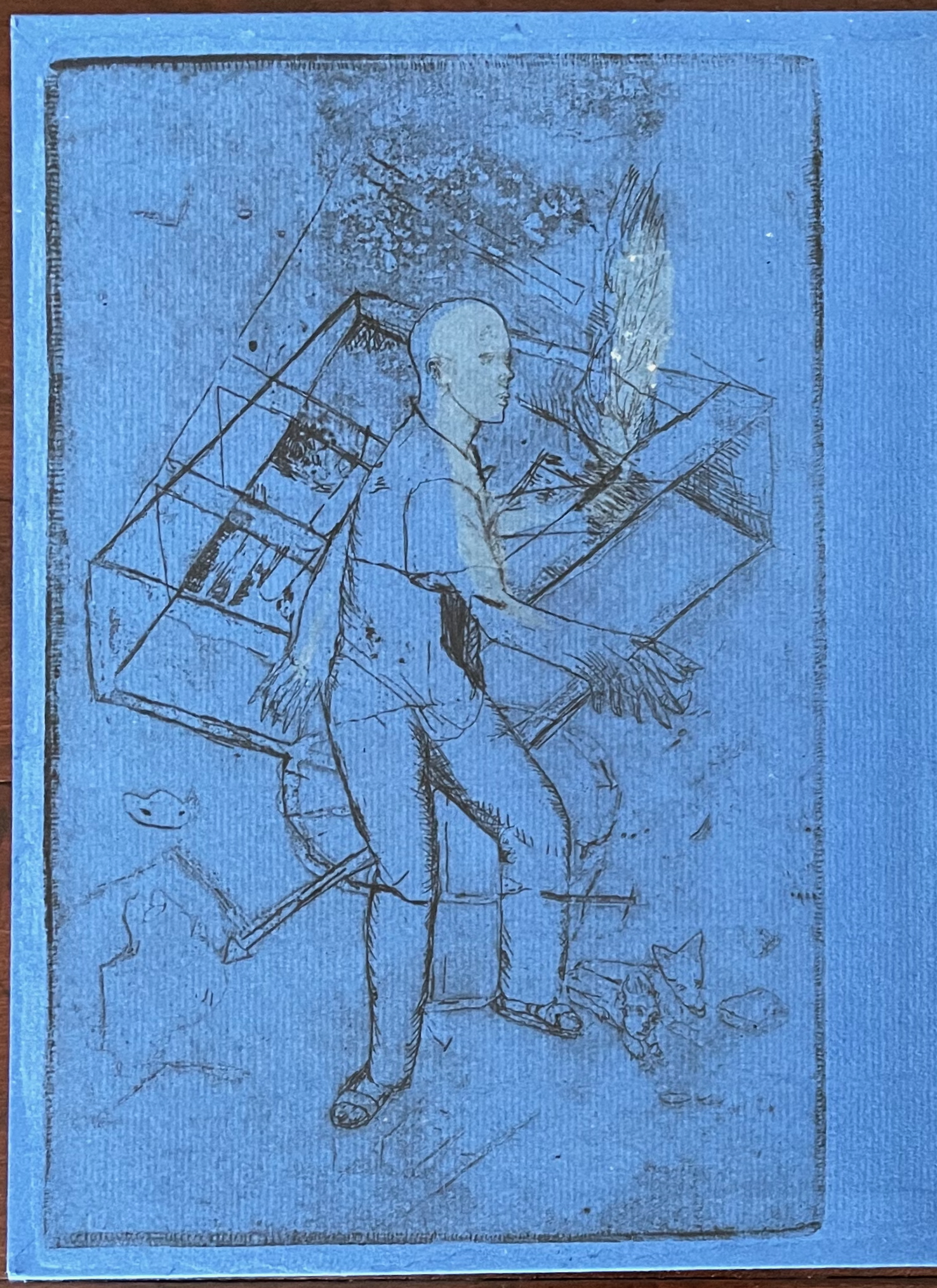
Images of tools — whether for preparing flax or for making the products from it — also recur on the inside of the front and back covers and throughout the book. The human figures alongside the tools, however, appear engaged in more than manufacturing. Elsewhere in the book, they dance, they sit and meditate or write, they row on ponds beside the growing flax. The fairy tale, too, has these Romantic juxtapositions of nature, art and craft. So, again, the spirit of Andersen’s tale finds another way into Tau blau / Dew Blue.
Inside front and inside back covers.
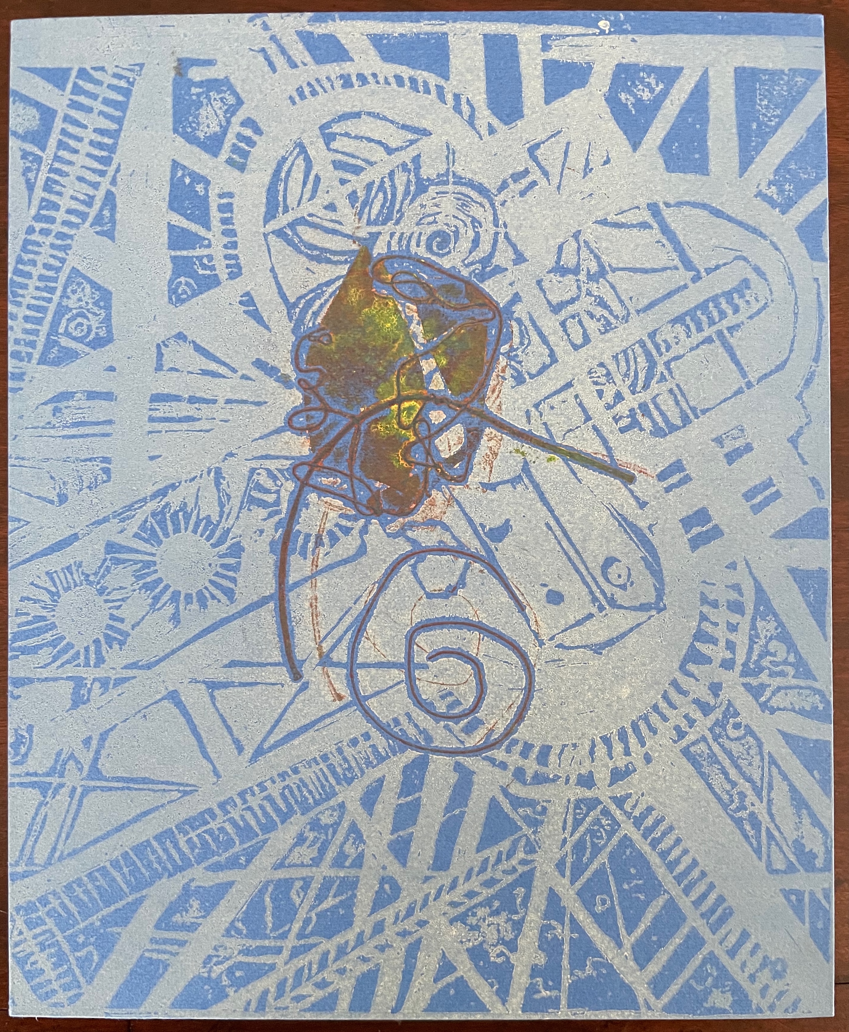
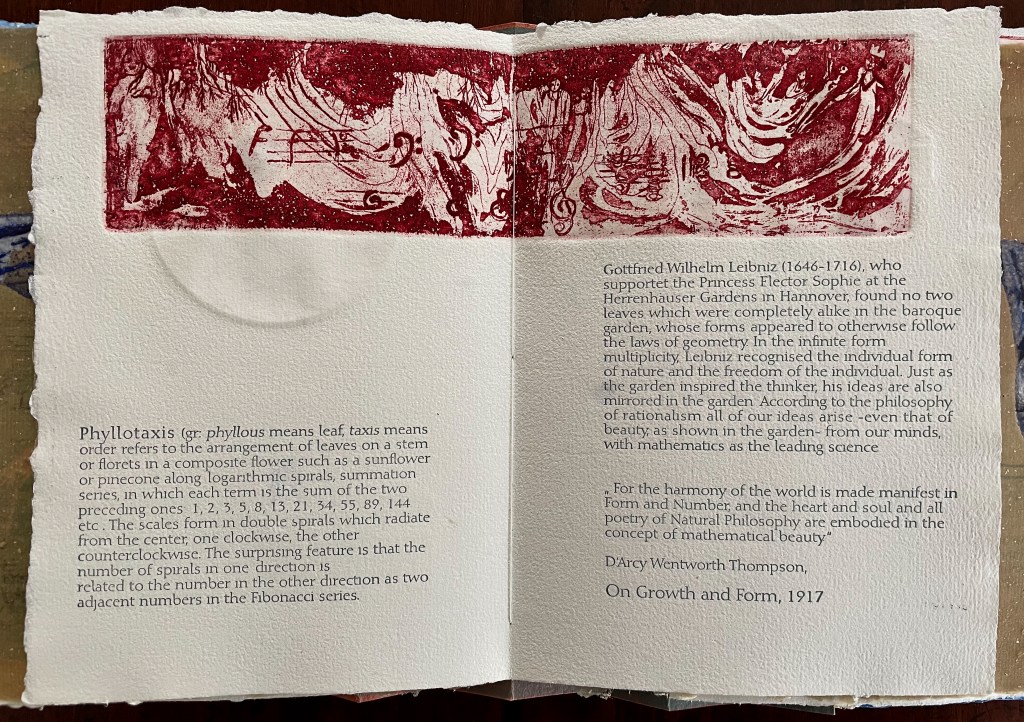
The front cover also announces another motif in those coils of thread below the young girl’s feet. Within the coils is the image of a Fibonacci spiral, which appears on the back cover and throughout the book in different ways. It can be found drawn and printed. It can be found in watermarks in the handmade paper. It can be found in the arrangement of florets in flax. Being a composite flower, flax blossoms display the spiral based on the Fibonacci sequence 1, 2, 3, 5 … 233, and so on. These numbers are waterjet-drawn on the pure flax paper below and explained in an entry printed on the adjacent plain handmade paper folio. By appearing on the book’s front and back covers, the spiral echoes the beginning and ending cycles of birth and rebirth the flax goes through in the folktale.
The Fibonacci spiral on the front and back covers.
The sequence of Fibonacci numbers 1, 2, 3, 5 … 55, 89, 144, 233 … watermarked on handmade flax paper with a water jet.
Description of the Fibonacci spiral side by side with quotation from Thompson’s On Growth and Form (1917), drawing on Leibniz’s Rationalist philosophy.
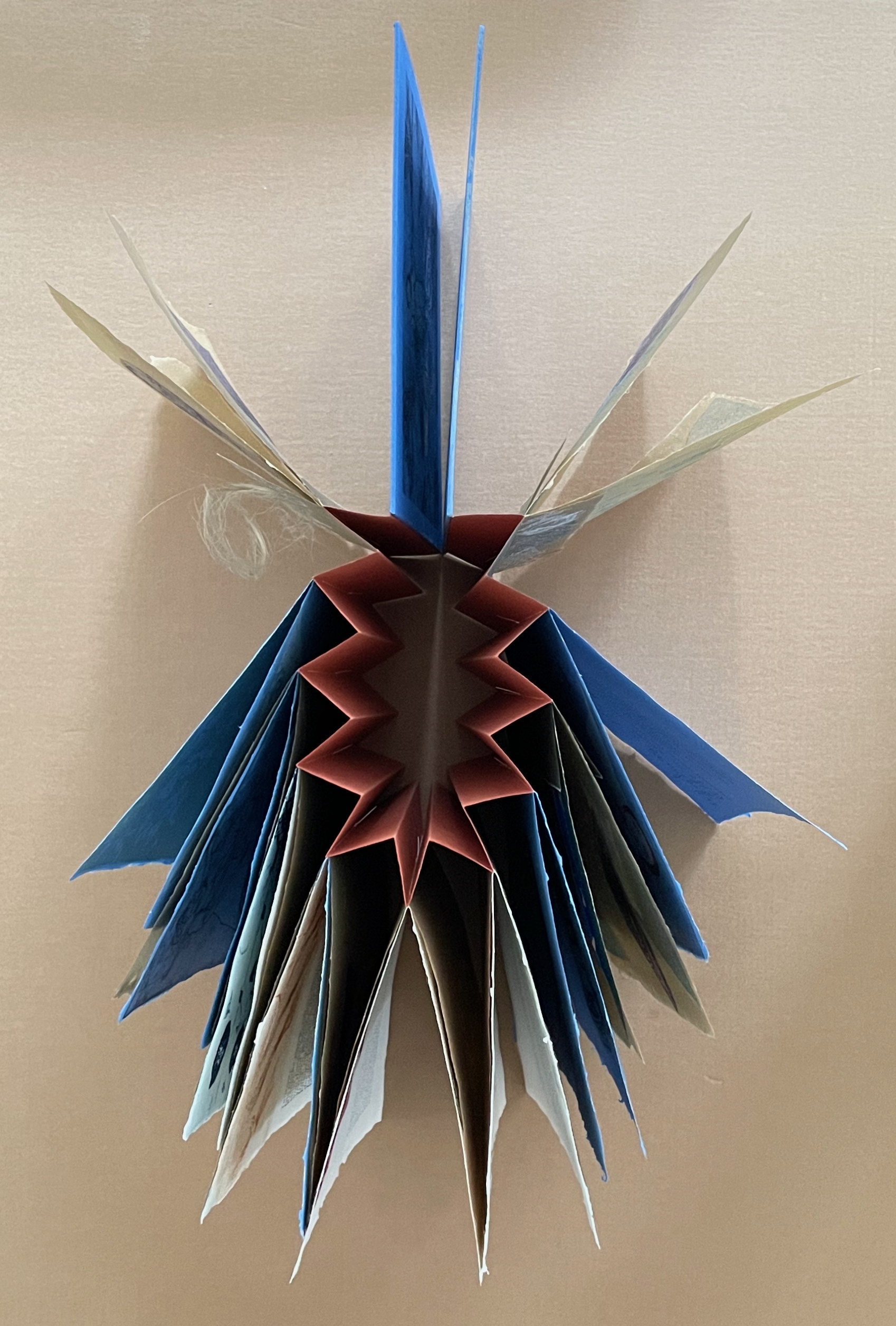
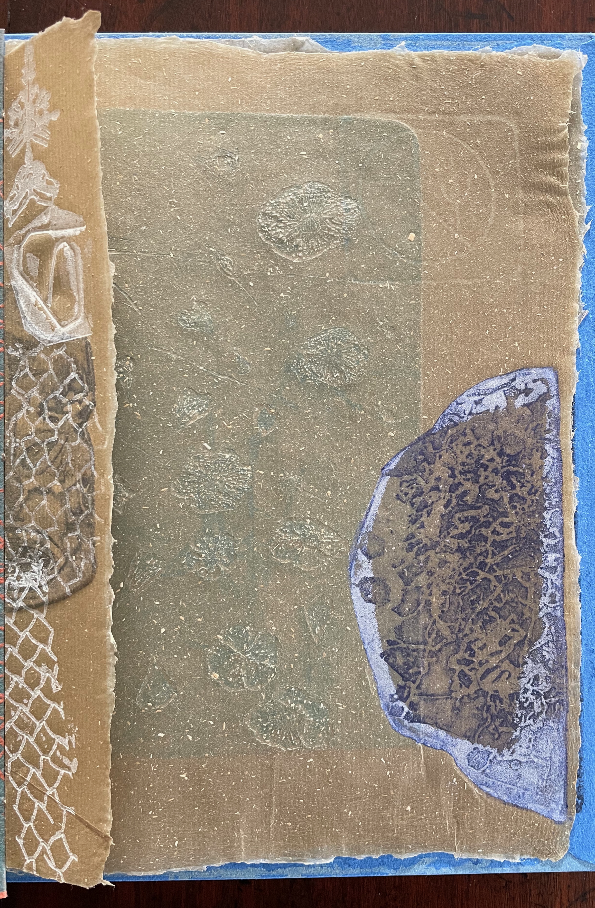
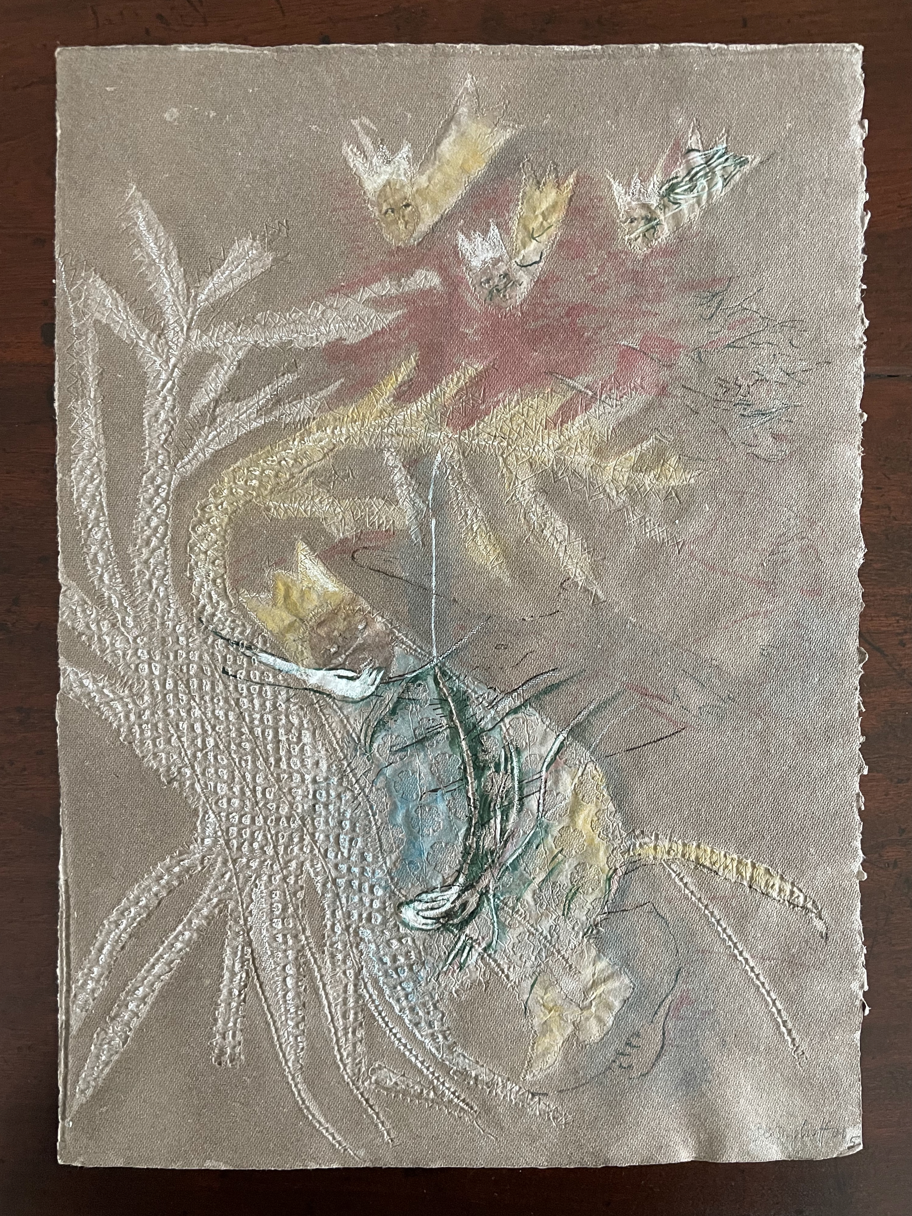
To organize and weave her motives together, Beisinghoff uses an accordion spine to whose peaks eleven sets of folios are sewn with linen thread. Three of the eleven are 4-page folios consisting of blue handmade paper. Another three 4-page folios consist of pure flax paper (handmade by John Gerard). The remaining five gatherings have 8-page folios, each consisting of a pure flax paper folio around a blue or plain one.
Side and top views of the accordion spine.
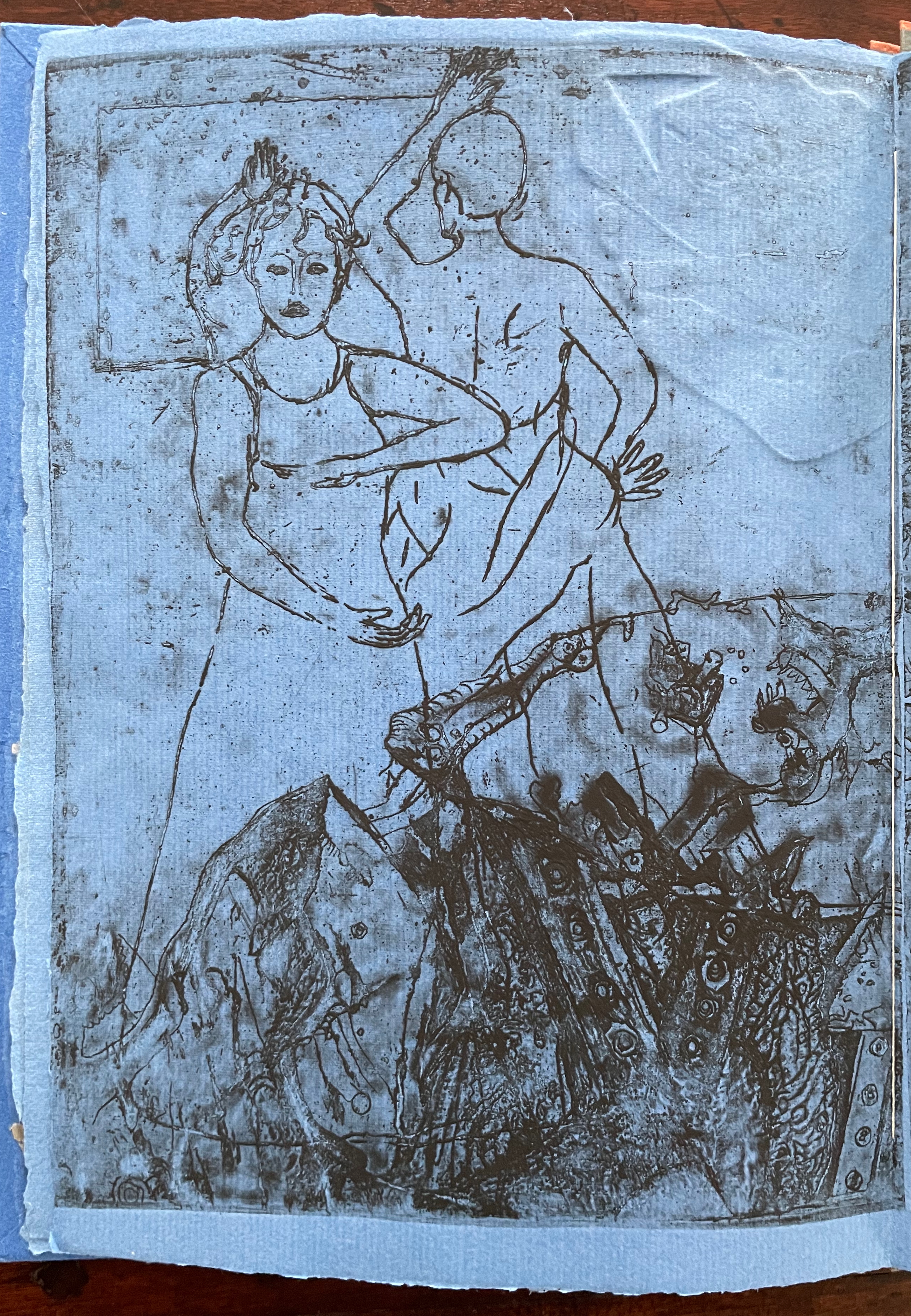
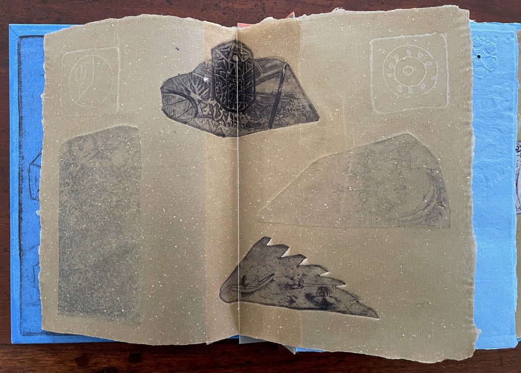
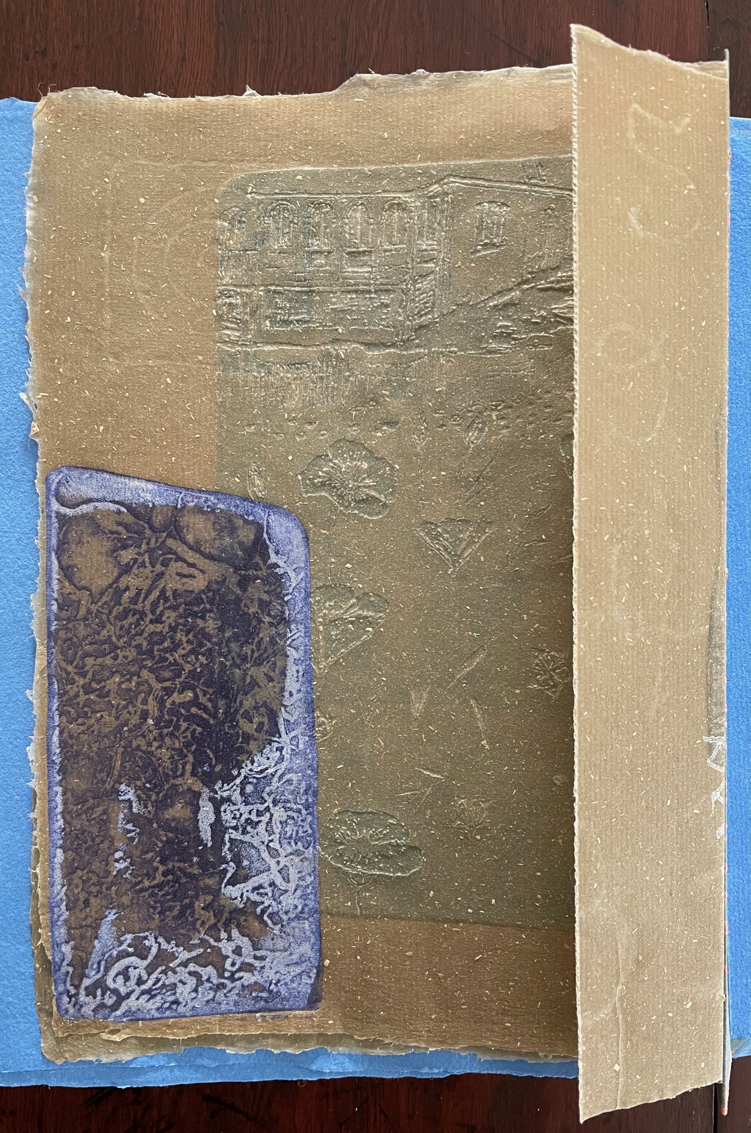
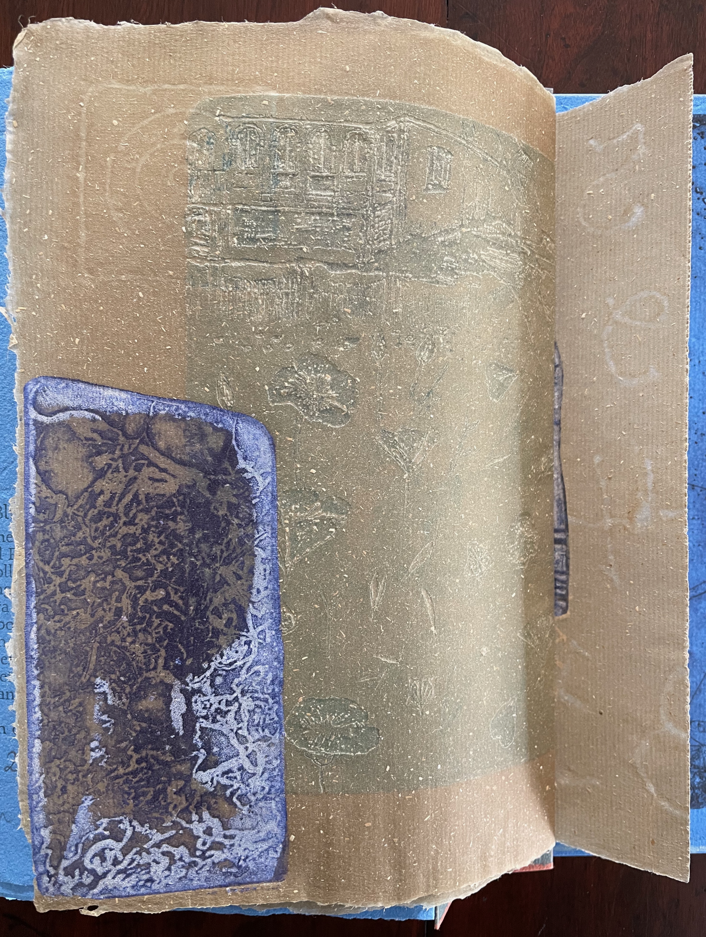
The first pure flax folio begins the book, displaying two title pages (German and English) and two etchings on its first and last pages. In the center spread, two more etchings appear. A watermark symbolizing phyllotaxis shows through in the upper left, balanced by a watermark with a cross section of a flax stalk in the upper right of the center spread. The texture and weight of the flax paper allows the impress and shadow of the etchings to stand out on both sides against the inking and watermarks.
Inside front cover and Tau blau title page and etching.
Center spread of first flax paper folio. Note the watermarks in the upper left and right corners.
Dew Blue title page and etching, loop of flax fibers, first page of blue handmade paper folio; note its boating image repeated from the prior center spread.
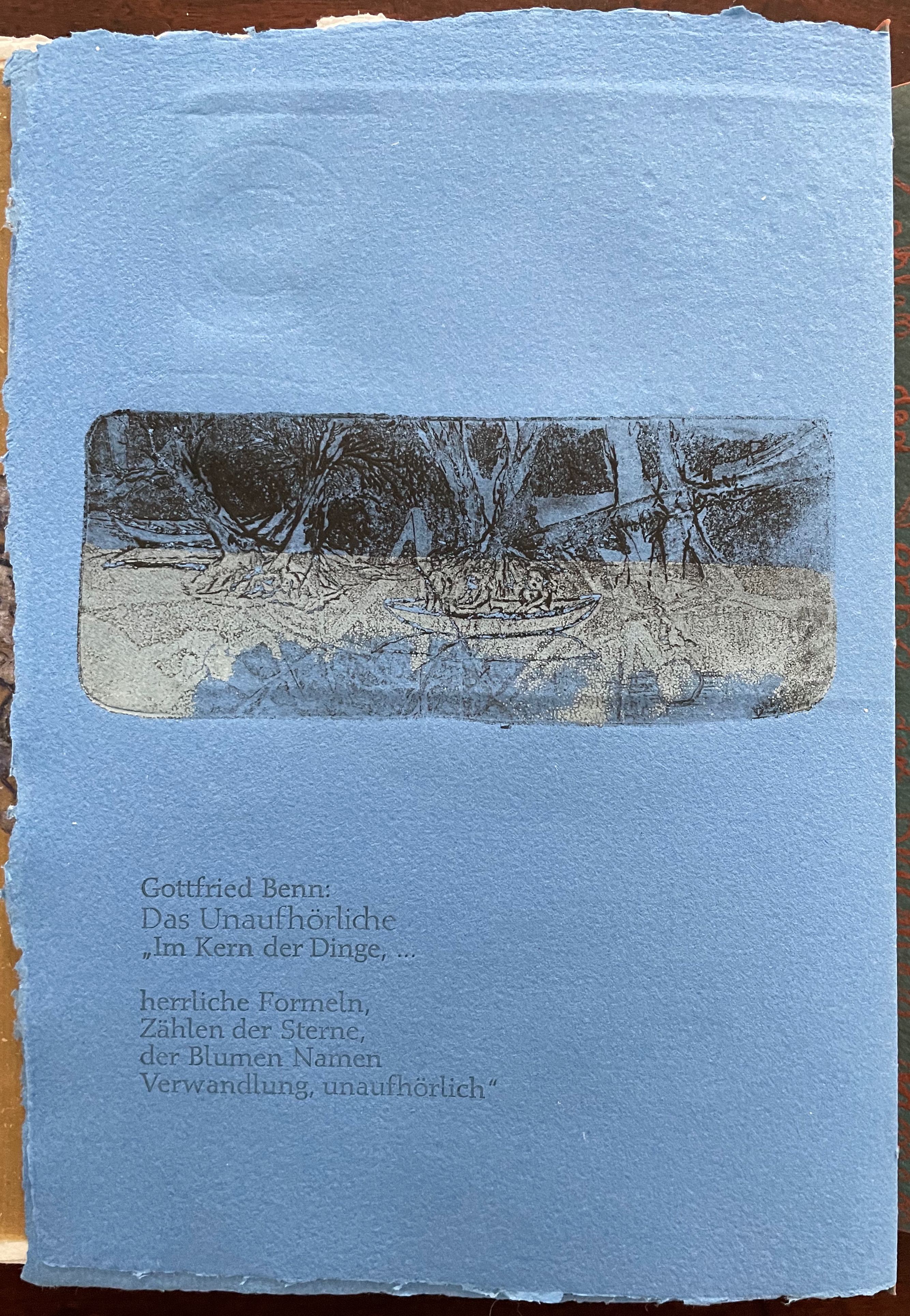
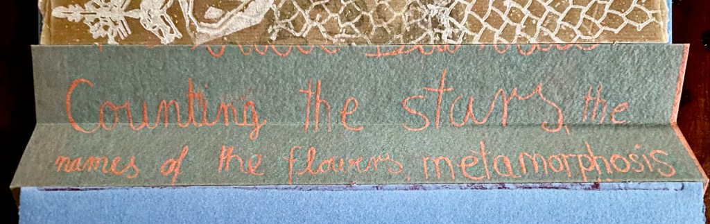
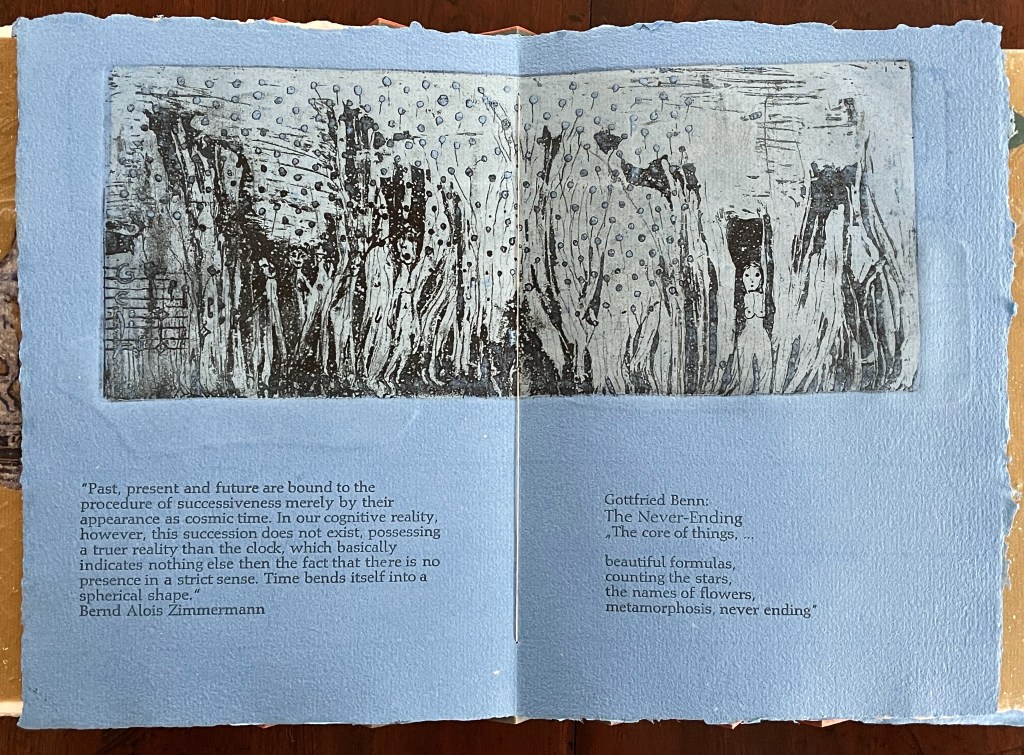
Following the pure flax folio, the first all blue folio gives us that introductory excerpt from Andersen’s fairy tale. Next comes a description of flax comes from Leonhart Fuchs’ Book of Herbs (1543), then the series of planting and harvesting observations from Beisinghoff, then the refrain from Clemens Brentano’s poem “Ich darf wohl von den Sternen singen” (1835), then philosophical observations drawing on G.W. Leibniz from D’Arcy Wentworth Thompson’s On Growth and Form (1917), a much-quoted theorem of musical composition from Bernd Alois Zimmermann’s Intervall und Zeit (1974), and finally (below) a passage of text by Gottfried Benn from the Hindemith oratorio Das Unaufhörliche / The Neverending (1936). In the valleys of the accordion spine, some of the lines from Andersen, Fuchs, Beisinghoff and Been appears handwritten in orange paint.
Translated fragment of Benn’s lyrics for Paul Hindemith’s oratorio Das Unaufhörliche / The Neverending (1936).
Even with these additional texts, Andersen’s fairy tale remains the most central text in Tau blau / Dew Blue, despite the brevity of its excerpt. Brentano’s Romantic/religious expostulations (“O Star and Bloom, Garb and Soul, Love, Hurt and Time for evermore”) sound like those of the plant in the story’s final passage. The occurrence of Fibonacci’s spiral in the plant may be a physical fact, but Beisinghoff turns it into something more mystical by placing the description of phyllotaxis next to Leibniz’ and Thompson’s transcendental view of mathematical science and natural philosophy. Likewise she links the texts from Bernd Alois Zimmermann and Gottfried Benn to the fairy tale by placing them beneath the etching that captures the flax plant’s singing and dancing into its transformation by fire.
Below is the final folio of the work. Like the first, it is made completely of flax paper, but its center spread offers a fuller image: flax blossoms and stalks float in the foreground, and in the background is a sketch of Beisinghoff’s residence where she grows her flax. Like the Fibonacci spiral on the front and back covers, the first and last flax folios round out the work. But go back and listen for the hidden sound installations accompanying Dew Blue. Noticing Beisinghoff’s abstract musical notation, indulge yourself with recordings of a Swedish folk song (“Today is supposed to be the big flax harvest” here or here) to which the notation and phrases allude, and as the flax papers turn and wave on their accordion peaks, listen carefully for their musical rustle.
The final pure flax paper folio.
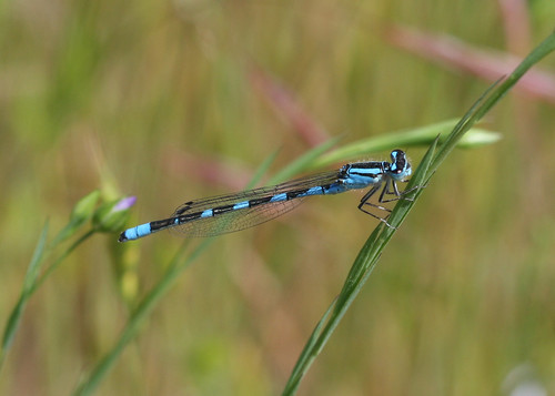
Tule Bluet damselfly perched on flax leaf. Photo: John Riutta, The Well-Read Naturalist (2009). Displayed with permission.
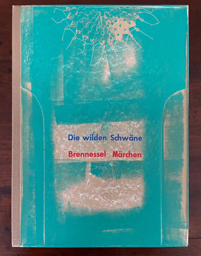
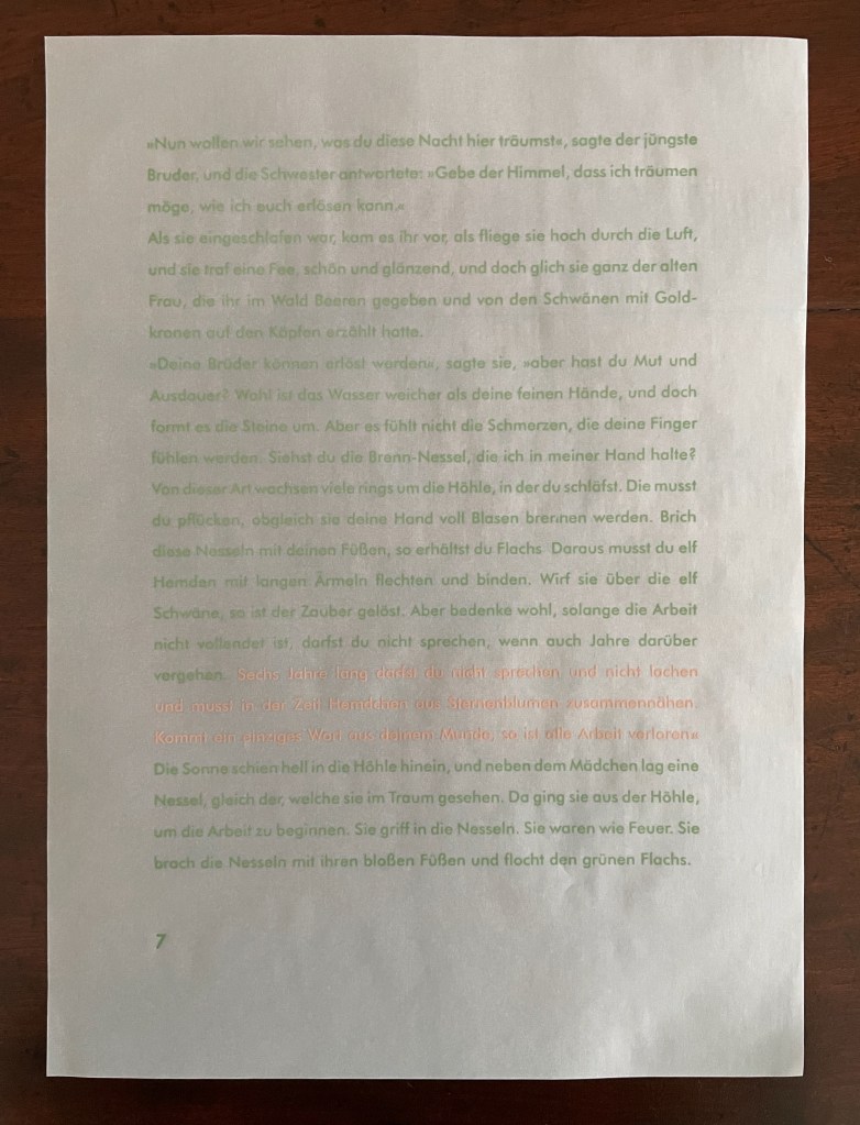
Die wilden Schwäne (2001)
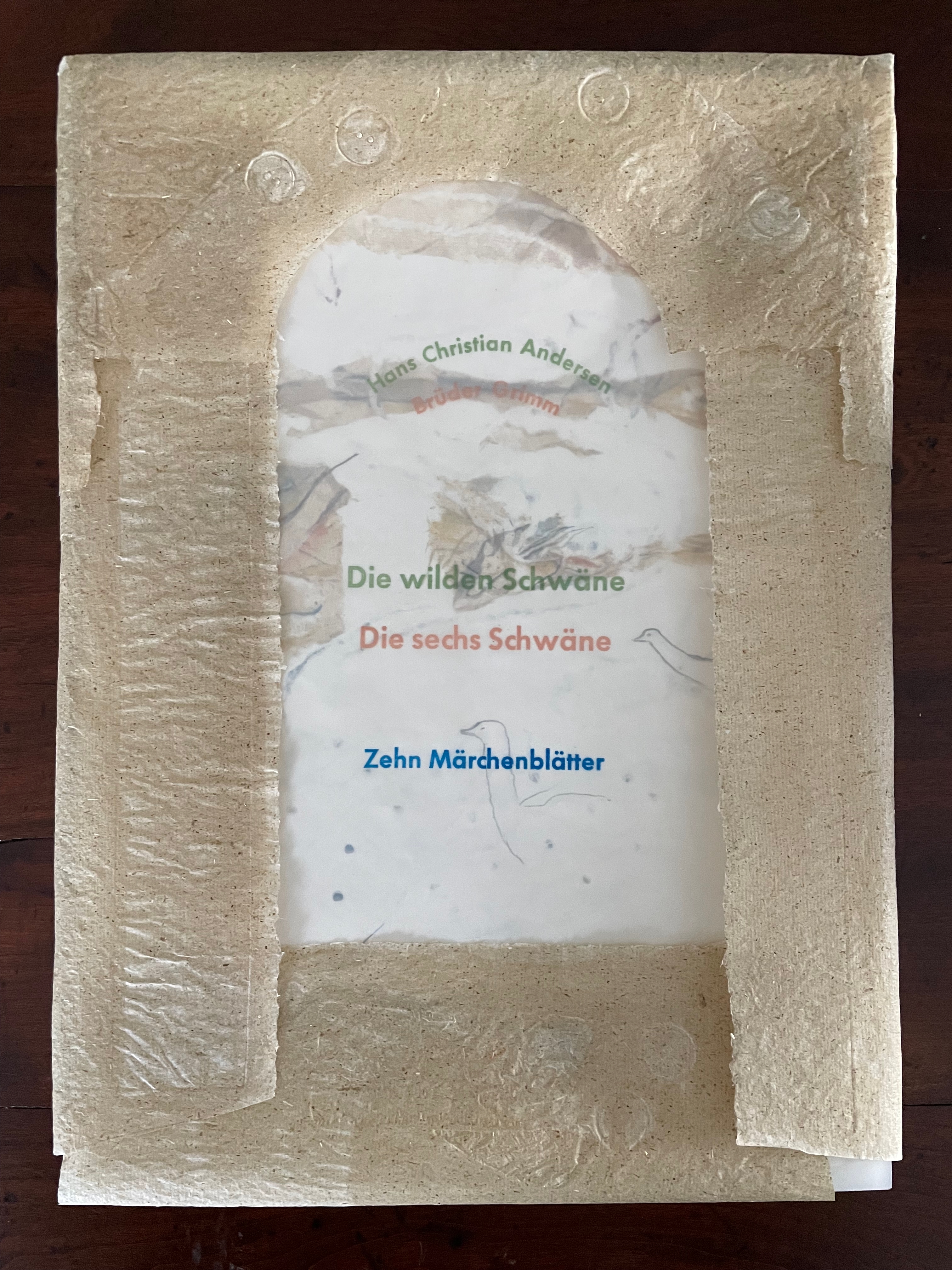
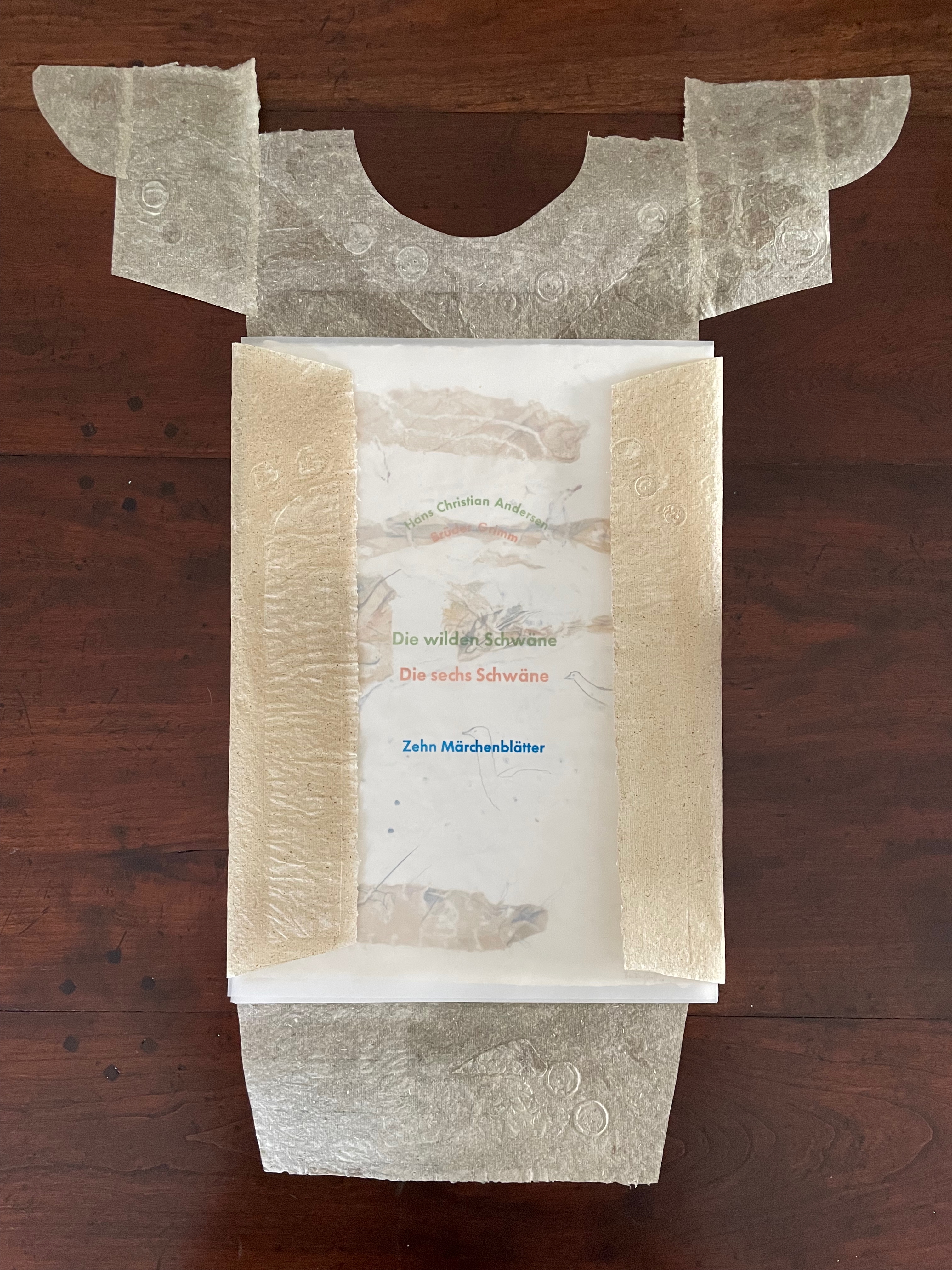
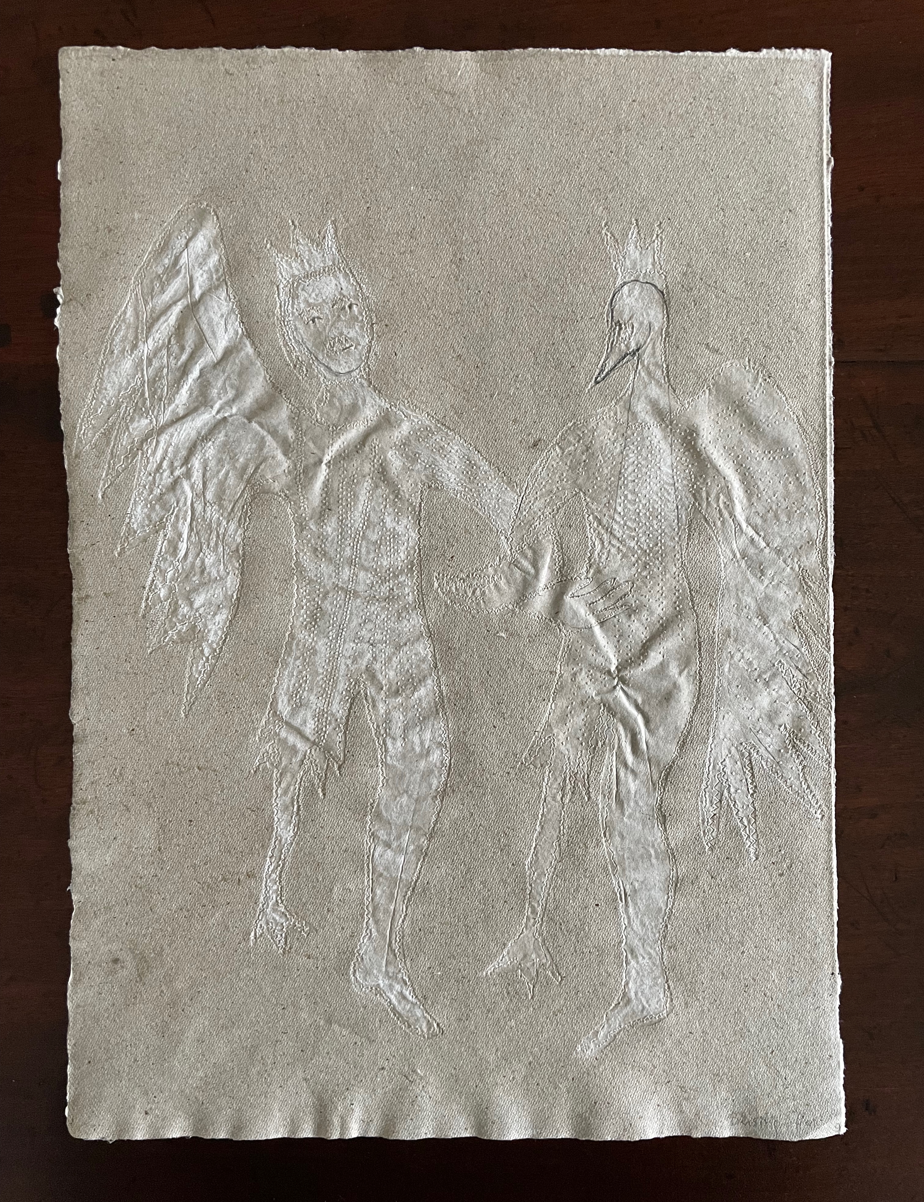
Die wilden Schwäne (2001) Barbara Beisinghoff Box with embossed cover holding folios wrapped in chemise. H35o x W250 mm. 18 folios. Edition of 25, of which this is #6. Acquired from the artist, 20 December 2024. Photos: Books On Books Collection.
Barbara Beisinghoff’s Die wilden Schwäne is an exemplar of collaboration and craft. In it, she even requires collaboration between Hans Christian Andersen and the Brothers Grimm. Andersen’s Die wilden Schwäne and the Grimms’ Die sechs Schwäne are based on the same tale of brothers turned into swans who are saved by their sister Elisa’s diligent and mute harvesting, pulping, spinning and sewing of stinging nettles into shirts that break the spell when donned. H.C. Andersen, however, is verbose and elaborate in his telling (even including vampires!), and Beisinghoff has done a bit of nipping and tucking with the more succinct Brothers Grimm to create a version more suited to the artist’s book she creates.
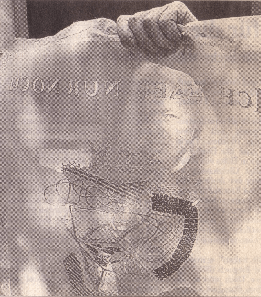
To match Elisa’s effort with stinging nettles, Beisinghoff enlisted the collaboration of Johannes Follmer, the owner of a paper mill. Together they obtained cultivated stinging nettles from the Institute for Applied Botany in Hamburg, cut the fibers, left them to rot, boiled them into a pulp, mixed that with water in a vat, scooped up layers in a sieve embroidered with illustrations, couched the sheets, then pressed and dried them into paper. Beisinghoff applied further drawings with a water jet, watercolor and pencil to the watermark-embossed sheets to illustrate aspects of the tale. To present the Andersen/Grimm “collage”, Beisinghoff had the type set and printed at the Gutenberg Museum. Andersen is printed in light green and Grimm in light red on seven numbered translucent sheets and interleaved with the nine folios of paper art (two more translucent sheets carry the cover page and colophon). To wrap the folios together, Beisinghoff made an embossed chemise or “feather dress” of pure nettle fiber, which could represent Andersen’s description of the brothers’ blowing off each other’s feathers every evening when the sun has set or one of the shirts that their sister makes to break their spell.
The “feather dress” of stinging nettle fiber.
“The King’s little daughter was standing in the cottage room, playing with a green leaf, for she had no other toys. She pricked a hole right through the leaf, looked up at the sun, and there it was, she saw the clear eyes of her brothers, but every time the warm rays of the sun shone on her cheeks, she thought of all their kisses.” Translation with DeepL.
“When she had fallen asleep, it seemed to her as if she were flying high through the air, and she met a fairy, beautiful and radiant, yet she looked very much like the old woman who had given her berries in the forest and told her about the swans with gold crowns on their heads.” Translation with DeepL.
“The swans swooped down to her and lowered themselves so that she could throw the shirts over them: and as she touched them, the swan skins fell off, and her brothers stood before her in the flesh, fresh and beautiful.” Translation with DeepL.
“Barbara Beisinghoff (head in the background) covers the frame with this transparent, embroidered and sewn gauze, which is used to scoop and emboss her nettle papers. This is how her large-format watermark illustrations end up on the sheets.” Translation with DeepL. Peter Holle. 30 August 2001. Frankfurter Rundschau. Photo: Oliver Weiner.
This art by watermarking recalls that of other artists in the collection: Fred Siegenthaler and Gangolf Ulbricht, in particular. The technique of pulp painting also finds other practitioners in the collection: Pat Gentenaar-Torley, John Gerard, Helen Hiebert, Tim Mosely, Maria G. Pisano, Taller Leñateros, Claire Van Vliet and Maria Welch. Beisinghoff’s blend of embroidered watermarks, waterjet marking and pulp painting, however, creates a bas relief effect that is echoed only in the collection’s works by Mosely, Taller Leñateros and Van Vliet, albeit achieved differently. These workings of the substrate — as material, color, surface, and even narrative — with the workings of book structure is one of the more magical locations of book art. It is perfect for Beisinghoff’s metamorphical interpretation of the Andersen/Grimm fairy tale.
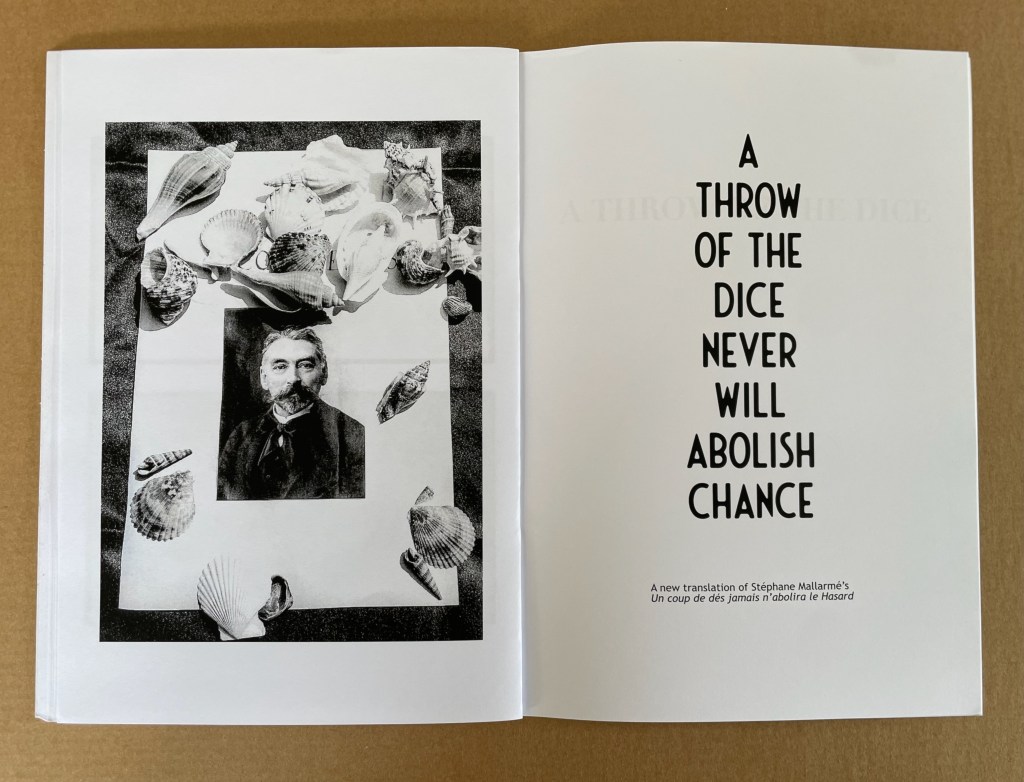
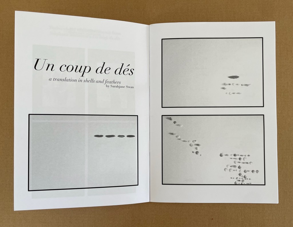
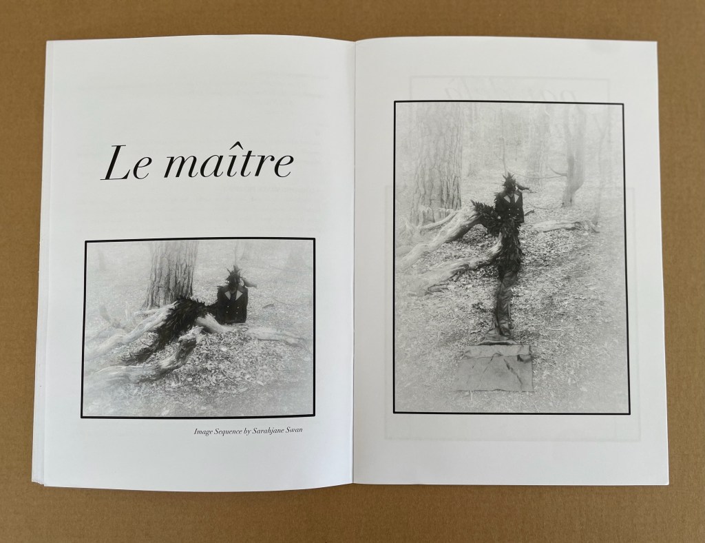
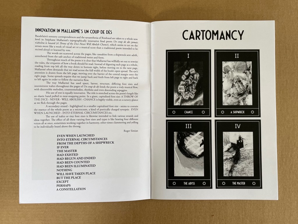
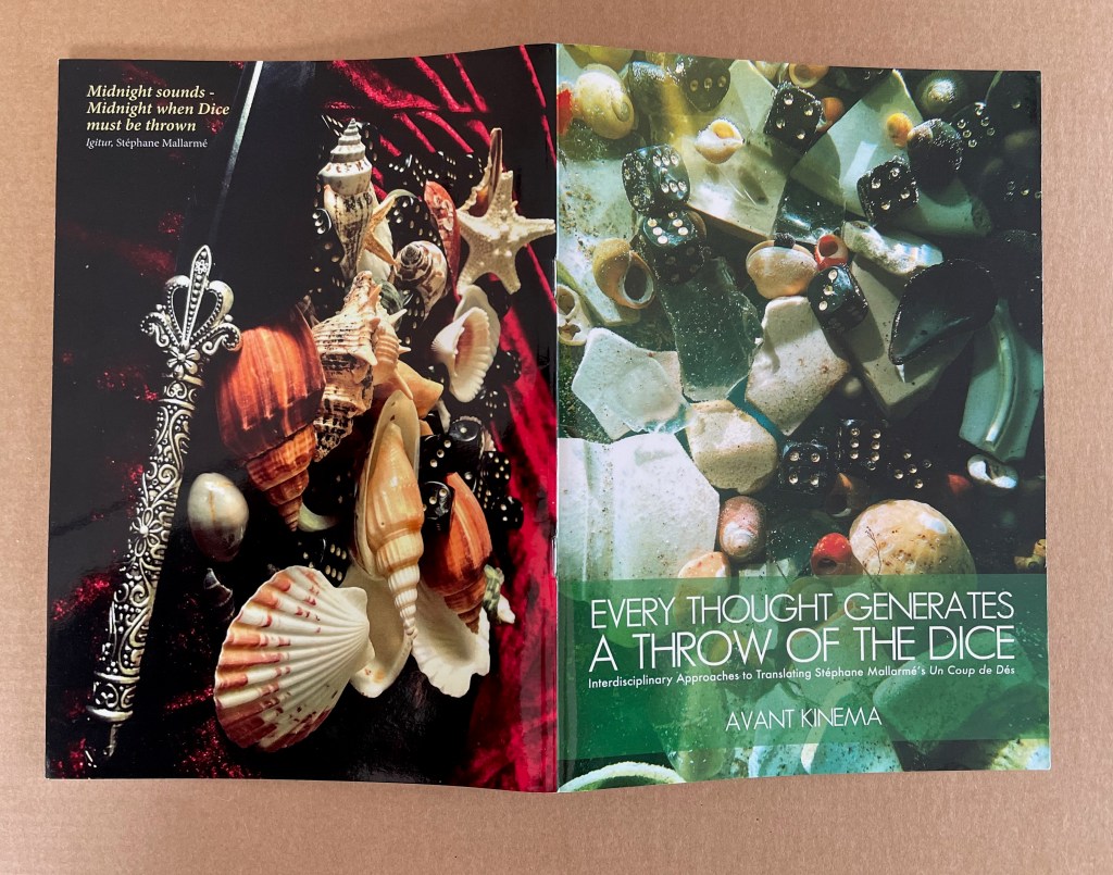
Sarahjane Swan & Roger Simian (the strangely named duo behind Avant Kinema) were responding to an invitation from the AHRC-funded project Imprints of the New Modernist Editing in 2019, which would have resulted in an exhibition at Shandy Hall, home of the Laurence Sterne Trust, but the Covid-19 pandemic intervened. Their response consisted of “visual artworks, photography, poetry, fiction and Tarot style card designs featuring ‘twelve virgin symbols extracted from Un coup de dés‘” (Swan & Simian, “Introduction”). This booklet captures those works and concludes with a new translation of the poem.
The subtitle characterizes the works as an interdisciplinary approach to translating the poem, but Dick Higgins’ term “intermedial” might be a more apt description.
Swan’s substitution of feathers and shells for Mallarmé’s words, Broodthaers’ redactions and Pichler’s excisions brings a new form of materiality to Un Coup de Dés. It recalls the similar playfulness of other artists such as Clotilde Olyff with the alphabet.
From an image sequence by Swan, the artists pull together a set of Tarot-like cards to introduce a new angle on the poem’s invocation of chance.
Avant Kinema’s homage is a collage or assemblage of different media distilled in this booklet. The preempted installation might have echoed that of Marine Hugonnier’s The Bedside Book Project (2006-07).
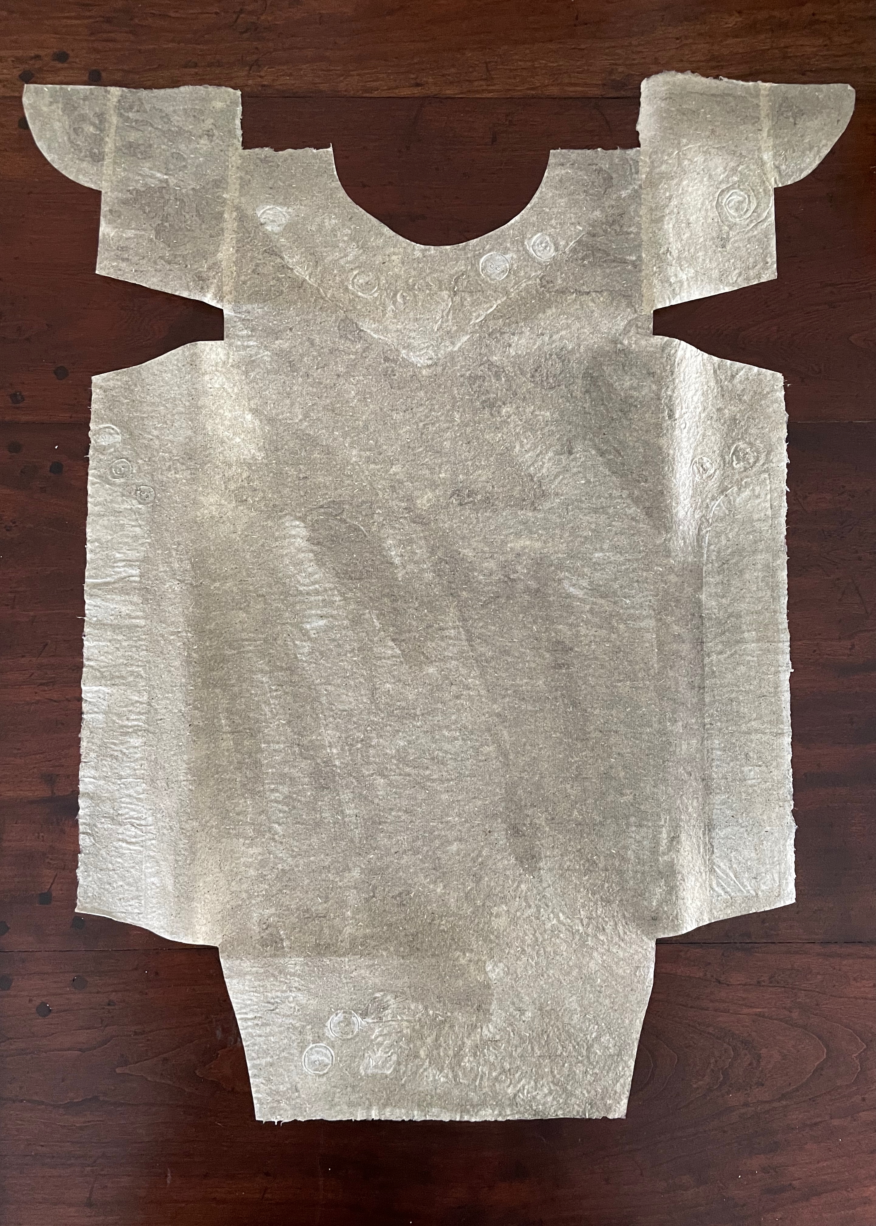
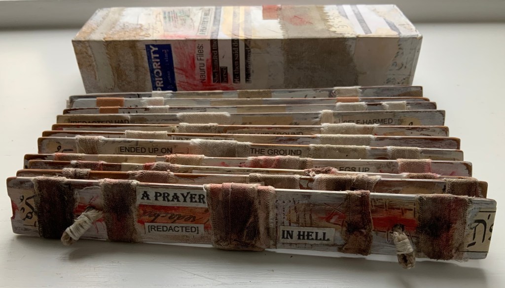
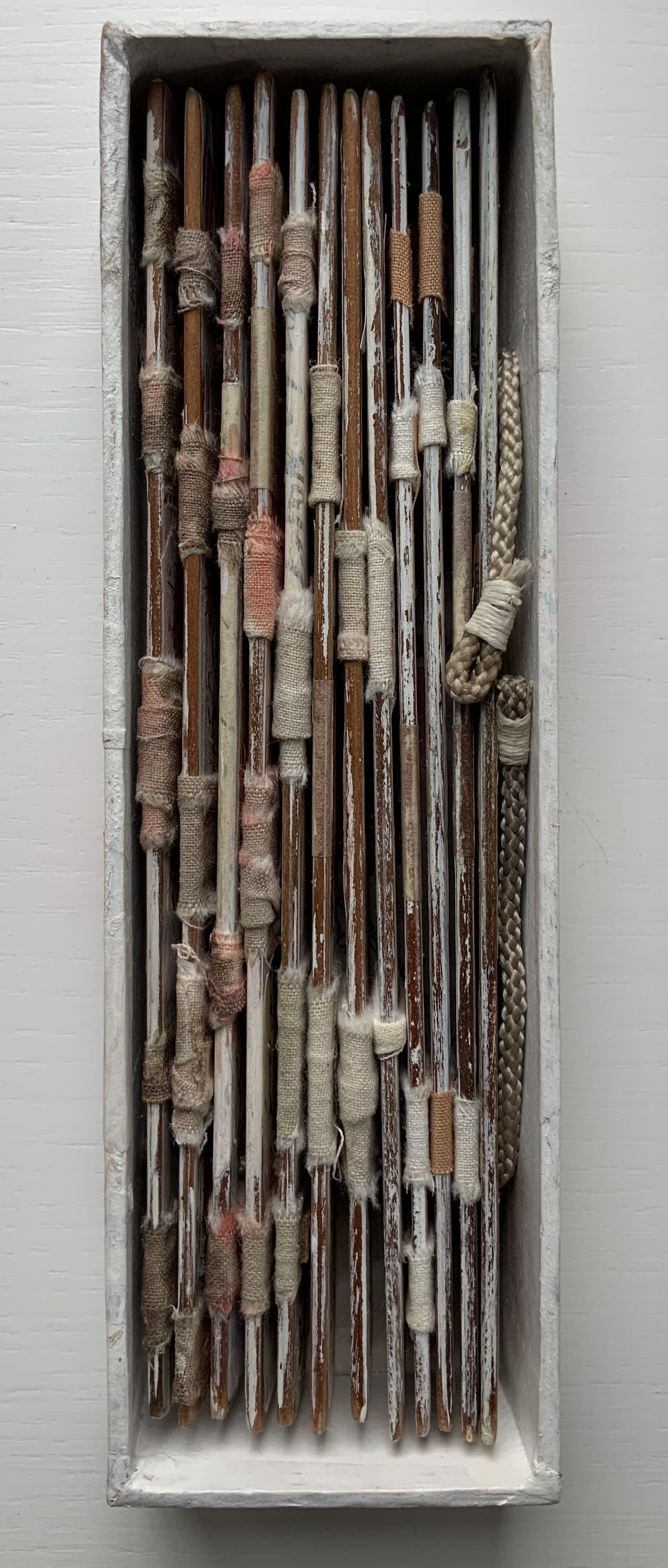
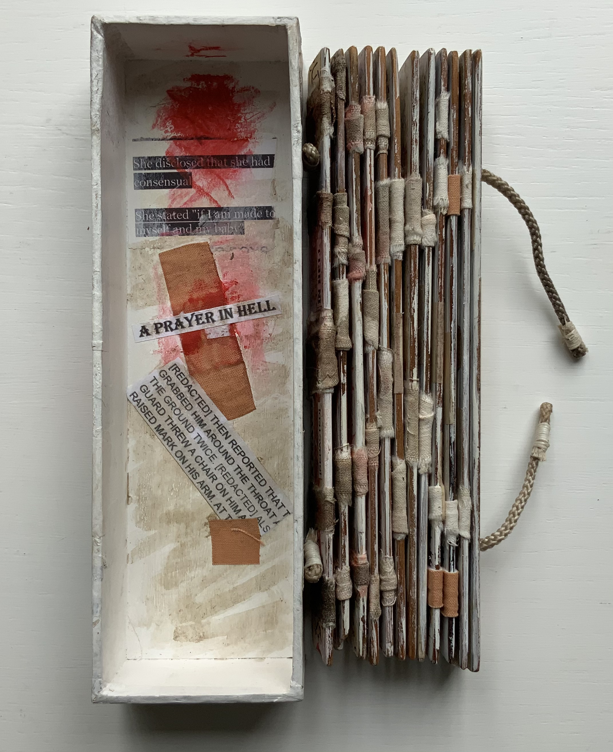
A Prayer in Hell (2018) Jacobus Oudyn Palm leaf prayer book format of 12 timber slats with double-sided collages materials and images made with pomegranate ink on antique paper, water soluble crayon calico, wound dressings and PVA adhesive. Text from Nauru Files — Guardian Newspaper and Islamic prayer book. Open: H195 x W130 mm. Closed: H195 x W 55 x D35 mm. Slip case: 2 mm card with collage, H202 x W60 x D38 mm, to be displayed with the book. Unique. Acquired from the artist, 4 January 2020. Photos: Books On Books Collection, displayed with permission of the artist.
A Prayer in Hell is one of Jack Oudyn’s larger works. works refer to the Australian experience of the world’s refugee crisis (perhaps the largest diaspora in history), A Prayer in Hell is the most scorching of them all.
Materially, the work embodies the refugees and their experience in many ways — its palm-leaf prayer book pages even consist of “stressed and recycled timber slats”. The binding cords penetrate drawings of eyes on each slat, creating the effect of the faceless staring through bars. Although the work’s title alludes to the English expression “not a hope in hell”, the work itself nods toward hope appears in how the wound dressings, wound round the slat pages, gradually become cleaner. Under and over the dressings, strips of English and Arabic text are collaged alongside handwritten extracts from Islamic prayer books and reports of events and conditions in Australian detention centers. Complete with redactions, the English text refers to the scandals associated with the centers at Nauru, Papua New Guinea, Christmas and Manu islands.
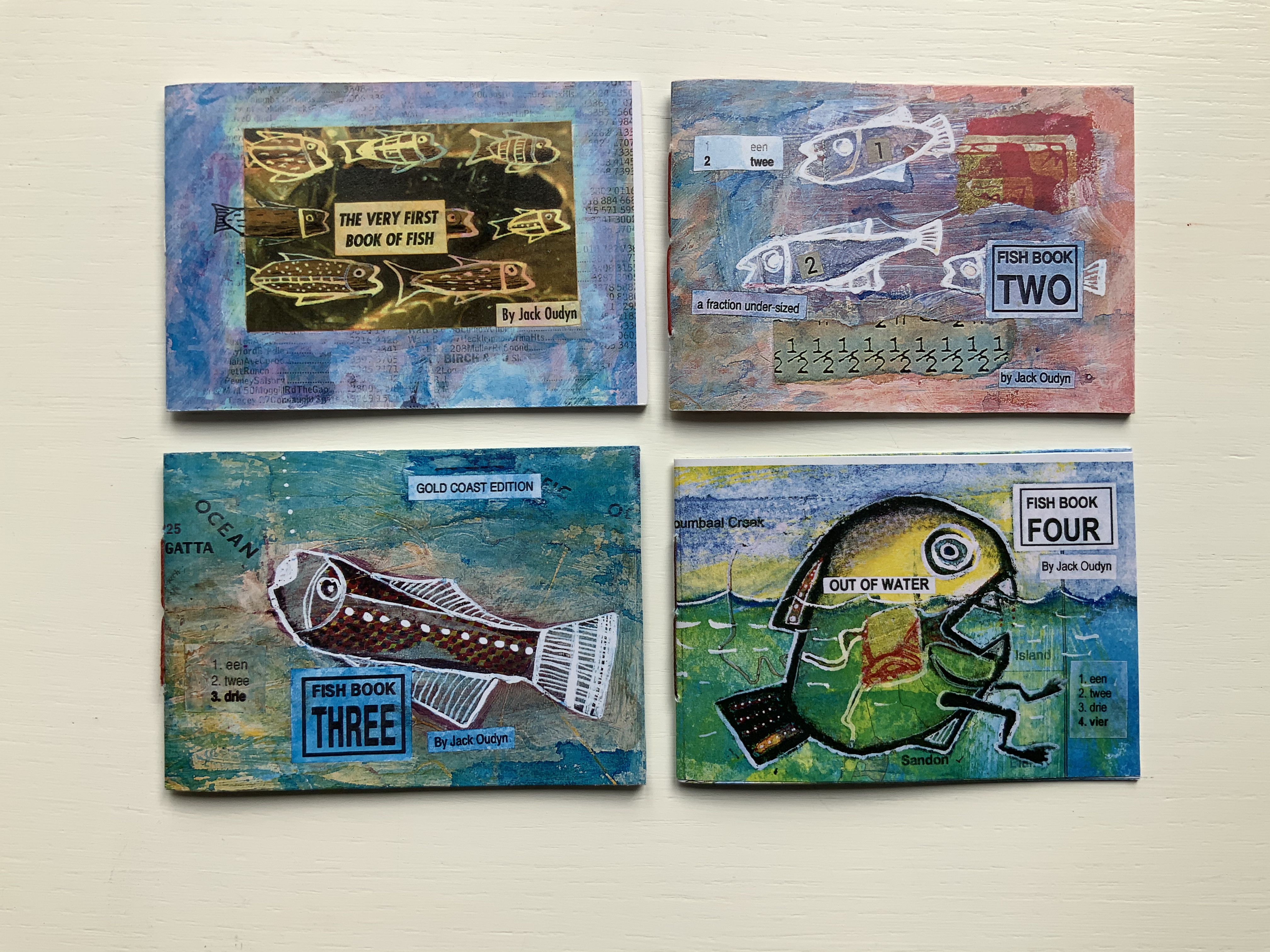
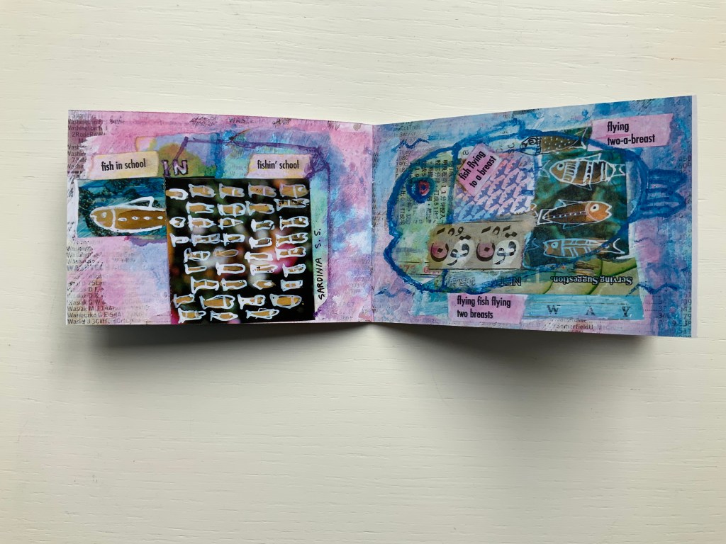
Fish Books One, Two, Threeand Four (1999 – 2001)
All acquired from the artist, 4 January 2020. Photos: Books On Books Collection, displayed with permission of the artist.
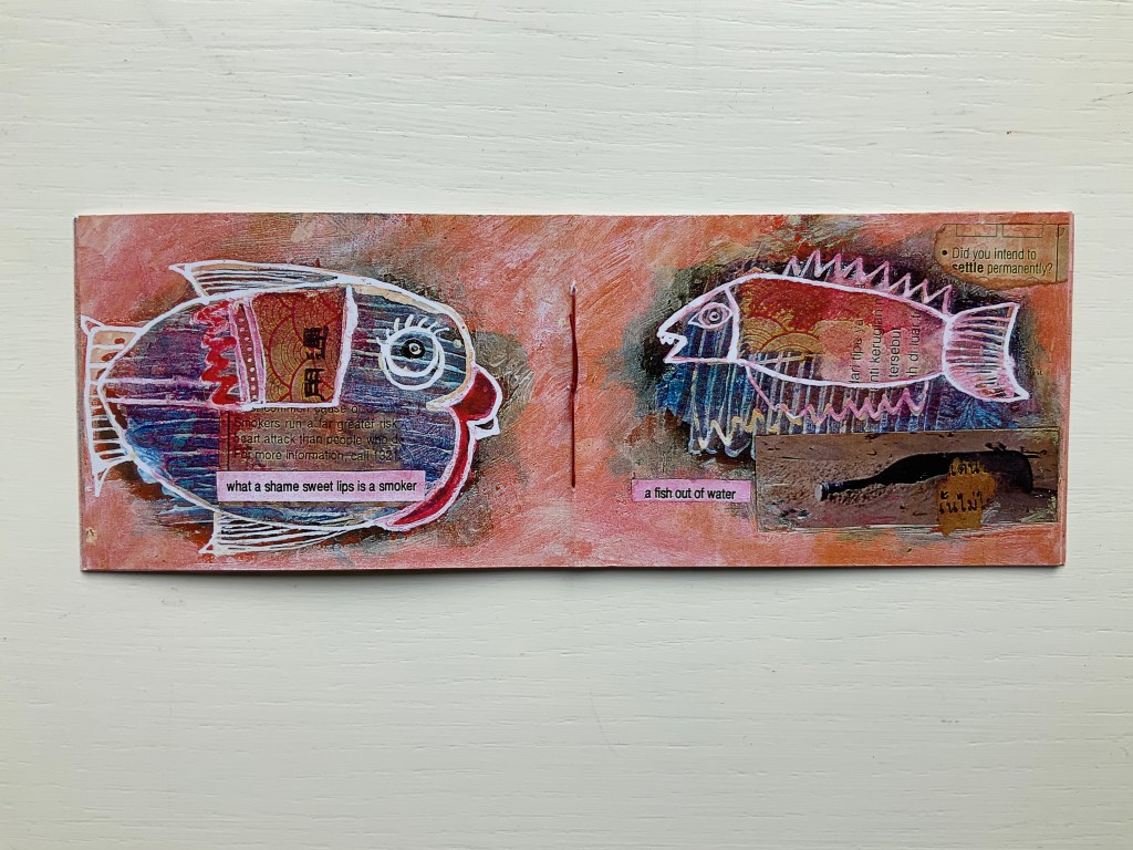
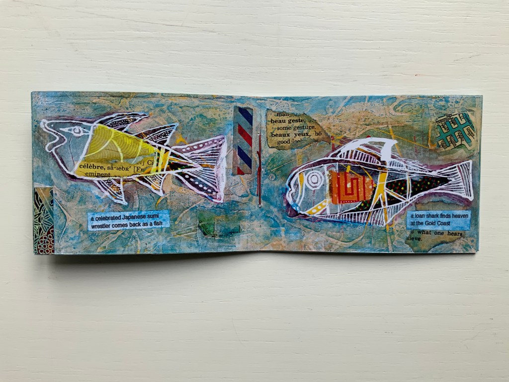
This complete set of his fish books represents Oudyn’s Micro Press imprint well. Many of the small works are playful with language, form, and material and, often, socially satirical or critical. More hook-in-mouth than tongue-in-cheek, the fish books have provided the artist with ground for playing with collage and printing techniques. In imagery, they are reminiscent of Ric Haynes, Breughel and Bosch. In text, they encapsulate the punsterdom of book art (albeit without the usual book-related self-referencing, though “fish wrapper” would have been good for their covers); reveal the artist’s Dutch heritage in their numbering; and revel in Australia’s odd common fishnames (dart, flattie, stargazer, sweetlips, etc.). By Fish Book Four (2001), however, a socially sharper tone emerges. The dates of publication, which vary from those in the WorldCat links for each title, are taken from the artist’s website.
The Very First Book of Fish (1999) Jack Oudyn Booklet made of 200 gsm digital paper, sewn with single white waxed thread, 16 pages. Color laser print of mixed media drawings; ink, paint, collage on pages from telephone directory. H70 x W105 mm, 16 pages. Edition of 50, of which this is #27. Photos: Books On Books Collection, displayed with permission of the artist.
Fish Book Two(1999) Same format as first, except sewn with single red waxed thread; #49 of 50.
Fish Book Three (2000) Same format as the second; #25 of 50.
Fish Book Four(2001) Same format as third, except sewn with single dark gray waxed thread: #13 of 50.
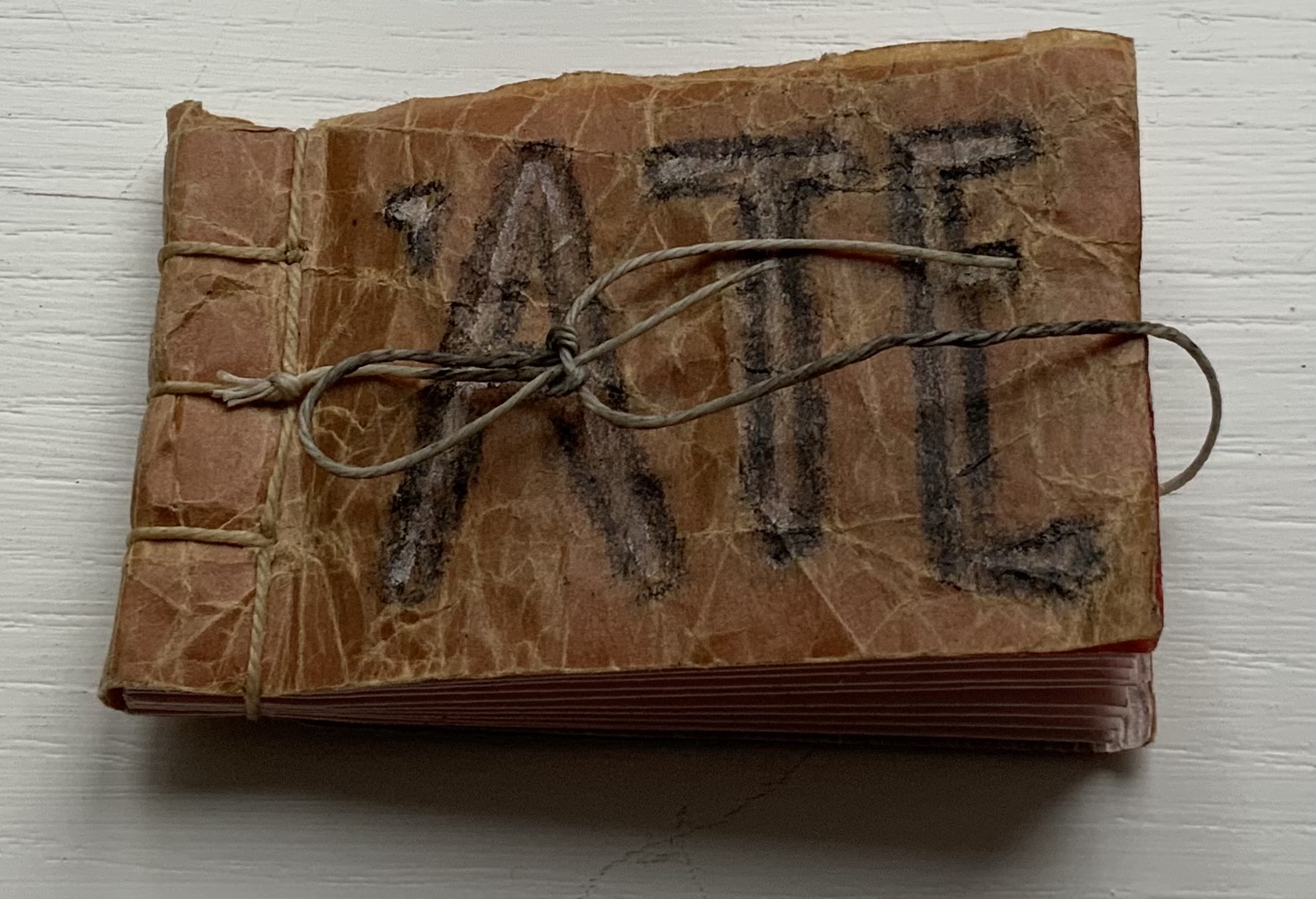
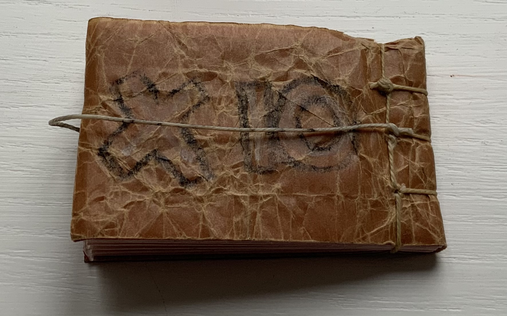
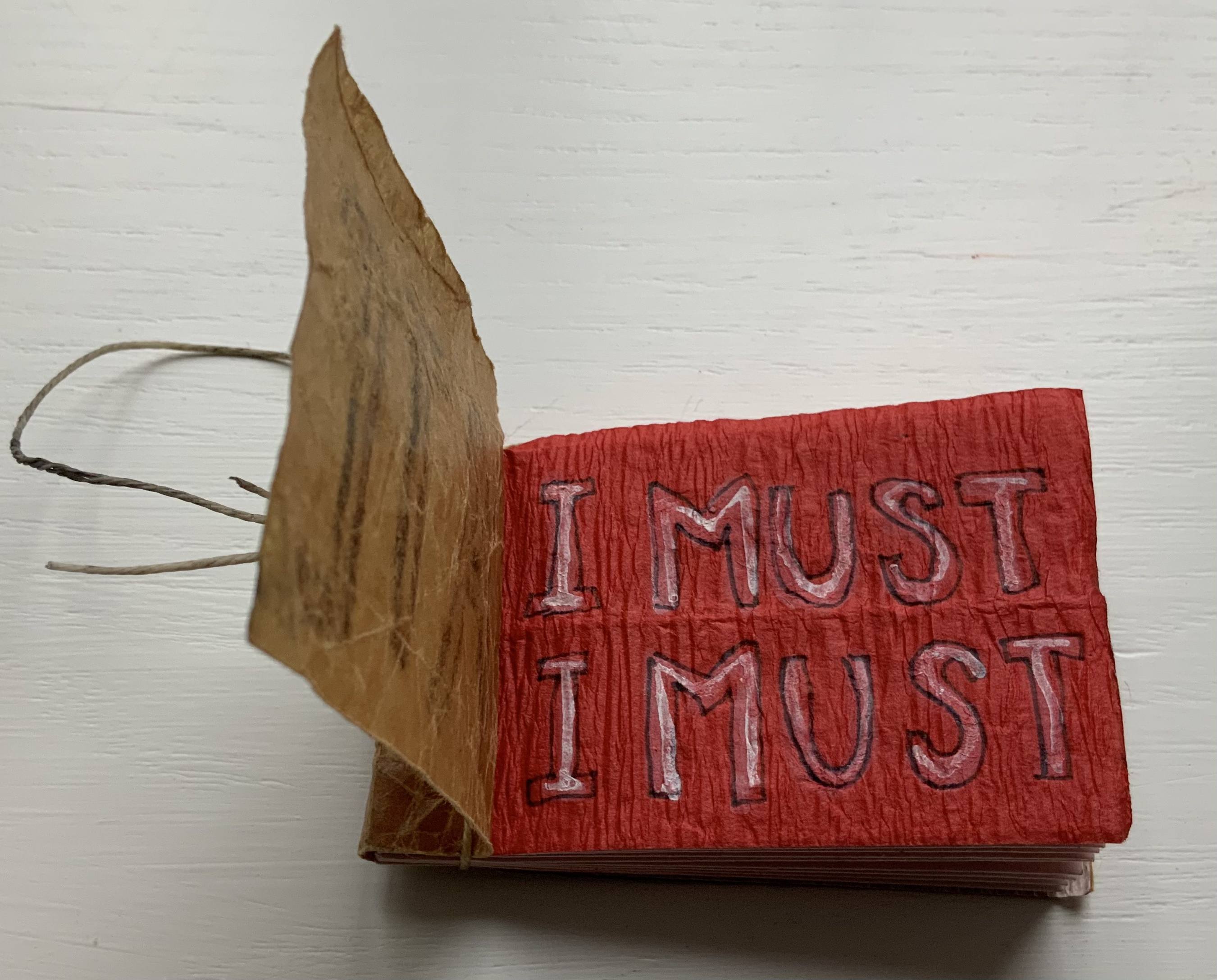
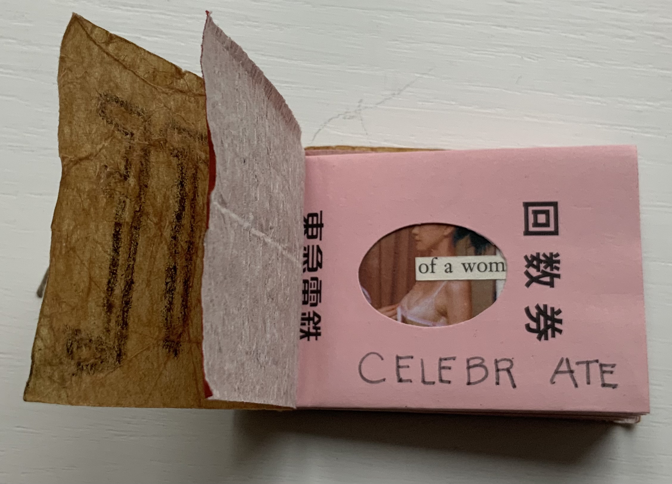
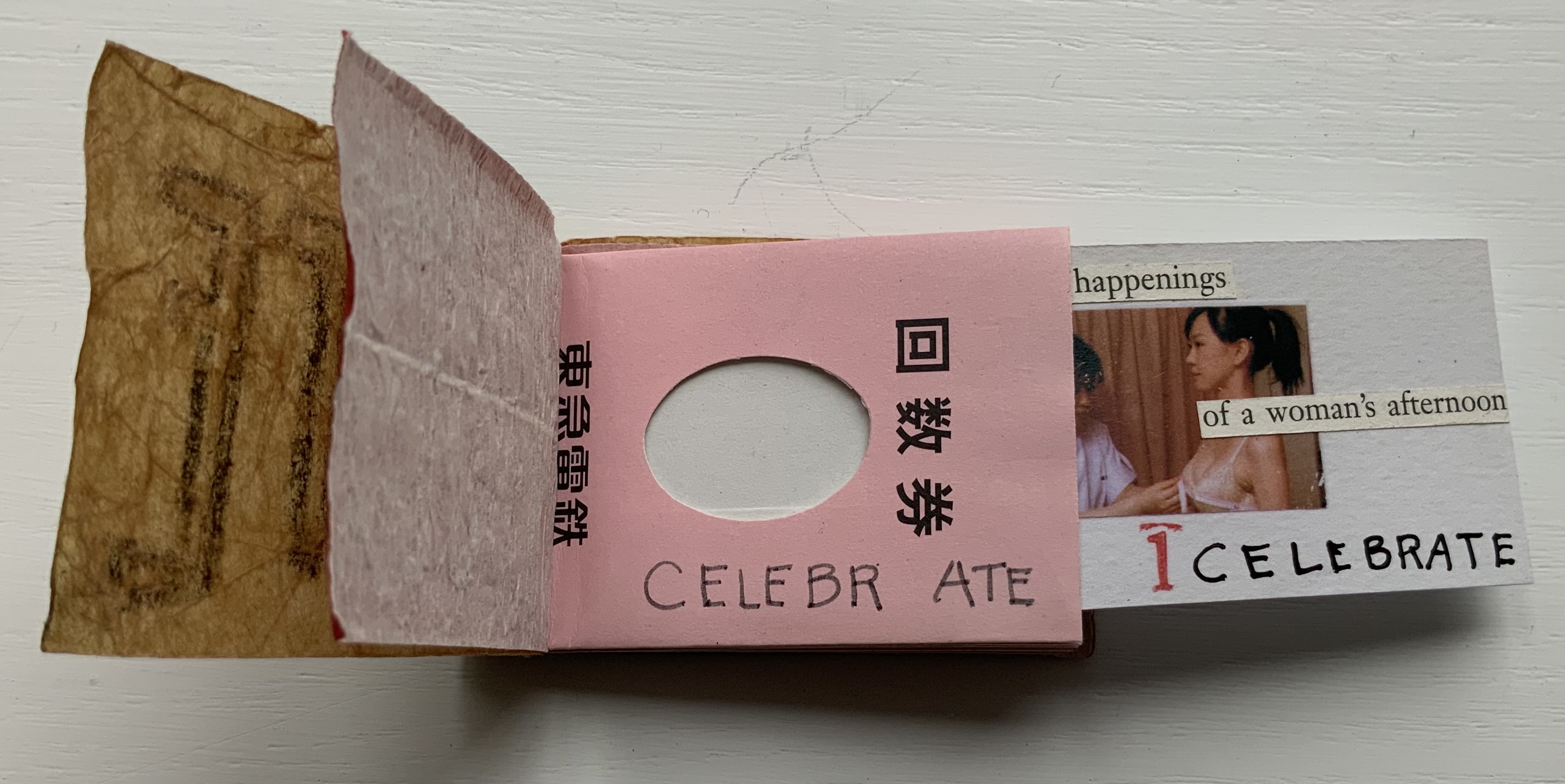
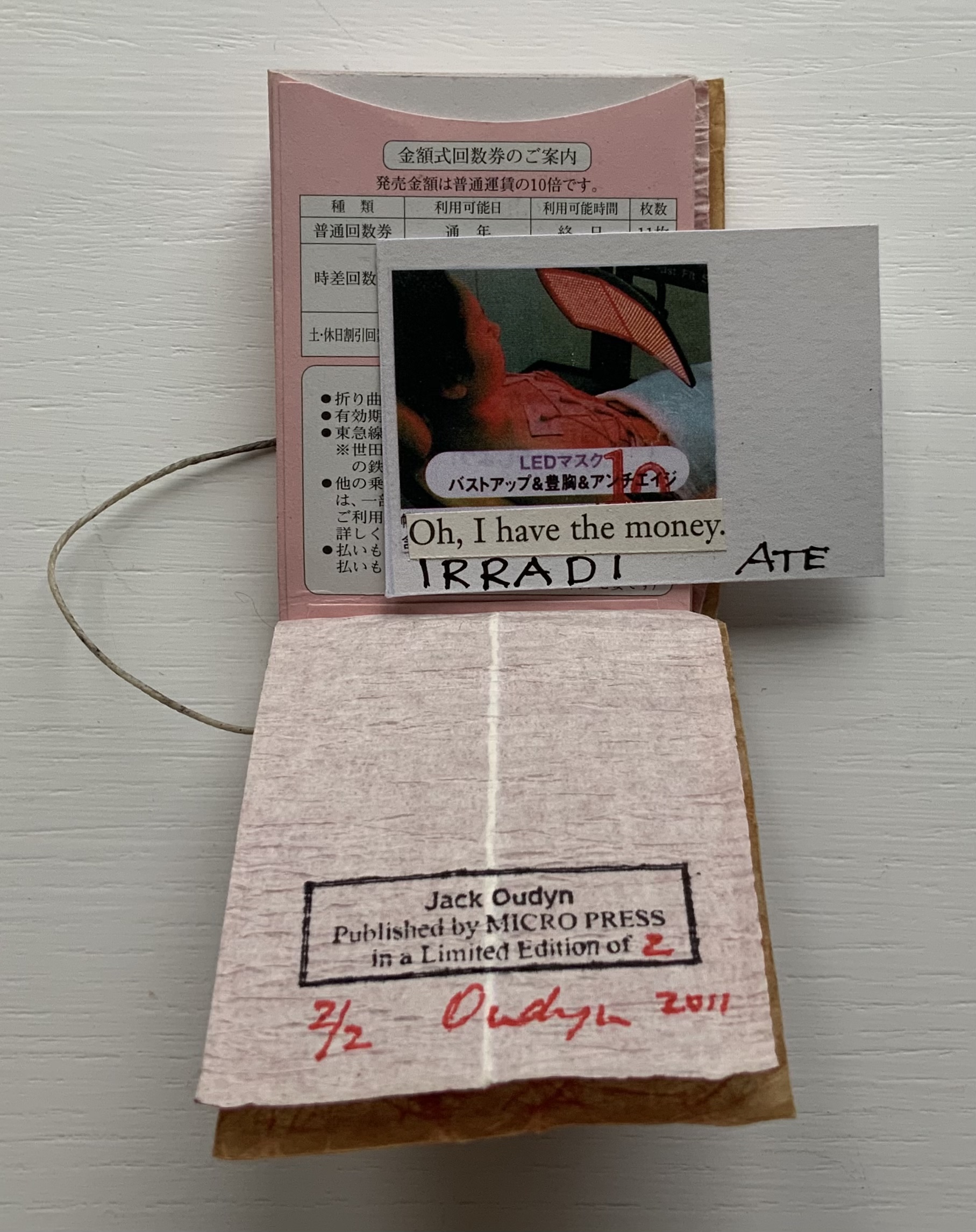
‘ATE (2011)
‘ATE X 10 (2011) Jack Oudyn Japanese stab-bound booklet, with wax paper cover and Momigami fly leaves. H54 x W74 mm, 10 train ticket sleeves holding 10 small numbered cards collaged with advertising brochure photos. Edition of 2, of which this is #2. Photos: Books On Books Collection, displayed with permission of the artist.
‘ATE X 10 demonstrates Oudyn’s wont to play language, form and material off image and vice versa. Bound in a Japanese stab binding by waxed thread and wax paper from the fish markets at Tsukiji in Tokyo, the book begins with a front fly leaf page bearing a tag line from the breast exercise mantra; on the same Momigami paper, the end fly leaf bears the colophon. The pages are made of Japanese train ticket sleeves containing numbered cards collaged with small photos from advertising brochures found near railway stations. As the fly leaf hints, the modest photos come from ads for breast enhancement services, an 8 x 10 promise relative to the images presented.
The works in the Micro Press imprint also reflect Oudyn’s interest (and presence) in mail art. He has been a member of the International Union of Mail Artists, and a section on his site is devoted to mail art.
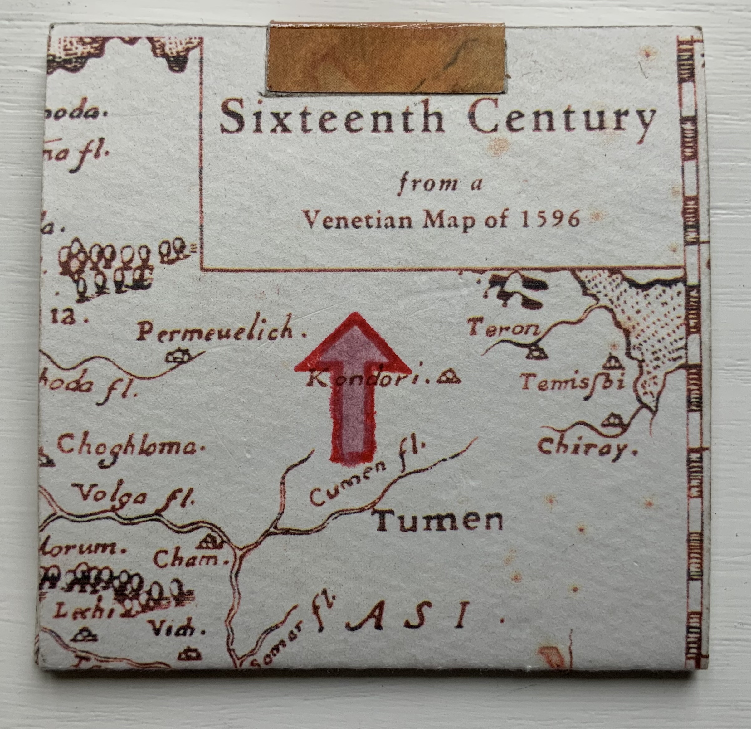
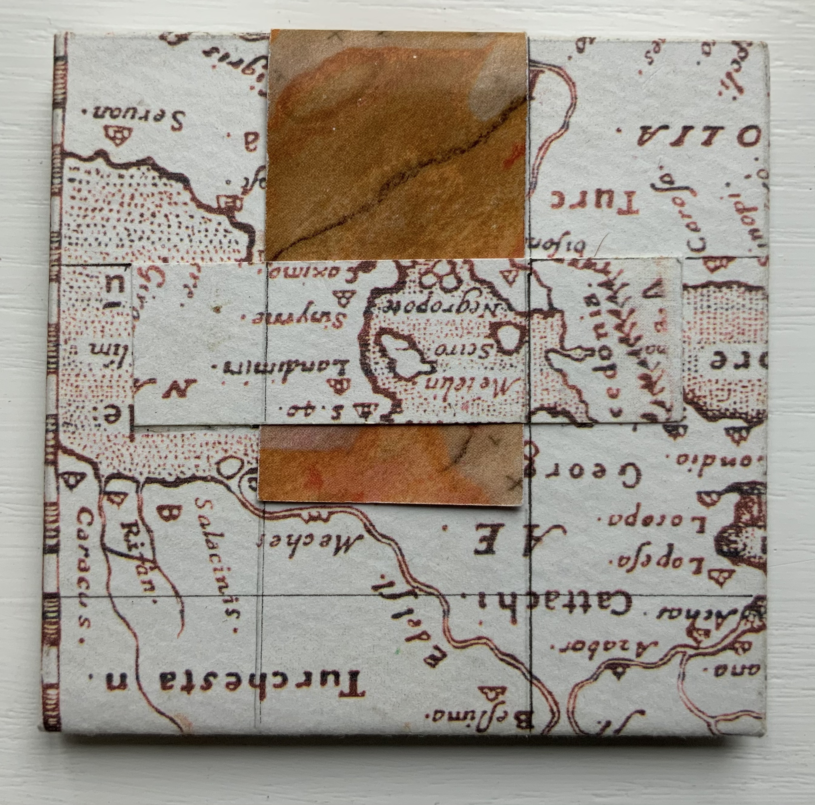
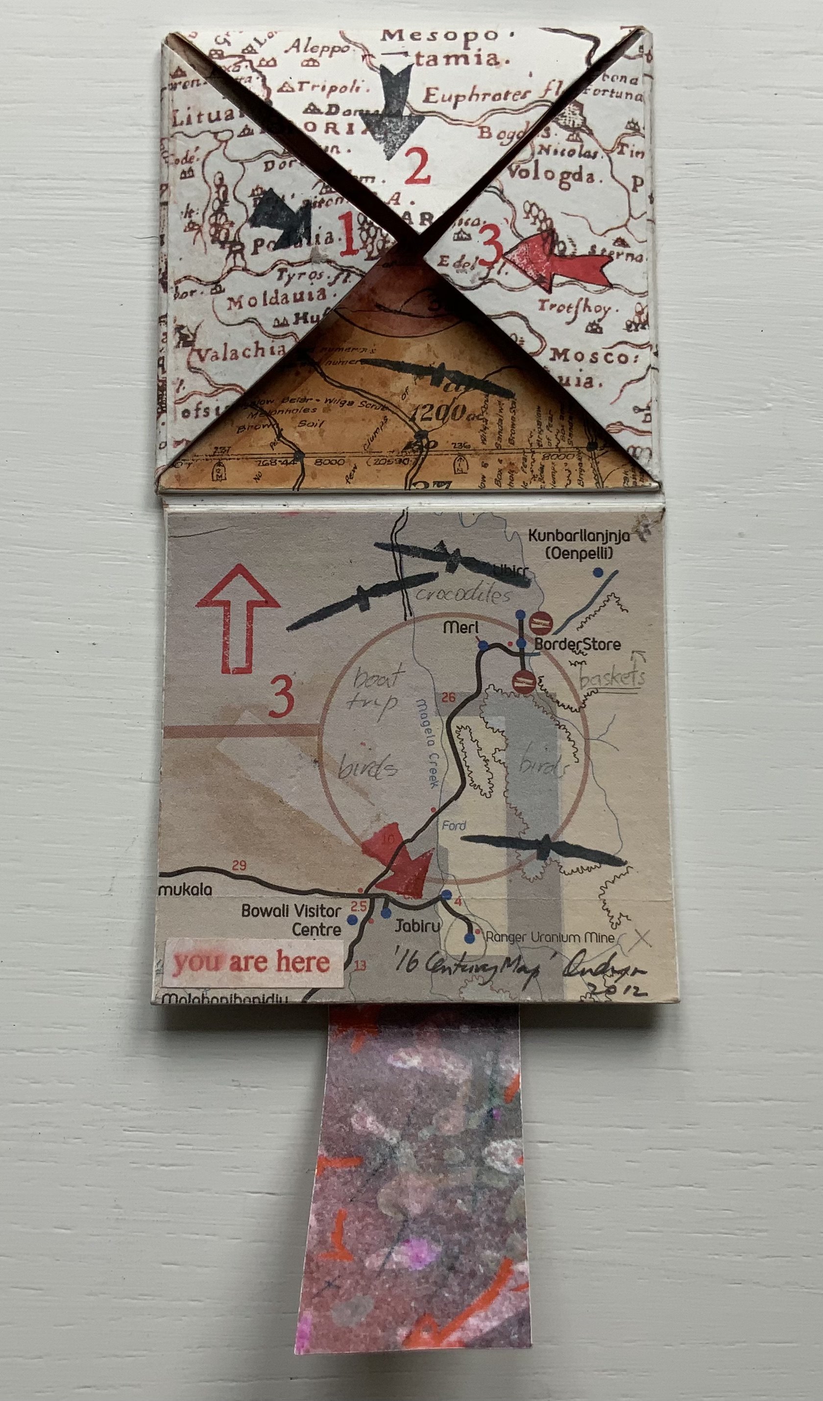
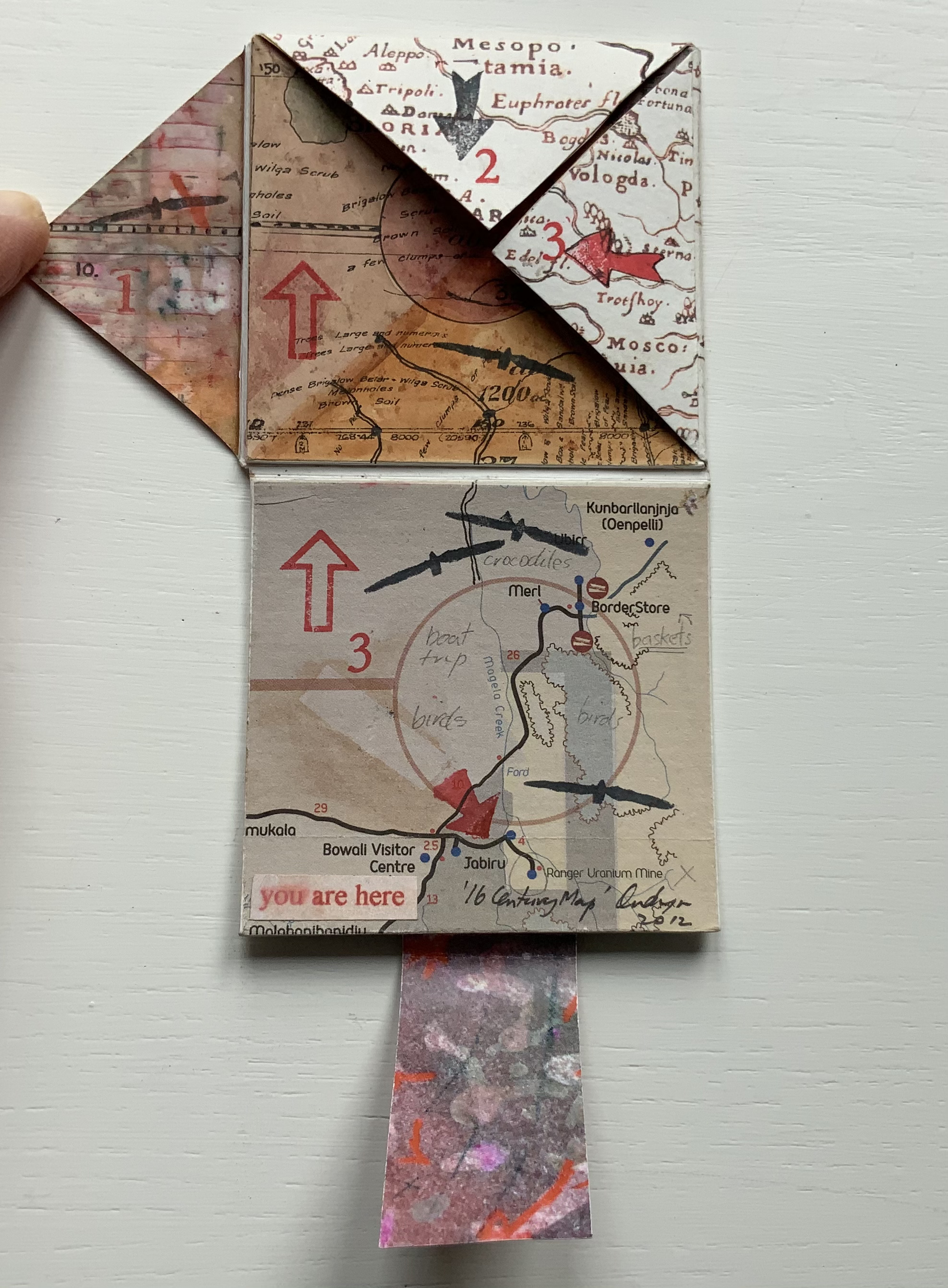
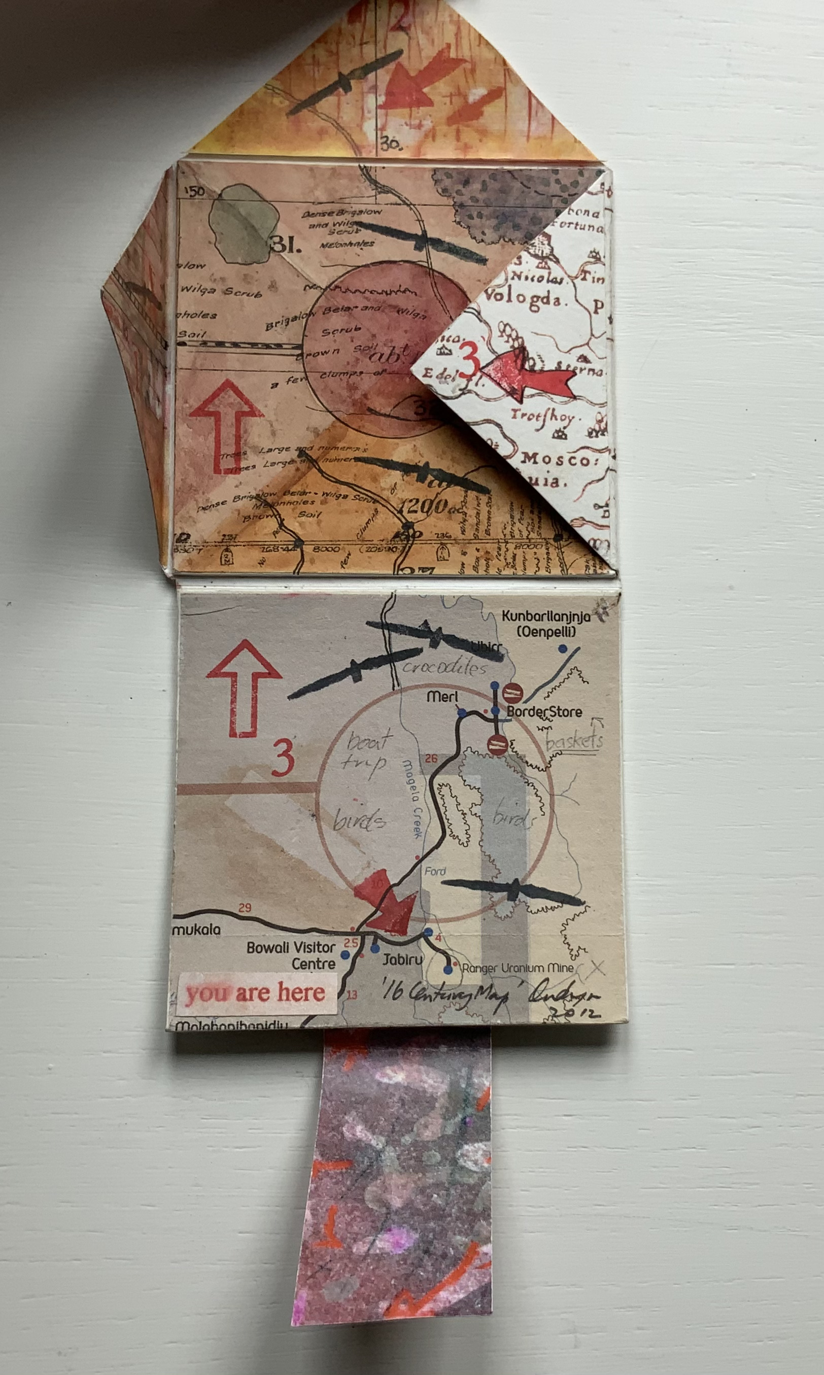
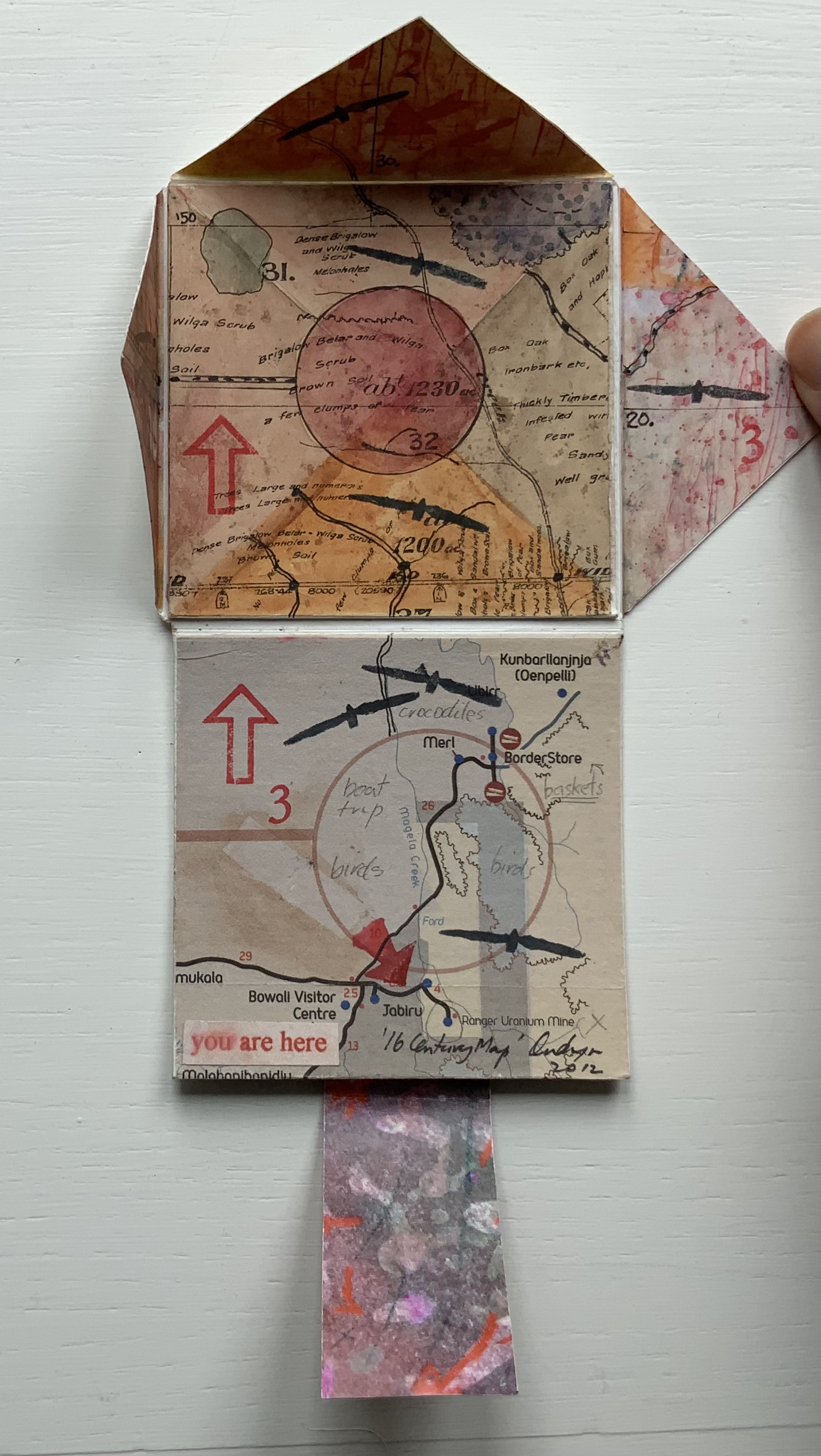
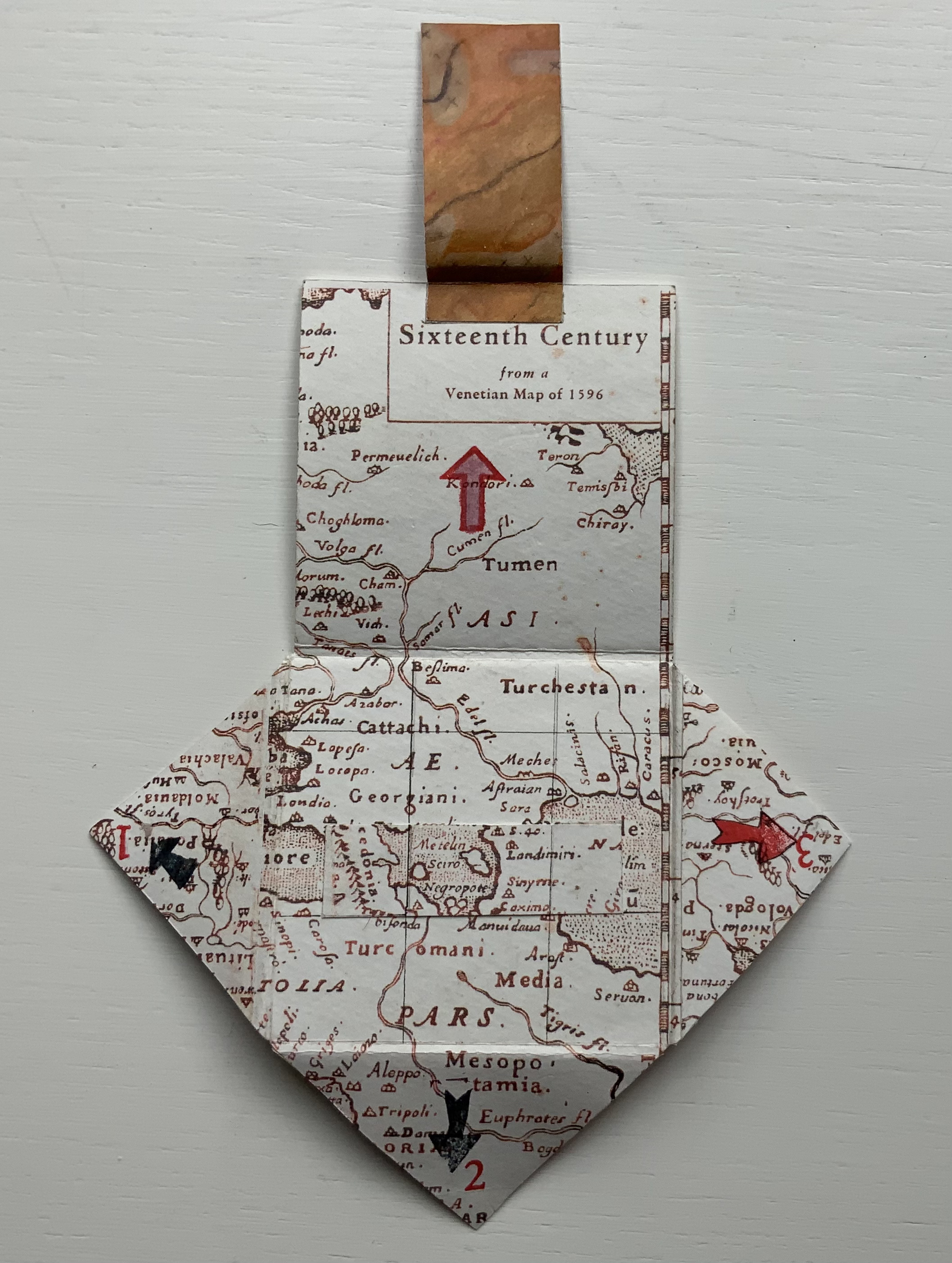
’16 Century Map’ (2012)
’16 Century Map’ (2012) Jack Oudyn Tab/slot-bound, single-fold, map paper on board, covering three outward-opening triangular cut tabs over center map paper on board; ink-stamped and drawn, with “you are here” sticker in lower left corner. H70 x W72 mm (closed). Unique. Acquired from the artist, 4 January 2020. Photos: Books On Books Collection, displayed with permission of the artist.
This small unique work — and those that follow — lie outside the Micro Press imprint. As the artist writes on his blog, this is a trial attempt at juxtaposing the exterior old European map (showing Mesopotamia and the Euphrates, the Northern hemisphere’s cradle of civilization) with the interior Australian map of the Kakadu National Park to get at the concept of Tjukurpa, by which Australia’s Anangu refer to the creation period.
It is not strictly a Turkish-fold map, but the way the tab with indigenous colors snugly closes ’16 Century Map’ is just as mechanically satisfying.
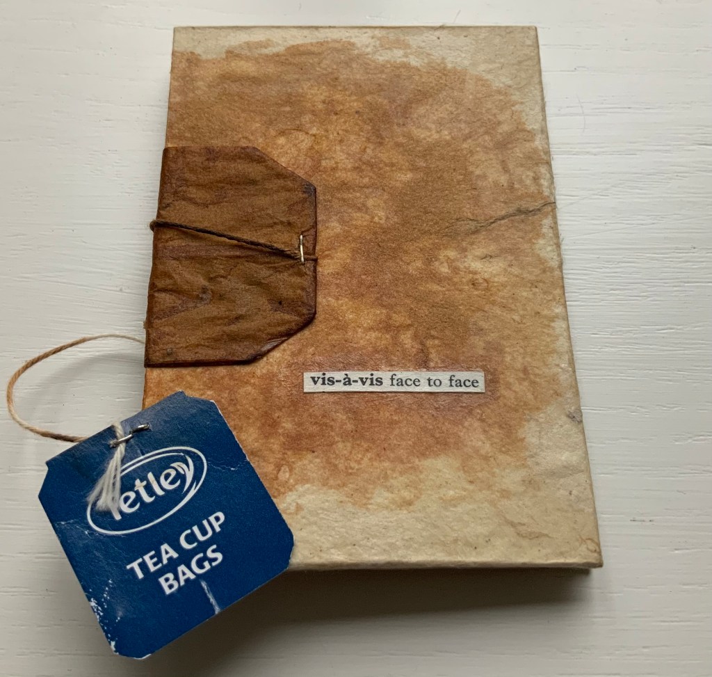
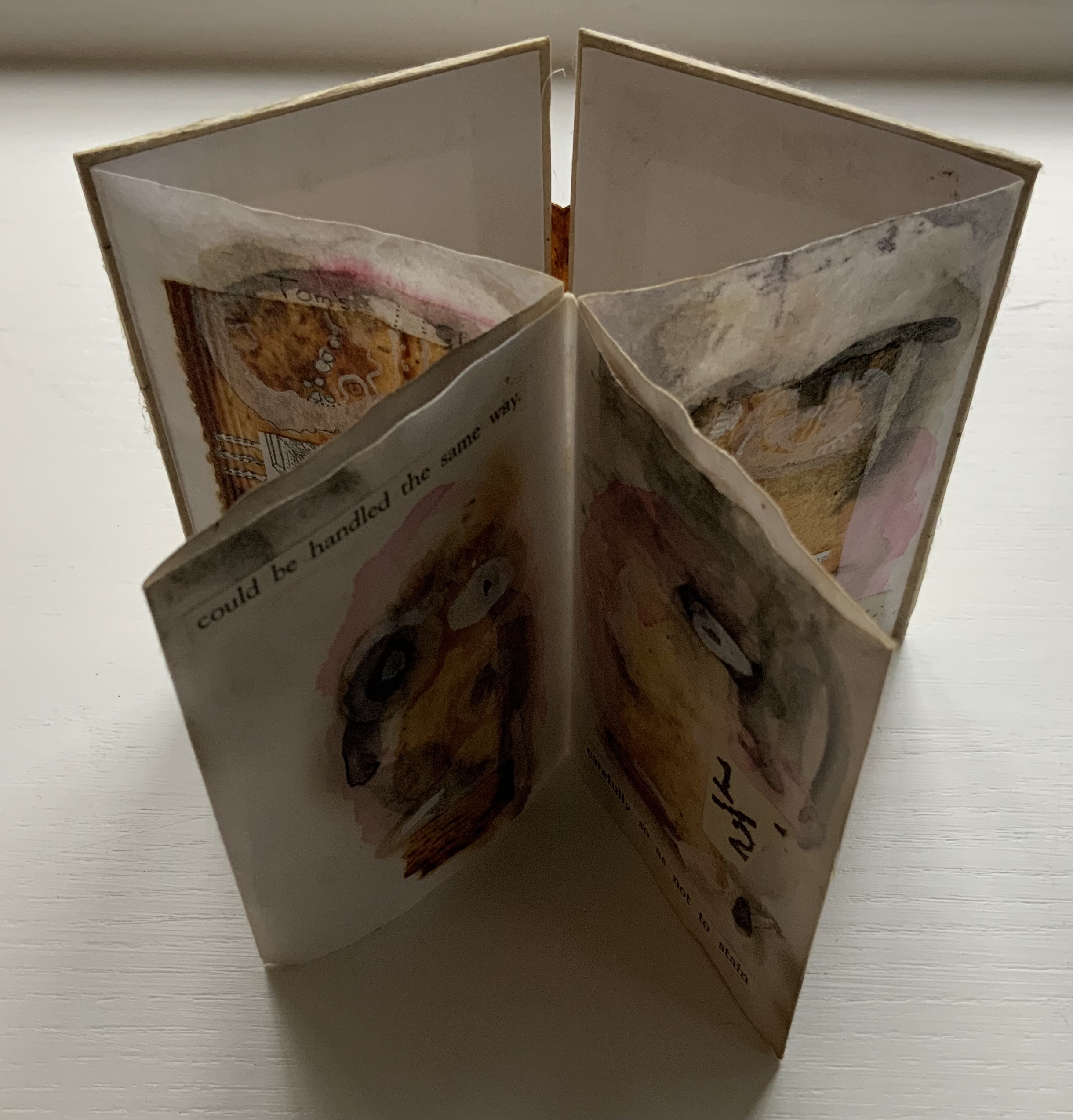
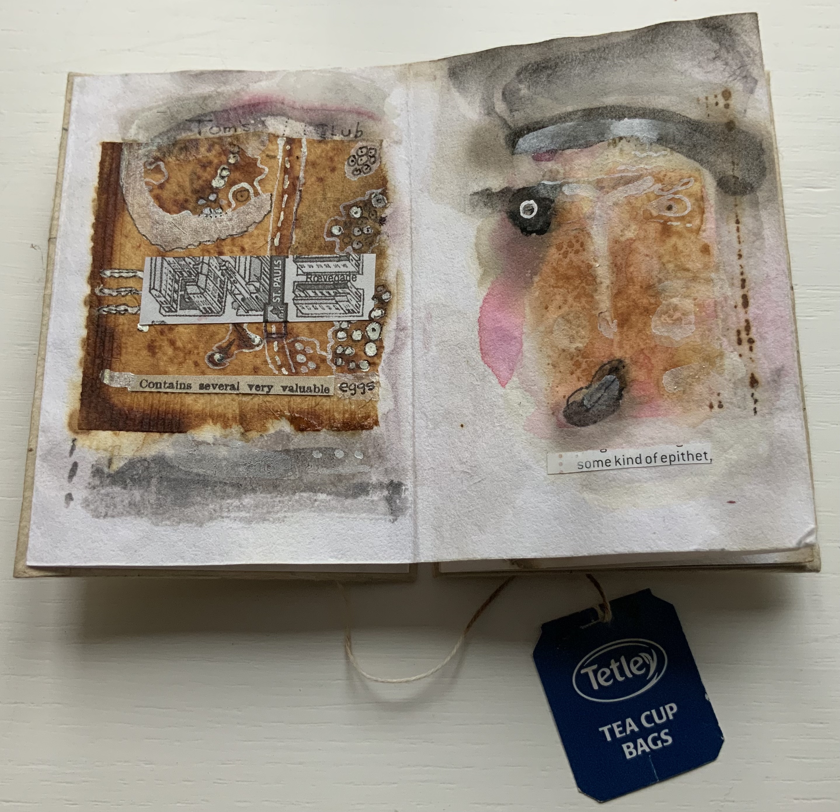
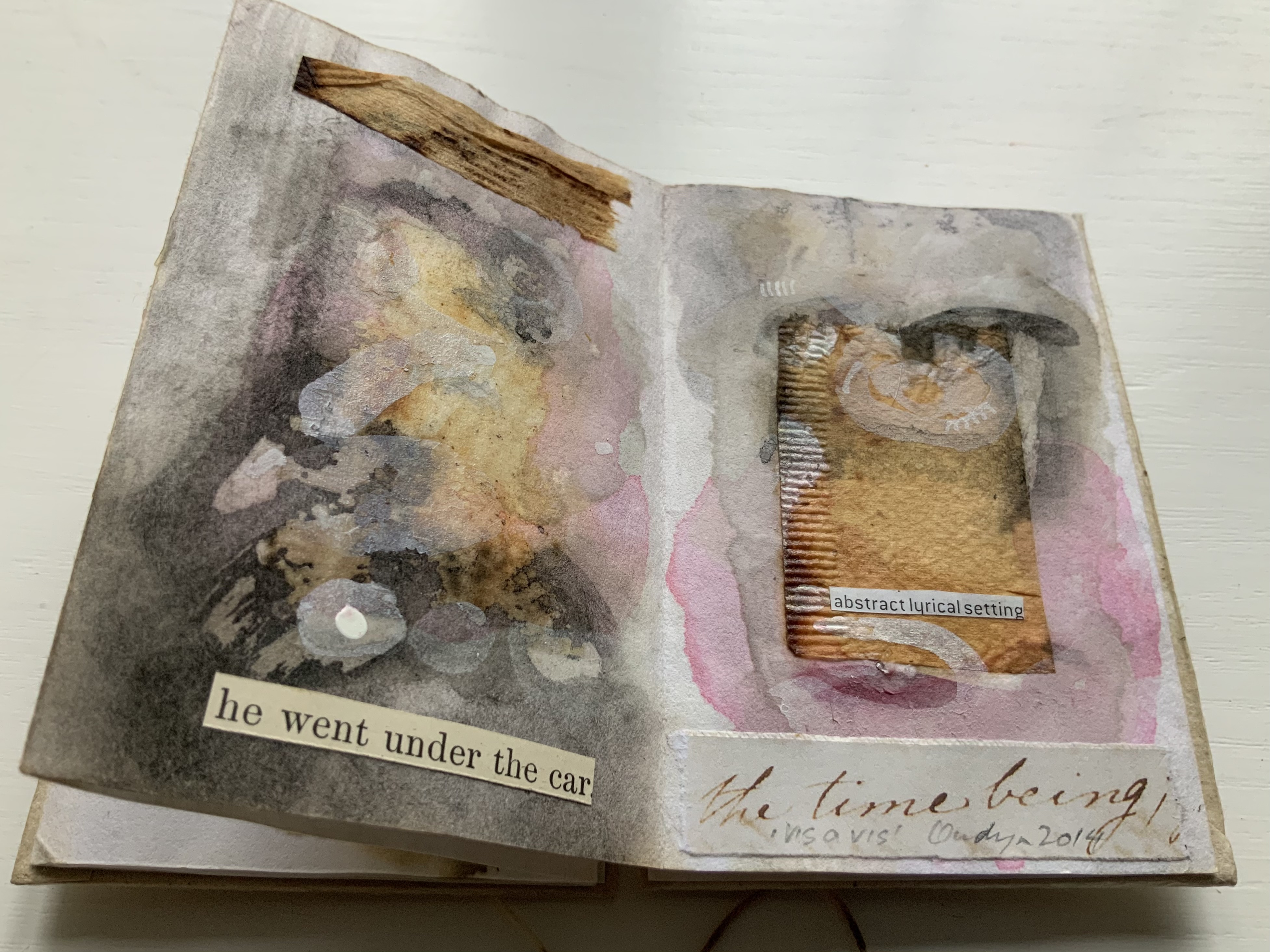
vis-à-vis | face to face (2014)
vis-à-vis | face to face (2014) Jack Oudyn Blizzard-fold booklet, mixed media and collage with tea bag paper. H100 x W70 mm, six panels. Unique. Acquired from the artist, 4 January 2020. Photos: Books On Books Collection, displayed with permission of the artist.
A heavily stained, empty teabag glued across the two boards, whose opening is closed with the teabag string wrapped around a wooden button, serves for this booklet’s binding. A conversation between two people struggling for words, hence the near random use of found text, occupies the six panels. The abstract faces profiles are characteristic of Oudyn’s work, as is the use of acrylic medium as a block out or resist. Or perhaps it is egg yolk, which would be in keeping with the reference to eggs and, with the tea stains, in keeping with a breakfast-table conversation.
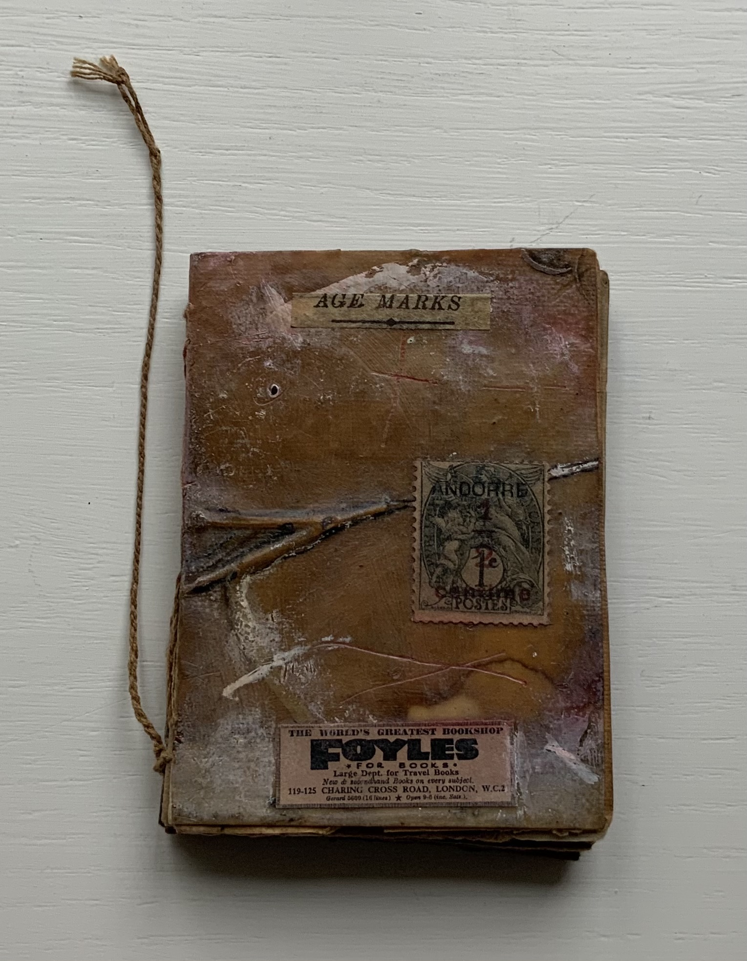
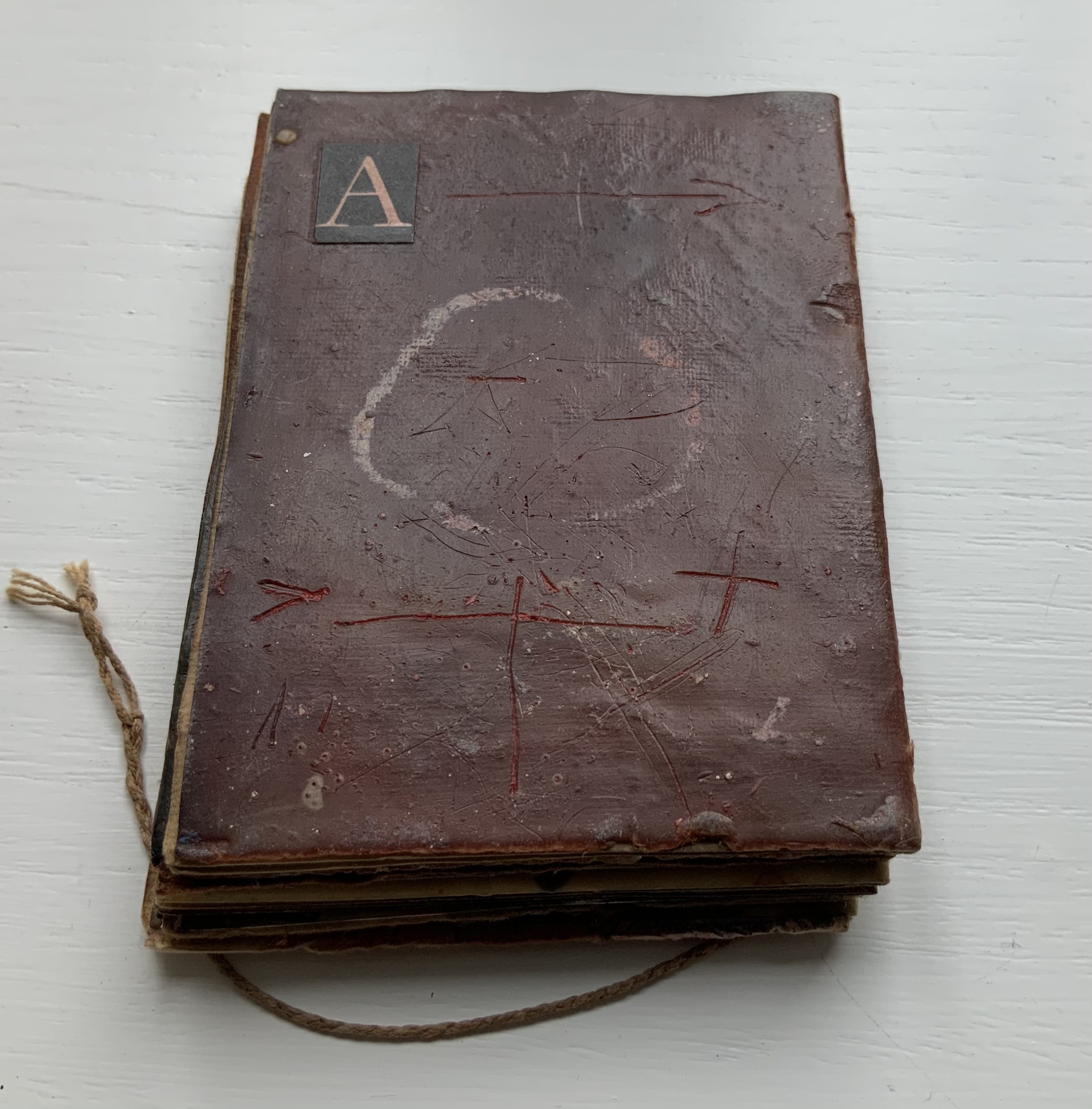
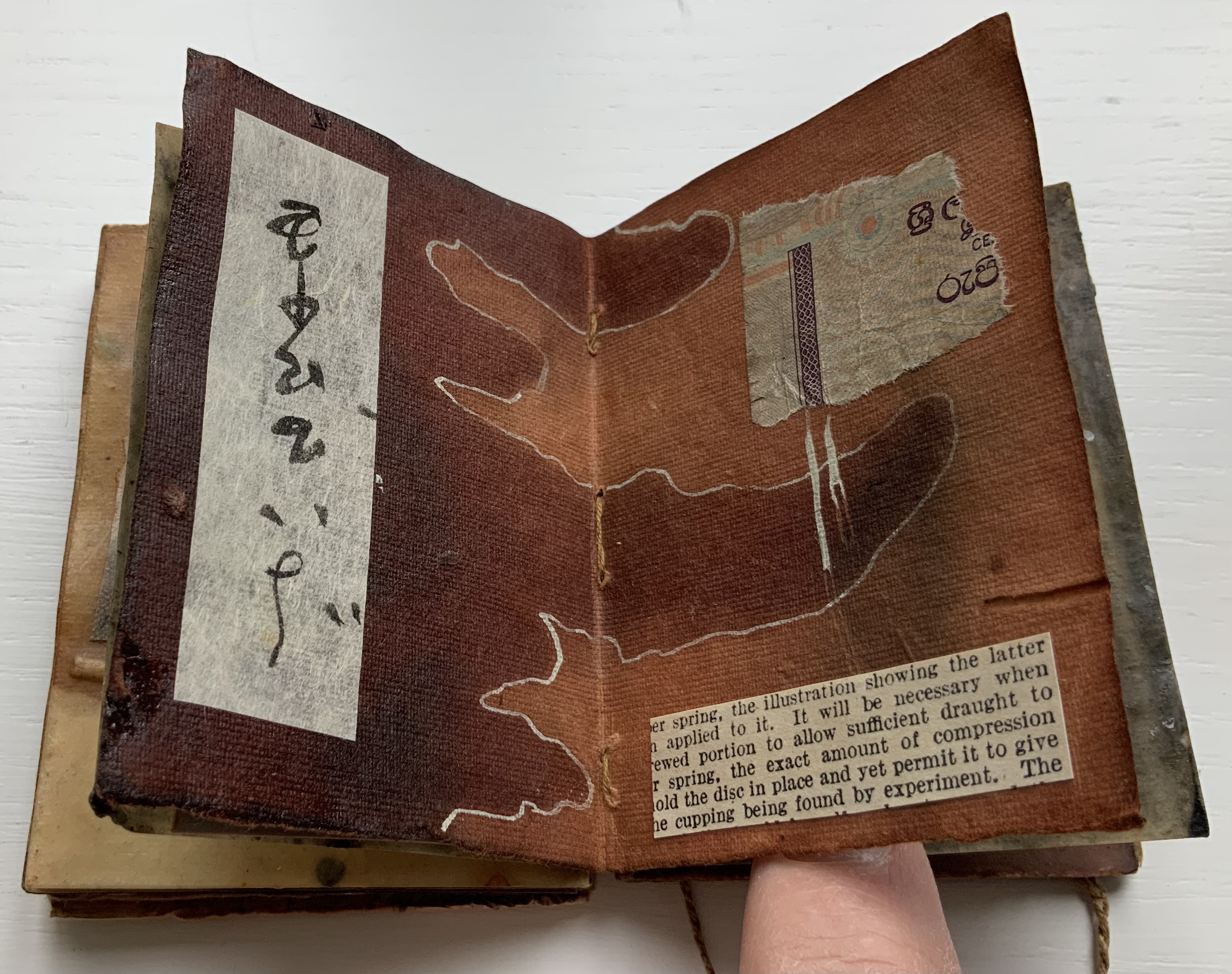
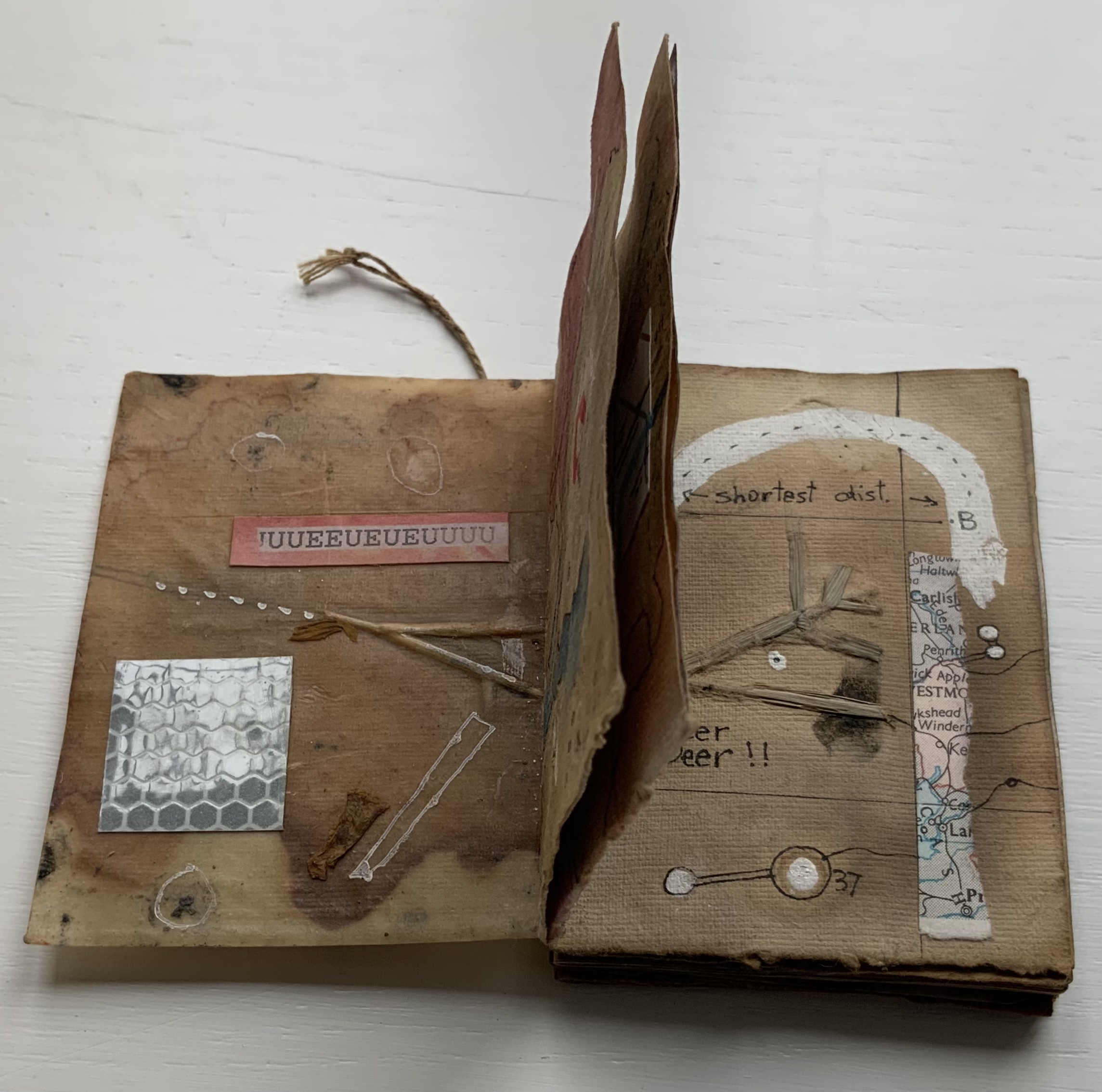
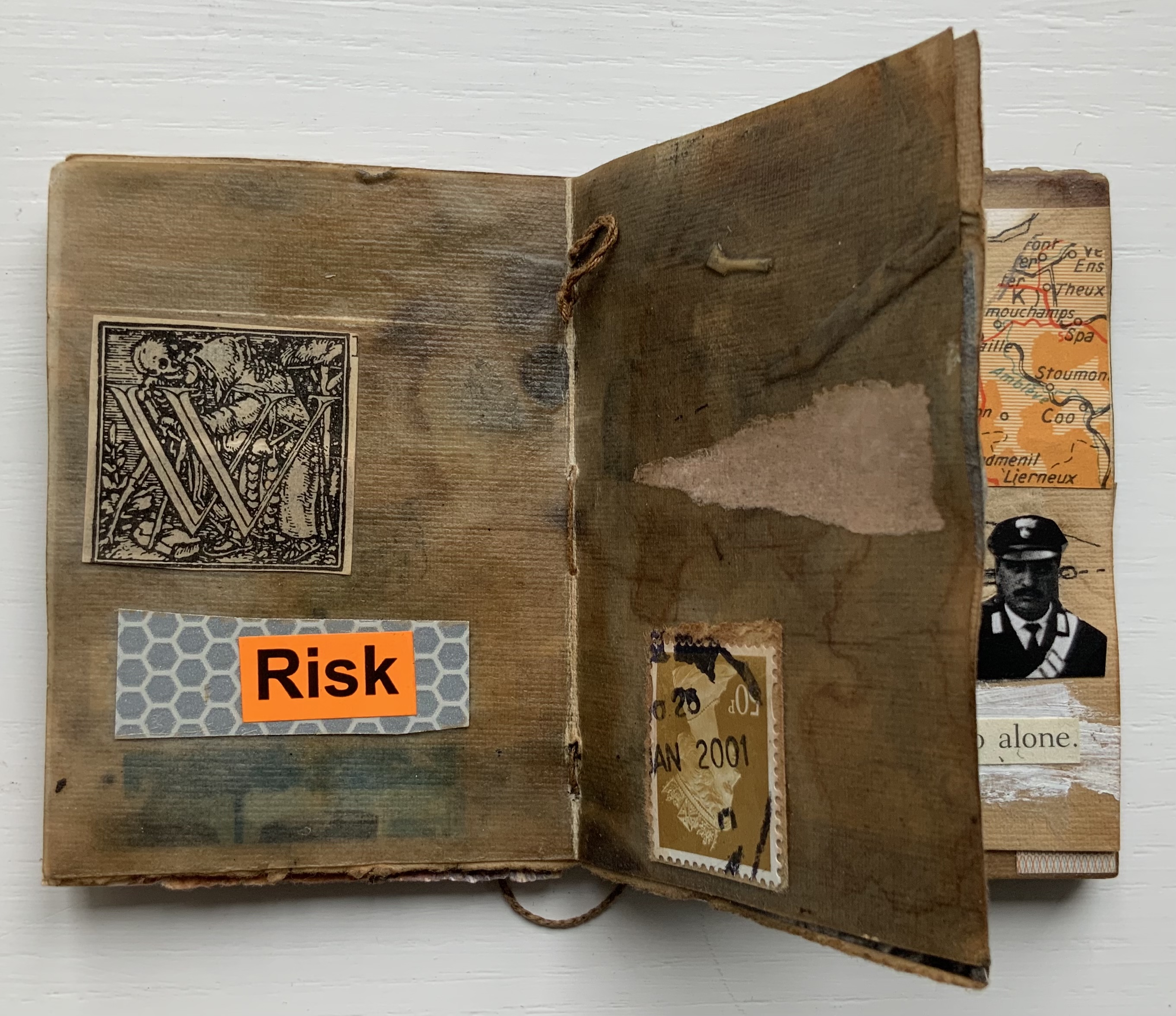
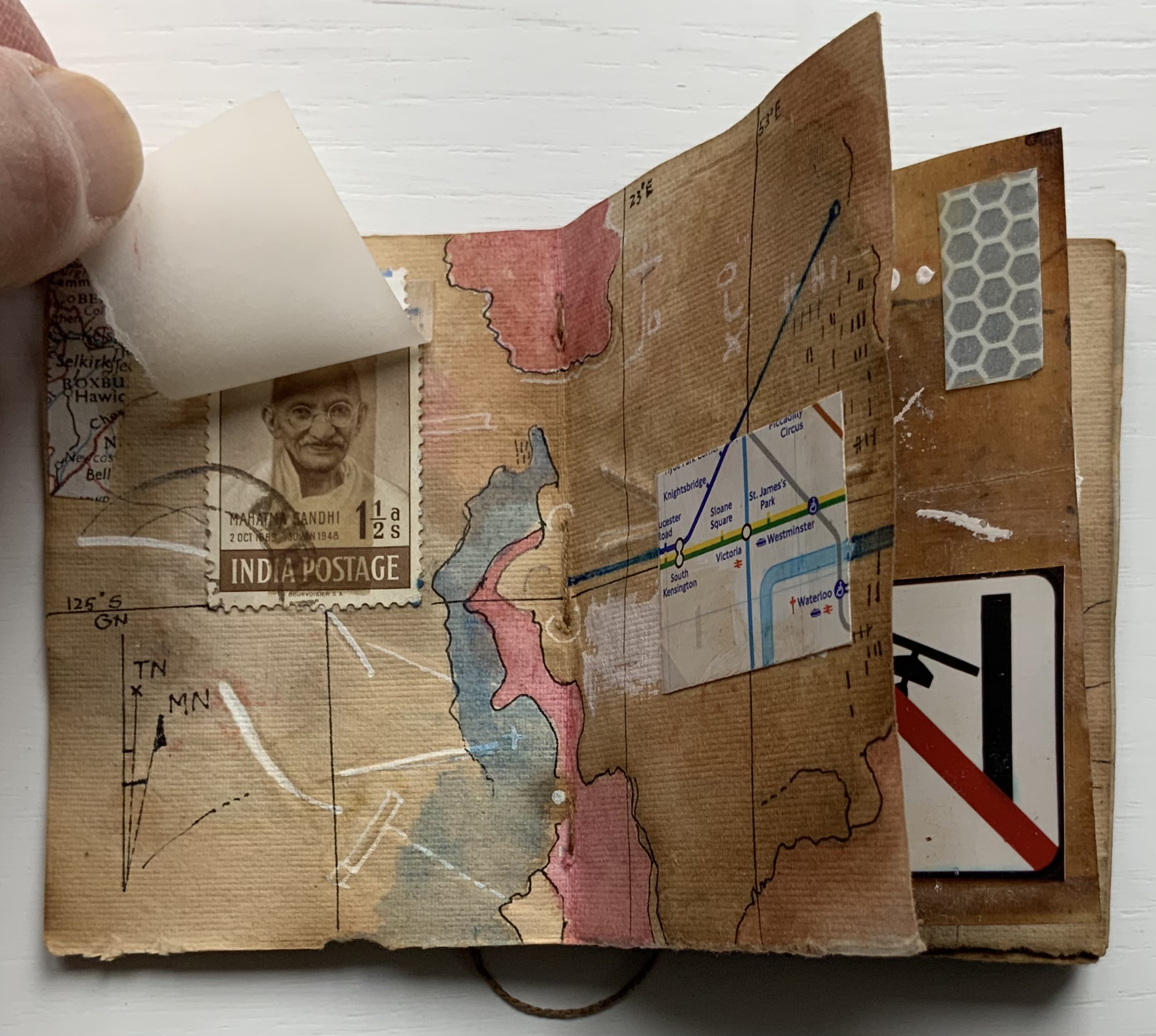
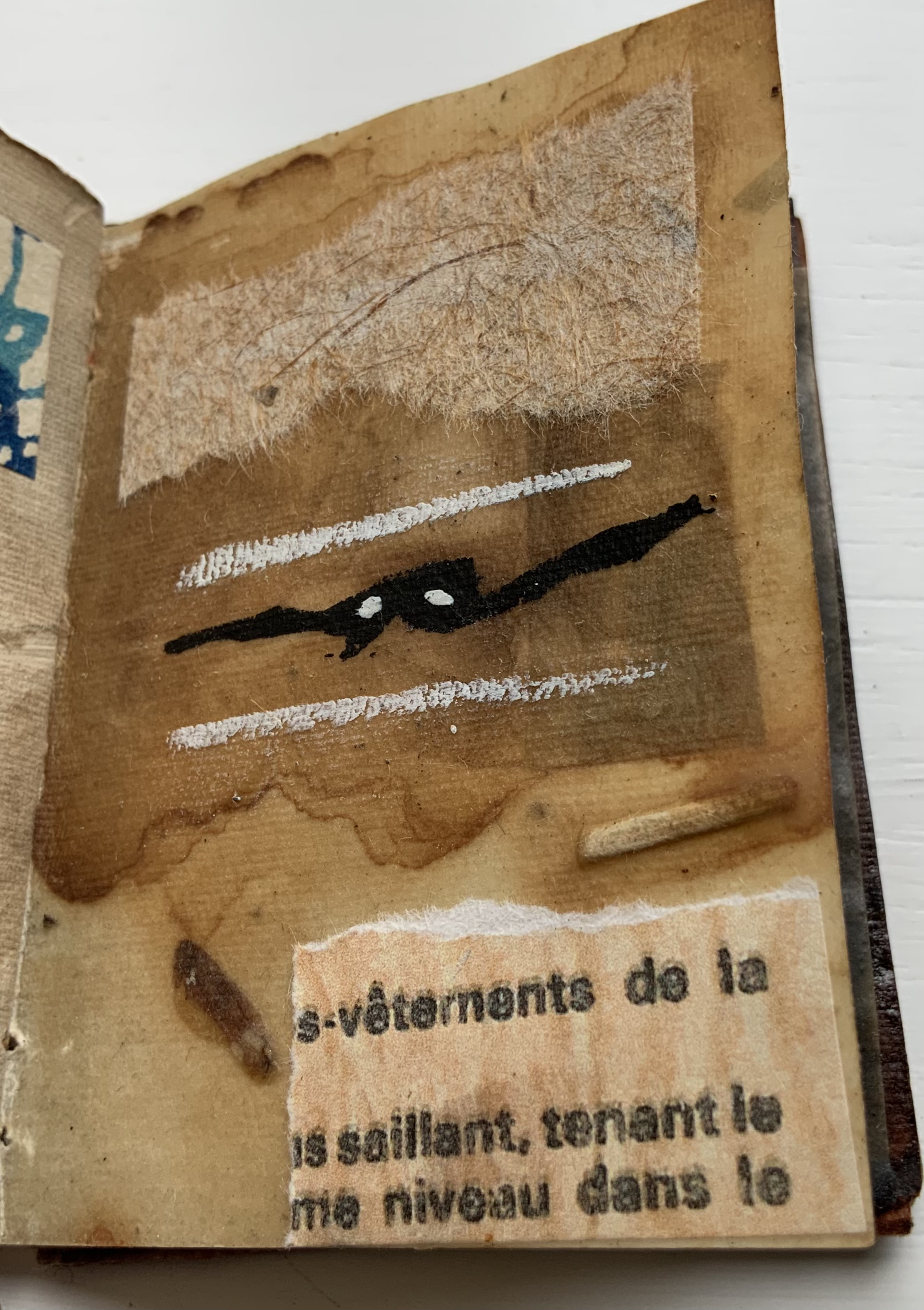
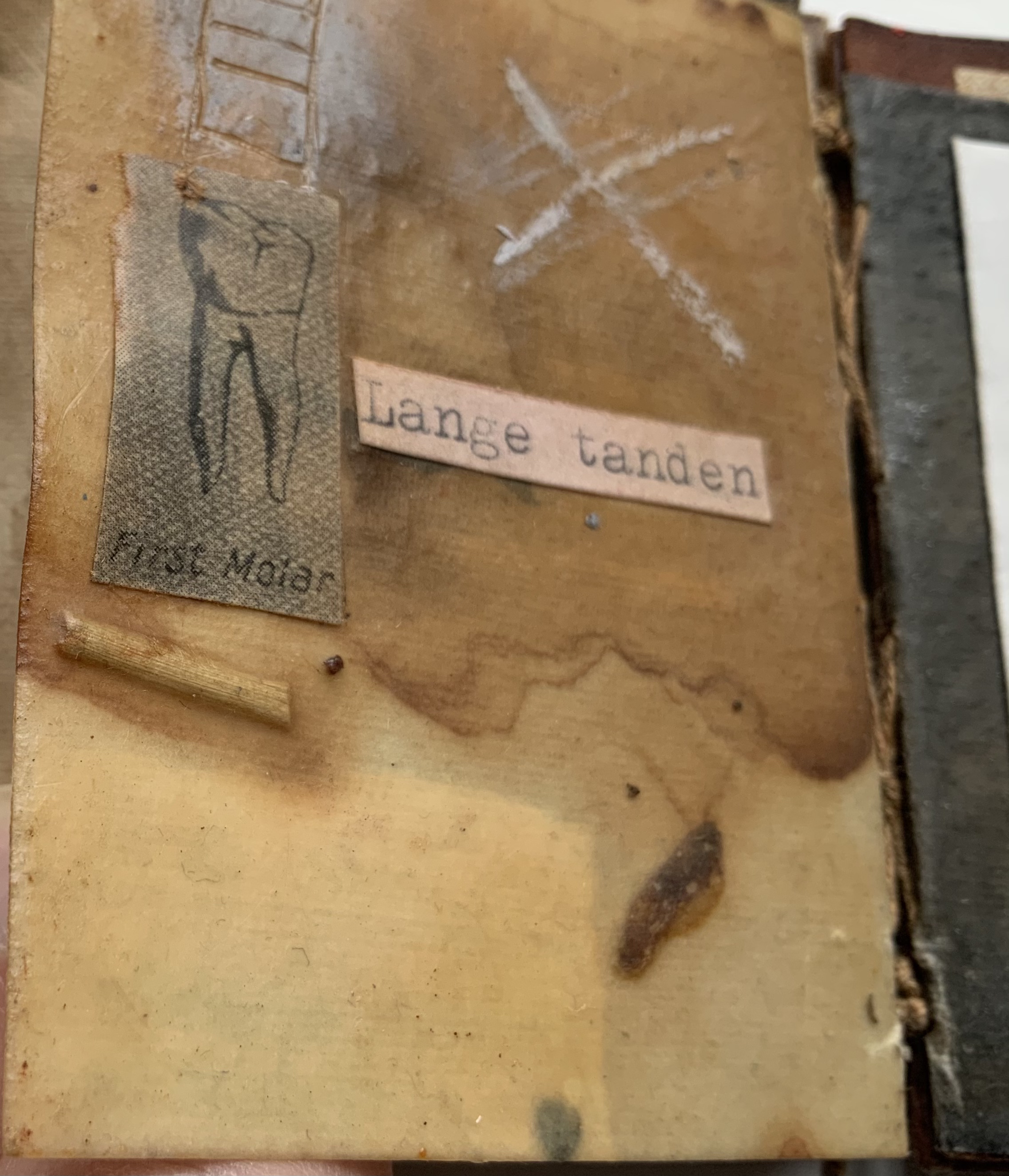
Age Marks (2014)
Age Marks (2014) Jack Oudyn Handmade waxed and stained paper book by Trace Willans. Mixed media and collage on paper. H85 x W65 x D10 mm, 44 pages. Unique. Acquired from the artist, 4 January 2020. Photos: Books On Books Collection, displayed with permission of the artist.
Trace Willans makes blank books from organic, sustainable media. Age Marks began as one of these blanks, its pages consisting of lightly textured machine-made lightweight paper (ca. 100 gsm), some stained and waxed. The result is not exactly an inscribed blank notebook, not exactly an altered book. Oudyn’s use of mixed media of different hand-made papers, tracing paper, found text, wax, reflective road tape, postage stamps, white acrylic ink, gouache and pigment creates a unique record of the aging process of mark making. Marks made by conversation, observation, inscription, printing, writing, drawing, collation, lifts and reveals, cutting, tearing, pasting, weaving, binding — all filtered through aging.
Small as it is, Age Marks is one of the most varied haptic experiences in the collection.
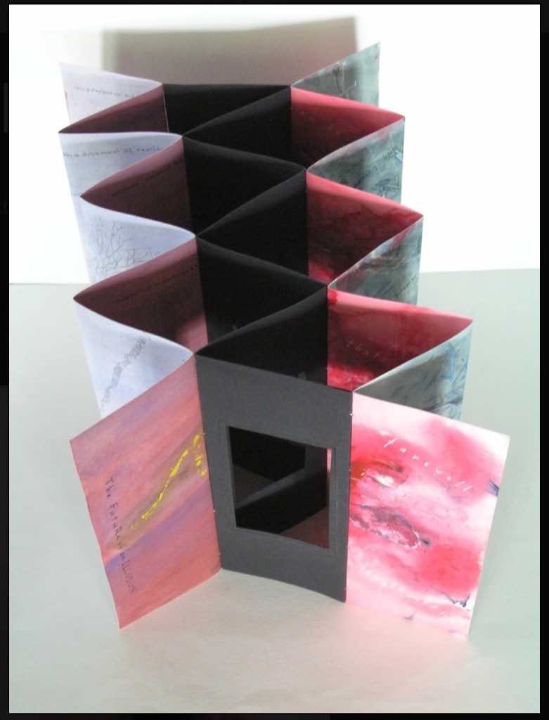
The Future of an Illusion (2017)
The Future of an Illusion (2017) Helen Malone and Jack Oudyn Sculptural tunnel book structure (three joined four-fold leporellos) enclosed in a folder and protective boxin a box,. Box made with Lamali handmade paper, suede paper (lining) and Somerset Black 280 gsm; Folder: Canson black 200gsm, skull button and waxed thread; Leporellos: center leporello made of Canson black 200 gsm, linen thread adjoining two leporellos made of Arches watercolour paper 185 gsm with acrylic, soluble carbon, gouache and transfer ink jet images. Box: H275 x W313 x D34 mm; Folder: H258 x W295 x D21 mm; Book: H250 x W290 x D16 mm closed, D410 mm open. One of an unnumbered, signed edition of 4. Acquired from Helen Malone, 12 September 2017.
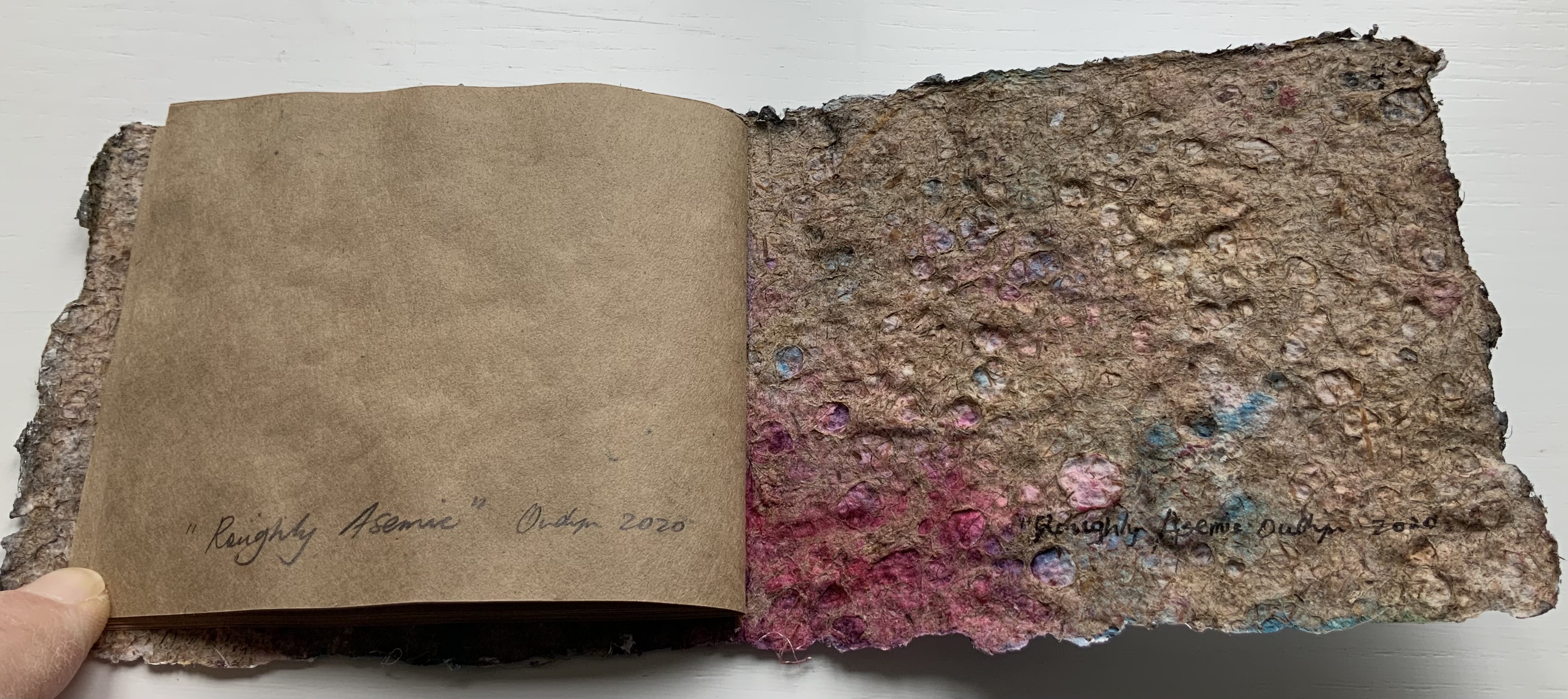
Roughly Asemic (2020) Jack Oudyn Booklet, single-thread stitched, handmade paper cover, painted and inked, over brown Kraft paper folios illustrated with drawings and markings in paint and ink. H105 X W123 mm, 7 leaves, folded in half making 28 unnumbered pages, 14 of which bear drawings and markings, 13 of which are left blank, and the last page bears the title, signature and year. Unique. Acquired from the artist, 4 January 2020. Photos: Books On Books Collection, displayed with permission of the artist.
This work’s title could not be more apropos. It is a scratchy thing to hold, its pages stiff and crackling as they turn. Patterns, images and letters struggle to emerge, only to be submerged by each other on the same or next page, which goes to show how difficult it must be to achieve entirely asemic markings. “Roughly asemic” might be the best hoped for.
Foster, Robin. “Feature Artist – Jack Oudyn“, Personal Histories, International Artist Book Exhibition, Redland Museum, UNSW, Canberra. 11 March 2014. Accessed 19 October 2020.