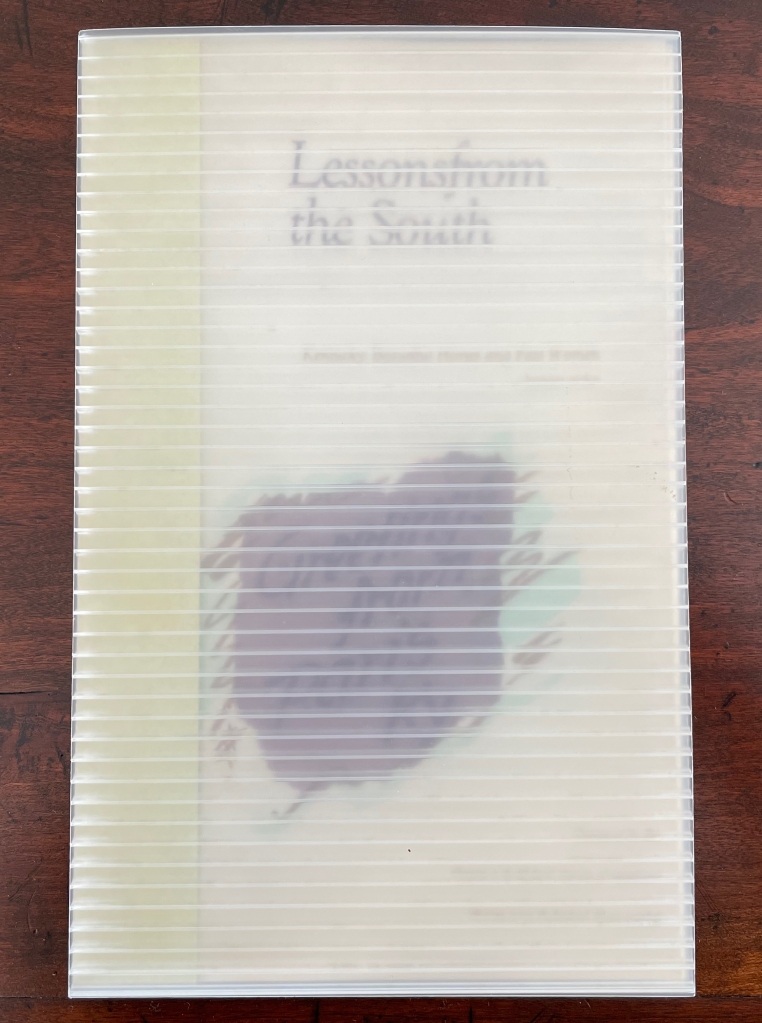
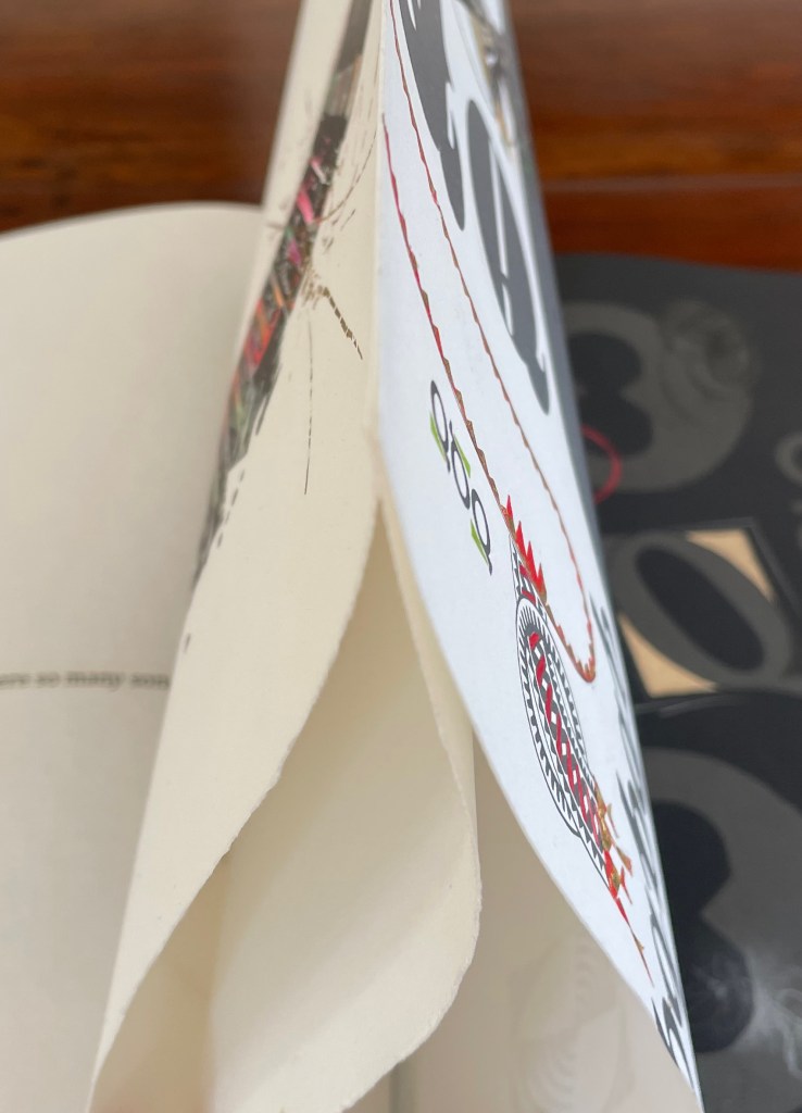
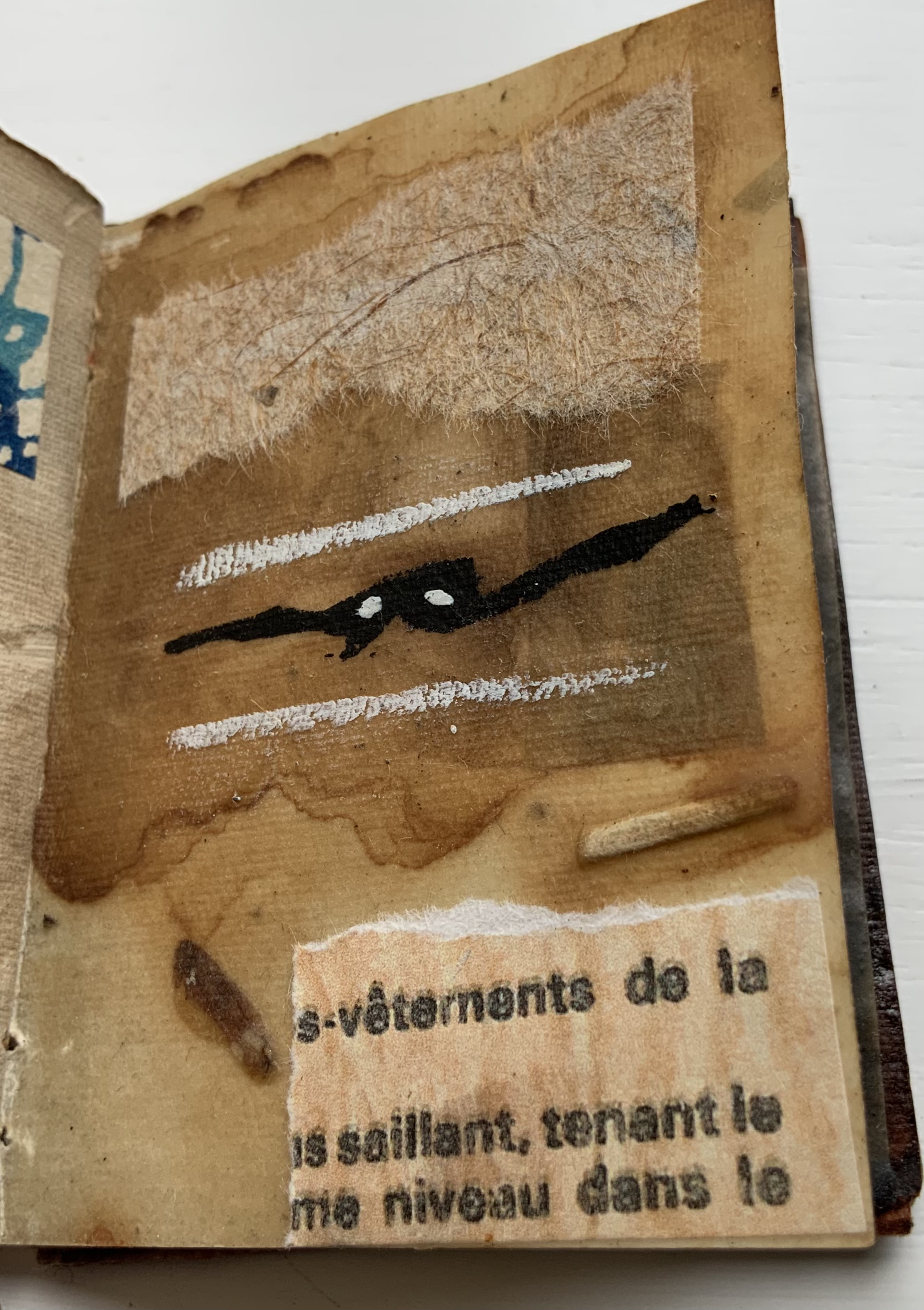
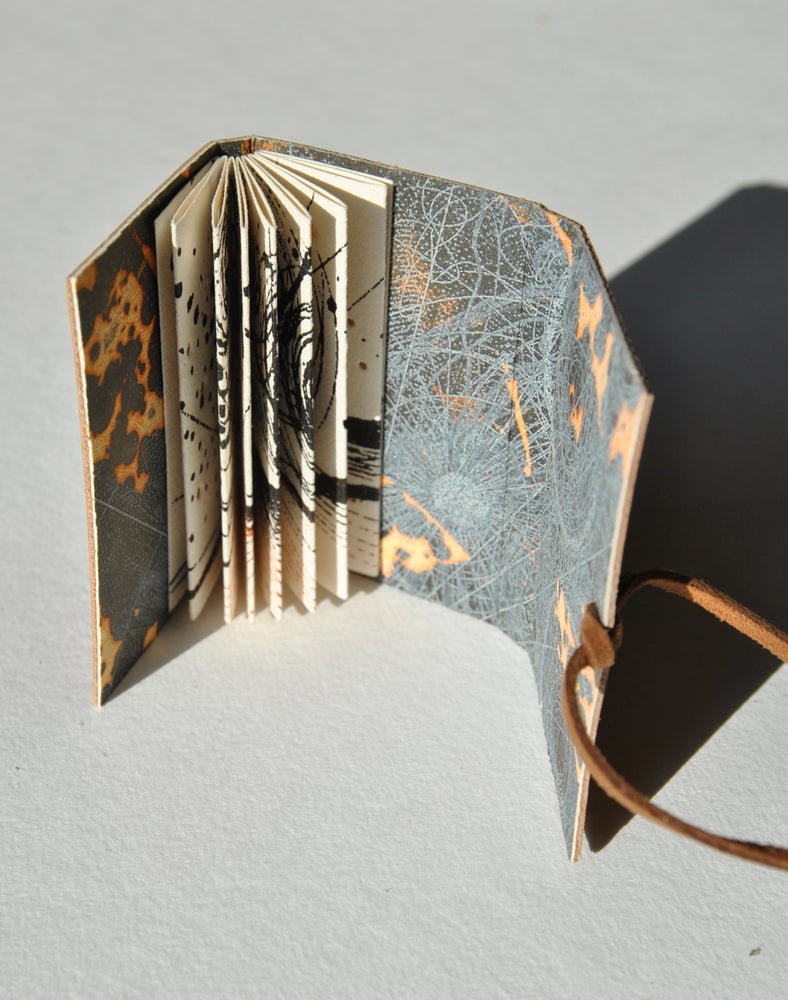
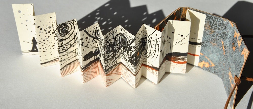
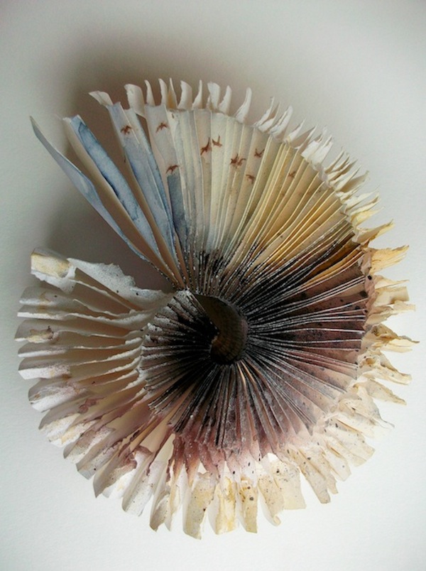
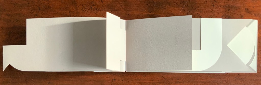
Lessons from the South(1986) Susan E. King Modified flag book. Closed: H270 x W172 mm; Open: W670 mm. 20 pages. Acquired from Rickaro Books BA PBFA, 22 September 2023. Photos: Books On Books Collection.
Lessonsfrom the South presents a masterful weaving together of material, structure, technique and image with Susan King’s reminiscences and social observations of her birth state Kentucky. For King, growing up white and female in the South in the second half of the 20th century engendered a sense of otherness and rebellion. As with some white southerners, it led to mild acts of rebellion — sitting too far back in the bus, sitting next to black students in typing class, or finally leaving for other regions of the US. With the 21st century’s rise of the “Karen”, repression of voting rights and reproductive rights, and resurgence of white supremacy, can we afford to dismiss the expression of conscience as “mild”? Any expression of conscience is something. Lessons from the South is an artful expression of fondness, humor, closeness and distance — a sense of being ill at ease with a Southern heritage we all seem unable to escape — that should be revisited not only for the sake of its art but as encouragement to conscience.
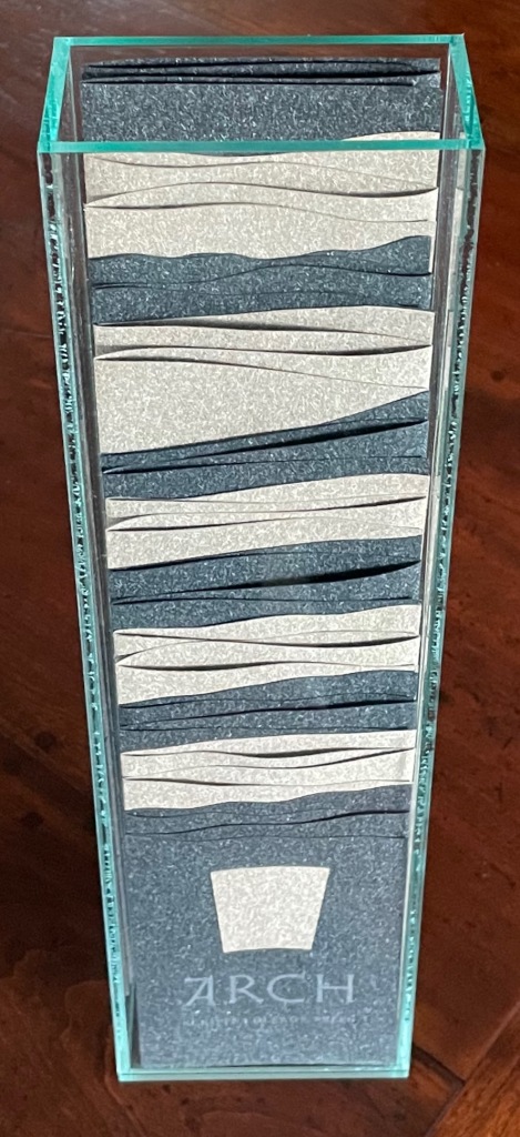
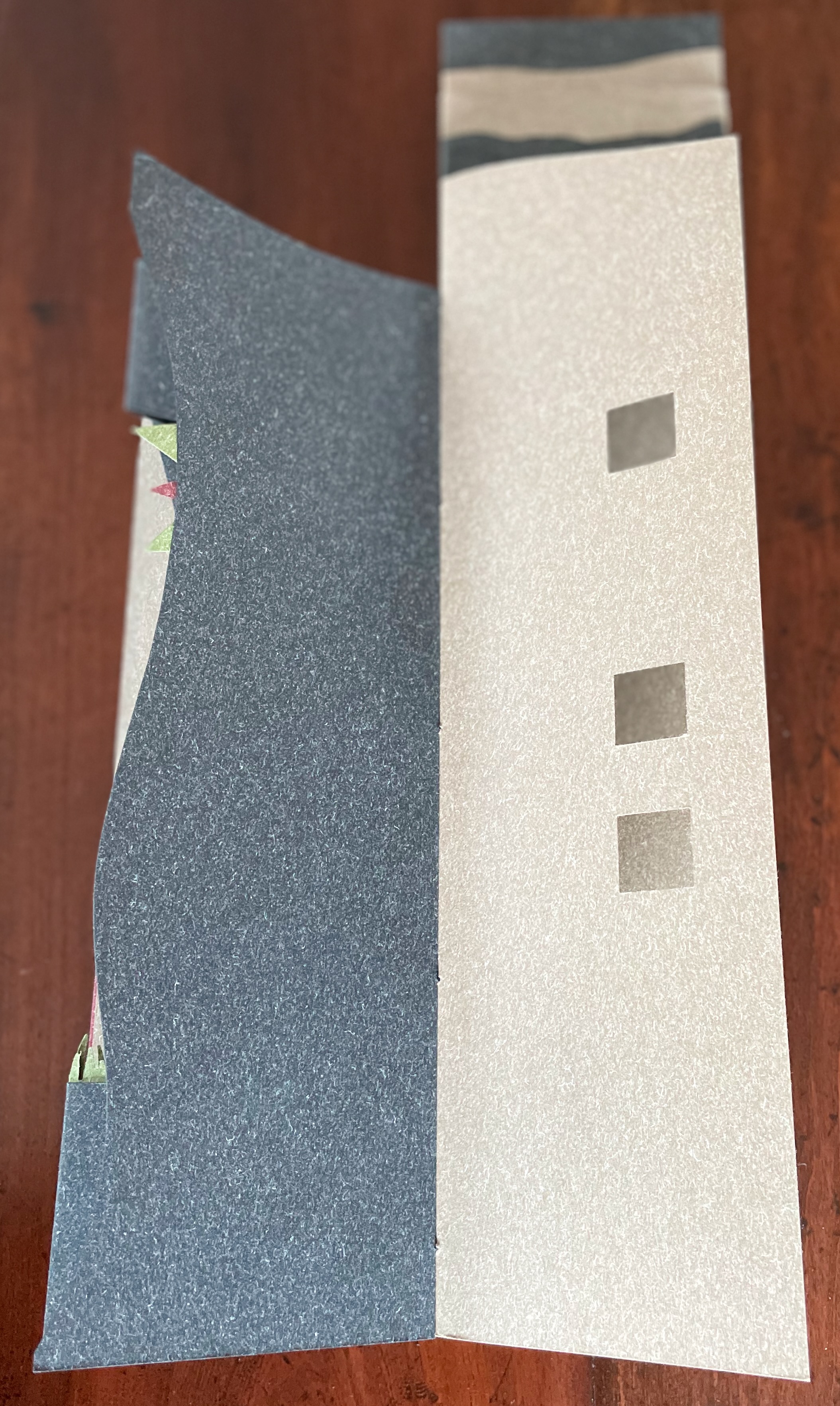
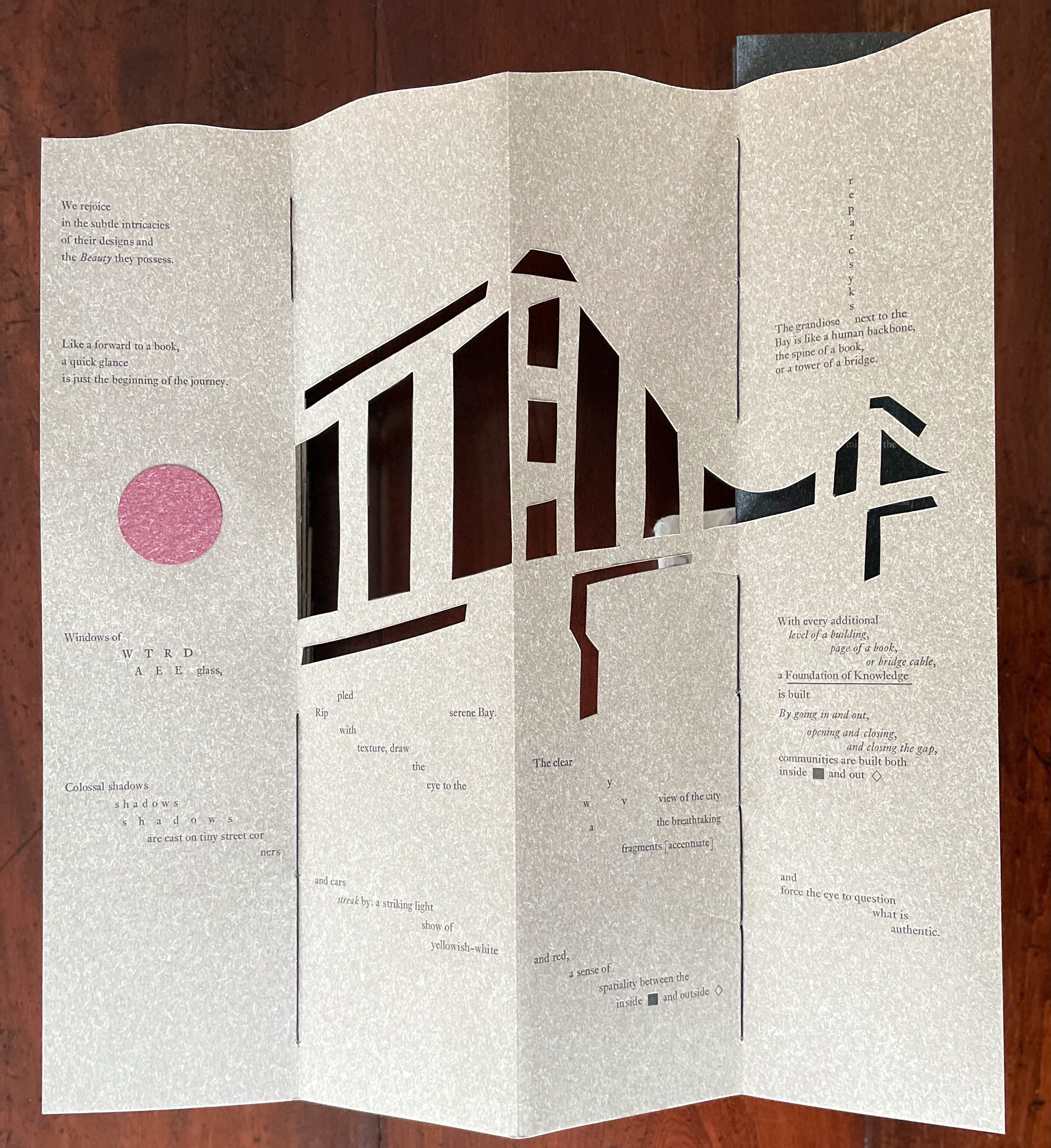
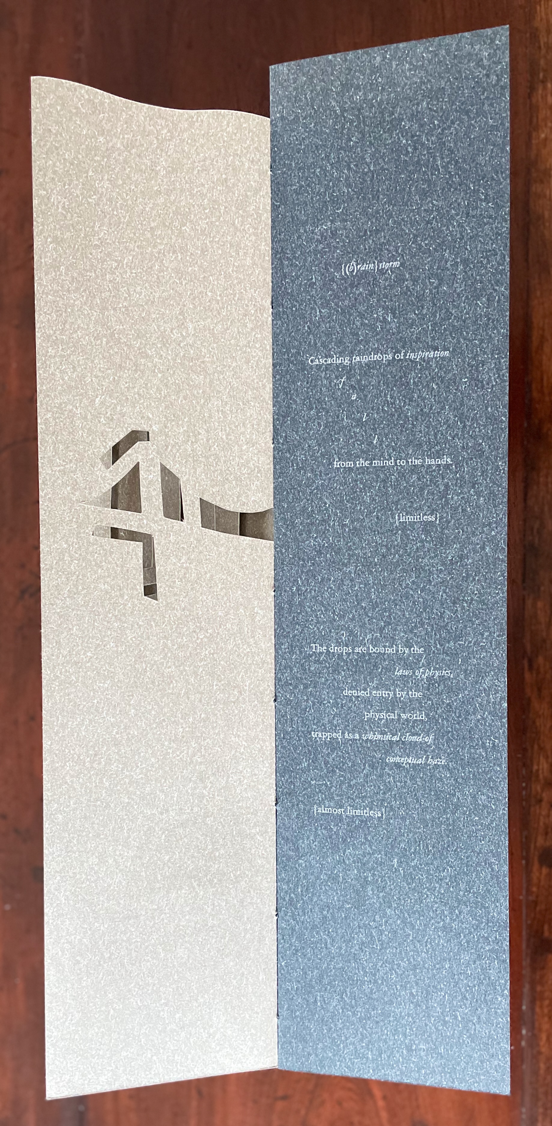
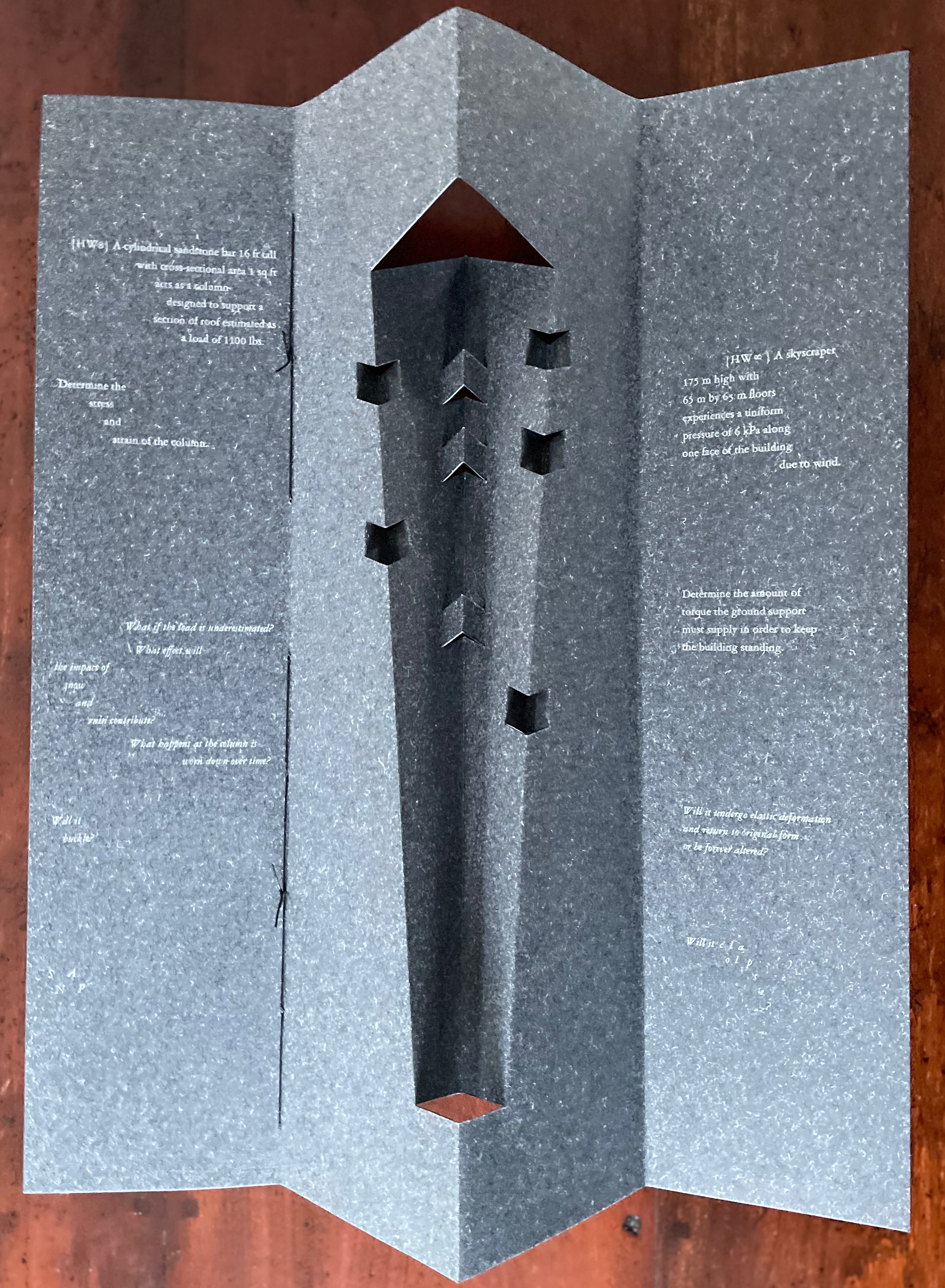
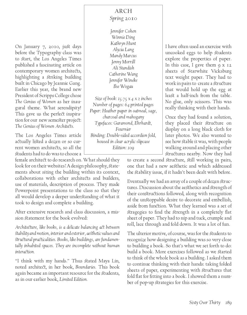
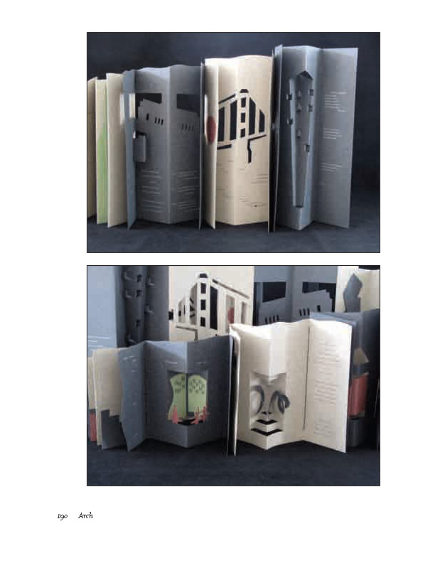
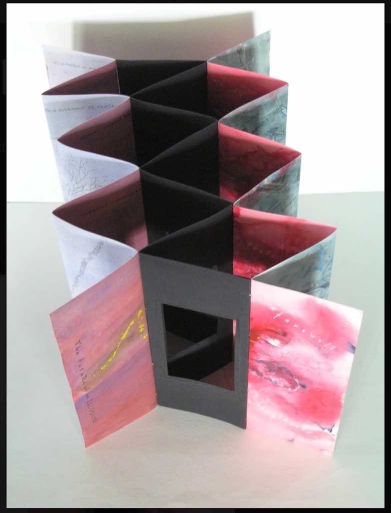
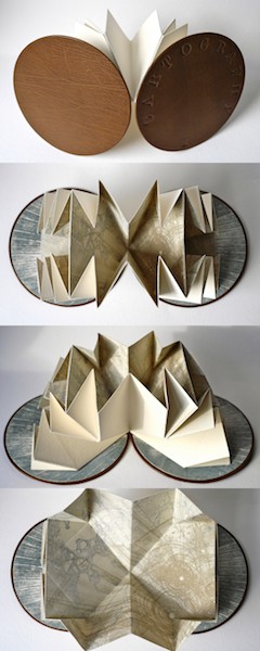
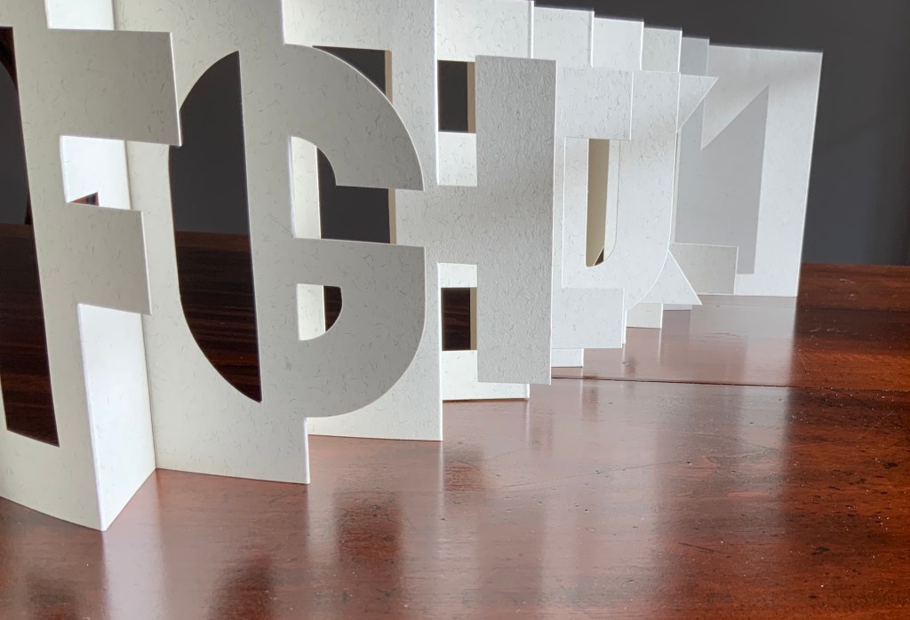
Arch (2010) Kitty Maryatt, Jenny Karin Morrill, Ali Standish, Alycia Lang, Jennifer Wineke, Mandesha Marcus, Catherine Wang, Kathryn Hunt, Ilse Wogau, Jennifer Cohen and Winnie Ding Acrylic slipcase, leporello formed of self-covering booklets sewn together. Slipcase: H410 x W110 x D50. Leporello: H400 x W 90 mm (closed). 64 pages. Unnumbered copy from edition of 109. Acquired from Bromer Booksellers, 7 December 2022. Photos: Books On Books Collection
Nôtre-Dame de Paris (1831), Archdeacon Claude Frollo points to the book in his hand and then to the cathedral and says, “This will kill that”. It is ironic that Hugo’s book (popularly known now by its English title The Hunchback of Nôtre-Dame) was written in large part to save the then-decaying cathedral (post-Revolution, it served as a warehouse), and it succeeded. It is also ironic that, while the fictional character’s metaphor has a point about the book’s permanence of replicability outlasting the building’s permanence of stone, it misses the collaborative foundations of both.
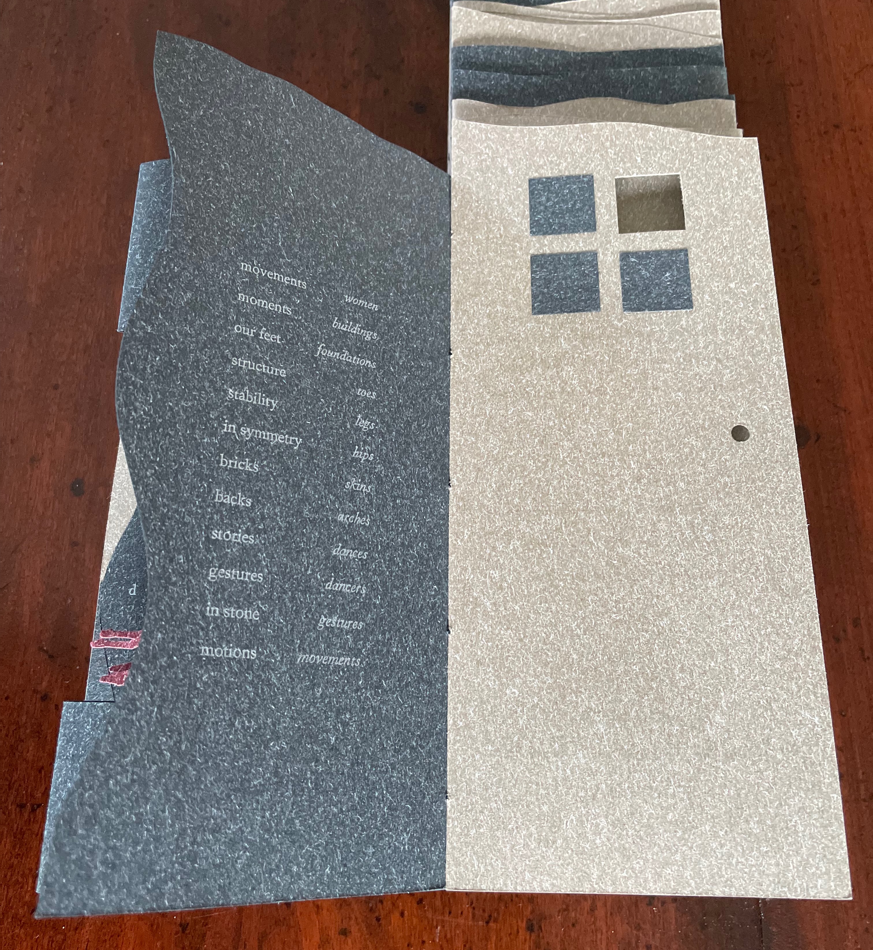
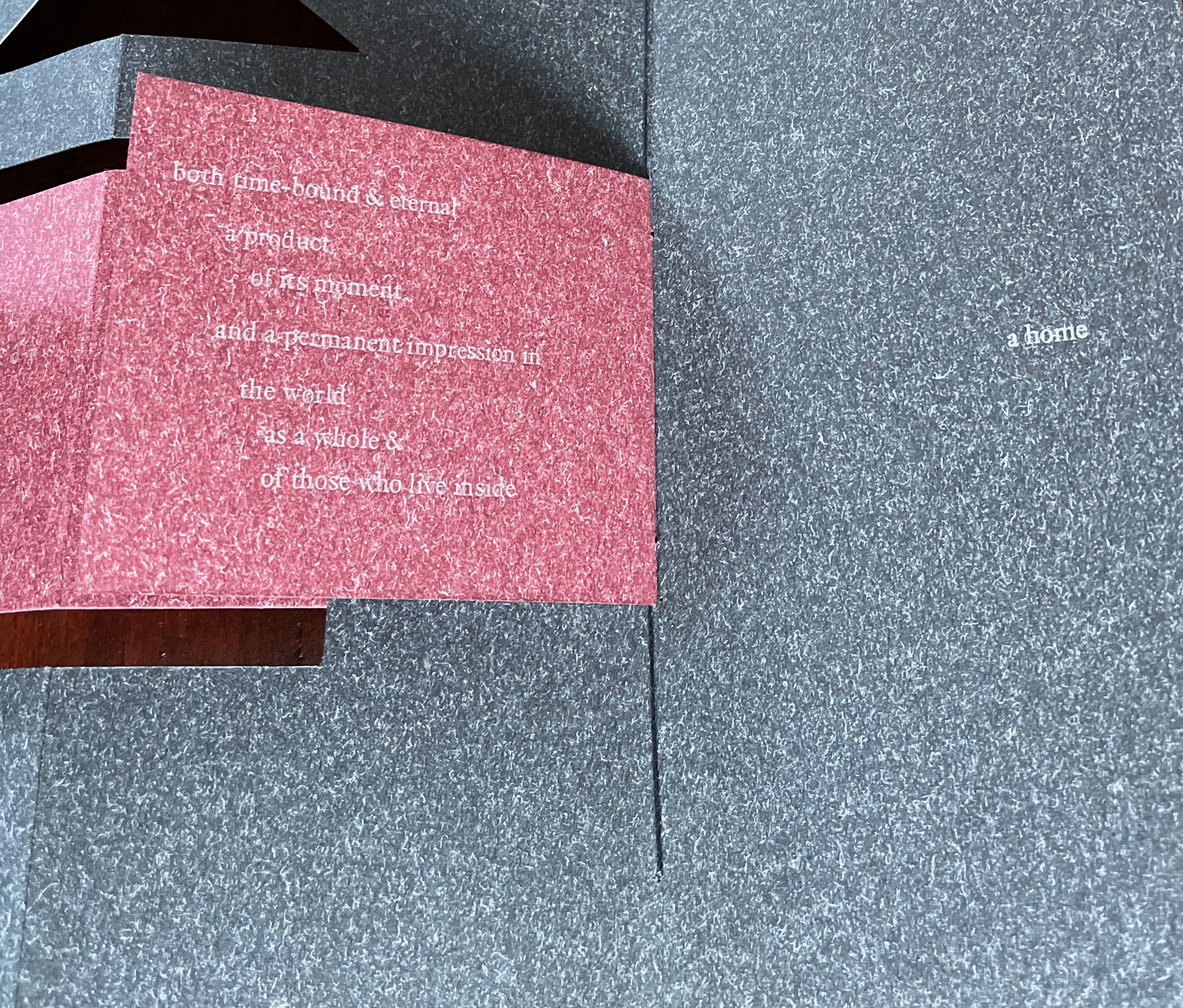
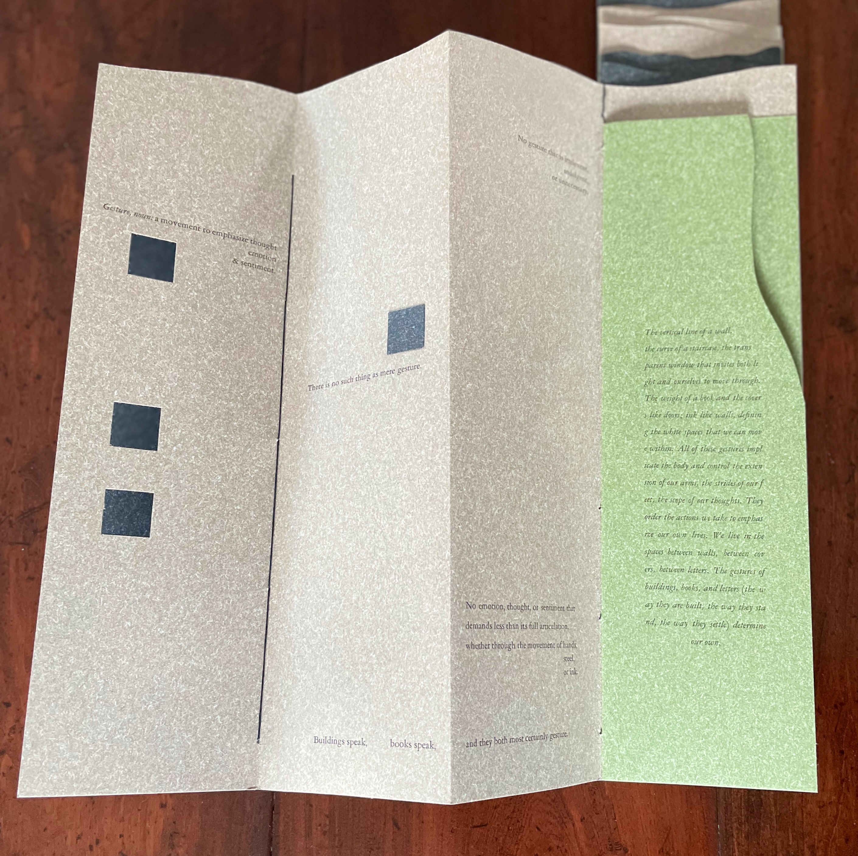
Arch (2010), created by ten students at Scripps College under the direction of Kitty Maryatt, reminds us that the creation of a book — even a work of book art — is a collaborative effort. All the students involved in the design, planning and production were women, a happenstance serendipitously blessed ahead of time by a Los Angeles Times article celebrating women architects. Drawing on that article and Maya Lin’s Boundaries (2000) as well as other research, the students agreed on a mission statement for the work: “Architecture, like books, is a deliberate balancing act between stability and motion, interior and exterior, aesthetic values and practicalities. Books, like buildings, are fundamentally inhabited spaces. They are incomplete without human interaction.”
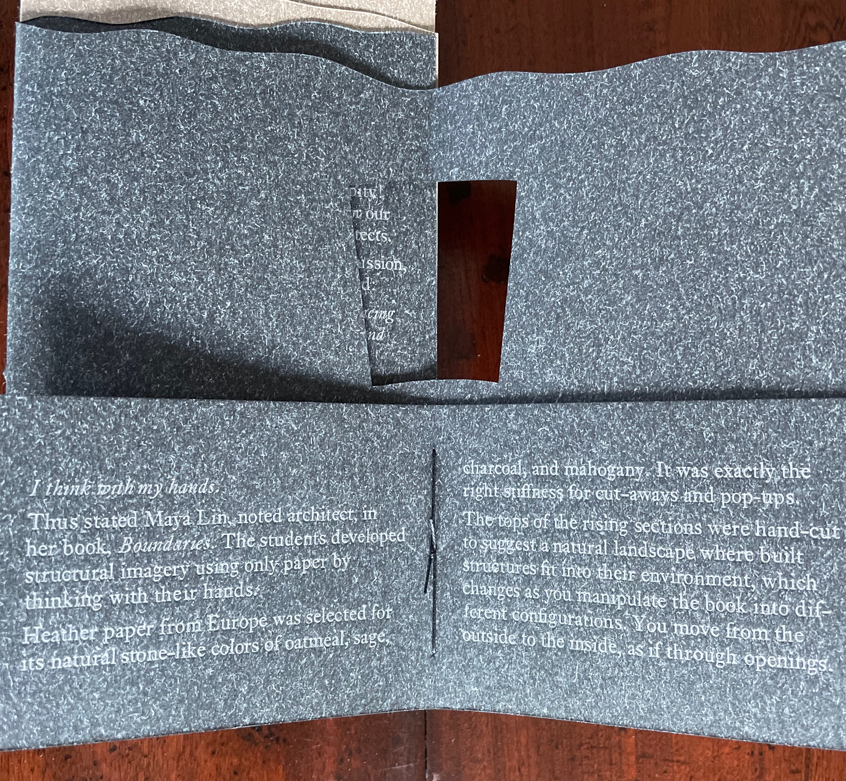
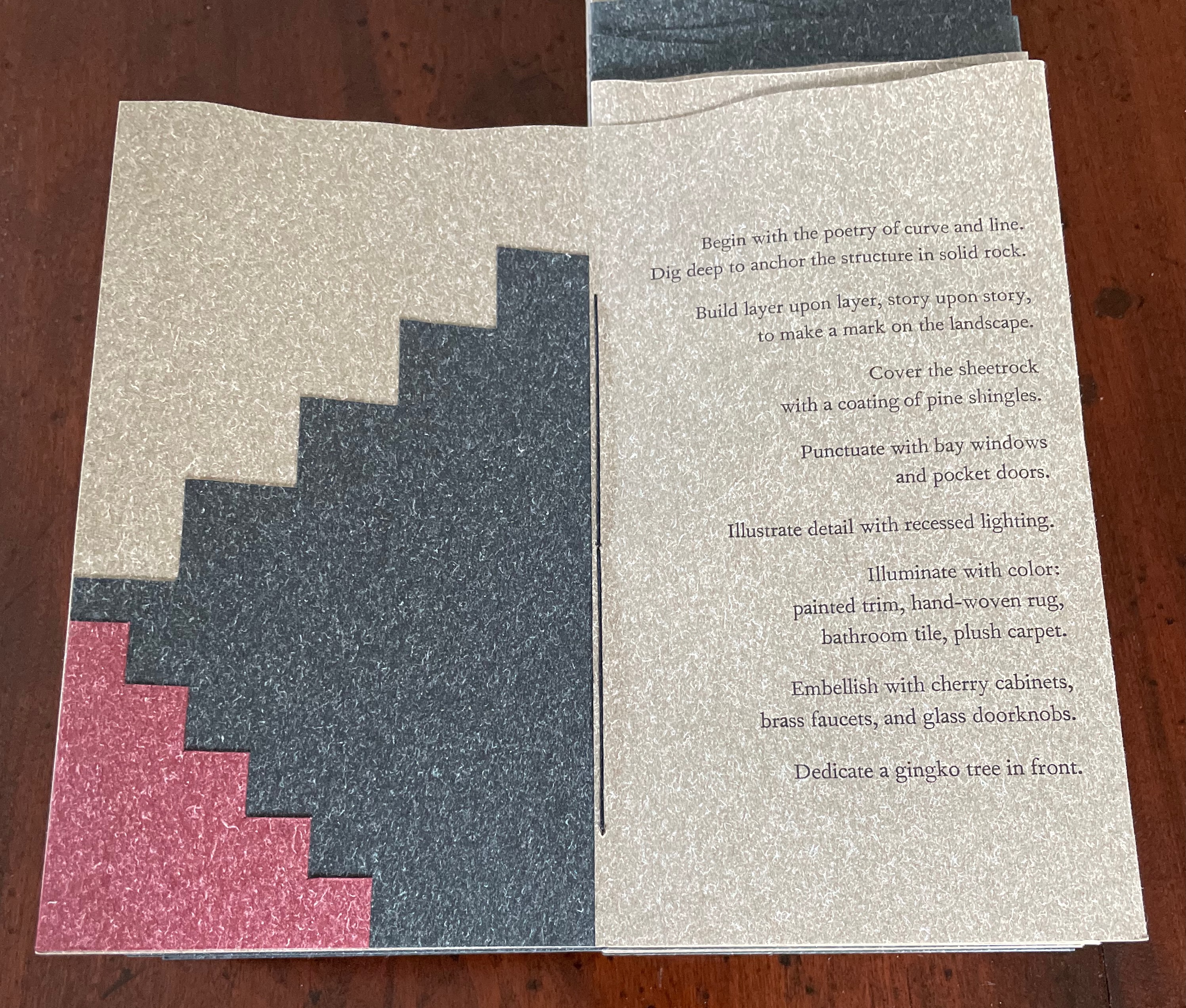
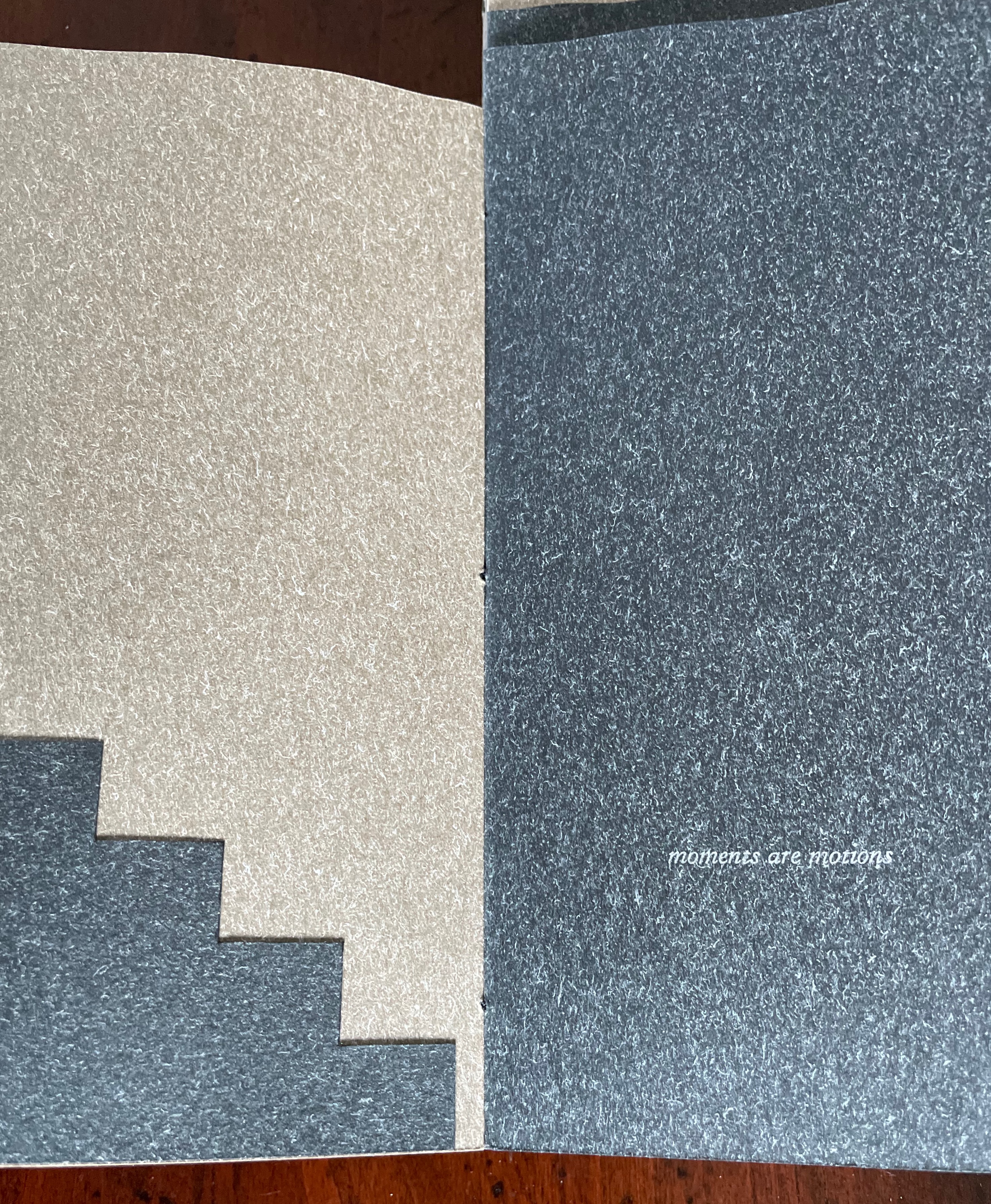
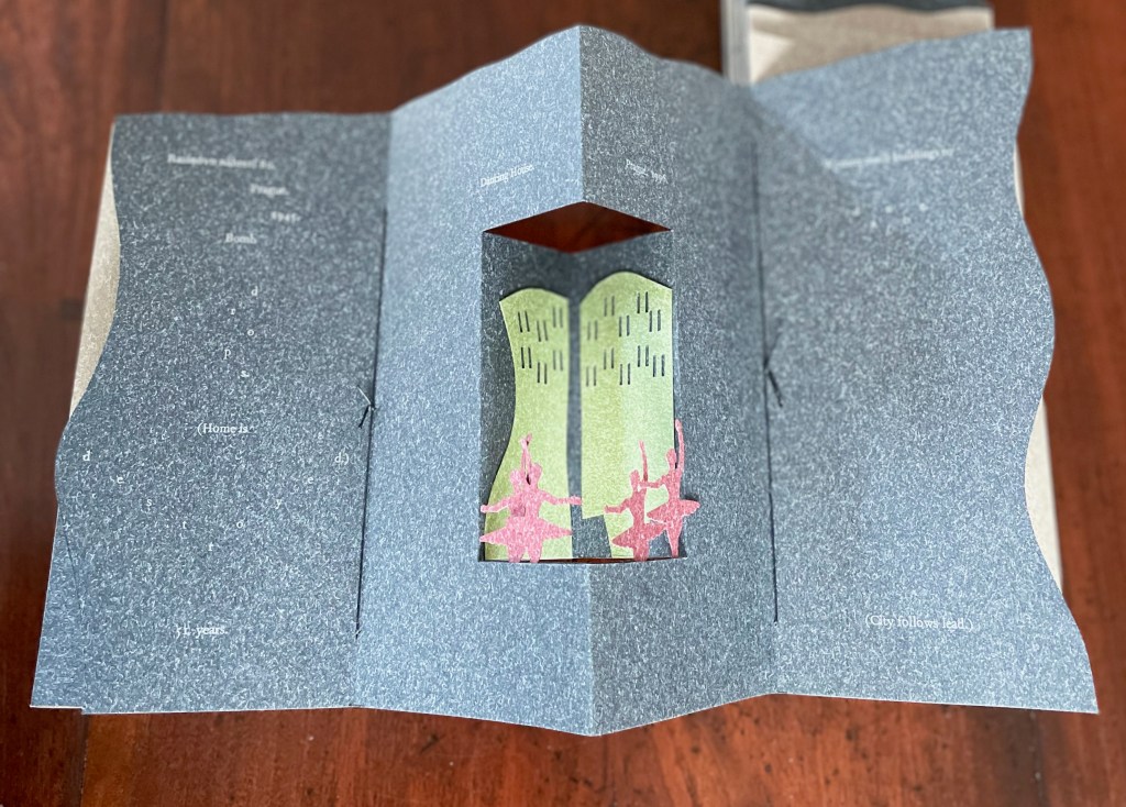
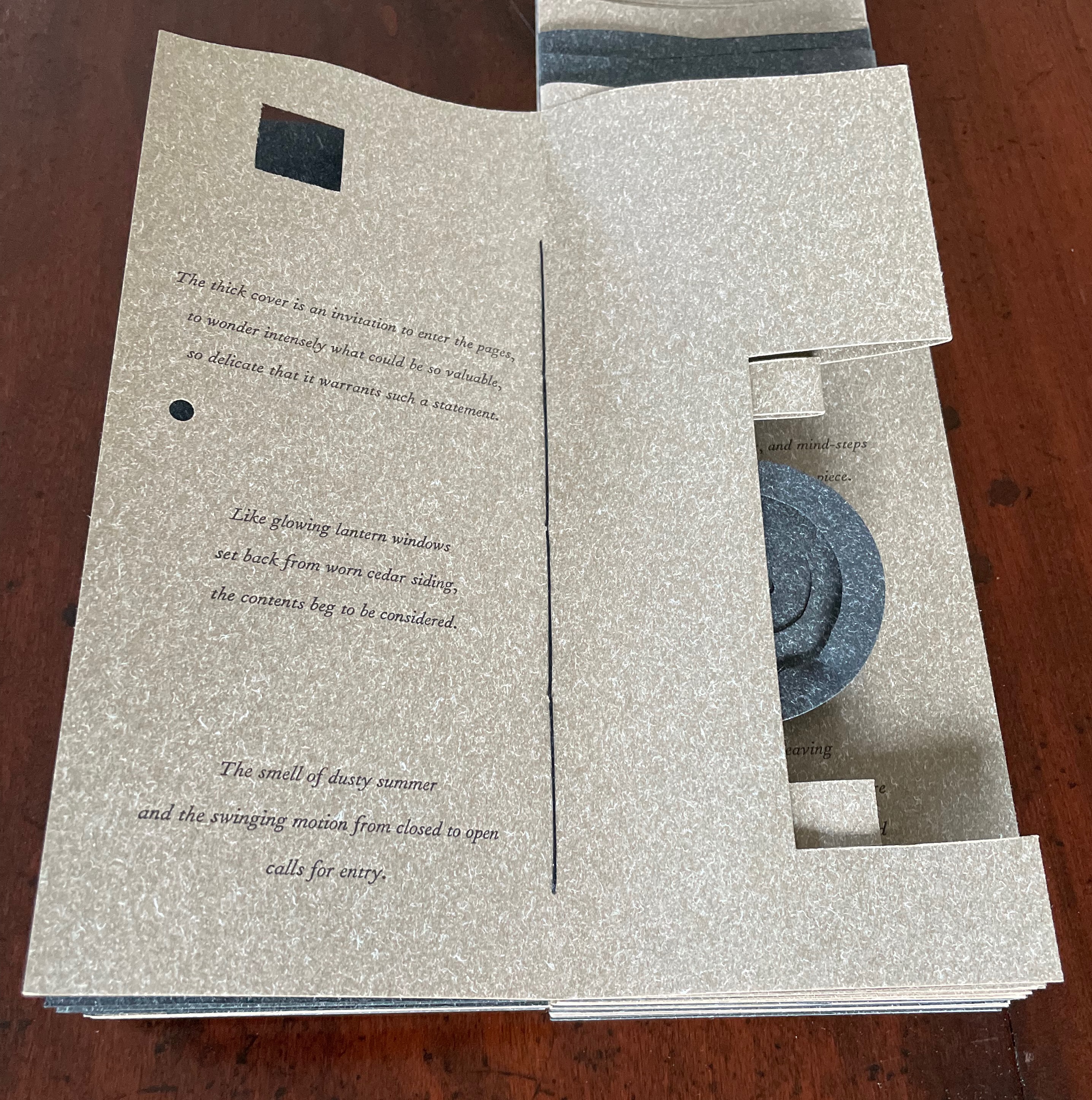
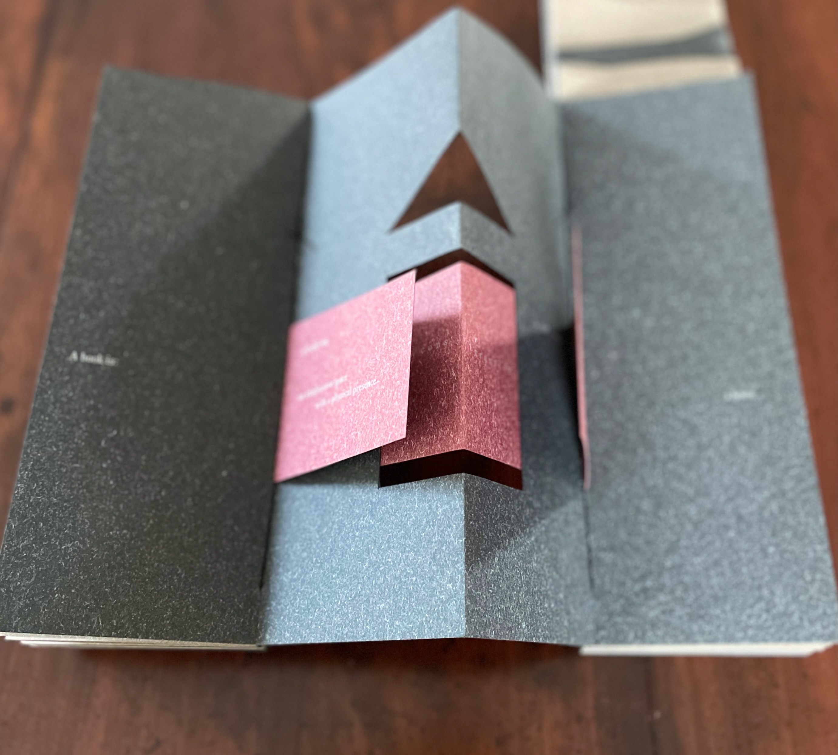
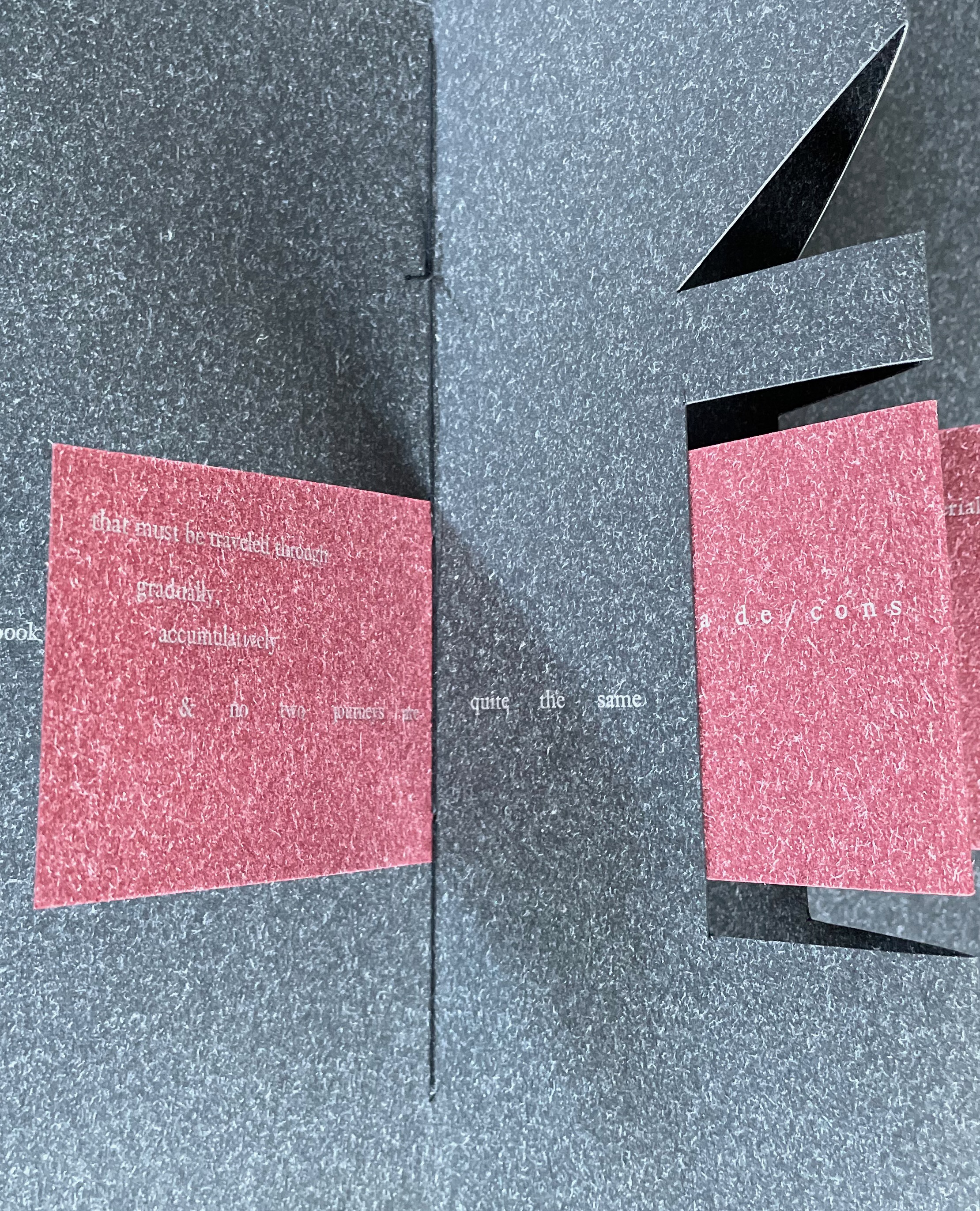
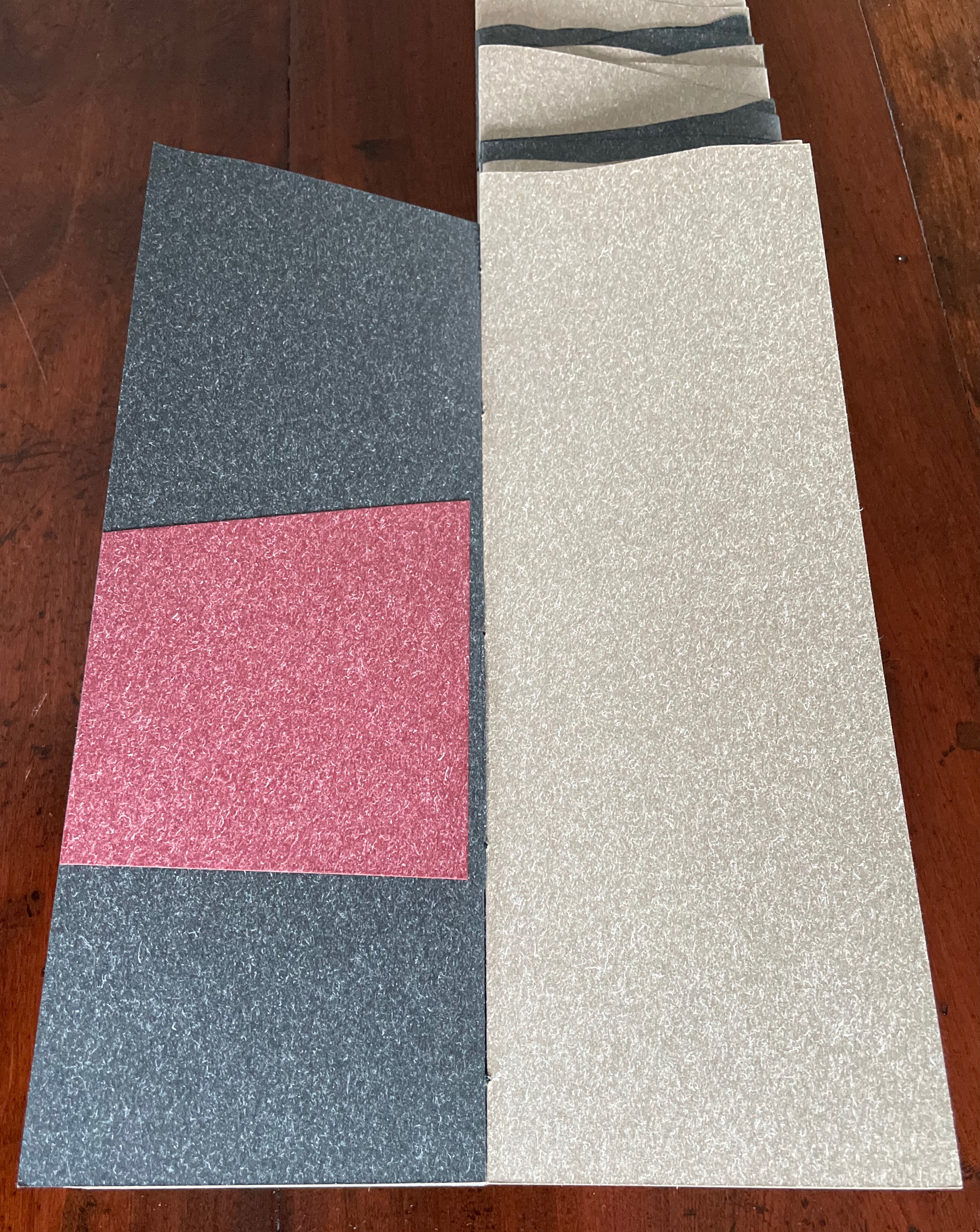
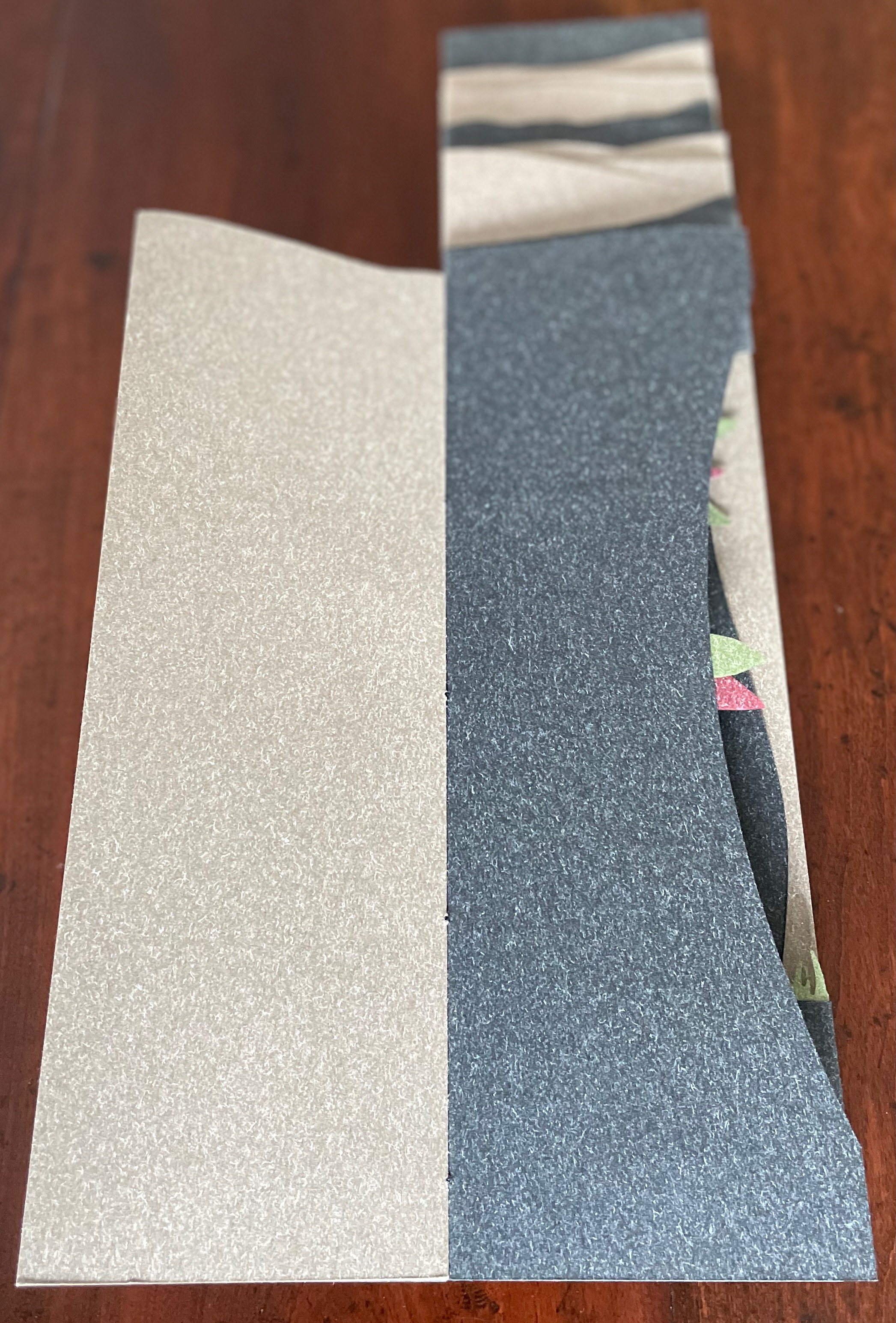
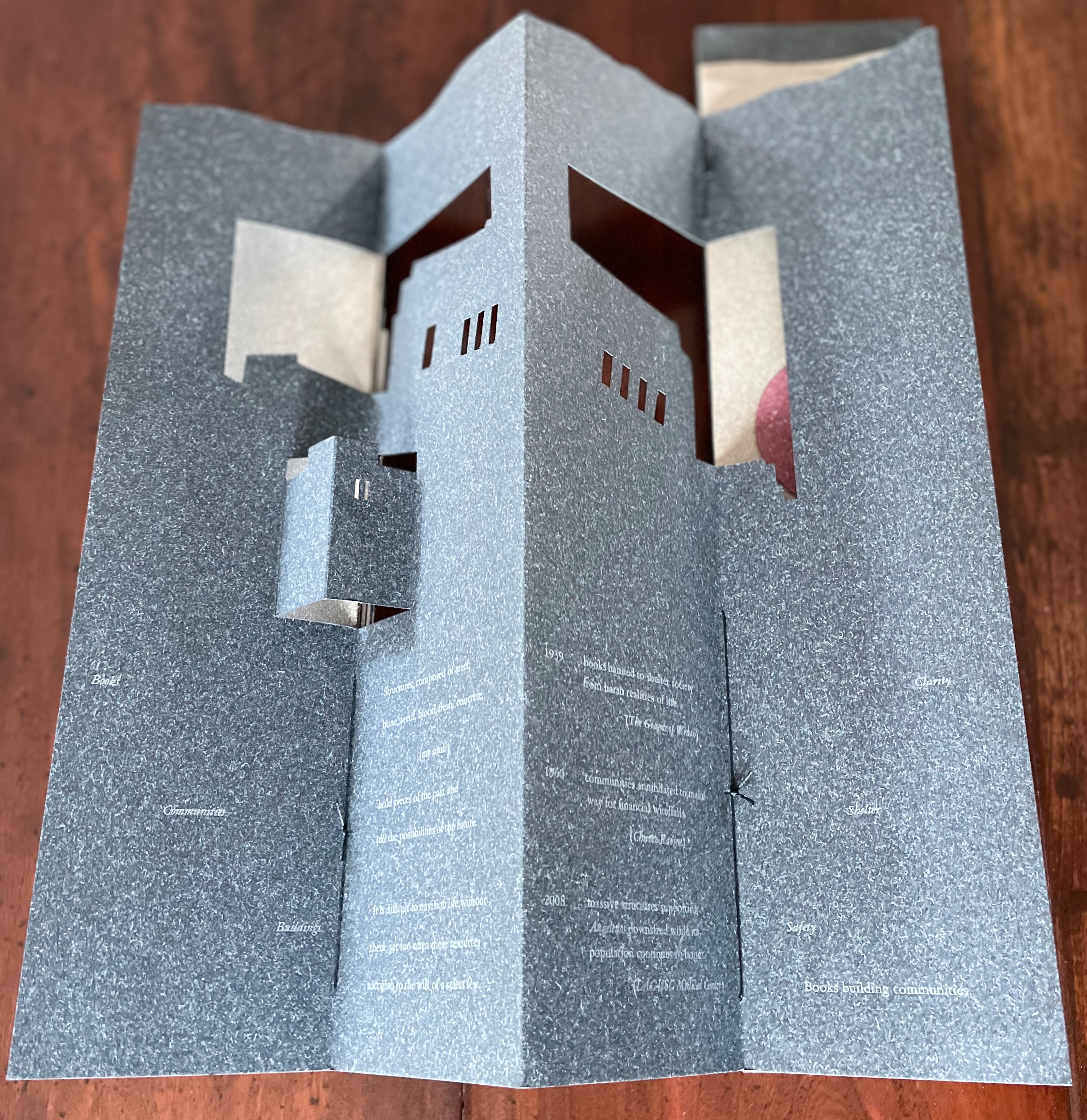
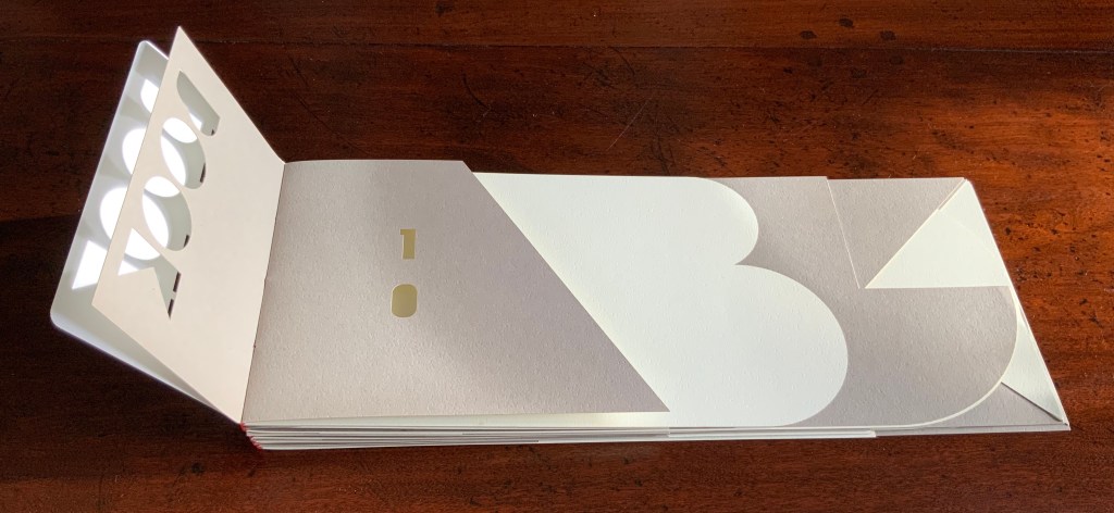
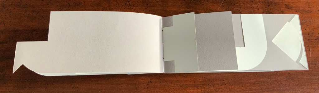
Clever structural use of paper with a stone-like appearance, paired with apt choices of text matched with equally judicious choices in typography, evoke the similarities between books and buildings. Each architect/bookmaker’s contribution is a self-covering booklet in leporello format. Of different heights, the booklets are sewn together to create a tiered tower to be housed in an acrylic slipcase.
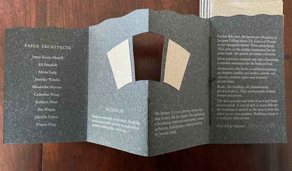
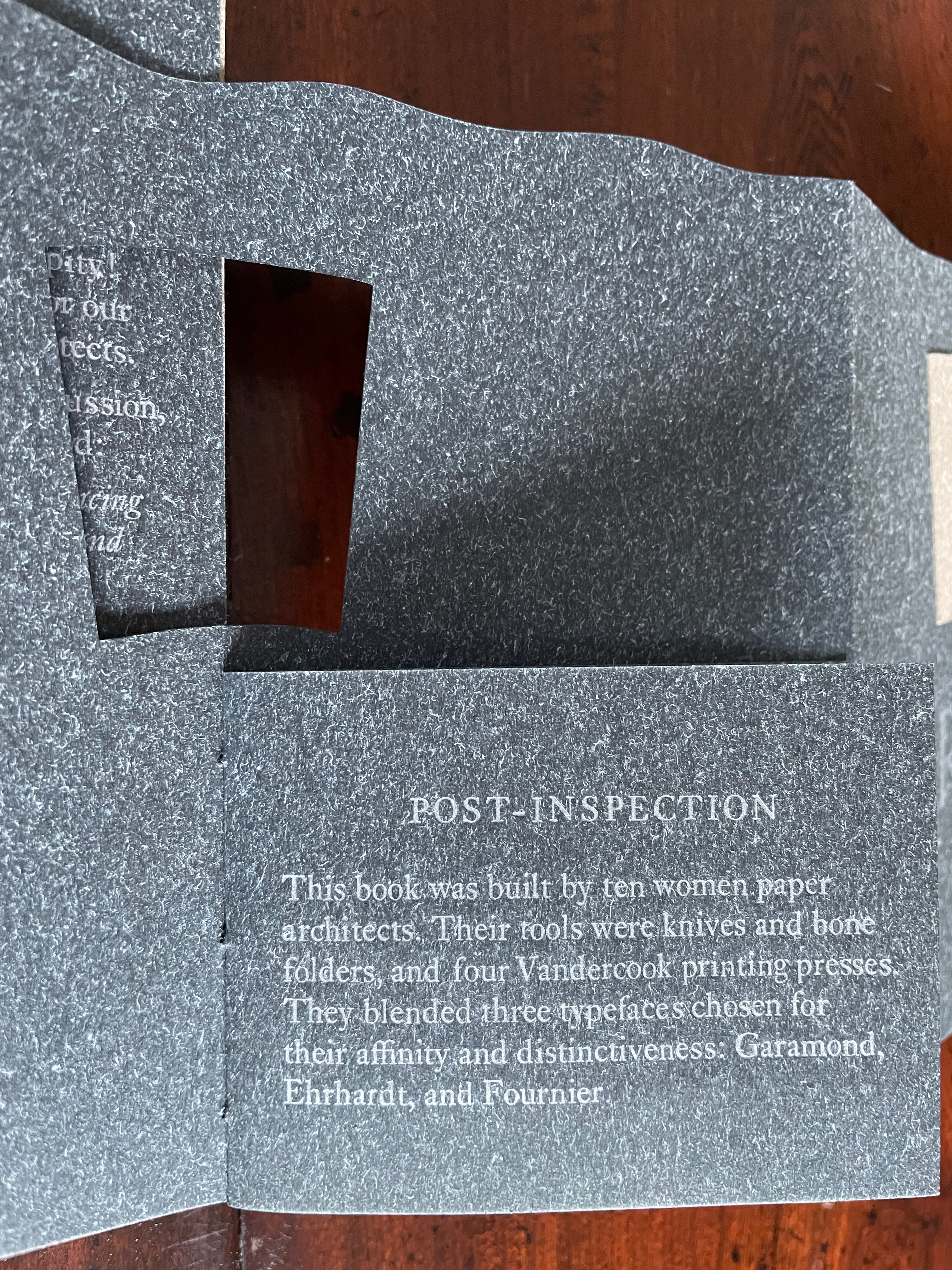
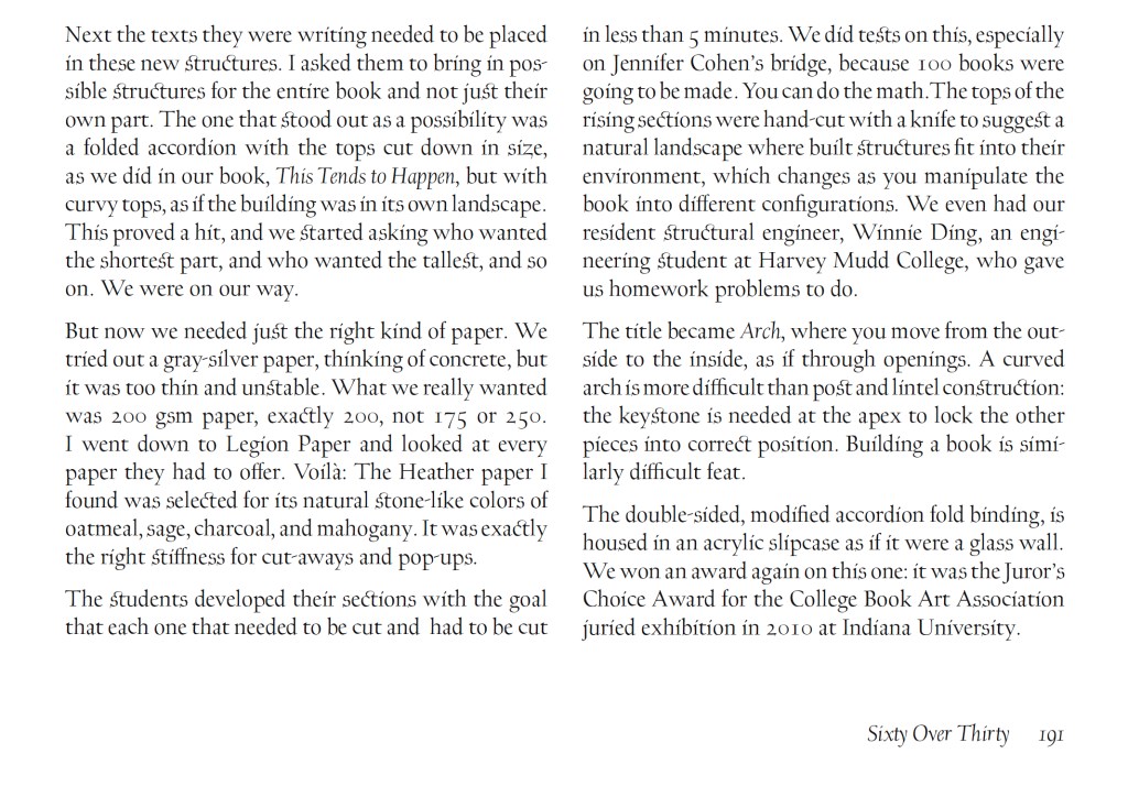
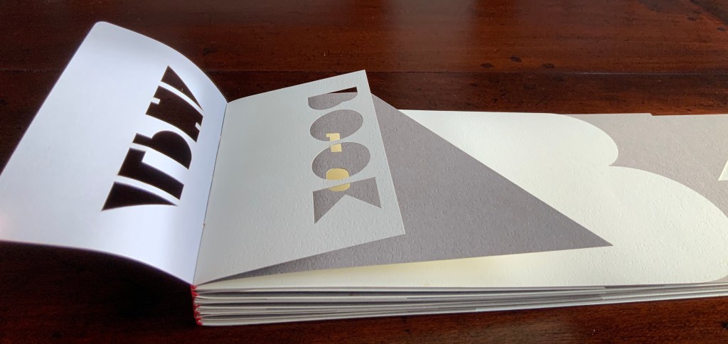
The first booklet, open below, incorporates Maryatt’s introduction, entitled “Blueprint”, all of which appears in the work’s entry in the publication Sixty over Thirty: Bibliography of Books Printed Since 1986 at the Scripps College Press (2016). The entry is reproduced in full further below.
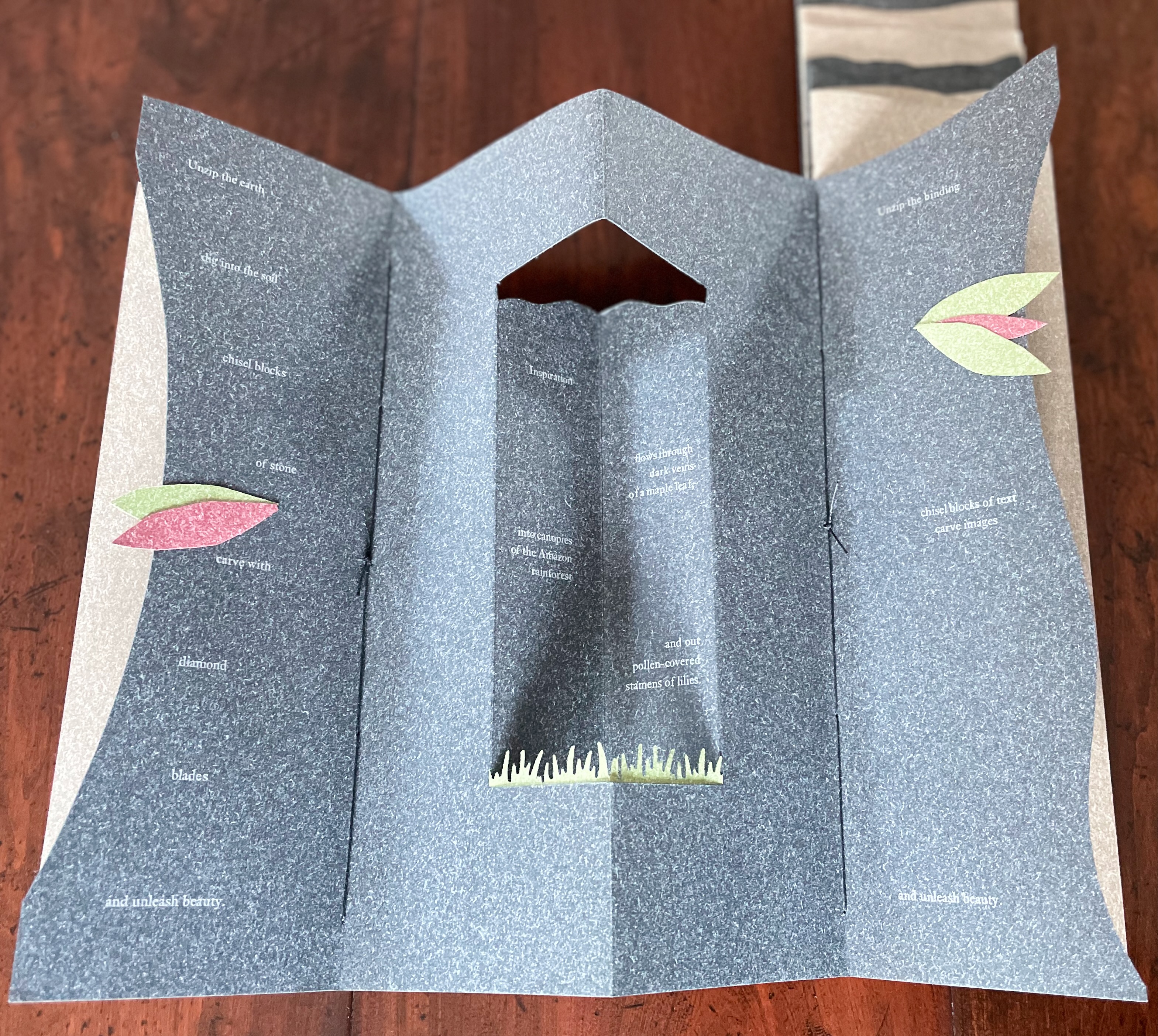
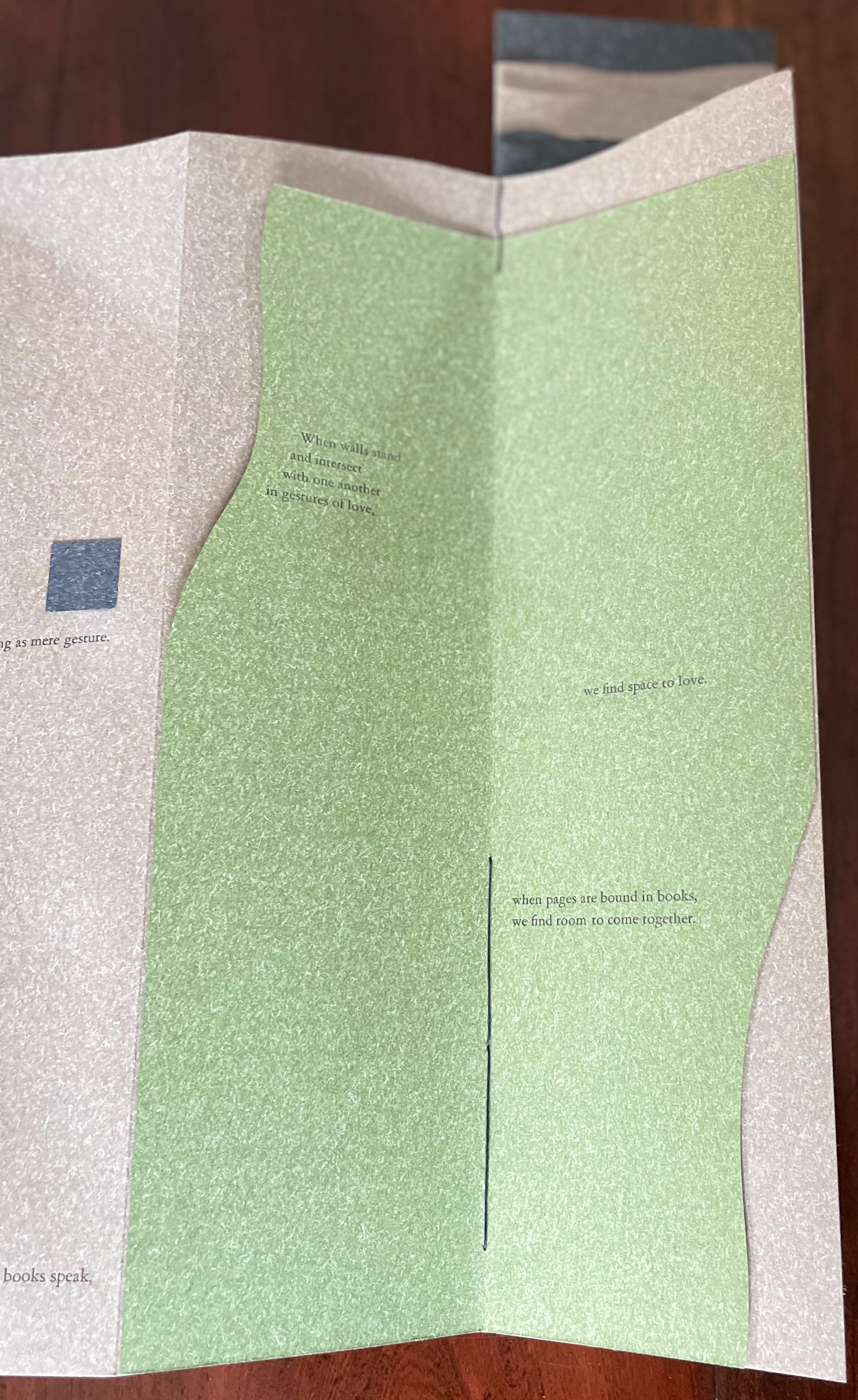
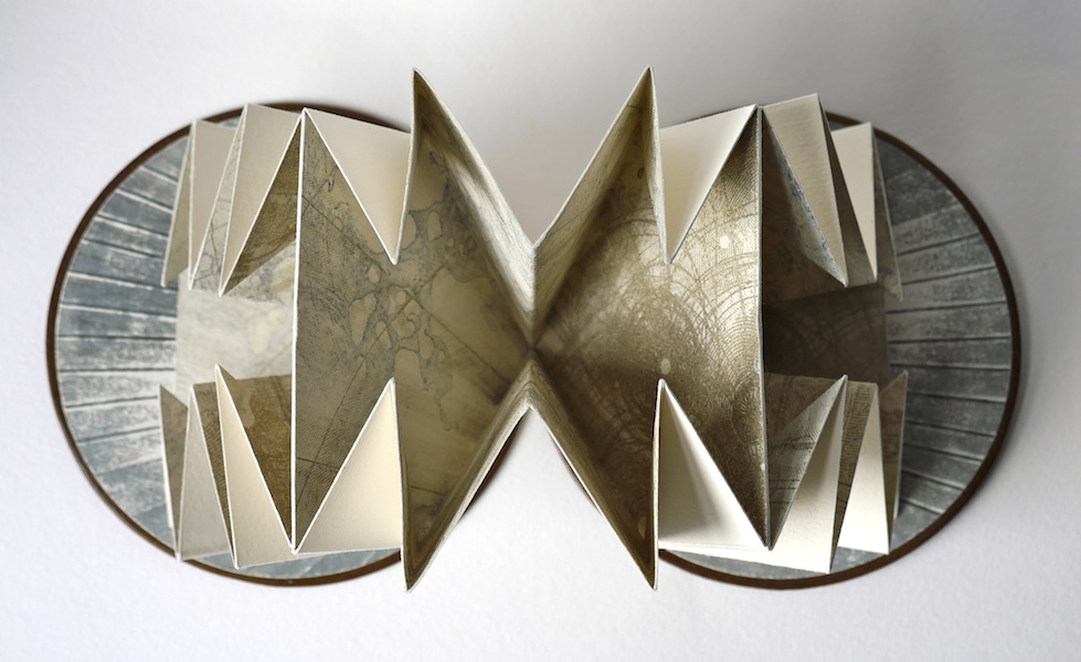
The next booklet lists the sources of architectural inspiration, and as the lattice door on the list’s facing page turns, two sets of stairs, cutouts in contrasting colors, ascend on the verso page to the text that begins at the top of the recto page and ends at the foot of descending stairs on the next double-panel spread. Like Maya Lin, Maryatt’s students built their works by learning to think with their hands. The reader, too, has to think with the hands to experience fully this booklet and those that follow. The whole work conjures up the titles of Juhani Pallasmaa’s books — The Thinking Hand and The Embodied Image. Readers of this online entry will have to expand the images below, enjoy the words and imagine their way through with the title of another of his books — The Eyes of the Skin.
Lynn, Greg. 2004. Folding in Architecture Rev. ed. Chichester, West Sussex: Wiley-Academy. See for references to Mario Carpo, Gilles Deleuze and Peter Eisenman.
Macken, Marian. Binding Space: The Book as Spatial Practice (London: Taylor and Francis, 2018). A trained architect and book artist, Macken articulates and illustrates the how and why of the overlap between architecture and book art.
Williams, Elizabeth. 1989. “Architects Books: An Investigation in Binding and Building”, The Guild of Book Workers Journal. 27, 2: 21-31. This essay not only pursues the topic of architecture-inspired book art but turns it on its head. An adjunct professor at the time, Williams set her students the task of reading Ulises Carrión’s The New Art of Making Books (Nicosia: Aegean Editions, 2001) then, after touring a bindery, “to design the studio and dwelling spaces for a hand bookbinder on an urban site in Ann Arbor, Michigan”. But before producing the design, the students were asked “to assemble the pages [of the design brief and project statement] in a way that explored or challenged the concept of binding”. In other words, they had to create bookworks and then, inspired by that, create their building designs. Williams illustrates the essay with photos of the students’ bookworks. [Special thanks to Peter Verheyen for this reference.]
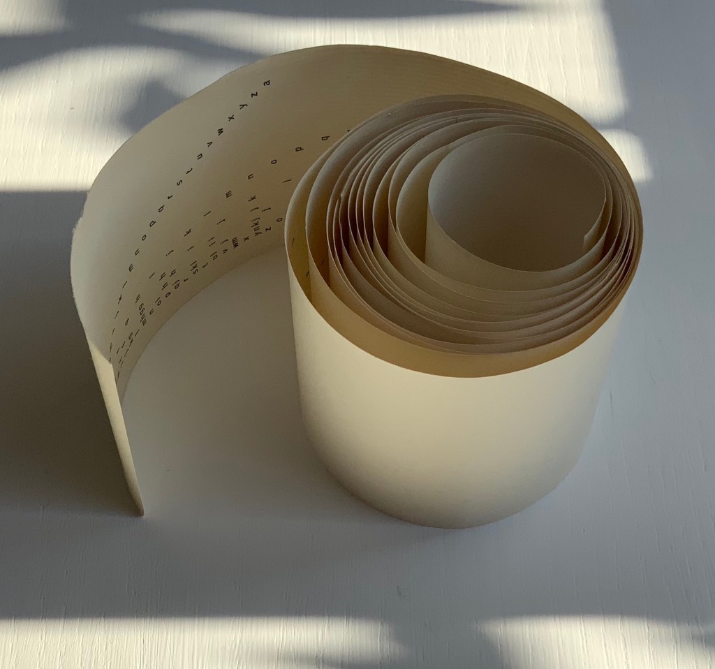
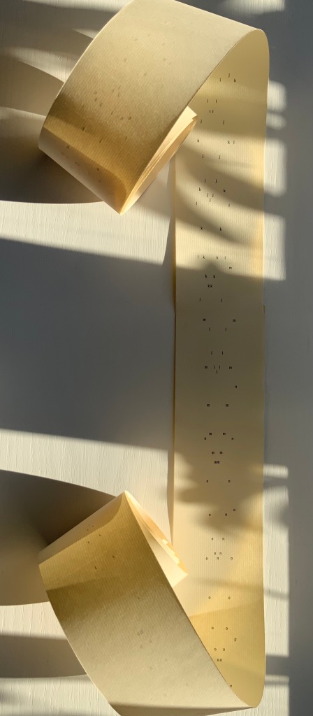
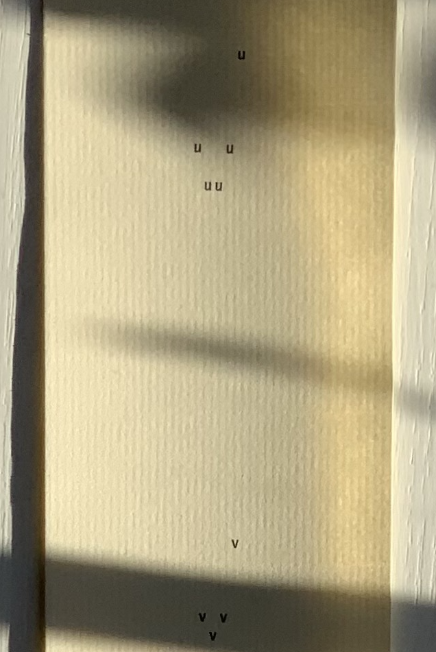
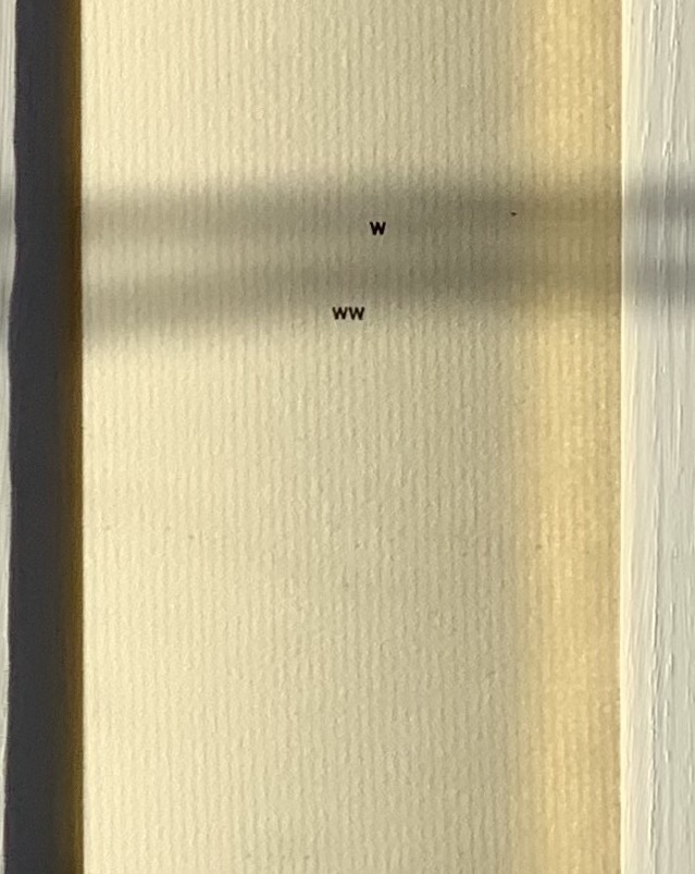
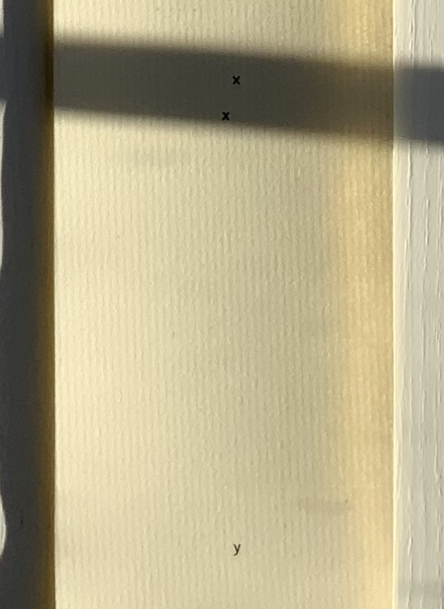
abcdefghijklmnopqrstuvwxyz(“Alphabet Poem”) (1963) Emmett Williams Scroll in three parts printed offset on laid paper. H2228 x W60 mm. Acquired from Ozanne Rare Books, 29 September 2021. Photos: Books On Books Collection. Permission to display from Ann Noël Williams.
More than seven feet in length, this alphabet scroll was originally published around 1961 by Verlag Kalender, the same publisher that published the Kalender Rolle, whose form influenced this work. Intended for performance, the scroll is gradually unfurled and read aloud. The “Alphabet Poem” was sold on its own and as a part of George Maciunas’ Fluxus 1. Other views online can be found in the Galerie Krinzinger archive, New York’s MoMA and Swarthmore College.
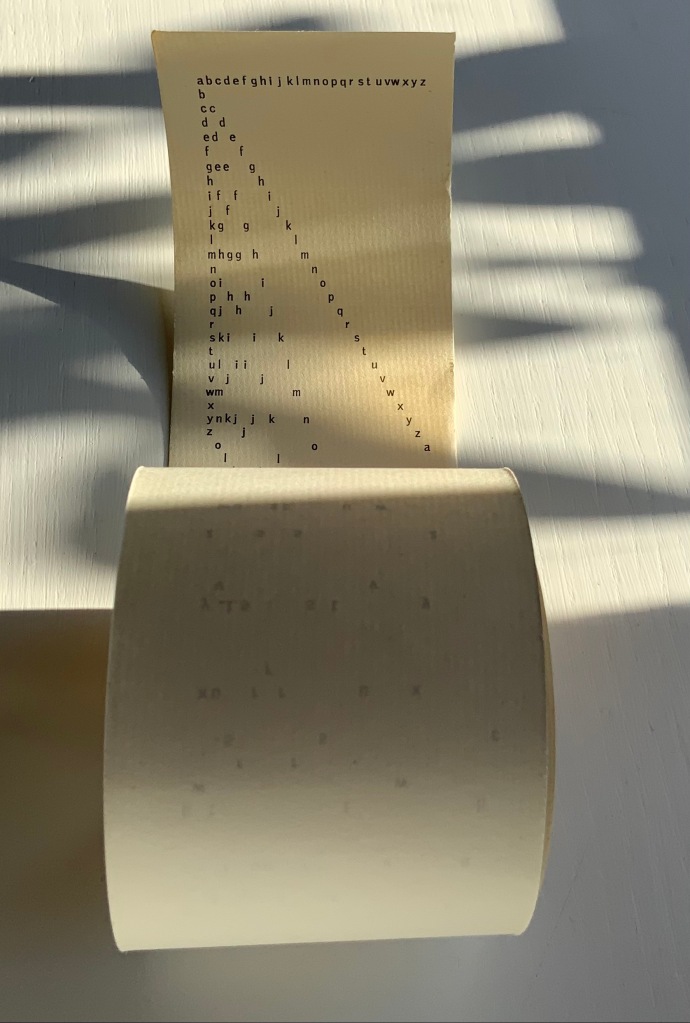
Exactly how the “Alphabet Poem” would be performed is unclear. Presumably read left to right line by line? How are the gaps to be handled? Should the reader pause for each letter missing in the gaps? Performance aside, the form and structure entice more of a visual engagement in the way that concrete and conceptual art and poetry most often do. The letters fall according to rule and constraints. The rule is to maintain the alphabetic sequence vertically, horizontally and in a zigzag diagonal. The constraints are the width of the paper roll, the spacing between letters in the top row and the spacing between lines. The visual patterns that result pull the eye away from the alphabetic/spatial rules, and it searches for entirely other pareidolic patterns — faces, constellations, etc. Just the way the eye discovers letters and shapes in everyday surroundings, the clouds, etc. All of which bumfuzzles our hemispherical brains — no doubt the concrete/conceptual intent?
There is no letter z!
Under Further Reading, other artists associated with Fluxus and visual (or concrete) poetry can be found in the Books On Books Collection. Beyond the collection, Hansjörg Mayer’s alphabetenquadrate (1966), in particular, should be compared and contrasted with Williams’ scroll. Like Williams’ scroll, Mayer’s leporello reads left to right and vertically. But where Williams’ alphabet seems to flutter away algorithmically and languidly into blank space at the end of the scroll, Mayer’s alphabet takes on a curving pattern that fills in a grid of 26 x 26 character spaces and finally overprints the completed grid to the point of illegibility.
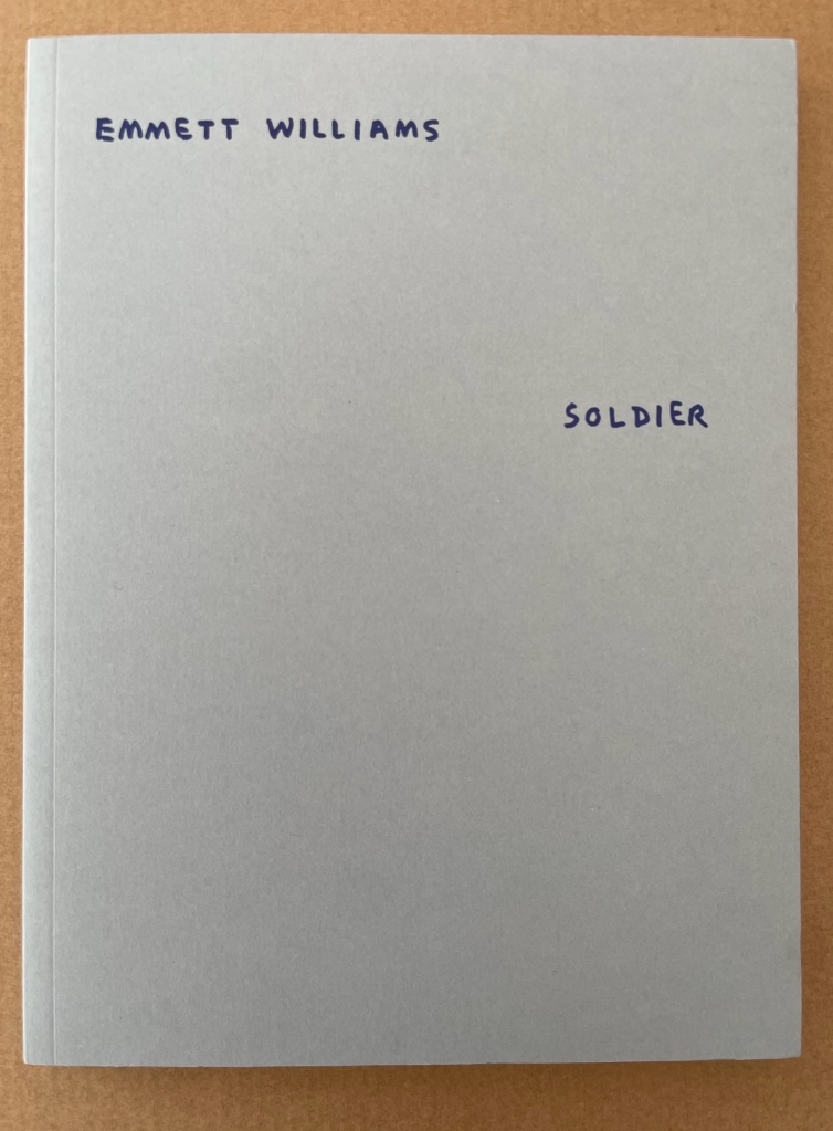
As if there weren’t enough for which to thank Clive Philpott and Moeglin-Delcroix, we have their efforts through Zédélé Editions to reprint early classics of book art, including SOLDIER by Williams, Jan Dibbetts Robin Redbreast ‘s Territory (1969) and hermann de vries’ White (1960/80) among others.
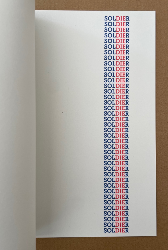
Between 1966 and 1970, Emmett Williams (1925-2007) was the editor, with Dick Higgins, of Something Else Press, which published a large number of books by artists linked with the Fluxus movement. A pioneer from the Fifties of a new form of poetry called “Concrete Poetry”, in reference to Concrete Art, in 1967 Emmett Williams assembled the first collection of works by international poets and artists, An Anthology of Concrete Poetry, simultaneously published by Hansjörg Mayer in Europe and Dick Higgins in the United States. He defined it in his introduction as “direct” poetry, “using the semantic, visual and phonetic elements of language as raw materials”. In contrast with the subjective expression of traditional poetry, this approach sought to use a minimum of resources, focusing on systematic composition processes based on repetition, permutation and mechanical development, governed by a pre-established protocol.
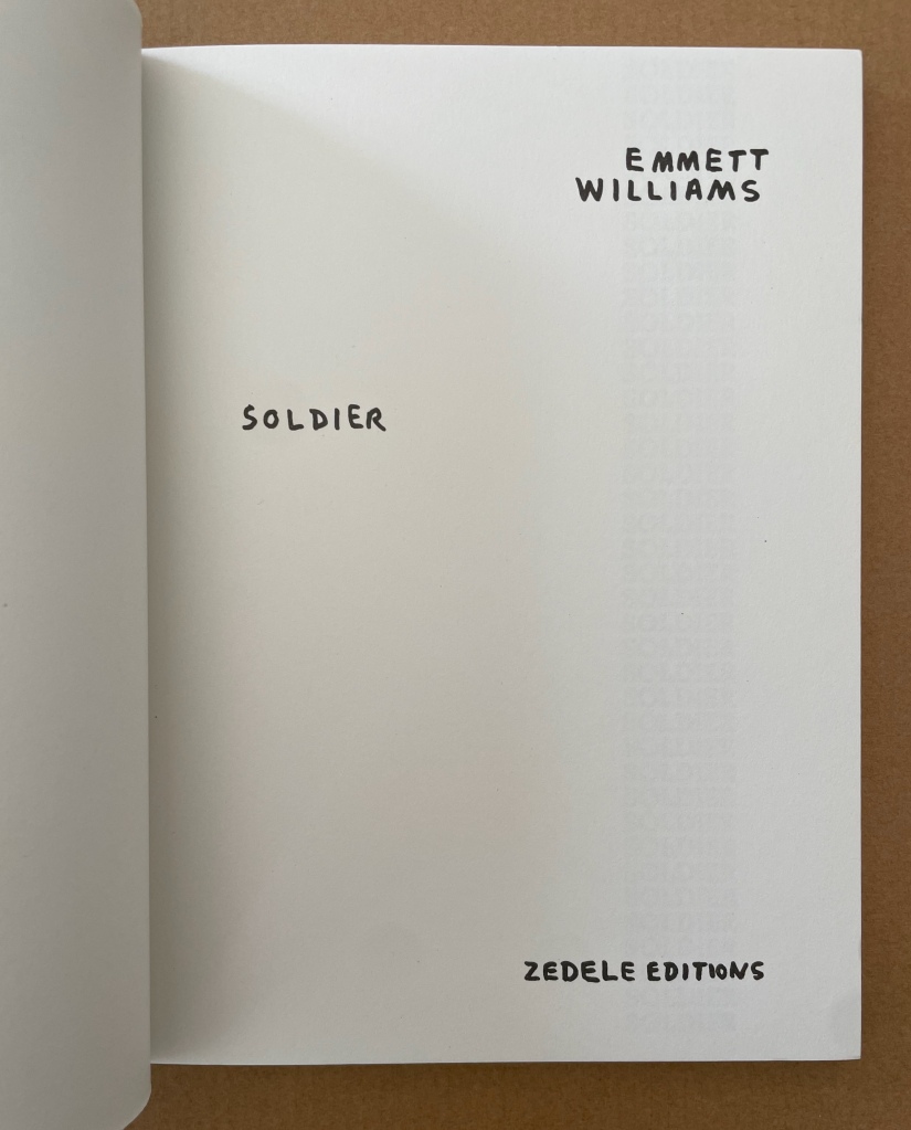
In 1973, again with Hansjörg Mayer and Something Else Press, Emmett Williams published four long autonomous poems, including SOLDIER, composed the previous year at the California Institute of the Arts, and collected in a single volume entitled A Valentine for Noël. The book was dedicated to his young pregnant wife, Ann Noël, whom he had met in 1968 when she was working for a year as Dick Higgins’ assistant, and who, as director of the graphics workshops at CalArts, helped the artist overcome the technical difficulties of changing over from manuscript to printed poems.
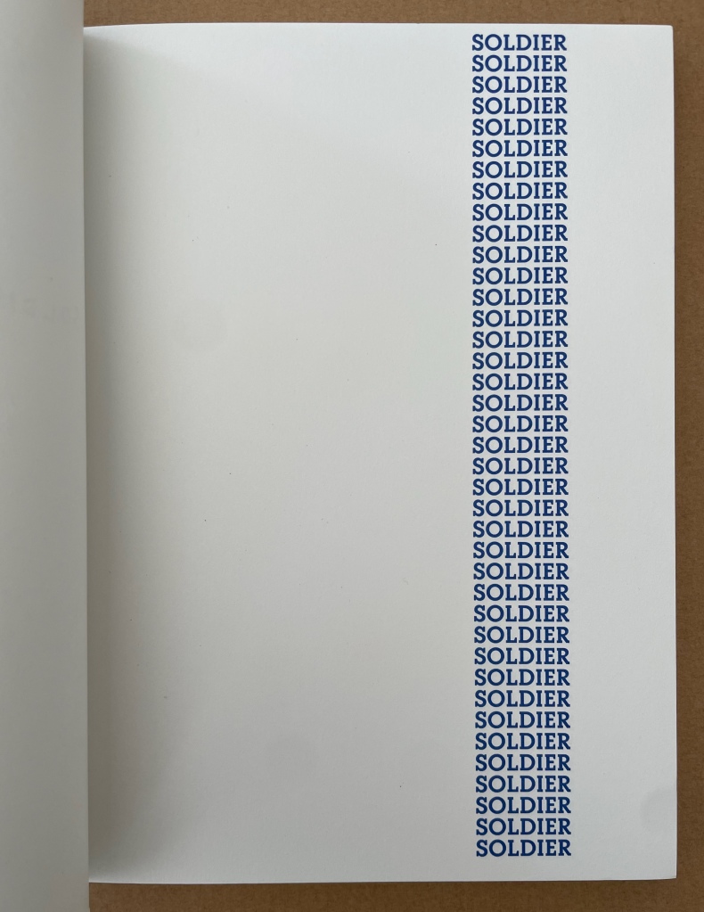
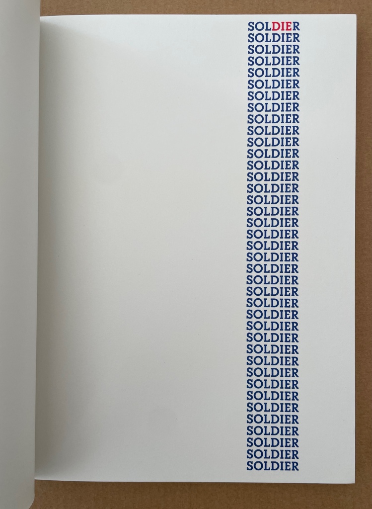
Later, Emmett Williams said: “My first ‘dying’ soldiers poem dates from 1970 during the war in Vietnam.” This first version of SOLDIER is a silkscreen print in red and blue. It is obvious that the later version — a sequence of 40 pages during which the reader sees the three red letters, DIE, gaining one line on each sheet — is visually more striking and politically more effective: by the simplest of means, it makes the inevitable advance of death in the column of soldiers typographically visible. For this re-edition, it also seemed obvious that the publication of the poem in a separate volume restored its implicit function as a flip book. The “playful” aspect present in all Emmett Williams’ works seems to have taken refuge here in the childlike form of these animated books, designed to give the impression of continuous motion. Far from undermining the tragic nature of the subject, the flip book form accentuates the protest against war as a killing machine. A flip book for adults, which remains highly topical. — Publisher’s insert.
Noël Williams, Ann. 2020. Spirale. Berlin: Argobooks. “The design for the artist’s book SPIRALE was developed to accompany the performance of the same name, performed by Ann Noël and Emmett Williams at the Sprachen der Künste festival at the Akademie der Künste on 4 February 1984. The alphabet with names of artists, Berlin squares, song fragments, streets and restaurants was created through Emmett Williams’ and Ann Noël’s habit of making alphabet lists to fall asleep at night. The artist couple prepared their word and name lists for the performance independently of each other and then challenged each other on stage.” — publisher’s description.
John Crombie formed Kickshaws in 1979 in Paris. Joined by Sheila Bourne, they published over 150 works. Apparent as the esoteric influence of visual poetry and the Oulipo movement may be, their works have the combined smell of the printer and typesetter’s workshop and artist’s studio that distinguish them from that crowd.
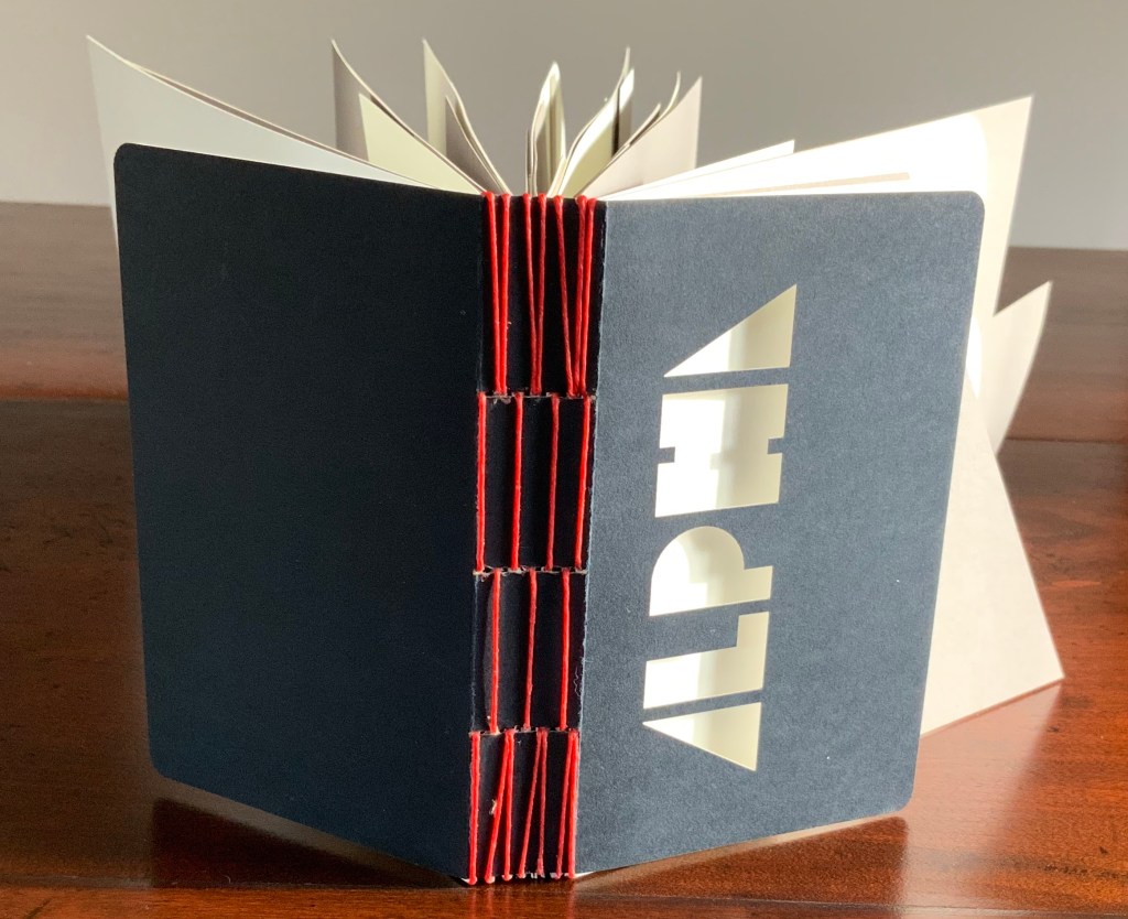
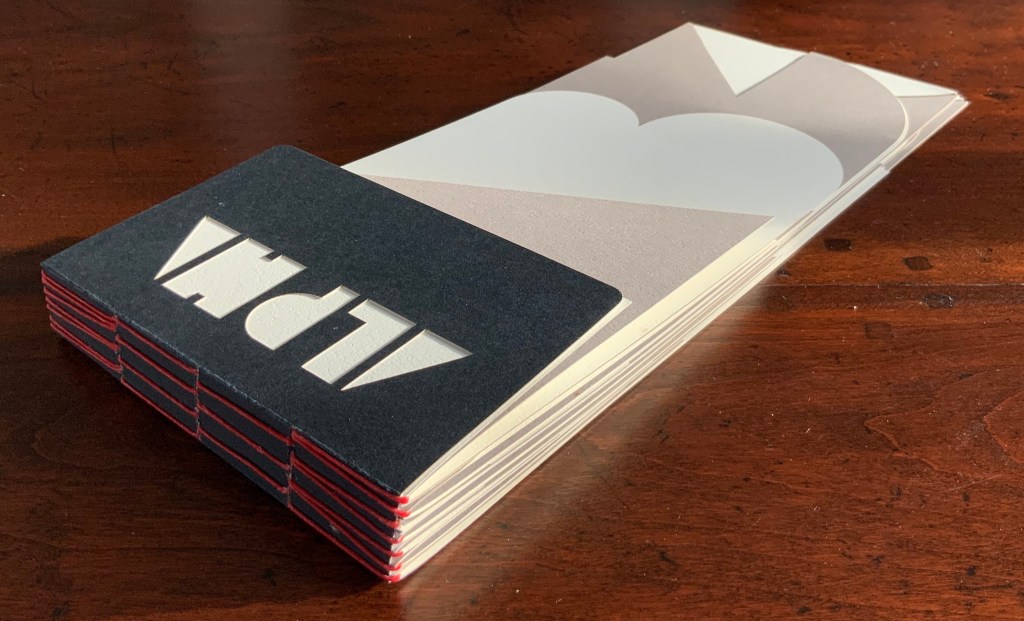
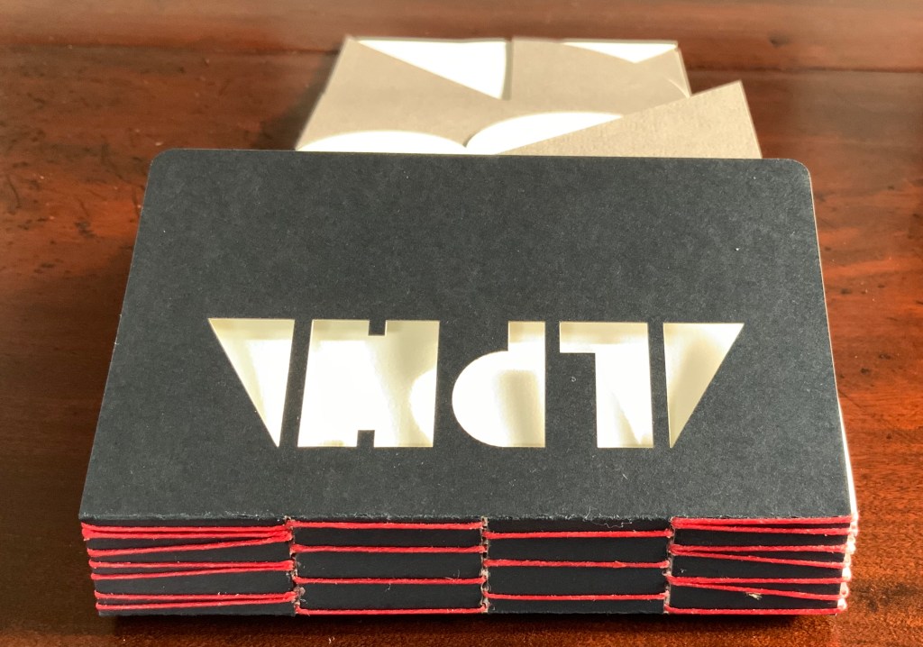
ABC in a maze (1987)
ABC in a maze (1987) John Crombie Spiral bound on four sides, double gate fold. H95 xW95 mm, 17 leaves. Edition of 300 (150 in English, 150 in French), of which this is Letter of 26 numbered A-Z. Acquired from Librairie Jean-Étienne Huret, 17 March 2022. Photos: Books On Books Collection.
The cover of this work hides its title, just as the proper order of the pages hides in the reiterations of the alphabet across 17 leaves of this double gatefold puzzle and book.
The French title ABC Dédale carries more freight than the English. Not only does it convey the idea of the maze by reference to its inventor Daedulus, it refers to Cadmus, the Phoenician prince who brought the alphabet to Greece while on his quest to find his sister Europa, mother by Zeus to the Minotaur — the “monster in the alphabet”. If that seems a far-fetched allusion, then consider the additional hint in the name of the chosen typeface: Hélios, the Greek god and personification of the sun, to which Daedulus’ son Icarus flew too close in their escape from Crete.
Portrait évolutif du typographe “Evolving portrait of the typographer” (1988)
If a selection of works from the Books On Books Collection were made based on the theme of “artists’ books and color”, this small work would have to make the cut. Moving from five small splashes of color in the first pass, subsequent passes build up a multi-colored cartoon image of the typographer in a head-on eyeless gaze. At the seventh pass, however, the colors begin to fade; in the ninth, the features of the portrait begin to erode, and by the twelfth, only streaks of gray and the faintest impression of the outline remain.
A close look at the title reveals that same faint impression of the portrait’s outline. Were it not for its reference to the three primary colors, the title would have to be amended to a baker’s dozen of passes in collaboration with the press.
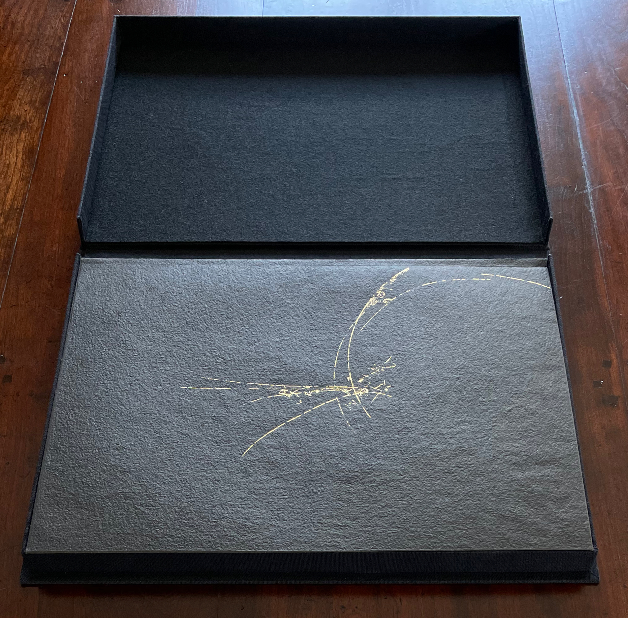
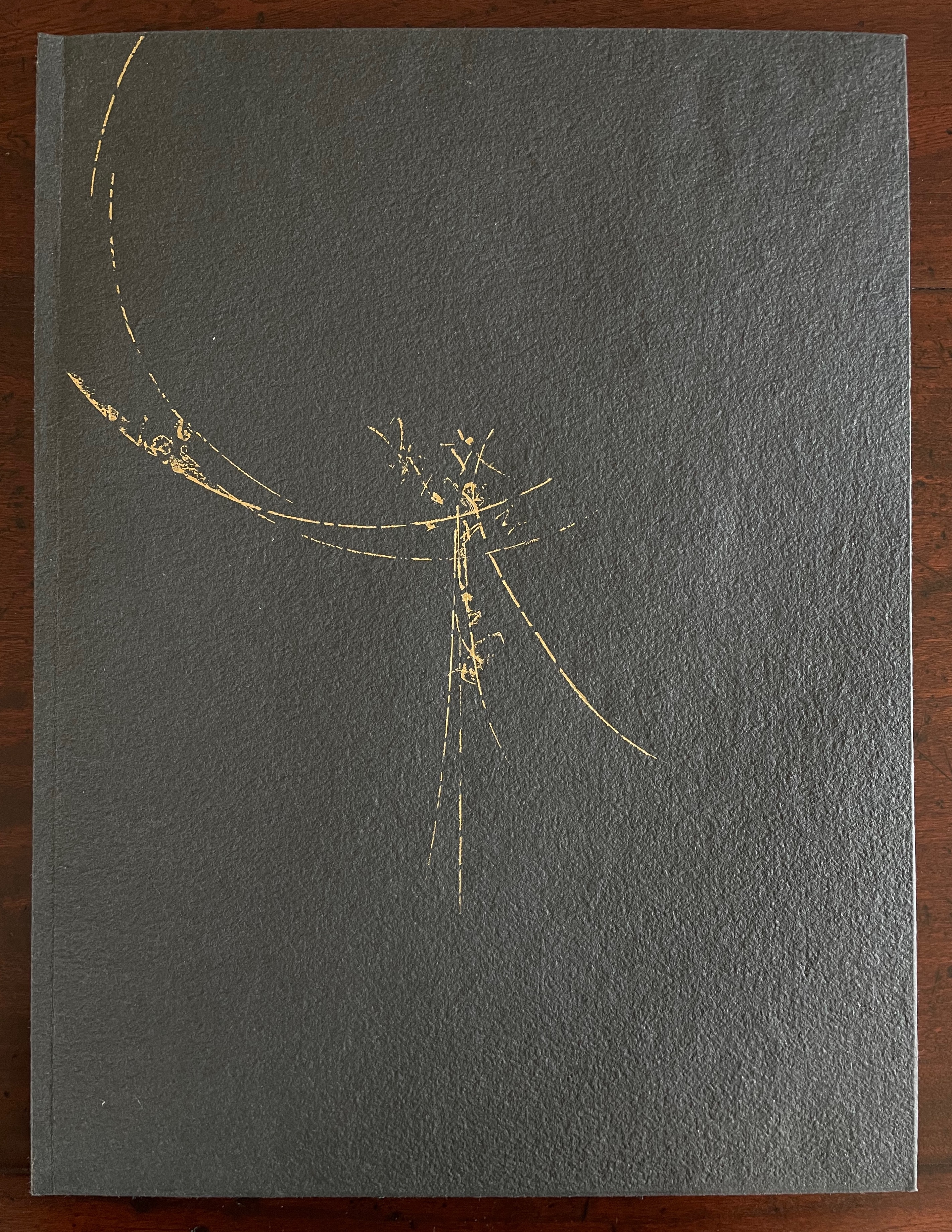
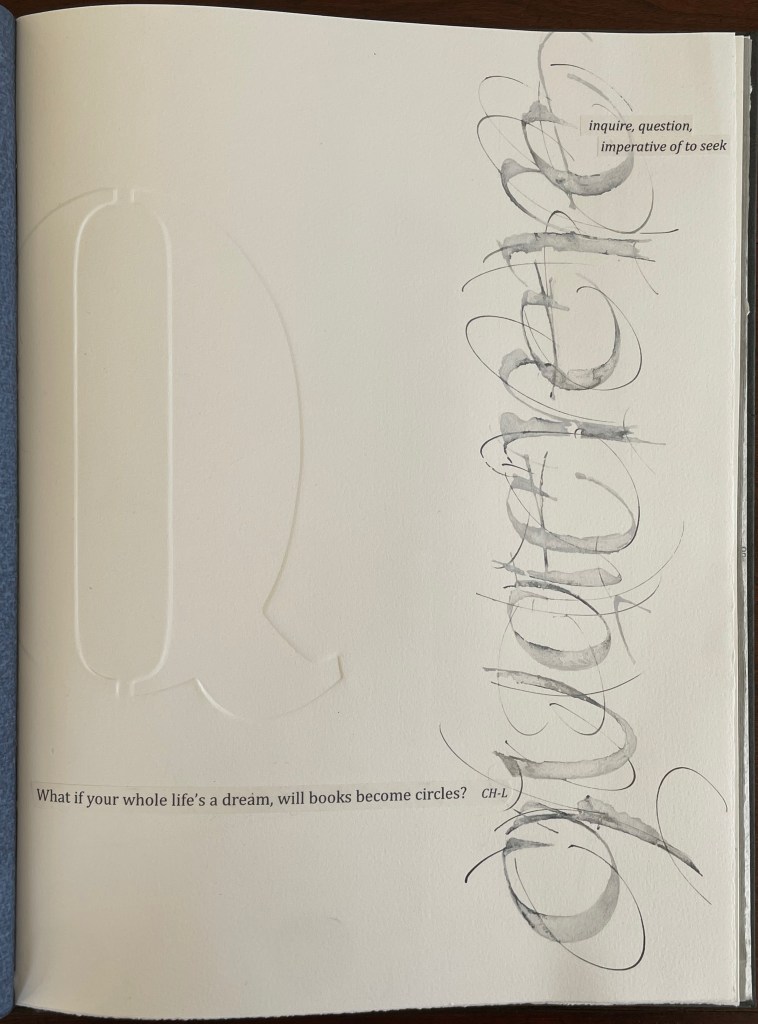
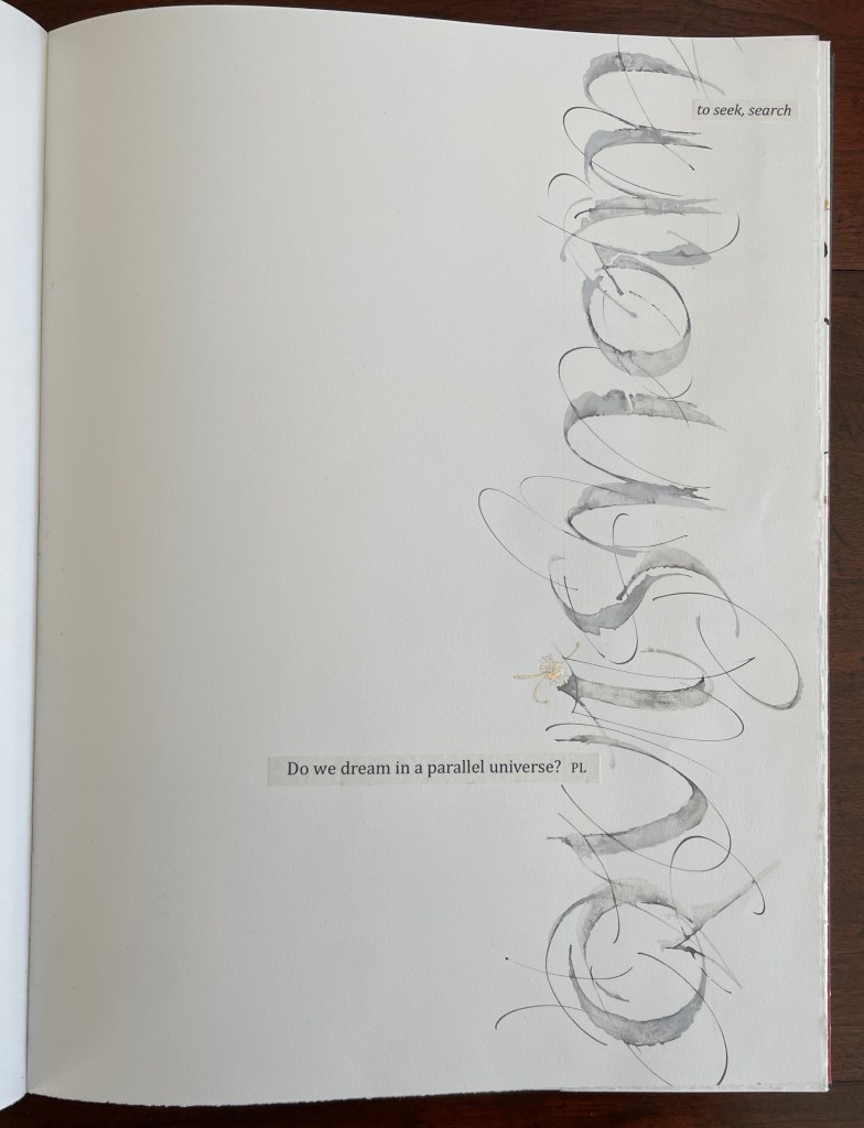
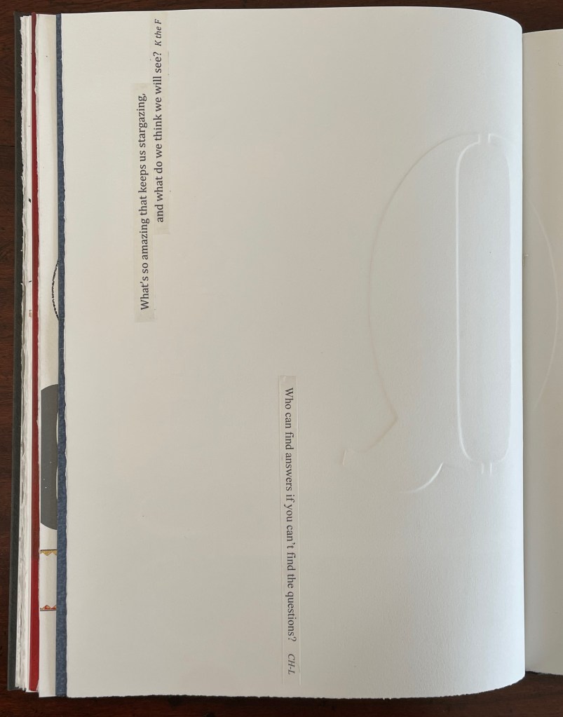
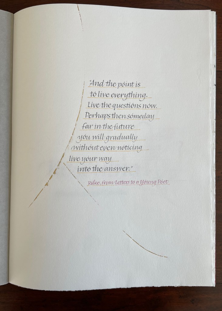
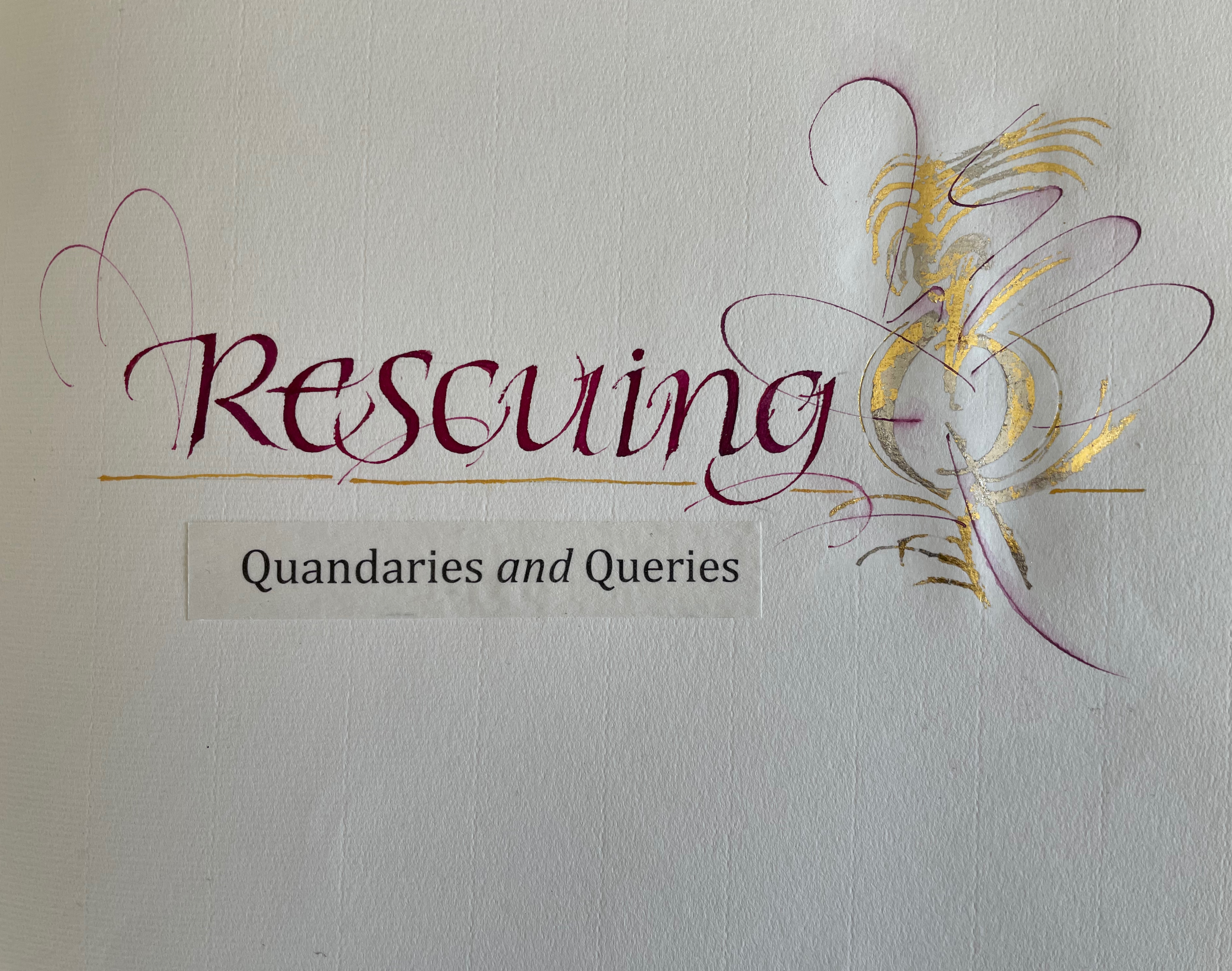
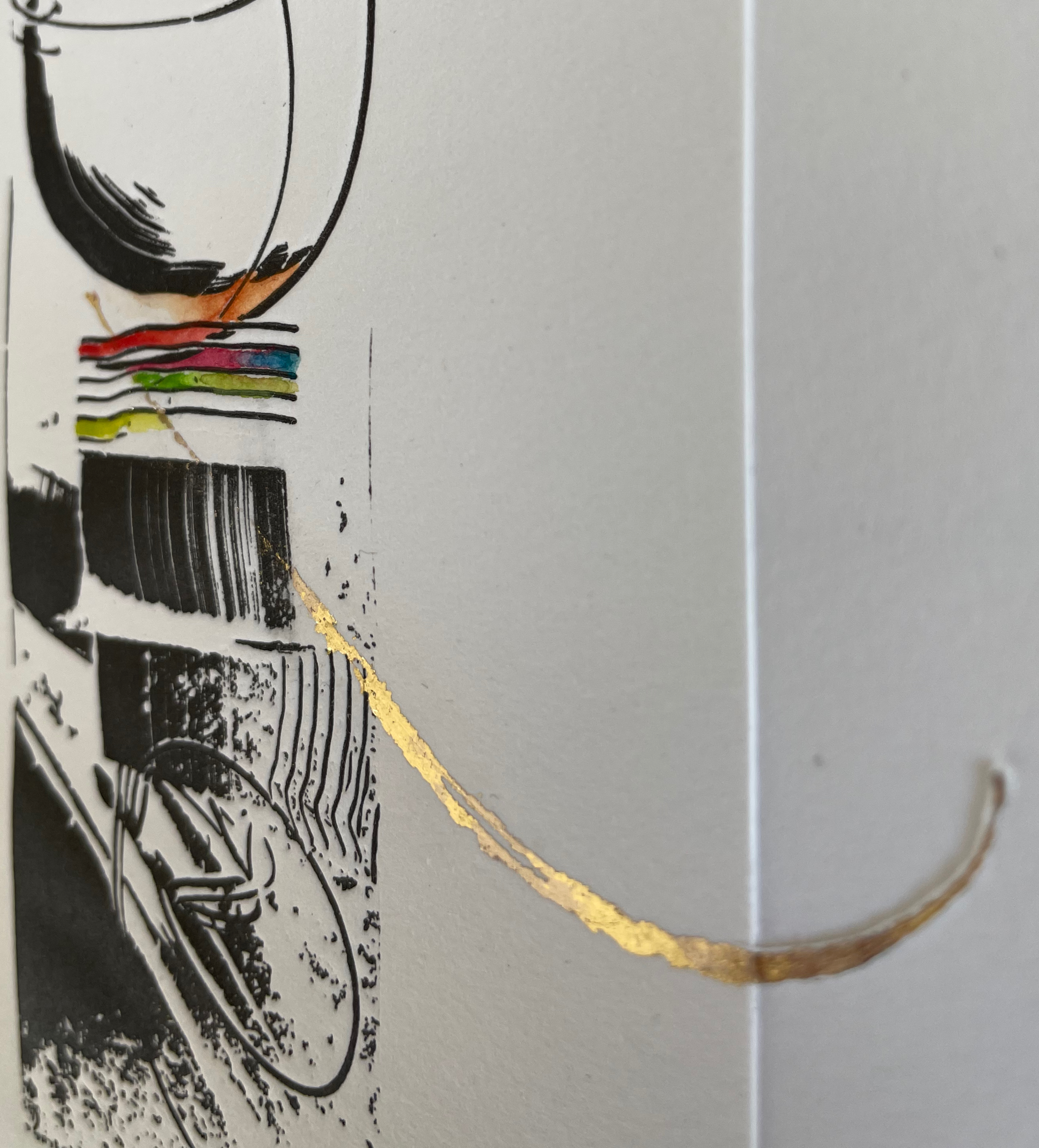
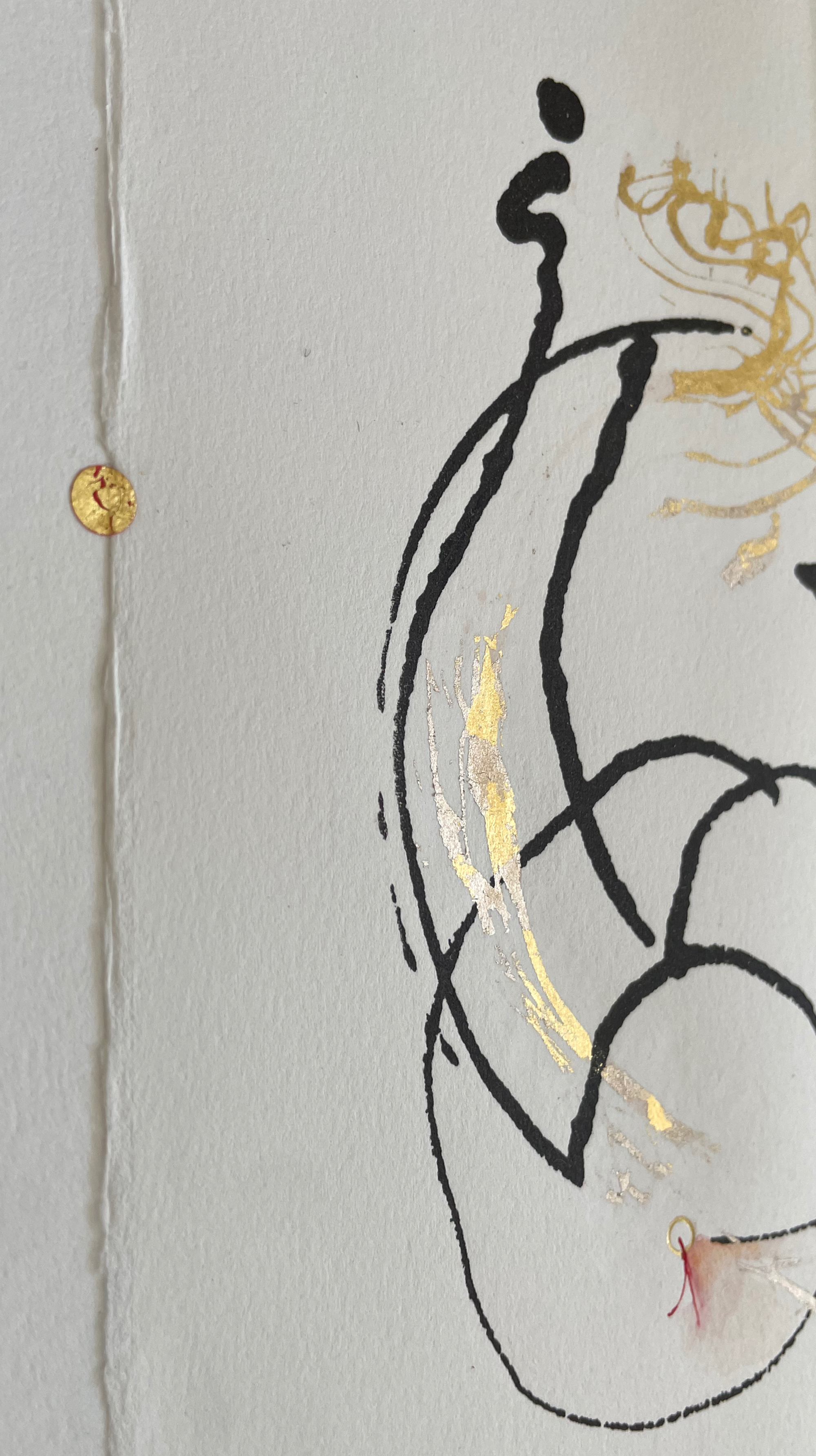
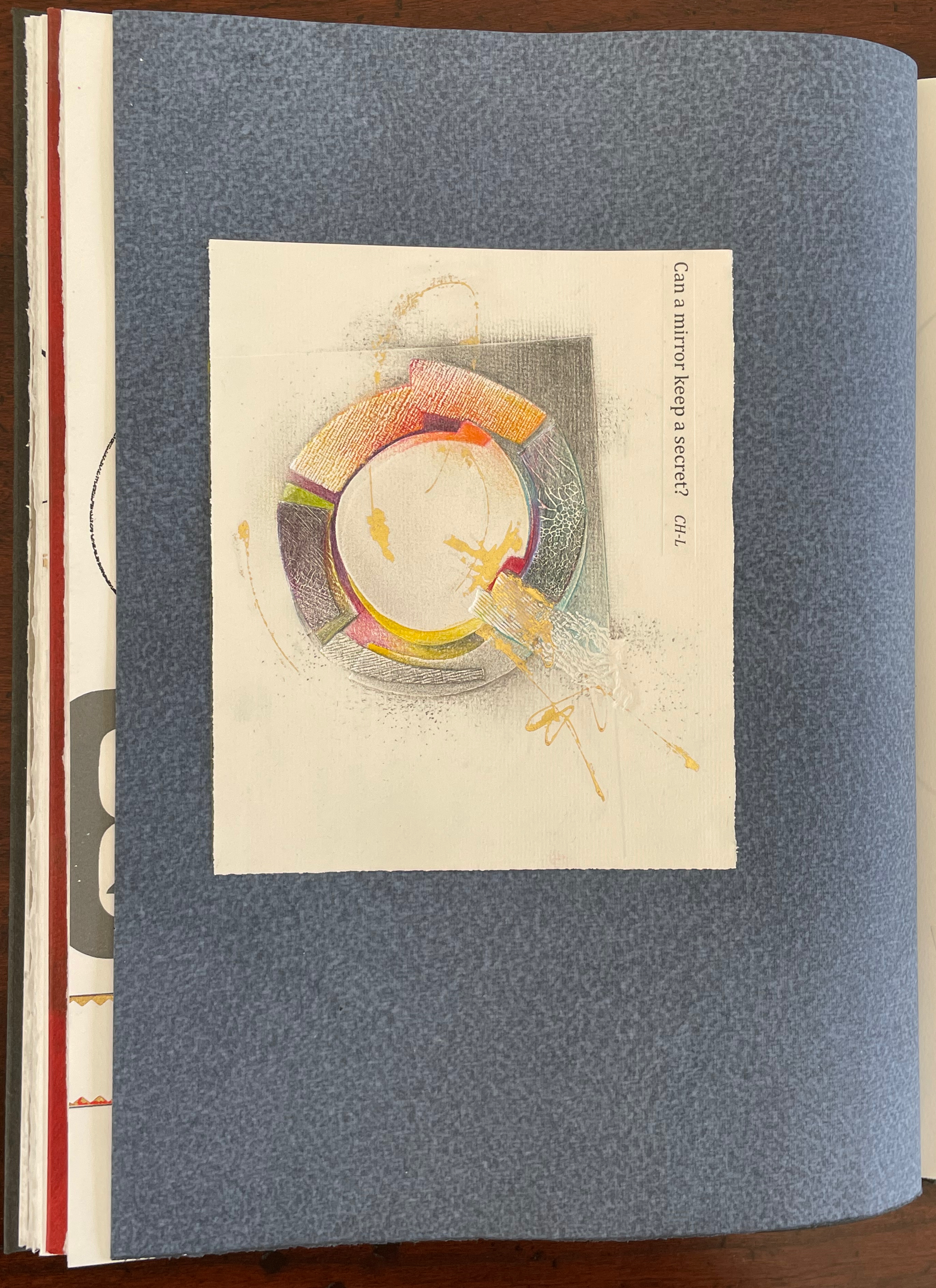
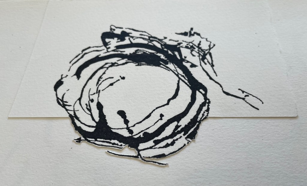
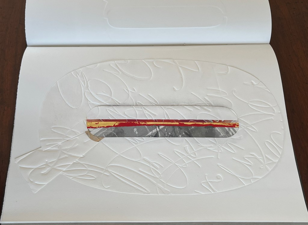
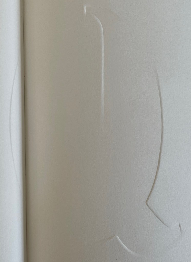
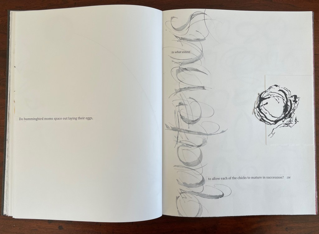
Rescuing Q (2023) Suzanne Moore Box enclosing softcover book. Box: H400 x W300 x D30 mm. Book: H380 x W285 mm. 32 pages. Printing by Sandy Tilcock (and Phoebe) at Lone Goose Press and Jessica Spring, Springtide Press. Unique edition. Acquired from the artist, 25 April 2023. Photos: Books On Books Collection. Displayed with permission of the artist.
Rescuing Q is a manuscript book, consisting of original paintings, monoprints, collage, pigmented prints, embossing, debossing, gilding and handwork complementing the letterpress printing. It is one of several such works designed and created by Suzanne Moore after more than 20 years of experimentation.
Q is not normal. Q is quirky. Q floats away. Q comes in too many shapes and sizes and colors. So attractive, Q was bound to be hijacked by Q-Anon, political operatives and social anarchists.
But Q will not remain captive for long because it is always asking questions. And, if we want answers, then as Rilke says, we must “live the questions now”.
For most readers though, the question that will be uppermost is “How did she do that?” Moore is quick in her generosity and would insist on amending that question to “How did they do that?” Consider the selection of paper. More than Arches (a laid paper with visible mesh and watermark) had to be considered for these interactions of ink, gouache, gold leaf, palladium, debossing/embossing by etching press and hand, cuts and overlays.
What notes, movements and rhythms were playing when these colors and the sequences were chosen?
How do they think of paper and ink in three dimensions?
Who saw Q and questions in a bird’s nest?
And someone’s memory called up Cave Alphabet paper for the endpapers.
The fact that Moore and her colleagues can do all that (and more) and the fact that their gentle and pointed questions fuse with the art ensure that Rescuing Q does and will succeed.
A Musings (2015)
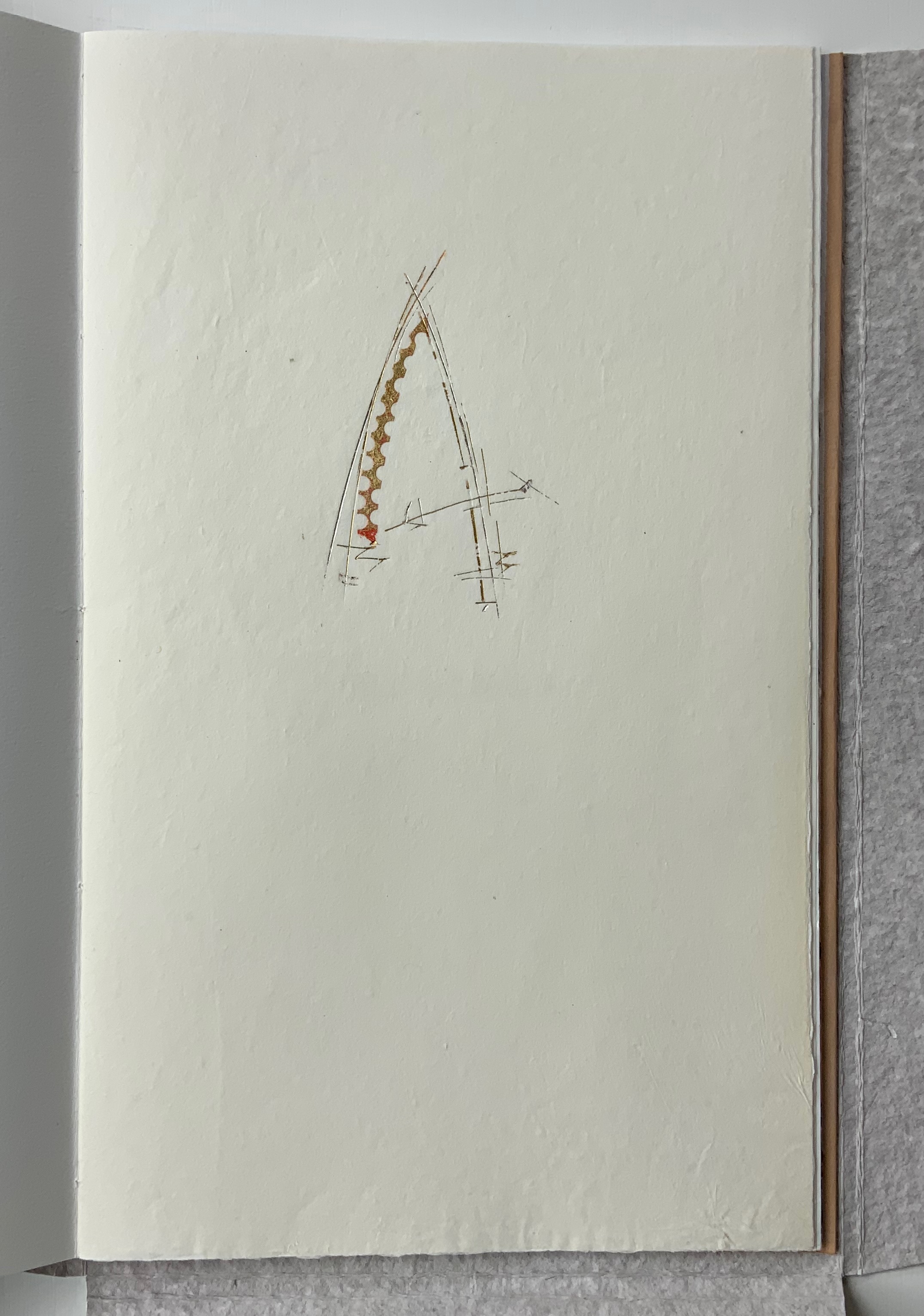
A Musings (2015) Suzanne Moore Tab-insert portfolio around softcover book. H370 x W230 mm, 24 pages. Edition of 26 variants, of which this is N. Acquired from Abecedarian Gallery, 13 February 2022. Photos: Books On Books Collection. Displayed with permission of Suzanne Moore.
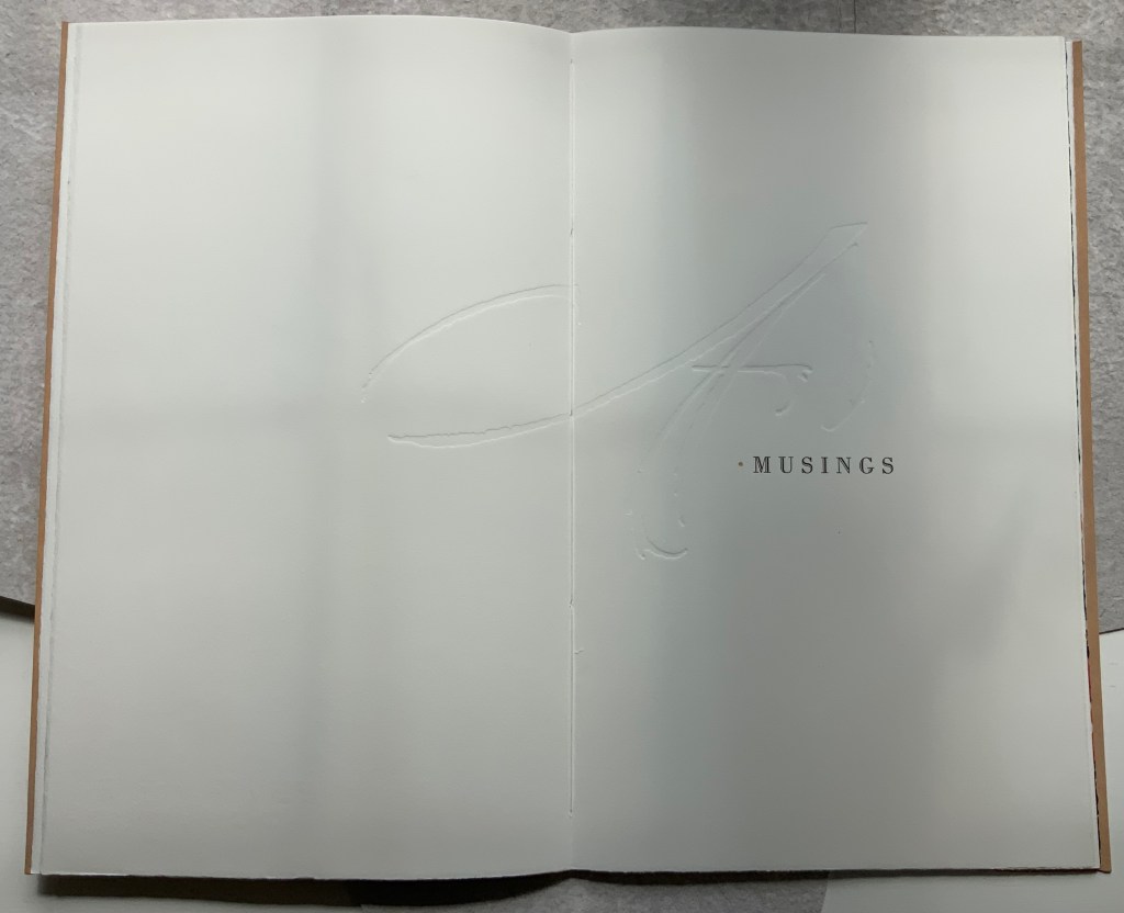
Title page
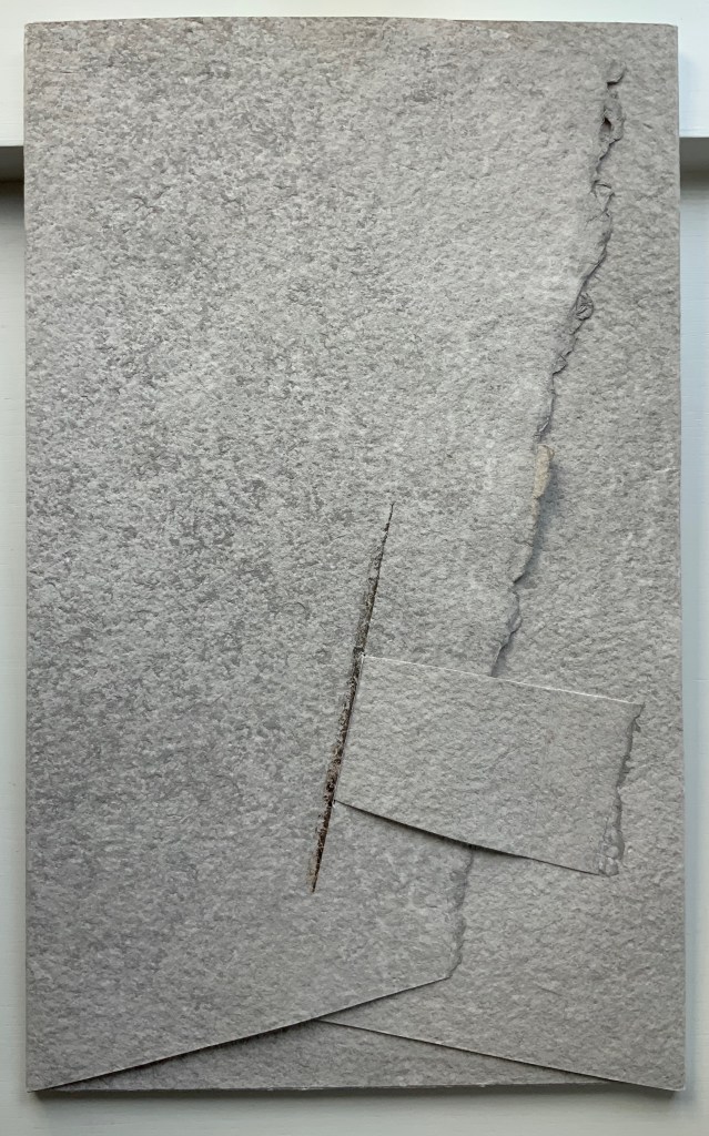
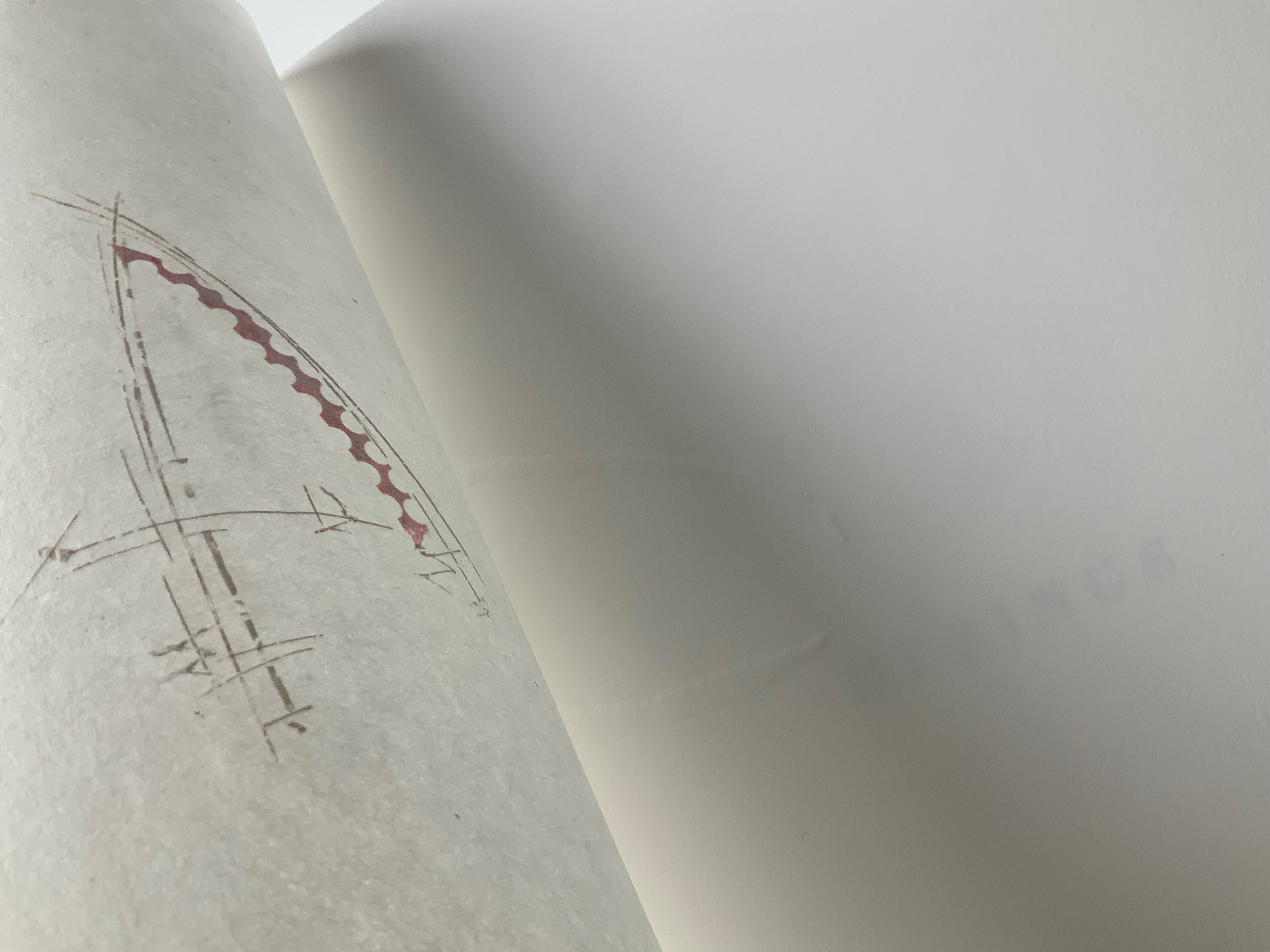
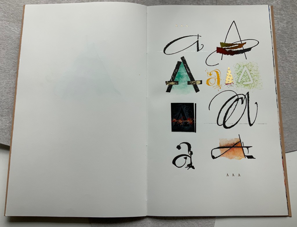
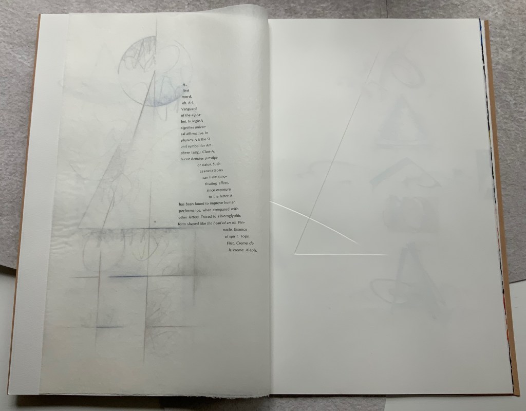
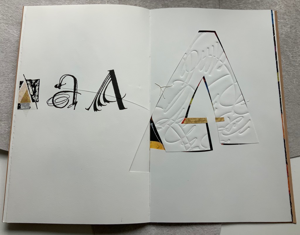
Another manuscript book, A Musings is an encounter between Suzanne Moore and the letter A, one of her 26 muses. As with any artist and muse, this naturally leads to portrayals of A in such varied positions, with such varied tools and techniques and such varied materials that the boxed and bound portfolio must take the amusing title A Musings. The muse finds itself posed across Magnani Aquaforte, Arches Text Wove, transparent kozo and other handmade papers enveloped by a stiffened, painted handmade paper. Moore’s musings fall on the historical, symbolic and spiritual aspects of the letter A with acrylic paint, pencil, freehand foil tooling, gold and palladium leaf, collage, debossing and embossing, sumi ink and gouache, sizing and varnish, monoprint, letterpress, folds and cutouts.
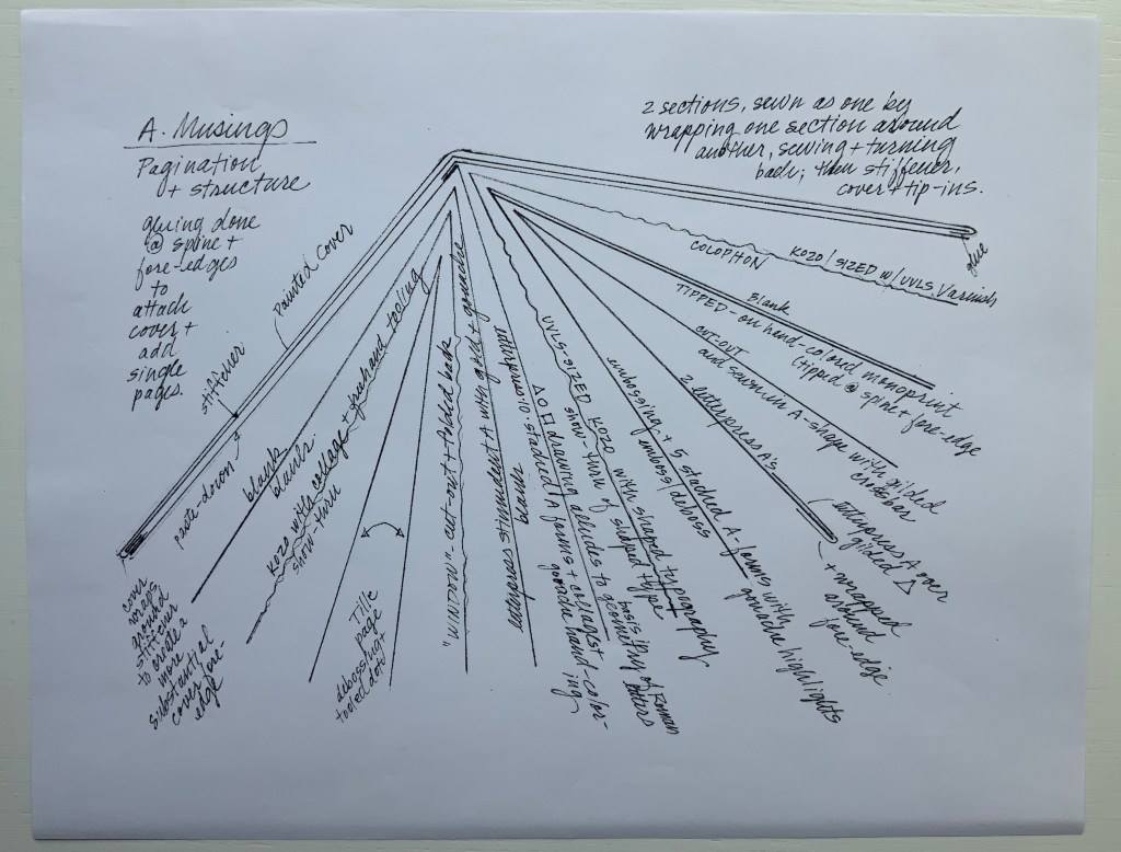
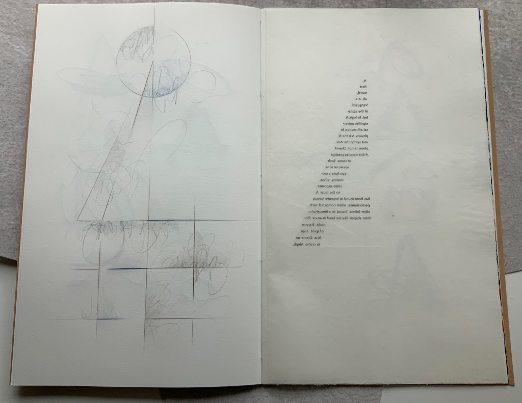
A separately provided copy of the artist’s plan for the pagination, structure and treatment per page offers a useful insight into the questions of how such a work is thought through and made. Page layout and the type of paper, in particular, play together sometimes like a clockwork mechanism and sometimes organically.
Painted cover
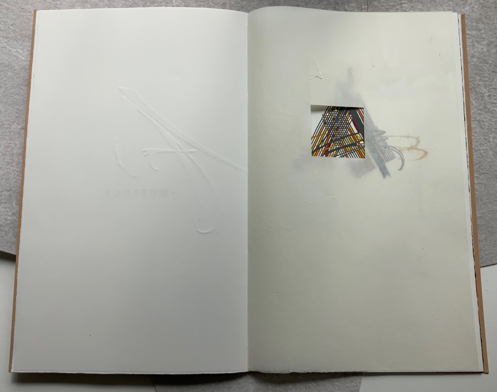
Left: Half-title. Right: Half-title turned to show translucency of kozo; note on the facing recto how the stroke from the debossed A on the title peeks through.
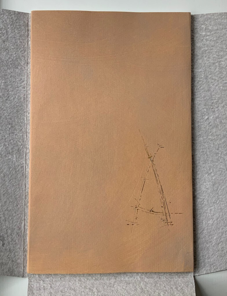
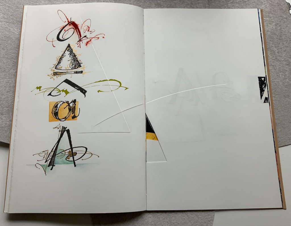
After the title page (see further above), the next double-page spread shows the title page’s debossed A in reverse on the verso page. Facing it is a square cutout through which multicolored lines forming overlapping As appear. Because the cutout page is translucent paper, we can see that the multicolored lines extend into a larger A on the next recto page. Turning the cutout page reveals that the cutout is actually a flap folded up and secured with white thread sewn in the shape of an A. This three-dimensionality of the flap is echoed by the way the crossbar swashes of the facing A seem to swirl around its two legs implying a spinning A.
From the single A interacting with a cutout, we move to a dozen evocations of the historic forms that the lowercase and uppercase A have taken. The lowercase “closed a” from the semi-uncial hand starting in the 5th century appears second down in the lefthand column, and the “perfected” Roman uppercase A appears at the bottom of the right column. Amusingly, some evocations blend periods of history. In the lower left, the drawing of a lowercase “open a”, which comes from the 8th century Carolingian miniscule hand, takes on the stylization of the 15th century’s bianchi girari (white-vine stem decoration). Just across from it, the stylized version of the Proto-Sinaitic (1700 BCE) form of aleph, meaning “ox”, has a burnt umber background that suggests markings in early cave dwellings.
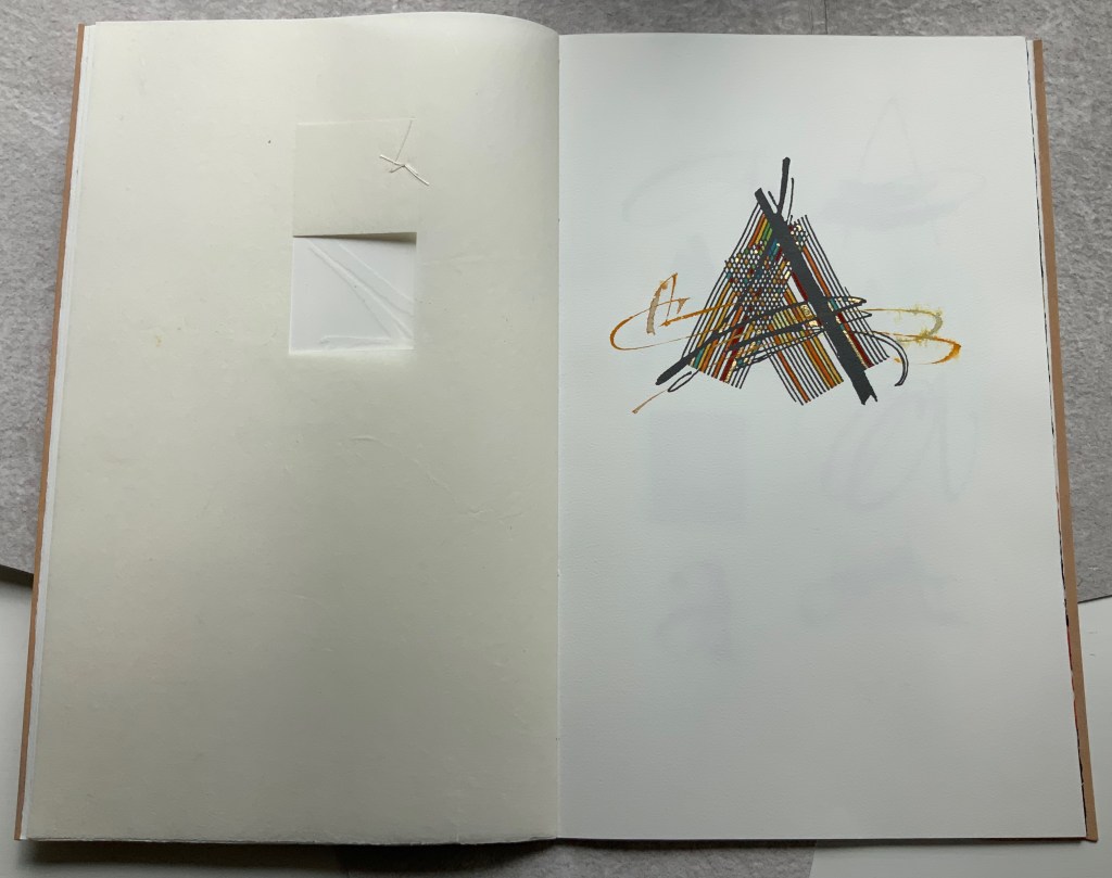
Using a translucent leaf with set type shaping half an A, the next two double-page spreads play (or muse) on uppercase A’s bilateral symmetry poised between geometric and freehand approaches to lettering, between typography and calligraphy and between inking and debossing.
When the recto page above with its debossed line and angle is turned, another extraordinary integration of composition, paper, printing (inking, debossing and “embossing”) and, now, cutting occurs. Notice how the ink of the first and third As overlaps the now “embossed” angle, how the now “embossed” line becomes debossed as it crosses the gutter, how the previous double-page spread’s themes of geometry/freehand, printing/drawing and lowercase/uppercase likewise cross over, and how the cutout triangle uses the yellow ink showing through to form the crossbar of an A and the gutter to form the A’s lefthand stem.
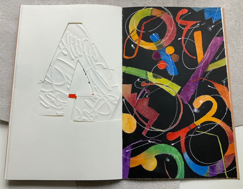
There is much else to muse upon in the spreads above, but it’s in the last two spreads where Moore builds and unfolds a fantasia of calligraphy, color, debossing, cutting, gilding and painting. Notice how the gilt crossbar slots through the page and helps secure the debossed piece behind the cutout to the page.
And when the page turns, notice how its gilt crossbar reveals its red paper beneath and becomes the spot of red completing the crossbar for the cutout A. The red spot against white seems to set off the explosion of color and calligraphy on the black final page, printed by Jessica Spring from polymer. The different shapes for A here come from African alphabets. The images are unique monoprints, done on an etching press. With the letters placed to block out the black and overlap one another, a sense of depth and texture arises. Contributing to that sense of texture, the white letters are hand-painted in gouache — sometimes layered, sometimes blended.
Books are inherently collaborative affairs, and for artists’ books, collaboration can become almost another tool for the artist. Jessica Spring, mentioned above, also debossed the opening A, hand-set the half-A composition and contributed to Rescuing Q. Now a fine binder in her own right, Gabby Cooksey, a studio assistant to Moore and Don Glaister, was essential to A Musing‘s hand work, binding and wrapper. Part of Moore’s creative progression from contributing to overseeing to orchestrating can be traced from here across three other works in the Books On Books Collection.
A Blind Alphabet (1986)
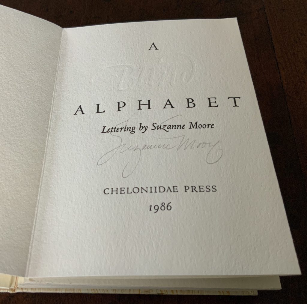
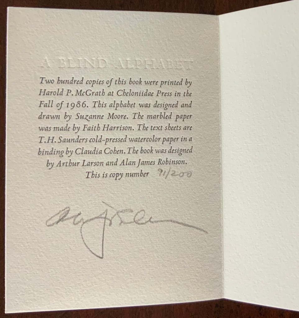
A Blind Alphabet (1986) Suzanne Moore Accordion-fold. Closed H128 x W93 D28 (spine) D22 (fore-edge) mm; open 3200 mm. 34 pages. Edition of 200 of which this is #91. Calligraphic letters designed and drawn by Suzanne Moore, printed by Harold McGrath on T.H. Saunders cold-pressed watercolour paper, bound by Claudia Cohen in marbled paper by Faith Harrison. Acquired from Veatchs, 1 May 2018.
Here, as noted in the colophon to A Blind Alphabet, Moore has the creative role of originating artist, designing and drawing the alphabet — soloist, as it were, in the Cheloniidae Press reportory orchestrated by Alan James Robinson.
In Robinson’s wood engravings of birds, Moore plays a creative contributing role with much the same repertory company.
A Fowl Alphabet (1986)
A Fowl Alphabet(1986) Alan James Robinson (etchings), Suzanne Moore(calligraphy) Casebound. Marbled paper over boards. Doublures and flyleaves. H218 x W145 mm. 26 Folios untrimmed at head. Four-page prospectus loose. Acquired from Bromers Bookseller, 16 August 2022. Photos: Books On Books Collection. Displayed with Suzanne Moore’s permission.
Again, Cheloniidae Press’ master printer Harold Patrick McGrath and “usual suspects” Arthur Larson (hand typesetting), Faith Harrison (hand marbling) and Claudia Cohen (binding) played their roles in this book. Here, Moore has the creative contributing role of designing the alphabet and, for the deluxe and full vellum editions (not shown), hand lettering.
In book art, an artist’s progression from contributor to orchestrator is not necessarily linear as can be seen in this subsequent work.
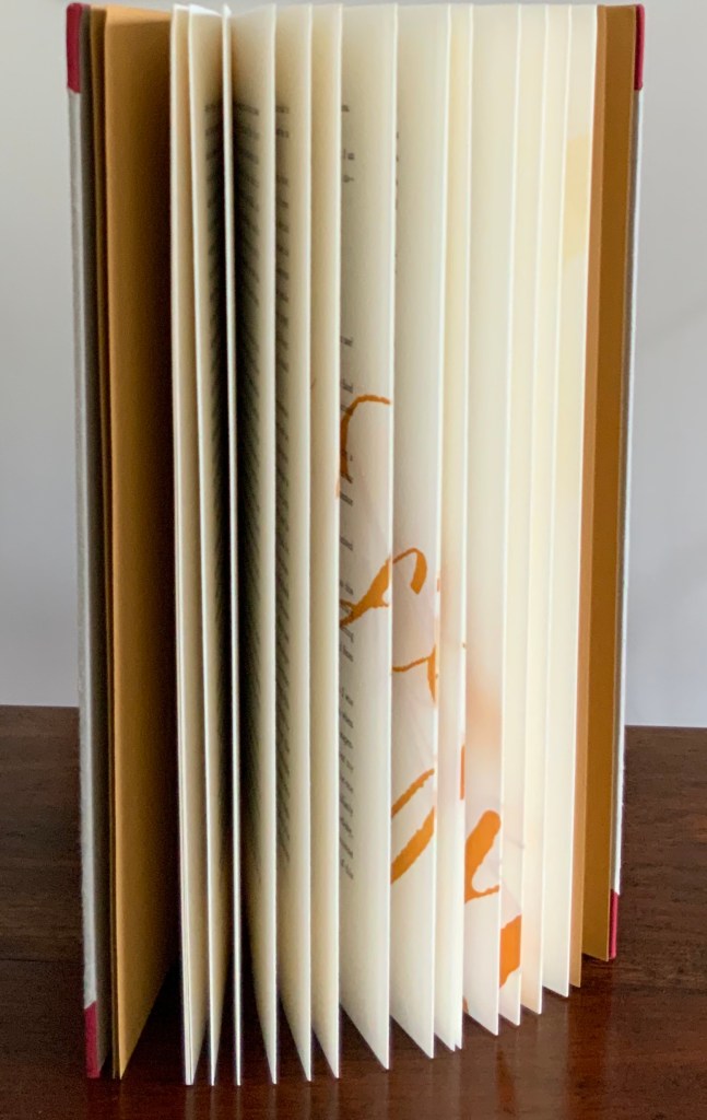
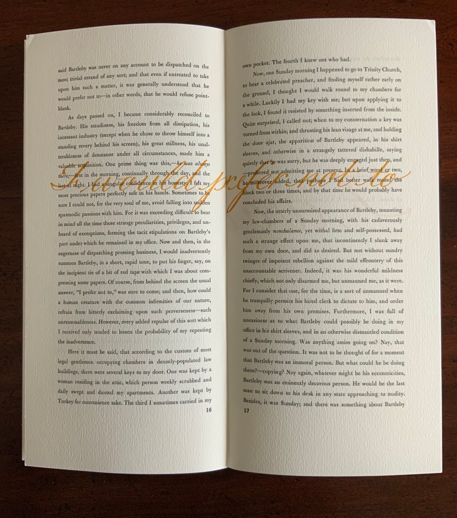
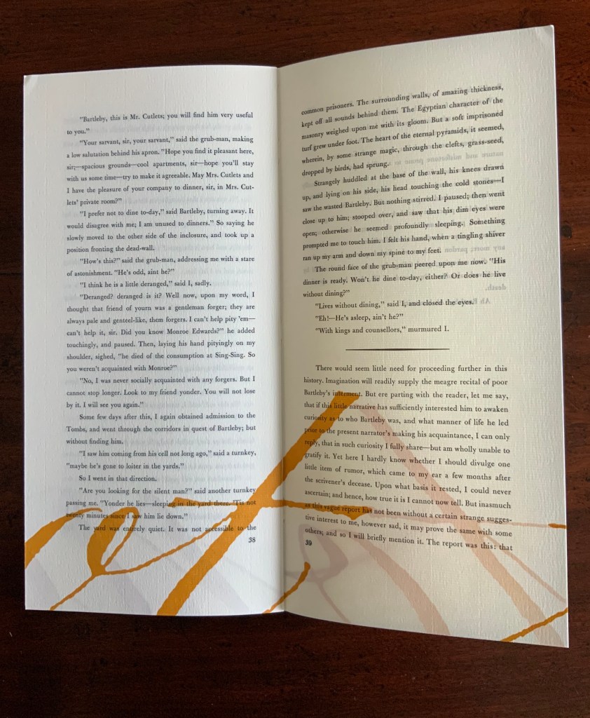
Bartleby, The Scrivener: A Story of Wall Street (1995)
Herman Melville, Bartleby the Scrivener: A Tale of Wall Street, 1853. Indulgence Press, 1995. Typeetting, printing and binding by Wilber Schilling; Calligraphy by Suzanne Moore. Text paper by Janus Press. Endpapers by MacGregor & Vinzani. Edition of 100 of which this is #71. H320 x W158 x D14 mm. Acquired from Indulgence Press, 17 December 2015. Photos: Books On Books Collection. Displayed with permission of the publisher.
Wilber Schilling (Indulgence Press) orchestrated this edition of Herman Melville’s well-known story. Part of Schilling’s genius was to invite Moore to provide the calligraphy for Bartleby’s hallmark (his only) words “I prefer not to”. Another part was to print Moore’s calligraphy in ever-increasing size in ghostly ochre and in descending position across the pages of the book.
For more of Suzanne Moore’s works and artistic roles as well as others’ insight into them, see below.
Moore, Suzanne. 2016. Studies in Love the Question. Handlettered pages in book bound by the artist. 34 images available at Letterform Archives. ______________. 2014. Zero – Cypher of Infinity. 24-page handlettered pages in book bound by the artist. Letterpress pages by Jessica Spring. 20 images available at Letterform Archives.
______________. 2014. Origins and Spectrum. Process portfolio for Zero — Cypher of Infinity. Includes notes from the artist. 28 images available at Letterform Archives.
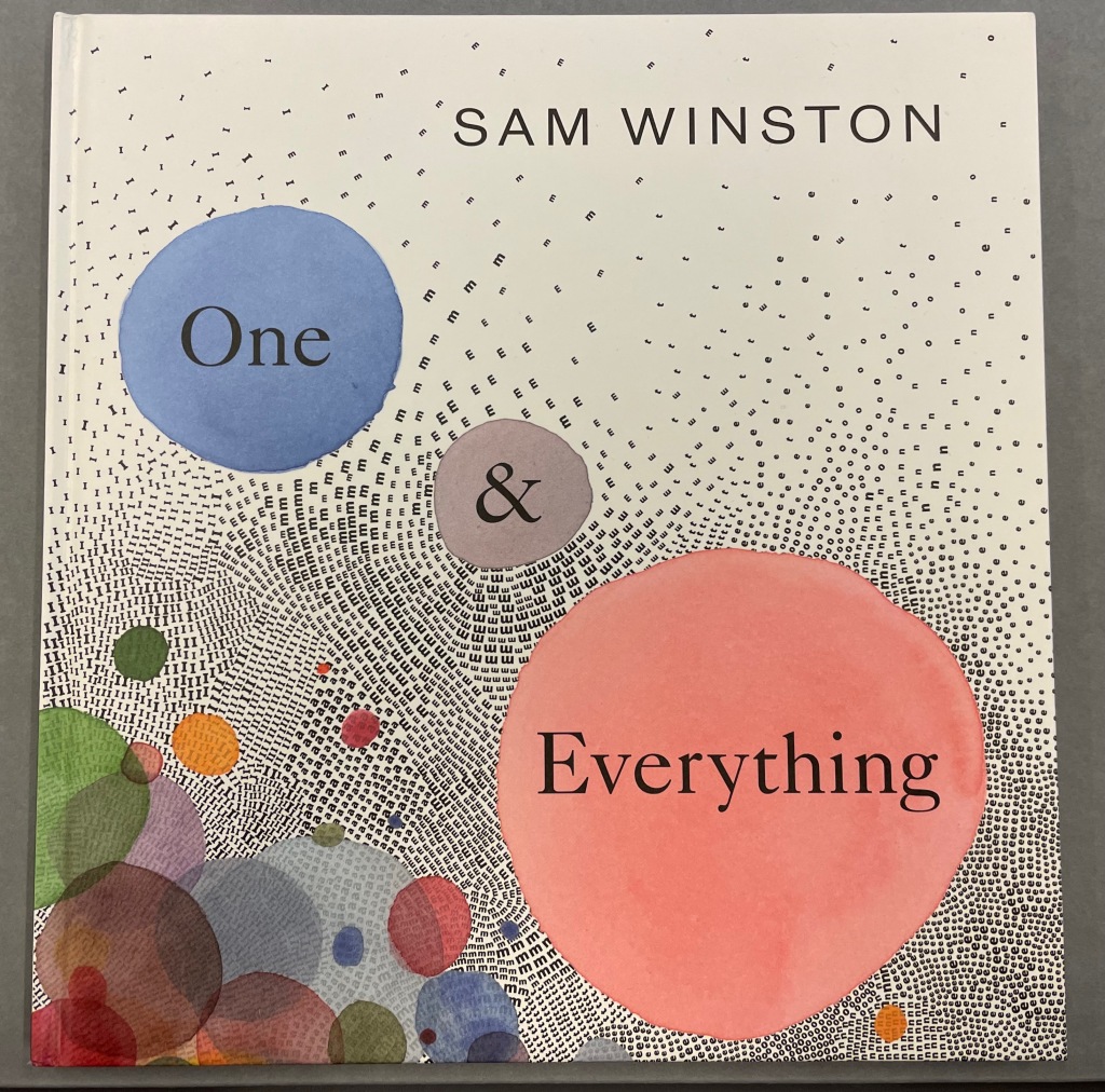
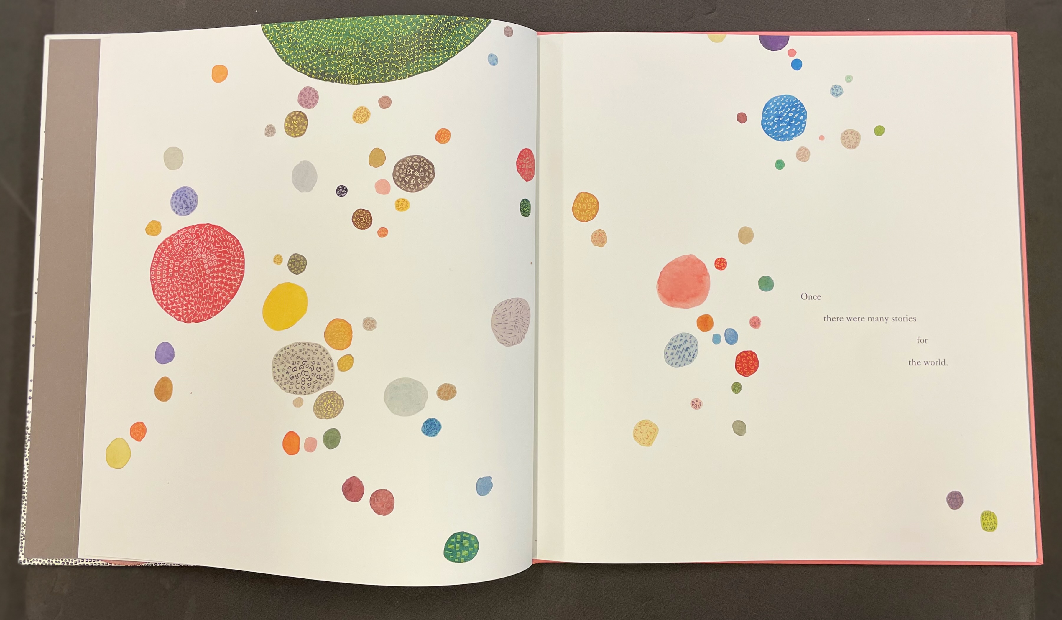
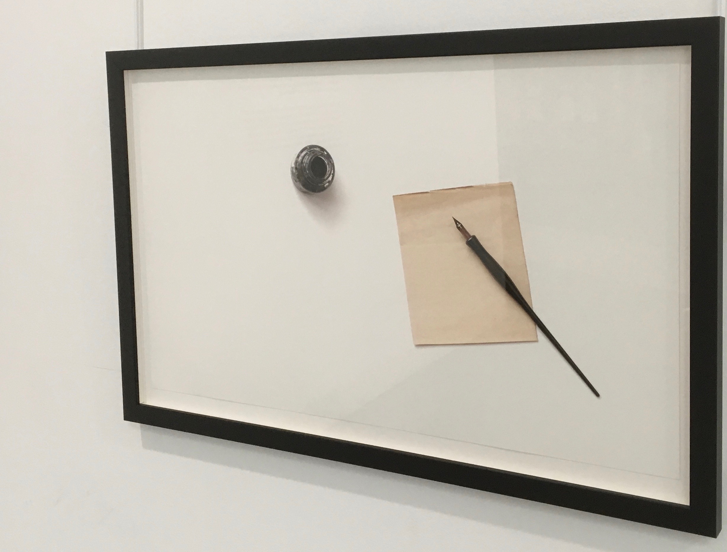
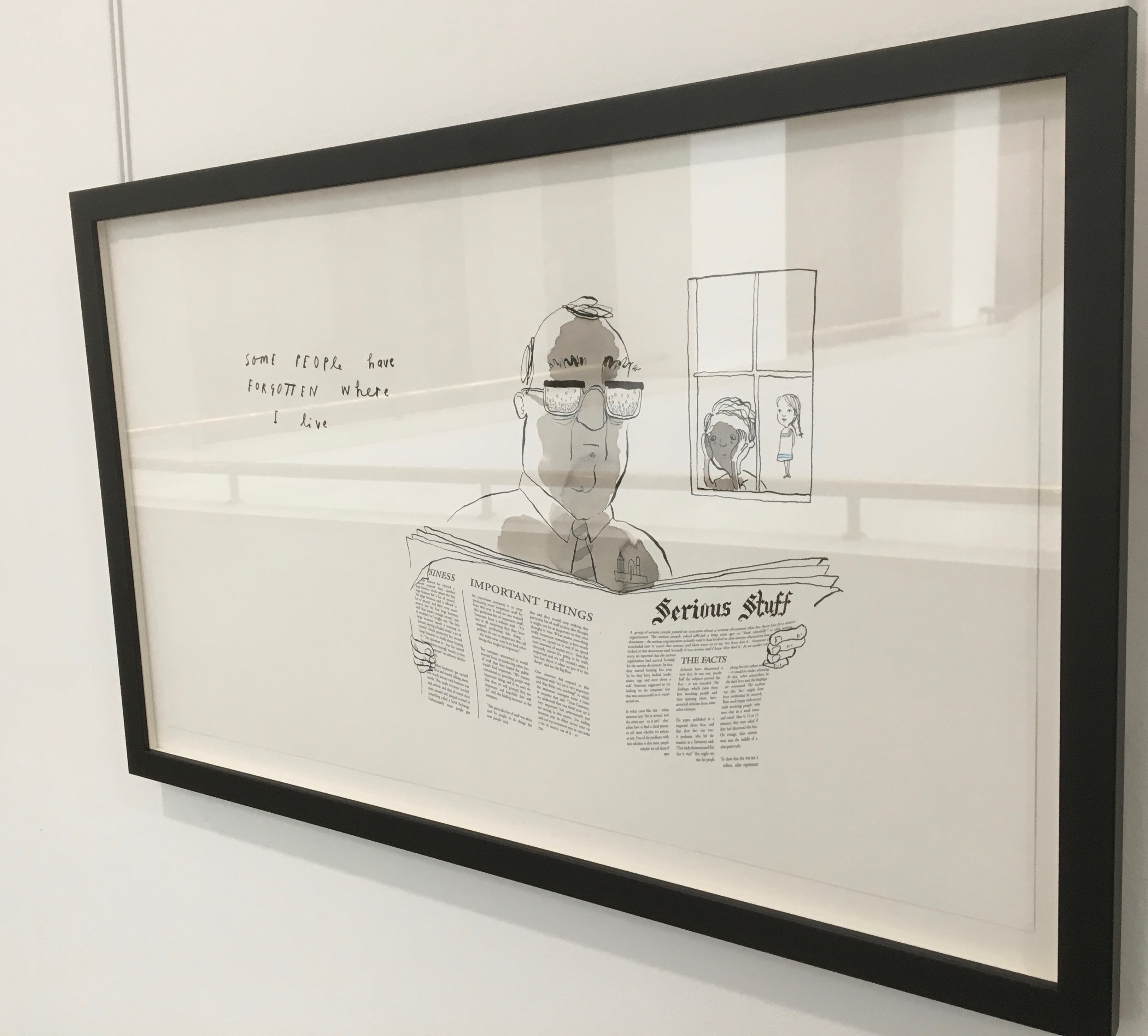
One & Everything(2022) Sam Winston Casebound with illustrated paper over boards. H265 x W255 mm. 48 unnumbered pages. Acquired 23 November 2022. Photos: Books On Books Collection. Displayed with artist’s permission.
Sometimes you just know that you have read a classic. This is one of those times. Winston and Candlewick Press (Walker Books in the UK) have worked a fresh tale, tone and meaning together with image, color, design and production values to an extraordinary level. Inspired by Tim Brookes’ “Endangered Alphabets Project“, Winston uses the striking shapes of letters and scripts from the Latin, Ogham, Cherokee, Armenian, Hebrew, Tibetan and dozens more alphabets and syllabaries to create the characters in his fable about the story that decides one day that it is the One and Only story.
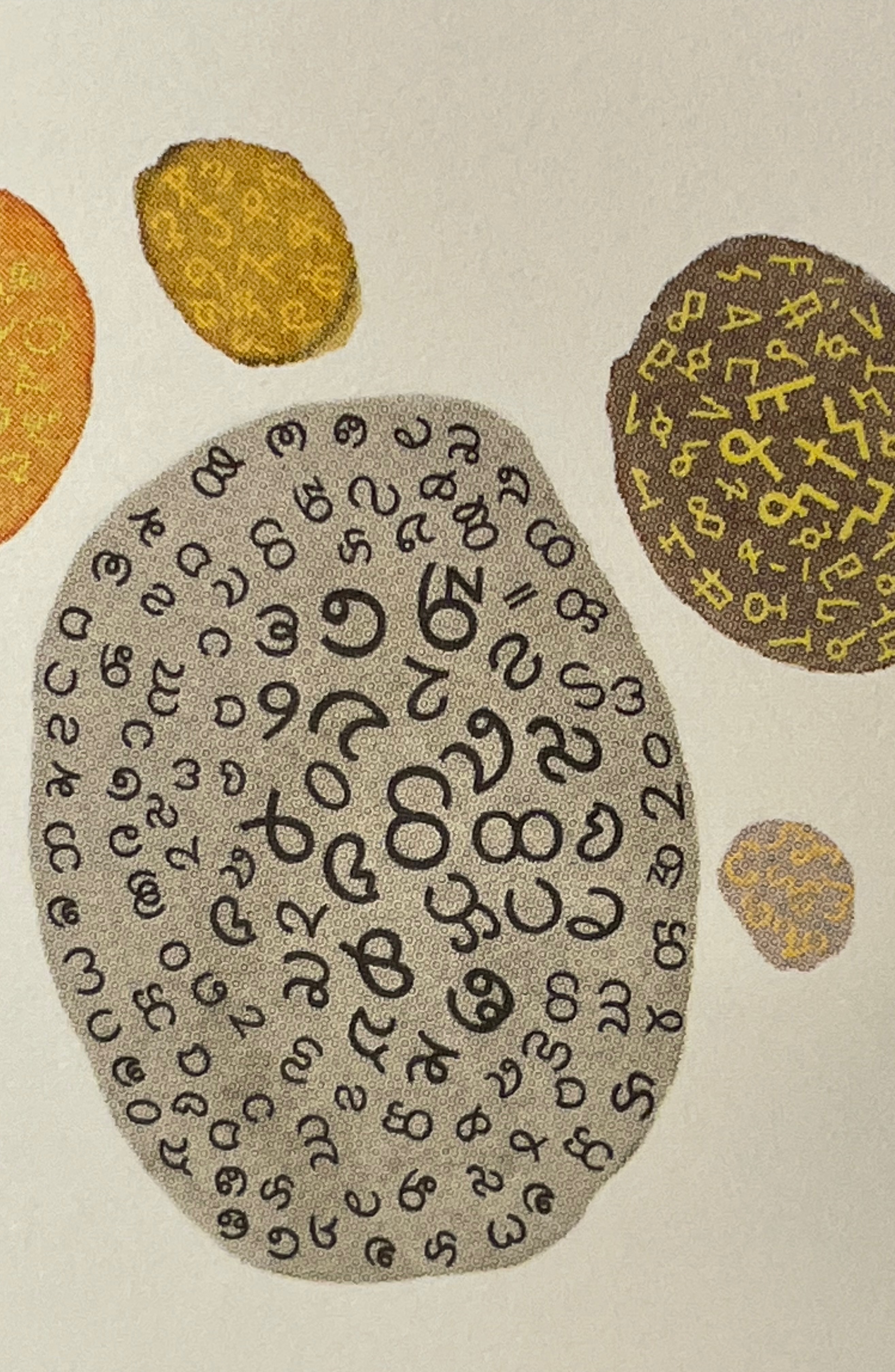
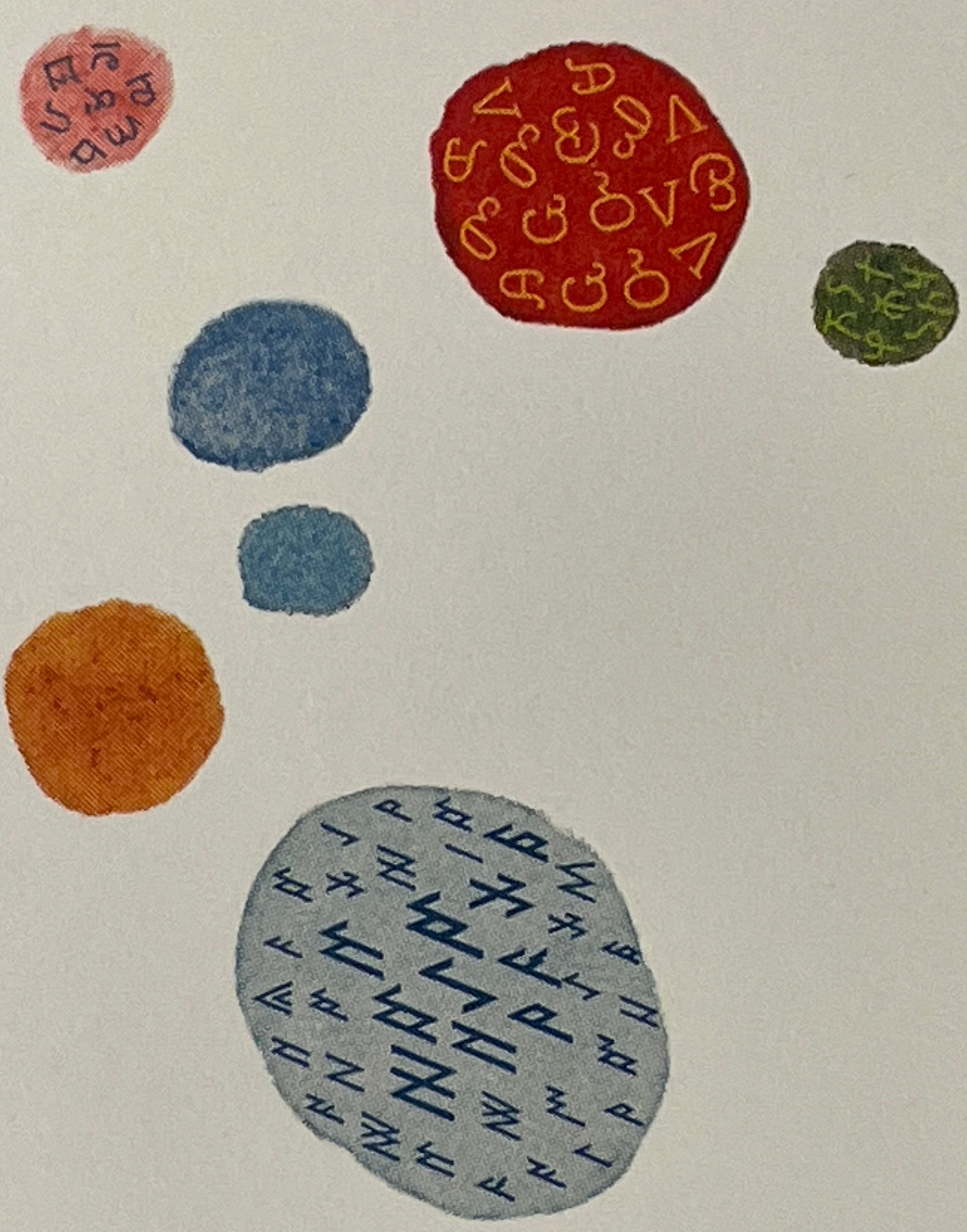
Shapes like single-celled creatures (each filled with a different alphabet) represent the many stories existing before “The One” arrives.
“The One” is made of the English (i.e., Latin or Roman) alphabet. Will it listen to and make sense of all these other stories?
The fable of One & Everything does more than support the notion that alphabets and languages can be endangered. Implicit in the fate of the “One & Everything” story” is the message that Babel was more of a blessing than a curse.
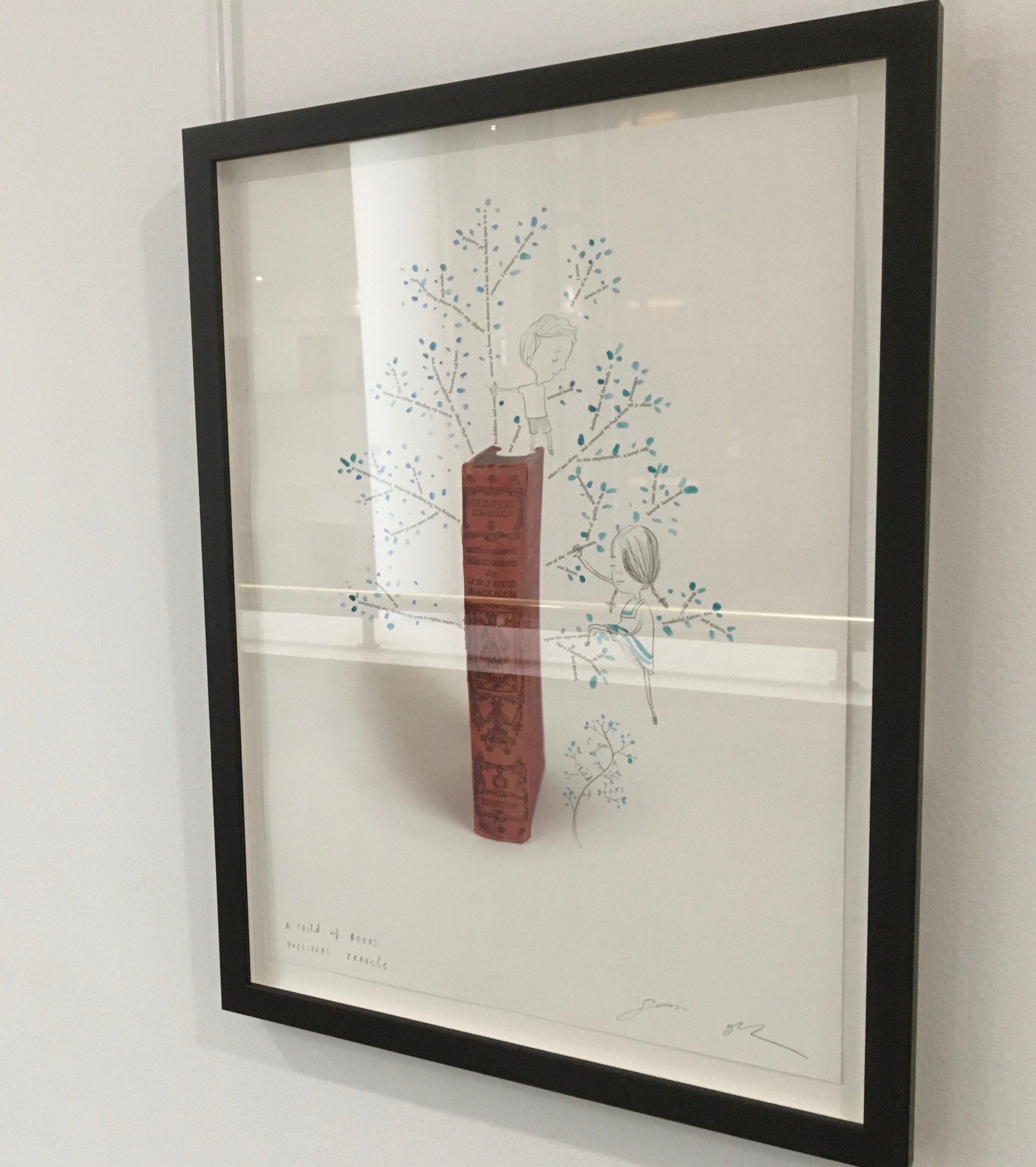
Readers familiar with Winston’s A Dictionary Story and his collaboration with Oliver Jeffers in A Child of Books (both below) will recognize a growing refinement and, now, breadth and depth in Winston’s storytelling. The youngest audience and beginning readers will be held by the shapes, colors and simplicity of the story. Older readers will easily grasp its underlying meanings and be intrigued by the variety of letters and scripts and the idea that languages and alphabets can die. Still older readers and teachers will appreciate the helpful resources following the story’s ending invitation. At all levels, the audience will delight in Winston’s creation of his characterful abstractions with letters from the alphabets and scripts identified in those resources. Those with an eye for such artistry will appreciate Winston’s extension of a tradition embraced by Paul Cox, Roberto de Vicq de Cumptich, Sharon Forss and Nicolas McDowall.
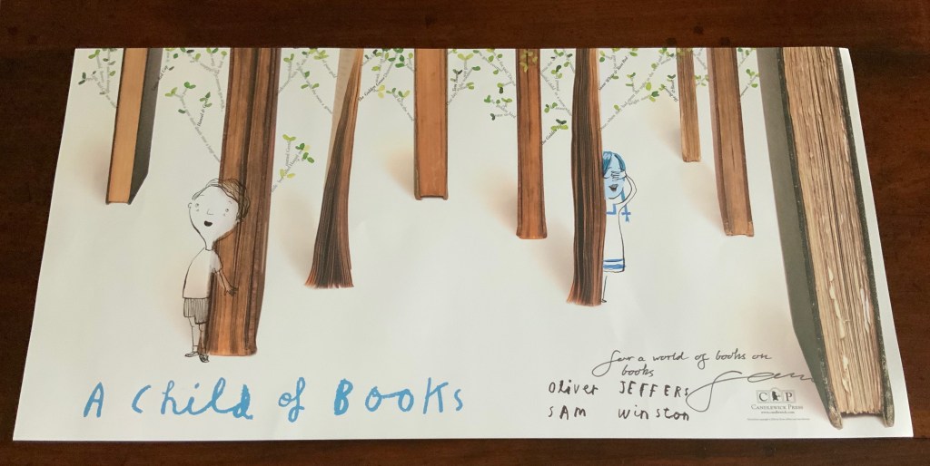
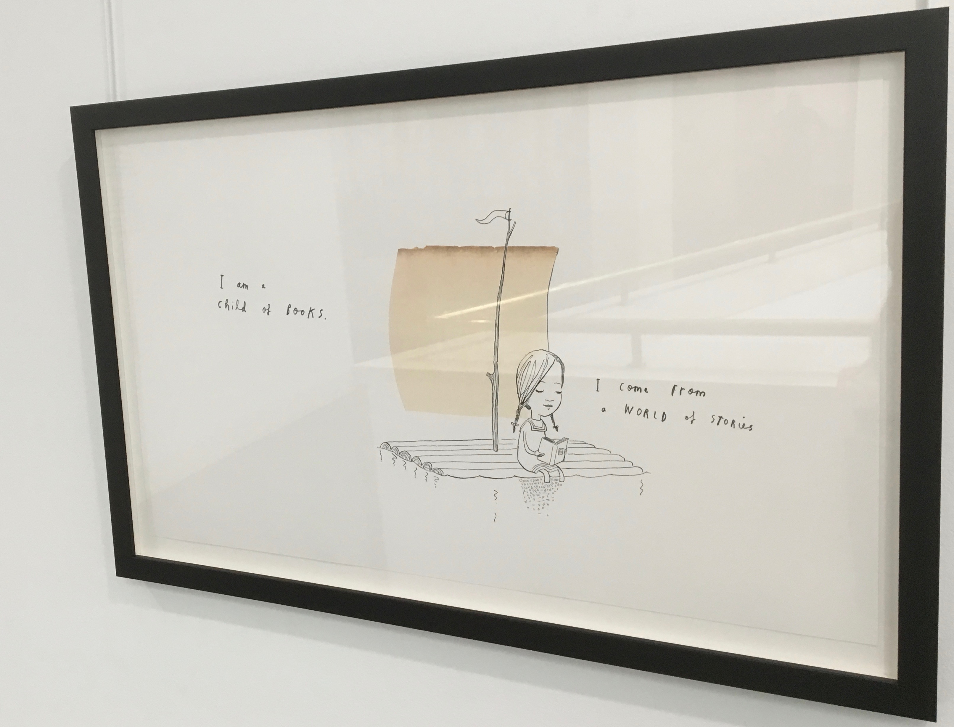
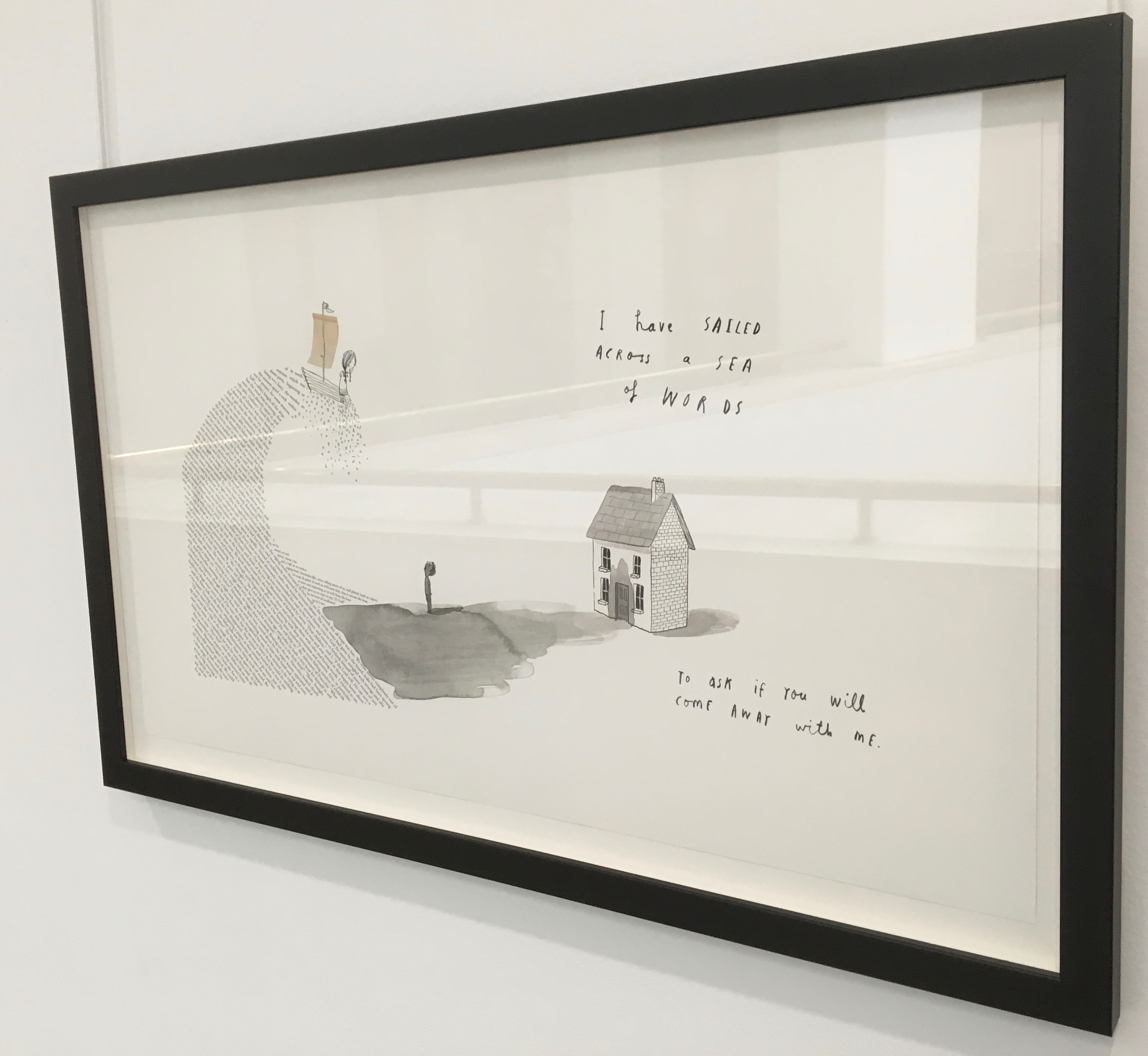
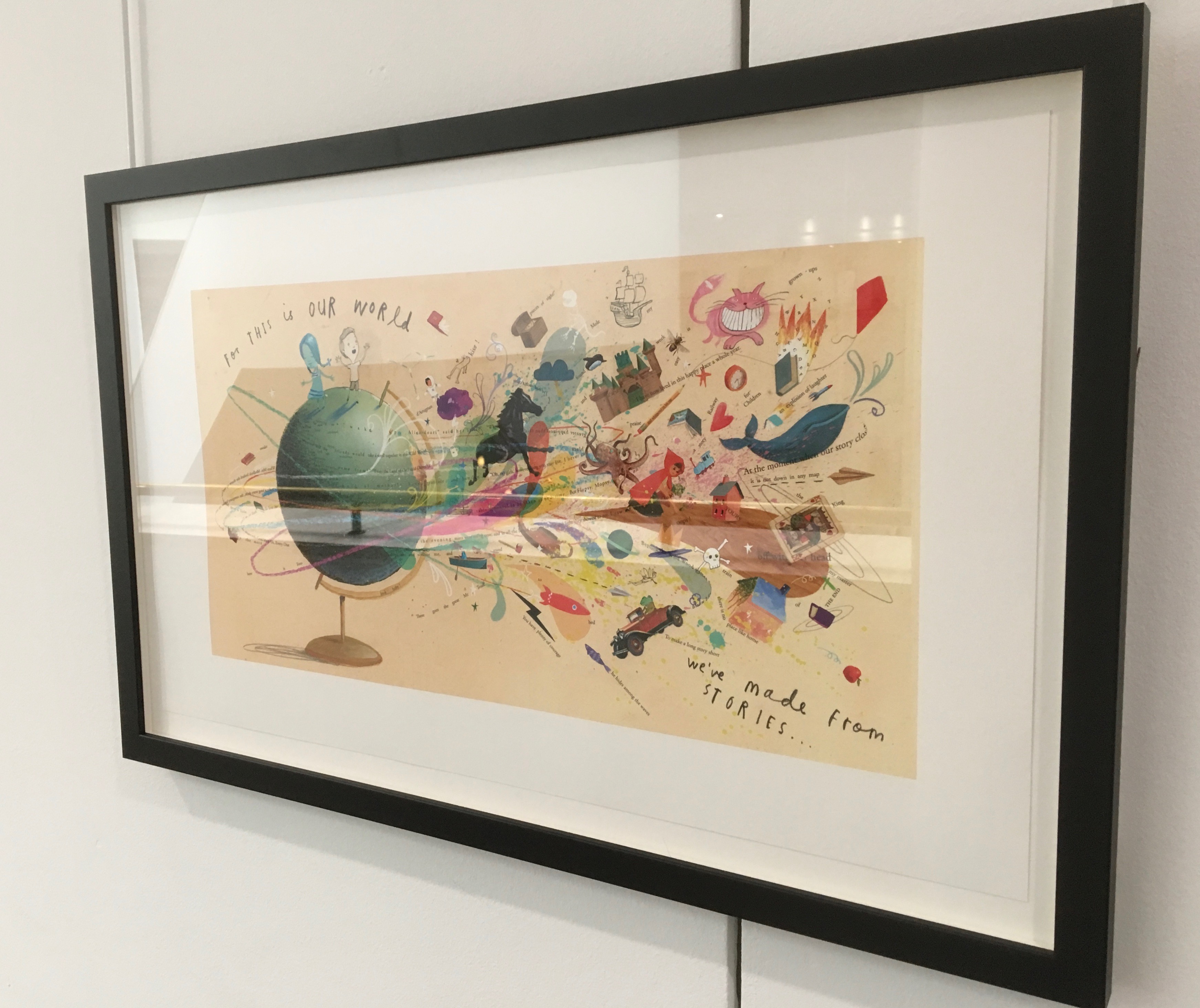
A forest made of fore-edges. A raft made of spines and its sail a book page. A wave and a path made of excerpts from books. In this fabulous world made from the features of books, the simpatico imaginations of Oliver Jeffers and Sam Winston deliver a heroine and an invitation that are hard to resist.
Promotional poster. Displayed with permission of Sam Winston.
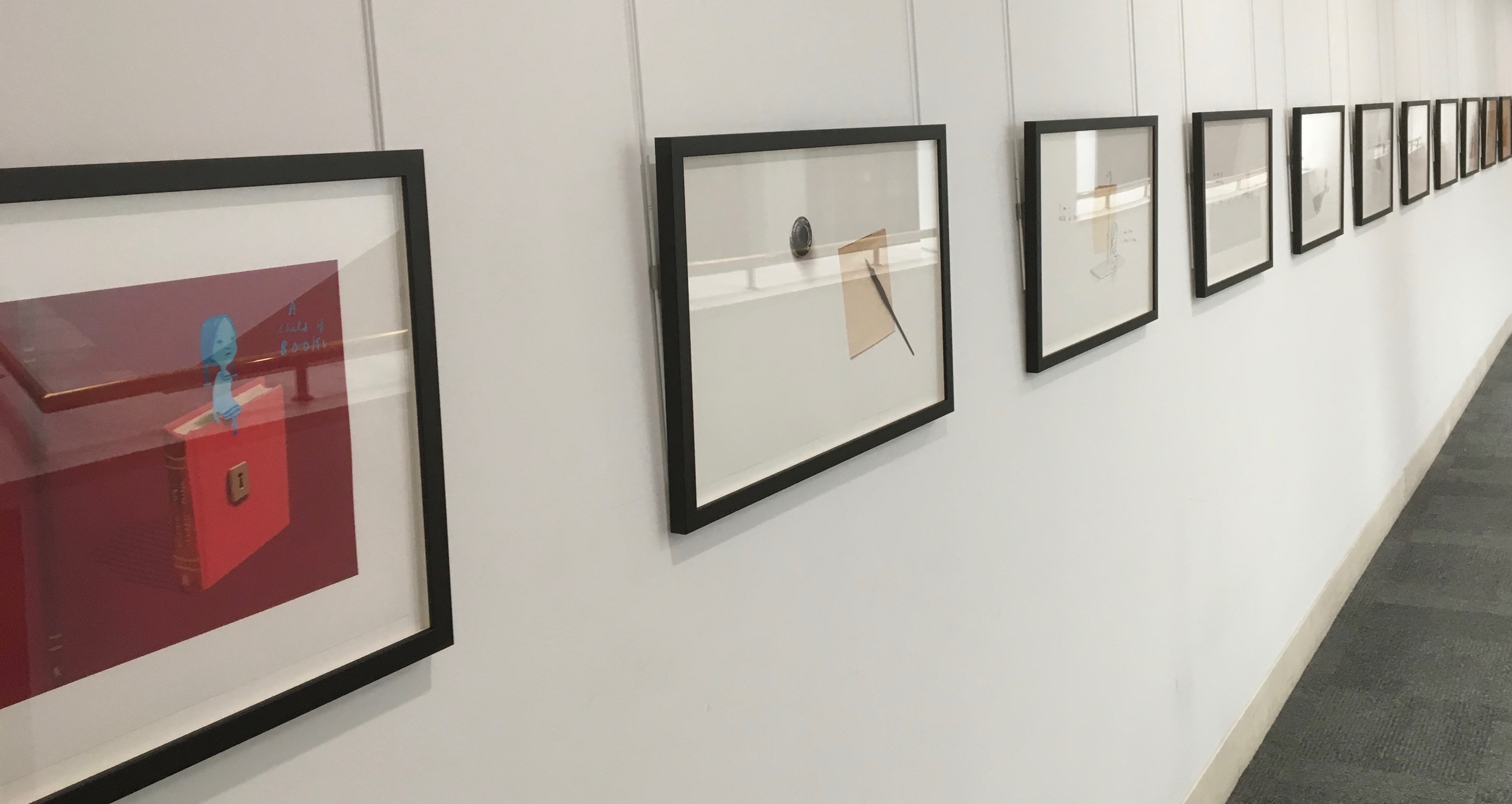
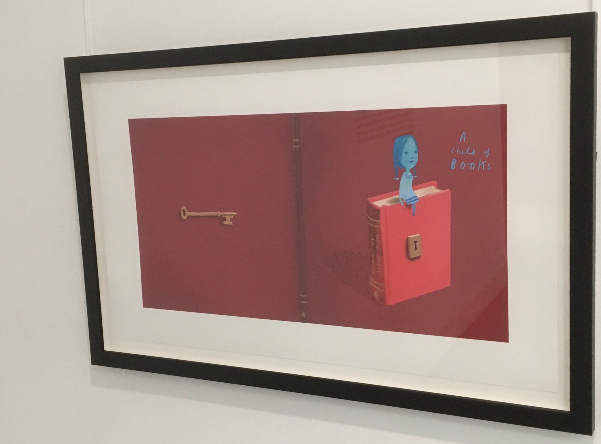
In addition to the poster above and the trade book it promotes, Winston created an artist’s book edition celebrated by this hallway gallery below mounted by the British Library shortly after its appearance.
A Child of Books prints displayed at the British Library, 9 August – 27 September 2019.
Winston’s abiding love of letters, words and stories shines through in A Child of Books. Arguably, it has its origins in an earlier work whose story is told by his invention of a very different “child of books”.
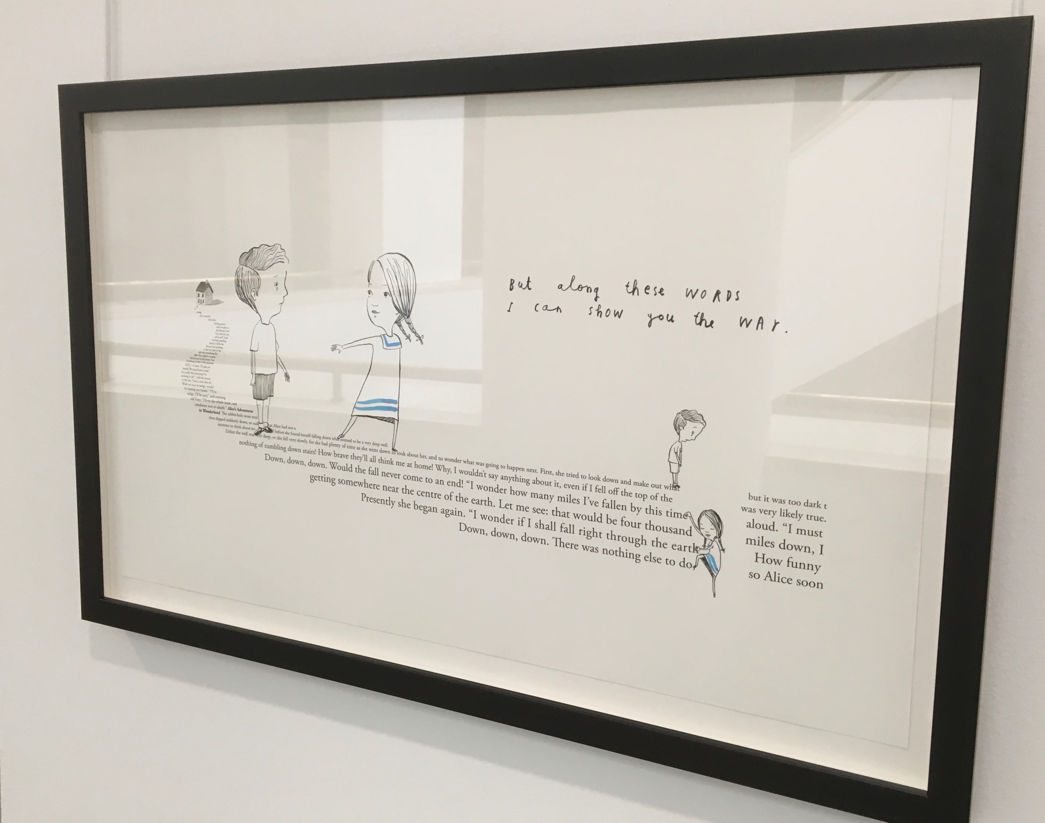
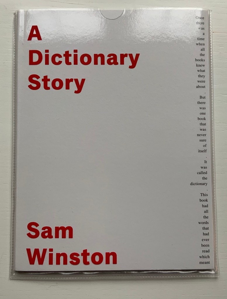
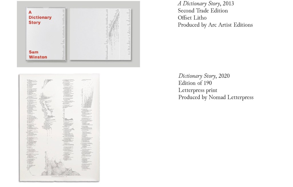
A Dictionary Story (2001 – 2020)
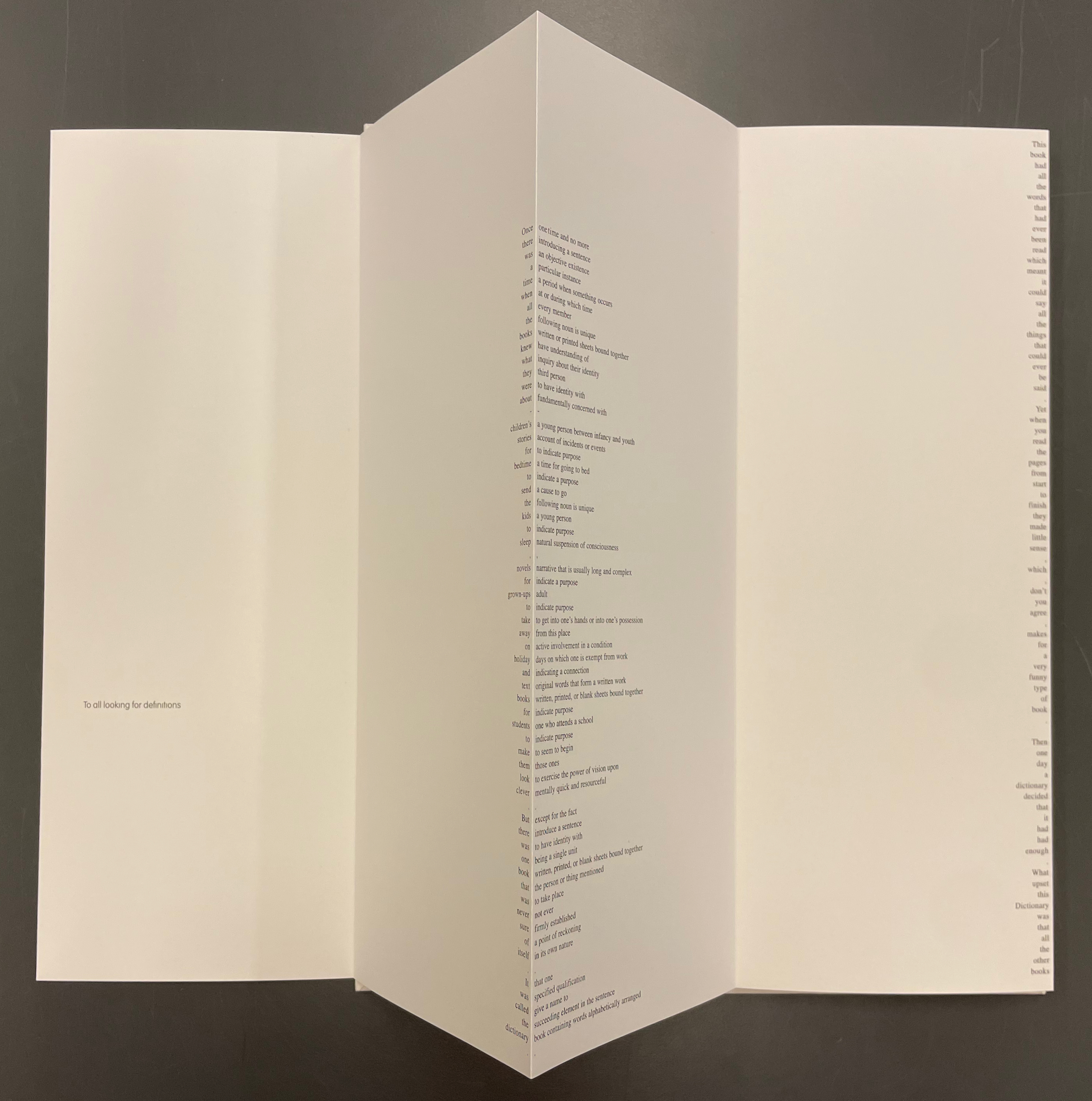
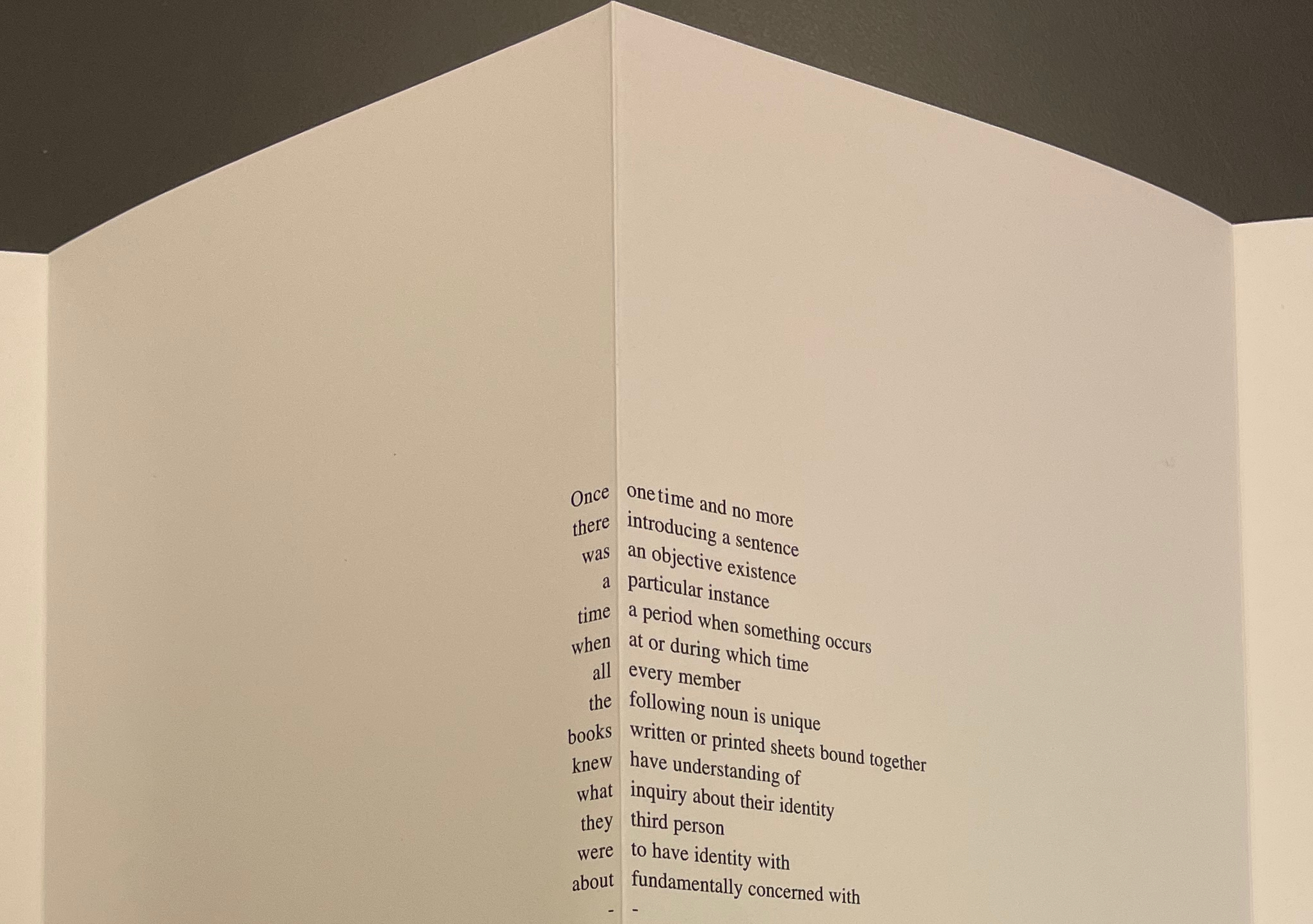
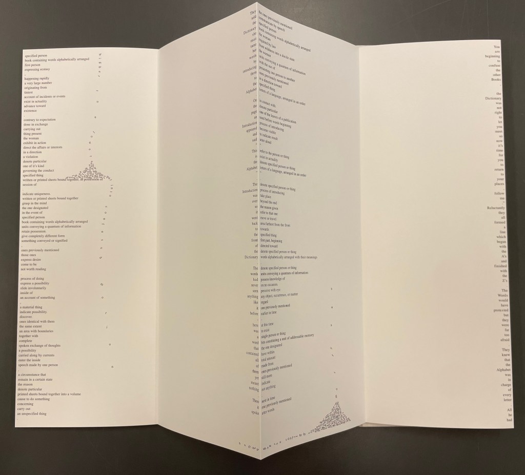
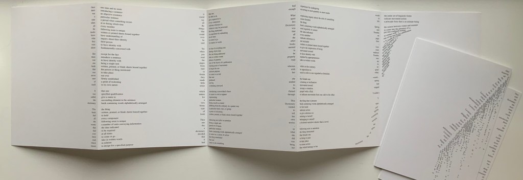
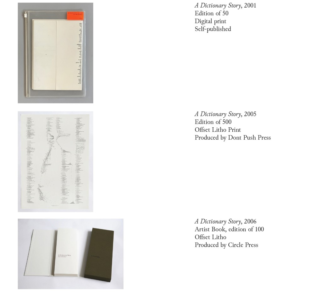
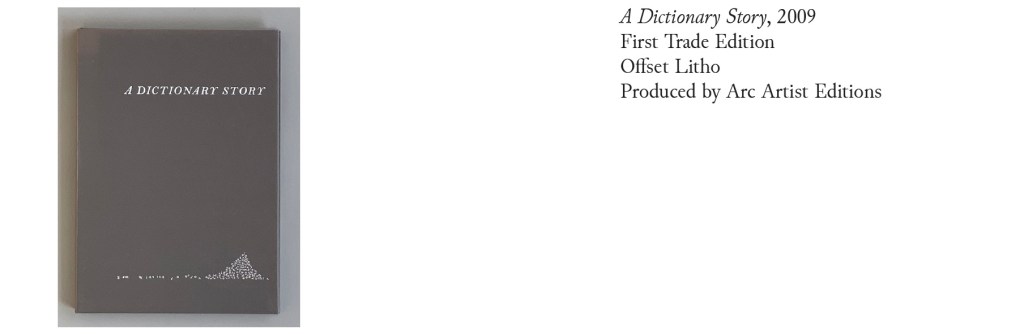
Since its origin as a student project in 2001, A Dictionary Story has appeared in an accordion book form as a fine press edition and two trade editions and as single-sheet prints. The Books On Books Collection holds the fine press edition and the second trade edition, both of which have in common a vertical flush-right single-word column that tells the story and the immediately adjacent vertical flush-left column of definitions of the words in the story. In the fine press edition, the two columns meet at each mountain peaks of the accordion fold.
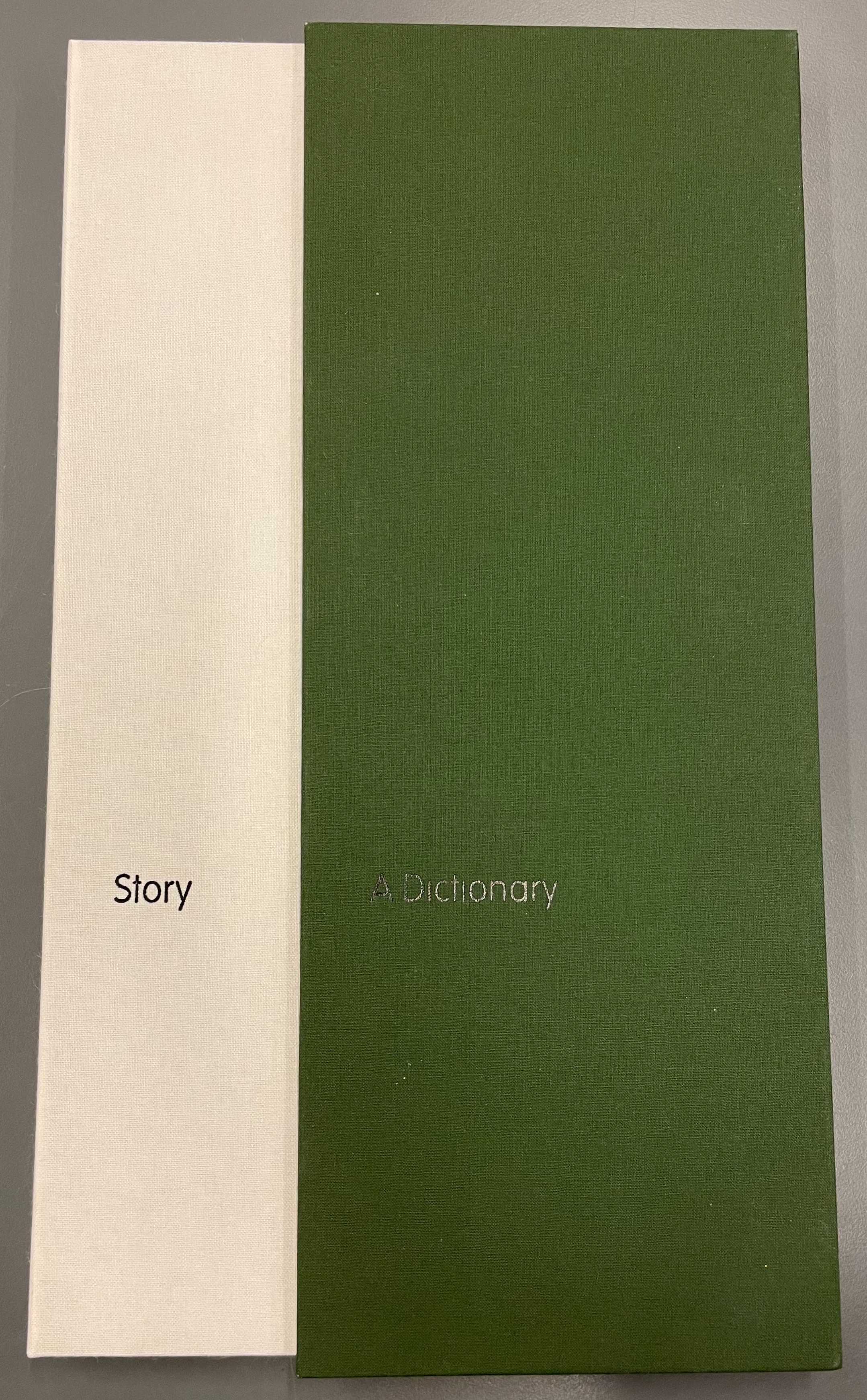
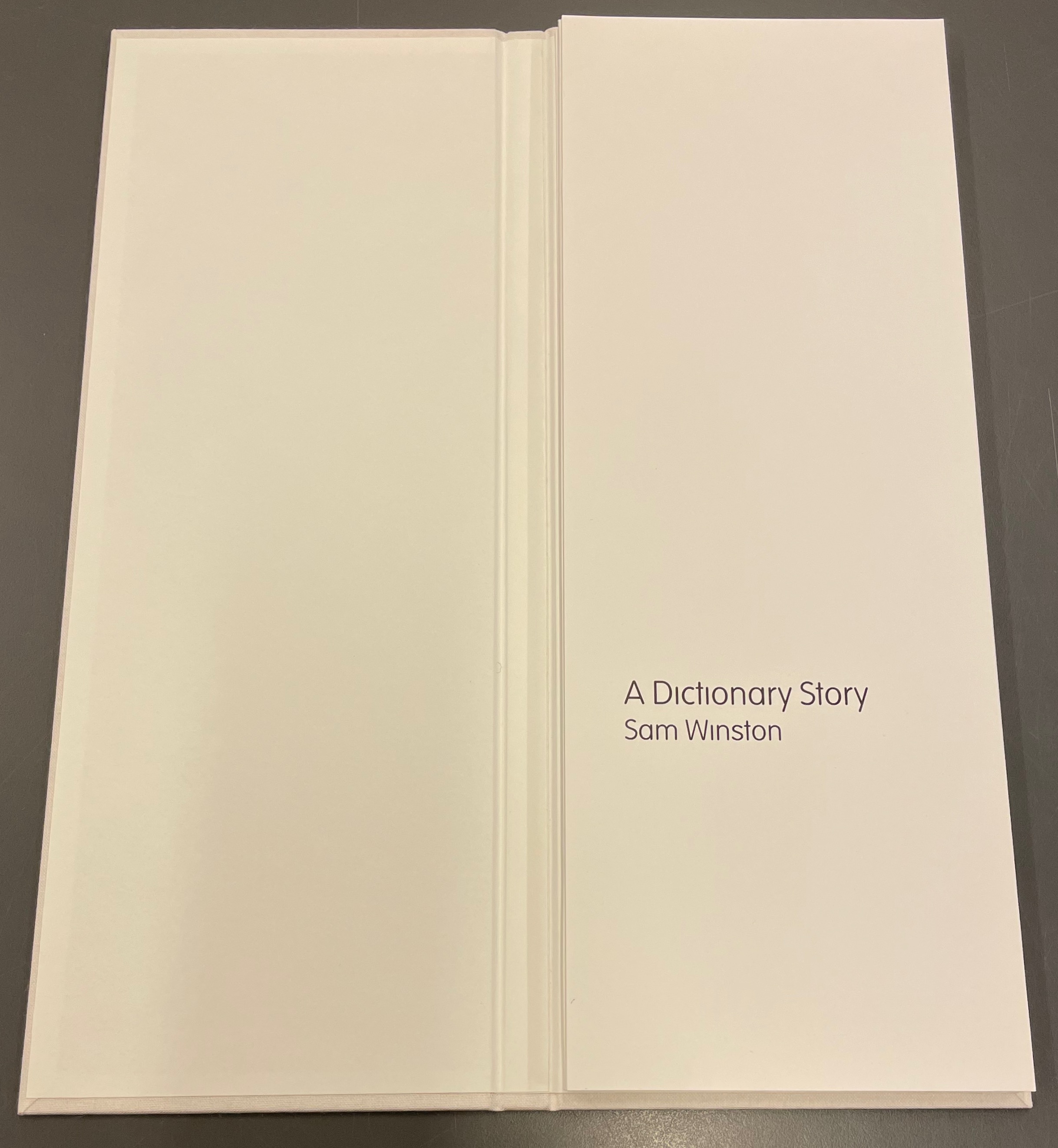
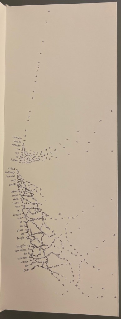
A Dictionary Story (2006) Sam Winston Slipcased leporello between cloth-covered boards.H360 x W140 mm, 25 panels. Story text set in 9 point Times Roman by Sam Winston. Book designed by Richard Bonner-Morgan and Sam Winston. Printed by David Holyday at Trichrom Limited. Bound at Quality Art Reproductions, England. Published by Circle Press. Edition of 100, of which this is #68. Acquired from the artist, 30 May 2018. Photos: Books On Books Collection. Displayed with artist’s permission.
“Once there was a time when all the books knew what they were about. But there was one book that was never sure of itself.”
Panels 2-5 from the fine press edition; detail of panels 2-3.
So begins Winston’s tale about this uncertain book. The book never sure of itself is the Dictionary, which of course it must be, otherwise the tale would not be called “A Dictionary Story”. The Dictionary is jealous of all the other books because they are “properly read”, whereas she is just flicked through from time to time. A bit like the “One” in One and Everything, the Dictionary seems to think she contains all the stories imaginable, because she contain all the words — just not in the right order. So she decides to bring her words to life as characters to see what will happen. Words and letters fly about, enacting the story as if in a concrete poem. A meaningful tussle between text and image is a frequent feature for artists’ books as well as visual poetry.
Another defining aspect of book art is its self-referential nature. In an interview with Typeroom, Winston captures this in his response to the question “What is Dictionary Story all about?”:
Dictionary Story is a playful way of exploring some of our presumptions around the printed word. Or you could say that it looks towards a tool we are given at a very young age – the Dictionary – and invites us to actually think about how that works. Here’s a device that is designed to explain a word’s meaning by offering further words in its place – to me that is remarkable. This is a type of knowledge that can only explain itself through referencing itself. As a visual person the image that comes to mind is a giant, never ending, Möbius strip of language twisting back on itself.
Of course for less visual persons, the Dictionary’s whim engenders chaos, which Winston, a dyslexic, can appreciate. So he brings onstage (or “onpage”) the Books, of whom the Dictionary was jealous, to remonstrate that if words become disconnected from their definitions, how will they the Books know what they are about? Insisting that she tame her words, they have the Dictionary’s Introduction introduce her bewildered words to the character “Alphabet”.
Making the journey over the hills and valleys of A Dictionary Story is satisfying, and re-making it is even more satisfying and delightful each time. The making and re-making of A Dictionary Story must also have been satisfying and delightful for Sam Winston; he has done it so many times.
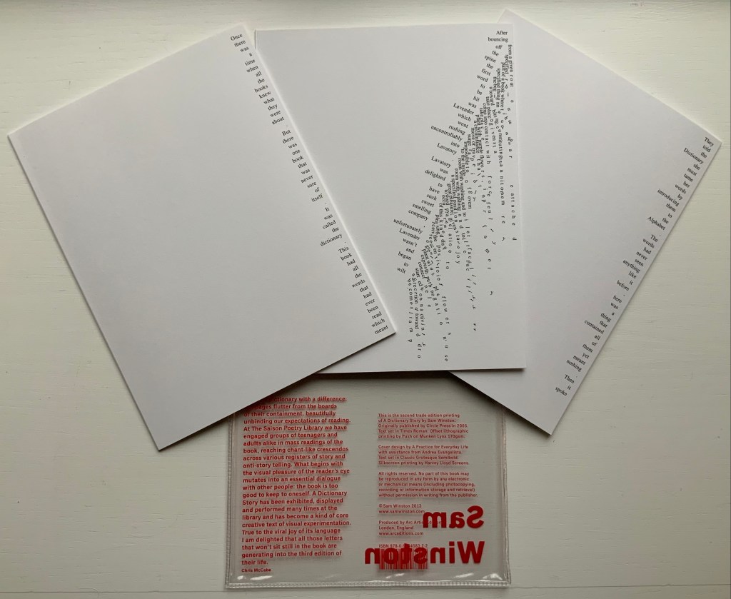
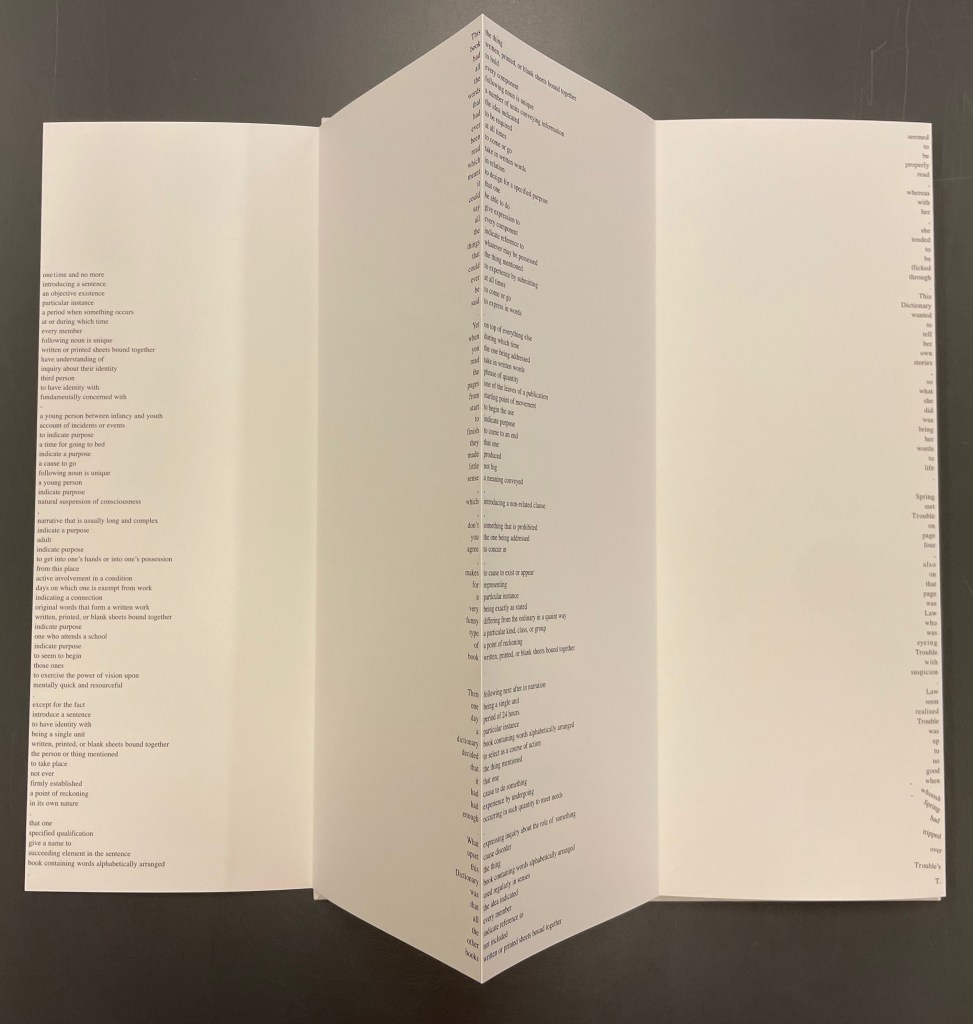
A Dictionary Story (2013) Sam Winston Three five-panel accordion folded sections in a plastic sleeve cover. Second trade edition. Sleeve: H205 x W160 mm. Sections: H200 x W150 mm, 15 panels. Acquired from the artist, 13 December 2020. Photos: Books On Books Collection.
Watching the artist adjust the typography of A Dictionary Story to changing dimensions is like watching a star tennis player who is also a star basketball player and star soccer (football) player. There’s always a ball, there’s always a net, there’s always genius.
The trade edition splits the fine press edition into three less narrow leporellos and nudges some of the two columns (story/definition) into the valley fold. Below, in the trade edition across panels 3 and 4 is where the Dictionary decides to bring her words to life, and on the right side of the fourth panel, the words begin to slip away from the fold.
The same part of the story in the fine press edition occurs on the fourth panel below, and the words tilt against the fold.
These variations create subtly different narrative paces and visual impressions in the two editions. Not one better than the other, just different. The poster variations, however, subordinate narrative pace entirely to visual impression. At present, the posters are not in the collection, but the images below help to make the point. As with movie goers, some will like the prints more than the books, others the books more than the prints, and still others will marvel at the genius in all of them.
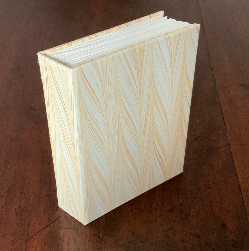
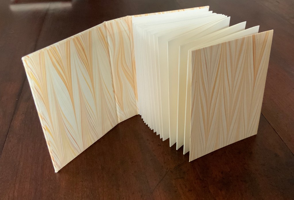
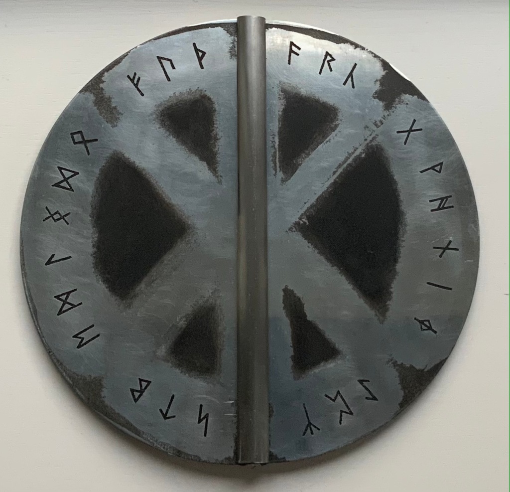
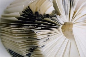
Fuþorc (1992) Brynja Baldursdottír Casebound in brushed and inked 1.6 mm zinc plate cover. Decorated doublures. Closed: H290 x W160 mm. Open: 320 mm. 32 folios. Edition of 144, of which this is #98. Acquired from the artist, 15 November 2021. Photos of the work: Books On Books Collection. Displayed with permission of the artist.
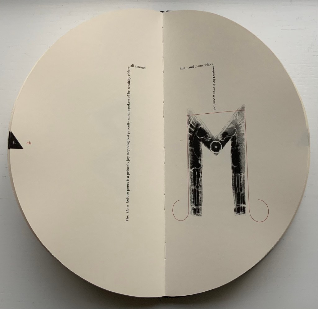
Fuþorc, the name of Brynja Baldursdottír’s artist’s book, is the word made from the first six runes of the Runic alphabet, much as alphabet derives from the first two Greek letters alpha and beta. The shield-like covers, laid face down, display all twenty-four runes of the fuþorc. Over time and geography, the runes have changed in number, spelling and meaning, reflected in the explanatory and interpretive Norwegian, Icelandic and Anglo-Saxon versions of the “Rune Poem”. Baldursdottír’s version is “The Old English Rune Poem”, translated by Marijane Osborn and Stella Longland, which is we have the Old English fuþorc rather than the Scandinavian fuþark.
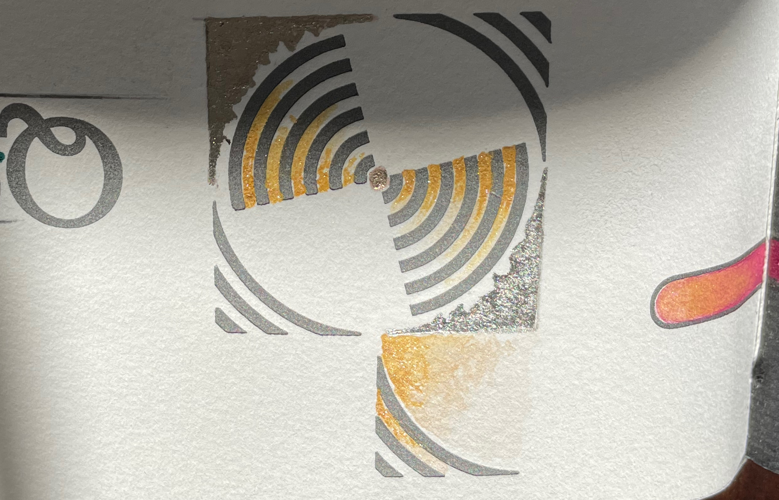
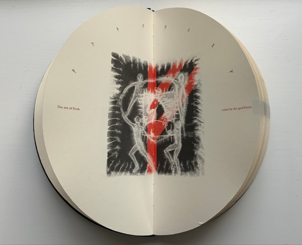
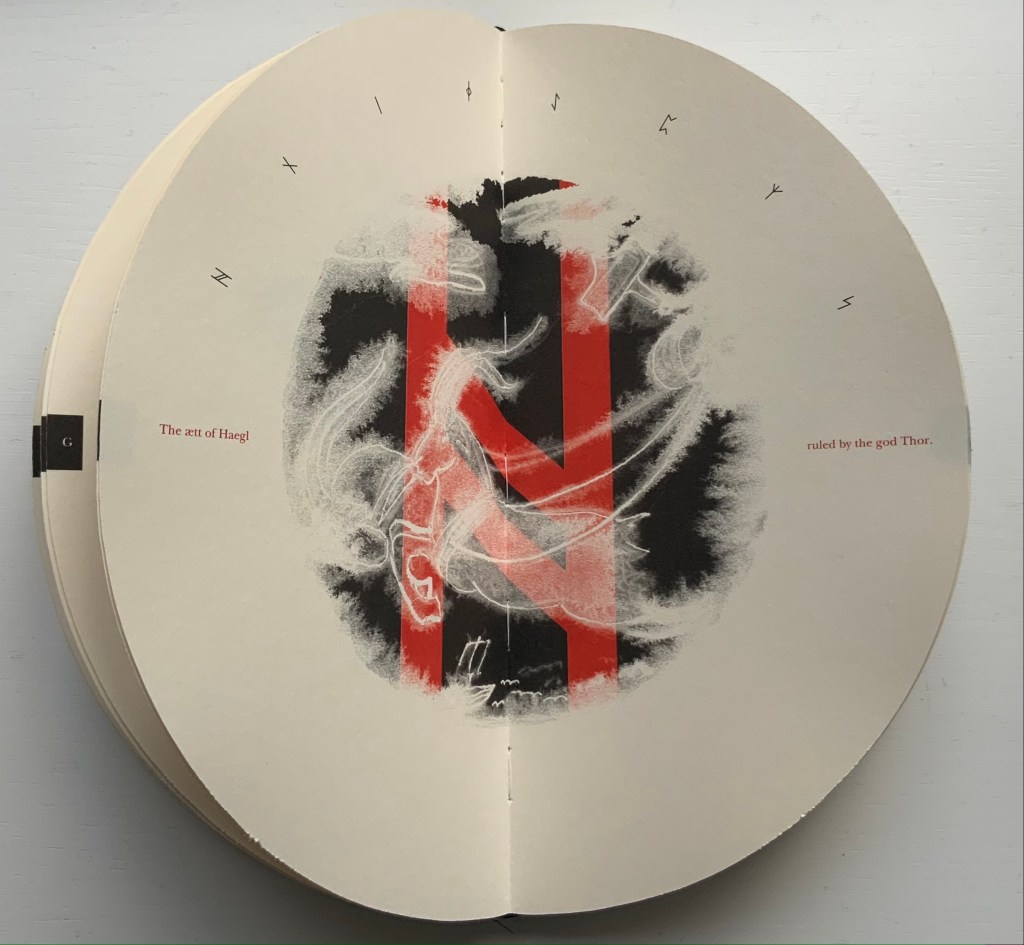
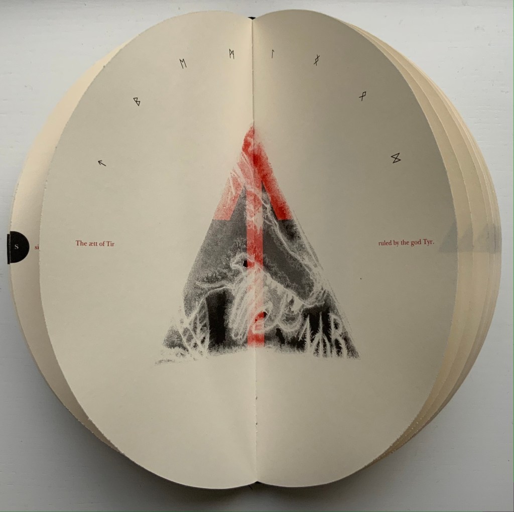
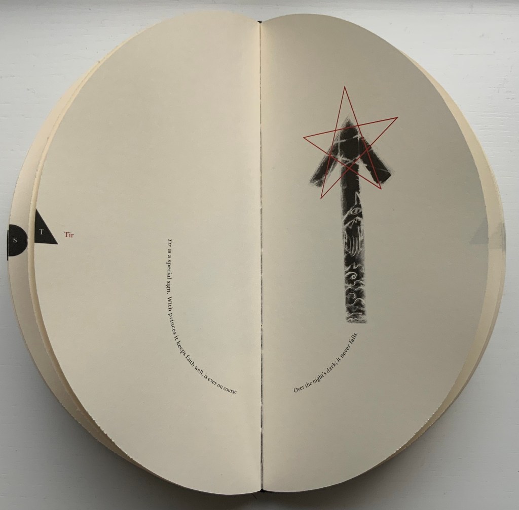
The Runic alphabet divides into three equal parts or ættir (pl. of ætt). In Fuþorc, Baldursdottír signals the beginning of each ætt with a double-page spread in which the eight runes of the ætt arc over a central image containing the ætt’s first letter. Different attributes attach to the ættir and each of the runes they embrace. Using layout of the text and imagery embedded in or surrounding the rune, Baldursdottír has evoked these attributes.
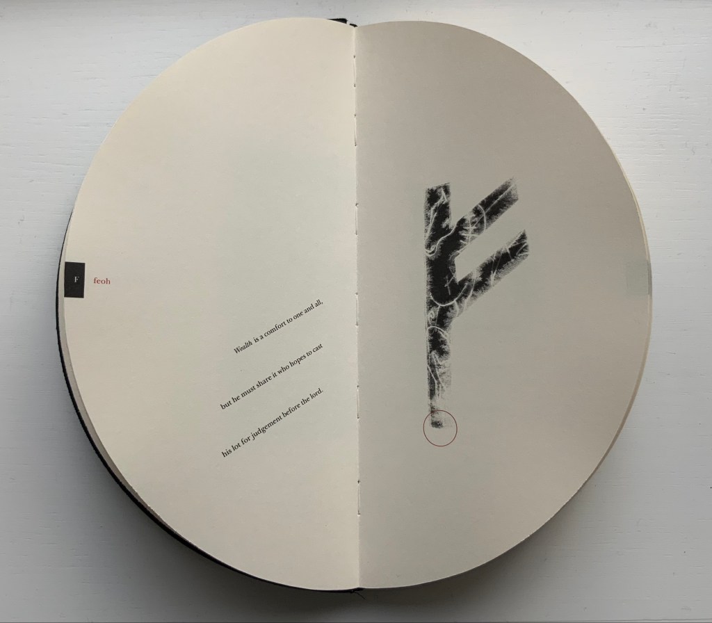
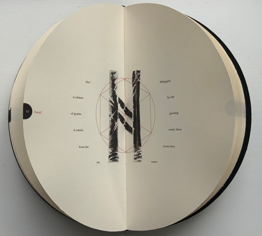
So, for the Ætt of Feoh, figures dance around the Maypole-like rune feoh, which is the first letter of Freyr and Freya who rule over this ætt associating it with agriculture, fertility and sexuality. Although Baldursdottír has Thor ruling over the Ætt of Haegl, it is the Watcher god and goddess Heimdall and Mordgud who rule over it. The seacliff-dwelling goat refers to Heimdall’s usual watch post. The snake to the left of the goat may be Jörmungandr, for which Thor goes fishing in the Prose Edda, which explains the presence of Thor’s hammer in the upper right of the image. Haegl means “hail”, and Heimdall is associated with the kind of disruptive weather threatening the ship at the foot of the image. For the Ætt of Tir, the arrowhead or spear shape of the rune evokes Tyr, the god of war, who rules over this ætt. By shaping each ætt with one of the fundamental geometric shapes of square, circle and triangle, Baldursdottír highlights the elemental nature of the Runic alphabet.
Ætt of Feoh, Ætt of Haegl, Ætt of Tir
In displaying each rune, it is as if Baldursdottír invites the viewer to peer through a rune-shaped stencil to that other world of associated attributes, but as with most divination, the images are partial and ambiguous. Is that a horse or a dragon behind feoh? Hail descending and melting behind haegl? A warship’s prow behind tir?
The runes feoh, haegl and tir
No doubt, more familiarity with the lore of runes would increase the reward of close attention to each image. But many are easily accessible. The image of horses shows well enough through the rune eh (or ehwaz), which means horse, horses or transport, but if there is any doubt, the explanatory text is laid out like reins and a bridle.
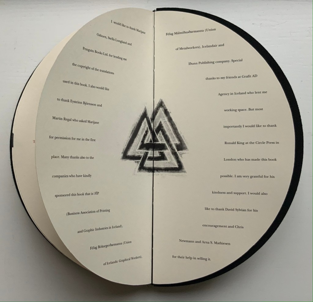
The book closes with the Valknut, sometimes called Odin’s knot, at the center of the Acknowledgments. Although runes and symbols such as this may be susceptible to misappropriation, the Acknowlegments themselves serve the Books On Books Collection as a welcome reminder that Fuþorc was first seen among other treasures at Ron King’s home.
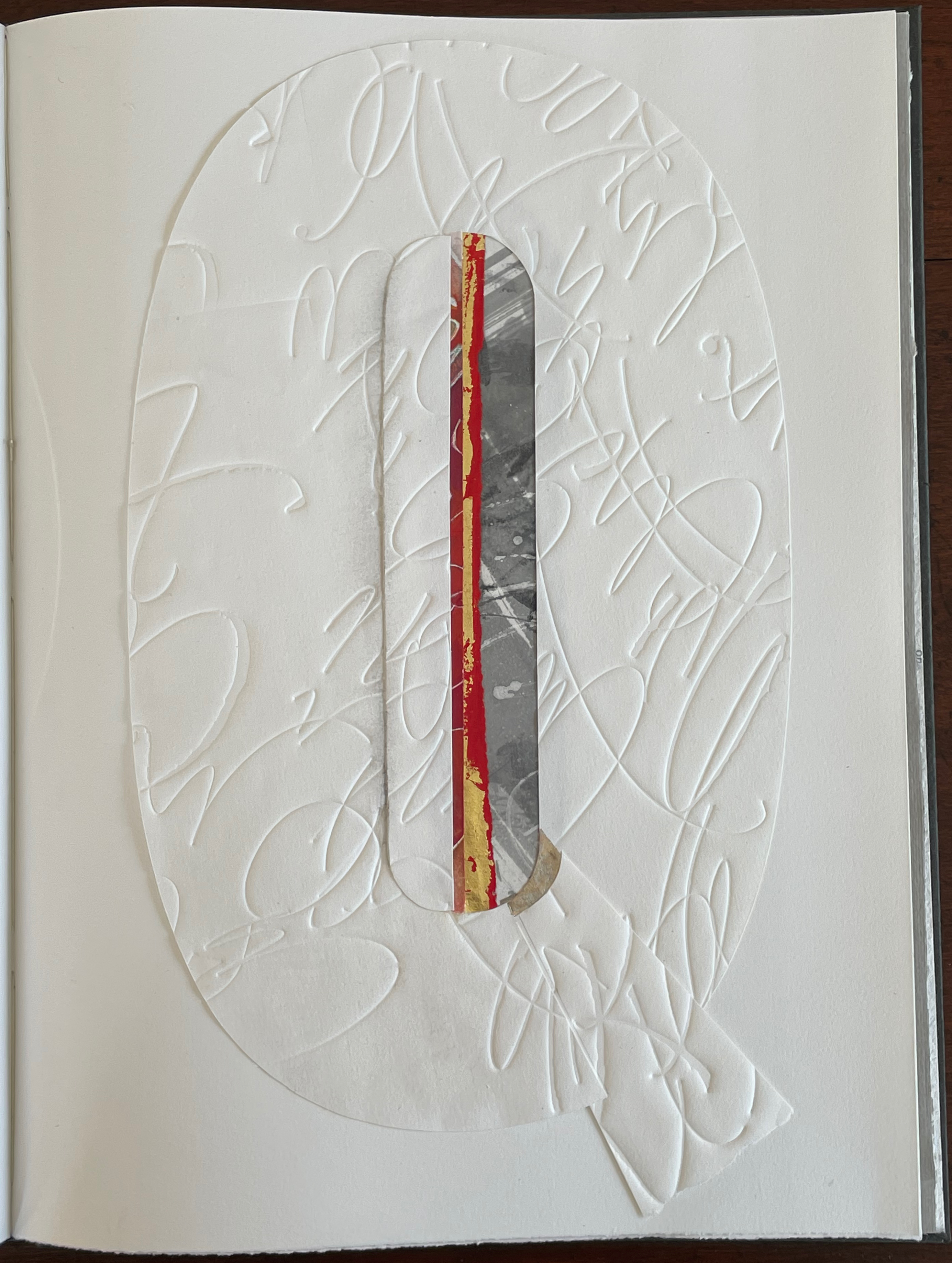
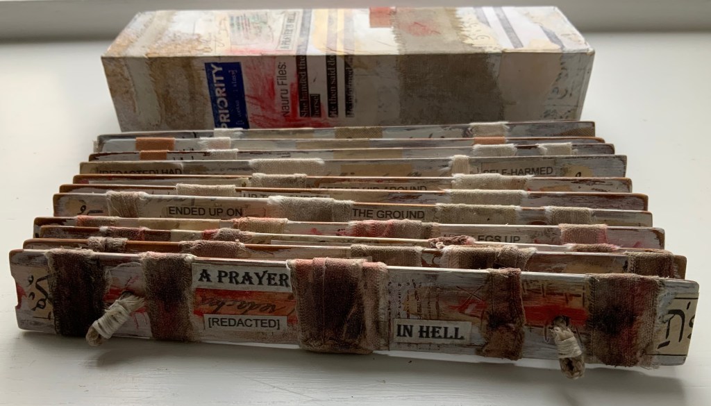
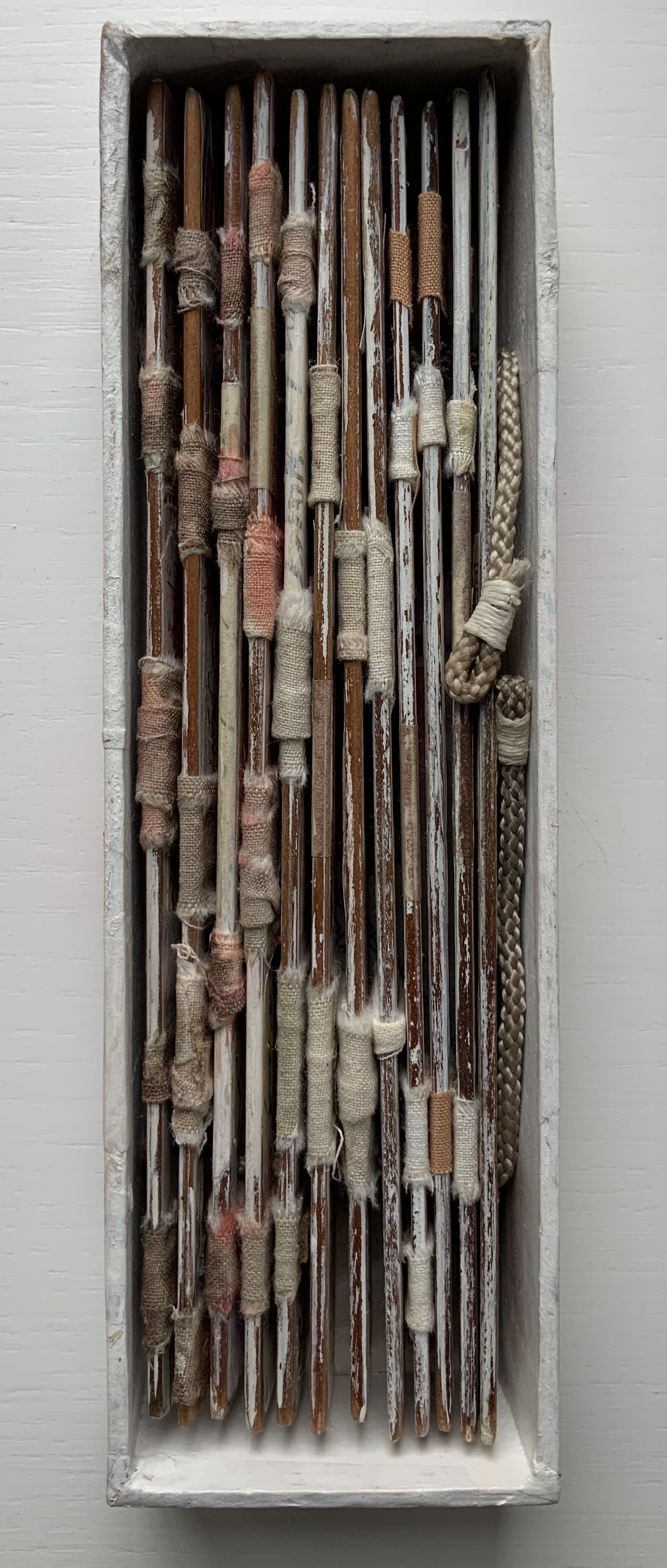
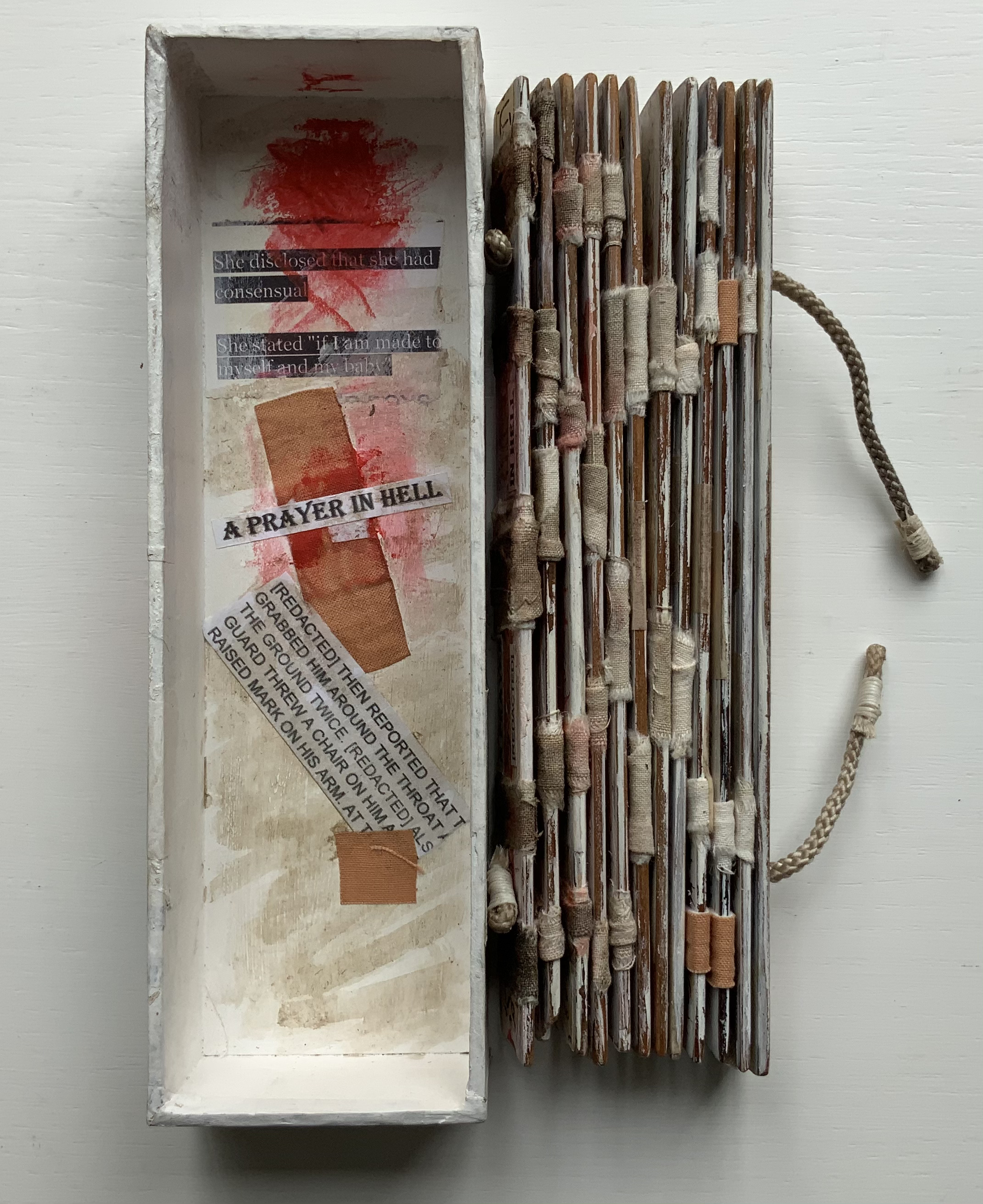
A Prayer in Hell (2018) Jacobus Oudyn Palm leaf prayer book format of 12 timber slats with double-sided collages materials and images made with pomegranate ink on antique paper, water soluble crayon calico, wound dressings and PVA adhesive. Text from Nauru Files — Guardian Newspaper and Islamic prayer book. Open: H195 x W130 mm. Closed: H195 x W 55 x D35 mm. Slip case: 2 mm card with collage, H202 x W60 x D38 mm, to be displayed with the book. Unique. Acquired from the artist, 4 January 2020. Photos: Books On Books Collection, displayed with permission of the artist.
A Prayer in Hell is one of Jack Oudyn’s larger works. works refer to the Australian experience of the world’s refugee crisis (perhaps the largest diaspora in history), A Prayer in Hell is the most scorching of them all.
Materially, the work embodies the refugees and their experience in many ways — its palm-leaf prayer book pages even consist of “stressed and recycled timber slats”. The binding cords penetrate drawings of eyes on each slat, creating the effect of the faceless staring through bars. Although the work’s title alludes to the English expression “not a hope in hell”, the work itself nods toward hope appears in how the wound dressings, wound round the slat pages, gradually become cleaner. Under and over the dressings, strips of English and Arabic text are collaged alongside handwritten extracts from Islamic prayer books and reports of events and conditions in Australian detention centers. Complete with redactions, the English text refers to the scandals associated with the centers at Nauru, Papua New Guinea, Christmas and Manu islands.
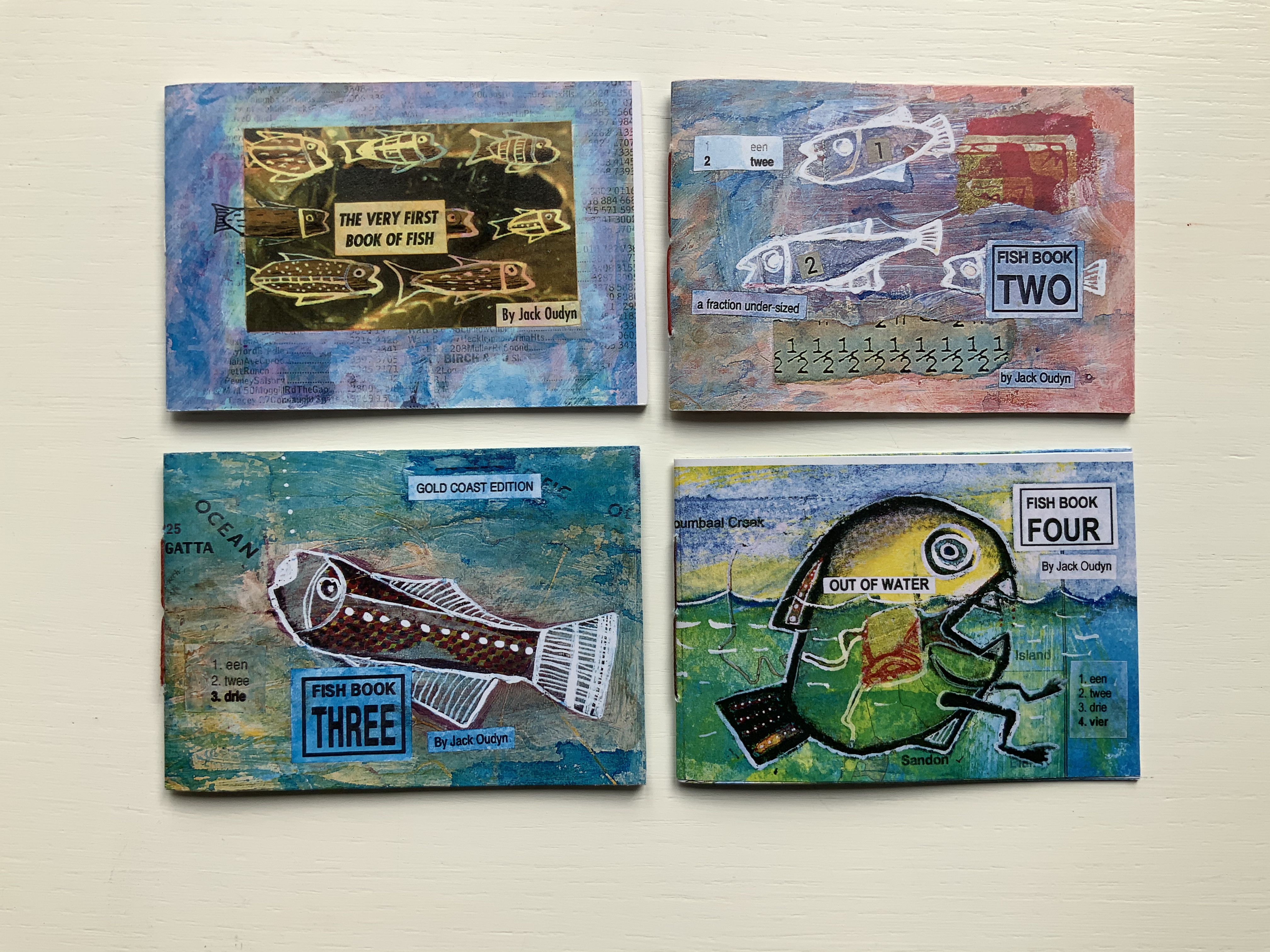
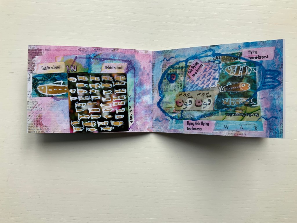
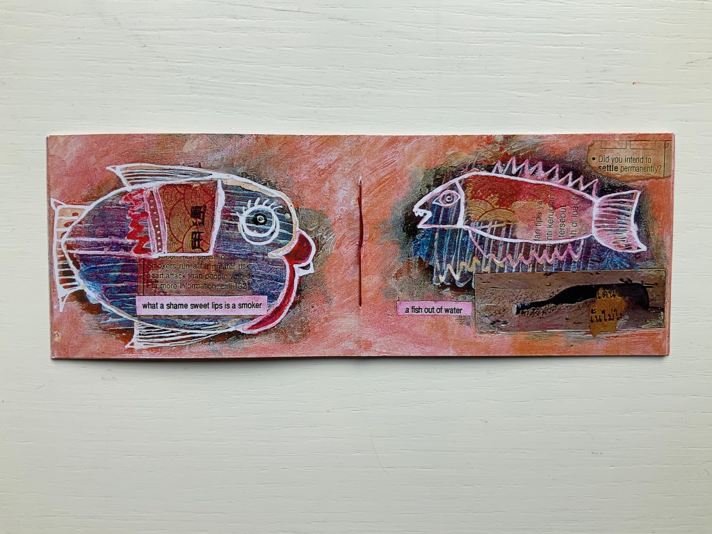
Fish Books One, Two, Threeand Four (1999 – 2001)
All acquired from the artist, 4 January 2020. Photos: Books On Books Collection, displayed with permission of the artist.
This complete set of his fish books represents Oudyn’s Micro Press imprint well. Many of the small works are playful with language, form, and material and, often, socially satirical or critical. More hook-in-mouth than tongue-in-cheek, the fish books have provided the artist with ground for playing with collage and printing techniques. In imagery, they are reminiscent of Ric Haynes, Breughel and Bosch. In text, they encapsulate the punsterdom of book art (albeit without the usual book-related self-referencing, though “fish wrapper” would have been good for their covers); reveal the artist’s Dutch heritage in their numbering; and revel in Australia’s odd common fishnames (dart, flattie, stargazer, sweetlips, etc.). By Fish Book Four (2001), however, a socially sharper tone emerges. The dates of publication, which vary from those in the WorldCat links for each title, are taken from the artist’s website.
The Very First Book of Fish (1999) Jack Oudyn Booklet made of 200 gsm digital paper, sewn with single white waxed thread, 16 pages. Color laser print of mixed media drawings; ink, paint, collage on pages from telephone directory. H70 x W105 mm, 16 pages. Edition of 50, of which this is #27. Photos: Books On Books Collection, displayed with permission of the artist.
Fish Book Two(1999) Same format as first, except sewn with single red waxed thread; #49 of 50.
Fish Book Three (2000) Same format as the second; #25 of 50.
Fish Book Four(2001) Same format as third, except sewn with single dark gray waxed thread: #13 of 50.
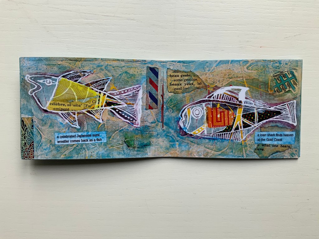
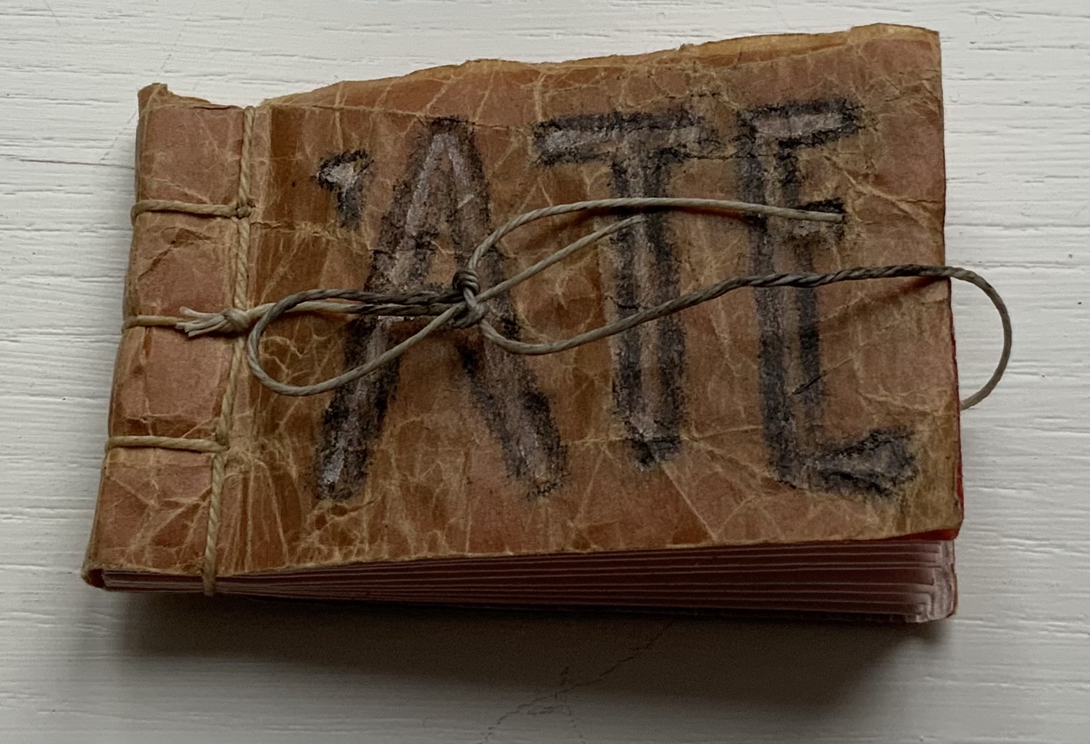
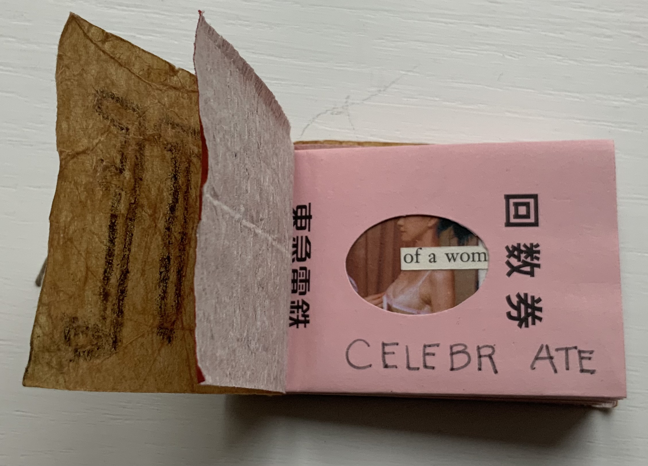
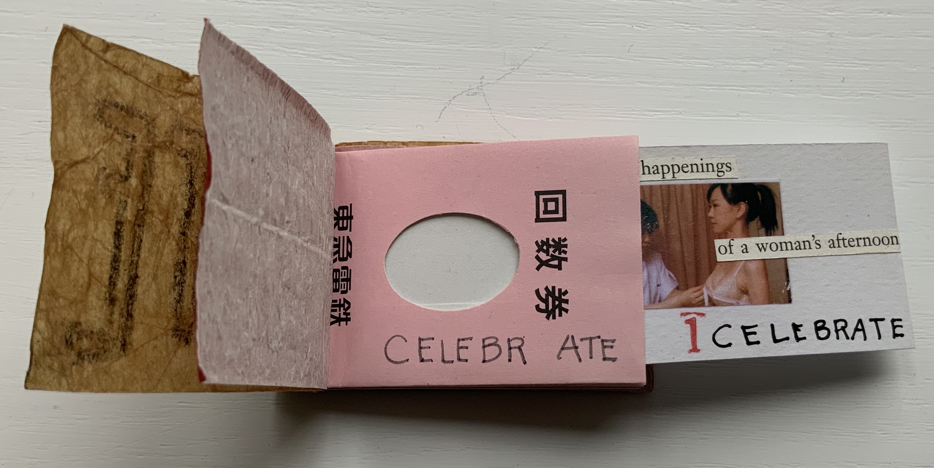
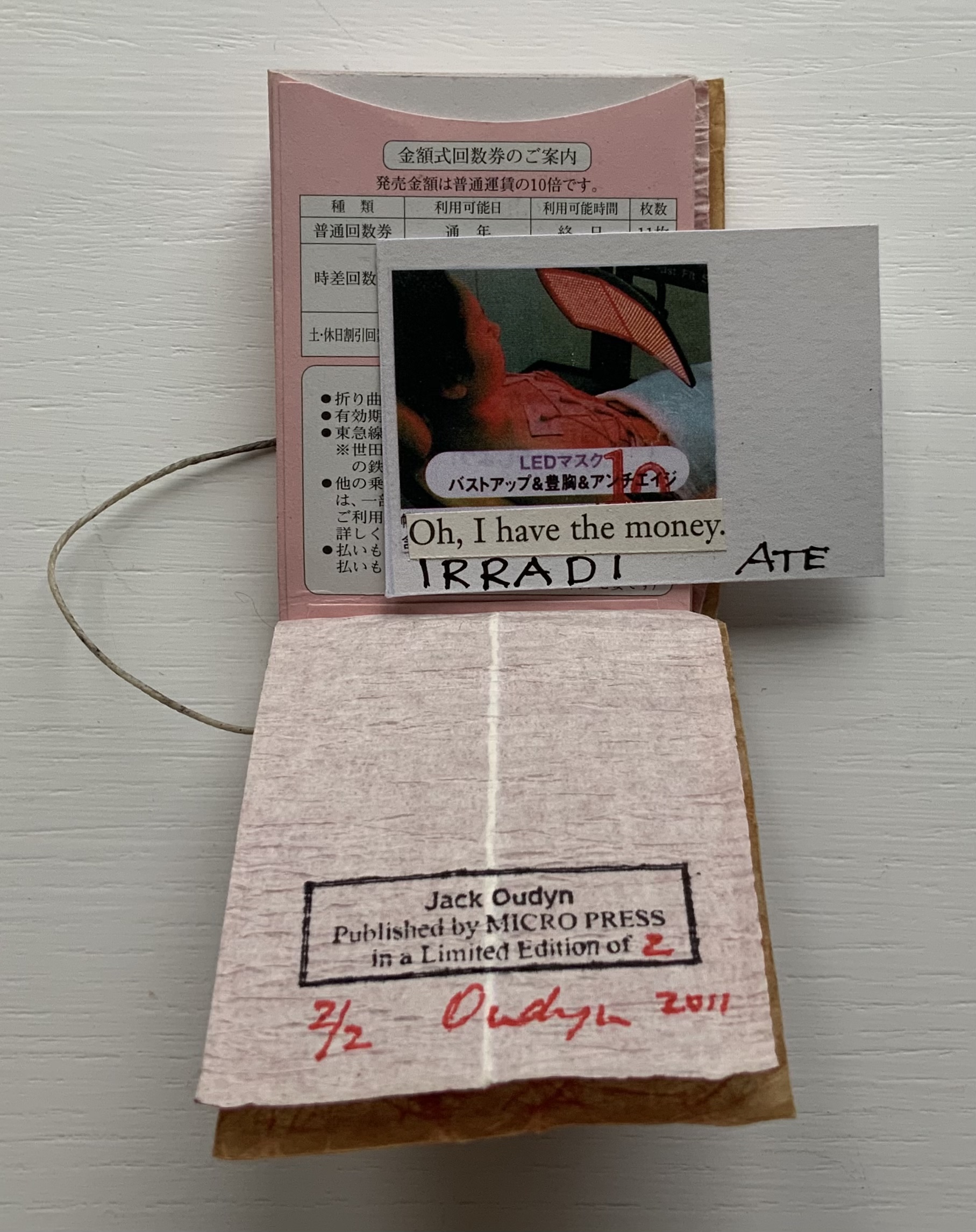
‘ATE (2011)
‘ATE X 10 (2011) Jack Oudyn Japanese stab-bound booklet, with wax paper cover and Momigami fly leaves. H54 x W74 mm, 10 train ticket sleeves holding 10 small numbered cards collaged with advertising brochure photos. Edition of 2, of which this is #2. Photos: Books On Books Collection, displayed with permission of the artist.
‘ATE X 10 demonstrates Oudyn’s wont to play language, form and material off image and vice versa. Bound in a Japanese stab binding by waxed thread and wax paper from the fish markets at Tsukiji in Tokyo, the book begins with a front fly leaf page bearing a tag line from the breast exercise mantra; on the same Momigami paper, the end fly leaf bears the colophon. The pages are made of Japanese train ticket sleeves containing numbered cards collaged with small photos from advertising brochures found near railway stations. As the fly leaf hints, the modest photos come from ads for breast enhancement services, an 8 x 10 promise relative to the images presented.
The works in the Micro Press imprint also reflect Oudyn’s interest (and presence) in mail art. He has been a member of the International Union of Mail Artists, and a section on his site is devoted to mail art.
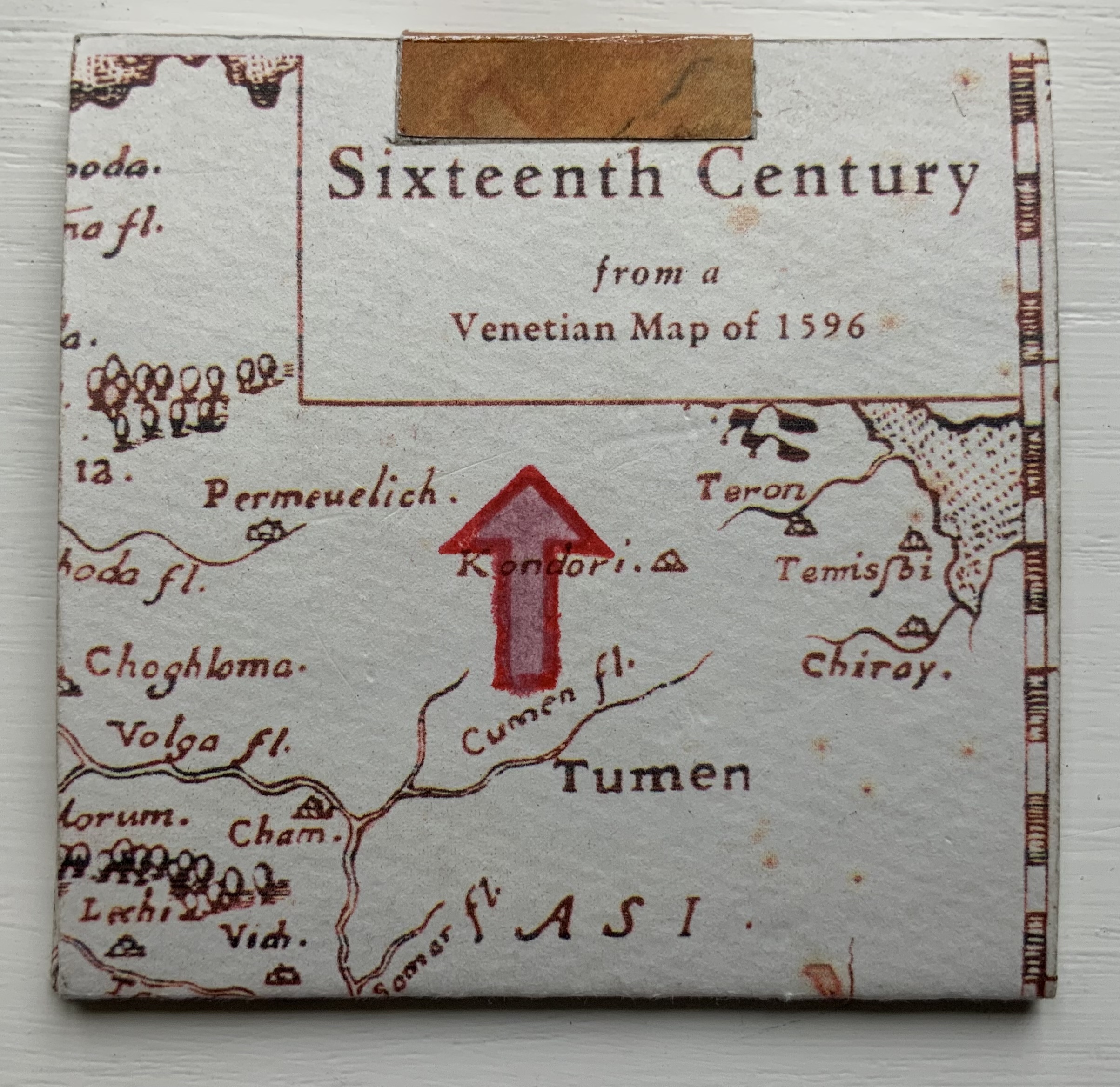
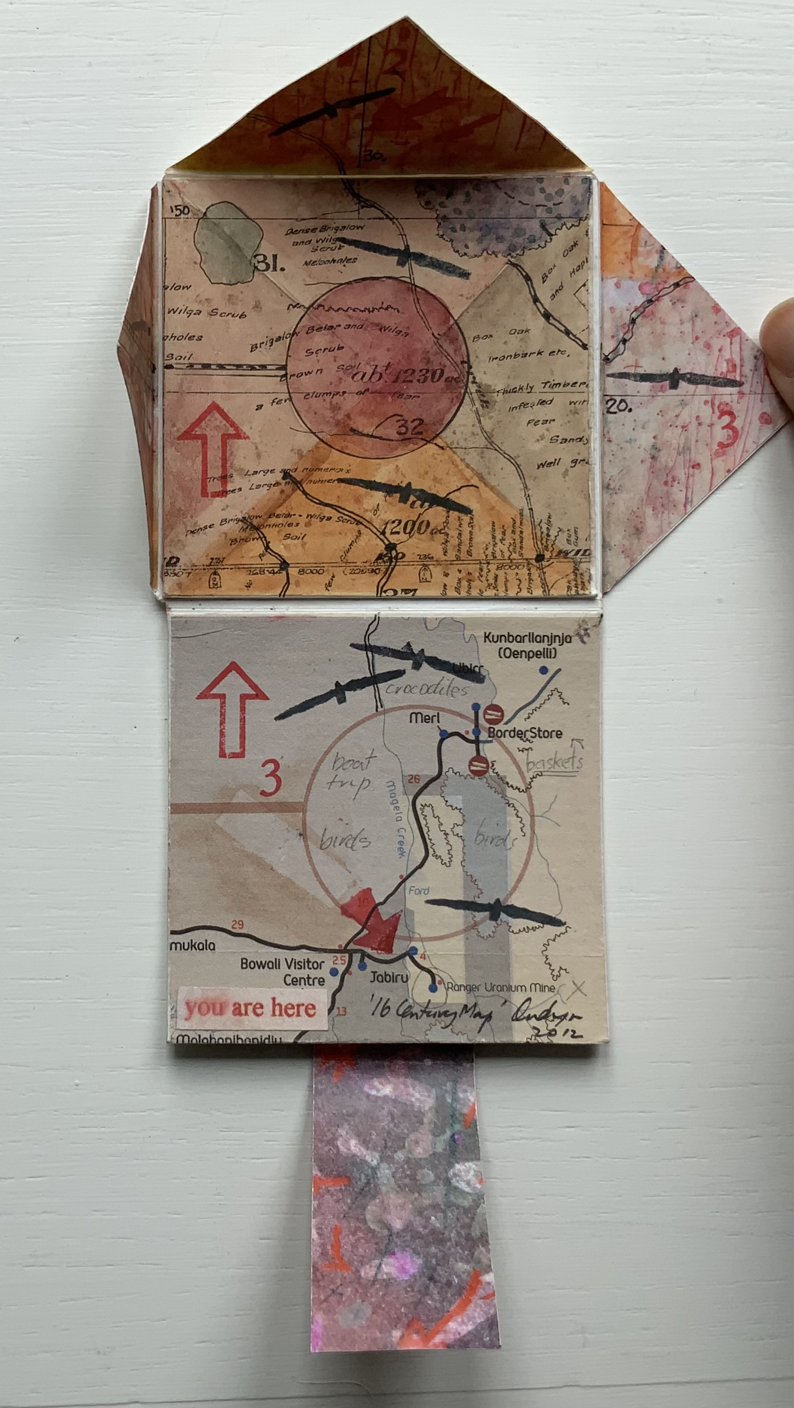
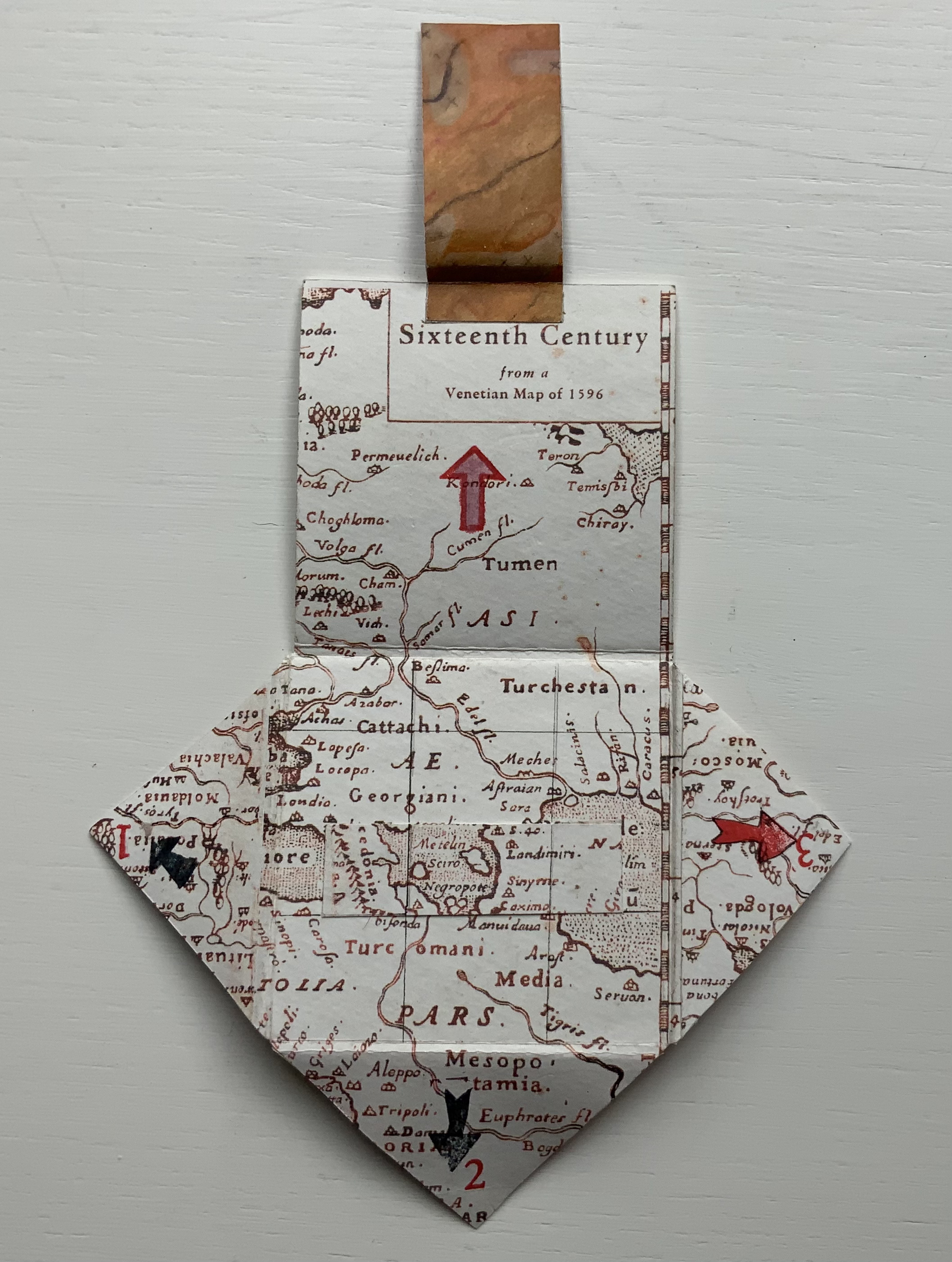
’16 Century Map’ (2012)
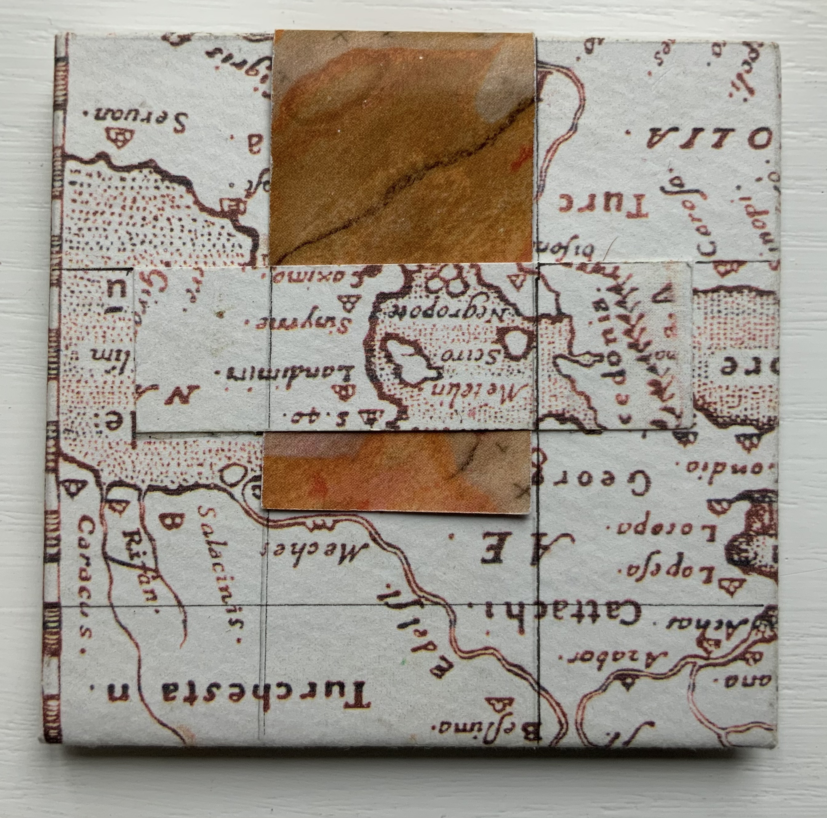
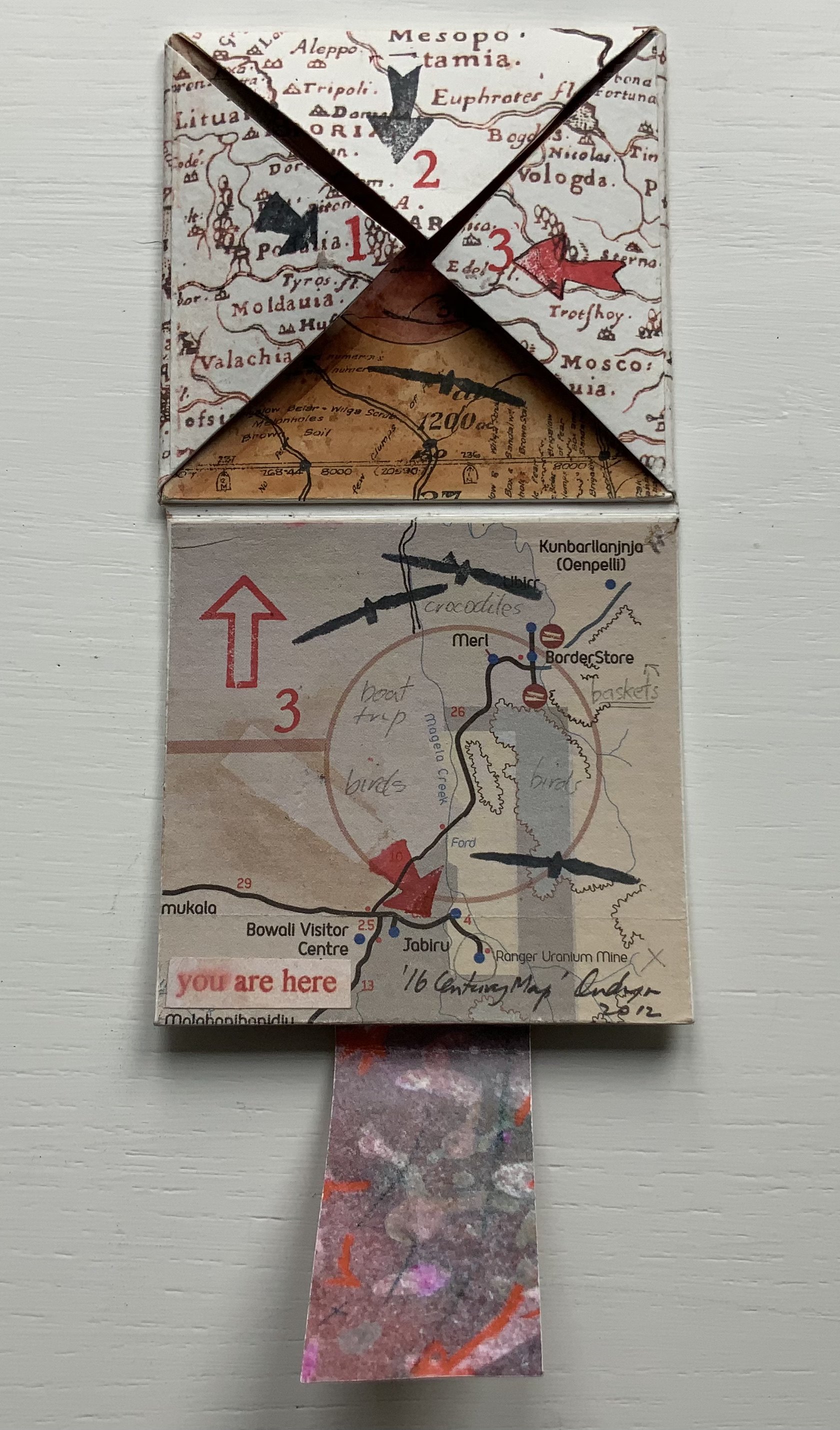
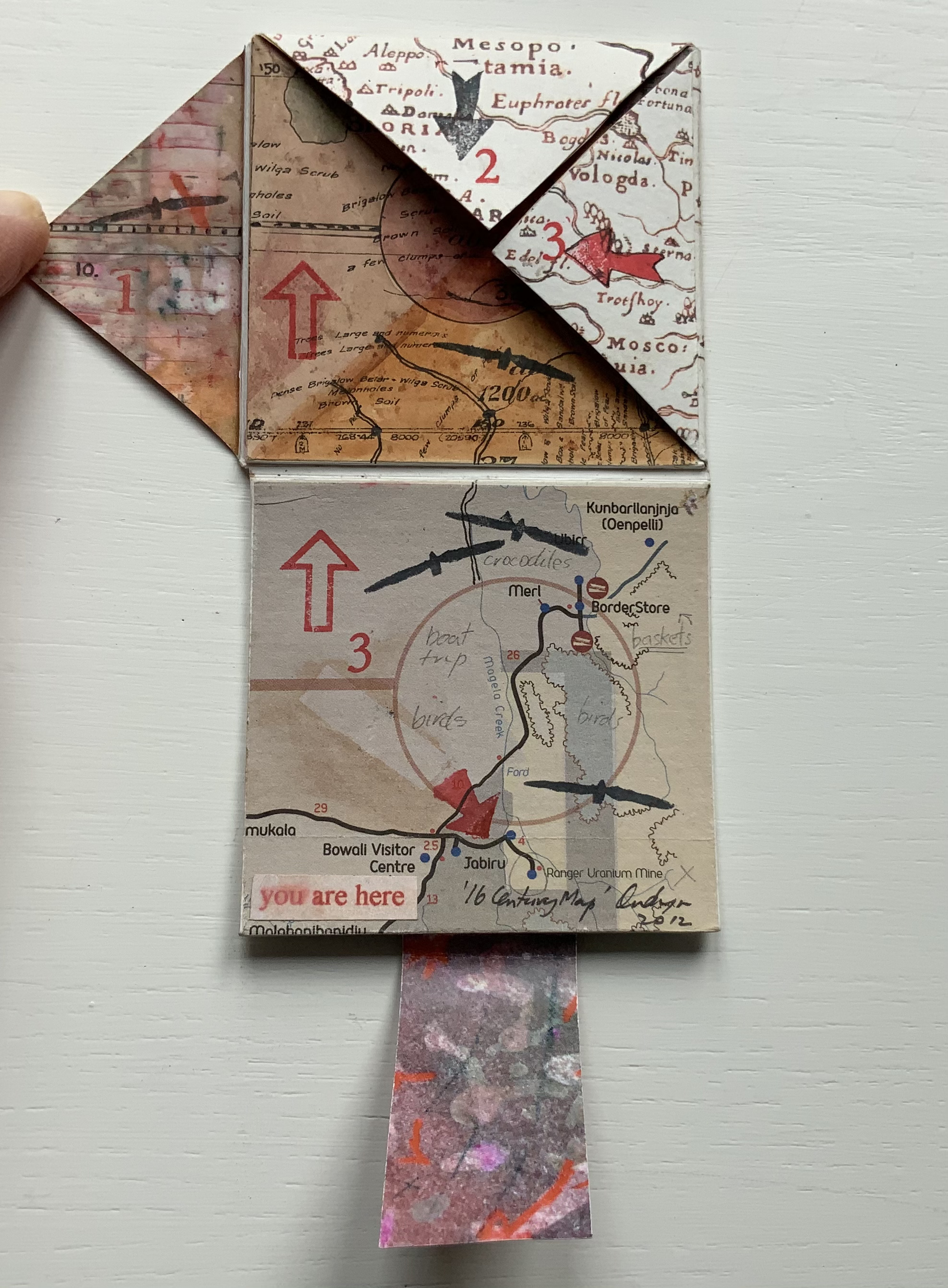
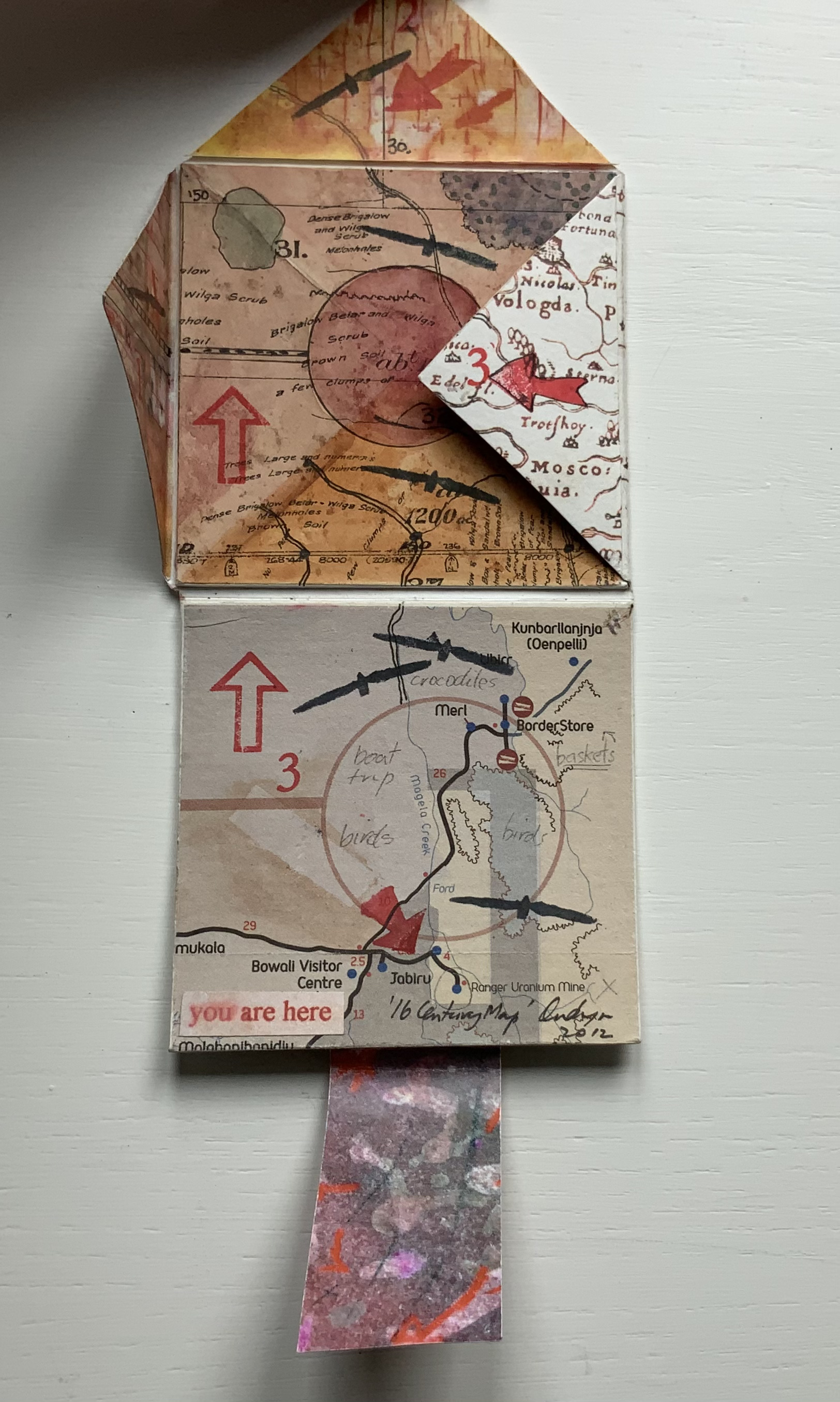
’16 Century Map’ (2012) Jack Oudyn Tab/slot-bound, single-fold, map paper on board, covering three outward-opening triangular cut tabs over center map paper on board; ink-stamped and drawn, with “you are here” sticker in lower left corner. H70 x W72 mm (closed). Unique. Acquired from the artist, 4 January 2020. Photos: Books On Books Collection, displayed with permission of the artist.
This small unique work — and those that follow — lie outside the Micro Press imprint. As the artist writes on his blog, this is a trial attempt at juxtaposing the exterior old European map (showing Mesopotamia and the Euphrates, the Northern hemisphere’s cradle of civilization) with the interior Australian map of the Kakadu National Park to get at the concept of Tjukurpa, by which Australia’s Anangu refer to the creation period.
It is not strictly a Turkish-fold map, but the way the tab with indigenous colors snugly closes ’16 Century Map’ is just as mechanically satisfying.
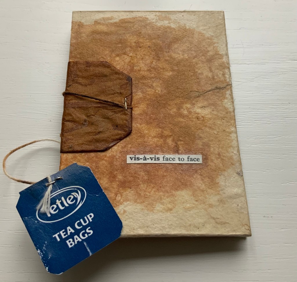
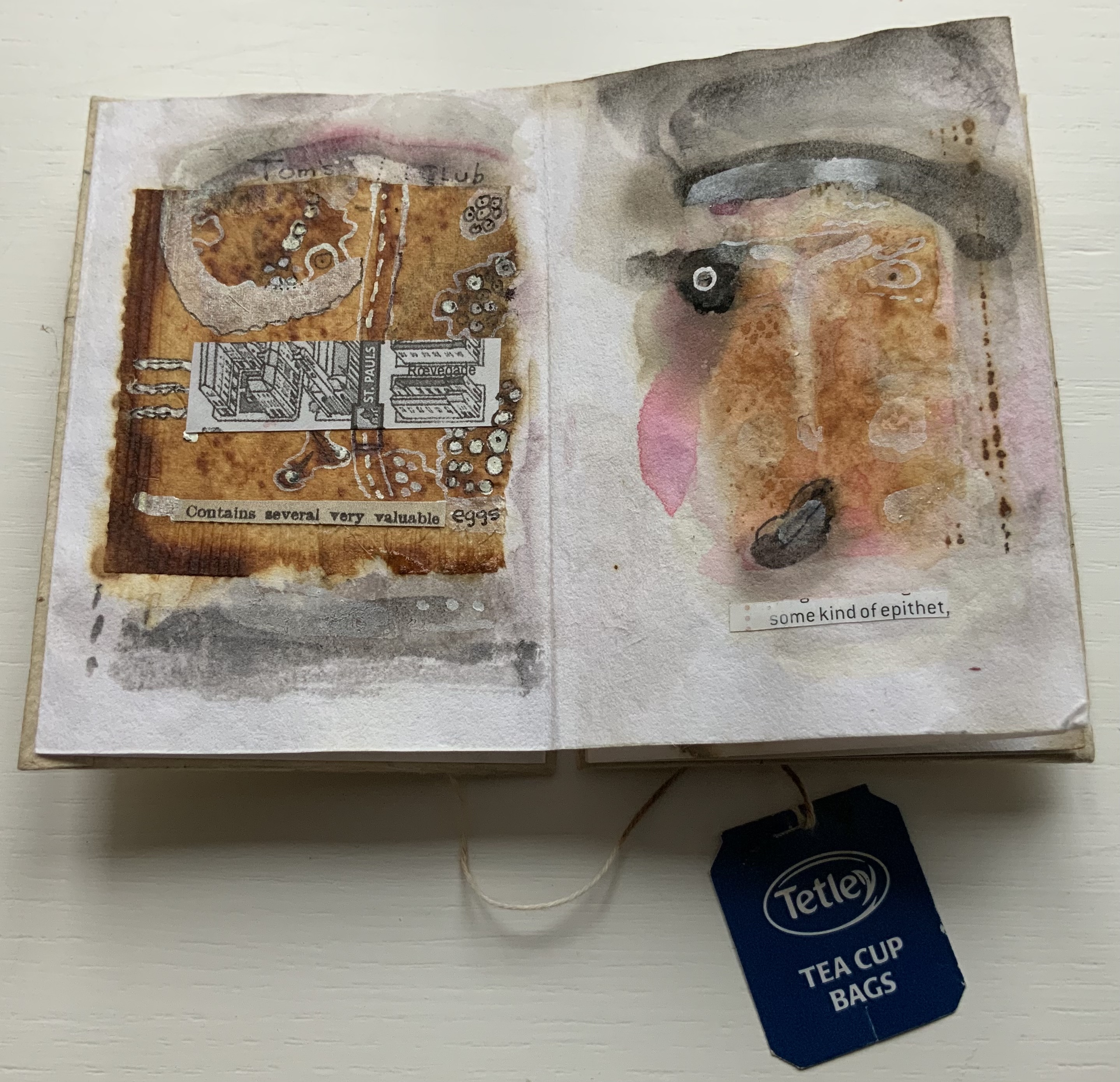
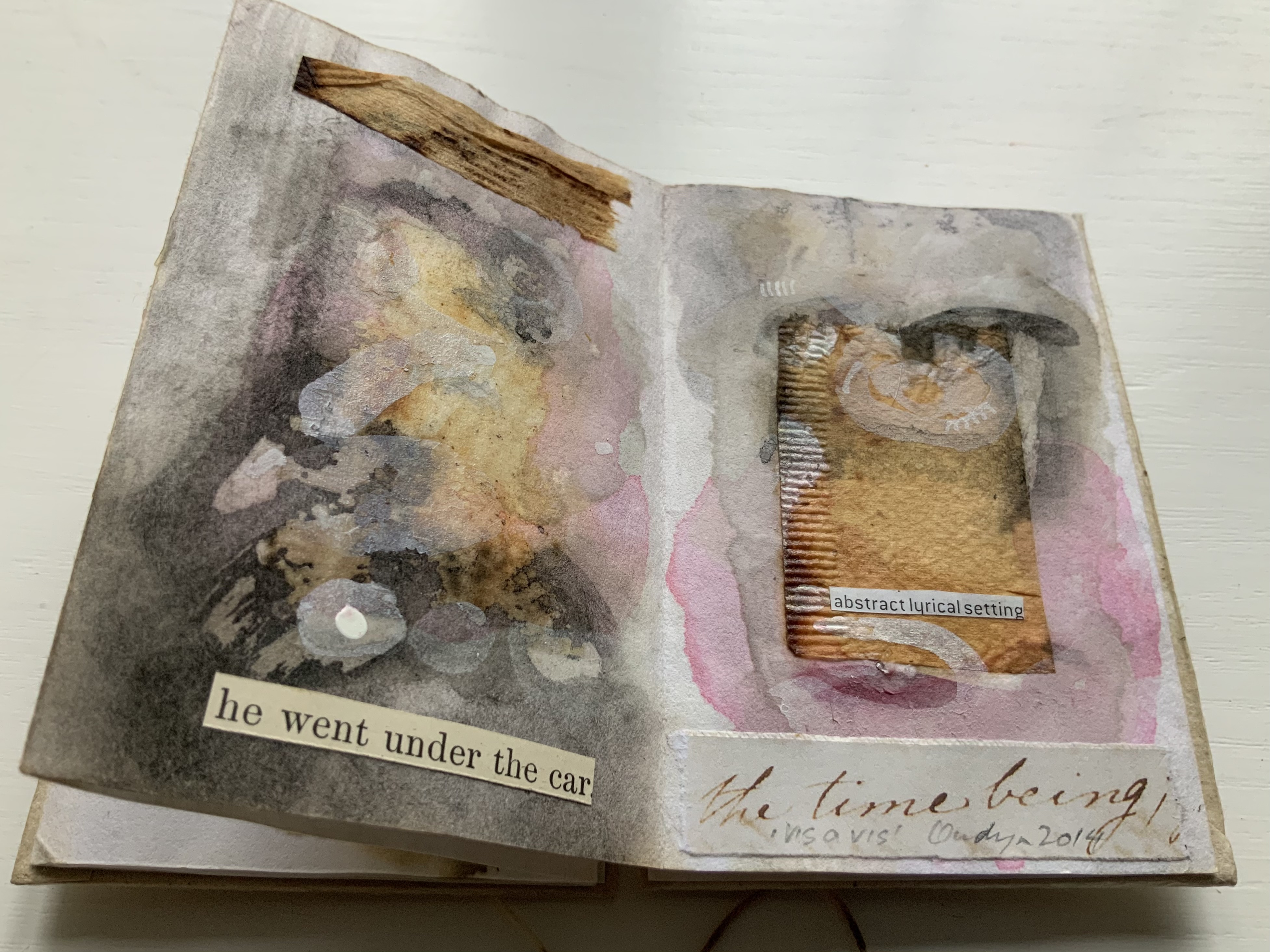
vis-à-vis | face to face (2014)
vis-à-vis | face to face (2014) Jack Oudyn Blizzard-fold booklet, mixed media and collage with tea bag paper. H100 x W70 mm, six panels. Unique. Acquired from the artist, 4 January 2020. Photos: Books On Books Collection, displayed with permission of the artist.
A heavily stained, empty teabag glued across the two boards, whose opening is closed with the teabag string wrapped around a wooden button, serves for this booklet’s binding. A conversation between two people struggling for words, hence the near random use of found text, occupies the six panels. The abstract faces profiles are characteristic of Oudyn’s work, as is the use of acrylic medium as a block out or resist. Or perhaps it is egg yolk, which would be in keeping with the reference to eggs and, with the tea stains, in keeping with a breakfast-table conversation.
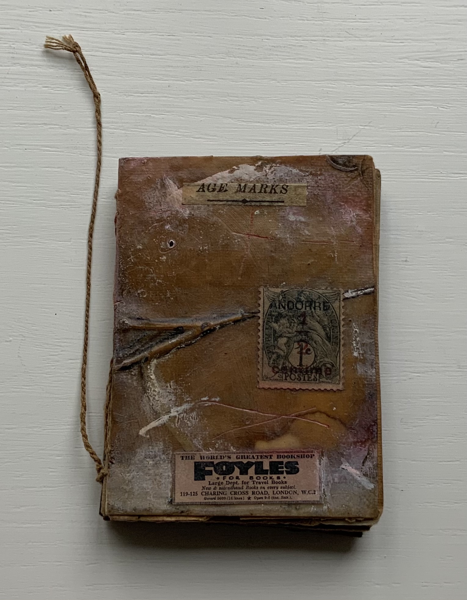
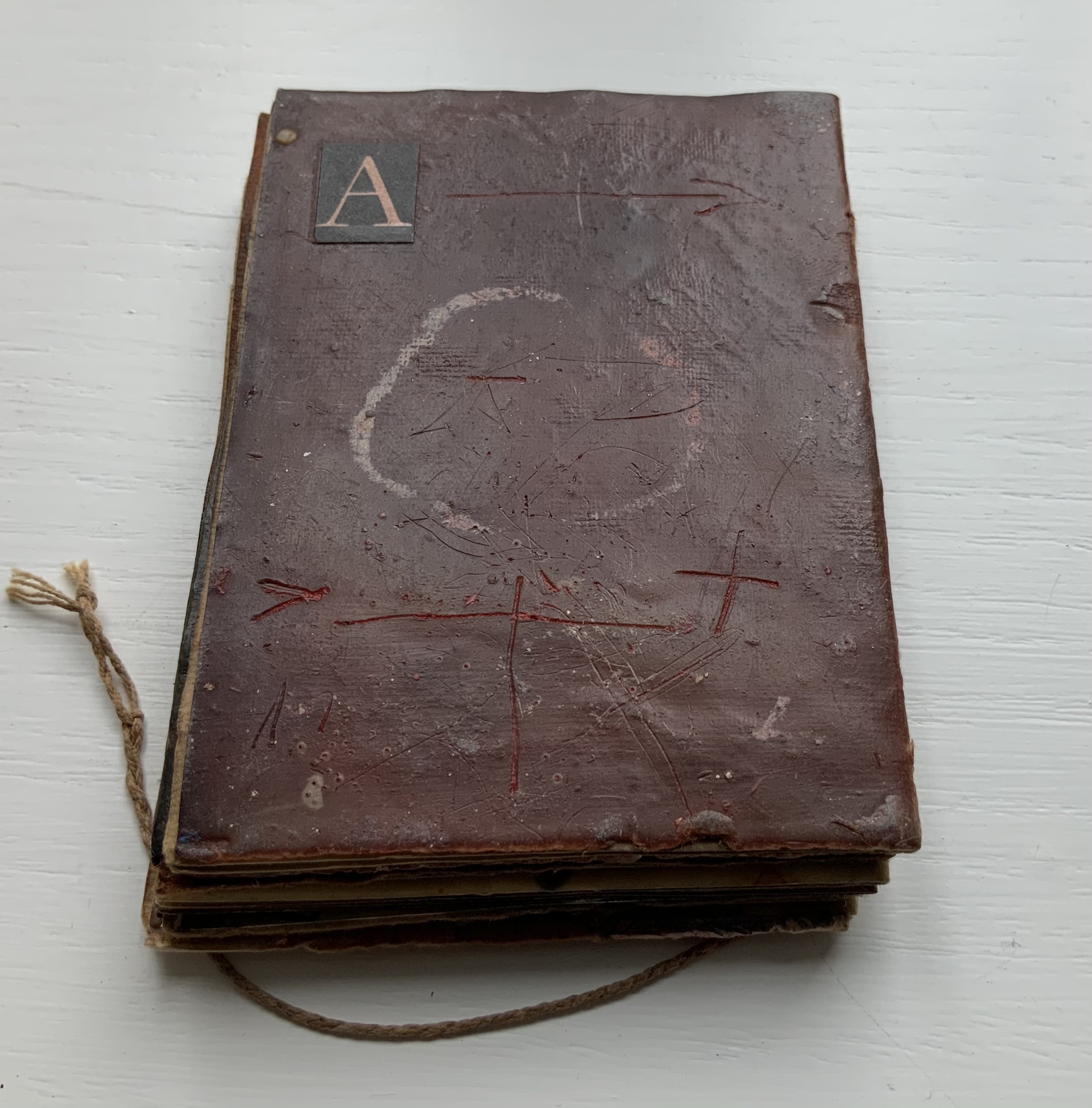
Age Marks (2014)
Age Marks (2014) Jack Oudyn Handmade waxed and stained paper book by Trace Willans. Mixed media and collage on paper. H85 x W65 x D10 mm, 44 pages. Unique. Acquired from the artist, 4 January 2020. Photos: Books On Books Collection, displayed with permission of the artist.
Trace Willans makes blank books from organic, sustainable media. Age Marks began as one of these blanks, its pages consisting of lightly textured machine-made lightweight paper (ca. 100 gsm), some stained and waxed. The result is not exactly an inscribed blank notebook, not exactly an altered book. Oudyn’s use of mixed media of different hand-made papers, tracing paper, found text, wax, reflective road tape, postage stamps, white acrylic ink, gouache and pigment creates a unique record of the aging process of mark making. Marks made by conversation, observation, inscription, printing, writing, drawing, collation, lifts and reveals, cutting, tearing, pasting, weaving, binding — all filtered through aging.
Small as it is, Age Marks is one of the most varied haptic experiences in the collection.
The Future of an Illusion (2017)
The Future of an Illusion (2017) Helen Malone and Jack Oudyn Sculptural tunnel book structure (three joined four-fold leporellos) enclosed in a folder and protective boxin a box,. Box made with Lamali handmade paper, suede paper (lining) and Somerset Black 280 gsm; Folder: Canson black 200gsm, skull button and waxed thread; Leporellos: center leporello made of Canson black 200 gsm, linen thread adjoining two leporellos made of Arches watercolour paper 185 gsm with acrylic, soluble carbon, gouache and transfer ink jet images. Box: H275 x W313 x D34 mm; Folder: H258 x W295 x D21 mm; Book: H250 x W290 x D16 mm closed, D410 mm open. One of an unnumbered, signed edition of 4. Acquired from Helen Malone, 12 September 2017.
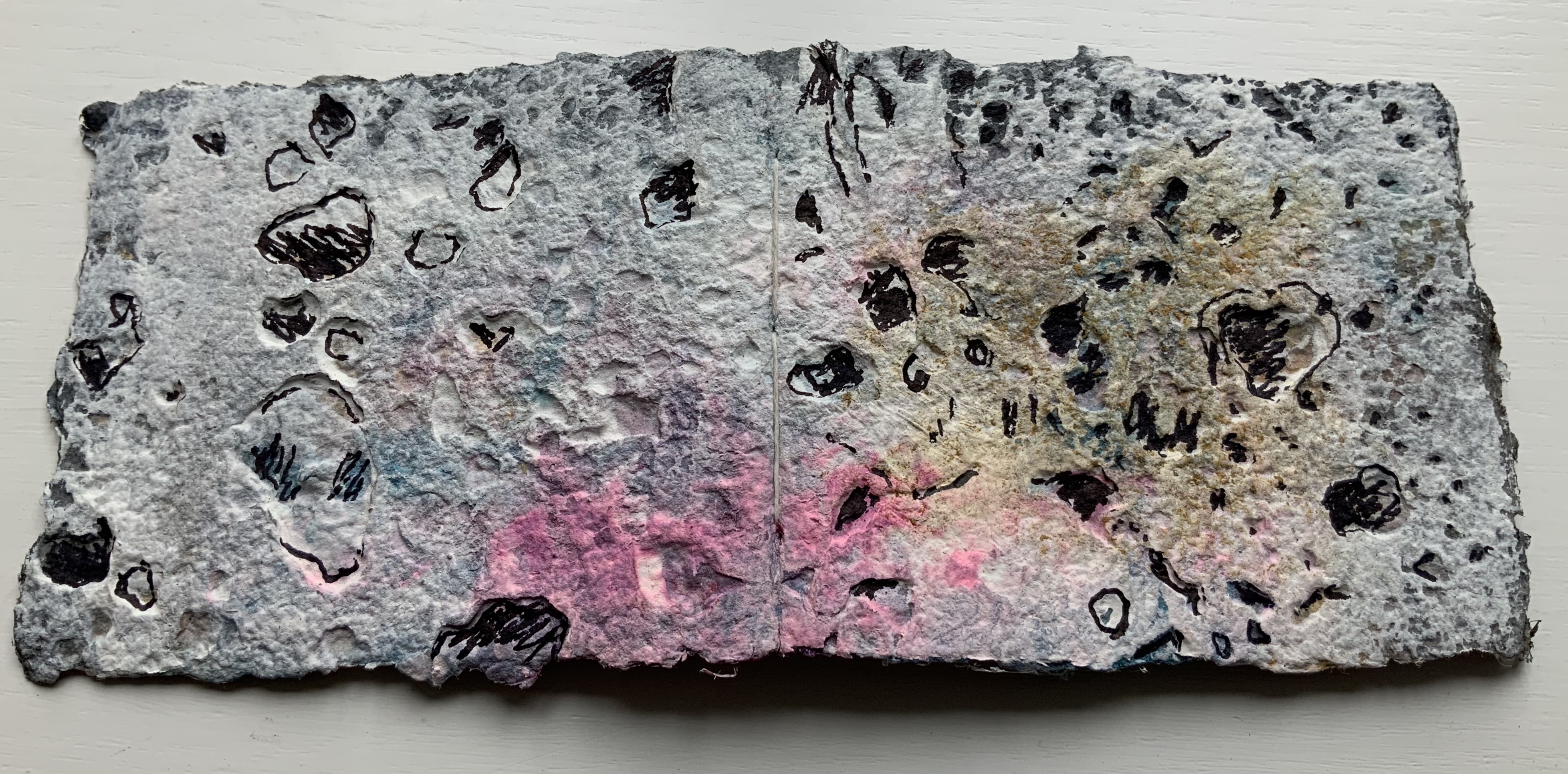
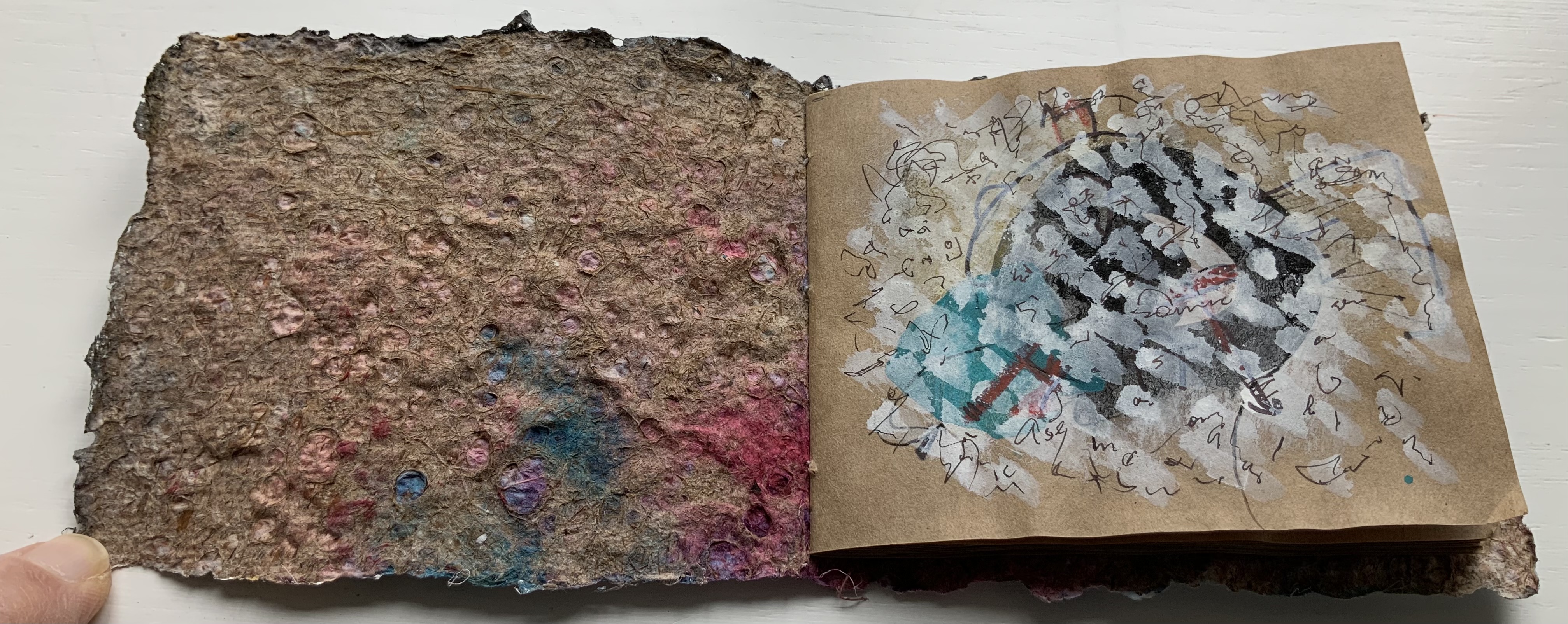
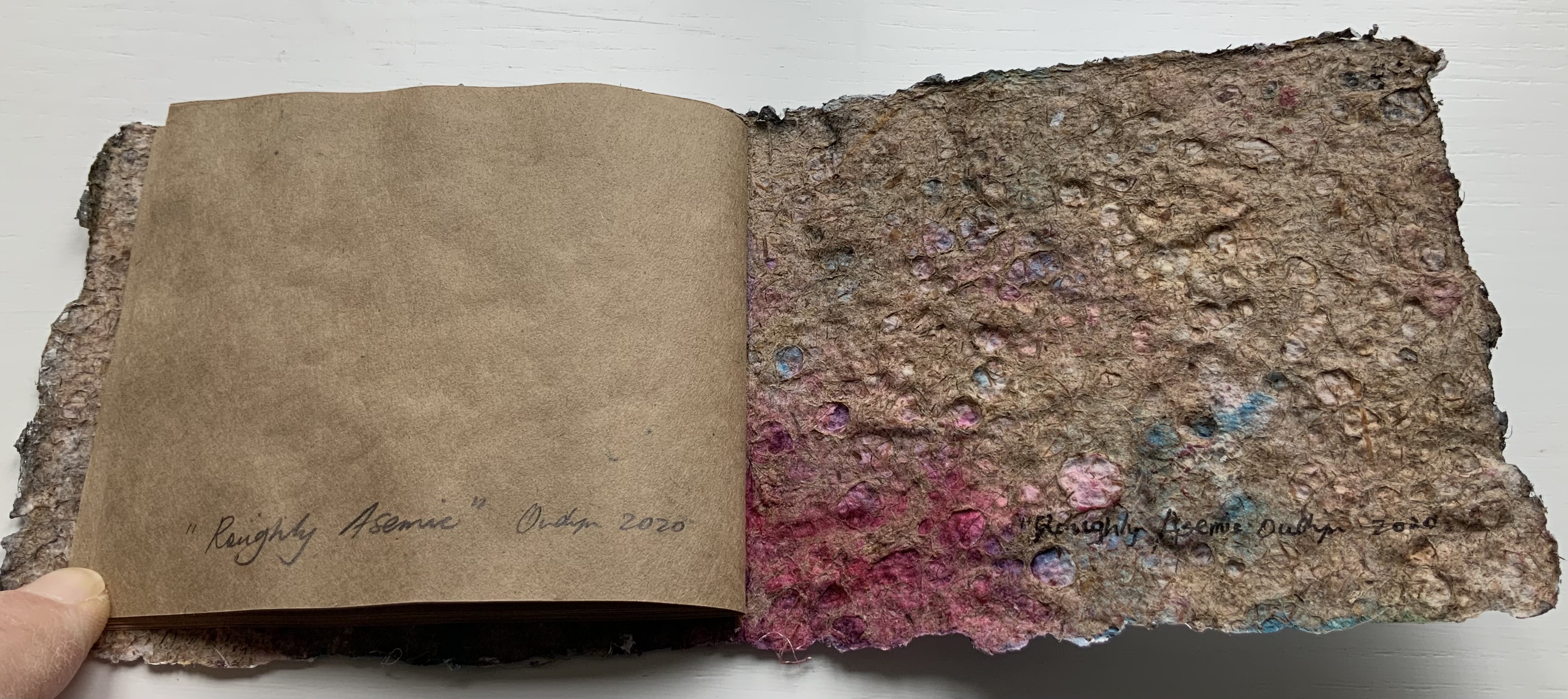
Roughly Asemic (2020) Jack Oudyn Booklet, single-thread stitched, handmade paper cover, painted and inked, over brown Kraft paper folios illustrated with drawings and markings in paint and ink. H105 X W123 mm, 7 leaves, folded in half making 28 unnumbered pages, 14 of which bear drawings and markings, 13 of which are left blank, and the last page bears the title, signature and year. Unique. Acquired from the artist, 4 January 2020. Photos: Books On Books Collection, displayed with permission of the artist.
This work’s title could not be more apropos. It is a scratchy thing to hold, its pages stiff and crackling as they turn. Patterns, images and letters struggle to emerge, only to be submerged by each other on the same or next page, which goes to show how difficult it must be to achieve entirely asemic markings. “Roughly asemic” might be the best hoped for.
Foster, Robin. “Feature Artist – Jack Oudyn“, Personal Histories, International Artist Book Exhibition, Redland Museum, UNSW, Canberra. 11 March 2014. Accessed 19 October 2020.
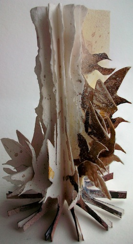
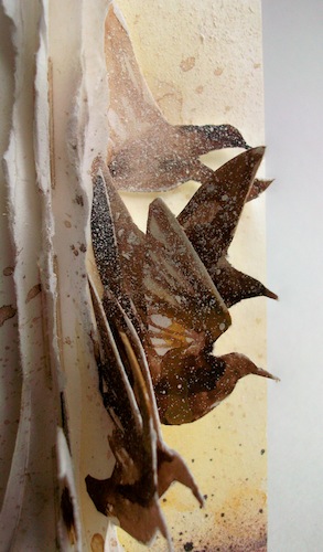
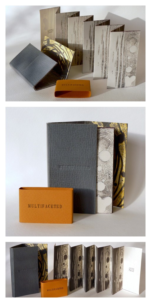
Stardust (2013) Louisa Boyd Leather bound, oil-based ink, Somerset paper, micro-fibre suede, Magnani handmade ivory wove paper, metal leaf, pencil crayon; 16 panels. Closed – H70 x W45cm x D10 mm; Open – H70 x W420 mm. Edition of 20, of which this is #10. Acquired from the artist, 28 May 2017. Photos: Courtesy of the artist.
Through abstraction and symbol, Louisa Boyd‘s art focuses on sense of place and our intrinsic connection to nature. The titles of three of her artist’s book series – Infinity, Landscape, and Mapping – and those of the book art in them – Aether (2013), A Walk (2001), and Cartography I (2014) – reflect that focus. How she manages abstract imagery and symbol across her range of material and techniques – paper (including hand-marbled paper), book structure, printmaking (block, screen, letterpress), watercolor, metalwork, leatherwork – adds to that unifying focus through a rightness of choice but also introduces a breadth of originality and variety.
In Aether, the crayon work, cutting and metalwork are applied with a three-dimensional sense wedded to an obvious understanding of the possibilities of the page and double-page spread. The stop-motion animation video tour of Aether (click on the image below) makes you wonder if Boyd conceived the work as a flipbook in the first place. There is no wondering, however, about the place of human existence in relation to the aether. In the video, look at the lower righthand fore-edge of the book.
A Walk illustrates Boyd’s skill with freestanding three-dimensional sculpture, a skill that has grown in The Flight Series (more later on two of its works from 2009) and The Paper Manipulation Series, from which the work Flare above comes.
Her use of abstract markings and the Turkish map folding technique in Cartography I demonstrates again her careful marriage of abstraction, symbol and technique.
The etching printed on each of the three internal folded pages is an abstract that nevertheless evokes mapping, which the form and fold of the pages reinforces. Each Turkish fold page can lay flat to be viewed individually, or as pictured above and below, the book may be viewed as a sculpture.
The video tours (links embedded the images of Aether and A Walk above) represent Boyd’s search for what she calls “a bridge between traditional and contemporary media”. So far, that exploration reflects the artist’s rootedness in the book arts and traditional skills and processes of drawing, printing and painting. It is intriguing to think what effect a bit of influence from Helen Douglas or Amaranth Borsuk might have on Boyd’s bridge. The use of stop-action video for Aether hints at an instinct for what Douglas calls “visual narrative”.
A professed recurrent theme in Boyd’s book art is “restriction and freedom”. Although it arises from periods of city dwelling and lack of access to the countryside, imposed by the UK’s 2001 “foot and mouth” epidemic, it manifests itself in the more “traditional” spur of constraint of form and structure that goads an artist’s imagination. Flock (2009) and A Walk bear close resemblance, but note the difference in invention whereby the former plays with the book form by placing the bird imagery at the edges, spirals the paper tearing upwards and gradates the watercolor from dark to light (like a flock dispersing) and the latter deals with the “restricted” walk by blending the watercolor with tearing and tunneling.
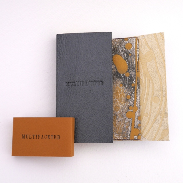
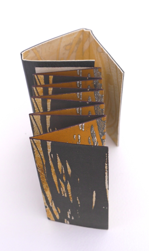
Although Multifaceted returns to the theme of different views that was the intent in A Walk, it tilts the theme more toward the abstract side of Boyd’s work. In this, Multifaceted is more akin to the works in The Paper Manipulation Series: Flare (2013), Whorl (2013), and Pleat (2013). It almost purely plays with the concept of differing perspectives. Again, techniques and form express concept with a simple rightness. This double-sided leporello is designed to be viewed from four different angles. The display of photos here cannot offer the intended perspective (pun intended): the viewer needs to circle the piece to view its facets. That word “facet” is tooled on the interior pages four times, the clue as to how the book should be read.
The abstract imagery evoking landscape or skyscape – whether juxtaposed vertically or horizontally – plays with viewpoint. Even the print technique on the interior pages plays with viewpoint: they are prints of an etching inked up both in relief and intaglio. Breaking free of the ultimate restriction of the book, the pages are not attached to the cover, allowing the piece to be read in four different directions. These features of the work and the seeming absence of that human figure from Aether throw it back on the viewer’s necessary engagement to establish fully the human connection: by engaging with Multifaceted – “reading” it – the viewer enacts the human place in the aether around the work.
Since graduating from Manchester Metropolitan University in 2001 and winning the Paperchase Future of Design Award (2001) and receiving a high commendation from the judges of the New Designer of the Year (2001), Boyd has exhibited in 46 venues. Her 47th is the most significant so far: inclusion in the John Ruskin Prize Shortlist Exhibition at Millennium Gallery in Sheffield, UK (21 June – 8 October, 2017). If this book artist manages to continue her sure-handed forging of concept, material and method, the Ruskin Prize Shortlist Exhibition will not be her last significant exhibition.
Further Reading
Chen, Julie. 2013. 500 Handmade Books. Volume 2. New York: Lark. Pp. 15 (Flock), 414 (Tower of Babel).
Abecedaries have a long lineage among calligraphers, typographers, children’s book authors and designers (including those of online books), fine press impresarios and book artists. From the world of libraries and museums, we have had abecedary lists and exhibitions such as Favorite Alphabets, (Library of Congress), Primers, etc. Post-1850 (Bodleian), Artists’ Alphabets and Ecstatic Alphabets/Heaps of Language (New York MoMA).
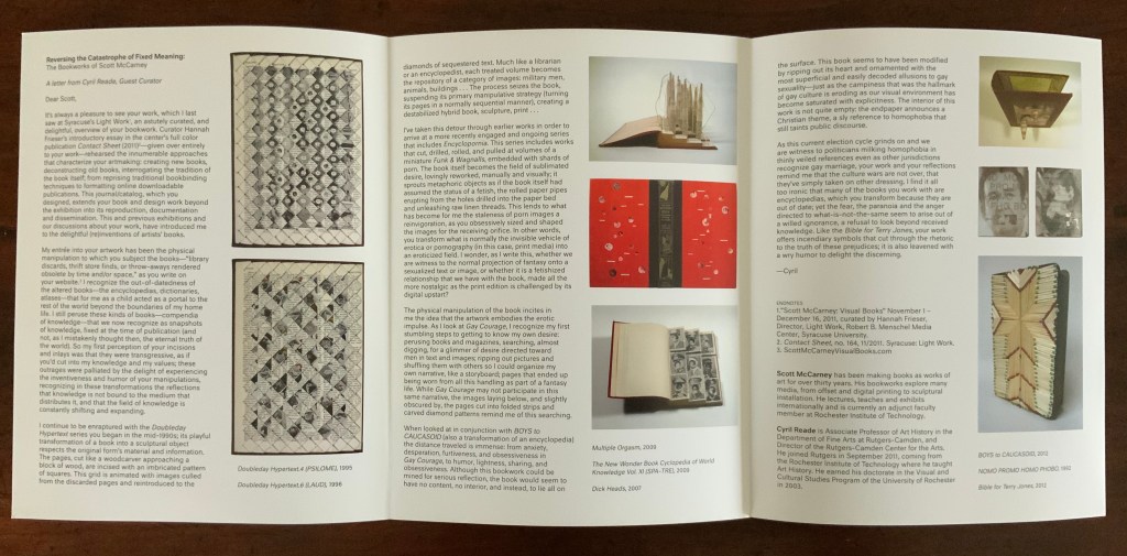
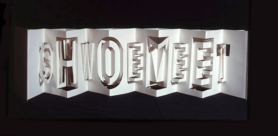
Since 1981, Scott McCarney has diligently extended the lineage through a series of alphabets designed in book form, where the letterforms depend upon the materiality of the book. The limits and possibilities of the book — its material, form and processes by which both can be handled — have inspired McCarney’s Alphabook series. According to the artist, all the Alphabooks (with the exception of numbers 3, 10 and 13) “are one-of-a-kind, and have not been shown much (if at all), so I’m not aware of them being illustrated anywhere“. Fortunately, Alphabook 1 (1981) appears in The Penland Book of Handmade Books: Master Classes in Bookmaking Techniques (2004), p.134, and Alphabook 9 (1985), which McCarney produced as a one-of-a-kind book of photograms in a residency at Light Work in 1985, appears in the Light Work Collection. McCarney describes his inspired manipulation of material, form and process in creating Alphabook 9:
I folded pop-up letterforms with unexposed photo paper in the darkroom and exposed it to directional light then developed, fixed, dried and flattened the prints. I made a book for Light Work for their collection that spelled out “LIGHTWORK” in the photogram alphabet, which can be seen in their database here: Light Work Collection / Artwork / Photogram Letter book [1133]. — Correspondence with Books On Books, 7 February 2020.
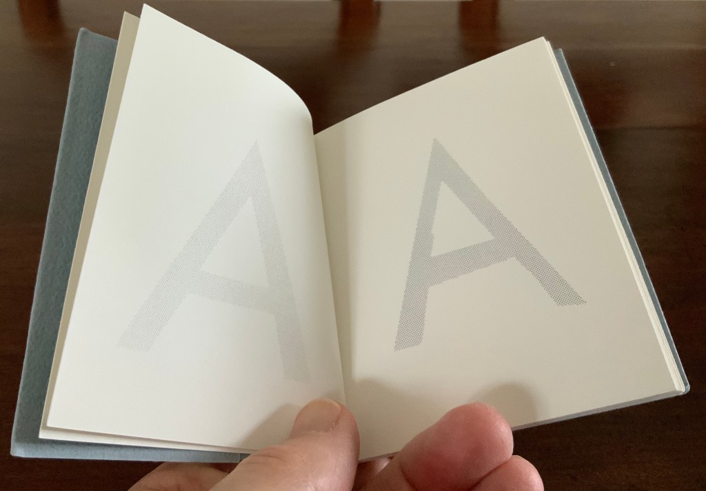
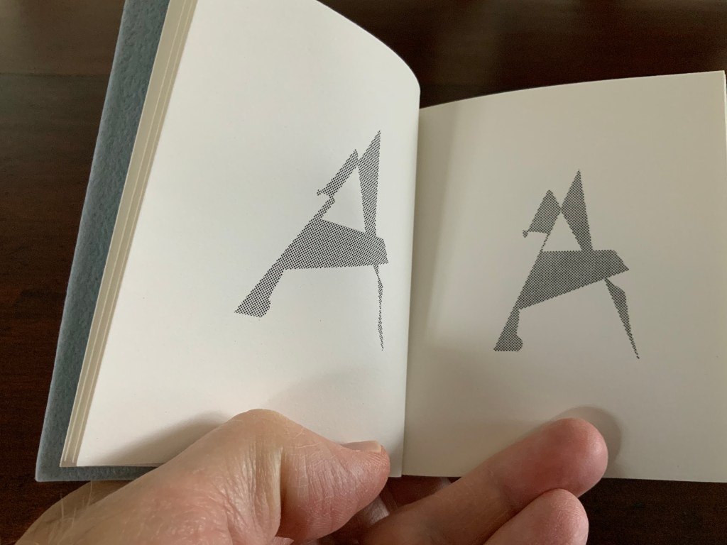
And WorldCat shows that Alphabook 13 (1991) can be found in at least three institutions. It was produced in an edition of 25 and consists of one volume (110 x 100 mm) in which the letter A gradually morphs into the letter Z.
With three of the series works now in the Books On Books Collection, the lack of illustration can be somewhat remedied.
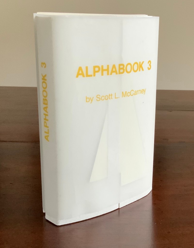
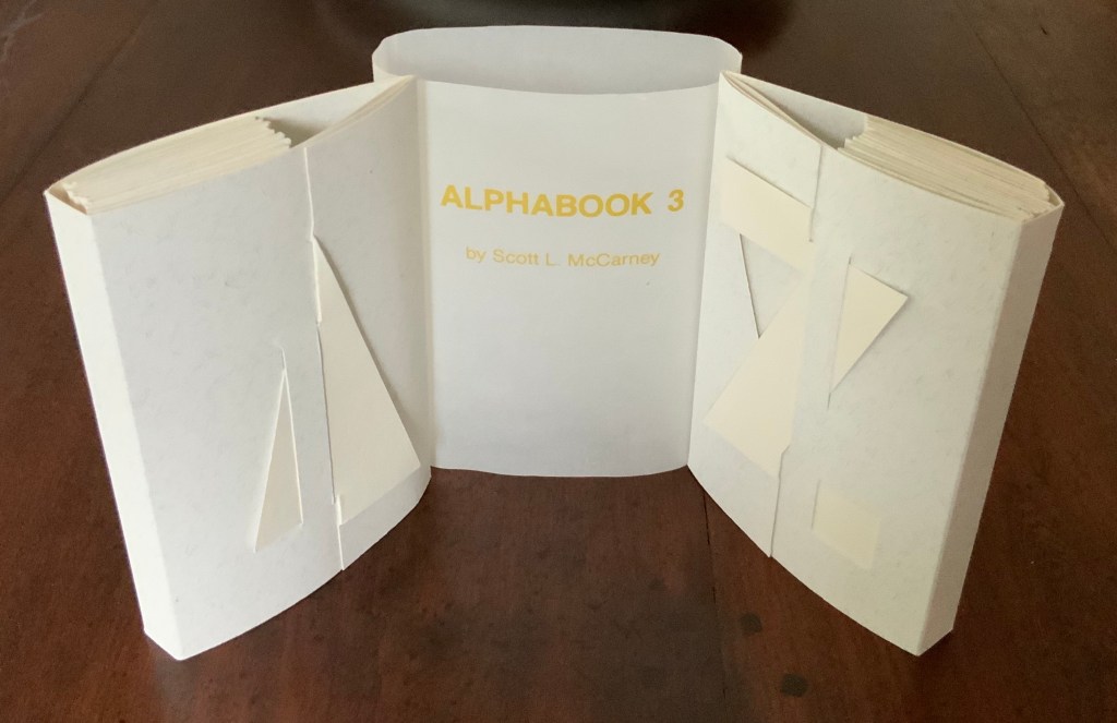
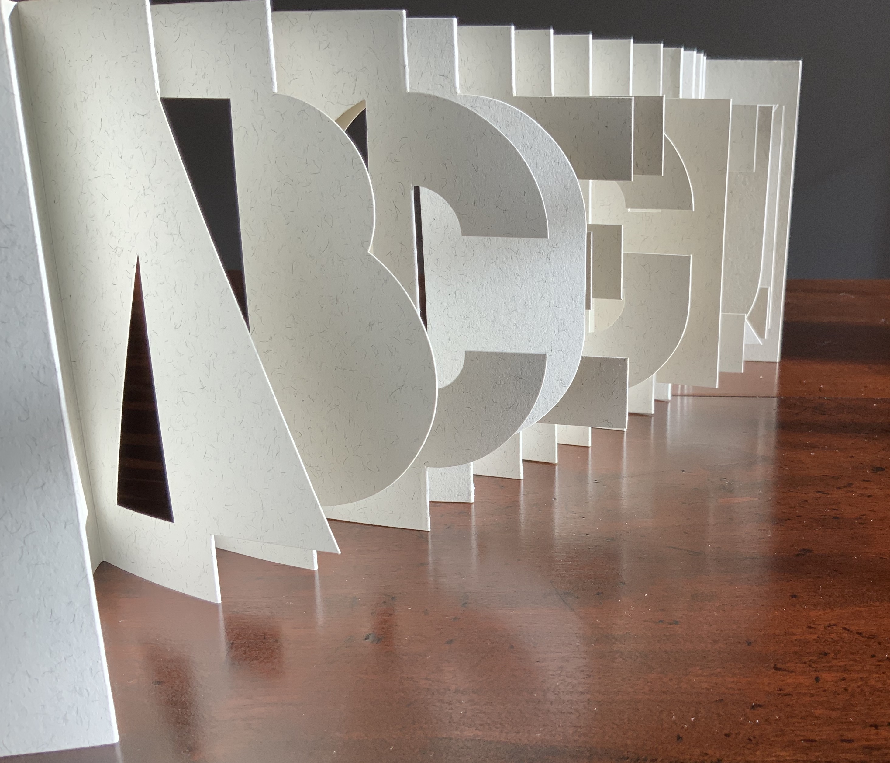
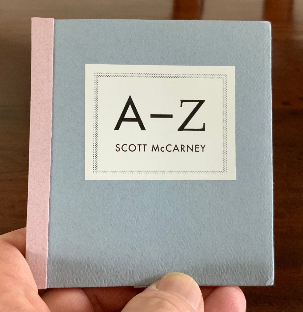
Alphabook 3 (1986)
Alphabook 3 (1986) Scott McCarney Two volumes, each of 26 unnumbered die-cut pages and wrapped in translucent belly band. Edition of 300, signed but not numbered. Each volume, closed: H151 x W104 mm; open: H151 x W2195. Acquired from the artist, 14 August 2017. Photos: Books On Books.
Photos: Books On Books.
Unlike most others in the series, Alphabook 3 is a multiple of 300 copies.
Alphabook 10 (2015)
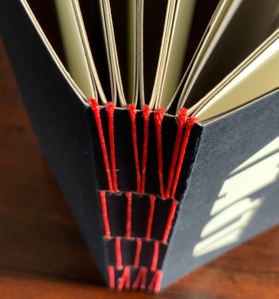
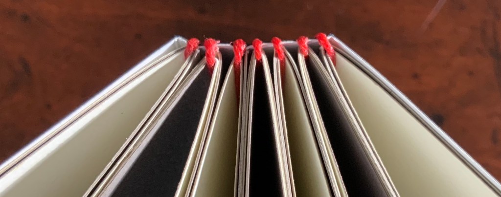
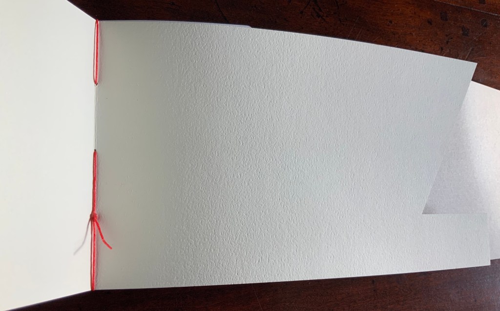
Alphabook 10 (2015) Scott McCarney Laser cut duplex papers hand bound with long stitch through slotted cover; housed in archival box. 56 unnumbered pages. 130 x 310 mm; in box 140 x 310 x 30 mm. Edition of 14, of which this is #11. Acquired from the artist, 23 January 2020. Photos: Courtesy of the artist
The codex form receives McCarney’s playfulness in Alphabook 10. The artist writes:
… The fore edge of each page is cut into geometric forms from black, white and cream toned duplex stock (two sheets of different colored paper laminated together). … Produced during a residency at The Institute for Electronic Arts, a high technology research studio facility within the School of Art and Design, NYSCC, Alfred University, New York, committed to developing cultural interactions spurred by technological experimentation and artistic investigations.
Scott McCarney, Visual Books. Accessed 9 February 2020.
The handling of the cover and first page draw attention to the role that empty space, light and stock color will play throughout the book.
Photos: Books On Books.
The binding warrants a closer look as well. Outside and inside, the red thread, its pattern and function stand out.
Photos: Books On Books.
And notice how the thread calls out the textured surface of the paper.
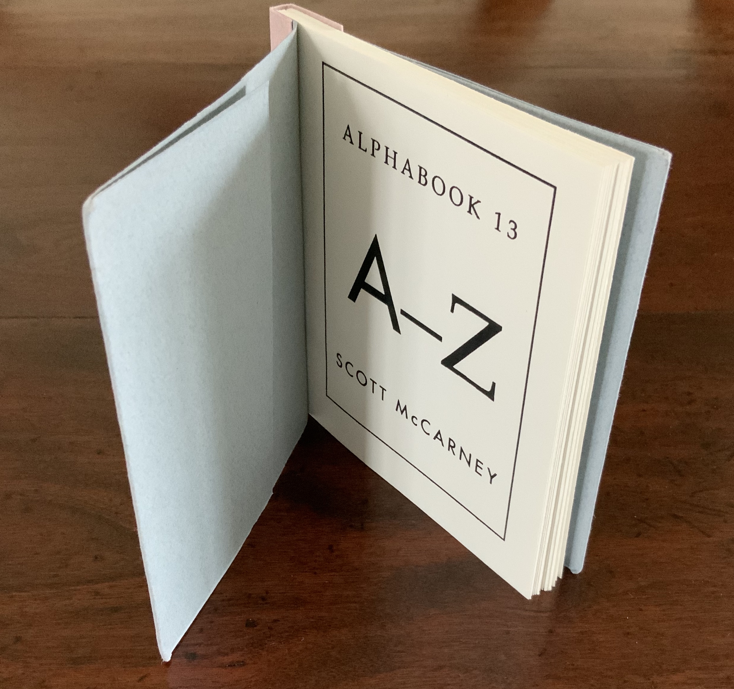
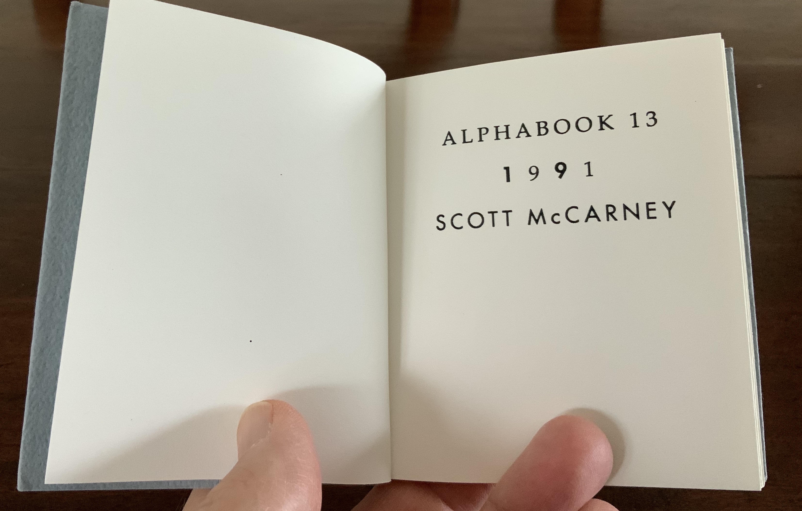
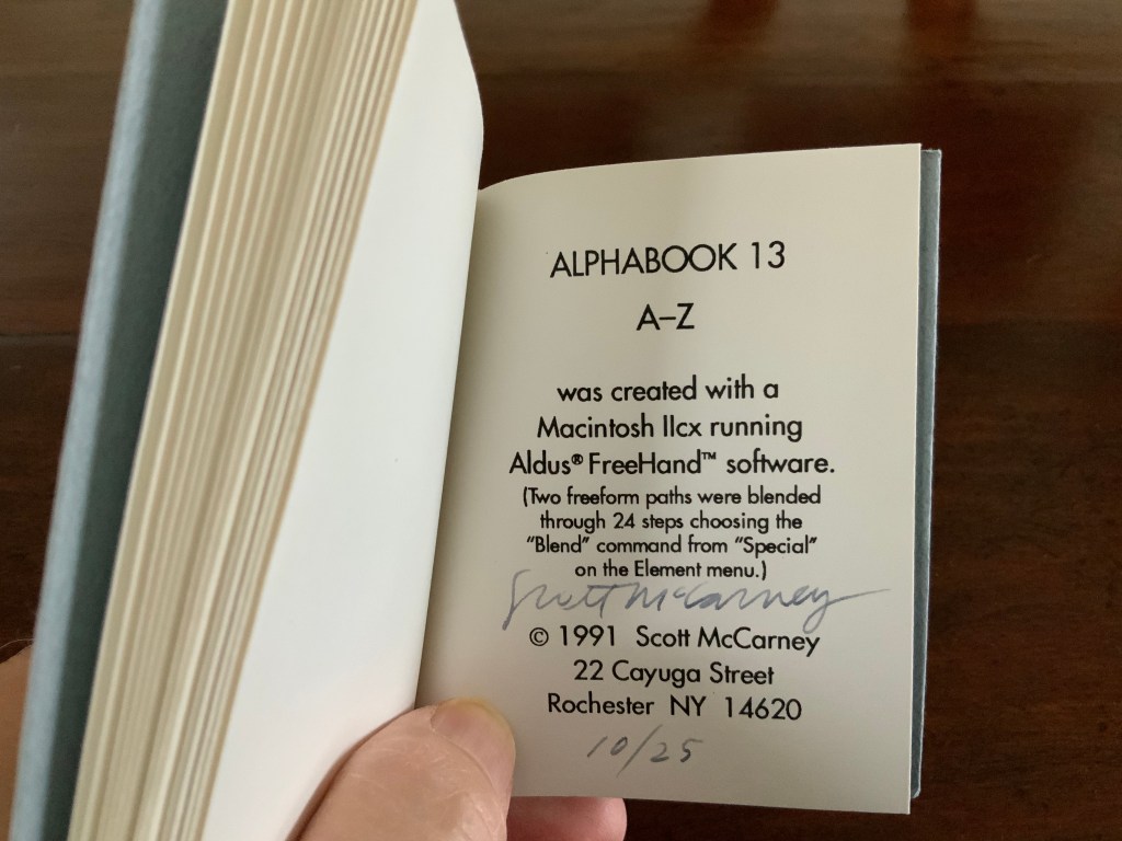
Alphabook 13 (1991)
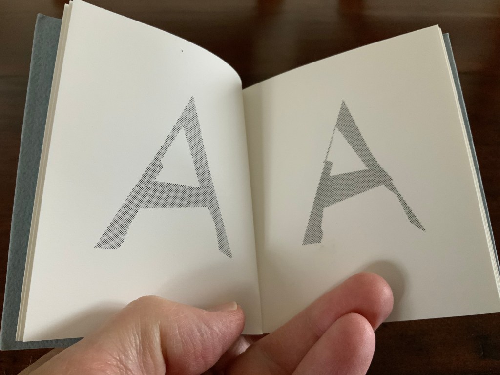
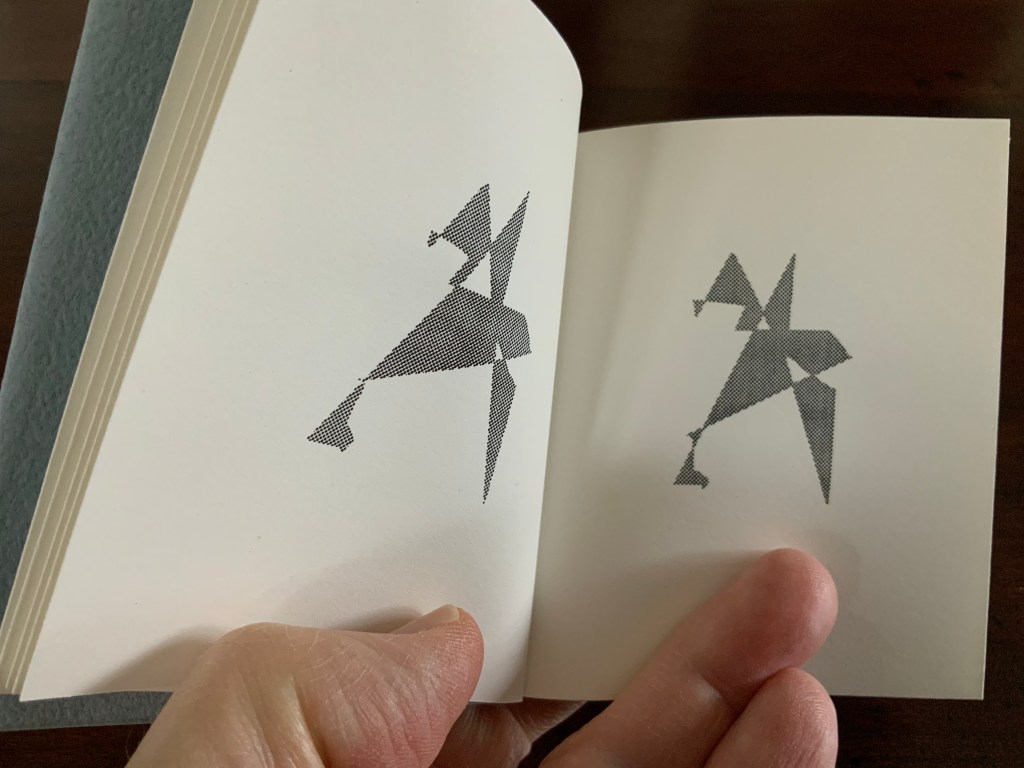
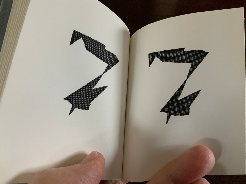
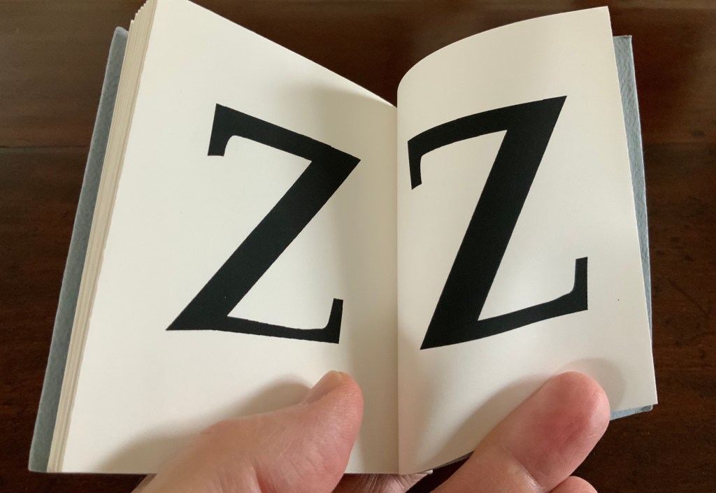
Alphabook 13 (1991) Scott McCarney Flipbook, created with a Macintosh IIcx running Aldus® FreeHand™️ software. H100 x W92 mm. 32 pages. Acquired from the artist, 15 February 2020. Photo: Books On Books Collection.
Photos: Books On Books Collection.
Photo: Books On Books Collection.
In correspondence with Books On Books, McCarney explains that the Alphabooks’ mismatch of numbering and chronology stems from discrepancies between dates of conception and opportunities to execute. This little flipbook was conceived and executed as a photocopy edition of 25 in 1991; of more importance here though is the coming together of computer-based typesetting, book structure and pun. As we know, the shortest distance between A and Z is not B to Y, but the points in A reconfigured into Z across 24 flipping pages. It is interesting to compare this transformation with Claude Closky’s calligraphic version De A à Z (1991).
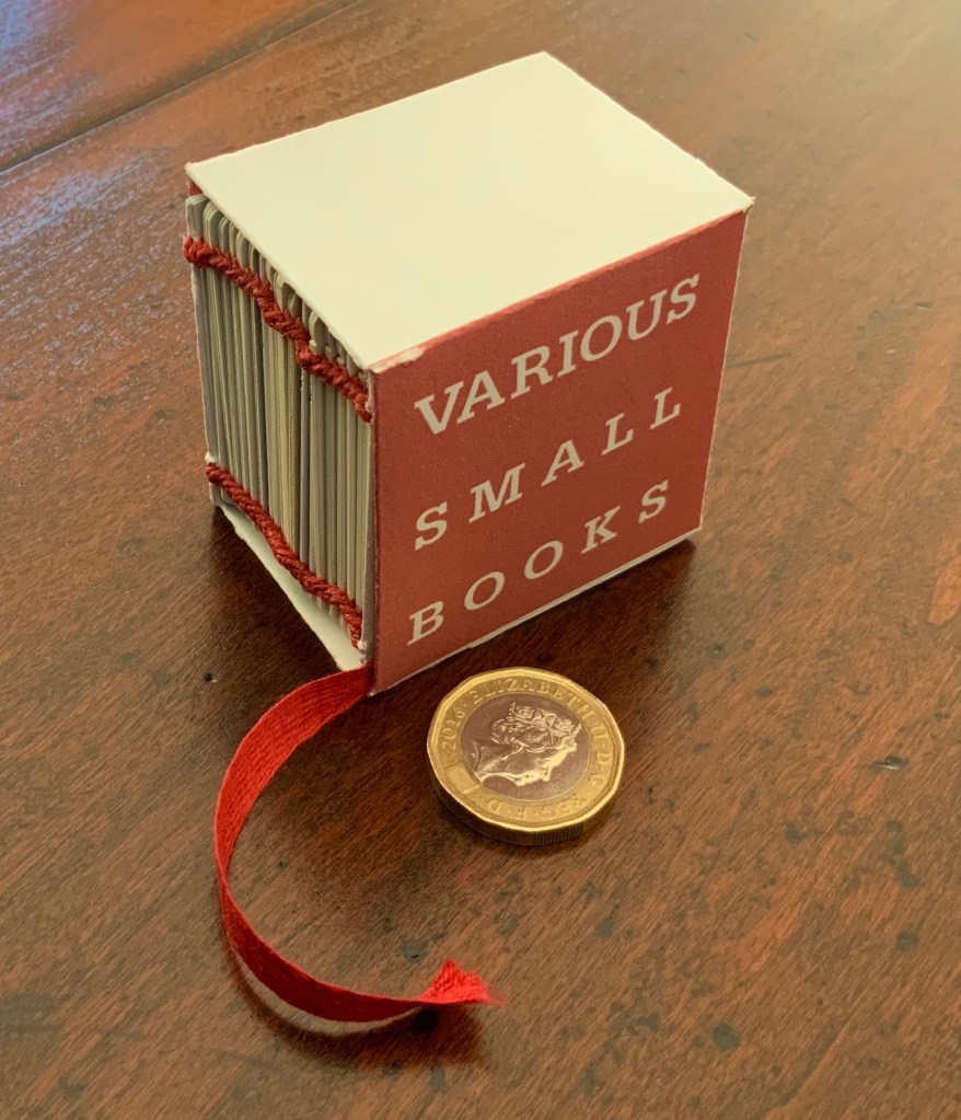
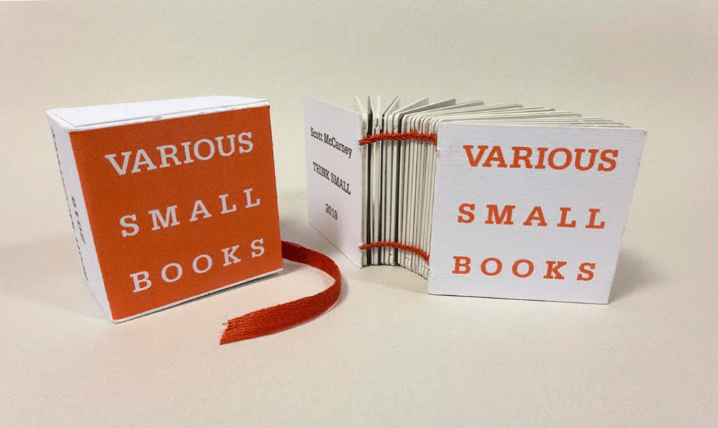
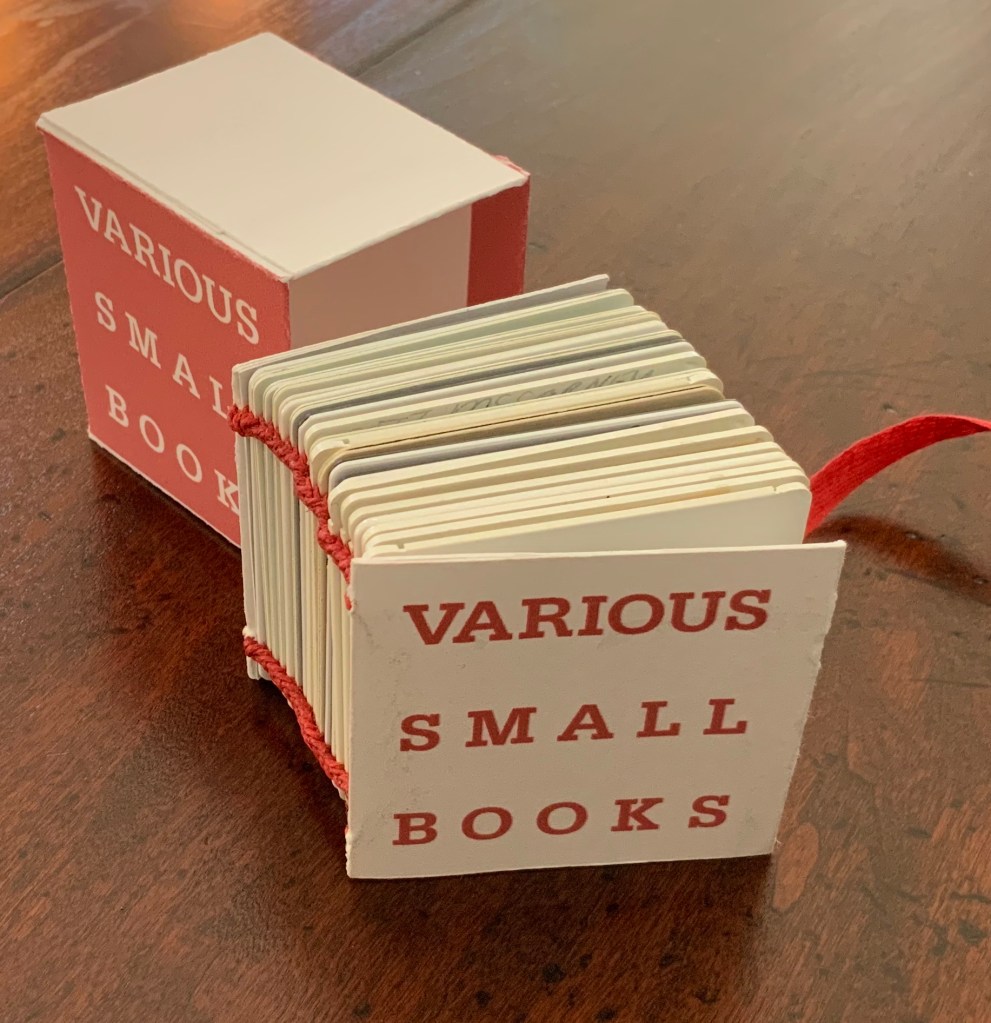
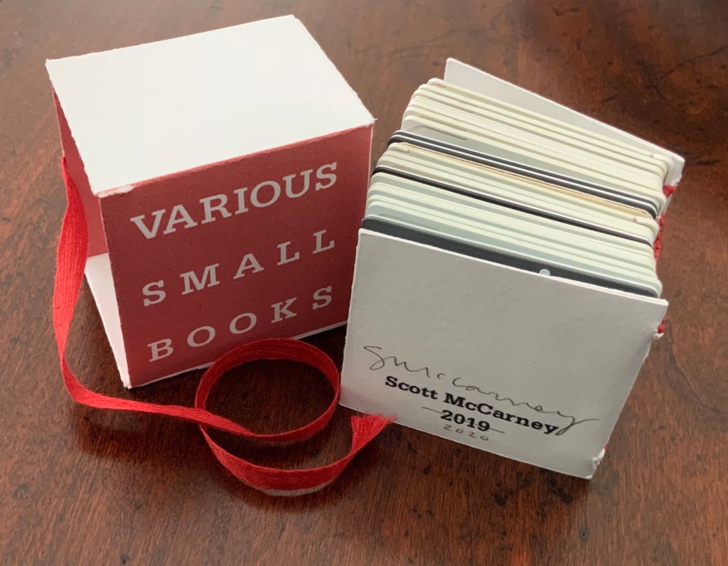
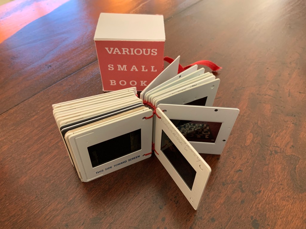
Various Small Books (2019/20)
Various Small Books (2019/20) Scott McCarney Photo: Books On Books.
Various Small Books (2019) Scott McCarney Photo: Courtesy of the artist.
The 2019 edition was conceived for a fundraising exhibition at Artspace in Richmond, VA. Both the 2019 and 2019/20 editions consist of 35mm slides documenting various of McCarney’s bookworks. Consisting of different slides, the two editions of Various Small Books are unique, and since the slides are bound together and cannot be projected, the images of the books appear small indeed.
Various Small Books (2019/20) Scott McCarney Photo: Books On Books
Courtesy of the artist, the inclusion in Various Small Books (2019/20) of slides documenting Alphabook 4, Alphabook 6 and Alphabook 10 makes the 2019/20 edition particularly apropos for the Books On Books Collection.
“Scott McCarney, Special Edition”, Contact Sheet, No. 164 (Syracuse, NY: Light Work, 2011). Exhibition catalog, which kicked off the conference “Photographers + Publishing”, 3-5 November 2011, Light Work and Syracuse University.
Home Sweet Home (1985)
Home Sweet Home (1985) [Not in collection] Scott McCarney Paper in accordion binding with decorative and marbled paper-covered boards and paper-covered slip case. 11 5/8” x 9 1/2” x 1 3/4”