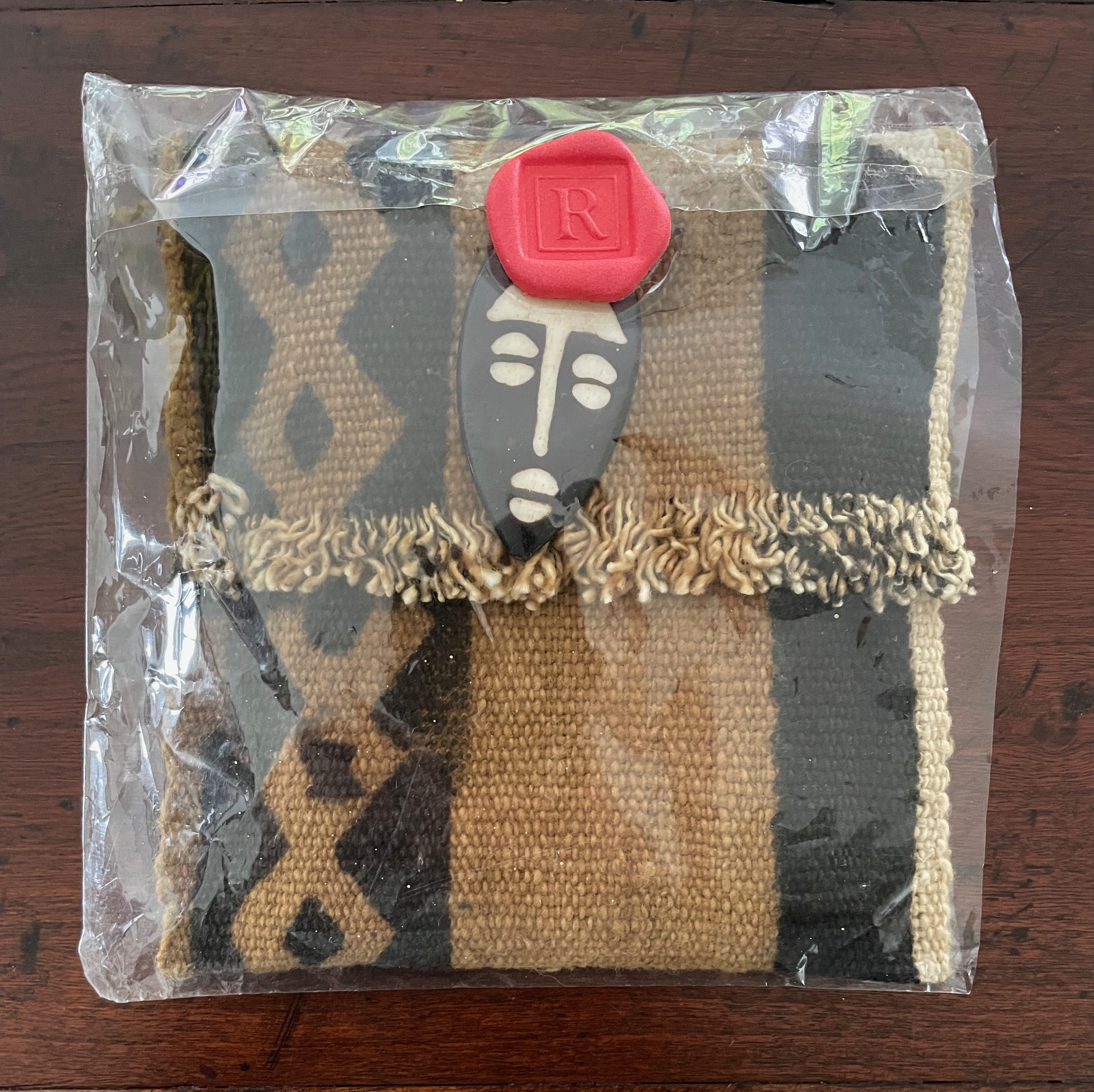
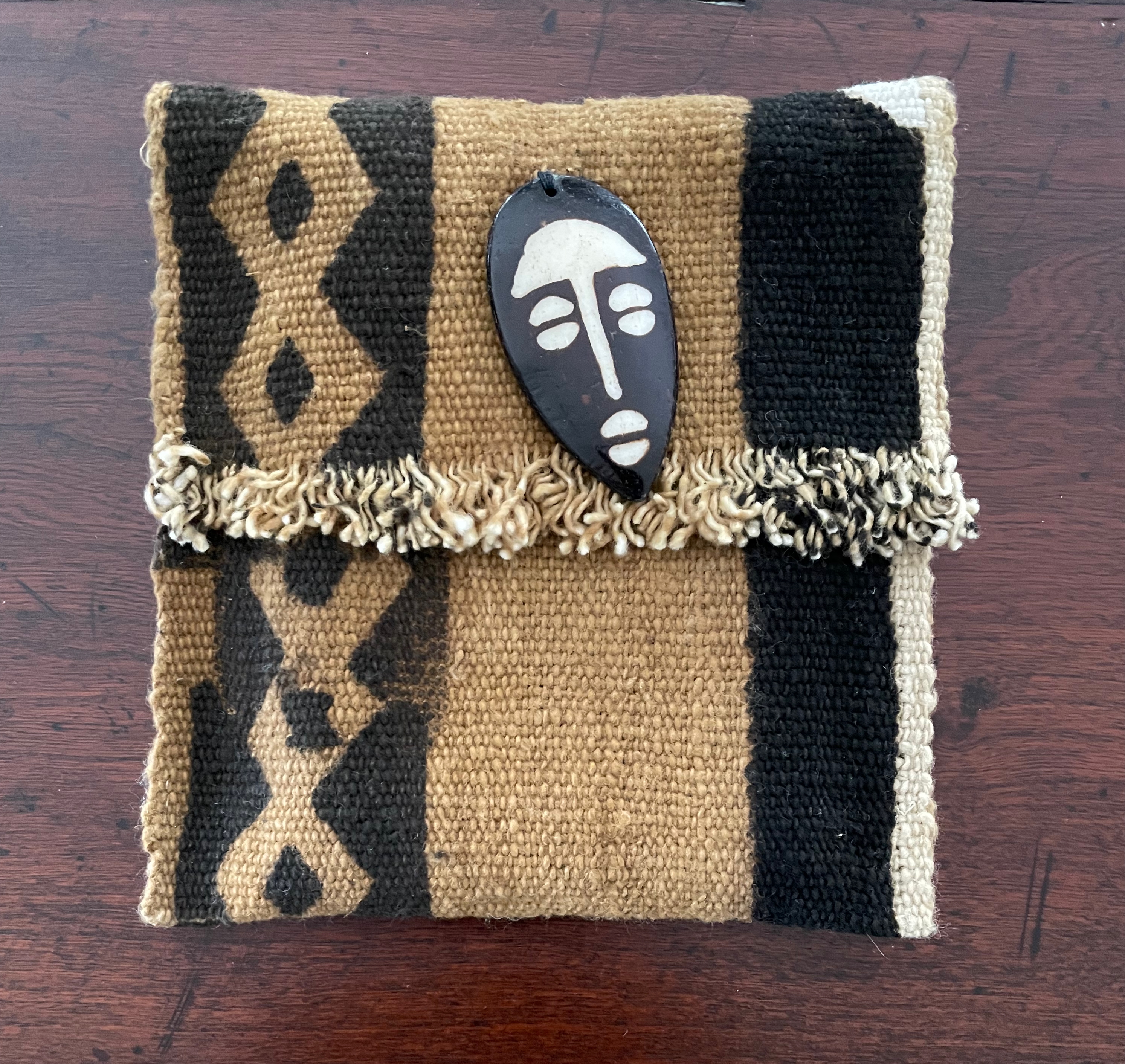
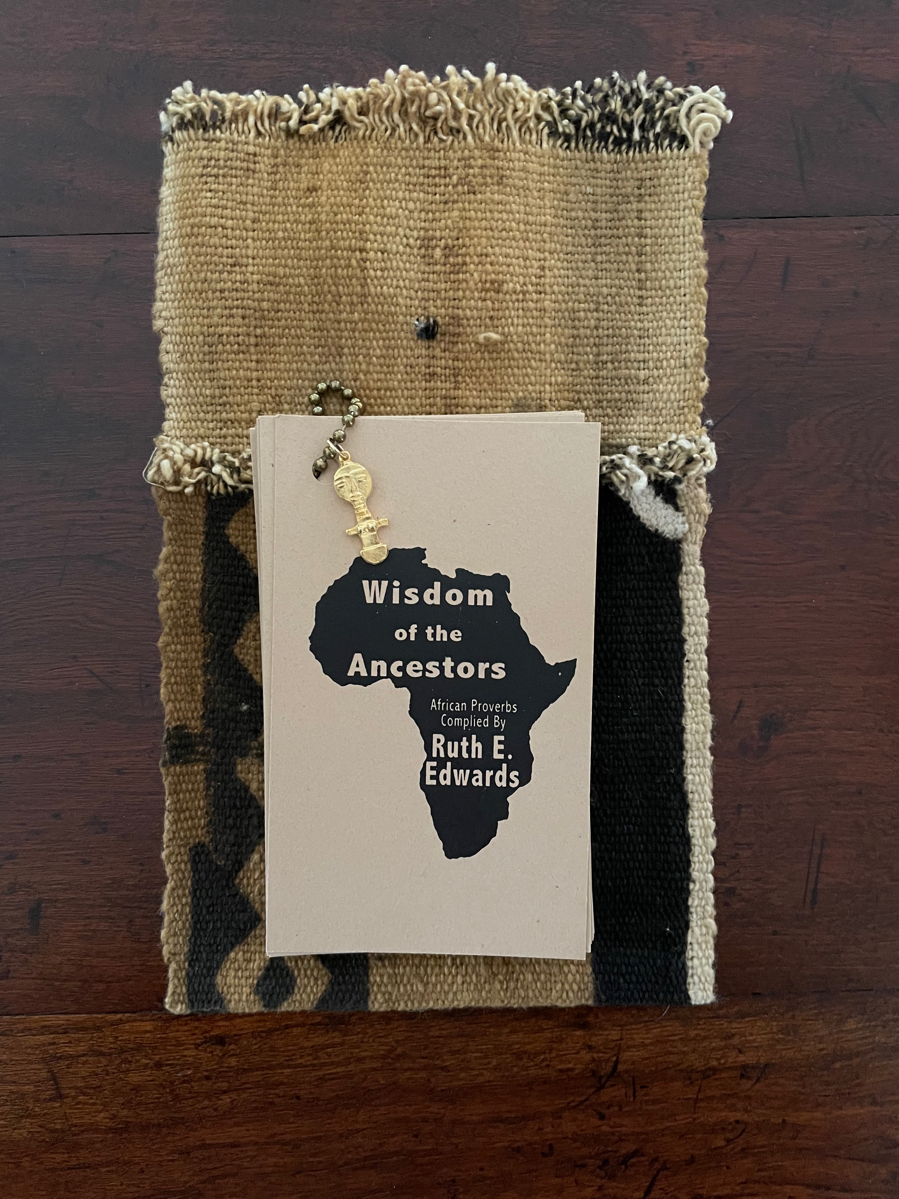
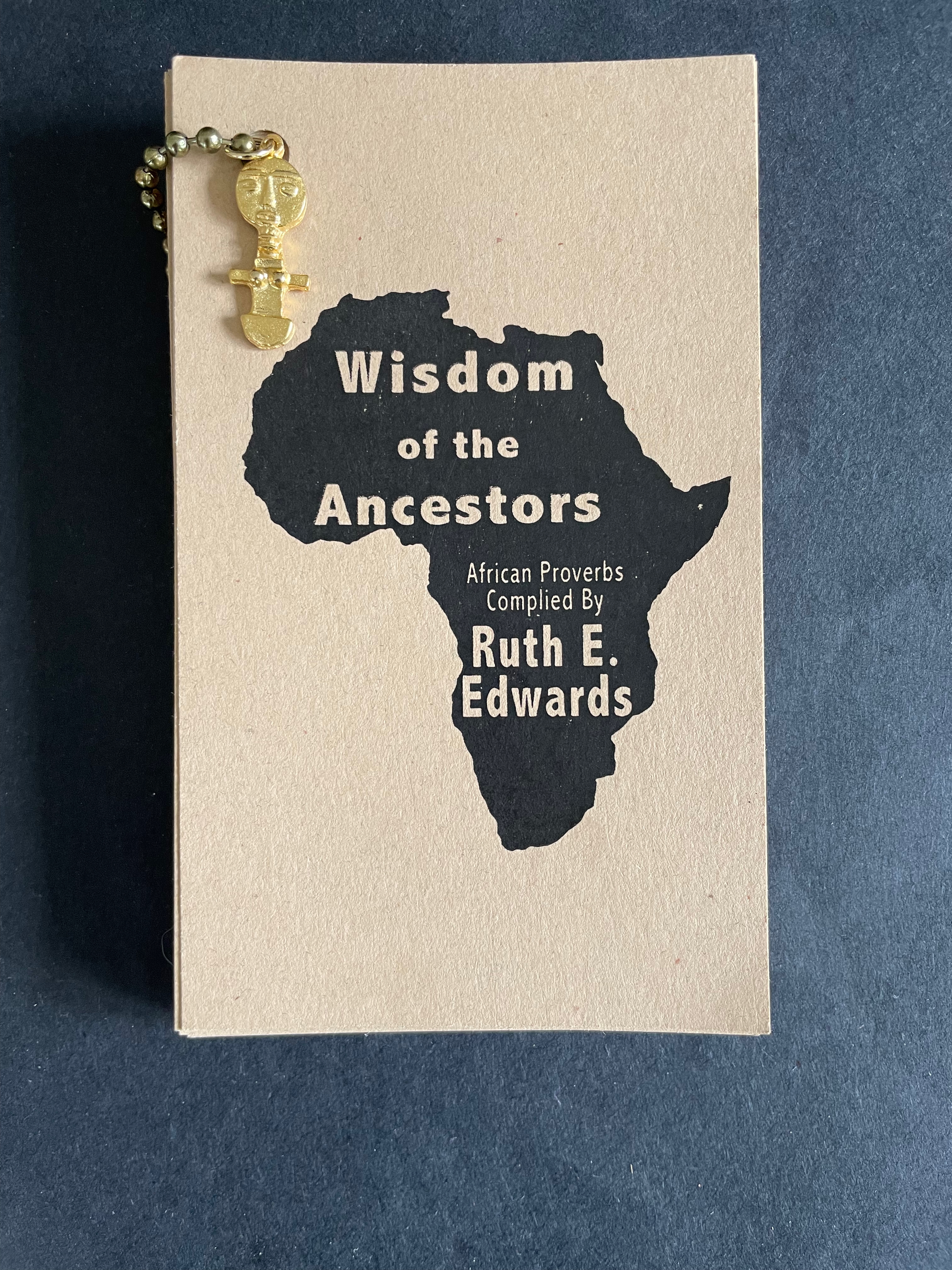
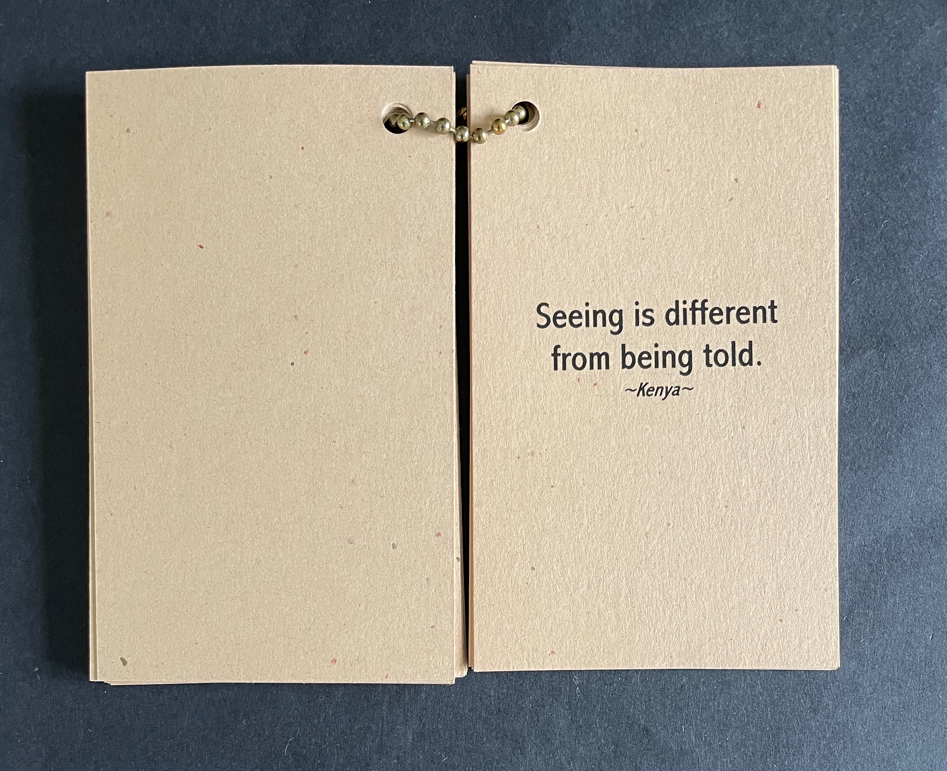
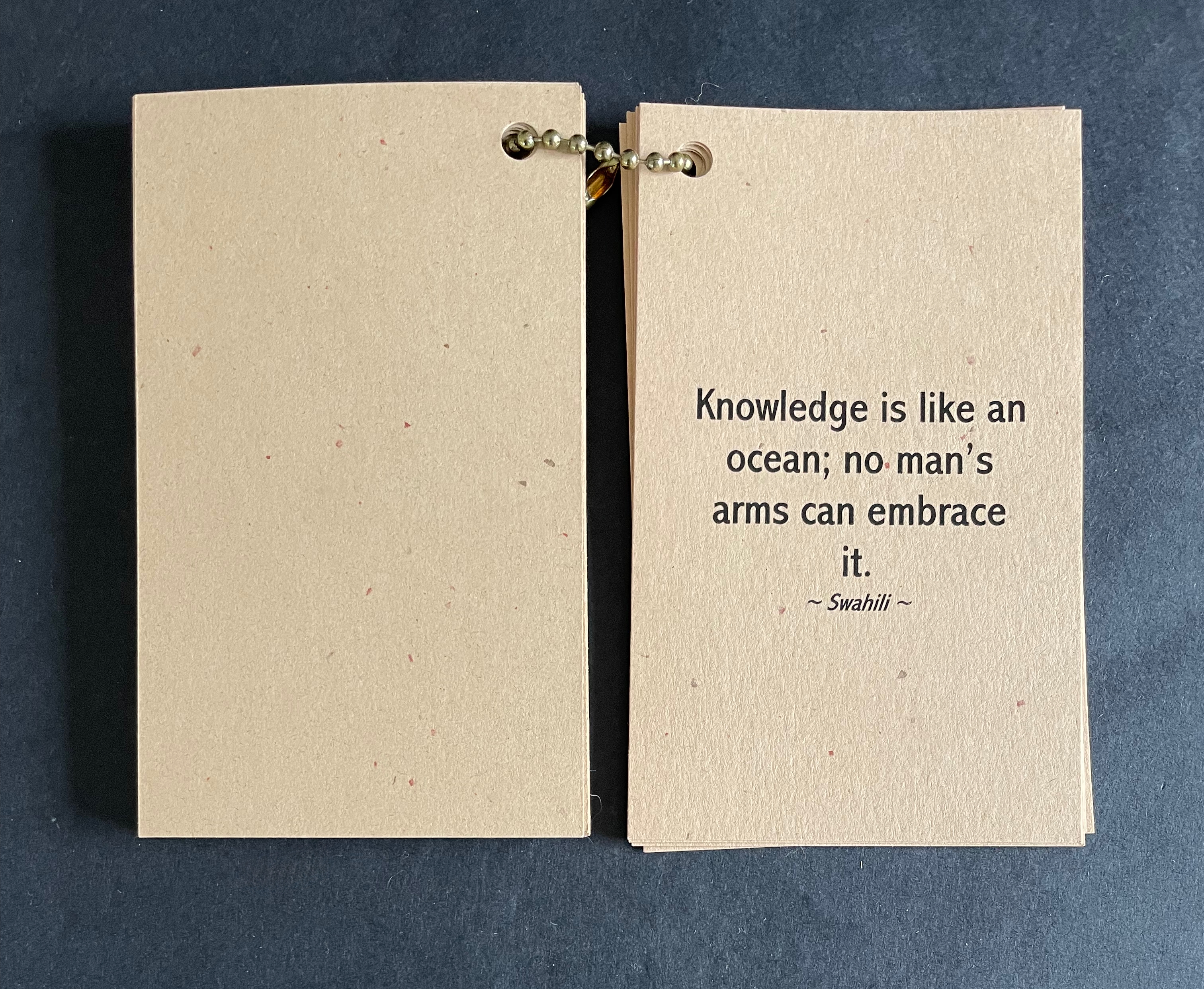
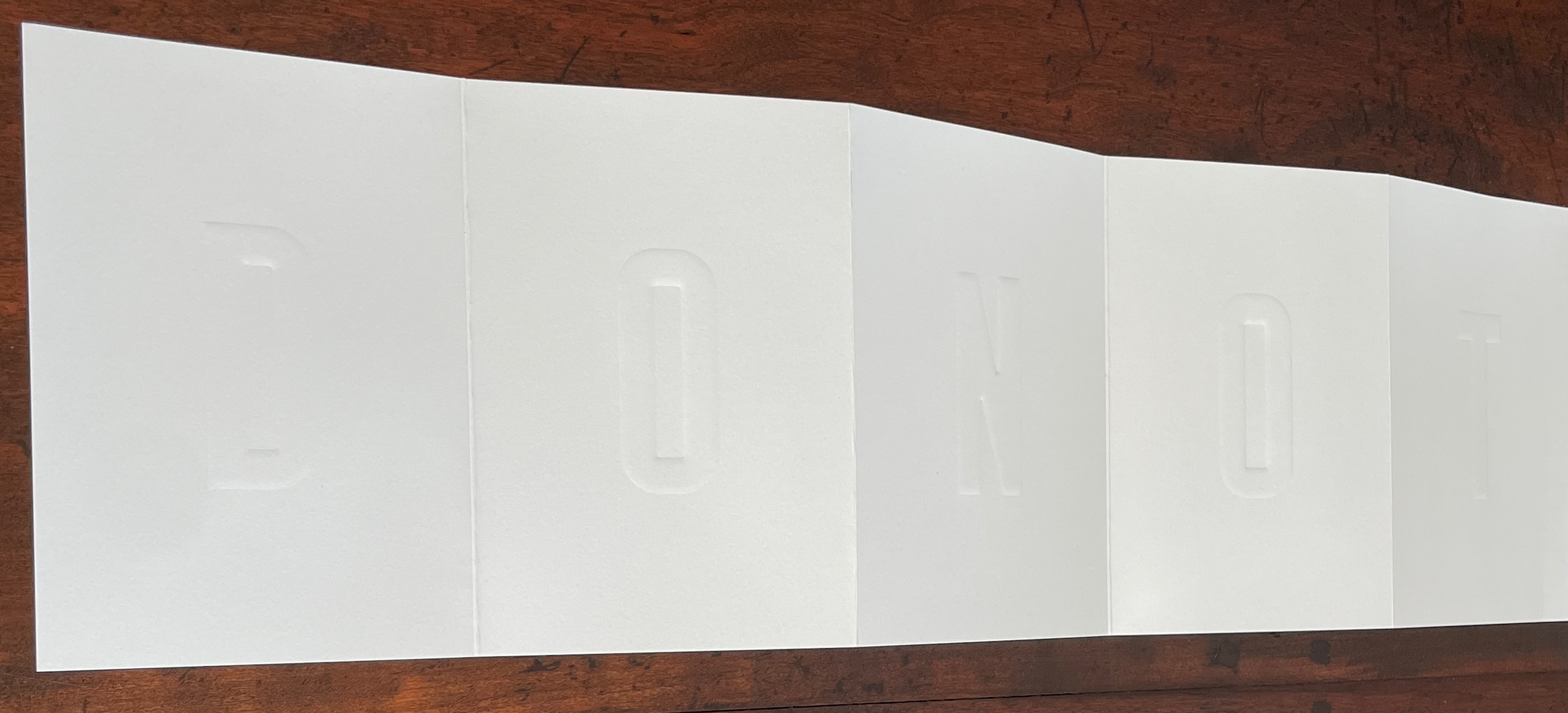
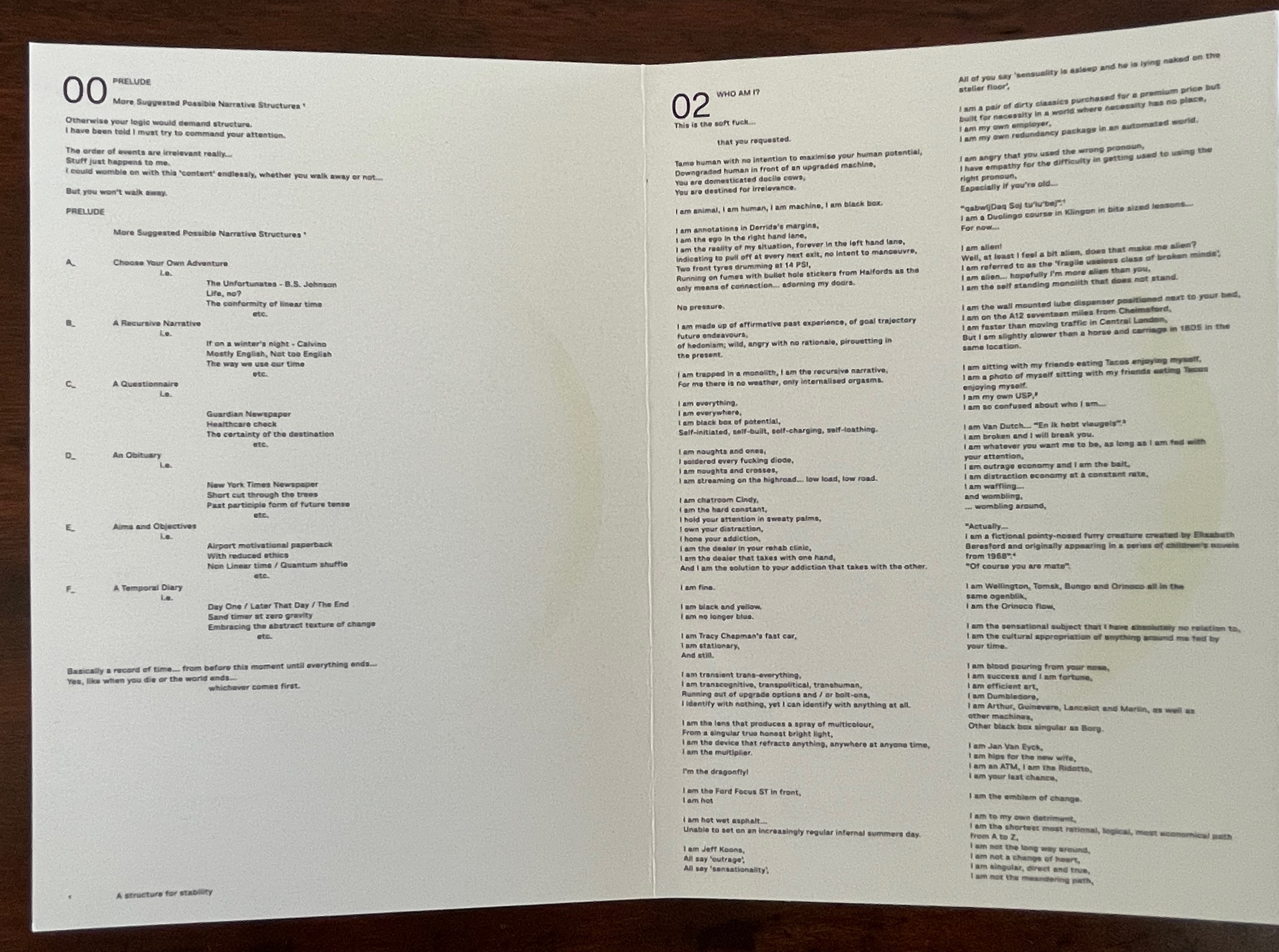
Wisdom of the Ancestors (1999) Ruth E. Edwards Cloth bag with painted stone amulet, hand-woven African mudcloth from Mali, containing metal ball bead chain through single-hole punched in cards, with gold talisman hanging. Bag: H145 x W135 mm. Cards: H130 x W76 mm. 30 cards. Eclectic Art and Collections 23 October 2025. Photos: Books On Books Collection.
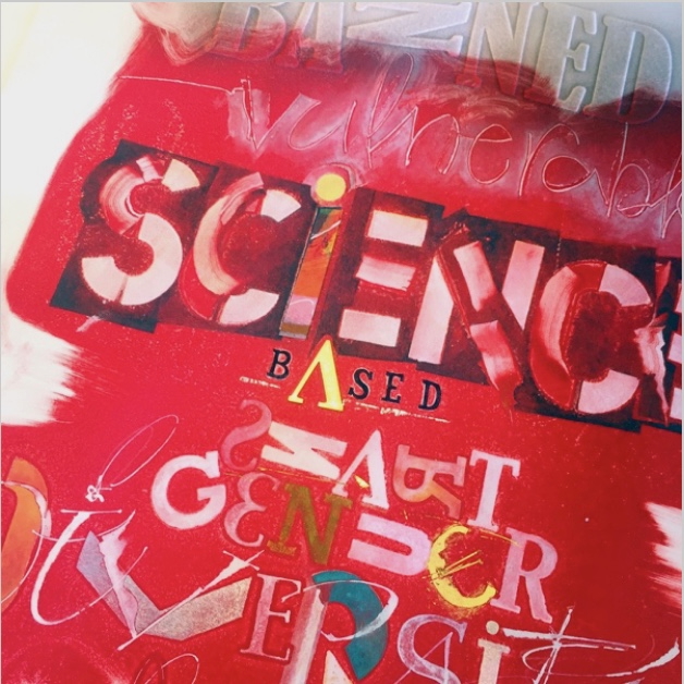
It appears the African ancestors had some inkling of and ancient words for the USA of 2016 and 2024.
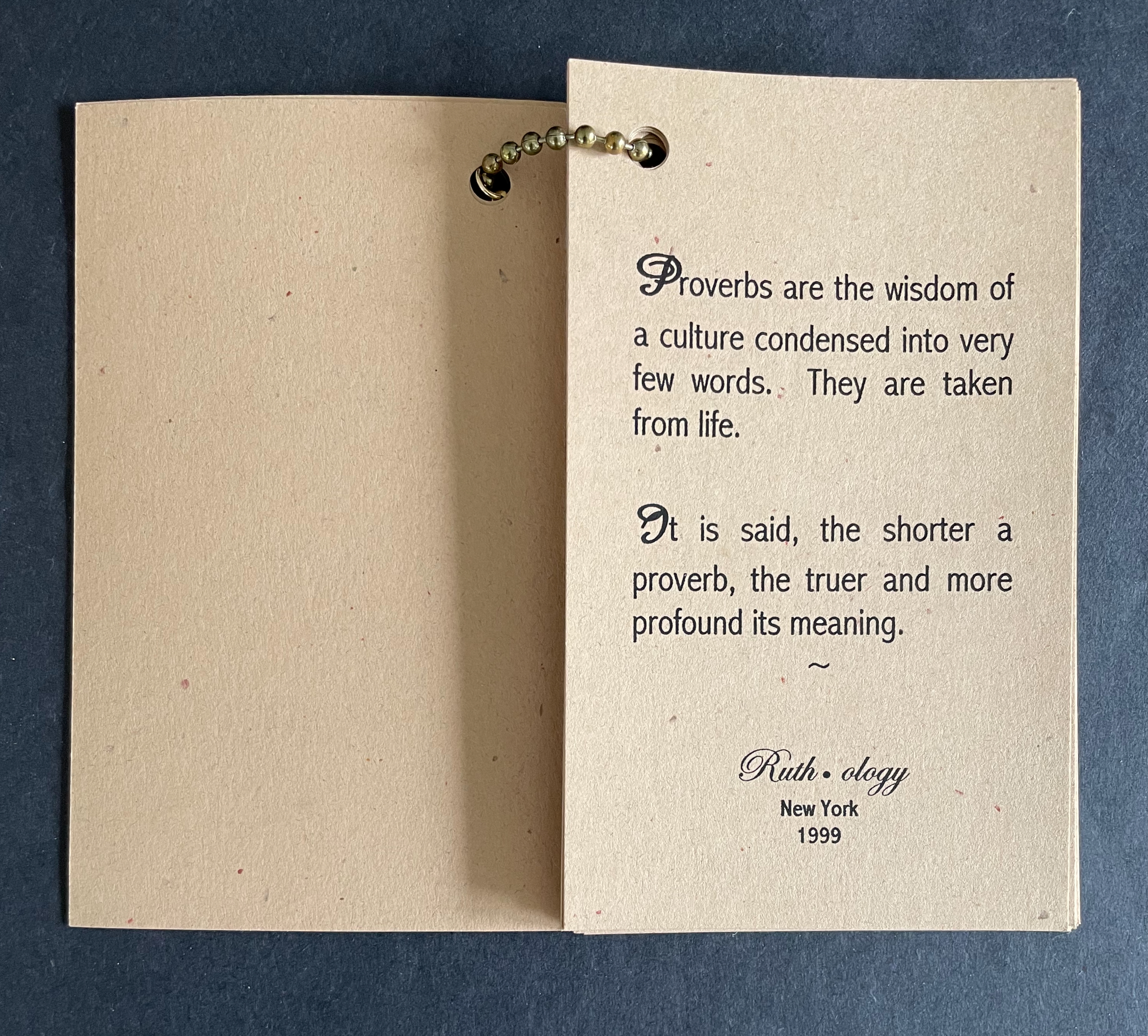
Other expressions remind how best to learn. Others put growing anxieties about information overload in the shade of the ocean-wide context of knowledge.
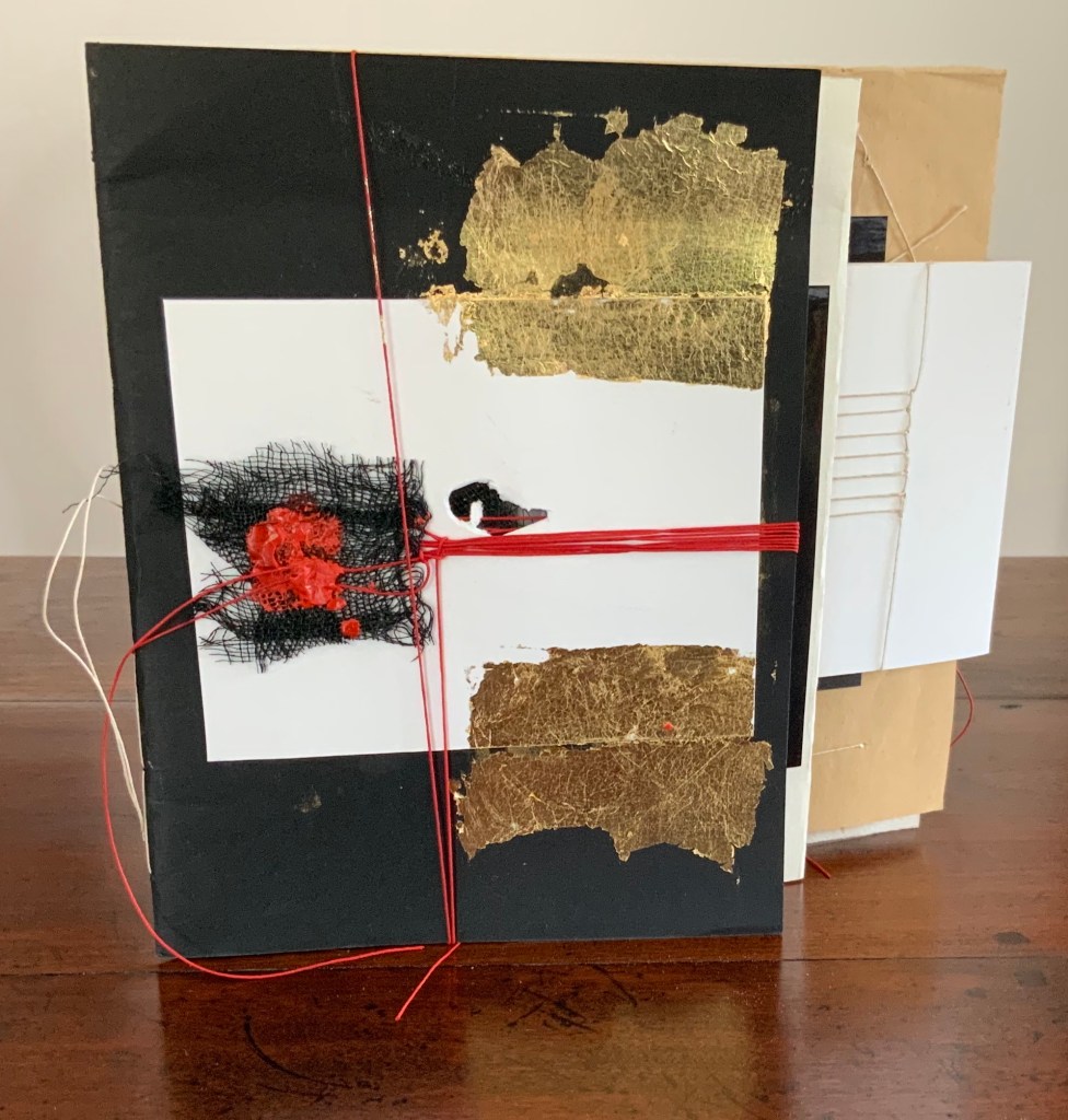
The earth-tone cards “bound” with a metal ball bead chain and mudcloth bag imbue the thirty wise sayings with a further sense of the “make do” of craft and art, which carries its own wisdom
Further Reading
“Tia Blassingame“. 17 August 2020. Books On Books Collection.
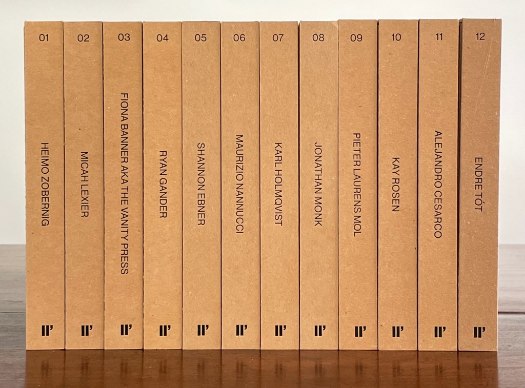
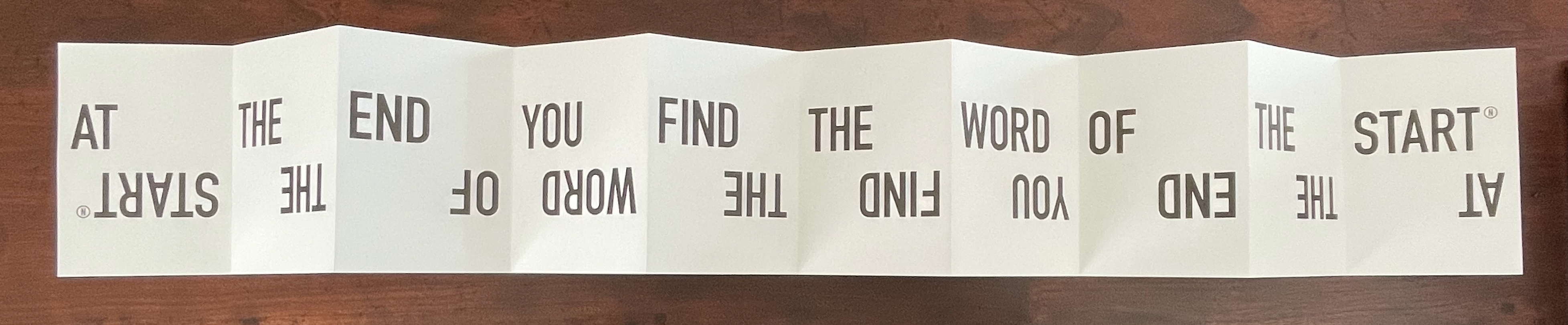
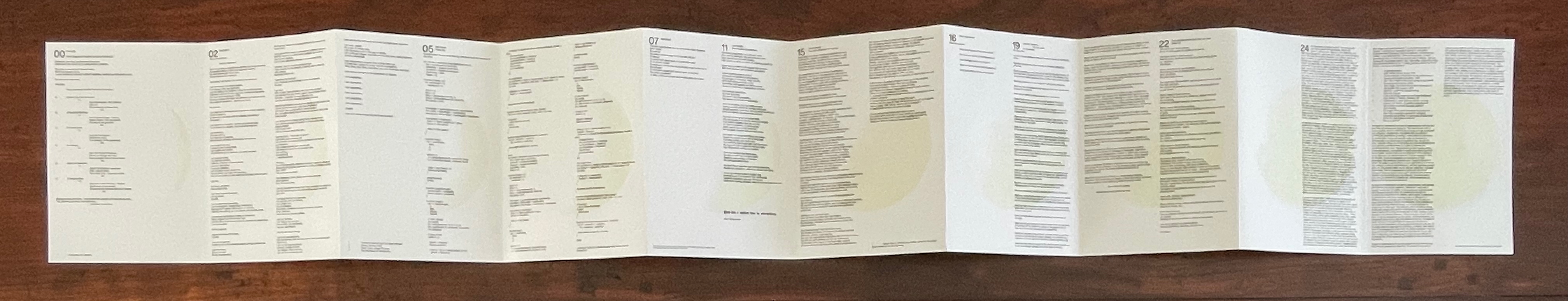
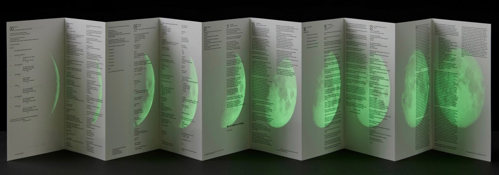
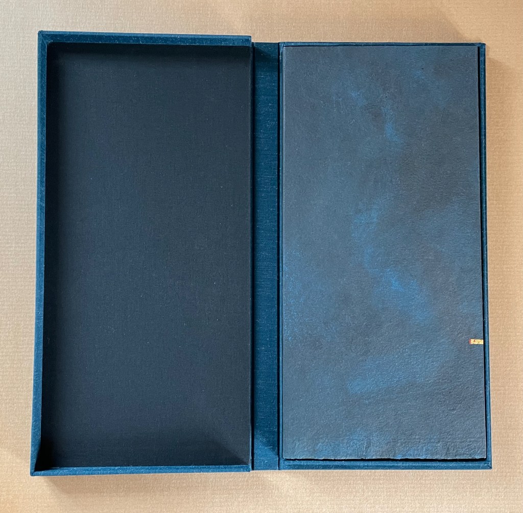
Enthusiasts and collectors of artists’ books should congratulate LL’Editions (Göteborg, Sweden) on its leporello series not only for the artists enlisted so far but for the constraint to inspire them. Critics of book art have opined that book artists turned to the accordion structure in the 20th century for more freedom with visual images and another tool with which to question the notion of the book as book. LL’Editions has challenged its invited artists with a constraint: a fixed-format leporello of ten panels, nine folds and always H140 x W100 mm (closed). The works are printed on Mohawk Superfine Eggshell paper. Housed in a custom box with the title hot foiled both on its front and spine, each volume in the series is limited to 250 numbered copies.
The real pleasure in each work and across the series is how each artist handles the shape to make it dance to a personal style or stamp. With each new addition — brick by brick — LL’Editions is building a monument to book art’s most common structure.
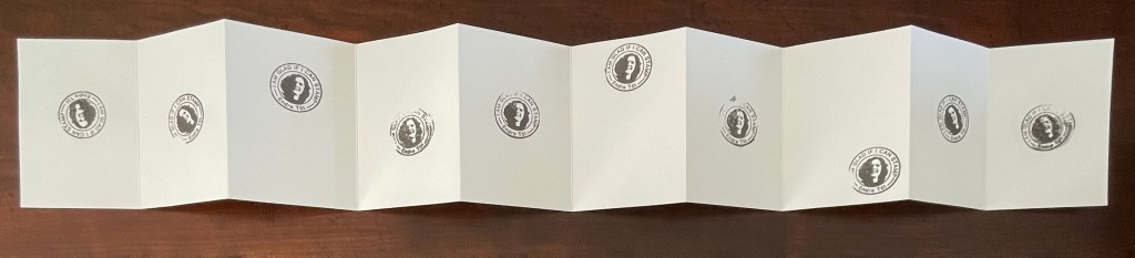
Leporello #12 (2025)
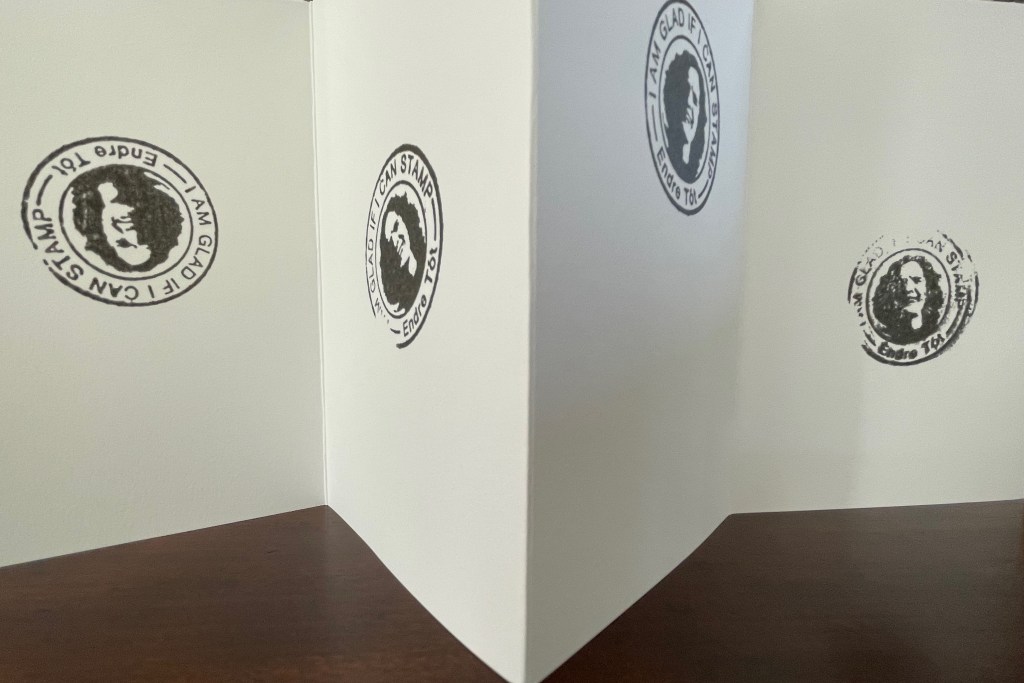
Leporello #12 (2025) Endre Tót Box: 148×191×23 mm. Leporello: H142 x W99 mm (closed); W990 mm (open). 10 panels. Edition of 250, of which this #70. Acquired from LL’Editions, 28 August 2025. Photos: Books On Books Collection. Displayed with permission of LL’Editions.
Bespoke Eska Board 1260 G/M2, Insert: F-Flute Black 500 G/M2, Hot-foiled title on front and spine. Mohawk Superfine Eggshell Ultrawhite 175 gsm.
Endre Tót has worked with a wide range of media: telegrams, postcards, posters, actions, and artist’s books. This one self-reflexively celebrates his signature gladness statements “We are glad if we are happy”, “I am glad that I have stood here”, “I’m glad that I can write one sentence after another”, “We are glad if we can demonstrate” and so on.
I am glad to have Endre Tót’s work in the Books On Books Collection.
Leporello #11 (2024)
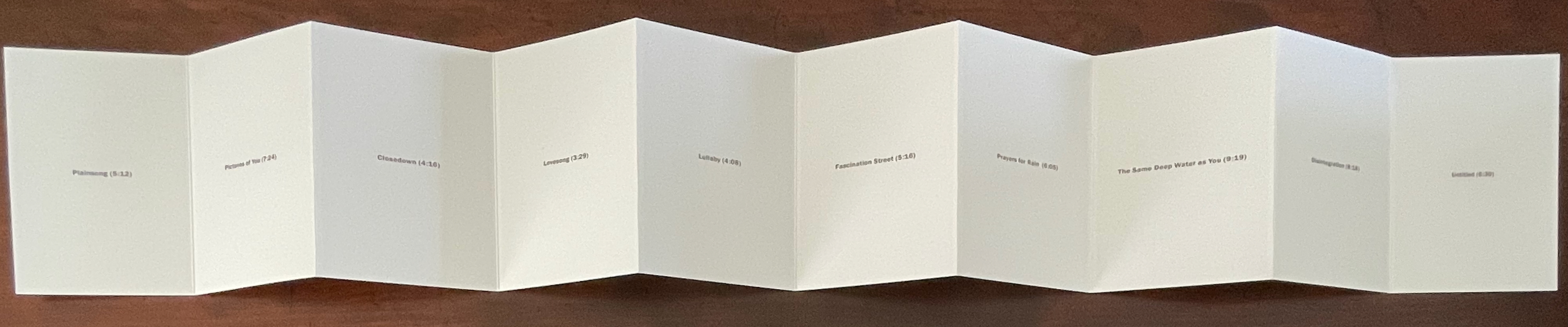
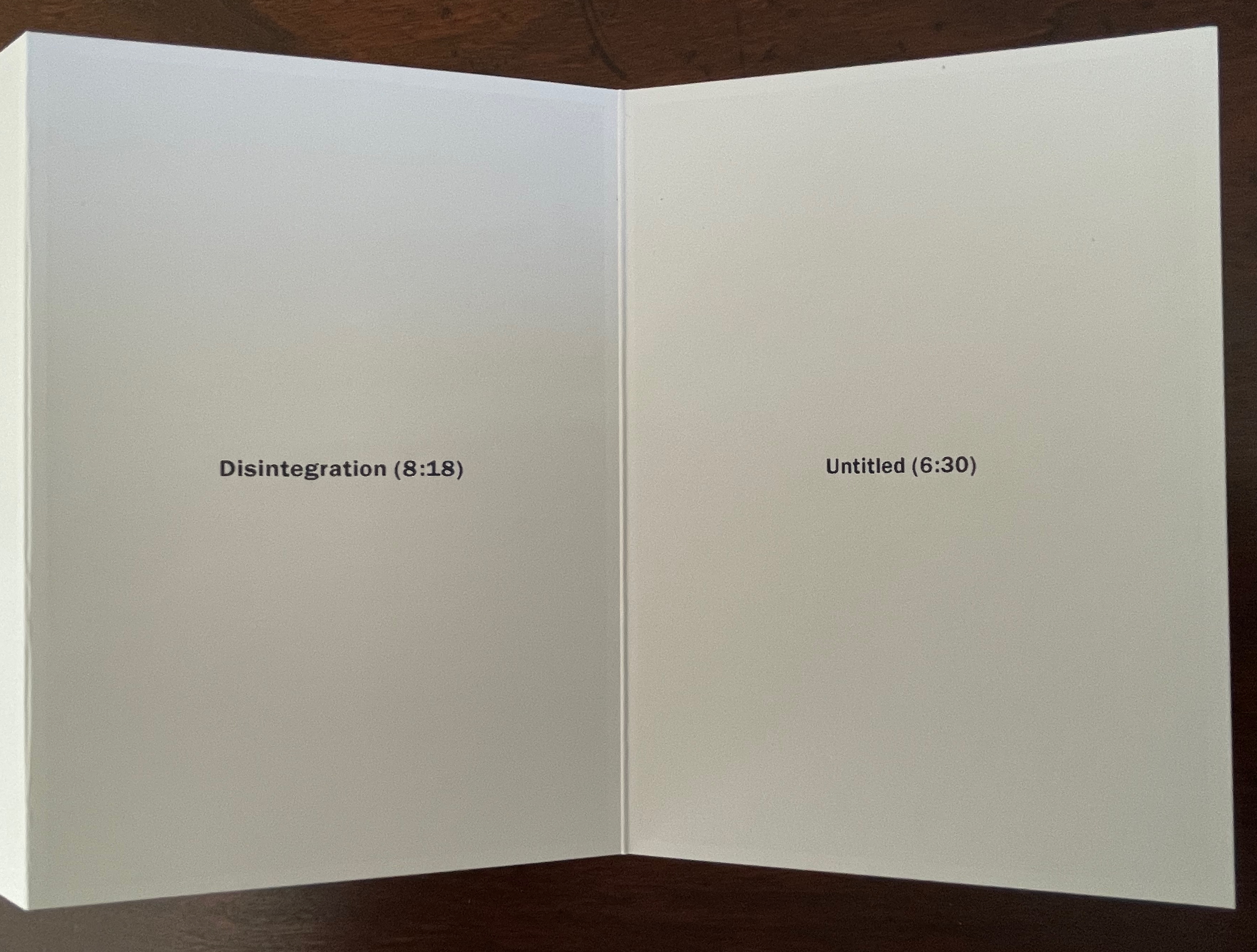
Leporello #11(2024) Alejandro Cesarco Box: H191 x W148 x D 23 mm. Leporello: H142 x W99 mm (closed). W990 mm (open). 10 panels. Edition of 250, of which this #229. Acquired from LL’Editions, 14 November 2024. Photos: Books On Books Collection. Displayed with permission of LL’Editions.
These are the titles and durations of the songs making up The Cure’s 1989 album. With each song on its own panel, Cesarco (b. 1975) seems to have created a photo album to remind himself of his youth. Given his artworks referencing/co-opting/implicating/appropriating John Baldessari, Marcel Broodthaers, Félix Gonzáles-Torres, Allen Ruppersberg, Ed Ruscha, and other book artists, the less-than-fans of The Cure may wonder if Cesarco is deliberately wrong-footing their expectations for his tackling the book artist’s platform. If you are one of them, consider that your horizons have been widened and that The Ramones (An Autobiography) (2008) — his list in chronological order of every Ramones song that begins with the pronoun “I” — does not neatly divide by 10.
Leporello #10 (2024)
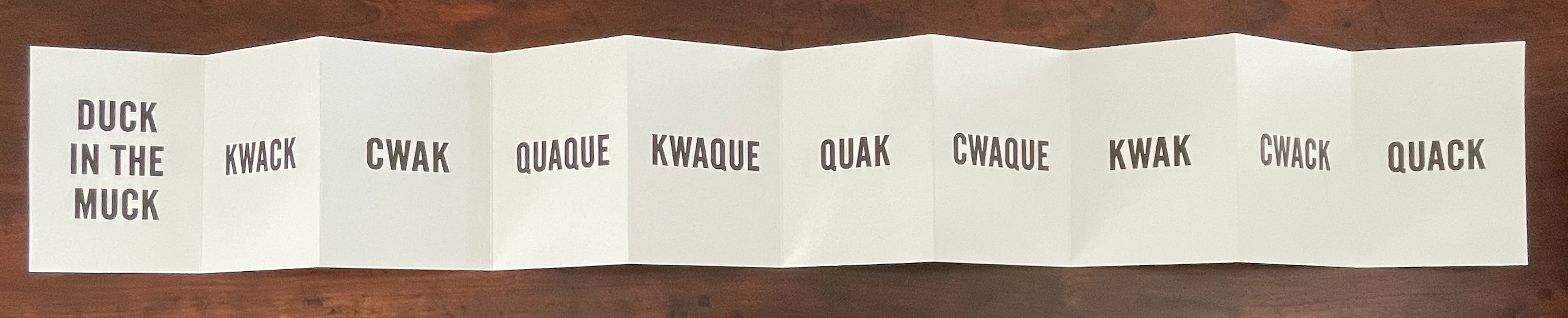
Leporello #10 (2024) Kay Rosen Box: H191 x W148 x D 23 mm. Leporello: H142 x W99 mm (closed). W990 mm (open). 10 panels. Edition of 250, of which this #116. Acquired from LL’Editions, 14 November 2024. Photos: Books On Books Collection. Displayed with permission of LL’Editions.
There’s a lengthy and excellent essay entitle “The Gravity of Language” about Rosen’s work in Osmos Magazine (Winter 2019) by Stephanie Cristello. In it, she writes:
You will notice, by now, that the works discussed here are united by their allusions to the motions of up and down. Does this seem arbitrary to you? Or strike you as the imposition of a rule-based physics upon an artistic practice whose oeuvre certainly contains variances, divergences, and oddities–cut out for the purpose of being explored through a particular force?Perhaps. (Cristello, 2019)
Somehow this more recent artist’s book seems to confirm and repudiate the critic’s approach. As if to say, “Yes, I’m stuck in the muck despite my variances, divergences and oddities”, or “No, ducky, there’s no gravitas or gravity here”. Or perhaps it’s Rosen’s visual way of using permutations on language (starting with a common expression) to poke fun at LL’Editions’ constraint: “So you want to confine me like a duck in the muck? Well, quack, the joke’s on you”.
Leporello #9 (2024)
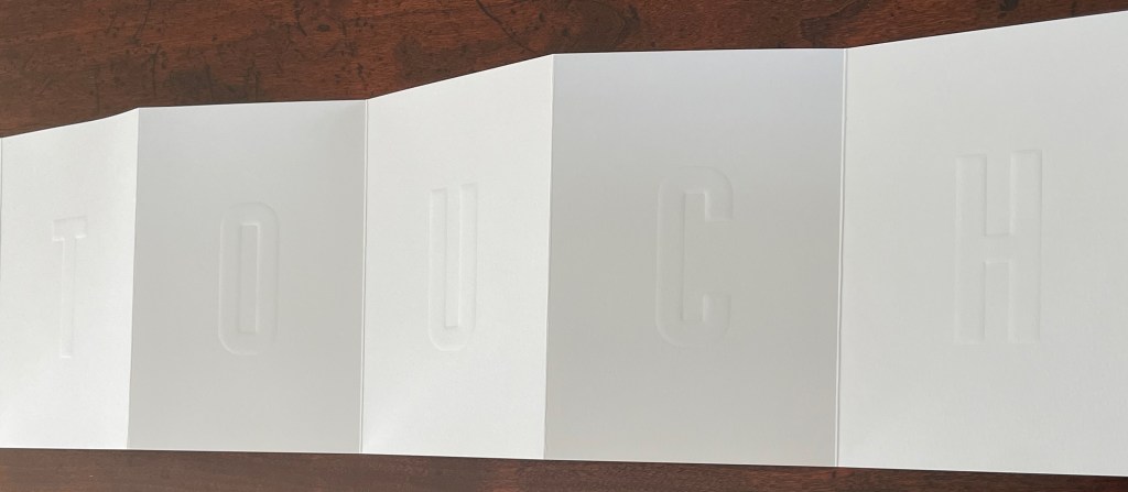
Leporello #9 (2024) Pieter Laurens Mol Box: H191 x W148 x D 23 mm. Leporello: H142 x W99 mm (closed). W990 mm (open). 10 panels. Edition of 250, of which this #111. Acquired from LL’Editions, 14 November 2024. Photos: Books On Books Collection. Displayed with permission of LL’Editions.
How many artists before and after Marcel Duchamp’s Prière de Toucher (1947) have played this joke in an artist’s book? Where Duchamp’s displayed work played against the usual museum injunction, Pol’s embraces and wrong-foots it with blind embossing.
Leporello #8 (2022)
Leporello #8 (2022) Jonathan Monk Box: H191 x W148 x D 23 mm. Leporello: H142 x W99 mm (closed). W990 mm (open). 10 panels. Edition of 250, of which this #175. Acquired from LL’Editions, 14 November 2024. Photos: Books On Books Collection. Displayed with permission of LL’Editions.
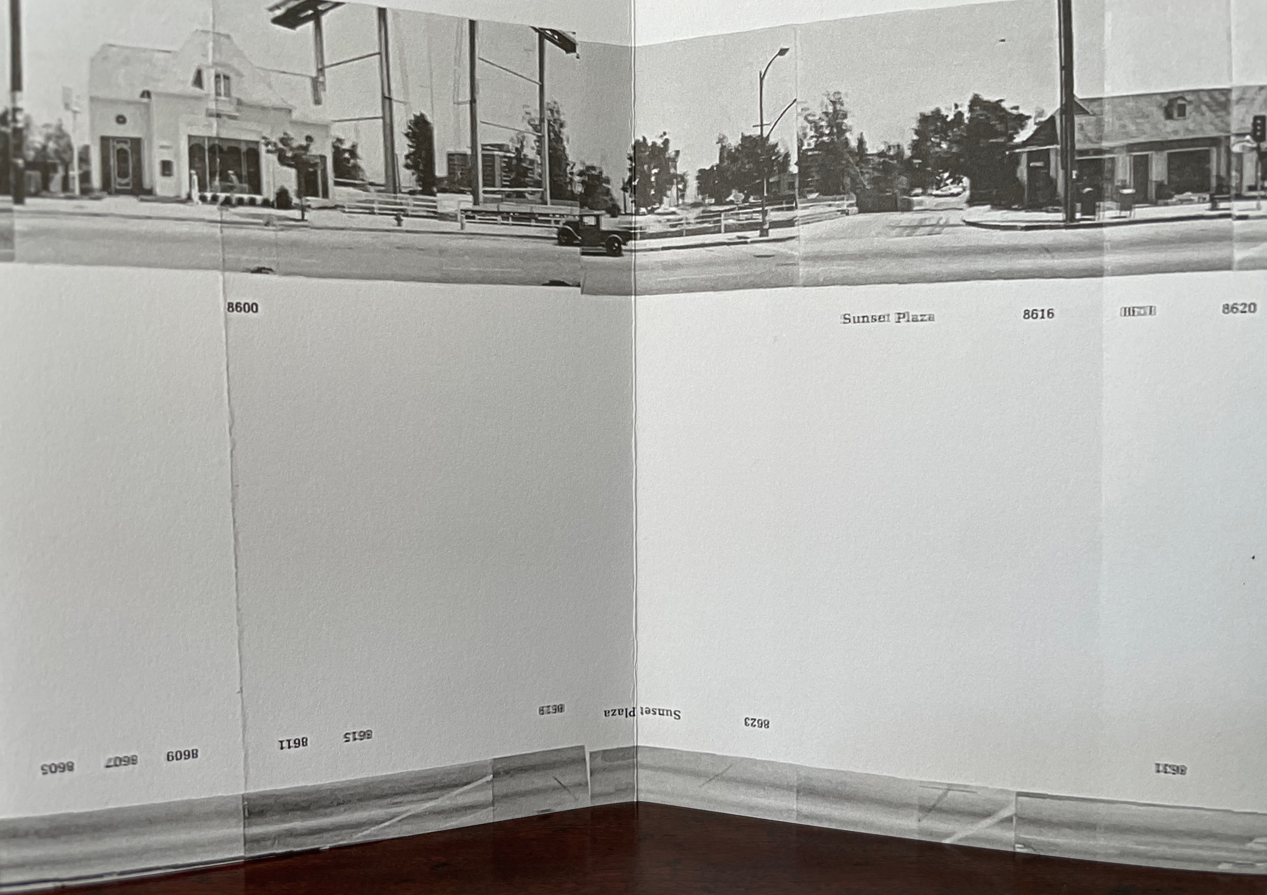
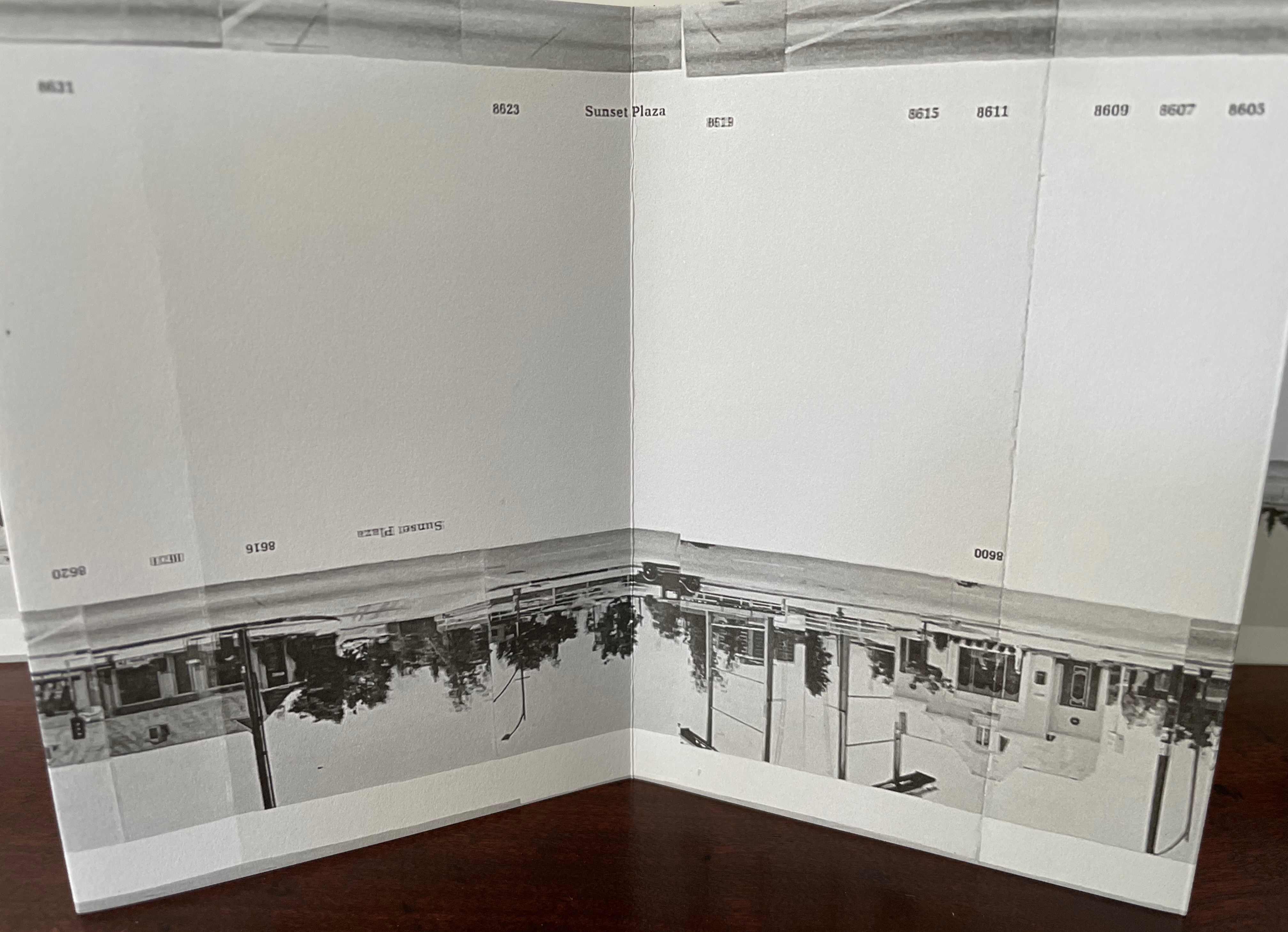
It helps to know or remember that in 2002, Jonathan Monk published None of the buildings on Sunset Strip with Revolver. Here, he has used his iPhone in panoramic mode to appropriate again Ed Ruscha’s Every Building on the Sunset Strip (1966). But when Monk’s leporello is turned over, notice that this side of the Strip has been truncated. Monk’s thoughts on appropriation and self-reflexivity can also be enjoyed in the three-handed interview Books on Books (2011) with Jérôme Saint-Loubert Bié and Yann Sérandour.
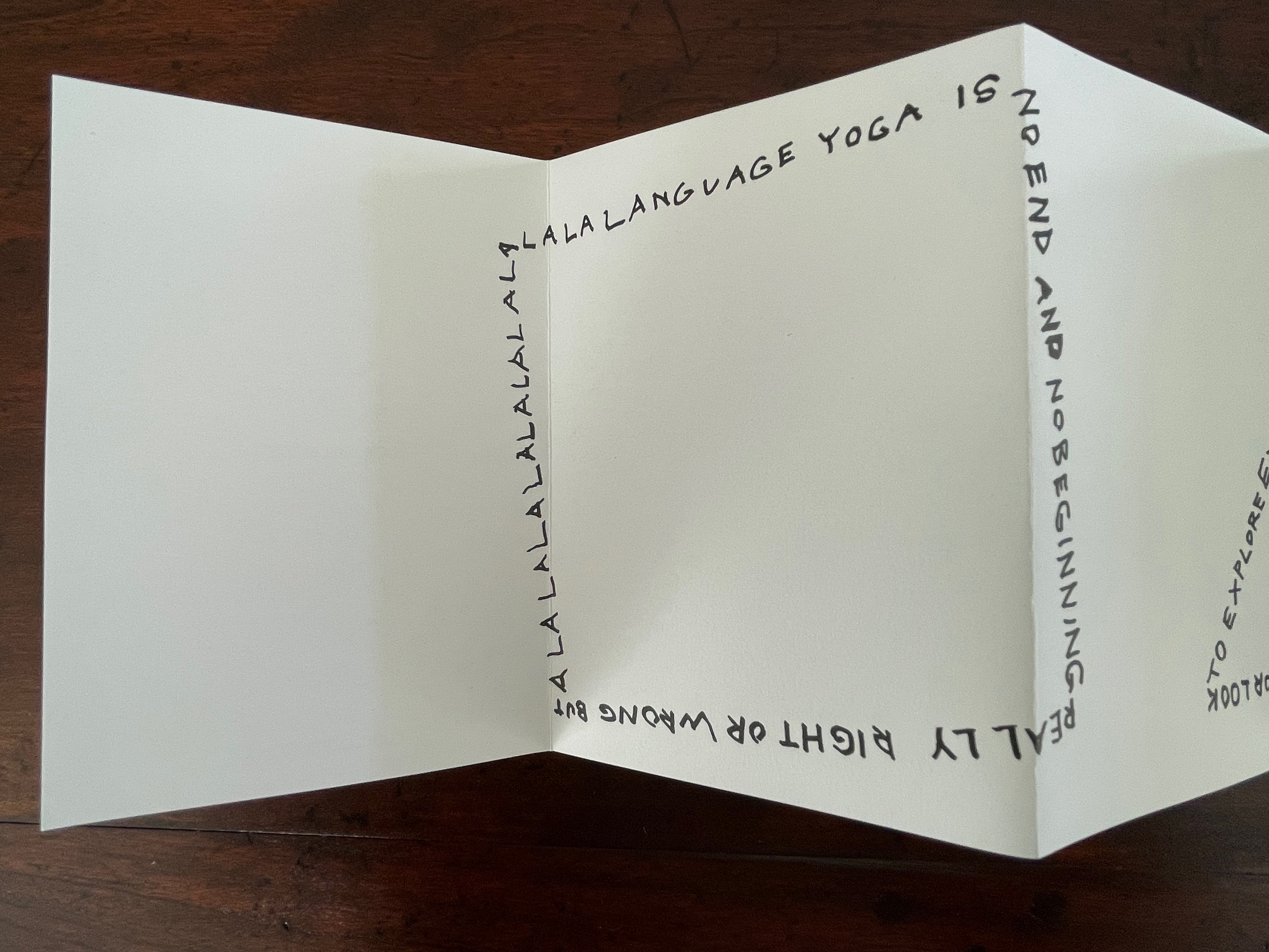
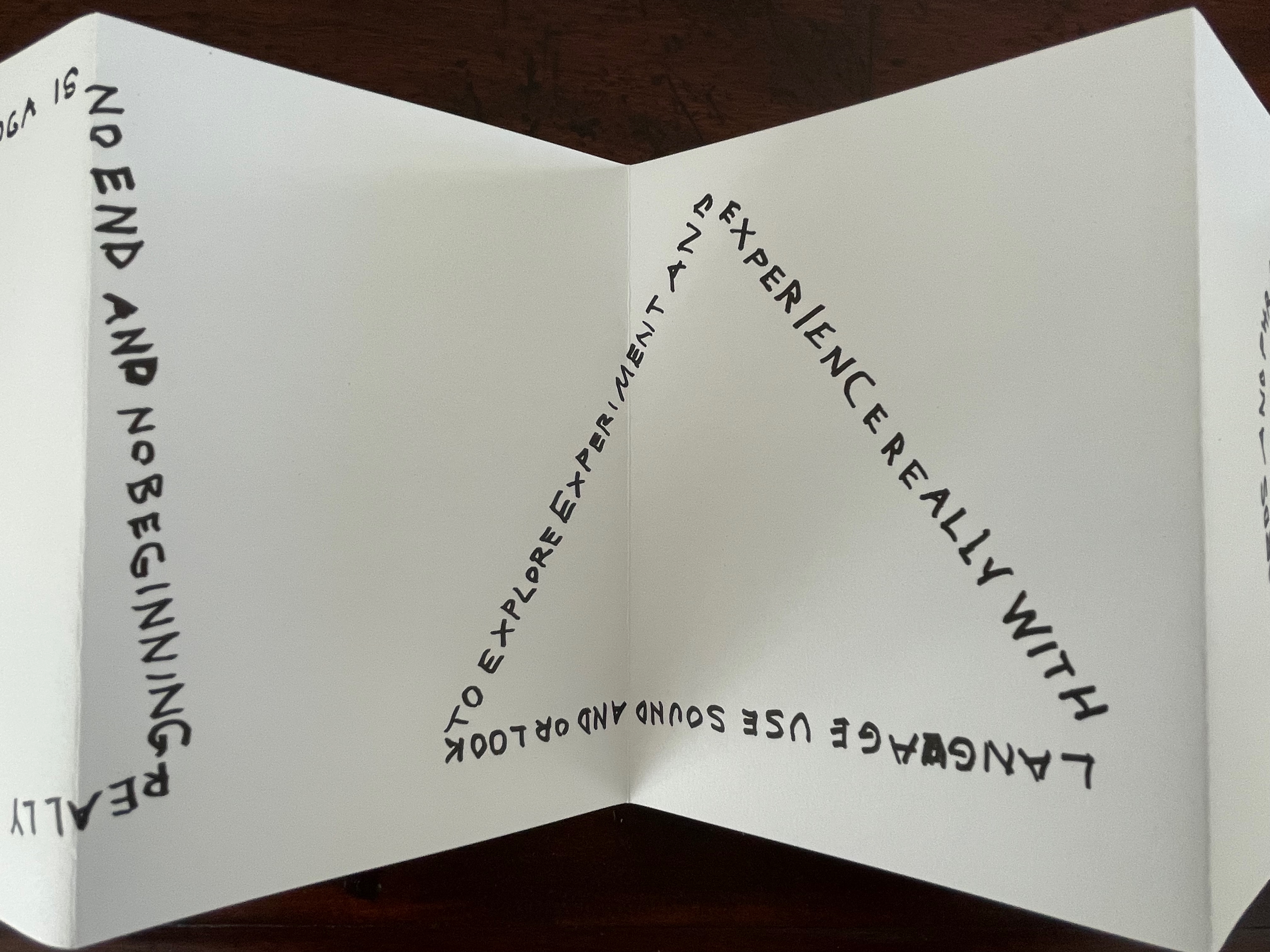
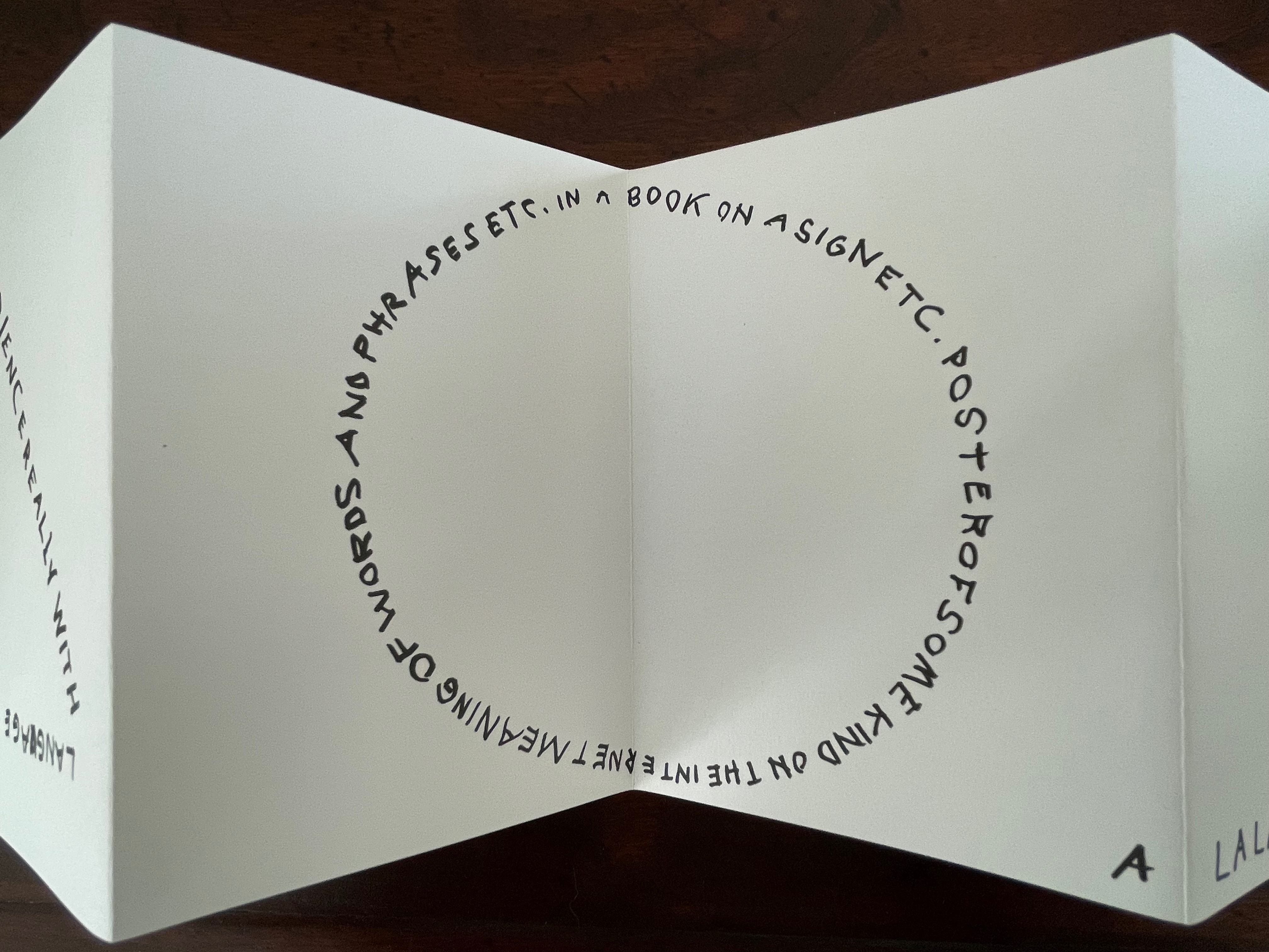
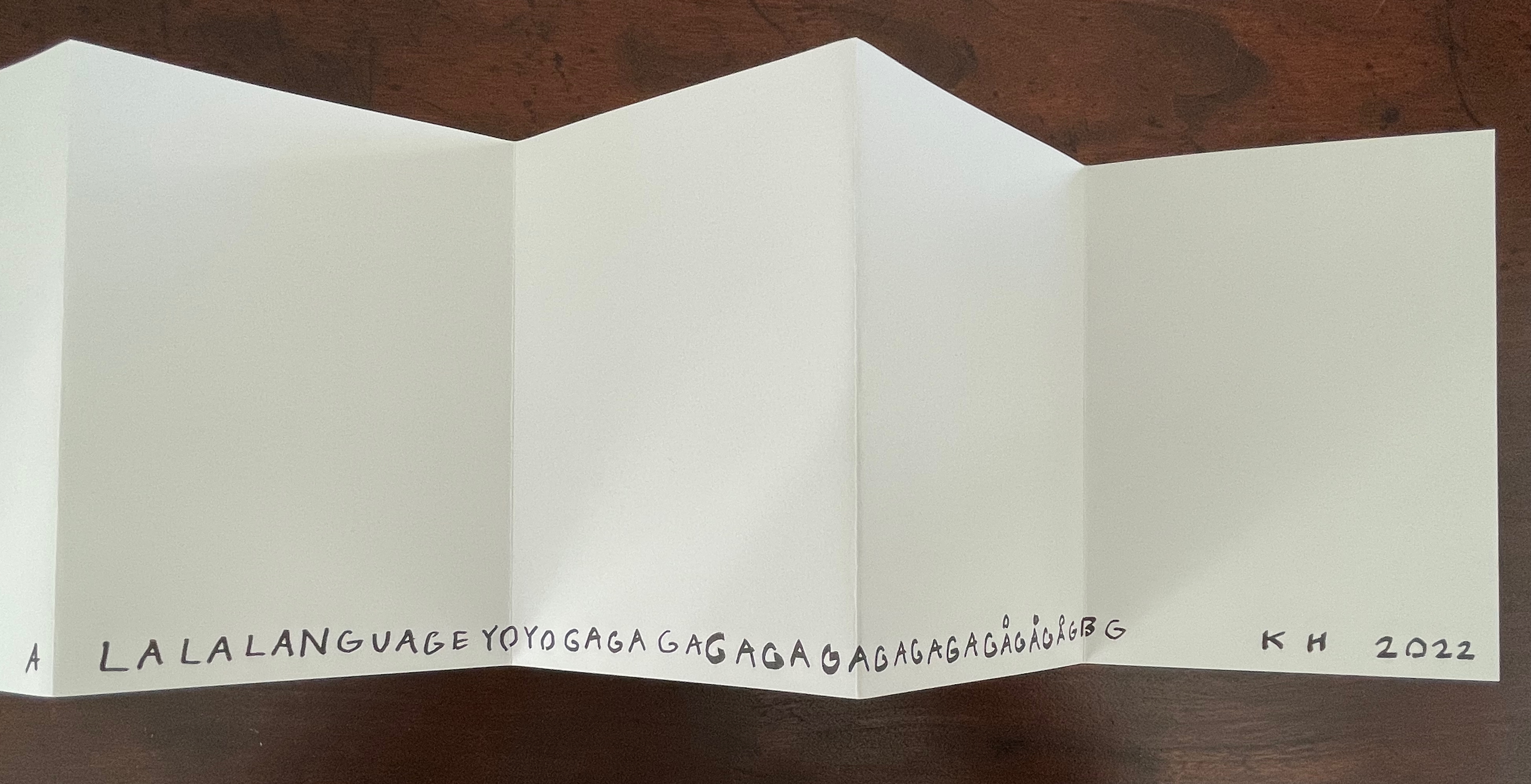
Leporello #7 (2022)
Leporello #7 (2022) Karl Holmqvist Box: H191 x W148 x D 23 mm. Leporello: H142 x W99 mm (closed). W990 mm (open). 10 panels. Edition of 250, of which this #110. Acquired from Unoriginal Sins, 14 November 2024. Photos: Books On Books Collection. Displayed with permission of LL’Editions.
Here’s one to add to Bruno Munari‘s collection of squares, circles, and triangles. While the yoga may also remind you of Ric Haynes‘s Aquatic Yoga with Dangerous Foods (1984), this leporello is a welcome opportunity to experience this Swedish artist’s ability to weld language and shapes together in perceptive and humorous (and sometimes acerbic) ways. Galerie Neu in Berlin has been astute enough to hold three solo exhibitions for Holmqvist since 2013; their display of his works here provides views of his several sculptures that chime with Leporello #7.
Leporello #6 (2022)
Leporello #6 (2022) Maurizio Nannucci Box: H185 x W148 x D 23 mm. Leporello: H143 x W90 mm (closed). W900 mm (open). 10 panels. Edition of 250, of which this #106. Acquired from Unoriginal Sins, 14 November 2024. Photos: Books On Books Collection. Displayed with permission of LL’Editions.
It’s hard to believe that Leporello #6 may be one of only three accordion books produced by this prolific and inventive artist associated with Fluxus. The other two are Sessanta Verdi Naturali (Sixty Natural Greens)(1977) and Up Above the Wor(l)d/A Guide for Aliens (1981). In Leporello #6, he has made the accordion structure, panel layout, and language reinforce one another simultaneously to create an ouroboros artwork.
Leporello #5 (2022)
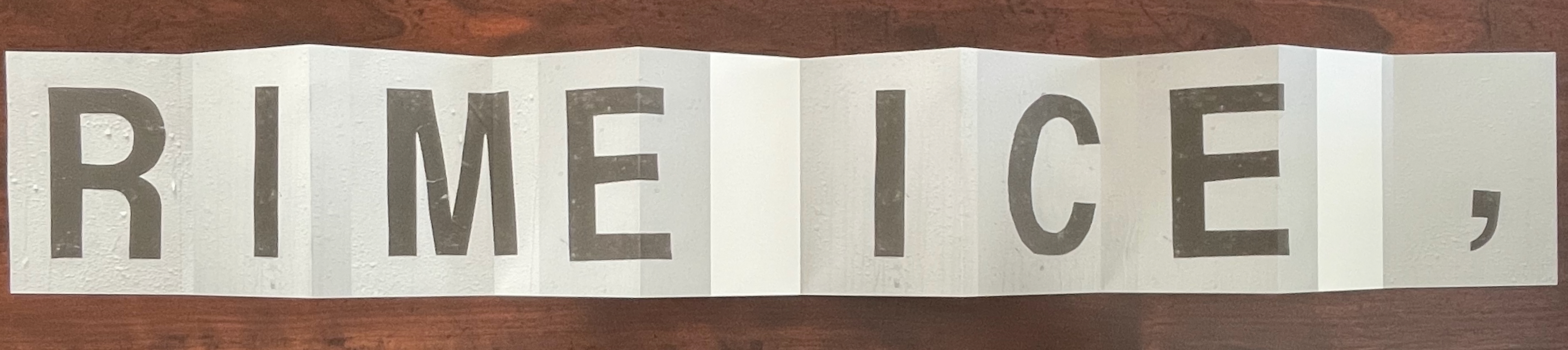
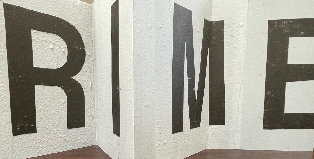
Leporello #5(2022) Shannon Ebner Box: H185 x W148 x D 23 mm. Leporello: H143 x W90 mm (closed). W900 mm (open). 10 panels. Edition of 250, of which this #132. Acquired from Unoriginal Sins, 14 November 2024. Photos: Books On Books Collection. Displayed with permission of LL’Editions.
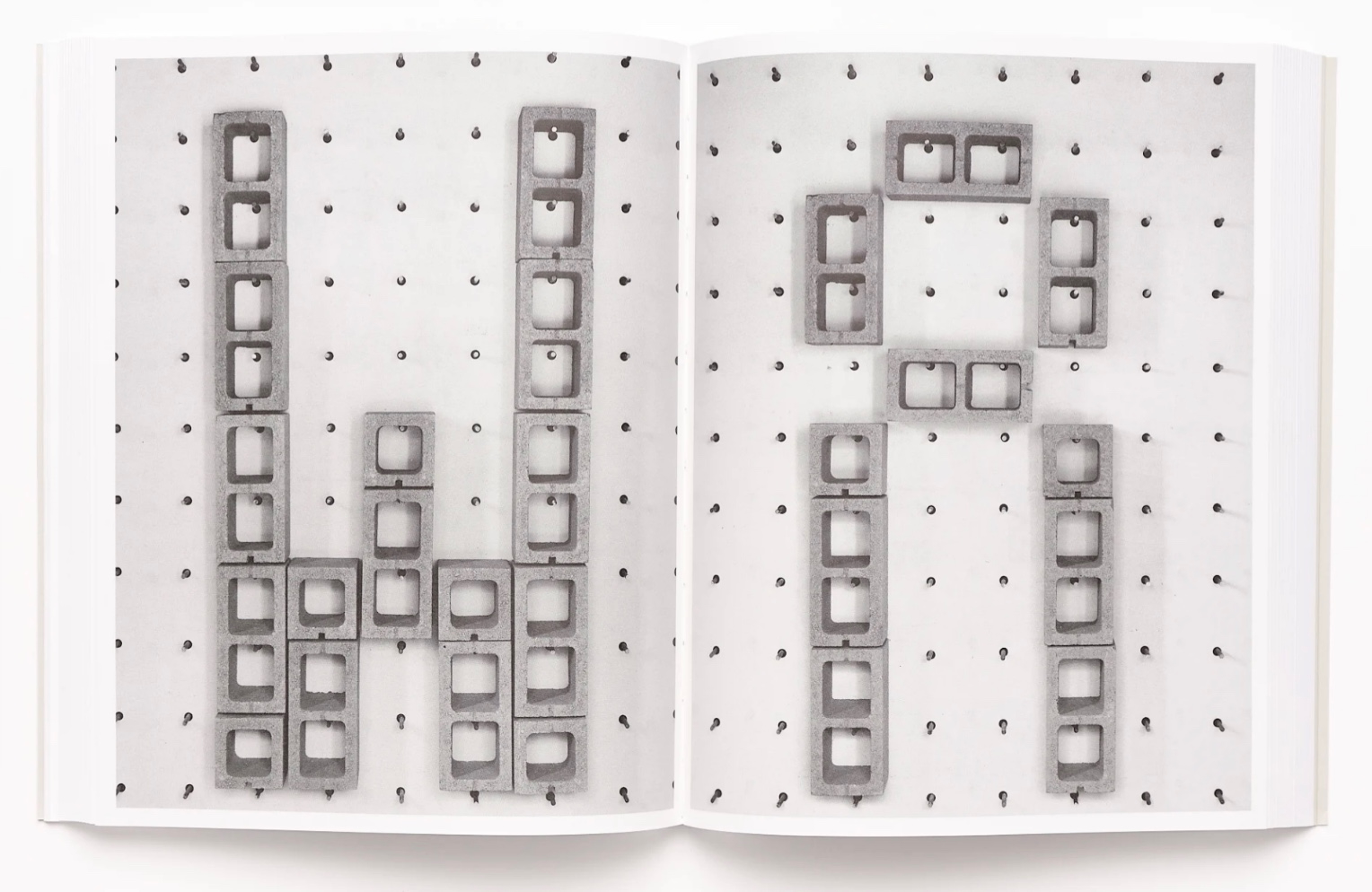
Since her participation in MoMA’s Ecstatic Alphabets/Heaps of Language in 2012, Shannon Ebner has been a book artist to watch for bringing the alphabet and the artist’s book together.
Her Strike (2014) concretely rewarded the alert. The textures of melting ice in Leporello #05 and concrete blocks in Strike seem to leap off the letters and paper. From the LL’Editions’ description of Leporello #05:
Ebner has selected specific materials based on their self-reflexive relationship to the subject of the writing itself. Each photographic typeface is in essence a material response to the various cultural conditions and societal pressures at hand. For Ebner’s leporello, the meteorological term RIME ICE is its single subject, though the phenomenon itself falls into two categories, soft or hard rime. In either case it is rime ice that forms when liquid droplets comprised of supercooled water freeze onto surfaces. RIME ICE is an outtake from Ebner’s recent exhibition FRET SCAPES (2022). FRET is acronym for the Forecast Reference Evapotranspiration Report, a report that is generated by climate scientists to measure the rate at which water that falls to the ground will evaporate to the sky.
Leporello #04 (2021)
Leporello #04 (2021) Ryan Gander Box: H191 × W148 x D23 mm. Leporello: H142 x W99 mm (closed), W990 mm (open). 10 panels. Edition of 250, of which this #32. Acquired from Unoriginal Sins, 14 November 2024. Photos: Books On Books Collection. Displayed with permission of LL’Editions.
Ryan Gander has repurposed his installation Staccato Reflections (2017-20) to create Leporello #04. The tiny text originates from the artist’s notebook. In Staccato Reflections, it appears in a normal-sized font in business-directory format on a freestanding reflective screen. Gander describes the installation this way in an interview in Art in America:
Staccato Reflections is based on the idea of the self in culture, the obsession with the me and the selfie and the narcissist wand. The surface is mirrored, so as you read the words, you see yourself. The work has devices in it that are self-referential. It asks you to touch the screen, and then says “don’t touch the screen.” So it seems like it is responding to you, but it’s not.” (Fullerton, 107)
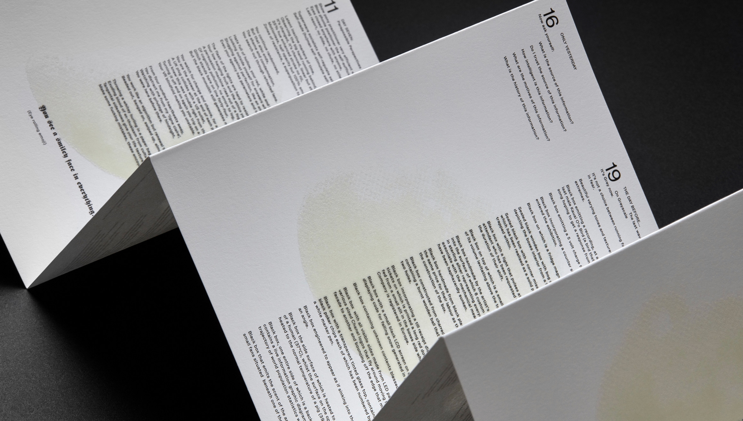
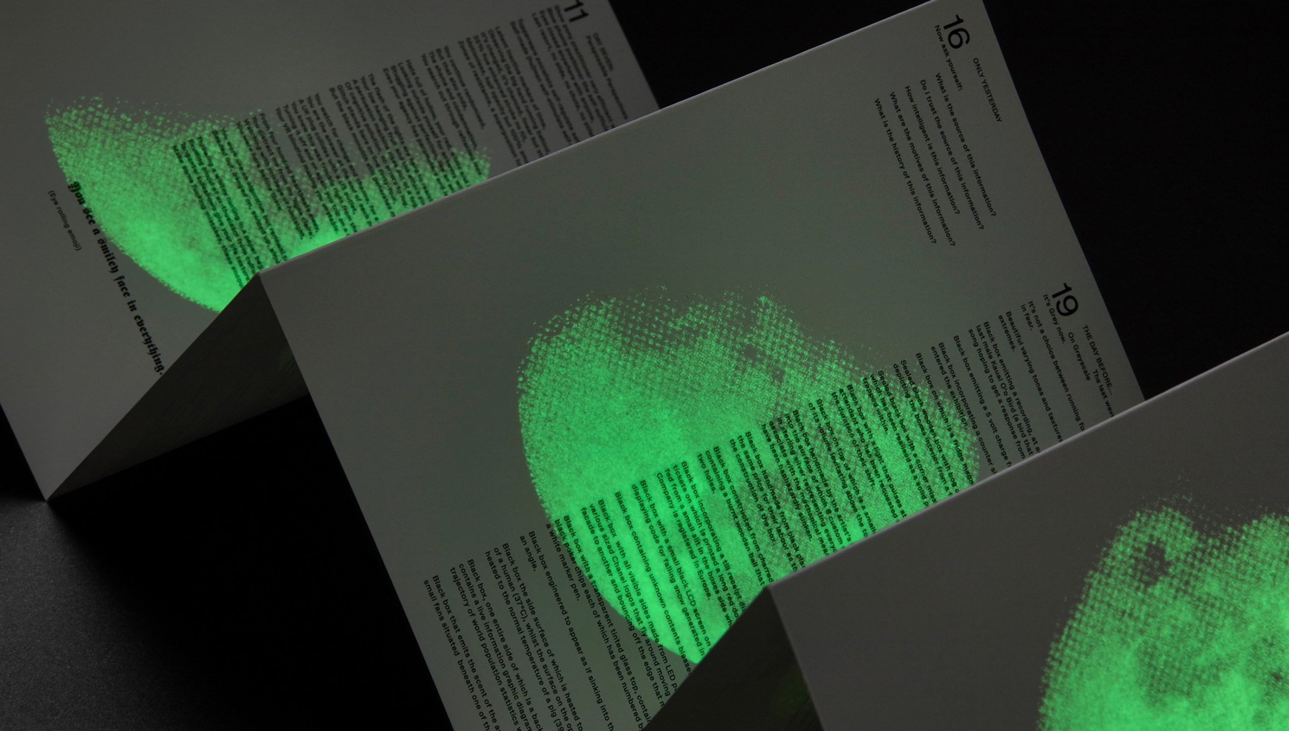
With its miniscule print requiring the enclosed rectangular plastic magnifying glass, and with its overprint in glow-in-the-dark ink of a waxing full moon, Leporello #04 marks quite a departure from the installation.
Leporello #03 (2021)
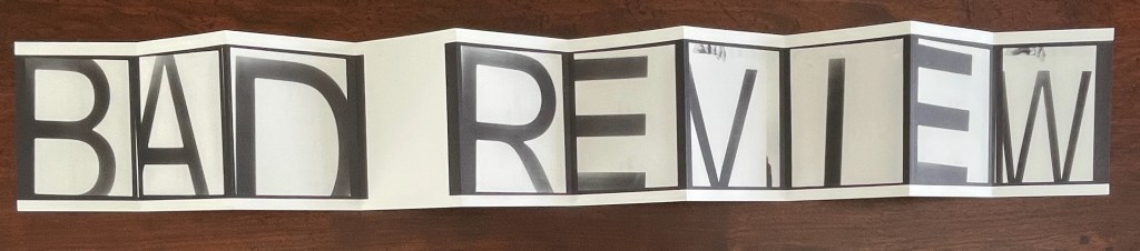
Leporello #03 (2021) Fiona Banner Box housing leporello. Box: H185 xW140 xD25 mm. Leporello: H140 x W100 mm. 10 panels. Numbered edition of 250, of which this #42. Acquired from Unoriginal Sins, 14 November 2024. Photos: Books On Books Collection. Displayed with permission of LL’Editions.
With Leporello #03, Fiona Banner repurposes the previously repurposed conceptual artwork Bad Review. It has appeared as a C-typeprint with the words overlaid on a rearview mirror and as a sculpture. To reproduce the two words, Banner uses found letters photographed held up by hand and badly positioned. Is it serendipity or cheeky genius that, like readymades, the nine letters and space of Banner’s conceptual artwork fit the ten panels imposed by LL’Editions to give us another re-view?
Leporello #02 (2021)
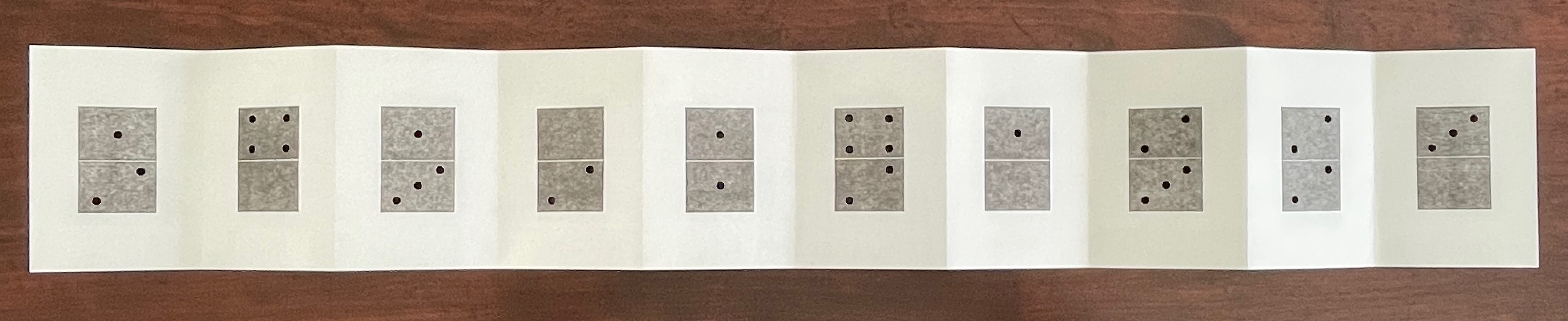
Leporello #02(2021) Micah Lexier Box housing leporello. Box: H185 xW140 xD25 mm. Leporello: H140 x W100 mm. 10 panels. Edition of 250, of which this #171. Acquired from Unoriginal Sins, 14 November 2024. Photos: Books On Books Collection. Displayed with permission of LL’Editions.
Publisher’s description: A number of years ago Micah Lexier purchased a small paperback publication about the game of dominoes. The very end of the book consisted of a series of pages that reproduced a complete set of twenty-eight domino tiles. The images were printed on right-hand pages, four to a page, while the left-hand pages were blank. The idea was that you were supposed to cut these images out of the book and glue them to empty matchboxes to create your own do-it-yourself set. That sequence of pages, combined with the quality of their reproductions, was the inspiration for Lexier’s leporello. To that, he added two favourite print techniques – perforations and die-cut holes – to create a set of ten domino tiles. Lexier chose the denomination of each tile and its order in the leporello so that none of the thirty-four die-cut holes line up with each other, allowing each hole to be misread as a printed white domino dot.
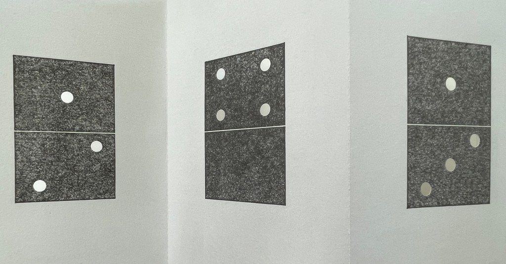
If you stand Leporello #02 on its edge on a table and then lean forward to view the panels at eye level, the domino images seem to have grown into oversized hangings on gallery walls. You can see some of the die-cut holes if you look closely at the lower right corner below.
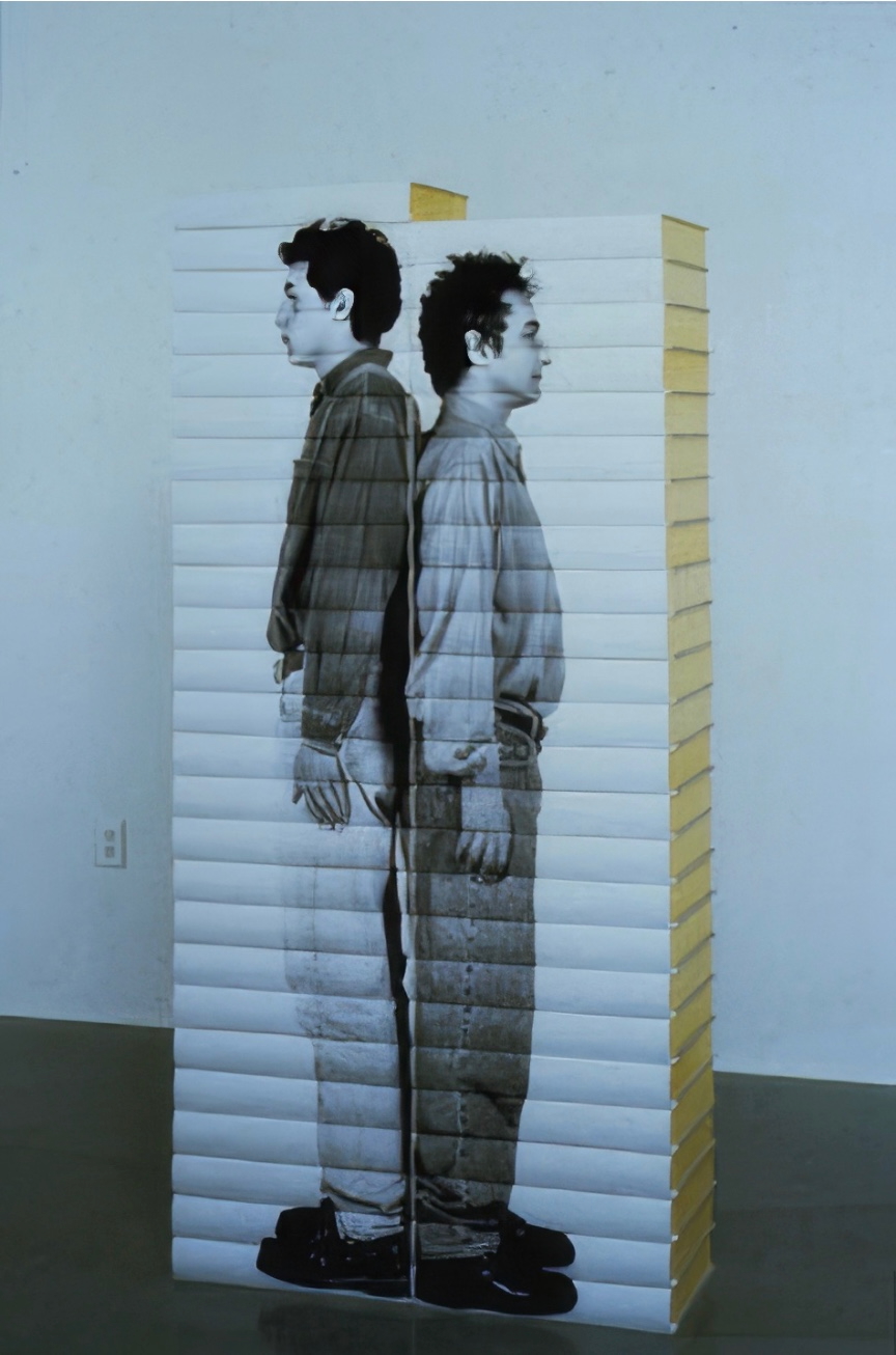
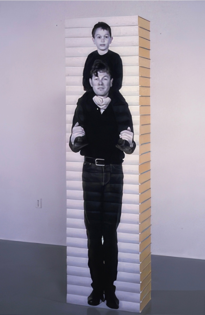
It’s a peculiar sensation, but it echoes Lexier’s website, which highlights mostly installations and large-scale works. Even more so it echoes Robert Birch Gallery in Toronto, which emphasizes his large wall displays. On both sites, Lexier’s play with patterns, shapes, tiles, and contrasts of black and white stands out. Although it’s not clear from those current sites, he has many book-related works. In the ’90s, he produced book sculptures in which each spine in a stack of books would have part of a life-size photo of a human subject printed on it. Properly stacked, the books display the human figure.
As can be seen in Leporello #02 and other works on display in the CCCA Canadian Art Database Project, Lexier likes to work with found objects. As can be seen in the book sculptures above and in the Database Project, Lexier’s art also reflects on relationships and community. Leporello #02 neatly and abstractly brings these two themes together with the found dominoes game book and the game’s communal roots.
Leporello #01 (2021)
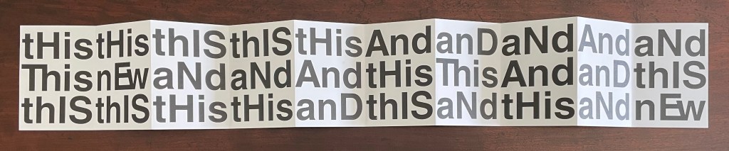
Leporello #01 (2021) Heimo Zobernig Box housing leporello. Box: H185 xW140 xD25 mm. Leporello: H140 x W100 mm. 10 panels. Edition of 250, unnumbered. Acquired from Unoriginal Sins, 14 November 2024. Photos: Books On Books Collection. Displayed with permission of LL’Editions.
If you extend Leporello #01 fully, you are likely at first glance to project onto it the common expression “this and that”, but thwarted, you then start looking for another phrase comprised of “His”, “IS”, “And”, but you run into “Ew” or “nEw”, which throws you into renewed pattern-seeking behavior. Should you count the “this’s” and “and’s” in each row? Maybe there’s something in the pattern of lowercasing and uppercasing? Is there anything to the fact that the word “new” never begins with an uppercase N, or that it occurs only twice? Maybe you should read the rows aloud? With that, you may remember that, in earliest writings, words were not spaced and mixed majuscule and miniscule didn’t come along until later. Now you see how the folds are the primary means of separating the words in this book. This becomes clearer if you read the book panel by panel, or page by page codex-style. But now there are other possible patterns: does the book begin with “thIs, This, thIS” and proceed to “tHis, nEw, thIS”, and so on?
Somehow the acronym “WYSIWYG” — what you see is what you get — pops to mind, but Leporello #01 seems also a case of “WYGIWYS” — what you get is what you see. Fully extended or panel by panel, Leporello #01 offers more to see than a glance will get you.
Leporello #01 continues Zobernig’s love affair with Helvetica, which is also on display in Farben Alphabet (2018) and CMYK (2013), also in the Books On Books Collection.
Fullerton, Elizabeth. 28 April 2017. “In the Studio: Ryan Gander“. Art in America. Accessed 7 November 2025.
Hubert, Renée Riese, and Judd David Hubert. 1999. The Cutting Edge of Reading : Artists’ Books. New York City: Granary Books. See chapter 6, “Variations on the Accordion”, pp. 97-122.
Marlene MacCallum achieves distinctive results by painting with photography and sculpting with book structure in her artist’s books. Her painting with photography has involved not only collage work but pinhole cameras, digital cameras, digital layering and masking as well as a variety of transfer processes — digital and analogue photogravure, lithography, digital pigment printing, and digital inkjet printing. Sculpting with book structure mainly includes varying the binding as in the accordion with fold-out of Obvert (1997), the tunnel book structure of Do Not Enter (1998), the gatefold of Domestic Arcana (1999), the tile format fold-outs of pink story (2004-05), the accordion of Quadrifid (2009), the dos-à-dos of Glaze: Reveal and Veiled (2013), and the Miura fold of Rise (2020). It also includes altering books as in Withdrawn (2010) and varying the substrate as in the lace paper, Moriki, double matte Mylar, Lanaquarelle, and embossed leather of Townsite House (2006) and the etched copperplate and Tyvek of Trompe l’Oreille (2011).
Watercourse I (2022) Barbara Hocker Scroll in variant dragon scale binding. L152 cm (variable) x W12 cm. 64 panels. Unique. Acquired from the artist, 10 February 2024. Photos: Books On Books Collection.
Works evocative of water often invoke a sense of meditative stillness, but Barbara Hocker’s Watercourse I prompts a sense of meditative activity. You can’t stop moving it about. Or if you’re not moving it, you find yourself moving around it to contemplate it. It is the layering of watercolor, sumi ink, photographic prints with archival inks on washi paper, and the ancient Chinese method of bookbinding called dragon scale (sometimes called “whirlwind” or “fish scale” binding) that achieves this. Traditionally, the binding method involves a long scroll of paper to which successively shorter folios are attached at one end, often secured with a bamboo rod. Hocker has modified this structure by attaching folios of the same size with hinges to the underlying long scroll at intervals allowing one folio to overlap the next and so on. In each case, the effect of the overlapping folios creates the appearance of dragon scales.
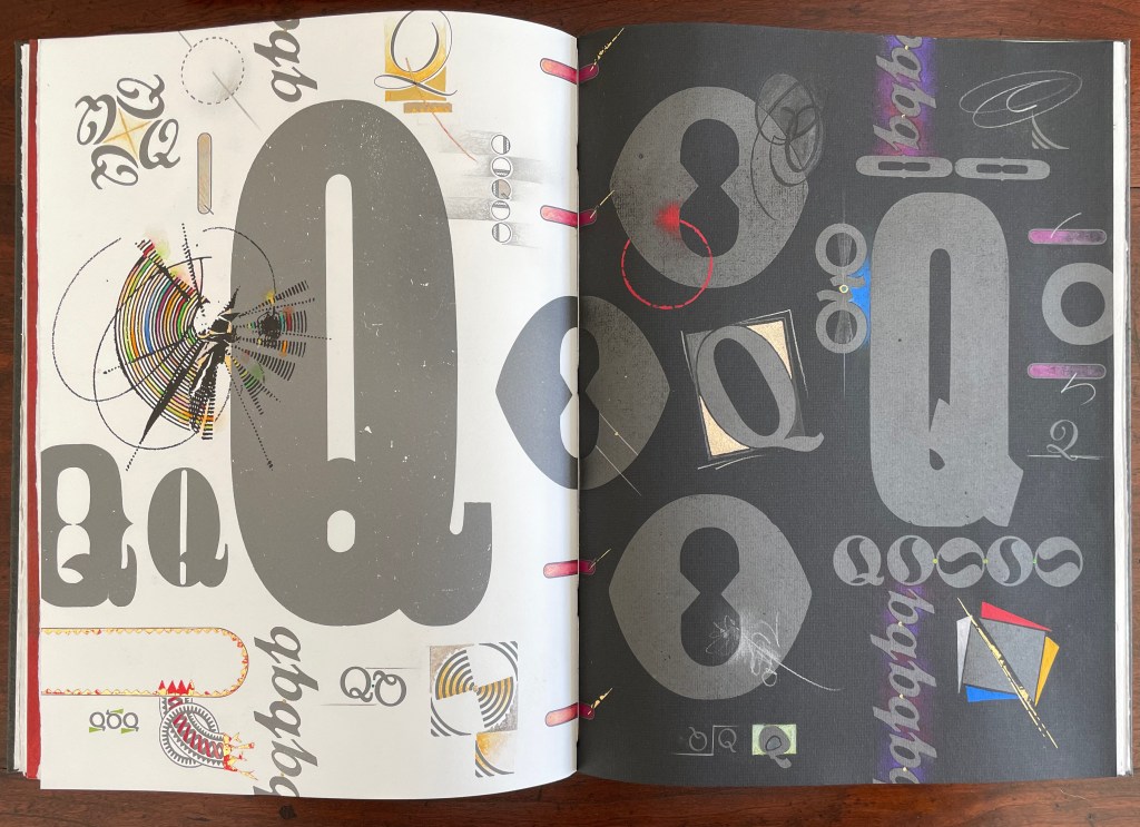
Dreamings (2023) Suzanne Moore Artist’s manuscript. Softcover, handsewn. Cloth-covered box with handwritten and painted title pastedown on the spine. H368 x W178 mm. 17 pages. A unique edition. Acquired from the artist, 15 April 2024. Photos: Books On Books Collection and artist.
Dreamings (2023) follows the artist’s Question Series, begun in 2008 considering questions of life and art while exploring the letter Q – “that quirky letter of distinct design” as Moore calls it. Other works in the series include:
Thirteen Questions (2008), drawn from Pablo Neruda’s The Book of Questions (1991) [Libro de las preguntas (1974)], unknown location.*
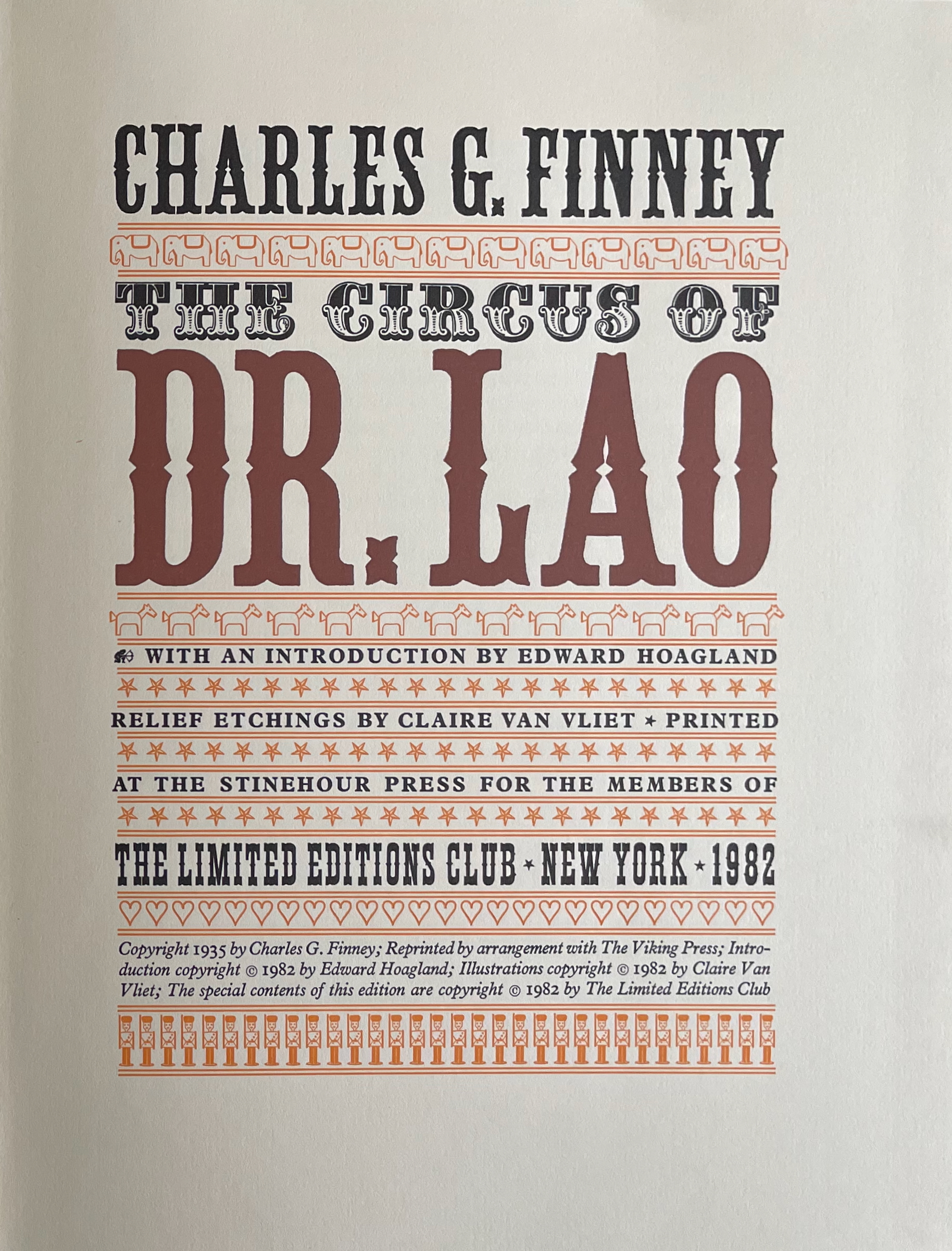
The Circus of Dr. Lao (1982) Charles G. Finney (text) Claire Van Vliet (design and illustration) Hardback, cased in cotton cloth over boards, head and tail bands, sewn. H x W mm. 9 1/4 x 12 inches 140 pages. Edition of 2000, of which this is #996. Acquired from BlueMamaBooks, 9 February 2025. Photos: Books On Books Collection.
If you have read Nathaniel West’s The Day of the Locust (1939) or Flannery O’Connor’s A Good Man Is Hard to Find (1955), Charles Finney’s novella illustrated by Claire Van Vliet will seem only marginally disturbing. If you have seen Tod Browning’s Freaks (1932), it will seem more than tame. Somewhere in between is the appropriate trigger warning for The Circus of Dr. Lao (1982).
Finney drops Dr. Lao’s circus of P.T. Barnum-esque carnival sideshows, a bestiary of distorted mythological creatures and exaggerated stereotypes, into the Arizona backwater of Abalone. The denizen of Abalone and their reactions — from gullibility, lubricious fascination, racist hazing, and violence to shrugs and a smug return to unexceptional normality — are the targets of Finney’s fevered satire. Van Vliet mirrors the range with her illustrations printed from original relief etchings and her selection of contrasting Plantin and Victoria display types.
“Book of Hours was designed and created by Julie Chen & Keri Miki-Lani Schroeder. This long-distance collaboration, between California and Texas, took place during the 2020-21 pandemic. The format of Book of Hours is known as a blow book, a historical structure originally designed as a magic trick which allows the presenter to show completely different visual sequences of pages within the same book. … The first and last sequences on each side of the book were designed by the two artists collaboratively, and the other eight sequences were designed individually by each artist. …” — Colophon.
Book of Hours (2021)
Book of Hours (2021) Julie Chen & Keri Miki-Lani Schroeder Box: H283 x W220 x D51 mm. Book: H279 x W216 x D48 mm. Artists’ book Structure #/88 Julie Chen 8 October 2024. Photos: Courtesy of artists, and Books On Books Collection.
As with all blow books, hold the Book of Hours‘ spine in your left hand, place your right thumb at the upper end of the fore edge, and flick through the pages. A set of sequenced images appear from beginning to end. But start again, shifting the pressure of your thumb to a lower position on the fore edge, and a different set of sequenced images shows up in the riffling. Turn the book over on its horizontal axis, and yet another series of sequenced images become available. To distinguish one side of the Book of Hours from the other, Chen and Schroeder have designated one side as “ante meridiem” on its title page and the other side as “post meridiem”.
These are Bruno Munari’s words that I share. I play and I have fun with my papers and my colours, but it is a job and a job, even if enjoyable, is a serious thing. My notes on image diaries are serious. A collection of thoughts translated into images, that are daily, just like a diary, “annotated” on nearly three hundred pages. I use the stencil technique with a monochromatic press, an imaginary thread connects them and creates a long history that develops, touching on events that have hit me in a particular way. It is my imaginary world, but at the same time, very real.Paper, card, fabric, needle, thread, colours and gouges are the materials that allow me to work and to leave my fantasy and creativity free. I have one very small study, but it is sufficient. It is welcoming, full of books, with a great ceiling window, three tables, two chalcographic presses and one press. When I am sitting in my workplace, I manage to isolate myself in my world. I can stay seated for hours without the passing time weighing on me, making me happy with this choice of life. — Eleonora Cumer
libro catalogo con interventi manuale (2019)
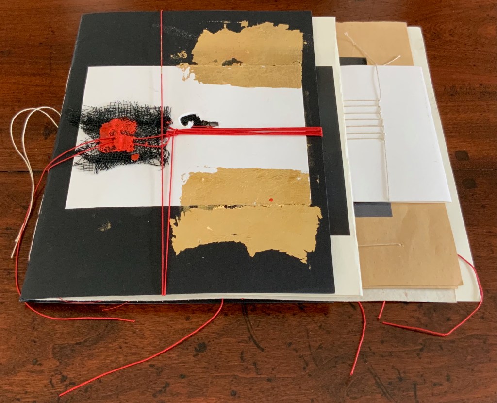
libro catalogo con interventi manuale / “book catalogue with manual interventions” (2019) Eleonora Cumer Sewn booklet, various papers including photographic, gold leaf, thread, mesh, string, wax. H200 x W220 (variable) mm. [16] pages. Unique. Acquired from the artist, 21 September 2020. Photos: Books On Books Collection.
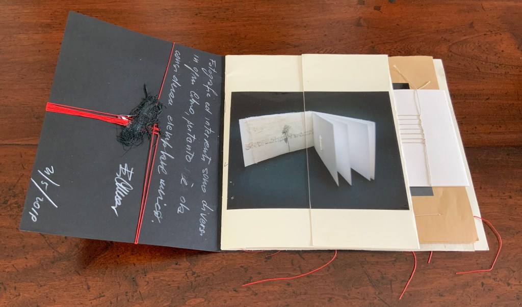
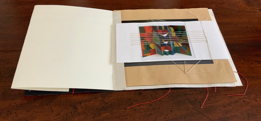
Many catalogues of individual artist’s books aim to be works of art themselves. Some attempt this with fine press production and limiting the edition, which sometimes succeeds. Some embody the very material and techniques that the artist used to create the items represented in their pages. Eleonora Cumer’s libro catalogo con interventi manuale / “book catalogue with manual interventions” (2019) is an extreme and stunning example of the latter. It is extreme because it is unique, not a limited edition. It lacks any identifying captions or list of works (the captions below appear only as a convenience for this entry in the Books On Books Collection). Libro catalogo con interventi manuale stands on its own as a stunning work of book art.
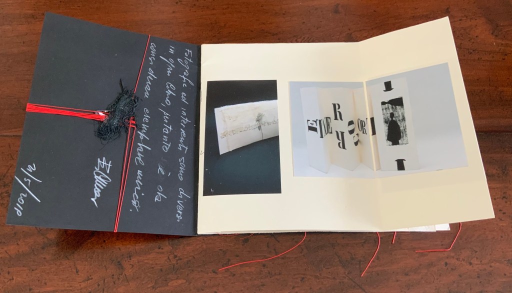
As the richly textured and gold-leafed cover turns, notice how Cumer presents the image of the catalogue’s first work: Parole non dette, frasi in sospeso / “Unspoken words, unfinished sentences” (2018). Split and pasted on two sides of the first folio, the glossy photograph of Parole non dette reunites with precise registration in the center of the folded folio.
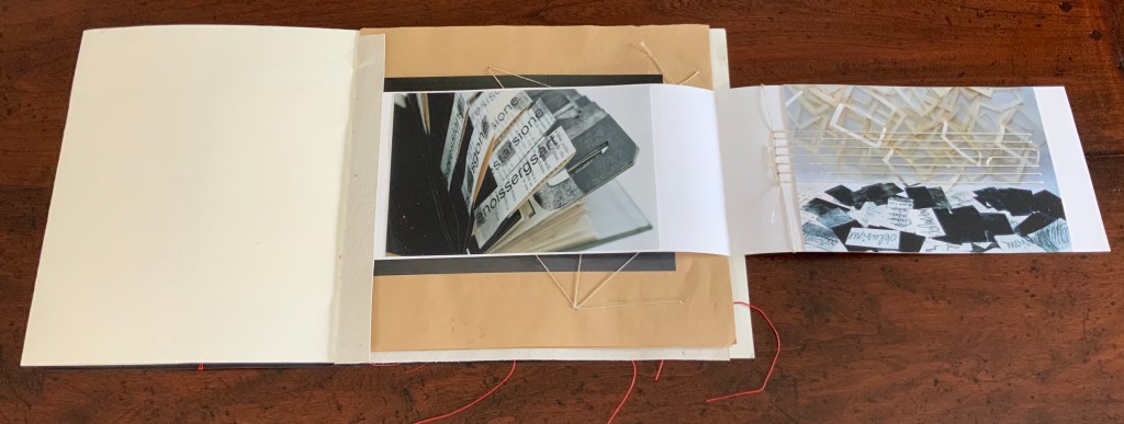
When the right half of Parole non dette turns, the second work — controcorrente /”against the current” (2010) — comes into view.
Although pasted on one side of the folio, the photograph of controcorrente splits in two at the fold, the left side and right side precisely registered with one another on either side of the fold. This is subtle. First an image reunited and aligned by virtue of cut and fold, then second an image separated but aligned by virtue of cut and fold. We may be long used to how juxtaposition works artistically on the flat surface of collage or the multiple surfaces of assemblage. Cumer teaches this afresh with the flat and multiple surfaces of book structure as well as with the materials and techniques of bookmaking.
The next three works appear in a fold-out insert attached to the stub of a textured folio that also supports a brown paper folio following the insert. The colorful città / “city” (2018) reflects how Cumer’s palette and sculptural repertoire extends beyond the black and white leporello of controcorrente. The threads sewn in parallel over the photograph of città not only reflect another part of Cumer’s material repertoire, they also enact another part of her sculptural repertoire in the way they work with, in, and across the photographs and folios.
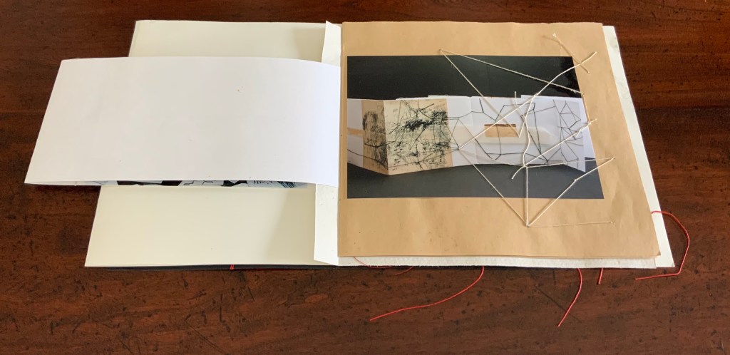
When the image of città / “city” folds out to the right, photographs of two more works appear: desiderio di … arte / “desire for … art” (2012) and illusione – delusione / “illusion – delusion” (2012). The image of desiderio highlights Cumer’s use of the flag book structure, although there is structurally much more to that work’s composition. The parallel threads that extended over the photo of cittá on the other side of the fold-out now pierce the photograph of illusione – delusione.
The next work to appear — il libro segreto /”the secret book” (2018) — carries on with the intervention and penetration by thread. The patterns formed by the thread reflect and extend those which can be seen in the photograph of il libro segreto. Leaping out of the photograph and penetrating the supporting brown paper folio, the thread introduces a new motif that will recur in just a few more pages.
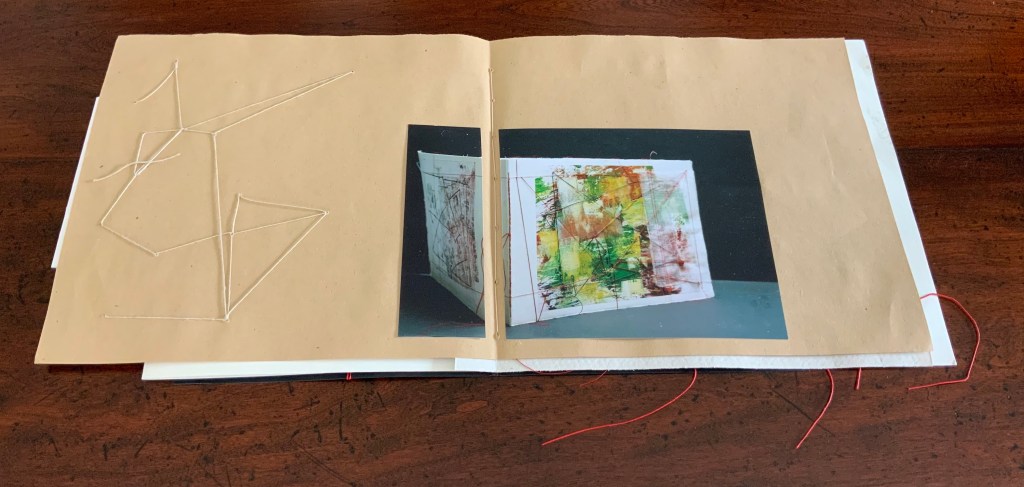
The spread presenting the next work — fili intrecciati / “twisted threads” (2018) — reverts to the split aligned photo as used with controcorrente, but here the division comes at the center of the double-page spread. Off to the left side, the abstract figure in stitched thread echoes the technique used in fili intrecciati itself and starts another recurring motif in the catalogue.
No intervention occurs in the photograph of cancellazioni e riscruttare / “cancellations and rewritings” (2018). No cuts, no folds, no threads, but on the facing verso page, Cumer brings to life one of the cancelled/rewritten objects that can be seen in the photograph. Just as in fili intrecciati, the thread-bound bundle of strips of cut text has leapt from two dimensions to three dimensions, highlighting again how Cumer uses the flat and multiple surfaces of book structure as well as the materials and techniques of bookmaking to re-teach us how juxtaposition works artistically on the flat surface of collage and the multiple surfaces of assemblage.
Following but elaborating on the previous spreads’ motif of juxtaposing an extract of the work with a photograph of the work, Cumer places a red-threaded square of tartalan across from the cut and misaligned photograph of la poesia dell’universo / “the poetry of the universe” (2018). The cut photograph is split by a red stitch that divides in two itself.
Here is where the variation on the two dimensional becoming three dimensional introduced by il segreto libro recurs. Defying the gutter’s separation of the tartalan sample from the whole work and the severing of the photo on the recto page, threads from the sample cross the gutter, fall across one half of the photograph, and link up with the severing stitch. The thicker thread of the severing stitch passes under the other half of the photograph to exit from it on the right and fall across the image of red threads similarly exiting the work itself. The ways in which this double-page spread speaks to the self-reflexive nature of book art and the paradoxical relationship of art to what it re-presents are remarkable.
The final work in the catalogue — visioni urbani / “urban visions”(2015) — resides in the Books On Books Collection. More about it can be found here. Threads do not make an appearance in visioni urbani, but their triangular appearance here does reflect on urbanivisioni. If the space to the left of the red stitching can be counted as a page, this is a “three-page” spread echoing the three-way split of the photo of the work, which echoes the tripartite physical structure of the work itself.
In the colophons of several earlier works, Cumer has drawn attention to this practice in libro catalogo of recycling her works. She labels them as part of projects “born of work with old books”, “born from her artist’s books”, and “born of her work with old theater posters”. Three of them are explored below, and three others can be found in a previous entry on her work.
PRESENTE/OTASSA (2015)
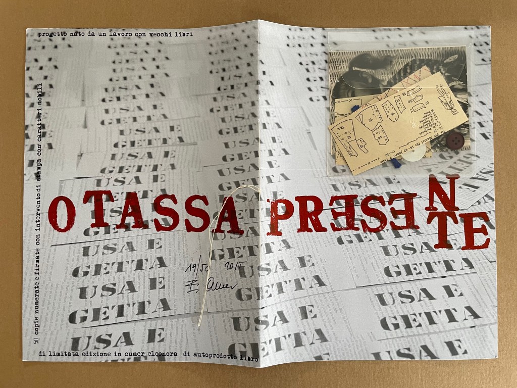
PRESENTE/OTASSA / “Present / Tax” (2015) Eleonora Cumer Sewn booklet. H287 x W204 mm. [8] including cover. Edition of 50, of which this is #19. Acquired from the artist, 21 September 2020. Photos: Books On Books Collection.
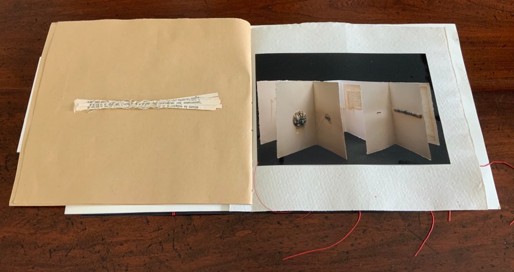
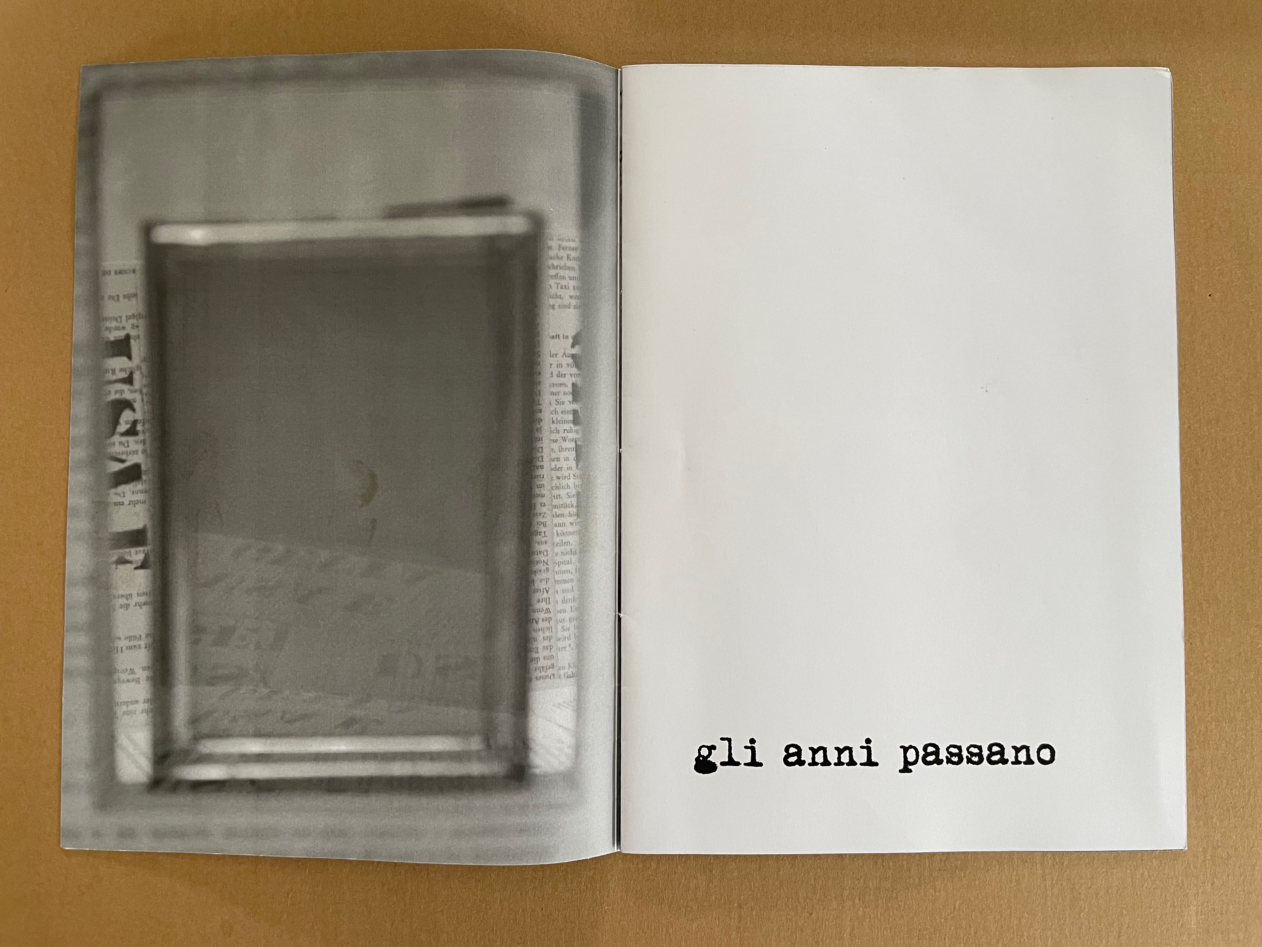
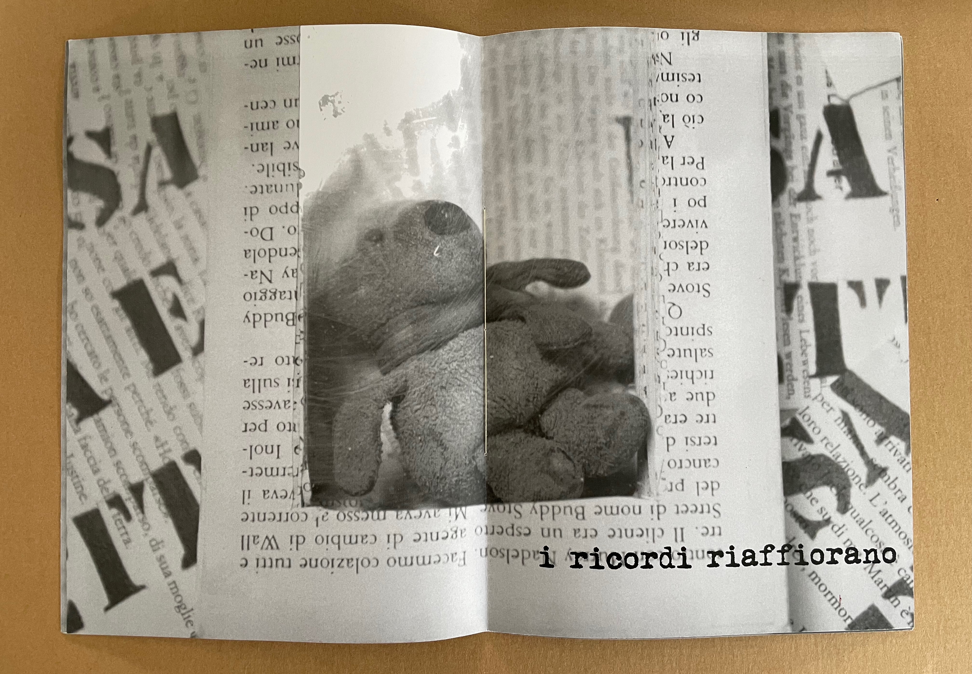
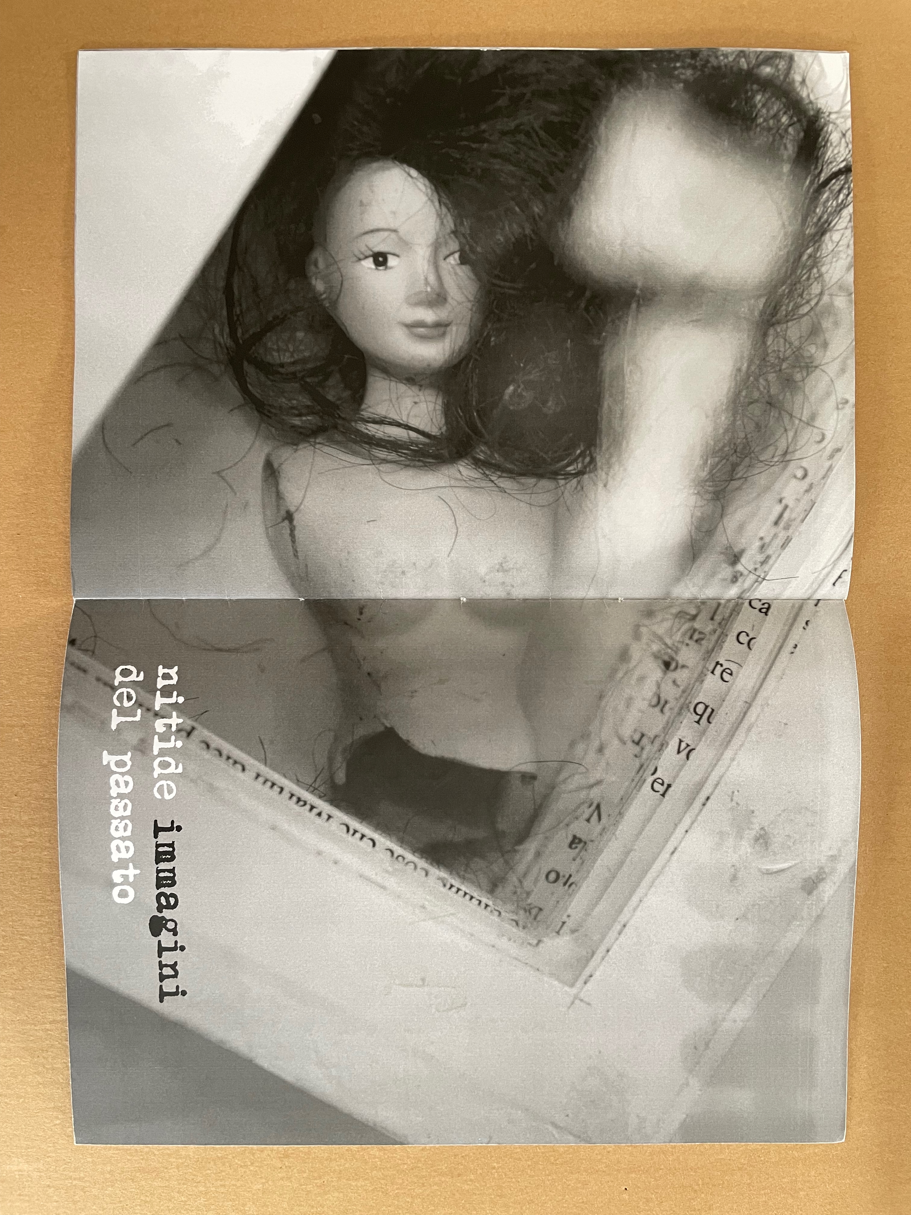
Whether read as otassa presente or presente otassa, the translation of this sewn booklet’s title comes out the same: a present tax. The phrase in the background — usa e getta — stamped over ghosted images of cutout book pages means “disposable” and is used as the title of a 2014 work. The ghosted book pages come from the Italian edition of Mario Puzo’s last novel Fools Die, a Hollywood/Wall Street potboiler. The front cover’s sealed plastic envelope containing cut-up sewing patterns, buttons, thread and an old photograph of a little girl wearing a knit shawl and sitting in a white wicker chair makes the intriguing juxtapositions only more so. What do these collaged and assembled elements have to do with one another?
Some clarity dawns with phrases on the interior pages: gli anni passano (“years go by”), i ricordi riaffiorano (“memories come back”), and nitide immagini del passato (“clear images of the past). “Disposable” alludes not only to the novel whose pages wallpaper the cover and interior pages but also to Cumer’s work of the preceding year — USA E GETTA (2014), a series of unique altered books. The series is the source of the images inside PRESENTE/OTASSA. Each shows a hollowed-out book with an object held in place between clear plates — a picture frame (empty except for the reflection of the foreground — the rest of the work it comes from), a stuffed toy, and a broken dress-up doll. Things of the past that in general are disposable (like sewing patterns no longer needed or broken dolls) nevertheless come back as clear images: a tax on the present.
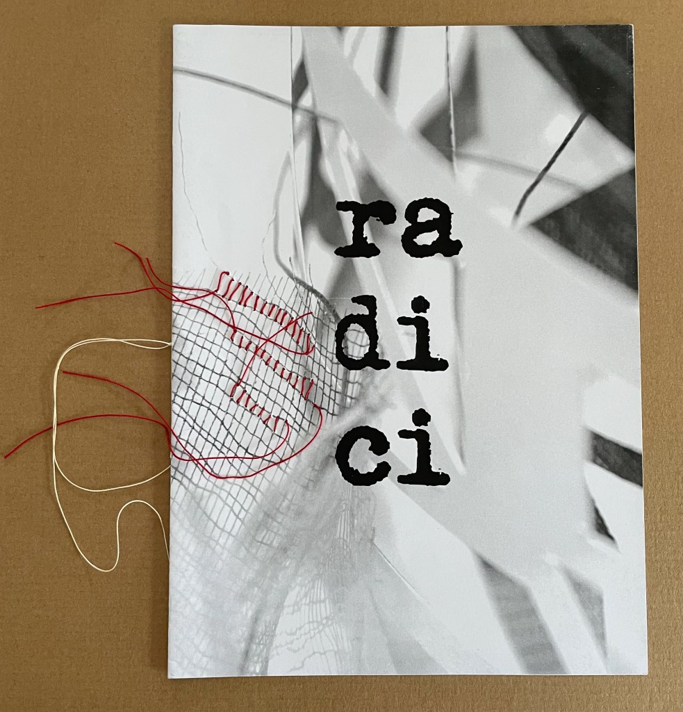
radici/ in memoria dei miei genitori (2015)
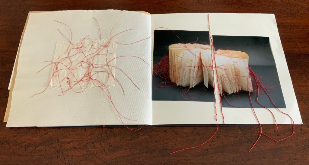
radici/ in memoria dei miei genitori / “roots/ in memory of my parents” (2015) Eleonora Cumer Sewn booklet with stitching. H287 x W206 mm. [8] pages. Edition of 50, of which this is #11. Acquired from the artist, 21 September 2020. Photos: Books On Books Collection.
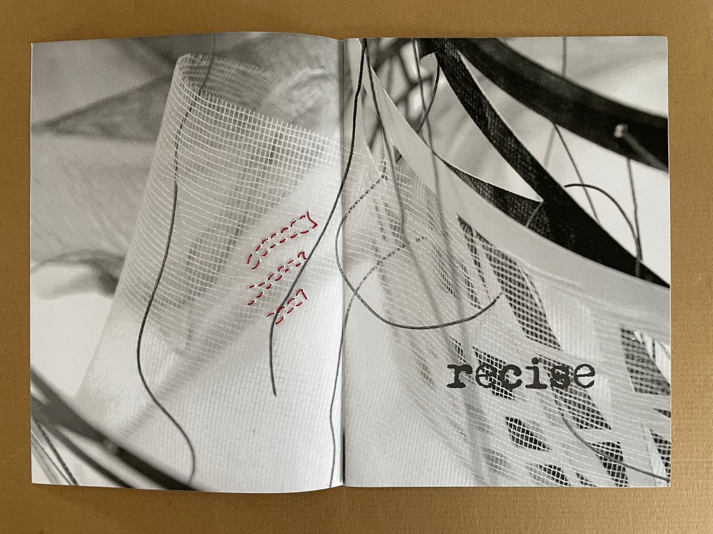
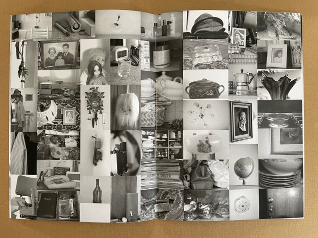
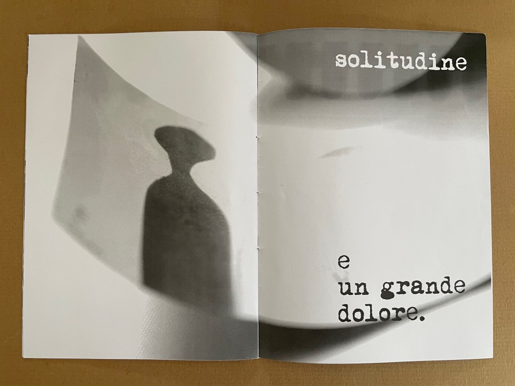
The theme of memory continues in radici/ in memoria dei miei genitori / “roots/ in memory of my parents” (2015) but perhaps more poignantly than in presente/otassa. Drawing on the previous works moltitudine e solitudine/ “multitude and solitude” (2013) and no time no space (2015), the booklet also evokes Cumer’s passion for textile and fabric art. The small image of a sewing box in the lower left hand corner of the central spread may speak to a parental source of that passion, but the words on the other spreads — recise and solitudine e un grande dolore (“severed or sever or cut” and “loneliness and a great sorrow”) — turn that central spread into a collage of loss almost more so than a collection of memories. It is one of the more somber works by Cumer in the Books On Books Collection.
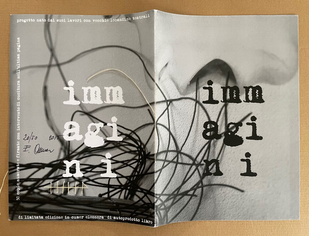
immagini (2015)
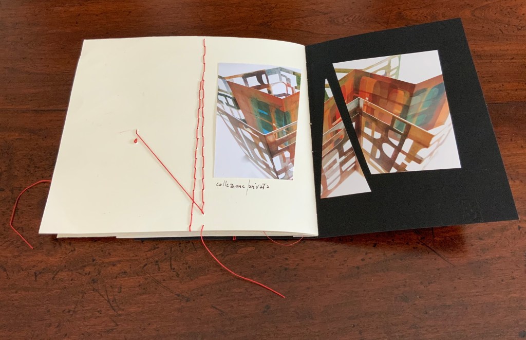
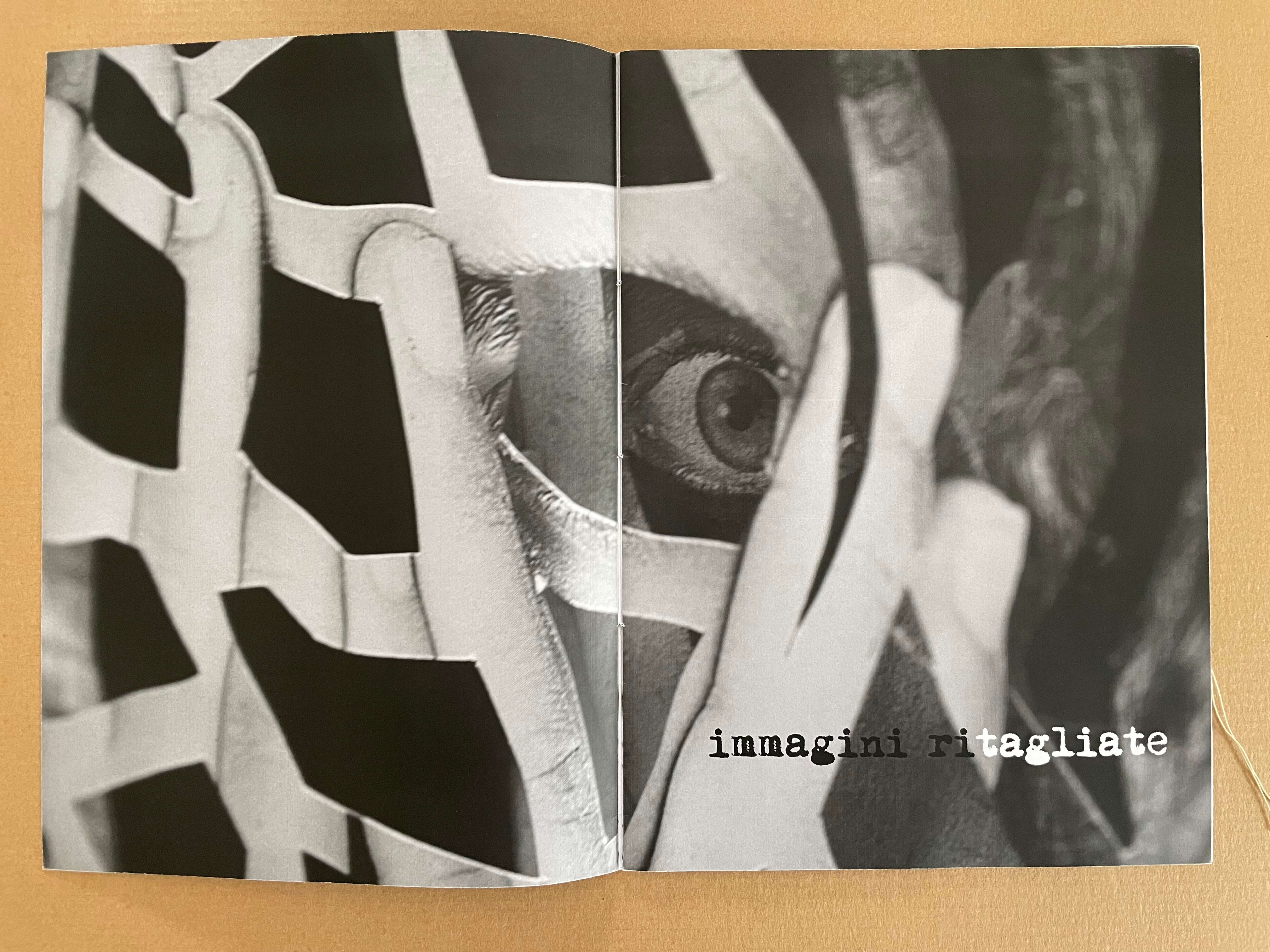
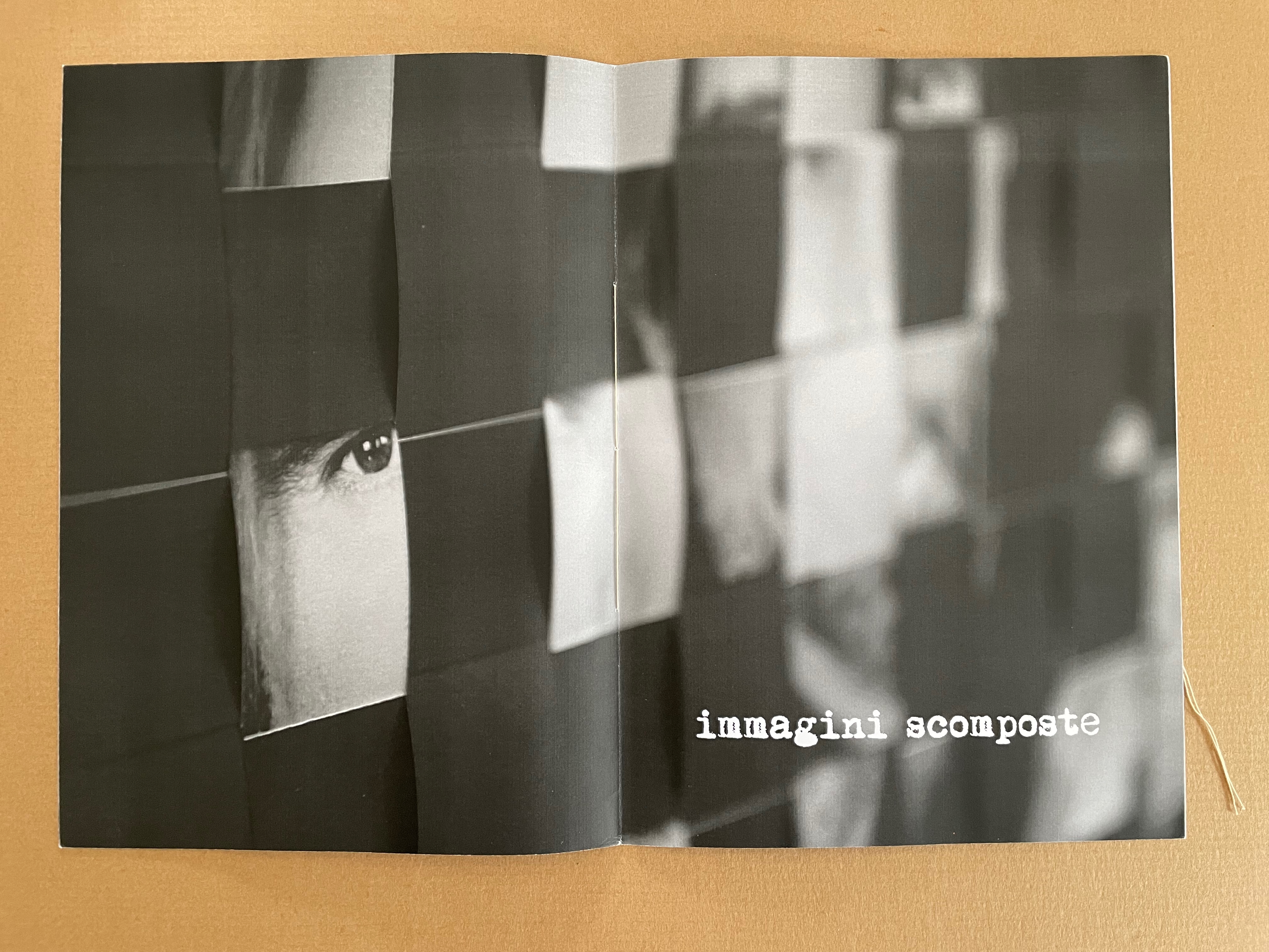
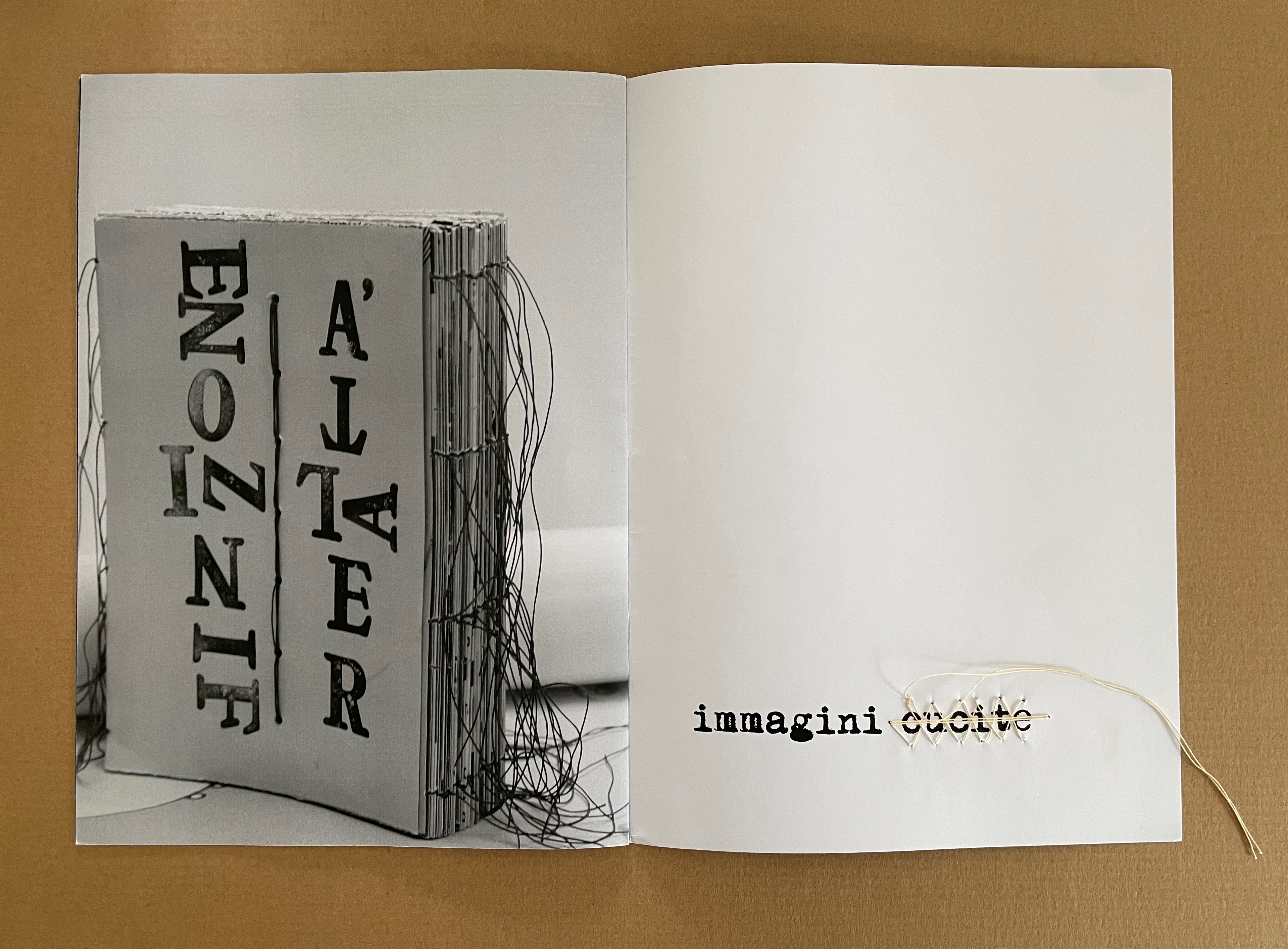
immagini / ‘“images” (2015) Eleonora Cumer Sewn booklet with stitching on the last page. H287 x W206 mm. [8] pages. Edition of 50, of which this is #20. acquired from the artist, 21 September 2020. Photos: Books On Books Collection.
The overlaid phrases immagini ritagliate, immagini scomposte, and immagini cucite can be translated as “cut out images”, “distorted images”, and “stitched images”, respectively. On the cover of the unreadable book displayed, the words FINZIONE / “fiction” and REALTÁ / “reality” are spelled in reverse. As in libro catalogo, there is self-reflexivity at play here. Cumer plays with the word ritagliate by printing ri in black and tagliate in white, creating two verbs — ritagliate (“cut out”) and tagliate (“cut”), which apply to the word itself, the technique in the poster displayed, and the fragment of it blown up on the double-page spread. By blurring the image on the recto page of the second double-page spread, she makes the spread play out the meaning of scomposte — “distorted”. And in the third spread, she playfully stitches over the word cucite — “stitched” — which comments not only on the word but also on the stitched unreadable book on the verso page.
*Giocare è una cosa seria! I bambini di oggi sono gli adulti di domani aiutiamoli a crescere liberi da stereotipi aiutiamoli a sviluppare tutti i sensi aiutiamoli a diventare più sensibili. Un bambino creativo è un bambino felice!
“Playing is a thing! Today’s children are tomorrow’s adults. Let’s help them grow up free from stereotypes. Let’s help them develop all their senses. Let’s help them become more sensitive. A creative child is a happy child!” Bruno Munari, on occasion of 1986
Bruno Munari, 1986, on occasion of a Children’s Workshop Laboratory, prompted by a series of seminars promoted in 1977 by Franco Russoli, Superintendent of the Pinacoteca di Brera.
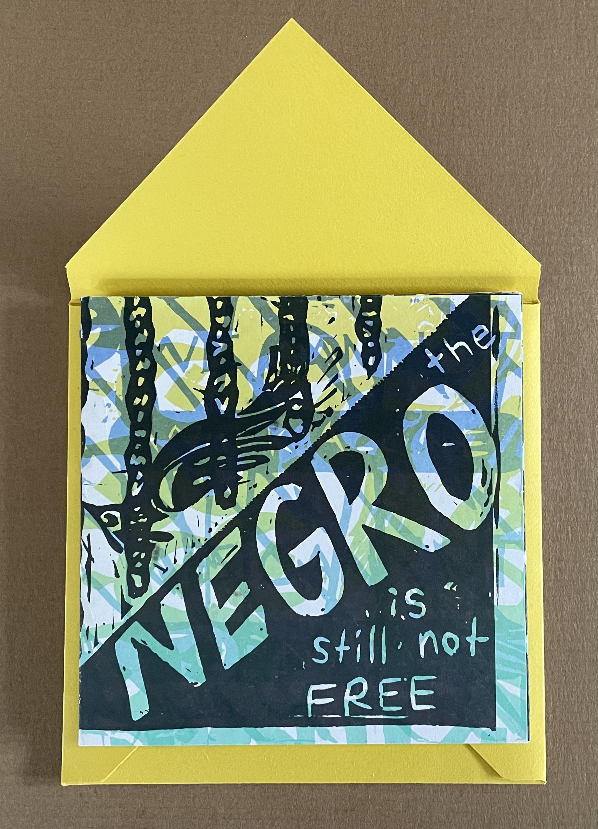
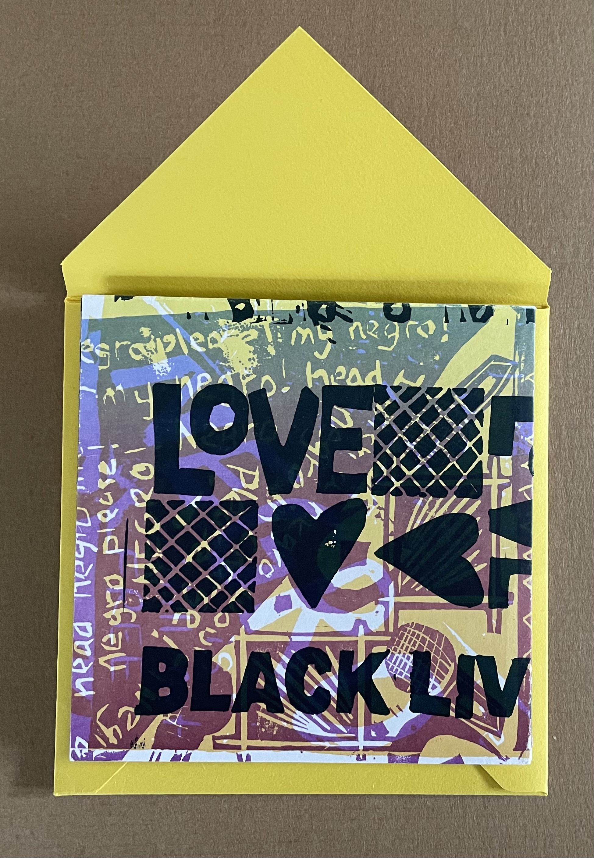
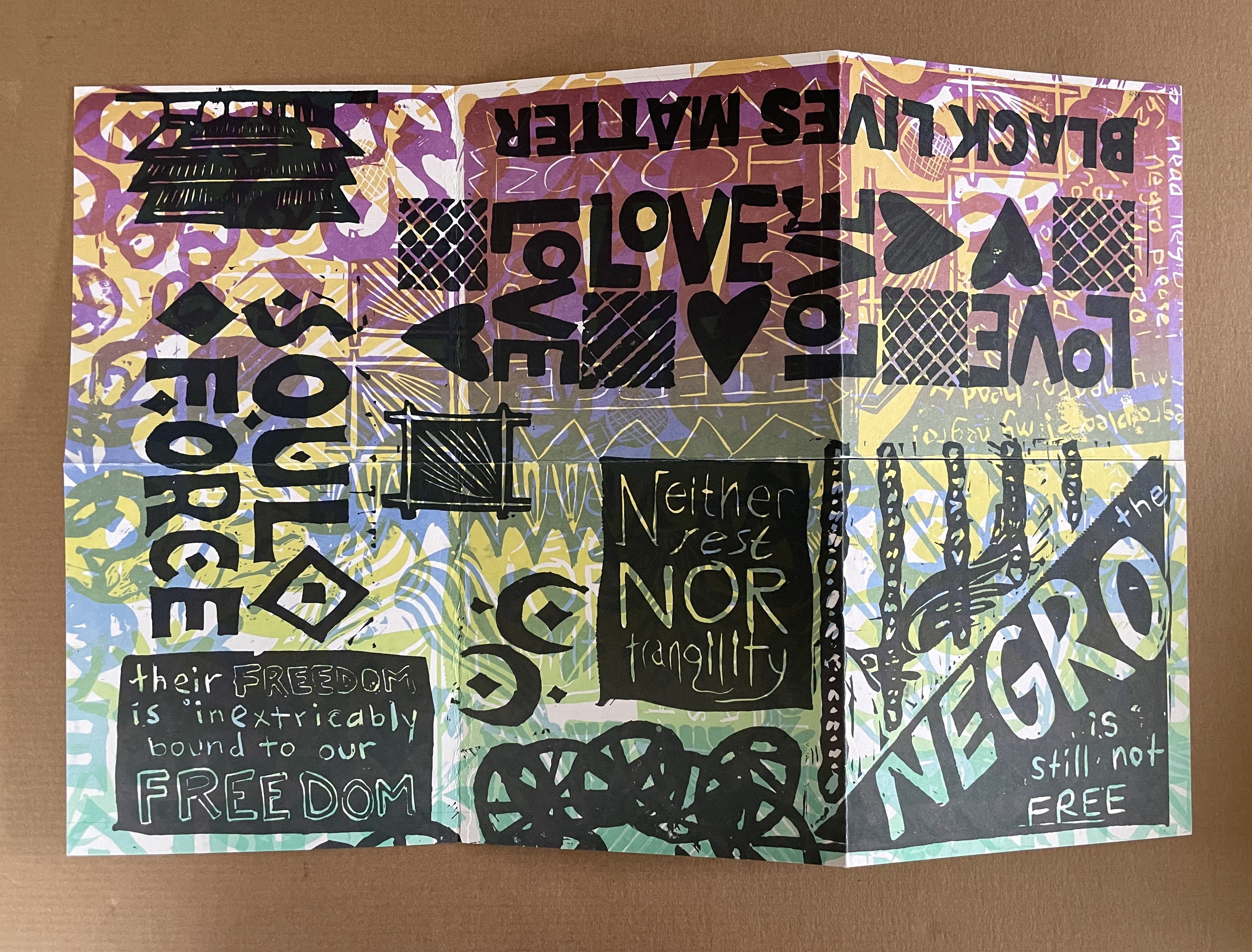
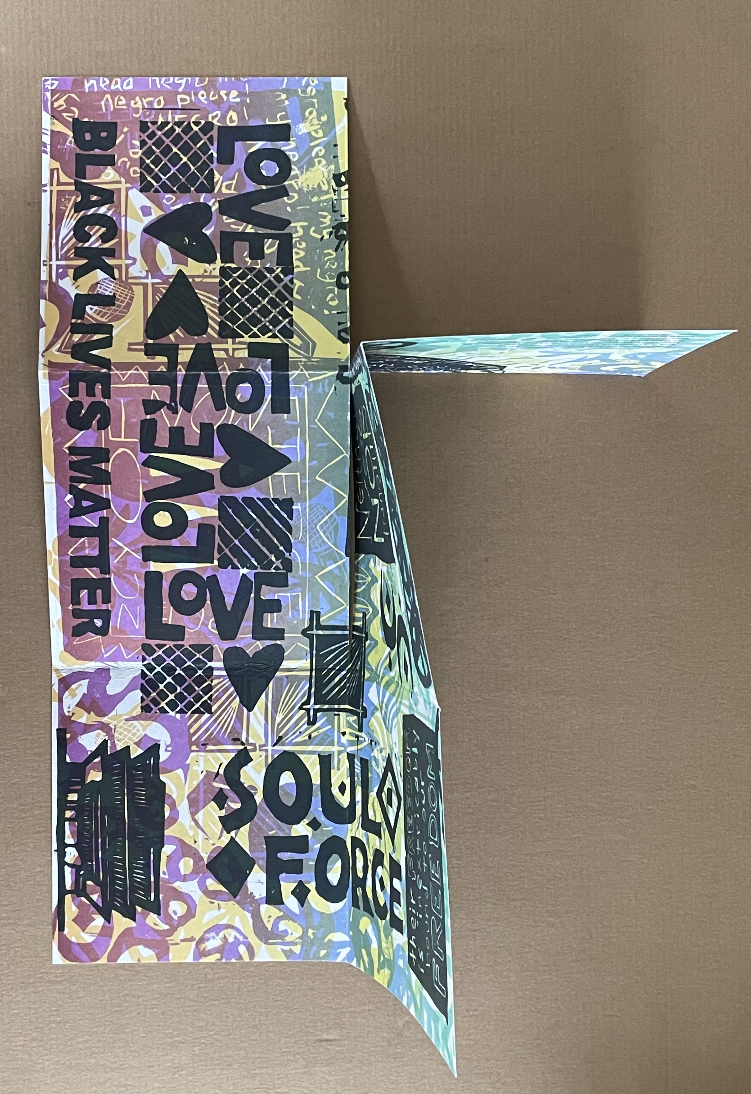
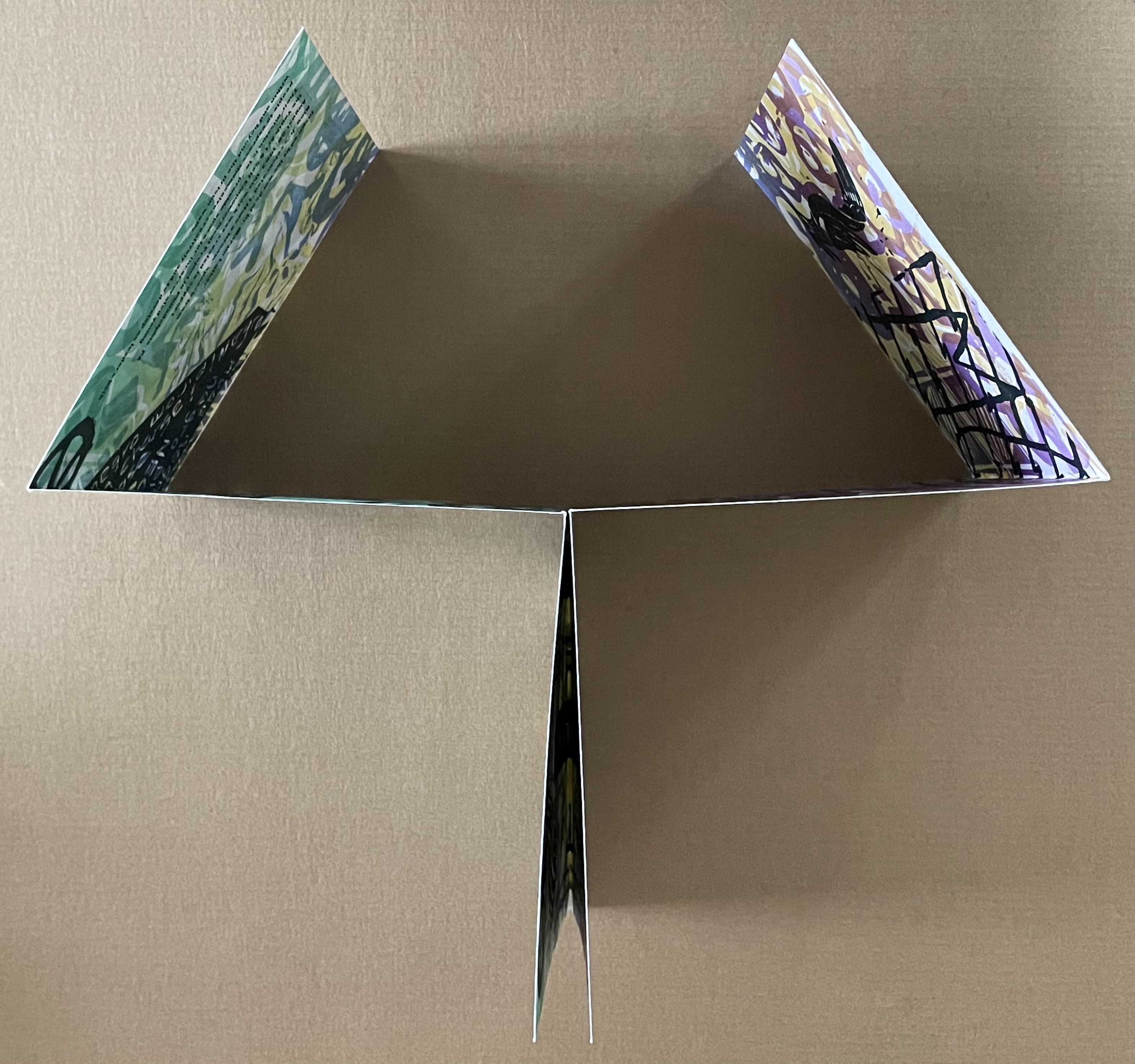
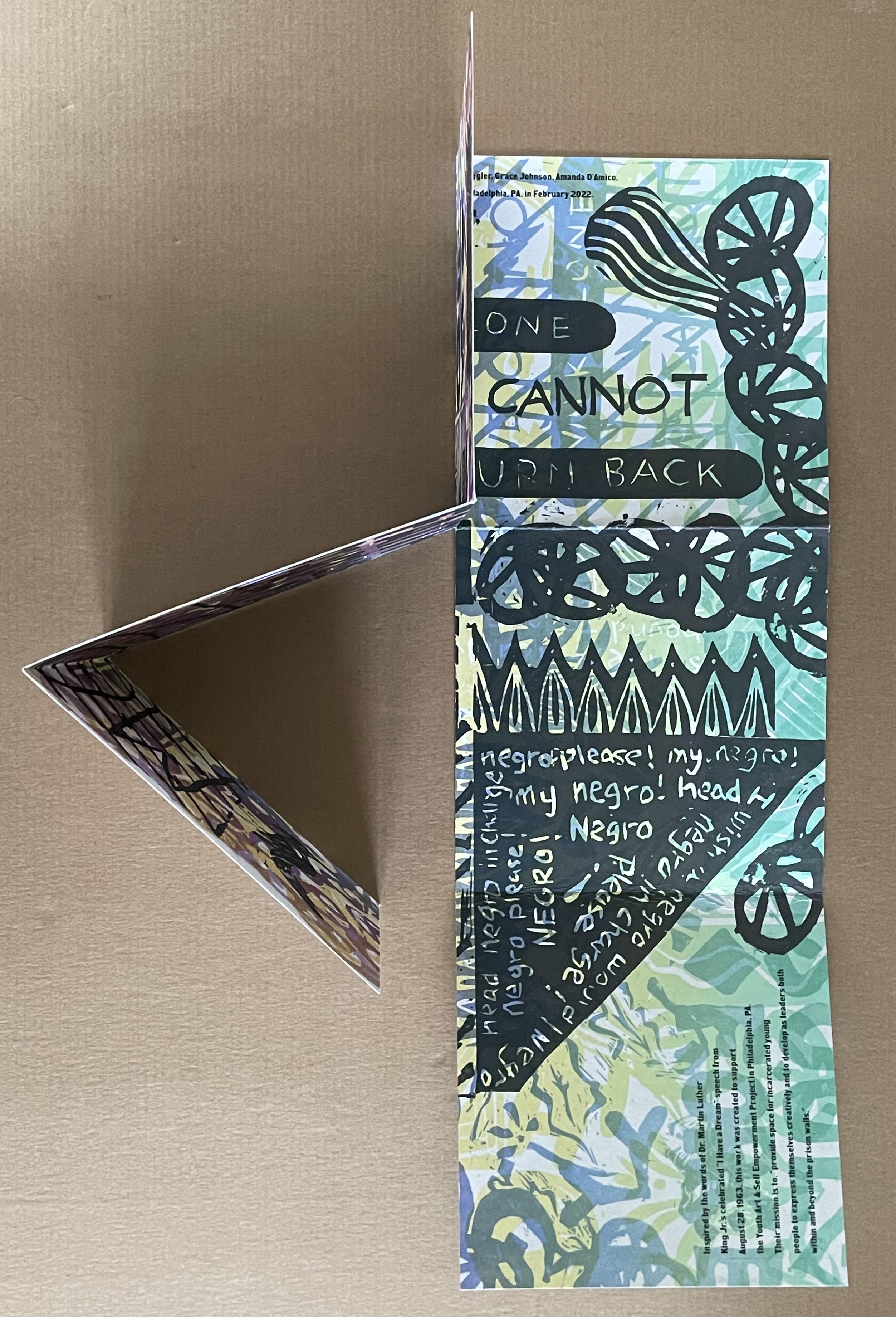
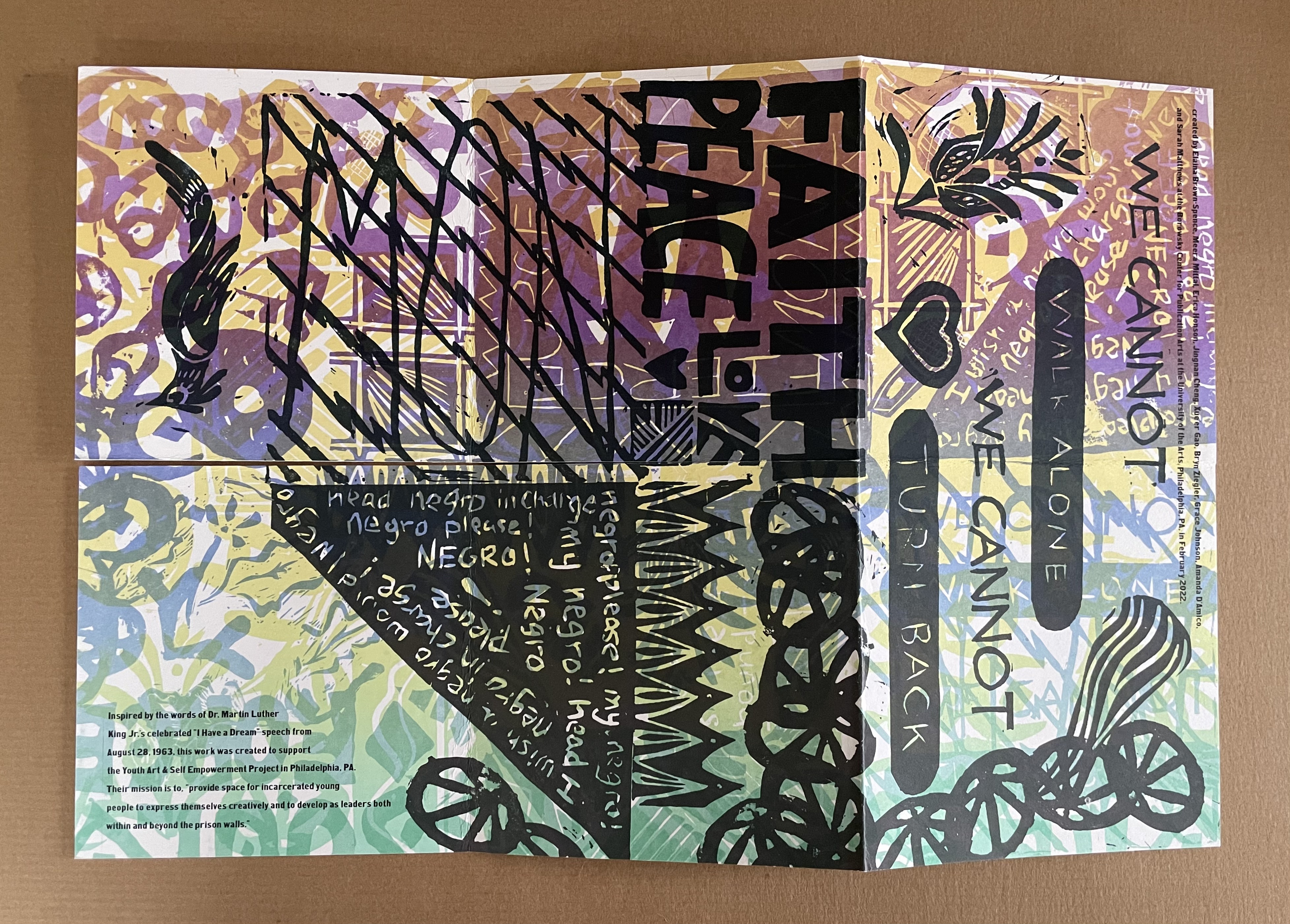
The Negro Is Still Not Free (2022) Elaina Brown-Spence, Meera Mittari, Erica Honson, Jingnan Cheng, Xue’er Goo, Bryn Ziegler, Grace Johnson, Amanda D’Amico, and Sarah Matthews Double-sided single-page book in a pants fold. 152 x 152 mm. Acquired from Sarah Mathews, 6 August 2024. Photos: Books On Books Collection
The Negro is Still Not Free was created by Elaina Brown-Spence, Meera Mittari, Erica Honson, Jingnan Cheng, Xue’er Goo, Bryn Ziegler, Grace Johnson, Amanda D’Amico, and Sarah Matthews at the Borowsky Center for Publication Arts at the University of Arts in Philadelphia, PA during the month of February 2022. In its color and style, it reflects the influence of Amos Paul Kennedy, Jr. Its double-sided single-sheet pants-fold book structure, cleverly fuses the traditions of poster and book (or zine).
Inspired by the words of Dr. Martin Luther King, Jr’s celebrated “I Have A Dream” speech from August 28, 1963, the work was created to support the Youth Art & Self Empowerment Project in Philadelphia, PA. Their mission is to “provide space for incarcerated young people to express themselves creatively and to develop as leaders both within and beyond prison walls.”
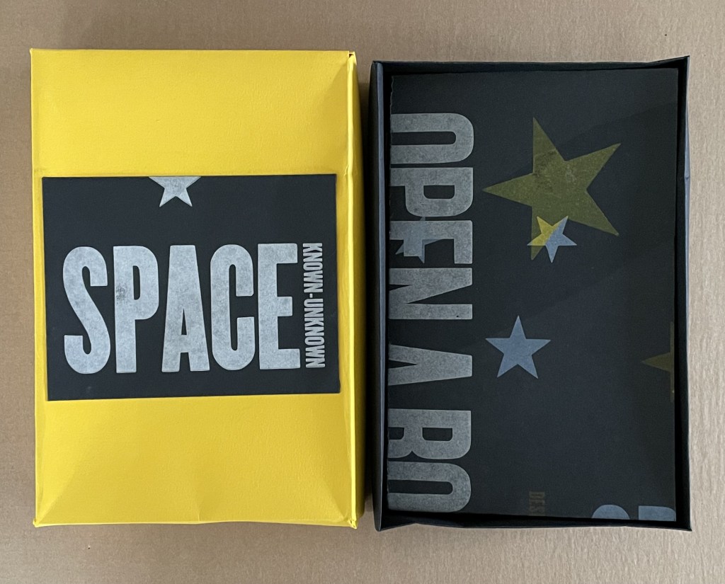
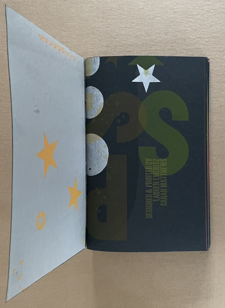
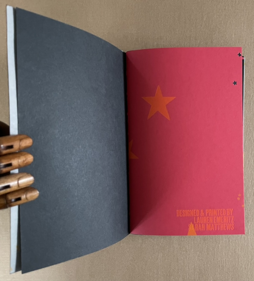
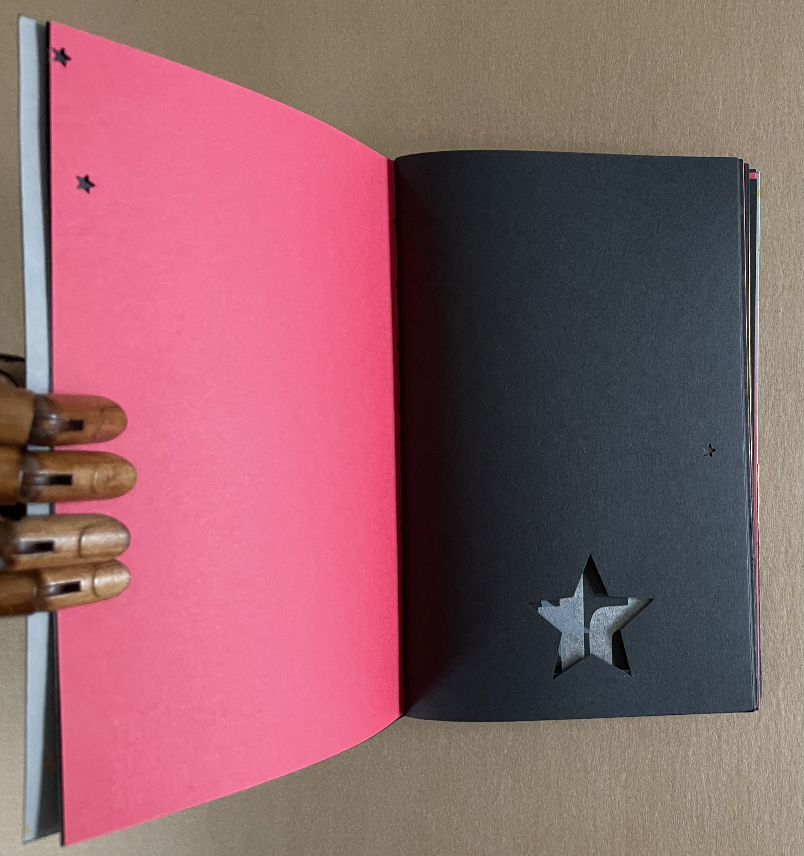
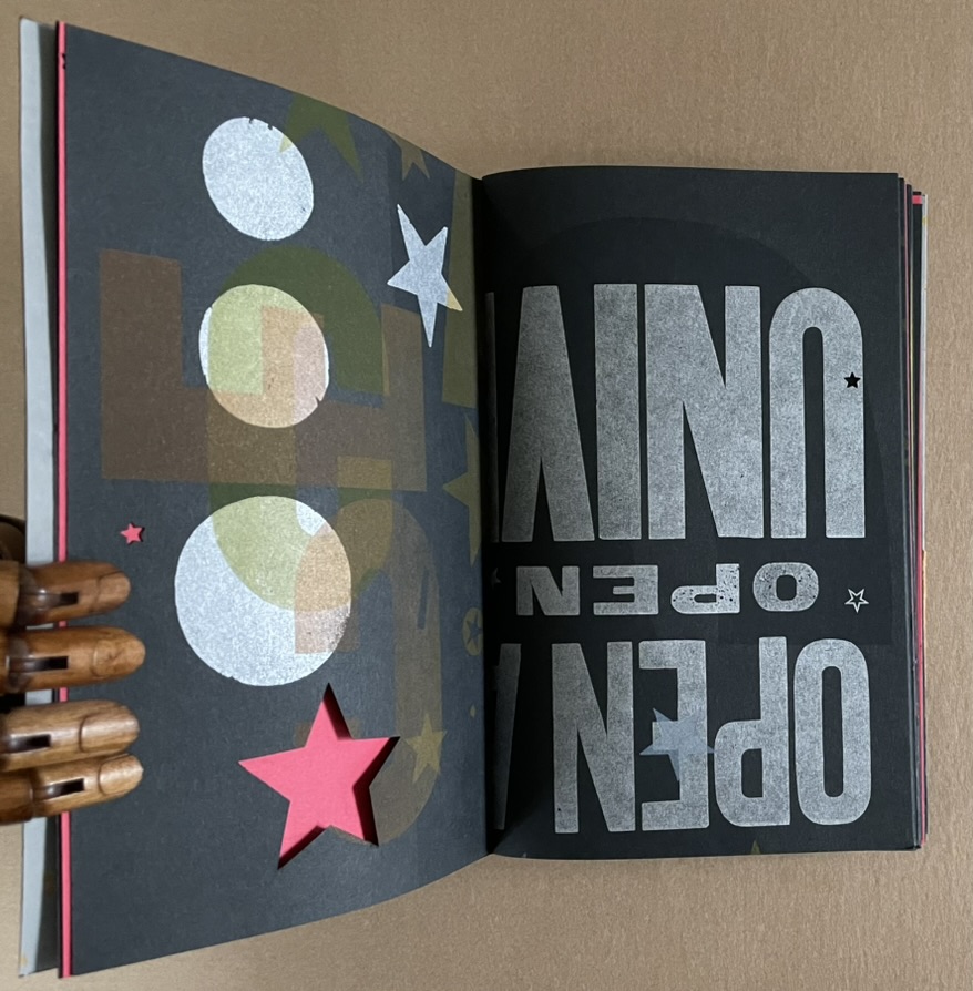
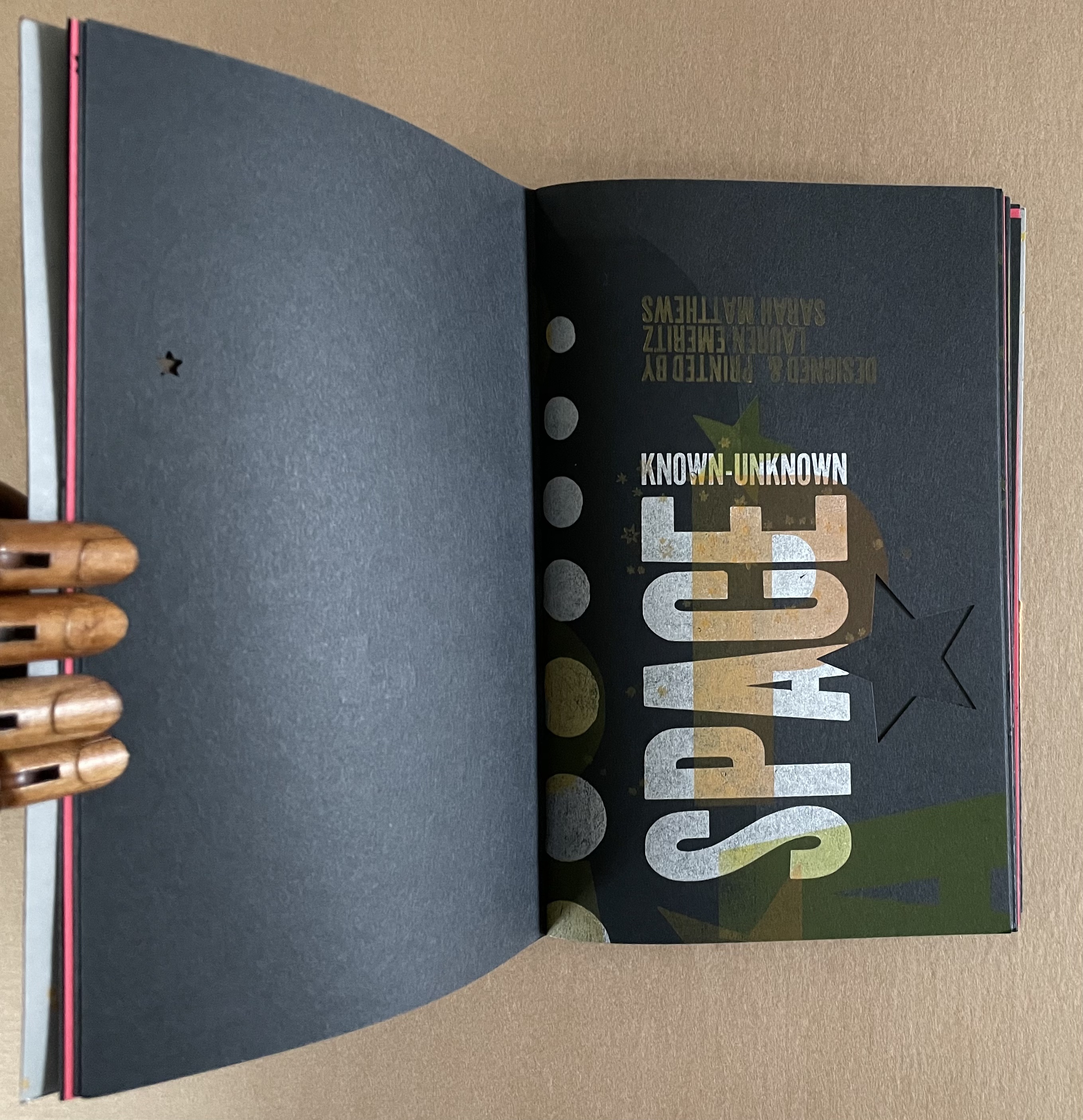
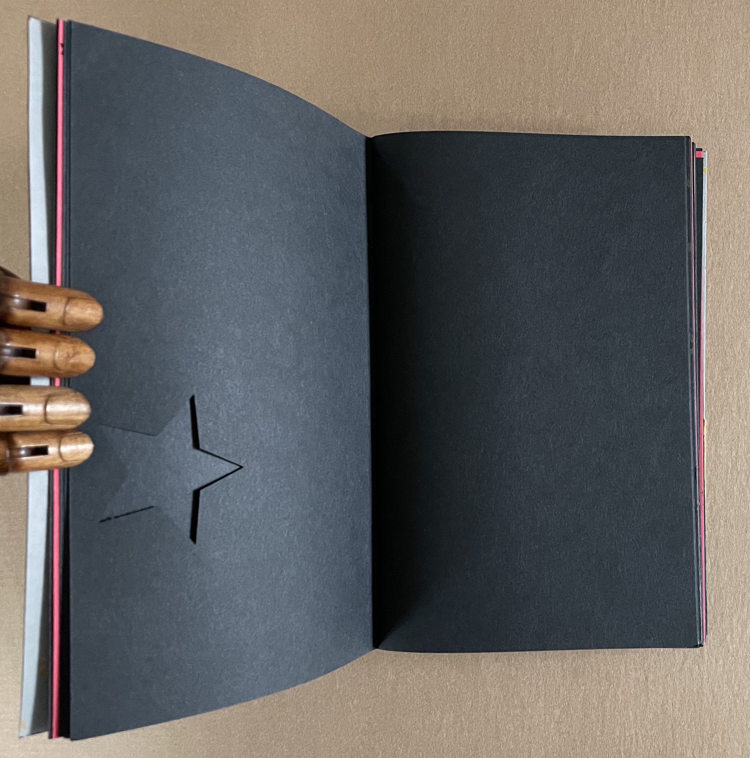
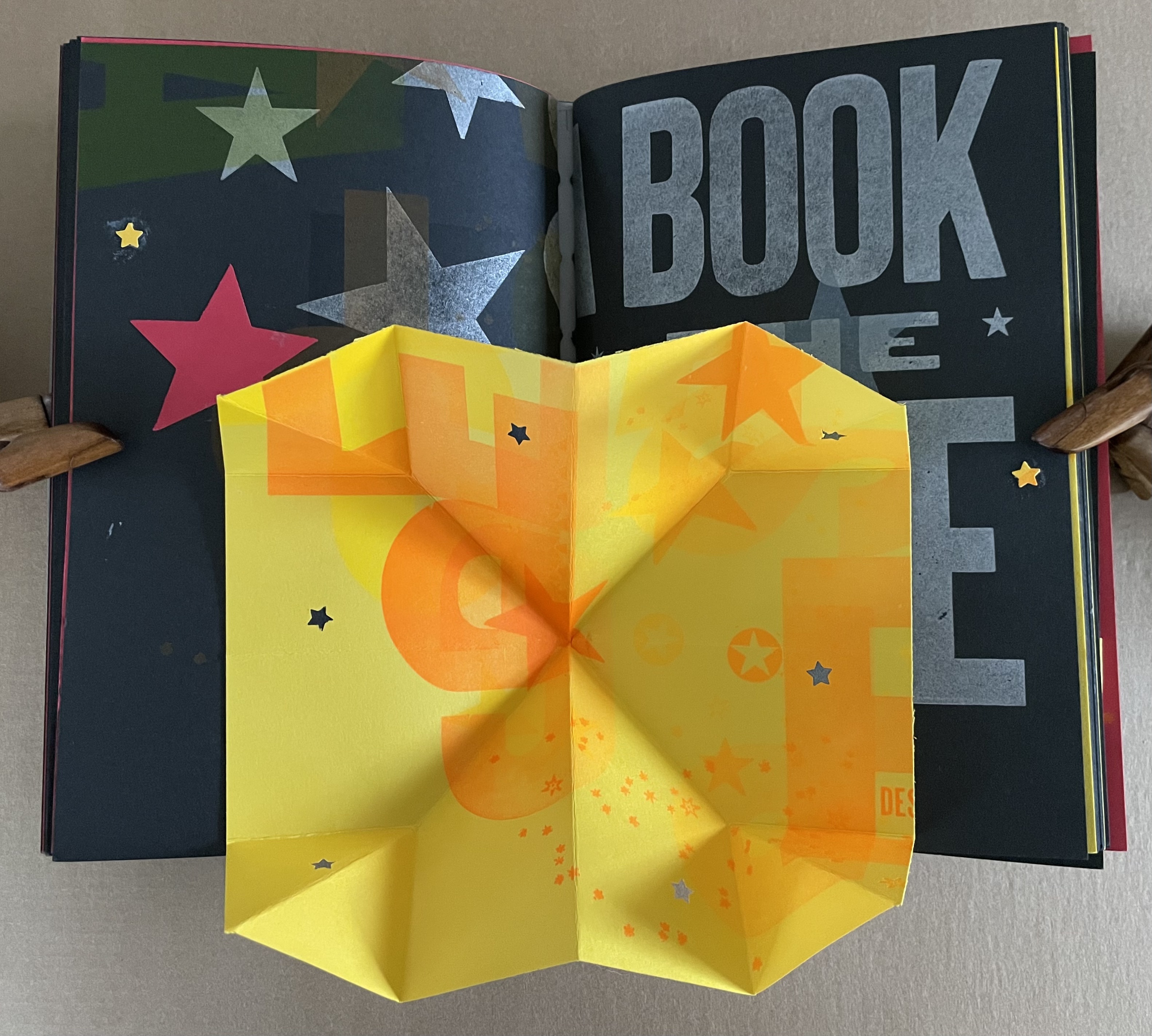
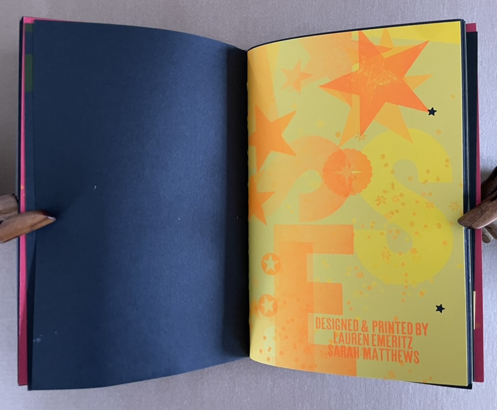
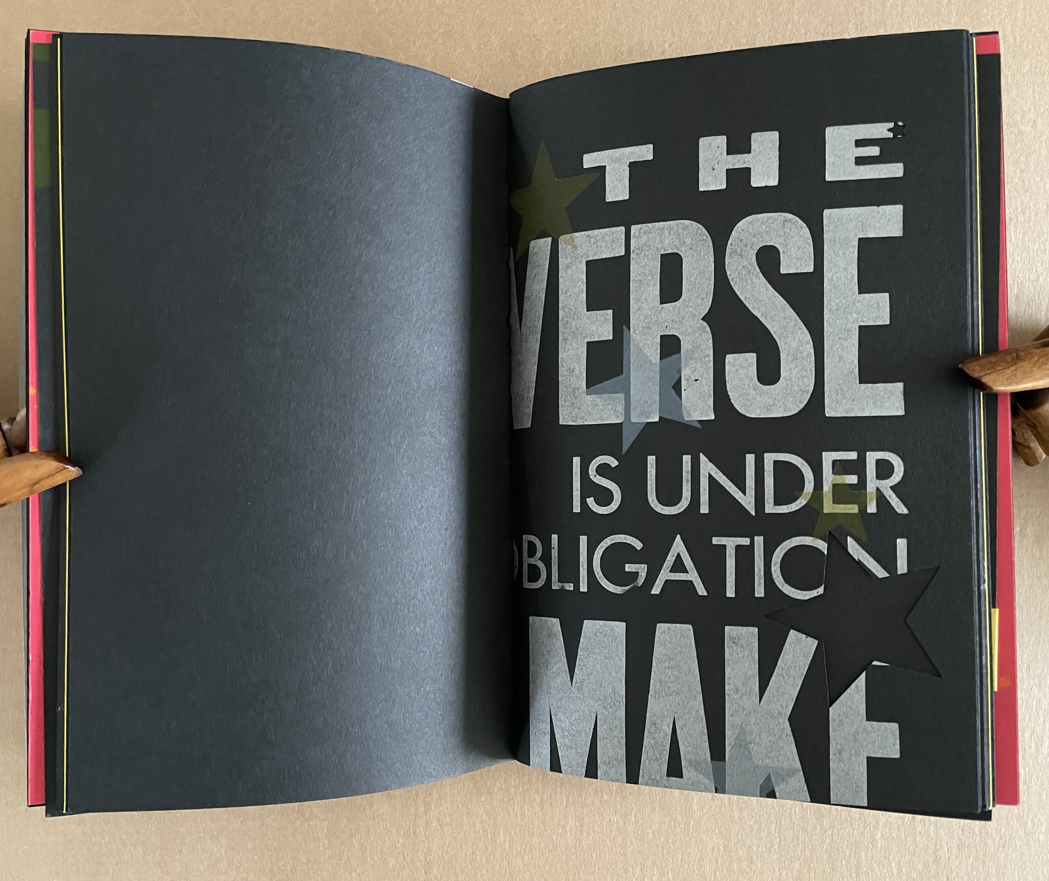
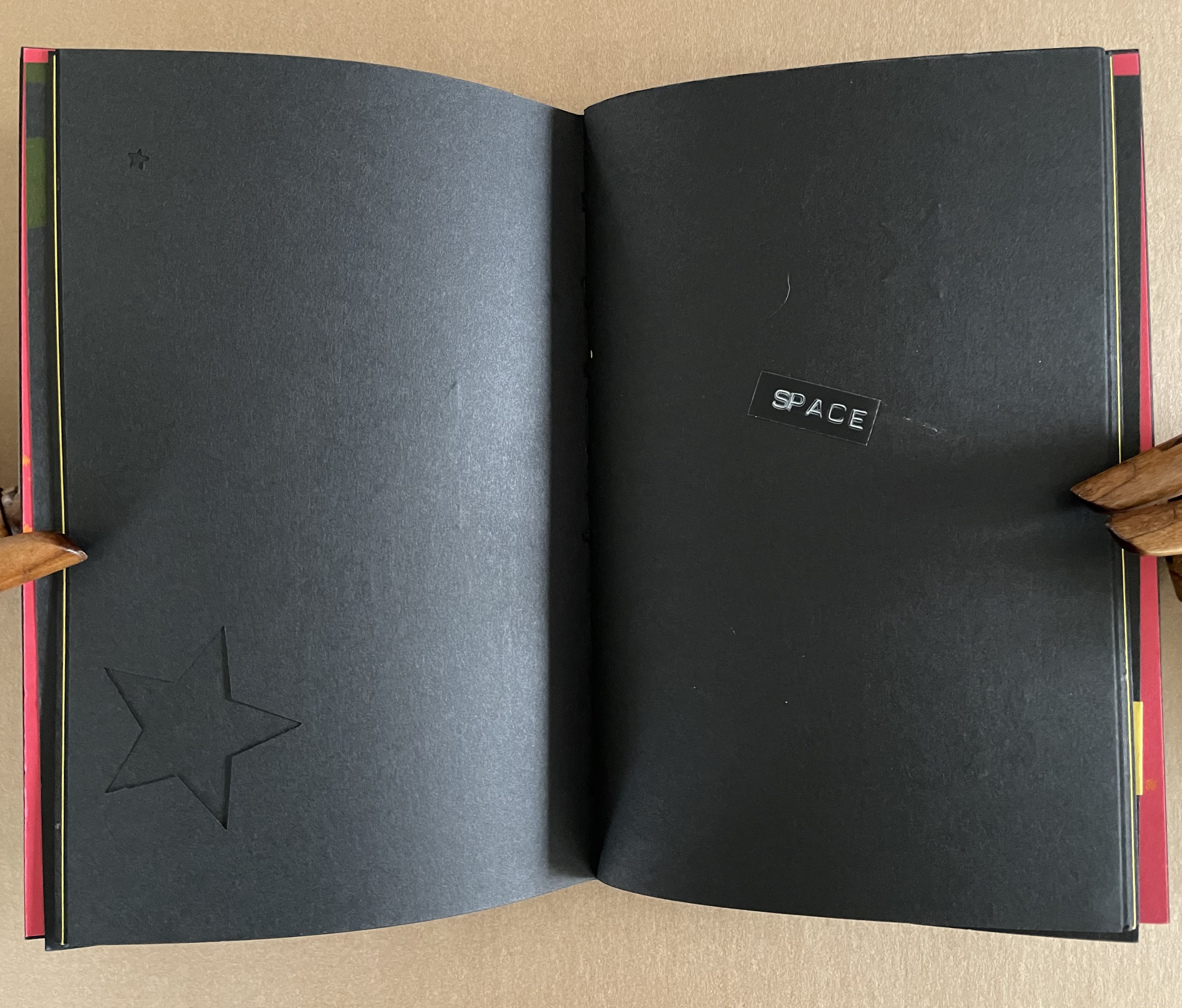
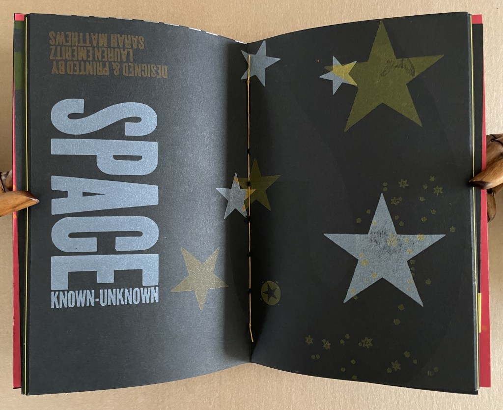
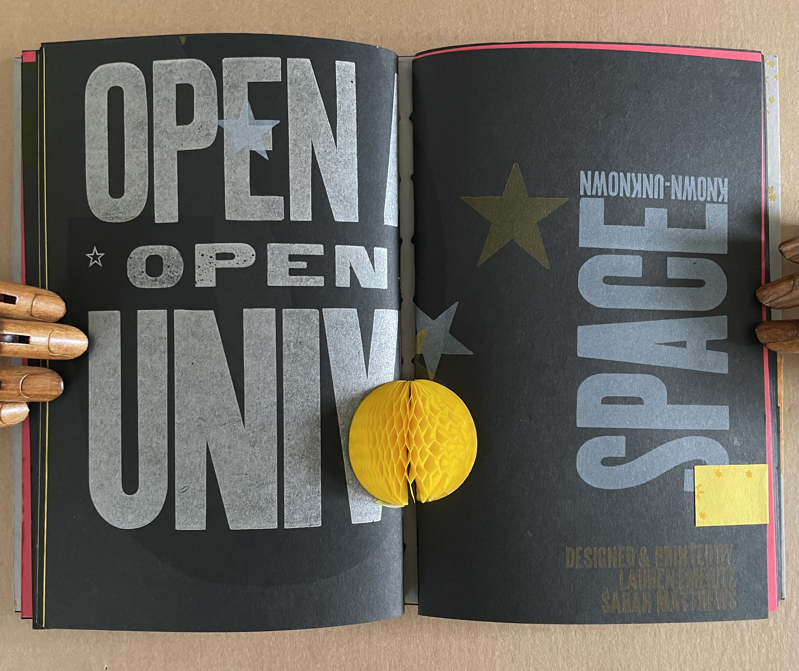
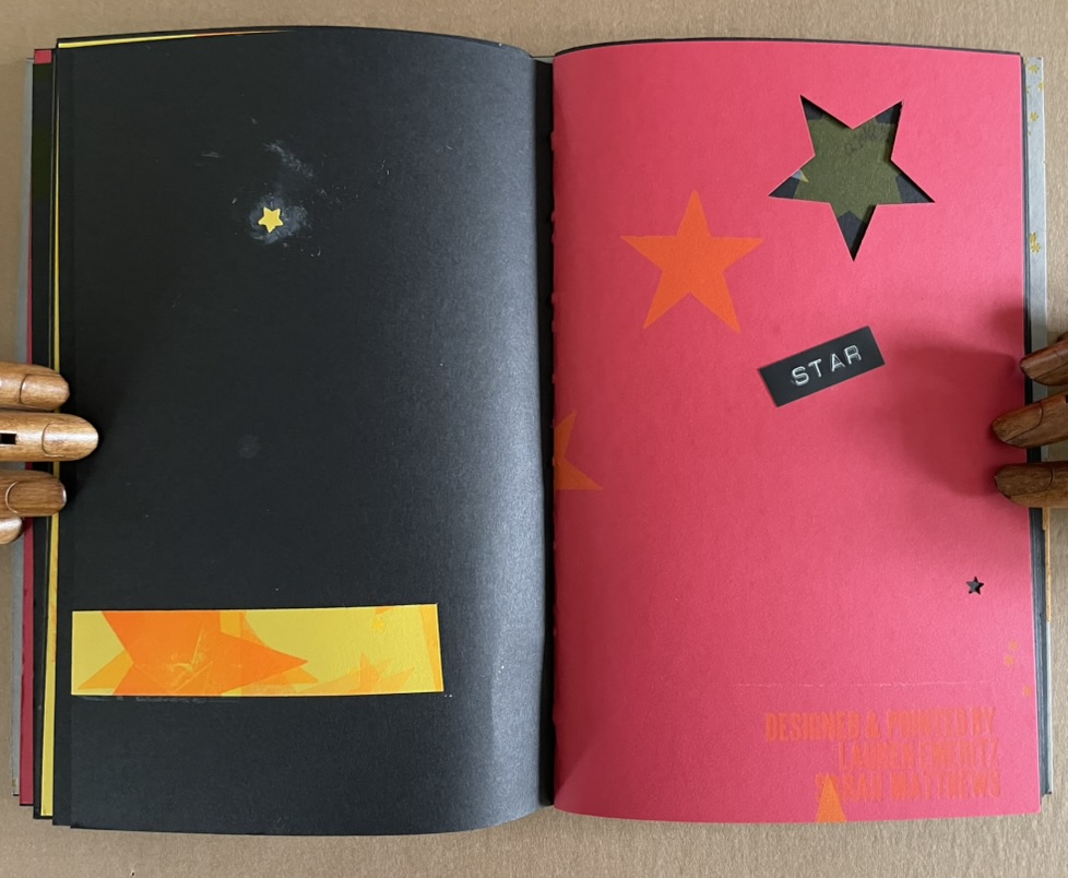
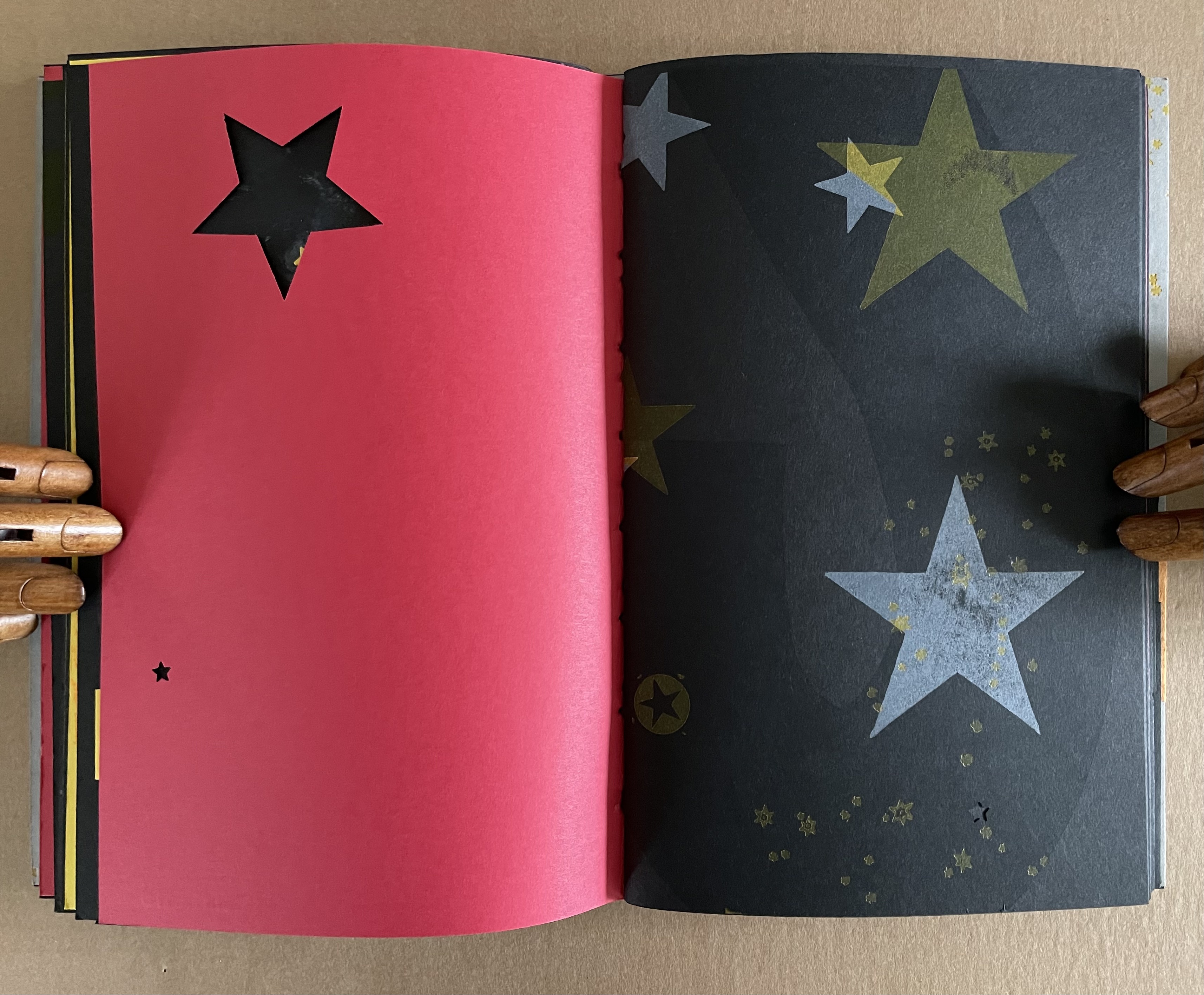
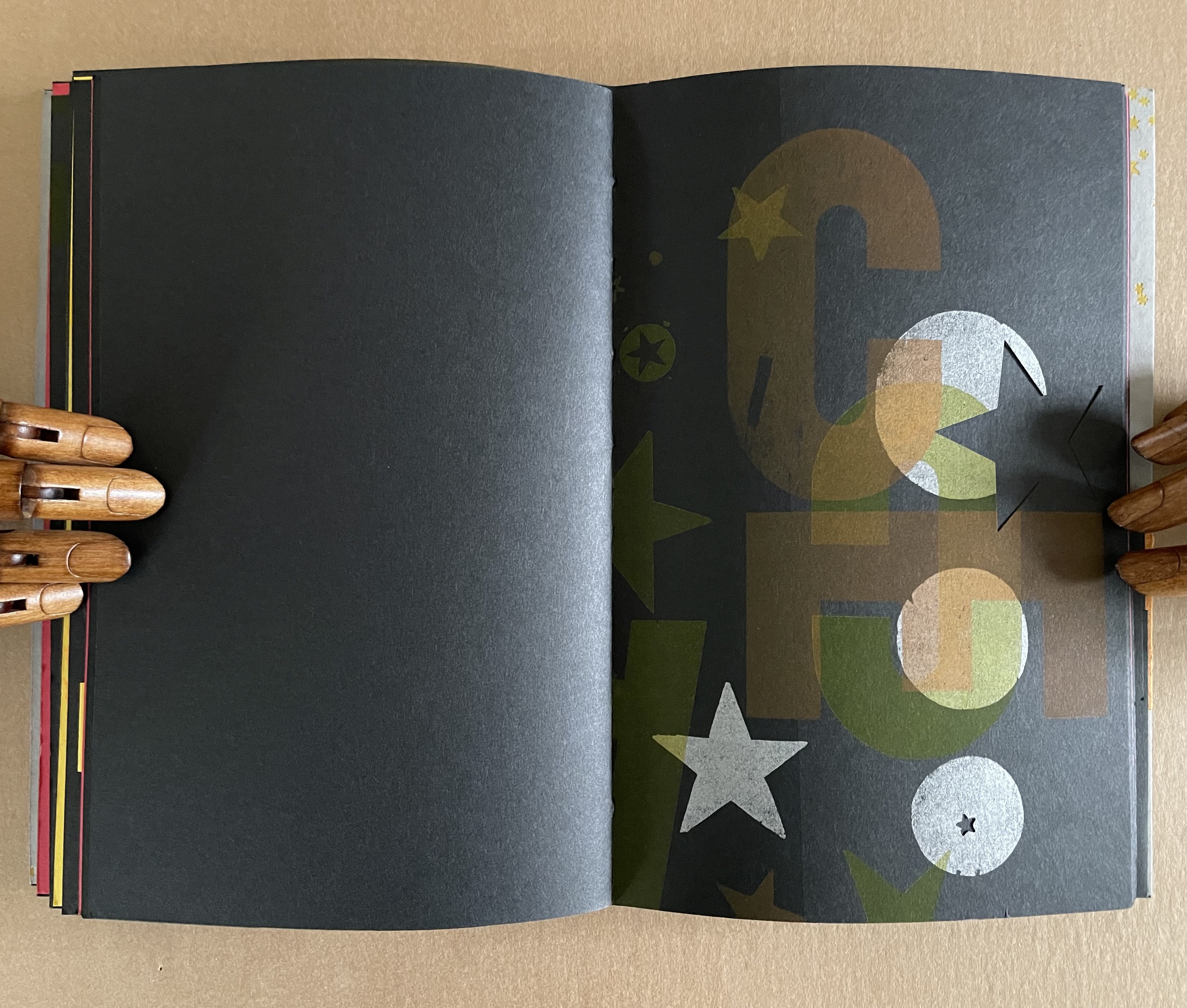
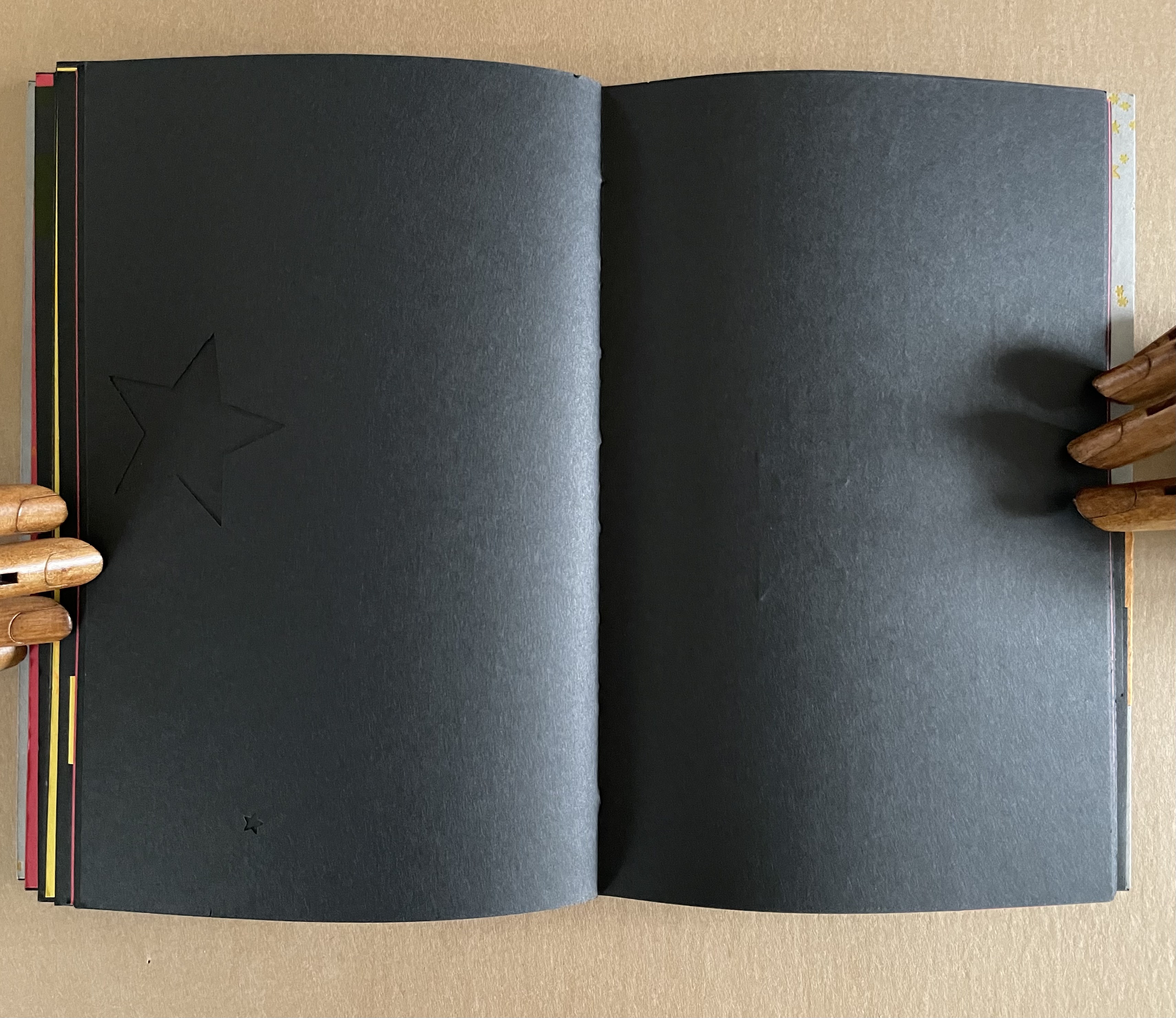
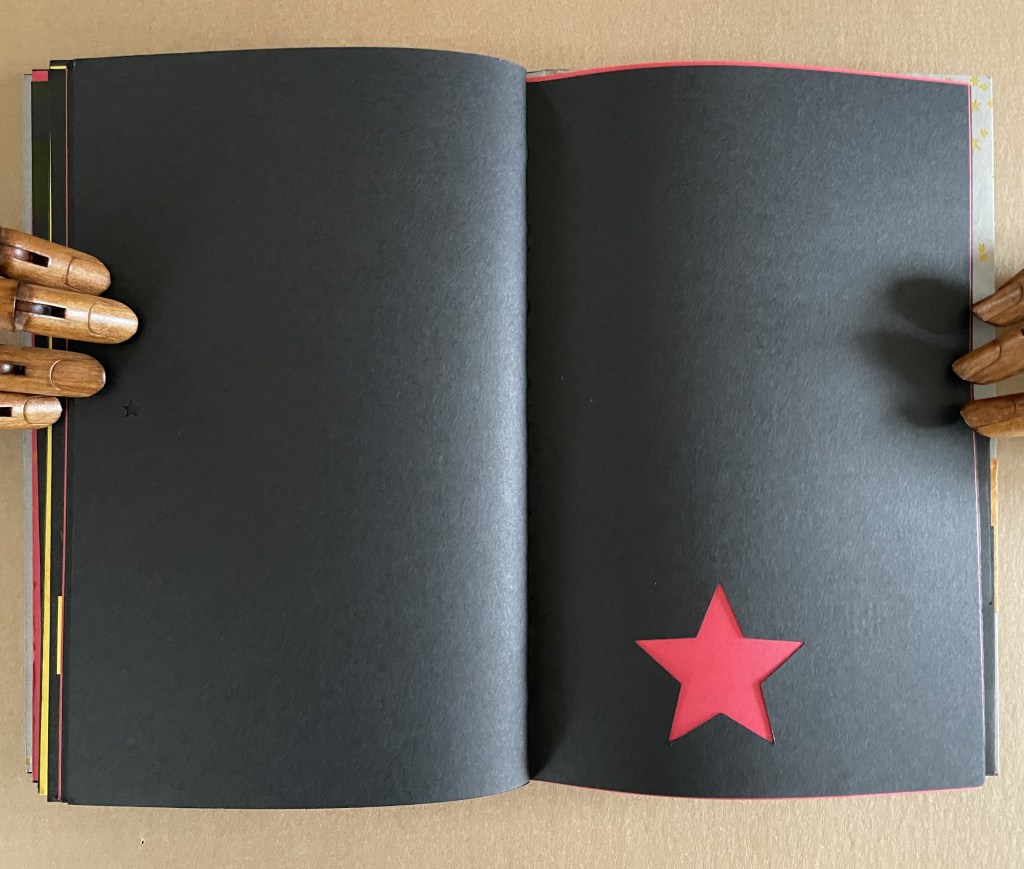
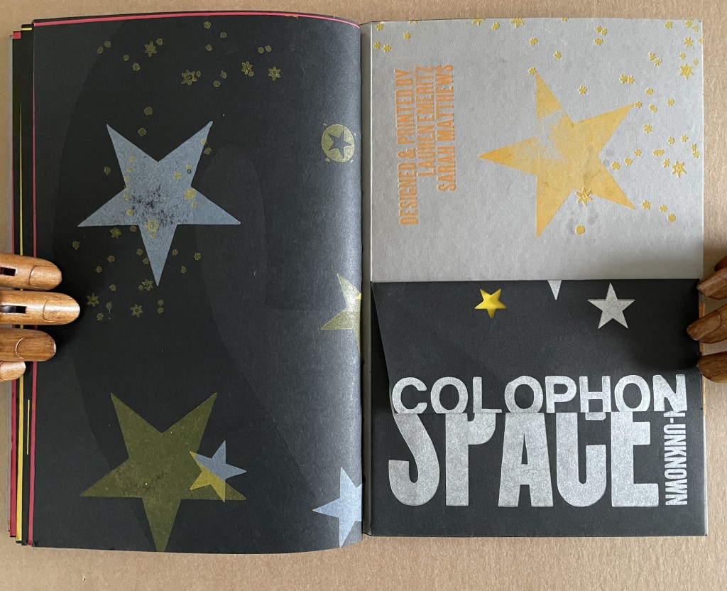
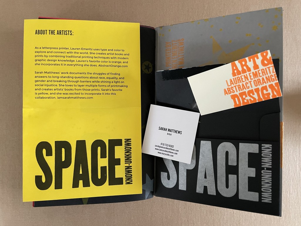
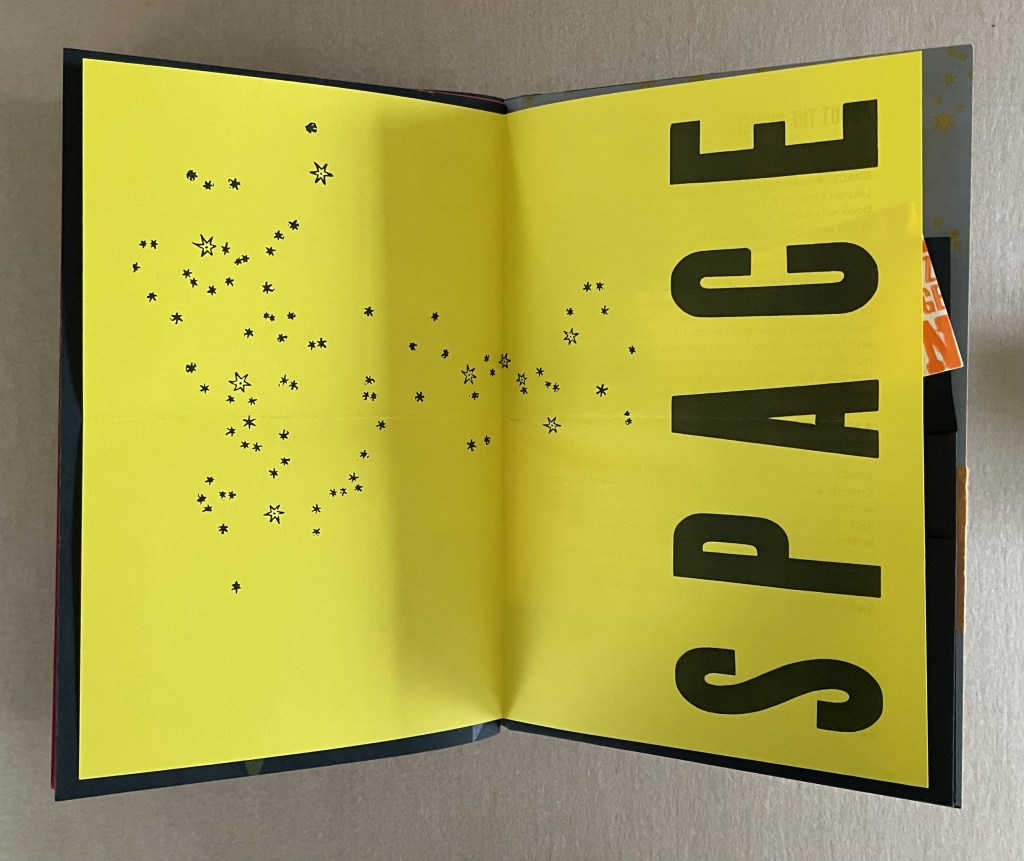
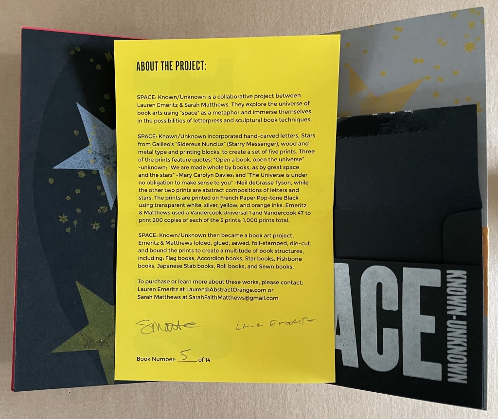
SPACE: Known/Unknown (2022)
SPACE: Known / Unknown Lauren Emeritz & Sarah Matthews Box with pastedown title enclosing softcover book. Box: 237 x W157 x D50 mm. Book: H230 x W150 x D25 mm. 48 pages and loose 4-page colophon in envelope attached to inside back cover. Edition of 15, of which this is #5. Acquired from Sarah Mathews, 6 August 2024. Photos: Books On Books Collection.
A collaborative project between Lauren Emeritz & Sarah Matthews, SPACE: Known/Unknown features three telling quotations:
“Open a book, open the universe”– Unknown “We are made whole by books, as by great space and the stars” — Mary Carolyn Davies “The Universe is under no obligation to make sense to you” — Neil deGrasse Tyson
The universe of this artist’s book is that of letterpress, handcarved letters, wood and metal type, embossed printer labels, multiple inks and foil stamping, die cuts, paper engineering, and multiple binding structures. This and its crazy quilt imposition make it a lively universe to explore, and it certainly lives up to deGrasse Tyson’s quip.
Does this book subscribe to the “argument by design” made by Socrates and St. Thomas Aquinas?
A universe in which page layout turns one way and then another is under no obligation to make sense.
A Turkish fold of constellations.
The artists must have traveled back in time to include one of these embossed sticky labels.
The universe and title page can appear in multiple places — even in the middle.
A sunburst — and then star label in case we missed it?
A multi-color galaxy of ink leads to die-cut black stars (or holes?).
Not exactly a dwarf red star, but it’s the artists’ universe, they get to decide.
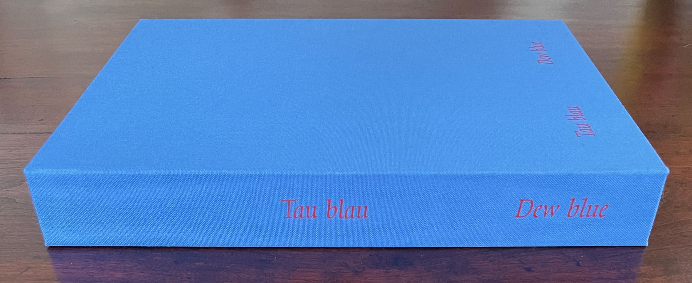
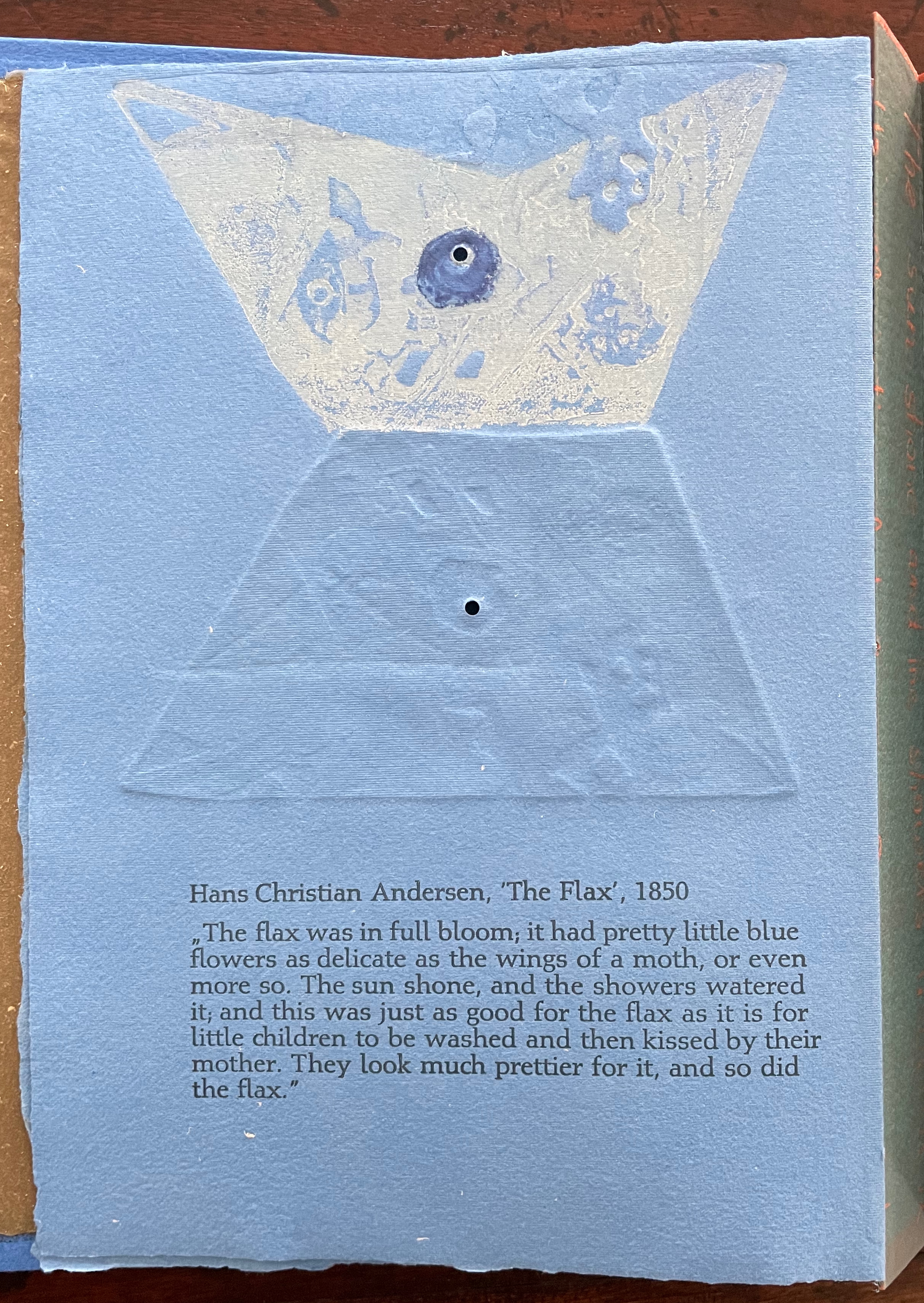
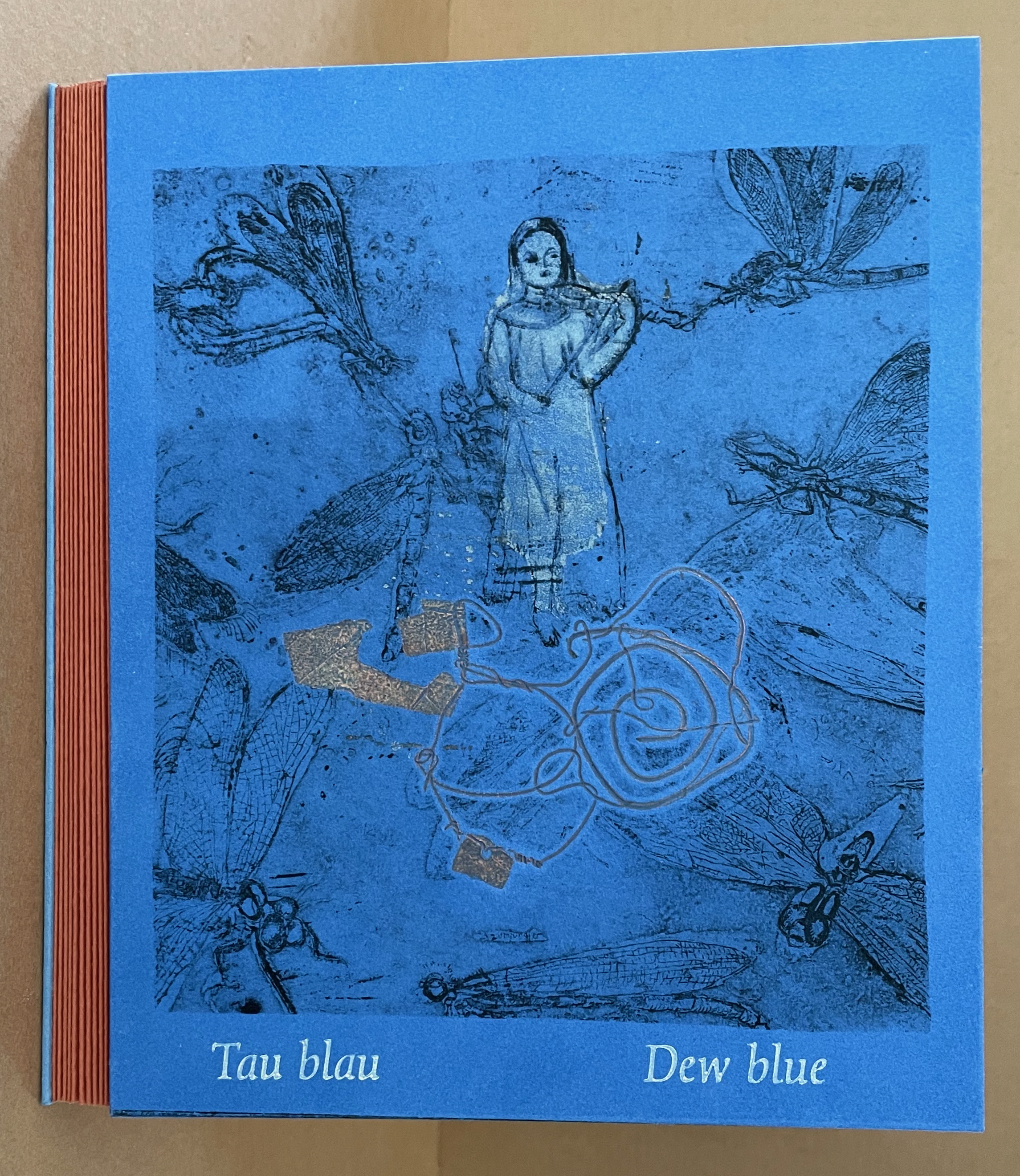
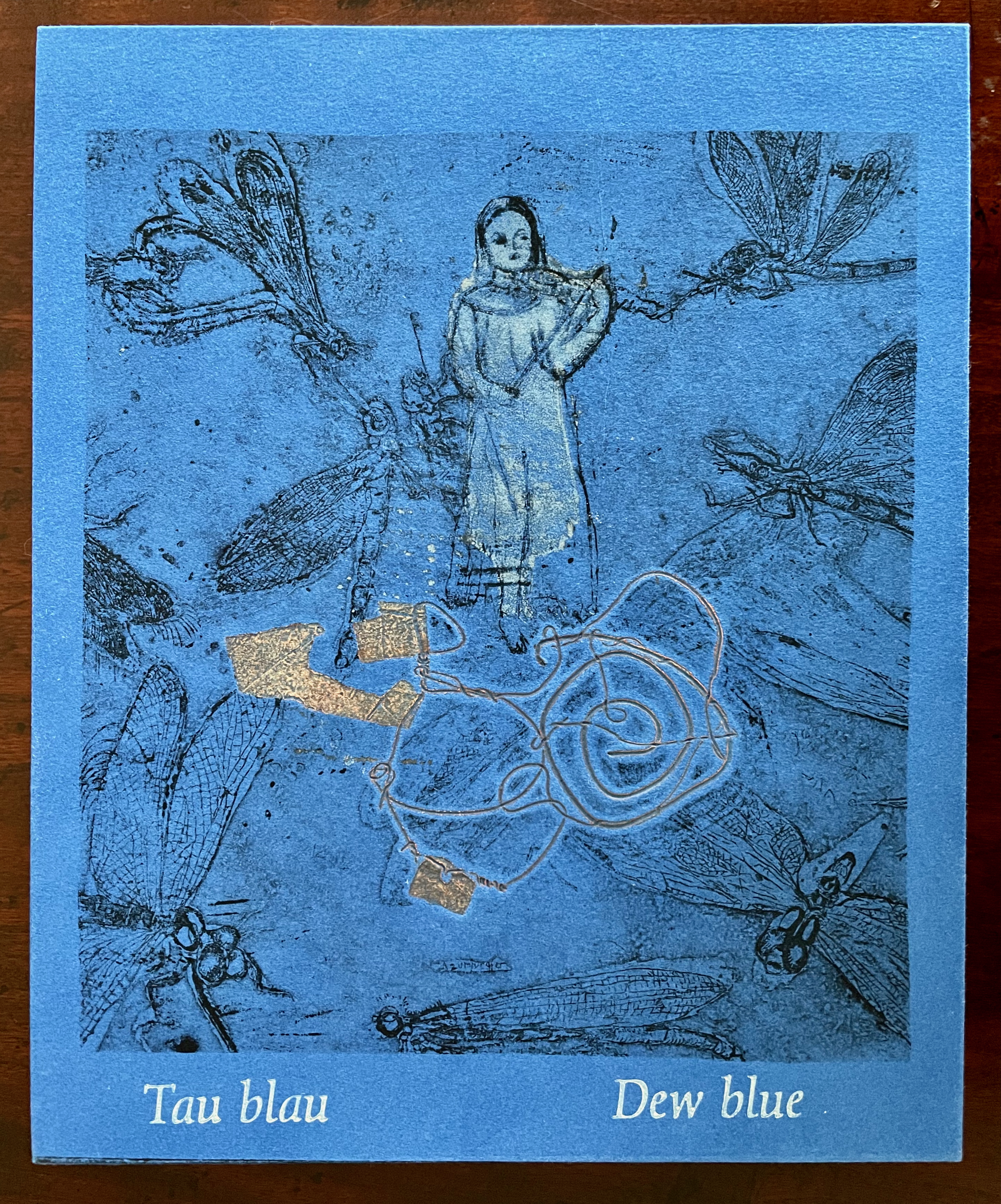
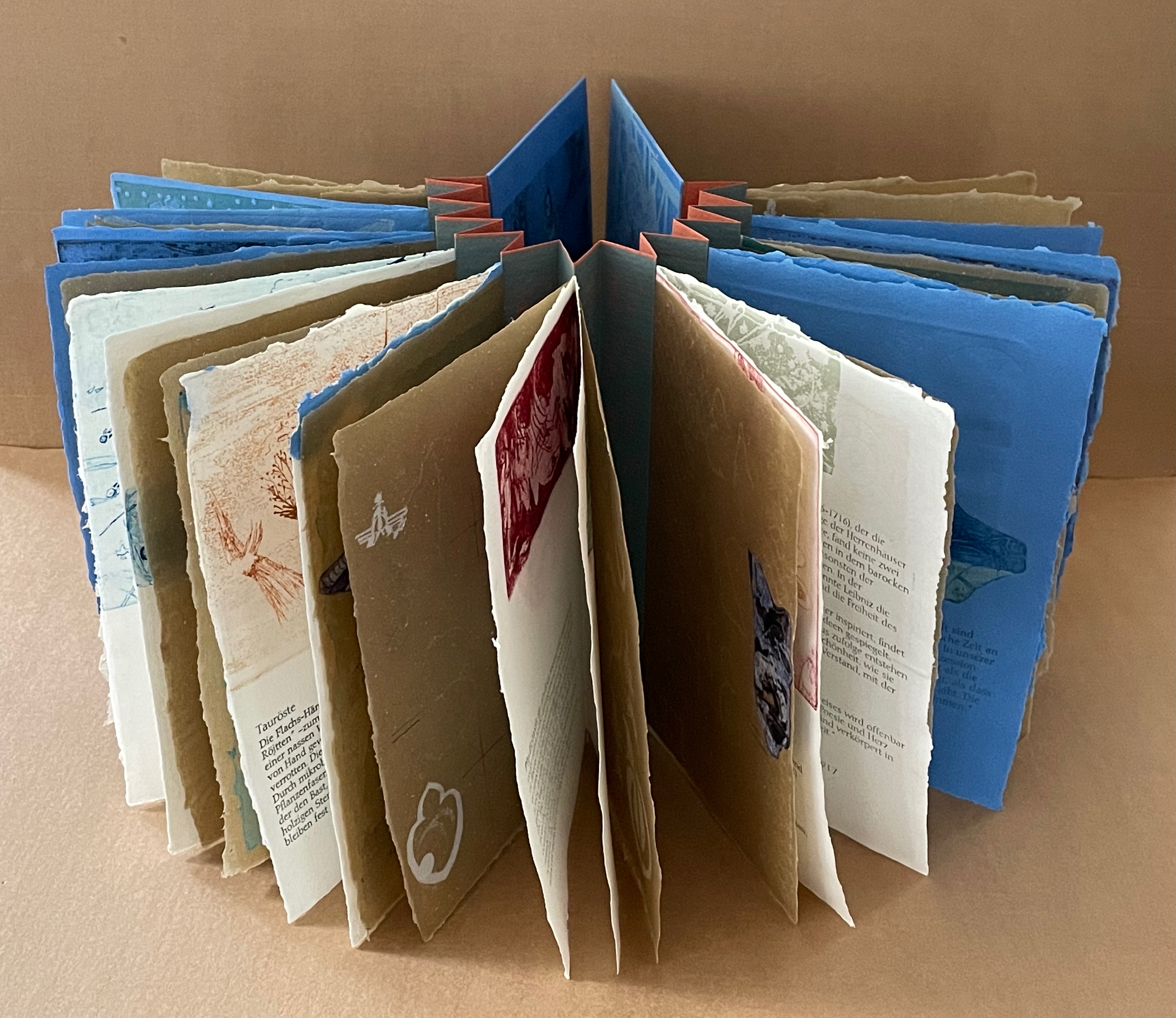
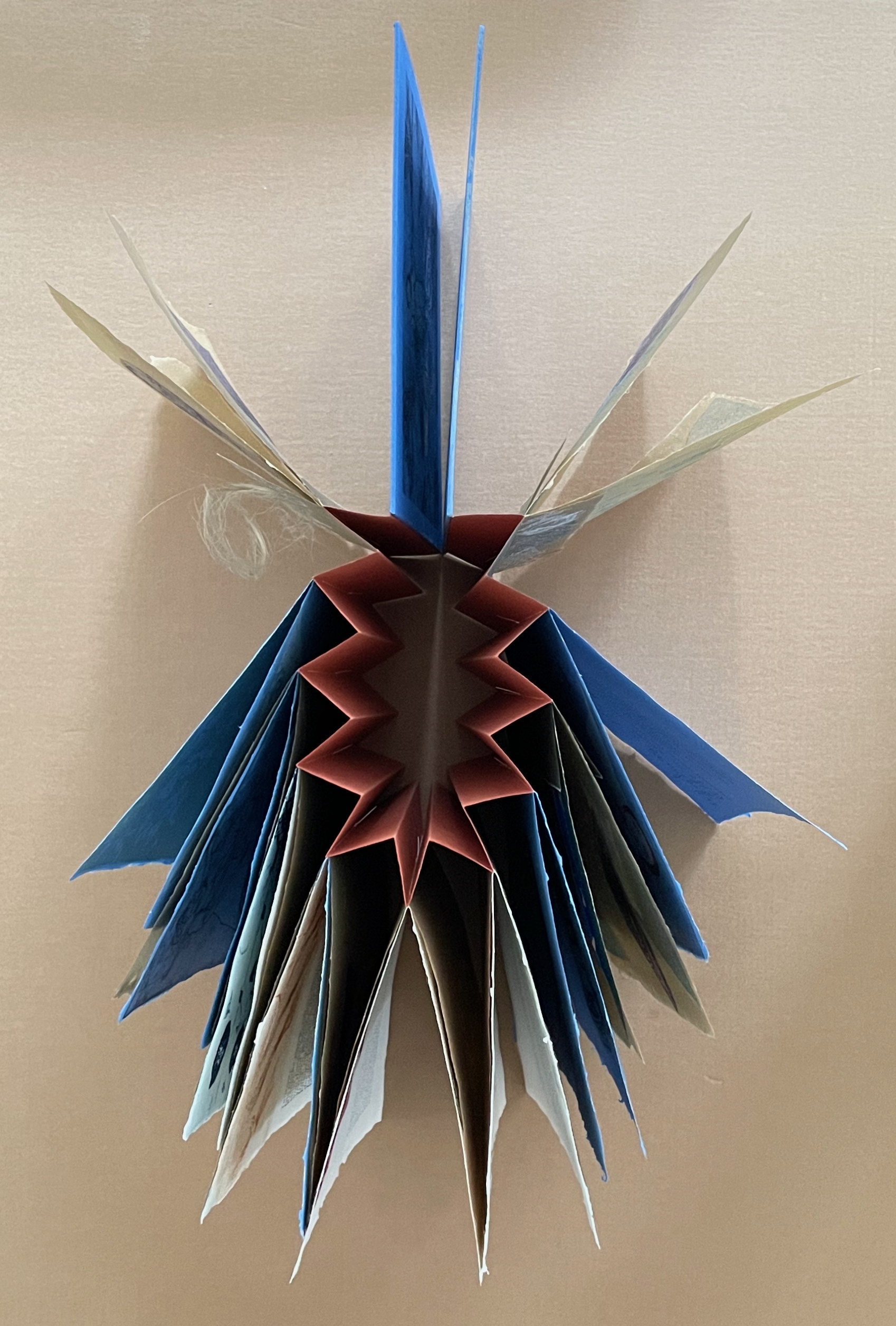
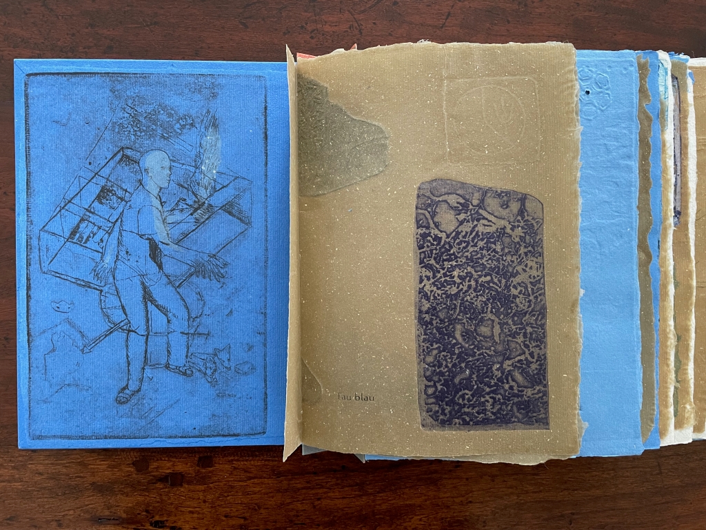
Tau blau / Dew Blue (2013) Barbara Beisinghoff ; Solander box in linen, handbound Vera Schollemann; Flax paper, handmade by John Gerard. Solander box: H240 x W200 x D32 mm. Flagbook: H220 x W180 mm. Edition of 38, of which this is #22. Acquired from the artist, 30 December 2024. Photos: Books On Books Collection.
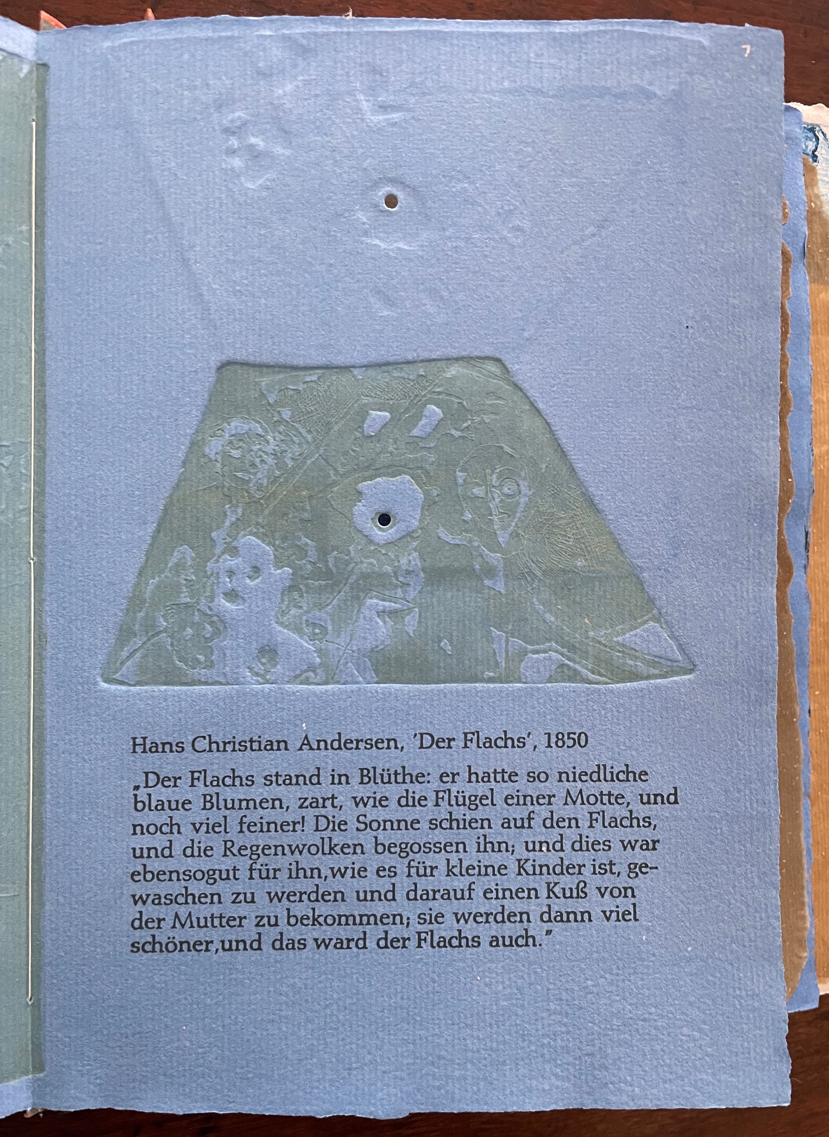
Familiarity with Hans Christian Andersen’s fairy tale Hørren /The Flax enhances appreciation of Barbara Beisinghoff’s Tau blau / Dew Blue. Andersen gives a voice to the plant that expresses its joy, pain, hope and observations at each stage of its blooming, being harvested, turned into linen and clothing then paper, and finally consigned to flames. The H.C. Andersen Centre offers Jean Hersholt’s translation of it here.
Only the opening paragraph of the story appears in Tau blau / Dew Blue, but Beisinghoff documents and illustrates the stages from her own cultivation of flax, observation of its growth and preparation of its processing. And with the etching, drawing, watermarking, handmade papers, linen cloth and thread, and binding structure, Beisinghoff suffuses the spirit of the tale’s metamorphosizing plant throughout the whole of Tau blau / Dew Blue.
From the blue of the plant’s blossoms to the white of its change into linen and paper to the red, burnt orange and black of its sparks and ash when it is consumed by fire in the end, all of the story’s colors are replayed across Tau blau / Dew Blue from its Solander box to its covers and spine like motives in a Baroque musical piece.
In a concerto, motives play off one another and develop. In Tau blau / Dew Blue, the motif of nature (the plant) plays off the motif of artifice and the manmade (the fairy tale, music, linen, paper, etc.). On the front cover (above), a young girl, surrounded by large damselflies, plays a fiddle or violin and seems to hover above a silver foil image of flax thread and tools for making it. In the spread above alongside the front cover, the specks rising over the staves and musical notes (a recurring motif in itself) recall the tale’s final passage in which the bundle of papers (made from linen rags) is cast into a fire:
“I’m going straight up to the sun!” said a voice in the flame. It was as if a thousand voices cried this together, as the flames burst through the chimney and out at the top. And brighter than the flames, but still invisible to mortal eyes, little tiny beings hovered, just as many as there had been blossoms on the flax long ago. They were lighter even than the flame which gave them birth, and when that flame had died away and nothing was left of the paper but black ashes, they danced over the embers again. Wherever their feet touched, their footprints, the tiny red sparks, could be seen.
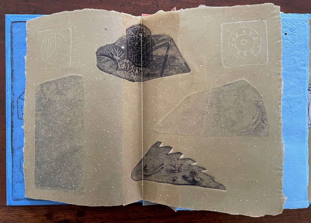
Images of tools — whether for preparing flax or for making the products from it — also recur on the inside of the front and back covers and throughout the book. The human figures alongside the tools, however, appear engaged in more than manufacturing. Elsewhere in the book, they dance, they sit and meditate or write, they row on ponds beside the growing flax. The fairy tale, too, has these Romantic juxtapositions of nature, art and craft. So, again, the spirit of Andersen’s tale finds another way into Tau blau / Dew Blue.
Inside front and inside back covers.
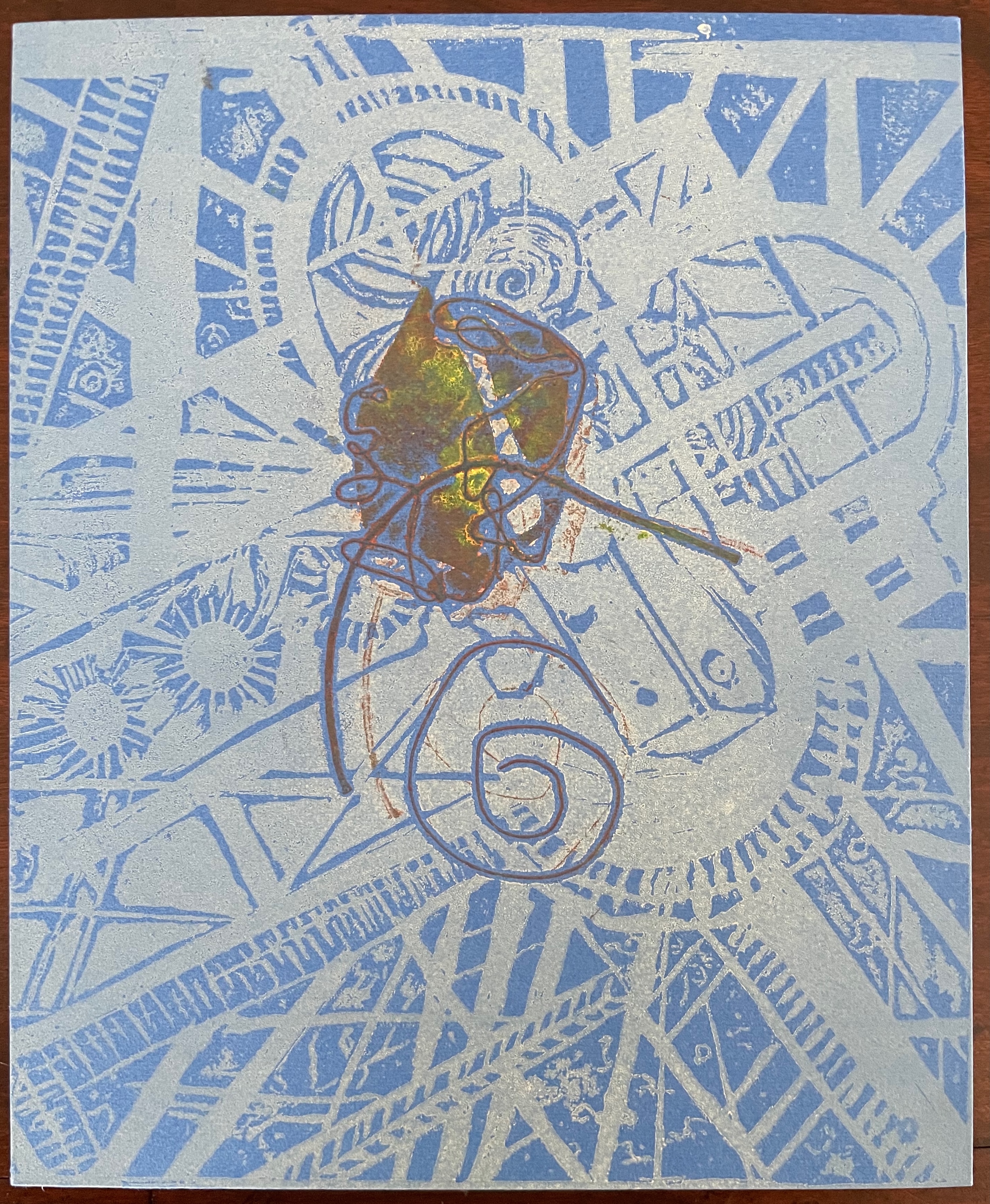
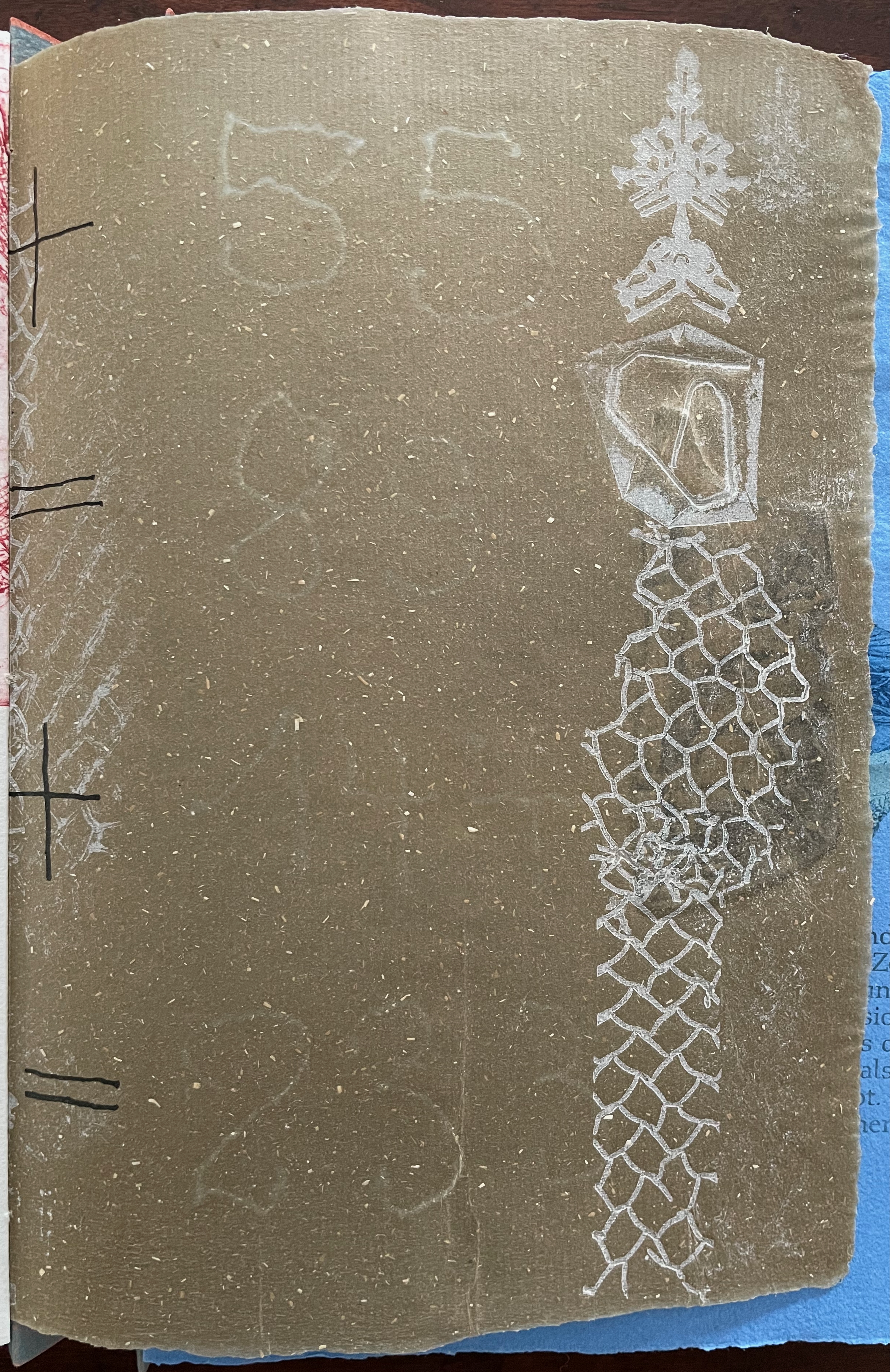
The front cover also announces another motif in those coils of thread below the young girl’s feet. Within the coils is the image of a Fibonacci spiral, which appears on the back cover and throughout the book in different ways. It can be found drawn and printed. It can be found in watermarks in the handmade paper. It can be found in the arrangement of florets in flax. Being a composite flower, flax blossoms display the spiral based on the Fibonacci sequence 1, 2, 3, 5 … 233, and so on. These numbers are waterjet-drawn on the pure flax paper below and explained in an entry printed on the adjacent plain handmade paper folio. By appearing on the book’s front and back covers, the spiral echoes the beginning and ending cycles of birth and rebirth the flax goes through in the folktale.
The Fibonacci spiral on the front and back covers.
The sequence of Fibonacci numbers 1, 2, 3, 5 … 55, 89, 144, 233 … watermarked on handmade flax paper with a water jet.
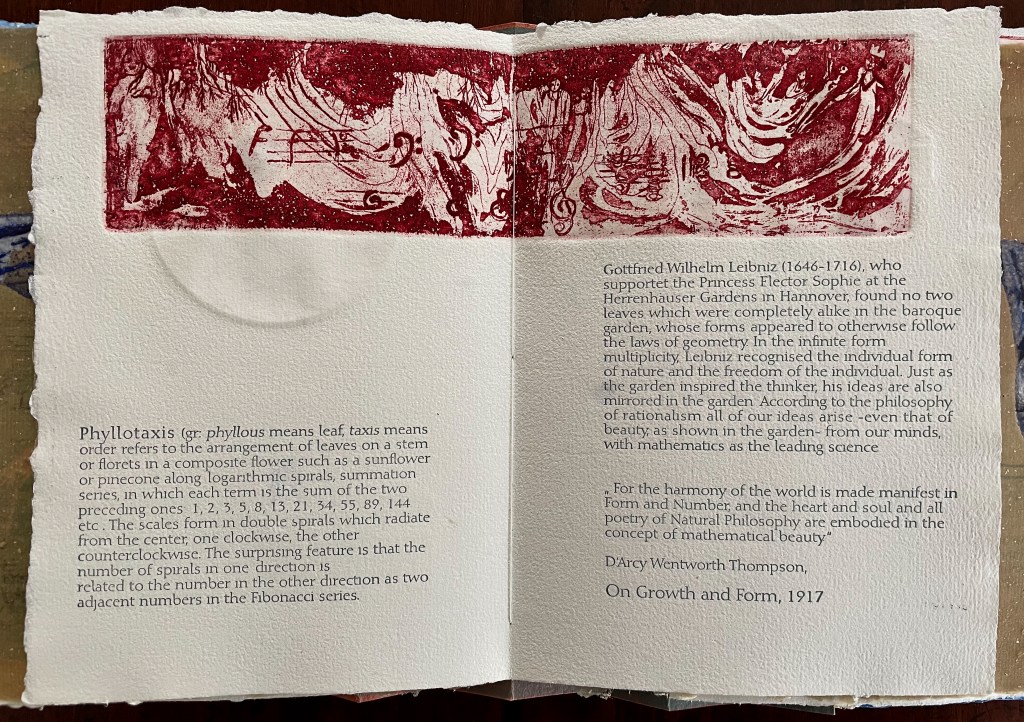
Description of the Fibonacci spiral side by side with quotation from Thompson’s On Growth and Form (1917), drawing on Leibniz’s Rationalist philosophy.
To organize and weave her motives together, Beisinghoff uses an accordion spine to whose peaks eleven sets of folios are sewn with linen thread. Three of the eleven are 4-page folios consisting of blue handmade paper. Another three 4-page folios consist of pure flax paper (handmade by John Gerard). The remaining five gatherings have 8-page folios, each consisting of a pure flax paper folio around a blue or plain one.
Side and top views of the accordion spine.
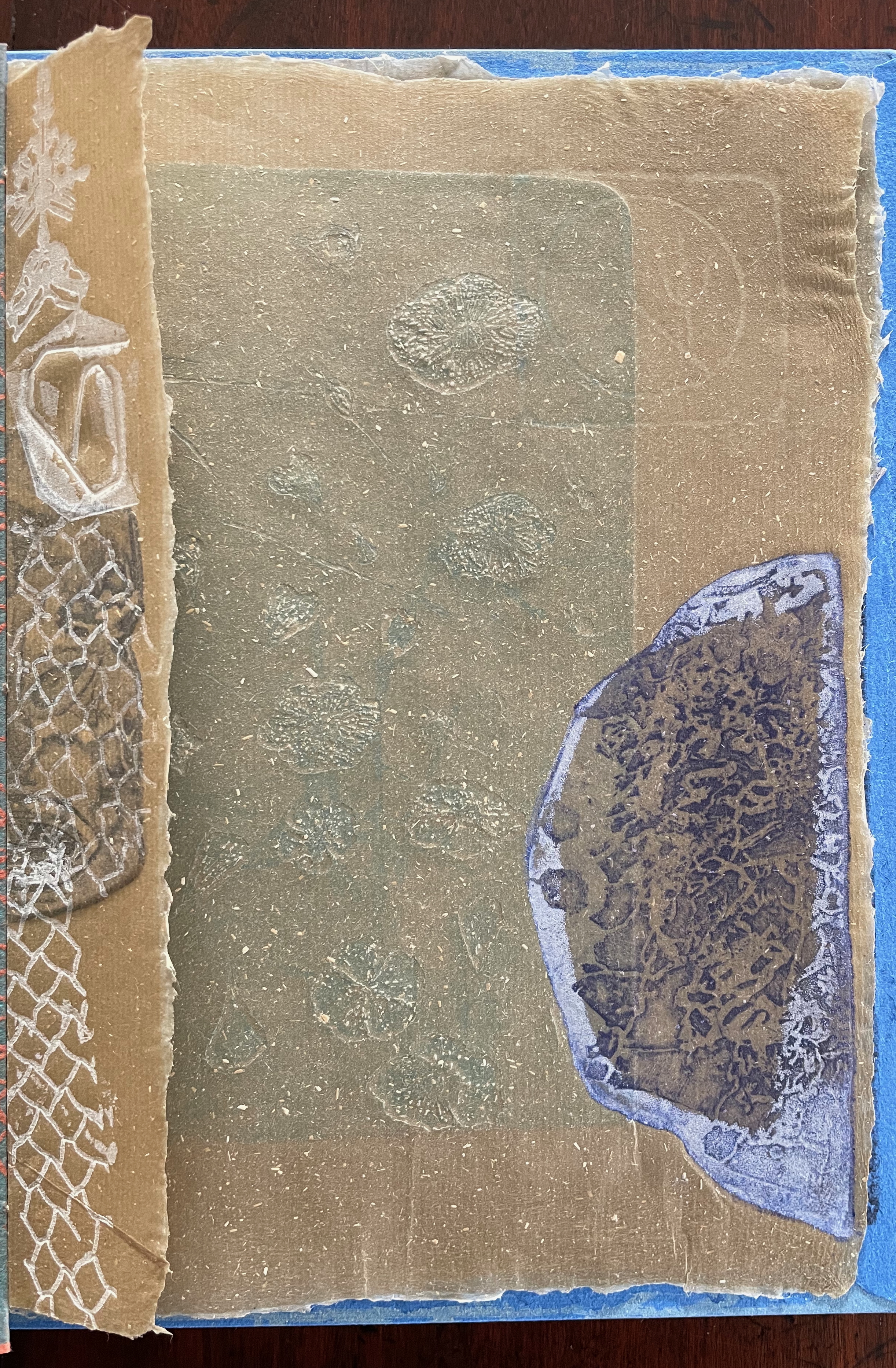
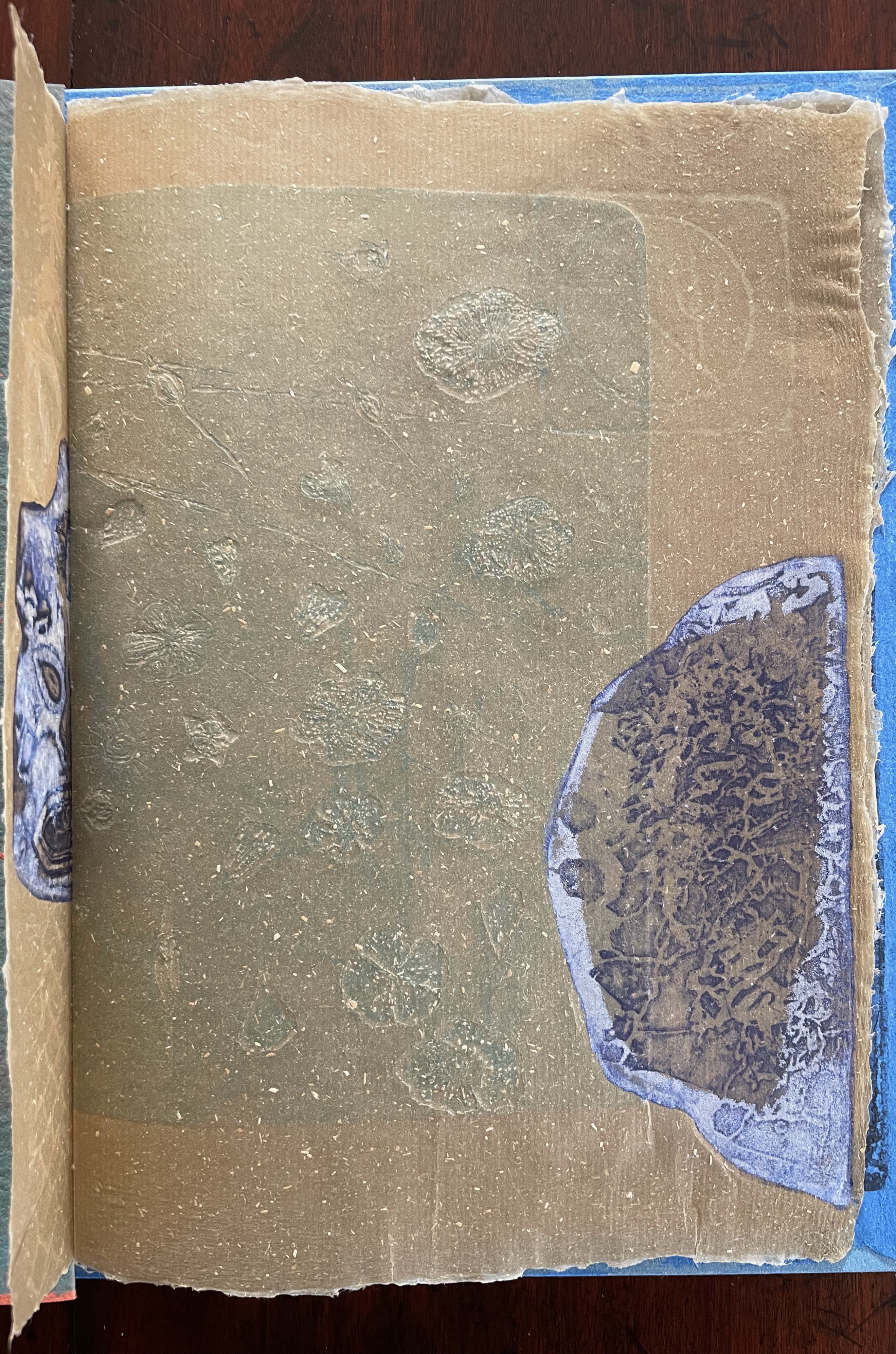
The first pure flax folio begins the book, displaying two title pages (German and English) and two etchings on its first and last pages. In the center spread, two more etchings appear. A watermark symbolizing phyllotaxis shows through in the upper left, balanced by a watermark with a cross section of a flax stalk in the upper right of the center spread. The texture and weight of the flax paper allows the impress and shadow of the etchings to stand out on both sides against the inking and watermarks.
Inside front cover and Tau blau title page and etching.
Center spread of first flax paper folio. Note the watermarks in the upper left and right corners.
Dew Blue title page and etching, loop of flax fibers, first page of blue handmade paper folio; note its boating image repeated from the prior center spread.
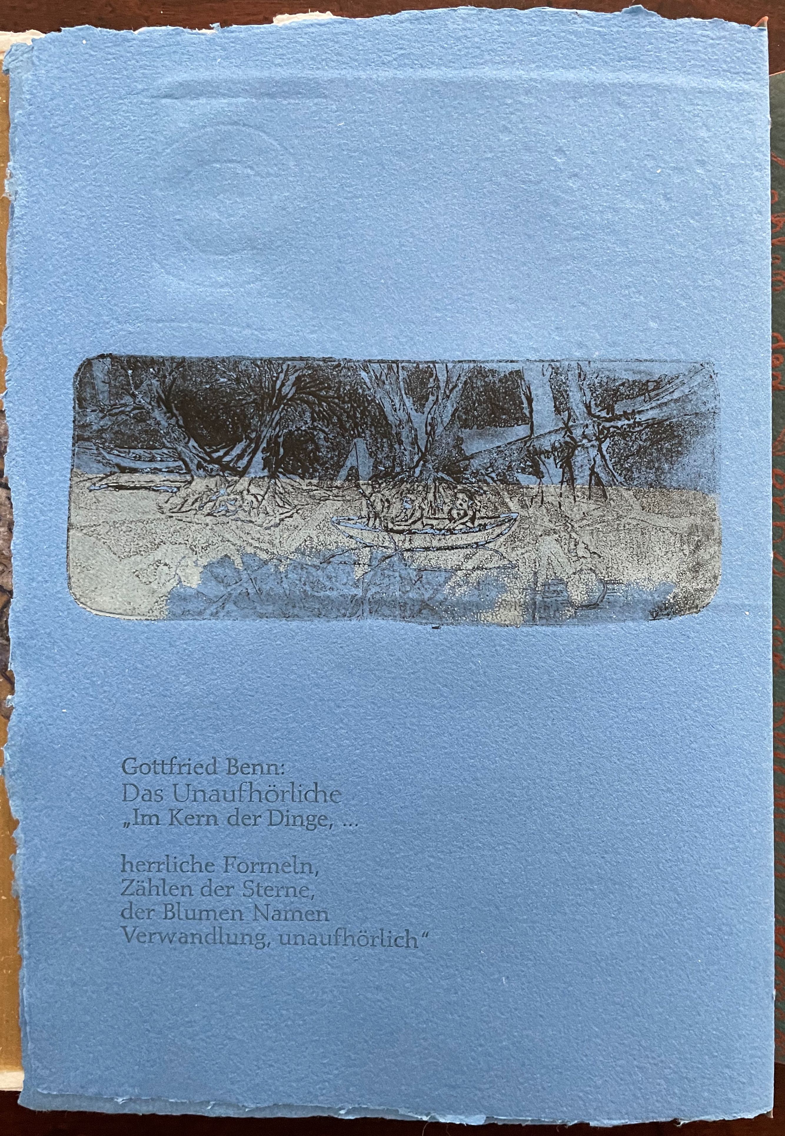
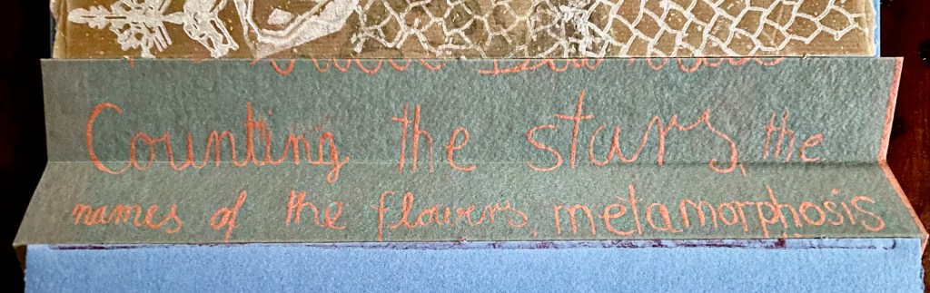
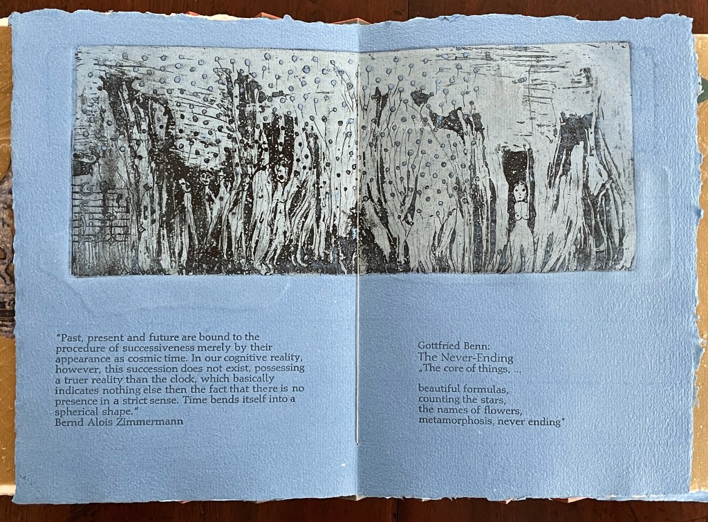
Following the pure flax folio, the first all blue folio gives us that introductory excerpt from Andersen’s fairy tale. Next comes a description of flax comes from Leonhart Fuchs’ Book of Herbs (1543), then the series of planting and harvesting observations from Beisinghoff, then the refrain from Clemens Brentano’s poem “Ich darf wohl von den Sternen singen” (1835), then philosophical observations drawing on G.W. Leibniz from D’Arcy Wentworth Thompson’s On Growth and Form (1917), a much-quoted theorem of musical composition from Bernd Alois Zimmermann’s Intervall und Zeit (1974), and finally (below) a passage of text by Gottfried Benn from the Hindemith oratorio Das Unaufhörliche / The Neverending (1936). In the valleys of the accordion spine, some of the lines from Andersen, Fuchs, Beisinghoff and Been appears handwritten in orange paint.
Translated fragment of Benn’s lyrics for Paul Hindemith’s oratorio Das Unaufhörliche / The Neverending (1936).
Even with these additional texts, Andersen’s fairy tale remains the most central text in Tau blau / Dew Blue, despite the brevity of its excerpt. Brentano’s Romantic/religious expostulations (“O Star and Bloom, Garb and Soul, Love, Hurt and Time for evermore”) sound like those of the plant in the story’s final passage. The occurrence of Fibonacci’s spiral in the plant may be a physical fact, but Beisinghoff turns it into something more mystical by placing the description of phyllotaxis next to Leibniz’ and Thompson’s transcendental view of mathematical science and natural philosophy. Likewise she links the texts from Bernd Alois Zimmermann and Gottfried Benn to the fairy tale by placing them beneath the etching that captures the flax plant’s singing and dancing into its transformation by fire.
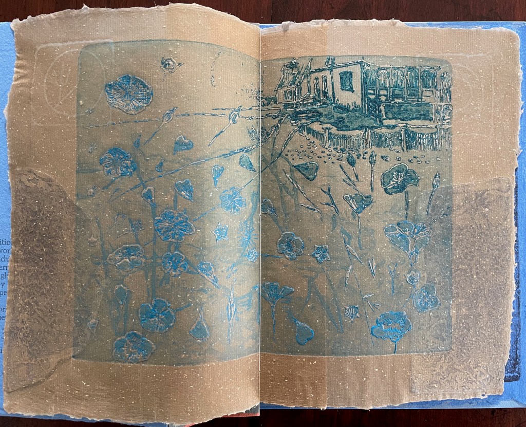
Below is the final folio of the work. Like the first, it is made completely of flax paper, but its center spread offers a fuller image: flax blossoms and stalks float in the foreground, and in the background is a sketch of Beisinghoff’s residence where she grows her flax. Like the Fibonacci spiral on the front and back covers, the first and last flax folios round out the work. But go back and listen for the hidden sound installations accompanying Dew Blue. Noticing Beisinghoff’s abstract musical notation, indulge yourself with recordings of a Swedish folk song (“Today is supposed to be the big flax harvest” here or here) to which the notation and phrases allude, and as the flax papers turn and wave on their accordion peaks, listen carefully for their musical rustle.
The final pure flax paper folio.
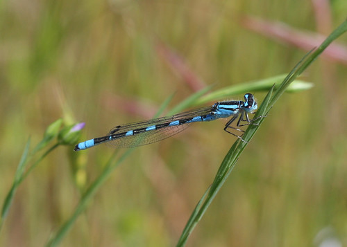
Tule Bluet damselfly perched on flax leaf. Photo: John Riutta, The Well-Read Naturalist (2009). Displayed with permission.
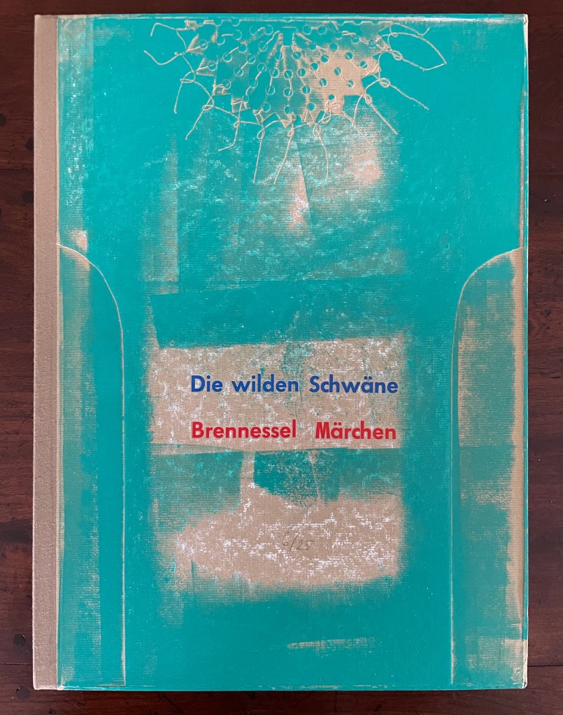
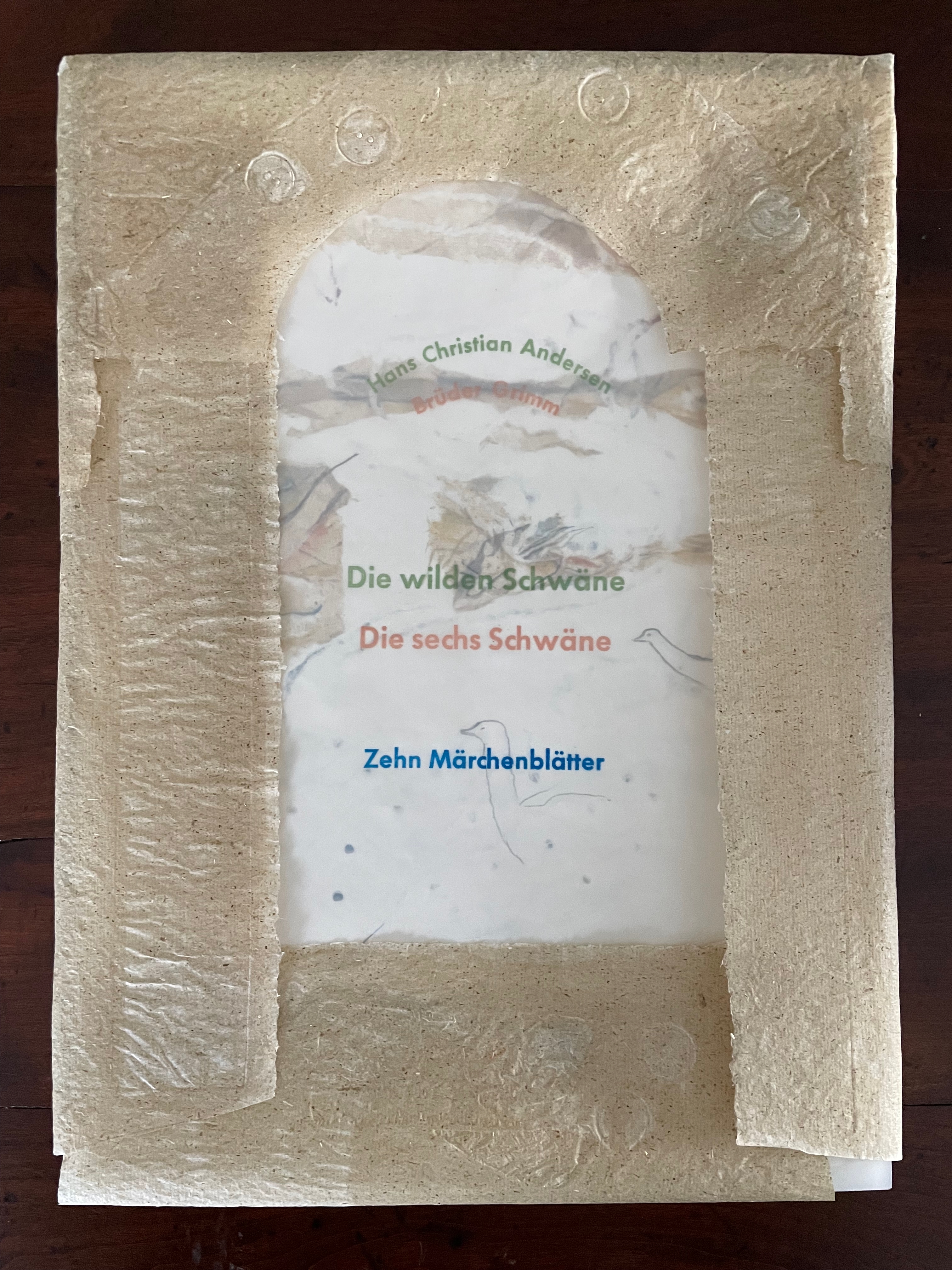
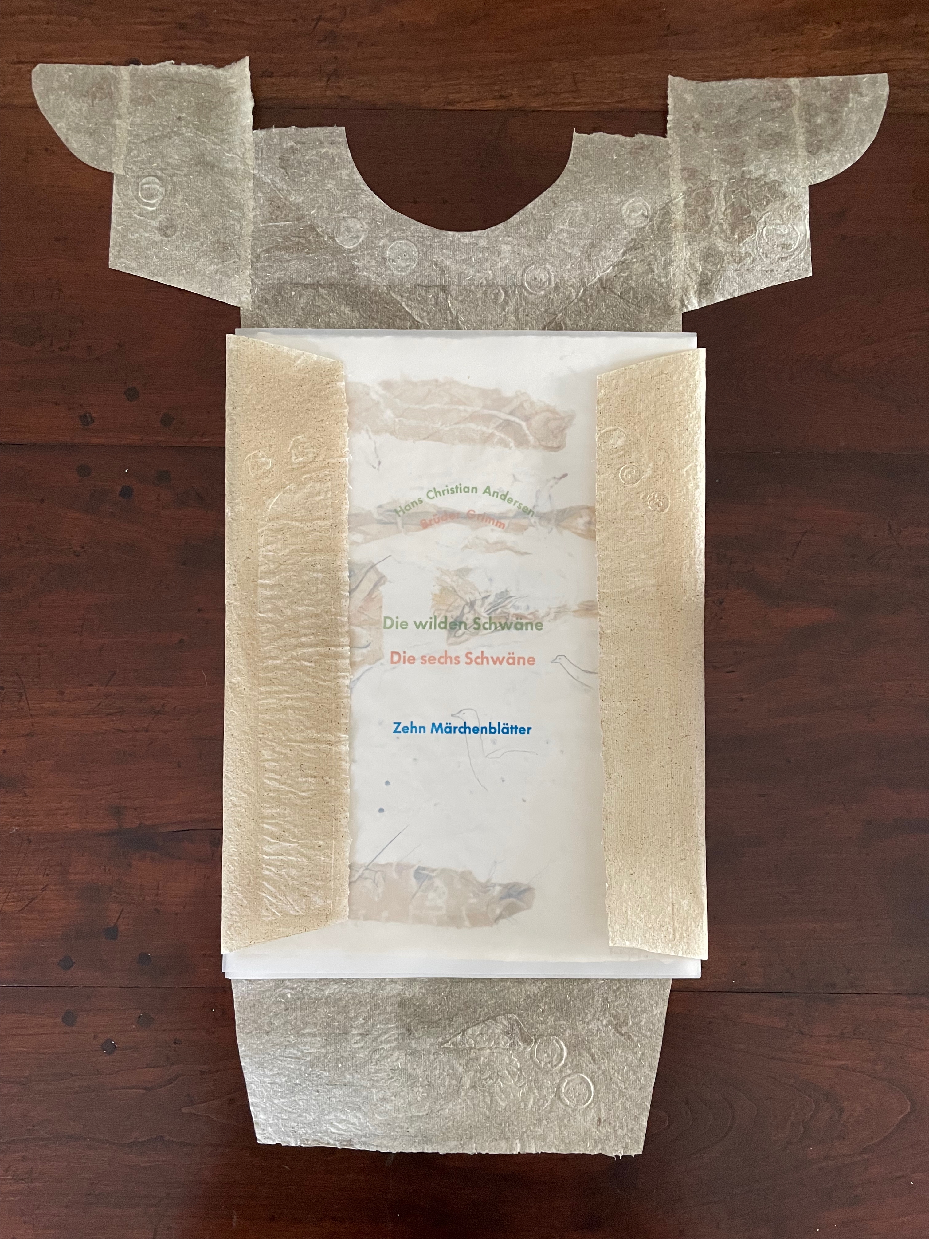
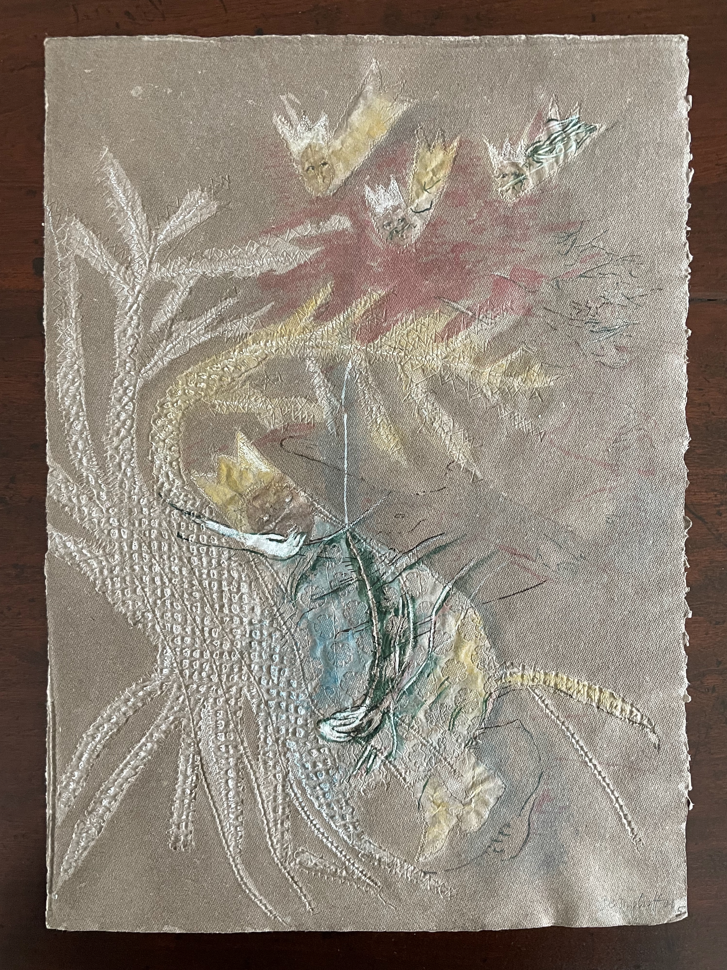
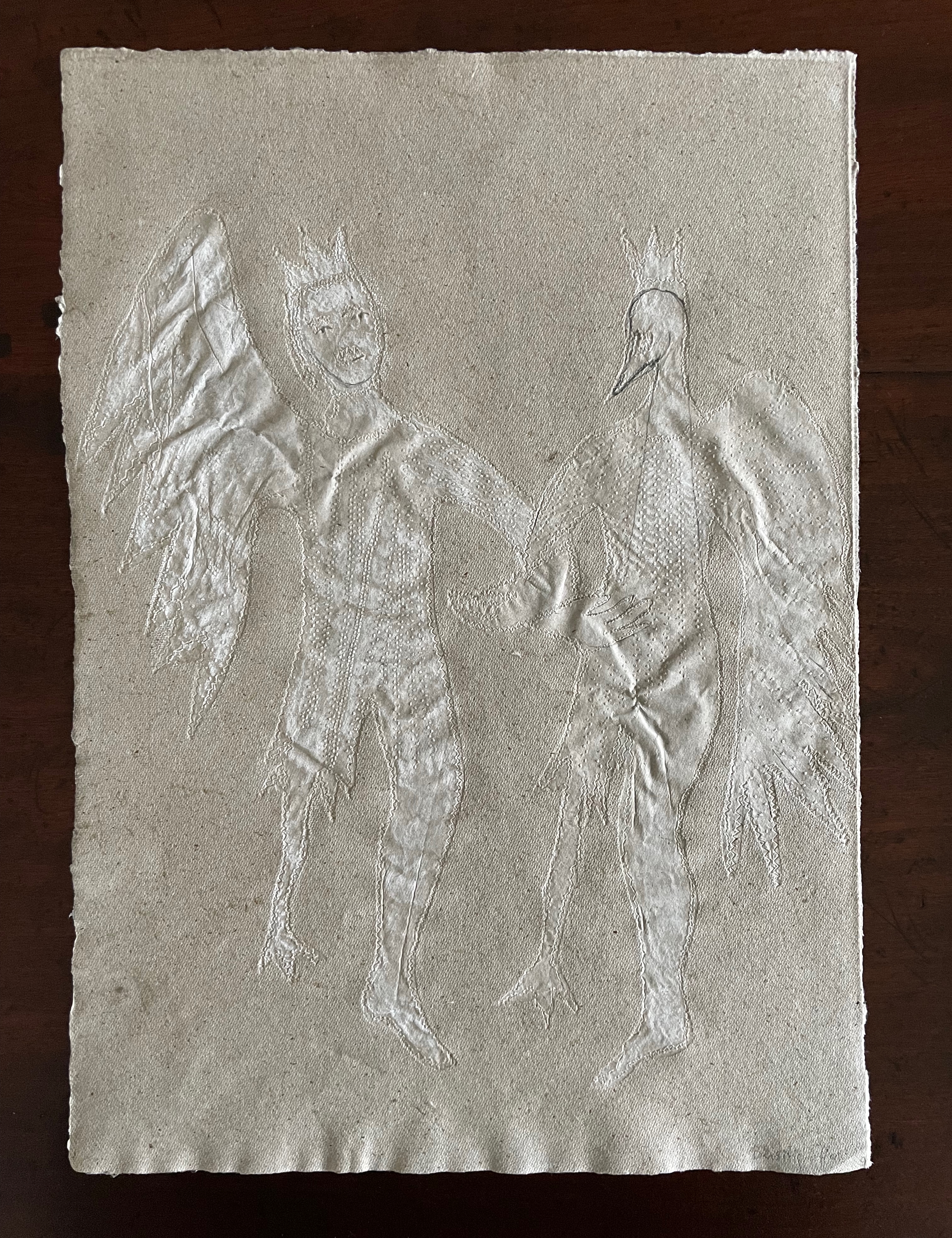
Die wilden Schwäne (2001)
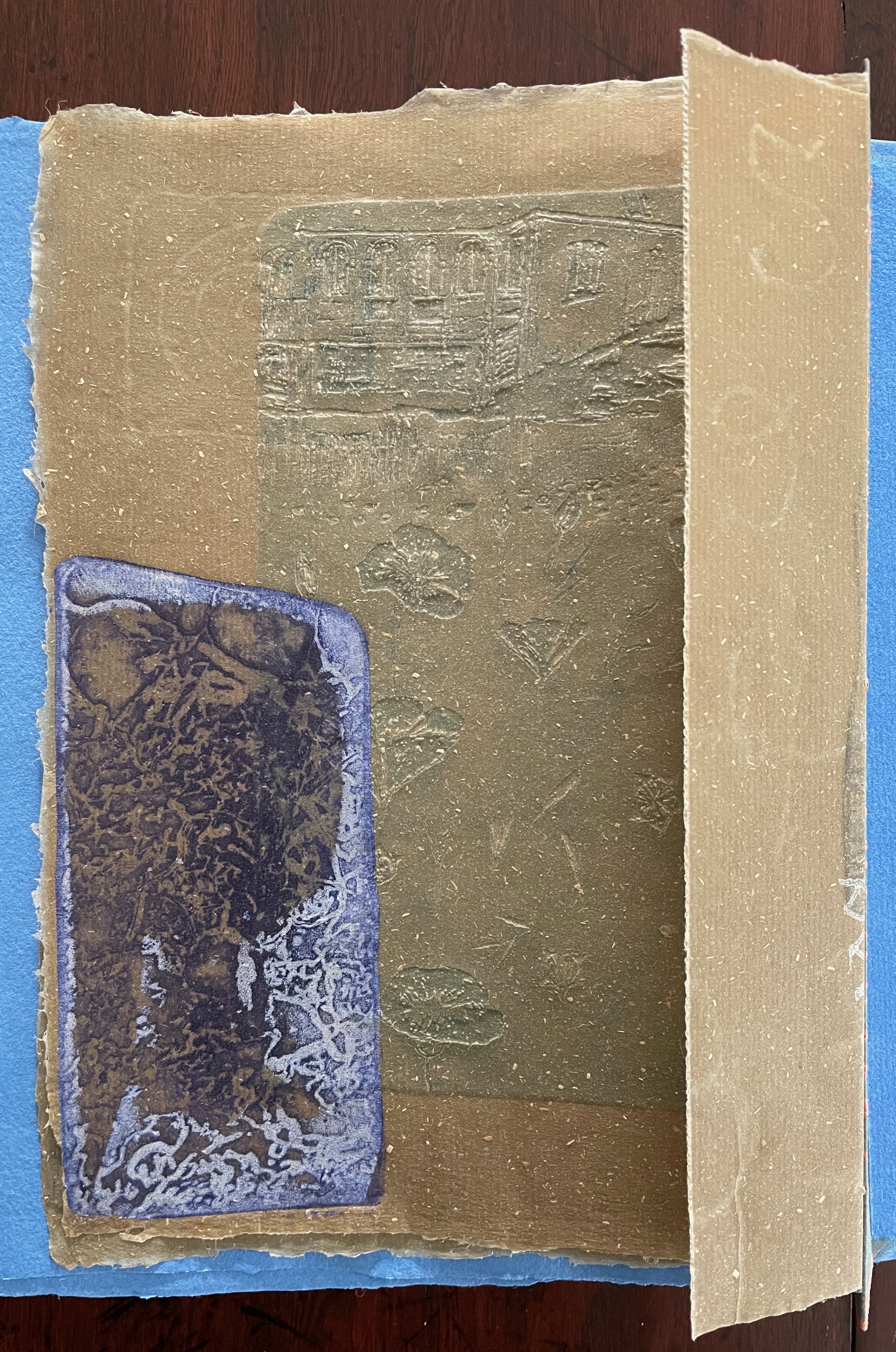
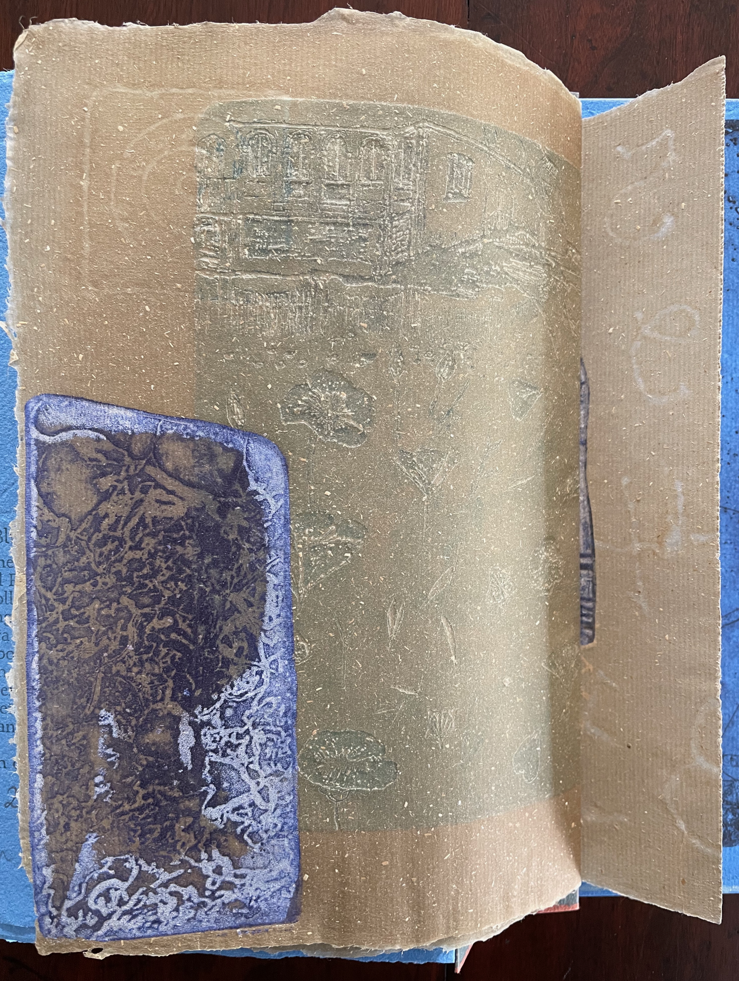
Die wilden Schwäne (2001) Barbara Beisinghoff Box with embossed cover holding folios wrapped in chemise. H35o x W250 mm. 18 folios. Edition of 25, of which this is #6. Acquired from the artist, 20 December 2024. Photos: Books On Books Collection.
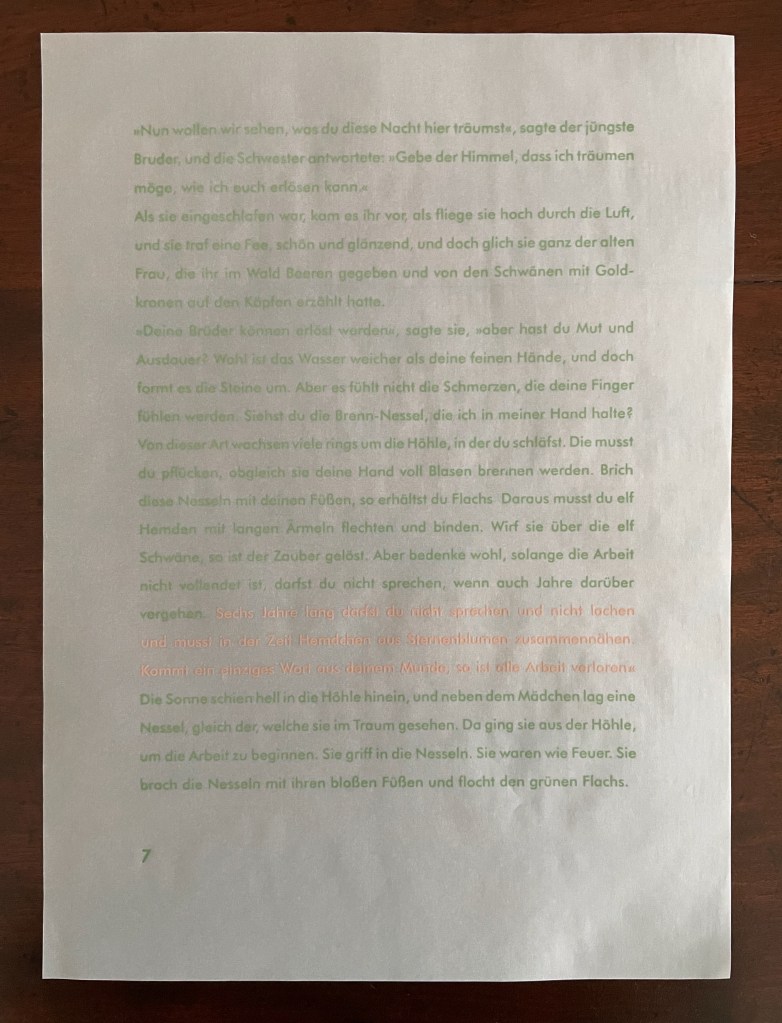
Barbara Beisinghoff’s Die wilden Schwäne is an exemplar of collaboration and craft. In it, she even requires collaboration between Hans Christian Andersen and the Brothers Grimm. Andersen’s Die wilden Schwäne and the Grimms’ Die sechs Schwäne are based on the same tale of brothers turned into swans who are saved by their sister Elisa’s diligent and mute harvesting, pulping, spinning and sewing of stinging nettles into shirts that break the spell when donned. H.C. Andersen, however, is verbose and elaborate in his telling (even including vampires!), and Beisinghoff has done a bit of nipping and tucking with the more succinct Brothers Grimm to create a version more suited to the artist’s book she creates.
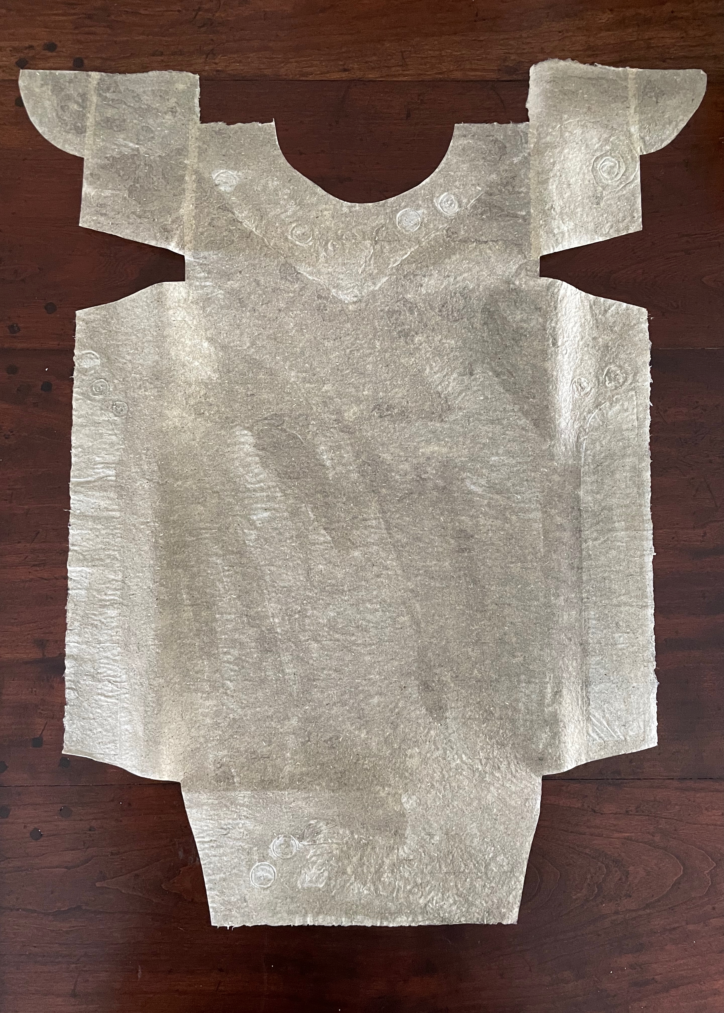
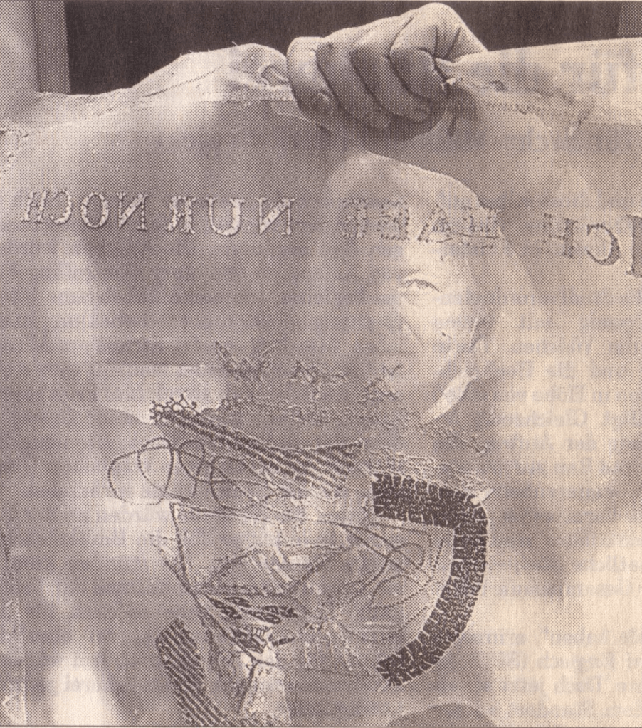
To match Elisa’s effort with stinging nettles, Beisinghoff enlisted the collaboration of Johannes Follmer, the owner of a paper mill. Together they obtained cultivated stinging nettles from the Institute for Applied Botany in Hamburg, cut the fibers, left them to rot, boiled them into a pulp, mixed that with water in a vat, scooped up layers in a sieve embroidered with illustrations, couched the sheets, then pressed and dried them into paper. Beisinghoff applied further drawings with a water jet, watercolor and pencil to the watermark-embossed sheets to illustrate aspects of the tale. To present the Andersen/Grimm “collage”, Beisinghoff had the type set and printed at the Gutenberg Museum. Andersen is printed in light green and Grimm in light red on seven numbered translucent sheets and interleaved with the nine folios of paper art (two more translucent sheets carry the cover page and colophon). To wrap the folios together, Beisinghoff made an embossed chemise or “feather dress” of pure nettle fiber, which could represent Andersen’s description of the brothers’ blowing off each other’s feathers every evening when the sun has set or one of the shirts that their sister makes to break their spell.
The “feather dress” of stinging nettle fiber.
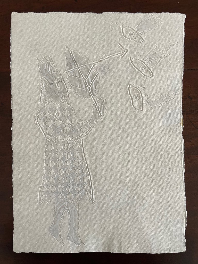
“The King’s little daughter was standing in the cottage room, playing with a green leaf, for she had no other toys. She pricked a hole right through the leaf, looked up at the sun, and there it was, she saw the clear eyes of her brothers, but every time the warm rays of the sun shone on her cheeks, she thought of all their kisses.” Translation with DeepL.
“When she had fallen asleep, it seemed to her as if she were flying high through the air, and she met a fairy, beautiful and radiant, yet she looked very much like the old woman who had given her berries in the forest and told her about the swans with gold crowns on their heads.” Translation with DeepL.
“The swans swooped down to her and lowered themselves so that she could throw the shirts over them: and as she touched them, the swan skins fell off, and her brothers stood before her in the flesh, fresh and beautiful.” Translation with DeepL.
“Barbara Beisinghoff (head in the background) covers the frame with this transparent, embroidered and sewn gauze, which is used to scoop and emboss her nettle papers. This is how her large-format watermark illustrations end up on the sheets.” Translation with DeepL. Peter Holle. 30 August 2001. Frankfurter Rundschau. Photo: Oliver Weiner.
This art by watermarking recalls that of other artists in the collection: Fred Siegenthaler and Gangolf Ulbricht, in particular. The technique of pulp painting also finds other practitioners in the collection: Pat Gentenaar-Torley, John Gerard, Helen Hiebert, Tim Mosely, Maria G. Pisano, Taller Leñateros, Claire Van Vliet and Maria Welch. Beisinghoff’s blend of embroidered watermarks, waterjet marking and pulp painting, however, creates a bas relief effect that is echoed only in the collection’s works by Mosely, Taller Leñateros and Van Vliet, albeit achieved differently. These workings of the substrate — as material, color, surface, and even narrative — with the workings of book structure is one of the more magical locations of book art. It is perfect for Beisinghoff’s metamorphical interpretation of the Andersen/Grimm fairy tale.