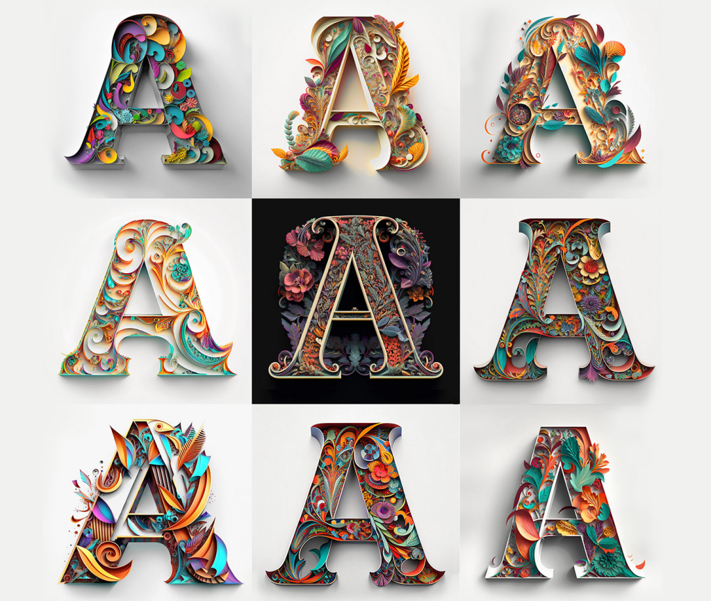
While working on the “Alphabets Alive!” exhibition with the Bodleian to open in July 2023, I came across this project site page by Yevhen Berdnikov, a calligrapher based in Kyiv, Ukraine.
Since “Alphabets Alive!” would primarily concern the creative relationship of artists’ books with alphabets and other writing systems, an AI-generated rendition of the alphabet (humankind’s second-greatest invention, language being the first) was a natural for inclusion. Given the short notice, the artist’s lack of bookmaking experience and — oh yes — the ongoing Russian invasion of Ukraine and attacks on Kyiv, a book was out of the question. Still, with one of the exhibition’s display cases being devoted to artists’ books driven by calligraphy and another to ones driven by color, some way of including these letter images prompted by Yevhen Berdnikov and generated by the text-to-image AI Midjourney from the company of the same name begged to be found.
Paper Cut Alphabet (2023)
Paper Cut Alphabet (2023) Yevhen Berdnikov Poster. H x W. Acquired from Yevhen Berdnikov, 8 March 2023. Images courtesy of Yevhen Berdnikov and reproduced with permission.
When the digital file for the poster first arrived, the treatment of letter Z was a surprise. Even without its current caption, the implication of the treatment was obvious to anyone who knew Berdnikov’s nationality and had seen news images of Russian tanks and military vehicles with Z painted on them. An AI-generated letter Z exists in the Paper Cut Alphabet Project’s files, but, in preparing the poster for a public exhibition, Berdnikov could not bring himself to prompt the AI to generate a symbol that had become intolerable and particularly loathsome on the anniversary of the invasion.
Chance is a well-known muse to many artists. Midjourney, the application, requires an extensive amount of “prompting” — detailed text describing the image it will create. As Berdnikov notes above, the same text can generate different results, which implies an element of randomization at work in the application. But how could a randomizing function yield a meaningful absence of image in response to prompting text? How could machine learning enable Midjourney on its own to compile this version of the alphabet without that particular and human creative intervention?
Even while acknowledging his intervention in Paper Cut Alphabet, Berdnikov insists that he is not the artist, but isn’t his use of Midjourney analogous to Vermeer’s presumed use of a camera obscura to achieve the detail and perspective we see in his paintings? If he did use that technology, does it warrant calling his paintings “device-generated”? Even so, this viewer “feels” the human artists behind View of Houses in Delft (c. 1658) and Paper Cut Alphabet (2023).
Berdnikov’s comments above and his demurrer at being named the “artist” of Paper Cut Alphabet reflect an inquisitive, open and thoughtful mind. Whatever its undetermined implications, the result of his wielding this new artist’s tool is decidedly art.
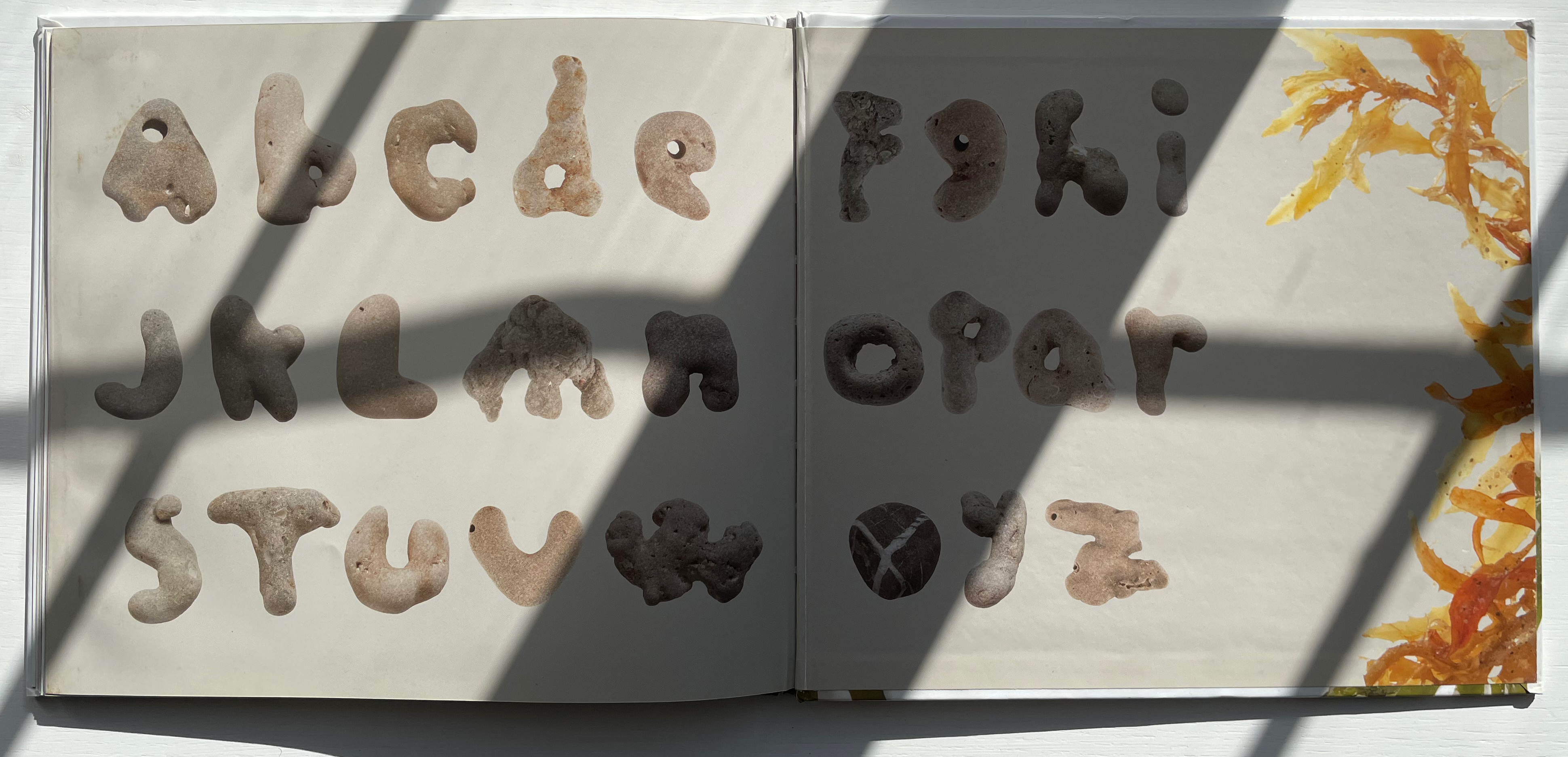
Along the Victor Hugo-esque theme of “alphabets all around”, here is a beachcomber’s eye for rock shapes with which to construct not only a complete alphabet but also the images necessary for an abecedary.
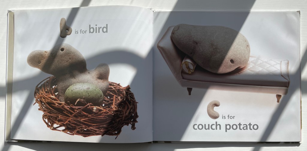
Not only a b-shaped stone, but also one shaped like a bird. Likewise a c-shaped stone, but this time a miniature sofa to accommodate the resident stone with a shape to complete the phrase.
McGuirk has spotted stones for verbs as well as adjectives and nouns — all equally astonishing in their serendipity, humor and insight. Perhaps the last is best: the match of the z-shaped stone with a word beginning with z that matches a numeral-shaped stone that, arguably, reproduces the concept at its eroded center.
Alphabet Everywhere (2012) Elliott Kaufman Casebound, paper over board, cutout cover. 235 x 235 mm. 62 pages. Published by Abbeville Press. Acquired from Amazon, 22 September 2022. Photos: Books On Books Collection. Displayed with permission of the artist.
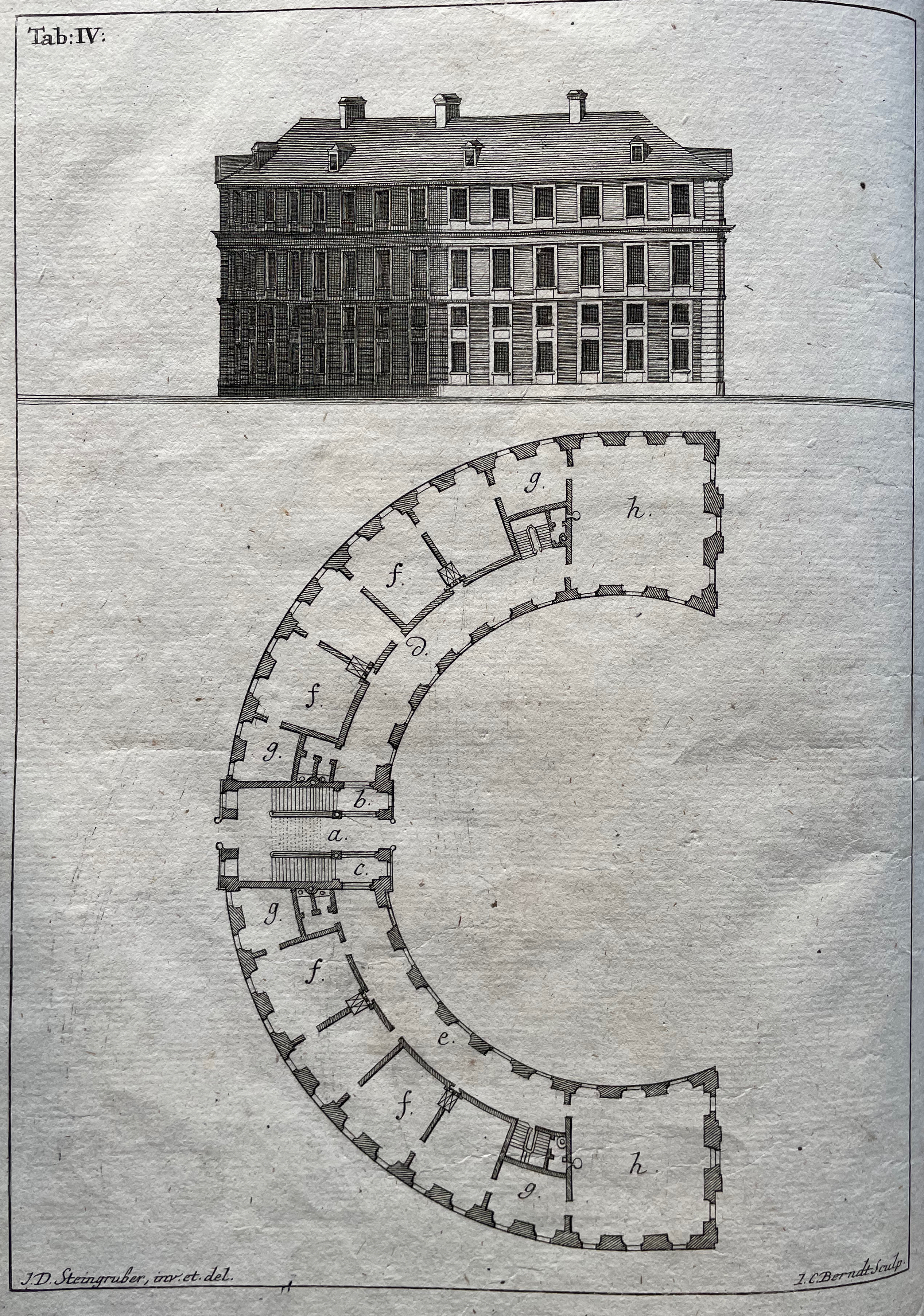
Evident across the images in his alphabet book and website, Elliott Kaufman’s work revolves around architectural motives. The Books On Books collection has found a recurrent theme in architectural alphabets. Would that Johann David Steingruber’s designs for palaces in the shape of the letters from A to Z had actually been built so that Kaufman could photograph them.
Architectonisches Alphabeth (1773) bestehend aus dreyßig Rissen wovon Jeder Buchstab nach seiner kenntlichen Anlage auf eine ansehnliche und geräumige Fürstliche Wohnung, dann auf alle Religionen, Schloß-Capellen und ein Buchstab gänzlich zu einen Closter, übrigens aber der mehreste Theil nach teutscher Landes-Art mit Einheiz-Stätte auf Oefen und nur theils mit Camins eingerichtet, wobey auch Nach den mehrest irregulairen Grund-Anlagen vielerley Arten der Haupt- und Neben-Stiegen vorgefallen, dergleichen sonsten in Architectonischen Rissen nicht gefunden werden, zu welchen auch Die Façaden mit merklich abwechslender Architectur aufgezogen sind. Johann David Steingruber Casebound. H395 x W240 mm. 71 folios. Acquired at auction from Kiefer Buch- und Kunstauktionen, 15 December 2022. Photos: Books On Books Collection.
More Romantic than romantic, Victor Hugo wrote to his wife while traveling that the alphabet is all around us in nature. Kaufman has a different view. Kaufman’s several images per letter prove the point of his book’s title but in keeping with his architectural slant: our constructions distribute our oldest construction all around us.
Ironically if inadvertently, Kaufman gives the Romantic another tweak of the nose. In his Hunchback of Nôtre Dame, Hugo has his character Archdeacon Claude Frollo point to a book in his hand and then to the cathedral outside and say, “This will kill that”, by which he meant among other things that the book’s permanence of replicability will outlast the building’s permanence of stone. If by fictional time travel we could put Kaufman’s book in the archdeacon’s hand, we could point to the cathedral and retort: “But Venerable Sir, look here how ‘that’ foretells the building blocks of ‘this’.”
I tried to “define the book” when I designed (one of my books) Cover to Cover hoping that the “reader” would have a multi-sensory experience of the nature of what she/he held in her/his hands. (from The Book: 101 Definitions)
Cover to Cover (1975)
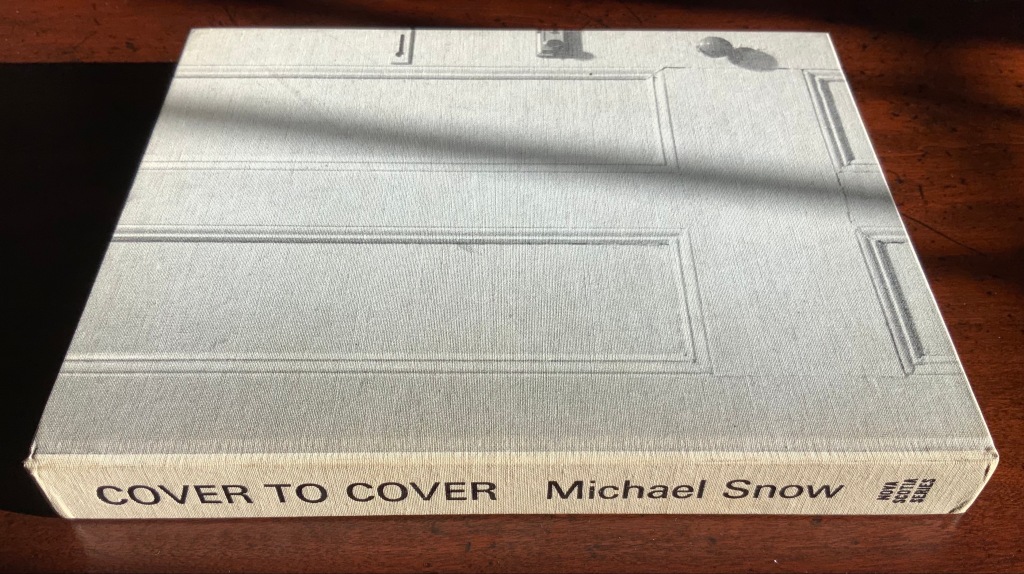
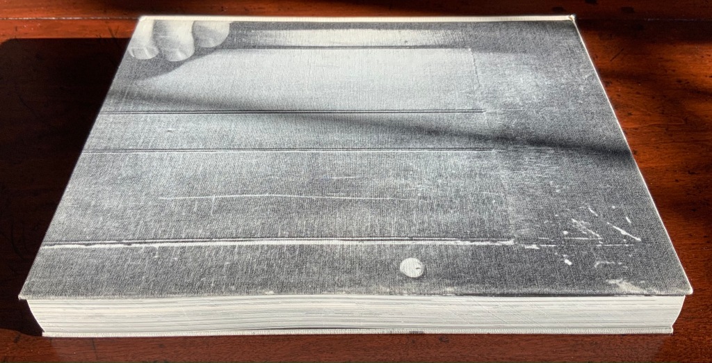
Cover to Cover (1975) Michael Snow Cloth on board, sewn and casebound. H230 x W180 mm. 310 unnumbered pages. Published by Nova Scotia College of Art and Design. Unnumbered edition of 300. Acquired from Mast Books, 10 December 2020. Photos of the work: Books On Books Collection.
After a long search since first sight of it in 2016 at Washington, D.C.’s now defunct Corcoran Gallery library, the original hardback edition of Michael Snow’s Cover to Cover (1975) finally joins the Books On Books Collection. Thanks to Philip Zimmermann, more readers/viewers have the chance to experience Cover to Cover — if only through the screen — than the original’s 300 copies and Primary Information’s 1000 facsimile paperback copies will allow.
Amaranth Borsuk describes the work and experience of it in The Book(2018), as do Martha Langford in Michael Snow (2014), Marian Macken in Binding Spaces (2017) and Zimmermann in his comments for the exhibition “Book Show: Fifty Years of Photographic Books, 1968–2018” (for all, see links below). Like Chinese Whispers by Telfer Stokes and Helen Douglas and Theme and Permutation by Marlene MacCallum, Michael Snow’s Cover to Cover evokes an urge to articulate what is going, how the bookwork is re-imagining visual narrative, how it is making us look, and how it makes us think about our interaction with our environs and the structure of the book.
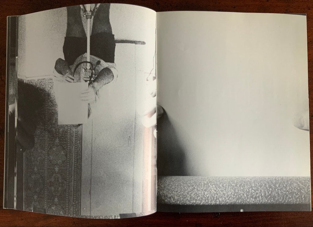
The already existing commentary about Cover to Cover sets a high hurdle for worthwhile additional words. One thing going on in the book, though, seems to have gone unremarked. Some critics have asserted that, other than its title on the spine, the book has no text. There is text, however. It occurs within what I would call the preliminaries, and they show us how to read the book.
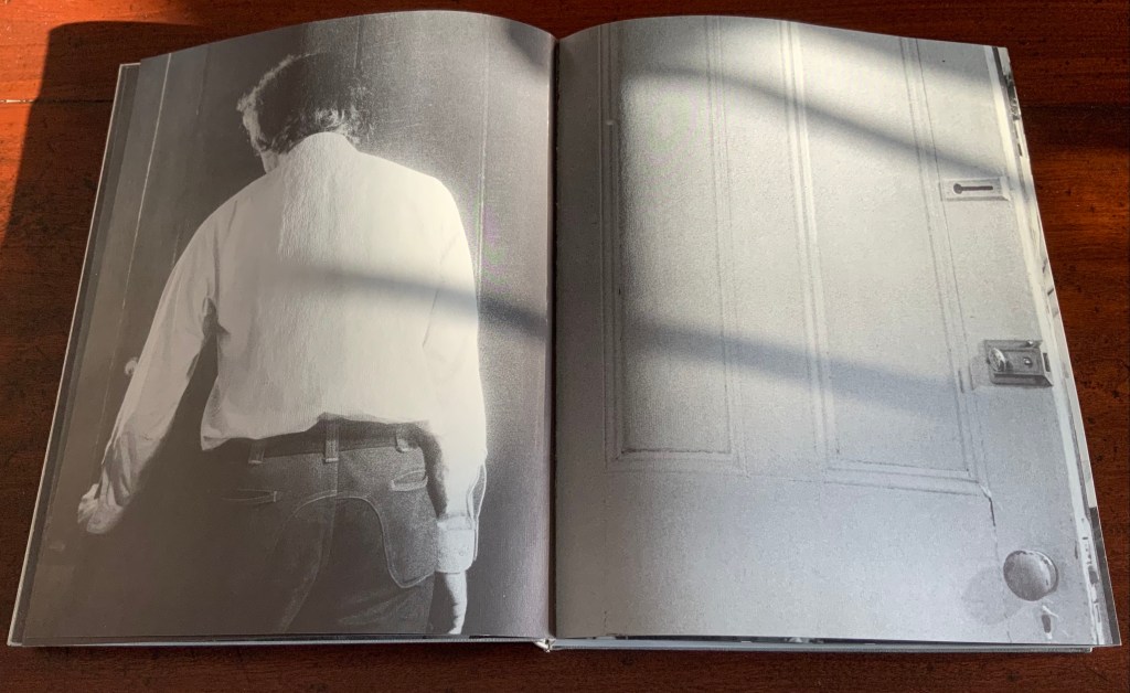
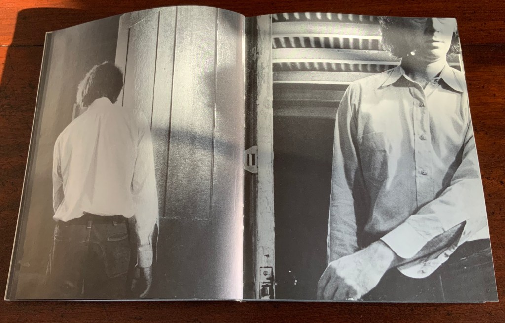
On the front cover, we see a door from the inside. Then, on its pastedown endpaper, the author outside the door with his back to us.
Front cover; pastedown end paper and page “1”.
On turning the “inside door” (page “1” of the preliminaries), we see in small type a copyright assertion and the Library of Congress catalogue number appearing vertically along the gutter of pages “2-3” (a tiny clue as to what is going on).
Pages “2-3”
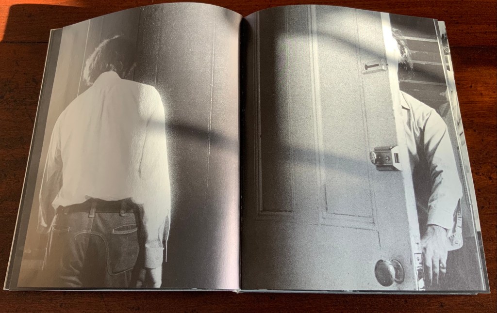
Over pages “4” through “14” from the same alternating viewpoints, the author reaches for the door handle, the door is seen opening from the inside, and the artist is seen walking through the door (from the outside) and into the room (from the inside). But who is recording these views?
Pages “10-11”, “12-13”, “14-15”
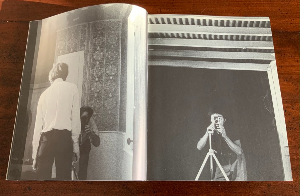
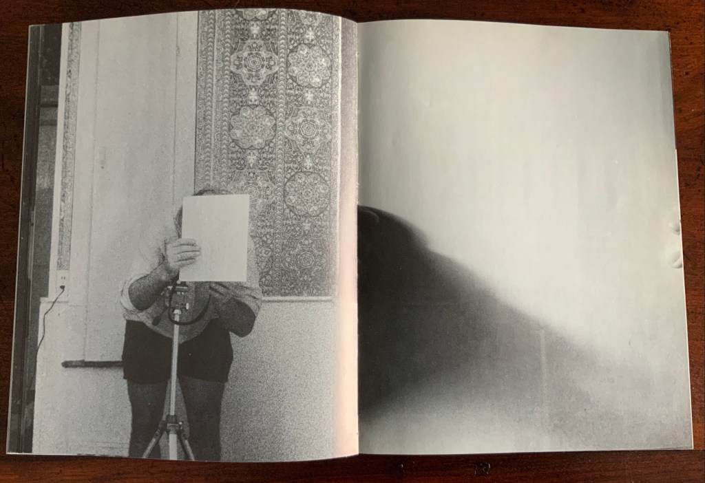
Over pages “16” through “24”, two photographers appear. Facing us, they are bent over their cameras — the one outside, clean shaven and wearing a short-sleeved shirt, is behind the author, and the one inside, bearded and wearing shorts, is in front of the author. As the author moves out of the frame, we see that the photographer inside is holding a piece of paper in his right hand. All of this occurs through the same alternating viewpoints. At page “21”, the corner of that paper descends into the frame of the inside photographer’s view of the outside photographer, and after the next switch in viewpoint that confirms what the inside photographer is doing, we see a completely white page “23”, presumably the blank sheet that is blocking the inside photographer’s camera aperture. Page “24” is the outside photographer’s view of the inside photographer whose face and camera are blocked by the piece of paper.
Pages “16-17”, pages “20-21” and pages “24-25”
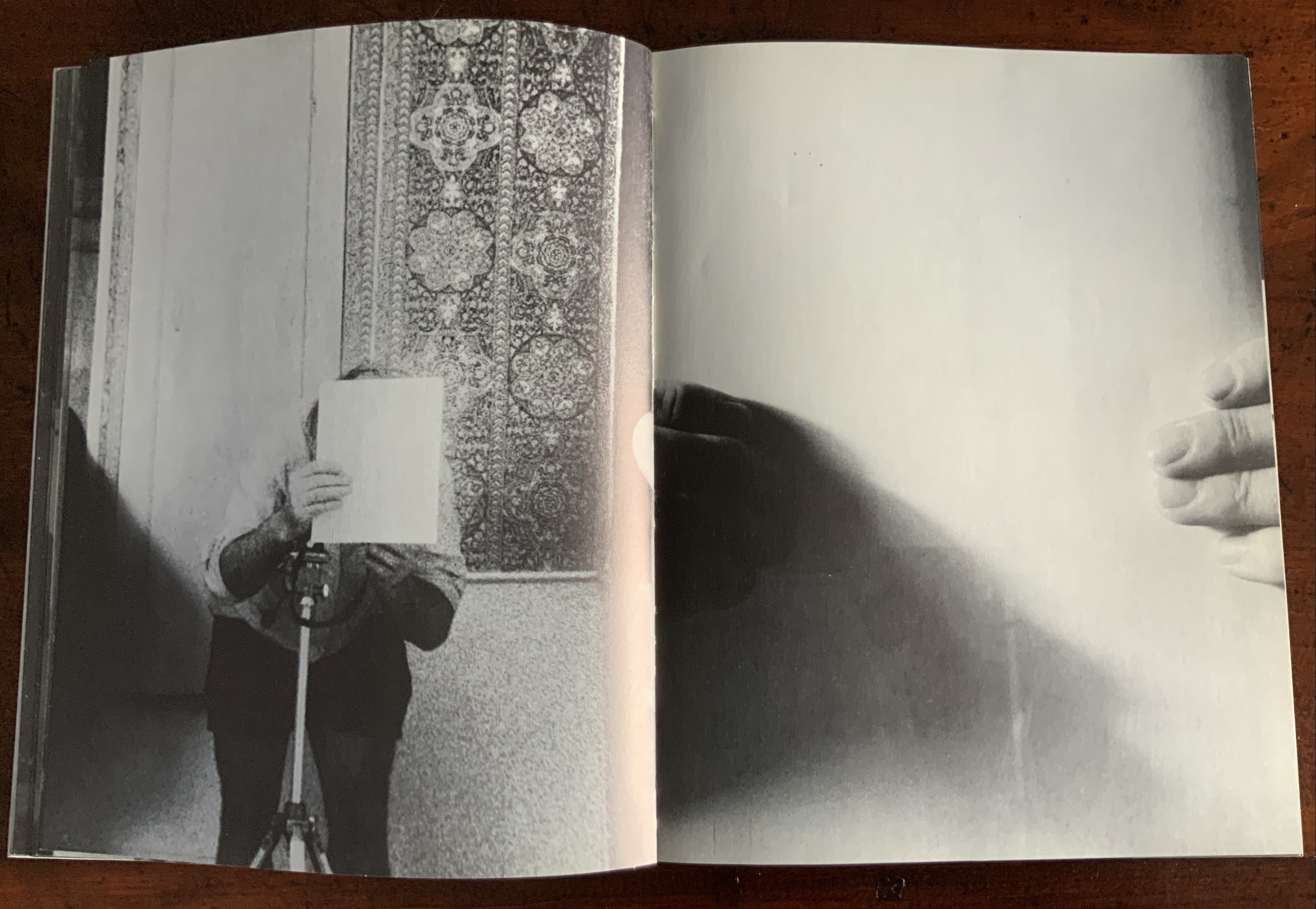
After the sequence above, something stranger still happens: on the left, a photo of the inside photographer holding the blank paper in front of his face appears. We can tell it is a photo by the tip of the thumb holding it (look in the gutter) between pages “26 and 27”. It is the developed photo the outside photographer just took of the inside photographer with his face and camera hidden by the sheet of paper. The image on page “27” is the reverse of that photograph. We can tell by the fingers on the right holding it.
Pages “26-27”
We are looking at images of images. But on pages “30-31”, whose fingers are holding the image of images?
Pages “30-31”
From there on, we see images of this piece of paper being manipulated by one pair of hands. The thumbs appear on the verso (the view from the outside photographer’s perspective), the fingers on the recto (the view seen by the inside photographer). By page “34”, it has been flipped upside down (the inside photographer is standing on his head), and on page “35”, we see a close up of the blank reverse side of the paper being held between the two photographers. By page “37”, we can see the blank side of the photo paper being fed into a manual typewriter. The pair of hands feeding the paper into the typewriter cannot belong to one of the photographers. Who is the typist — the author?
Pages “34-35” and pages “36-37”
For both pages “42” and “43”, the perspective is that of a typist advancing the photo paper and typing the title page of the book. On both pages, we can see the ribbon holder in the same position. As it progresses, more and more of the outside photographer’s camera appears above the typed page. Page “45” presents itself as the full text of the book’s title page, curling away from the typist and revealing the inside photographer on the other side of the typewriter. Page “46” shows the upside-down view of the title page as it moves toward the inside photographer and reveals the outside photographer on the other side of the typewriter. Not only are we seeing images of images, we are witnessing the making of the book’s preliminaries.
Pages “42-43”, “44-45”, and “46-47”.
From page “48” through page “54”, the photographers alternate views of blank paper advancing through the typewriter. By pages “55” and “56”, the typewriter has moved out of the frame. Look carefully at page “56”, however, and you can see the impression of the typewriter’s rubber holders on the paper. As a book’s preliminaries come to a close, there is often a blank verso page before the start of the book. If Cover to Cover is following that tradition, page “56” is that blank page at the end of the preliminaries, and page “57”, showing a record player, is the start of the book.
Pages “56-57”.
Zimmermann notes that, at somewhere near the book’s midpoint, the images turn upside down, and that readers who then happen to “flip the book over and start paging from the back soon realize that they are looking at images of images produced by the two-sided system, and indeed the very book that they are holding in their hands”. He notes this as another mind-bender added to the puzzlement of the two-sided system with which the book begins. Yet the long set of preliminaries foretold us that the upside-downness, back-to-frontness and self-reflexivity of images of images were on their way. Without doubt, Cover to Cover is an iconic work of book art.
Further Reading
Afterimage (1970). No. 11, 1982/83. On the occasion of an exhibition of his films at Canada House in London, an entire issue on Snow’s work.
… Cover to Cover is the result of another distanced use of self in the course of art-making. Snow is subject/participant as he and his actions are observed and analyzed by two 35 mm cameras… simulataneously recording front and back, the images then placed recto-verso on the page… Snow is subject observed in the book at the same time that he is also choosing and making decisions about images. Cover to Cover in 360 pages, [sic] becomes a full circle — front door to back door or the reverse. The book is designed so that it can be read front to back and in such a way that one is forced to turn it around at its centre in order to carry on. Regina Cornwell in Snow Seen and “Posting Snow”, Luzern catalogue.
But as the scene “progresses,” an action is not completed within the spread, but loops back in the next one, so that the minimal “progress” extracted from reading left to right is systematically stalled each time a page is turned, and the verso page recapitulates the photographic event printed on the recto side from the opposite angle. This is the disorienting part: to be denied “progress” as one turns the page seems oddly like flashback, which it patently is not; it might be called “extreme simultaneity.” Two versions of the same thing (two sides of the story) are happening at the same time. Zimmerman.
Bartleby the Scrivener: A Story of Wall Street (1995)
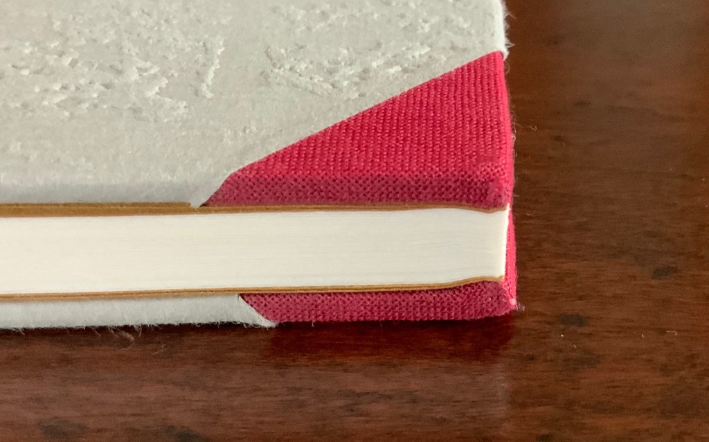
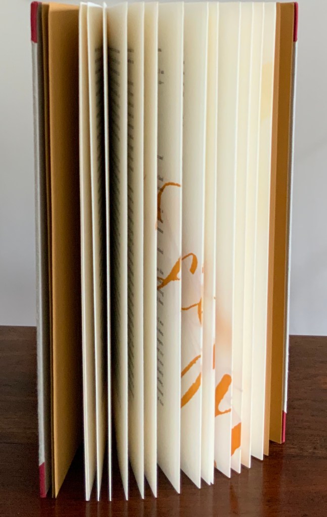
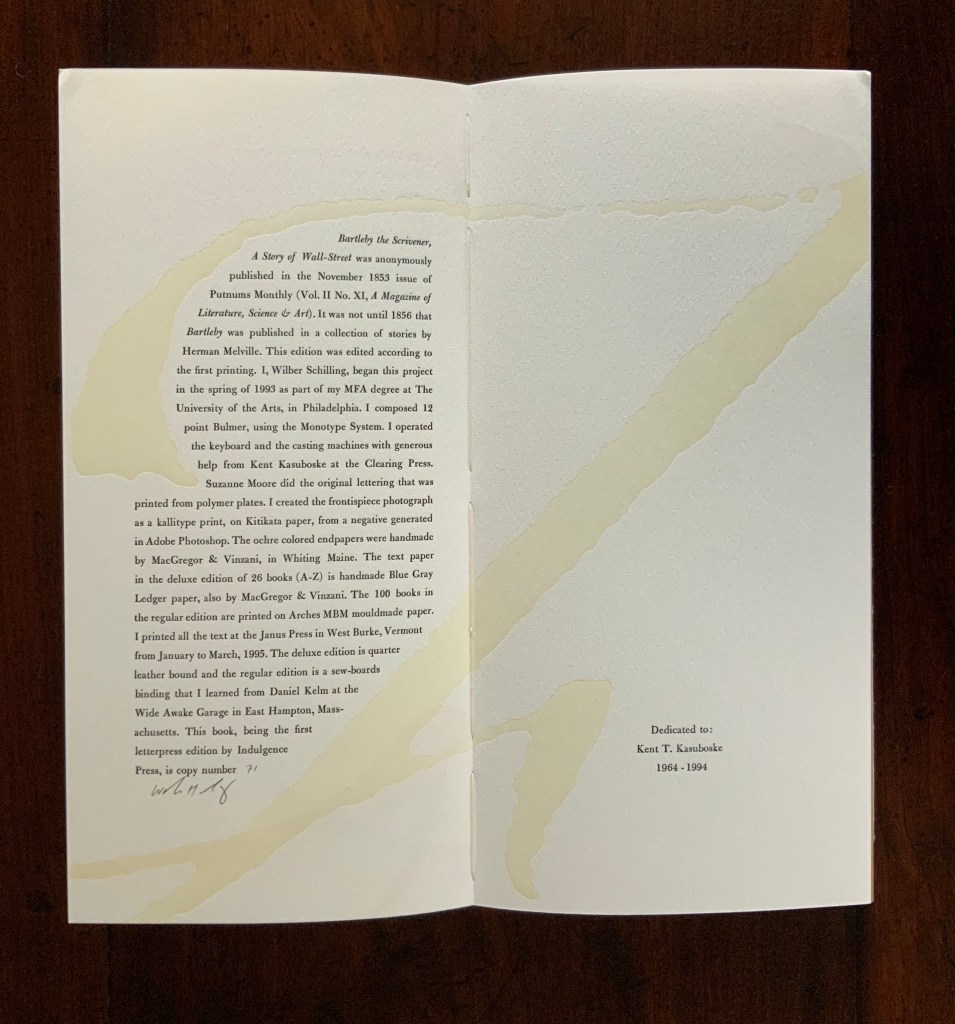
Herman Melville, Bartleby the Scrivener: A Tale of Wall Street, 1853. Indulgence Press, 1995. Type composed in 12 point Bulmer on the Monotype System and printed by Wilber Schilling on Arches MBM mould made paper at Janus Press. Calligraphy by Suzanne Moore. Ochre-coloured endpapers handmade by MacGregor & Vinzani. Wilber Schilling created the frontispiece photo as a Kallitype print from a negative generated in Adobe Photoshop. The binding, also by Schilling, is cloth over sewn boards and, over the cloth, an embossed print of details from the frontispiece photo. Edition of 100 of which this is #71. H320 x W158 x D14 mm. Acquired from Indulgence Press, 17 December 2015.
Further Reading
“Suzanne Moore“. 14 January 2020. Books On Books Collection.
Jury, David, and Peter Rutledge Koch (eds.) 2008. Book Art Object. Edited by David Jury. Berkeley, California: Codex Foundation. Pp. 198 (Where Do We Start?), 199 (Surplus Value Books #13).
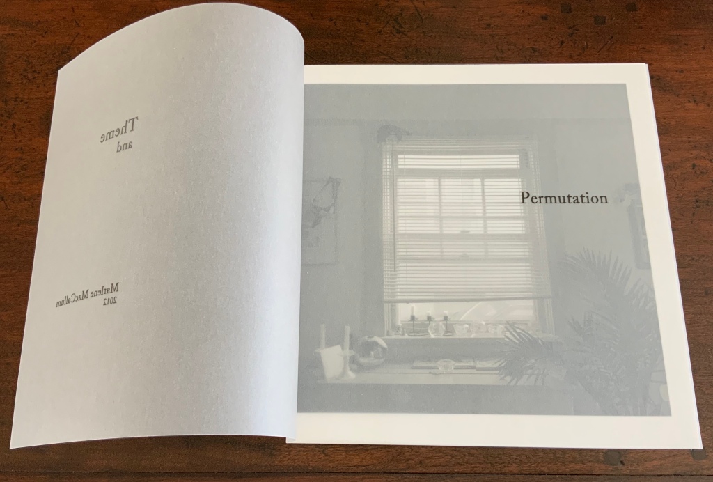
Theme and Permutation (2012) Marlene MacCallum Hand sewn pamphlet, images custom-printed in offset lithography on Mohawk Superfine, text printed in inkjet, covers inkjet printed on translucent Glama. H235 × W216 mm Edition of 100, of which this is #54. Acquired 5 October 2018.
Photos: Books On Books Collection.
Theme and Permutationis one of a series of artist’s books inspired by the experience of living in Corner Brook’s Townsite area on the west coast of the island of Newfoundland. Between 1924-34 the pulp mill built 150 homes to house the mill management and skilled labourers. Over a period of 10 years, I have photographed in several homes, all the same type-4 model as the one I live in. These homes vary in condition from close to original in design and décor to highly renovated. This project gave me the rare opportunity to record the evolution of interior aspects of these homes. It has been the context to explore the paradoxical phenomena of conformity and individualization that occurs in a company town. Having grown up in a suburban housing development, my earliest memories of home is that of living in a space that is reminiscent of my neighbors’. Each artist’s book explores a distinct facet of image memory, multiplicity, sequence and offers the viewer a visual equivalence of the uncanny. Theme and Permutation is a response to the permutations and variations of the type-4 Townsite House. Digital tools were used to translate the original film source of eight different window images from five houses. The sixteen offset lithographic plates were custom printed in twenty-nine separate press runs. Each image is the result of a different combination of plates. The structure is a sewn pamphlet with translucent covers. The viewer enters the body of the book with a tritone image of a single Townsite window. As one moves into the piece, new window images appear and layer over each other. The images become darker and more heavily layered towards the mid-point. The center spread has an inkjet layer of two text blocks printed over the offset litho images. The text speaks of the history of the homes, the architectural permutations and economic shifts within the Townsite area. The ensuing pages continue to provide new combinations of window layers, gradually lightening in tonality and allowing the individual windows to become more distinct. A third text block provides a personal narrative. The piece concludes with a tritone image of one of the Townsite windows in original condition.(From artist’s website. Accessed 1 September 2019.)
*From the artist’s description of Wall Stories (2014).
Chicago Octet (2014)
Chicago Octet (2014) Marlene MacCallum Hand bound artist’s book with folded paper structure, letterpress and inkjet printing, H166 × W78 mm closed, H443 x W293 mm open Unique. Acquired 5 October 2018.
Photos: Books On Books Collection
Chicago Octet is a work of visual poetry by eight masters of book art. If they were performing music (and you can almost hear the music of Michigan Avenue), MacCallum would be their performing conductor.
The piece I created, Chicago Octet, had several collaborative components. The letterpress printing consisted of a word selected by each participant printed on one of Scott [McCarney]’s folded structures. The images were a digital layering of every cityscape photograph that I made and then inkjet printed on top of the letterpress. The final folded structure was designed by Mary Clare Butler. The case was designed and built by Scott McCarney, the front cover embossment was by David Morrish and Clifton Meador. (From artist’s website. Accessed 31 August 2017.)
Update: With funding from the Canada Council for the Arts Digital Originals Grant and assistance of Matthew Hollett and David Morrish during the Covid pandemic, the artist created Shadows Cast and Present, a digital re-imagining of her three most recent book works. The three cantos into which the work is divided also enrich one’s appreciation of Theme and Permutation and Chicago Octet. MacCallum orchestrates the various media — text; sound from music, voice and the noise of city and nature; video — with a touch as light as paper and light.
Further Reading
Books On Books. “Architecture”. Books On Books, 12 November 2018.
MacCallum, Marlene. 2014. Wall Stories. Website. For the text cited in the epigraph for this entry, go to the last linked image in the series of thumbnails displayed.
Otis Artist Book Collection. “Conrad Gleber ‘Chicago Sky Line’”, 27 January 2014. Gleber’s work is an interesting one to compare with Chicago Octet. Chicago Sky Line (1977) is a fan book of photographs secured at a single point by the binding and, when spread clockwise, reveals the sky above Chicago and, when spread counterclockwise, shows the Chicago “skyline” below clouds and sky.
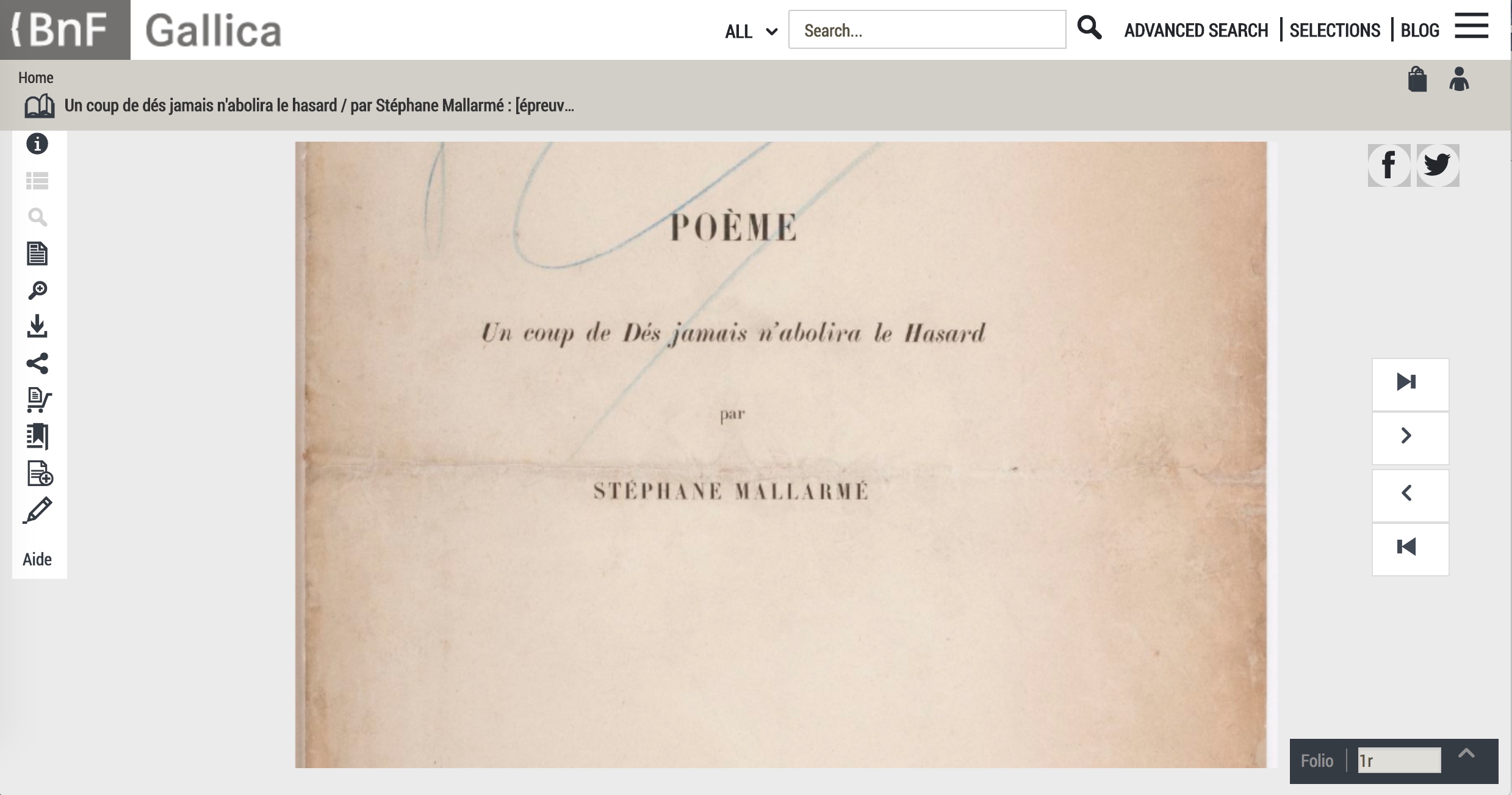
From Sexy Codicology (well, they must have thought the name would increase traffic). Accessed May 1, 2017 11:17 PM.
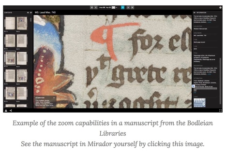
Scholars and programmers from all over the world are working together on providing a technology that give researchers, and heritage enthusiasts, a rich and uniform experience when viewing digitized heritage. Most of all, they want to make it possible that as many digital collections as possible all work in the same way, so that any image from any museum or library can be seen in any viewer online, together with any other manuscript or artwork that is IIIF compliant! Side-by-side!
The International Image Interoperability Framework (“triple I eff“) began its efforts in 2011. As of September 2018, over 100 universities, libraries, cultural heritage institutions and open source software companies are participating.
space
Some of those organizations hold book art collections. Imagine being able to examine an artist’s book “in the round”, to zoom in, to compare one artist’s flag book with another’s side by side. A query about whether any of those organizations plan to apply the technology to those collections has been sent.
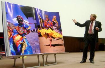
Standing open at 7 foot by 5 foot, is it the world’s largest bound book? The result of Michael Hawley‘s research and field expeditions out of the Media Lab at the Massachusetts Institute of Technology, it is certainly the iMax of books.
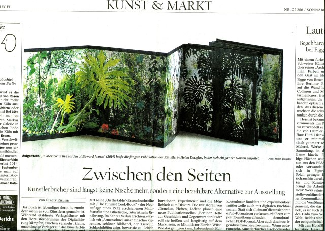
Helen Douglas, In Mexico: in the garden of Edward James (2014). Reviewed in Der Tagesspeigel
Helen Douglas has been kind enough to forward the notice above of her most recent work — In Mexico: in the garden of Edward James. Based on her invited residency in Mexico City, this concertina book takes the viewer through Edward James’ jungle garden Las Pozas, its buildings and staircases, James’s surreal imagination and, best of all, Douglas’s own imaginative experience of them. See the interview at BookArtBookBlogthat preceded the work’s unveiling at the London Art Book Fair at the Whitechapel Gallery and Berlin Art Book Fair.
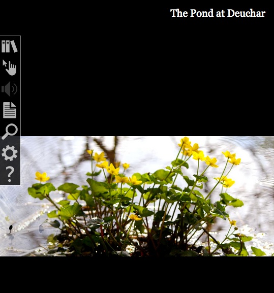
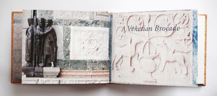
When I go to Weproductions, the website of founding partners, Telfer Stokes and Helen Douglas, it is like taking a walk in Yarrow, Scotland, or taking the measure of paper samples between forefinger and thumb, or browsing in a bookstore, or lingering in an art gallery. Two of Helen Douglas’s works in particular elicit this: The Pond at Deuchar(2013) and A Venetian Brocade(2010).
Was it London Book Fair where I first saw this bookwork, appwork, scrollwork … this work of art? What you see above leads you to the app. Clive Philpott’s postscript to this work, featured on Weproductions and published by the Tate, offers all the background and appreciation of the work you need to read. Read it, then go to The Pond at Deuchar*, lean forward and trail your fingers through its waters.
Helen Douglas and Marina Warner. A Venetian Brocade (Weproductions, 2010)
A Venetian Brocade equally makes the “act of looking” tactile and the “act of touching” insightful. The work reminds me of this passage from Joseph Brodsky’s Watermark (New York: Farrar Straus Giroux, 1992):
… bipeds go ape about shopping and dressing-up in Venice for reasons not exactly practical; they do so because the city, as it were, challenges them. We all harbor all sorts of misgivings about the flaws in our appearance, anatomy, about the imperfection of our very features. What one sees in this city at every steep, turn, perspective, and dead end worsens one’s complexes and insecurities. That’s why one—a woman especially, but a man also—hits the stores as soon as one arrives here, and with a vengeance. The surrounding beauty is such that one instantly conceives of an incoherent animal desire to match it, to be on par. This has nothing to do with vanity or with the natural surplus of mirrors here, the main one being the very water. It is simply that the city offers bipeds a notion of visual superiority absent in their natural lairs, in their habitual surroundings. That’s why furs fly here, as do suede, silk, linen, wool, and every other kind of fabric.
If you are lucky enough to buy one of the few remaining copies of A Venetian Brocade, you will see and feel how it leads to In Mexico: in the garden of Edward James. Appreciation of that double-sided leporello work’s extension of the Douglas’s concept of Visual Narrative and its kinship with James’s surrealism can only be enhanced by viewing The Secret Life of Edward James, George Melly’s documentary film from 1975.
But having indulged the surreal elements, think back to the pond at Deuchar, think back to the Tate’s association with Douglas’s work, then consider this work also held at the Tate:
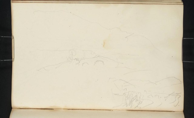
Joseph Mallard William Turner, “Deuchar Old Bridge, near Yarrow, Selkirkshire”, 1834, in The Edinburgh Sketchbook 1831-34, graphite on paper, 111×181 mm. Reference: D26161 Turner Bequest CCLXVIII 34 a
Here is a narrative of art across time and place to touch by looking and, by looking, to be touched by.
*Deuchar is pronounced “dew-ker”, the “k” as in “loch”.