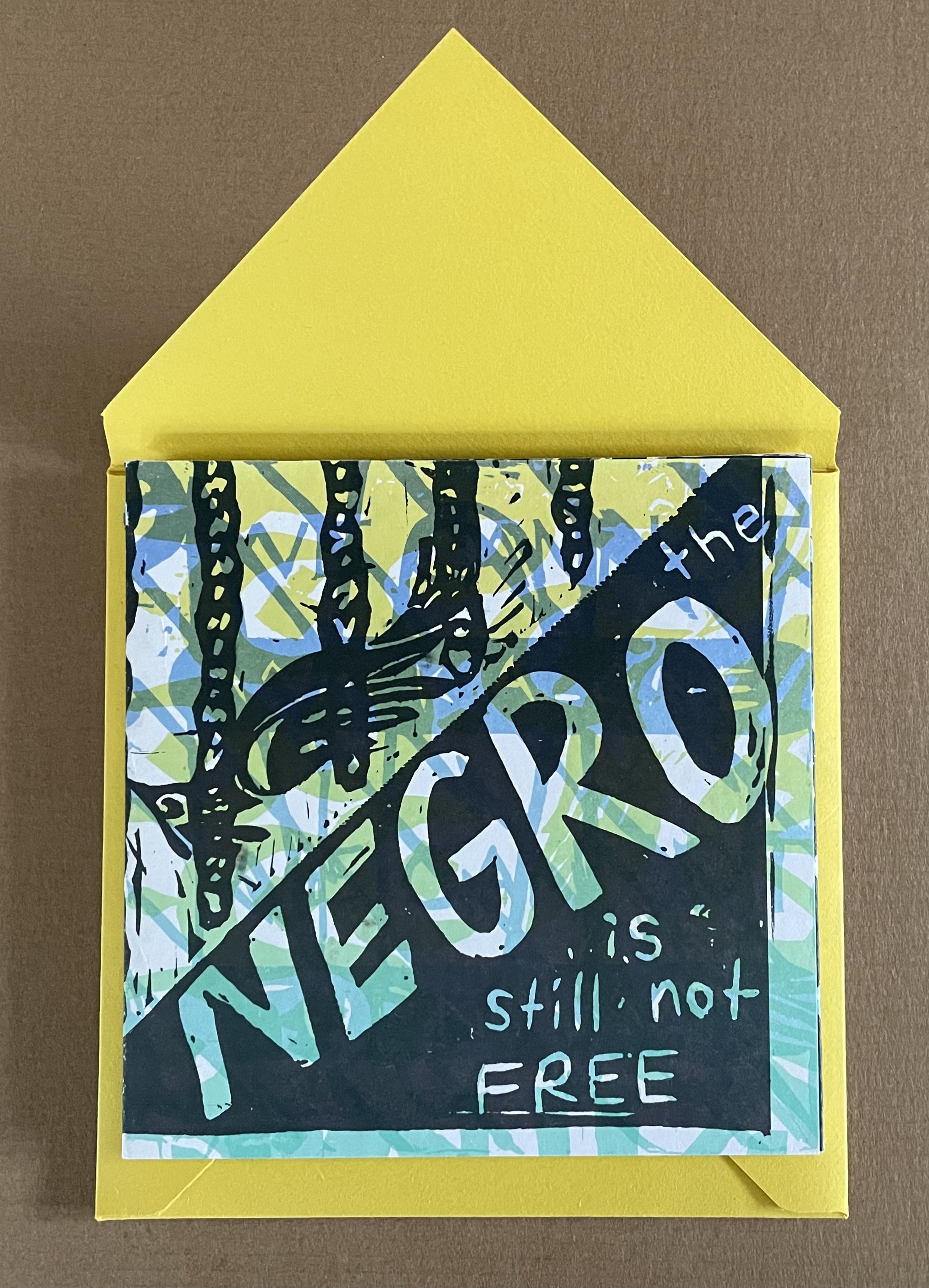
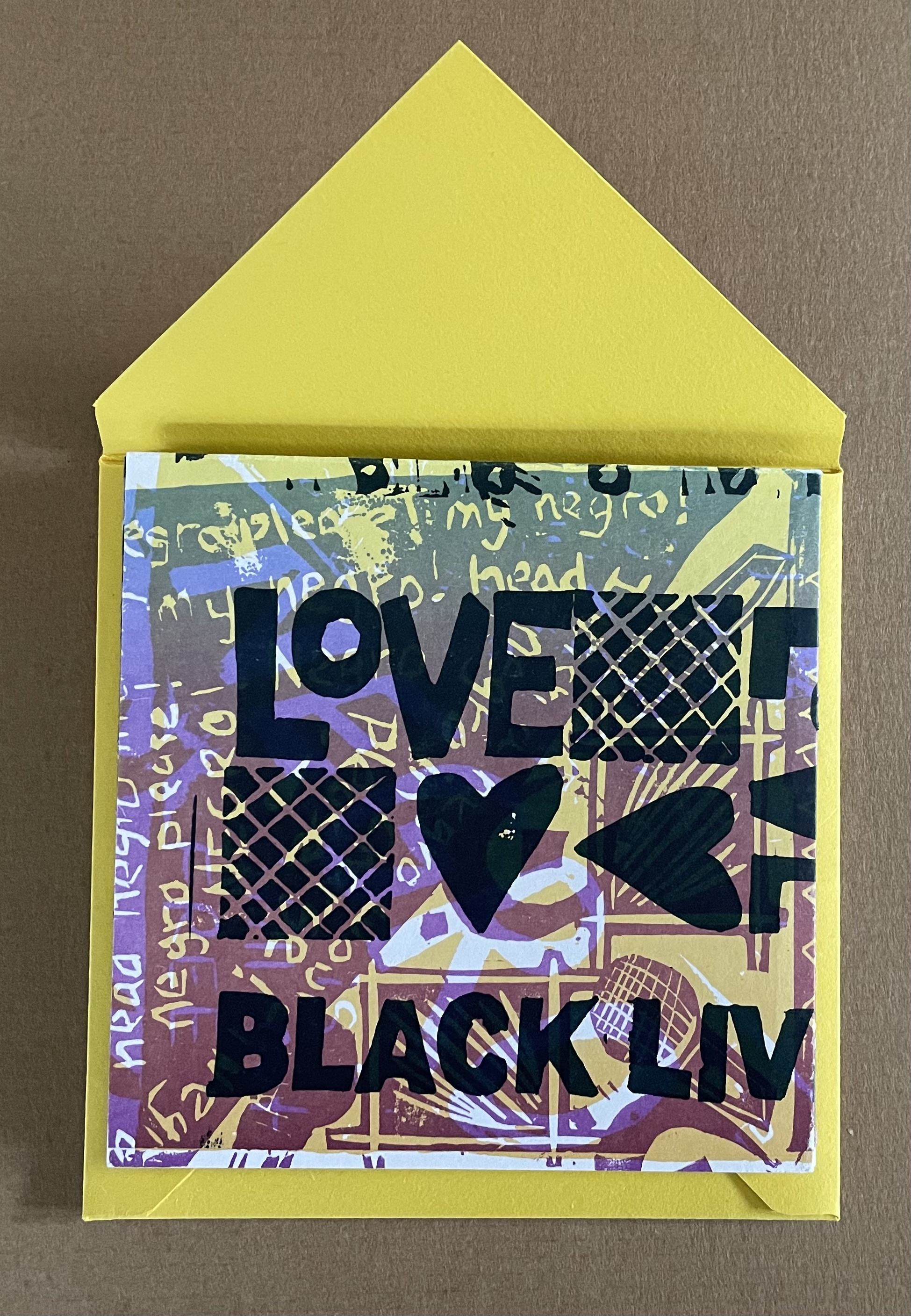
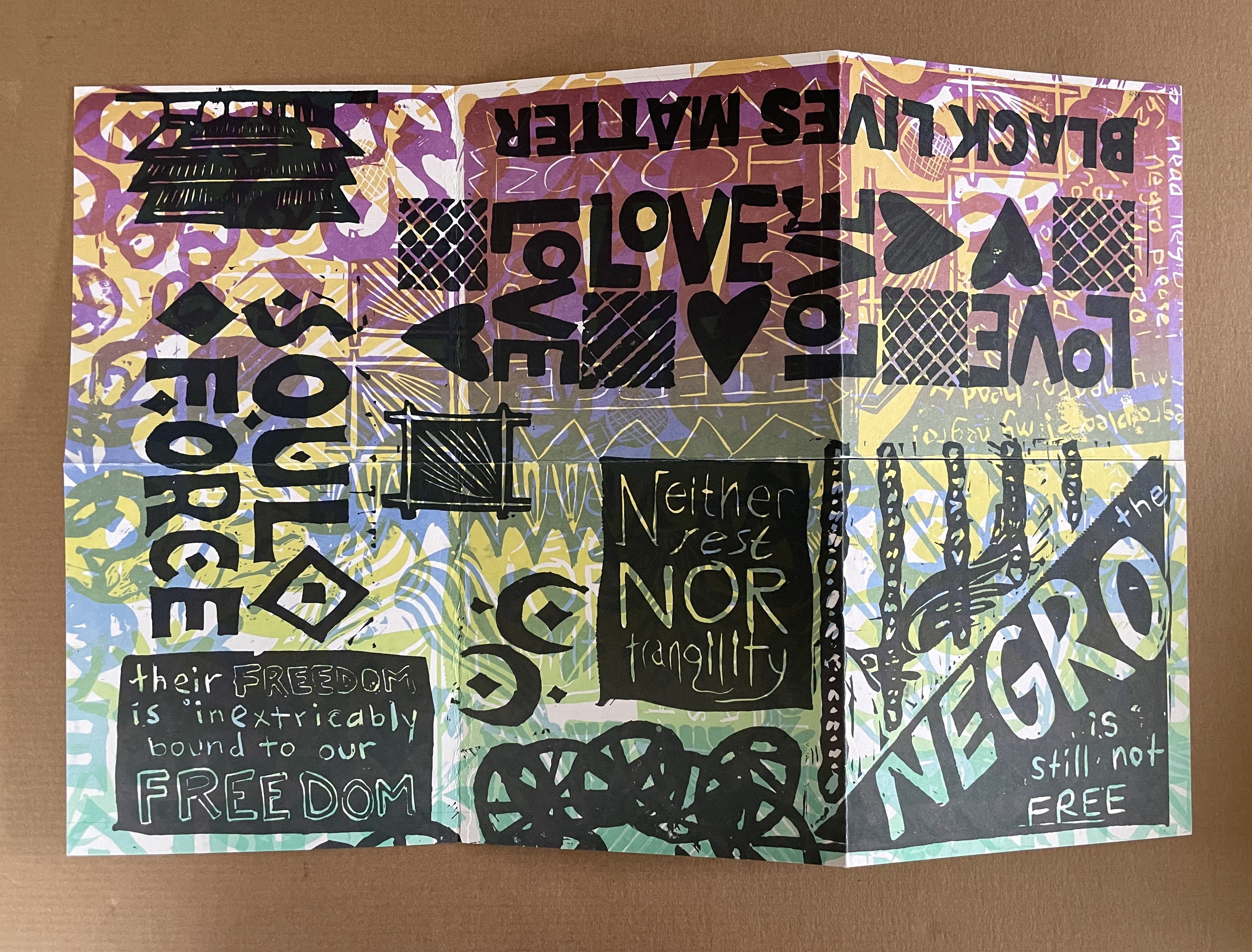
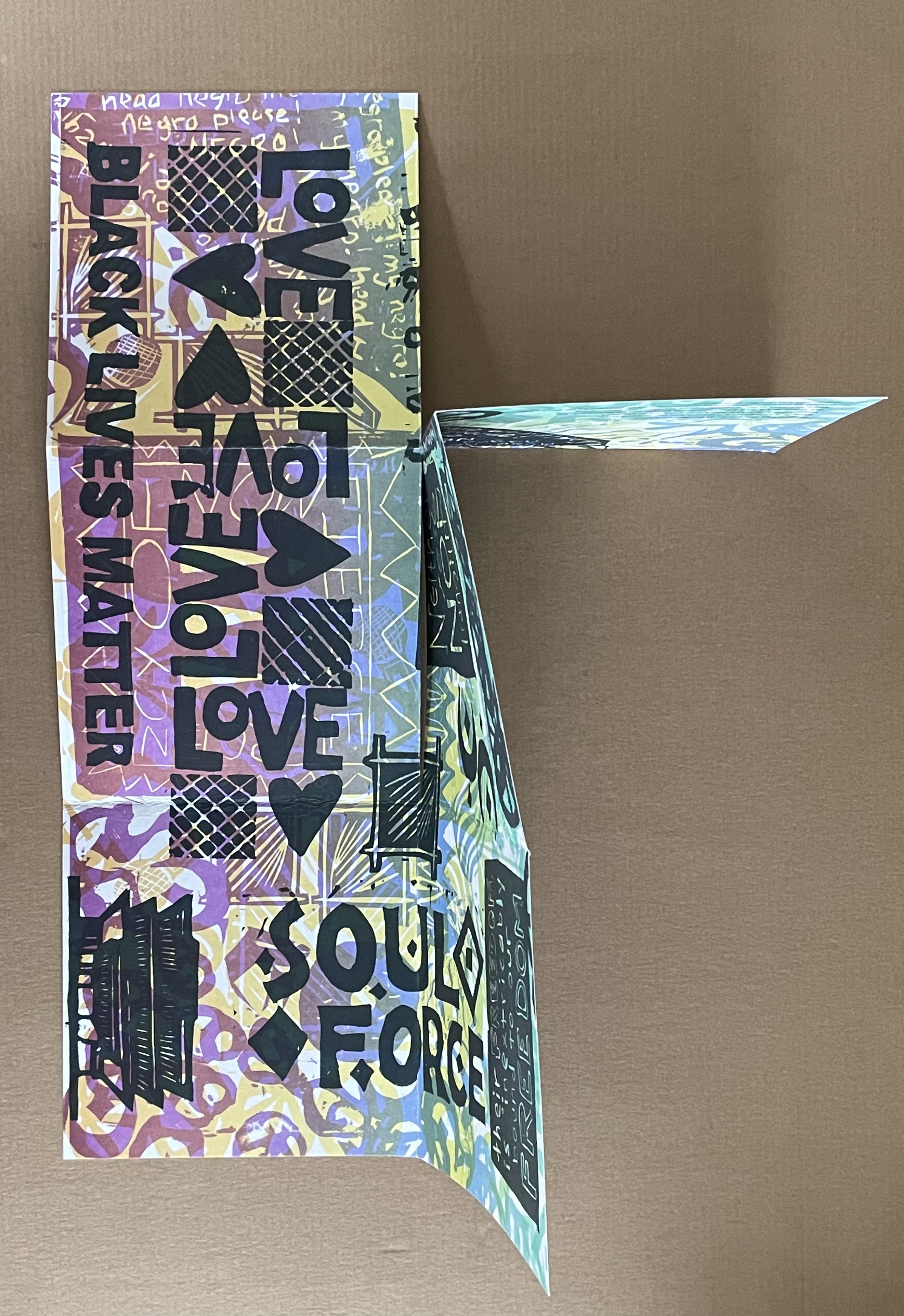
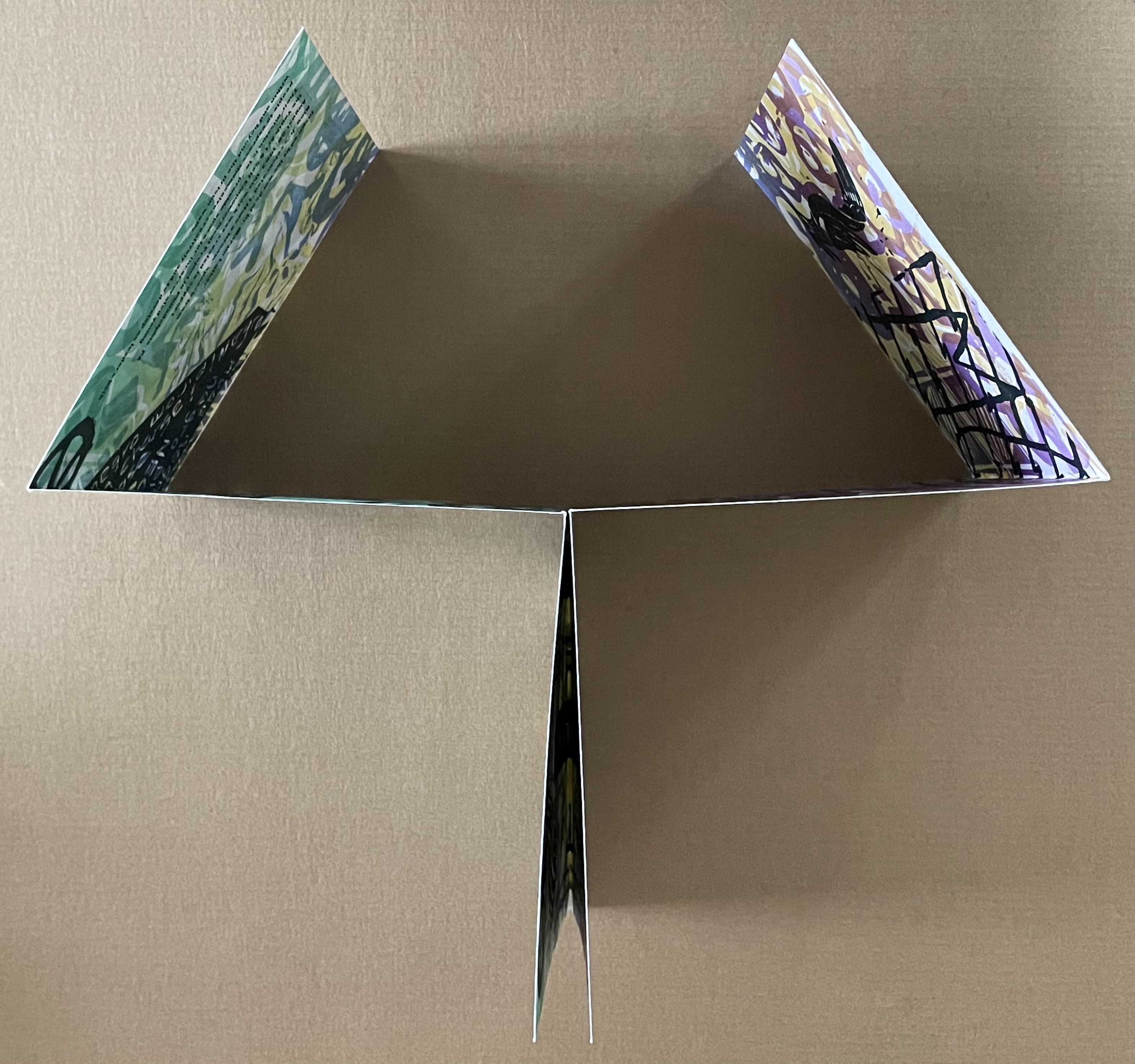
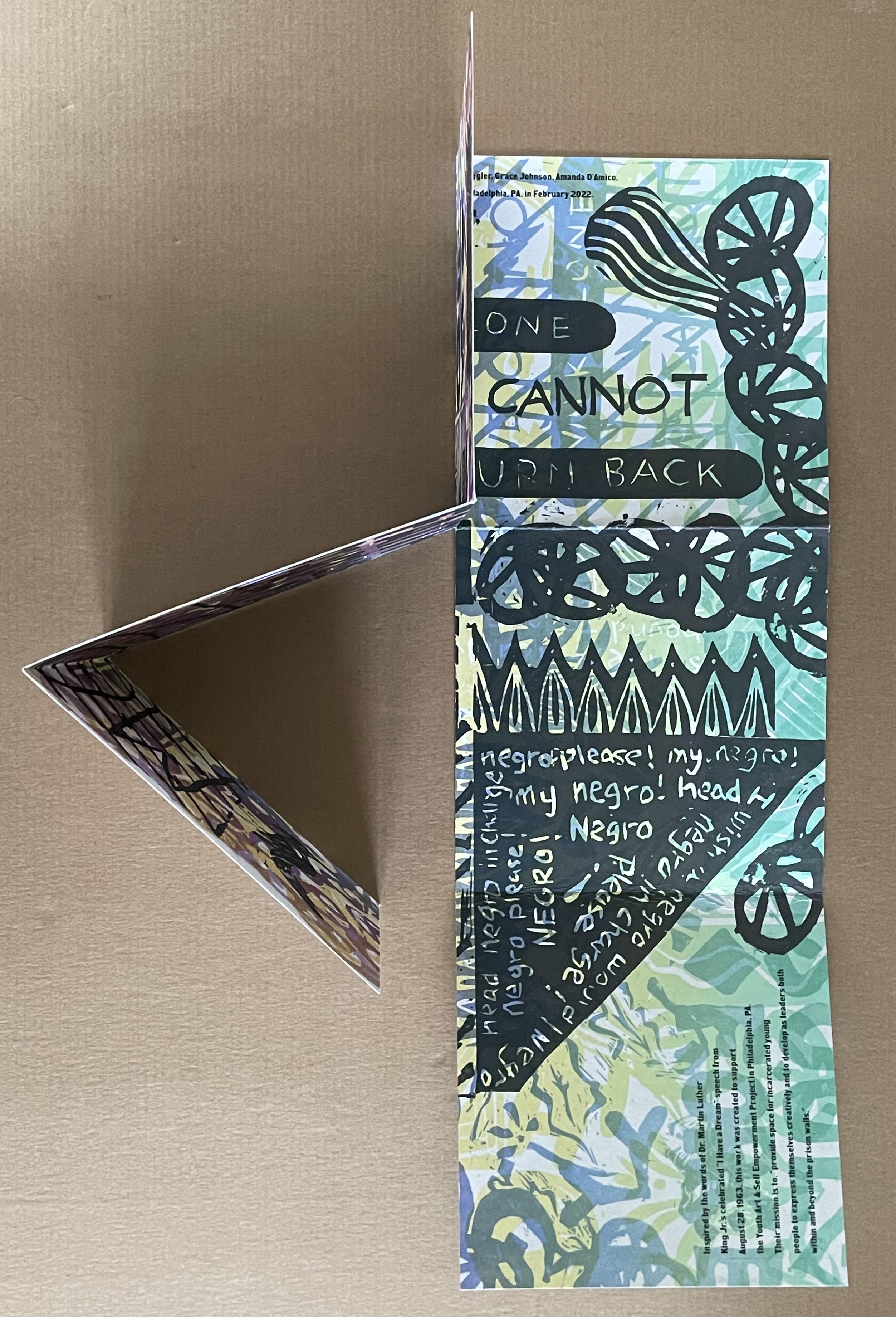
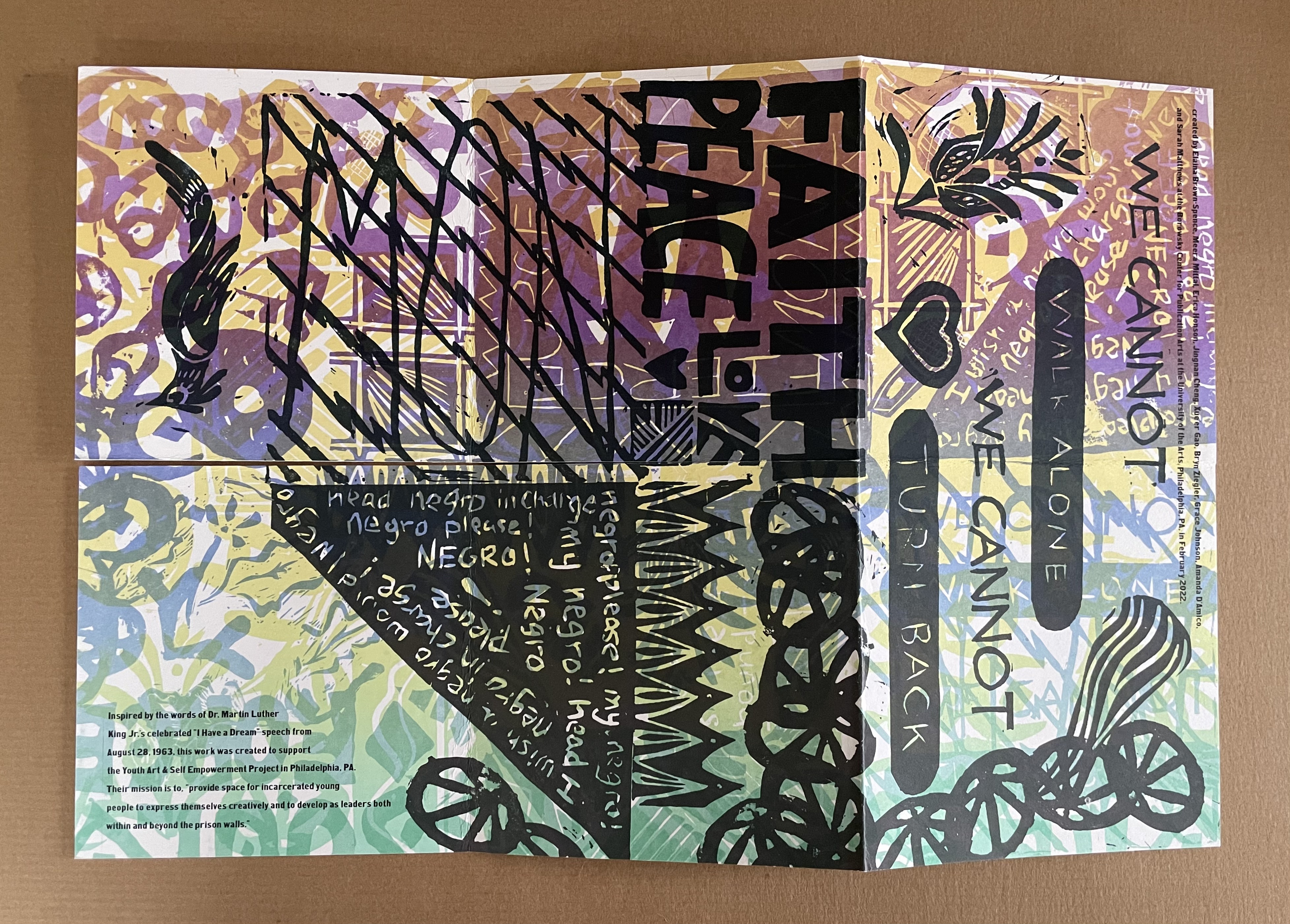
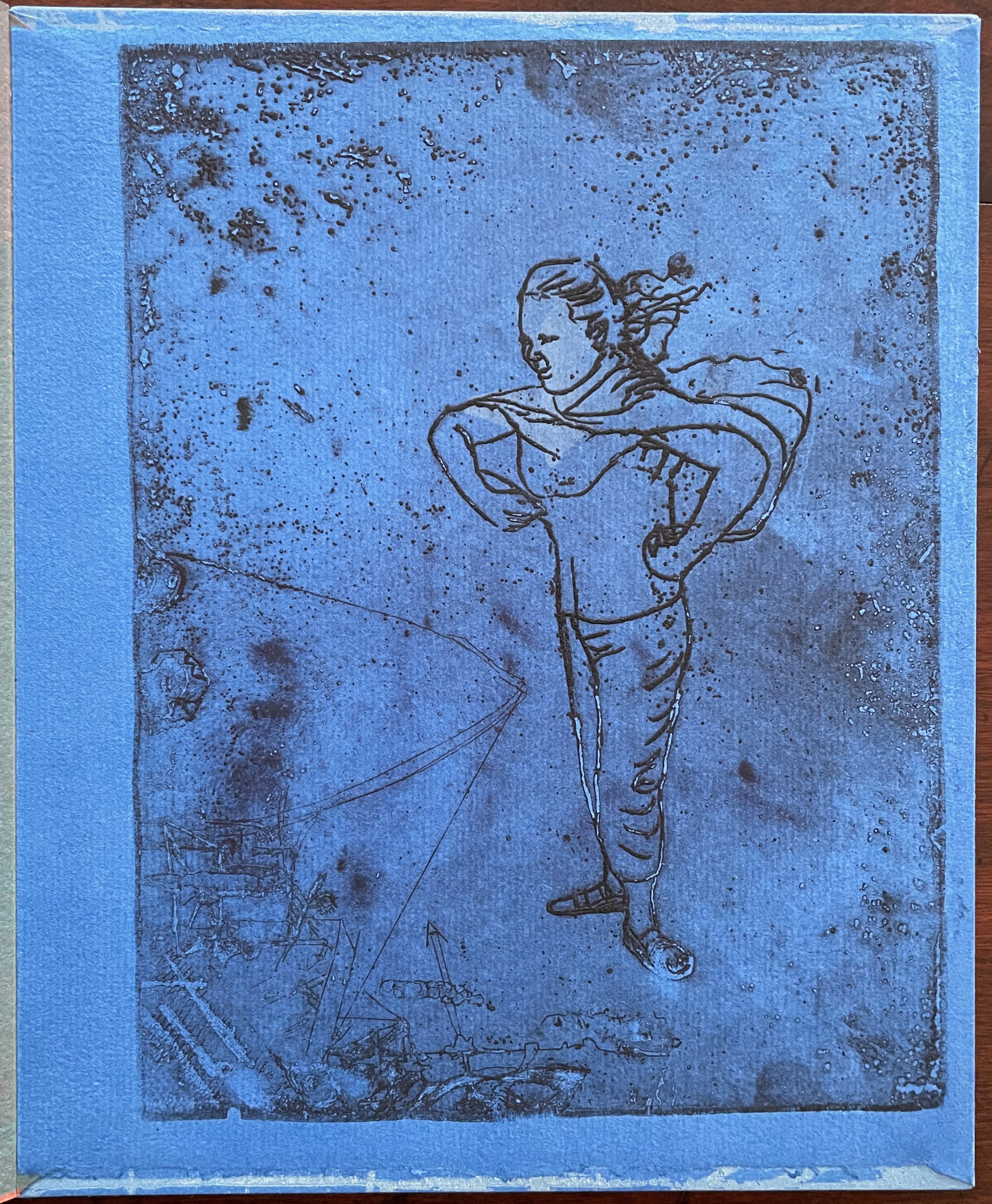
The Negro Is Still Not Free (2022) Elaina Brown-Spence, Meera Mittari, Erica Honson, Jingnan Cheng, Xue’er Goo, Bryn Ziegler, Grace Johnson, Amanda D’Amico, and Sarah Matthews Double-sided single-page book in a pants fold. 152 x 152 mm. Acquired from Sarah Mathews, 6 August 2024. Photos: Books On Books Collection
The Negro is Still Not Free was created by Elaina Brown-Spence, Meera Mittari, Erica Honson, Jingnan Cheng, Xue’er Goo, Bryn Ziegler, Grace Johnson, Amanda D’Amico, and Sarah Matthews at the Borowsky Center for Publication Arts at the University of Arts in Philadelphia, PA during the month of February 2022. In its color and style, it reflects the influence of Amos Paul Kennedy, Jr. Its double-sided single-sheet pants-fold book structure, cleverly fuses the traditions of poster and book (or zine).
Inspired by the words of Dr. Martin Luther King, Jr’s celebrated “I Have A Dream” speech from August 28, 1963, the work was created to support the Youth Art & Self Empowerment Project in Philadelphia, PA. Their mission is to “provide space for incarcerated young people to express themselves creatively and to develop as leaders both within and beyond prison walls.”
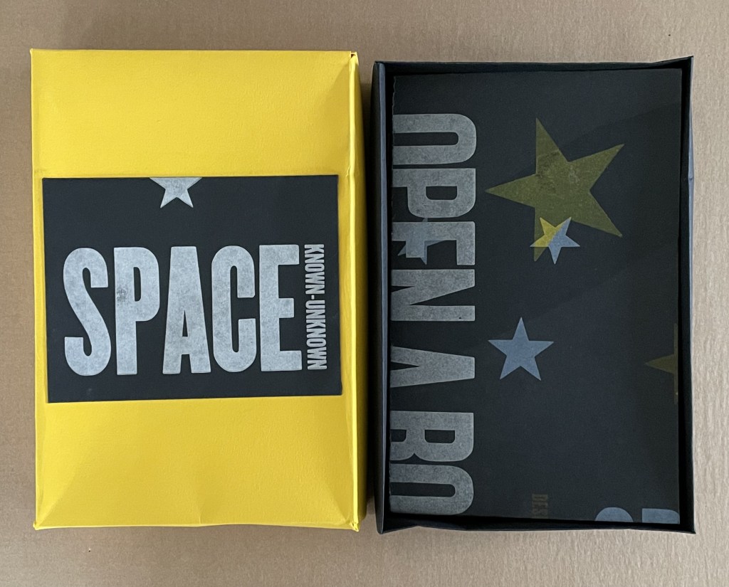
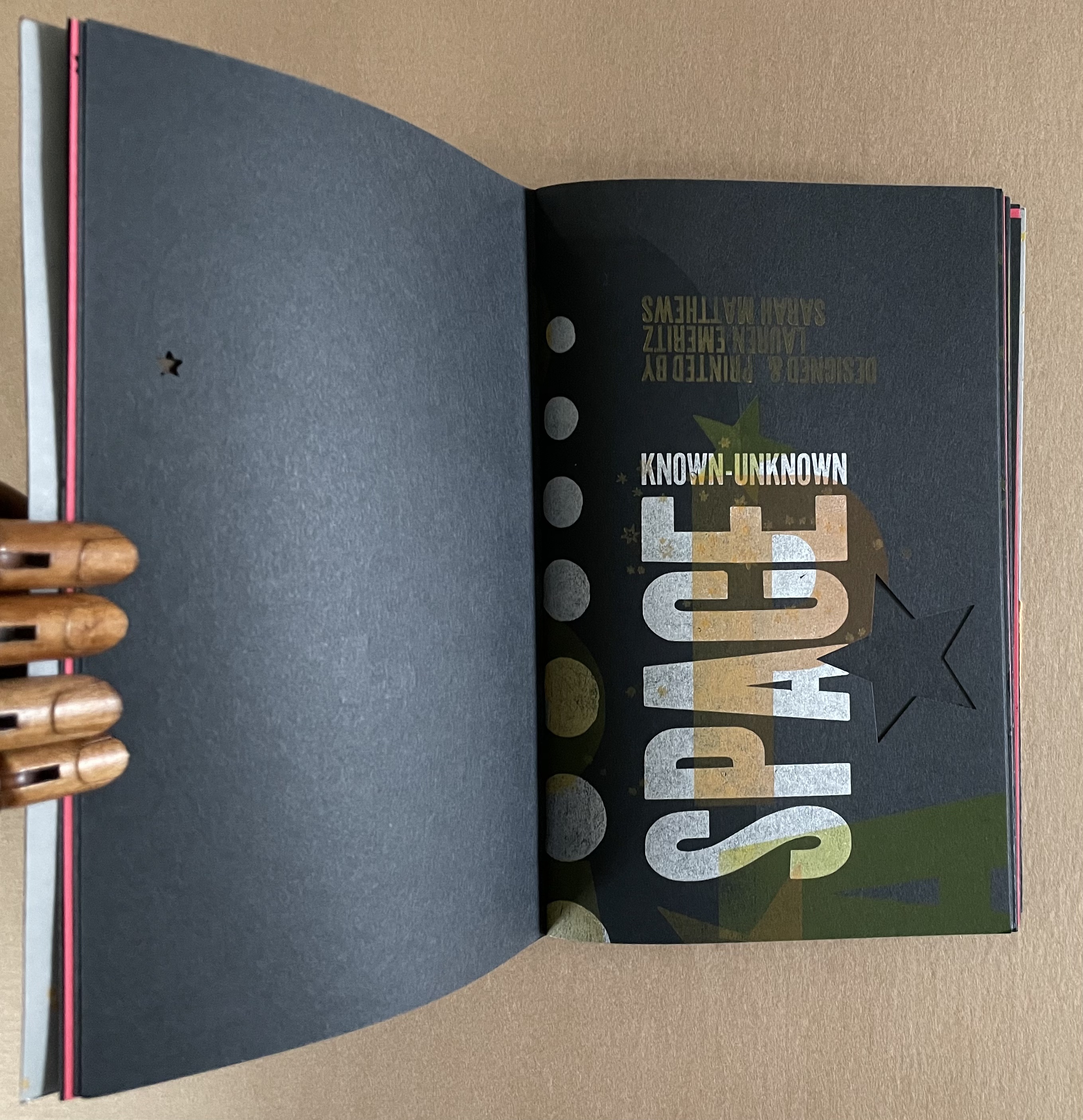
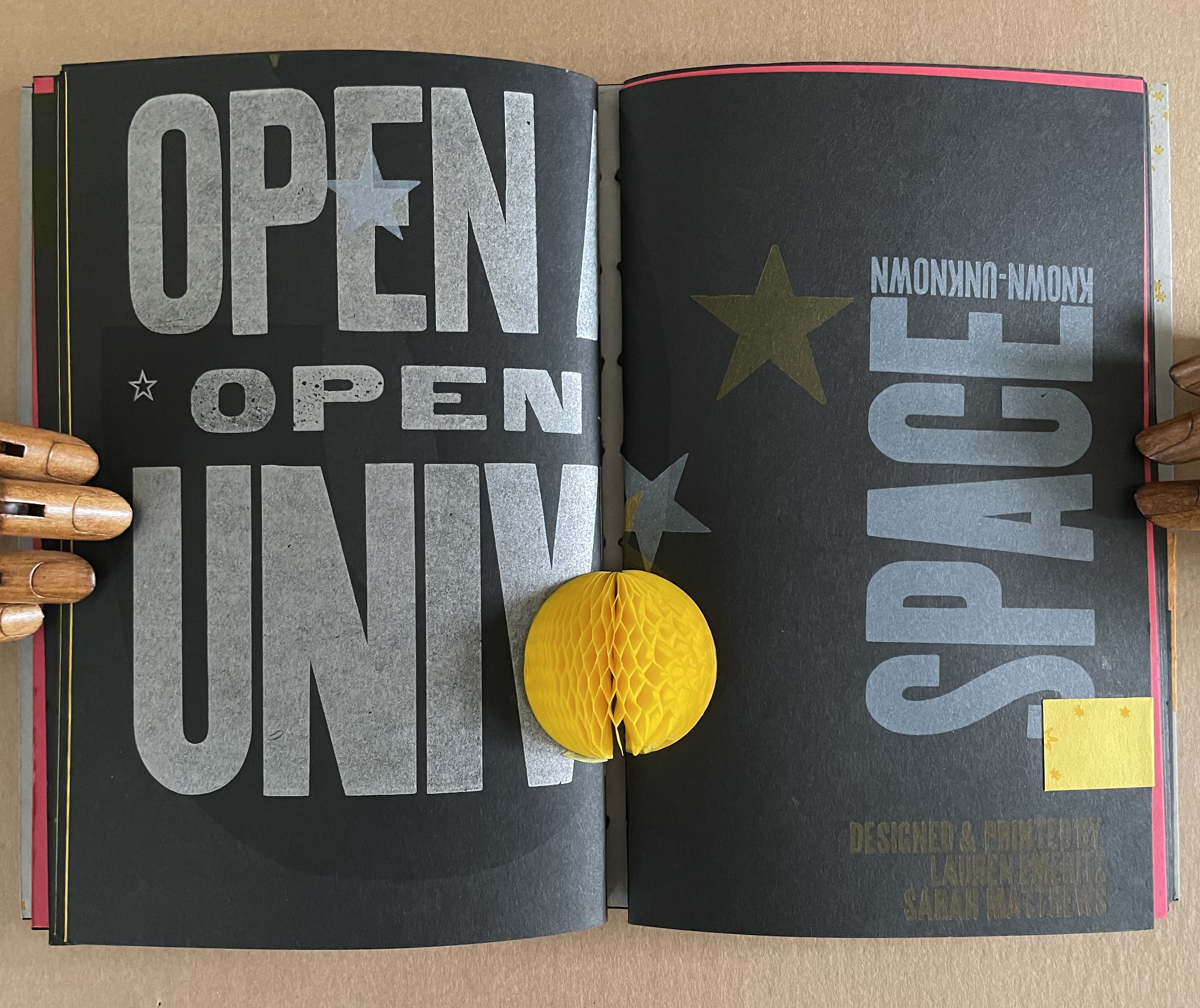
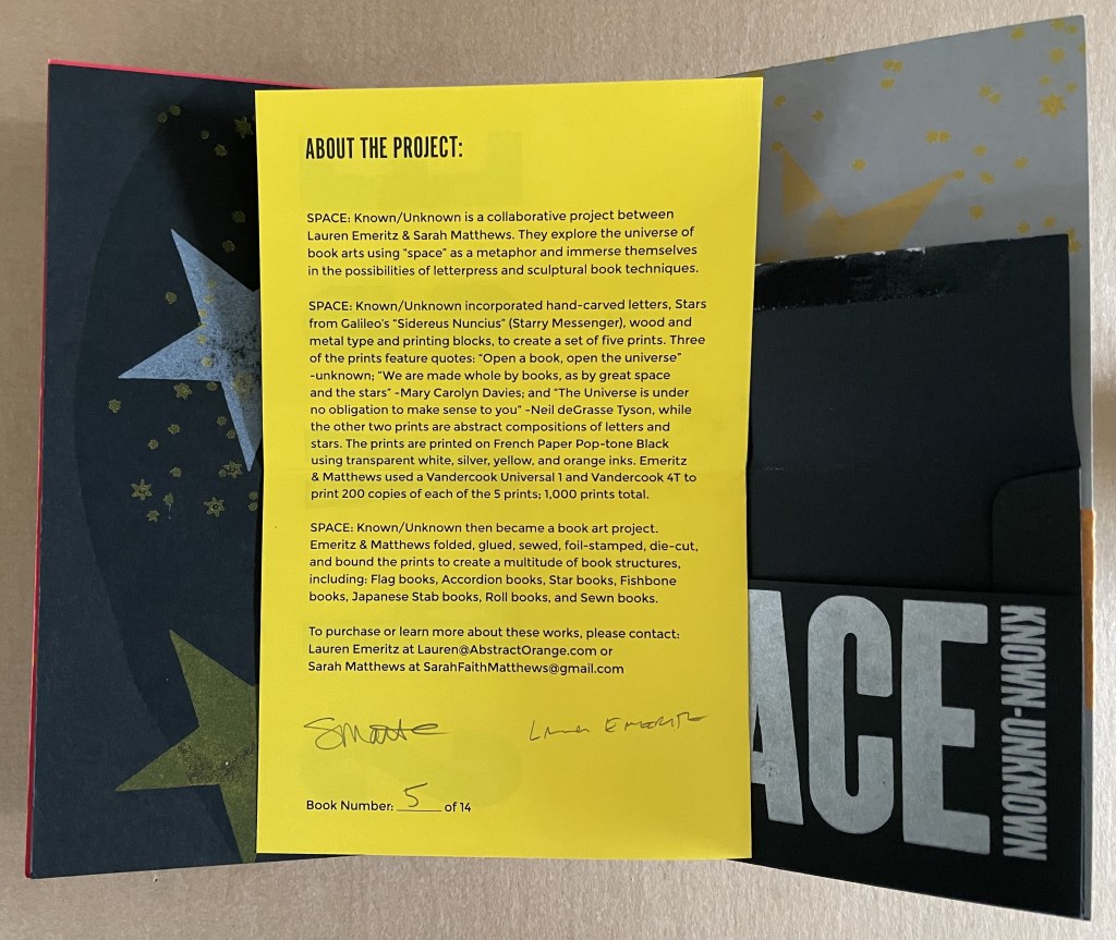
SPACE: Known/Unknown (2022)
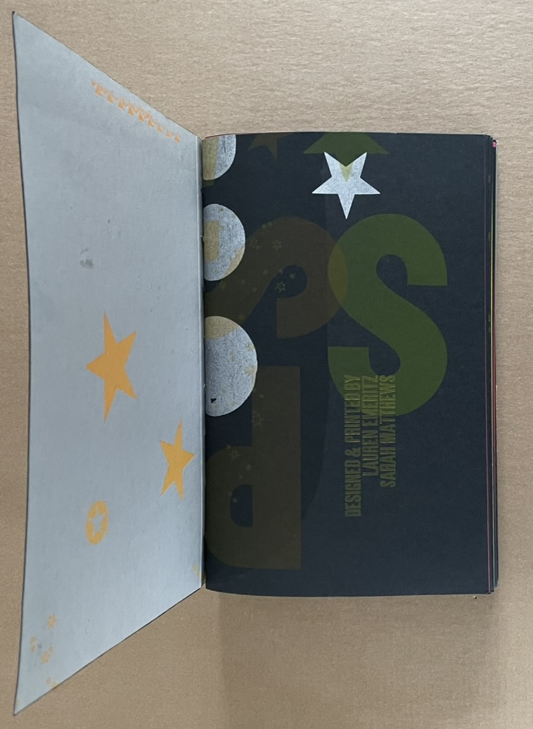
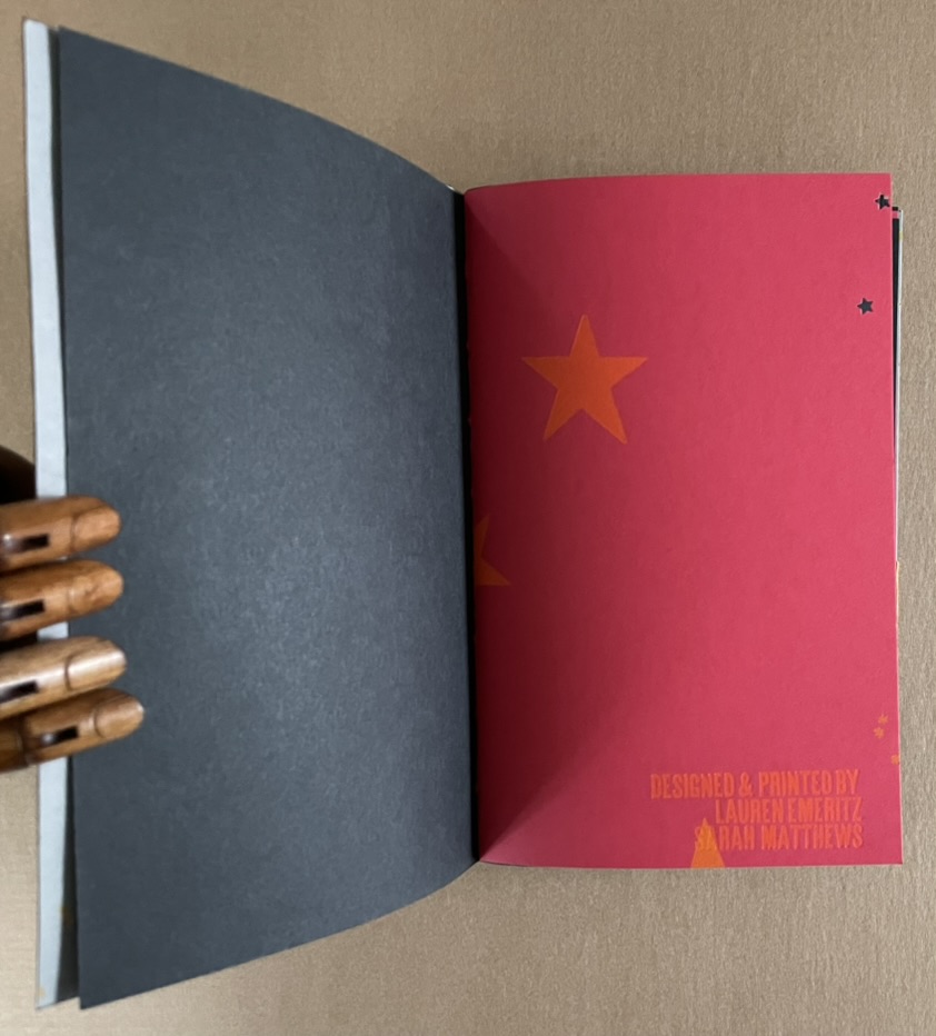
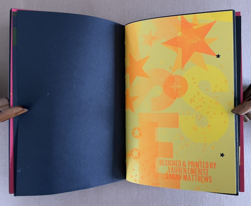
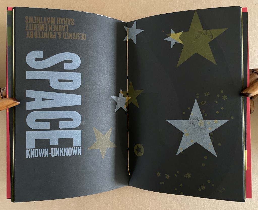
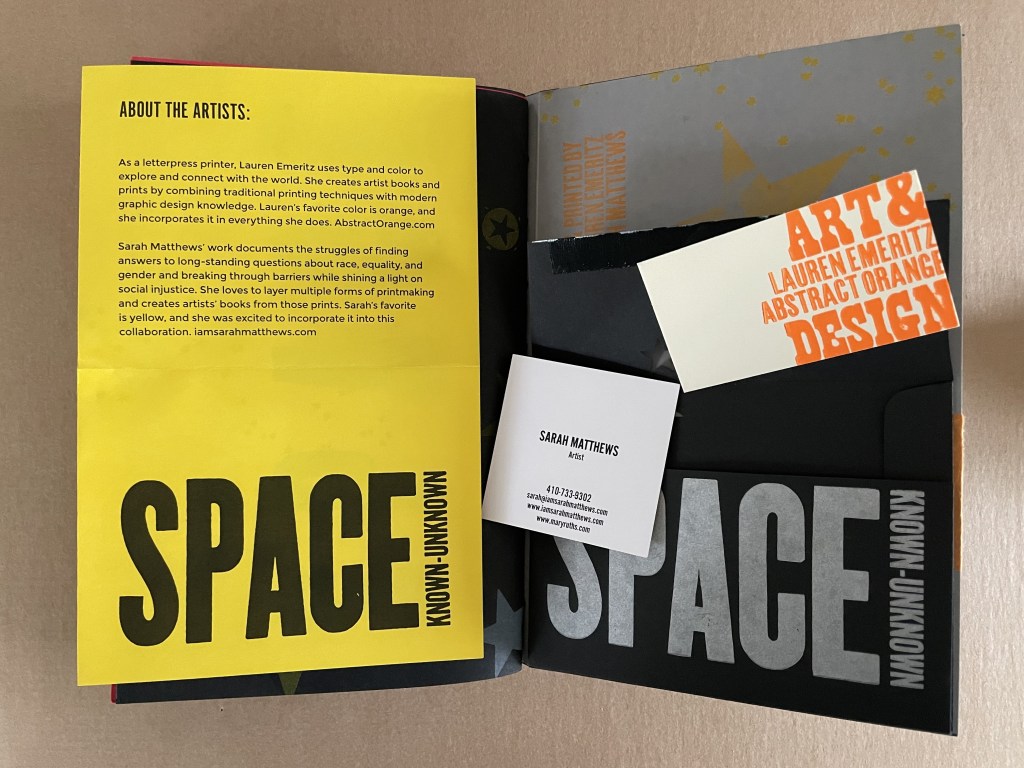
SPACE: Known / Unknown Lauren Emeritz & Sarah Matthews Box with pastedown title enclosing softcover book. Box: 237 x W157 x D50 mm. Book: H230 x W150 x D25 mm. 48 pages and loose 4-page colophon in envelope attached to inside back cover. Edition of 15, of which this is #5. Acquired from Sarah Mathews, 6 August 2024. Photos: Books On Books Collection.
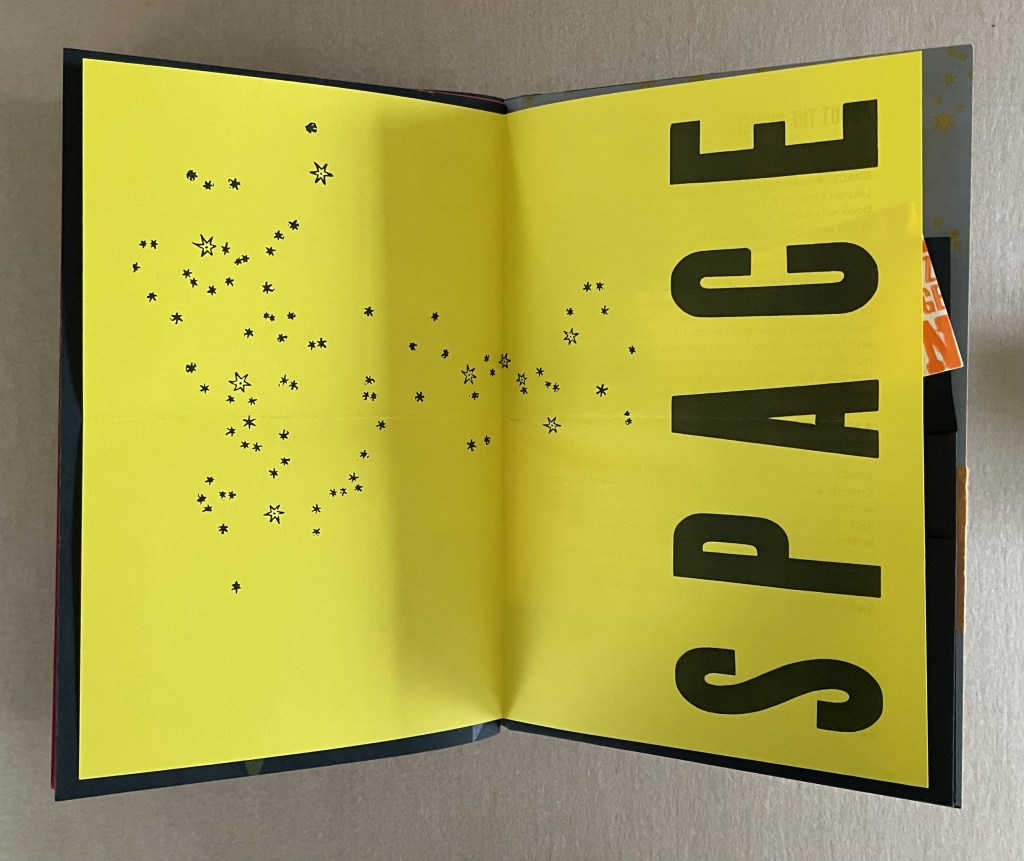
A collaborative project between Lauren Emeritz & Sarah Matthews, SPACE: Known/Unknown features three telling quotations:
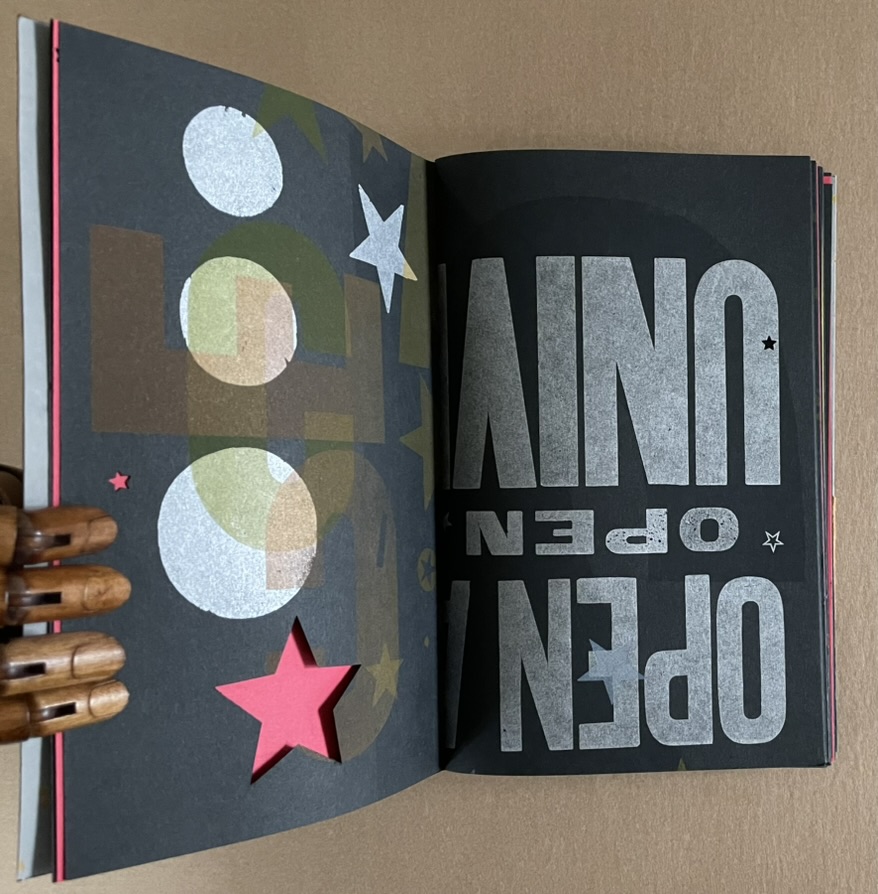
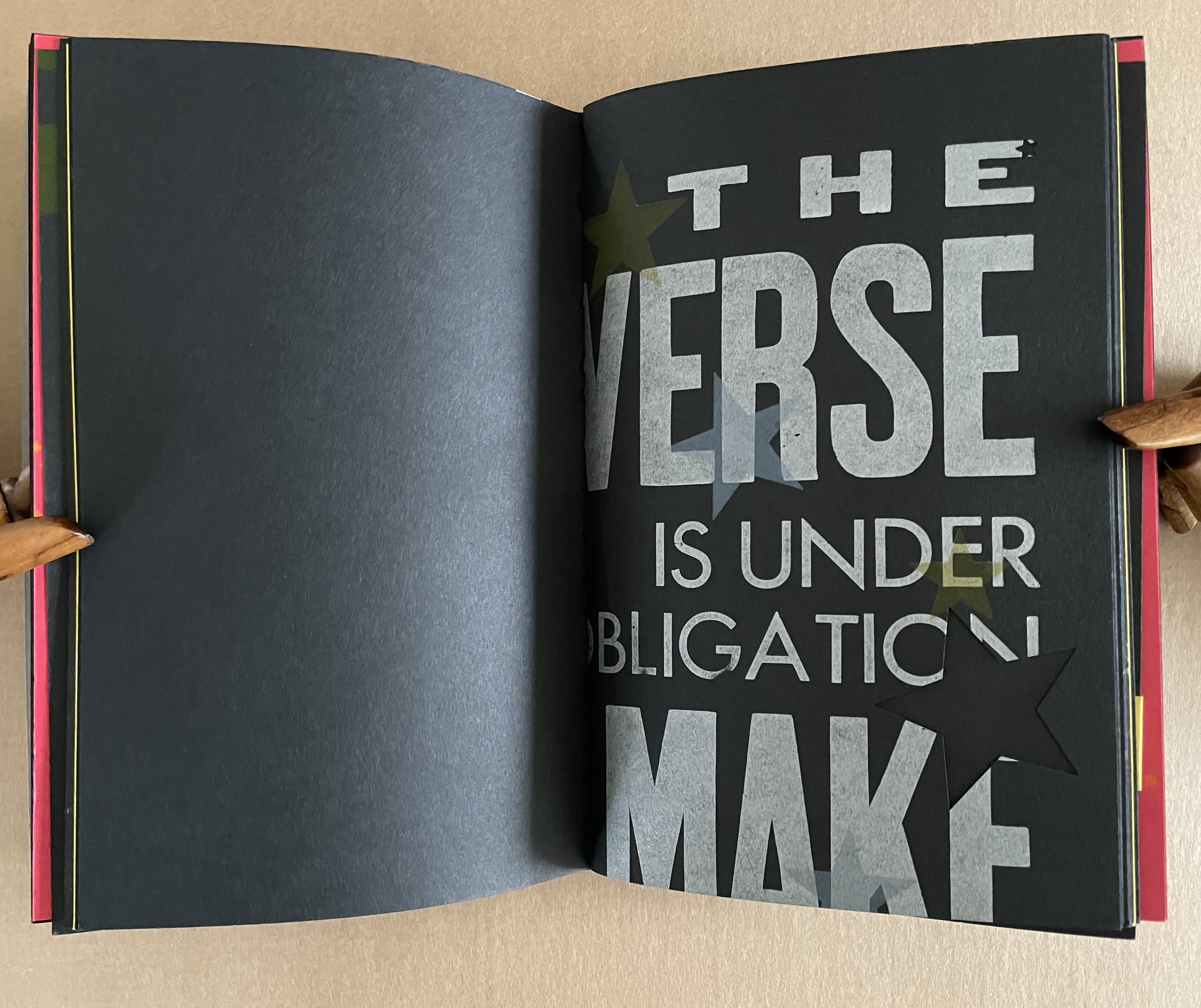
“Open a book, open the universe”– Unknown “We are made whole by books, as by great space and the stars” — Mary Carolyn Davies “The Universe is under no obligation to make sense to you” — Neil deGrasse Tyson
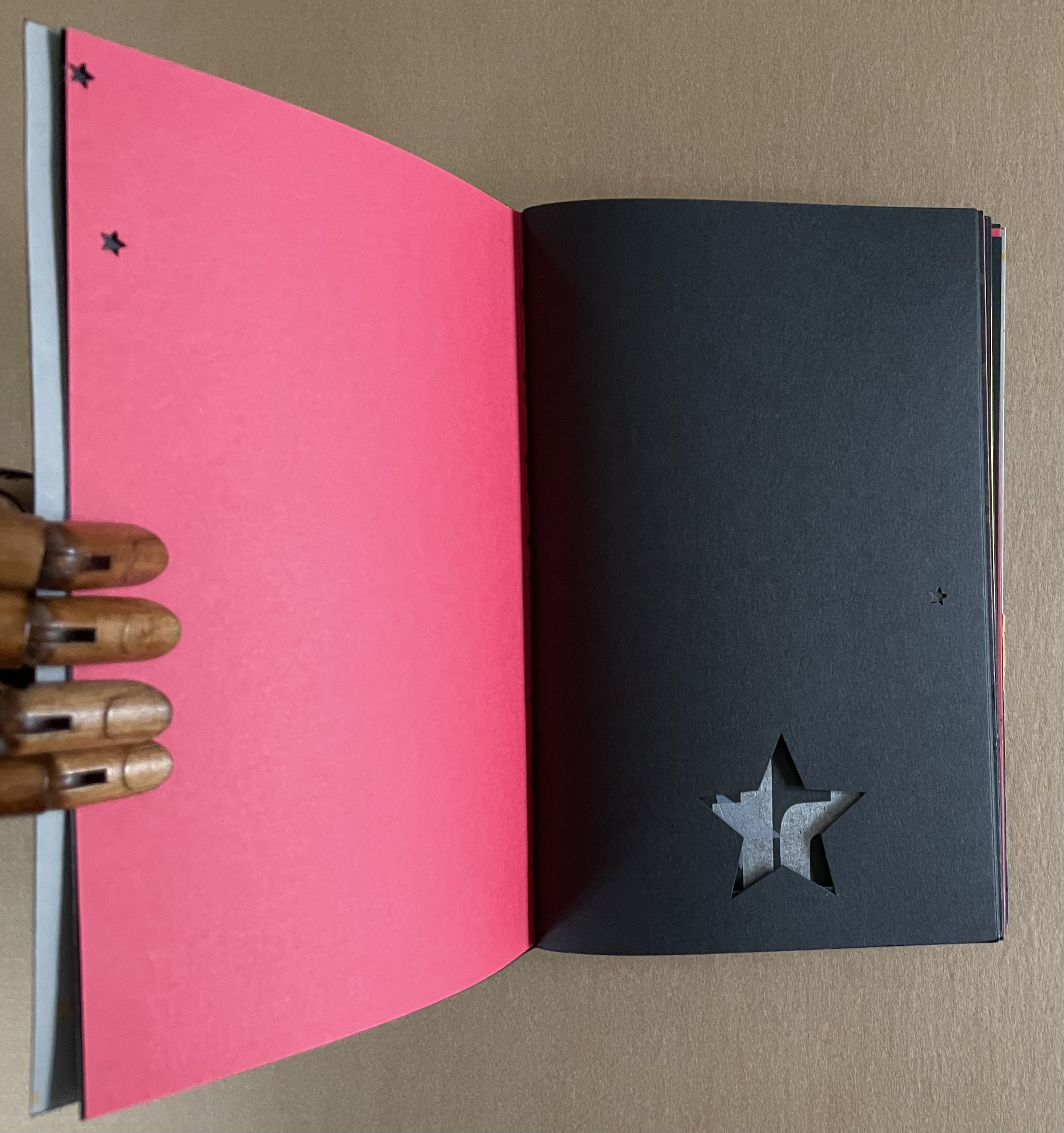
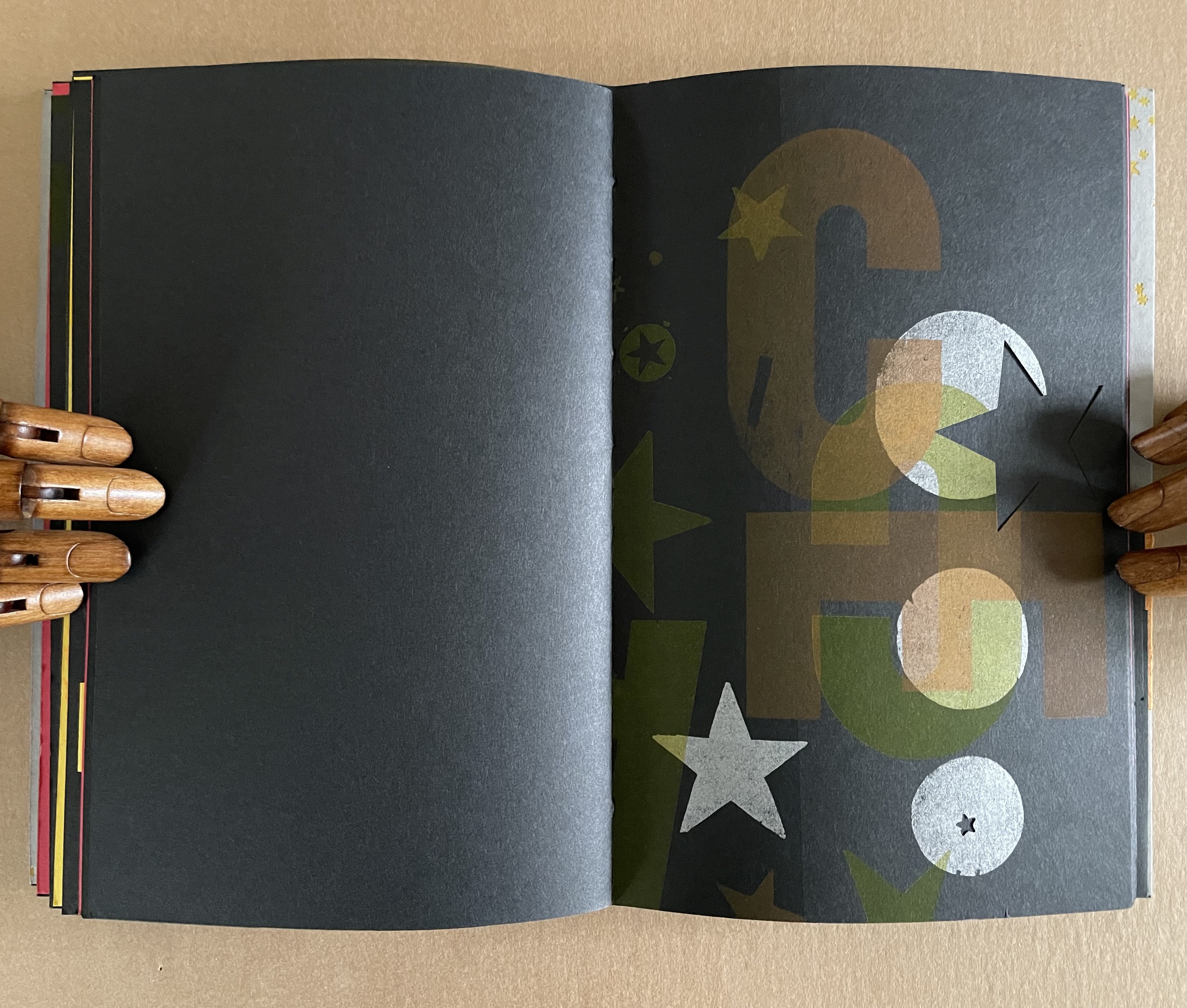
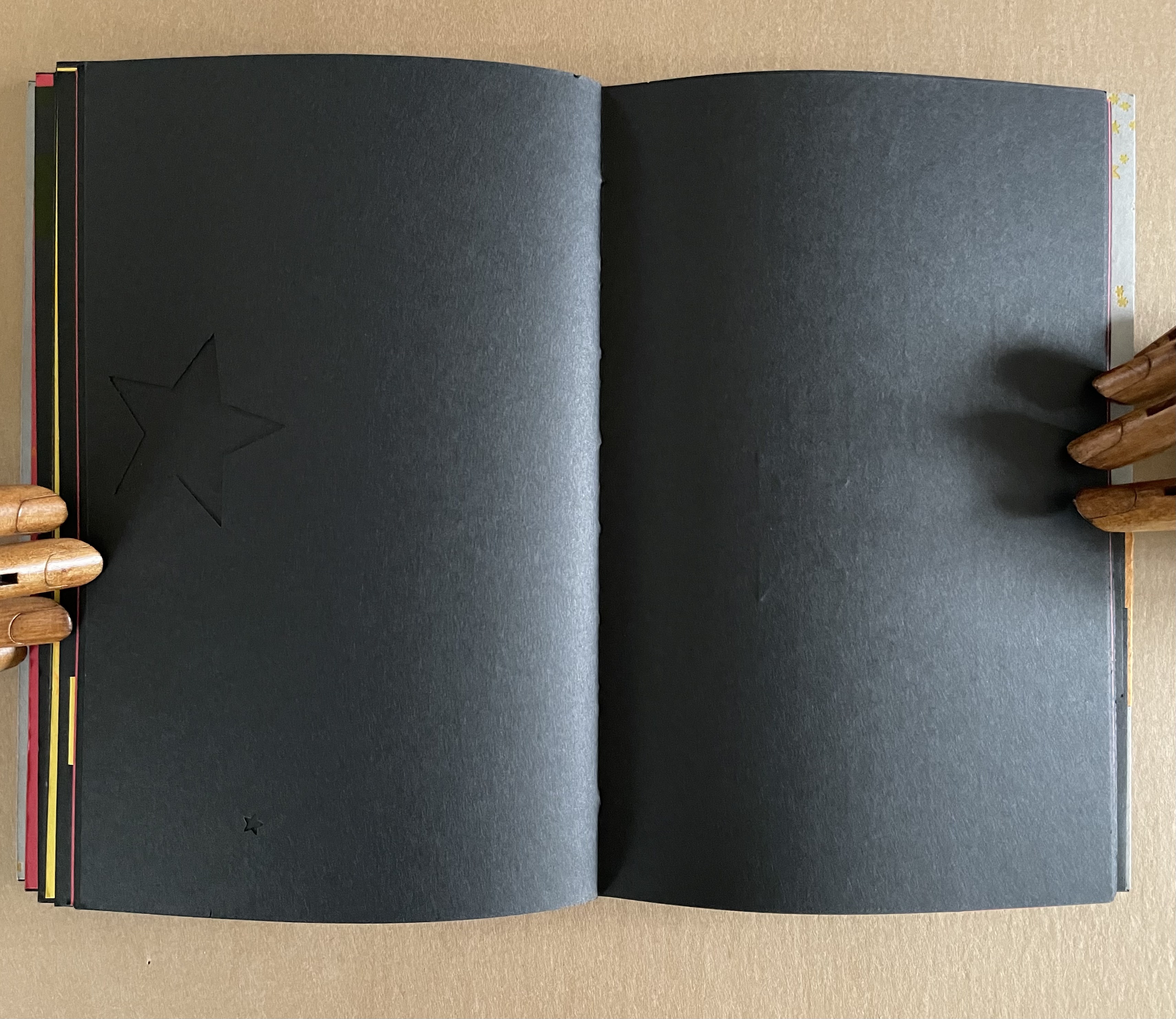
The universe of this artist’s book is that of letterpress, handcarved letters, wood and metal type, embossed printer labels, multiple inks and foil stamping, die cuts, paper engineering, and multiple binding structures. This and its crazy quilt imposition make it a lively universe to explore, and it certainly lives up to deGrasse Tyson’s quip.
Does this book subscribe to the “argument by design” made by Socrates and St. Thomas Aquinas?
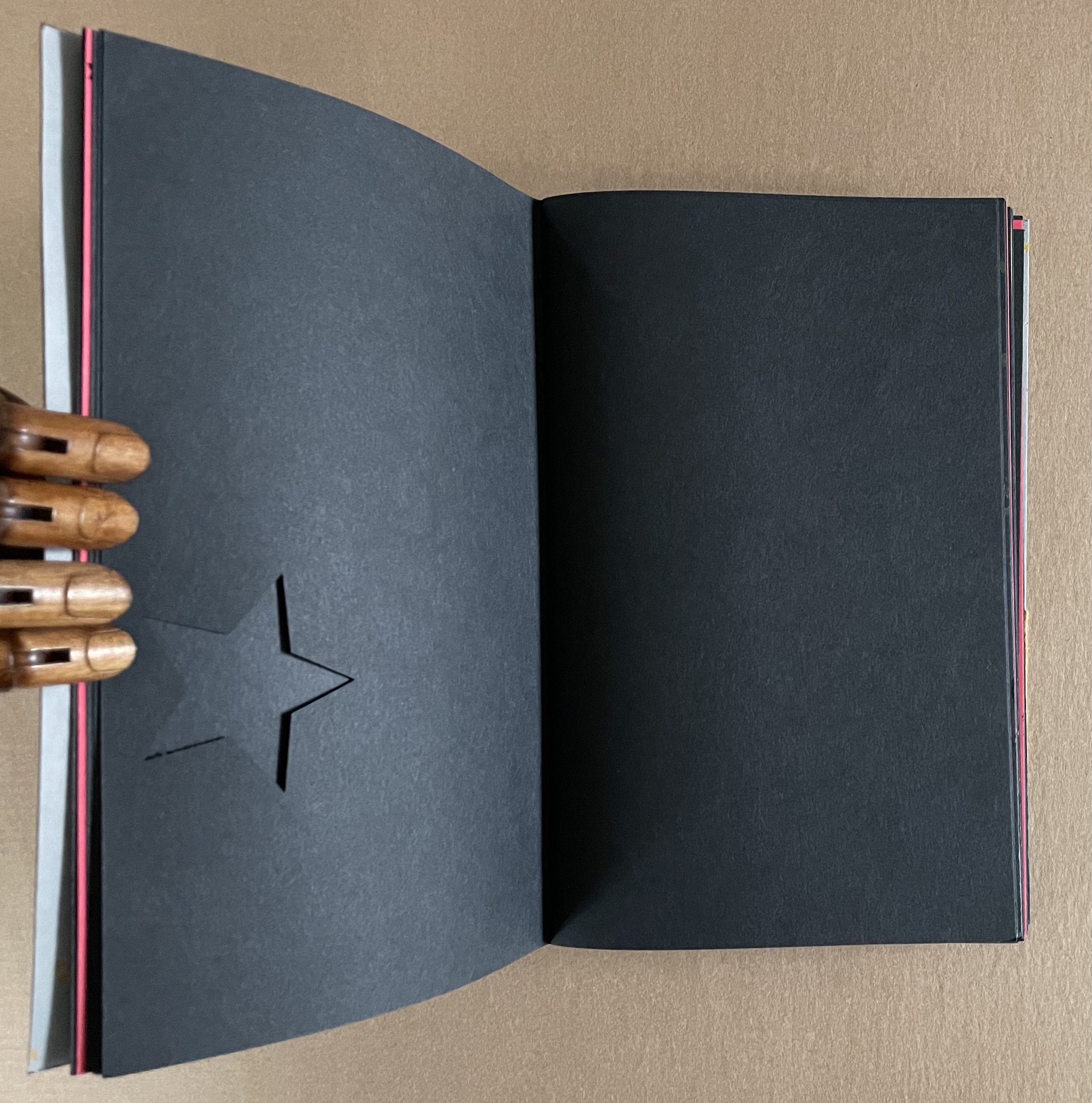
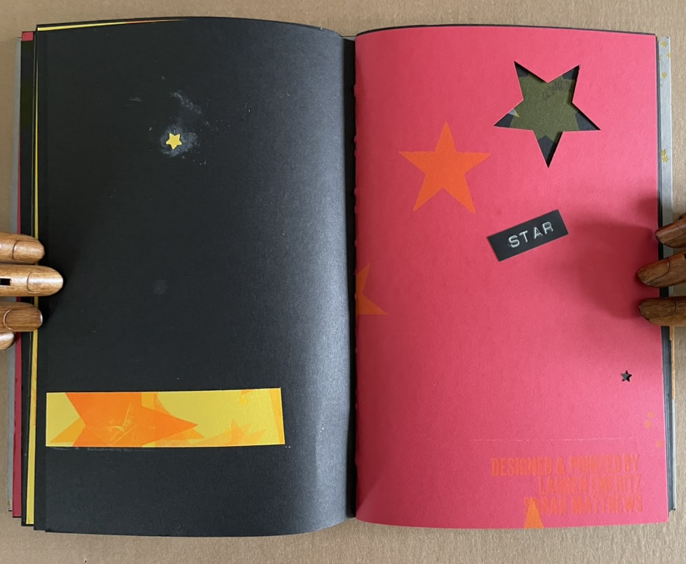
A universe in which page layout turns one way and then another is under no obligation to make sense.
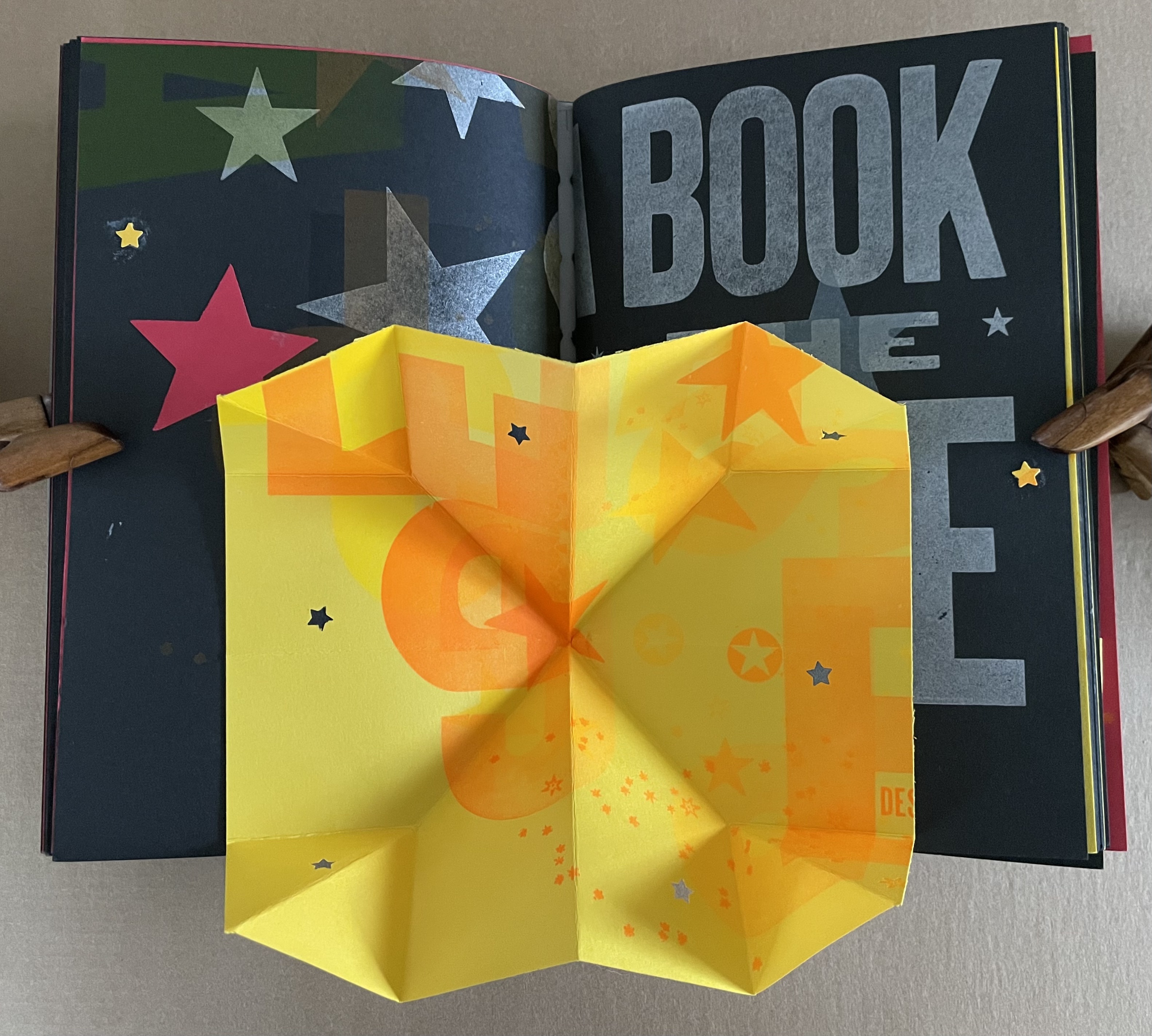
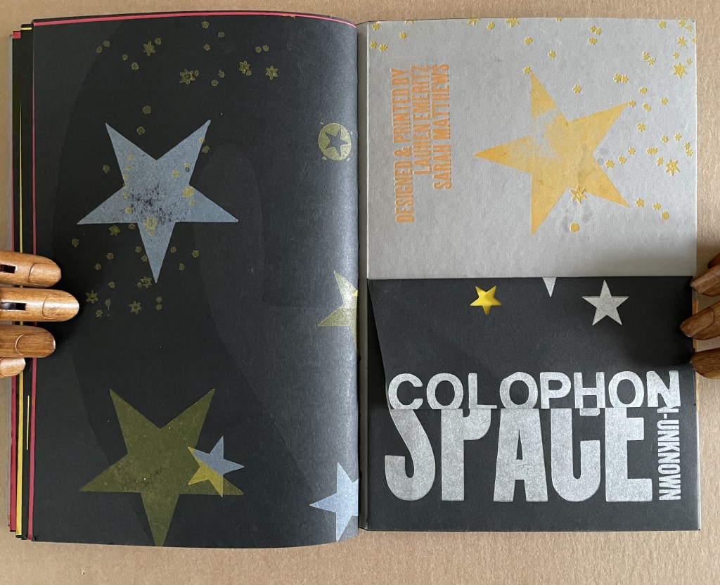
A Turkish fold of constellations.
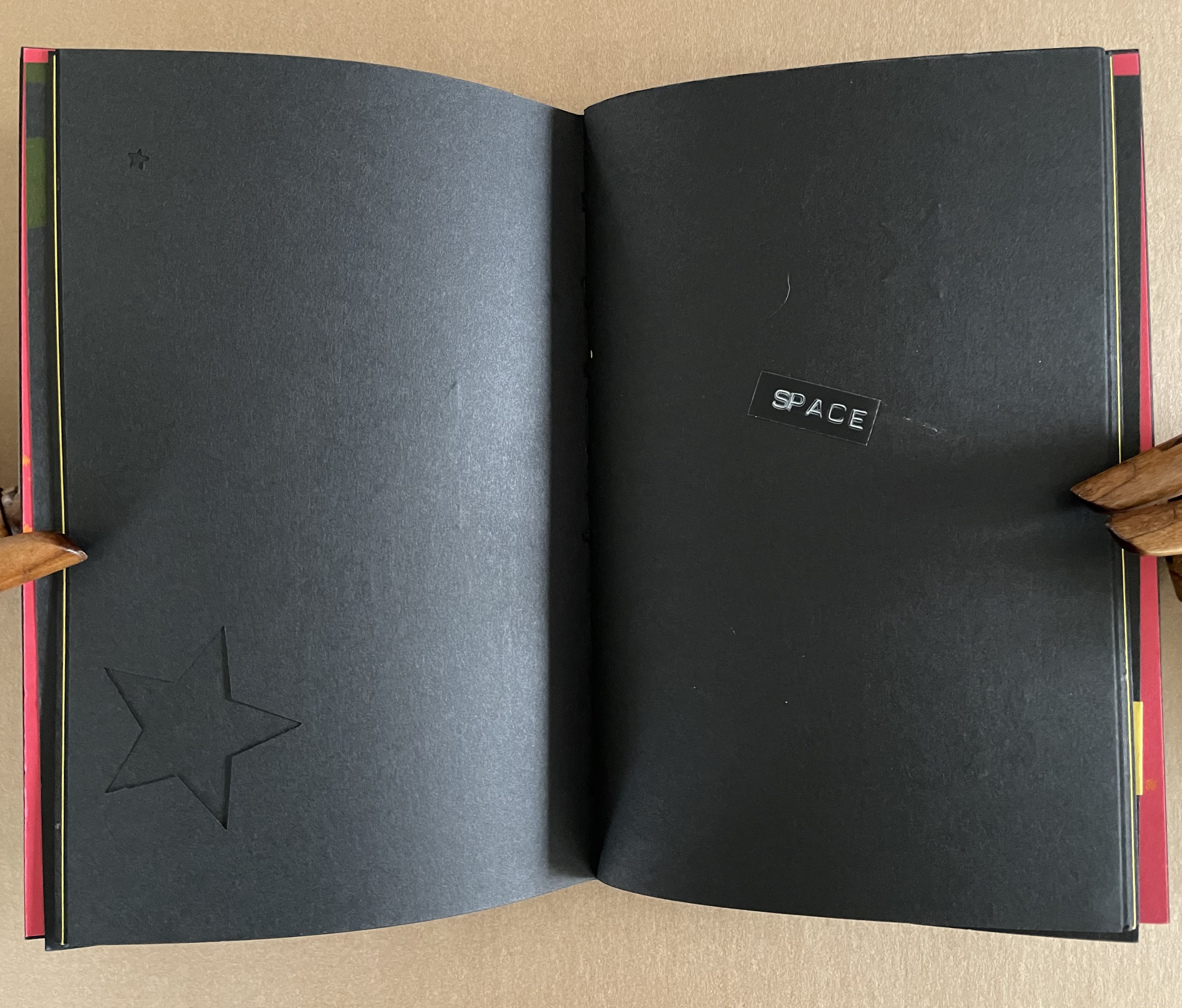
The artists must have traveled back in time to include one of these embossed sticky labels.
The universe and title page can appear in multiple places — even in the middle.
A sunburst — and then star label in case we missed it?
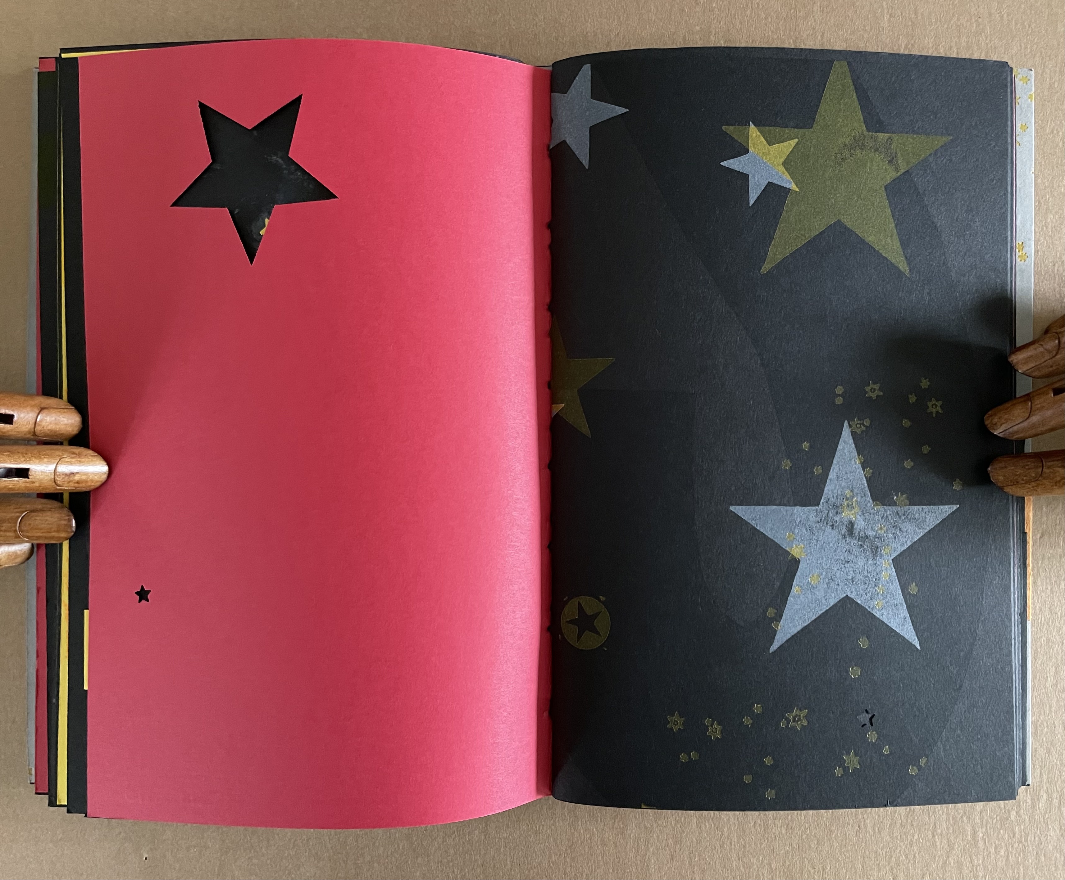
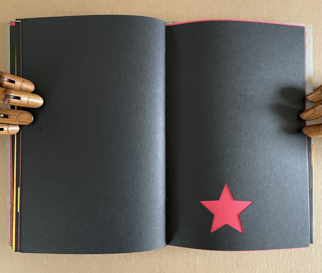
A multi-color galaxy of ink leads to die-cut black stars (or holes?).
Not exactly a dwarf red star, but it’s the artists’ universe, they get to decide.
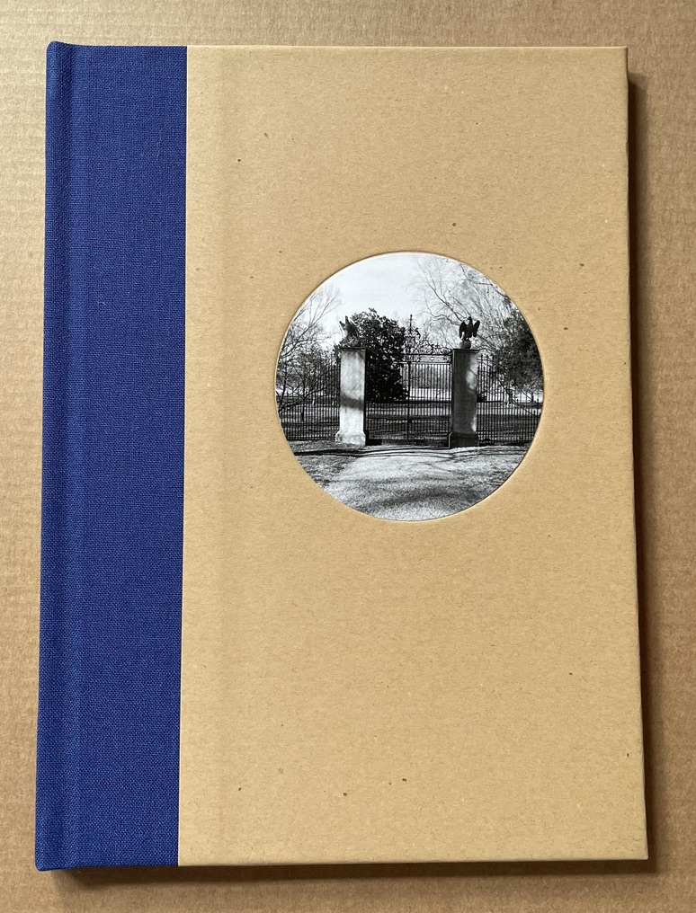
Monument (2018) Carrie Mae Weems Casebound hardback, cloth spine. H210 mm x W153 mm. [16] pages. Includes a duotone original print signed by the artist. Edition of 500, of which this is #455. Acquired from Nazraeli Press, 22 February 2021. Photos of the work: Books On Books Collection.
Africa: Gems and Jewels (2021)
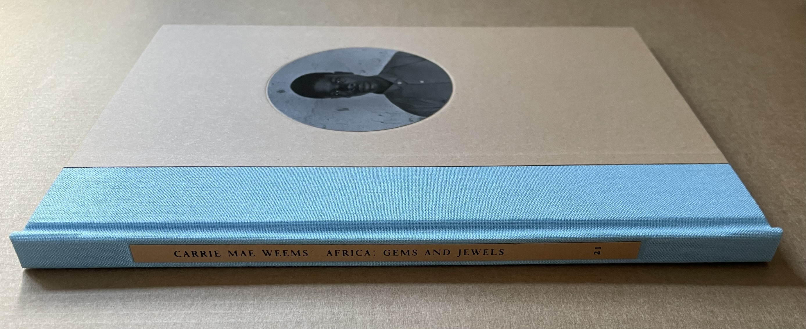
Africa: Gems and Jewels(2021) Carrie Mae Weems Casebound hardback. H210 mm x W153 mm. [16] pages. Includes an original print signed by the artist. Edition of 500, of which this is #490. Acquired from Nazraeli Press, 22 February 2021. Photos of the work: Books On Books Collection.
These two works by Carrie Mae Weems appear in the second round of the Nazraeli Press subscription series entitled “One Picture Book”. In its statement about the first round, which topped out at 100 books, the publisher explains the series: “The series consists of uniformly designed, modestly-sized hardcover books, comprising 16 pages that serve as a “canvas” for the artist to display one cohesive body of work”. As in both series, “picture” means “photograph”, the results could amount to catalogues, notebooks or photobooks. The phrase “one cohesive body of work” and the reference elsewhere to the works as “artists’ books” indicate that the publisher has more in mind. Weems’ two volumes rise to the intention. They stand on their own but also capture elements of the artist’s larger body of work.
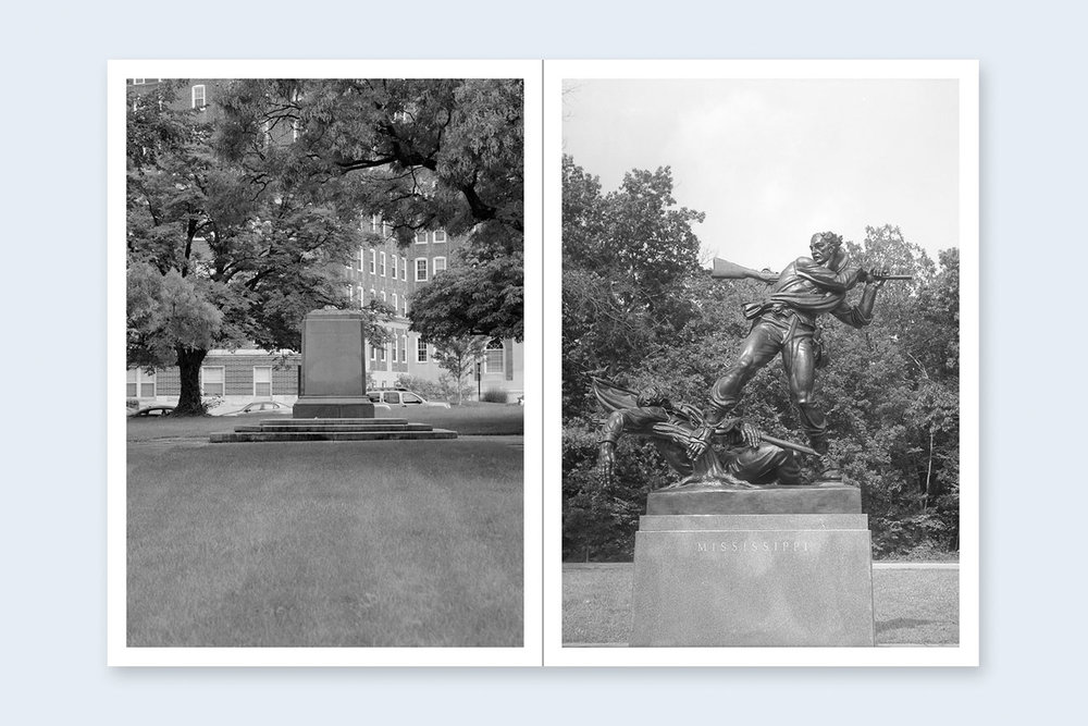
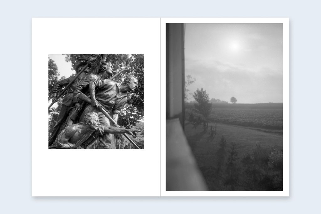
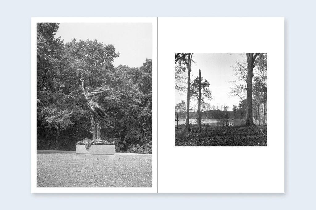
In Monument, the pages alternate between memorials to the Confederate dead and empty plinths from which they have been removed. It builds on three installation series: The Louisiana Project (2003), Museums (2006), Roaming (2006). All of these series are covered in the October Files book mentioned below. In each of these three series, Weems stands mostly with her back to the camera. In the first series, she gazes on and poses in various antebellum mansions; in the second, she stands dressed in a soutane-like black dress and, always with her back to us, gazes on museums; and in the third, in the same dress and same stance, gazes on ruins of ancient Rome. In The Louisiana Project, the stance speaks of dancing on the grave of exclusion — “the ruins of your remains”. In Museums, it speaks of possible inclusion but segregation. In Roaming, the stance speaks of 21st century Blackness in confrontation with empire. In those series, her presence forces the viewer to take her into account — into context.
In Monument, Weems is behind the camera. She relies on the absence and presence of the sculptures to convey her perspective. In two particular images without any monument — one of a plantation field and one of swamp land — absence is entirely the point; these are the places slaves died. A much earlier series — Slave Coast(1993) — comes closer to Monument in her physical absence in general and these two images in particular. The places where captives were once held awaiting shipment into slavery are presented under blazing sunlight or dark inside shadows and starkly empty. Unlike Monument, though, posters label the images with place names whose ambiguity, if any, disappears with one poster’s warning: GRABBING SNATCHING BLINK AND YOU BE GONE.
The power of architecture is extraordinary — the power of places that we are, or are not, invited into. Architecture defines for us. It tells us what a building means and to whom it belongs. — Carrie Mae Weems “Identity, Relationships & More” Crystal Bridges Distinguished Speaker Lecture, Crystal Bridges Museum of American Art, 8 December 2017
Absence and presence are used to assert the artist’s perspective just as strongly as her turned back does in the three later series. That power of perspective through absence and presence is what Weems deploys against this power of architecture. But the display of Weems’ name at an installation or on a book like Monument makes the reader well aware whose perspective is being asserted. What if the images of Monument appeared somewhere without attribution? If they were displayed along the corridors of a courthouse, hospital, state or municipal building, would the viewer register the weight of the absences and presences? More than likely, it would depend on the particular viewer’s sensibilities and ability to recognize them for what their presence or absence are to others — reminders of the “Lost Cause” or reminders from the Jim Crow era erected to memorialize a fight for slavery.
“In the earlier 90s after traveling throughout the Sea Islands on the Southeast Coast on the United States, I decided that it was time to go home, back to Africa. There was something that I needed to know about the nature of myself. In love with customs, beliefs and material cultural, I made many pictures, but only a … handful of people. The portraits for Africa: Gems and Jewels are that handful.” — Carrie Mae Weems
Like those from the installation Colored People, the portraits in this book are presented through lens filters of yellow, green, violet, blue and sepia. In both cases, the filters play off the titles of the works. Is the artist nudging us to recognize that we cannot be colorblind, that color gives color to the subject, that we may only recognize gems and jewels if we know what is filtering our perception?
Given how Weems modulates subject, composition, technique, text and platform in Monument and Africa: Gems and Jewels to lift them from simply a photobook to artist’s books, it is surprising that there seem to be no artist’s books associated with the installations of Colored People or From Here I Saw What Happened and I Cried. By no means does Weems always simply nudge with her technique. The blood red filters and text over the portraits in From Here I Saw What Happened and I Cried land hard. The chance to pore over those nudges and shoves is something an artist’s book would provide.
Further Reading
“Tia Blassingame“. 17 August 2020. Books On Books Collection.
“Sarah Matthews“. Books On Books Collection. In progress.
“Arial Robinson“. 15 May 2023. Books On Books Collection.
“Clarissa Sligh“. 2 September 2020. Books On Books Collection.
“Kara Walker“. Books On Books Collection. In progress.
Lewis, Sarah Elizabeth, ed. 2020. Carrie Mae Weems. Cambridge, Massachusetts: The MIT Press. See especially “Diasporic Landscapes of Longing (1994)” by bell hooks, pp. 15-23.
Weems, Carrie Mae et al. 2023. Carrie Mae Weems : Reflections for Now. Ed. by Raúl Muñoz de la Vega, Florence Ostende, and Maja Wismer. Berlin: Hatje Cantz. See especially the sections entitled “Constructing History” and “Architecture & Power”.
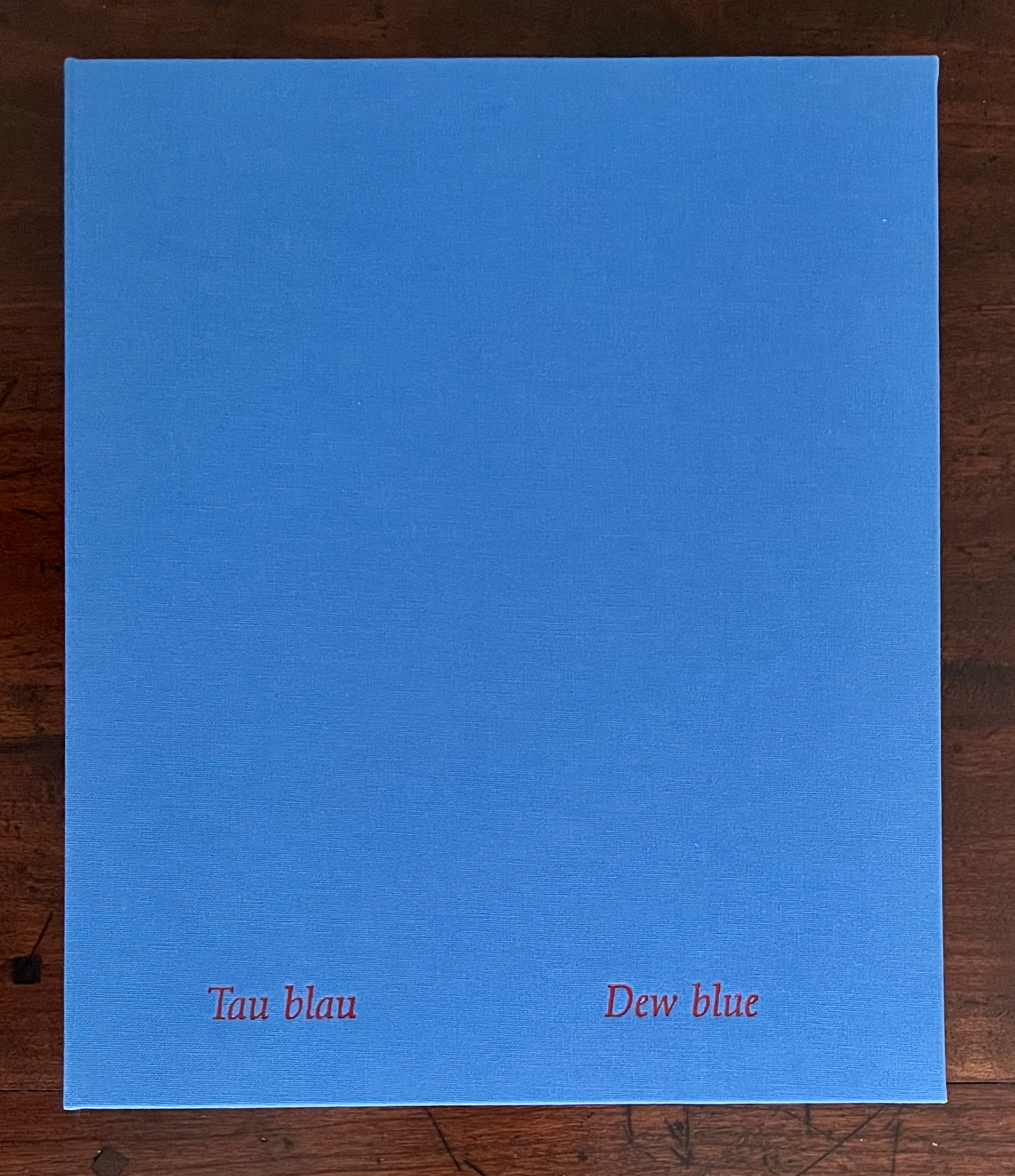
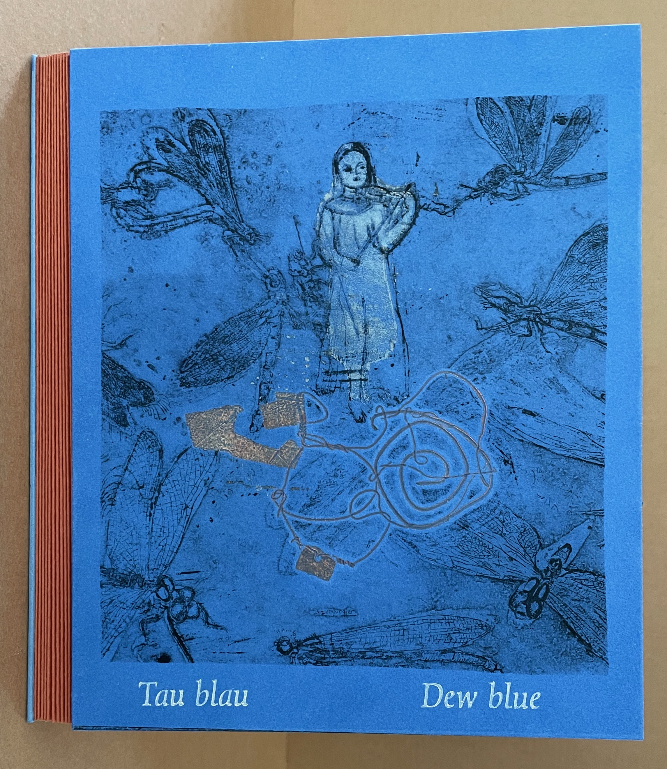
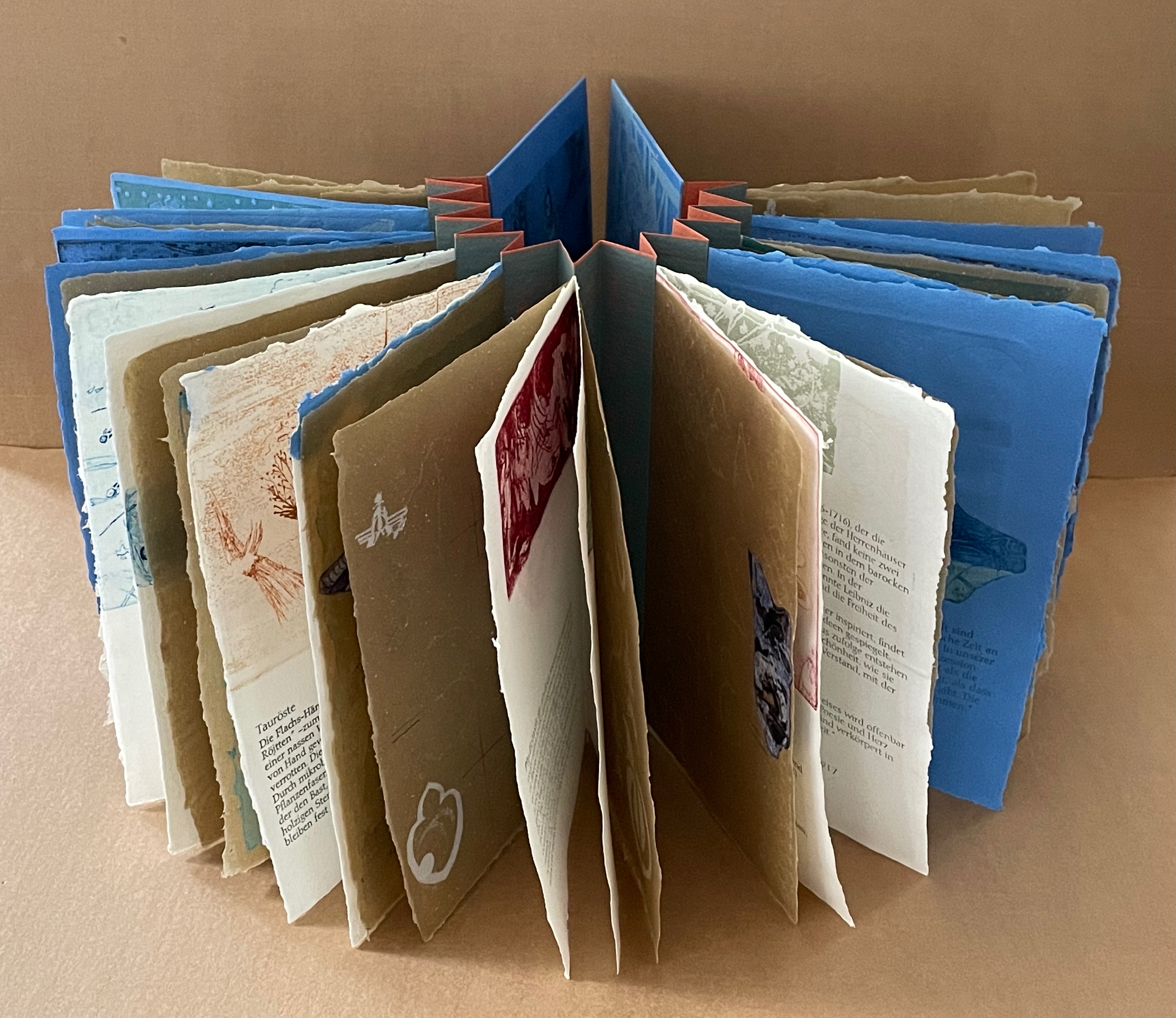
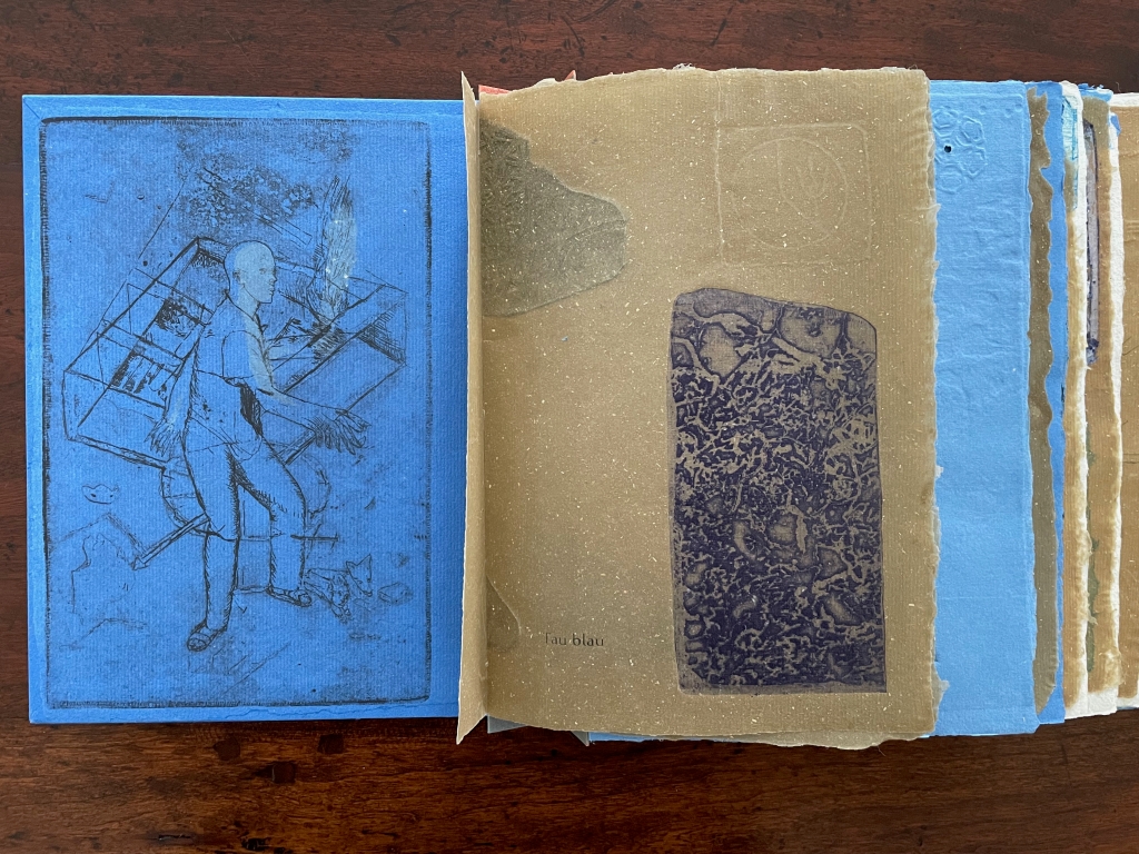
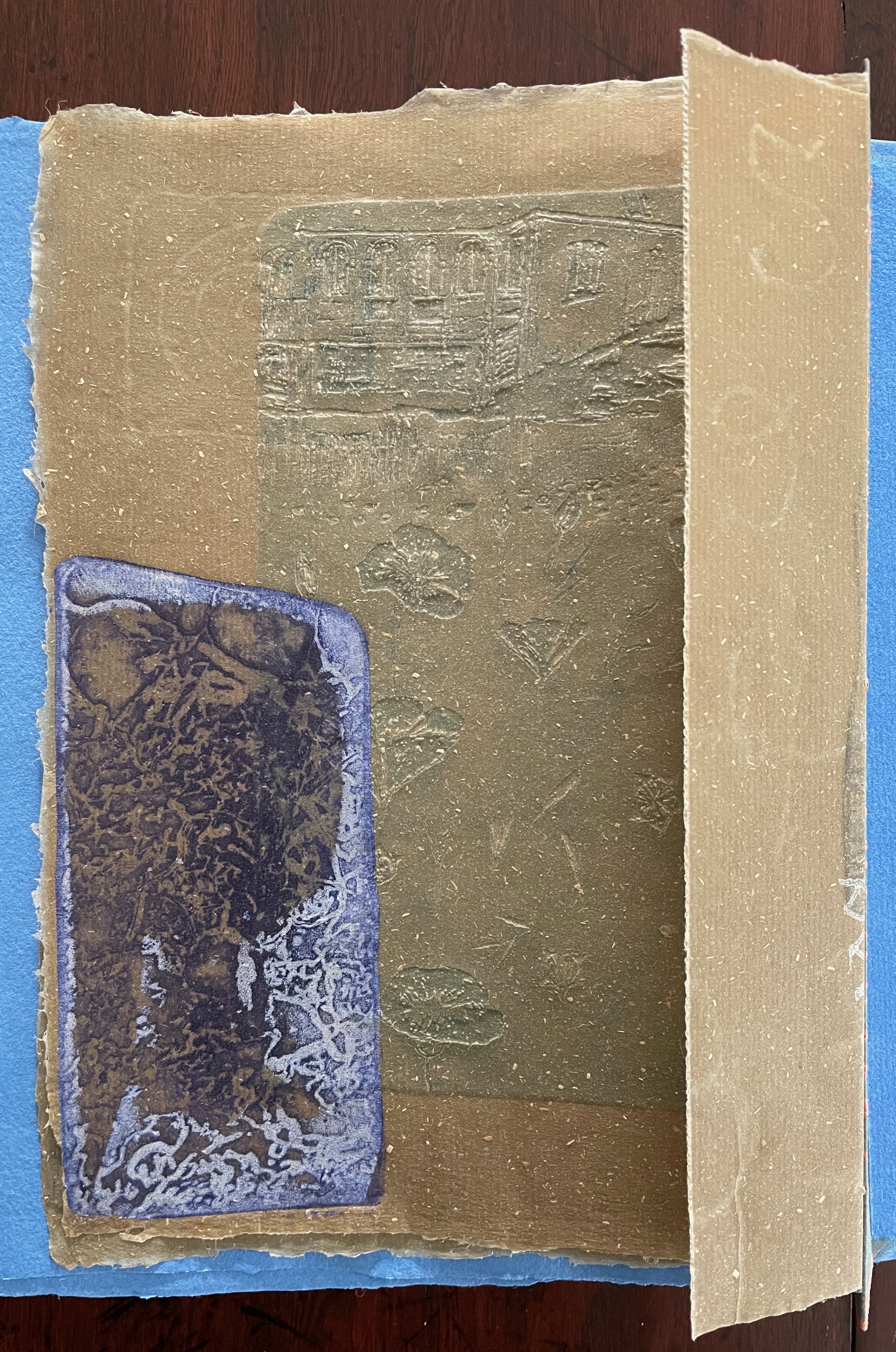
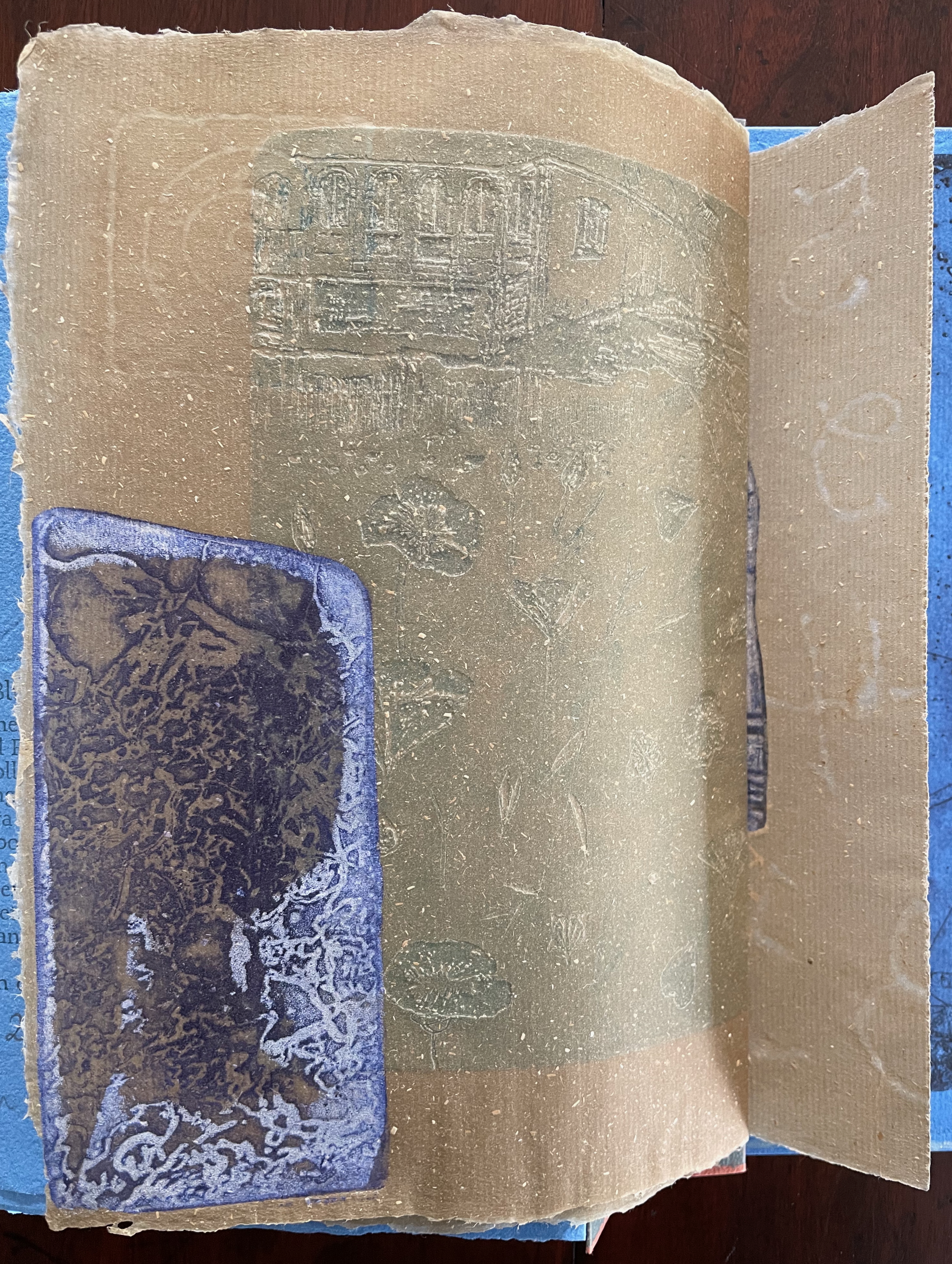
Tau blau / Dew Blue (2013) Barbara Beisinghoff ; Solander box in linen, handbound Vera Schollemann; Flax paper, handmade by John Gerard. Solander box: H240 x W200 x D32 mm. Flagbook: H220 x W180 mm. Edition of 38, of which this is #22. Acquired from the artist, 30 December 2024. Photos: Books On Books Collection.
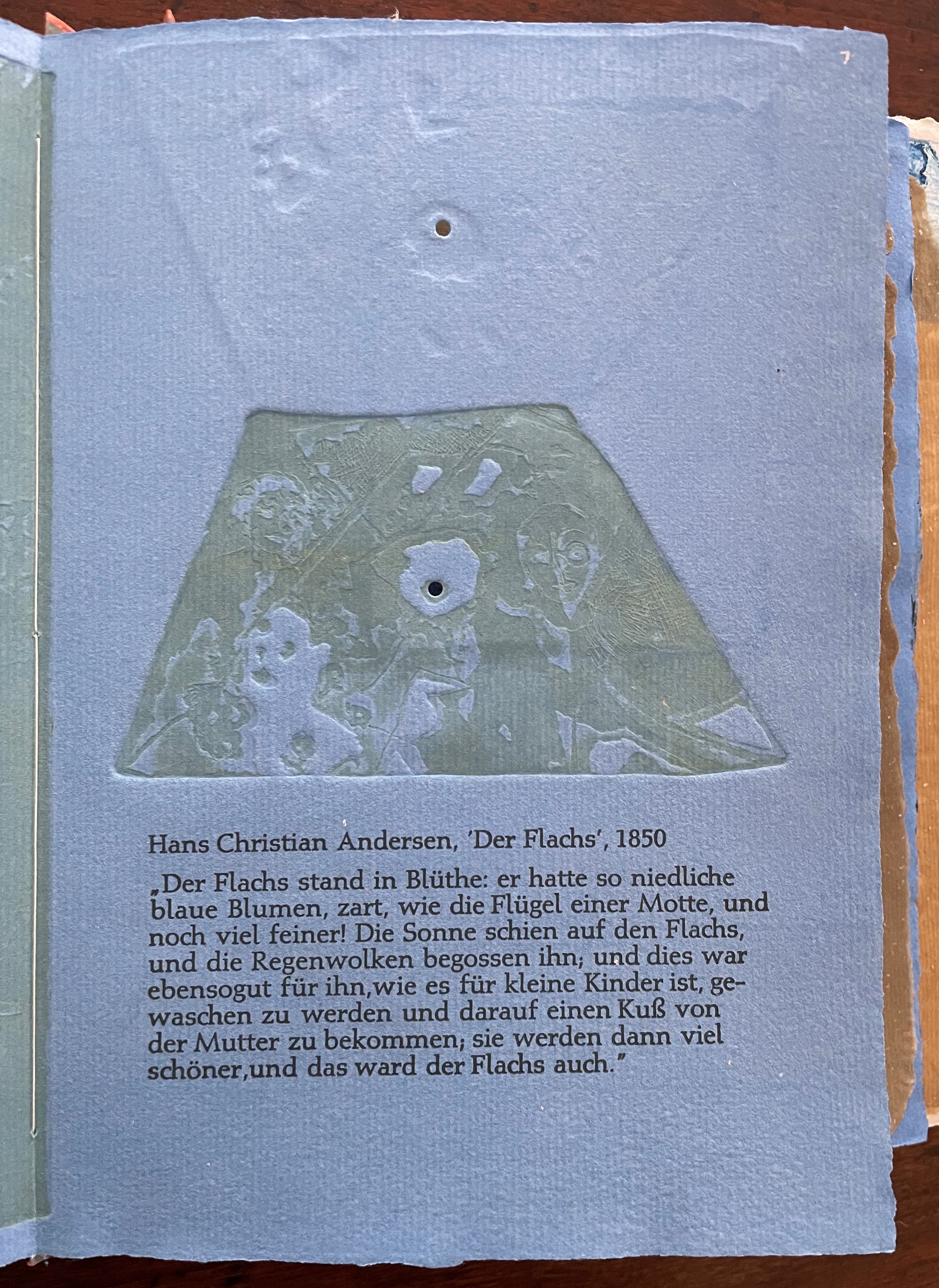
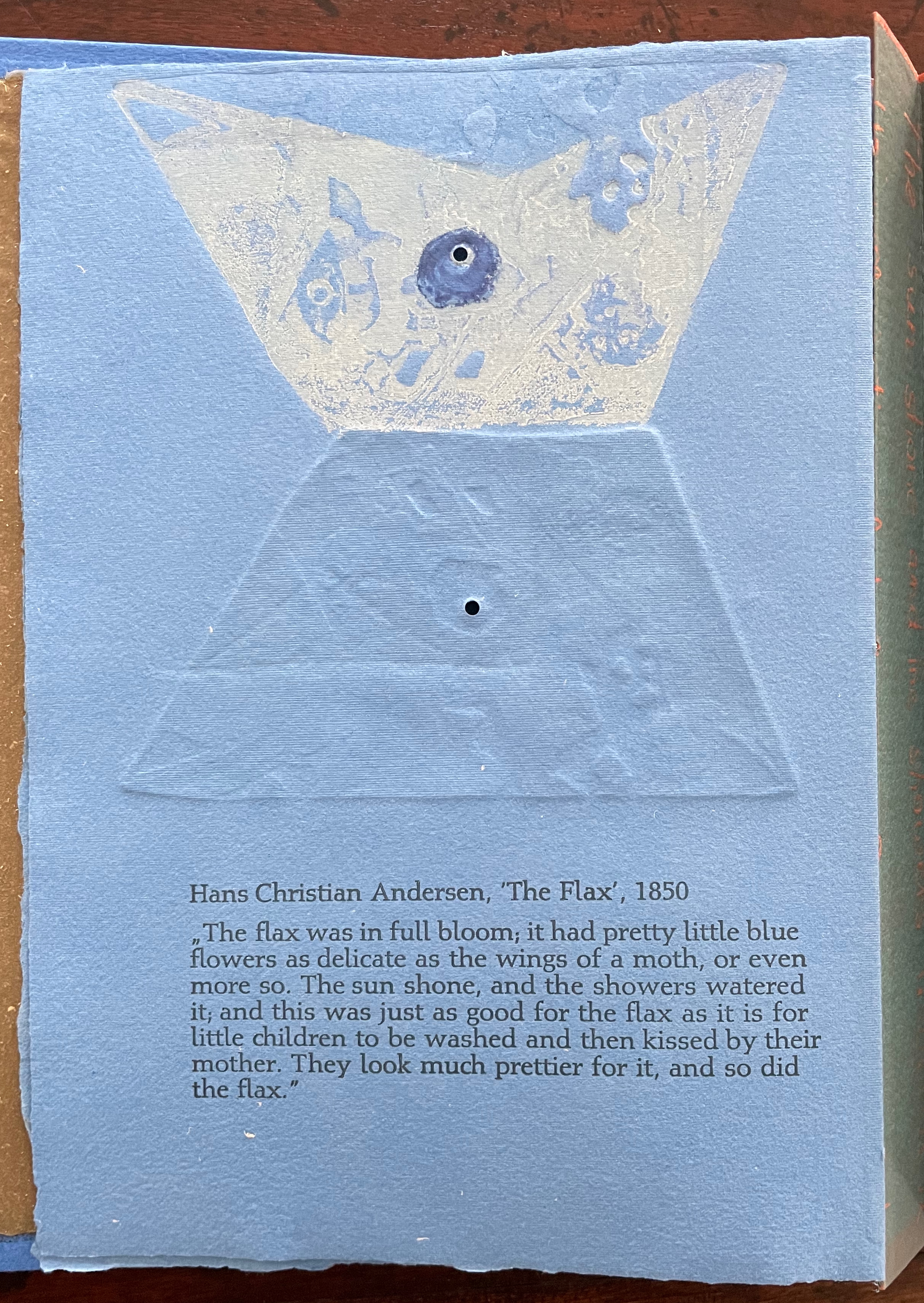
Familiarity with Hans Christian Andersen’s fairy tale Hørren /The Flax enhances appreciation of Barbara Beisinghoff’s Tau blau / Dew Blue. Andersen gives a voice to the plant that expresses its joy, pain, hope and observations at each stage of its blooming, being harvested, turned into linen and clothing then paper, and finally consigned to flames. The H.C. Andersen Centre offers Jean Hersholt’s translation of it here.
Only the opening paragraph of the story appears in Tau blau / Dew Blue, but Beisinghoff documents and illustrates the stages from her own cultivation of flax, observation of its growth and preparation of its processing. And with the etching, drawing, watermarking, handmade papers, linen cloth and thread, and binding structure, Beisinghoff suffuses the spirit of the tale’s metamorphosizing plant throughout the whole of Tau blau / Dew Blue.
From the blue of the plant’s blossoms to the white of its change into linen and paper to the red, burnt orange and black of its sparks and ash when it is consumed by fire in the end, all of the story’s colors are replayed across Tau blau / Dew Blue from its Solander box to its covers and spine like motives in a Baroque musical piece.
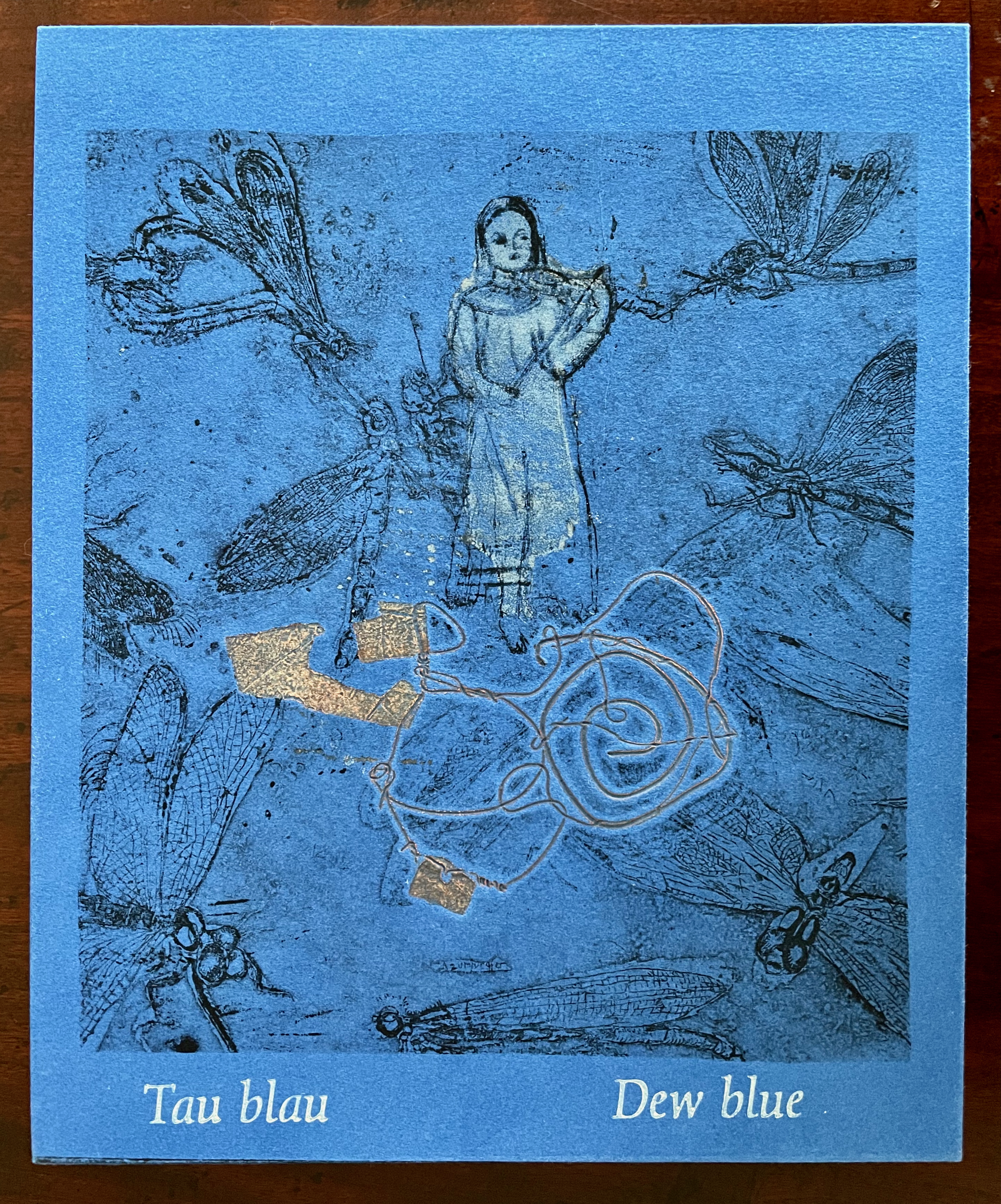
In a concerto, motives play off one another and develop. In Tau blau / Dew Blue, the motif of nature (the plant) plays off the motif of artifice and the manmade (the fairy tale, music, linen, paper, etc.). On the front cover (above), a young girl, surrounded by large damselflies, plays a fiddle or violin and seems to hover above a silver foil image of flax thread and tools for making it. In the spread above alongside the front cover, the specks rising over the staves and musical notes (a recurring motif in itself) recall the tale’s final passage in which the bundle of papers (made from linen rags) is cast into a fire:
“I’m going straight up to the sun!” said a voice in the flame. It was as if a thousand voices cried this together, as the flames burst through the chimney and out at the top. And brighter than the flames, but still invisible to mortal eyes, little tiny beings hovered, just as many as there had been blossoms on the flax long ago. They were lighter even than the flame which gave them birth, and when that flame had died away and nothing was left of the paper but black ashes, they danced over the embers again. Wherever their feet touched, their footprints, the tiny red sparks, could be seen.
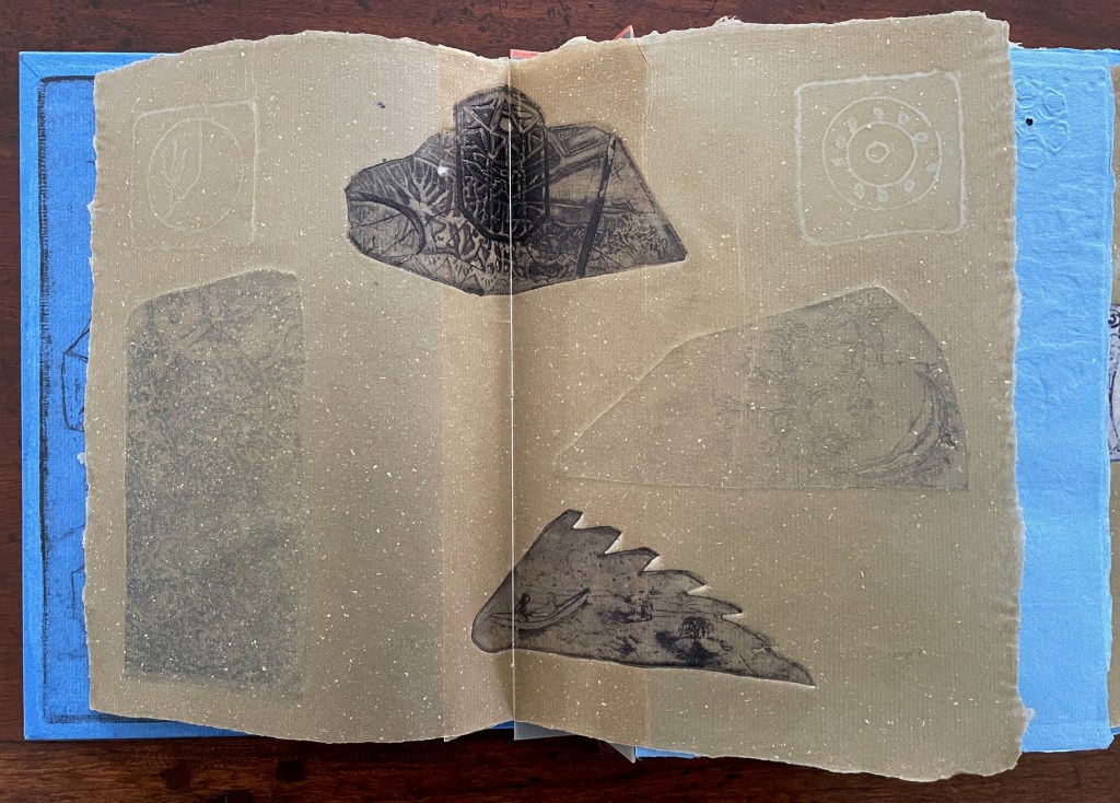
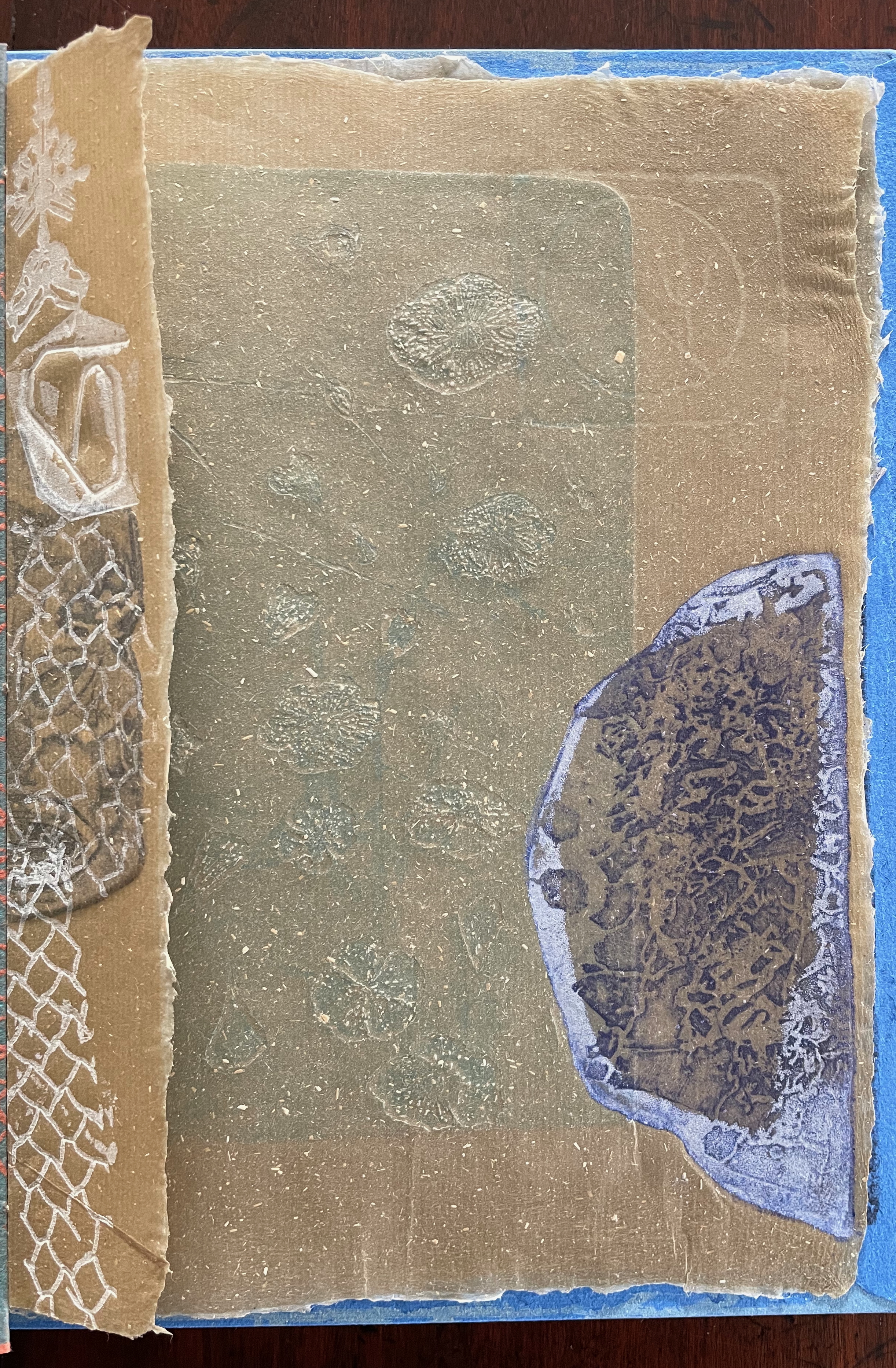
Images of tools — whether for preparing flax or for making the products from it — also recur on the inside of the front and back covers and throughout the book. The human figures alongside the tools, however, appear engaged in more than manufacturing. Elsewhere in the book, they dance, they sit and meditate or write, they row on ponds beside the growing flax. The fairy tale, too, has these Romantic juxtapositions of nature, art and craft. So, again, the spirit of Andersen’s tale finds another way into Tau blau / Dew Blue.
Inside front and inside back covers.
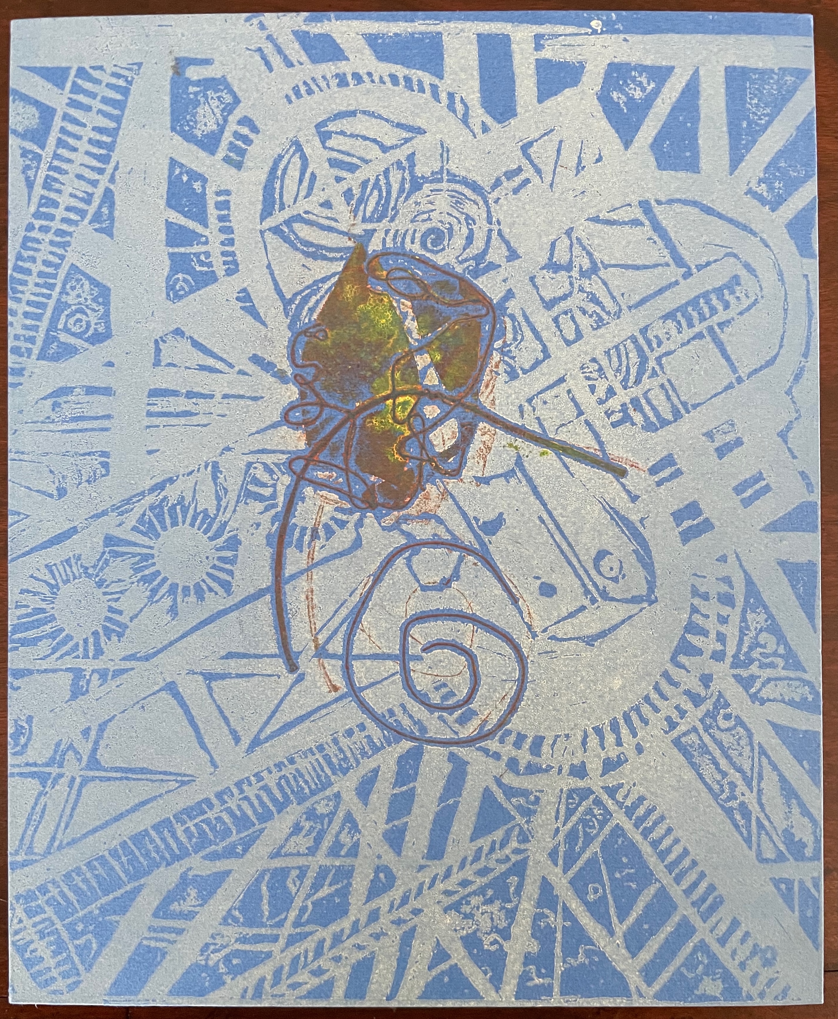
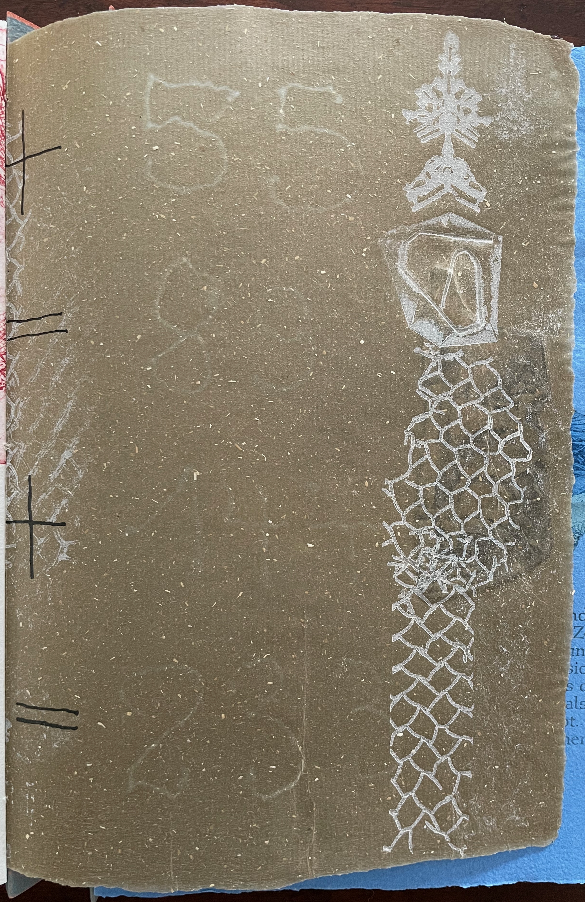
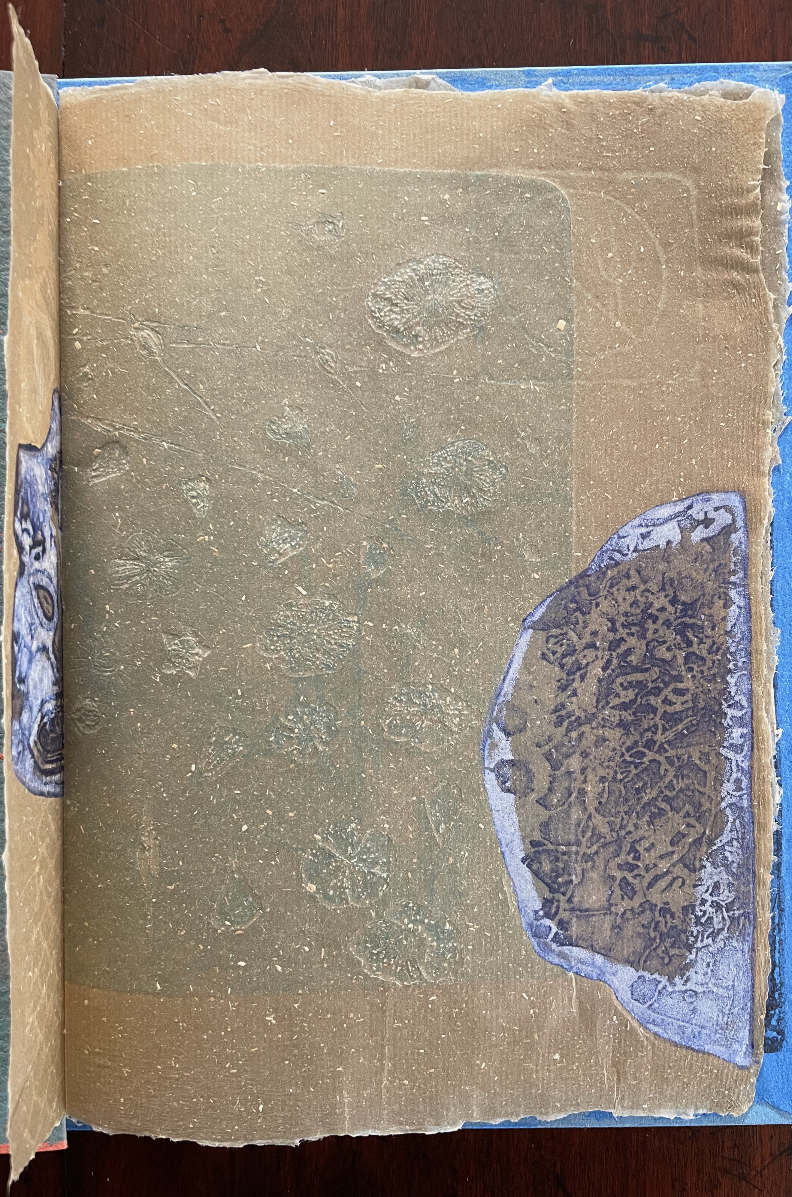
The front cover also announces another motif in those coils of thread below the young girl’s feet. Within the coils is the image of a Fibonacci spiral, which appears on the back cover and throughout the book in different ways. It can be found drawn and printed. It can be found in watermarks in the handmade paper. It can be found in the arrangement of florets in flax. Being a composite flower, flax blossoms display the spiral based on the Fibonacci sequence 1, 2, 3, 5 … 233, and so on. These numbers are waterjet-drawn on the pure flax paper below and explained in an entry printed on the adjacent plain handmade paper folio. By appearing on the book’s front and back covers, the spiral echoes the beginning and ending cycles of birth and rebirth the flax goes through in the folktale.
The Fibonacci spiral on the front and back covers.
The sequence of Fibonacci numbers 1, 2, 3, 5 … 55, 89, 144, 233 … watermarked on handmade flax paper with a water jet.
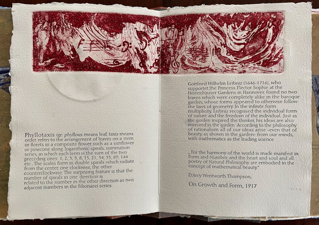
Description of the Fibonacci spiral side by side with quotation from Thompson’s On Growth and Form (1917), drawing on Leibniz’s Rationalist philosophy.
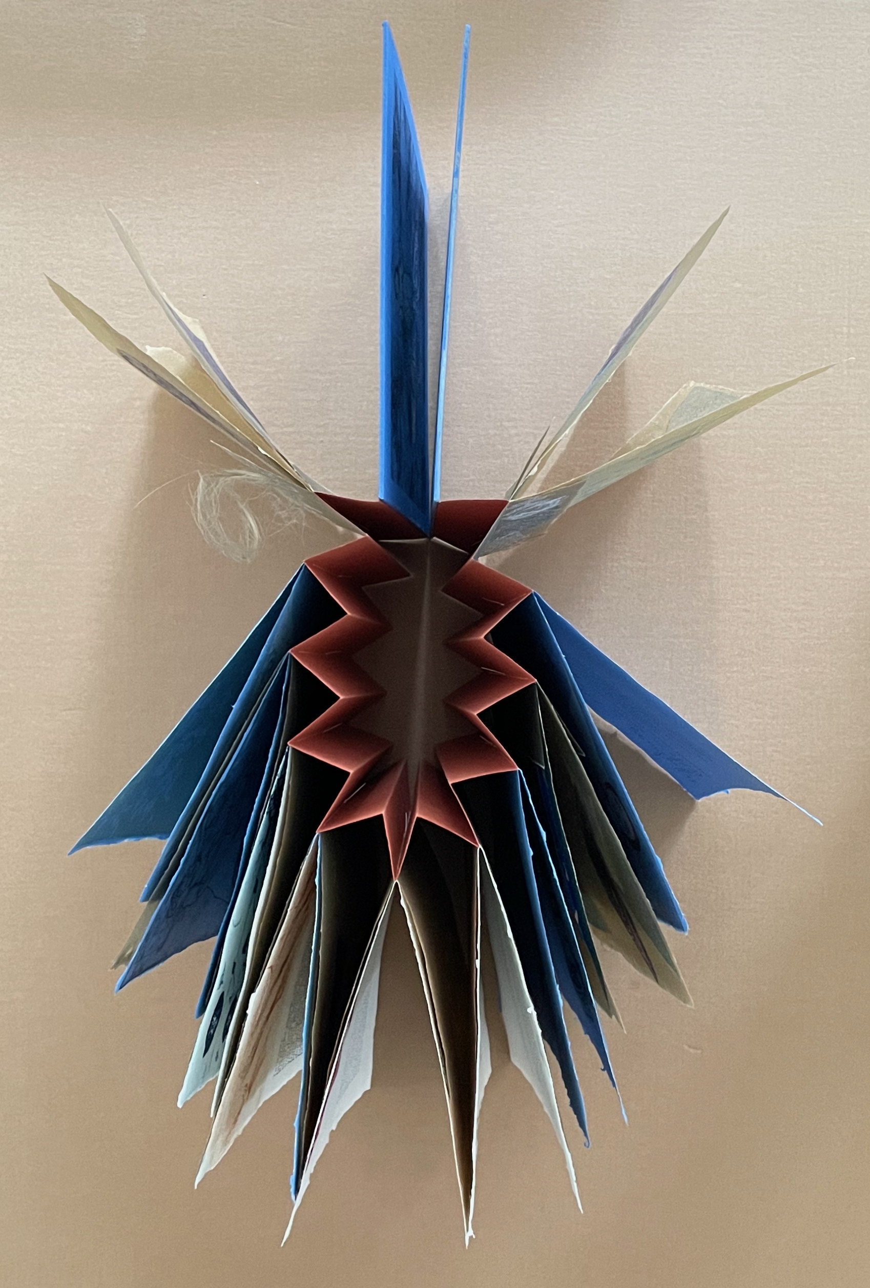
To organize and weave her motives together, Beisinghoff uses an accordion spine to whose peaks eleven sets of folios are sewn with linen thread. Three of the eleven are 4-page folios consisting of blue handmade paper. Another three 4-page folios consist of pure flax paper (handmade by John Gerard). The remaining five gatherings have 8-page folios, each consisting of a pure flax paper folio around a blue or plain one.
Side and top views of the accordion spine.
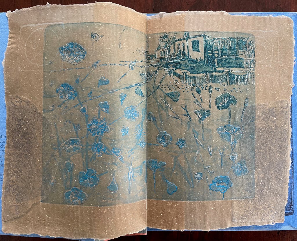
The first pure flax folio begins the book, displaying two title pages (German and English) and two etchings on its first and last pages. In the center spread, two more etchings appear. A watermark symbolizing phyllotaxis shows through in the upper left, balanced by a watermark with a cross section of a flax stalk in the upper right of the center spread. The texture and weight of the flax paper allows the impress and shadow of the etchings to stand out on both sides against the inking and watermarks.
Inside front cover and Tau blau title page and etching.
Center spread of first flax paper folio. Note the watermarks in the upper left and right corners.
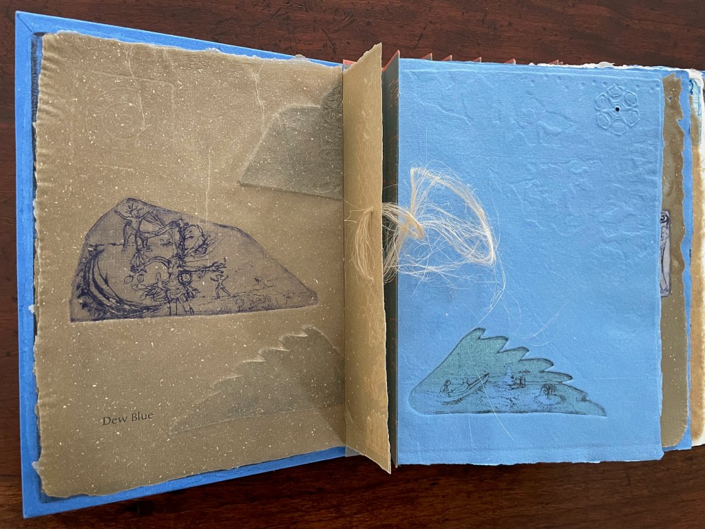
Dew Blue title page and etching, loop of flax fibers, first page of blue handmade paper folio; note its boating image repeated from the prior center spread.
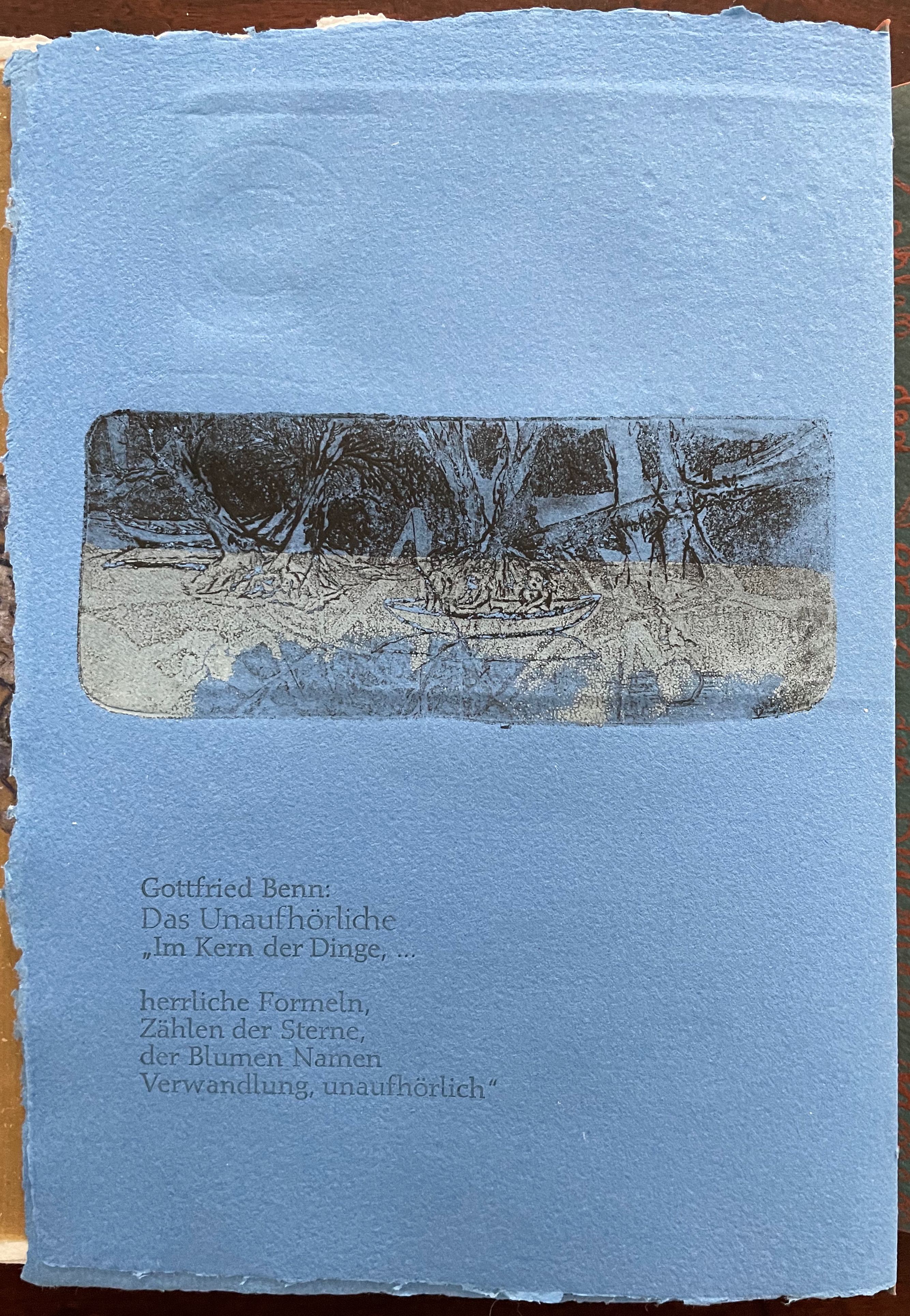
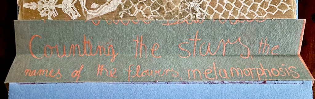
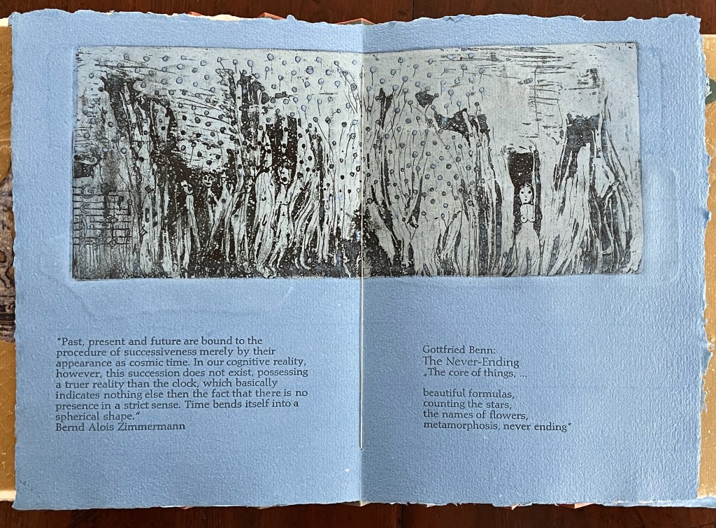
Following the pure flax folio, the first all blue folio gives us that introductory excerpt from Andersen’s fairy tale. Next comes a description of flax comes from Leonhart Fuchs’ Book of Herbs (1543), then the series of planting and harvesting observations from Beisinghoff, then the refrain from Clemens Brentano’s poem “Ich darf wohl von den Sternen singen” (1835), then philosophical observations drawing on G.W. Leibniz from D’Arcy Wentworth Thompson’s On Growth and Form (1917), a much-quoted theorem of musical composition from Bernd Alois Zimmermann’s Intervall und Zeit (1974), and finally (below) a passage of text by Gottfried Benn from the Hindemith oratorio Das Unaufhörliche / The Neverending (1936). In the valleys of the accordion spine, some of the lines from Andersen, Fuchs, Beisinghoff and Been appears handwritten in orange paint.
Translated fragment of Benn’s lyrics for Paul Hindemith’s oratorio Das Unaufhörliche / The Neverending (1936).
Even with these additional texts, Andersen’s fairy tale remains the most central text in Tau blau / Dew Blue, despite the brevity of its excerpt. Brentano’s Romantic/religious expostulations (“O Star and Bloom, Garb and Soul, Love, Hurt and Time for evermore”) sound like those of the plant in the story’s final passage. The occurrence of Fibonacci’s spiral in the plant may be a physical fact, but Beisinghoff turns it into something more mystical by placing the description of phyllotaxis next to Leibniz’ and Thompson’s transcendental view of mathematical science and natural philosophy. Likewise she links the texts from Bernd Alois Zimmermann and Gottfried Benn to the fairy tale by placing them beneath the etching that captures the flax plant’s singing and dancing into its transformation by fire.
Below is the final folio of the work. Like the first, it is made completely of flax paper, but its center spread offers a fuller image: flax blossoms and stalks float in the foreground, and in the background is a sketch of Beisinghoff’s residence where she grows her flax. Like the Fibonacci spiral on the front and back covers, the first and last flax folios round out the work. But go back and listen for the hidden sound installations accompanying Dew Blue. Noticing Beisinghoff’s abstract musical notation, indulge yourself with recordings of a Swedish folk song (“Today is supposed to be the big flax harvest” here or here) to which the notation and phrases allude, and as the flax papers turn and wave on their accordion peaks, listen carefully for their musical rustle.
The final pure flax paper folio.
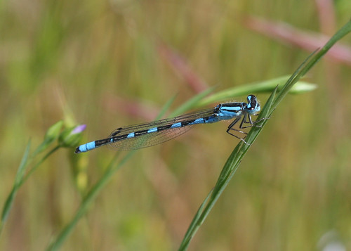
Tule Bluet damselfly perched on flax leaf. Photo: John Riutta, The Well-Read Naturalist (2009). Displayed with permission.
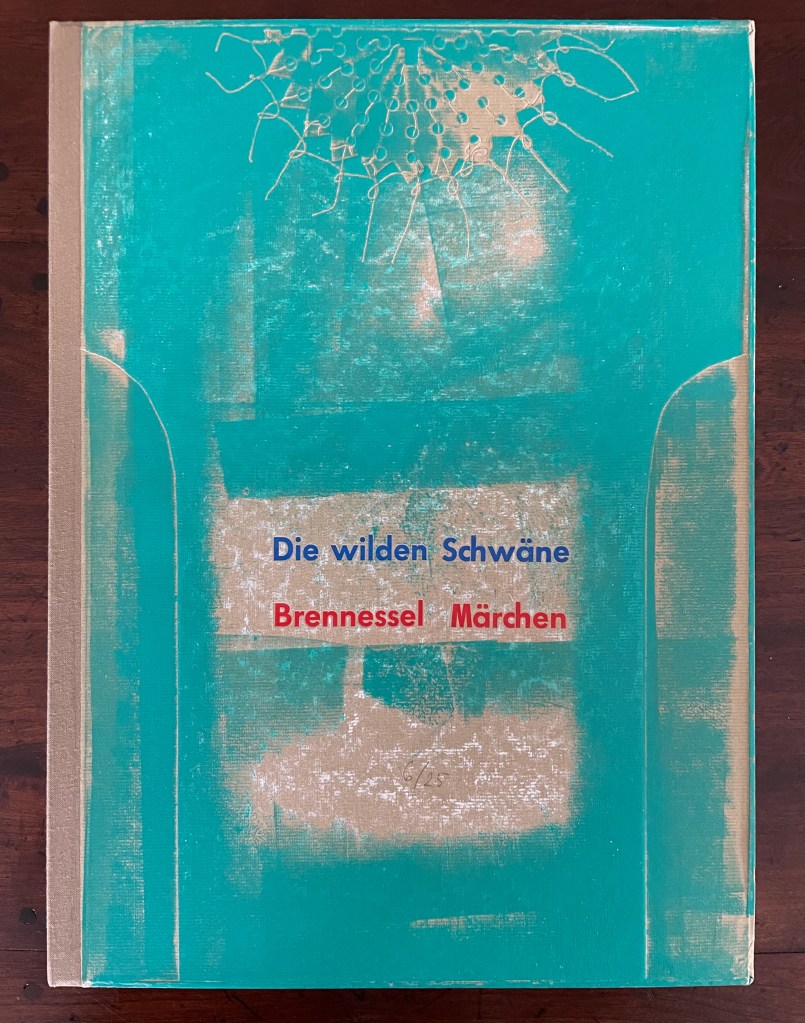
Die wilden Schwäne (2001)
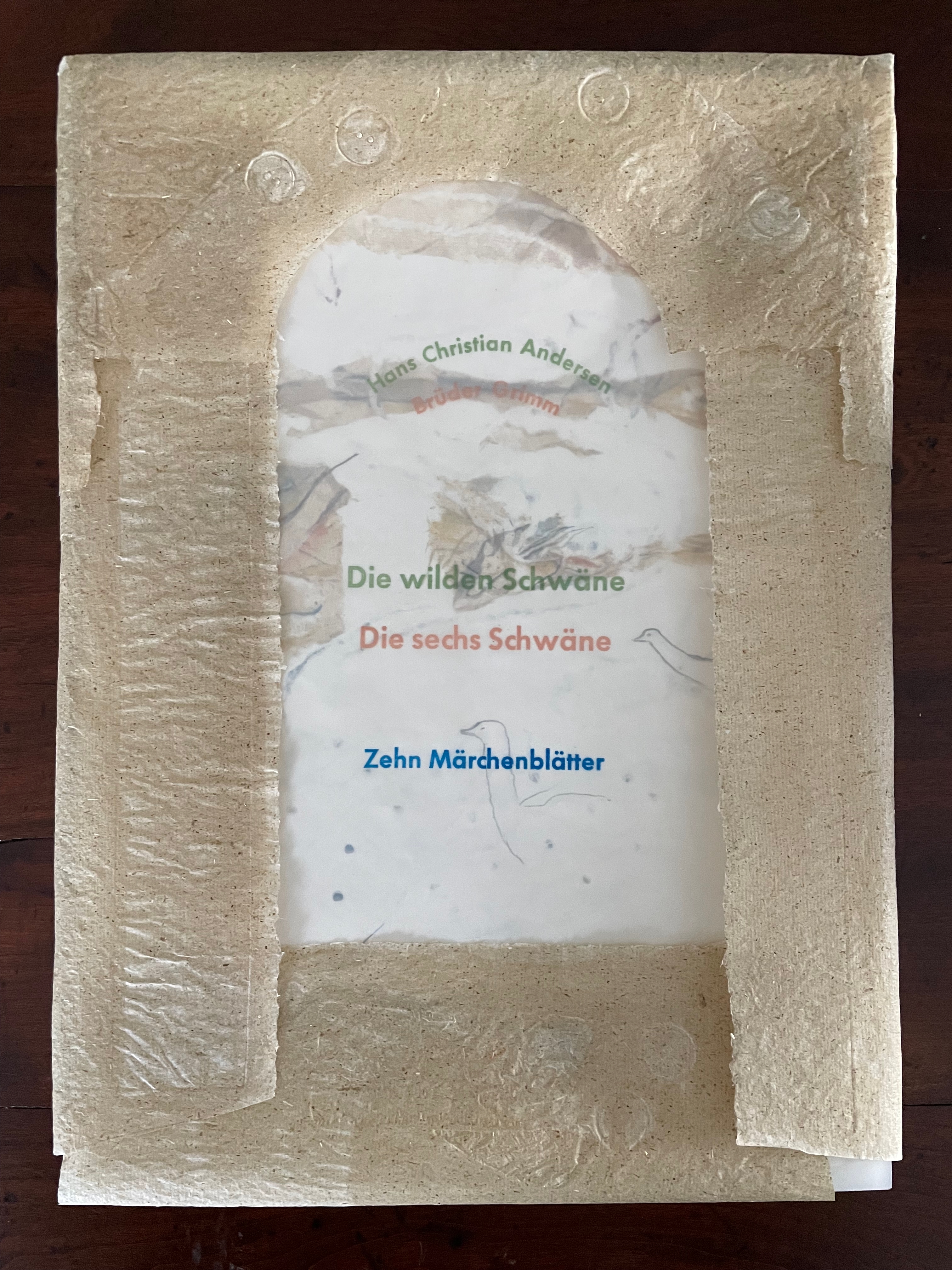
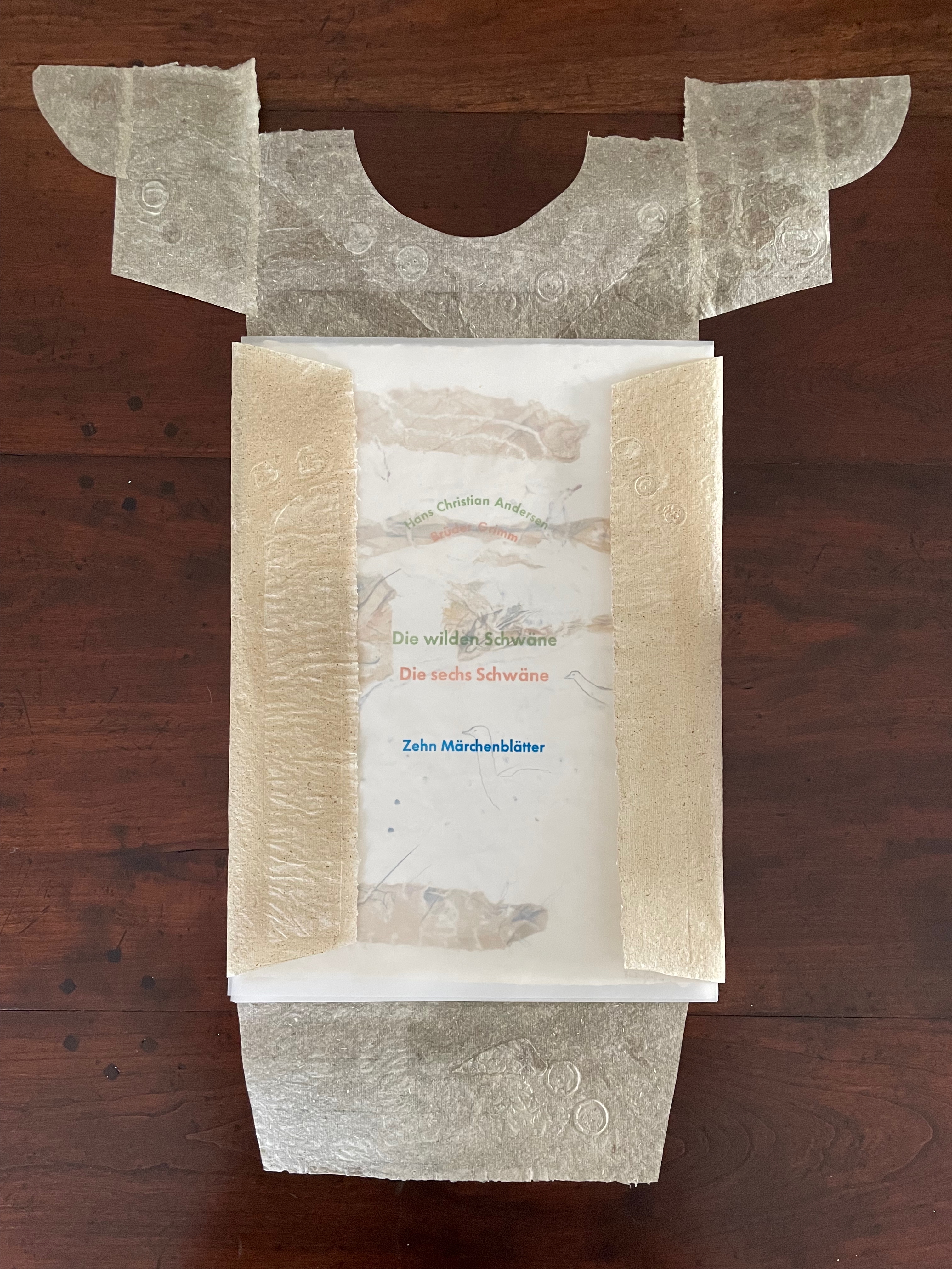
Die wilden Schwäne (2001) Barbara Beisinghoff Box with embossed cover holding folios wrapped in chemise. H35o x W250 mm. 18 folios. Edition of 25, of which this is #6. Acquired from the artist, 20 December 2024. Photos: Books On Books Collection.
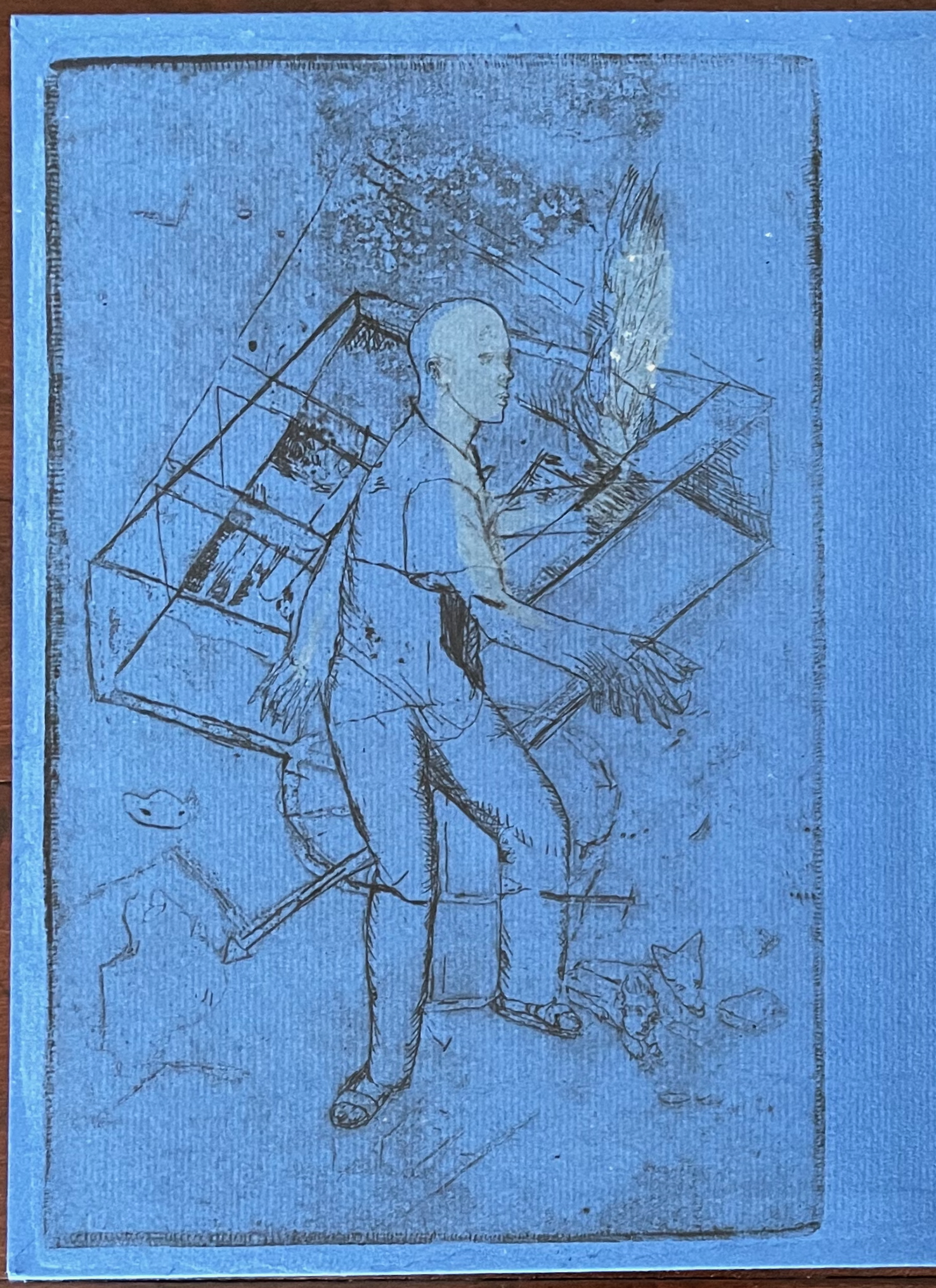
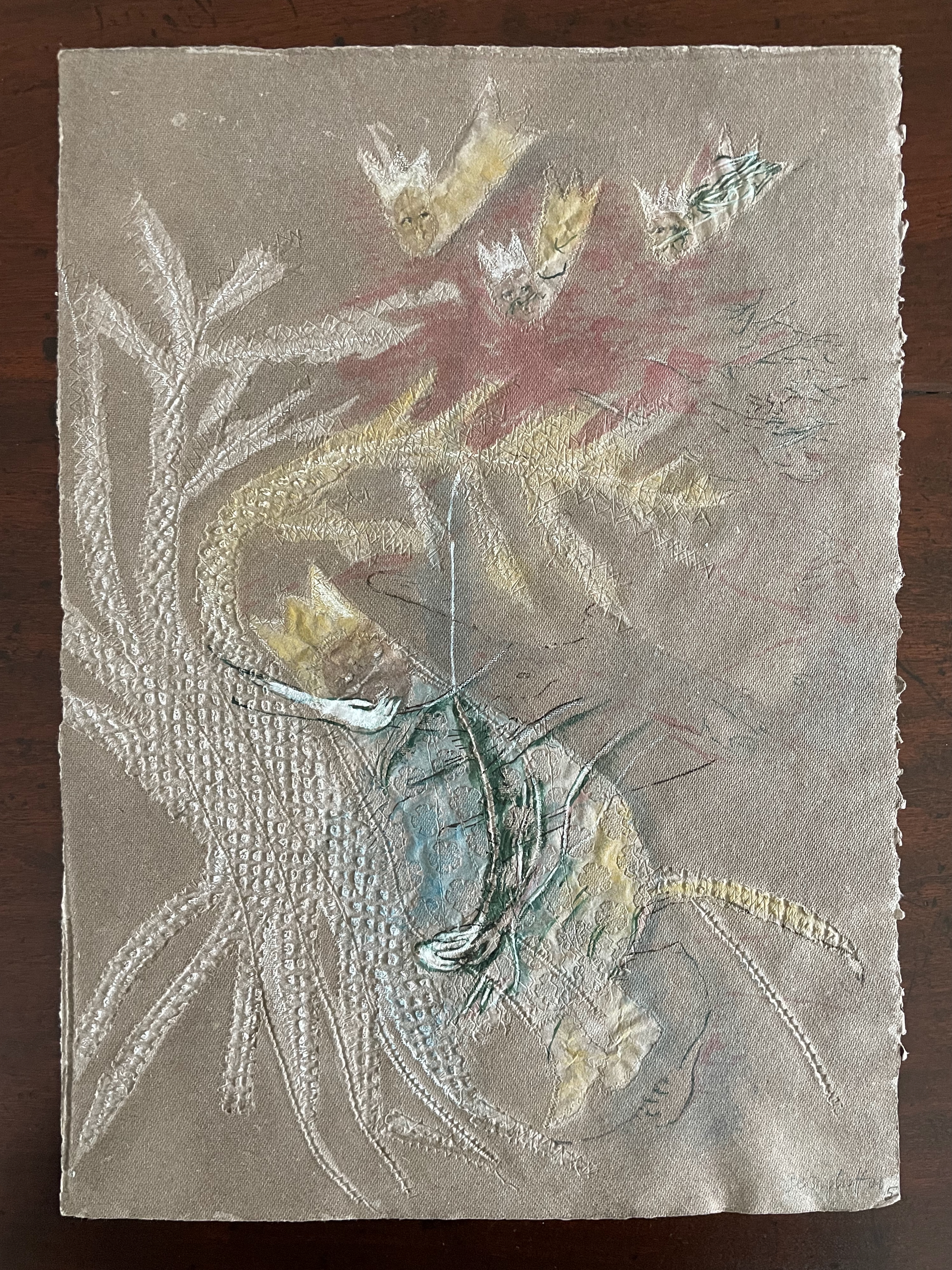
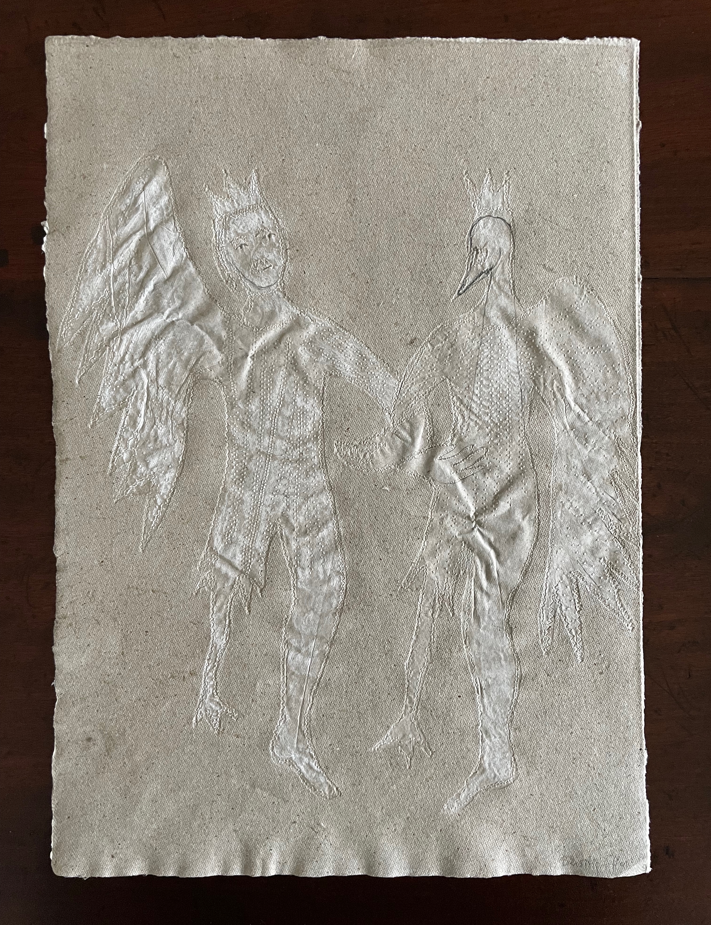
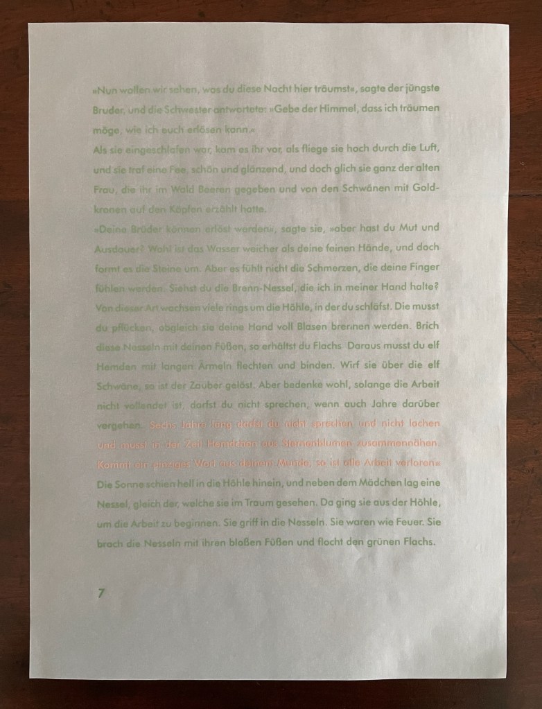
Barbara Beisinghoff’s Die wilden Schwäne is an exemplar of collaboration and craft. In it, she even requires collaboration between Hans Christian Andersen and the Brothers Grimm. Andersen’s Die wilden Schwäne and the Grimms’ Die sechs Schwäne are based on the same tale of brothers turned into swans who are saved by their sister Elisa’s diligent and mute harvesting, pulping, spinning and sewing of stinging nettles into shirts that break the spell when donned. H.C. Andersen, however, is verbose and elaborate in his telling (even including vampires!), and Beisinghoff has done a bit of nipping and tucking with the more succinct Brothers Grimm to create a version more suited to the artist’s book she creates.
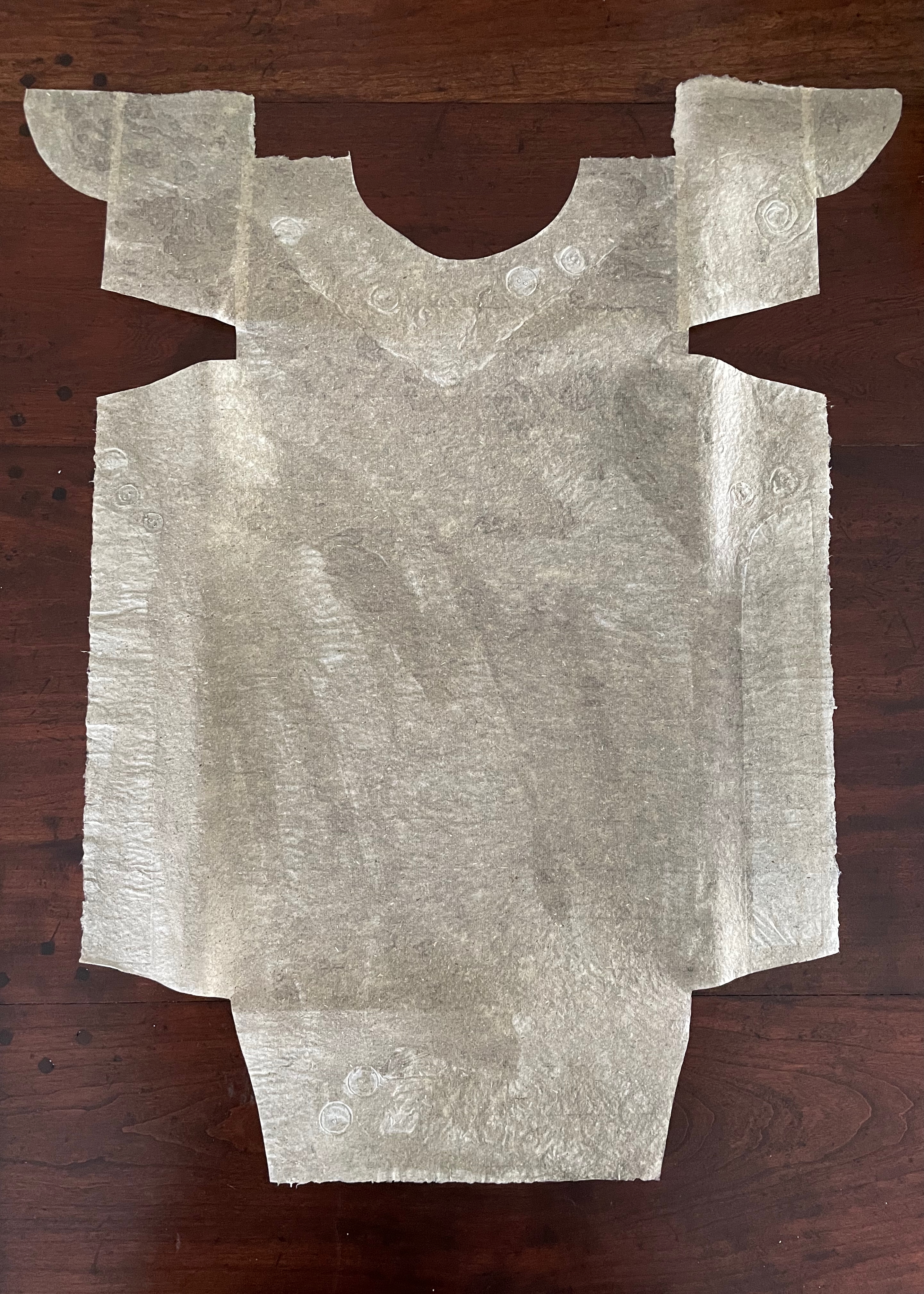
To match Elisa’s effort with stinging nettles, Beisinghoff enlisted the collaboration of Johannes Follmer, the owner of a paper mill. Together they obtained cultivated stinging nettles from the Institute for Applied Botany in Hamburg, cut the fibers, left them to rot, boiled them into a pulp, mixed that with water in a vat, scooped up layers in a sieve embroidered with illustrations, couched the sheets, then pressed and dried them into paper. Beisinghoff applied further drawings with a water jet, watercolor and pencil to the watermark-embossed sheets to illustrate aspects of the tale. To present the Andersen/Grimm “collage”, Beisinghoff had the type set and printed at the Gutenberg Museum. Andersen is printed in light green and Grimm in light red on seven numbered translucent sheets and interleaved with the nine folios of paper art (two more translucent sheets carry the cover page and colophon). To wrap the folios together, Beisinghoff made an embossed chemise or “feather dress” of pure nettle fiber, which could represent Andersen’s description of the brothers’ blowing off each other’s feathers every evening when the sun has set or one of the shirts that their sister makes to break their spell.
The “feather dress” of stinging nettle fiber.
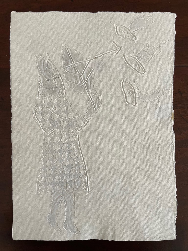
“The King’s little daughter was standing in the cottage room, playing with a green leaf, for she had no other toys. She pricked a hole right through the leaf, looked up at the sun, and there it was, she saw the clear eyes of her brothers, but every time the warm rays of the sun shone on her cheeks, she thought of all their kisses.” Translation with DeepL.
“When she had fallen asleep, it seemed to her as if she were flying high through the air, and she met a fairy, beautiful and radiant, yet she looked very much like the old woman who had given her berries in the forest and told her about the swans with gold crowns on their heads.” Translation with DeepL.
“The swans swooped down to her and lowered themselves so that she could throw the shirts over them: and as she touched them, the swan skins fell off, and her brothers stood before her in the flesh, fresh and beautiful.” Translation with DeepL.
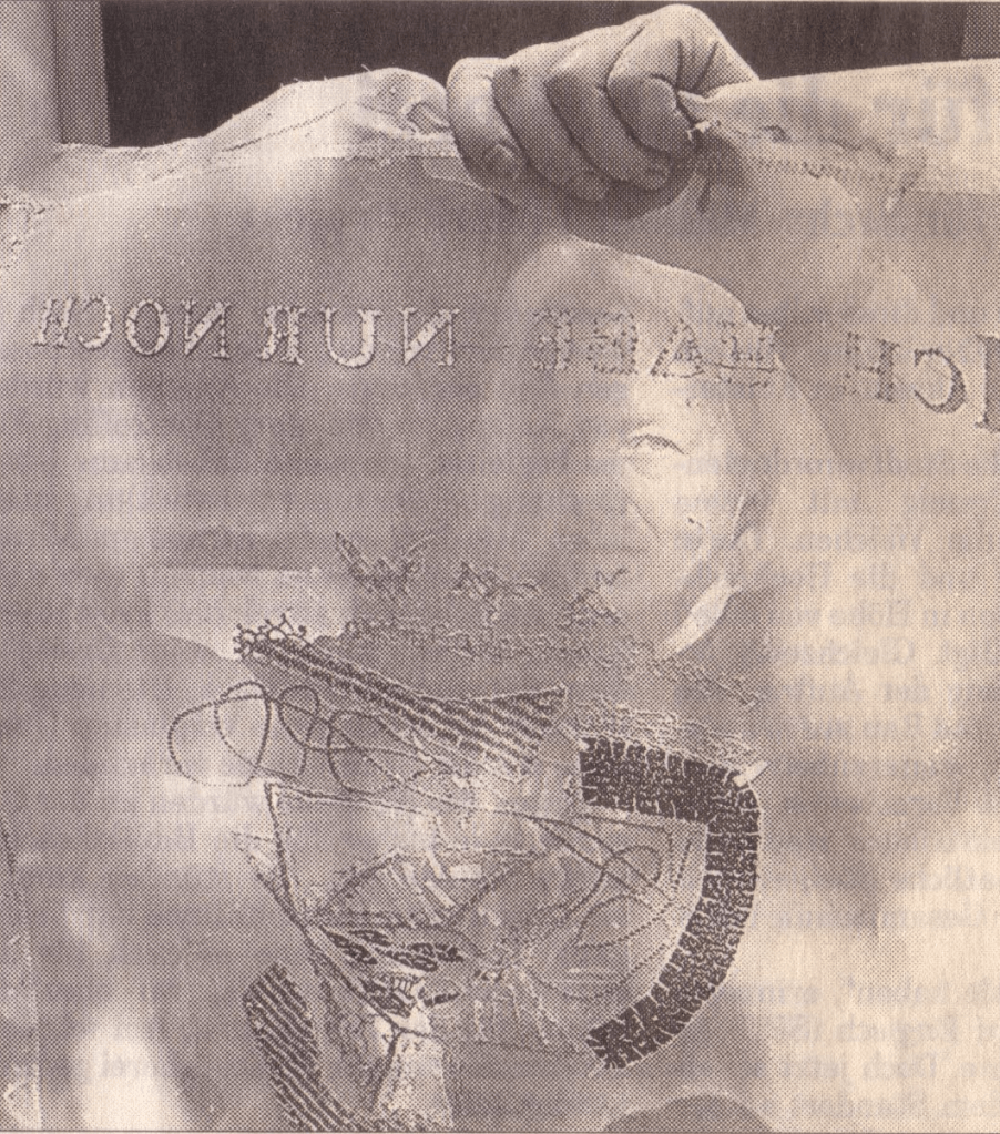
“Barbara Beisinghoff (head in the background) covers the frame with this transparent, embroidered and sewn gauze, which is used to scoop and emboss her nettle papers. This is how her large-format watermark illustrations end up on the sheets.” Translation with DeepL. Peter Holle. 30 August 2001. Frankfurter Rundschau. Photo: Oliver Weiner.
This art by watermarking recalls that of other artists in the collection: Fred Siegenthaler and Gangolf Ulbricht, in particular. The technique of pulp painting also finds other practitioners in the collection: Pat Gentenaar-Torley, John Gerard, Helen Hiebert, Tim Mosely, Maria G. Pisano, Taller Leñateros, Claire Van Vliet and Maria Welch. Beisinghoff’s blend of embroidered watermarks, waterjet marking and pulp painting, however, creates a bas relief effect that is echoed only in the collection’s works by Mosely, Taller Leñateros and Van Vliet, albeit achieved differently. These workings of the substrate — as material, color, surface, and even narrative — with the workings of book structure is one of the more magical locations of book art. It is perfect for Beisinghoff’s metamorphical interpretation of the Andersen/Grimm fairy tale.
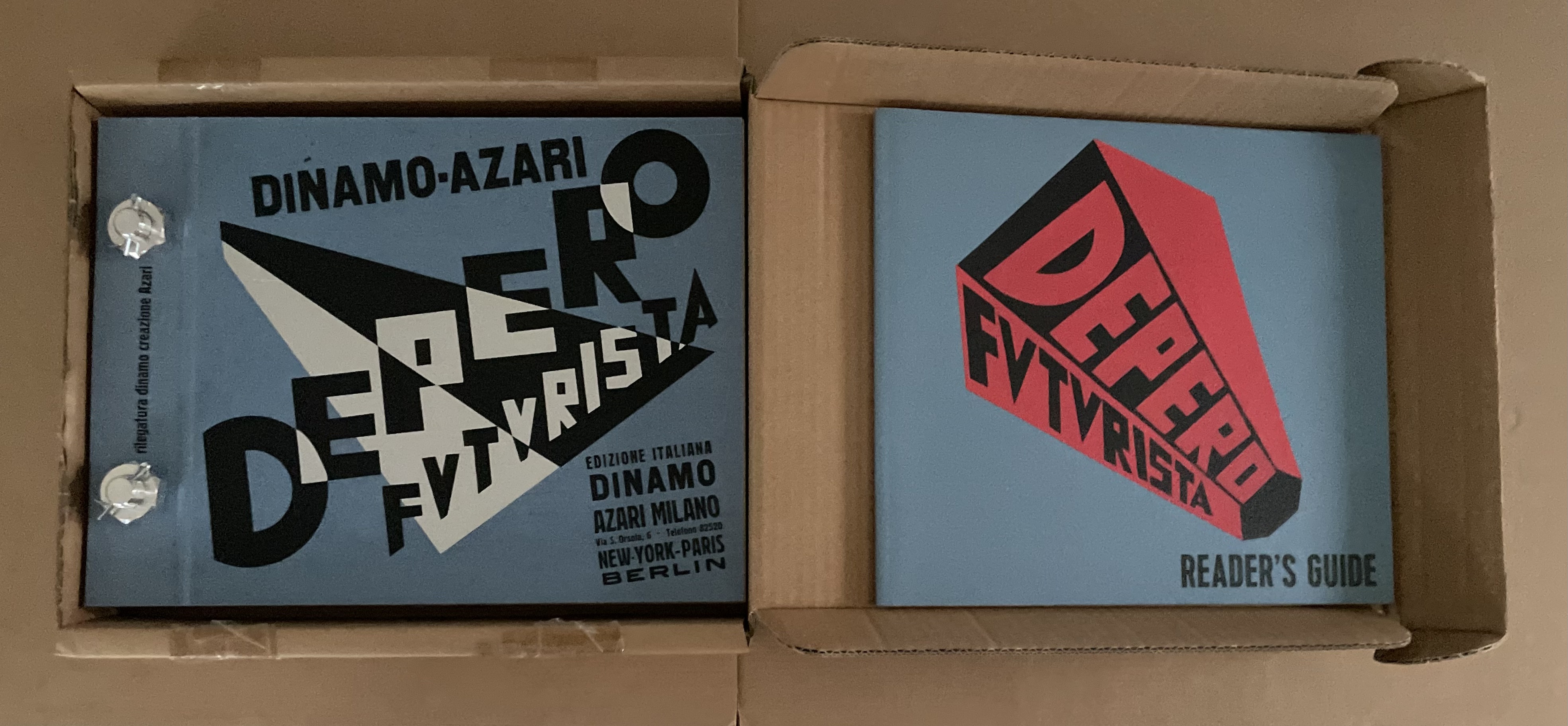
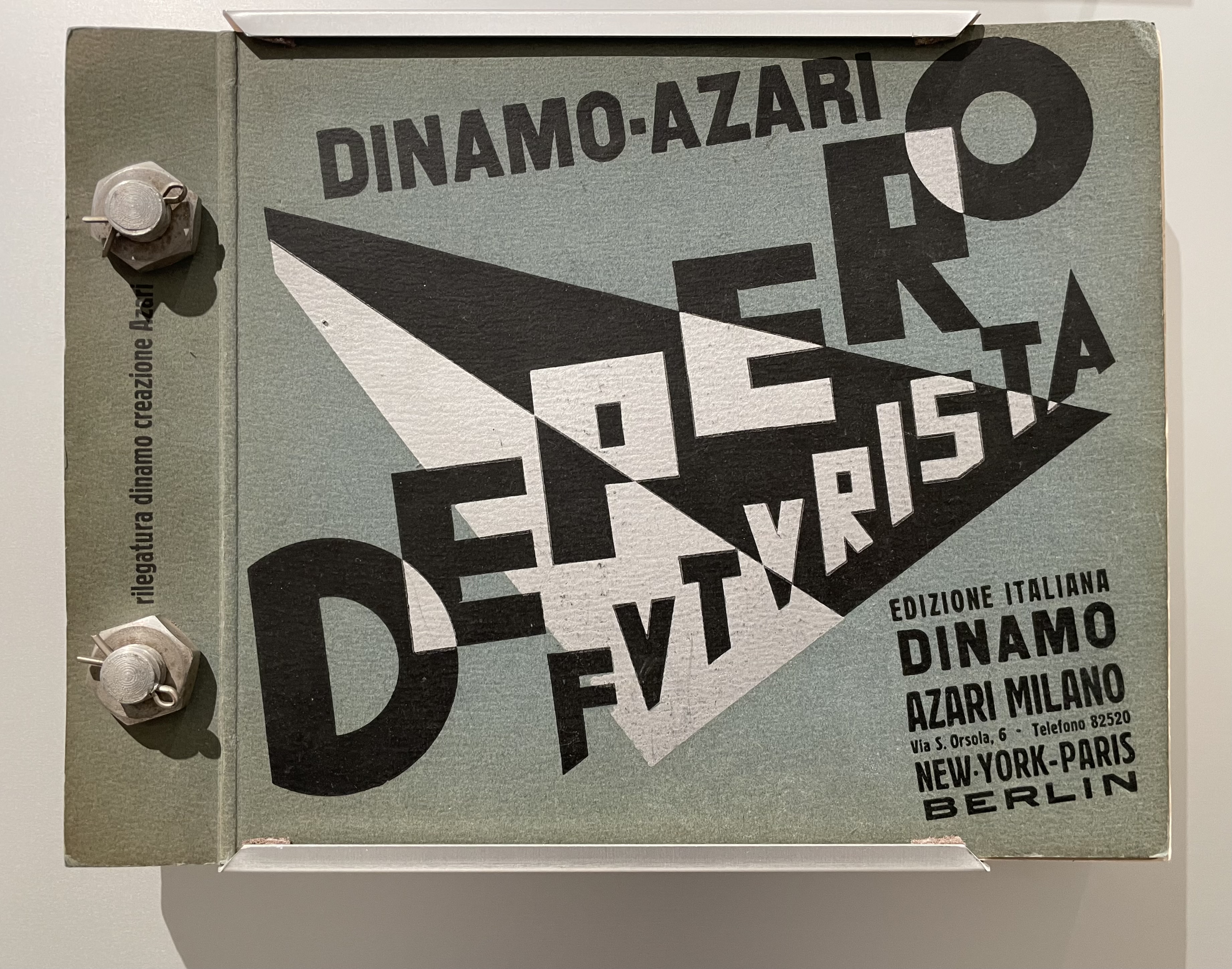
Fortunato Depero’s Depero Futurista: Imbullonato (the “Bolted Book”) stands at the center of an uneasy off-rhyming of history. Where Depero and the avant-garde Futurists of the early 20th century rode the waves with Benito Mussolini and fascism, this 2016/17 facsimile edition of Depero Futurista coincided with the emergence of America’s “Tangerine Mussolini” and his MAGA movement.
In 2024, the original and facsimile editions of Depero Futurista appeared in an exhibition at the American Academy in Rome just as Trump was elected as the first Convict-in-Chief. And five days before he was sworn in, the Estorick Collection of Modern Italian Art in London presented its copy of the original edition in an exhibition devoted to the poet Filippo Tommaso Marinetti, leader of the Futurist movement, good friend of Depero, and peripatetic pal to Mussolini.
Depero Futurista’s peculiar off-rhymings in history prompt questions about the intersection of art and our social contract. How is it that fascism weighs on Depero’s art but has not suffocated it, even when the association peeps out as it does in Imbullonato? How is it that communism weighs on El Lissitzky’s About Two Squares (1922) but has not buried it?
Günter Berghaus’ Futurism and Politics provides a nuanced view of Futurism, Marinetti, Depero and their links with fascism. Fabio Belloni traces the rise, fall and rise of Depero in his essay “The Critical Fortune and Artistic Recognition of the Work of Depero“, which appeared in the journal of the now defunct Center for Italian Modern Art. Gianluca Camillini’s 2020 doctoral thesis traces the disconnects and remaining connections with fascism in Depero Futurista after the 1924 break between Futurism and Mussolini.
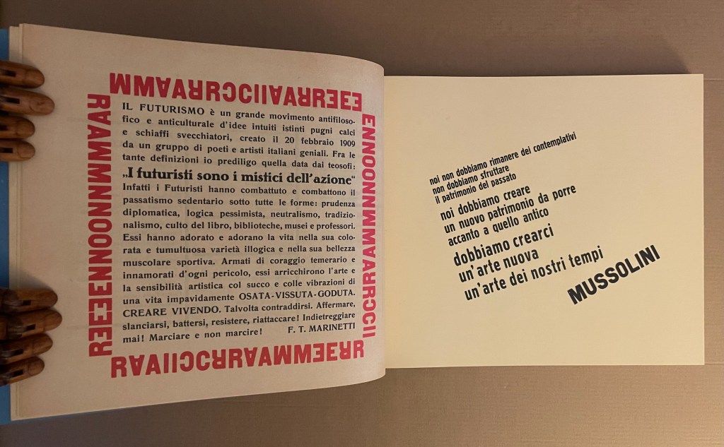
Perhaps Depero’s case contrasts helpfully with that of Ezra Pound. Like Depero, Pound was an enthusiastic supporter of Mussolini. Pound coopted Marinetti’s and Depero’s Futurism into his and Wyndham Lewis’ Vorticism. Unlike Depero Futurista, however, Pound’s poetry — especially the Cantos –foregrounds that enthusiasm. The frequency of its appearance in Pound’s poetry and its ugliness weigh more heavily than the few mentions of Mussolini in Depero Futurista. Depero’s and Marinetti’s hero-worship appears mostly in their poetry and prose but without Pound’s anti-semitism. The connection with fascism that remains in Depero Futurista, however, appears in the bellicosity and glorification of war by this “book machine”.
In the American Academy’s exhibition, Depero Futurista sits alongside the anti-racism of William Kentridge’s Portage (2000) and Kara Walker’s Five Poems Rainmaker (2002). How does (can?) art deliberately associated with fascist, statist or authoritarian movements rise above them to be celebrated and fruitfully juxtaposed with the works of today’s artists more associated with progressive causes?
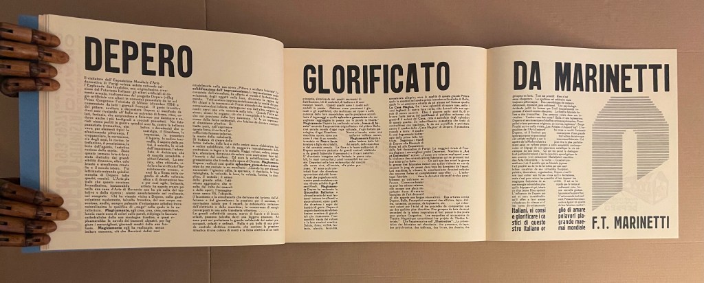
For the Books On Books Collection, Depero is also an important figure in the overlap of typography and the alphabet with architecture and the artist’s book. Depero defined typographic architecture as
that special architectural form suggested by typographie types which has been used with great efficacy in advertising artistic constructions, in pavilions, kiosks and advertising plastics of national and international exhibitions of decorative art and in industrial and commercial exhibitions. The painter Depero created, in 1927, the book pavilion of the Bestetti- Tumminelli and Treves publishing house at the international exhibition of decorative art at Monza, inspiring his work to this conception of typographie architecture.(p. 18)
And he reproduced an image of it in Depero Futurista.
From Depero Futurista: “Padiglione del Libro” (1927).
The book pavilion is not bellicose. It is bombastic as is much of what is in Imbullonato. The blast of its typography has much in common with that in Kurt Schwitters’ Die Scheuche Märchen (1925) and other artists’ works not associated with fascism, authoritarianism or statism. To focus on Imbullonato‘s innovation, technique, typography or cross-fertilization with architecture and compare and contrast them with that of other artists is not to forget its entanglements. In fact, the difficulty in focusing is a reminder of how art, too, can be bolted to the shameful.
Camillini, Gianluca. 2020. “Fortunato Depero and Depero futurista 1913–1927“. Dissertation thesis. Reading: University of Reading. “In the two reprints of Depero futurista 1913–1927 (1978 and 1987 by SPES Firenze), Luciano Caruso also repeatedly writes ‘libromacchina imbullonato’ (bolted machine-book, Caruso, 1987, 36).” (p. 14).
Caruso, Luciano (ed.) and Fortunato Depero. 1987. Depero Futurista. Firenze: Studio per Edizioni Scelte Salembeni.
Caruso, Luciano (ed.) and Fortunato Depero. 1978. Fortunato Depero Futurista. Firenze: Studio per Edizioni Scelte Salembeni.
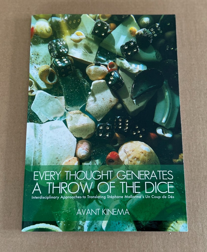
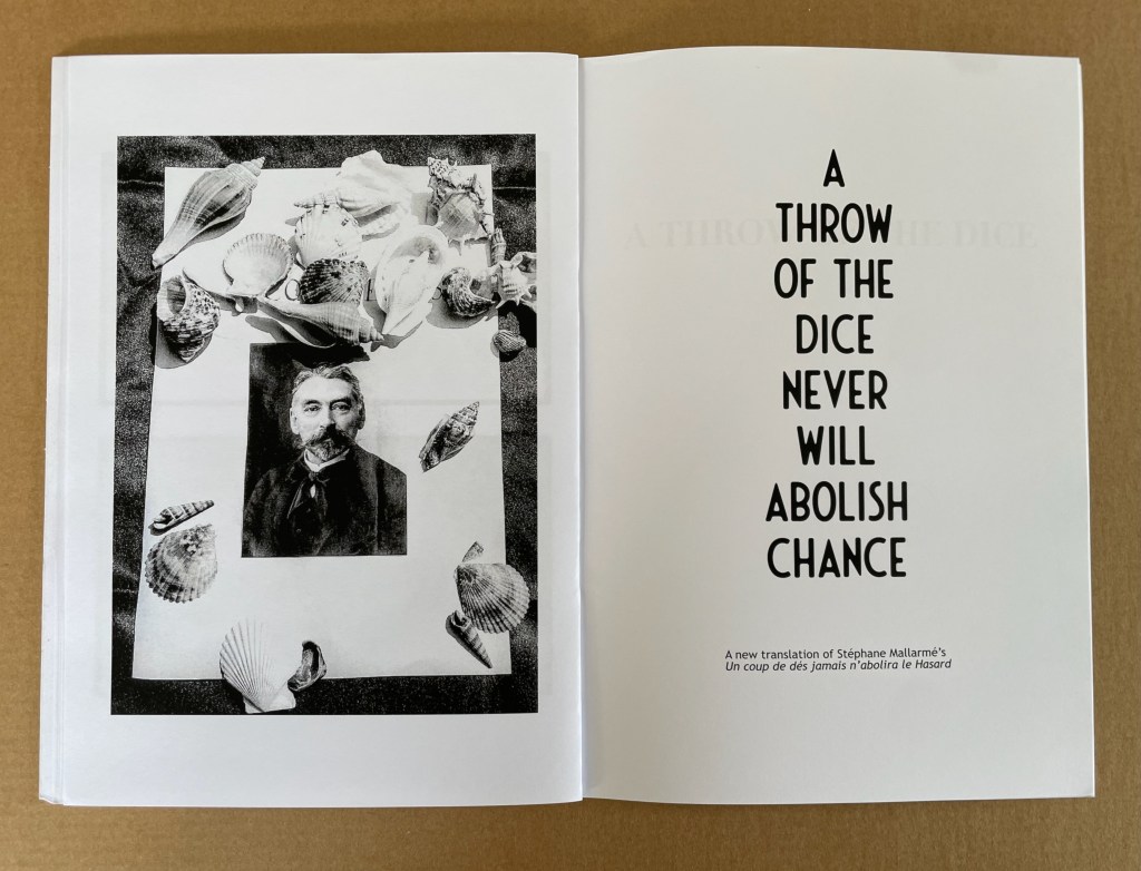
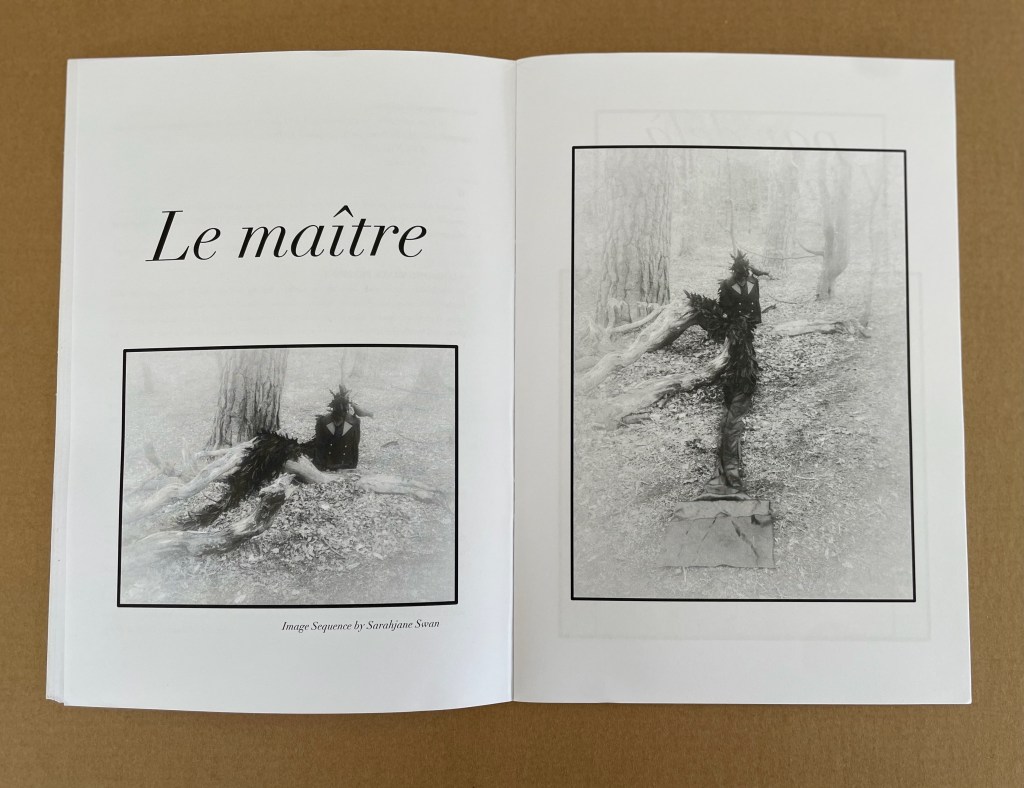
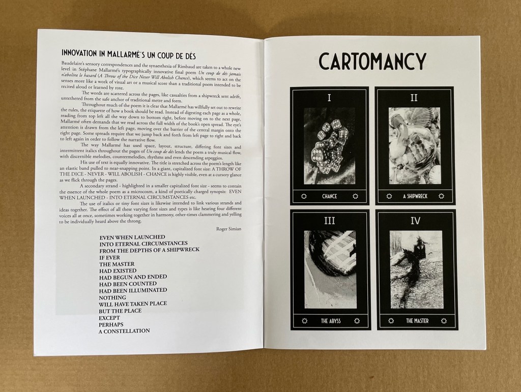
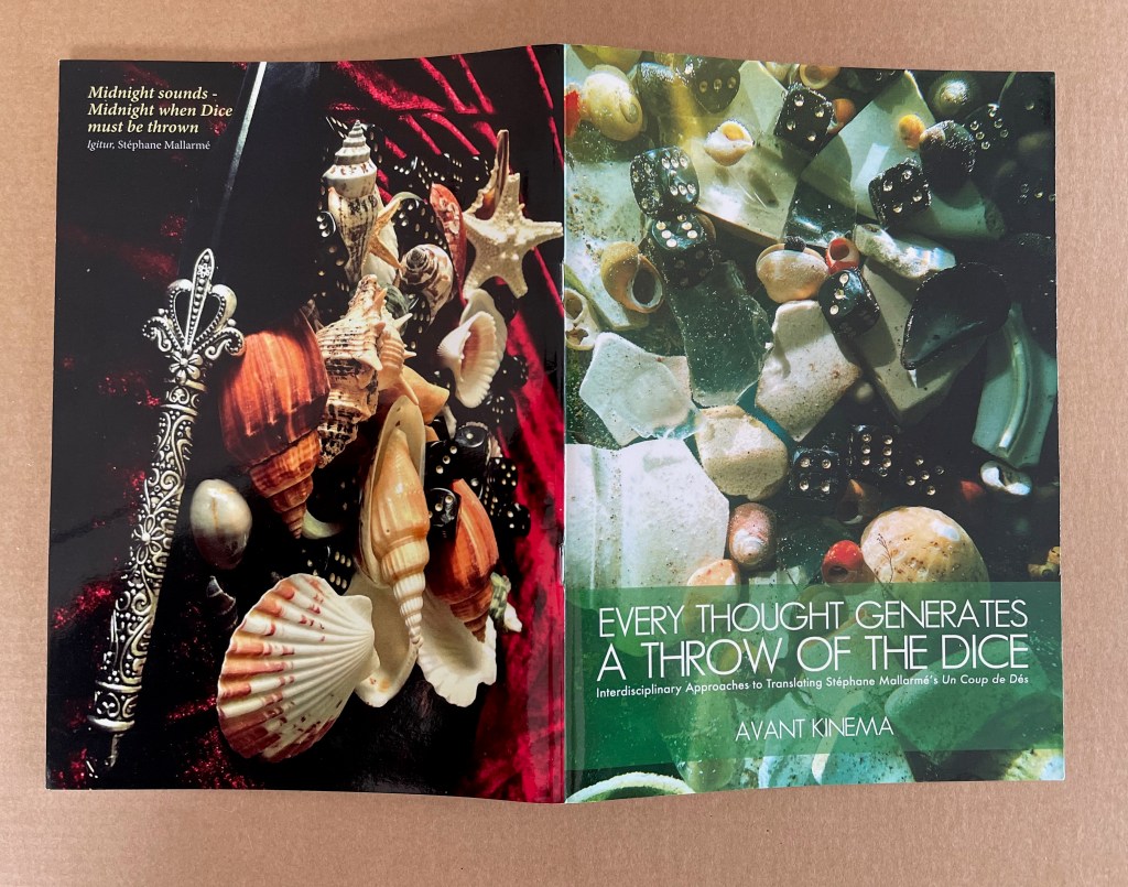
Sarahjane Swan & Roger Simian (the strangely named duo behind Avant Kinema) were responding to an invitation from the AHRC-funded project Imprints of the New Modernist Editing in 2019, which would have resulted in an exhibition at Shandy Hall, home of the Laurence Sterne Trust, but the Covid-19 pandemic intervened. Their response consisted of “visual artworks, photography, poetry, fiction and Tarot style card designs featuring ‘twelve virgin symbols extracted from Un coup de dés‘” (Swan & Simian, “Introduction”). This booklet captures those works and concludes with a new translation of the poem.
The subtitle characterizes the works as an interdisciplinary approach to translating the poem, but Dick Higgins’ term “intermedial” might be a more apt description.
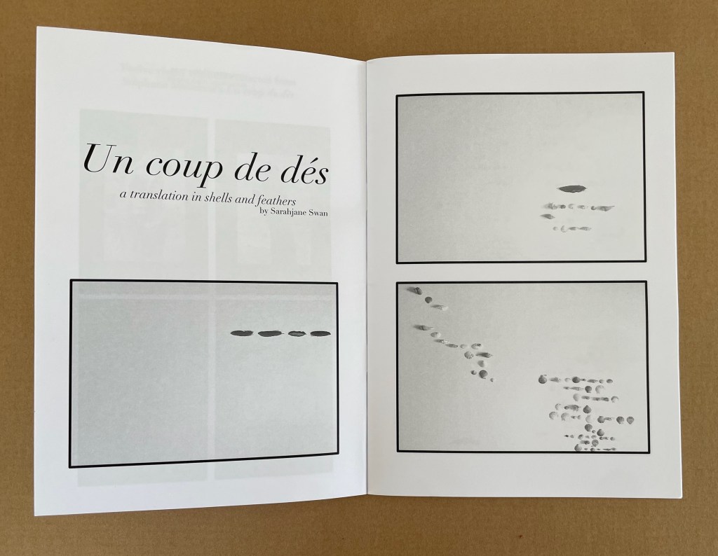
Swan’s substitution of feathers and shells for Mallarmé’s words, Broodthaers’ redactions and Pichler’s excisions brings a new form of materiality to Un Coup de Dés. It recalls the similar playfulness of other artists such as Clotilde Olyff with the alphabet.
From an image sequence by Swan, the artists pull together a set of Tarot-like cards to introduce a new angle on the poem’s invocation of chance.
Avant Kinema’s homage is a collage or assemblage of different media distilled in this booklet. The preempted installation might have echoed that of Marine Hugonnier’s The Bedside Book Project (2006-07).
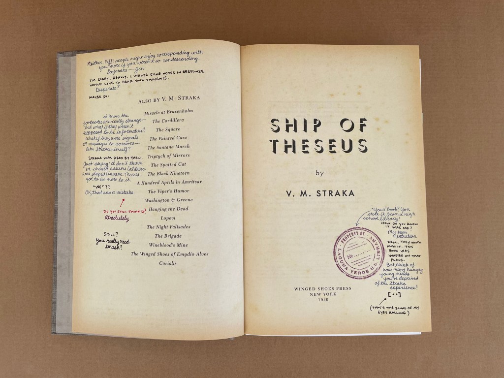
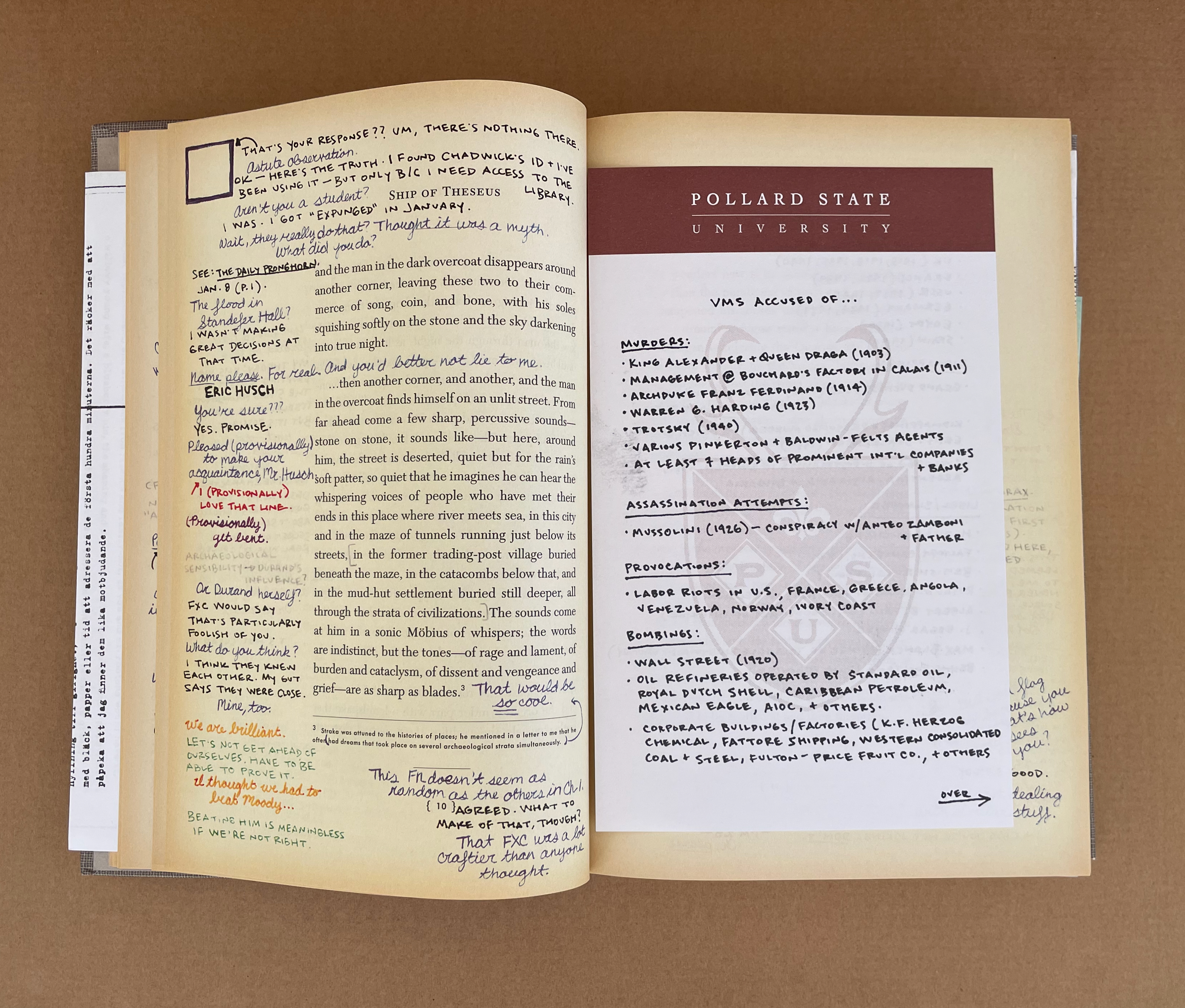
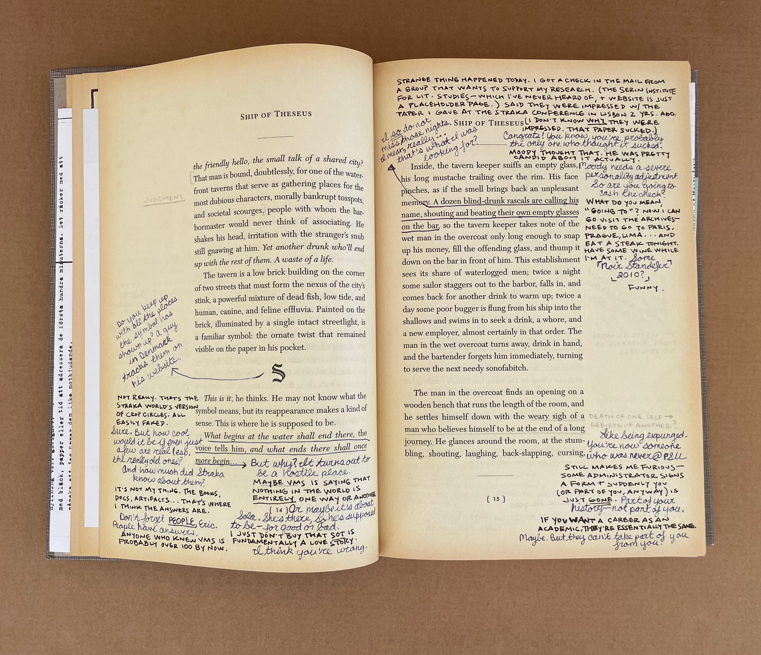
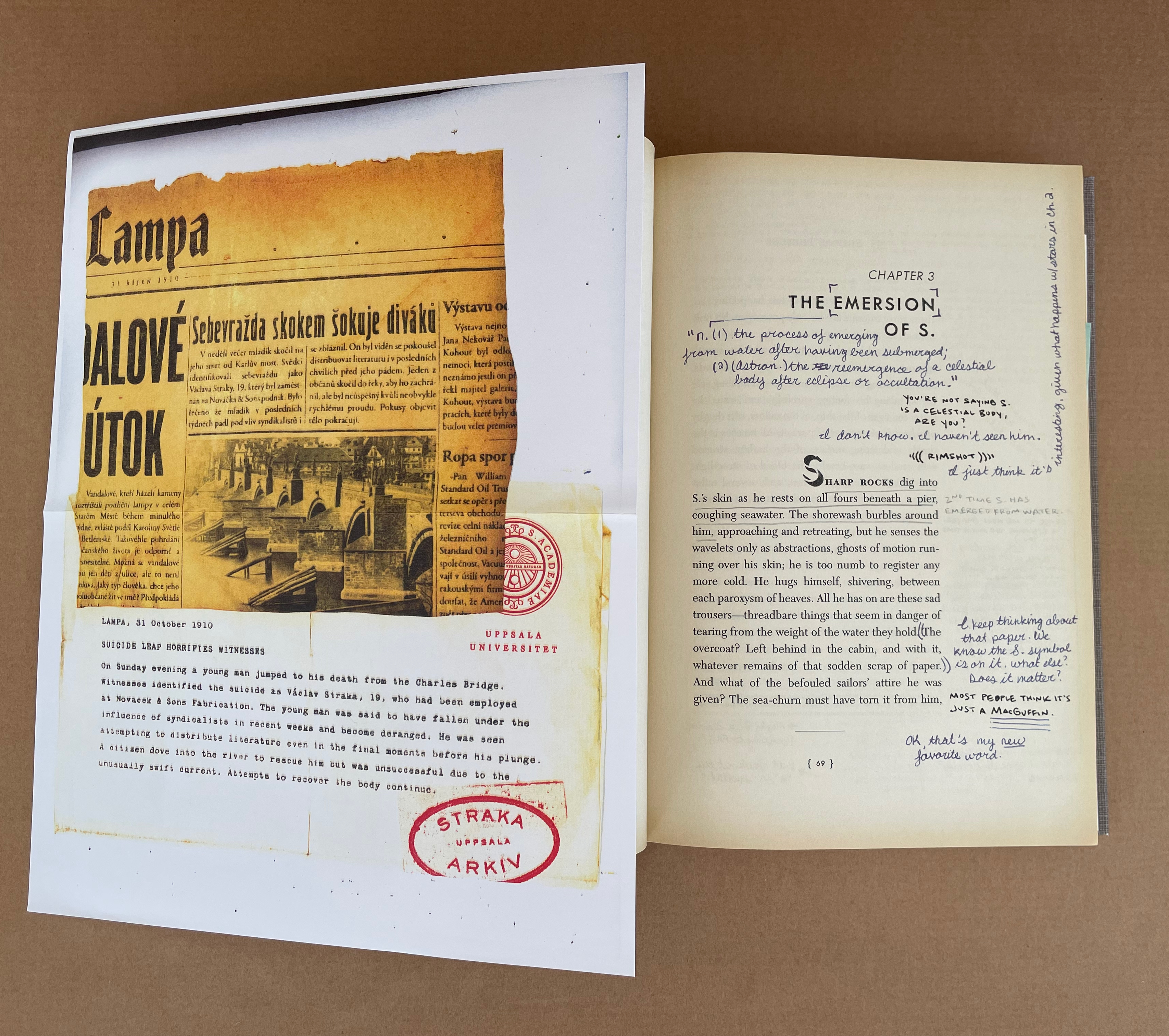
S: Ship of Theseusby V.M. Straka (2013) J.J. Abramsand Doug Dorst Printed card slipcase. Casebound stamped and printed cloth over boards, gray doublures, yellow head- and endbands. H242 x W162 mm. 472 pages. 22 inserts (postcards, photocopies, photo, prayer card, circular cipher device, campus café napkin, etc.). Acquired from AbeBooks, 5 March 2024. Photos: Books On Books Collection.
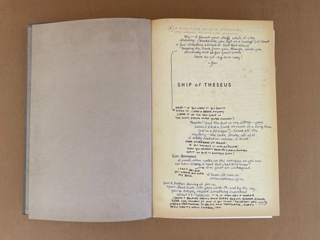
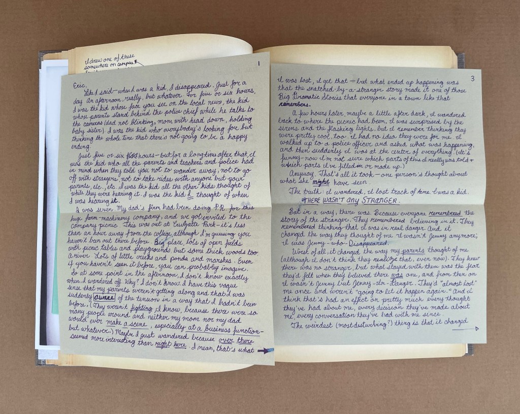
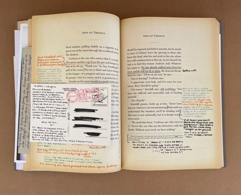
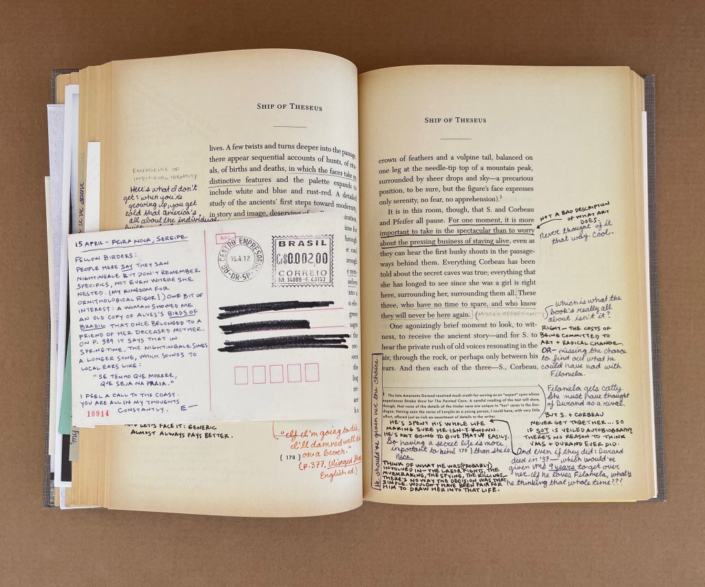
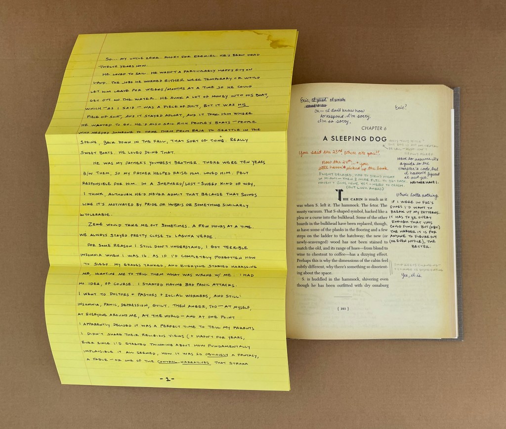
A young woman picks up a book left behind by a stranger. Inside it are his margin notes, which reveal a reader entranced by the story and by its mysterious author. She responds with notes of her own, leaving the book for the stranger, and so begins an unlikely conversation that plunges them both into the unknown. The book: Ship of Theseus, the final novel by a prolific but enigmatic writer named V.M. Straka, in which a man with no past is shanghaied onto a strange ship with a monstrous crew and launched onto a disorienting and perilous journey. The writer: Straka, the incendiary and secretive subject of one of the world’s greatest mysteries, a revolutionary about whom the world knows nothing apart from the words he wrote and the rumors that swirl around him. The readers: Jennifer and Eric, a college senior and a disgraced grad student, both facing crucial decisions about who they are, who they might become, and how much they’re willing to trust another person with their passions, hurts, and fears.— Publisher’s description on the slipcase.
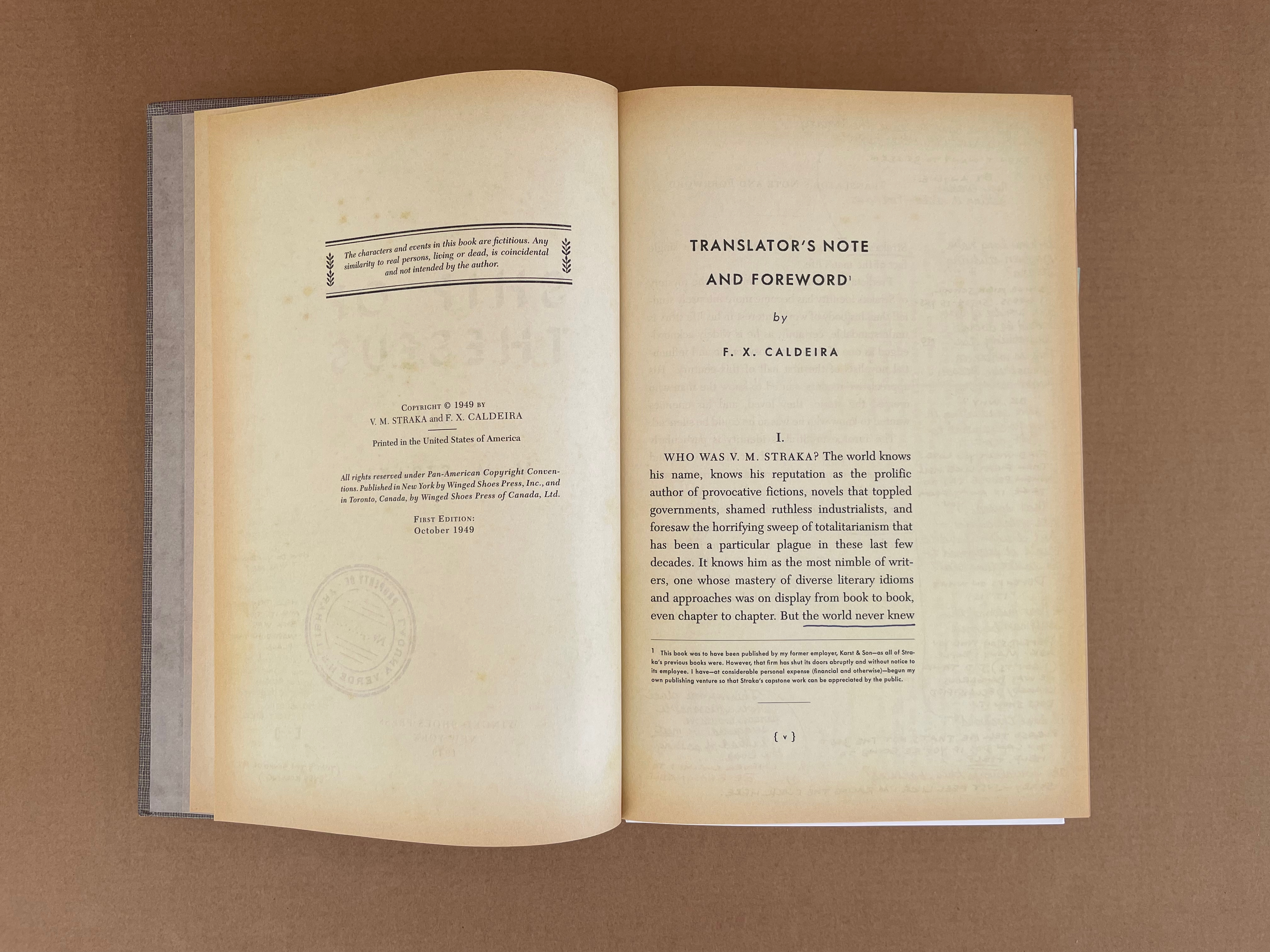
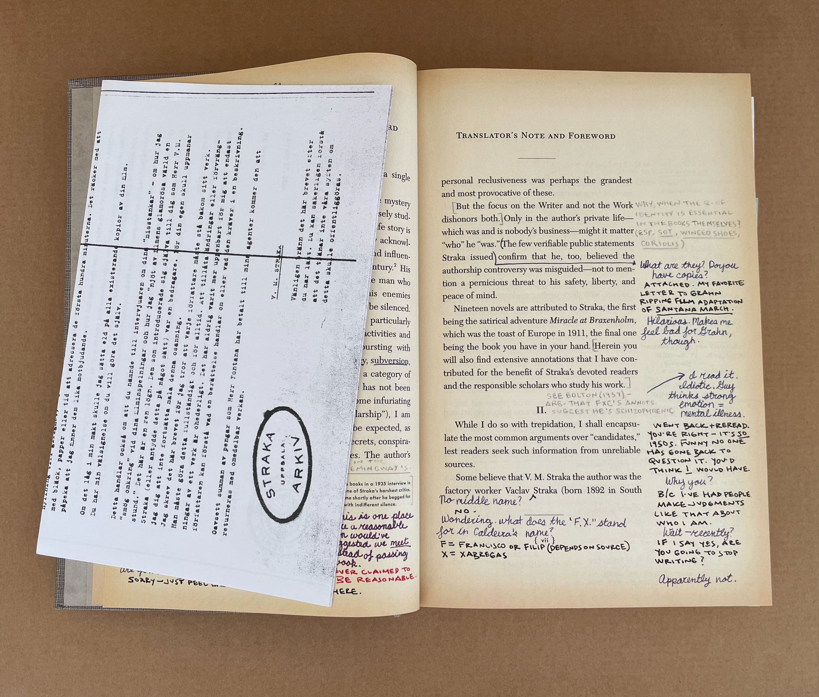
Most of the reviewers’ and libraries’ summaries of Ship of Theseus describe it as a traditional narrative with a second story in the form of marginal notes, letters and objects left by two readers of the main narrative, but I count five, possibly six, narrative lines or plots in this strange book. First is the story of the main character “S”, the shanghaied man with no past. Second is the story of the author V.M. Straka and his mysterious identity told by the fictitious translator F. X. Caldeira in his “Translator’s Note and Foreword” and footnotes. Third is the story of the two readers, Jennifer Heyward and Eric Husch, and their pursuit of Straka’s identity and his novel’s “meaning”. Fourth is Jennifer’s and Eric’s personal narratives of their academic lives to be found in their notes and left objects. Fifth is their love story that unfolds in the margins and objects as they discover each other’s identity and share their stories.
As for the sixth, in his Bibliography and the Sociology of Texts (1986), the scholar D.F. McKenzie writes: “every book tells a story quite apart from that recounted by its text”. Of course, McKenzie means the historical and social story told by the font, typesetting, binding, paper and so on. So the story of the production of Ship of Theseus would be its sixth narrative to be deduced from the book as object. Fortunately, Abrams and Dorst were interviewed in 2013 by Joshua Rothman in The New Yorker and told him a large part of that story. Sociologists of the book will revel in Abrams’ comparison of the book’s creation with that of a screenplay and movie, and they will marvel that, with all of its of seemingly one-off insertions and its realistic appearance as a used library book, it was produced as a trade book. A decade later, there are still copies available for purchase online. Speaking of online, S: Ship of Theseus has its own Wikipedia page and countless fan sites (academic and non-academic).
Like many artist’s books, S; Ship of Theseus has layers of self-referentiality “interrogating” the nature of the Book. Like many artist’s books, it challenges the act of reading — in this case with narrative frames, parallel color-coded narratives and objects of evidence each related to different narratives. The verisimilitude of its inserts and used-book appearance speaks to levels of craft and craftiness offered by many limited-edition works of book art. Like many artist’s books, it is the result of an intricate collaboration. But somehow it bulges the genre of the artist’s book.
After acquiring it, I came across Brian Davis’ two essays for the College Book Arts Association, which comment on S: Ship of Theseus. He must have felt the same “bulge” and found a sufficient number of similar works to coin a name for them: “Multimodal Book-Archives”. Yes, more academic jargon, but with a genre of art that has had its troubles with apostrophes and coinages such as “bookwork”, can we complain? Probably not, but we can cavil.
“Archives”can be temporally and spatially open ended without even hinting at boundedness. Works like S: Ship of Theseus and Warren Lehrer’s A Life in Books (2013), among others, do seem to “exploit the material and expressive possibilities of the book” through documentation, curation or compilation and preservation of artifacts. These two works, however, have not only a trade book boundedness, even allowing for loose inserts, but also a sense of narrative closure that makes “archives” not quite on the money. Faced with an artist’s book relying on narrative framing, documentation, and loose artifacts, we usually fall back on the terms of collage and assemblage to describe them, but then neither of the two examples has the pasted-down single view of collage or the sometimes disjointedness of assemblage.
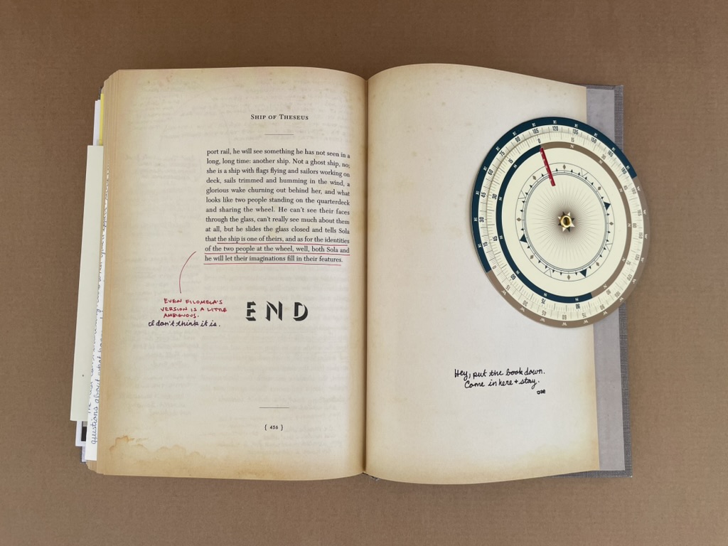
Narrative closure: “END” and “Hey, put the book down. Come in here & stay.”
“Archives” may not hit the mark, but Davis is right that these two works are multimodal. And/or, maybe they are instances of Dick Higgins’ “intermedia”, in which case I am reminded of his closing caveat:
And with this I would leave the matter of intermedia. It is today, as it was in 1965, a useful way to approach some new work; one asks oneself, “what that I know does this new work lie between?” But it is more useful at the outset of a critical process than at the later stages of it. Perhaps I did not see that at the time, but it is clear to me now. Perhaps, in all the excitement of what was, for me, a discovery, I overvalued it. I do not wish to compensate with a second error of judgment and to undervalue it now. But it would seem that to proceed further in the understanding of any given work, one must look elsewhere—to all the aspects of a work and not just to its formal origins, and at the horizons which the work implies, to find an appropriate hermeneutic process for seeing the whole of the work in my own relation to it.
Below are a few images of S: Ship of Theseus and its types of media. Below that is the product of “a poor devil of a Sub-Sub” librarian at the Fleet Library of the Rhode Island School of Design, who took the trouble to list all of the inserts and describe them as well as the features of the slipcase, spine, title page, etc., that contribute to its success.
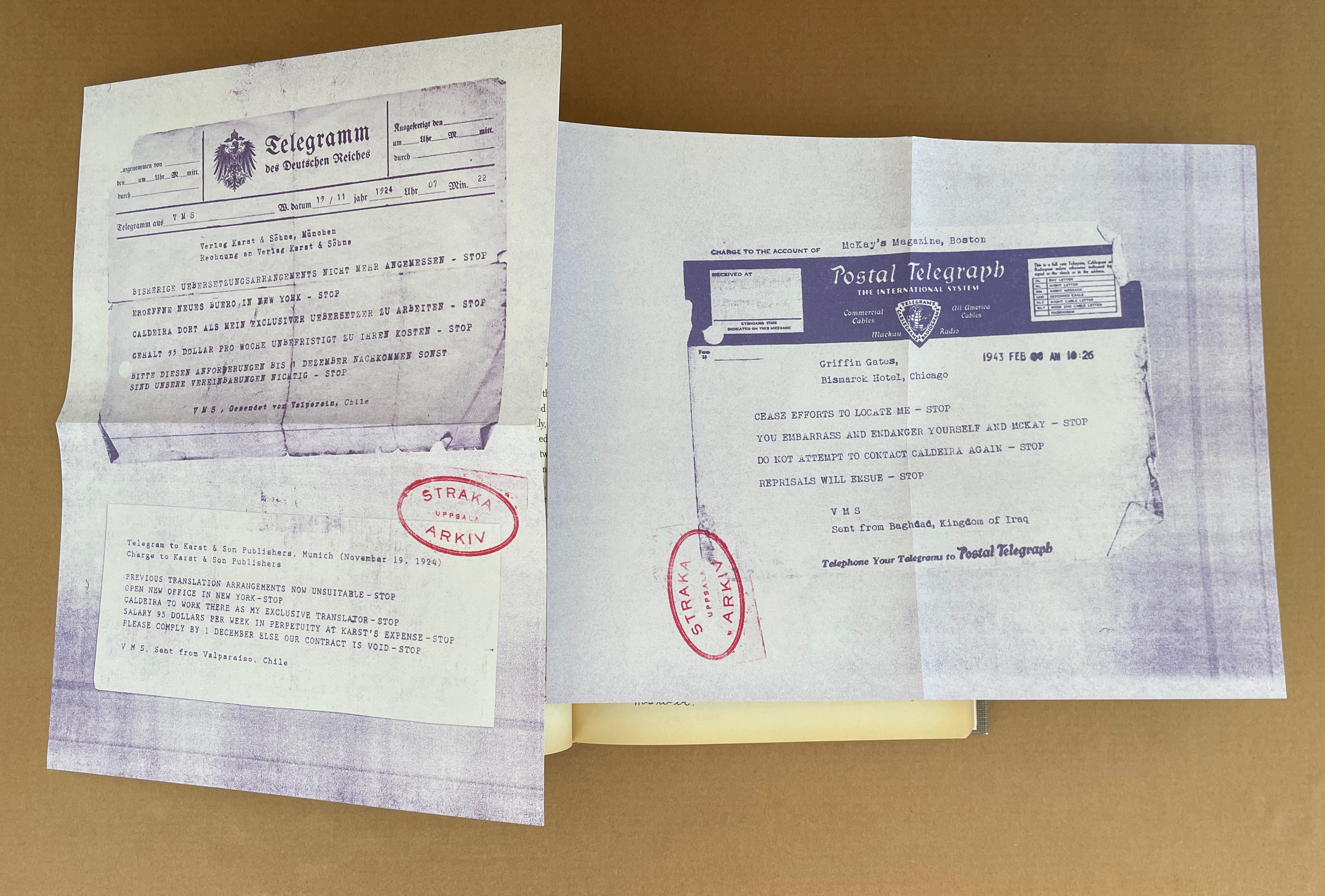
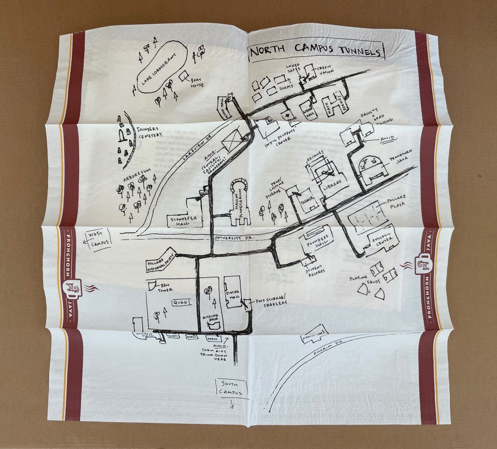
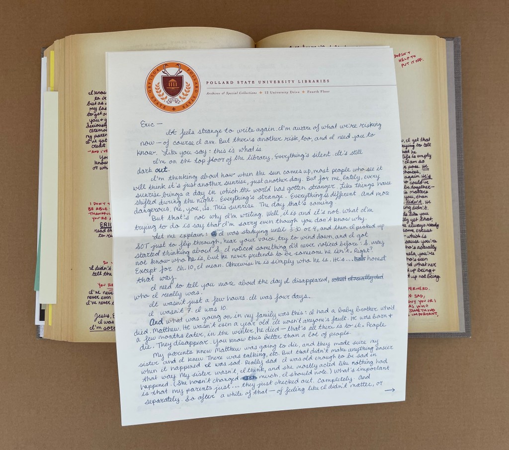
Konfidentiell letter (2 leaves) [insert between pages viii-ix] + Pollard State University : VMS accused of … (1 leaf) [insert between pages 10-11] + Xerox copy of journal article (1 leaf) [insert between pages 20-21] + Newspaper clipping (2 pages) [insert between pages 32 -33] + Telegram (2 leaves) [insert between pages 54-55] + 1 newspaper clipping/memo (1 leaf) [insert between pages 68-69] + Letter from Desjardins (1 leaf) [insert between pages 86-87] + Letter from Jen (4 pages) [insert between pages 100-101] + 1 Brazil postcard [insert between pages 112-113] + 1 photograph of stone wall [insert between pages 130-131] + 1 Birds of Brazil postcard [insert between pages 178-179] + 1 postcard of palms [insert between pages 190-191] + 1 postcard of a beach [insert between pages 192-193] + 1 Pictorial Brazil postcard (20 April near Marau) [insert between pages 200-201] + So … My Uncle Zeke (5 pages) [insert between pages 202-203] + 1 photograph of woman [insert between pages 242-243] + 1 newspaper clipping within 1 greeting card [insert between pages 256-257] + 1 map on napkin [insert between pages 306-307] + 1 in memoriam card [insert between pages 360-361] + Letter from J (4 pages) [insert between pages 376-377] + Letter from Esmerlinda Pega (1 leaf) [insert between pages 416-417] + 1 decoder wheel [insert between end leaf and pages 3 of cover]. Altered book. Issued in slipcase. Title and statement of responsibility from slipcase.”Bad Robot, Melcher Media.”–Spine of slipcase. Title page and cover title of volume inside slipcase: Ship of Theseus / V.M. Straka. Imprint on title page: Winged Shoes Press, New York, 1949. Title page and page [3] of cover printed with “stamps” of Laguna Verde High School Library; spine includes a Dewey call number label. Includes 23 items purporting to be documents concerning the “author,” V.M. Straka, and his “translator,” F.X. Caldeira from the Straka Arkiv; decoding wheel, letters, postcards and notes by the “readers,” Jennifer and Eric; and other related materials.Marginalia printed in various colors. Description from Fleet Library Special Collections, Rhode Island School of Design.
Further Reading
“Warren Lehrer“. 28 May 2024. Books On Books Collection.
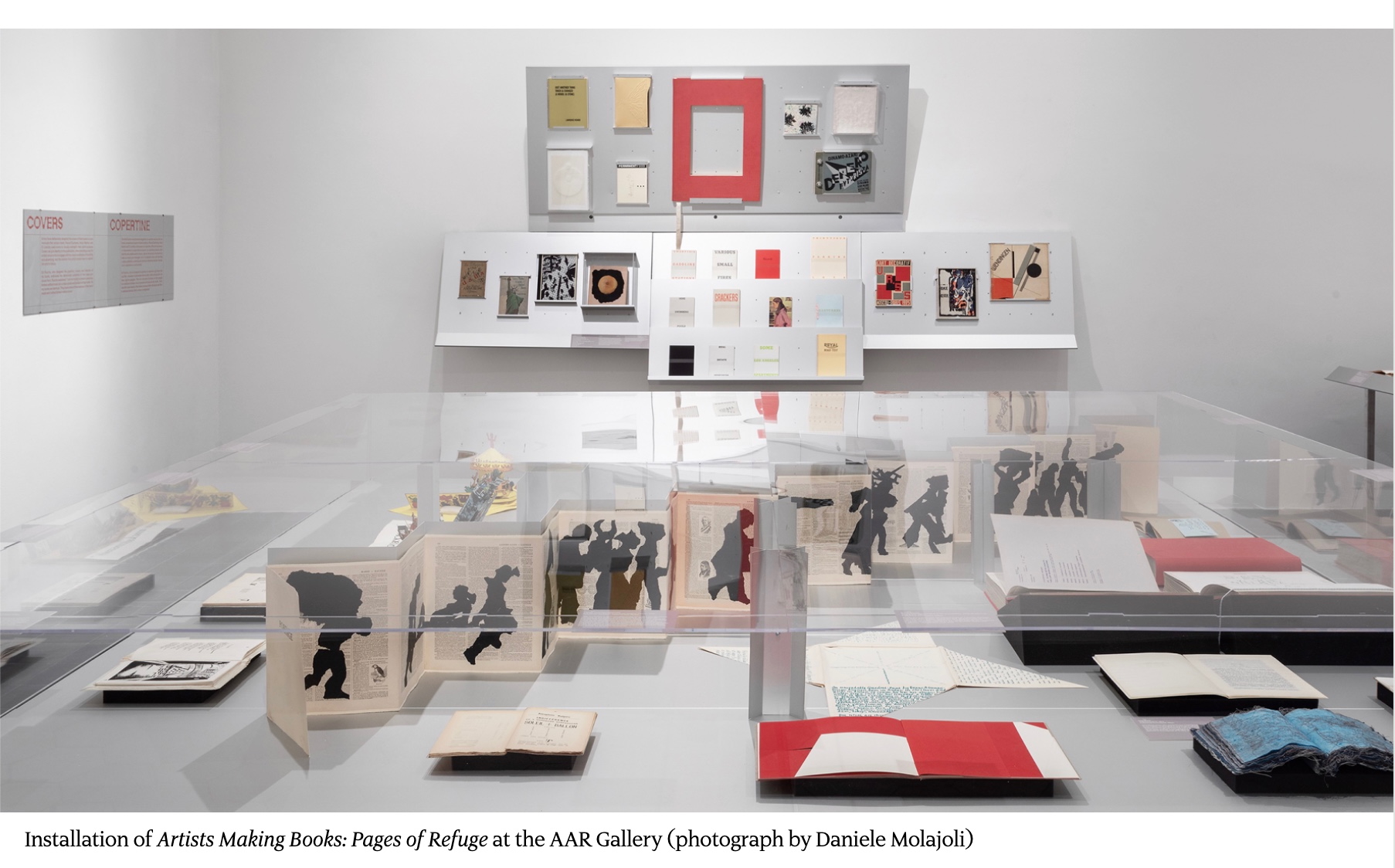
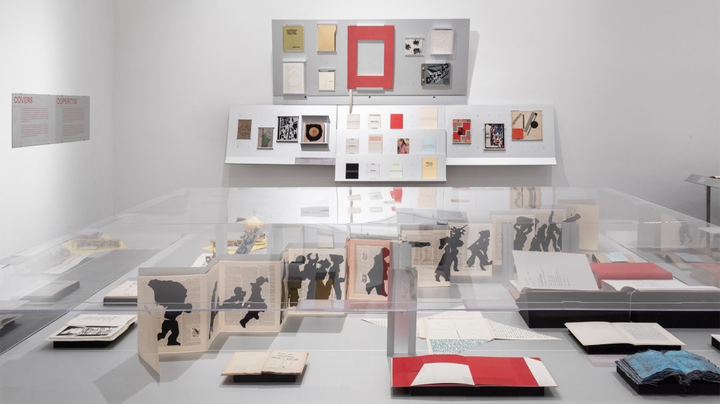
Ilaria Puri Purini and Sebastian Hierl at the American Academy in Rome are to be congratulated on Artists Making Books: Pages of Refuge, an exhibition that ran from 27 September to 7 December 2024. It boasted works from the Academy’s own library and the collections of Claudia Consolandi and Giovanni Aldobrandini as well as innovative customized displays by the architectural design firm Supervoid.
Because the Academy has attracted artists to Rome with residencies and the Rome Prize, Purini and Hierl had a headstart with artists’ books by Jenny Holzer, William Kentridge, Ana Mendieta, Tricia Treacy, Kara Walker and many others. They were also able to draw on several works by Ed Ruscha from the Academy’s Arthur & Janet C. Ross Library. The Collezione Consolandi added stars such as Giuseppe Anselmo, Alighiero Boetti, Maurizio Cattelan, Hanne Darboven, Lucio Fontana, Sol LeWitt and Andy Warhol, while the Collezione Giovanni Aldobrandini brought Balthus, Marcel Duchamp, Wassily Kandinsky, El Lissitzky, Bruno Munari, Kurt Schwitters and, again, Andy Warhol. The duplicates enabled the curators and Supervoid to offer visitors multiple views of the same work, and two wall-mounted iPads allowed visitors to scroll through the entirety of dozens of the works on display.
Although the eye might have been attracted to the wall display or the central large-scale vitrine shown in the first image above, an understated work just inside the entrance attracted mine. Pietre Foglie is a book of twenty lithographic prints, ten by Ana Mendieta and ten by Carl Andre. The title’s pietre (or stone) and foglie (leaves or folios) refer not only to the lithographic technique of the prints but also to the ten images of stone walls and the ten of arranged leaves. The self-reflection of title, technique, images and interleaving of the artists’ efforts make the book more than a mere portfolio of prints; they make it an artist’s book or rather a collaborative artists’ book. On display is Mendieta’s folio of five leaves arranged to evoke the female form. The caption to the display cites Mendieta’s aim of “carrying out a dialogue between the landscape and the female body”, to which this image contributes. The delicacy of the leaves contrasts with their earthy pose suggestive of the Artemis statue in the Vatican Museum or the Venus of Willendorf. As an example of artists’ books’ materiality and frequency of collaboration in their creation, Pietre Foglie captures two of the exhibition’s main themes. With the hindsight of Mendieta’s death in an abusive relationship, her leaves’ dialogue with Andre’s stone walls (not shown in the case or the mounted iPads, a perennial issue with the display of the artist’s book) might freeze informed viewers in their tracks. The depth of feeling in its choice reflects the curators’ thoughtfulness, and the rest of the exhibition did not disappoint.
Ana Mendieta (1984 Fellow) Pietre Foglie. Roma: Bulla, 1984 The Arthur & Janet C. Ross Library American Academy in Rome “I have been carrying out a dialogue between the landscape and the female body”, said Ana Mendieta, who explores this relationship in Pietre Foglie. She realized the book during her time in Rome in collaboration with her husband Carl Andre, with whom she had a relationship punctuated by his violence and abuse of her. — Academy’s display caption.
Throughout the exhibition, the focus on the materiality of the artist’s book naturally recurs. Of course, materiality surfaces in livres d’artiste and fine press books like the represented works of Picasso, Matisse or Arion Press, but its presence and use in works like Pietre Foglie or Tricia Treacy’s Slot (2018) is often the ingredient that nudges a work into that special category of artist’s book. The Academy and curators do a real service for this notion with their video of Treacy’s and Francis Offman’s discussion of their works, practices and the material nature of artists’ books.
Moderator Vittoria Bonifati: cofounder of Villa Lontana, focused on ancient and contemporary practices in both visual arts and sound.
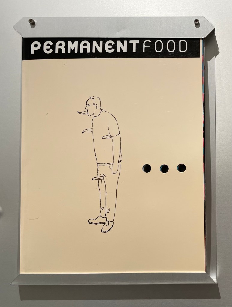
Materiality and conceptual art are often considered separate streams in art, but a serendipitous inspiration that upends that notion struck when Purini and Hierl chose to display Maurizio Cattelan’s PermanentFood (2002). Only weeks before their exhibition’s close, the Chinese cryptocurrency entrepreneur Justin Sun ate his $6.2 million purchase of Cattelan’s duct-taped-to-a-wall banana entitled Comedian (2019). The complex and temporal levels of ironic self-reference between the two works makes one wish for a duct-taped-to-the-wall onion to have been juxtaposed with Permanent Food to encourage the unpeeling (and add to the tears of laughter).
Maurizio Cattelan Permanent Food, no. 8 / no. 9. 2002 Collezione Consolandi, Milan In 1995, Cattelan, along with artist Dominique Gonzalez-Forster, founded Permanent Food to gather “images that belong to everyone,” as they stated in the preface. Later, with designer Paola Manfrin, they created what they termed a “second-generation” publication with no hierarchy of images and no copyright, serving as a free territory for image exchange before the rise of blogs and social media. — Academy’s display caption.
Another pleasure was the completely unfolded leporello by William Kentridge, benefiting from Supervoid’s design of the large central vitrine in the main room.
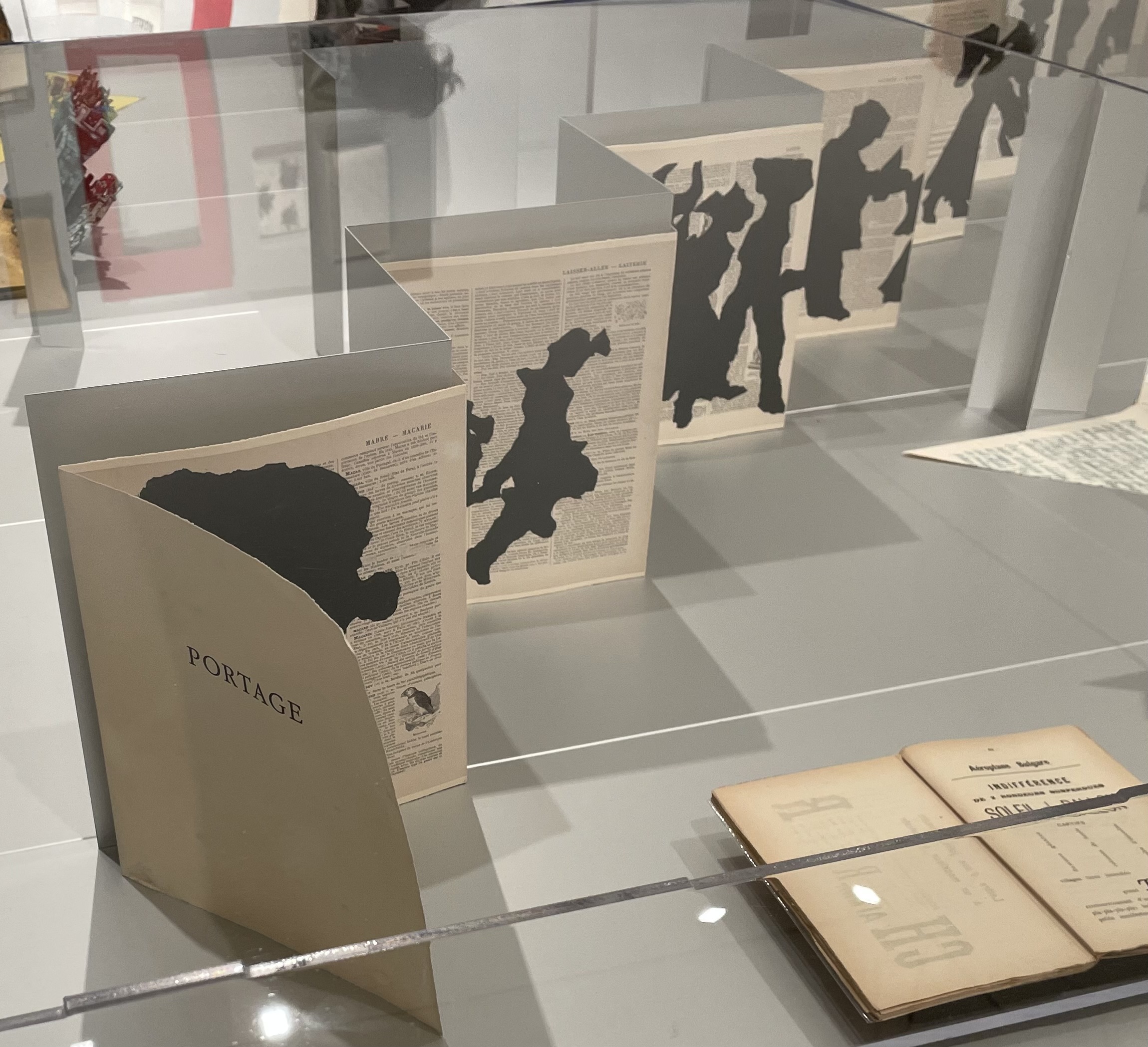
William Kentridge (2014 and 2016 Resident) Portage. White River The Artist’s Press, 2000 Collezione Consolandi, Milan Kentridge’s practice is focused on the traumatic memories he holds of South Africa. He frequently uses processions as a way to convey the heaviness of the narratives of history. In Portage, he juxtaposes silhouettes against the pages of the Encyclopédie, the compendium of Enlightenment thought, published in France in the mid-eighteenth century, creating random encounters between text and image, and asking fundamental questions about knowledge, progress, and power. — Academy’s display caption.
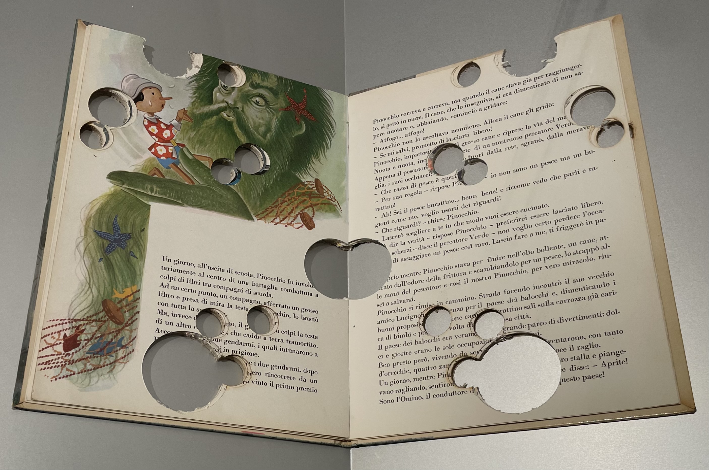
The exhibition also captured book artists’ interest in children’s books, spanning from Bruno Munari’s Le Macchine (1942) to Stefano Ariente’s alteration of Pinocchio (2006), which looks like a copy closely read by the puppet himself.
Bruno Munari Le Macchine. Torino: Einaudi, 1942 Collezione Giovanni Aldobrandini, Rome Le Macchine (The Machines) is Munari’s first children’s book, marking the beginning of his long collaboration with editor Giulio Einaudi. The book reveals Munari’s interest in games, education, and didactic principles. The machine become a surreal and playful object in this powerful graphic format, designed to surprise the reader. Munari controlled production and distribution of his books. — Academy’s display caption.
Stefano Arienti Pinocchio, 2006 Collezione Consolandi, Milan In Pinocchio, Stefano Arienti carves circles of various shapes into the pages, altering the reading experience of the original story. The work plays with the overlapping of different texts, generating a new vision for the book. Arienti’s career is marked by his reworking of common objects and popular culture images to create unexpected effects of the original material. — Academy’s display caption.
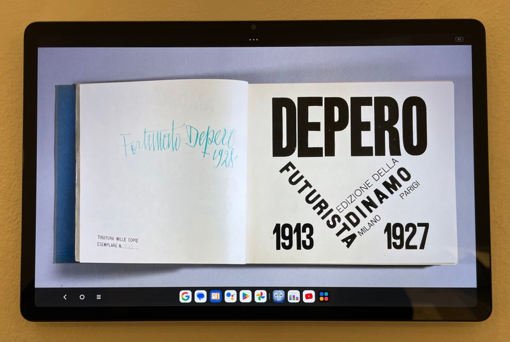
It was a pleasure to see on display the original of Fortunato Depero’s Depero Futurista and to find in the Rare Books Room the facsimile by Designers & Books, also in the Books On Books Collection. The added treat was the view of the entire book in the iPad display. Only a few are shown below, but Designers & Books offers all the pages here.
Fortunata Depero Imbullonato. Milano: Azari, 1927 Collezione Giovanni Aldobrandini, Rome Depero’s Imbullonato (bolted book) embodies ideas from the Futurist manifesto, such as the “destruction of syntax,” “imagination without strings,” and “words-in-freedom.” By rejecting traditional print formats and blending book mechanics with fantastical elements, Depero declared Imbullonato a “dangerous object,” as its metal plates could damage other books. The pages can be rearranged by the reader in any order. — Academy’s display caption.
Also displayed in the Rare Books room was a unique work by Huang Min, on loan from the AAIE Contemporary Art Center in Rome. The artist’s usual medium is the large-scale canvas (a showcase can be found at Blue Mountain Contemporary Art), so this leporello in which she has painted directly on the panels represents the unique end of the spectrum of book art.
The exhibition as a whole provided a good historical review of artists’ books from the 20th and early 21st centuries. Lecturers on artists’ books would have done well to take their students on a guided tour there. Other institutions with significant collections of this form of art would do well to mount similar exhibitions and issue invitations to local schools, art colleges and universities. The traffic would be ensured.
“Darby English & Cornelia Lauf – Pick a Book“. 18 October 2024. Rome: American Academy in Rome. Features Kara Walker and Toni Morrison’s Five Poems and Ed Ruscha’s Every Building on the Sunset Strip from the exhibition.
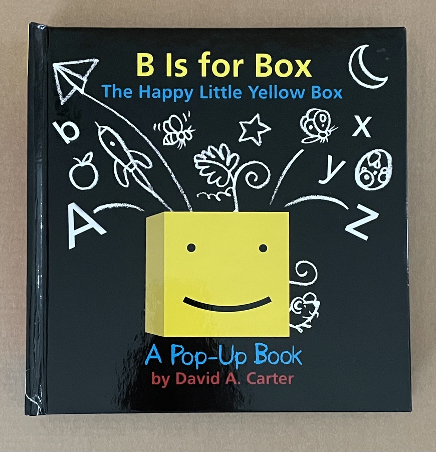
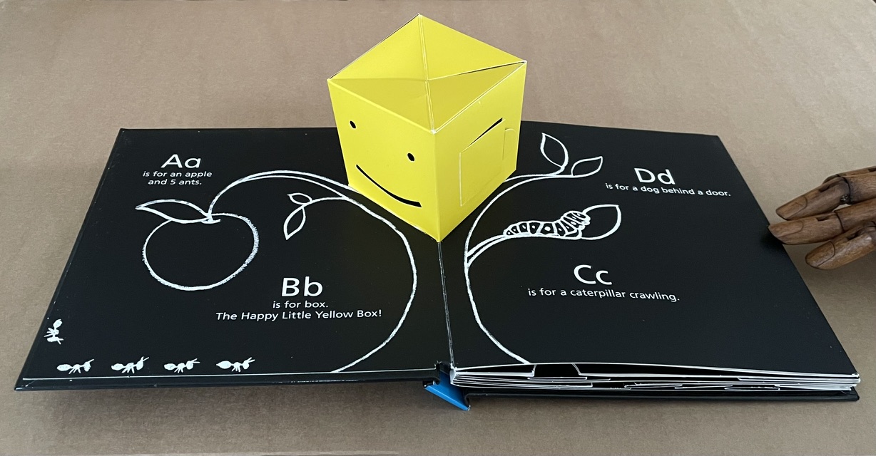
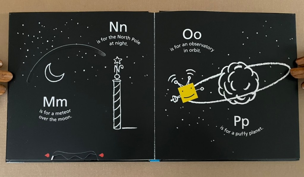
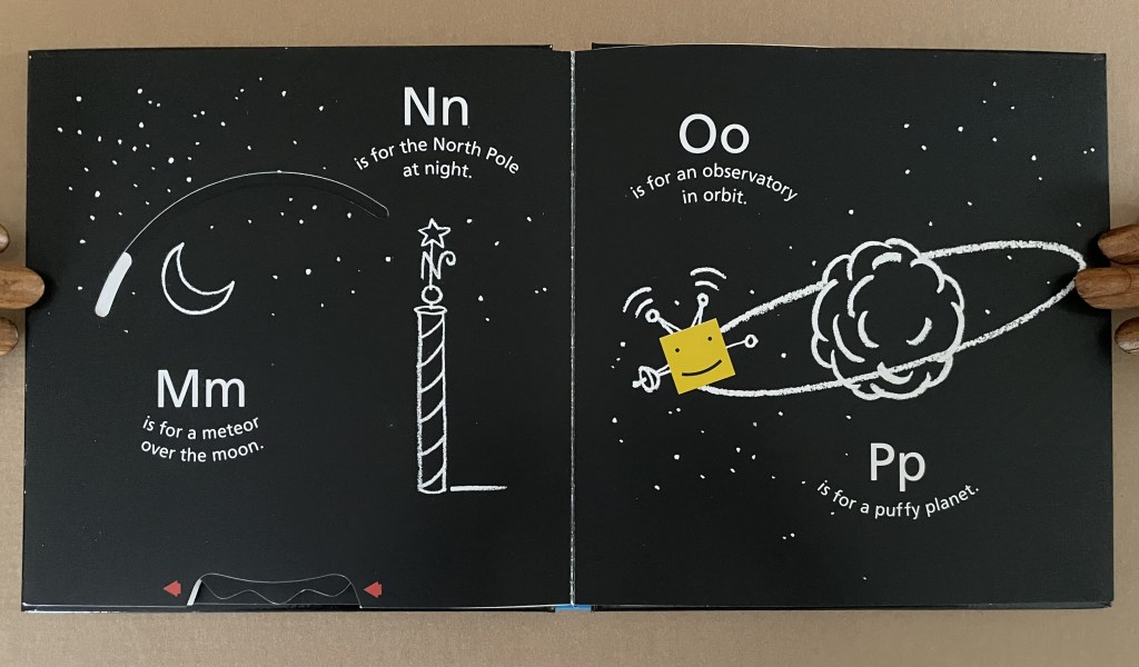
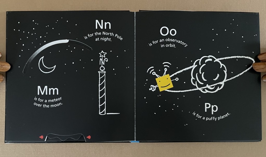
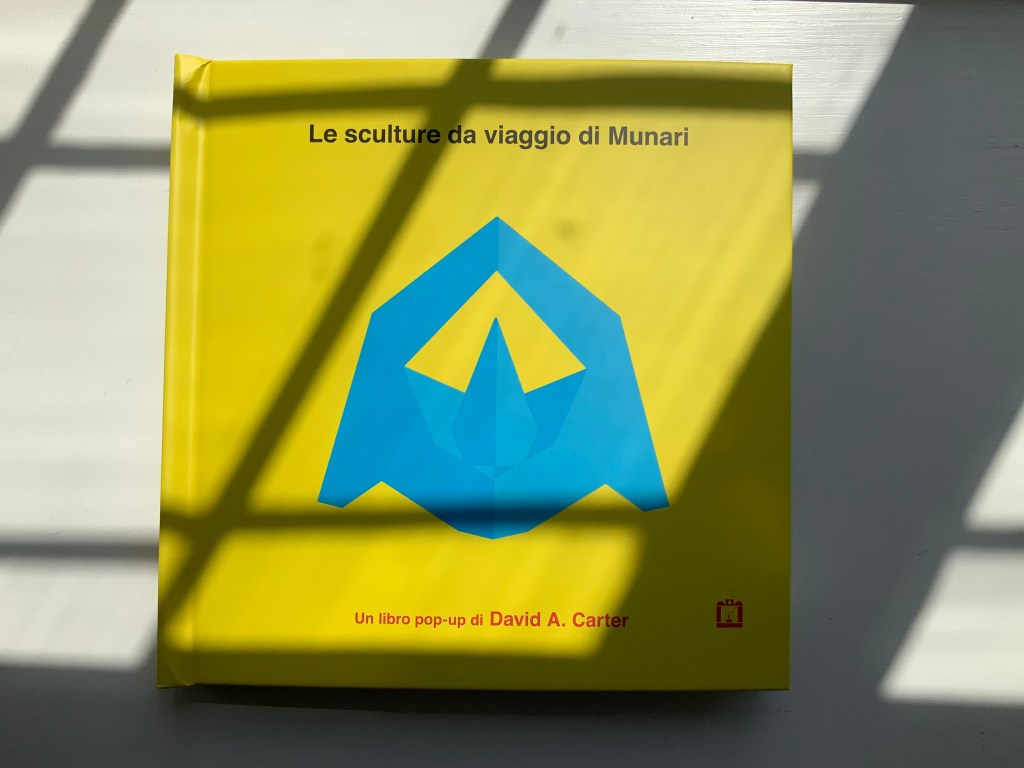
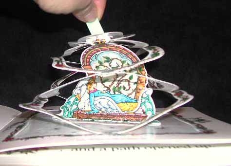
B is for Box (2014) David A. Carter Pop-up book, printed paper over boards. H187 x W184 x D28 mm. [14] pages. Acquired from Type Punch Matrix, 17 September 2024. Photos: Books On Books Collection.
“The Happy Little Yellow Box” was first introduced in a pop-up book of opposites by that name in 2012. For the Books On Books Collection, the box’s return in this pop-up alphabet makes it the one to add to all the other abecedaries here. The box is also a happy reminder of the items under Further Reading (below).
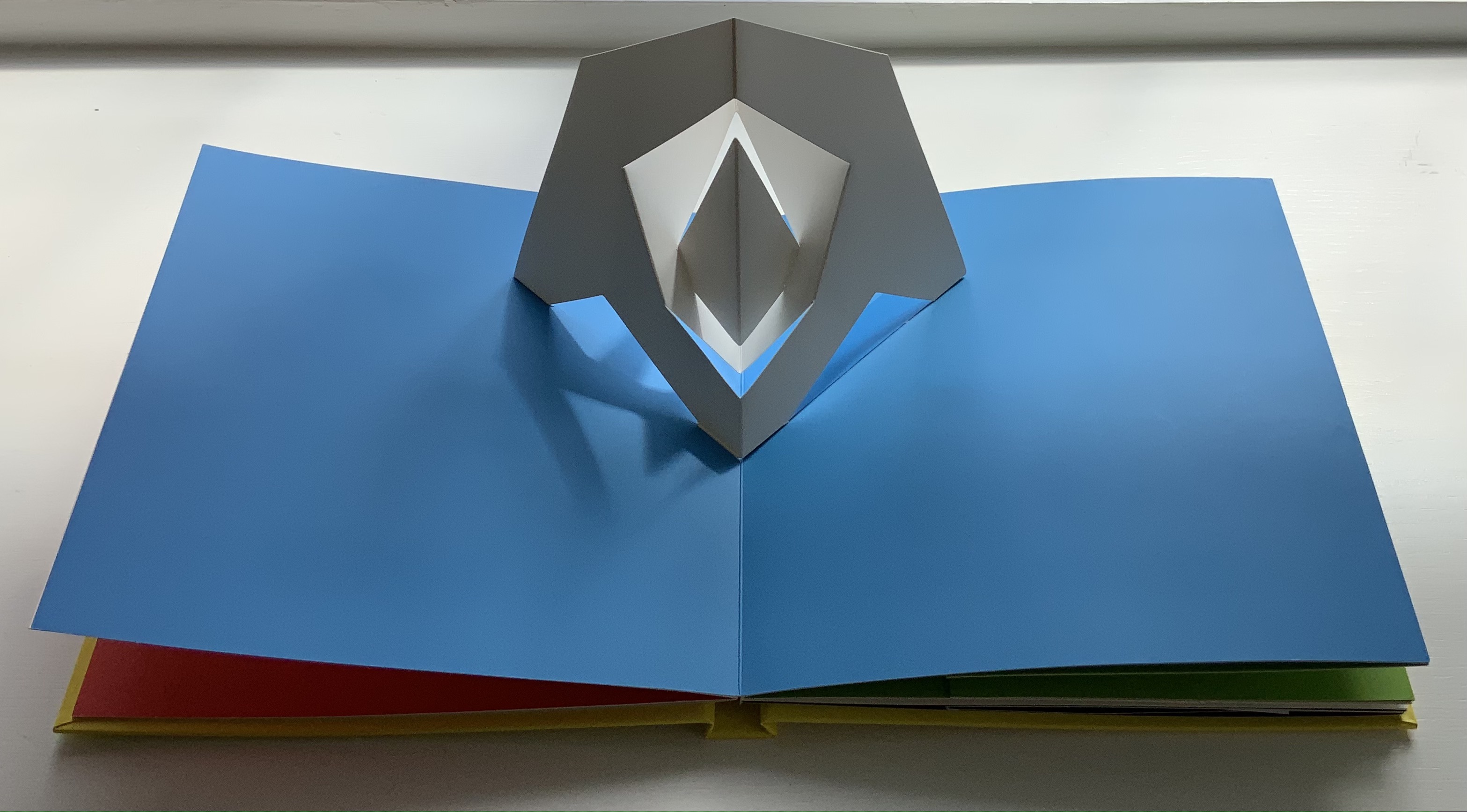
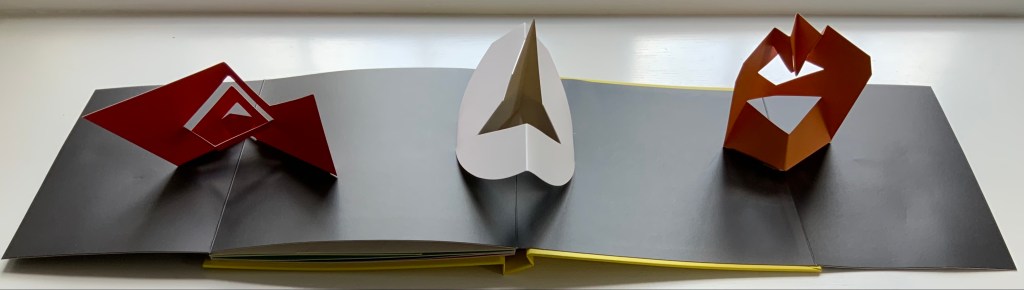
Le sculture da viaggio di Munari (2019)
Carter’s Le sculture da viaggio di Munari brings the spirit of Munari’s “travel sculptures” into the collection. His homage carries the blessing of Corraini Edizioni, further justifying its inclusion.
Travel sculptures started off as small sculptures (some even pocket-sized) to carry with you, so you could take part of your own culture to an anonymous hotel room. Later they were turned into ‘travel sculptures’, five or six metres tall and made of steel. One of these was seen for a few months in Cesenatico, another one in Naples. Others are sleeping among huge trees in the Alto Adige region.’ This is how Italian designer Bruno Munari (1907-1998) described his ‘travel sculptures’, which in turn inspired American illustrator and designer David A. Carter for this pop-up book. –Corraini Edizioni website. Accessed 3 August 2021.
Munari’s travel sculptures also recall works in the collection like Cumer’s scultura da viaggio dipinta n.2(2017), Komagata’s「Ichigu」(2015) and, albeit less portable, Ioana Stoian’s Nous Sommes (2015).
Rubin, Ellen. 2019. Ellen Rubin – The Popuplady. For her definition of the “spider web” form of pop up (Within a circle, a spiral is cut either by hand or laser. A ribbon or pull is attached to the center area. When pulled up, a ‘spider web’ pop-up is created.), Rubin illustrates it with an example from Carter.
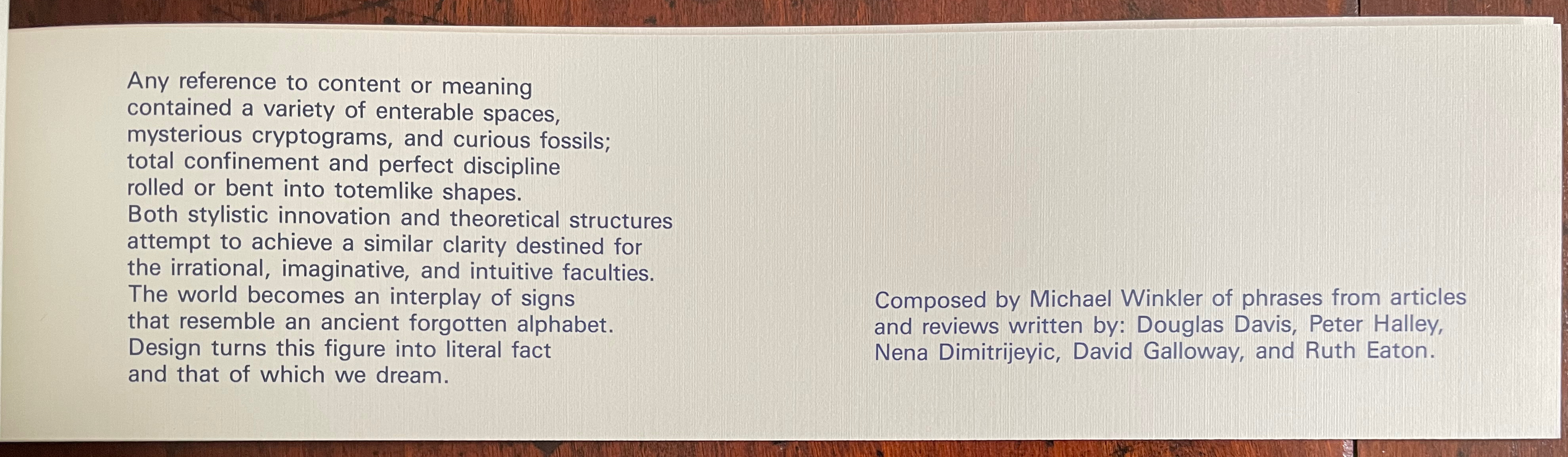
Word Art/Art Words(1985) Michael Winkler Booklet of 29 folios, including front and back covers, held in a white plastic clip. H73 x W288 mm. 27 folios, printed on recto only. Edition of 500. Acquired from Printed Matter, Inc., 23 September 2022. Photos: Books On Books Collection. Displayed with artist’s permission.
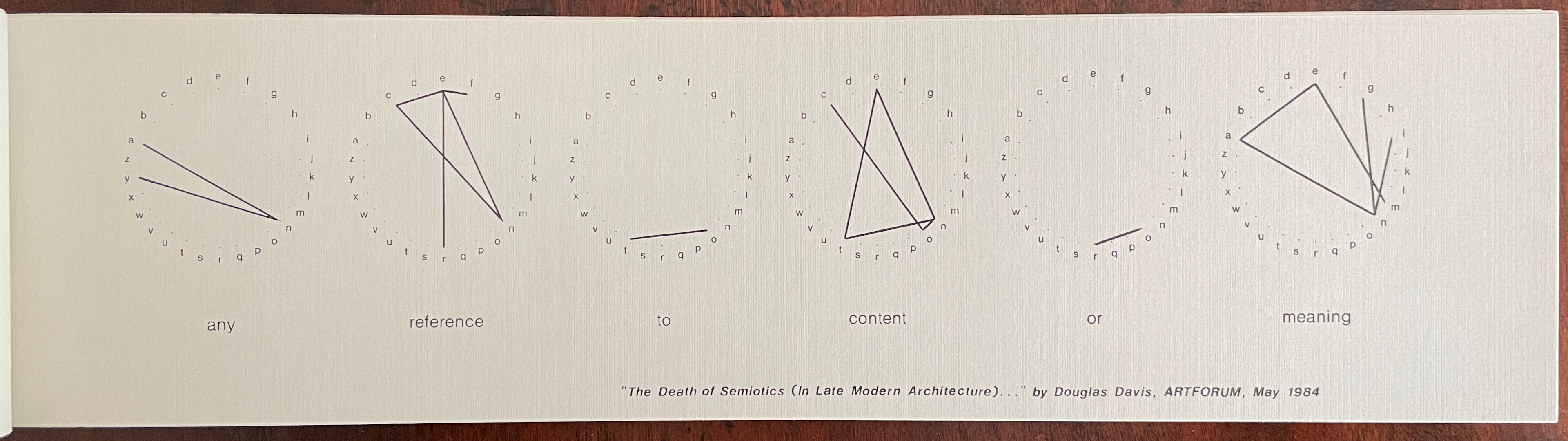
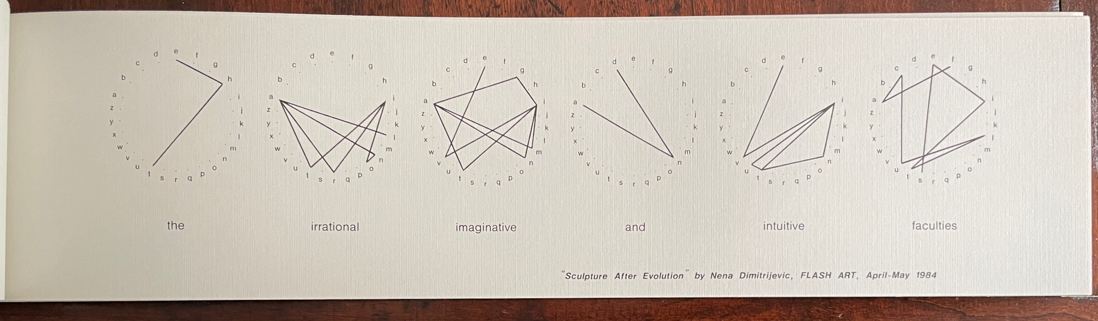
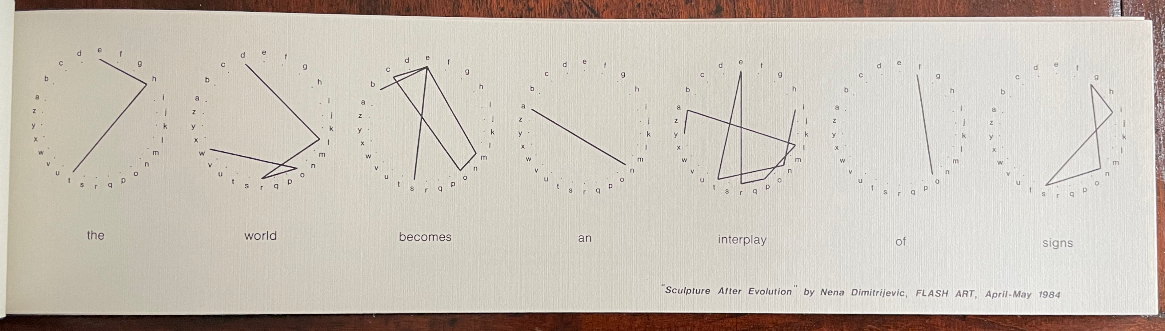
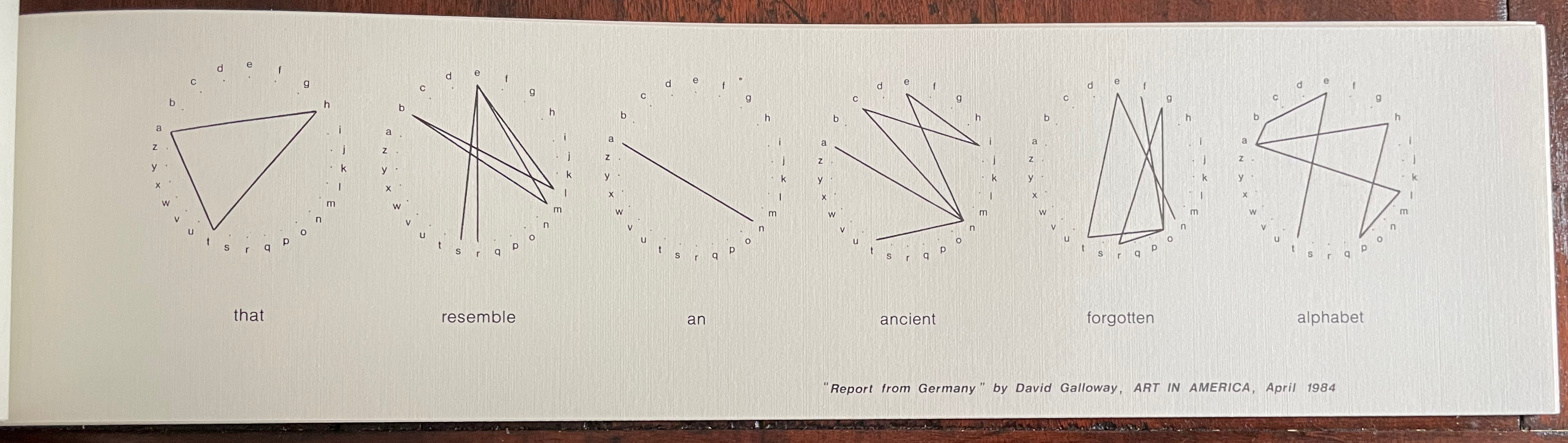
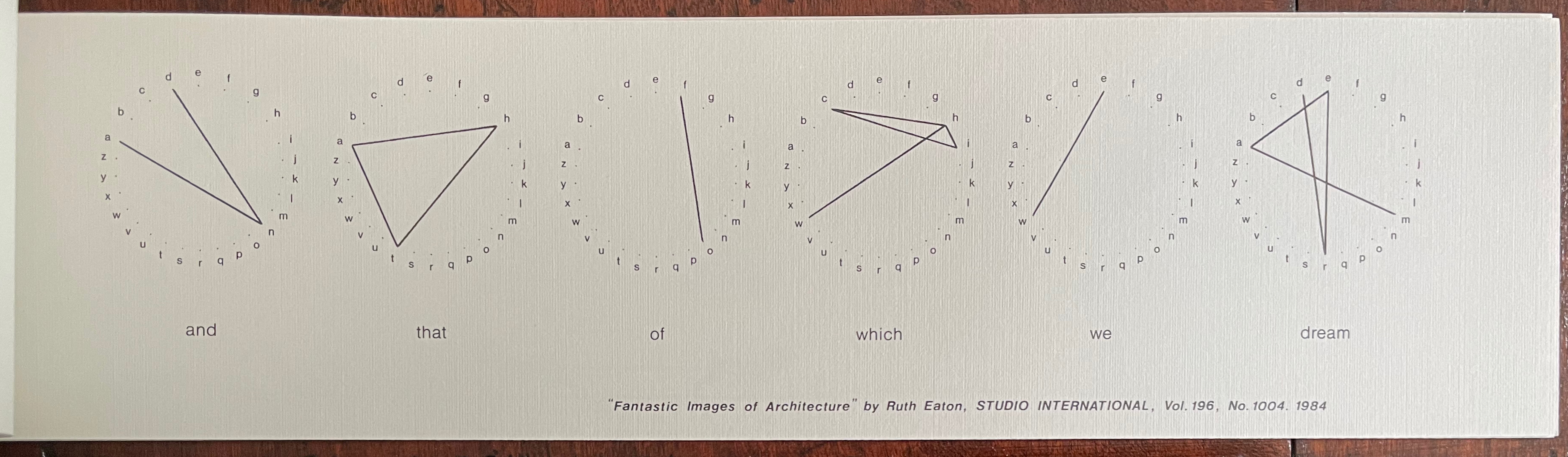
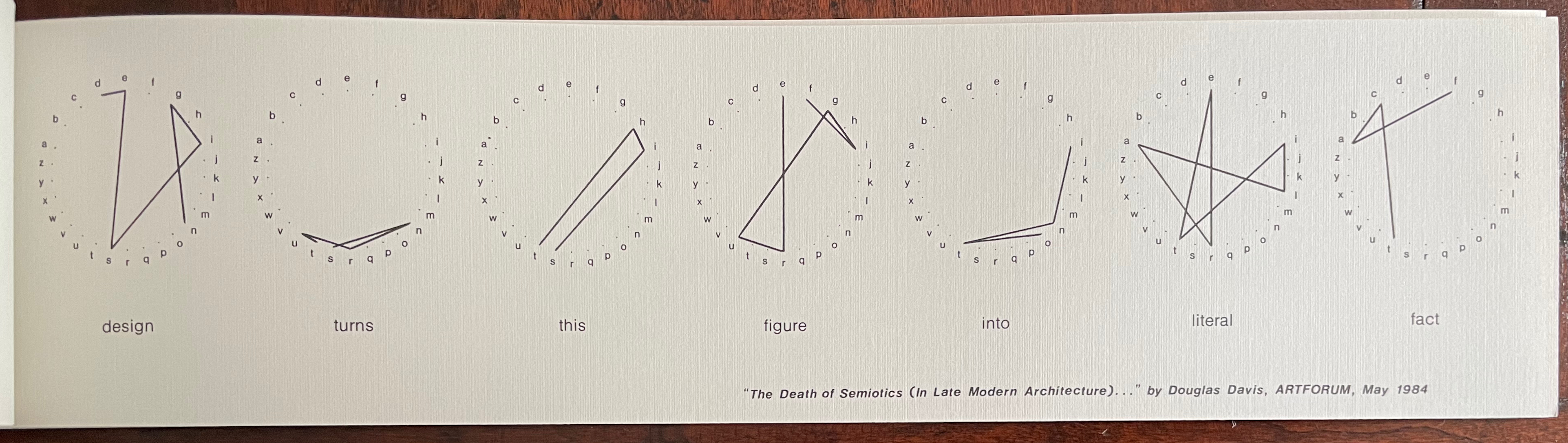
Among all the works of book art related to the notion of alphabets and signs in the Books On Books Collection, Michael Winkler’s word art/art words is one of the more unusual. Winkler’s view of the alphabet varies from traditional linguistic and semiotic theories that families of language arose from ur-languages and that letters evolved from pictographs into increasingly abstract abstractions arbitrarily associated with sounds by social convention. Winkler celebrates a different mystery.
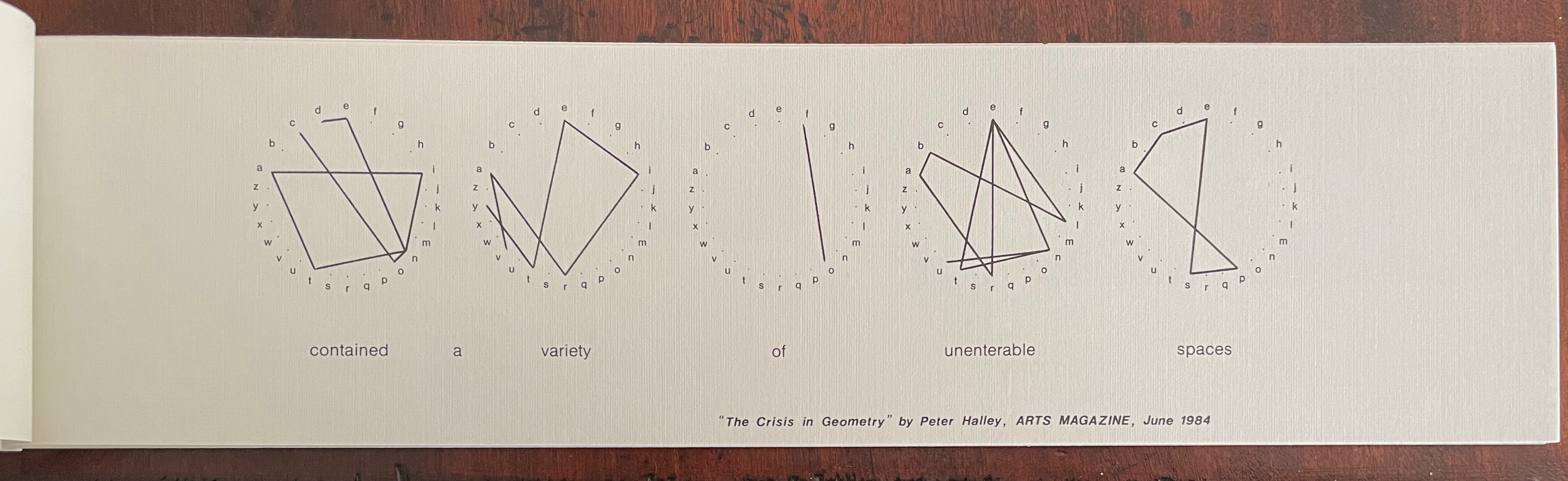
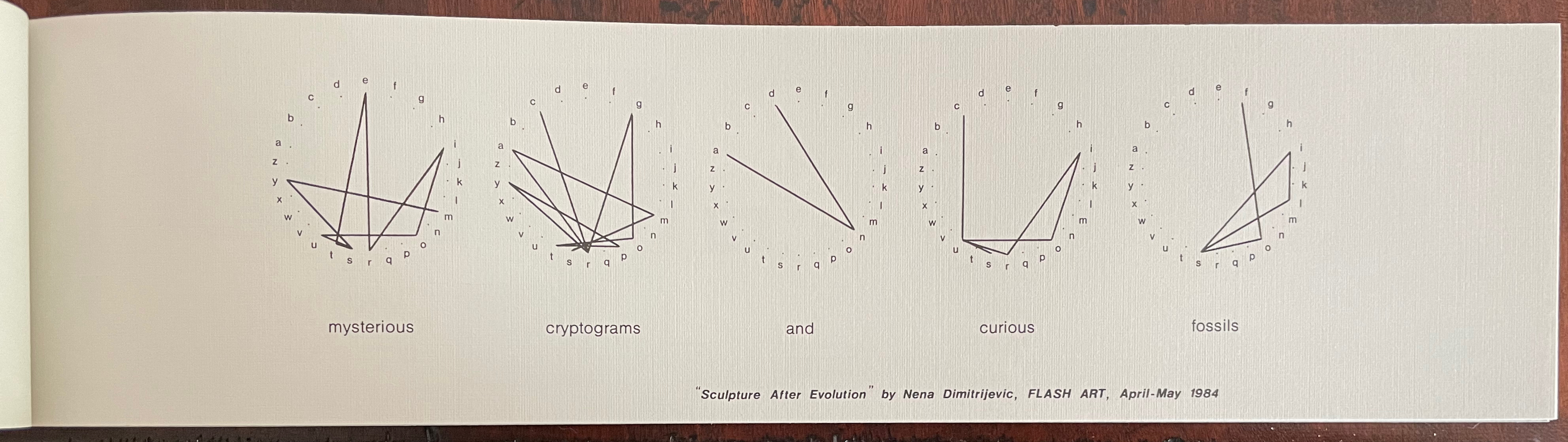
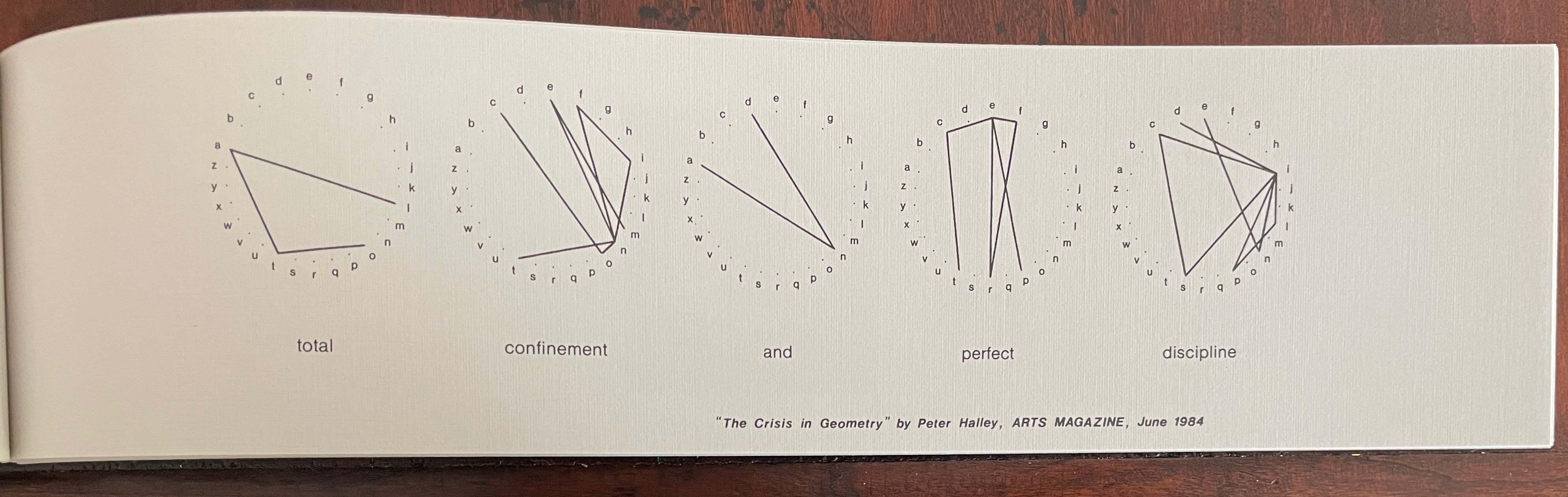
Each of twelve folios has a phrase taken out of context from an art review or essay about art and printed on one side. Above each word, Winkler presents the word’s transformation into an image by drawing lines from letterpoint to letterpoint in a circularly displayed alphabet. Here is the first folio that performs that transformation:
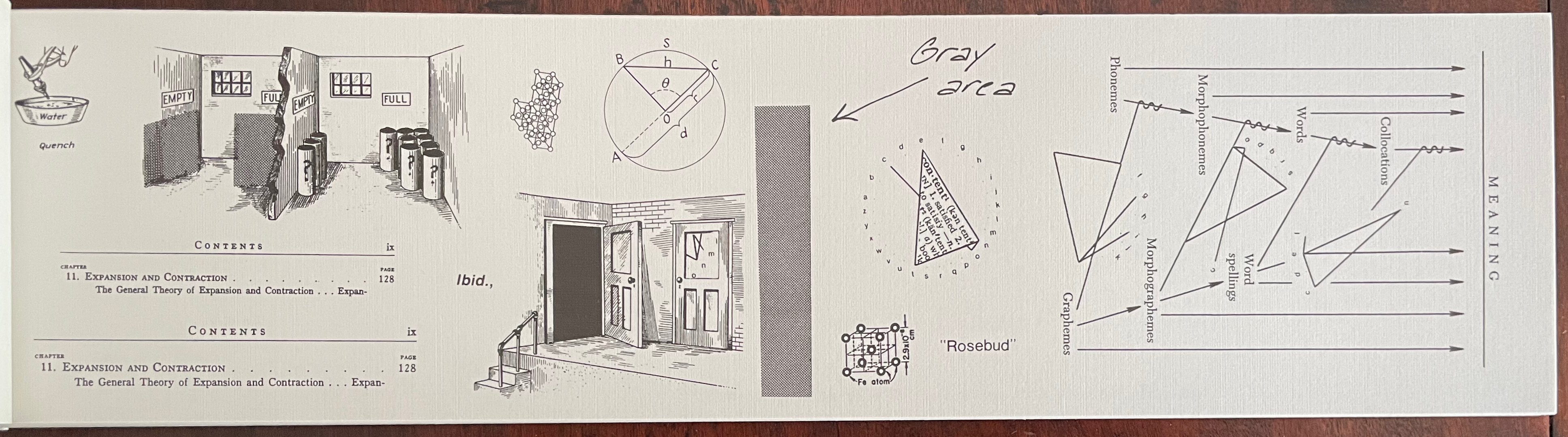
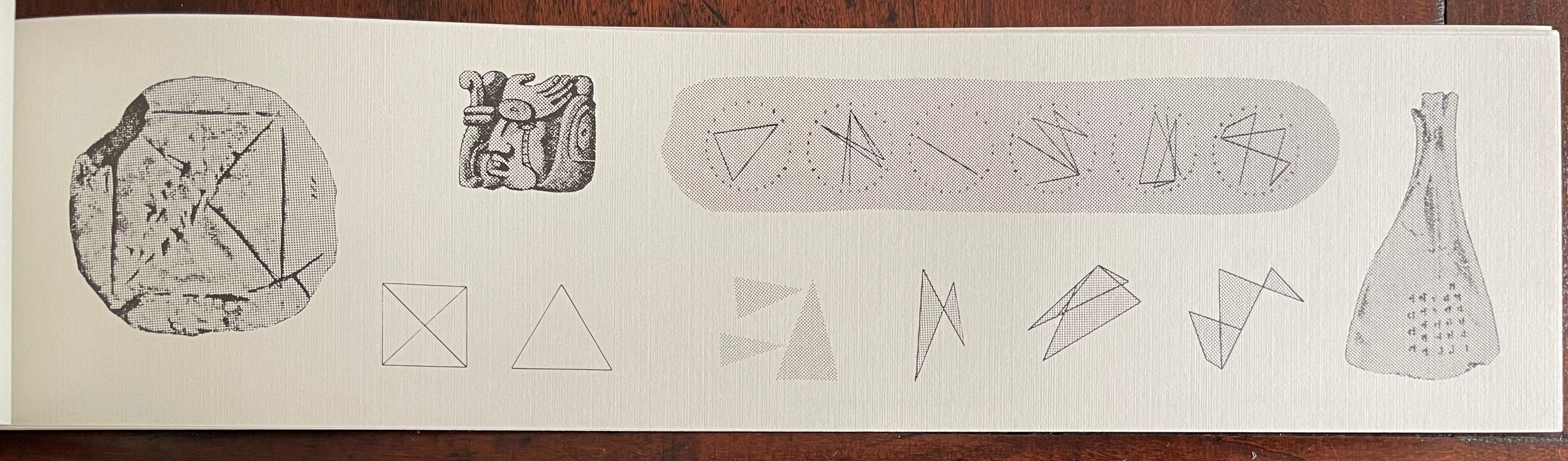
After each of these word-image folios, Winkler adds another folio with various images “based on the visual aspects of, or the implications of the meanings inherent in,” the preceding folio’s sequence of word/images. Below is the folio that follows the word/images above:
Notice that, just under the label “gray area”, the word/image for “content” is reproduced from the preceding folio but with the dictionary-definition of “content” (as meaning “satisfied”) collaged into the triangular space of the image. Text generates image, image captures text. To the left of the gray block, the lower arc of the image for “meaning” appears within the rectangular window of the doorframe. If we miss the point that geometric representation of text and meaning is linked to geometric definition and measurement of shape, there is the traditional image of circle, circumference, diameter, radius, segment and chord displayed just above the doorframe to remind us. If we miss the point that the “content” referenced by a circle can be empty or full of meaning, there are the closed and open portals as well as a cross section of rooms labeled “empty” and “full” to remind us. The ambiguity of the word “content” shows up in the section of a Table of Contents, whose reference to the paired opposites of expansion and contraction is reinforced by the metaphorical equation set up by ibid. (the “same source”) between the twice-repeated Contents section on the one hand and the open and closed portals on the other. The manifoldness of “meaning” as well is represented by the semantic diagram on the right.
And so it goes, folio after folio, which are otherwise loose but bound only by virtue of the plastic clip and meaningfulness of sequence. The plastic clip, the loose folios and the oblong shape contrary to expectations for a codex — they obliquely reprise Winkler’s suggestion of what meaning/making (or making meaning) is about. Circularly represented, the loose letters of the alphabet nevertheless combine in words and linear images in which meaning inheres.
But isn’t meaning associated with words arbitrary (as hinted at by the allusion to the mysterious Wellesian “Rosebud” from Citizen Kane)? Winkler’s circular word-decoder (or rather image-encoder) implies that it only seems so. The mystery doesn’t lie in arbitrariness, rather it lies in Nature. In Winkler’s view, language is a product of a Nature that is meaningfully patterned. If consciousness and language are products of Nature, the associations that he finds between the abstract linear images and external figurative images argue for an inherent meaningfulness perhaps resident in some “ancient forgotten alphabet”.
Although the preface to word art/art words signals the clinching argument that Winkler presents, it has to be experienced from front to back and back to front to appreciate it. The final page compiles all of the previous twelve phrases into a single paragraph of four sentences: a sort of textual collage that presents a syntactically and semantically coherent manifesto.
The seamlessness of the collaged paragraph implies a vision just waiting for discovery through application of the artist’s word/image technique. Albeit out of context and somewhat disparately sourced, though, the phrases were selected and combined to produce that articulate statement of artistic vision. The artistry in doing so is what celebrates the mystery of language and representation that Winkler finds in Nature.
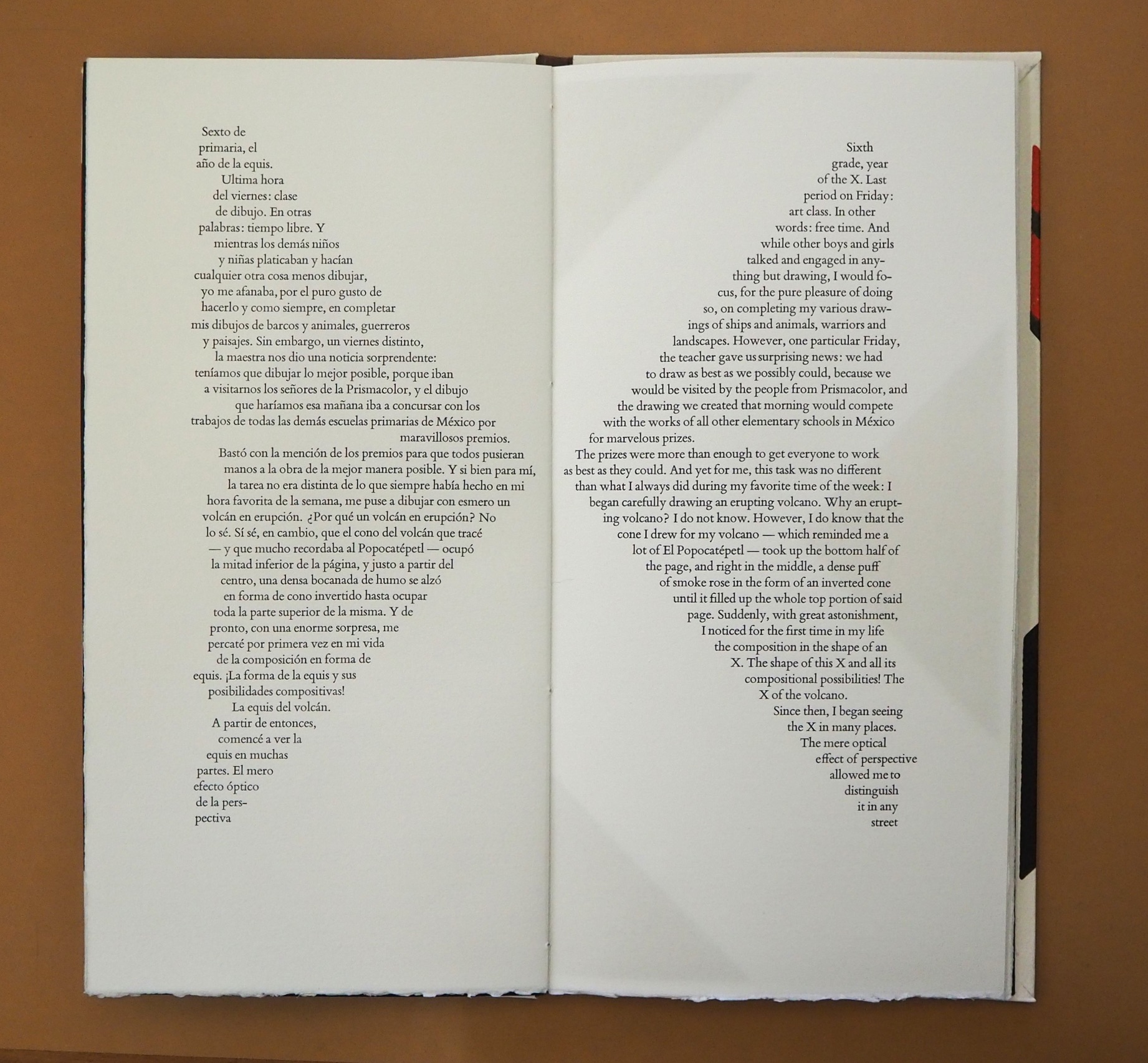
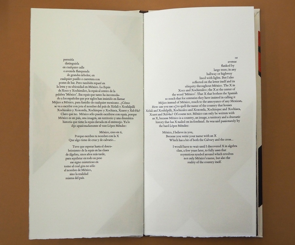
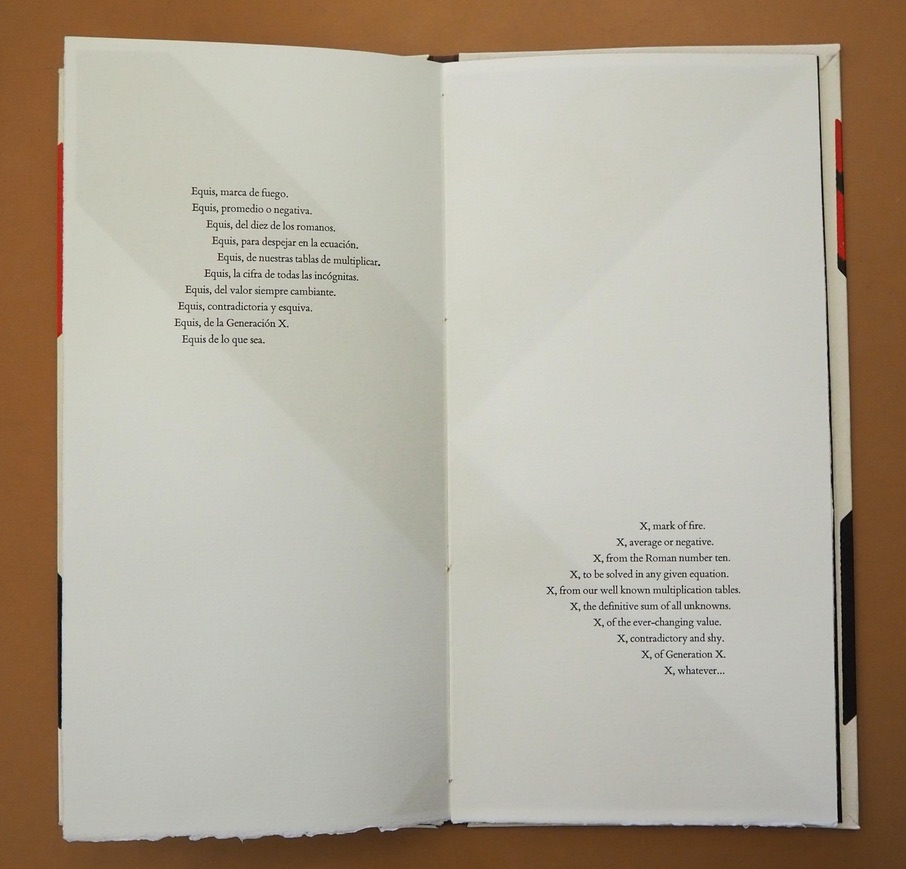
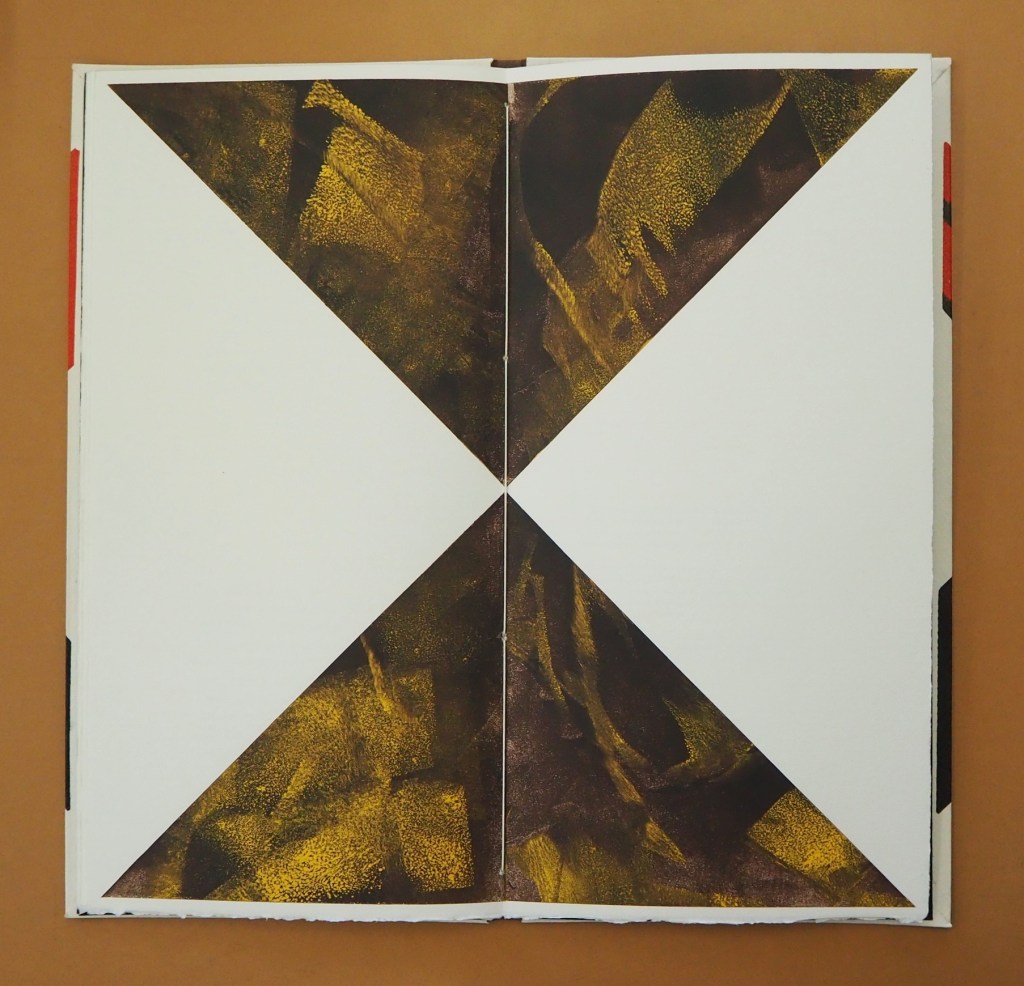
In this ode to the letter X, Mexico and language itself, Alberto Blanco and Nacho Gallardo Larrea brilliantly show how the artist’s book can translate word and image from one to the other and back and, at the same time, soar over the challenge of translating poetry.
The Spanish and English versions of Blanco’s text shape, and are shaped by, the bilateral symmetry of the letter X and the codex form of the book. Spanish on the left, English on the right: the imposition of type and the ghostly images of the X play with one another. The two texts delight in the crossover between similarity and difference, knowingly in the white space at the exact center of the X in the double-page spread below. How better to use the notion that, for all letterforms, space counts as much as line?
Sometimes the language on one side completes a thought or expression before the language on the other side can do so, a natural phenomenon in translation in which one language needs fewer or more words than the other. See above, for example, the passages beginning “La equis del volcán” and “X of the volcano” that do not quite align in the legs of the X. The Spanish sentence trails off in a fragment to be completed on the following verso page, but the English sentence is already half way there on the recto page above.
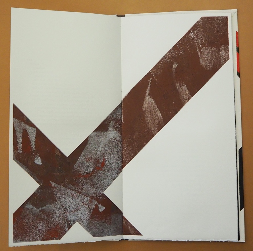
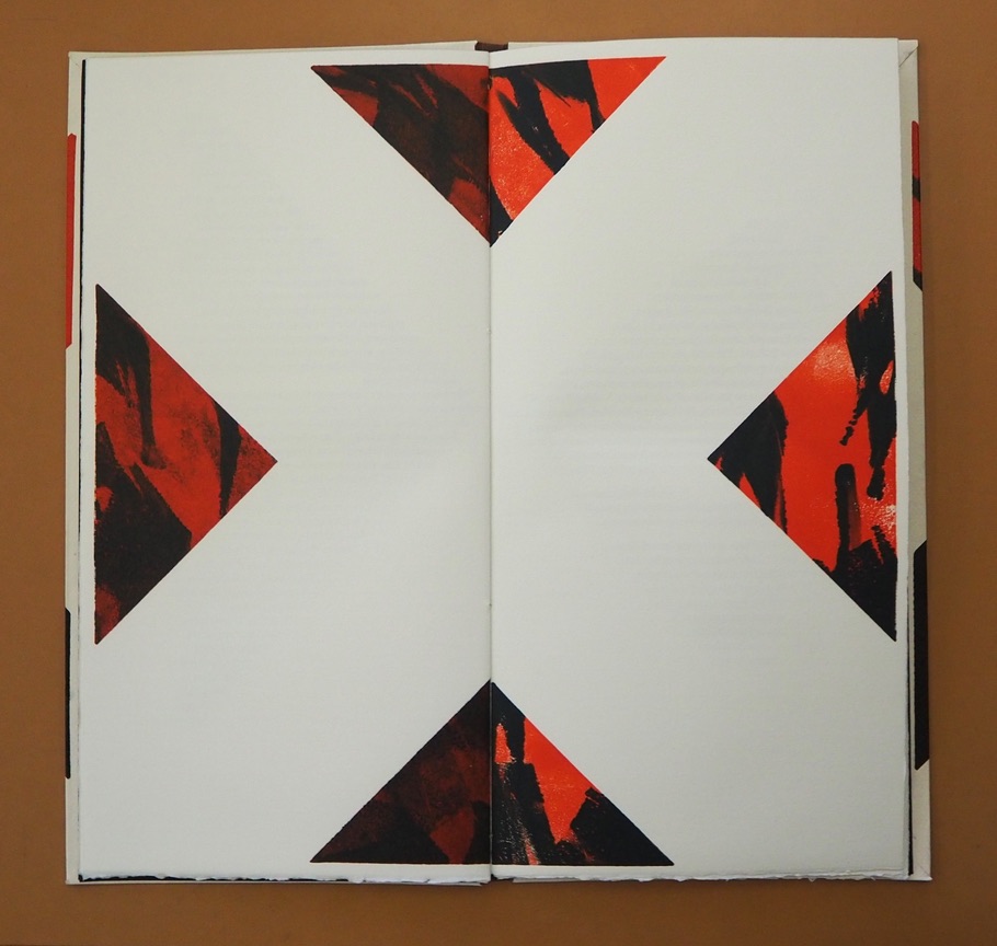
As the shaped poem continues in the pages below, and the number of words in one language exceeds those on the other creating lines asymmetrical to one another, the poet and artist use the X shape in whole and parts and the diametrical placement of text in the last double-page spread to reflect the crossing dance of similarity and difference, asymmetry and symmetry, that they find in X across languages, generations and country.
Interpersed between the pages of text, the late El Nacho’s monotypes make color, shape and space play with one another to mirror — not merely illustrate — the thrust of the language. If ever there were a collaborative work that distinguishes the artist’s book from a livre d’artiste, this is it. Alberto Blanco has also created solo artist’s books, which enjoyed an exhibition at the Athenaeum Music & Arts Library, La Jolla, California, February 19-March 26, 2011. Stylistically they are distinct from The Book of Equis, which underscores its collaborative originality.
Colophon: “The Book of Equis was designed and printed in Intagrafía, located in San Jose del Cabo under the direction of Peter Rutledge Koch, with monotypes created by El Nacho. Printed under the supervision of Lenin Andujo Fajardo by Ivonne Rivas.”
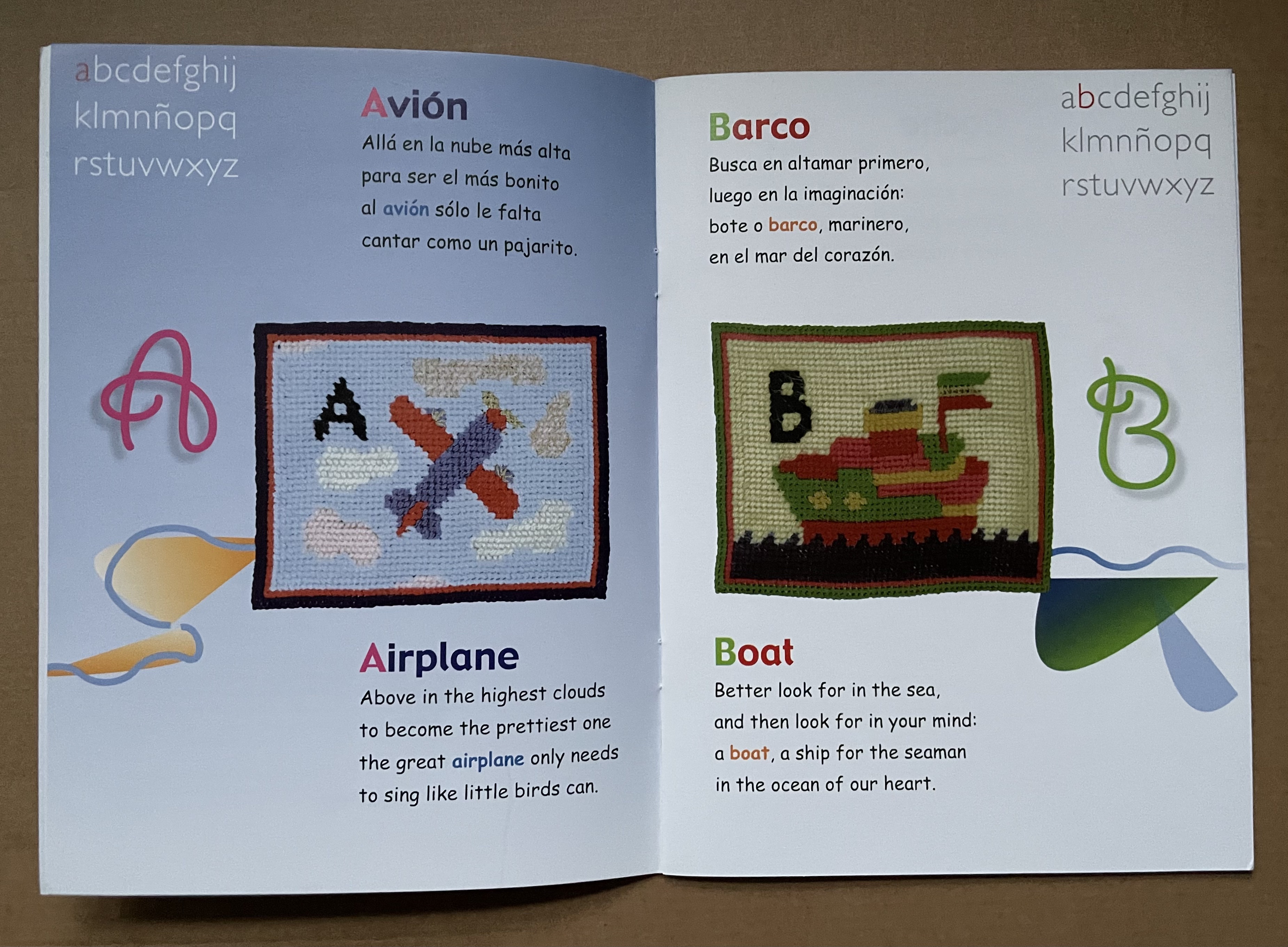
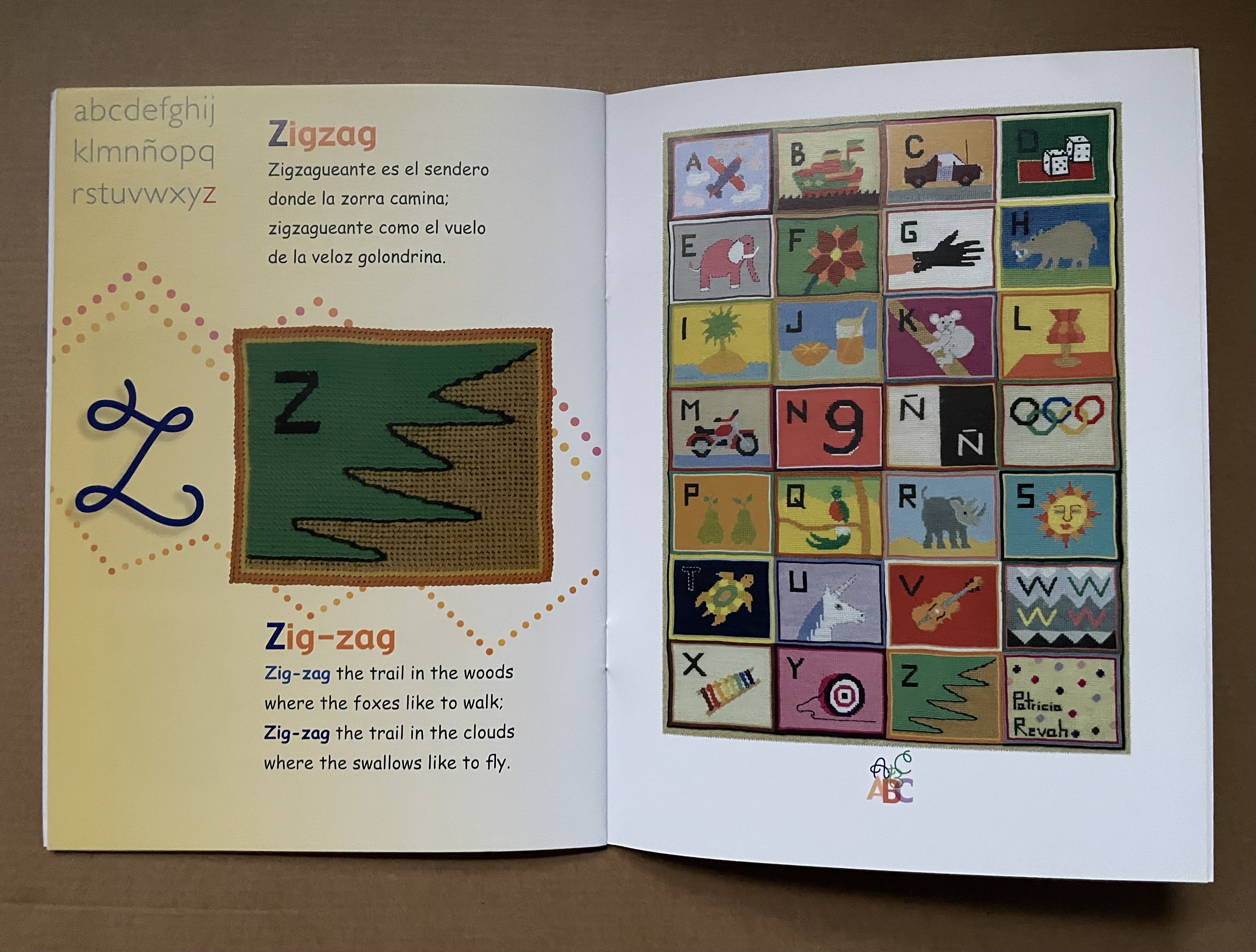
Rhyming poetry often raises the already high bar to translation. The literal English translations that follow Alberto Blanco’s charming abab Spanish poems do not attempt to substitute suitable rhymes. The textile art in this abecedary, however, wraps a comforting quilt around the challenge of translating poetry in a way that appeals to children.
Who would think it possible to introduce children to the ideas of Stéphane Mallarmé? Alberto Blanco for one, albeit without mentioning the French poet.