A Semaphore Alphabet: From Angels to Zebras (2002) Lynn Hatzius Softcover, saddle stitched, staples. H148 x W105 mm. 32 pages. Edition of 300. Acquired from Blackwell’s Antiquarian & Rare Books, 15 November 2022. Photos: Books On Books Collection. Displayed with permission of the artist.
Lynn Hatzius’s blend of the traditional and surreal in her abecedarium of linocuts foreshadows her more photographic collage and printmaking work, especially her book cover for Edith Grossman’s translation of Happy Families by Carlos Fuentes, her contributions to the Faces exhibition at the Topolski Gallery in 2010 and her series Limbs from the same period.
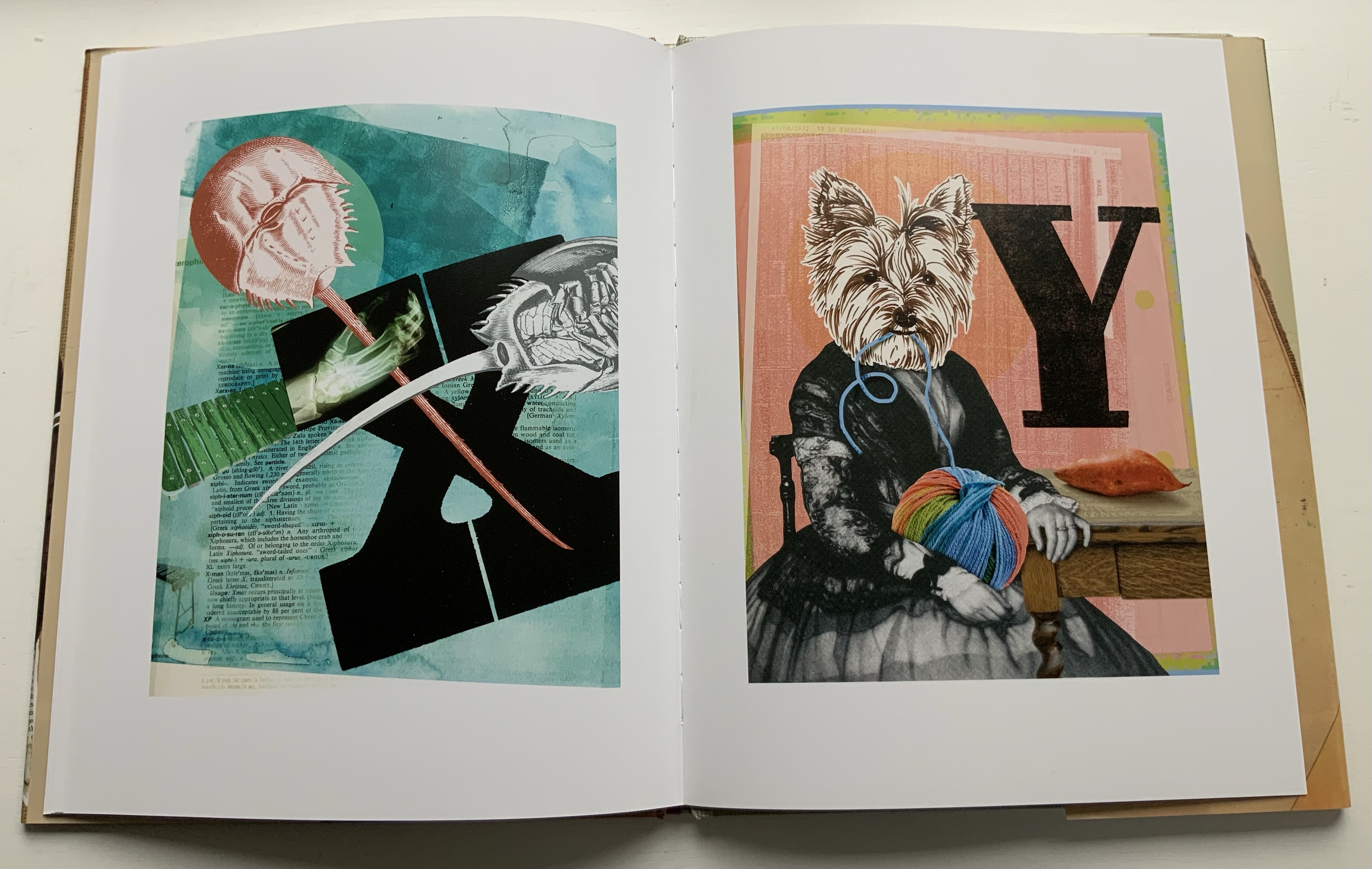
Hatzius finds several layers of whimsy and meaning by wordlessly jamming an inanimate template of limbs together with the heads, trunks, hands and actions of creatures usually associated with children’s ABC books (B for bird, C for cat, X for xylophone playing and Y for yo-yoing). Further surrealism — such as the bird’s wearing a beard and a headdress of bananas and basket of berries or the cat’s having lobster claws for paws — keeps readers on their toes. As the xylophonist and other occasional changes to the template’s lower extremities demonstrate, Hatzius also keeps her semaphore-forming template on its toes, blurring the line between animate and inanimate.
Perhaps that is Hatzius’s way of drawing our attention to the arbitrary association of letters and signs with things, actions and ideas. The usually inanimate part of a template can become animated, and the usually animate part of the template can just as well become the inanimate fence rail over which the zebra leans its head.
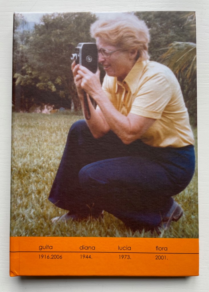
A photographer since 1991, Brazilian Lucia Mindlin Loeb turned to the book as the surface and form for her art. Works such as Livro sobre Livros (“Book about Books“), Entre páginas (“Between Pages”) and Biblioteca (“Library“) speak to an academic fascination with the structural elements of the book — especially its volume, edges, pages and spine. Along with Memória fotográfica (“Photographic memory”), they explore what photography and the book can tell us about time, space, memory, the world we see and a familial experience of it. The works below from the Books On Books Collection show only a fraction of how far beyond the photobook Loeb has gone.
Abismo (2012)
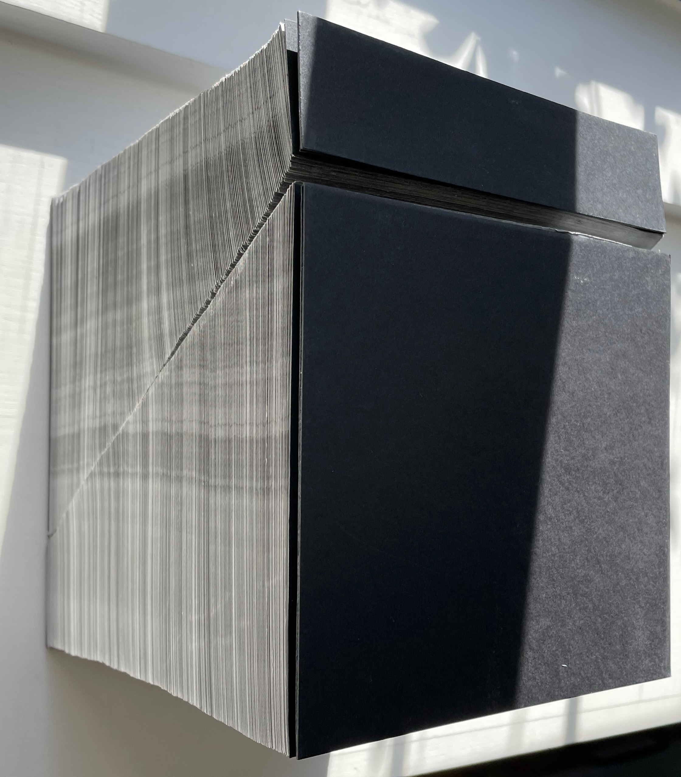
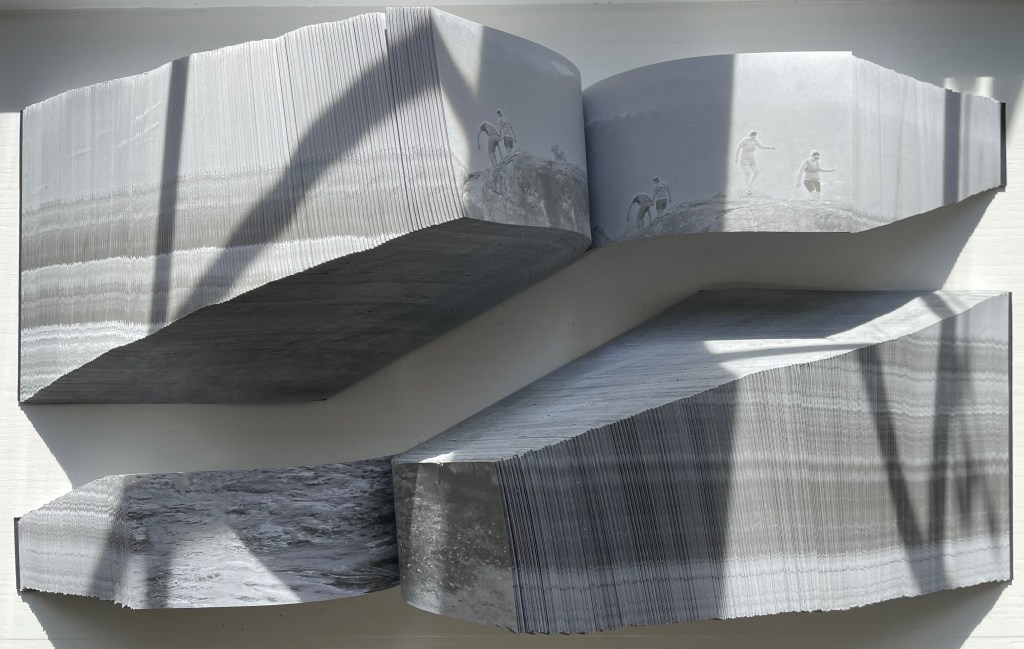
Abismo (2012) Lucia Mindlin Loeb Front and back card covers on a sewn, exposed-spine book block cut diagonally into two volumes, each housed in a custom archival box. H210 x W210 x D175 cm. Edition of 5 and 2 artist’s proofs, of which this is A/P #2. Acquired from the artist, 5 October 2022. Photos: Books On Books Collection.
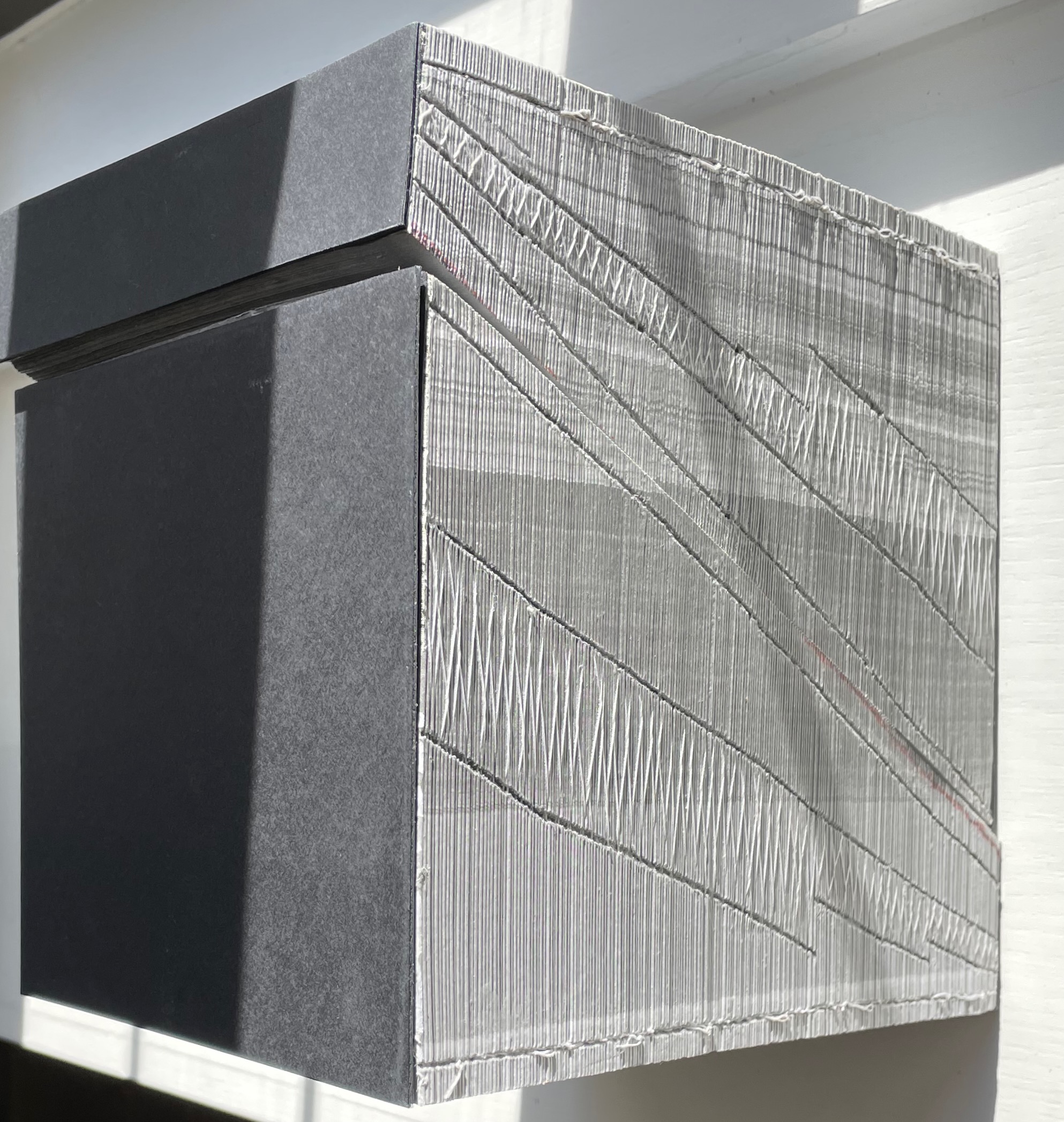
Fore-edge view (L) and spine view (R) of the cut halves resting against each other.
Close up of spine.
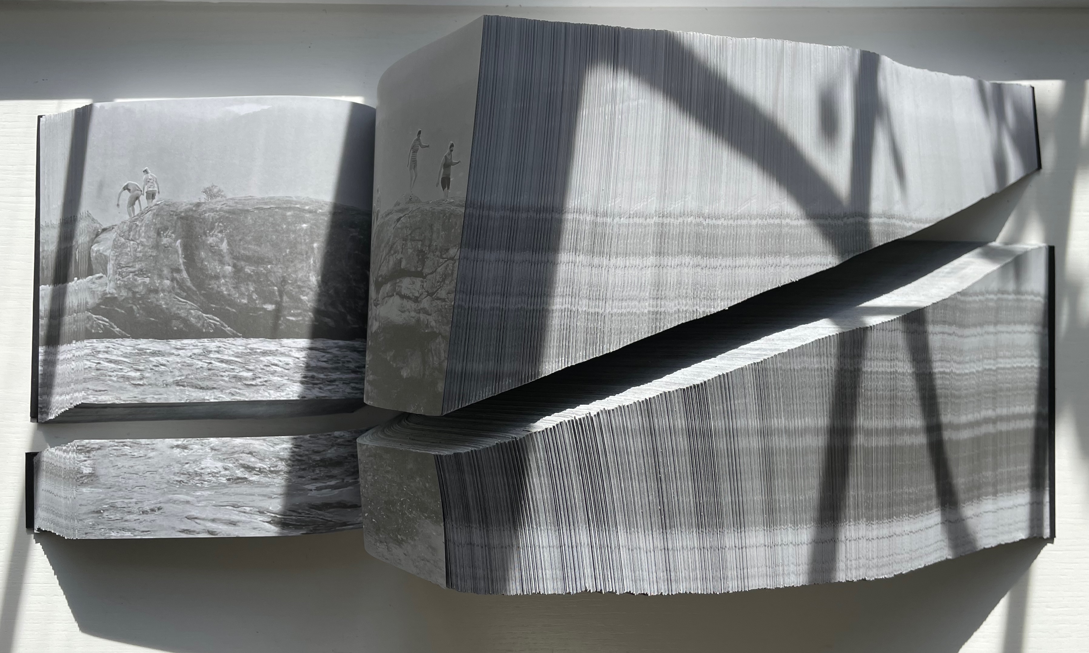
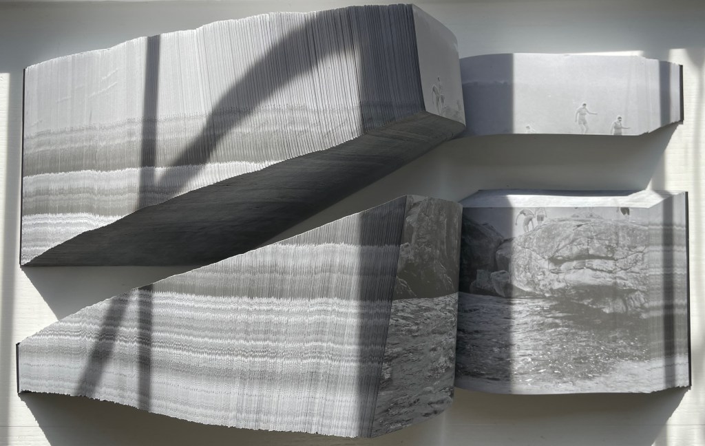
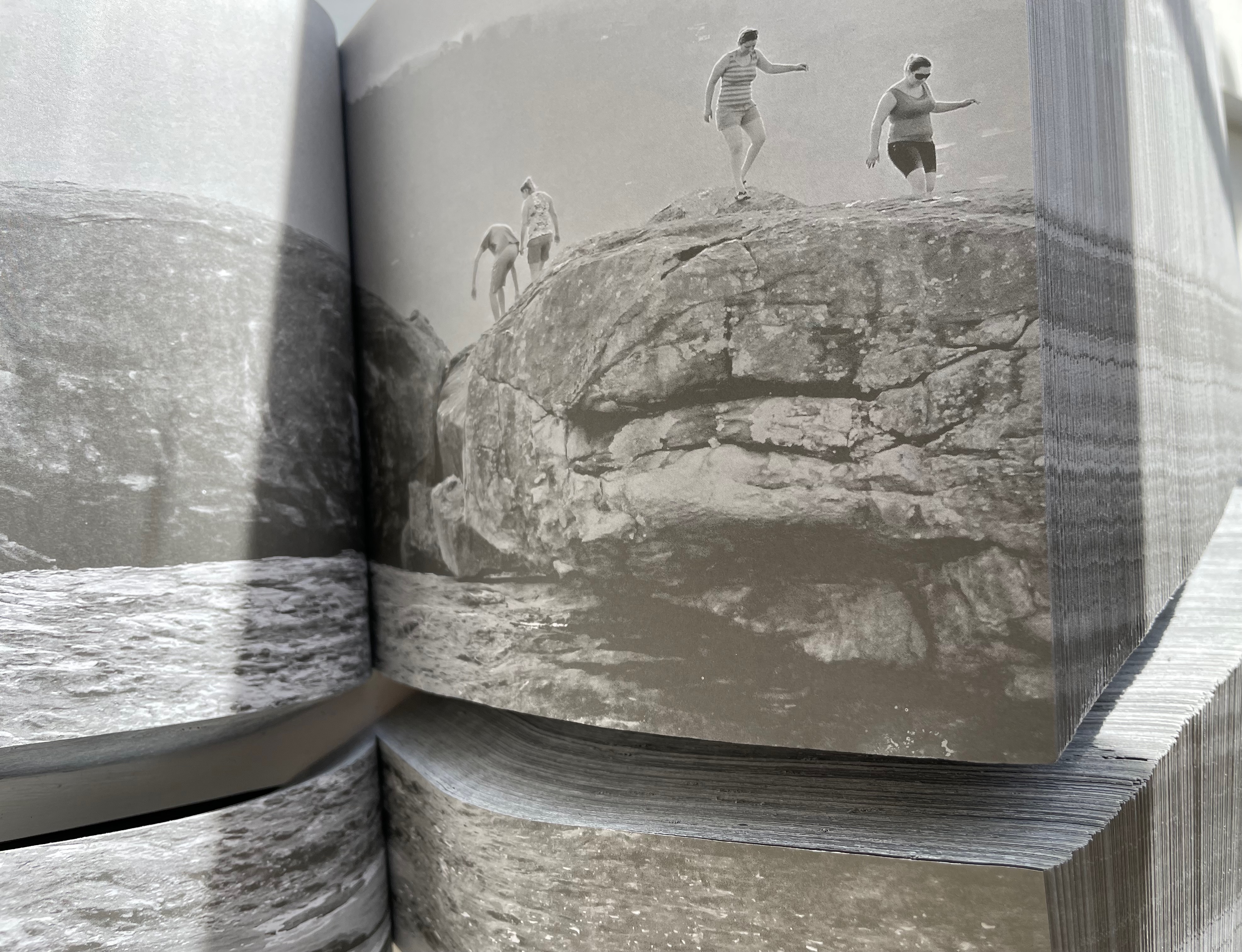
With the two halves open and positioned properly, their parallel opening and page turning soon creates a disorientation. The top half thickens and narrows, while the bottom half thickens and deepens.
Below, a close-up view of the abyss and the cliffwalkers evokes a sense of precariousness and vertigo.
Few books allow views of double-page spreads simultaneously from two different places in the book, and varying the position of the two halves can widen the abyss.
The brief clip below conveys more of the disorienting effects that “reading” this work offers. Perhaps the same feelings the cliffwalkers experienced.
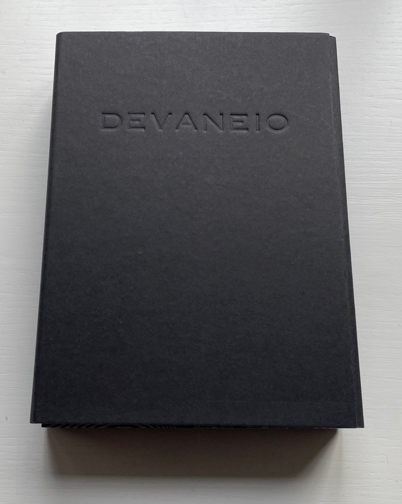
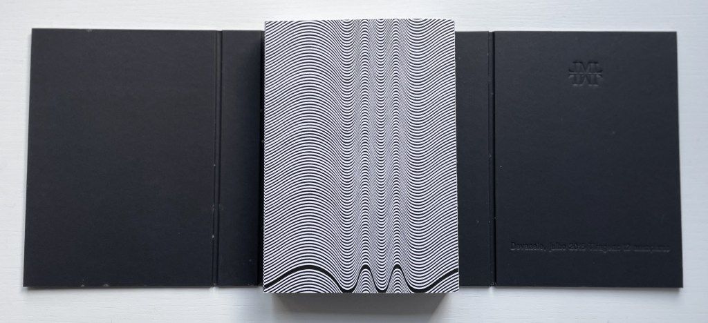
Devaneio (2015)
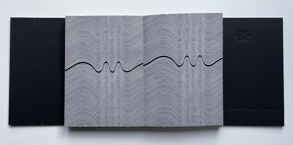
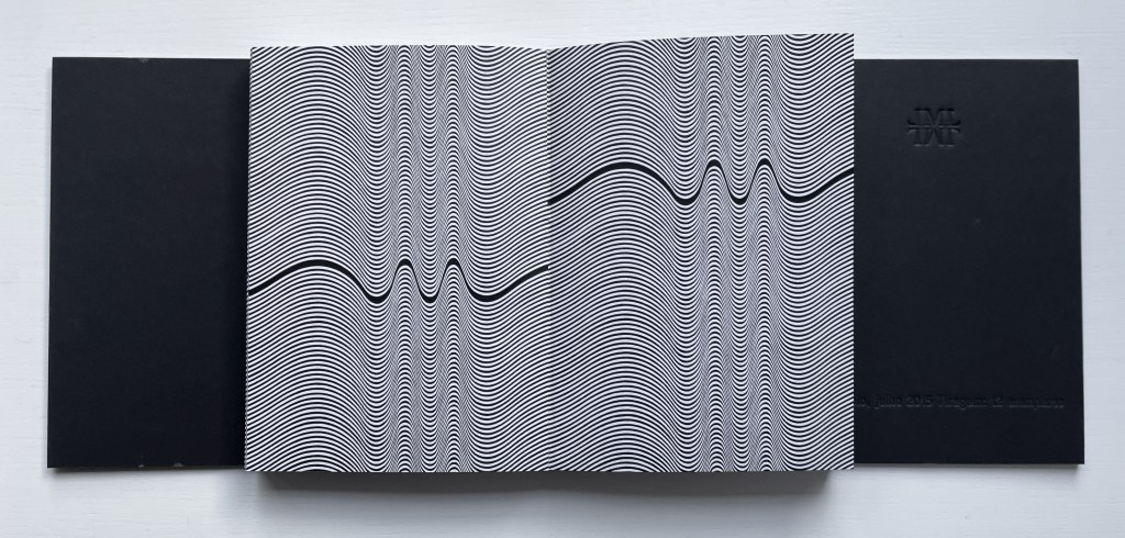
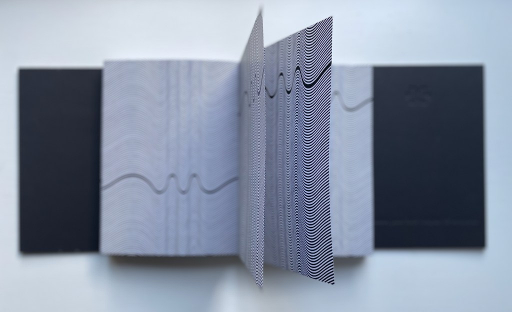
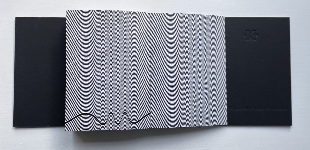
Devaneio (2015) Lucia Mindlin Loeb Exposed spine book block, handsewn and glued, loose in trifold case. H180 x W130 x D3 mm. 384 pages. Edition of 12, of which this is #5. Acquired from the artist, 5 October 2022. Photos: Books On Books Collection.
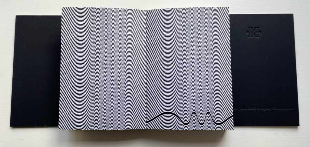
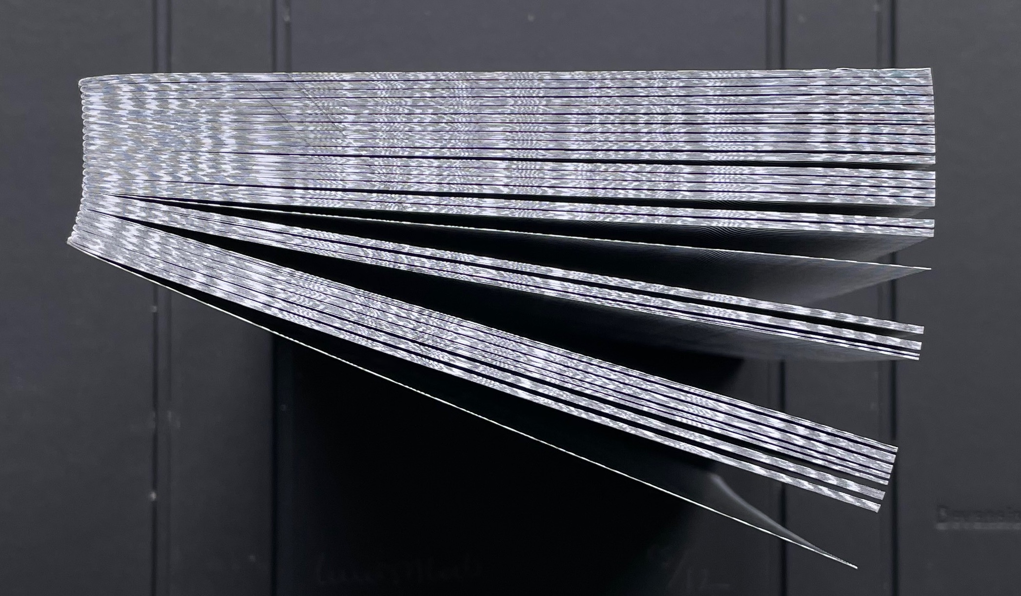
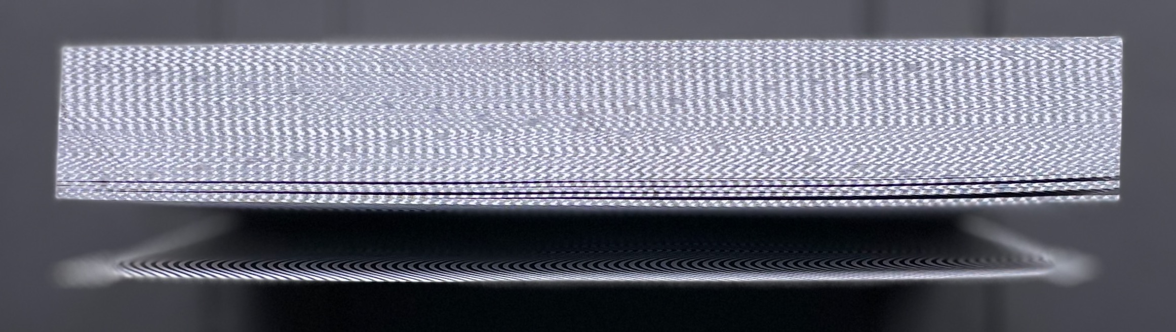
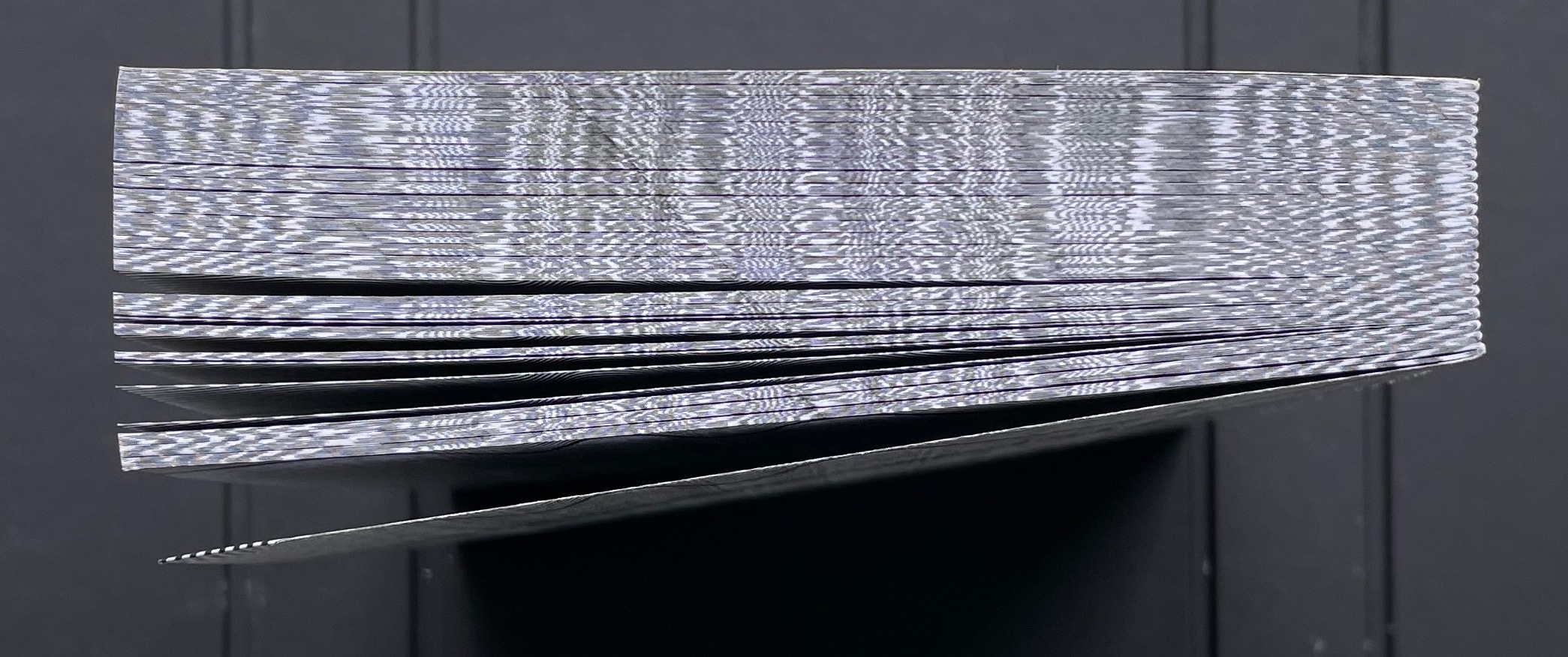
Devaneio means “daydream”, which is certainly elicited by the thick black line undulating over the hills and valleys optically created by the thinner lines parallel to each other and the thicker line. Over the first seventeen pages, the thick line appears only at the bottom of the recto page, but almost imperceptibly rises up the page.
First recto page
Seventeenth recto page
As the seventeenth recto page turns, another thick line begins its descent seemingly from outside the top edge of the eighteenth verso page. From here on, in their respective downward and upward movements, the thick lines on the verso and recto pages appear headed for convergence. The stroboscopic effect of the background of tightly packed thinner lines enhances this appearance of downward and upward motion. Although they converge, the thick lines skip over any direct intersection and continue their journeys toward the bottom edge of the verso page and top edge of the recto page.
The thick line on the verso page makes its appearance.
The lines begin to converge,
but do not intersect.
The lines diverge, the verso continuing downwards and the recto, upwards.
As the daydream begins to end, the upward bound thick line has almost disappeared at the top of its recto page. As the page turns, only the downward bound thick line remains to finish its journey at the bottom of the last verso page, the last page of the book. Of course, the the thick line’s end position on the last verso page is the same as its start position on the first recto page.
The upward bound thick line almost gone on the recto page.
The thick line has gone from the recto page.
The thick line at rest on the last verso page.
The crossover of the verso and recto thick lines can be observed on the book’s fore edge, and the thinner lines’ stroboscopic effect shows up even on the top and bottom edges.
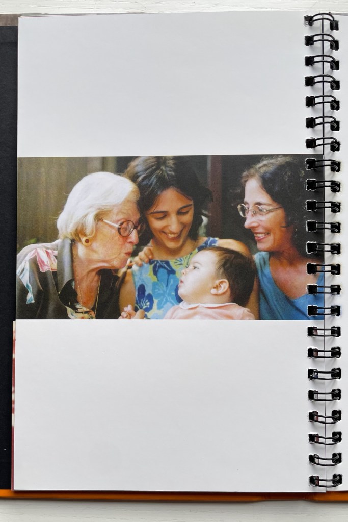
Devised by Robert Sayer (1756), “harlequinade” was a form of children’s book. Also called a “metamorphosis” or “turn-up” book, its pages were cut horizontally so that their parts could turn independently of one another and generate amusing mix-and-mismatch images. Book artists such as Emily Martin have seized on the form to great satirical effect.
Loeb’s “Memories of You” maintains the form’s comic nature but blends it with the forms of the photobook and family photograph album to deliver a whimsical and sentimental celebration of four generations. Loeb plays her title’s deliberate ambiguity out with the form’s interchange of resemblances in faces, poses and costumes and lifts her work out of mere sentimentality. The video below provides a better view of the work than would photos of the book.
The sculptural mastery in Loeb’s works makes for intriguing and enjoyable comparison with that of Doug Beube, Andrew Hayes and Guy Laramée in the Books On Books Collection, while the photographic mastery calls up Scott Kernan, Marlene MacCallum and Michael Snow for similar revisits.
Further Reading
“Doug Beube“. 21 April 2020. Books On Books Collection.
“Andrew Hayes“. 4 September 2019. Books On Books Collection.
“Guy Laramée“. 18 September 2019. Books On Books Collection.
“Scott Kernan“. 22 February 2019. Books On Books Collection.
Baabaa Aab Daad (Father Gave Water) (2020) Golnar Adili Wood, felt, board and cloth, 5 x 7 x 1.5 inches (closed). Edition of 25. Acquired from the artist, 1 July 2022 Photos: Books On Books Collection unless indicated otherwise. Displayed with artist’s permission.
Helpfully for a Western audience, the box cover of this homage to the traditional Persian sentence for first-year readers links the right-to-left-reading words with their roman alphabet transcription and English translation. Beyond that, understanding just these few characters and appreciating the artistry involved require some research.
Close-up of box cover.
The character called ‘alef and making an aa sound is آ. From the transcription, we know that the sound should appear four times — twice in “Baabaa” and once in each of “Aab” and “Daad”. The character called be and eliciting a b sound is ب . The transcription indicates it should appear three times — twice in “Baabaa” and once at the end of “Aab”. The character named daal and making a d sound is د . The transcription calls for it to appear twice — at the beginning and end of “Daad”.
As in Arabic, from which Persian adopts most of its characters, some characters’ appearance changes depending on their position in a word or syllable. If a word begins with ‘alef (آ) and is the aa vowel (as opposed to the “o” or “é” vowel), the character for it has a “roof” — as in the word “Aab” — but if the sound falls in the middle of a word — as in “Daad” — the “roof” comes off: (ا). Also as in Arabic script, Persian letters can be linked with one another, altering their appearance. In “Baabaa”, ‘alef (ا) links up with be (ب); so not only does its “roof” disappear, but it squeezes the width of ب and shifts its diacritic (the dot underneath): با. To Western eyes, the linked characters look like one character. In some typefaces, we have the similar phenomenon of ligatures, in which, for example, the letter f and the letter i will join into the single character fi.
Spine of the box.
Even if Gutenberg’s type mimicked scribal lettering, roman type was not cursive script, which explains in part the hard work by Francesco Griffo da Bologna and Aldus Manutius to come up with italic. For Arabic and Persian or any calligraphically represented language with characters changing shape with position and linkage, with diacritics and a slantable baseline to allow stacking of letter combinations, the development of movable type would be and has been even harder — if not impossible as designers Rana Abou Rjeily and Bahman Eslami explain (see references below).
All of this preamble helps in appreciating the linguistic and cultural bridging that Adili’s artwork performs. The miniaturized shape of traditional alphabet blocks meets pixellated and sculpted Persian in Adili’s modular wooden cubes and recessed felt base. Her invented typography mostly skirts the calligraphic concerns by leaping into the third dimension. Language becomes tactile and three-dimensional not only in this work but in almost all of the work emanating from her studio.
Colophon.
Larger set of letter modules. Photo: Courtesy of the artist.
The Jasmine Scented Ones is a particularly good example. This series of works uses the pixellated shapes from Father Gave Water to screenprint Persian characters and words this time taken from a Hafez poem and exploits the play of light through superimposed sheets of Japanese Rayon Lens paper and across 3D resin prints to embody the tension in the poem’s wordplay with the verbs to sit and to settle. For touch that would see and sight that would touch, Adili offers highly expressive works.
Many thanks from Books On Books — or Ketab bar Ketab (کتاب برکتاب) — to Golnar Adili and friend for assistance with the crash course in Persian characters. Any errors rest with Books On Books.
Center for Book Arts. 14 January – 26 March 2022. “Father Gave Water/Baabaa Aab Daad: An Homage to Childhood, Persian, and Process“. Exhibition. New York: Center for Books Arts Gallery. Accessed 1 March 2022. Center for Book Arts’s description of the work: “Adili drew inspiration from her own childhood education in Iran, where all first graders learn the phrase “Baabaa Aab Daad” (translates to “Father Gave Water”) as a foundational example of the elemental letter and sound composition in the Persian language. As a mother to a multilingual toddler, Adili was further inspired to employ a system of blocks and puzzles within her artist book as a reference to her daughter’s tactile style of play. In conducting research for this project, Adili learned of Iranian educator Seyyed Abbas Sayyahi, who drafted the country’s first-grade curriculum and co-founded a system of schools to serve the nomadic population. Adili could not find any formal recognition of Seyyed Abbas Sayyahi’s immense contributions by Iran’s education department, Sazman é Aamoozesh va Parvaresh, so she decided to celebrate his important work by including him in her book. Ultimately, Adili views her artist’s book as a didactic tool for English readers to fully understand the Persian sentence “Baabaa Aaab Daad.” The book includes an English phonetic key for the Persian alphabet and color-coded diagrams that break the sentence down word-by-word. A bilingual speaker and reader herself, Adili is fascinated by the connections between English and Persian, which are both Indo-European languages, and pursues new formal and visual translations through her art practice.”
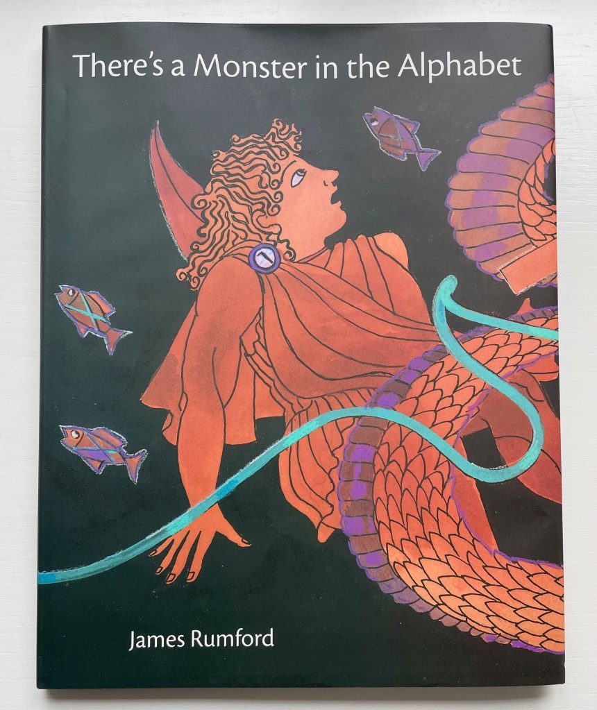
There’s a Monster in the Alphabet (2002) James Rumford Dustjacket, hardcover. H285 x W230 mm. 32 pages. Acquired from Bud Plant and Hutchison Books, 3 November 2022. Photos: Books On Books Collection. Displayed with permission of the author.
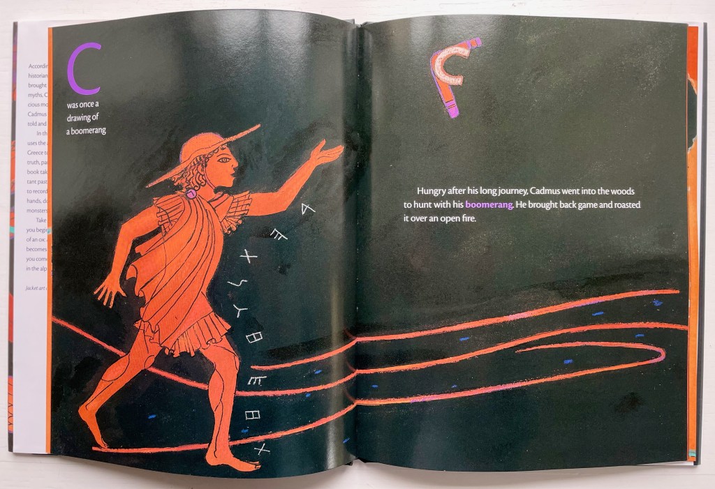
James Rumford subtly weaves fanciful, speculative and well-founded points about the origin and transmission of the alphabet into his inventive reframing of Herodotus’s tale of how the Phoenicians brought the alphabet to Greece. In the double-page spread above, the letter A’s evolution can be found in the ox’s head on the right and among the fish on the left.
Rumford’s painting with letters is another reminder of the fluidity of picture and letter. Phoenician and early Greek letters are used white on black to outline figures and suggest motion (as with the stick-throwing Cadmus above) or orange on black to evoke the decorative patterns of Greek pottery (as with the vase below).
The note shaped within the vase makes for a deft graphic transition from the pictorial to the fully textual appendix on the recto page, whose explanations will send an attentive reader back to the preceding pages to look more closely at their images.
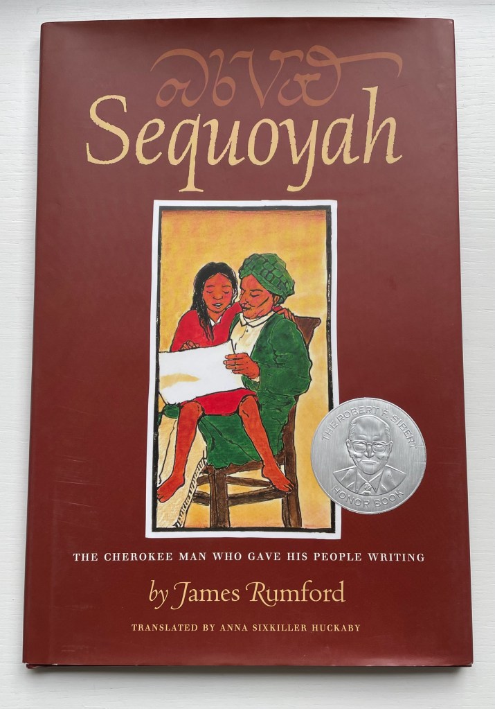
Sequoyah (2004)
Sequoyah (2004) James Rumford Dustcover, hardback. H285 x W230 mm. 32 pages. Acquired from Amazon EU, 25 September 2022. Photos: Books On Books Collection. Displayed with permission of the author.
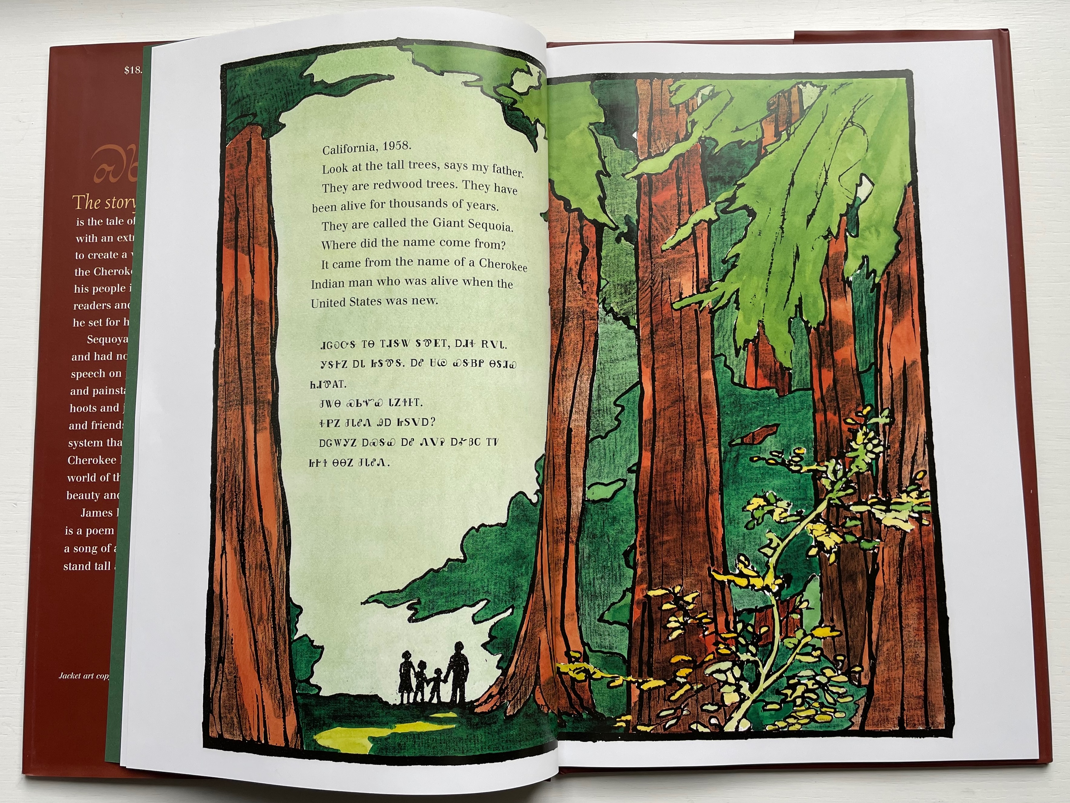
Rumford’s Hawaiian residence places him on the equivalent of a linguistic equator reflected in the range of languages his books have engaged: Arabic, Bamum, Chinese, English, French, Ikinyarwanda, Persian and, of course, Hawaiian. He might be suspected of aiming to create an A-Z library of stories about the world’s languages. He has even covered hieroglyphics and Latin.
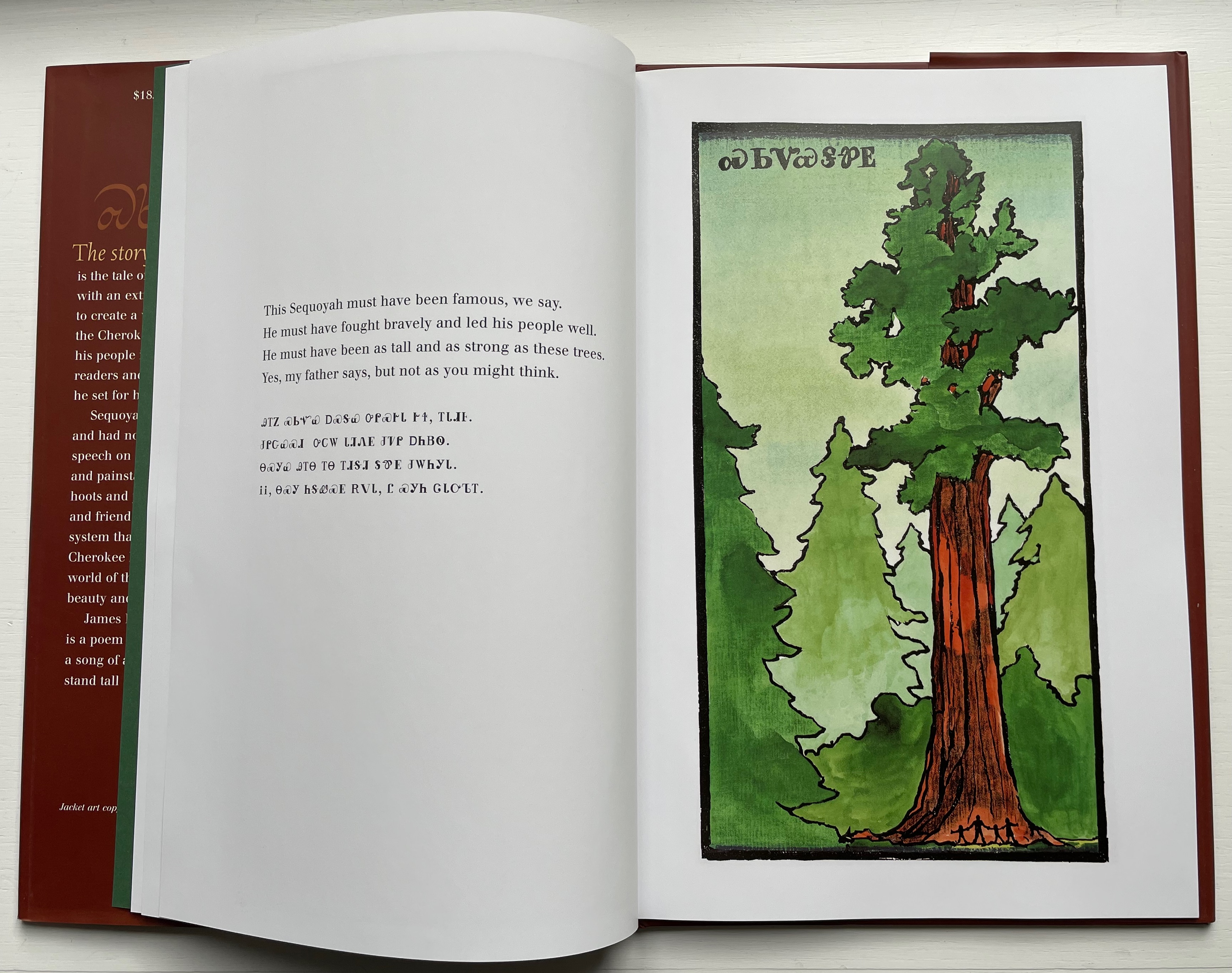
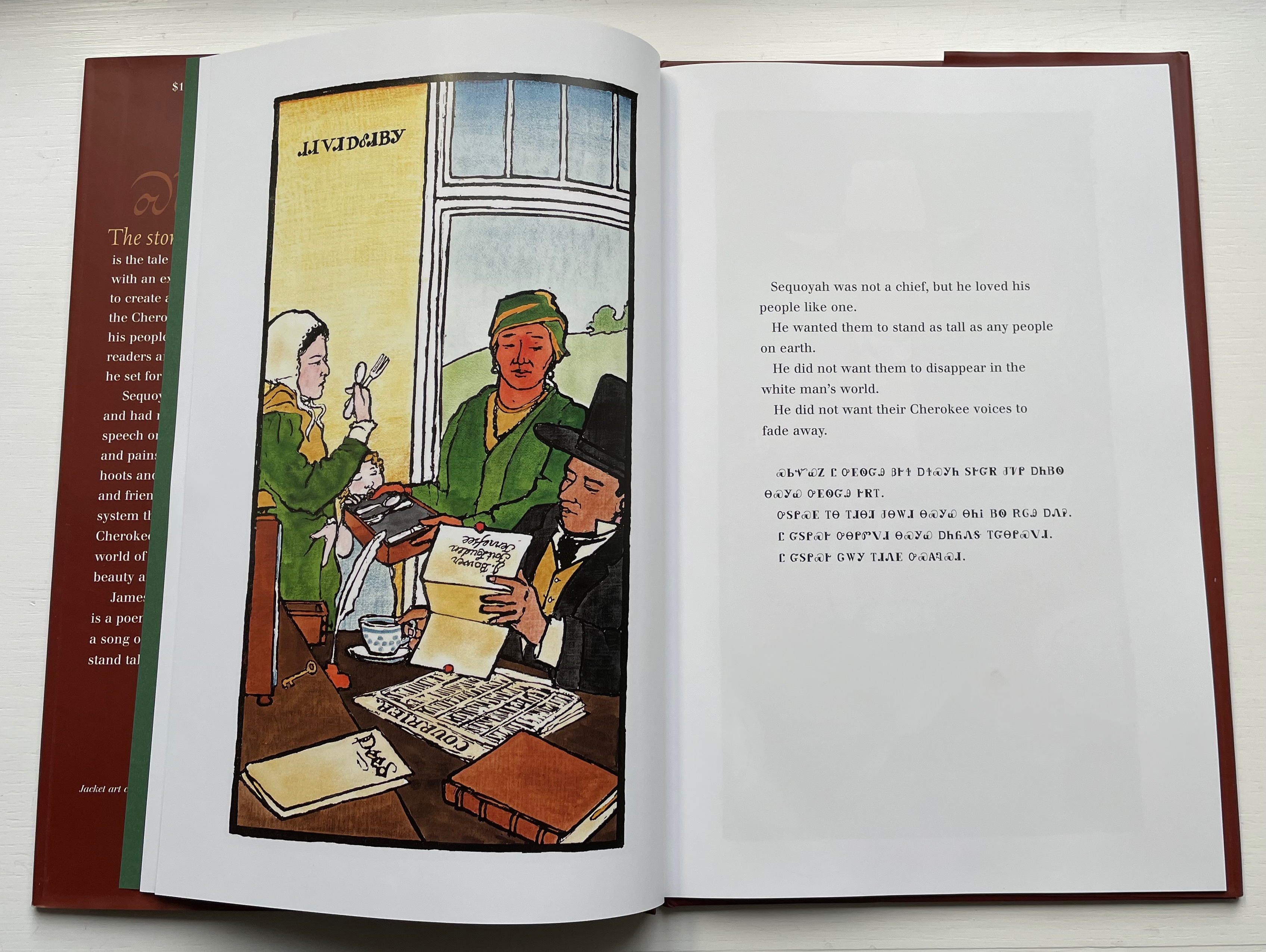
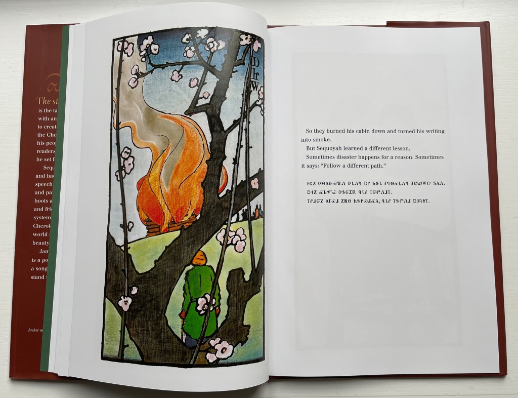
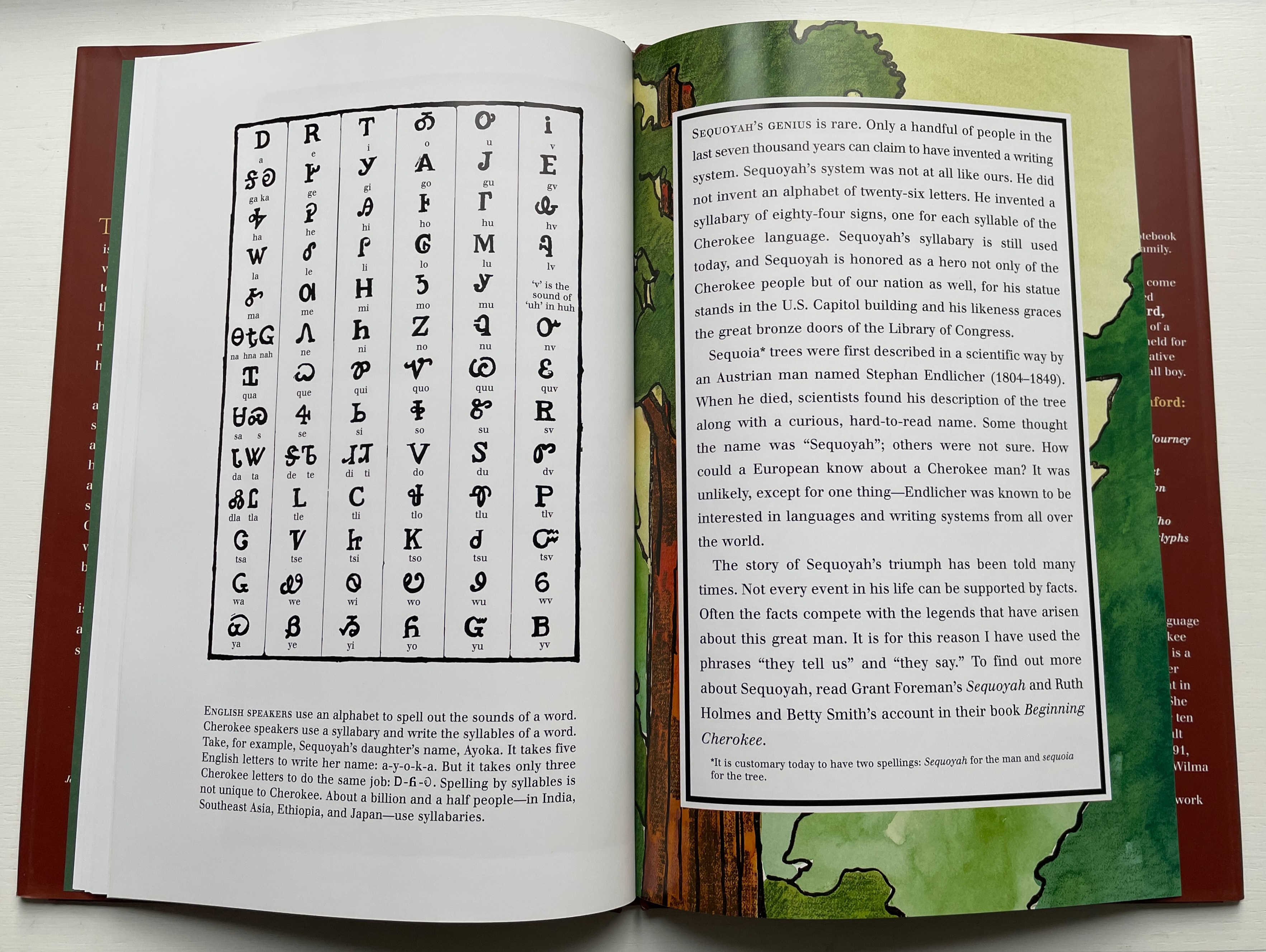
With Sequoyah, Rumford gives bilingual treatment to an astonishing feat — the creation of a syllabary within decades as opposed to the centuries it has taken for most other languages’ alphabets and syllabaries.
Rumford’s style in this book takes on elements of Japaneses woodcuts and the perspective and color that Gaugin found in them.
As with There’s a Monster in the Alphabet, the audience for Sequoyah is older children (probably ages 8 and older), but supporters of the Endangered Alphabets Project and fans of works such as Sam Winston’s One and Everything (2022) would also enjoy Rumford’s two books.
Diringer, David, and Reinhold Regensburger. 1968. The alphabet: a key to the history of mankind. London: Hutchinson. A standard, beginning to be challenged by late 20th and early 21st century archaeological findings and palaeographical studies.
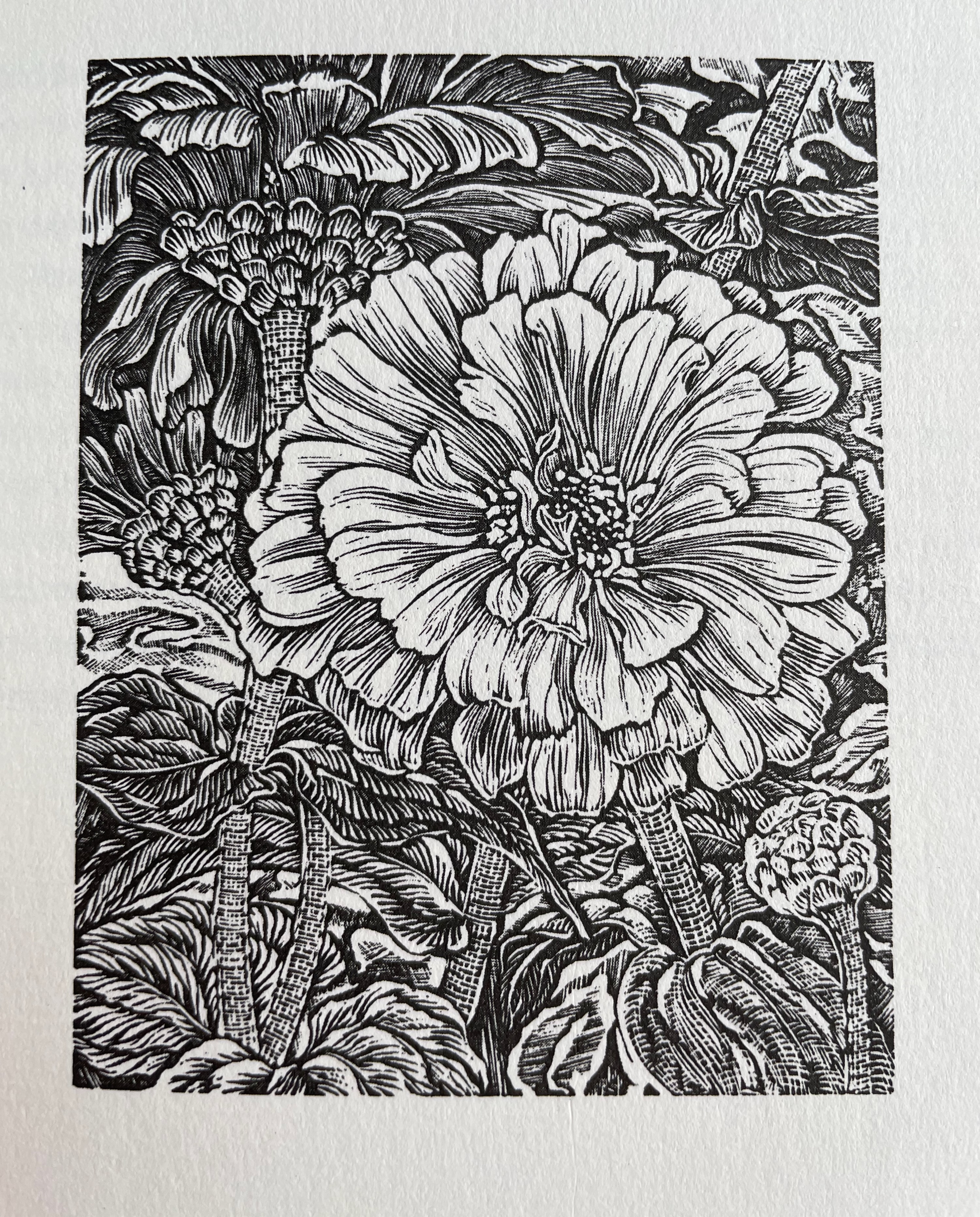
“Working on this series of engravings reminded me that the Victorians delighted in employing flowers to send messages, having an established lexicon of meanings for many common flowers. One might send foxgloves to express a suspicion of insincerity, snapdragons to underscore offence at another’s presumptiveness (and don’t the tight-lipped snapdragons in my engraving have an offended air about them?)” — Gerard Brender à Brandis
Further Reading
“E.N. Ellis“. 30 October 2022. Books On Books Collection.
“Enid Marx“. 1 August 2022. Books On Books Collection.
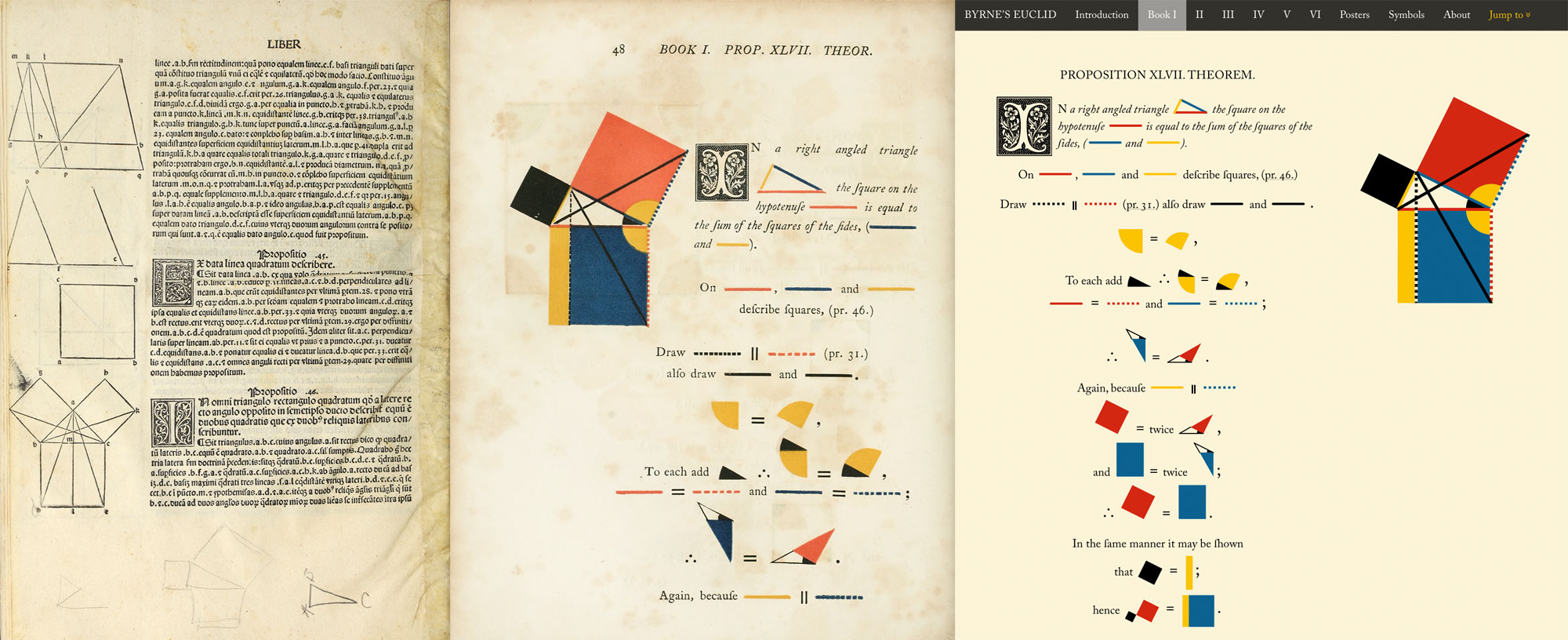
Innovative combinations of color and geometry in artists’ books — think of Ursula Hochuli-Gamma’s 26 farbige Buchstaben (1986), Jeffrey Morin & Steven Ferlauto’s Sacred Space (2003), Sarah Bryant’s The Radiant Republic(2019) or Ana Paula Cordeiro’s Body of Evidence (2020) — make for a useful angle on which to focus in appreciating book art.
Nicholas Rougeux shows that it is also a useful inspiration for interactive digital art.
Rougeux describes himself as a “data artist”, and his works might also be considered “found art” given such sources of data as Nicolas Bion’s treatise on mathematical instruments from 1709, Spencer Fullerton Baird’s Iconographic Encyclopædia of Science, Literature, and Art (1852) and John Southward’s A Dictionary of Typography and its Accessory Arts (1875). While the resulting works recall Ben Fry’s and Stefanie Posavec & Greg McInerny’s celebrations of Darwin’s On the Origin of Species, two different and more apropos, even if analogue, points of comparison are Edward R. Tufte’s Envisioning Information (1990) and Francisca Prieto’s Composition No. 1. The connection with Tufte is the more obvious, but Rougeux’s digital manipulation of antique works feels very much like Prieto’s manual folding of them.
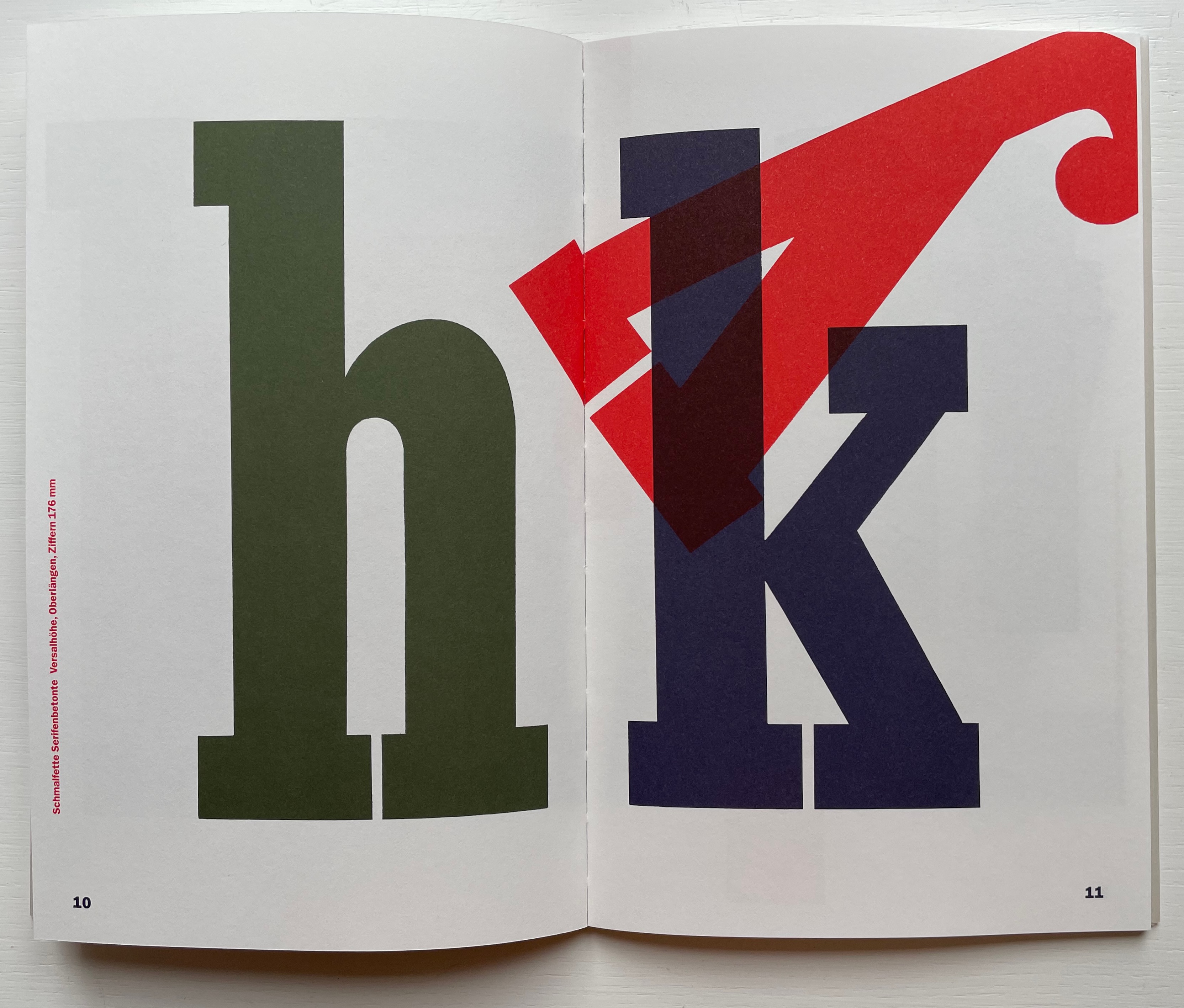
26 farbige Buchstaben (1986) / “26 Colored Letters“ Ursula Hochuli-Gamma Afterword Rolf Kühni Sewn paperbound. H240 x W152 mm. 36 unnumbered pages. Acquired from VGS Verlagsgenossenschaft, 7 June 2022. Photos: Books On Books Collection. Displayed with permission of VGS.
A is for Alphabet; The alphabet belongs to those who write and to those who read. B is for Buchstaben: All letters fix words in the past, but they also bring them back again.
26 farbige Buchstaben is a gem of design and letter art, but its added text strains to transform it into an abecedary. Some are aphorisms (containing a grain of truth) like A, B and E. Some fall more toward religious or political dicta like F. Some play letter jokes as with Y, which is named Ypsilon in German and has been belabored in English as well for its “superfluitie“. Any translation into any language would be a struggle.
How to find substitutes for the capitalized German nouns to which the letters refer and to convey the gnomic tone? With its cognate “Alphabet”, letter A above is easy. “The Alphabet belongs to both the one who writes and the one who reads”. Even if occasionally a solution for non-cognates offers itself — as with E for Easy below — there remain B for Buchstaben (“letters”) above, F for Frage (“question”) below, Z for Ziel (“destination”) below and 21 more with which to contend.
E is for Einfache: “The simple left much behind before it became simple.” (or, Easy left much behind before it became Easy.) F is for Frage: The question of “peace or freedom” will sound strange to those who have no bread.
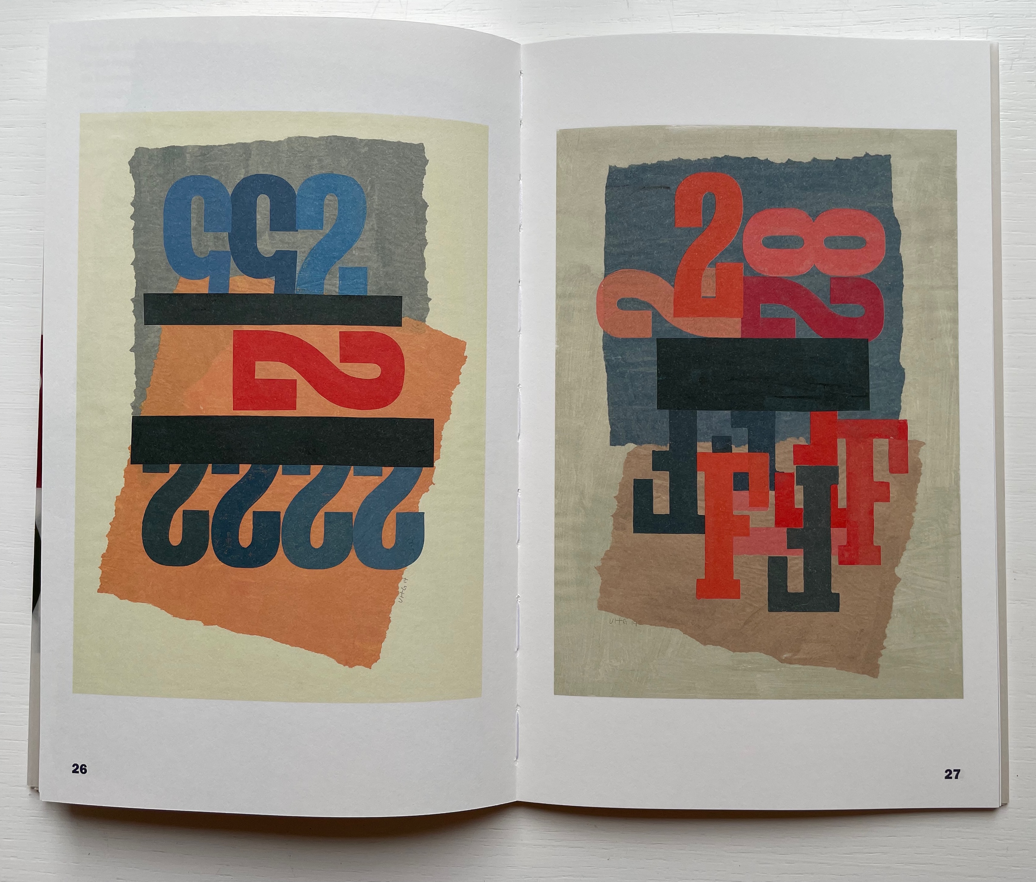
Given the fundamental arbitrariness of the alphabet itself and the often bizarre range of sayings assigned to letters in other languages’ alphabet books, perhaps “strain” is unfair. Nevertheless, the text in 26 farbige Buchstaben is unnecessary to identify any of the letters in the images and generally is a distraction from the images, which as can also be seen below in Metamorphose and Zeichen, Ziffern, Lettern are the point. The art of 26 farbige Buchstaben foreshadows how the artist would use wooden letter type for collage, painting and inspiration in these later works.
From Metamorphose (“Metamorphosis”) on the left and Zeichen, Ziffern, Lettern (“Characters, Numbers, Letters”) on the right. Metamorphose(2014) Softcover. H240 mm. 38 pages. Ursula Hochuli-Gamma and Jost Hochuli. Zeichen, Ziffern, Lettern (2015) Softcover. H300 mm. 40 pages. Ursula Hochuli-Gamma. Acquired from VGS Verlagsgenossenschaft, 9 August 2022. Photos: Books On Books Collection. Displayed with permission of VGS.
Given the scarcity of writing online about her work and the absence of any of her works in the British Library, the National Art Library (V&A) or Library of Congress, Ursula Hochuli-Gamma seems under-appreciated. Her exhibitions have tended to be local to St. Gallen, but her books can be acquired from Verlagsgenossenschaft St. Gallen and some booksellers.
Further Reading
Poor letter Z, even when it is giving Zen-like advice, it is relegated to the end of the queue.
Y is for ypsilon: The Ypsilon makes little sense. According to Bayern it is right in the middle. Z is for Ziel: The destination is not as important as the journey, so we should start from the beginning.
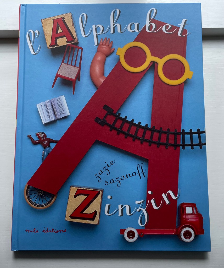
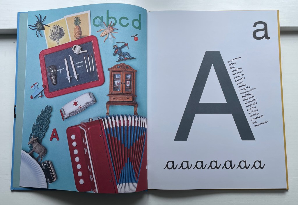
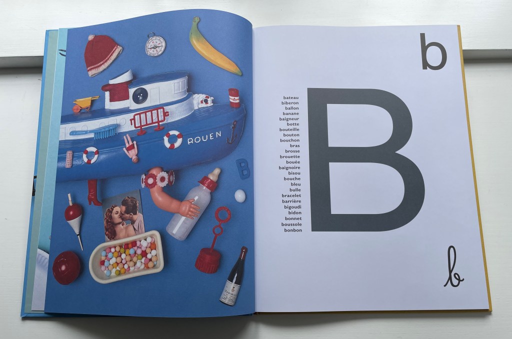
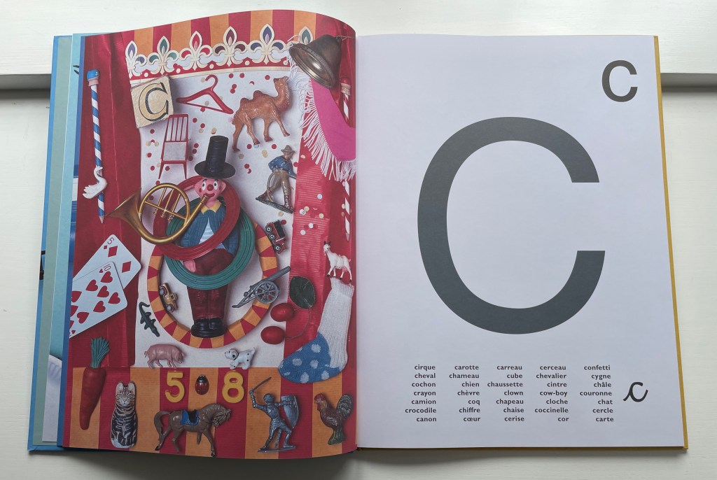
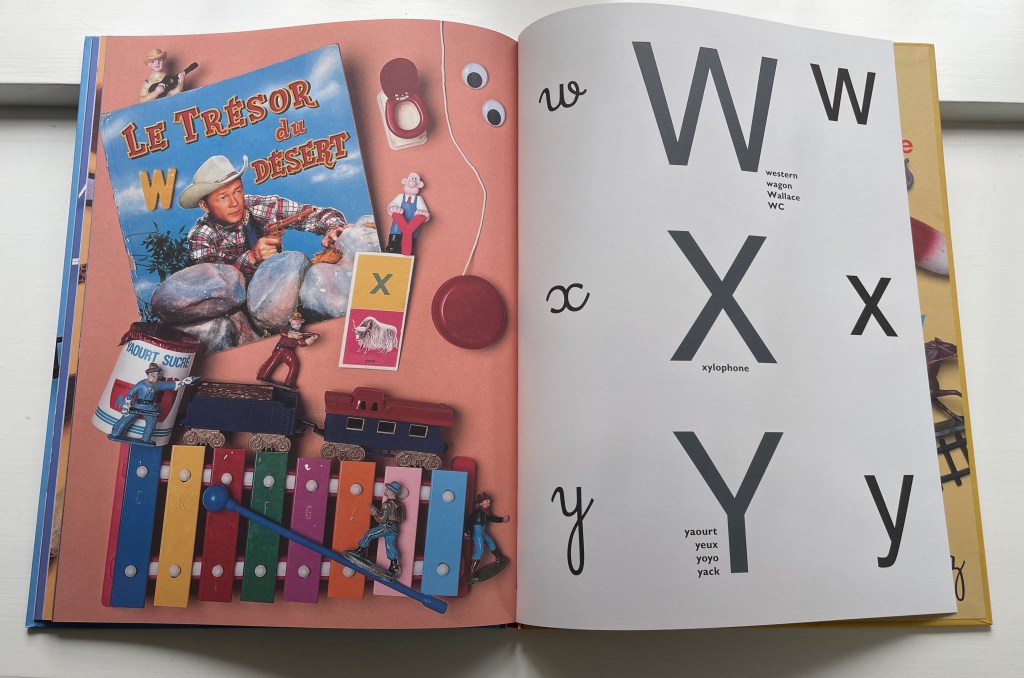
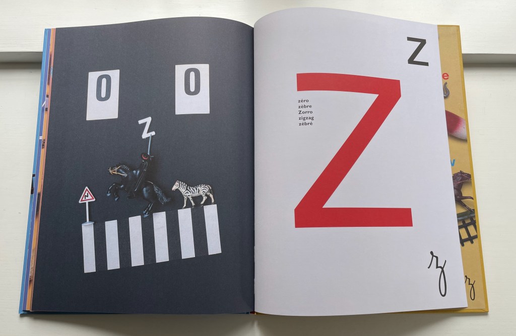
L’Alphabet Zinzin (2011) Zazie Sazonoff Casebound, paper over board. H370 x W280 mm. 52 unnumbered pages. Acquired from Amazon, 31 January 2022. Photos: Books On Books Collection. Displayed with permission of Nathalie Sazonoff.
Zazie Sazonoff describes herself as a metteur en scène d’objets. Like mise en scène, it is an expression that is difficult to translate. It is easier to point at her works and say, “There, that’s what a metteur en scène d’objets does”. With its arrangement of toys from the 1960s, ’70s and ’80s on the verso page, L’Alphabet Zinzin presents uppercase, lowercase and lowercase cursive letters on the recto pages and a variety of words beginning with the relevant letter. Zinzin means crazy or zany. As part of France’s National Education’s literature reference list for cycle 1, L’Alphabet Zinzin‘s zaniness must engage the imaginations of its young audience.
“Zany” was a frequent fallback for the letter Z in English abecedaries of the 18th and 19th centuries, but this is a whole zany alphabet that should engage the imaginations of an older audience, too. There seems to be something more going on: Flick the pages back and forth quickly and you might think you are catching the objects moving into place. Are there activities or untold stories behind the scenes?
On Sazonoff’s website, you can find under Projets two works that suggest influences from Man Ray, Luis Buñuel and film noir: Rêve: livre animé and Têtes à queue: roman graphique, but the titles and recurrence of paper pop-ups show the continued grounding of her art in the book form. Petites Curiosités, under the section Art, suggest the influence of Joseph Cornell, perhaps the founding genius of the mise-en-scène in assemblage of found objects. With these works as context, L’Alphabet Zinzin teeters on the cusp of becoming an artist’s book. It certainly compares favorably with Peter Blake’s ABC (2009) and Leslie Haines’ Animal Abecedary(2018).
Animal Abecedary: A One-of-a-Kind Alphabet Book (2018) Leslie Haines Hardcover, paper over board, dustjacket and foldout poster in back cover pocket. H287 x W224 mm. 32 pages. Acquired from Dines Books, 13 October 2021. Photos: Books On Books Collection. Displayed with permission of Leslie Haines.
Of the many artistic techniques applied to alphabet books, the collage has several champions, and the surreal collage claims many of them: Clément Mériguet, Paul Thurlby and Ludwig Zeller. Leslie Haines’ effort harks back to the collages of surrealist Max Ernst, who also turned his hand to lettrines.
For a useful exercise in comparing styles of collage, take Haines’ Animal Abecedary for a visit with Zazie Sazonoff’s L’Alphabet Zinzin as well as Mériguet’s ABCDead, Thurlby’s Paul Thurlby’s Alphabet and Zeller’s AlphaCollage.
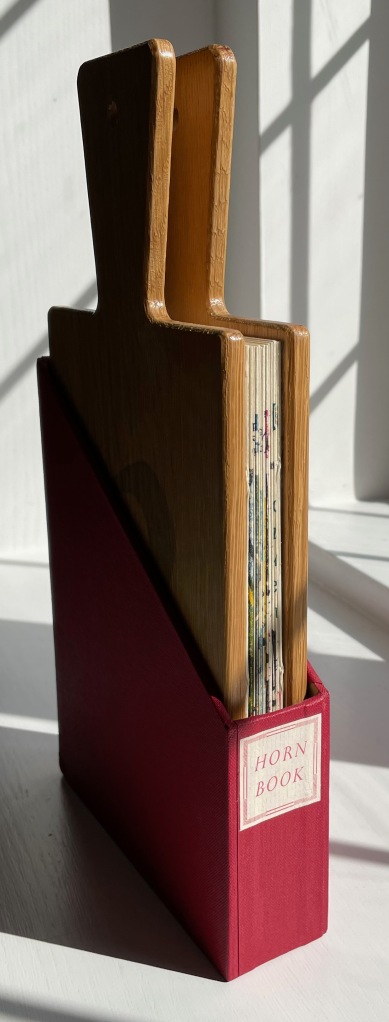
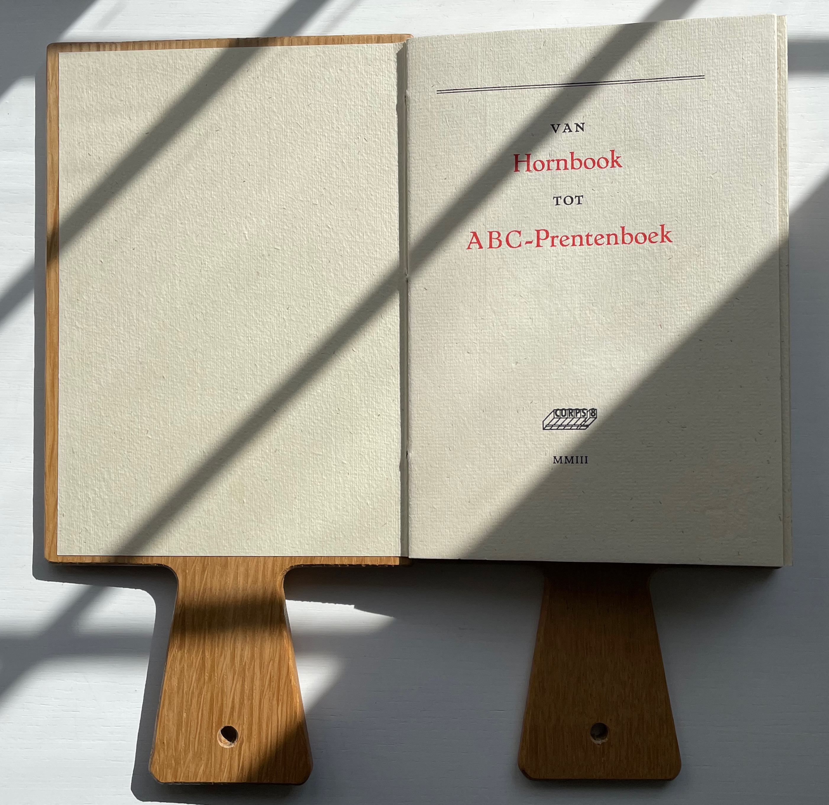
Van Hornbook tot ABC-Prentenboek (2003) Kees Baart, Dick Berendes, Henk Francino and Gerard Post van der Molen Double-sided leporello between two pamphlet-sewn booklets and bound between two oversized wooden hornbooks, held in an open cardboard box. H295 x W150 x D 30 mm. First booklet, 18 unnumbered pages; second booklet 8 pages; 52 panels. Edition of 135. Acquired from Fokas Holthuis, 13 September 2022. Photos: Books On Books Collection. Displayed with permission of the artists.
From Hornbook to ABC Picture Book was organized by four members of the Corps 8 collective. They issued it with the financial backing of the Zeeuwse Nederland Bibliotheek and under the auspices of Drukwerk in de Marge (Printing in the Margin), a foundation established in 1975 by likeminded amateur printers and publishers. Drukwerk in de Marge recalls The Typophiles, a similar group founded in the 1930s in New York that attracted great talents like Frederic Goudy, Bruce Rogers and Beatrice Warde. Like Drukwerk in de Marge, The Typophiles stimulated quirky publications. One of them — Diggings of Many Ampersandhogs (almost the last word on the ampersand) — resides in the Books On Books Collection and, until now, lacked an appropriate partner covering the preceding twenty-six characters of the alphabet.
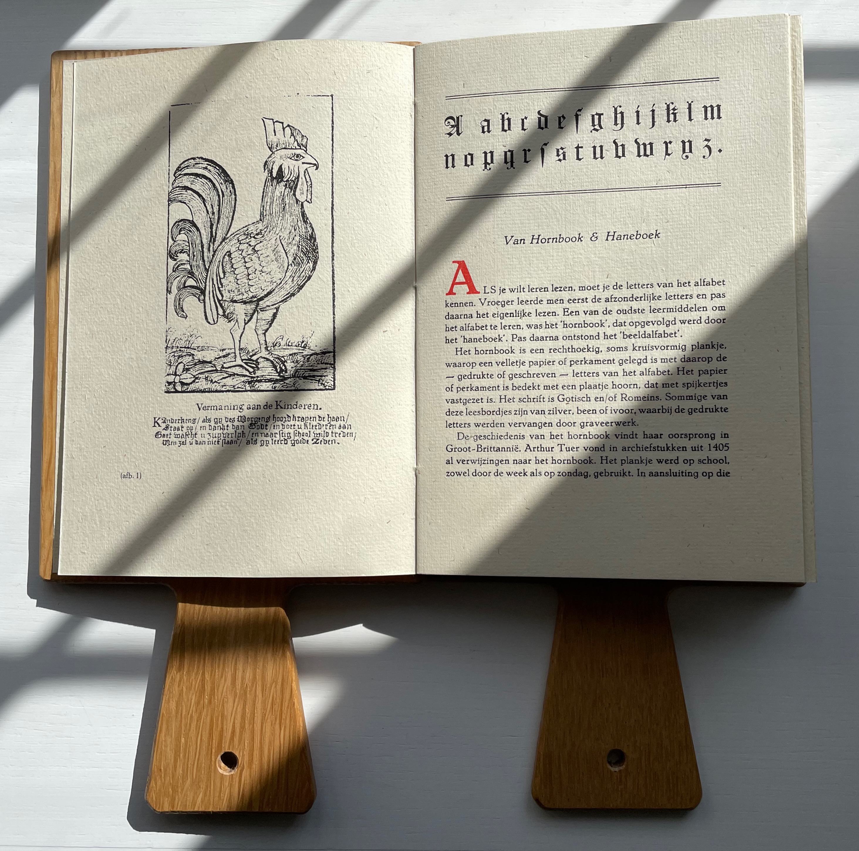
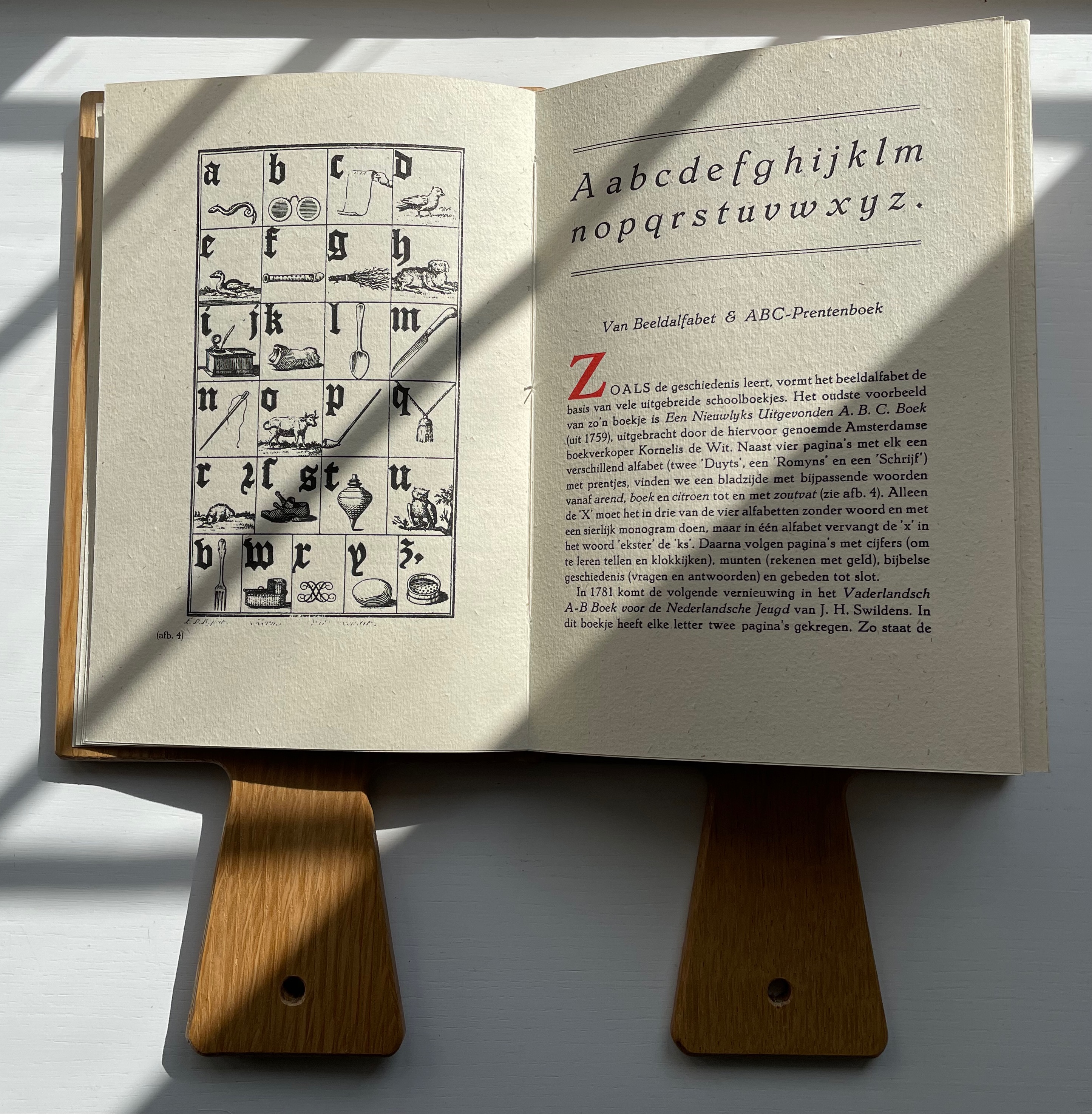
Van Hornbook includes four brief essays. Following in the footsteps of Andrew White Tuer’s History of the Horn-Book, the first two — “Van Hornbook & Haneboek” / “Of Hornbook & Handbook” and “Van Beeldalfabet & ABC-Prentenboek” / “Of Picture Alphabet & ABC Picture Book” –provide historical context for the format and its successors. Only four hornbooks have survived in the Netherlands, dating from the eighteenth century, so like Tuer, Van Hornbook‘s essayists rely on images from popular historical prints to show the hornbook’s appearance and handling. To the three hundred illustrations of History of the Horn-Book, the Nederlanders add this:
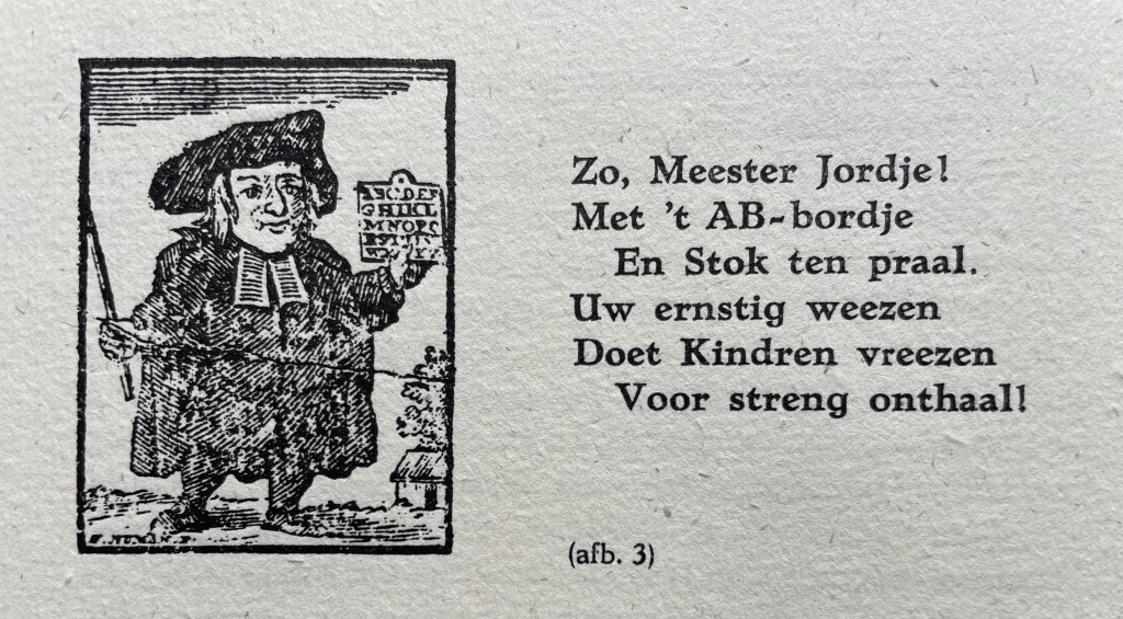
So, Master Jordje! With AB boardje And cane on high. Your earnest weening Leaves children keening As school draws nigh!
The print dates to 1785. The Dutch collective’s undertaking and their contributors’ offerings for the leporello are all the more notable for such a narrow historical margin on which to build.
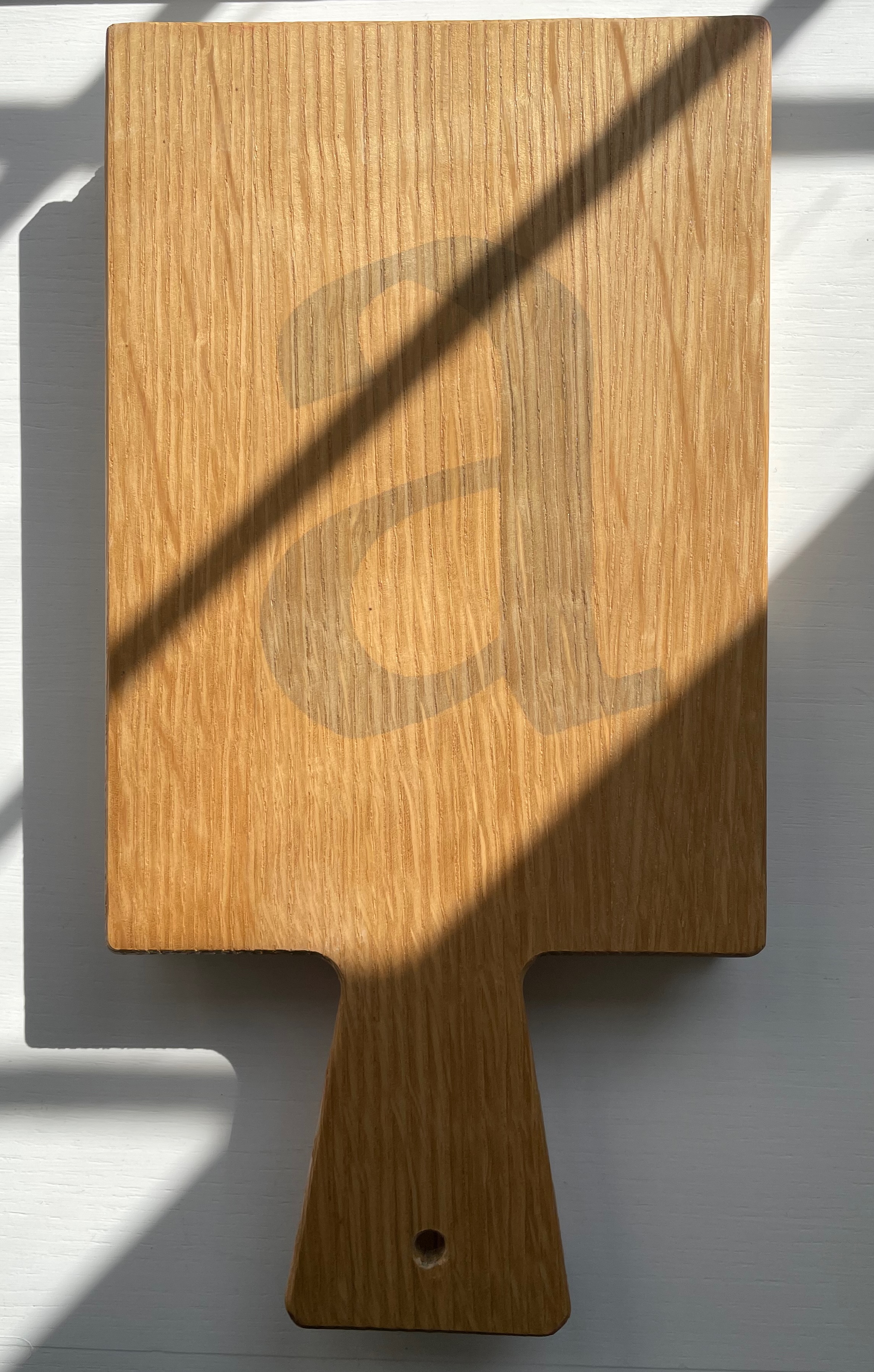
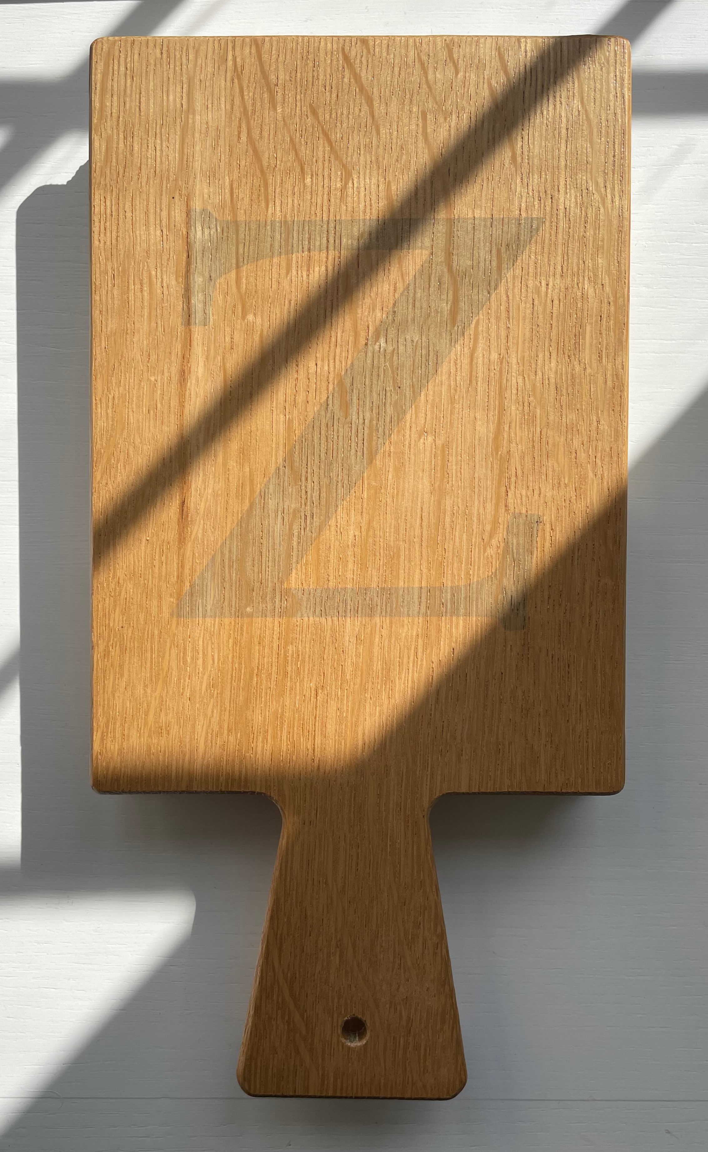
The work’s four editors have the last say with “Verantwoording” / “Explanation”, which is an extended run-up to the colophon. The leporello is printed on 180 gms Antik Gerippt Bütten by Hahnemühle, and the essays are on 130 gms. The heavier weight of the leporello’s panels must have been an open invitation for the contributors to show off. Aside from the constraint of print area, the “Hornbook preparation group” seems to have imposed only one other layout requirement: that each double-panel spread display the same horn-book shape on its left-hand panel. As the images below show, this was just the right touch of uniformity to spark rather than impede the contributors’ creativity and individuality.
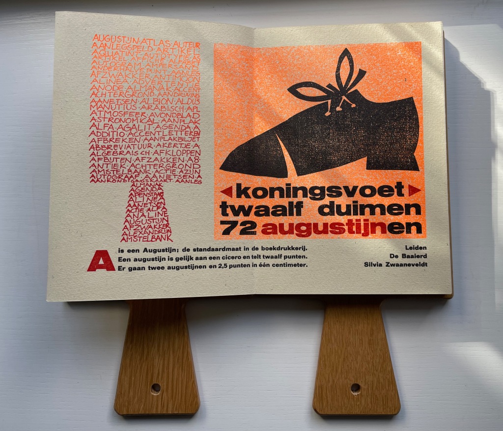
In English, the text beneath the two images here reads “A is an Augustin, the standard size in letterpress. An Augustin is equal to a cicero and has twelve points. Two Augustins and 2.5 points equal one centimeter.” Under the image of the shoe, Silvia Zwaaneveldt (De Baaierd, Leiden) converts into points the traditional measure for the “foot”: a foot would equal the size of the king’s foot, which eventually was standardized to twelve inches, which — to save us from chasing after Willem-Alexander or Charles III with a pica stick — is 72 Augustins.
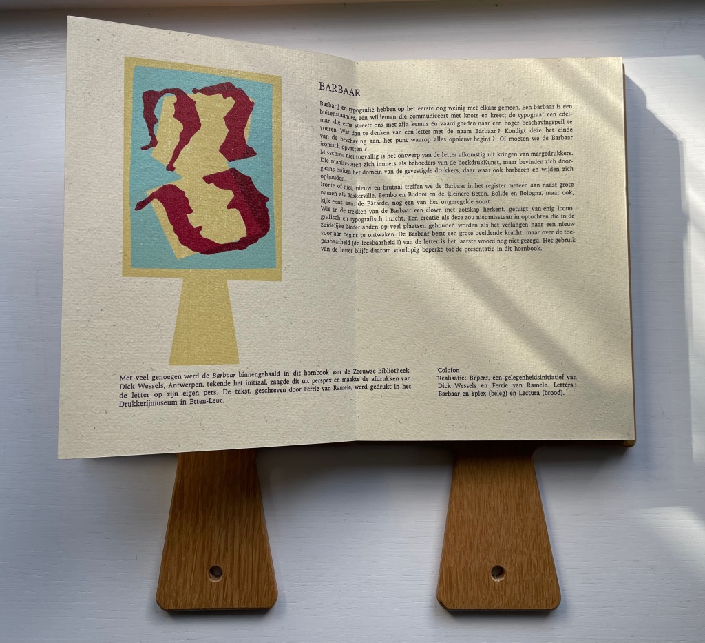
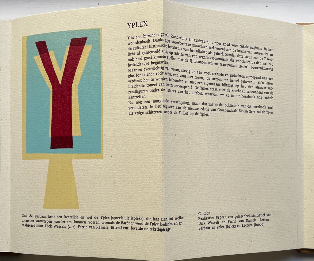
In their contribution for the letter B, Dick Wessels and Ferrie van Ramele invent a fictitious typeface Barbaar, named to allow them an extended joke about the outsider (or barbarian) status of Margedrukkers among traditional printers. If the Dutch reader misses the tongue-in-cheekiness of the entry, the colophon gives away the game:
Realisatie: BYpers, een gelegenheidsinitiatief van Dick Wessels en Ferrie van Ramele. Letters: Barbaar en Yplex (beleg) en Lectura (brood). / “Realization: BYpers, an occasional initiative of Dick Wessels and Ferrie van Ramble. Letters: Barbaar and Yplex (icing) and Lectura (cake).”
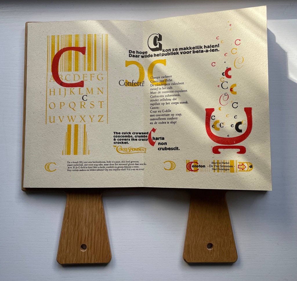
Elze ter Harkel (De Vier Seizoenen, Groningen) concocts two panels of verbal and visual puns on the letter C. The alliterative wordplay in the doggerel of “Confetti” is too Dutch and deliberately nonsensical for a satisfactory replica in English, but its reference to cellulose is a clue to the visual papermaking pun in the C’s bubbling up from the pulp vat next to it. Also referring to paper, the panels’ best pun hides in the last altered word of Cicero’s saying “Charta non erubescit“. This is usually translated as “Documents don’t blush”, meaning you can express opinions in print you might blush to express in person, but charta also means “paper”. With the “e” changed to a “c” in the last word, the Latin now means “crumble”. So, it’s “Paper doesn’t crumble”, which ought to make the winking punster blush a little.
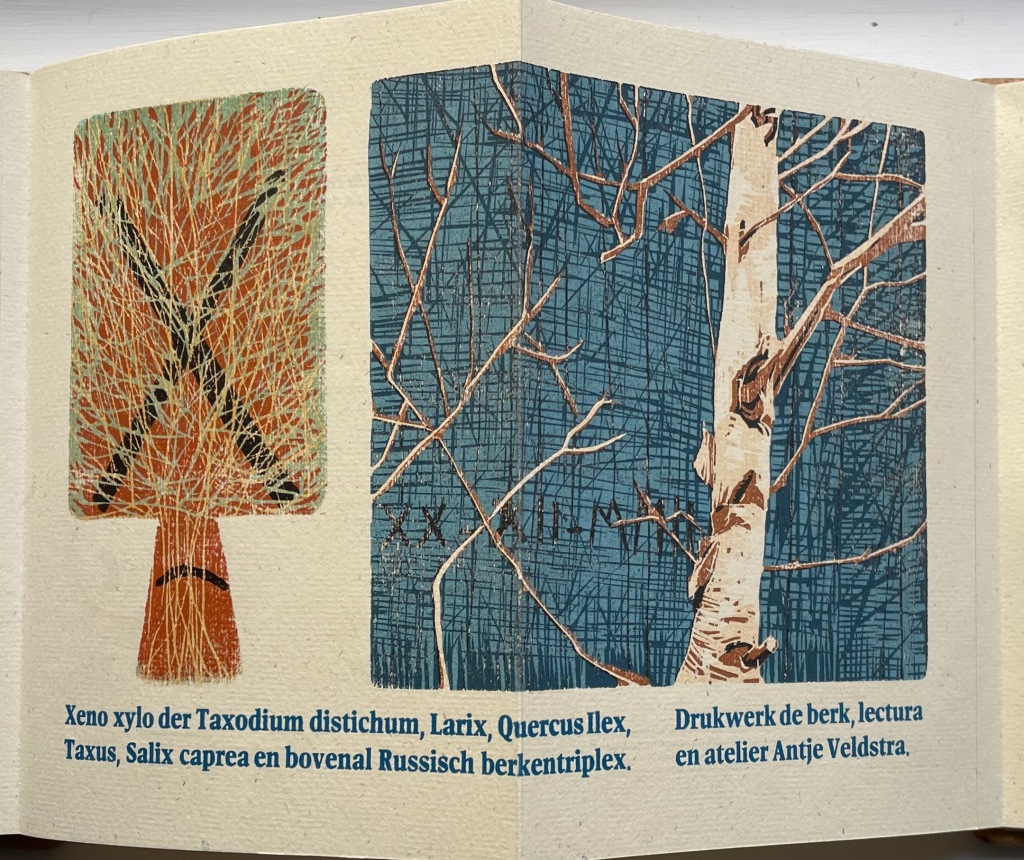
Antje Veldstra (Antje Veldstra Grafiek, Groningen) is an award-winning woodcut artist. Almost all of the X-words in her couplet are the Latin names for trees: Taxodium distichum (Bald Cypress), Larix (Larch), Quercus Ilex (Holm Oak), Taxus (Yew) and Salix caprea (Goat Willow). The first two words, however, — xeno and xylo — are prefixes. The first means “alien,” “strange” or “guest” as in xenophobia (“fear of foreigners”). The second means “wood” as in xylography (“the art of engraving on wood or of printing from woodblocks”). But what is so strange or alien about these trees? The clue is in the background (lower left) of the birch print. Those are runes, the ancient marks of mystery and secret language. The most easily distinguished are ᚷ (called Gebo, associated with gift and fortuitous outcome) and ᛖ (called Ehwaz, associated with horse and movement). In her craft, Veldstra, however, does not leave us with the ancients. The last entry — en bovenal Russisch berkentriplex — is Russian birch plywood, commonly used for engraving.
If there remains any doubt about the tone of the entry for B by Dick Wessels and Ferrie van Ramele, consider their entry for Y.
Y is a special case. Eccentric and rare, barely good for a few pages in the dictionary: it owes its survival perhaps mainly to the strength of conventions and the cultural-historical significance of the alphabet as a whole. Without this support, the Y might have already been killed off, on the advice of a government committee that concluded that we could very well make do with the IJ. Economical and transparent, entirely in keeping with contemporary principles.
But so balanced in form, standing firmly on one foot and evoking thoughts of a glass of sparkling red wine, a vase of roses, arms raised to heaven…. Such a letter deserves to be preserved and added with its own name to the ever-expanding stage of letter designs! The Yplex represents the strength and beauty of the marginal figures among the letters of the alphabet, a few of which we still find in this hornbook.
Although still a marginal appearance, that will soon change after the publication of this hornbook. In the register of the new edition of Groenendaal’s Printing Letters, the Yplex will be the only one shining under the Y. Stand by for the Yplex!”
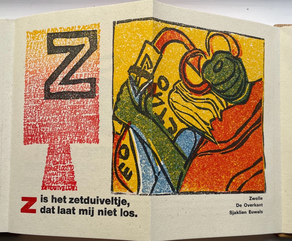
The last letter of the alphabet bedevils abecedarians in every language. Sjaklien Euwals settles on zetduiveltje: “typesetter’s or printer’s little devil”. Word for word in English, the caption reads “Z is the typesetter’s little devil that will not let me loose”. The image rules out the English expression “printer’s devil”, which refers to the printshop apprentice. Euwals’ little devil is the green and red gremlin who leans over her shoulder, grabs her wrist and makes her drop letters from her composing stick. In other words, the imp on whom to blame typographical errors. To capture Sjaklien Euwals’ humor in translation, we might have to go with “Z iz the typezetter’z gremlin that won’t let looze.”
Given the affinity between artists’ books and children’s books (particularly alphabet books), it is surprising how few works of book art pay homage to the form of the horn-book. Van Hornbook tot ABC-Prentenboek sets a high bar. Perhaps increased awareness of it will prime the pump for primers.
Further Reading/Viewing
“Elder Futhark“. Last edited 11 August 2022. Wikipedia. Accessed 27 October 2022.