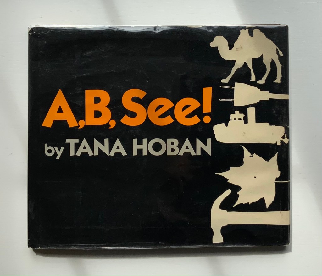
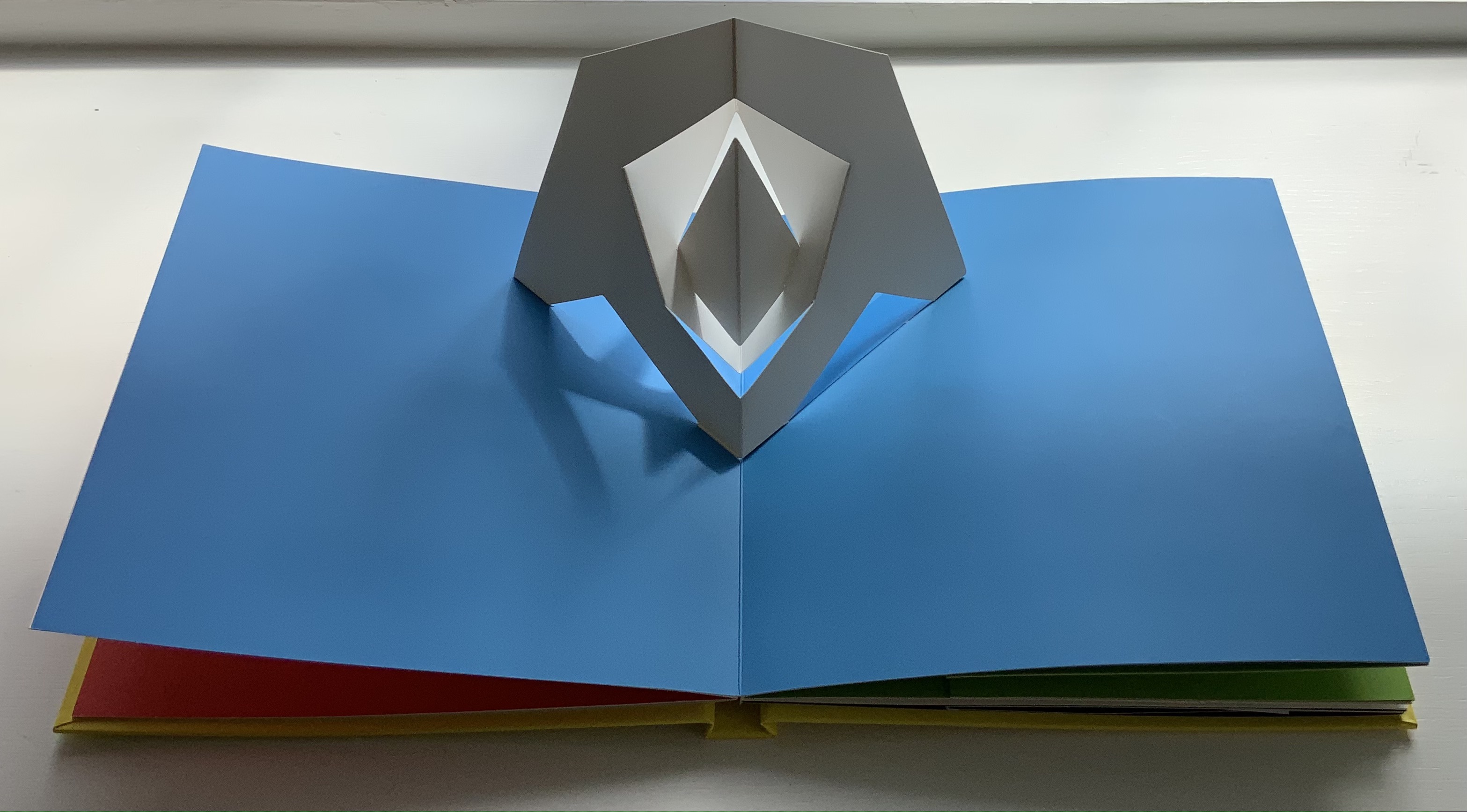
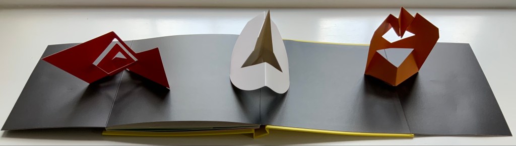
A, B, See! (1982) Tana Hoban Hardcover, casebound. H252 x W286 mm, 32 pages. Acquired from Cattermole 20th Century Children’s Book, 7 August 2021. Photos of the work: Books On Books Collection.
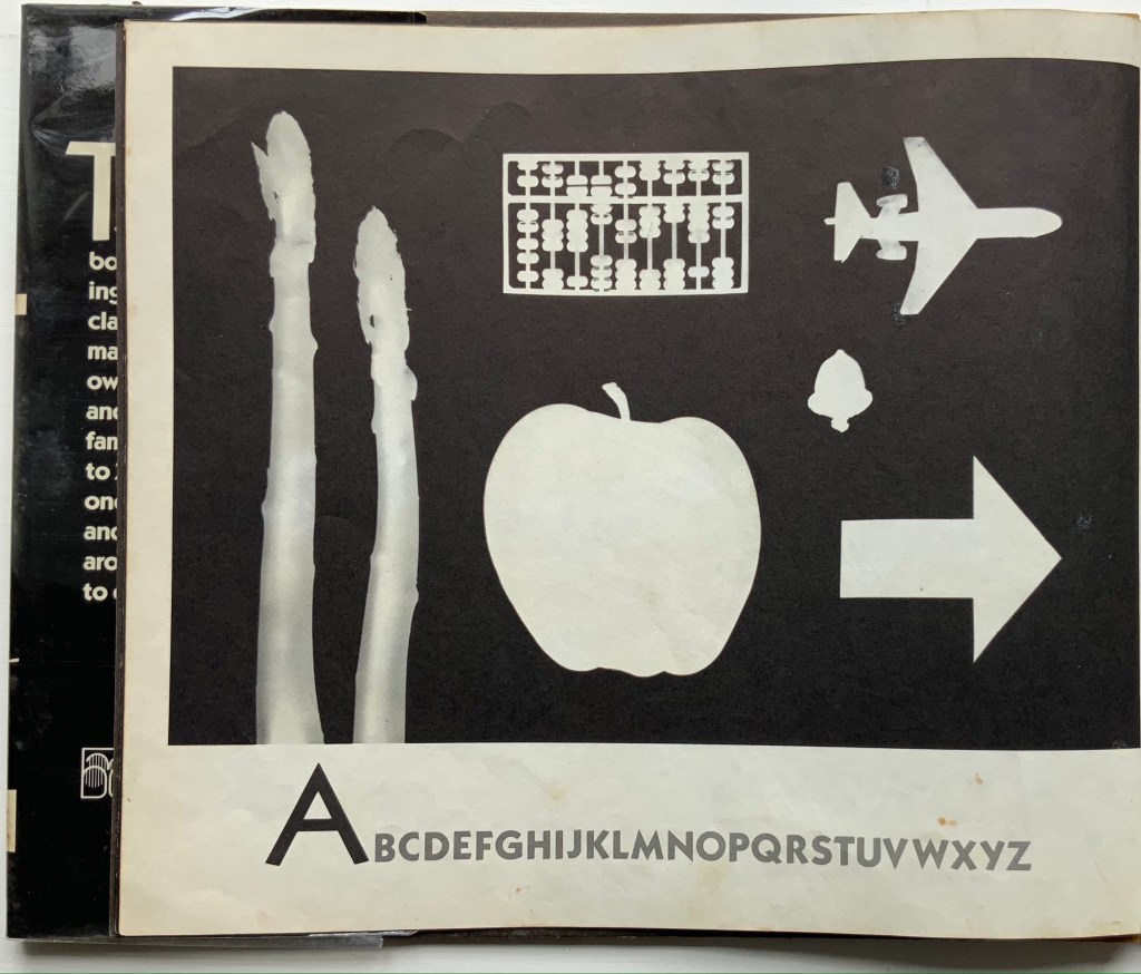
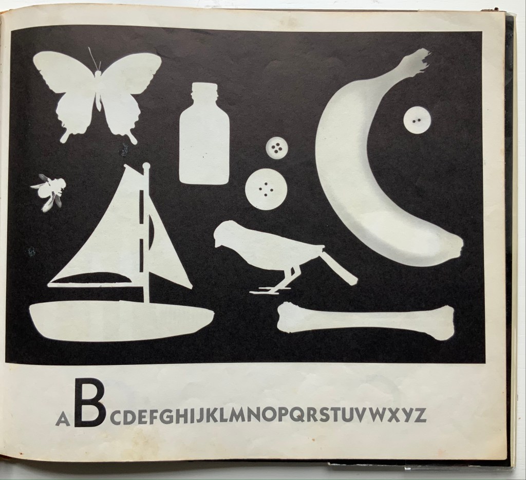
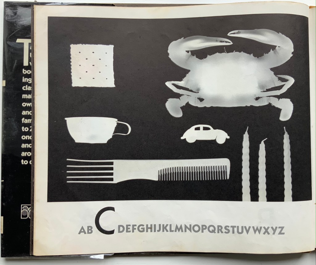
Made in dark-room conditions with light-sensitive paper, actual objects and cutouts, these photograms lift this simple ABC book to the plane of object recognition and to the level of art. Other artists who have applied photographic techniques to the abecedary are Anthon Beeke, Eileen Hogan, Peter Hutchinson, Simon Jennings or Stephen T. Johnson. Each has a distinctiveness of eye, technique or conceptualizing. Hoban’s seems to lie in extracting something more from that simple imposition of white on black.
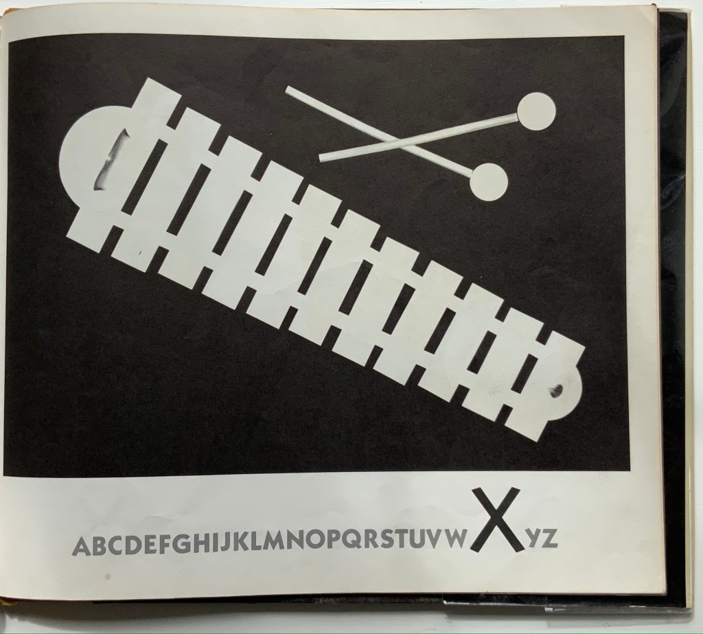
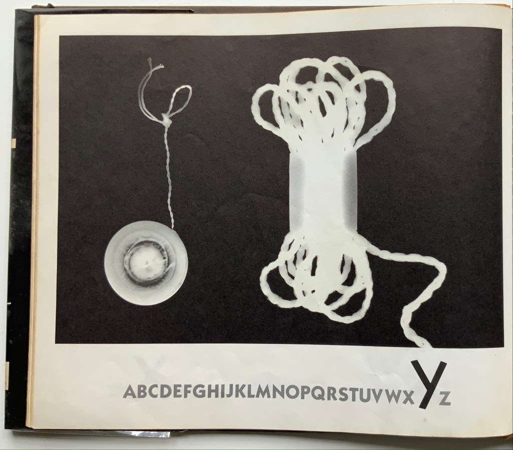
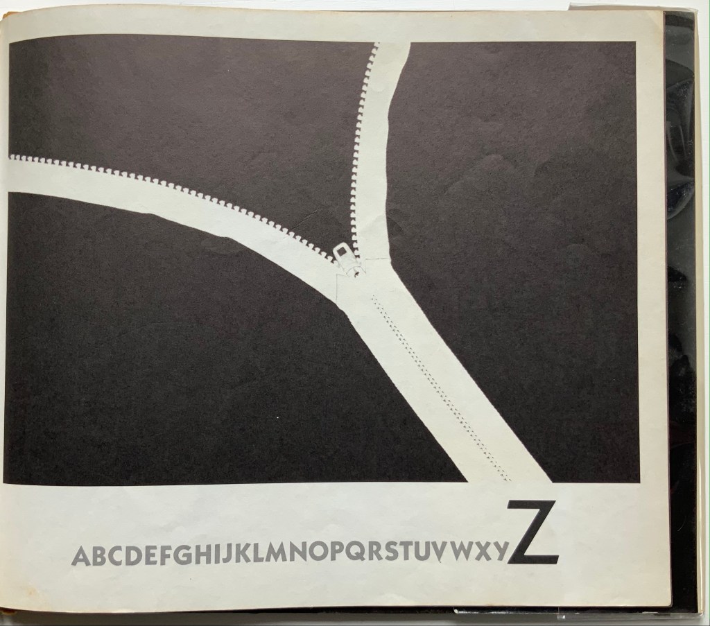
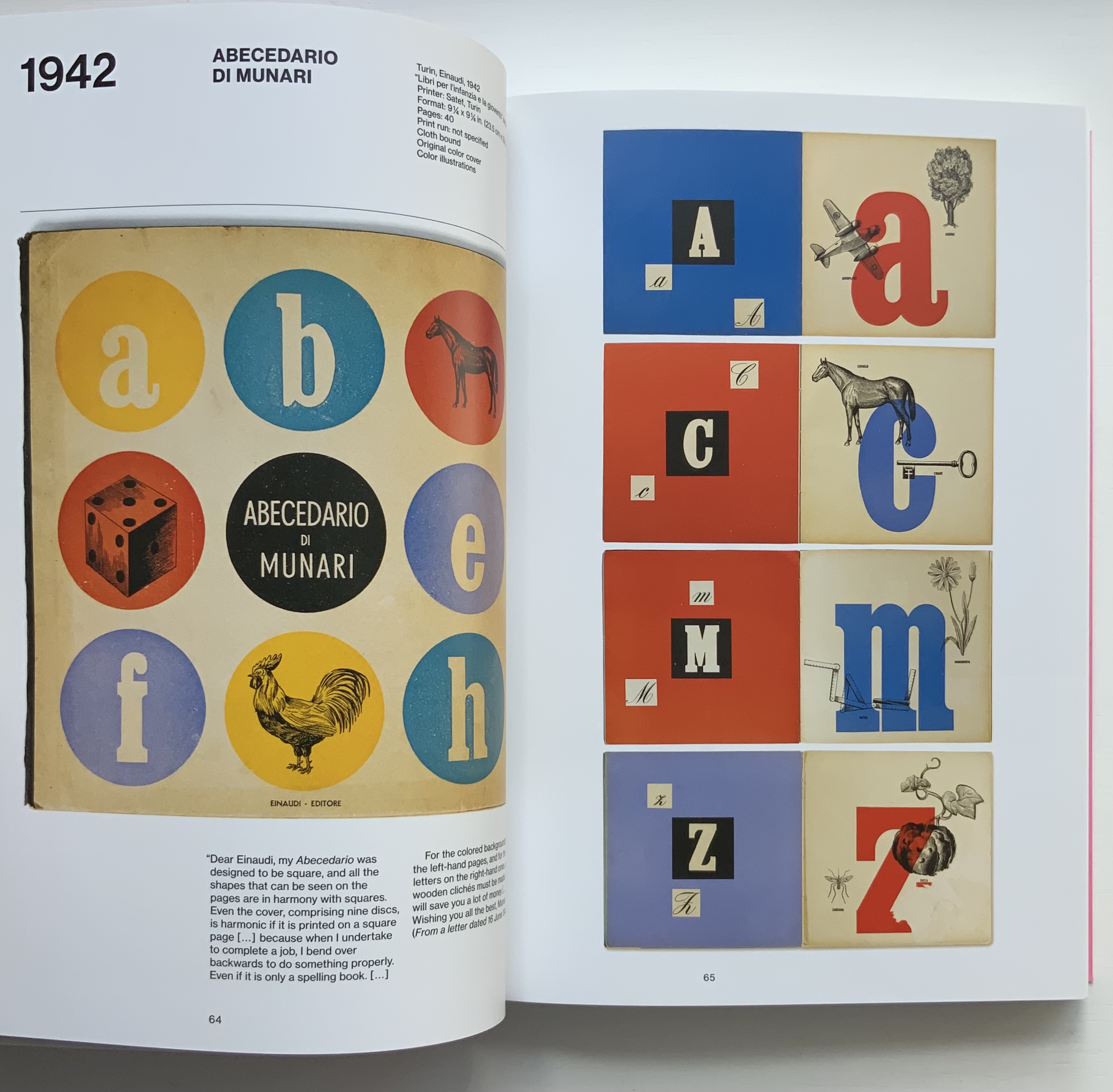
Giorgio Maffei’s 2008 definitive collection of book designs by Bruno Munari brings together two of Italy’s renowned book artists. Giorgio Maffei’s own work, his writing and gallery/bookshop (highlighted by his son Giulio Maffei’s extraordinary video catalogues Le vite dei libri) warrant a catalogue raisonné in their own right. The Italian edition published by Munari’s long-time publisher Maurizio Corraini was followed up in 2015 by this translation by Martin John Anderson and Thomas Marshall in 2015. For the Books On Books Collection, one of the great pleasures of Munari’s works is its attention to the alphabet, which this book documents.
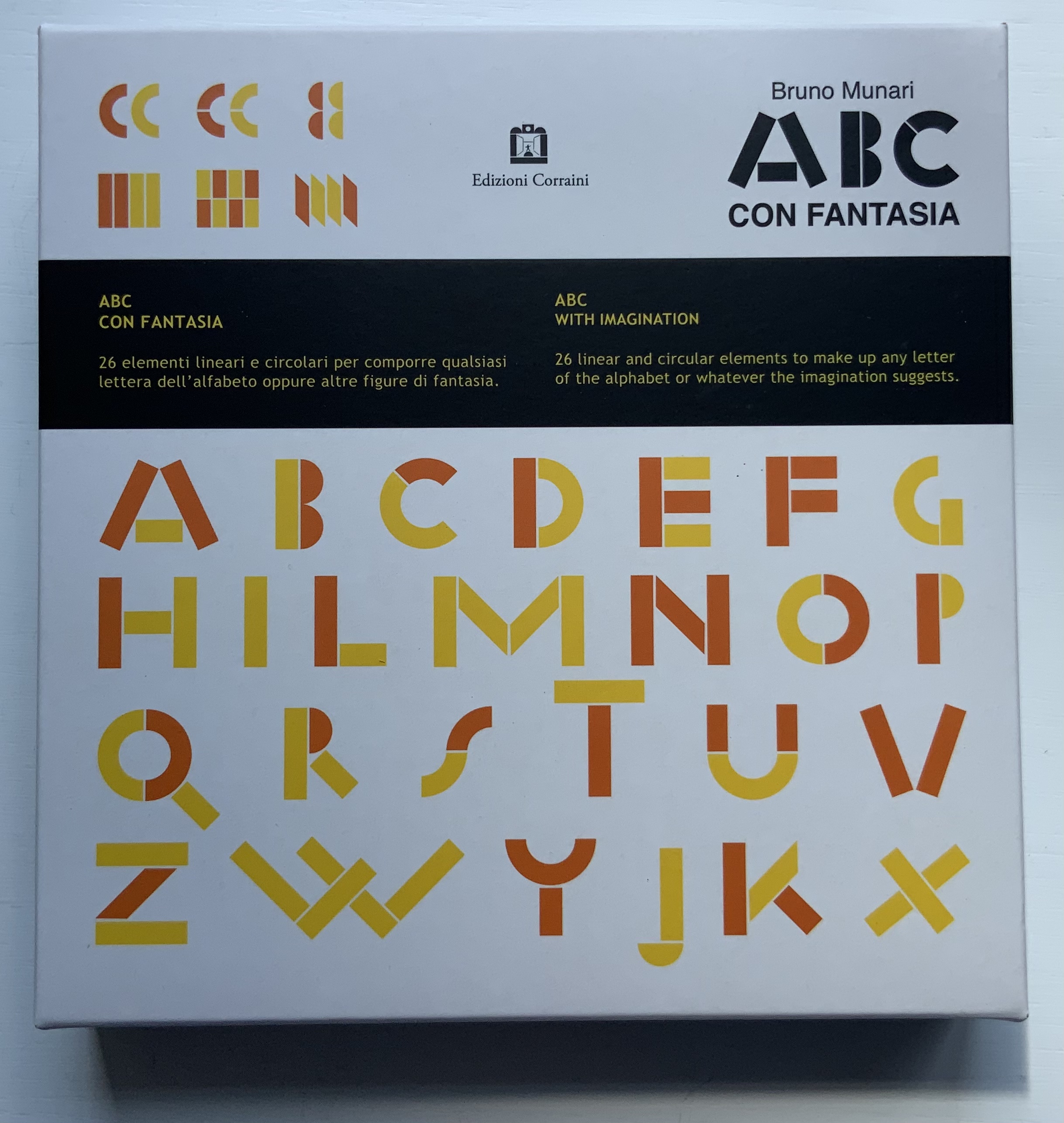
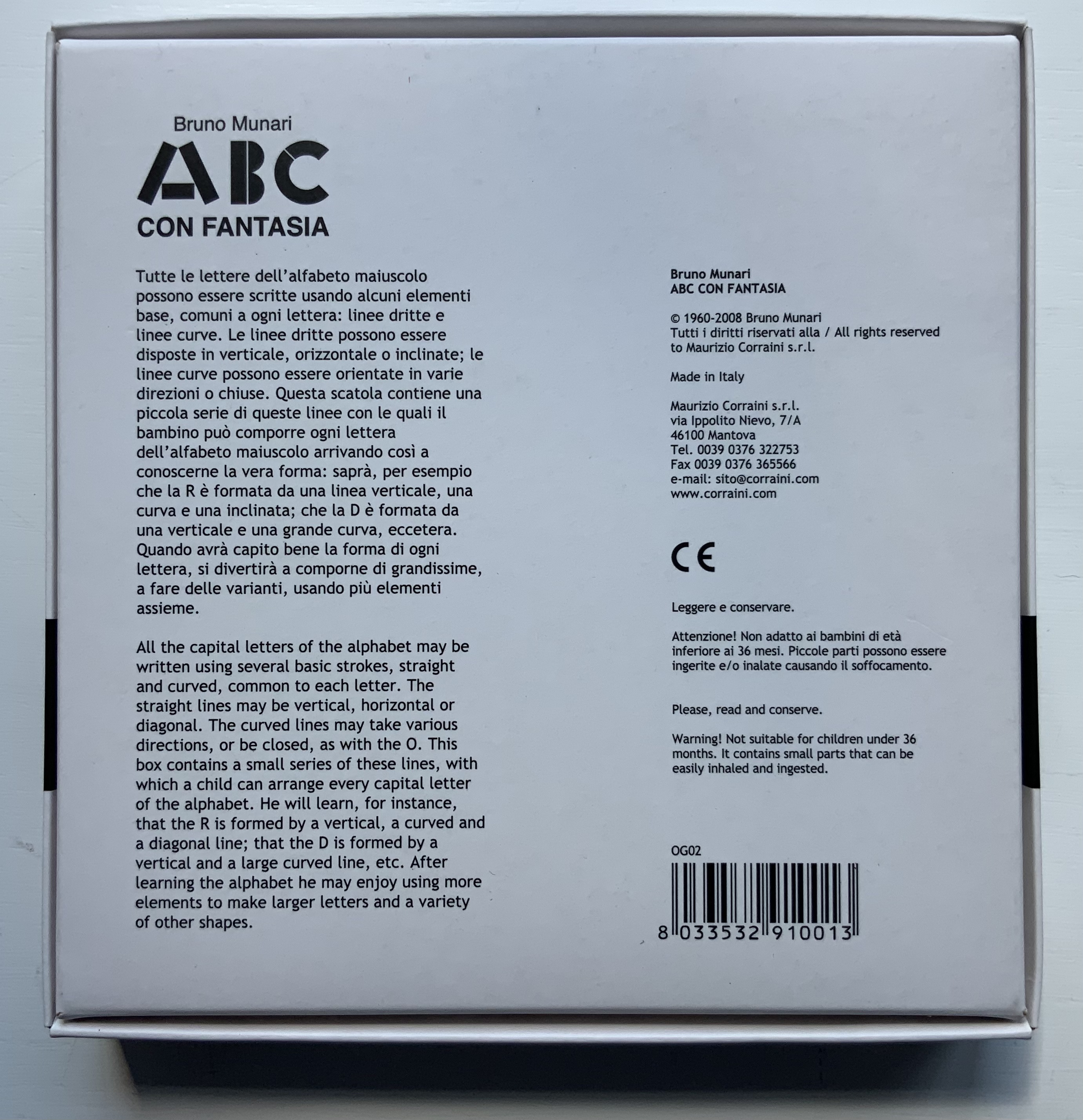
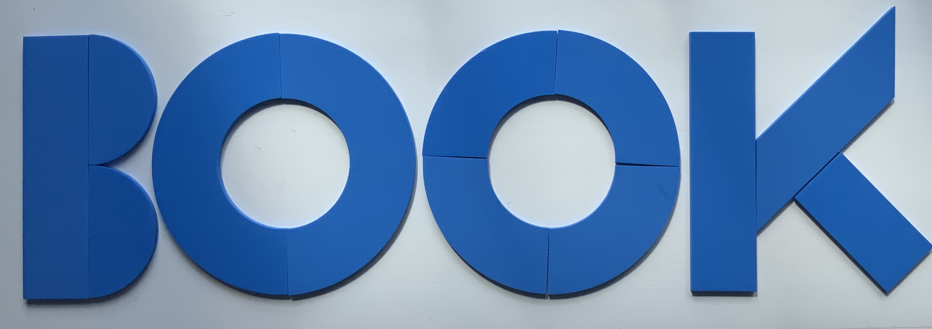
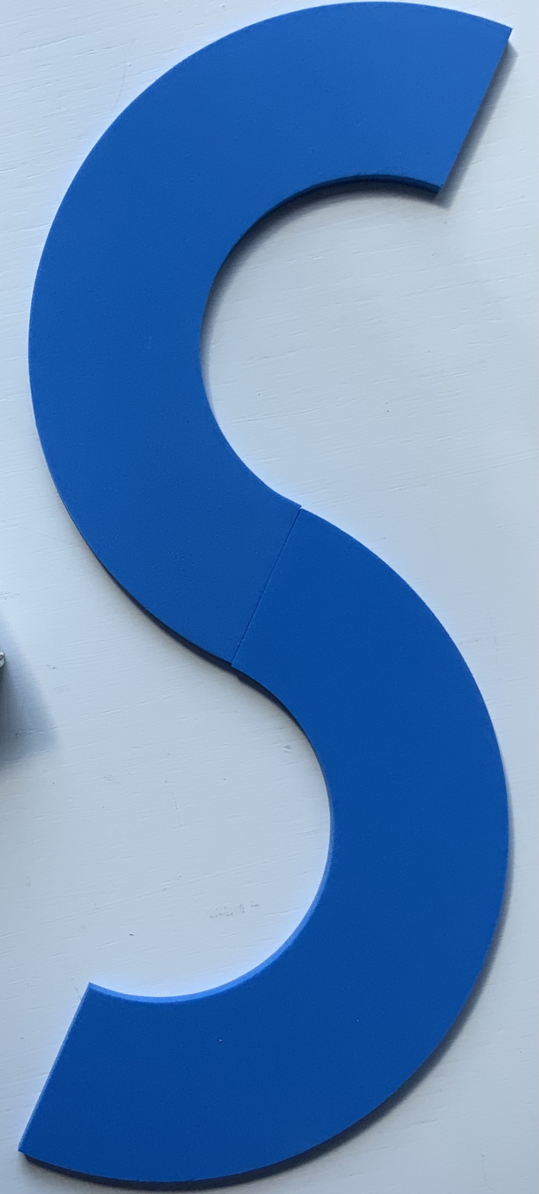
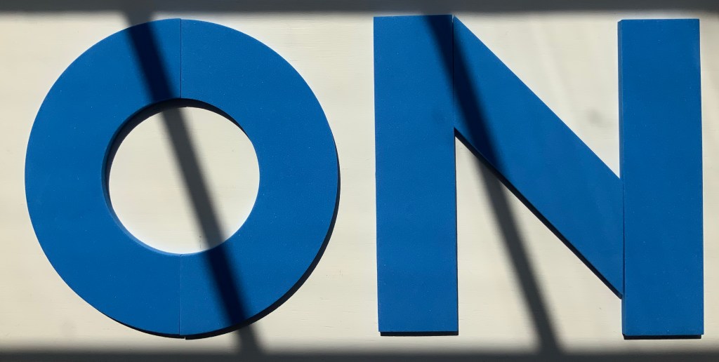
Although not shown in Munari’s Books, an alphabet-related work that underscores Picasso’s calling Munari “our Leonardo” is ABC con fantasia (1973/2000). If we are to believe Fra Luca Pacioli, it was Leonardo da Vinci who inspired his “straight lines and curves” exposition for creating letters. Following in their footsteps, Munari provides the linear and curvilinear basics for the collector and offspring to join the game.
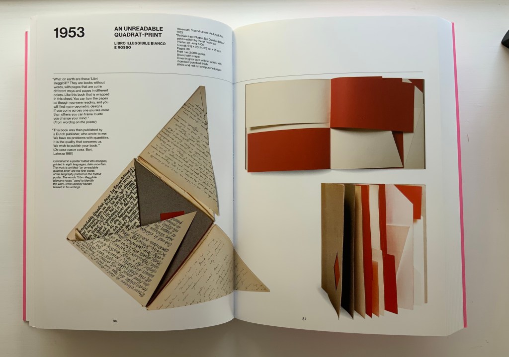
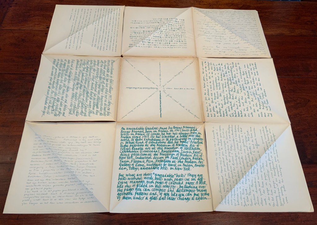
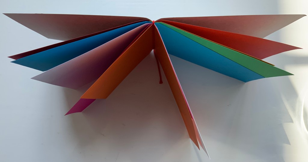
Another pleasure is how Munari’s works lead to other works in the collection. Just by preceding them in Pieter Brattinga’s Kwadraatblad/Quadrat-prints series, Munari’s An Unreadable Quadrat-Print (1953), below, conjures up Wim Crouwel‘s, Gerard Unger‘s, Timothy Epps and Christopher Evans‘, and Anthon Beeke‘s more alphabetical contributions.
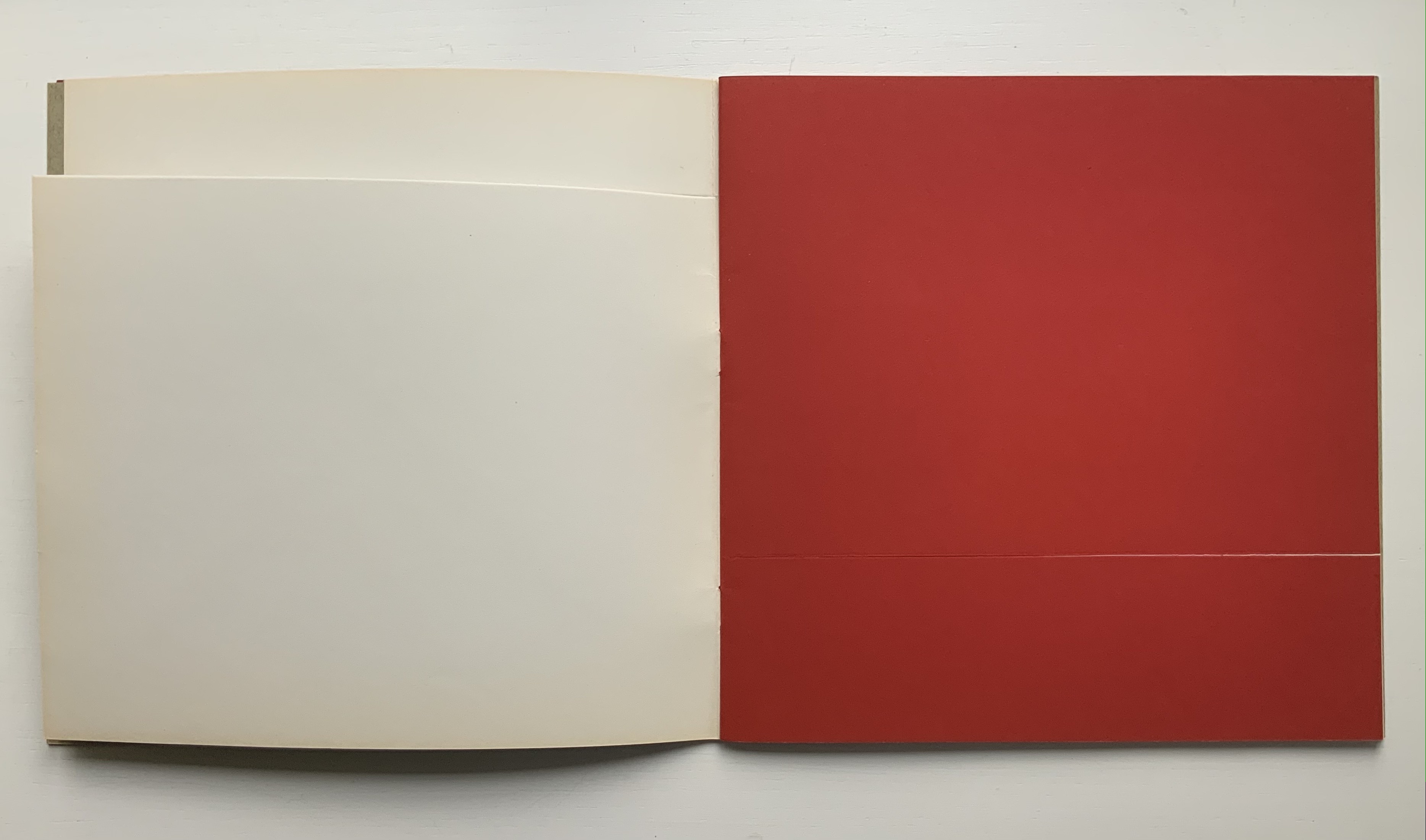
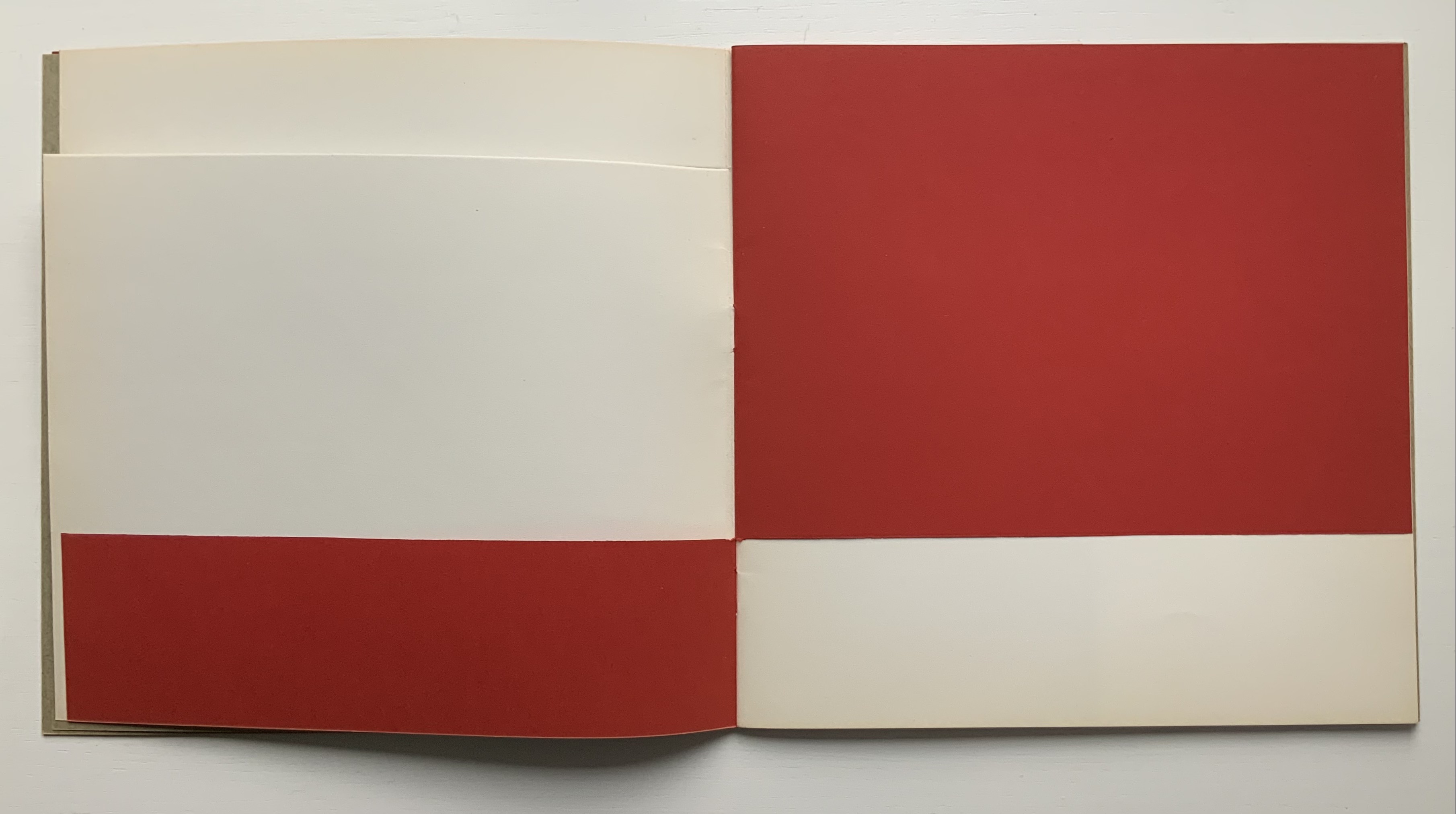
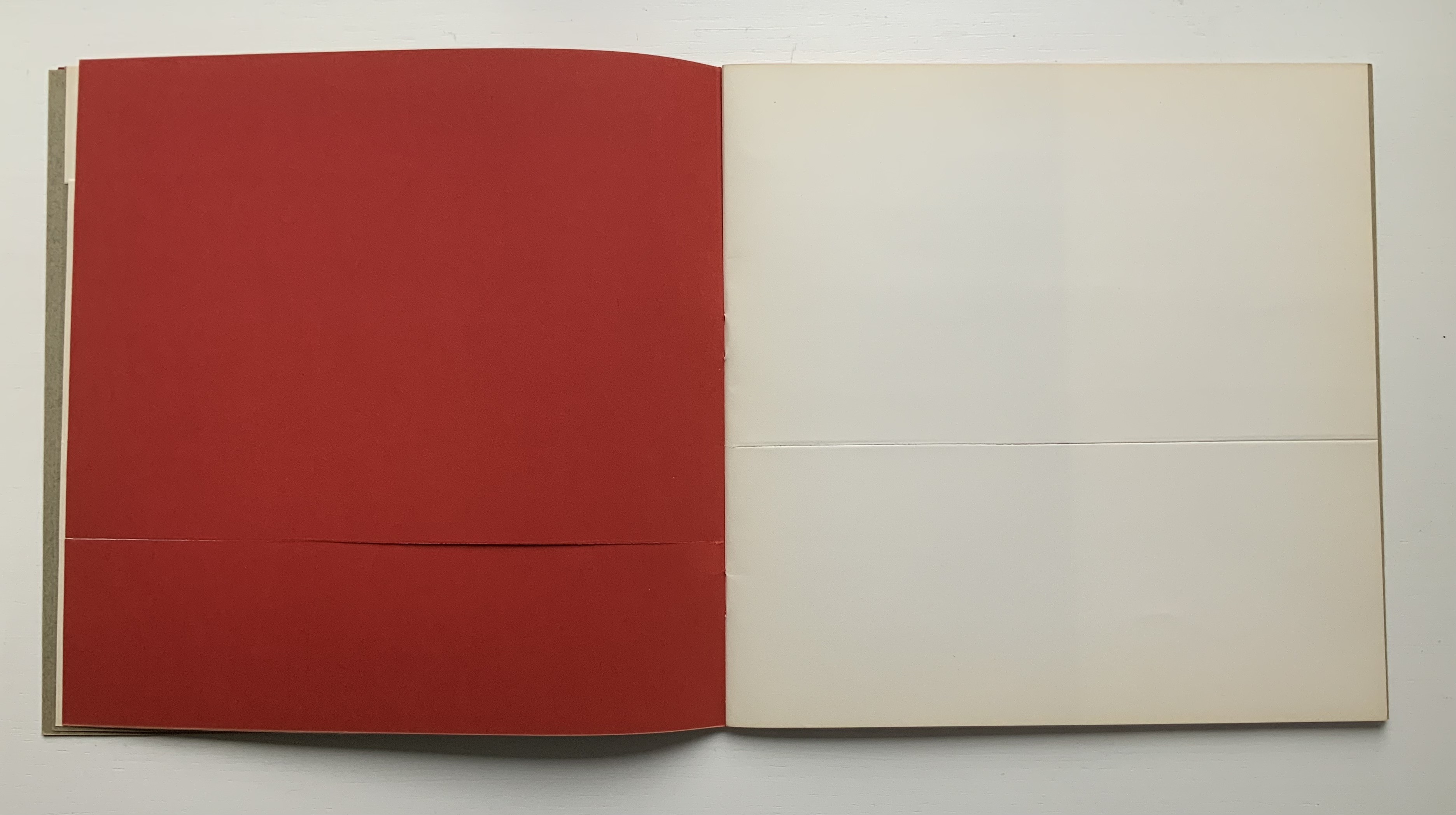
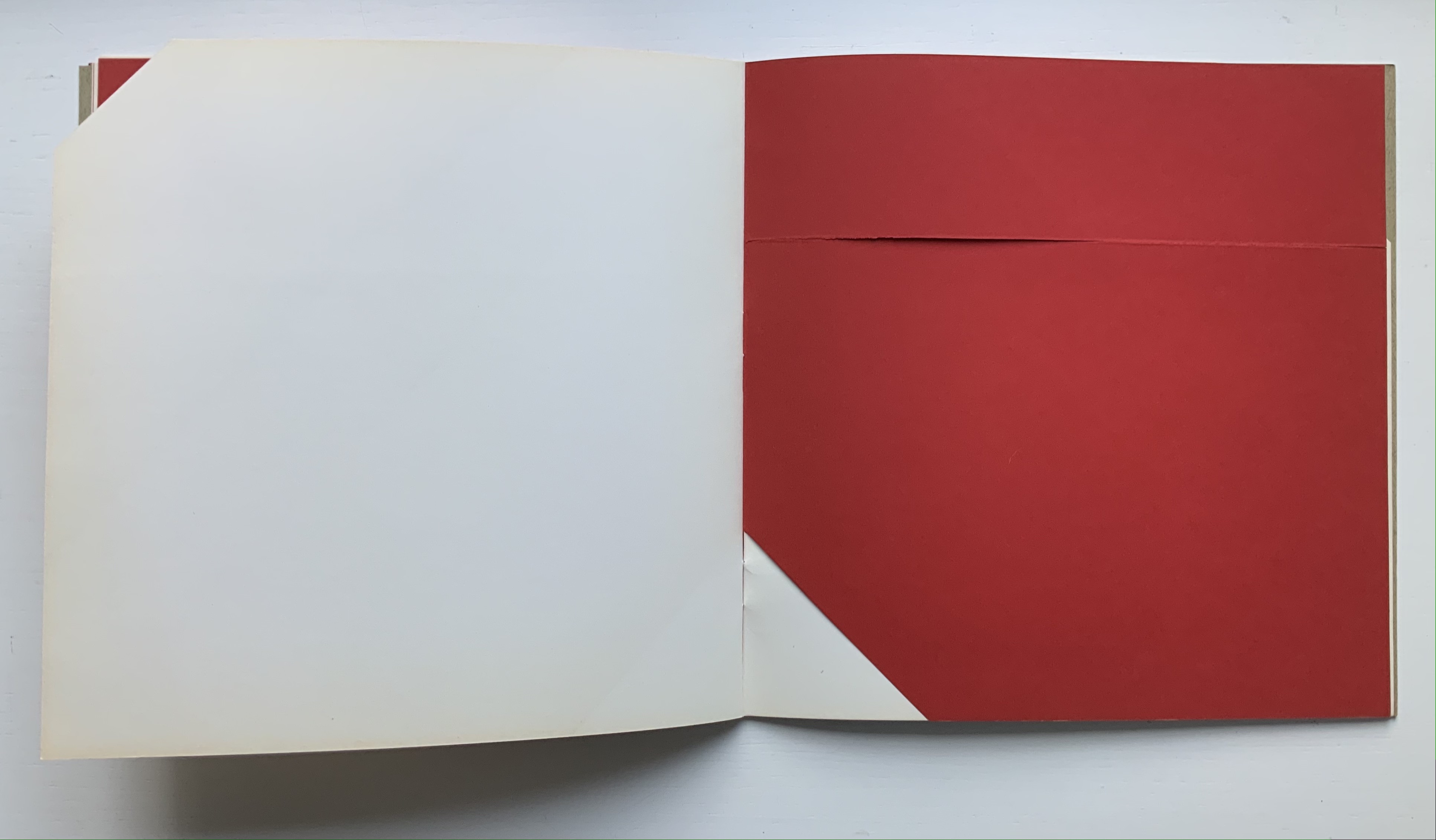
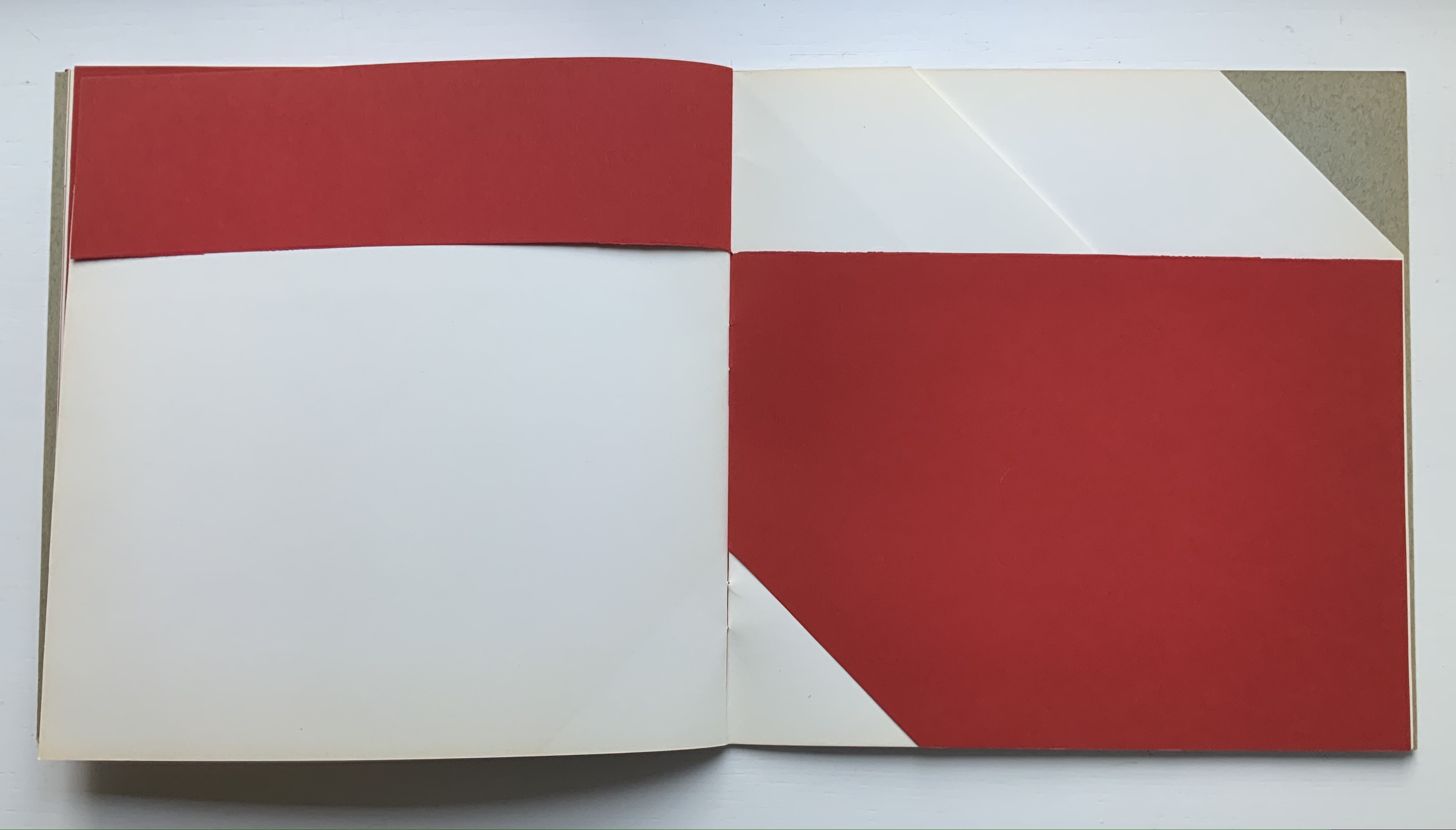
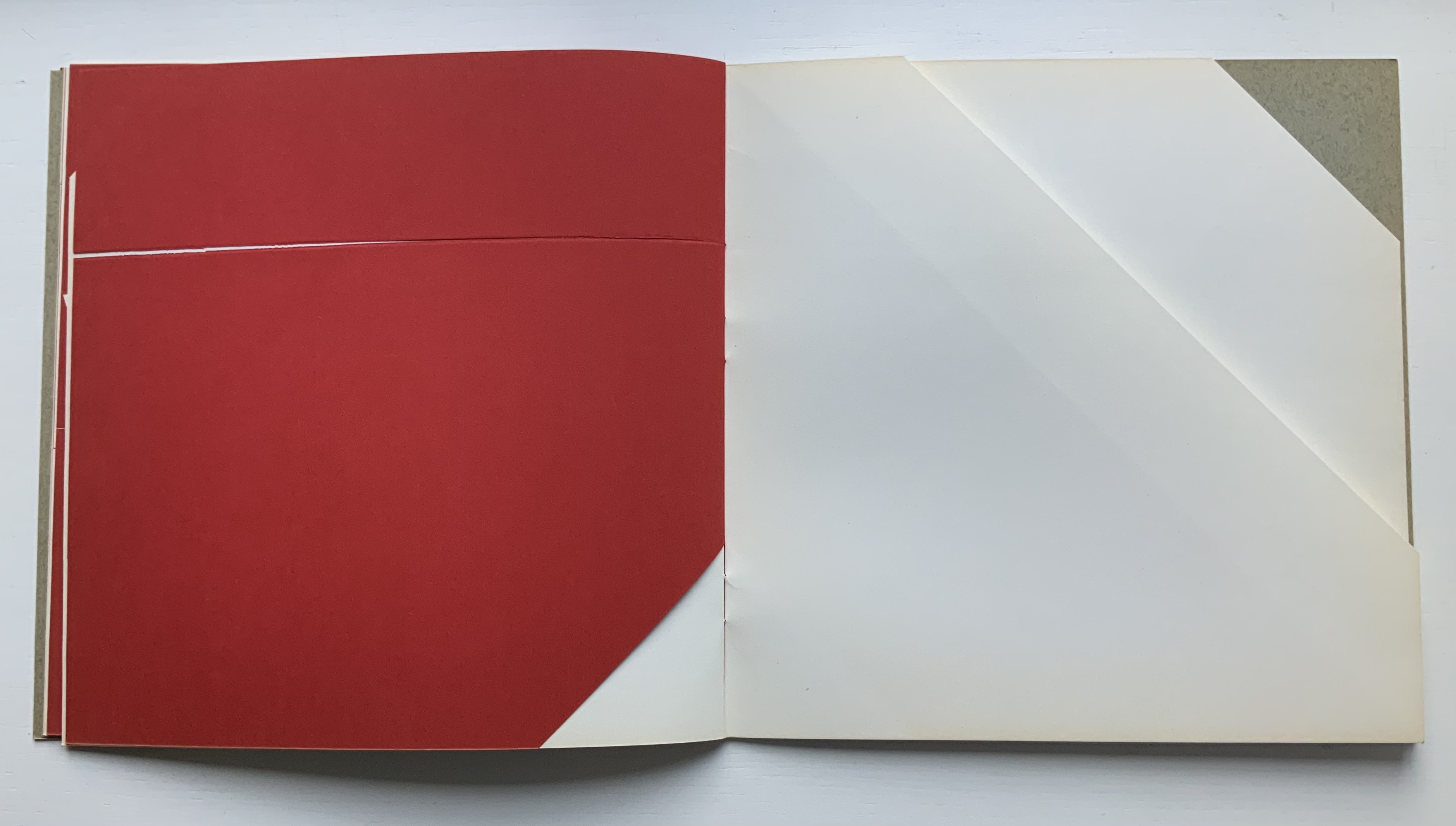
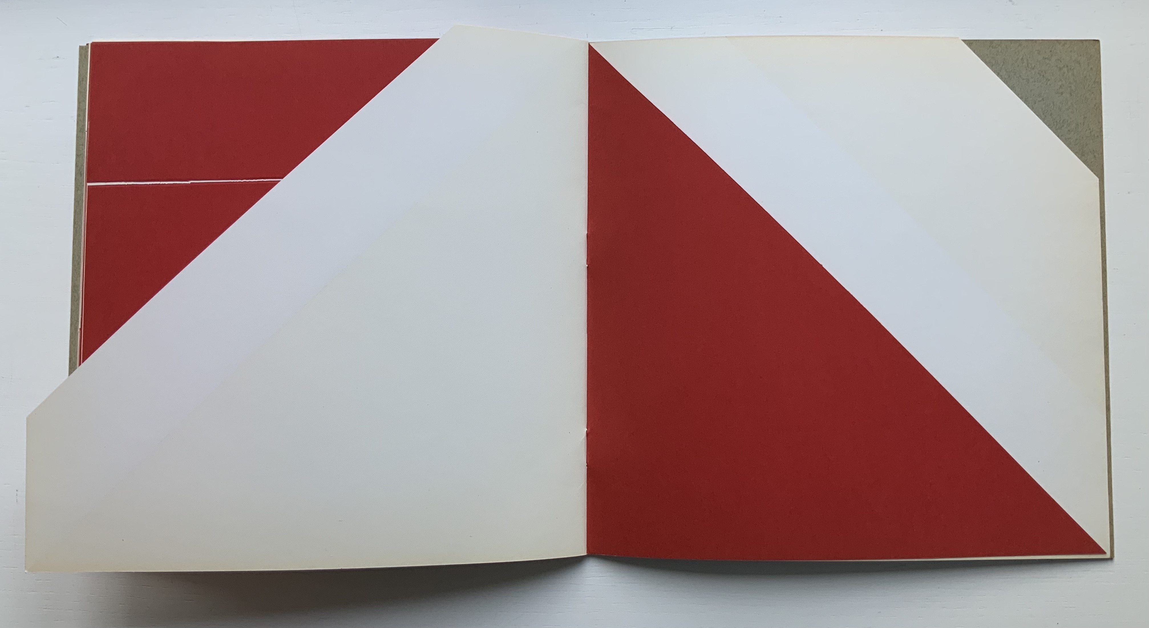
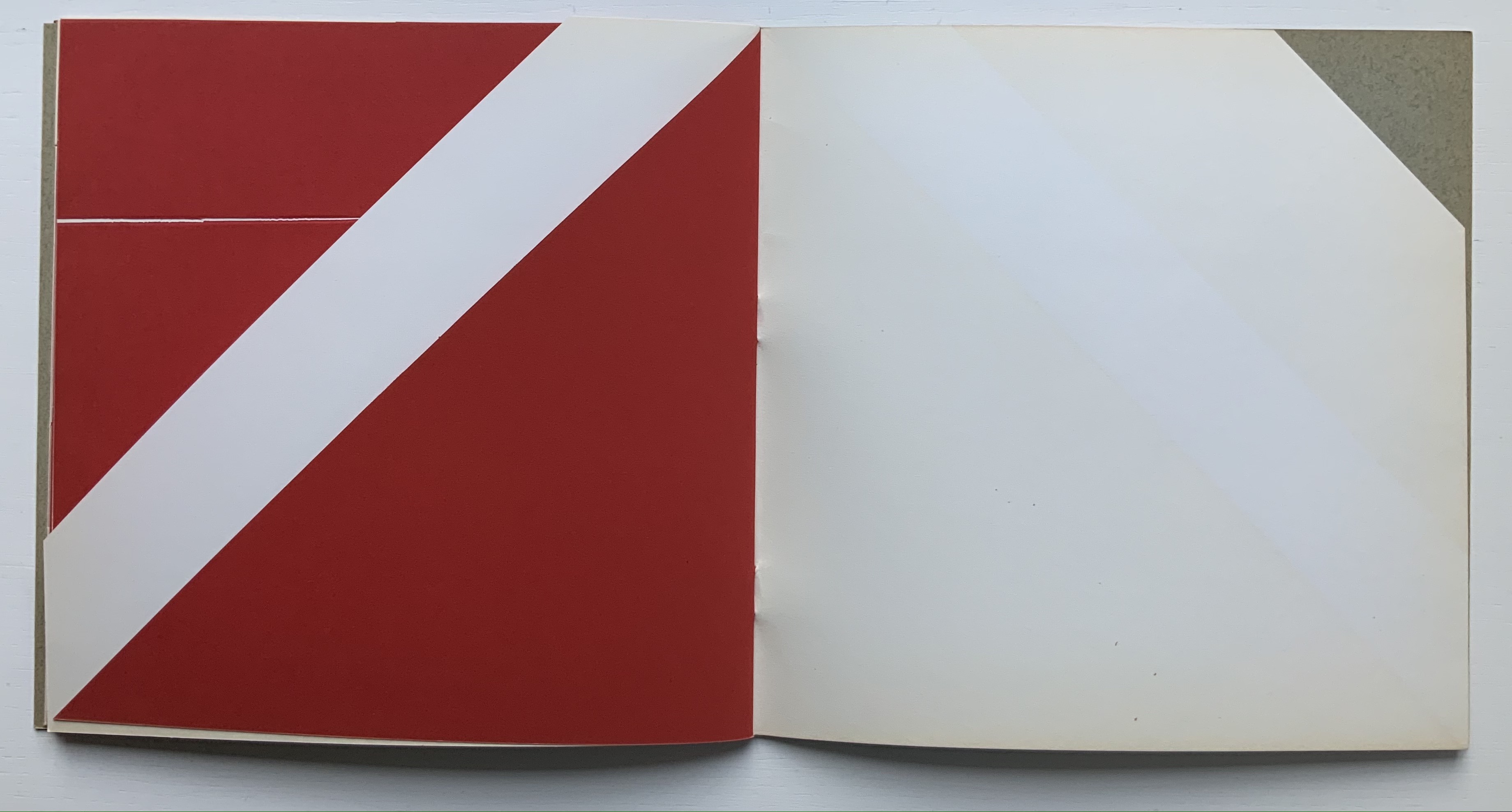
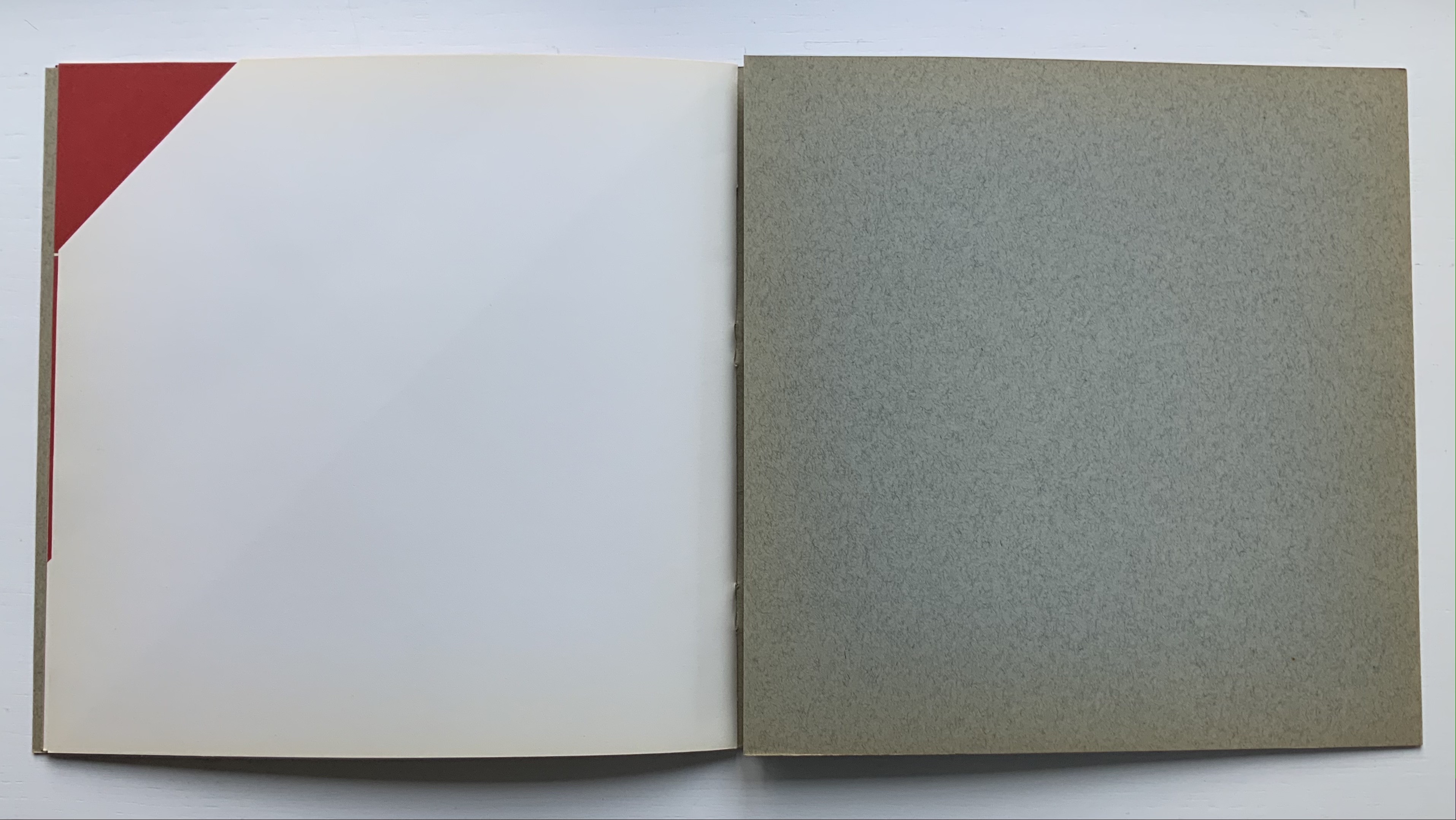
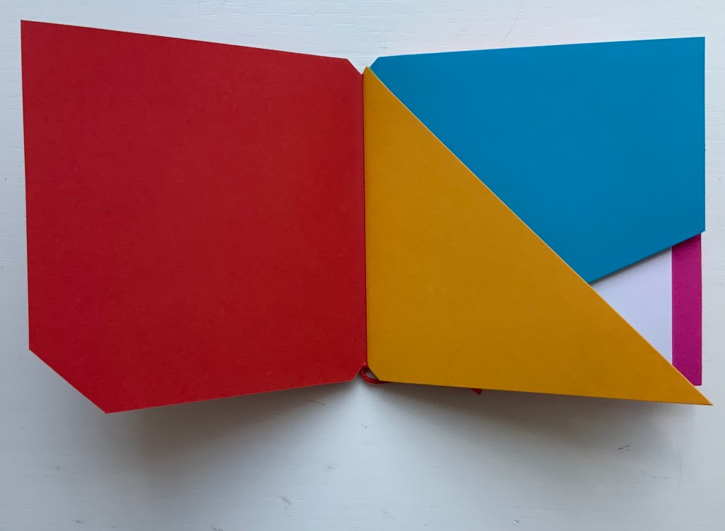
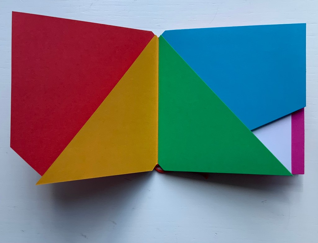
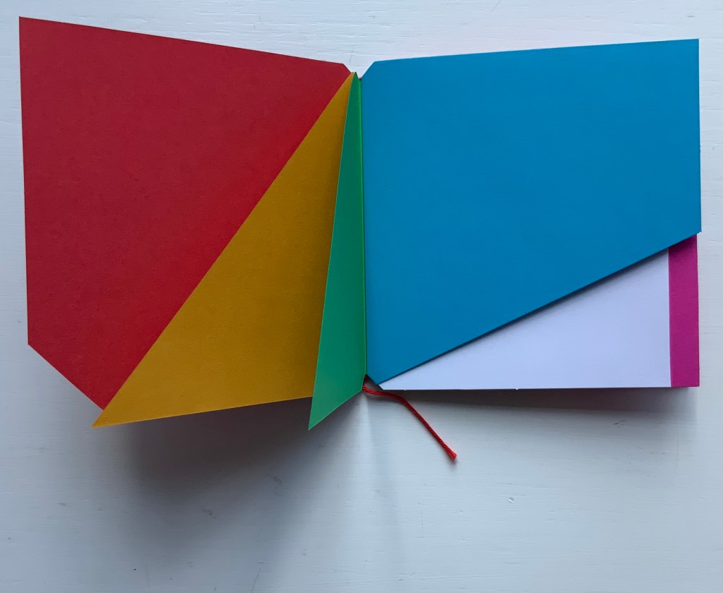
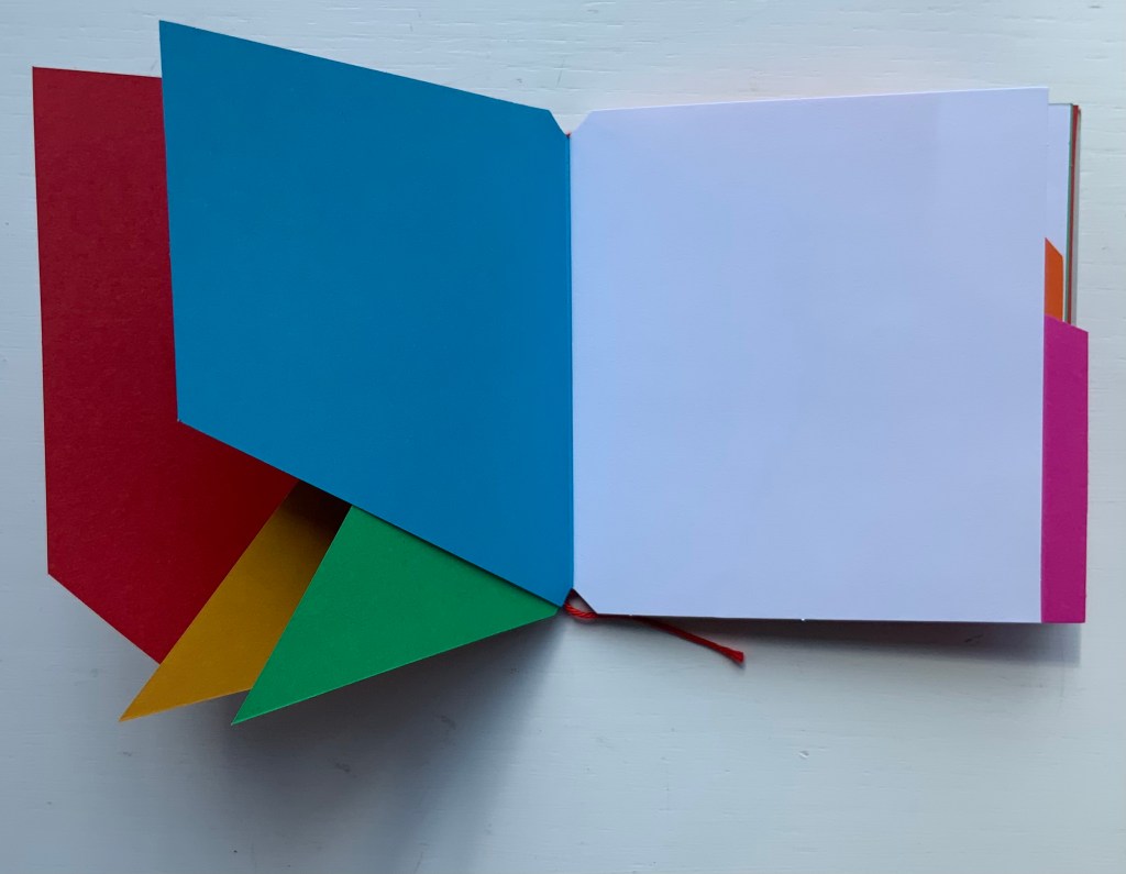
Libro illeggibile bianco e rosso / An unreadable Quadrat-Print / Een onleesbaar kwadraat blad / Ein unlesbares Quadrat-Blatt (1953)
Although there are no words on numbered pages that have to fall in the right order, An Unreadable Quadrat-Print still presents the author/printer/binder with a challenge in imposition. White and red alternate, which is easy enough, but to cut or not cut a folio on the left and right, how to cut it, how to place the differently cut folios in the right order to achieve the variation in images when the pages turn, how to ensure a sewable area down the center for each folio whether it has a horizontal cut extending into the spine or a diagonal one extending from some point along the spine — that is impressive. It speaks to the sculptural process and result in making books, as well as the sculptural process of reading them.
The following sequences — the book’s first five double-page spreads and then its last six — take a normal page-turning approach, always turning from the upper right corner of whatever shape/page is available. Note how, in the last six double-page spreads, the pages and shapes become more complex.
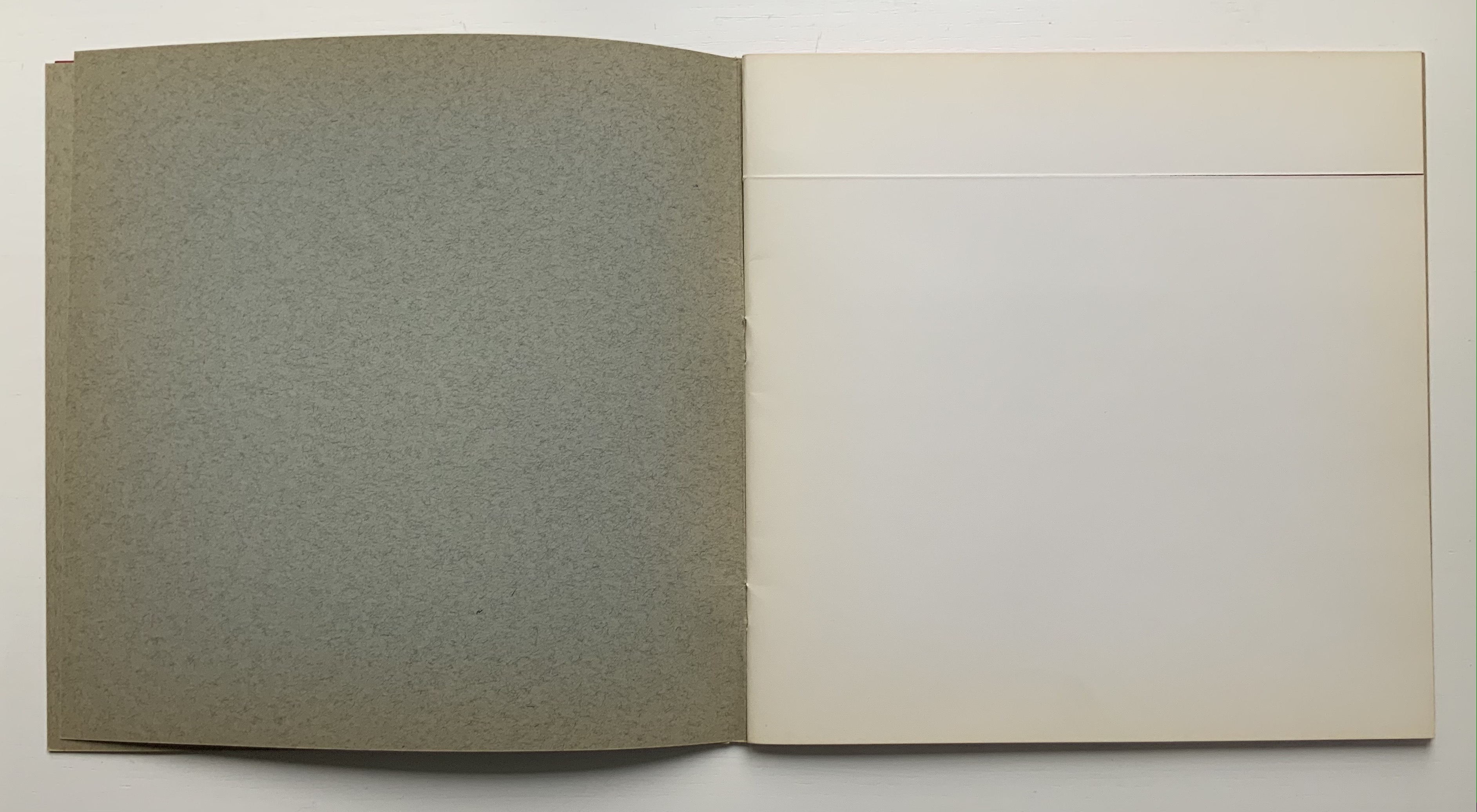
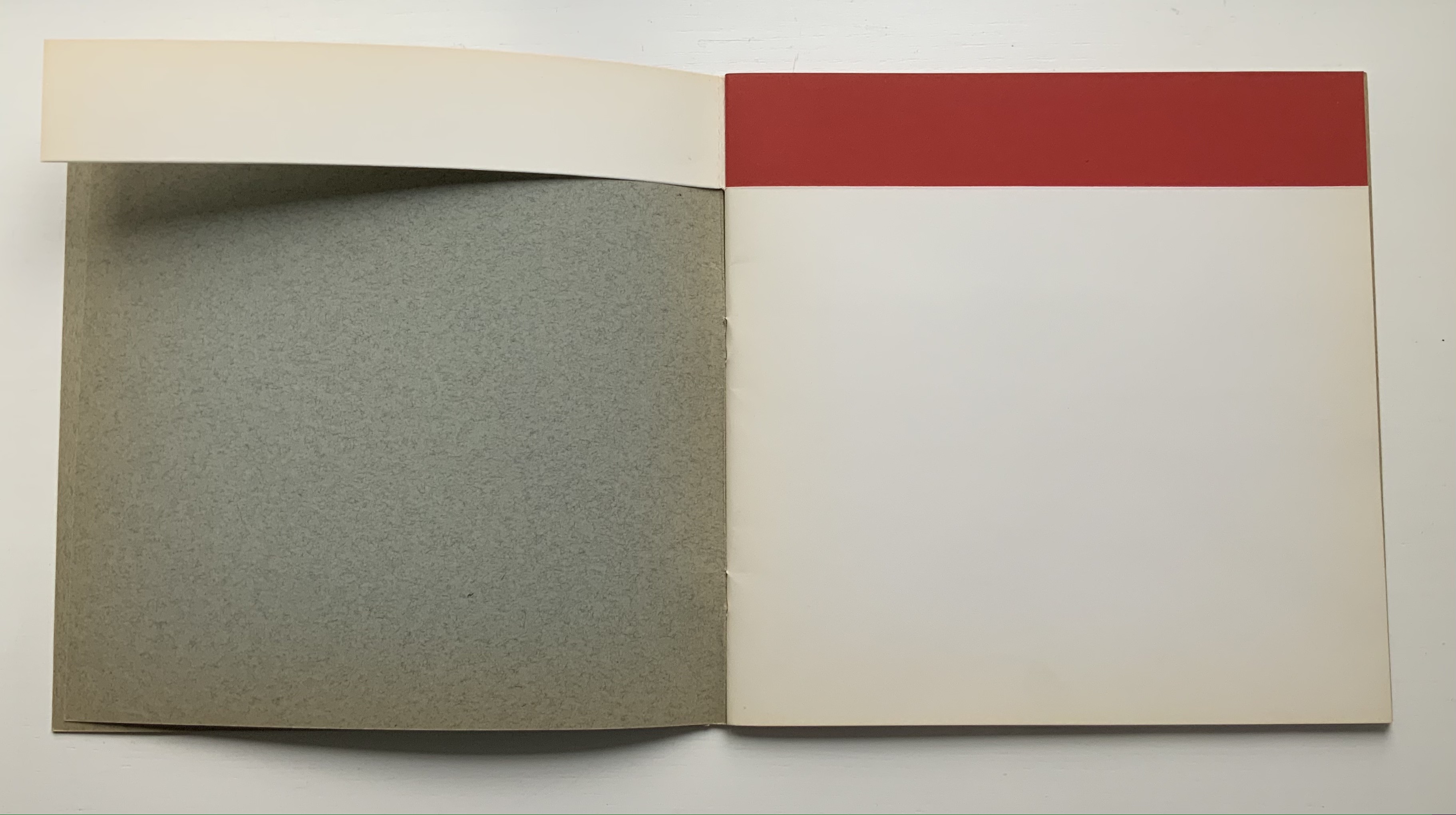
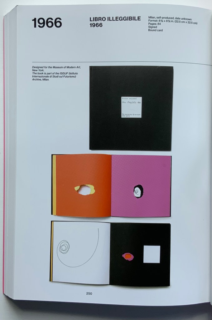
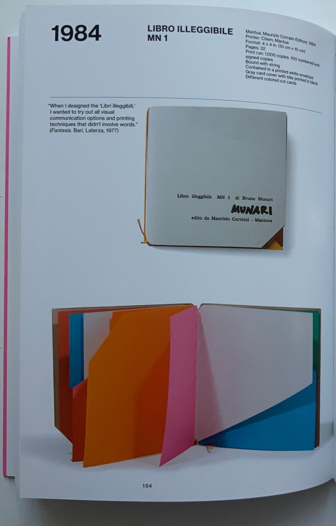
Libro illeggibile (1966), below left, calls to mind Katsumi Komagata’s A Cloud (2007), and the one in the middle foreshadows Eleonora Cumer’s subtle artistry with transparent paper in Circoscrivere lo spazio No. 3 (2021). While Munari’s rare works press modest budgets, some of it — in its simplicity and popular appeal — has led Corraini Edizionito put it within easier reach. Numerous reissues of the 1984 Libro illeggibile MN 1 have pushed its price to €5. Short of the artist’s signature (which would likely obstruct the aesthetic intention), a copy from the latest 5000-copy print run will “perform” and deliver the same experiential value as one from the earliest run.
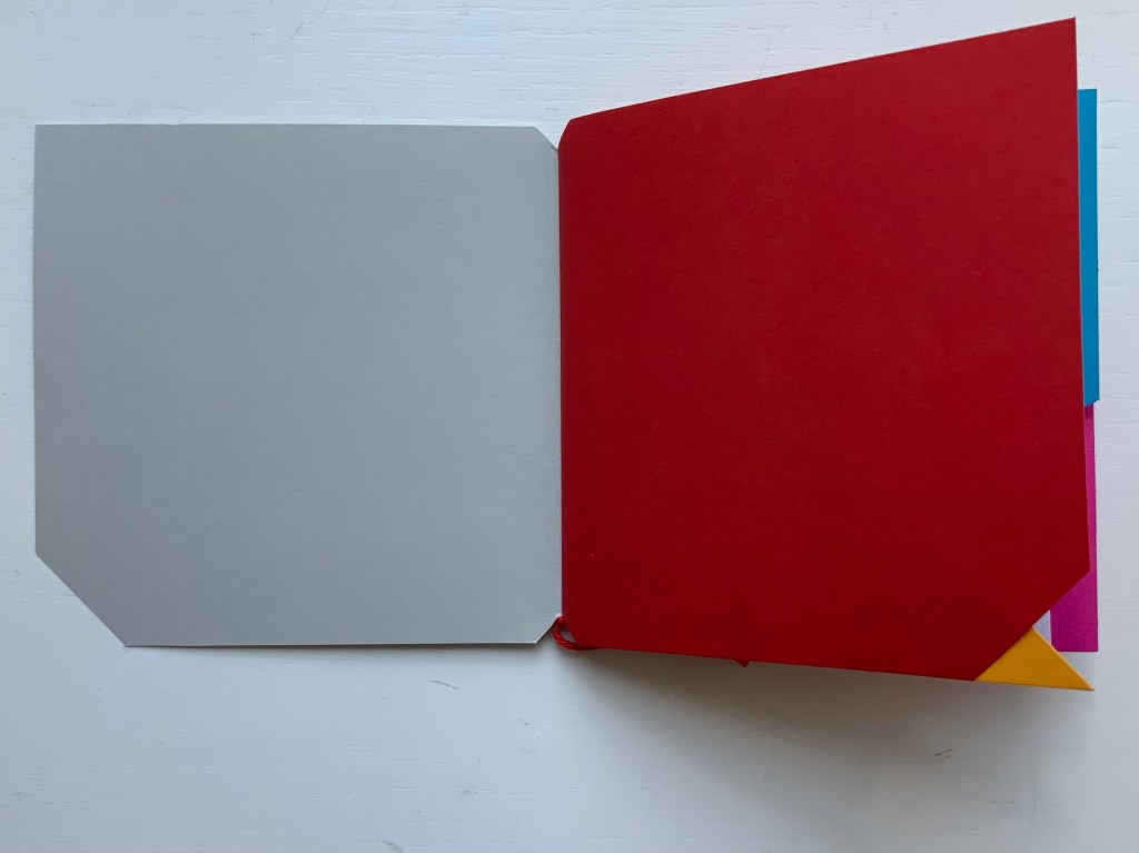
Munari’s many series of illegible books tap into book artists’ longstanding and ongoing preoccupation with whether a book without words can communicate information, narrative, sensations or feelings through material, shape or color and their permutations. The colors, shape, feel and binding of Libro illeggibile MN 1 evoke simple and sophisticated pleasure in their juxtaposition and sequence. The unchanging straightness of the top edge and the anchoring red thread of the binding set off the changeability of shapes and colors.
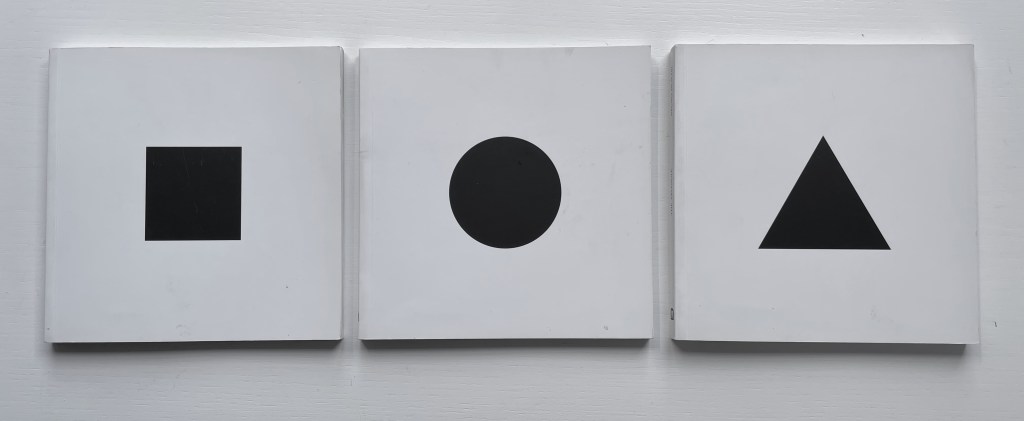
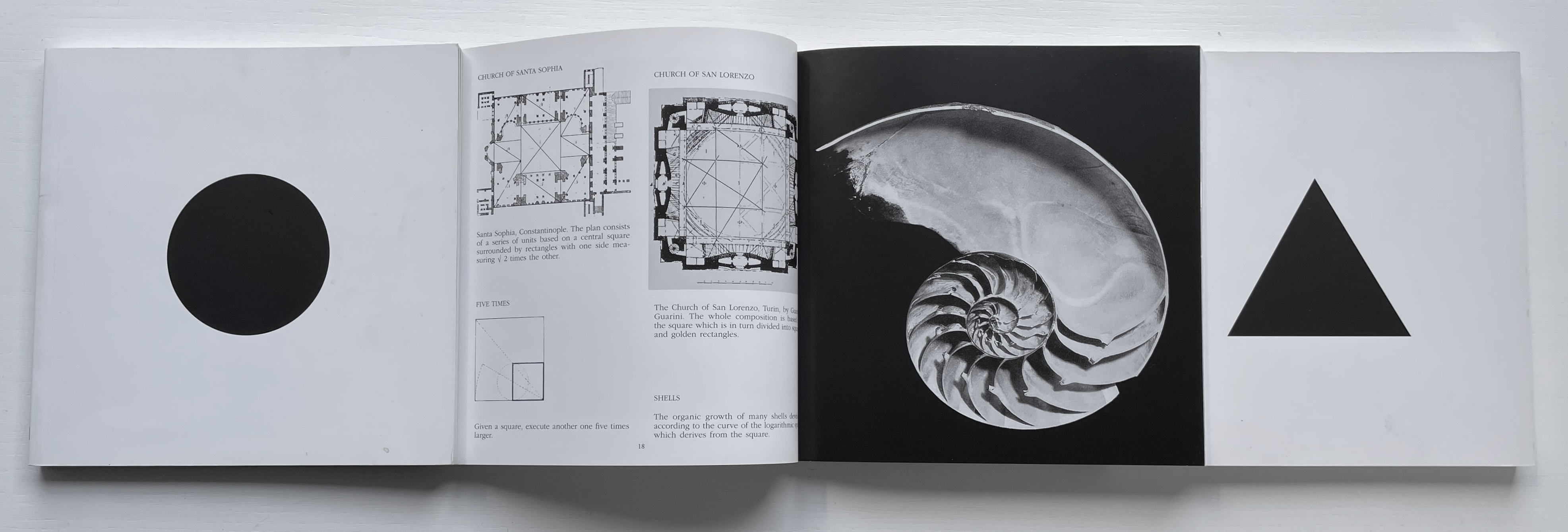
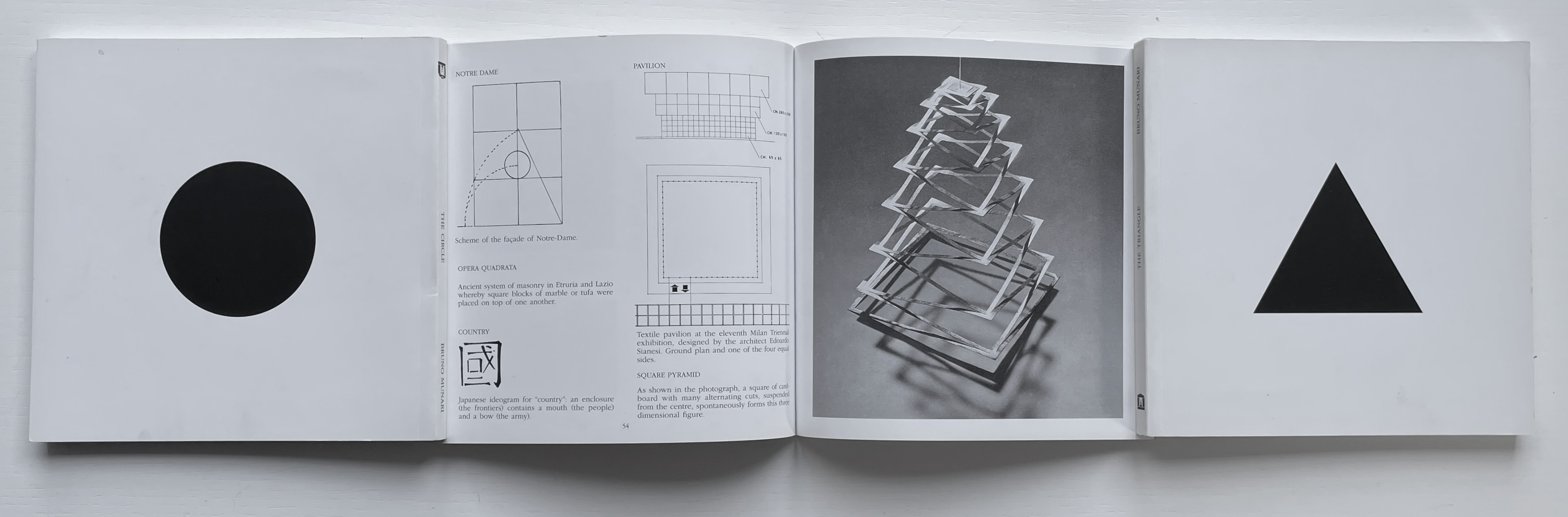
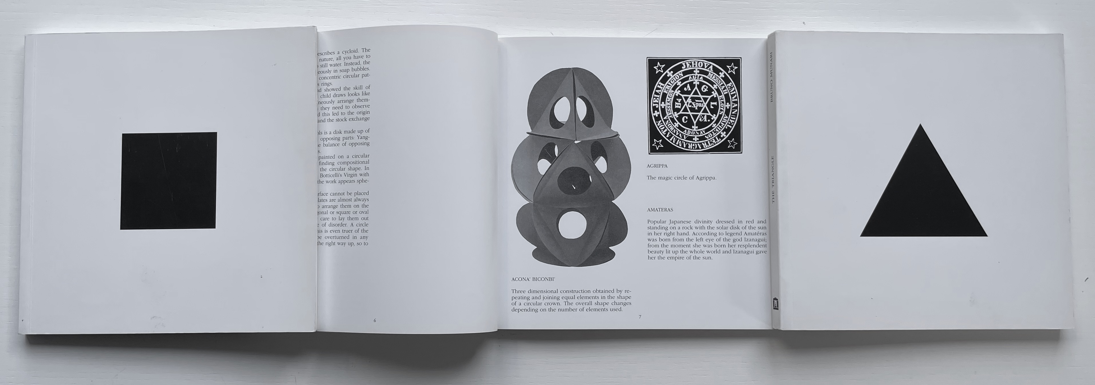
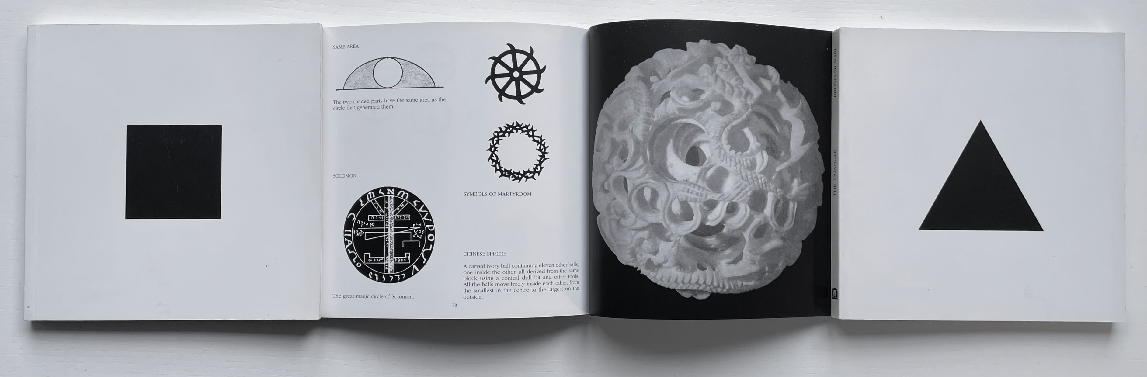
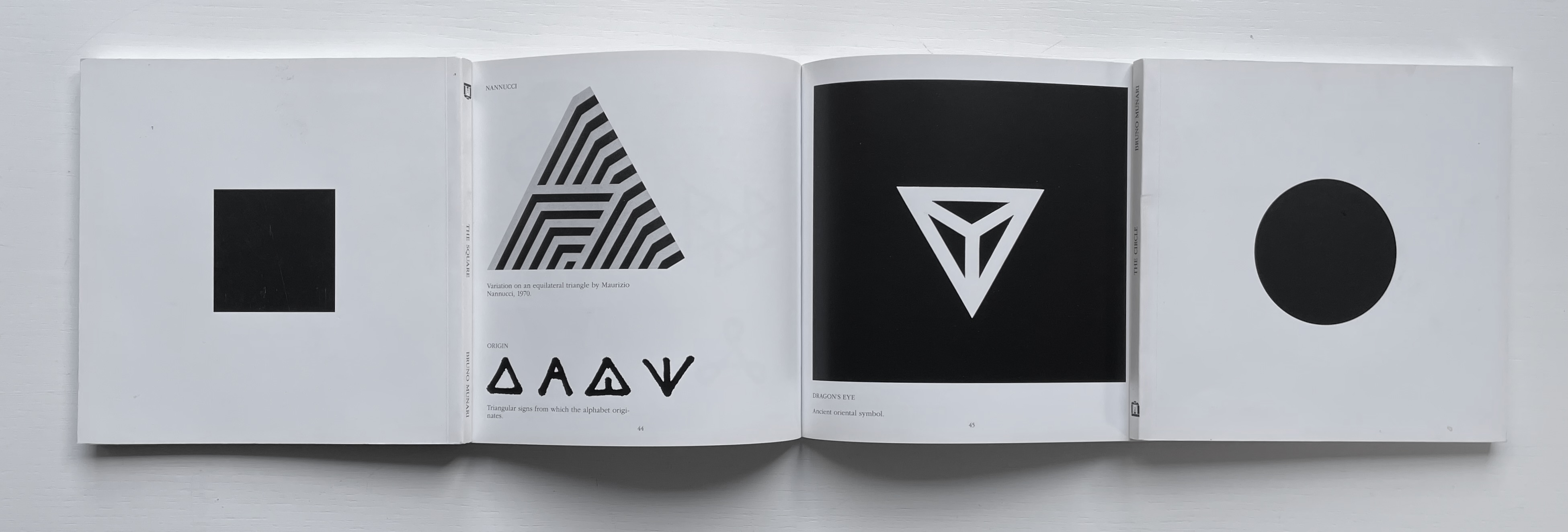
The Square (1960), The Circle (1964) and The Triangle (1976)
Although not a book of Munari’s making, David A. Carter’s Le sculture da viaggio di Munari is one way of bringing the spirit of Munari’s “travel sculptures” into the collection. Carter’s homage carries the blessing of Corraini Edizioni, further justifying its inclusion.
Travel sculptures started off as small sculptures (some even pocket-sized) to carry with you, so you could take part of your own culture to an anonymous hotel room. Later they were turned into ‘travel sculptures’, five or six metres tall and made of steel. One of these was seen for a few months in Cesenatico, another one in Naples. Others are sleeping among huge trees in the Alto Adige region.’ This is how Italian designer Bruno Munari (1907-1998) described his ‘travel sculptures’, which in turn inspired American illustrator and designer David A. Carter for this pop-up book. –Corraini Edizioni website. Accessed 3 August 2021.
Munari’s travel sculptures also recall works in the collection like Cumer’s scultura da viaggio dipinta n.2(2017), Komagata’s「Ichigu」(2015) and, albeit less portable, Ioana Stoian’s Nous Sommes (2015).
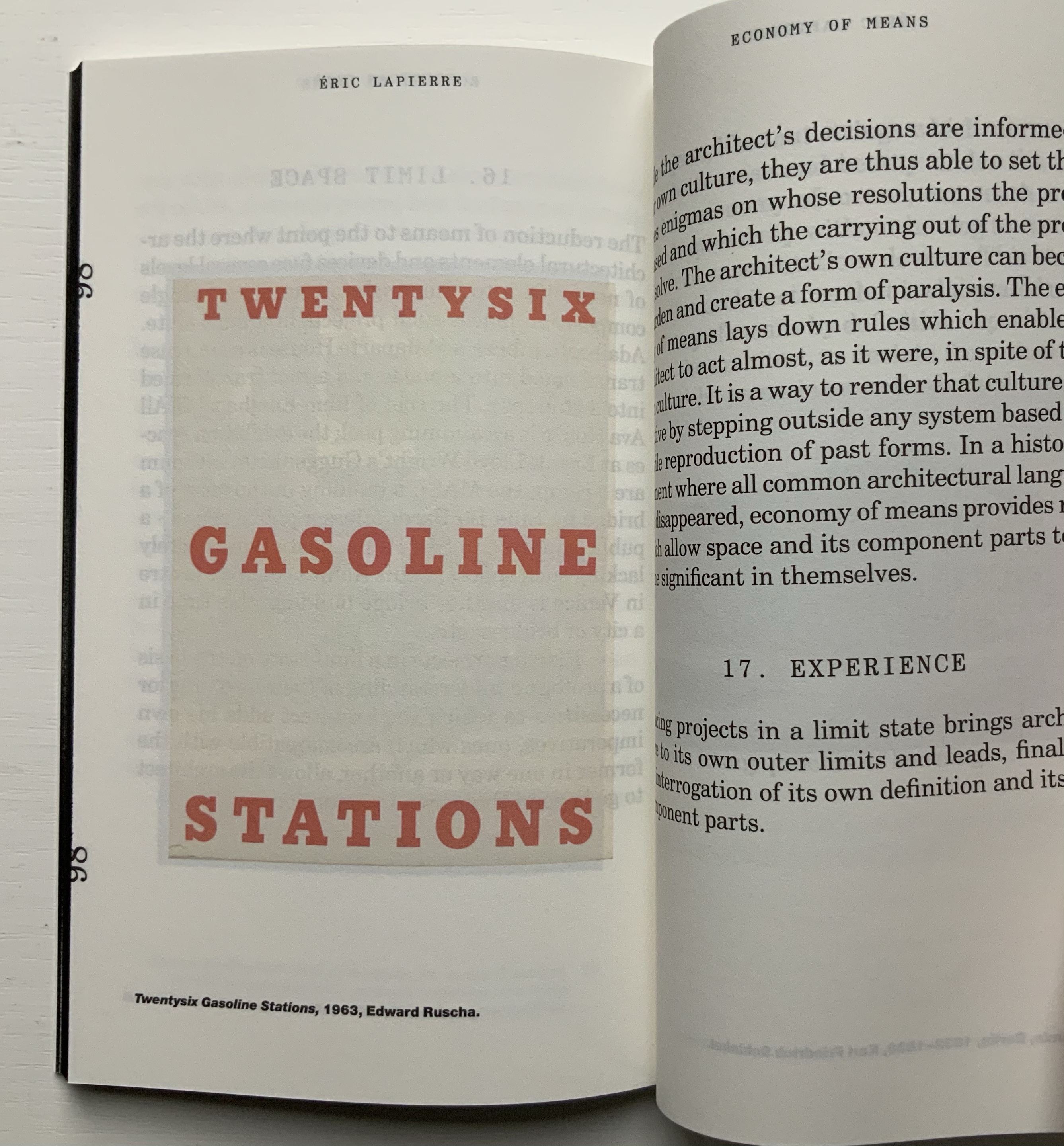
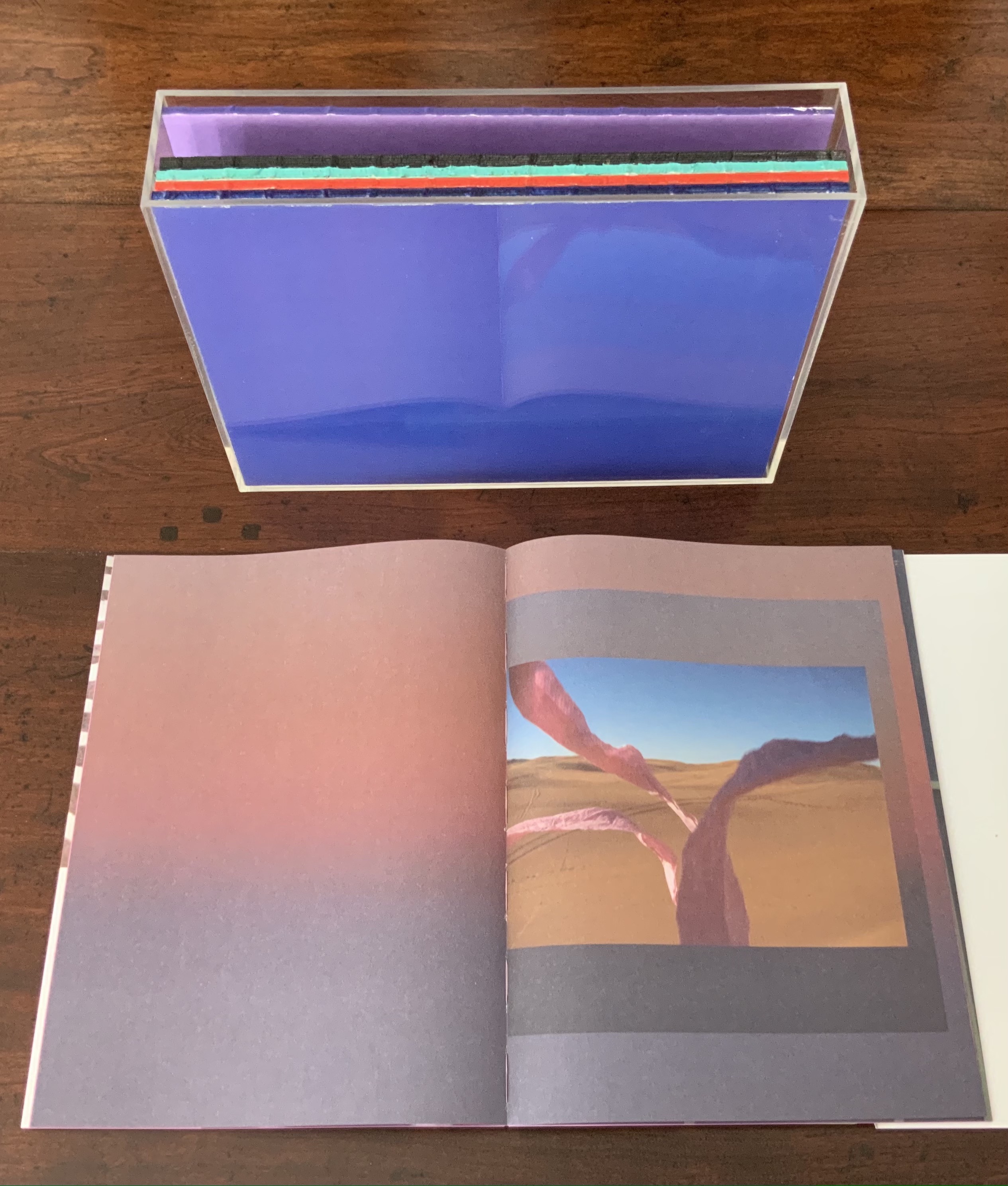
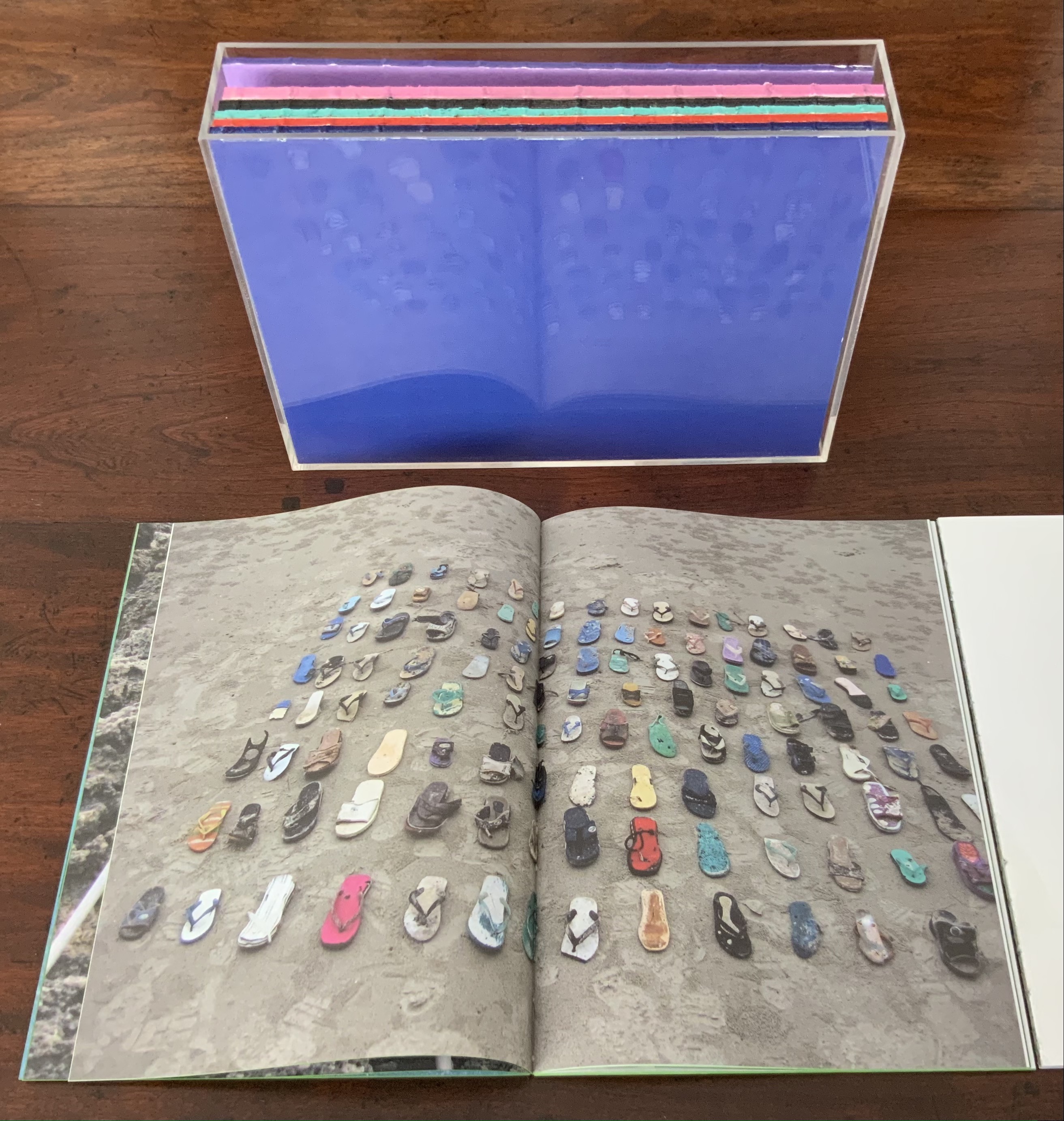
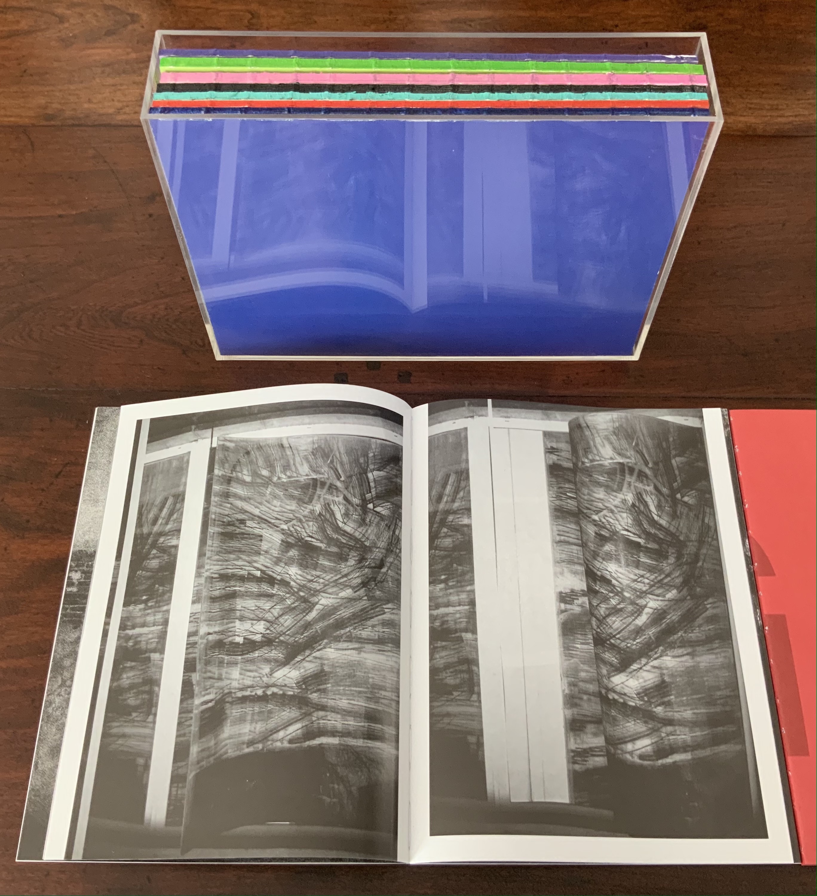
“The Poetics of Reason” was the title and theme for the fifth Lisbon Architecture Triennale in 2019 (the first was in 2007). Awarded the ADG Laus 2020 Golden Prize in the category of editorial graphic design, this work stands well with Bruno Munari’s three small 1960’s books on the square, circle and triangle, now available in a single volume, and calls to mind several works testifying to the relationship between architecture and book art. In the first of the five volumes, Éric Lapierre even interweaves with his text on architectural rationality illustrations from book artists such as Bernd and Hilla Becher, Sol Lewitt and Ed Ruscha — all without comment, in itself conveying their implicit relevance. His similar display of a page from Stéphane Mallarmé’s Un Coup de Dés Jamais N’Abolira le Hasard — that progenitor of modern and post-modern book art — speaks to the role that space — les blancs, as Mallarmé calls it — plays in these adjacent communities.
136 pages
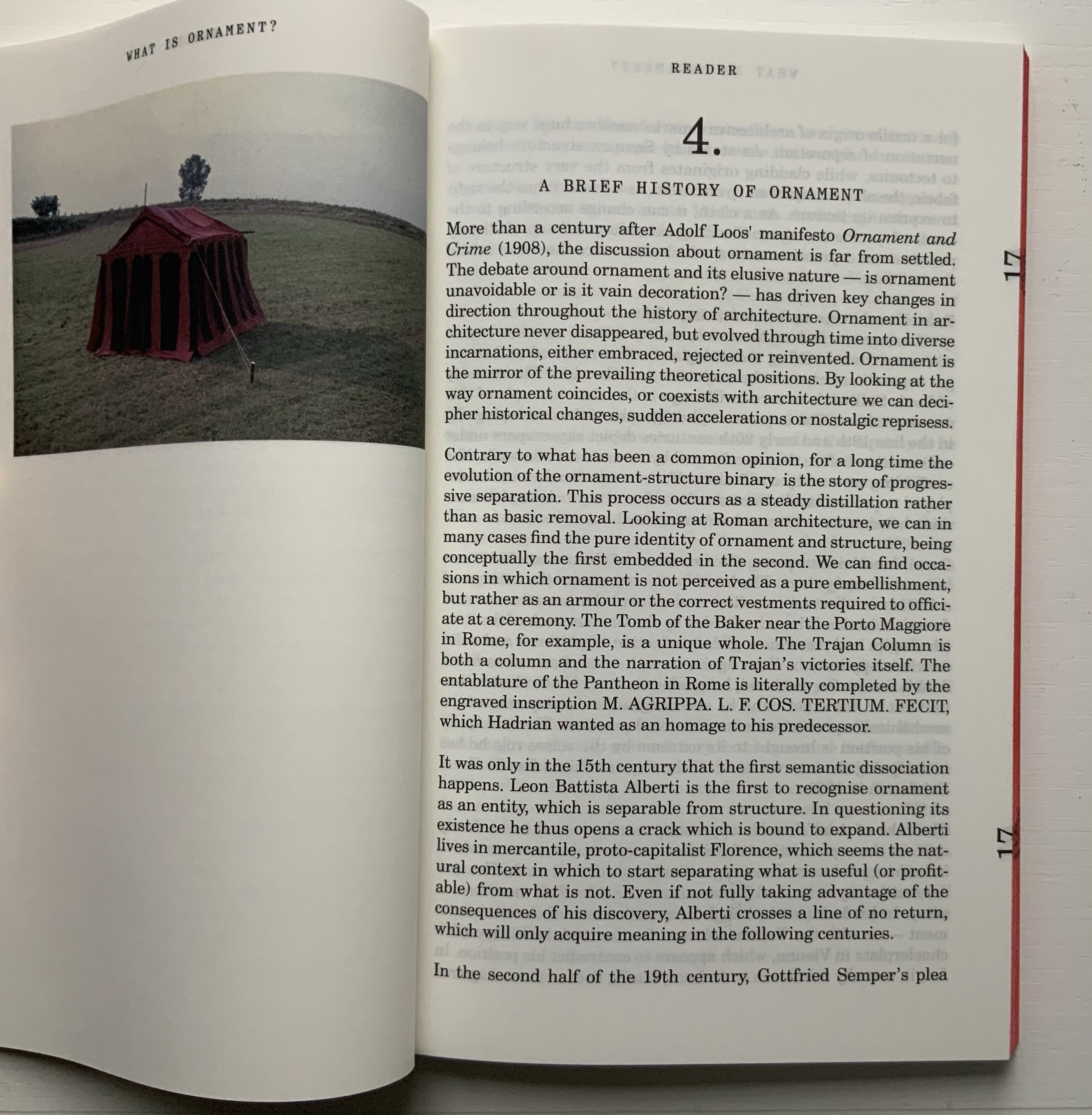
The second volume, by Ambra Fabi and Giovanni Piovene, draws in Leon Battista Alberti, of course, whose columns ornament works by Mari Eckstein Gower, Helen Malone and many other book artists.
136 pages
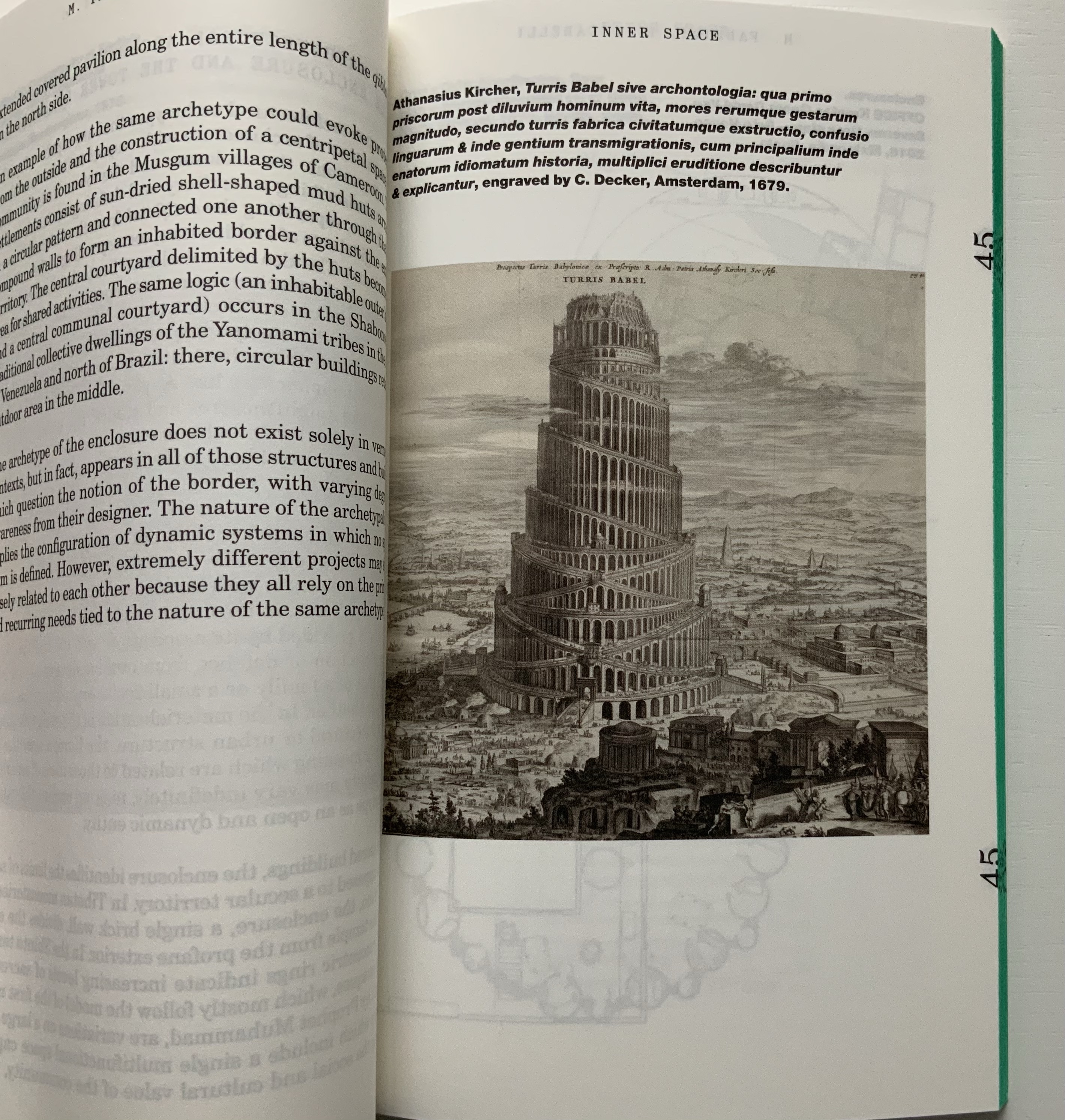
Drawing on Gaston Bachelard and Juhani Pallasmaa as it does, the third volume, by Mariabruna Fabrizzi and Fosco Lucarelli, calls to mind the work of Olafur Eliasson and Marian Macken here in the Books On Books Collection and elsewhere. Anyone familiar with Richard Niessen’s The Typographic Palace of Masonry will appreciate Fabrizzi and Fosco’s exploration of where architecture, imagination and memory intersect.
136 pages
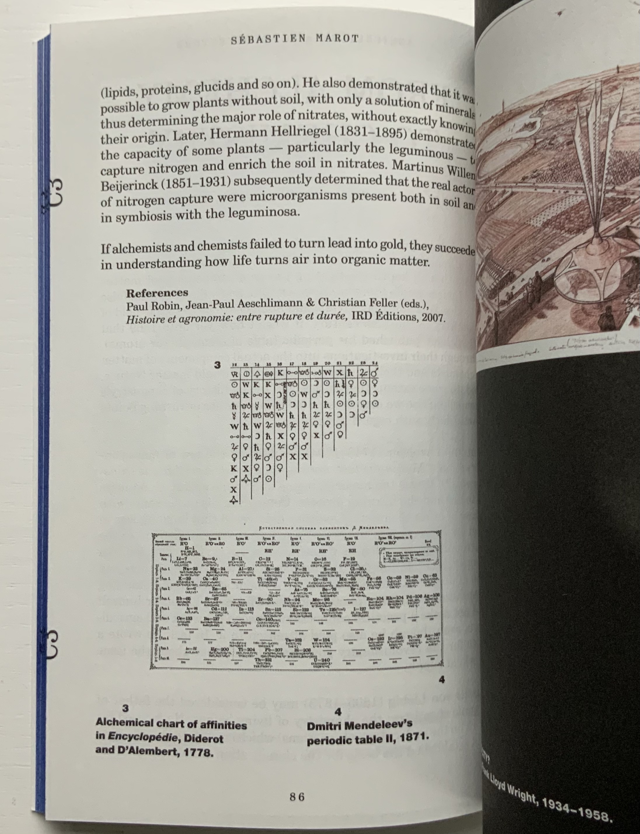
In the lengthiest of the five volumes, Sébastien Marot takes us into the territory of urban architecture and the anthropocene, also occupied by book artists Sarah Bryant, Emily Speed, Philip Zimmermann and many others.
216 pages
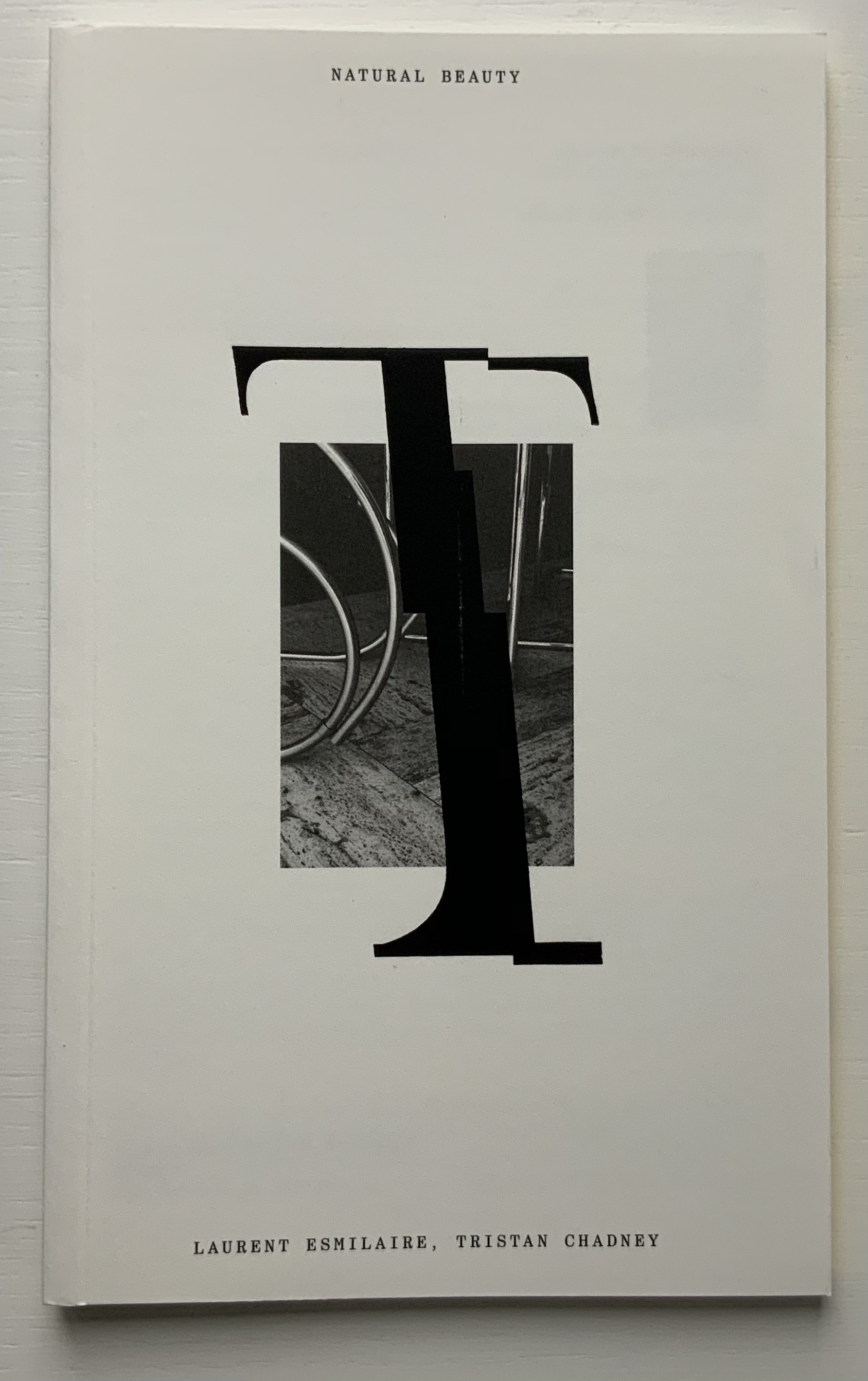
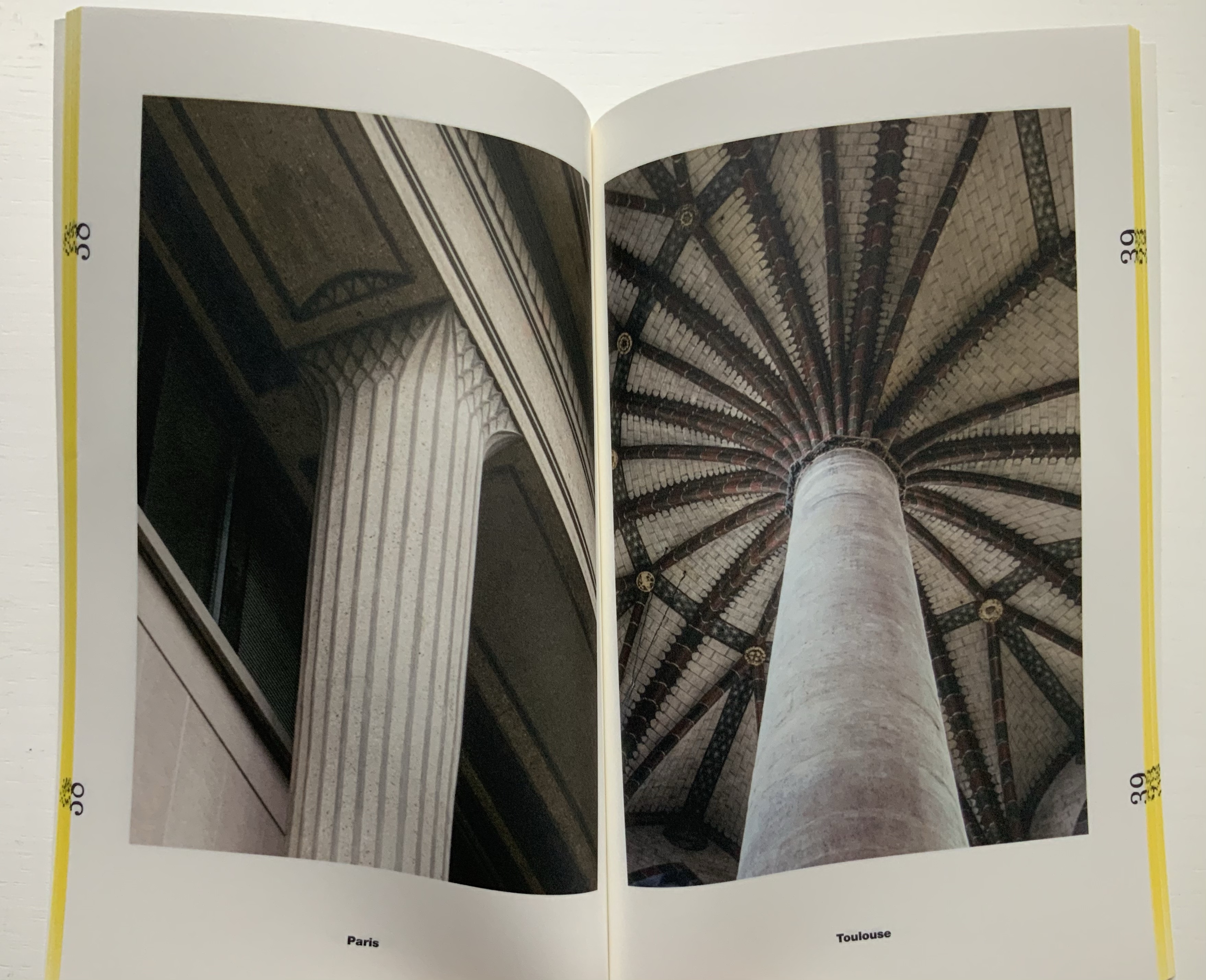
The last and shortest volume, put together by Laurent Esmilaire and Tristan Chadney, consists mostly of photos that may remind the viewer of Irma Boom’s Elements of Architecture, with Rem Koolhaas, or Strip, with Kees Christiaanse — especially in conjunction with the tinted fore edges.
88 pages
Referenced below, Pedro Vada’s review of the Triennale and the five separate sites across which it occurred in Portugal provides more insight into the five volumes themselves. Marco Ballesteros LETRA website provides additional images of the five volumes’ design.
Further Reading
“Architecture“. 12 November 2018. Books On Books Collection.
SOCKS Studio, an extraordinary website run by Fabrizzi and Lucarelli.
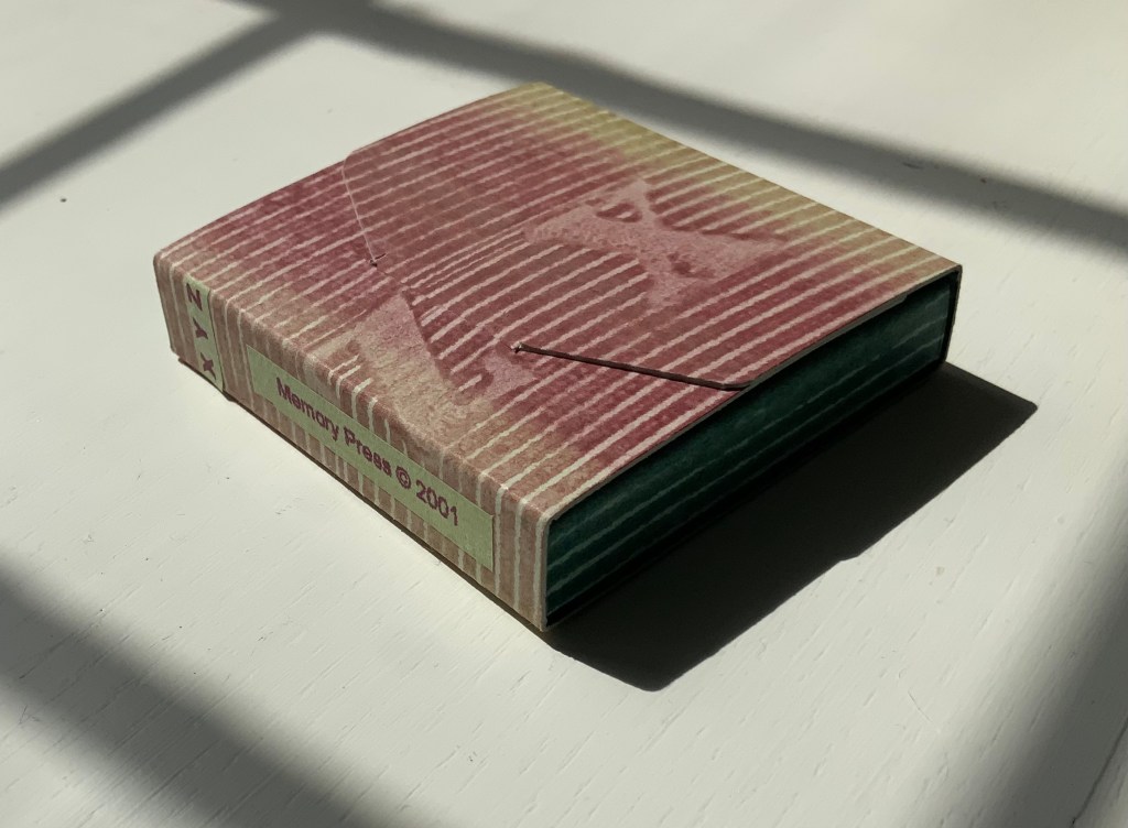
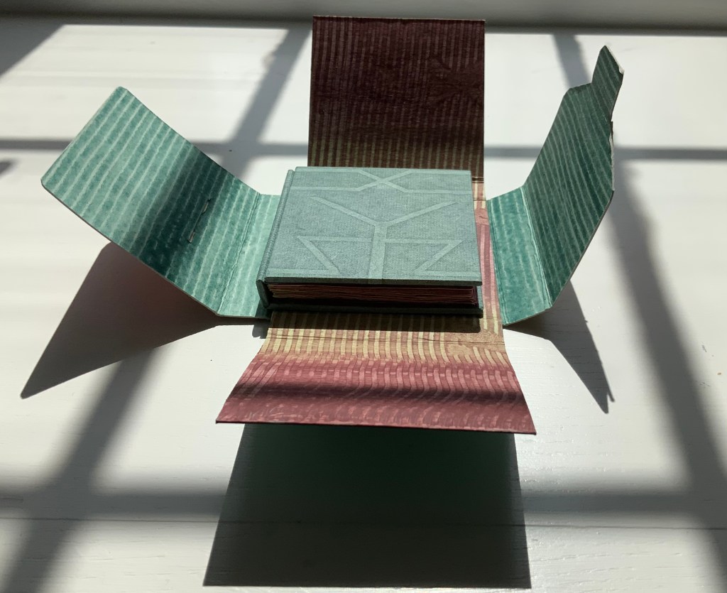
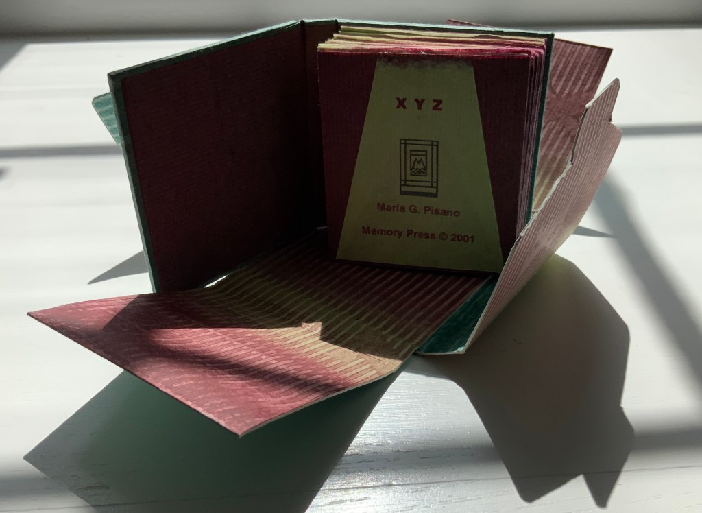
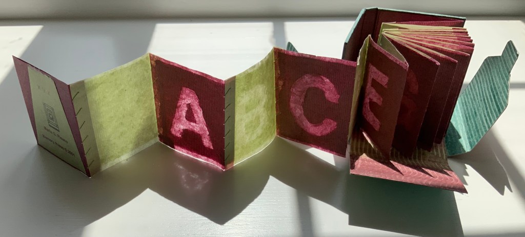
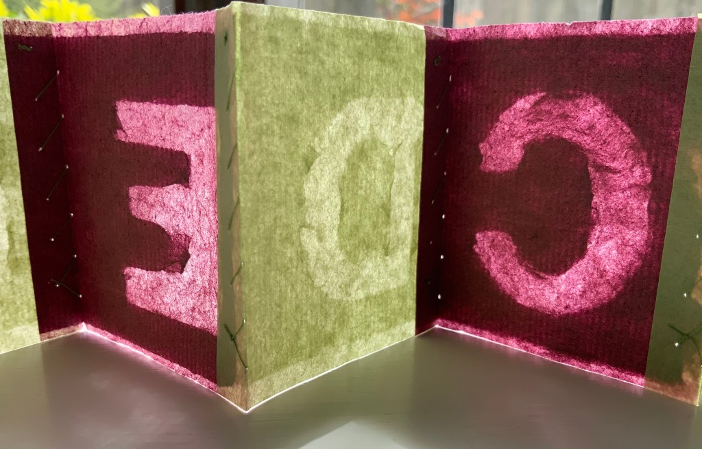
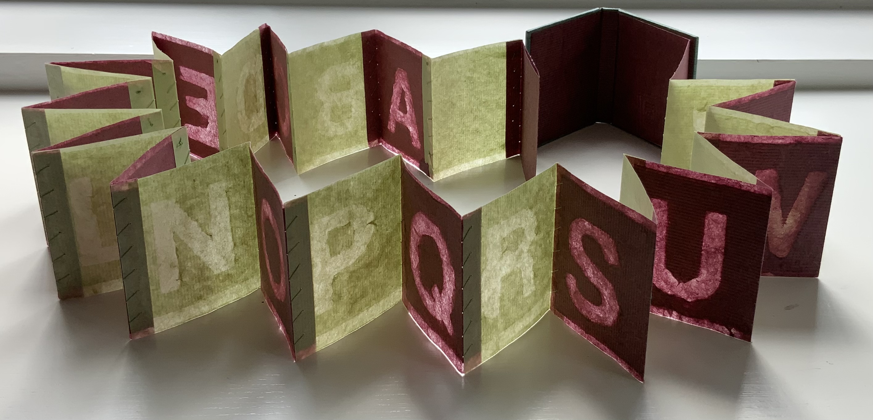
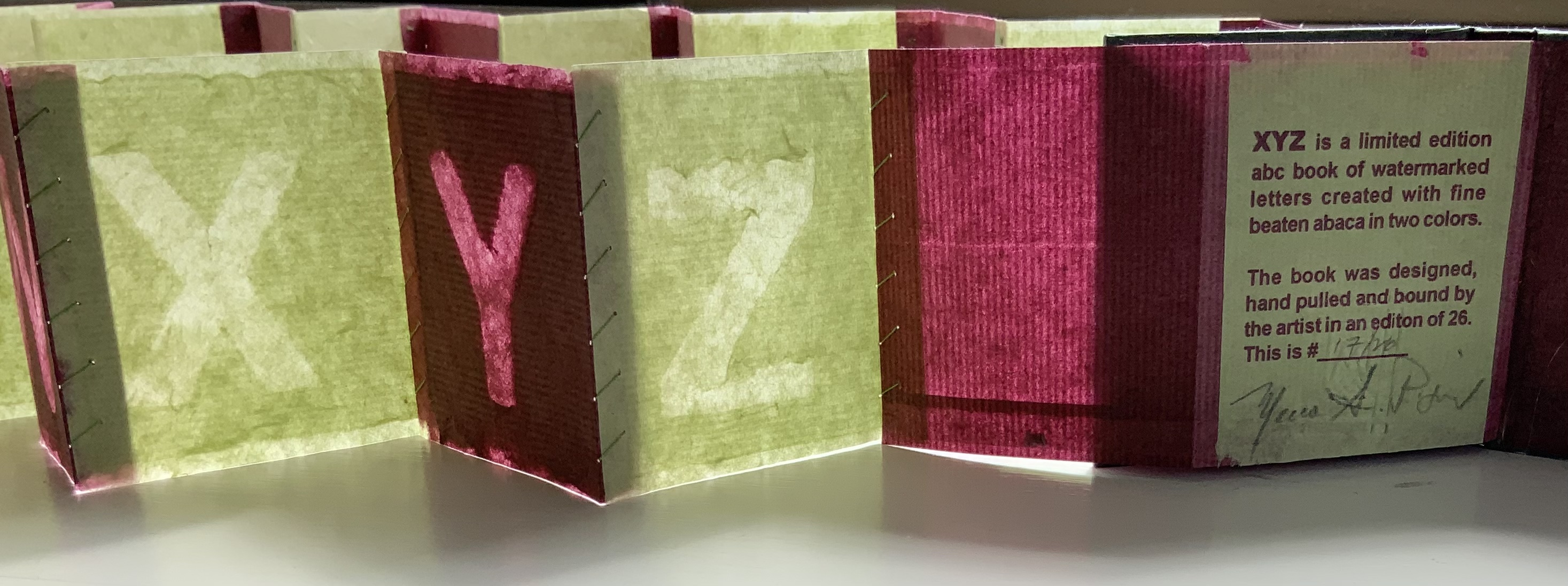
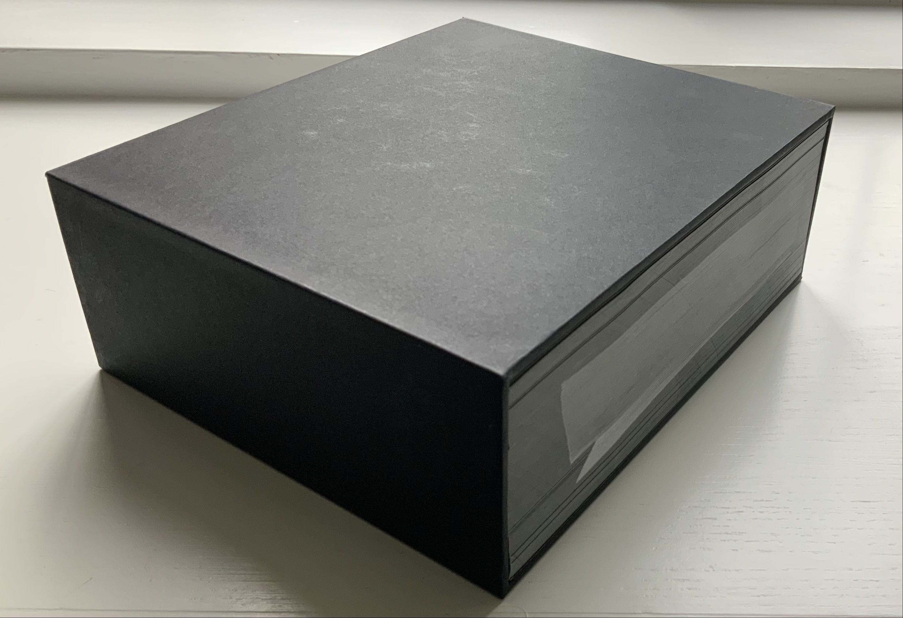
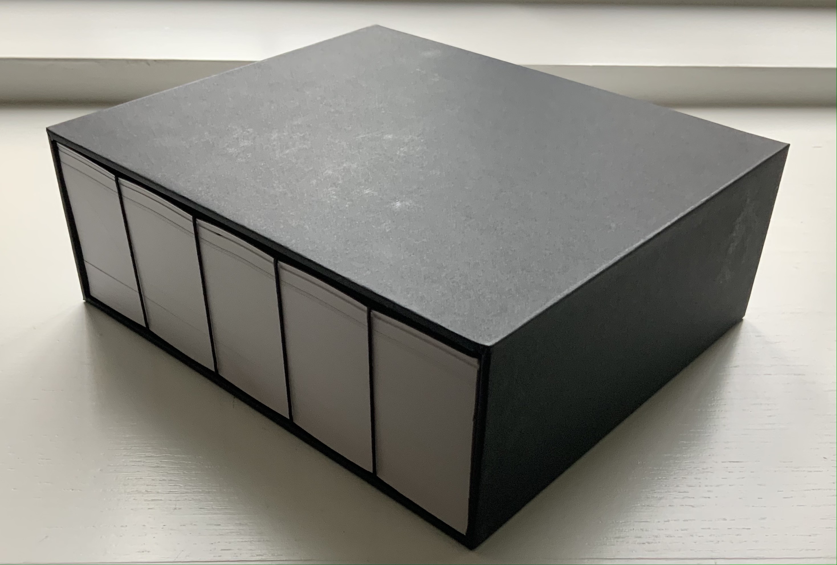
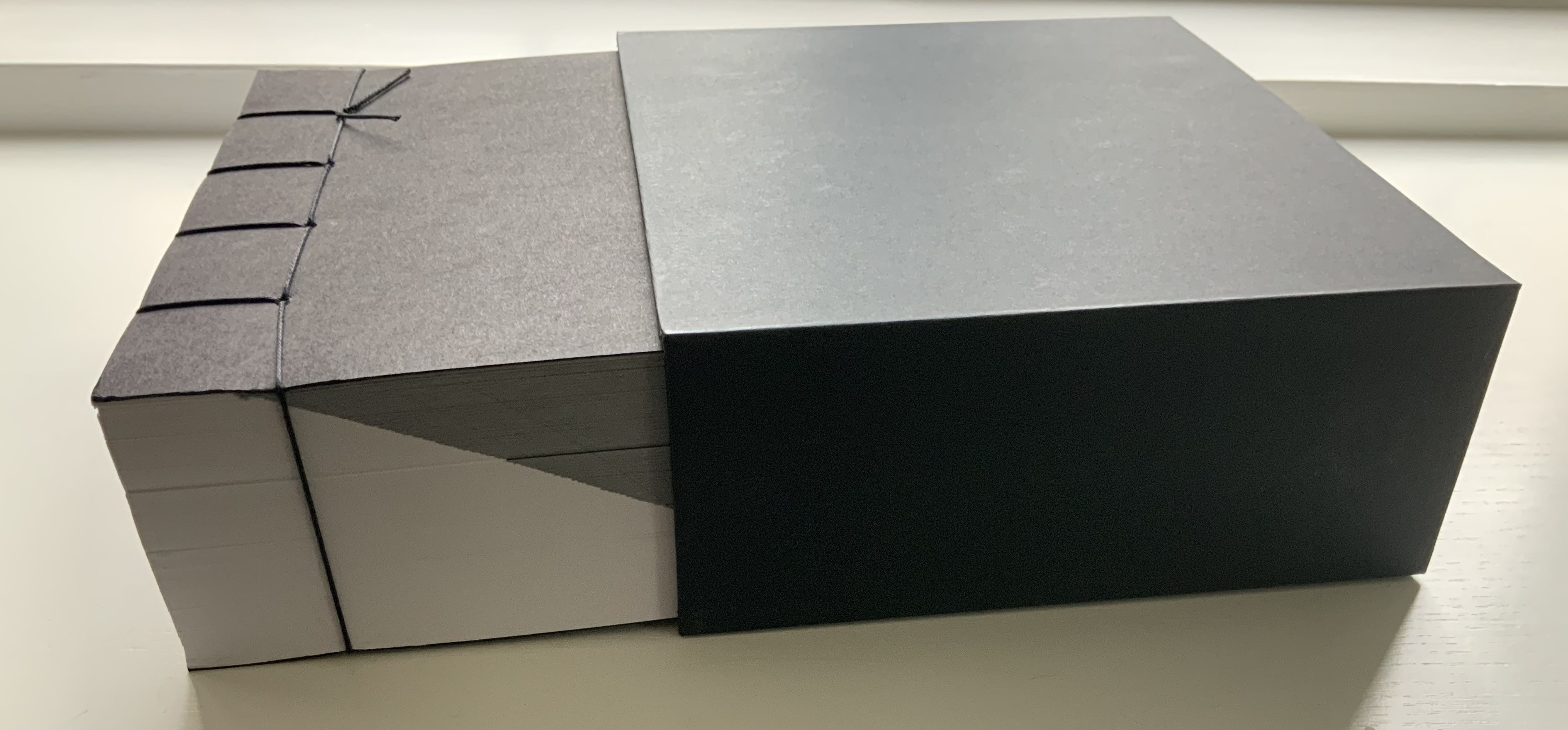
XYZ (2002) Maria G. Pisano Housed in a paste paper wrapper, a miniature concertina book, case bound, each page individually sewn to the next in a light green cotton thread. The title is watermarked on the front cover. H72 x W65 mm closed, 26 lettered pages alternating in colors. Edition of 26, of which this is #17. Acquired from the artist, 22 July 2021. Photos of the work: Books On Books Collection. Displayed with permission of the artist.
This work finds its way into the Books On Books Collection on several counts. Many of the ABC books in the collection use the accordion, concertina or leporello structure, but none combine fine beaten abaca in two colors and the watermark technique to achieve their effect. The colored abaca resonates with the collection’s interest in “Strange Papers” as Fred Siegenthaler labelled them and in “painting” with the watermark as Siegenthaler, Gangolf Ulbricht, John Gerard and others have done (see below under Further Reading).
Besides fusing papermaking with printing, Pisano unifies XYZ by making the alternation of colored paper and printing by watermark extend outwards from the “text block” to the case and paste board housing. The photos below follow this from the outside in.
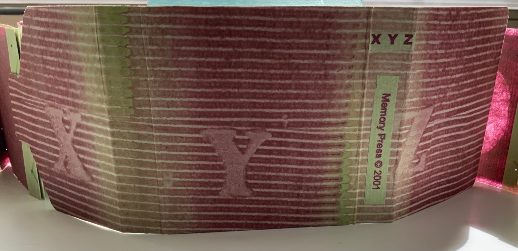
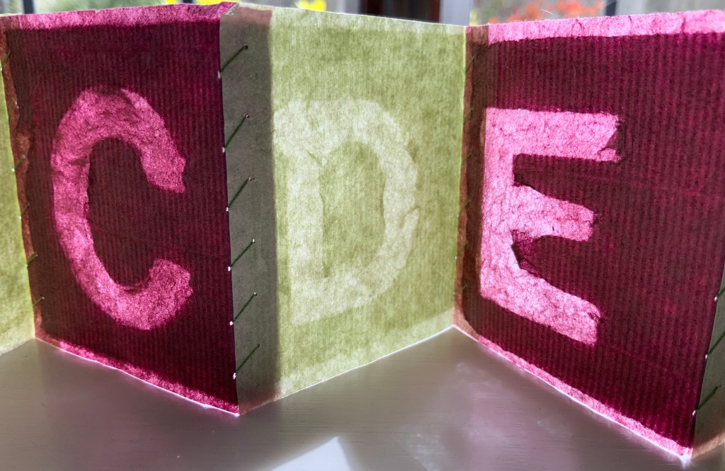
Usually a watermark is barely noticeable, a thin-lined monogram or insignia created by a wire fixed into the mesh or screen in the “deckle” (frame in which the mesh is stretched and into which paper pulp is poured). As the water drains from the pulp through the mesh, the papermaker shakes the deckle to mix the fibers evenly. The fibers thin against the mesh and watermark leaving impressions in the paper.
Each letter shape lies face down and runs head to tail along the “laid lines” (made by the closely spaced wires in the mesh) and perpendicular to the “chain lines” (made by the wider spaced wires in the mesh). One of the chain lines can be seen just under the upper stroke of the letter E below. When a sheet is pulled from the mesh, laid between layers of felt and subjected to pressure to squeeze out the remaining water, the rough side (the side previously face down on the mesh) becomes the right reading side. If your screen permits enlargement, the mirror reading side on the right below displays its smoothness.
Given the shaking of the deckle that goes on, those letter shapes had to have been secured to the mesh. Their points of attachment can just be detected; see the curves of the C and P.
“John Gerard“. Books On Books Collection. 13 August 2020. Another practitioner of watermarking art.
“Claire Van Vliet”. Books On Books Collection. 8 August 2019. See Tumbling Blocks for Pris and Bruce (1996) for a similarly small but perfectly formed ABC work of art.
In the fifth show of his series Raw Craftof visits and interviews to celebrate craftsmen and craftswomen, the late Anthony Bourdain met with Andrew Hoyem, poet, master typographer and now retired printer of Arion Press. Although the Arion Press production of Hart Crane’s poem “The Bridge” does not feature, the episode is worthwhile background for enjoyment of this collaborative work of book art.
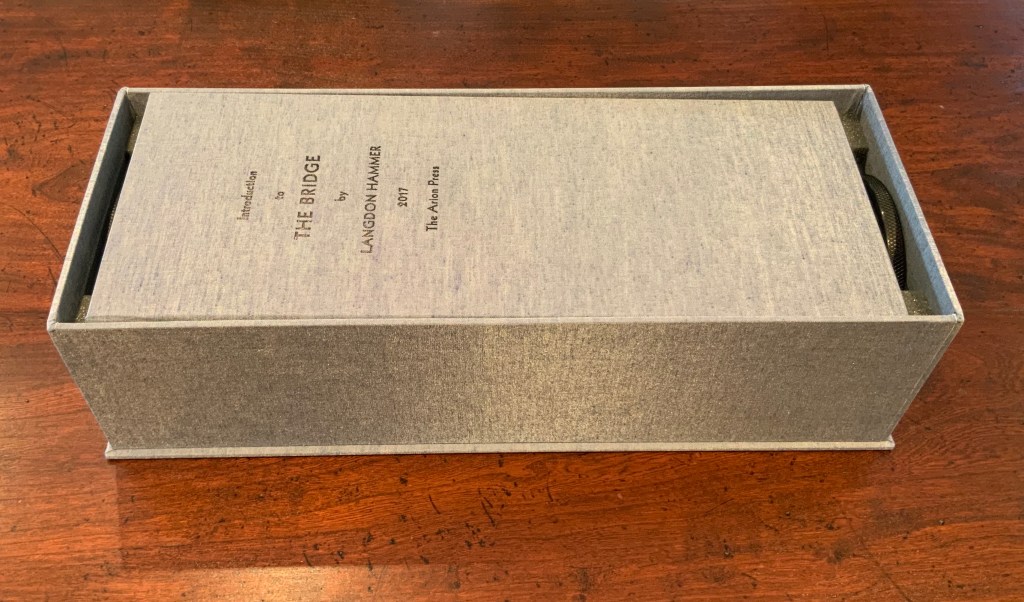
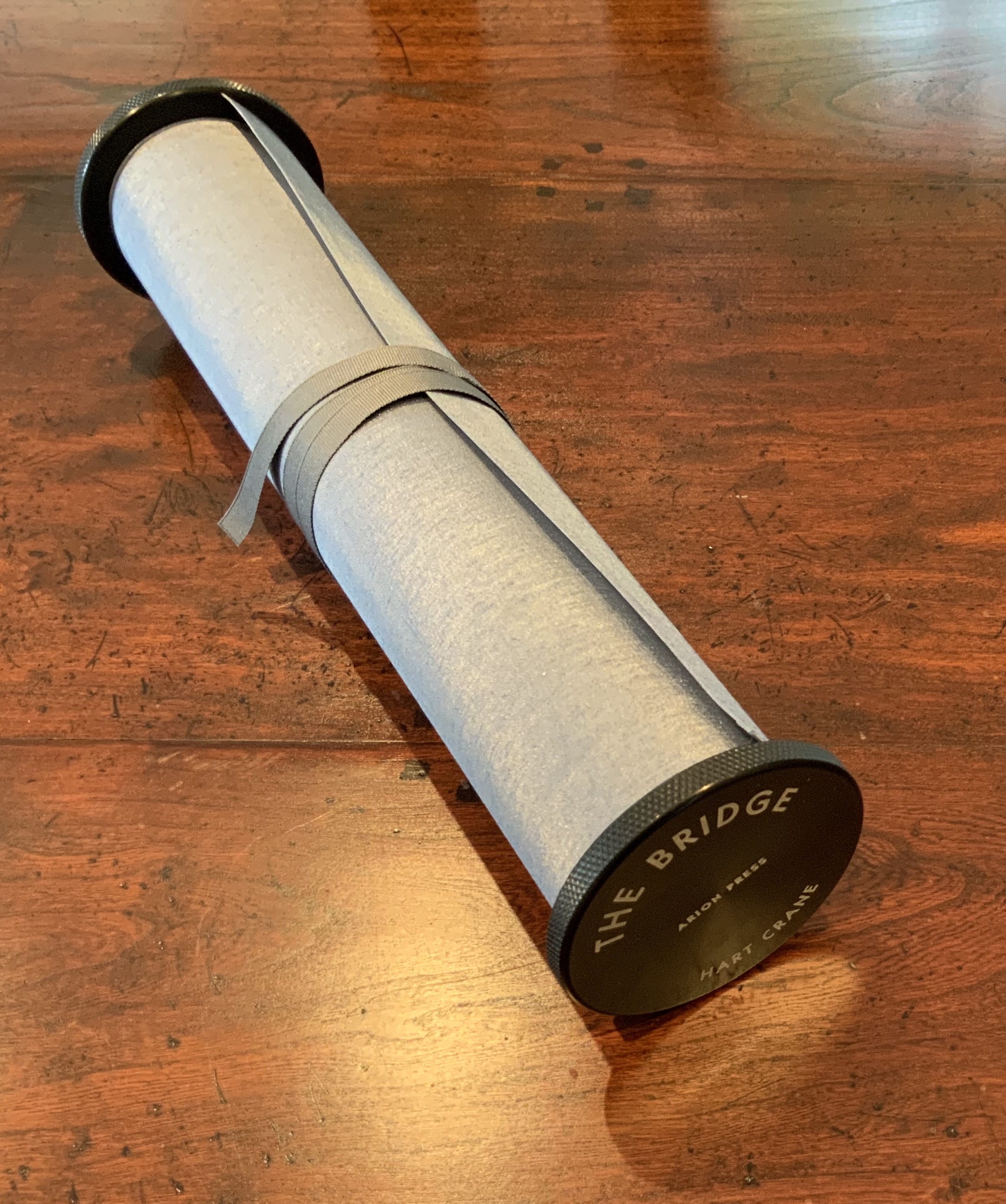
The Bridge (1930/2017)
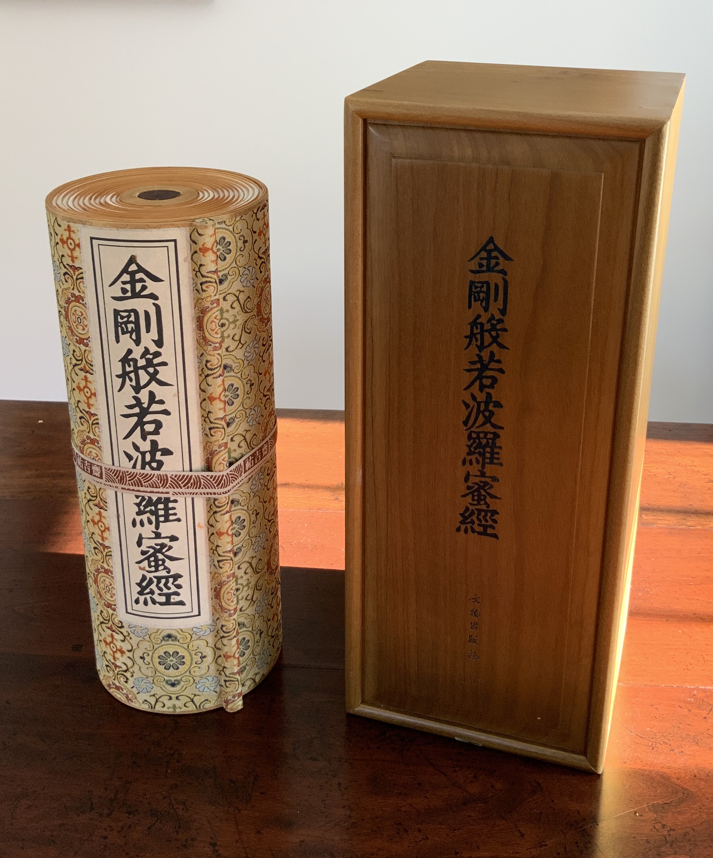
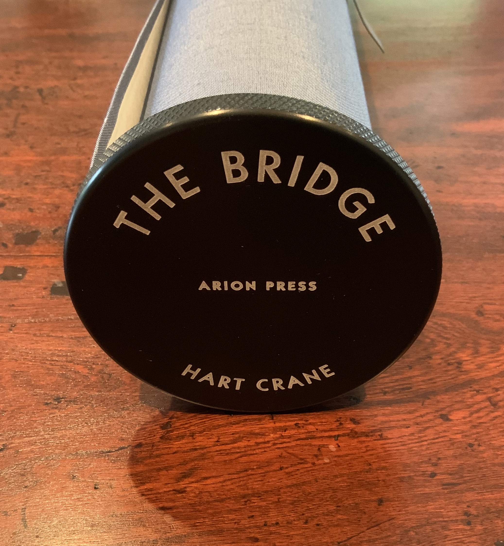
The Bridge(1930/2017) Hart Crane Design, Arion Press. Woodblock prints, Joel Shapiro. Introduction, Langdon Hammer. Scroll, 13-1/2 inches by 50 feet, wound on aluminum spool with bookcloth wrapper, housed in a box. Edition of 300, of which this is #97. Acquired from Classic Editions, 10 June 2020. Photos of the work: Books On Books Collection. Displayed with permission of Arion Press.
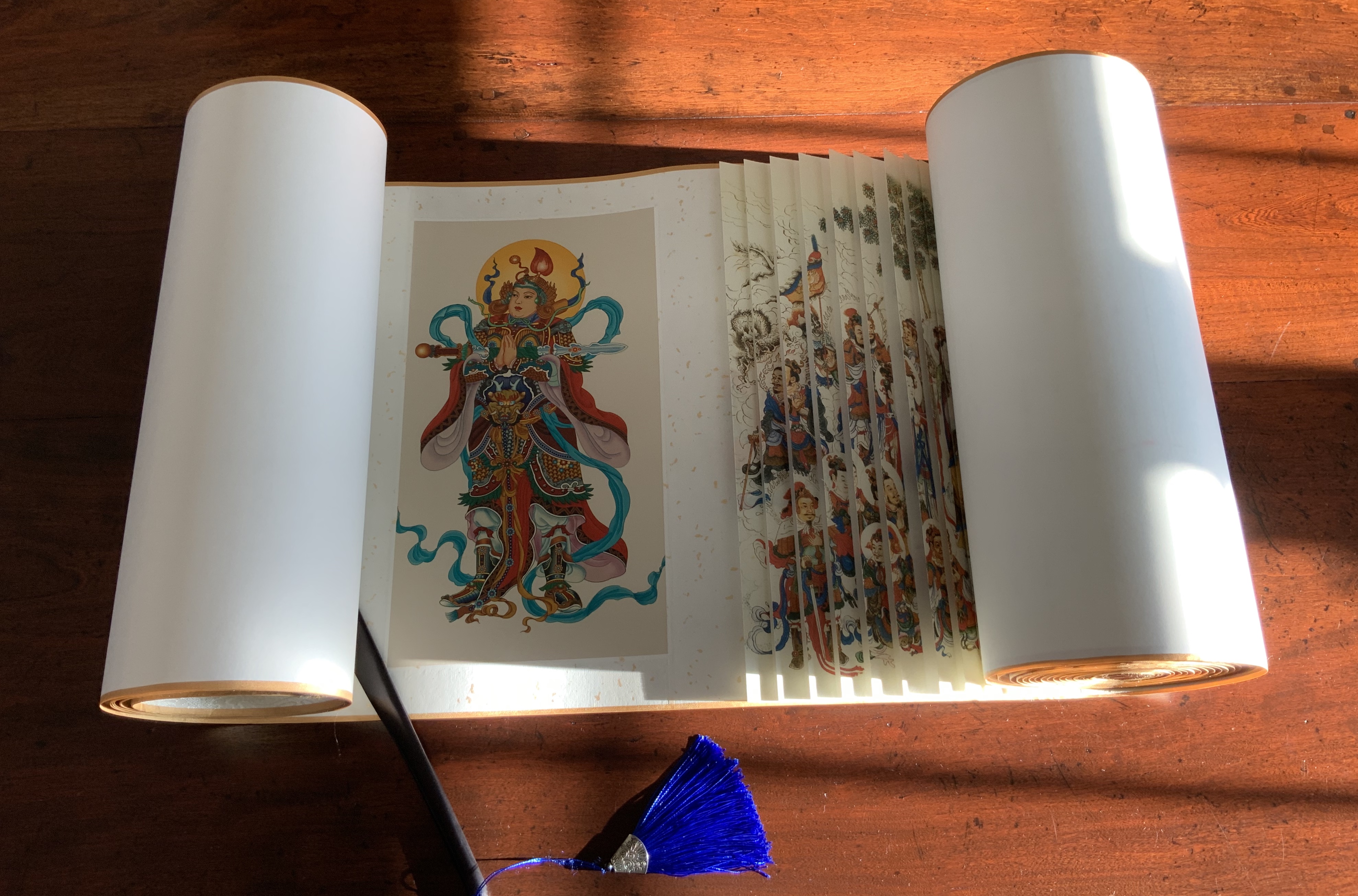
From first sight, this work of art evoked thoughts of an earlier acquisition — the dragon scale binding of the Diamond Sutra, done by Zhang Xiaodong in 2017.
Diamond Sutra, Dragon scale binding (2017) Zhang Xiaodong In 32 zhuan (seal) fonts, 152 x 382×160mm. Edition of 300, of which this #197. Acquired from Sin Sin Fine Arts (Hong Kong), 31 October 2019. Photos: Books On Books Collection.
It was more than the similarities of scrolls stored in boxes. Despite the differences in texts and images, something resonated –still resonates — between the two works. The Arion Press prospectus for The Bridge holds the clue to what that something is:
The publisher, Andrew Hoyem, conceived of a scroll format for “The Bridge” while he and senior editor Diana Ketcham were on a two-week tour of China in April 2017 organized by the Grolier Club, an association of bibliophiles in New York City. The theme of the trip was the history of paper, type, printing, binding, and the collecting of books, both private and institutional, in China.
During the first week they visited the Red Star Paper Company in Wuxi, Anhui Province. The Chinese government has recently sought to revive and support traditional crafts. Red Star is the fore-most producer of handmade paper in the nation, using ancient methods and many plant fibers in exacting proportions to make sheets of beautiful thin paper, used mainly for calligraphy and ink and watercolor painting.
In Beijing they visited the most important book collector in China, who showed them an unmounted scroll from the eighth century. Hoyem was inspired to order handmade paper from the mill and to make “The Bridge” in a single-spool scroll format.
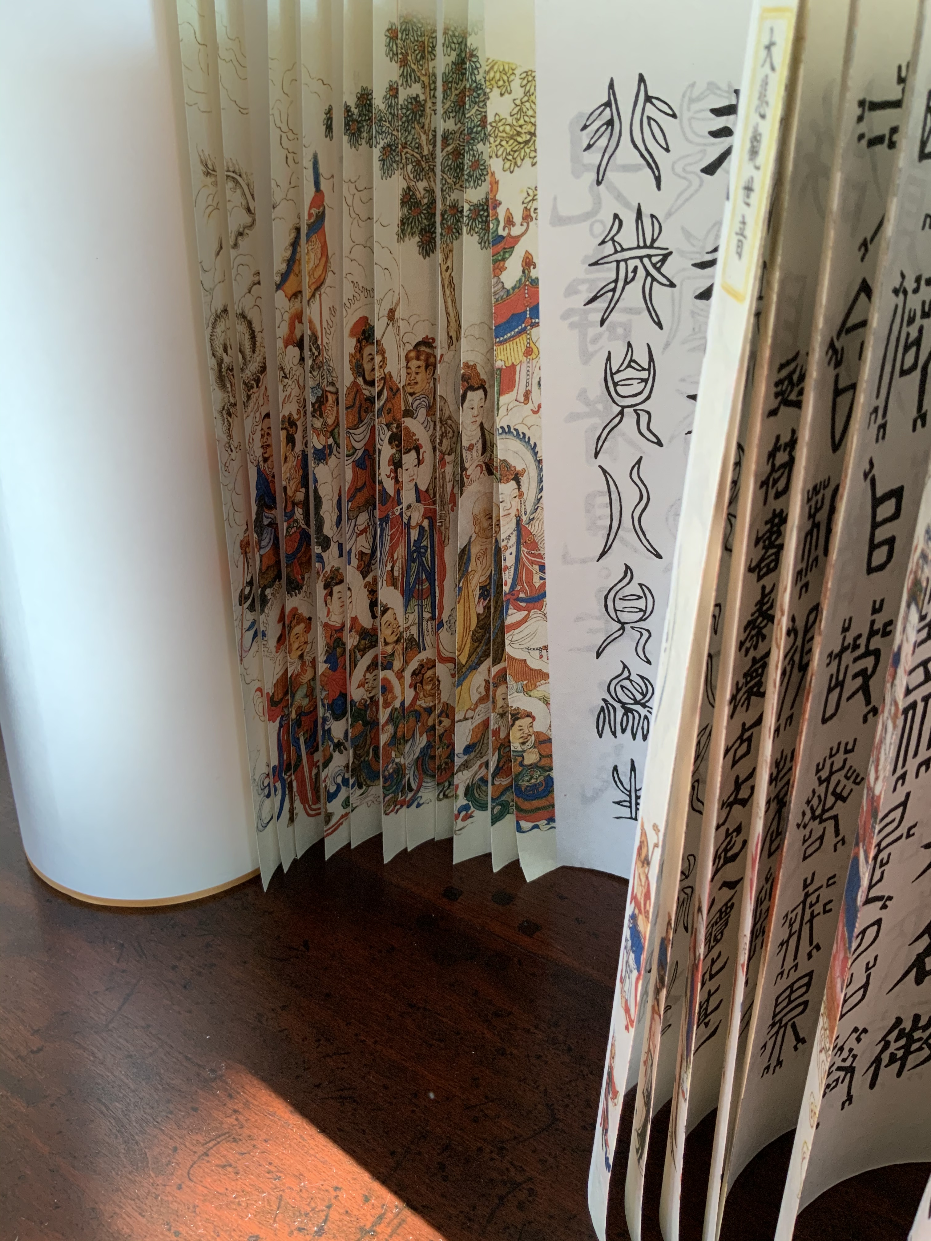
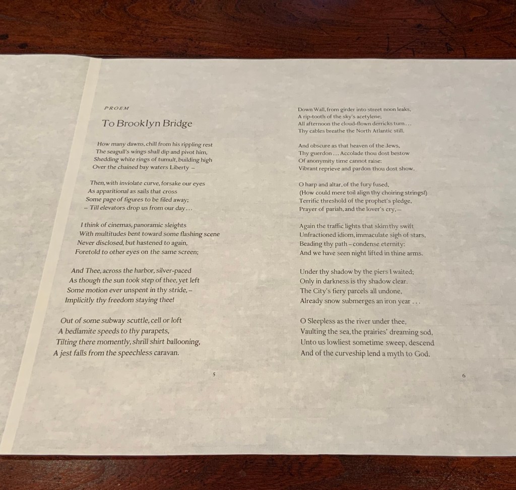
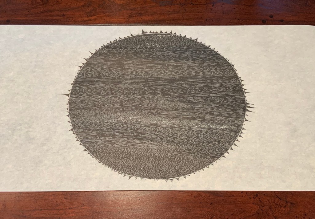
In each case, content, image, structure and handmade paper more than complement one another. Even though they do so in different ways, the rightness and thoroughness with which it is done and the feel of the paper strike that resonant chord. A comparison of the texts of the two works would not ordinarily arise, but once it is made, the prayerfulness of Crane’s “Proem” stands out even more in its French Elzevir handset by Hoyem himself and printed on handmade paper of his choosing. Hoyem’s choices of material and structure put him on an equal artistic footing with Shapiro and Zhang. Note the scroll end’s echo of Shapiro’s woodcut, which itself may be an allusion to the Black Sun Press, first publisher of The Bridge (1930). What is it that bridges the precision mechanical fixture and the wood grain revealed by hand and ink if not Crane’s words? In pairing Crane with Shapiro, Hoyem made as canny and artistic a choice as any that book impresario Ambroise Vollard ever made.
In his comments at the opening of his 2018 exhibition at Pace Prints, which featured The Bridge, Shapiro refers to the rapture and ecstasy of the poem as his chief challenge. Here he is in an earlier interview that speaks to how he approaches such a challenge:
Visual art can be tricky – the goal is not simply to illustrate, but, in this case, to create images which correspond to profound and historically significant prayers and material. My role here is that of mediator – attempting to capture the meaning I see in the material, and translate it into form. — “Artist Joel Shapiro Discusses the Art in Mishkan HaNefesh”.
Alongside those comments, the interplay of artists Hoyem and Shapiro, Crane’s text, the continuous scroll, the French Elzevir typeface and the Chinese handmade paper suggests an entirely new meaning for Dick Higgins’ term “intermediation”. In his 1965 essay “Intermedia”, republished in Leonardo in 2001, Higgins adopted the term from Samuel Taylor Coleridge. As Higgins expressed it, “Many fine works are being done in mixed media: paintings which incorporate poems within their visual fields, for instance. But one knows which is which. In intermedia, on the other hand, the visual element (painting) is fused conceptually with the words” (p. 52). With The Bridge — as with Diamond Sutra, Dragon-Scale Binding — the fusion goes beyond the visual and textual and yields two exceptional works of art.
Further Reading
“Joel Shapiro and Hart Crane“. 19 December 2017. Graphic Arts Collection, Special Collections, Firestone Library, Princeton University. Accessed 4 August 2020.
“Playing Against Type“. 2 November 2017. Antiques: The Magazine. Accessed 4 August 2020.
Higgins, Dick. February 2001. “Intermedia“. Leonardo, Volume 34, Number 1, February 2001, pp. 49-54. Reprint of his 1965 essay with an addendum from Hannah Higgins, co-curator with Simon Anderson (School of the Art Institute of Chicago) of a 2000-2002 travelling restrospective on Dick Higgins’ life and art.
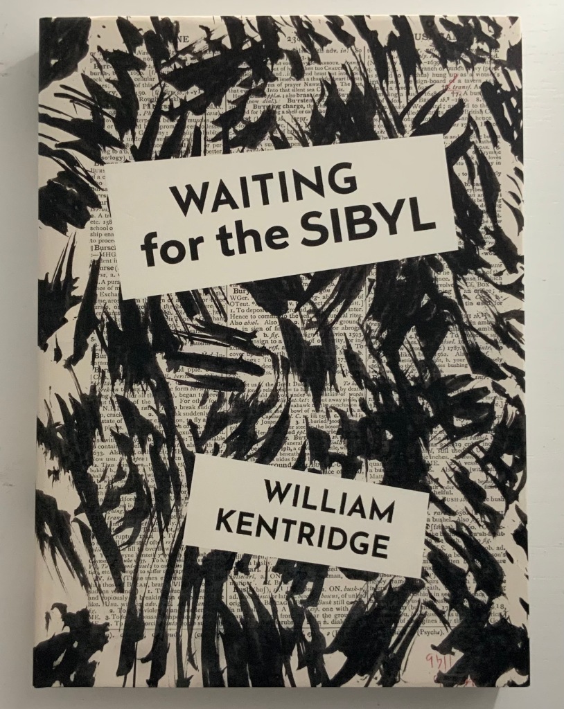
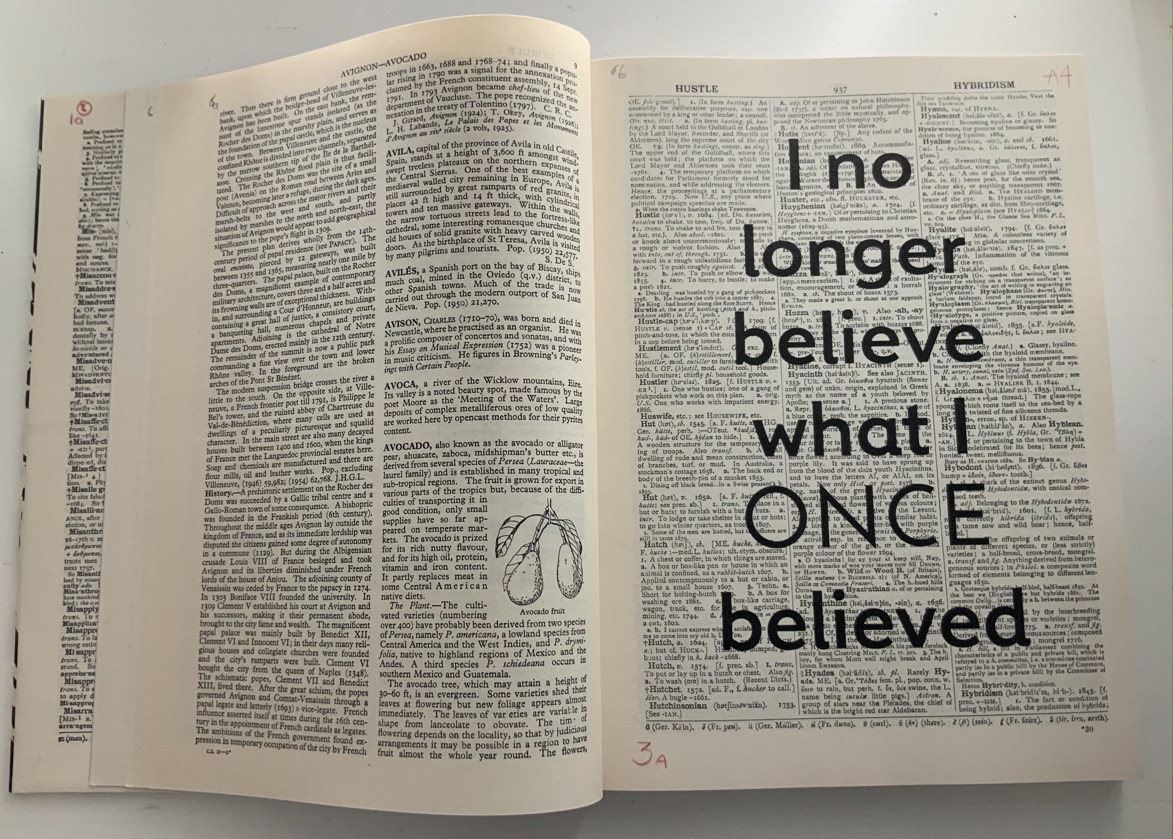
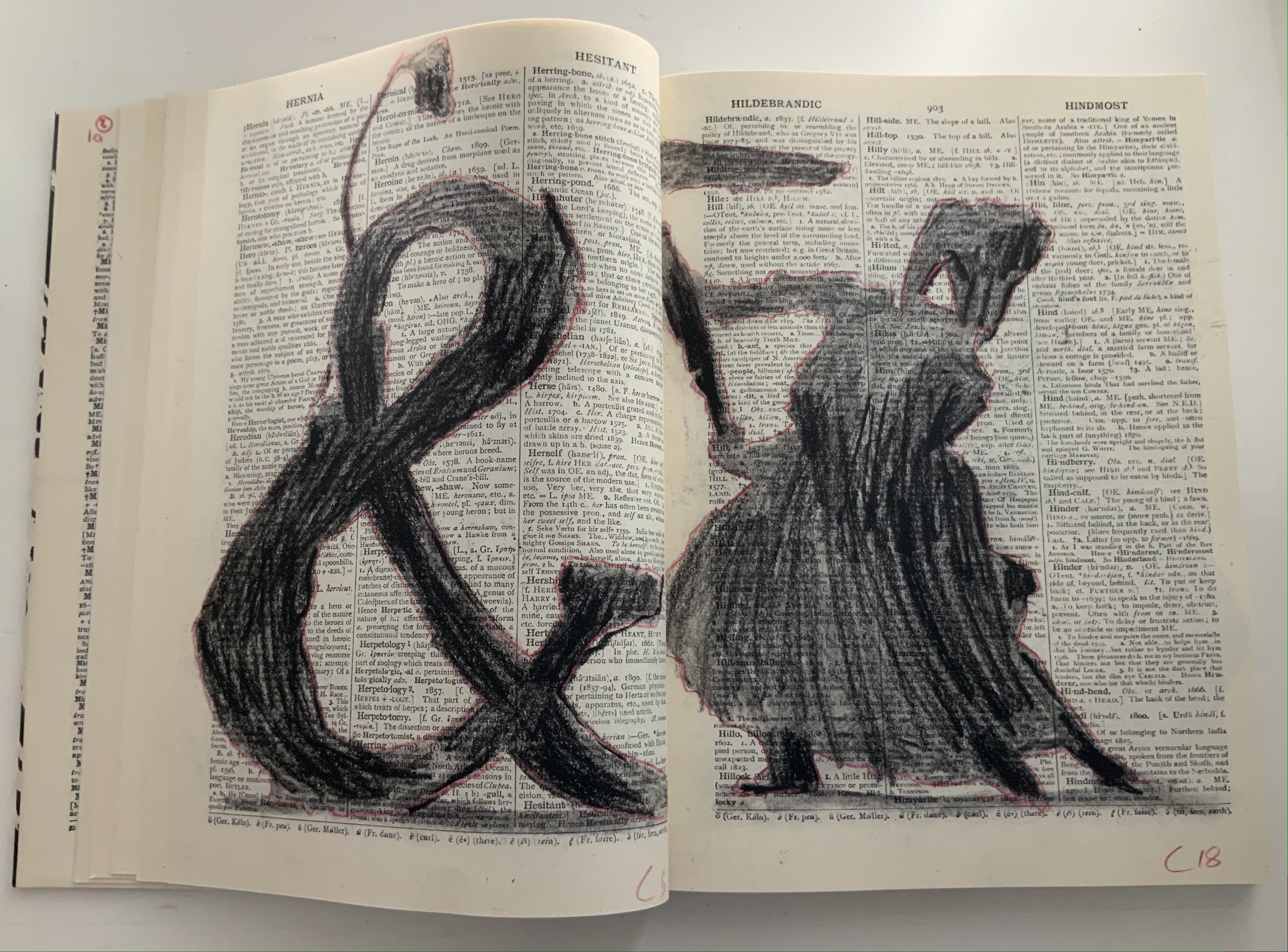
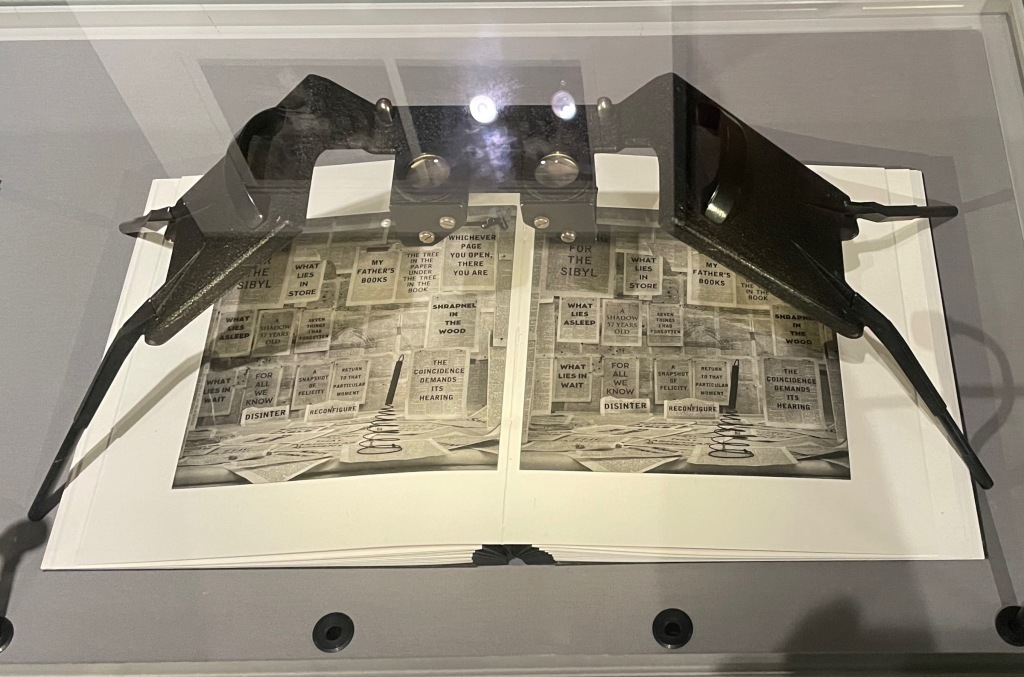
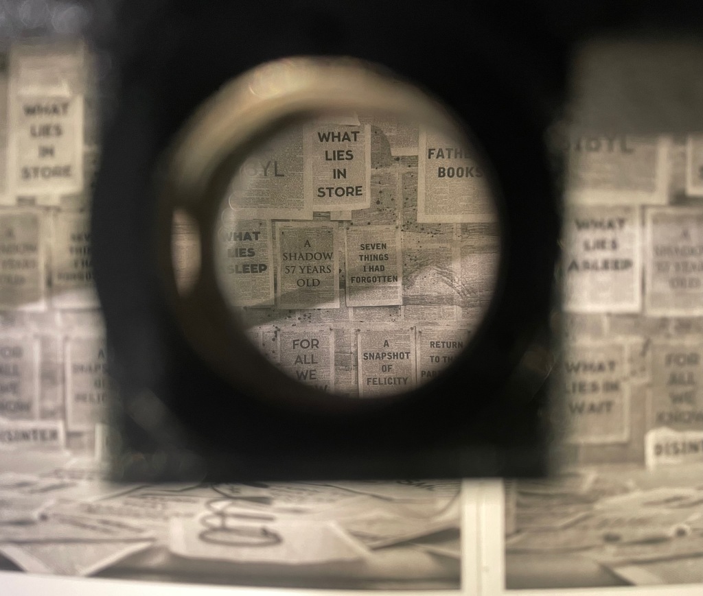
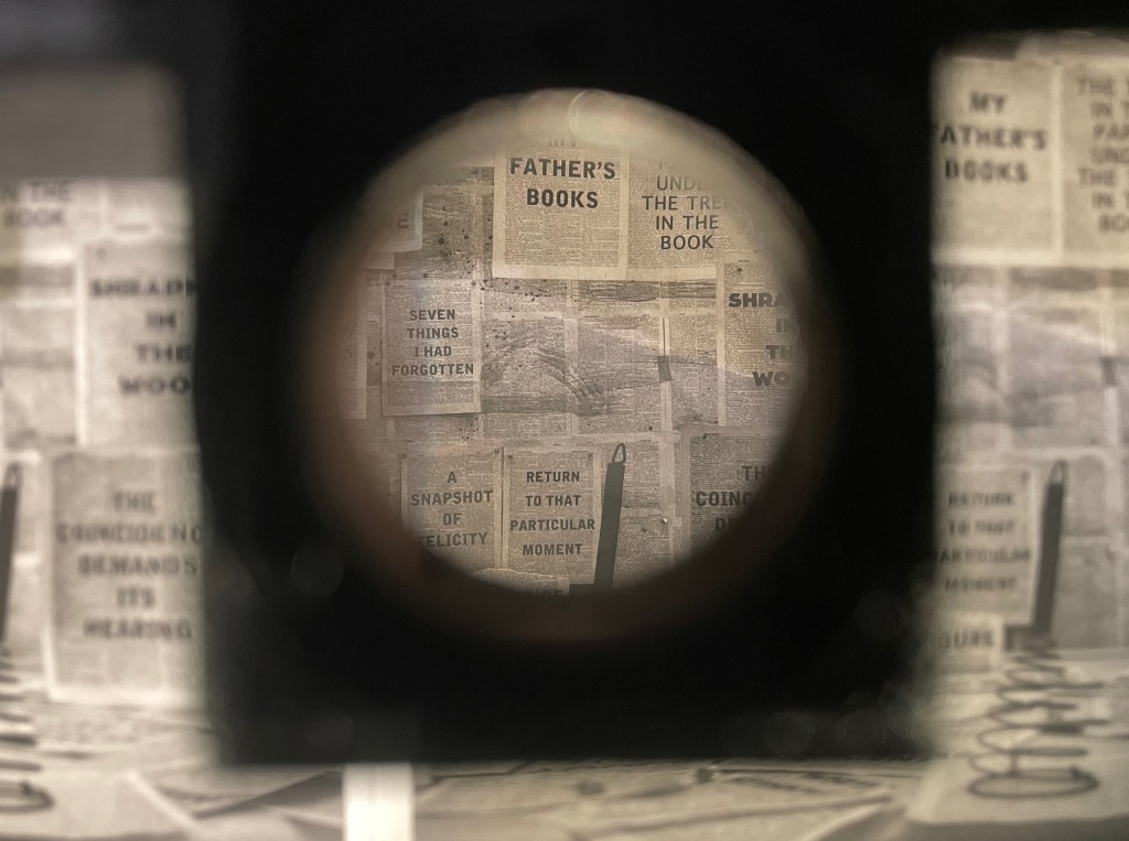
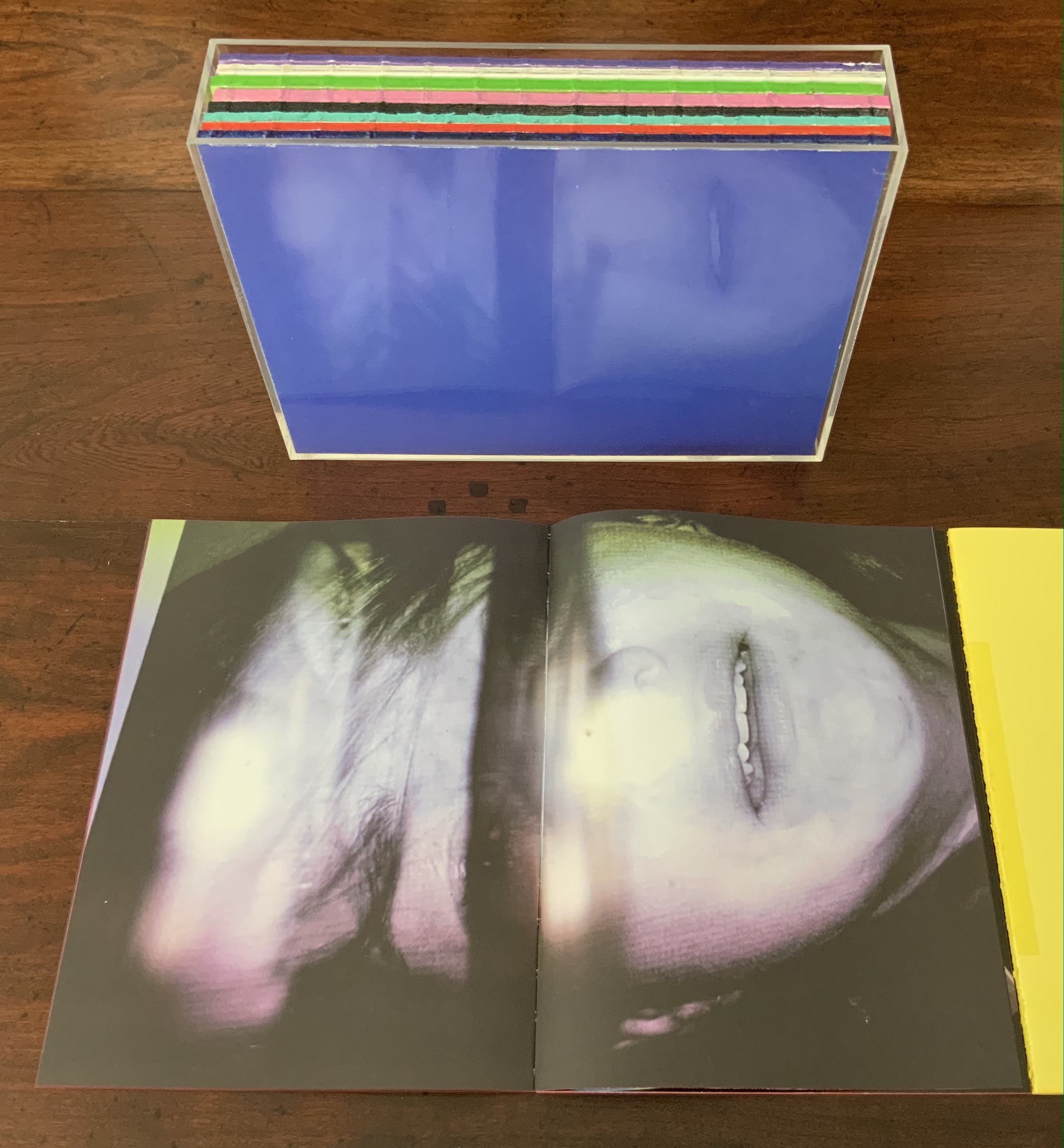
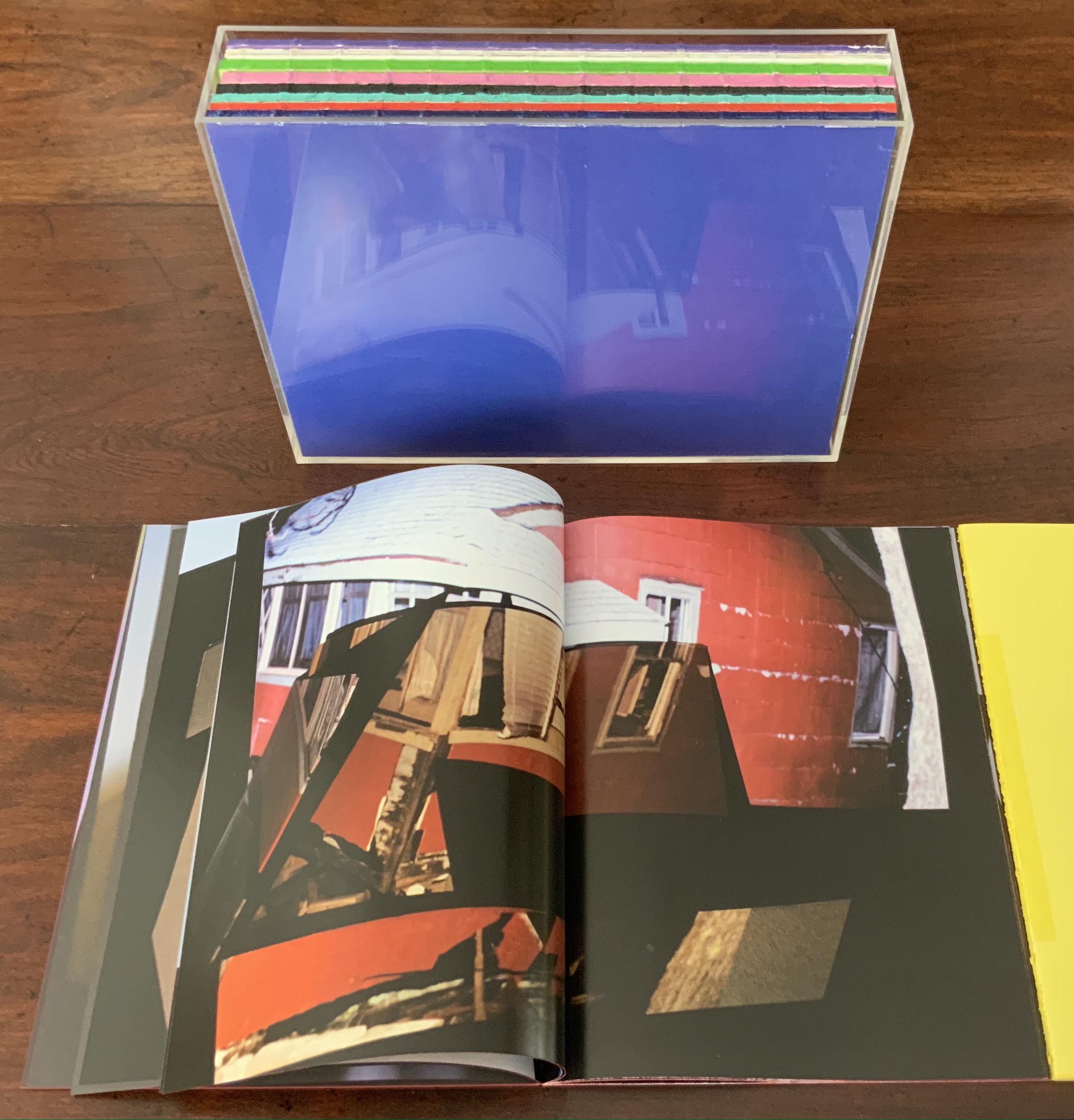
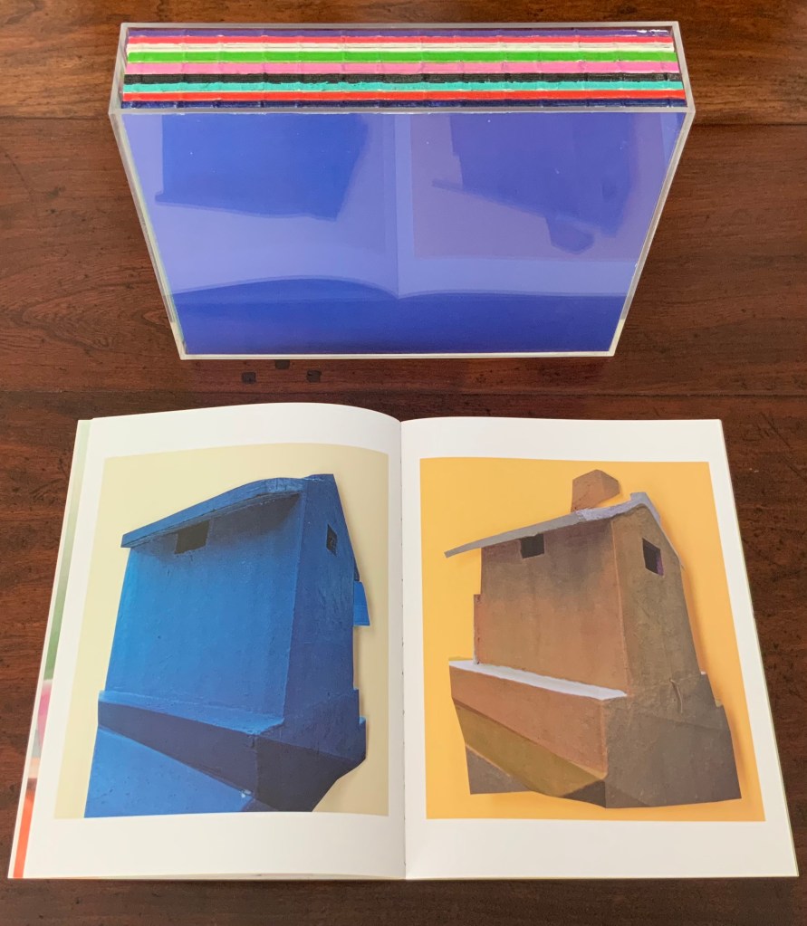
Waiting for the Sibyl (2020) William Kentridge Casebound and dustjacketed. H275 x W200 mm, 360 unnumbered pages. Acquired from Blackwells, 1 July 2021. Photos of the work: Books On Books Collection. Displayed with permission of the artist and the Marian Goodman Gallery.
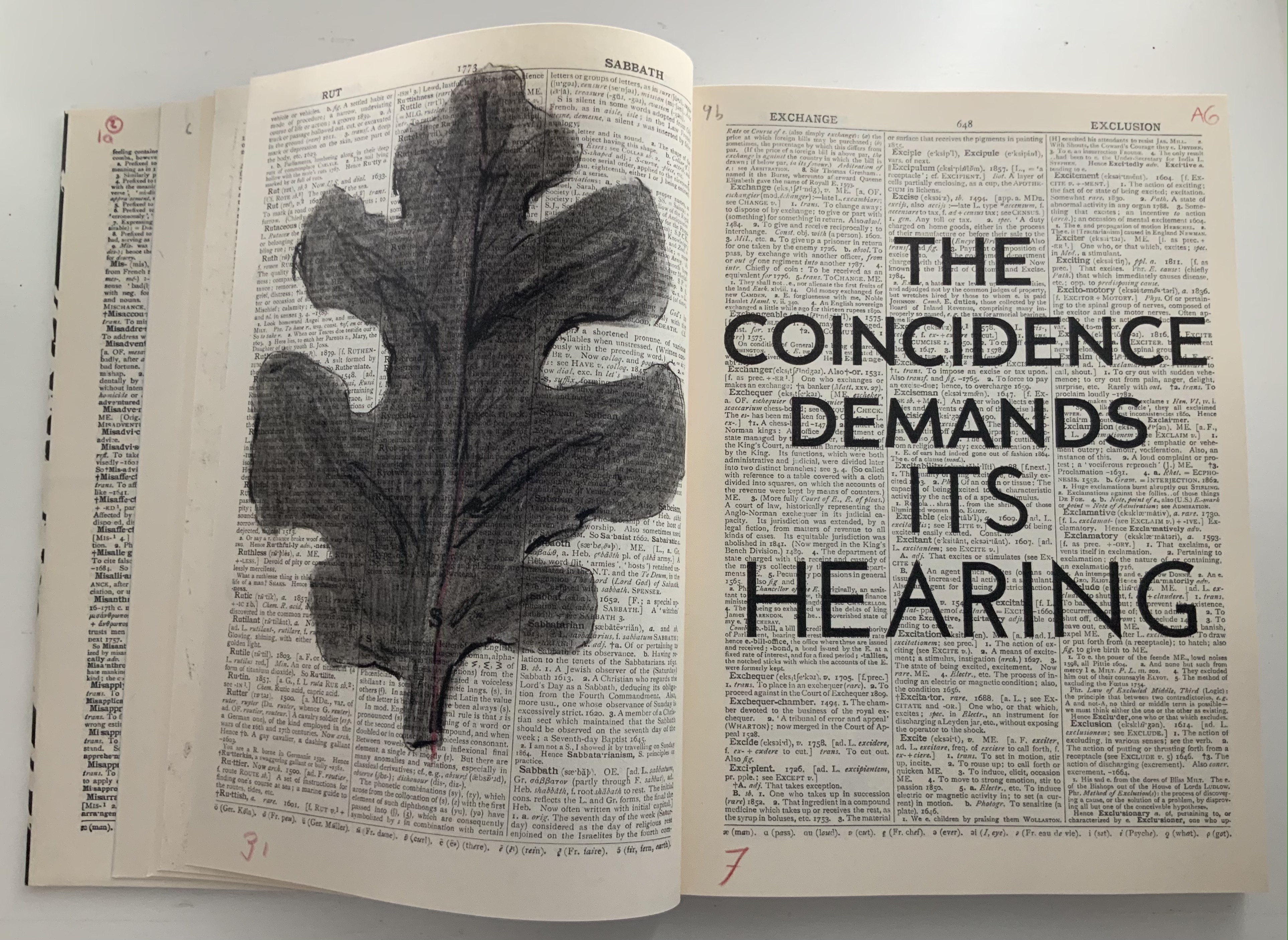
Like the ancient Greek playwrights, William Kentridge begins his chamber opera’s retelling of the Cumaean Sibyl’s myth in medias res — in this case, in the middle of the dictionary at the letter M. Redactions and marks build and build across the dictionary pages, a visual prelude like a musical one. Then they suddenly disappear, leaving the “stage” to unmarked pages from the letter A, a thunderclap announcement in all caps bold and then an explanatory statement slightly reduced in volume with a lighter type face and uppercase with lowercase letters. What is going on?
Because performance of the opera was curtailed by the pandemic beginning in 2019/2020, we have only a few short clips from a trailer and filmed rehearsals to guess at how a live performance might have unfolded: this short clip posted by Teatro dell’Opera di Roma, this one from Quaternaire, this one from The Red Bridge Project and this version posted by the Centre for the Less Good Idea. A description from the Théâtres de la Ville de Luxembourg tells us that the performance consists of a series of six short scenes. From the Red Bridge Project, coordinating the commission, we have Kentridge’s description of four of them:
A scene in the waiting room for the Sibyl. A scene about which is the right decision and which is the wrong one. How do you know which is the chair that will collapse when you sit on it and which is the chair that will support you? Is the plane that you’re rushing to catch the one that will crash or do you relax and not catch that plane and take the next one − and in fact that is the one that crashes?
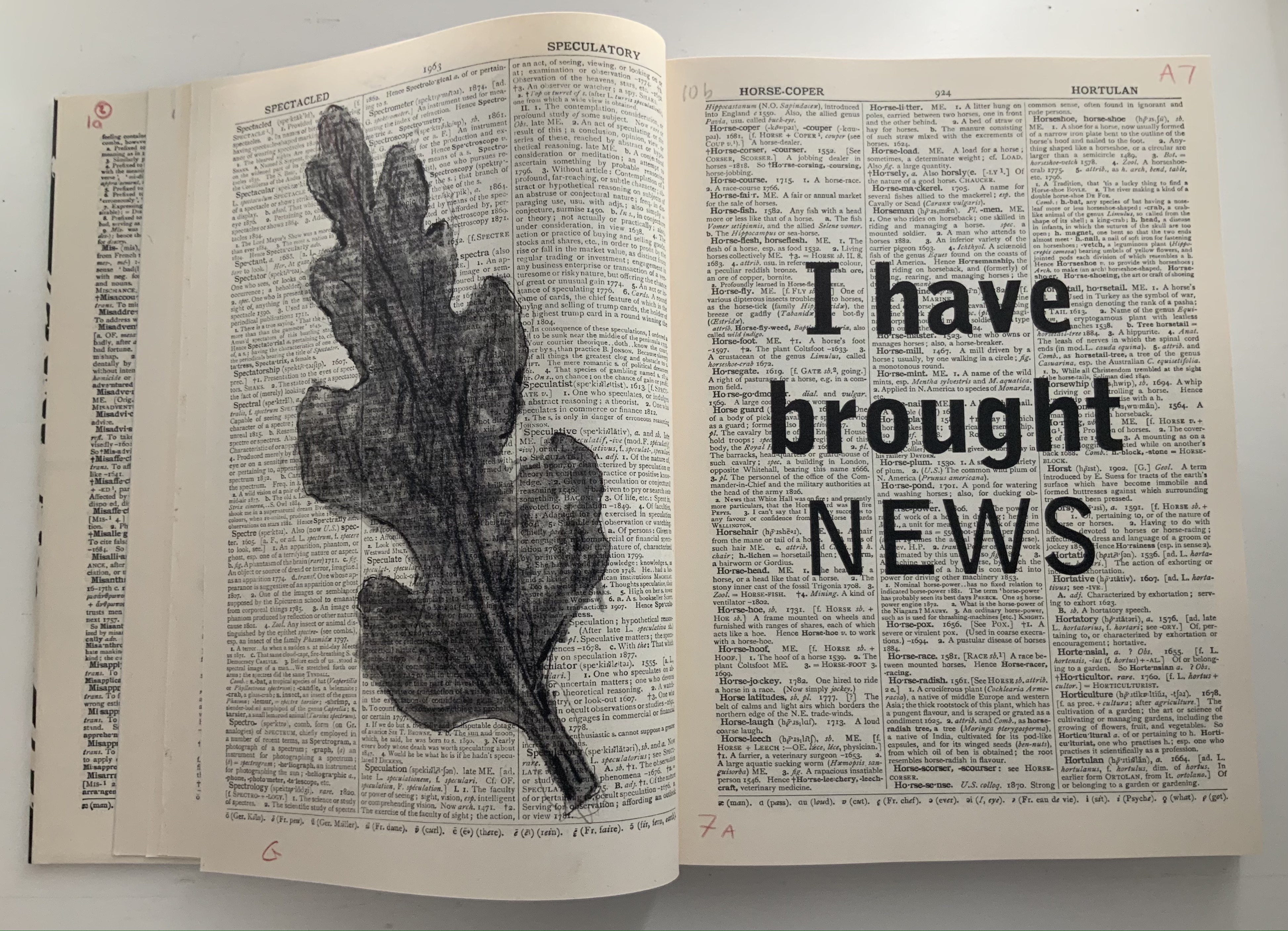
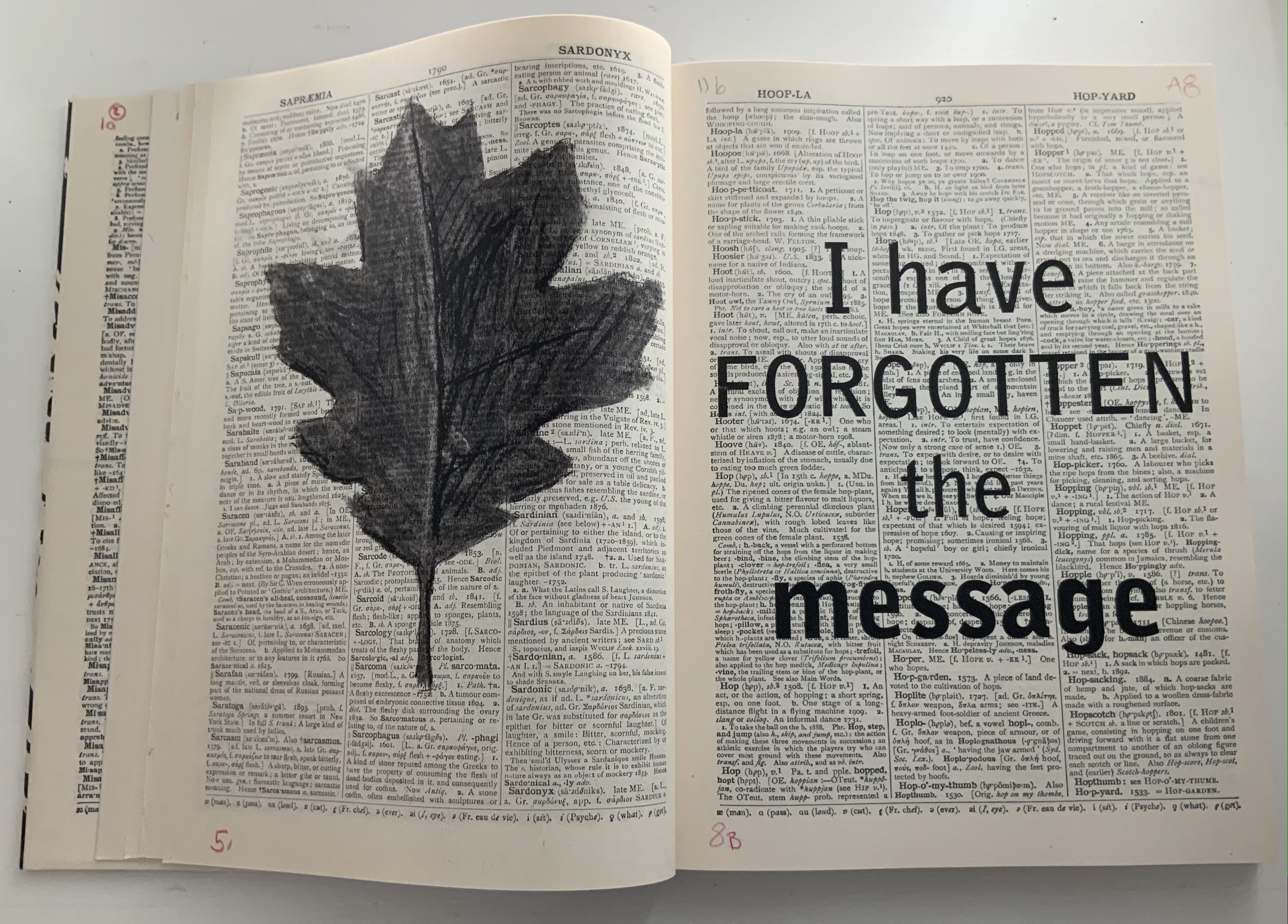
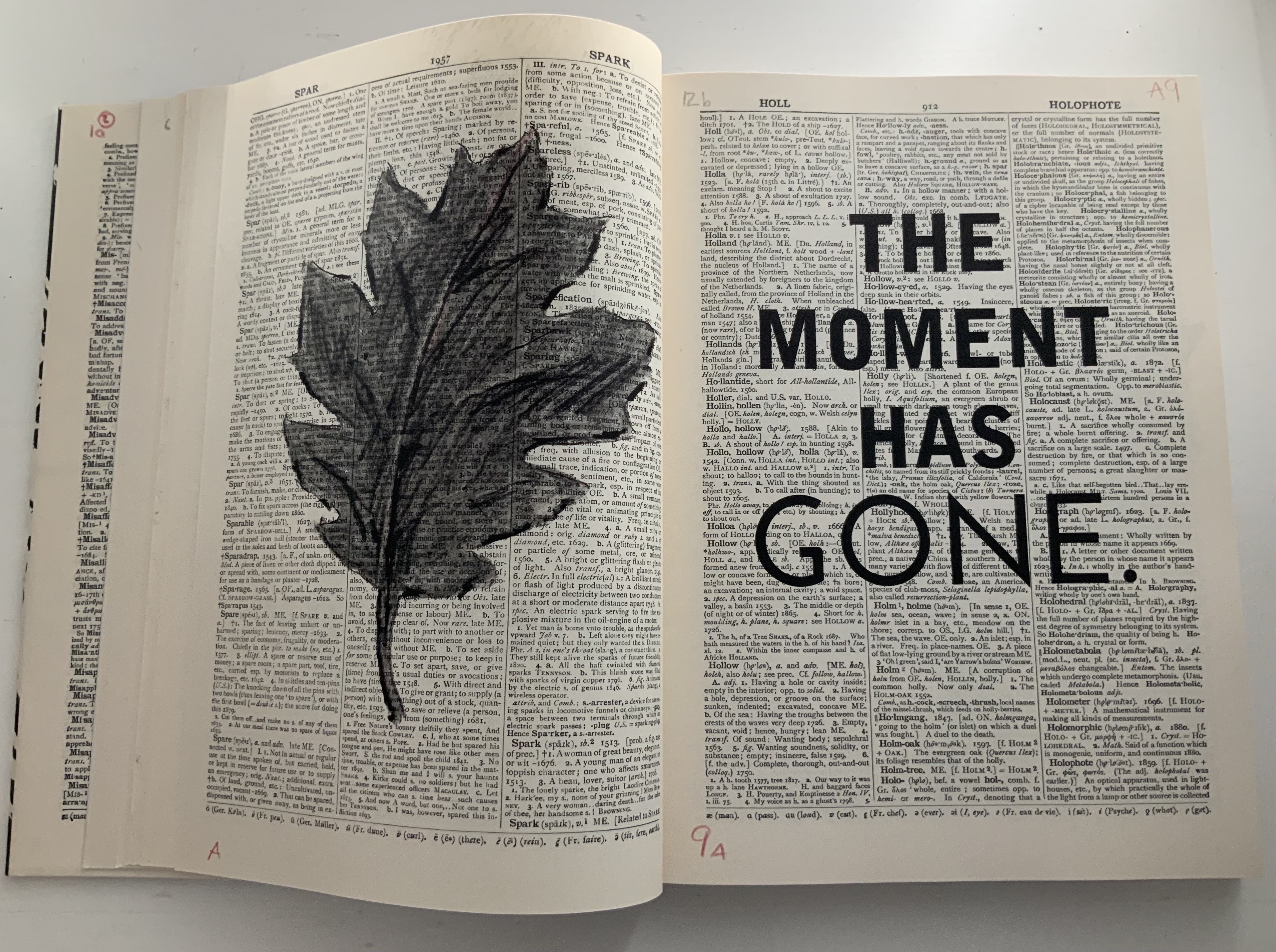
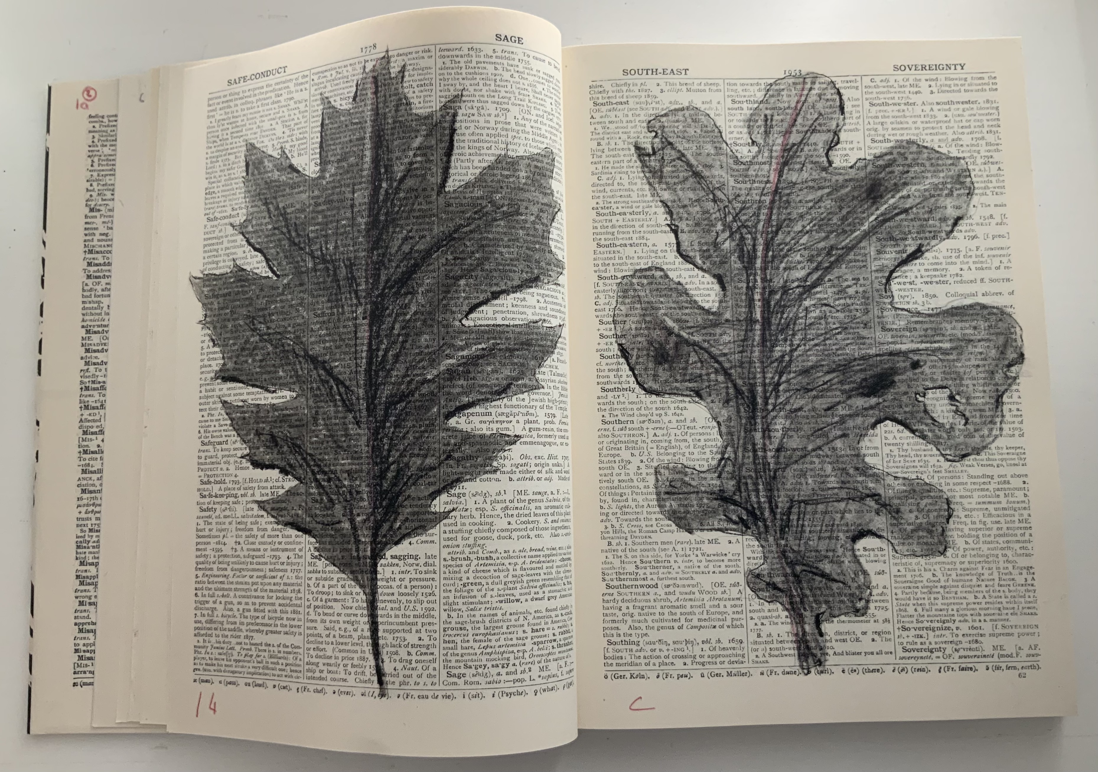
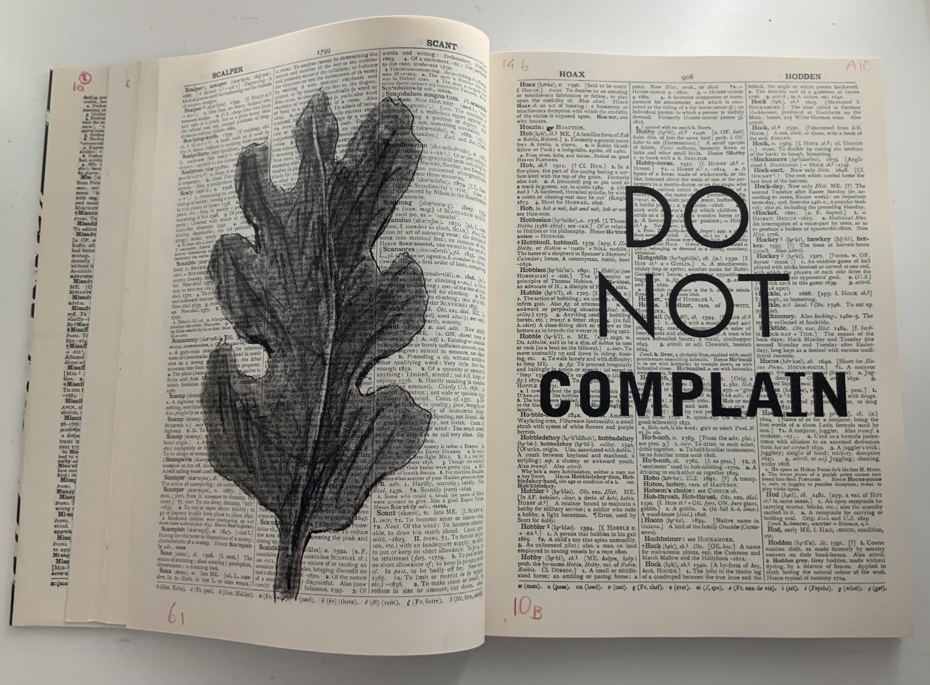
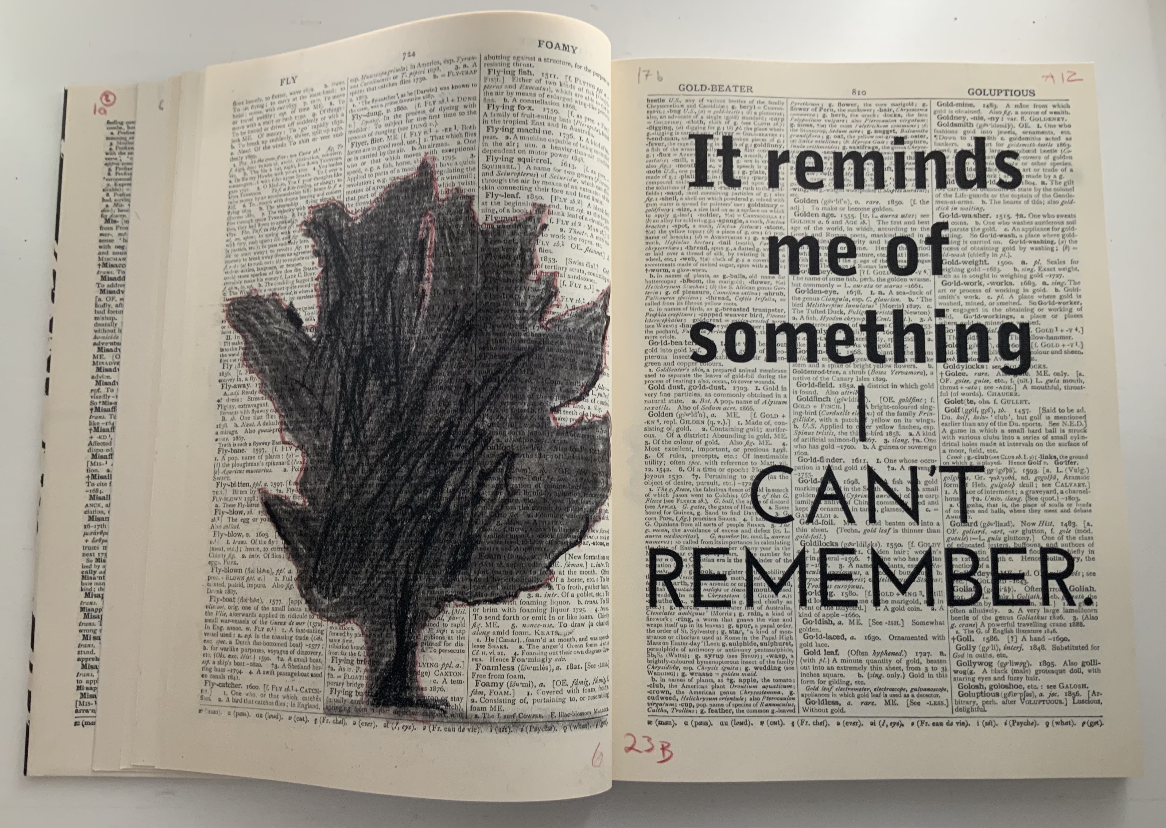
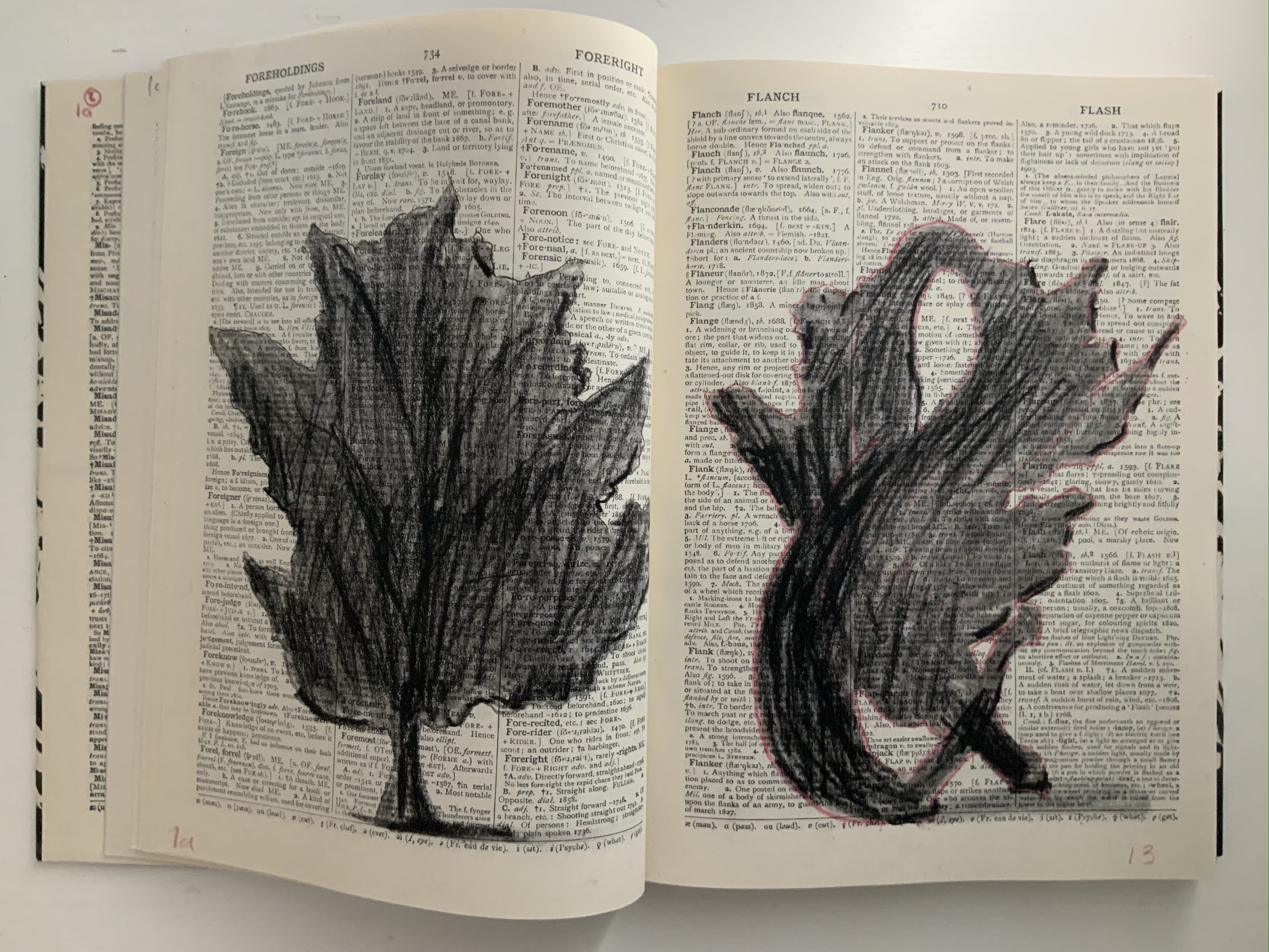
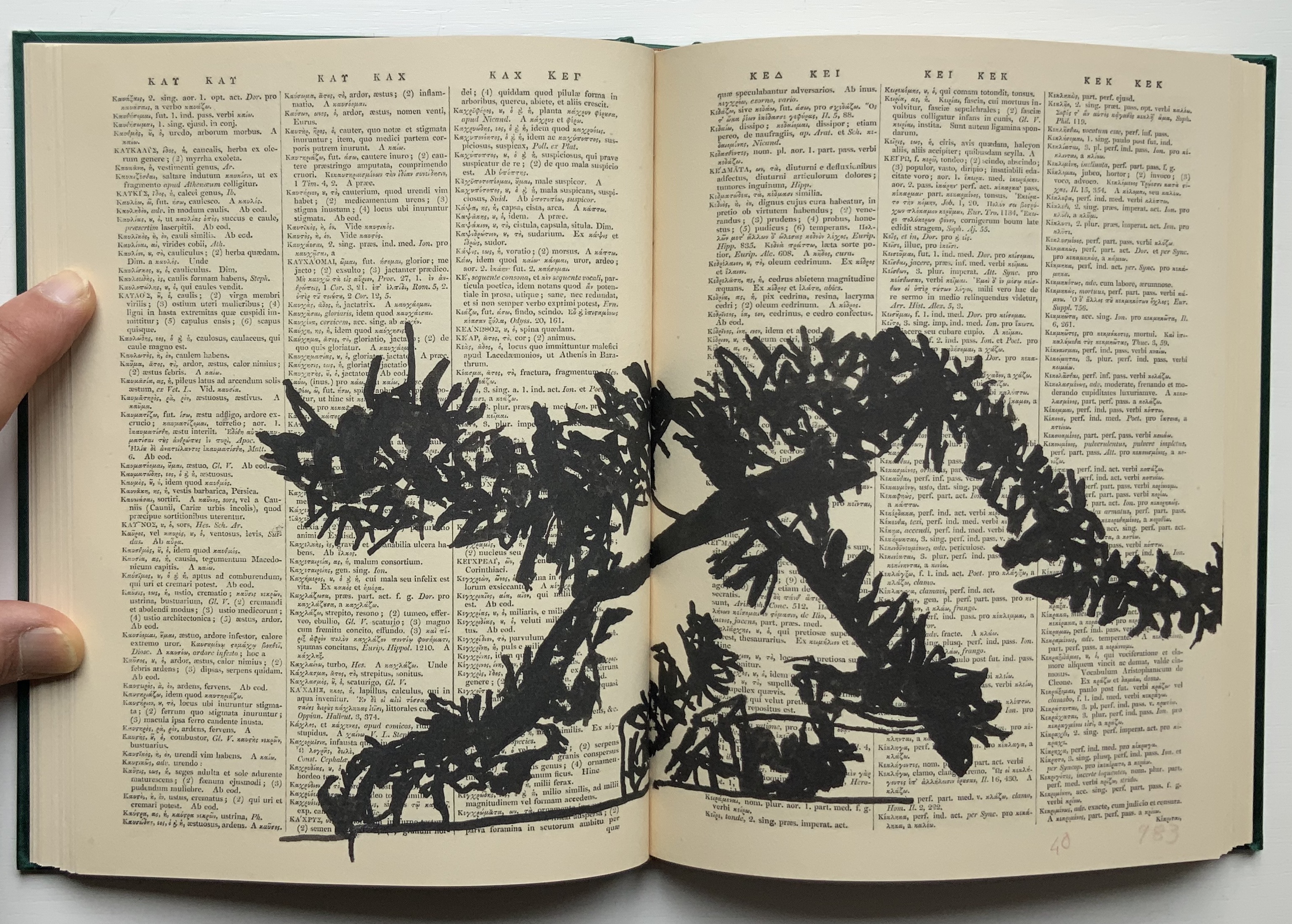
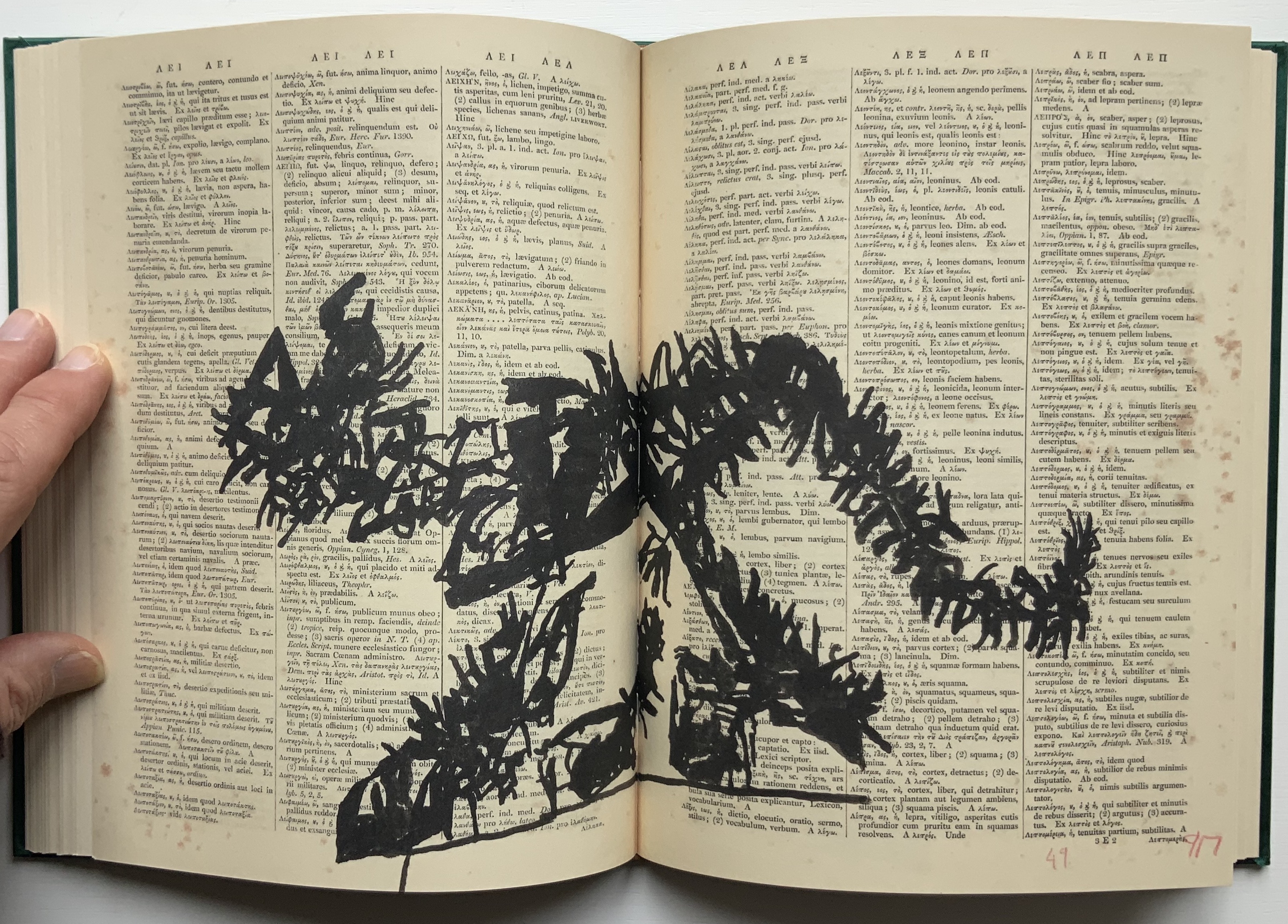
Judging from the videos and description, it is presumptuous to declare that the book and opera begin in medias res. Almost anywhere in the out-of-order pages or chaotic rehearsal scenes of performers snatching at and reacting to the scattered leaves of books, typescript and so on is the middle. But if the left-to-right reading convention of the Western codex prevails, the text to be sung continues to rumble along in the codex after the thunderous proclamations. The chorus or speaker seems to falter, admitting to having forgotten the message and losing the moment of its delivery. All the while, the libretto is being joined on the left by gradually forming images of leaves (a maple and an oak), an allusion to the leaves on which the Cumaean Sibyl would write the predictions of fate she had sung but which would be scattered and whirled by the wind before the supplicant could claim his or her rightful leaf.
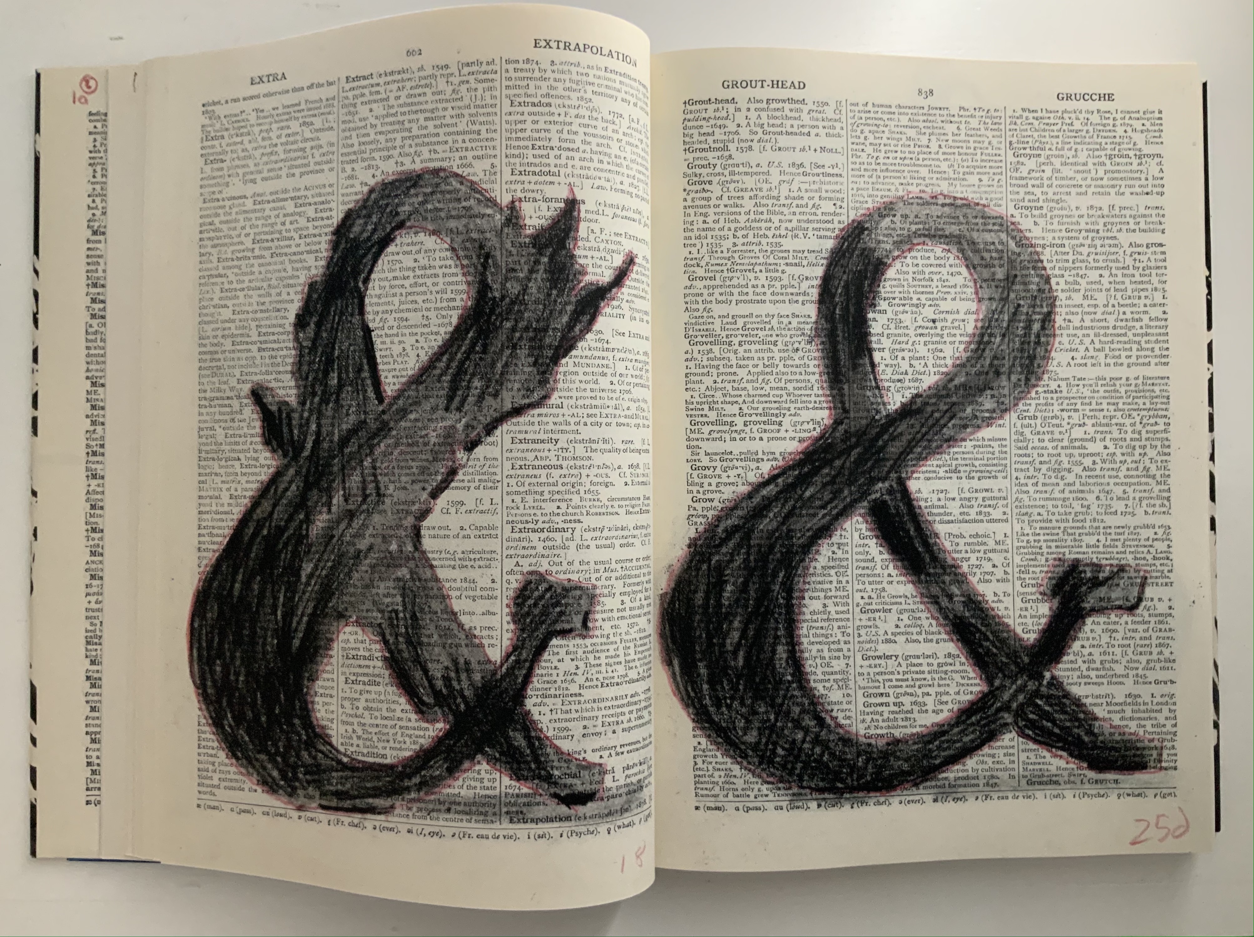
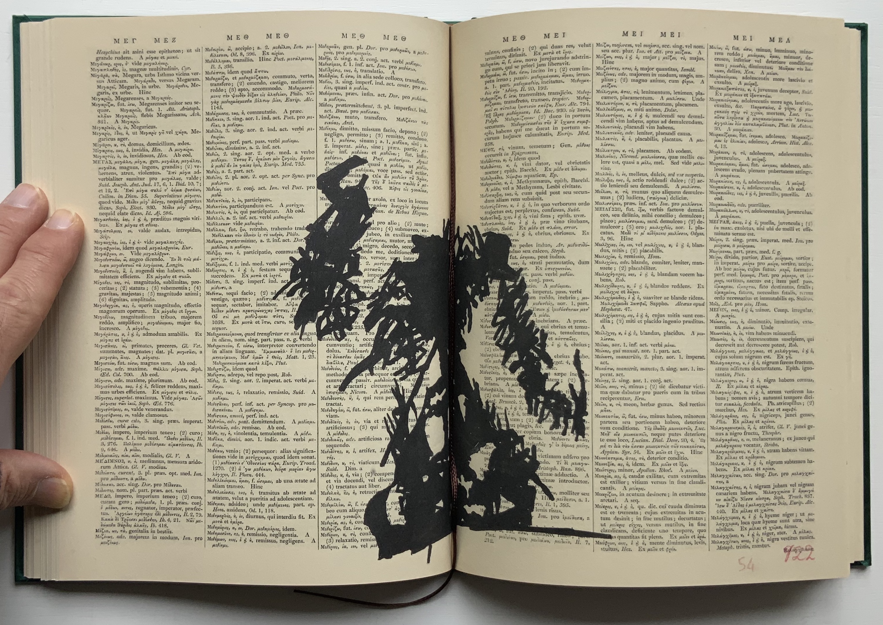
As occurs in Kentridge’s other bookworks, these gradual formations draw on the flip-book tradition, introducing that other recurrent media in his work — film — as well as performing an echo of the projections in the to-be performed opera. As the leaves assert themselves, the speaker’s confidence returns in all caps, a larger face and some bold. And while the speaker quickly recedes into lowercase and a lighter typeface, only able of being reminded “of something I can’t remember”, a leaf begins to metamorphose into a tree, an ampersand and then a dancer. Metamorphosis is that mythical translation of one being or object into another. Metaphor is that figure of speech that uses one object to remind us of another. “Etc., etc.” is what we say when we can’t remember or be bothered to complete a statement or series of examples. What Kentridge offers here is unquestionably not mixed metaphor but rather metaphor-mosis.
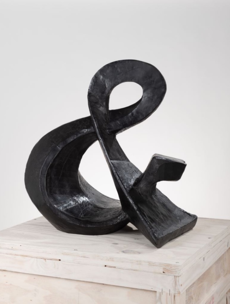
The metamorphosing ampersand recalls an illustrative example from another of Kentridge’s favored media — sculpture. As Kentridge puts it:
The turning sculptures I’ve made in the past have all been ones which have one moment of coherence, when the different components of the sculpture align. From one viewpoint they turn into a coffee pot, a tree, a typewriter, an opera singer. And then, as the sculpture turns, the elements fragment into chaos. — from The Red Bridge Project site, accessed 21 July 2021.
Ampersand (2017) William Kentridge Bronze, 85 x 82 x 54 cm, 87 kg Courtesy the artist and Goodman Gallery
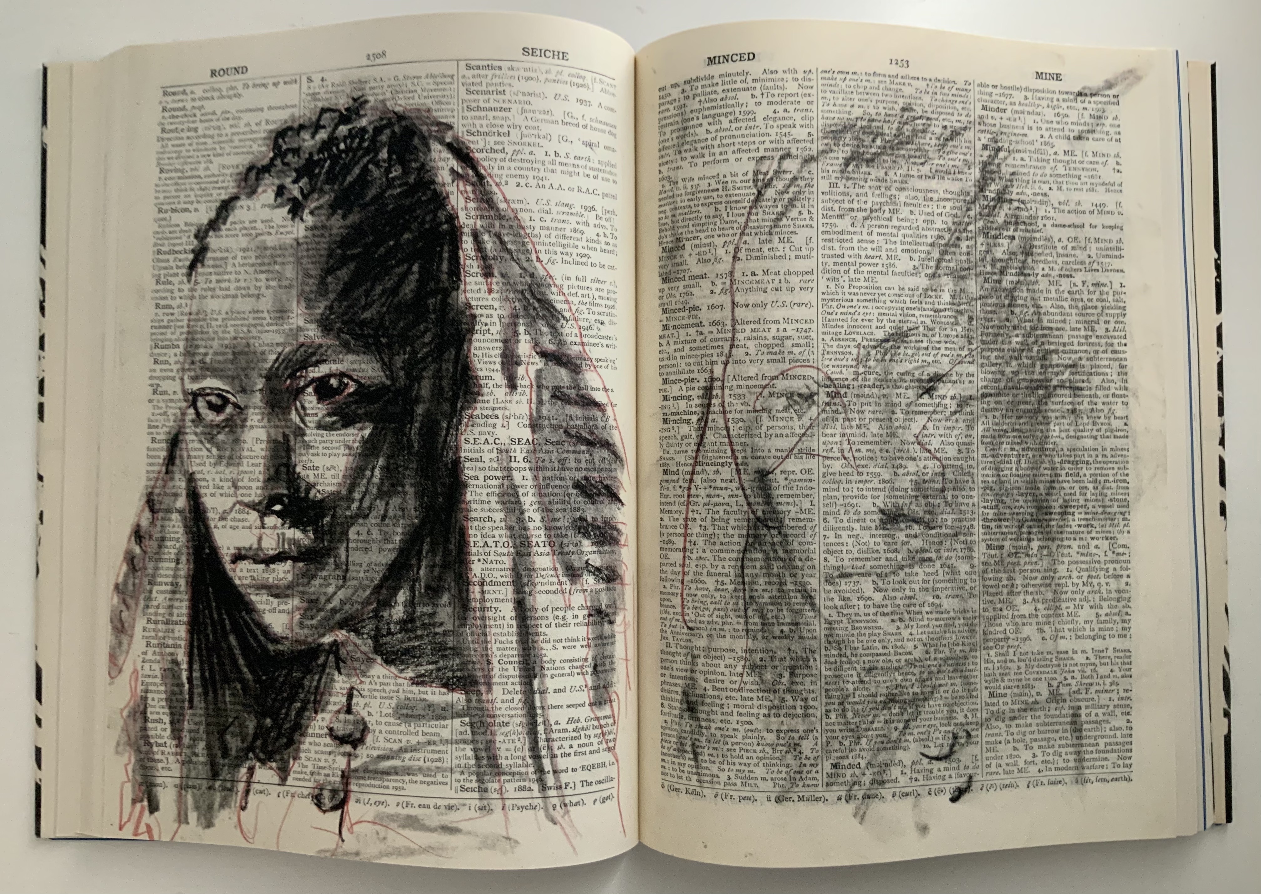
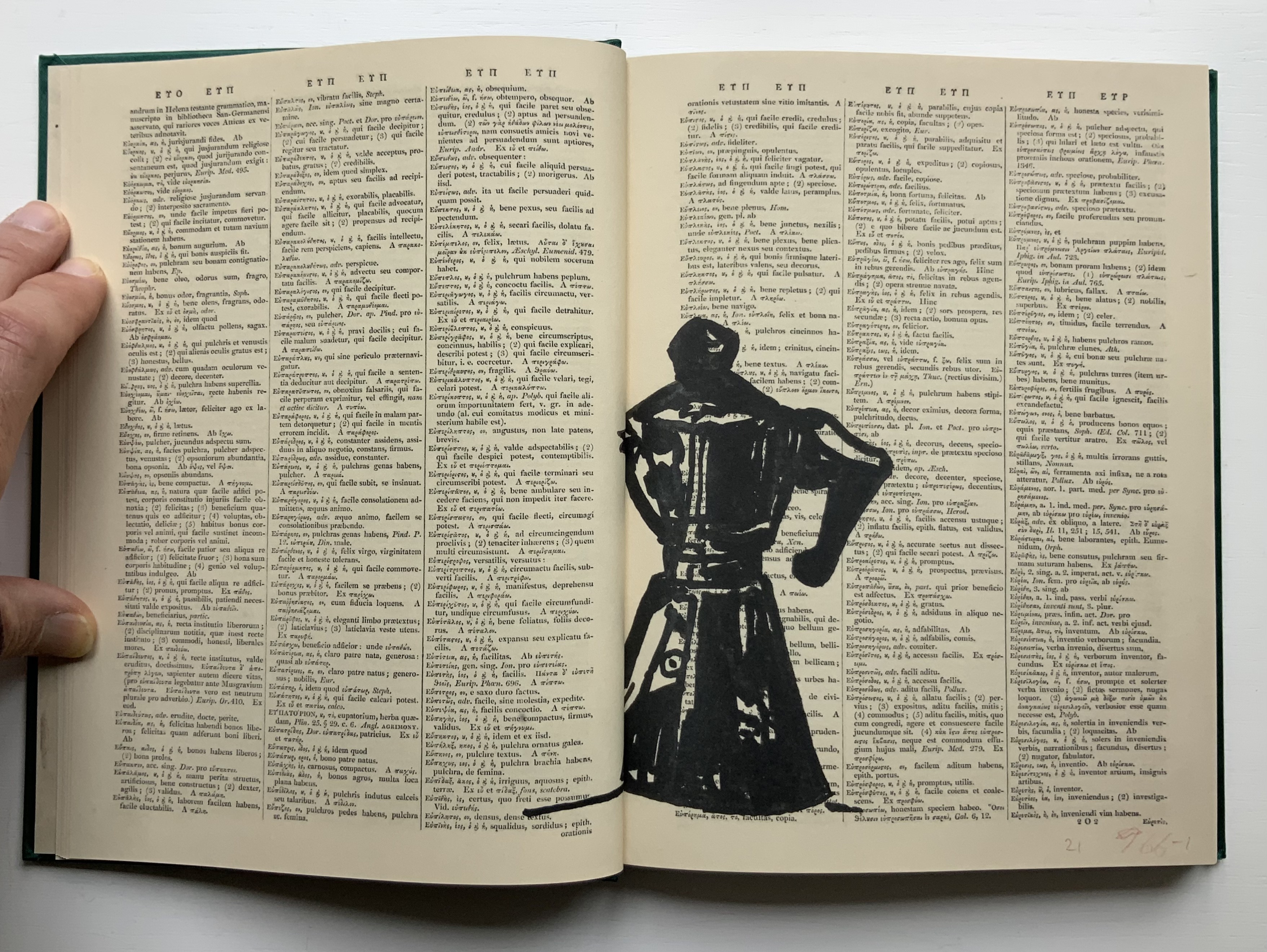
Even though there is a speaker/singer for the libretto, the dancer has the central role in the opera. Performed by Teresa Phuti Mojela, the dancer casts her shadow over the projected pages and seems to “dance” the prophecies. Kentridge notes in the book’s afterword that he has added images of her to stand in for her projected shadows. As this sequence in the codex shows, the dancer/Teresa Phuti Mojela is the Sibyl.
In addition to containing the libretto, serving as part of the setting for the actual performance, presenting the central player and the Sibyl’s transformation into her, demonstrating the dancer’s performance (when flipped like a flip-book) and exemplifying the key props (prophecies on leaves), the codex also reflects the collaborative creative effort that Kentridge extols in describing the opera’s preparation:
… when we had our first workshop in Johannesburg, in which we brought together the singers, the pianist, a dancer to be the Sibyl, costume designer, set designer, videographer, the editor of the animations I’ve been drawing, we discovered very quickly that the magic of the piece was in the live performance of the music. At this point the project became possible to do only if we could have these singers on stage.
As the book’s last page notes, creative collaboration among Kentridge and Anne McIlleron (editors), Oliver Barstow (designer), Alex Feenstra (lithographer) and robstolk® (lithographer and printer) is what has made this work of art possible.
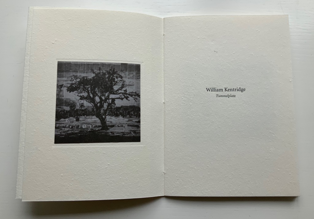
Tummelplatz (2016)
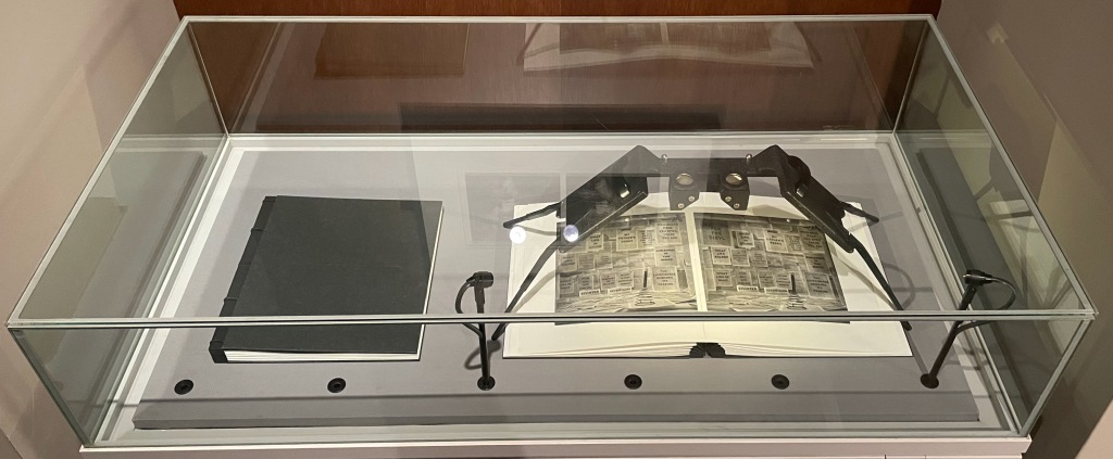
Tummelplatz (2016) William Kentridge Papercased sewn booklet. H214 x W152 mm, 16 pages. Acquired from Lady Elena Ochoa Foster, 28 June 2022, “Sensational Books” exhibition at the Bodleian Libraries. Photos of the work: Books On Books Collection.
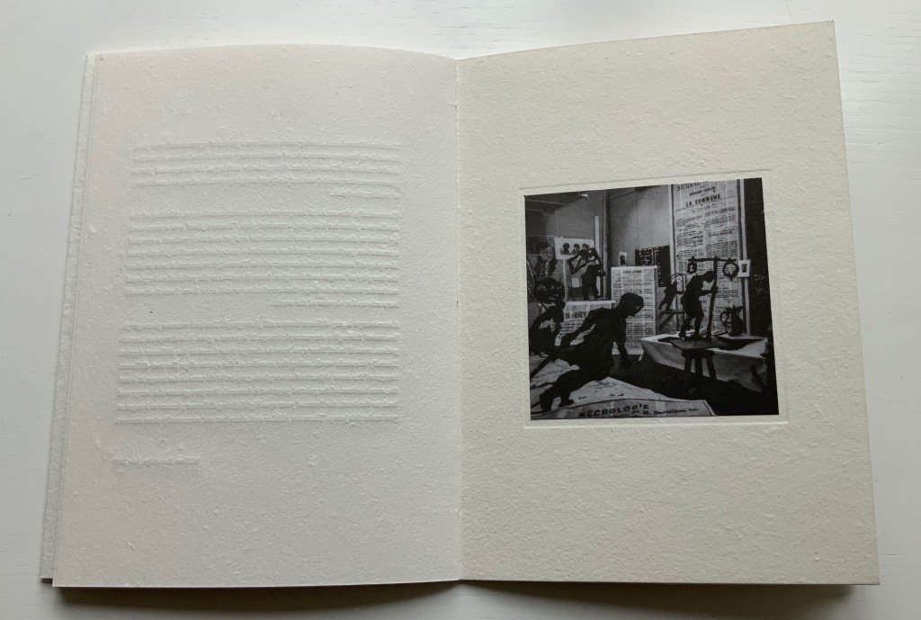
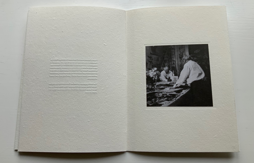
In Tummelplatz the booklet created for the Ivorypress exhibition of the larger eponymous work, William Kentridge explains that tummelplatz is Freud’s term for the space between analysts and their patients. But its literal translation is “playground”, which might be the perfect word for William Kentridge’s studio. The studio is the actual setting for the series stereoscopic photographs reproduced as photogravure images in the double volume of Tummelplatz. With the artist’s charcoal drawings of a landscape background pinned to the walls and others cut out as foreground figures and fixed into position, the studio was transformed into a sort of diorama in which the artist himself posed. A stereoscopic viewing device in fixed position over the volume invites the reader/viewer to join Kentridge in his playground.
These are images that have to be read, not scanned like flat photos. The eyes’ focus has to jump from layer to layer, element to element. In the exhibition “Sensational Books”, Tummelplatz is set up within a glass case, so only one scene is available for viewing and reading, and the distance imposed by the extra layer of glass makes the sensation hard to appreciate. Nevertheless, there is enough of it to set the reader/viewer to wondering whether the technique, the effect of the photogravure and this three-dimensional precursor to virtual reality have transformed him or her into the patient and the work of art itself into the analyst. Or whether it’s just a playdate with William Kentridge in his playground.
Showcased at “Sensational Books” exhibition, Weston Library, Oxford University. Photo: Books On Books, 8 July 2022.
Showcased at “Sensational Books” exhibition, Weston Library, Oxford University. Photo: Books On Books, 8 July 2022.
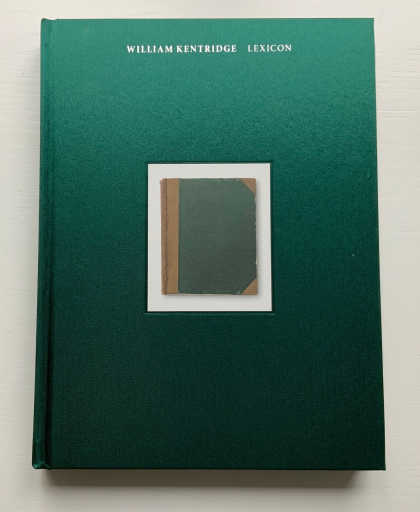
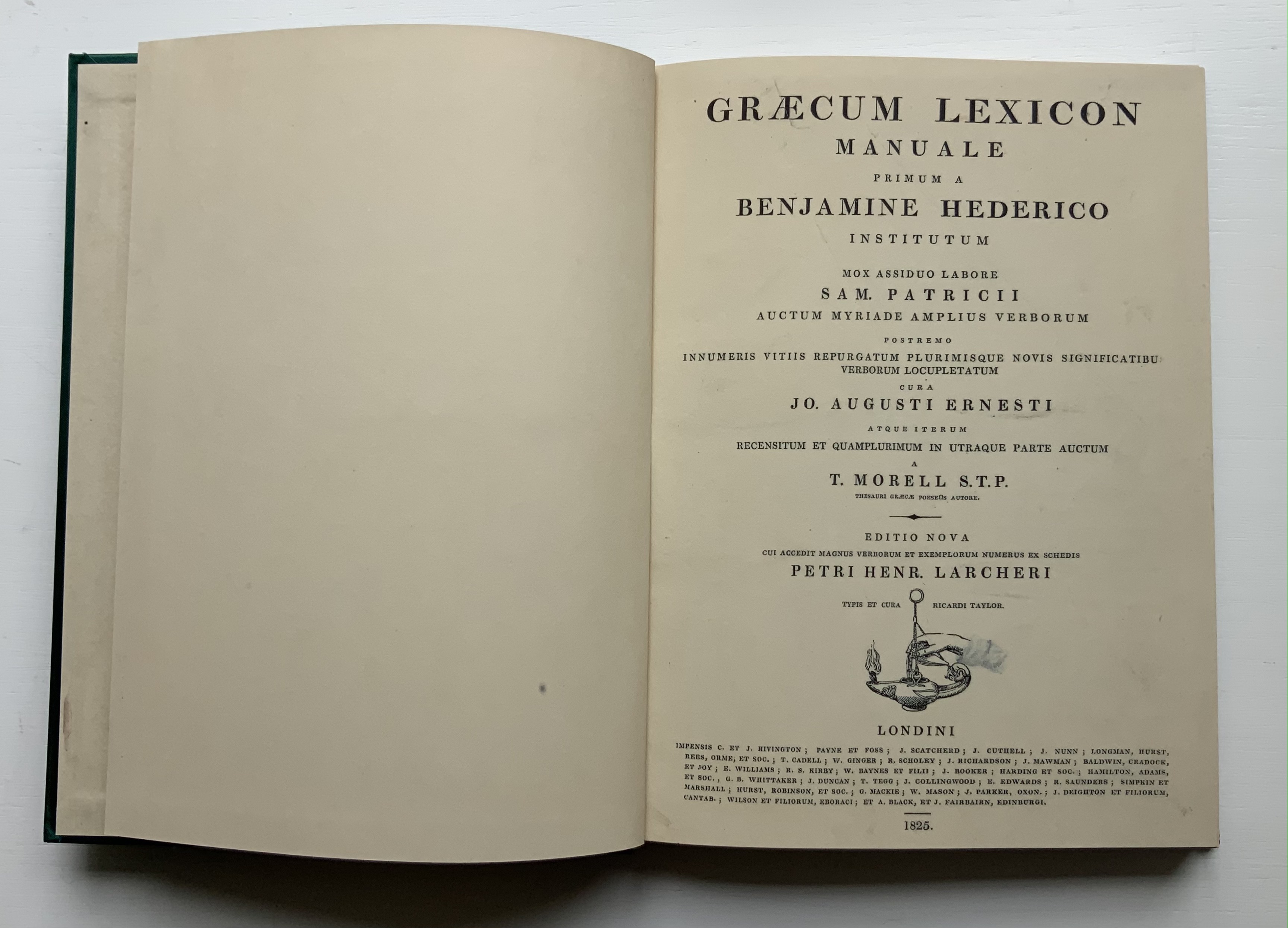
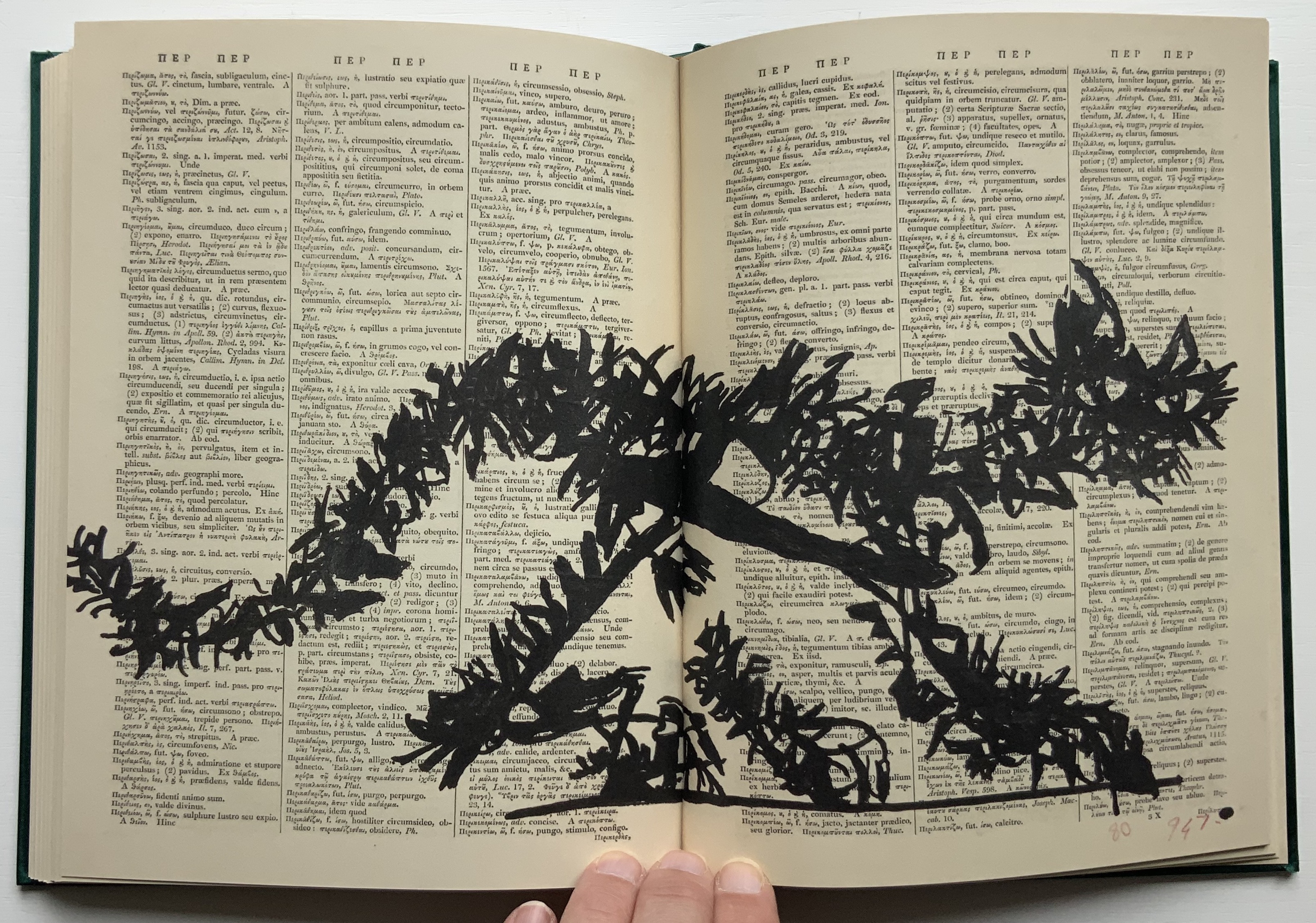
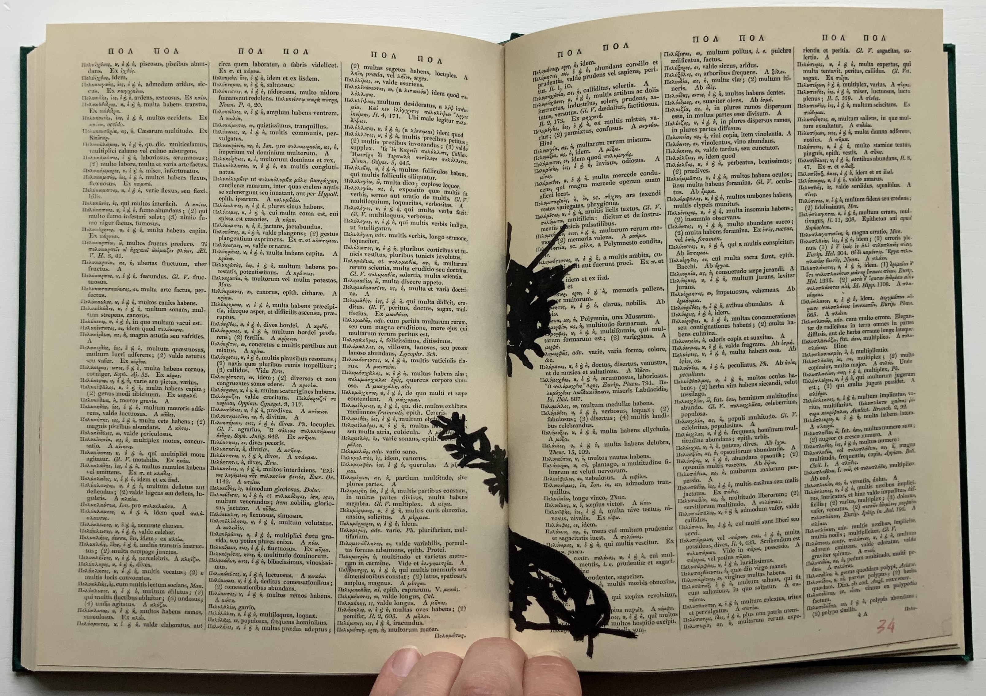
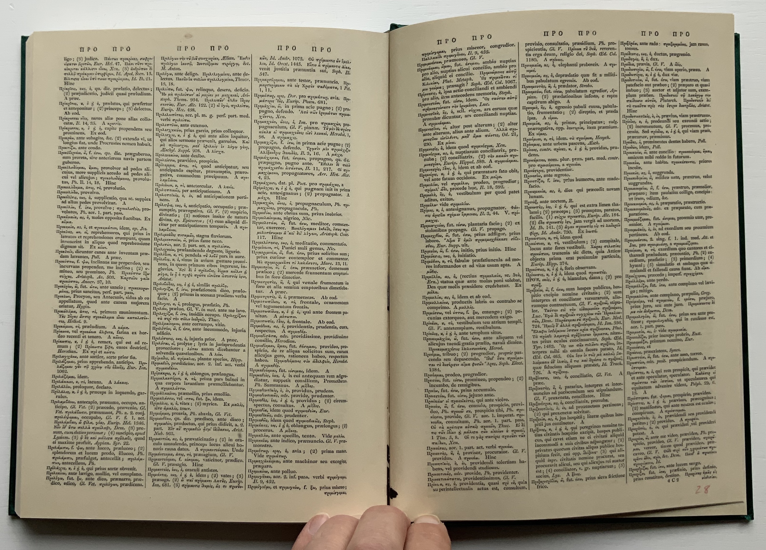
William Kentridge : Lexicon (2011)
William Kentridge : Lexicon (2011) William Kentridge Cloth boards, sewn bound. H234 x W177 mm, 160 pages. Acquired from Specific Object, 2 May 2021. Photos of the book: Books On Books Collection. Permission courtesy the artist and Goodman Gallery.
The first work by Kentridge I ever saw displayed was 2nd Hand Reading (2014) at the Museum Meermanno (The House of the Book) in The Hague. The exhibition was called The Art of Reading and had been curated by Paul van Capelleveen. Curator at the Dutch national library and advisor to the Meermanno, he felt strongly that the challenges of artist books cannot be understood “under glass” and insisted that each work be touchable. So under his supervision, I was able to flip through 2nd Hand Reading and also watch the projected animation of stop-motion images across the pages being flipped. While the forward motion of the animation offers a narrative, its substrate — pages of the Shorter Oxford English dictionary on historical principles — contradicts any notion of logical beginning, middle and end: the drawn-upon pages are not in the original’s paginated or alphabetical order.
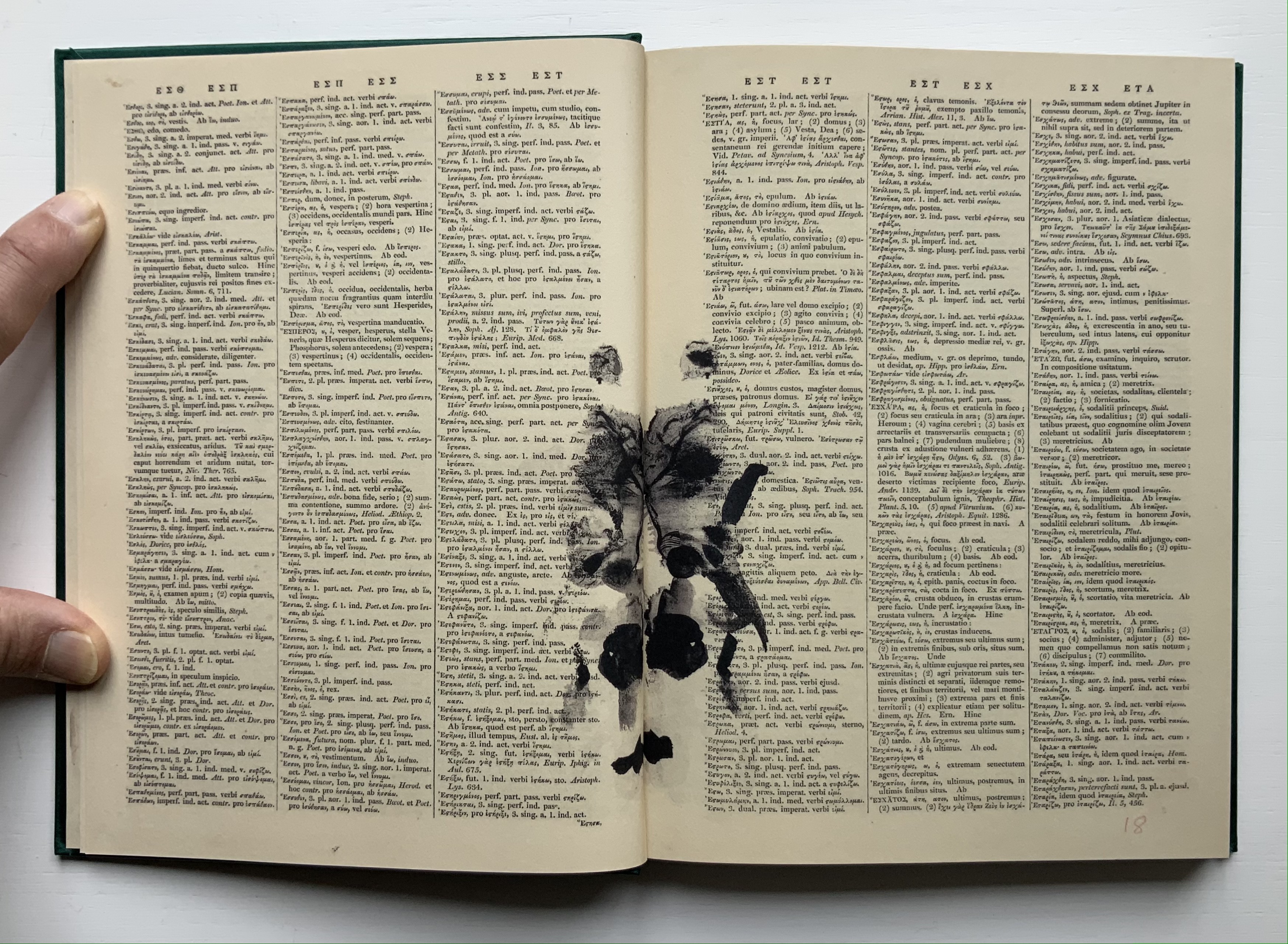
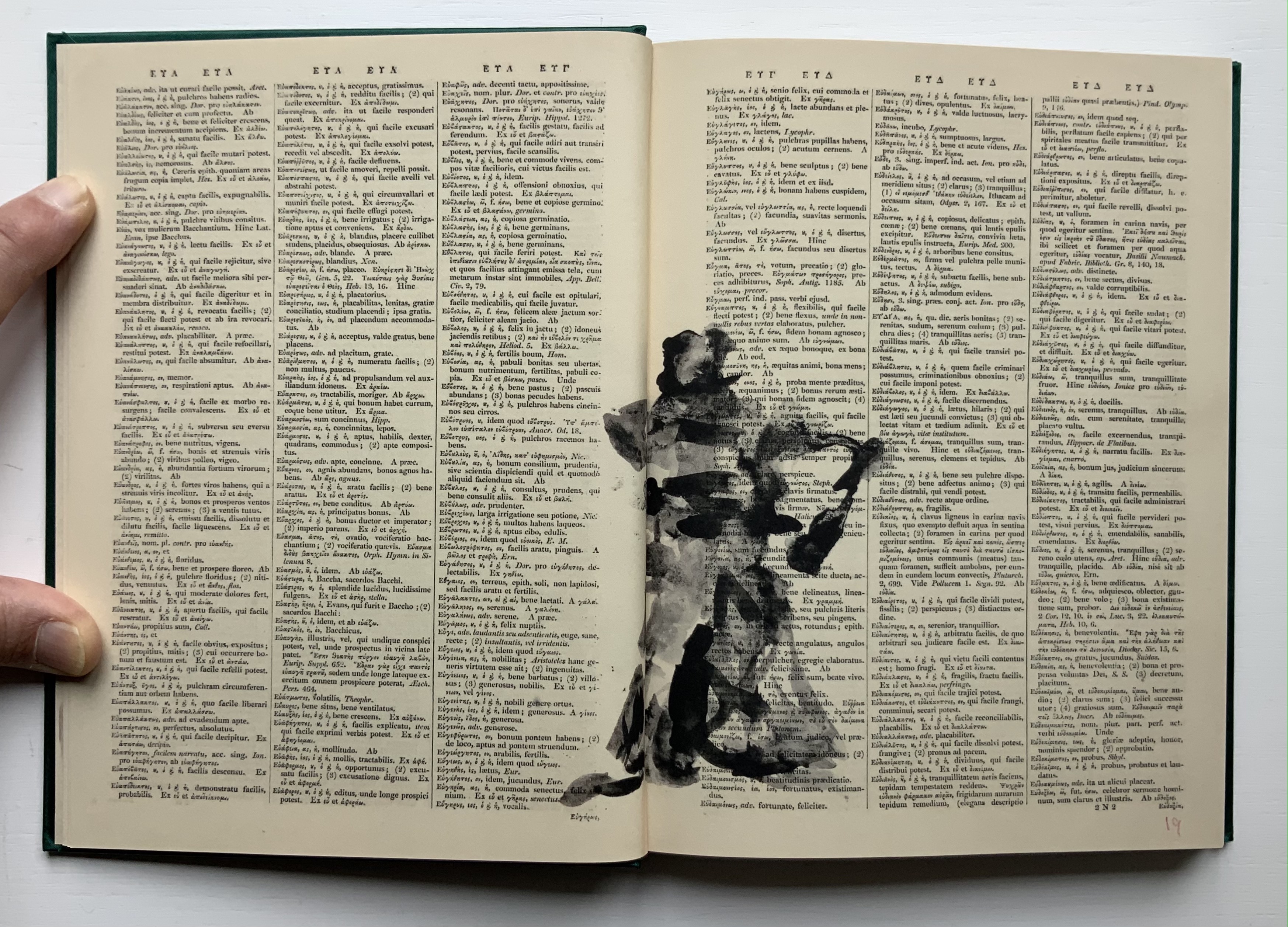
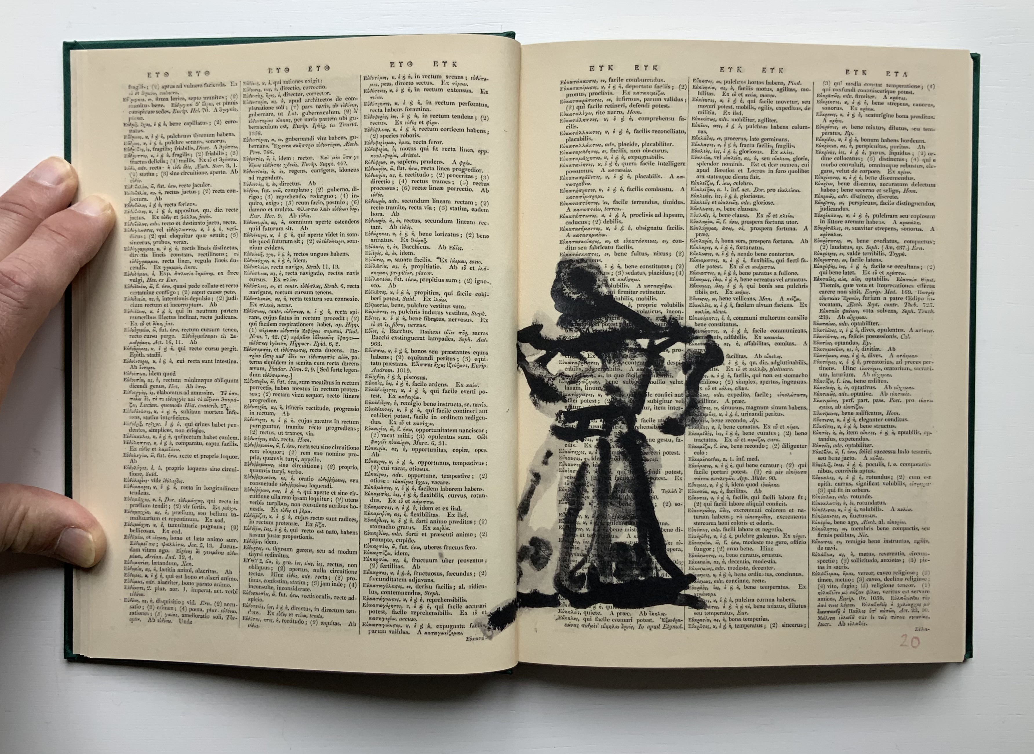
Compared to 2nd Hand Reading‘s 800 pages, Lexicon at 160 pages provides a small reminder of the experience. Bound in a green satin-sheen cloth, Lexicon begins as a facsimile edition of an antiquarian Latin-Greek dictionary. The dictionary’s browned pages and antique languages perform the role of drawing surface or projection screen for a flip-book metamorphosis. In scrawly black ink drawings, an Italian coffee pot emerges from the gutter and starts to tilt and turn.
Gradually the pot changes into a black cat, striding from right to left. Not the direction in which Western reading and narratives usually proceed. In its transformation and movements, the cat seems to pivot on itself as it turns and strides across the Latin and Greek like Rilke’s panther behind its bars until it turns back into a coffee pot. Or does it?
That drawing in the center certainly looks like the coffee pot, but as the pages turn, the cat returns to stride from left to right, expanding then shrinking until it is swallowed by the gutter.
The reference to Rilke’s panther is actually Kentridge’s, made ex post facto in the next book in the Collection.
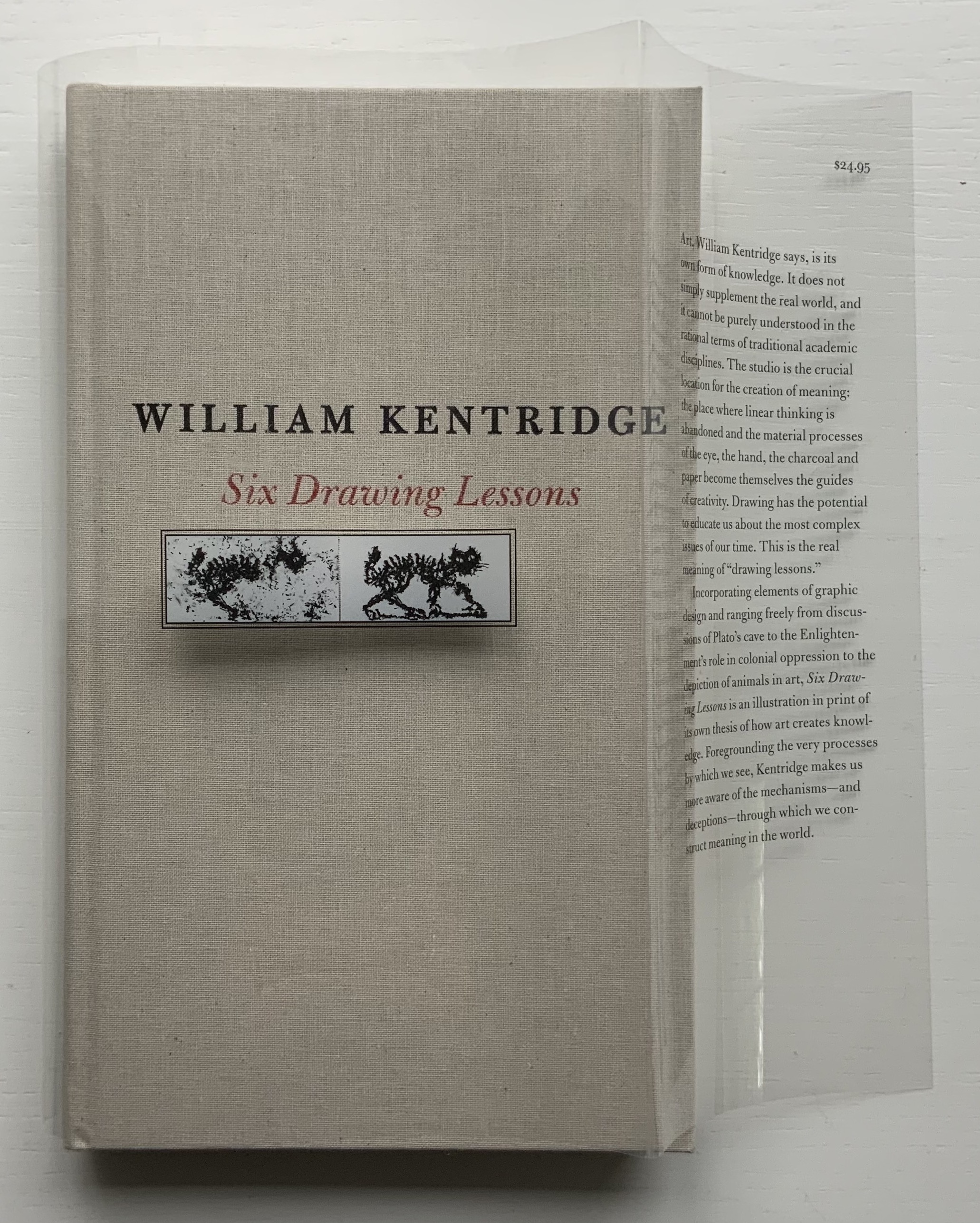
Six Drawing Lessons (2014)
Six Drawing Lessons(2014) William Kentridge Cloth boards, sewn bound. H x W mm, 208 pages. Acquired from Amazon, 23 March 2019. Photos of the book: Books On Books Collection. Permission courtesy of the artist and Goodman Gallery.
You rarely see a clear dustjacket. Of course, if it has type printed on it, you can see it. Still, it is rare, and in this case — in light of Kentridge’s film artistry — transparently ingenious.
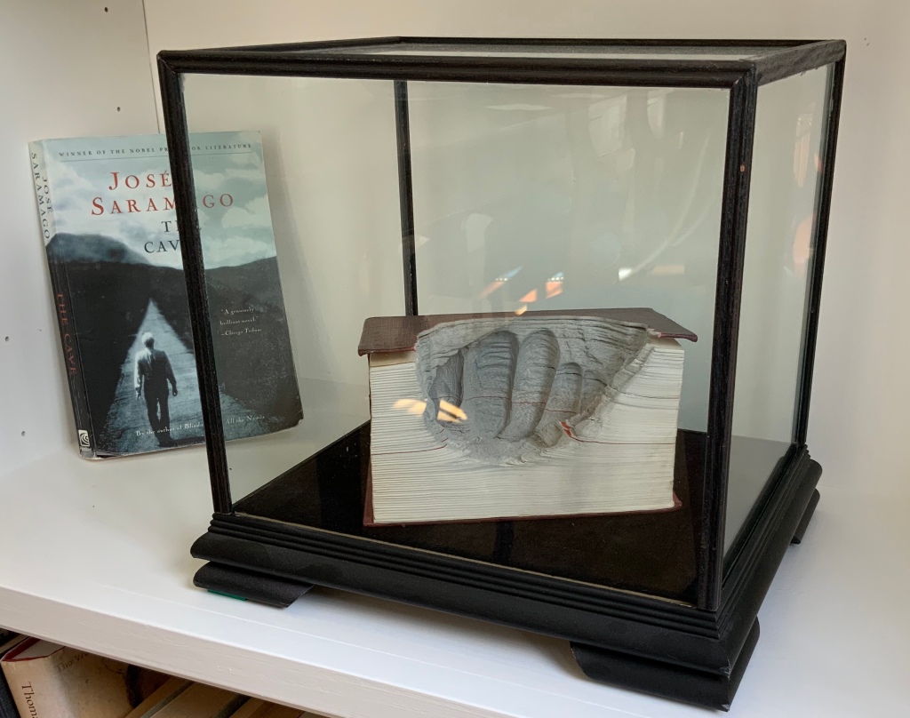
The six lessons — Kentridge’s Charles Eliot Norton Lectures delivered at Harvard — begin with an extended riff on Plato’s allegory of the cave. Variations on the riff recur throughout — applied to film projected from behind the audience, to a stage design of The Magic Flute as the bellows of a tripod camera, to transformations and metamorphoses and to the mining caves under Johannesburg. Kentridge’s interpretation of Plato’s cave reminds me of José Saramago’s interpretation in A Caverna (2014) and Guy Laramée’s homage to A Caverna. All three address “the great cloud of unknowing“, a kind of knowing by not knowing — but without God.
A Caverna (2012) Guy Laramée Portuguese-Spanish dictionary carved. Wood and velvet plinth, wood-framed glass cover. H260 x W276 x D226 mm Acquired from William Baczek Fine Arts, 12 September 2017.
What’s remarkable is how Kentridge brings so many variations, seeming tangents and media in the lectures into coherence. Or perhaps not so remarkable given that he manages it across his body of work and the multiple media in which he works. In breadth of stuff and raw material to hand and in his head, Kentridge himself identifies Picasso’s studio practices and work as an influence. Although not mentioned, Anselm Kiefer’s works such as Das Lied von der Zeder – Für Paul Célan (“The song of the cedar – for Paul Célan”, 2005) and his studio at La Ribaute, near Barjac in France, come to mind in these lectures. Likewise another artist called to mind is Xu Bing, especially his Landscape/Landscript (2013) and massive junk assemblage Phoenix (2008-15) among other works. Both Kiefer and Xu use the book as a medium with which to fuse language or text with the visual. All three artists confront similarly dark, raw cultural inheritances. Kentridge’s lectures, especially Lessons Two and Three, make plain his apartheid inheritance and its presence in his art.
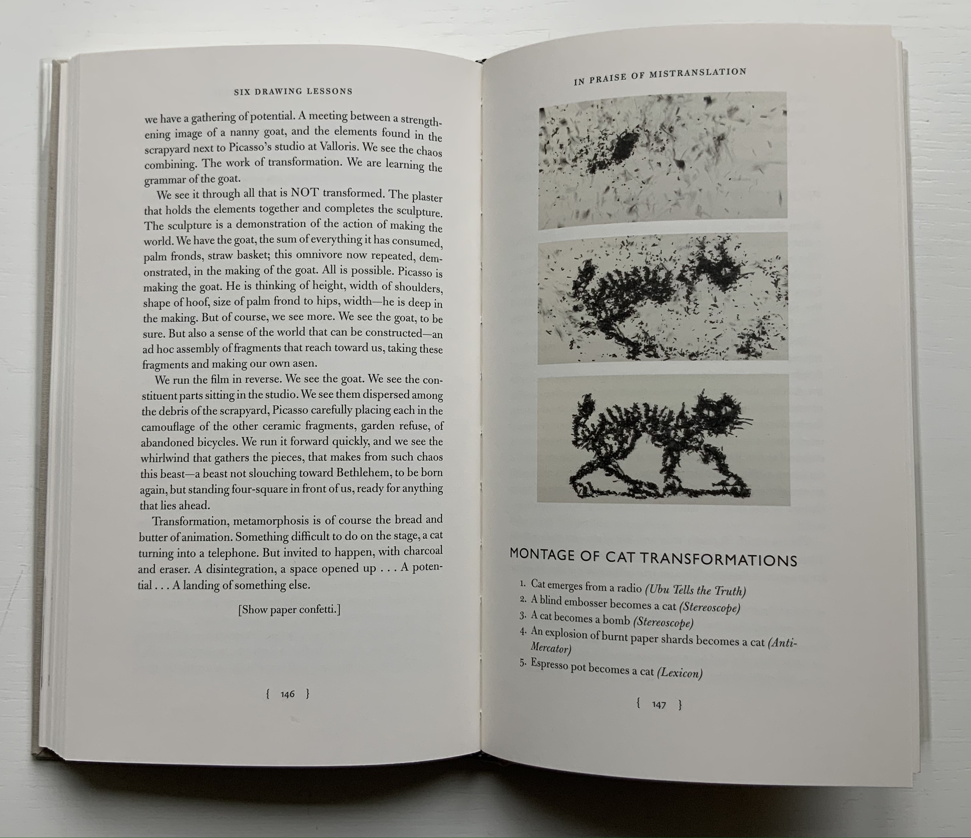
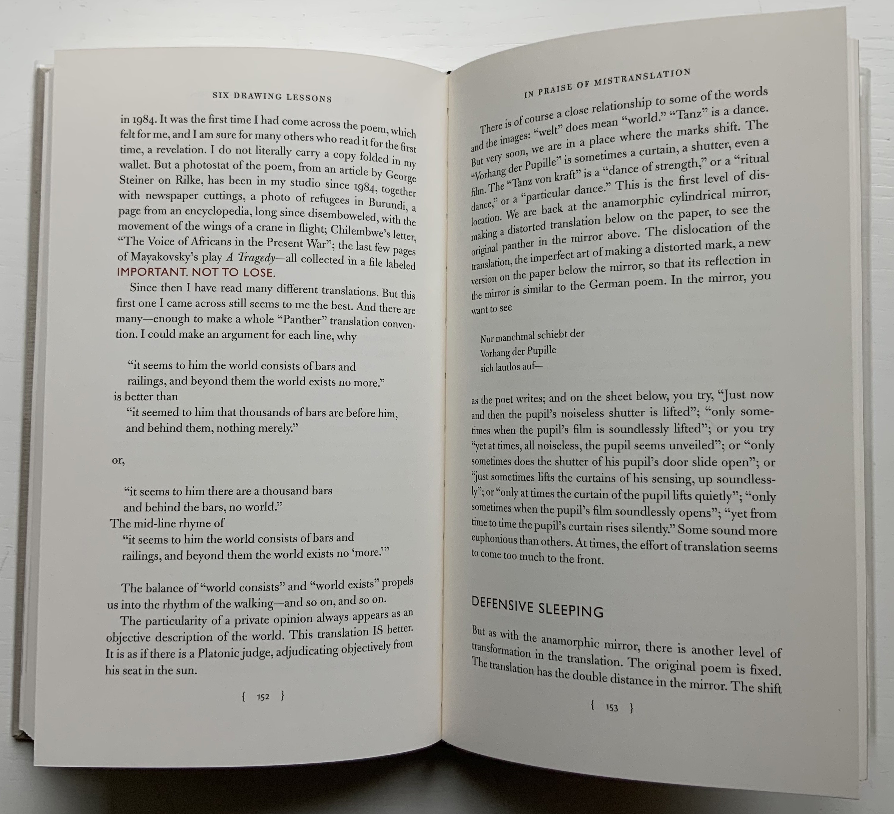
Circling back to the book as artistic medium, the fifth and sixth lessons provide an important insight that underscores Kentridge’s artistry there. “Lesson Five: In Praise of Mistranslation” reproduces Rilke’s “Der Panther” and Richard Exner’s translation of it in full. In that same lesson, Kentridge presents us with a montage of the feline transformations and names the works from which they come, one of them of course being Lexicon.
Before going back to Lexicon for the cat, the reader/viewer would do well to wait for Kentridge to expand in the sixth lesson on the lines describing the panther’s walk around his cage as “a dance of strength round a centre where a mighty will was put to sleep”. He writes:
There is no avoiding it. …it is the circle in the studio, the endless walking around the studio, … Again here we go back to Rilke’s panther, and the radical insufficiency, the radical gap in the center. There has to be some gap, some lack, which provokes people to spend 20 years, 30 years, making drawings, leaving traces of themselves. It has to do with the need to see oneself in other people’s looking at what you have made.
With that, remember the cat — metamorphosing from the Italian coffee pot that slips from Lexicon‘s gutter, prowling from right to left, turning back into the coffee pot, striding from left to right and then being sucked into the center. Can you ever look the same way at the gutter of a book?
Kentridge, William. 2012. Six Drawing Lessons, Charles Eliot Norton Lectures, Harvard University. Six videos from the Mahindra Humanities Center, posted 14-15 January 2020. Lesson 1, Lesson 2, Lesson 3, Lesson 4, Lesson 5, Lesson 6. Accessed between 1 April 2019 and 21 July 2021.
Krauss, Rosalind E. 2017. William Kentridge. Cambridge, Mass: MIT Press.
Mudam Luxembourg. 11 – 12 Jun 2021. “Sibyl“. Announcement. Accessed 22 July 2021. “Waiting for the Sibyl, co-commissioned by the Théâtres de la Ville de Luxembourg, Teatro dell’Opera di Roma and Dramaten – Stockholm and created in collaboration with choral director and dancer Nhlanhla Mahlangu and composer Kyle Shepherd, unfolds in a series of six short scenes, …”
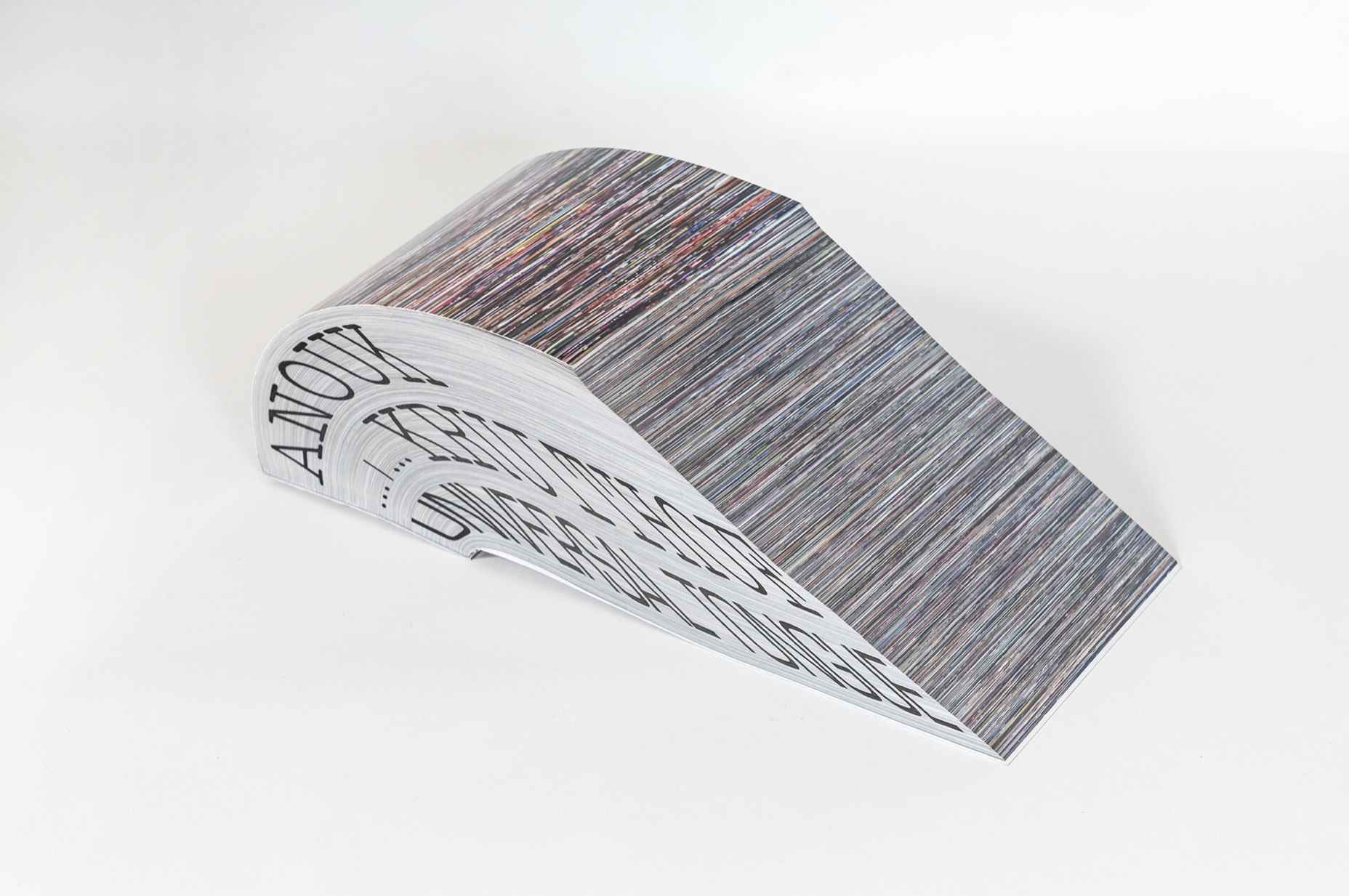
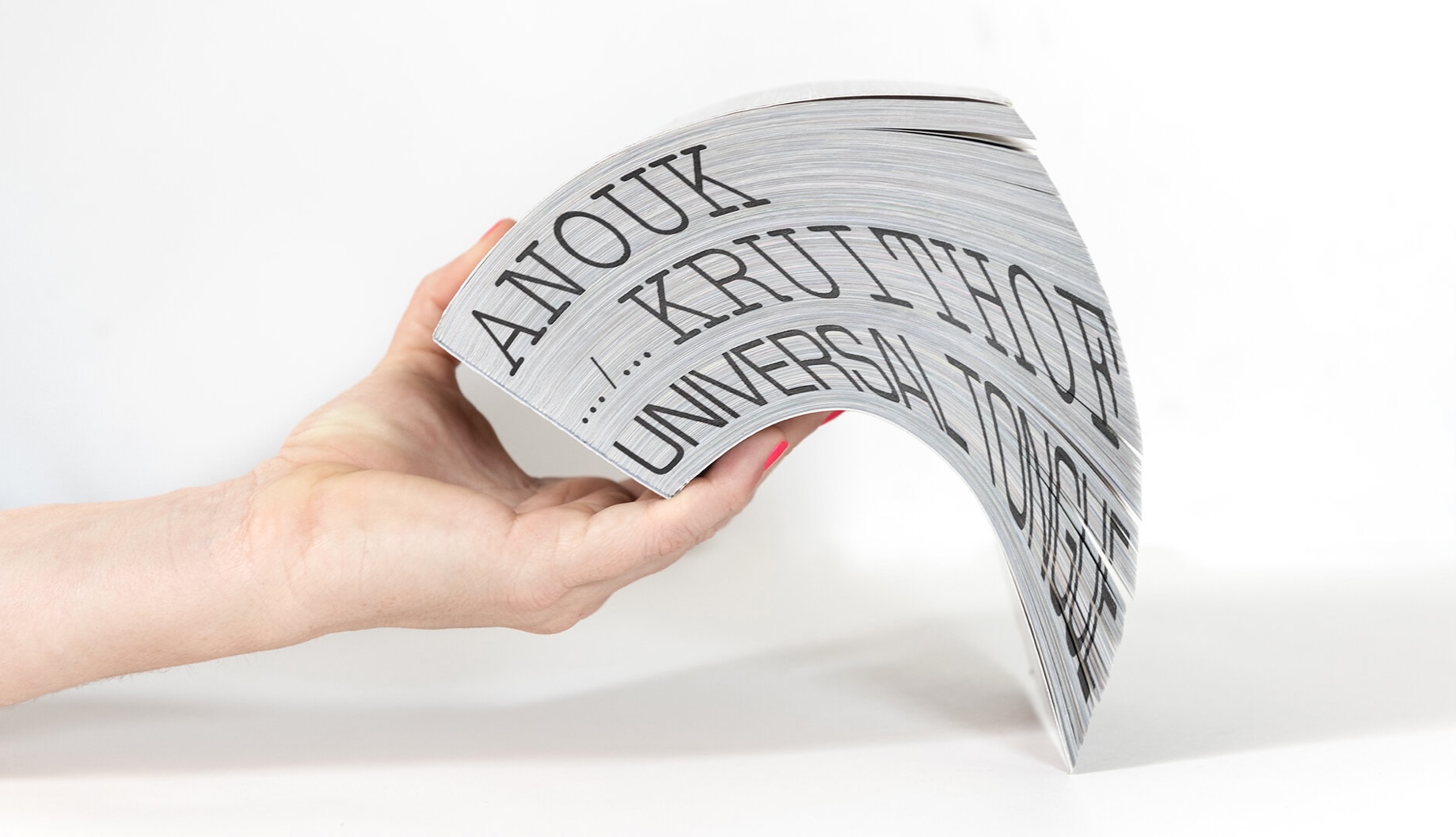
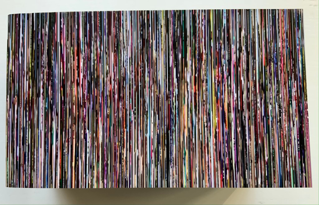
Universal Tongue(2021) Anouk Kruithof Paperback with fore-edge printing. H100 × W170 × D75 mm, 2008 pages. Edition of 500. Acquired from Art Paper Editions, 15 May 2008. First two photos: Courtesy and permission of the artist. Third photo: Books On Books Collection. Displayed with permission of the artist.
If ever a book danced, it is this one. It is a tango between Anouk Kruithof‘s images and Jurgen Maelfeyt‘s design. It is a global line dance with a team of 50 researchers from across the globe. It is a rave, sourced from 8800 online dance videos. It is a still point in motion against Kruithof’s choreographed four-hour eight-channel video version.
Photos: Books On Books Collection. Displayed with permission of the artist.
Photos: Books On Books Collection. Displayed with permission of the artist.
From the artist’s and publisher’s description: This book shows how dance can be a way of knowing about the world. It is by no means exclusive, final, or academic. It is a statement. Organized in alphabetical order by the first letter of each dance style, it confirms the horizontality of Universal Tongue, by erasing typical categories of the world order, such as country, continent, or culture. Instead, it points us towards a more inclusive world with a limitless exchange—a world where simply everyone is a dancer.
Universal Tongue also neatly uses the vertical surfaces of the codex. The bottom-edge printing of name and title calls to mind Around the Corner by Ximena Pérez Grobet. The fore-edge effect of the full-page bleeds calls to mind Irma Boom’s Strip (2003). Both techniques evoke the book form’s ability to embrace. As the physical and haptic constant alongside the digital sourcing, production and video installation, Universal Tongueas book shows that traditional dance and the book remain undiminished in cultural relevance.
AUTOMAGIC (2016)
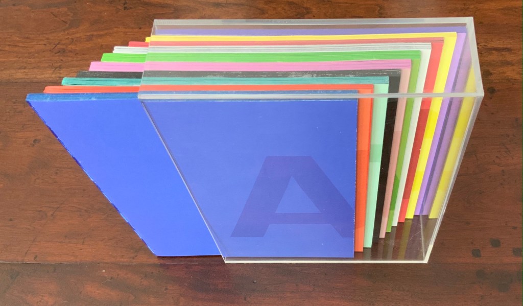
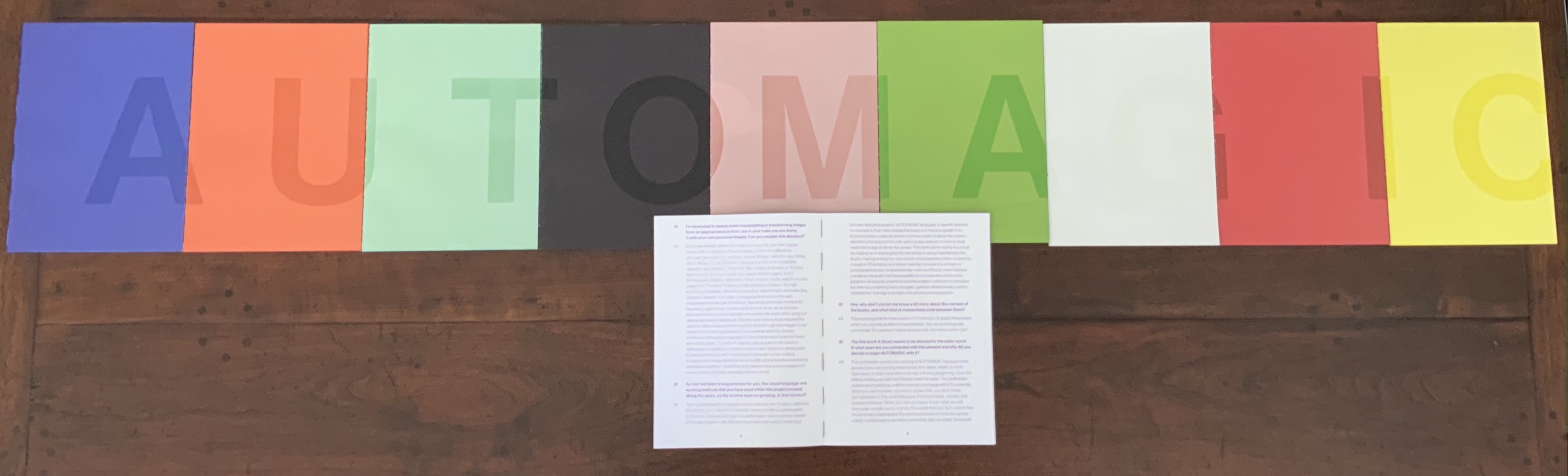
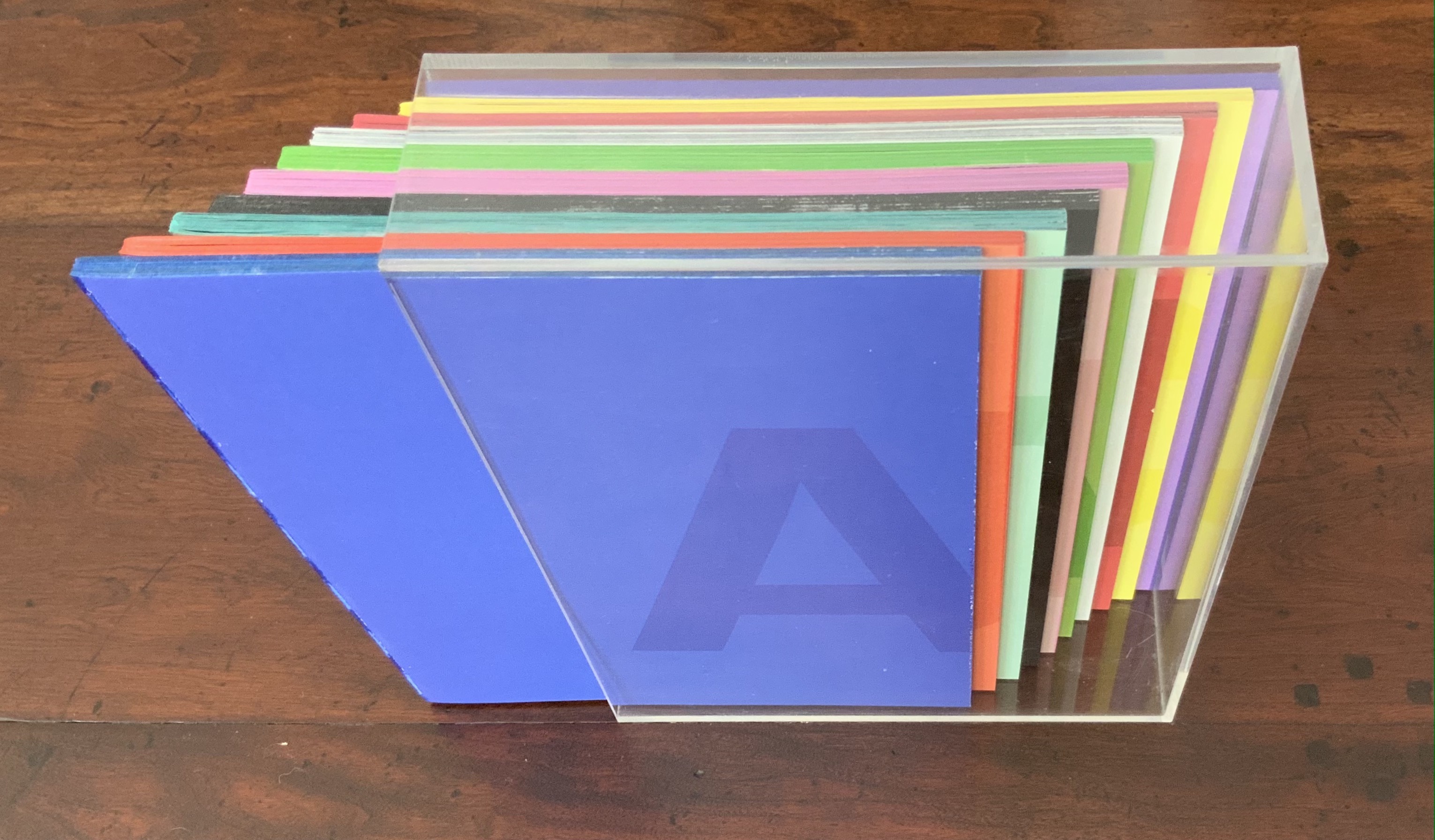
AUTOMAGIC (2016) Anouk Kruithof Transparent acrylic box holding 10 booklets without covers. Box: H235 x W173 x D53 mm; Booklets: H228 x W170 mm each; 768 pages. Edition of 1000. Acquired from the artist, 14 April 2017. Photos of the work: Books On Books Collection. Displayed with permission of the artist.
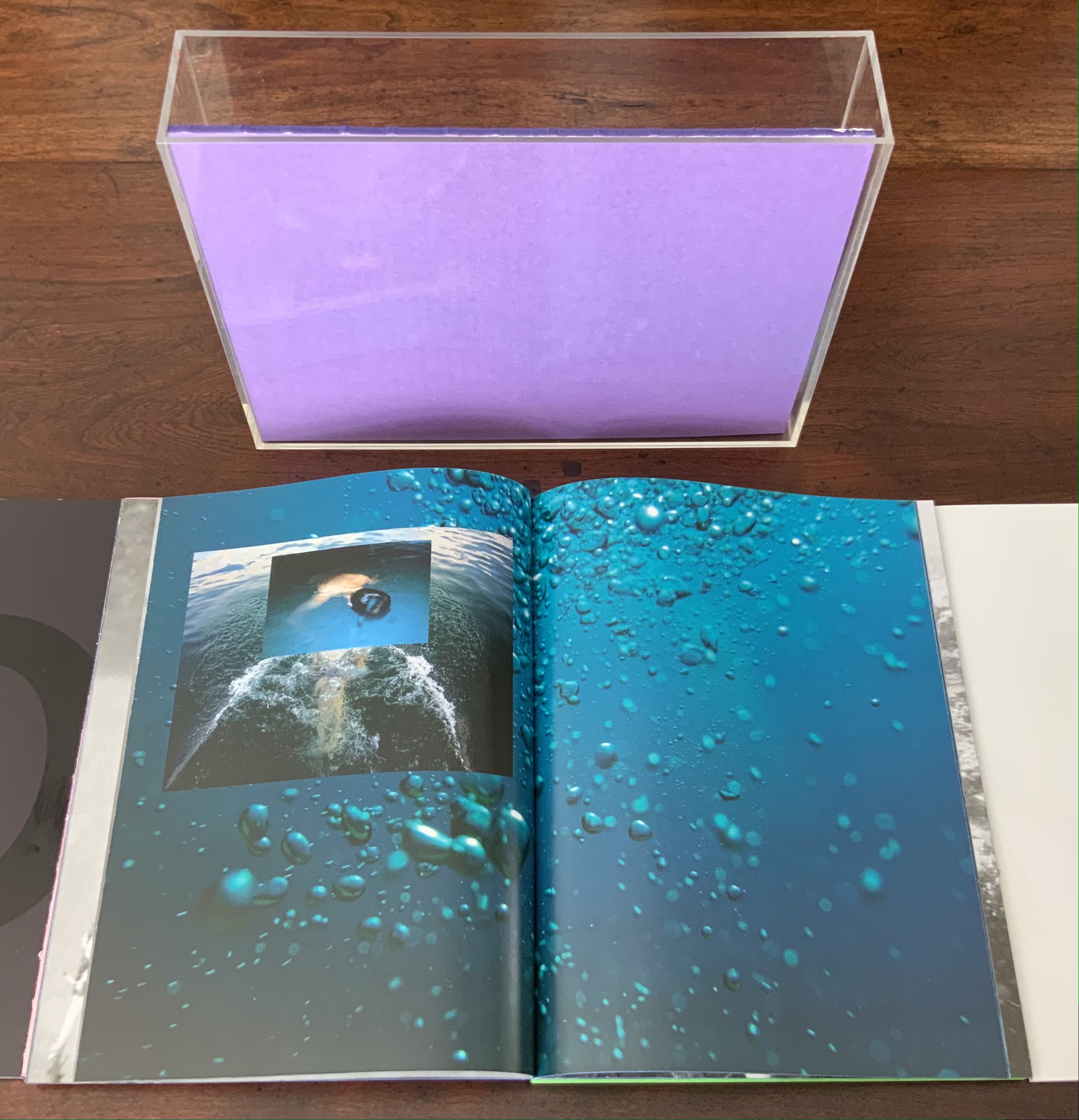
Unlike Universal Tongue, which is based on found images, AUTOMAGIC is drawn from a database of images created (and still being created) by Kruithof herself over the years. With a skill in book artistry as much as photographic artistry, she has curated, edited and montaged the images into nine differently colored booklets, bound by a transparent acrylic shell. As with Universal Tongue, the work is a collaboration, this time with Piera Wolf, the Zurich half of W-E Studio, on the design, and Iñaki Domingo, photographer and professor at the Istituto Europeo di Design, on the text. Domingo’s interview of Kruithof for the book provides the content for a tenth booklet. It is the purple one, edges color sprayed, bound with exposed purple thread and placed like a colophon looking back over the other differently colored nine “chapters” as Kruithof calls them. Laid out in order, the ten front covers spell out “AUTOMAGIC”. The way the individual letters lap over to the back edge of the next cover nods toward the unity the artist intends as well as the metaphorical unity residing in their database source and acrylic box binding.
The tenth booklet lies open under the other nine spelling out the work’s title; its purple cover can be seen in last position in the acrylic box underneath.
AUTOMAGIC is the first work by Kruithof to come into the Books On Books Collection. Its color and bright materiality continually urge taking it down from the shelf and selecting one of the nine “individual chapters” of this long visual work to re-read (re-see). There is, however, a rhythm to the whole work, so they are best read in pairs or trios.
Chapter A (blue), below left, starts the nine-part work with underwater photos and Kruithof’s signature montages on glossy paper.
Chapter U (orange), below right, shifts to portraiture on plain paper, with montages created by laser-printing photos on top of photos, and interspersed with photos of the blank side of the montages with the edge of the picture frame showing. This movement between the portraits and blanks gives Chapter U an easily detectable inner rhythm, all the better appreciated in its contrast with the preceding and following chapters.
Left: from Chapter A (blue). Right: from Chapter U (orange) front and back.
Chapter T (aqua) shifts back to nature, but a “visually psychedelic” one as Kruithof puts it, achieved with layering photos and editing in Photoshop. It also shifts back to a glossier paper like Chapter A, but the paper is thinner and so saturated with ink that the pages must be carefully separated, slowing down the reader/viewer’s movement through the booklet.
Moving into black and white, Chapter O (black) turns more to human forms and activities, depicted in a mix of straight photos, sometimes layered and some re-photographed analogue photo montages, all printed on the heavier glossy paper used for Chapter A.
Chapter T (aqua), Chapter O (black)
Chapters M (lavender) and A (green) move back into color on plain paper. They are two of the thicker booklets. Both are a blend of the human and nature, both have frequent carefully constructed arrangements of evidence of human impact on nature, with Chapter A building this theme more intensively.
Chapter M (lavender), Chapter A (green)
Chapter G (white) has a frenetic almost violent quality in its images and their manipulation. It alternates images of objects (broken windows, destroyed brick walls, melted candles, a partly erased blackboard) with those of humans contorted by awkward poses, layered photos or editing. While the chapter has shifted back to the thicker glossy paper of Chapter A (blue) and Chapter O (black) and has picked up the black and white rhythm of Chapter O, a burst of melted colored candles interrupts that BW rhythm half-way through before letting it return. This frenetic Chapter G feels like a build-up to a distraught Chapter I (red).
Chapter G (white)
Chapter I (red) juxtaposes self-portraits of distress (on matte paper) with images of a hurricane’s aftermath (on glossy paper). The even division between subjects and type of paper individualizes this chapter and drives home the alternating rhythms of the work as a whole.
Chapter I (red)
Chapter C (yellow) consists of “re-photographed analog photomontages of mausolea and images of color smoke bombs in abstract architectural settings”. If the previous eight chapters have expressed a sense of being in the world, this one expresses a sense of exiting it — a sense that is complicated by the fictive enhancement of the brightly colored Mexican mausolea and the fictive smokescreen attempt to impose a ritual and architectural structure on that exit.
Chapter C (yellow)
Pixel Stress (2013)
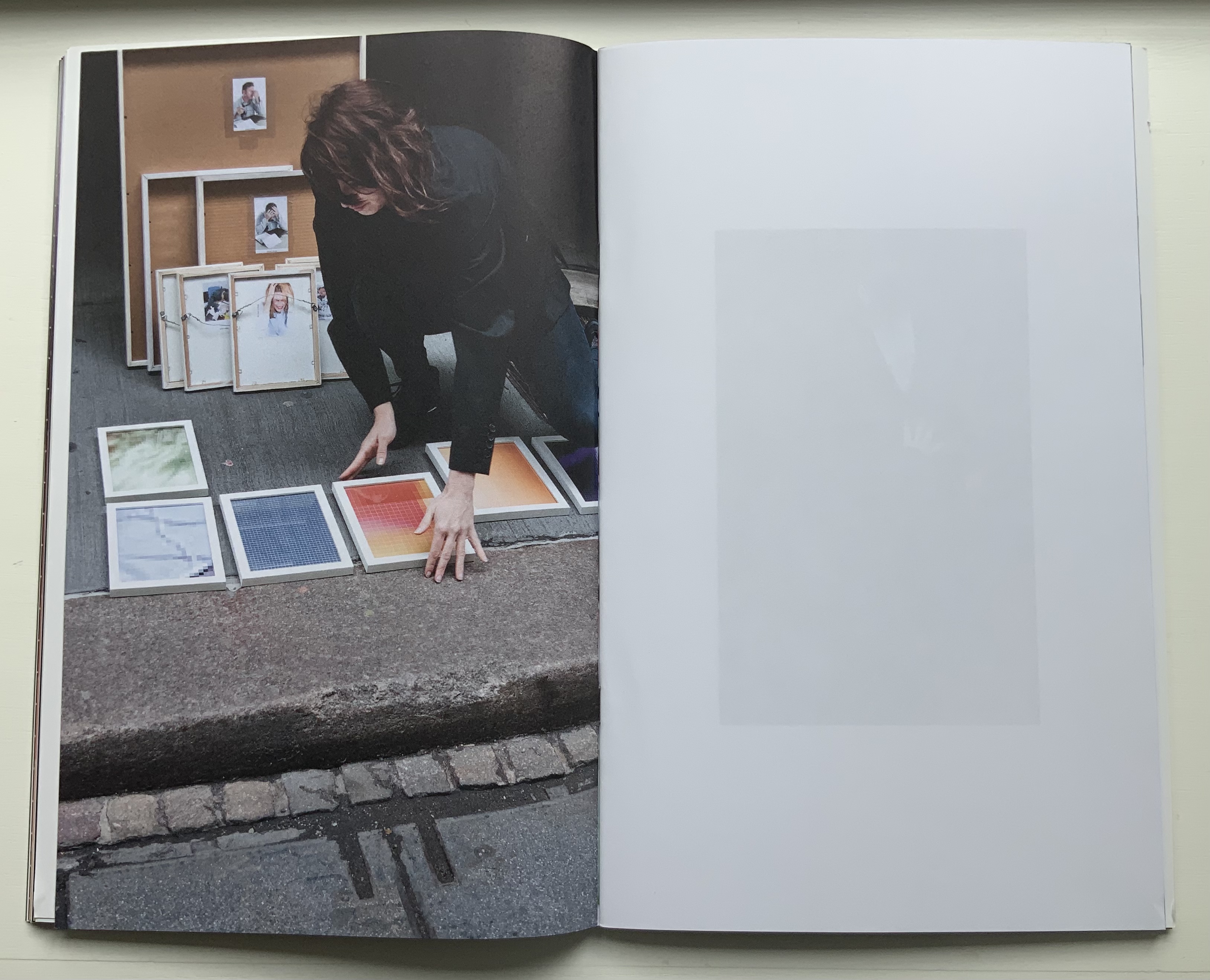
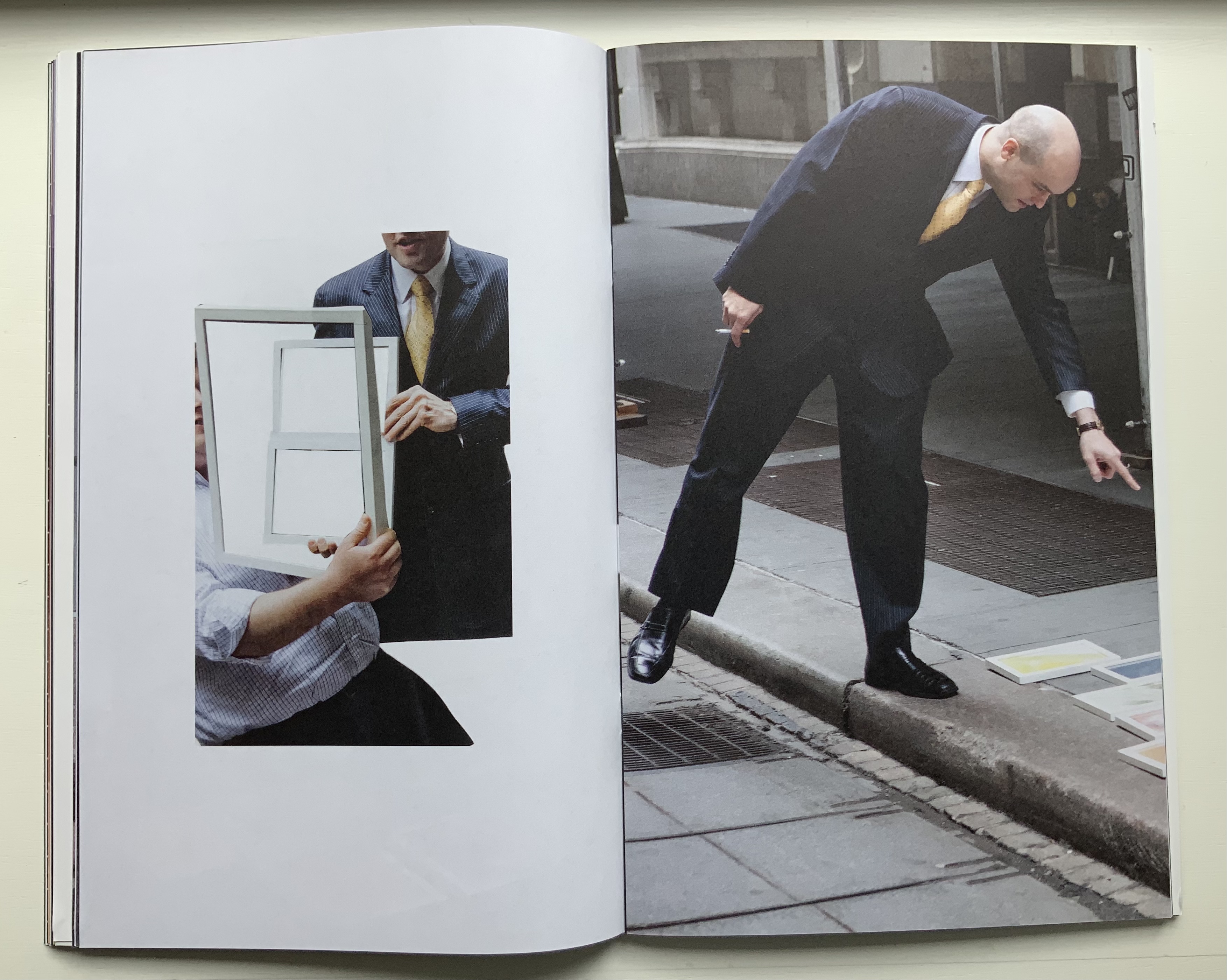
Pixel Stress (2013) Anouk Kruithof Softcover booklet stapled, enclosed in a set of 15 single-fold folios held together with an elastic cloth band. H320 x W200 mm, 100 pages.Edition of 1000. Acquired from RVB, 12 June 2021. Photos of the work: Books On Books Collection. Displayed with permission of the artist.
Remove the elastic cloth band and the 15 folios of glossy prints (H320 x W407 mm) folded in half start to slip and slide. At the center of the inmost folio lies a stapled booklet. The booklet’s front cover serves as the title page, its back cover explains the event that yielded this book.
Single-fold folios slipping apart, front and back covers of the booklet enclosed by the glossy folios.
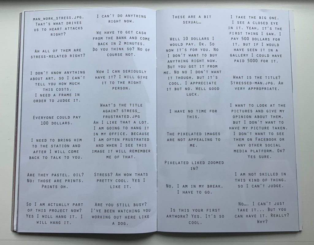
The booklet’s photos and montage pull the reader into the event — busy New Yorkers brushing by and hurrying away, or stopped in their tracks, intrigued and lingering, heads shaking, edging away or absorbed and brightening, then walking off with their prize. Selected comments on the day complete the scenario.
Only the folio that forms the front and back cover presents a complete version of one of the prizes that a New Yorker might have taken away. The print is a detail enlarged from the thumbnail image “WOMAN_IN_STRESS.JPG”, reproduced on the back of the print.
Clockwise: Front of the folio that is the front and back cover of the book. Back of the folio. Upper right of the book’s “inside back cover” showing the jpeg.
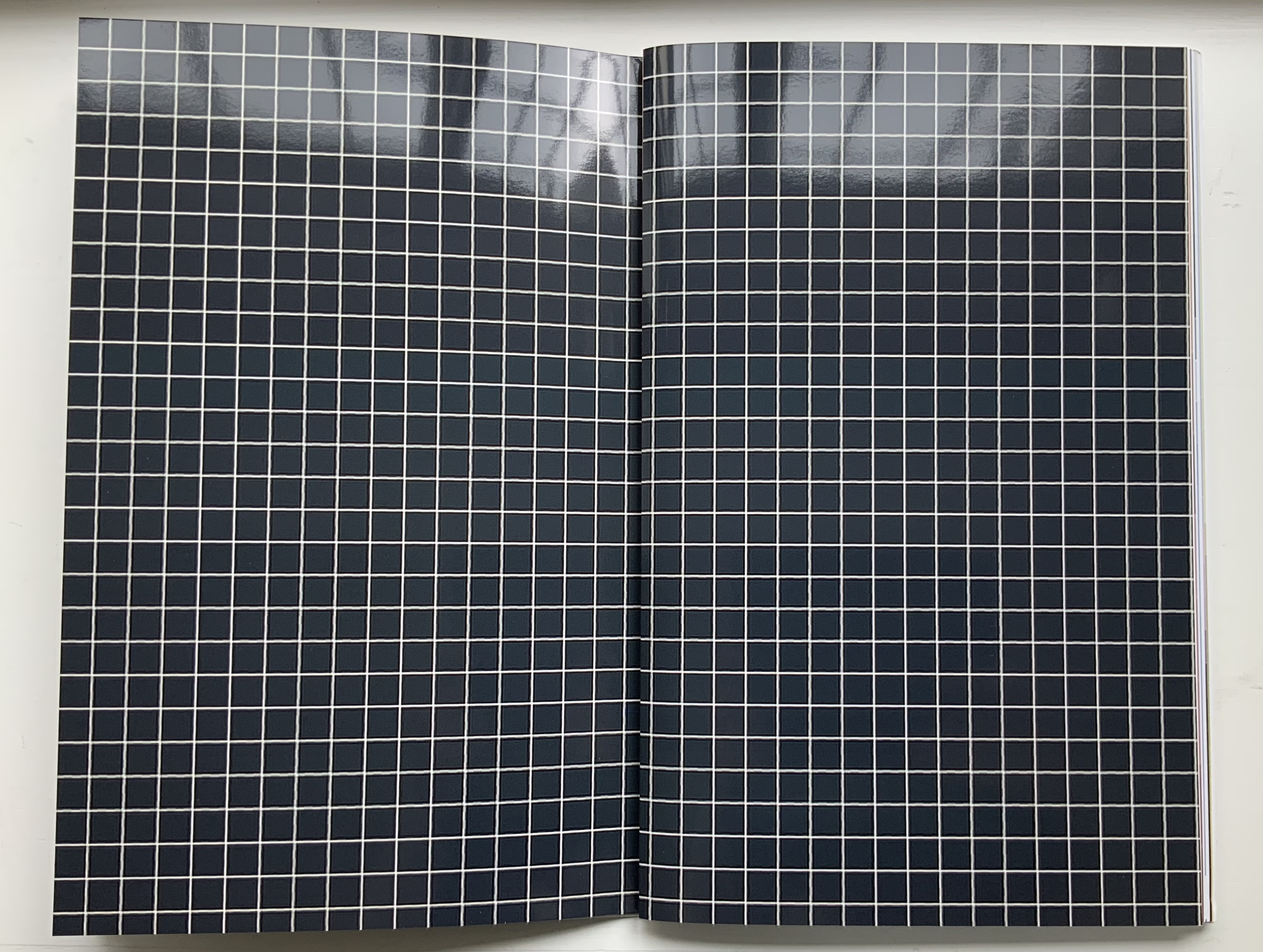
All of the other prizes are transformed in the book into beautifully aligned verso and recto pages. Thus the recto page of the glossy white-on-black grid in this double-page spread below is a bundle of single-fold, gathered folios. The least nudge shifts the bundle to the right exposing the underlying folio: half white-on-black grid, half umber-to-gold enlarged detail of the image “STRUGGLING-WITH-STRESS.JPG”, which appears on the reverse of the enlargement.
Fifty-two color photographs and photo-montages make up the content of Pixel Stress. Glorious as they are in their photographic language, it is the language of the book, spoken fluently by Kruithof and her collaborator Rémi Faucheux of RVB, that makes Pixel Stress a work of art.
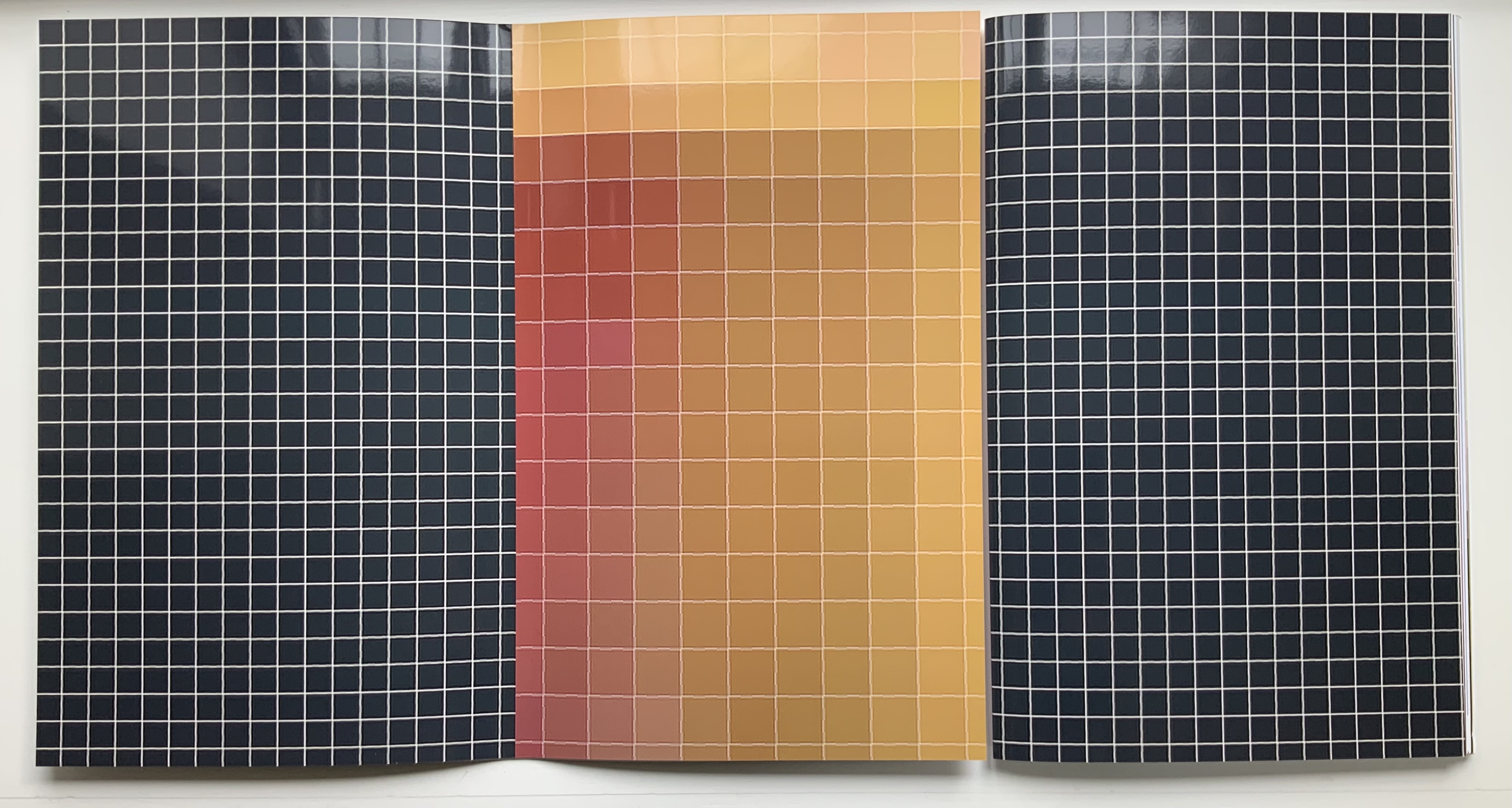
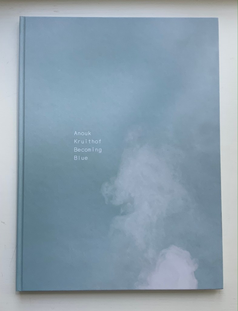
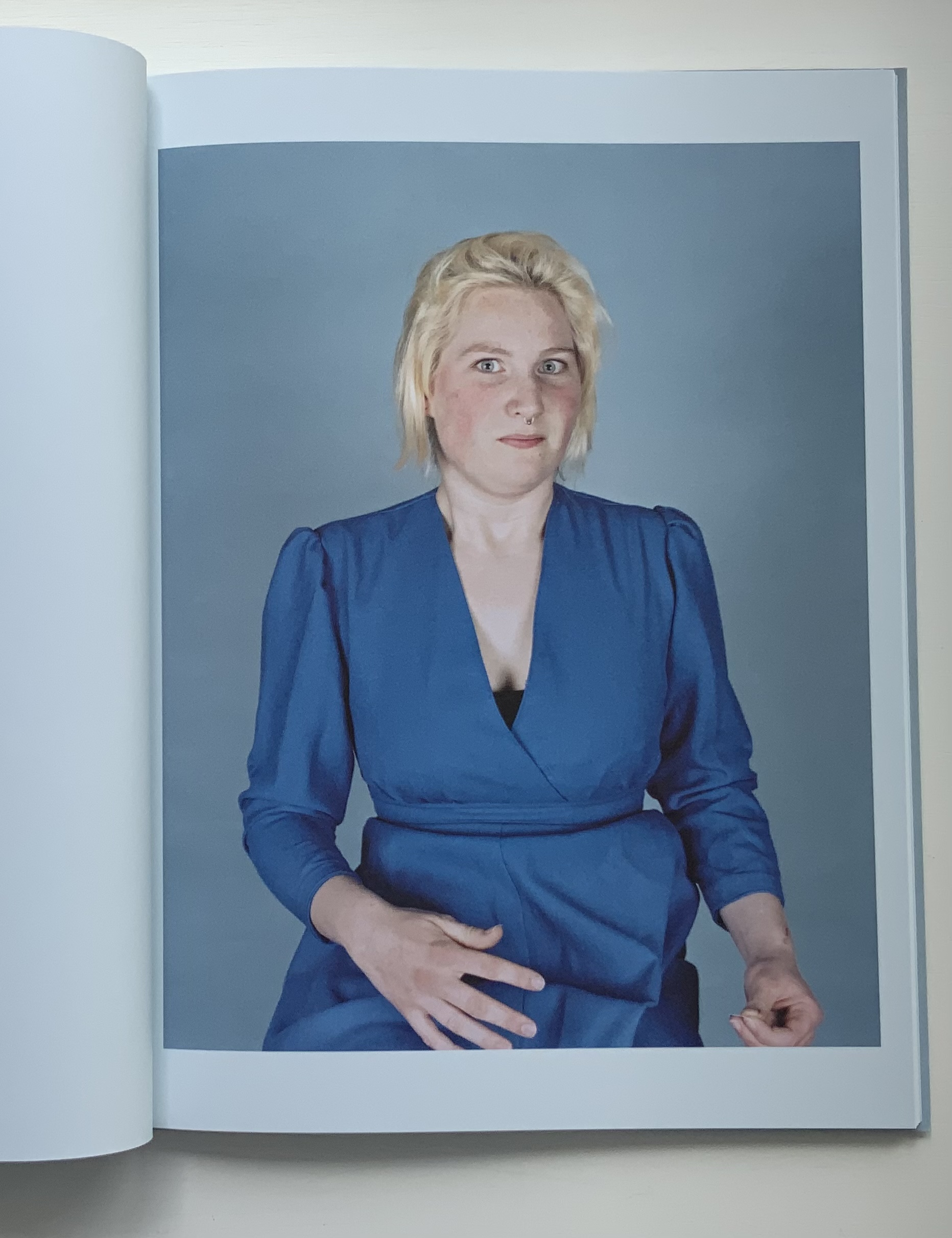
Becoming Blue (2009)
Becoming Blue (2009) Anouk Kruithof Paperback, sewn. H275 x W205 mm, 102 pages. Limited edition of 750. Acquired from the artist, 12 June 2021. Photos of the work: Books On Books Collection. Displayed with permission of the artist.
Being the product of a design house (Kummer & Herrman) and photo book publisher (Revolver Publishing), Becoming Blue seems more a showcase of photography rather than of book artistry. It nevertheless reflects Kruithof’s playful investigation of color, creative interaction with strangers (hers is the extra hand, head of hair or shape peeking out from behind the subjects) and love of the quirky and awkward.
Ephemera
Newsprint
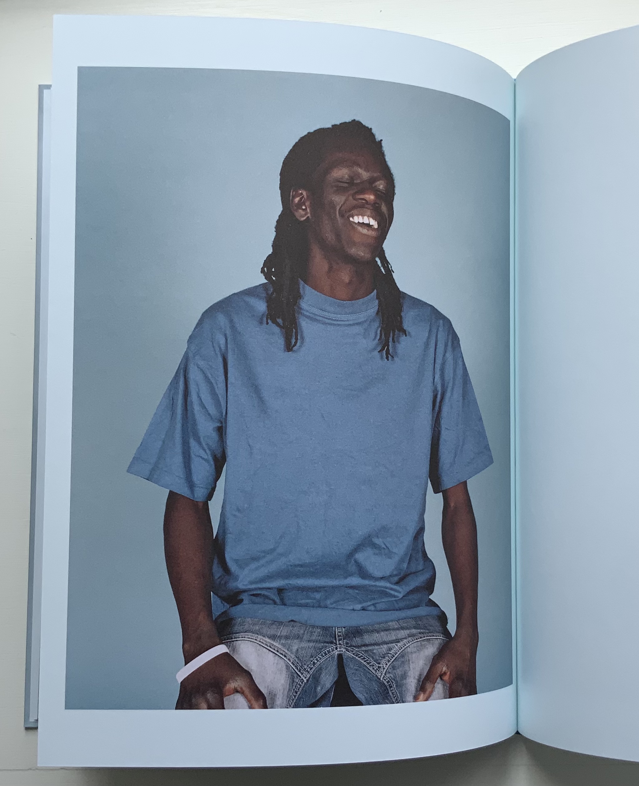
The Daily Exhaustion (2010) Anouk Kruithof Tabloid format newspaper. H275 x W195 mm, 48 pages. Edition of 5000. Acquired from the artist, 12 June 2021. Photos of the work: Books On Books Collection. Displayed with permission of the artist.
A clever contribution to the Dutch self-portrait tradition. Kruithof reworks some of these photos in AUTOMAGIC.
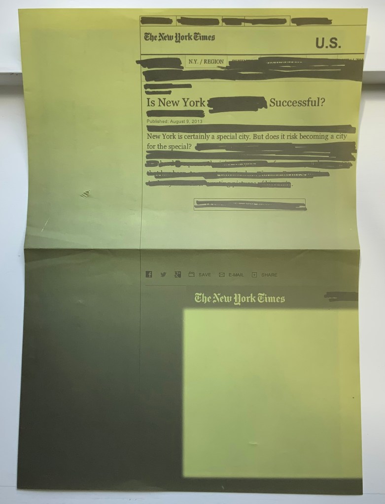
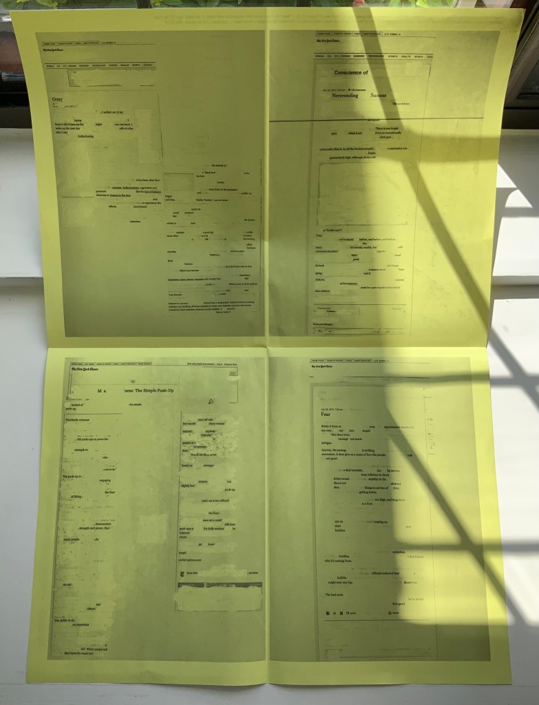
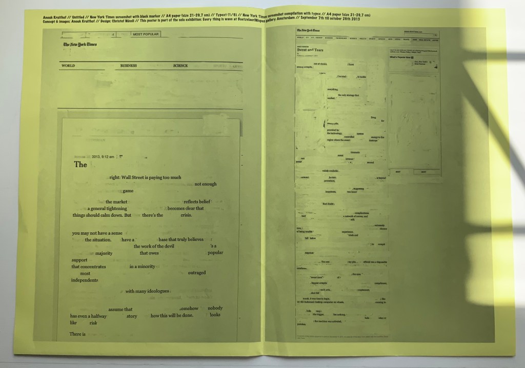
NYC Typext(2013) A2 poster, bw offset print on yellow paper, folded twice to A4. Photos of the work: Books On Books Collection. Displayed with permission of the artist.
NYC Typext is associated with the solo exhibition “Every thing is wave” held in September and October 2013 at the Boetzelaer I Nispen Gallery in Amsterdam.
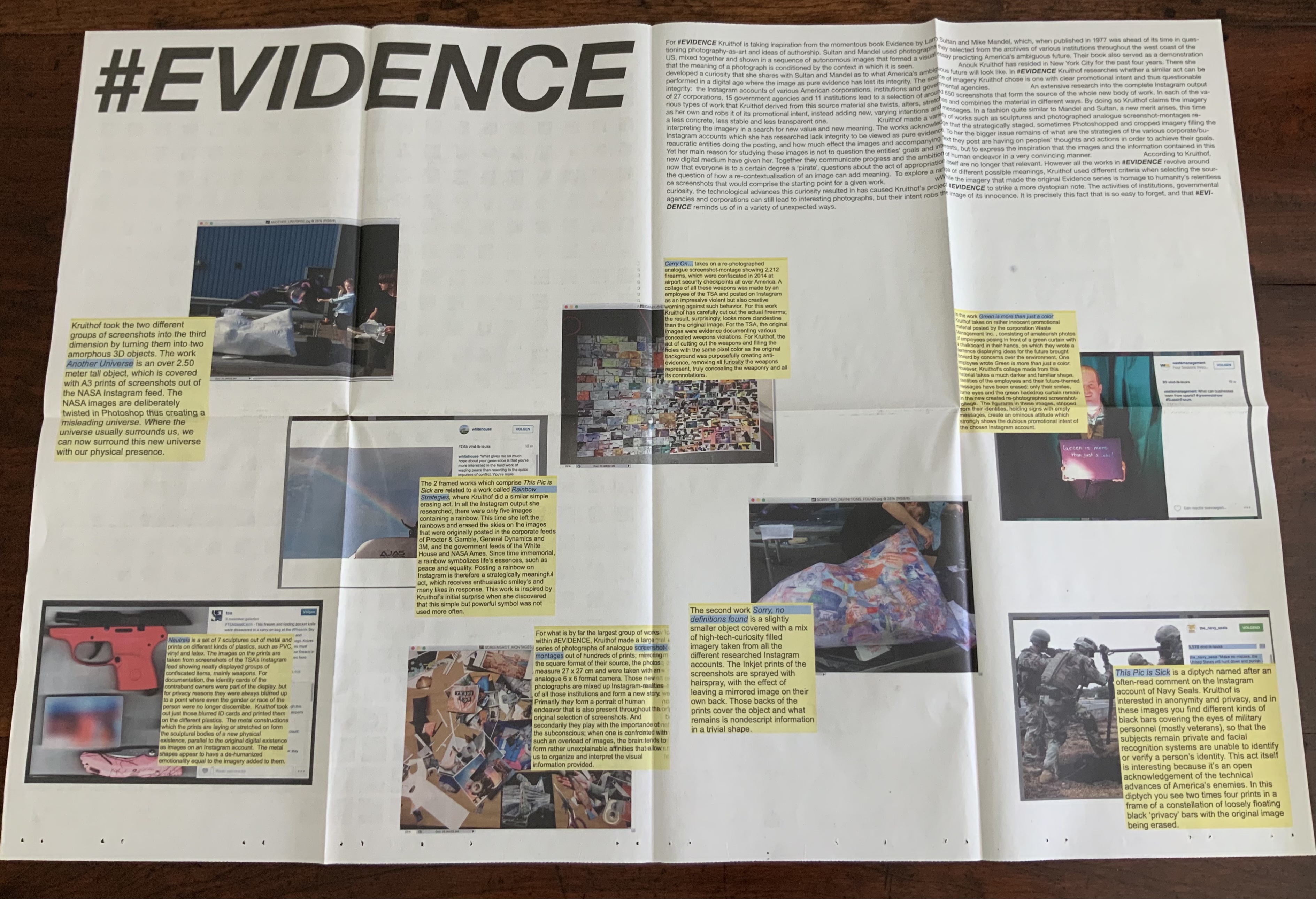
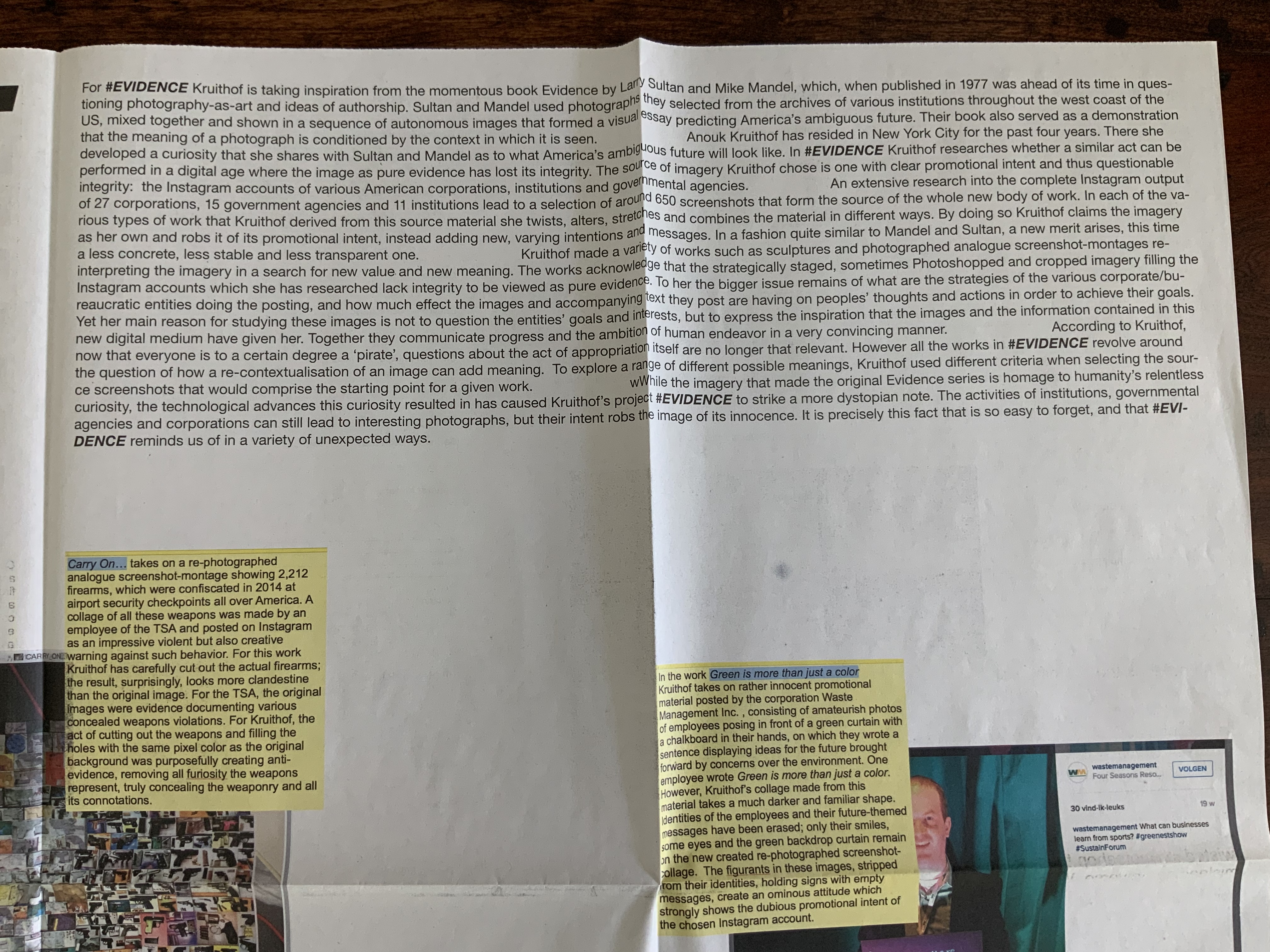
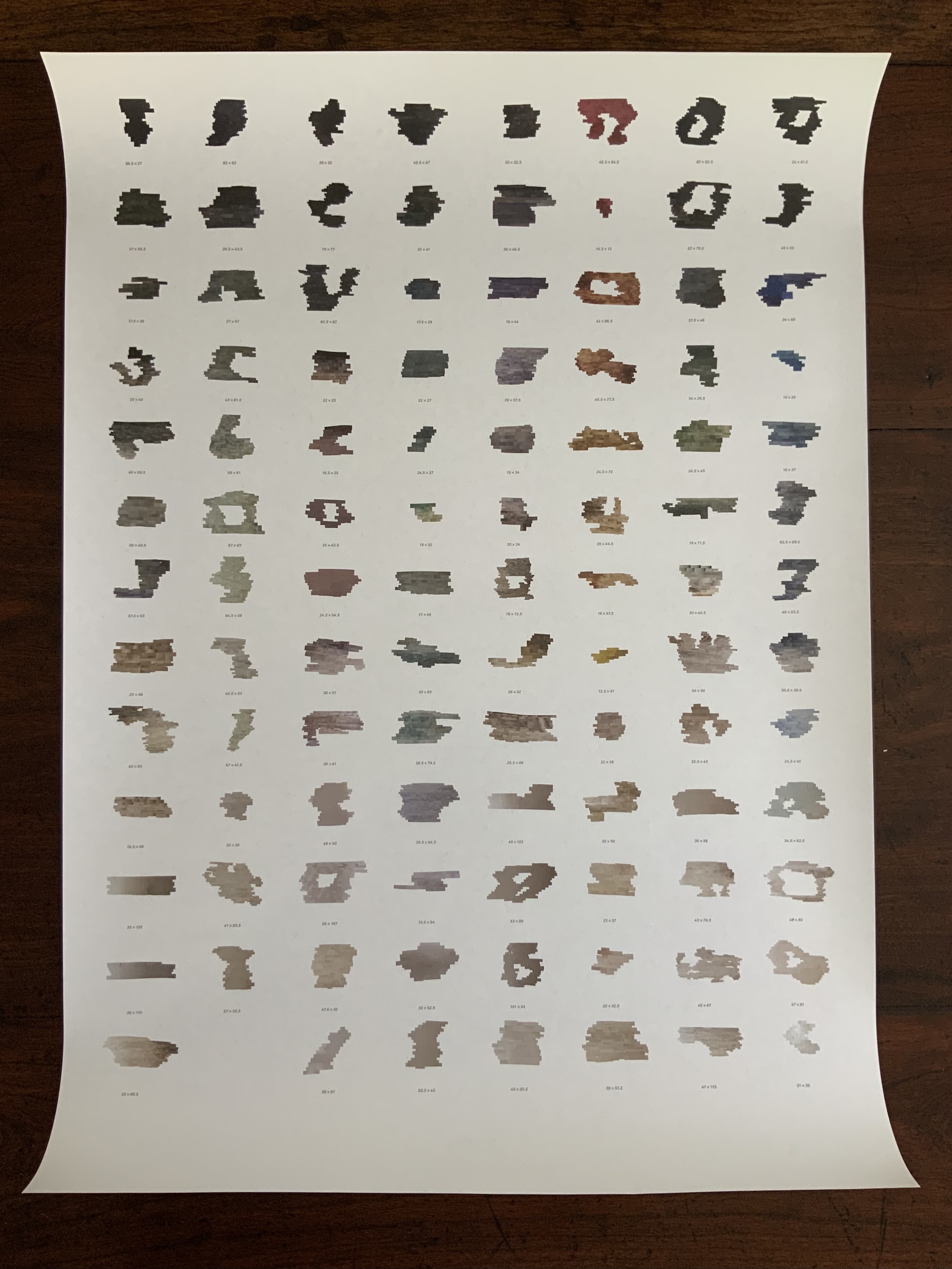
#EVIDENCE (2015) A2 poster, full color newspaper print on recycled paper, folded twice to A4. Photos of the work: Books On Books Collection. Displayed with permission of the artist.
#EVIDENCE is associated with the solo exhibition of the same name held from October through November at the Boetzelaer I Nispen Gallery in Amsterdam.
Poster-Set (2008-12)
Five posters. Edition of 50. Acquired from the artist, 12 June 2021. Photos of the works: Books On Books Collection. Displayed with permission of the artist.
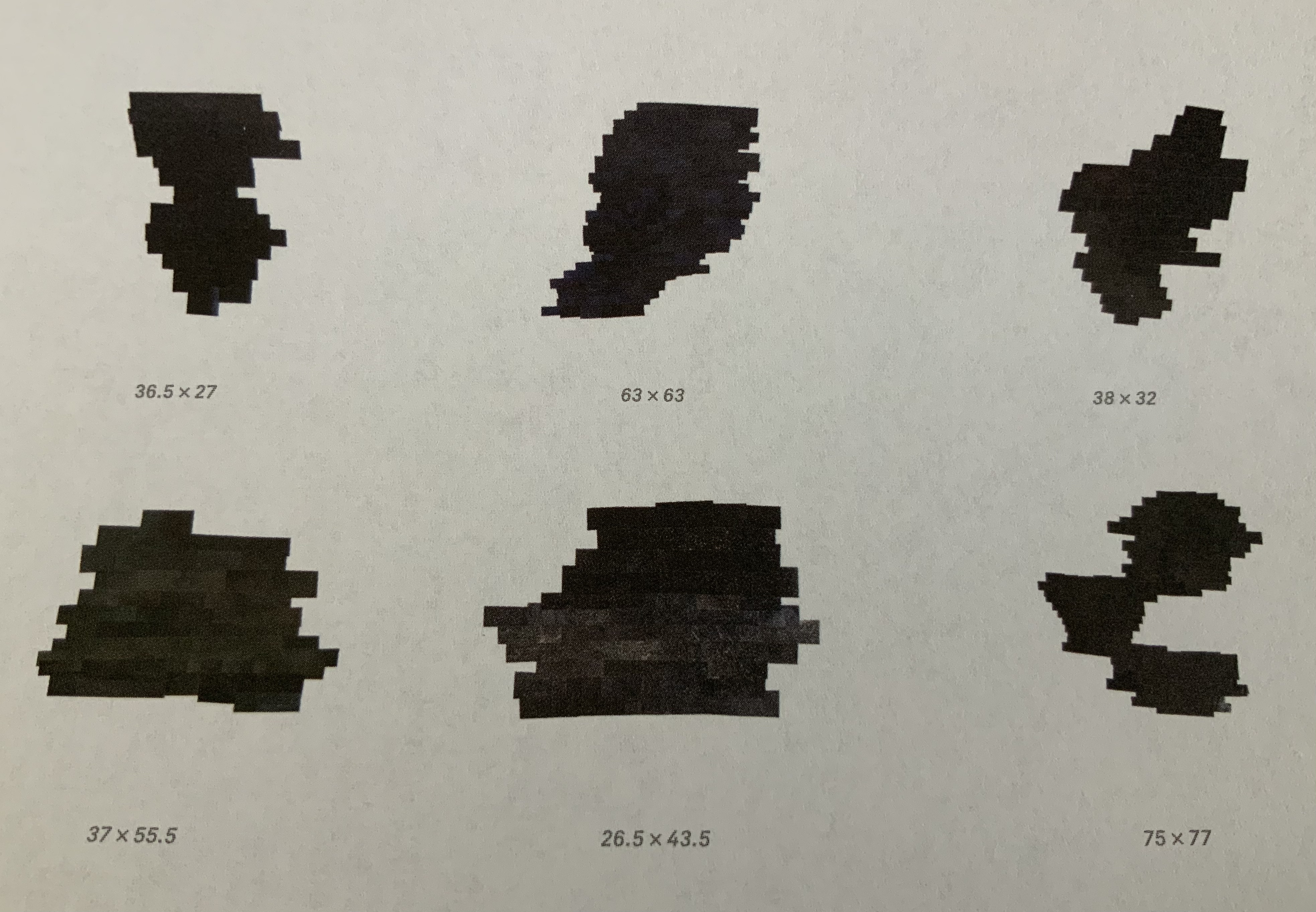
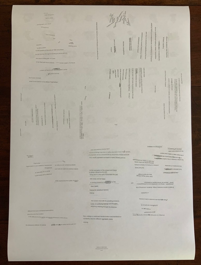
Fragmented Entity (2012) Double-sided A2 associated with the solo exhibition of the same name held at the Boetzelaer I Nispen Gallery in London.
Front of poster and details from upper left and lower right.
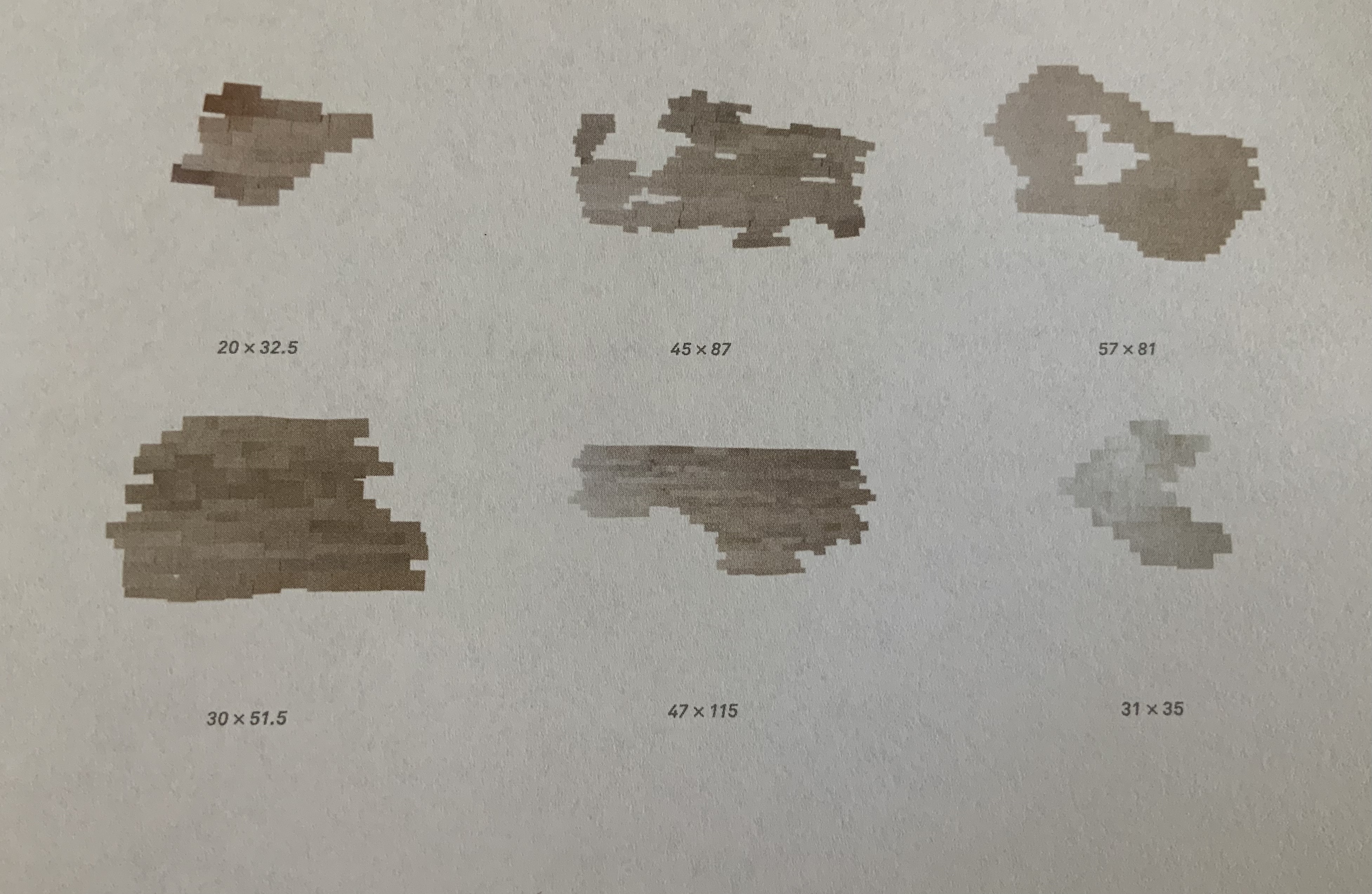
Back of poster.
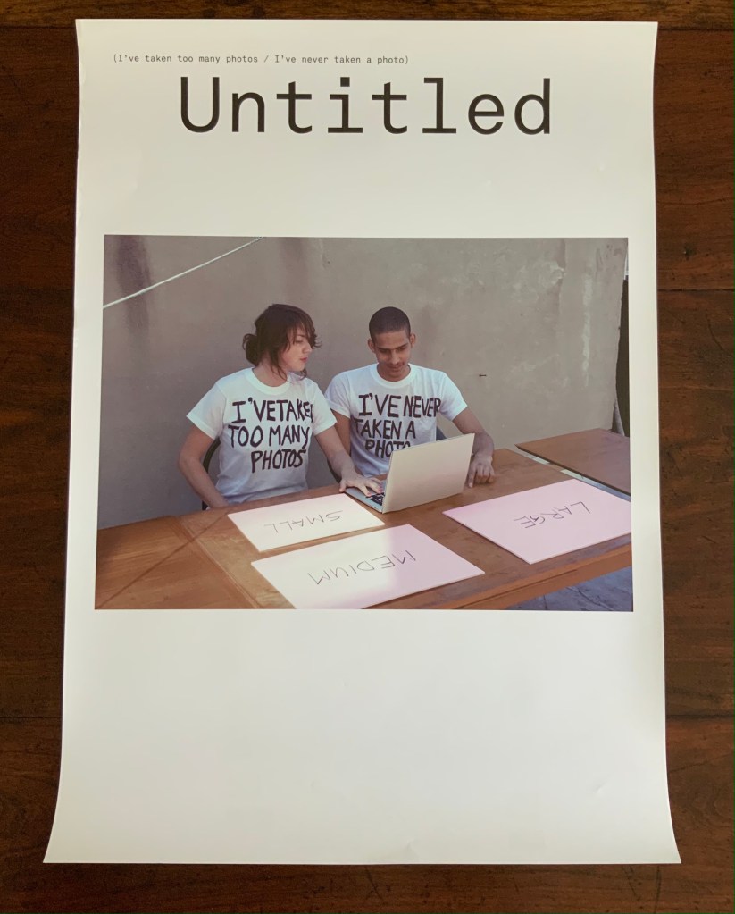
Untitled (I’ve taken too many photos / I’ve never taken a photo) (2012) Double-sided A2 poster, color, first shown at Tour le Templiers, Hyeres, France.
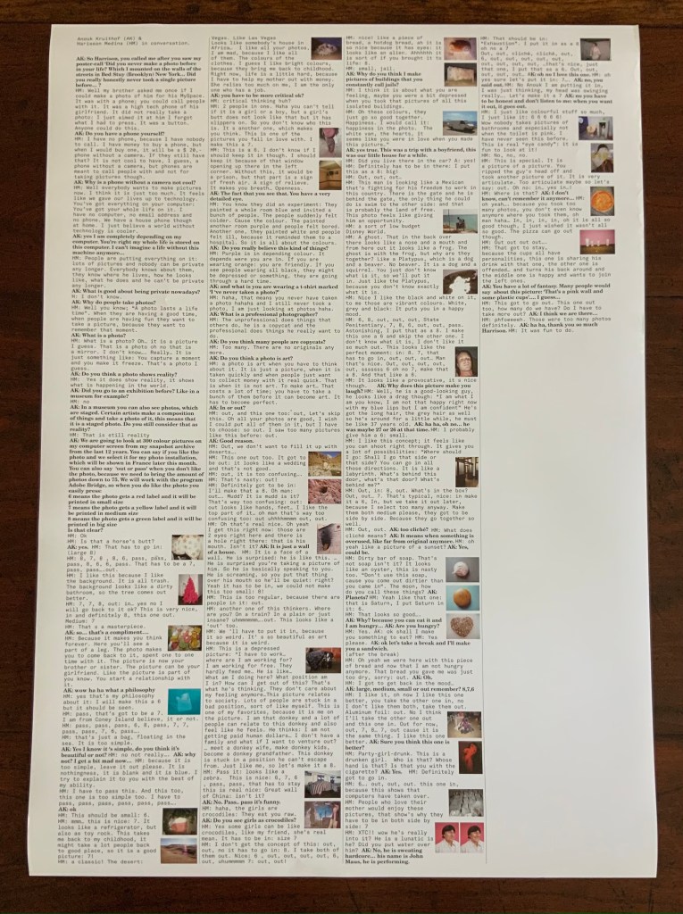
Pictured above with Kruithof is Harrison Medina, who responded to the artist’s ad that read “Did you never make a photo in your life?” Kruithof wanted to engage someone with as little experience of photography as possible to co-edit a selection of photos from her archive. The result was an installation, a book and this poster, on the back of which is printed excerpts from conversations during the editing process.
Back of poster.
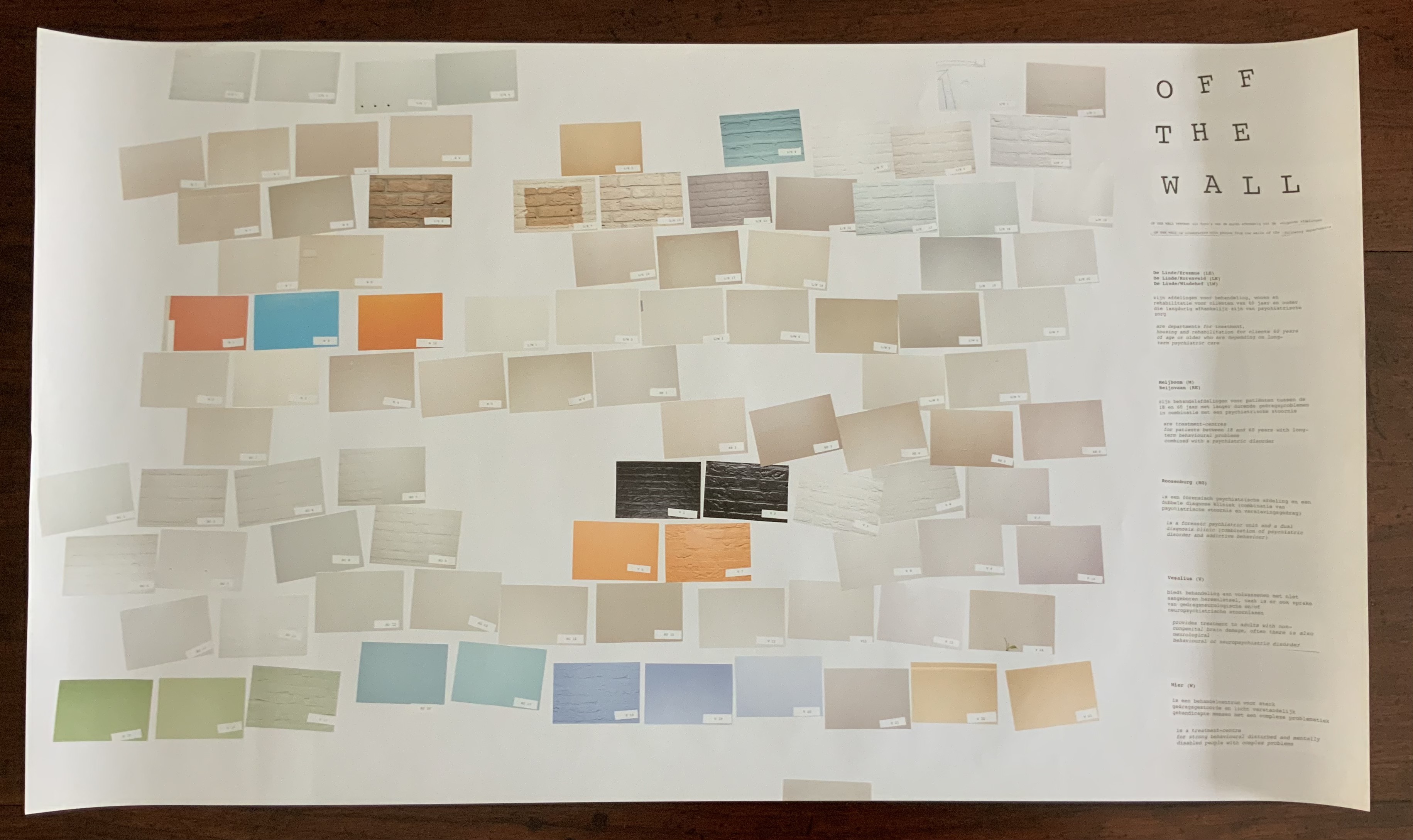
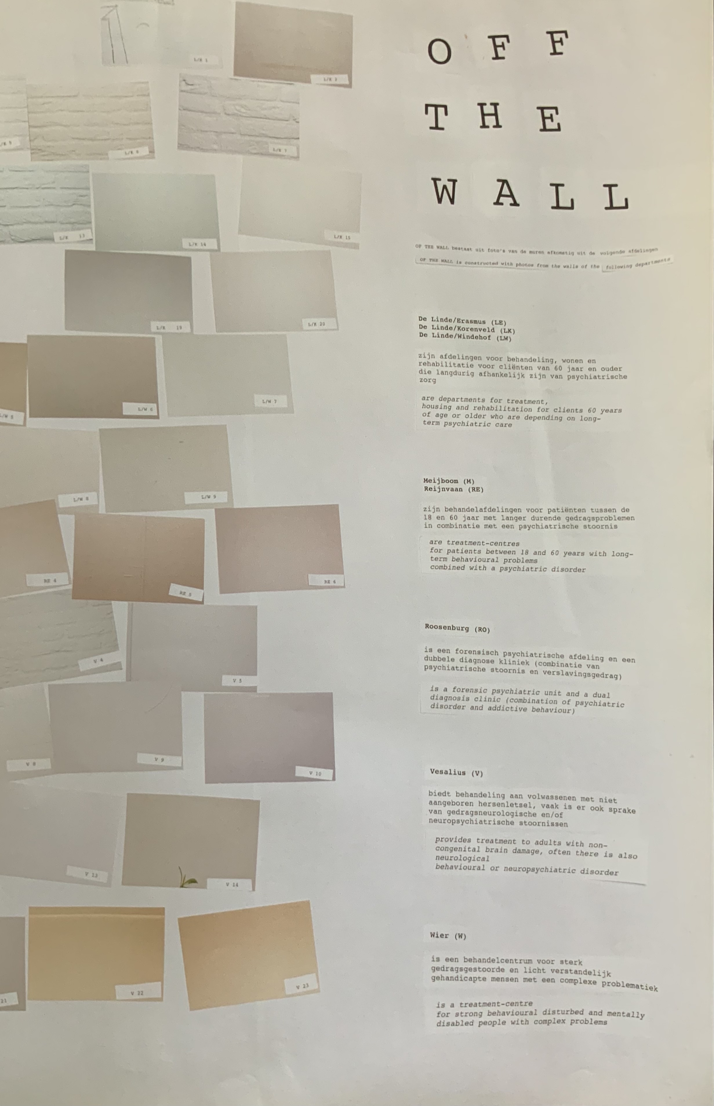
Off the Wall(2011) A3 poster associated with the publication Happy Birthday to You.
Kruithof took photos of walls in mental health institutions then reduced them to color swatches or individual bricks in an unstable wall. Two years before, she had explored another set of color-combined metaphors.
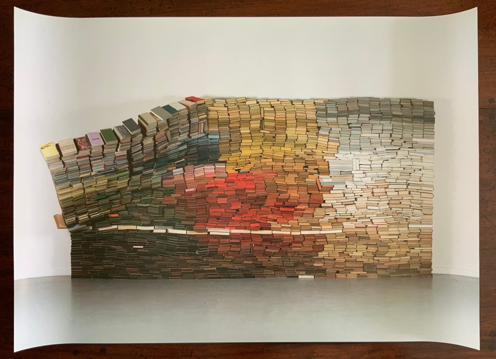
Enclosed content chatting away in the colour invisibility (2009) One-sided A2 Poster, color, on the occasion of the solo exhibition at the Kunstlerhaus Bethanien.
This sculpture consists of approximately 3500 used book obtained from bookshops or a recycling dump and then dyed. The constructed wall is rigged to collapse at some point during the installation, which has taken place in several venues.
Anonymous Poster(2008) 500 x 500 mm. Photos of the work: Books On Books Collection. Displayed with permission of the artist.
This photo montage reflects Kruithof’s early mastery of this element in the language of photography. As can be seen from Universal Tongue, AUTOMAGIC and Pixel Stress in particular, her working of this language, her engagement with friends and strangers, her crossing of borders in geography, media and format, and her fusion of all that into book art are what make her work distinctive.
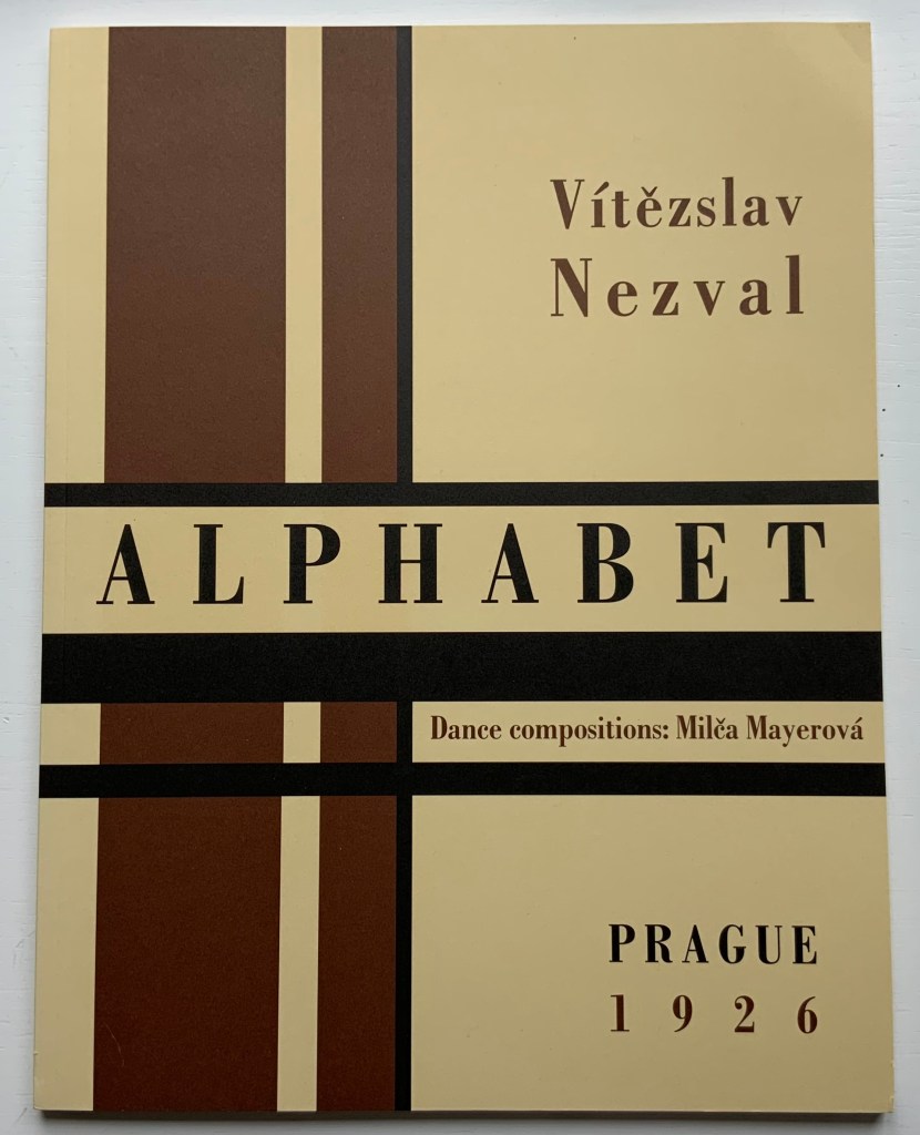
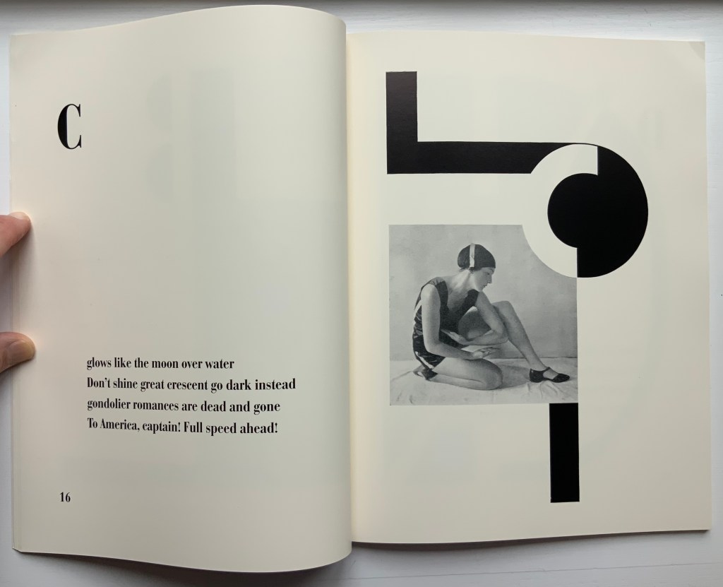
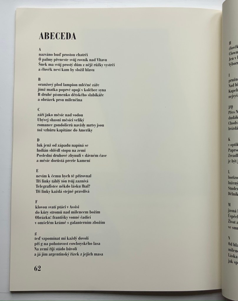
Alphabet (1926/2001) Karel Teige & Vítězslav Nezval / translated by Jindřich Toman and Matthew S. Witkovsky Facsimile and translation of Abeceda. Perfect bound paperback, H305 xW235 mm, 72 pages. Acquired from Ergode Books, 1 July 2021. Photos: Books On Books Collection.
From the Afterword:
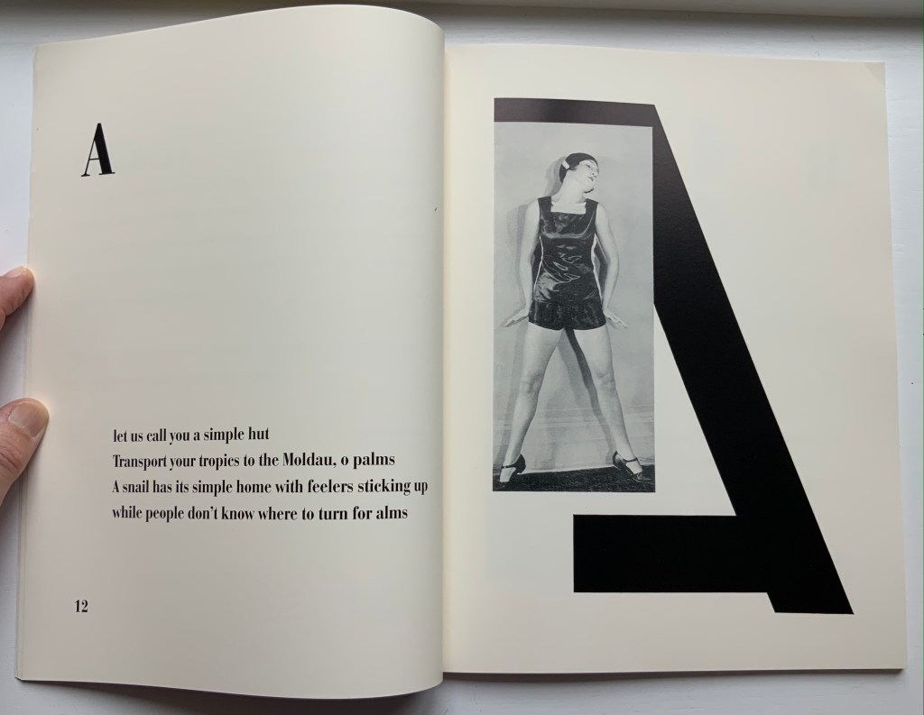
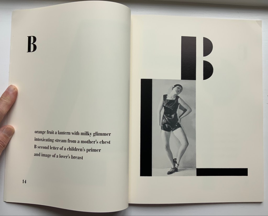
The 1926 book Alphabet (Abeceda) is a landmark achievement in European modernism. Its frequent reproduction in exhibition catalogues and scholarly articles has made it a key symbol of Devětsil (1920-ca. 1931), the Czech artists’ collective within whose ranks the book was conceived, and its importance is increasingly measured in international terms as well. The book consists of a series of rhymed quatrains by Devětsil poet Vítězslav Nezval, titled and ordered according to the letters of the Latin alphabet. Facing each set of verses is a Constructivist photomontage layout by Karel Teige, a painter turned typographer who was also Devětsil’s spokesperson and leading theorist. Teige developed his graphic design around photographs of dancer and choreographer Milada (Milča) Mayerová, a recent affiliate of the group, who had performed a stage version of “Alphabet” to accompany a recitation of the poem at a theatrical evening in Nezval’s honor in April 1926… The project to create a new alphabet epitomizes the proselytizing attitude of avant-gardists in various fields in the years after World War I. From Dada poetry to Constructivist architecture and design, from calls to overhaul theater to revolutions in literary theory, a panoply of experiments took the alphabet as their model or target and disclosed the potency of this elementary linguistic structure as a trope for creative renewal and social revolution.
The Afterword mistakenly asserts that there was no precedent for Mayerová’s choreography and performance of the alphabet. In fact, the Athenian dramatist Kallias (late 5th century BCE?) wrote Grammatike Theoria, sometimes called “a spectacle of letters”, the ABC Show or ABC Tragedy, in which actors and a chorus sang and danced the twenty-four characters of the new-fangled Ionian alphabet. What does seem to be without precedent is the collaboration across poetry, dance, typography, photography and bookmaking.
Carrying on the collaborative tradition and more emphatically challenging gender stereotyping, here is Paulina Olowska dancing Abeceda at the Simon Lee Gallery’s 2019 exhibition of Tomaso Binga/Bianca Menna‘s works, which included Alfabetière Pop (1976), his/her nude alphabet portfolio. If only Tomaso/Bianca or Paulina would find a book artist to reprise the codex part of the collaborative tradition.
Further Reading
“Anthon Beeke“. 21 June 2021. Books On Books Collection.
Culture.pl. n.d. “Paulina Ołowska“. Accessed for update, 31 January 2023.
Gagné, Renaud. 2013. “Dancing Letters: The Alphabetic Tragedy of Kallias”. In Choral Mediations in Greek Tragedy, ed. R. Gagné and M. Hopman, Cambridge University Press 282-307.
Lawler, Lillian. April, 1941. “The Dance of the Alphabet”. The Classical Outlook, 18: 7, pp. 69-71.
Wikipedia. 1 July 2021. “Paulina Olowska“. Accessed 8 July 2021.
Another key performance in Paulina Olowska oeuvre was the Alphabet, which was inspired by the book ABECEDA by Karel Teige, a key figure in the Czech avant-garde who in 1926, in collaboration with Milca Mayerova, created an experimental “mobile alphabet”. Referring to Teige’s project, Olowska combines rhythmicity with a constructivist fascination with typography and points to the rhetorical function of dance: three performers arrange their bodies into 26 letters, from A to Z, confronting the alphabet of written language with the “alphabet” of gestures and movements, creating a new system for expressing meaning. Alphabet was first shown in Berlin in 2005 (Galerie Meerrettich). In 2012 it was exhibited at the Museum of Modern Art in New York, and in early 2014 it was presented at the Museum of Modern Art in Warsaw.” Wikipedia.
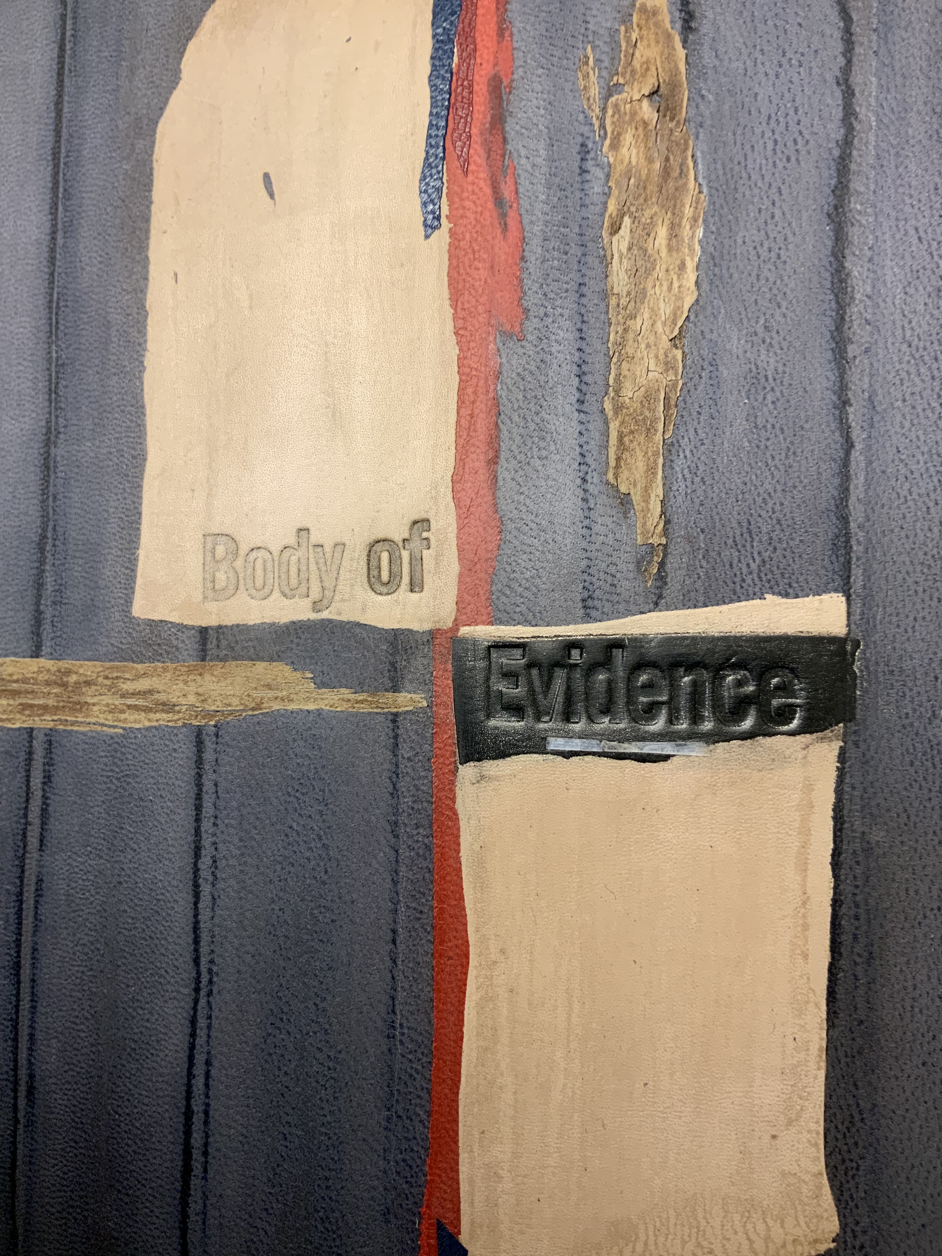
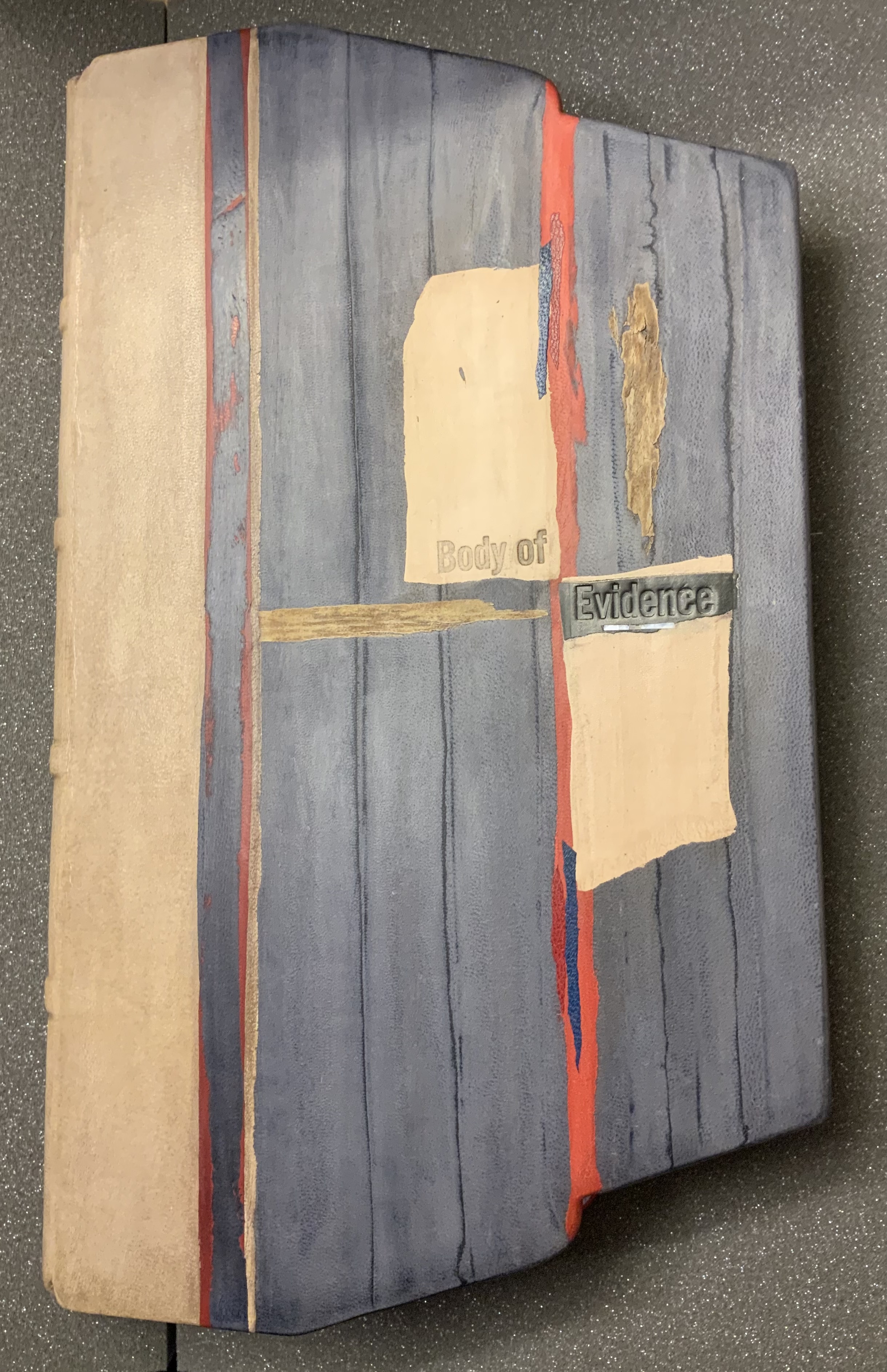
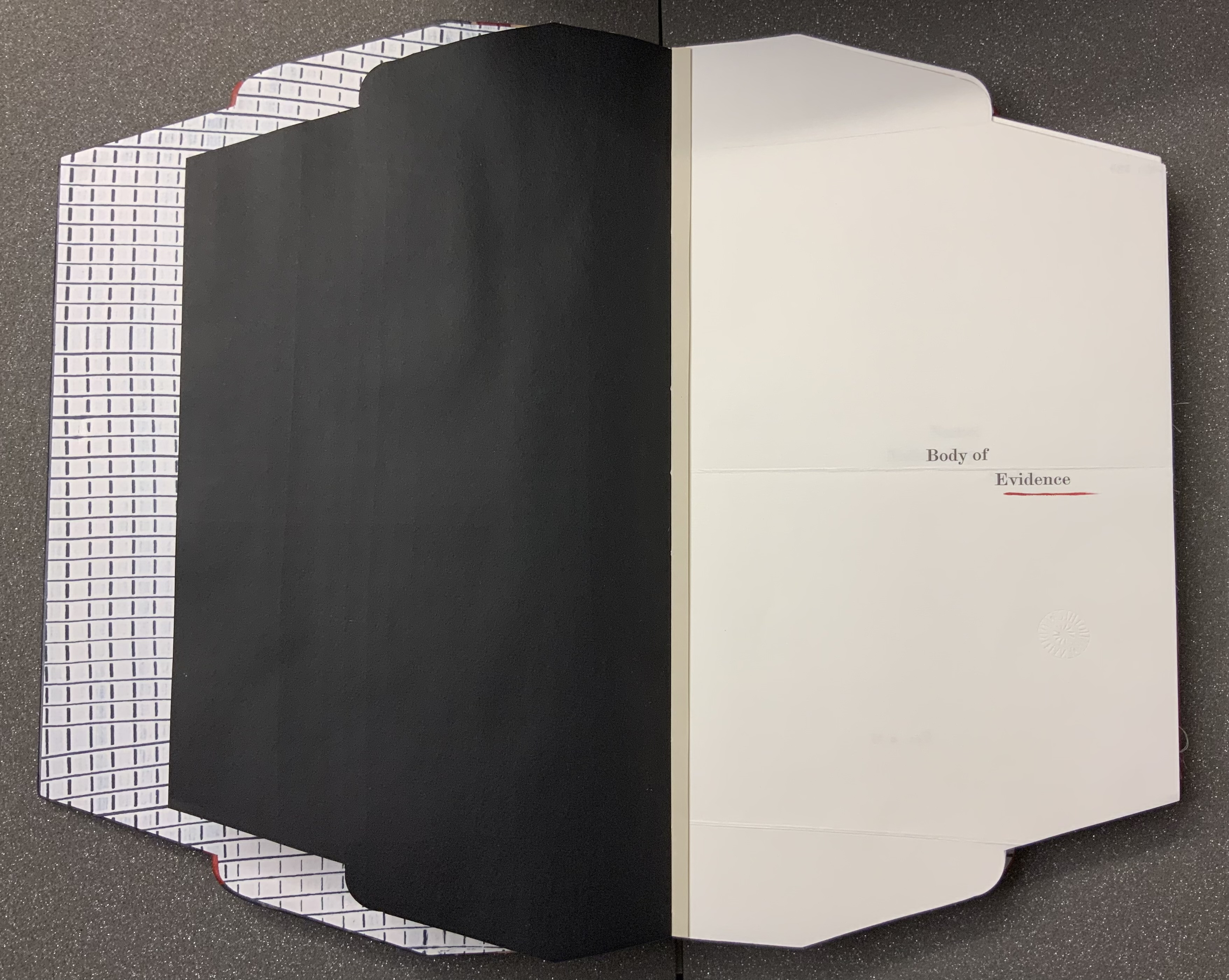
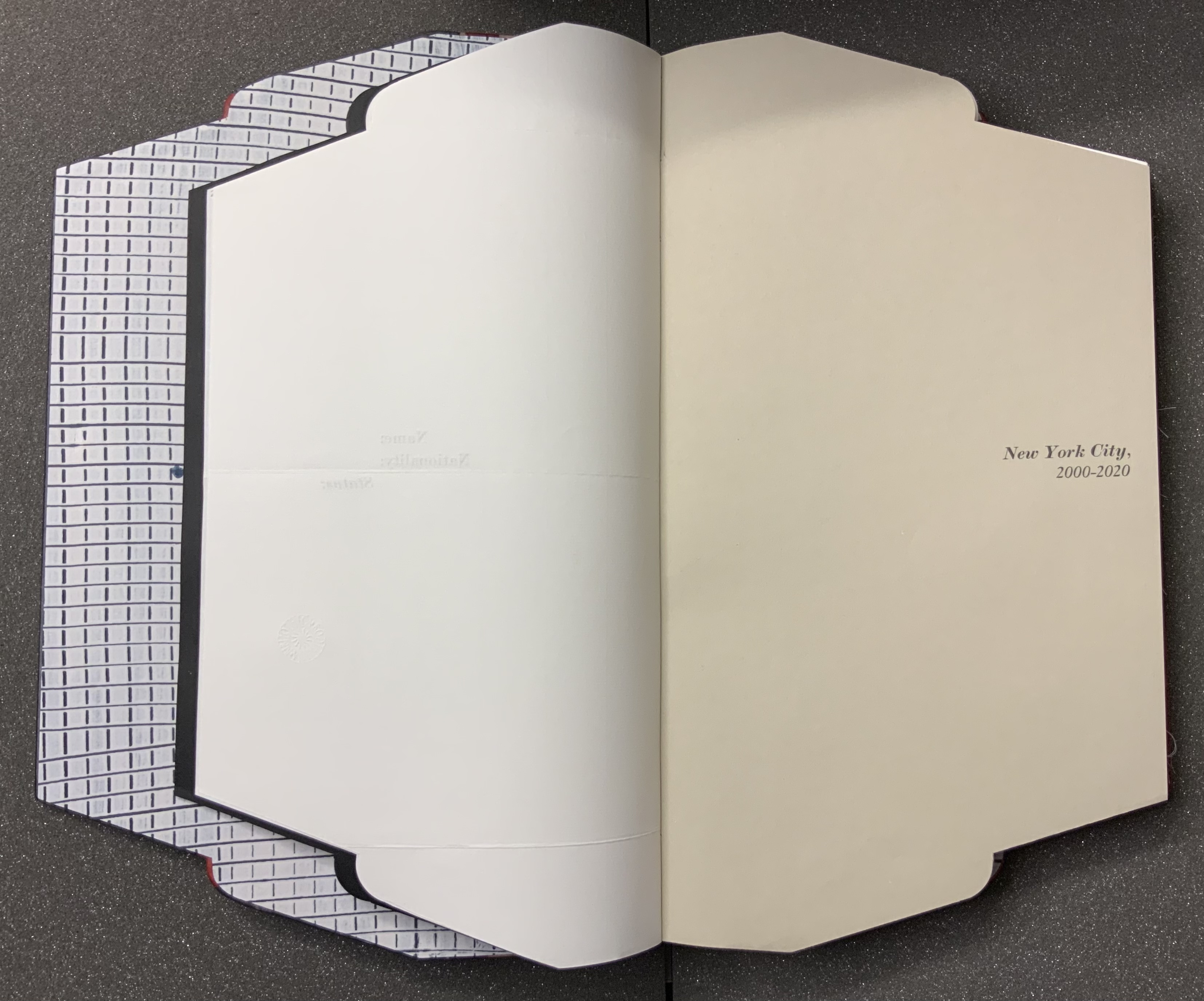
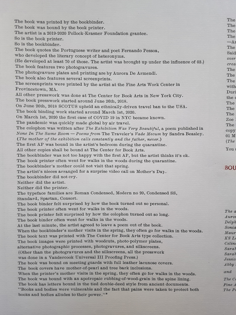
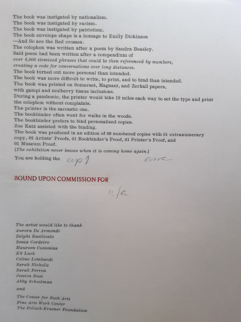
Body of Evidence (2020) Ana Paula Cordeiro Artist’s book. Bound on meeting guards, covers in full leather lacunose panels with tree bark and mother-of-pearl onlays. H16 x W9 in, 30 pages. Somerset, Magnani and Zerkall papers with gampi and mulberry inclusions. Edition of 9; this copy commissioned by the Bodleian Library. Photos: Books On Books Collection, with thanks to Alexandra Franklin, Jo Maddocks and Sarah Wheale of the Bodleian.
When I encounter works of book art, I often recall another collector’s comment — “you don’t collect these works to read them” — and shake my head. Every one of these works expects you to try — even the ones nailed shut, submerged, cast in concrete, burnt to calcification or otherwise hermetically sealed. At their end of the spectrum, those are challenging your expectation that a book is meant to be opened. At the other end are those that “mess with” nearly every material and metaphorical aspect of the book such that they challenge nearly every expectation you might have. Starting with its title and shape, Body of Evidence falls at this end of the spectrum.
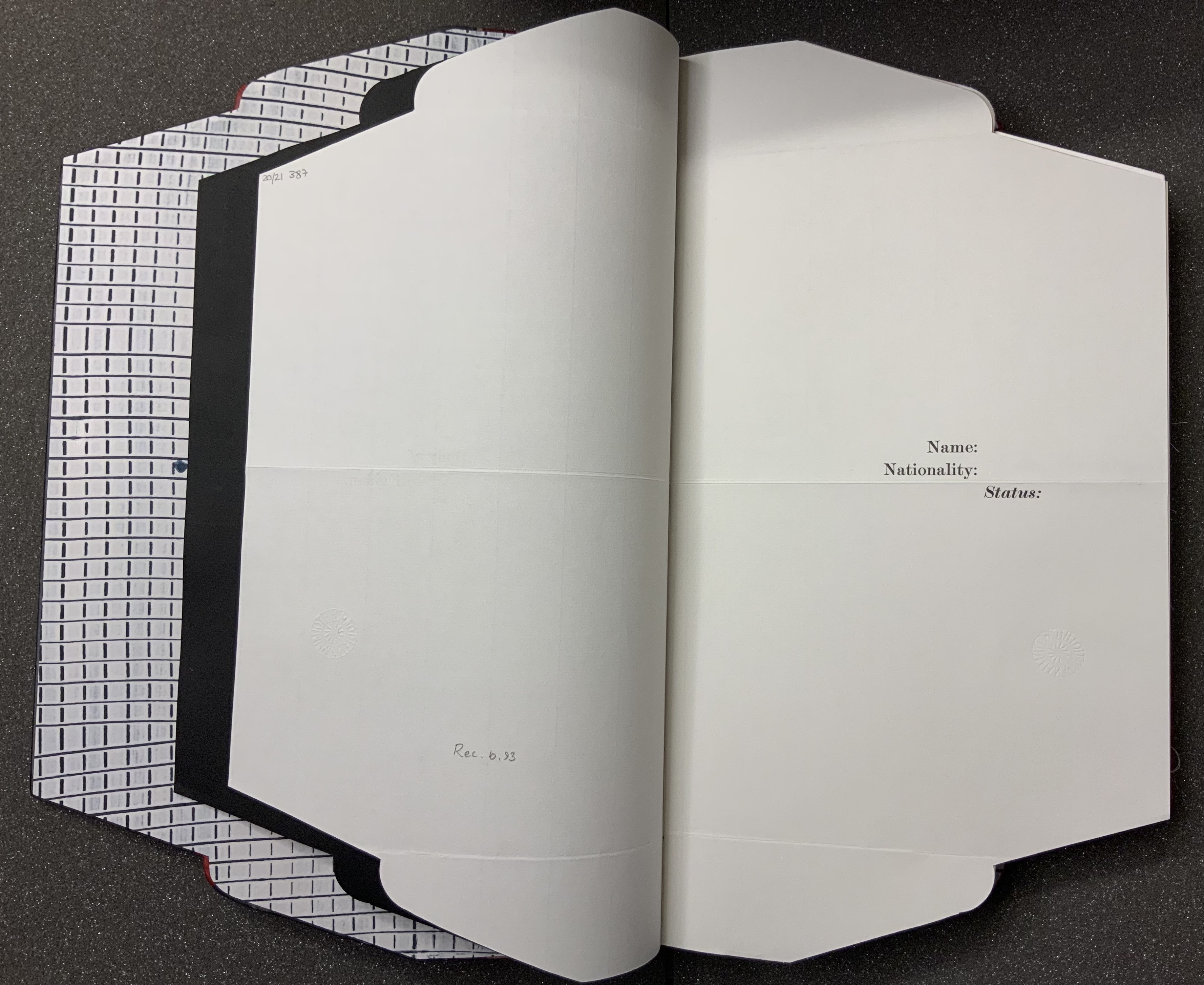
From its folder or opened-envelope outline, you know that, if this is a murder mystery as the title implies, the shape, the gridded endpaper, spotted with drops of red and blue, the flimsy black liner and stiff sheets of the title and subtitle pages are telling you: read with caution, read with unease, read to detect. That the front cover falls away from the book block to show the inner spine to be lined with the same spotted grid as the endpaper tells you: look as you read.
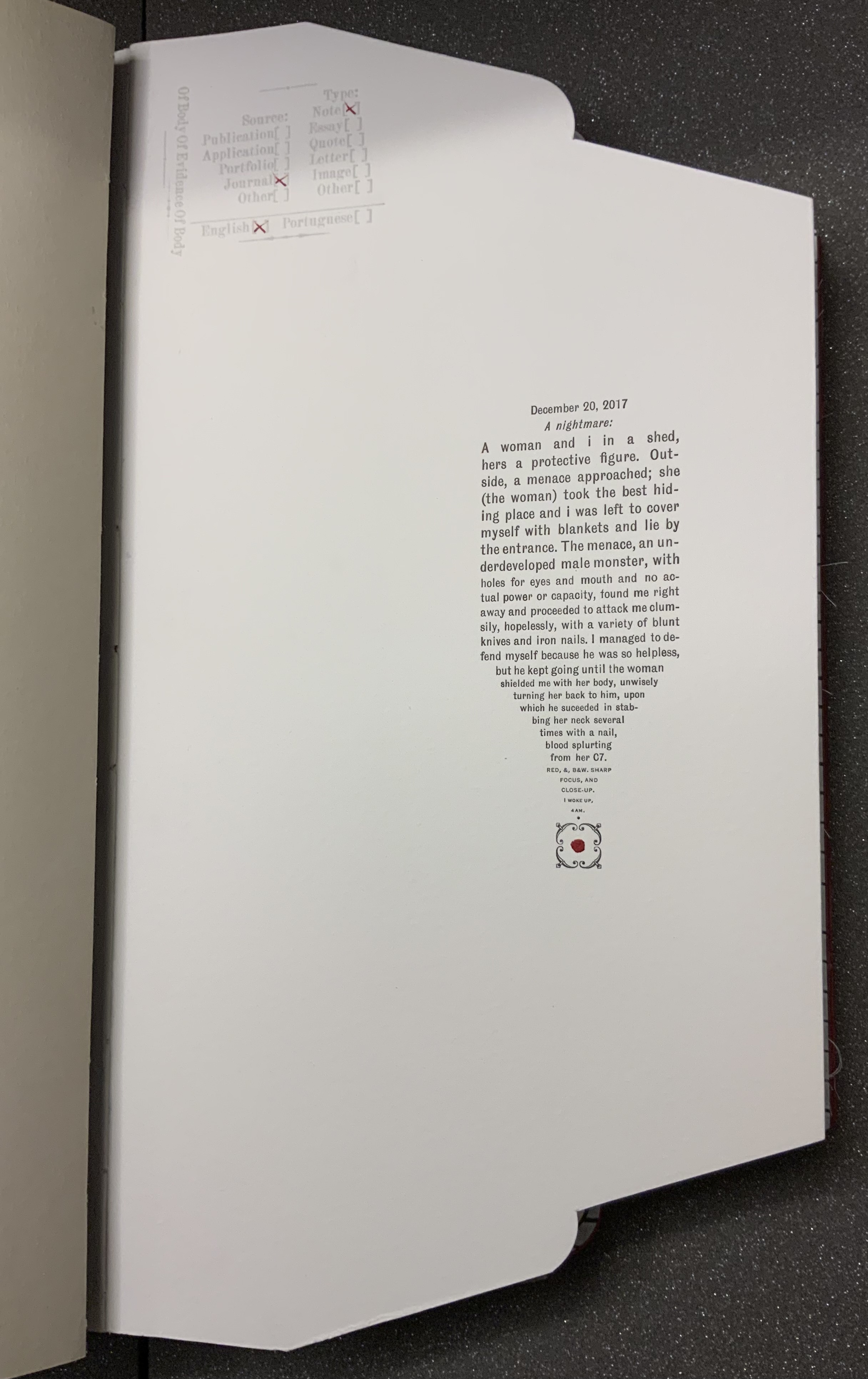
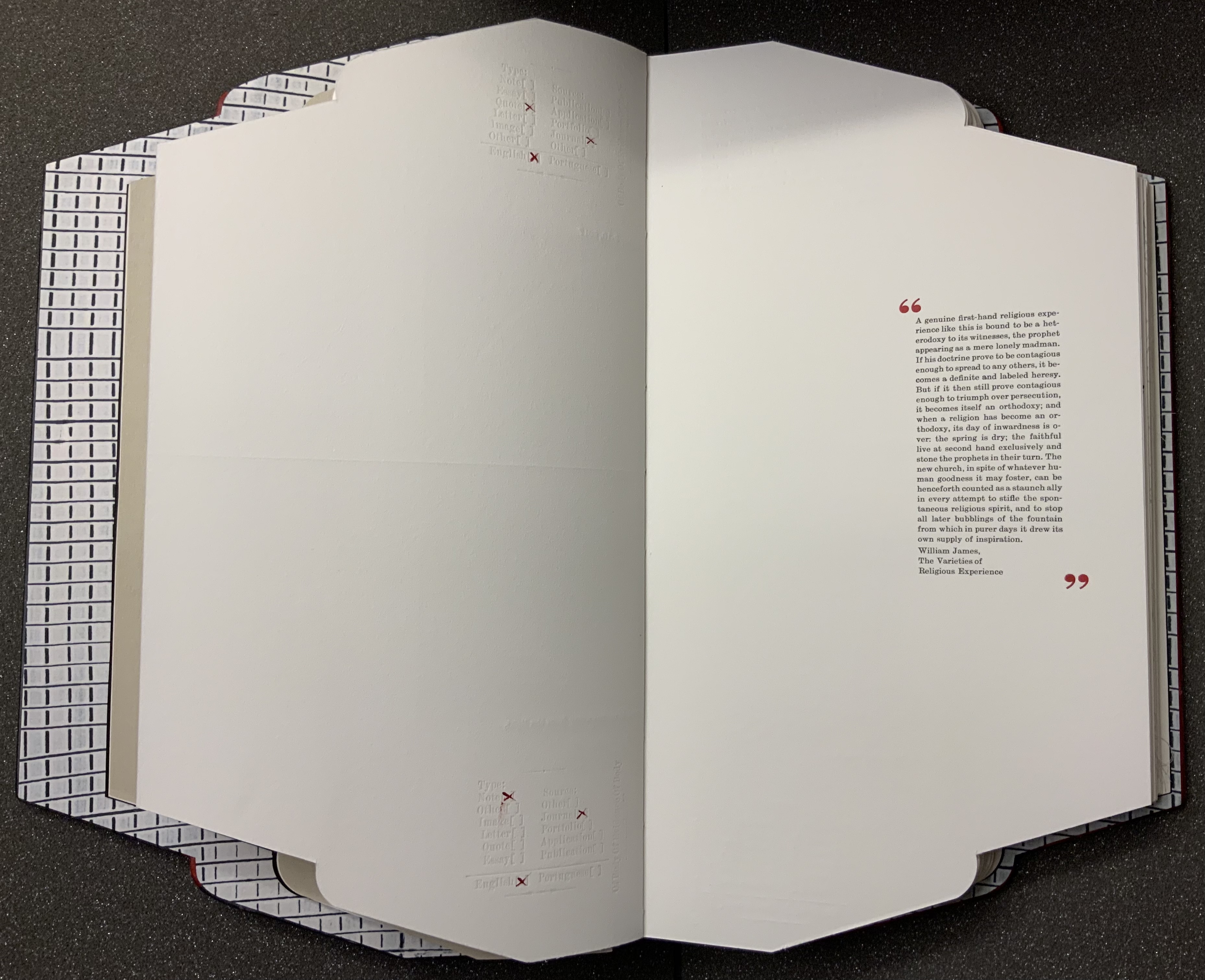
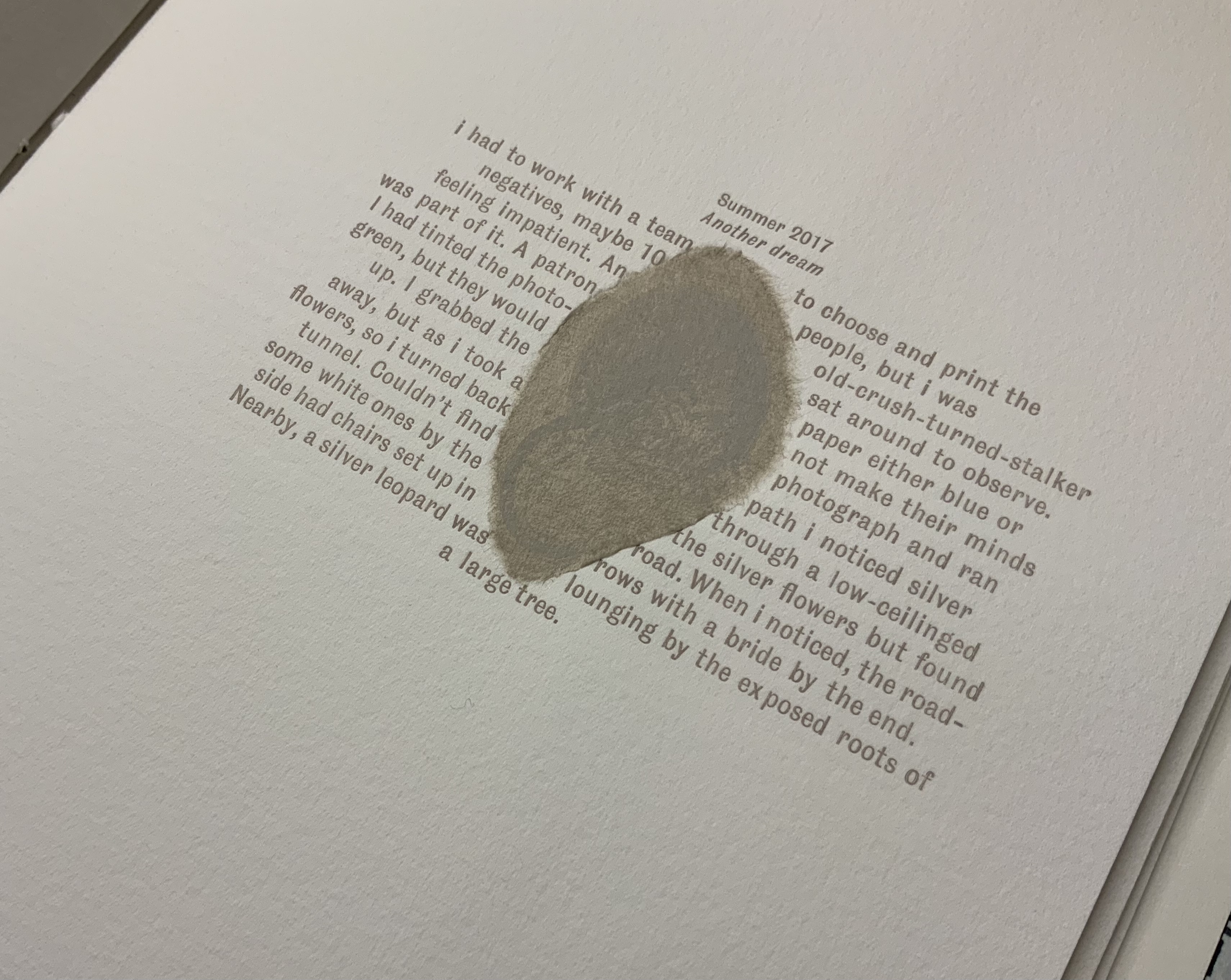
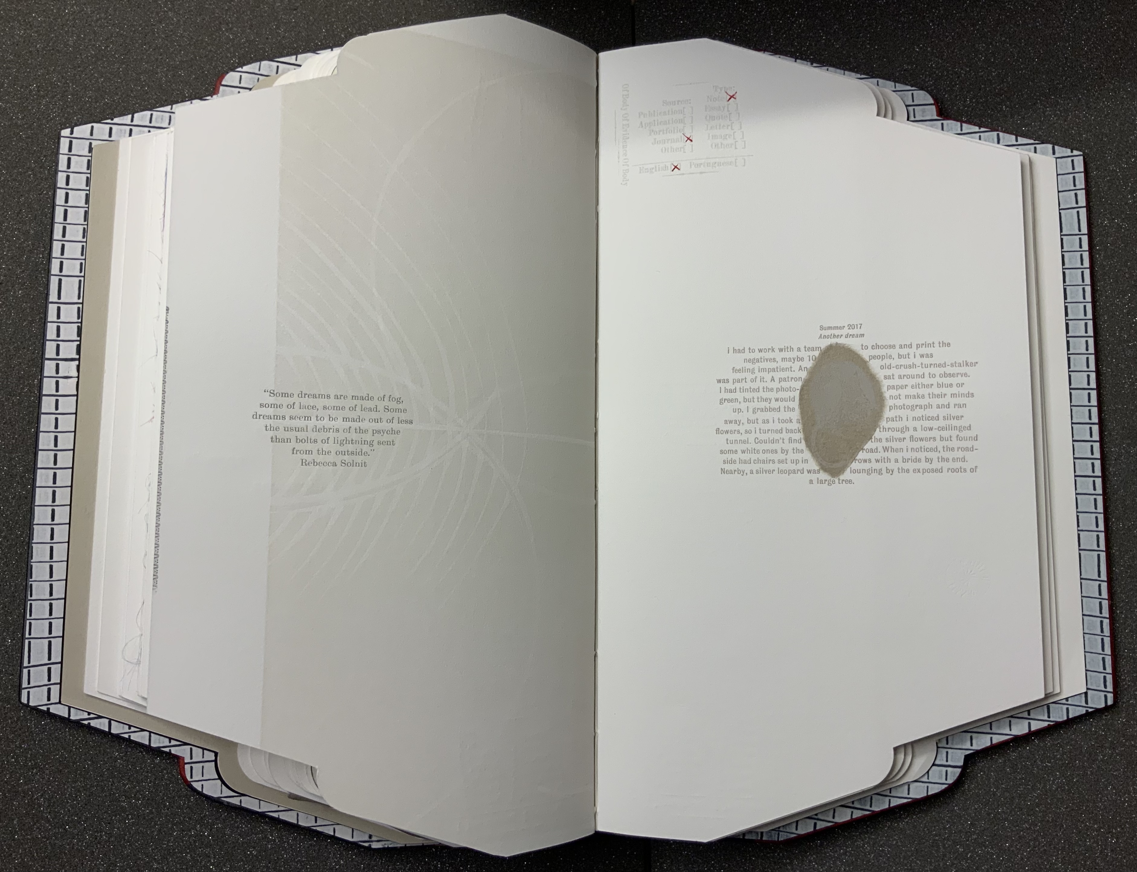
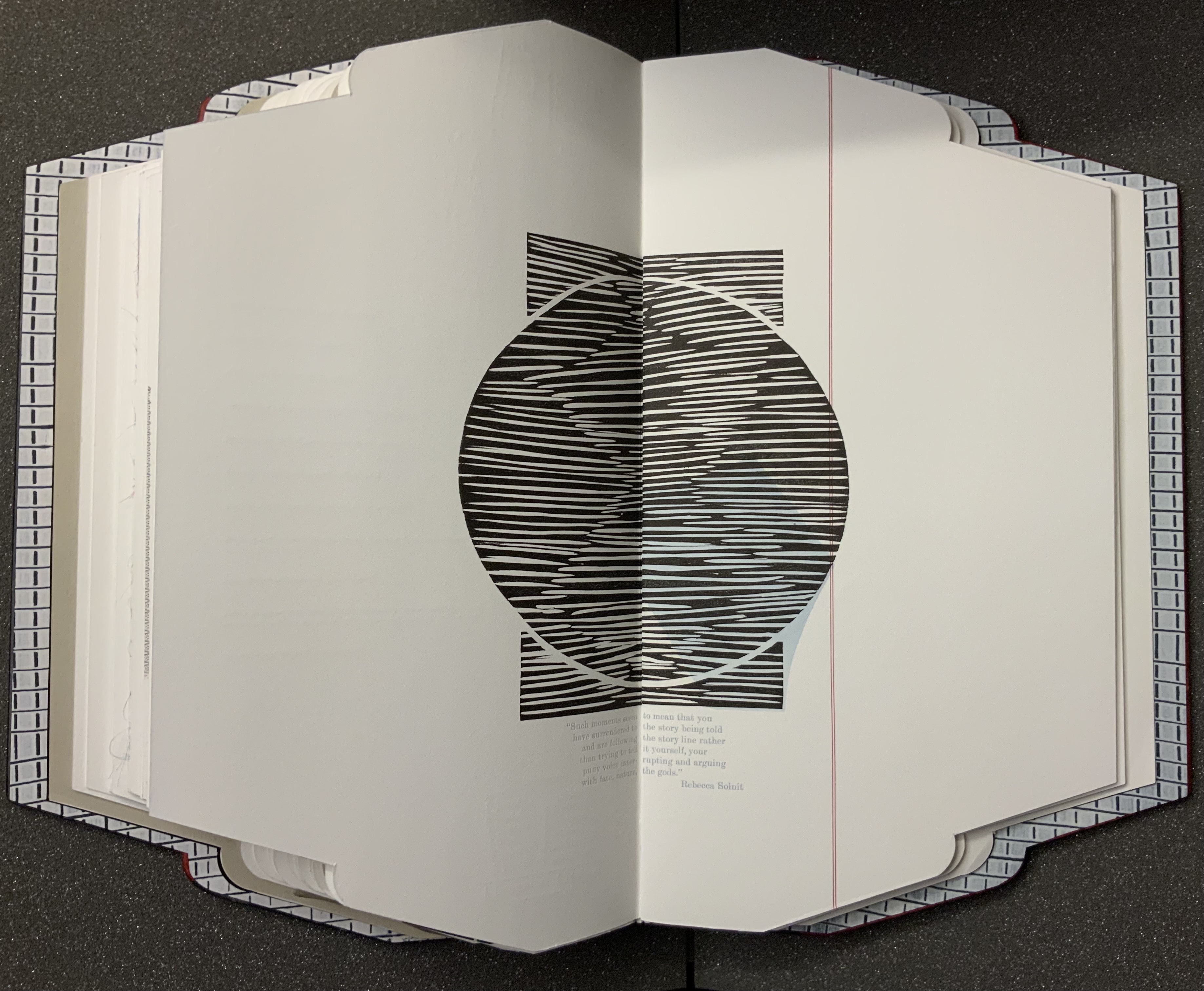
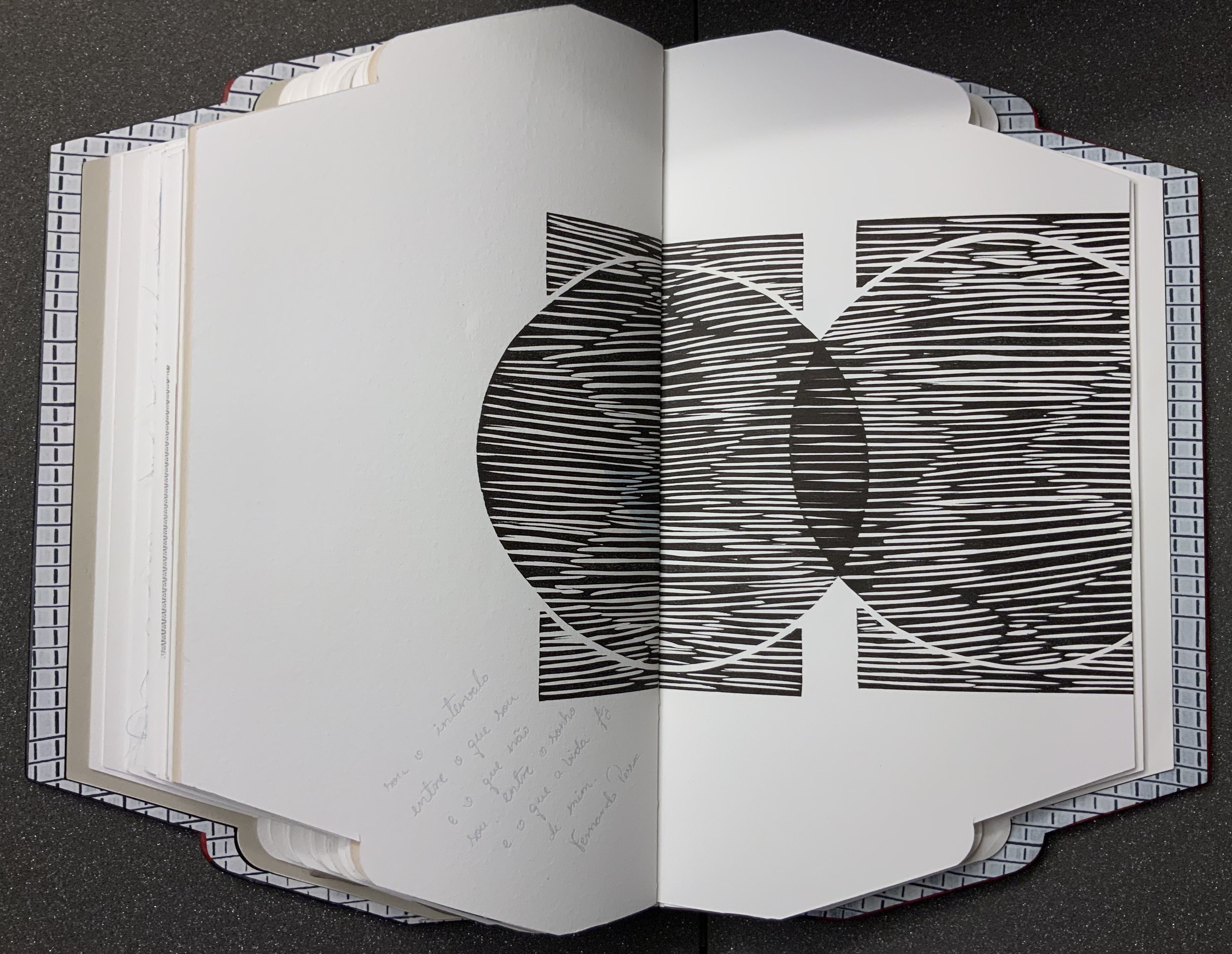
Another urging to look and read is the faint and embossed stamp with not-so-faint red X’s indicating the source and type of evidence presented on the page or spread. The opening text relates a violent assault, but one that occurs in a dream. The X’s in the stamp designate the source as “Journal”, the type as “Note”, the language as “English”, but says nothing about the shaping of the text into a pen nib pointing to a square fleuron, or is it a dagger ending in a drop of blood? The next body of text occupies the same place on its page, the categorizing stamp indicates that it, too, comes from a journal, and its language is English. But its type is “Quote”.
Like the first text’s italicized date headline that suggests its journal origin, the second text’s inverted commas identify it as a quotation. So why then the categorizing stamp? The journal writer is the artist, as the colophon will confirm, but the categorizing stamp and the envelope/folder form of the book identify the artist as collector, categorizer and shaper of the evidence. Is the artist implying “heteronyms” like those invented by Fernando Pessoa, another source of quotations?
This out-of-context quotation from William James’ The Varieties of Religious Experience seems to describe the preceding dream as a “genuine first-hand religious experience”. The dream extract is a piece of evidence. The commonplace extract from James is also a piece of evidence that contextualizes the dream extract. Read them.
Other pieces of evidence include
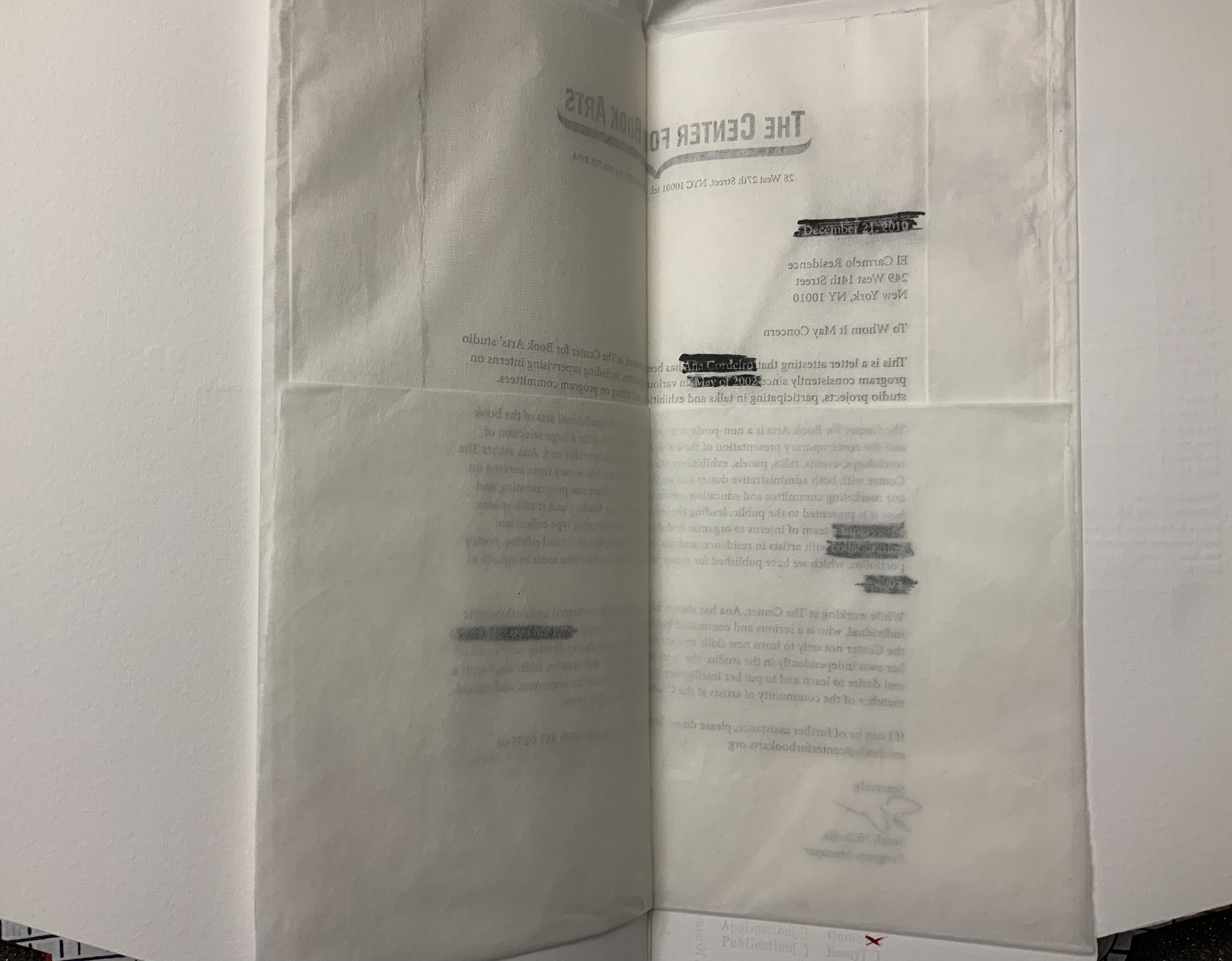
a “To whom it may concern” document on Center for the Book Arts letterhead, folded inwards from all four sides like a deed or secret letter. The letter supports an immigration application. The paper is mulberry tissue paper; so initially the text appears in reverse. Attention is drawn to that view by blocks of black redactions in which right-reading text appears in white (a reverse-out on the reverse side of the letter).
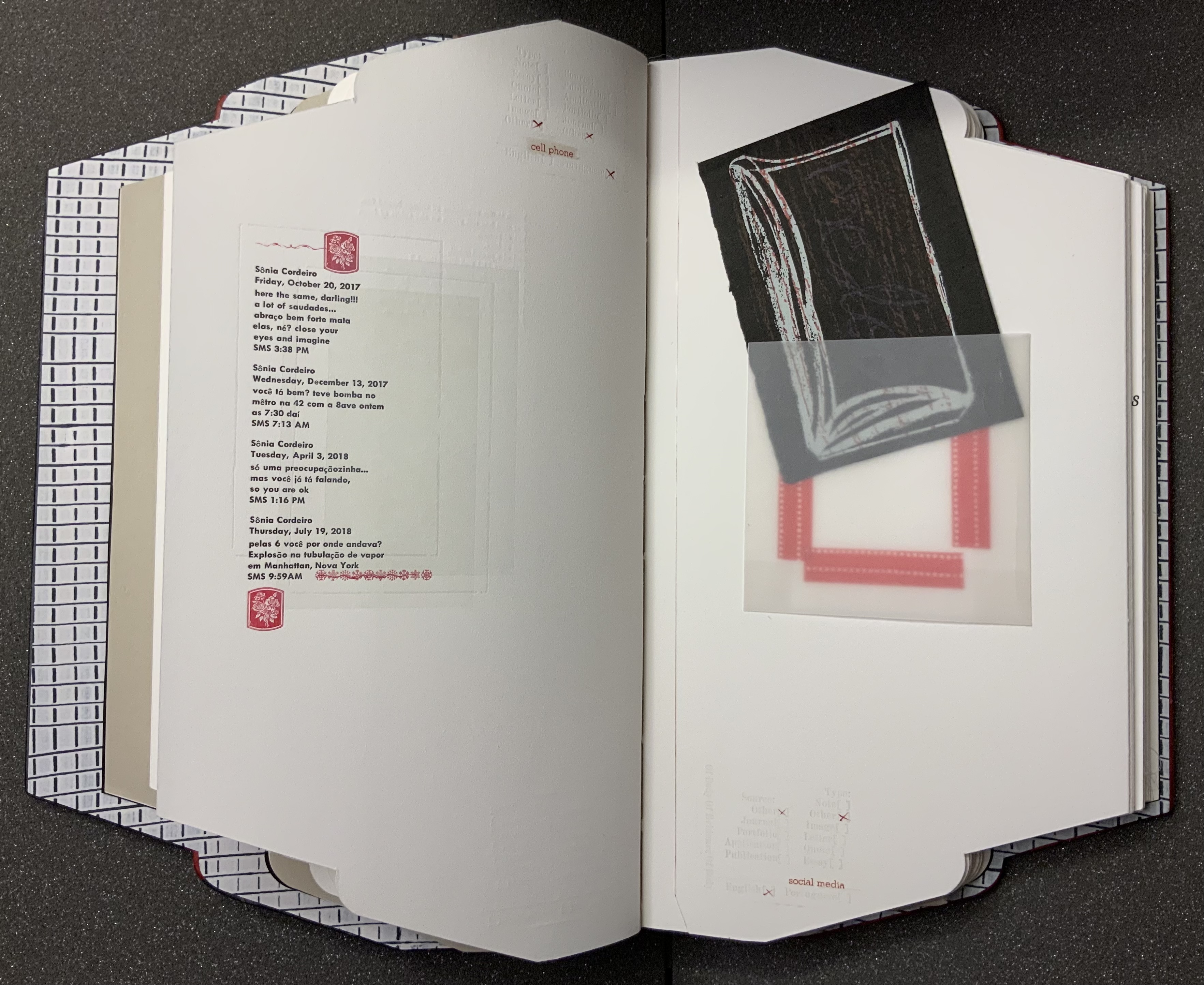
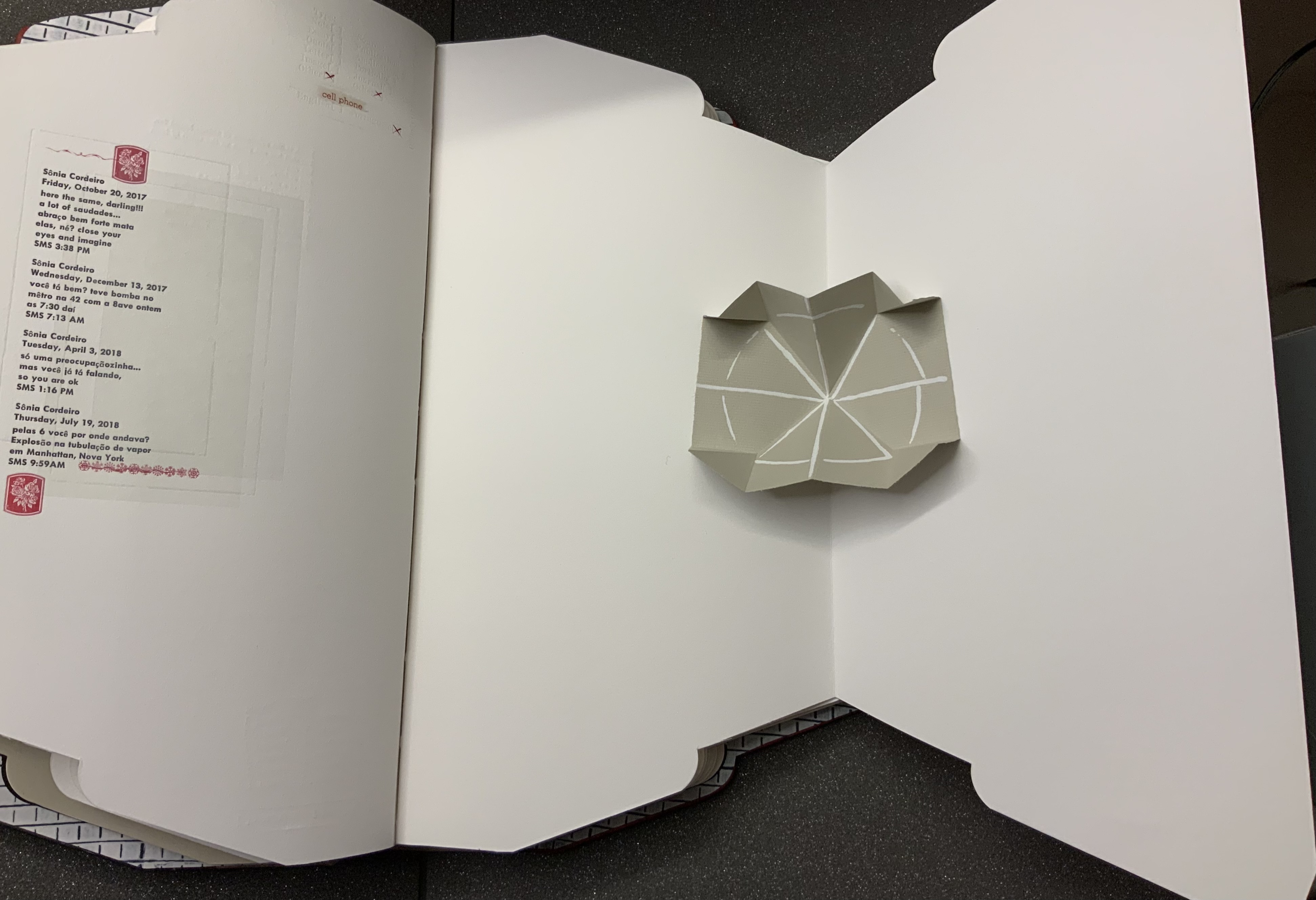
a display of SMS texts between the artist and her mother, made to appear like a print-out that had been folded then sealed with red sealing wax impressed with a sigil.
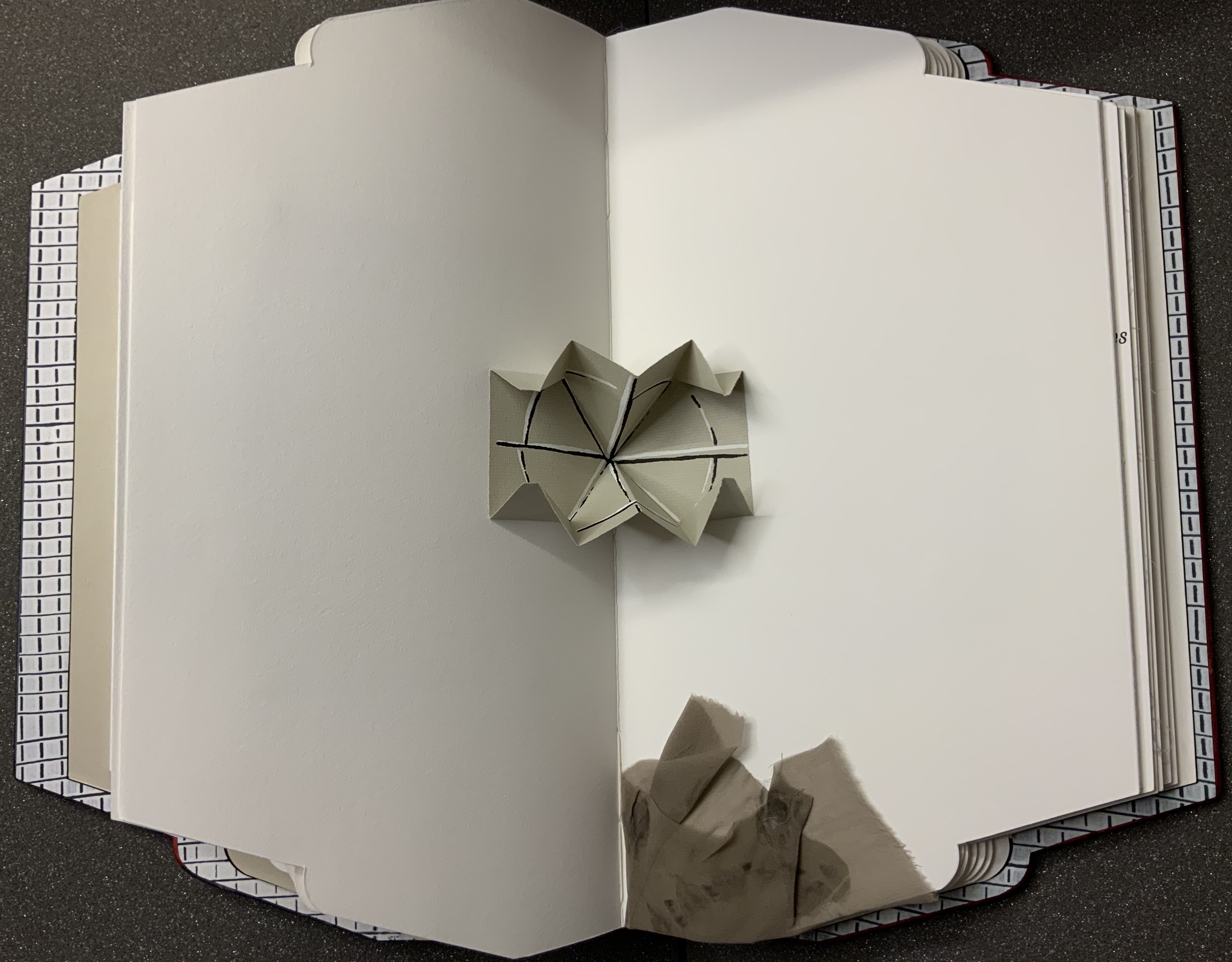
two Turkish fold maps, both with the same geometric emblem printed inside, one that pops up in the gutter of a double-page spread and one hidden under an inward-folded flap.
a medallion of gampi impressed with the image of a crouching leopard and placed within a journal extract set to surround the medallion. The pressure on the silk-like gampi causes the image to flicker iridescently.
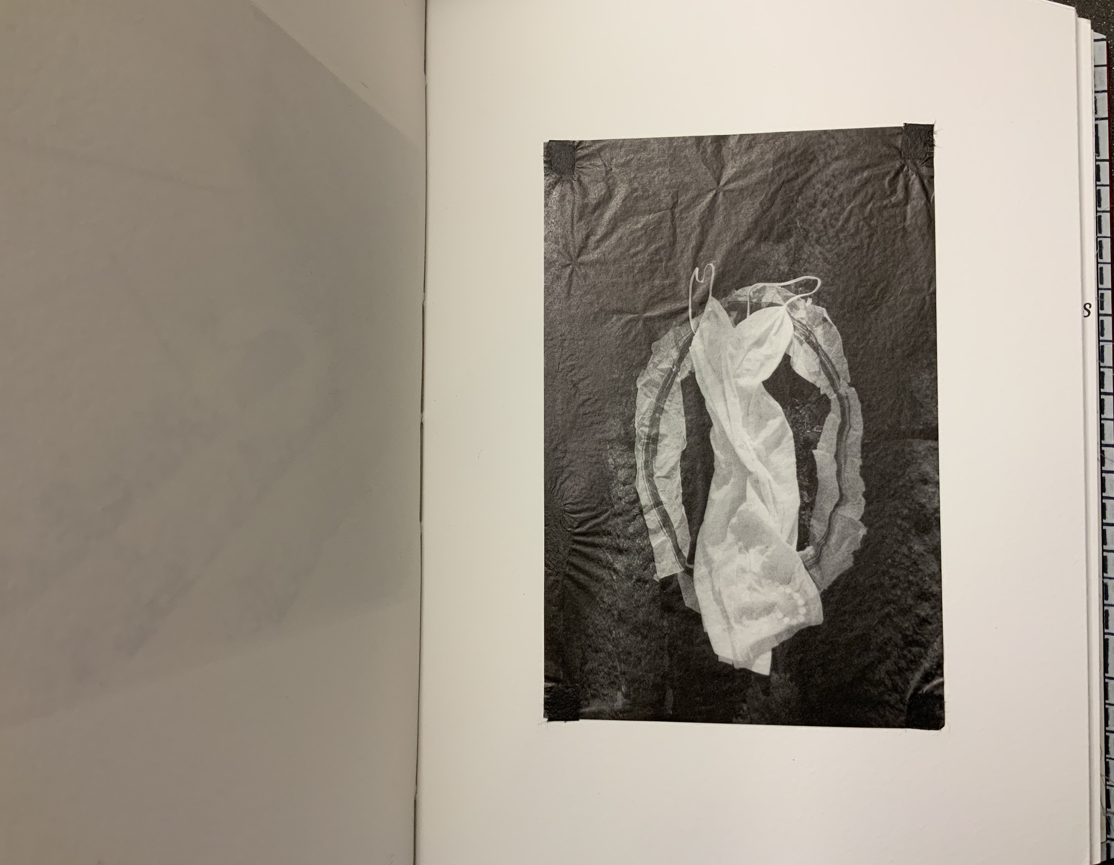
But of what is this a body of evidence? The photo of an empty negligee and the insert of part of a nylon stocking raise the questions – of what body, whose? The empty clothing points to the wordplay on “body” in the categorizing stamp’s own label — “Of Body Of Evidence Of Body”. Perhaps it is missing. Perhaps it is outlined or staring at us from the strobing abstractions over the quotations from Rebecca Solnit and Pessoa. Perhaps it is the artist whose name appears only in only three places — in white against one of the black reverse redactions, in the SMS texts and in her signature in the colophon.
From the artist’s website. Accessed 8 July 2021.
From the artist’s website. Accessed 8 July 2021.
Despite its usual place of culmination, the colophon is just as unusual as the shape of Body of Evidence and its treatment of almost every other material and metaphorical aspect of a book. The colophon comes as an unbound folio, enclosed in a deed-fold sheet that is bound to the book. It is much more than the usual brief assertion of creation by scribe or printer. It is an outpouring, a venting. As the last piece of evidence, it answers the question “Of what is this a body of evidence?”
It is the accretion of the immigrant artist’s tensions and unease in the context of anti-immigrant feeling and, on its heels, a pandemic requiring isolation and its further inciting “fear of the Other”. Like the material aspects of Body of Evidence, those tensions and the unease are complex. In its ambiguity of heteronymy and near anonymity, Body of Evidence invites the reader/viewer to be an empathetic witness to the tension between a desire for privacy and a desire to be open and welcoming. The tension between wanting to belong and not wanting to lose one’s self. A tension arising from hurt inflicted under the guise of intended empathy. The tension of selves.
Whether the reader/viewer can empathize is answerable only from reading, looking and feeling.
Further Reading (and Looking)
Produced by Thomas Gallagher and uploaded 15 January 2021. Accessed 8 July 2021.
Further Reading
Drucker, Johanna. 2004. The Century of Artists’ Books [Second edition] ed. New York City: Granary Books. Drucker’s comments on auratic works under the heading “The Book as Private Archive” would be useful in developing further readings of Cordeiro’s work.
Around the Corner(2020) Ximena Pérez Grobet Japanese bound in slip case open at both ends. H200 x W175 x D70 mm. Edition of 20, of which this is # 2. Acquired from the artist, 1 December 2020. Photos: Books On Books Collection.
Since 2008, the AM Bruno coalition has sponsored artist book challenges. The one in 2020 was entitled “One and Many Pages” and challenged the participants to respond to the image below:
Clive Philpott reviewed the various proposals and selected twelve to go forward. Pérez Grobet’s Around the Corner was one. On the fore-edge you can see the whole image of “a”one and many pages” reproduced. As you remove the book from its slipcase, you are gradually astounded that, in fact, the image produces the book. Like a flip book, each page holds a segment of the whole image of the “one and many pages” photo. As each segment appears as a full-page bleed, this image of a book un-builds and re-builds within and around the corners of the book in your hands.
While the video below conveys some of the visual experience to be enjoyed with this artwork, it does not convey the tactile and spatial experience of how the image of “a book” becomes “the book” in your hands.
Around the Corner received a Special Mention in the Prix Bob Calle 2023 du livre d’artiste.
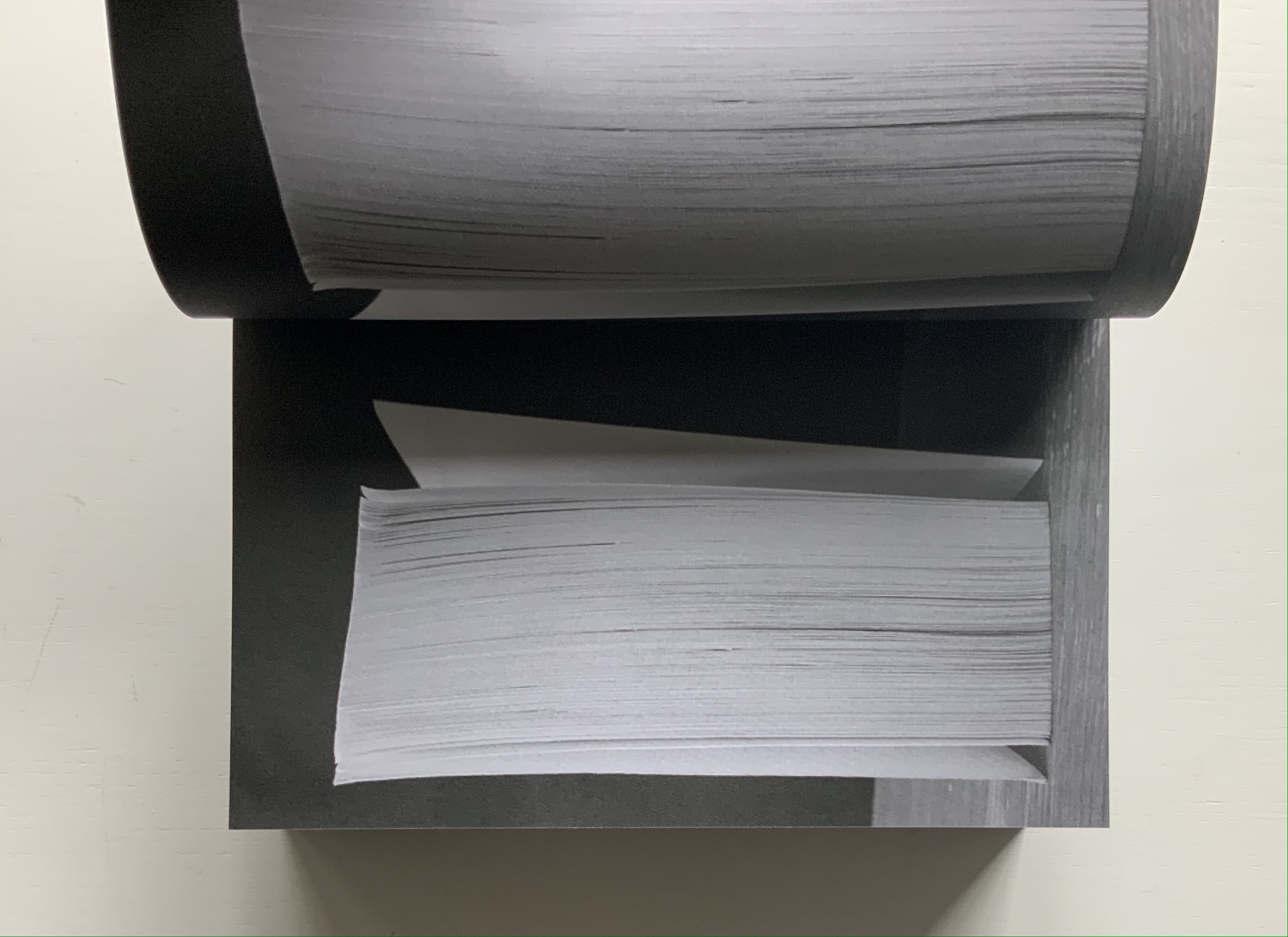
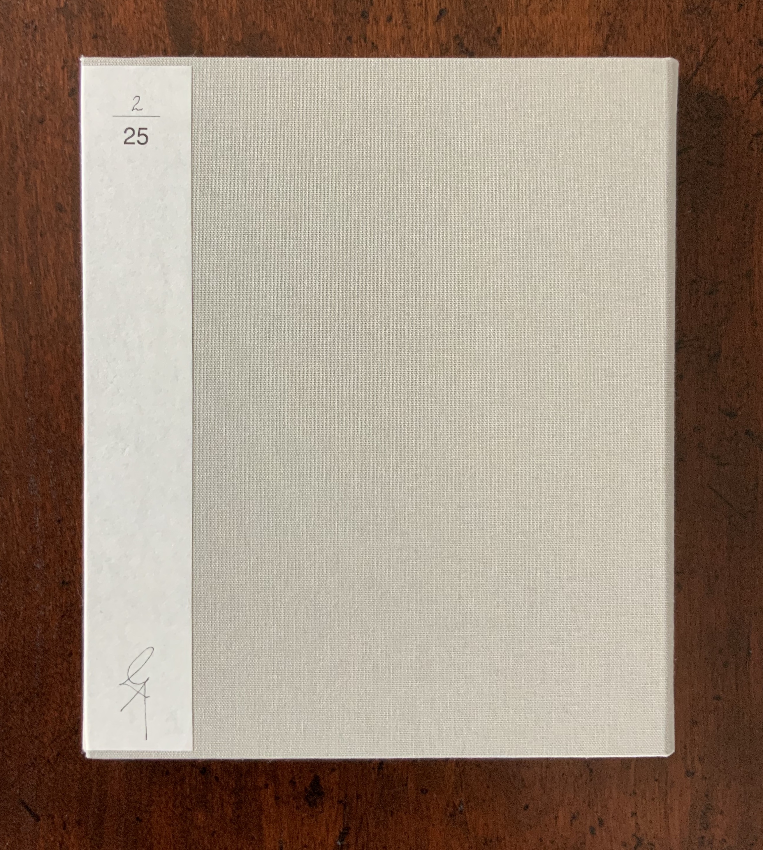
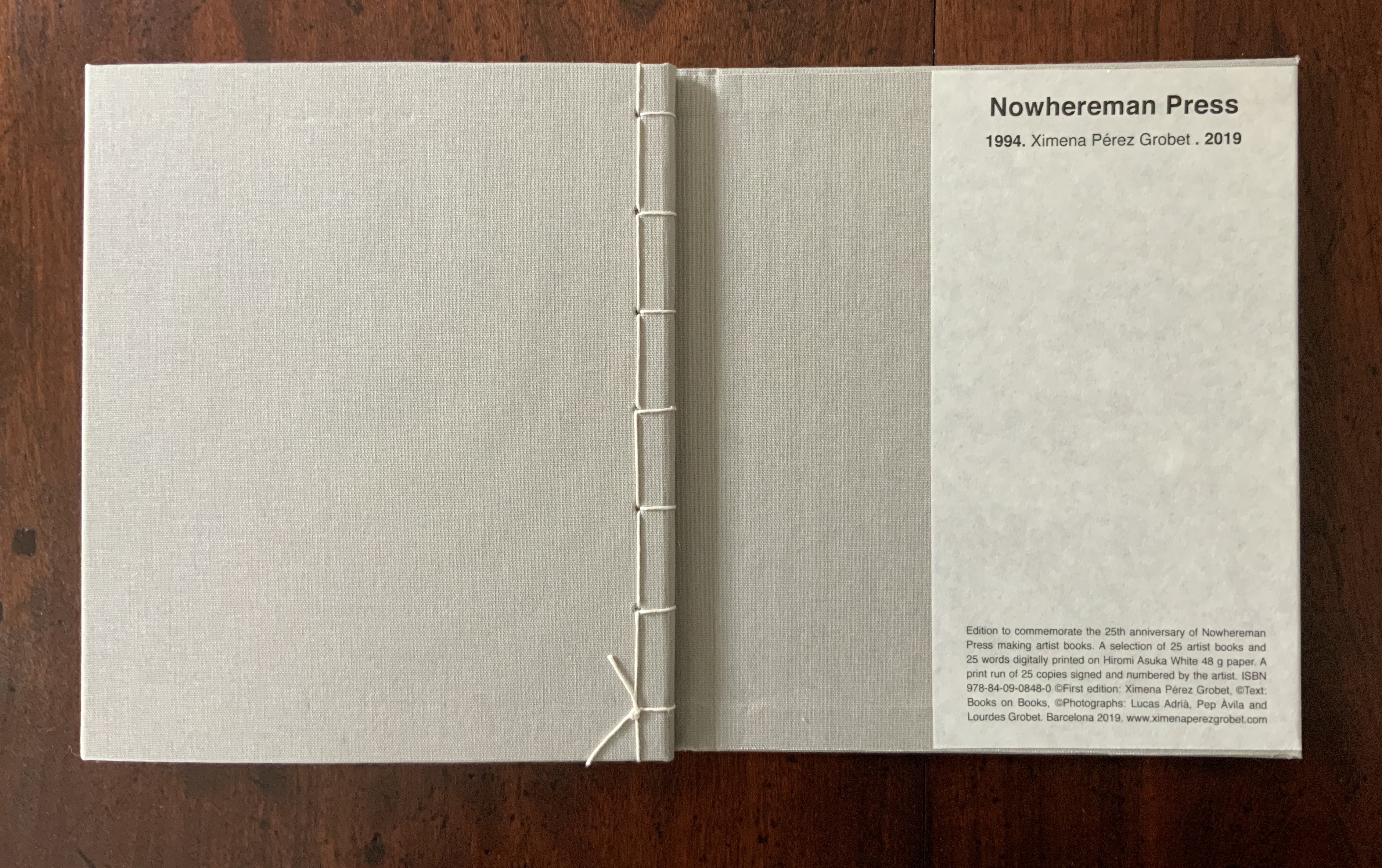
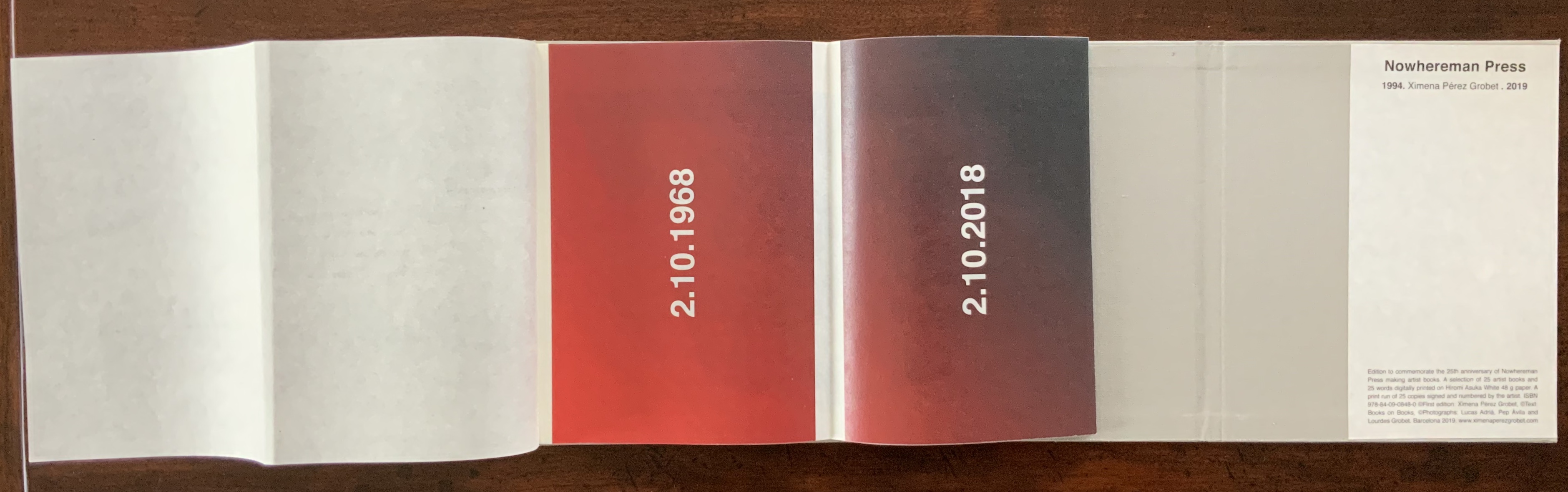
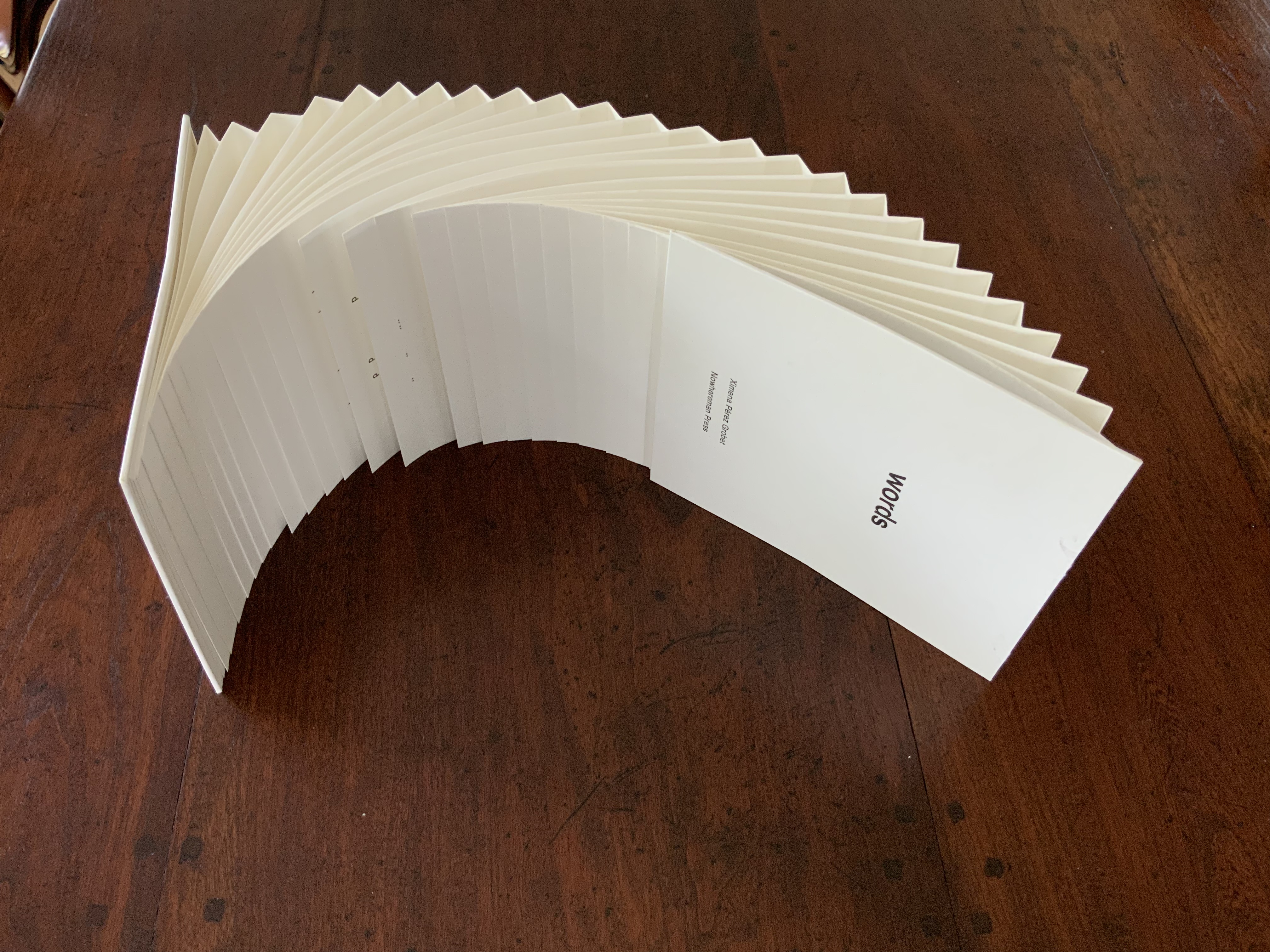
Nowhereman Press 1994-2019 (2019)
The year 2019 marked the twenty-fifth anniversary of Ximena Pérez Grobet’s Nowhereman Press. To celebrate, she issued the catalogue below illustrating twenty-five of her works. (Books On Books declares an interest, having provided twenty-five words for the opening page and owning two of the works in the catalogue in addition to the one above.)
Nowhereman Press 1994-2019 (2019) Ximena Pérez Grobet Overlapping clothbound folder attached to Japanese bound book. H210 x W180 mm, 25 pages. Edition of 25, of which this is #2. Acquired from the artist, 1 May 2019. Photos: Books On Books Collection.
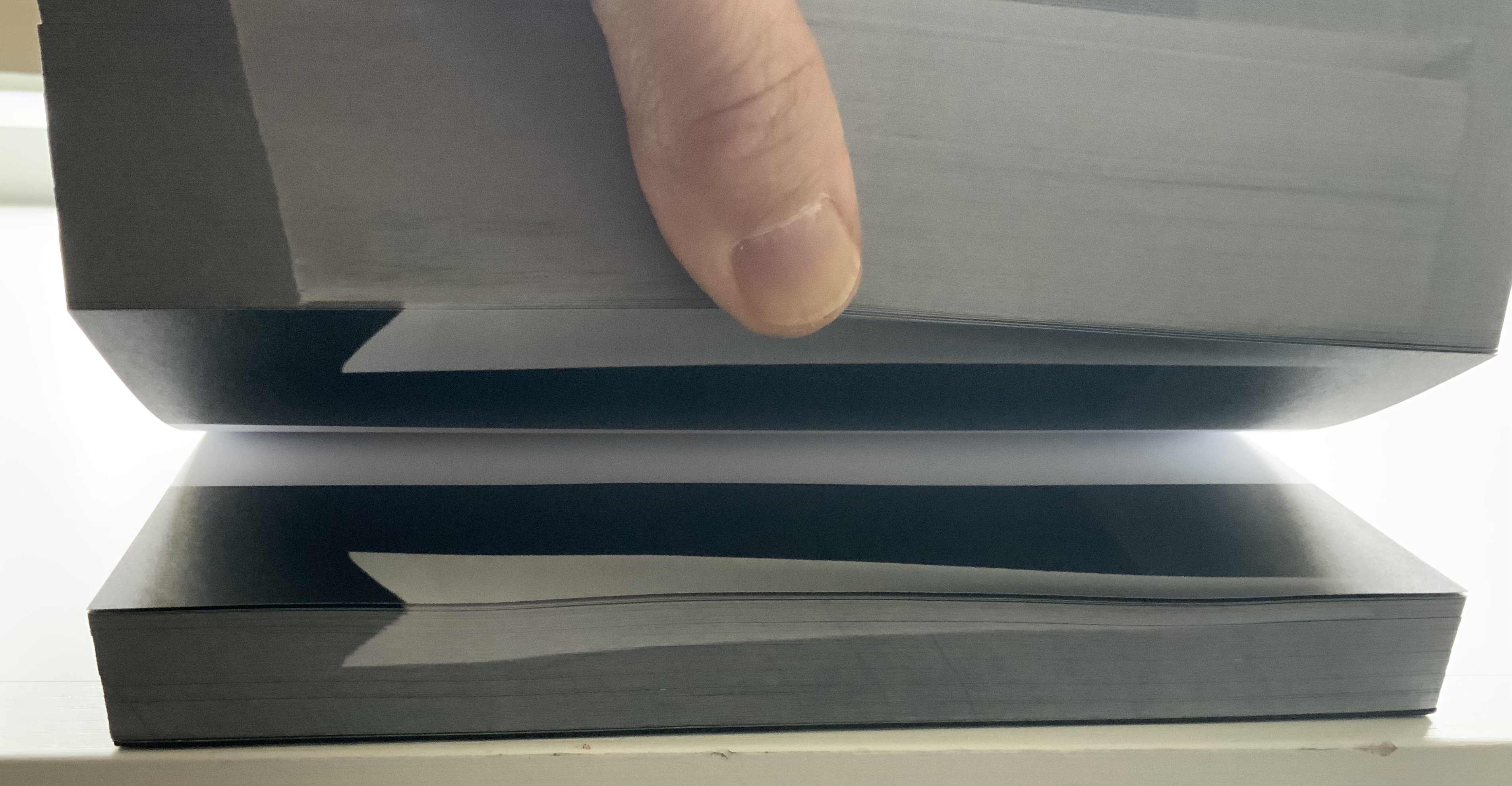
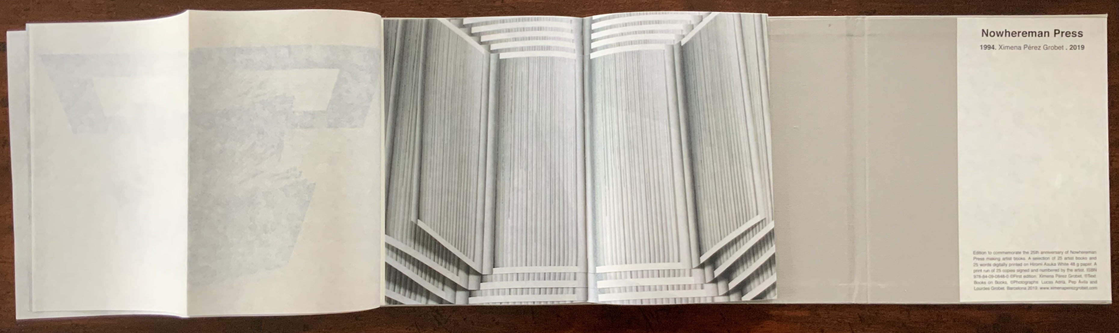
The catalogue itself demonstrates this artist’s ingenious engagement with what the critic Gérard Genette called “seuils” or the “thresholds” of the book — its features such as cover, binding, edges, the page, title page, preface, index, colophon, typography, printings, etc., that make up “this fringe at the unsettled limits that enclose with a pragmatic halo the literary work” (quoted by Richard Macksey in his preface to Genette’s Paratexts (Cambridge University Press, 1997), p. xvii).
For example, the catalogue opens right-ward rather than left-ward — despite the false hint to open it left-ward given by the “almost” quarter-paperbound appearance of the front cover. Inside is the catalogue’s true spine, with its externalised sewing. Turning the inner cover and first page to the left reveals that each recto landscape page holds a photo of a double-page spread from one of the twenty-five works.
These are the catalogue’s first reminders of Pérez Grobet’s playful embrace of the “book” as her chosen form of art. Only a few pages in, though, and her serious — political, thoughtful and philosophical —side shows itself. The page above shows the first and last pages from 2.10.1968 – 2.10.2018 (2018), which commemorates the fiftieth anniversary of the Tlatelolco massacre that occurred in Mexico City.
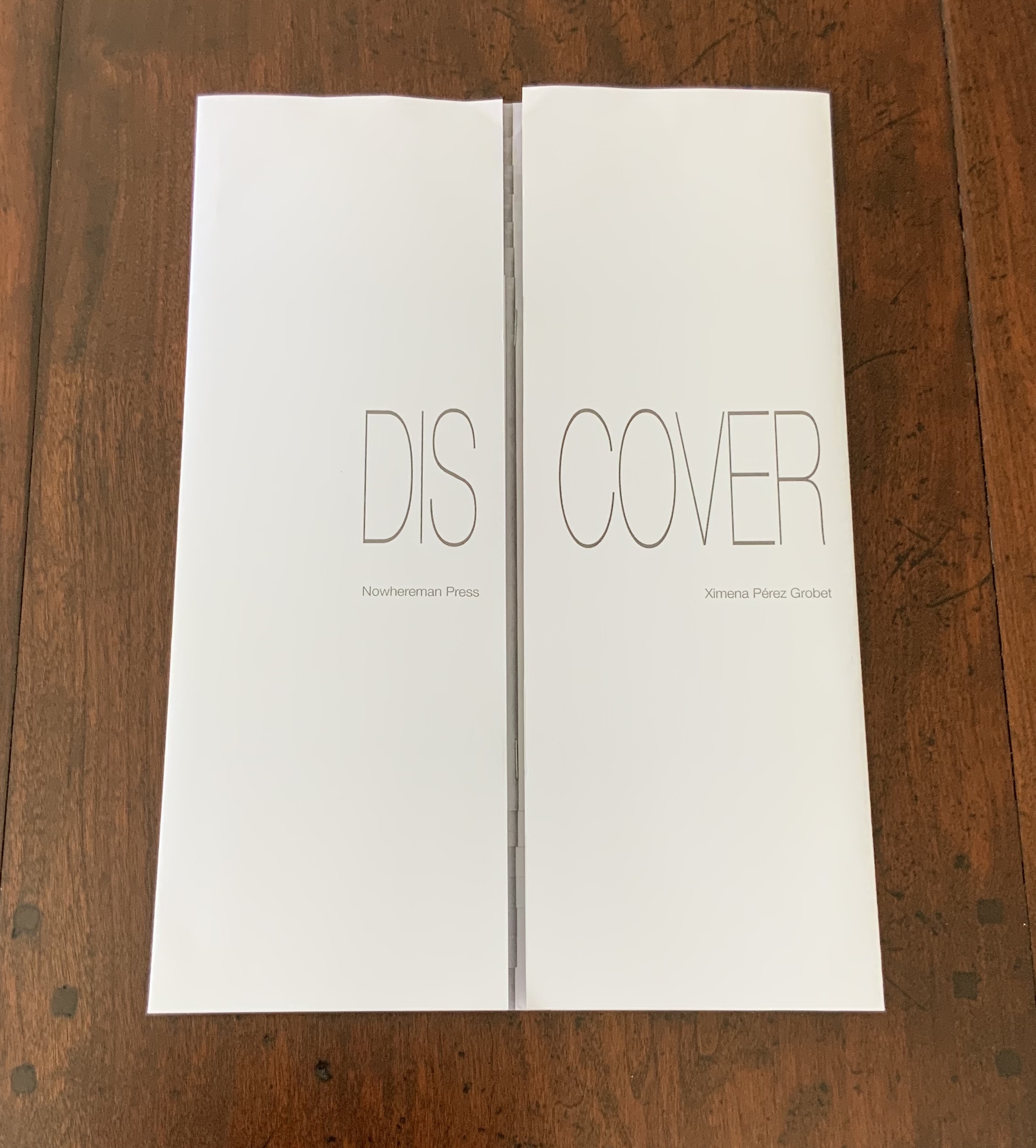
The work Dis-Cover (2019) pictured above and below exhibits Pérez Grobet’s play with the paratext of the book — in this case, select two- and three-dimensional aspects of the book: the cover, fore-edge and double-page spread. The title splitting across the French fold opening enacts one pun while the trompe l’oeil effect inside, done with the simplest of papers and bindings, enacts another. Like Around the Corner above, Dis-Cover is a response to an AM Bruno challenge.
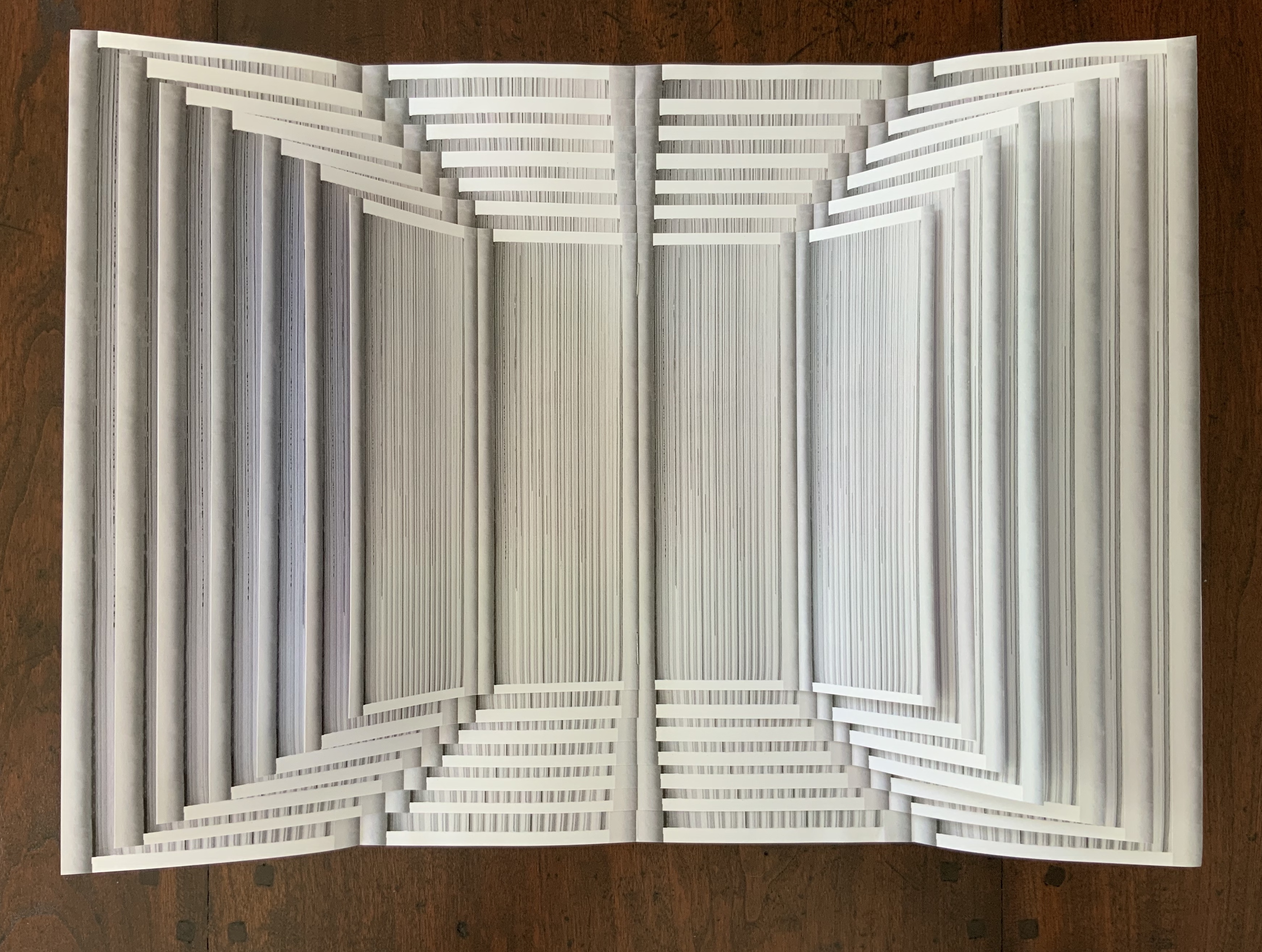
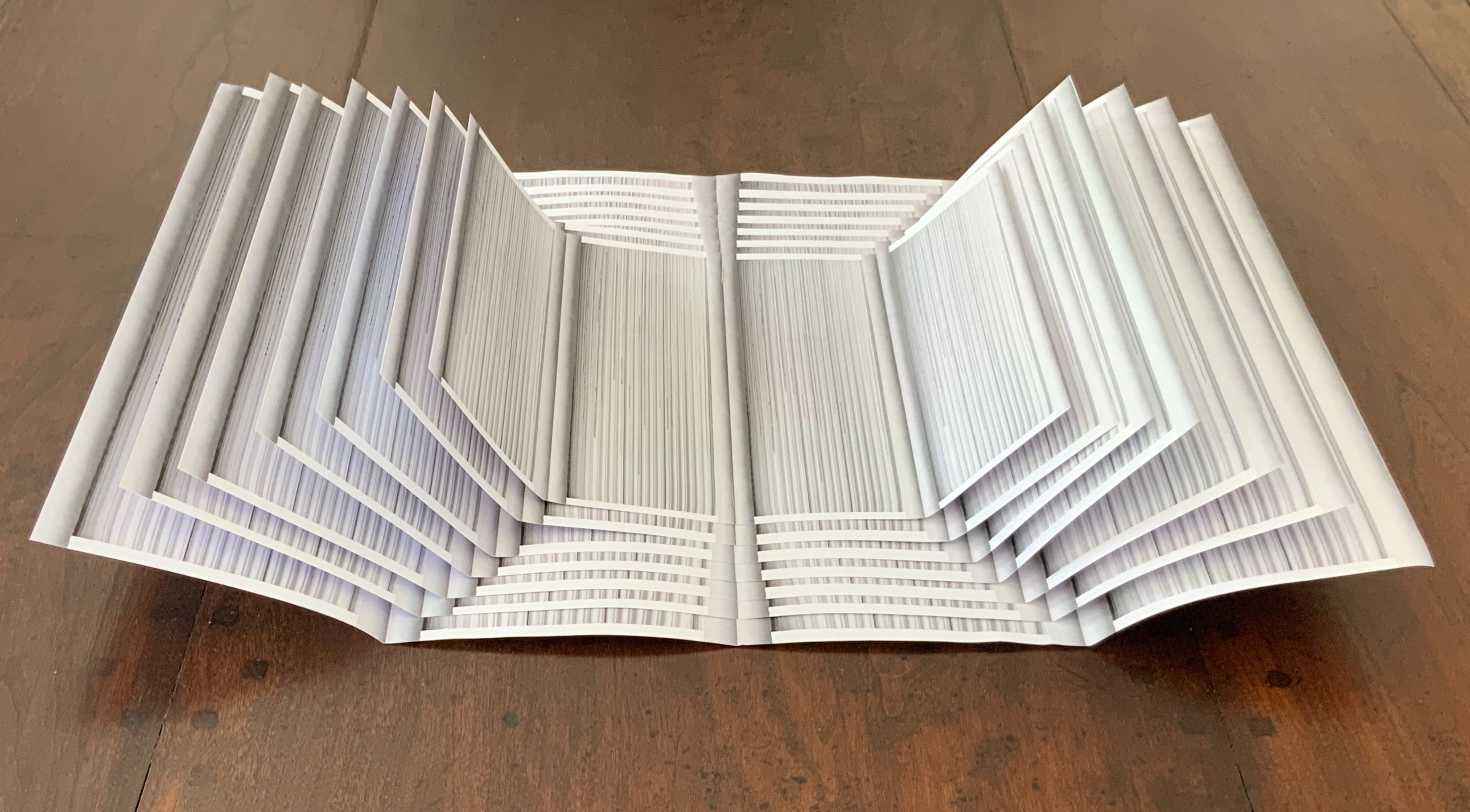
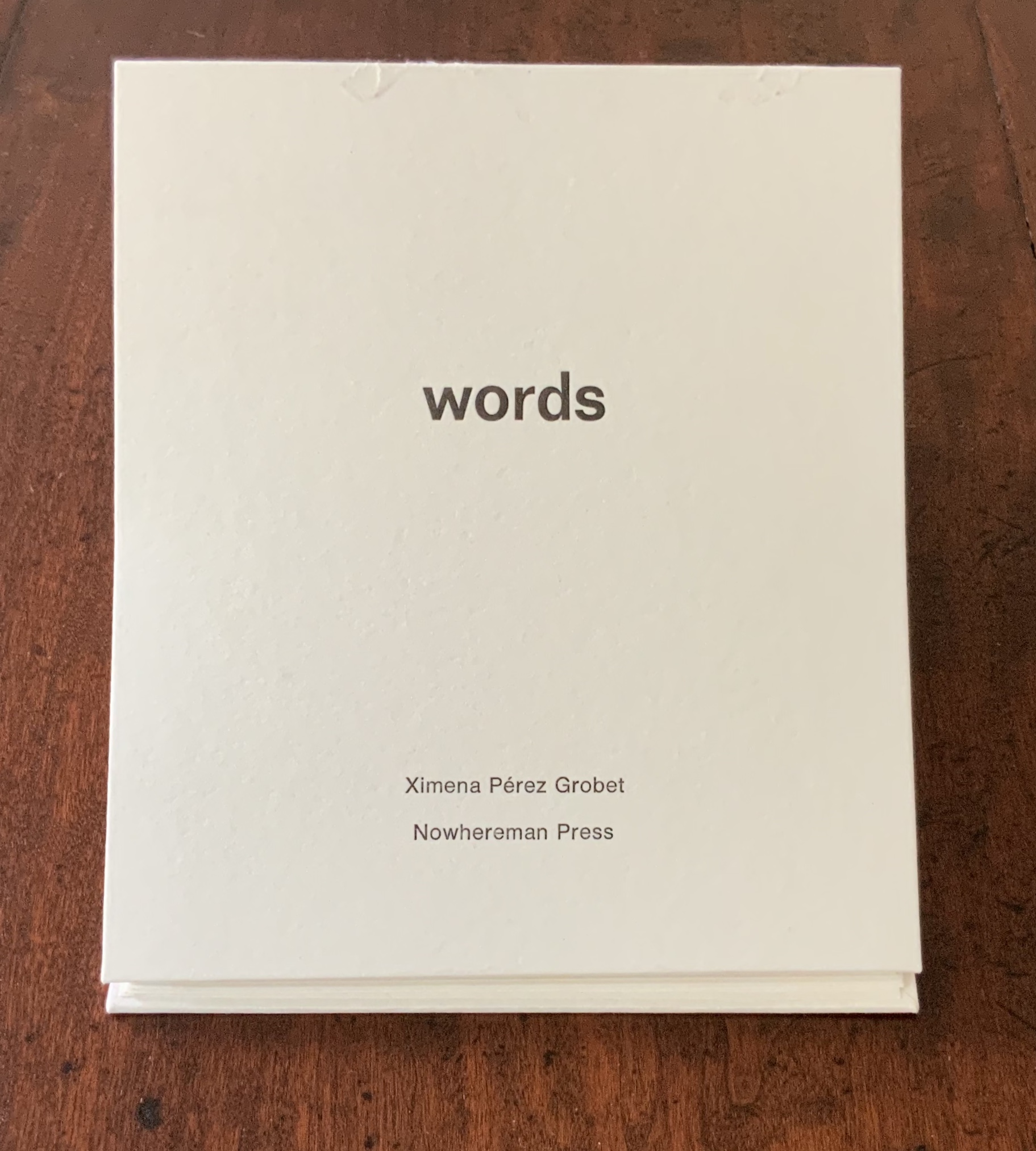
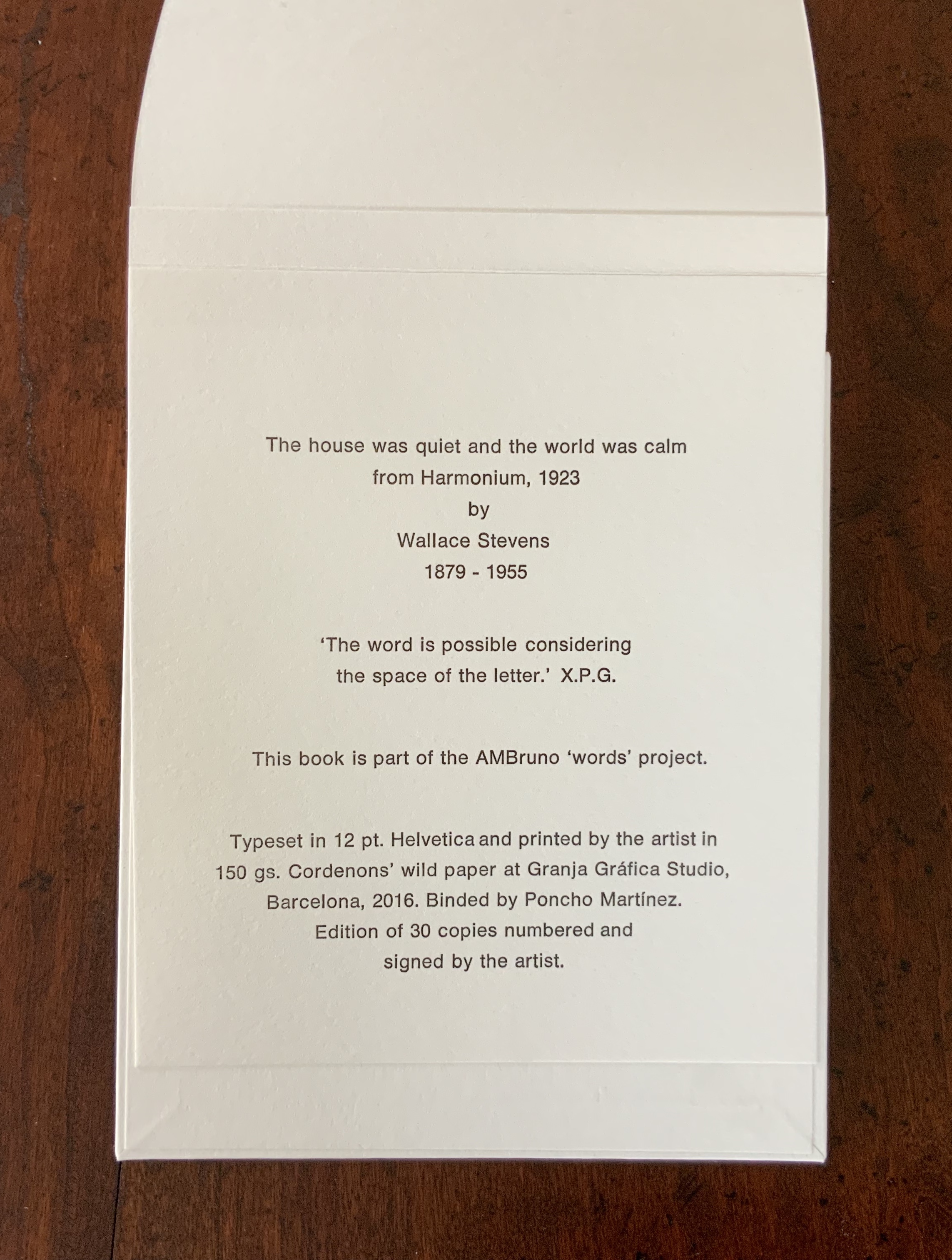
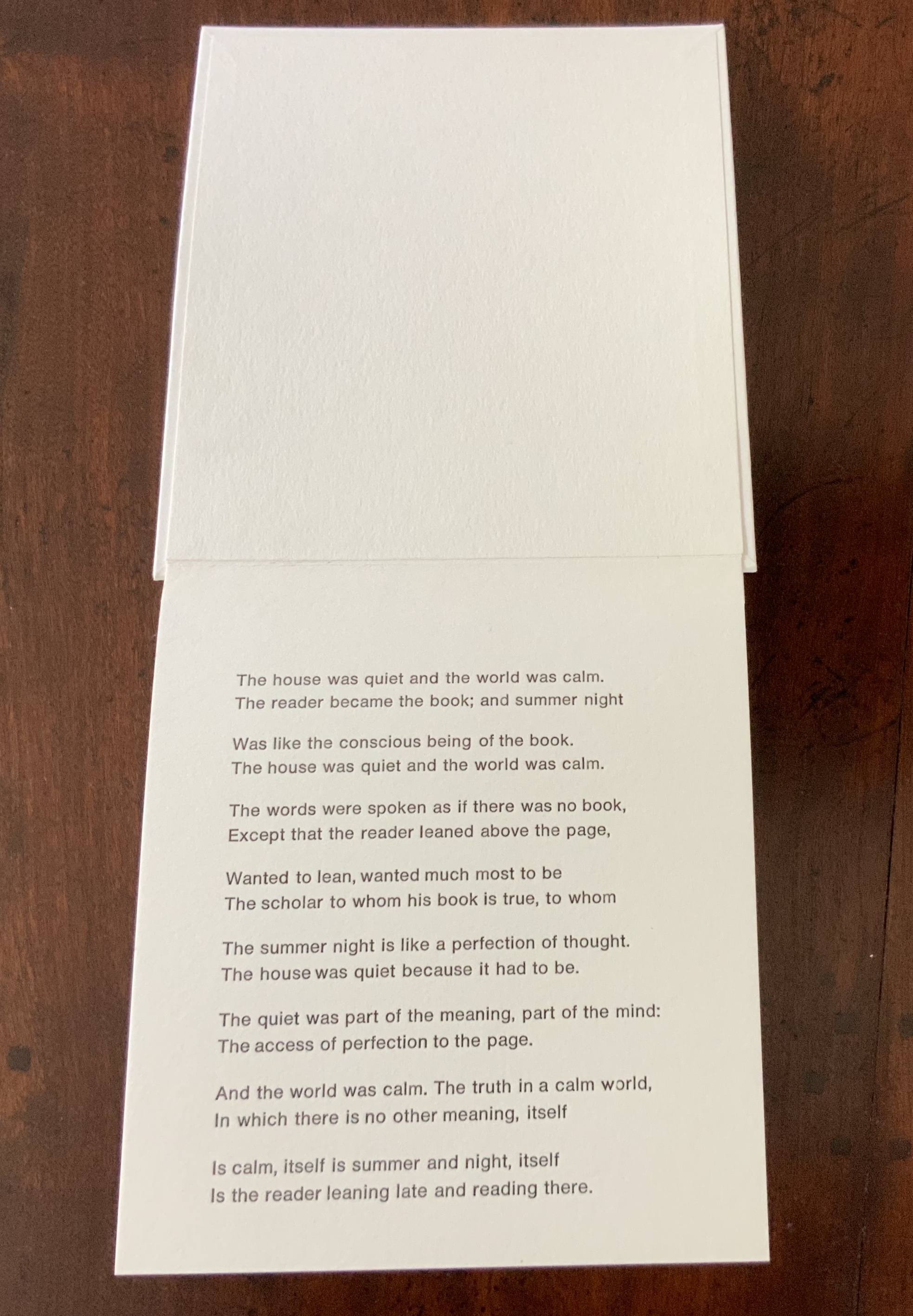
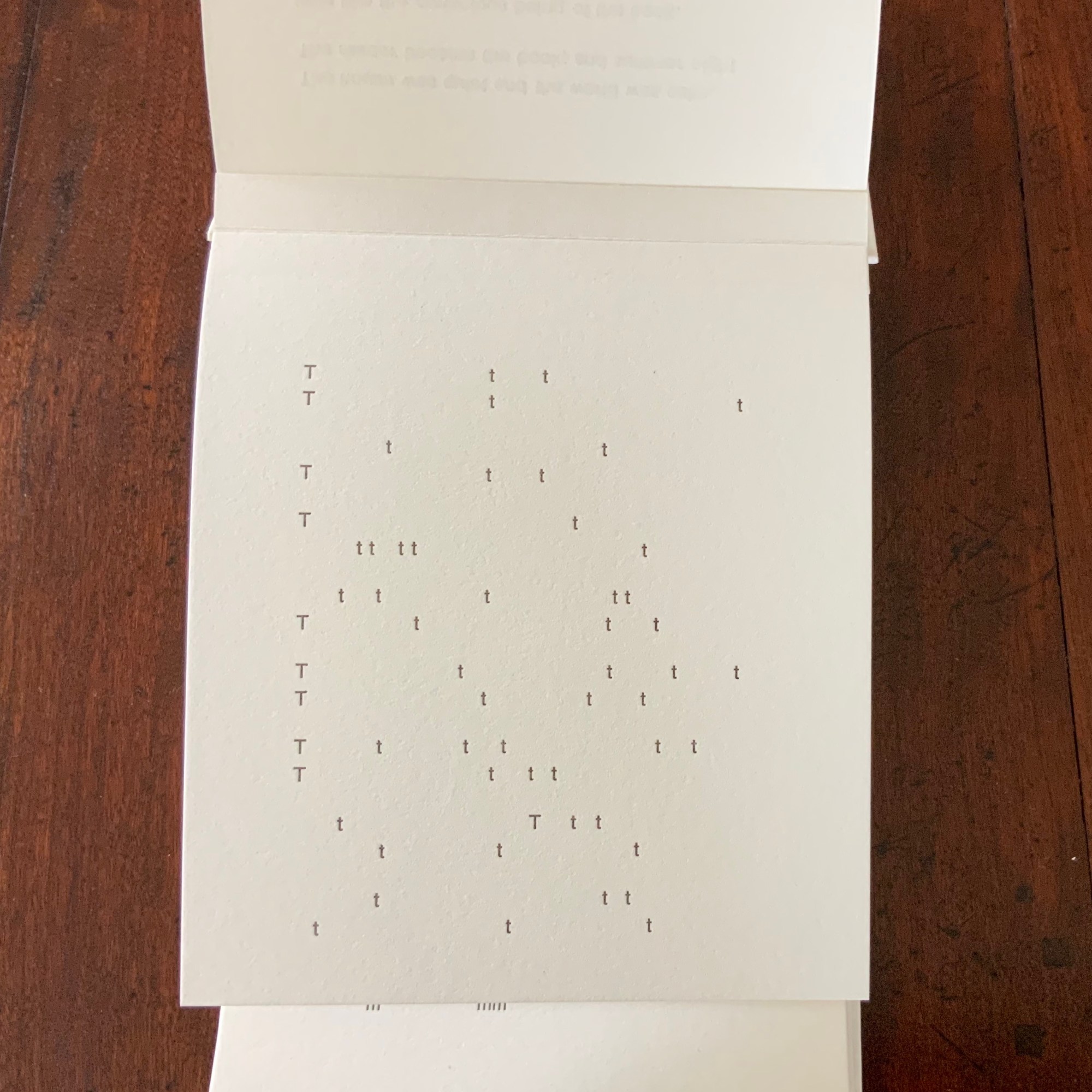
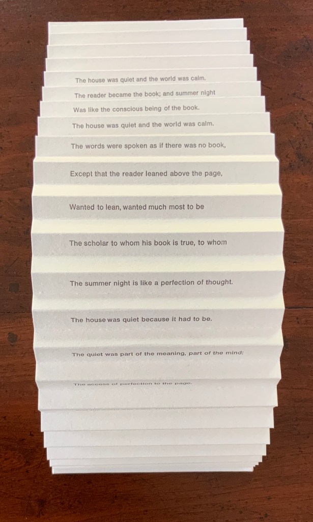
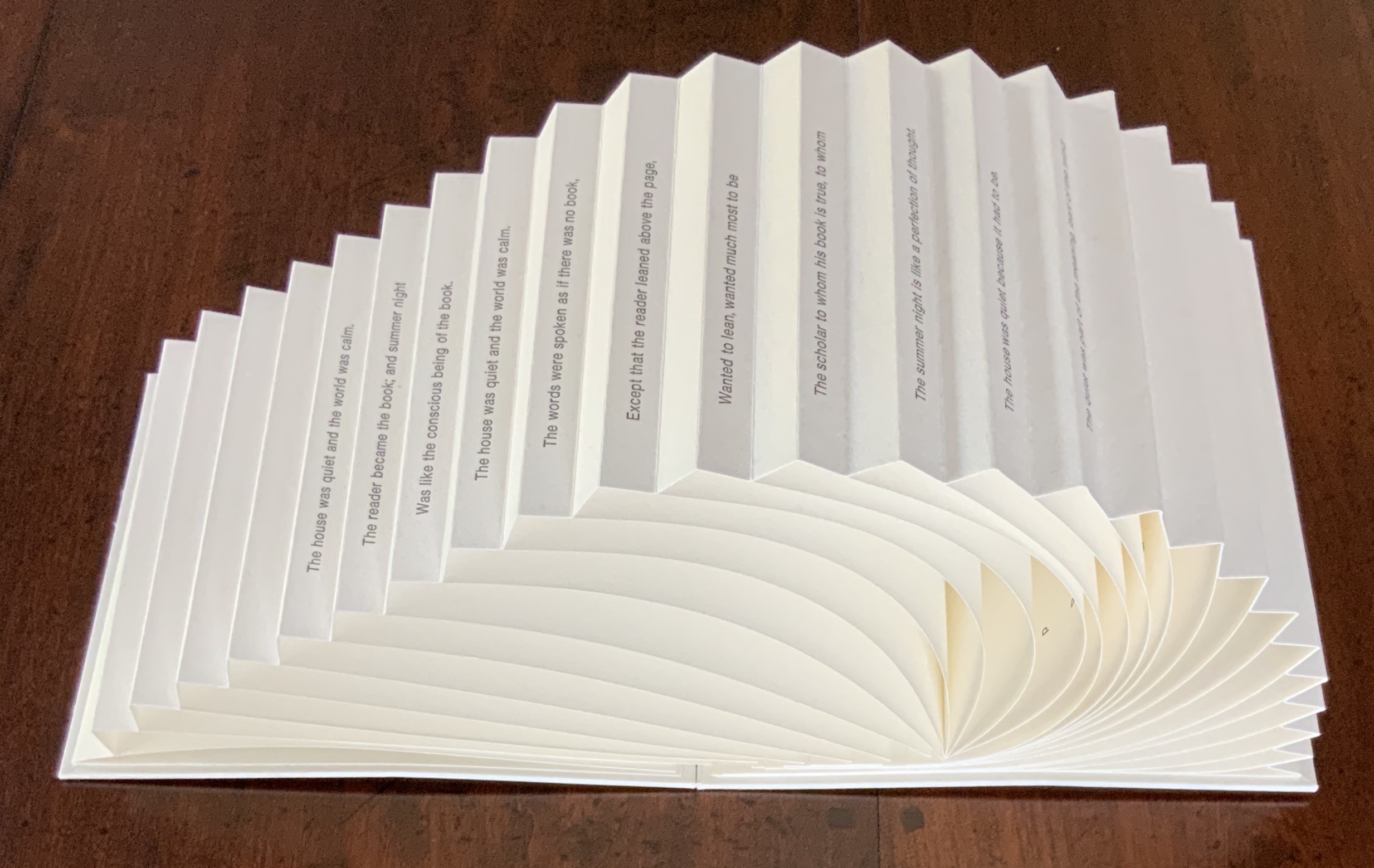
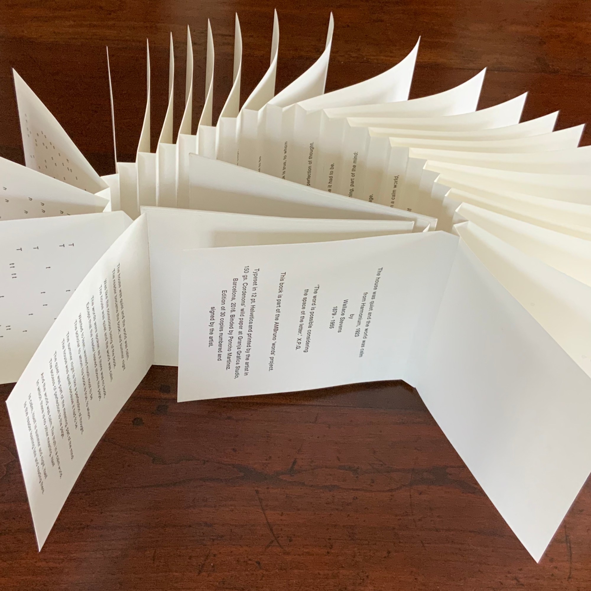
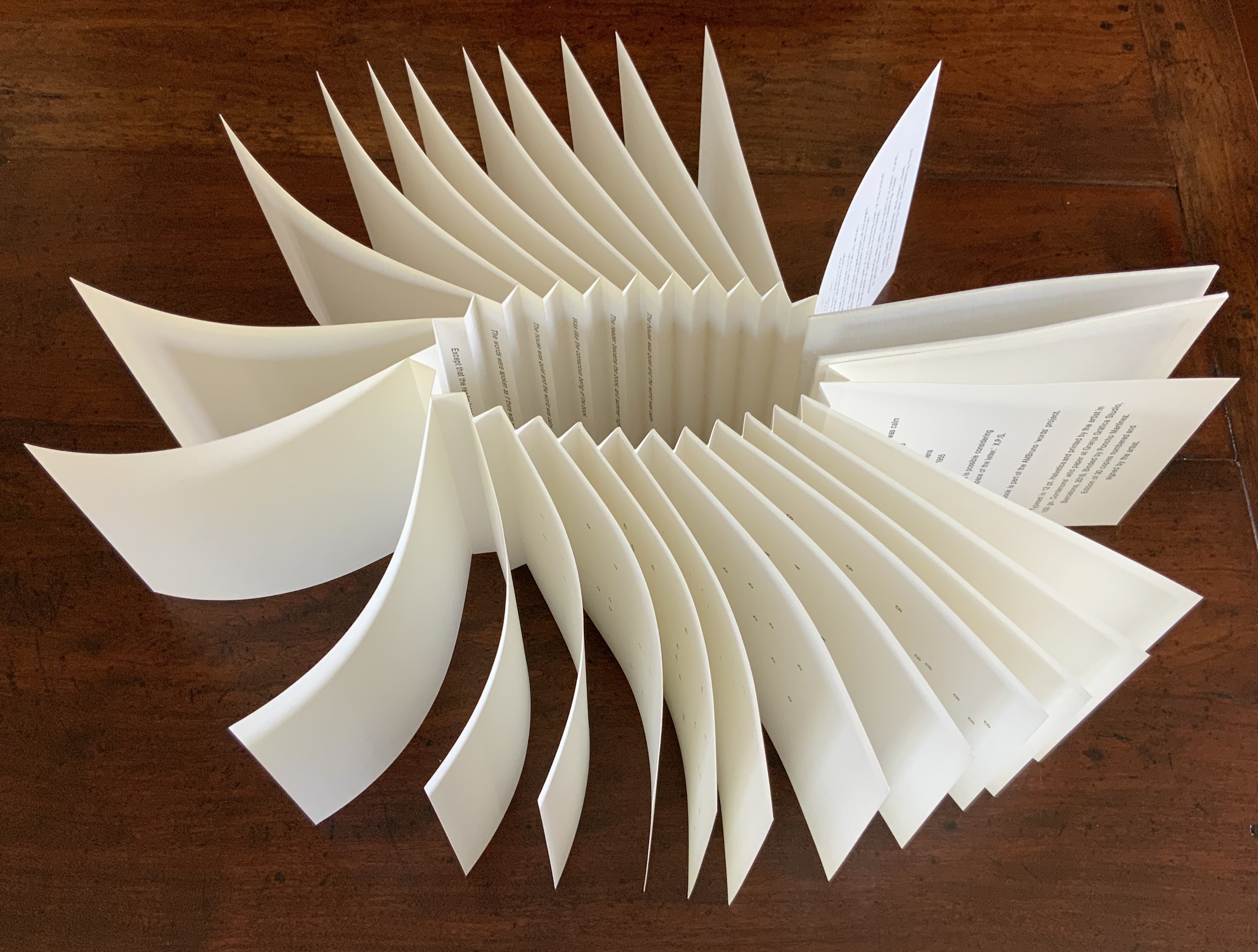
Another and richer example of the depth of Pérez Grobet’s work — and another response to an AMBruno challenge — is words (2016). In its colophon, she makes a statement that is both finishing touch and starting point to words: “The word is possible considering the space of the letter.” Rather than follow the tradition of the “fine press” edition, Pérez Grobet appropriates Wallace Stevens’ poem “The house was quiet and the world was calm”, breaks it into lines and letters, and creates an original work of book art.
In depicting a reader becoming “the book”, speaking its words “as if there was no book” and wanting to be “The scholar to whom his book is true”, Stevens’ poem seeks to lead us to “The access of perfection to the page”: a state of mind and situation. The state of mind is that in which the truth of meaning is as much a pose, perception and act of the body as it is of the mind. The situation is the threshold of object and subject, of being and the possibility of meaning, where the summer night we feel is “like the conscious being of the book” and where the act of perceiving meaning is simply being there, “leaning late and reading there”.
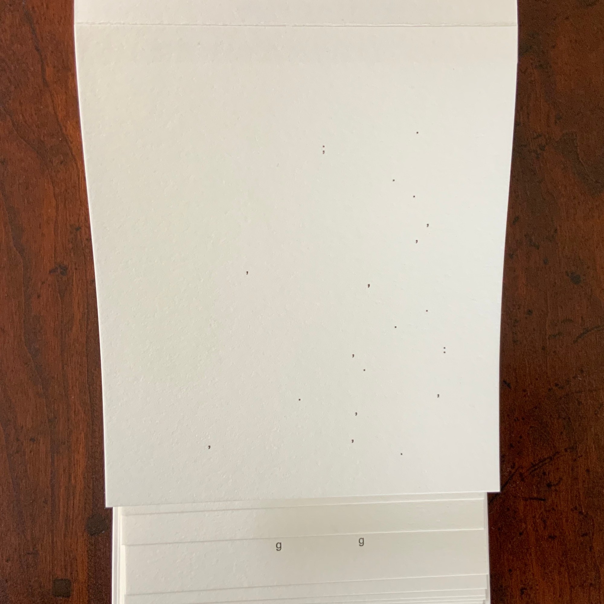
Pérez Grobet’s work challenges the reader/viewer to re-enact this. As the pages turn, the poem explodes into letters scattered across the recto pages. The letters “T”, “h” and “e” that first separately appear suggest a linear decomposition — a letter by letter representation of the poem. But “The” is followed by “o”, other random letters and even a comma — each dispersed in different patterns across its allocated page.
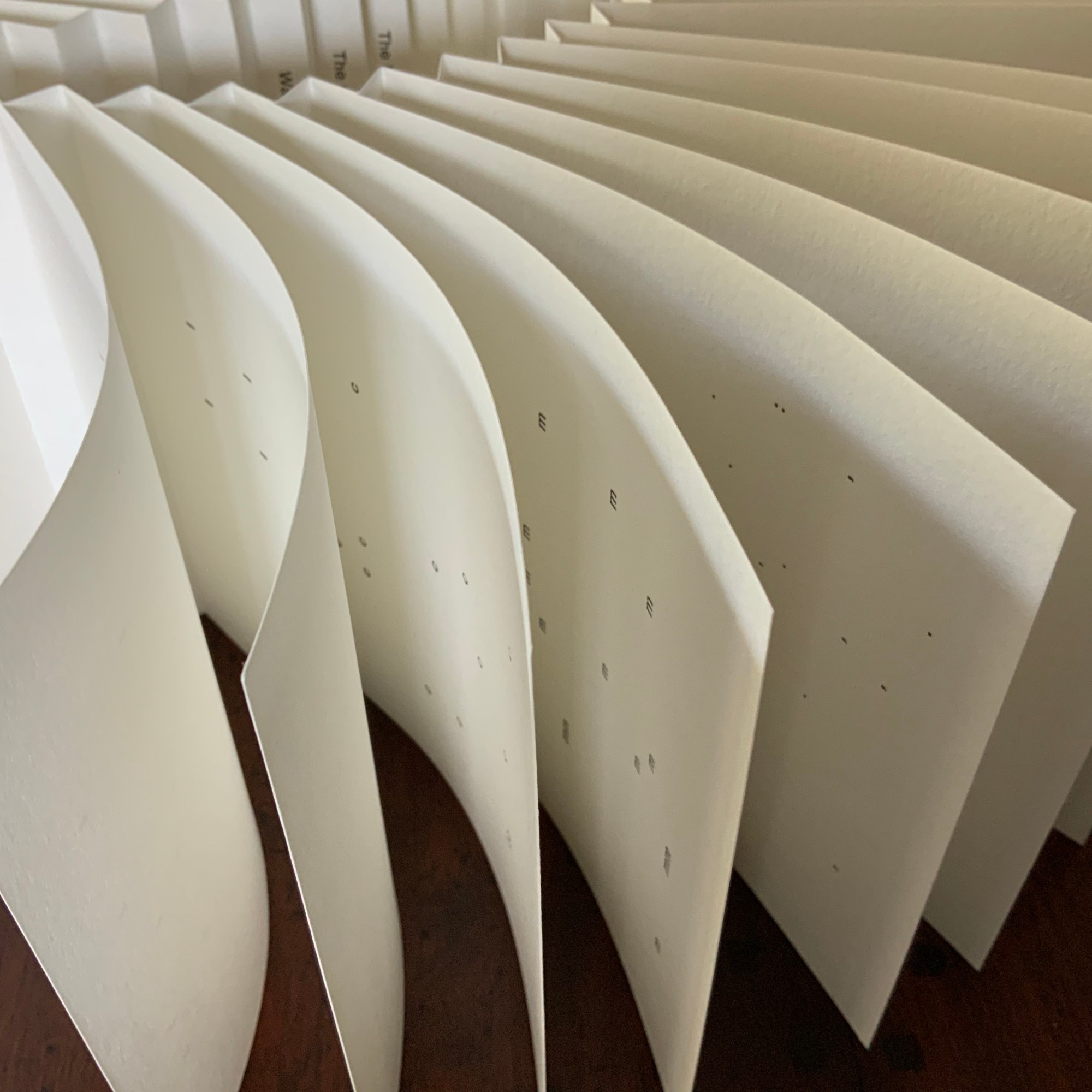
What’s more, the seemingly indecipherable book can be opened in more than one direction and read. Along the mountain folds of the open spine, the poem appears line by line.
Book or object, which way to read it? Which way to open it? Whichever way, the texture of the Cordenons paper combines with that traditional font of the periodic table (Helvetica) to provide a reassuring background for the mental and tactile challenge.
As an object — in its structure and its placement of text, especially Stevens’ text — words embodies both the sense of Pérez Grobet’s statement in the colophon and the sense of the poem. The possibility of meaning (the word) rests in the space of the letter and at the threshold between the physical and idealised fact of the cover, spine and page, on the one hand, and our physical and mental acts as readers/viewers, on the other.
The catalogue has twenty-two more works — equally engaging with different structures, colors, papers, type, techniques and content. More than enough to warrant another solo exhibition, and as always with book art, the challenge will be how to let the readers/viewers engage with the possibilities before them.