Books On Books Collection – Horst Antes

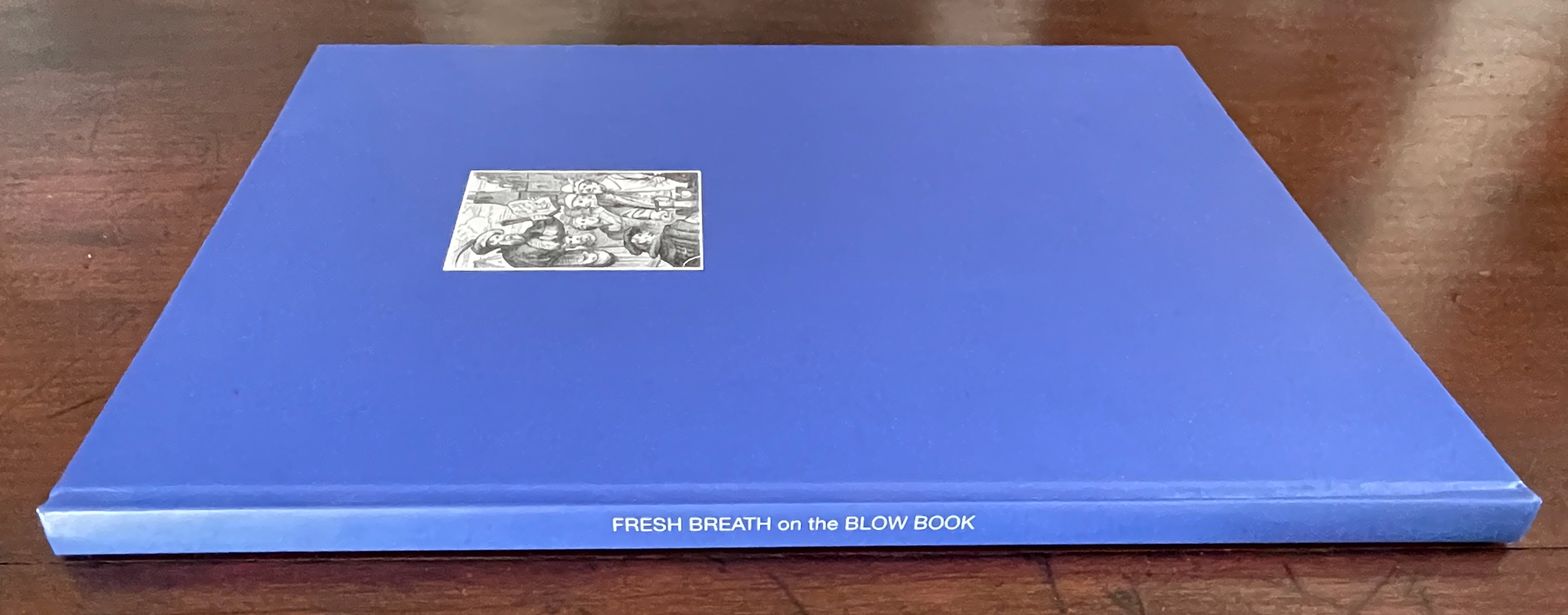
Flickbuch, Geschichten um das Flickbuch, and Fresh Breath on the Blow Book (2000, 2001, and 2003)

Flickbuch, Geschichten um das Flickbuch, and Fresh Breath on the Blow Book [trans] (2000, 2001, and 2003)
Horst Antes and Volker Huber [Translators: Ariel Frailich, Richard Hatch, and Sharon and Arno Ziesnitz]
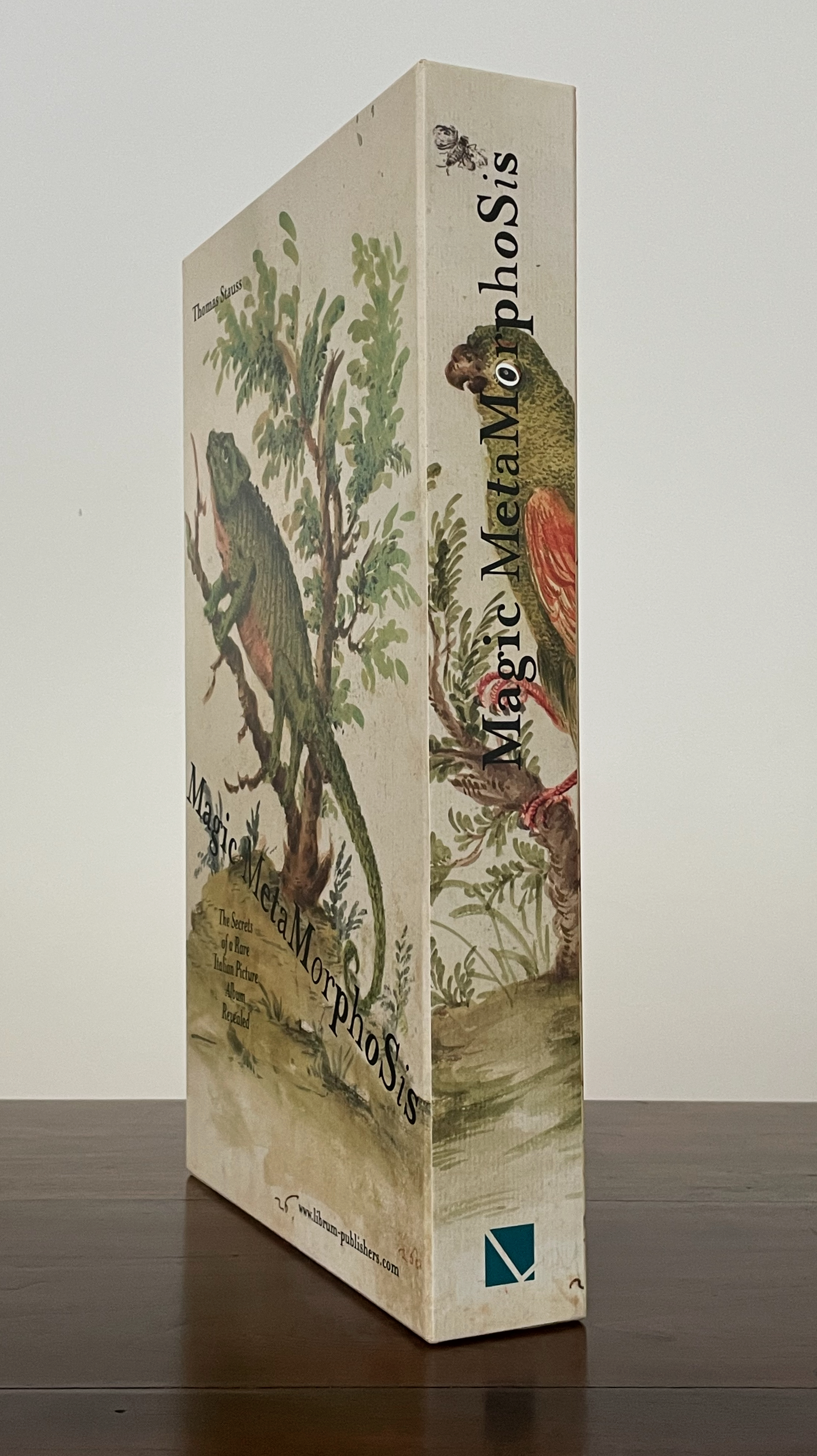
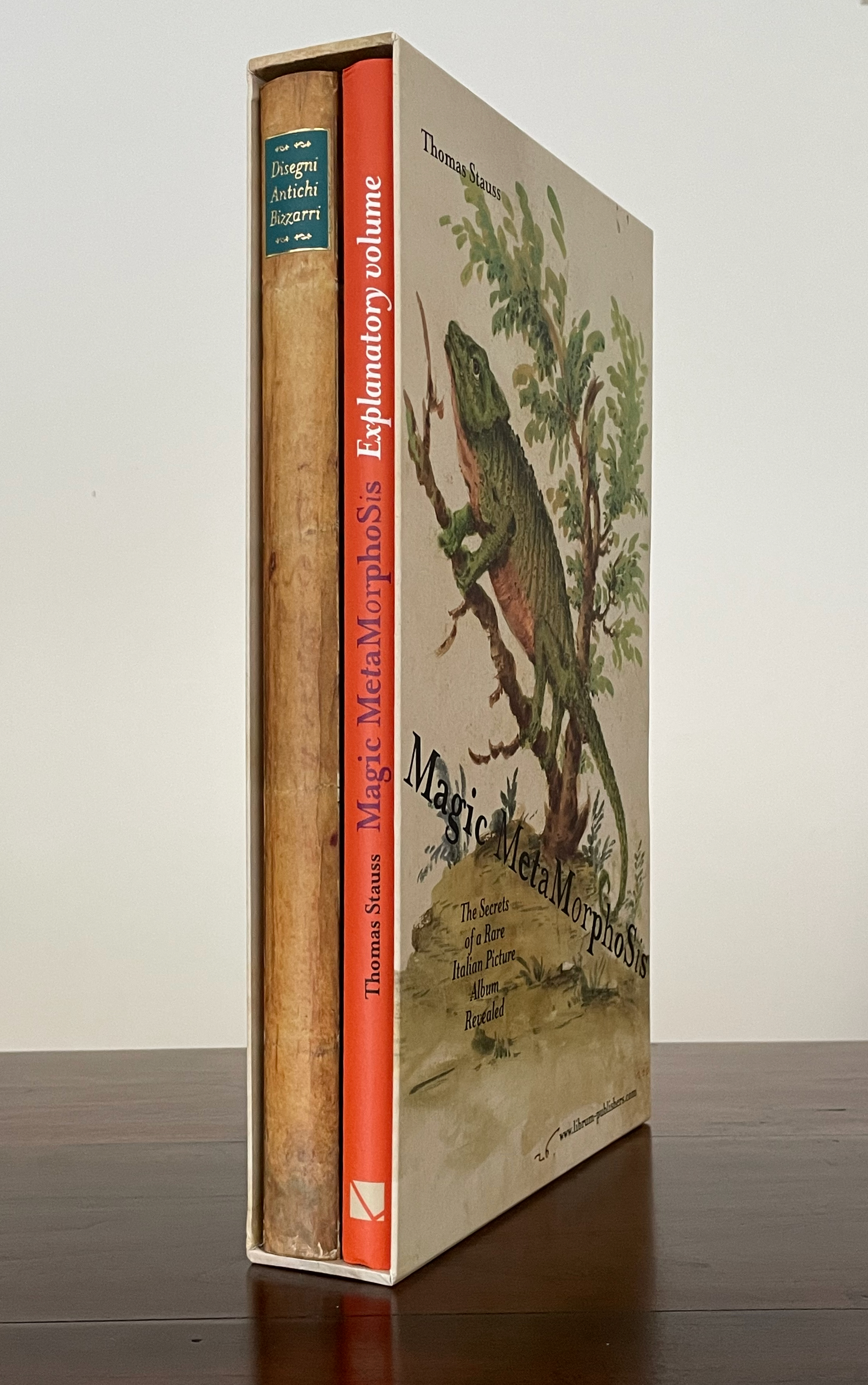
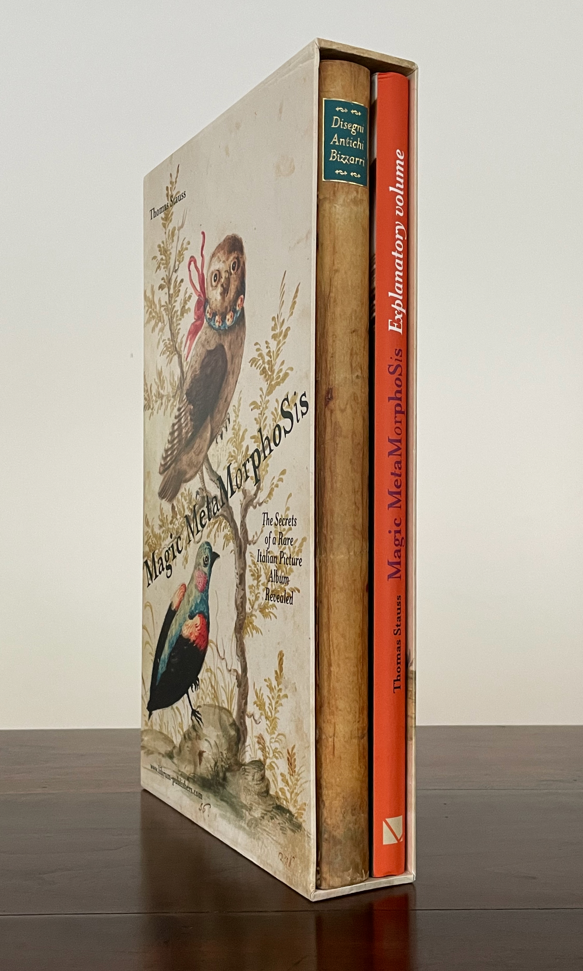
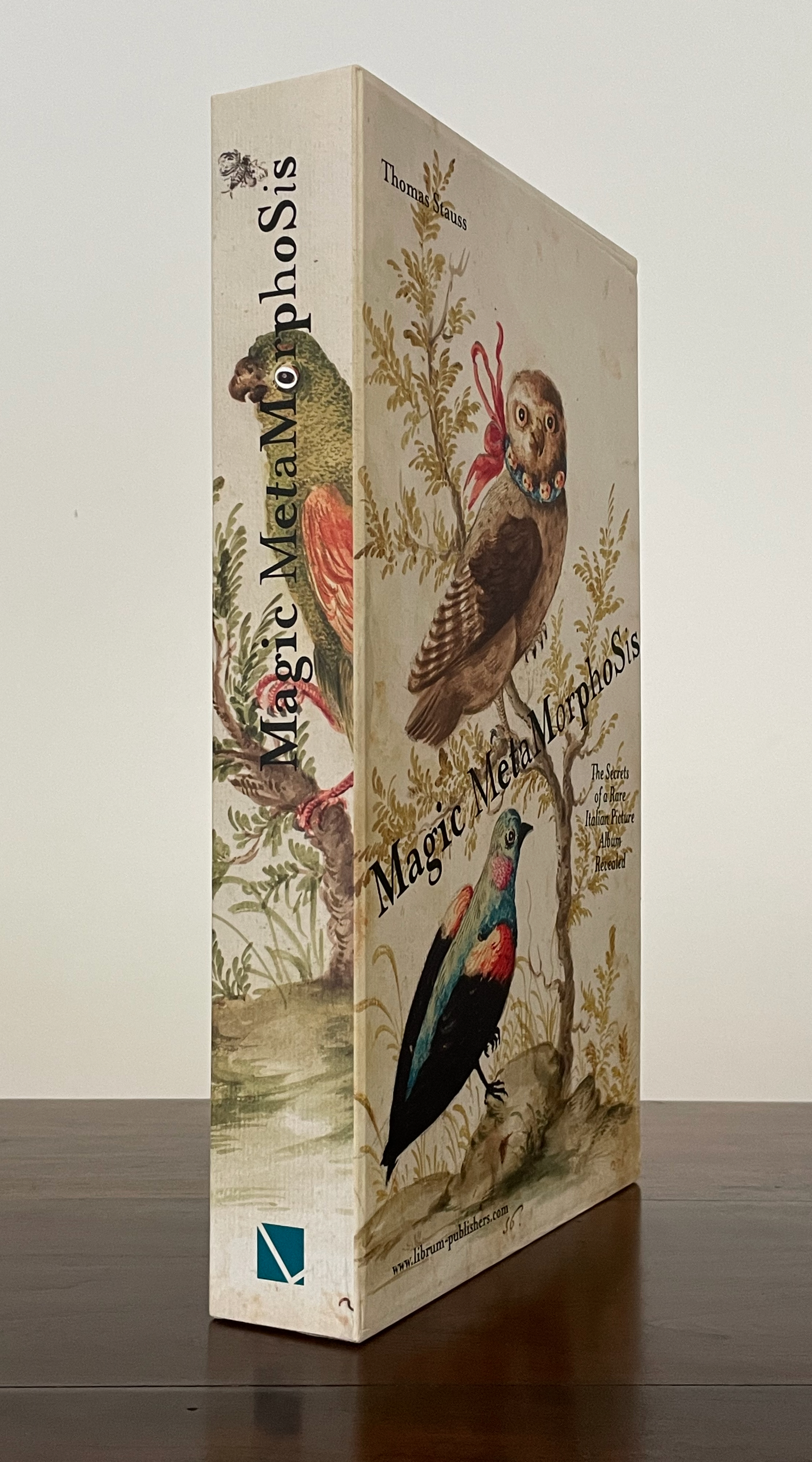
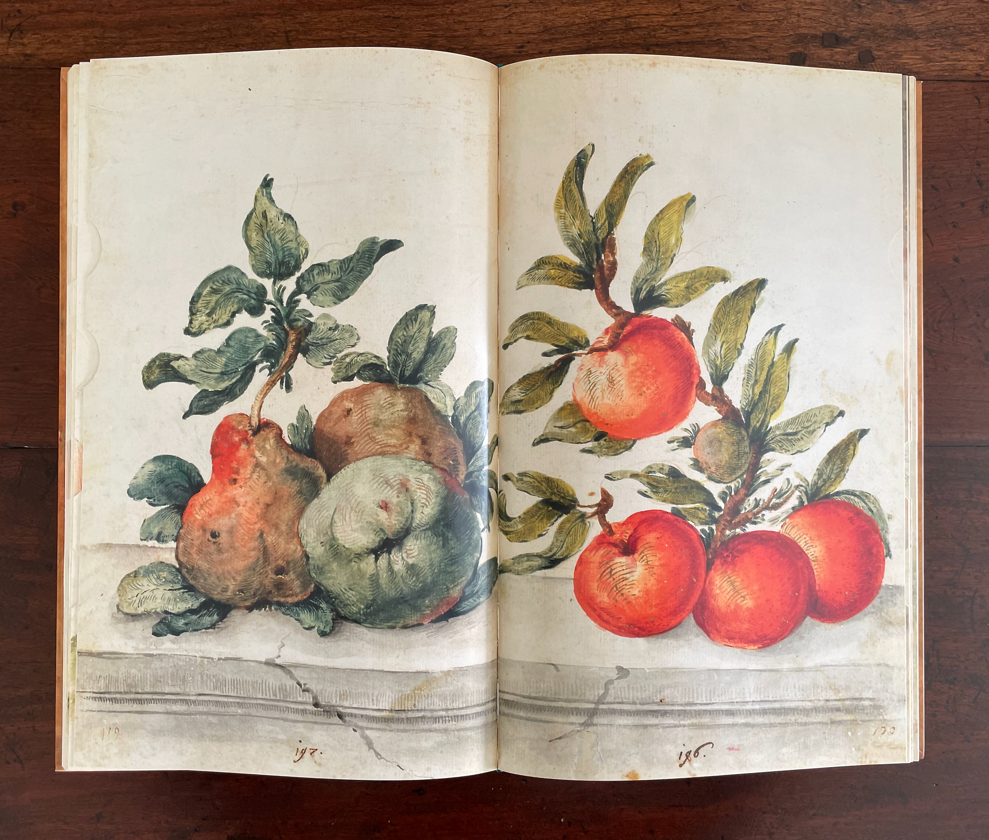
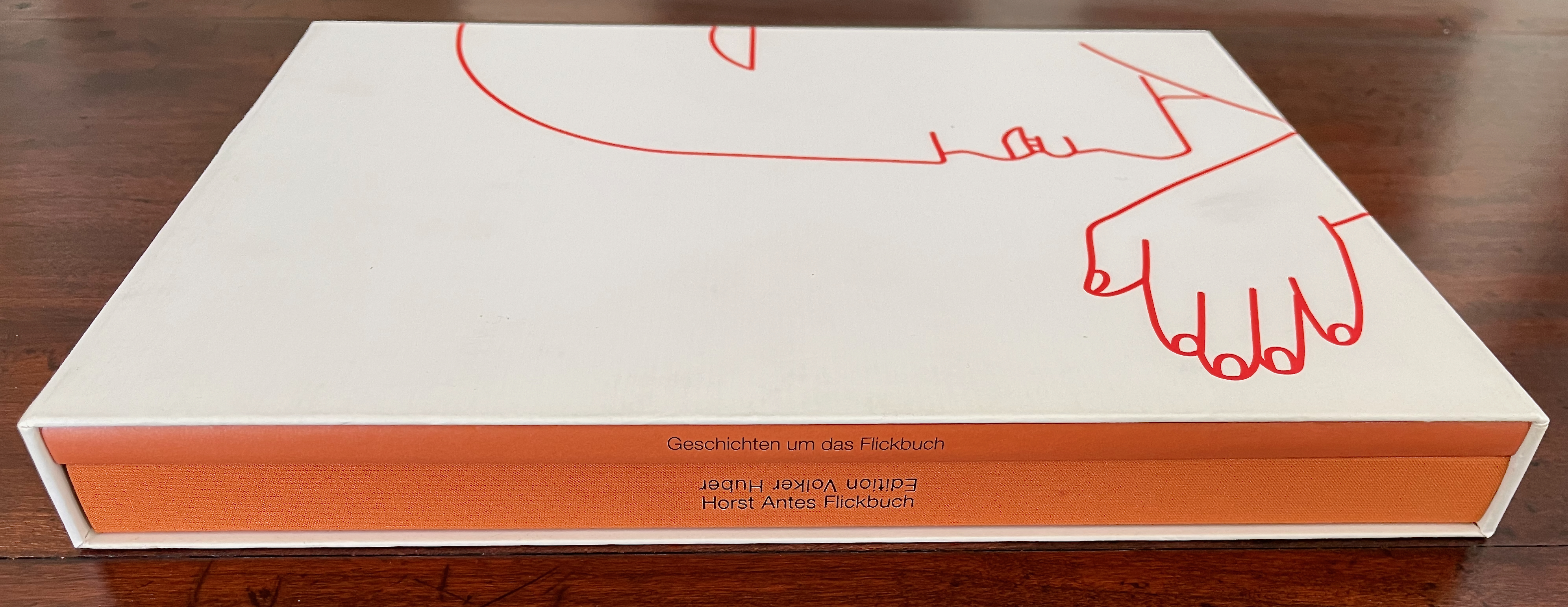
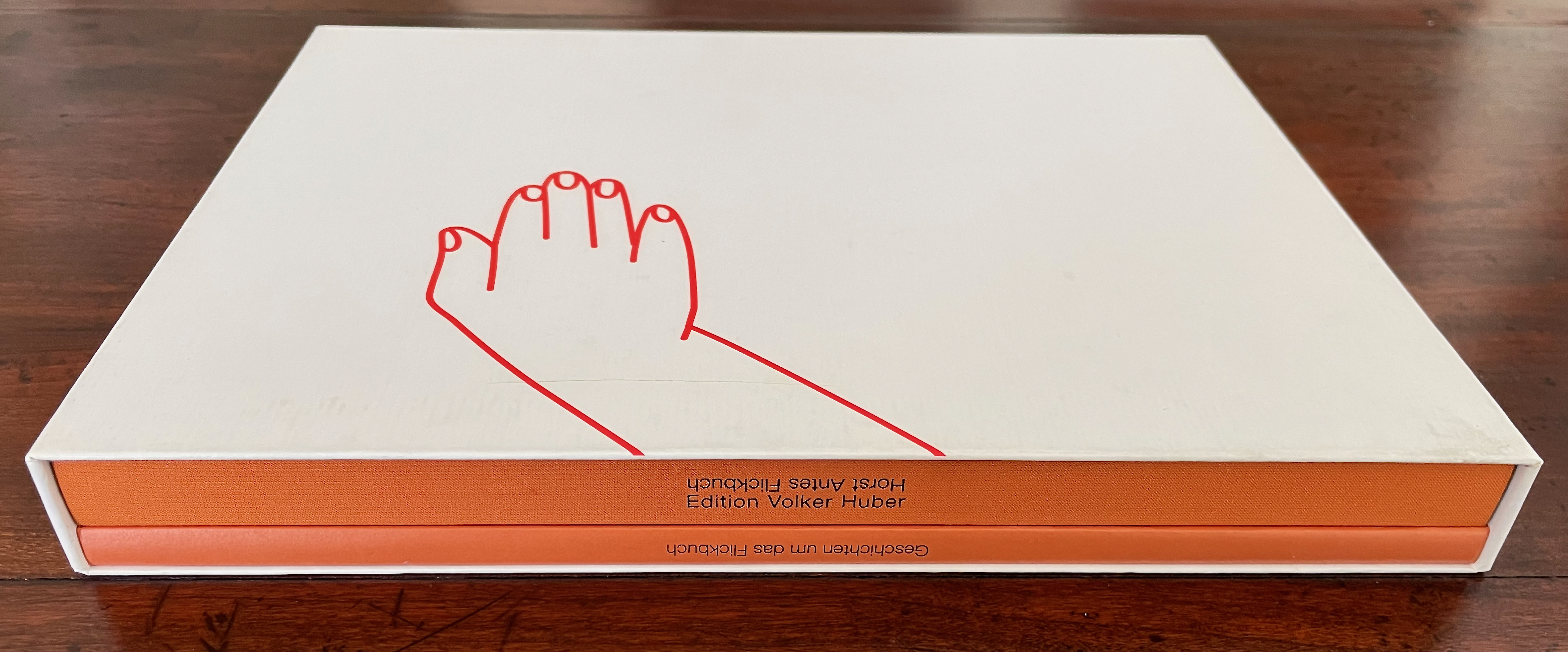
Slipcase containing two volumes in German. Single volume in English. Slipcase: H276 x W212 mm. Books: H269 x W209 mm. [164] and 32 pages. Translation volume: H268 x W209 mm. 40 pages. Slipcased edition of 1000, unnumbered copy. Acquired from Ricky Jay Estate, 17 August 2024.
Photos: Books On Books Collection.

I had been looking for Ricky Jay’s The Magic Magic Book (1994) and hoped that the 2024 estate auction would yield a result. It did but an unexpected one. Like Jay, the namesake founder of Volker Huber Edition und Galerie in Offenbach was a collector of magic artifacts. He was also an honorary member of Germany’s Magic Circle, so his acquaintance with the celebrated magician and actor was no surprise. What was a surprise was that he had combined his art interests with those in magic to create a “blow book” with Horst Antes, one of the several well-known German artists he published.

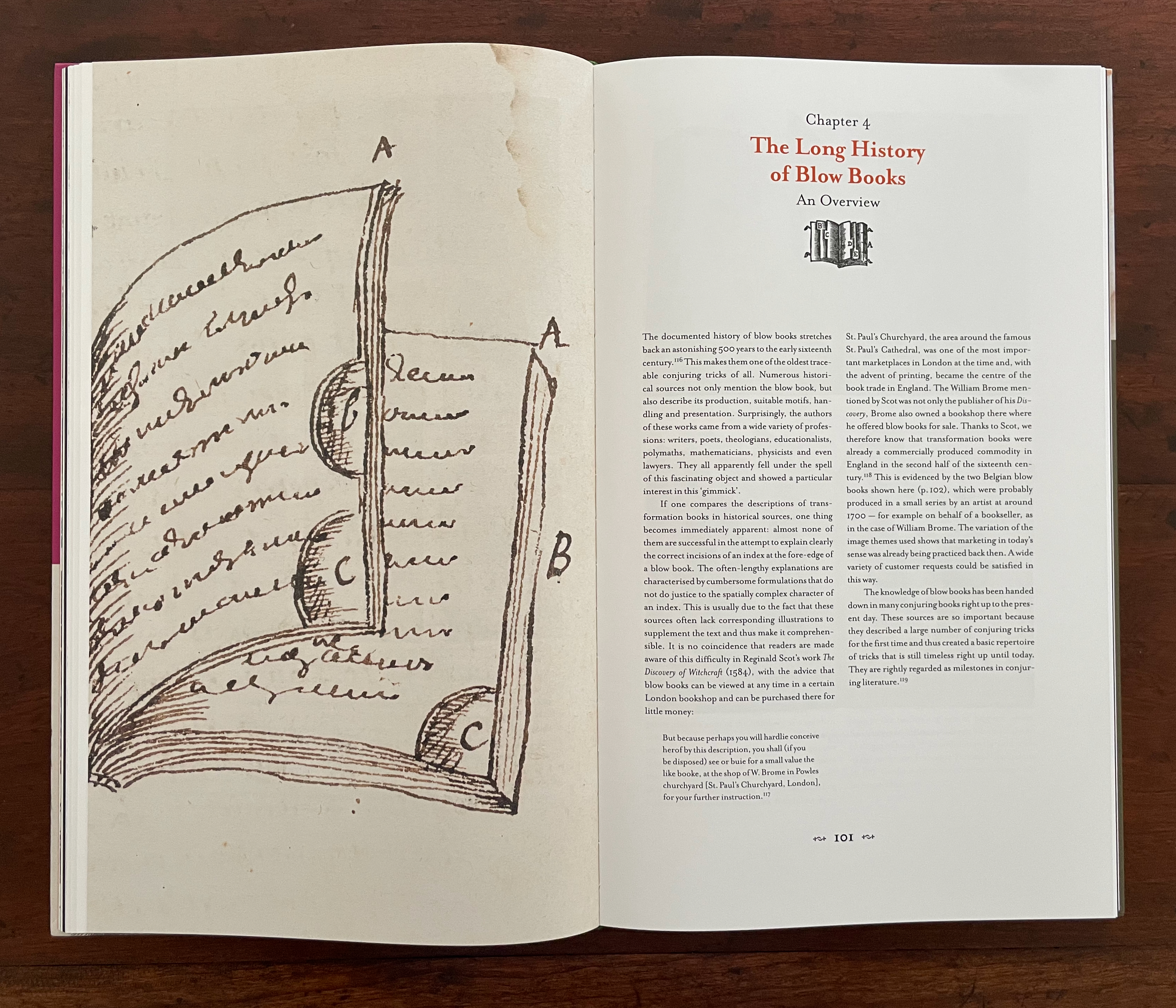
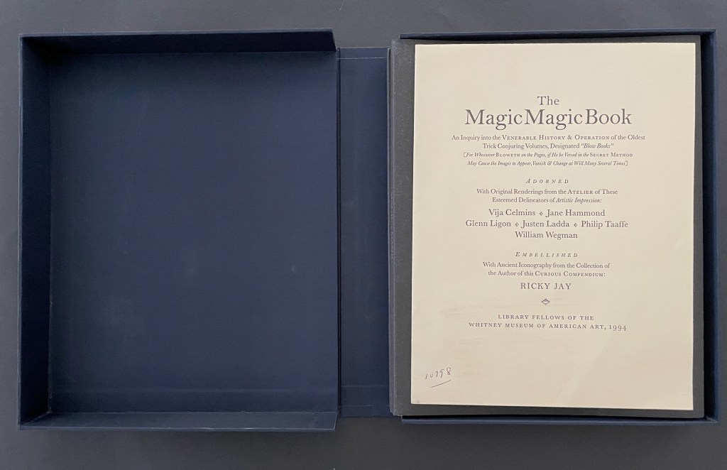
The blow book is best known in its familiar incarnation as the “magic coloring book”. The performer flicks through the book of blank figures to be colored in, calls on an observer to blow on the closed book, and then reopens it to show all of the pictures colored in. Hard-to-see tabs or alternating page widths enable the performer to produce the effect. Jay’s work remains the definitive history of the blow book. It consists of two volumes, one of which is a working blow book with contemporary art by Vija Celmins, Jane Hammond, Glenn Ligon, Philip Taaffe, and William Wegman, the other being the history of the apparatus.

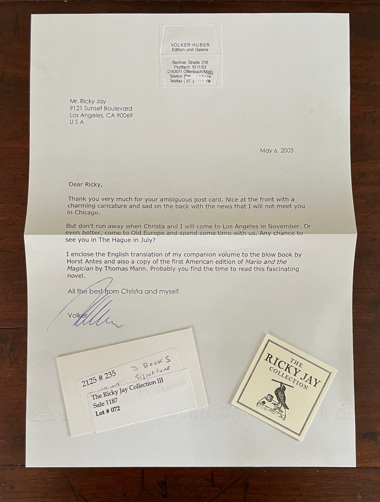
A handwritten letter addressed to Mr. Ricky Jay, dated May 6, 2003, from Volker Huber, expressing gratitude for a post card and discussing upcoming visits. Below the letter are two items: a small card related to 'The Ricky Jay Collection' and another card labeled with details about a sale.

Huber leads the list of acknowledgments in Jay’s book. From that and this piece of ephemera, there is no doubt of their close acquaintance. If, however, you have read the New Yorker profile on Ricky Jay, Huber’s reference to Jay’s “ambiguous post card” will raise an eyebrow. Both Jay’s and Huber’s productions are slipcased, both are in two volumes, both have a working blow book, and both have an accompanying history. Given the New Yorker anecdote about Jay’s harsh reaction to a magician who mentioned he had incorporated Jay’s famous “The Four Queens” routine in his act, might Jay’s “ambiguous post card” have implied that Huber had reperformed Jay’s book trick?

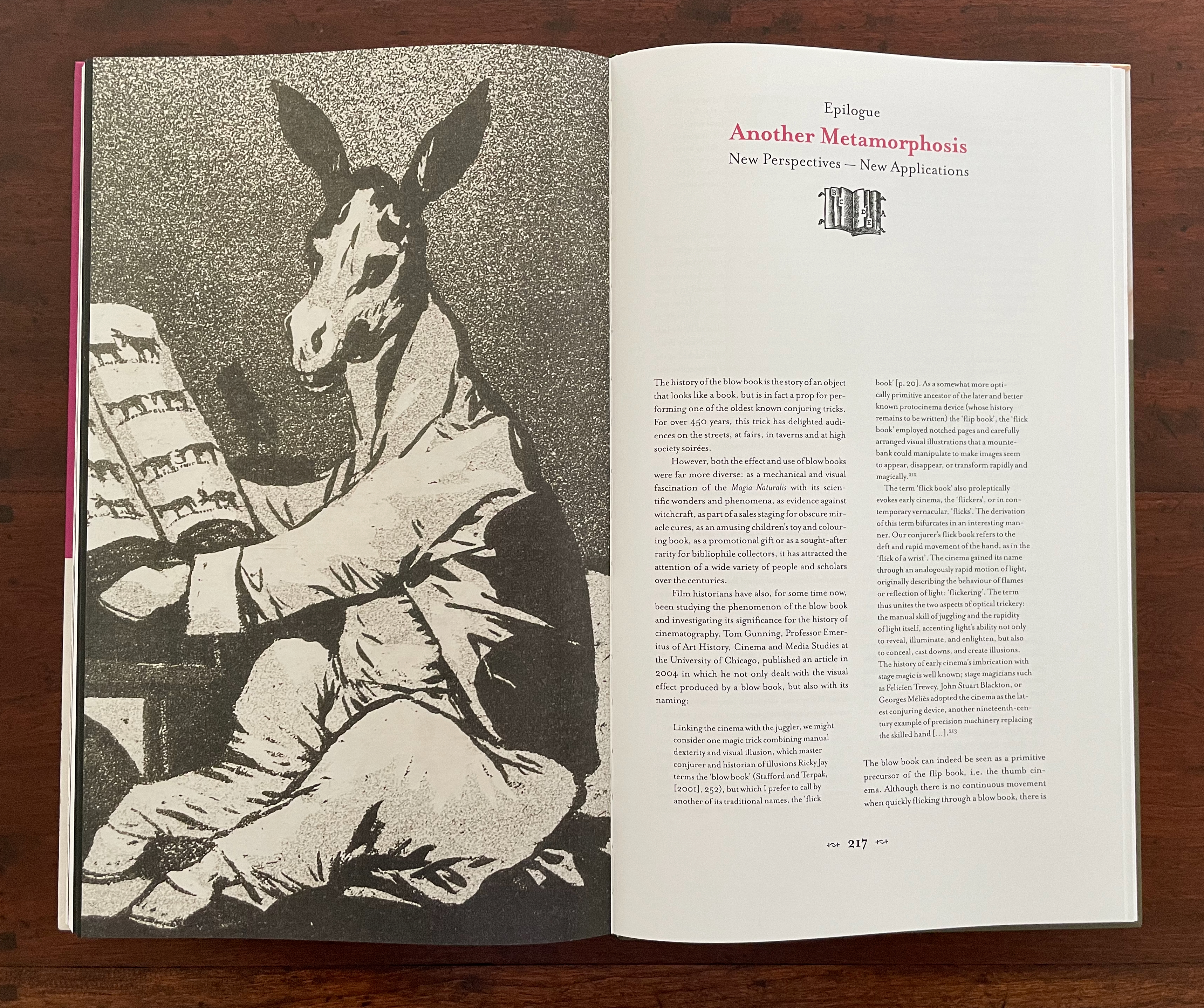
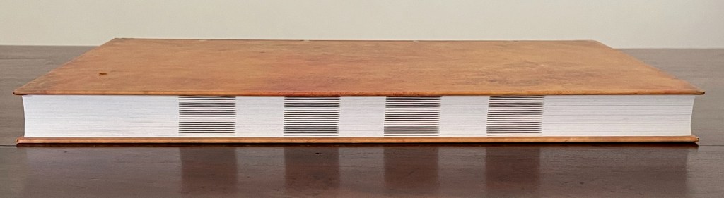
Huber’s Geschichten um das Flickbuch [“History of the Blow Book”*] naturally cites Jay’s book. But it has many of the same illustrations. Unsurprisingly it equally highlight the same source for the first detailed description of the blow book. The main difference is that Huber argues for the existence of a missing blow book that would have accompanied the source, whereas Jay considers it unlikely. As for the working volumes, both have dos-à-dos structures. Admittedly there are differences. Jay uses tabs to facilitate the performer’s switch from sequence to sequence; Huber uses a sloping trim of width. Jay’s has twelve sequences, six to each side of the dos-à-dos; Huber and Antes have only four, two to each side. Might Jay have been a little jealous that those differences are what give Huber and Antes the room to elevate the blow book from a worked example to an artist’s book?

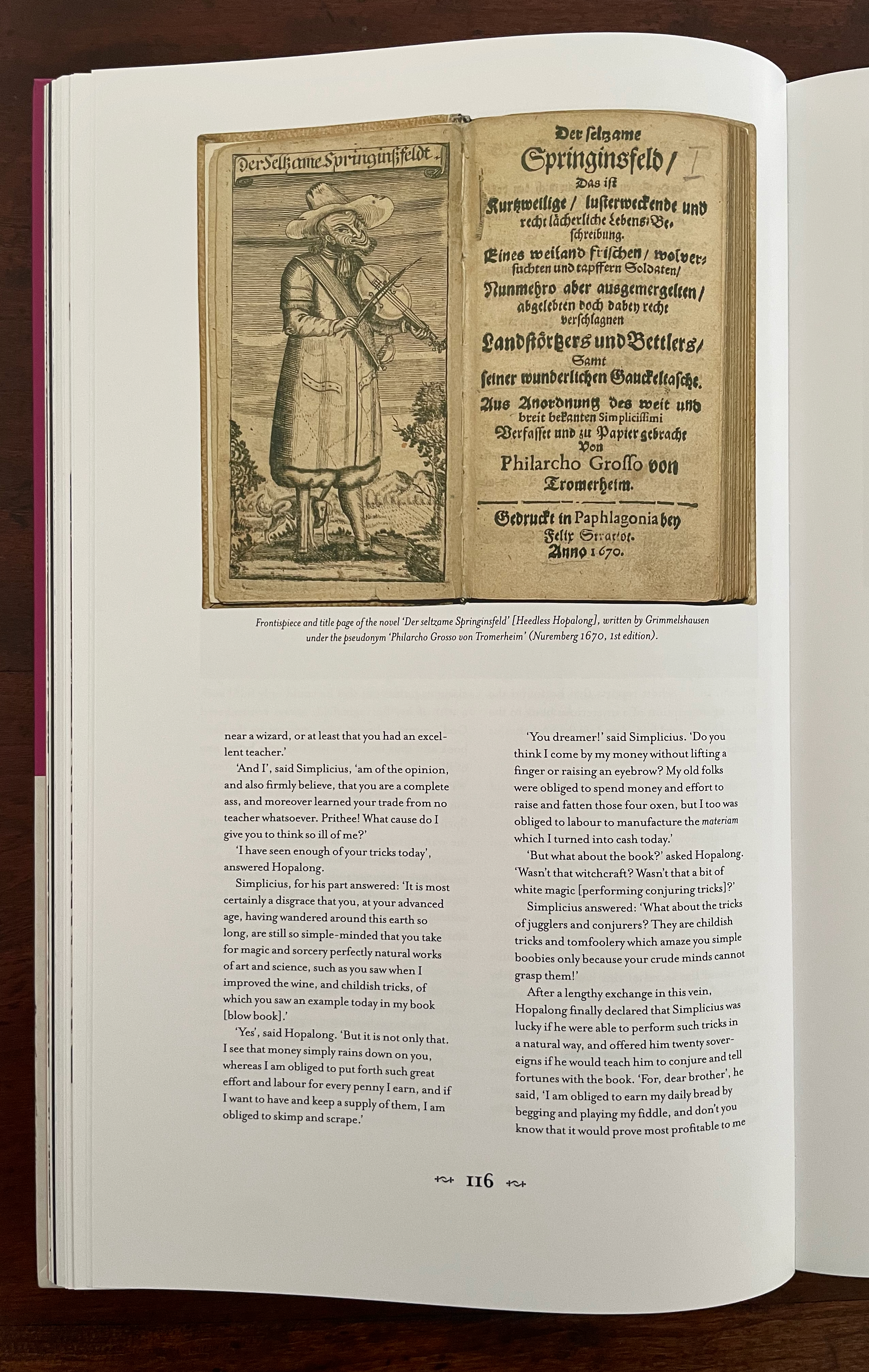
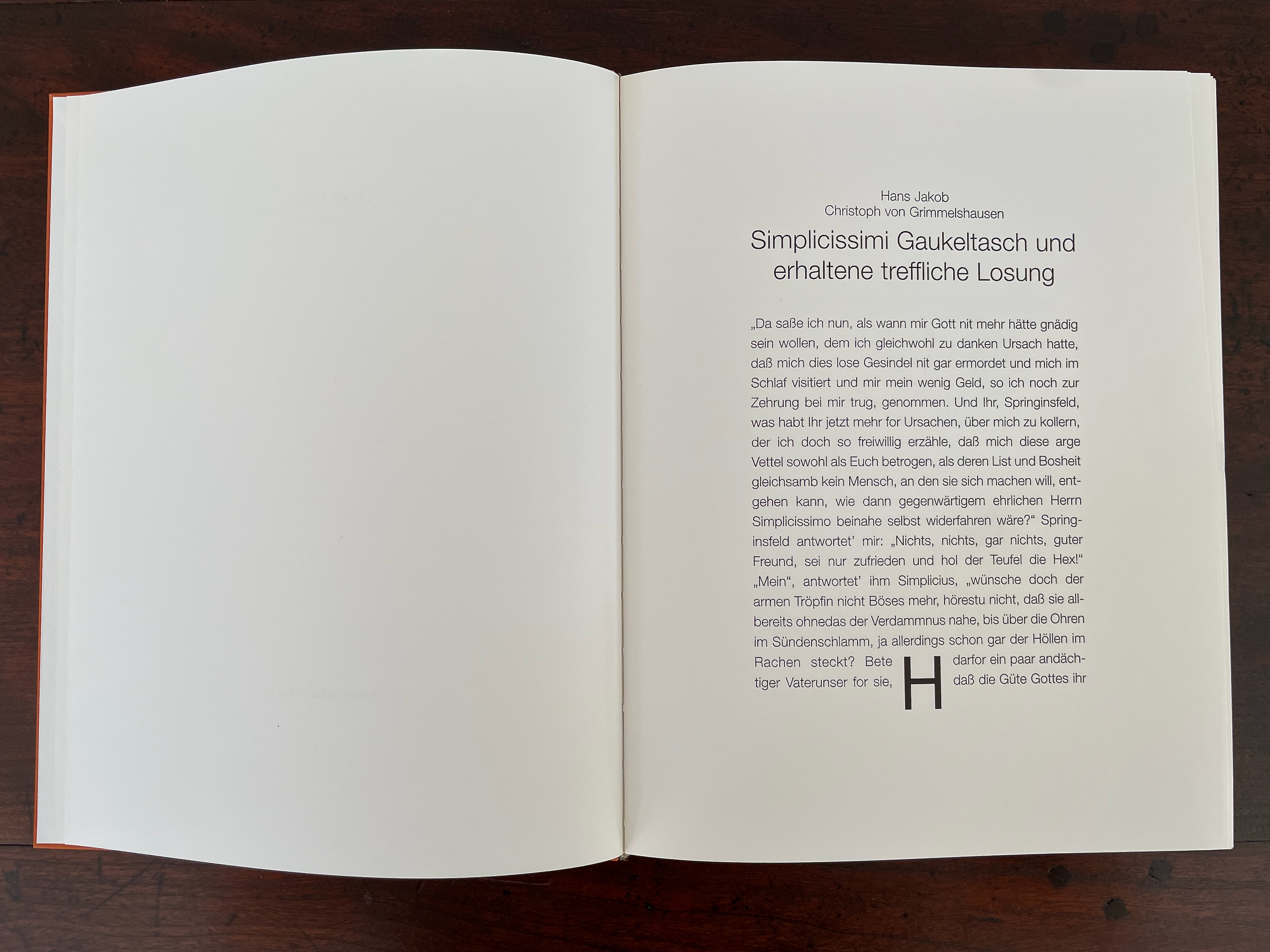
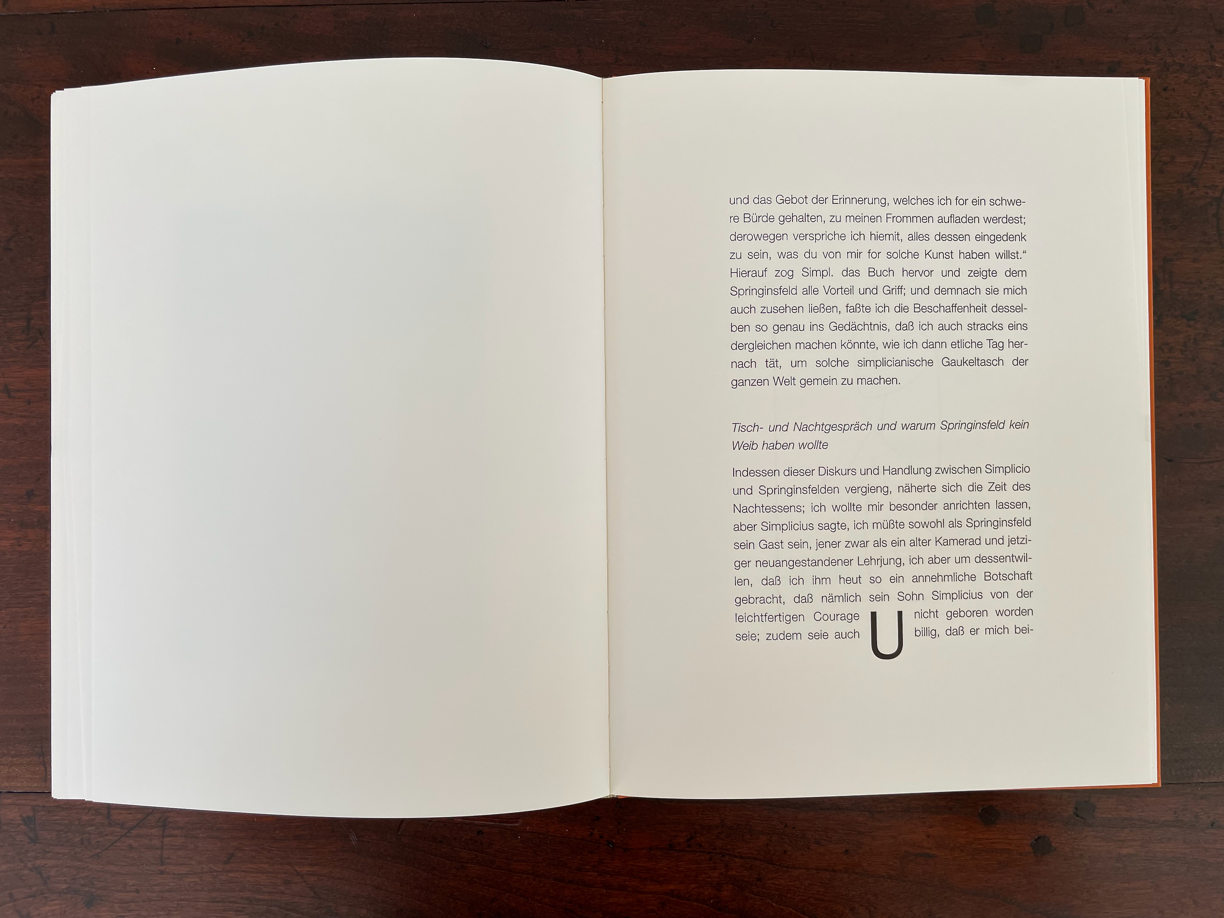
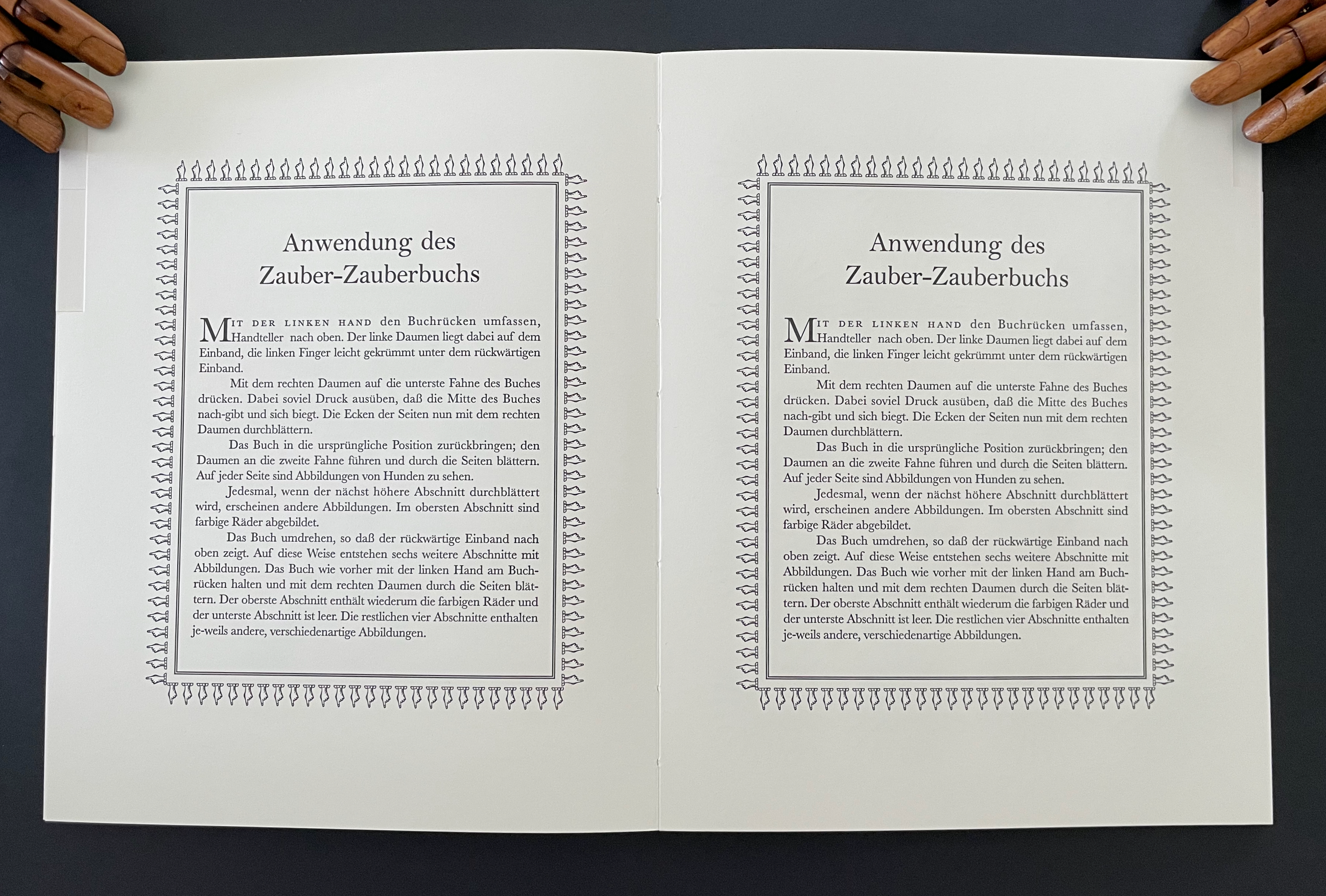
Holding the spine of Flickbuch with the left hand and placing the right thumb against the lower corner of the fore edge, the reader/performer riffles through the book. Twenty pages flip along, displaying the text of three selections from the mid-17th-century picaresque novel by Hans Jakob Christoffel von Grimmelshausen entitled “Simplicissimi Gaukeltasch und erhaltene treffliche Losung” [“Simplicissimus’ Magic Book and its Excellent Profits”]. At the bottom of the text block on each page, a large display letter appears: first H, then O, gradually spelling out HORSTANTES-FLICKBUCH. It is a clever way of appropriating the Simplicissimus tale for Antes.

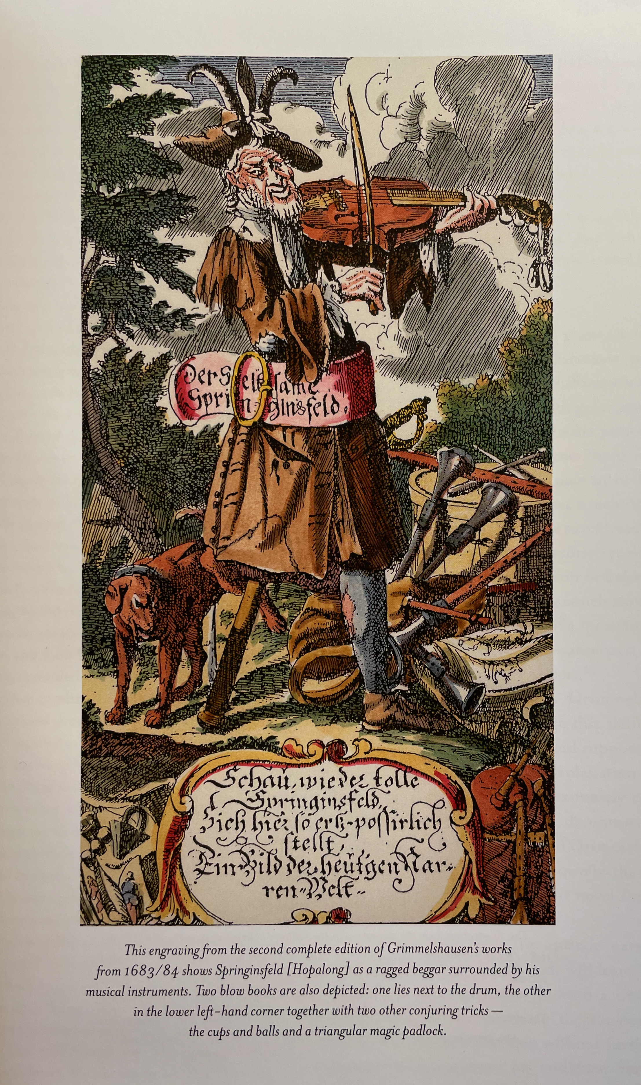
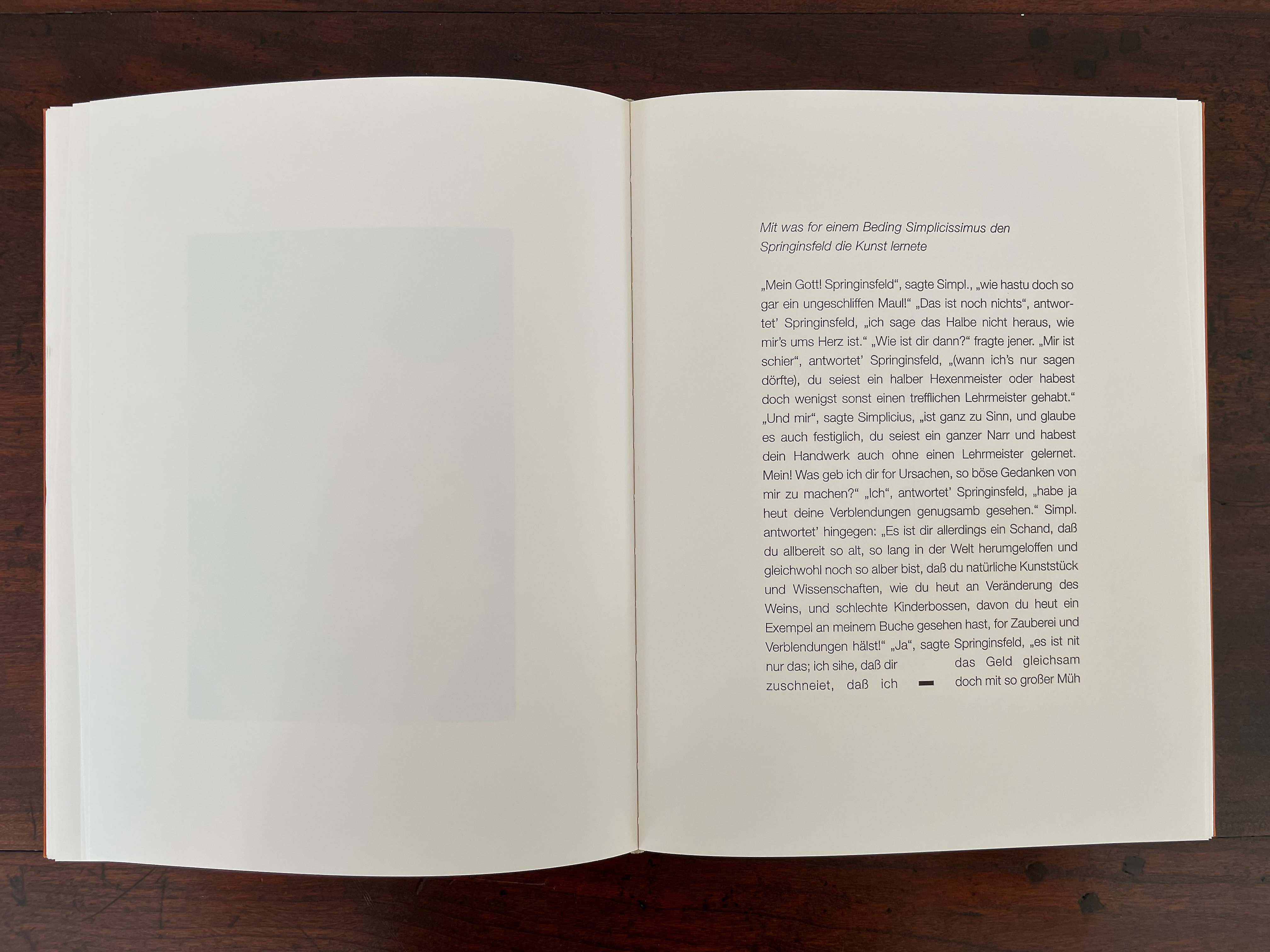
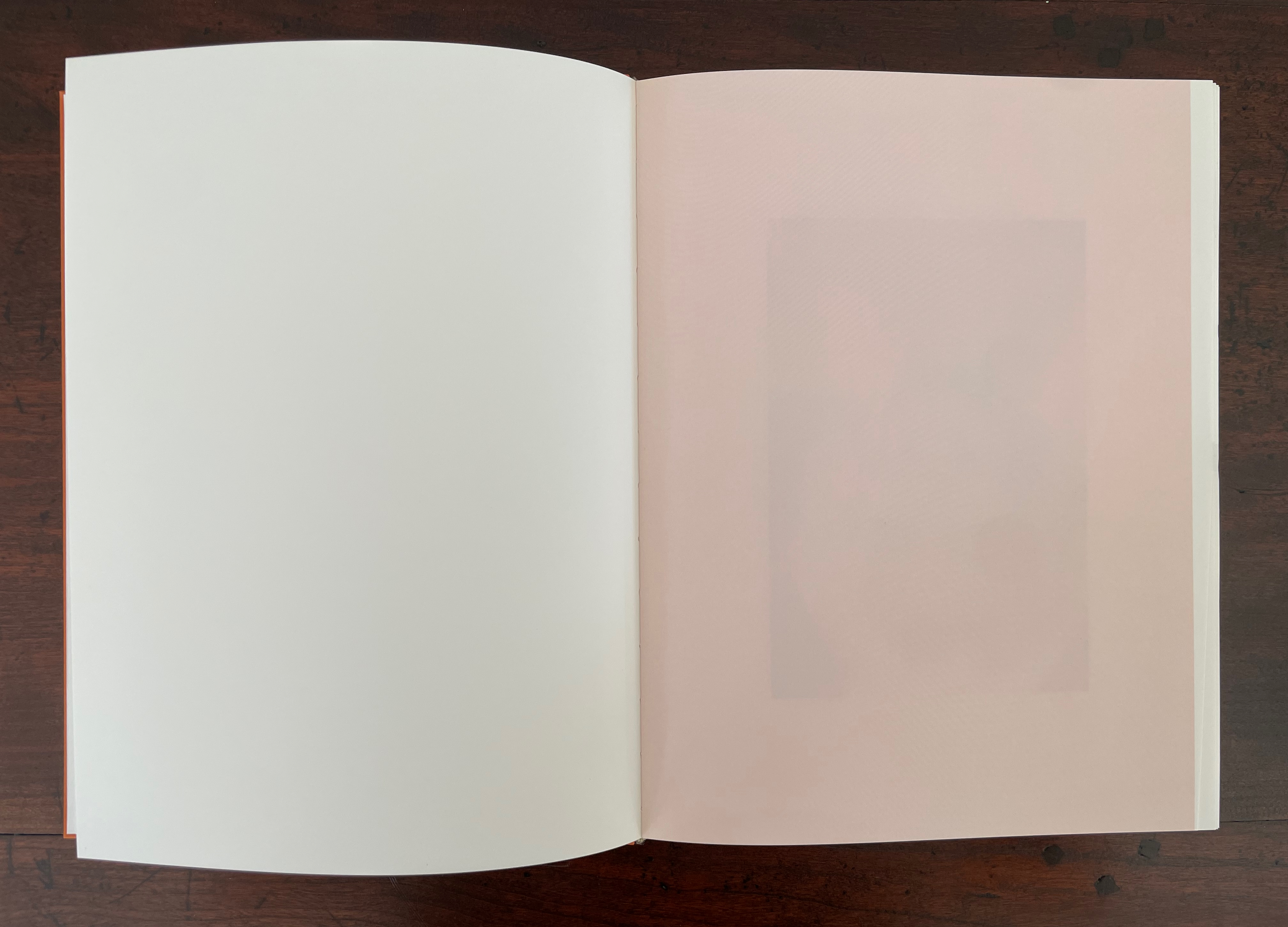
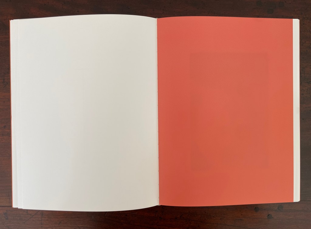
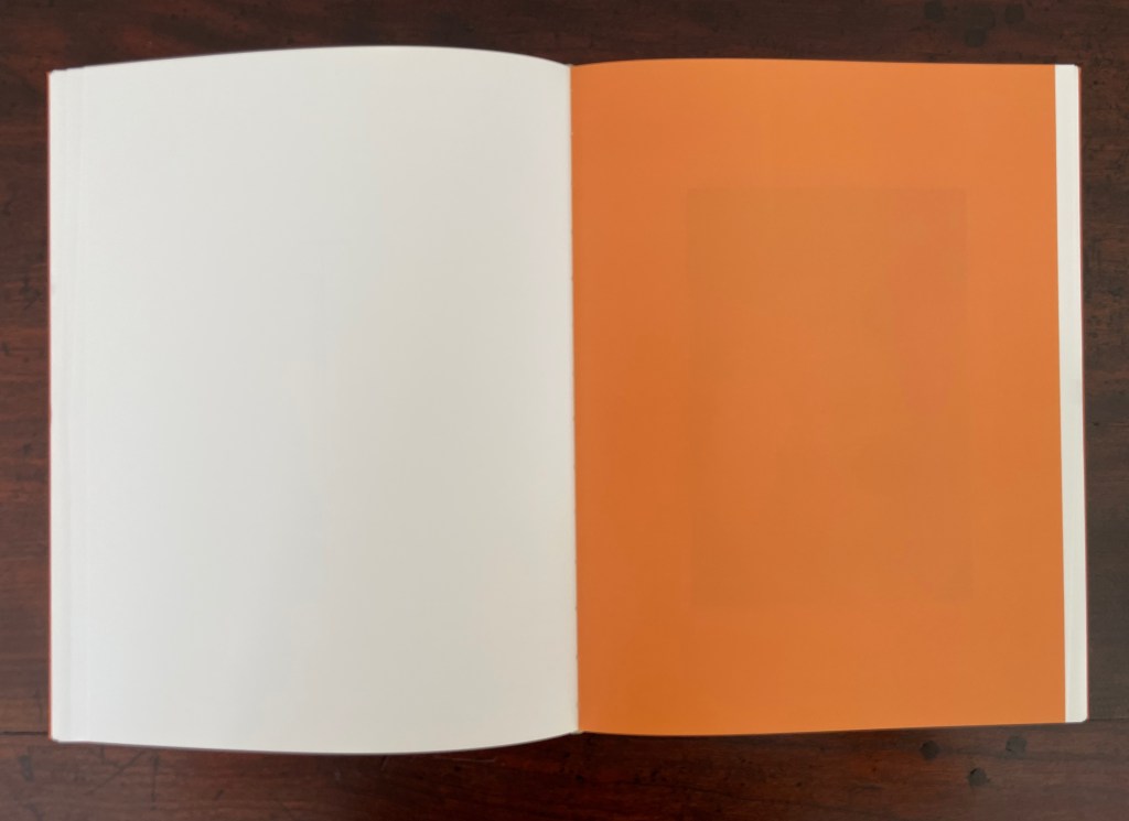
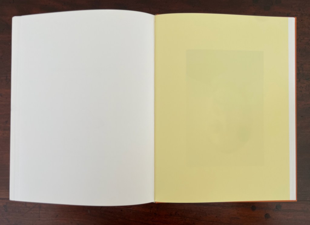
The next flick-through sequence is accessed by closing the book, shifting the right thumb to the upper corner of the fore edge, and again riffling through the book. “Magically” the text has disappeared, replaced by blank pages that change colors, gradually darkening from a light pink to coral to orange then lightening to yellow. This is another appropriation of the Simplicissimus tale. In the just-vanished text, Simplicissimus, the con artist, has arrayed six glasses of wine before the crowd of dupes gathered by his blow book patter. By adding one drop of magic elixir to the first glass, he changes the wine’s color and quality. The second glass receives two drops, the third three drops, and so on until Simplicissimus and his sidekick Hopalong are relieving their audience of their money in exchange for tins of the elixir that they believe will turn casks of plonk into the finest vintage.

The opening pages of the three Simplicissimus excerpts. Note the display characters H, -, and U, three of the twenty that spell out HORSTANTES-FLICKBUCH.

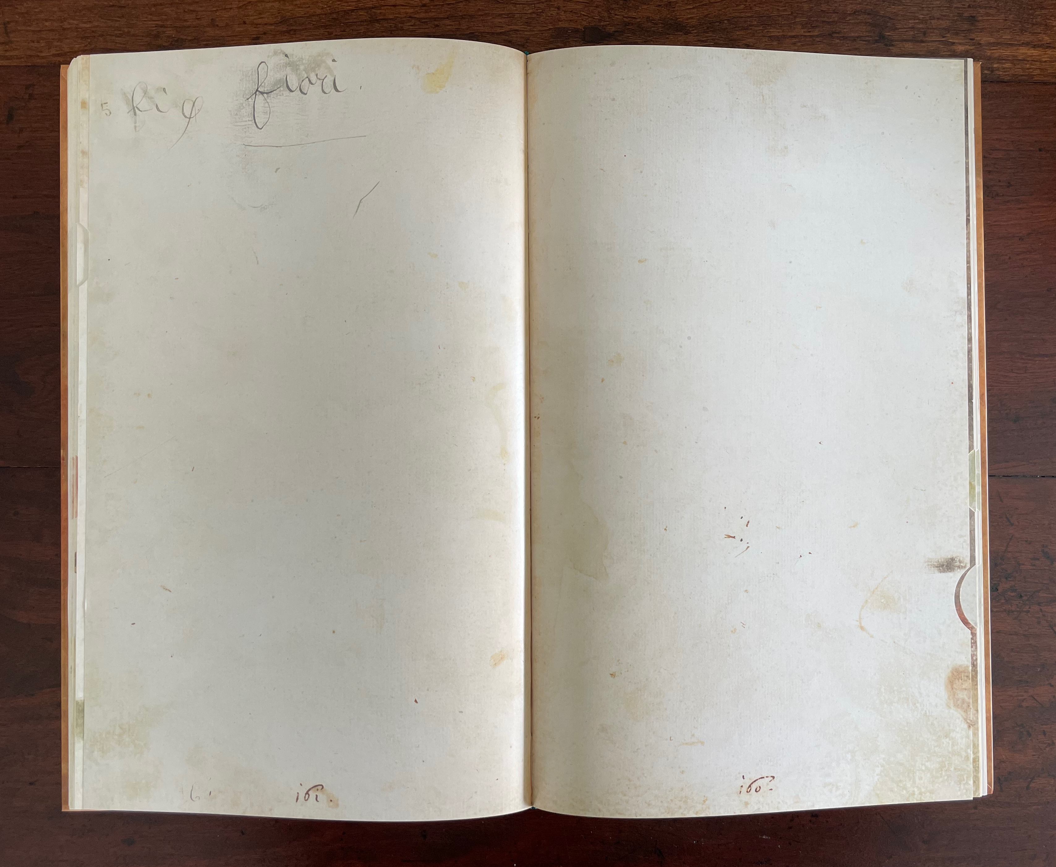
The first, ninth, eleventh, and last spreads of colored blank pages.

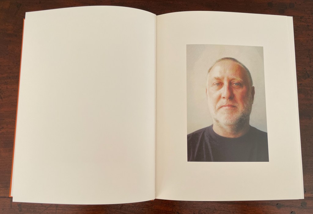
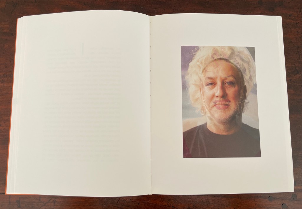
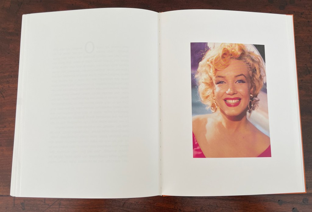
On the other side of the dos-à-dos structure, the first flick-through’s sequence of twenty images has Antes’ face morphing into Marilyn Monroe’s. It’s a curious transformation. Perhaps it’s in keeping with the carnivalesque barker Simplicissimus, and after all, the color of the paper does change from cream to white as the artist turns into the bearded lady and the latter turns into Marilyn. The sequence’s twenty-page length facilitates the gradation of the change.

The first portrait image, the mid-point image, and the final image.

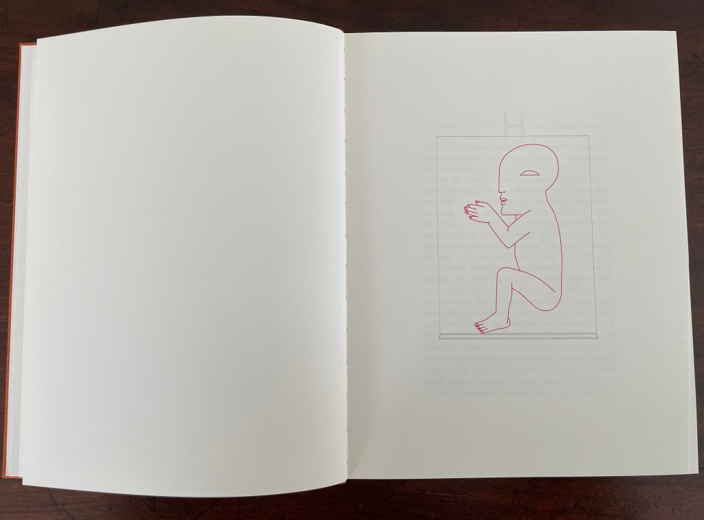
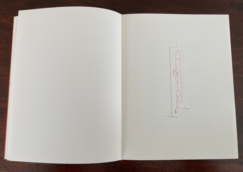
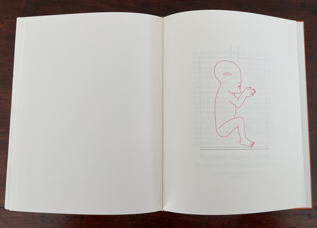
The second flick-through presents an ink drawing of one of Horst Antes’ clear acrylic sculptures called Die Figur (1995-97). A version of the sculpture rests in the rooftop foyer of Vienna’s Hofburg. Inscribed in a large plane of acrylic intersecting another plane of acrylic acting as its footing, Antes’ signature figure the Kopffüßler [“Head-Footer”] appears. In Flickbuch, the figure is drawn in red, and the plexiglas in grey ink. Across this flick-through’s twenty spreads, the drawing is animated, turning from the left, gradually showing an edge-on view, and ending up facing right. It captures Ante’s blend of the figurative and abstract for which he is known.

For some reason, Antes’ graphics often appear in German galleries alongside Andy Warhol’s images of Monroe, but here, perhaps it is a dig at Clement Greenberg. In the accompanying volume Geschichten um das Flickbuch, Huber explains how Antes’ work has been a counter-response to Greenberg’s avant gardist art theory that figurative, illusionistic painting belongs to a bygone era that has been superseded by high Abstract art that accepts and self-reflexively explores the nature of its two-dimensionality. In Huber’s view, Antes’ emphasis on two dimensions in his sculptures and paintings nevertheless restores the figurative and three-dimensionality to art, superseding Greenberg’s dicta.

Greenberg also placed photography as second fiddle to the self-reflexive and opaque surface of pure abstract painting.

The art in photography is literary art before it is anything else: its triumphs and monuments are historical, anecdotal, reportorial, observational before they are purely pictorial. Because of the transparency of the medium, the difference between the extra-artistic, real-life meaning of things and their artistic meaning is even narrower in photography than it is in prose. And as in prose, “form” in photography is reluctant to become “content,” and works best when it just barely succeeds in converting its subject into art—that is, when it calls the least attention to itself and lets the almost “practical” meaning of the subject come through. — Greenberg, 1964.

The photography in Flickbuch certainly calls attention to itself. Maybe using the flick book form to play with photos and allude to a literary text actually supports Greenberg’s formalism. Then again, the photography sequence seems to throw shade on another Greenberg polemic: his 1939 salvo for the avant-garde and against kitsch.

Kitsch, using for raw material the debased and academicized simulacra of genuine culture, welcomes and cultivates this insensibility. It is the source of its profits. Kitsch is mechanical and operates by formulas. Kitsch is vicarious experience and faked sensations. Kitsch changes according to style, but remains always the same. Kitsch is the epitome of all that is spurious in the life of our times. Kitsch pretends to demand nothing of its customers except their money—not even their time. — Greenberg, 1939.

There is something a bit tongue-in-cheek about this artist’s book and its creators. The idea of a blow book likely came from Huber to Antes. Together they must have enjoyed that spread placing the artist at one end of the spectrum and the image of Marilyn Monroe, goddess of high Pop and kitsch, at the other. Antes in particular must have enjoyed bringing the three-dimensional Kopffüßler into the two-dimensional confines of pages and, seizing on the blow book’s mechanics, creating a representational illusion of its original three-dimensional self, which of course emphasized an inherent two-dimensionality.

* The German term flichbuch translates as “flick book”. For most book historians and artists, that term and its alternates “flip book” and “flicker book” refer to the structure that creates an animation effect by gradually changing an image from one page to the next.

Further Reading

Julie Chen & Keri Miki-Lani Schroeder“. 27 May 2025. Books On Books Collection.

HAP Grieshaber“. 27 August 2023. Books On Books Collection.

Ricky Jay“. 2 September 2026. Books On Books Collection.

Nicholas Phillips“. 11 August 2020. Books On Books Collection. Phillips’ Egyptian Cards demonstrate a multiple image changes in a deck of cards.

Aling, Michael. n.d. “Publishing as Architectural Practice“. University of Greenwich. Architectural book designer Michael Aling put the “blow book” principle to work in Negative Equity: House Projects by Neil Spiller & Nic Clear. By adjusting the trim, Aling makes the book display only spreads with Spiller’s work if the codex is flicked through with the right thumb and only Clear’s spreads if flicked through with the left thumb. P. 6, Fig. 2.

Dunstan, Dominique. 10 October 2021. “Treasures of the Library: the magic of blow books“. State Library Victoria. Video.

Greenberg, Clement. 23 January 1964. “Four Photographers“. The New York Review.

Greenberg, Clement. 1939. “Avant-Garde and Kitsch.” Partisan Review. 6:5

Singer, Mark. 29 March 1993. “Secrets of the Magus“. New Yorker.

Stauss, Thomas. 2025. Magic Metamorphosis : The Secrets of a Rare Italian Picture Album Revealed. Basel: Librum Publishers and Editors LLC.

Books On Books Collection – Ricky Jay

The Magic Magic Book (1994)

The Magic Magic Book : An Inquiry into the Venerable History & Operation of the Oldest Trick Conjuring Volumes, Designated ‘Blow Books’ … (1994)
Ricky Jay et al.
Blue silk clamshell box decorated with red and silver metallic playing card motif, housing two softcover casebound and sewn volumes. Box: H270 x W217 x D43 mm. Books: H254 x W206 mm. 106 and 80 pages, respectively. Edition of 300 copies, of which this is #208. Acquired at Swann Auctions, 22 April 2025.
Photos: Books On Books Collection.

Ricky Jay’s The Magic Magic Book explains and presents a structure well suited to the artist’s book but one rarely used. The structure is called the “blow book”. Most of us know the apparatus from childhood birthday parties as the “magic coloring book” in which the clown or magician flips through a book of blank figures to be colored, calls on the birthday boy or girl to blow on the closed book, and then reopens it to show all of the pictures colored in. Hard-to-see tabs or alternating page widths enable the performer to produce the effect. Until Jay’s production with the Whitney Museum Library, there had never been an extended serious study of the blow book by scholars of magic, iconography, children’s literature, or the history of the book.

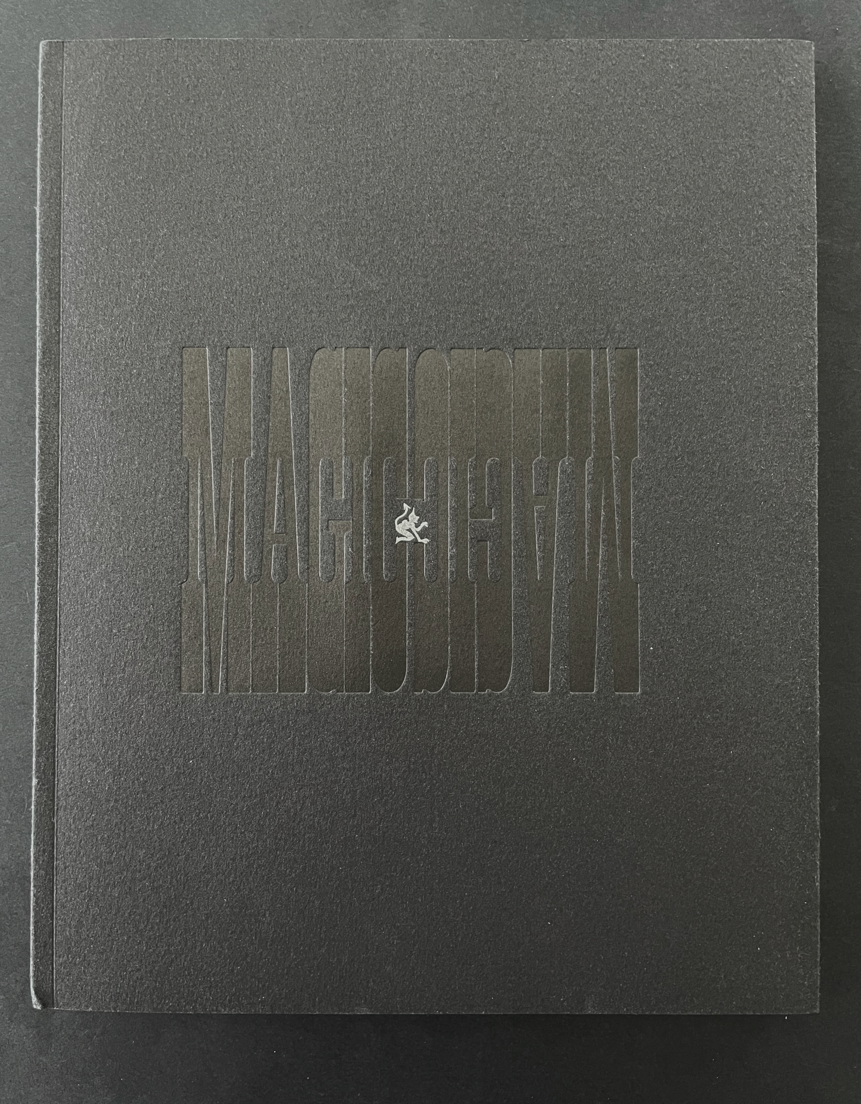
A black book cover with the title 'MAGMOODVIN' embossed in a lighter shade of black, featuring a small white logo or illustration centered at the bottom.

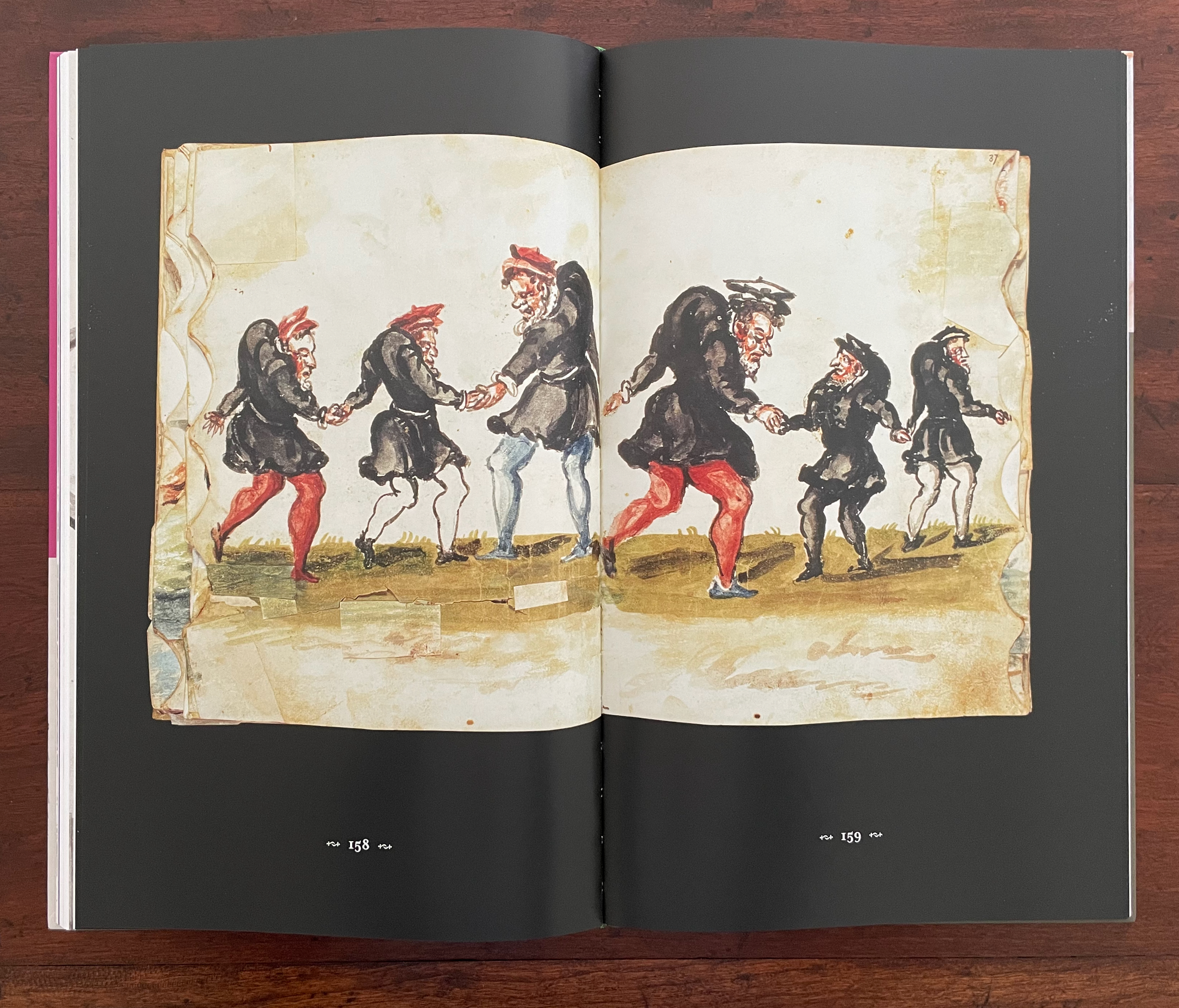
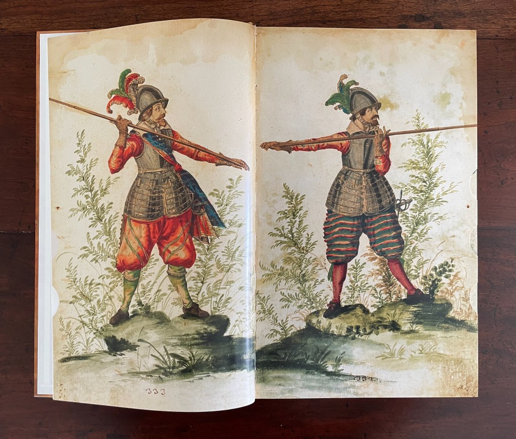
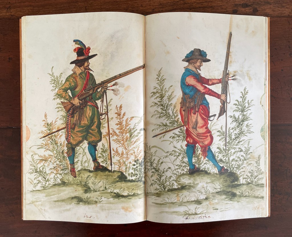
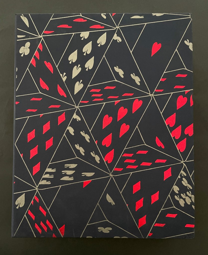
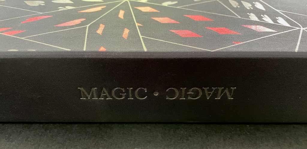
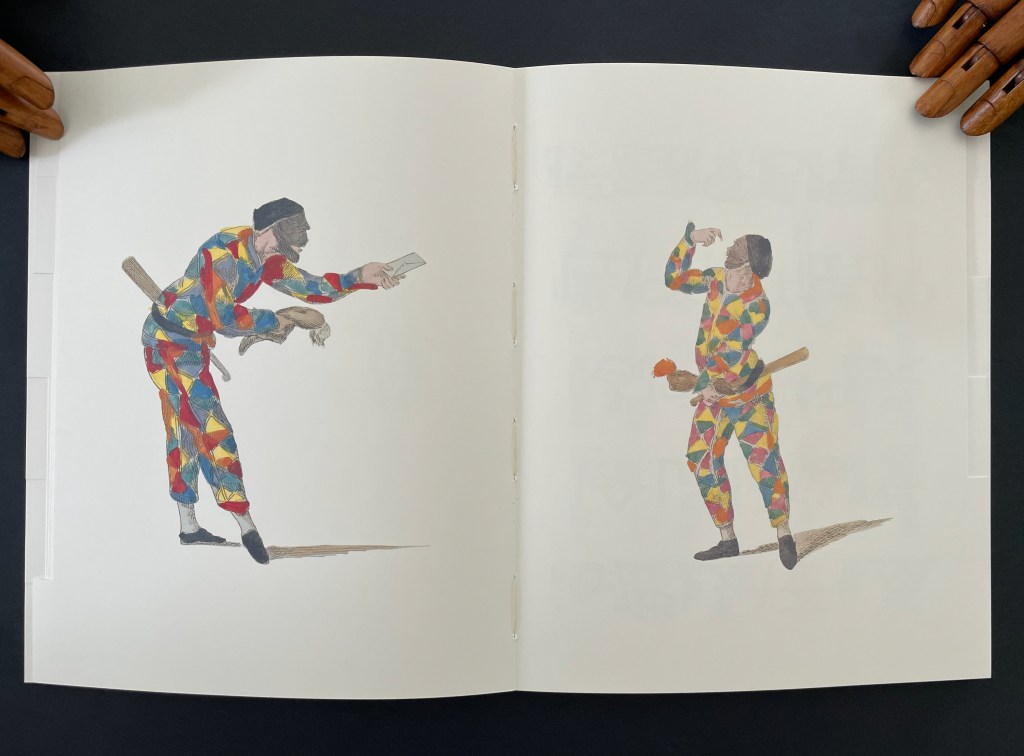
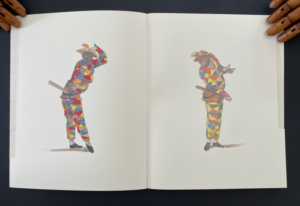
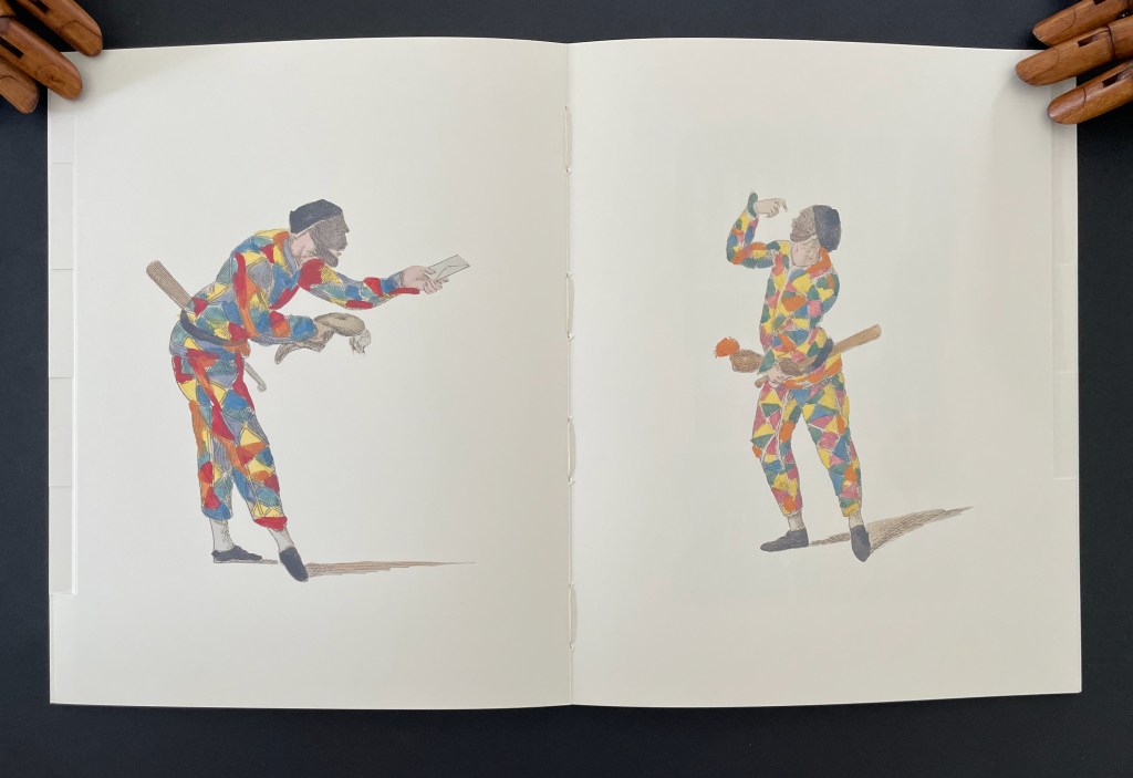
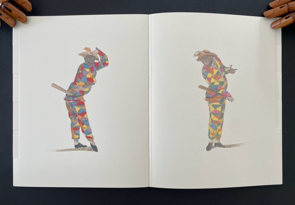
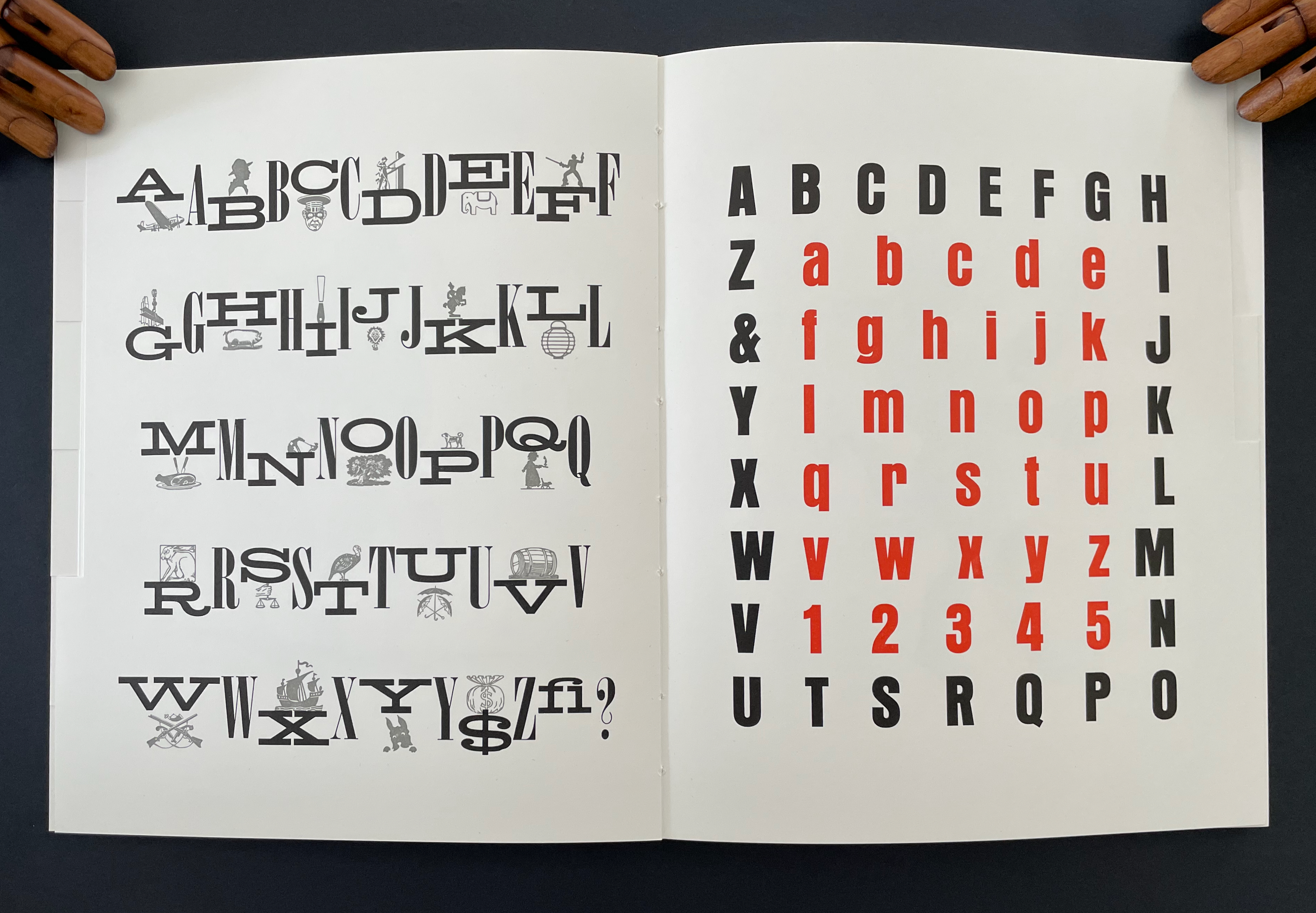
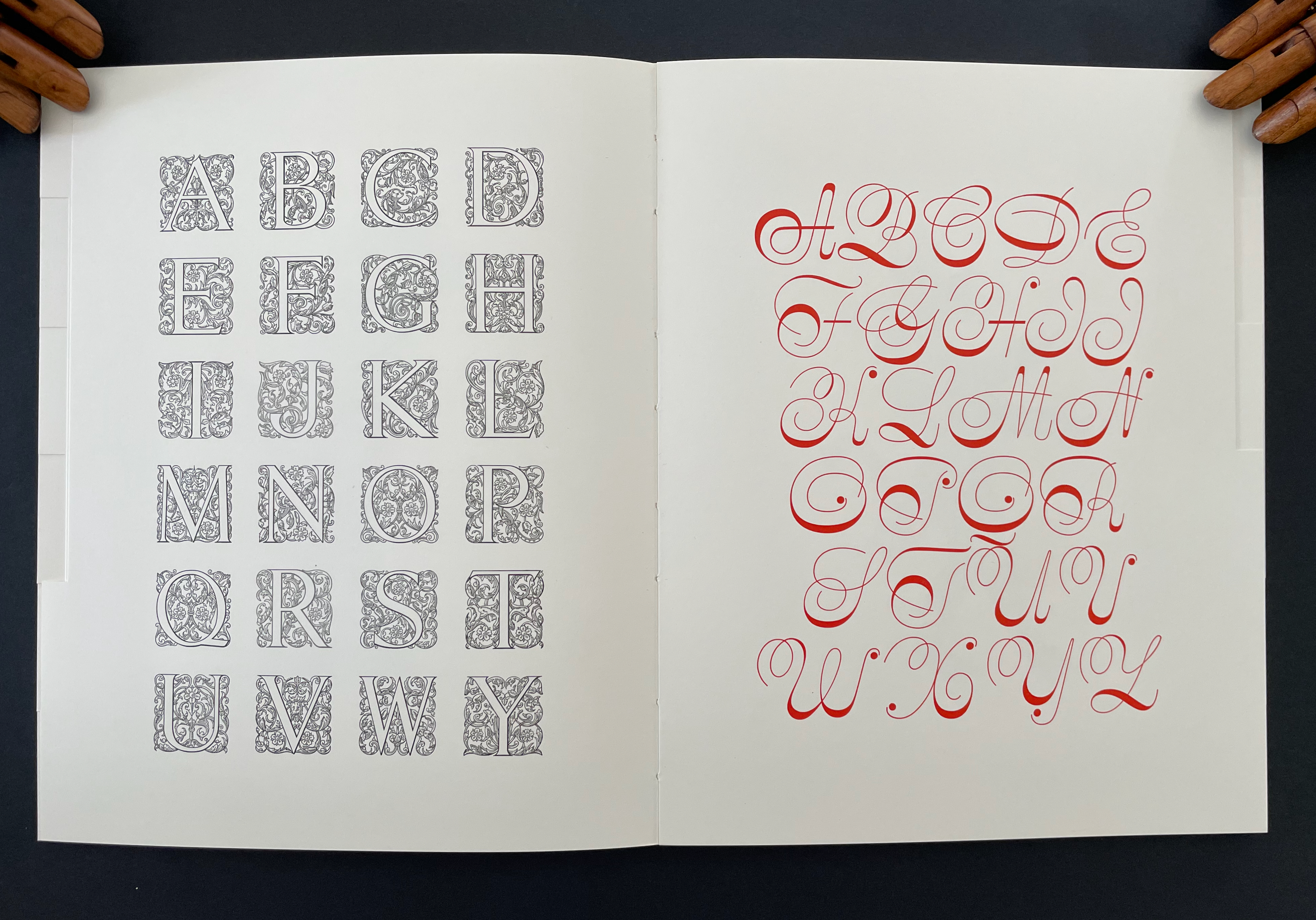
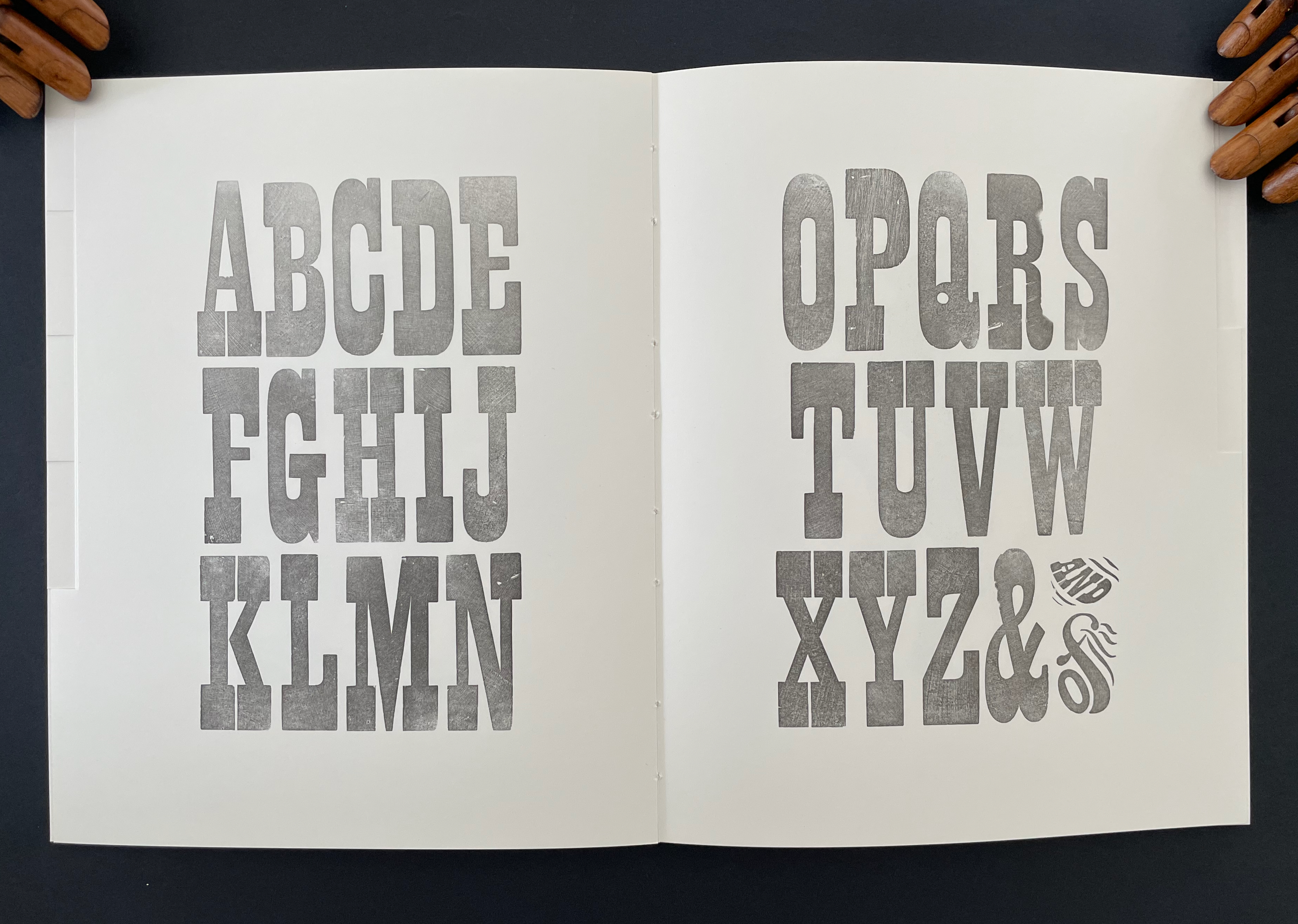
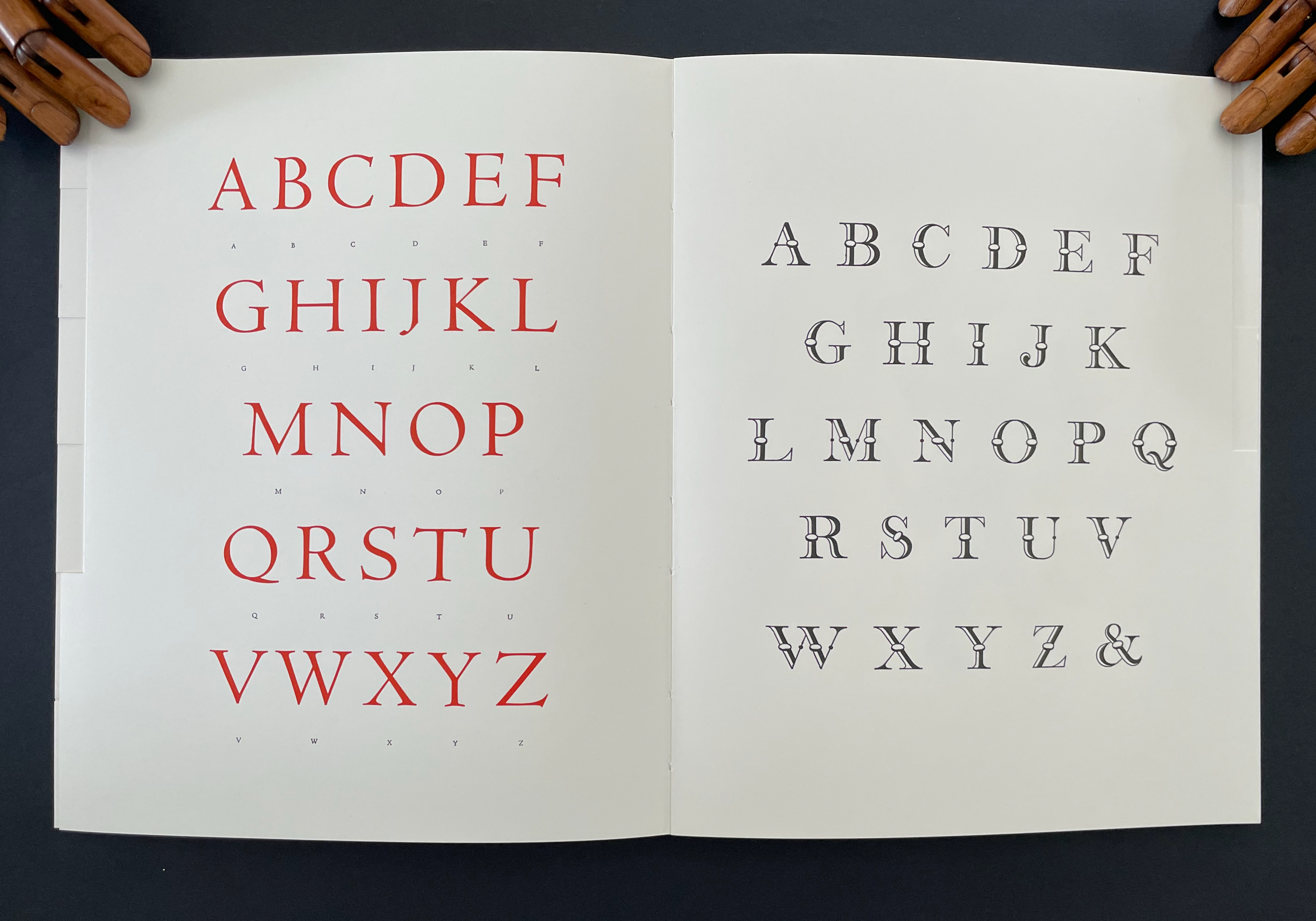
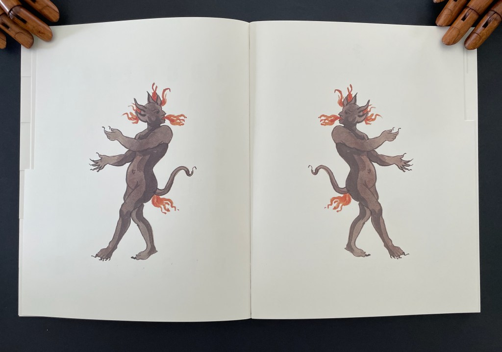
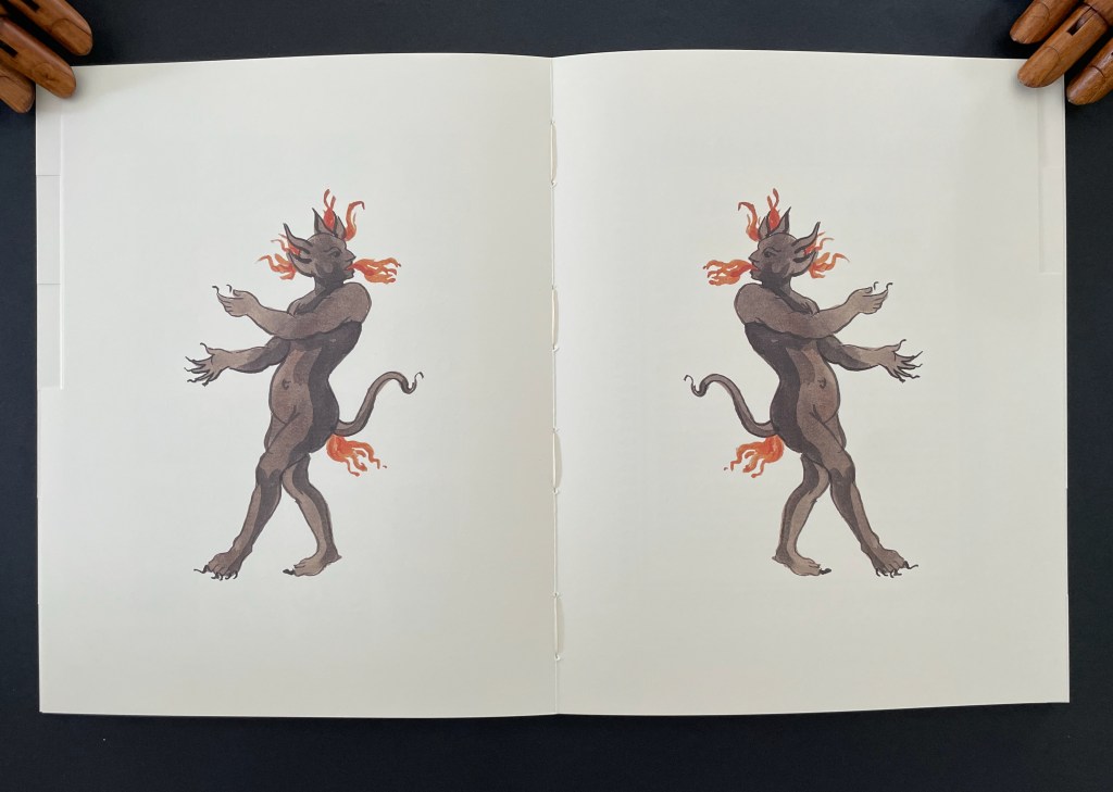
The Magic Magic Book ‘s two softcover volumes are housed in a blue silk clamshell box whose front cover displays the optical illusion of a house of cards. The card motif reflects both the blow book structure’s use in trick decks of cards and Jay’s reputation in the 90s as “perhaps the most gifted sleight of hand artist alive” (Singer, 1993). The first volume gives an illustrated essay on the history of the blow book. The second volume (a blow book itself and in a dos-à-dos structure) features illustrations by contemporary American artists Vija Celmins, Jane Hammond, Glenn Ligon, Philip Taaffe, and William Wegman as well as painted devils and harlequins, letterpress alphabets, figures in silhouette, and instructions (in four languages) for operating the blow book. After one flick through the book showing blank spreads, the next flick yields a dance of eight harlequins.

The next flick turns the harlequins into alphabets.

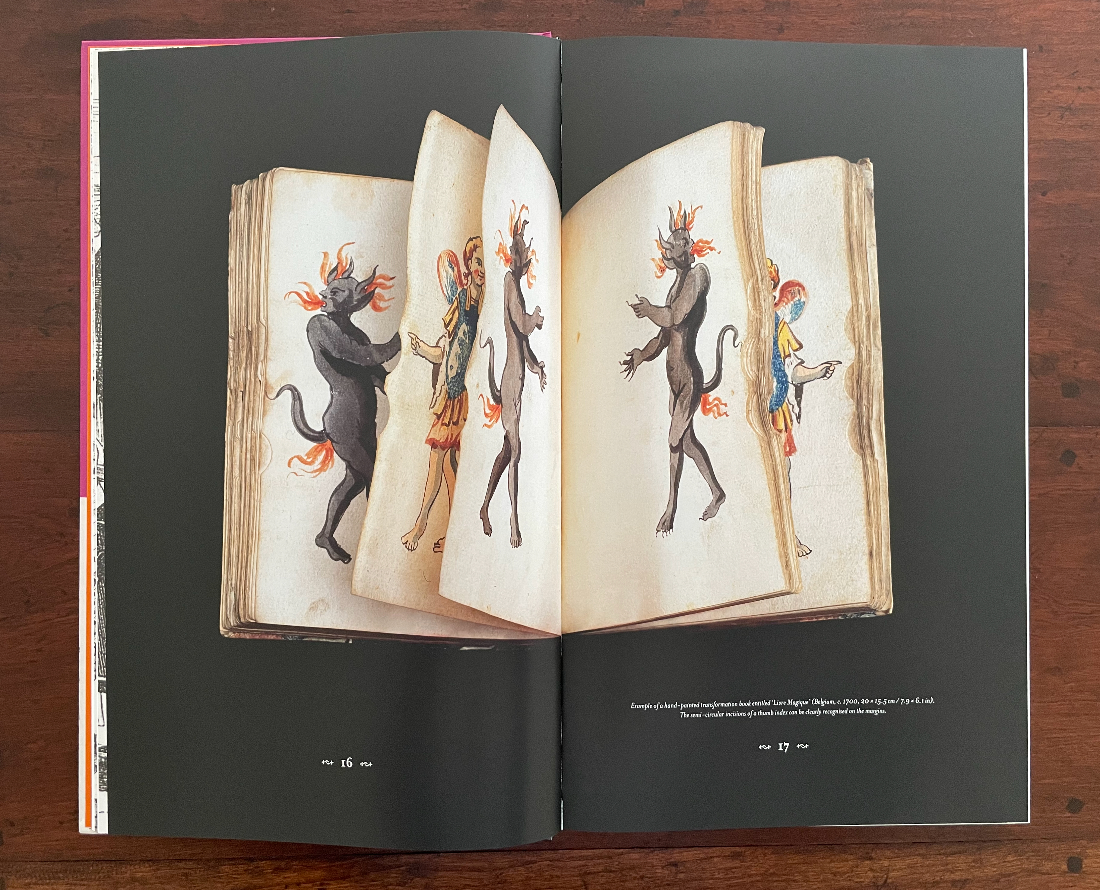
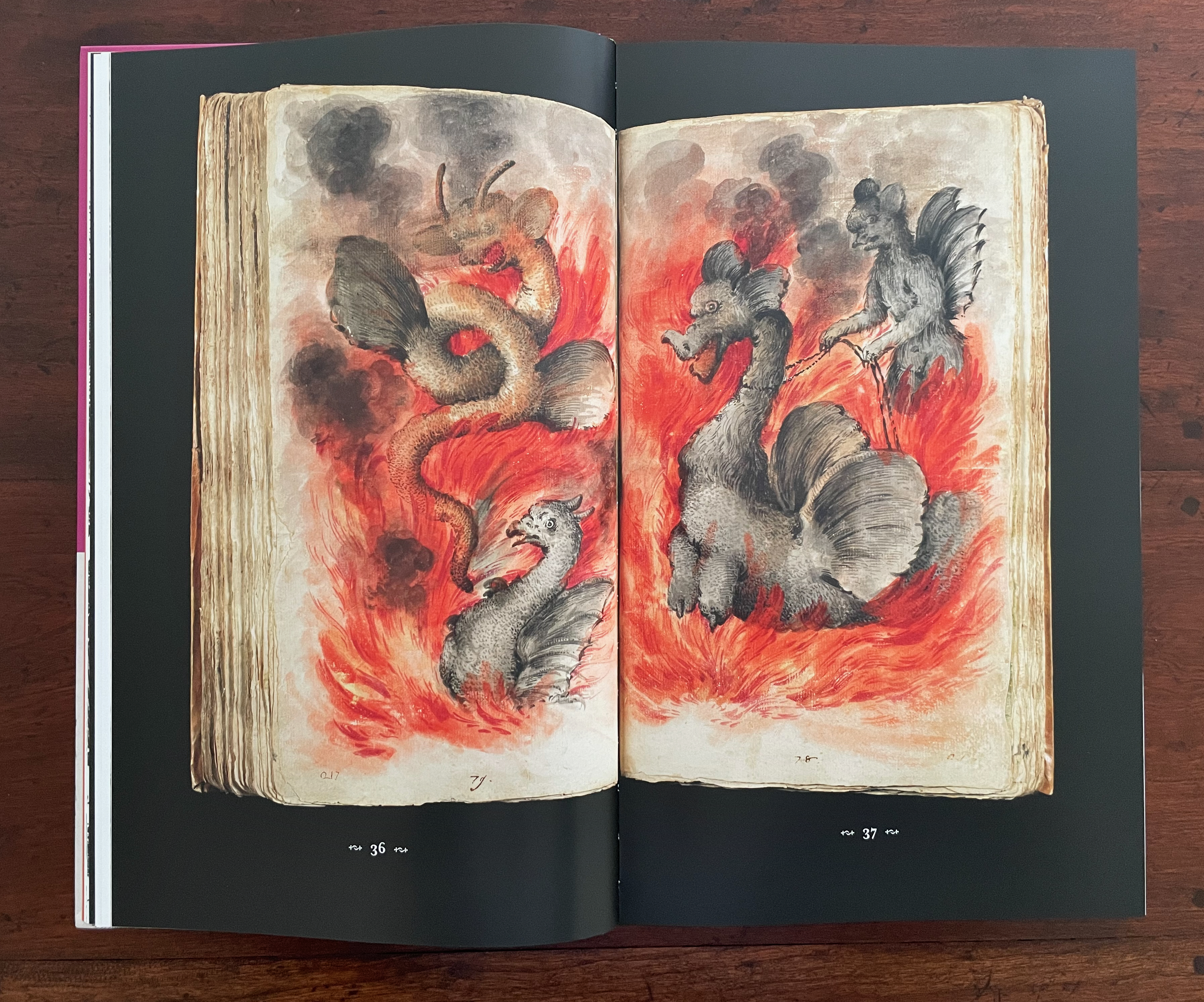
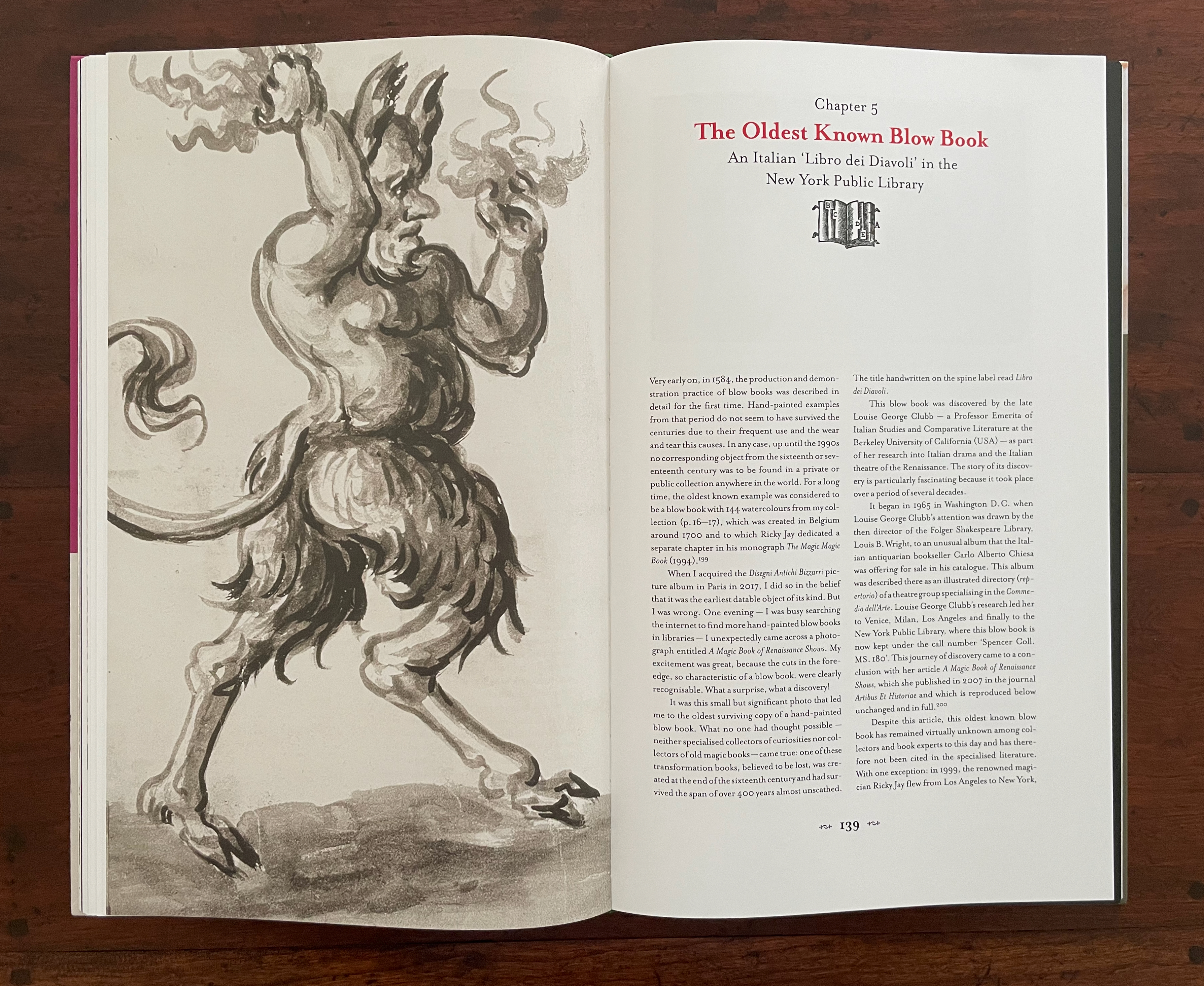
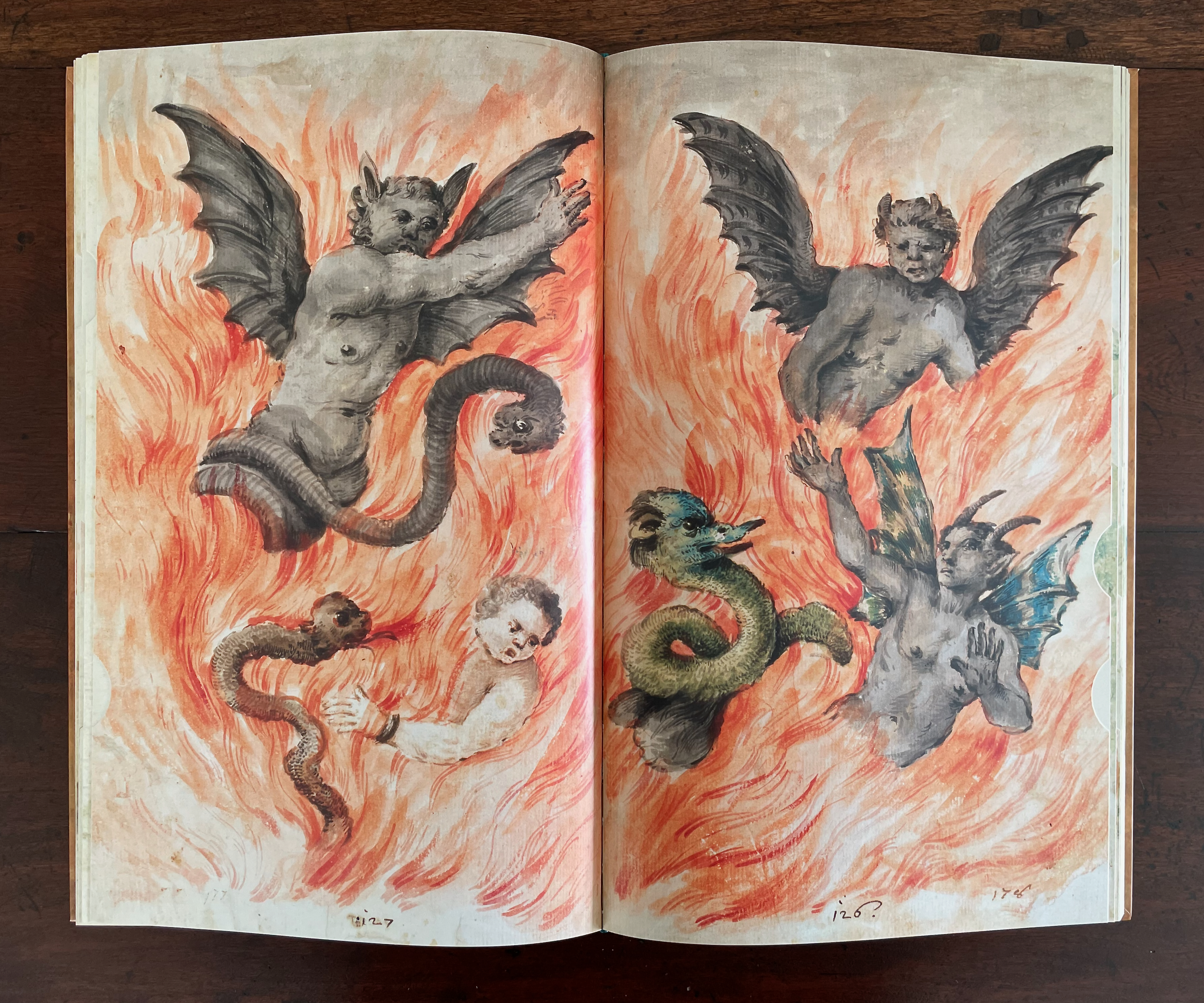
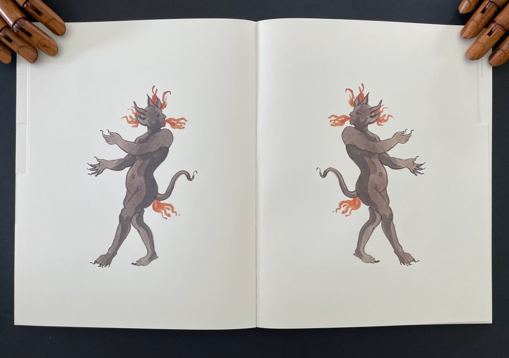
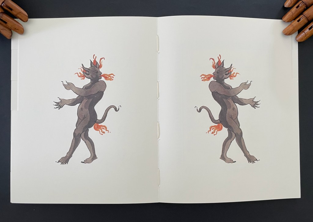
The next flick transforms the alphabets into fire-breathing, fire-farting devils (the images courtesy of Thomas Stauss to Jay).

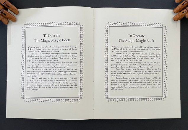
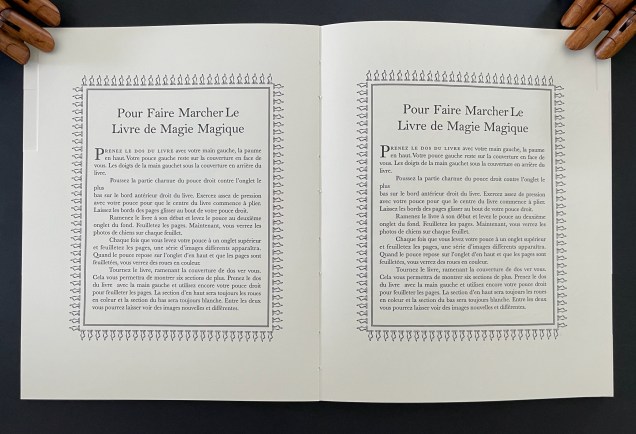
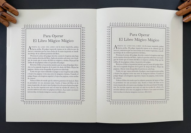
With the next flick, we get the English, then French, then German, and finally Spanish instructions for operating the book.

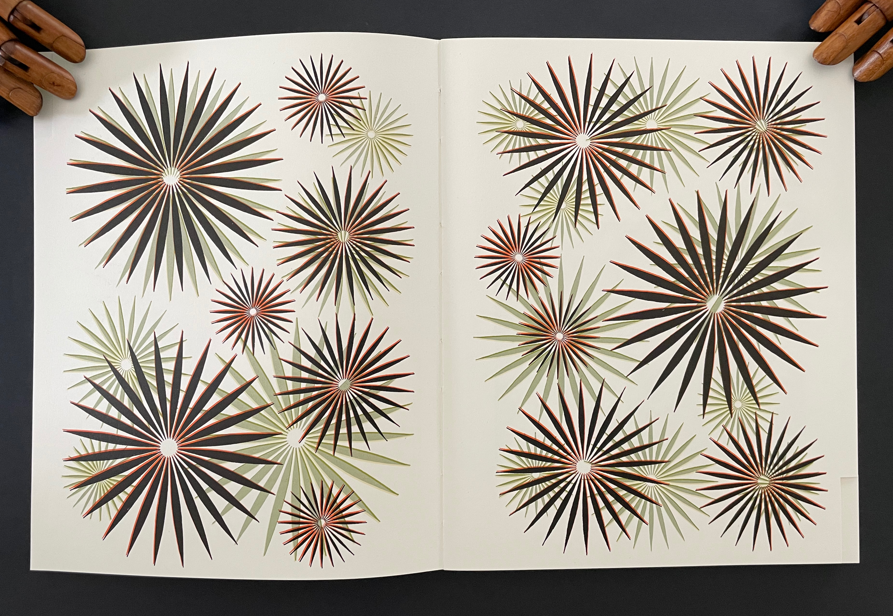
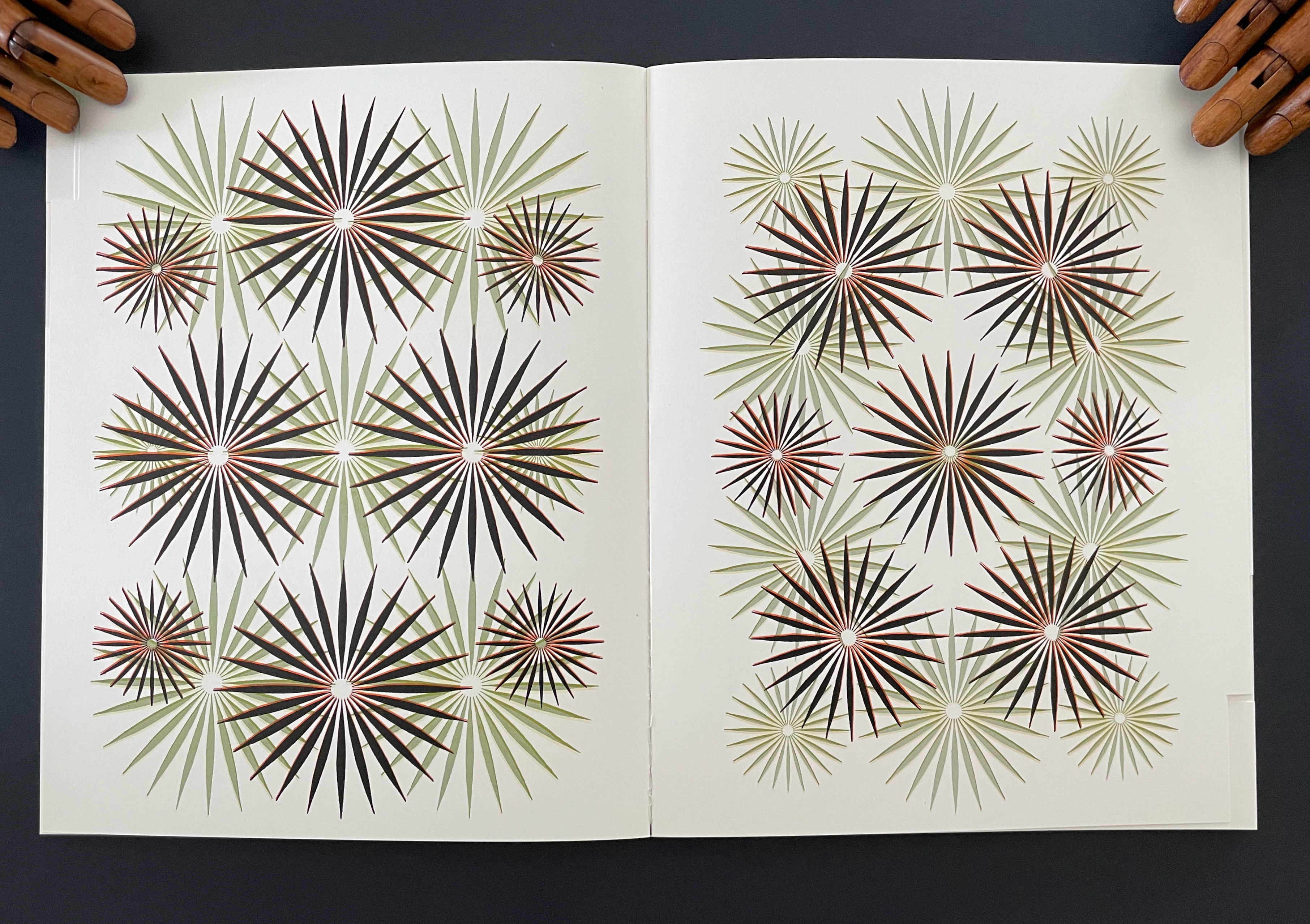
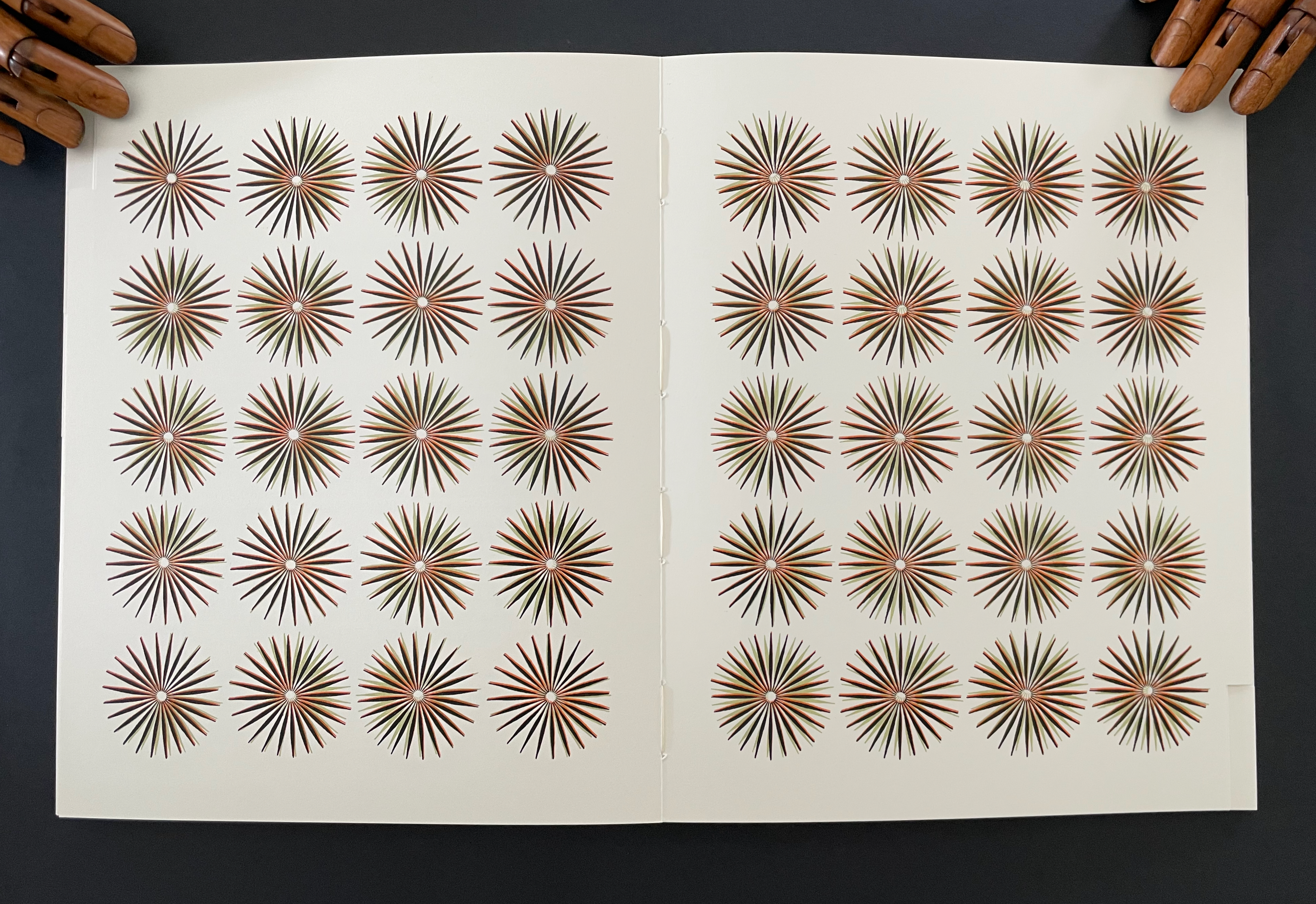
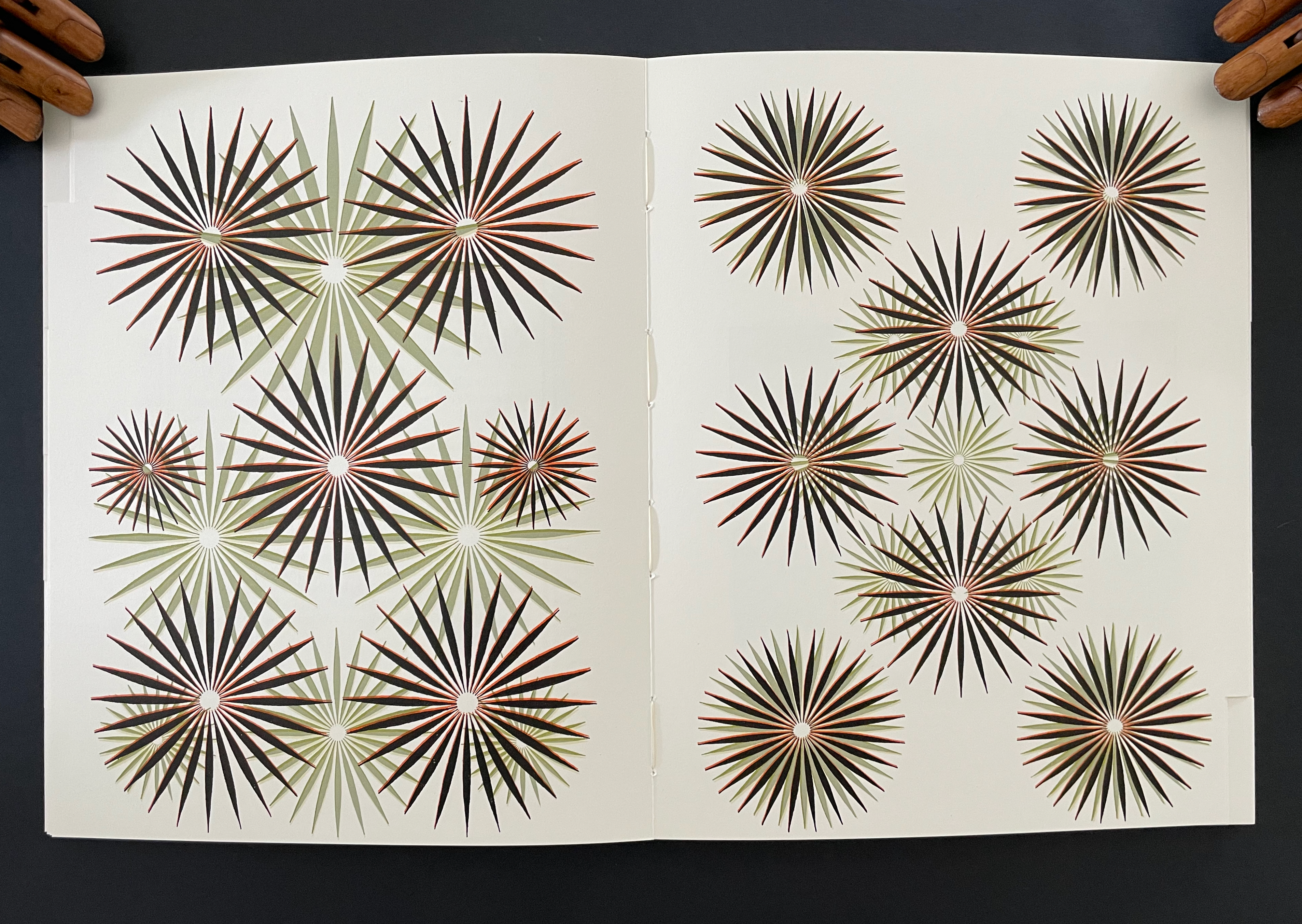
And with the last flick, Philip Taaffe’s fern-like, starburst abstractions appear, gradually shrinking and ordering themselves into columns of four and rows of five. When the dos-à-dos is turned, Taaffe’s series returns (again last in the sequence of flicks) but in reversed order, the columns and rows dispersing into other patterns and increasing in size.

The blow book offers artists a tool that can shape meaning, metaphor, and perspective. It can elicit performance by the reader to enact ideas, narrative, and structural effects. Its close association with the rise of the printing press, affordable paper, and binding capabilities recommend the blow book to book artists intent on demonstrably tying their works to the history of the book. The hard-to-see tabs or alternating page widths that enable the performer to produce the blow book’s effects offer a means of enhancing the materiality of the artist’s book. Its mechanics offer the chance to use flip (or flick) book’s animating effects, which have appealed to numerous book artists. Its twist on those effects lends it to juggling the layout of text and image in a non-traditional manner. Its mechanics can also enhance binding structures like the dos-à-dos, a structure also borrowed for magic tricks. Its reliance on manipulating a book’s fore edge offers the chance to emphasize both form and tactility, a characteristic theme of artists’ books. The two volumes of The Magic Magic Book itself incorporate “watercolors, woodcuts, etchings, hand-colored engravings, lithography (black-and-white and colored), mimeograph, drawings, decals, stencils, photo-offset — even leaves from other books” (“Prologue”, p.2) — surely another enticement to book artists to explore the form.

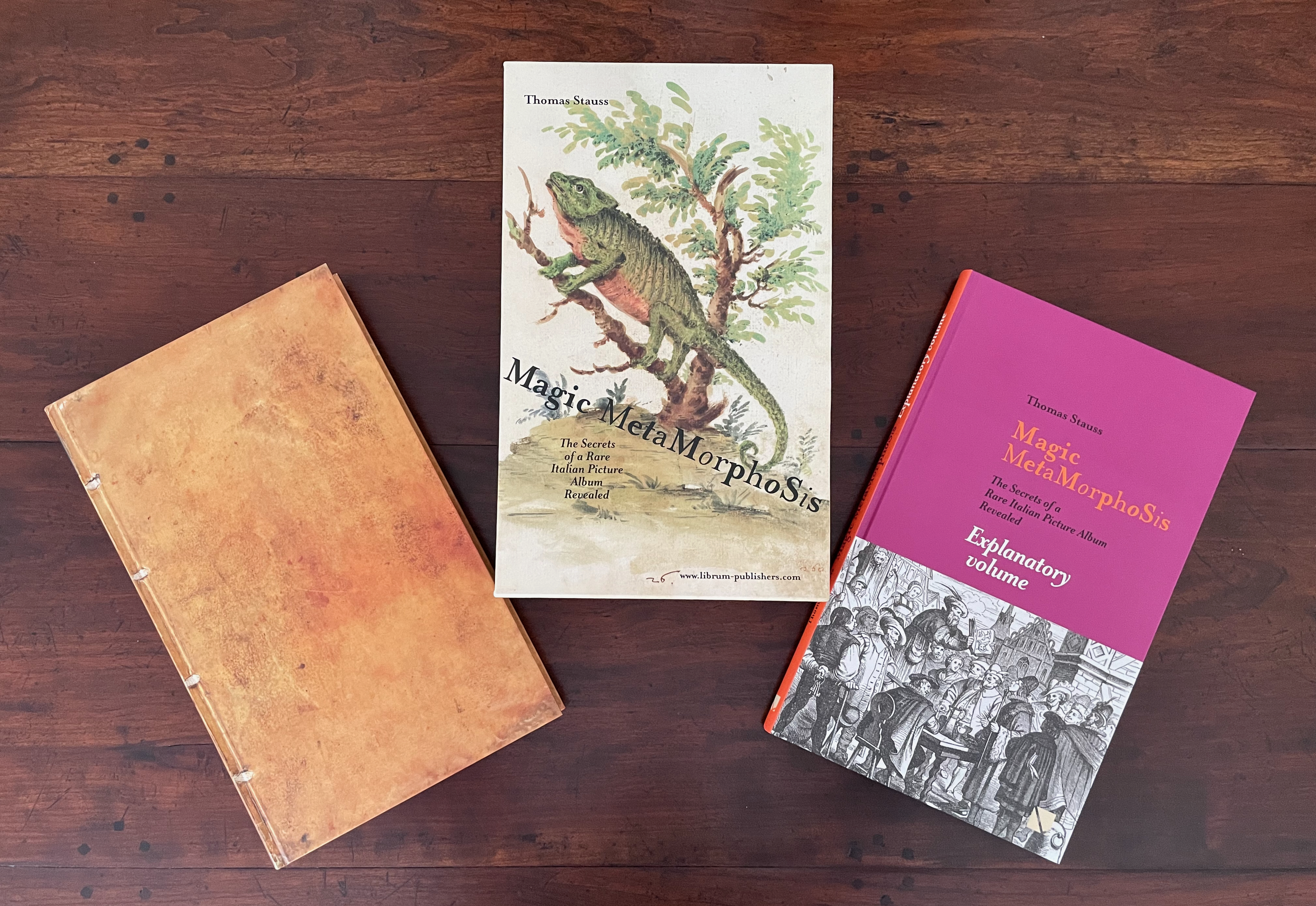
In the Books On Books Collection, Julie Chen and Keri Miki-Lani Schroeder’s Book of Hours (2021) and Horst Antes’ Flickbuch (2000) are the only two artists’ books that exploit the blow book structure. As examples, they show the form’s scope for artists to work their individual magic and demonstrate the blow book’s magical transformations that make us query the nature of “the book”.

Further Reading

Horst Antes“. 2 September 2026. Books On Books Collection.

Julie Chen & Keri Miki-Lani Schroeder“. 27 May 2025. Books On Books Collection.

Nicholas Phillips“. 11 August 2020. Books On Books Collection. Phillips’ Egyptian Cards demonstrate multiple image changes in a deck of cards.

Aling, Michael. n.d. “Publishing as Architectural Practice“. University of Greenwich. Architectural book designer Michael Aling put the “blow book” principle to work in Negative Equity: House Projects by Neil Spiller & Nic Clear. By adjusting the trim, Aling makes the book display only spreads with Spiller’s work if the codex is flicked through with the right thumb and only Clear’s spreads if flicked through with the left thumb. P. 6, Fig. 2.

Dunstan, Dominique. 10 October 2021. “Treasures of the Library: the magic of blow books“. State Library Victoria. Video.

Singer, Mark. 29 March 1993. “Secrets of the Magus“. New Yorker. “I’m really intrigued with the concept of the book as both a subject and an object of mystery,” says Jay towards the end of the article.

Stauss, Thomas. 2025. Magic Metamorphosis : The Secrets of a Rare Italian Picture Album Revealed. Basel: Librum Publishers and Editors LLC.

Books On Books Collection – Fred Siegenthaler

Strange Papers: A Collection of the World’s Rarest Handmade Papers (1987)

Strange Papers (1987)
Fred Siegenthaler
Wooden, felt-lined briefcase, containing a large box enclosing a book and 101 rare handmade paper samples in individual portfolios. Covering paper for the box and book is two-layer handmade paper from Nepal made with the bast fiber of the Daphne papyracea. Briefcase: H x W x D mm. Box: H x W x D Book: H x W mm, 127 pages. Portfolios: Edition of 200 copies, of which this is #28, signed by Fred Siegenthaler.  Acquired from Berkelouw Rare Books, 13 Aug 2020.
Romana-Butten cover paper from Papierfabrik August Koehler in Oberkirch, W. Germany. 
Printed by G. Krebs in Basel, Switzerland. 

As Siegenthaler explains in his preface, this is the work that started an international organization: the International Association of Hand Papermakers and Paper Artists (IAPMA). By 1986, Siegenthaler was well positioned to start this international association focused on paper art and the craft and science of papermaking. Since the late 1960s, he had been experimenting with strange material for paper — glass beads, hay, leather waste, stinging nettles, tobacco, wasps’ nests and much more. By the 1970s, he was supplying handmade custom papers to Helen Frankenthaler, Jasper Johns, Marisol, Claes Oldenburg among others. Travelling the world for business reasons (Sandoz), he began collecting paper samples from like-minded artists and papermakers in Mexico, Thailand, Viet Nam and more than 87 other countries. And he was “convinced that [he] had a duty to include these exclusive, beautiful and rare creations in [his] collection and preserve them for posterity”.

So, in November 1985, he began writing (by hand) to his network and, later, new association colleagues telling them of his plan for assembling Strange Papers. With the 200 samples of each paper, each selected contributor also provided a structured description of the raw materials and process used. The resulting book not only delivers a wealth of knowledge on the portfolios of samples but also contains items worth placing alongside the portfolios in an exhibition: a sample of a Taoist sacrificial money note on handmade rice paper with embossed gold leaf, plant drawings by Marilyn Wold and small samples of shifu and kinu-shifu (woven papers).
To hold a piece of papyrus and feel its natural curl toward scrolling, its roughness on one side and its smoothness yet segmentedness on the other, brings the history of paper alive. The differences among all the samples — in touch, appearance and, for some, even smell — is extraordinary. It is hard to choose what is most enjoyable about Strange Papers: reading the entries, holding each sample up to the light to examine it, comparing one sample with another, or deciding which is the strangest raw material.

The text — Browsing and reading the entries yields fascinating tidbits. Hawaii’s Akia plant has poisonous bark, roots and leaves, which are discarded in papermaking, but, according to Pam Barton, Hawaiians pound them, put them in a porous container and sink it in salt water pools to narcotize fish to be caught. Donna Koretsky advises observing the Fancy Manila Hemp paper under varying angles of light to see how the coloring changes. From the region where the Hollander beater was invented, De Zaanse Molen’t Weefhuis cites a letter from the paper scholar Henk Voorn that in large shipbuilding works, Moss Paper “was nailed to wood with so-called paper nails under the copper skin of the hull.” In making Jute Paper, Natan Kaaren in Israel “used old sacks … cut up into shreds and placed to rot in a barrel of water … about a year.” The confluence of patience, planning, sense of tradition, attention to detail, awareness of function with creative exuberance is the chief effect of the entries.

Inspection and comparison — Each of the 101 samples calls for inspection. Holding each one to the light and turning it side to side to see the change in effect is seductive. Photographing each paper backlit through its portfolio’s oval cutout shares some of this pleasure of inspection. To the oval cutout’s left, the number-stamped side is shown; to the right, the reverse side. Each sheet rests on its portfolio folder and is angled for viewing the surface. The six similarly named papers of the twelve composed of some form of grass leap out for comparison.

Sample 1.1 Composed of Poaceae — poa annua, poa trivialis. Netherlands. Not of the same family as the following sample, which goes to show how the same common name does not always identify the same substance. Both Lawn Grass samples were cut by lawn mower, but 1.1 was harvested over a longer period and fermented. Both were cooked for two hours, but 1.1 underwent another half hour of boiling. This sample’s darker color and slightly greater heft may be due to its difference in family or the washing process. Both feel brittle and make a crinkling sound when flexed.

Sample 19.5 Composed of Stenotaphrum secundatum. Israel. With this sample, the pulp was washed for a further two hours after boiling and then strained through a screen under high pressure, which may account for its greater translucence. Sample 19.5’s wrinkles are more shallow than 1.1’s and resembles wax paper. Both samples have a pungent dry grass smell.

Sample 14.2 Composed of Cortaderia selloana. Australia. The color and texture differ greatly from those of the next sample. This one is almost linen-like, not fully apparent from the photo, and is lighter, more flexible and less brittle than the next sample. It has almost no smell. The sample’s description is not extensive, which limits comparison of processing.

Sample 22.1 Also composed of Cortaderia selloana. USA. The darker color may be due to inclusion of stalks and fibrous plumes and possibly the season of harvesting. This sample is far less dense and far more brittle than 14.2. Where 14.2 has that linen-like texture on its number-stamped side, 22.1 is actually more polished between the bits of stalk or leaf. Its smell is slightly metallic.

Sample 15.5 Composed of Phragmites australis. Australia. Cut with a garden shredder before soaking then boiling in a solution of 17% caustic soda (500 gms in 30 liters). Beating occurred by chopping with a Chinese-style vegetable cleaver, then running through a sink garbage disposal unit, then running through a kitchen blender. Its color, lighter than the next sample’s, matches with its weight and stiffness, both less than the next sample’s.

Sample 18.1 Composed of Phragmites communis. USA. Cut into 2-3 inch length. Soaked then boiled in 20% caustic soda. Processed with a Hollander beater. The densest and least translucent of all the grass samples above. It has a huskier smell than the Common Reed sample above.

The strangest raw material — This is truly a contest. Carrots are a strong contender, but so are hemp from old fire brigade hoses, moss, peat and stinging nettles. The following are chosen due to their inorganic, silicate and worrisome nature. Except for the sample made of 100% polyethylene fibers, all others consist of organic material.

Sample 32.1 Composed of 100% asbestos fiber. Light and flimsy, it feels like cloth; seems odorless; but this is not one to handle or sniff too closely. Its white, greyish color and dimpled texture will be familiar to anyone who attended school in the latter half of the twentieth century and looked up the ceilings.

Sample 28.1 Composed of 70% strands of glass, containing about 200 tiny fibers, 20% Kozo and 10% polyvinyl alcohol fibers for binding. The glass strands feel tough and breakable; they shine like satin under glancing light; their pinkness comes from dye. Odorless.

Among the contributors with other works represented in the Books On Books Collection are Winifred Lutz, Maureen Richardson, Raymond Tomasso and Therese Weber. Each also appeared in one of the first seven books published for the Rijswijk Paper Biennial, which along with Siegenthaler’s works here, Helen Hiebert’s The Secret Life of Paper, paper samplers from Velma Bolyard and Maureen Richardson, works from Taller Leñateros, watermark art from Gangolf Ulbricht, and pulp painting works from Pat Gentenaar-Torley, John Gerard, Claire Van Vliet and Maria Welch form the core of the collection’s subset focused on paper. Other references are listed under Further Reading.

Das Werk / The Works (2009)
Das Werk: Schöpfen bis zum Erschöpfen: mein Leben mit Kunst u. Papier / The Works: From Creation to Exhaustion: My life with Art and Paper (2009)
Fred Siegenthaler with Renate Meyer.
Hardback, goldleaf stamped. H300 x W240 mm, 301 pages. Edition of 50, of which this is #23. Acquired from ZVAB, 21 October 2020. Photos: Books On Books Collection, displayed with permission of the artist.

The Works and its update (below) are useful and valuable to have alongside Strange Papers. Both illustrate Siegenthaler’s breadth of artistry beyond papermaking, and the former includes a comprehensive essay on that artistry by Nana Badenberg. Along with John Gerard and Gangolf Ulbricht, Siegenthaler is one of the twentieth and twenty-first centuries’ masters at using watermarking to make art. His self-portrait, included in The Works, provides an outstanding example of watermark art, described at length by Badenberg. She records Siegenthaler’s watermark contributions to works by Horst Antes and Meret Oppenheim as well as his papermaking for the artists mentioned in this entry’s introduction. Her commentary on the technical, material and conceptual aspects of Siegenthaler’s work in each of its areas of development — “incorporation” (similar but more subtle than appropriation), “revealments”, book objects, paper castings of the human form, “repulpings” (recycling of precious papers), pulp painting and sculpturing, signage, erotica and religious works — enriches any encounter with his art.

Nachtrag zu: Fred Siegenthaler Das Werk: neue Arbeiten aus den Jahren 2010 bis 2015 / Addendum to: Fred Siegenthaler The Works: New Works from 2010 to 2015 (2016)

Nachtrag zu: Fred Siegenthaler Das Werk neue Arbeiten aus den Jahren 2010 bis 2015 / Addendum to: Fred Siegenthaler The Works: New Works from 2010 to 2015 (2016) Fred Siegenthaler with Renate Meyer
Casebound in paper-on-board covers. H303 x W211 mm, 48 pages. Edition of 300. Acquired from the artist, 2 November 2020.
The cover shows Endlich wieder vereint (2015) (“Finally united again”).

This double-page spread provides a snapshot of continuity and development. The cards made from repulping and recalling Siegenthaler’s earlier work with this technique speak to continuity — as does the juxtaposition of the overpaintings from 2000 and 2011 on the next page. The nature of Siegenthaler’s 2010-2015 absorption with color on the verso page contrasts with his earlier handling of color in the Kopfüssler and the facsimile leaf of the Gutenberg Bible on the recto. Like Strange Papers, the Addendum reflects the careful planning and exuberant creativity characteristic of Siegenthaler’s entire career.

Further Reading

The First Seven Books of the Rijswijk Paper Biennial“. 10 October 2019. Books On Books Collection/

Taller Leñateros“. 19 November 2020. Books on Books Collection.

@incunabula. 7 July 2019. “The German paper artist Fred Siegenthaler’s monumental 1987 ‘Strange Paper’“. Twitter thread. Accessed 4 September 2019. An extended thread of commentary provides close-ups of the samples made with carrot, US dollar bills, eggplant, steel and glass fiber. Some, like the steel sample, are in the special edition of Strange Papers, for which only 20 copies were produced.

Bloom, Jonathan. 2001. Paper before print: the history and impact of paper in the Islamic world. New Haven: Yale University Press.

Blum, André, and Harry Miller Lydenberg. 1934. On the origin of paper. New York: R.R. Bowker Company.

Hamady, Walter; Samuel Haatoum; and Hermann Zapf. 1982. Papermaking by Hand : A Book of Suspicions. Perry Township, Dane County, Wisconsin, USA: Perishable Press Limited.

Hiebert, Helen. 12 August 2014. “Strange Papers“, Helen Hiebert Studio. Accessed 3 November 2020.

Hiebert, Helen. 2000. The papermaker’s companion: the ultimate guide to making and using handmade paper. North Adams, MA: Storey Pub.

Hiebert, Helen, and Melissa Potter. 2016. The secret life of paper: 25 years of works in paper. Kalamazoo, MI: Kalamazoo Book Arts Center.

Hunter, Dard. 1987. Papermaking: the history and technique of an ancient craft. New York: Dover.

Kurlansky, Mark. 2016. Paper: paging through history. New York, NY: W.W. Norton.

McIlroy, Thad. 3 January 2018. “The Future of Paper”, The Future of Publishing. Accessed 14 September 2019.

Müller, Lothar. 2015. White magic: the age of paper. Cambridge, UK: Polity Press.

Sansom, Ian. 2012. Paper: an elegy. New York, NY: Wm. Morrow.

Vincent, Jessica. 08 August 2019. Indigenous Women Are Publishing the First Maya Works in Over 400 Years, Atlas Obscura. Accessed 27 October 2020.

Weber, Therese. 2008. The language of paper: a history of 2000 years. Bangkok, Thailand: Orchid Press.