recomp (2013-23) Cathryn Miller Hinged and clasped diptych, housing an altered book, explanatory booklet, and loose colophon. Unique. Acquired from Vamp & Tramp Booksellers, 2025. Photos: Books On Books Collection.
Recomp (2013-2023) is a collaboration with a colony of bald-faced hornets. Having reviewed Stephen Collis and Jordan Scott’s decomp (2013), their artists’ book devised by exposing several copies of Darwin’s On the Origin of Species to the elements, Cathryn Miller followed suit and hung her reviewer’s copy of decomp in a tree. Over time, the wind, rain, and snow sent the book to the forest floor where it fell apart. Hornets had done their part in its decomposition, nibbling away at its edges and weakening the structure. Their conversion of the book into cellulose for their nest was also the start of their artistic partnership with Miller. Eventually the nest, too, became prey to the elements or marauders and fell and broke apart on the ground. Miller and photographer husband David recorded all this and gathered up the book fragments and broken nest.
Land Forms and Air Currents (2014) Carol Barton Leporello (with 11 pop-ups) fixed to inside cover of case, cloth over board, debossed with fitted, pastedown artwork on front cover and spine. Cover: H292 x W192 x D50 mm. Leporello: H275 x W175 mm. 37 panels. Edition of 25, of which this is #21. Acquired from the artist, 27 October 2023. Photos: Books On Books Collection. Displayed with artist’s permission.
Carol Barton’s reputation for paper-engineering, supported by her well-received multi-volume The Pocket Paper Engineer, should not overshadow appreciation of her talents with watercolor and words. With its poems of free verse, scanned watercolors and pop-up structures all by the same author/artist, Land Forms and Air Currents (2014) qualifies as a champion of the Blakean tradition in artists’ books.
Artist, curator and historian Jeffrey Abt wrote that the “irresistible” idea of placing an exhibition of artists’ books alongside the University of Chicago Library’s collection “broadly representative of the history of the book” started with a visit to famed art dealer Tony Zwicker‘s studio. It was also, however, almost as if he were taking a cue from this statement by artist-printers Betsy Davids and Jim Petrillo just the year before:
A representative collection of artists’ books often does not seem visually remarkable in a gallery, where a wide range of visual experience is the norm. The same collection, installed in a library or bookstore, can seem visually startling almost beyond the limits of decorum. — “The Artist as Book Printer: Four Short Courses” in Artists’ Books: A Critical Anthology and Sourcebook, edited by Joan Lyons (Rochester, NY: Visual Studies Workshop Press, 1985).
The handful of images below would lead anyone to suspect that the 49 works (many loaned by Zwicker) were selected to startle and, in a subtle way, challenge the notion that ”a representative collection of artists’ books often does not seem visually remarkable in a gallery”. The peculiar shape of the exhibition catalogue deepens the suspicion. The rest of its design and identity of its designer — Buzz Spector — clinch it.
While Abt’s introductory essay rings the historical changes on the roots of book art — once there was Mallarmé’s Un Coup de Dés, but before Mallarmé, there was William Blake — the works included and the catalogue’s design ring some chimes of their own about book art. One way or another, all book art self-consciously draws attention to some particularly bookish element. For the most part, the 49 works listed in the catalogue ring true. The catalogue design itself, however, chimes not only to that notion of self-reflexiveness but also to wider notions about the nature of book art within contemporary art.
Not long after this 1986 exhibition, Spector wrote of “the language of the book” and all its parts — pages, signatures and cover as well as its letter forms and their placement on the spread page — as having a syntax. With its pencil-circled numbers, alignment guides, pastedowns and other designer’s marks appearing throughout — as if a printer’s devil had run amok and let the marked-up proofs go to press unchanged — the catalogue draws attention to that syntax, the underlying processes of bookmaking and and this object’s “bookness”. The colophon’s note initialed by Jeffrey Abt to Buzz Spector and “pasted” on the last page seals the self-reflexive joke of the markings throughout the catalogue.
Page 36 and cover 3 from The Book Made Art (1986) Permission of the curator and designer.
The second chime comes in the catalogue’s verbal and visual punning. Like book art, punning is self-reflexive, words playing on words. The title ”the book made art” can be read with different meanings: “the book made into art”, “art that is bookish” and so on. The catalogue’s trim and two-dimensional representation of three-dimensions create the visual pun of a glass or white cube. The verbal and visual puns also play with Abt’s “irresistible” context. Here in the Joseph Regenstein Library was an exhibition catalogue, teasing the viewer with a reminder that vitrines separated them from the bookworks. Reviewing two other exhibitions of book art, Spector elaborated explicitly on his visual tongue-in-cheek irony:
The dilemma in staging exhibitions of books as art objects is the denial of access to the work that conservation necessarily demands. … and it is a morethan passing irony that implications of hermeticism and elitism should surround books shown to a public using the library as a means of gaining access to texts. — Buzz Spector, “Art Readings” in The Book Maker’s Desire (Pasadena, CA: Umbrella Editions, 1995), p.13.
The catalogue also teases with its title and design by suggesting that once books have been placed on display like this, the setting is no longer a library but a “white cube gallery“. As the catalogue progresses, black-and-white photos of items from the exhibition appear on the verso page in frames that appear to be hanging on the trompe l’oeil cube’s rear wall.
Pages 14 and 20 of The Book Made Art (1986) Permission of the curator and designer.
But a viewer standing in the “brutalist” construct of the Regenstein Library and holding this catalogue of The Book Made Art might have asked, “What makes these objects I cannot touch — or, in some cases even if I could, cannot read — art?” There is the catalogue’s third chime. From the start, book art has faced a constant definitional or identity crisis and even the challenge “but is it art?” The catalogue’s title echoes Lucy Lippard’s Duchampian proposition: “It’s an artist book if an artist made it, or if an artist says it is”. The catalogue’s design says, “This is the gallery, these are the objects on display in it, they are art”.
The “white cube gallery” brings on a fourth and final ironic chime. In the 1970s and early ‘80s, artists’ books were pitched as a “democratic” medium and means by which art could escape the clutches of the gallery and reach a wider public. In another catalogue — the one for the 1973 Moore College exhibition, nominated as the first of book art — John Perreault writes:
Books as art, from the artist’s point of view and the viewer’s point of view, are practical and democratic. They do not cost as much as prints. They are portable, personal, and, if need be, disposable. Because books are easily mailed, books as art are aiding in the decentralisation of the art system. — John Perreault, “Some Thoughts on Books as Art”, in Artists Books, Moore College of Art, 23 March – 20 April 1973 (Philadelphia, PA: Moore College of Art, 1973), p. 21.
By the mid-80s, lo and behold, The Book Made Art’s catalogue-cum-gallery jokingly recaptures “books as art”. And in a further irony, by the mid-80s and since, the increased rareness and price of such bookworks have made them into galleries‘ and museums’ expensive objects of desire.
With the catalogue for The Book Made Art being so scarce and with its inclusion of images of only 13 of the 49 works displayed, it is difficult to reconstruct and imagine what the exhibition must have been like. Why try? By the mid-80s, book art had opened its arms to a variety of works not existing in the 1960s to mid-70s when the Moore College of Art and the Nigel Greenwood landmark exhibitions occurred. From what the catalogues for Dianne Perry Vanderlip’s Artists’ Books and Germano Celant’s Book as Artwork: 1960/72 convey, from the images for each that can be found, the experience in Philadelphia and London must have differed greatly from that in Chicago with The Book Made Art.
What follows is a resource for comparing and contrasting The Book Made Art with the two earlier catalogues. Although he is present in The Book Made Art through Spector’s Altered LeWitt entry, Lewitt and many of the earlier catalogues’ illuminati are missing: Art-Language (Atkinson, Baldwin, Burn, Hurrell, Kosuth and Ramsden), Carl Andre, John Baldessari, Mel Bochner, Stanley Brouwn, John Cage, Robert Filliou, Mario Merz, Bruce Nauman, Claes Oldenburg, Tom Phillips, Dieter Rot, Ed Ruscha, Daniel Spoerri, Lawrence Weiner and Emmet Williams. These omissions leave The Book Made Art with fewer works that are purely text-based, algorithmic or typographic (as in construction poetry). The overarching impression — urged on by Spector’s inspired design — is that The Book Made Art emphasizes more of the painterly and sculptural and offers a new group of claimants to the circle of book art illuminati: Beube, Broaddus, Löhr, Share, Smith, Spector, Van Horn and several others shown below.
In addition to images retrieved or provided by the artists, links to information about the artists, to sources or images of the displayed work or to images of similar work are offered. Where possible the links provided are persistent links (avoiding “Page Not Found” messages). As with the online annotation of Celant’s Book as Artwork: 1960/72 (see Further Reading), this one offers some comparison/contrast links to earlier and later bookworks to aid in appreciating continuities and departures.
Also under Further Reading, Jeffrey Abt has kindly provided additional context about the roles played by Tony Zwicker and Robert Rosenthal, Curator of Special Collections at the University of Chicago Library, in making The Book Made Art possible.
Caveat lector/observator: Even with a work’s measurements supplied by the catalogue, it is difficult to call to the mind’s eyes and hands the presence of the object — even harder to imagine the experience of an exhibition and its environment. Measure or scale is not the only issue. As one of the artists below — Timothy Ely — puts it: “Time is scale” and “On the scale of time, some books may well last a thousand years and a drawing on a beach only a few hours. Exhibits end and fortunes change.” But then that’s why it’s called an essay.
The Artists and their Works
Algardi, Alessandro. L’Immagine della scrittura [maquette]. Milan? (1983). Paint and graphite pencil over paper; codex binding in calf; 12 leaves. Signed. 20 3/16” x 14 1/4” x 3/4”. [No image of the work found]
Some of Algardi’s works can be seen here and more extensively and clearly in the online version of Ubeir Peeters’ book Alessandro Algardi (2006), pages 112-20 in particular. As a maquette, L’Immagine della scrittura (“The image of writing”) would have required the viewer to project in the mind the executed work. Algardi’s work ranges widely in materials: acrylic, oils, cementite, titanium, vinyl tempera, emulsified canvas and from large paintings to oversized and lesser books constructed of overpainted card and even plexiglas in various bindings, including the accordion. His constant subject (the written word) and use of impasto make Algardi’s work distinctive.
Detail from 28 works, Mythos (1995) at MutualArt. Accessed 3 February 2020.
Allen, Roberta. The Traveling Woman, Book IV (1985). Paint and ink over paper; codex binding with string loops and painted boards; 6 leaves. Signed. 8 15/16” x 6 5/8” x 5/8”.
The Traveling Woman, Book I (1985) Roberta Allen Photos: Courtesy of the artist.
Allen has provided images of Book I as all four books were similarly formatted. She notes, however, that the binding for all four books consists of archival paper, not boards. These artist’s books are one manifestation of The Traveling Woman oeuvre. Several stories from this vein of Roberta Allen’s imagination appeared in WhiteWalls, the magazine of writings by artists founded in Chicago in 1978, continuing up to 2002. In 1986, The Traveling Woman morphed into a novel.
The technique of roughly painted-over paper appeared among many of the works in The Book Made Art, thereby contributing to the exhibition’s painterly ambiance. While The Traveling Woman’s size is close to the US standard of 6 x 9 in., together with several other much larger painted-over paper bookworks, it must have created a colourful overall effect. It is a technique varying but traceable at least to the ‘70s if not earlier (for example, John Latham’s Skoob works) and continues today (for example, Bodil Rosenberg’s Vandstand).
Appel, Christian.Incontro di Dante con Beatrice (1983). Black-and-white and color photocopies, hand-coloured and mounted on binders’ boards; accordion-fold binding; 7 panels. Signed. 10 7/16” x 5 3/16” x 11/16”.
Appel is mentioned in the Umbrella archives as being associated with the short-lived review/cooperative KLAB, but there is little else online. This image of the encounter of Dante with Beatrice comes from the Walker Art Center Library (see the image’s lower right hand corner) and yields two of the seven panels of the twenty-edition work in accordion form, published out of Amsterdam by Da Costa Editions. Zooming in on the image behind the link, one can detect considerable and vigorous overdrawing. Vibrant turquoise, orange and lavender distinguish this work from these images of other works by Appel in the Bibliotheca Librorum apud Artificem. Appel’s Postkarten in the Joan Flasch Artists’ Book Collection shows up only in its slipcase.
Baltazar/Michel Butor.Zodiaque des Nuages (1984). Watercolor, ink, and pastel over paper; in codex gathering but not sewn; with rigid publishers’ cloth cover and slip case; 18 leaves with paper wrapper. Script in author’s hand. Signed by artist and author. With autograph postcard, decorated with collage, Butor to Baltazar, 10.19.85. 11 5/16” x 7 9/16” x 1 3/8”. [No image of the work found]
Baltazar is Hervé Lambion‘s nom de plume. He has created numerous livres d’artiste with many authors in addition to those with Butor. No online image of Zodiaque des Nuages is readily located. The image below shows a similar work: Entre Deux Avalanches (1980).
Two other artist’s books by Baltazar can be seen here in the Champetier Gallery, and several images and an analysis of another (with Butor’s text) — La main sur le mur — can be viewed here from the Koninklijke Bibliotheek in The Hague. Baltazar’s work with the author Michel Butor has been extensive enough to warrant this lengthy (but minimally illustrated) essay. As can be gathered from the images of these other works and from the essay, Baltazar’s contribution to The Book Made Art served as an exemplar of the traditional artist’s book.
Beube, Douglas. Ashes: The Effect of Fire on Paper (1980). Cloth, fabric edging and cords, marbled and found papers, and specimen bottles; mounted on found and hinged compartment trays. Signed. 16 11/16” x 11 5/8” x 2 5/16”.
Pages 12 and 13 of The Book Made Art (1986) Permission of the curator and designer.
No online image seems available, and the one in the catalogue is black and white. Framed on the back wall of the page, it hangs there like a religious diptych. This work became the second in the M.A.D. trilogy (matches, ashes, dust), and full-color images of Ashes and the trilogy have been provided here by the artist. These can also be seen in full color and context in Beube’s Breaking the Codex (New York: Etc. Etc. The Iconoclastic Press, 2011), p. 186.
M.A.D. trilogy. Photo: Courtesy of the artist.
Beube has been extraordinarily inventive with the book as raw artistic material. His works have altered the codex form and deployed nearly every element of its “syntax” to address recurring political, social and philosophical themes. His outcomes range as well across larger sculptural works as well as action installations. Breaking the Codex documents the impression that Beube has foreshadowed and/or echoed nearly every variation of book art in play. With Beube’s Ashes and works below by Lori Christmastree, David Horton, Andrew Masullo, Anne Hicks Siberell and Paul Zelevansky, The Book Made Art gives a significant nod toward the tradition of the Cornellian “box” in book art (see “The Box from Duchamp to Horn” in Further Reading below).
____________. My Book Journal: 1980-1982. Graphite pencil, watercolor, coloured marking pens, stamping, coloured pencil, found and layered papers, photographs, miscellaneous materials, small objects, and ephemera; codex binding in printed fabric-wrapped boards; 33 leaves. Unsigned. 5 13/16” x 10 5/8” x 1 9/16”. [No image of the work found]
Images of bound sketchbooks from other date ranges can be found on the artist’s website. Here is Sketchbook #1: My Book Journal (1979), which comes closest to the work described for the exhibition.
Sketchbook #1: My Book Journal (1979) Doug Beube Collage, fabric, paper, gouache, graphite, water color, thread, silver gelatin print, rubber stamp. H6 x W10 x D2 1/2 in.
Brater, Meryl.Black Pool White Pillow #2 (1984). Graphite, graphite pencil, coloured pencil, and printing ink over paper with ribbon ties; combination codex and accordion bindings; four principal panels. Signed. 23 7/8” x 16 11/16” x 1 5/8”. [No image of the work found]
As described in the catalogue, this work combined codex and accordion structures. Another of Brater’s works — Hidden Agenda — appears to do the same but adds a protective four-fold envelope. The accordion form is well represented among the catalogue’s entries: Appel, Brater, Haynes, McCarney, Polansky, Robinson, Schnabel, Senser, Van Horn and Vogel.
This image of Brater’s Hidden Agenda (1991) appeared on AbeBooks (23 January 2020); a thumbnail image of the same appeared on Printed Matter’s website the same date; and an exterior-only view can be found in the Joan Flasch Artists’ Book Collection.
Broaddus, John Eric. Meridian Passage (1979). Paint and ink over paper; codex binding in painted boards; 9 leaves. Unsigned. 22 7/16th x 22 3/8” x 7/8”.
This unique work now resides with the Fine Arts Museums of San Francisco. Its record is “John Eric Broaddus, American, 1943–1990. Meridian Passage, 1979 Unique book, each page hand painted with acrylic, tempera, watercolor, and ink with abstract cut-outs Folio: 572 x 616 mm (22 1/2 x 24 1/4 in.) L15.99.2“.
Along with Allen’s, Apple’s and several others’ works below, the bold colours and cutouts of Meridian Passage underscore the painterly and sculptural nature of the book art celebrated by The Book Made Art. Despite the strong theme of democratic multiples around him, Broaddus explored the unique bookwork. Meridian Passage and the next work by Broaddus are unique, not limited editions or multiples.
____________. France I (1983). Found printed codex [popular geography] altered with paint, ink, coloured pencil, glitter, and cutting; with painted slip case and painted cloth outer wrapper; 104 leaves. Signed. 12 1/8” x 9 1/16” x 1 11/16”.
At 104 leaves, this was one of the larger works in the exhibition. The three small black-and-white images of double-page spreads in the catalogue do not do the work justice, nor does the one in The Cutting Edge of Reading by Renée Riese Hubert and Judd D. Hubert. With the latter, however, we have this bit of description to aid in visualising the work:
By cutting away large sections of pages, Broaddus playfully establishes astonishing connections between well-known monuments as well as between them and his own imaginative creations. … By clever cutting, a cute photograph showing children observing an artist drawing, it would seem, their portraits, metamorphoses on the other side of the leaf into a gigantic statue consisting of Watteau’s famous Arlequin partly framed within a dark blue Broaddus abstraction. — Hubert, Renée Riese, and Judd D. Hubert. The Cutting Edge of Reading: Artists’ Books (New York: Granary Press, 1999), p. 230.
Best of all, though, for visualising the work, we have the tribute video from the Jaffe Center for Book Arts, which includes full-colour images and discussion by the Huberts and others.
Christmastree, Lori.You Have to Break the Glass to Get Out (1984). Graphite pencil, colored ink, watercolor, found materials, and glass shards over layered papers; unbound in double-lidded box with ribbon ties; 9 leaves. Signed. 25 1/4” x 19 1/8” x 2 3/16”.
You Have to Break the Glass to Get Out (1984) Lori Christmastree Photos of pages 3, 6 and 7: Courtesy of Misha Tomic via Buzz Spector.
Much of Lori Christmastree’s work and documentation of it were destroyed in a house fire. The artist Misha Tomic, her partner, kindly provided the images above, which echo her other works’ characteristic use of collage, ink and watercolour.
Crawford, Elsie. Willow Waterway (1985). Colored ink over wood veneer-backed paper scroll mounted on wooden dowel with leather tie; with hollowed-out tree stump case. Unsigned. 6 1/2” x 4 5/8” x 4” [No image of the work found]
Ely, Timothy C.Field Points 3 (1985). Ink and watercolor over pigment, foil-stamped, and embossed paper; in codex binding with painted boards with collage elements, and pigment and foil stamping; in drop-spine book box with buckram covering; 26 leaves. Signed. 16 3/4” x 11 5/16” x 1 1/2”. [No image of the work found]
Synesthesia, a work that in some ways exemplifies Ely’s output but in others does not, provides a stand-in here. It contains drawn and painted images by Timothy Ely and text by Terence McKenna. The typography and printing are by Philip Gallo and The Hermetic Press; the binding is by Daniel E. Kelm and The Wide Awake Garage; and the publishing, by the Granary Press. It is a limited edition (75). Note the precision of production, especially in the binding, as well as the distinctive effect of ink and watercolor over pigment. Compare it with the Baltazar/Butor work above. This is a distinctively American livre d’artiste.
Synesthesia (1992) Timothy C. Ely Bound between black boards blind stamped with multiple symbols and shapes; boards have touches of copper, blue, and pink paint; copper triangle with symbols written on it is mounted on front board; exposed spine shows 3 bands of sewing attached at each end to a metal rod running through each board. In black cloth box. 250 mm in box of 270 mm. Photos: Books On Books.
Forget, Carol.The Diplomat’s Handbook (1981). White cloth gloves stuffed with miniature flags of various nations, sewn end to end. Signed on display instructions. 8 1/4” x 4 1/4” x 3 9/16”. [No image of the work found]
With its flag-stuffed gloves punning on its title, The Diplomat’s Handbook hands us the catalogue’s first “book-alluding object“. The use of gloves finds later echoes in the work of Jules Allen (below):
The Book of White (in progress) Jules Allen Kid leather gloves, hand made paper, housing a collection of utilitarian antiques and collectibles from the mid to late 20th century. H270 x W80 x D50 mm
Forget’s tongue-in-glove tendency is evident from these images of another work — Margin Release (1976), a collection of loose cards (no binding, thus releasing the margins) — and from the New York Times’ mention of yet another of her works: “A Formica steak on a base of shredded newsprint, for instance, is titled ’Model for the Historical Novel (Meat Plus Filler)’ by the artist Carol Forget of New York.“
____________. VHF Salvation (1984). Found printed codex [Bible] altered with cloth ribbons. Signed on display instructions. 11 3/8” x 5 11/16” x 1 5/8”.
VHF Salvation (1984) Carol Forget
The caption for this work tantalisingly refers to signed display instructions. With that (and unable to enact the instructions), the viewers must have felt their noses being rubbed in both the catalogue’s joking “vitrine” and the exhibition’s real glass case. It is a guess that the instructions helped the viewer to decipher this instance of an “altered-book object” (or, in keeping with its spirit, an altared-book object) that preserves the altered book.
VHF Salvation is a King James Version of the Holy Bible altered with a multitude of ribbon placeholders protruding from its lower edge to provide the “very high frequency” means of “saving one’s place“. In a special issue of Visible Language, Renée Riese Hubert describes the work as an “aggressive antibook” (p. 130). Even though VHF Salvation preserves the book being altered — unlike Beube’s Ashes diptych (above), which alters the book or books beyond recognition — some viewers might nevertheless have felt as uneasy as some viewers of Meg Hitchcock’s more aggressive alterations of the Bible, Koran and Bhavagad Gita.
Freeman, Jane. The Book of Sisters (1978). Watercolor and color marking-pen ink over collage elements including packaging ephemera, postcards, clippings from magazines and books, and photographs; in codex binding with cloth-covered boards and fore-edge ties; 23 leaves. Unsigned. 5 9/16” x 8 7/8” x 1 9/16”.
The Book of Sisters (1978) Jane Freeman Photo: Courtesy of the artist.
As with Forget’s work, images of Freeman’s early works are hard to find. The description of the 23 leaves as a collage of packaging ephemera, postcards, magazine and book clippings and photographs — all covered by watercolour and colour-marking pen ink — serves well to capture Freeman’s approach in these additional images of another work — A Freelance Life (1988).
A Freelance Life (1988) Jane Freeman 9” x 6 1/2“ Photos: Courtesy of the artist.
____________. Worse Verse (1983). Found printed codex [poetry] altered with watercolor, color marking pen, and collage elements including string, postage stamps, and clippings from magazines and books; in codex binding in publisher’s cloth altered with paint; 12 leaves. Signed. 8 13/16” x 5 3/8” x 9/16”. [No image of the work found]
The New York Center for Book Arts shows four images of another work by Freeman — New, Improved (1985) — which is an altered Sotheby Parke-Bernet Inc. fine art auction catalogue. The artist has provided images of a similar work — Highly Important Paintings (1985) — shown below. With their heavily overpainted layers of acrylic and gouache obscuring and/or revealing parts of the underlying work and text and with tipped-in images and found bits of ephemera, these two works likely give an impression comparable to Worse Verse.
Highly Important Paintings (1985) Jane Freeman Auction house catalogue, each page collaged and painted. 10 1/4” x 8” closed. Photo: Courtesy of the artist.
As mentioned in the entry for Roberta Allen, the technique of painted-over pages has been widespread. So has the technique of painting over book and magazine pages and selectively allowing text to show through. Tom Phillips’ A Humument is perhaps the best known of the type that creates a new novel, a type not represented in the Chicago exhibition. The type that comments on the underlying form and content is well represented by Broaddus and Freeman.
Hartmann, Werner. Krankengeschichten (1979). White pencil over slate; assembled in cloth sleeves in codex format in cloth wrapper with ties; 10 slates. Signed. 11 5/16” x 7 7/8” x 2 1/4”.
In the catalogue, two images show Krankengeschichten (“Medical Records”) closed and open. Closed, it is a codex shape made up of page-size cloth sleeves; two cloth ties hold it closed like a hospital gown. Open, it displays one of ten dark slates removed from its sleeve and showing white-pencilled text and an image (a cross section? an X-ray?). Hartmann worked with images on slate in at least two other instances, but nothing as book-like as Krankengeschichten.
Haynes,Ric.Early Fish (1984). Paint, ink, and rubber stamping over layered papers in combination with decorative and marbled papers; in accordion-fold binding with rubber stamping and marbled-paper decorated slip case; 8 panels. Signed. 9 5/16” x 20 1/4” x 4 1/2”. [No image of the work found]
The description of Haynes’ entry conjures a work very different from his other work self-published under his Joke Bone Press imprint. With no image of Early Fish readily discoverable, Haynes’ Aquatic Yoga with Dangerous Foods (1984) may serve as an alternative with which to imagine what Early Fish depicts and to have a sense of Haynes’ sense of humor as well as to remind us of humor’s presence throughout The Book Made Art.
Photos: Books On Books Collection.
Aquatic Yoga subjects a number of targets to parody — including the New Age as well as the artist’s book as democratic multiple. His anecdote recounted in The Sun (March 1984) captures this:
Ric says that when he first published the book, “I took it to a ‘New Age’ bookstore and was thrown out for being insulting to the Art and Life of Yoga. However, I know that Yoga people, like the rest of us, get off on a nice chocolate mint-chocolate chip ice cream sundae with kaluha syrup on top and a shot or two of creme de cacao on the side once in a while. Maybe at least they dream of it. I am sure.” — The Sun (March 1984).
Although Aquatic Yoga has the irreverence of R. Crumb’s Mr. Natural (1970-77) and Fritz the Cat (1969), the description of Early Fish implies a nod toward the sort of livre d’artiste exemplified by Max Ernst’s Une Semaine de Bonté (1934) and Ludwig Zeller’s Alphacollage (1979). Continuing in this tradition are book artists such as Moussa Kone and Francesc Ruiz.
Hines, Kay. The Endless Filmscript [drehbuch] (1978). Found objects and motion-picture film altered with ink and mounted as a Möbius strip. Signed. 29 1/2” X 8” x 13 5/8”.
The Endless Filmscript [Drehbuch] (1978) Kay Hines Photo and video: Courtesy of the artist. Click on the image or title to see the video.
Along with her partner Dieter Froese (d.2006), Hines pioneered video installation art and co-founded Dekart Video. Both were part of the Fluxus movement. Displayed in the same space as Jana Kluge’s Untitled (see below), this loop of film altered with ink and mounted as a Möbius strip would certainly have contributed to the exhibition’s startle factor. The video behind the link shows the work more clearly and includes its reading by the performance artist Arleen Schloss. What a boon to book art exhibitions if each work displayed under glass were accompanied by similar videos.
Hines writes that the inspiration for The Endless Filmscript was twofold:
It was based on 2 concepts. One I wanted to correlate individual film frames with alphabet letters. And two, I was interested in the Möbius loop concept where the last sentence of a story leads back to the first. — Correspondence with Books On Books, 31 March 2020.
The Möbius strip is not uncommon in book art. Two outstanding examples are Daniel E. Kelm‘s Neo Emblemata Nova (2005) and Doug Beube’s Red Infinity #4 (2014). But combining the use of film with the allocation of one letter per film frame is one of the more uncommon challenges in book art to the page as a syntactic unit.
Hocks, Paula.No Caryatids(1982). Multiple: one of two. Black-and-white and color photocopy reproductions of collages; in codex binding with publisher’s cloth with inner and outer cloth wrappers; 115 leaves. Unsigned. 9 1/16” x 10 11/16” x 1 9/16”. [No image of the work found]
Founder of Running Women Press, Hocks (d.2003) relied on a photocopier to reproduce imagery and text that was hand written, typed, or clipped from printed material. This seems to have been more of financial necessity than allegiance to the ”democratic multiple”. Images of her other works can be found here. The Otis College of Art and Design has images of four of her works, including Head and Bodies 2, which illustrate the likely techniques of No Caryatids. The Paula Hocks archive resides at the New Mexico Museum of Art Library.
Horton, David.In Celebration of the Discovery of the Abandoned Star Factory(1982). Multiple: one of thirty. Paper maché and electric motor in commercial salesman’s samples case; with cloth pouch containing: David Horton. In Celebration of the Discovery of the Abandoned Star Factory. Atlanta, Georgia. Nexus Press, 1982 [halftone illustrations and text printed lithographically with serigraphed designs over paper and string collages, and silver print (photograph); in codex binding in publisher’s cloth; 12 leaves]. Construction: unsigned. 11 15/16” x 15 1/8” x 5 11/16”. Codex: signed. 9 15/16” x 8 11/16” x 1”. [No image of the work found]
As noted in Ric Haynes’ entry, Horton can be associated with the comic or cartoon book tradition in book art. Although In Celebration does not fall into that category, it predicts Horton’s fictional character “Dr. Thelonious Tinker, Cosmic Archeologist”. According to Horton’s entry at William Paterson University, “In addition to making artifacts, appliances and notebook pages, he is currently drafting writings and drawings for a series of graphic novels on this character’s life and adventures“. This work by Horton with its commercial salesman’s sample case reflects the Duchampian “boîte-en-valise” tradition in book art, and its introduction of moving parts and motors reflects another sub-genre in the field. See Regan Avery’s The Groton Avery Clan (2014) or Doug Beube’s Dis/Solve(2018).
Kluge, Jana.[Untitled] (1984). Found printed codex [Spanish/English dictionary] altered with seawater borne vegetable and mineral matter. Signed. 4 9/16” x 5 7/8” x 1 11/16”.
The description above matches that for her work entitled se(e)a book (1984) displayed by Galerie Horst Dietrich in Berlin in 1987 as well as that for the description of the work entitled Book Written by the Sea, Cadaqués, Spain (1984) listed and shown in Odd Volumes: Book Art from the Allan Chasanoff Collection (2014). In correspondence with Books On Books, Kluge writes that the work was one of a series created over the summers of 1983-85 in Cadaqués, Spain. The technique or tradition in book art of creating a work by exposing it to the elements runs back to Marcel Duchamp’s Le Readymade Malheureux (1919) and forward to Mark Cockram’s Kintsugi (2013) and Decomp (2013) by Stephen Collis and Jordan Scott.
se(e)a book (1984) Spanish/English dictionary, covered under water with seaweed and seashells, being formed by movements of the sea, dried in the wind and by the sun); 23 x 18 x 7 cm. Photographer: Horst Dietrich. Photo: Courtesy of the artist.
Photo of page from Odd Volumes: Book Art from the Allan Chasanoff Collection (2014) Photo: Books On Books
From the late 80s though, Kluge felt another force impinging on the book form, and her work moved from collaboration with the elements to the communal and expanded into the digital. Her collaboration Gutenberg‘s Galaxy (2014) represents Marshall McLuhan’s themes of alphabetization, print culture and electronic medias altered by a “village” of artists employing audiovisual fantasies, video-works, digital art on paper and twelve electro-acoustical compositions.
Image: Courtesy of the artist
Kostiuk, Michael. Airplane Shadow Book (1981/82). Found codex, plastic airplane model, wood, and photolithography-offset reproduction altered with paint. Signed. 7 7/16” x 16 1/16” x 16 1/16”.
The found codex is apparently penetrated by a diving plastic model airplane (cut in two and attached to the back and front covers). From the Franklin Furnace “New Zealand Tour” of artists’ books, Kostiuk’s comments on his approach shed some light on Airplane Shadow Book, and images on his FaceBook page use an approach similar to that in Airplane Shadow Book.
I use the book format to involve the viewer personally and tactually [sic] by elements of surprise within the motion of opening and viewing the pop-up books and the physical or visual three-dimensionality of various works. Sometimes clear vinyl is used for pages, instead of paper, and are loose-leaf/ring bound, giving the viewer an option of hand viewing or, by attaching each grommeted page with push pins to a wall, linear viewing.
I use various artistic experiences to create an imagery that is both clearly stated and contradictory. The concepts are seen as paired imagery, visible speech narratives, and three-dimensional pop-ups, incorporated in various media of drawing, painting, and sculpture on photographic surfaces to create a personal style.
Kostiuk’s book penetration is quite distinct from those of, say, John Latham and Doug Beube. The Michael Kostiuk Collection is held at the University of Texas at Austin, but no online images are currently available there, and Airplane Shadow Book seems not to be part of the collection. Images of Kostiuk’s photography can be found in the Dallas Museum of Art.and archival material resides with New York’s MoMA.
Lavater, Warja.Jeu : livre en “papier modulé” (1980). Multiple: One of twenty-two. Cast paper, some color-dyed; in codex gathering but not sewn; in drop-spine book box with publisher’s cloth covering; 10 leaves. Signed. 18 1/2” x 11 11/16” x 1 7/16”. [No image of the work found]
Lazaron, Edna (d.2007). Terror (1985). Multiple: One of four. Black-and-white and color photocopies of collages over paper and transparent polyester, altered with ink, paint, and color photographs; in codex binding with foil over heavy paper front board altered with paint and string, and colored plastic back board, with electrical coil cord, string, and field clasp tie; in matte plastic draw-string bag; 6 leaves. Unsigned. 9” x 12 1/4” x 1 7/8”.
The catalogue shows two images of this work: closed and open. A related work — Terrorism (1985) — resides in New York’s Center for Book Arts and is shown in the catalogue Multiple, Limited, Unique (2011), p.88. The Joan Flasch Artists’ Books Collection holds two other works — Souvenir vignette/Yucatán (1982) and Markings (1985) — that suggest a penchant on Lazaron’s part for soft containers for her bookworks, further confirmed by the plastic sleeve enveloping Worth the Wait?, four images of which can be seen in the Artists’ Book Collection, University of Louisville Margaret M. Bridwell Art Library.
Worth the Wait? (197?) Edna Lazaron Unbound artists’ book folded to 11 x 11 cm with illustrations; 22 x 22 cm unfolded. Artists’ Book Collection, University of Louisville Margaret M. Bridwell Art Library.
Löhr, Helmut(d.2010). Blablabla (1985). Found codex wrapped in layered and rubber stamped colored tissue papers. Signed. 11 5/16” x 7 13/16” x 3 1/4”. [No image of the work found]
The many instances of Löhr’s works in the National Art Library at the Victoria & Albert Museum are nothing like that described in The Book Made Art. In Visual Poetry (1987), below, Löhr distorts blocks of type and the type within the blocks and presents them in irregular pentagrams. The text may be found text, but the production value is unlike that in most found codex works.
Visual Poetry (1987) Helmut Löhr Artist’s book, featuring typewriter art printed on double leaves cut in the shape of an irregular pentagram. Photos: Books On Books at National Art Library, Victoria & Albert Museum.
Long, Richard.Mud Hand Prints (1984). Multiple: One of one hundred. Dried mud over paper; 6 leaves. Unsigned. 13 1/2” x 11 5/8” x 5/8”.
Mud Hand Prints was published by an early champion of Long, Coracle Press, which is also represented in The Book Made Art by Erica Van Horn (below). The incorporation of raw natural material in book art has a long tradition and ongoing
Masullo, Andrew.Pandora (1985). Twenty tablets wrapped in letterpress- and photolithography-offset-printed papers; in hinged box with glass-covered compartments containing dried flowers, a photograph, and found papers; box covered with found and painted papers. Unsigned. 2 5/16” x 6 5/8” x 4 5/8”.
Masullo retains the work, and the only view of it is that in the catalogue. Like Beube’s entry in The Book Made Art, the description of Masullo’s will remind the viewer of Joseph Cornell’s boxes. According to Masullo, the work’s full title is 1029; Pandora. His subsequent works (mostly paintings in vibrant colours and numbered sequentially), the titles are simply the number reflecting the order in which they were created. According to most articles about Masullo, the numbers reflect his aim “to prevent the viewer from being unduly influenced by words“. More than that, as Masullo writes: “using words to explain my visual life is something I do my best to avoid“ (correspondence with Books On Books, 17 February 2020).
So if the work had been named only 1029, how might the viewer in 1986 have responded to this hinged box, closed with a “P”-shaped clasp and containing dried flowers in their glass-covered compartments, images of classical busts and the Sphinx, medical drawings of the human organs, a globe and twenty tablets wrapped in paper and embedded in the upper half of the box? From that clasp, might the viewer have sussed that it was “Pandora’s” box? Would the viewer have known what had been irretrievably released by opening the box? Hard to say: like Pandora, the viewer/reader today cannot un-know what is known when responding to this work of art. The conundrum does, however, focus attention on the role of words and text in book art.
McCarney, Scott.Home Sweet Home(1985). Multiple: One of four. Paper in accordion-fold binding with decorative and marbled paper-covered Boards; with paper-covered slip case. Signed. 11 5/8” x 9 1/12” x 1 3/4”.
Home Sweet Home (1985) Scott McCarney Photo: Courtesy of the artist.
The role of words and text in Scott McCarney’s art runs long and deep. McCarney’s use of the pop-up and leporello forms is most often seen in his abecedaries, a common genre in book art that is surprisingly not represented in The Book Made Art. As Spector might put it, in Home Sweet Home, McCarney is a master of the syntax of the book. Using the leporello and pop-up structures, the forms of letters and their placement on the spread page, he creates a striking effect of simultaneity.
Miller, Brenda. The Aleph (1985). Pastel over stencil pattern-cut decorative paper [correction per correspondence with artist, 8 May 2020: “Blue editing pencil on hand made paper from sisal, cut from alphabet stencil“]; in codex binding with leather over boards and gold foil title stamping by Gérard Charrière; 31 leaves. Signed. 16 13/16” x 15 1/16” x 1 5/8”.
Miller’s other alphabet-related works differ from The Aleph in their size and in this work’s more literary inspiration (the Borges story, according to Miller in correspondence with Books On Books, 21 March 2020). This “blue editing pencil on hand made paper from sisal, cut from alphabet stencil“ and Miller’s Horizontal alphabet (26) south-east in the Harry Ransom Center Book Collection, University of Texas Austin, share Gérard Charrière as binder. Clearly from the title of the latter, it is closer to the spirit of the installations under the titles Vertical Alphabet and Horizontal Alphabet, which can be seen on the New York MoMA site. An interview with Barbara Haskell on the occasion of an exhibition at the Whitney explains Miller’s conceptual and systematic creative technique.
Osborn, Kevin.Vector Rev (1983). Multiple: One of one hundred. Color offset lithography over decorative die-cut papers with glass marbles; in fan-shape binding (hinged near base); with brushed aluminum outer covers and cloth ribbon tie with aluminum clasp; 140 leaves. Unsigned. 19 3/16” x 2 1/16” x 1 7/8”.
Like Kay Hines’ The Endless Filmscript and many other works displayed in The Book Made Art, Osborn’s Vector Rev challenges to the very structure of the book. But this challenge is rooted in the book’s historical structure. Books shaped like fans are an Asian and Indian tradition, dating back to manuscript sutras.
Photos: Left – “Pattra”, Cangminzho • CC BY-SA 4.0; Right – “Palm leaf manuscripts of 16th century in Odia script”, Manoj Choudhury • CC BY-SA 3.0.
Phillips, Nicholas. Egyptian Hours (1980). Multiple: One of ninety. Color intaglio over paper altered with cutting, watercolors, thread, and graphite pencil; unbound in paperback edition leather folding case; 8 panels. Signed. 6 7/16” x 6 7/16” x 1 3/4”
Egyptian Hours falls somewhere between book and portfolio box. Somewhat like photos and captions in a photobook, text and relief images play off one another, but mediated by glyphs in the “table of contents”, the named hours are distant from the images associated with them. If the table of contents were held apart, the distance would shorten, but the images are so evocative, there is more pleasure in guessing the nature of the hour that the image represents: the image of a window lattice through which to watch, an image of a tile fragment or the image of archivally numbered shards.
Egyptian Hours (1980) Nicholas Phillips Photos: Books On Books at the National Art Library, Victoria & Albert Museum.
____________. Tales of the Floating World (1983). Multiple: One of forty-five. Color intaglio over paper; unbound with two protective boards in publisher’s cloth and paper-covered telescoping box; 9 leaves. Signed. 10 1/4” x 10 3/16” x 1 1/16”.
Photos: Courtesy of the artist.
A sequence of images where the viewer floats away from the earth and its orbit to the far reaches of the universe. Starting with a view of the pyramids at Kareima (from drawings I’d done from high up on the Gebel Berkal), thence a low earth orbit view of cloud formations over the ocean, and so on past the moon to be amongst the exploding galaxies. The images increase in size as we travel: from the single squares at the start to the doubles for space walk and moon to the final image where the view opens out across 3 side-by-side sheets. The colophon text, a quote from a 17th cent Buddhist priest [Tales of the floating world, by Asai Ryoi] says it all. — Nicholas Phillips
The words of Asai Ryoi, partially hidden in the first row’s center image, are
Living only for the moment, turning our full attention to the pleasures of the moon, the snow, the cherry blossoms, and the maple leaves; singing songs, drinking wine, diverting ourselves in just floating, floating …Tales of the Floating World (Columbus, OH: Ohio State University, 1984).
Polansky, Lois.Anatomical Digressions (1985). Gold ink, graphite pencil, charcoal, printing ink, watercolor, paint, and dry transfer and self-adhesive lettering over cast and machine-made papers; in accordion-fold binding; 12 panels. Signed. 15 3/8” x 11 1/2” x 3 3/4”. [No image of the work found]
U&LC, February 1985, Vol 11, No 4 contains “The Metamorphosis of a Book”, an essay on Polansky’s bookworks. A small thumbnail appears on the “Art in Embassies” site, and two loose album pages have been offered for sale by RoGallery (see below).
The Heart Leves (n.d.) Lois Polansky From “Lois Polansky”, Art in Embassies, U.S. Department of State, accessed 3 February 2020.
Album Pages IX & X (n.d.) Lois Polansky From RoGallery, accessed 5 February 2020.
Robinson, Aminah Brenda Lynn.Sapelo Hog Hammock Community (1984). Cloths, buttons, and embroidery yarns; in accordion-fold binding; 3 panels. Signed. 24” x 16 5/8” x 2 3/4”.
A halftone image of the bookwork is included in the catalogue, so the full glory of the work has to be appreciated by a look at its quilt work companion. The quilt work shown below surpasses the book work in size, but both thrust a vibrant narrative grounded in the African concept of Sankofa, “learning from the past in order to move forward“. Both works draw on her extended visits to Sapelo Island, Georgia, USA. [Image of the book art from Artnet]
Schnabel, Bruce.Companions in Spirit (1985). See Simon Toparovsky below.
Senser, Andreas.I remember Italy (1985). Paint, graphite pencil, and ink over layered papers, found illustrations and text, photographs, and clear polyester; in accordion-fold binding; 11 panels. Unsigned. 13 3/16” x 10 3/16” x 15/16”. [No image of the work found]
Images of thirteen works by Senser can be viewed at Visual AIDS. The one below is the only accordion-fold among them.
Untitled (poem), 1986 Andreas Senser Pigment on collaged paper, rag board, and wood, 6×10 1/2×4 Courtesy the estate of Andreas Senser and Visual AIDS.
Share, Susan Joy.The Bell Show (1982). Game board and game board pieces, black-and-white and color photocopies of packing ephemera, found illustrations, and text, altered with watercolor, paint, and rubber stamping; mounted on painted publishers’ cloth-wrapped panels; in end-to-end gate-fold binding with brass snap-buttons on buckram band closure; 4 panels. Signed. 14 7/8” x 14 5/8” x 1 9/16”.
The Bell Show (1982) Susan Joy Share Photos: Courtesy of the artist.
Another example of Share’s “architectural” flair in making art of the book’s form, Vivian’s Photos (below) from the same period combines discarded photos of buildings and sidewalks with painted papers to create changing atmospheres and architectural formats. This work did not appear in The Book Made Art but did show up in Book Ar(t)chitecture, curated by Richard Minsky the year before.
Vivian’s Photos (1984) Susan Joy Share Cloth, board, photo, paper, acrylic, cord. The eight signatures are made from board-weight collaged panels, laminated to linen hinges. The signatures are oversewn onto a single common cord, creating a clothesline-like appearance. A collage folding-box contains the piece. 7” x 6.25” x 2.5” opening to 6.25” x 13″” x 30”. Photos: Hiro Ihara. Courtesy of the artist.
Update: Still more can be found in this interview with Helen Hiebert, accessed 15 November 2020. And more in this artist’s talk at New York’s Center for Book Arts in 2023.
Shaw, Karen.Petit Larousse: Various Editions (1980). Found materials including twelve miniature blank books, pins, metal title plate, glass-lidded box, cotton, and small labels altered with dry-transfer lettering. Signed. 12 3/16” x 16 1/4” x 2 1/2”.
The catalogue provides a halftone image, but the zoomable, online images at the Yale Art Gallery, where the work is part of the Allan Chasanoff Collection, provides some of the color’s impact. Shaw’s bookworks have a great sense of humor, as does the best of book art. These images of another of her dictionary-related works demonstrate that humor well.
Entomological–Etymological Specimens Karen Shaw From a series of nine. Open: 14” x 22”. When these works were displayed, they were only partially open and mounted on the wall to resemble the shape of butterflies. Photos: Courtesy of the artist.
Siberell, Anne Hicks. Wotan (1984). Colored and cast plasters imbedded with found objects including photographic slide mount altered with paint, packaging labels, and ruler fragment; with wood box and cover and elastic band closure containing ink on vellum manuscript poem. Unsigned. 8” x 5 15/16” x 1 3/8”.
Wotan (1984) Anne Hicks Siberell Photo: Courtesy of the artist.
Unboxed: Wotan (1984) Anne Hicks Siberell Photo: Courtesy of the artist.
Clockwise from top left: Goddess Doormat (), Archaeology (), Three Blind Mice (), He Said She Said () and Pisa (). Anne Hicks Siberell. Photos: Courtesy of the artist.
Skuber, Berty.A Different Game (1977). Ink, graphite pencil, and watercolor over paper in combination with black-and-white photocopies, black-and-white photographs, color photographs, and postage stamp; unbound in publishers’ cloth drop-spine book box; 16 leaves. Signed. 9 1/16” x 6 3/4” x 15/16”.
First and last “pages” from A Different Game (1977) Berty Skuber Photos: Courtesy of the artist.
This work has “long, strong legs”. It appeared as recently as 7 March – 7 June 2019 in the exhibition called Anatomia del linguaggio at the Galleria dell’Accademia di Belle Arti in Macerata, Italy. In requesting that the work be framed in two rows, one above the other, each eight pages long, and shown on a wall, or displayed in a vitrine, Skuber makes clear that she does not think of A Different Game as exclusively a book. In correspondence, she also notes, “This was the form most typical of my work at that time, most of which, like this piece, made use of photographs, India ink, watercolor, and elements of collage.“ In 2002, Henry Martin wrote an insightful piece in NY Arts Magazine about Skuber’s work then. Skuber’s work will be shown in New Orleans in 2020, and for that show she writes: “Words are an essential part of [my work], and another of its features is a constant return to grids and grid-like stuctures that also have something to do with a sense of the scansion of time. This is particularly clear, moreover, in my animated video collages, all of which are visible on my website, and three of which I’d especially call to your attention: Widdershins, parts 1 & 2 (2015-2016); Epicycles/eclipse (2013); and Sieben Farbraeume, for which the best English title might be “Seven Spaces, Seven Colors” (1996).
Smith, Keith A.Book 91 (1982). Multiple: One of fifty. Die-cut and embossed paper with string; in quarter publishers’ cloth and paper-sides binding; 24 leaves. Signed. 10 3/16” x 14 3/8” x 1 1/8”.
Phil Zimmerman published Book 91 under Spaceheater Editions 1984 and released the video above in 2013. Another example of how an accompanying video can somewhat counter the glass case. Also known as the ”String Book”, Book 91 boasts images at the Boston Athenaeum] and the Jaffe Center for Book Arts, which has an excellent descriptive essay by Judith Klau.
Spector, Buzz.Altered Lewitt (1985). Multiple: One of five. Found printed book [Sol Lewitt. (untitled. n.p.:) Sperone/Fisher, 1974. Edition: one of fifteen hundred.] altered by tearing and mounting text block in open position. Signed. 17 11/16” x 8 7/8” x 7/8”.
Photo: Courtesy of the artist. Taken during preparation for June 2020 exhibition at Saint Louis Art Museum.
Photo: Courtesy of the artist.
At the 1’55” mark, this video provides a view of Spector’s handling a similar work (a Jasper Johns catalogue). The technique of altering another book artist’s work or another artist’s catalogue of works is a recurrent practice among artists. Bruce Nauman’s 1968 Burning Small Fires plays with Ed Ruscha’s 1964 Various Small Fires and Milk, and Dennis Oppenheim’s 1970 Flower Arrangement for Bruce Nauman returns the favour. Noriko Ambe has come closest to Spector’s variation; she has altered catalogues of Koons, Lichtenstein, Richter, Warhol and several others.
Terauchi, Yoko.Terra (1984). Multiple: One of ten. Powdered pigment and paper; in codex binding with cloth ribbon fore-edge ties. Unsigned [correction per artist’s correspondence: “the title Terra on the first page is handwritten by myself and it is my ‘signature’ for all my art works”]. 14 5/8” x 10 15/16” x 5/8”.
Terra was the first of several works that Terauchi published with Coracle.
Toparovsky, Simon. Companions in Spirit (1985). Sequins, wire, thread, and cloth over synthetic mesh in silk-wrapped mats; in accordion-fold binding with silk over shallow bas-relief covers; with drop-spine book box in silk-wrapped, embossed, and shallow bas-relief outer covers; 6 panels. Unsigned. 19 1/8” x 15 3/4” x 2 3/8”. [No image of the work found]
Bruce Schnabel taught bookbinding at the Otis College of Design. Around 1990, he abandoned book art and began sculptural work under the name Simon Toparovsky. Toparovsky writes, “I believe ‘Companions in Spirit’ is in Special Collections at the University of Southern California… The most similar book about which I have a record is in the Getty Research Institute– ‘Chaos Should be Regarded as Extremely Good News’.” (correspondence with Books On Books, 24 April 2020). Although a full description of the latter can be found under its link, there is no image there. The artist has been kind enough to provide images of other bookworks from the same period.
Healing Hand (1983) Simon Toparovsky Photos: Courtesy of the artist.
Tikal Codex (1982) Simon Toparovsky Photos: Courtesy of the artist.
The Mind Sees What the Eye Misses (1986) Simon Toparovsky From the artist’s collection: A screen book made of hand-dyed silk, heat tooled with gold and color foils over boards with onlays of hand-dyed silk. Bound with silk insertion stitches and glass seed beads. Edition of 9. Photos: Courtesy of the artist.
Van Horn, Erica.La Ville aux dames (“second state”). Vitry-sur-Seine: n.p., 1983. One-of-a-kind. Paint over paper; in accordion-style cover in publishers’ cloth with cloth ribbon ties on three sides; 12 leaves. Signed. 12 1/4” x 17 15/16” x 11/16”.
Permission of the artist. Additional images can be found in Yale University’s Beinecke Digital Collections.
The work is one sheet constructed of six sheets sewn together and folded accordion style. Displayed unfolded, the work exceeds seventeen feet. Nancy Kuhl’s The Book Remembers Everything (2010) shows images of La Ville aux Dames and places the work in context of Van Horn’s other works of that period.
Vogel, Cornelia.6 Livres (1982). Each book containing a number of collage elements including ink, graphite pencil, paint, and watercolor over paper with string, intaglio prints, color photographic transparencies, and cloth mesh; in accordion-fold bindings with similarly prepared paper covers; 6 leaves each. All signed. With painted compartment box. Unsigned. 3 1/2” x 3 11/16” x 4 15/16”. [No image of the work found]
Wygonik, Melanie (d.2005). Lost Playground (1985). Colored pencil, graphite pencil, ink, and paint over layered and sewn papers in combination with collage elements including fabrics, fabric edgings; embroideries, embroidery threads, buttons, sequins, and charms; in codex binding; 7 leaves. Signed. 22 1/4” x 15 3/16” x 1 3/8”. [No image of the work found]
Images of some of the artist’s two-dimensional works can be easily found, not so for the three-dimensional. From the same decade, Just Desserts (1980) and Shimmering (1983) are representative; unfortunately the images are black and white. The detail from this untitled watercolour can be found here (accessed 25 February 2020).
Detail of untitled watercolor (1977) Melanie Wygonik From eBay, accessed 25 February 2020.
Zelevansky, Paul.The Case for the Burial of Ancestors, Book I (1979-81). Ink, watercolor, graphite and blue graphic layout pencils, rubber stamping, dry-transfer lettering, and typewriter printing over paper in combination with photographs and photolitho-offset reproductions; unbound in solander case with carrying handle; 101 leaves. Signed. [Partial manuscript for: Paul Zelevansky. The Case for the Burial of Ancestors, Book I. New York: Zartscorp, Inc. Books and Visual Studies Workshop, 1981.] 2 15/16” x 15 3/8” x 13 1/2”.
Zush. Portrait of New York City (1976-82). Found blank codex, with fore-edge leather ties, altered with ink, graphite pencil, and watercolor with the addition of found objects including photographs, string, metal scraps, fabric, vegetable matter, map fragment, and postcard. 23 leaves. Signed. 12 15/16” x 10 3/16” x 1 5/16”. [No image of the work found]
The Catalan artist Alberto Porta y Muñoz assumed the name Zush in 1968 and gradually switched to Evru starting in 2001. Portrait of New York City may have looked like the work Untitled (1979-1984) in Colleció “La Caixa”. Another work Uroxos (2000) is one of the last bookworks by Porta under the name Zush. Although Uroxos is an accordion-fold, its appearance alongside those of the accompanying prints and Untitled may stand in here for that of Portrait of New York City.
Credit for the exhibit’s inception goes to Tony Zwicker (1925-2000) a passionate, knowledgeable, courageous, and caring dealer of modern and contemporary artists books. I first met her on a visit to her home/gallery located in a former artist’s studio in the National Arts Club building overlooking Gramercy Park (on 20th Street in New York) around 1983 or 1984. With its nearly two-story tall glass wall facing north over the park, it was a memorable setting. I was visiting her in the company of Robert Rosenthal, Curator (head) of the Special Collections Research Center, University of Chicago Library, where I worked as exhibition coordinator. In addition to that job, I also advised Bob on the acquisition of artists books for the rare book collections; and we were there to learn and perhaps make some purchases. Tony not only knew the history of artists books and kept up to date on the latest developments, she was also discerning, insightful, and generous with her learning. When the idea for doing this show came about in thefollowing year, we did not–originally–intend to rely so heavily on her holdings, but it became inevitable because she was so widely connected and the artists she represented trusted her (nearly all the works in the exhibit were very fragile and had to be prepared for shipment by fine arts packers). Bob, who was nothing if not adventuresome in his approach to book culture, enthusiastically backed my proposal for the exhibition despite its cost and encouraged the University’s Library Society to fund it and publication of the exhibit catalogue.
Tony’s importance at this particular point in the development of contemporary artists books warrants further exploration. Her papers are preserved at the Art Institute of Chicago: Tony Zwicker Archive. — Jeffrey Abt, Professor Emeritus, James Pearson Duffy Department of Art and Art History, Wayne State University, 12 May 2020.
Where to go to compare and contrast the book art in Germano Celant’s pioneering “catalogue” of the Nigel Greenwood Gallery exhibition in London (1972) with that of the last half century?
Being a sort of small and portable catalogue and curator’s explanation for the gallery’s exhibition of ca. 300 works, Celant’s Book as Artwork is arranged chronologically and then alphabetically by artist. Presumably it was organized to match the exhibition’s organization (note the year 1967 in upper left of the photograph below and the distinctive Hidalgo cover, fifth from the left). With no photographs of the works, Book as Artwork gives no easily accessible visual sense of the 300 works in that exhibition. If we had that starting visual touchpoint, it would be easier to “place” the period or individual works in relation to book art from the 80’s onward.
Book as Artwork 1960 – 1972 – Exhibition Nigel Greenwood Gallery B, 1972.
Stephen Bury’s Artists’ Books: The Book as a Work of Art, 1963 – 2000 (2015) includes, by design, only a handful of the artists and works selected for the Celano/Greenwood exhibition.
Lucy Lippard’s Six Years: The dematerialization of the art object from 1966 to 1972 (1973, 1997) — a “bibliography into which are inserted a fragmented text, art works, documents, interviews, and symposia, arranged chronologically” — comes as close as one might hope in black-and-white print for a starting visual touchpoint. Lippard’s scope, however, ranges beyond book art, so the number illustrated limits systematic visual comparison and contrast with the book art of the ensuing decades.
Phaidon’s Artists Who Make Books(2017) provides good coverage and bridges the 1960s to the 21st century. The essays and descriptions bring the book art off the page and into the mind’s hands.
Best of all is Lynda Morris’s mini-memoir of her role in organizing the Celant/Greenwood exhibition.
Germano had sent Nigel [Greenwood] a wonderful, arty handwritten letter in pink capitals … on December 22, 1970:
DEAR PUBLISHER I AM PREPARING FOR A NEW INTERNATIONAL MAGAZINE A COMPLETE ANTHOLOGY OF BOOKS MADE DIRECTLY BY ARTISTS.
…Nigel had met Germano and had his telephone number in Genoa. I was sitting beside him when he phoned and proposed Book as Artwork exhibition for September 1972. Germano immediately agreed.
For sources of book art since the close of the Celant/Greenwood exhibition, we are spoilt for choice. Print and digital, image-rich aggregations of book art abound. We can return to the Phaidon and Bury books. We can turn to the well-illustrated print and online publications from the Centre for Fine Print Research at the University of Western England, online library collections such as the MassArt Library or Chicago’s School of the Art Institute, the websites of dealers such as Zucker Art Books displaying their wares, the dozens of websites for recurring book art fairs such as International Artist’s Books Triennial Vilnius (1997 – present) and CODEX International Book Fair (2007 – present) and community sites suchas Artist Books 3.0. In the future, the Getty Research Institute‘s processing of the Steven Leiber Basement archive should also yield a rich source of images of works by the artists selected for the Celant/Greenwood exhibition.
Present-day online access challenges Mallarmé’s dictum: ”Everything in the world exists to end up in a book.” Now it seems:
Everything in the world exists to end up on the web.
As far as that premise holds, this annotation and rearrangement of Celant’s bibliography — a “webliography” — offers an online starting point for connecting the book as artwork 1960/1972 with the book as artwork since. In providing some images of the works and links to images, the webliography offers anyone interested in book art the means to gain a more colored impression of the period’s book art. That the primary impression is still black and white underscores the impact of xerographic technology on artists then as well as that of conceptualism driven by text or photograph. A webliographic approach also offers the opportunity to link the book art of the Celant exhibition with book-oriented Web-art or Net-art such as that of Amaranth Borsuk, Taeyoon Choi, Gunnar Green, Johannes Heldén, Bernhard Hopfengärtner and many others referenced below.
The reorganization here of Celant’s and Morris’s list — by artist alphabetically then chronologically — makes it easier to see the curators’ tendencies in selection as well as the influence of practical factors. The curators’ selection is obviously more Western, less Eastern European and even less Middle Eastern and Asian. Individuals’ prodigality surely played a role in whom and what was included. As Morris’s essay in the Phaidon book reveals, the geographical proximity of works available to be chosen played a role; so, too, the influence of the then-contemporary art network played a role (Atkinson, Beuys, Celant, Dwan,Greenwood, Hansjorg Mayer, Walther König, Maenz, Siegelaub, Sperone and the many other personalities of the Art-Language, Arte Povera, Conceptualist and Fluxus movements); and even the size of suitcases and availability of transport for bringing the artwork into the UK played a role.
Generally the online links for the artists’/authors’ names lead to biographies, either in their official websites, Wikipedia or other news sources. Where an artist/author is listed multiple times, the links vary from instance to instance to provide a wider range of information about the individual and, in some cases (such as Dieter Rot’s), more images. The links behind the publishers’ names go to publishers’ websites or Wikipedia entries about them. The links that follow each entry resolve to images of the work, videos, audio, interviews or essays relevant to the work. For selected entries in Celant’s list, a compare/contrast takes the user to websites or works whose juxtaposition might shed light on the similarities or differences between the item in Celant’s list and book art of the subsequent decades.
The webliography also supports the haptically as well as digitally inclined. The links behind the titles of the works provide information on the nearest library location of the work (although not all titles could be located). Be sure to enter your own location and refresh the results.
Bochner, Mel. The Singer Notes. New York: Self-published, 1968. [Images] [Compare/contrast Bochner’s notes and drawings resulting from conversations with scientists and engineers at Singer Labs in New Jersey with the Smithsonian Libraries’ online exhibition Science and the Artist’s Book, 1995]
Gregory, Kathe; Landis, Marilyn; Lewis, Russell; Crane, David; Kahn, Scott. Stolen. New York: Colorcraft Lithographers/Dwan Gallery, 1970. [Images] [Compare/contrast with Andrew Savage’s Stolen White Goods, 2006, and then Cristina Garrido’s intervention White Goods, 2011]
Lole, Kevin; Smith, Paul. Handbook on Models. Coventry: Self-published, 1972. [Unable to locate a work of this title in WorldCat, but one with the title The Relativism of Emotion Handbook to the Model and same date of publication is described in Paul Robertson‘s “A Collection of Rare Art+ Language Books and Internal Documents – Many Unknown in Literature”, Gorebridge, Midlothian: Unoriginal Sins/Heart Fine Art, n.d.]
30 x 21cm, 50pp (printed recto only) plus printed card covers. Xerox inner pages as issued. The first and only edition of this theoretical work based on a physical model (electro-shock, photo beams and electronic buzzers) acting as metaphor for analogue, theoretical and representative models. Cover is very minority marked on the front and back cover has a faint diagonal crease else VG++. From the archive of David Rushton who believes only 10 or fewer of this book was published.
Display of Ed Ruscha’s Various Small Fires and Milk, 1964, at Pliure: La Part du Feu, 2 February – 12 April 2015, Paris. Photo by Robert Bolick. Reflected in the lower left hand corner is the display of Bruce Nauman’s Burning Small Fires; in the upper right corner, the film clip of Truffaut’s 1966 Fahrenheit 451; and in the upper left, Maria Helena Vieira da Silva’s La bibliotheque en feu, 1974.
Pilkington, Philip; Rushton, David; Lole, Kevin; Smith, Paul. Concerning the Paradigm of Art. Zurich: Editions Bischofberger, 1971. [Last author’s name corrected from “Paul” to “Peter”] [From Paul Robertson, “A Collection of Rare Art+ Language Books and Internal Documents – Many Unknown in Literature”, Gorebridge, Midlothian: Unoriginal Sins/Heart Fine Art, n.d.
“30 x 21cm, 16pp (recto only). White card covers – with offset title. A text published by Bischofberger from a theoretical document written by Kevin Lole, Philip Pilkington, David Rushton and Peter Smith (formerly Analytical Art and by this time fully regarded as members of Art & Language) which applied Thomas Kuhn’s theory of paradigm shift to art (the original theory by Kuhn being a view that revolutions in scientific thought only occurred when sufficient contrary evidence to the prevailing orthodoxy had mounted up and the original hypothesis could no longer explain the physical evidence emerging from empirical studies). It is worth noting that at this time Bischofberger bought a great deal of Art + Language material from the group and published other documents by them including some of the group’s rarest publications – storing many of the more three-dimensional works for later resale. Bischofberger did not print the books himself – rather Art and Language arranged design and publication in Coventry (for free using the University’s resources) and David Rushton drove the books over in a camper van to Switzerland (breaking down just on the edge of the city due to running out of petrol and having little money left, Rushton coasted the last mile down hill on an empty tank).
The limitations of these series of books are usually placed at c. 200 but Rushton remembers taking far fewer than that with him and this Analytical Art book was in fact only produced in 50 copies taken to Zurich plus a few retained by the artists in the UK.
That said this is one of ONLY 5 copies which were numbered in roman numerals (this one being III/V) and signed by ALL of the four writers in pencil on the first title page.”]
Pilkington, Philip; Rushton, David. Sample from a Topological Notebook. Coventry: Self-published, 1972. [Video] [From Paul Robertson, “A Collection of Rare Art+ Language Books and Internal Documents – Many Unknown in Literature”, Gorebridge, Midlothian: Unoriginal Sins/Heart Fine Art, n.d.
“30 x 21cm, 28pp carbon copy pages and printed cover. This was one of ONLY four copies made and published by the group – two copies being signed by David Rushton and Peter [sic] Pilkington and created from original typed sheets and two copies remaining unsigned and created (as here) using the carbon copies from the originals. These latter two examples were regarded by the group as artist’s proofs of the book. This is the only copy of this book available for sale anywhere as from the original four prices: one is in Paul Maenz’s archive and another two copies are in the hands of private collectors (who purchased them from ourselves). This copy is signed by David Rushton and Philip Pilkington and has been stamped on the inside front cover with the official Art & Language Stamp and also designated in blue ink “Second Copy”. Fine estate and clearly rare.”]
Magnet / Photo Series / Group 2000 / September 1968 / (4 Phase) / Continuous Photographic Photographs Continuously Photographs Up to 20,000 Shots / Run Time work / 10 years / annual series of 20,000 elements / technique / black and white photography / leafs / 3 M / K 203 3 / each 30 x 40 / constant time setting diaphragm / fixed tilt stand / 1969 / camera used maintains the original value and adds to the artistic market.
Ramsden, Mel. The Black Book. [Unable to find a work under this title in WorldCat]
Ramsden, Mel. Abstract Relations. New York: Art-Language, 1968. Edition of 5. [Unable to find a work under this title in WorldCat; the 5 images on the left in this photograph from the Philippe Méaille private collection at MACBA come closest.]
Rot, Dieter. Icelandic Leather. Reykjavik: Self-published, 1970. [Unable to locate by this title; may be referring to Volume 5, Bok 3 of the Collected Works]
Display of Ed Ruscha’s Various Small Fires and Milk, 1964, at Pliure: La Part du Feu, 2 February – 12 April 2015, Paris. Photo by Robert Bolick. Reflected in the lower left hand corner is the display of Bruce Nauman’s Burning Small Fires; in the upper right corner, the film clip of Truffaut’s 1966 Fahrenheit 451; and in the upper left, Maria Helena Vieira da Silva’s La bibliotheque en feu, 1974.
It is interesting to contemplate an entangled bank, clothed with many plants of many kinds, with birds singing on the bushes, with various insects flitting about, and with worms crawling through the damp earth, and to reflect that these elaborately constructed forms, so different from each other, and dependent on each other in so complex a manner, have all been produced by laws acting around us…. There is grandeur in this view of life, with its several powers, having been originally breathed into a few forms or into one; and that, whilst this planet has gone cycling on according to the fixed law of gravity, from so simple a beginning endless forms most beautiful and most wonderful have been, and are being, evolved.
– On the Origin of Species, 1869, the final paragraph.
In disparate “entangled banks” and micro-climates around the world, book artists and Charles Darwin have evolved a symbiotic relationship. By date and place, here are some bookmarks on that evolution.
1995, Washington, D.C., USA
Carol Barton and Diane Shaw organized the exhibition “Science and the Artist’s Book” for the Smithsonian Institution Libraries and the Washington Project for the Arts. Barton and Shaw invited book artists to respond to works in the Heralds of Science collection in the Smithsonian’s Dibner Library. Among twenty-one other pairings, George Gessert was invited to respond to Charles Robert Darwin’s On the Origin of Species by Means of Natural Selection, London, 1859.
Gessert’s response wasNatural Selection(1994), an artist’s book consisting of computer-printed handwriting and Cibachrome prints of the results of Gessert’s own experiments in hybridizing irises. Citing Darwin’s description of the breeding of pigeons for their ornamental characteristics, Gessert contends “that Darwin also recognized aesthetics as an evolutionary factor”. Since the 1980s, Gessert’s work and writings have focused on the way human aesthetics can affect evolution and the aesthetic, ethical and social implications. His work and that of artists/theorists such as Suzanne Anker, Eduardo Kac, Marta De Menezes, the Harrisons and Sonya Rapoport have constituted the bio art and eco art movements. A collection of his essays appeared as Green Light: Toward an Art of Evolution in the Leonardo Book Series, published by The MIT Press in 2010.
Emma Lloyd Evolution Triptych (2004) Part 1 – 10 x 7.5 x 1, Part 2 – 12 x 9 x 2, Part 3 – 8.5 x 6.5 x 1
Inspired by Darwin’s The Descent of Man, Part I, and cell structures in biology texts, Emma Lloyd‘s Evolution Triptych sparks thoughts of fossils, woodcarved altarpieces or the tooled cover of the St Cuthbert Gospel, the code of life embedded in DNA structure and the code of information embedded in the codex.
The artistic technique here – carving the book as artifact – is prevalent in book art; see the work of Doug Beube, Brian Dettmer and Guy Laramée, for example. Lloyd’s treatment of the Darwin volume is the only one of its type in this collection of bookmarks. Given the influence of On the Origin of Species, though, it would be unusual if other “book surgeons” have not been similarly inspired by it.
2009, London, UK
Storyteller and book artist Sam Winston set about categorizing the words in On the Origin of Species and poet Ruth Padel’s Darwin, A Life in Poems (Chatto & Windus, 2009). He sorted them by nouns, verbs, adjectives and “other”. As Winston puts it, he “wanted to present a visual map of how a scientist and a poet use language – a look at how much each author used real world names (Nouns) and more abstract terminology (Verb, Adjective and Other) in their writings.”
To do that, he categorized the 153,535 words in On the Origin – a dot with a 4H pencil for the 50,567 words categorized as “Other”, a 2H pencil for the 38,266 categorized as “Noun”, an HB pencil for the 26,435 categorized as “Verb” and a 4B pencil for the 38,266 categorized as “Adjective”. The result – Darwin, a series of visual “frequency poems” on display at Le Gun Studio in London – is a book altered through the DNA-like pattern of its own words into a completely “other” scroll and into a topographical map of itself – guided by the artist’s hand and mind.
Sam Winston Darwin (2009)
Right view. Sam Winston, Darwin (2009) Le Gun Studio, 19 Warburton Road, London, E8 3RT, UK
In the same sesquicentennial year, in the same city, Stefanie Posavec collaborated with Greg McInerny to issue (En)tangled Word Bank, a series of diagrams, each representing an edition of On the Origin of Species, and the work’s title alluding to Darwin’s “entangled bank” passage presented above.The pressed-dandelion-shaped chapters and subchapters are divided into paragraph ‘leaves’ with wedge-shaped ‘leaflets’ representing their sentences.
The sentences forming the ‘leaflets’ of the organism are of orange, senescent tones when they will be deleted in following editions. The green, growth tones are applied to those sentences that have life in the following edition. The tone of each colour is determined by its age, in editions, to that point. Through these differences in colouration the simplicity in structure in the early stages of the organism’s life develops into a complex form, showing when the structures developed to its changing environment. Around the organisms the textual code is provided, showing the changes in the size of the organism, and where the senescence and growth is derived in that code. A series of re-arrangements of the organism focus on changes at each level of organisation.
This is “structural infographic” as art.
Stefanie Posavec and Greg McInerny for Microsoft Research, Cambridge (En)tangled Word Bank (2009)
2009, Boston, MA, USA
Across the Atlantic, Ben Fry, author of Visualizing Data (O’Reilly, 2007), created a similar work of art called The Preservation of Favoured Traces. Fry color-coded each word of Darwin’s final text by the edition in which it first appeared and used the data to build an interactive display at fathom.com demonstrating the changes at the macro level and word-by-word. Fry went on to produce a poster version and print-on-demand book version.
Ben Fry The Preservation of Favoured Traces (2009)
2009, Vancouver, Canada
Three thousand miles away that summer, Canadian poets Stephen Collis and Jordan Scott placed multiple copies of On the Origin of Species in various outdoor locations “not … to put the natural into the text, [but] … to put the text out into the natural world and see what happens to it” (p. 2). After a year, Collis and Scott photographed the results in situ and collected and used the some of the still decipherable words as found text for their volume Decomp (Coach House Press, 2013).
Former science teacher and now botanical artist and bookmaker, Kelly Houle embarked on a 10-year plan to create an illuminated and scribed copy of the first edition of On the Origin. Where medieval scribes and rubricators had abbots to preside over them and their book art, Houle has University of Chicago Professor Emeritus Jerry A. Coyne and several other academics. As she notes about her process, the past techniques have also yielded to present concerns:
Kelly M. Houle The Illuminated Origin (2009 – ) Watercolor, gouache, interference watercolor, gold foil, shell gold on Fabriano Artistico, 22 x 30 inches
Today many artists still practice the tradition of illumination using medieval and renaissance-era materials and techniques. While many of these have stood the test of time, there are more earth-friendly materials than those used in the past….
Detail of frontispiece Courtesy of the artist
The Illuminated Origin of Species will be written on hot-pressed Fabriano Artistico paper made in Italy. It is the best paper in the world for both calligraphy and botanical art. These are extremely smooth, beautiful, and durable papers. They are chlorine-free, acid-free, and 100% cotton. No animal by-products are used in the sizing. Combined with Winsor and Newton watercolors and gouache, this paper will be perfect for the demands of The Illuminated Origin.
Detail of frontispiece Courtesy of the artist
To mimic the play of light on various shiny and iridescent surfaces in nature, I am using 23k gold foil, shell gold, and interference watercolors, which contain small flecks of mica to produce an iridescent effect. These metals will distinguish The Illuminated Origin as a truly “illuminated” manuscript. — Kelly M. Houle, “The Making of a Modern Illuminated Manuscript“
Houle aims to complete her work in 2019,On the Origin‘s 160th anniversary.
2009, Farnham, Surrey, UK
Between its hardback covers lined in marbled papers, Angela Thames’ Darwin’s Poetic Words has distilled the often liturgical, poetic passages of On the Origin of Species.
Angela Thames Darwin’s Poetic Words (2009) Hardbound, 12 pages, 12 x 8 cm, 8 linocuts, Somerset paper
Between 2009 and 2013, Thames created four more artist’s books besides Darwin’s Poetic Words, based on excerpts from On the Origin of Species. In this focus and technique, Thames takes and interprets portions rather than the whole of the source as do Houle, Collis and Scott, Fry, McInerny and Posavec, Winston, and Lloyd in their differing ways.
Angela Thames Evident Evolution (2009-13) Collagraph images of bone structures and text, 8 pages, Silkscreen covers, Spiral bound edition
Angela Thames A Grain in the Balance (2009-13) Collagraph images with rubber-stamped text, 8x10cm, 15 pages, Somerset beige paper
Angela Thames Poor Man (2009-13) Folded card with pop up flower, Words spoken by his gardener, Silkscreen, wood-stamped text, Open edition
Poor Man (2009-13) is the only exhibit in this survey that demonstrates the pop-up technique in book artistry, but as evolutionary biology and fossil-hunting have shown, who knows what undiscovered forms are out there.
2012, New York, NY, USA
Following in their tradition since 1984, Tim Rollins and K.O.S. (“Kids of Survival”) seized on Darwin’s “Tree of Life” diagram
Darwin’s notebook sketch of an evolutionary tree. Charles Robert Darwin, Transmutation of Species, 1837
and “jammed” to produce a series of paintings and preliminary works in ink and watercolor on pages of the book to create ON THE ORIGIN OF SPECIES (after Darwin). Eighteen students, aged 13 to 16, worked with Rollins on the preliminary studies, one of which appears below, that preceded the 2013 exhibition of paintings at the Lehmann Maupin Gallery.
Tim Rollins and K.O.S. Studies for ON THE ORIGIN OF SPECIES (after Darwin) (2014) Ink and watercolor on book page, 22.9 x 15.2 cm Photo credit: Lehmann Maupin Gallery
The large-scale paintings consist of almost all of the 360 pages of On the Origin fixed to canvas and ink-stamped over and over with the “Tree of Life” image, which had been cut into 60 handstamps. Rollins described the concept of the works in an interview for Brooklyn Rail:
The whole book is 360 pages but we don’t ever want to be literal so it’s not all of the pages. They’re there to inspire. It’s like an opera. The libretto inspires the music. You can watch an opera in a language you don’t know, without reading. It’s the same with our work. It’s about a visual correspondence with the text. The work is not about something. That’s why you can’t get hung up on interpretation. That’s a big issue, especially with so much politically engaged art. We want to create a situation, learning machines, so everyone is learning in the process of making and then hopefully the audience will be inspired too. Maybe they will pick up Darwin or continue with the idea. These are catalysts for action.
In a video interview with ArtNet, Rollins also refers to the K.O.S. jamming process -reading aloud from the book in a studio setting, discussing it with students and seeking inspiration from the text – not as a school lesson or classroom exercise but as a kind of séance, an assertion that touches the essence of “reverse ekphrasis” in book art. Rather than the literary work or book capturing the spirit of a work of art, the work of art captures the spirit of the book.
2013/14, Oxford, OH, USA
At the University of Puget Sound (2013) and Center for Book Art in New York (2014), Diane Stemper exhibited her Darwin-inspired book art that explores “the intersection between the natural world, daily living, science and the collective and individual experience of landscape”.
Diane Stemper Universal Sample (2014) Edition of 4, Intaglio and letterpress on Arches
Diane Stemper Universal Sample (2014) Edition of 4, Intaglio and letterpress on Arches
Diane Stemper Universal Sample (2014) Edition of 4, Intaglio and letterpress on Arches
Hand bound, printed and produced in her Plat 21 Studio, in Oxford, her Galapagos Map (2013), Darwin’s Atlantic Sea (2014) and Universal Sample (2014), these works have an eerie physical presence. At the Center for Book Art, I have seen and, with the kind permission of Alex Campos, the curator there, touched the works. The intaglio printing and richly textured creamy paper still communicate themselves even across the digital divide.
2014, Amsterdam, The Netherlands, and London, UK
Simon Phillipson completed a variorum edition of On the Origin of Species, in which every verso page is the evolved or amended text and the recto page is the final text from the the Sixth edition.
Charles Robert Darwin, On the Origin of Species, variorum edition designed by Simon Phillipson, 2014. Printed in the Netherlands on special 60gsm bible paper and finished with a special metallic bronze ink
The verso pages are completely printed in a special metallic bronze ink. The recto is printed in a combination of black and bronze ink. The bronze highlighted words in the recto correspond to the evolving or amending text in the verso. Very reminiscent of, but distinct from, Ben Fry’s The Preservation of Favoured Traces (see above).
2014, Minneapolis, MN
Vesna Kittelson, Mrs. Darwin’s Garden, Book Two (2014) Accordion book, 9 x 7 in
Vesna Kittelson is an American-Croatian artist based in Minneapolis. Her résumé cites public collections ranging from Tate Britain and Minnesota Museum of American Art to Cafesjian Center for the Arts in Armenia and the Modern Museum of Art in Croatia. In 2009, she spent time at Churchill College, Cambridge University, where she learned about the life and marriage of Charles Darwin and Emma Wedgwood. Subsequently she created four artist books titled Mrs. Darwin’s Garden depicting primitive-seeming plants imagined as flora that Darwin might have seen from the deck of the Beagle. The names of the plants are made-up Latin names or variations on those of contemporary plants.
Vesna Kittelson, Mrs. Darwin’s Garden, Book Two, 2014 Accordion book, 9 x 7 in
These abstract images are imagined plants for Mrs. Darwin’s garden. They are illustrations of named floral specimens that never existed in reality. In Mrs. Darwin’s Garden they are presented as if they correspond to data derived from Darwin’s experimentation in his greenhouse. In this book I replaced the 19th C methods of botanical drawing with pouring paints to incorporate the contemporary notion of valuing an accident, followed by drawing with brushes and pencils to gain control and give the images a place and time in the 21st C.
2014, Grasswood, Saskatchewan, Canada
Jonathan Skinner (Warwick University) wrote in his preface to Decomp (see above):
Writing rots, meaning flees. … Yet the book is written to locate (some) meaning here. Would it make any difference to leave Decomp itself in the wilderness? Probably not.
Book artist, papermaker and co-founder with her husband David Miller of Byopia Press, Cathryn Miller reviewed Decomp in 2013. If not prompted by Skinner’s preface, Miller must have felt how appropriately evolutionary it would be to attempt to replicate the Decomp experiment by substituting the result of that experiment for the subject of the replicating experiment. Thus, in January 2014, Miller nailed to a tree “a book based on letting brand new copies of On the Origin of Species rot in various locations”.
Cathryn Miller Recomp (2014) Copy of Decomp, Collis and Scott (2013) nailed to a tree Photo credit: David G. Miller
For over twenty months, Miller monitored and husband David photographed the book’s weathering. That, however, was not the transformation that would result in an altered book and possibly a work of book art. Nature had some ironic appropriateness in store for Miller, Skinner, Collis, Scott and all of us. The blown pages were visited by Bald-faced Hornets, who digested them á la John Latham and his students but regurgitated them as cellulose with which to build a large nest.
Cathryn Miller Recomp (2015) Photo credit: David G. Miller
Cathryn Miller and Bald-faced Hornets Recomp (2015) Nest composed of pages from Decomp, Collis and Scott (2013) Photo credit: David G. Miller
In the context of book art, the nest offers a curiously serendipitous digression. In 1719, the French naturalist René Antoine Ferchault de Réaumur published an essay to the Royal Academy of Sciences on the natural history of wasps. In the passage below, he hypothesizes how their natural papermaking industry could be adopted by man.
In 2015, Miller presented the results as Recomp in her blog at Byopia Press. In September that year, however, critics (raccoons, the artist thinks) visited the work and deconstructed it.
Recomp vandalized, 2015 Photo credit: David G. Miller
Might this prove that, to paraphrase the last paragraph of On the Origin, “by laws acting around us…. from the war of nature, from famine and death, the most exalted object which we are capable of conceiving, namely, the production of the higher animals [and their art], directly follows”? If so, that makes raccoons and critics equal laws of nature.
2015, Umeå, Sweden
Johannes Heldén’s work Field is book, visual art and installation all in one. Heldén’s is perhaps the darkest variant on Darwin’s theme here.
It consists of interactive landscape animations on a floor touchscreen of 20 sqm,
Johannes Heldén Field (2015) Produced, and premiered, at HUMlab, Umeå University
a series of sculptural mutations of the Eurasian Jackdaw*,
Johannes Heldén Field (2015) Produced, and premiered, at HUMlab, Umeå University
an ever-changing soundscape and an interactive screen wall with a text responding to the changing DNA of the bird
Johannes Heldén Field (2015) Produced, and premiered, at HUMlab, Umeå University
– as the ”code” of todays species is slowly lost, so is the code and context of language. The gaps in the text correspond to the shift in the DNA sequence, prose turns into dark poetry, connections and meaning changing for each iteration.
Johannes Heldén Field (2015) Produced, and premiered, at HUMlab, Umeå University
Johannes Heldén Field (2015) Produced, and premiered, at HUMlab, Umeå University
All these pieces are connected: as you explore the landscape and trigger the glowing touch points with your body, time is rapidly speeding up (clouds move over the scene, trees wither away, a flood is coming), one by one the four bird sculptures in the installation will be ”activated” with light and sound, spiraling the species further down into mutations. At the end of the piece, no lights remain in the landscape, the sound is immense, all mutations have occurred, the last poetry dissolves into entropy. Then all fades to black.
Since Darwin’s theory encompassed extinction, perhaps Heldén’s vision is not so much a variant on Darwin as it is a pessimistic appreciation and warning about the impact of our interaction with the entangled bank.
2016, Guildford, Surrey, UK
Cathryn Miller’s “bio-book-art” and that of Collis and Scott stand at the collaboration end of the bio art spectrum, where the artist yields considerable control to nature in the creative process. At the coordination end of the spectrum – closer to domestication of species – stands Dr. Simon F. Park’s bio-book-art – The Origin of Species – perhaps “the first book to be grown and produced using just bacteria”. Presented at the Edinburgh International Science Festival, the small book has pages made of bacterial cellulose, produced by the bacterium Gluconoacetobacter xylinus (GXCELL). Its cover is even printed with naturally pigmented bacteria.
Dr. Simon F Park The Origin of Species “The small book shown here was grown from and made entirely from bacteria. Not only is the fabric of its pages (GXCELL) produced by bacteria, but the book is also printed and illustrated with naturally pigmented bacteria. ” Posted 27 March 2016 Photo credit: Dr. Simon F. Park
Although Park’s science-driven process for paper manufacturing and printing echoes the speculations of French naturalist René Antoine Ferchault de Réaumur (see above), it seems to have much in common with the painstaking craft of handmade paper and hand letterpress printing. The first sheet of Park’s micro-organically grown paper took a little under two weeks to be generated and stencilled with his bacterial ink.
2016, Colchester, Essex, UK
It seems chronologically backwards to move from bio-book-art’s live media to Chris Ruston’s ammonites of The Great Gathering. As should be evident by now, however, the evolution of the symbiotic relationship between book artists and Darwin has been anything but a straight line. It has curved, circled and recursed.
Tim Rollins + K.O.S may have had their séance 30-50 feet away from Darwin’s lodgings in Edinburgh, but Chris Ruston brought her Darwin-inspired book art to an even more fitting venue: a church converted into Colchester’s Natural History Museum.
Natural History Museum Colchester, Essex, England Photo credit: Chris Ruston
As the artist comments at her site:
The Great Gathering refers to our continued exploration of where we have come from, and where we are going. Combined the seven volumes tell an amazing story spanning 650 million years. Sculptural in form, each book reflects a moment of this journey. From black holes and dark beginnings, through ocean and sediment layers, Darwin’s On the Origin of Species, and recycled National Geographic magazines the work charts the inevitability of change.
View of exhibition of The Great Gathering Natural History Museum, Colchester Photo credit: Chris Ruston
They are a response to visiting Museum collections, in particular the Natural History Museum, Colchester and the Sedgwick Museum of Earth Sciences Cambridge. Fossils have enabled us to unlock the story of our Origins – from the largest creatures to the smallest organisms. The 19th century saw an explosion of knowledge and understanding, culminating in Darwin’s publication of On the Origin of Species. By piecing together the riddle of the fossil record, Darwin and his contemporaries began asking revolutionary and challenging questions, the results of which are still felt today.
View of exhibition of The Great Gathering Natural History Museum Photo credit: Chris Ruston
Science and art are the presiding geniuses over The Great Gathering. In The sciences of the artificial (1969), Herbert Simon emphasized: “The natural sciences are concerned with the way things are” and engineering, with the way things ought to be to attain goals. Like the scientist, the artist, too, is concerned with the way things are. They are the raw material with which the artist works or to which he or she responds. But like the engineer or the designer, the artist is concerned with the way things ought to be:
Chris Ruston The Great Gathering, 2016 Photo credit: Chris Matthews
how a solander box ought to be constructed to operate with the work and, in enclosing it, be “the work”;
Chris Ruston The Great Gathering (2016) Photo credit: Chris Matthews
what materials (photos from the Hubble telescope) ought to be used to reflect a moment in time;
Chris Ruston The Great Gathering (2016) Photo credit: Chris Matthews
how thread, tape and stitch ought to be to hold together a spine that will flex and spiral into the shape of a fossil;
Chris Ruston The Great Gathering (2016) Photo credit: Chris Matthews
how the color of the material ought to be juxtaposed with the material’s altered shape to carry meaning;
Chris Ruston The Great Gathering (2016) Photo credit: Chris Matthews
how the shift from content to blankness ought to be juxtaposed with the material’s altered shape to carry meaning;
Chris Ruston The Great Gathering (2016) Photo credit: Chris Matthews
how the selection and alteration of text ought to be made to show the fixity and flux of knowledge and ourselves;
Chris Ruston The Great Gathering (2016) Photo credit: Chris Matthews
and how our reflection in the mirror in Volume VII under the maker’s tools and the made thing ought to implicate us — the viewer here and now – in an ongoing process of making and remaking.
On display at “Turn the Page”, Norwich, England (2016) Photo credit: Chris Ruston
If you have come this far with these bookmarks on the evolution of book artists’ symbiosis with Darwin, note that today and every 12th of February is Darwin Day, marking international celebrations of the birth of Charles Darwin and his contributions to science. From today’s engagements and all those to come with the concepts of On the Origin of Species and (I hope) with these bookmarks, perhaps new discoveries and new creations of book art will emerge.
Update
Sam Winston Modern Gods (2013) Photo: Books On Books Collection
Modern Gods follows on from Winston’s Darwin (2009) and consists of three “sacred” scrolls, each bearing a mandala formed by the names and symbols in type of the chemical elements that compose the modern god the scroll represents: the Rolex President watch, the pay-as-you-go SIM card, and Darwin’s On the Origin of Species.
Modern Gods is partially an example of inverse ekphrasis — where a visual artwork aims to re-present something already presented by a written text. Not the same thing as an illustrated book or livre d’artiste.
Rolex, SIM, On the Origin of Species
Like the works displayed above, Winston’s third scroll offers an example of visual and textual representation of Darwin’s On the Origin of Species, which adds to the unusually lengthy list of works inspired by Darwin’s book. (Perhaps no surprise, but the Memory Palace project also commissioned Stephanie Posavec, whose earlier work also appears above).
Modern Gods was commissioned by Victoria & Albert Publishing as a response to a new piece of fiction it had commissioned from novelist Hari Kunzru along with 19 other visual works in response. As the V&A curators put it, Kunzru’s Memory Palace (2013) and the original commissions from the 20 graphic designers and illustrators would form the basis of an “exhibition that can be read. … [to explore] what happens when a story leaves the pages of a book and enters the gallery space.” Modern Gods stands on its own as an extraordinary fusion of type, word, image, material, and structure.
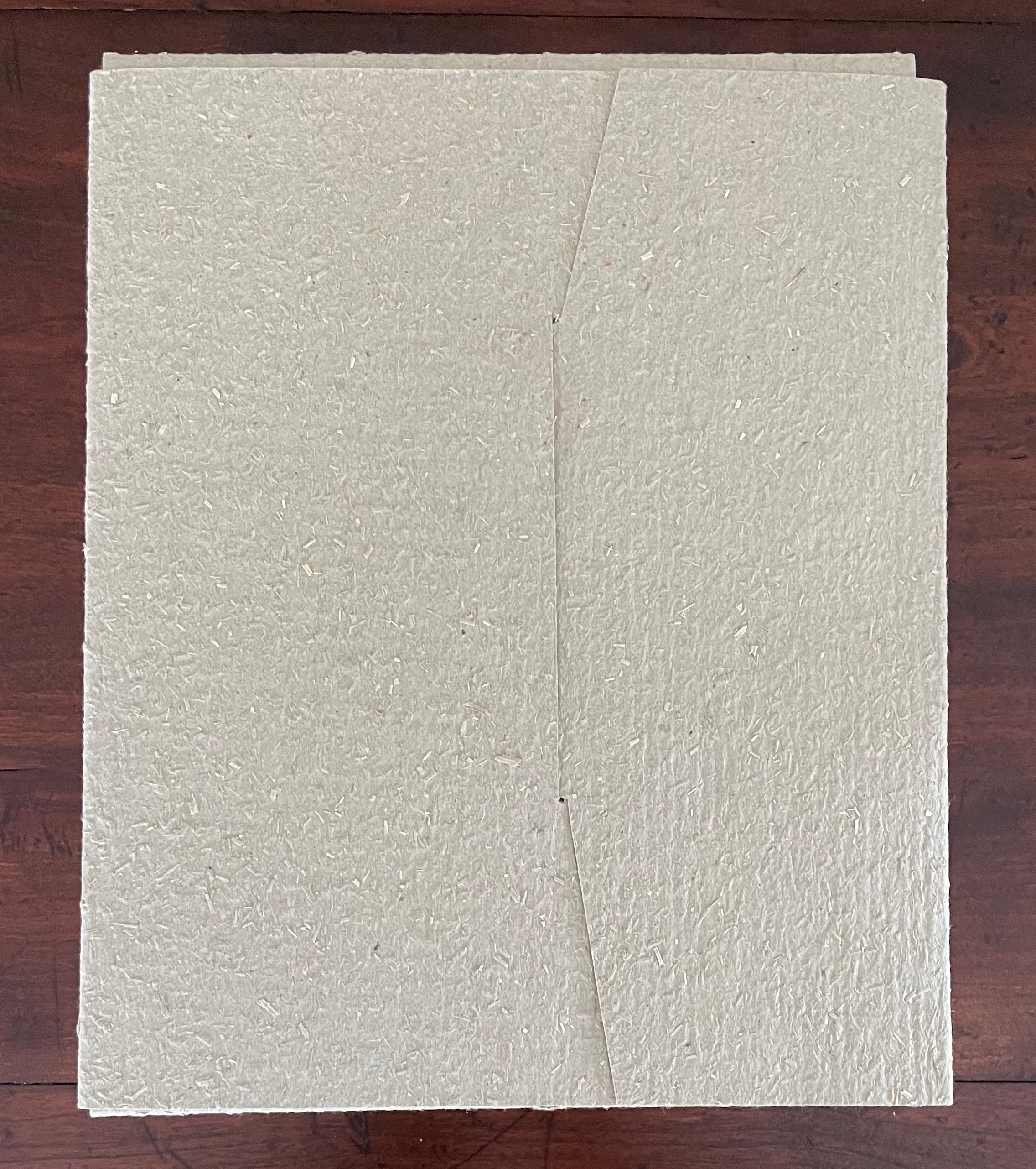
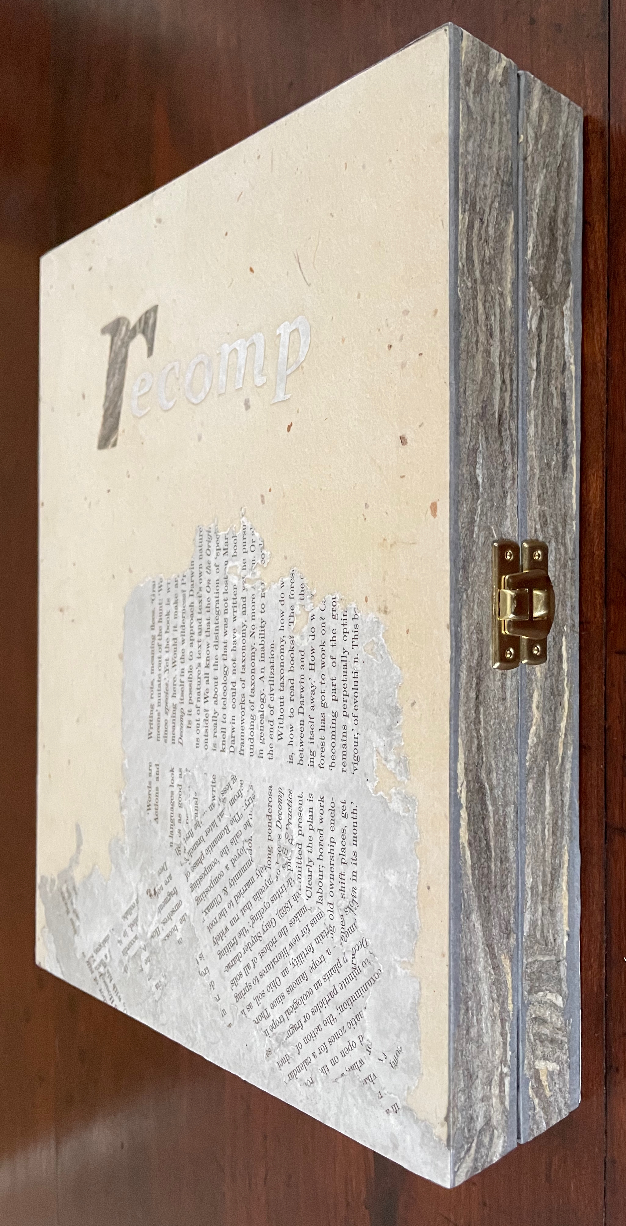
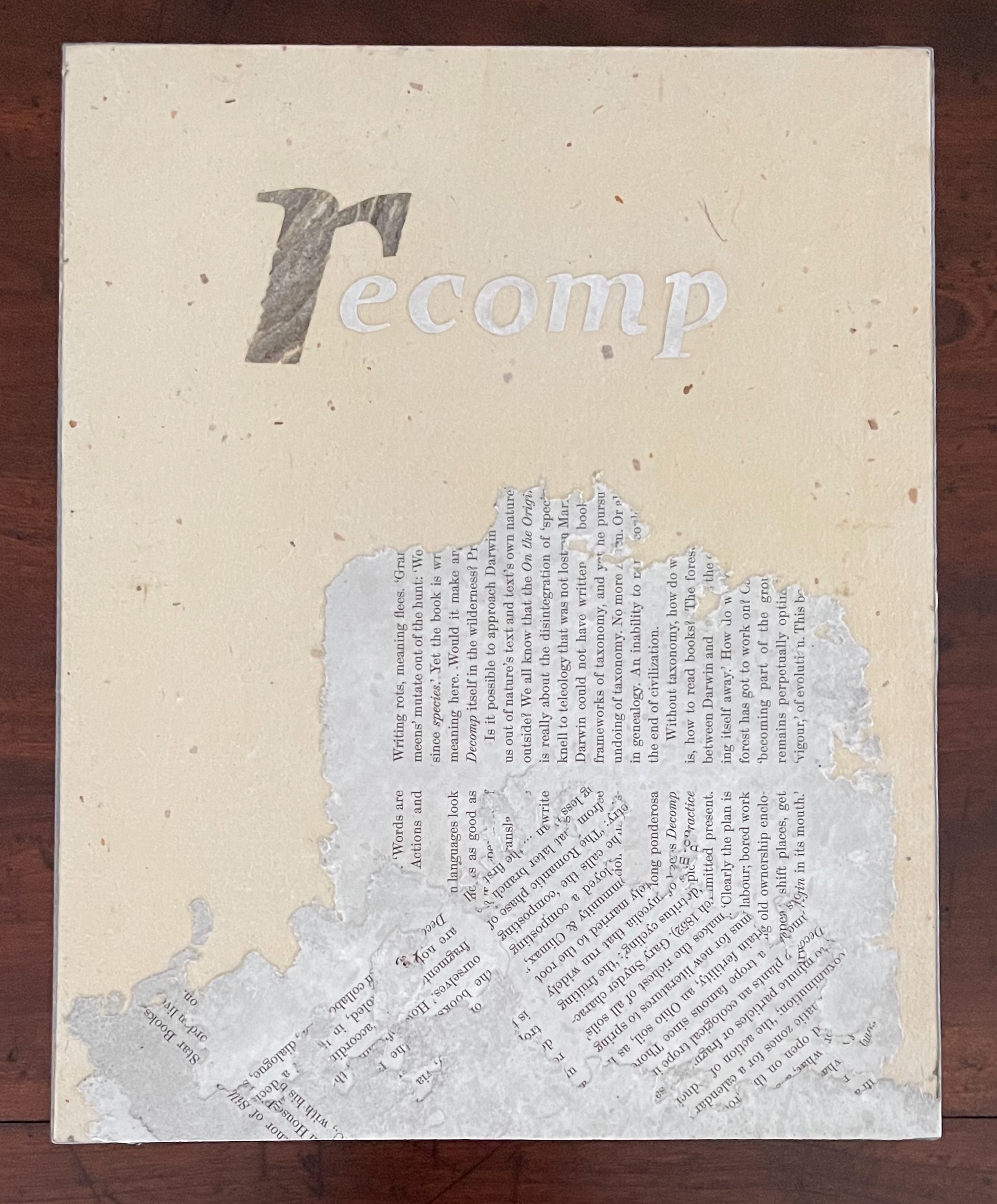
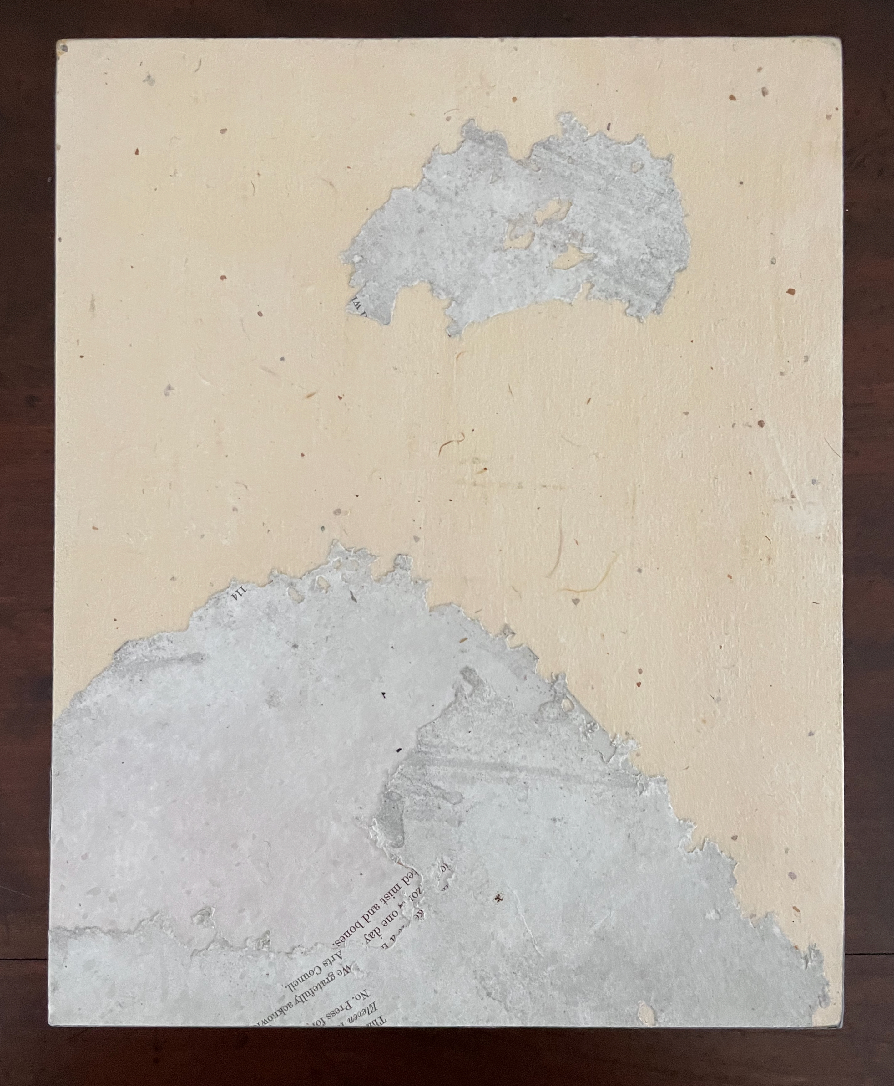
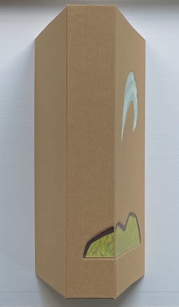
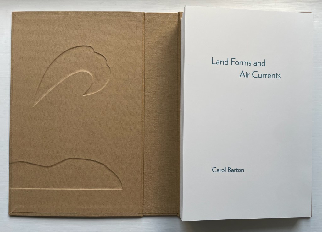

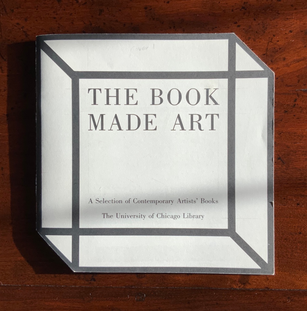
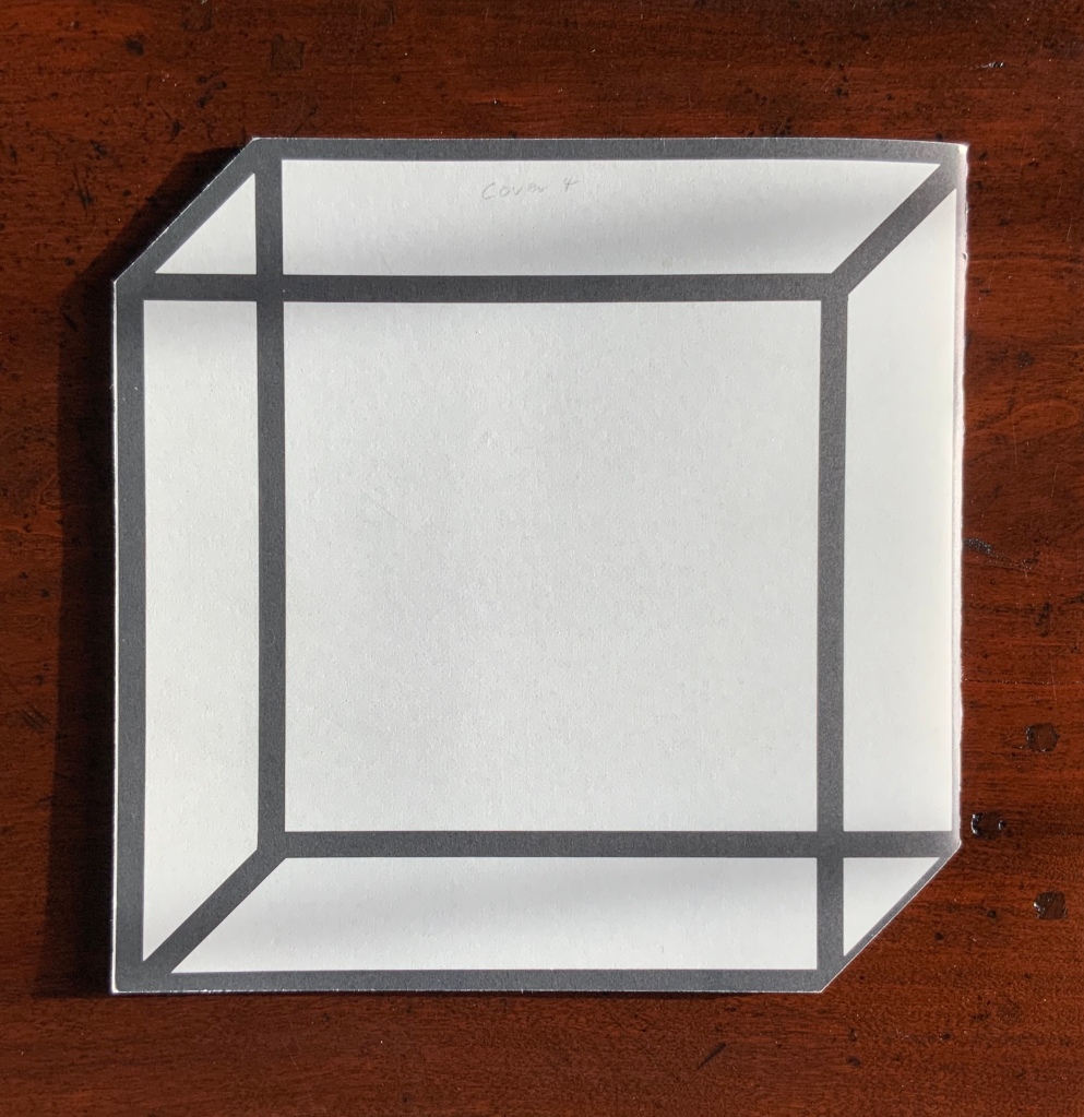

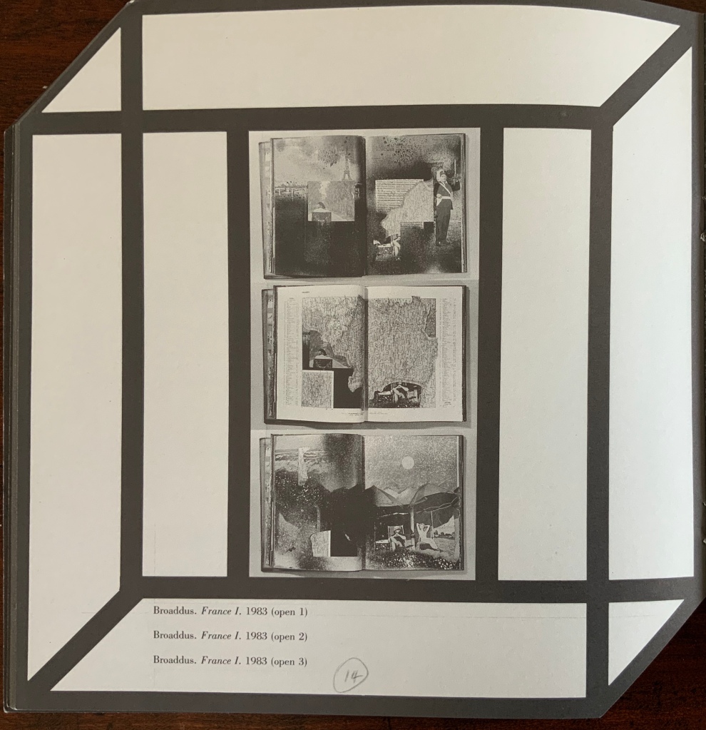

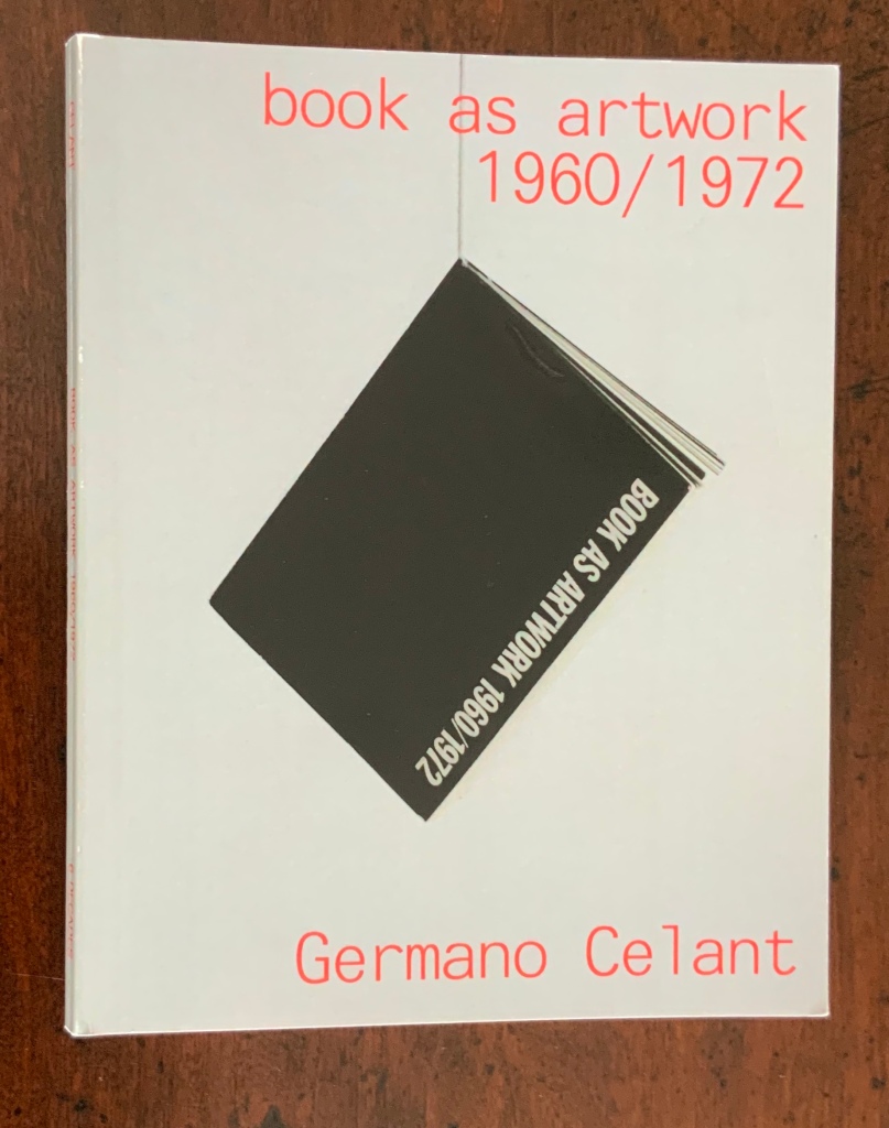
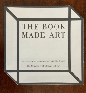


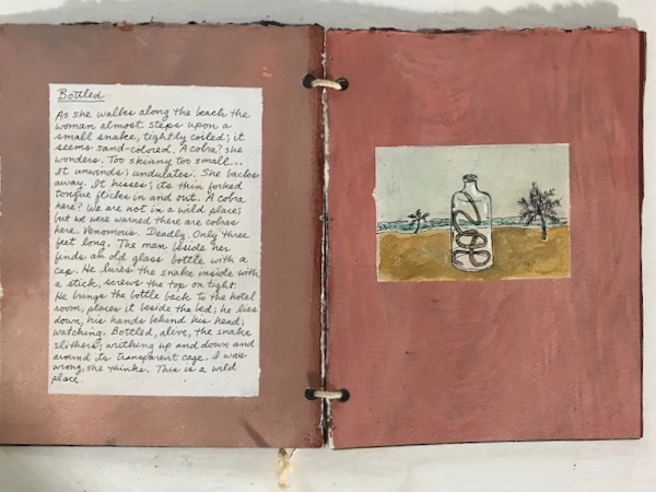
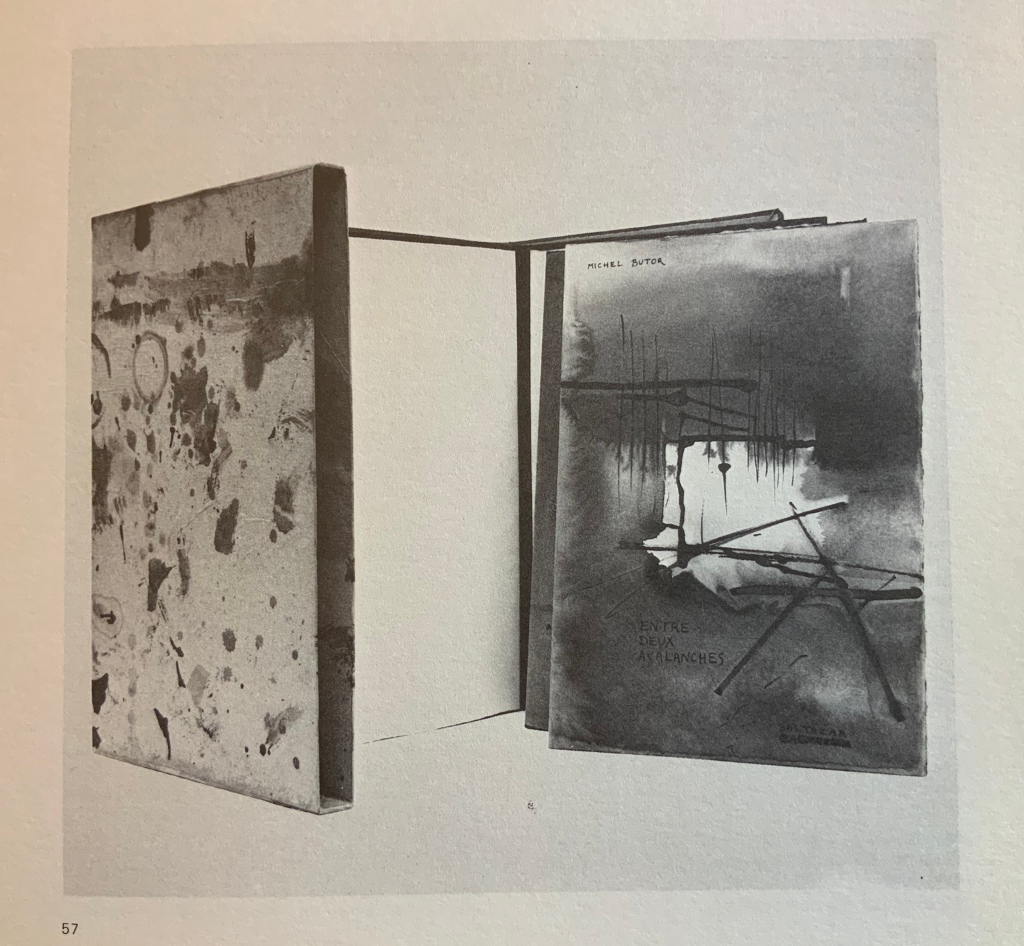


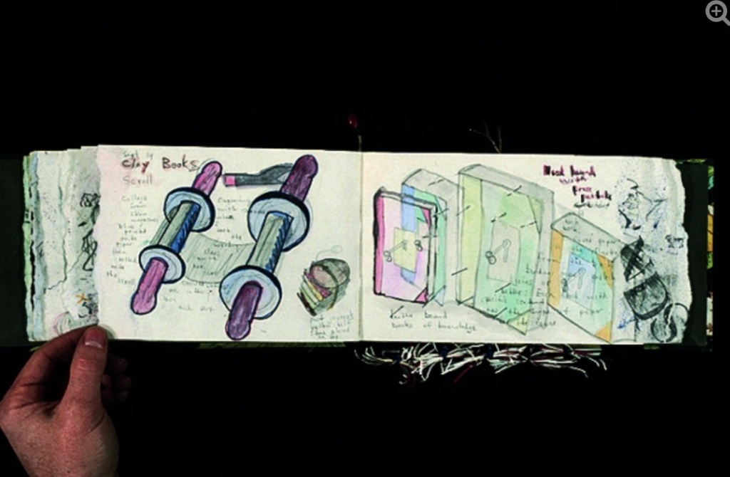

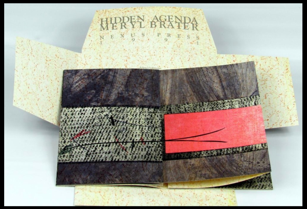


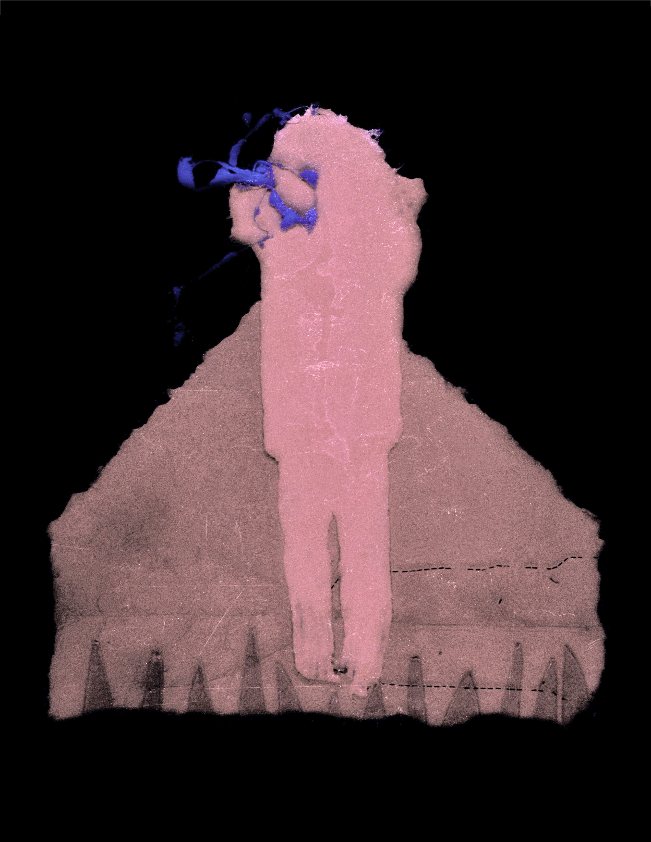

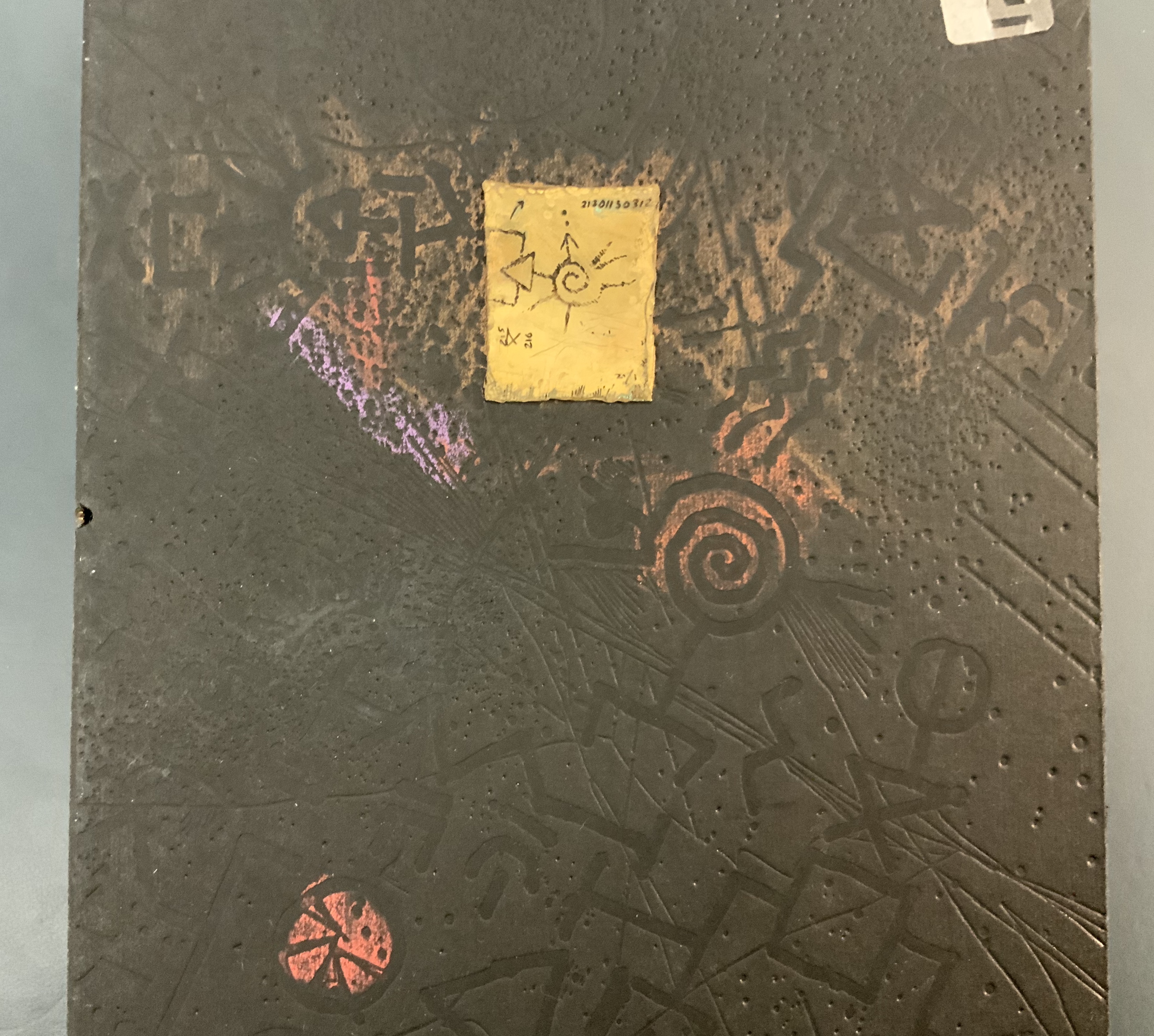
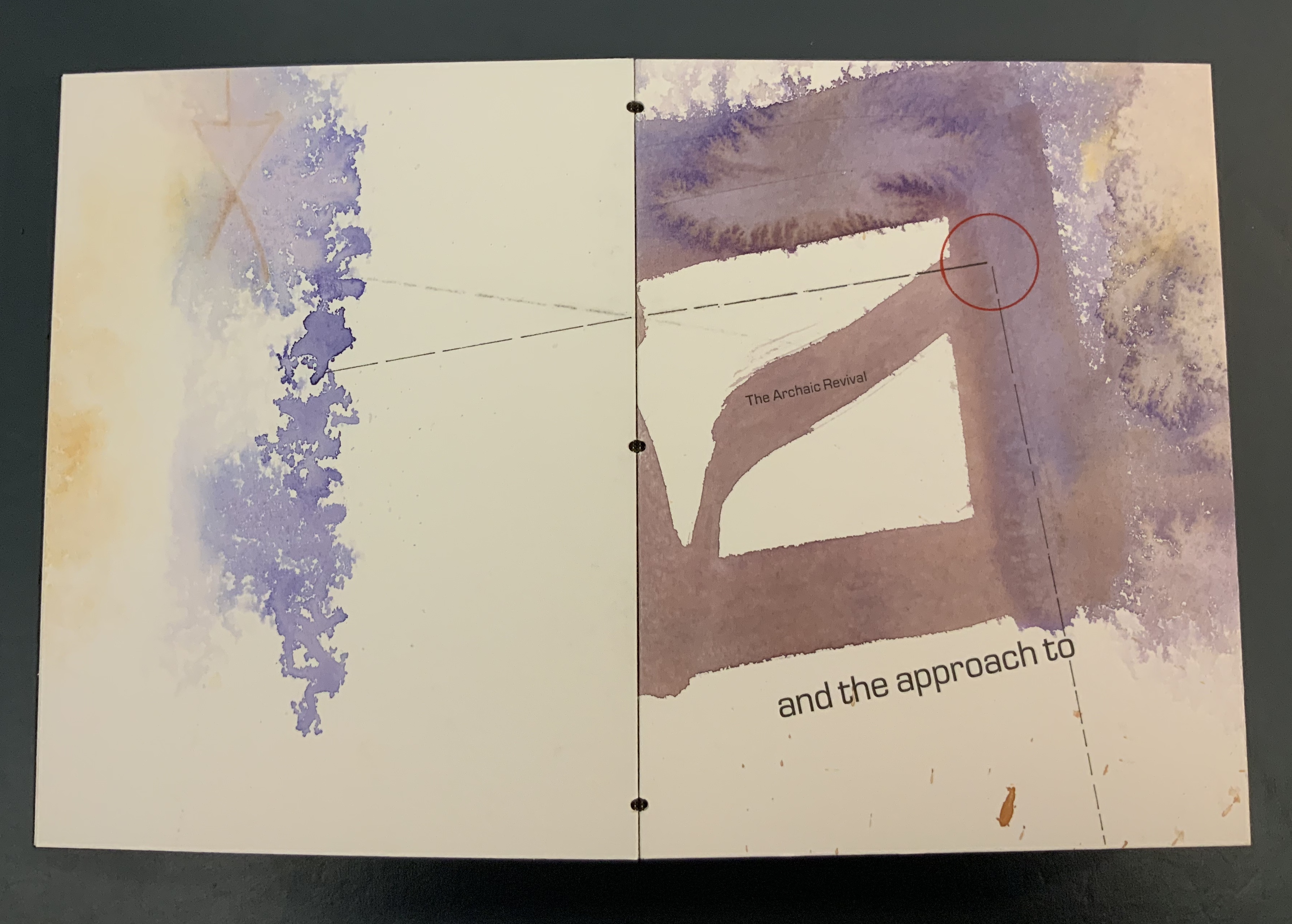


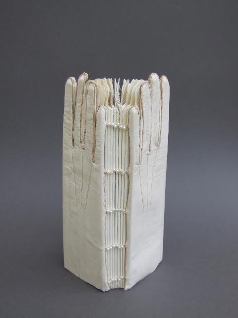
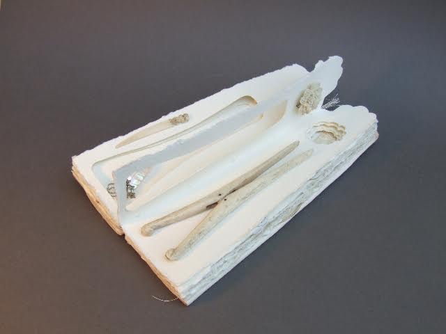
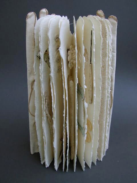

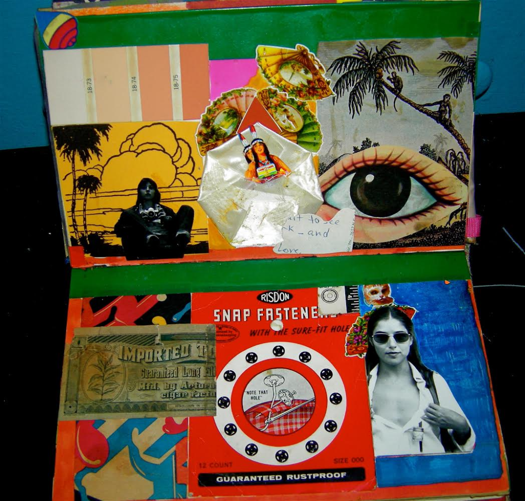
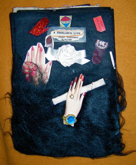


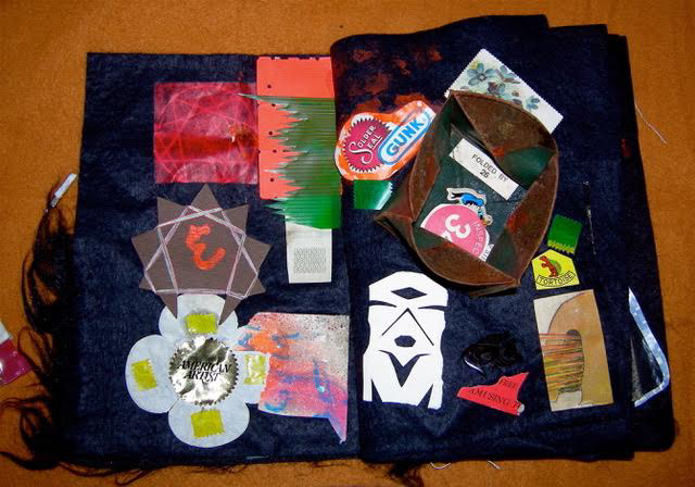
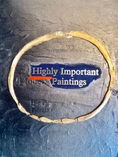


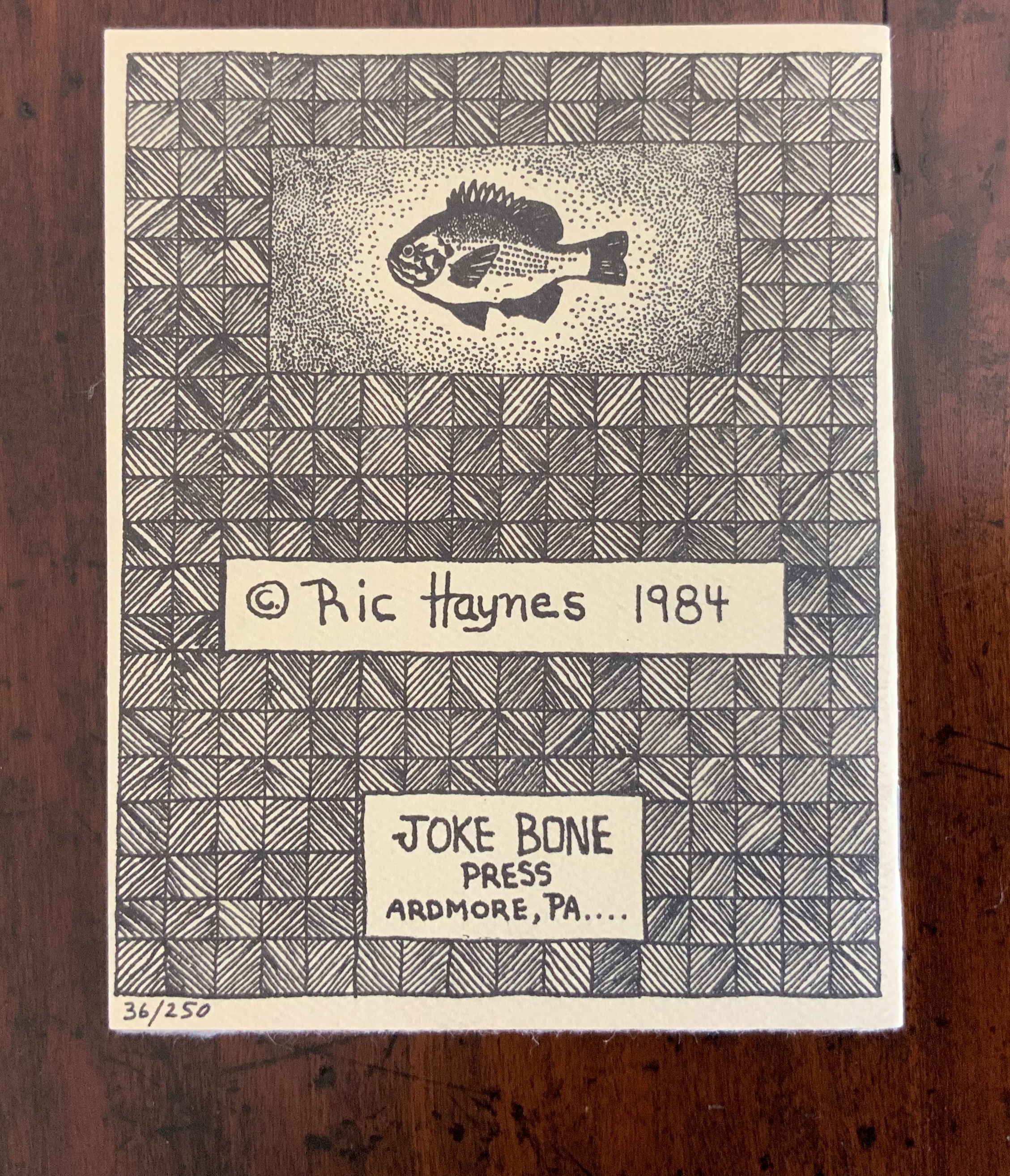
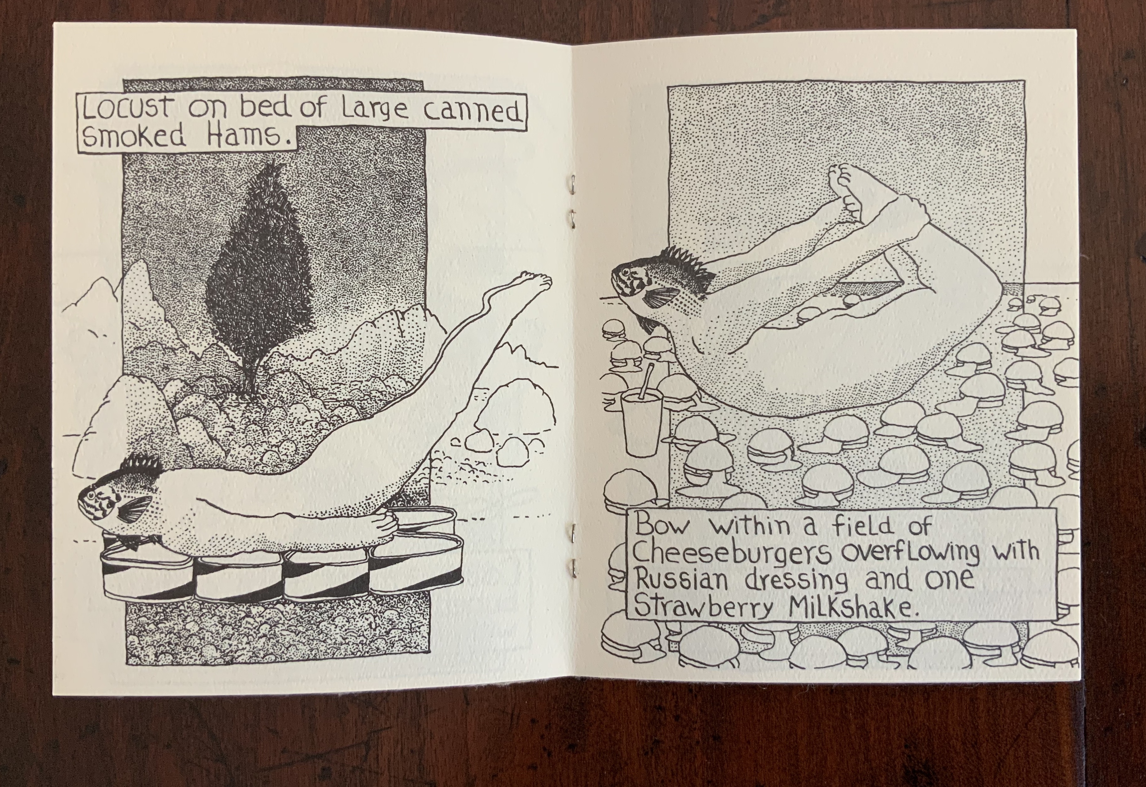


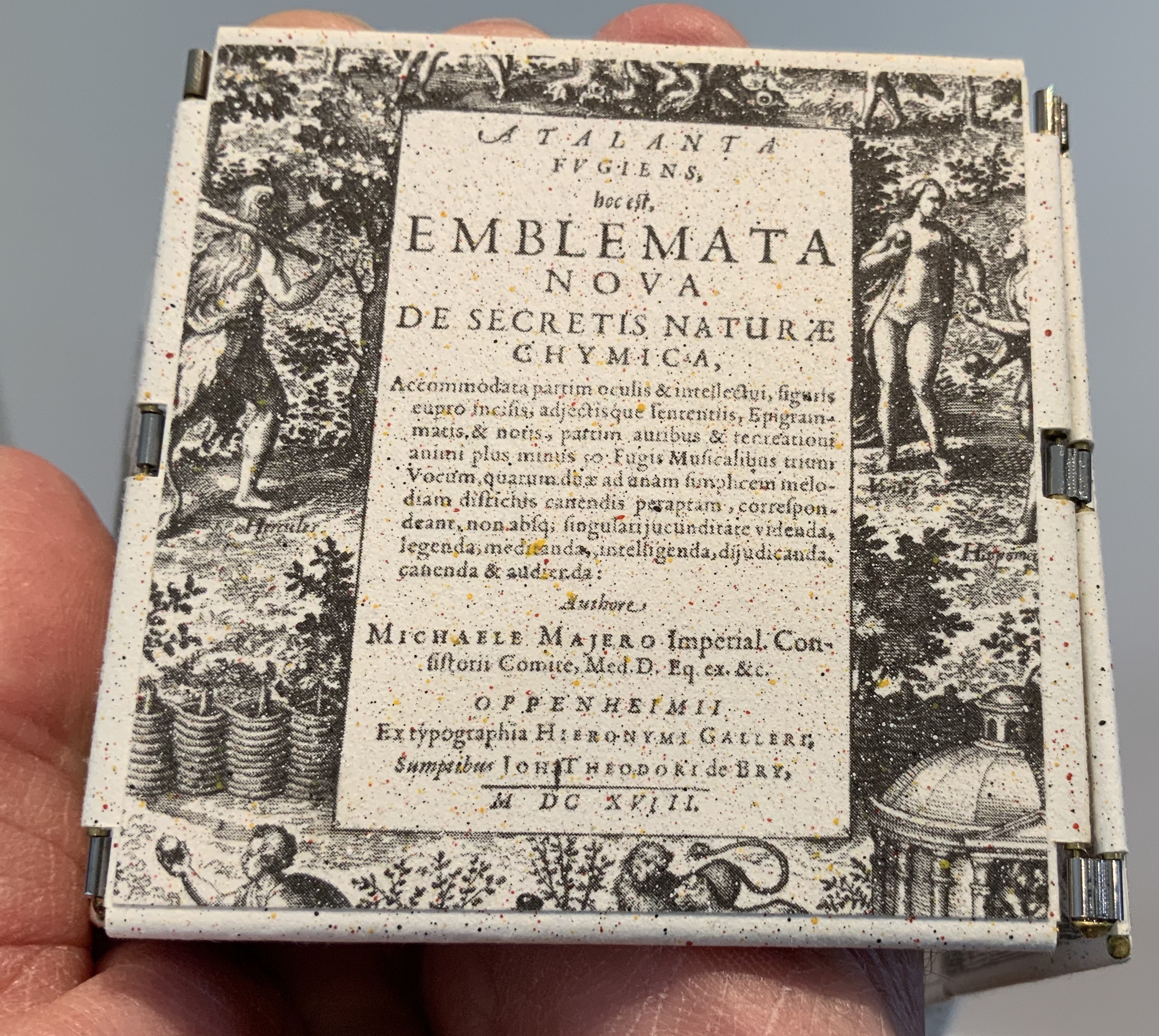

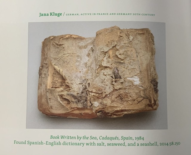

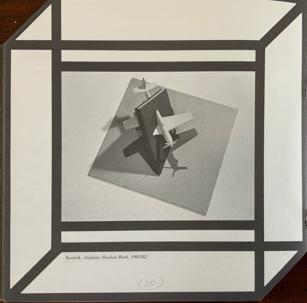
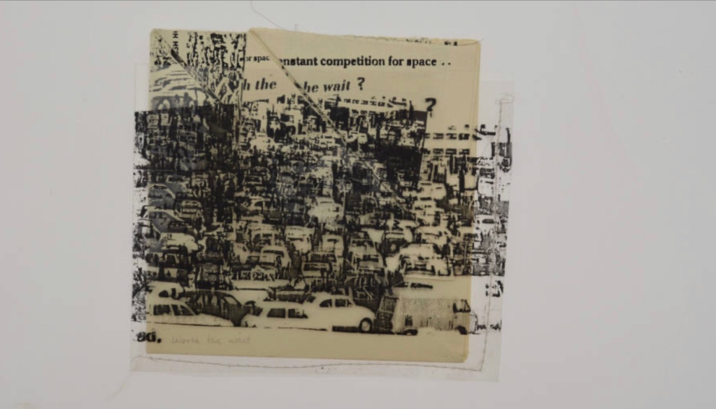


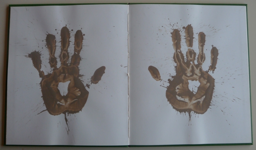

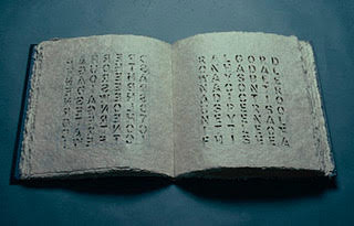


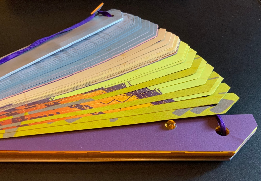

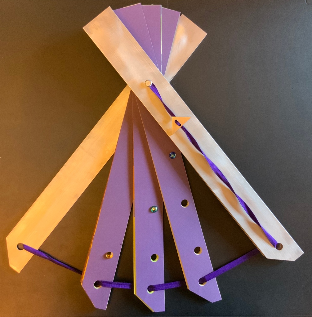

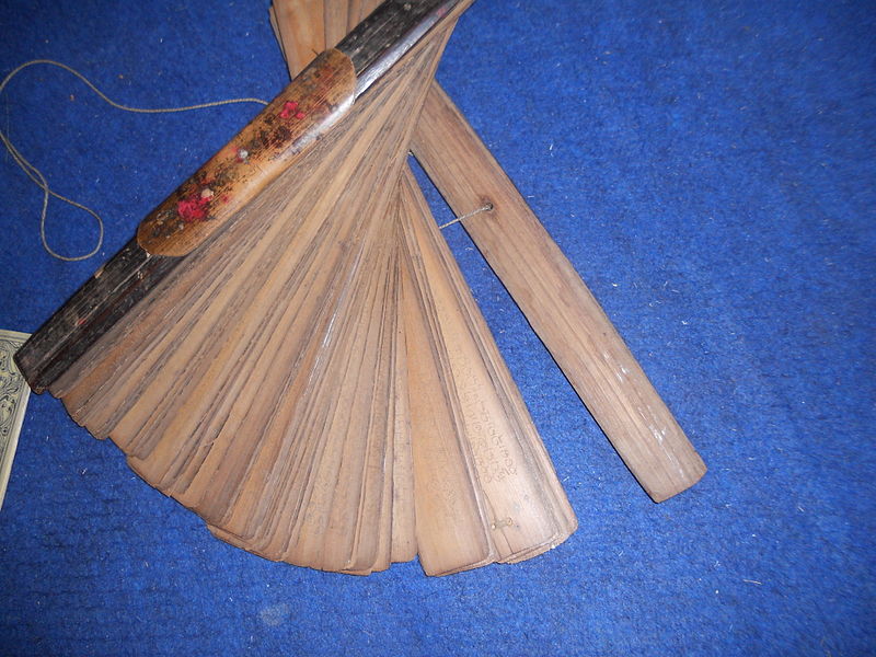
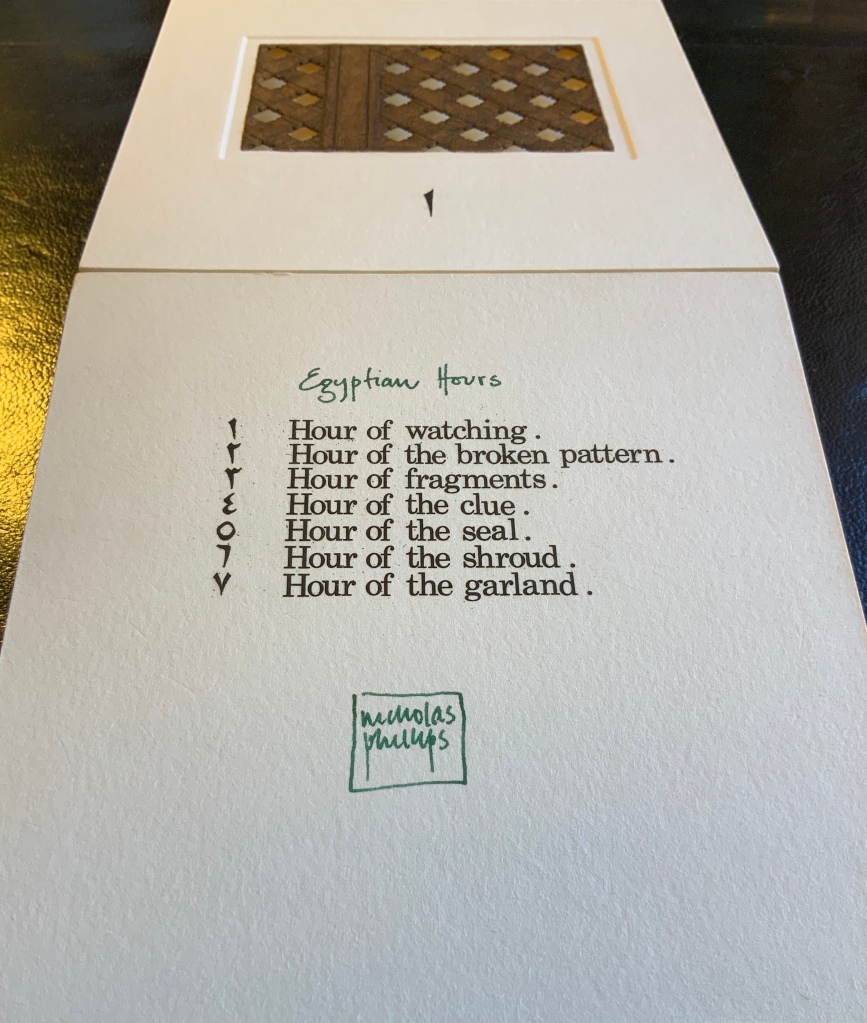
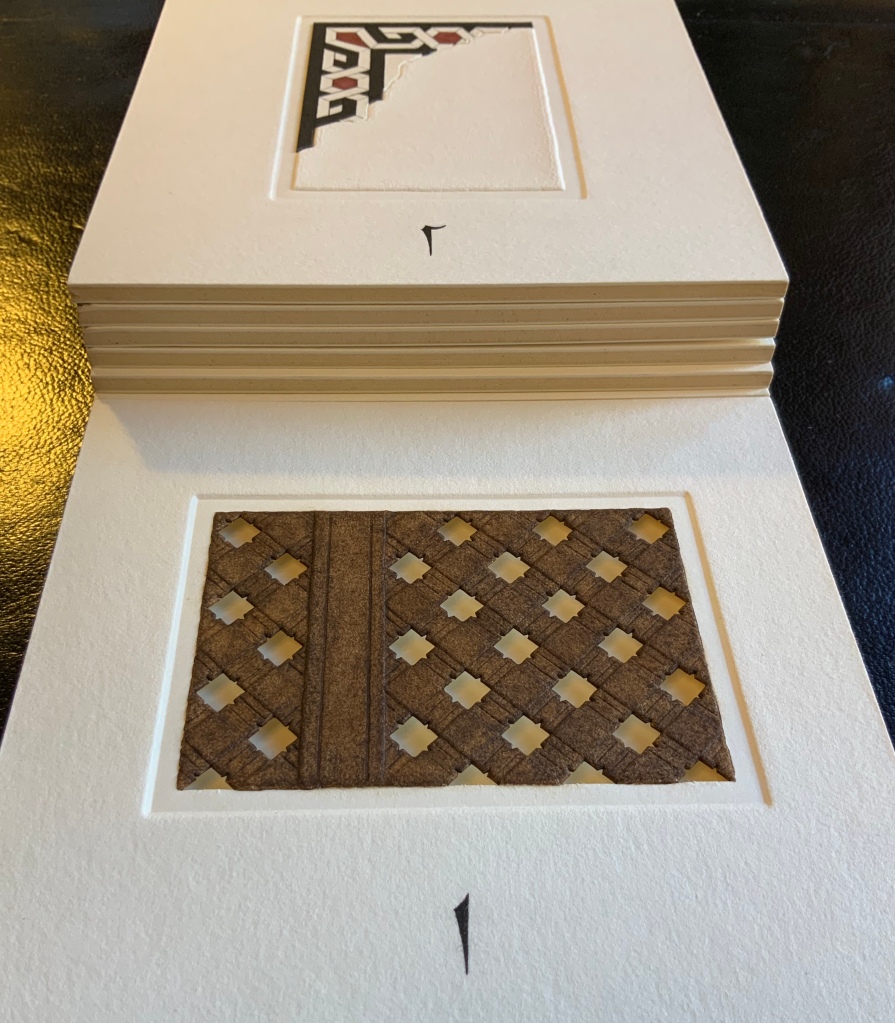
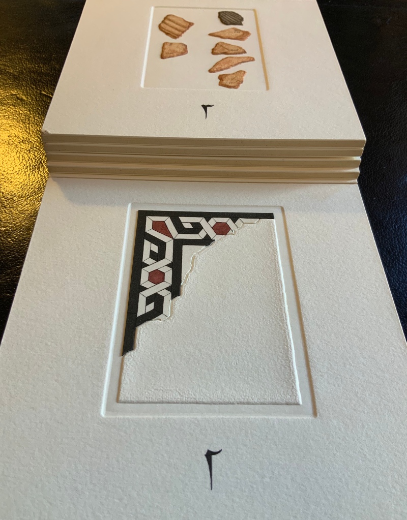


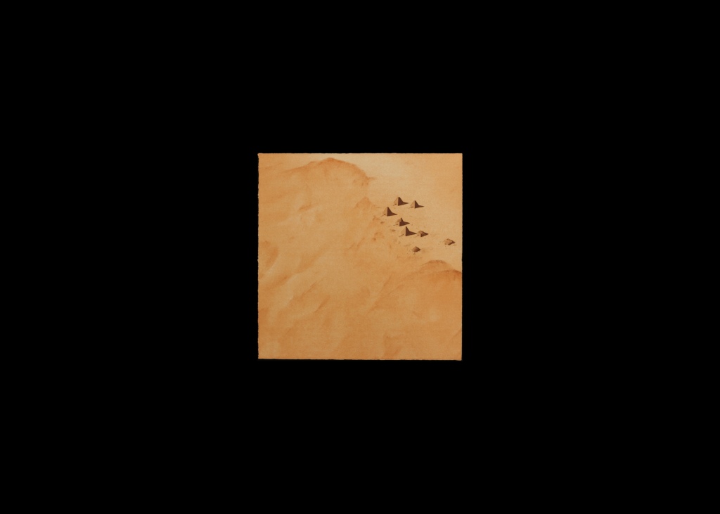
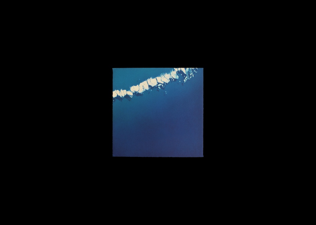

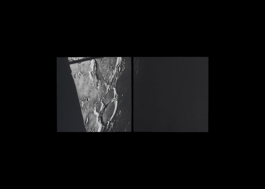

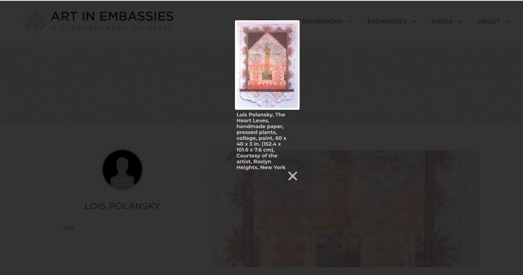
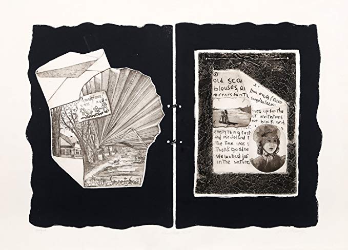

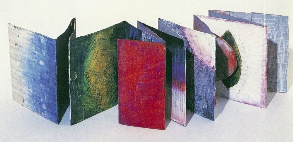
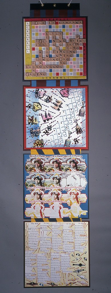

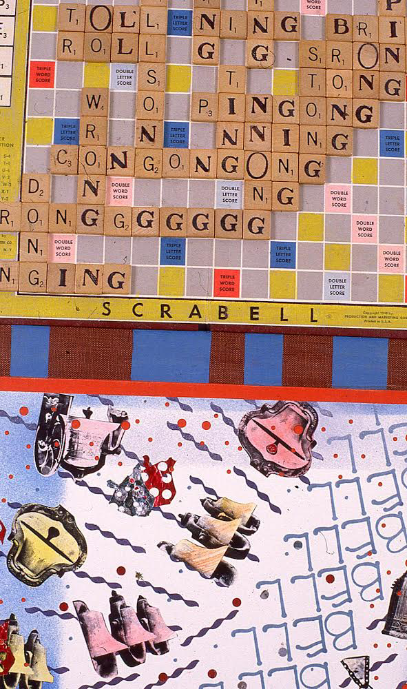


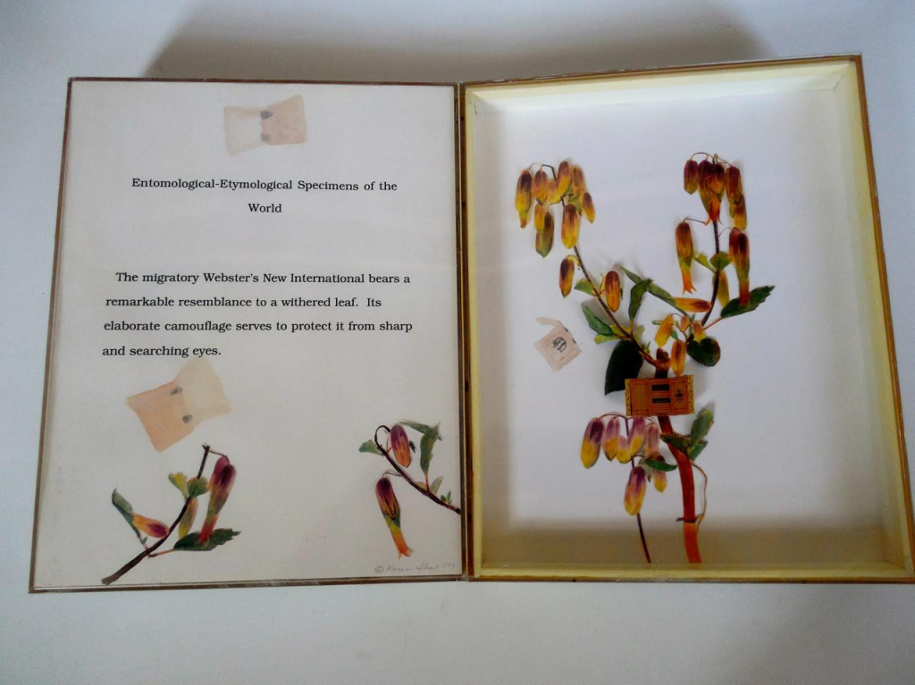
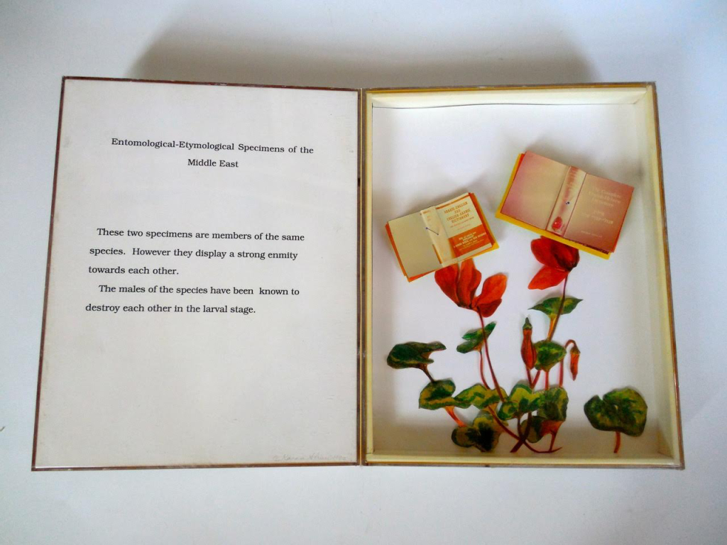

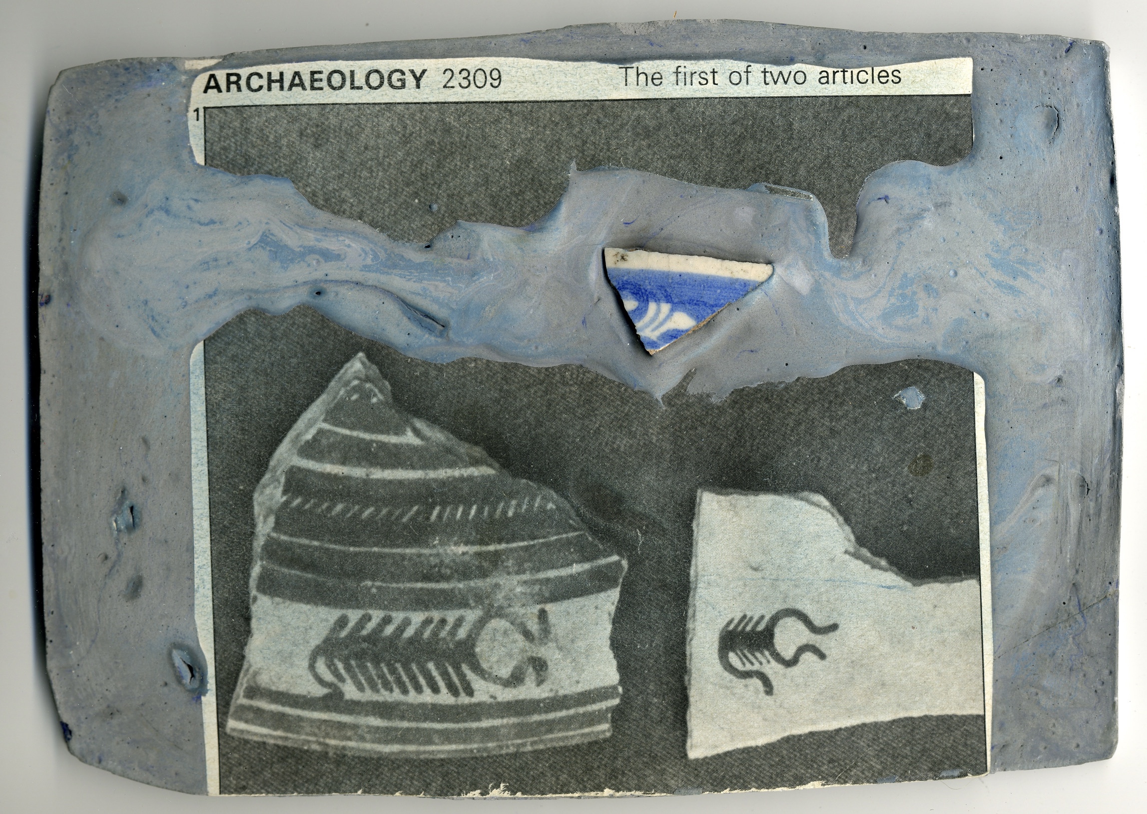

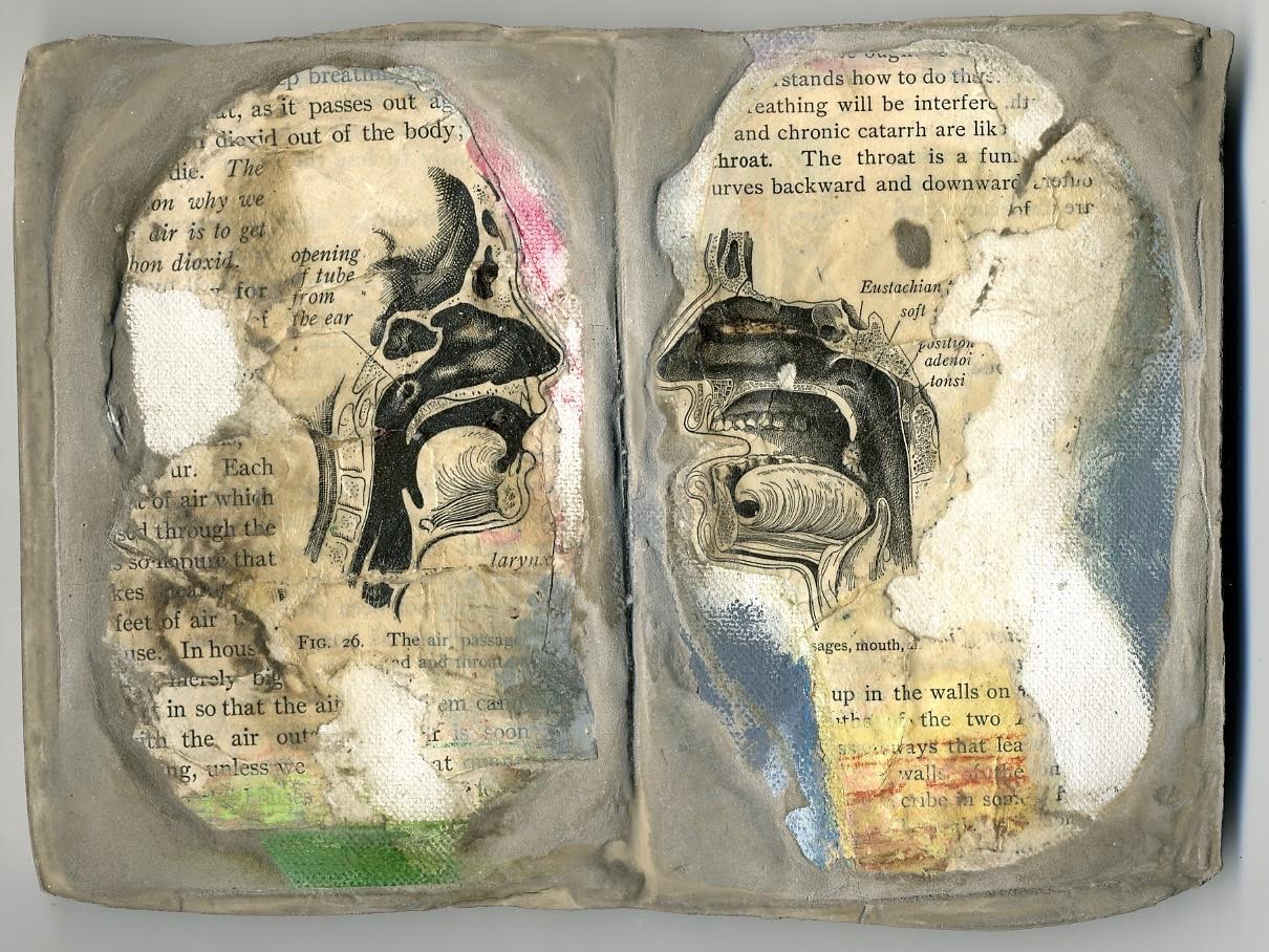

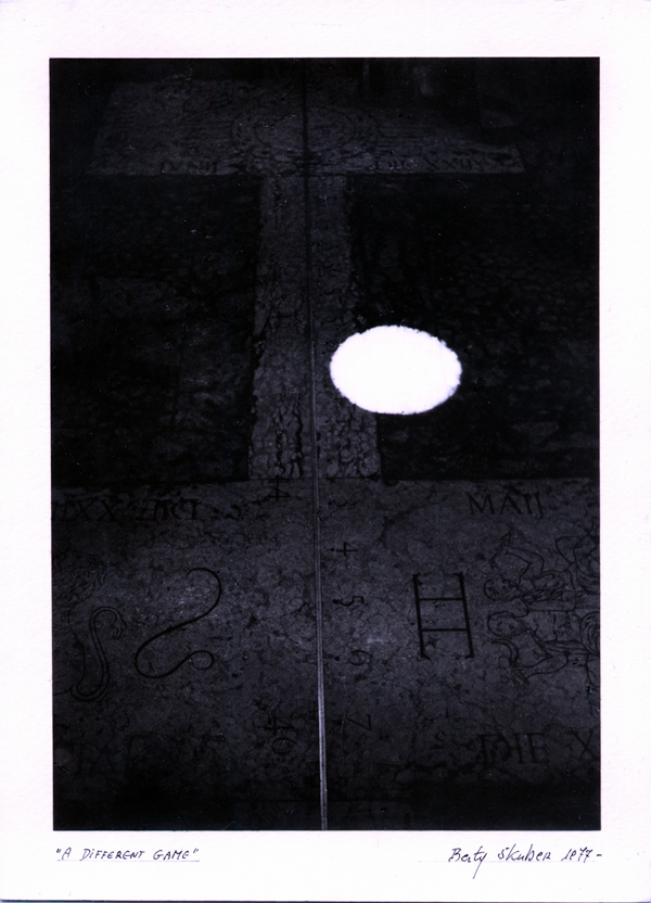
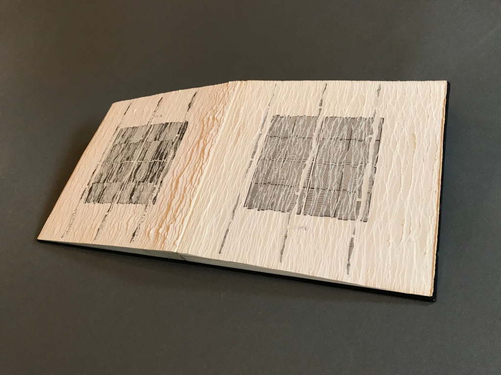


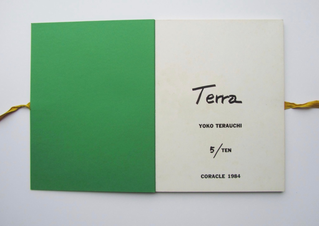


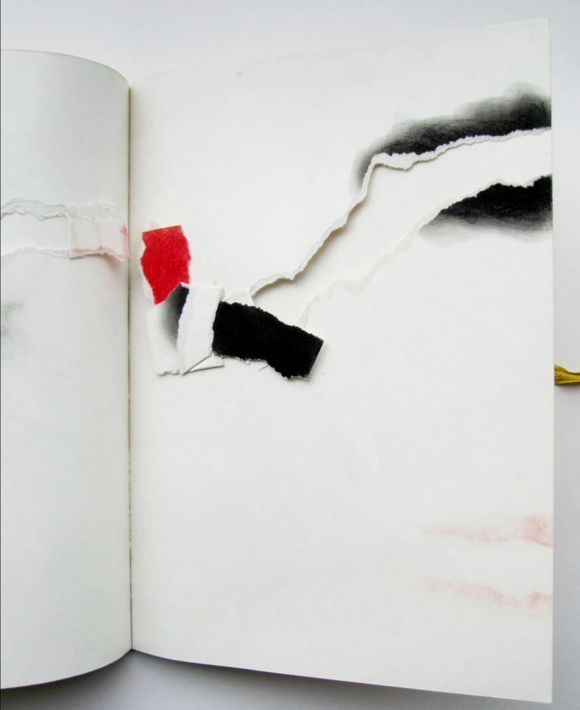


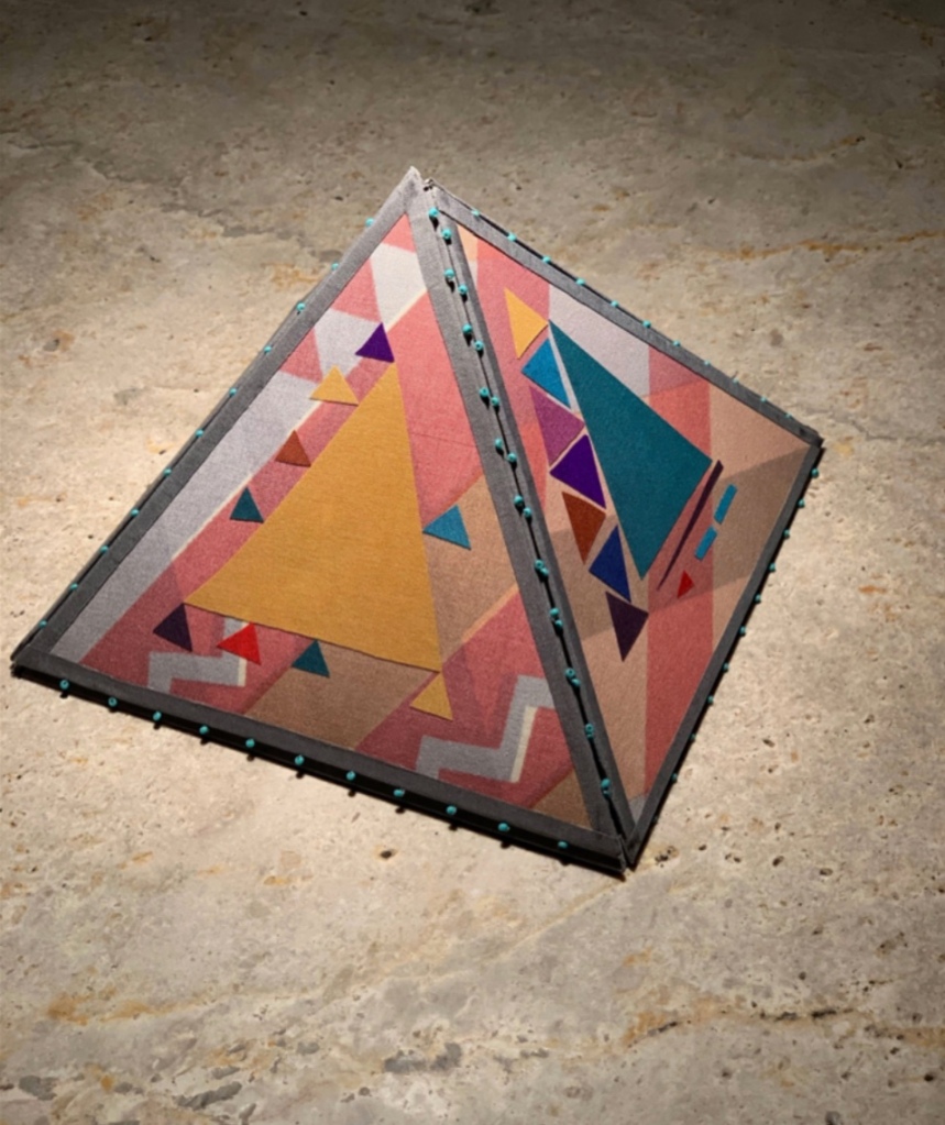
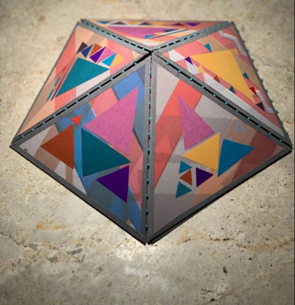


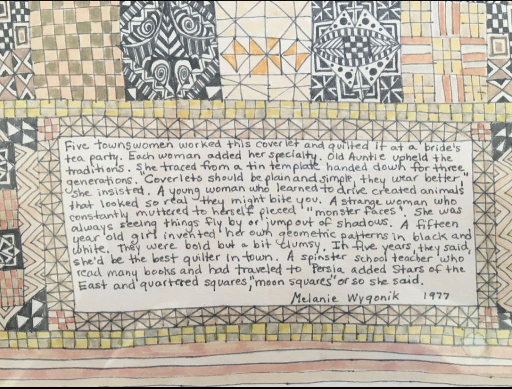
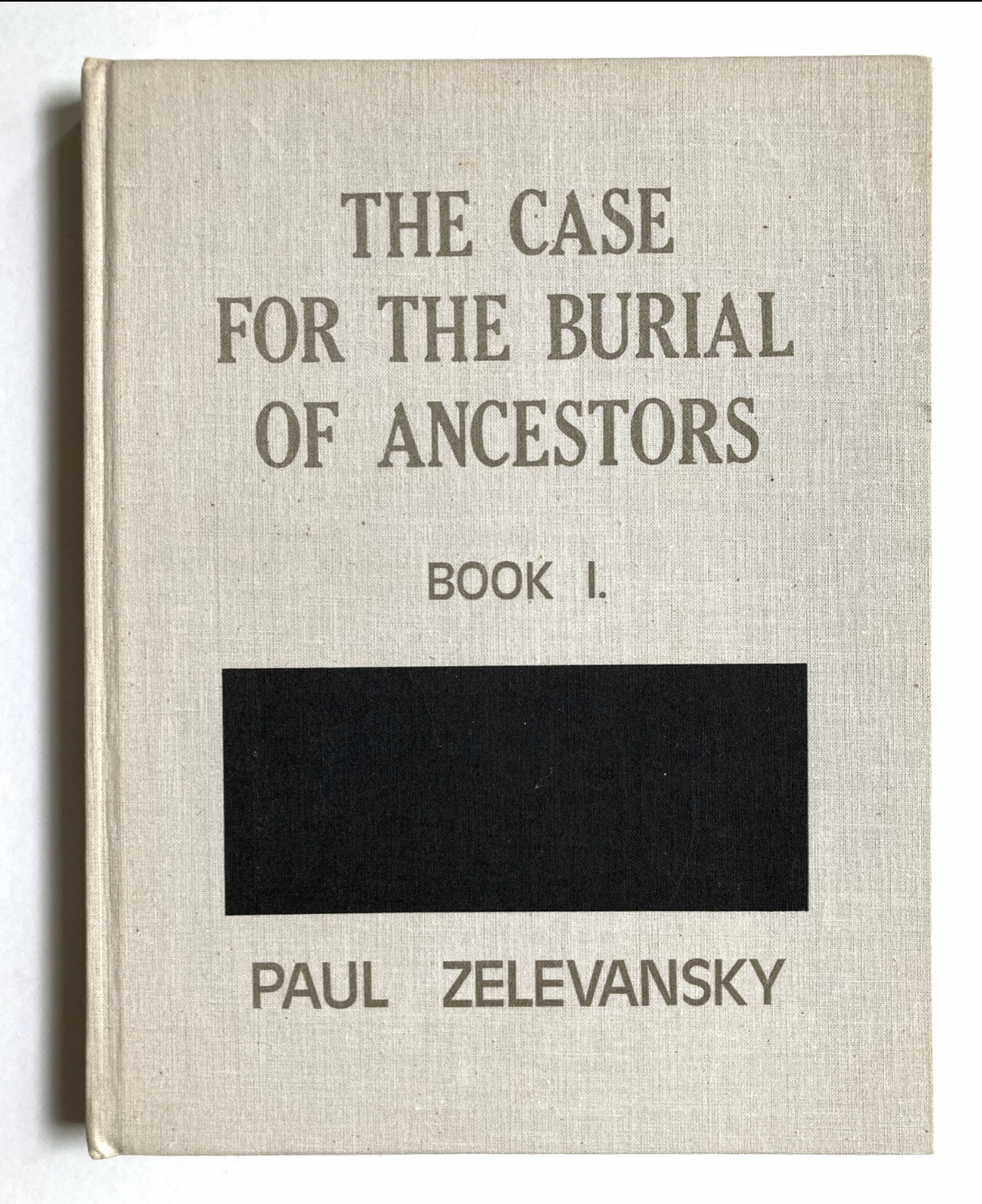
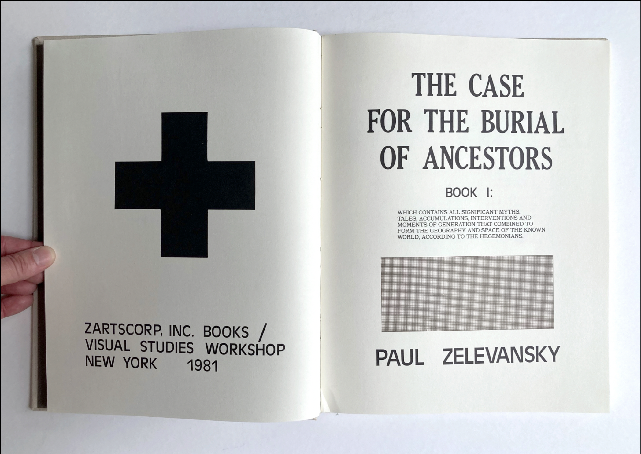

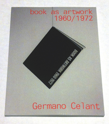

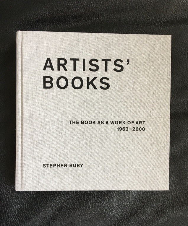
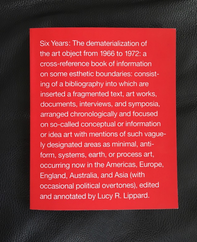


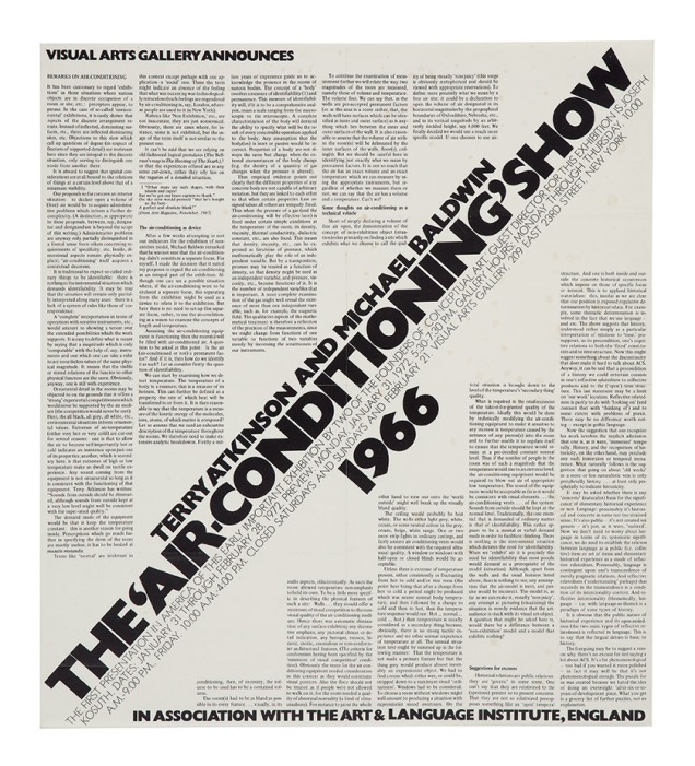
![Image result for art & language: texte zum phänomen kunst und sprache [book]](http://igem.adlibsoft.com/wwwopacx/wwwopac.ashx?command=getcontent&server=images&value=coda%5CAB00318.jpg)
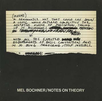


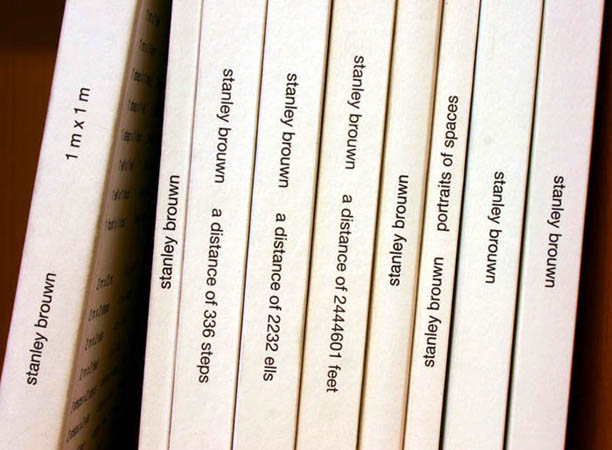
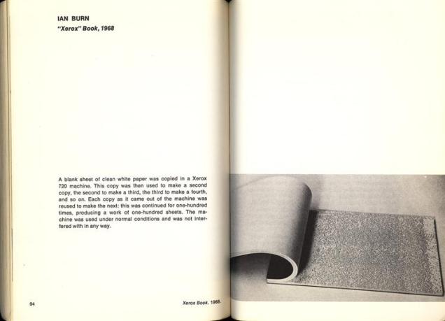


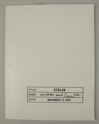

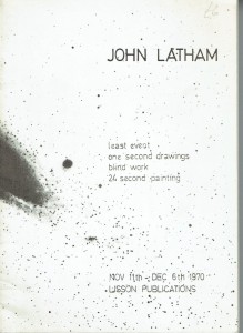


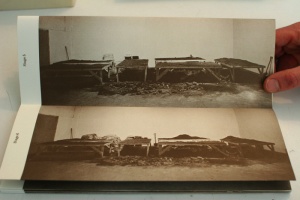
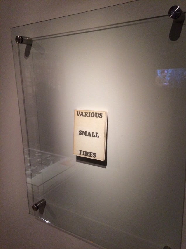
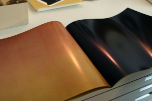
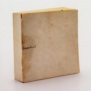
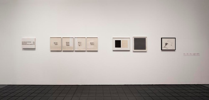


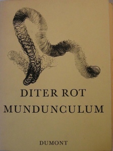


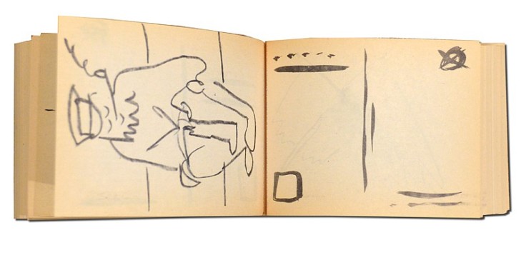


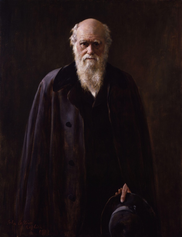

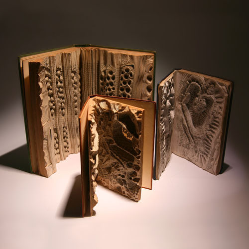


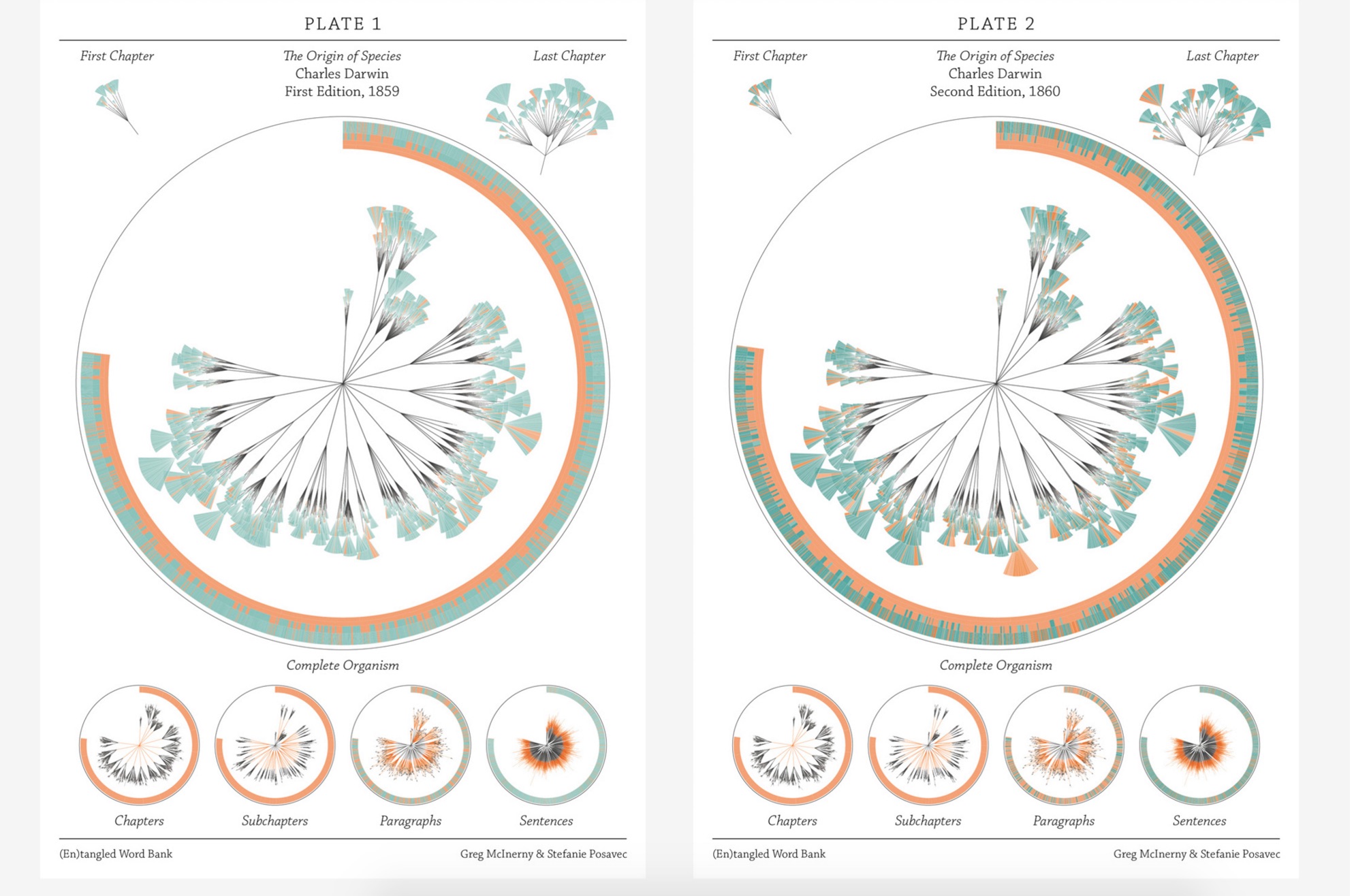
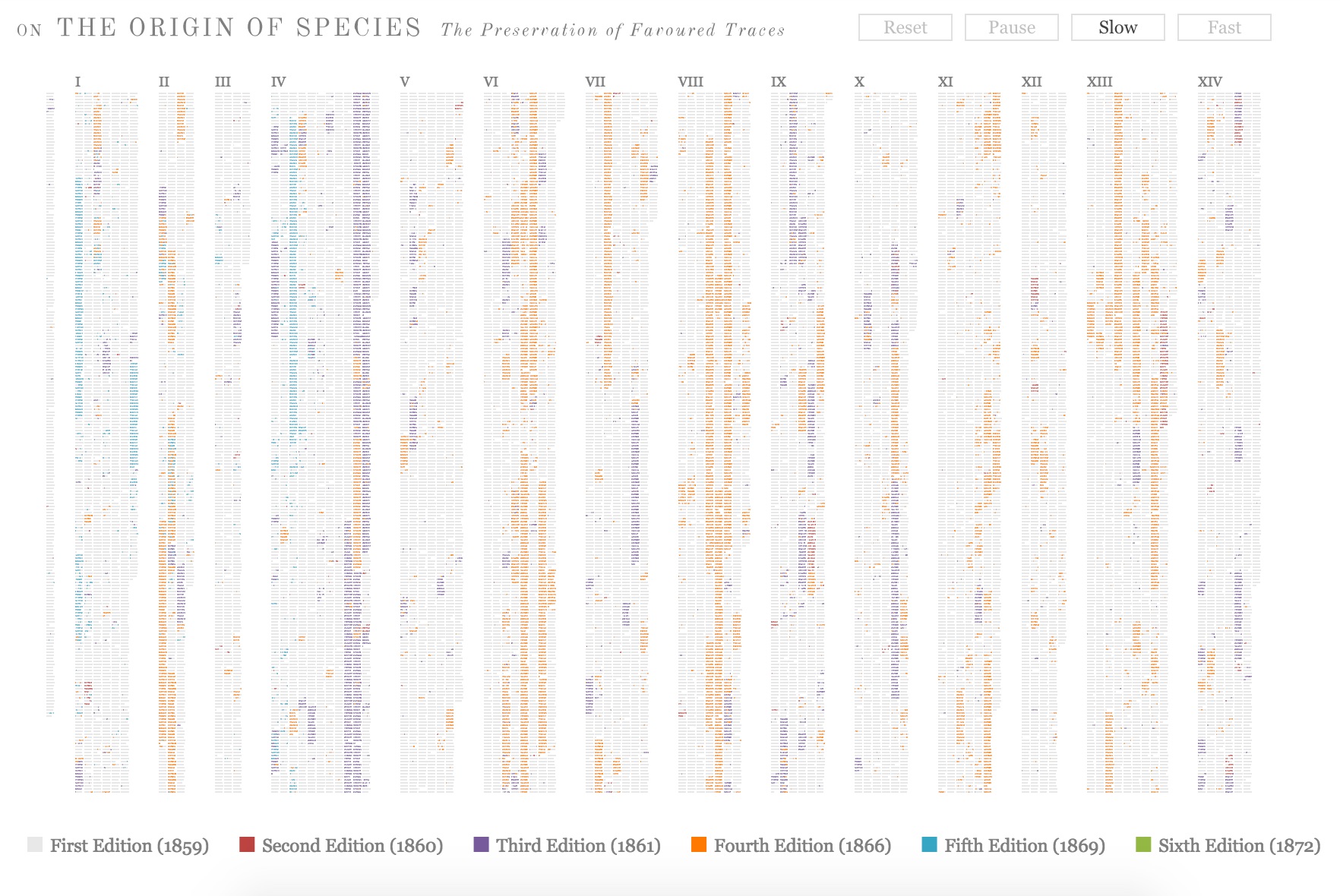
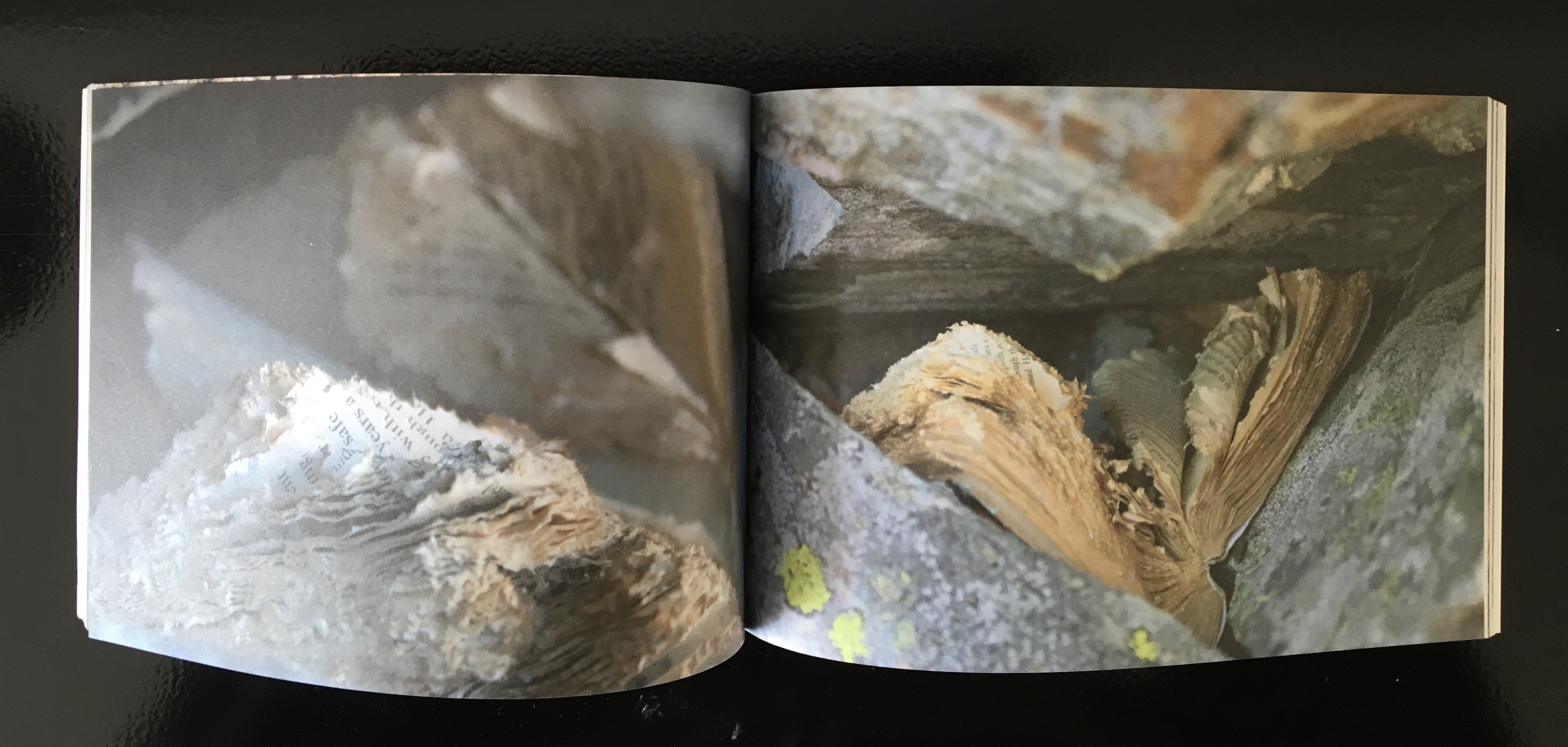

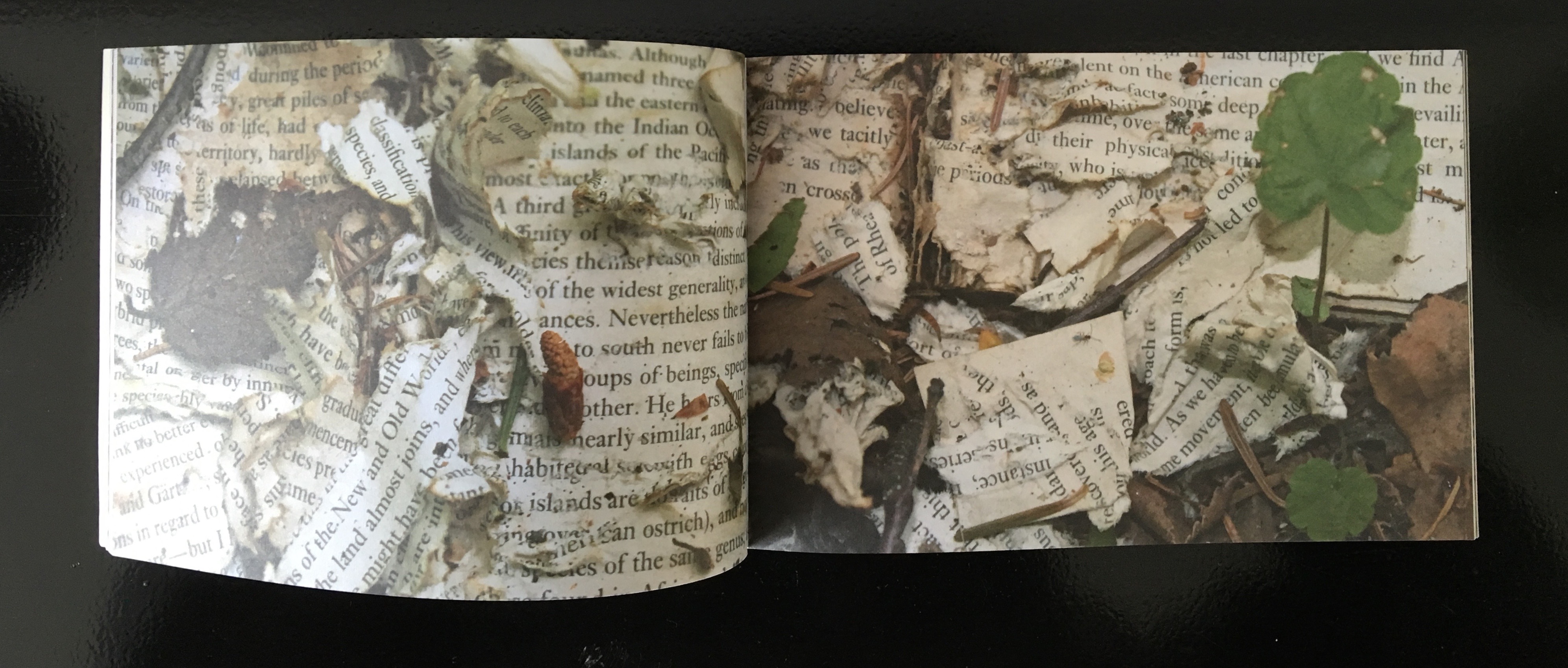
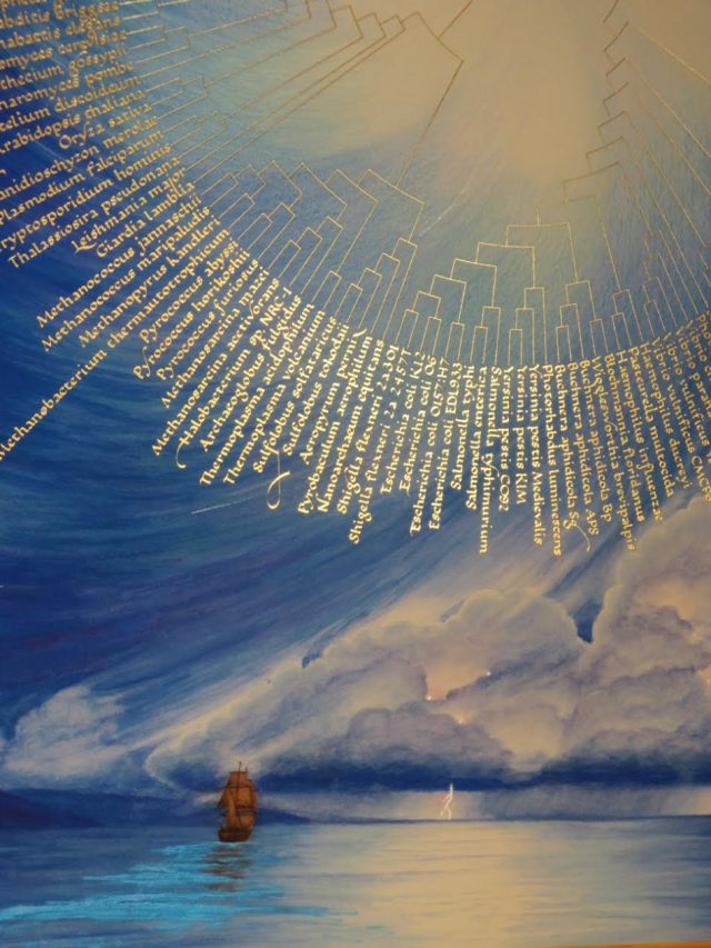
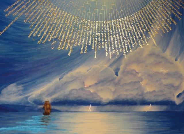
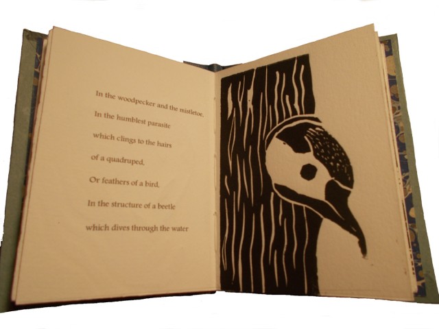
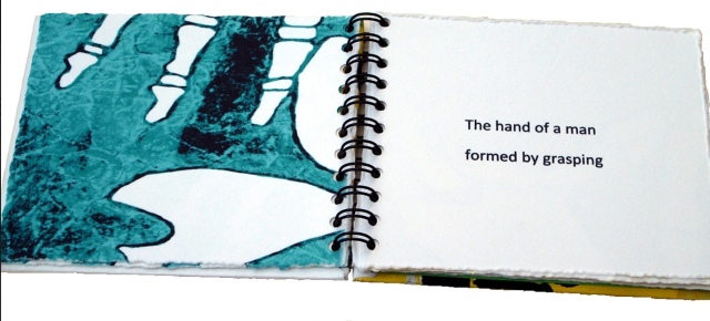
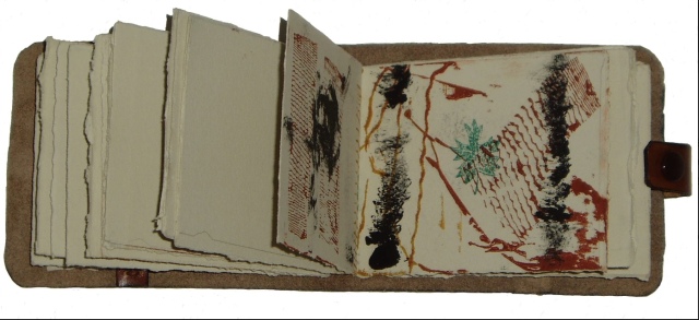

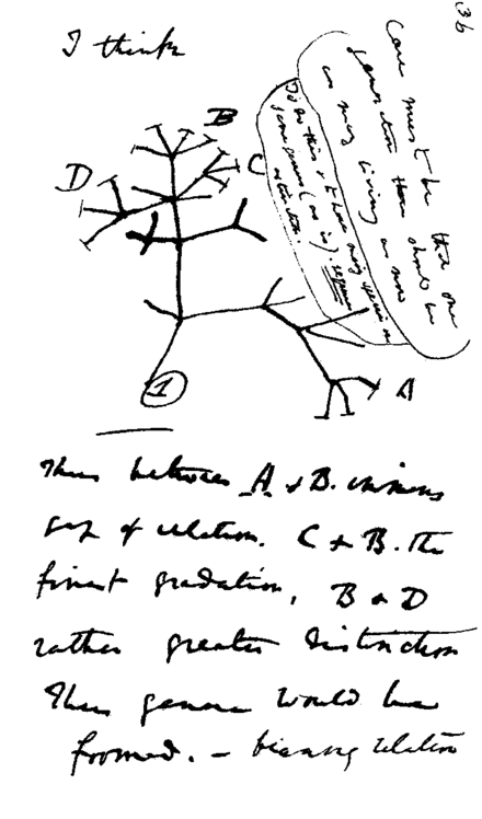
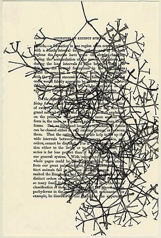
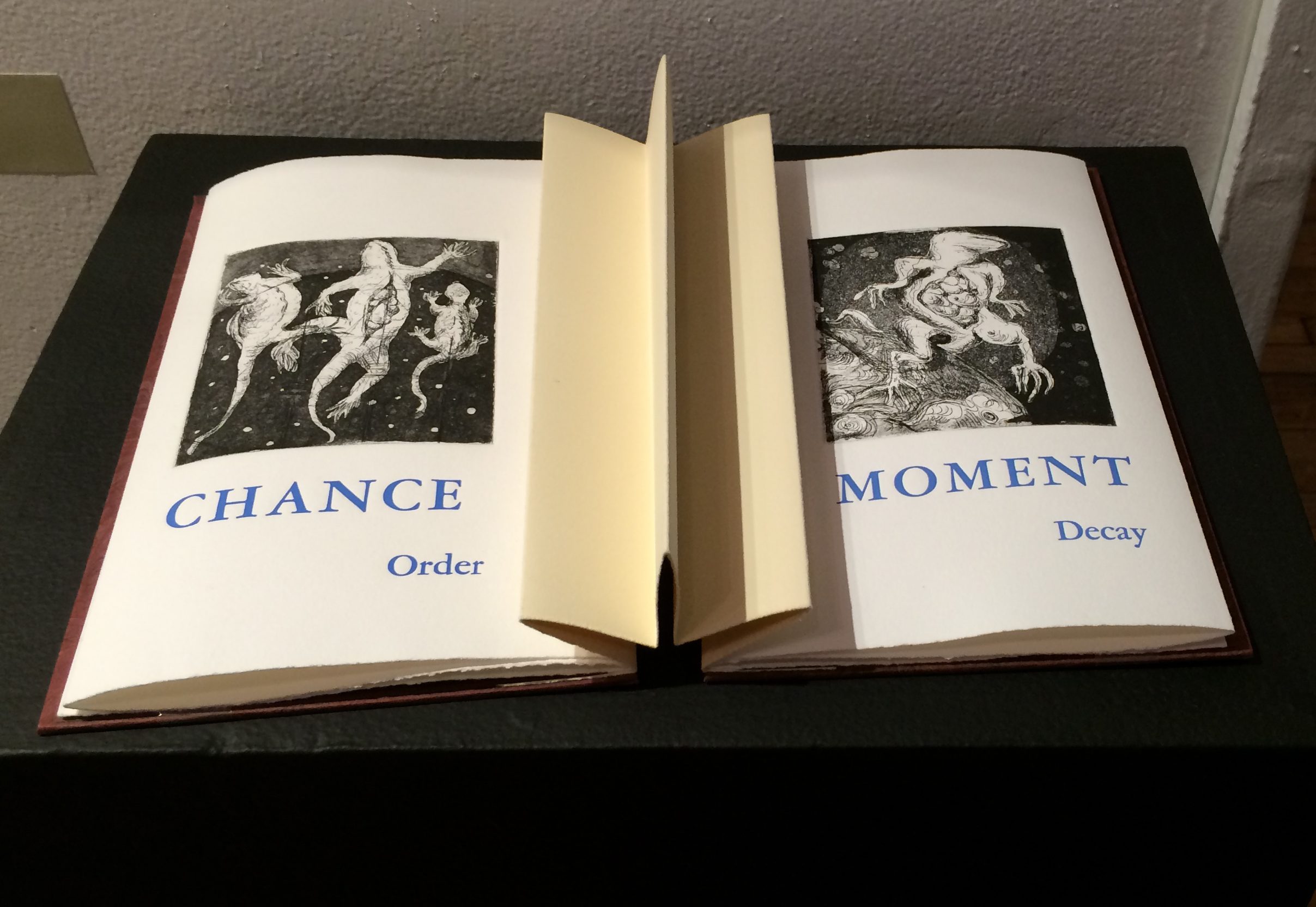
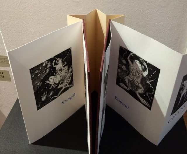
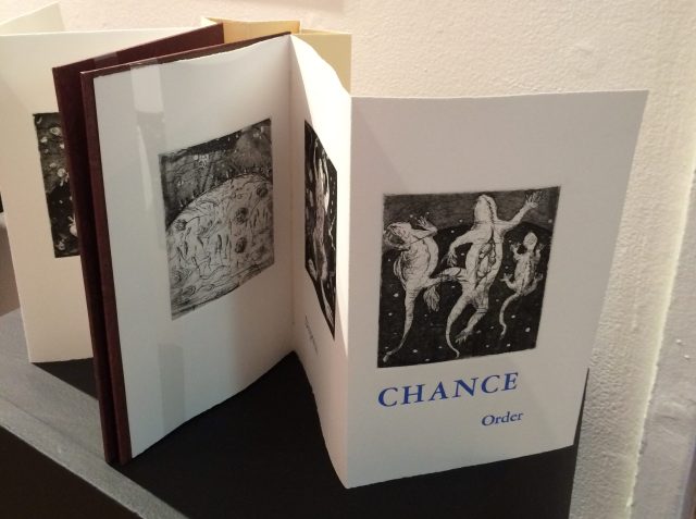
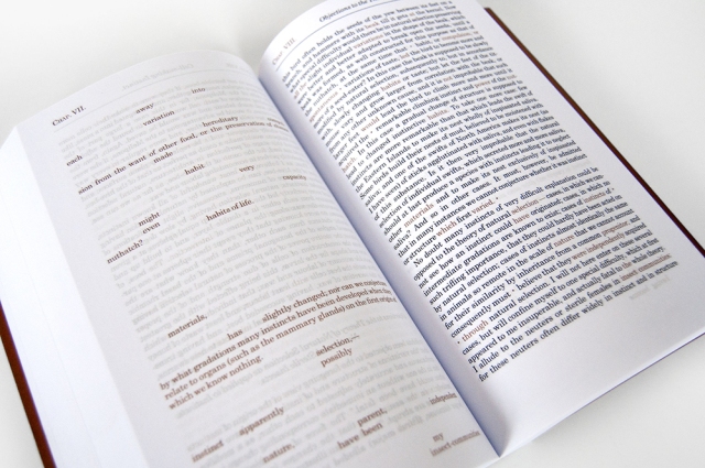
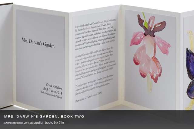
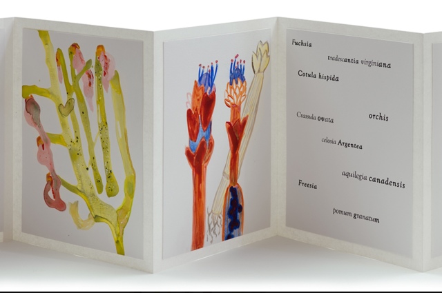
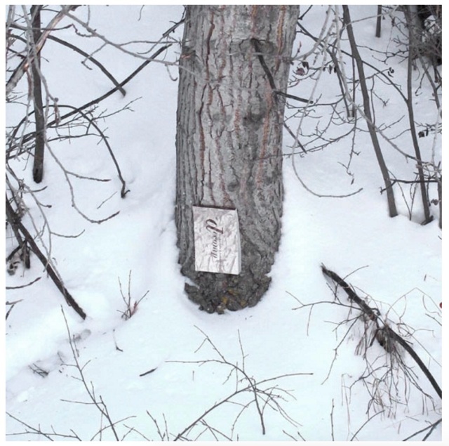
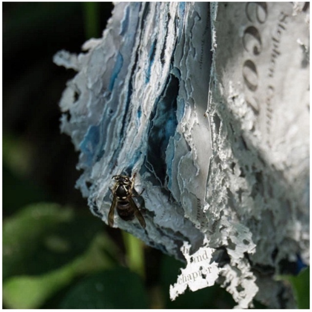
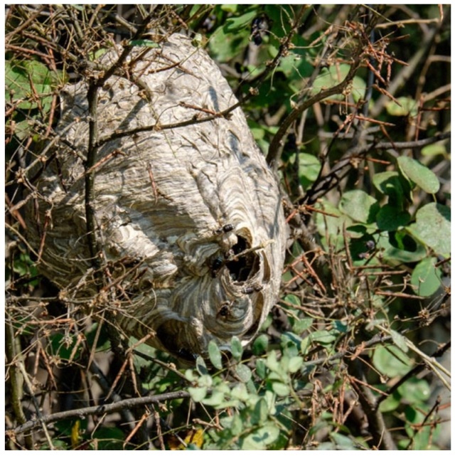
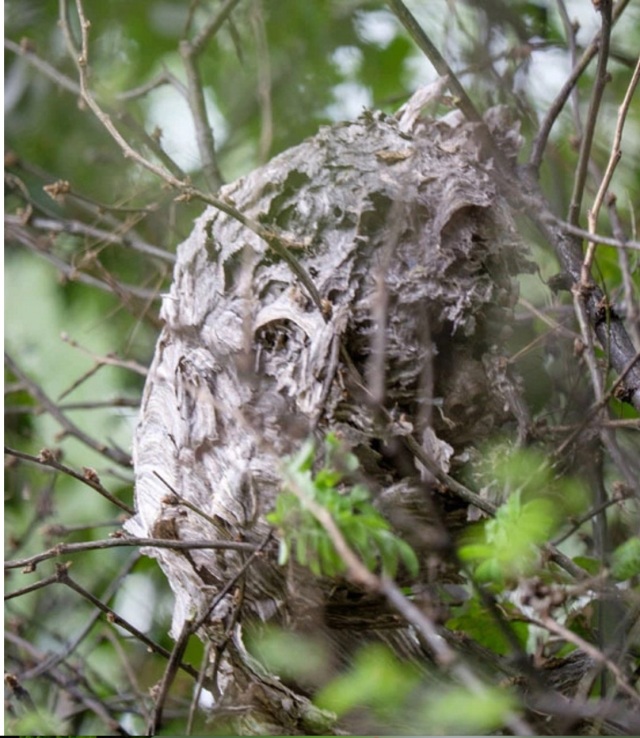
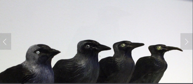
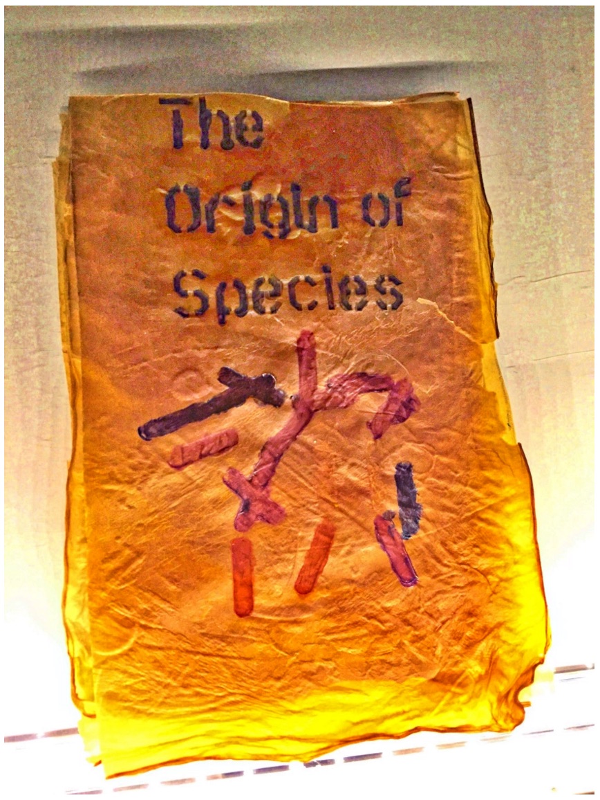
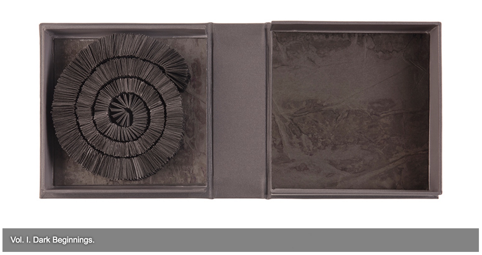
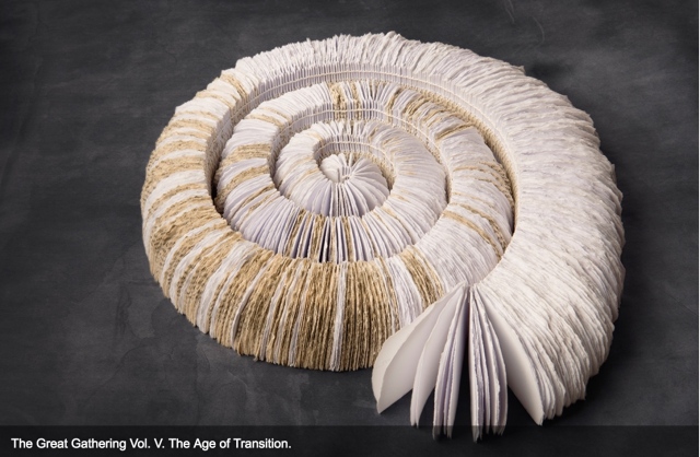
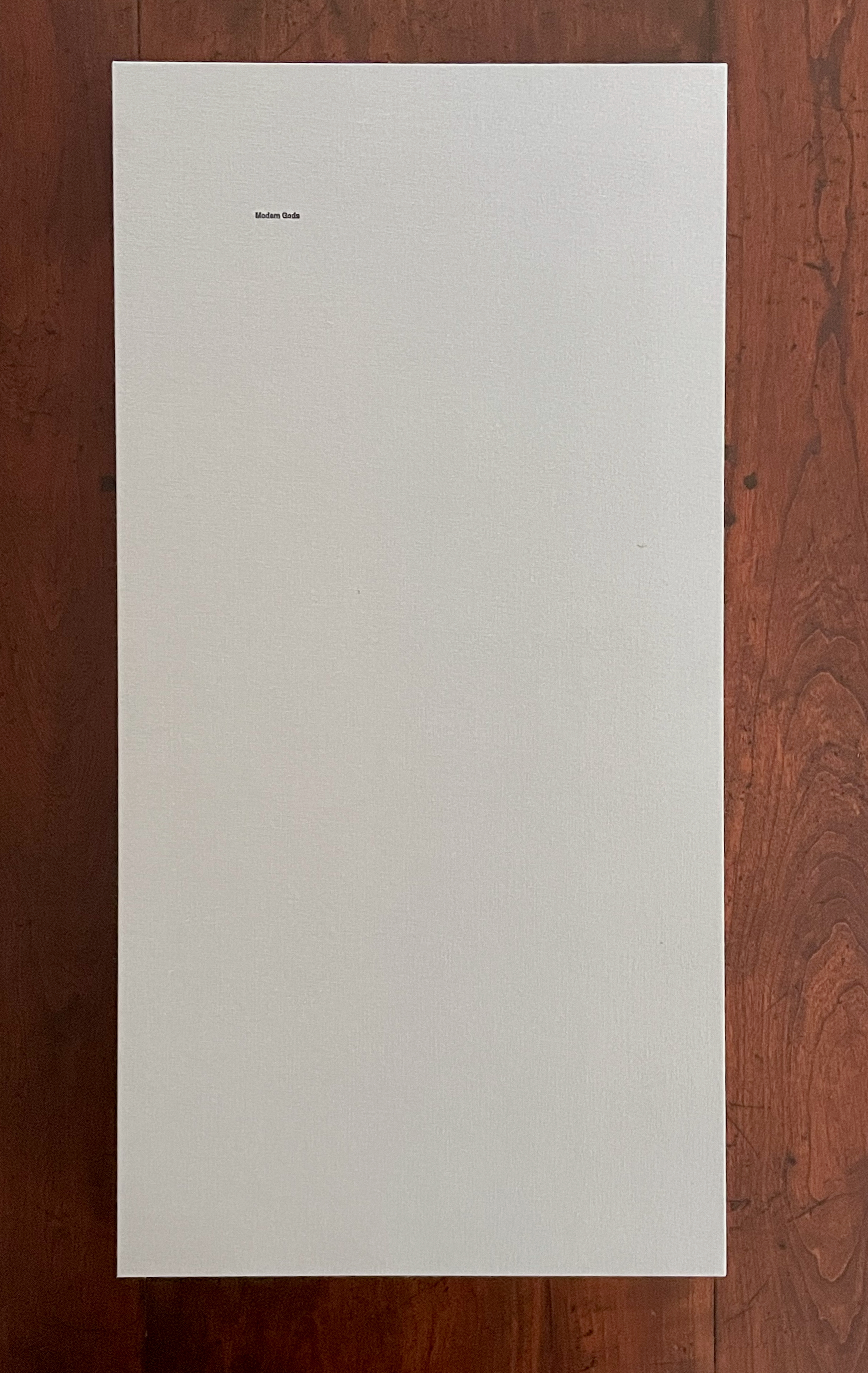
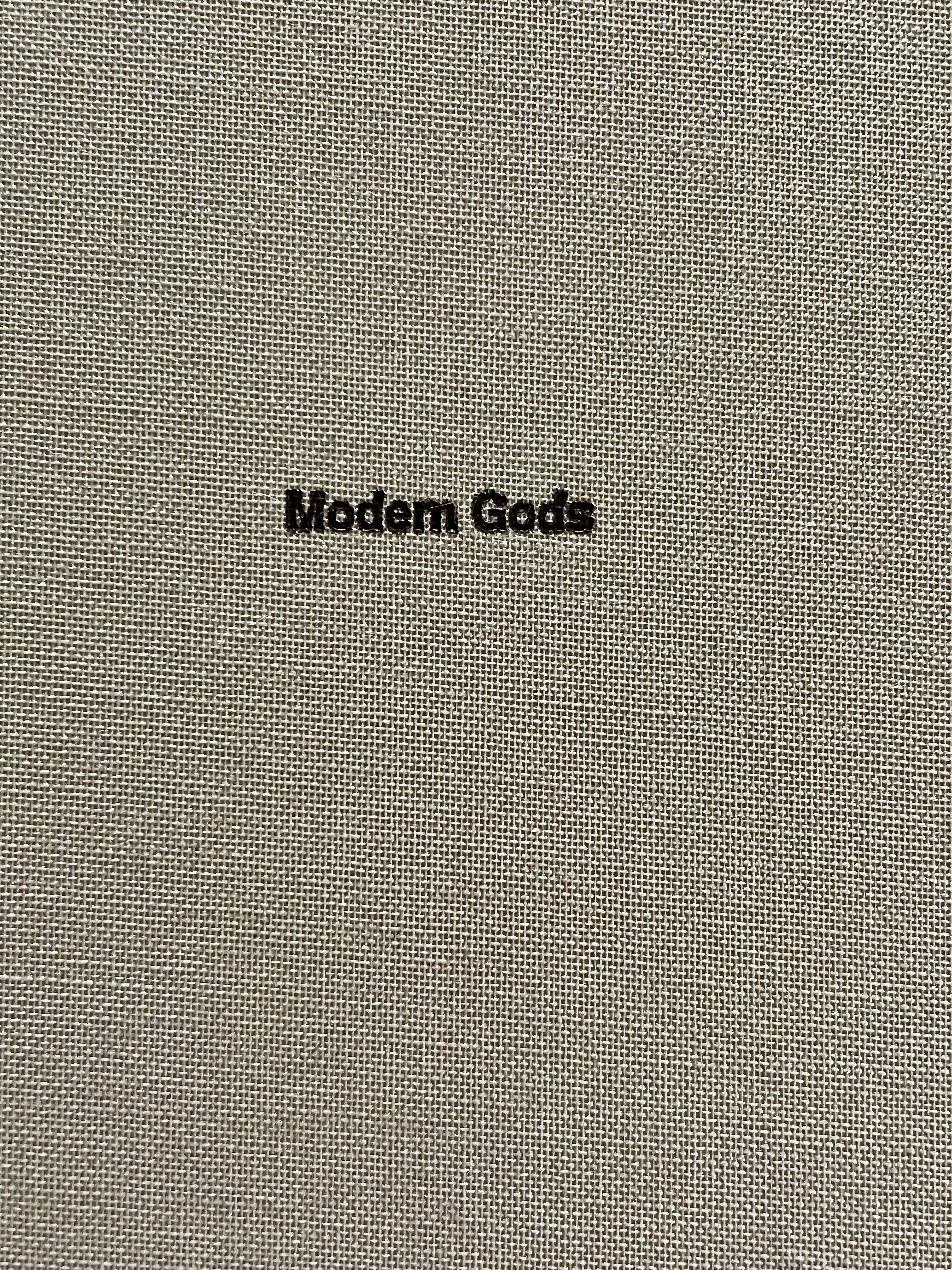
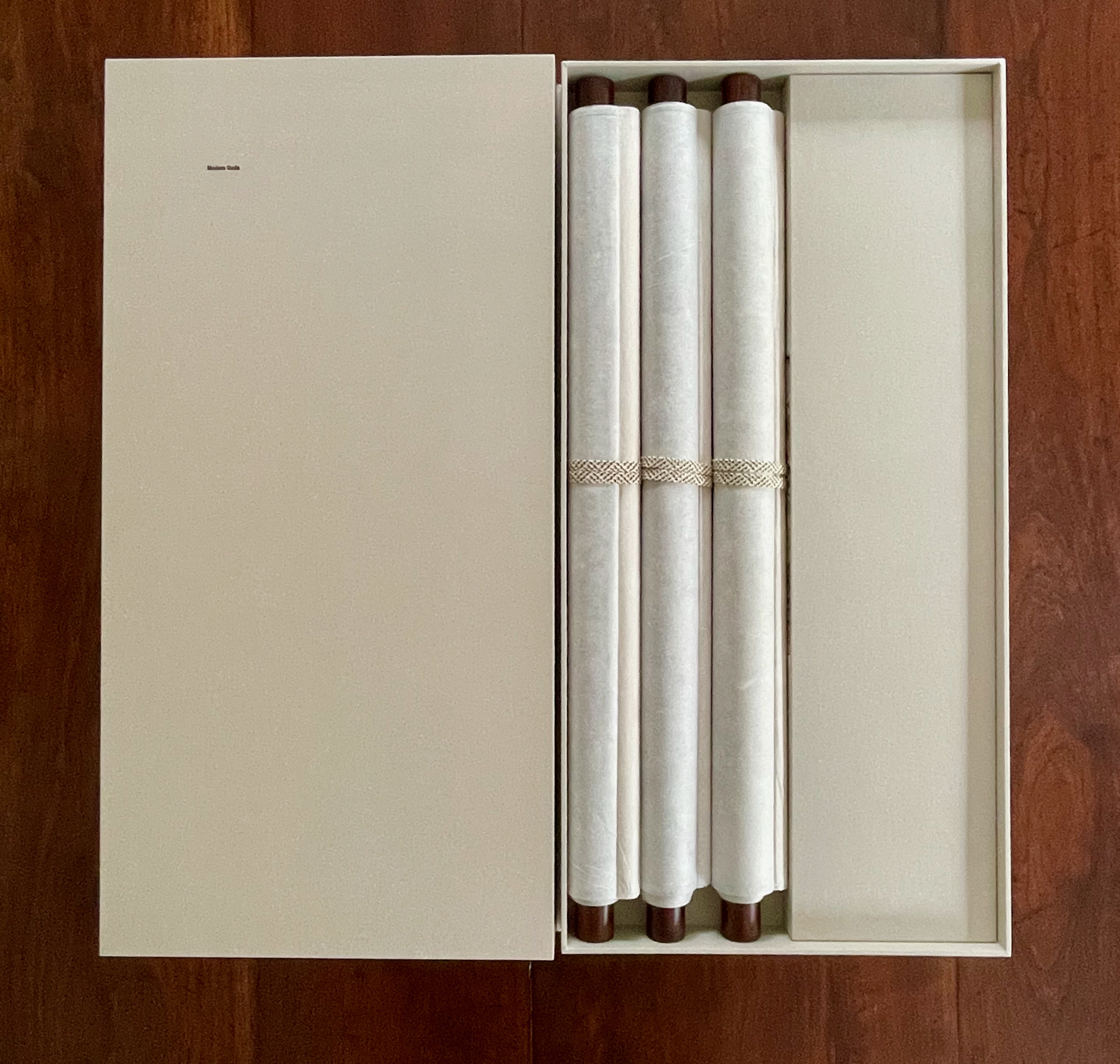
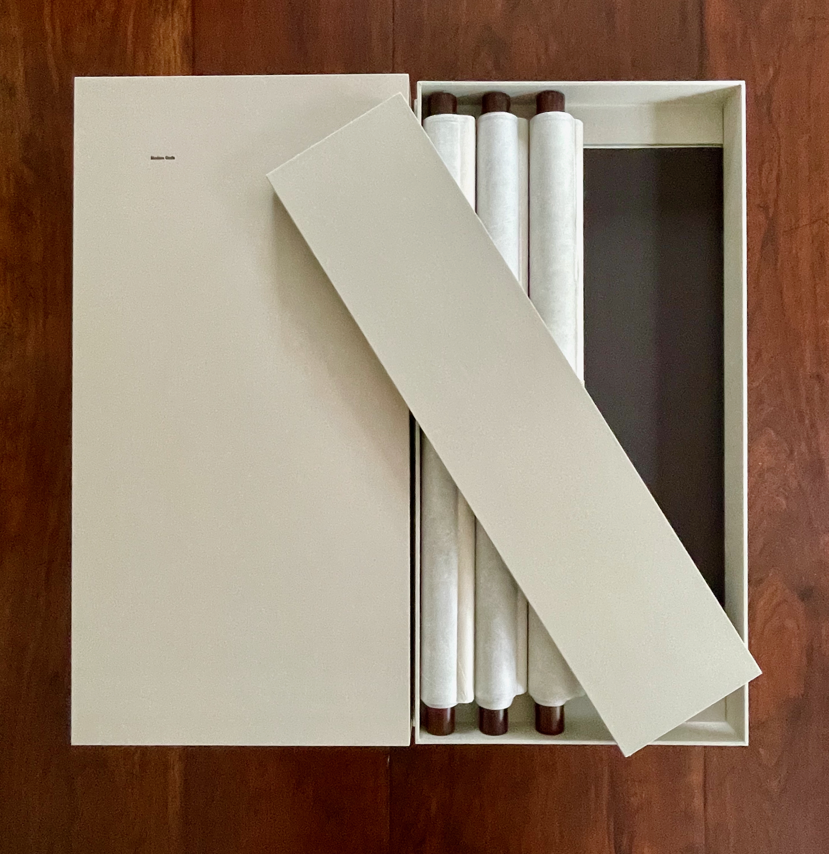
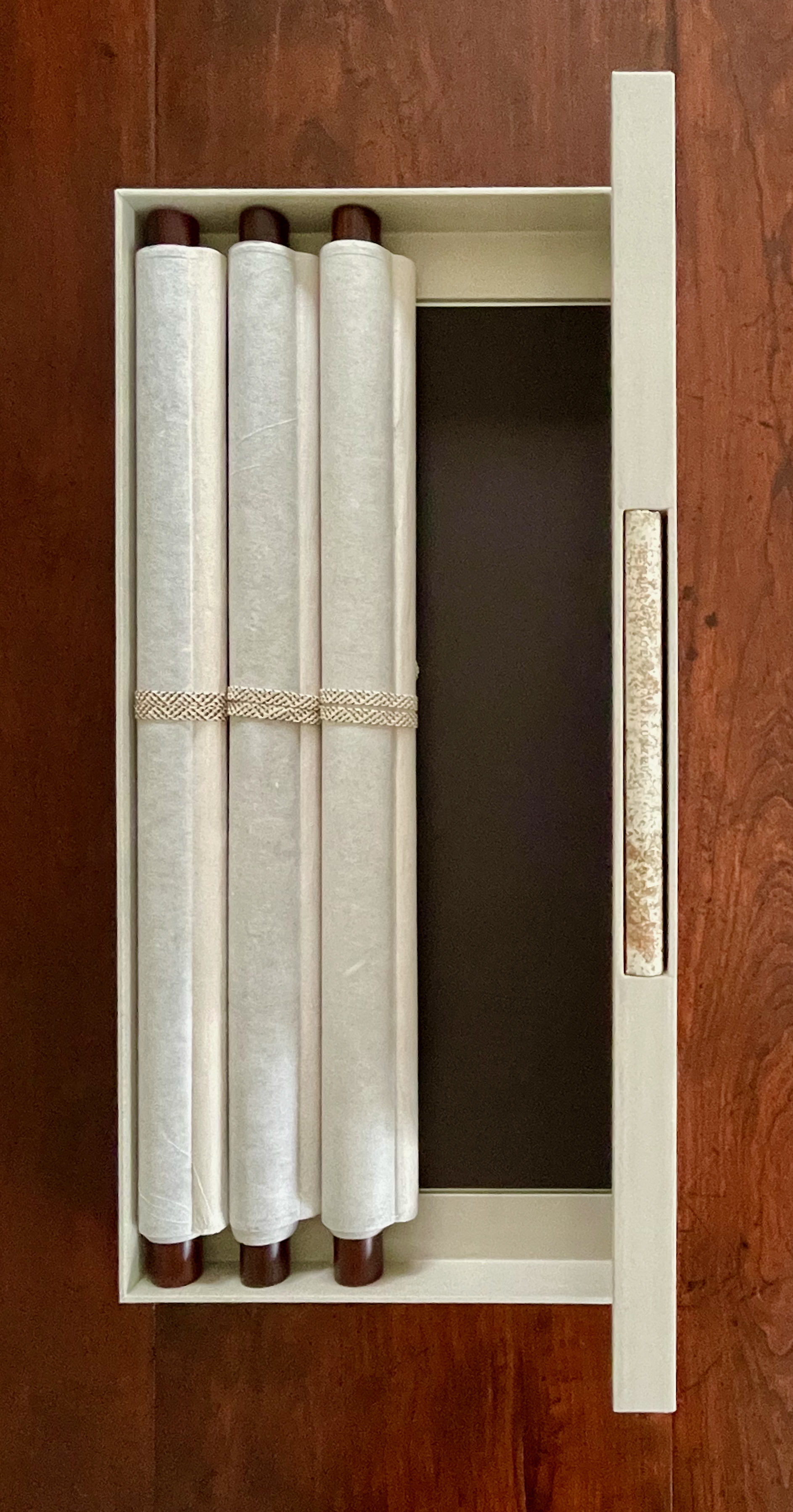
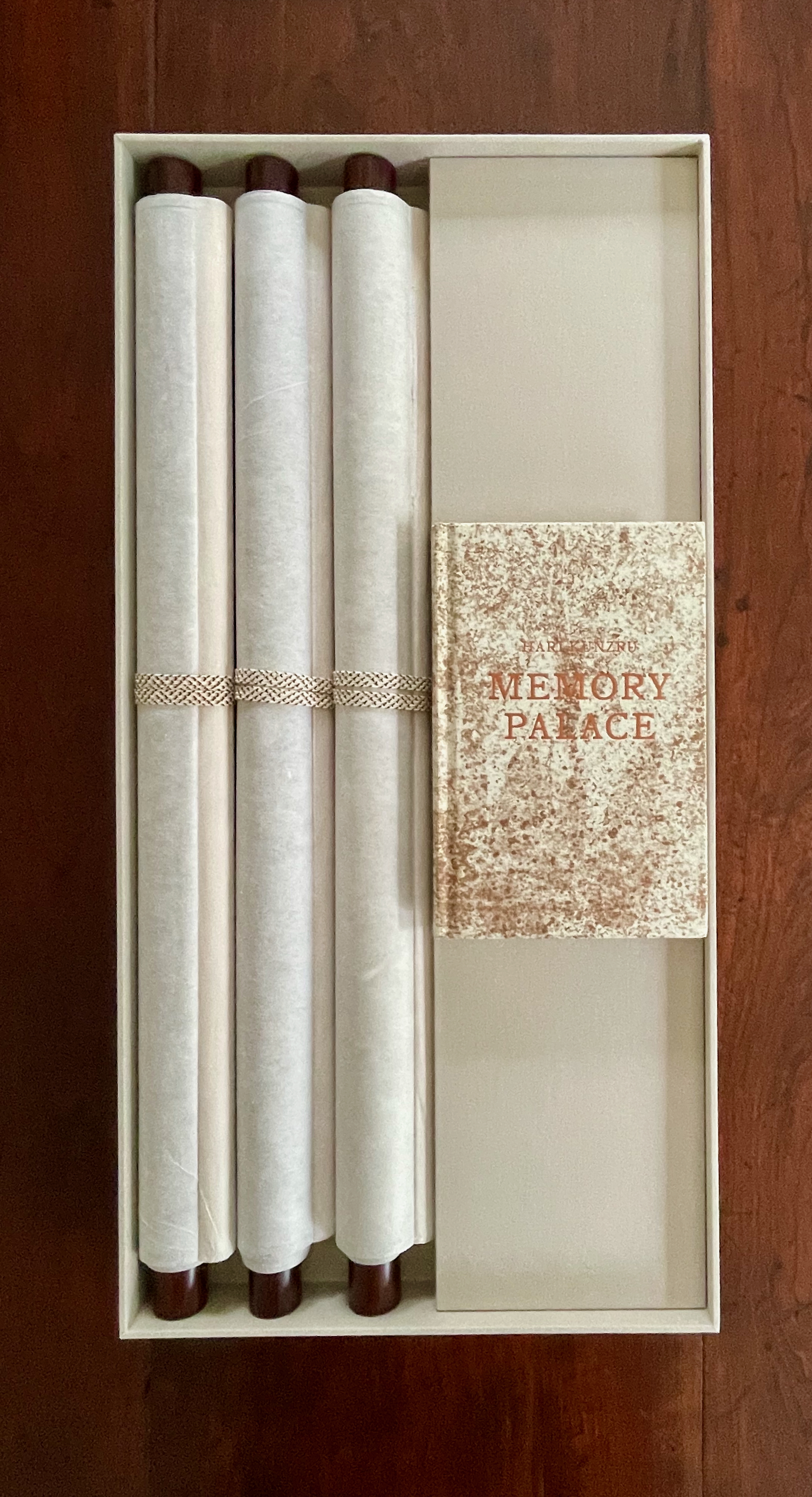
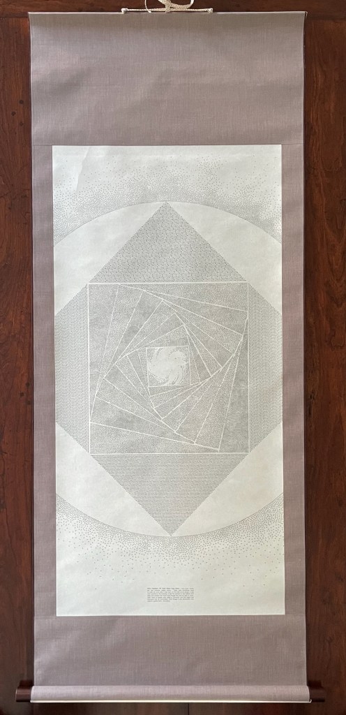
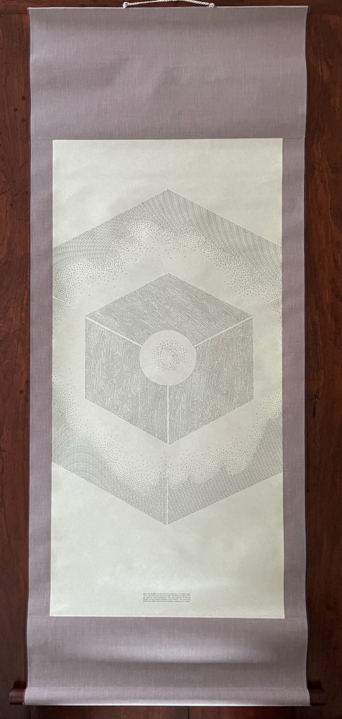
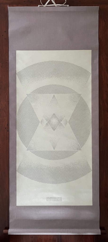
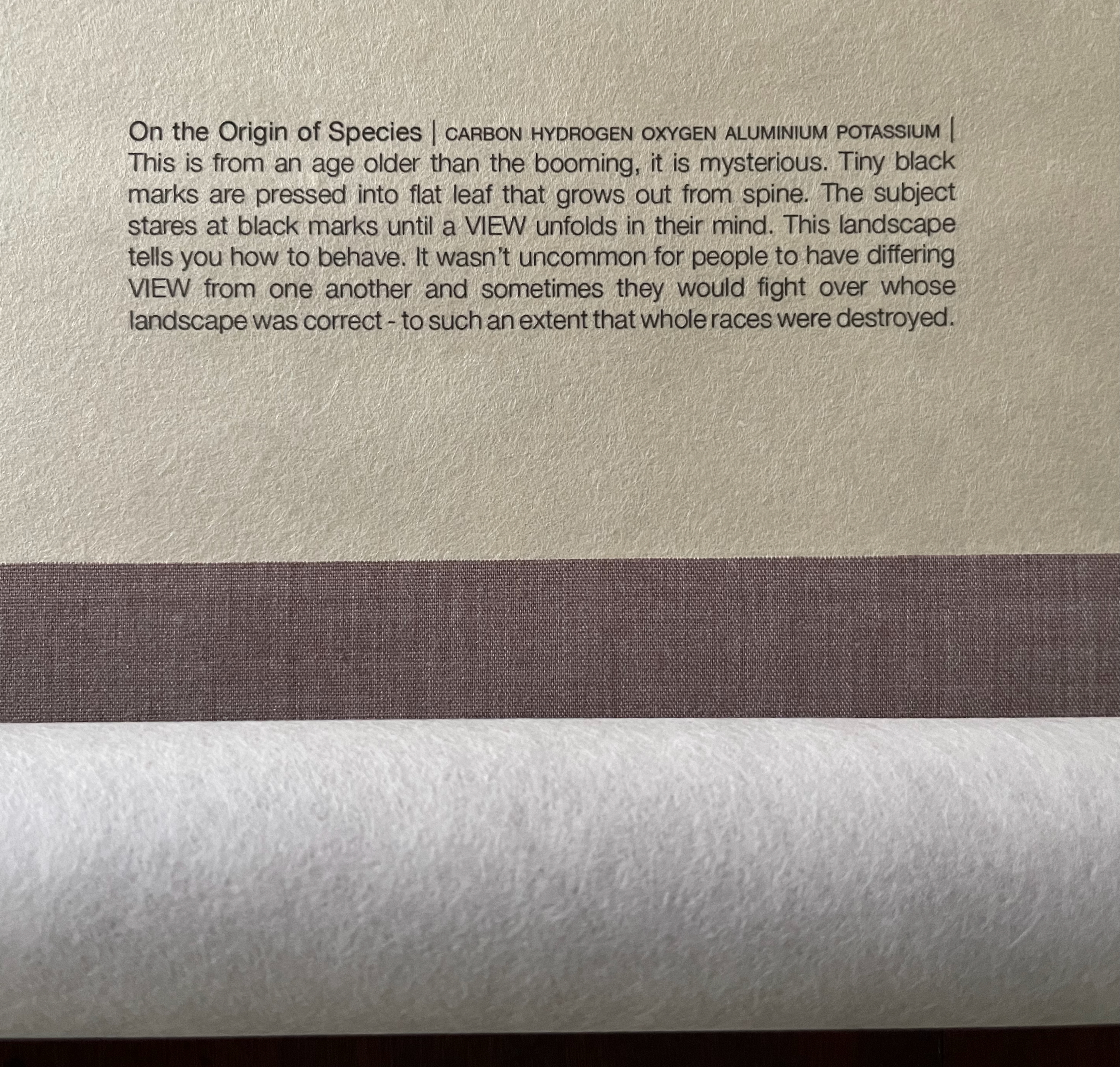
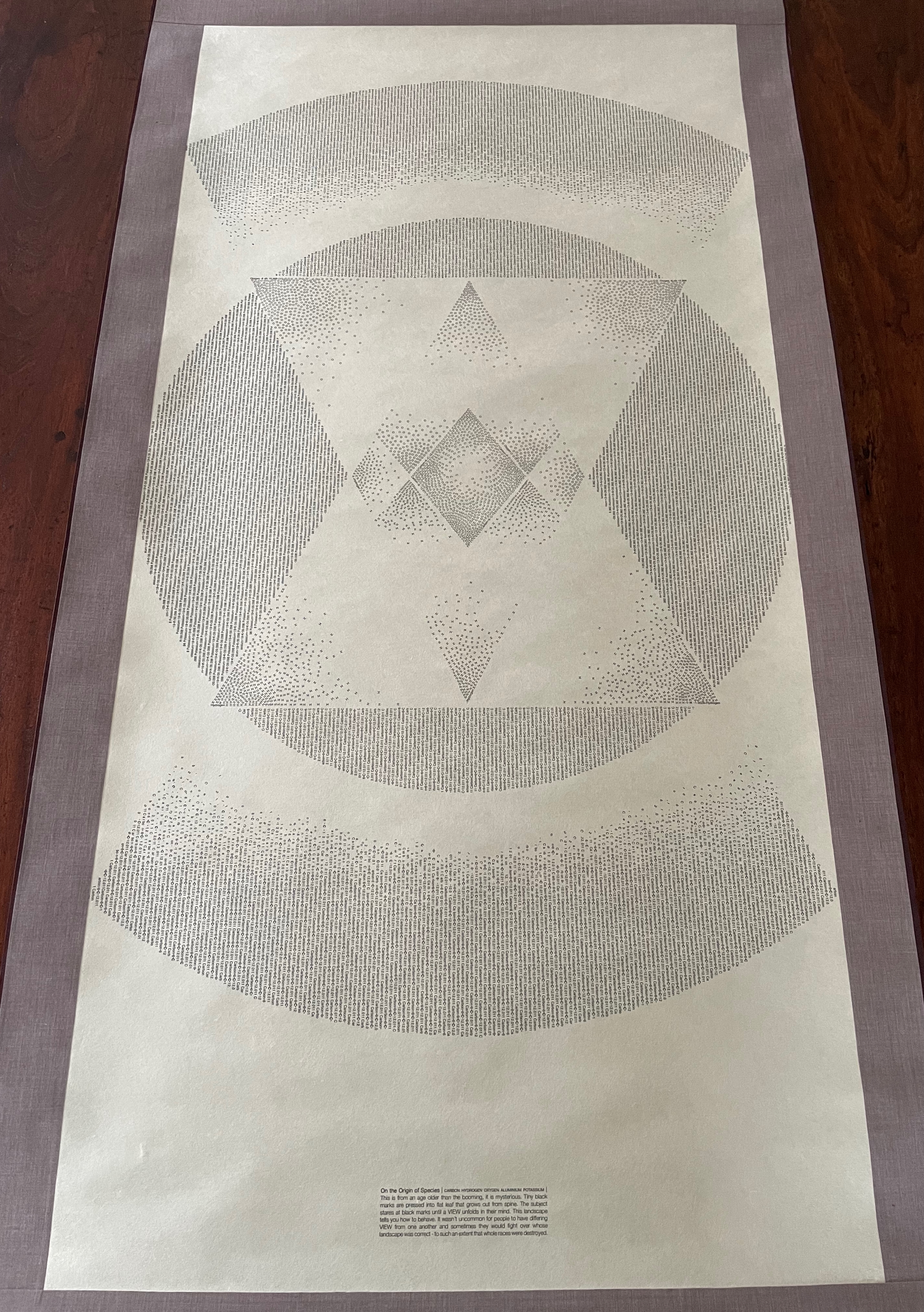
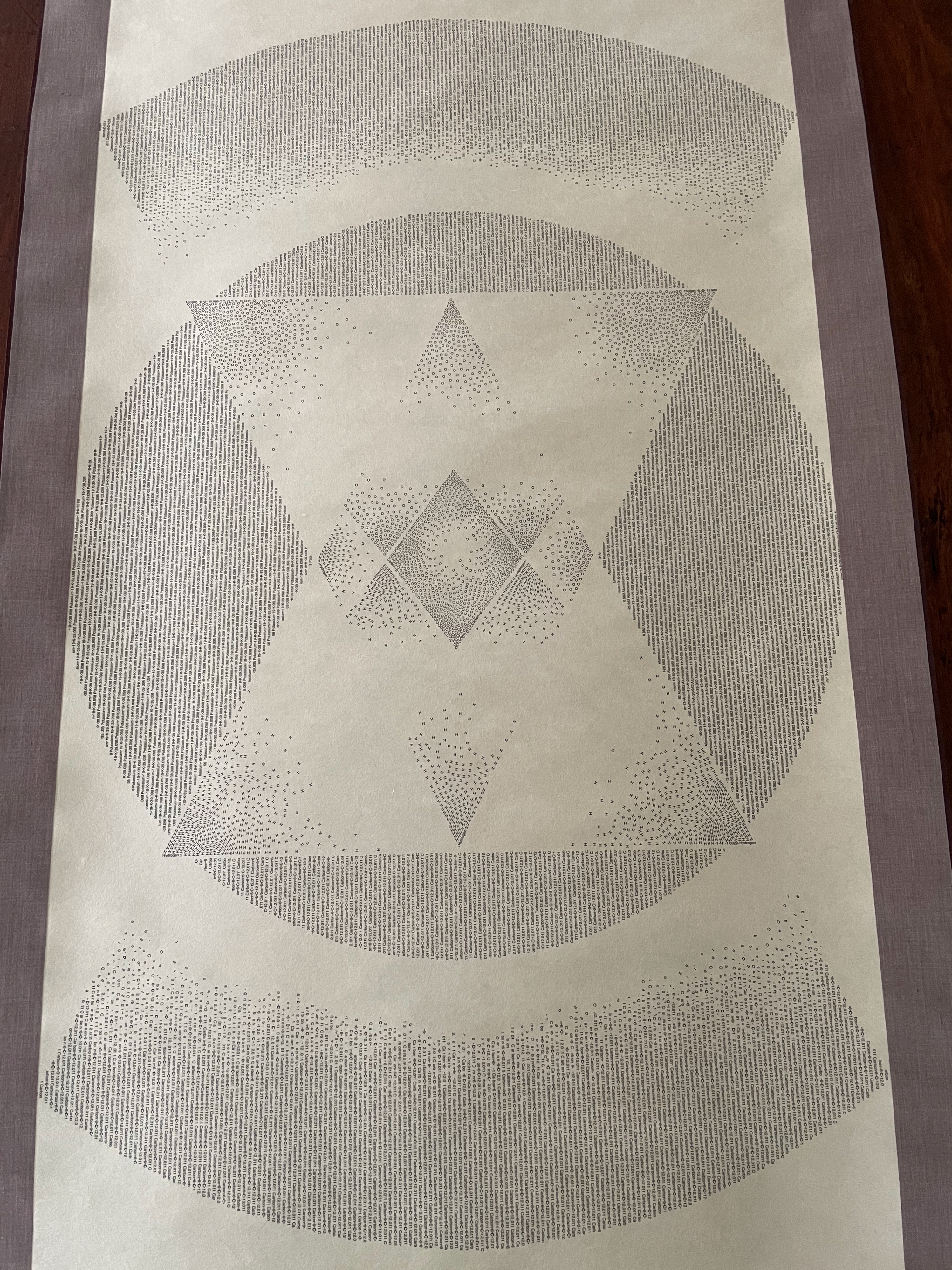
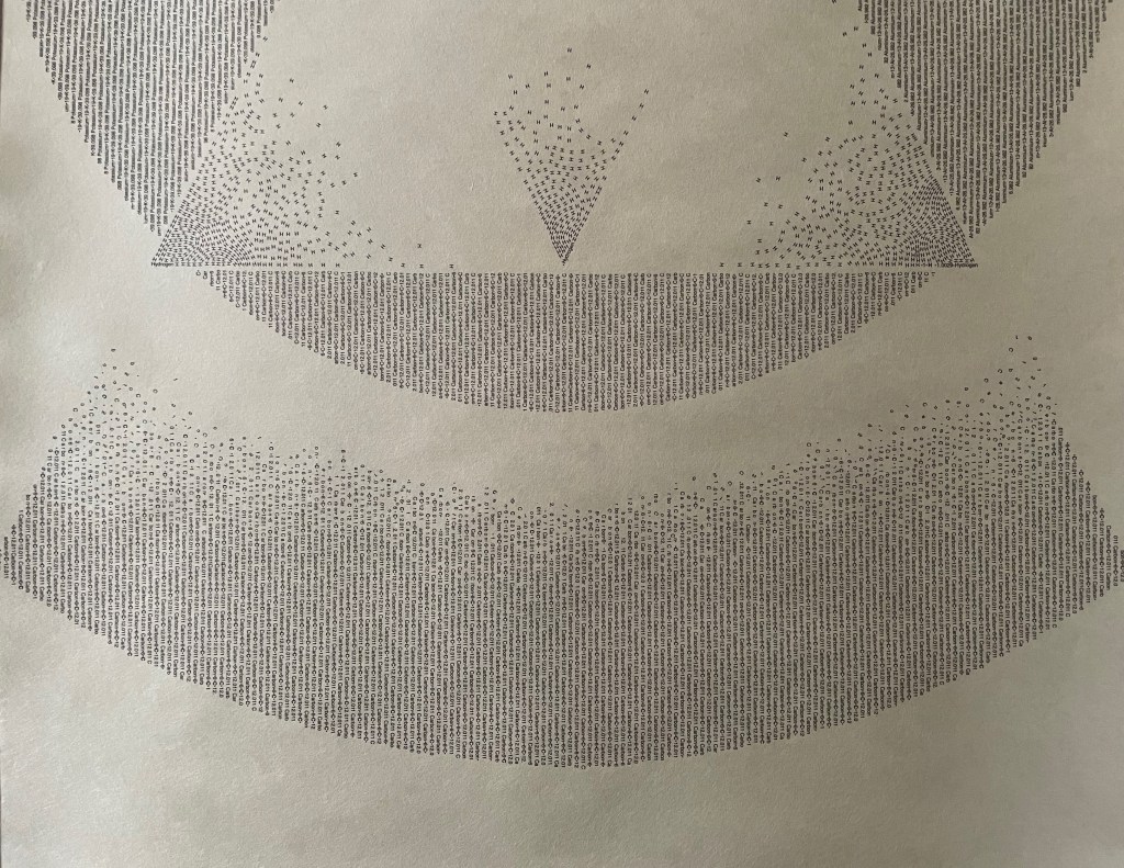
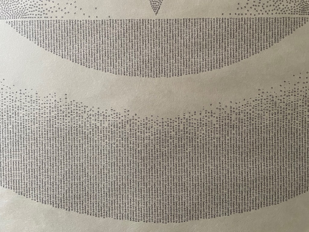
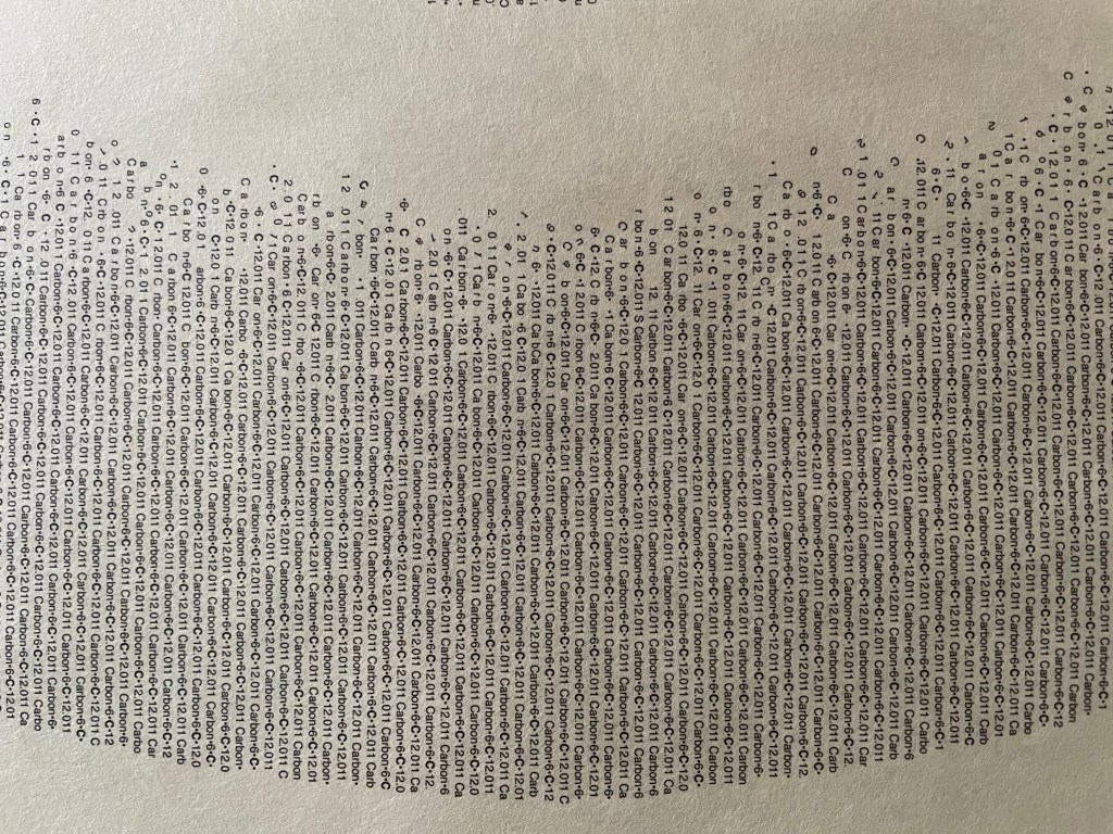
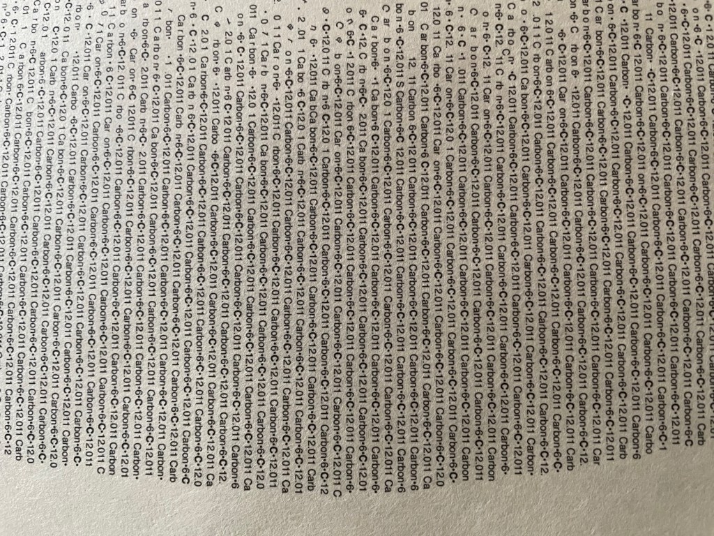
