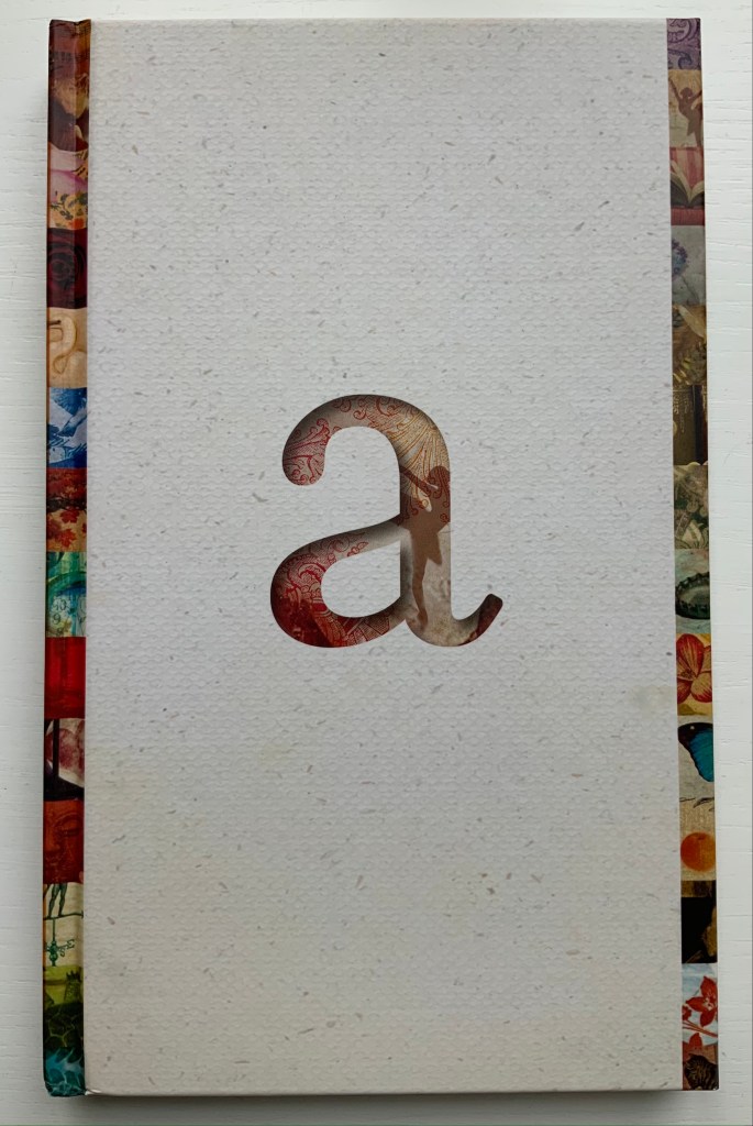
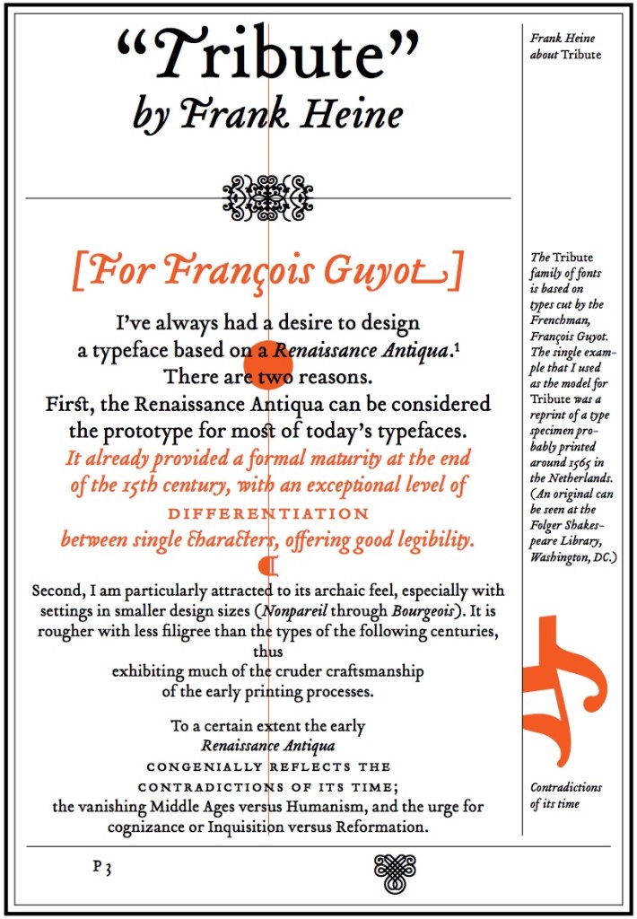
Given the intent spelled out in its specimen below, Frank Heine’s “Tribute” should add to the fabulistic atmosphere of Peacock’s fictions played out by her 26 characters each named after a letter in the alphabet. Despite the book’s colophon extolling the typeface, there is something about it, however, that does not quite work for Alphabetique.
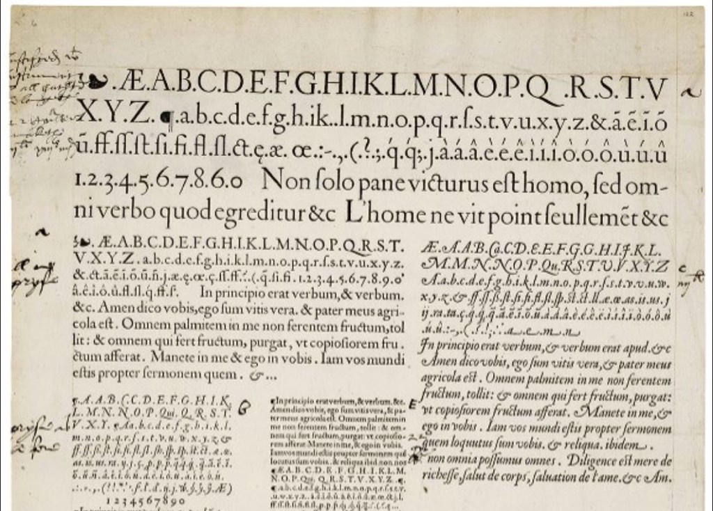
Tribute (2003), Frank Heine, Emigré Fonts; Type specimen sheet attributed to François Guyot (1565), Luna: Folger Digital Image Collection.
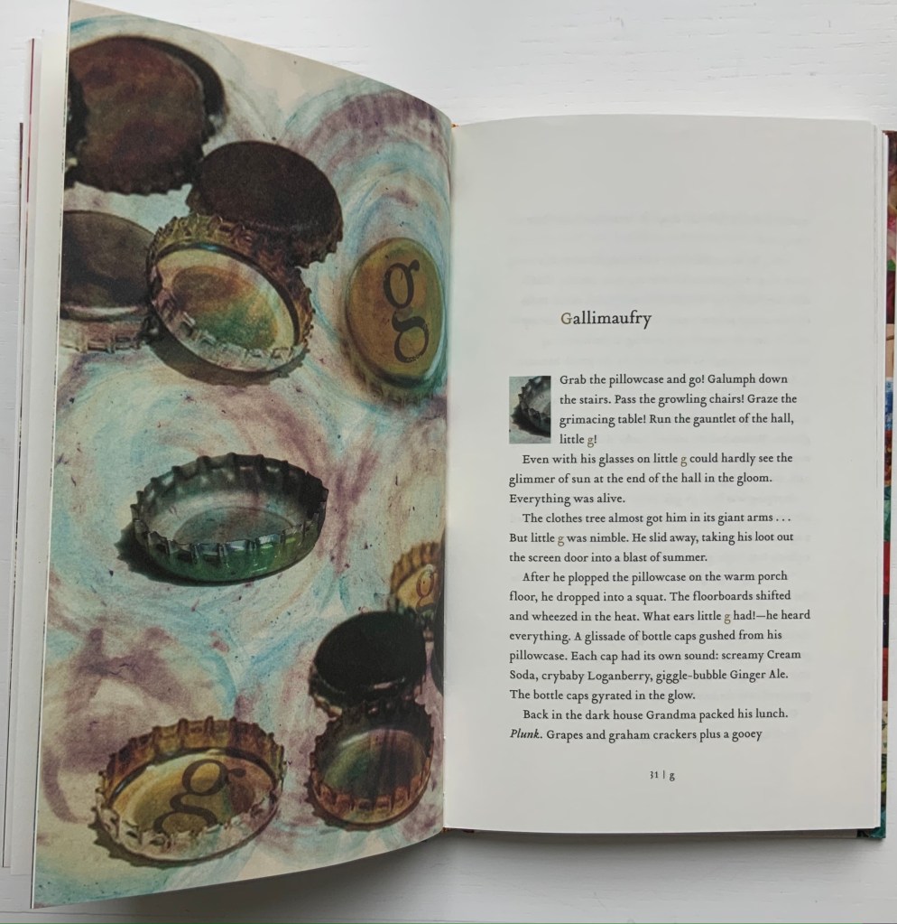
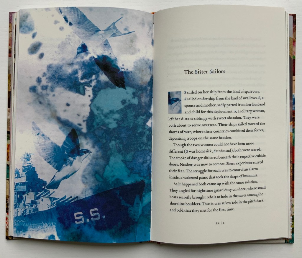
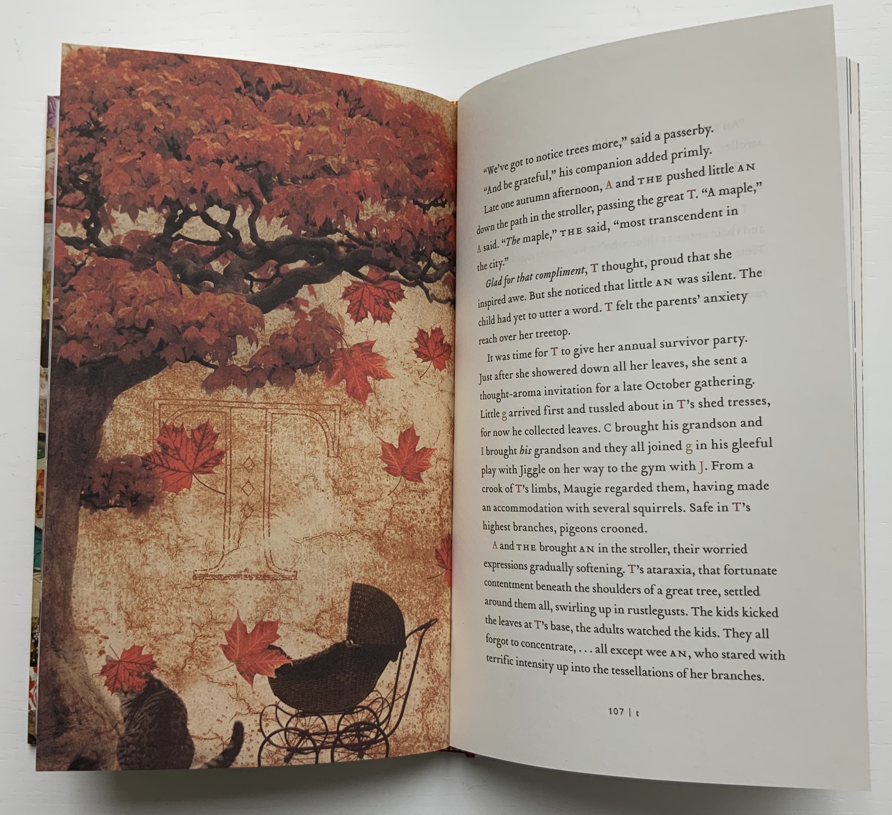
For example, its capital G squats like an un-Guyot-esque toad in the seventh chapter, and the capital Q lacks Guyot’s swordlike swash so appropriate to the tale of Q, master of the quilloned thorn knife who rises to the position of Royal Flower Keeper. Nevertheless, the choices of font (lowercase and smallcaps for the children, uppercase for the grown-ups, roman for the married sister and italic for the single) and the use of color for each character’s name ring true throughout the narrative. Like the layout and choice of font, Kara Kosaka’s collages fuse with the narrative and, unlike the typeface, deliver the atmosphere the fictions deserve.
When the character T appears (a maple tree), characters from the other vignettes show up, including the offspring of the articles A and THE, but this coalescence is only a feint toward an ensemble tale. The stories of U-Y return to standalone status, making the twenty-sixth chapter a surprise gathering of all the letters, albeit not in their characters of the preceding twenty-five fictions.
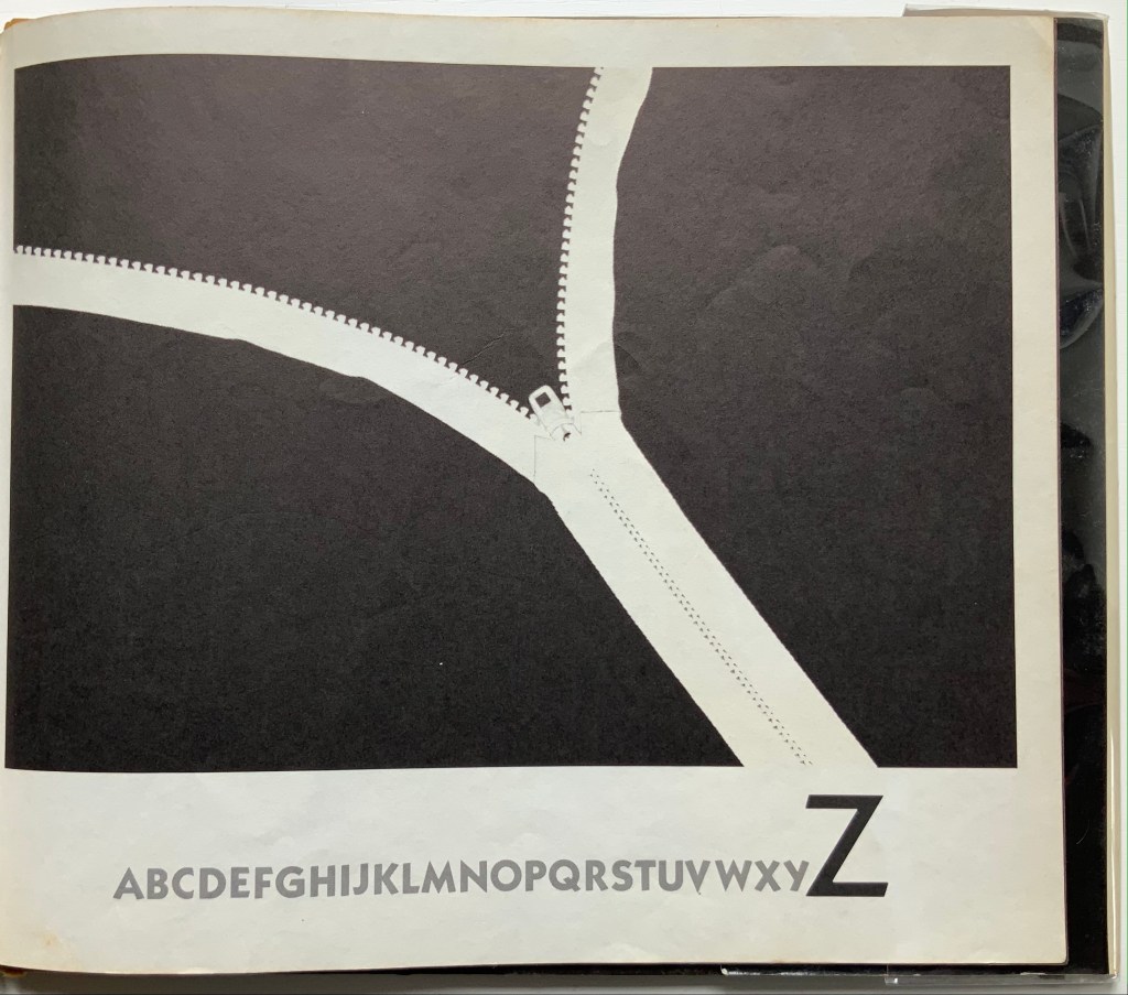
What happens to Z, the zoologist, is perhaps the most original of all the fictions. Any hint beyond the choice of font in that preceding sentence would spoil the surprise for the book artist with a mastery of letterpress, access to an extensive collection of typefaces and the readiness to be inspired.
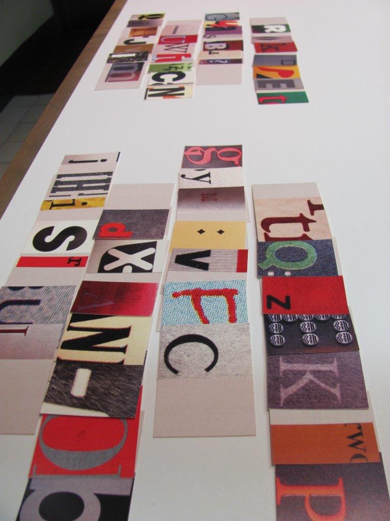
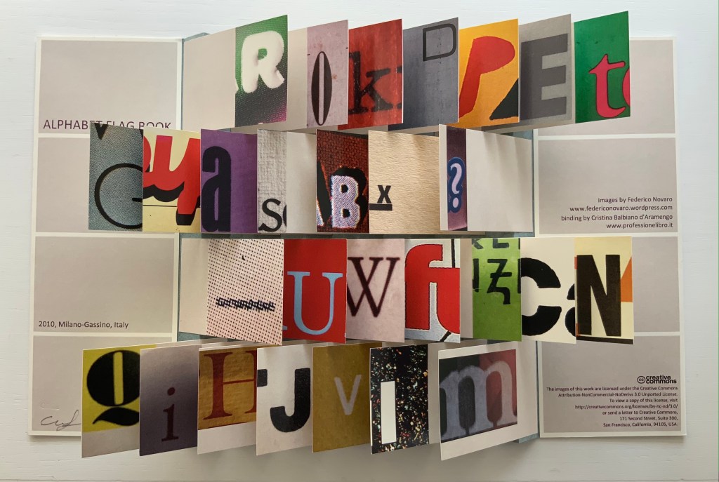
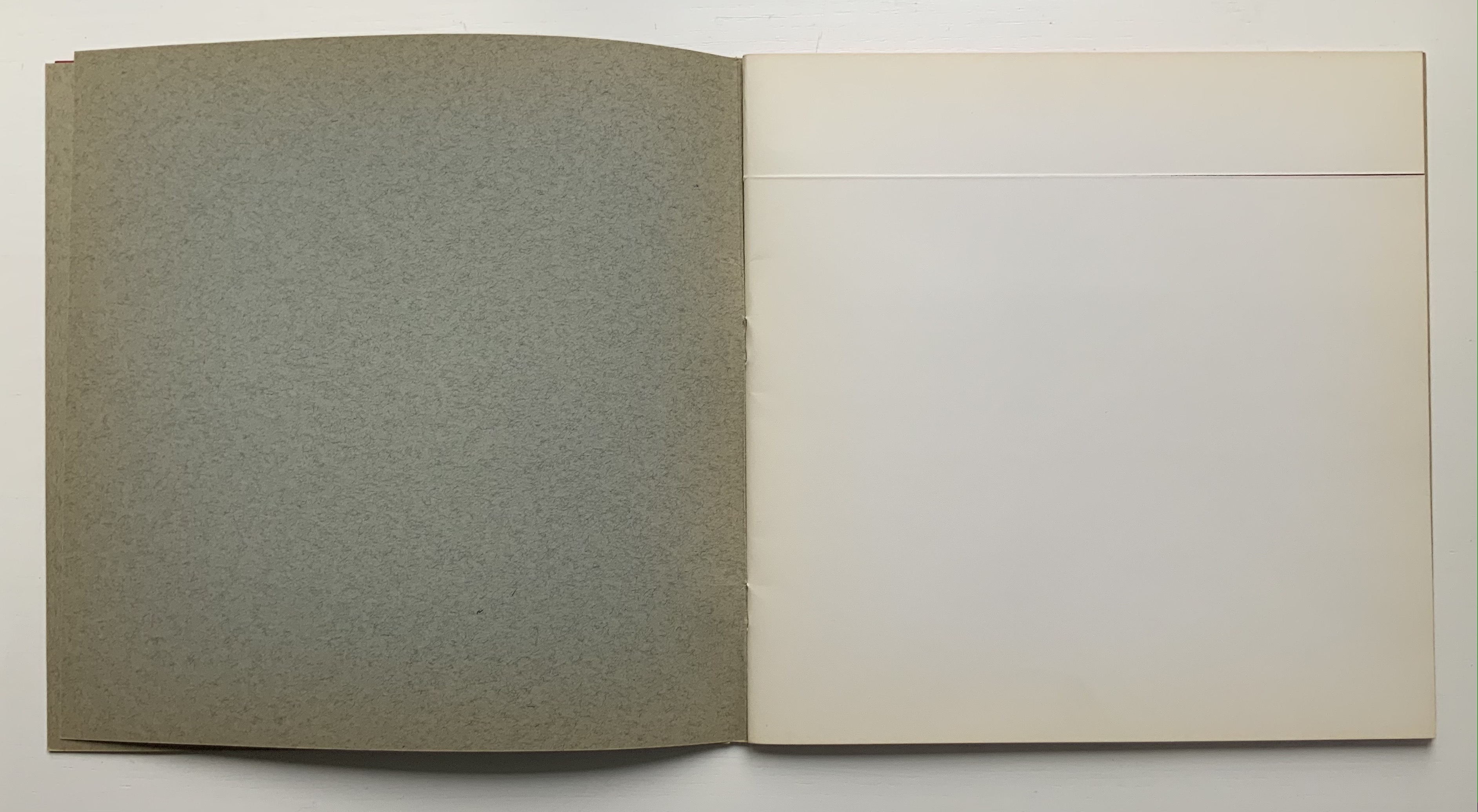
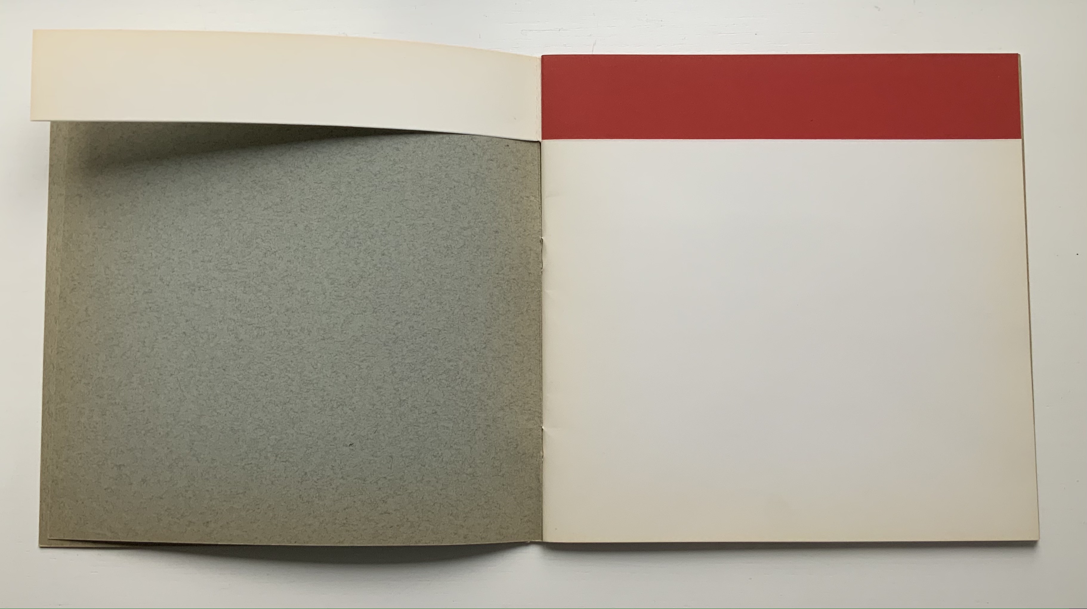
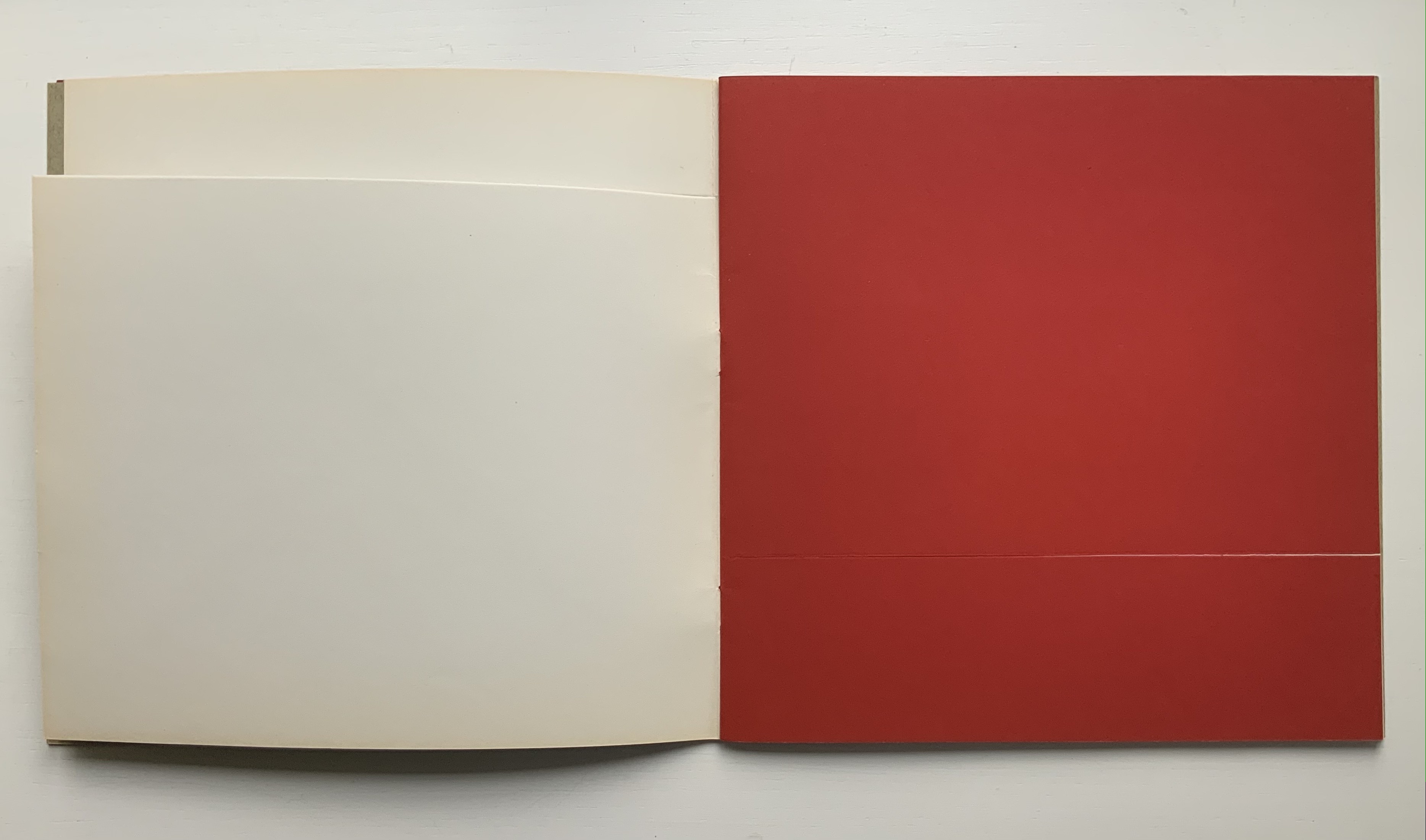
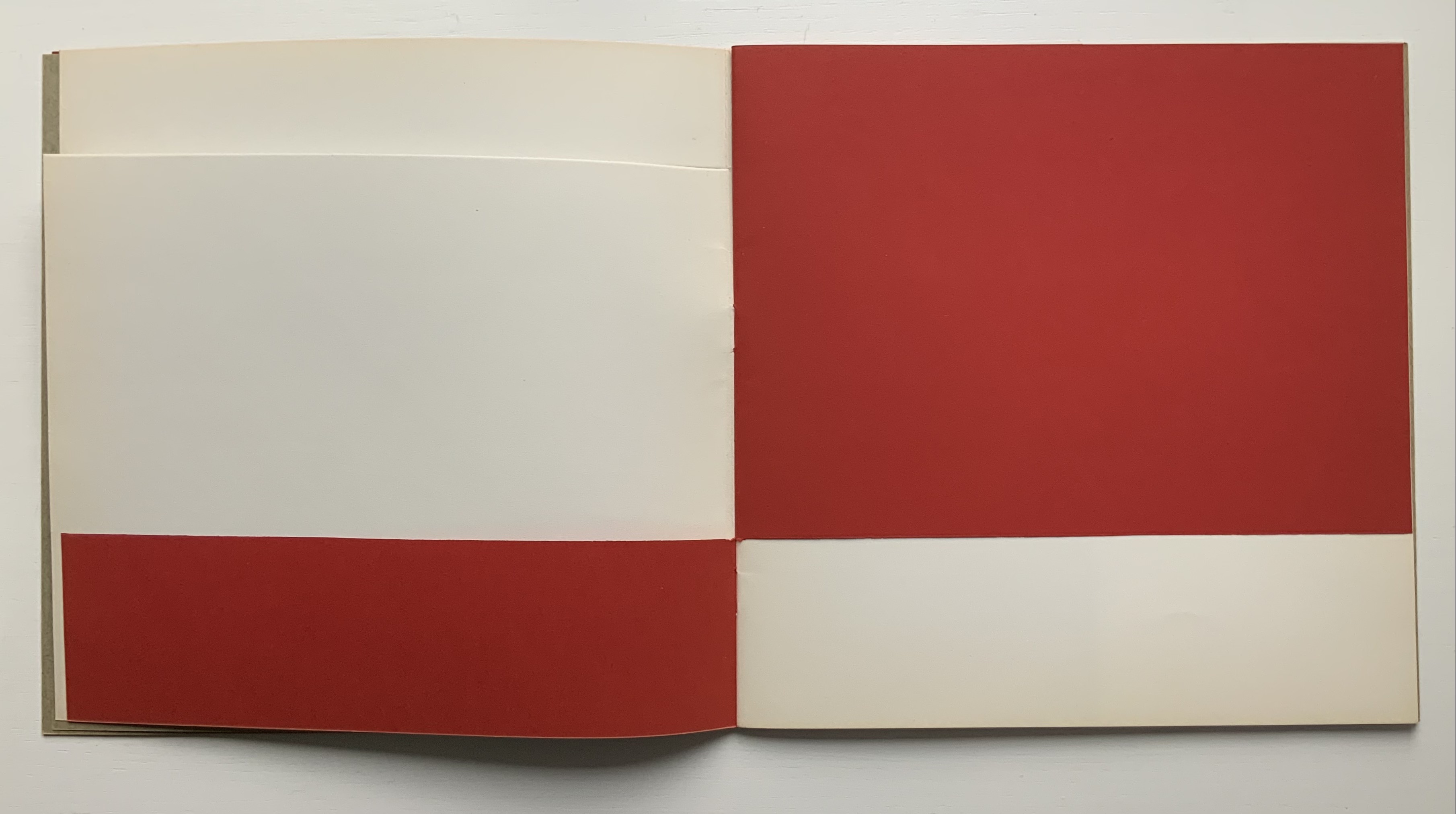
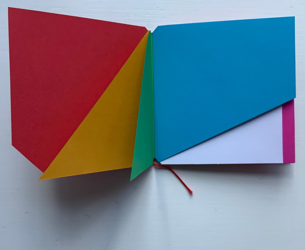
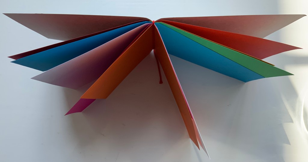
Alphabet Flag Book (2010) Cristina Balbiano d’Aramengo (photos by Federico Novaro) Flag book. H207 x W176 mm, 14 panels, 28 flags. Edition of 20. Acquired from the artist, 21 July 2021. Photos of the work: Books On Books Collection. Displayed with permission of the artist.
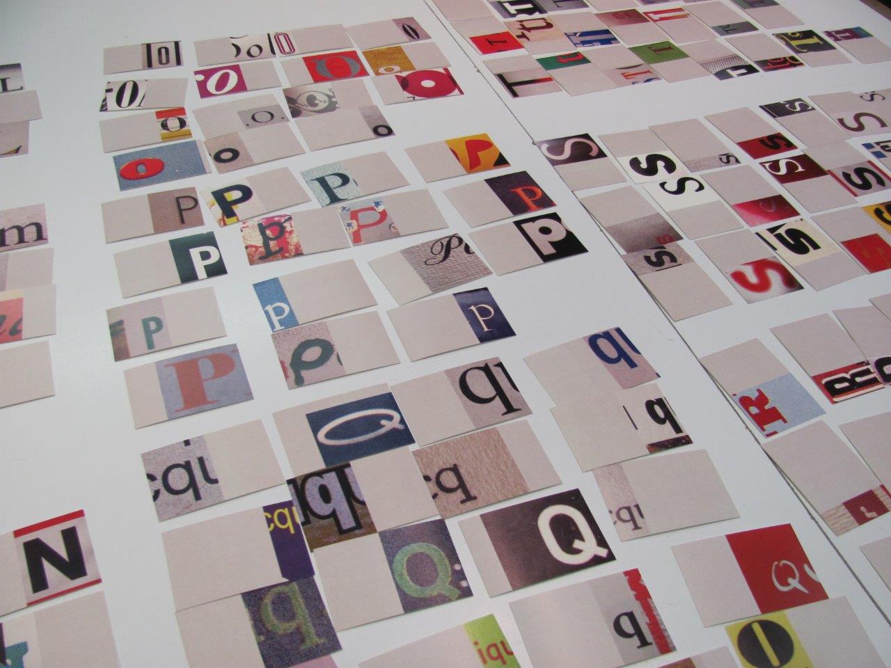
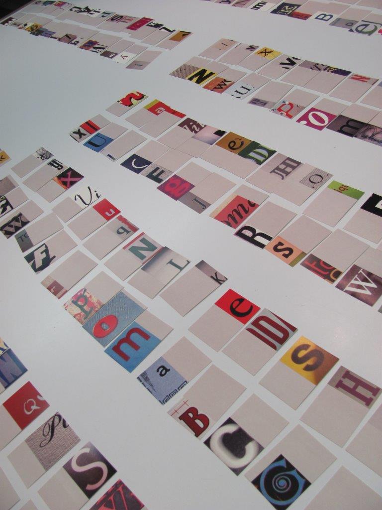
In part, the Alphabet Flag Book is a case of web-found art. In 2008 Federico Novaro initiated a blog of editorial news and reviews. Like a chapter in an illuminated manuscript, each article opens with the enlarged image of a letter or punctuation mark taken from Novaro’s photo of the cover of the book being reviewed. Friend of Novaro, Balbiano d’Aramengo proposed the flag book structure and then found that there were enough images for an edition of twenty unique copies.
For each copy, the artist could have followed an alphabetical order with each row of characters reading left to right. Or a boustrophedon order with A-G reading left to right in the top row, H-N reading right to left in the second row, and so on as the ox plows. Of course, the artist’s eye for harmonies of color and shape when selecting from the found images has a role in choosing the order of content. But then there is the need to fill the 27th and 28th flags. The availability of punctuation marks in the found images solves that constraint. In fact, the front and back covers embrace them. The symmetry of the marks on the covers is even enhanced by the precision of the belly band that holds the book closed. So what order will the covers reveal?
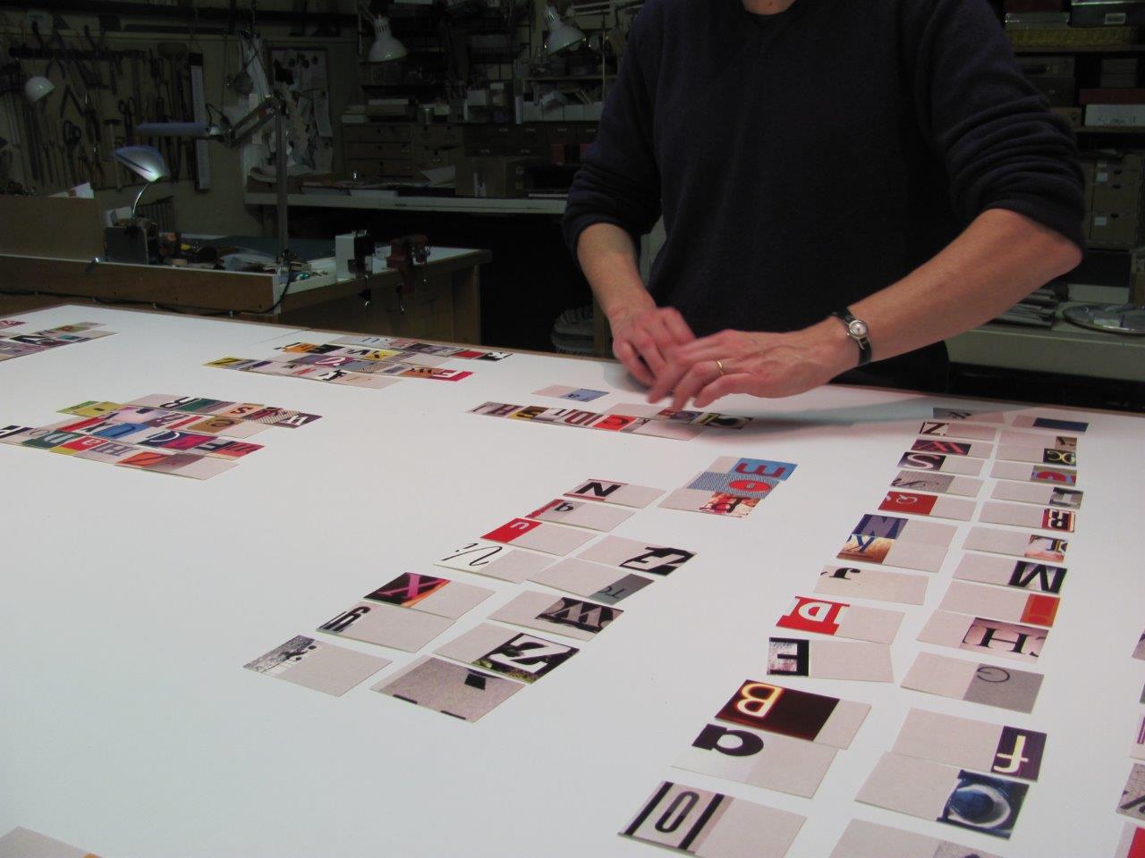
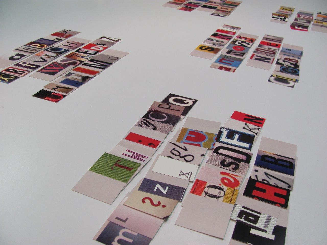
The artist has been kind enough to provide the following behind-the-scenes photos of the process.
Photos: Courtesy of Cristina Balbiano d’Aramengo.
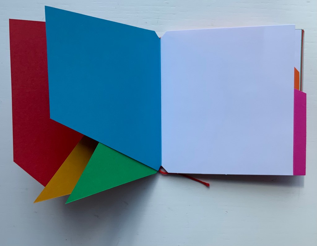
Despite the alphabetical sorting process to assemble the content for each copy, the result is far from alphabetical.
To have followed a left-to-right order or boustrophedon order would not have embraced how a flag book’s structure breaks up the traditional codex pages vertically and horizontally no matter the angle of view. The explosion of non-alphabetical color and shapes inside the orderly covers is a bit like the chaos of the internet behind that simple rectangular search button between the clamshell covers of a laptop.
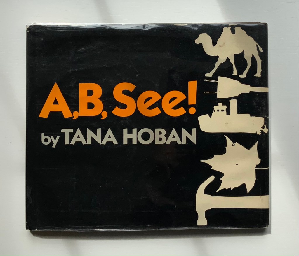
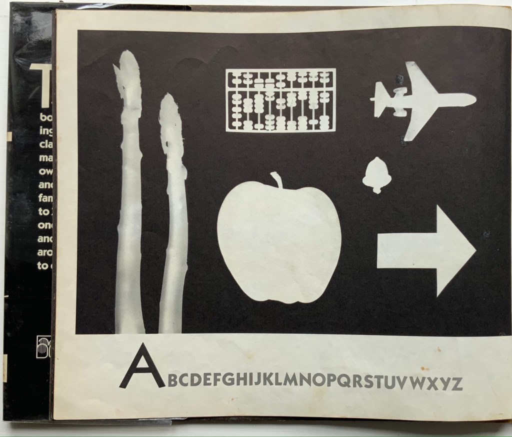
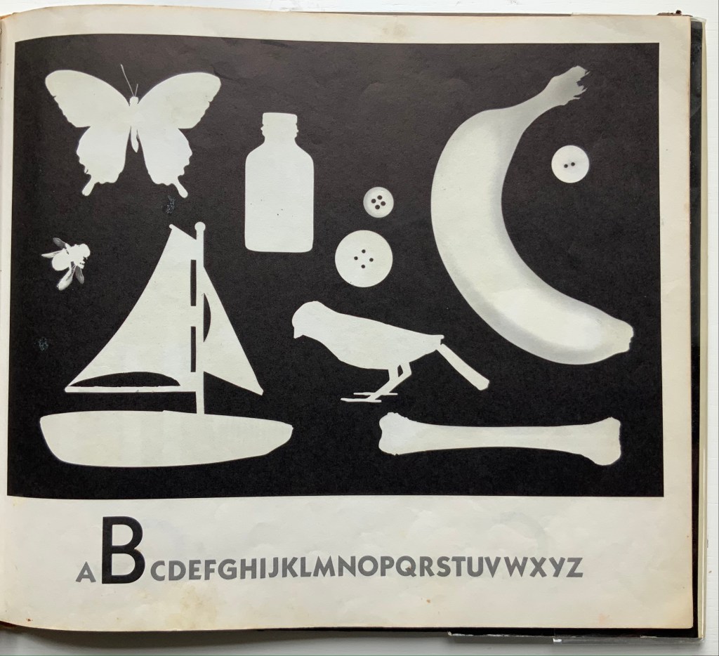
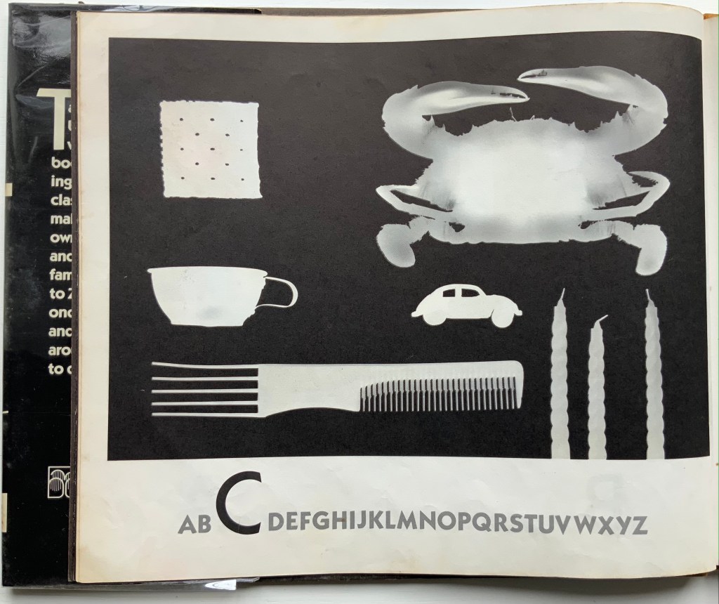
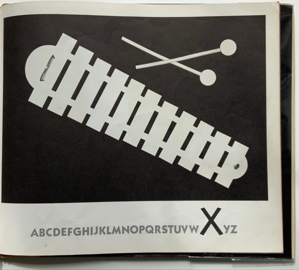
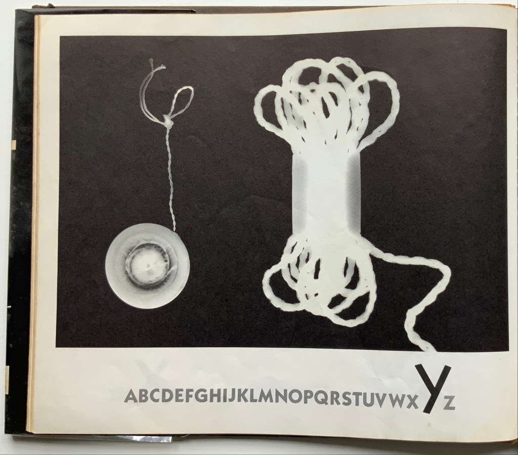
A, B, See! (1982) Tana Hoban Hardcover, casebound. H252 x W286 mm, 32 pages. Acquired from Cattermole 20th Century Children’s Book, 7 August 2021. Photos of the work: Books On Books Collection.
Made in dark-room conditions with light-sensitive paper, actual objects and cutouts, these photograms lift this simple ABC book to the plane of object recognition and to the level of art. Other artists who have applied photographic techniques to the abecedary are Anthon Beeke, Eileen Hogan, Peter Hutchinson, Simon Jennings or Stephen T. Johnson. Each has a distinctiveness of eye, technique or conceptualizing. Hoban’s seems to lie in extracting something more from that simple imposition of white on black.
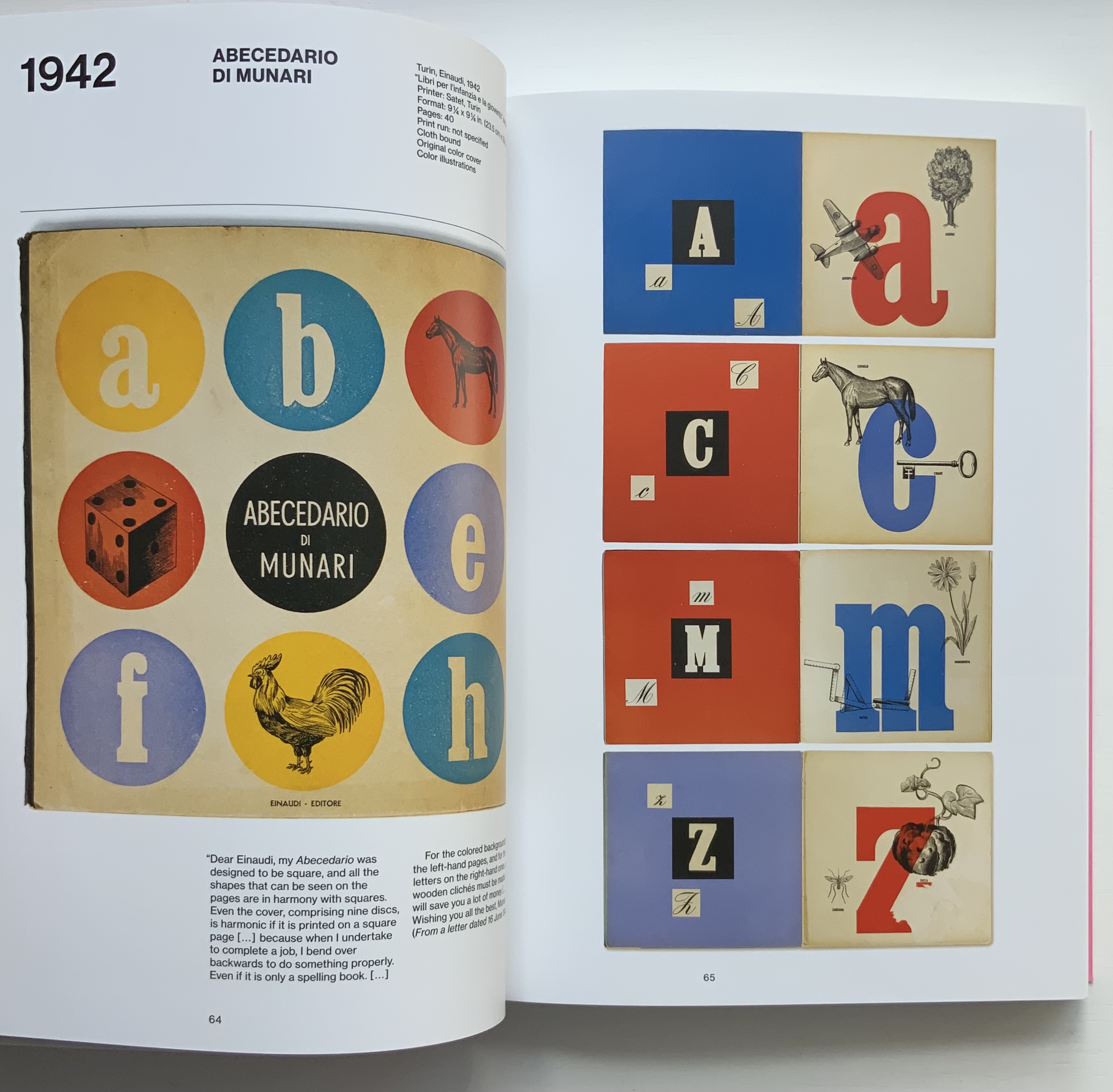
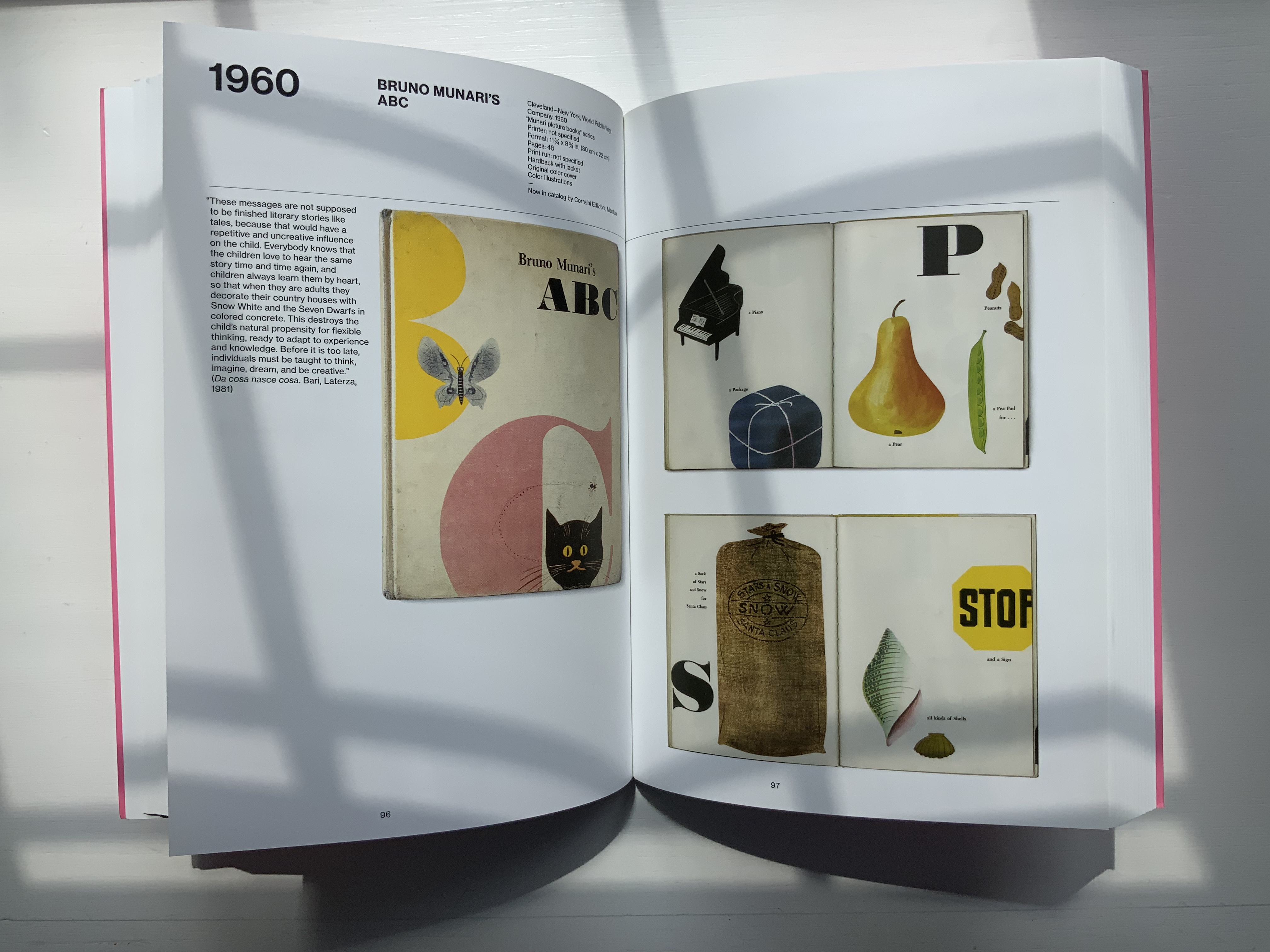
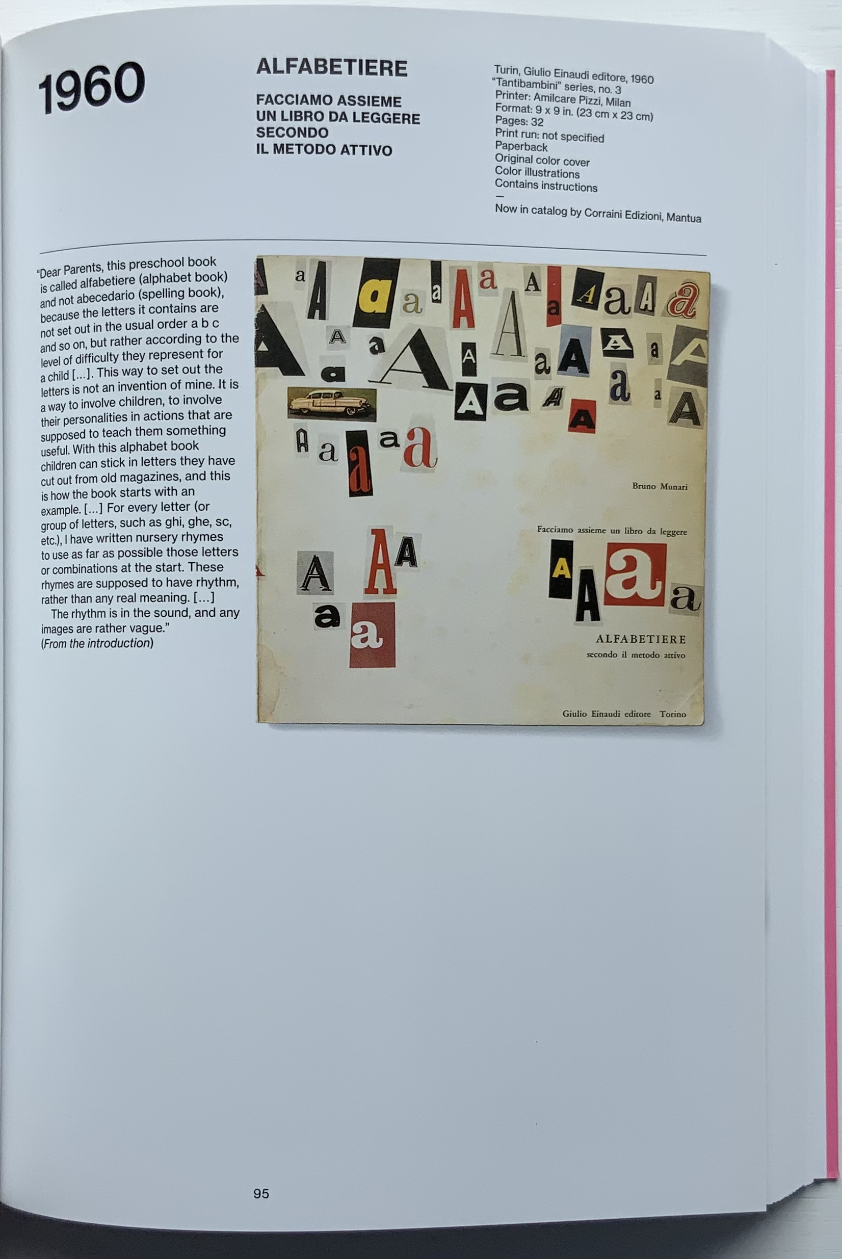
Giorgio Maffei’s 2008 definitive collection of book designs by Bruno Munari brings together two of Italy’s renowned book artists. Giorgio Maffei’s own work, his writing and gallery/bookshop (highlighted by his son Giulio Maffei’s extraordinary video catalogues Le vite dei libri) warrant a catalogue raisonné in their own right. The Italian edition published by Munari’s long-time publisher Maurizio Corraini was followed up in 2015 by this translation by Martin John Anderson and Thomas Marshall in 2015. For the Books On Books Collection, one of the great pleasures of Munari’s works is its attention to the alphabet, which this book documents.
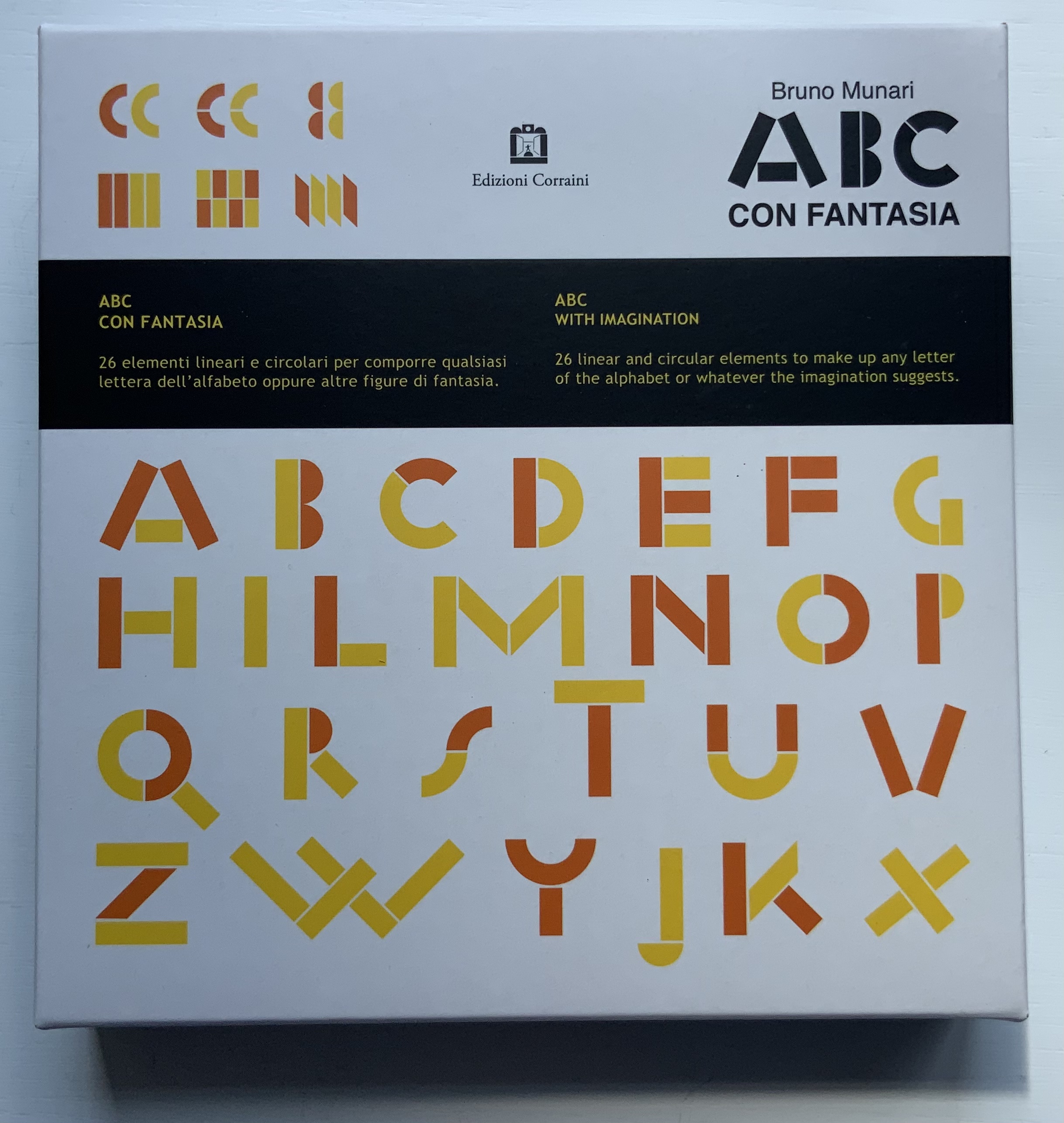
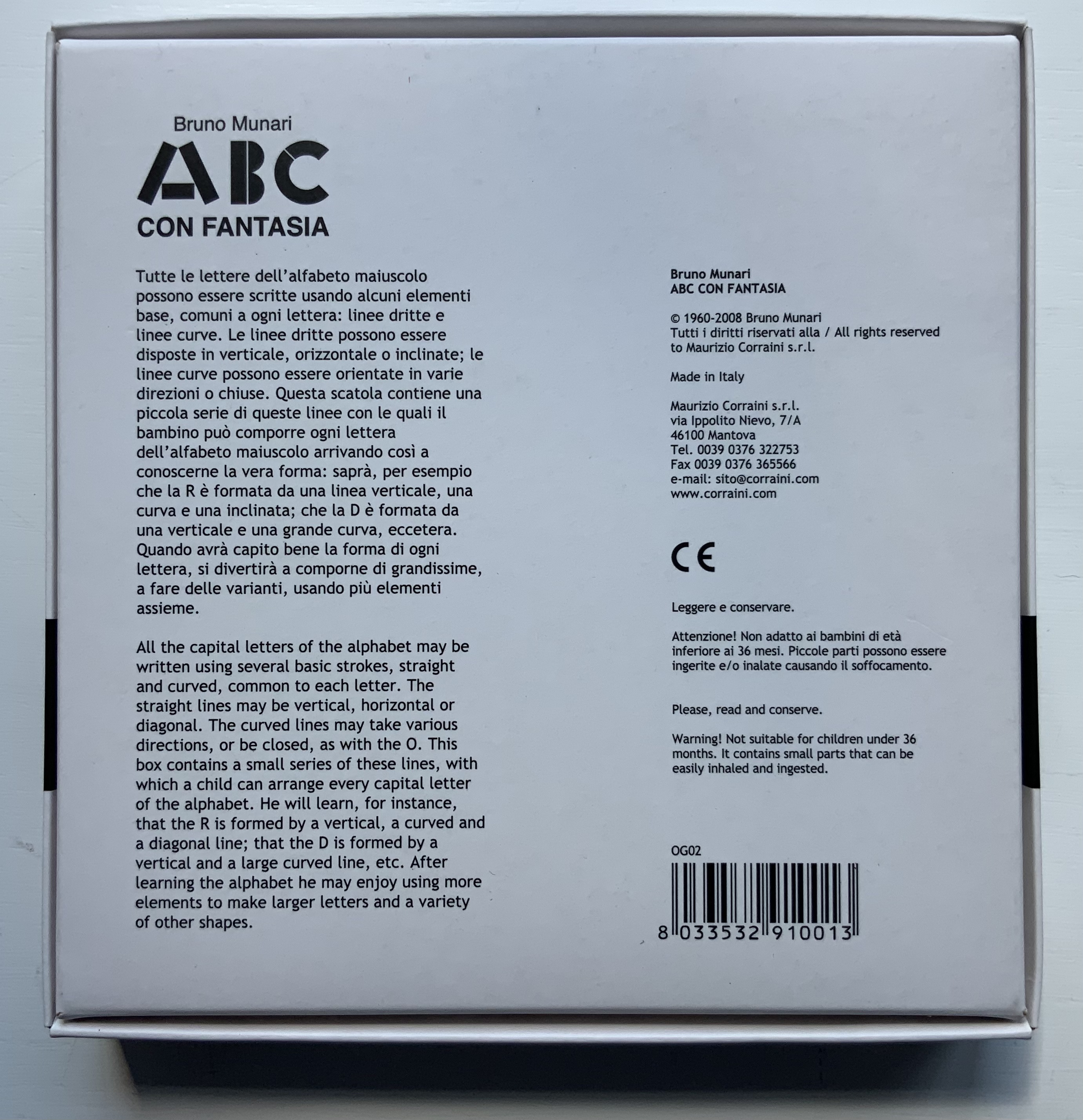
Although not shown in Munari’s Books, an alphabet-related work that underscores Picasso’s calling Munari “our Leonardo” is ABC con fantasia (1973/2000). If we are to believe Fra Luca Pacioli, it was Leonardo da Vinci who inspired his “straight lines and curves” exposition for creating letters. Following in their footsteps, Munari provides the linear and curvilinear basics for the collector and offspring to join the game.
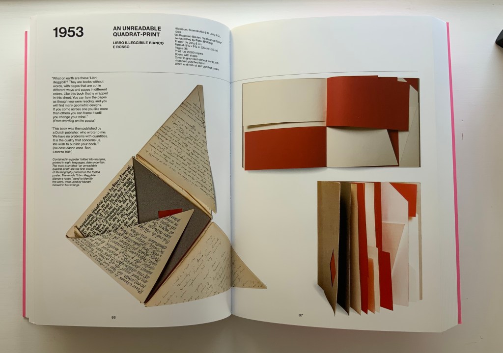
Another pleasure is how Munari’s works lead to other works in the collection. Just by preceding them in Pieter Brattinga’s Kwadraatblad/Quadrat-prints series, Munari’s An Unreadable Quadrat-Print (1953), below, conjures up Wim Crouwel‘s, Gerard Unger‘s, Timothy Epps and Christopher Evans‘, and Anthon Beeke‘s more alphabetical contributions.
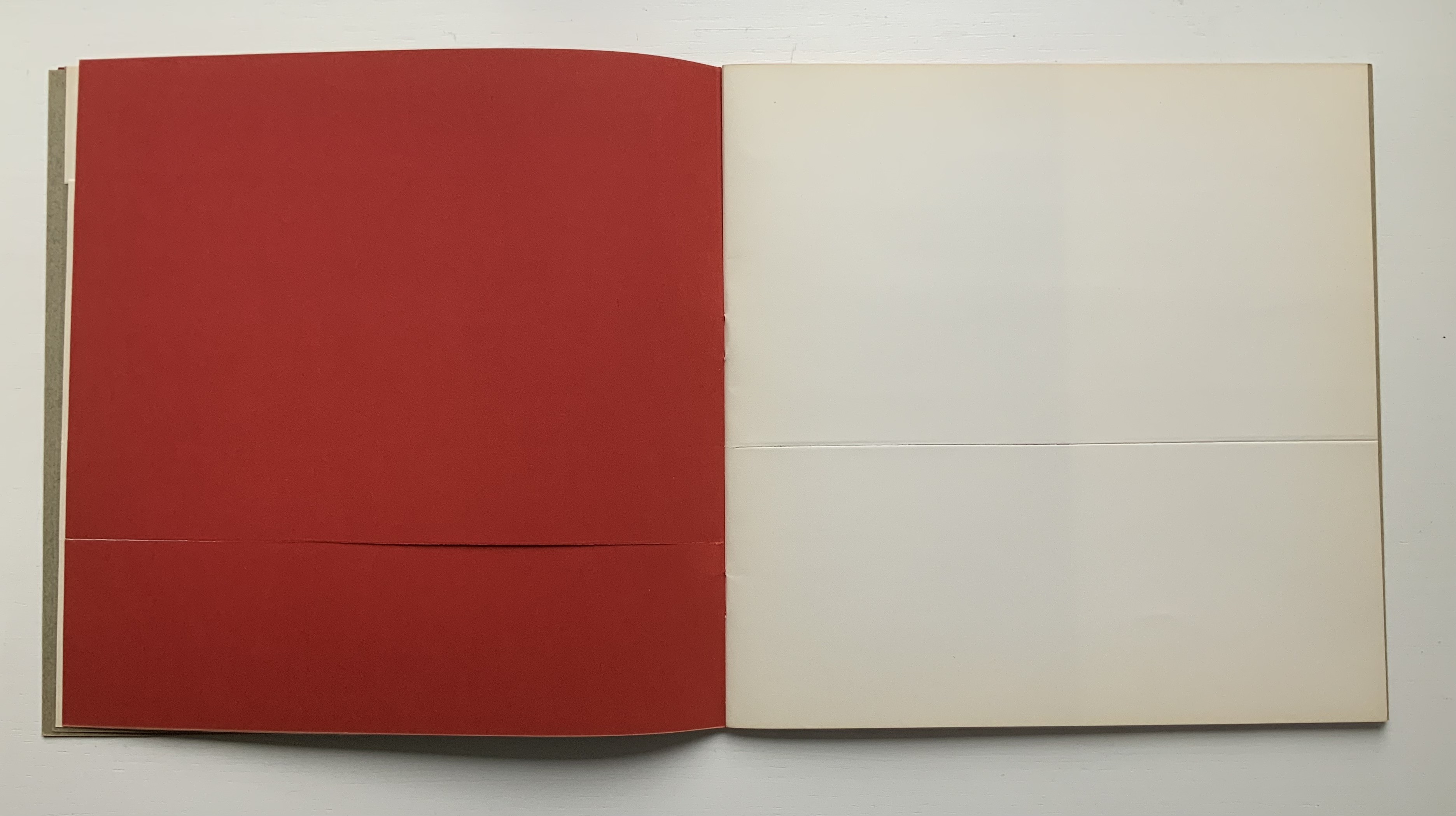
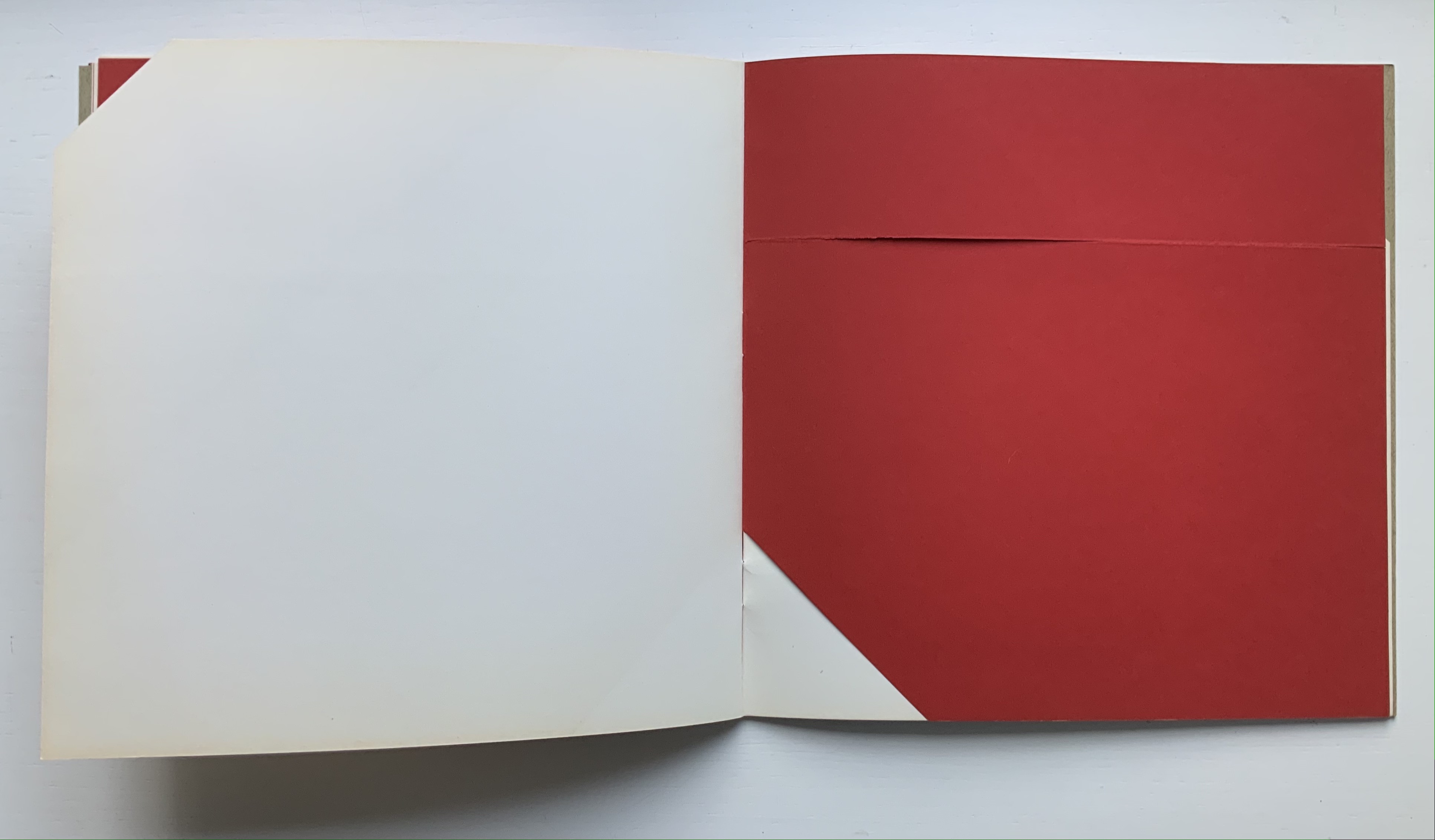
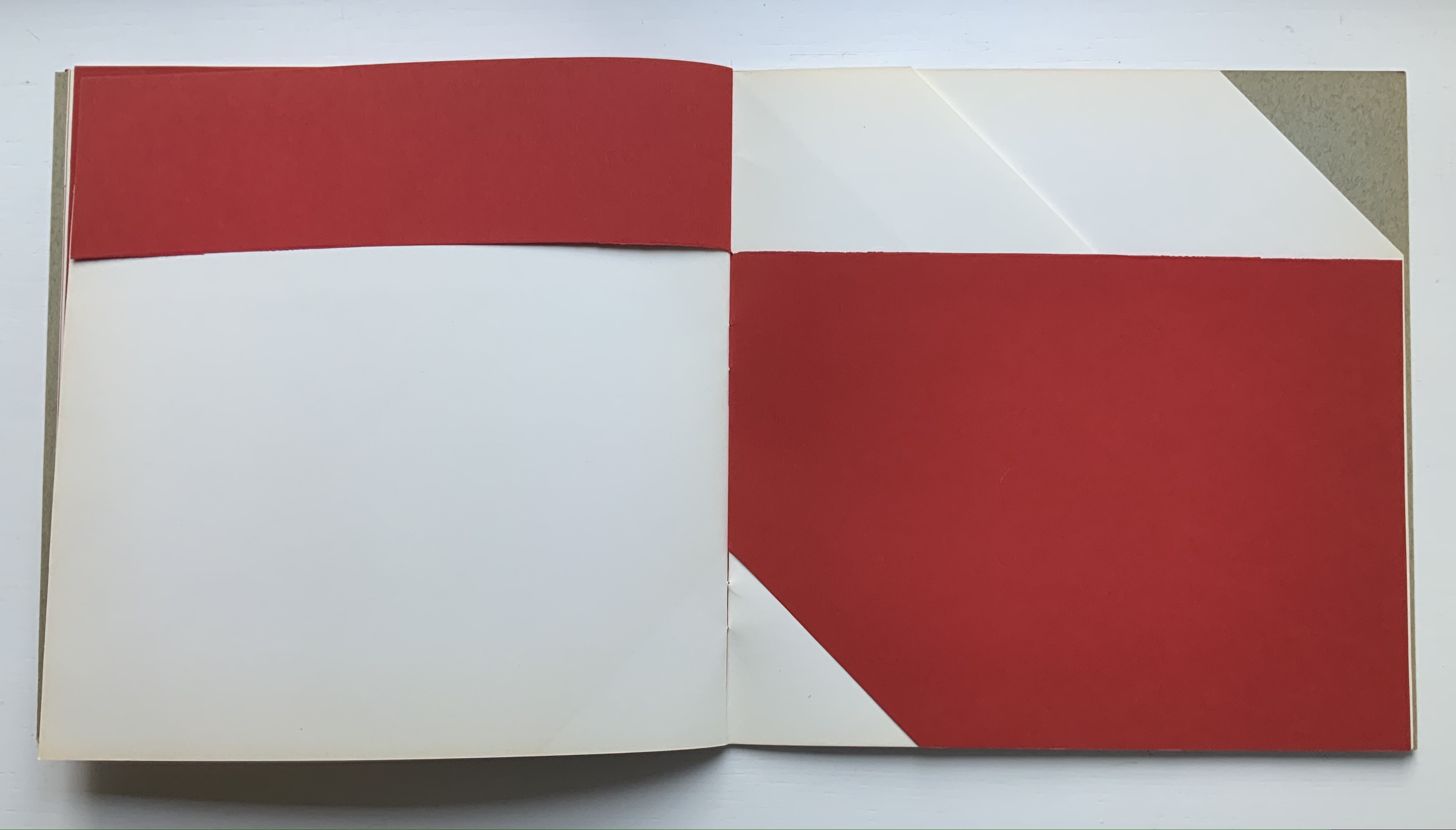
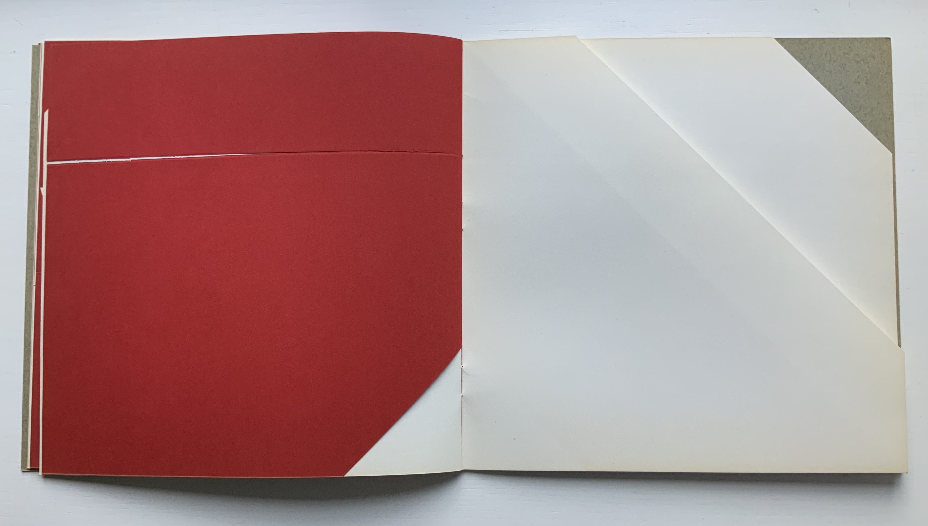
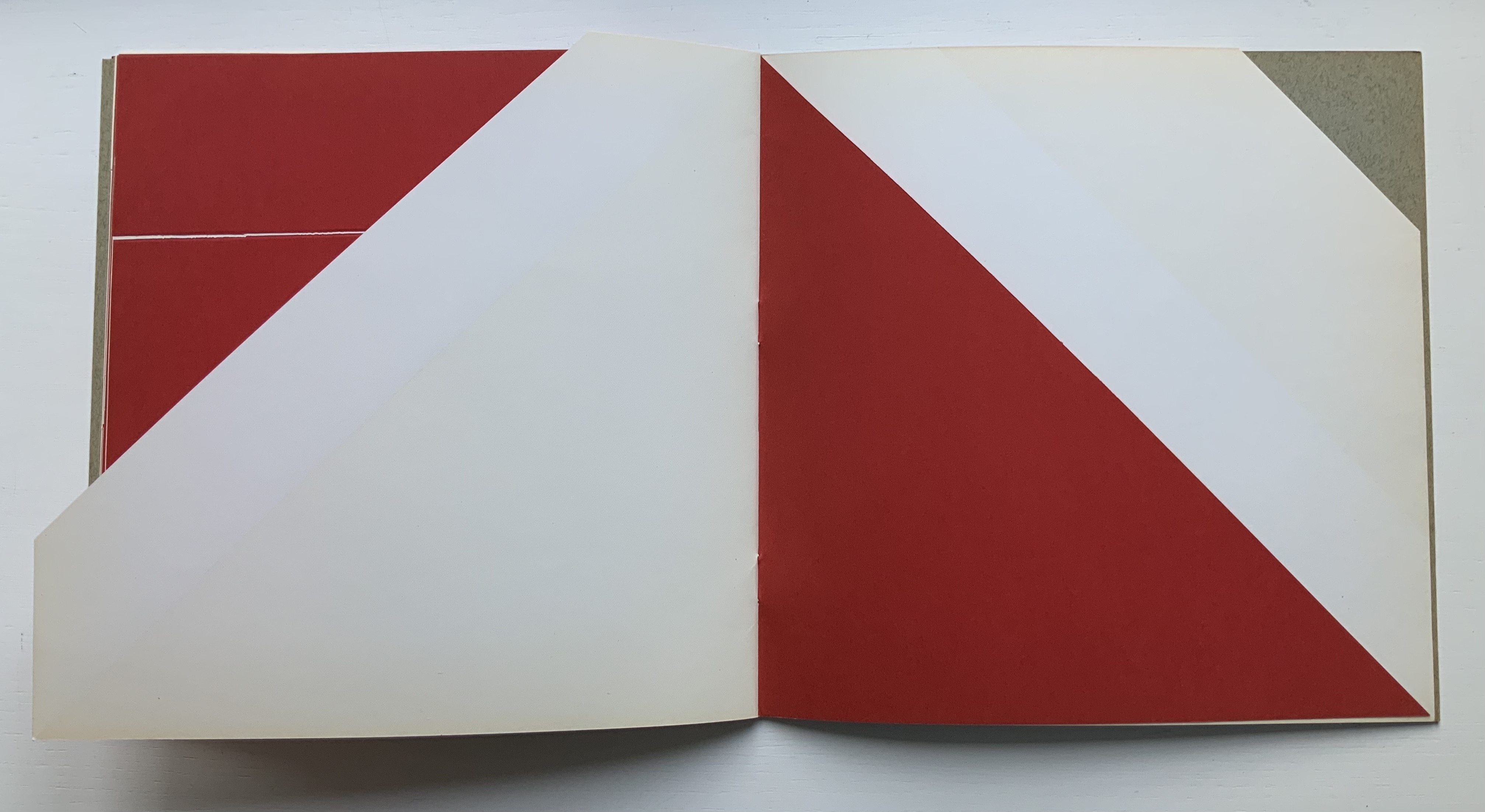
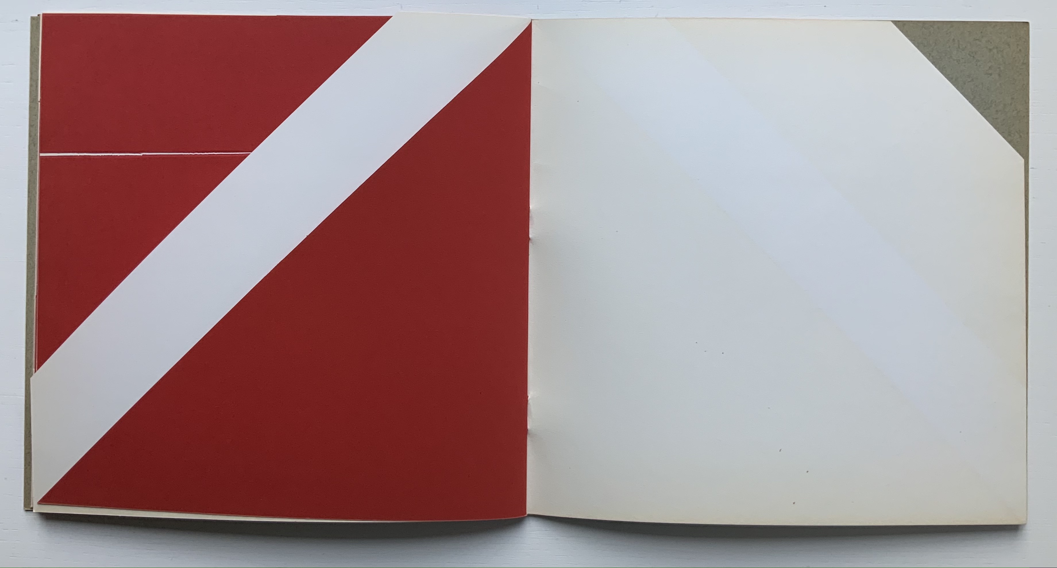
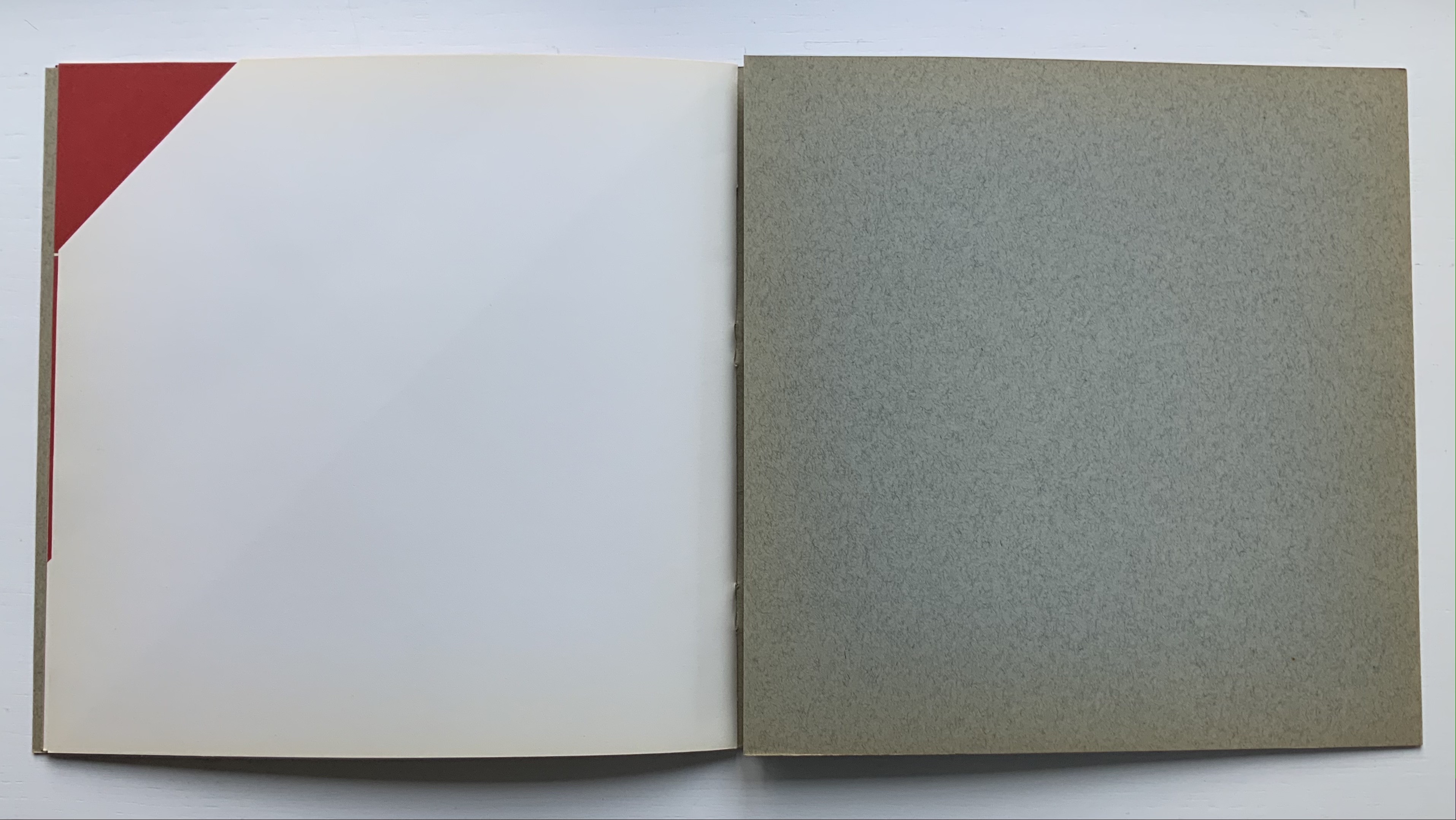
Libro illeggibile bianco e rosso / An unreadable Quadrat-Print / Een onleesbaar kwadraat blad / Ein unlesbares Quadrat-Blatt (1953)
Although there are no words on numbered pages that have to fall in the right order, An Unreadable Quadrat-Print still presents the author/printer/binder with a challenge in imposition. White and red alternate, which is easy enough, but to cut or not cut a folio on the left and right, how to cut it, how to place the differently cut folios in the right order to achieve the variation in images when the pages turn, how to ensure a sewable area down the center for each folio whether it has a horizontal cut extending into the spine or a diagonal one extending from some point along the spine — that is impressive. It speaks to the sculptural process and result in making books, as well as the sculptural process of reading them.
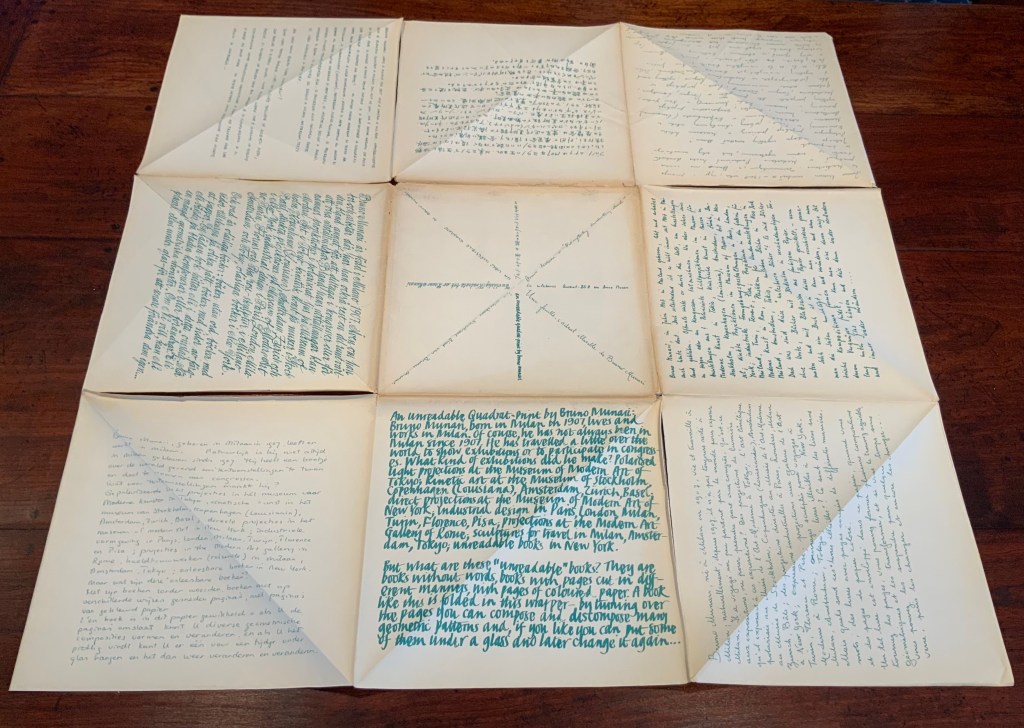
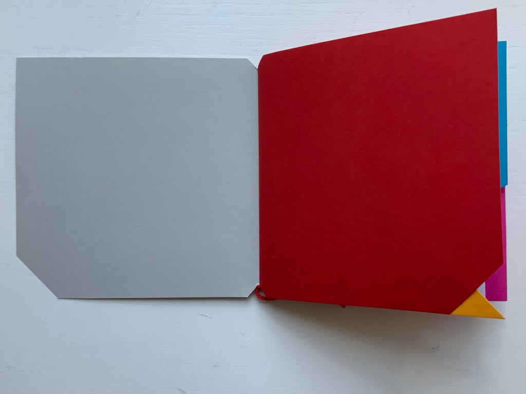
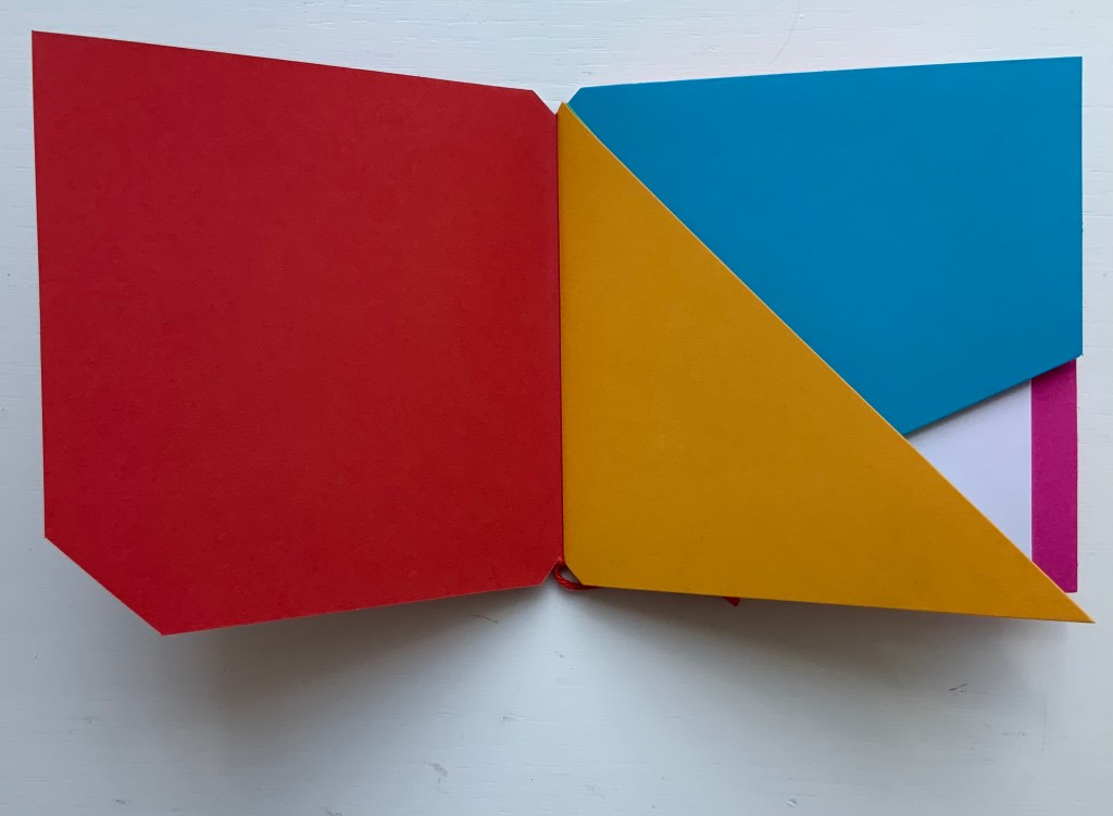
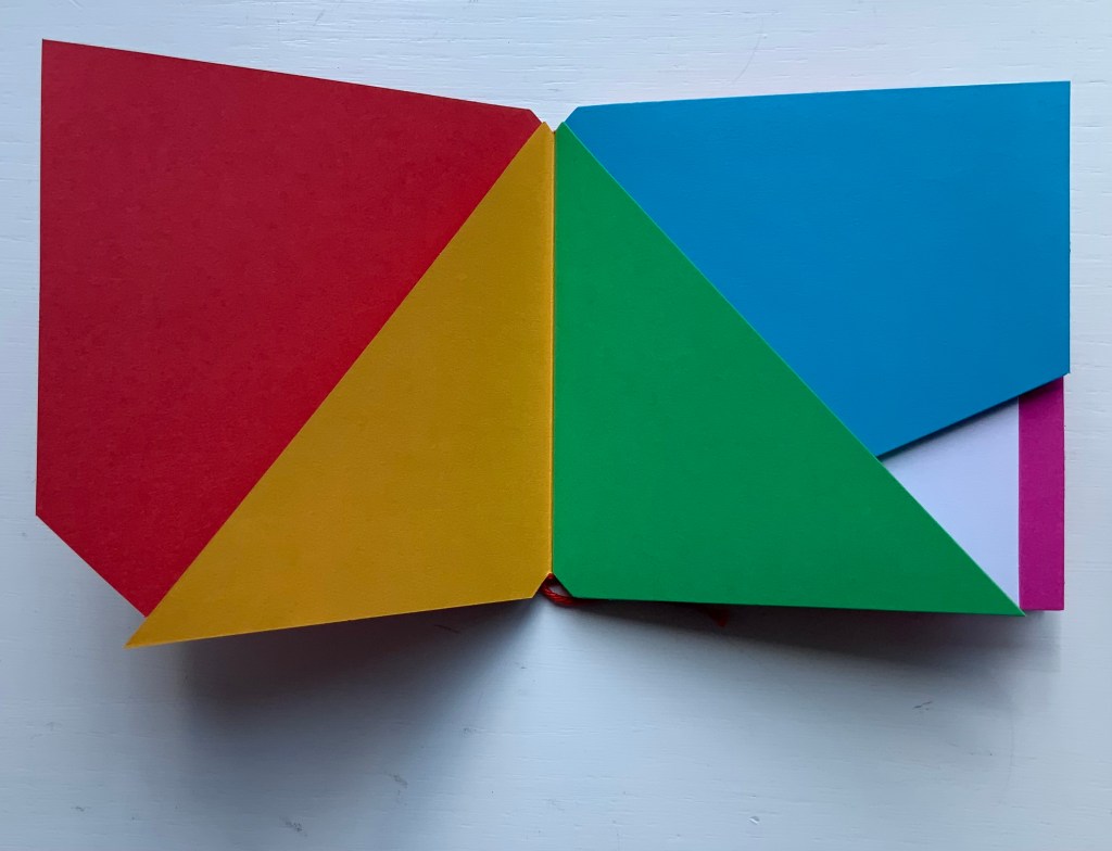
The following sequences — the book’s first five double-page spreads and then its last six — take a normal page-turning approach, always turning from the upper right corner of whatever shape/page is available. Note how, in the last six double-page spreads, the pages and shapes become more complex.
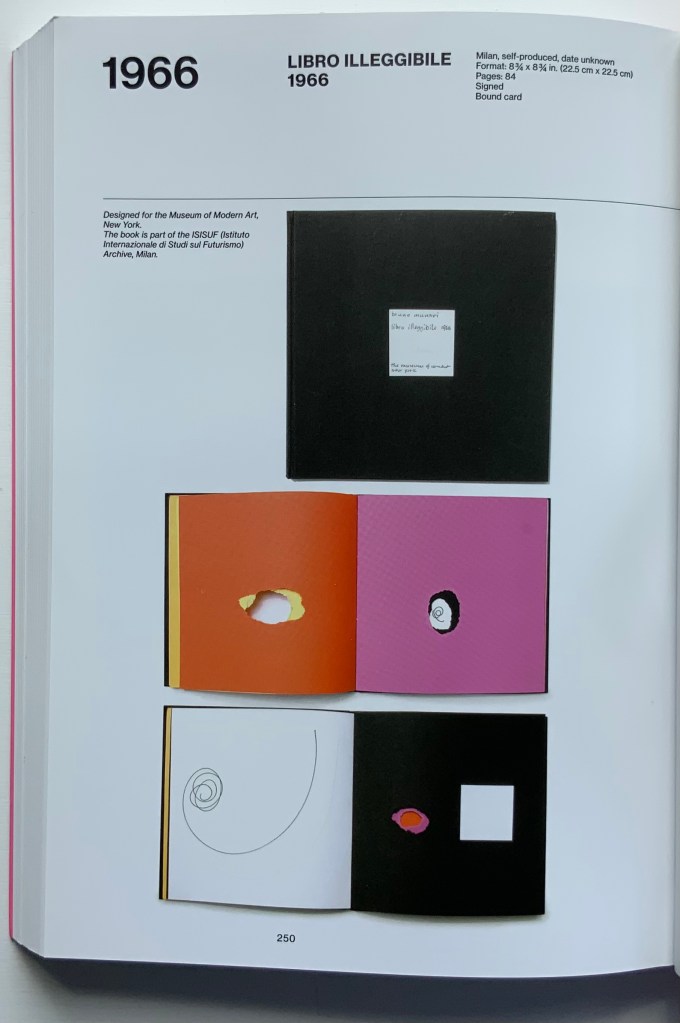
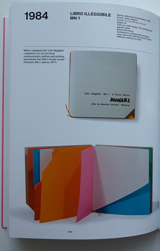
Libro illeggibile (1966), below left, calls to mind Katsumi Komagata’s A Cloud (2007), and the one in the middle foreshadows Eleonora Cumer’s subtle artistry with transparent paper in Circoscrivere lo spazio No. 3 (2021). While Munari’s rare works press modest budgets, some of it — in its simplicity and popular appeal — has led Corraini Edizionito put it within easier reach. Numerous reissues of the 1984 Libro illeggibile MN 1 have pushed its price to €5. Short of the artist’s signature (which would likely obstruct the aesthetic intention), a copy from the latest 5000-copy print run will “perform” and deliver the same experiential value as one from the earliest run.
Munari’s many series of illegible books tap into book artists’ longstanding and ongoing preoccupation with whether a book without words can communicate information, narrative, sensations or feelings through material, shape or color and their permutations. The colors, shape, feel and binding of Libro illeggibile MN 1 evoke simple and sophisticated pleasure in their juxtaposition and sequence. The unchanging straightness of the top edge and the anchoring red thread of the binding set off the changeability of shapes and colors.
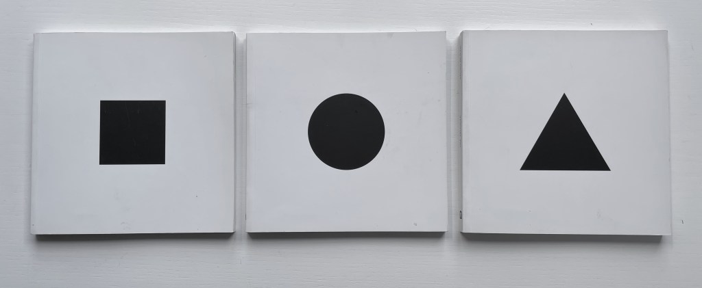
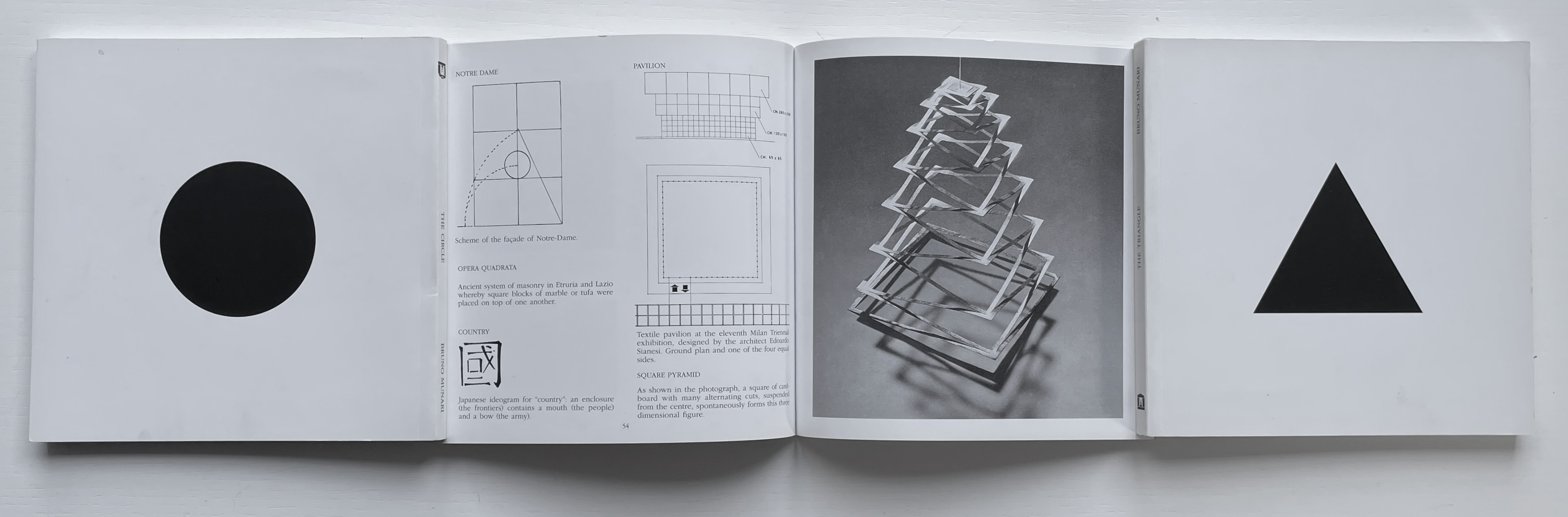
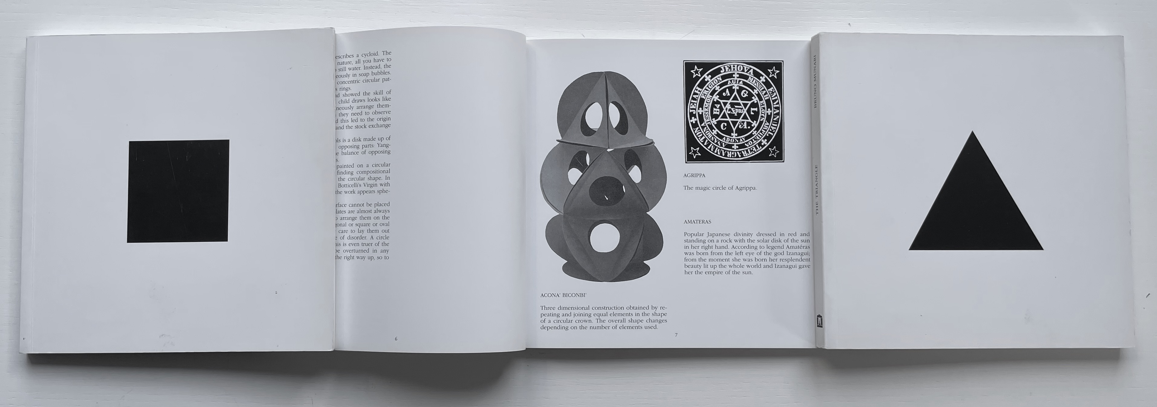
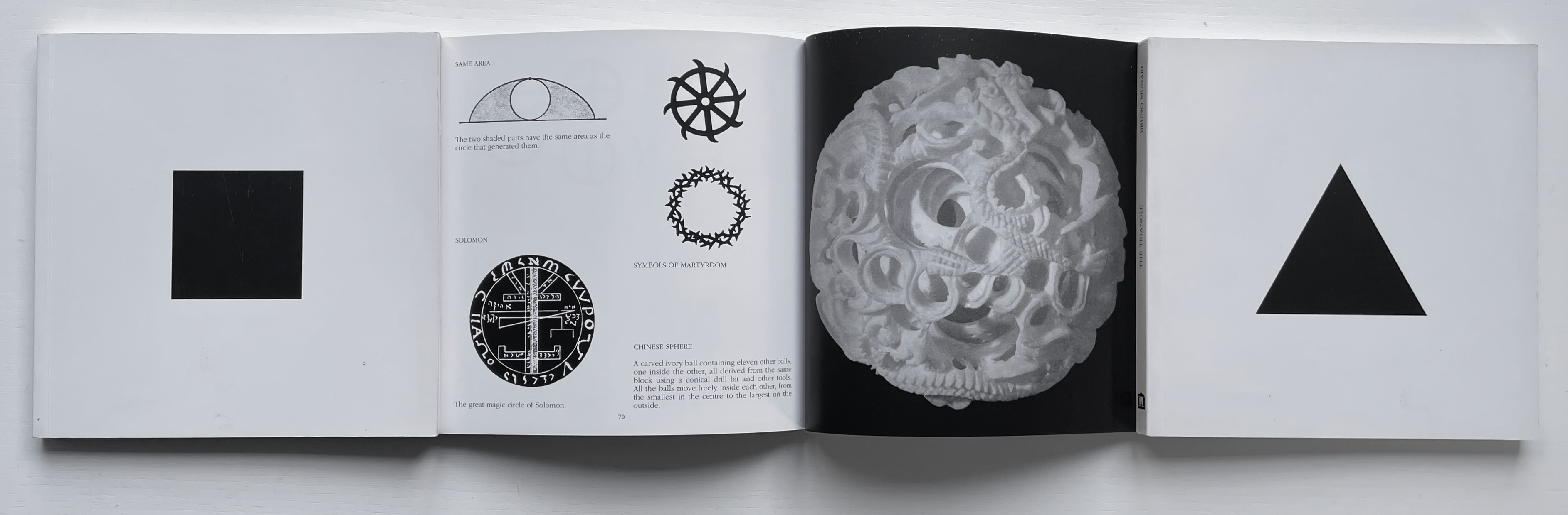
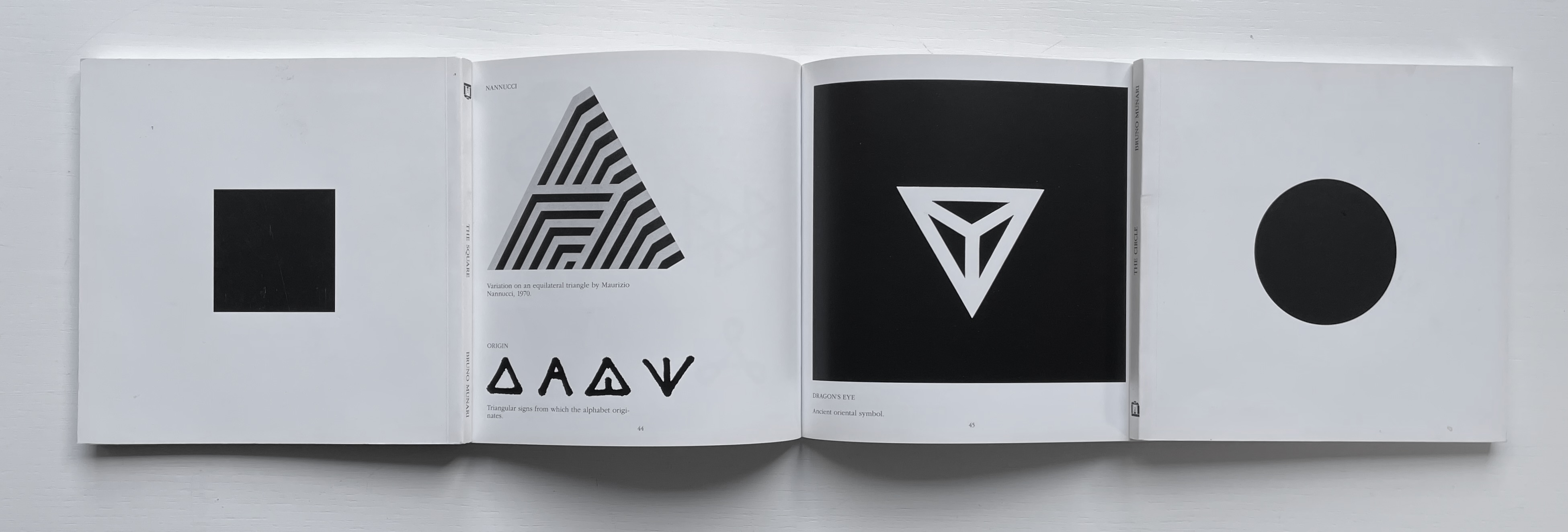
The Square (1960), The Circle (1964) and The Triangle (1976)
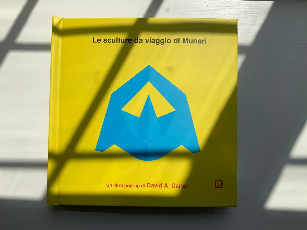
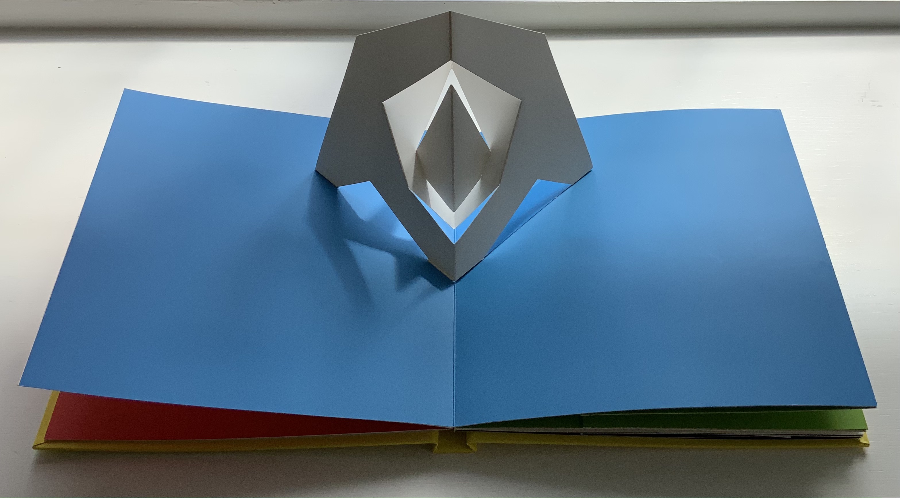
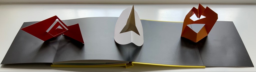
Although not a book of Munari’s making, David A. Carter’s Le sculture da viaggio di Munari is one way of bringing the spirit of Munari’s “travel sculptures” into the collection. Carter’s homage carries the blessing of Corraini Edizioni, further justifying its inclusion.
Travel sculptures started off as small sculptures (some even pocket-sized) to carry with you, so you could take part of your own culture to an anonymous hotel room. Later they were turned into ‘travel sculptures’, five or six metres tall and made of steel. One of these was seen for a few months in Cesenatico, another one in Naples. Others are sleeping among huge trees in the Alto Adige region.’ This is how Italian designer Bruno Munari (1907-1998) described his ‘travel sculptures’, which in turn inspired American illustrator and designer David A. Carter for this pop-up book. –Corraini Edizioni website. Accessed 3 August 2021.
Munari’s travel sculptures also recall works in the collection like Cumer’s scultura da viaggio dipinta n.2(2017), Komagata’s「Ichigu」(2015) and, albeit less portable, Ioana Stoian’s Nous Sommes (2015).
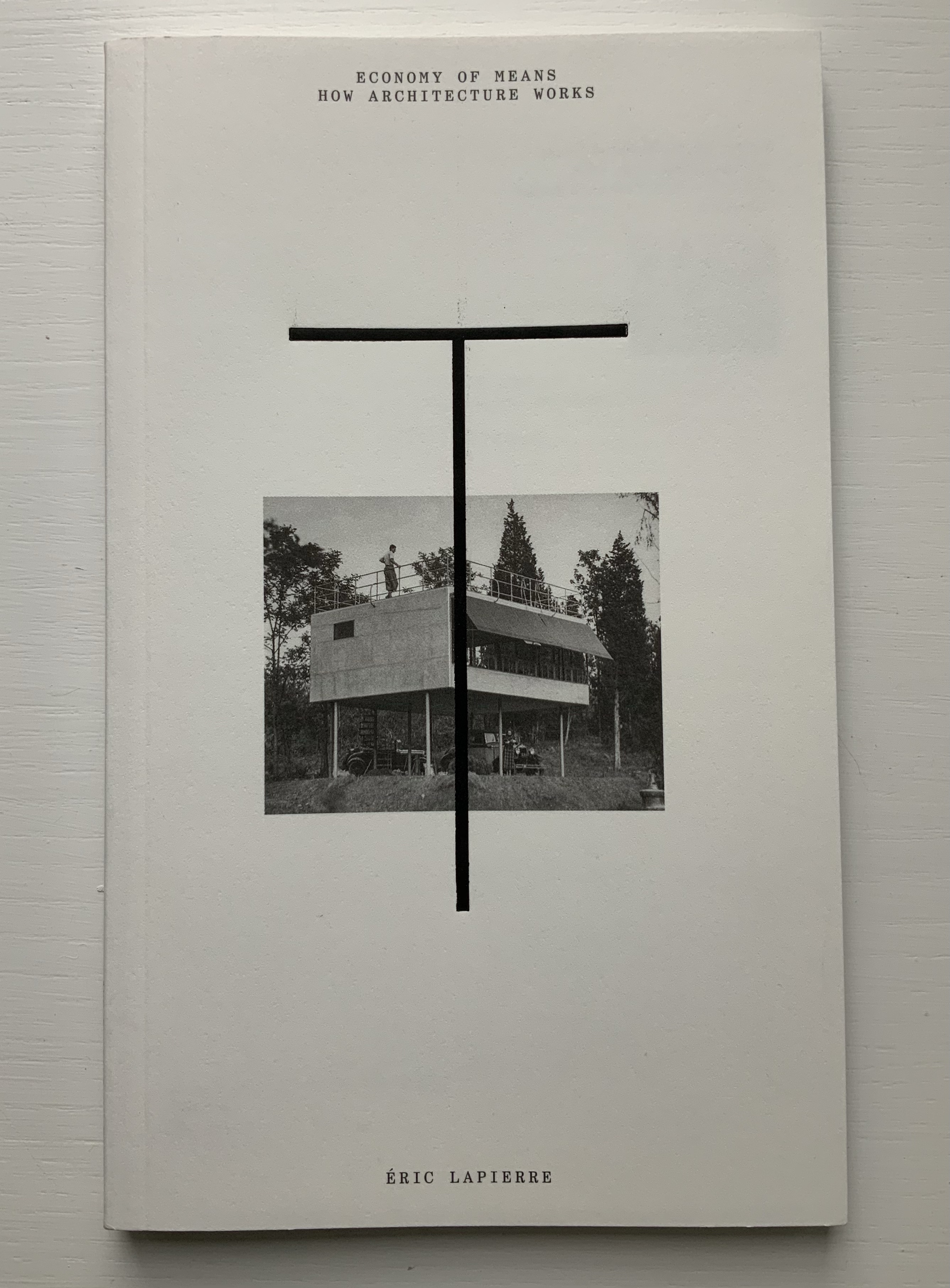
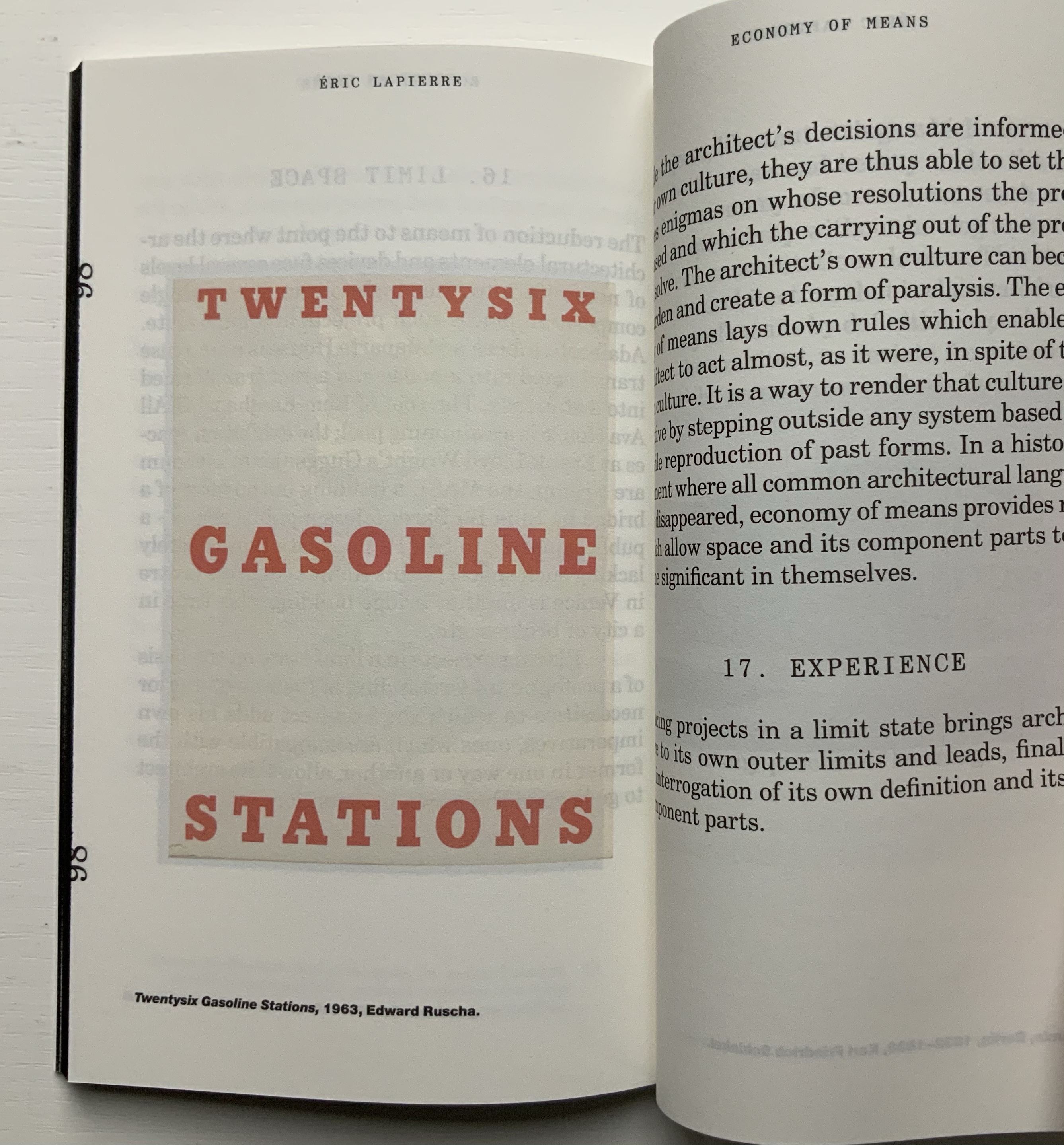
“The Poetics of Reason” was the title and theme for the fifth Lisbon Architecture Triennale in 2019 (the first was in 2007). Awarded the ADG Laus 2020 Golden Prize in the category of editorial graphic design, this work stands well with Bruno Munari’s three small 1960’s books on the square, circle and triangle, now available in a single volume, and calls to mind several works testifying to the relationship between architecture and book art. In the first of the five volumes, Éric Lapierre even interweaves with his text on architectural rationality illustrations from book artists such as Bernd and Hilla Becher, Sol Lewitt and Ed Ruscha — all without comment, in itself conveying their implicit relevance. His similar display of a page from Stéphane Mallarmé’s Un Coup de Dés Jamais N’Abolira le Hasard — that progenitor of modern and post-modern book art — speaks to the role that space — les blancs, as Mallarmé calls it — plays in these adjacent communities.
136 pages
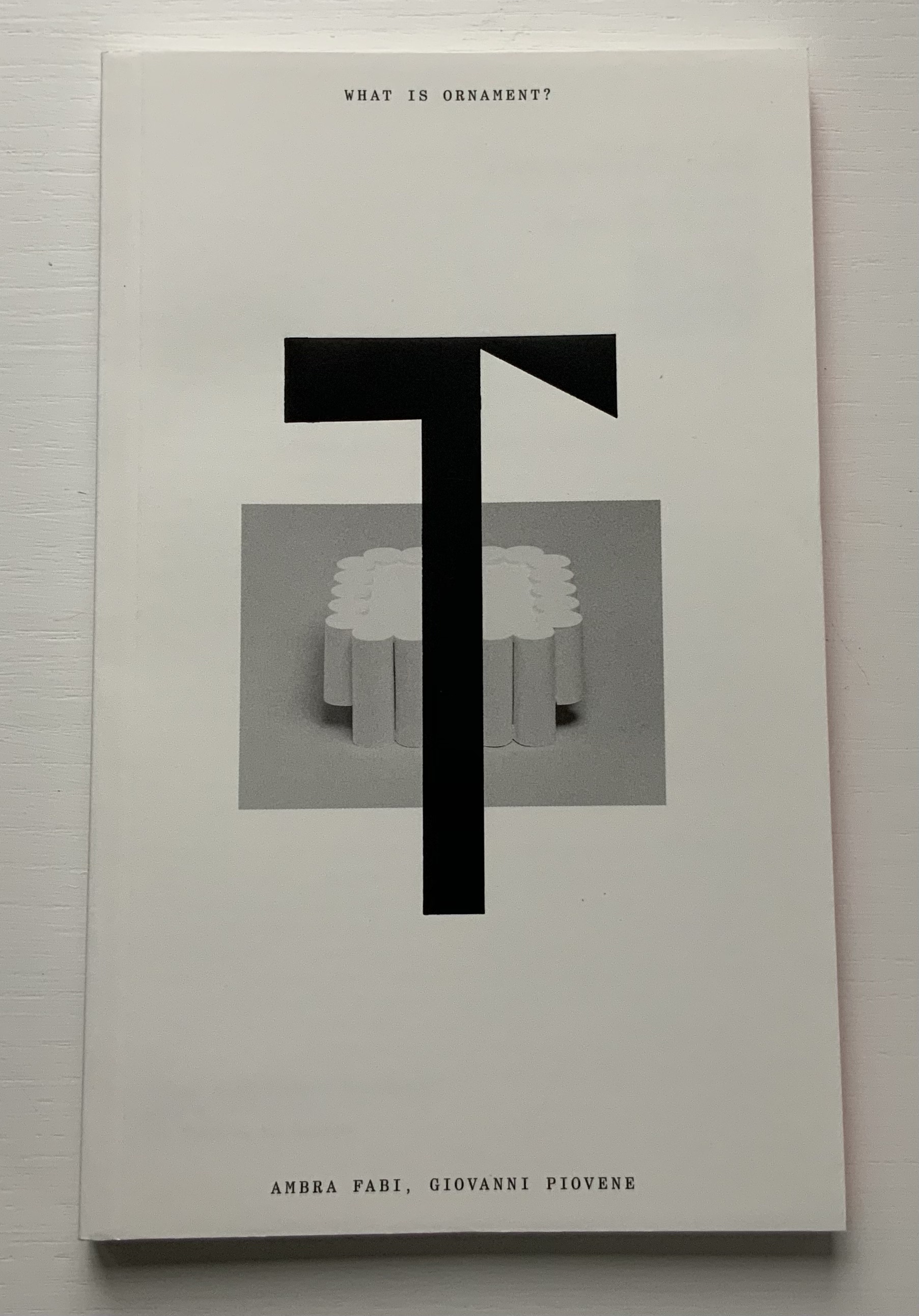
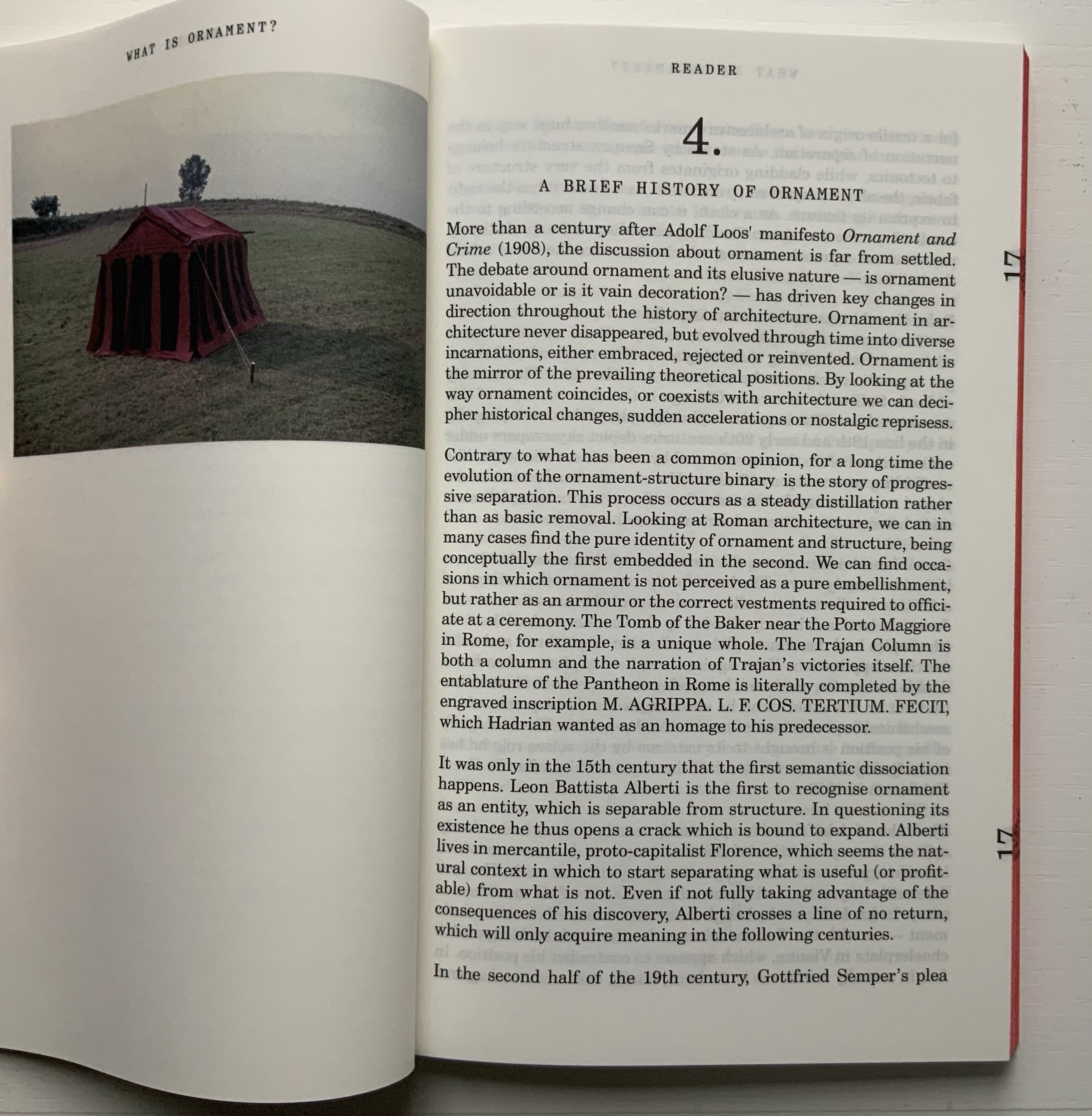
The second volume, by Ambra Fabi and Giovanni Piovene, draws in Leon Battista Alberti, of course, whose columns ornament works by Mari Eckstein Gower, Helen Malone and many other book artists.
136 pages
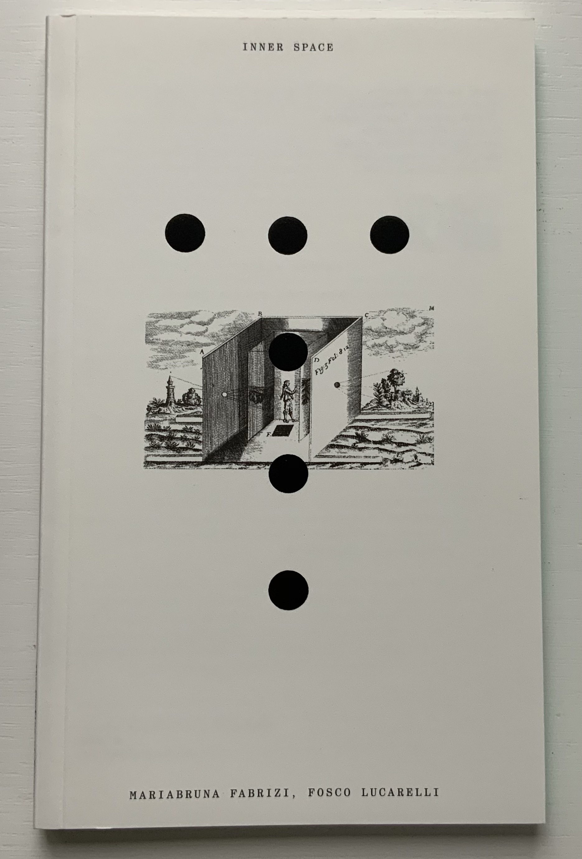
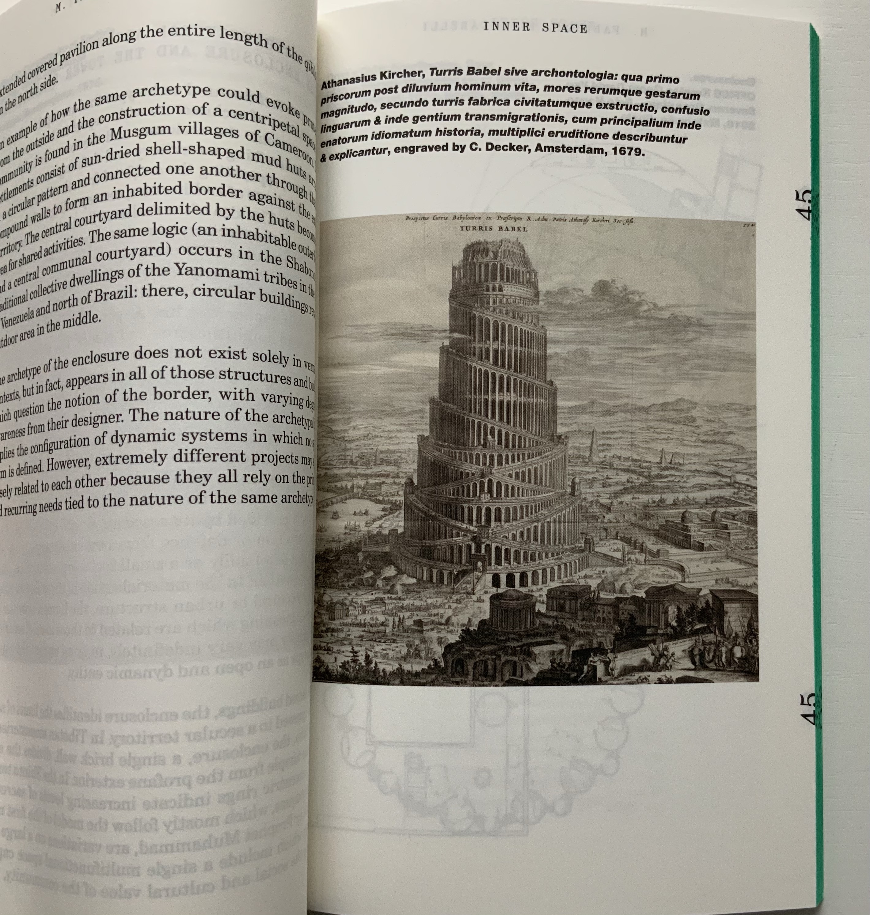
Drawing on Gaston Bachelard and Juhani Pallasmaa as it does, the third volume, by Mariabruna Fabrizzi and Fosco Lucarelli, calls to mind the work of Olafur Eliasson and Marian Macken here in the Books On Books Collection and elsewhere. Anyone familiar with Richard Niessen’s The Typographic Palace of Masonry will appreciate Fabrizzi and Fosco’s exploration of where architecture, imagination and memory intersect.
136 pages
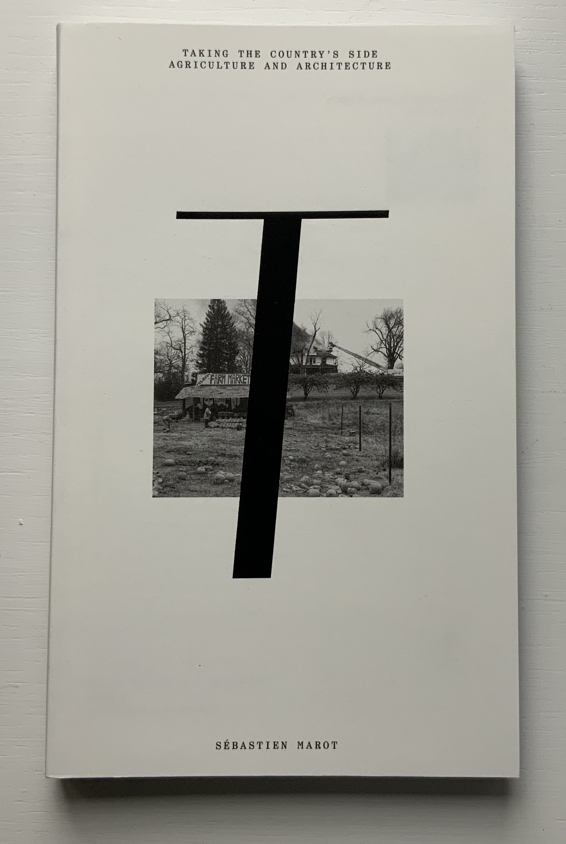
In the lengthiest of the five volumes, Sébastien Marot takes us into the territory of urban architecture and the anthropocene, also occupied by book artists Sarah Bryant, Emily Speed, Philip Zimmermann and many others.
216 pages
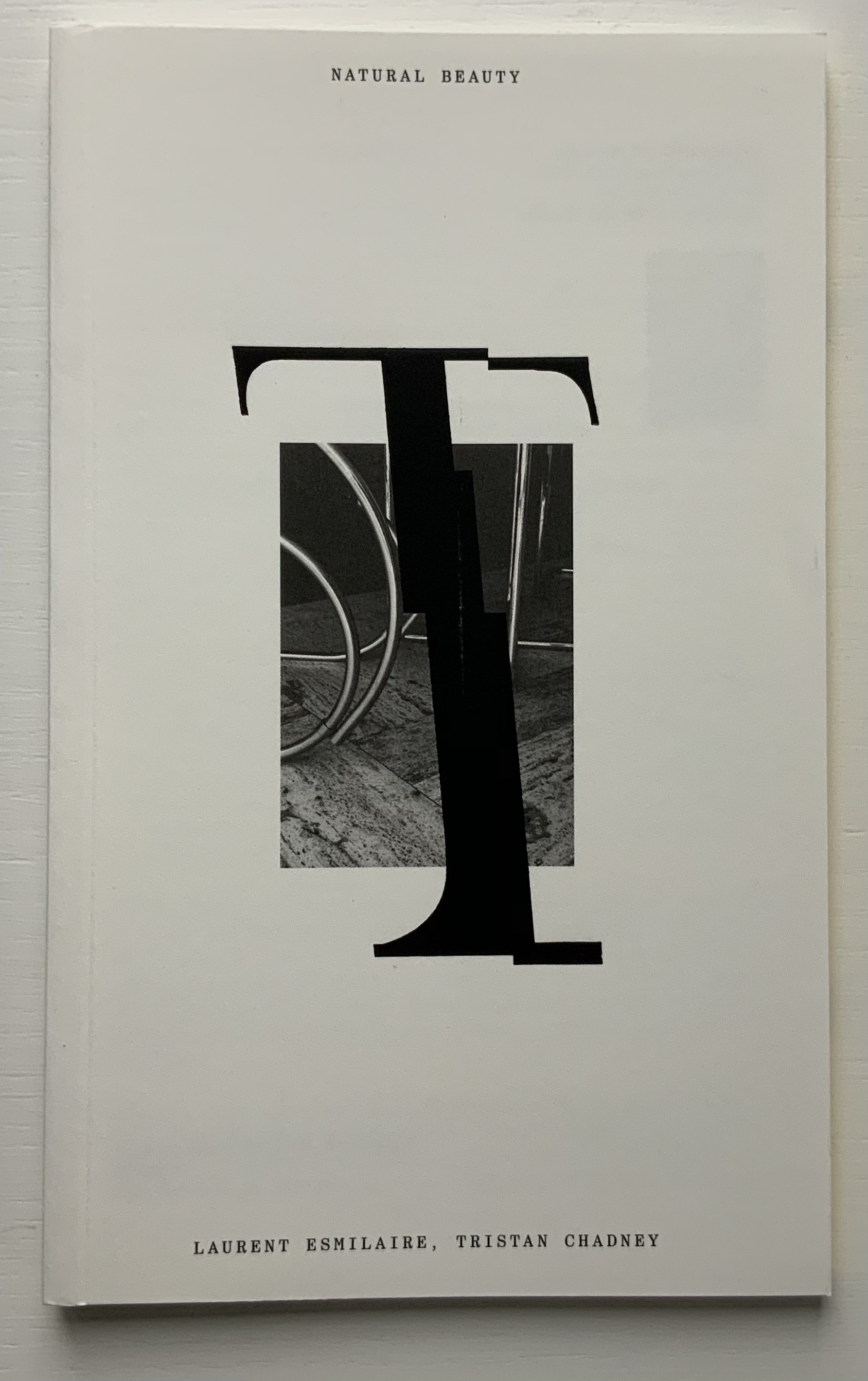
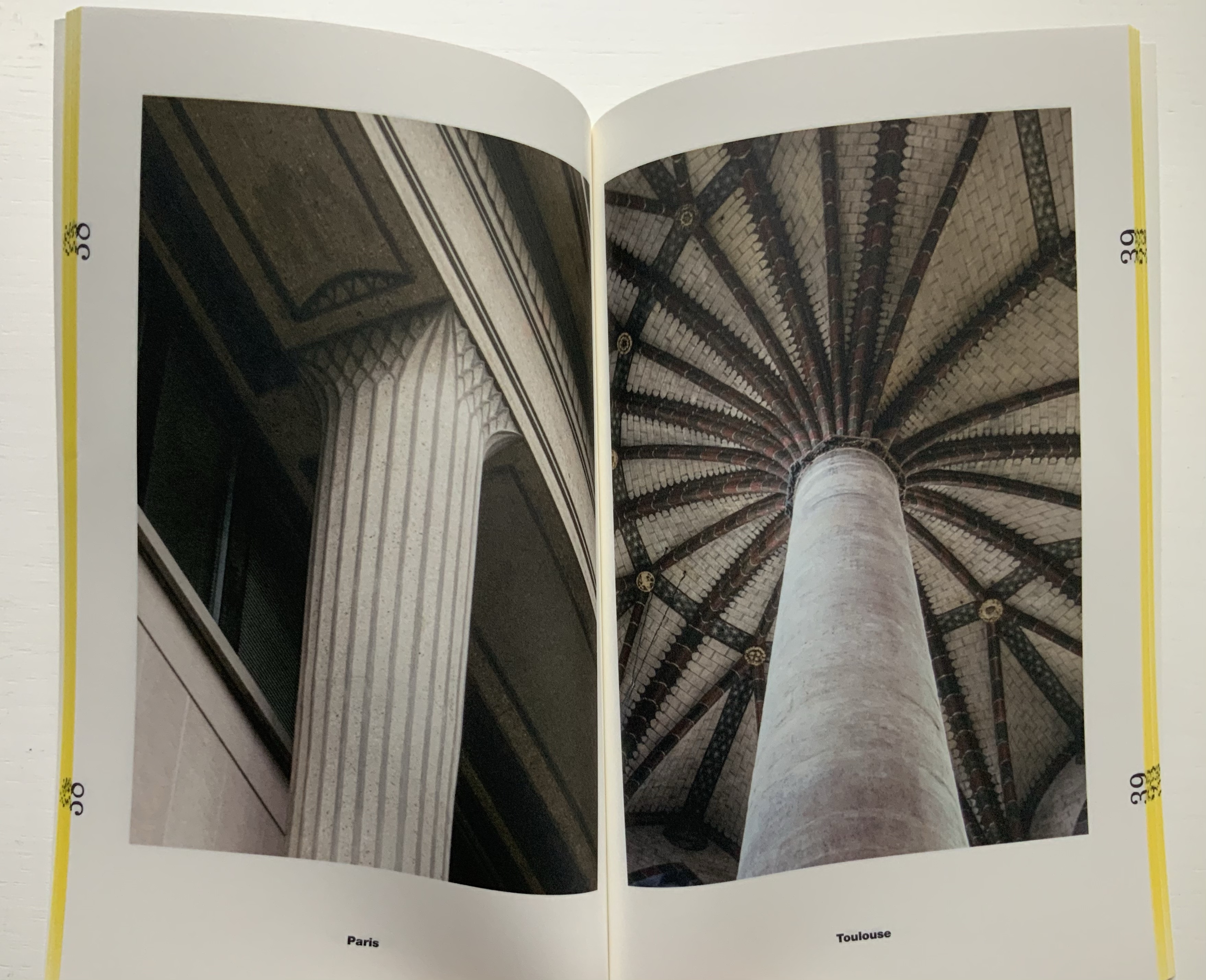
The last and shortest volume, put together by Laurent Esmilaire and Tristan Chadney, consists mostly of photos that may remind the viewer of Irma Boom’s Elements of Architecture, with Rem Koolhaas, or Strip, with Kees Christiaanse — especially in conjunction with the tinted fore edges.
88 pages
Referenced below, Pedro Vada’s review of the Triennale and the five separate sites across which it occurred in Portugal provides more insight into the five volumes themselves. Marco Ballesteros LETRA website provides additional images of the five volumes’ design.
Further Reading
“Architecture“. 12 November 2018. Books On Books Collection.
SOCKS Studio, an extraordinary website run by Fabrizzi and Lucarelli.
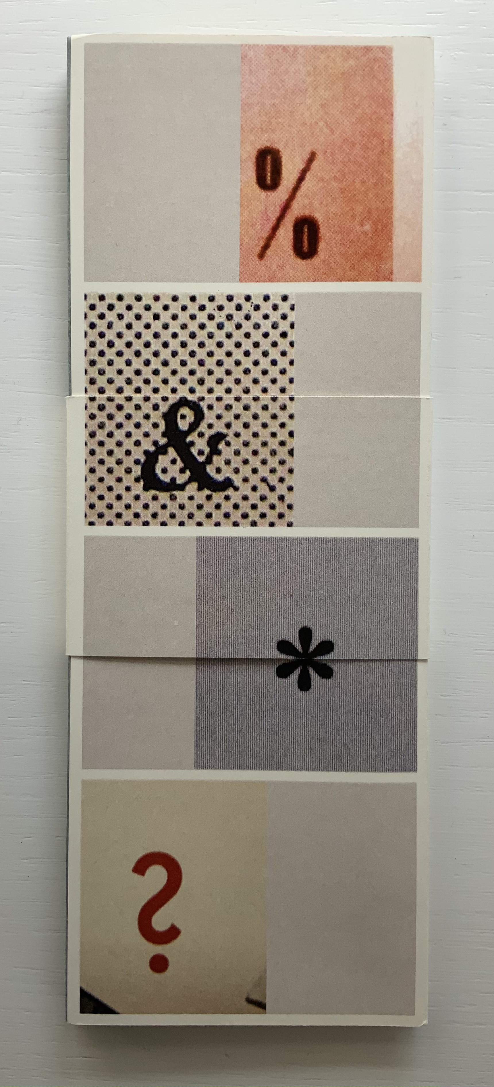
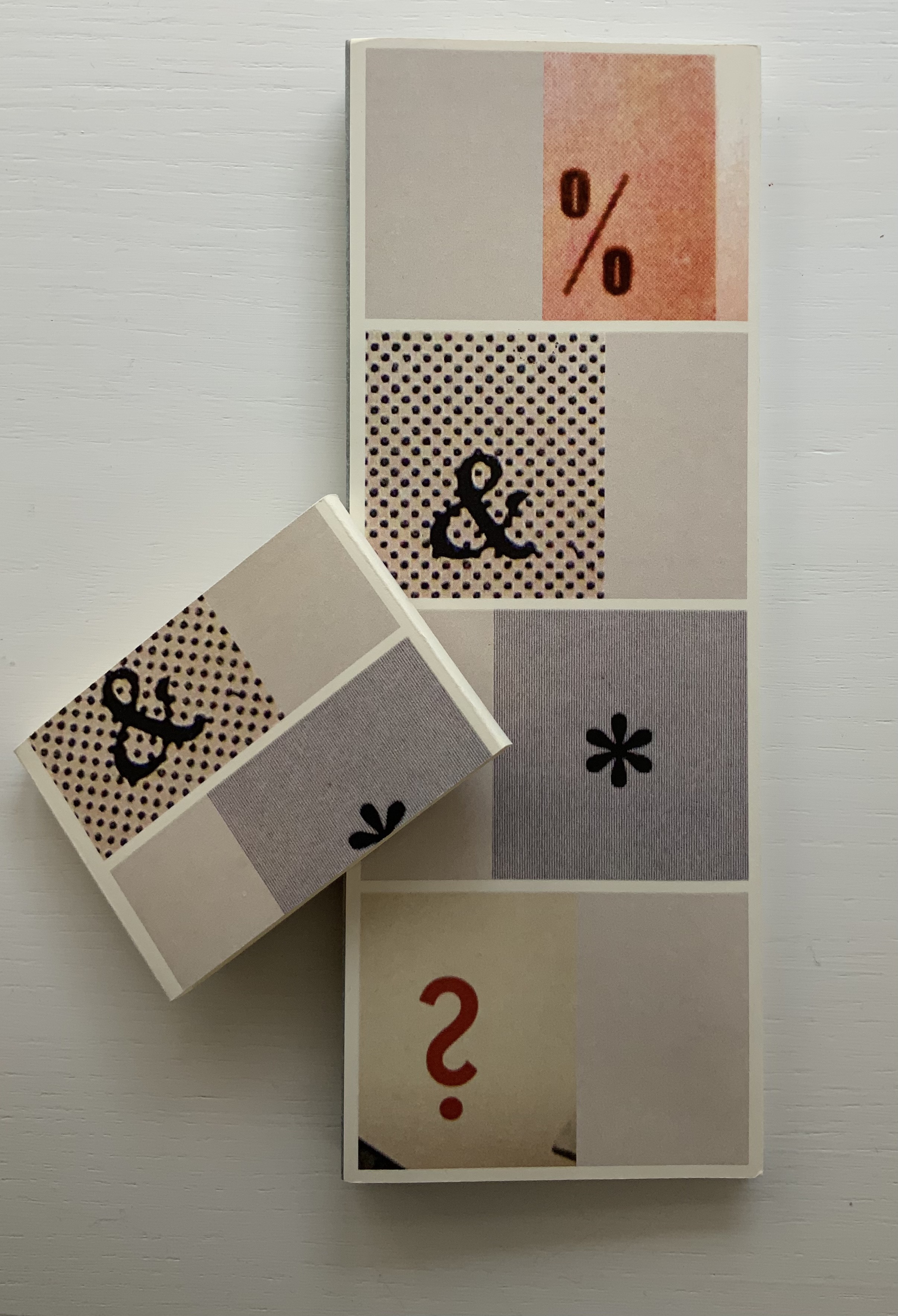
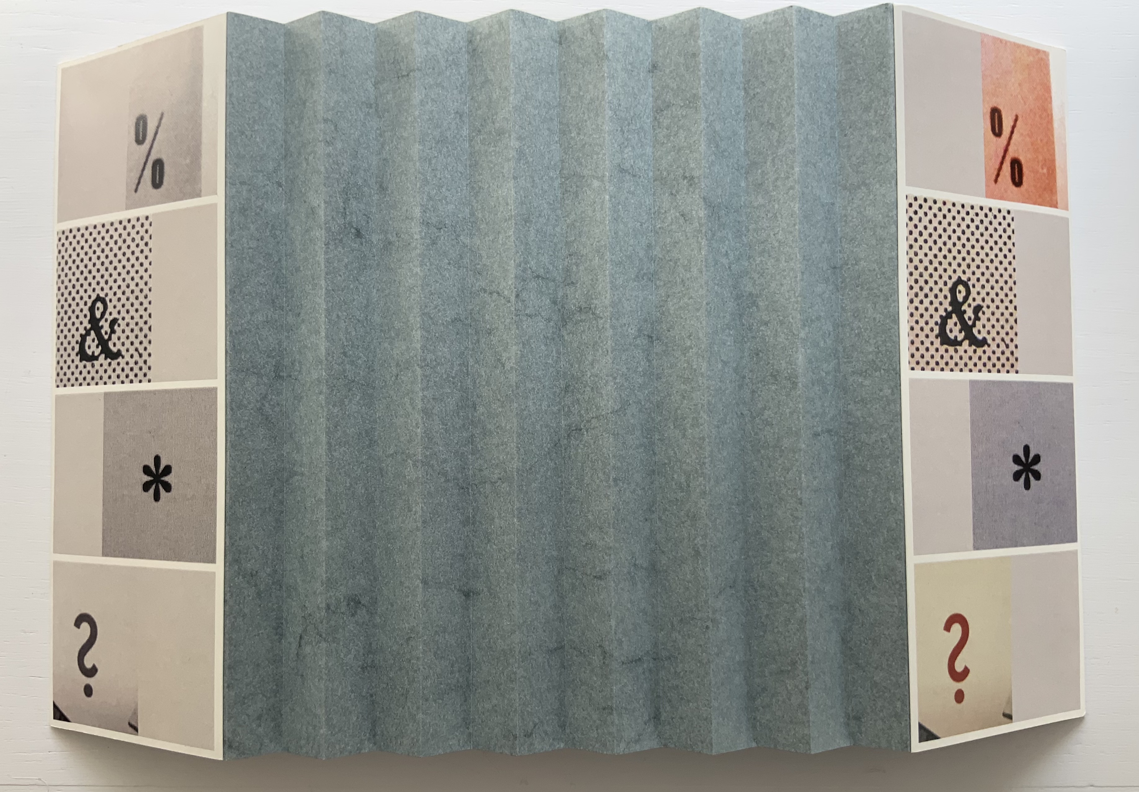
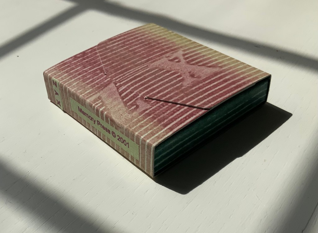
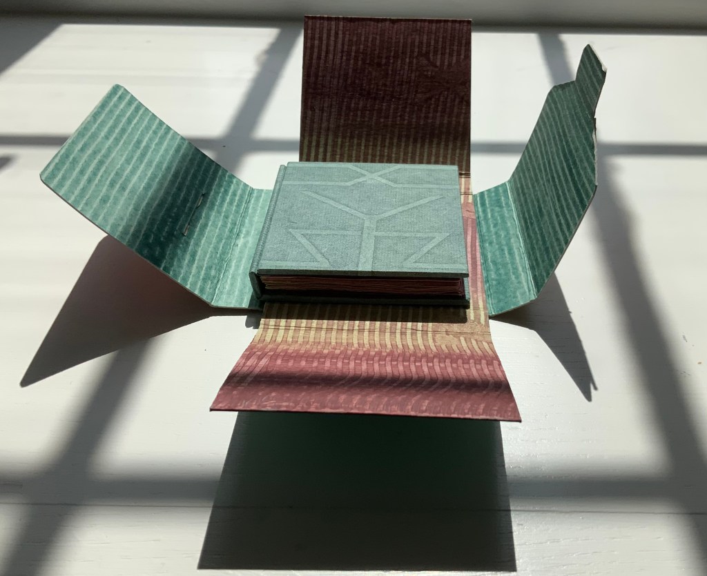
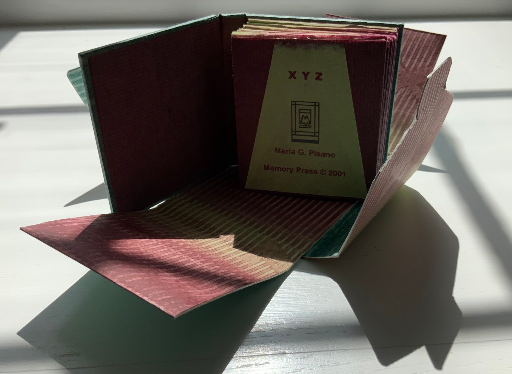
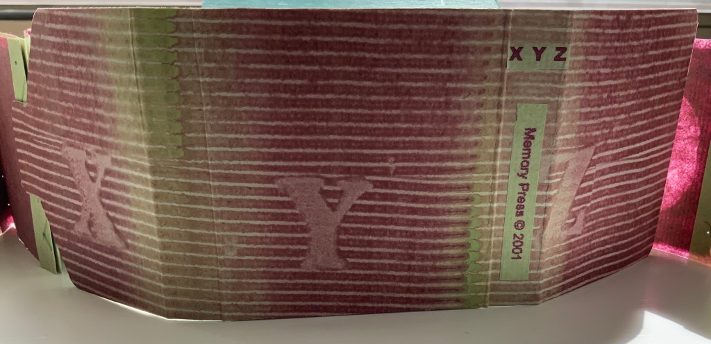
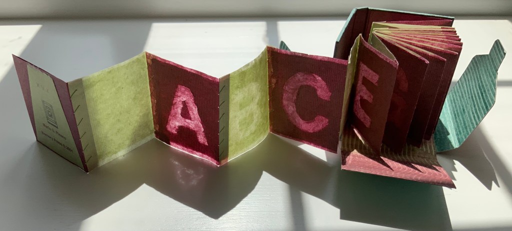
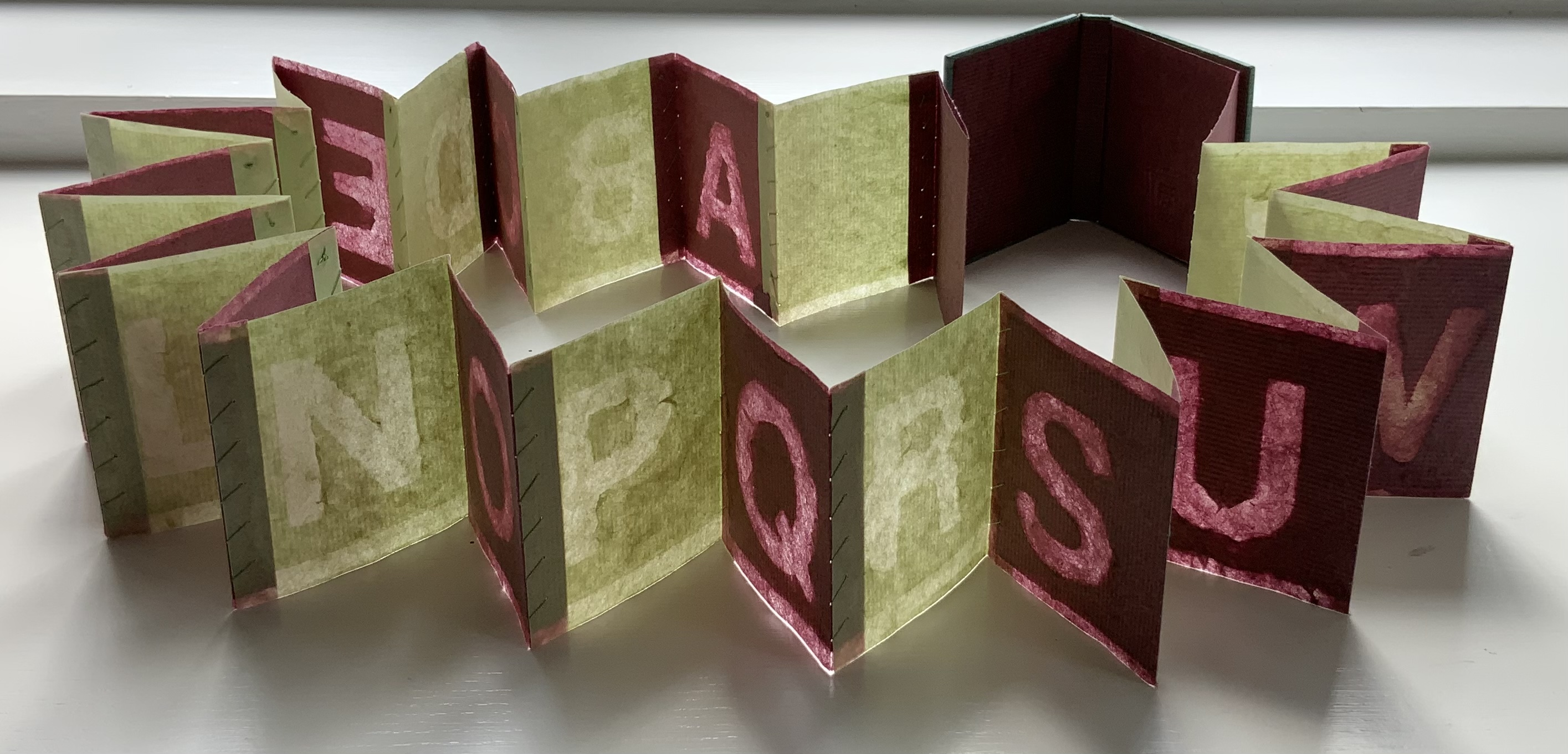
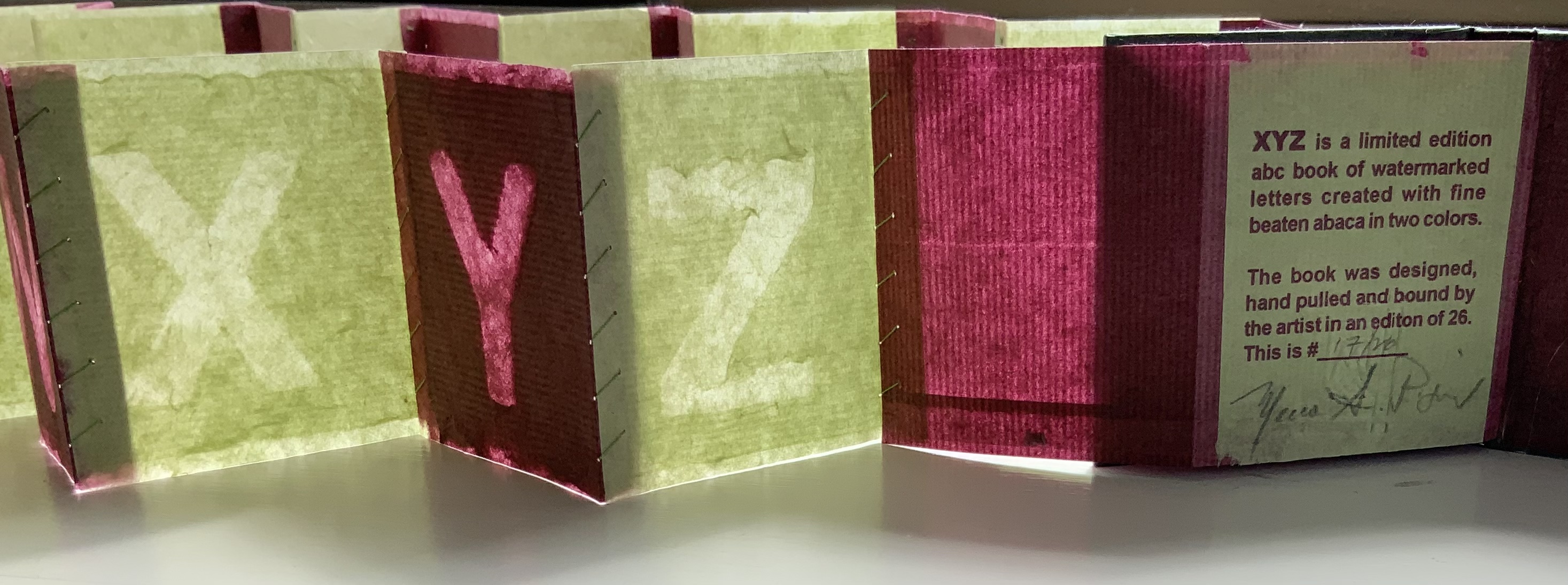
XYZ (2002) Maria G. Pisano Housed in a paste paper wrapper, a miniature concertina book, case bound, each page individually sewn to the next in a light green cotton thread. The title is watermarked on the front cover. H72 x W65 mm closed, 26 lettered pages alternating in colors. Edition of 26, of which this is #17. Acquired from the artist, 22 July 2021. Photos of the work: Books On Books Collection. Displayed with permission of the artist.
This work finds its way into the Books On Books Collection on several counts. Many of the ABC books in the collection use the accordion, concertina or leporello structure, but none combine fine beaten abaca in two colors and the watermark technique to achieve their effect. The colored abaca resonates with the collection’s interest in “Strange Papers” as Fred Siegenthaler labelled them and in “painting” with the watermark as Siegenthaler, Gangolf Ulbricht, John Gerard and others have done (see below under Further Reading).
Besides fusing papermaking with printing, Pisano unifies XYZ by making the alternation of colored paper and printing by watermark extend outwards from the “text block” to the case and paste board housing. The photos below follow this from the outside in.
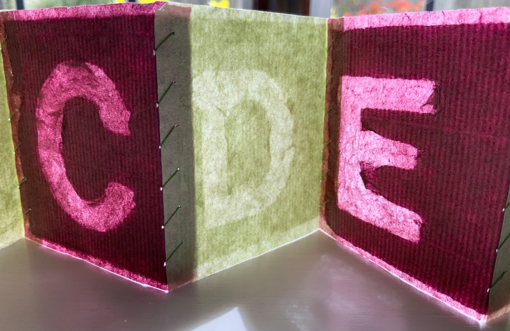
Usually a watermark is barely noticeable, a thin-lined monogram or insignia created by a wire fixed into the mesh or screen in the “deckle” (frame in which the mesh is stretched and into which paper pulp is poured). As the water drains from the pulp through the mesh, the papermaker shakes the deckle to mix the fibers evenly. The fibers thin against the mesh and watermark leaving impressions in the paper.
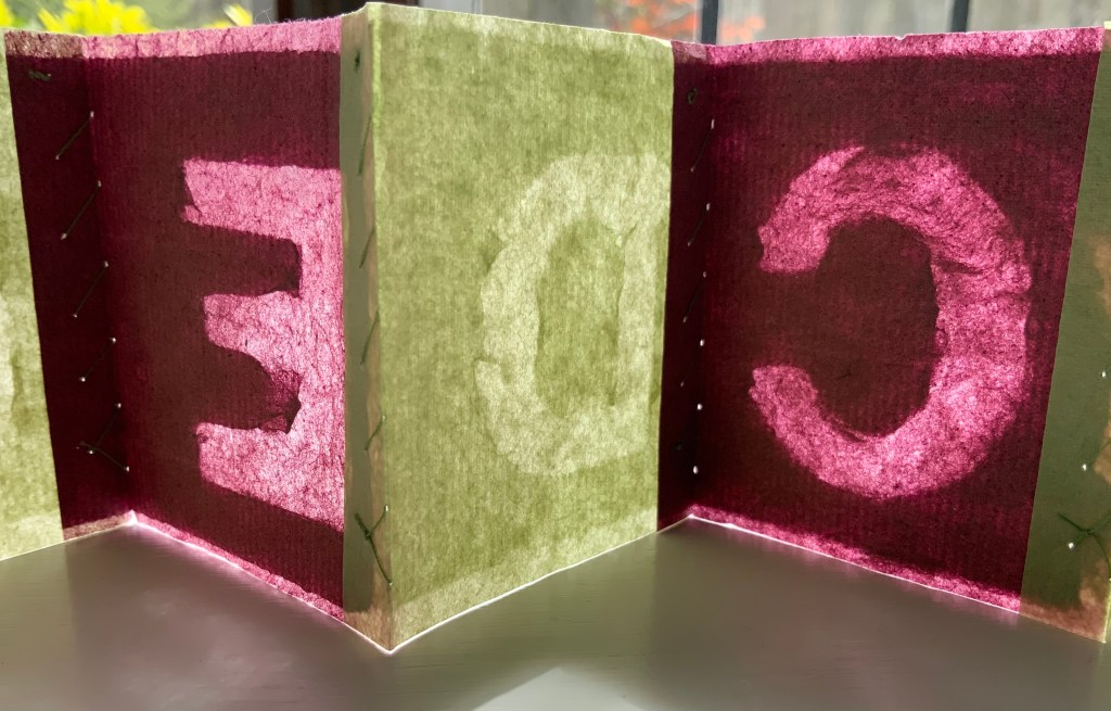
Each letter shape lies face down and runs head to tail along the “laid lines” (made by the closely spaced wires in the mesh) and perpendicular to the “chain lines” (made by the wider spaced wires in the mesh). One of the chain lines can be seen just under the upper stroke of the letter E below. When a sheet is pulled from the mesh, laid between layers of felt and subjected to pressure to squeeze out the remaining water, the rough side (the side previously face down on the mesh) becomes the right reading side. If your screen permits enlargement, the mirror reading side on the right below displays its smoothness.
Given the shaking of the deckle that goes on, those letter shapes had to have been secured to the mesh. Their points of attachment can just be detected; see the curves of the C and P.
“John Gerard“. Books On Books Collection. 13 August 2020. Another practitioner of watermarking art.
“Claire Van Vliet”. Books On Books Collection. 8 August 2019. See Tumbling Blocks for Pris and Bruce (1996) for a similarly small but perfectly formed ABC work of art.
In the fifth show of his series Raw Craftof visits and interviews to celebrate craftsmen and craftswomen, the late Anthony Bourdain met with Andrew Hoyem, poet, master typographer and now retired printer of Arion Press. Although the Arion Press production of Hart Crane’s poem “The Bridge” does not feature, the episode is worthwhile background for enjoyment of this collaborative work of book art.
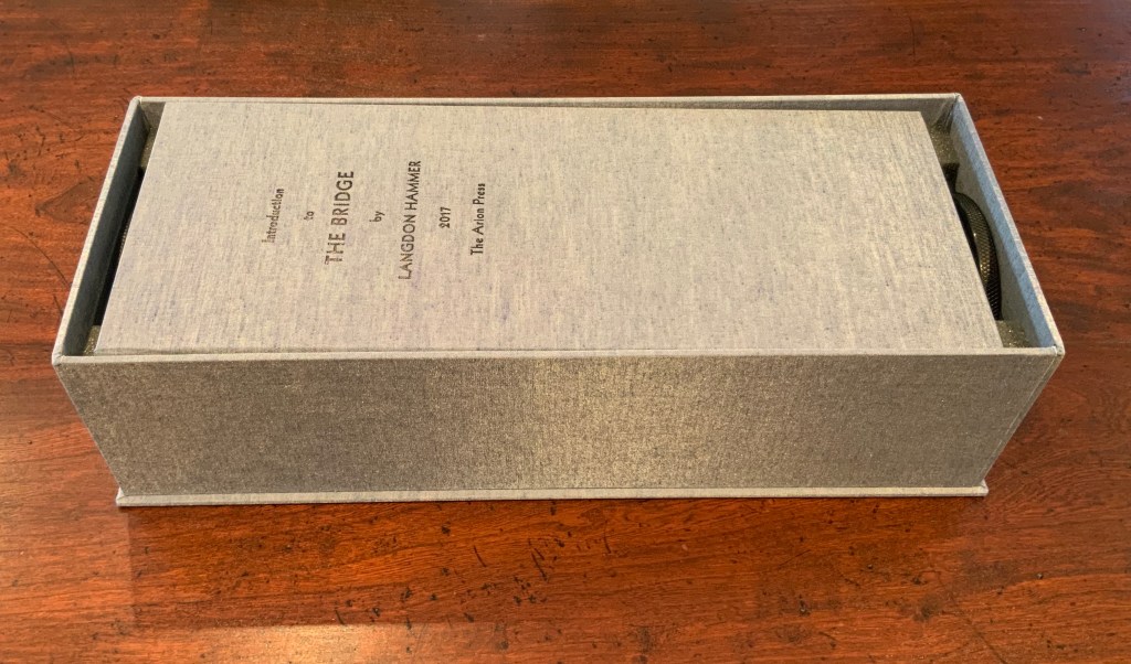
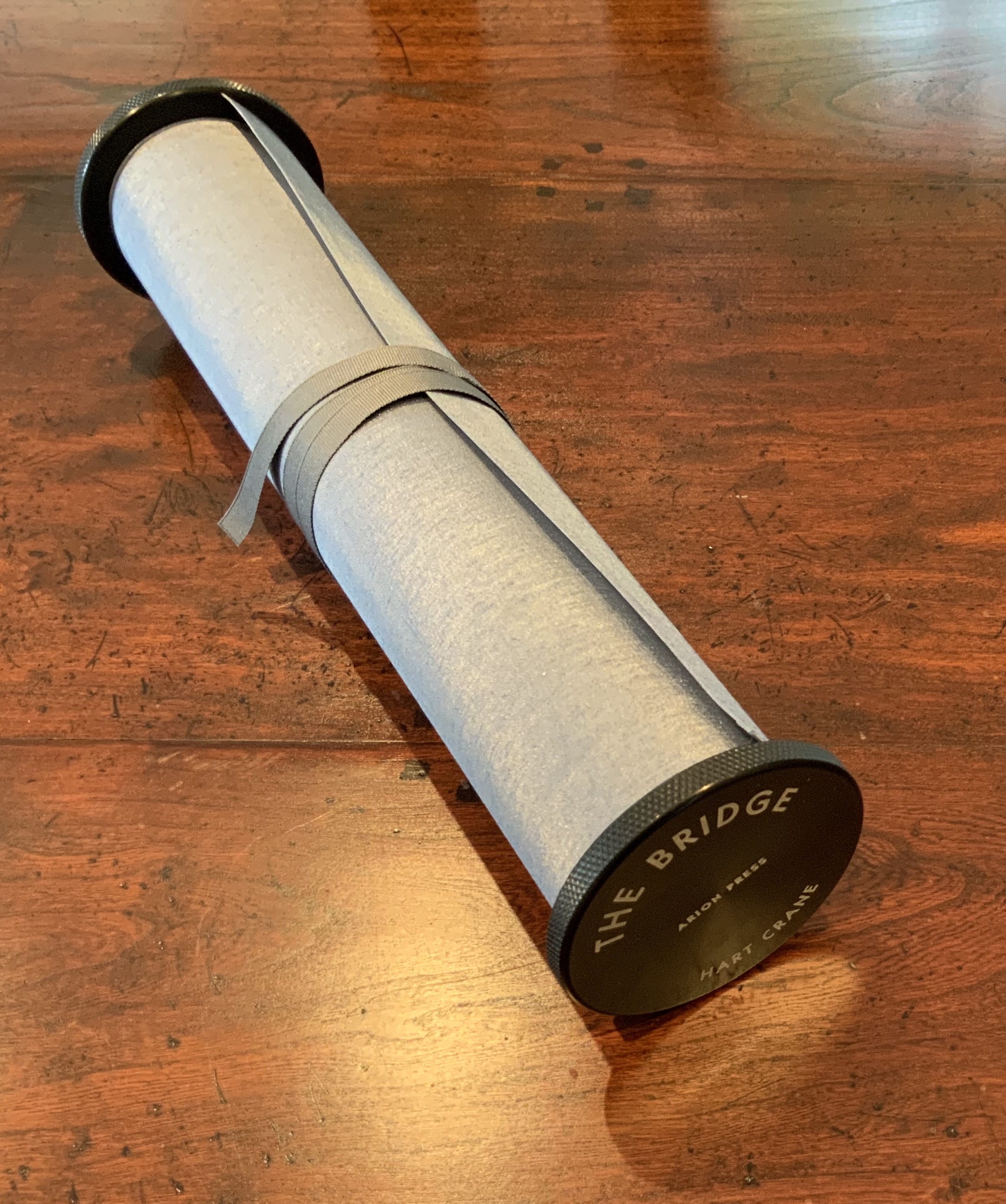
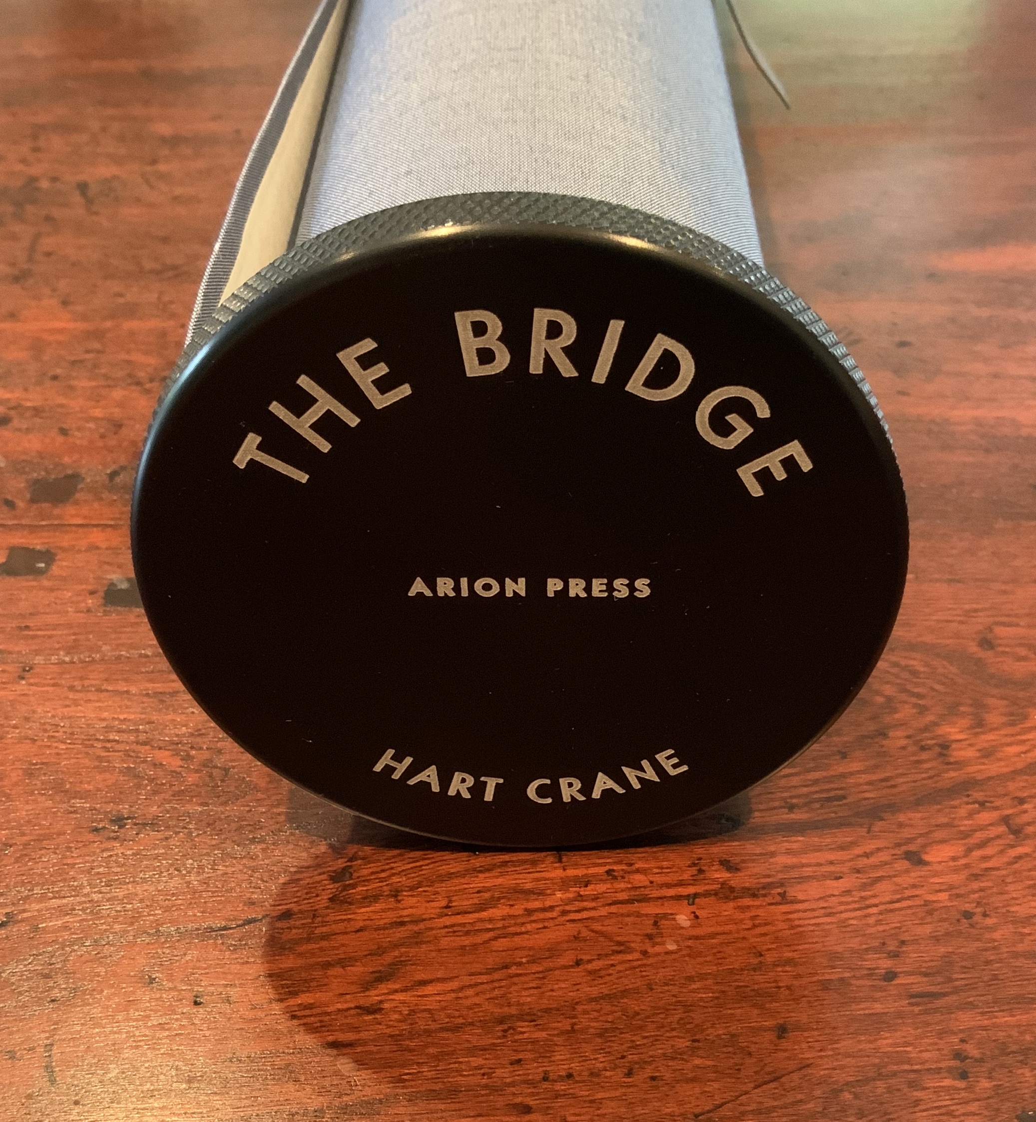
The Bridge (1930/2017)
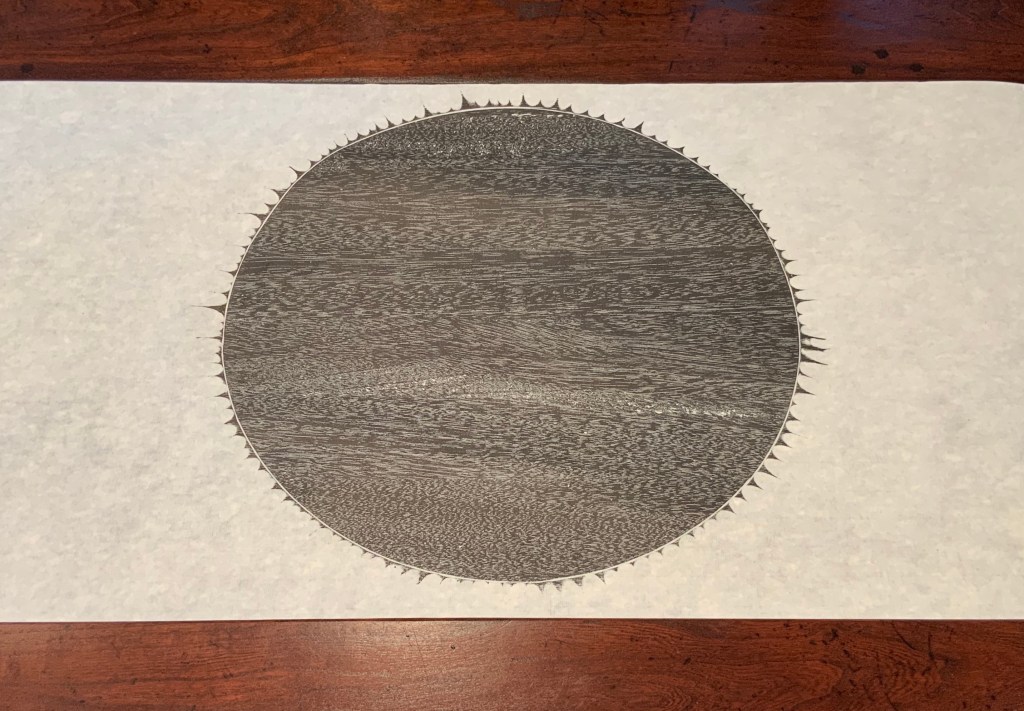
The Bridge(1930/2017) Hart Crane Design, Arion Press. Woodblock prints, Joel Shapiro. Introduction, Langdon Hammer. Scroll, 13-1/2 inches by 50 feet, wound on aluminum spool with bookcloth wrapper, housed in a box. Edition of 300, of which this is #97. Acquired from Classic Editions, 10 June 2020. Photos of the work: Books On Books Collection. Displayed with permission of Arion Press.
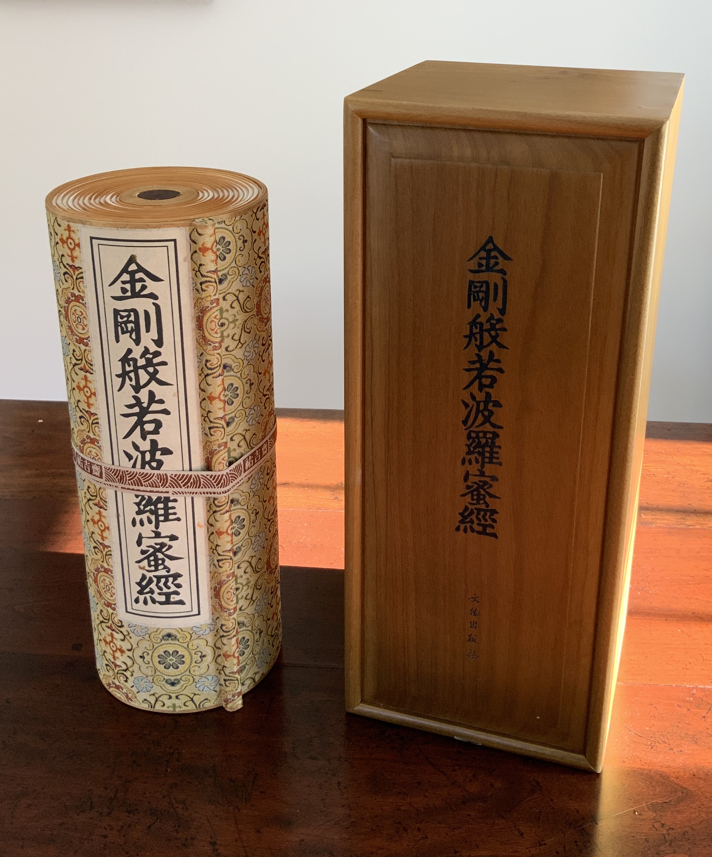
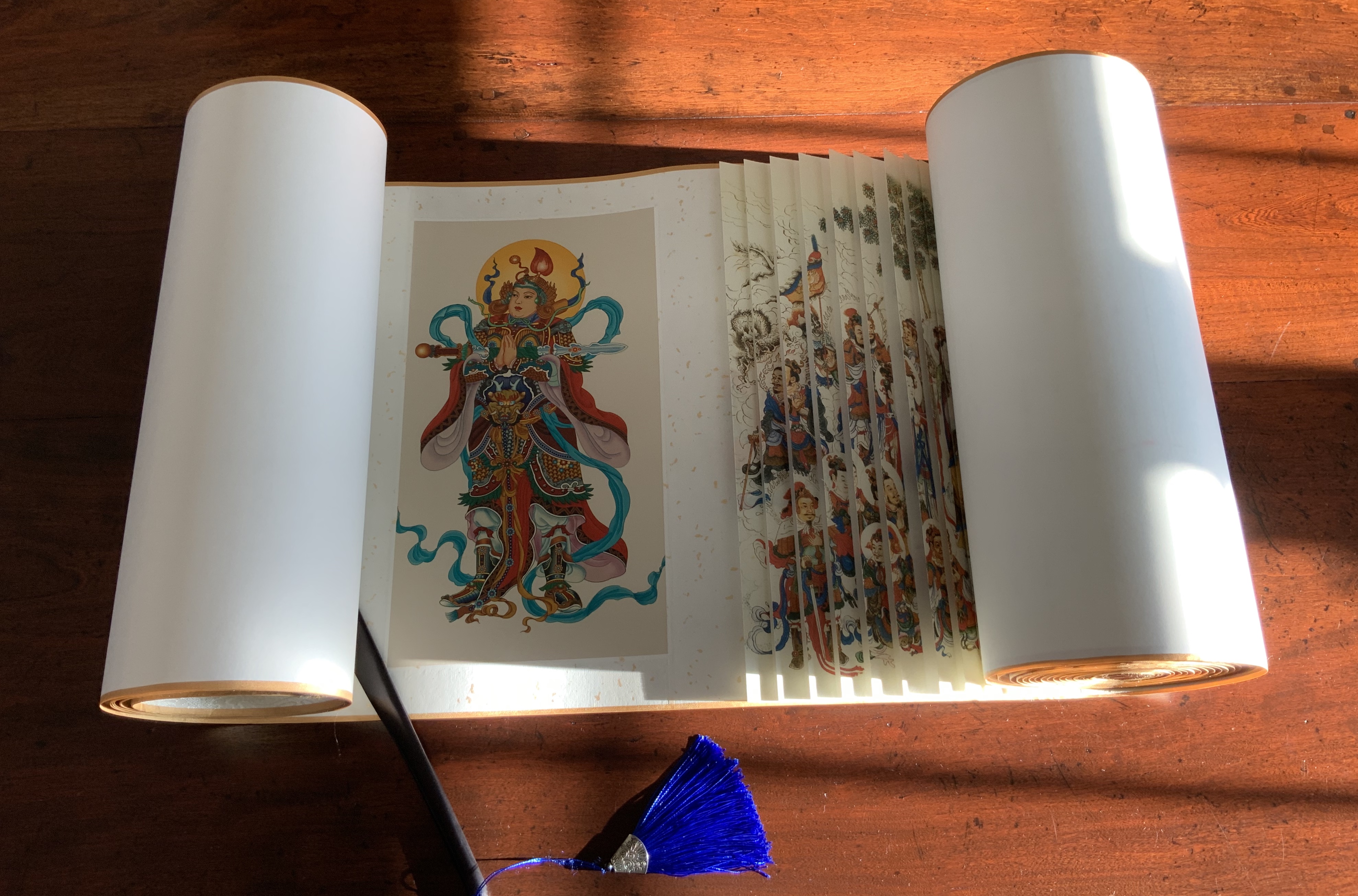
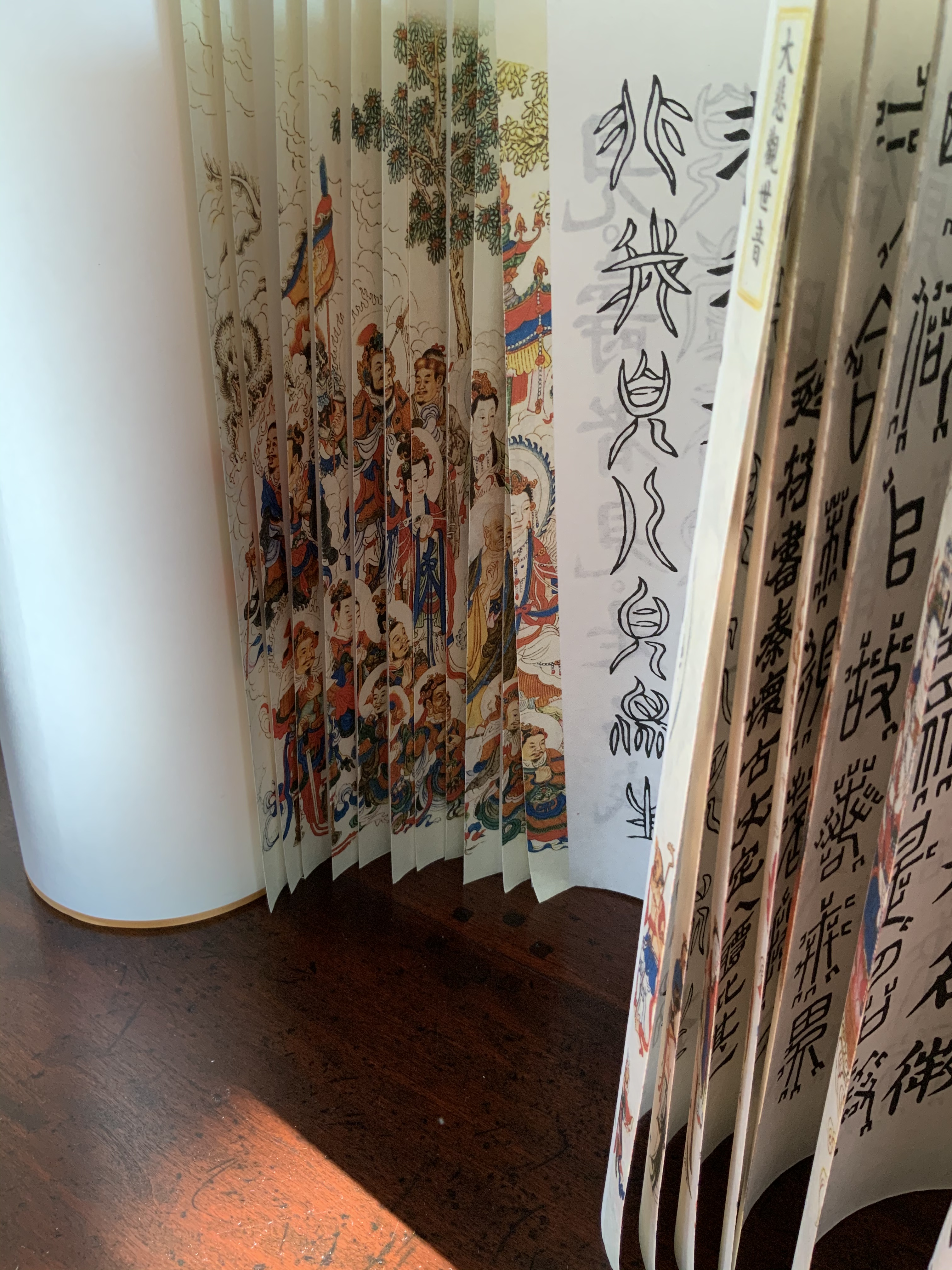
From first sight, this work of art evoked thoughts of an earlier acquisition — the dragon scale binding of the Diamond Sutra, done by Zhang Xiaodong in 2017.
Diamond Sutra, Dragon scale binding (2017) Zhang Xiaodong In 32 zhuan (seal) fonts, 152 x 382×160mm. Edition of 300, of which this #197. Acquired from Sin Sin Fine Arts (Hong Kong), 31 October 2019. Photos: Books On Books Collection.
It was more than the similarities of scrolls stored in boxes. Despite the differences in texts and images, something resonated –still resonates — between the two works. The Arion Press prospectus for The Bridge holds the clue to what that something is:
The publisher, Andrew Hoyem, conceived of a scroll format for “The Bridge” while he and senior editor Diana Ketcham were on a two-week tour of China in April 2017 organized by the Grolier Club, an association of bibliophiles in New York City. The theme of the trip was the history of paper, type, printing, binding, and the collecting of books, both private and institutional, in China.
During the first week they visited the Red Star Paper Company in Wuxi, Anhui Province. The Chinese government has recently sought to revive and support traditional crafts. Red Star is the fore-most producer of handmade paper in the nation, using ancient methods and many plant fibers in exacting proportions to make sheets of beautiful thin paper, used mainly for calligraphy and ink and watercolor painting.
In Beijing they visited the most important book collector in China, who showed them an unmounted scroll from the eighth century. Hoyem was inspired to order handmade paper from the mill and to make “The Bridge” in a single-spool scroll format.
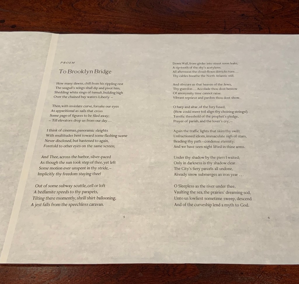
In each case, content, image, structure and handmade paper more than complement one another. Even though they do so in different ways, the rightness and thoroughness with which it is done and the feel of the paper strike that resonant chord. A comparison of the texts of the two works would not ordinarily arise, but once it is made, the prayerfulness of Crane’s “Proem” stands out even more in its French Elzevir handset by Hoyem himself and printed on handmade paper of his choosing. Hoyem’s choices of material and structure put him on an equal artistic footing with Shapiro and Zhang. Note the scroll end’s echo of Shapiro’s woodcut, which itself may be an allusion to the Black Sun Press, first publisher of The Bridge (1930). What is it that bridges the precision mechanical fixture and the wood grain revealed by hand and ink if not Crane’s words? In pairing Crane with Shapiro, Hoyem made as canny and artistic a choice as any that book impresario Ambroise Vollard ever made.
In his comments at the opening of his 2018 exhibition at Pace Prints, which featured The Bridge, Shapiro refers to the rapture and ecstasy of the poem as his chief challenge. Here he is in an earlier interview that speaks to how he approaches such a challenge:
Visual art can be tricky – the goal is not simply to illustrate, but, in this case, to create images which correspond to profound and historically significant prayers and material. My role here is that of mediator – attempting to capture the meaning I see in the material, and translate it into form. — “Artist Joel Shapiro Discusses the Art in Mishkan HaNefesh”.
Alongside those comments, the interplay of artists Hoyem and Shapiro, Crane’s text, the continuous scroll, the French Elzevir typeface and the Chinese handmade paper suggests an entirely new meaning for Dick Higgins’ term “intermediation”. In his 1965 essay “Intermedia”, republished in Leonardo in 2001, Higgins adopted the term from Samuel Taylor Coleridge. As Higgins expressed it, “Many fine works are being done in mixed media: paintings which incorporate poems within their visual fields, for instance. But one knows which is which. In intermedia, on the other hand, the visual element (painting) is fused conceptually with the words” (p. 52). With The Bridge — as with Diamond Sutra, Dragon-Scale Binding — the fusion goes beyond the visual and textual and yields two exceptional works of art.
Further Reading
“Joel Shapiro and Hart Crane“. 19 December 2017. Graphic Arts Collection, Special Collections, Firestone Library, Princeton University. Accessed 4 August 2020.
“Playing Against Type“. 2 November 2017. Antiques: The Magazine. Accessed 4 August 2020.
Higgins, Dick. February 2001. “Intermedia“. Leonardo, Volume 34, Number 1, February 2001, pp. 49-54. Reprint of his 1965 essay with an addendum from Hannah Higgins, co-curator with Simon Anderson (School of the Art Institute of Chicago) of a 2000-2002 travelling restrospective on Dick Higgins’ life and art.