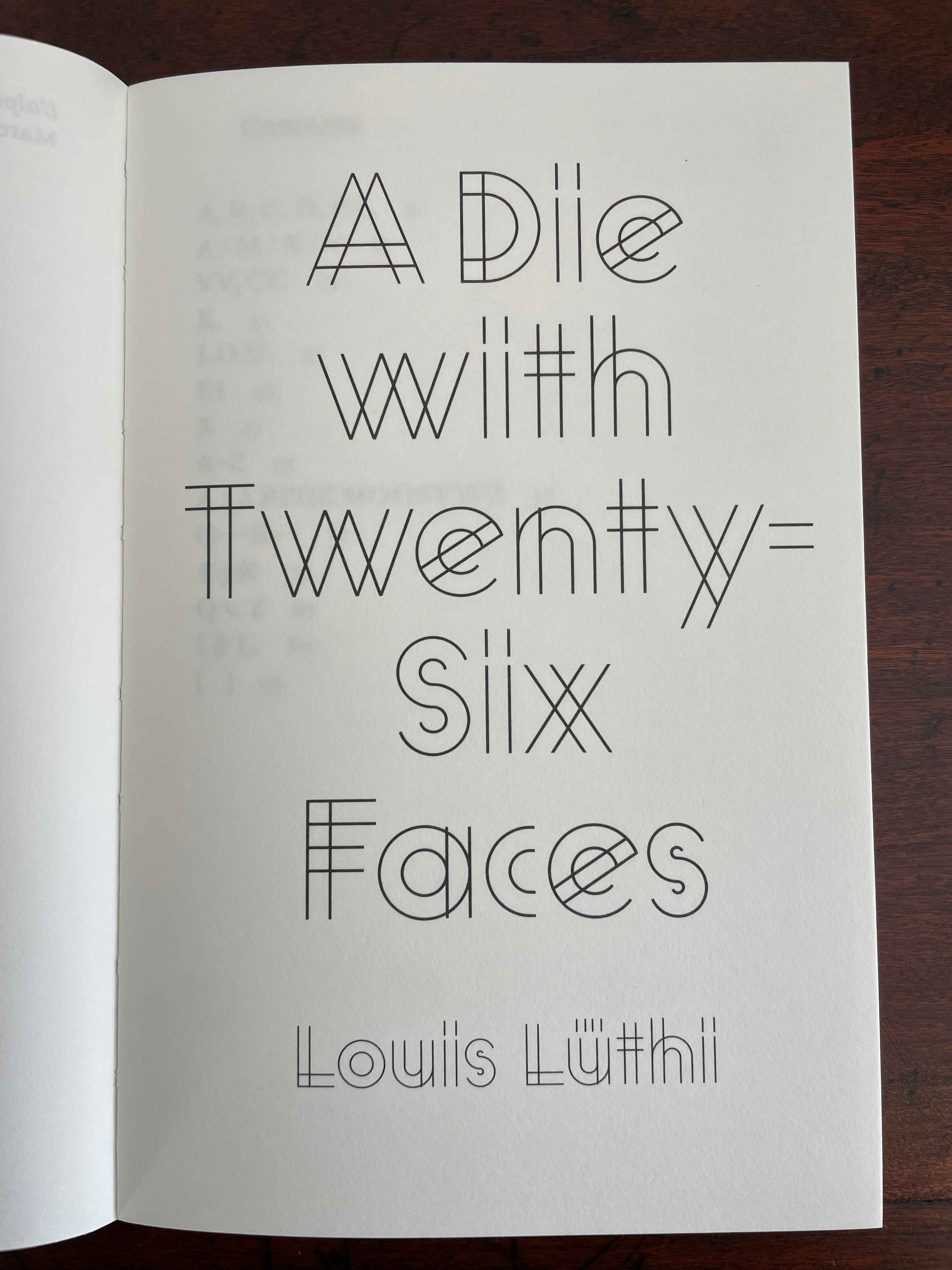
Gotische Alphabete (1897)
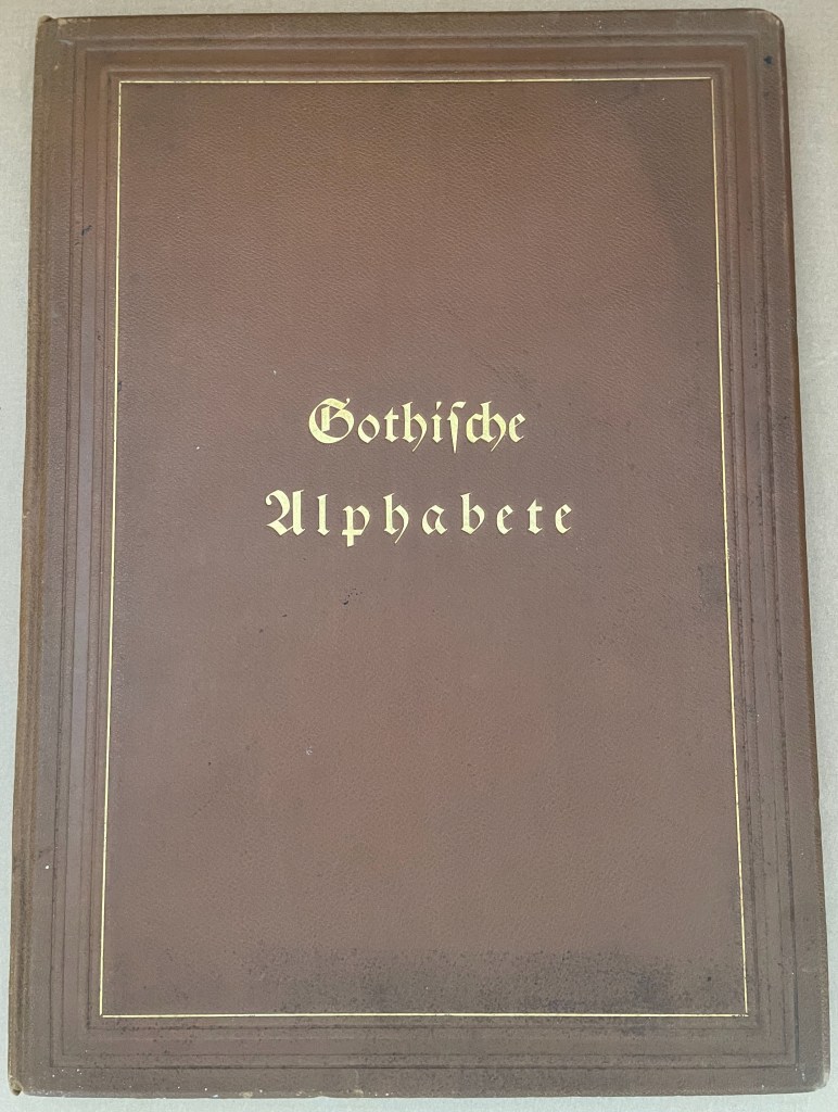
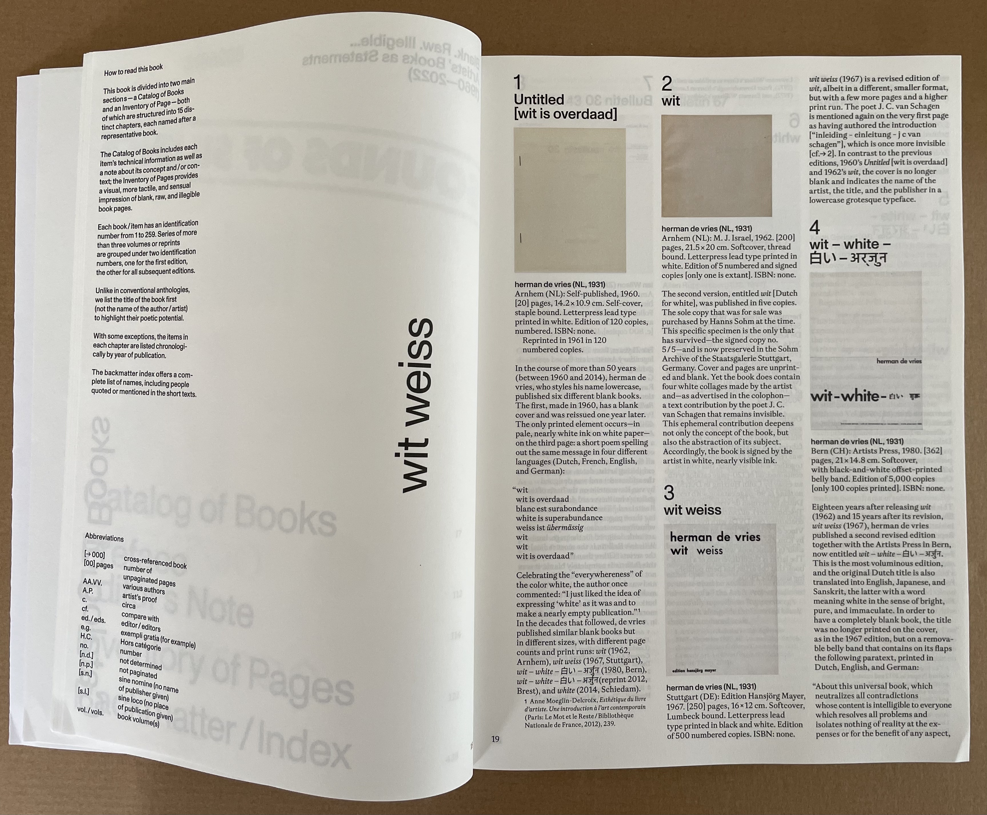
Gotische Alphabete (1897)
Jaro Springer
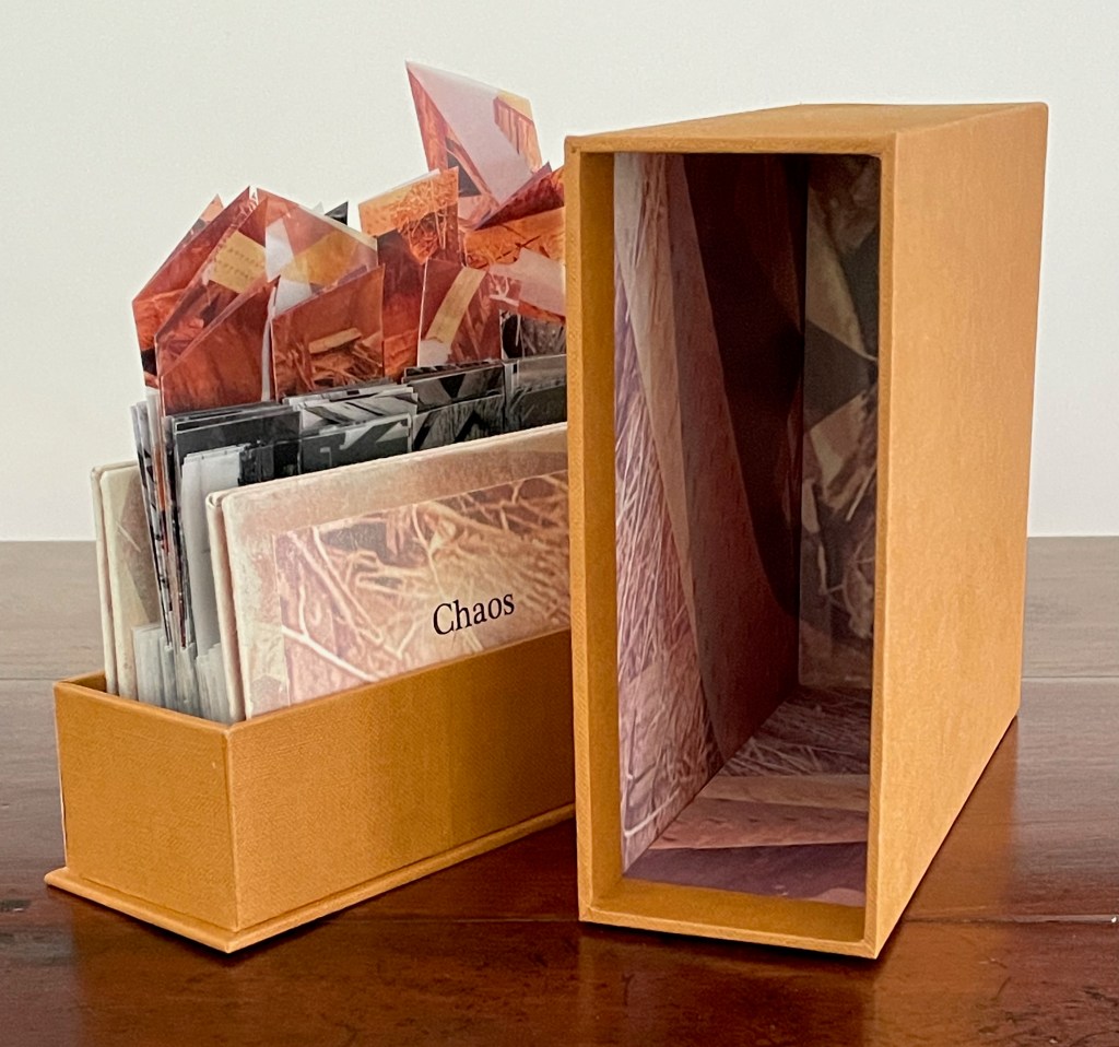
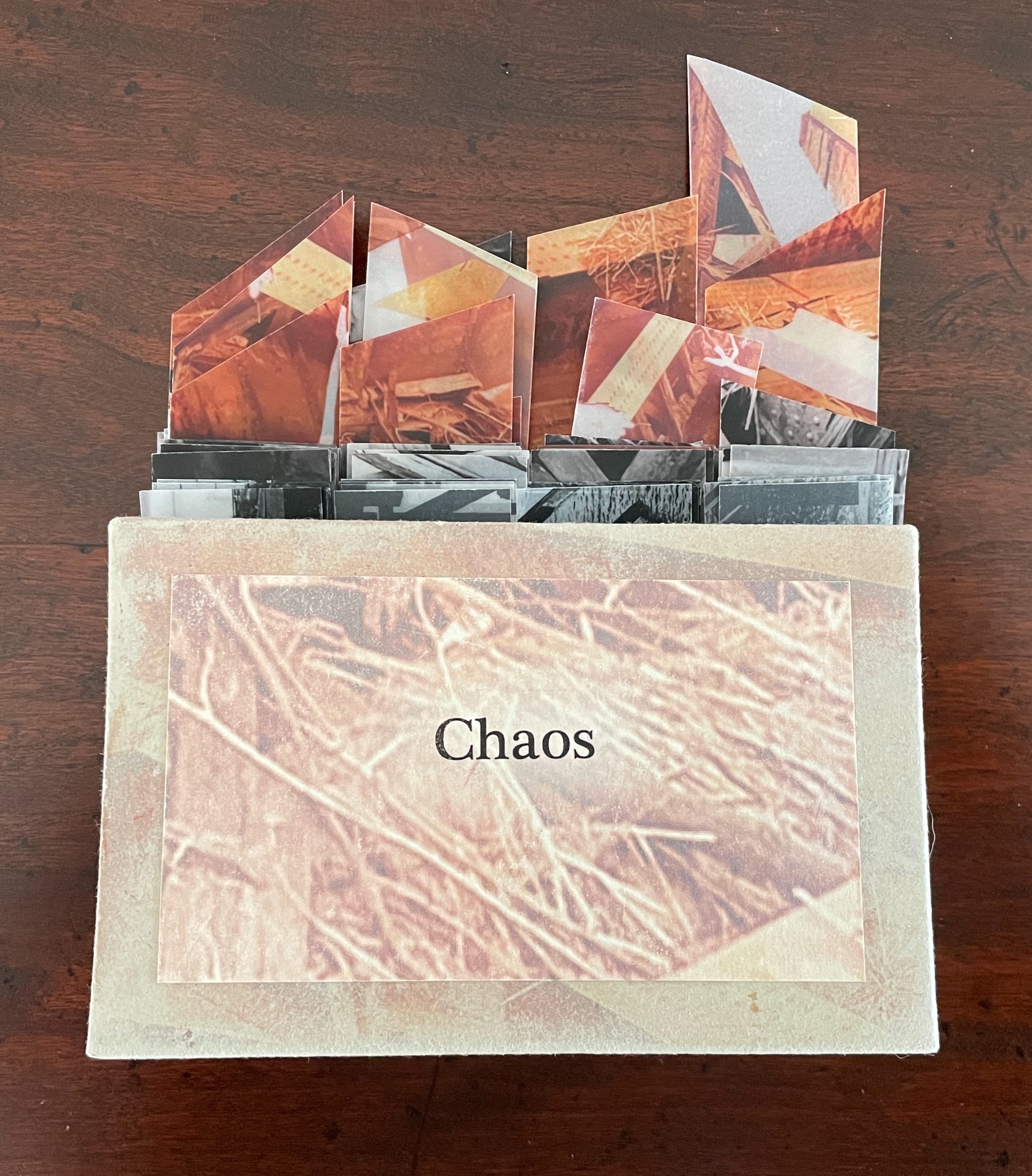
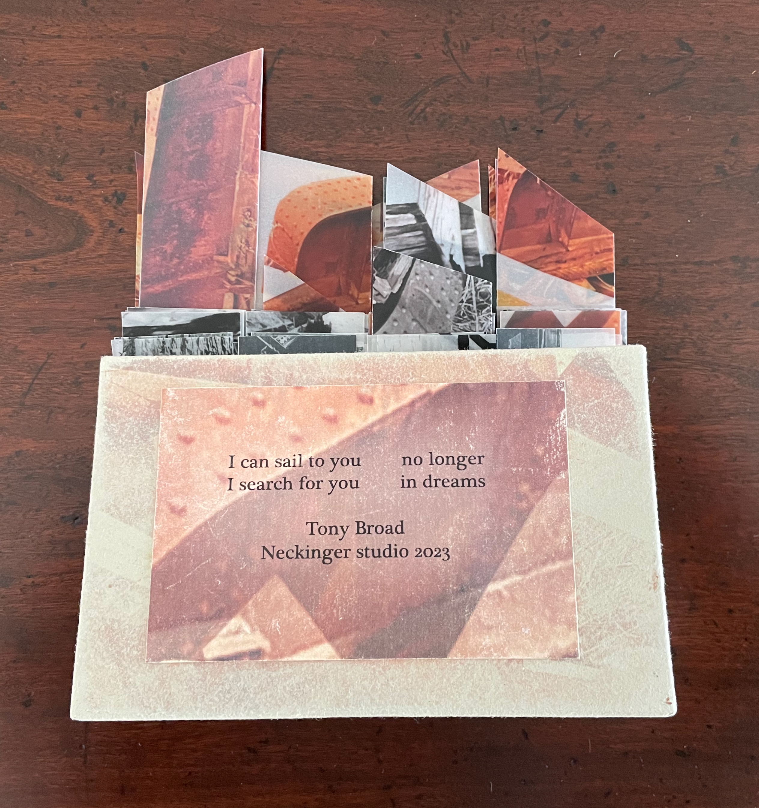
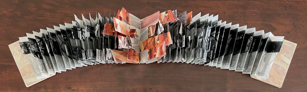
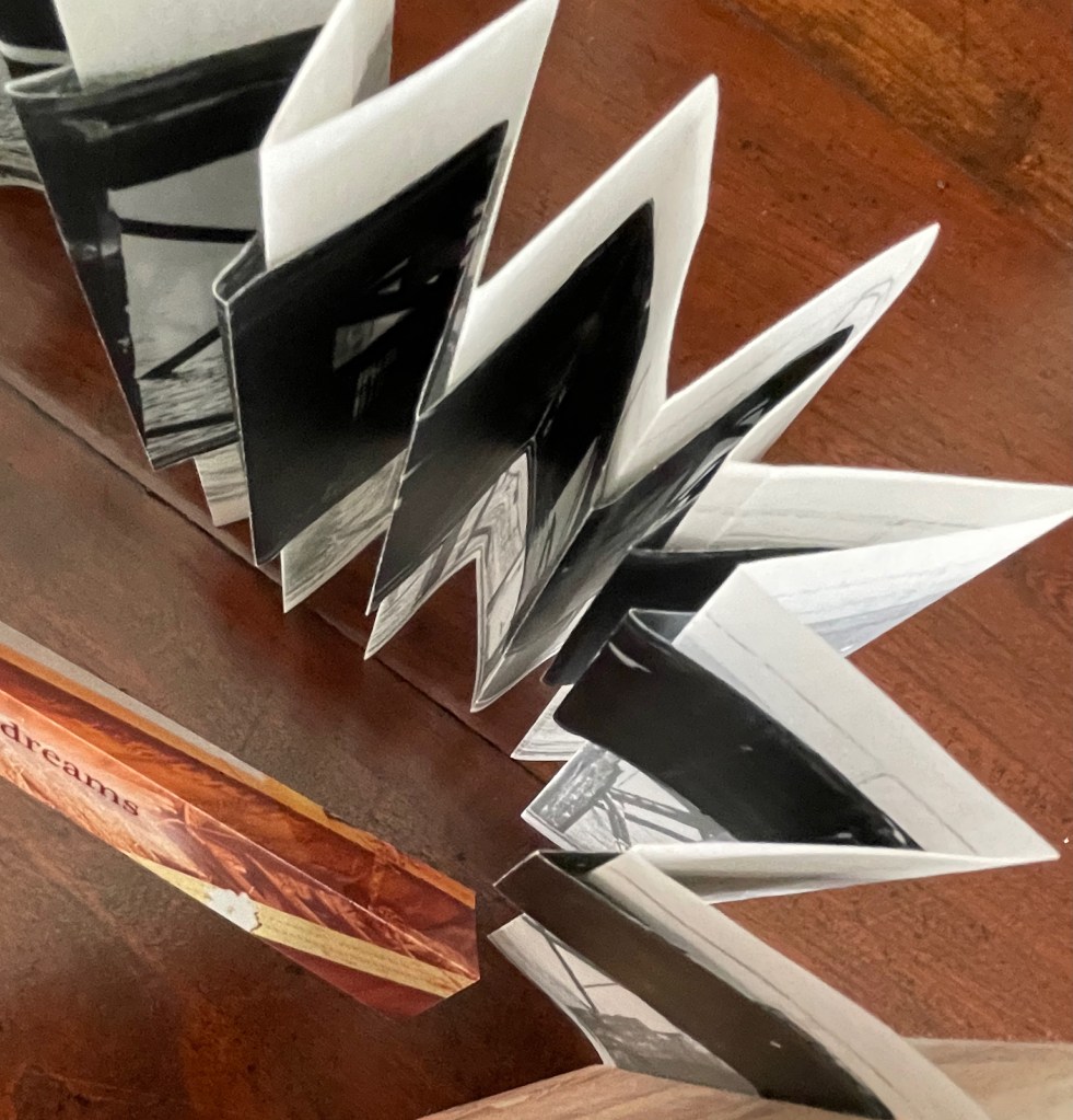
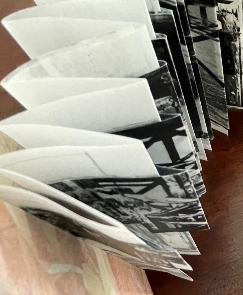
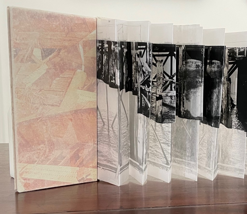
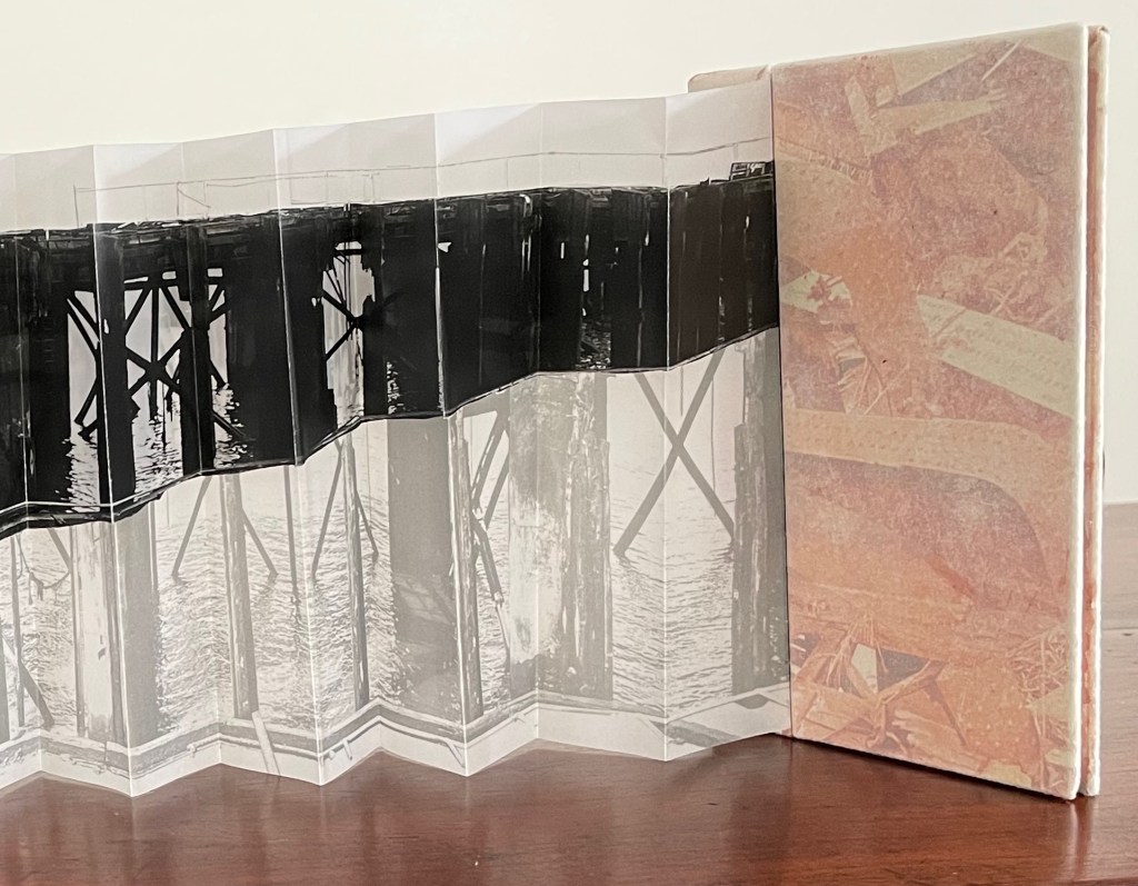
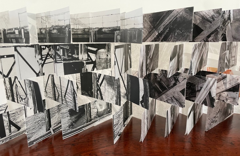
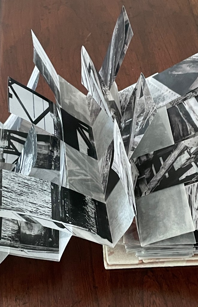
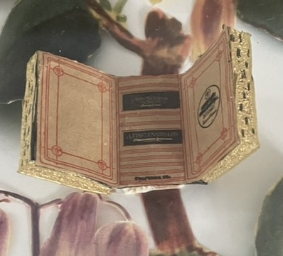
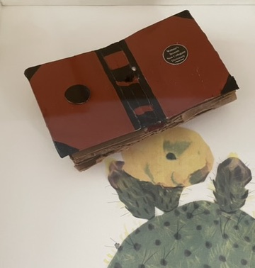
Casebound hardcover in leather with cover title and cover illustration in gold and blind embossing. H415 x W300 mm. 1 sheet, 8 pages, 3 sheets, 39 plates. Acquired from Antiquariat Braun, 14 November 2024.
Photos: Books On Books Collection.

Every history of letters or script begins with a scrawl. Someone somewhere at some time made a mark tied to an object tied to a sound — A is for Ox — and some others in the same place and time accepted that this handmade mark or shape could conjure up that object in the mind. Perhaps it seemed magical, perhaps it seemed mundane as they imagined that somehow meaning and reality inhered in that shape or sound, the connection just waiting to be discovered.
Regardless, the shapes of characters and their relationship to the sound or meaning they represent is arbitrary, a prehistorical and historical function of social convention, a collective making by individuals. Jaro Springer’s art historical specimen book reminds us of the fantastical visual elaborations to which 15th-16th century artists’ hands would put those “shapes for sounds” we call the alphabet.
Gotische Alphabete (1897) [Gothic Alphabets] showcases two specimens of anthropomorphic and zoomorphic alphabets of uppercase letters and one specimen of an architectonic alphabet of lowercase letters. It was Springer’s contribution to the International Chalcographical Society, formed for the study of the early history of engraving. The Society had over 160 subscribers in 1897. A professor of art history and assistant and custodian for the Berlin Kupferstichkabinett, Springer was one of its leading lights. In addition to his Gothic Alphabets, he managed to catalogue Albrecht Dürer, Hercules Seghers, Adriaen van Ostade, and Rembrandt as well as issue a facsimile of Holbein the Younger’s Die Totentanz before being killed in the First World War.
Springer claims his first specimen, dated around 1400, as the earliest figurative alphabet.* It has 23 letters (no J at this time, and V did triple duty for itself, U, and W). They were drawn with pen and ink and an India ink wash on four strips of parchment.
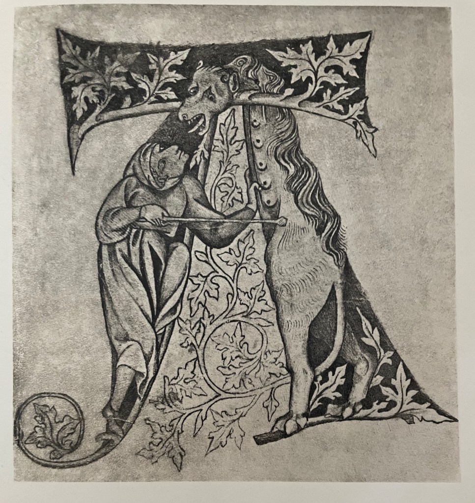
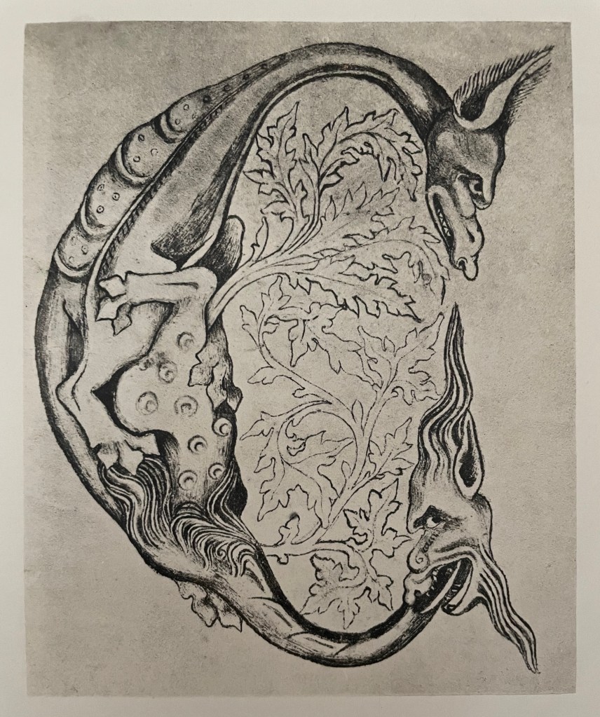
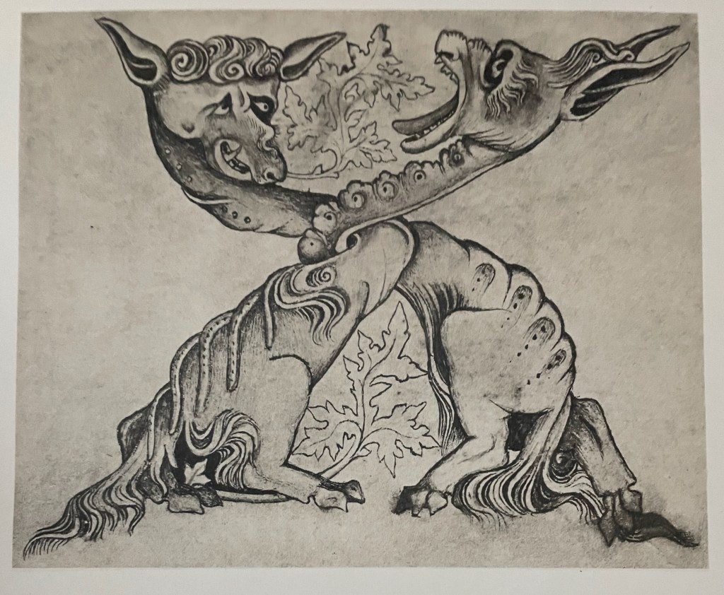
Figurative alphabet in pen drawings washed with India ink on parchment (c. 1400). Kupferstichkabinett, Berlin. Reproduced in Gotisches Alphabete.
Strangely the foliage filling the counterspaces frequently sprouts from the animals’ tails or tongues, never from the human figure, but then the latter are not fantastical except in their postures while the former are so in every respect. In those cases, the Gothic artist’s pen seems to have seized control of the drawing as if to foreshadow Paul Klee’s quip — “A line is a dot that went for a walk”.
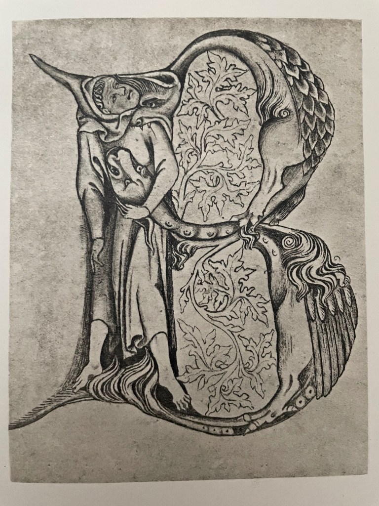
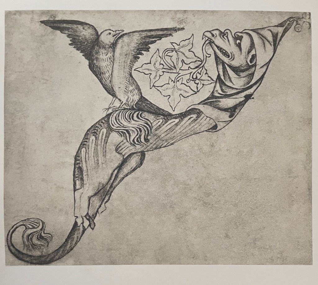
The second specimen is a copper engraving of a woodcut version by the Master of the Banderoles (c. 1464).

Figurative A, B, C, G, H and I, woodcuts engraved in copper by the Master of the Banderoles (c. 1464). Basel Museum. Reproduced in Gotisches Alphabete.
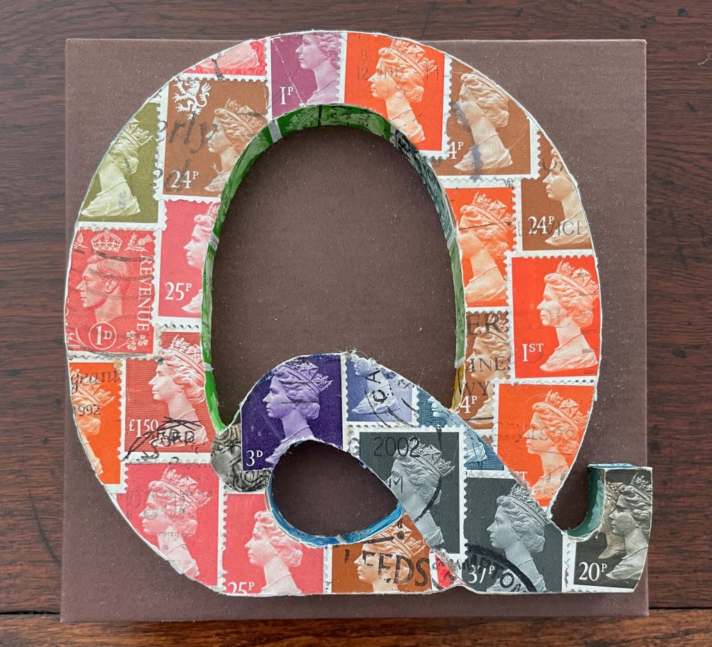
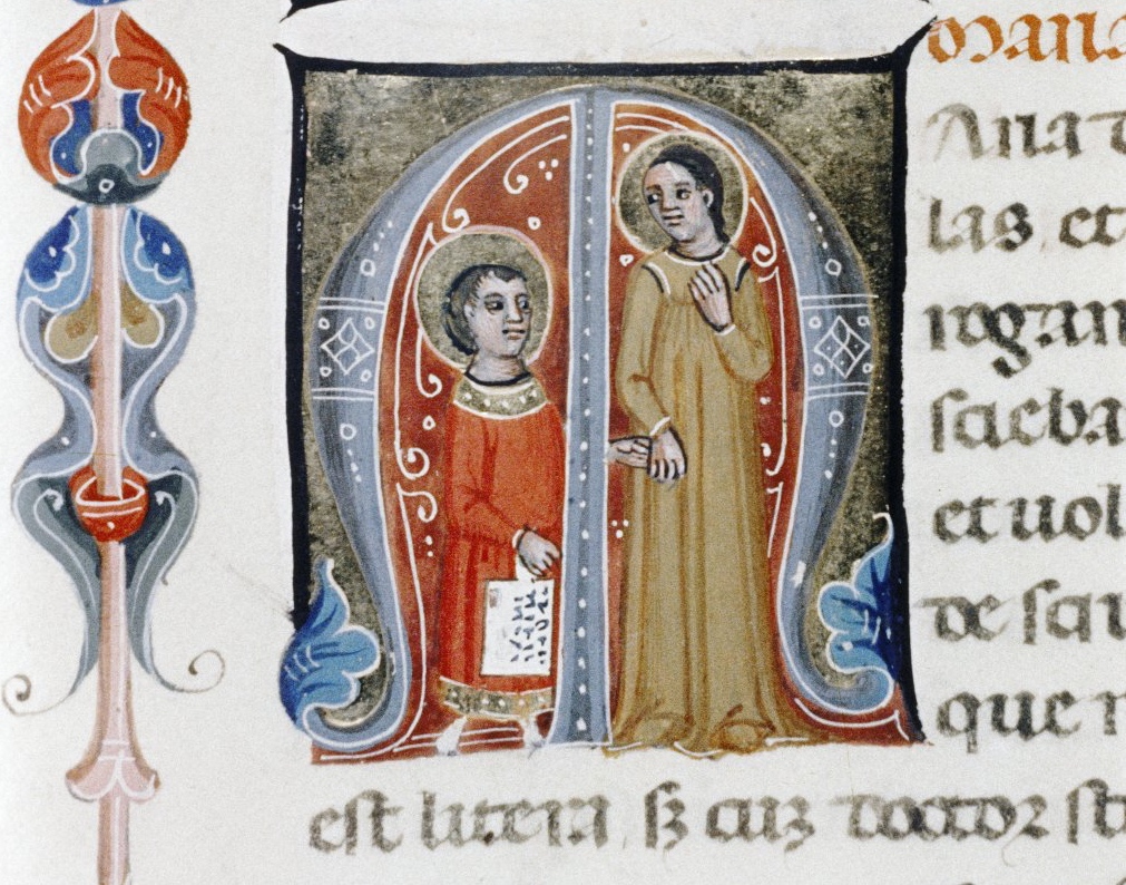
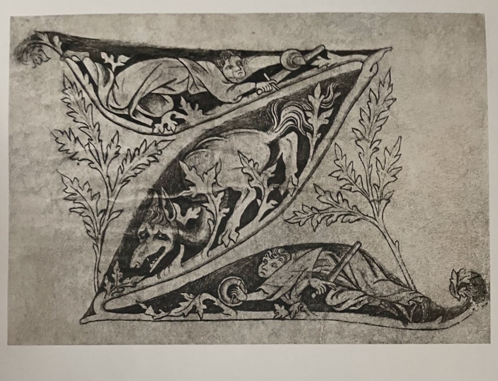
Springer’s introduction to his specimen book identifies several other single letters and human alphabets: an armless man as the letter I in the 8th century Homilies of St. Augustine (not pictured), a demonic letter T in the Mortuary Scroll of St. Vital (not pictured in Springer) from the 12th century, and the letter Q from the alphabet by Master E.S. (1466-67).

L: Letter T in “Titulus”, Rouleau mortuaire du B. Vital, abbé de Savigni: contenant 207 titres écrits en 1122 – 1123 dans différentes églises de France et d’Angleterre. R: Letter Q from alphabet of Master E.S., 1466.
It is curious though that so far no earlier complete human alphabets have shown up. After all, the idea of contorting the human body or bodies into the shapes of letters goes back to the 5th century Greek playwright Kallias. In his play known from fragments as the Alphabet Tragedy (although it sounds more of a comedy), he had his chorus and actors mime and dance the letters of the alphabet.** Joseph Kiermeier-Debre and Fritz Vogler’s Menschenalphabete (2001) offers the most extensive illustrated survey of human alphabets from 14th to 20th centuries.
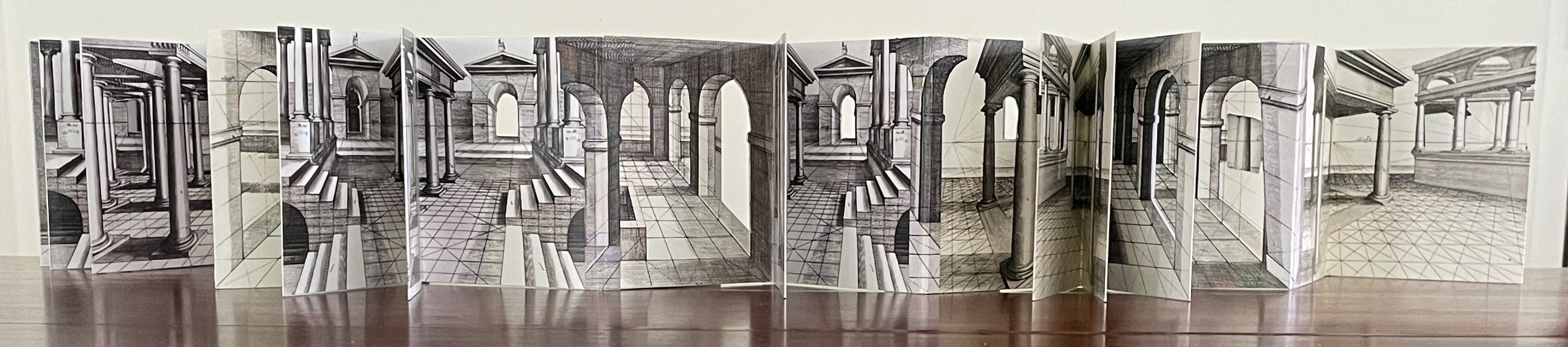
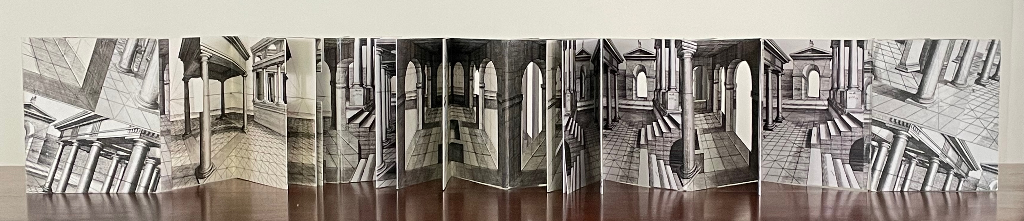
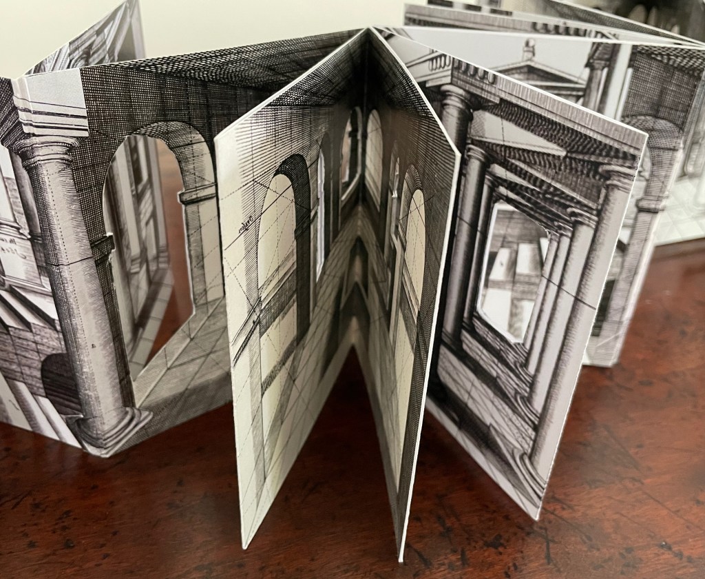
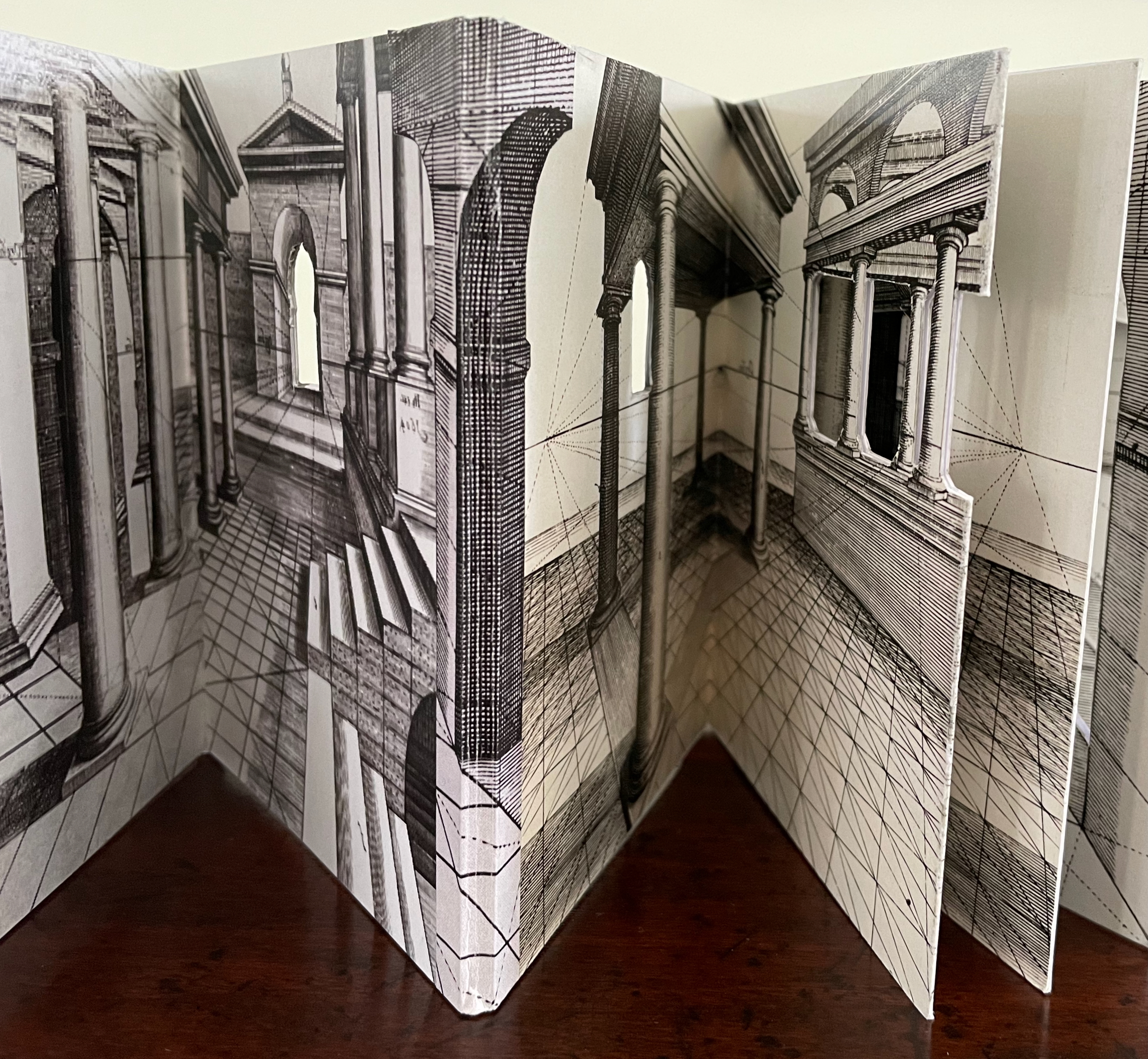
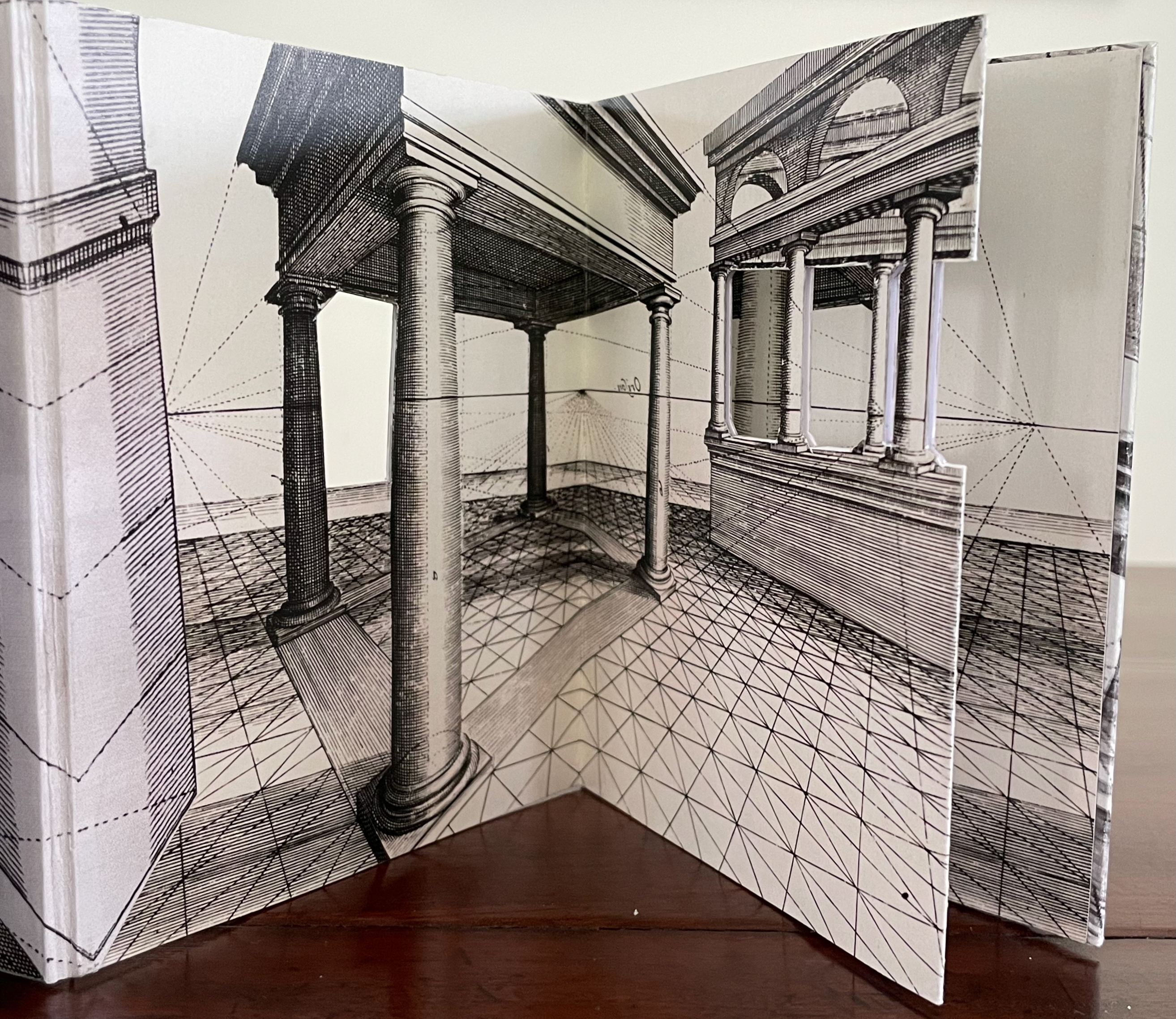
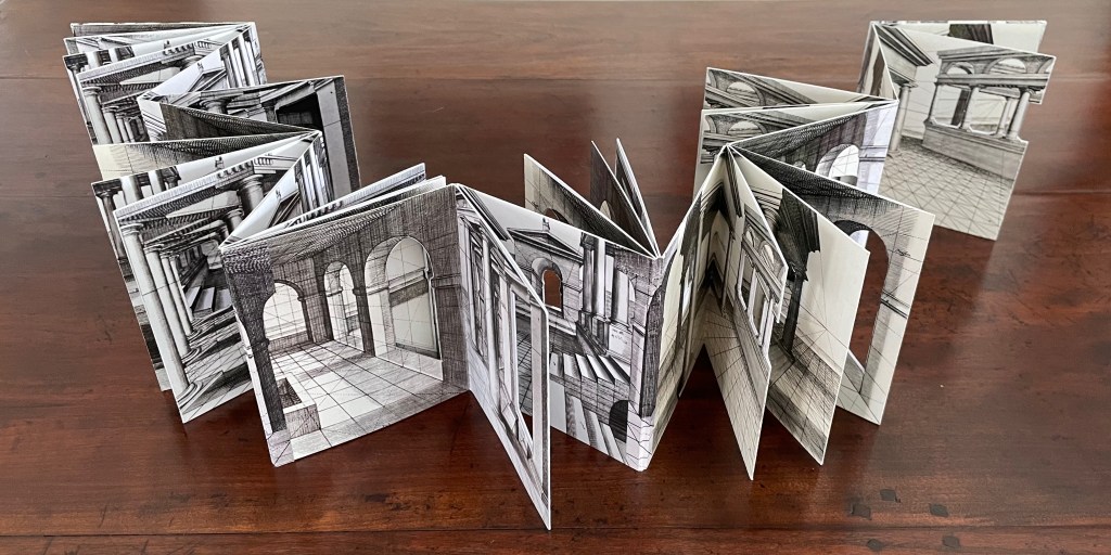
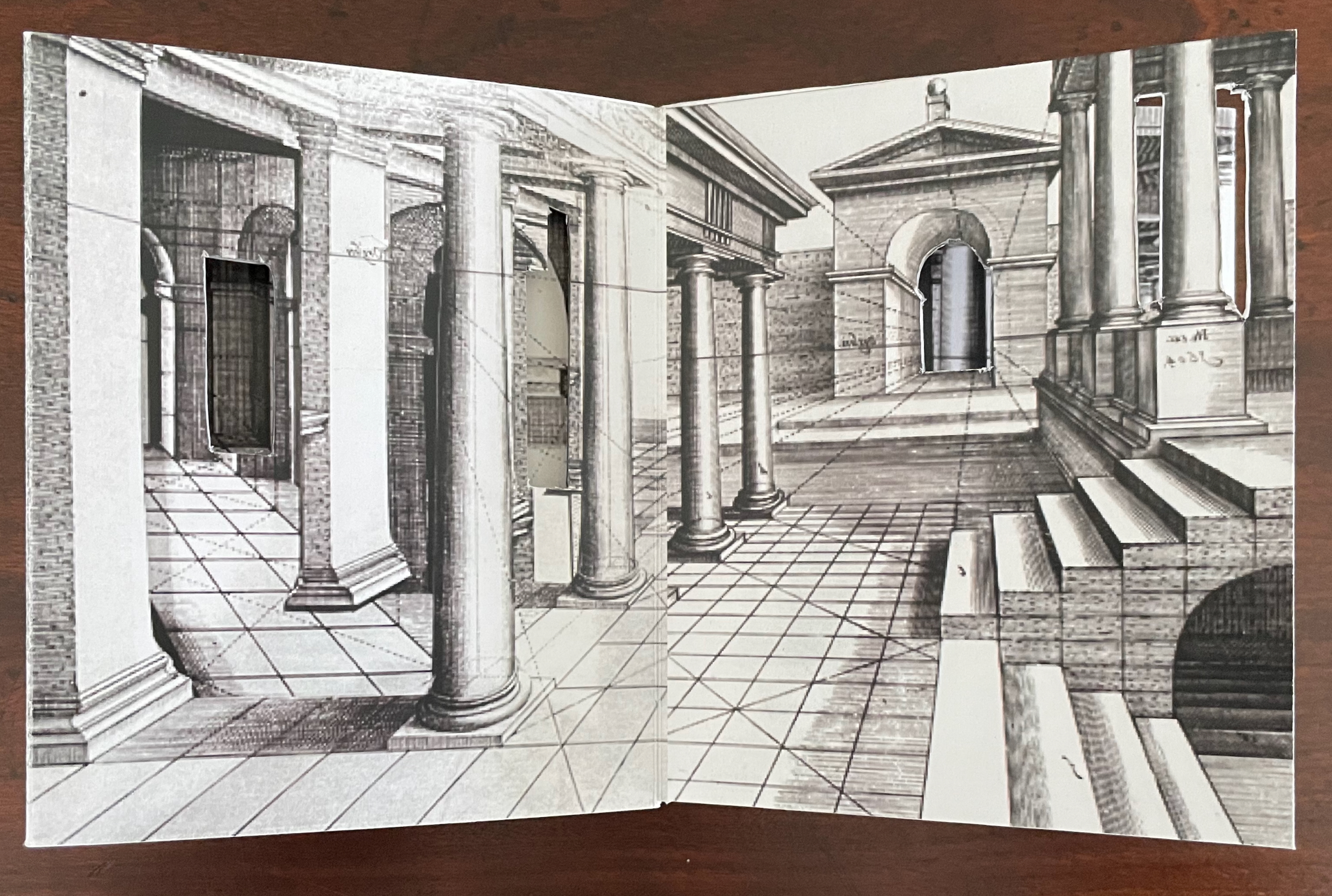
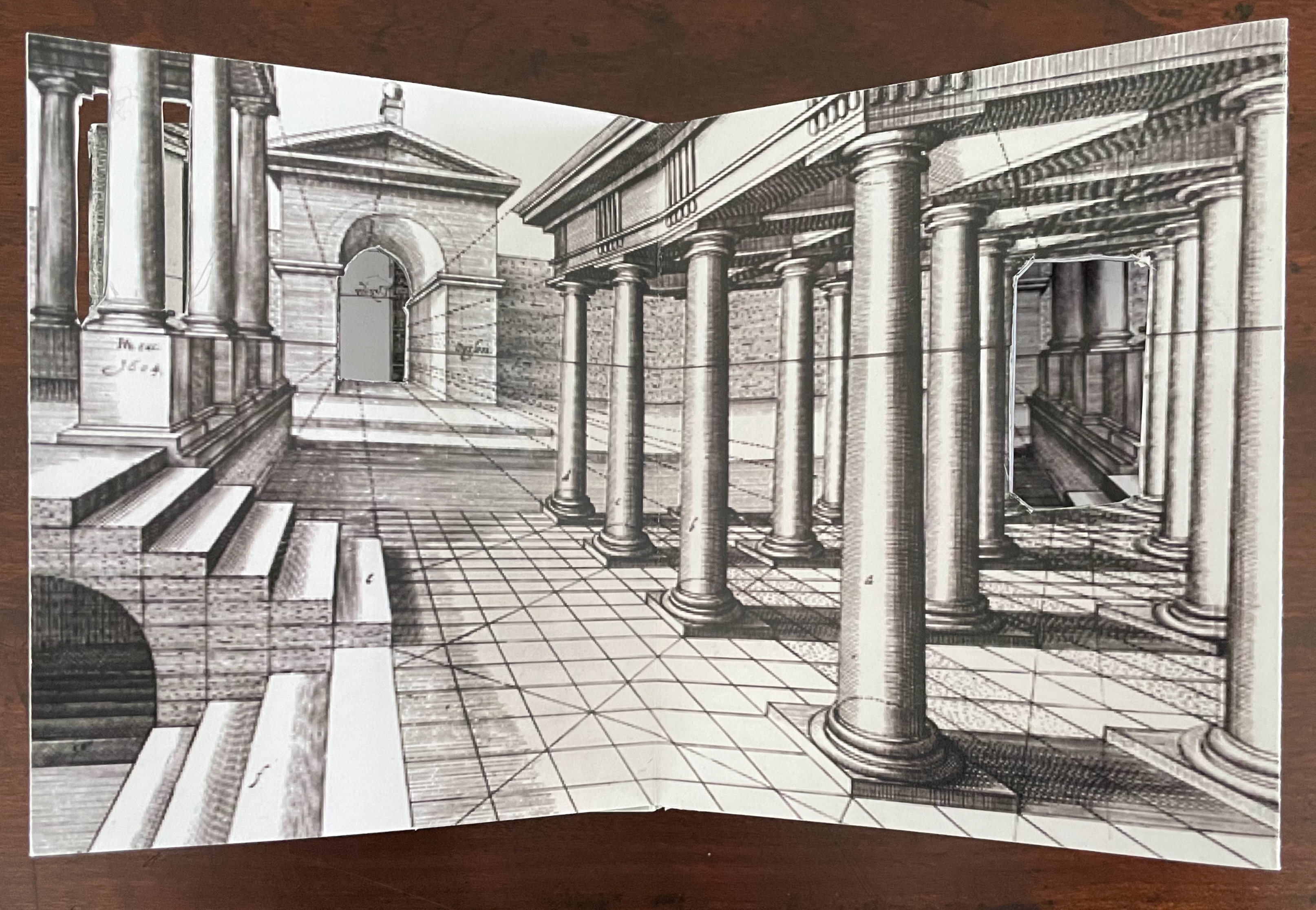
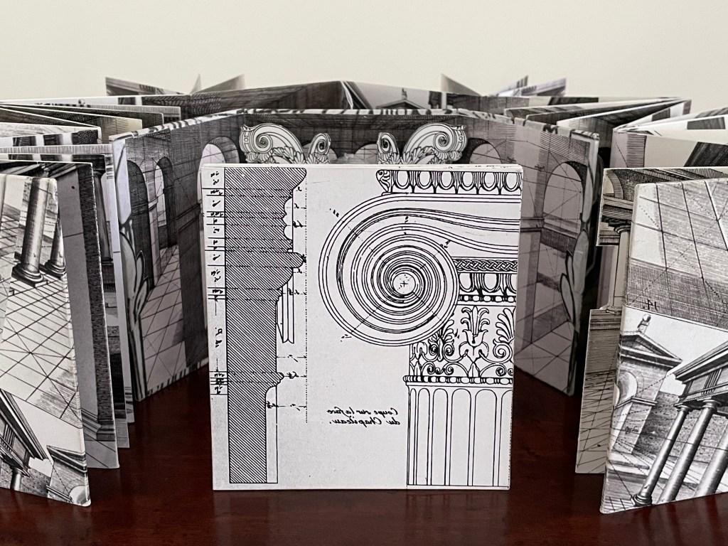
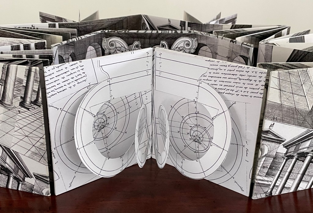
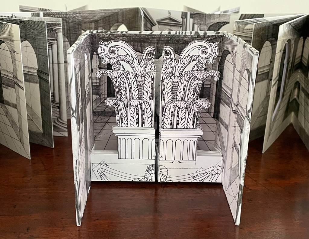
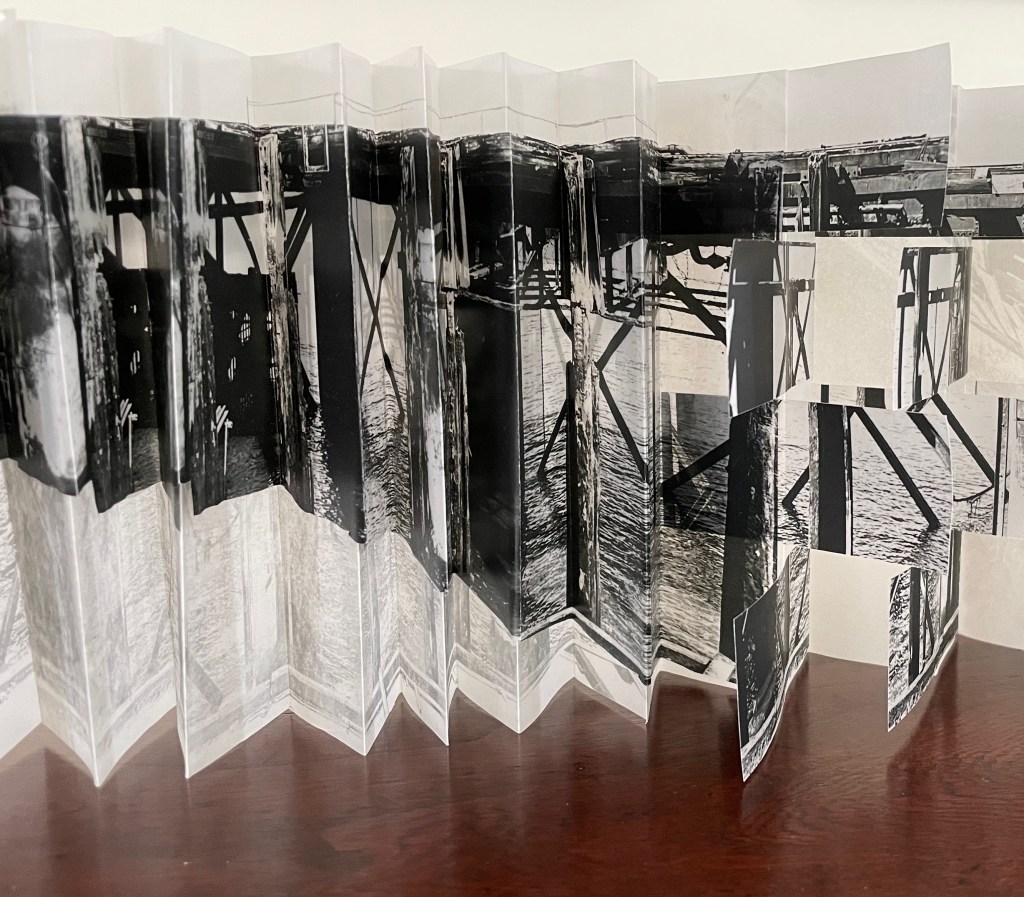
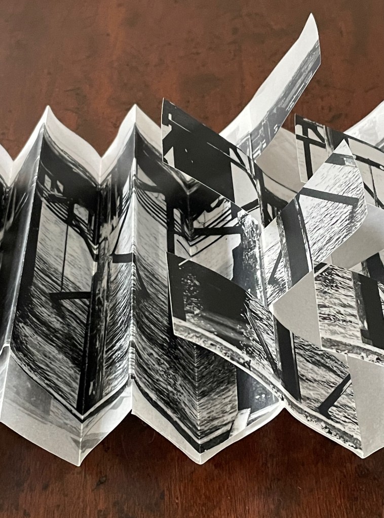
Springer’s third specimen is the first visual marriage of alphabet and architecture in the West. It shows up in the late 15th-century at the time of Gutenberg’s press. While Gutenberg’s workers were mixing lead and antimony, engravers were creating fantasy reliquaries, monstrances, retables, and chapel spaces. Springer located these engravings of miniscule letters by an unknown artist in Erlangen and Bologna.
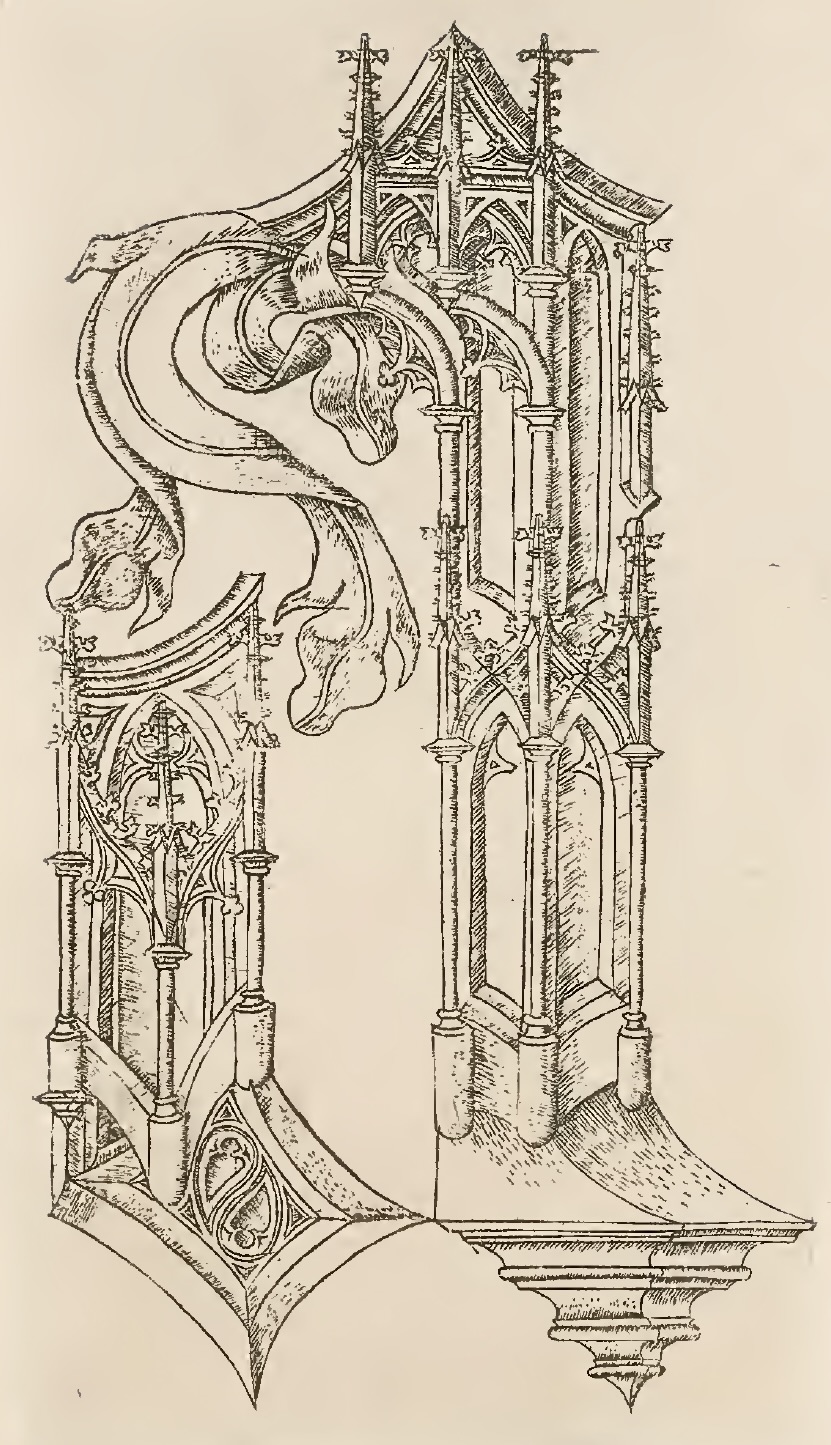
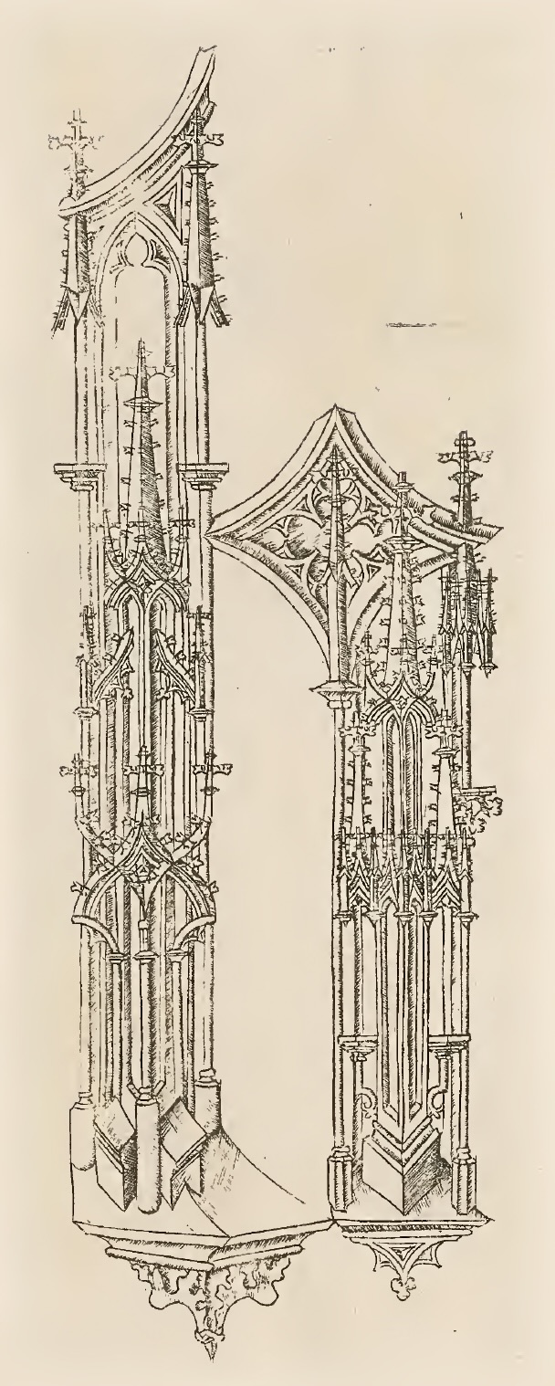
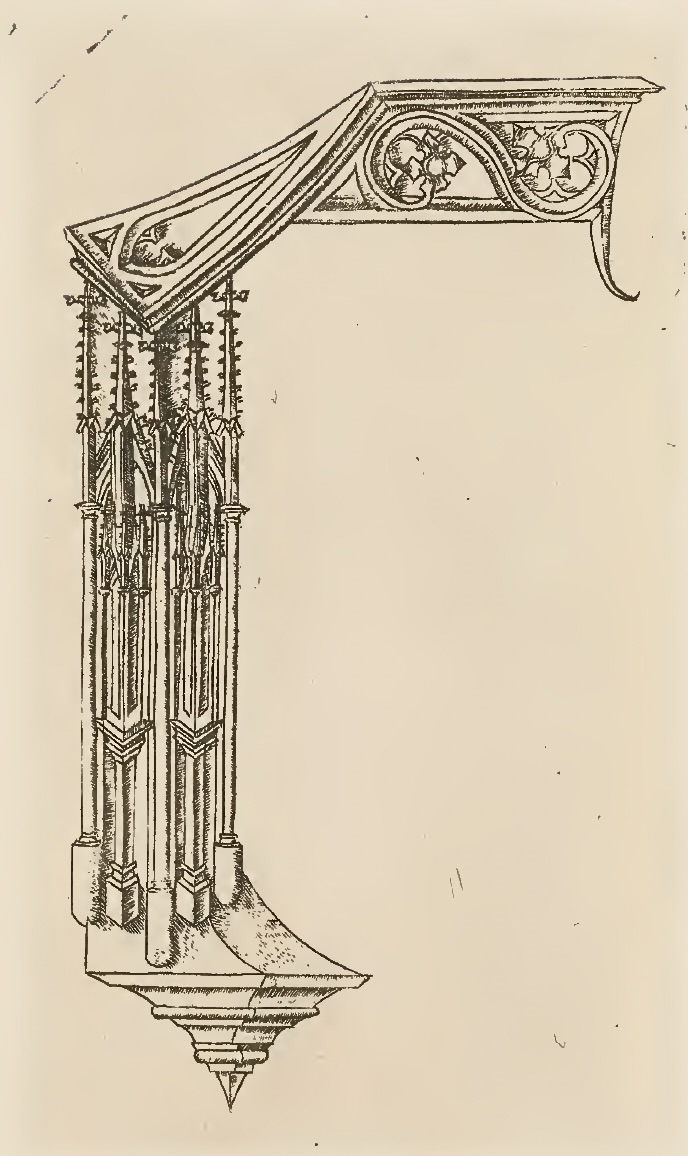
For more on this architectonic alphabet, see Erika Boeckeler’s “Building Meaning: The First Architectural Alphabet”, ch. 5, p. 176 in Blick and Gelfand (eds.). 2011. Push Me, Pull You: Imaginative and Emotional Interaction in Late Medieval and Renaissance Art.
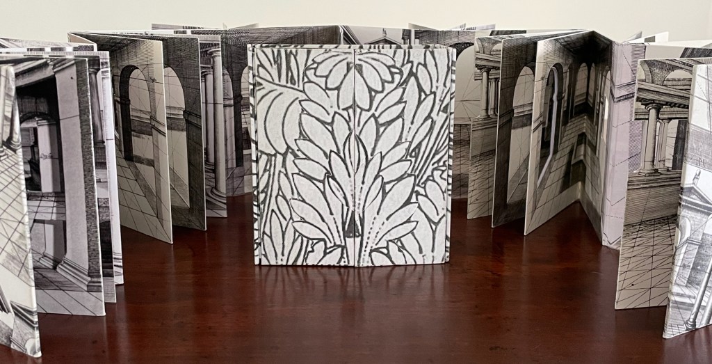
This Gothic artist’s alphabet weds the strokes and shapes of miniscule letterforms with architectural features, echoing the surfaces of parchment and stone and the mark-making tools of quill and burin as well as hammer and chisel. His or her perspectival drawing elevates the letters into three dimensions. Not only that, he or she uses architectural features and finishings such as colonettes, baldachins, fabric and leafage to open up the letters’ strokes, repurposing the typographic bars, counters, ascenders, descenders and so on. Although these little edifices suggest interior spaces to inhabit, to look through or out of, or to use for shelving objects, their primary use would be decorative. And complexly rendered as they are, the letters, too, would be impractical for any extended legible or edifying text.
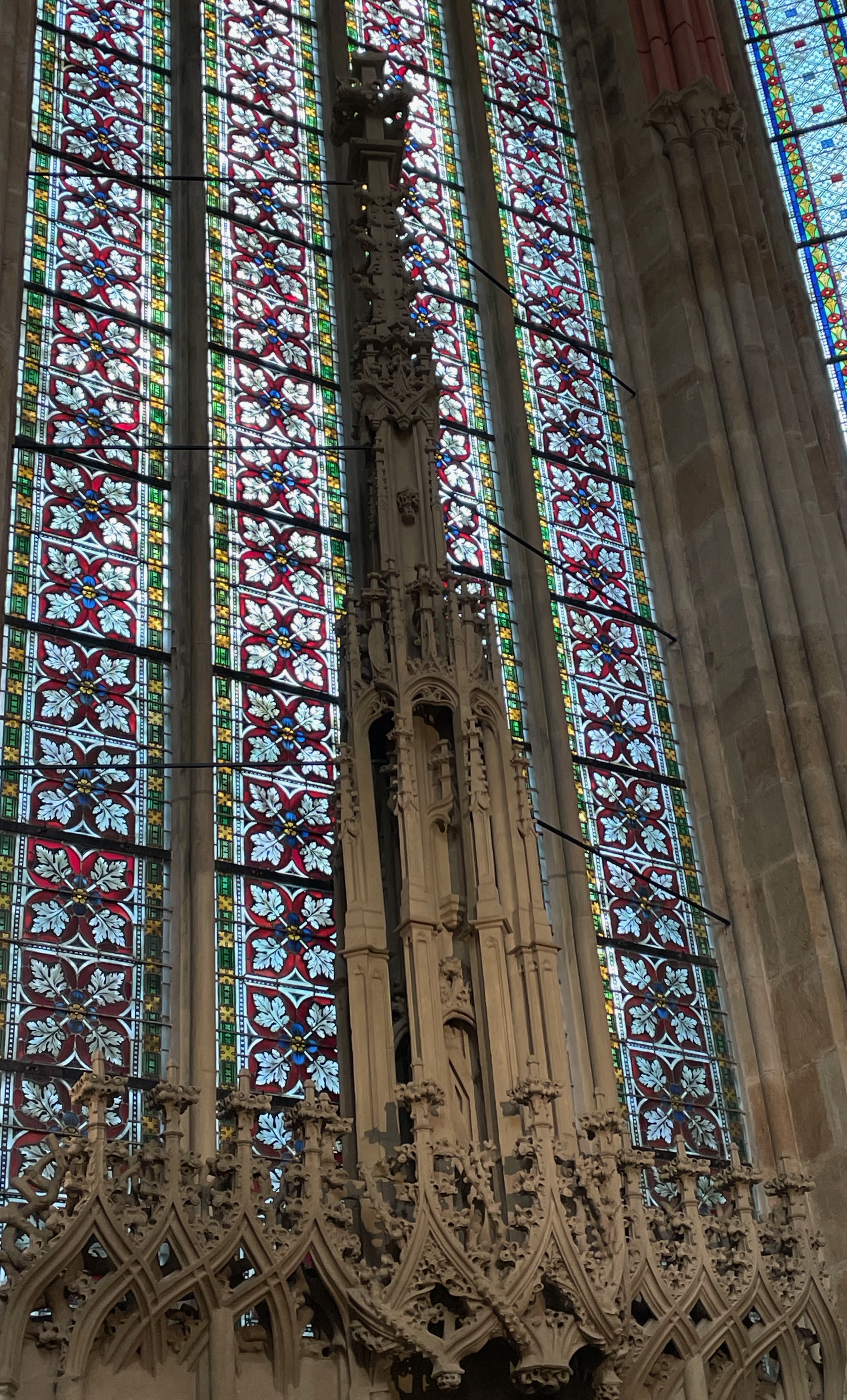
Decorative architectural element in Meissen’s Gothic cathedral.
Boeckeler has pointed out that this first marriage of alphabet and architecture may have served as a memory aid or a prompt for religious meditation. Or perhaps it was just a playful exercise in lettering and architecture because the artist was delighted by how letters and architecture may act as metaphors for one another: letters being the building blocks of texts; architectural components being the linguistic elements of readable buildings.
Springer’s human and animal alphabets, on the one hand, and his architectural alphabet, on the other, signpost two well-developed themes in works of book art across the centuries. Demeude, Kiermeier-Debre & Vogel, and Lehmann-Haupt & Petteway have usefully documented the anthropomorphic and zoomorphic alphabets and commented in greater depth than Springer does. Boeckeler has also provided insights on human alphabets and, in particular, on Springer’s architectonic specimen. Kiermeier-Debre & Vogel, McEwen, Polano, and Tsimourdagkas have well-documented the recurrence of architectural alphabets following Springer’s Gothic artist.
Jaro Springer’s Gothic Alphabets plays the squeaky hinge in the Books On Books Collection, a reminder of the two recurrent themes and a reminder to look to tradition and the new in book art.
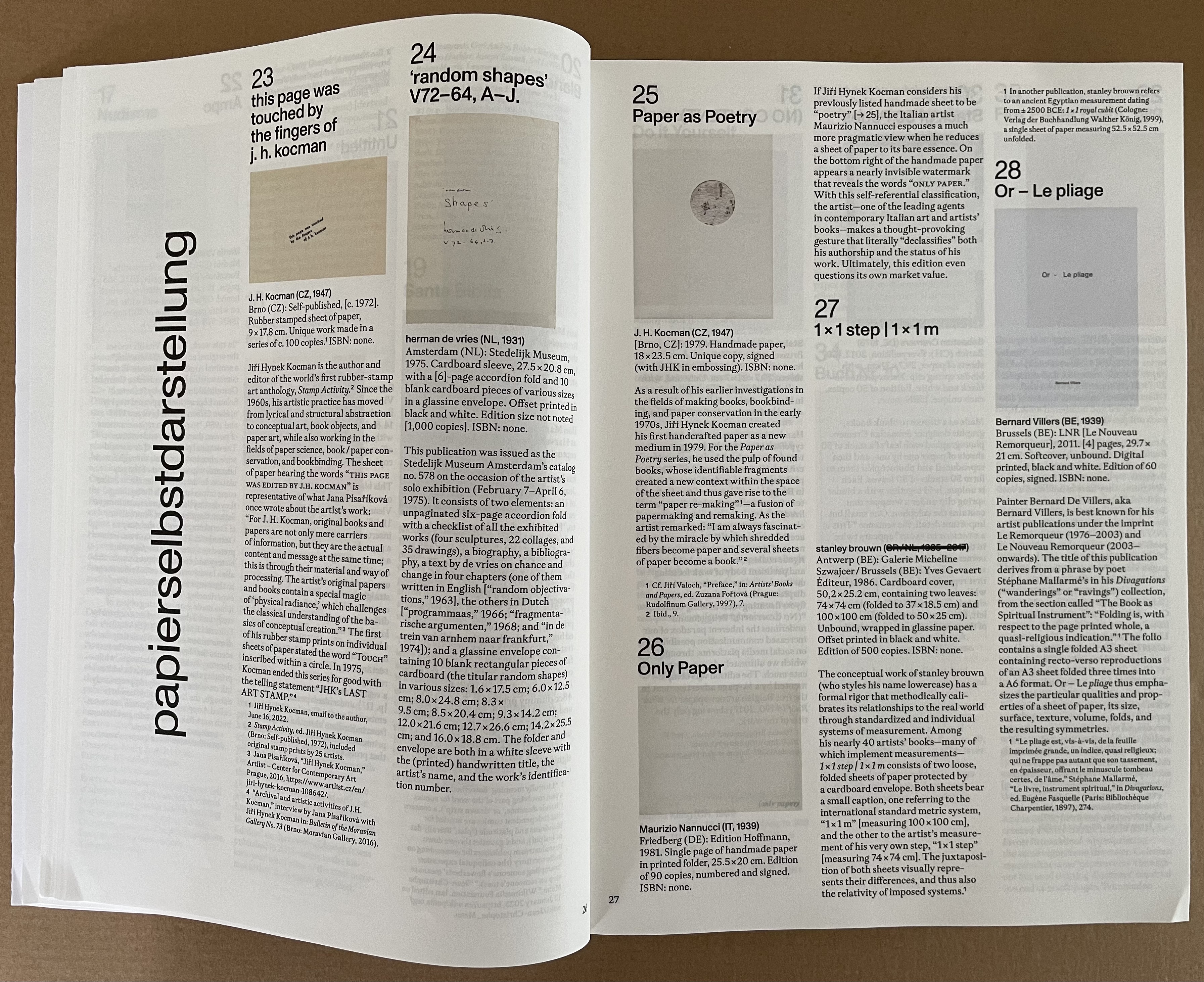
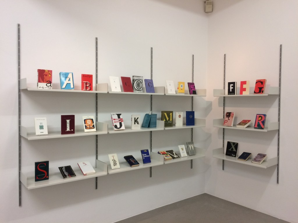
There are several human alphabets in the Books On Books Collection such as the music hall performance by The Three Delevines documented in The Strand Magazine (1897) , Vítězslav Nezval & Karl Teige’s Abeceda (1926), Anthon Beeke, Geert Kooiman & Ed van der Elsken’s Alphabet (1969), Rowland Scherman’s Love Letters (2008), the Pilobolus Dance Company’s Human Alphabet (2010), the Paulina Olowska Book (2013), Marie Lancelin’s Gestes Alphabétiques (2014), Douglas & Françoise Kirkland’s Physical Poetry Alphabet (2018), Richard Hell’s Uh by Ernie Stomach (2019), and Lisa Merkin’s Bodies Making Language (2021). All of these works except Lancelin’s and Merkin’s follow in Springer’s codex footsteps. Lancelin’s leporello follows the parchment strips of Springer’s first specimen, and Merkin’s wooden blocks echo the woodcuts of the Master of the Banderoles.
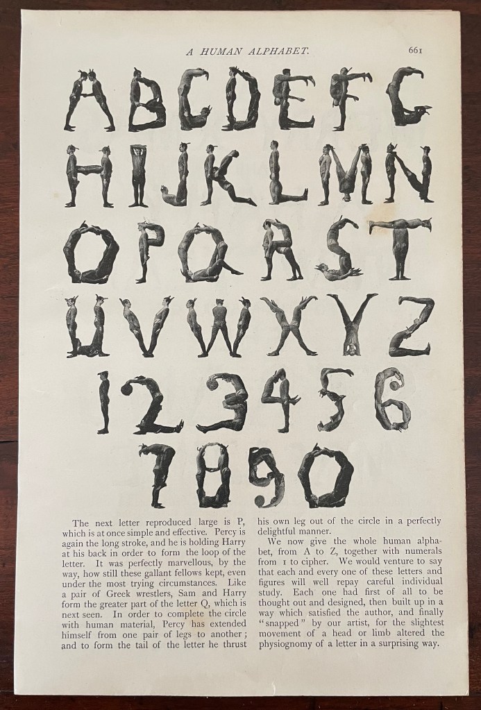
The Three Delevines from W.G. Shepherd’s “The Human Alphabet”, The Strand Magazine, London.
One human alphabet outside the collection but worth seeking out is Barbara Crow’s An acrobatic alphabet (1986). Its characters’ contortions rival those of the Gothic alphabets and will prod another look into them for their humor. Although not a children’s book, Crow’s artist’s book is also a reminder to keep an eye on that domain where crossovers with artists’ books have become more and more frequent.
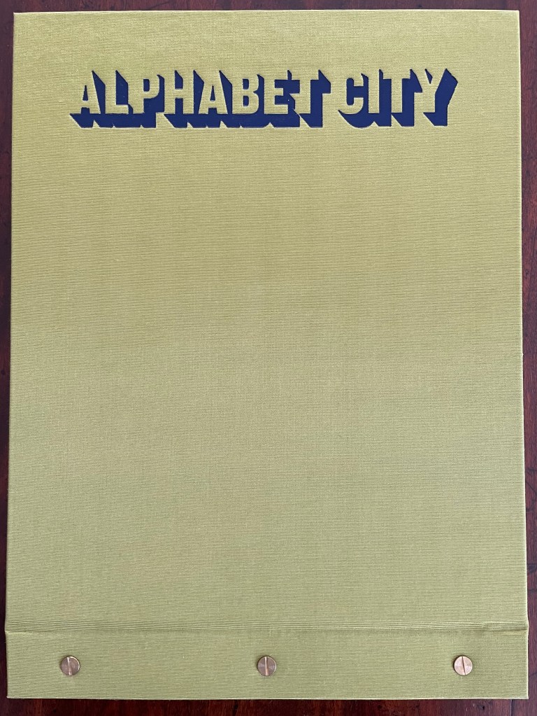
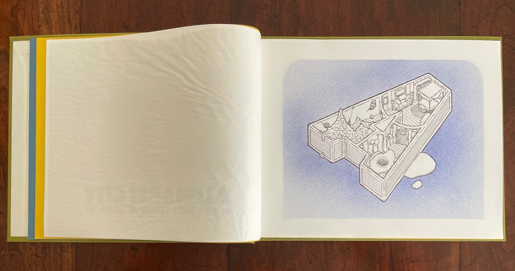
Likewise there are several architecture/alphabet-inspired works in the collection such as Geofroy Tory’s Champ Fleury (1529/1927), Johann David Steingruber’s Architectonisches Alphabet or Architectural Alphabet (1773), Lanore Cady’s Houses & Letters (1977), Paul Noble’s Nobson Newtown (1998), Jeffrey Morin and Steve Ferlauto’s Sacred Space (2003), Edward Andrew Zega & Bernd H. Dams’ An Architectural Alphabet : ABC (2008), Scott Teplin’s Alphabet City (2009), Federico Babina’s Archibet (2015), Nerma Prnjavorac Cridge’s Sarajevska Abeceda (2019), and Heather Hunter’s Alphabet Cityscape (2025).
*Demeude, Kiermeier-Debre, and Lehmann-Haupt give Giovanni dei Grassi’s alphabet the nod as the first figurative alphabet.
**See Steiner.
Further Reading
“Alphabets Alive! – Body“. 19 July 2023. Books On Books Collection.
“Federico Babina“. 23 April 2021. Books On Books Collection.
“Anthon Beeke“. 21 June 2021. Books On Books Collection.
“Lanore Cady“. 16 December 2022. Books On Books Collection.
“Celebrating the 250th Anniversary of Steingruber’s Architectural Alphabet”. 1 January 2023. Books On Books Collection.
“Nerma Prnjavorac Cridge“. 14 February 2021. Books On Books Collection.
“Lyn Davies“. 7 August 2022. Books On Books Collection. Reference and fine print.
“Heather Hunter“. In progress. Books On Books Collection.
“Lisa Merkin“. 24 February 2023. Books On Books Collection.
“Jeffrey Morin & Steven Ferlauto“. 23 April 2021. Books On Books Collection.
“Richard Niessen“. 20 April 2021. Books On Books Collection.
“Paul Noble“. 23 April 2021. Books On Books Collection.
“Tiphaine Samoyault“. 10 July 2023. Books On Books Collection. Illustrated children’s book.
“Karel Teige & Vítězslav Nezval“. 16 July 2021. Books On Books Collection.
“Scott Teplin“. 14 October 2025. Books On Books Collection.
“Geofroy Tory“. 21 June 2021. Books On Books Collection.
“Edward Andrew Zega & Bernd H. Dams“. 23 April 2021. Books On Books Collection.
Boeckeler, Erika. 2011. “Building Meaning: The First Architectural Alphabet”. In Blick, Sarah, and Laura Deborah Gelfand. 2011. Push Me, Pull You. Leiden: Brill.
Boeckeler, Erika Mary. 2017. Playful Letters : A Study in Early Modern Alphabetics. Iowa City: University of Iowa Press.
Delisle, L. ed., 1909. Rouleau mortuaire du B. Vital, abbé de Savigni: containing 207 titres écrits en 1122 – 1123 in different églises de France et d’Angleterre , Paris: Champion. Image: University of Heidelberg.
Demeude, Hugues. 1996. The animated alphabet. London: Thames and Hudson.
Honey, Andrew. 18 April 2024. “‘I dare say will please you when you see them’ – more ‘new’ wood-blocks of an old grotesque alphabet.” The Bodleian Conveyor. Oxford: Oxford University.
Kiermeier-Debre, Joseph, and Fritz Franz Vogel. 2001. Menschenalphabete : Nackte Models, Wilde Typen, Modische Charaktere. Marburg: Jonas.
Lehmann-Haupt, Helmut, & Norman Petteway. “Human Alphabets”. In Nord, Max (ed).1958. Amor Librorum: Bibliographic and Other Essays, A Tribute to Abraham Horodisch on his 60th Birthday. Zürich: Safaho Foundation.
McEwen, Hugh. Polyglot Buildings. 12 January 2012. Issuu. Accessed 13 March 2021.
Polano, Sergio. January 2019. “Architectural Abecedari“, Casabella, 893, pp. 62-75 (Ital.) + 100-101 (Eng.). Milan.
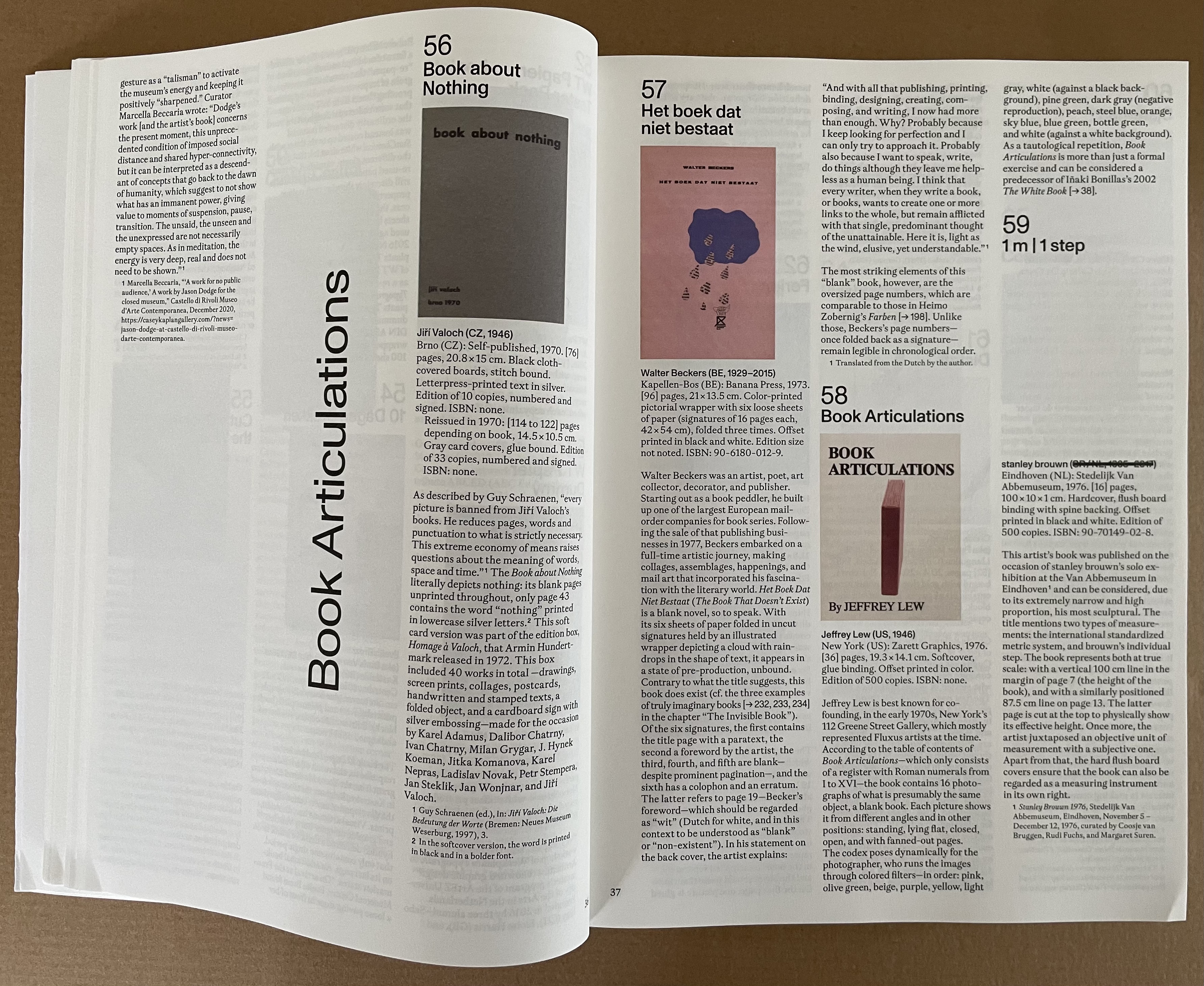
Steiner Deborah. 2021. Choral Constructions in Greek Culture : The Idea of the Chorus in the Poetry Art and Social Practices of the Archaic and Early Classical Period. Cambridge: Cambridge University Press. See chapter 8 for the story on Kallias and dancing the alphabet.
Tsimourdagkas, Chrysostomos. 2014. Typotecture: Histories, Theories and Digital Futures of Typographic Elements in Architectural Design. Doctoral dissertation, Royal College of Art, London. Accessed 13 March 2021.
Ward, John Powell. 2004. The Spell of the Song : Letters, Meaning, and English Poetry. Madison, N.J.: Fairleigh Dickinson University Press.