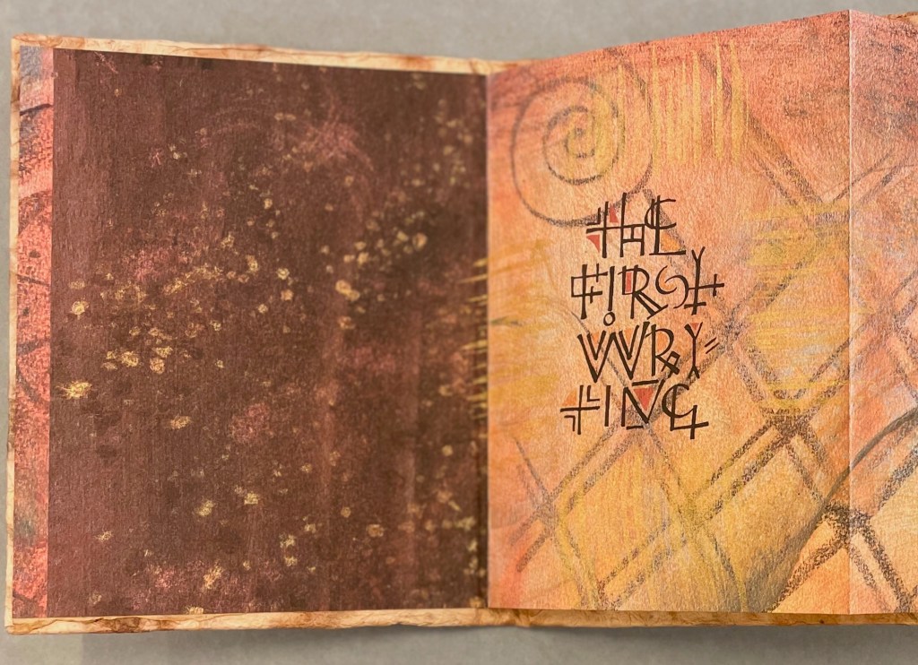
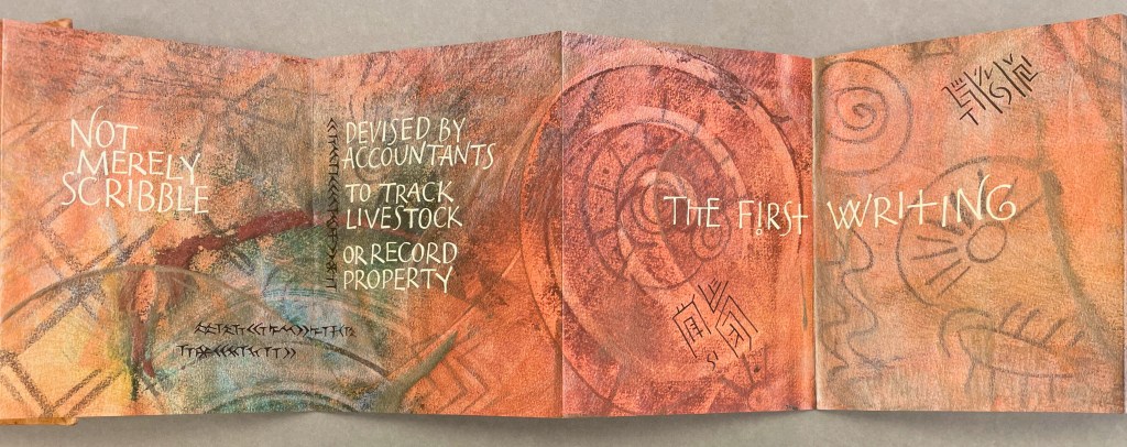
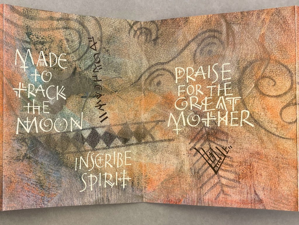
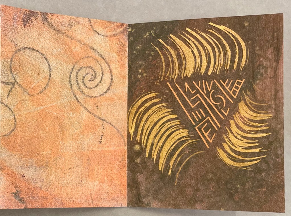
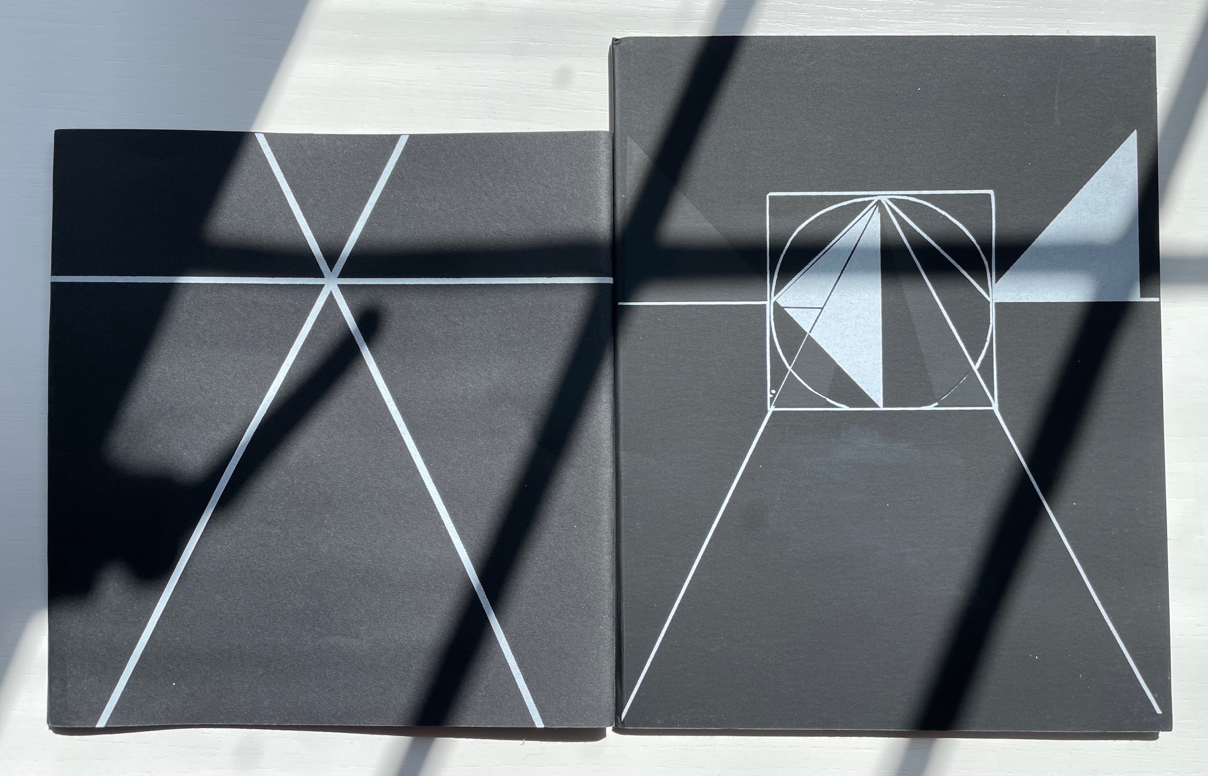
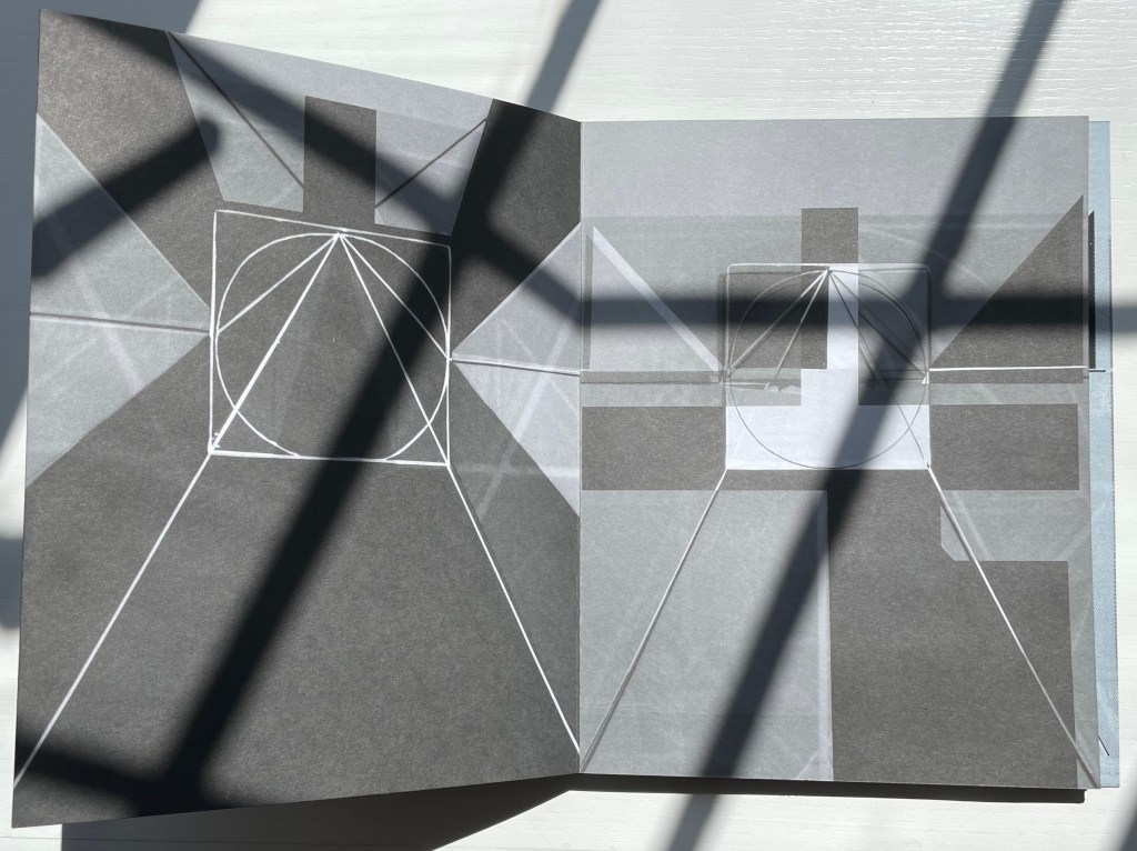
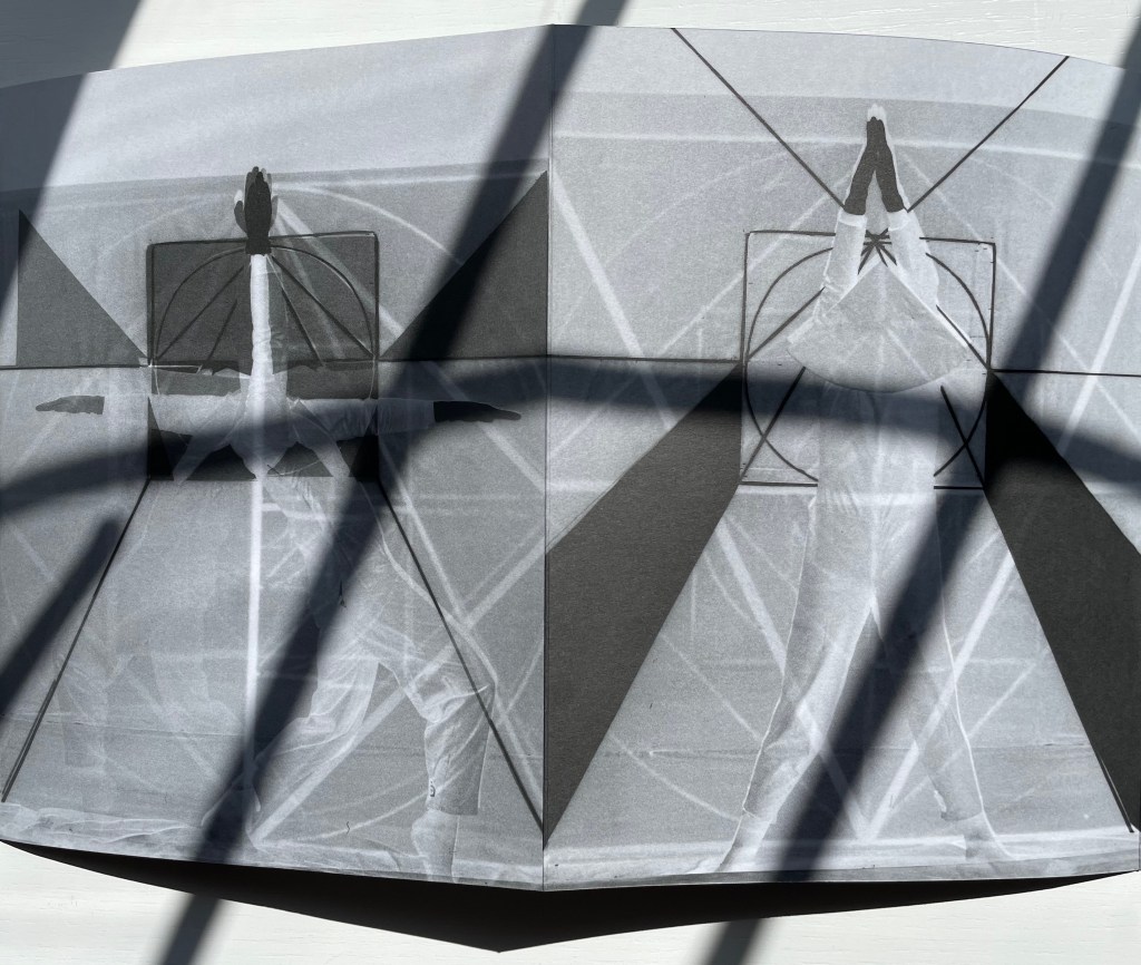
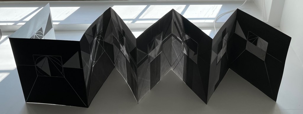
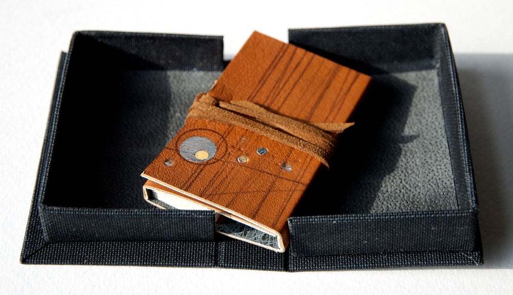
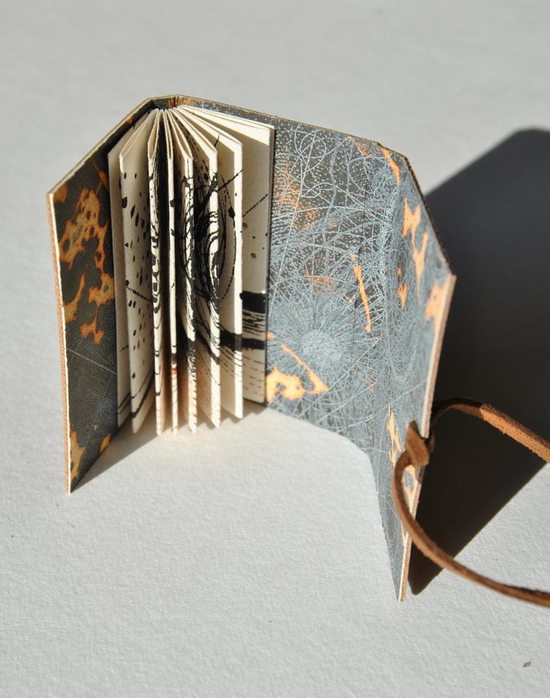
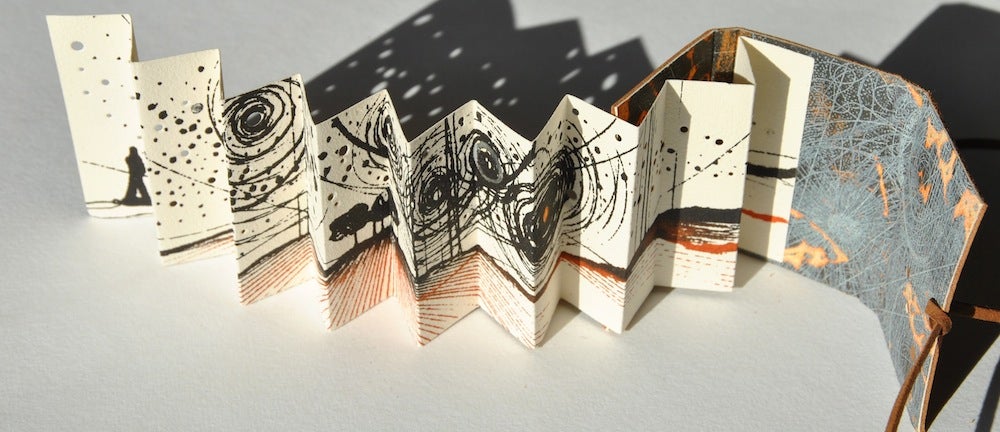
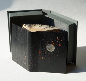
The First Writing(2004) Cari Ferraro Leporello attached to front board; leather thong and bead closure.. H178 x W127 mm (7 x 5 in) closed; W1245 mm open (49 in). 10 panels. Edition of 50, of which this is #40. Purchased from Vamp&Tramp, 4 January 2022. Photos: Books On Books Collection.
Strange as it sounds to the Western ear, writing came before the alphabet. And like the alphabet, that ancient writing has inspired artists’ books. Two of them in the Books On Books collection are Helen Malone’s Alphabetic Codes (2005) and Cari Ferraro’s The First Writing (2004).
Crumpled Lokta paper dyed to resemble old leather and decorated with a crescent moon in gold metallic ink covers the boards of The First Writing. Just as much as old leather — and along with the interior — it evokes a painted cave wall to conjure up the archeologist Marija Gimbutas’s theory “that the first writing actually predated Sumerian businessmen by a few thousand years, and instead grew out of symbolic marks on ritual objects made to venerate the Great Mother in Old Europe”. Inspired by the archaelogist’s catalogue of marks in her book The Civilization of the Goddess, the glyphs and stylized alphabet round out Ferraro’s poetic invocation of the theory against the background of undeciphered symbols found in the 5000-year-old circular passage tombs at Knowth and Newgrange in Ireland (both described by Gimbutas). A link to Ferraro’s excellent essay on Gimbutas’s work can be found below under Further Reading.
“Abe Kuipers“. Books On Books Collection. Artist’s book. [In progress]
“Helen Malone“. 23 July 2020. Books On Books Collection. Sculpture book.
“Don Robb and Anne Smith“. 26 March 2023. Books On Books Collection. Illustrated children’s book. [In progress]
“James Rumford. 21 November 2022. Books On Books Collection. Illustrated children’s book.
“Tiphaine Samoyault“. 10 July 2023. Books On Books Collection. Illustrated children’s book.
“Ben Shahn“. 20 July 2022. Books On Books Collection. Artist’s book.
“Pat Sweet“. 18 January 2023. Books On Books Collection. Artist’s miniature book.
“Tommy Thompson“. 21 August 2022. Books On Books Collection. Reference.
“Dave Wood“. 5 June 2023. Books On Books Collection. Artist’s book.
Clodd, Edward. 1913. The Story of the Alphabet. London: Hodder and Stoughton. 1913. Superseded by several later works, but is freely available online with line illustrations and some black and white photos.
Diringer, David, and Reinhold Regensburger. 1968. The alphabet: a key to the history of mankind. London: Hutchinson. A standard, beginning to be challenged by late 20th and early 21st century archaeological findings and palaeographical studies.
Thompson, Tommy. 1952. The ABC of our alphabet. London: Studio Publications. Not a fine press publication, but its layout, illustrations and use of two colors bear comparison with the Davies book. It too is out of print and unfortunately more rare.
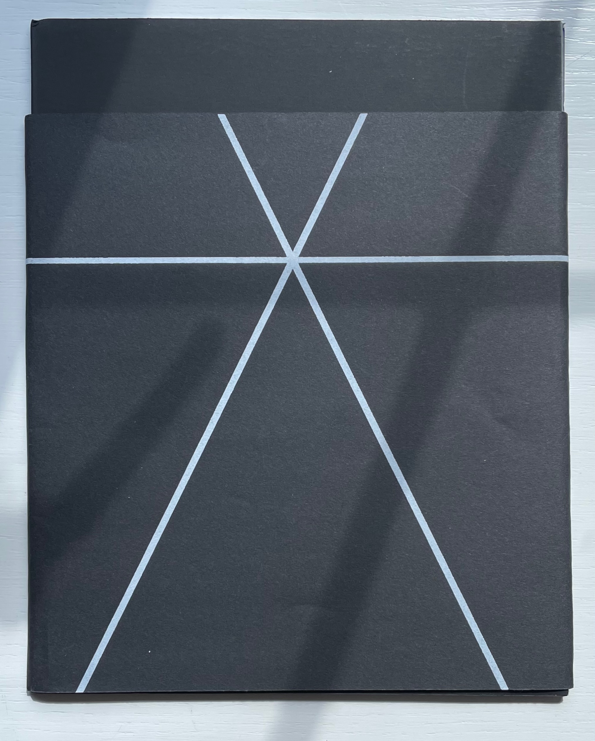
Gestes Alphabétiques (2014) Marie Lancelin Double-sided leporello with sleeve. H200 x W170 mm (closed). 14 panels. Laser-printed, screen print. Interior: offset on Arcoset Extra White 170 gsm. Cover and band: serigraphy on Curious Skin 270 gsm. Edition of 100. Acquired from Printed Matter, Inc., 31 July 2022. Photos: Books On Books Collection. Displayed with permission of the publisher, Grante Ègle (Nantes, France).
There is a long-standing tradition of “dancing the alphabet”. In his satyr play Amphiaraus, Sophocles brings in an actor dancing the letters. A more extended instance comes from 5th century Greek dramatist Kallias; his entire play Grammatike Theoria (“ABC Show” or “The ABC Tragedy“) presents the alphabet and pronunciation exercises. Apparently in acting out the letters psi and omega, the chorus member’s performance tended to the erotic, a phenomenon still to be found in Erté’s alphabet suite (1927/1978) and Anthon Beeke’s Alphabet (1970). Less suggestive are Vítězslav Nezval’s Abeceda (1926), Toshifumi Kawahara’s Dancing Alphabets (1991) and, most recently, Marie Lancelin’s Gestes Alphabétiques (its publisher issued two editions of 100 copies each in 2008 and 2014).
All the media and techniques that Lancelin engaged to make Gestes Alphabétiques — photograms, photomontage, laser printing, serigraphy, staging, lighting, drawing, printing — take her gestures beyond the alphabet and geometric abstractions we can easily see. Also apparent is her grounding in filming; the overlaying of the model’s poses transform that side of the leporello into a dance sequence. With the combined techniques, the ink and paper create the effect of displaying the dance through transparencies or glass or within some black and white computer graphic setting.
Fundamentally, through these media, techniques and the double-sided leporello form, Lancelin translates gesture, symbol, shape and light into one another and back again, offering the viewer the opportunity to see the artist explore the making of meaning.
Gagné, Renaud. 2013. “Dancing Letters: The Alphabetic Tragedy of Kallias”. In Choral Mediations in Greek Tragedy, ed. R. Gagné and M. Hopman, Cambridge University Press 282-307.
Goetz, Sair. “Letterforms / Humanforms“. 11 June 2020. Letterform Archive. Accessed 7 June 2021.
Lancelin, Marie. 29 October – 19 December 2015. “My Models“. Exhibition. In Extenso. Accessed 1 January 2023.
Lawler, Lillian. April 1941. “The Dance of the Alphabet”. The Classical Outlook, 18: 7, pp. 69-71.
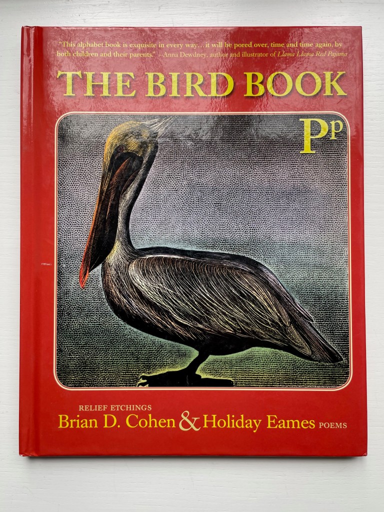
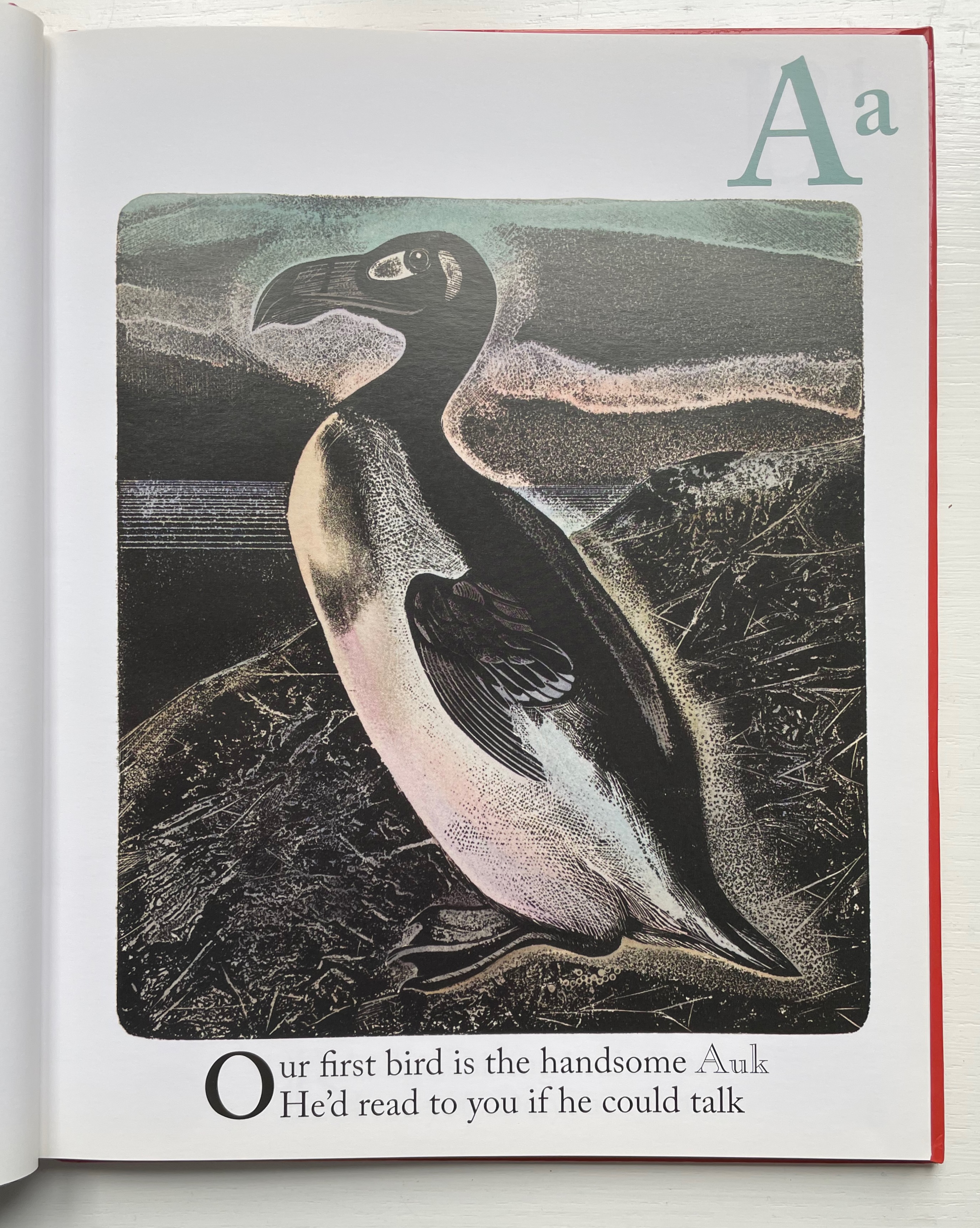
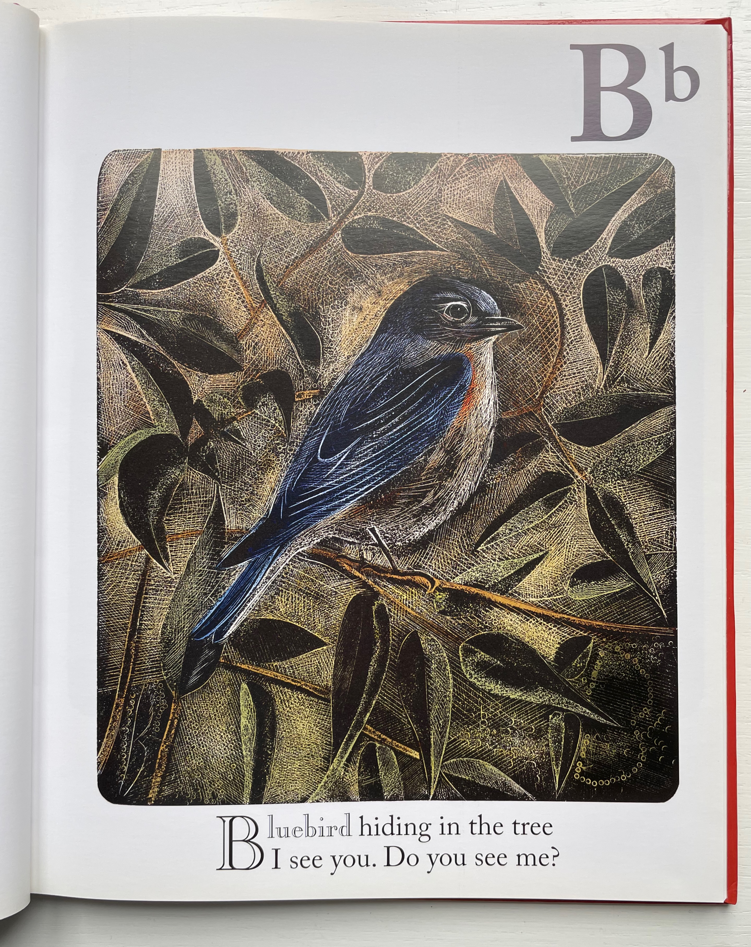
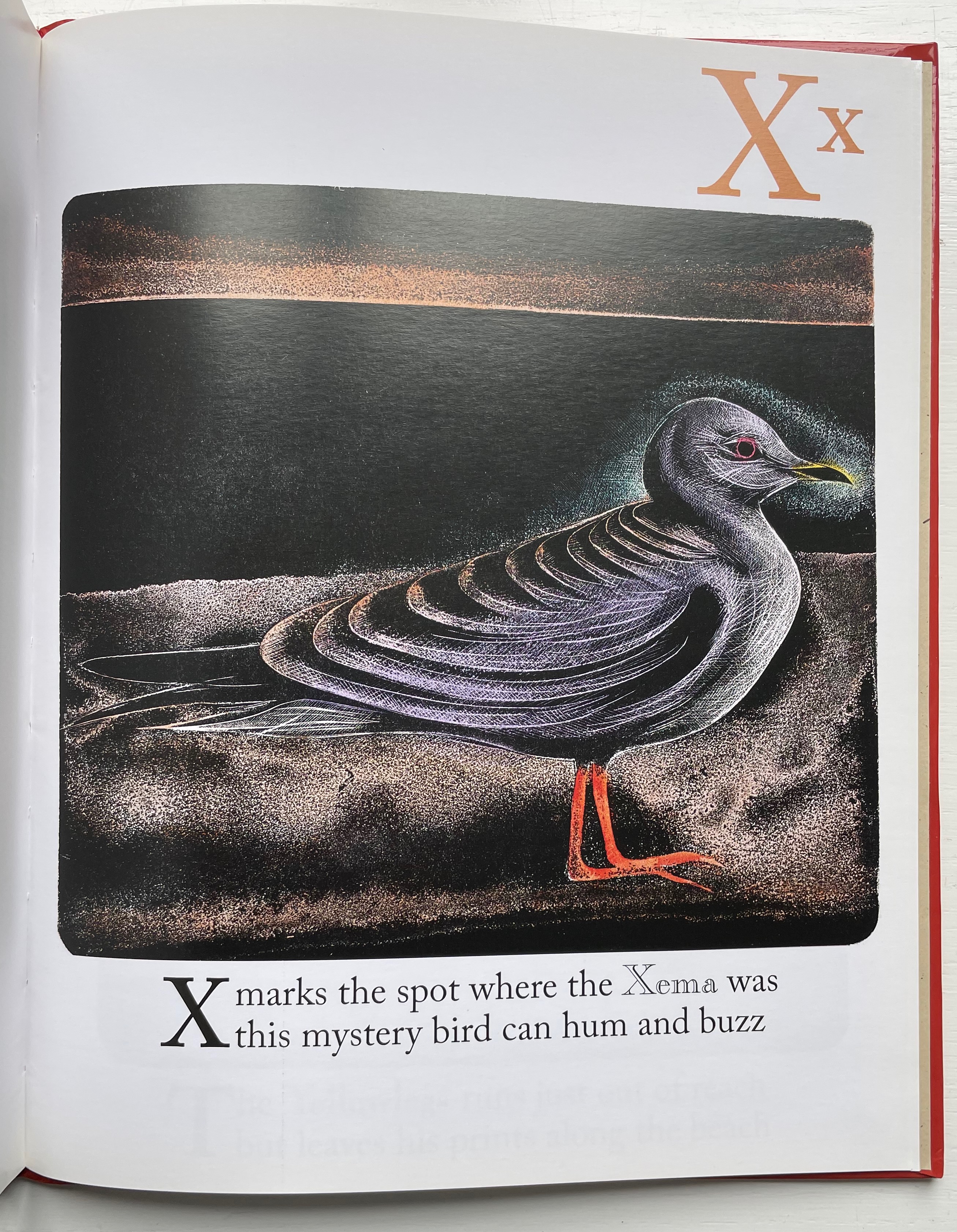
The Bird Book (2013) Brian D. Cohen & Holiday Eames Case bound hardback, paper over boards with doublures. H260 x W210 mm. 56 unnumbered pages. Acquired from The Saint Bookstore, 17 September 2022. Photos: Books On Books Collection. Displayed with the artist’s permission.
Brian Cohen’s inclusion of the following statement makes examining The Bird Book again and again a rewarding effort:
The printmaking technique … used for this book was originally developed by William Blake in 1788. The printing plates for the book were created with acids and engraving on metal (zinc) plates as in traditional etching techniques. The plates were then printed by carefully rolling a thin layer of ink over the surface of the plate, exactly the way a woodblock (relief print) is made. Because the technique combines both etching to create the plates and relief printing, it is termed relief etching. After printing, each individual sheet was hand-colored by brush with watercolor by the artist.
The artist has also encouraged close viewing of each relief etching by hiding its letter in the background, middle ground or foreground — or even the body of the bird.
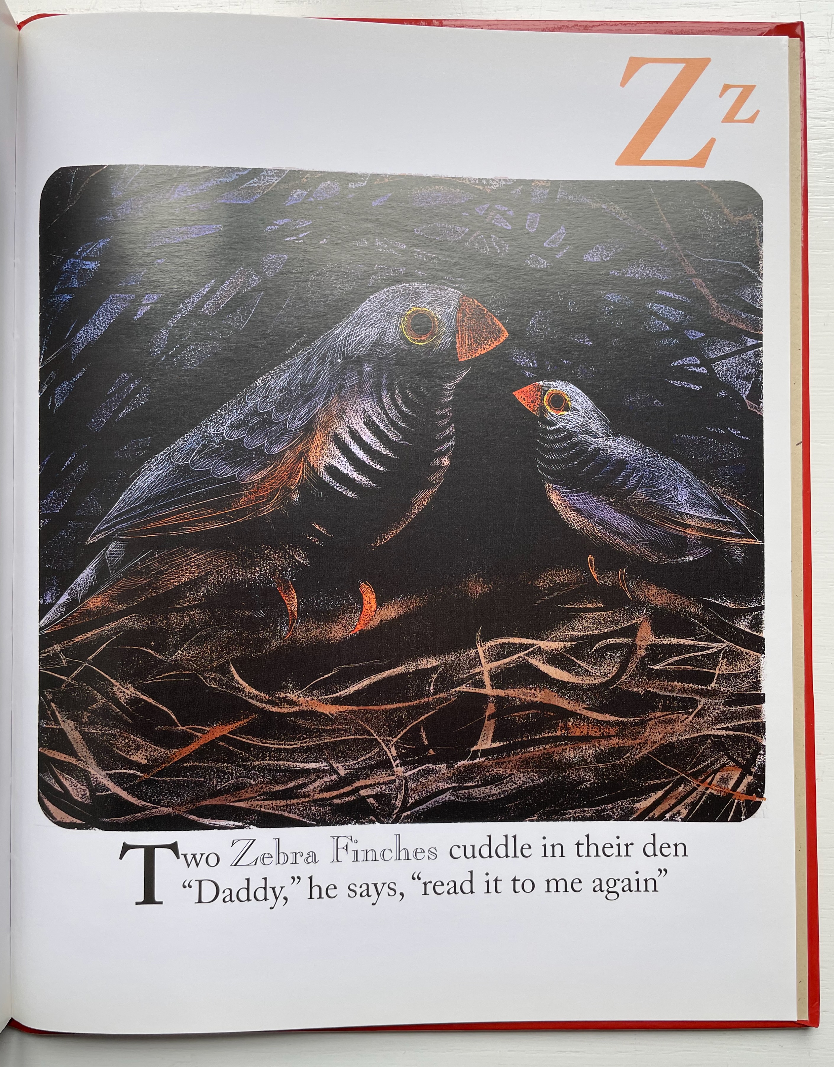
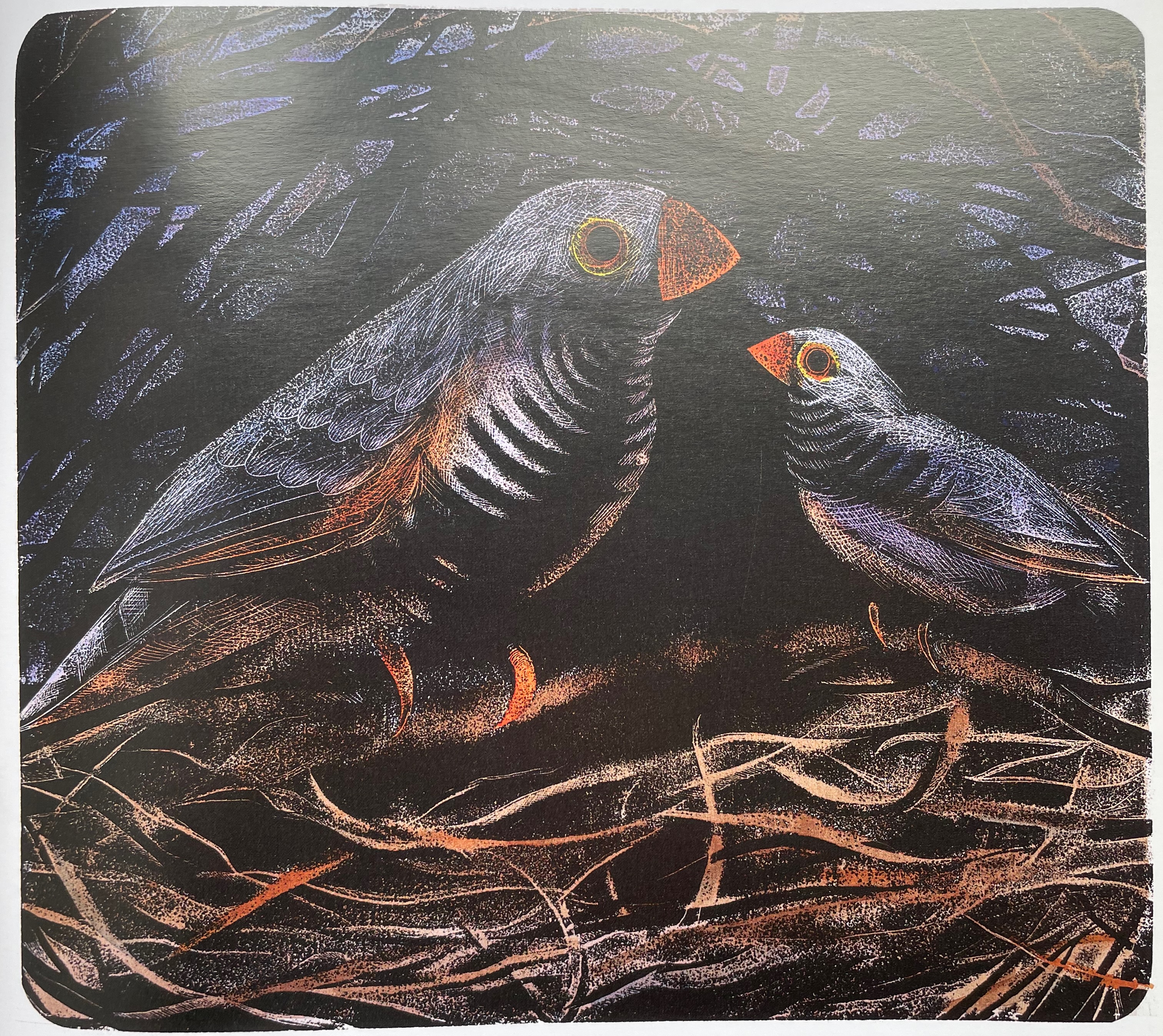
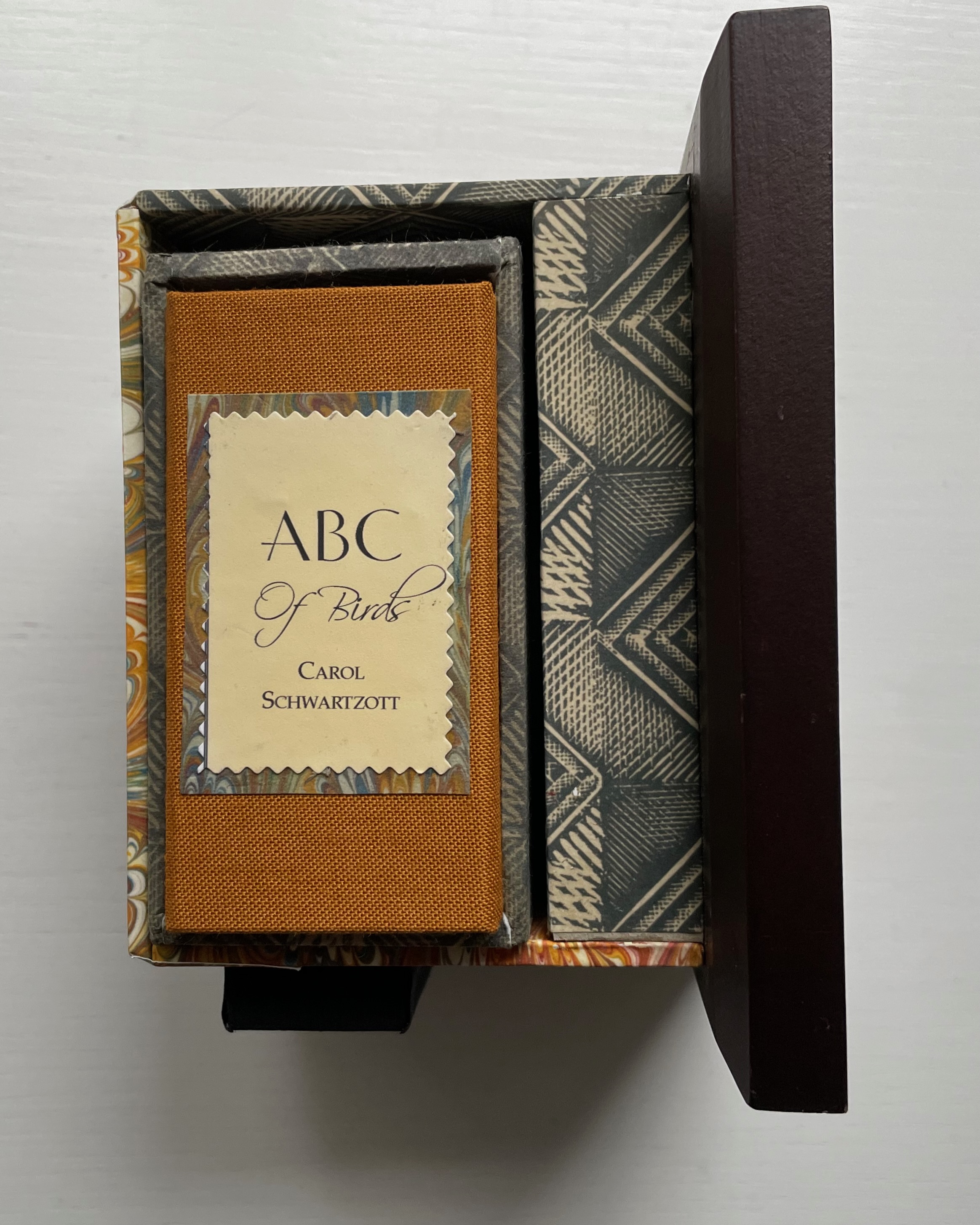
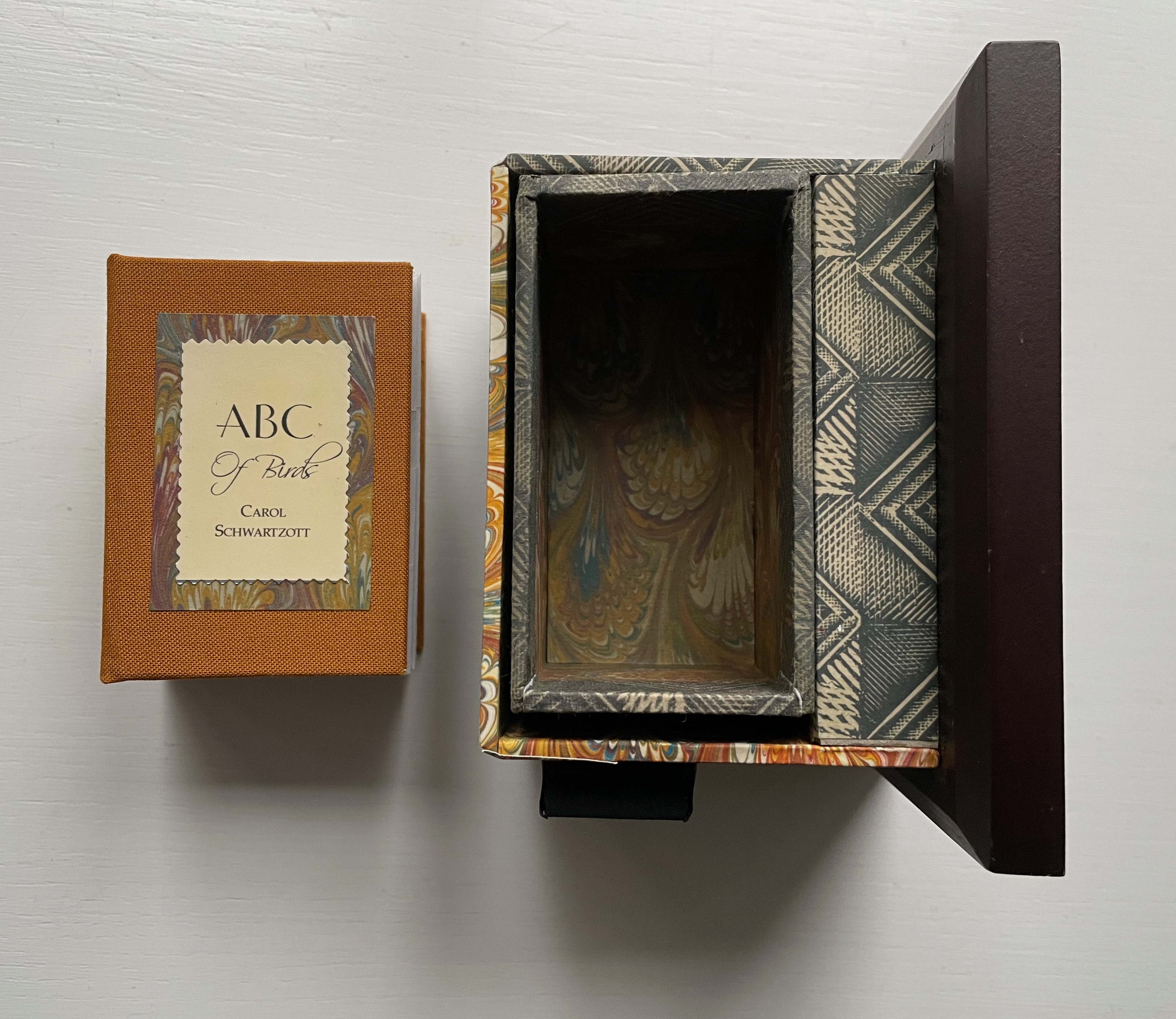
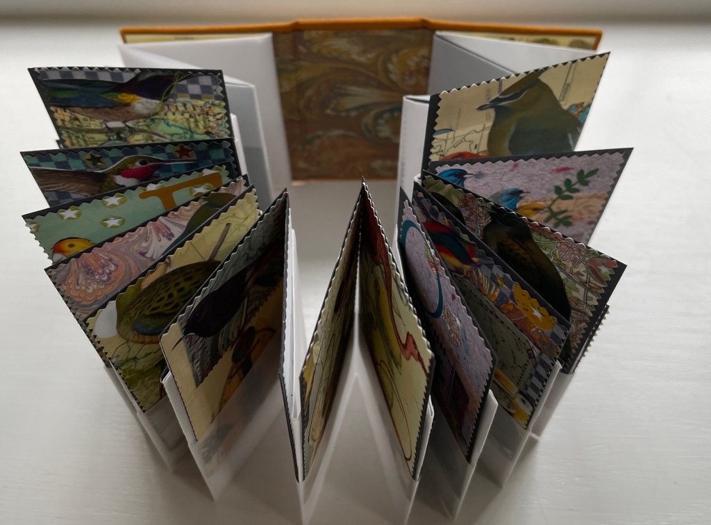
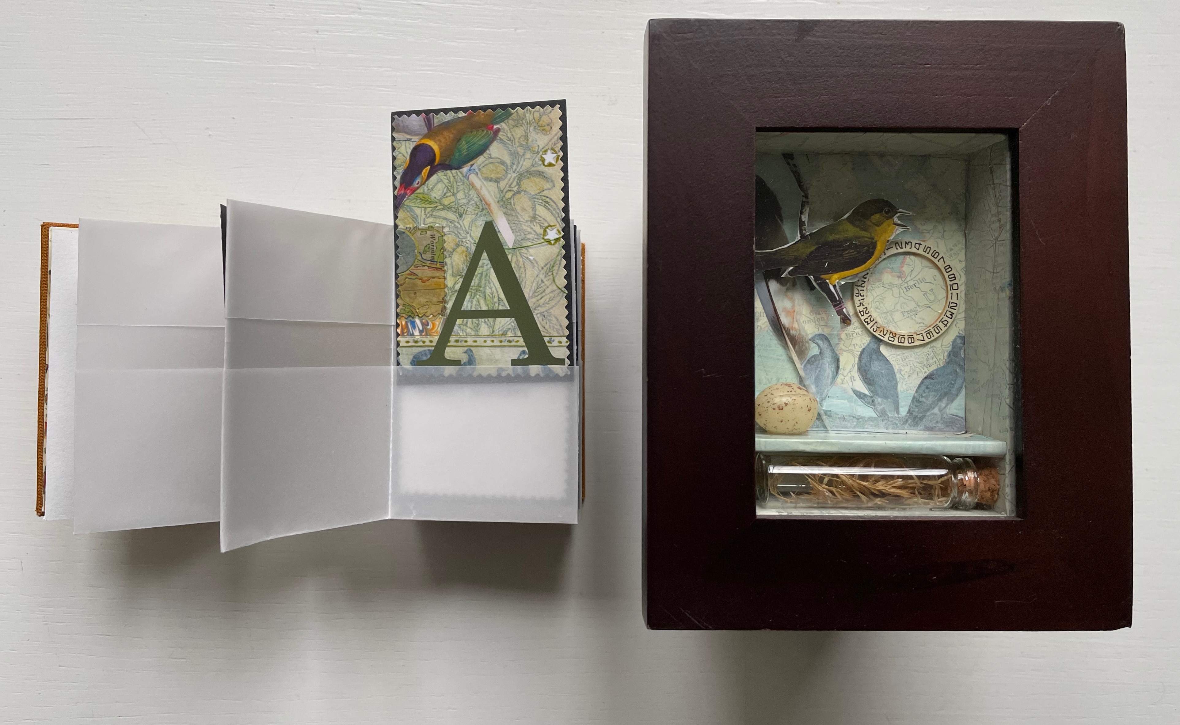
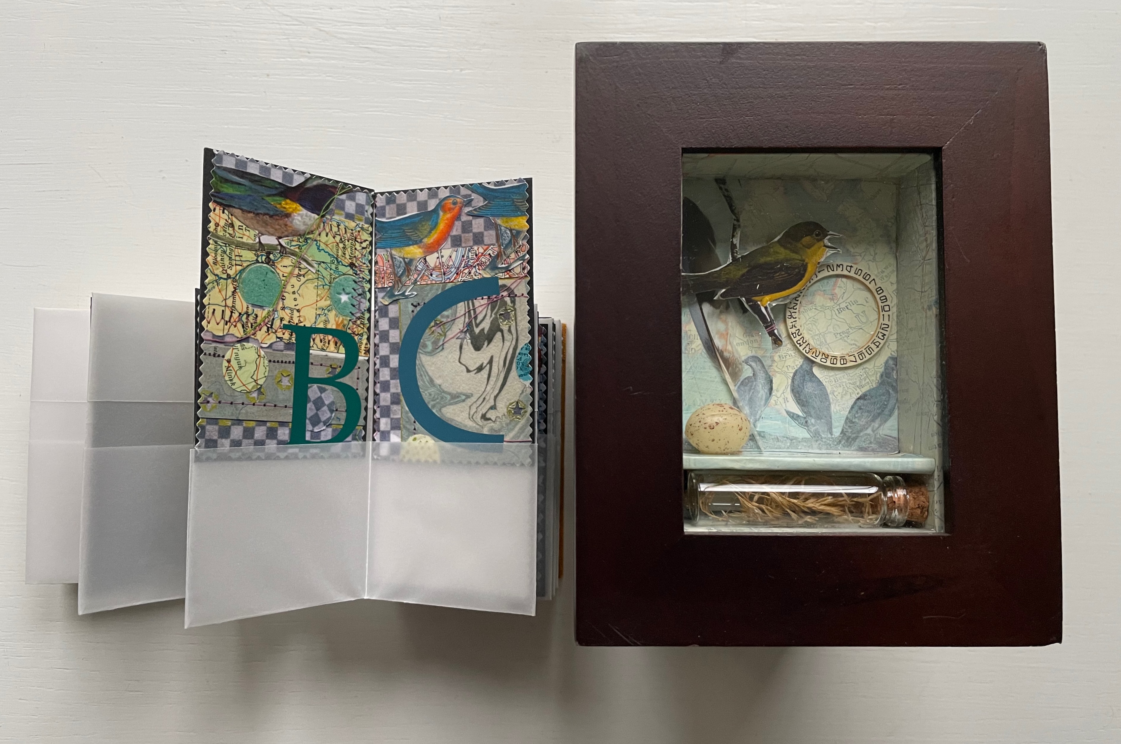
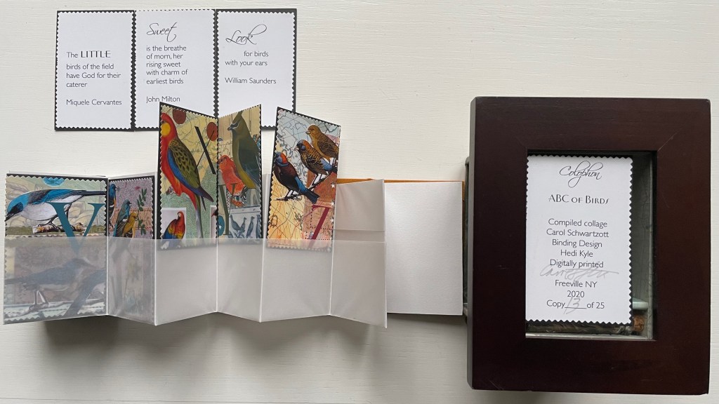
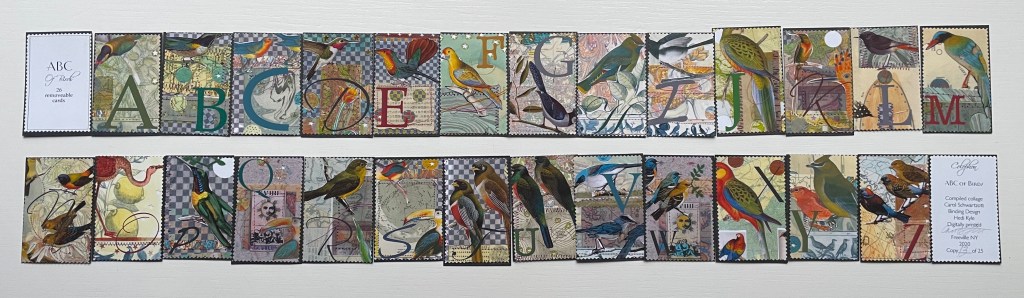
ABC of Birds (2020) Carol Schwartzott Cabinet of curiosity housing a miniature book in paste paper slipcase; double-sided leporello of transparent vellum pockets holding collaged cards. Book measures 2 x 3 x 1.5 inches. 28 pocket pages (collages, title page and colophon). Book in edition of 25, of which this is #13. “Cabinet of Curiosity” is one of five. Acquired from Vamp & Tramp, 4 January 2022. Photos: Books On Books Collection. Displayed with artist’s permission.
The cabinet of curosity recalls Joseph Cornell’s box constructions, and while the cards’ collages may extend that influence, they differ from it sufficiently in intensity of color (having been scanned for printing and “touched up” with pencils or over colored), incorporation of an abecedary and use of an unusual variant on the leporello to distinguish the work as Schwartzott’s. She writes:
The collages themselves were done as original art, each 4 x 6″ centered on a larger sheet of Rives BFK. There are 26 of these. All are reduced to miniature format, and a graphic letter in an interesting font completes the image. Each of these little cards can be removed from the book.
The trimmed edges of the cards give them the appearance of oversized postage stamps, appropriate for the album-style binding and their removability for philatelic-like examination.
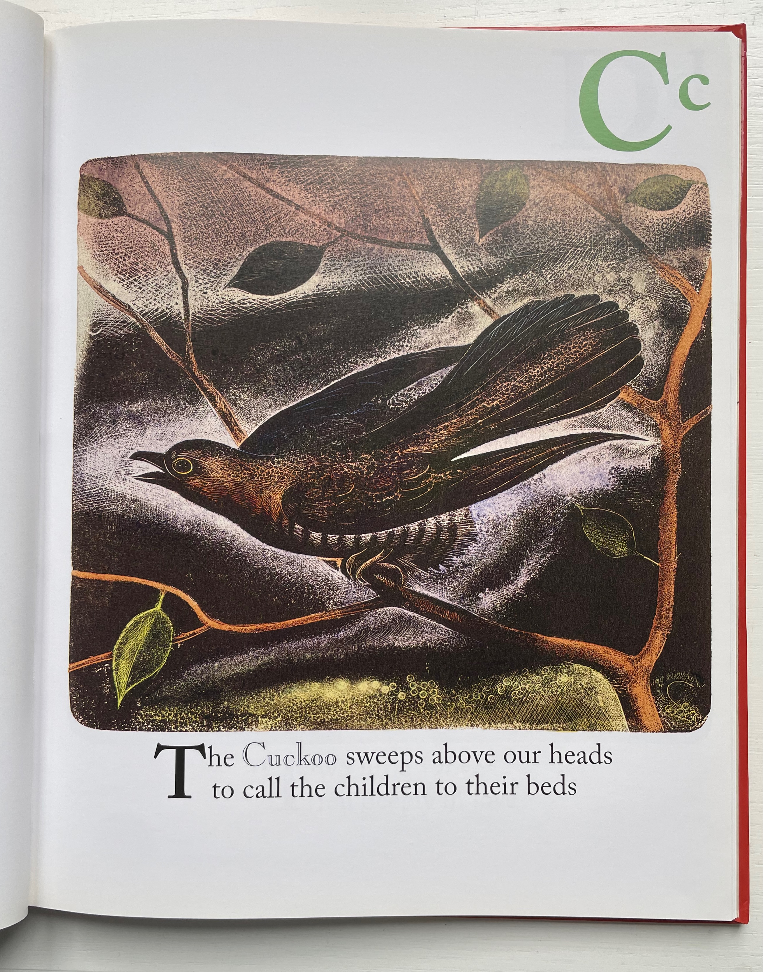
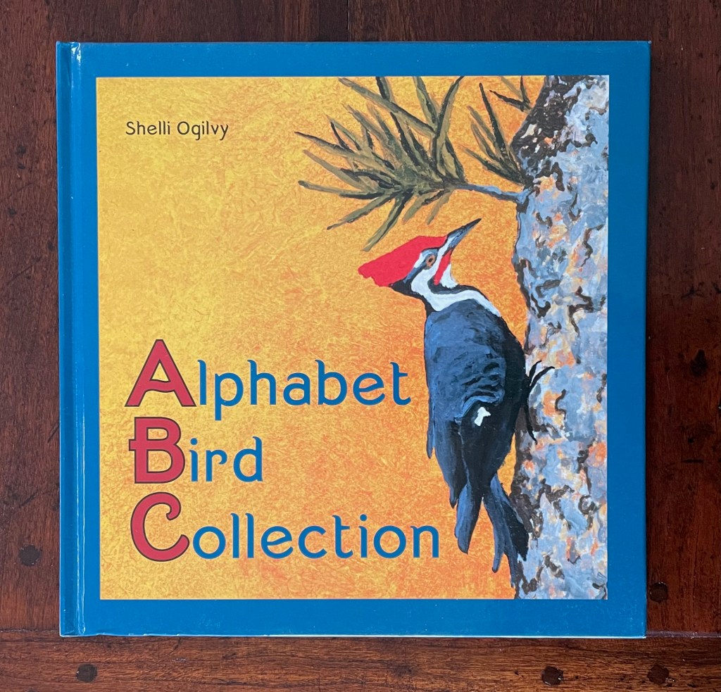
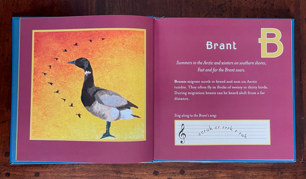
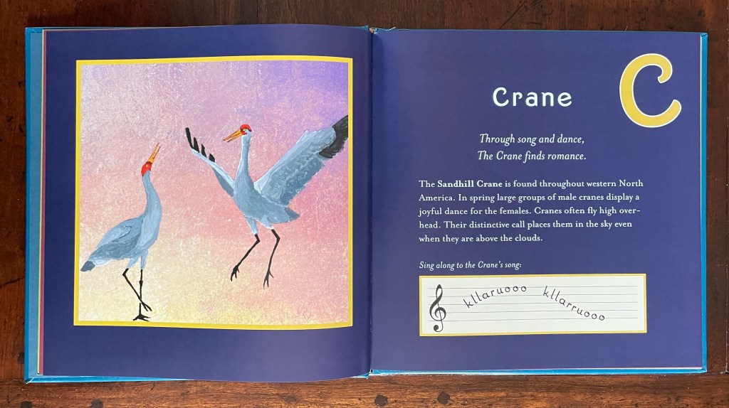
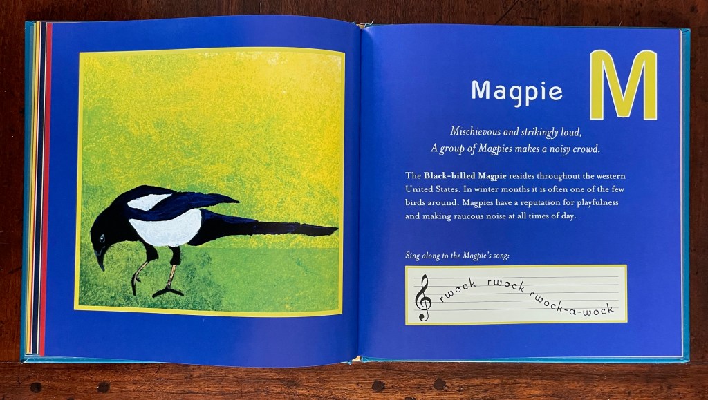
Alphabet Bird Collection (2009) Shelli Ogilvy Dustjacket, casebound paper over board, sewn, single-color doublures. H215 x W215 mm. 56 unnumbered pages. Acquired from Hay-on-Wye Booksellers, 16 December 2022. Photos: Books on Books Collection. Displayed with permission of the artist.
In Alphabet Bird Collection, each double-page spread features the letter of the alphabet, a bird representing it, a couplet followed by prose to describe the bird’s distinctive behavior and habitat, and, beneath, a musical staff with an attempt to represent a sample of each bird’s song or call. Unifying each double-page spread is its own full-bleed background color. The primary distinguishing feature of this abecedary, however, is Shelli Ogilvy’s artwork — original paintings of each bird. Ogilvy works primarily with acrylic on canvas or paper, sometimes combining mediums of chalk, ink, and spray paint into her work.
Instead of concluding with XYZ as with other abecedaries, this entry concludes with a favorite bird.
For another instance of magpie obsession, see Nick Wonham’s The Charm of Magpies (2018).
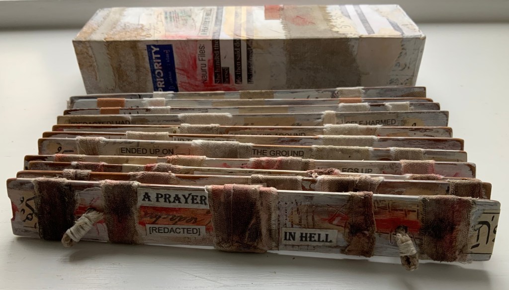
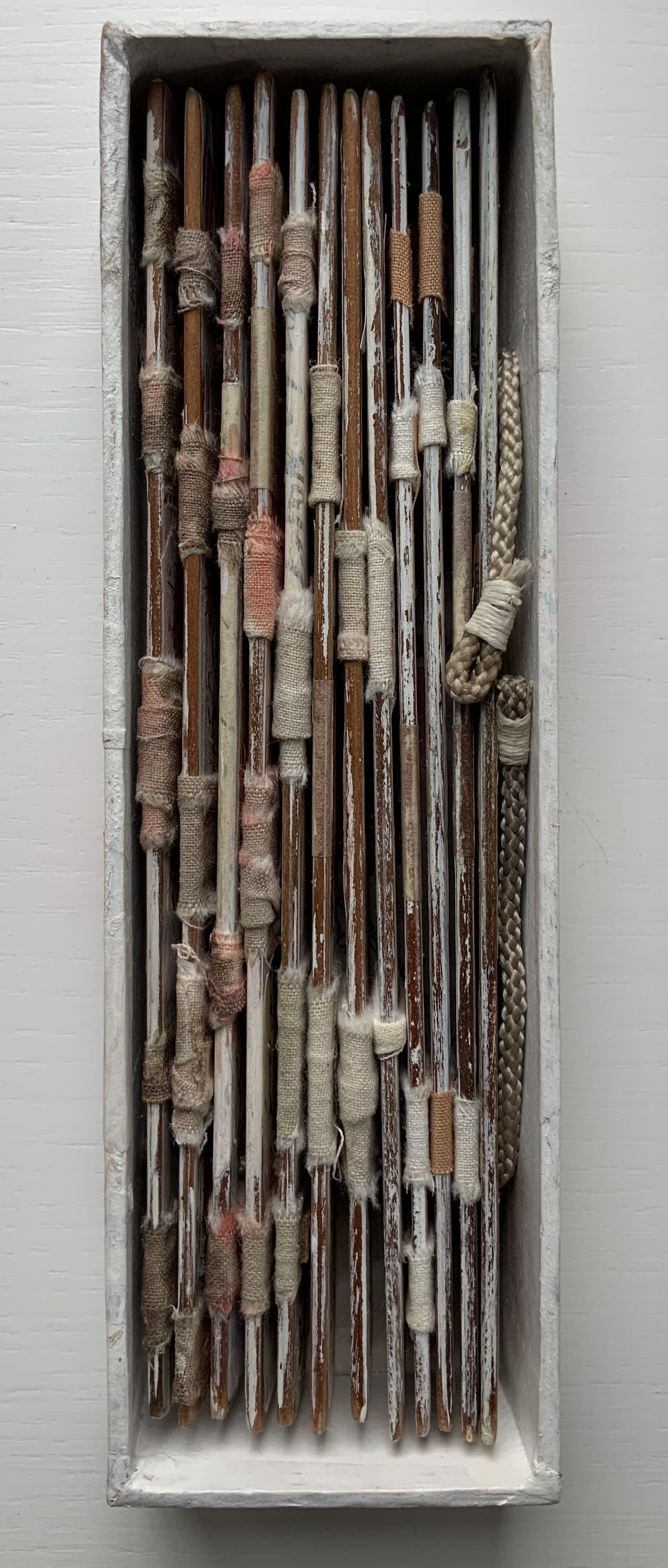
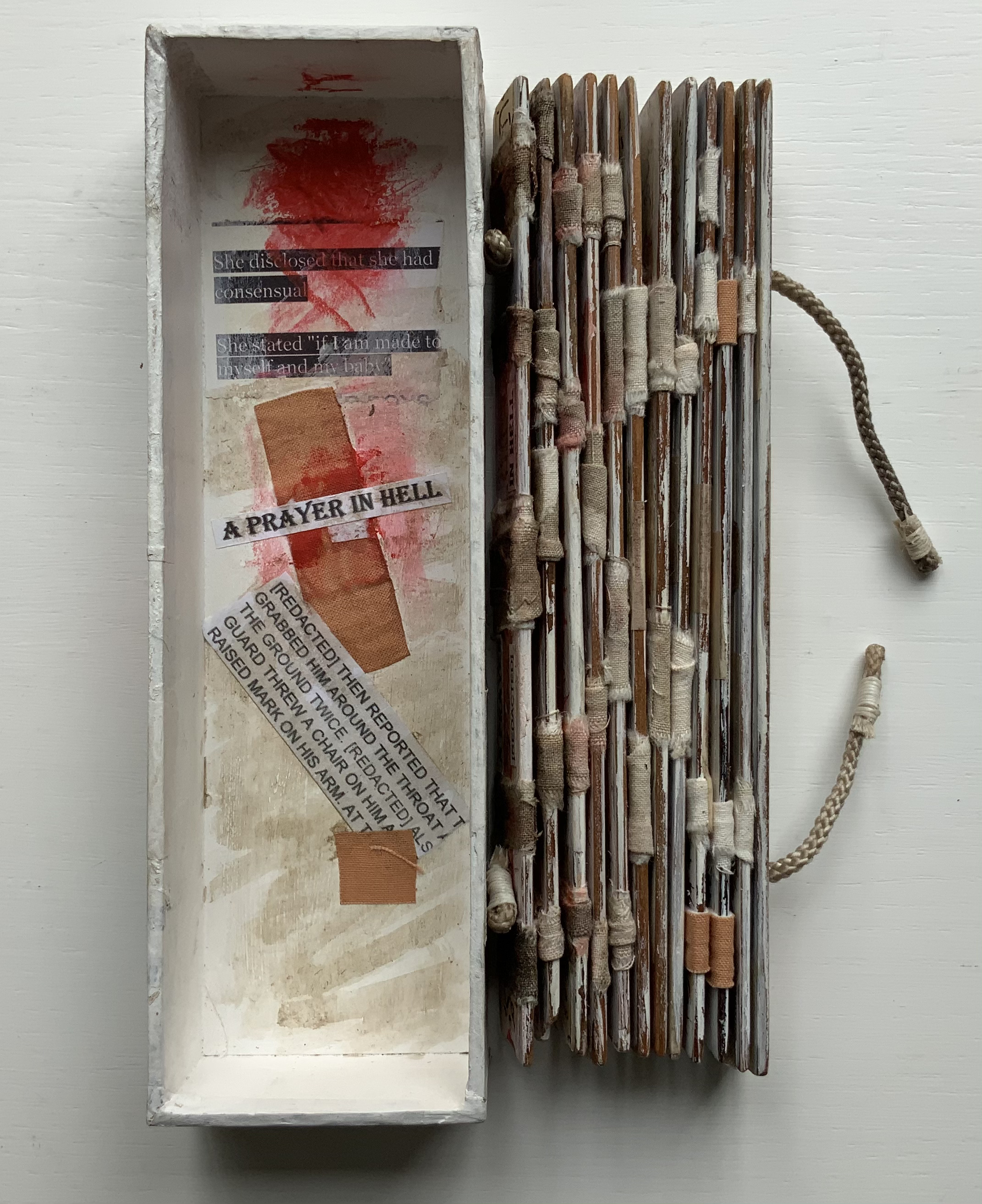
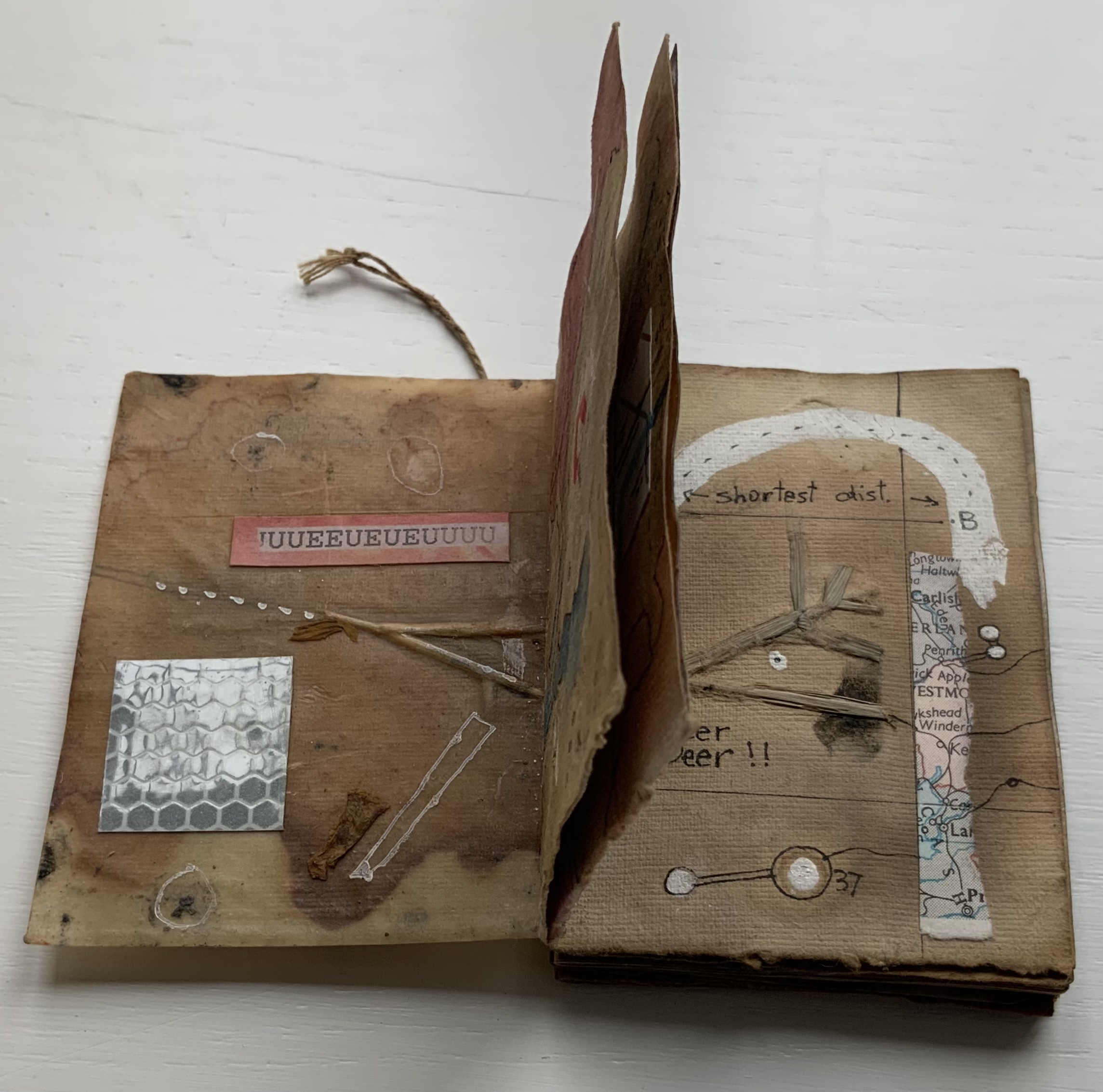
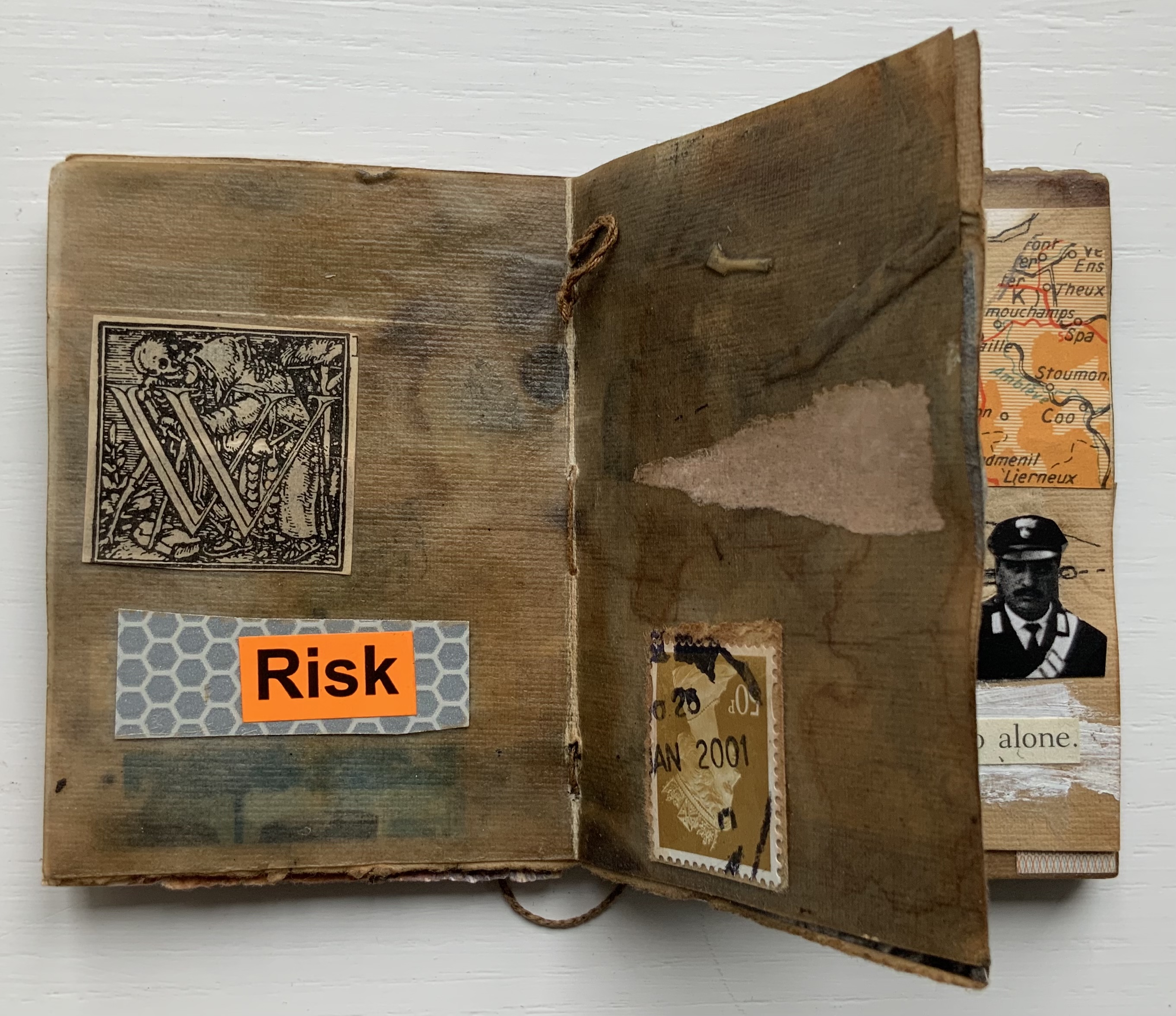
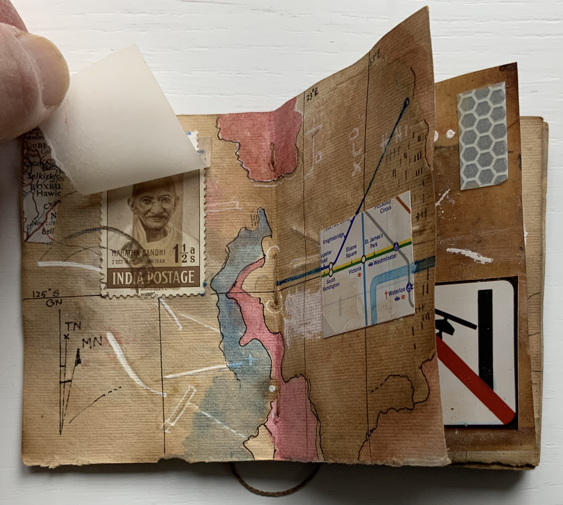
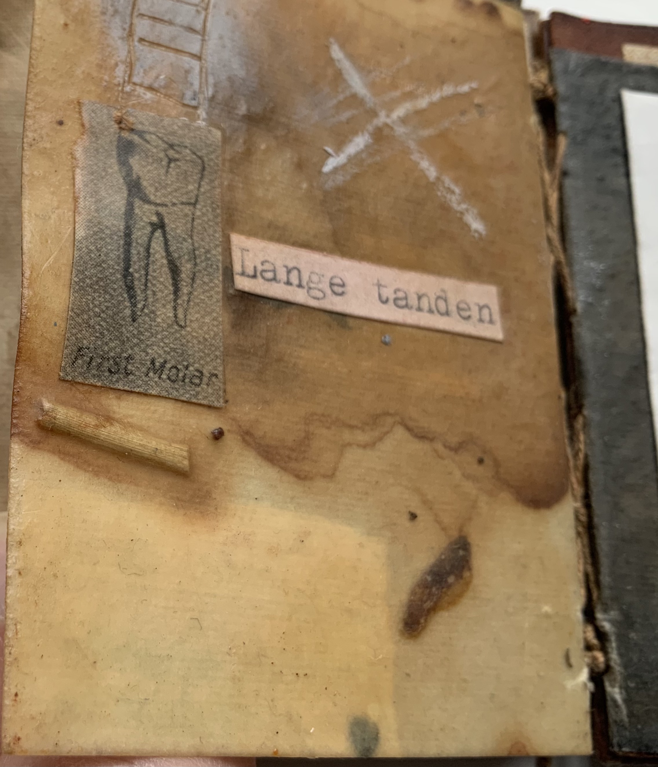
A Prayer in Hell (2018) Jacobus Oudyn Palm leaf prayer book format of 12 timber slats with double-sided collages materials and images made with pomegranate ink on antique paper, water soluble crayon calico, wound dressings and PVA adhesive. Text from Nauru Files — Guardian Newspaper and Islamic prayer book. Open: H195 x W130 mm. Closed: H195 x W 55 x D35 mm. Slip case: 2 mm card with collage, H202 x W60 x D38 mm, to be displayed with the book. Unique. Acquired from the artist, 4 January 2020. Photos: Books On Books Collection, displayed with permission of the artist.
A Prayer in Hell is one of Jack Oudyn’s larger works. works refer to the Australian experience of the world’s refugee crisis (perhaps the largest diaspora in history), A Prayer in Hell is the most scorching of them all.
Materially, the work embodies the refugees and their experience in many ways — its palm-leaf prayer book pages even consist of “stressed and recycled timber slats”. The binding cords penetrate drawings of eyes on each slat, creating the effect of the faceless staring through bars. Although the work’s title alludes to the English expression “not a hope in hell”, the work itself nods toward hope appears in how the wound dressings, wound round the slat pages, gradually become cleaner. Under and over the dressings, strips of English and Arabic text are collaged alongside handwritten extracts from Islamic prayer books and reports of events and conditions in Australian detention centers. Complete with redactions, the English text refers to the scandals associated with the centers at Nauru, Papua New Guinea, Christmas and Manu islands.
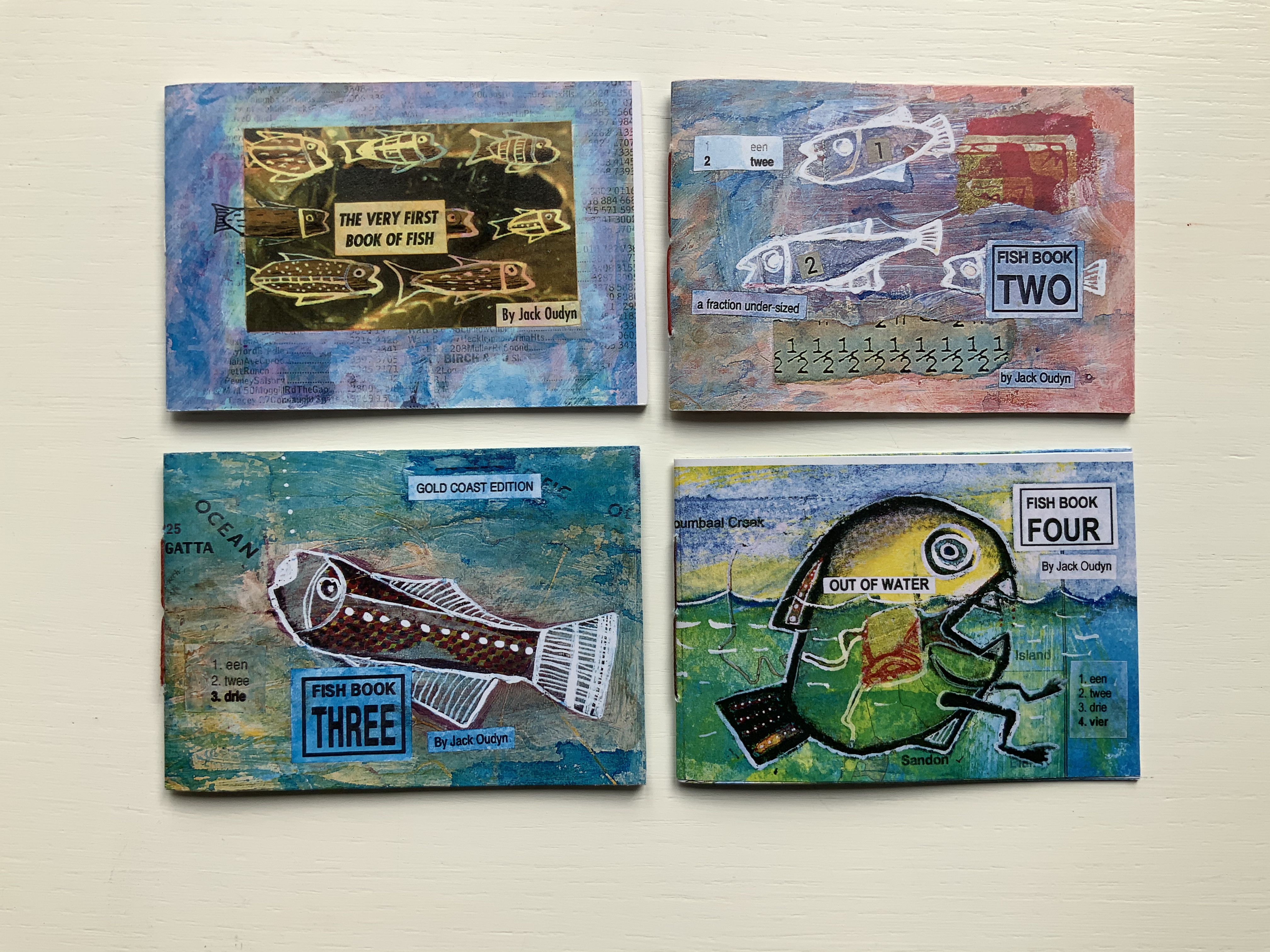
Fish Books One, Two, Threeand Four (1999 – 2001)
All acquired from the artist, 4 January 2020. Photos: Books On Books Collection, displayed with permission of the artist.
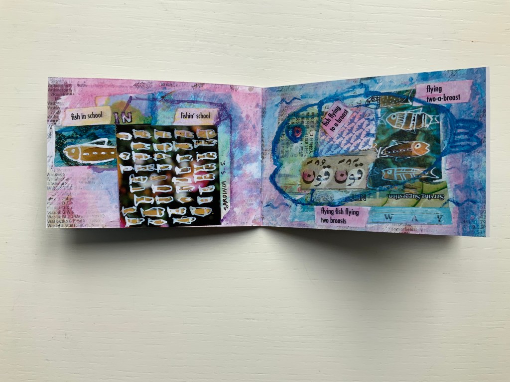
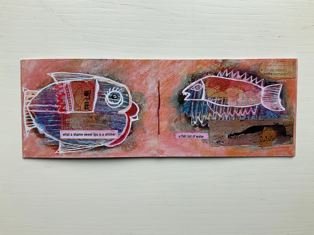
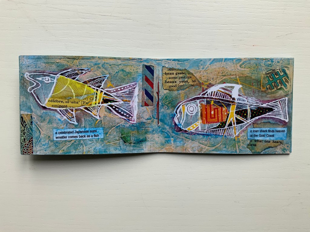
This complete set of his fish books represents Oudyn’s Micro Press imprint well. Many of the small works are playful with language, form, and material and, often, socially satirical or critical. More hook-in-mouth than tongue-in-cheek, the fish books have provided the artist with ground for playing with collage and printing techniques. In imagery, they are reminiscent of Ric Haynes, Breughel and Bosch. In text, they encapsulate the punsterdom of book art (albeit without the usual book-related self-referencing, though “fish wrapper” would have been good for their covers); reveal the artist’s Dutch heritage in their numbering; and revel in Australia’s odd common fishnames (dart, flattie, stargazer, sweetlips, etc.). By Fish Book Four (2001), however, a socially sharper tone emerges. The dates of publication, which vary from those in the WorldCat links for each title, are taken from the artist’s website.
The Very First Book of Fish (1999) Jack Oudyn Booklet made of 200 gsm digital paper, sewn with single white waxed thread, 16 pages. Color laser print of mixed media drawings; ink, paint, collage on pages from telephone directory. H70 x W105 mm, 16 pages. Edition of 50, of which this is #27. Photos: Books On Books Collection, displayed with permission of the artist.
Fish Book Two(1999) Same format as first, except sewn with single red waxed thread; #49 of 50.
Fish Book Three (2000) Same format as the second; #25 of 50.
Fish Book Four(2001) Same format as third, except sewn with single dark gray waxed thread: #13 of 50.
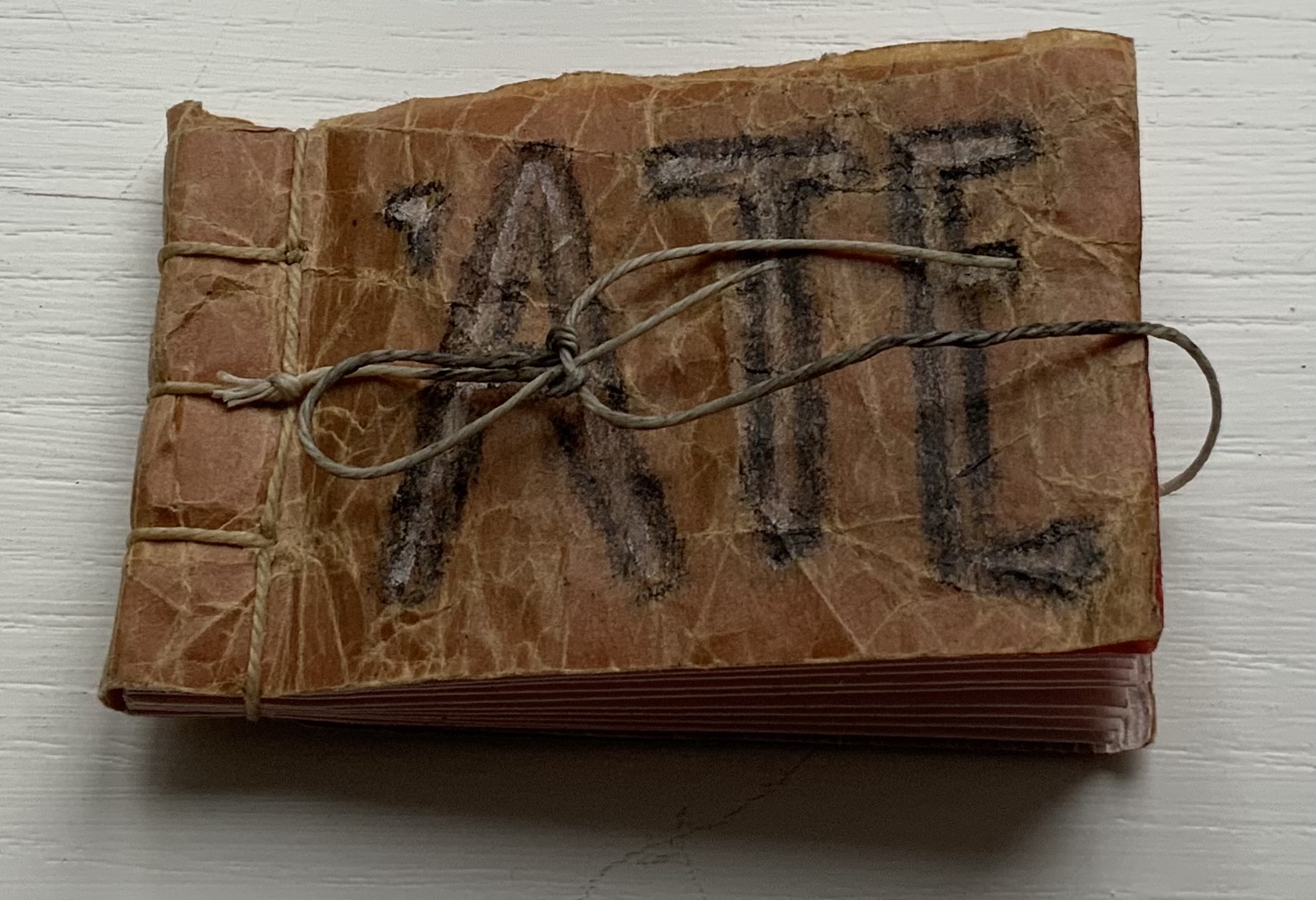
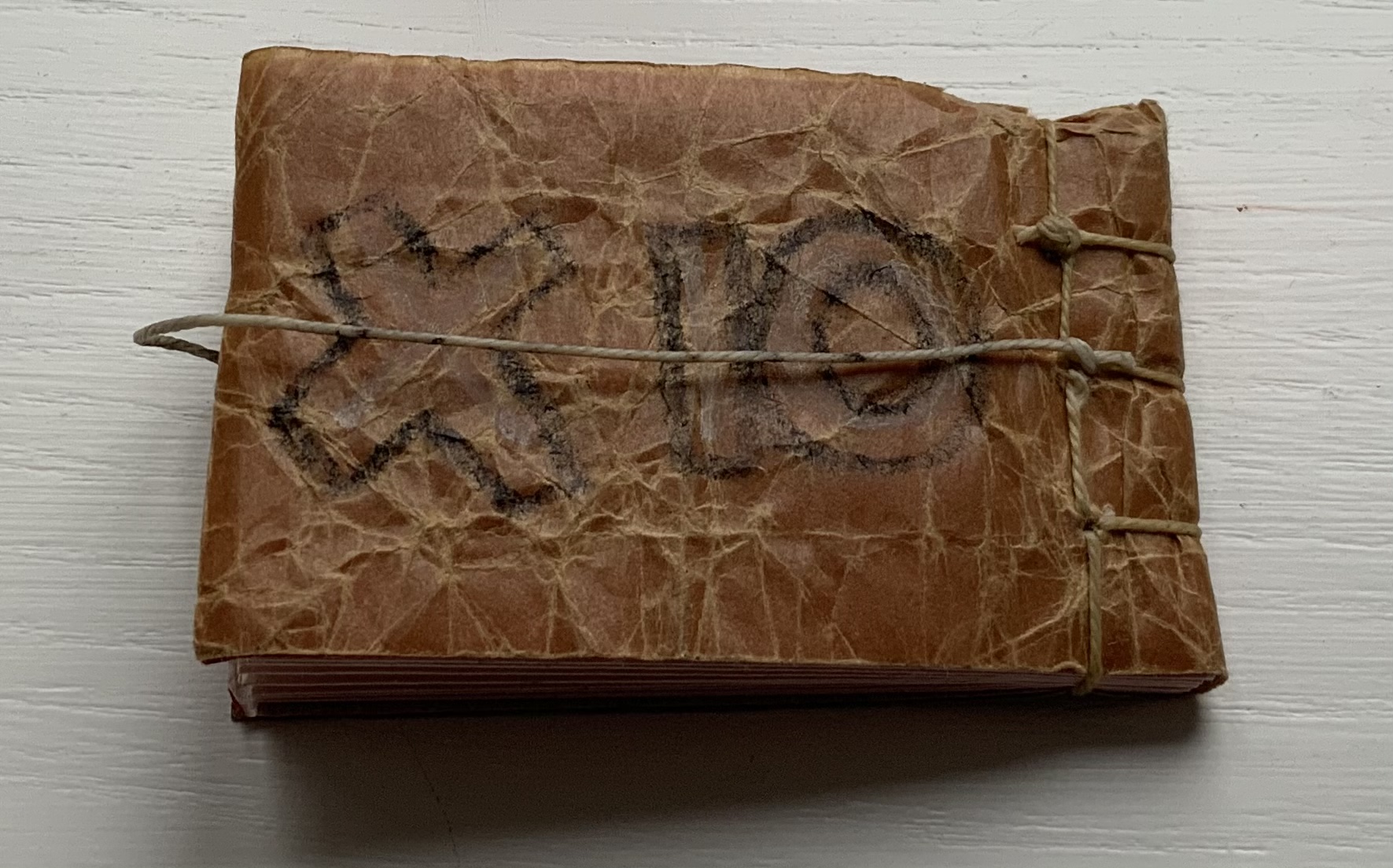
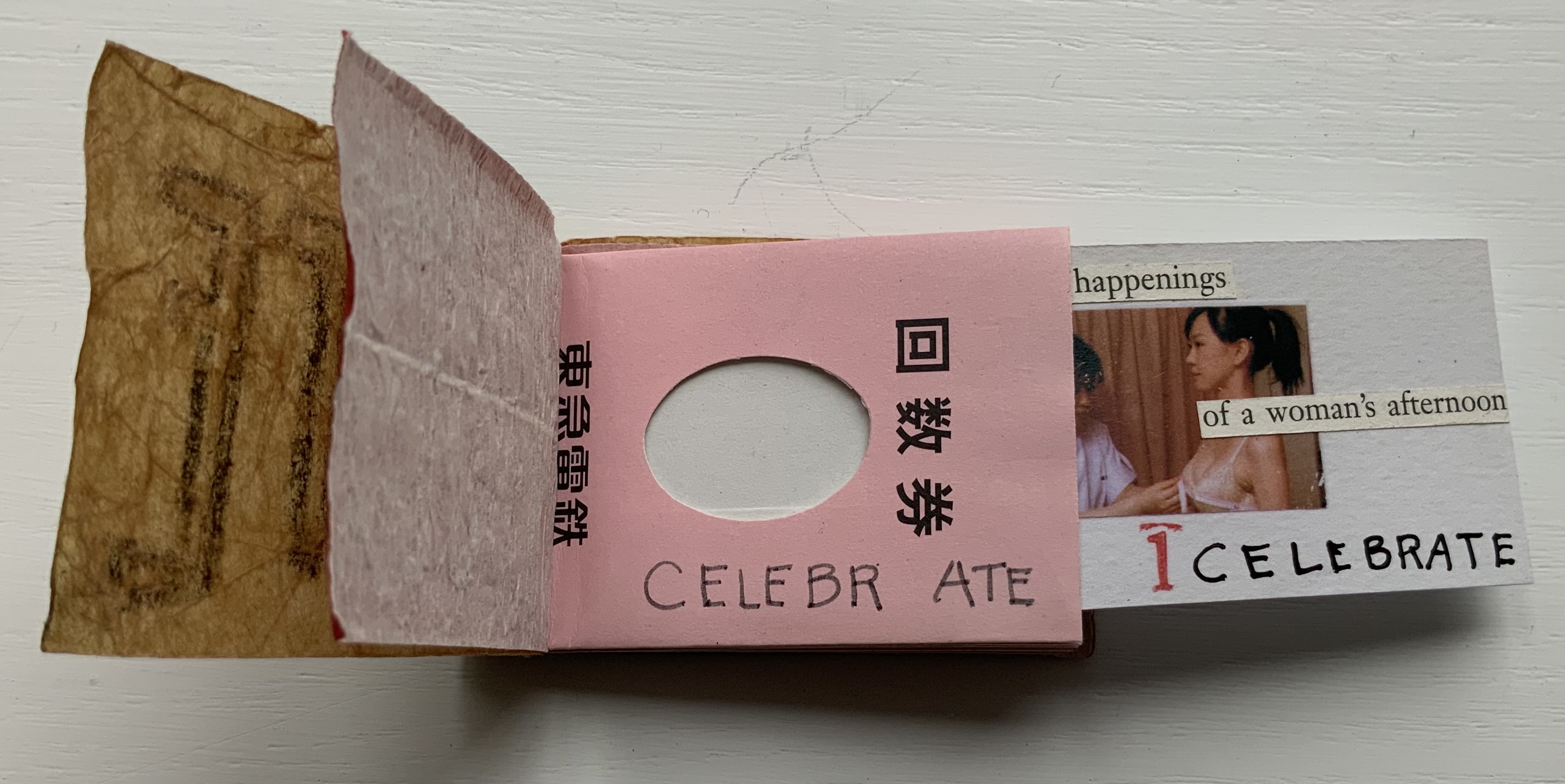
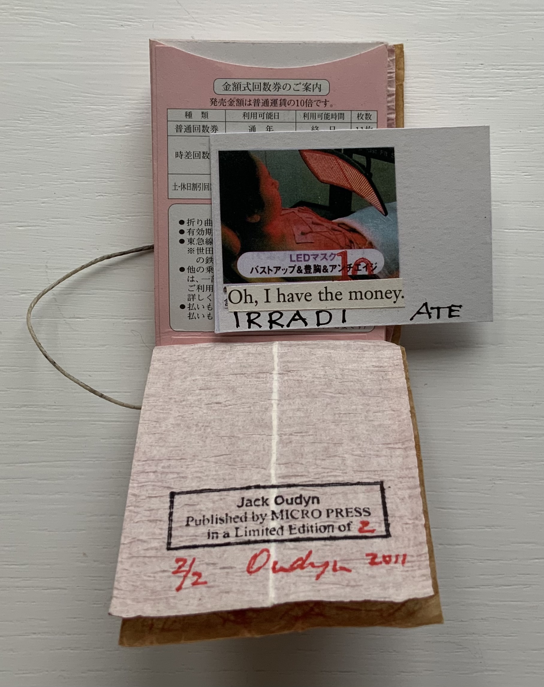
‘ATE (2011)
‘ATE X 10 (2011) Jack Oudyn Japanese stab-bound booklet, with wax paper cover and Momigami fly leaves. H54 x W74 mm, 10 train ticket sleeves holding 10 small numbered cards collaged with advertising brochure photos. Edition of 2, of which this is #2. Photos: Books On Books Collection, displayed with permission of the artist.
‘ATE X 10 demonstrates Oudyn’s wont to play language, form and material off image and vice versa. Bound in a Japanese stab binding by waxed thread and wax paper from the fish markets at Tsukiji in Tokyo, the book begins with a front fly leaf page bearing a tag line from the breast exercise mantra; on the same Momigami paper, the end fly leaf bears the colophon. The pages are made of Japanese train ticket sleeves containing numbered cards collaged with small photos from advertising brochures found near railway stations. As the fly leaf hints, the modest photos come from ads for breast enhancement services, an 8 x 10 promise relative to the images presented.
The works in the Micro Press imprint also reflect Oudyn’s interest (and presence) in mail art. He has been a member of the International Union of Mail Artists, and a section on his site is devoted to mail art.
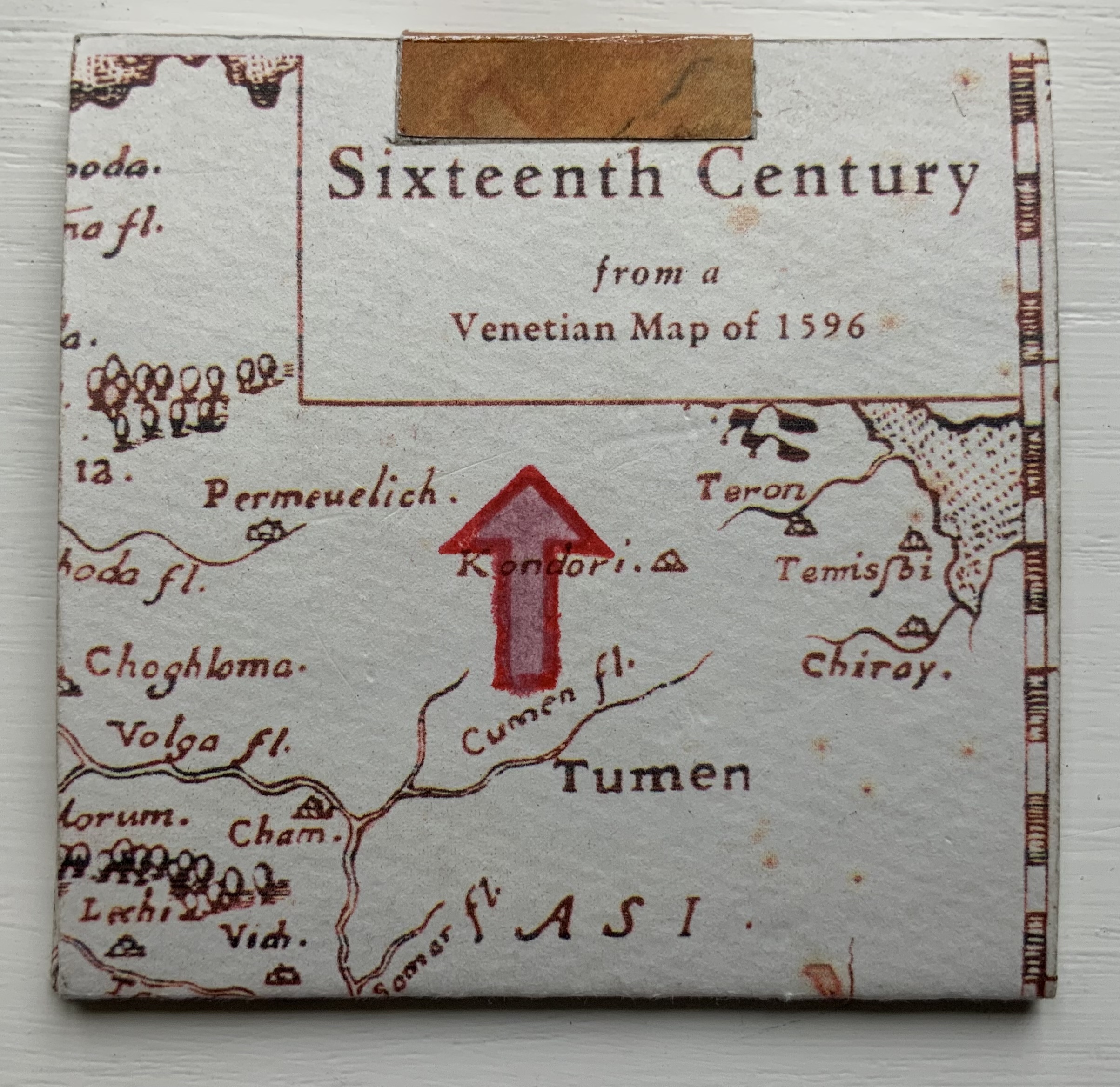
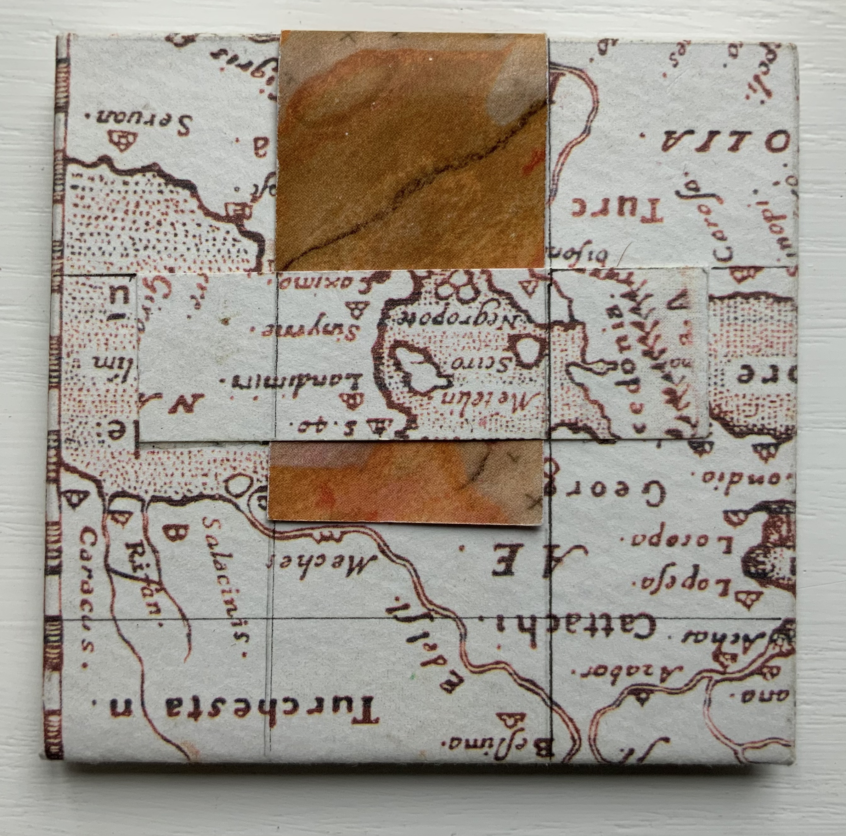
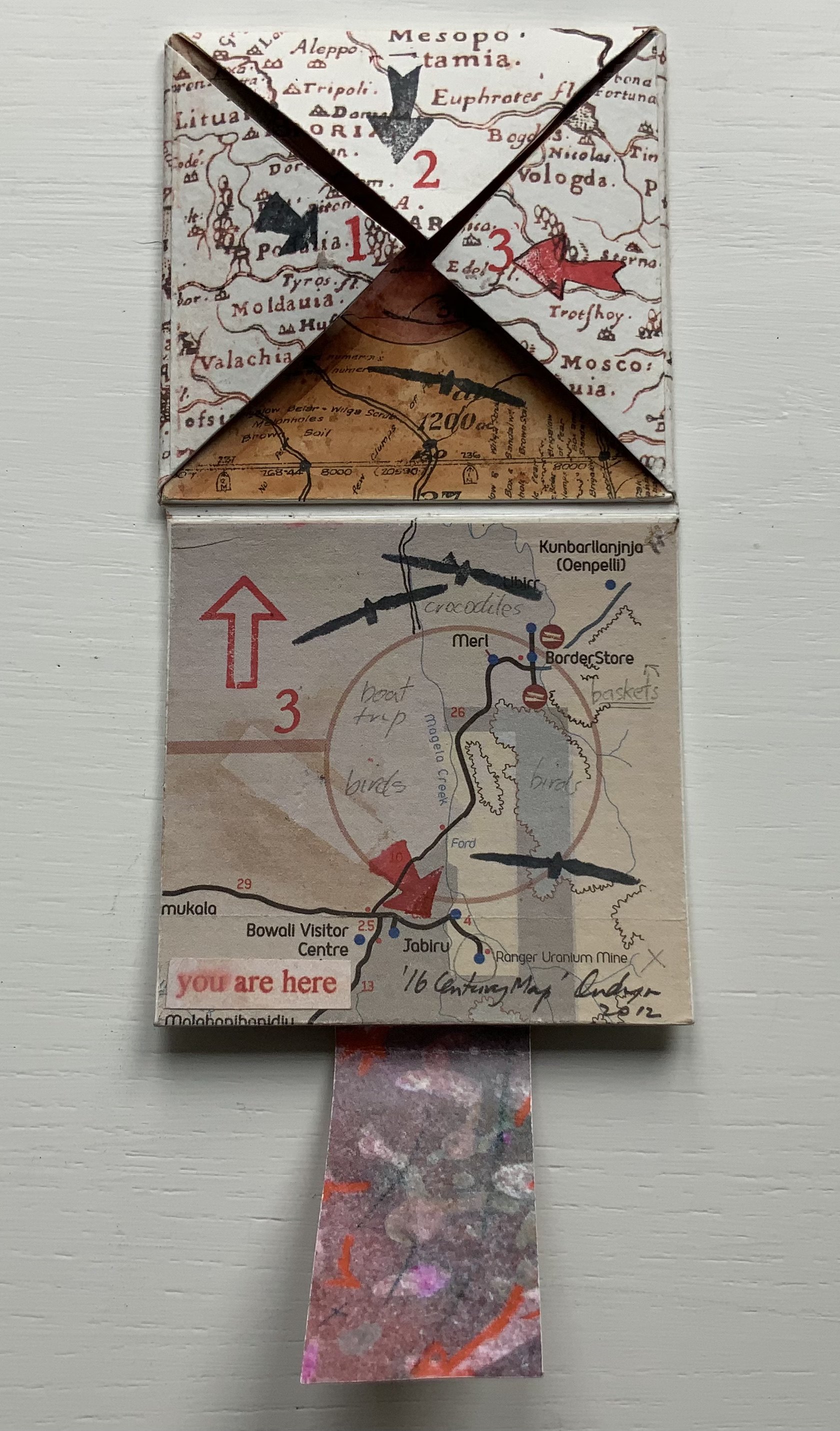
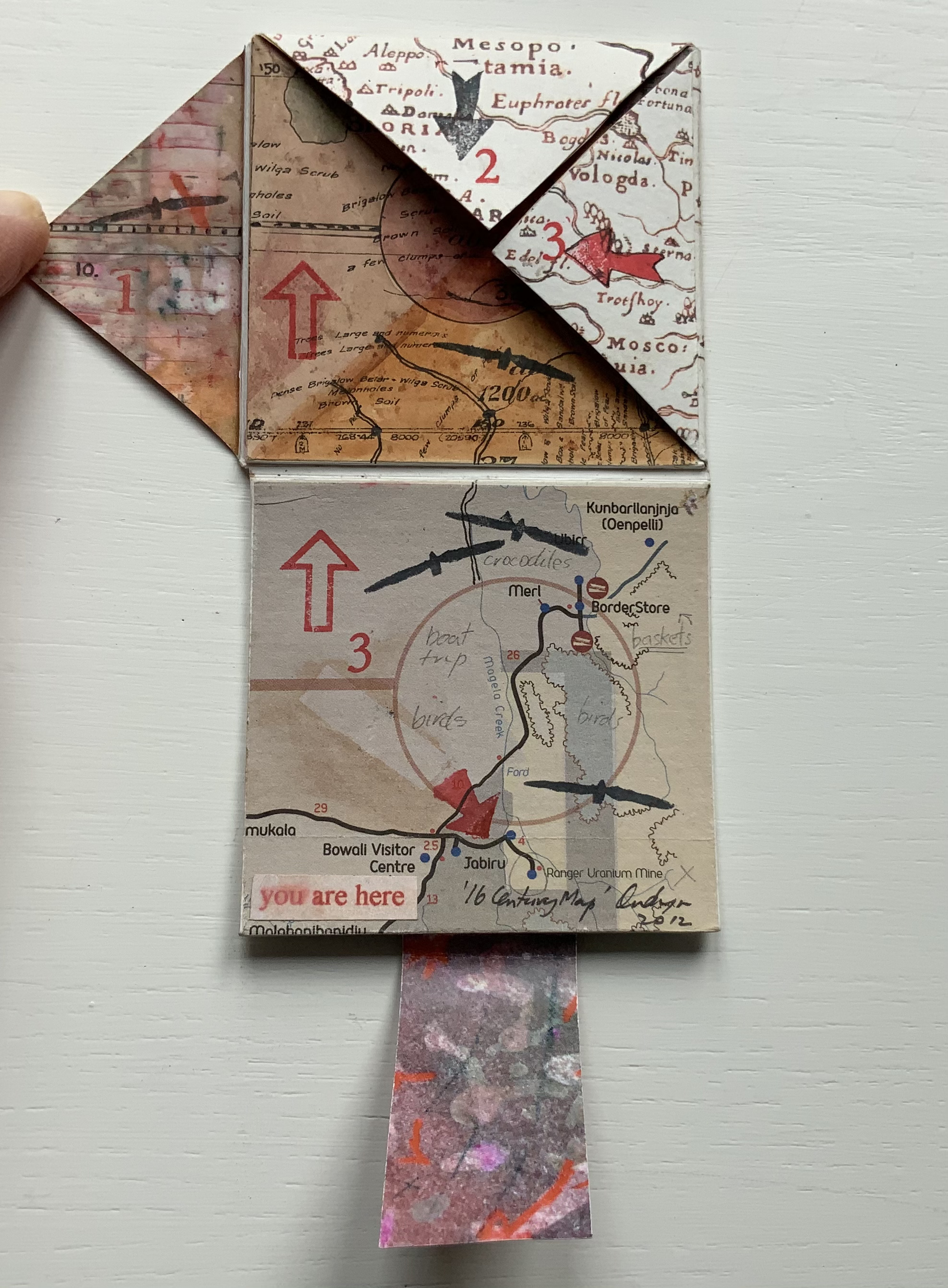
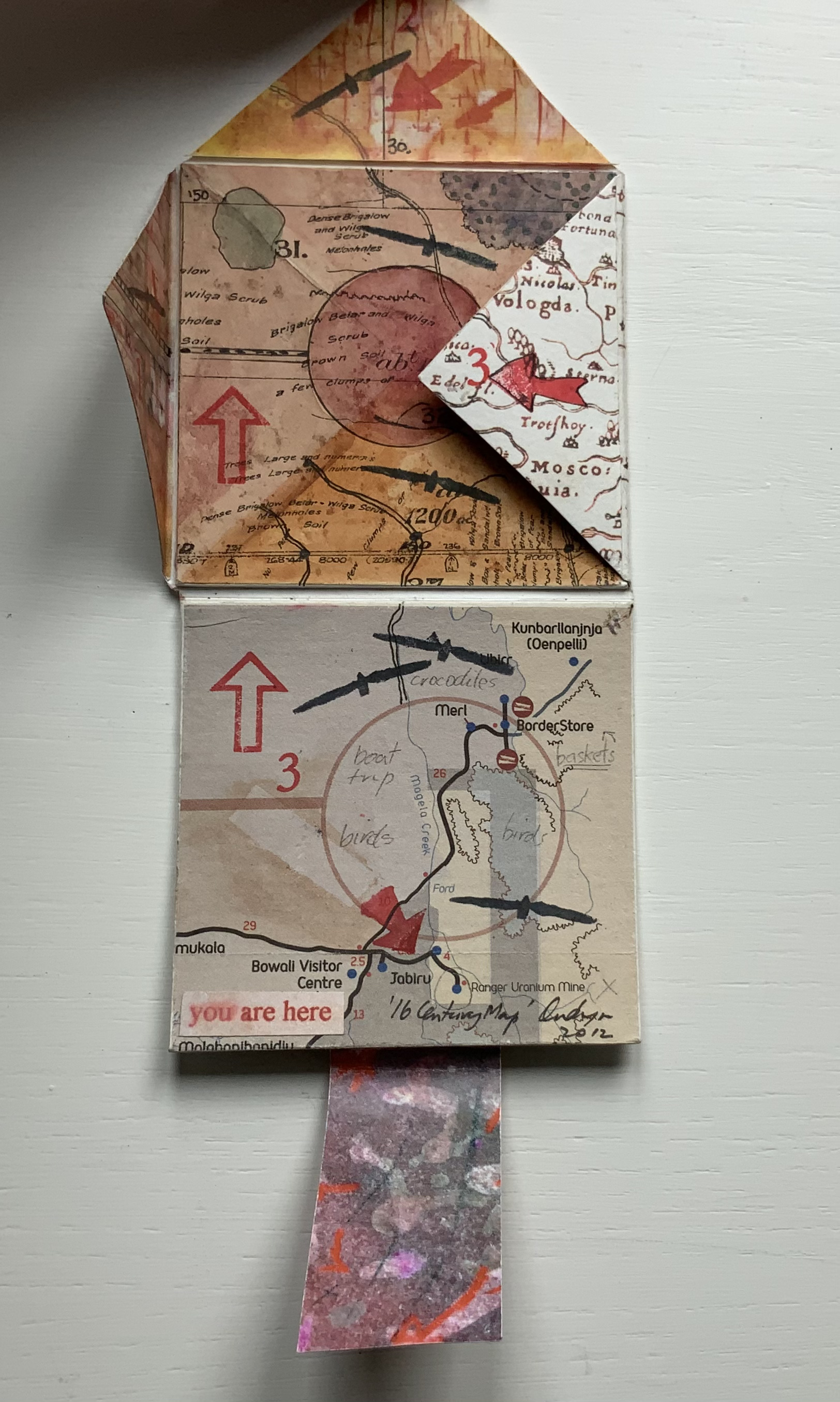
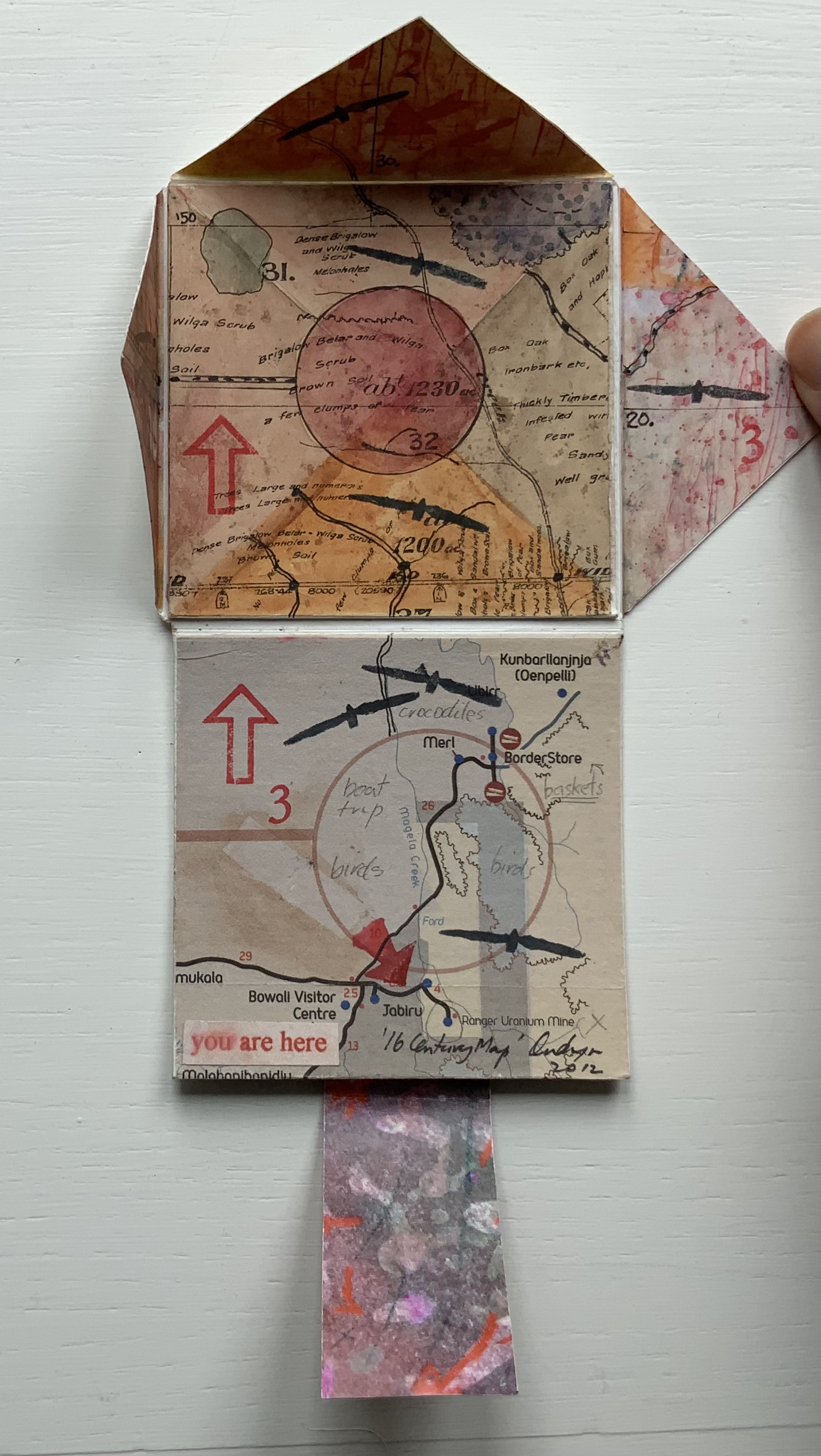
’16 Century Map’ (2012)
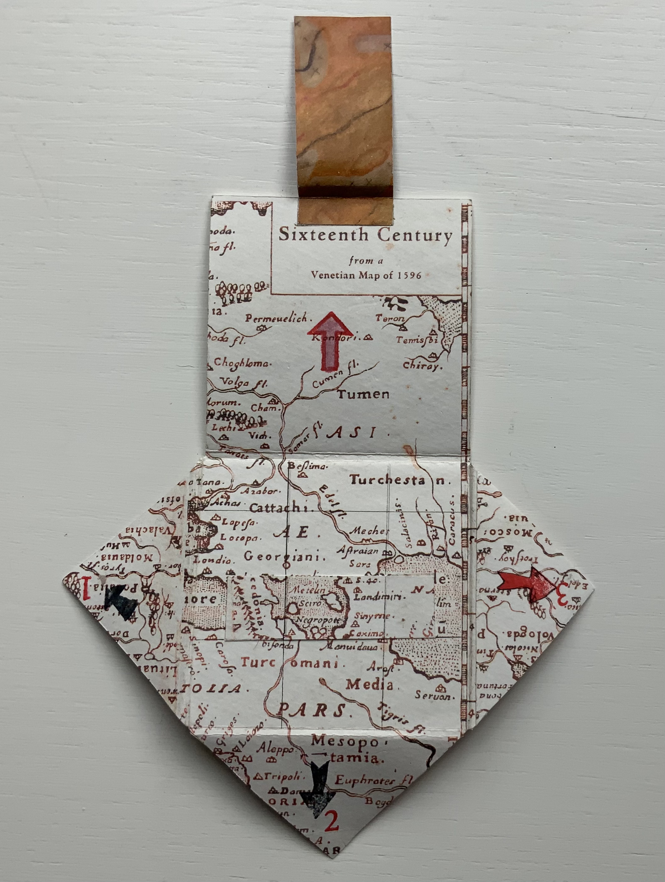
’16 Century Map’ (2012) Jack Oudyn Tab/slot-bound, single-fold, map paper on board, covering three outward-opening triangular cut tabs over center map paper on board; ink-stamped and drawn, with “you are here” sticker in lower left corner. H70 x W72 mm (closed). Unique. Acquired from the artist, 4 January 2020. Photos: Books On Books Collection, displayed with permission of the artist.
This small unique work — and those that follow — lie outside the Micro Press imprint. As the artist writes on his blog, this is a trial attempt at juxtaposing the exterior old European map (showing Mesopotamia and the Euphrates, the Northern hemisphere’s cradle of civilization) with the interior Australian map of the Kakadu National Park to get at the concept of Tjukurpa, by which Australia’s Anangu refer to the creation period.
It is not strictly a Turkish-fold map, but the way the tab with indigenous colors snugly closes ’16 Century Map’ is just as mechanically satisfying.
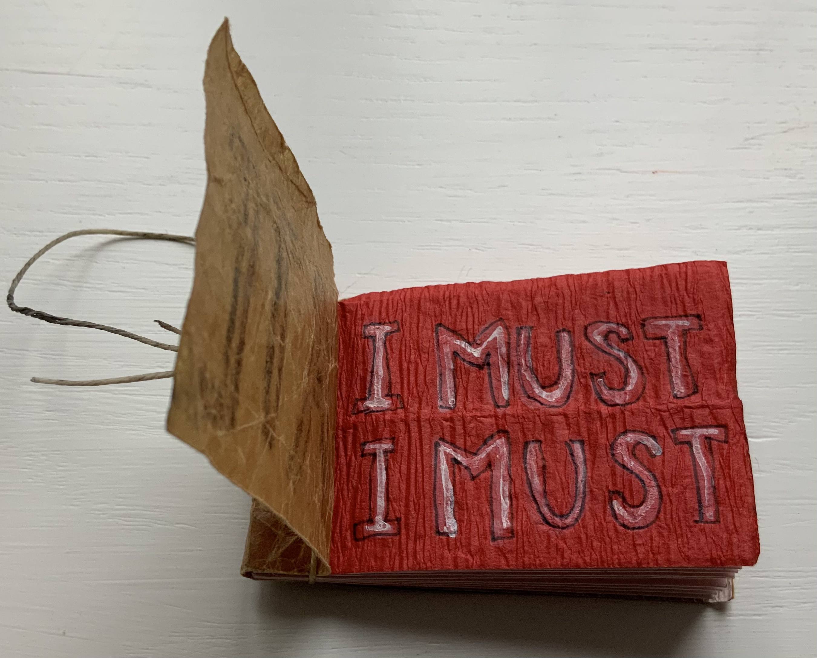
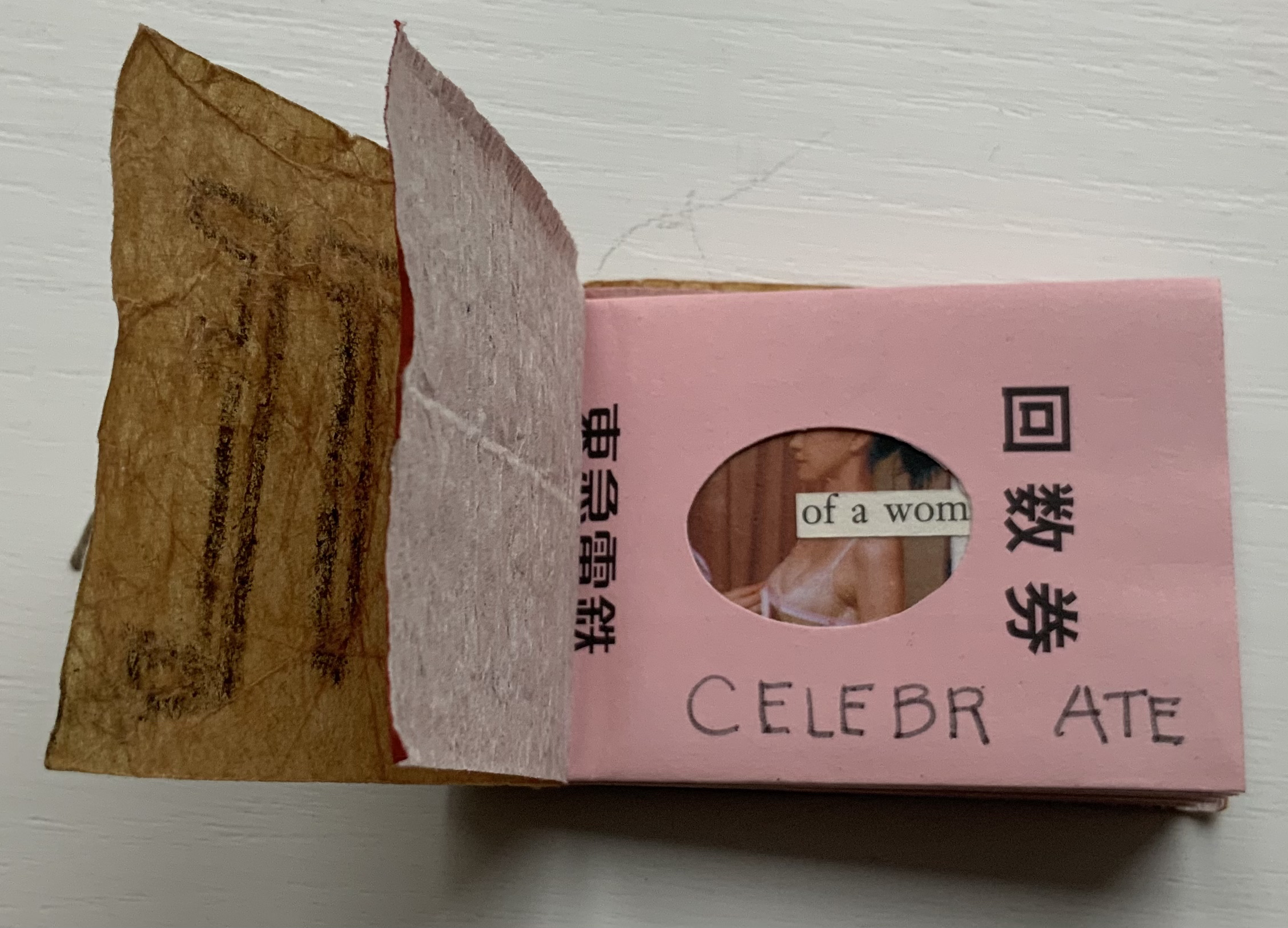
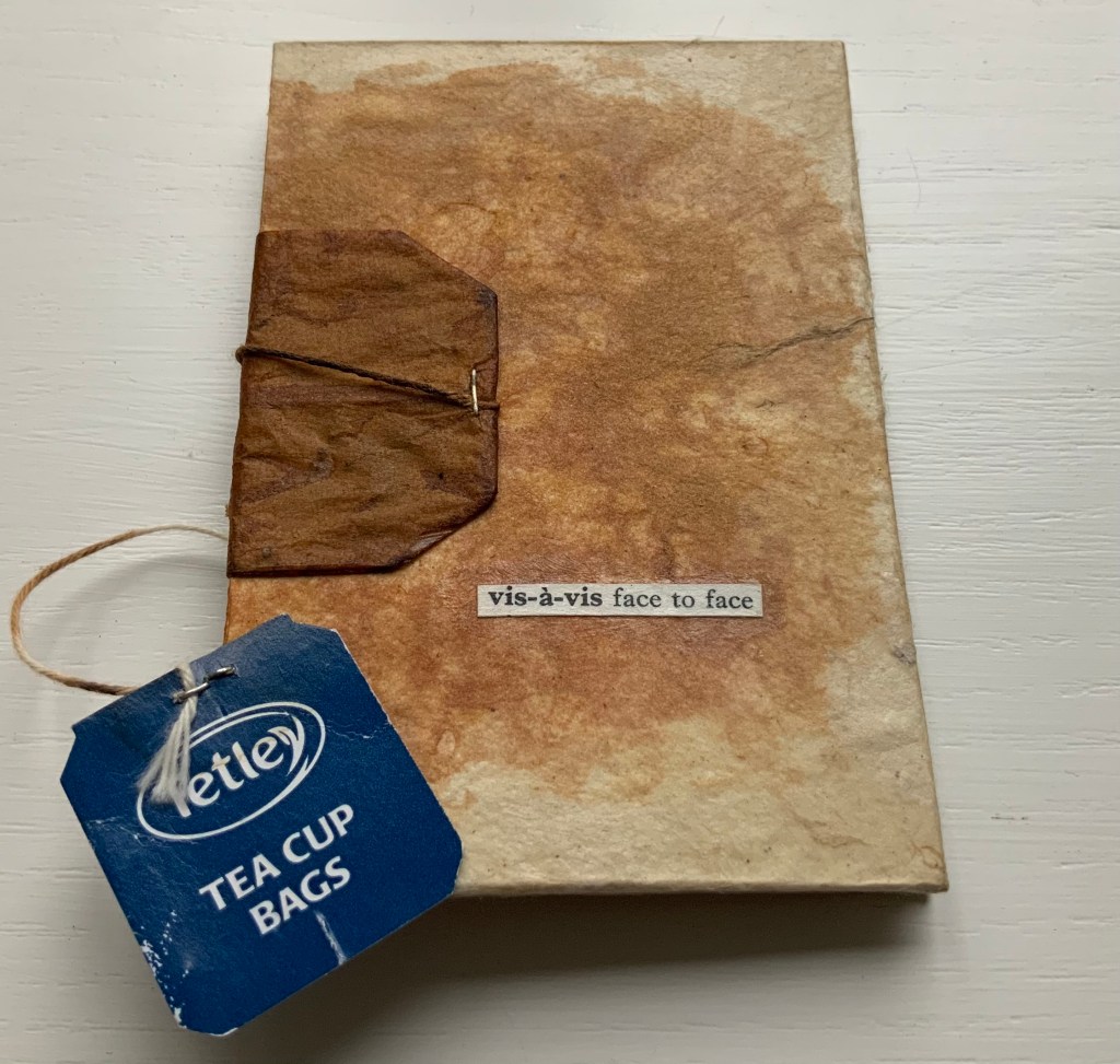
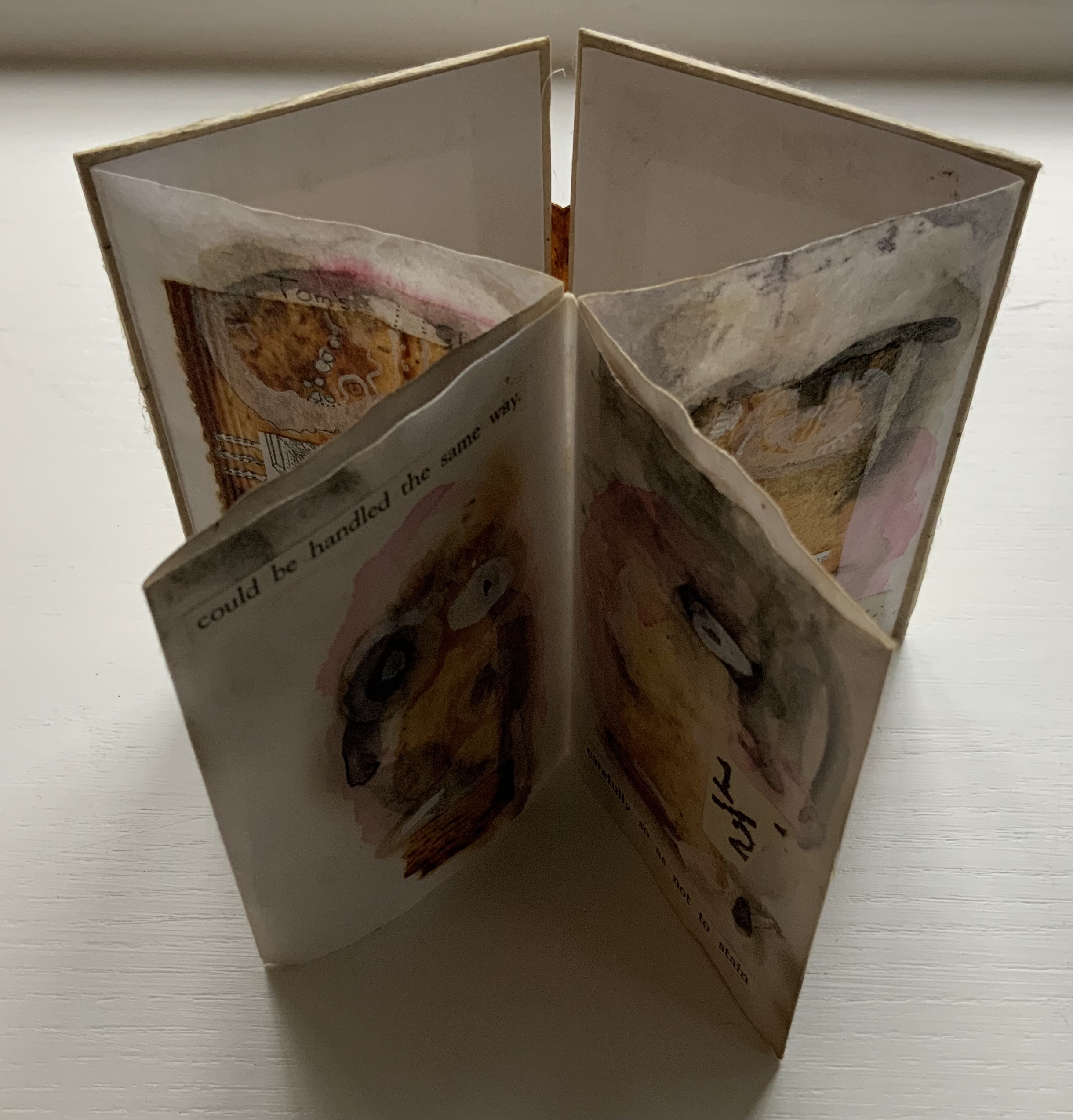
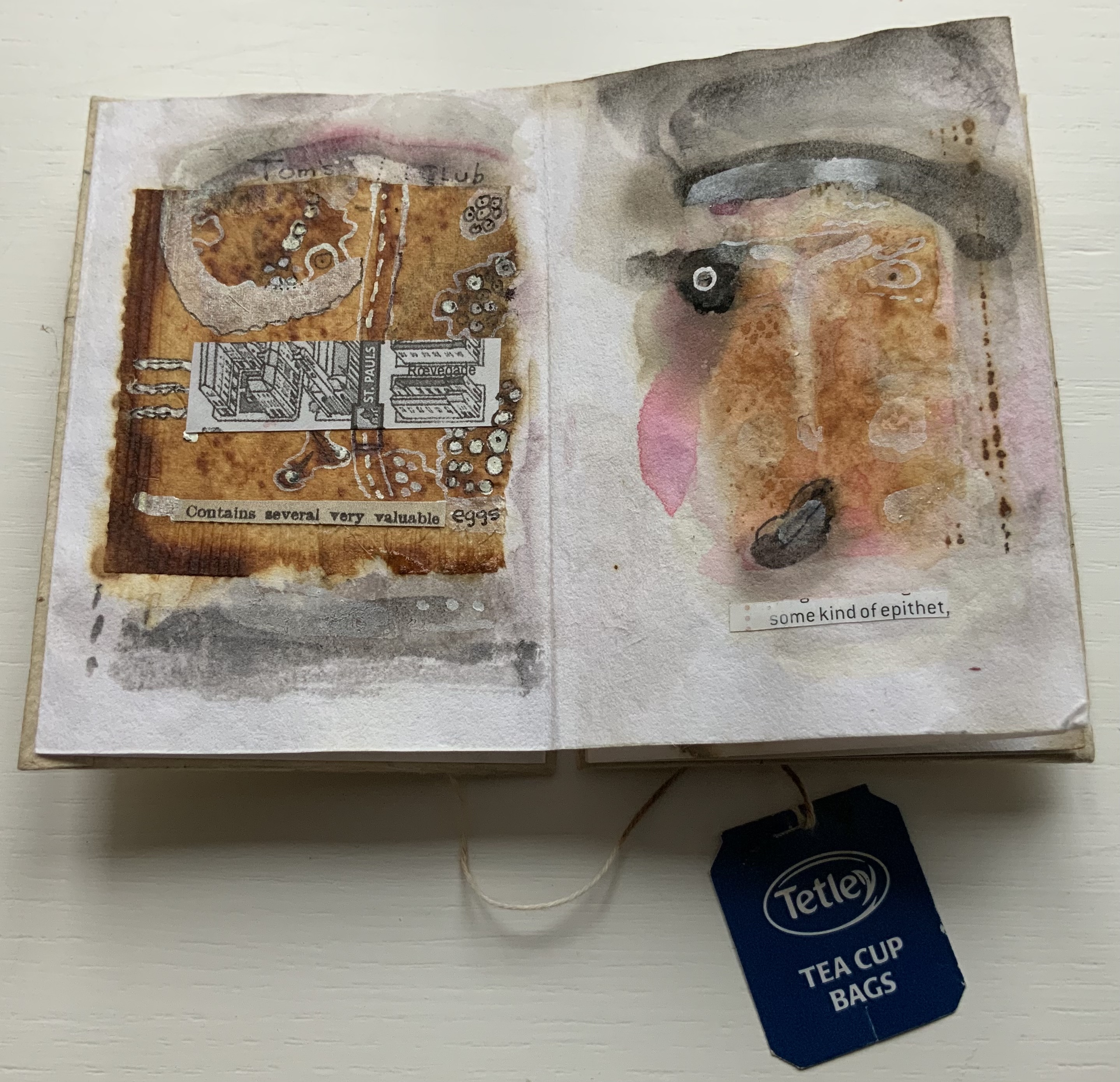
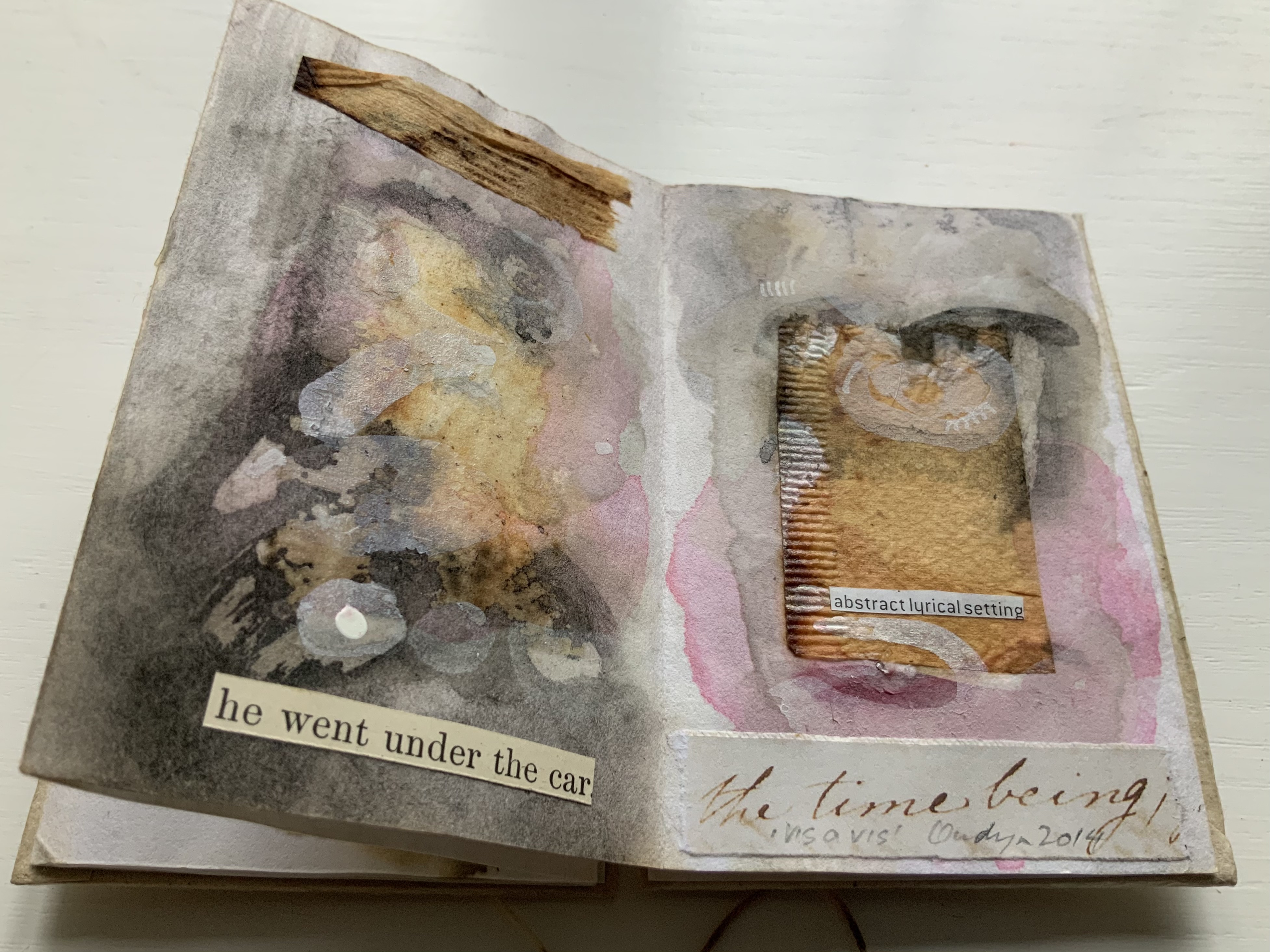
vis-à-vis | face to face (2014)
vis-à-vis | face to face (2014) Jack Oudyn Blizzard-fold booklet, mixed media and collage with tea bag paper. H100 x W70 mm, six panels. Unique. Acquired from the artist, 4 January 2020. Photos: Books On Books Collection, displayed with permission of the artist.
A heavily stained, empty teabag glued across the two boards, whose opening is closed with the teabag string wrapped around a wooden button, serves for this booklet’s binding. A conversation between two people struggling for words, hence the near random use of found text, occupies the six panels. The abstract faces profiles are characteristic of Oudyn’s work, as is the use of acrylic medium as a block out or resist. Or perhaps it is egg yolk, which would be in keeping with the reference to eggs and, with the tea stains, in keeping with a breakfast-table conversation.
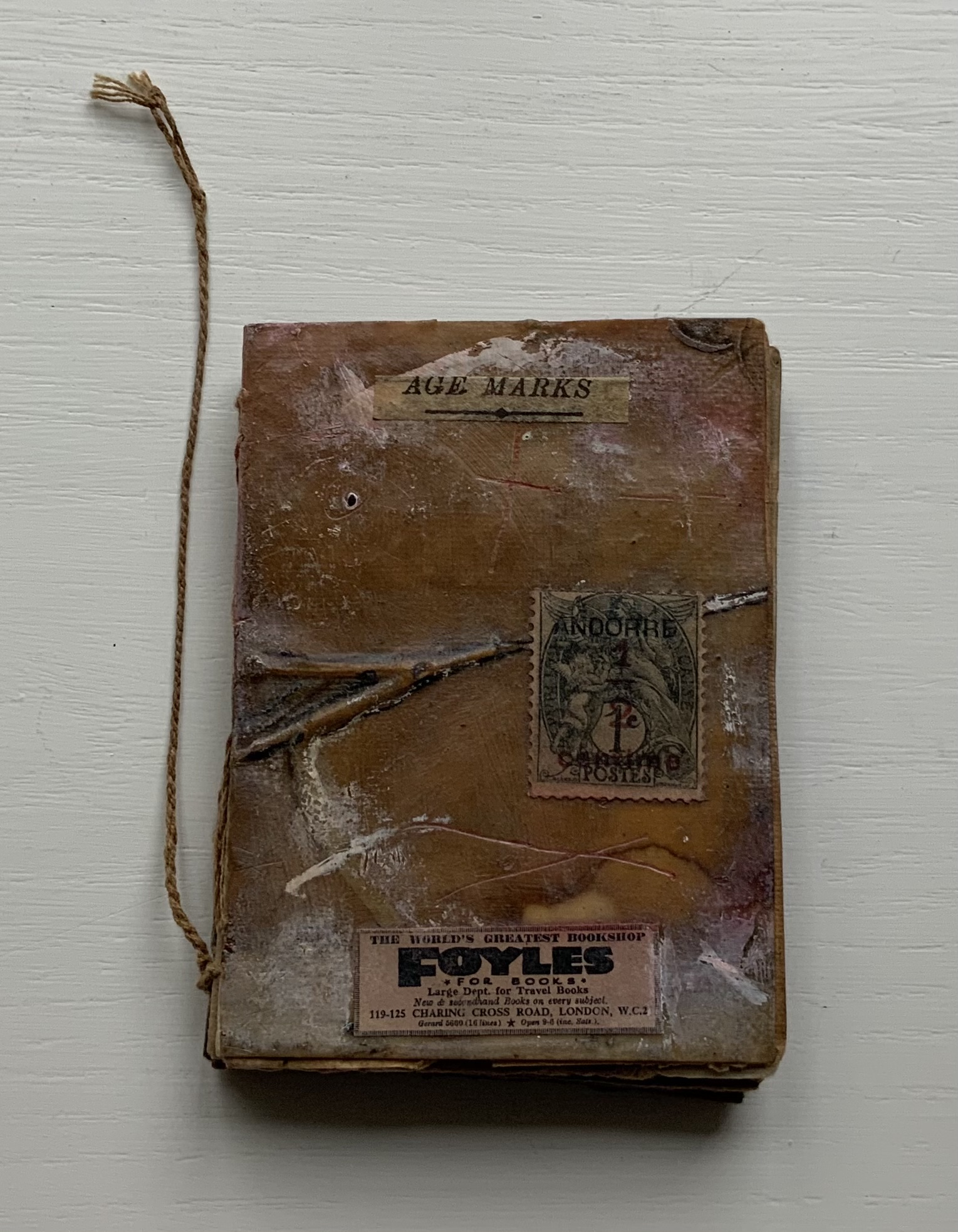
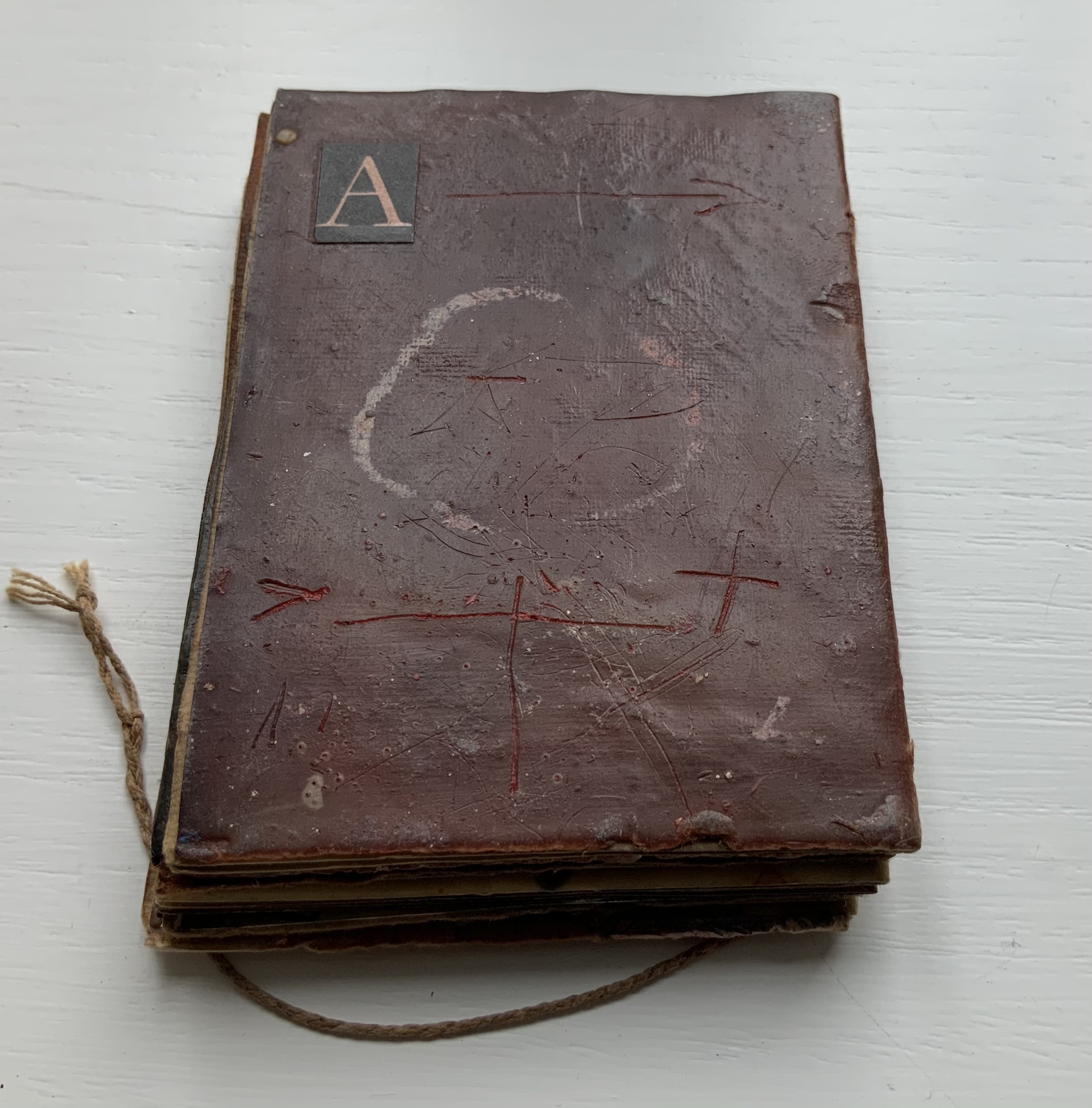
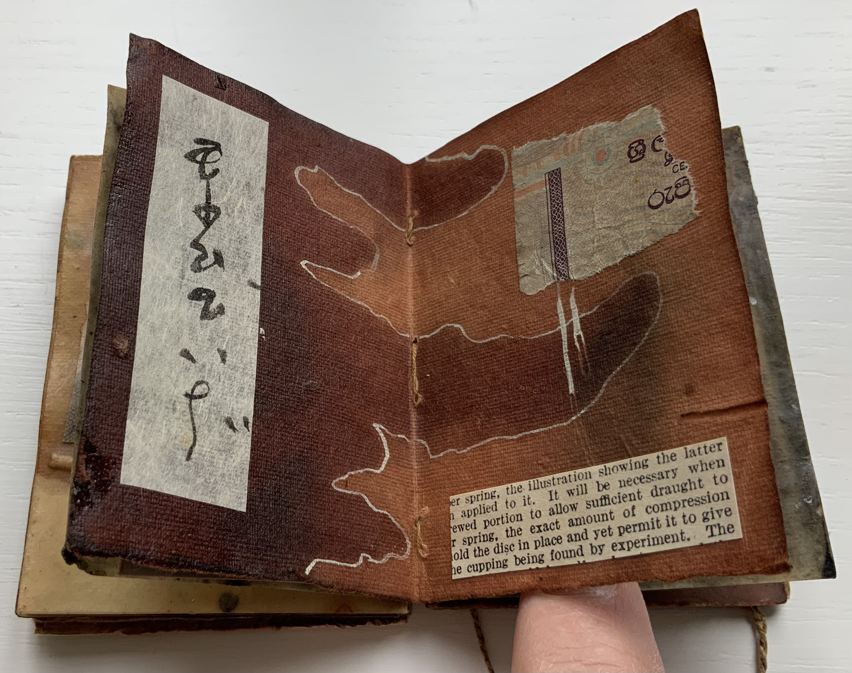
Age Marks (2014)
Age Marks (2014) Jack Oudyn Handmade waxed and stained paper book by Trace Willans. Mixed media and collage on paper. H85 x W65 x D10 mm, 44 pages. Unique. Acquired from the artist, 4 January 2020. Photos: Books On Books Collection, displayed with permission of the artist.
Trace Willans makes blank books from organic, sustainable media. Age Marks began as one of these blanks, its pages consisting of lightly textured machine-made lightweight paper (ca. 100 gsm), some stained and waxed. The result is not exactly an inscribed blank notebook, not exactly an altered book. Oudyn’s use of mixed media of different hand-made papers, tracing paper, found text, wax, reflective road tape, postage stamps, white acrylic ink, gouache and pigment creates a unique record of the aging process of mark making. Marks made by conversation, observation, inscription, printing, writing, drawing, collation, lifts and reveals, cutting, tearing, pasting, weaving, binding — all filtered through aging.
Small as it is, Age Marks is one of the most varied haptic experiences in the collection.
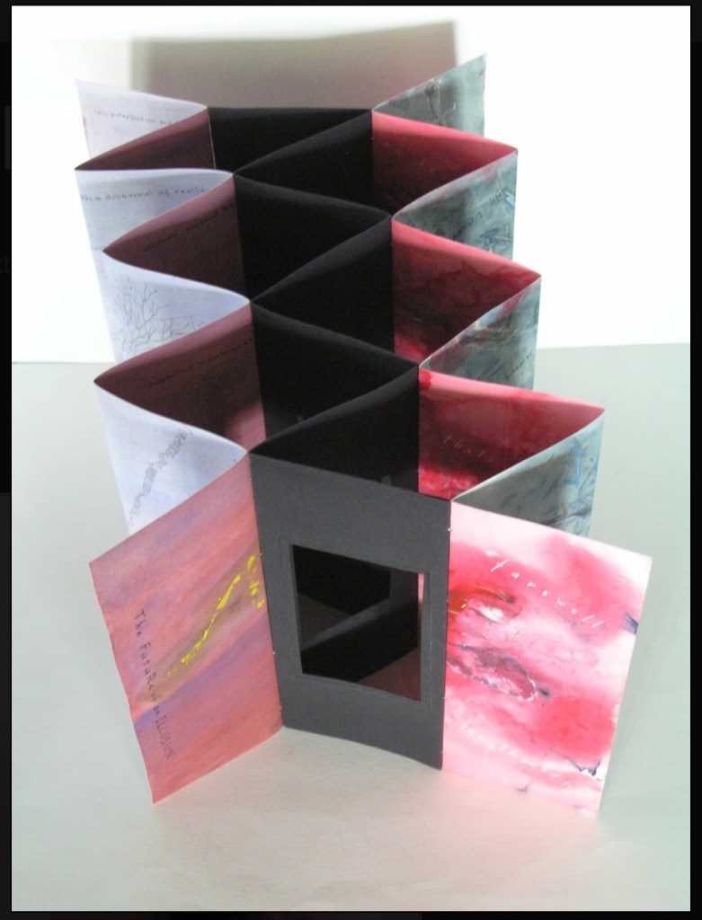
The Future of an Illusion (2017)
The Future of an Illusion (2017) Helen Malone and Jack Oudyn Sculptural tunnel book structure (three joined four-fold leporellos) enclosed in a folder and protective boxin a box,. Box made with Lamali handmade paper, suede paper (lining) and Somerset Black 280 gsm; Folder: Canson black 200gsm, skull button and waxed thread; Leporellos: center leporello made of Canson black 200 gsm, linen thread adjoining two leporellos made of Arches watercolour paper 185 gsm with acrylic, soluble carbon, gouache and transfer ink jet images. Box: H275 x W313 x D34 mm; Folder: H258 x W295 x D21 mm; Book: H250 x W290 x D16 mm closed, D410 mm open. One of an unnumbered, signed edition of 4. Acquired from Helen Malone, 12 September 2017.
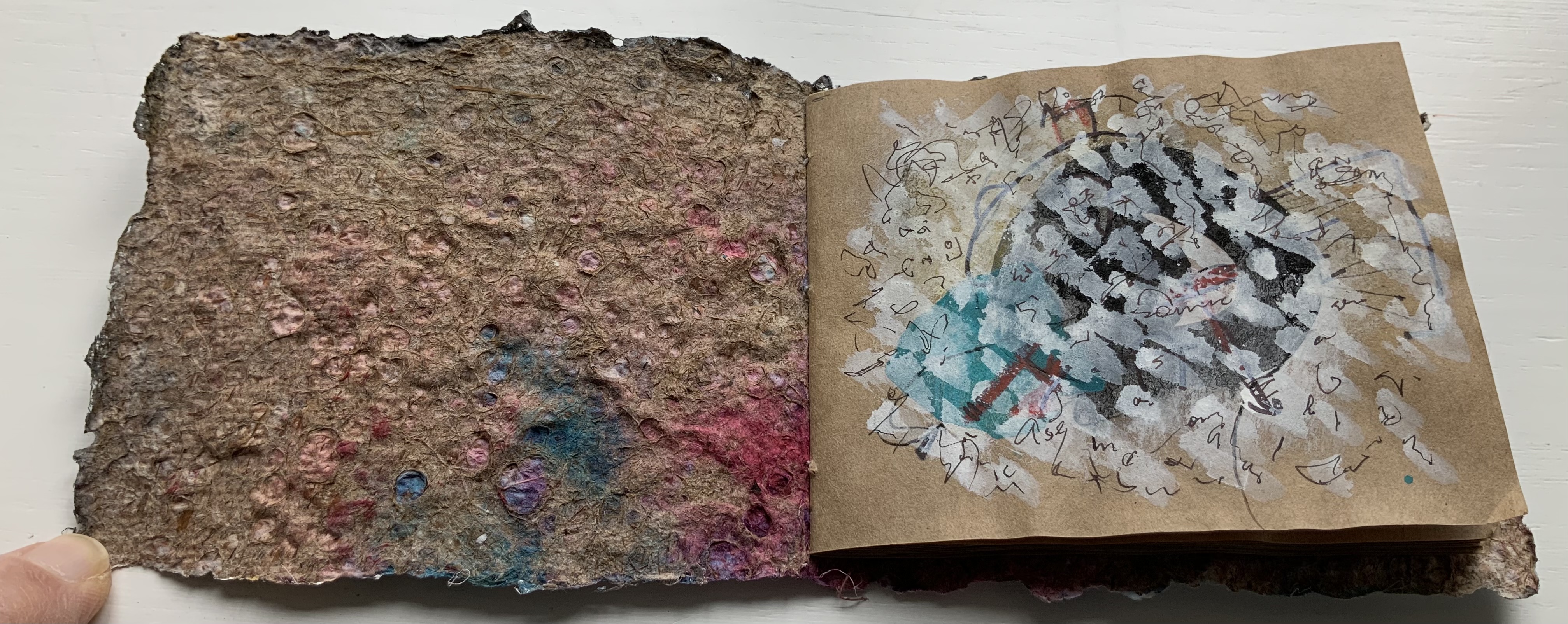
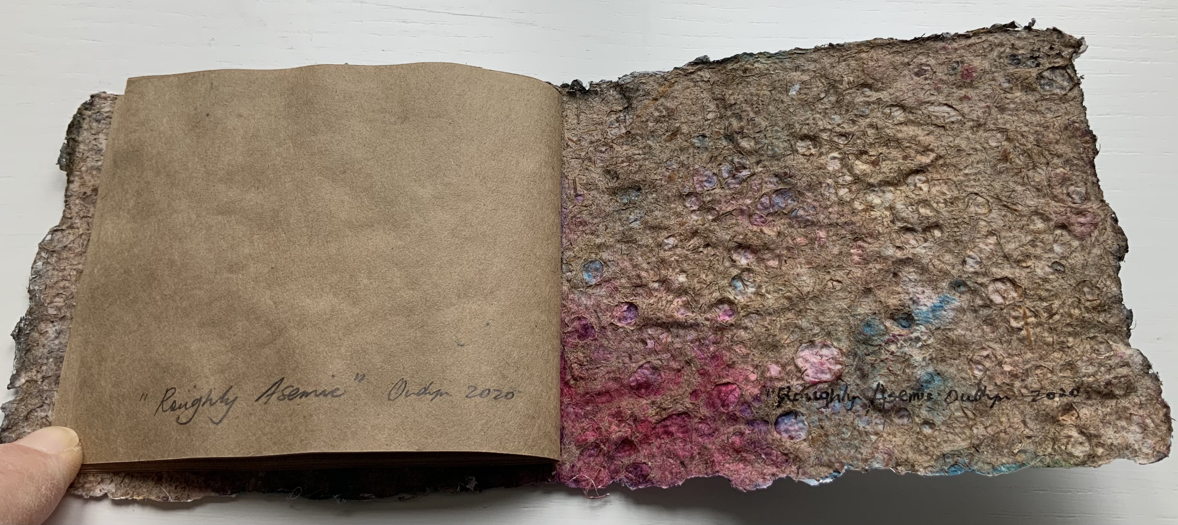
Roughly Asemic (2020) Jack Oudyn Booklet, single-thread stitched, handmade paper cover, painted and inked, over brown Kraft paper folios illustrated with drawings and markings in paint and ink. H105 X W123 mm, 7 leaves, folded in half making 28 unnumbered pages, 14 of which bear drawings and markings, 13 of which are left blank, and the last page bears the title, signature and year. Unique. Acquired from the artist, 4 January 2020. Photos: Books On Books Collection, displayed with permission of the artist.
This work’s title could not be more apropos. It is a scratchy thing to hold, its pages stiff and crackling as they turn. Patterns, images and letters struggle to emerge, only to be submerged by each other on the same or next page, which goes to show how difficult it must be to achieve entirely asemic markings. “Roughly asemic” might be the best hoped for.
Foster, Robin. “Feature Artist – Jack Oudyn“, Personal Histories, International Artist Book Exhibition, Redland Museum, UNSW, Canberra. 11 March 2014. Accessed 19 October 2020.
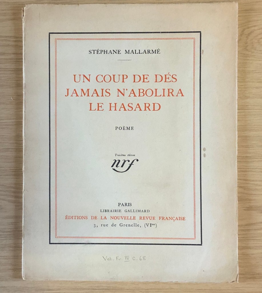
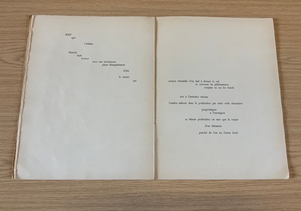
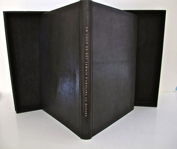
It was 1913. Stravinsky’s ballet “The Rite of Spring” debuted. The Cubists, Constructivists, Suprematists, Futurists all bound onto the art scene, many of them showcased in the Armory Show in New York that year. The Nouvelle revue française (NRF) attempted the first book form of Stéphane Mallarmé’s Un Coup de Dés Jamais N’Abolira le Hasard, which revived that 1897 typographic disruption of the page and prepared the ground for dozens of works of book art since. And Blaise Cendrars and Sonia Delaunay-Terk announced and published what they called le premier livre simultané. It was La Prose du Transsibérien et de la petite Jehanne de France.
From the Bodleian Library collection Photos: Books On Books
From the National Art Library, Victoria & Albert Photo: Books On Books
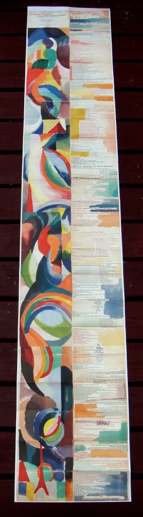
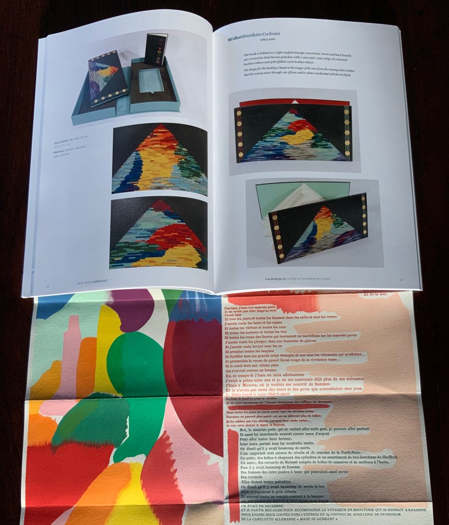
Like Mallarmé, Cendrars disrupts the page with multiple typefaces (thirty distinct ones in his case) and scattered placement of lines and stanzas. But La Prose presents an even more physical and structural disruption of the page and book than Un Coup de Dés. Unlike the latter, La Prose unfolds — twice — in an accordion format to over two metres in length or rather height since the text descends on the right and ends alongside the interlinked images of the Eiffel Tower and a Ferris wheel at the foot of the accordion. Cendrars and Delaunay had aimed to produce 150 copies of La Prose because, placed end to end, that would have equalled the Eiffel Tower’s height.
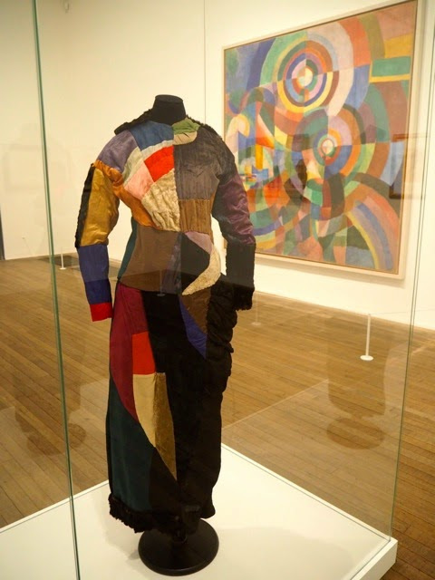
More than this monumental, sculptural, typographic and physical disruption of page and book, La Prose presents a temporal disruption. By le premier livre simultané, Cendrars meant a simultaneity of the verbal and visual — the way that text and image appear all at once — en un éclair. Early Bohemian that he was, Cendrars was co-opting a fair bit of artistic and literary theorising by the Cubists, Futurists and others. Most important and of the moment was his co-opting of Robert and Sonia Delaunay’s colour theory of simultanéisme. The “couleurs simultanées de Mme Delaunay-Terk” had also appeared in her 1913 robe simultanée and paintings. Building on a French scientist’s exposition on how perception of colours changes depending on the colours around them, the Delaunays claimed that rhythmic, musical and spatial synaesthetic elements were also at play. Sonia Delaunay asserted that the artwork produced for La Prose was not in response to reading the poem but hearing it from Cendrars. (Listen to it for yourself here.)
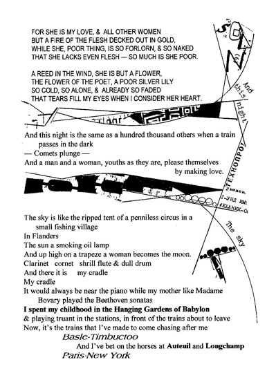
In presenting the adolescent Cendrars travelling physically eastward on the Transsibérien, travelling mentally to Flanders-Basle-Timbuctoo-Auteuil-Longchamps-Paris-New York while still registering the landscape outside, seeing the maimed and wounded returning from the front of the Russo-Japanese war, conversing with a prostitute named after Joan of Arc, doubting himself as a poet, and so on until a sudden transposition back to Paris, the process poem juxtaposes the sacred and profane, past/present/future, stationary and dynamic, national and international in outlook and locale. In short, simultaneously. In a format that is bound and unbound, the poem mirrors the swirling, interacting shapes and colours beside and in which it moves — and vice versa.
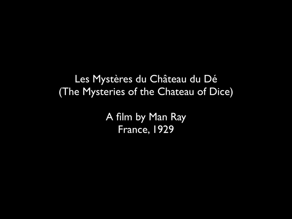
However more disruptive of the page and book La Prose may have been, it did not inspire the profusion of direct re-interpretations (or appropriations) that Un Coup de Dés prompted from artists such as Jérémie Bennequin, Ellsworth Kelly, Man Ray, Didier Mutel, Michel Pichler, Eric Zboya and dozens of others.
Not until 2001 did a re-versioning of La Prose appear. Tony Baker and Alan Halsey published an English translation and codex re-formatting. Its black on white imagery is reminiscent of the Russian Futurists, the type is monochromatic, and the typefaces, fonts and weights vary but not as much as in La Prose.
Baker and Halsey note in their colophon:
So far as we’re aware no translation of the poem into English has ever been attempted to give a sense of Cendrars and Delaunay’s original conception, not the least reason for which may have been the difficulty until recently of seeing the first edition, even in reproduction. — Prose of the Trans-Siberian and of the Little Jeanne de France (Sheffield: West House Books, 2001)
A well-founded lament — at least for the book art community. Not until 2000 had there been a reduced-scale reproduction of La Prose. It appeared in Granary Books’ A Book of the Book by Jerome Rothenberg and Steven Clay across a four-page foldout in the embrace of Ron Padgett’s English translation. Only in 2008 was there a full-scale, full-colour offset facsimile, produced by Yale University Press with an appended translation. It is now out of print.
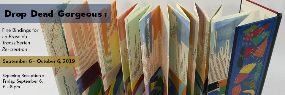
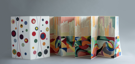
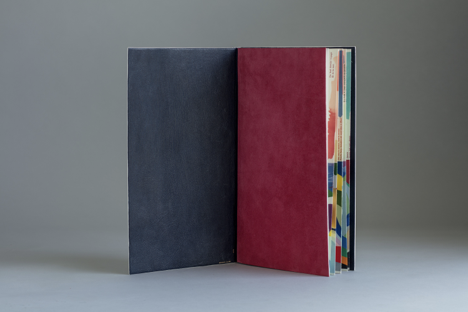
With her work La Prose du Transsibérien Re-creation (2019), Kitty Maryatt has changed all that. With this deuxième livre simultané, she has more than caught the echo of Cendrars/Delaunay’s original and its arrival. As scholar, artist and veritable impresaria, she has reinvigorated the book art/arts community with the legacy of La Prose.
Her blogspot documents the research and production with rich details about sourcing the type, learning about stencil-cutting from Atelier Coloris (one of the few remaining businesses devoted to pochoir), determining the recipes for the ink colours, testing papers (Zerkall Crème, Biblio, and Rives HW), creating a census of the existing 1913/14 originals and their locations — all that and more, including the use of bacon fat and a wine bottle filled with lead shot. She also organized a documentary by Rosylyn Rhee: “The Pochoir Re-creation of La Prose du Transsibérien”. It brings the importance of the original and this re-creation to life in the expressions and voices of prominent collectors, librarians and scholars, artists, rare book dealers and the project’s funders.
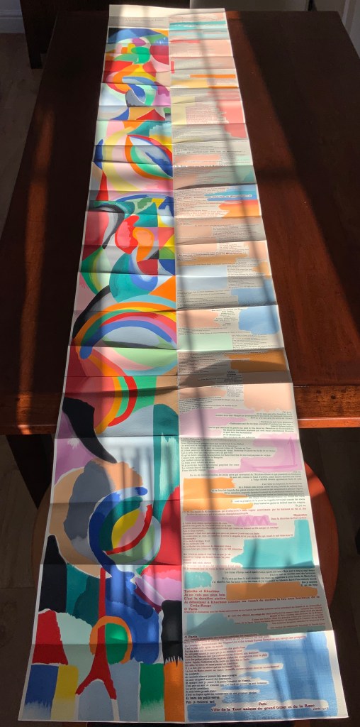
In addition, Maryatt has been either a contributor to, or the motivating force behind, several symposia and exhibitions such as “Paris 1913: Reinventing the Artist’s Book” (at the Legion of Honor Museum in San Francisco, 2018) and “Drop Dead Gorgeous”. The latter is a travelling exhibition resulting from invitations to twenty-four book artists and designer bookbinders to design and create bound copies of La Prose du Transsibérien Re-creation. For the San Francisco venue, Maryatt prepared a workshop on traditional French pochoir and provided text for the exhibition catalogue (available from the online store of the San Francisco Center for Books).
Monique Lallier’s fine binding of La Prose du Transsibérien Re-creation Photos: Courtesy of Monique Lallier
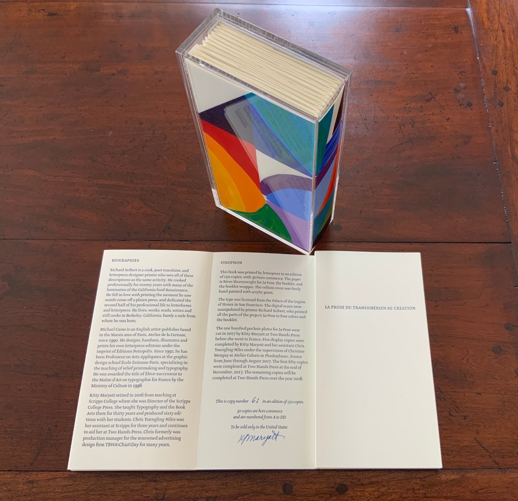
The pinnacle of Maryatt’s efforts, of course, is the standard and deluxe editions of La Prose. Both editions consist of 4 pages, glued together to create the tall single page. For the standard edition, the page is folded into 21 sections and loosely placed in a painted vellum cover with a booklet describing the project and production. An acrylic slipcase houses the covered bundle.
The standard edition Slipcase: H195 x W108 x D45 mm. Wrapper: H182 x W97 x D35 mm. Leporello: H81 x W95 mm (closed). H1954 x W160 mm (open). Booklet: H81 x W94 mm (closed), W1055 mm (open). Photo: Books On Books
Photo: Books On Books
Photos: Books On Books
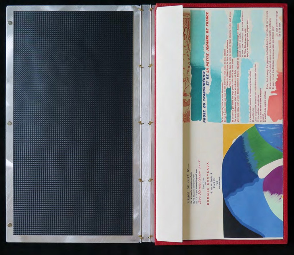
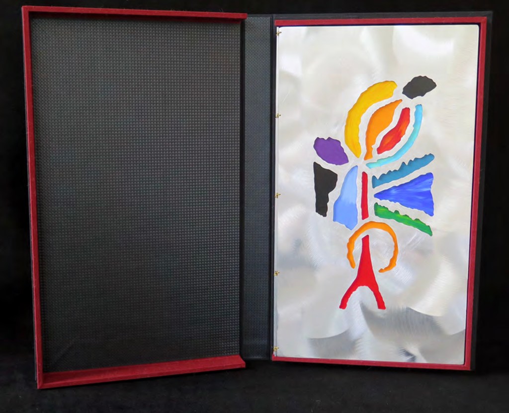
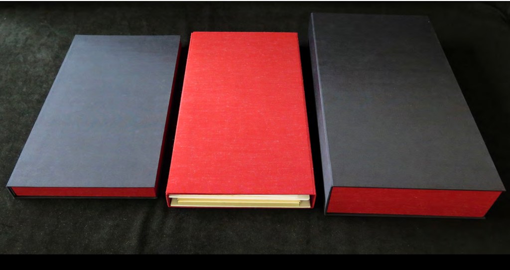
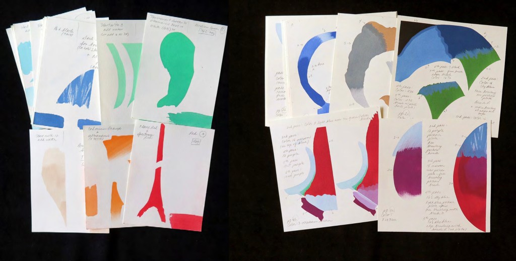
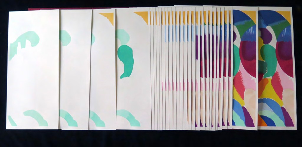
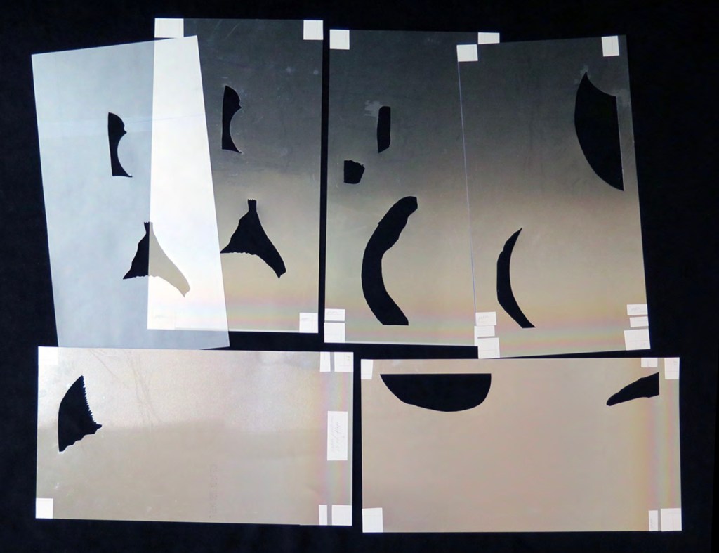
For the deluxe edition, the single page is left double-wide, accordion-folded double-tall between aluminum covers and housed in a clamshell box. A separate case holds the painted vellum cover, colour cards, Sonia’s visual vocabulary, 27 progressives for page one, 5 pochoir plates with tracing paper and registration system, the booklet with introduction and colophon, and the list of 30 typefaces Cendrars used. A large clamshell box houses this separate case and the boxed book. The colour cards include the recipe for mixing the gouache, and Sonia’s visual vocabulary shows the numbered steps of operations. The progressives for page one show the steps for doing the pochoir stencils and handwork.
The deluxe edition Photos: Courtesy of Kitty Maryatt
Any institution with a focus on book art or the graphic arts should seek out the standard edition of La Prose du Transsibérien Re-creation. Any institution with a focus on teaching and practice in those domains should seek out the deluxe edition. As indefatigable as Cendrars and as productive as Delaunay, Kitty Maryatt has provided the basis of master classes for generations. Now it is up to the book art community to respond as it has to Un Coup de Dés.
A shorter version of this essay appears in Parenthesis 39, Fall Issue, 2020.
Further Reading
Ashton, Doré. “On Blaise Cendrars. . . But I Digress.” Raritan 31, no. 2 (2011): 1-42,164. An entertaining extended anecdote sketching Cendrars and his milieu.
Gage, John. Colour and Meaning : Art, Science and Symbolism(Berkeley, CA: University of California Press, 1999). Despite her works’ better quality and representation of simultanéisme, Gage focuses on Robert and mentions Sonia only in passing or footnotes. (Telling that the Tate chose Sonia not Robert for a retrospective in 2015.) Nevertheless, there are passages that place her work in context.
P.198: Chevreul’s “privileging of the harmony of complementaries was essentially in the context of ‘painting in flat tints’, a method developed largely in the decorative arts, but which was increasingly integrated into many branches of French painting in the second half of the nineteenth century …”.
P.254 “When, probably early in 1912, Delaunay wrote to Kandinsky outlining his theories, he had shifted to a rather different approach, claiming: ‘the laws I discovered … are based on researches into the transparency of colour, that can be compared with musical tones. This has obliged me to discover the movement of colours.’ …
P.256 [Delaunay’s] Essay on Light, which was composed in the summer of 1912, attributed the movement of colours less to transparency than to the qualities of hue: ‘Movement is given by the relationship of unequal measures, of contrasts of colours among themselves which constitute Reality. The reality has depth (we see as far as the stars), and thus becomes rhythmic Simultaneity.’”
P.257 “For Chevreul in 1839 such painting [in flat tints] had only a decorative, accessory function, but the Delaunays did not feel the distinction, and Sonia had recently been experimenting with flat colours in appliqué textiles and in bookbindings decorated with collage.”
Maryatt, Kitty. “A Bookmaker’s Analysis of Blaise Cendrar’s and Sonia Delaunay’s La Prose du Transsibérien et de la Petite Jehanne de France”, The Quarterly Newsletter(Fall 2016), The Book Club of California. Online version available here.
Maryatt, Kitty. Interview with Steve Miller, Book Arts Podcasts, School of Library Information and Sciences, University of Alabama, 13 January 2006.
Rothenberg, Jerome; Clay, Steven. A Book of the Book: Some Works & Projections about the Book & Writing (New York City: Granary Books, 2000). Contains an excerpt from Perloff’s book above, Ron Padgett’s translation of La Prose and a four-page foldout showing a full-color photo-reduction of the 1913 original.
Shingler, Katherine. “Visual-verbal encounters in Cendrars and Delaunay‘s La Prose du Transsibérien“, e-France: an on-line Journal of French Studies, Vol. 3, 2012, pp. 1-28. Accessed 15 November 2019. Along with Perloff’s book, this is the best explication of the work and its lineage with Mallarmé’s Un Coup de Dés.
Woodall, Stephen. “La Prose du Transsibérien et de la Petite Jehanne de France”, Insights from the de Young and Legion of Honor (San Francisco: Fine Arts Museums of San Francisco, 2020. A spectacular website presenting the original work in its context and its influences on subsequent book art. The work can be viewed panel by panel, and its overall structure is presented in an animation of its unfolding and refolding.
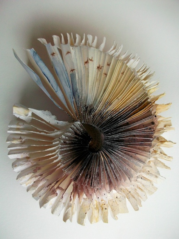
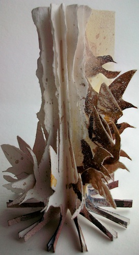
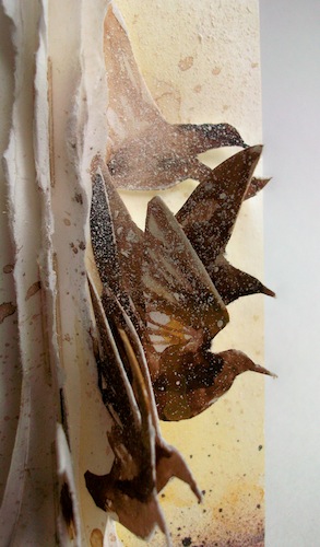
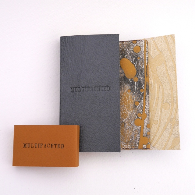
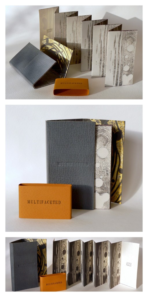
Stardust (2013) Louisa Boyd Leather bound, oil-based ink, Somerset paper, micro-fibre suede, Magnani handmade ivory wove paper, metal leaf, pencil crayon; 16 panels. Closed – H70 x W45cm x D10 mm; Open – H70 x W420 mm. Edition of 20, of which this is #10. Acquired from the artist, 28 May 2017. Photos: Courtesy of the artist.
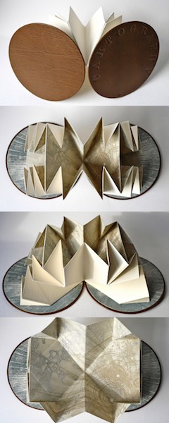
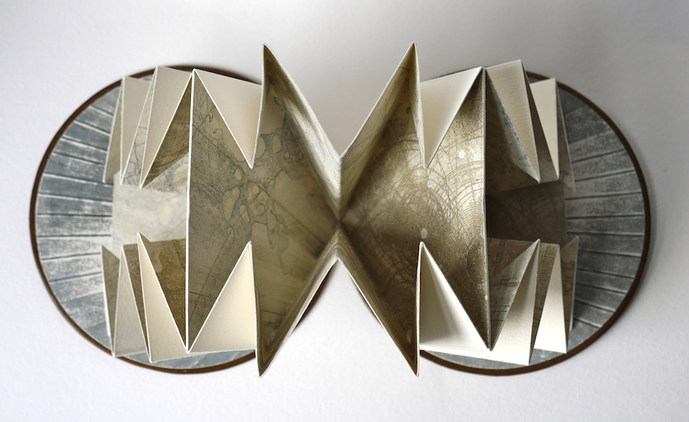
Through abstraction and symbol, Louisa Boyd‘s art focuses on sense of place and our intrinsic connection to nature. The titles of three of her artist’s book series – Infinity, Landscape, and Mapping – and those of the book art in them – Aether (2013), A Walk (2001), and Cartography I (2014) – reflect that focus. How she manages abstract imagery and symbol across her range of material and techniques – paper (including hand-marbled paper), book structure, printmaking (block, screen, letterpress), watercolor, metalwork, leatherwork – adds to that unifying focus through a rightness of choice but also introduces a breadth of originality and variety.
In Aether, the crayon work, cutting and metalwork are applied with a three-dimensional sense wedded to an obvious understanding of the possibilities of the page and double-page spread. The stop-motion animation video tour of Aether (click on the image below) makes you wonder if Boyd conceived the work as a flipbook in the first place. There is no wondering, however, about the place of human existence in relation to the aether. In the video, look at the lower righthand fore-edge of the book.
A Walk illustrates Boyd’s skill with freestanding three-dimensional sculpture, a skill that has grown in The Flight Series (more later on two of its works from 2009) and The Paper Manipulation Series, from which the work Flare above comes.
Her use of abstract markings and the Turkish map folding technique in Cartography I demonstrates again her careful marriage of abstraction, symbol and technique.
The etching printed on each of the three internal folded pages is an abstract that nevertheless evokes mapping, which the form and fold of the pages reinforces. Each Turkish fold page can lay flat to be viewed individually, or as pictured above and below, the book may be viewed as a sculpture.
The video tours (links embedded the images of Aether and A Walk above) represent Boyd’s search for what she calls “a bridge between traditional and contemporary media”. So far, that exploration reflects the artist’s rootedness in the book arts and traditional skills and processes of drawing, printing and painting. It is intriguing to think what effect a bit of influence from Helen Douglas or Amaranth Borsuk might have on Boyd’s bridge. The use of stop-action video for Aether hints at an instinct for what Douglas calls “visual narrative”.
A professed recurrent theme in Boyd’s book art is “restriction and freedom”. Although it arises from periods of city dwelling and lack of access to the countryside, imposed by the UK’s 2001 “foot and mouth” epidemic, it manifests itself in the more “traditional” spur of constraint of form and structure that goads an artist’s imagination. Flock (2009) and A Walk bear close resemblance, but note the difference in invention whereby the former plays with the book form by placing the bird imagery at the edges, spirals the paper tearing upwards and gradates the watercolor from dark to light (like a flock dispersing) and the latter deals with the “restricted” walk by blending the watercolor with tearing and tunneling.
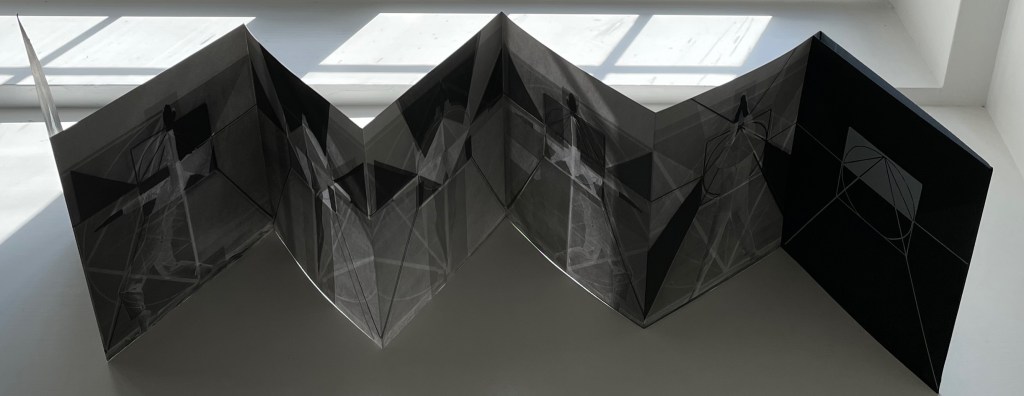
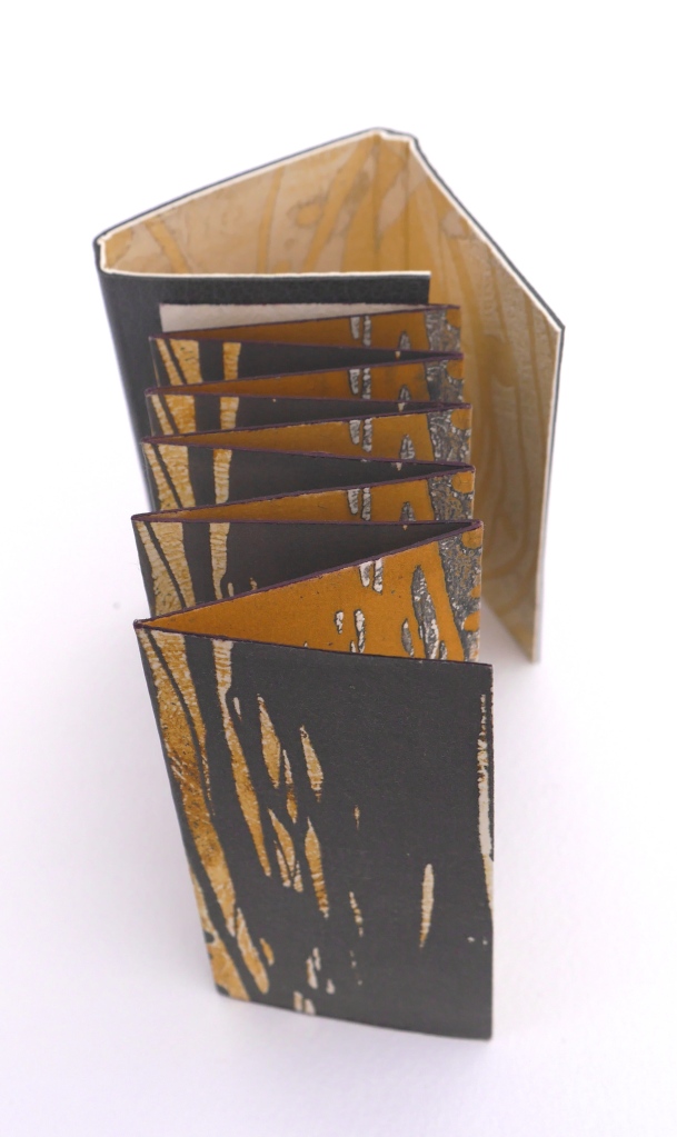
Although Multifaceted returns to the theme of different views that was the intent in A Walk, it tilts the theme more toward the abstract side of Boyd’s work. In this, Multifaceted is more akin to the works in The Paper Manipulation Series: Flare (2013), Whorl (2013), and Pleat (2013). It almost purely plays with the concept of differing perspectives. Again, techniques and form express concept with a simple rightness. This double-sided leporello is designed to be viewed from four different angles. The display of photos here cannot offer the intended perspective (pun intended): the viewer needs to circle the piece to view its facets. That word “facet” is tooled on the interior pages four times, the clue as to how the book should be read.
The abstract imagery evoking landscape or skyscape – whether juxtaposed vertically or horizontally – plays with viewpoint. Even the print technique on the interior pages plays with viewpoint: they are prints of an etching inked up both in relief and intaglio. Breaking free of the ultimate restriction of the book, the pages are not attached to the cover, allowing the piece to be read in four different directions. These features of the work and the seeming absence of that human figure from Aether throw it back on the viewer’s necessary engagement to establish fully the human connection: by engaging with Multifaceted – “reading” it – the viewer enacts the human place in the aether around the work.
Since graduating from Manchester Metropolitan University in 2001 and winning the Paperchase Future of Design Award (2001) and receiving a high commendation from the judges of the New Designer of the Year (2001), Boyd has exhibited in 46 venues. Her 47th is the most significant so far: inclusion in the John Ruskin Prize Shortlist Exhibition at Millennium Gallery in Sheffield, UK (21 June – 8 October, 2017). If this book artist manages to continue her sure-handed forging of concept, material and method, the Ruskin Prize Shortlist Exhibition will not be her last significant exhibition.
Further Reading
Chen, Julie. 2013. 500 Handmade Books. Volume 2. New York: Lark. Pp. 15 (Flock), 414 (Tower of Babel).
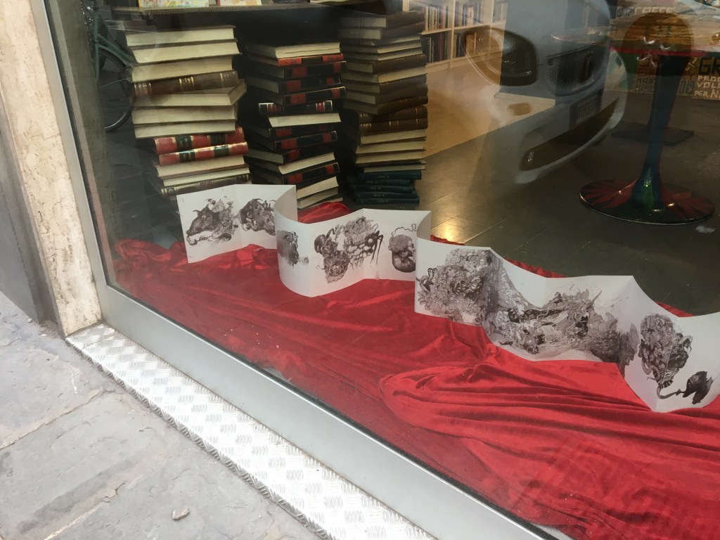
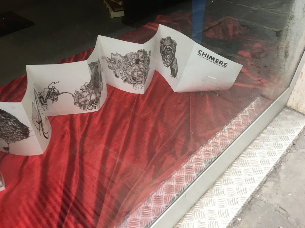
Chimere (2020) Alessandro Baldanzi Leporello: Original drawing (700 x 500 mm) made with black markers on drawing paper (Scheller Hammer), scanned and edited in PhotoShop, digitally printed on 200 gsm. H195 x W202 mm, closed; H195 x W4659 mm, open. Booklet: Bound in card with linen thread across 40 unnumbered pages, digitally printed. H148 x 102 mm. Both enclosed in a handmade box, covered and lined with black linen paper. Edition of 10, of which this is #2, signed. Acquired from the artist, 19 February 2020. Photos: Books On Books Collection.
A cross between a print portfolio and leporello. A cross between Durer, Beardsley and Ernst. A severing of image from text; though in both, one thing swallows a thing only to breathe, excrete or dream another that dreams, excretes, breathes or swallows yet another.
Chimere appeared to me on Via San Gallo. According to the myth, Chimera had three heads: a lion’s, a goat’s emerging from the lion’s back to breathe fire, and a snake’s at the end of its tail. Perhaps the serpent’s eye exerted the same fabled fascination as this leporello did, snaking along the window of Libri Liberi. Drawn closer, then inside, I could find no one to tell me anything about it, but a poster provided the artist’s name and address.
After some correspondence, divergent trips and finally a meeting in Florence at L’Hotel Orologio near Santa Maria Novella, the artist enabled Chimere‘s capture.
In the hotel lobby, the detail of the drawing and the inventiveness in linking the panels demanded close attention, making the accompanying small thread-bound booklet recede into the background. But, as I learned later, that background should not be ignored.
“Never can one be equivalent to the many” (Sophocles, King Oedipus, 430-420 BC), or Is the opposite true? What is impossible for everyone to be just one? There will be nothing strange, as Plato stated, if one proves that I myself am one and many.
The problem of duplicity of the single one occurs on several occasions in this series of multiples, combinations of lives, Chimeras formed by animal, human, plant parts. Monstrous beings in flesh and blood, three-dimensional, real but, at the same time, far from reality.
… figures that appeared to me in a dream, but children of wakefulness, don’t certainly lend themselves to living with only one part, but always with one and the other together, in the desperate identity (like the Sphinx) solving enigmas: Fusion, separation, identity, otherness, being, becoming, how can one always be identical to himself and at the same time change to be many? How can anything be generated by something else? “Introduction”, Chimere.
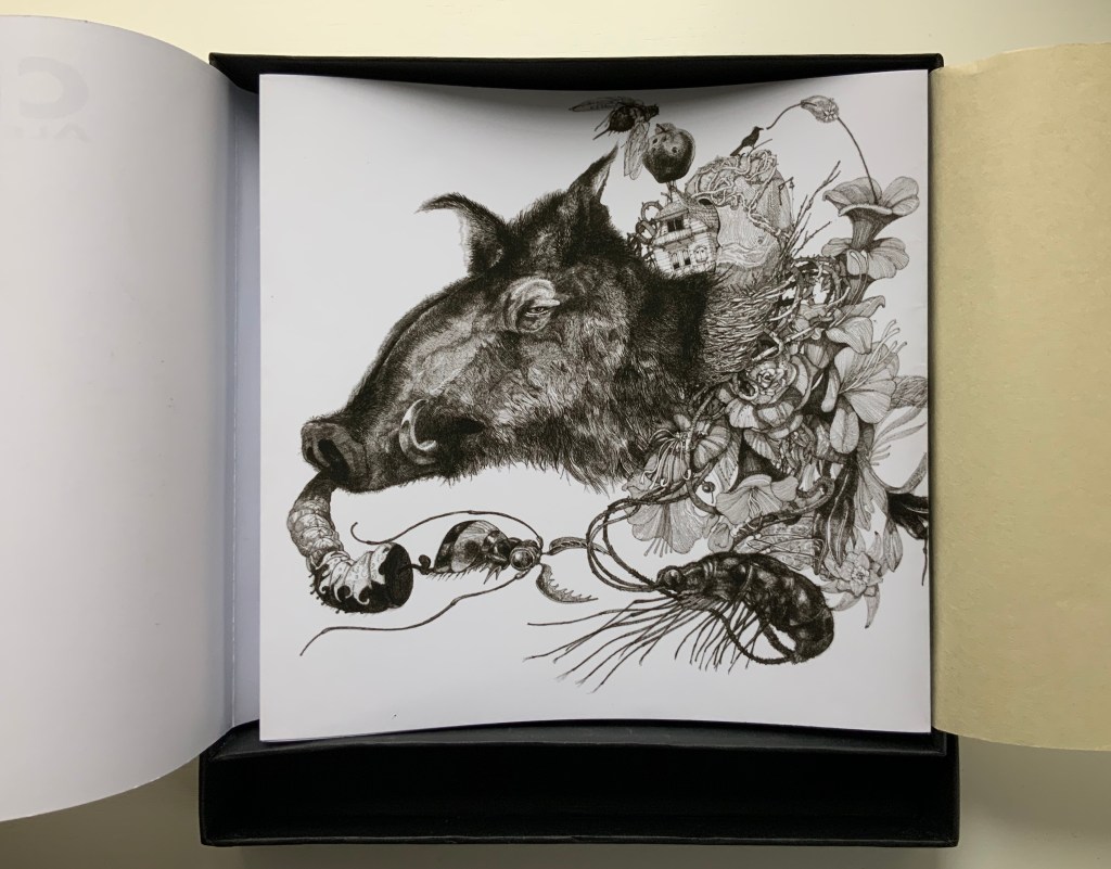
Odessa (wild boar); in Greek, the feminine of Odysseus.
In the booklet, each of the Chimeras has a sort of prose poem in Italian and English to tell its story. The first beast is “Odessa (wild boar), Birth: March 1, 2011 – Death: November 1, 2017”, whom the artist addresses alongside Oedipus:
Did you find me! You finally made it.You tore me with your wet and rough nose, with all the arrogance hatched over time.Night, day, father, son, how can a snake fly?You, clumsy riddles' solver, father and brother of your children, husband and son of your mother, legitimate usurper of the new that encompasses the many, similar to everything and equal to nothing, identical and different both with respect to himself and the other.You, devoid of education, of pedagogy, you have grown only by hurting yourself, risking and suffering.Often dying.
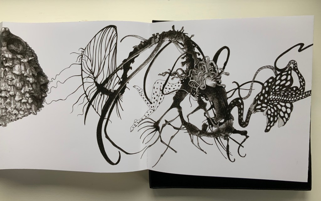
Turning the pages of the leporello or unfolding it to full display invokes the feel of an artist book. Consulting the separate booklet of text creates the air of a disembodied gallery. I move from Odessa to Elasmus (rhinoceros), Ecla (amberjack woman), Amutiel (Scorpionfish), Tharnos (The great mother), Boeotia (Horn of Plenty), Smyrna (Wave), Kalamata (Onda bis), Thelma (zebra lion), Elsa (Mouth eats mouth), Talpio (Bull), One (Noses), Orphestia (fish), Corinna (Cat), Soneril (tiger monkey) and Temel (mouth), but often forget to consult the booklet, which sends me back to gaze at the Chimera whose entry I missed and whose intricacy and connection to the next Chimera make me restart the journey from that point.
After many journeys, the prose poems become mostly internalized, but then there are the Italian versions. And then — over and over — at the final Chimera …
Temel (mouth); in Turkish, a masculine name and also means “fundamental, basic”.
looking at the multiracial multitude inside Temel (mouth), I see that, from Temel’s “fish nose”, a fishing line hangs, and I realize that Chimere’s “capture” is not merely its addition to a collection but its capture of me and the many.
Further Reading
“Ellen Lanyon“. 25 June 2024. Books On Books Collection. For comparison of Chimere with Transformations I (1977).
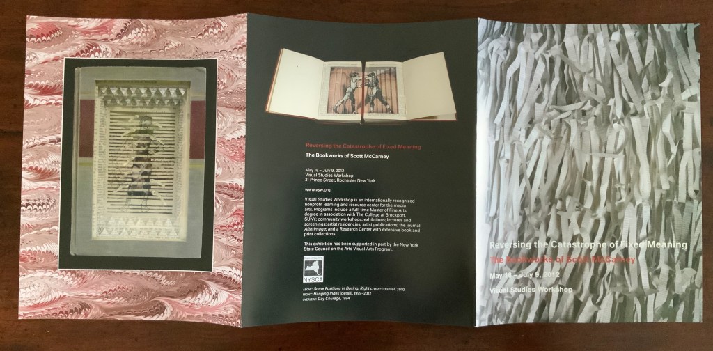
Abecedaries have a long lineage among calligraphers, typographers, children’s book authors and designers (including those of online books), fine press impresarios and book artists. From the world of libraries and museums, we have had abecedary lists and exhibitions such as Favorite Alphabets, (Library of Congress), Primers, etc. Post-1850 (Bodleian), Artists’ Alphabets and Ecstatic Alphabets/Heaps of Language (New York MoMA).
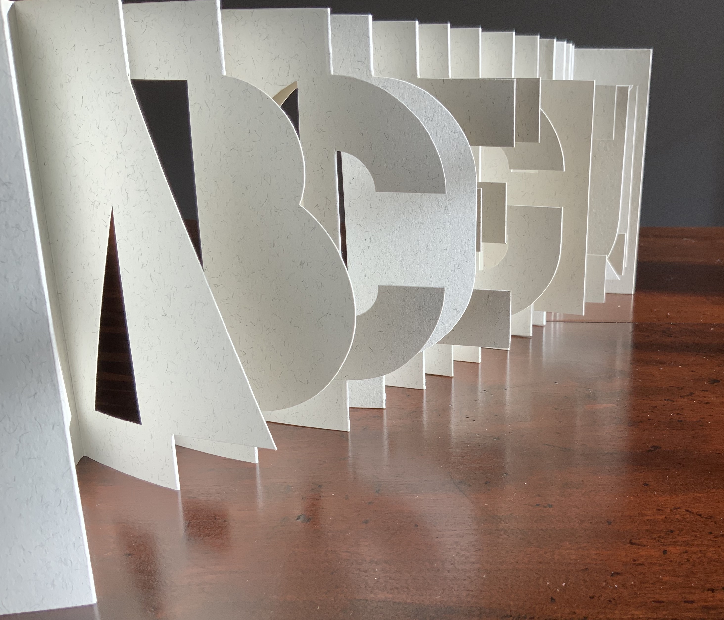
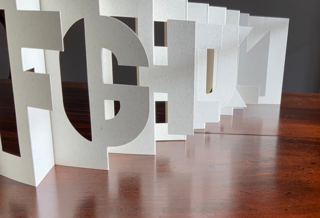
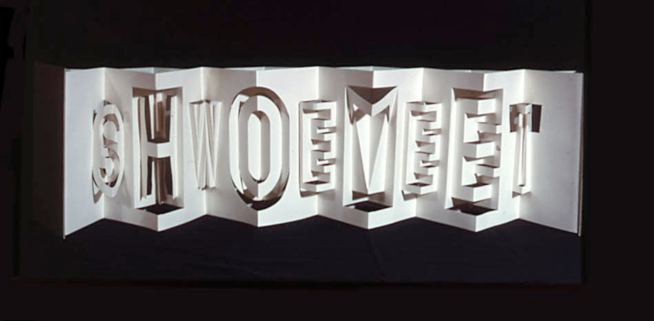
Since 1981, Scott McCarney has diligently extended the lineage through a series of alphabets designed in book form, where the letterforms depend upon the materiality of the book. The limits and possibilities of the book — its material, form and processes by which both can be handled — have inspired McCarney’s Alphabook series. According to the artist, all the Alphabooks (with the exception of numbers 3, 10 and 13) “are one-of-a-kind, and have not been shown much (if at all), so I’m not aware of them being illustrated anywhere“. Fortunately, Alphabook 1 (1981) appears in The Penland Book of Handmade Books: Master Classes in Bookmaking Techniques (2004), p.134, and Alphabook 9 (1985), which McCarney produced as a one-of-a-kind book of photograms in a residency at Light Work in 1985, appears in the Light Work Collection. McCarney describes his inspired manipulation of material, form and process in creating Alphabook 9:
I folded pop-up letterforms with unexposed photo paper in the darkroom and exposed it to directional light then developed, fixed, dried and flattened the prints. I made a book for Light Work for their collection that spelled out “LIGHTWORK” in the photogram alphabet, which can be seen in their database here: Light Work Collection / Artwork / Photogram Letter book [1133]. — Correspondence with Books On Books, 7 February 2020.
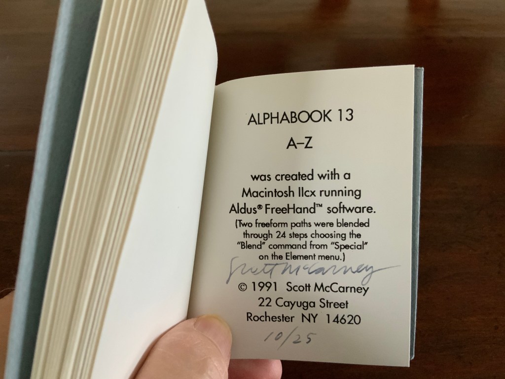
And WorldCat shows that Alphabook 13 (1991) can be found in at least three institutions. It was produced in an edition of 25 and consists of one volume (110 x 100 mm) in which the letter A gradually morphs into the letter Z.
With three of the series works now in the Books On Books Collection, the lack of illustration can be somewhat remedied.
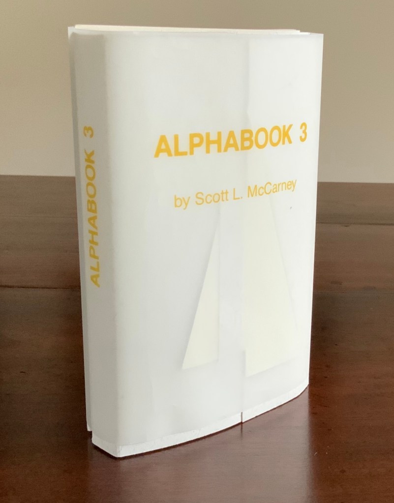
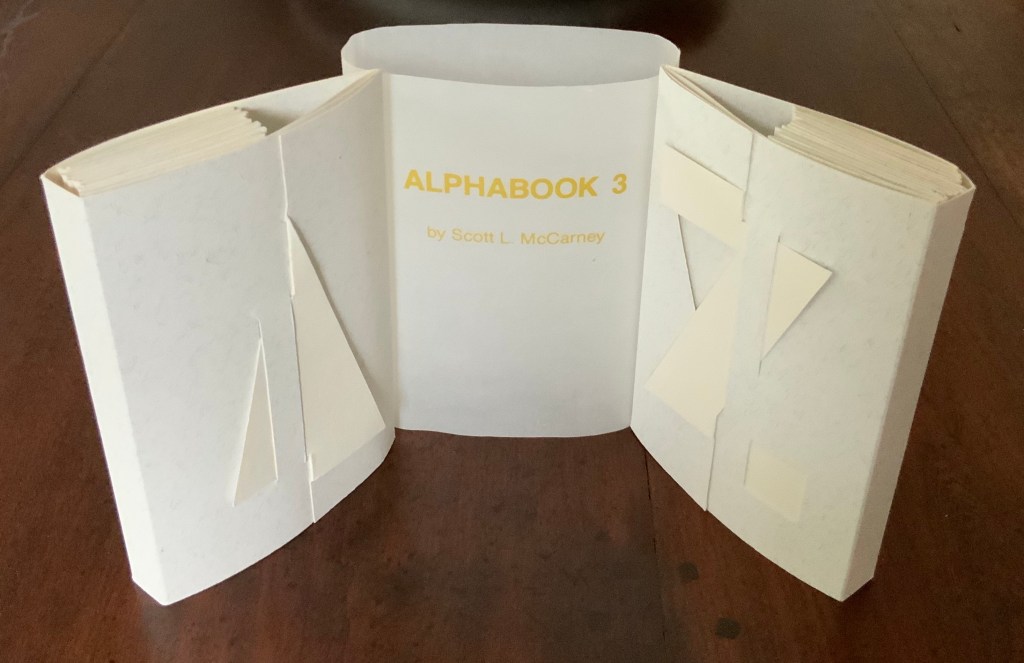
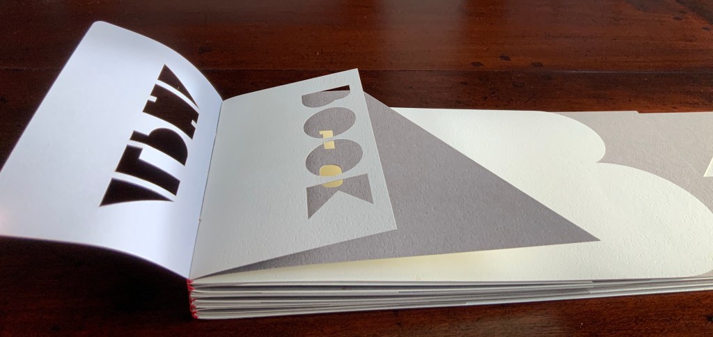
Alphabook 3 (1986)
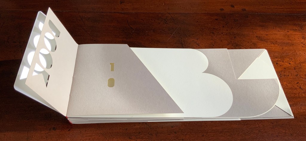
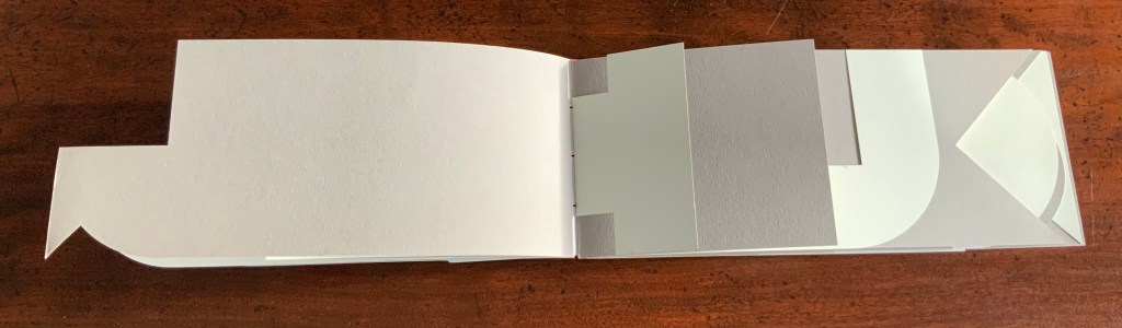
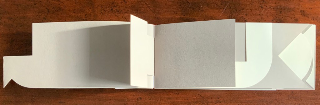
Alphabook 3 (1986) Scott McCarney Two volumes, each of 26 unnumbered die-cut pages and wrapped in translucent belly band. Edition of 300, signed but not numbered. Each volume, closed: H151 x W104 mm; open: H151 x W2195. Acquired from the artist, 14 August 2017. Photos: Books On Books.
Photos: Books On Books.
Unlike most others in the series, Alphabook 3 is a multiple of 300 copies.
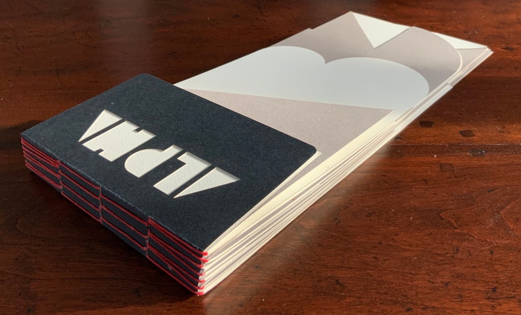
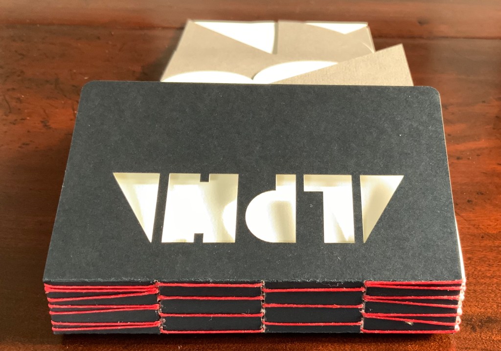
Alphabook 10 (2015)
Alphabook 10 (2015) Scott McCarney Laser cut duplex papers hand bound with long stitch through slotted cover; housed in archival box. 56 unnumbered pages. 130 x 310 mm; in box 140 x 310 x 30 mm. Edition of 14, of which this is #11. Acquired from the artist, 23 January 2020. Photos: Courtesy of the artist
The codex form receives McCarney’s playfulness in Alphabook 10. The artist writes:
… The fore edge of each page is cut into geometric forms from black, white and cream toned duplex stock (two sheets of different colored paper laminated together). … Produced during a residency at The Institute for Electronic Arts, a high technology research studio facility within the School of Art and Design, NYSCC, Alfred University, New York, committed to developing cultural interactions spurred by technological experimentation and artistic investigations.
Scott McCarney, Visual Books. Accessed 9 February 2020.
The handling of the cover and first page draw attention to the role that empty space, light and stock color will play throughout the book.
Photos: Books On Books.
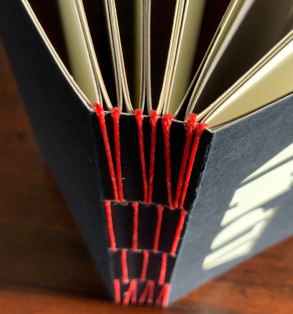
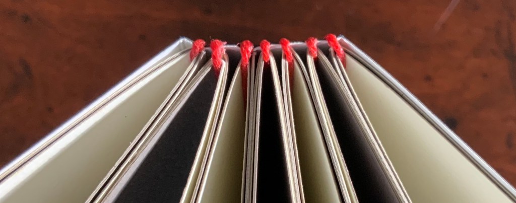
The binding warrants a closer look as well. Outside and inside, the red thread, its pattern and function stand out.
Photos: Books On Books.
And notice how the thread calls out the textured surface of the paper.
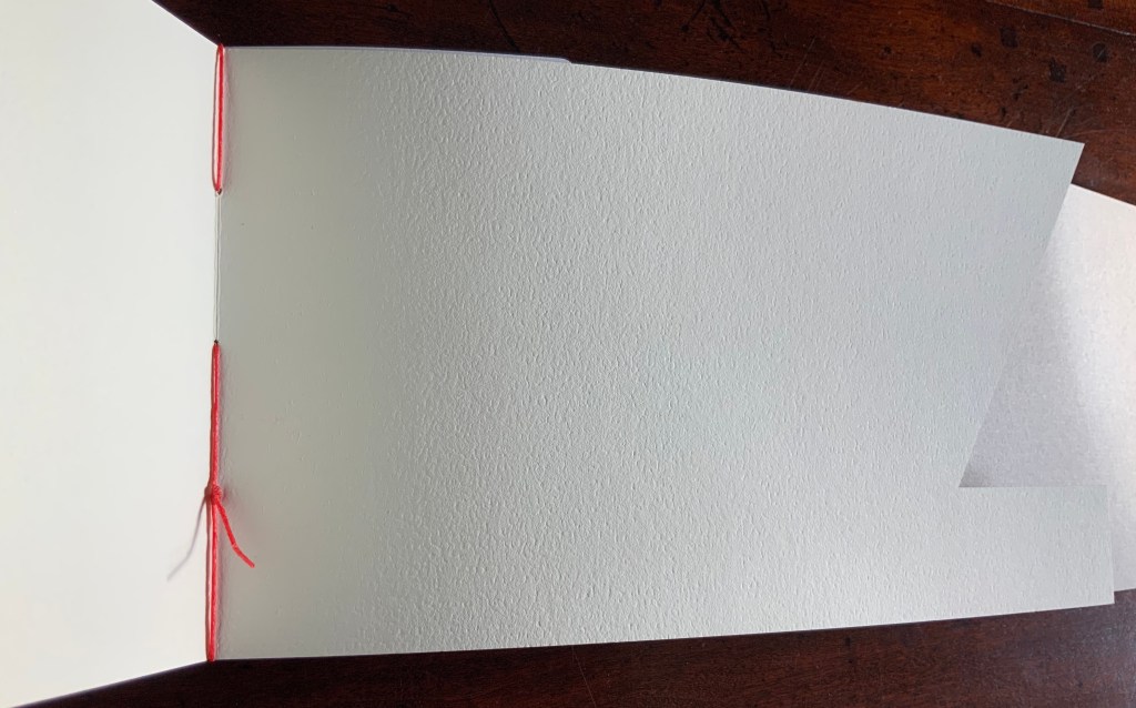
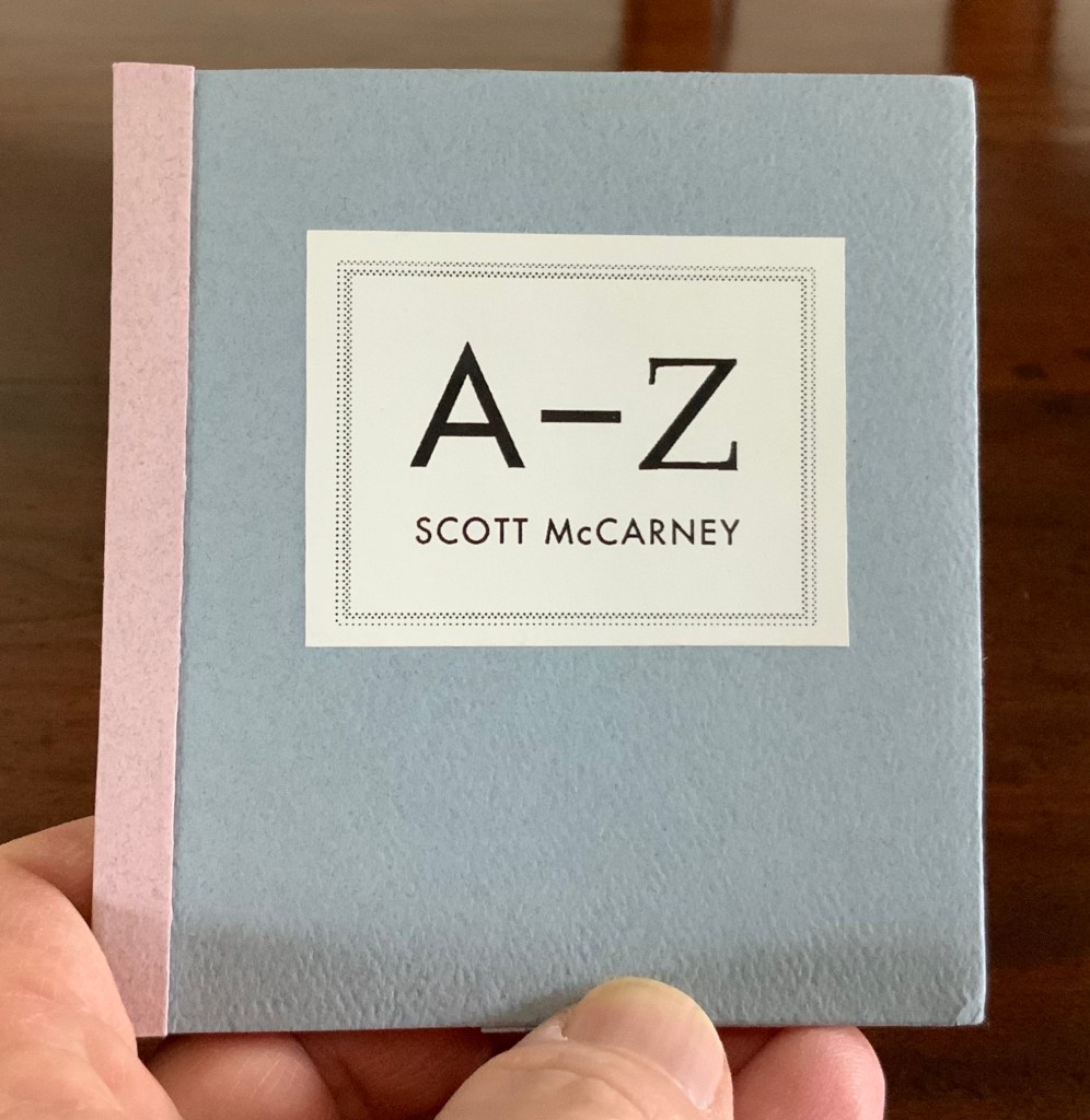
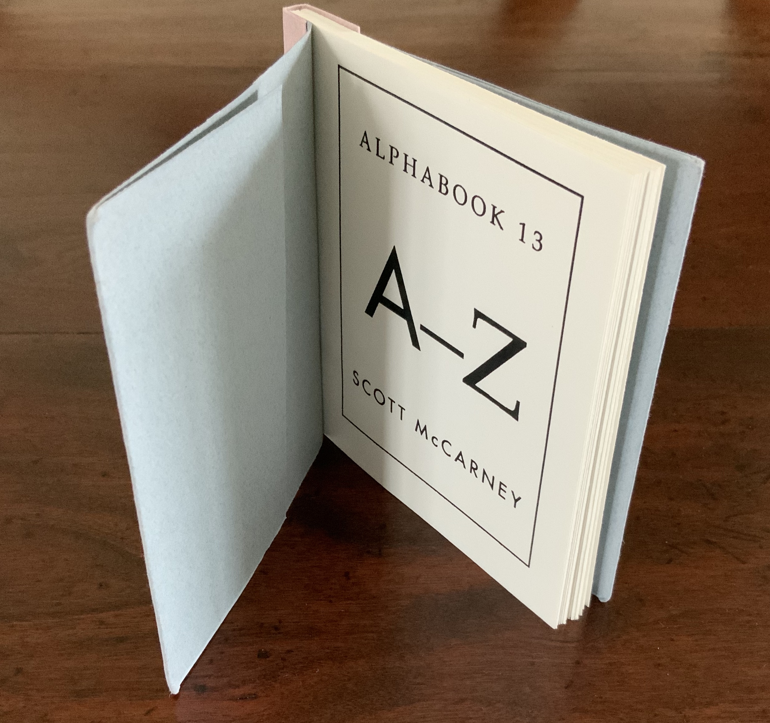
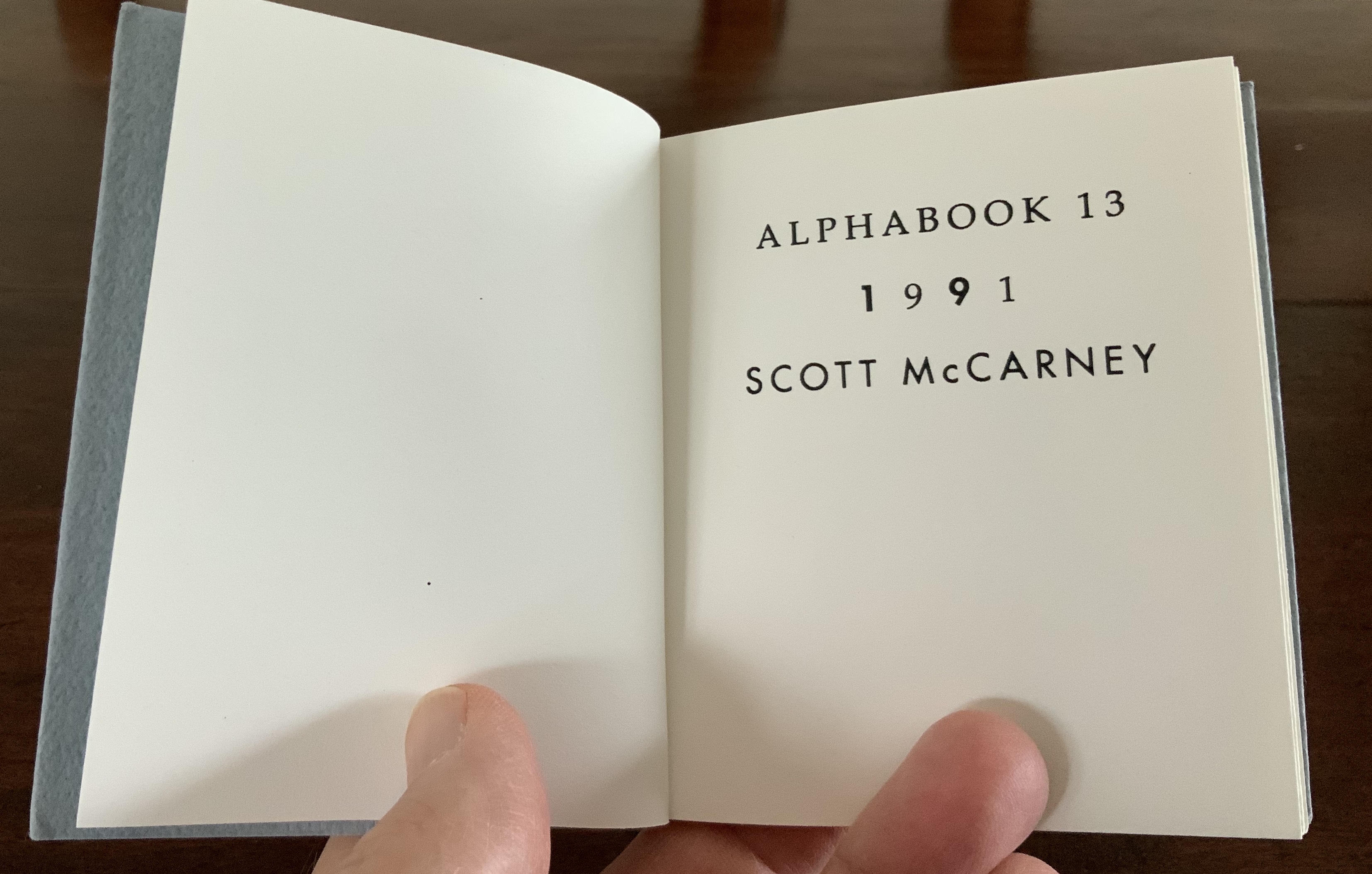
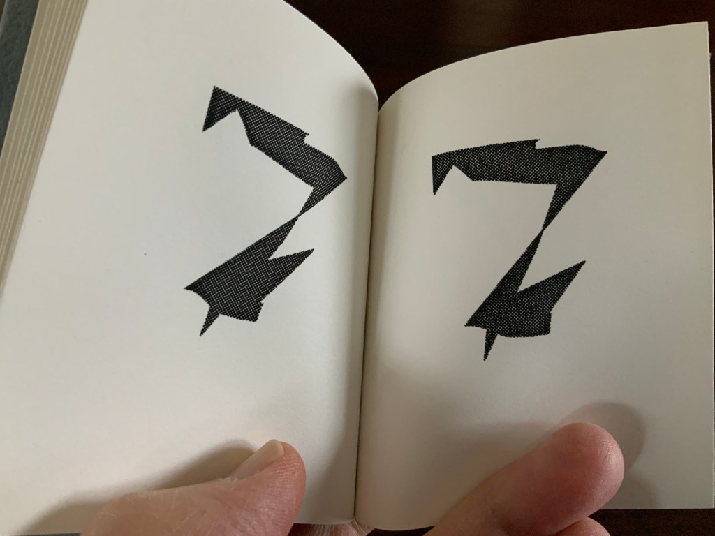
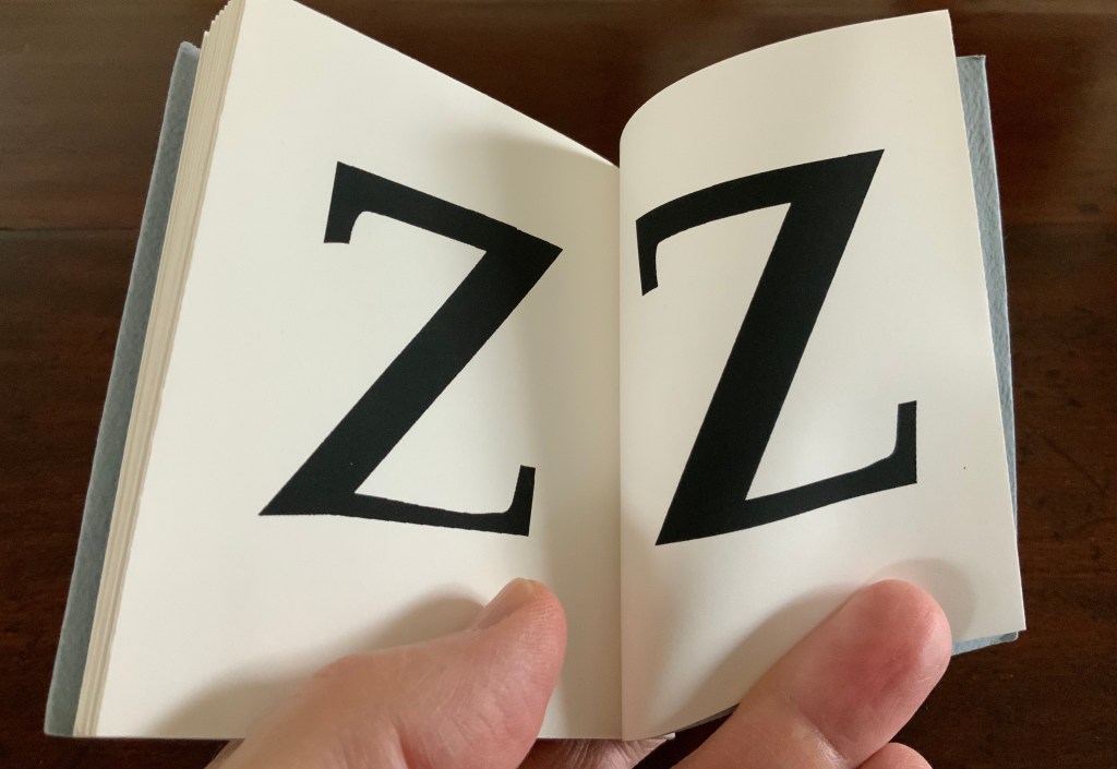
Alphabook 13 (1991)
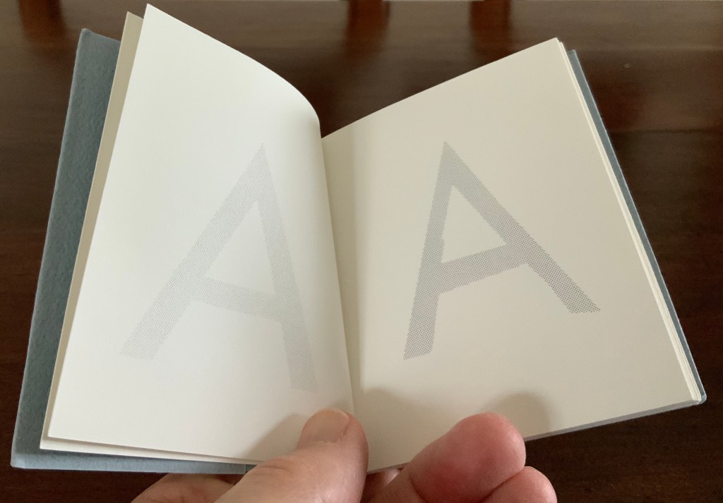
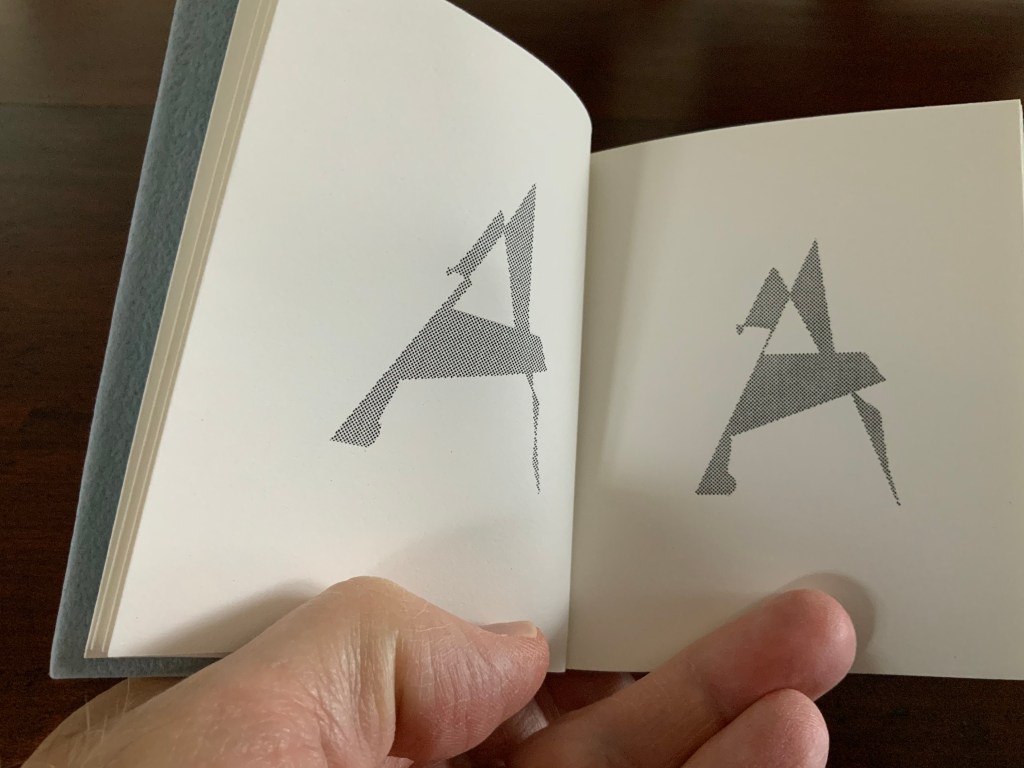
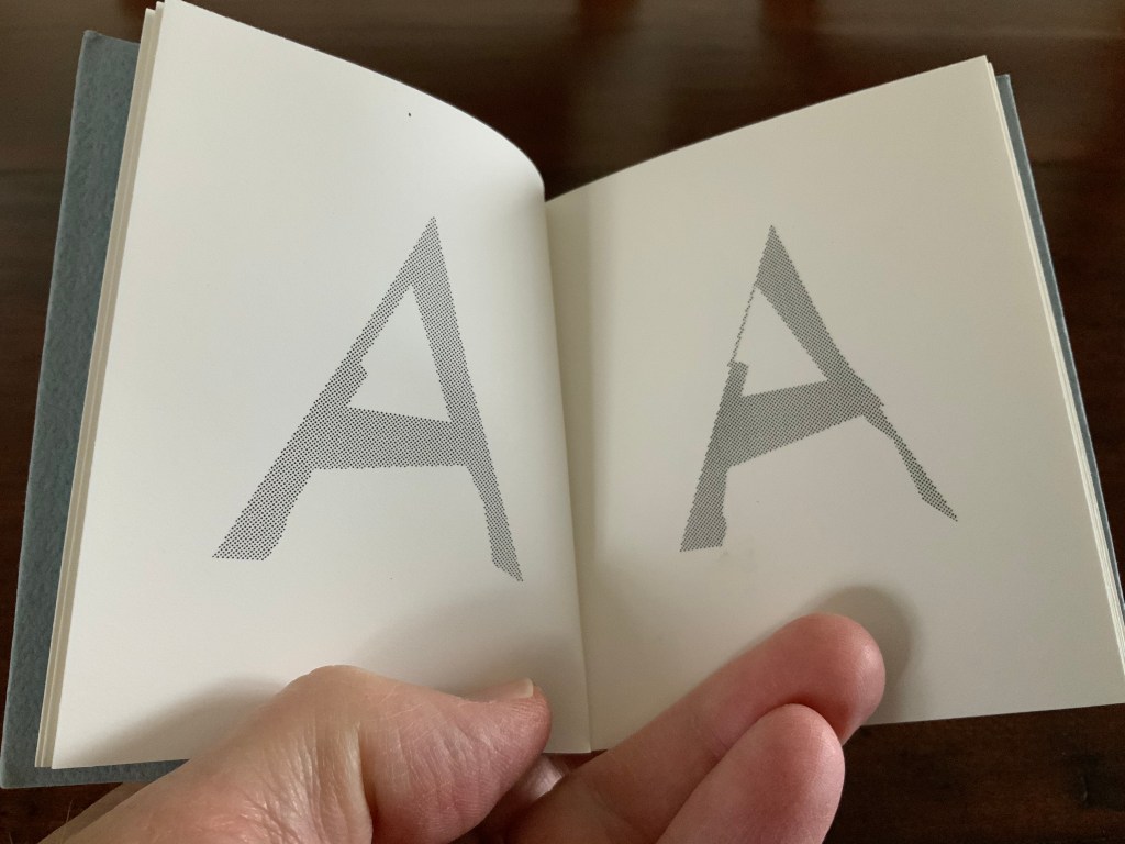
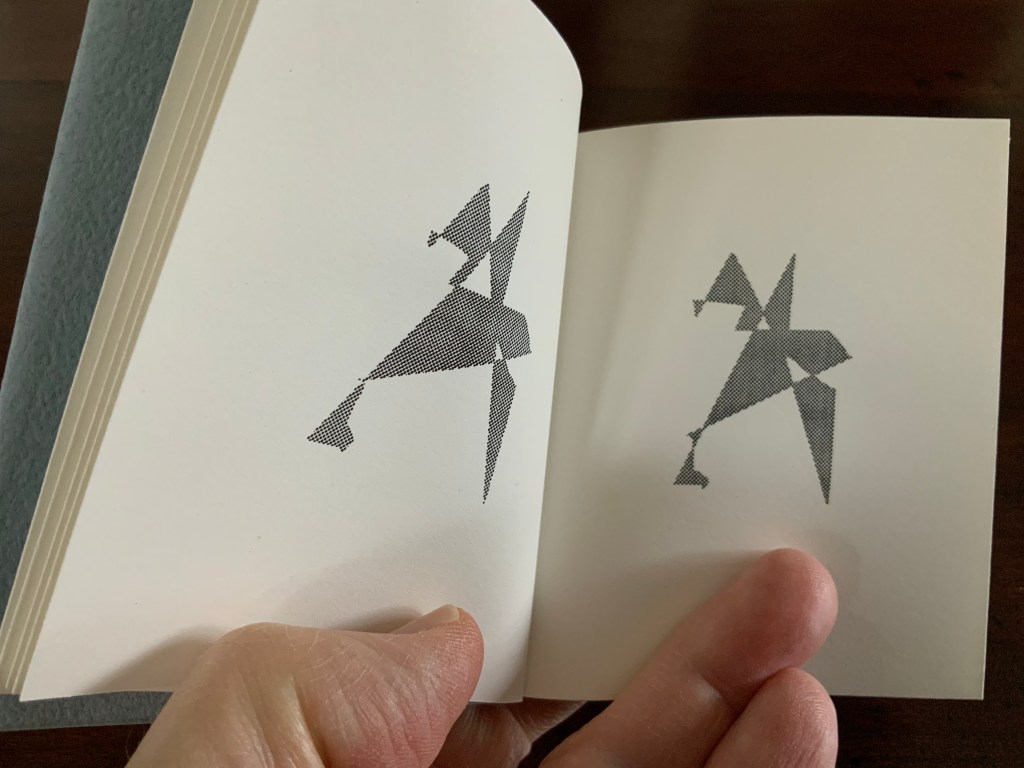
Alphabook 13 (1991) Scott McCarney Flipbook, created with a Macintosh IIcx running Aldus® FreeHand™️ software. H100 x W92 mm. 32 pages. Acquired from the artist, 15 February 2020. Photo: Books On Books Collection.
Photos: Books On Books Collection.
Photo: Books On Books Collection.
In correspondence with Books On Books, McCarney explains that the Alphabooks’ mismatch of numbering and chronology stems from discrepancies between dates of conception and opportunities to execute. This little flipbook was conceived and executed as a photocopy edition of 25 in 1991; of more importance here though is the coming together of computer-based typesetting, book structure and pun. As we know, the shortest distance between A and Z is not B to Y, but the points in A reconfigured into Z across 24 flipping pages. It is interesting to compare this transformation with Claude Closky’s calligraphic version De A à Z (1991).
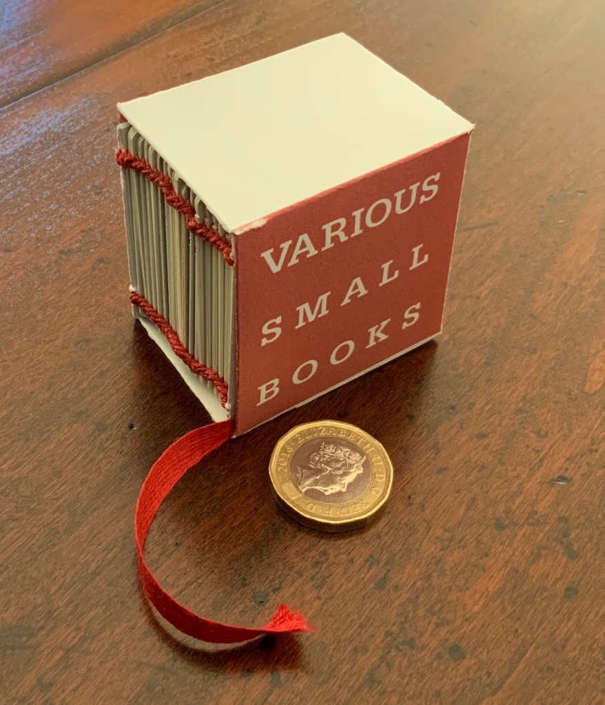
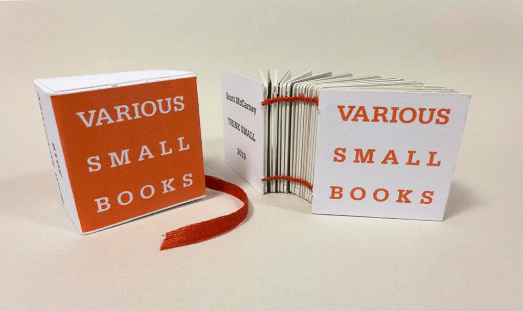
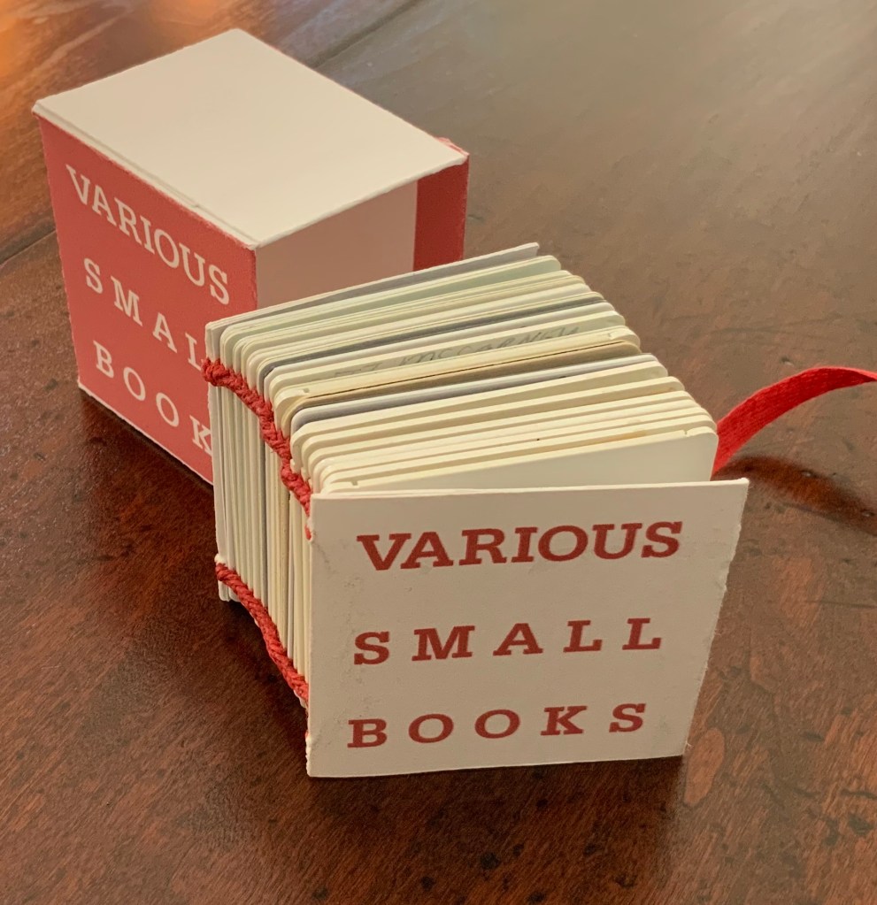
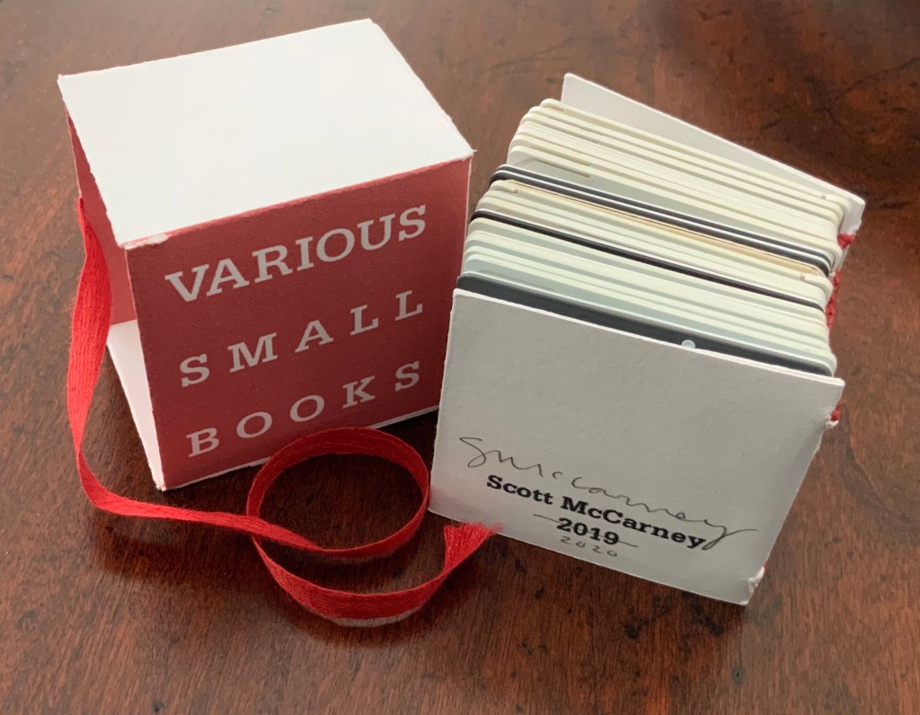
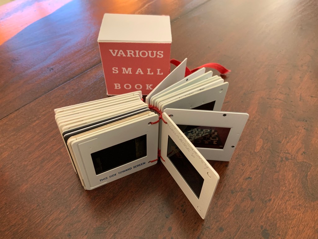
Various Small Books (2019/20)
Various Small Books (2019/20) Scott McCarney Photo: Books On Books.
Various Small Books (2019) Scott McCarney Photo: Courtesy of the artist.
The 2019 edition was conceived for a fundraising exhibition at Artspace in Richmond, VA. Both the 2019 and 2019/20 editions consist of 35mm slides documenting various of McCarney’s bookworks. Consisting of different slides, the two editions of Various Small Books are unique, and since the slides are bound together and cannot be projected, the images of the books appear small indeed.
Various Small Books (2019/20) Scott McCarney Photo: Books On Books
Courtesy of the artist, the inclusion in Various Small Books (2019/20) of slides documenting Alphabook 4, Alphabook 6 and Alphabook 10 makes the 2019/20 edition particularly apropos for the Books On Books Collection.
“Scott McCarney, Special Edition”, Contact Sheet, No. 164 (Syracuse, NY: Light Work, 2011). Exhibition catalog, which kicked off the conference “Photographers + Publishing”, 3-5 November 2011, Light Work and Syracuse University.
Home Sweet Home (1985)
Home Sweet Home (1985) [Not in collection] Scott McCarney Paper in accordion binding with decorative and marbled paper-covered boards and paper-covered slip case. 11 5/8” x 9 1/2” x 1 3/4”