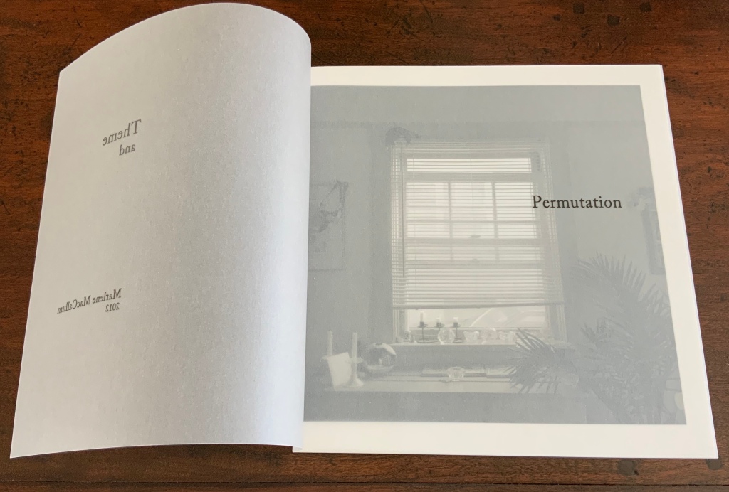
Theme and Permutation (2012) Marlene MacCallum Hand sewn pamphlet, images custom-printed in offset lithography on Mohawk Superfine, text printed in inkjet, covers inkjet printed on translucent Glama. H235 × W216 mm Edition of 100, of which this is #54. Acquired 5 October 2018.
Photos: Books On Books Collection.
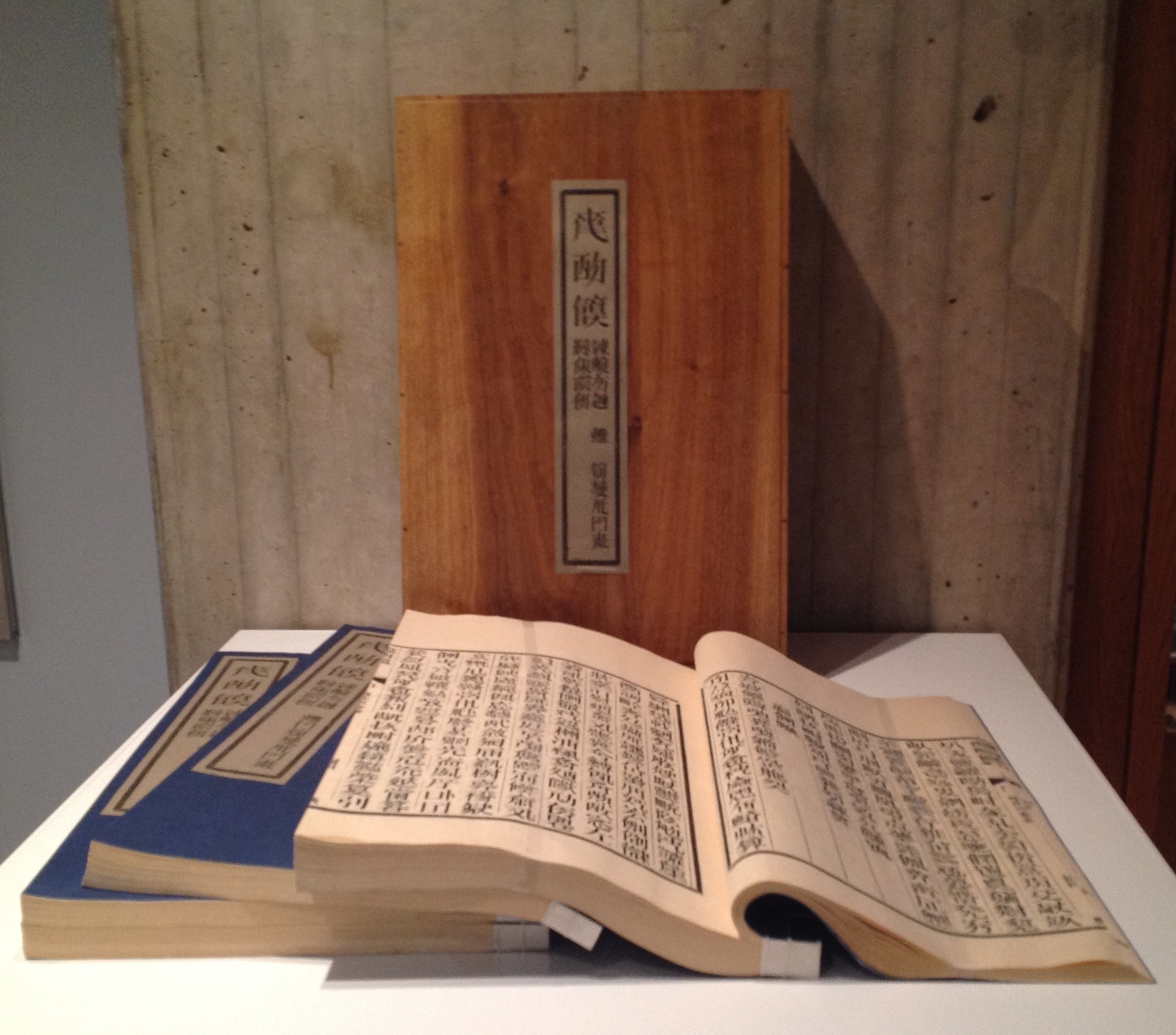
Theme and Permutationis one of a series of artist’s books inspired by the experience of living in Corner Brook’s Townsite area on the west coast of the island of Newfoundland. Between 1924-34 the pulp mill built 150 homes to house the mill management and skilled labourers. Over a period of 10 years, I have photographed in several homes, all the same type-4 model as the one I live in. These homes vary in condition from close to original in design and décor to highly renovated. This project gave me the rare opportunity to record the evolution of interior aspects of these homes. It has been the context to explore the paradoxical phenomena of conformity and individualization that occurs in a company town. Having grown up in a suburban housing development, my earliest memories of home is that of living in a space that is reminiscent of my neighbors’. Each artist’s book explores a distinct facet of image memory, multiplicity, sequence and offers the viewer a visual equivalence of the uncanny. Theme and Permutation is a response to the permutations and variations of the type-4 Townsite House. Digital tools were used to translate the original film source of eight different window images from five houses. The sixteen offset lithographic plates were custom printed in twenty-nine separate press runs. Each image is the result of a different combination of plates. The structure is a sewn pamphlet with translucent covers. The viewer enters the body of the book with a tritone image of a single Townsite window. As one moves into the piece, new window images appear and layer over each other. The images become darker and more heavily layered towards the mid-point. The center spread has an inkjet layer of two text blocks printed over the offset litho images. The text speaks of the history of the homes, the architectural permutations and economic shifts within the Townsite area. The ensuing pages continue to provide new combinations of window layers, gradually lightening in tonality and allowing the individual windows to become more distinct. A third text block provides a personal narrative. The piece concludes with a tritone image of one of the Townsite windows in original condition.(From artist’s website. Accessed 1 September 2019.)
*From the artist’s description of Wall Stories (2014).
Chicago Octet (2014)
Chicago Octet (2014) Marlene MacCallum Hand bound artist’s book with folded paper structure, letterpress and inkjet printing, H166 × W78 mm closed, H443 x W293 mm open Unique. Acquired 5 October 2018.
Photos: Books On Books Collection
Chicago Octet is a work of visual poetry by eight masters of book art. If they were performing music (and you can almost hear the music of Michigan Avenue), MacCallum would be their performing conductor.
The piece I created, Chicago Octet, had several collaborative components. The letterpress printing consisted of a word selected by each participant printed on one of Scott [McCarney]’s folded structures. The images were a digital layering of every cityscape photograph that I made and then inkjet printed on top of the letterpress. The final folded structure was designed by Mary Clare Butler. The case was designed and built by Scott McCarney, the front cover embossment was by David Morrish and Clifton Meador. (From artist’s website. Accessed 31 August 2017.)
Update: With funding from the Canada Council for the Arts Digital Originals Grant and assistance of Matthew Hollett and David Morrish during the Covid pandemic, the artist created Shadows Cast and Present, a digital re-imagining of her three most recent book works. The three cantos into which the work is divided also enrich one’s appreciation of Theme and Permutation and Chicago Octet. MacCallum orchestrates the various media — text; sound from music, voice and the noise of city and nature; video — with a touch as light as paper and light.
Further Reading
Books On Books. “Architecture”. Books On Books, 12 November 2018.
MacCallum, Marlene. 2014. Wall Stories. Website. For the text cited in the epigraph for this entry, go to the last linked image in the series of thumbnails displayed.
Otis Artist Book Collection. “Conrad Gleber ‘Chicago Sky Line’”, 27 January 2014. Gleber’s work is an interesting one to compare with Chicago Octet. Chicago Sky Line (1977) is a fan book of photographs secured at a single point by the binding and, when spread clockwise, reveals the sky above Chicago and, when spread counterclockwise, shows the Chicago “skyline” below clouds and sky.
Magicienne des formes et des couleurs is how Art & Métiers du Livre (2002) describes Shirley Sharoff. The magic she makes reveals itself in a particular kind of fusion. One of structure, content as image, content as text, color, type, layout, material and craft. It is a magic best sensed when handling or really seeing her work.
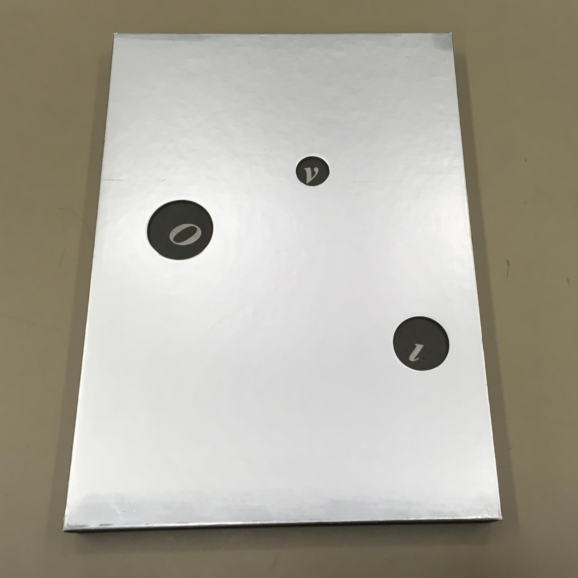
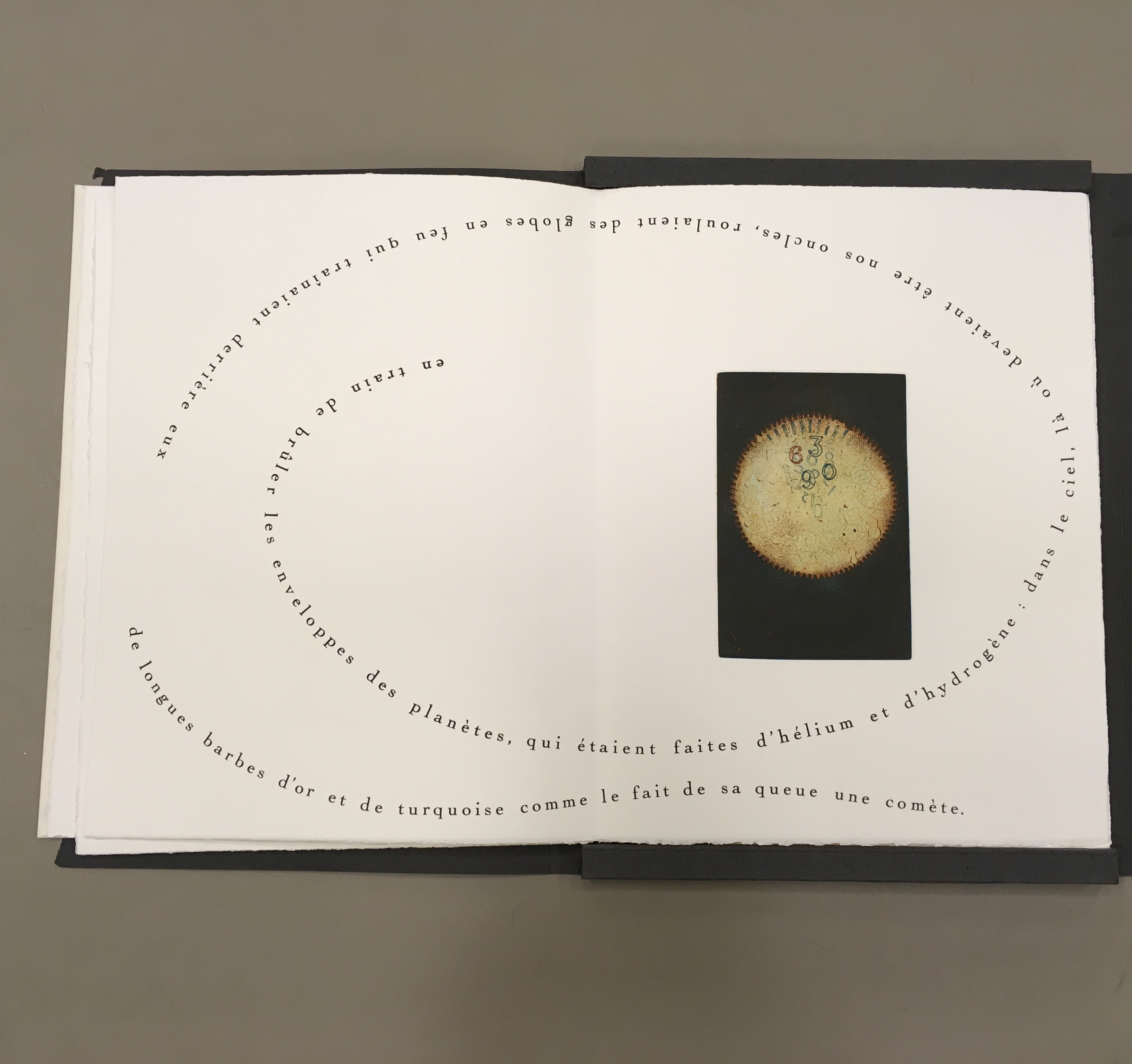
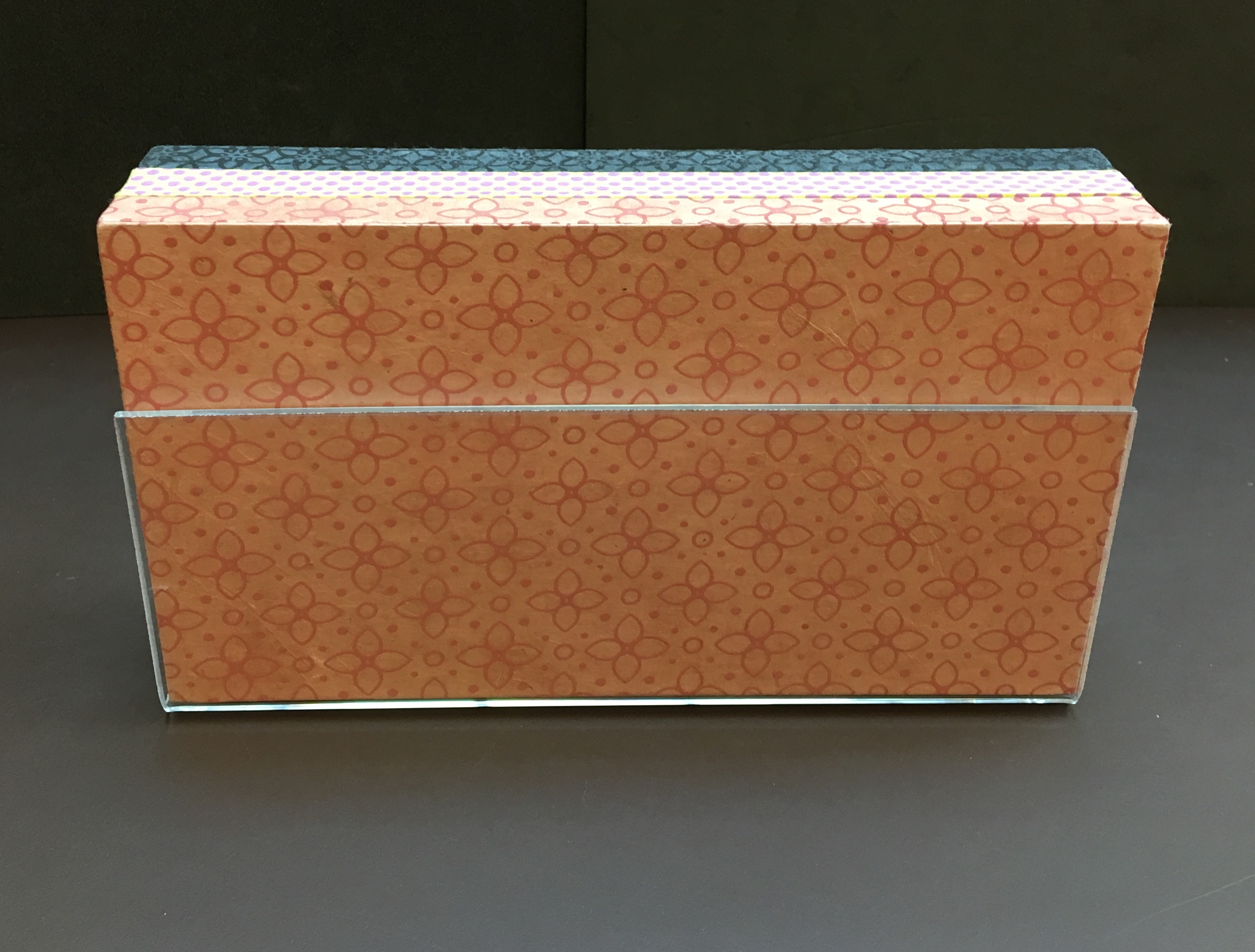
OVI: objets volants identifiés dans le ciel d’Italo Calvino (1988) Shirley Sharoff Graphic ‘big bang’ and typographic spirals with an extract from Cosmicomics by Italo Calvino, postface by Mario Fusco 4 color etchings printed by the Atelier René Tazé Edition of 74 on Vélin Rives Typography by François Da Ros in Cochin typeface In a silver-colored box of 26.5 x 37 cm Photos by Books On Books and reproduced with artist’s permisision
Brooklyn-born but resident and working in France for most of her life, Sharoff studied in Paris under Gotthard Johnny Friedlaender (1912-1992), learning his method of making color prints from two or three different plates. She came to the artist’s book in the 1980s through a friend who introduced her to a typographer with whom the friend was working: François Da Ros.
During my conversation with [Da Ros], I told him that I had an idea for a book but didn’t know how to go about it. It involved prints and an excerpt from one of Italo Calvino’s works. … that’s how my first artist book got started — and once I did that I thought “artist books” were so interesting that I just wanted to keep on doing it. — Artist’s correspondence with Books On Books, 18 December 2018
The result of that encounter was OVI (1988). The text came from Calvino’s Big Bang story “Sul far del giorno” (“At daybreak”) in his collection Le Cosmicomiche (1965) (Cosmicomics, 1968). Calvino’s story relates how the main character, Qfwfq, and his extended family, from a species we cannot identify, experience the cosmic Big Bang.
The story’s language, character and narrative deliver an astrophysical and micro-organic alchemy that falls in line with Calvino’s association with the Ouvroir de Littérature Potentielle (OuLiPo) or “Workshop for Potential Literature”. OuLiPo’s participants seek and have sought new forms and structures for literature through play with the properties of language, word games or imposing constraints through mathematical or computational principles such as Boolean algebra or recursiveness. For example, Georges Perec wrote La Disparition (1969), a “lipogrammatic” novel avoiding any words containing the letter “e”. Raymond Queneau constructed Cent mille milliards de poèmes (1961), which is actually an interactive work of book art, confronting readers with 1014 different sonnets generated by the reader’s choosing one of 10 options per line, accessed by turning each line like a page.
OVI lifts this literary playfulness into a revel of intricate puns, played out in language, image, typography and structure or form. Sharoff discovered the Calvino story in Le Monde independently of her prints already underway, but it was the conjunction of the story with them that led her to “an idea for a book”. Although, like Friedlaender, Sharoff would illustrate books, the idea diverged from a mere illustration of the story or a livre d’artiste in the traditional sense. Like many book artists, Sharoff conceived a blend of image, text and form. The Sharoff/Da Ros execution of her idea re-presents, absorbs, reacts to, embodies Calvino’s fiction in a work that stands apart from it. It is the reverse of the usual ekphrasis we see when a literary text strives to re-present, absorb, react to, embody an urn, a sculpture, painting or print. Think of Keats’ “Ode to a Grecian Urn”.
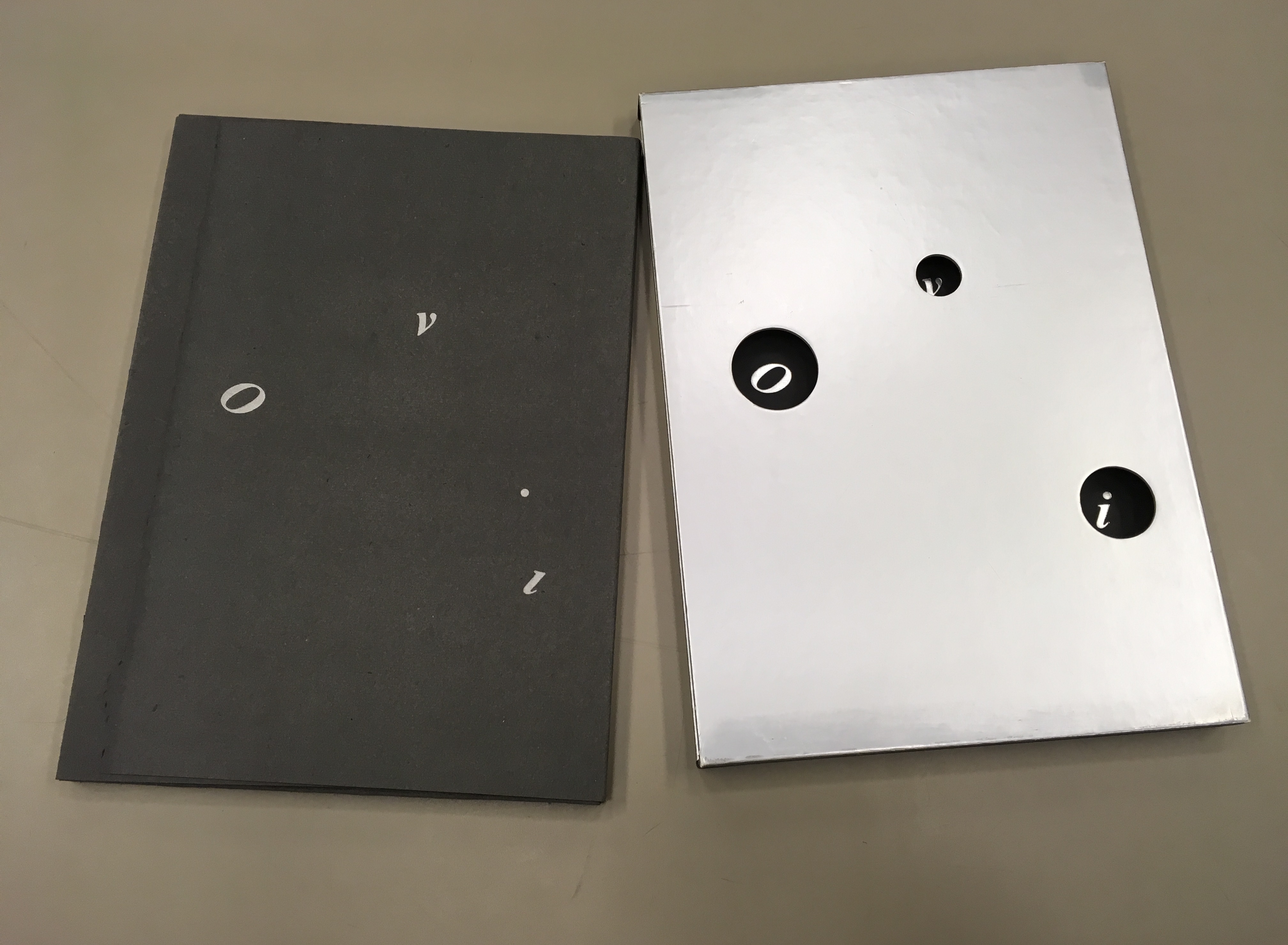
Instead of Unidentified Flying Objects (OVNI in French), the artist gives us OVI (“identified flying objects”), the first three of which are the letters “O”, “v” and “i” appearing through the “black holes” of the silver paper slipcase. As the black portfolio emerges from the slipcase, we see the i’s dot adrift as perhaps another object in the firmament. Through the holes in the slipcase, the same letters reappear printed on the inside of the slipcase but with the i’s dot no longer adrift (the “stars” aligned?). And this is just the start of the punning and play with structure, content as image, content as text, color, type, layout, material and craft.
The portfolio removed from the silver paper slipcase
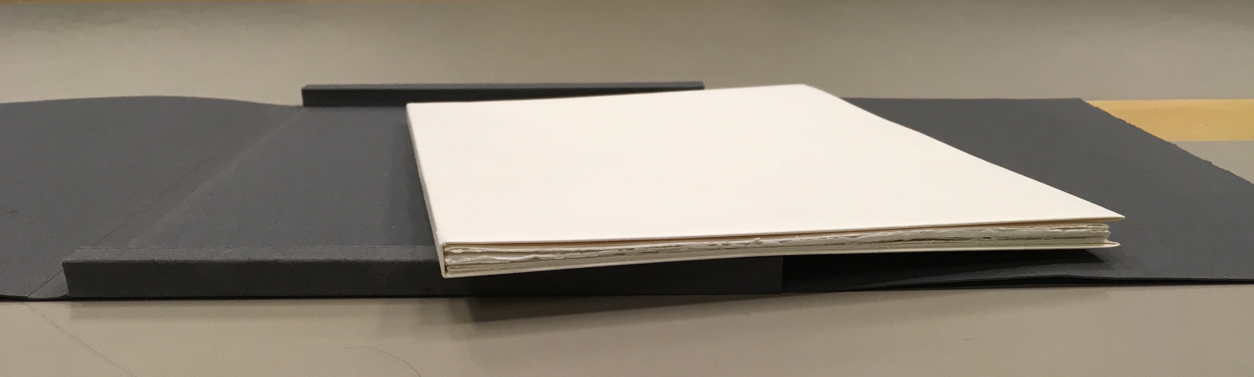
Encased in the trifold black portfolio are nine loose map-like folios.
Opened, the folios display selected text from the French translation of Calvino’s short story and four Sharoff prints. In three of the prints, the text swirls, construction-poem-like, around the multicolor images. Part of the folios’ magic here is Sharoff’s fusion of image with the substance of Calvino’s words, a Friedlaender-esque palette and the typographic and form-locking skills of Da Ros.
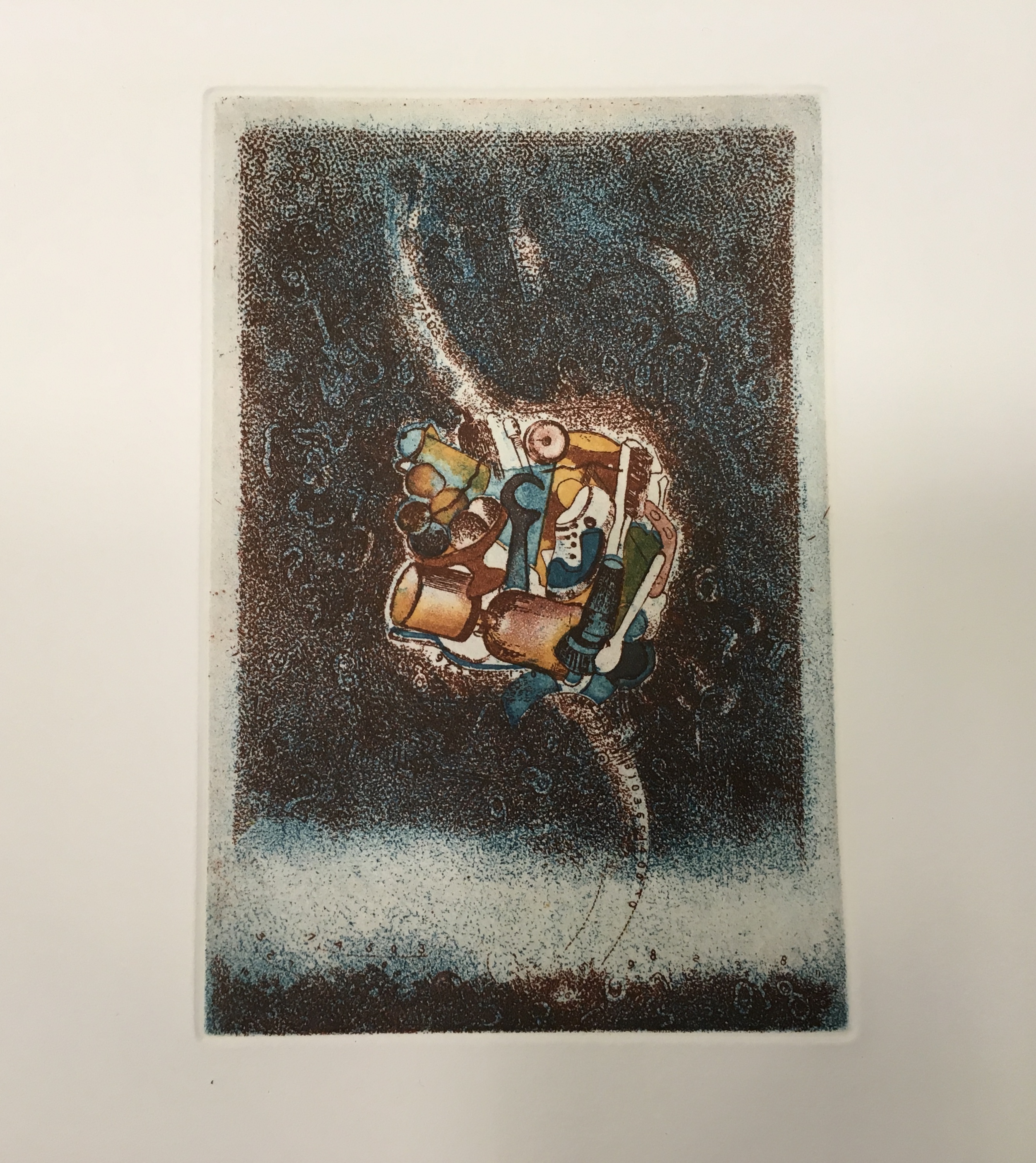
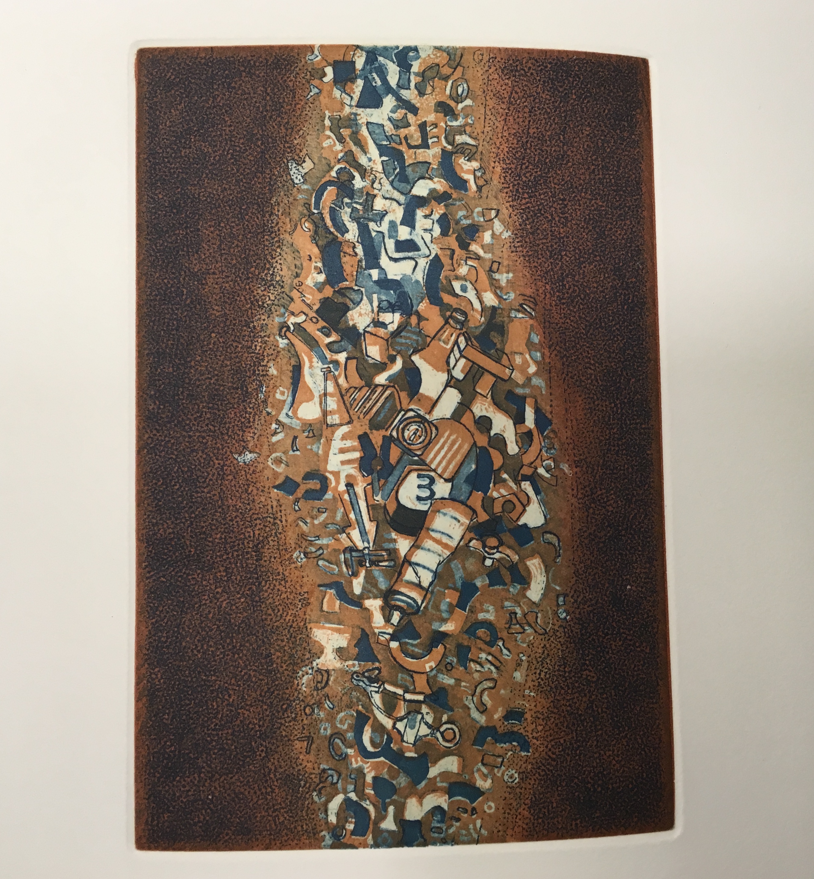
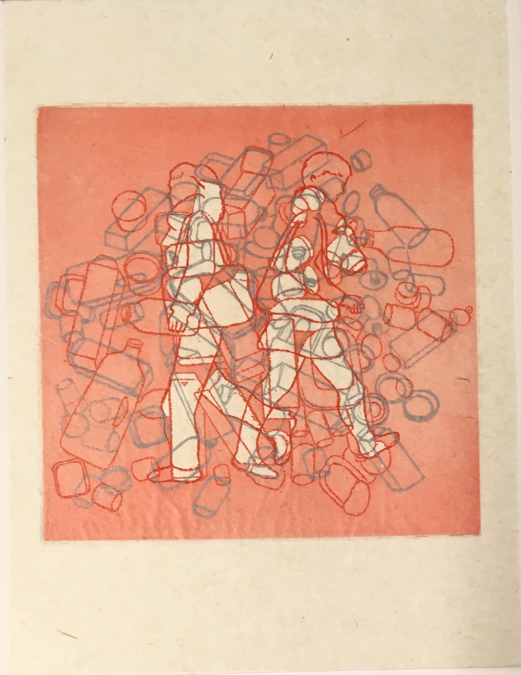
The first image looks like a macrophoto of a cell (or is it an image of the sun?) with numbers superimposed. The second image looks like a cloud nebula (or is it some multicellular life form with two flagellae?) consisting of everyday objects. The third image looks like an asteroid belt (or is it a paramecium?) made of a discarded aerosol can and other trash.
“The darkness came back. By now we were sure that everything that could possibly happen had happened, and ‘yes, this is the end,’ Grandmother said, ‘mind what us old folks say. . .’ Instead, the Earth had merely made one of its turns. It was night. Everything was just beginning.” from Italo Calvino, “Sul far del giorno” in Le Cosmicomiche (Milan: Einaudi, 1965), translated as “At Daybreak” by William Weaver in Cosmicomics (New York: Harcourt, Brace & World, 1968)Detail: the “cloud nebula”(?) image, formed of identifiable everyday objectsDetail: the “asteroid belt” (?) image, formed of everyday detritus
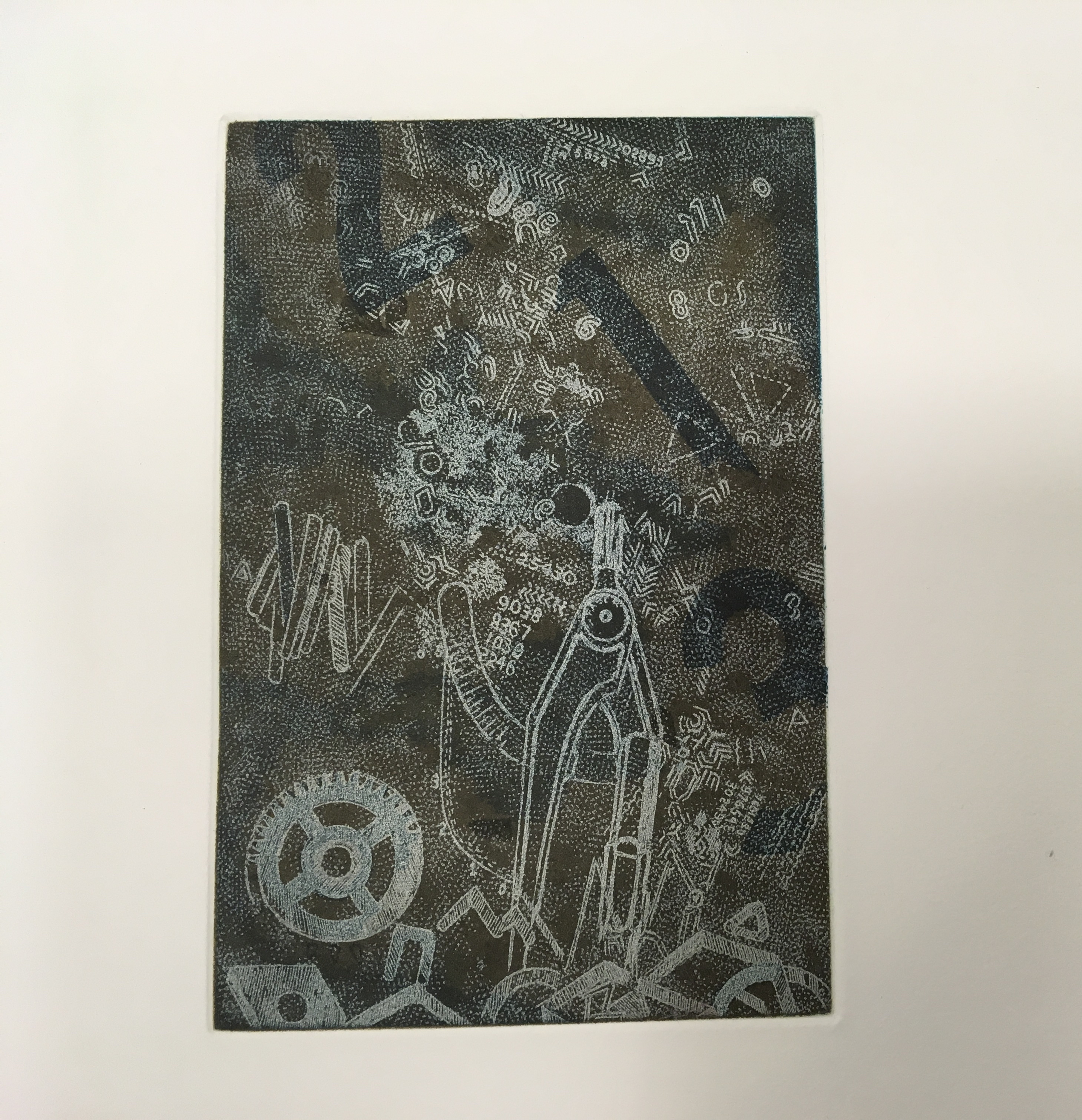
One of the four prints stands alone without text. The image is a cascade of large and small numerals, logic symbols, a gear, protractor and metallic-looking detritus landing in a heap.
Detail: the fourth print
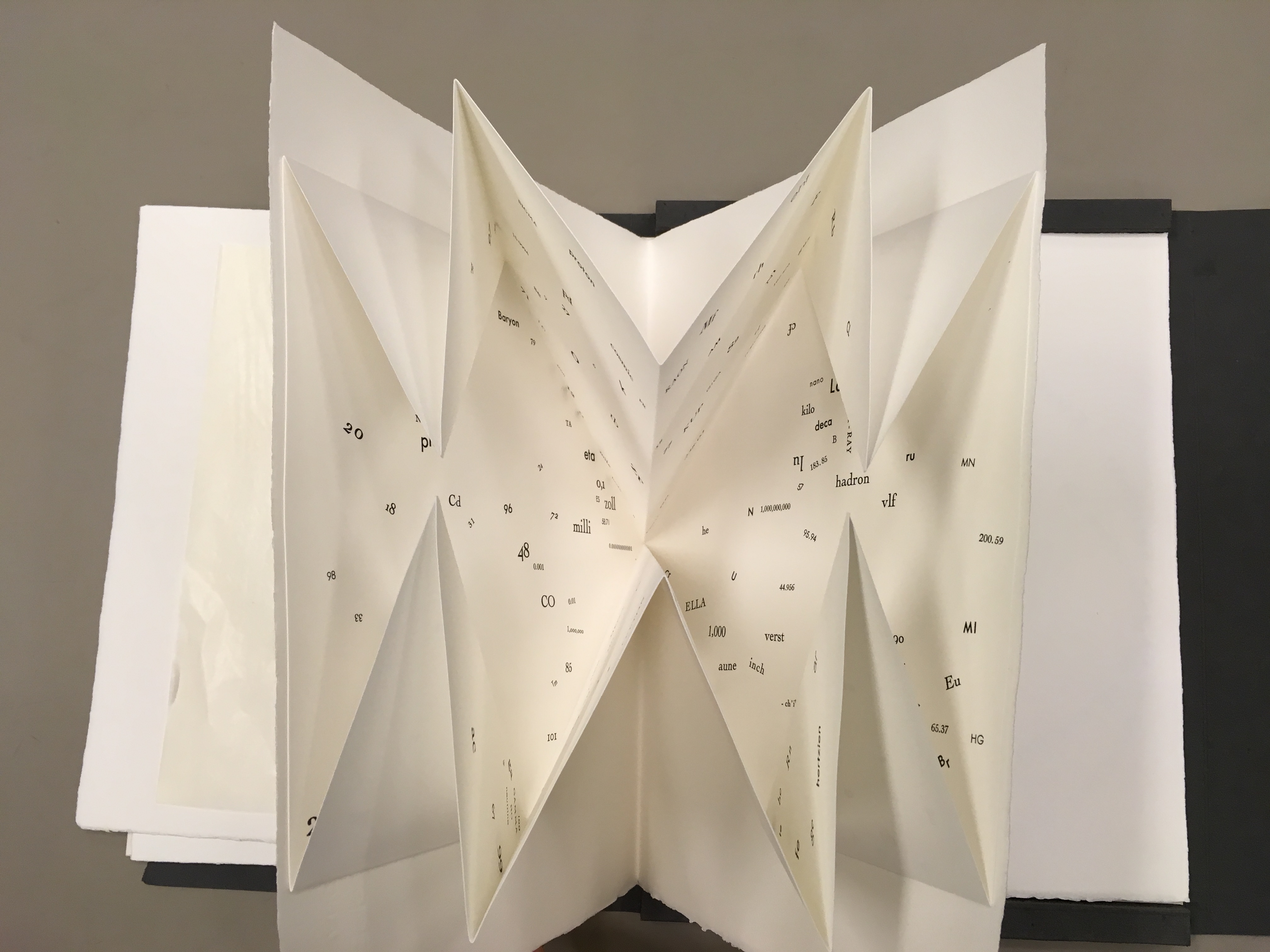
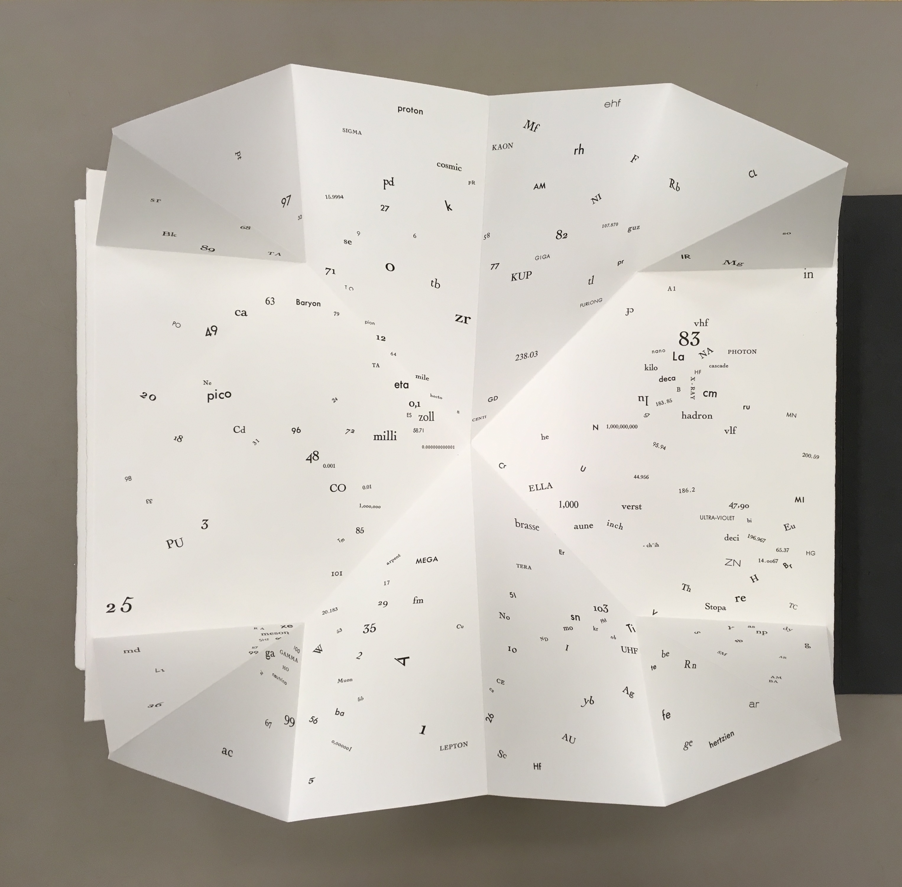
One of the leaves deploys a Turkish map fold, opening to reveal a constellation of numbers, letters from the periodic table and terms from particle physics and astrophysics — an outstanding display of skill from Da Ros and entirely evocative of Qfwfq and his family’s bizarre tale of the big bang. It’s also a prescient reminder that a crater on the planet Mercury and a main asteroid belt were named after Calvino.
The separate folios echo the abrupt jumps in Calvino’s story. In the end, Sharoff succeeds with OVI in echoing how the story — despite those jumps, the bewildering and unpronounceably named characters and the teasing references to familiar and unfamiliar domains of knowledge — hangs together. The spiraling text makes the viewer turn and turn the opened folio to read the words — much as the story’s surreal yet familiar characters and their situations make the reader puzzle through the storyline. The prints present the viewer with familiar yet unfamiliar shapes composed of everyday objects or recognizable symbols. The tactility of the paper, the solidity of the slipcase and texture of the multicolored prints play off the intellectuality of the ekphrasis and scientific images and symbols in much the same way as the familiar familial relations play off the characters’ bewildering experience of the cosmic Big Bang.
Sharoff’s next major artist’s book — again with Da Ros — would be La grande muraille/The Great Wall (1991). There is little if anything implying a Chinese or other oriental influence on printmaking or typography as practiced by Friedlaender or Da Ros, respectively. And until her visit to China in the late eighties, Sharoff’s work showed no such influence. When the influence came, it was concentrated in the one work. Sharoff was concerned not to respond to China in a typical Western artist way or to fall prey to traditions that neglected the hardship or grittiness she saw while teaching English to young Chinese bank employees. Sharoff hungered for a text that would fuse with the images coming to her in reaction to the remnants of the Great Wall, the summer palace’s maze, and post-revolutionary infrastructure.
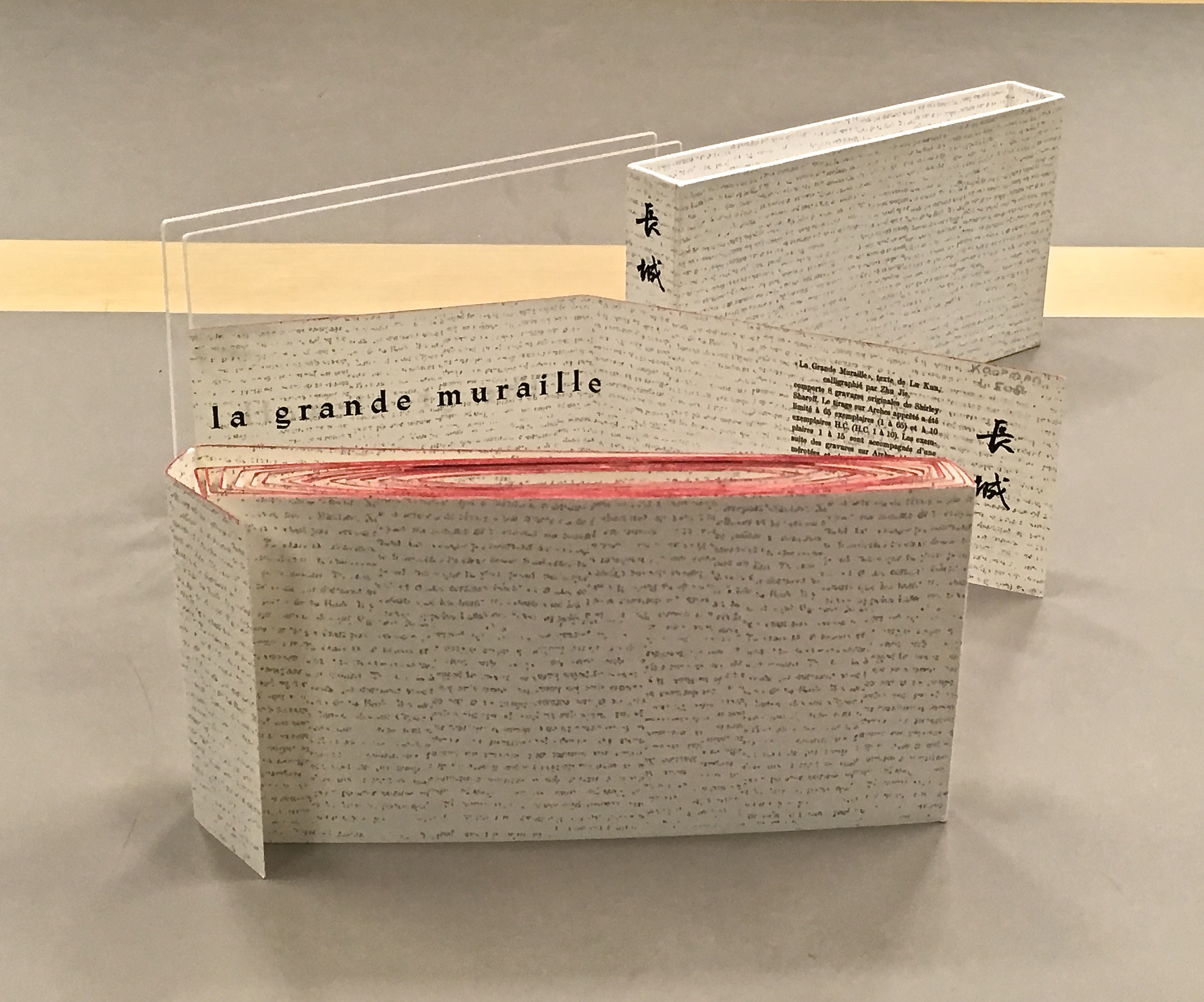
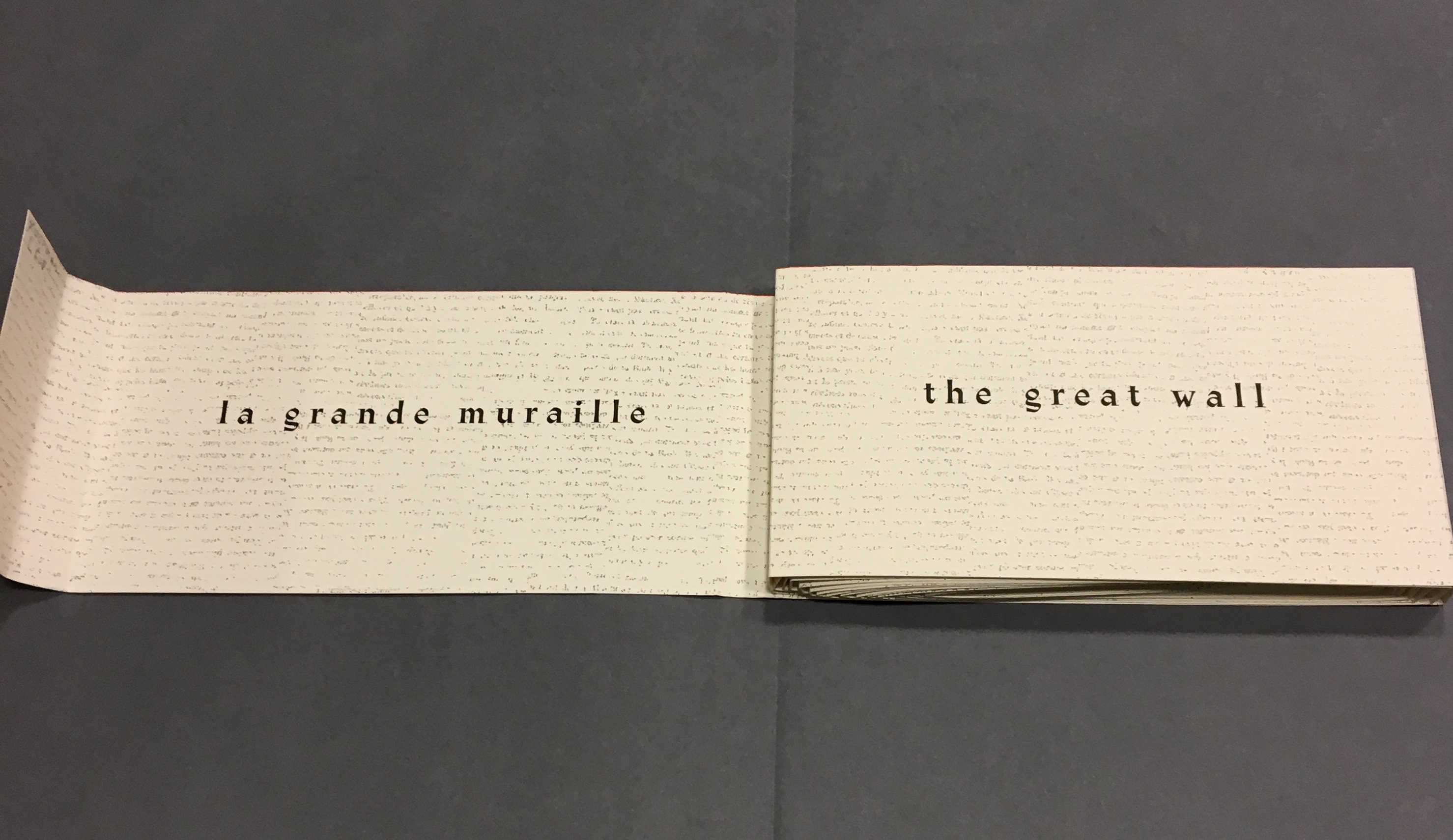
La grande muraille/The Great Wall (1991) Shirley Sharoff Taken at Koninklijke Bibliotheek, Den Haag, Nederlands. Reproduced with permission of the artist.
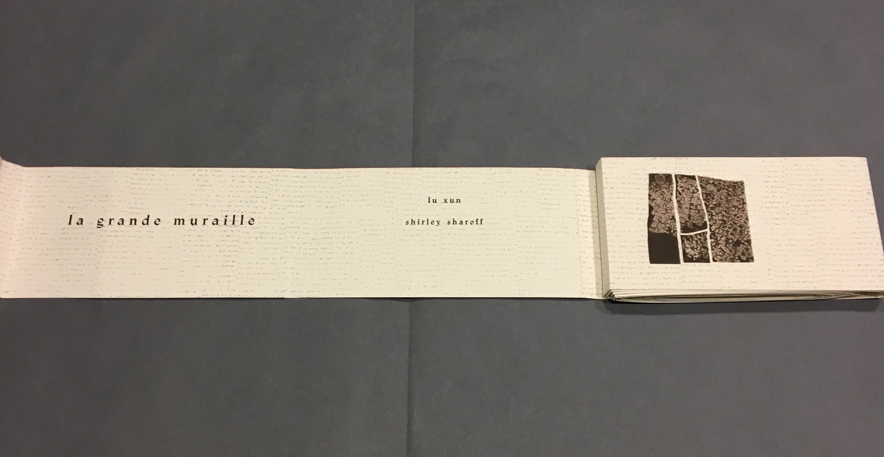
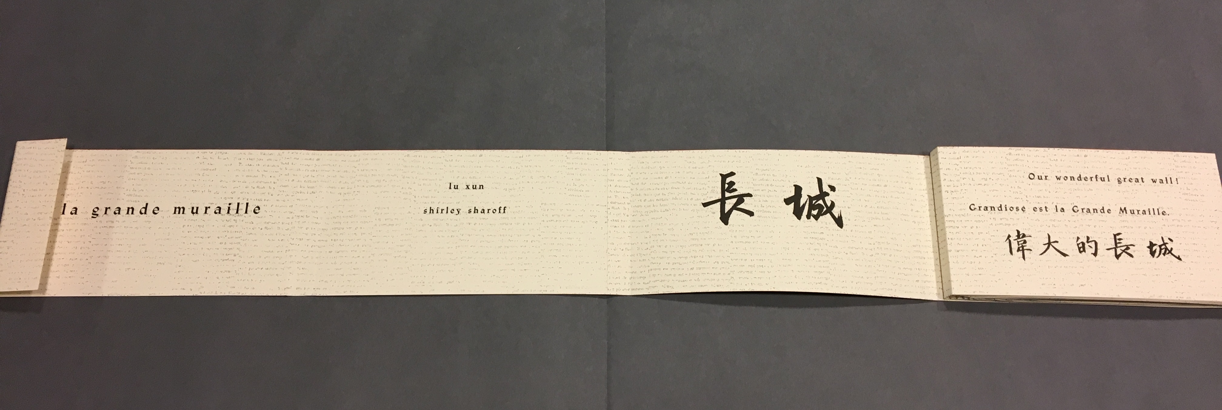
She uses the words of the 1930s writer Lu Xun and those of her 1980s English-language students to bounce echoes of strife, ambivalence and paradox from the walls of her prints and artist’s book, a double-sided accordion in forme en escargot (snail-shell form as she calls it). Lu’s poem appears in Chinese calligraphy and translated into French and English, set in bold and equal in weight to the Chinese characters. Sharoff breaks the three versions across increasingly shorter segments of paper, layering the different languages like mortar and rows of bricks. In a different, smaller typeface — like fragments of modern brick — the English text from her language students, reflecting on Western culture and their lives, is interspersed along with eight prints. The “snail-shell” structure unfolds/unrolls in a way that both “sides of the wall” end up being read. The juxtapositions and structure draw the viewer repeatedly from the flatness of paper into the multiple dimensions of the bookwork.
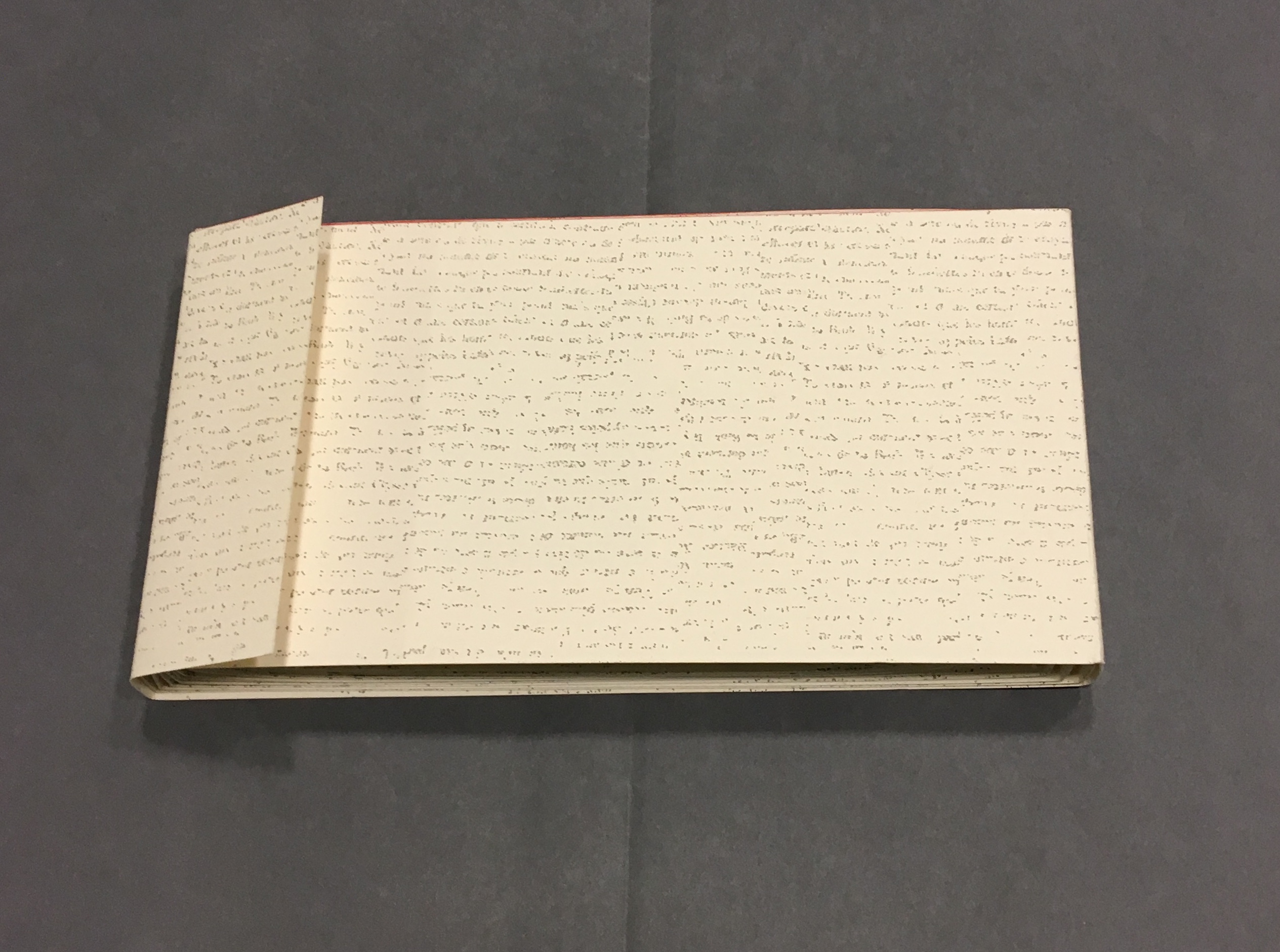
Bringing together barriers/bridges — languages, cultures and political eras — the bookwork breathes its own original life into Lu’s text of ambivalence and paradox. It is an effect similar but on a different scale to contemporaneous works by Xu Bing: Book from the Sky (1991) and Ghosts Pounding the Wall(1990-91). The faint markings on the Arches paper of Sharoff’s wall, markings created by printing the results of repeated photocopies of an unidentified manuscript, echo the unreadability of Xu’s faux Chinese characters printed from his 4,000 hand-cut stamps for Book from the Sky. The red edge of Sharoff’s wall and the words of Lu Xun catch the echo of Xu’s and his students’ beating their ink-soaked mallets against the rice paper hanging on the Great Wall and invoke the ghosts of those who died building the wall. The execution of the unusual “forme en escargot” equals in exquisiteness and production value any of Xu’s works.
Front cover La grande muraille/The Great Wall (1991), Shirley Sharoff
On first encounter, that snail-shell structure of this double-sided accordion book challenges the reader/viewer. Should the work be completely unfurled? Should it stand on its edge, or be laid flat then turned over? To try to read La grande muraille in those ways, however, is to overlook the multi-page spreads that Sharoff conceived with François Da Ros. The snail-shell form, its multi-page spreads and the text demand that you read La grande muraille as you unroll it or, rather, as you unfold it.
With the book laid flat, the “page spreads” are easier to recognize, the text is easier to read, and the forethought needed for the “imposition” of text and images to deliver the sequential text, easier to marvel at. As each recto page is turned to the right, two new pages appear to the right. This unfolding approach to reading the book offers several intriguing “double- and multi-page spreads” and an experience of the texts and eight prints in the sequence driven by the text. When you have finished reading in this sequence, you will have read both sides of the scroll.
“Pages 1 and 2” As “page 2” is turned to the right and the English title of the work disappears, “pages 3 and 4” come into view.
“Pages 1, 3 and 4” “Page 3” displays the authors names, and “page 4” displays the first of eight prints in the book. As “page 4” is turned to the right and disappears, “pages 5 and 6” appear.
“Pages 1, 3, 5 and 6” “Page 5” gives the title of the book in Chinese calligraphy. On “page 6”, the opening line of Lu Xun’s text appears in English, French and Chinese. Turning “page 1” to the right will cover the authors’ names on “page 3”, and turning “page 6” to the right will yield the next four-page view.
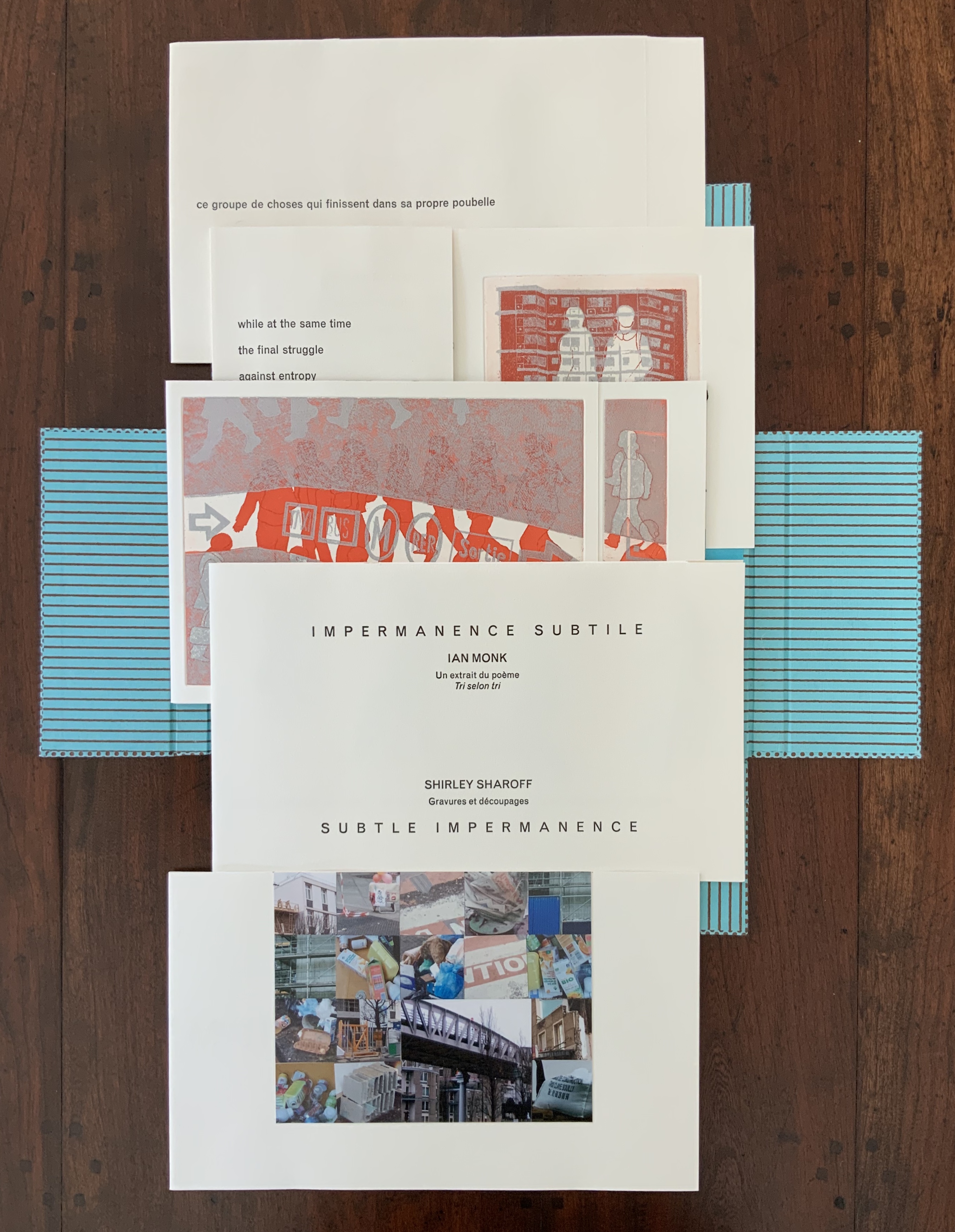
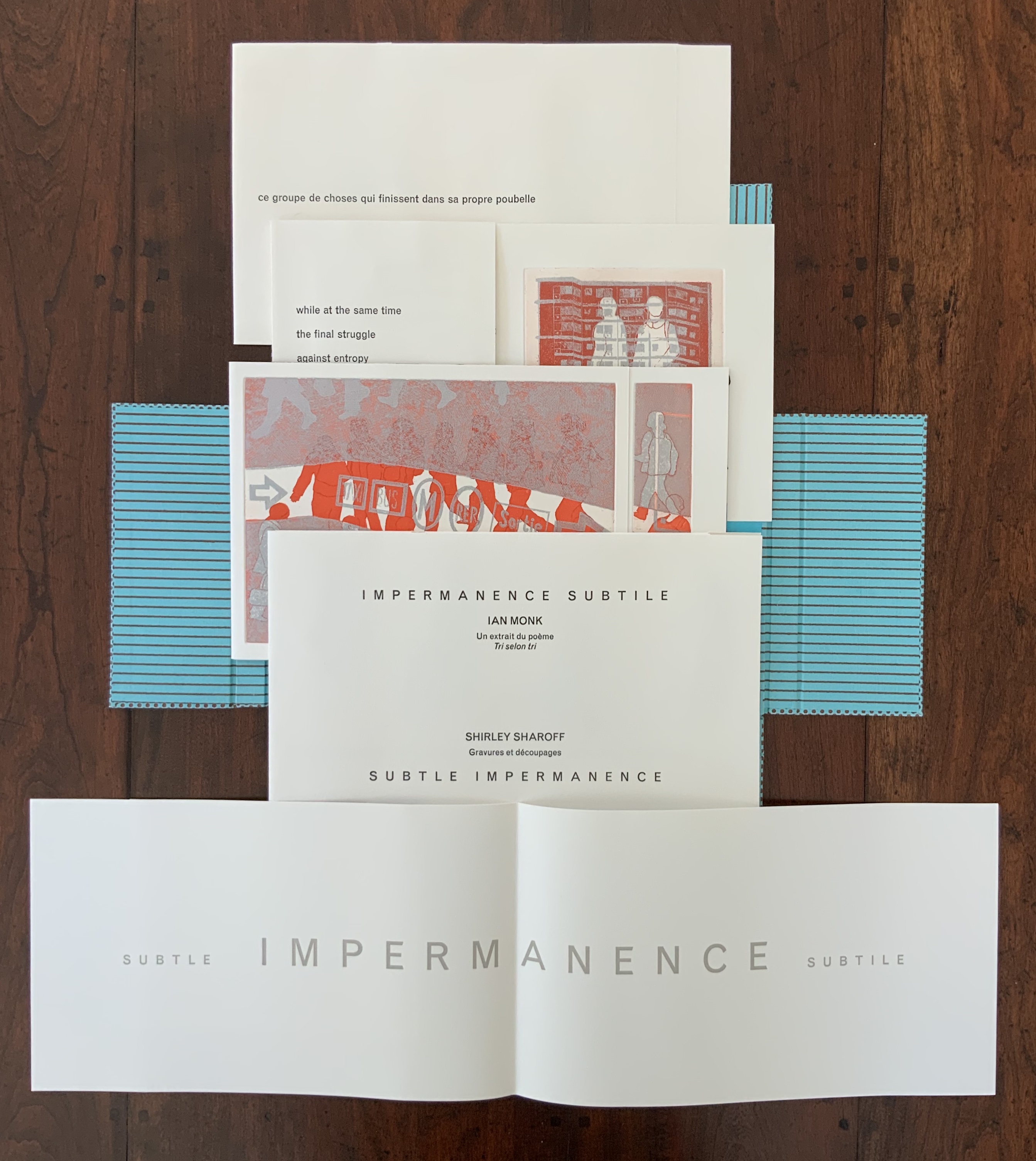
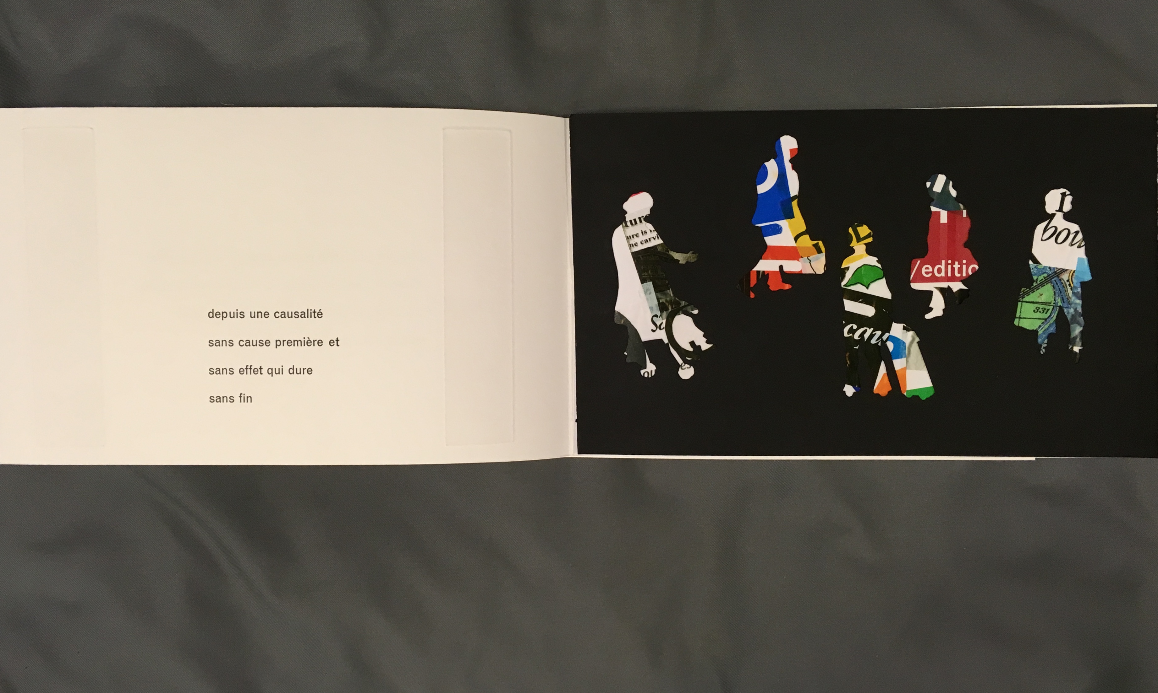
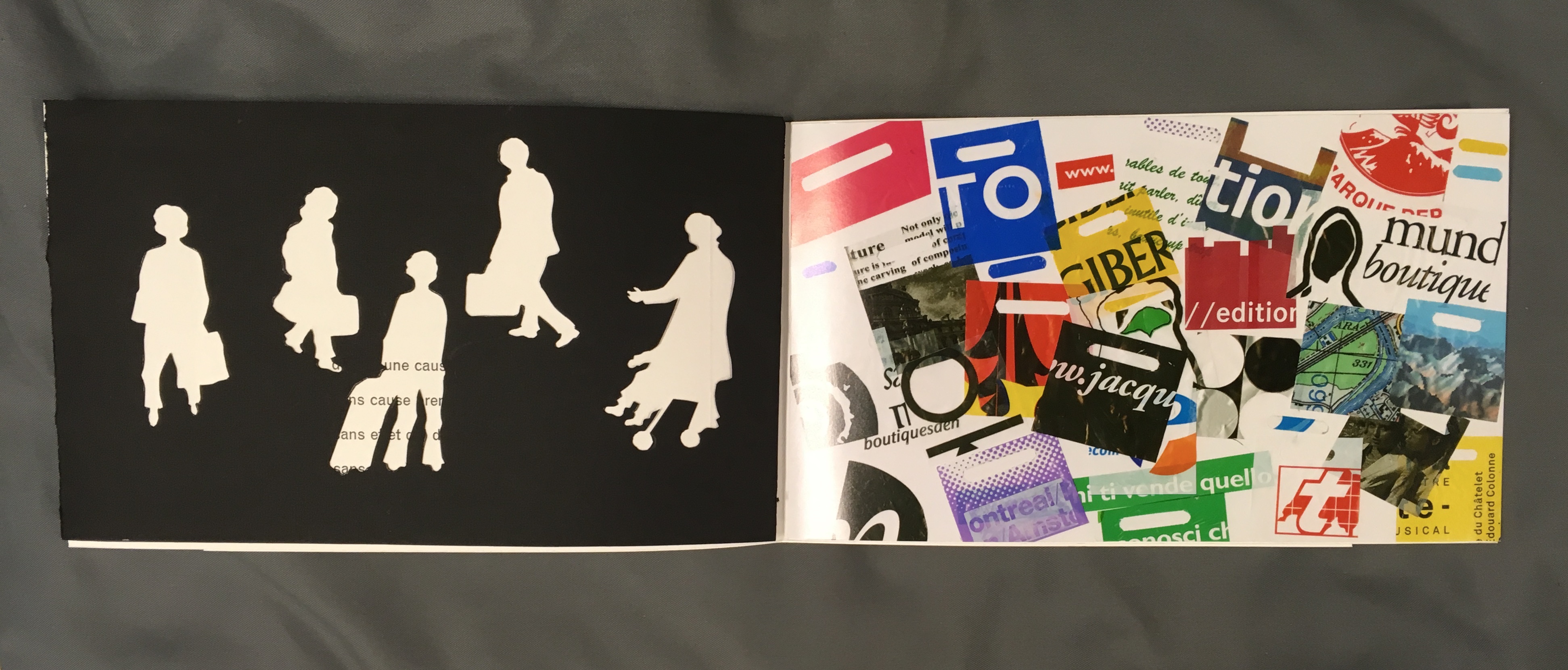
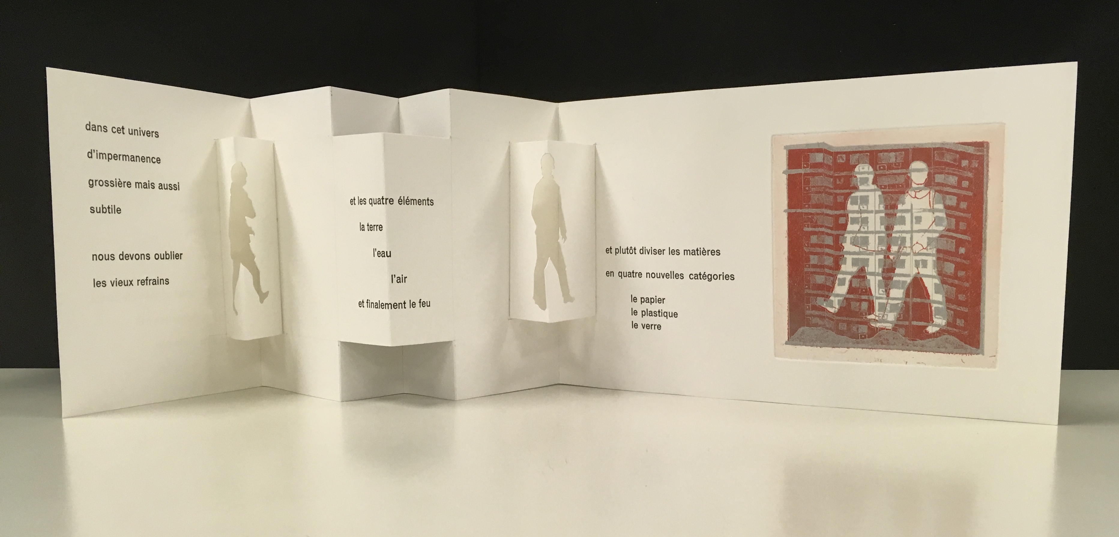
La grande muraille is a rare work, viewable at the Koninklijke Bibliotheek in The Hague and these other locations. Almost as rare but still available from the artist is Impermanence subtile/Subtle Impermanence (2013), in which Sharoff continues her experimentation with structures. She returns to the cased portfolio and folios of OVI but introduces fraction folds (two-thirds, etc.), vertical flaps and an accordion structure with mountain folds. In collage-like manner, silhouettes and cutouts of modern everywoman and everyman move through their urban working and shopping environment. And vice versa, images of the environment behind the cut-outs move through everywoman and everyman!
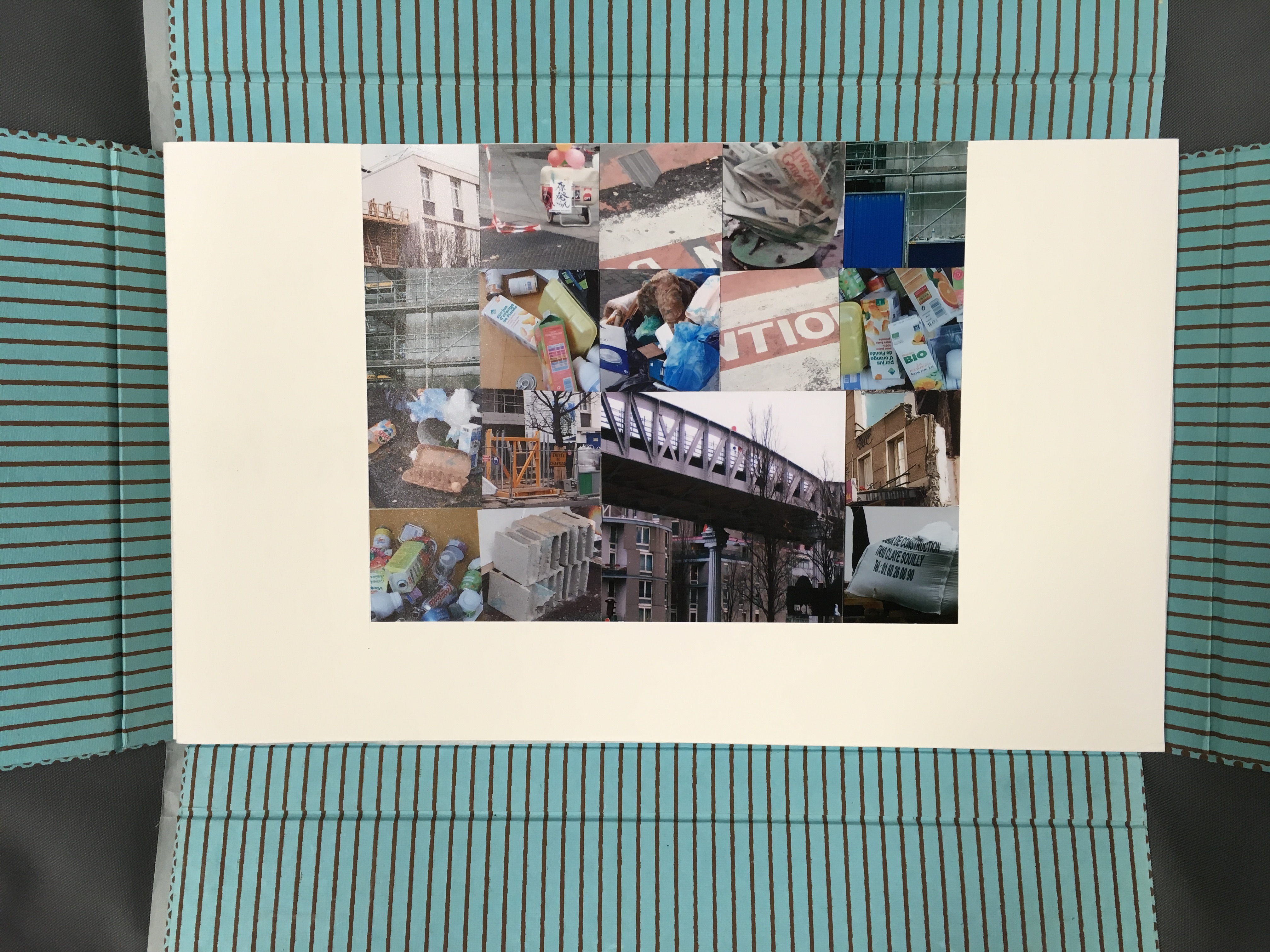
Sharoff’s everyman and everywoman are in strife with the environment. The portfolio opens with a “collage of garbage” whose relationship to them becomes clear in the ways Sharoff works the fragment of Ian Monk’s poem “Tri selon Tri” (displayed in French and English) in, under and through her prints and book structure.
Impermanence subtile / Subtle Impermanence (2013) Shirley Sharoff Photo: Books On Books at Koninklijke Bibliotheek, Den Haag, Nederlands
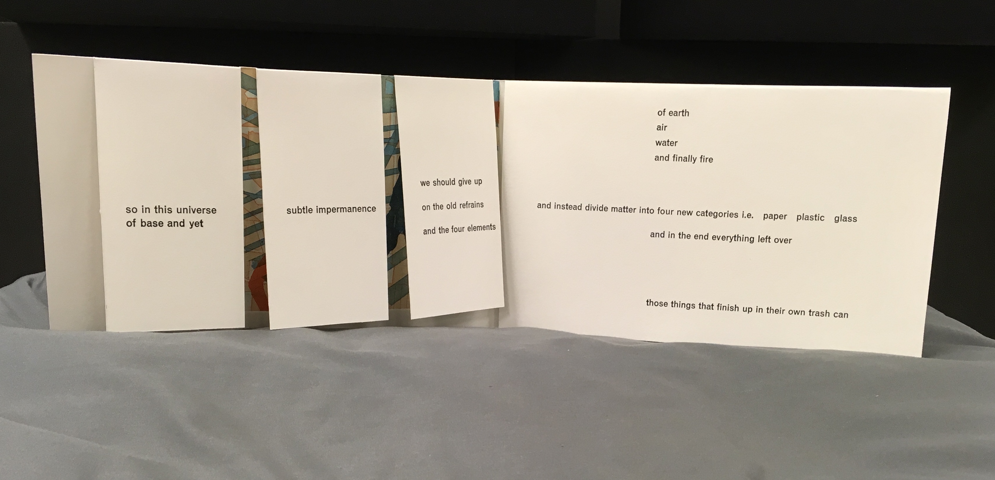
The five folios Photo: Books On Books collectionThe five folios with the first opened Note the “grammatico-textual” binding of the adjectives around the noun, mirroring the wordplay binding of the poem’s title “Tri selon tri” Photo: Books On Books collection
The third folio opened to the cutouts leaf Photo: Books On Books at Koninklijke Bibliotheek, Den Haag, Nederlands
The third folio with the cutouts leaf turned to the left Photo: Books On Books at Koninklijke Bibliotheek, Den Haag, Nederlands
Print from the third folio, where “blocks of matter/ wind around/ each other/ fold upon fold” Photo: Books On Books collection
The fourth folio opened to reveal an accordion structure with mountain folds Photo: Books On Books at Koninklijke Bibliotheek, Den Haag, Nederlands
The fifth folio opened to a flap structure Photo: Books On Books at Koninklijke Bibliotheek, Den Haag, Nederlands
The cutouts of everywoman and everyman fill up with the photos of trash behind them. In the prints, they stroll entangled in bricks and clutter toward an outcome where “in this universe of base and yet subtle impermanence, we should give up on the old refrains and the four elements of earth, air, water and finally fire, and instead divide matter into four new categories, i.e., paper, plastic, glass and in the end everything left over — those things that finish up in their own trash can” — i.e., us!
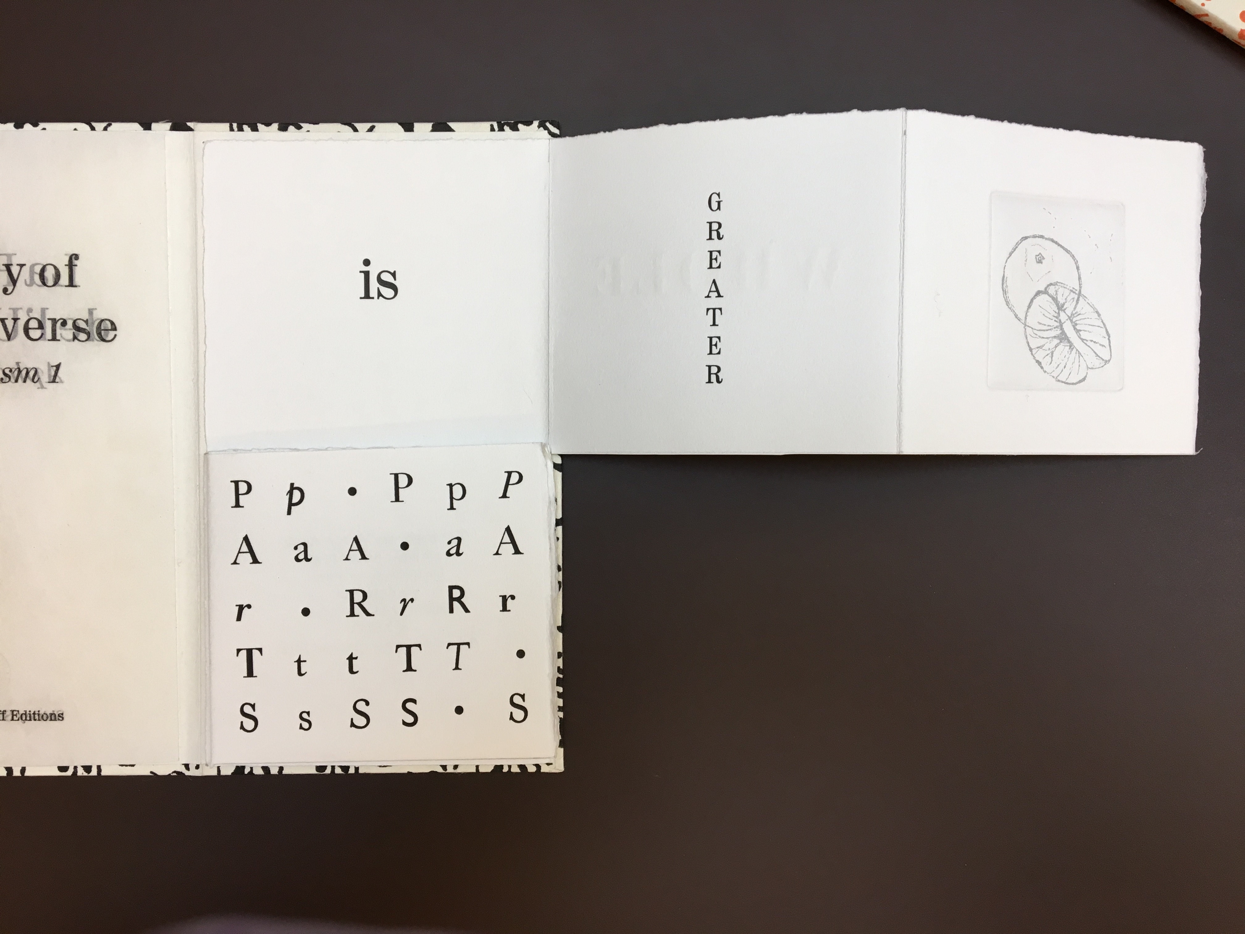
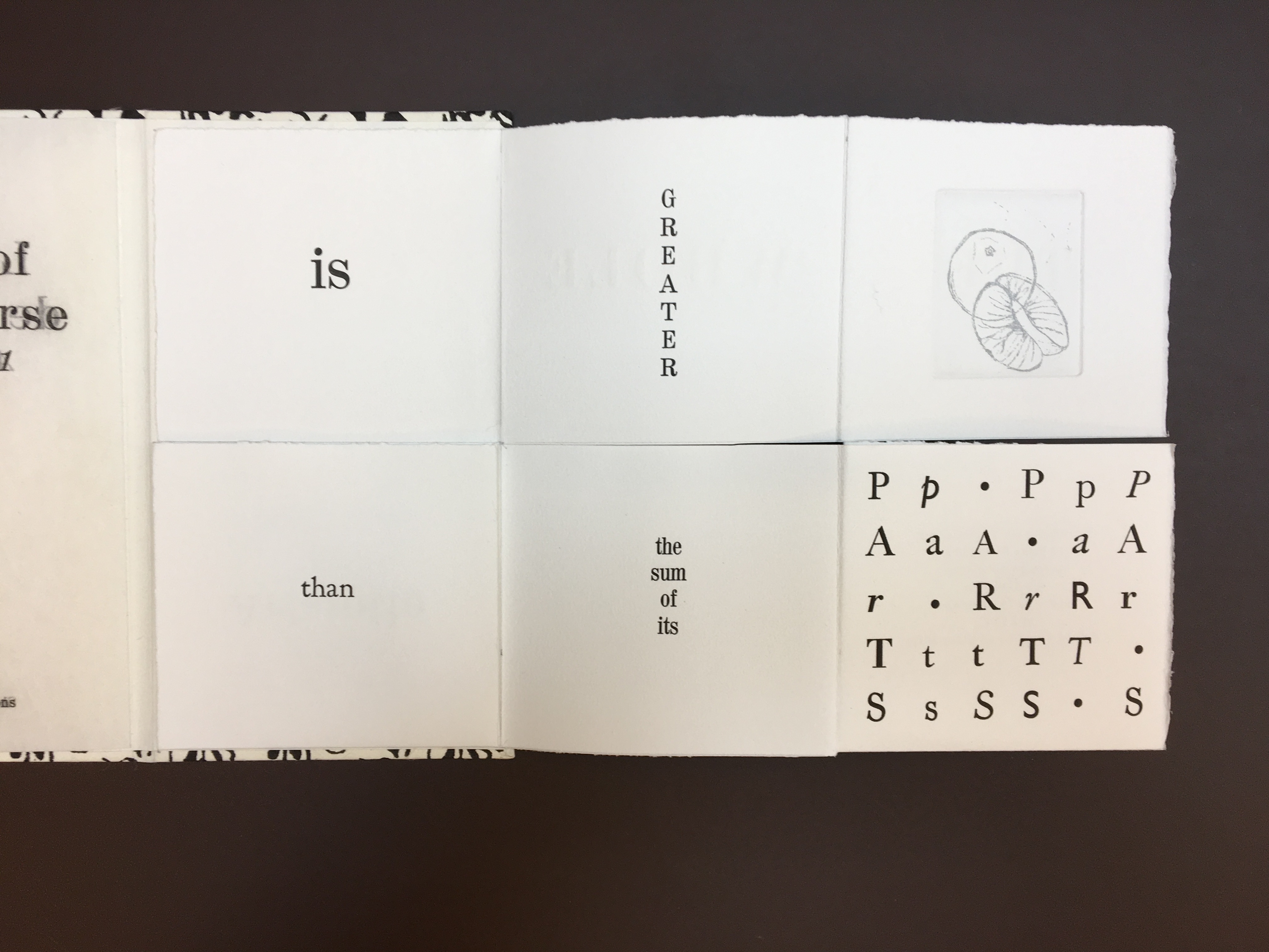
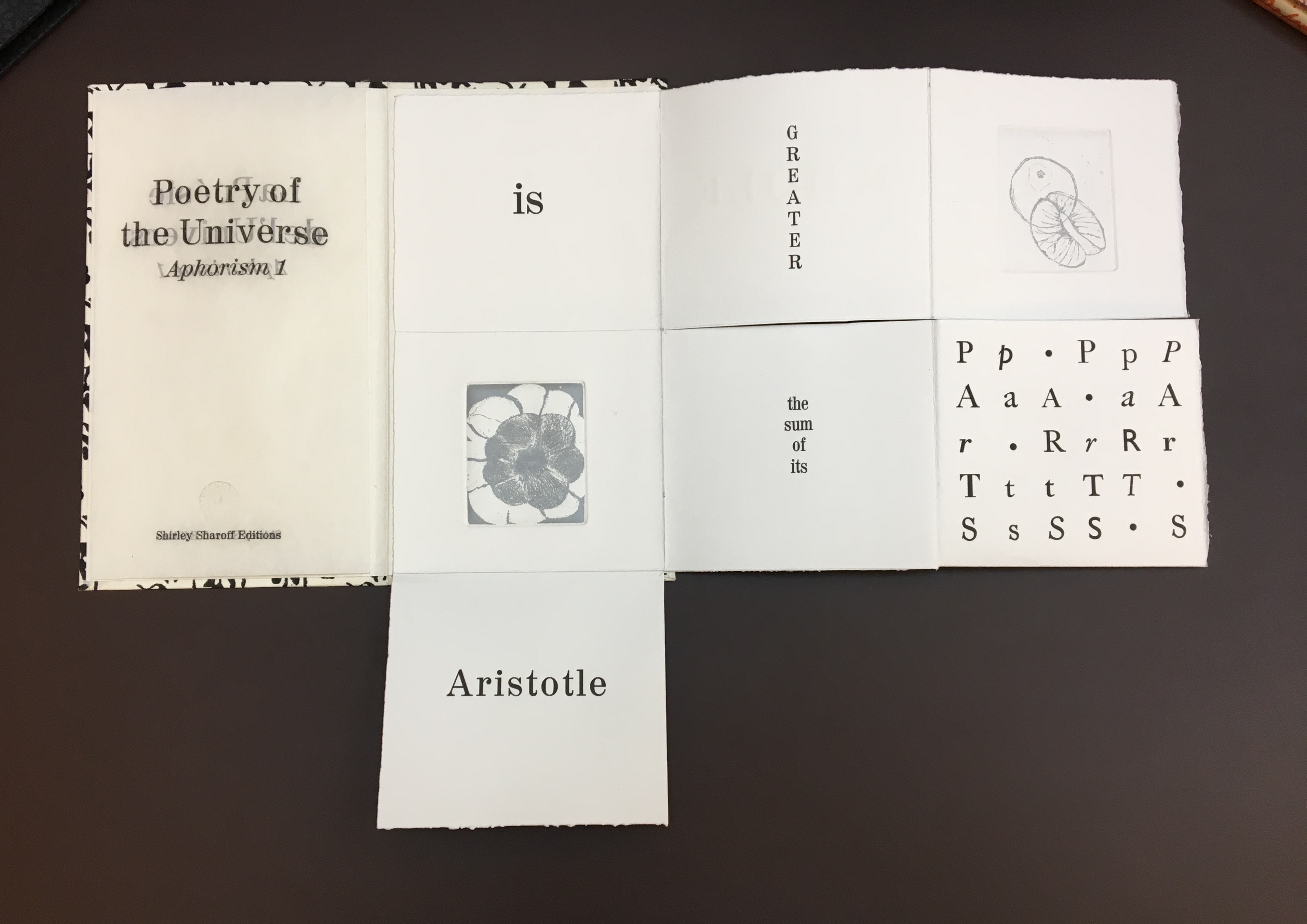
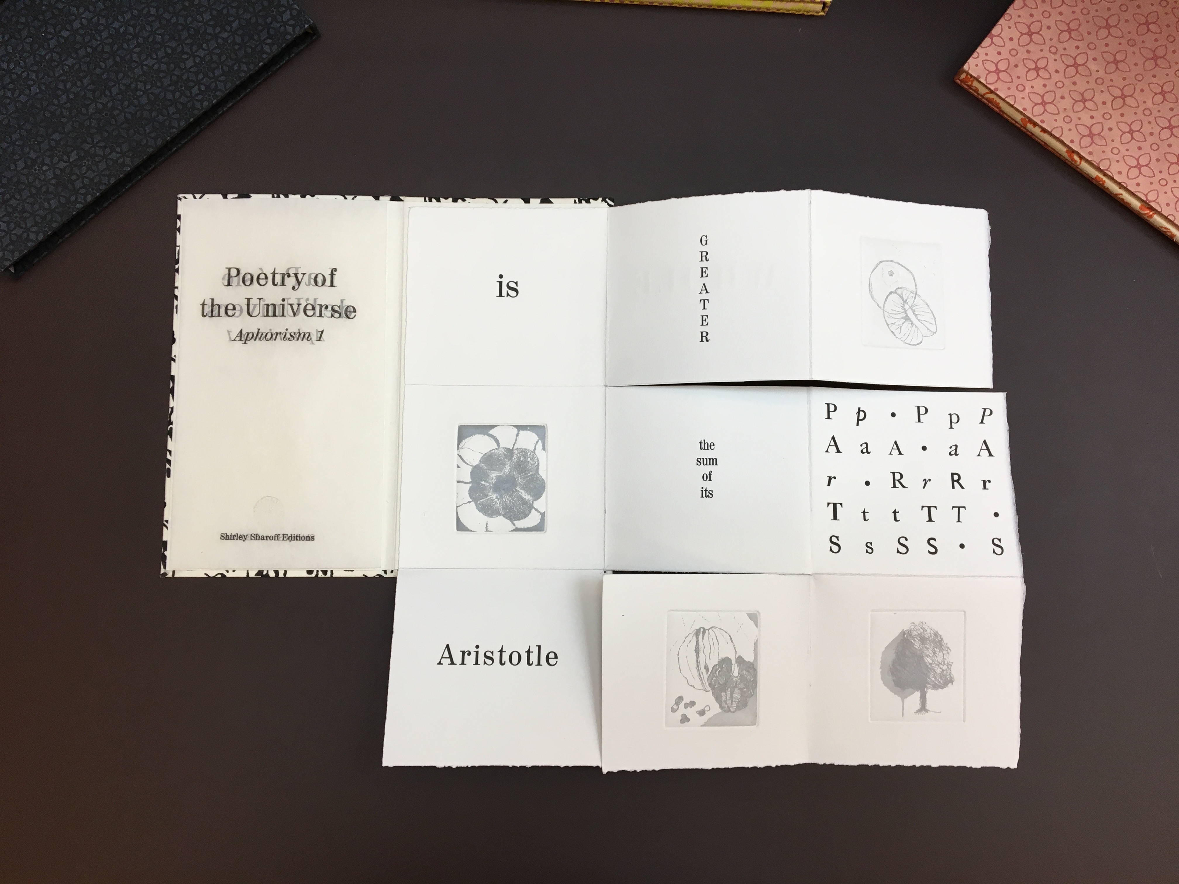
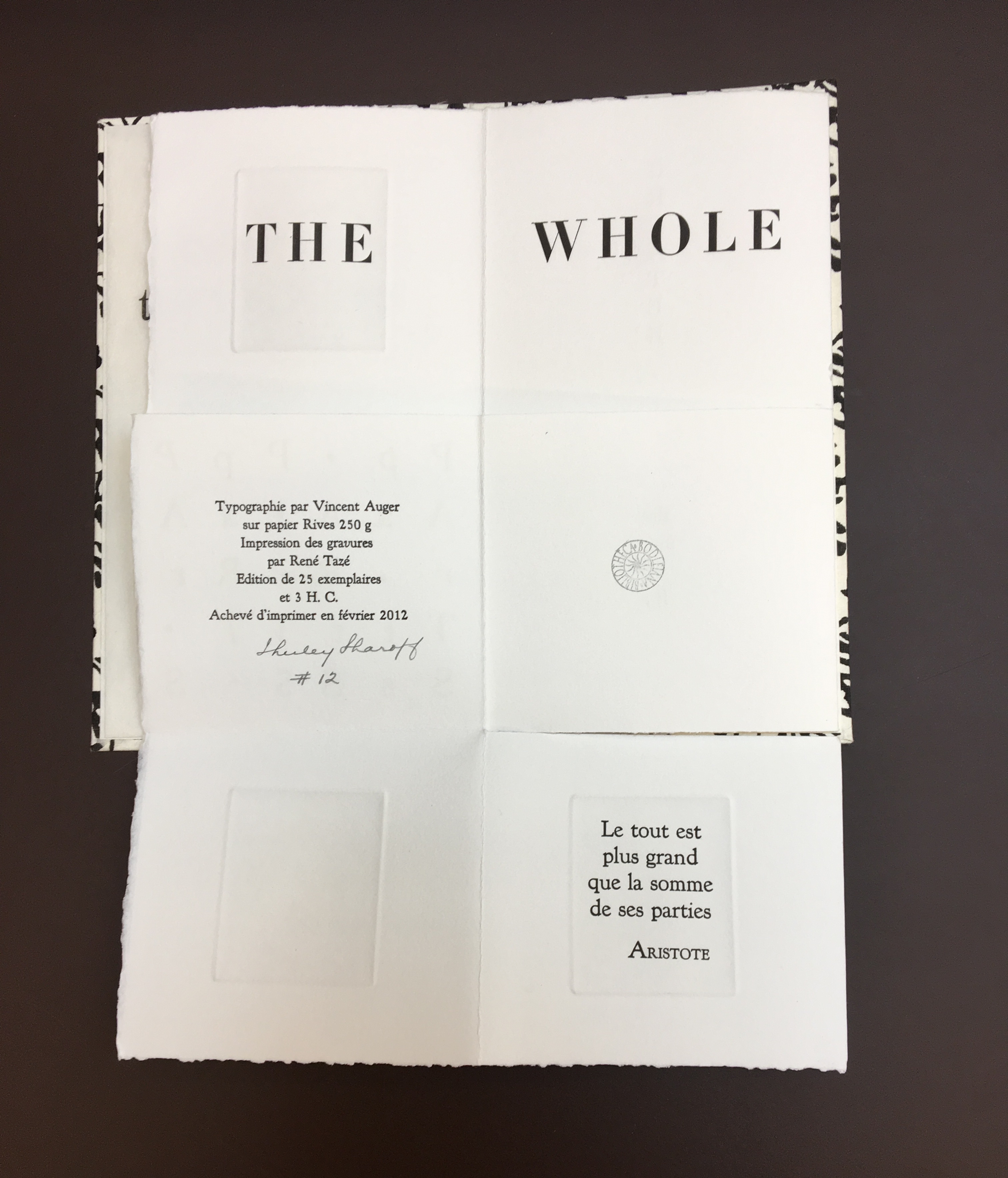
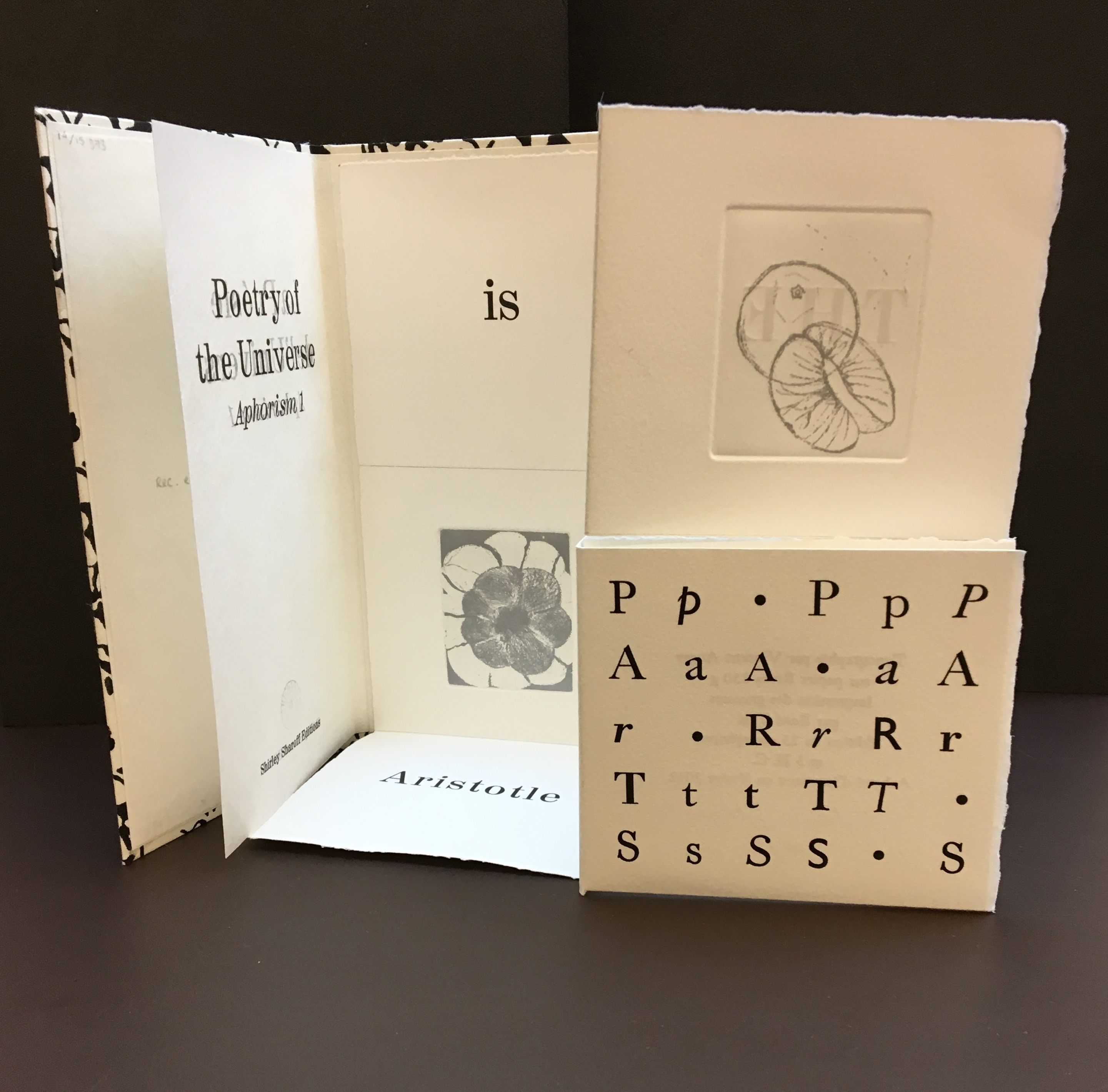
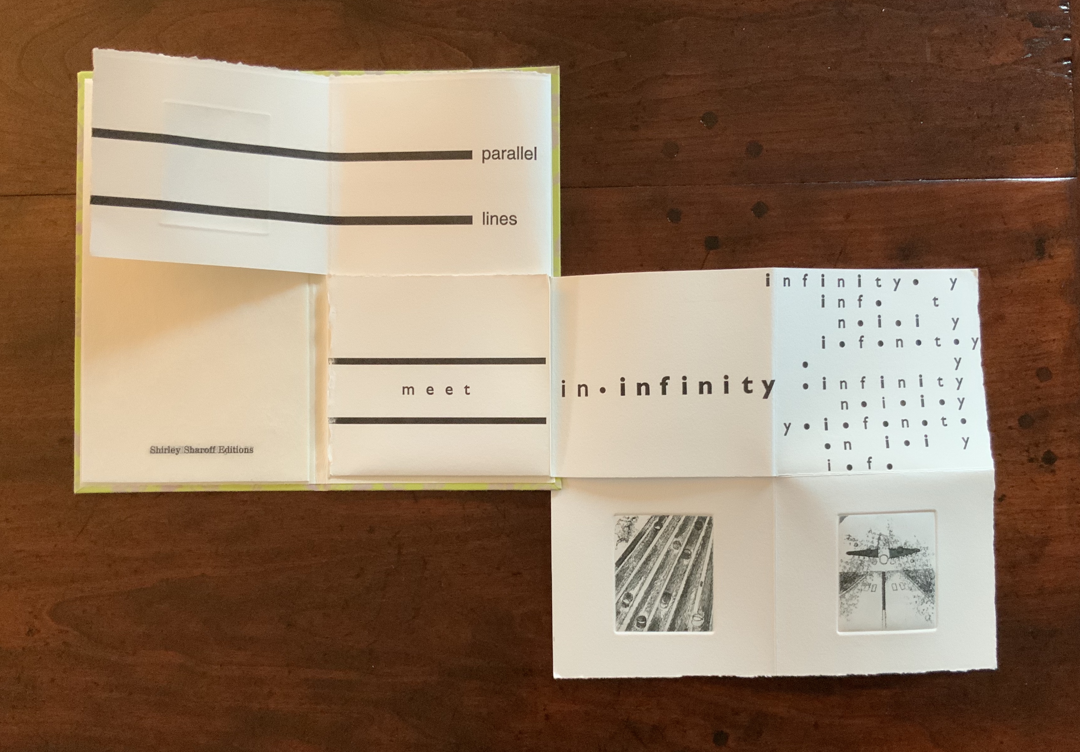
Continuing with the elemental, paradox and structural experiment, La poésie de l’univers (2012-2013) takes up the challenge of the folded single-page codex. In each of the three volumes in the set, the pattern of folds and cuts is the same, yet the pattern’s interplay with the prints and bilingual content in each seems uniquely appropriate. A hat trick of book art magic.
La poésie de l’univers (2012-2013) Shirley Sharoff Each volume (12 x 21.5 cm) is housed in a slipcase. The text in each is printed on one sheet of Rives 250 gsm in English and French, folding and unfolding to reveal different aspects of the text and images; 4 prints in each book. Edition of 25
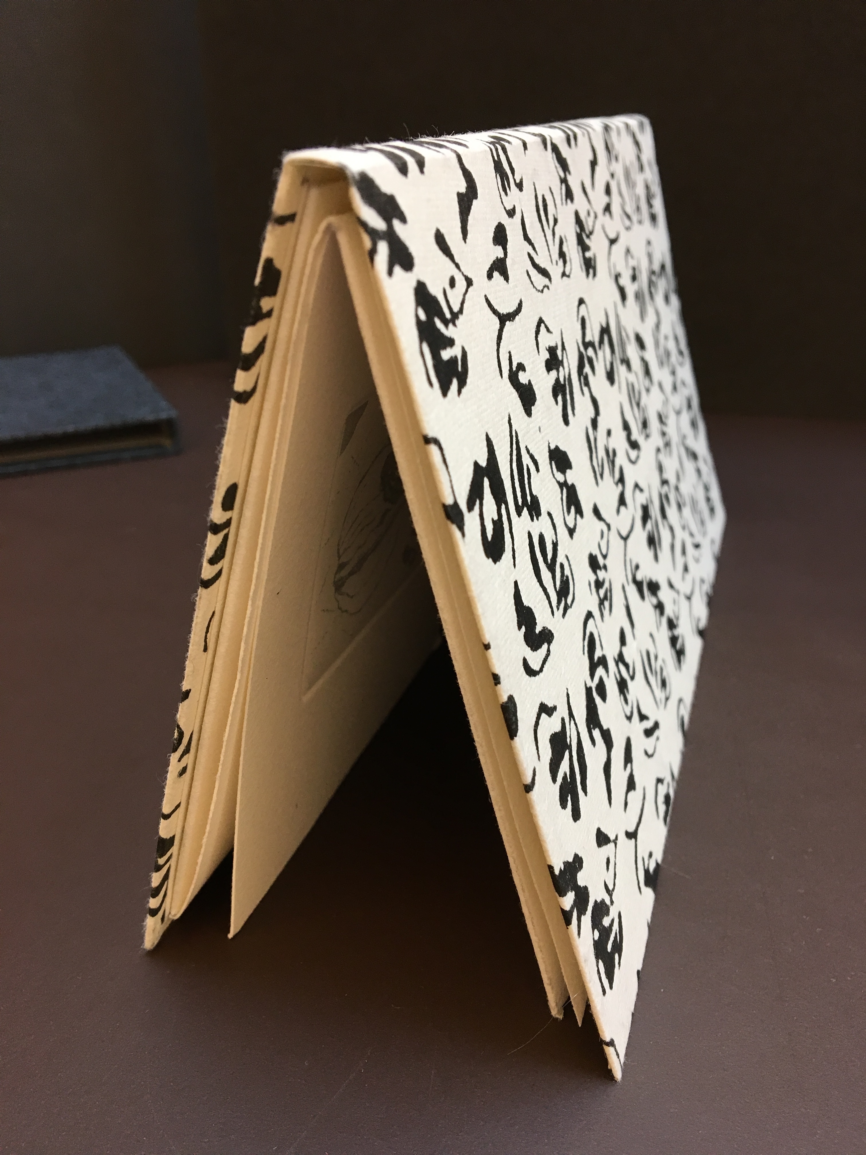
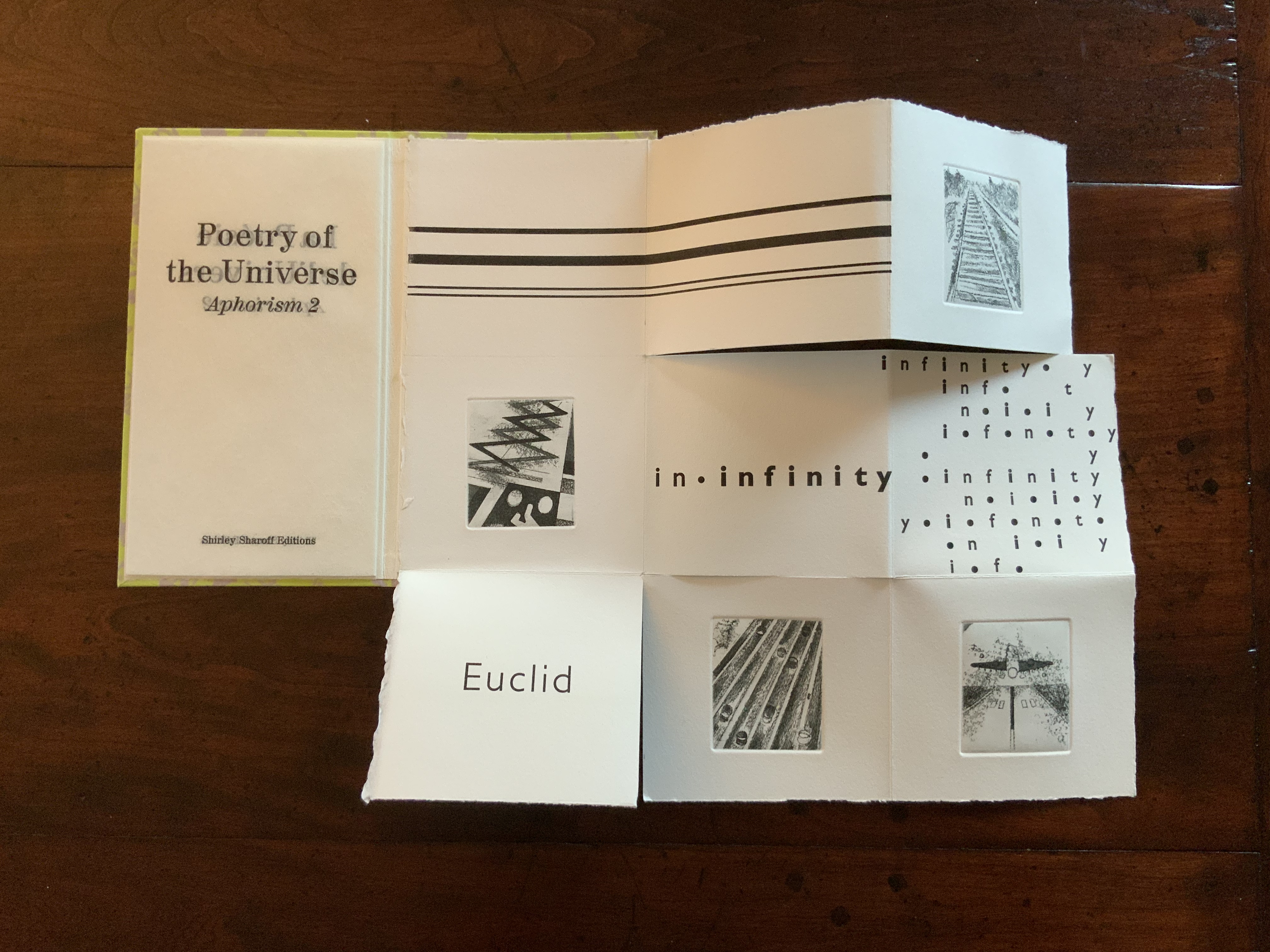
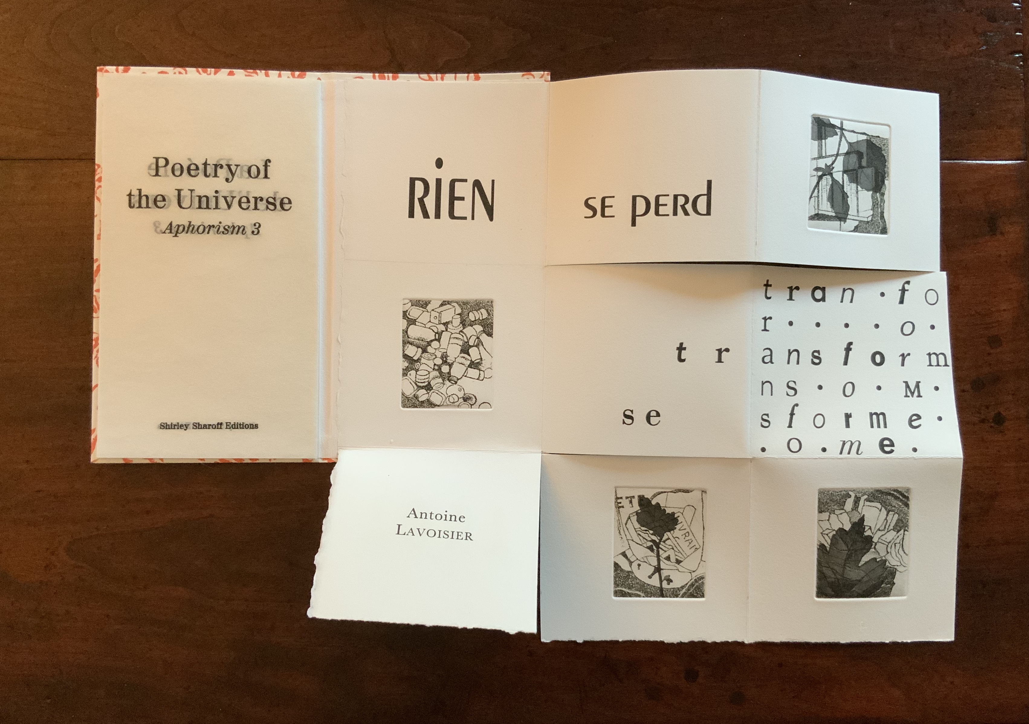
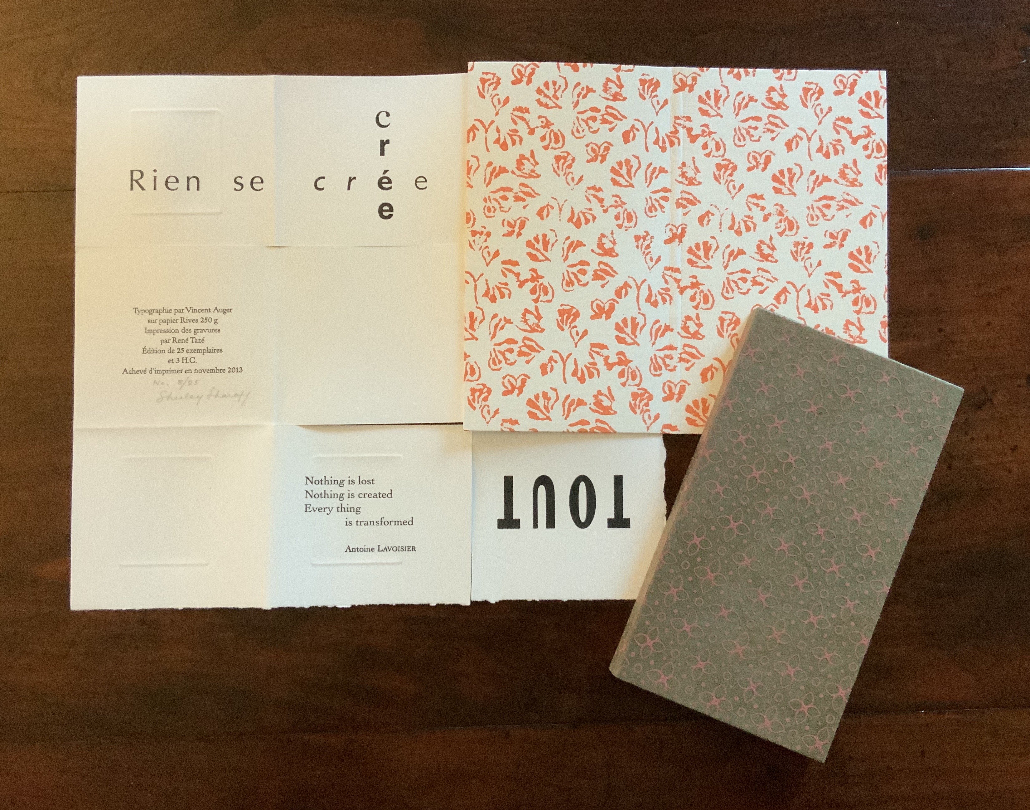
The Poetry of the Universe consists of three aphorisms: Aristotle’s “The whole is greater than the sum of its parts”; Euclid’s “Parallel lines meet in infinity”; and Lavoisier’s “Nothing is lost, nothing is created, everything is transformed”. As mentioned with La grande muraille, the execution is exquisite, and likewise, learning to read the work requires exploration.
Opening to slipcase for Aristotle volume
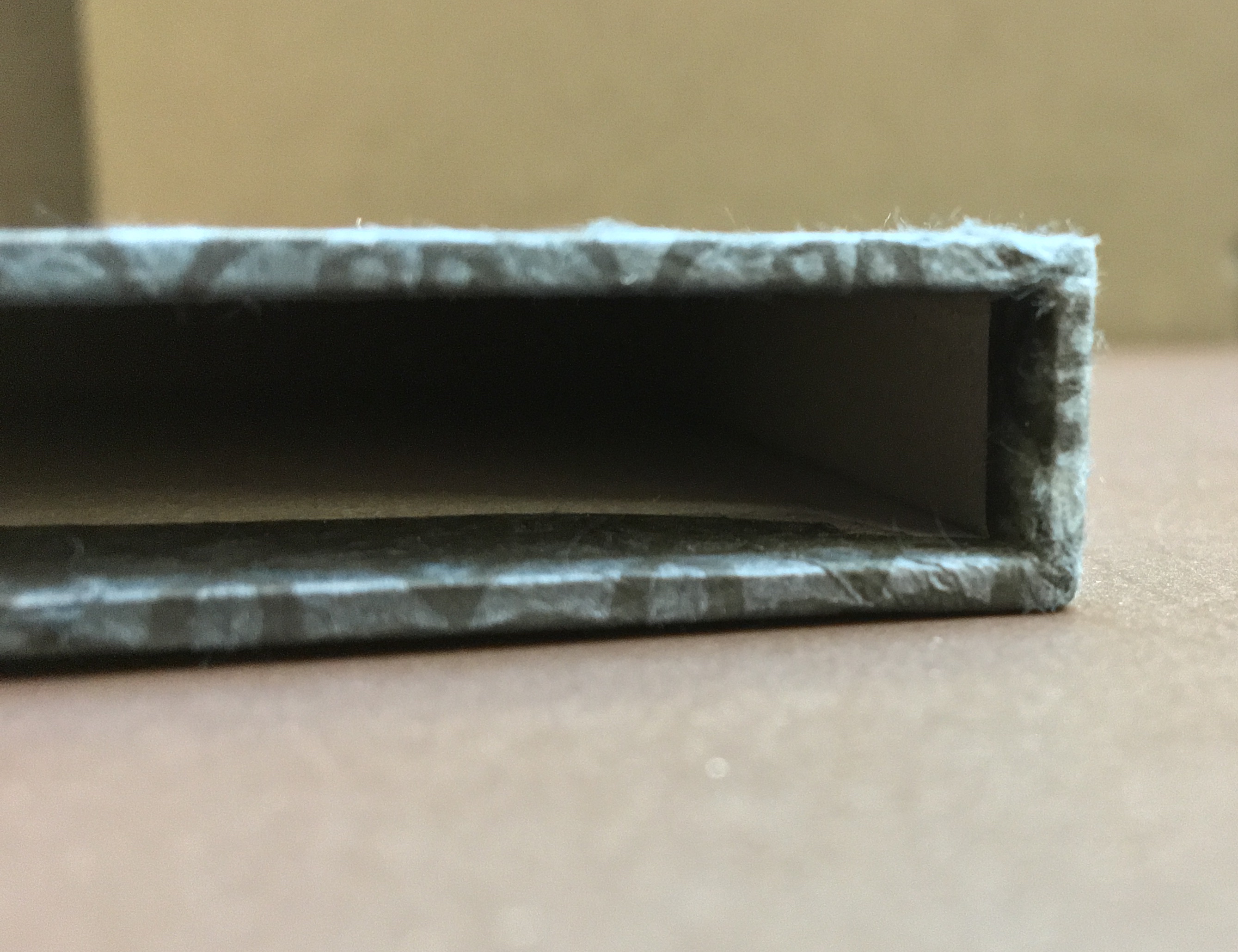
Lower edge of Aristotle volume
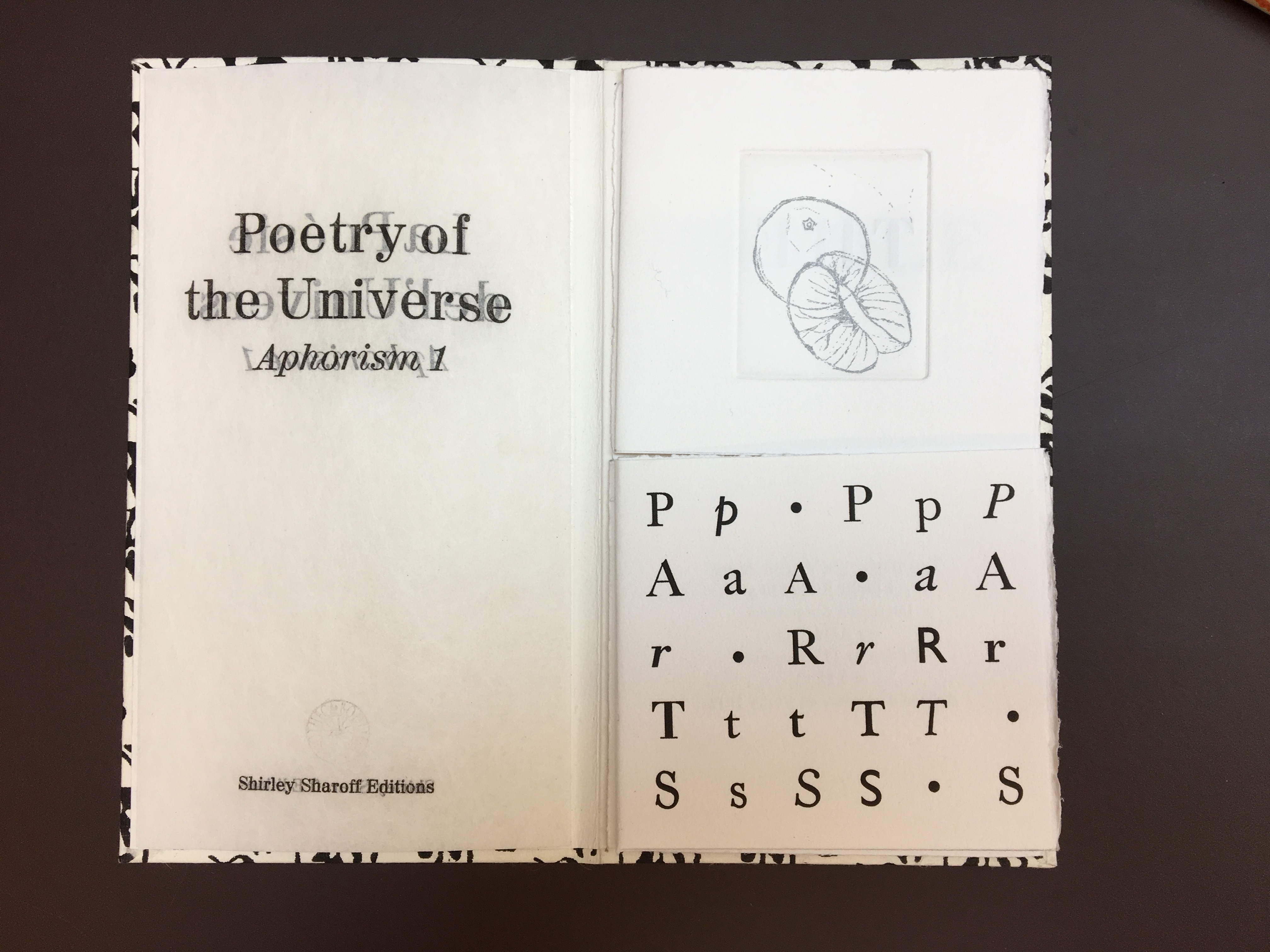
Title page and, on the right, the book’s first of four prints
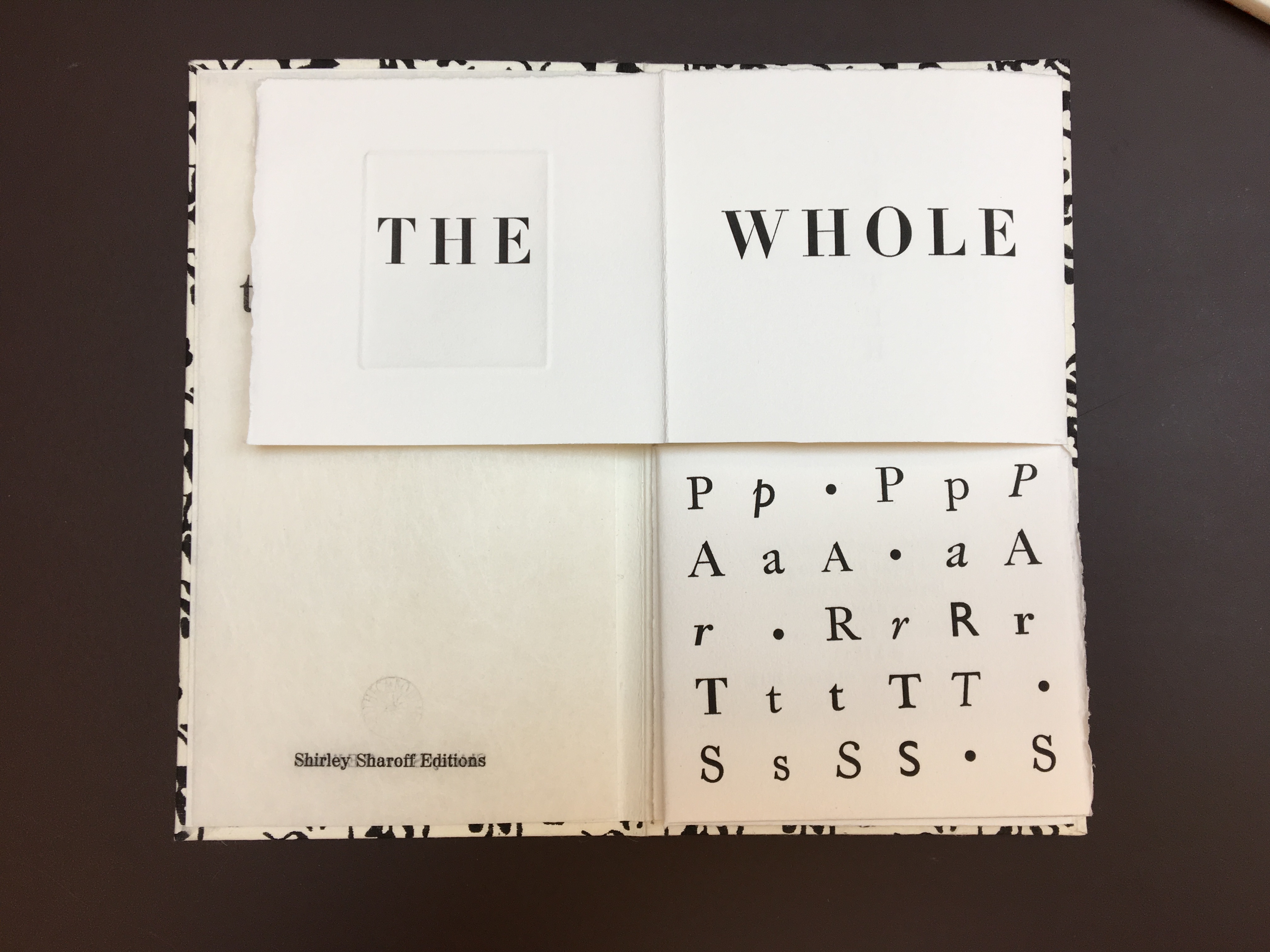
Opening the text: the first print folds to the left.
Note how the syntax requires turning “THE WHOLE” page or fold to the right, which brings the book’s first print back into view.
The syntax and structure call for pulling the lower page or fold to the right.
Folding down the “than” page reveals “Aristotle” and the second print in the book.
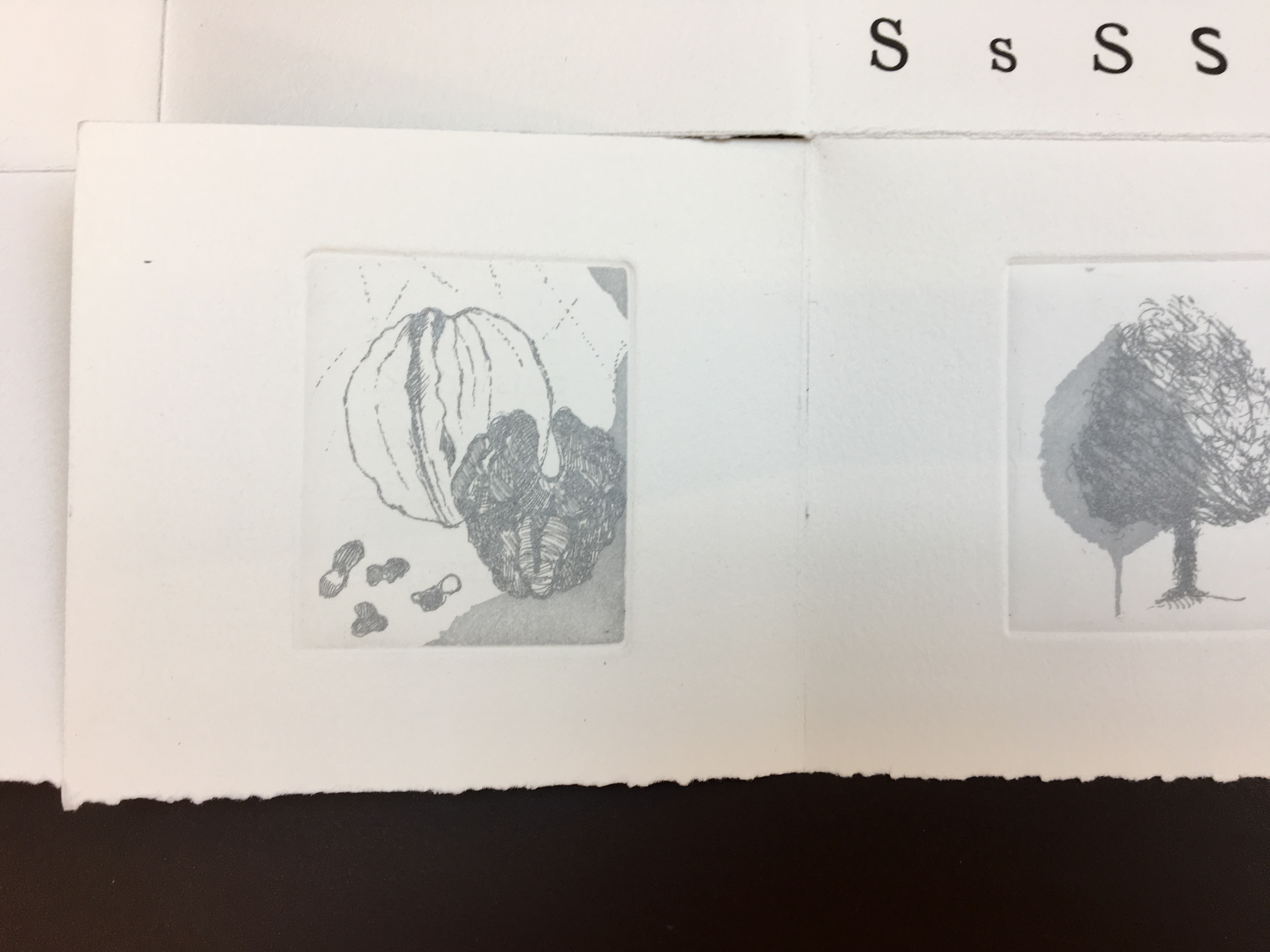
The third and fourth prints in the book unfolded downward and from under the two squares above
The colophon appears when the two righthand columns of squares in the previous view are turned to the left.
Detail of third and fourth prints
The etchings in soft grey — an orange and its segments, a blossom and its petals, a walnut and its meat, and a tree and leaf — illustrate the aphorism, much as the typographic choices and arrangements and the breaking up of the sentence complement it. Sharoff makes the second and third volumes perform similarly but differently — just as a magician weaves a routine from variations on the same vanishes and productions of a coin or other object.
Aphorism 2 — Euclid
Aphorism 3 — Lavoisier
As Comentale wrote in Art & Métiers du Livre: ”magicienne des formes”. La Poésie de l’univers is as rare as OVI and La grande muraille. It can be viewed here and here.
The most extensive essay on Sharoff’s work can be found in Paul van Capelleveen’s Artists & Others(2016). It comments on La reparation (2001), The Waves (2003), Les amazones sont parmi nous (2005), Bruits de la ville (2007), Impermanence subtile (2013), La poésie de l’univers (2012-2013). He addresses La grande muraille (1991) in Voices and Visions (2009). The special collection at the Koninklijke Bibliotheek in The Netherlands is one of the few where several of Sharoff’s works — including La grande muraille — can be seen and handled in one place.
Christophe Comentale’s essay captures the delight of exploration and discovery in the encounter with Sharoff’s art.
Shirley Sharoff, entre France et Etats-Unis, présente une pluralité d’inspiration consommée entre l’estampe et le livre devenu un média, entre unique et multiple. […] Magicienne des formes et des couleurs, Shirley Sharoff ne cesse de remettre en cause, par besoin autant que par défi personnel, tout ce qui pourrait ressembler au début d’un système de lecture, de vision, figé et donc clos. L’impossibilité de savoir -qui vaut aussi pour elle- de quoi sa prochaine oeuvre-livre-manuscrit-tableau-dépliant, ou tout cela à la fois, sera fait est assez excitant. La présence de textes sentis par affinités sensorielles, personnelles, avec des écrivains non encore classiques, autant de raisons d’apprécier de pénétrer dans cet univers où le conformisme est inexistant.
Christophe Comentale, “Shirley Sharoff, des livres a tenir debout et des estampes a voir aussi”, Art & Métiers du Livre, n°231 (Aout-Septembre 2002), p.63.
Xu Bing: Thought and Method Ullens Center for Contemporary Art (UCCA) (尤伦斯当代艺术中心) 21 July through 18 October 2018, Beijing
For most of us, the only glimpse of the 2018 Beijing exhibition Xu Bing: Thought and Method will have come from online articles, screen shots and a short film or two. By noting commentaries contemporaneous with the exhibition and linking them to older related articles and books, Books On Books aims to enhance appreciation of the exhibition and Xu’s work as well as findability of the latter. Throughout, where known, links to institutions holding Xu’s works are provided.
May 2018 saw the first announcement of the Xu Bing retrospective, his “most comprehensive institutional exhibition” to date, according to Sue Wang writing for CAFA Art Info.
July 2018, just before the exhibition’s opening, Helena Poole’s article arrived to guide the reader on what to expect from the exhibition. One of its useful observations is the influence of the printmaking tradition of Lu Xun on Xu’s early prints. Although not a printmaker himself, Lu stimulated the tradition with his activist writing and encouragement of woodcut printmaking in the journals of the Morning Flower Society (朝花社) founded in 1929. In Art in Print (May-June 2016), the reader can find a useful background on Lu Xun and a selection of images from the New Woodcut Movement that will deepen Poole’s guidance.
Also helpful to a better appreciation of the prints are two online displays of images (more than offered by Wang and Poole): ArtThat eLite and RADII China’s “Photo of the Day”. Both displays enable us to see that, while Xu’s early prints — for example, The End of a Village (1982) — reflect the New Woodcut Movement style, his later work is at once more subtle and abstract than that of the early revolutionary periods and yet still evocative of the figurative, the diurnal and strife. The subtlety lies in the shift from the depiction of workers’ strife to the strife between sense and nonsense or language and concept, between cultures and their languages, and between the individual and polity.
Just after the exhibition’s opening, two excellent overviews of Xu’s career and art appeared in July. Sue Wang followed up her May announcement with a translation of an essay by Lin Jiabin expanding on the exhibition’s title Xu Bing: Thought and Method. Rather than focus on any one work, Lin Jiabin digs into the artist’s thought and method. Among Lin’s several useful insights are these:
Xu Bing adheres to the essence of simplicity and wisdom of eastern culture, and also faces the world in a broader sense. His works are forward-looking and vigilant; at the same time, his works under the guise of dislocation, multi-level social issues and cultural thinking sway and excite each other. [Emphasis added]
… the new work is an excavation and extension of something that is valuable in the past and that was not fully realized. It actually has a “cue” effect. Xu Bing said, “As long as you are sincere, no matter what form these works are, big or small, no matter how early or late, actually the final relationship between them is like constructing a closed system.” [Emphasis added]
Through the transformation of old artistic languages and the creation of new languages, the artist provides the audience with a variety of channels for entry and exploration. [Emphasis added]
The second overview — Grace Ignacia See’s “UCCA Presents …” in The Artling — takes a more descriptive and linearly developmental view following the exhibition’s division into three sections, “a direct reflection of the turning points in [Xu’s] artistic context and processes”.
The first section:
Book from the Sky (1987-1991), Ghosts Pounding on the Wall (1990-1991), and Background Story (2004-present) allow viewers to observe the means in which Xu’s meditations on signification, textuality, and linguistic aporia have been evoked;
The second section:
A, B, C… (1991), Art for the People (1999) and Square Word Calligraphy (1994-present) project his explorations of hybridity, difference, and translingual practice through his works;
The third section:
his more recent works Tobacco Project (2000-present), Phoenix (2008-2013), Book from the Ground (2003-present) and his first feature length film Dragonfly Eyes (2017), exist as commentaries on economic and geopolitical changes that have contributed towards China’s societal evolution and the world’s in the last hundred years.
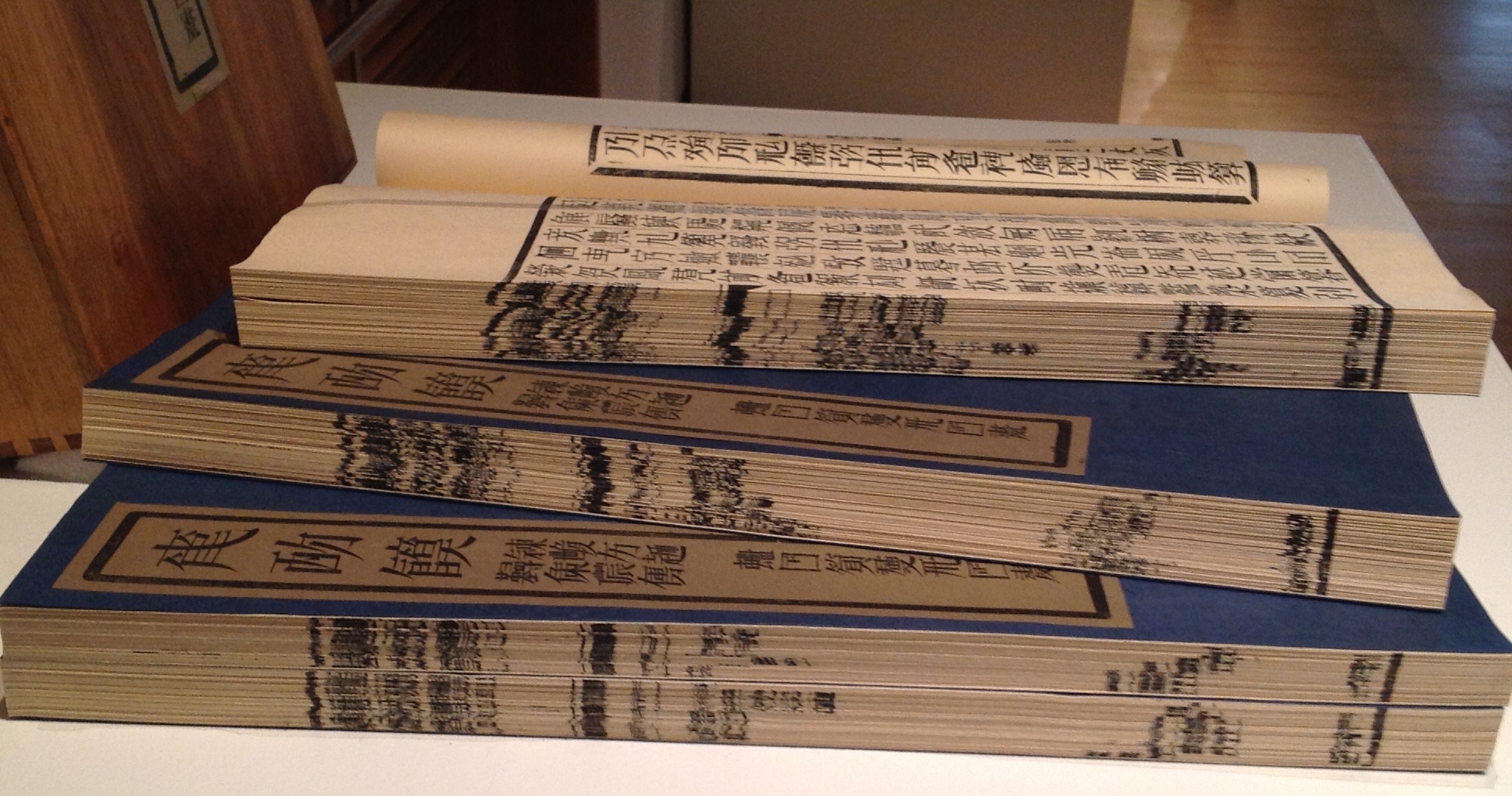
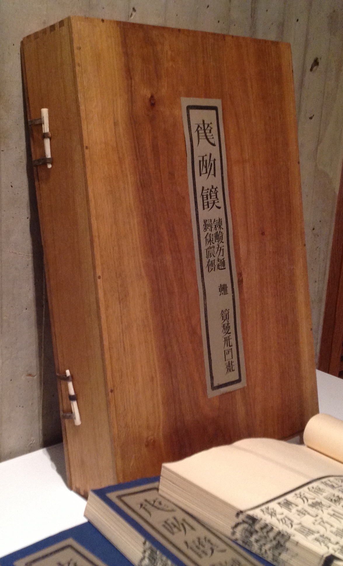
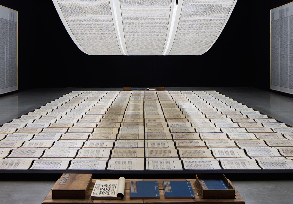
Tianshu or Book from the Sky, consisting of four volumes enclosed in a fastened wooden box, is a challenge to find, almost as much a challenge as being in the right place to see its installation version. The greatest challenge for a Westerner, however viewing the work, is grasping a Chinese viewer’s perception of it. How to imagine markings that, at first, look like the characters of the roman alphabet and even seem to form combinations that look like words and sentences but, on closer inspection, are not any letter, word or sentence known or knowable to the Western eye. Xu carved 4000 wooden stamps for characters that look like Chinese characters but are not and proceeded to have the four volumes printed under his instruction — as well as scrolls and wall hangings for installations.
Tianshu/Book from the Sky (1991) Xu Bing From the Allan Chasanoff Collection, Yale University Art GalleryFore edges of the four volumesClose-up of the container and its catch mechanism, which is repeated on the other edge.
Book from the Sky (1991) Xu Bing View of installation
For a lengthier description and appreciation of Tianshu, John Cayley’s commentary and lecture are only surpassed by his book, where he writes:
[Tianshu is] not an object. It’s not a painting or a sculpture or even a book as such. It’s a configuration of objects and materials that represent a concept and provide some evidence or record of the development of the concept and the making of its constituent elements. You can’t possess it. You either have to find some elaborate way to acquire a personal record of the work or you have to take part in a process that allows the installation to remove itself into a museum or major gallery where this representation, beyond an individual’s acquisitive capacities, can be preserved for collective curated culture. In a sense, I’m helping you to ‘own’ the Tianshu by writing this.
Given the challenge of tracking down locations to visit where Tianshu has been acquired, Cayley’s “help” is welcome. The Beijing exhibition’s installation can be seen at the 4’04” mark in the UCCA video.
Although nicely illustrated in See’s article, Ghosts Pounding the Wall (1990) needs a bit more commentary for a fuller appreciation. According to Julia F. Andrews and Kuiyi Shen in The Art of Modern China (2012), the work was Xu’s response to the criticism that Book from the Sky demonstrated he had lost his way “like ghosts pounding the wall” (p. 258). It’s also worth noting that these two works have in common the process of turning one form of work into another.
Just as Book from the Sky consists of the four volumes in a wooden box yet is also an installation with scrolls and wall panels repeated in multiple venues, Ghosts Pounding the Wall began as the performance by Xu and his students wearing bright yellow jackets, stenciled with characters from Book from the Sky, and rubbing ink on rice paper fastened piece by piece across a one-kilometer stretch of the Great Wall and also is the installation. The latter is nicely shown in See’s article and can also be seen in the UCCA video at the 5’20” mark. Xu’s performance was one of “ghosts pounding the wall”; the installation, one of the ghostly impressions from that pounding of the wall. This characteristic or method in Xu’s art is one to watch for in almost all of his work.
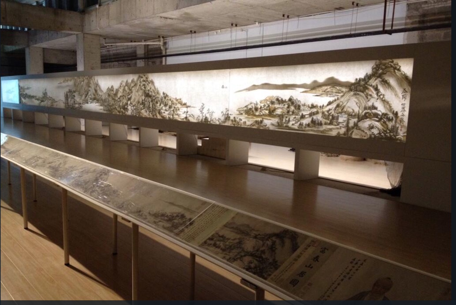
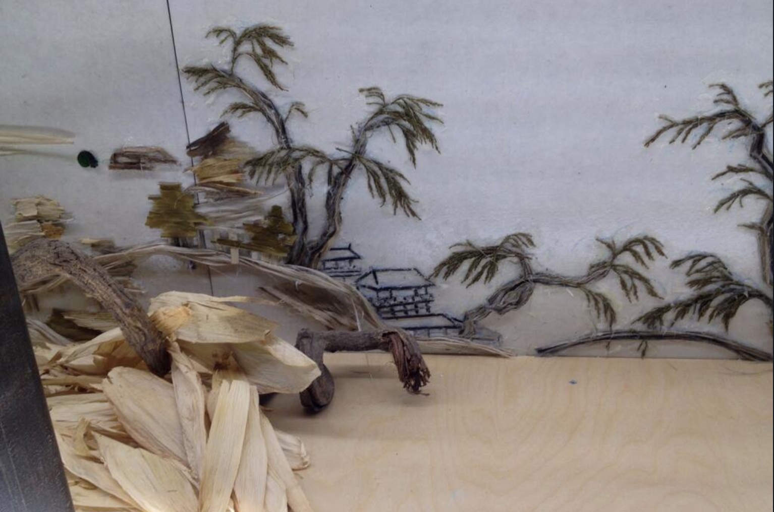
Background Story, the third work in this section, is an installation and as such only fully accessible when in situ like Ghosts and later works. It first appeared in 2004. What appears to be a Chinese landscape printed on rice paper secured in a long row of joined-up lightboxes extending across the space of the host gallery is actually formed of shadows cast by objects on the other side of the lightboxes, which are open to view. Over time, the installation has developed as a series, with each version being based on a different ancient Chinese landscape painting. Usually the painting belongs to the institution where the work is installed. Four of the versions can be found at these links to videos and a slide show: 2011, 2012, 2014, 2015. The 2018 version can be found in the UCCA video at the 6’16“ mark.
In the meantime, another earlier essay from Sue Wang provides useful insights on experiencing the version based on the painting “Dwelling in Fuchun Mountains” by the Yuan dynasty painter Huang Gongwang. This version appeared in 2014 in Beijing as jointly organized by the Inside-Out Art Museum, Jing & Kai, the Rose Goldsen Archive of New Media at Cornell University, Life Bookstore and SDX Joint Publishing Company.
Front and back of Background Story: Dwelling in Fuchun Mountains (2014) Xu Bing Photo credit: Joy Lidu Yi
Wang also includes an interview with Xu about the process and intent of Background. The work marks a departure from Xu’s traditional materials: ink, paper, print, characters and language, but as Xu points out to Wang:
… whether using ink or not isn’t the issue at the core, while the most important thing is what the artist wants to express. It is necessary to think of what material does well in the presentation of the expected effect and the words of the artist. It may be a new language that no one speaks, it is a new language of the time, so it is in need of finding a new way of speaking ….
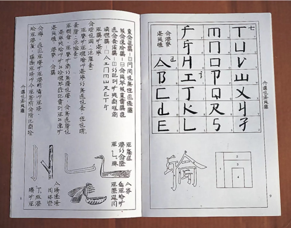
The second section of the 2018 Beijing exhibition brought into focus Xu’s deepening thought about language and culture when confronted with English and the art scene in the US and elsewhere in the West. See’s article highlights A, B, C… (1991) and Square Word Calligraphy (1994-present) as examples of Xu’s “explorations of hybridity, difference, and translingual practice through his works”. One of those works is An Introduction to Square Word Calligraphy (2000), a woodblock hand-printed accordion book with ink rubbings and wood cover. It is a textbook written by Xu Bing for users to learn the square word calligraphy writing system invented by the artist himself. The “installation version” consists of a classroom set up for learning and practicing the system.
An Introduction to Square Word Calligraphy (2000) Xu Bing
Columbia University has produced a video of one such installation, which demonstrates the fun of interacting with art. For most of us, though, an easier means of interacting with square word calligraphy and owning a bit of Xu’s art is to purchase the children’s songbook shown below.
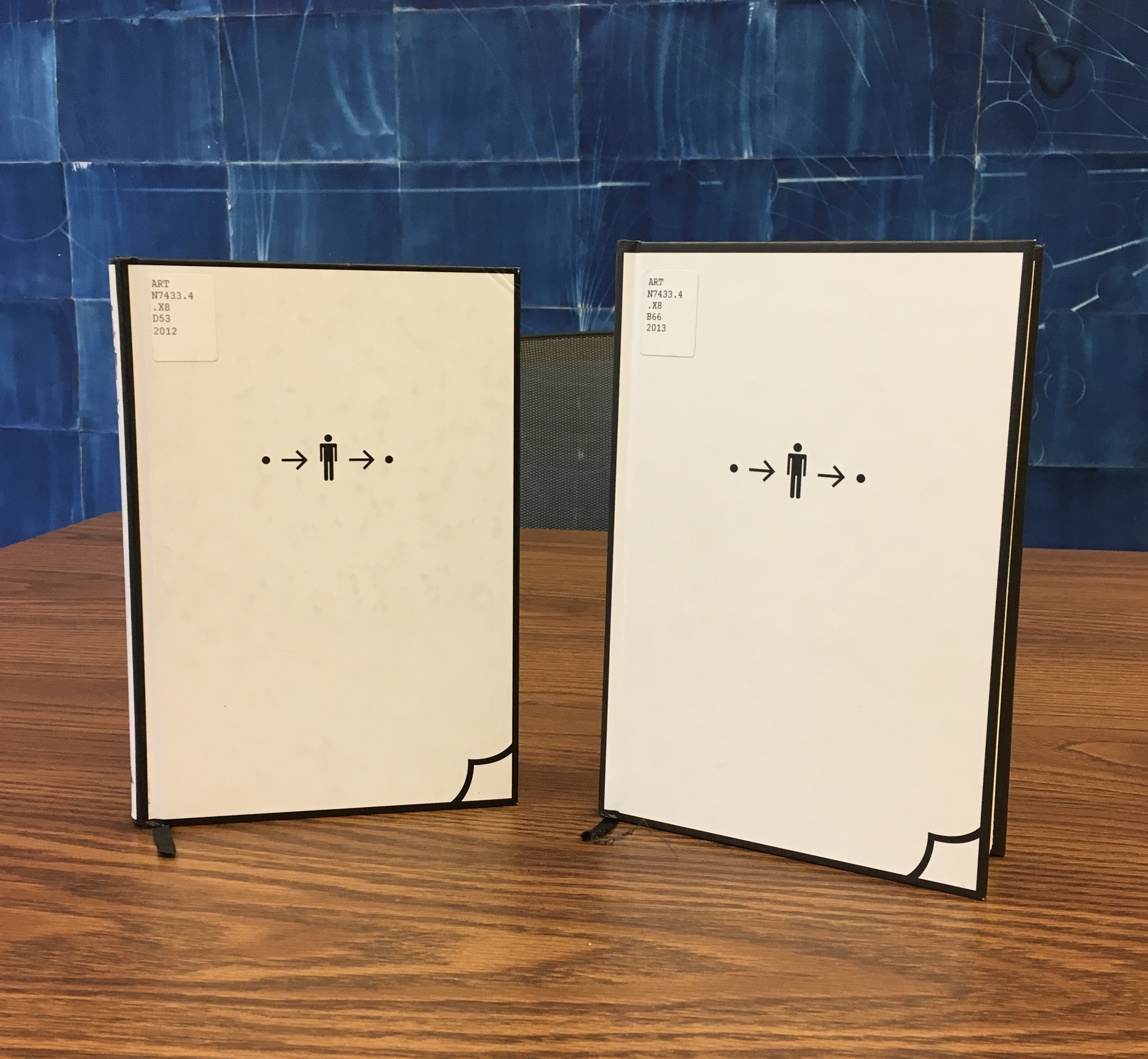
Another book by Xu, related to this third section of the Beijing exhibition and available for purchase, is Book from the Ground(2014), telling a day in the life of Mr. Black, an office worker — told completely in the symbols, icons, and logos of modern life. Xu’s playful but serious, to-and-fro treatment of language, meaning and cultures is another recurrent characteristic of his work.
Book from the Ground (2000) Xu Bing From the Hanes Library, University of North Carolina – Chapel Hill Notice the difference in size. On the left is the “Chinese” edition; on the right, the “English”. Why the quotation marks? There are no differences in the icons in which the narrative is written! Of course, the book trade being what it is, the traditional trim sizes are one cultural difference Xu could not erase.
Full appreciation of Xu’s signature interest in language — text and art, culture and meaning — would have sent the attendee in Beijing back from section two or three to section one to look at Book from the Sky again.
Serendipitously, another Xu exhibition was running nearby at INK Studio in Beijing at the same time: Xu Bing: Language and Nature. That show’s curator, Dr. Britta Erickson, is also the author of The Art of Xu Bing: Words without Meaning, Meaning without Words (2001). Her book covers many of the works in sections one and two and delivers insightful, plain-language readings of them that add considerably to the appreciation of Xu’s art. Again, as with the UCCA retrospective, Radii China delivers some outstanding photos from the INK Studio exhibition, and its briefest description makes the reader hunger for more as well as an actual visit:
… a selection from his The Living Word series in which the Pinyin Chinese word for bird, niao, transforms over a series of serial sculptures into the simplified character 鸟, then the traditional character 鳥, then, finally, into a small flock of birds soaring toward the gallery’s skylight.
A visitor could have hardly hoped to take in the UCCA and INK exhibitions in less than several days.
Xu’s conceptualism, genius for planning and meaningful attention to the detail of material recurs again and again in his work. He has a deft wittiness and patient, opportunistic eye, ear and even nose for enriching his artwork after the fact. Section three’s strong odor of tobacco must have underscored that to visitors.
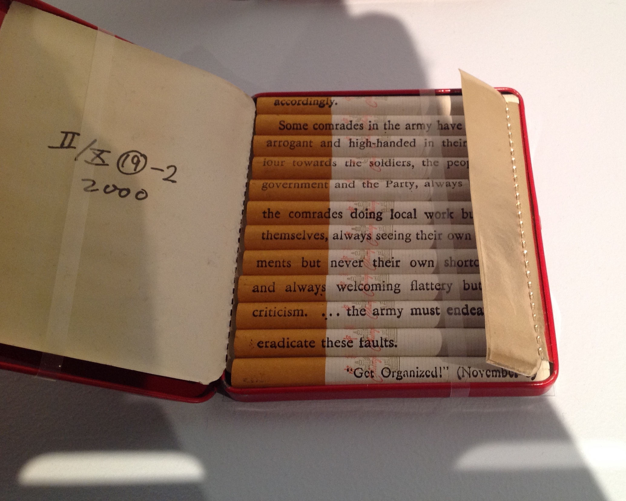
Xu’s Tobacco Project trilogy, which began in 1999, incorporates Red Book (with Chinese and English inscriptions on each cigarette from Mao’s little Red Book), the floor sculpture Honor and Splendor (composed of 660,000 Fu Gui cigarettes) and several other related works. For an earlier in-depth piece on the Tobacco Project (and extensive illustrations), the reader can go to John Ravenal’s description in Blackbird (Fall 2011, Vol 10, No. 2). As the curator who organized the Tobacco Project exhibition in 2011, Ravenal’s perspective is unique. Like John Cayley, Ravenal also produced a book — Tobacco Project, Duke/ Shanghai/ Virginia, 1999–2011 (2011).
Introducing another of Xu’s major works — Phoenix (2008-13), not in the exhibition — See argues, contrary to Lin Jiabin, that Xu has been on a path to a shift in focus:
Phoenix (2008-13) and Dragonfly Eyes (2017) further highlight Xu’s … shift towards the economic and geo-political, where the first comments on China’s breakneck development and the latter dramatizes the role of individuals within the framework of an ever-expanding surveillance network.
See’s comments on these works closing section three of the Beijing exhibition miss the presence of a tension in them — or rather tensions present in all of Xu’s works from the very beginning. In a way, those ongoing tensions support the analysis of Lin Jiabin and how Xu’s works “sway and excite each other”.
August 2018. Enid Tsui surfaced the primary tension a few weeks later — worth the wait for the artful weaving of her own observations with Xu’s comments — in a “long read” in the South China Morning Post Magazine. That tension is between, on the one hand, the exquisite and, on the other, the cynical, the pessimistic, the ugly and anger. For Tsui, the anger is most evident in “Xu’s latest, and most bizarre, work … Dragonfly Eyes (2017)”:
His team edited 10,000 hours of surveillance footage into an 80-minute feature film loosely structured around the story of a man running after the woman he loves. There are no actors or cameramen. … Xu used only clips that were never meant to be seen in public. Film critics were baffled. Xu says the work is, once again, about how we are shaped by culture. The scenes in Dragonfly Eyes hardly fill you with joy: beauty parlours selling cosmetic surgery packages; aggressive customers in a shop; drab, anonymous streets. Scenes of terrible natural catastrophes or accidents add to the general atmosphere of doom. There is an uncustomary fury here about the state of the world, beyond the film’s obvious reference to how we are all being surveilled by invisible, all-seeing eyes.
“The exquisite” shows in the attention to detail and exactitude of execution. There are other tensions at play within and across Xu’s works: cynicism vs idealism, pessimism vs optimism, tranquillity vs anger, sense vs nonsense, meaning vs meaninglessness, beauty vs ugliness. But if The Beijinger‘s regular arts columnist, G.J. Cabrera, is right in his August article extolling the accessibility of Xu’s art,
… the exhibition is rife with examples of how Xu’s witty thought processes can find technically challenging ways to address questions about linguistic processes or historical circumstance, which resonate not only in his homeland but also worldwide. The content is surprisingly accessible and not at all obscured by the dense narrative which could easily hijack the content when dealing with such deep themes.
G.J. Cabrera,”State of the Arts“, The Beijinger, 29 August 2018. Accessed 2 September 2018
then shouldn’t those tensions be able to shape our appreciation of the works without explanations from articles and essays like this one and those above? If we are attentive enough, yes. Xu’s works are clever and beautiful enough, sometimes appalling and shocking enough, almost always playful and serious enough to make the viewer pause and attend — to hear Xu’s works say, “Language, the things of our cultures and their differences are not always what they seem”.
Pictured above is the back cover of dongghab, a sort of self-portrait in book art in that its content derives from events occurring in 1963, the year of the artist’s birth. The back cover is not just “another conversation” with Ed Ruscha, but one with American culture, as is the book as a whole.
Why do some books of photography lodge themselves in our minds as book art or artist’s books? Ed Ruscha’s books have done that, so much so that it seems almost odd to call them photobooks, although their deadpan presentation as such is essential to their artistic status. Why do works like Sean Kernan’s The Secret Books and Abelardo Morell’s A Book of Books defy relegation to the coffee table?
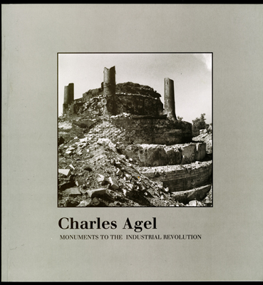
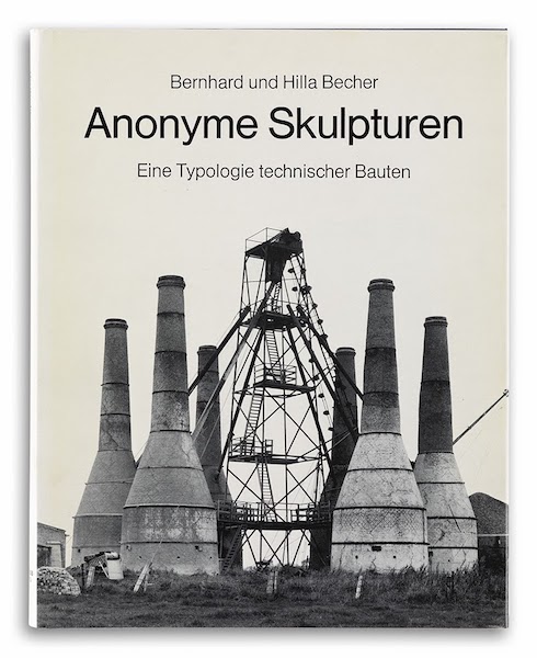
In juxtaposing his photos with text from John Lloyd Stephens, the 19th century explorer of Mesoamerica, Charles Agel positions Monuments to the Industrial Revolution (1998) as more than a book of photos. Quite a different conceptualizing strategy from the typologizing pursued from the 1970s onward by Bernd and Hilla Becher, mentioned by photographer John Pfahl in his introduction to Monuments.
Seeking the differences and similarities in strategies of composing the works as well as those of composing the photos adds to the appreciation and understanding of them.
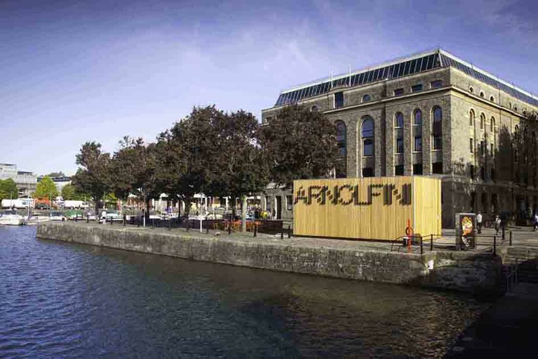
Containing over 700 items, the Arnolfini artists’ book collection is one of the largest UK collections of contemporary book art. It leans toward the 1970s and 1980s. The US-based Franklin Furnace Archive Artists Book Bibliography is representative, as are European works such as those of Vito Acconci, Marcel Broodthaers, Stanley Brouwn, Hanne Darboven, Jan Dibbetts, Helen Douglas, Dieter Roth and Telfer Stokes.
Franklin Furnace Archive Artists Book Bibliography (1977) Unbound notecards of artists’ books catalogues 3 v. ; 430 cards ; 11 x 16cm
The collection is not without later representative works such as those by SooMin Leong, Jonathan Monk and Grayson Perry, but there seem to be no works after 2012. The Arnolfini, Bristol’s center for contemporary art, also hosts the biennial Bristol Artists Book Event.
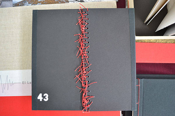
43: Cuarenta y Tres (2015) Lorena Velázquez Book 21.5 x 21.5 cm; box 30.3 X 24.2 cm; mixed technique, interventions with acrylic and serigraphy; edition: 43.
Josh Hockensmith, curator at the University of North Carolina’s Joseph C. Sloane Art Library, made it possible for me to handle this searing work memorializing the 43 students from the Raúl Isidro Burgos Rural Teachers’ School of Ayotzinapa who disappeared in September 2014 near Iguala, Mexico. The driving rain outside the windows that day compounded the work’s effect.
The hard work of describing Velázquez’s book has been done by Stephen Dingler, rare book cataloger at the University of Texas, Austin, Below is an excerpt of online comments on the 13th copy of the edition of 43.
The use of the number 43 is not restricted to the title in Ms. Velázquez’s work. Forty-three numbered copies of the book were made; the book, constructed in concertina (accordion) style, has 43 unnumbered pages; the numbers from one to 43 are printed across several pages; on one page the number 43 is produced in braille. There is little text but the book artist’s use of photographs showing demonstrations and rallies, as well as portrait photographs of the 43 missing, convey a sense of outrage and a demand for justice. The book’s pages are colored black, with most splashed or streaked with red paint, which further conveys a sense of horror and tragedy at what happened.
Stephen Dingler, “The Significance of Numbers”, The Top Shelf, 15 August 2016. Accessed 7 September 2018.
Even with more than 100 people arrested in relation to the case and a key suspect in custody in March 2018, the facts remained unknown. The 43 would have graduated in July 2018. Mexico’s new president Andrés Manuel López Obrador has committed to launching an independent commission on 1 December 2018 to to re-open the investigation in compliance with a federal court ruling.
One among the names of the 43 has been redacted because his remains have been identified. 43: Cuarenta y Tres (2015) Lorena Velázquez
The Spiral Lady (2013) Book 21.5 X 20.0 cm; box 56.5 X 21.5 cm; edition 20 + 2 a/p. Collaboration with Lola Argemí. WorldCat link.
El Vuelo/Flying (2012) Book 21.5 x 18.0 cm; box: 23.0 cm x 19.5 cm; mixed technique, fine art printing, interventions with chinese ink and acrylic; edition: 10 + 2 a/p. WorldCat link.
El Latido del Corazón/Heartbeat (2011) Book 24.5 x 35.5 cm; box 38.5 x 37 x 4.5 cm; mixed media, digital printing over plaques of collodion and several objects; edition: 4 + 2 a/p.
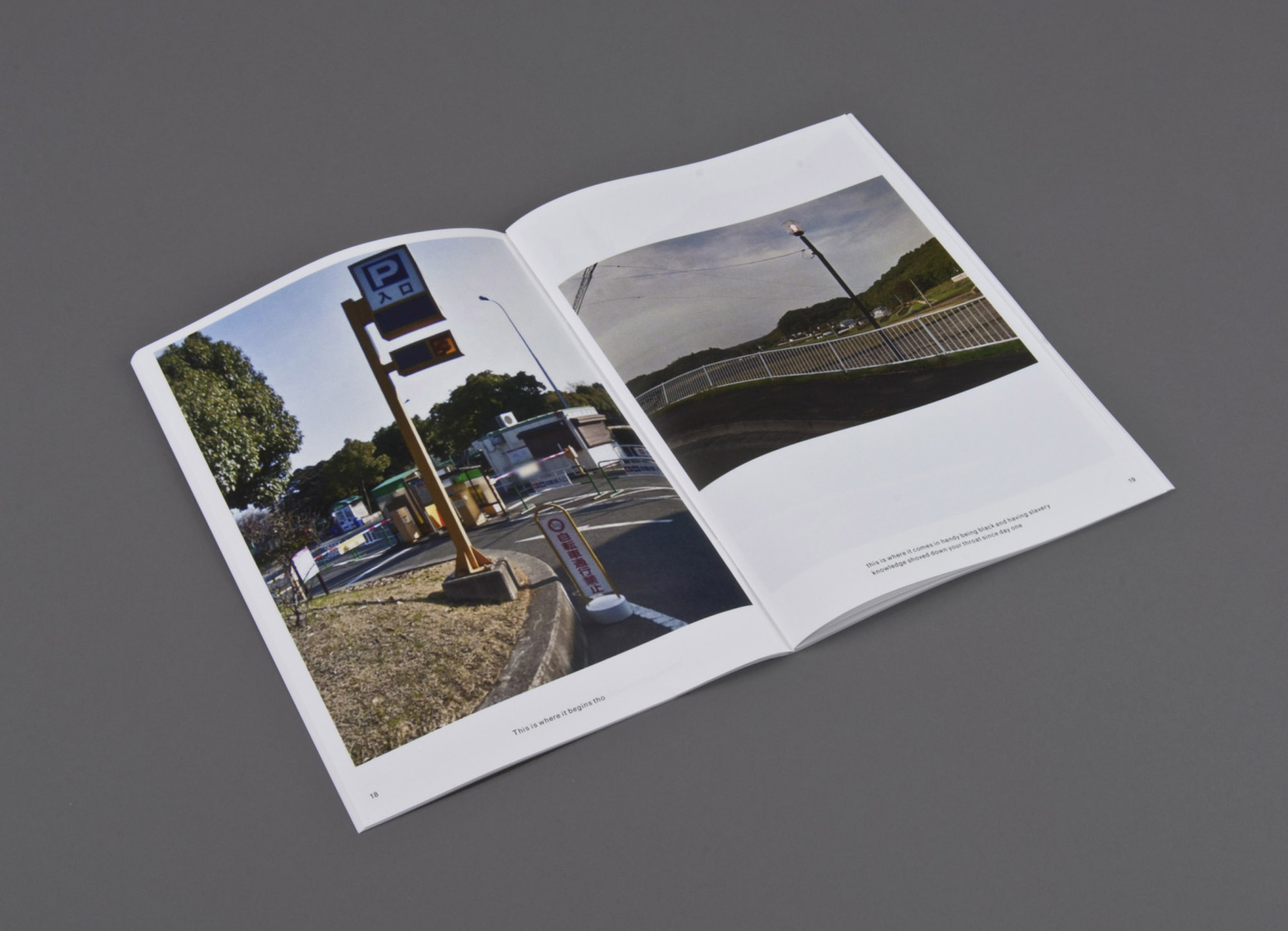
This is where (2014) Print on demand, three booklets Erin Zwaska
An ongoing chance-based publication project in the spirit of Ed Ruscha. Images are randomly-selected Google streetviews (which are often captured at noon to avoid shadowing) of cities like Paris, Tokyo, etc. The copy is compiled from all tweets containing the phrase “this is where” between noon and 12:15pm local time for each city. Consequently the text and imagery for each 15-minute issue originates from the same, albeit ambiguous, time and place. And though text and image are randomly paired, surprising narratives often emerge. Included in the collection of the Library of the Printed Web.
This is where is where the tradition of Ed Ruscha meets the Web. Go there and see for yourself.
A search of Lafayette College’s Artists’ Books Collection on the genre yields 1284 entries, including works by Alicia Bailey, Julie Chen, Maureen Cummins, Steven Daiber, Karen Hanmer, Margaret Kaufman, Clifton Meador, Lois Morrison, Werner Pfeiffer, Gerhard Richter, Maryann Riker, Edward Ruscha, Buzz Spector, Barbara Tetenbaum, Erica Van Horn and Sam Winston.
Check out the archives for the Werner Pfeiffer exhibition.
Worth a visit to the Skillman Library if you’re in Easton, PA.